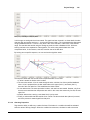
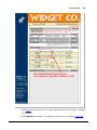
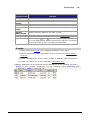
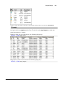
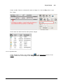
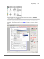
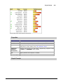
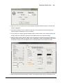
1
Table of Contents
Part I Introduction
19
1 Welcome
...................................................................................................................................
to Ignition
19
2 Getting
...................................................................................................................................
Help
19
3 Licensing,
...................................................................................................................................
Activation, and Trial Mode
20
4 Quick...................................................................................................................................
Start
21
Gatew ay Hom..........................................................................................................................................................
epage
21
Connect to a PLC
.......................................................................................................................................................... 23
Connect to a Database
.......................................................................................................................................................... 23
Launch the Designer
.......................................................................................................................................................... 24
Create som e ..........................................................................................................................................................
tags
25
Create a Window
.......................................................................................................................................................... 26
Launch a Client
.......................................................................................................................................................... 27
Create a Transaction
..........................................................................................................................................................
Group
27
Part II FAQ
29
1 How to
...................................................................................................................................
I get data from my PLC?
29
2 How do
...................................................................................................................................
I log history for a tag?
31
3 How do
...................................................................................................................................
I run a SQL Query from a button?
34
4 How do
...................................................................................................................................
I control who logs into a project?
35
5 How do
...................................................................................................................................
I change the default username and password?
37
6 How do
...................................................................................................................................
I connect to a database?
38
7 How do
...................................................................................................................................
I enable auditing?
39
8 How do
...................................................................................................................................
I call a stored procedure?
39
Part III Overview
43
1 What ...................................................................................................................................
is Ignition?
43
2 Architecture
................................................................................................................................... 44
Architecture Overview
.......................................................................................................................................................... 44
System Concepts
.......................................................................................................................................................... 44
Ignition Gatew
.........................................................................................................................................................
ay
44
Ignition Designer
......................................................................................................................................................... 45
Ignition Vision
.........................................................................................................................................................
Clients
45
Mobile Clients
......................................................................................................................................................... 45
Database Access
......................................................................................................................................................... 46
OPC-UA ......................................................................................................................................................... 47
SQLTags ......................................................................................................................................................... 47
Architecture Diagram
..........................................................................................................................................................
s
49
Standard Architecture
......................................................................................................................................................... 49
OPC-UA Architecture
......................................................................................................................................................... 50
Remote Datalogging
.........................................................................................................................................................
Architecture
51
Wide-area .........................................................................................................................................................
SCADA Architecture
52
Mission Critical
.........................................................................................................................................................
Architecture
53
© 2013 Inductive Automation
3
Advanced Architecture
..........................................................................................................................................................
Topics
53
Remote Logging
......................................................................................................................................................... 53
Distributed.........................................................................................................................................................
SQLTags
54
Client Retargeting
......................................................................................................................................................... 54
3 Modules
................................................................................................................................... 54
Overview
.......................................................................................................................................................... 54
OPC-UA Module
.......................................................................................................................................................... 55
SQL Bridge Module
.......................................................................................................................................................... 55
Vision Module.......................................................................................................................................................... 56
Reporting Module
.......................................................................................................................................................... 57
Mobile Module
.......................................................................................................................................................... 57
Alarm Notification
..........................................................................................................................................................
Module
57
OPC-COM Module
.......................................................................................................................................................... 57
Other Modules
.......................................................................................................................................................... 58
4 Basic...................................................................................................................................
Usage
58
Gatew ay Navigation
.......................................................................................................................................................... 58
Gatew ay Control
..........................................................................................................................................................
Utility
59
Web Launching
.......................................................................................................................................................... 62
Launching Clients
.......................................................................................................................................................... 63
Launching the..........................................................................................................................................................
Designer
64
Part IV Gateway Configuration
66
1 Gateway
...................................................................................................................................
Configuration Overview
66
2 Logging
...................................................................................................................................
into the configuration page
66
3 Basics
................................................................................................................................... 66
Basic Gatew ay..........................................................................................................................................................
Settings
66
Gatew ay Hom..........................................................................................................................................................
epage Custom ization
68
Setting the Port
.......................................................................................................................................................... 68
Resetting the ..........................................................................................................................................................
trial period
68
Activation
.......................................................................................................................................................... 68
Online Activation
......................................................................................................................................................... 68
Offline Activation
......................................................................................................................................................... 69
Unactivation
......................................................................................................................................................... 69
Updating the
.........................................................................................................................................................
License
69
Gatew ay Console
.......................................................................................................................................................... 69
4 Projects
................................................................................................................................... 70
What is a Project?
.......................................................................................................................................................... 70
Project Managem
..........................................................................................................................................................
ent
71
Project Versioning
.......................................................................................................................................................... 71
Im porting and..........................................................................................................................................................
Exporting Projects
72
5 Modules
................................................................................................................................... 73
Module Managem
..........................................................................................................................................................
ent
73
6 Databases
................................................................................................................................... 73
Databases Overview
.......................................................................................................................................................... 73
Supported Databases
.......................................................................................................................................................... 74
Database Connections
.......................................................................................................................................................... 75
Creating and
.........................................................................................................................................................
Editing Connections
75
Monitoring .........................................................................................................................................................
Connection Status
76
Connecting.........................................................................................................................................................
to Microsoft SQL Server
76
Connecting.........................................................................................................................................................
to MySQL
83
Database Drivers
.......................................................................................................................................................... 84
© 2013 Inductive Automation
What is JDBC?
......................................................................................................................................................... 84
Can I connect
.........................................................................................................................................................
using ODBC?
84
Adding a JDBC
.........................................................................................................................................................
driver
84
Database Translators
......................................................................................................................................................... 85
7 Store ...................................................................................................................................
and Forward
86
Store and Forw
..........................................................................................................................................................
ard Overview
86
Engine Configuration
.......................................................................................................................................................... 87
Store and Forw
..........................................................................................................................................................
ard for Reliability
88
Store and Forw
..........................................................................................................................................................
ard for high-speed buffering
89
Engine Status..........................................................................................................................................................
Monitoring
90
Data Quarantining
.......................................................................................................................................................... 90
8 OPC ................................................................................................................................... 91
What is OPC? .......................................................................................................................................................... 91
OPC Connections
.......................................................................................................................................................... 92
Connecting.........................................................................................................................................................
to OPC-UA
92
Connecting.........................................................................................................................................................
to OPC Classic (COM)
93
Troubleshooting
.........................................................................................................................................................
OPC-COM Connections
95
OPC Quick Client
.......................................................................................................................................................... 97
Ignition OPC-UA
..........................................................................................................................................................
Server
97
OPC-UA Server
.........................................................................................................................................................
Settings
97
Adding a New
.........................................................................................................................................................
Device
98
Verifying Device
.........................................................................................................................................................
Connectivity
98
Drivers ......................................................................................................................................................... 99
Allen Bradley Drivers
......................................................................................................................................... 99
ControlLogix 5500
................................................................................................................................... 99
MicroLogix 1100/1400
................................................................................................................................... 100
PLC-5
................................................................................................................................... 100
SLC 505
................................................................................................................................... 101
Allen Bradley Connection
...................................................................................................................................
Paths Explained
102
Simulator Drivers
......................................................................................................................................... 107
Generic Simulator
................................................................................................................................... 107
Allen Bradley SLC
...................................................................................................................................
Simulator
109
Modbus Drivers......................................................................................................................................... 109
Modbus Ethernet
................................................................................................................................... 109
Overview
................................................................................................................................... 109
Device Configuration
................................................................................................................................... 109
Addressing ................................................................................................................................... 110
UDP and TCP Drivers
......................................................................................................................................... 117
UDP and TCP ................................................................................................................................... 117
Siemens Drivers......................................................................................................................................... 119
Overview
................................................................................................................................... 119
Addressing ................................................................................................................................... 119
9 SQLTags
................................................................................................................................... 120
SQLTags Configuration
..........................................................................................................................................................
Overview
120
Configuring Realtim
..........................................................................................................................................................
e SQLTags
122
SQLTags Realtim
..........................................................................................................................................................
e Provider Types
122
Internal Provider
......................................................................................................................................................... 122
Database.........................................................................................................................................................
Provider
122
Database.........................................................................................................................................................
Driving Provider
122
External Provider
.........................................................................................................................................................
Reference
123
SQLTags Historian
.......................................................................................................................................................... 130
How SQLTags
.........................................................................................................................................................
Historian Works
130
Configuring
.........................................................................................................................................................
SQLTags Historian
131
© 2013 Inductive Automation
5
10 Security
................................................................................................................................... 132
Users and Roles
.......................................................................................................................................................... 132
User Source ..........................................................................................................................................................
Types
133
Internal User
.........................................................................................................................................................
Source
133
Database.........................................................................................................................................................
User Source
133
Active Directory
.........................................................................................................................................................
User Source
134
AD/Internal
.........................................................................................................................................................
User Source
134
AD/Database
.........................................................................................................................................................
User Source
134
Enabling SSL..........................................................................................................................................................
Encryption
135
11 Alarming
................................................................................................................................... 135
Alarm ing Overview
.......................................................................................................................................................... 135
Alarm Notification
.......................................................................................................................................................... 135
Voice Notification
......................................................................................................................................................... 136
SMS Notification
......................................................................................................................................................... 139
Alarm Journal
.......................................................................................................................................................... 139
Schedules .......................................................................................................................................................... 142
On-Call Rosters
.......................................................................................................................................................... 142
12 Redundancy
................................................................................................................................... 143
What is Redundancy?
.......................................................................................................................................................... 143
How Redundancy
..........................................................................................................................................................
Works
144
Setting up Redundancy
.......................................................................................................................................................... 145
Redundancy ..........................................................................................................................................................
Settings
146
Database Considerations
.......................................................................................................................................................... 147
Troubleshooting
..........................................................................................................................................................
Redundancy
149
13 Mobile
...................................................................................................................................
Module
149
Mobile Module
..........................................................................................................................................................
Settings
149
Part V Project Design
153
1 Designer
...................................................................................................................................
Introduction
153
2 Using
...................................................................................................................................
the Designer
153
Logging into..........................................................................................................................................................
the Designer
153
Creating or Opening
..........................................................................................................................................................
a Project
153
Designer UI Overview
.......................................................................................................................................................... 153
Using the Docking
..........................................................................................................................................................
System
154
Com m unication
..........................................................................................................................................................
Modes
154
Designer Tools
.......................................................................................................................................................... 155
Output Console
......................................................................................................................................................... 155
Diagnostics
.........................................................................................................................................................
Window
155
Find / Replace
......................................................................................................................................................... 156
Image Manager
......................................................................................................................................................... 156
Symbol Factory
......................................................................................................................................................... 157
Query Brow
.........................................................................................................................................................
ser
157
3 SQLTags
................................................................................................................................... 157
What is a SQLTag?
.......................................................................................................................................................... 157
Types of SQLTags
.......................................................................................................................................................... 158
Creating SQLTags
.......................................................................................................................................................... 159
Basic Tag Properties
.......................................................................................................................................................... 160
General Properties
......................................................................................................................................................... 160
Numeric Properties
......................................................................................................................................................... 160
Metadata .........................................................................................................................................................
Properties
161
Permission
.........................................................................................................................................................
Properties
162
© 2013 Inductive Automation
History Properties
......................................................................................................................................................... 162
Alarming Properties
......................................................................................................................................................... 164
Expression/SQL
.........................................................................................................................................................
Properties
167
Com plex Tags
..........................................................................................................................................................
(UDTs)
168
Introduction
......................................................................................................................................................... 168
Defining Data
.........................................................................................................................................................
Types
168
Creating Instances
......................................................................................................................................................... 171
Scan Classes.......................................................................................................................................................... 172
Tag Paths .......................................................................................................................................................... 173
Data Quality .......................................................................................................................................................... 174
Im porting/Exporting
..........................................................................................................................................................
Tags
175
4 Project
...................................................................................................................................
Properties
179
Project General
..........................................................................................................................................................
Properties
179
Designer General
..........................................................................................................................................................
Properties
180
Designer Window
..........................................................................................................................................................
Editing Properties
180
Client General
..........................................................................................................................................................
Properties
180
Client Launching
..........................................................................................................................................................
Properties
181
Client Login ..........................................................................................................................................................
Properties
182
Client Polling..........................................................................................................................................................
Properties
182
Client User Interface
..........................................................................................................................................................
Properties
182
5 Project
...................................................................................................................................
Scripting Configuration
183
Script Modules
.......................................................................................................................................................... 183
Event Scripts.......................................................................................................................................................... 183
Overview......................................................................................................................................................... 183
Startup and
.........................................................................................................................................................
Shutdow n Scripts
184
Shutdow n.........................................................................................................................................................
Intercept Script
184
Keystroke.........................................................................................................................................................
Scripts
184
Timer Scripts
......................................................................................................................................................... 184
Tag Change
.........................................................................................................................................................
Scripts
185
Menu Bar.........................................................................................................................................................
Scripts
185
6 Transaction
...................................................................................................................................
Groups
185
Introduction .......................................................................................................................................................... 185
Execution Cycle
.......................................................................................................................................................... 186
Anatom y of a..........................................................................................................................................................
Group
187
Action Settings
......................................................................................................................................................... 187
Trigger and
.........................................................................................................................................................
Handshake Settings
188
Advanced.........................................................................................................................................................
Settings
189
Items Types
......................................................................................................................................................... 189
Overview
......................................................................................................................................... 189
OPC Item
......................................................................................................................................... 190
Expression Item......................................................................................................................................... 191
SQLTag Reference
......................................................................................................................................... 193
Types Of Groups
.......................................................................................................................................................... 194
Standard .........................................................................................................................................................
Group
194
Block Group
......................................................................................................................................................... 195
Historical .........................................................................................................................................................
Group
196
Stored Procedure
.........................................................................................................................................................
Group
197
7 Windows,
...................................................................................................................................
Components, and Templates
198
Introduction .......................................................................................................................................................... 198
Window s
.......................................................................................................................................................... 199
Window s.........................................................................................................................................................
Overview
199
Anatomy .........................................................................................................................................................
of a Window
199
Window Types
......................................................................................................................................................... 200
© 2013 Inductive Automation
7
Window Properties
......................................................................................................................................................... 201
Window Security
......................................................................................................................................................... 204
Typical Navigation
.........................................................................................................................................................
Strategy
204
Sw apping.........................................................................................................................................................
vs Opening
204
Open Window
.........................................................................................................................................................
s and Performance
205
Parameterized
.........................................................................................................................................................
Window s
205
Com ponents.......................................................................................................................................................... 206
Introduction
......................................................................................................................................................... 206
Creating Shapes
.........................................................................................................................................................
and Components
206
Component Palette
......................................................................................................................................... 206
Shape Tools ......................................................................................................................................... 207
Custom Palettes......................................................................................................................................... 209
SQLTags Drag-n-Drop
......................................................................................................................................... 209
Selecting .........................................................................................................................................................
Components
210
Manipulating
.........................................................................................................................................................
Components
210
Keyboard.........................................................................................................................................................
Shortcuts
212
Properties......................................................................................................................................................... 213
The Property
.........................................................................................................................................................
Editor
213
Fill and Stroke
......................................................................................................................................................... 214
Geometry.........................................................................................................................................................
and Paths
216
Data Types
......................................................................................................................................................... 219
Component
.........................................................................................................................................................
Customizers
220
Custom Properties
......................................................................................................................................................... 220
Component
.........................................................................................................................................................
Styles
221
Quality Overlays
......................................................................................................................................................... 221
Touchscreen
.........................................................................................................................................................
Support
222
Component
.........................................................................................................................................................
Layout
223
Shape Components
......................................................................................................................................................... 225
Grouping ......................................................................................................................................................... 227
Using Symbol
.........................................................................................................................................................
Factory
227
Tem plates .......................................................................................................................................................... 228
Introduction
......................................................................................................................................................... 228
Using Templates
......................................................................................................................................................... 229
Template .........................................................................................................................................................
Parameters
229
Property Binding
.......................................................................................................................................................... 231
Overview......................................................................................................................................................... 231
Polling Options
......................................................................................................................................................... 232
Bidirectional
.........................................................................................................................................................
Bindings
232
Indirect Bindings
......................................................................................................................................................... 233
Binding Types
......................................................................................................................................................... 233
Tag Binding
......................................................................................................................................... 233
Indirect Tag Binding
......................................................................................................................................... 234
SQLTags Historian
.........................................................................................................................................
Binding
234
Property Binding......................................................................................................................................... 235
Expression Binding
......................................................................................................................................... 235
DB Brow se Binding
......................................................................................................................................... 236
SQL Query Binding
......................................................................................................................................... 236
Cell Update Binding
......................................................................................................................................... 237
Function Binding......................................................................................................................................... 237
Com ponent Scripting
.......................................................................................................................................................... 237
Event Handlers
......................................................................................................................................................... 237
The 'event'
.........................................................................................................................................................
object
238
Event Types
......................................................................................................................................................... 239
Script Builders
......................................................................................................................................................... 245
© 2013 Inductive Automation
Security
.......................................................................................................................................................... 246
Role-based
.........................................................................................................................................................
access
246
Tag Security
......................................................................................................................................................... 246
Component
.........................................................................................................................................................
Security
247
Securing .........................................................................................................................................................
event handlers
247
8 Reporting
...................................................................................................................................
Module
247
Introduction .......................................................................................................................................................... 247
Introduction
......................................................................................................................................................... 247
Features ......................................................................................................................................................... 251
How it w orks
......................................................................................................................................................... 252
Installation.........................................................................................................................................................
and trial mode
255
Getting Started
......................................................................................................................................................... 258
Step by Step
.........................................................................................................................................................
Quick Start
258
Tutorials
.......................................................................................................................................................... 269
Tutorial #1.........................................................................................................................................................
- Table Example
269
Overview
......................................................................................................................................... 269
Background
......................................................................................................................................... 271
Getting Started ......................................................................................................................................... 272
Basic Layout ......................................................................................................................................... 273
Substitution Keys
.........................................................................................................................................
and Tables
275
Row Versioning......................................................................................................................................... 279
Tutorial #2.........................................................................................................................................................
- Adding Graphs
283
Overview
......................................................................................................................................... 283
Background
......................................................................................................................................... 284
Getting Started ......................................................................................................................................... 285
Basic Layout ......................................................................................................................................... 286
More changes ......................................................................................................................................... 289
Graphs
......................................................................................................................................... 291
Tutorial #3.........................................................................................................................................................
- PDF Example
295
Overview
......................................................................................................................................... 295
Background
......................................................................................................................................... 296
Creating the report
......................................................................................................................................... 297
Com ponents.......................................................................................................................................................... 299
Ignition Components
......................................................................................................................................................... 299
Row Selector ......................................................................................................................................... 299
Column Selector......................................................................................................................................... 303
Report View er ......................................................................................................................................... 306
File Explorer ......................................................................................................................................... 310
PDF View er
......................................................................................................................................... 312
ReportView
.........................................................................................................................................................
er Components
314
Basic Draw ing Tools
......................................................................................................................................... 314
Crosstab
......................................................................................................................................... 317
Graph
......................................................................................................................................... 318
Line Graph
......................................................................................................................................... 322
Images
......................................................................................................................................... 325
Labels
......................................................................................................................................... 328
Barcode
......................................................................................................................................... 330
Simple Table ......................................................................................................................................... 331
Tables
......................................................................................................................................... 332
Overview
................................................................................................................................... 332
Basics
................................................................................................................................... 333
Table Row s ................................................................................................................................... 339
Sorting and Filtering
................................................................................................................................... 341
Row Versioning
................................................................................................................................... 343
© 2013 Inductive Automation
9
Grouping
................................................................................................................................... 345
Table Groups ................................................................................................................................... 348
Concepts .......................................................................................................................................................... 349
User Interface
......................................................................................................................................................... 349
Selection and Alignment
......................................................................................................................................... 349
Object Layout ......................................................................................................................................... 351
Text Editing
......................................................................................................................................... 353
Report Designer......................................................................................................................................... 354
Menu
................................................................................................................................... 355
Toolbar
................................................................................................................................... 358
Attributes Panel................................................................................................................................... 359
Inspector Panel................................................................................................................................... 364
Basic
......................................................................................................................................................... 376
Dynamic Properties
......................................................................................................................................... 376
Substitution Keys
......................................................................................................................................... 378
Expressions, operators,
.........................................................................................................................................
and functions
381
Saving Reports ......................................................................................................................................... 383
PDF Reports ......................................................................................................................................... 385
Date Formatting.........................................................................................................................................
Paterns
389
Label Sw ich Versions,
.........................................................................................................................................
Graph
394
Dataset Key - Table
.........................................................................................................................................
or Graph
398
Advanced......................................................................................................................................................... 401
BLOB images ......................................................................................................................................... 401
Image Placeholders
......................................................................................................................................... 405
Property Expressions
......................................................................................................................................... 407
9 Alarm
...................................................................................................................................
Notification Pipelines
410
Overview
.......................................................................................................................................................... 410
Alarm Properties
.......................................................................................................................................................... 412
Pipeline Blocks
.......................................................................................................................................................... 414
Notification
......................................................................................................................................................... 414
Delay
......................................................................................................................................................... 415
Splitter ......................................................................................................................................................... 416
Expression
......................................................................................................................................................... 416
Sw itch ......................................................................................................................................................... 416
Set Property
......................................................................................................................................................... 417
Jump
......................................................................................................................................................... 417
Part VI Scripting
419
1 About
...................................................................................................................................
Scripting
419
2 Python
................................................................................................................................... 420
About Python
.......................................................................................................................................................... 420
Python Tutorial
.......................................................................................................................................................... 420
Basic Syntax
......................................................................................................................................................... 420
Control Flow
......................................................................................................................................................... 422
String Formatting
......................................................................................................................................................... 423
Functions......................................................................................................................................................... 424
Scope and
.........................................................................................................................................................
Import
426
Sequences
.........................................................................................................................................................
and Dictionaries
427
Exception.........................................................................................................................................................
Handling
429
Learn More
......................................................................................................................................................... 429
Python in Ignition
.......................................................................................................................................................... 430
Working w.........................................................................................................................................................
ith Different Datatypes
430
Working w.........................................................................................................................................................
ith Components
434
© 2013 Inductive Automation
Global Script
.........................................................................................................................................................
Modules
436
Gatew ay .........................................................................................................................................................
vs Client Scripts
436
Timer, Keystroke,
.........................................................................................................................................................
and Tag Change Scripts
436
Python Standard
.........................................................................................................................................................
Library
436
Component
.........................................................................................................................................................
Event Handlers
437
Component
.........................................................................................................................................................
Extension Functions
437
Accessing
.........................................................................................................................................................
Java
437
Web Services
..........................................................................................................................................................
& SUDS
439
Overview.........................................................................................................................................................
& Simple Arguments
439
Complex Arguments
......................................................................................................................................................... 444
Parsing XML
.........................................................................................................................................................
Results
446
3 Expressions
................................................................................................................................... 447
Overview
Syntax
.......................................................................................................................................................... 447
.......................................................................................................................................................... 448
Part VII Tutorials & Helpful Tricks
452
1 Using
...................................................................................................................................
HTML in Ignition
452
2 Kepware
...................................................................................................................................
OPC-UA Connection Guide
454
3 Troubleshooting
...................................................................................................................................
Gateway Scripts
458
4 Changing
...................................................................................................................................
Memory Allocation for Ignition
460
5 Mapping
...................................................................................................................................
a Network Drive
462
6 Creating
...................................................................................................................................
an Editable Table in Ignition
463
7 Create
...................................................................................................................................
Basic Navigation Windows
466
8 Indirect
...................................................................................................................................
Bindings and Window Parameters
470
9 Database
...................................................................................................................................
Performance Tips
473
10 Accessing
...................................................................................................................................
Ignition Over a WAN
475
Part VIII Installation / Deployment
478
1 Installation
...................................................................................................................................
(Windows)
478
2 Installation
...................................................................................................................................
(Linux)
481
3 Installation
...................................................................................................................................
(Debian Package Management)
490
4 Upgrade
...................................................................................................................................
(Windows)
492
5 Upgrade
...................................................................................................................................
(Linux)
496
6 Uninstallation
................................................................................................................................... 503
7 Licensing
...................................................................................................................................
and Activation
504
8 Making
...................................................................................................................................
Backups
504
9 Restoring
...................................................................................................................................
from a Backup
504
10 Transferring
...................................................................................................................................
Servers
505
11 Gateway
...................................................................................................................................
Homepage Customization
505
12 Gateway
...................................................................................................................................
Web Security
506
13 Gateway
...................................................................................................................................
Monitoring
506
14 Installing
...................................................................................................................................
a Genuine SSL Certificate
507
Part IX Appendix A. Components
511
© 2013 Inductive Automation
11
1 Input................................................................................................................................... 511
Text Field .......................................................................................................................................................... 511
Num eric Text..........................................................................................................................................................
Field
514
Spinner
.......................................................................................................................................................... 518
Form atted Text
..........................................................................................................................................................
Field
520
Passw ord Field
.......................................................................................................................................................... 524
Text Area .......................................................................................................................................................... 526
Dropdow n List
.......................................................................................................................................................... 528
Slider
.......................................................................................................................................................... 533
2 Buttons
................................................................................................................................... 536
Button
.......................................................................................................................................................... 536
2 State Toggle
.......................................................................................................................................................... 540
Multi-State Button
.......................................................................................................................................................... 544
One-Shot Button
.......................................................................................................................................................... 547
Mom entary Button
.......................................................................................................................................................... 551
Toggle Button
.......................................................................................................................................................... 555
Check Box .......................................................................................................................................................... 558
Radio Button.......................................................................................................................................................... 560
Tab Strip
.......................................................................................................................................................... 563
3 Display
................................................................................................................................... 566
Label
.......................................................................................................................................................... 566
Num eric Label
.......................................................................................................................................................... 569
Multi-State Indicator
.......................................................................................................................................................... 573
LED Display .......................................................................................................................................................... 575
Moving Analog
..........................................................................................................................................................
Indicator
578
Im age
.......................................................................................................................................................... 582
Progress Bar.......................................................................................................................................................... 585
Cylindrical Tank
.......................................................................................................................................................... 587
Level Indicator
.......................................................................................................................................................... 590
Linear Scale .......................................................................................................................................................... 592
Barcode
.......................................................................................................................................................... 596
Meter
.......................................................................................................................................................... 598
Com pass .......................................................................................................................................................... 603
Therm om eter
.......................................................................................................................................................... 606
Docum ent View
..........................................................................................................................................................
er
609
IP Cam era View
..........................................................................................................................................................
er
611
4 Tables
................................................................................................................................... 614
Table
List
Tree View
Com m ents
.......................................................................................................................................................... 614
.......................................................................................................................................................... 622
.......................................................................................................................................................... 625
Panel
.......................................................................................................................................................... 629
5 Charts
................................................................................................................................... 634
Easy Chart .......................................................................................................................................................... 634
Chart
.......................................................................................................................................................... 645
Sparkline Chart
.......................................................................................................................................................... 649
Bar Chart
.......................................................................................................................................................... 654
Radar Chart .......................................................................................................................................................... 659
Status Chart .......................................................................................................................................................... 661
Pie Chart
.......................................................................................................................................................... 665
Box and Whisker
..........................................................................................................................................................
Chart
669
Equipm ent Schedule
.......................................................................................................................................................... 671
Gantt Chart .......................................................................................................................................................... 675
© 2013 Inductive Automation
6 Calendar
................................................................................................................................... 677
Calendar
.......................................................................................................................................................... 677
Popup Calendar
.......................................................................................................................................................... 680
Date Range .......................................................................................................................................................... 683
Day View
.......................................................................................................................................................... 687
Week View .......................................................................................................................................................... 691
Month View .......................................................................................................................................................... 695
7 Admin
................................................................................................................................... 699
User Managem
..........................................................................................................................................................
ent
699
Schedule Managem
..........................................................................................................................................................
ent
702
8 Alarming
................................................................................................................................... 703
Alarm Status..........................................................................................................................................................
Table
703
Alarm Journal
..........................................................................................................................................................
Table
707
9 Misc................................................................................................................................... 710
Container .......................................................................................................................................................... 710
Paintable Canvas
.......................................................................................................................................................... 713
Line
.......................................................................................................................................................... 715
Pipe Segm ent
.......................................................................................................................................................... 717
Pipe Joint .......................................................................................................................................................... 719
Sound Player.......................................................................................................................................................... 721
Tim er
.......................................................................................................................................................... 722
Signal Generator
.......................................................................................................................................................... 724
10 Reporting
................................................................................................................................... 725
ReportPanel .......................................................................................................................................................... 725
Row SelectorTree
.......................................................................................................................................................... 736
Colum nSelectorPanel
.......................................................................................................................................................... 749
FileExplorer .......................................................................................................................................................... 761
PDFView er .......................................................................................................................................................... 773
Part X Appendix B. Expression Functions
785
1 Aggregates
................................................................................................................................... 785
groupConcat.......................................................................................................................................................... 785
m ax
.......................................................................................................................................................... 785
m axDate
.......................................................................................................................................................... 786
m ean
.......................................................................................................................................................... 786
m edian
.......................................................................................................................................................... 786
m in
.......................................................................................................................................................... 787
m inDate
.......................................................................................................................................................... 787
stdDev
.......................................................................................................................................................... 788
sum
.......................................................................................................................................................... 788
2 Colors
................................................................................................................................... 788
brighter
color
darker
gradient
.......................................................................................................................................................... 788
.......................................................................................................................................................... 789
.......................................................................................................................................................... 789
.......................................................................................................................................................... 789
3 Date...................................................................................................................................
and Time
789
dateArithm etic
.......................................................................................................................................................... 789
dateDiff
.......................................................................................................................................................... 790
dateExtract .......................................................................................................................................................... 790
dateForm at .......................................................................................................................................................... 791
now
.......................................................................................................................................................... 791
© 2013 Inductive Automation
13
tim eBetw een
.......................................................................................................................................................... 791
4 Logic
................................................................................................................................... 792
binEnc
binEnum
coalesce
getBit
if
isNull
lookup
sw itch
try
.......................................................................................................................................................... 792
.......................................................................................................................................................... 792
.......................................................................................................................................................... 792
.......................................................................................................................................................... 793
.......................................................................................................................................................... 793
.......................................................................................................................................................... 793
.......................................................................................................................................................... 793
.......................................................................................................................................................... 794
.......................................................................................................................................................... 795
5 Math................................................................................................................................... 795
abs
acos
asin
atan
ceil
cos
exp
floor
log
log10
round
sin
sqrt
tan
todegrees
toradians
.......................................................................................................................................................... 795
.......................................................................................................................................................... 795
.......................................................................................................................................................... 795
.......................................................................................................................................................... 795
.......................................................................................................................................................... 796
.......................................................................................................................................................... 796
.......................................................................................................................................................... 796
.......................................................................................................................................................... 796
.......................................................................................................................................................... 796
.......................................................................................................................................................... 797
.......................................................................................................................................................... 797
.......................................................................................................................................................... 797
.......................................................................................................................................................... 797
.......................................................................................................................................................... 797
.......................................................................................................................................................... 797
.......................................................................................................................................................... 798
6 Strings
................................................................................................................................... 798
concat
.......................................................................................................................................................... 798
escapeSQL .......................................................................................................................................................... 798
escapeXML .......................................................................................................................................................... 798
indexOf
.......................................................................................................................................................... 798
lastIndexOf .......................................................................................................................................................... 799
left
.......................................................................................................................................................... 799
len
.......................................................................................................................................................... 799
low er
.......................................................................................................................................................... 800
num berForm..........................................................................................................................................................
at
800
repeat
.......................................................................................................................................................... 801
replace
.......................................................................................................................................................... 801
right
.......................................................................................................................................................... 801
split
.......................................................................................................................................................... 801
stringForm at.......................................................................................................................................................... 802
substring .......................................................................................................................................................... 802
trim
.......................................................................................................................................................... 803
upper
.......................................................................................................................................................... 803
7 Type...................................................................................................................................
Casting
803
toBoolean
toBorder
toColor
toDataSet
toDate
toDouble
© 2013 Inductive Automation
.......................................................................................................................................................... 803
.......................................................................................................................................................... 803
.......................................................................................................................................................... 805
.......................................................................................................................................................... 808
.......................................................................................................................................................... 808
.......................................................................................................................................................... 809
toFloat
toFont
toInt
toInteger
toLong
toStr
toString
.......................................................................................................................................................... 809
.......................................................................................................................................................... 809
.......................................................................................................................................................... 810
.......................................................................................................................................................... 810
.......................................................................................................................................................... 810
.......................................................................................................................................................... 810
.......................................................................................................................................................... 810
8 Advanced
................................................................................................................................... 811
forceQuality .......................................................................................................................................................... 811
runScript
.......................................................................................................................................................... 811
sortDataset .......................................................................................................................................................... 812
tag
.......................................................................................................................................................... 812
Part XI Appendix C. Scripting Functions
814
1 About
................................................................................................................................... 814
2 system.alarm
................................................................................................................................... 814
system .alarm
..........................................................................................................................................................
.acknow ledge
814
system .alarm
..........................................................................................................................................................
.getShelvedPaths
815
system .alarm
..........................................................................................................................................................
.queryJournal
815
system .alarm
..........................................................................................................................................................
.queryStatus
817
system .alarm
..........................................................................................................................................................
.shelve
818
3 system.alert
................................................................................................................................... 818
system .alert.acknow
..........................................................................................................................................................
ledgeAlert
818
system .alert.queryAlertHistory
.......................................................................................................................................................... 820
system .alert.queryAlertStatus
.......................................................................................................................................................... 821
4 system.dataset
................................................................................................................................... 823
system .dataset.addColum
..........................................................................................................................................................
n
823
system .dataset.addRow
.......................................................................................................................................................... 823
system .dataset.dataSetToExcel
.......................................................................................................................................................... 824
system .dataset.dataSetToHTML
.......................................................................................................................................................... 824
system .dataset.deleteRow
.......................................................................................................................................................... 825
system .dataset.exportCSV
.......................................................................................................................................................... 826
system .dataset.exportExcel
.......................................................................................................................................................... 826
system .dataset.exportHTML
.......................................................................................................................................................... 827
system .dataset.from
..........................................................................................................................................................
CSV
827
system .dataset.getColum
..........................................................................................................................................................
nHeaders
829
system .dataset.setValue
.......................................................................................................................................................... 829
system .dataset.sort
.......................................................................................................................................................... 830
system .dataset.toCSV
.......................................................................................................................................................... 830
system .dataset.toDataSet
.......................................................................................................................................................... 831
system .dataset.toPyDataSet
.......................................................................................................................................................... 832
system .dataset.updateRow
.......................................................................................................................................................... 832
5 system.db
................................................................................................................................... 833
system .db.beginTransaction
.......................................................................................................................................................... 833
system .db.closeTransaction
.......................................................................................................................................................... 834
system .db.com
..........................................................................................................................................................
m itTransaction
834
system .db.createSProcCall
.......................................................................................................................................................... 835
system .db.dateForm
..........................................................................................................................................................
at
837
system .db.execSProcCall
.......................................................................................................................................................... 838
system .db.getConnectionInfo
.......................................................................................................................................................... 838
system .db.getConnections
.......................................................................................................................................................... 838
system .db.refresh
.......................................................................................................................................................... 839
© 2013 Inductive Automation
15
system .db.rollbackTransaction
.......................................................................................................................................................... 839
system .db.runPrepQuery
.......................................................................................................................................................... 840
system .db.runPrepUpdate
.......................................................................................................................................................... 840
system .db.runQuery
.......................................................................................................................................................... 842
system .db.runScalarQuery
.......................................................................................................................................................... 844
system .db.runUpdateQuery
.......................................................................................................................................................... 845
6 system.file
................................................................................................................................... 846
system .file.fileExists
.......................................................................................................................................................... 846
system .file.getTem
..........................................................................................................................................................
pFile
847
system .file.openFile
.......................................................................................................................................................... 847
system .file.readFileAsBytes
.......................................................................................................................................................... 848
system .file.readFileAsString
.......................................................................................................................................................... 848
system .file.saveFile
.......................................................................................................................................................... 849
system .file.w
..........................................................................................................................................................
riteFile
849
7 system.gui
................................................................................................................................... 851
system .gui.chooseColor
.......................................................................................................................................................... 851
system .gui.color
.......................................................................................................................................................... 851
system .gui.confirm
.......................................................................................................................................................... 852
system .gui.convertPointToScreen
.......................................................................................................................................................... 852
system .gui.createPopupMenu
.......................................................................................................................................................... 853
system .gui.errorBox
.......................................................................................................................................................... 855
system .gui.findWindow
.......................................................................................................................................................... 855
system .gui.getOpenedWindow
..........................................................................................................................................................
Nam es
856
system .gui.getOpenedWindow
..........................................................................................................................................................
s
856
system .gui.getParentWindow
.......................................................................................................................................................... 857
system .gui.getSibling
.......................................................................................................................................................... 857
system .gui.getWindow
.......................................................................................................................................................... 858
system .gui.getWindow
..........................................................................................................................................................
Nam es
858
system .gui.inputBox
.......................................................................................................................................................... 859
system .gui.isTouchscreenModeEnabled
.......................................................................................................................................................... 859
system .gui.m
..........................................................................................................................................................
essageBox
860
system .gui.m
..........................................................................................................................................................
oveCom ponent
860
system .gui.passw
..........................................................................................................................................................
ordBox
861
system .gui.reshapeCom
..........................................................................................................................................................
ponent
862
system .gui.resizeCom
..........................................................................................................................................................
ponent
862
system .gui.setTouchscreenModeEnabled
.......................................................................................................................................................... 863
system .gui.show
..........................................................................................................................................................
Num ericKeypad
863
system .gui.show
..........................................................................................................................................................
TouchscreenKeyboard
864
system .gui.w
..........................................................................................................................................................
arningBox
865
8 system.nav
................................................................................................................................... 865
system .nav.centerWindow
.......................................................................................................................................................... 865
system .nav.closeParentWindow
.......................................................................................................................................................... 866
system .nav.closeWindow
.......................................................................................................................................................... 866
system .nav.getCurrentWindow
.......................................................................................................................................................... 867
system .nav.goBack
.......................................................................................................................................................... 868
system .nav.goForw
..........................................................................................................................................................
ard
868
system .nav.goHom
..........................................................................................................................................................
e
868
system .nav.openWindow
.......................................................................................................................................................... 869
system .nav.openWindow
..........................................................................................................................................................
Instance
870
system .nav.sw
..........................................................................................................................................................
apTo
870
system .nav.sw
..........................................................................................................................................................
apWindow
871
9 system.net
................................................................................................................................... 872
system .net.getExternalIpAddress
.......................................................................................................................................................... 872
© 2013 Inductive Automation
system .net.getHostNam
..........................................................................................................................................................
e
873
system .net.getIpAddress
.......................................................................................................................................................... 874
system .net.httpGet
.......................................................................................................................................................... 874
system .net.httpPost
.......................................................................................................................................................... 875
system .net.openURL
.......................................................................................................................................................... 876
system .net.sendEm
..........................................................................................................................................................
ail
877
10 system.opc
................................................................................................................................... 878
system .opc.getServerState
.......................................................................................................................................................... 878
system .opc.readValue
.......................................................................................................................................................... 878
system .opc.readValues
.......................................................................................................................................................... 879
system .opc.w
..........................................................................................................................................................
riteValue
879
system .opc.w
..........................................................................................................................................................
riteValues
880
11 system.print
................................................................................................................................... 880
system .print.createIm
..........................................................................................................................................................
age
880
system .print.createPrintJob
.......................................................................................................................................................... 881
system .print.printToIm
..........................................................................................................................................................
age
882
12 system.security
................................................................................................................................... 882
system .security.getRoles
.......................................................................................................................................................... 882
system .security.getUserRoles
.......................................................................................................................................................... 882
system .security.getUsernam
..........................................................................................................................................................
e
883
system .security.isScreenLocked
.......................................................................................................................................................... 884
system .security.lockScreen
.......................................................................................................................................................... 884
system .security.logout
.......................................................................................................................................................... 885
system .security.sw
..........................................................................................................................................................
itchUser
885
system .security.unlockScreen
.......................................................................................................................................................... 886
system .security.validateUser
.......................................................................................................................................................... 886
13 system.serial
................................................................................................................................... 887
system .serial.closeSerialPort
.......................................................................................................................................................... 887
system .serial.configureSerialPort
.......................................................................................................................................................... 888
system .serial.openSerialPort
.......................................................................................................................................................... 889
system .serial.readBytes
.......................................................................................................................................................... 889
system .serial.readBytesAsString
.......................................................................................................................................................... 889
system .serial.readLine
.......................................................................................................................................................... 890
system .serial.readUntil
.......................................................................................................................................................... 890
system .serial.w
..........................................................................................................................................................
rite
890
system .serial.w
..........................................................................................................................................................
riteBytes
891
14 system.tag
................................................................................................................................... 891
system .tag.exists
.......................................................................................................................................................... 891
system .tag.isOverlaysEnabled
.......................................................................................................................................................... 891
system .tag.queryTagDensity
.......................................................................................................................................................... 892
system .tag.queryTagHistory
.......................................................................................................................................................... 892
system .tag.read
.......................................................................................................................................................... 894
system .tag.readAll
.......................................................................................................................................................... 894
system .tag.setOverlaysEnabled
.......................................................................................................................................................... 895
system .tag.w
..........................................................................................................................................................
rite
895
system .tag.w
..........................................................................................................................................................
riteAll
896
system .tag.w
..........................................................................................................................................................
riteSynchronous
896
15 system.user
................................................................................................................................... 897
system .user.getRoles
.......................................................................................................................................................... 897
system .user.getUser
.......................................................................................................................................................... 897
system .user.getUsers
.......................................................................................................................................................... 897
16 system.util
................................................................................................................................... 898
© 2013 Inductive Automation
17
system .util.beep
.......................................................................................................................................................... 898
system .util.execute
.......................................................................................................................................................... 899
system .util.exit
.......................................................................................................................................................... 899
system .util.getClientId
.......................................................................................................................................................... 900
system .util.getConnectTim
..........................................................................................................................................................
eout
900
system .util.getConnectionMode
.......................................................................................................................................................... 901
system .util.getEdition
.......................................................................................................................................................... 901
system .util.getGatew
..........................................................................................................................................................
ayAddress
901
system .util.getInactivitySeconds
.......................................................................................................................................................... 902
system .util.getProjectNam
..........................................................................................................................................................
e
902
system .util.getProperty
.......................................................................................................................................................... 902
system .util.getReadTim
..........................................................................................................................................................
eout
903
system .util.getSessionInfo
.......................................................................................................................................................... 903
system .util.getSystem
..........................................................................................................................................................
Flags
904
system .util.invokeAsynchronous
.......................................................................................................................................................... 905
system .util.invokeLater
.......................................................................................................................................................... 906
system .util.jsonDecode
.......................................................................................................................................................... 906
system .util.jsonEncode
.......................................................................................................................................................... 907
system .util.playSoundClip
.......................................................................................................................................................... 907
system .util.queryAuditLog
.......................................................................................................................................................... 908
system .util.retarget
.......................................................................................................................................................... 909
system .util.setConnectTim
..........................................................................................................................................................
eout
910
system .util.setConnectionMode
.......................................................................................................................................................... 910
system .util.setReadTim
..........................................................................................................................................................
eout
911
Index
© 2013 Inductive Automation
912
Introduction
Part I
Introduction
1
Introduction
1.1
Welcome to Ignition
19
Welcome to Ignition by Inductive Automation, the next generation of accessible, scalable, and datacentric HMI/SCADA/MES software. Ignition was designed from the ground up to be approachable and
easy to get started with, but highly flexible and capable of scaling up to the largest projects.
This guide aims to introduce you to Ignition and its architecture, get you started quickly, and then
provide all of the reference resources you should need as you become more proficient with the system.
We recommend proceeding through this manual roughly in the order that it's laid out. In particular, we
recommend starting with the following topics:
What is Ignition?
Architecture Overview
Quick Start
But how do I...?
Of course, it would be impossible for us to anticipate every question or goal a reader might have, and
therefore we strive to be as approachable and helpful as possible. The Getting Help section outlines a
variety of ways that you can find answers to any questions that might not be answered here.
Additionally, we encourage users to contact us with feedback about the product or this manual. Our goal
is to always provide powerful and straight-forward software that solves problems, and to this end we rely
heavily on the feedback of our users and integrator partners.
1.2
Getting Help
If you get stuck designing a system in Ignition, don't worry! There are lots of ways to get help.
User Manual Search
The Ignition User Manual has a search feature as well as an index that tend to often get overlooked. The
index can sometimes be a little more helpful when you are not yet familiar with the layout of the user
manual and where certain topics are located within the content hierarchy. The search feature allows you
to enter keywords and search the entire manual returning results ordered by relevance. Both of these
features will help you get the most out of the Ignition User Manual.
Online Forum
One of the most effective ways to get help is our active user forum. The forum is always available, and is
actively patrolled by Inductive Automation staff and many knowledgeable users. Chances are you will
find your question already answered in an existing post, but if not you can be assured that yours will
receive a quick reply. The forum can be found under the Support section of the Inductive Automation
website.
Phone Support
You can reach us during business hours 8am-5pm PST at 1-800-266-7798. Support charges may apply.
24-hour support is also available, at an additional fee.
© 2013 Inductive Automation
Introduction
20
E-Mail Support
E-mail support is available at [email protected]
1.3
Licensing, Activation, and Trial Mode
How the trial mode works
Ignition can be used for 2-hours at a time, with no other restrictions. At the end of the demo period, the
system will stop most functions. For example, transaction groups will stop logging, and clients will show
a demo screen. By logging into the gateway, you may re-start the demo period, and enable another 2
hours of execution. The demo period may be restarted any number of times.
All portions of the gateway (and therefore, all modules) share the same clock and will timeout
simultaneously.
How licensing works
Ignition is a modular platform, and therefore, is licensed based on modules. Licensed and un-licensed
modules can operate side-by-side, so some modules can be tested in trial mode while others run in a
licensed state.
Despite the modular licensing, each server only has a single CD-Key and license file. That is, there is a
single license file that dictates which modules are currently activated.
When module(s) are purchased, you will receive a "cd-key" - a six digit code that identifies your
purchase. You then use this cd-key to activate the software, through the Ignition Gateway. Activation is
a process by which that cd-key and its associated parameters get locked to the machine that you are
activating. If you are adding an additional module, your account will be updated, and you can re-use your
existing cd-key to activate the new features.
It is possible to un-activate your cd-key, freeing it for activation on a different machine.
How activation works
Activation, as mentioned above, is the method by which a cd-key is locked down to the install machine,
and the modules are notified of their license state. It is a two step process that can be performed
automatically over the internet, or manually through email or through the Inductive Automation website.
Step 1 - Enter CD-Key
When the software is purchased, you are provided with a six digit cd-k ey. After logging into the
gateway configuration, go to Licensing > Purchase or Activate, and select "Activate".
Enter your cd-key.
Step 2a - Activate over Internet
If your computer has internet access, activating over the internet is the easiest option. A secure file
will be created with your cd-key, and sent to our servers. The response file will then be downloaded
and installed, completing the entire process in seconds.
Step 2b - Activate Manually
If you do not have internet access on the installation machine, you must activate manually. In this
process, an activation request file is generated (activation_request.txt). You must then take
this file to a machine with internet access, and email it to [email protected], or visit
our website to activate there. Either way will result in a license file (license.ipl) being generated,
© 2013 Inductive Automation
Introduction
21
which you then must take back to the Gateway machine and enter into the License and Activation
page.
License Reloading
If you purchase additional modules, they will be added onto your existing CD-Key. To update your
license, you must reload it, which can be performed from the same location in the gateway as activation.
Transferring Licenses
If you would like to transfer your license from one machine to another, simply unactivate the currently
licensed machine. This process is similar to the licensing procedure, but in reverse. If the licensed
Ignition server has internet access, the unactivation will occur immediately, and the license will again be
available for activation. If you do not have internet access, an unactivation request file will be generated,
and the license will not be allowed to activate until the file is loaded into the Inductive Automation
website, or emailed to support.
Emergency Activation
Licenses may only be activated one time. After that, if not properly unactivated, you must call Inductive
Automation in order add another license grant to your cd key. However, in cases where activation is not
possible, the system will be activated in emergency mode. In this mode, a temporary activation is
granted that will run for 7 days, in order to provide you with enough time to contact us. The presence of
an emergency activation will be displayed when logged into the gateway configuration, but will not
otherwise affect clients or functionality.
1.4
Quick Start
1.4.1
Gateway Homepage
The Ignition Gateway is a web server. When it is running, you access it through a web browser. For
example, if you are logged into the computer that you installed Ignition on, open up a web browser and
go to the address:
http://localhost:8088
and it will bring up the Gateway Homepage, pictured here.
© 2013 Inductive Automation
Introduction
22
The Gatew ay Hom epage
w ith Quickstart Steps
The first time you go to the Gateway Homepage, It will show you 5 common steps to help you get
started. You can follow along with these steps and/or with this quick-start guide - they follow the same
basic workflow.
The Configuration Section
The first step is to log into the Gateway's Configuration Section. To do this, click on the large
"Configure" button in the top navigation bar.
You will be asked to log in - the default username/password is: admin / password
Once you are in the configuration section you can navigate to the various configuration areas using the
menu tree on the left-hand side of the page. Learn more about using Gateway's web interface in the
Gateway Navigation section.
© 2013 Inductive Automation
Introduction
1.4.2
23
Connect to a PLC
Now that we've installed Ignition and have logged into the Configuration section of the web interface, lets
install a device. A device is a named connection to an industrial device like a PLC. There are also
"simulator" devices that you can add that will mimic a connection to a real device in case you don't have
one handy.
This step is optional! You can come back to it later if you'd like. The next steps will be more
interesting if you add a device now, however.
These devices are part of the integrated Ignition OPC-UA server module. If you have a classic OPC
server (OPC-DA 2.0 or 3.0) that you'd like to connect to, see the OPC-COM Module.
Adding a Device
To add a device, use the left-hand side configuration menu to go to the OPC-UA > Devices section.
Once at the Devices page, click on the Add a Device... link at the bottom of the table.
Choose a Driver
You will be given the option to pick the driver for the device you want. If you don't have a device that
matches one of the available drivers, you can add a simulator device so you have some data to play
with.
Configure the Device
After you choose the driver, you'll need to give your device a name and set some options. Typically, the
options are just an IP address to connect to. See the documentation for your specific driver for more
details.
After configuring the device, simply press the "Save" button to add your device. You can check the
connectivity status of your device in the Gateway Status section, under Ignition OPC-UA Server.
1.4.3
Connect to a Database
Many of the advanced features of Ignition, such as the Transaction Groups and SQLTags Historian
require a connection to an external database. If you don't have a database, like Microsoft SQL Server,
MySQL, or Oracle installed, don't worry - you can come back to this step later.
Add a Database Connection
Make sure you are in the Gateway Configuration section of the Gateway's web interface. To connect to a
database, use the left-hand side configuration menu to go to the Databases > Connections section.
Once at the Database Connections page, click on the Create new Database Connection... link at the
bottom of the table.
Pick a JDBC Driver
Database connections in Ignition are powered by JDBC drivers. Ignition ships with drivers for Microsoft
SQL Server, MySQL, Oracle, and PostgreSQL. Adding a new JDBC driver for other databases, like IBM
DB2, is not very difficult, see Adding a JDBC driver.
Pick the JDBC driver your database, and click on the "Next >" button.
Configure the Connection
Each database connection needs a name, which should consist of letters, numbers and underscores.
© 2013 Inductive Automation
Introduction
24
The Connect URL parameter is the most important parameter of the connection. This parameter defines
where the database server is on the network, and what database to connect to. Each database's
connect URL is slightly different. Follow the instructions given for the driver you chose.
The Extra Connection Properties field is used less frequently, but is important for some drivers, such as
SQL Server's driver. It is a semi-colon separated list of key-value pairs. Each driver has its own set of
property keys that it accepts.
The Username and Password fields are used to supply credentials to the database connection.
For example, suppose we wanted to connect to a database named "ProcessDB" on the server at IP
address 10.0.25.122. Here are some examples for the different databases:
jdbc:sqlserver://10.0.25.122\InstanceName
Microsoft SQL Server
with extra connection properties:
databaseName=ProcessDB
jdbc:mysql://10.0.25.122:3306/ProcessDB
MySQL
jdbc:oracle:thin:@10.0.25.122:1521:ProcessDB
Oracle
jdbc:postgresql://10.0.25.122:5432/ProcessDB
PostgreSQL
When you are done configuring your database connection, click on the "Create New Database
Connection" button to continue. You can check the status of your database connection in the Gateway
Status section under Database Connections.
1.4.4
Launch the Designer
Now that we have some connections set up (or not, if you skipped the last two steps. They were
optional, after all), we'll web-launch the Designer.
Web-Launching
Web-launching is one of the best parts about Ignition. This is how we launch both the Designer, which is
where you'll configure your projects, and our Ignition Vision Clients. Web-launching is a technology that
lets you launch a full-fledged application with zero installation just by clicking a link on a webpage. This
means that with Ignition, you'll only ever need to install the Gateway. All of your Clients and Designers
do not need to be installed, and they are always kept up-to-date. Once you start using web-launched
clients, you'll wonder how you ever did without them.
In order to successfully web-launch, you'll need Java 5 or Java 6 installed. If you're on the computer
that's running the Ignition Gateway, you already have Java installed - the Ignition installer made sure of
that. If you're on a computer that is accessing the Gateway over the network, the Java Detection panel
on the bottom of the Gateway's homepage will detect whether or not Java is installed.
Launch the Designer
To launch the Designer, simple press the big "Launch Designer" button in the upper right-hand corner of
any Gateway page. Once the Designer starts up, you'll see the login pane. The default username for the
Designer is the same as for the Gateway Configuration section: admin / password
The next window will prompt you to open a project. You don't have any projects yet - so click on the "
Create New" tab. Enter a name for your new project (no spaces!) and press the "Create" button. That's it
- you're now editing your project!
© 2013 Inductive Automation
Introduction
1.4.5
25
Create some tags
Once you're in the Designer, a good first step is to create some tags. You'll use these tags for realtime
status and control and to store history with the SQLTags Historian.
Drag-and-Drop from OPC
If you created a device in the earlier step, the easiest way to create some SQLTags is through drag-anddrop. Select the "Tags" folder, and then click on the device icon to bring up the OPC Browser.
The OPC brow ser button
Now you can browse all of your OPC connections. By default you've got a connection to the internal
Ignition OPC-UA server, which has the device in it that you created earlier. Browse the device and find
some tags that you're interested in. Highlight the tags and drag them into the "Tags" folder in the
SQLTags Browser panel.
© 2013 Inductive Automation
Introduction
26
Creating SQLTags from the OPC brow ser
Thats it - you now have some SQLTags. You should see their values come in and start updating.
1.4.6
Create a Window
Lets create a window so we can use our SQLTags for some basic status and control. Click on the New
Window (
) icon in the toolbar or use the File > New > Window menu item.
SQLTags are used in windows to power property bindings on components. The easiest way to make
some components that are bound to SQLTags is to simply drag and drop some tags onto your window.
When you drag a SQLTag onto a window, you'll get a popup menu asking you what kind of component
to make. You can Display the tag with some components, and control the tag with other components.
Drag a few tags onto the screen to experiment with the different options.
As you're editing your project, you can hit the Save (
) to save you changes. In Ignition, you're not
editing a file. Your Designer is linked up to the Ignition Gateway. When you hit save, the project is saved
back on the central Gateway. Any running Clients would be notified that there is a new version of the
project available.
See also:
Creating Components / SQLTags Drag-n-Drop
© 2013 Inductive Automation
Introduction
1.4.7
27
Launch a Client
Now that we've created a window, lets launch a client to see it in action. Make sure you've saved your
project, and then go back to the Ignition Gateway homepage. Your project will appear in the Launch
Projects panel with a big Launch button its right. Click on the launch button to start up a Client.
You'll need to log into the Client. By default, a new project uses the same user source as the Gateway so the admin / password credentials will work.
Once you've logged in, you will see your window running. Now go back into the Designer and make a
change to the window and hit Save. Your Client will show a notification that there are updates to the
project. Click on the notification and the Client will update itself.
Thats it - you can launch as many clients as you want! Try it out - if you've got other computers on the
same network as the Gateway computer try launching on them too. Make sure that your Gateway
computer doesn't have a Firewall enabled, or if it does, it is allowing traffic on port 8088 - the default port
for the Ignition web server.
See also:
Web Launching
1.4.8
Create a Transaction Group
Transaction groups are used to store history, log events, synchronize databases tables with PLC,
perform calculations, and many more data-centric tasks. To get started, let's create a basic History
Group and start logging some PLC values to your database.
Switch the Designer to the Transaction Group work space by clicking on "Transaction Groups" in the
Project Browser panel.
Make a new Historical Group by clicking on File > New > New Historical Group. Your new group,
named "Group" will be selected. The OPC-browser panel is now dock ed to the lower left side of the
screen. Browse your OPC device again and drag some OPC tags into the Basic OPC/Group Items
section.
Your group starts out disabled. To enable logging, press the Enabled button above the item tables. You
can also change the Table Name field under the Action tab to name your table something interesting.
Right now your group only exists in the Designer - you need to Save the project to start the group.
Groups execute on the Ignition Gateway. Save your project now.
Your group is now running, logging data to your database connection. To see the data, you can use the
Ignition Designer's built-in database query browser. The easiest way to do this is to click on the Query
Browser (
) button to the right of your group's Table Name field. The Query Browser is a convenient
way to directly query your database connection without leaving the Ignition Designer. Of course - you
can also use any query browser tools that came with your database.
© 2013 Inductive Automation
FAQ
Part II
FAQ
2
29
FAQ
The FAQ section is a great place to start for those new to Ignition and are looking for answers to
common questions. This section is less of a "how-to" section and more of a specially tailored index
designed to make navigating the Ignition user manual a little bit easier for users that are not yet familiar
with the terminology used when referring to concepts within the Ignition system. Included topics are
phrased in a friendly "how do I" manner and link to a section that briefly describes the topic and then
links to other areas of the user manual that provide the information required to achieve the desired task.
By reading through the FAQ you will start to see that many tasks in Ignition have multi-step solutions
and require you to touch different components of the Ignition software. Working through some of these
"simple" tasks will allow you to glean a better understanding of how the different pieces of Ignition are
tied together and afterwards should feel a little more comfortable with the organization of the user
manual.
While walkthroughs of how to accomplish these common tasks are included in each FAQ subsection,
they are not intended to be exhaustive references on the topics being dealt with. The links provided to
other sections of the user manual contain further information about the topics at hand and should be
read in order to gain complete insight to the different Ignition features presented. Some of the links only
link to the first entry of a larger section, so it is important read through the topic in its entirety to better
understand how the different features of Ignition work.
2.1
How to I get data from my PLC?
Getting data from your PLC into Ignition is a two step process: add a device, add some tags. It requires
you to touch both the Ignition Gateway and the Ignition Designer. There are also some limitations as to
what kind of devices you can connect to Ignition and these are explained throughout the user manual,
however included below is an overview of what you can expect when it comes to compatibility.
Brief summary of device connection in Ignition
Ignition can only connect directly to devices over ethernet.
Ignition can only connect directly to devices for which there is an Ignition device driver.
Included drivers:
Allen Bradley - ControlLogix 5500, CompactLogix, MicroLogix 11/1400, PLC-5, SLC 505
Siemens - S7-300, S7-400, S7-1200
Modbus - The Modbus driver will connect to any ethernet enabled device that uses the
Modbus protocol
Ignition can connect to third party OPC servers via OPC-UA or OPC-DA (using the OPC-COM module)
for devices that do not have a supported driver.
Related Links
OPC-UA - Overview of OPC-UA in Ignition
OPC-UA Architecture - Overview of the the OPC-UA architecture in Ignition
OPC-UA Server Settings - Description of the OPC-UA server settings that are configured in the Ignition
Gateway
ControlLogix 5500 - Ignition ControlLogix driver settings overview
MicroLogix 1100/1400 - Ignition MicroLogix driver settings overview
SLC 505 - Ignition SLC driver settings overview
PLC-5 - Ignition PLC5 driver settings overview
© 2013 Inductive Automation
FAQ
30
Adding a device to Ignition
Ignition Supported OPC-UA Device
Most commonly you will be adding a device that is supported by one of the built-in device drivers.
The first step is connecting your device to Ignition. This is done through the Ignition Gateway
Configuration section under the OPC-UA -> Devices page.
1. Click "Add a device..."
2. Select the driver for the device you wish to add
3. When adding a device you will notice that there are some common settings that are shared by all
devices. You can find an explanation of these settings here: Adding a New Device
4. Specify any of the required device specific settings for the device (e.g. hostname, etc.)
5. Check the status of your device to see if it is connected.
As long as all the device information you entered was correct you should see your device in a
"Connected" state. The only exception to this is if you chose to add a Siemens or Modbus device.
Since these devices don't support the browsing of tags you will have to create and address some tags in
the Ignition designer before the device will stop cycling from a connected to disconnected state.
If you need to address your tags for your Siemens or Modbus device you'll want to read about adding
SQLTags in the Ignition Designer as well as how addressing works for the different protocols. You will
have to first add a tag in the Ignition designer and then edit the OPC Item Path of the tag using the
appropriate addressing scheme.
What is a SQLTag?
Types of SQLTags
Create some SQLTags
Modbus Addressing
Siemens Addressing
Adding Connection to 3rd Party OPC Server via OPC-UA
In the case that your device does not have an Ignition driver you may use a 3rd party OPC server to
connect to your device and then have Ignition connect to the server as a client. If the OPC server talks
OPC-UA then you can add a new OPC-UA server connection in the Ignition Gateway. Configuration will
be different depending on what OPC server you are using but the following is an example of a popular
solution, connecting to KEPServer viw OPC-UA.
Kepware OPC-UA Connection Guide
Adding Connection to 3rd Party OPC-Server via OPC-COM
The following section provides a detailed walk through on how to connect to an OPC server using the
OPC-COM module. If Ignition doesn't have a driver for your device and you don't have an OPC server that
talks OPC-UA then you will have to connection using the OPC-COM module.
Connecting to OPC Classic (COM)
Adding tags for Allen Bradley devices
SQLTags are how Ignition represents your PLC tags. You create SQLTags in the Ignition designer and
then you can use these tags to store history or display PLC data in your projects.
For the most part Allen Bradley devices support browsing of tags in the PLC. There are a few
exceptions like the MicroLogix 1200/1500 for which you will have to manually address your tags. For
now we will focus on creating tags from devices that support browsing.
1. Open the Ignition designer
2. Drag desired tags from the OPC browser to the SQLTags browser as described here: Creating
© 2013 Inductive Automation
FAQ
31
SQLTags (if you don't know what "tag provider" means don't worry, merely drag them into the
"Tags" folder)
You should now see some tags in the SQLTags browser that show the current values of the respective
tags in your PLC. Don't stop here. You should read through the related links below so you can learn
more about SQLTags and how they work.
Related Links
SQLTags Configuration Overview - This is just the overview of SQLTags and their gateway side
configuration. To get a full understanding of the SQLTags system you should read the rest of the entries
in the SQLTags section.
What is a SQLTag? - Links to the start of the SQLTags section that deals with how SQLTags function in
the Ignition Designer and how they are used in your projects.
2.2
How do I log history for a tag?
Ignition has several different ways for you to store tag history: SQLTags Historian, and Transaction
Groups. Both have their benefits and their drawbacks, so knowing how you are going to want to access
and use your tag history data in the future comes into play when selecting one option over the other.
Each of these features have their own sizable sections in the user manual dedicated to explaining the
ins and outs of how they function and you are encouraged to read these sections in their entirety.
Before You Can Store History
You need a device connected to Ignition and tags in the designer: How to I get data from my PLC?
You need a database connection: How do I connect to a database?
You need a SQLTags Historian provider configured in the gateway: Configuring SQLTags Historian
SQLTags Historian
Overview
The following section provides detailed information on this SQLTags Historian properties: History
Properties
For an overview of how the SQLTags Historian works read the following: How SQLTags Historian
Works
Items to Make Note Of
History is configured on a tag by tag basis.
Once configured tag data is managed for you.
Tag history settings can be set/manipulated in a CSV tag export as well as in the designer.
There is a history provider created for each of the configured database connections. Take care to
note the tags being stored and their respective providers.
How to Turn on History for a Tag
1. In the Ignition designer, locate the desired tag in the SQLTags browser.
2. Edit the tag by right clicking and selecting "Edit Tag" or merely double click on the tag.
3. Select the history option, and then select "yes" to enable history.
4. Fill in the appropriate settings for the history properties. Refer to this section for property
explanation and help: History Properties
5. Finally click ok and history will start being stored for your tag to the history provider you selected.
© 2013 Inductive Automation
FAQ
32
Where Your Data is Stored
Your tag data is stored in the database connection associated with the selected history provider.
Ignition creates and manages several tables within the database that the historian uses to not only store
your data but also make it easily available within your Ignition projects. Data is partitioned out over
multiple tables, spanning set time periods as specified in the configuration section of the history
provider. This partitioning of the data allows for faster querying and data lookup from within your
projects.
Accessing your stored data
You can access your stored historical data from within your projects in several ways:
The Easy Chart component allows for drag-and-drop functionality with historian enabled tags within
the Ignition designer. Select any number of tags from the SQLTags browser and merely drag them
onto an Easy Chart component you have placed on a window. Historical data for the selected tags
will immediately begin to be displayed on the chart.
The data property of a table component can make use of the Tag History binding option. Here you
can select from a list of available historical tags, specify a start and end date, and change the
different modes for how your data should be returned. Using this option will display your history
data for selected tags in a the table component that you can place on any of your project windows.
Start and end dates can be bound to properties allowing the table data to be dynamic in regards to
what time slice of data to be displayed. More information on the Tag History binding can be found
here: SQLTags Historian Binding
Much of the power of Ignition is harnessed through event scripting and there are several built in
scripting functions that allow you to query the Historian to get information about stored tag data.
system.tag.queryTagHistory and system.tag.queryTagDensity are the scripting functions made
available to you for access to your history data through scripting.
Pros of Using SQLTags Historian
Ease of setup
Drag and drop trending
Ignition managed historical database tables
Optional data compression
When SQLTags Historian may not be Ideal
You want to maintain a custom database schema for your historical data
Access to history data via custom/specialized SQL queries either through Ignition or third party
software
Data needs to be stored on a complex trigger condition
Transaction Groups
Overview
An introduction to transaction groups and how they execute: Introduction and Execution Cycle
The different types of Transaction Groups: Standard Group, Block Group, Historical Group, Stored
Procedure Group
Transaction Group Item types: Overview, OPC Item, Expression Item, SQLTag Reference
Other important aspects of a Transaction Group: Action Settings, Trigger and Handshake Settings,
Advanced Settings
Items to Make Note Of
Different types of groups have different features, make sure you are using the type that best fits
your needs
© 2013 Inductive Automation
FAQ
33
OPC Items of a group are subscribed at the execution rate of the group, SQLTag references are
subscribed at their own scan class rate
You specify the table to which the data gets written. If the table you specify doesn't exist and the
auto-create feature is enabled Ignition will attempt to create the table for you.
You can create your tables beforehand and then select them in the table selector dropdown.
In non-block groups, each tag will be stored to a column.
Order of Item execution: tag values updated -> triggered expression items executed in top-tobottom order -> tag items written to db/opc
Setting up a Basic Historical Group
A historical group is the simplest of the Transaction Group types. It's function is to write opc tag,
expression item, and SQLTag values to the database. You still have the option to run the group on a
trigger and change some of the advanced settings, but the direction of the group is strictly opc -> db.
1. In the Ignition designer click on the "Transaction Group" item in the Project Browser to change
your workspace view to the Transaction Group edit view.
2. Right click the Transaction Group item in the project browser then select New Transaction Group > New Historical Group
3. Navigate to the OPC Browser in the Ignition designer. If it is not visible you can open it by clicking
on the View menu option then going to Panels -> OPC Browser.
4. Browse through your devices and locate the tags you wish to store history for and then drag them
into the "Basic OPC/Group Items" area of the designer.
5. Read through the following sections and the configure your group to your needs: Action Settings,
Trigger and Handshake Settings, Advanced Settings
6. Once you have your group settings configured make sure to edit the Target Name option for each
tag so that it represents the column of the database table in which you wish to store the tag
values.
7. Click Enable and then save your project.
8. Your group should now be running and data should be populating your database. If your group
failed to start check the events tab of the group and double click any error messages that may
have been reported to see why the group has failed.
Where is Your Data Stored
Your tag data is written using the database connection specified to the database table that was
configured in the group. You can verify that your data is being stored by using the Database Query
browser tool available in the designer. This tool allows you to run SQL queries against the selected
database connection. You can open it any time in the designer by selecting it from the Tools menu.
Accessing your stored data
Like SQLTags historian you have several ways to access your stored data within your Ignition projects.
Once again, the Easy Chart allows you to display your stored data as a trend. There are no dragand-drop capabilities when you are not using SQLTags Historian, but the Easy Chart does allow to
set up what are known as Database Pens rather easily. Merely double clicking on an Easy Chart
that resides on a window in the designer will bring up the Easy Chart Customizer. Clicking on the
plus icon of the Database Pens section brings up the Edit Pen window that allows you to specify
where the data for your pen resides. You merely have to give the pen a name, select the database
connection, database table, and column where the data is stored.
Table components allow you display data brought back from a SQL query and the data property
has two bindings that allow you to bring back data from your database. The SQL Query Binding
and DB Browse Binding allow you to write and build queries to run against your database.
Several scripting functions allow you to run SQL queries against the database: system.db.
runPrepQuery, system.db.runPrepUpdate are a couple of these functions that will return a dataset
containing the results of your query.
© 2013 Inductive Automation
FAQ
2.3
34
How do I run a SQL Query from a button?
Before you can run your query
You have to have a valid database connection set up in Ignition - How do I connect to a database?
Running a Query from a Button
There are several steps involved with query execution on a button press:
1. Add a button to your window
2. Write your script for the actionPerformed event of the button
1. Determine which scripting function you need to use
2. Handle the results of a SELECT query (if applicable)
Adding Your Button
You can add a button to your window by simply selecting it from the component palette in the designer
and then clicking anywhere on your window. There are many different types of events you can add
scripting to, but the main event associated with a button press is the actionPerformed event. To add a
script to the actionPerfomed event or view all of the events the button supports, right click on the button
you added to the window and select "Event Handlers".
The event handlers window provides you with a list of all the events available for the selected component,
along with several script generation wizards for common tasks. In the cases where you wish to write
your own custom script for an event, you will make use of the script editor tab. Any Python script added
to this area will be executed when the event fires. You can find more information about the button
component here: Button
Writing Your Script
There are some built in scripting functions that Ignition makes available for you to use when running
queries against the database. Each function serves a different purpose, so the function you use will
depend on what type of query you need to run and what sort of results you want to get back. The
functions listed below are a couple of the functions that you're likely to use the most. Pay close
attention to the options provided to you by each of the different functions. Options such as the ability to
return auto generated key for insert queries can be extremely helpful and eliminate the need to hit the
database multiple times. Examples of each of these functions can be found in their linked topic
sections.
system.db.runPrepQuery - This function is used to run basic SELECT queries against your
database using a special placeholder (?) to allow for dynamic query building.
system.db.runPrepUpdate - Allows you to run queries that modify your database in some way.
This function also makes use of the (?) placeholder.
system.db.runScalarQuery - Returns only the value from the first column of the first row of your
query.
system.db.createSProcCall, system.db.execSProcCall - These functions are used together to
execute any stored procedures you may have in your database.
Once you determine the function that best suits the query that you want to run you have to add your
script to the script editor section of the actionPerformed event for your button.
Example:
name = "John Doe"
© 2013 Inductive Automation
FAQ
35
results = system.db.runPrepQuery("SELECT * FROM Customers WHERE Name = ?", [name])
Handling Results From SELECT Query
SELECT queries return resultsets in the form of PyDataSets. You can assign these results directly to
the data property of a table on your window or any other dataset property you may have on a currently
open window. Assigning the PyDataSet to a table will cause the table to refresh and then display the
results from your query. The reference to your table (myTable) is unique so make sure you select it from
the property browser:
myTable = event.source.parent.getComponent('Table')
myTable.data = results
Merely running a query and then assigning the resulting PyDataSet to a table is really no different than
just binding the data property of the table to a SQL Query binding. Much of the time when you run a
query in a script it is because you want to examine the resultset in the script and then do some action
based on your findings. Python, like many other programming languages, provides looping capabilities
that make iterating through a resultset quite easy. There is some basic information about Python Control
Flow statements that you should read over as well as the section on dealing with looping through data
in PyDataSets. Below is a quick example of looping through a PyDataSet
stmt = "select * from customers"
results = system.db.runPrepQuery(stmt)
#loop through the resultset and print the value in the lastname column
#for each row in the query results
for row in results:
print row["lastname"]
#loop through the resultset and print each column value for each row
for row in results:
for column in row:
print column
The above example is very simple, but it shows how you can use for loops to loop through resultsets.
Scripts that you implement in your projects will likely be a lot more complex and it may be difficult at
first to determine how exactly they should be written in order to accomplish exactly what you need.
These simple loops involving print statements are great for debugging and initial script development. Print
statments (when run in the designer or client) get output to the console. You can access the console in
the designer by selecting it from the Tools menu. Printing things out as your script is running helps you
to see what is actually happening and compare it to what you think should be happening. When you are
new to Python and scripting print statements will help you be able to better visualize what is going on
and help you get a better grasp on how your script is functioning. Read through the Python section in
the user manual starting with the About Python section for a quick tutorial and overview of how Python
works.
2.4
How do I control who logs into a project?
The short answer to this question is that each project has a property called Required Roles that you set
up in the designer. You can access the project properties window by clicking the Project menu item in
the designer and then selecting the Properties option. The Required Roles option is located in the
General section of the Project area. You can enter a comma separated list of role names that are
required to access the project. If a user doesn't have the required role then they will not be able to sign
into the project.
© 2013 Inductive Automation
FAQ
36
Ignition and Security
Ignition uses what's known as role based security. Logging in to the Gateway; logging in to a project;
access to windows in a project; any type of security configuration relies on users and their associated
roles. Users and all their associated roles are stored in user sources the you configure in the Ignition
gateway. Take a look at the Security Overview section for a quick explanation of how security in Ignition
works.
After finishing the initial installation of Ignition a default user source will be set up automatically for you
to use. It is an internal profile that cannot be deleted but can be modified to include more users and
roles.
The default user source
You can manage the default user source by navigating to the Configure > Security >
Authentication section of the Gateway. The manage users link will allow you to add new users,
© 2013 Inductive Automation
FAQ
37
modify roles and passwords for existing users, remove users, and add/remove roles from the user
source. Choosing to edit a user will bring you to the following page allowing you to make any necessary
changes to that user.
Types of user sources
Internal user source - This is a simple to setup, internally managed user source. All information in this
type of profile is stored in the internal database used by Ignition. These types of profiles can only be
managed from the Ignition Gateway, so they are not ideal for situations where you wish to create an
user source that is modifiable at project runtime.
Database user source - All roles, users, and passwords are stored in a database that you specify.
Managing users is done via direct interaction with the database so this kind of profile is best suited for
managing users and roles during your project at runtime.
Active Directory user source - Roles and users are managed by Active Directory.
AD/Internal user source - Users managed by Active Directory and roles stored internally.
AD/Database user source - Users managed by Active Directory and roles stored in an external
database.
2.5
How do I change the default username and password?
Changing the default username and password for accessing the Ignition Gateway configuration page and
the Ignition designer is a rather simple process. The easiest solution is to simply manage the users for
the default user source that is set up on installation.
Steps
1. Navigate to the Configuration > Security > Users, Roles of the Gateway
2. Click "manage users" next to the default user source.
3. Select "Create new User", enter a new user name and password, then select the "Administrator" role
and click "Create New User"
© 2013 Inductive Automation
FAQ
38
These three steps will add a new user to the default internal user source and you will now be able to use
that username and password to log in to the Gateway Configuration section and Ignition Designer. To
learn more about the Security settings in Ignition take a look at the following user manual sections:
Security Overview
How do I control who logs into a project?
Project General Properties - The security section explains how you choose the user source for a
project and specify roles needed to log in to a project.
2.6
How do I connect to a database?
Ignition is able to connect to many different types of databases so that you can store and access data
from your Ignition projects, but it is not itself a database. There are many different third party software
packages that provide database solutions, some of the most popular being MySQL, MS SQL Server,
and Oracle. Ignition connects to these databases using JDBC drivers that are unique to each database.
Drivers for the most popular databases are included so there is usually no need to install the JDBC driver
manually.
It is important to note that Ignition does not install any database. It is your job to choose the database
solution that is best for you and then install it either on the server that Ignition resides on or a server that
can be reached over the network from the Ignition server.
Connecting to a database
The process for creating a database connection in Ignition is the same for all databases. The only place
the process differs is in the connection properties. Information regarding creating a new database
connection can be found here: Creating and Editing Connections. See the two guides below for a more
detailed walkthrough on connecting to two of the most popular databases used with Ignition.
Guides
Connecting to MySQL - MySQL is extremely easy to connect to and should give you little problem.
Connecting to Microsoft SQL Server - MS SQL Server can be a bit more complicated to get a valid
connection going, but this guide gives you step by step directions for getting connected that should
make the process much easier.
© 2013 Inductive Automation
FAQ
2.7
39
How do I enable auditing?
Enabling auditing is a simple process in Ignition. As long as you have a database connection already
established (see How do I connect to a database?) all you have to do is merely create an audit profile in
the Ignition Gateway.
Steps
1. Navigate to the Configure > Security > Auditing section of the Gateway.
2. Select "Create new Audit Profile" and then click the "Next" button on the following window.
3. Configure your audit profile settings:
Name - A unique name for your profile
Description - An optional description for you profile
Retention - The number of days you want your auditing records to be kept
Database - The database connection in which you want the audit profile stored
Auto Create - Will create the database table necessary for the audit profile automatically. If not
selected then you will have to create the table in the database manually with all of the necessary
columns that are specified in the "Show advanced properties" section.
Table Name - The name of the table you want the audit records to be stored to
Show advanced properties - Enabling this will display a list of all the columns that are needed for
the audit profile. You can change the names of the columns if you prefer.
4. Click the "Create New Audit Profile" button
If you enabled the "Auto Create" option your table may not appear in your database right away. The
table is only created the first time it is needed and can't be found, so the first audit worthy action that
occurs (e.g. logging in to a project) will cause the table to be created.
2.8
How do I call a stored procedure?
Ignition has two different ways for you to make use of stored procedures within your database:
transaction groups, scripting functions. Depending on your specific needs will determine which method
you use to call your stored procedures.
You will want to read up on transaction groups and how they generally function if you are not very
© 2013 Inductive Automation
FAQ
40
familiar with them:
General Overview - Introduction, Execution Cycle
Group Anatomy - Action Settings, Trigger and Handshake Settings, Advanced Settings
Group Items - Overview, OPC Item,
Stored Procedure Transaction Groups
Stored procedure groups allow you to target stored procedures in your database as opposed to tables,
allowing you to map input and output params directly to your PLC tags. The stored procedure group is
set up in much of the same way as all the other types of transaction groups in Ignition, so if you are
familiar with how to use standard or historical groups then you should have no real difficulty setting up a
stored procedure group. A more detailed description of the stored procedure group can be found here:
Stored Procedure Group.
Setting Up a Stored Procedure Group
1. In the Ignition designer right click the Transaction Groups icon in the project browser then select
"New Transaction Group" -> "New Stored Procedure Group"
2. From the dropdown box choose the data source in which your stored procedure resides. (If you
have not yet made a connection to the database that contains your stored procedure see: How do I
connect to a database?)
3. Once you have selected the data source, the "Procedure name" dropdown should populate with
the names of any stored procedures in your database. Select which procedure you would like to
© 2013 Inductive Automation
FAQ
41
use. If your stored procedures aren't listed and you are sure that you have selected the correct
data source then simply type the name of the stored procedure in the dropdown box (case
sensitive).
4. Drag in the OPC tags you want your group to use and then assign the to an input param (Target
Name) or/and output param (Output) of your stored procedure. The names of your procedure
parameters should show up in the dropdown boxes for the Target Name and Output columns,
however if they do not show up then just specify the name of the parameter you want to reference
omitting any special characters (e.g. @)
5. Configure any trigger settings you may wish to set up (Trigger and Handshake Settings), and
configure and settings in the Options section (Advanced Settings)
6. Enable the group and save your project.
It is important to note that not all databases will browse correctly and list your stored procedures and
their in/out parameters. Usually just entering the name of the stored procedure or parameter will be
sufficient, however there are times when the database will still return an error complaining about not
being able to find the correct parameter even after you have entered it exactly as it appears in the stored
procedure. In these situations you will usually have to refer to the parameters by their index (usually
starting at 0). The index of the parameter corresponds to its position relative to the other procedure
parameters when it is declared.
Troubleshooting Group Execution Errors
Remember that the Events tab is a helpful tool for troubleshooting problems with your group execution.
Error messages will be displayed under this section and double clicking the different messages will
present you with a pop-up that contains more detailed information about the error that occurred. You
can usually get a good idea about what exactly is causing your group to throw an error.
Scripting Functions
Ignition has several built in scripting functions that allow you to call stored procedures from event scripts
in you project. The process for using these functions is similar to that described in the How do I run a
SQL Query from a button? section. A summation of the general steps for using the scripting functions is
as follows:
1. Create the call context by calling system.db.createSProcCall
2. Register any In/Out/Return Params
3. Execute the call context by calling system.db.execSProcCall
4. Use the appropriate call context functions to retrieve any output params, a return value or a
resultset generated by the stored procedure
The section for system.db.createSProcCall contains some detailed examples on how to use both the
create and exec functions so be sure to read through those thoroughly.
© 2013 Inductive Automation
Overview
Part III
Overview
3
Overview
3.1
What is Ignition?
43
Ignition is an Industrial Application Server. Installed as server software, it uses webpages and weblaunching to create a wide variety of industrial applications. These sorts of applications typically fall
under the definitions of HMI, SCADA, and MES applications. Ignition achieves its functionality through a
modular architecture, meaning that multiple pieces work together seamlessly to provide features like:
OPC-UA Server
OPC-UA the leading industrial standard for data access. Using the OPC-UA Module, Ignition will act
as an OPC-UA server, serving data collected by its built in drivers to other Ignition modules, as well
as third-party OPC-UA clients.
For more information about OPC, see the section What is OPC?
Data Logger
Ignition offers robust data-logging functionality. The SQL Bridge module offers historical logging,
trigger based transactions with handshakes, and much more. Additionally, the ground-breaking
SQLTags Historian feature makes it easier than ever to store and use historical process data.
Status & Control
Ignition offer first class status and control functionality, and can be used to create single-user
terminals as well as distributed systems. SQLTags, Ignition's tag system, provides many powerful
features and unparalleled ease of use. By simply dragging-and-dropping, you can create a powerful
status and control screen in minutes.
Web-Launched Clients
Client application screens are designed using a WYSIWYG designer, and then deployed to any
number of client computers without installation or licensing hassles. Our powerful GUI
Alarming Server
A powerful alarming system is built into Ignition. Dynamic alarm configuration is available for each
tag. A powerful alarm notification pipeline system allows for precise control over notification logic.
Messages can use email, SMS, or phone calls to be sure to reach the right person when something
goes wrong. A built-in alarm journal stores the history of the alarm system to a database, making it
easy to track and analyze common problems in your process.
Data Analysis
Ignition offers industry-leading trending and data analysis functionality. The power of SQL database
access is built in from the ground up, and offers a tremendous amount of power in today's IT centric
plants. Powerful charting, tables, and reports combined with Ignition no-install, web-launched
distribution model offer new possibilities in data analysis.
PDF Reporting
Create dynamic, data-rich PDF reports using the Reporting module. Leveraging the power of SQL
databases, it's easy to tie together production and business data.
Fault Tolerance
Two Ignition Gateways maybe connected together using the Redundancy feature to create a fault
tolerant system for mission critical applications.
See Also:
Modules
© 2013 Inductive Automation
Overview
3.2
Architecture
3.2.1
Architecture Overview
44
Ignition is a powerful server application that consists of many parts. However, it is designed to be
approachable and easy to start using up front, with the power to accomplish many advanced tasks as
the user requires them.
In order to effectively use this guide and to get started, there are a few basic concepts about the
architecture of Ignition that should be understood from the start. These key concepts are located in the
System Concepts chapter.
In addition to the internal architecture of Ignition, there are many system architectures that are possible.
This is how Ignition is installed, and how it interacts with other key systems, such as Databases and
OPC servers. The Architecture Diagrams chapter outlines a variety of different possibilities. Most users
will begin working with Ignition using a standard architecture, where the software and all components are
all installed on a single machine. To receive the full benefit of Ignition, however, it's important to know
what is possible- and therefore it is recommended that you at least browse through the various
architecture diagrams and advanced architecture topics. As your system expands, you can come back
to investigate the possibilities in more depth.
3.2.2
System Concepts
3.2.2.1
Ignition Gateway
The Ignition gateway is the primary service that drives everything. It is a single application that runs an
embedded web server, connects to data, executes modules, communicates with clients and more.
Starting and Stopping the Gateway
After installation, the gateway will be started automatically. Manually stopping and starting the service
will depend on the platform that you are using.
Windows
Access the service control utility through Control Panel>Administrative Tools>Services
. The "Ignition" service entry can be used to control the run state of the gateway.
Linux
It is possible to control the service through the Ignition.sh script. It can be called with the start and
stop parameters to perform the relevant operations.
For example:
>./Ignition.sh start
Access the Gateway
To monitor and configure the gateway, you will use a web browser to connect to the web server operated
by Ignition. See the Gateway Navigation section for information about how to connect, and a description
of the gateway.
Gateway Control Utility
The Gateway Control Utility is an application that can be used to monitor the gateway and perform highlevel tasks that aren't available inside of the web application. The GCU can be found from the Start menu
in windows and in the install directory in other platforms. See Gateway Control Utility under the Basic
© 2013 Inductive Automation
Overview
45
Usage chapter for more information.
3.2.2.2
Ignition Designer
The Ignition Designer is a web-launched application that lets you configure and build your projects. The
application is launched from the gateway homepage. See Gateway Navigation for more information.
Project structure and the designer
The Ignition gateway runs projects, and it is possible to create any number of projects. Each project
consists of settings and project resources, objects that are defined by modules.
When the designer is opened, you will be asked to select or create a project. The designer will then
display one or more work spaces according to the modules that are installed, and you will be able to
create and modify different types of project resources. When the project is saved, the modifications are
sent to the gateway, where they are handled by the appropriate modules.
Working concurrently on projects
It is possible for multiple designers to operate on the same project concurrently. This situation is
common in large projects where multiple people may be involved. When a particular resource is being
edited, it will be lock ed, and the other designers won't be able to edit it. When the project is saved, the
resource will be unlocked.
Concurrent edits will be received by other designers only when "Update Project" is clicked from the file
menu.
3.2.2.3
Ignition Vision Clients
The web-launched Vision Clients are the "runtimes" of the Vision module. They run as full applications
and feel like a traditional installed client, without the need to install and manually synchronize projects.
Launching clients
Clients are launched from the Gateway homepage, for a specific project. See the Gateway Navigation
section for more information.
Updating client projects
Clients are automatically notified when project updates are available. When launching a client, the most
recent version of the project will always be used. If an update occurs while a client is open, a bar will
appear across the top of the client, notifying the user. By clicking on the bar, the new project
modifications will be downloaded and applied. You can also configure a client to use Push notification,
which means that the new version will be downloaded and applied automatically.
3.2.2.4
Mobile Clients
With the Mobile Module installed, you can launch your same Vision projects on any modern smartphone
or tablet. This ability does not require any re-design of your projects - a mobile client launches the same
projects that the Vision clients launch.
© 2013 Inductive Automation
Overview
46
How it works
Normally, you can't launch Vision Module projects on mobile devices. This is due to the technical
limitation that Java SE (Standard Edition) does not run on mobile devices. The Mobile Module gets
around this limitation by launching the client on the Gateway in a special headless (invisible) mode, and
then using HTML5 and AJAX to show the client's screen on the mobile device's browser.
Networking
Typically, the mobile device will connect to the Ignition Gateway via the facility's wireless LAN (802.11)
infrastructure. To launch a mobile client, the mobile device simply connects to the Ignition Gateway by
pointing its web browser to the Gateway's LAN address. It is important to understand that normally, the
traffic is not going over the device's cellular connection. This wouldn't work, because the cellular
connection connects to the internet, and without explicit setup, an Ignition Gateway is not accessible
from the outside internet.
Remote (as in, beyond the reach of 802.11 wireless LAN) mobile access can be enabled through the
same networking strategies that enable remote access for standard Vision clients. Somehow, the
mobile device must be able to access the Ignition Gateway via its cellular connection. One strategy
would be to set up a VPN router and configure the mobile device as a VPN client. This way, the mobile
device could directly access the LAN address of the Gateway as if it were on-site. Another technique
would be to put the Ignition Gateway in a DMZ so that at least one NIC had a public IP address. Or, an
edge router could be configured to port-forward the HTTP and HTTPS ports to the Gateway. Coordination
with your I.T. department would be advised when attempting to set up remote access.
3.2.2.5
Database Access
Access to relational databases is at the heart of the Ignition platform. Ignition can connect to any SQL
database that has a JDBC driver, though depending on the database's capabilities, some features may
not be available.
Why use Databases?
Ignition can perform many tasks without the use of a database. For instance, the Vision and OPC-UA
modules can be used to create powerful HMI status and control screens, SQLTags can be used to
generate alarms that can be sent over email, and more. However, tightly integrated database access is a
key feature that makes Ignition stand out from its competitors.
Modern relational databases offer amazing storage and querying capabilities with great performance at a
price that is incomparable to older legacy historians. While it is true that historians still have a place in
the industry, for most applications relational SQL databases not only suffice, but offer much more than
what was previously available. Using SQL, you can store and track production information with ease.
However, you can also correlate that data to who was on shift, previous runs, downtime, inventory levels
and more, naturally and easily. Make the data available to more people using the Vision module's weblaunch clients, or integrate the data directly into your company's internal or external website. SQL
databases are at the heart of the web and modern corporate IT systems, and now thanks to Ignition, the
plant floor as well.
Configuring Database Access
See the Database section under Gateway Configuration for more information about connecting to
databases through Ignition.
© 2013 Inductive Automation
Overview
3.2.2.6
47
OPC-UA
OPC-UA is the latest revision of the OPC specification, which offers platform and vendor neutral transfer
and use of industrial data. The specification plays a crucial role in Ignition, and is the primary data
access specification used in the Gateway. Ignition supports connections to any number of OPC-UA
servers created by any manufacturer, provided that they are compliant to the specification. The data is
then used to drive all aspects of the system. Creating connections to OPC-UA servers is described in
the Gateway Configuration section.
Creating Distributed Systems with OPC-UA
OPC-UA breaks down boundaries and enables free data flow. Using standard TCP/IP instead of legacy
DCOM, OPC-UA makes it easy to securely transfer data between networks and though firewalls. All
OPC-UA connections are based on the same technology, which means that a connection to your local
machine is not entirely different than a connection to a machine that's far away. This enables the
creation of highly distributed system, and in combination with other features of Ignition can lead to much
more connected enterprises.
For example, imagine a corporate network with an office in the center, and remote processes connected
through a VPN, which would pass through a variety of connections. Each remote site could have an
Ignition installation running only an OPC-UA module that would report data back to a central facility and
record it in a database. The overall system cost would be very low, the data could be managed centrally
in a single location, and then made available to all interested parties through the Vision module or any
application that could access the database.
3.2.2.7
SQLTags
Introduction
SQLTags TM is the tag database mechanism of Ignition. Each tag in Ignition is a SQLTag, irregardless of
whether the value comes from OPC, an expression, or is static. SQLTags provide a variety of
configuration options, such as alarming, scaling, and historical storage.
SQLTags are stored in tag providers. By default, a fresh Ignition installation will have an internal tag
provider - this can be thought of as a standard internal tag database. Additionally, it is possible create
external DB-based tag providers, thus turning your SQL database into the tag database. This ability
opens up some very flexible architectures and is the primary reason why SQLTags have their name.
Main benefits of SQLTags
SQLTags work naturally with Ignition to offer many exciting features:
Drag and Drop screen design
Using the Vision module, drag and drop tags onto a window to automatically create new bound
components. Drag tags onto existing components or properties to quickly bind them to the data.
Creating powerful status and control screens is literally just clicks away!
Object-Oriented Design
Use SQLTag UDTs (user-defined data types) to design re-usable, parameterized, and extendable
data types. New instance tags can be created and configured in seconds, potentially saving a
tremendous amount of time over traditional tag systems.
Performance and Scalability
SQLTags offer terrific performance on both the gateway and client side. On the gateway side, the
© 2013 Inductive Automation
Overview
48
system can support thousands of value changes per second, and hundreds of thousands of tags
overall. On the client side, SQLTags improve efficiency with their lightweight subscription
architecture. Adding additional clients creates a nearly negligible effect on the database and gateway
performance.
Integrated component feedback
SQLTags feature a quality and overlay system for Vision module components. If a tag's data quality
is anything but good, a component that depends on it will get a visual overlay. Input components
display an animated overlay while write pending requests are being written. These features effectively
communicate the status of the system at a glance.
One-click historical logging with SQLTags HistorianTM
SQLTags Historian makes it easier than ever to store and use historical data. By simply selecting a
checkbox on a tag, historical data will be stored in an efficient format in your SQL database, and will
be available for querying through scripting, historical bindings and reporting. Drag-and-drop tags
directly onto an EasyChartTM to create trends, or onto a table to display historical values. SQLTags
Historian's robust querying features give you great flexibility in how you retrieve the data.
Powerful Alarming Model
Each tag can have any number of alarms configured on it. There are many different alarm modes
accommodating simple digital alarms, analog high/low value alarms, as well as more specialty
alarms like bad data quality and bit-packed alarms. The settings for alarms may be bound to other
tags, making the alarm configuration dynamic. You can attach associated data to alarms to turn the
alarm journal into a forensic tool to help determine the state of your process when issues occurred.
Getting started with SQLTags
See the SQLTags section under Project Design for more information about creating and using SQLTags
and SQLTags Historian.
© 2013 Inductive Automation
Overview
3.2.3
Architecture Diagrams
3.2.3.1
Standard Architecture
49
In the standard architecture, a single Ignition gateway is installed on a central server with all of the
desired modules. Devices are connected over the network or serial links, and are accessed through
Ignition OPC-UA or other OPC servers installed on the same machine. Database connections are made
to database servers installed on the same machine or elsewhere on the network.
Any network enabled device with Java and access to the server can launch clients by going to the
gateway homepage. Designers can also be launched over the network. Both clients and designers can
be launched locally at the server as well.
© 2013 Inductive Automation
Overview
3.2.3.2
50
OPC-UA Architecture
The OPC-UA architecture is very similar to the Standard architecture, but with only the Ignition OPC-UA
module installed on the server. In this configuration, the Ignition gateway acts as a dedicated OPC-UA
server. Any remote OPC-UA client, including other Ignition gateways, with network access can connect
to the server and read and write data.
This installation is useful for aggregating data from many sites. The low installation cost and the secure,
painless connections provided by OPC-UA make it easy to access and collect data that wasn't
previously available on the network.
© 2013 Inductive Automation
Overview
3.2.3.3
51
Remote Datalogging Architecture
Ignition is highly network centric, with the ability to connect to remote databases and OPC-UA servers
as naturally as to local ones. This fact, combined with the built-in store & forward engine, make it
possible to create wide, geographically dispersed systems with little additional work.
Remote Ignition gateways with the OPC-UA and SQL Bridge modules can store data to central servers.
Should the connection go down, the data will be cached until the connection is again available, ensuring
that nothing is lost.
Web-launched clients can be used on any computer with access to the network- even over a WAN (wide
area network) or VPN (virtual private network). In this way, users can securely access data that has
been pulled together from a wide variety of sources.
© 2013 Inductive Automation
Overview
3.2.3.4
52
Wide-area SCADA Architecture
As described in the Remote Datalogging section, the network-centric nature of Ignition makes it easy to
access data across a wide area network. Additional key features such as retargeting make it possible to
blend complete systems hosted at different locations into one seamless architecture.
Each location operates independently, but when combined with a secure inter-location network (such as
a VPN over the internet), any location can securely interact with the other locations. There are many
possible layers of security, included encrypted communication and the ability to adjust authentication
access for each location. For example, users from remote sites may be allowed to only view data, and
not modify or control machinery. Conversely, if desired, a central operator may be allowed to control
aspects of each location.
© 2013 Inductive Automation
Overview
3.2.3.5
53
Mission Critical Architecture
Two Ignition Gateways can connect together in a fault-tolerant master/backup configuration, enabling
redundancy that protects against server hardware failure. If the master gateway fails, the backup will
take over and continue executing. All connected clients will be redirected to the backup machine
automatically, and historical data logging will continue with minimal interruption.
After the master is restored, the switch back to the master can be configured to be automatic or require
a manual command to be issued.
3.2.4
Advanced Architecture Topics
3.2.4.1
Remote Logging
The network-centric nature of Ignition offer a large amount of flexibility for building highly distributed
systems. One common task is to gather data from remote sites and record it centrally, for easy sharing
and additional analysis. There are several ways to accomplish this in Ignition.
OPC-UA Only
OPC-UA is a network-based specification, and is ideal for collecting data from remote locations.
Installing Ignition with only the OPC-UA gives you the ability to connect easily and securely from any
number of other Ignition installations, or with other OPC-UA clients.
This method only exposes data, however, and the client side must then record it if historical data is
© 2013 Inductive Automation
Overview
54
desired. If the connection goes down, data will not be available. This method offers the lowest cost, and
is suited for situations where the data is not highly critical or historical- for example, remote realtime
monitoring.
Remote SQL Bridge
By installing the SQL Bridge module in the remote gateway, you benefit from the store & forward system
to ensure that no historical data is lost. The system may still be access through OPC-UA as outlined
above, or database-based SQLTags may be used to communicate current status. By doing this, it is
possible to use SQLTags Historian and alarming, both of which utilize the store & forward system to
avoid data loss. This method is ideal for historical data.
3.2.4.2
Distributed SQLTags
SQLTags offer a number of different configuration options. By default, SQLTags are driven by Ignition and
stored internally. However, using the Database SQLTags provider, it is possible to store SQLTag
configuration and values in an external database. This database can hold tags from multiple Ignition
gateways, and each of those gateways will be able to access the tags driven by the others.
Using this methodology it is possible to aggregate multiple remote sites and built a cohesive system
that spans multiple parts of a single plant, or multiple separate plants entirely.
3.2.4.3
Client Retargeting
Client Retargeting is the method by which Clients running a particular project switch to a different project
on the fly, even if the other project is hosted on a different Ignition Gateway.
Retargeting is a key feature used to build distributed systems. It allows you switch between projects and
servers as easily as switching between windows. Using Retargeting, even geographically dispersed
projects can be presented as a single cohesive unit.
Using Retargeting
Retargeting is accomplished through scripting, usually as a response to a button press or other
component event. The system.util.retarget function allows you to specify a Gateway and project
to retarget to. Authentication will be transferred with the request, and the switch will only occur if the
current user also has rights to the target project.
3.3
Modules
3.3.1
Overview
What are modules?
Modules are applications that are built on the Ignition platform and integrate into the platform in order to
offer functionality. Most of the main features of Ignition are actually provided by different modules such as
the Vision and SQL Bridge modules.
Modules integrate seamlessly into the system and provide things like new designer workspaces, new
gateway settings, new drivers, and much more.
Why Modules?
© 2013 Inductive Automation
Overview
55
The modular architecture of Ignition offers a wide array of benefits.
Flexible licensing - only license the modules that you need, saving money and reducing complexity
compared to big monolithic applications that try to do everything. At the same time, the modules have
been designed to offer a broad swath of functionality, to avoid having too many pieces.
Hot-swappable - Modules can be dynamically loaded and unloaded, allowing you to install, remove
and upgrade them without affecting other parts of the system. This can have huge implications for big
projects where up-time is important.
Increased system stability - Building modules on a common platform means fewer bugs, better
isolation, and all around increased stability.
3.3.2
OPC-UA Module
The Ignition OPC-UA module offers OPC-UA server functionality with a variety of device drivers and a
robust, open driver API.
OPC-UA Server Functionality
This module turns Ignition into an OPC-UA server, capable of handling connections from any OPC-UA
compatible client. Outgoing connections can also be made to 3rd party OPC-UA servers. In this way
Ignition functions as both an OPC-UA server and an OPC-UA client.
Built-in Device Drivers
The OPC-UA module offers a number of device drivers for common protocols out-of-the box, and is easily
expandable thanks to the hot-swappable module architecture in Ignition. New drivers can be downloaded
and installed in minutes without requiring a system restart or otherwise affecting other parts of the
Ignition platform.
Redundancy Support
The OPC-UA module ties into the Ignition redundancy in order to provide efficient access to device data
along with failover redundancy, with no additional configuration.
Public Driver API
Anyone can create new drivers thanks to the open driver API, and users can download and install drivers
created by other developers. This is the first time such an API has been made publicly available for a
product like Ignition. For more information about creating drivers for Ignition, visit the Inductive
Automation website.
3.3.3
SQL Bridge Module
The SQL Bridge module is a robust and flexible tool to map between OPC data and Database data.
Different types of Transaction Groups allow you to configure a variety of behaviors, from trigger based
historical logging, to bi-directional synchronization, to recipe management and more.
Services provided by the SQL Bridge Module
Multiple types of Transaction Groups that offer:
o Historical logging
o Status updating
© 2013 Inductive Automation
Overview
56
o Transactional logging
o DB-to-OPC synchronization
o Stored procedure support
Easy configuration using the web-launched designer
SQLTags Historian
External SQLTags driving
See also:
Transaction Group Overview
3.3.4
Vision Module
The Vision module provides the visual elements of Ignition. Vision offers a wide range of functionality,
and can be used to create HMI style control systems, data analysis and trending applications, executive
dashboards, and more. The projects are designed using the Ignition Designer, and clients are weblaunched with zero installation from any Java capable computer.
Create your ideal control system in minutes
Combined with the power of SQLTags, it's never been easier to build effective status and control
systems. Drag and drop tags on the screen to create automatically bound buttons, HOA toggles, LED
displays, value entry fields, and more. Drag tags directly onto component properties to bind bidirectionally in seconds. The innovative overlay system provides intuitive data quality feedback with no
additional configuration.
Vector graphics
Powerful vector-graphics drawing tools allow you to create inviting graphics for your project. Vector
graphics are screen-resolution independent, allowing screens to look great on any size monitor.
Advanced graphics features like gradients, Bézier curves, transparency, are easily accessible with the
intuitive drawing tools. Create your own symbols, import them from *.svg files using drag-and-drop, or
use the Symbol Factory module to access nearly 4,000 ready to use, professional-quality vector
symbols.
World-class charting capabilities
The Ignition Vision module offers a variety of charting and trending options. The Easy Chart, as its name
suggests, makes it incredibly easy to create useful and powerful charts. The charts support multiple
axes, sub-plots, many pens, and hundreds of thousands of data points. Using SQLTags Historian,
creating charts is as simple as drag-and-drop, and charts intelligently pull just the data they need,
making clients more efficient.
Integrated database connectivity
The Ignition Vision module is the world's most database friendly HMI/SCADA application. Working with
SQL databases is integrated into many aspects of the project design process, allowing you to integrate
process and business data effortlessly.
Unlimited potential
Web-launched clients, the ability to seamlessly connect multiple projects through Retargeting, and no
licensing restrictions on screens, tags, components or clients means the system can grow over time.
© 2013 Inductive Automation
Overview
3.3.5
57
Reporting Module
The reporting module adds dynamic reporting functionality to the Vision module, allowing you to display
reports to Vision clients or to generate PDF files.
The reporting module offers flexible report generation, with a variety of components, charts and tables.
Additionally, it supports the import of existing forms and images, allowing you to migrate from paper
based tracking systems to an electronic system.
3.3.6
Mobile Module
The Mobile Module adds the ability to launch Vision Module projects on modern smartphones. This lets
you keep track of your control system while moving around your facility. The Mobile Module can be
combined with remote-access networking architecture to allow global on-the-go access to your control
system.
3.3.7
Alarm Notification Module
The alarm notification module (introduced for Ignition version 7.6.0) adds the ability to send out
notification messages when alarms go active and when they clear. This module provides the functionality
outlined below, and then other modules can extend it to provide additional notification capabilities, like
phone support.
Notification Pipelines
Alarm notification pipelines are logic diagrams that control how alarm notifications are sent out, including
who they are sent to and when. They can be used to achieve many advanced alarming scenarios, such
as delays, escalation, and parallel delivery. They are designed using a drag-and-drop designing interface
through the Ignition Designer.
Email Notification Profile
The Alarm Notification Module includes the ability to send alarm notifications via email. Users who
receive these emails are also able to acknowledge the alarm by visiting a link contained in the email.
3.3.8
OPC-COM Module
The OPC-COM module gives Ignition the ability to connect to legacy ("classic") COM based OPC-DA
servers. It supports OPC-DA 2.0 and 3.0.
Connecting to classic OPC servers
With the OPC-COM module installed, there will be a new option for COM based OPC servers when
creating a server connection in the gateway. The OPC-COM module is primarily intended for use with
local OPC servers, although it also provides basic support for remote connections.
Even when connecting locally, the application may run into the traditional difficulties of connecting to
OPC servers. DCOM security settings on the machine can interfere with connections, and the OPC Core
Components package must be properly installed before connections can be established.
© 2013 Inductive Automation
Overview
58
Using data from classic OPC servers
After a connection to a server has been defined, the server will appear along side of other OPC servers
(both COM and UA based) in the OPC Tag Browser. You can use these tags like any other ones - bring
them into SQLTags, use them in Transaction Groups, etc.
3.3.9
Other Modules
The pluggable module architecture allows quick integration of new modules into the Ignition platform.
From time to time new modules will be release which add additional features. Third party modules that
provide a wide range of functionality are also available.
Driver modules
Drivers for the OPC-UA module are deployed as modules themselves. While they don't add a visible
element to the system, they are loaded and upgraded in the same manner as other Ignition modules.
Symbol Factory Module
This module integrates Symbol Factory 2.5 from Software Toolbox into the Ignition Designer. The
intuitive interface allows you to browse and search through nearly 4,000 high quality vector graphics
symbols. Once you find the symbol you're looking for, simple drag-and-drop it onto a Vision window to
use it right away. Double-click on the symbol to change it, or dynamically animate parts of it to bring
your project to life.
SMS Notification Module
This module adds the ability to send alarm notifications via SMS. The Alarm Notification Module is
required for this module to work. The SMS messages are sent through an Airlink Raven XE modem,
which must be purchased separately.
Voice Notification Module
This module adds the ability to send alarm notifications as a phone call. It uses an advanced text-tospeech library to turn the alarm message into audio. The phone call is mode using SIP, a VoIP (Voice
over Internet Protocol) technology. If you do not have an available VoIP server on-premise, a Skype
Connect connection can be made, or a plain telephone line can be used by purchasing a product such
as the Atcom IP01 phone gateway.
3.4
Basic Usage
3.4.1
Gateway Navigation
Accessing the Gateway
The Ignition Gateway is accessed via a web browser. The web browser can be running on any machine
that has network access to the host that is running the Ignition Gateway. By default, Ignition installs
using port 8088.
Example
If the host's IP address was 10.0.28.30, you would access the Ignition Gateway via the URL:
http://10.0.28.30:8088
© 2013 Inductive Automation
Overview
59
Gateway Sections
Across the top of the Ignition gateway you'll find several buttons that lead to the key sections of the
server.
Home
The homepage shows a quick overview of the primary modules installed. From here you can:
Launch Vision project clients.
View the current status of the SQL Bridge module, and how many transaction groups are running.
View the state of your device connections under the OPC-UA module.
Status
The status portal provides in depth information about various parts of the Ignition system. There are
sub-pages containing information about:
The state of the installed modules
The status of all DB connections, OPC Server connections, and SQLTag providers.
The status of the store and forward engine, including performance metrics and data cache
information.
Current designer and client sessions connected to the gateway.
Status of all the Gateway Scripts that are running in each of the different projects on the Ignition
Gateway
Information and statistics regarding the OPC-UA server.
Configure
This section is where all gateway/platform configuration is performed. See Gateway Configuration for
more complete details.
In general, this is where you'll go to:
Create new projects
Create database connections
Create connections to OPC servers
Tune performance settings
Modify SQLTags Historian data settings
Manage users and roles and much more.
Launch Designer
This button directly launches the Ignition Designer.
3.4.2
Gateway Control Utility
The Gateway Control Utility, sometimes referred to as simply the "GCU", is a lightweight stand-alone
application that can provide information about the Ignition gateway. It also provides basic administrative
controls, such as stopping and restarting the server, and setting the ports used between the gateway
and clients. Note that the Gateway Control Utility must run on the same machine as the Ignition
gateway.
© 2013 Inductive Automation
Overview
60
The Gatew ay Control Utility
Windows: The GCU can be launched from the start menu under Programs > Inductive
Automation > Ignition > Launch Gateway Control Utility. You can also launch the
GCU from either a command line or from the Start -> Run dialog by typing launch-gcu
Linux: The GCU can be launched by opening a command shell and typing gcu. If you receive an error
saying that "gcu can't be found", then you need to add the Ignition installation directory to your system
path. See the Installation (Linux) section for instructions. If you are running in a headless Linux
environment, or you have logged into the Linux machine through an SSH shell, then the functions of the
GCU are still available in command-line form. See the Command Line Utility section below.
Gateway Status
The upper left side of the screen shows the state of the Tomcat web server and the Ignition Gateway web
application. It is possible for the web server to be running while the Gateway has failed. For example,
this can occur when the Gateway has faulted upon startup.
Commands
The GCU provides several commands that can be run to administer the gateway:
Go to webpage
Launches a web browser to the gateway home page.
Restart
Restarts the Tomcat web server.
Reset Password
Allows you to reset the root password of the system. This is not normally considered a security risk,
because the GCU can only be used from the machine the software is installed on, which should be
© 2013 Inductive Automation
Overview
61
secure. However, it is important to know that this function is here, so that the GCU can be removed if the
machine can't be properly secured (for example, when the server is also used as a client).
Thread dump
Downloads a file with the current states of all threads in the server, used by Inductive Automation for
troubleshooting problems.
Gateway Backup
Downloads a Gateway backup (.gwbk) file to the local file system. A Save File dialog will open, allowing
you to specify where to save the .gwbk file.
Create offline activation request
Creates a license activation_request.txt file that you can use to request a license.ipl file from the
Inductive Automation website (see the Offline Activation section for more details). You will be prompted
to enter a CD-key to create the activation file. Use this function only if online activation through the
Internet is not available.
Apply license.ipl
Applies a license.ipl file that was downloaded from the Inductive Automation website. An Open File
dialog will open, allowing you to select the license.ipl file to use.
Create offline unactivation request
Creates an unactivate_message.txt file that you can use to unactivate a license via the Inductive
Automation website (see the Unactivation section for more details). Use this function only if online
unactivation through the Internet is not available. Also, the Gateway returns to trial mode immediately
after the unactivate_message.txt file is generated. It is not possible to unactivate a Gateway again after
it is already been unactivated once. Do not lose the unactivate_message.txt file until after it has been
used on the Inductive Automation website!
Port
Sets the primary, non-encrypted port used by clients to communicate with the server. Click the Save
button to apply the port change to the gateway. The gateway must be restarted for the change to take
effect.
SSL Port
Sets the port that will be used by clients for SSL communication. Click the Save button to apply the port
change to the gateway. The gateway must be restarted for the change to take effect.
Stop Service and Start Service
Windows users get two additional buttons at the top. The stop button stops the Ignition Windows
service, and the start button starts the Ignition Windows service. Linux users can stop and start the
gateway with these command-line commands:
/etc/init.d/ignition start
/etc/init.d/ignition stop
Command Line Utility
All the functions in the GCU are also available as a command line utility for both Windows and Linux. To
run the utility, open a command shell and type in:
gwcmd <option>
Options are as follows:
-a,--activate <CD-key> Offline activation: creates an activation_request.txt file that can be used to
request a license.ipl file from the Inductive Automation website. You must specify
© 2013 Inductive Automation
Overview
62
the CD-key to use for activation. The activation_request.txt file will be saved in
the current directory.
-b,--backup <new file Downloads a Gateway backup (.gwbk) file and saves the file to the specified
path>
path. The path can be either an absolute path or a relative path.If a new file name
is not specified at the end of the path, then the file name will become the current
date and time along with the .gwbk extension. You will be prompted whether it is
OK to overwrite the file if another .gwbk file with the same name already exists
(override with the -y option to force the file to always be overwritten).
-h,--help
Shows the usage for this command
-i,--info
Retrieves server status and port information from the Gateway if it is running
-k,--port <new port>
Changes the Gateway http port
-l,--sslport <new port> Changes the Gateway https port
-p,--passwd
Resets the Gateway login password
-r,--restart
Restarts the Gateway
-t,--tdump
Performs a thread dump in the Gateway and prints the dump to the command
line
-u,--unactivate
Offline unactivation: creates an unactivation_message.txt file that can be used to
unactivate a license via the Inductive Automation website. The
unactivation_message.txt file will be saved in the current directory.
-w,--uselicense
Applies a license.ipl file that was downloaded from the Inductive Automation
<license.ipl path>
website. You must supply the location of the license.ipl file. If it is in the current
directory, use license.ipl for the location.
-y,--promptyes
Automatically answers "yes" to any prompt that may appear in the above
commands (such as permission to overwrite an existing file).
3.4.3
Web Launching
Web-launching is the mechanism by which clients and designers are opened on a machine. They are
launched from the Ignition gateway, download and run without requiring any installation steps.
How Web-Launching Works
Web-launching relies on Java WebStart technology. When the user clicks on a project or designer link
in the Ignition gateway (or embedded in a separate website), they download a small JNLP file that
describes the application. When this file is opened (usually automatically), Java is invoked on the user's
machine and directed to the remote application. The application is downloaded and cached, and then
executed.
The running application (an Ignition client or designer) communicates with the gateway via HTTP. It is
cached for increased subsequent launch speed, and can optionally install a link in the Start menu and
on the desktop for easy access. By default a shortcut is created for you but this setting can be
changed in the Java Control Panel.
Troubleshooting Web Launch Problems
There are a few common problems that can cause difficulties with web-launching. Fortunately, they are
often easy to fix.
No Java Installed
Web-launching clients and designers requires having Java version 5 or greater installed on the client
machine. The Ignition gateway will detect whether Java is installed and offer help, but users are free
to download and install Java on their own. Java can be installed by visiting http://www.java.com
No Network Connection
© 2013 Inductive Automation
Overview
63
Web-launched clients depend on network connectivity to connect to the server. If the network is
unavailable, the client cannot be launched. This is often a problem with clients and designers
launched directly from desktop/start menu links.
Cached References to Modified Servers
The cached projects/launch shortcuts contain the address of the gateway machine. If the server is
relocated, these links will no longer work. They can be updated by re-launching from the gateway.
3.4.4
Launching Clients
Clients are launched by going to the gateway homepage. See Gateway Navigation for more information
about accessing the gateway.
There are three ways to run clients: Windowed, Full screen, and Applet. The mode can be chosen from
the drop down next to the project name. Clicking on the project name will launch the project in the
default mode. Certain modes may not be available, depending on project settings.
Windowed
The "Windowed" mode is the standard launch method. The client will be web-launched using Java WebStart and will have its own window. In this mode, it will run as a full, independent application. After being
launched, the browser can be closed and the project can be launched from a shortcut on the desktop.
Full Screen
The "full screen" launch mode is similar to the Windowed mode, and will also use web-launching to run
the client as a full, independent application. In this mode, however, the client will occupy the full screen,
and will not have a title bar. This mode is ideal for touch-screen display panels, and other displays where
the Ignition project will be the sole focus on the screen.
Applet
Selecting "applet" launch mode will run the client application as an applet embedded in your web
browser. Applet mode is most commonly used to integrate Vision projects into existing web sites, such
as in a corporate intranet setting.
Mobile
If you have the Mobile Module installed, you can launch projects on your smartphone or tablet as well.
All the user has to do to launch a mobile client is to connect their mobile device to the wireless network
and point the web-browser to the Gateway's LAN address. At this point, they'll be presented with a
mobile-optimized version of the Ignition Gateway homepage, where they can select a project to launch.
Note that projects must have at least one window defined and be enabled for mobile launching in order to
show up in this list. After selecting a project and logging in, they can use the project like a normal
project. To access the mobile project context menu, press and hold on your touch-sensitive device. A
circular menu will appear allowing you to switch between pointer and pan/zoom mode, as well as options
for logging out and entering text input.
© 2013 Inductive Automation
Overview
3.4.5
64
Launching the Designer
The Designer can be launched from the Gateway homepage by clicking on the "Launch Designer"
button. See Gateway Navigation for more information about accessing the Gateway.
It is possible to have multiple Designers open concurrently. Each Designer will lock the resources that
it's modified, and other Designers won't be able to access them until they've been saved.
© 2013 Inductive Automation
Gateway Configuration
Part IV
Gateway Configuration
4
Gateway Configuration
4.1
Gateway Configuration Overview
66
The gateway is the central location where all general services are configured in Ignition. Additionally, the
gateway configuration section is where operations such as backing up the system, restoring, and
managing projects are performed.
The gateway configuration settings cover the following broad categories:
System Management - Licensing, Backup/Restore
Module Management
Project Management
Database Connectivity
OPC Connectivity
SQLTags
Security
Alarming
Other categories may also be available, depending on the modules installed.
4.2
Logging into the configuration page
Clicking on the Configure section of the title bar, or any link on the homepage that would take you to
the configuration section, will bring you to a gateway log-in page.
Gateway access is controlled by a user source, in the same way that projects and the designer are
protected. The gateway settings dictate which roles are allowed to have access. It is important that the
gateway be kept secure, therefore you should quickly change the default authentication settings.
Default Login
When the system is first installed, the gateway can be access with the following credentials:
Username: admin
Password: password
As mentioned above, it is strongly suggested that you quickly change these default settings to
something more secure. See the Managing Users section for more information.
4.3
Basics
4.3.1
Basic Gateway Settings
The basic gateway settings are found under Configuration > Gateway Settings. They define
high-level settings that apply to the entire gateway.
System Name
A unique name for this Ignition installation. It is used to distinguish between this server and others on
the network when working with multiple Ignition installations.
System user source
The user source used to secure access to the Gateway, as well as to the Designer.
Gateway Config Roles
© 2013 Inductive Automation
Gateway Configuration
67
A comma-separated list of roles, one of which will be required in order to log into the Gateway's
configuration section. These roles roles should be defined in the System user source.
Status Page Roles
Required roles to access the Gateway's status section. Leave blank to remove security restrictions
for this section.
Home Page Roles
Required roles to access the Gateway's home section. Leave blank to remove security restrictions for
this section. Note that this is only used to limit access to the homepage itself, each project will have
its own user source for limiting access to the runtimes.
Designer Roles
The roles that will be granted access for logging into the Designer.
Use SSL
Forces the clients to use SSL encrypted communication when talking to the gateway. It is
recommended that you purchase and install a genuine SSL certificate if you use this option. See the
guide in the Deployment section of this manual.
Persist Alarms
Whether or not alarm properties such as acknowledgment should be persisted across Gateway
restarts.
Update Notifications
When enabled a notification bar will be displayed at the top of the configuration page when a new
version of Ignition is available for download. This only works if your server is connected to the
internet.
Launch Link Script Policy
Controls how the HTML that launches Clients and Designer functions. If set to JavaScript, the
links will use javascript to attempt to launch directly using the Java browser plugin. If set to Direct,
the links will be direct links to the *.jnlp files that launch the Client or Designer.
Allowed JREs
Which versions of the Java Runtime Environment will be allowed to web-launch clients and designers.
Designer Memory
The maximum memory that the designer may use.
Disable Direct3D / Disable DirectDraw
These advanced properties affect launched Clients and Designers on Windows OS only. These flags
control whether or not the Java Swing windowing subsystem may use Direct3D and/or DirectDraw.
Disabling these features may incur a performance penalty, but might be required for some video
cards that have faulty DirectX drivers.
Scheduled Backups
These 4 properties (enable, backup folder, backup times, and retention count) control the Gateway's
scheduled backup system. This system is capable of automatically making a Gateway backup and
storing it to a folder path, which may be a network path. When you enable this system, you must
specify a destination folder. This may be a local folder, for example "C:\backups" or "/var/
backups" or a network path such as "\\fileserver\backups".
The scheduled backup system works on a schedule that is specified using UNIX crontab syntax. This
is a standard format for specifying a basic schedule. The format consists of five space-separated
fields, one for minute, hour, day-of-month, month, and day-of-week. The special character * means
"all". Slashes can be used to indicate that values should be stepped, for example, */5 in the minutes
© 2013 Inductive Automation
Gateway Configuration
68
field means "every 5 minutes", or 0:00, 0;05, 0:10, etc. Some examples:
5 * * * *
*/15 * * * *
30 5 * * Mon
* 6-14 * * *
*/5 8-17 * * 1-5
015**
Once an hour, on the :05 minute. 0:05, 1:05, 2:05, etc.
Every 15 minutes, on the quarter-hour. 0:15, 0:30, 0:45; 1:00, 1:15, etc.
Every Monday at 5:30am
Every minute, but only between 6am and 2pm
Every 5 minutes between 8am and 5pm but only during the week (1-5). 0=Sunday,
1=Monday, etc.
Once a month, on the 5th day at 1am
If something is wrong with the scheduled backup system it will store error messages to the Gateway
logs.
4.3.2
Gateway Homepage Customization
It is possible to modify the options available on the gateway homepage from the Homepage Config
section, a tab under Configuration > Gateway Settings.
This section allows you to specify which panels are shown, whether they are initially expanded or
collapsed, and the order in which they appear.
4.3.3
Setting the Port
By default, the Ignition server runs on port 8088. There are a variety of reasons why it might be
necessary to change this, such as the port already being used by another application, or the desire to
run on a more "user-friendly" port, such as 80.
The port can only be set through the Gateway Control Utility. It cannot be changed from the gateway
configuration portal.
If the port is already in use, the Ignition gateway will not be allowed to start. In this case, the Gateway
Control Utility may be used from the server machine to select a different port for the server.
4.3.4
Resetting the trial period
When unlicensed, the Ignition gateway will run for two hours at a time. After the trial period has expired,
all unlicensed modules will be stopped.
You can reset the trial period by logging into the gateway configuration section and selecting "Reset"
from the trial banner. It is possible to restart the trial period any number of times. Depending on the
module, additional action may need to be taken. For example, the Vision Clients require the user to log
out and back in in order to continue the trial.
4.3.5
Activation
4.3.5.1
Online Activation
All activation activity is performed in the gateway configuration portal under System > Licensing.
The general topic of activation is described in the introduction under Licensing, Activation, and Trial
Mode.
If you have been issued a CD Key and wish to activate online:
1. Click on the "Purchase or activate..." link on the licensing page.
2. Click on "Activate"
© 2013 Inductive Automation
Gateway Configuration
69
3. Enter your CD Key
4. The request will be processed over the internet. If a connection is not available, you will be redirected
to a page that allows you to perform an offline activation.
4.3.5.2
Offline Activation
Offline activation is used to activate servers when an internet connection isn't available. The process
consists of generating a secure file, transferring it to Inductive Automation, and receiving back a
corresponding license file.
To activate off-line, follow the same steps as outlined in the Online Activation section. After entering your
CD Key, you will be presented with a screen where you can download your activation request file.
Methods of Transferring the Activation Request
The activation request file may be used on the Inductive Automation website to generate an activation file
instantly. Additionally, you may email it to [email protected]. It will be processed and
returned within 1 business day.
Installing the License File
Once a license file has been generated from an activation request, it can be loaded by returning to the
Licensing section of the gateway configuration portal.
4.3.5.3
Unactivation
Only one Ignition gateway instance is allowed to be activated at a given time, for a given CD Key. If you
would like to activate Ignition on a different server, you must first unactivate the previous server.
To unactivate, go to System > Licensing. On that page you will see the currently installed license,
with the option to "unactivate" at the bottom of the display. Clicking this link and following the
instructions will initiate the unactivation procedure.
Unactivation is virtually the exact opposite of Activation. In the process, an "unactivation request" will be
generated. The software will be unactivated immediately, but a new activation will not be available until
the unactivation request is received by Inductive Automation. There are both online and offline options for
transferring the request, as with activation.
4.3.5.4
Updating the License
If you wish to modify your license in order to add or remove modules, or change the level of a particular
license, you will need to contact Inductive Automation. The modules will be adjusted for the CD Key, and
you will then be able to re-activate the system using the same key. If your Ignition Gateway is
connected to the internet you can merely click the "Update License" link that is found on the licensing
page of the configuration section. For systems that do not have an internet connection you will have to
go through the offline unactivation process followed by the offline activation process. Once your new
license file is installed, the Ignition server will be updated with the desired module licenses.
4.3.6
Gateway Console
The Gateway Console provides a wealth of information about the running state of the gateway. It is
located under System > Console, in the gateway configuration portal. Most of the features in this
section are for advanced troubleshooting, and are not often consulted in normal operation. Of all of the
© 2013 Inductive Automation
Gateway Configuration
70
tabs in this section, the Log Viewer is the most useful for system administrators.
Log Viewer
The log viewer shows the most recent output of gateway "loggers"- units in the gateway application that
output information.
Levels
The Levels tab shows all of the registered system loggers, and the level of detail that they should record.
Threads
This section shows the current state of all system threads.
Memory
Provides a breakdown of how memory is being used by Ignition.
Execution
Show a list of all registered "executors"- tasks that perform repeat operations.
Advanced
This section is the entry point to the Raw Settings Viewer. The Raw Settings Viewer allows advanced
users to make queries against the internal database for advanced troubleshooting purposes. There is
potential to really do some damage to the Ignition installation if one isn't careful. Use extreme caution
when working directly with the internal database.
4.4
Projects
4.4.1
What is a Project?
An Ignition project is a unit of configuration that consists of:
Windows
Transaction Groups
General Settings
Security Settings
Each runtime client or designer can operate on one project at a time. If a project contains viewable
elements (windows, reports) a launch link for it will appear on the gateway homepage. Otherwise, the
project will run in the gateway and will not have a client runtime.
There is no limit to the number of projects that can be created on a gateway.
What is not part of the project?
SQLTags providers, database connections, OPC server connections, OPC-UA module device
configurations, alarm notification pipelines are all not contained in a project. These settings are shared
by all projects on the system.
© 2013 Inductive Automation
Gateway Configuration
4.4.2
71
Project Management
Project management is performed under Configuration > Projects in the gateway. Some
project management can also be performed through the designer. See Designer Project Properties for
more information.
Creating a new Project
To create a new project, click on "Create new project" from the project management page. To create a
new project you'll define:
Name - A unique name for the project in the system. The name may only consist of alphanumeric
characters and the '_' character. Spaces and other special characters are not supported. Note: it is
not advisable to change this after it's been created, instead, change the Title if you want to change
how the project appears later.
Description - Purely for informational purposes for the user.
Title - How the project will appear to users.
Enabled - Determines whether or not the project is enabled. A disabled project will not be available to
launch from the gateway and none of the transaction groups or gateway scripts will run.
Additionally, there are a few crucial properties that dictate how the project is accessed and how
elements inside of it act:
user source
The profile to use for granting access to the project. For more information, see the Security section.
Default Database
All elements of the project will use this database connection unless explicitly specified otherwise.
Default SQLTags Provider
The primary SQLTags provider for the project. Most installations will likely only have one provider, but
in situations where there are more than one, this is the provider that will be used by default.
Deleting Projects
Projects can be deleted by selecting the "Delete" option to the right of the project name in the list. Be
aware that this action cannot be undone, and once a project is deleted it is gone forever (unless it can
be recovered from a backup or auto-backup. See the Backups section for more information).
Copying Projects
Projects can be cloned easily using the "Copy" link next to the project's entry. This is useful for creating
a "snapshot" of a project before starting major changes, or for creating a starting point for a new project
based on an old one.
4.4.3
Project Versioning
Each project can have two distinct versions at once: the Staging version and the Published version. By
default, a new project is configured to be in Auto publish mode, which means that the two versions are
always identical. However, if you change a project to be in Manual publish mode, then you can explicitly
publish a project in the Designer.
Published vs Staging
© 2013 Inductive Automation
Gateway Configuration
72
The general idea between having a published version and a staging version is to allow you to save a
project, and then test out the changes before "publishing" those changes to a production environment.
Under normal conditions, Vision module clients run the published version of a project. However, by
launching a client in a special mode (from the Designer or from the Config section of the Gateway), you
can launch a client that runs the staging version of that project. This staging client will receive updates
on every save, where the production clients receive updates only on publish. This lets you test out your
changes to the project in an actual client, which is more realistic than the Designer's preview mode.
Not all aspects that comprise a project use this system. It is primarily intended for systems such as the
Vision module's clients. Features that run persistently on the Gateway, such as SQLTags, the SQL
Bridge's Transaction Groups, and Gateway-side scripting always run the most recently saved changes
(the Staging version). Since these features by definition must run in exactly one place, they cannot be
effectively "tested out" by simultaneously running a staging version alongside a published version.
Project Versioning and History
Each project keeps a log of recent changes. These include both saves and publishes. Every save
increments a number called the "edit count" for the project, which can be used like a serial number. The
user, time, affected resources, and a commit message (see below) are logged as well.
Commit Messages
A project may be configured to prompt the user making changes to describe those changes, either on
every publish event, or on every save and publish event. These messages, called commit messages, are
used to describe the changes that have been made to the project. By inspecting the project's history
and reading these commit messages, you can learn what changes have been made to the project, for
what reason, and by whom.
See also:
Project General Properties
4.4.4
Importing and Exporting Projects
There are two primary ways to backup and restore projects.
System backup / restore
A project can be backed up as part of a full system backup. A system backup includes all of the
projects in the system, in addition to all of the settings. Restoring a system backup will replace all
current projects and settings on a gateway. See Backups for more information.
Project export / import
Projects can exported and imported individually through the project management page. Click the
download link to retrieve the *.proj file for the project. To restore, click the upload project link below the
project table.
Project exports only include project-specific elements, like windows and groups. They do not include
gateway settings, like database connections and device configurations.
© 2013 Inductive Automation
Gateway Configuration
4.5
Modules
4.5.1
Module Management
73
All module configuration is performed under Configuration > Modules. Note that this section is
used solely for adding, removing, and restarting modules. Modules integrate their settings into the
gateway configuration tree, and therefore do not offer settings in this section.
Installing, Upgrading and Uninstalling Modules
Modules can be installed by selecting Install or Upgrade a Module below the module list. To uninstall a
module, click uninstall next to its entry in the table.
Modules are hot-swappable, so these actions can be performed while the system is running.
Furthermore, the isolated nature of modules ensures that performing one of these actions will only affect
that particular module, and any modules which depend on it. For example, uninstalling the SQL Bridge
module will not affect any running Vision module clients.
Restarting a Module
Modules can be restarted by clicking the restart button next to their entries. As mentioned above, the
isolated nature of modules means that the other modules will not be affected by the restart (unless they
depend on that particular module).
Module Status
The installed module list also provides some basic information about the state of the module. The
version, license and state are all displayed in the list. Module licensing is performed centrally in System
> Licensing, so the values here are only for information purposes.
4.6
Databases
4.6.1
Databases Overview
Database access is at the heart of the Ignition platform, enabling you to create robust data-centric
systems. Relational "SQL"-based databases are extremely common in modern companies, and offer a
tremendous amount of power and flexibility in storing, calculating, and manipulating data. By connecting
Ignition to one or more databases, you can leverage this power to create systems that expose data,
store historical information, and more.
Uses of Databases in Ignition
The following are a few places that databases are used in Ignition. While connecting to a database is not
required for basic status and control functionality, it can dramatically increase the possibilities that the
system offers.
Historical Data Logging
Logging data for historical analysis, either through SQLTags Historian or with the SQL Bridge module,
requires a database connection. Databases are great at handling historical data, and by using a
standard relational database your data is stored in an open format that can be used in many ways.
© 2013 Inductive Automation
Gateway Configuration
74
Reports, Graphs and Charts
The Vision module makes it easy to present data stored in databases in a variety of ways. You can
quickly create charts that show performance over time, locate anomalies, detect trends, and more.
Furthermore, it's important to remember that it is possible to pull data from any database that Ignition is
connected to, even if the data wasn't placed there by Ignition. This means you can tie in data from other
sources or areas of your company, such as pulling in inventory and staff information, as well.
Storing Alarm Logs
Store alarm information historically and examine it later for patterns or trouble spots.
Database-driven SQLTags
It is possible to use a SQL database as your SQLTags repository. Any other Ignition system with
access to the database will be able to share and contribute tags, allowing you to create highly integrated
distributed systems. For example, multiple plant sites could use SQLTags to report current status over a
secure network connection to a central corporate headquarters.
Getting Started with Databases
The first step in using a database with Ignition is to identify or setup a database server. Many companies
already have database servers maintained by their IT departments. If you do not, or wish to set up your
own database server for Ignition, the Supported Databases section offers some advice on choosing a
database vendor.
Once you've identified a server, all you need to do is create a connection to that server to get up and
running.
4.6.2
Supported Databases
Ignition has been tested with the following databases, and can connect to them directly after installation.
It is possible to connect to other databases by installing additional JDBC drivers (the Java database
connection specification), which are often provided by database vendors.
Full support
Database
MySQL
Microsoft SQL Server
Oracle
PostgreSQL
Version
5.0+ for full support. Ignition will connect to 4.x, but many features such as
SQLTags have not been tested.
2005, 2008, full and express editions. Ignition will connect to 2000, but has not
been fully tested.
10g, 11g, full and express.
8.0+
Limited support
Database
Microsoft Access
Other JDBC drivers
Version
Access support is very limited, and should only be used to integrate existing
data into the project, not for storing new data.
Due to variances in databases, some features may not work fully through other
non-tested JDBC drivers. However, it is usually possible to get full functionality
though the careful use of the database translator feature.
© 2013 Inductive Automation
Gateway Configuration
75
Choosing a database
If you are new to working with SQL databases and are trying to choose a vendor, there are several
factors to weigh:
Existing company usage - Many companies already use SQL databases for other purposes, and thus
most IT departments already have a defined standard. Going along with your company's existing
standard is usually recommended, as there will already be staff available who are knowledgeable
about the system. Furthermore, you may be able to tie into your company's existing database system
instead of maintaining your own.
Price and Features - The fully supported databases above vary dramatically in price. Some systems
can cost thousands of dollars, but may have a free "express" edition that will work perfectly well for
your requirements. Others offer advanced features such as redundancy, which are either not offered or
difficult to configure in the other systems. It is therefore important to clearly define the features and
capabilities that you need.
Most common among Inductive Automation users - choosing a database that is commonly used by
Inductive Automation users means that you are more likely to find examples and help in the forum,
among other benefits. The supported database list above is sorted according to our current user install
base.
4.6.3
Database Connections
4.6.3.1
Creating and Editing Connections
Database connections are managed in the gateway under Databases > Connections. To create a
new connection, click the Create new Database Connection link below the connection table.
Select a driver
Select the appropriate database driver for the server that you'll be connecting to. If a suitable driver isn't
present in the list, you may need to install a new JDBC driver.
Configure Connection
After selecting the driver, you'll configure the settings for the connection. Some settings, such as the
Connect URL may be specific to the driver that you're using.
Connection Settings
Connect URL
A string that instructs the driver how to connect to the database. This string will
include the server address, and may include the port, instance name, database
name, etc. The format and parameters will depend on the driver being used.
Username
The username to use when connecting. Some databases support other
authentication methods, such as Windows authentication, in which case this field
would not be used.
Password
The password to use for the given username.
Extra Connection
Depending on which database you are connecting to there will be different default
Properties
values placed in this box. MS SQL Server requires you to place your database
name here, but for other databases you can usually leave this at its default values.
Each database has its own set of available extra connection properties so you
must refer to your DB documentation to determine what is valid here.
Enabled
Allow you to enable or disable a database connection.
Failover Datasource The connection to use when this connection is not available.
Failover Mode
How to handle failover and recovery. See below for more information on failover.
Slow Query Log
Queries that take longer than this amount of time, in milliseconds, will be logged
Threshold
making it easier to find queries that are not performing well.
© 2013 Inductive Automation
Gateway Configuration
76
Advanced Settings
There are a variety of advanced settings that should not need to be changed under normal
circumstances. Their descriptions are shown on the settings page.
Database Connection Failover
Database connections support "failover", by which objects that use that connection will use a different
connection if it is unavailable. The failover datasource determines which connection will be used, and
the failover mode determines when, if ever, the connection will switch back to the primary connection.
Standard mode dictates that the secondary connection will be used only until the primary connection is
available again. Stick y, instead, will continue to use the secondary connection until that connection fails,
or until the system is restarted.
4.6.3.2
Monitoring Connection Status
Database state can be monitored from the Status section of the gateway, under Status > Database
Connections.
The status panels show the current state and a fault message, if applicable, or throughput statistics if
the connection is active. When a connection is not available, it will be re-tested every 10 seconds, and
the status will be updated.
4.6.3.3
Connecting to Microsoft SQL Server
Microsoft SQL Server is a popular robust relational database produced by Microsoft. Ignition can connect
to Microsoft SQL Server, however many users find difficulty in getting all of the settings and parameters
correct. There are several different ways you can connect to Microsoft SQL Server (all using TCP/IP
communication):
Specifying a Port using Windows Authentication
Specifying an Instance Name using Windows Authentication
Specifying a Port using SQL Authentication
Specifying an Instance Name using SQL Authentication
The most common method, the one out of the box, is to connect using an Instance Name and Windows
Authentication.
SQL Server Instances
Microsoft SQL Server supports multiple instances of the database running concurrently on the same
computer. Each instance has its own name and set of system and user databases that are not shared
between instances. Applications, such as Ignition, can connect to each instance on a computer in much
the same way they connect to databases running on different computers. Each instance gets assigned
a dynamic TCP/IP port on startup that it will listen on for any incoming requests. Since the port is
dynamic and the application will not know what the new port is, it must connect using the instance
name.
If the communication is over TCP/IP and the application knows the instance name, how will the
application find which port to communicate over?
The answer is the Microsoft SQL Server Browser Service. The Microsoft SQL Server Browser program
runs as a Windows service and listens for all incoming requests for resources and provides information,
© 2013 Inductive Automation
Gateway Configuration
77
such as the TCP/IP port, about each instance installed on the computer. Microsoft SQL Server Browser
also contributes to the following actions:
Browsing a list of available servers
Connecting to the correct server instance
If the Microsoft SQL Server Browser service is not running, you are still able to connect to SQL Server if
you provide the correct port number. For instance, you can connect to the default instance of SQL
Server with TCP/IP if it is running on port 1433.
Check 1: Make Sure the Database has TCP/IP Enabled
Ignition connects using TCP/IP, so the first step is to make sure your database has TCP/IP enabled. To
check:
1. Open up the SQL Server Configuration Manager from Start > All Programs > Microsoft SQL Server
Version # > Configuration Tools > SQL Server Configuration Manager.
2. Once it is open, you will see all of the instances setup on that machine by expanding "SQL Server
Version # Network Configuration".
3. Find the database (or instance) you plan on using and click on it.
4. To the right you will see all of the protocols the database supports. One of the protocols is TCP/IP.
Make sure the status next to TCP/IP is set to Enabled. If not, double click on "TCP/IP" and
choose Yes from the drop-down next to Enabled and press OK.
© 2013 Inductive Automation
Gateway Configuration
78
Check 2: Make Sure Microsoft SQL Server Browser is Running
If you ARE connecting to your database using a NAMED INSTANCE you must make sure that the
Microsoft SQL Server Browser is running. As mentioned earlier, the Microsoft SQL Server Browser
translates the instance name to a TCP/IP port in order for your application (Ignition) to connect to it. To
check:
1. Open up the SQL Server Configuration Manager from Start > All Programs > Microsoft SQL Server
Version # > Configuration Tools > SQL Server Configuration Manager.
2. Once it is open, select the "SQL Server Version # Services" section.
3. To the right you will see all of the services installed. One of the services is the "SQL Server
Browser". Make sure this service is in fact running. If the service is not running, right click and
select Start.
Note: The service could be disabled so you may have to double click on it to enable the service
before starting it up.
© 2013 Inductive Automation
Gateway Configuration
79
Scenario 1: Connecting Using Instance Name and SQL Authentication
Since we are using SQL authentication, Microsoft SQL Server must allow this type of authentication. By
default, Microsoft SQL Server only allows Windows authentication since it is more secure. To enable:
1. Open the SQL Server Management Studio from Start > All Programs > Microsoft SQL Server
Version # > SQL Server Management Studio.
2. Once open and connected to your database, right click on the top level database in the Object
Explorer and select Properties.
3. Select Security on the left hand side.
4. Verify that "SQL Server and Windows Authentication" mode is selected. If not, select it and press
OK.
5. You will have to restart the "SQL Server Windows" service for this setting to take effect. Open the
"SQL Server Configuration Manager" (from previous steps) and restart the "SQL Server (Instance
Name)" item from the "SQL Server Services" section.
© 2013 Inductive Automation
Gateway Configuration
80
Now that Microsoft SQL Server accepts SQL authentication we can move to configuring Ignition. Follow
these steps:
1. Open and login into the Ignition Gateway configuration page from your web-browser. (http://
hostname:8088/main/web/config)
2. Select Databases > Connections from the menu.
© 2013 Inductive Automation
Gateway Configuration
81
3. Click "Create new Database Connection"
4. Select the "Microsoft SQL Server JDBC Driver" and press next.
5. Give the connection a name like "SQL Server SQL Auth"
6. Set the "Connect URL" to:
jdbc:sqlserver://Hostname\InstanceName
Replace the "Hostname" with your databases IP address or hostname and replace the
"InstanceName" with your databases instance name. Here are a couple of examples:
jdbc:sqlserver://localhost\SQLEXPRESS
jdbc:sqlserver://10.10.1.5\MSSQLSERVER
7. Set the username and password to a valid SQL authentication user. For example, "sa" is an
administrator account you can use. To add your own user account open the "SQL Server
Management Studio", expand the Security > Logins folder. There you can see all of the current
logins. Right click on the Logins folder and click "New Login...". Choose the SQL Server
authentication mode and type in a username and password. Note: You will also have to add
permissions to your database by mapping "db_datareader" and "db_datawriter" to the new user in
the "User Mapping" section.
8. Lastly, set the "Extra Connection Properties" to your database. For example:
databaseName=test
Replace "test" with your database name.
9. Press "Create New Database Connection" and the status should be Valid after a couple of
seconds.
If the connection is "Faulted" click on the "Database Connection Status" link to find out why. Typically
the username/password is incorrect or the user doesn't have the right permissions.
Scenario 2: Connecting Using Instance Name and Windows Authentication
In Windows authentication mode, the username and password used to connect comes from the Ignition
Windows Service logon. By default, the Ignition Windows Service is set to local system account which
usually doesn't have privileges to connect. To connect using Windows authentication:
1. First we have to download the necessary microsoft .dll files. We have made these available to
here:
http://files.inductiveautomation.com/sqlserver_winauth_dlls/auth.zip
2. Extract the files to your desktop. Locate the sqljdbc_auth.dll from the correct architecture folder
(x86 for 32-bit and x64 for 64-bit)
3. Copy the sqljdbc_auth.dll file to the following location:
C:\Program Files\Inductive Automation\Ignition\lib\
4. Now let's setup Ignition to logon using the right Windows account. Open the "Services Control
© 2013 Inductive Automation
Gateway Configuration
82
Panel" from Start > Control Panel > Administrative Tools > Services.
5. Right click on the "Ignition" service and choose "Properties".
6. Select the "Log On" tab.
7. Choose "This Account" and enter in your Windows username and password. Press OK to save.
8. Restart the Ignition service by either clicking the restart button in the toolbar or stopping and
starting from the right click menu.
Now we can move to configuring the database connection in Ignition. Follow these steps:
1. Open and login into the Ignition Gateway configuration page from your web-browser. (http://
hostname:8088/main/web/config)
2. Select Databases > Connections from the menu.
3. Click "Create new Database Connection"
4. Select the "Microsoft SQL Server JDBC Driver" and press next.
5. Give the connection a name like "SQL Server Windows Auth"
6. Set the "Connect URL" to:
jdbc:sqlserver://Hostname\InstanceName
Replace the "Hostname" with your databases IP address or hostname and replace the
"InstanceName" with your databases instance name. Here are a couple of examples:
jdbc:sqlserver://localhost\SQLEXPRESS
jdbc:sqlserver://10.10.1.5\MSSQLSERVER
7. Leave the username and password blank.
8. Lastly, set the "Extra Connection Properties" to your database and set it to use "Integrated
Security". For example:
databaseName=test; integratedSecurity=true;
Replace "test" with your database name.
9. Press "Create New Database Connection" and the status should be Valid after a couple of
seconds.
Again, if the connection is "Faulted" click on the "Database Connection Status" link to find out why.
Scenario 3: Connecting Using Port and SQL Authentication
Connecting using a port and SQL authentication is just like scenario 1 above except we specify a port
instead of the instance name. Set the "Connect URL" in step 6 to:
jdbc:sqlserver://Hostname:Port
Replace the "Hostname" with your databases IP address or hostname and replace the "Port" with your
databases TCP/IP port. Here are a couple of examples:
jdbc:sqlserver://localhost:1433
© 2013 Inductive Automation
Gateway Configuration
83
jdbc:sqlserver://10.10.1.5:1433
Scenario 4: Connecting Using Port and Windows Authentication
Connecting using a port and Windows authentication is just like scenario 2 above except we specify a
port instead of the instance name. Set the "Connect URL" in step 6 to:
jdbc:sqlserver://Hostname:Port
Replace the "Hostname" with your databases IP address or hostname and replace the "Port" with your
databases TCP/IP port. Here are a couple of examples:
jdbc:sqlserver://localhost:1433
jdbc:sqlserver://10.10.1.5:1433
Common Problems
TCP/IP Communication Not Enabled
SQL Server requires that you explicitly turn on TCP connectivity. To do this, use the SQL Server
Configuration Manager, located in the Start menu under "Microsoft SQL Server>Configuration Tools".
Under "SQL Server Network Configuration", select your instance, and then enable TCP/IP in the
panel to the right. You will need to restart the server for the change to take affect.
Window Firewall
When connecting remotely, make sure that Windows Firewall is disabled, or set up to allow the
necessary ports. Normally ports 1434 and 1433 must be open for TCP traffic, but other ports may be
required based on configuration.
SQL Server Browser Process Not Running
To connect to a named instance, the "SQL Server Browser" service must be running. It is
occasionally disabled by default, so you should verify that the service is not only running, but set to
start automatically on bootup. The service can be found in the Windows Service Manager (Control
Panel>Administrative Tools>Services).
Mixed Mode Authentication Not Enabled
Unless selected during setup, "mixed mode" or "SQL authentication" is not enabled by default. This
mode of authentication is the "username/password" scheme that most users are used to. When not
enabled, SQL Server only allows connections using Windows Authentication. Due to the ease of
using SQL Authentication over Windows Authentication, we recommend enabling this option and
defining a user account for Ignition.
To enable this, open the SQL Server Management Studio and connect to the server. Right click on
the instance and select "Properties". Under "Security", select "SQL Sever and Windows
Authentication mode".
4.6.3.4
Connecting to MySQL
Selecting the driver
After creating a new connection from the Databases>Connections section of the gateway, select
MySQL ConnectorJ.
Connect URL
MySQL uses the following URL format:
© 2013 Inductive Automation
Gateway Configuration
84
jdbc:mysql://hostaddress:3306/database
The hostaddress will be the address of the machine with MySQL installed, for example: localhost,
192.168.1.1, db-server, etc.
The database parameter will dictate which database schema the connection will target. It's important to
understand that a MySQL server can host many database files. The connection will target one
database.
Extra Connection Parameters
By default, there is one extra connection parameter defined, zeroDateTimeBehavior. It is usually
not necessary to add more parameters.
4.6.4
Database Drivers
4.6.4.1
What is JDBC?
JDBC stands for the Java DataBase Connectivity API. It is a standardized way for Java-based
applications to interact with a wide range of databases and data sources. A JDBC Driver enables Ignition
to connect to, and use data from, a particular database system.
JDBC in Ignition
Ignition, being a Java based application, leverages JDBC in order to connect to a variety of data sources.
This enables Ignition to offer a standardized set of functionality on a wide range of different systems and
databases. This includes databases such as MySQL, Microsoft SQL Server, and Oracle, but additionally
other lesser-known systems as well, provided the manufacturer offers a JDBC driver for the system.
JDBC vs. ODBC
JDBC differs from ODBC (Microsoft's OpenDataBase Connectivity standard) primarily in the fact that
JDBC is written in Java, and thus can be used without modification in cross-platform environments.
Additionally, whereas ODBC is a complex standard that is becoming technically out-dated, JDBC is a
modern, clean specification for cross-vendor database access.
4.6.4.2
Can I connect using ODBC?
While it is indeed possible to connect to an ODBC data source through the use of the JDBC-ODBC
bridge, this is generally not advised. The bridge is designed to offer a minimal amount of functionality,
and is considered a "transitional solution", meaning that it should only be used when JDBC is not
available. In other words, if a JDBC option is available, ODBC should not be used.
Since most commercial databases offer JDBC drivers, transition is usually as simple as recreating your
connections inside of Ignition. The lack of a JDBC connection inside of Ignition does not necessarily
indicate that JDBC isn't available for your particular database. Licensing restrictions sometime prevent
the inclusion of drivers with 3rd party software. Therefore, before using ODBC, due diligence should be
taken to verify that no JDBC solution is available.
4.6.4.3
Adding a JDBC driver
To add a new JDBC driver to Ignition, click the Create new JDBC Driver link from Databases >
Drivers page. In order to install a new driver, you'll need the Java JAR file that contains it and any
© 2013 Inductive Automation
Gateway Configuration
85
other required JARs, as well as the full name of the driver class. This name is provided in the
manufacturer's documentation.
Main Properties
Classname
JAR files
The full name of the JDBC driver. Should be provided in the manufacturer's
documentation.
The core JAR file containing the driver, as well as any others required by it.
Driver Defaults and Instructions
These properties will be used as defaults when creating new connections against this driver.
Driver Type
The brand of database. This is used for optimizations in the gateway, if in doubt,
select GENERIC
URL Format
A template/example of the jdbc connection string to use. The driver documentation
should have examples of this string.
URL Instructions
Free form instructions that will be shown to help the user create a connection.
Default Connection Any additional properties to add by default to the connection string.
Properties
Connection Property Tips about which connection properties might be useful.
Instructions
Default Validation
The default query that will be used to verify that the connection is available.
Query
SQL Language Compatibility
Default Translator
4.6.4.4
The database translator that will be used by default for connections from this driver.
Database Translators
Despite the presence of a SQL standard, many database system vary in how they implement or
accomplish various tasks. The JDBC driver system tries to hide these differences as much as possible,
but unfortunately some differences persist.
The database translator system in Ignition navigates these differences as they apply to the system. It
provides a way to define certain key operations that are commonly different between database vendors,
such as creating auto-incrementing index columns, and the keywords used for different data types.
Translator Management
Database translators are managed in the gateway under Databases > Drivers > Translators
(tab). Ignition comes pre-configured with translators for the major supported databases, but it is
possible to edit and remove them, as well as create new translators. It should only be necessary to
create a new translator when adding a new JDBC driver for a database that does not share syntax with
any of the existing translators.
Creating a New Translator
Each field of the database translator will define a pattern that will be used, with special token markers to
indicate places where other values will be placed. For example, the default Create Table entry looks as
follows:
CREATE TABLE {tablename} ({creationdef}{primarykeydef})
© 2013 Inductive Automation
Gateway Configuration
86
In this example, tablename, creationdef, and primaryk eydef are all tokens that will be expanded. The
token tablename will be replaced directly with the table, but creationdef will be a list of columns, and
primaryk eydef will be the phrase created by the Primary Key Syntax entry in the translator.
Many tokens only apply to certain entries. The possible tokens are as follows:
Token
Description
tablename
The name of the table being created.
indexname
The name of the index to create, when adding a column index to the table.
primarykeydef
A clause that will define a primary key for a new table.
creationdef
The list of columns to create in the table
alterdef
A list of columns to add/remove/modify in the table
columnname
The name of a column
type
The data type of a column
limit
The value of the limit clause
Other Translator Properties
Limit Position
Defines where the limit clause should be placed. With Back , the limit will be placed at the end of the
query. Front will place it directly after the "SELECT" keyword.
Column Quote Character
All columns will be created and accessed with the defined quote, which tells the database to use a
specific casing, as well as avoiding collisions between the column name and database keywords.
Supports Returning Auto-Generated Keys / Fetch Key Query
Indicates whether the JDBC driver supports the return of generated keys. If the driver does not
support this feature, the Fetch Key Query will be used to retrieve the last key.
Date Types
The keywords that will be used when creating columns of the given types.
4.7
Store and Forward
4.7.1
Store and Forward Overview
The store and forward system provides a reliable way for Ignition to store historical data to the database.
Systems such as SQLTags Historian, Transaction Groups, etc. use the store and forward system in
order to ensure that data reaches its destination in the database, and is stored in an efficient manner.
The store and forward system can be configured in a number of ways, offering both memory buffering for
performance and local disk caching for safe storage.
Primary Features and Benefits
The store and forward system offers a number of benefits over other systems that log directly to the
database:
Data loss prevention - Data is only removed from the system when the write to the database has
executed successfully.
Guaranteed Ordering - The store and forward system ensures that data is forwarded in the order
that it arrived.
Enhanced performance - By first buffering the data in memory, the store and forward system can
optimize writes, and prevent the originating systems from blocking. This means that the system is
less likely to lose data samples in the event of system slow downs.
© 2013 Inductive Automation
Gateway Configuration
87
Store and Forward Data Flow
Although the system offers settings that can affect the pipeline, by default the data flow occurs as
follows:
1. Data is generated in some system
2. Data is placed in a memory buffer
3. If not removed from memory buffer in some time (the Write Time), or if a certain amount of data
accumulates (Write Size), is placed in the local cache.
4. The data sink, based on a database connection, pulls data in order from the local store, and then the
memory buffer, based on the "Write Time" and "Write Size" settings under "Forward Settings".
5. If the data fails to forward, either due to an error in the connection or in the data itself, it is returned to
the buffer or cache.
6. If the data errors out too many times, it becomes quarantined.
7. Quarantined data can be managed through the gateway, and can be deleted or un-quarantined, if the
error has been resolved.
Understanding the Forward Triggers
Data is forwarded from one stage to the next based on the "Write Time" and "Write Size" triggers.
These settings work as an "either/or" manner, meaning that if either of them is surpassed, the data
will be forwarded. One important point to note is that the Write Size setting influences the transaction
size of similar data to be forwarded, and therefore can have a big impact on performance. As a result,
the Write Time should normally be used as the controlling factor, with the Write Size set to
something that will provide reasonable transactions, like 100.
4.7.2
Engine Configuration
Configuration of the store and forward engines is performed in the gateway under Databases > Store
and Forward. Store and forward engines are directly correlated to database connections, and are
automatically managed so that each connection has an engine defined.
Tip: Create multiple database connections pointing to the same database if you wish to configure
multiple store and forward engines for different purposes.
Store and Forward Settings
The settings of a store and forward engine define how and when data is moved through the system. It is
advisable to understand these settings and set them carefully in accordance with your goals.
Memory Buffer Settings
Memory Buffer Size
The number of records that can be stored in the memory buffer, the first stage of the store and
forward chain. Other settings define when the data will move from the memory buffer forward, this
setting only determines the maximum size. If the max size is reached, additional data will error out
and be discarded. The memory buffer cannot quarantine data, so if there are errors and the disk
cache is not enabled, the data will be lost.
If set to 0, the memory buffer will not be used.
Store Settings
© 2013 Inductive Automation
Gateway Configuration
88
These settings apply to the local disk storage cache.
Enable Disk Cache
Turn on the hard-disk cache. Data will be stored here if it cannot be forwarded in a timely manner.
The cache also stores quarantined data (data with errors).
Max Records
The maximum size of the cache. After the max is reached, data will back up into the memory buffer,
and once that is full, dropped.
Write Size
The number of records that should be accumulated in the memory store before written to the cache.
Writing data in blocks can increase performance, but too large of a size increases the risk of data
being lost in the event of a power outage or system failure.
Write Time
The max age of records in the memory buffer before they are stored to the cache. This setting is
used in combination with the write size in order to give the forwarder the opportunity to retrieve data
directly from the memory store and avoid the write to disk entirely.
Forward Settings
These settings govern when data will be forwarded to the database. The data will be pulled first from the
local cache, and then from the memory store. When no data is present in the cache, it is pulled directly
from the memory store.
Write Size
Same as disk cache setting above.
Write Time
Same as disk cache setting above.
Schedule Pattern
If enable schedule is selected, the forward engine will only be enabled during the times specified by
the pattern. The pattern can specify specific times and ranges using a simple syntax.
Schedule pattern syntax
The schedule is specified as a comma separated list of times or time ranges. You may use the
following formats:
24-hour times. Ie. "8:00-15:00, 21:00-24:00", for 8am through 3pm, 9pm through midnight.
12-hour with am/pm (if not specified, "12" is considered noon): "8am-3pm, 9pm-12am"
Note: when the time period is over, any queued data will remain cached until the next execution
period. That is, the forward engine does not run until all data is forwarded.
4.7.3
Store and Forward for Reliability
The store and forward system settings, while seemingly limited, offer a good deal of flexibility in tuning.
Different types of situations and goals will likely require different configurations.
When the safety of the data is a concern, the goal is to get the data stored to disk as quickly as
possible in order to minimize risk of loss due to a power outage or system failure. The local cache plays
a crucial role in this, allowing the system to store data locally for any amount of time until the remote
database can accept it. This protects against network failures and database failures, as well.
By setting the write size and write time of both the local cache and forwarder to low values, the data will
© 2013 Inductive Automation
Gateway Configuration
89
spend less time in the memory buffer. While the memory buffer can be set to 0 in order to bypass it
completely, this is not usually recommended, as the buffer is used to create a loose coupling between
the history system and other parts of Ignition that report history. This disconnect improves performance
and protects against temporary system slowdowns. In fact, it is recommended that for reliable logging
this value be set to a high value, in order to allow the maximum possible amount of data to enter the
system in the case of a storage slowdown.
Recommended Settings
These settings are merely a starting point, and should be adjusted to fit your goals.
Memory Buffer Size
1000 or higher. While the data won't reside in here for long, a high value will allow the data to enter
the store and forward system, as opposed to being lost if the maximum is hit.
Disk Store - Enabled
Max Records
500,000 or higher. Like the memory store, if the maximum is reached data will be lost, so it is best to
set the value high to protect against long periods of time without database connectivity.
Store Settings - Write Size
Very low, in order to get data into the cache as quickly as possible. Moving from the memory buffer
to the disk store does not use transactions as much as forwarding to the database, so a low value
should not impact performance too dramatically. A value of 1 is possible, though that would force all
data to go to the cache before going on to the database. A value of 10 would likely be a good starting
point.
Store Settings - Write Time
This should be the controlling factor in trying to get the system to forward as quickly as possible,
minimizing the time that data in the memory buffer. If the write size is 1, this setting will be of little
consequence, but if the value is greater than one, careful consideration should be given to this value.
Ultimately, this value should only be as large as what you would be willing to lose if there were a
power failure.
Forward Settings - Write Size
This value should be set to a decent size to increase transaction throughput. 100 is a good value.
Forward Settings - Write Time
This setting should be less than the Store Write Time, in order to avoid writing to the store when the
target database is available.
4.7.4
Store and Forward for high-speed buffering
When configuring the store and forward system for high-speed buffering, you are expecting the case that
data will come in quick bursts. By buffering the data, the system can accommodate more information
than would be possible going directly against the database.
The key points in configuring a buffering system is to avoid expensive operations like storing and reading
from the local cache, and to set the memory buffer large enough to accommodate the expected burst
sizes.
Recommended Settings
Memory Buffer
© 2013 Inductive Automation
Gateway Configuration
90
500 or higher. It should be high enough to accommodate several bursts of data. For example, if you
expect data to be logged at 100 ms burst for 10 seconds at a time, 100 records would be the
minimum value. Data will be forwarded as it comes in, according to the forward settings, but you
should not rely on any particular throughput in order to avoid data loss.
Disk Store - Disabled
Depending on your requirements, the disk store should be disabled, or at least set to have high write
size/count settings. Writing and reading from the cache is much slower than memory, so it is
desirable to avoid it. Of course, the cache should only be disabled if it is ok to lose some data,
should the database connection be down for a period of time.
Forward Settings - Write size
Should be larger than the expected burst size. Burst data will be from the same source, and therefore
will benefit heavily from the optimizations in the buffer.
Forward Settings - Write Time
Should be balanced in order to give the buffer time to received multiple records that can be optimized,
as describe in Write Size above. However, it should not be so long that too much data becomes
scheduled to write, which could cause a system slowdown/back up.
4.7.5
Engine Status Monitoring
The store and forward engines can be monitored under the Status section of the gateway, under the
Store & Forward menu. Each store and forward engine will be listed, each displaying the current
throughput and capacity of its memory buffer and local cache.
Statistics
Availability
Shows the status of the engine, each store, and the database.
Pending
The number of records waiting to be forwarded in that section.
Quarantined
The number of quarantined records for the cache.
Store and Forward Statistics
Shows the throughput, number of transactions, and duration statistics. It is important to remember
how the data flows when interpreting the statistics. The number of rows that have gone to the
database will be the number forwarded from the local cache, and then the number forwarded from the
memory buffer, minus those that entered the cache from there.
4.7.6
Data Quarantining
Quarantined data is data that has errored out multiple times during attempts to forward it. It has been
removed from the forward queue in order to allow other data to pass. The most common reason for data
quarantining is an invalid schema in the database for the data that is being stored.
Quarantined data will be held indefinitely until it is either deleted or re-inserted into the queue manually.
Quarantined data is controlled from the Quarantine Control tab under Databases > Store and
© 2013 Inductive Automation
Gateway Configuration
91
Forward. The data is listed according to store and forward engine and the data format, with a
description, the error that caused the quarantine, and the number of quarantined records. Next to the
record, there are options to Delete and Retry.
Delete
Permanently delete the data in the selected row. All transactions of the selected type will be deleted.
Retry
Un-quarantine the data and place it back in the forward queue.
4.8
OPC
4.8.1
What is OPC?
OPC is a specification for the transport and use of industrial data. It is published and maintained by the
OPC Foundation, an organization comprised of hundreds of member companies that strives to ensure
interoperability on the plant floor and beyond.
History
The OPC-UA specification is the latest specification in a line spanning back to the mid '90s. The original
OPC specifications used Microsoft DCOM technology to provide a uniform way for industrial applications
to share data. There were several separate specifications that provided functions such as Data Access
(OPC-DA), Alarms and Events (A&E), Historical data (HDA) and more.
DCOM always proved difficult to work with, and by 2004 it was clear that a more modern solution was
needed. Therefore, a new specification was developed that used common networking principals instead
of DCOM, was platform independent, and combined the various separate specifications into one: OPCUA.
Clients and Servers
When discussing OPC (as the specifications are often called collectively), it is common to hear about
"OPC servers" and "OPC clients". An OPC Server is a piece of software that implements the OPC
interface and provides data. An OPC Client is an application which connects to an OPC Server and uses
the specification to retrieve and work with data.
The Ignition platform inherently offers OPC-UA client functionality. That is, even with no modules
installed, the gateway can connect to any compliant OPC-UA server and work with data. With the
addition of the OPC-UA Module, Ignition becomes an OPC server as well, hosting device drivers that
read and publish data.
The OPC-COM module is available to provide client access to older, DCOM based, OPC-DA servers.
Technology
The OPC-UA specification offers a wide range of flexibility in choosing technologies, from the transport
mechanism, to the way data is encoded, to the encryption used to secure the data.
Ignition supports the UA/TCP transport with the UA/Binary encoding scheme for maximum performance.
Additionally, Ignition supports all of the common encryption schemes.
This means that Ignition connects to OPC-UA servers (and allows connections from clients) over TCP/IP,
© 2013 Inductive Automation
Gateway Configuration
92
using encryption, and sends data by first encoding it into an efficient format defined by the OPC-UA
specification. This is in contrast to other schemes outlined in the specification, which can use web
services and XML encoding, and are not as efficient.
4.8.2
OPC Connections
4.8.2.1
Connecting to OPC-UA
OPC-UA Connection
An OPC-UA Connection is used to communicate with an OPC-UA compliant server, such as the one the
OPC-UA module provides. To create a new connection, go to go OPC Connections>Servers and
click "Create new OPC Server Connection". Select "OPC-UA Connection" from the list. OPC-UA
connections communicate via TCP/IP so configuration is relatively straight-forward.
Main
Name
A name used to identify this connection.
Description
Short description of this connection, i.e. "Connection to plant
floor."
Connection Settings
Host
Port
Security Policy
Message Security Mode
Enabled
The host name or IP address of server. If the OPC-UA module is
running on the same computer you are configuring this connection
on then "localhost" will likely be sufficient.
The port the OPC-UA server is running. The OPC-UA module
defaults to running on port 4096 but can be changed on the OPCUA module settings page.
A Security Policy is a set of security algorithms that will be used
together during a security handshake. The OPC-UA server this
connection is intended for must support the chosen security
policy.
The Message Security Mode and the Security Policy specify how
to secure messages sent via this connection.
None - No security is applied.
Sign - Messages are signed but not encrypted.
Sign And Encrypt - Messages are signed and encrypted.
A connection can be set to Enabled or Disabled. Disabled
connections have their settings preserved but no actual
connection is made and the server will not show up in the OPC
Server Browser.
Authentication
If a username and password are specified then they will be used as a user identity token when
connecting to the specified OPC-UA server.
The internal OPC-UA server provided by the OPC-UA module uses an Ignition security profile to govern
who can connect to it. This can be configured in the OPC-UA module settings section.
© 2013 Inductive Automation
Gateway Configuration
4.8.2.2
93
Connecting to OPC Classic (COM)
Important
Classic OPC is based on COM, which is a technology in Microsoft Windows. Therefore, the information
in this section only applies to Ignition gateways installed on Windows. For other operating systems,
OPC-UA must be used.
Introduction
The OPC-COM module provides the ability to connect to OPC servers that only communicate using the
older COM based OPC-DA standard. If you have an OPC server that is not capable of accepting OPCUA connections and you need to talk to a PLC for which Ignition has no supported driver, then you'll have
to use the OPC-COM module to make your device data available in Ignition. Connections to OPC
servers will be held open while the Ignition gateway is running. All subscriptions to the server will use the
same connection.
This section provides a brief walk-through of how to set-up a new Local or Remote OPC-DA server
connection using the COM module. Due to the complications that Windows DCOM security settings
can cause, this set-up guide is followed by the Troubleshooting OPC-COM Connections section that
deals with an overview of how to deal with a faulted server connection due to DCOM security settings as
well as other possibilities.
Necessary Preliminary Steps - Install OPC Core Components
The OPC-COM module relies on a .dll package provided by the OPC Foundation (www.opcfoundation.org
) called the OPC Core Components. You can download the OPC Core Components Redistributable from
the OPC Foundation's website under the downloads section. Registration with the OPC Foundation is
required before you can download the package, but the registration process is free and painless.
There are two packages to choose from, the 32-bit (x86) and the 64-bit (x64) so make sure you get the
correct one for the version of Java and Ignition you are running. 64-bit Java and Ignition needs the 64-bit
Core Components package and likewise 32-bit installations need the 32-bit package. It should also be
noted that if you are going to be connecting to an OPC server on a remote machine then you must also
install the appropriate version of the Core Components on that server as well. The version type, 64-bit or
32-bit, does not need to be the same across the two servers. Just be sure to install the version that is
appropriate for the OPC Server and Windows architecture.
Once you have the correct package downloaded you can extract the contents of the .zip file and then
run the installer. With the core components installed you can now proceed to setting up your OPC-DA
server connection in Ignition.
Recap 1.
2.
3.
4.
Register at www.opcfoundation.org
Download appropriate OPC Core Components Redistributable package
Install Core Components on Ignition server
(Remote) Install Core Components on remote machine running the OPC-DA server
Creating an OPC-DA Connection
© 2013 Inductive Automation
Gateway Configuration
94
With the OPC Core Components now installed the next step is creating/configuring a new OPC-DA
server connection. Follow these steps:
1. Navigate to the Ignition Gateway Configuration section (i.e. http://localhost:8088/main/web/config).
2. Under OPC Connections select Servers and then select “Create new OPC Server Connection...”
3. Choose the OPC-DA COM Connection option and then select whether you want to make a local
connection or if the OPC server resides on a remote machine. For the most part, setting up a
local or remote connection to an OPC-DA server is the same. There are only a couple of
differences for a remote connection that will be highlighted along the way.
4. Local - Selecting a local connection will take you to a screen that contains a list of the available
and running OPC servers located on the local machine.
Remote - For a remote connection you will first have to specify the host name or IP address of the
machine the the OPC server resides on and then (as of Ignition 7.4) you will be redirected to the
available servers list.
5. Select the OPC server that you wish to connect to from the list. In the case where your server is
not listed then consult "OPC server is not listed..." topic of the troubleshooting section.
Unique Remote Connection Settings:
Remote connections have a few unique settings that you can specify. You can get to these
settings by selecting the “Show advanced properties” check box. As of Ignition 7.4 these should
all be set for you (except for the CLSID which should no longer be necessary but is still available
for you to set if you wish).
Remote Server
Specifies that the server is remote and that a DCOM connection will be used
Host Machine
The computer name or IP address of the machine on which the remote server is running
CLSID
This is no longer required as of Ignition 7.4, but it is still made available for you. It can be used
in place of the ProgId because the ProgId is really just used to lookup the CLSID in the
registry. This id can be found in the registry of the machine hosting the server under:
HKEY_CLASSES_ROOT\OPCServerName\CLSID
6. All of the settings for the server connection are rather straight forward and each property has a
description of its functionality. Most of these settings should be fine when left at their default
values. The only setting that could possibly give you some trouble is the ProgId. If you selected
your OPC server from the list on the “Choose OPC-DA Server” page then this will be filled in for
you. However, if for whatever reason your server wasn't listed and you chose the “Other Server”
option then you will have to know the ProgId for your server and specify it here. The ProgId is used
to look up the CLSID of the OPC Server in the Windows Registry and without this a connection
cannot be made.
7. When you are finished fine tuning these settings click “Create New OPC Server Connection”. You
will be redirected to the OPC Server Connections page and your new server connection should be
listed. The status of your connection will read “Connected” if Ignition was able to successfully
connect to the third party OPC server.
© 2013 Inductive Automation
Gateway Configuration
95
Connection is Faulted
In the case where your connection status is reporting Faulted, the troubleshooting process begins. As
previously stated, configuring the DCOM settings on your machine can be a headache. The
Troubleshooting OPC-COM Connection section is an attempt to ease the process of determining why
your connection is faulted and how to go about fixing the issue. If after exhausting the options presented
to you there you are still having issues getting you server connection up, give our Inductive Automation
tech support line a call and one of our representatives will be happy to assist you.
4.8.2.3
Troubleshooting OPC-COM Connections
This section is aimed at providing you with a list of common OPC-COM connection problems with their
possible solutions. It would be impossible to give an exhaustive list of everything that can go wrong but
this should give you a good start on the troubleshooting process. If you do not see your problem listed
and your connection status is faulted, try following the steps outlined in the "Ignition Server DCOM
Settings” and “OPC Server DCOM Settings” sections.
Common Problems:
OPC server is not listed in “Choose OPC-DA Server” list when first creating a connection
There are some cases in which an OPC Server that is installed will not show up in the generated
list. This list is generated by the OPC Server Enumerator which is part of the OPC Core
Components, so when a server you have installed on the machine does not appear in this list it is
likely due to the OPC Core Components not being installed correctly.
Try reinstalling the Core Components and going through the process of creating a new server
connection in Ignition again. If the server still does not appear and you have the ProgId (or the
CLSID for a remote connection) for the OPC server, you can just select the “Other Server” option
and then click “Next”. In this situation you will have to enter the ProgId manually on the “New OPCDA Server” page.
With all the correct information about the OPC server we can sometimes still make a valid
connection to the OPC Server even when it is not detected automatically. This however is rare.
Most of the time when the server is not detected, any connection attempts Ignition makes will fail.
Connection status is “Connected” but data quality is bad or the connection goes “Faulted”
after trying to read tag data
Usually this occurs when the DCOM settings for the machine on which Ignition is running are not
correctly configured. DCOM connections go in both directions. Ignition must be able to send
requests to the OPC server and the OPC server must also be able to callback to Ignition. If the
DCOM settings on the Ignition server are not configured correctly those callbacks will fail and the
server connection that initially had a status of “Connected” will either fault or all the tags that you
have configured will come back with bad quality.
This is a problem that can affect both local and remote server connections.
Follow the steps outlined in the “Ignition Server DCOM Settings” section to ensure that you have
© 2013 Inductive Automation
Gateway Configuration
96
correctly configured the DCOM security settings on the Ignition server machine.
Ignition launches second instance of an already running OPC server and is unable to see
any data
It is important to note that Ignition runs as a service under the Windows System account. This can
cause some issues with OPC servers that are meant to run interactively, meaning they run under
the user account that is currently logged on. When Ignition attempts to make a connection to the
OPC server it will attempt to find an instance running under the same account and if it doesn't find
one it will launch its own instance under the System account. Even if there are other instances
running, Ignition will choose the one that was launched under the System account for its
connection.
Many OPC servers maintain an instance running under the interactive user account that has been
configured by the user and maintains all of the device connection information. When Ignition
launches a new instance, this configuration information is lacking and none of the desired data can
be seen or accessed. To get around this problem you must specify in the DCOM settings for the
OPC server that it always identify itself with the interactive user. Essentially this will force Ignition
to use the currently running instance of the OPC server.
Setting OPC server to run as Interactive User:
1. The DCOM settings are found in the Component Services manager. Right click the entry for
your OPC server under the DCOM Config folder and select properties from the popup menu.
2. Select the Identity tab, select the option that reads “The interactive user” then click “OK”.
3. Close out of component services and kill any extra instances of the OPC server you see running
in the Task Manager
4. Go edit and save the OPC server connection in the Ignition Gateway.
Faulted status with E_CLASSNOTREG error reported on OPC connections status page
This is almost always caused by the OPC Core Components not being installed correctly.
Download and install the correct version(s) for your system(s) from the OPC Foundation (www.
opcfoundation.org). Remember, if you are making a remote connection you must install these
components on both the Ignition server as well as the machine on which the OPC server is running.
DCOM Settings:
Ignition Server DCOM Settings
Follow these steps to open up the DCOM security settings on the machine that is running Ignition.
1. Open up Windows Component Services, located in the Administrative Tools section of the
Control panel.
2. Browse down through the Component Services tree until you see “My Computer”, right click and
select “Properties”.
3. We want to focus on the COM Security tab. There are two sections, “Access Permissions and
Launch” and “Activation Permissions. Each section has an “Edit Limits...” and “Edit Defaults...”
button. You must add the ANONYMOUS and Everyone accounts under each of the four areas
© 2013 Inductive Automation
Gateway Configuration
97
making sure that the “Allow” option is checked for each of the permission settings. If you skip
adding both of these to either the limits or defaults areas under either of the two sections there is
a good chance your connection will not be successful.
4. You can also try setting the “Default Authentication Level” to “None” and the “Default
Impersonation Level” to “Identify” on the Default Properties tab. This isn't always necessary but
it can sometimes help.
OPC Server DCOM Settings
Follow these steps to open up the DCOM security settings on the machine that is running the OPC
server
1. Open up Windows Component Services, located in the Administrative Tools section of the
Control panel.
2. Browse down through the Component Services tree until get to the DCOM Config folder. Locate
the entry for your OPC server that you wish to make a connection to, right click and select
properties.
3. Click the Security tab and you will see three sections, “Launch and Activation Permissions”,
“Access Permissions”, and “Configuration Permissions”. There are two options to choose from
for each section. If you already added the ANONYMOUS and Everyone accounts to the COM
Security section from the “Ignition Server DCOM Settings” section then you can go ahead and
just select the “Use Default” option for each of the three areas. The second option is to edit
each of the groups that have Customize selected. You will have to add both the ANONYMOUS
and Everyone accounts with all privileges.
4. Now select the Identity tab. You will notice that you can choose which account you want to run
the OPC server under. Select the Interactive User option. This ensures that if Ignition launches
an instance of the OPC server that it will be run under whichever user is currently logged into the
system.
4.8.3
OPC Quick Client
The OPC Quick Client can be accessed from under the "OPC Connections" section of the Ignition
Gateway. It allows for quick, simple testing of any devices connected to the server.
You can browse by expanding tree nodes and read/write to tags by clicking on the [r] and [w] buttons
next to those tags.
Subscriptions can be made by clicking on the [s] button. Clicking on the "enable live values" link will
automatically refresh subscriptions and show live value changes (if there are any).
4.8.4
Ignition OPC-UA Server
4.8.4.1
OPC-UA Server Settings
Authentication
user source
© 2013 Inductive Automation
The user source that the OPC-UA module will use to authenticate
incoming connections against. By default this is set to the opcua-
Gateway Configuration
Allowed Roles
Allow Anonymous Access
98
module profile. This profile is included in the default installation and
has the following as its default settings:
user: opcuauser
password: password
Roles within the given user source that are allowed to connect to the
server.
Multiple roles should be separated by a comma, for example,
Administrator,user,manager.
If checked this will allow anonymous connections to the server.
Server
Server Port
Endpoint Address
The port the OPC-UA module runs on.
Overrides the address that will be returned in the endpoint URL during
a GetEndpointsRequest from a client.
This is useful if the server machine has a VPN connection or multiple
adapters and is returning the wrong address.
4.8.4.2
Adding a New Device
To add a new Device go to the "Devices" section of the OPC-UA module configuration in the Ignition
Gateway. Click "Add a Device..." and you will be taken to a page where you can select the driver to
use. Choose your driver and click the "Next" button.
"General" settings common to all devices are as follows:
Device Name
Browse Timeout
Read Timeout
Write Timeout
Enable Device
The user-defined name for this Device. The name chosen will show
up in OPC Item Paths and under the "Devices" folder on the OPCUA server.
The Device Name must be alphanumeric.
Amount of time (in milliseconds) before a browse operation on this
device times out.
Amount of time (in milliseconds) before a read operation on this
device times out.
Amount of time (in milliseconds) before a write operation on this
device times out.
Only devices that are enabled will appear in the "Devices" folder of
the OPC-UA server and thus have their tags available for use.
These timeout settings refer to the communication between the device driver and the OPC-UA server and
usually can be left at their default values. Any device specific settings will be unique to each driver and
you will see these (if there are any) listed below the "General" settings category in separate categories
of their own.
4.8.4.3
Verifying Device Connectivity
Device connectivity can be verified either in the "Devices" section under the OPC-UA Server section,
The Overview section of the Status page in the "Device Connections" bubble, or in the OPC-UA Server
section of the Status page.
© 2013 Inductive Automation
Gateway Configuration
4.8.4.4
99
Drivers
4.8.4.4.1 Allen Bradley Drivers
4.8.4.4.1.1 ControlLogix 5500
ControlLogix Connectivity Settings
Hostname
Communication Timeout
Browse Cache Timeout
Slot Number
Connection Path
Concurrent Requests
The Hostname value is the IP Address of the ControlLogix Ethernet
module (1756-ENET) to route through to connect a ControlLogix
processor. EthernetIP protocol on TCP port 44818 (0xAF12) is
used to communicate to ControlLogix processors.
After sending a request to the ControlLogix processor, the
Communication Timeout setting is the amount of time in mSec to
wait for a response before treating it as a failure.
When the data table layout is read from the ControlLogix
processor, the Browse Cache Timeout value is the amount of time
in mSec to cache the results.
The Slot Number value is the zero based ControlLogix chassis slot
number of the ControlLogix processor to connect to.
The Connection Path value is used to define the route of the PLC-5
processor to connect to. Currently routing through the ControlLogix
Ethernet Communication Interface Module (1756-ENET) to the
ControlLogix Data Highway Plus-Remote I/O Communication
Interface Module (1756-DHRIO) and on to a PLC-5 processor of the
DH+ network is supported.
The number of requests that Ignition will try to send to the device at
the same time. Increasing this number can sometimes help with
your request throughput, however increasing this too much can
overwhelm the device and hurt your communications with the
device.
More Information On Connection Path
The Connection Path format contains 4 numbers separated by commas. The first number is always 1
and tells the 1756-ENET module to route through the backplane. The second number is the slot number
of the 1756-DHRIO module of the DH+ network the PLC-5 processor is connected to. The third number
is the channel of the 1756-DHRIO module that the PLC-5 processor is connected to. Use 2 for channel A
and 3 for channel B. The final and fourth number is the DH+ node number. This number is in octal and is
the same as configured in the PLC-5 processor. See the ControlLogix Ethernet Communication interface
Module User Manual for more information.
Connection Path Format: 1,<1756-DHRIO slot number>,<1756-DHRIO channel>,<DH+ node number>
The valid range for the 1756-DHRIO slot number is between 0 and 16 but depends on the chassis size.
The 1756-DHRIO channel is either 2 for channel A or 3 for channel B.
The DH+ node number range is from 00 to 77 octal.
For a more in depth explanation of connection paths please read: Allen Bradley Connection Paths
Explained
© 2013 Inductive Automation
Gateway Configuration
100
Supported ControlLogix Connection Methods
ControlLogix 5500 connected through 1756-ENET/A or 1756-ENET/B.
4.8.4.4.1.2 MicroLogix 1100/1400
MicroLogix 1100/1400 Connectivity Settings
Hostname
The Hostname value is the IP Address of the MicroLogix 1100
processor, MicroLogix 1400 processor or 1761-NET-ENI Ethernet
interface. EthernetIP protocol on TCP port 44818 (0xAF12) is used
to communicate to the listed devices.
After sending a request to the MicroLogix processor, the
Communication Timeout setting is the amount of time in mSec to
wait for a response before treating it as a failure.
When the data table layout is read from the MicroLogix processor,
the Browse Cache Timeout value is the amount of time in mSec to
cache the results.
Communication Timeout
Browse Cache Timeout
Supported MicroLogix Connection Methods
MicroLogix 1100 and 1400 direct
MicroLogix 1100 and 1400 connected through 1761-NET-ENI
MicroLogix 1100/1400 connected through Spectrum Controls WebPort 500
Note: MicroLogix 1200 and 1500 are not fully supported. Browsing is not available on these devices.
4.8.4.4.1.3 PLC-5
PLC-5 Connectivity Setting
Hostname
Communication Timeout
Browse Cache Timeout
Connection Path
The Hostname value is the IP Address of the PLC-5 processor. The
protocol that the PLC-5 processor supports is automatically detected. It
will use either CSP protocol on port 2222 (0x8AE) or EthernetIP
protocol on port 44818 (0xAF12).
After sending a request to the PLC-5 processor, the Communication
Timeout setting is the amount of time in milliseconds to wait for a
response before treating it as a failure.
When the data table layout is read from the PLC-5 processor, the
Browse Cache Timeout value is the amount of time in milliseconds to
cache the results.
The Connection Path value is used to define the route of the PLC-5
processor to connect to. Currently routing through the ControlLogix
Ethernet Communication Interface Module (1756-ENET) to the
ControlLogix Data Highway Plus-Remote I/O Communication Interface
Module (1756-DHRIO) and on to a PLC-5 processor of the DH+ network
is supported.
© 2013 Inductive Automation
Gateway Configuration
101
More Information On Connection Path
The Connection Path format contains 4 numbers separated by commas. The first number is always 1
and tells the 1756-ENET module to route through the backplane. The second number is the slot number
of the 1756-DHRIO module of the DH+ network the PLC-5 processor is connected to. The third number
is the channel of the 1756-DHRIO module that the PLC-5 processor is connected to. Use 2 for channel A
and 3 for channel B. The final and fourth number is the DH+ node number. This number is in octal and is
the same as configured in the PLC-5 processor. See the ControlLogix Ethernet Communication interface
Module User Manual for more information.
Connection Path Format: 1,<1756-DHRIO slot number>,<1756-DHRIO channel>,<DH+ node number>
The valid range for the 1756-DHRIO slot number is between 0 and 16 but depends on the chassis size.
The 1756-DHRIO channel is either 2 for channel A or 3 for channel B.
The DH+ node number range is from 00 to 77 octal.
For a more in depth explanation of connection paths please read: Allen Bradley Connection Paths
Explained
Supported PLC-5 Connection Methods
PLC-5 L/20E, L/40E, L/80E direct
All PLC-5 processors connected through DH+ via the 1756-DHRIO module.
4.8.4.4.1.4 SLC 505
SLC Connectivity Settings
Hostname
Communication Timeout
Browse Cache Timeout
Connection Path
The Hostname value is the IP Address of the SLC processor. The protocol
that the SLC processor supports is automatically detected. It will use either
CSP protocol on port 2222 (0x8AE) or EthernetIP protocol on port 44818
(0xAF12).
After sending a request to the SLC processor, the Communication Timeout
setting is the amount of time in milliseconds to wait for a response before
treating it as a failure.
When the data table layout is read from the SLC processor, the Browse
Cache Timeout value is the amount of time in milliseconds to cache the
results.
The Connection Path value is used to define the route of the SLC processor to
connect to. Currently routing through the ControlLogix Ethernet
Communication Interface Module (1756-ENET) to the ControlLogix Data
Highway Plus-Remote I/O Communication Interface Module (1756-DHRIO)
and on to a SLC processor of the DH+ network is supported.
More Information On Connection Path
The Connection Path format contains 4 numbers separated by commas. The first number is always 1
and tells the 1756-ENET module to route through the backplane. The second number is the slot number
of the 1756-DHRIO module of the DH+ network the SLC processor is connected to. The third number is
the channel of the 1756-DHRIO module that the SLC processor is connected to. Use 2 for channel A and
3 for channel B. The final and fourth number is the DH+ node number. This number is in octal and is the
same as configured in the SLC processor. See the ControlLogix Ethernet Communication interface
© 2013 Inductive Automation
Gateway Configuration
102
Module User Manual for more information.
Connection Path Format: 1,<1756-DHRIO slot number>,<1756-DHRIO channel>,<DH+ node number>
The valid range for the 1756-DHRIO slot number is between 0 and 16 but depends on the chassis size.
The 1756-DHRIO channel is either 2 for channel A or 3 for channel B.
The DH+ node number range is from 00 to 77 octal.
For a more in depth explanation of connection paths please read: Allen Bradley Connection Paths
Explained
Supported SLC Connection Methods
SLC505 direct
SLC505, SLC504, SLC503 connected through 1761-NET-ENI
SLC504 connected through 1756-DHRIO
SLC505, SLC504, SLC503 connected through Spectrum Controls WebPort 500
4.8.4.4.1.5 Allen Bradley Connection Paths Explained
Connections to ControlLogix, CompactLogix, PLC-5, MicroLogix and SLC Allen-Bradley processors
through a ControlLogix Gateway require a connection path. The connection path is unique to your setup
and is dependent on what modules the connection is being routed through. With there being nearly an
endless number of ways to route your connection from device to device it is impossible to give an
example of every possible connection path, but in general there is a pattern to how the connection path
is specified.
Follow the Path
A connection path is exactly what it sounds like. It is a path that when followed will lead a processor
residing in a numbered slot of a chassis somewhere on site. You merely have to follow the path and
build the connection path as you go.
The first connection point between Ignition and the device is a ControlLogix Ethernet module such as an
ENET, ENBT or EN2T module. The slot number of this module doesn't matter and there is no need to
specify it in the connection path. The first entry in any connection path will be a 1, which specifies
moving to the back plane. You then specify the slot of the module you wish to move to, followed by the
port or channel of that module that you wish to exit through. Finally you specify the address of your
entry point to the next module and the process starts all over again. This process may sound
complicated at first but after some practice it will get easier.
Steps
1. Move to the backplane
2. Specify the slot number of the module you are moving to
3. Specify the exit port or channel
4. Specify address of entry point (DH+ Station Number / ControlNet Address / IP Address of
ethernet module)
5. Move to the backplane
6. Specify processor slot number OR the slot number of the module you wish to exit through
Connection Path Entries for Different Module Types
How you specify your exit point from a module is slightly different depending on which module type you
© 2013 Inductive Automation
Gateway Configuration
103
are using. You can only move in two directions once you are "in" a module: out to the back plane, or
out through the module port/channel. Ethernet modules have ethernet ports and an IP address;
ControlNet modules have ControlNet Ports and ControlNet addresses; DHRIO modules have channels
and station numbers. Below is a list of different kinds of modules and what numbers you specify in the
connection path when you are exiting or entering those modules. When in a module, an entry of 1 will
always take you to the backplane.
ENET, ENBT, and EN2T:
Exiting
1 = Backplane
2 = Ethernet Port
Entering
IP Address
CNB:
Exiting
1 = Backplane
2 = ControlNet Port
Entering
ControlNet Address
DHRIO
Exiting
1 = Backplane
2 = DH+ Channel A
3 = DH+ Channel B
Entering
DH+ Station Number (an octal value between 0-77)
You use these numbers to specify how to move out of the module, then you specify where you are
moving to by either specifying the DH+ station number, ControlNet address, or the IP address of another
ethernet module. Your connection path will always be an even number of entries due to the fact that you
always move in two steps: out of a module and then in to another module. So if your connection path
ends up with an odd number of entries you have missed a step somewhere and you'll have to go back
and trace the path again.
Some examples have been included to help illustrate the process of tracing a connection path. The first
three examples illustrate how to build your connection path when going from one ControlLogix Gateway
to another. The last example shows connecting through a ControlLogix Gateway to 3 different SLC 5/04
devices via DH+.
ControlNet Example
© 2013 Inductive Automation
Gateway Configuration
104
ENBT Example
© 2013 Inductive Automation
Gateway Configuration
DHRIO Example
© 2013 Inductive Automation
105
Gateway Configuration
106
ControlLogix Gateway -> SLC using DH+
© 2013 Inductive Automation
Gateway Configuration
107
4.8.4.4.2 Simulator Drivers
4.8.4.4.2.1 Generic Simulator
The generic simulator provides a variety of tags that offer different data types and value generation styles.
For example, there are ramps, sine waves, and random values. Additionally, there is a set of static
writable tags whose values will persist while the device is running.
There are no configurable settings for the generic simulator.
Simulator tags
ReadOnly - static values that do not change for read only purpose
ReadOnlyBoolean1 - false
ReadOnlyBoolean2 - true
ReadOnlyShort1 - 1
© 2013 Inductive Automation
Gateway Configuration
108
ReadOnlyShort2 - 2
ReadOnlyInteger1 - 1
ReadOnlyInteger2 - 2
ReadOnlyLong1 - 1
ReadOnlyLong2 - 2
ReadOnlyFloat1 - 1.1
ReadOnlyFloat2 - 1.2
ReadOnlyDouble1 - 1.1
ReadOnlyDouble2 - 1.2
ReadOnlyString1 - "ABCDEFG"
ReadOnlyString2 - "ZYXWVUT"
Writeable - static values that you can read/write to, initial values below
WriteableBoolean1 - false
WriteableBoolean2 - false
WriteableShort1 - 0
WriteableShort2 - 0
WriteableInteger1 - 0
WriteableInteger2 - 0
WriteableLong1 - 0
WriteableLong2 - 0
WriteableFloat1 - 0
WriteableFloat2 - 0
WriteableDouble1 - 0
WriteableDouble2 - 0
WriteableString1 - "" (empty string)
WriteableString2 - "" (empty string)
Random - Random values updating at some rate, they follow Java Random(rate) - rate is the seed
RandomBoolean1 - 10 sec
RandomShort1 - 5 sec
RandomInteger1 - 1 sec
RandomLong1 - 2 sec
RandomFloat1 - 10 sec
RandomDouble1 - 10 sec
Sine - Different sine waves with frequency, amplitude and offset (listed in that order)
Sine1 - 0.1, 100.0, 0.0
Sine2 - 0.01, 50.0, -25.0
Sine3 - 0.02, 10.0, 10.0
© 2013 Inductive Automation
Gateway Configuration
109
Sine4 - 0.04, 100.0, 0.0
Sine5 - 0.08, 100.0, 0.0
Ramp - Ramp signals starting from 0 going up to some value at the specified rate. When they reach
their upper limit, they are reset to zero.
Ramp1 - 0 - 100 @ 10 ms
Ramp2 - 25 - 75 @ 100 ms
Ramp3 - 0 - 100 @ 50 ms
Ramp4 - 0 - 100 @ 25 ms
Ramp5 - 0 - 100 @ 12.5 ms
Realistic - Values determined by adding a random number (between -1 and 1) to the current value.
Realistic1 - -50 - 50 @ 500 ms
Realistic2 - -50 - 50 @ 1000 ms
Realistic3 - -50 - 50 @ 1500 ms
Realistic4 - -50 - 50 @ 2000 ms
Realistic5 - -50 - 50 @ 2500 ms
4.8.4.4.2.2 Allen Bradley SLC Simulator
The SLC simulator driver creates a simple device whose address structure mimics a basic SLC
structure. There are currently no configurable parameters.
4.8.4.4.3 Modbus Drivers
4.8.4.4.3.1 Modbus Ethernet
The generic Modbus driver allows the Ignition OPC-UA server to communicate with any device that
supports Modbus TCP protocol.
The Modbus driver can connect directly to devices that support Ethernet communications. It can also
connect to Modbus devices through a gateway. It is important to only add one Modbus device in the
Ignition Device List per IP address. When communicating to multiple Modbus devices through a gateway
each with a unique unit ID, either include the unit ID in the Modbus specific address or set it in the
address mapping for the device. See below for more information of each method.
Properties
Hostname
The Hostname value is the IP Address of the Modbus device.
Communication Timeout After sending a request to the Modbus device, the Communication Timeout
setting is the amount of time in milliseconds to wait for a response before
treating it as a failure.
TCP Port
The TCP port to use when connecting to a Modbus device. The Modbus TCP
port specified in the Modbus specification is 502, but it can be changed to a
different port.
© 2013 Inductive Automation
Gateway Configuration
110
Maximum Holding
Registers per Request
Some Modbus devices cannot handle the default of requesting 125 Holding
Registers in one request. To accommodate this limitation change this setting
to the maximum number of Holding Registers the device can handle.
Maximum Input
Registers per Request
Some Modbus devices cannot handle the default of requesting 125 Input
Registers in one request. To accommodate this limitation change this setting
to the maximum number of Input Registers the device can handle.
Maximum Discrete
Inputs per Request
Some Modbus devices cannot handle the default of requesting 2000 Discrete
Inputs in one request. To accommodate this limitation change this setting to
the maximum number of Discrete Inputs the device can handle.
Maximum Coils per
Request
Some Modbus devices cannot handle the default of requesting 2000 Coils in
one request. To accommodate this limitation change this setting to the
maximum number of Coils the device can handle.
Use Zero Based
Addressing
The Modbus specification states that Modbus addresses are to be zero based.
Meaning Modbus addresses start at 0 instead of 1 and to read a value from
Modbus address 1024, 1023 is sent to the device. When connecting to devices
that do not adhere to zero based addressing, make sure this option is not
selected. This will cause 1024 to be sent to the device to read Modbus address
1024.
Reverse Numeric Word When reading and writing 32bit values from/to a Modbus device, the low word
Order
comes before the high word. By checking this option, the high word will come
before the low word. The Modbus specification does not include a section for
reading and writing 32bit values and as a result device manufacturers have
implemented both methods.
Reverse String Byte
When reading and writing string values from/to a Modbus device, the low byte
Order
comes before the high byte. By checking this option the high byte will come
before the low byte. If reading a string value from a device should read ABCD
but BADC appears in Ignition then check this option.
Right Justify Strings
Strings stored in a Modbus device may contain leading spaces or trailing
spaces. This can produce unwanted results so that Modbus driver removes
spaces or zeros when reading string values. By default, left justify string
handling will be used when reading and writing strings. By checking this option,
right justify string handling will be used.
Modbus Specific Addressing
Per the Modbus protocol specification there are four basic types of addresses that can be read from a
device. These include Holding Registers (read/write 16 bit words), Input Registers ( read only 16 bit
words), Coils (read/write bits) and Discrete Inputs (read only bits associated with device input points).
Modbus Specific Addresses can be manually entered into the OPC Item Path of an OPC Tag using the
following designators followed by the Modbus address.
HR for Holding Register
IR for Input Register
C for Coil
DI for Discrete Input
Because some devices that support Modbus protocol store data in BCD format, there are two additional
designators. These designators will convert the data from BCD format to decimal when reading data from
© 2013 Inductive Automation
Gateway Configuration
111
the device and convert data from decimal to BCD when writing to the device.
HRBCD for Holding Register with BCD conversion
HRBCD32 for 2 consecutive Holding Registers with BCD conversion
IRBCD for Input Register with BCD conversion
IRBCD32 for 2 consecutive Input Registers with BCD conversion
To accommodate other data encoding commonly used by Modbus supported devices, the following
designators are available for Modbus specific addressing.
HRF for 2 consecutive Holding Register with Float conversion.
HRI for 2 consecutive Holding Register with 32 bit integer conversion.
HRUI for 2 consecutive Holding Register with 32 bit unsigned integer conversion.
HRUS for Holding Register with 16 bit unsigned integer conversion.
IRF for 2 consecutive Input Register with Float conversion.
IRI for 2 consecutive Input Register with 32 bit integer conversion.
IRUI for 2 consecutive Input Register with 32 bit unsigned integer conversion.
IRUS for Input Register with 16 bit unsigned integer conversion.
To read or write string values from/to a Modbus device, the following designation is available for Modbus
specific addressing.
HRS read or write consecutive Holding Registers as a string value.
Note that there are 2 characters for each word and the order of which character comes first is controlled
by the Reverse String Byte Order device setting as described above. Because two characters are stored
in a word, the string length must be an even number of characters.
HRS FORMAT: HRS<Modbus address>:<length>
Examples:
[DL240]HR1024 Read 16bit integer value from Holding Register 1024.
[DL240]HRBCD1024 Read 16bit BCD value from Holding Register 1024.
[DL240]IR512 Read 16bit integer value from Input Register 512.
[DL240]C3072 Read bit value from Coil 3072.
[DL240]IR0 Read 16bit integer value from Input Register 0.
[DL240]HRS1024:20 Read 20 character string value starting at Holding Register 1024.
The Modbus unit ID can also be specified by prepending it to the Modbus address. For example, to
access Modbus unit ID 3 and read HR1024 the full OPC path is [DL240]3.HR1024.
The Modbus specification does not support bit level addressing but it can be specified in the OPC Item
Path. Please note that this only applies to reading bits of words and does not apply to writing bit values.
Example:
[DL240,bit=7]HR1024
Address Mapping
Because it can be very tedious manual entering OPC Tag information one-by-one, the driver has an
© 2013 Inductive Automation
Gateway Configuration
112
address mapping feature. This allows entering blocks of common addresses and the driver will create the
individual addresses and display them in the OPC browser.
Another benefit of address mapping is the addresses inside a device can have a different numbering
scheme than the Modbus address. The Direct Automation DL240 is a perfect example of this. Address
V2000, capable of holding a 16 bit integer, is Modbus Holding Register 1024. In addition, the DL240
addressing is in octal meaning there are no 8 or 9s. The sequence of addresses go: V2000, V2001,
V2002, V2003, V2004, V2005, V2006, V2007, V2010, V2011.... V3777. This is not very straight forward.
Below details how to map the DL240 address range V2000 to V3777 in octal to Modbus Holding
Register addresses 1024 to 2047. Also, notice the Radix setting that in this example being equal to 8
causes the addresses to be in octal (also known as base 8).
Note that mappings for string data types cannot be entered. Strings can only be read or written using
Modbus Specific Addressing. See above for more details.
Once this mapping has been entered and saved, the OPC browser or the Quick Client will show all the
DL240 addresses from V2000 to V3777 in octal.
© 2013 Inductive Automation
Gateway Configuration
Example
© 2013 Inductive Automation
113
Gateway Configuration
114
This show s m apping for all of the DL240 addressing.
When communicating to multiple devices through a Modbus gateway where the gateway only has one IP
address, it is not recommended to add multiple Modbus devices with the same IP address. Only one
Modbus device should be added to the Ignition OPC-UA Server device list for the gateway and to specify
the different unit IDs in teh address mapping. The unit ID is specified for each entry in the address
mapping for the Modbus device. Notice in the example address mapping below, that the Prefix, Start,
End, Modbus Type and Modbus Address can be the same for two entries provided that the Unit IDs are
different.
© 2013 Inductive Automation
Gateway Configuration
115
Now when browsing the Modbus device, the unit ID will show as a folder and The OPC tag path will
include the unit ID as shown below. This only happens when more than one unit ID is specified in the
address mapping else the unit ID will be eliminated.
Modbus doesn't support reading and writing to any other memory types other than bits and 16 bit words.
This is not very useful when reading from or writing to float point or 32 bit integers. To get around this the
Modbus driver has been designed to read 2 consecutive 16 bit words and encode it into the desired data
© 2013 Inductive Automation
Gateway Configuration
116
type.
The Modbus address mapping below details how to map float point addresses starting at 1024 and
ending at 1030. With the Step check box selected, the addresses on the Ignition side will be index by 2.
In this case R1024, R1026, R1028 and R1030 will be created.
Because the Modbus Type of Holding Register (Float) is selected, the driver will read two consecutive 16
bit words and convert it to a floating point value. It will also index the Modbus Address by 2 for each
entry. In this case, R1024 will read from Modbus addresses 1024 and 1025 and convert them into a
floating point value. When writing, the reverse of converting a floating point value into two 16 bits words is
done before sending them to the device.
This shows what appears in the OPC Browser. Notice that the numbering is index by two and that it
matches the Modbus address. With some devices, this will allow the addresses appearing in the OPC
Browser to match the addresses in the device.
© 2013 Inductive Automation
Gateway Configuration
117
Import / Export Address Mapping
The mapping configuration can be exported to a comma separated values (csv) file. The csv file can later
be imported in other Ignition installations or like devices.
4.8.4.4.4 UDP and TCP Drivers
4.8.4.4.4.1 UDP and TCP
The UDP and TCP drivers are strictly passive listeners. The UDP driver is configured to listen to one or
more ports on a given IP address. The TCP driver is configured to connect to one or more ports on a
given IP address.
© 2013 Inductive Automation
Gateway Configuration
118
Rules are configured that dictate how the incoming data is interpreted.
Structure in the Address Space
A device using the UDP or TCP driver appears in the Devices folder of the OPC-UA server with the name
it was configured to use. Browse the device will yield one folder per port configured to listen on.
Browsing the port folder will yield 1 variable node containing the entire message received as well as an
addition variable node per field configured.
A device configured with a field count of 4 would have 5 nodes total - 1 for the message and 4 for the
fields.
Properties
General
Device Name
Browse Timeout
Read Timeout
Write Timeout
Enable Device
The name to give to the device using this driver. This is will appear in the Devices
folder when browsing the OPC-UA server.
Amount of time before a browse operation times out.
Amount of time before a read operation times out.
Amount of time before a write operation times out.
Whether or not this device is currently enabled. Disabled devices will not make a
connection attempt.
Connectivity
Ports
On the UDP driver this will be the port(s) to listen on.
On the TCP driver this will be the port(s) to connect to.
IP Address
Separate multiple ports with a comma.
On the UDP driver this will be the IP address to listen to.
On the TCP driver this will be the IP address to connect to.
Message
Message Delimiter Sets the method used to determine how much or what data length constitues a full
Type
"message".
Packet Based - Assumes that whatever arrives in one packet, regardless if length or
content, is the message.
Character Based - Content is appended to a message buffer until the given
character arrives, at which point the contents of the buffer are considered the
message.
© 2013 Inductive Automation
Gateway Configuration
119
Fixed Size - Content is appended to a message buffer until some fixed number of
bytes is received, at which point the contents of the buffer are considered the
message.
Message Delimiter If the message delimiter type is "Character Based" then this shall be the character
used to identify a message.
Field Count
Field Delimiter
If the type is "Fixed Size" than this shall be the size used to identify a message.
The number of fields within a message must be fixed. This property dictates how
many fields will be present in each message.
When the number of fields received does not match the designated count all nodes
will receive quality BAD_CONFIG_ERROR.
The character(s) that are to be used as field delimiters.
For example, the message "a|b|c|d" with a field delimiter of "|" (no quotes) would be
split into four fields: "a", "b", "c", and "d". The field count would have to be set at 4.
4.8.4.4.5 Siemens Drivers
4.8.4.4.5.1 Overview
The Siemens Drivers Module provides support for connecting to S7-300, S7-400, and S7-1200 PLCs via
TCP/IP using the S7 protocol.
For more information on configuring tags see Addressing.
4.8.4.4.5.2 Addressing
The S7 protocol does not support browsing so all tags from the device must be configured as SQLTags
in the Ignition designer. This can be done either manually, as needed, or by importing in bulk using the
SQLTags CSV import functionality.
When creating a tag, the "OPC Item Path" field will be of the format: "[device_name]address", without
the quotes, where device_name is the name given to the device during configuration and address is an
S7 address, the format of which is described in the following text.
Tag addresses are made up of three different components: Area, DataType, and Offset.
Area
DataBlock s
Inputs
Outputs
Flags
Timers
Counters
Syntax
DBn,
I
Q
M
T
C
DataType
Bit
Byte
Char
Word
Syntax
X
B
C
W
© 2013 Inductive Automation
Signedness
N/A
Unsigned
Signed
Unsigned
Gateway Configuration
DataType
Int
DWord
DInt
Real
String
Syntax
I
D
DI
REAL
STRING or STRING.len
120
Signedness
Signed
Unsigned
Signed
Signed
N/A
To form an address you combine the desired Area and DataType with an Offset into that area.
Examples:
IB0
IW0
DB500,DI8
ISTRING24.50
Inputs area.
IX20.3
T0
Timers).
C0
Counters).
Byte at Offset 0 in the Inputs area.
Word at Offset 0 in the Inputs area.
DInt at Offset 8 in DataBlock 500.
A String of length 50 starting at offset 24 in the
Bit 3 of the Byte at Offset 20 in the Inputs area.
Timer at offset 0 (No DataType is specified for
Counter at offset 0 (No DataType is specified for
It is important to note that offsets are absolute. IW0 and IW1 share a byte. To get 2 consecutive, nonoverlapping words you would need to address IW0 and IW2.
Bits
Bits are addressed by using the Bit DataType (X) and appending .bit to the end, where bit is in
the range [0-7]. When addressing a Bit at a given offset, that offset is always treated as a Byte.
Strings
Strings are assumed to be in the S7 string format and have a max length of 210.
Timers
Timers are scaled up to a DWord and converted from S5 time format so they can represent the time in
milliseconds without requiring any multipliers. When you write to a timer it is automatically converted
from milliseconds into S5 time format for you. A DataType is not specified when accessing Timers.
Counters
Counters in the PLC are stored in BCD. The driver automatically converts to/from BCD for you and
exposes any counter tags as UInt16 values. A DataType is not specified when accessing Counters.
4.9
SQLTags
4.9.1
SQLTags Configuration Overview
While the goal of SQLTags is to create an easy yet powerful tag model, the variety of options and
terminology can sometimes make configuration confusing. The goal of this chapter is to provide a clear
overview of the SQLTags landscape, and provide a clear guide to the configuration of various
© 2013 Inductive Automation
Gateway Configuration
121
architectures. It will be useful to have a working knowledge of what SQLTags are and how they
executed, described in the section What is a SQLTag? in the Project Design chapter.
SQLTags Providers and Drivers
At the highest level of configuration is the SQLTag Provider. A provider is a tag database (a collection of
tags) and a name. An Ignition gateway can have any number of tag providers, and therefore the name is
used to distinguish which provider a tag comes from.
Every provider holds tags, but not every provider is a SQLTag driver, or tag executor. Some tag providers
simply make tags available to use, and the tag execution is performed by a different driving provider
elsewhere. For example, the Database Provider is a SQLTag provider that simply watches a tag
database stored in an external database. It does not execute tags, it only monitors the values of the
tags present. Somewhere else there is a tag driver such as a Driving Datasource Provider or a legacy
FactorySQL that is executing the tags and storing the values to the database.
Realtime vs. Historian Providers
As discussed above, all SQLTags reside in a tag provider and provide realtime values. Additionally, there
is the concept of tag historian providers, which can store and query historical data for tags. Each tag can
optionally have a historian provider assigned to it to whom it will report value changes for historical
storage.
Realtime providers - Internal vs. External
The SQLTags "tag database", or how SQLTags tag configuration is stored, can take two forms. In the
external form, tags are stored in a SQL database, outside of Ignition. For internal tags, the configuration
is stored in the Ignition internal configuration file, next to windows, groups, etc. The two different storage
mechanisms have different pro and cons, and so it is a good idea to acquaint yourself with each of them.
External SQLTags Providers
SQLTags were originally invented as a way to reliably bridge realtime status and control information
through the database. Therefore, the external storage of SQLTags represents the original
methodology, and in fact is why SQLTags have their name.
There are two possible external SQLTags providers in Ignition:
Database Provider
Database Driving Provider (provided by the SQL Bridge module)
The driving provider, as mentioned above, will execute tags as well as make available tags driven by
other external drivers looking at the same database, such as other Ignition gateways using the driving
provider, or legacy FactorySQL installations.
The primary benefit of external providers is that the data is stored in a central database, and is
therefore accessible to other consumers besides just the local installation. In this way, it is possible
to pull together data from geographically dispersed sites into a central location, and then make the
data from each site available to all of the others.
The negative side to external providers is that all tag values must be written to the database and then
polled for change, which is less efficient than holding them in memory as the internal provider does.
© 2013 Inductive Automation
Gateway Configuration
122
Internal SQLTags Provider
As mentioned above, the internal SQLTags provider stores the tag configurations in the Ignition
gateway. The tags cannot be accessed outside of that particular gateway, but in return the efficiency
is much greater, as values do not need to be written to the database and polled. It is possible to
create multiple internal providers per gateway.
4.9.2
Configuring Realtime SQLTags
Realtime SQLTags providers are configured in the gateway under SQLTags > Realtime.
After installation, the Ignition gateway will start with an internal provider defined. You can edit its name
and settings by selecting edit to the right of its entry in the table, or create new providers by selecting
Create new realtime SQLTags provider below the table.
4.9.3
SQLTags Realtime Provider Types
4.9.3.1
Internal Provider
The internal provider stores tags internally in the gateway, and executes them in memory. Static tag
values are stored persistently, but otherwise no values are stored.
Settings
The internal tag provider only has one additional setting:
Default Database
The database connection that will be used anytime a tag needs to access the database, such as
executing a SQL Query based Expression tag.
4.9.3.2
Database Provider
The database provider stores SQLTags in an open format in the specified database. This provider type
does not execute tags- it simply models tags and monitors values driven by a different tag provider
elsewhere, such as an Ignition gateway using the database driving provider or FactorySQL.
Settings
Database
The database connection where the SQLTags configuration is stored.
Poll rate
The rate (in milliseconds) at which to poll the tag database for changes in tag value or configuration.
Poll overlap
The amount of time to overlap polls by. If set to 0, the config scan will look for changes only since the
last execution. However, on databases that do not support millisecond resolution or are performing
less-than-optimally, this could result in missed changes. This setting will expand the window in order
to avoid missing these changes.
4.9.3.3
Database Driving Provider
The database driving provider extends the database provider adding the ability to execute tags. The
values will be stored to the SQLTags tag database in the specified database.
© 2013 Inductive Automation
Gateway Configuration
123
Availability
The database driving provider is a feature of the SQL Bridge module. It is only available when the module
is installed.
Settings
The driving provider shares most of the settings of the database provider. However, it adds some key
properties for driving and browsing.
Driver name
The unique name of this driver. Since the tags are stored in a central database, there may be multiple
providers and drivers operating on them. This name will be used to identify this driver instance, and
the tags that it executes. While the driving provider will read all of the tags stored in the database, it
will only execute those tags that are assigned to it.
Enable browsing (of OPC servers)
Allows remote browsing of the OPC servers available to this driver over TCP/IP. This allows other
gateways to remotely browse and add tags assigned to this driver into the central database.
Browse port
The port to listen on for remote connections. This port must not be in use by any other entity on the
machine. Also, each driving provider that wishes to support browsing must have its own port.
Browse address
The IP address/network name that remote gateways will use when browsing. Therefore, care must be
taken that the address is available from the gateways that will try to connect. Also, since it is used
for access by remote systems, it should not be the loopback address (localhost or 127.0.0.1).
The browse address and port will be stored in the SQLTags database so that other gateways can easily
look them up. After the settings are configured, you should immediately see the driver name in the OPC
browse list for the external provider on other systems looking at the same database.
Note: When using remote browsing, make sure that the local firewall has an exception for the port that is
used to listen. Otherwise, remote machines will not be allowed to connect.
4.9.3.4
External Provider Reference
Important
The information provided here requires an understanding of SQLTags and how they work. It is an
advanced reference to how the tables of external SQLTags providers are structured and an overview of
the concepts of tag execution. If you are a new user it is suggested that you read the SQLTags section
that resides in the Project Design area of the Ignition user manual first.
Basic Concepts and Data Flow
SQLTags operate through 9 tables created in the database.
Tag Configuration Tables
© 2013 Inductive Automation
Gateway Configuration
124
1. sqlt_core - The core tag information table, has one entry per tag. Defines fundamental
properties like data type, as well as the current value of the tag. Is monitored by the provider to
determine value and configuration changes.
2. sqlt_meta - Provides additional properties for tags. Only consulted when tag configuration has
changed.
3. sqlt_as - Provides alert state configuration for tags which utilize alerting.
4. sqlt_perm - Provides custom permission settings for tags set to use them.
Operations Tables
5. sqlt_sc - Contains the definitions of scam classes, which distate how tags are executed.
6. sqlt_sci - Contains an entry for each scan class from sqlt_sc, for each driver currently driving
tags. Used to verify that drivers are properly executing.
7. sqlt_drv - Contains an entry for each SQLTags driver. Only really used for browsing tags.
8. sqlt_err - Contains errors that have occurred executing tags.
9. sqlt_wq - The "write queue". All write requests are entered into this table, where the driver will
detect and execute them. The result will be written back by the driver, and will be noticed by the
provider.
Tag Execution Concepts
Polling – Many operations require polling of the database by either the driver or the provider. To
ensure efficiency, all polling operations utilize indexed timestamp fields. This allows the database
to do very little work when nothing has changed.
Tag Configuration – Tags are configured by inserting or modifying the appropriate entries in the
configuration tables above. Configuration change is signaled to the provider by updating the
“configchange” of sqlt_core to be the current time. Deleting a tag works by setting it’s “deleted”
column and then “touching” config change. This will inform all drivers and providers to remove the
tag from memory. At some point later, a daemon will delete the tag information from the database.
Tag Execution, drivers – Each tag has a “drivername” property that indicates which driver is
responsible for executing it. Other drivers and providers with different names will treat the tag as an
“external” tag – a tag driven by a different entity – and will only monitor its value.
Tag Execution, scan classes – Each tag is assigned to a scan class. The idea is that scan
classes will define how often the tag should execute, as well as provide more advanced options like
leased and driven execution. In reality, the tag driver is free to execute tags as it desires, but it is
important to understand how the scan classes and the sqlt_sci table are expected to work, as that
is how the provider will verify that the tags are being executed.
Tag Monitoring – Both providers and drivers generally monitor tag value and configuration
changes. In general, the entities will monitor tags whose “drivername” isn’t equal to their own,
which for providers means all tags, since providers don’t have a driver name. Monitoring occurs by
© 2013 Inductive Automation
Gateway Configuration
125
selecting the tag values (or any information desired) from the appropriate table where one of the
indexed timestamp columns is greater than the last checked time. The provider/driver will then
store that time in memory as the last check, and will use it in the next poll.
Table Reference
The following is a reference list for the table structures of all the tables listed above. In general, all
integer time values are in milliseconds.
sqlt_core
Column
Data Type
Notes
id
integer
Auto-incrementing, unique id for the tag
name
string
Name of tag
path
string
Folder path, in form of "path/to/"
drivername
string
Name of driver responsible for executing tags
tagtype
integer / TagType enum
The type of tag - ie. OPC, DB, etc.
datatype
integer / DataType enum
The type of data provided by the tag
enabled
integer (0 or 1)
Whether the tag is enabled for execution
accessrights
integer / AccessRights
enum
Access permissions for the tag
scanclass
integer
ID of the scan class for the tag
intvalue
integer
Value column used if tag has integer data
float value
double
Value column for float/real data
stringvalue
string
Value column for string data
datevalue
datetime
Value column for date data
dataintegrity
integer / DataQuality enum Current quality of the value
deleted
integer (0 or 1)
Whether the tag is deleted or not
valuechange
datetime
The last time that the value changed
configchange
datetime
The last time that the tag's config changed
sqlt_meta
Column
Type
Notes
tagid
integer
ID of tag that the property belongs to
name
string
The well-known property name
intval
integer
Value, if property has integer type
floatval
double
Value if property has float type
stringval
string
Value, if property has string type
sqlt_as
Column
Data Type
Notes
id
integer
Unique id of alert state
statename
string
Name of alert state
© 2013 Inductive Automation
Gateway Configuration
126
Column
Data Type
Notes
severity
integer / Severity enum
low
double
Low setpoint
high
double
High setpoint
flags
integer / Alert Flags
Flags that dictate how the state acts.
lotagpath
string
Path to tag that provides low setpoint, if low driven
flag is set
hitagpath
string
Path to tag that Provides high setpoint, if high driven
flag is set
timedeadband
double
Time deadband value
timedbunits
integer / TimeUnits enum
Time deadband units
sqlt_perm
Column
Type
Notes
tagid
integer
ID of tag that the permission belongs to
rolename
string
Name of the role that this permission is applied to
accessrights
integer / AccessRights
enum
Access rights for the given role on the given tag
sqlt_drv
Column
Type
Notes
name
string
Name of the tag driver
ipaddr
string
Address of browse server, blank or null if browsing
isn't available
port
integer
Port of browse server
sqlt_sc
Column
Data Type
Notes
id
integer
Auto-incrementing unique id
name
string
Name of the scan class
lorate
integer
The slower rate to run at, in milliseconds. Only rate
used if scan class mode is direct
hirate
integer
Higher rate, in ms. Only used if scan class is driver
or leased
drivingtagpath
string
Path to tag to watch if mode is driven
comparison
integer / Comparison enum Operation to apply to driving tag in driven mode
comparevalue
double
mode
integer / Scan class mode The mode of the scan class
enum
staletimeout
integer
Time, in milliseconds, before scan class is
determined to not be running
leaseexpire
datetime
The time that the lease should expire, if using leased
mode
configchange
datetime
The last time that the scan class has been modified
Value to compare driving tag to for driven mode
© 2013 Inductive Automation
Gateway Configuration
127
Column
Data Type
Notes
deleted
integer (0 or 1)
Whether the scan class has been deleted
sqlt_sci
Column
Data Type
Notes
sc_id
integer
The id of the scan class represented
drivername
string
The driver executing this instance
lastexec
datetime
Last time that the scan class executed
lastexecrate
integer
The rate of the scan class at last execution
lastecexduration
integer
Time, in ms, that the scan class took to execute
lastexecopcwrites integer
Writes to OPC performed during last execution
lastexecopcreads integer
Value updates from OPC processed in last execution
lastexecdbwrites integer
Writes to DB performed during last execution
lastexecdbreads
integer
Value updates from the database processed during
the last execution
lastecexdelay
integer
The delay between when the scan class should have
ran and when it actually ran for the last execution
avgexecduration
integer
The average duration time of the scan class, in ms
execcount
integer
The number of times the scan class has executed
nextexec
datetime
The next time that the scan class should execute
sqlt_wq
Column
Data Type
Notes
id
integer
Auto-incrementing unique id for the write operation
tagid
integer
ID of the tag to write to
intvalue
integer
Value, if tag has integer data type
fload value
double
Value, if tag has float or real data type
stringvalue
string
Value, if tag has string data type
datevalue
datetime
Value, if tag has date data type
responsecode
integer / Write Response
enum
The state of the write request. When created, the
response code should be set to 2 - Pending
responsemsg
string
Write error if operation failed
t_stamp
datetime
The time that the write request was created
sqlt_err
Column
Data Type
Notes
objectid
integer
ID of the object with the error
objectype
integer / Object Type
enum
The type of object. Used with objectid to identify the
item that caused the message
lifecycleid
integer / Lifecycle enum
When the message was generated
msgtype
integer / Message Type
enum
© 2013 Inductive Automation
Gateway Configuration
Column
Data Type
Notes
errormesg
string
The primary message
stack
string
Additional error ingormation
t_stamp
datetime
When the message was generated
128
Enum Reference
Enums are well-known values that are stored as integers in the database
Tag Type
0
OPC Tag
1
DB Tag
2
Client Tag
6
Folder Tag
Data Type
0
Int1
1
Int2
2
Int4
3
Int8
4
Float4
5
Float8
6
Boolean
7
String
8
DateTime
9
DataSet
Data Quality
0
Bad Data from OPC
4
CONFIG_ERROR
8
NOT_CONNECTED
12
DEVICE_FAILURE
16
SENSOR_FAILURE
20
Bad, showing last value
24
COMM_FAIL
28
OUT_OF_SERVICE
32
WAITING
64
UNCERTAIN
68
UNCERTAIN showing last
value
80
SENSOR_BAD
84
LIMIT_EXCEEDED
© 2013 Inductive Automation
Gateway Configuration
88
SUB_NORMAL
28
SERVER_DOWN
192
Good Data
216
Good, with local override
256
OPC_UNKNOWN
300
Config Error
301
Comm Error
310
Expr Eval Error
330
Tag exec error (fsql)
340
Type conversion error
403
Access Denied
404
Not Found
410
Disabled
500
Stale
600
Unknown (loading)
700
Write Pending
Access Rights
0
Read Only
1
Read/Write
2
Custom
Scan Class Modes
0
Direct
1
Driven
2
Leased
Comparison Mode
0
Equal
1
Not Equal
2
Less Than
3
Less Than Equal
4
Greater Than
5
Greater Than Equal
Alert Flags
0x01 Low Exclusive
0x02 Low Infinite
0x04 High Exclusive
0x08 High Infinite
0x10 Any Change
0x20 Low Driven
0x40 High Driven
© 2013 Inductive Automation
129
Gateway Configuration
130
Write Response
0
Failure
1
Success
2
Pending
4.9.4
SQLTags Historian
4.9.4.1
How SQLTags Historian Works
SQLTags Historian gives you the ability to quickly and easily store historical data for your tags, and
provides efficient querying of that data. Options for partitioning and deleting old data help ensure that the
system stays properly maintained with minimal extra work.
This section describes various aspects of how SQLTags Historian stores and queries data.
Historian Providers
The settings for SQLTags Historian providers are set in the gateway under SQLTags > Historian.
Historian providers are automatically created and removed according to the configured database
connections. By default they will be created with a one month partition size, and will not delete old data.
Note: The standard tag historian features are added by the SQL Bridge module. If this module is not
installed, the historian providers will not show up in the historian configuration section.
SQLTag Configuration and Historical Value Generation
The first step to storing historical data is to configure tags to report values. This is done from the
Historian Properties page in the SQLTags editor in the designer. The properties include a historical scan
class, that will be used to check for new values. Once values surpass the specified deadband, they are
reported to the history system, which then places them in the proper store and forward engine.
Data storage
As mentioned, the historical SQLTags values pass through the store and forward engine before
ultimately being stored in the database connection associated with the historian provider.
The data is stored according to its datatype directly to a table in the SQL database, with its quality and
a millisecond resolution timestamp. The data is only stored on-change, according to the value mode and
deadband settings on each tag, thereby avoiding duplicate and unnecessary data storage. The storage
of scan class execution statistics ensures the integrity of the data.
While advanced users may change the table according to their database to be more efficient (for
example, using a compressed engine), Ignition does not perform binary compression or encrypt the data
in any way.
Table Partitioning
Ignition has the ability to automatically break up data into different tables of fixed duration. This can help
make data maintenance easier, by preventing tables from becoming too large. Tables can easily be
deleted in order to prune old data, and the database is able to better optimize access to frequently
retrieved rows. The built-in partitioning feature can be used with any database.
© 2013 Inductive Automation
Gateway Configuration
131
It is important to note the difference between this feature and any partitioning options that the database
might provide. Most modern databases offer their own faculties for defining "partitions", offering similar
and greater benefits. While Ignition cannot use these features directly, advanced users may choose to
apply these features on top of what Ignition currently offers.
Data Compression
As mentioned above, Ignition does not perform any binary compression on the data. That is, values are
stored directly in standard database tables. However, in order to reduce the number of values stored,
Ignition offers two different algorithms for pre-compressing the data (trimming unnecessary values). The
two modes correspond to the value mode property of the tag: Discrete, and Analog.
Discrete: The value uses a simple deadband, and is only stored when a new value is +/- the deadband
value away from the previously stored value.
Analog: The deadband is used to form a corridor along the trajectory of the value. A new value is only
stored when it falls outside the previous corridor. When this occurs, the trajectory is recalculated, and
a new corridor formed.
See Historian Properties for more information about the difference between discrete and analog values.
Querying
While the data is stored openly in the database, the format does not lend itself well to direct querying.
Instead, the Ignition platform offers a range of querying options that offer a tremendous amount of power
and flexibility. In addition to simple on-change querying, the system can perform advanced functions
such as querying many tags from multiple providers, calculating their quality, interpolating their values,
and coordinating their timestamps to provide fixed resolution returns.
Querying can be performed on tables and charts through the Historical Binding, and through scripting.
4.9.4.2
Configuring SQLTags Historian
SQLTag Historian providers are configured at SQLTags > Historian. A historian provider is created
automatically for each database connection, and will be removed if the connection is removed. Although
enabled by default, the providers won't interact with the database unless data is logged to them.
General Settings
Enabled
Whether the provider will be turned on and accept tag history data. If disabled, any data that is
logged to the provider will error out and be quarantined by the store and forward engine, if possible.
Data Partitioning
SQLTags Historian can partition the data based on time in order to improve query performance.
Partitions will only be queried if the query time range includes their data, thereby avoiding partitions that
aren't applicable and reducing database processing. On the other hand, the system must execute a
query per partition. It is therefore best to avoid both very large partitions, and partitions that are too small
and fragment the data too much. When choosing a partition size, it is also useful to examine the most
common time span of queries.
Partition Length and Units
The size of each partition. The default is one month. Many systems whose primary goal is to show
only recent data might use smaller values, such as a week, or even a day.
© 2013 Inductive Automation
Gateway Configuration
132
Data Pruning
The data prune feature will delete partitions with data older than a specific age. It is not enabled by
default.
Enable
Monitor the partitions and drop those whose data is older than the specified age.
Prune Age and Units
The maximum age of data. As mentioned, the data is deleted by the partition, and could therefore
surpass this threshold by quite a bit before all of the data in the partition is old enough to be dropped.
4.10
Security
4.10.1 Users and Roles
Ignition uses the concept of role-based security throughout. Role-based security is the concept that
each user may be assigned to various roles. Security policies are then defined in terms of these roles,
rather than defined for specific users. This allows users to be reassigned, removed, and added without
affecting the logic of the security policy.
The users and their roles are defined in user sources. An Ignition Gateway may have many different user
sources defined, each governing the security of different aspects of the Gateway. For example, logging
into the Gateway configuration web interface might be governed by one user source, while the security
for a project is governed by another.
There are many different types of user sources that offer various features. For example, the Internal user
source offers the ultimate in ease-of-use: you simple define the users, their passwords, and the roles
within the Ignition Gateway configuration web interface. In contrast, the Active-Directory user source
offers the power of integrating Ignition with a corporate security infrastructure. Users, passwords, and
roles would be managed centrally by the IT department.
Security policies can be defined for many different parts of the system. For example:
You can alter the roles required to log into the Gateway configuration section
You can define roles required to write to or even read from a SQLTag
You can define roles required to view a Component.
You can access the security system in a script to restrict the operation of the script to authorized
users.
Who Controls What?
With potentially multiple user sources defined, you need to understand which user sources are
controlling which aspects of Ignition. To know what kind of user source is governing what, follow these
simple steps:
1. To manage users and passwords for logging into the Gateway Configuration section, you'll need
to see what user source is currently set as the Gateway's user source. You can check this under
Configuration > Gateway Settings by looking at the System User Source field and the
Gateway Config Role(s) field.
2. To manage users and passwords for logging into the Designer, you follow the same steps as in #1,
except that you need to look at the Designer Role(s) field to see what roles are allowed to log into the
designer.
3. To manage users and passwords for logging into a Vision Client, you go to the Configuration
© 2013 Inductive Automation
Gateway Configuration
133
> Projects section. Look at the project in question and you can find its user source listed there.
4. Now that you know what user source you need to manage, you can find out what kind it is under the
Security > Users, Roles section.
Contact Information and Schedules
User sources are also used for other aspects of the system besides security. For example, the alarm
notification system also uses users from user sources to know who to send alarm notification messages
to. For this reason, more information can be associated with a user. Contact info can be added to
support the alarm notification system. A schedule can be defined on a user which can control when they
are able to log in and receive alarm notification messages. Language preferences can be defined on a
per-user basis to better support individual user's preferred language.
Managing Users
User sources support managing the users and roles from within Ignition to varying degrees. Some user
sources are fully managable, meaning that you can administer the users, roles, contact info, etc from
within the Ignition Gateway, as well as inside a Vision Client. Other user sources do not support this at
all, while yet others only partially support it. Make sure you understand how and where the
administration takes place before you choose a user source type.
For user sources that support it, you can manage the users and roles from within the Ignition Gateway's
web config interface under Configure > Security > Users, Roles. Click on the "manage" link
next to the user source you want to administer.
Often it is desirable to let some management or administrative users of a Vision project manage other
users without having to log into the Gateway's configure section. To do this for a user source that
supports being managed, you can simply use the built-in User Management Panel that comes with the
Vision Module.
4.10.2 User Source Types
4.10.2.1 Internal User Source
The internal user source is very easy to use. This is the kind of user source that you get when you first
installed Ignition and had the default user/password combination of admin / password. You can of
course continue to use this "default" internal user source for your project(s), or you may choose to use
other user sources instead.
The internal user source is fully manageable from within Ignition.
4.10.2.2 Database User Source
The database user source uses an external database connection to find its users, their passwords, and
their roles. When you create a database user source, you have the option of setting it up in automatic or
manual modes.
Automatic Mode
In this mode, the user source will create and manage the database tables for you. In this mode, the user
source will be fully manageable from the Gateway and the Vision Clients using the user management
component. You can specify a prefix for the tables that are created, but their names after the prefix are
chosen by the user source.
© 2013 Inductive Automation
Gateway Configuration
134
Manual Mode
In this mode, you must provide SQL queries for various functions of the user source. In this mode, the
user source will not be manageable from the Gateway or the Clients. You'll have to manage the users
yourself directly through the database. Examples for each of the queries are given on the user source
setup page. Make sure to return the columns that are defined in each query's description.
4.10.2.3 Active Directory User Source
The active directory user source will communicate with a Microsoft Active Directory server through the
LDAP protocol. Administration of the users and roles must be done through Active Directory's
management tools. This user source is a good choice when integration with a corporate authentication
scheme is a requirement.
To set up an active directory user source, you must specify the host that is acting as your primary
domain controller. You can also use a secondary domain controller in case the primary is unavailable.
You'll also need to specify the name of the domain and credentials for the Gateway itself to use for
authentication for when it queries the list of roles.
This style of user source is not manageable within Ignition. You'll need to administer the users through
Active Directory itself.
4.10.2.4 AD/Internal User Source
The active directory/internal hybrid profile type combines the internal user source type with the active
directory user source type. Active Directory is used to find all of the users, and to check their credentials
when they attempt to log in. However, it allows assigning of roles, contact info, and other metainformation about a user through Ignition, all of this information is then stored as if it were an internal
user source.
This way, Active Directory can be consulted to see if a user is valid, but the management of roles does
not require coordination with the I.T. department, who typically control the Active Directory system. This
"best of both worlds" approach is popular for many users of Active Directory.
The AD/Internal hybrid user source is partially manageable. Users cannot be added or removed. Their
usernames and passwords cannot be changed. This is because this information resides in Active
Directory, not within Ignition. Other information, such as a user's roles, contact info, schedule, etc. is
manageable.
4.10.2.5 AD/Database User Source
The active directory/database hybrid profile type is a combination of the active directory user source and
the database (manual mode) user source. This means that for any username/password combination,
active directory gets to decide whether that user is a valid user, and if they are considered valid, then the
other information for that user (roles, contact info, etc) are retrieved from an external database
connection.
Just like the AD/Internal user source, this is very handy for projects that are required to integrate with
IT's centrally managed security, but negotiating the management of roles with IT would be too
cumbersome. This user source is not manageable from within Ignition. Users/passwords must be
administered through active directory, and roles, contact info, etc must be administered directly through
the database.
© 2013 Inductive Automation
Gateway Configuration
135
4.10.3 Enabling SSL Encryption
To enhance security in Ignition, you may opt to enable SSL encryption. This will affect all
communication to and from the Gateway that is done over the HTTP protocol. This includes not only
browsers interacting with the Gateway's web interface, but all Vision Client communication as well.
Turning on SSL will encrypt all data sent over HTTP. This protects your installation from anyone
"snooping" the data as it passes over the network. This may be important if data transferred between the
Gateway and clients is sensitive in nature. This also helps to thwart a security vulnerability known as
"session hijacking".
To turn on SSL, navigate to the Configuration section of the Ignition Gateway's web interface. Use the left
navigation menu to find the Configuration > Gateway Settings page. Here, check the "Use
SSL" checkbox, and then press the "Save Changes" button.
After SSL is enabled, all clients and web browsers will be redirected to the SSL port if they try to use the
standard HTTP port. By default, the SSL port is 8043. You may wish to change this to the standard SSL
port of 443. To do this, follow the directions in Setting the Port.
4.11
Alarming
4.11.1 Alarming Overview
Alarming is a core feature of the Ignition platform. Alarms are conditions that are evaluated with respect
to a specific numeric datapoint. Most commonly, alarms are configured on a tag or a Transaction Group
item.
Any number of alarms can be attached to a datapoint. When the alarm condition becomes true, the
alarm is considered to be "active". For example, on an analog tag you might add a high-level alarm that
goes active when the tag's value is over 50.0. You could add another alarm onto the same tag for a highhigh-level when the value is over 75.0. On a discrete tag, you might configure an alarm to be active when
the value is non-zero. Each alarm has its own name, priority, and many other settings.
When the alarm condition becomes false after it has been true, the alarm is said to have "cleared". Each
alarm has a numeric deadband and time delay deadbands that can affect when alarms go active and
clear to prevent frequent oscillations of an alarm between active and clear when the value is hovering
near the setpoint. At some point, an operator can ack nowledge an alarm, confirming that they have seen
the event.
The history of alarms is stored in any configured alarm journals. These will journal all state changes to
each alarm, as well as acknowledgement, to an external SQL database of your choosing.
Information about configuring alarms can be found in Alarm Properties under SQLTag configuration.
4.11.2 Alarm Notification
Alarm notification is the act of sending a message to a group of people when an alarm becomes active
or clear. In Ignition, this functionality is enabled by having the Alarm Notification Module installed. This
functionality was introduced in Ignition 7.6, replacing the legacy "alert notification" system.
© 2013 Inductive Automation
Gateway Configuration
136
Alarm Notification Profiles
A notification profile defines a delivery channel through which an alarm notification message may be sent
to a user. The Alarm Notification Module comes with one-way and two-way email notification profiles.
The one-way email notification profile simply sends an email containing the alarm notification message.
The two-way email notification profile sends an email that contains links that allow that user to
acknowledge the alarm(s).
Additional modules may be added to Ignition to enable more ways to send alarm notification messages.
The Phone Notification Module adds the ability to notify users by calling them on the phone. The SMS
Notification Module adds the ability to send text messages to users to notify them of alarms.
On-Call Rosters
An on-call roster is an ordered grouping of users. These are used as a way to group users together so
that alarms can be sent out. Depending on the alarm notification profile used, the users may be notified
one at a time (sequential), or all at once (parallel). You can create and manage on-call roster from the
Gateway configuration page.
Schedules
The alarm notification system uses the user scheduling system that is built-in to Ignition. Alarm
notification messages will only be sent to users whose schedule is currently active. When an alarm
notification message reaches a notification block in a pipeline, that block's on-call roster will be used to
find the users to notify. Of the users in the roster, only those users whose schedule is currently active
will receive the alarm notification message.
Alarm Notification Pipelines
These pipelines define the logic of what should happen between an alarm becoming active (or clear), and
people being notified. Pipelines are configured in the Designer, but you'll need to configure at least one
alarm notification profile and at least one roster in the Gateway before you can configure a valid pipeline.
4.11.2.1 Voice Notification
The Phone Notification Module adds the ability to deliver alarm notifications to users via telephone, using
any SIP compatible phone system. Messages are constructed in text, and are delivered through a high
quality text-to-speech engine. The engine supports multiple voices and languages. Therefore, in order for
the phone notification module to work, a compatible voice module must also be installed.
Core Features
Deliver voice calls through any SIP compatible phone system. No dedicated hardware required.
Messages generated by high-quality text to speech, and not a canned set of prerecorded files.
Supports multiple languages concurrently, based on user preference.
Allows users to acknowledge events.
Supports requiring a personal identification number for additional security.
Ties into the audit log to audit call events, successful message delivery, and user acknowledgements.
Supports message consolidation.
About SIP and VOIP
© 2013 Inductive Automation
Gateway Configuration
137
The Session Initiation Protocol, is a highly popular specification for implementing Voice Over IP (VOIP)
based phone systems. The protocol itself, as the name suggests, is responsible for initiating
communication sessions, and then other protocols such as SDP and RTP are used to actually transfer
voice data. Ignition has these protocols built in,
SIP is a peer-to-peer protocol, where one side talks directly to the other. However, it is possible to have
gateways that repeat and route data between the two parties. Sometimes phone calls on VOIP networks
stay purely in software, but often a gateway will transition the call to a traditional phone line.
By leveraging SIP, Ignition can call physical phones, soft phones, be worked into more complex PBX
schemes, while avoiding the high cost of traditional, dedicated voice cards. To get started, though, you’ll
need some sort of SIP gateway. Asterisk is a popular, open source, system that is used by thousands
of companies worldwide. If you simply want to connect to a phone line, the Atcom IP01 FXO box is a low
cost device that runs Asterisk.
Gateway Configuration
To get started with voice notification, add a new profile by going to Configure -> Alarming -> Notification
in the Ignition gateway. You are only required to specify the host address of the SIP gateway, though
depending on the gateway, you may be required to enter a username and password.
There are additional settings that dictate how calls are managed, such as timeouts for answering, and
the maximum amount of time that a call can take. Additionally, you can choose to link the notification
profile to an audit profile in order to record important call lifecycle events.
After saving the profile, you should see the status update from “Unknown” to “Registered”, indicating that
the gateway has successfully registered with the SIP gateway. If you see an error, verify that the
settings are correct, and that the username and password are correct. The system log console can also
be useful in determining what is wrong.
Note: If you receive errors indicating that an “invalid parameter” has been used, try setting the local and
public bind interface settings under the advanced options. These should be set to the IP address of the
network card that is being used to communicate with the SIP gateway. On some systems, especially
Linux hosts, the default empty values result in this error.
Using Skype
If you don’t have an existing VOIP system in place, using a hosted service is the quickest way to get
going with the voice notification module. Skype offers SIP based service through their Skype Connect
product. To get started, you must have a business account, which provides you access to the Skype
Manager. From there, you can create a new Skype Connect channel. For more information, visit
http://manager.skype.com
Once you have created a Skype Connect channel, configuration in the gateway is similar to that of
any other PBX system. The host will be “sip.skype.com”, and the user name and password will be
those provided by skype during the registration process. Note: while skype allows to you specify how
many “channels” may be used, Ignition currently only supports one channel at a time.
Configuring Messages
The message played to the user during the phone calls is defined in the call script. The script dictates
the overall structure of the call, defining the phrases and options, and the possible responses. The
© 2013 Inductive Automation
Gateway Configuration
138
messages for each alarm are built off of a message template that can reference properties in the alarm.
The script can be edited by selecting “manage scripts” next to the voice notification profile. Note:
Although the link appears next to a particular profile, the scripts are shared across all voice notification
profiles.
The role of each phrase in the script is explained on the settings page. Some parts of the script, such as
the phrase requesting the user’s PIN number, will only be used if certain settings are configured on the
notification block in the pipeline (in this case, the setting to require a PIN). As previously mentioned, the
alarm message (for both active and clear) can reference any property of the alarm. The default message
looks like this:
At {eventTime|hh:mm:ss}, alarm named {name} became {eventState} with a value of {eventValue}
In this case, the message refers to the alarm name, the eventState and eventValue (note: eventState is
different than state. Event state is just the transition that triggered the alarm, such as “active”, whereas
“state” is the full current state, such as “active, unacknowledged”), and the eventTime. Notice that the
event time is formatted to only use the time, and not include the current date.
Scripts can be created for different languages. When the system attempts to deliver a notification, it will
look to see if the target user has a preferred language. If so, and the language has both a script defined,
and a compatible voice installed, the user will be notified in that language.
Note: Alarms also allow you to define a custom message, relevant to that particular state. If a custom
message is defined, it will be used instead of the default message in the script.
The Call Lifecycle
A call is initiated when an alarm event enters the notification profile block in a pipeline. When this
occurs, the target users are collected, based on the defined call roster, and the current schedule. Only
users who have phone contact details defined will be selected for phone notification.
The voice system can only call one number at a time, and so it takes the first contact off of the queue
and initiates the call. The user is given up to the “answer timeout” to answer. After picking up, the user
will be asked to enter their pin number, or press any number to continue. The call is not considered
“answered” until this action occurs, so the message will be repeated until the answer timeout expires.
By acting in this way, the system is able to confirm that a human has actually answered, and the call
will then be audited as successful.
Once past the initial challenge, the user will then hear the alarm messages. After each message, they
will be asked to either acknowledge, ignore, or repeat the message. Selecting “acknowledge” will cause
the alarm to be acknowledged in the alarming system, likely causing it to drop out of the alarm pipeline
(dependant on pipeline settings). Ignoring the alarm indicates that the user has heard the message, but
cannot or does not want to acknowledge the alarm.
Once the call has completed, the notification system will check the alarm events against the pipeline
fallout conditions, and move on to the next call. The system will cycle through all alarms and all
contacts (and all phone numbers for each contact) until everyone has been notified, or the pipeline
settings have caused all events to drop out.
Pipeline Configuration
The voice notification system is accessed through the Notification Block in the Designer's pipeline
configuration, like all other notification methods. As with other methods, you select a call roster, and can
optionally turn on consolidation. There are only two options which can be set on the notification block:
Require PIN: If selected, the user will be required to enter their personal identification number in order to
hear the message. The user’s PIN number is specified on their profile in the user management system. If
© 2013 Inductive Automation
Gateway Configuration
139
false, or if the user does not have a PIN specified, the user will only be required to press any key to
continue.
Allow Acknowledgement: If true, the user will be given the opportunity to acknowledge the alarm. If false,
they will only be able to hear the alarm and continue.
4.11.2.2 SMS Notification
The Airlink Sms Notification Module gives users the ability to deliver SMS alarm notifications via an
Airlink Raven XE cellular modem configured with a SIM card belonging to an active cellular account. If
enabled, recipients of these messages can reply with a special code in order to acknowledge the alarm.
Gateway Configuration
To create an SMS notification profile, go to Configure -> Alarming -> Notification in the Ignition gateway,
select "new profile", and select the appropriate profile type. Enter the relevant details concerning your
device, and save the profile. The Airlink Address and Send Port are configured in the device, and the
Receive Port is the port used by Ignition when two-way messaging is enabled. Therefore, the port must
not already be used by the host system, and must not be blocked by a firewall.
Two-way Messaging
If enabled, the message recipients will be able to acknowledge alarms by replying to the SMS
messages received. This is communicated to Ignition via UDP data sent from the modem. Therefore,
the Airlink modem must be configured with the IP address of the system.
Device Configuration
Basic configuration of the Airlink modem can be accomplished by importing a template settings file
provided by Inductive Automation. The only settings that must be configured manually are the IP
Address of the device, and that of the reply target, when using two-way messaging.
Multiple Systems with One Modem
It is possible to use one SMS modem with multiple Ignition systems for one-way messaging. Only one
system can receive responses for two-way messaging.
4.11.3 Alarm Journal
An alarm journal stores historical information about alarms in a database. It can store basic data about
alarms that have occurred, such as their source and timestamp, along with associated data on the
alarm, and the values of the alarm's properties at the time the event occurred. The alarm journal is used
by the Alarm History Component, and can be accessed through scripting functions and direct database
queries.
Creating a new Alarm Journal
Alarm journals can be created by going to Alarming>Journal in the Ignition gateway, and selecting
"Create new...". The only required setting is the Datasource, which must be a valid database
connection.
Filtering Settings
The minimum priority and store shelved events options filter what time of alarm events are stored in the
© 2013 Inductive Automation
Gateway Configuration
140
journal. "Shelved" events are alarms that have been temporarily silenced by operators. Though they are
not displayed to users, these events continue to be generated, and can be stored if the journal settings
permit it. When stored, they will have a special flag indicating that they were shelved at the time.
Use Store and Forward
If enabled, the alarm events will go through the Store and Forward system. This system protects data
from being lost due to temporary database connectivity issues.
Event Data
Alarm events consist of two main types of data: the primary information about the alarm, such as
transition state, time, etc, and the "event data". These settings specify what type of event data is stored:
Static Config - Alarm properties that are not bound. These do not change during evaluation, only when
a user modifies them in the designer, and so they are not stored by default.
Dynamic Config - Alarm properties that are bound. The value of these properties can change at any
given time, and the values at the time of the alarm are captured on the alarm event.
Static Associated Data - Associated Data (properties created by the user) that are not bound, and do
not change during execution.
Dynamic Associated Data - Associated Data that is dynamically bound.
Data Pruning
If enable, the system will periodically delete data older than the specified timeframe. Note that since the
data is stored directly in a database, an administrator is free to manually delete data at any time.
Advanced Properties - Table Names
These settings allow you to specify your own table names. This is especially useful when trying to use
multiple alarm profiles within a single database (not common, but can happen, especially with multiple
systems sharing a single database).
Table Definitions
The alarm journal system will automatically create the necessary tables for you, and scripting functions
can be used to query the system without having to know about the table structure. However,
understanding the structure of the alarm journal tables can be useful for accessing the data in situations
where SQL queries are more convenient.
Alarm Events (alarm_events)
This table stores the core data for each event that occurs. An event is a transition for an alarm between
active, cleared, or acknowledged. Additionally, other events may be stored in this table that aren't
directly related to an alarm, such as a system shutdown event. This table defines a primary key "id",
that is used as a foreign key by the Alarm Event Data table, which stores additional information for each
event.
Column Name Data Type Description
id
integer
A unique integer id for each event entry.
eventid
string
The UUID of the alarm event that this individual event is related to. Each
"alarm event" (one particular active/clear/ack cycle of a defined alarm)
receives a unique id in order to distinguish it from other events from the same
source.
source
string
The qualified path of the entity that generated the alarm event. See below for
more information about qualified paths.
display path
string
The value set for the "Display Path" of the alarm. Generally a user defined,
friendlier version of the source.
priority
integer
The priority or severity of the alarm:
© 2013 Inductive Automation
Gateway Configuration
eventtype
integer
eventflags
integer
eventtime
datetime
141
0: Diagnostic
1: Low
2: Medium
3: High
4: Critical
The type of transition represented by this event:
0: Active
1: Clear
2: Acknowledgement
A numeric bitmask flag field providing additional information about the event.
Bit 0: System Event - See below for more information
Bit 1: Shelved Event - The alarm was "shelved" at the time that the event
occurred. Shelving alarms does not prevent execution, so if the journal is
configured to store shelved events, they will be stored even if they're not sent
to the notification system, or shown to users.
Bit 2: System Acknowledgement - When the "live event limit" (defined in
general alarm settings) is exceeded, the system will automatically
acknowledge overflow events, and the acknowledgment event will have this
flag set.
The time of the event.
Alarm Event Data (alarm_event_data)
This table stores the properties associated with an alarm event. The individual event is referenced
through the "id" column, against the alarm event table.
Column Name Data Type Description
id
integer
The id that corresponds to the alarm event in the alarm_events table.
propname
string
The name of the property. May be one of the common alarm properties (a
configuration setting), or the name of an associated data property.
dtype
integer
The data type of the property, indicating which data column should be used:
0: Integer
1: Float
2: String
intvalue,
integer,
The corresponding value columns for the property. Unused columns will
floatvalue,
float
receive "null" values.
strvalue
(double),
string
Note: Although the dtype column indicates which data column should be used, since null will be stored
in the unused columns, using "coalesce(intvalue, floatvalue, strvalue)" provided by most databases is an
effective way to query the value.
About System Events
System events are stored in the journal to record actions that aren't directly related to a particular alarm.
Currently the following events are stored:
System Startup
System Shutdown
Alarms Shelved
Alarms Un-shelved
Qualified Paths
A qualified path in Ignition is a path to an object, described by various annotated components. Each
component has a type identifier, and a value, separated by a colon (":"), and each component is
separated by colon-foward slash (":/"). For example, an alarm is identified by "alm:Alarm Name". It
usually exists under a tag, in which case it's fuller path would be "tag:Path/To/Tag:/alm:Alarm Name".
© 2013 Inductive Automation
Gateway Configuration
142
Paths can be built up further depending on the level of specificity required by the situation.
4.11.4 Schedules
Schedules define times of availability and unavailability. The built-in "Always" schedule is a schedule
that is simply always active. Defining new schedules is easily done through the Gateway's configuration
web interface. Schedules can also be administered inside a Vision Client by using the Schedule
Management Panel component.
Defining a Schedule
Each schedule is defined by which days of the week it is active for, and during what times. Schedules
can also be defined with repeating patterns that repeat either weekly or daily. When defining time
ranges, use 24-hour format and commas to break up different spans. For example, to if you want the
schedule to be active from 8am-5pm with a 45 minute break starting at noon, you'd use: 8:00-12:00,
12:45-17:00
For Alarm Notification
Schedules are always used by the alarm notification system. When an alarm notification pipeline
reaches a notification block, it looks at all of the users defined in that block's configured on-call roster.
Only those users whose schedules are currently active will be notified. This way, you can group people
in call rosters by role, not by shift. For example, suppose you have alarms that should be sent to all
supervisors. You can put all of the supervisors in one call roster, and the scheduling system will
automatically only notify those supervisors who are on-shift when the alarm goes active.
For Restricting Login
Schedules may optionally be used to restrict users' ability to log in. To enable this, check the "Schedule
Restricted" option on the user source in question. That user source will then reject logins for users
whose schedule is inactive, even if their credentials were accurate.
4.11.5 On-Call Rosters
An On-Call Roster (often simply called "roster" for short) is simply a group of users in a specific order.
Rosters are used for alarm notification. Alarm pipelines' notification blocks must choose an on-call roster
which defines the users to notify for that notification block.
It is important to remember that when an on-call roster is used for alarm notification, only those users on
the roster whose schedules are active will actually be notified.
You can define rosters via the Gateway's web configuration interface under Configure > Alarming
> On-Call Rosters. Adding users to the rosters is done via picking a user source, and then
dragging the users into the roster. Once in the roster, you can drag them up and down to define the
order.
Roster management can also be exposed to users inside a Vision Client by using the Roster
Management Panel component. This component can re-arrange and add/remove users to any defined
roster.
© 2013 Inductive Automation
Gateway Configuration
4.12
143
Redundancy
4.12.1 What is Redundancy?
Redundancy is an advanced feature of Ignition that provides a higher degree of fault-tolerance and
protection from downtime due to machine failure. Using redundancy, two Ignition installations can be
linked together, so that when one fails, the other takes over and continues executing. All of the clients
connected will be redirected to the backup machine, and historical data will continue to be logged.
There are a variety of design decisions that come into play when setting up redundant systems, so it is
important to understand the available options, and how the pieces of the system function in a redundant
setting. This chapter will start with key terminology that will be used heavily, and will then proceed to
explain how the main parts of the system function. It will then explain the various settings available, and
will finish up with an examination of a few common setups.
Clustering vs. Redundancy, and previous versions of Ignition
Previous versions of Ignition contained a feature called clustering that was similar to redundancy in that it
linked multiple systems, but different in terms of the goals it aimed to achieve. The primary goal of
clustering was to provide a seamless platform for balancing many client connections across multiple
servers. In the reality of the field, it was observed that client load was rarely a cause for concern. Ease of
configuration and greater flexibility in creating redundant fail-over systems were larger concerns, and
resulted in the switch to "redundancy".
Terminology
Here are some of the most common terms used in relation to redundancy.
Activity Level
The activity level describes what the Ignition installation is currently "doing". A node in a redundant
pair will operate at one of three levels: Cold, Warm, or Active. In "cold", the system is doing a
minimal amount of work. In "Warm", the system is nearly running at full level, in order to switch over
quickly. Both of these levels imply that the other node is currently active. In "active", the system is
the primary system, responsible for running all sub-systems.
Node
A node is an Ignition installation, set to be part of the redundant pair. There can be a master node,
and a backup node.
Active Node
The active node is the Ignition installation that is currently at the "active" level, and is responsible for
running. It is also described occasionally as the "responsible node". It can be either the master or
backup node, even when both are available. For example, if the backup node becomes active after
the master node fails, and the master comes back up but is set to manual recovery mode, the
backup will continue to be active until it fails or the user switches responsibility back to the master.
Master Node
The node that is responsible for managing the configuration state. It is also generally expected to be
the active node when available, though this is dependent on settings. It is therefore import to separate
the ideas of the master node and the active node.
Backup Node
The node that communicates with the master and takes over when that node is no longer available.
© 2013 Inductive Automation
Gateway Configuration
144
4.12.2 How Redundancy Works
Ignition redundancy supports 2-node systems. One node is considered the master node, and the other
is the backup node. Both nodes share the same "state", or configuration. In other words, all projects,
gateway settings, etc. are shared between the nodes. The management of the configuration is performed
by the master node, and then replicated to the backup node.
Node Communication
The master and backup nodes communicate over TCP/IP. Therefore, they must be able to see each
other over the network, through any firewalls that might be in place. All communication goes from the
backup to the master node, by default on port 8750. Therefore, that port must allow TCP listening on the
master machine. The port can be changed in the gateway redundancy settings page.
Configuration Synchronization
The master node maintains the official version of the system configuration. All changes to the system
must be made on the master- the gateway on the backup will not allow you to edit properties. Similarly,
the designer will only connect to the master node.
When changes are made on the master, they are queued up to be sent to the backup node. When the
backup connects, it retrieves these updates, or downloads a full system backup if it is too far out of
date.
If the master node has modules that aren't present on the backup, they will be sent across. Both types
of backup transfers- "data only" and "full"- will trigger the gateway to perform a soft reboot.
Runtime State Synchronization
Information that is only relevant to the running state, such as current alert states, is shared between
nodes on a differential basis, so that the backup will take over with the same state that the master had.
On first connection, or if the backup node falls too far out of sync, a full state transfer is performed. This
information is light-weight and will not trigger a gateway restart.
Status Monitoring
Once connected, the nodes will begin monitoring each other for liveliness and configuration changes.
While the master is up, the backup runs according to the standby activity level in the settings. When
the master cannot be contacted by the backup for the specified amount of time, it is determined to be
down, and the backup assumes responsibility. When the master becomes available again, responsibility
will be dictated by the recovery mode, and the master will either take over immediately, or wait for user
interaction.
System Activity
When a node is active, it runs fully, connecting to any configured OPC servers, and communicating with
devices. When it is not active, its activity level is dictated by the settings, either warm or cold. In
"warm" standby, the system will run as if it were active, with the exception of logging data or writing to
devices, allowing for faster fail-over. In "cold" standby, the system does not subscribe to tag values, and
does not communicate with any device. This allows the system to standby without putting additional
load on the devices and network. Fail-over will take slightly longer, as tags must be subscribed and
initialized.
Historical Logging
Historical data presents a unique challenge when working with redundancy, due to the fact that it is
never possible for the backup node to know whether the master is truly down, or simply unreachable. If
© 2013 Inductive Automation
Gateway Configuration
145
the master was running but unreachable due to a network failure, the backup node would become active,
and would begin to log history at the same time as the master, who is still active. In some cases this is
OK because the immediate availability of the data is more important than the fact that duplicate entries
are logged, but in other cases, it's desirable to avoid duplicates, even at the cost of not having the data
available until information about the master state is available. Ignition redundancy provides for both of
these cases, with the backup history level, which can be either "Partial" or "Full". In "full" mode, the
backup node logs data directly to the database. In "partial" mode, however, all historical data is cached
until a connection is reestablished with the master. At that time, the backup and master communicate
about the uptime of the master, and only the data that was collected while the master was truly down is
forwarded to the database.
Client Fail-over
All Vision clients connect to the active node. When this system fails and is no longer available, they will
automatically retarget to the other node. The reconnection and session establishment procedures are
handled automatically, but the user will be notified that they have been transferred to a different node, so
that they can notify the system administrator that they system may need attention.
4.12.3 Setting up Redundancy
To set up redundancy, you first must understand that both of the nodes share the exact same
configuration state. This means that when a backup node joins to a master node, it will essentially
download a backup of the master's state and restore that backup on itself. This fact leads to a couple of
observations:
1. It is best to start with a fresh install for the backup node. The current configuration of the backup node
will be overwritten, so make sure that it does not contain anything valuable in it when enabling
redundancy.
2. All system configuration relative to the master node must also resolve on the backup node. For
example, OPC-UA connections and database connections must use addresses that resolve from both
nodes, any OPC-COM servers must be installed and configured identically on both nodes, etc.
With that in mind, setting up redundancy is fairly simple. Follow these steps to set up your redundant
pair:
1. Turn off firewalls between the redundancy nodes. Redundant systems need TCP connectivity
between each other on a variety of ports. Turning off software firewalls or adding special exception
rules for each others' addresses is required. Specifically, The master node must be able to receive
data on TCP/IP port 8750 (changeable in settings), and the backup node must be able to send
outgoing data on that port.
2. Configure the master node.
2.1. Set mode to 'Master' under the Configuration > Redundancy in the gateway configuration.
2.2. It is advisable to turn off 'Auto-detect network interface' and to manually specify the address of the
NIC (network interface card) to use for communication.
2.3. The addition settings are described in the next section, redundancy settings.
3. Configure the backup node
3.1. On the desired backup system, set the mode to 'Backup'.
3.2. Under 'Backup Node Settings', specify the address of the master node. Also verify that the port is
correct under 'Network Settings'.
3.3. After saving, the system will connect to the master and will download a system backup, which
will trigger a restart. After the restart is complete, the backup node should now be synchronized
and in communication with the master.
4. Verify Redundancy Setup with the System Map. When you go to the status section of the
© 2013 Inductive Automation
Gateway Configuration
146
gateway, the system map should show both connected nodes and should show their current states.
4.12.4 Redundancy Settings
All redundancy settings are configured in the Ignition configuration gateway under
Configuration>Redundancy. Most settings are used by both the master and backup nodes, with their
individual settings broken out into separate categories.
It is important to know that while the full system configuration is shared between nodes, redundancy
settings are not shared between nodes. Therefore, it is perfectly acceptable to have different values
for the same settings on the two nodes. For example, it is possible to have a different Standby Activity
Level on both nodes, and, of course, the network settings will often be different.
Redundancy Settings
Mode
Independent - Redundancy is not enabled and this Ignition system runs as an independent node.
Master - This is the master node, who listens for a connection from the backup node, and is in
charge of managing system synchronization.
Backup - This is the backup node, who will connect to the master and receive system updates.
Standby Activity Level
How the node operates when it is not the "active" node.
Cold - perform minimal activities, do not connect to devices, etc. Purpose: minimize the load on
the network and on devices.
Warm - Connect to devices, subscribe to tags and set up all executing objects. Purpose: minimize
fail-over time.
Fail-over Timeout
The time, in milliseconds, before the opposite node is determined to be unavailable and this node
takes over.
Startup Connection Allowance
The time, in milliseconds, to wait on initial startup for a connection to be established before making a
decision on the node's activity level. This is used to prevent unnecessary switch over caused by a
node starting as active, only to connect and find that the other node is active, resulting in one of the
nodes being de-activated. It is important to note that this setting can interfere with the Master
Recovery Mode- if the master is active, it will always request the backup to de-activate. If this setting
is low, or 0, the master will always become active before connecting to the backup, and thus "manual
recovery" will not be possible.
Network Settings
Port
For the master, the port to listen on. For the backup, the port to connect to on the master.
Auto-detect Network Interface
If true, the system will automatically select which network interface to use on the machine. If
false, the system will bind itself to the interface of the specified address.
Network Bind Interface
The address to bind to if Auto-detect is false.
Auto-detect HTTP Address
© 2013 Inductive Automation
Gateway Configuration
147
When clients are launched, they are provided with a list of addresses that they may connect to. If
this option is true, the list will be generated automatically. If false, they will be provided with the
list specified.
HTTP Addresses
The list of addresses to give to the clients if auto-detect is turned off. These are the addresses that
the clients will attempt to connect to, so the HTTP and HTTPS ports must match the configuration of
the system in the Gateway Control Utility.
Master Node Settings
Recovery Mode
How the master acts when it connects to a backup node that is currently active.
Automatic - The master automatically takes back responsibility, and becomes active. The backup
node goes to standby.
Manual - The backup node is allowed to stay active. The master will become active if the backup
node fails, or if the user requests a switchover from the gateway configuration page.
Runtime Update Buffer Size
How many "runtime status updates" can be queued up in memory before the system stops tracking
them and forces a full refresh. These updates represent information that the other node should have in
order to have the same running state as the master when it's forced to take over. This is most often
the values of static tags and the current alert state. Given that the update buffer is only used once the
nodes are connected, the default value is usually fine, and only needs to be increased on systems
that may have many alerts that change together, or many static tag writes.
Backup Node Settings
Master Node Address
The address where the master is located.
History Mode
How the backup node treats history when it is active.
Full - The system operates normally, and data is stored to the database.
Partial - The system caches all historical data until it can verify the time period that the master was
actually down. This prevents the storage of duplicate data in the case that only the communication
between the master and backup went down, resulting in a situation where both nodes ran as active
for a period of time.
4.12.5 Database Considerations
Given that many parts of the Ignition system interact with the database, it's important to give some
thought as to how it will be used when redundancy is turned on, and the different database architectures
that are possible.
Ignition Database Requirements
When evaluating database architectures for use with Ignition, it's important to look carefully at how the
system will use the database. Which pieces are critical? Which pieces are "optional", in that the
system will continue to function while the database is down? Which pieces can operate in "read-only"
mode if necessary?
Ignition uses the database for many purposes. Here are some common areas where they are used, and
how availability can impact the system:
© 2013 Inductive Automation
Gateway Configuration
148
SQLTags
If using the default internal provider, SQLTags only rely on the database for tags which execute
queries. These tags will error out if the database is unavailable, but the status and control
functionality of the system will function on the whole. If using an external provider, which is housed in
the database, the tags will no longer function. Therefore it's much more important to have a readcapable database connection available when using external tags.
History - SQLTags and Other
All history in Ignition goes through the store-and-forward system, meaning that it will be cached until
the database is available. However, while the data is cached, it will be unavailable to view or analyze
on the clients. Therefore, when looking at how the database should be set up, it is necessary to
determine how crucial rapid-availability of the data is.
Alerting
The alert status system does not reside in the database, so it will continue to function if the
connection is down. Alert log information will go through the store and forward system as history
data.
Project screens
Almost all projects use database access for providing information on screens. These queries will error
out as long as the database is unavailable. Screens that only use SQLTags (in an internal provider)
will continue to function, so it would be beneficial to make a distinction between status screens and
history screens, if a failover database is not used.
Database Architectures
Single Shared Server
A single database server is used. The Ignition gateways will both use it, so it is expected to be
available even when one of the nodes is not. For that reason, it almost always resides externally, on
a separate server machine.
This arrangement is the easiest to use with Ignition. A single database connection configured on the
master will be replicated to the backup, and both nodes will use the connection as necessary.
Clustered/Replicated Database Servers
There is a wide variety of capabilities supported by the different brands of database servers. To obtain
fault-tolerance on the database front, it is usually necessary to have some sort of cluster/replication
system in place. However, it can be very import to examine how Ignition is using the databases, and
what capabilities the clustering solution provides.
For example, in many replication scenarios, the master database copies data to the backup. The
backup can be used for read purposes, but new data inserted will not be replicated back to the
master. Therefore, it is possible to have a failover connection to the backup database, so that clients
will continue to receive data, but it would be necessary to run in partial history mode, so that the
historical data was cached and inserted only to the master database. The failover connection would
be set to standard mode, so the primary connection would be used when possible.
In a more complete cluster environment, where writes to either node would be replicated, a stick y
failover connection could be used with full history mode.
Pertinent Settings
When working with various database architectures, there are a few settings in various parts of the
system that are important.
Database connection settings - Failover Datasource
Any database connection can have a failover datasource. If the main connection is unavailable, any
© 2013 Inductive Automation
Gateway Configuration
149
queries executed on it will pass through to the secondary connection. In this way, a secondary
database can be used when the first is not available, and the system will continue to function. It is
important to note that everything passed through to the failover will function normally- no special
considerations will be made. For example, the system won't cache data for the primary connection, it
will forward it to the secondary. In cases where you want to allow reading from the secondary
database, but not writing, you can set up another connection directly to the first database, with no
failover, and set all of your write operations to use that.
Clustering settings - History Mode
The history mode dictates how history will be treated when the node is not active. If partial, the data
will be cached, and only forwarded when the master node is available. This mode can be used to
prevent data from being inserted into a backup database in some cases.
4.12.6 Troubleshooting Redundancy
Troubleshooting Connectivity
When the two redundant nodes are connected, the will both appear along with their state details in the
Status section of the gateway. There are also various other places where the redundancy state is shown
as "connected". If the two nodes cannot connect, check the following:
Verify that the master address is correct in the backup. Try to ping the master machine from the
backup machine, and verify that you're using the correct address for the network card that the master
is connected through.
If using system names (or domain names), verify that the name is resolving to the correct address by
performing a ping.
Verify that the firewall on the master is set to allow TCP traffic to the designated port.
Verify that the backup is not connecting and then immediately disconnected for some reason. Viewing
the error log in the gateway console section should show this. If errors are occurring at regular
intervals, look at the message for an indication of what is happening. An example of a potential
problem is when the failover time is set too low for the given network, which results in many socket
read timeout exceptions, which in turn leads to many disconnect/reconnect attempts. If errors are
occurring, but the cause isn't clear, contact Inductive Automation support.
Advanced Troubleshooting
A variety of loggers can be found under the gateway console section by going to "Levels" and searching
for "Redundancy". By setting these loggers to a finer level, more information will be logged to the
console. This is generally only useful under the guidance of Inductive Automation support personnel,
though more advanced users may find the additional logged information helpful.
4.13
Mobile Module
4.13.1 Mobile Module Settings
There is very little setup involved with the mobile module. Usually the default settings should suffice with
the exception of the Server Address setting.
Settings
Java Path
This is the path to the Java executable on the Ignition Gateway server machine. The Java 6 JRE is
required for the mobile module; it is NOT compatible with Java 7. A default value of “java” assumes that
© 2013 Inductive Automation
Gateway Configuration
150
Java 6 is on the path and can be invoked merely with the “java” keyword.
Client Memory
The amount of space allowed for each mobile client that is launched. Mobile clients are virtual clients
that are launched on the server. All of the work is done on the server and transmitted to the mobile
device so keep in mind that more mobile clients means more memory and CPU consumption on the
server.
JVM Options
Command-line JVM options to use when launching mobile client VM's. Multiple options are separated
with spaces. This option is made available mostly for troubleshooting by technical support staff, but if
you are familiar with java and comfortable with command-line arguments then you can specify ones you
may find useful here.
Environment Variables
Here you can specify any environment variables in the format of NAME=VALUE.
Idle VMs
The number of client VMs to startup and wait for incoming mobile connections. These will start when the
gateway is started and sit idle until a mobile connection is made. This should be left at the default value
of 0 unless it is taking a long time to launch a mobile client. It's important to note that the VMs that are
sitting idle are not connected to a project so it will still take time to load the selected project.
Server Address
This is the address to use when launching from the QR code on the launch page. This is a setting that
often causes confusion. Initially this value is blank by default which results in the QR code pointing to
the address of http://localhost:8088. Since Ignition is not running on your mobile device this address will
not actually launch the mobile homepage. This should be set to the Ignition server address that can be
reached by the mobile device.
Networking
Callback Port
The port that the VMs use to communicate to the Gateway on. By default this is set to 45900, but if
this port is already in use then change this to an available port.
Callback Interface
The interface that mobile client VMs should use to communicate back to the Gateway on. By default
this is localhost and makes use of the loopback adapter, however if this host doesn't have a loopback
adapter or if there are two network cards, set this to the IP address of the NIC that should be used for
local loopback.
Ajax Timeout
The max time, in milliseconds, that each request has to complete. The default is 10,000 (10sec).
Advanced Properties
The Mobile Module also has an option to allow VNC connections. This allows certain thin clients that do
not support the Java Runtime Environment and also do not have an HTML 5 compatible browser to
launch Ignition clients. The settings listed under the advanced properties section all have to do with
configuring the VNC connection.
© 2013 Inductive Automation
Gateway Configuration
151
Enable VNC
Allows direct thin-client connection over VNC.
VNC Port
The port used for the VNC connection
Project Name
The Mobile Module only allows one of the projects on the Ignition gateway to be viewed through VNC so
you have to specify that project here. Unlike the normal mobile launch screen that allows you to choose
a project, the project that you specify in this setting will be automatically launched when you connect via
a VNC viewer application.
Project Width
The width of the project when it's launched
Project Height
The height of the project when it is launched
© 2013 Inductive Automation
Project Design
Part V
Project Design
5
Project Design
5.1
Designer Introduction
153
The Ignition Designer is where the majority of configuration and design work is done in Ignition. It is used
to configure Projects, which are the major unit of design. Projects contain various resources, such as
windows and transaction groups. A project may contain a variety of different types of resources,
depending on the goal of the project and the modules installed.
Common First Steps
Create some SQLTags
Create a Window
Create a Transaction Group
See also:
Launching the Designer
What is a Project?
5.2
Using the Designer
5.2.1
Logging into the Designer
Click on the "Launch Designer" button near the top-right corner of any Gateway page to launch the
Ignition Designer. To log into the Designer, you need to use a username and password that:
1. Is valid for the System user source. This is set in the Gateway Settings section of the Gateway's web
configuration interface.
2. Has at least one of the roles defined in the Designer Role(s) field in the Gateway Settings page.
5.2.2
Creating or Opening a Project
After logging into the Designer, or at anytime through the Designer's File > Open menu, you will be
prompted to either open an existing project or create a new project. A project must have a name and an
user source. You may also specify a default database connection and a default SQLTags provider for
your project.
See also:
Project General Properties
5.2.3
Designer UI Overview
The Designer is organized around a central work space. The workspace changes based on the type of
resource that you are currently editing. For example, if you are editing a Window, then your workspace
will be the Window Designer. If you are editing a Transaction Group, your workspace will be the
Transaction Group Editor, etc.
There are many dock able panels that surround the workspace, as well as the familiar menu bars and
toolbars. The dockable panels may be rearranged to your liking. Each type of workspace may have
panels that are only valid when that workspace is active. Each workspace remembers its own
perspective, which is the docking arrangement of the panels around it. If you have closed a panel and
want to get it back, re-enable it in the View > Panels submenu.
© 2013 Inductive Automation
Project Design
5.2.4
154
Using the Docking System
The Designer's docking system allows for a very flexible user interface, allowing a user to customize the
layout to their liking. To re-arrange the dockable panels, simply drag on their title bars. As you are
dragging the panel, use the highlighted border that appears to gauge where the panel will be moved to.
Dockable panels can be in one of four modes:
1. Docked. The panel is visible, and located somewhere around the perimeter of the workspace. If two
panels are docked in the same location, a tab strip will appear to switch between the two panels.
2. Floating. A panel can be dragged outside of the workspace perimeter to be floated. The panel can now
be positioned anywhere on your desktop.
3. Pinned. Pinning a panel makes it minimize to one of the four sides of the Designer, represented by a
small tab. Hover over the tab to use the panel.
4. Hidden. A hidden panel is not shown. You can open it again by selecting it in the View > Panels
menu.
Toolbars can also be rearranged and floated to your liking. Simply drag on the "textured" left edge of the
toolbar.
If you have re-arranged your panels into a layout that you don't like, you can quickly revert back to the
default by selecting the View > Reset Panels option from the menu bar.
Expert tip: Your docking preferences are stored under %USER_HOME%/.ignition/*.layout. If
you really want to reset your preferences, remove these files and restart the Designer.
5.2.5
Communication Modes
The Designer has three communication modes that affect data flow to and from the Gateway:
Off: All database query traffic and tag subscriptions and writes will be blocked.
Read-Only: tag subscriptions and SELECT queries will work, but tag writes and UPDATE/INSERT/
DELETE queries will be blocked.
Read/Write: All data will be passed through to the Gateway.
The mode can be switched at any time via the tri-state toggle selection in the main toolbar, or the radio
buttons in the Project menu. The Designer starts up in Read-Only mode as a safety mechanism, so
that you don't inadvertently write to a tag as you are designing. You can customize the designer's
startup mode, see the Designer General Properties section.
A common beginner mistake is to forget to switch the mode to Read/Write when
attempting to test a window's functionality in preview mode.
A com ponent w ith
the GW_COMM_OFF
quality overlay
Experts often use the Off mode while designing a window to temporarily shut off data flow so that they
can manipulate components' bound properties without the values being overwritten by the data bindings.
This is useful to set the values that they want to serialize into the window. This can be important for
windows with large datasets; clearing the datasets before saving the window can significantly reduce the
size of the window, improving performance.
Note: This setting does not affect the execution of a project's transaction groups. This is because
© 2013 Inductive Automation
Project Design
155
transaction groups execute on the Gateway, not in the Designer.
5.2.6
Designer Tools
5.2.6.1
Output Console
The Output Console is the script-writers best friend. It is a dockable panel, and can be opened via the
Tools > Console menu or the Ctrl-Shift-C keyboard shortcut.
The output console is most frequently used to test and debug Python scripts in Ignition. By using the
print keyword in your script, you can observe the inner workings of your script as it executes. For
example, if you executed the following script:
# A function that intercepts tag writes, printing out the previous value first
def writeToTag(path, value):
import system
prevValue = system.tag.getTagValue(path)
print "Writing value '%s' to %s, was previously '%s'" % (value, path, prevValue)
system.tag.writeToTag(path, value)
writeToTag("Compressor/HOA", 2)
writeToTag("Compressor/HOA", 1)
It would print the following to the console:
Writing value '2' to Compressor/HOA, was previously '0'
Writing value '1' to Compressor/HOA, was previously '2'
Note that the output console is also available in the Vision Client, via the Diagnostics window.
See also:
About Python
Diagnostics Window
5.2.6.2
Diagnostics Window
The Diagnostics window, which is available in both the Designer and the Vision Client, contains a
number of useful troubleshooting features. It features a number of tabs, some of which are initially
hidden. Right-click on any of the visible tabs to show or hide other tabs.
Performance
Displays a number of small realtime charts that display various aspects of the currently executing
Designer or Client's performance. These charts can be very useful to help troubleshoot performance
issues, especially slow queries. One of the most common causes of query slowdown is simply
running too many queries too frequently, and the # of Select Queries / Second chart can help identify
when this is occurring.
Console
Displays the Output Console.
Log Viewer
Displays the logged events for the current Designer or Client session. Whenever errors occur, they
will be logged and displayed in this tab. This is a good place to go when troubleshooting an issue, as
any errors shown here may illuminate the cause of the problem. To view entries across all categories
chronologically, uncheck the Group Categories checkbox.
Logging Levels
© 2013 Inductive Automation
Project Design
156
Determines the verbosity of a host of internal loggers. Most users will not use this tab unless
prompted by a technical support representative.
Thread Viewer
Shows information about the currently running threads. Most users will not use this tab unless
prompted by a technical support representative.
5.2.6.3
Find / Replace
The Find / Replace tool is a very handy tool. It can be used to search an entire project for where a tag
gets used. The replace feature can also be used to to make mass changes to a project with very little
effort. To open the Find/Replace dialog box, choose the menu item under the Edit menu or use the
shortcut Ctrl-F.
Finding
To search through your project, simply type what you're searching for in the text field at the top and
press the Find button. You can use the wildcard character (*) which will match anything, and the singlecharacter wildcard character (?).
For example, to find all references to a tag that include the string "Motor", you'd search for "Motor*".
This would match things like "Motor15", "MotorHOA", etc, whereas the search query "Valve?
Status" would match "Valve1Status" but not "Valve38Status"
Target Scope
To narrow down your search, it is often useful to specify a narrow search target. The Find / Replace
system searches through many different parts of a project, and through SQLTags as well. The target
settings let you specify exactly what to search through. By unchecking boxes in the target section, you
can avoid search results that you aren't interested in.
Results
When you execute a search, all matching items appear in the search results section. You can doubleclick on an item in the results table to bring that item into editing focus in the Designer.
Replace
To use the replace feature, select a result entry after doing a search. You'll see the current value with the
matching area in bold-face font. Enter the text you'd like to use as a replacement in the Replace textbox, and you'll be shown a preview of the new value in the preview box. Hit the Replace button to
execute the replace. This will move your selection down in the results table so that you can rapidly
execute multiple replacements. If you're satisfied that you'd like to make the identical replacement to
many items, select them all in the results table in hit the Replace All button.
5.2.6.4
Image Manager
The Image Manager is available from the Tools > Image Management menu. This tool is a dragand-drop browser that helps manage the images that are stored on the Gateway. It is important to
realize that these images are shared across all projects: they are not stored inside a project itself.
Use the toolbar at the top to do common tasks like uploading new images and creating folders. You can
drag images from your computer's desktop or hard drive into this window to easily upload new images to
© 2013 Inductive Automation
Project Design
157
the Gateway.
You can also get to this tool by putting an Image component on a window, and using the browse button
on the image's Image Path property.
See also:
Image Component
5.2.6.5
Symbol Factory
If you have the Symbol Factory module installed, you'll be able to open the symbol browser under the
Tools menu in the Designer. You can browse through the symbols or use the convenient search
function to find the symbol you need. Once you find a symbol, you can drag-and-drop it into a window.
Each symbol will be dropped as a shape group. You will be able to un-group it or double-click into the
group just as if you had drawn the symbol yourself using fundamental shapes. This means that you can
alter the shape if you need to, or bind any colors inside the shape to a tag to make the shape dynamic.
5.2.6.6
Query Browser
The Query Browser is a very convenient tool that lets you interact with all of the databases that you have
configured connections for. Because Ignition is so heavily integrated with databases, it is very common
in the course of project design to need to inspect the database directly, or to experiment with a SQL
query to get it just right.
You can use the auto-refresh option in the Query Browser to monitor a database table for changes. This
is often convenient when designing Transaction Groups. As the group runs, you can view the table that it
is targeting with auto-refresh turned on to watch how the group is altering the table.
The Query Browser is a convenient way to make simple edits in a database table as well. If you execute
a SELECT query that includes the table's primary k ey(s), then you may activate edit mode by selecting
the Edit button. While in edit mode, you can alter the values in the result set. Make sure to hit Apply
when you are done to commit your edits, or press Discard to back out. Note that this feature depends
on the applicable JDBC driver's ability to detect the table's primary keys.
See also:
Creating a Database Connection
5.3
SQLTags
5.3.1
What is a SQLTag?
A SQLTag, in many ways, is what is simply considered a "tag" in other systems. They are points of
data, and may have static values or dynamic values that come from an OPC address, an expression, or
a SQL query. They also offer scaling, alarming, and meta information facilities.
SQLTags provide a consistent data model throughout Ignition, and offer the easiest way to get up and
running creating status, control, and simple history systems. Despite their low initial learning curve,
however, SQLTags offer a great amount of power in system design and configuration. The ability to
aggregate tags from a variety of installations in a central SQL database means that you can build widely
distributed SCADA systems more easily than ever before, with a high level of performance and relatively
easy configuration. SQLTag User Defined Types (UDTs) provide an object-oriented approach to tag
building, allowing you to define parameterized data types, extend and override types, and then rapidly
generate instances. A change to the type definition is then inherited by all instances, drastically saving
© 2013 Inductive Automation
Project Design
158
time when making routine changes. The UDT data types are fully supported by Vision templates, which
means you can configure templates for your custom data types and take advantage of drag-and-drop
binding to rapidly build complex screens.
For more information about the benefits of SQLTags, see the SQLTags Overview in the Architecture
chapter.
Tag Execution
SQLTags are executed by scan classes inside of a tag provider. In a typical system there will be one or
two tag providers (the internal provider, which keeps the tag configuration in the project, and possibly an
external tag provider in which tag configuration and values are stored in a database), and a number of
scan classes.
SQLTags stored in an external provider will be available to all Ignition installations that have access to
that database. One of the installations will be specified as the tag's driver. The driving system will have a
copy of the scan class that it executes, which in turn evaluates the tag. The value will be stored to the
database, and all of the other installations will be notified of the new value.
For more information about providers, see SQLTags in the gateway configuration section.
What can tags do?
Fundamentally, the primary goal of a tag is to represent a value in the Ignition system. The values can
come from OPC, expressions, queries, etc., and can be used on screens, in transaction groups, and
more. Additionally, SQLTags provide a core set of features above and beyond simple values:
Alarming
Scaling
Meta information
History
Depending on the specific type of tag, even more options may be available. In general, SQLTags provide
a common interface for tying together many types of data in Ignition.
5.3.2
Types of SQLTags
There are several types of SQLTags. While in discussing "SQLTags" we commonly mean gateway
executed tags, system and client tags can play an important role in the overall design of a project.
Gateway Executed Tags
Tags executed in the gateway support all of the primary features of SQLTags: scaling, alerting, history,
and role based permissions. They are identical in their configurations, apart from defining how the value
is generated.
OPC Tags
OPC tags specify an OPC server and address which drives their values. The OPC address will be
subscribed at the rate of the tag's scan class.
Memory Tags
These tags are simply values. The value is specified during configuration, and is stored when written
(if the tag allows writing).
Expression Tags
These tags are driven by an expression. The expression syntax is the same as for property bindings,
© 2013 Inductive Automation
Project Design
159
and allows mathematical operations, references to other tags, logic operations and more.
SQL Query Tags
These tags execute a SQL Query, whose result provides the value for the tag. Like SQL binding in
Vision, SQL Query tags can reference other tags to build dynamic queries.
Complex Tags (UDTs)
Complex tags are created out of standard tag types, but offer a variety of additional features. In
simple terms, you can think of them as a way to create "data templates", where a particular structure
of tags is defined, and can then be created as if it were a single tag.
System Tags
System tags provide status about the system, such as memory usage, performance metrics, etc. They
exist for the client and the gateway. Gateway system tags can be modified by the user to use alerting,
history, and scaling, while client tags cannot.
Client Tags
Client tags, as the name implies, are only available for use in clients. This means that their values are
isolated to a client runtime, and even though they are created in the designer, each client will create
their own instances. This makes them very useful as in-project variables, for passing information
between screens, and between other parts of the clients, such as scripting.
Client tags are a hybrid of memory, expression, and sql query tags. However, they do not have a scan
class. When set to run as an expression or query, a poll rate is specified dictating how often the value
should be calculated.
5.3.3
Creating SQLTags
Creating From OPC Tags
The easiest and most common way to create SQLTags is to drag tags into the SQLTags Browser
window from the OPC Browser
. After browsing OPC and finding the tags that you want, simply drag
and drop them onto the correct tag provider, and the system will create OPC SQLTags for each.
Creating Tags Manually
The above method only works for OPC tags, and then only for browsable tags. For other types of tags,
as well as OPC tags that cannot be obtained through browsing, you can click on the "new tag" button
or right-click on the provider node and select "New Tag".
Converting Tag Types
Once created, it is possible to convert a tag to a different type- such as from OPC to Expression. To do
this, right click on the tag, and select "Convert Tag"
Re-naming SQLTags
Tags can be named anything (inside the rules of allowed characters). In other words, it is not necessary
that tag's name be related at all to its underlying data source (opc path, for instance). This provides a
level of indirection that is convenient for systems whose underlying data storage changes, or for system
with many repeat tag structures. By providing tags with meaningful names and arranging them in
© 2013 Inductive Automation
Project Design
160
hierarchical folders, indirect binding can be used to create robust screens that can be used for multiple
systems.
Valid characters for SQLTag names include spaces and the following:
1234567890_-abcdefghijklmnopqrstuvwxyzABCDEFGHIJKLMNOPQRSTUVWXYZ
5.3.4
Basic Tag Properties
5.3.4.1
General Properties
Properties common to most tags
Property
Name
Binding Name Description
Name
How the tag will be presented and referenced in the system. The tag path
will be the provider, the folder structure, and this name.
Value
Value
The value of the tag. Can only be modified if the tag allows value writing
and the user has sufficient privileges.
Quality
Quality
The data quality of the value. If not GOOD (integer value 192), the value
should not be trusted. The Data Quality section explains quality codes in
more depth.
Datatype
Datatype
The type of the value. It is important that this be set as correctly as
possible with regards to the tag's underlying data source. The SQLTags
system will attempt to coerce any raw incoming value (for example, from
OPC or a SQL query) into the desired type.
Enabled
Enabled
Whether the tag will be evaluated by the scan class. If false, the tag will
still be present, but will have a bad quality.
Access ModeAccessRight Specifies the access level allowed to the tag- read/write, read only, or
s
custom. If custom, the tag will use the permission settings
Scan Class ScanClass
The scan class that will execute the tag. The scan class dictates the rate
and conditions on which the tag will be evaluated.
Additional properties - OPC Tags
Property
Binding Name
OPC Server OPCServer
OPCItemPath
OPC Item
Path
Description
The server against which to subscribe the data point.
The path to subscribe to on the server. The point will be subscribed at the
rate dictated by the scan class.
Additional properties - Tag in external providers
Property
Driver
5.3.4.2
Binding Name Description
DriverName The name of the Ignition gateway that will be responsible for the execution
of the tag. All other gateways will monitor the value.
Numeric Properties
The numerical properties are available to OPC, DB, and Client tags whose data types are numeric.
Property
Binding Name Description
Scale mode ScaleMode
If and how the tag value will be scaled between the source, and what is
reported for the tag.
Deadband
Deadband
A floating point value used to prevent unnecessary updates for tags whose
© 2013 Inductive Automation
Project Design
161
values "float" by small amounts.
Scaling Settings
Property
Raw Lo
Raw Hi
Scaled Lo
Scaled Hi
Clamp Mode
Binding Name
RawLow
RawHigh
ScaledLow
ScaledHigh
ClampMode
Description
Start of the "raw" value range
End of the "raw" value range
Start of "scaled" value range. Raw low will map to Scaled low for the tag.
End of "scaled" value range. Raw high will map to Scaled high for the tag.
How values that fall outside of the ranges will be treated. "Clamped"
values will be adjusted to the low/high scaled value as appropriate.
Scale Factor ScaleFactor For single parameter modes (currently only Exponential Filter), the factor
parameter for the equation.
Linear Scaling
The value will be scaled linearly between the low and high values, and clamped as appropriate.
The linear equation is:
ScaledValue = ∆S * (Value-R L)/∆R + S L
Square root Scaling
The equation for square root scaling is:
ScaledValue =
(∆S * (Value-R L)/∆R) + S L
... where ∆S is (ScaledHigh-ScaledLow), ∆R is (RawHigh - RawLow), RL is RawLow, and SL is
ScaledLow
Exponential Filter
This mode implements a simple linear recursive filter to smooth values. The scale factor corresponds
to the weight of the smoothing effect, and is a value between 0.0 and 1.0. The smaller the factor, the
greater the degree of smoothing.
The equation for the filter is:
y(t) = (1-f)*y(t-1)+f*x(t)
With:
y(t) = the output at time t.
y(t-1) = the previous output
x(t) = the input value (current value)
f = the scale factor, with 0.0<=f<=1.0
Note: Only "good" quality values are considered for the filter. Bad quality values will be ignored.
5.3.4.3
Metadata Properties
The metadata properties provide informational properties for a tag. The values of these fields can be read
and modified through scripting, or bound to properties such as range, tooltips, etc.
Property
Format
Binding Name
FormatString
Eng. Units
EngUnit
© 2013 Inductive Automation
Description
How the value should be formatted when converted to a string (only
applies to numerical data types)
The engineering units of the value
Project Design
Eng. Low
Eng. High
Eng. Limit
Enforcement
162
The lowest expected value of the tag.
The highest expected value of the tag
Dictates how the engineering range should be enforced on the tag. If
not "none", the tag will change to bad quality ("limit exceeded"),
when the value exceeds the specified range.
Tooltip
Tooltip
The tooltip provides a hint to visual components as to what should be
displayed when the user hovers their mouse cursor over the
component that is being driven by the value of this tag.
Documentation Documentation A freeform text property for information about the tag
5.3.4.4
EngLow
EngHigh
EngLimitMode
Permission Properties
By default, a tag's Access Mode property is set to Read/Write, which means that any user may read
the value of the tag and may write to the tag. Read-only mode makes the tag non-writeable for all users.
Custom mode allows the tag to assign read/write or read-only privileges to individual roles. Any roles not
explicitly granted a right by using the custom permissions editor will not be able to read the tag's value
or write to the tag.
5.3.4.5
History Properties
The properties on the History tab detail if and how the tag's history will be stored in the SQLTags
Historian system.
Property
Binding Name
Store History HistoryEnabled
Description
Whether the tag will report its history to the SQLTags Historian
system.
PrimaryHistoryPr Which SQLTags Historian data store the tag will target. A particular
History
ovider
Provider
tag can only target one history store.
HistoricalScancl The scan class to use to evaluate tag history. This allows the tag's
Historical
Scan Class ass
history to be stored at a slower rate than the status is updated at.
HistoricalDeadba A deadband that applies only to historical evaluation.
Historical
nd
Deadband
Value Mode InterpolationMod How interpolation will be handled for the tag in querying. See below
e
for more information.
HistoryMaxAgeMod The maximum amount of time that can pass before a new record is
Max Time
e /
Between
logged for the tag.
HistoryMaxAge
Records
Timestamp HistoryTimestamp Which timestamp is used for the value of the tag.
Source
Source
Value Mode
The value mode, analog or discrete, dictates the type of value that the tag represents, and will affect how
the deadband is applied to values, and how interpolation should be performed when querying.
Interpolation is the method in which the SQLTags Historian query system generates values for a tag
when the desired time does not fall directly on a sample timestamp.
Discrete
Storage - The deadband will be applied directly to the value. That is, a new value (V1) will only be
stored when: |V1-V0| >= Deadband.
Interpolation - The value will not be interpolated. The value returned will be the previous known
value, up until the point at which the next value was recorded.
© 2013 Inductive Automation
Project Design
163
Analog
Storage - The deadband is used to form a corridor along the trajectory of the value. A new value is
only stored when it falls outside the previous corridor. When this occurs, the trajectory is
recalculated, and a new corridor formed. See below for an example.
Interpolation - The value will be interpolated linearly between the last value and the next value. For
example, if the value at Time0 was 1, and the value at Time2 is 3, selecting Time1 will return 2.
Max Time Between Records
Normally SQLTags Historian only stores records when values change. By default, an "unlimited" amount
of time can pass between records- if the value doesn't change, a new row is never inserted in the
database. By modifying this setting, it is possible to specify the maximum number of scan class
execution cycles that can occur before a value is recorded. Setting the value to 1, for example, would
cause the tag value to be inserted each execution, even if it has not changed. Given the amount of extra
data in the database that this would lead to, it's important to only change this property when necessary.
Timestamp Source
When a SQLTag executes, there are two possible timestamps that can be observed: the time
associated with the data, and the time that the tag was evaluated. The first case is generally only
interesting when the value is provided by an OPC server. In most cases, the time provided by OPC,
which in Ignition is referred to as the "Value" time, will be very close to the system time. Some servers,
however, either due to their location or how they function (history playback, for example), will provide
times that are very different than the current time.
It is generally desirable to store the System time, as it is the time that the value was actually observed
by the system, and it creates a uniform timeframe for all realtime data. However, in the later case
described above, it is necessary to store the time provided by the OPC server. Using the Value
timestamp source has several consequences: the system is no longer able to validate the tag quality
against the scan class' execution, and tag value interpolation will behave differently.
The validation of the scan class execution is generally not a concern when recording historical playback
data. Interpolation only occurs when the value mode is Analog, and when there is not a value for every
time window. Using System time, the value is only interpolated during the last "scan class execution
window", that is, one scan class timeframe before the next value. Using Value time, however, the value
is interpolated for the entire time between two data points.
The Deadband, and Analog Compression
As described above, the deadband value is used differently depending on whether the tag is configured
as a Discrete tag, or an Analog tag. Its use with discrete values is straight forward, registered a change
any time the value moves +/- the specified amount from the last stored value. With Analog tags,
however, the deadband value is used more as a compression threshold, in an algorithm similar to that
employed in other Historian packages. Its behavior may not be immediately clear, so the following
images show the process in action, comparing a raw value trend to a "compressed" trend.
© 2013 Inductive Automation
Project Design
164
Raw (blue) vs. Com pressed (red) Data
In this image, an analog value has been stored. The graph has been zoomed in to show detail; the value
changes often and ranges over time +/- 10 points from around 1490.0. The compressed value was stored
using a deadband value of 1.0, which is only about .06% of the raw value, or about 5% of the effective
range. The raw value was stored using the Analog tag mode, but with a deadband of 0.0. While not
exactly pertinent to the explanation of the algorithm, it is worth noting that the data size of the
compressed value, in this instance, was 54% less than that of the raw value.
By looking at one specific sequence, we can see how the algorithm works:
The sequence starts with the second stored compressed value on the chart.
1. A value is stored. No further action is taken.
2. The next value arrives. A line is made through the value, with the size of the specified deadband
value. A line is projected from the last stored value to the upper (line U1), and lower (line L1),
bounds of this new value line. This establishes the initial corridor.
3. A new value arrives. The same procedure is taken, and new lines are created. However, only lines
that are more restrictive than the previous are used. In this case, that means only line U2, the new
upper line.
4. Another value arrives, causing a new lower line (L3) to be used.
5. Finally, a value arrives that falls outside of our corridor. The last received value (value 4) is stored,
and a the process is started again from that point.
5.3.4.6
Alarming Properties
Tags have the ability to define any number of alarms. Each alarm is a condition that will be evaluated
when the value of the tag changes. When the condition becomes true, the alarm is said to be active.
© 2013 Inductive Automation
Project Design
165
When it becomes false, the alarm is said to be clear.
Binding
Many alarm properties are bindable, which means they can be bound to other tags in the system, or
expressions. For example, you might bind the enabled property to another tag which represents whether
or not your process is running, thereby disabling the alarm when production is stopped. Or, you might
bind the setpoint of an alarm to a tag that operators can manipulate, thereby letting the setpoint be
changed at runtime.
To bind a tag, simply click on the binding icon (
), and the binding UI will slide in from the right. From
here you can select the binding type (No Binding, Tag, Expression, or UDT Parameter, if applicable).
Note that the expression can reference many useful values such as the tag's value and other settings of
the alarm. When you've configured the binding to your liking, click on the "Back" button.
Associated Data
Associated data are custom alarm properties that can be added to any alarm. These properties will often
be bound to other tags that represent associated contextual data that may be related to the alarm. A
snapshot of the values of these properties will be taken when the alarm becomes active. These values
will be attached to the alarm event as it moves through the rest of the alarming system, meaning that the
values will be available from the alarm status system, the alarm journal system, and in the alarm
notification system.
Main Alarm Settings
Alarm Name
Each alarm has it's own name. For example, if the tag is representing a level, the alarm name might
be "High Level".
Enabled
This boolean determines whether or not the alarm will be evaluated. A disabled alarm's condition will
not be evaluated, and thus will not generate any alarm events.
Priority
An alarm's priority can affect how is appears in an alarm status table, or can affect how it is
escalated through a pipeline. The priorities, which can be referenced by their integer equivalent in
scripts and expressions, are: Diagnostic [0], Low [1], Medium [2], High [3], Critical [4]
Timestamp Source
Chooses where the timestamp for the alarm event should come from: the system time of when the
event was generated, or the timestamp of the value that tripped the event.
Display Path
This is a string value that will be used to display the alarm to operators. If this is blank, the operator
will see the path to the tag instead. Please use the forward-slash character to separate hierarchy
levels in this path, for example: "East Area/Boilers/Boiler5"
Ack Mode
Dictates how acknowledgement works for the alarm.
Unused - Acknowledgement will not be used for this tag, and any alarm that is generated will
automatically be marked as acknowledged.
Auto - The alarm is acknowledged automatically when the alarm becomes cleared.
Manual - The alert is never set to acknowledged by the system, and it is up to the user to
© 2013 Inductive Automation
Project Design
166
manually acknowledge alerts.
Notes
A place for any free-form documentation about the alarm that can be displayed to operators.
Ack Notes Required
If this setting is true, the operators will be unable to acknowledge this alarm without entering some
notes.
Shelving Allowed
If this setting is true, the shelving feature will be unavailable for this alarm.
Alarm Mode Settings
Mode
This setting controls what condition this alarm is evaluating. Available modes are:
Equal - Active when the tag's value equals the alarm's setpoint.
Not Equal - Active when the tag's value does not equal the alarm's setpoint.
Above Setpoint - Active when the tag's value is above the alarm's setpoint.
Below Setpoint - Active when the tag's value is below the alarm's setpoint.
Between Setpoints - Active when the tag's value is between the low and high setpoints. If any
change is true, an event will be generated for each value change between the setpoints.
Outside Setpoints - Active when the tag's value falls outside the low and high setpoints. If any
change is true, and event will be generated for each value change outside the setpoints.
Out of range - The same as Outside Setpoints, but uses the tag's Engineering High and
Engineering Low as the high and low setpoints.
Bad Quality - Active if the tag value becomes a bad quality, for example, on comm loss.
Any Change - An alarm event is generated every time the tag value changes. Note that this alarm
will never be "active" because each active event is paired with a matching clear event, instantly.
Bit State - This alarm mode is used to alarm when a specific bit out of an integer tag becomes
high. You must specify which bit position to use, with zero being the least significant bit. The On
Zero property is used to invert the logic and alarm when the bit is low.
On Condition - This free-form alarm mode is used for when you want to specify the condition
using an expression or another tag. To do this, bind the "Is Active" property to an appropriate
expression or tag.
Setpoint / Low Setpoint / High Setpoint
The setpoint properties are used for many alarm modes to specify in what range the alarm becomes
active.
Inclusive / Low Inclusive / High Inclusive
These settings correspond to a setpoint. If true, the range will be active if the value is exactly equal to
the setpoint, not only above or below it.
Deadbands and Time Delays
Deadband Mode
Absolute - The deadband setting is considered to be an absolute value.
Percent - The actual deadband is calculated as a percent of the tag's engineering unit span.
Deadband
The value for the deadband, interpreted according to the deadband mode. Note that all alarms are
only evaluated after the tag's value changes, which means that the tag's own deadband will be
considered first.
© 2013 Inductive Automation
Project Design
167
When the deadband positive, an active alarm condition needs to clear it's setpoint(s) by the amount
of the deadband for the alarm to clear. For example, suppose you had a Between Setpoints alarm
with a low setpoint of 50 and a high setpoint of 70, with a deadband of 2. The alarm will go active if
the value is between 50 and 70, but will only clear if the value falls below 48 or rises above 72.
Active Delay
The time, in seconds, before the alarm will be considered active after the alarm's condition becomes
true. Also known as a "rising edge time deadband"
Clear Delay
The time, in seconds, before an active alarm will be considired clear after the alarm's condition
becomes false. Also known as a "falling edge time deadband".
Notification Settings
Active Pipeline
The name of an alarm notification pipeline to put this alarm into when it becomes active in order to
send out active alarm messages. Many alarms may share a single pipeline.
Clear Pipeline
The name of an alarm notification pipeline to put this alarm into when it becomes clear in order to
send out clear messages.
Email Notification Settings
Custom Subject
A string that will be used as the subject line of an email notification message. If blank, the message
settings defined on the notification block that sent the email out will be used instead.
Custom Message
A string that will be used as the body of this alarm's email notification message. If blank, the
message settings defined on the notification block that sent the email out will be used instead.
Extended Configuration Settings
Various modules may add additional properties to alarms. The will appear in the list as standard
properties, unless the module is no longer available, in which case they'll appear as Associated Data.
See the documentation of each particular module for more information about how the properties are
used.
5.3.4.7
Expression/SQL Properties
DBTags have the ability to use an expression or a SQL query as their value instead of an OPC item path.
This can be used to select information from the database or create your own formulas to manipulate
other tag values .
Expression
In expression mode, the tag can use all of the features available in the expression language. It can
refer to other tags, and use operators and functions to calculate a value for the tag.
See also:
Expressions Overview
SQL Query
In this mode, the tag's value will be the result of the specified SQL query. The query can be any valid
© 2013 Inductive Automation
Project Design
168
query, but should result in only one value. Note that insert and update queries can be used, and will
often result in an integer value, so the tag's data type should be set accordingly.
Like SQL Query bindings in the Vision module, the queries for tags can refer to other tag values. The
values of referenced tags will inserted as literal text in the query before being sent to the database.
5.3.5
Complex Tags (UDTs)
5.3.5.1
Introduction
Complex Tags, also referred to and SQLTag UDTs (user defined types), offer the ability to leverage
object-oriented data design principles in Ignition. Using complex tags, you can dramatically reduce the
amount of work necessary to create robust systems by essentially creating parameterized "data
templates" that can be used to generate tag instances.
Primary Features
Central Definition - Once you define your data type, you can then create instances of it. If at a later
time you want to change some aspect of the tag, you can simply edit the type definition, and all
instances will be automatically updated.
Parameterized Settings - Define custom parameters on your data type, and then reference them
inside your member tags. When it comes time to create instances, you can simply modify their
parameter values in order to change where the underlying data comes from.
Extendable - Data types can inherit from other data types in order to add additional members, or
override settings. Instances can also override settings, allowing for flexibility for dealing with irregular
data and corner cases.
Terminology
Many terms are frequently used when discussing complex tags:
UDT or UDDT - User Defined Type or User Defined Data Type. The definition of the data type: its
structure, tags, attributes and settings.
Instances - Running copies of a data type, with concrete data for all members. Instances are linked to
their parent types, and are reloaded when their parent type changes. Besides specifically overridden
settings, all settings are inherited from the type definition.
Parameters - Custom properties on data types that can be used inside the type or instance definition
to create parameterized data templates. For example, if a data type consists of 3 OPC tags that only
differ by a number in the path, a parameter can be used for the "base address", allowing instances to
be created with only 1 setting.
Members - The tags inside of a data type or instance.
5.3.5.2
Defining Data Types
Creating a new data type is very similar to creating standard tags. Simply select New Data Type from
the tag creation menu to open the editor. When editing complex tags, the tag edit window appears a bit
differently. The member structure is presented in the upper left. By selecting a member, the tag property
categories are displayed below, and the editor for the selected category appears to the right.
Extending Other Types
Data types can extend other data types, to add additional members, or override default values. The
parent data type can be modified by selecting the data type itself in the tag member tree. Note that the
© 2013 Inductive Automation
Project Design
169
data type can only be selected when the tag is first created. After that, it is not possible to modify the
parent tag type.
Adding Members
To add members to a data type, simply select the type of tag from the toolbar above the member tree.
Data types can contain standard tags like OPC and DB, as well as folders and instance of other
complex types.
Adding Parameters
Parameters, which can be used for property expansion in member tags, can be added by selecting the
data type in the member tree. If a data type contains other complex types in it, there may be various
points in the tree with custom parameters. While a data type can override the parameter values inherited
from a parent, new parameters can only be added to the root node of the new data type.
Configuring Member Properties
The tags inside of data types are configured much like normal tags. However, in this case, the values
can be thought of more as "default values", which will be used unless other values are specified when
the instance is created. Most of the values configured in the data type can be modified later in sub types
or instances. Furthermore, unlike normal tags, in the context of a data type many properties (general the
string based properties) can reference the custom attributes of the type in order to build parameterized
types.
Attribute Referencing and Parameterized Types
As mentioned above, many properties in the member tag configuration can reference the parameters
available in the data type. When instances are created, these references are replaced with the values
defined for the type. Parameter references also support basic offsets and numerical formatting,
providing a great deal of flexibility. To reference a parameter, use the syntax "{ParameterName}", or
use CTRL-SPACE to display a list of available parameters to choose from.
To offset a value, use the form "{ParameterName+offset}".
To format a value, use the form"{ParameterName|format}". The format pattern is the same as that
used for the numberFormat expression function. In short, "0" can be used to require a digit, and "#"
can be used for optional digits.
Example:
For this example, we'll assume that we're parameterizing the OPC Item Path, and that the data type
has an integer attribute named "BaseAddress" defined. We'll pretend the opc server provides tags
named like "DataPoint1".
Standard referencing
OPC Item Path: DataPoint{BaseAddress}
Offset
Imagine that our data type had three fields, and these were laid out sequentially in the device. Instead
of specifying each address for each tag, we can simply offset from the base address:
Member 1: DataPoint{BaseAddress+0}
© 2013 Inductive Automation
Project Design
170
Member 2: DataPoint{BaseAddress+1}
Member 3: DataPoint{BaseAddress+2}
Formatting (with offset)
Continuing from the example above, imagine that our OPC server actually provided addresses in the
form "DataPoint001", in order to stay consistent up to "DataPoint999". This can be accommodated
using number formatting in the reference:
Member 1: DataPoint{BaseAddress+0|000}
Member 2: DataPoint{BaseAddress+1|000}
Member 3: DataPoint{BaseAddress+2|000}
This format of three zeros means "three required digits". If our instance has a base address of 98, the
resulting paths will be "DataPoint098, DataPoint099, DataPoint100".
Properties that can be parameterized
The following tag properties can reference parameters:
Value (for string data type only)
OPC Server
OPC Item Path
Tooltip
Documentation
Expression/SQL Query
Bindable Alarm Properties (note: you can bind a property directly to the parameter, or use
parameters in the binding expression, or directly in string property values)
Overriding Properties
Sub types and instances can override the properties defined in parent types. To do this, simply select
the override control (the small grey ball) next to the property to override in the member editor.
Conversely, to remove the override, simply unselect the control.
Custom parameters can be overridden as well, but it is not require to specify that the value is an
override. Simply provide a new value for the property. For inherited parameters, the "delete" button next
to the parameter table will simply remove the override. The parameter can only truly be delete from the
type that defines it.
Create Data Types from Existing Tags or OPC
You can save time and quickly generate data types from existing structures. This is particularly useful,
for example, when data types are already defined in the PLC.
Converting from existing SQLTags
To create a data type from existing SQLTags, simply select the tags or folders you wish to include,
right click, and select "Create Data Type from Selection"
The standard type editor will appear with the selected tags pre-populated as members. From here
you can modify the tags, add parameters, etc. The original tags will not be affected. Tip: If you select
a single folder as the root to create the type from, its sub-members will be added, and its name will
© 2013 Inductive Automation
Project Design
171
be the basis for the type (that is, the folder itself won't be included in the structure).
Creating from OPC
If you have data types defined in your PLC (or OPC server), you can short-cut the conversion step
outlined above by simply dragging the tags (or the folder for the type) from the OPC Browser directly
onto the Data Types folder, and selecting "Create Type" from the subsequent dialog.
5.3.5.3
Creating Instances
Creating instances of complex types is virtually identical to creating other types of tags using the New
Tag menu. Unlike standard tags, it is likely that you'll have to modify attribute values or override certain
member properties in order to make the instance unique. The process for doing this is equal to that used
when creating data types. Once created, instances run very much like standard SQLTags. If the parent
data type is updated, the instance will automatically receive the updates and refresh.
Using the Multi-Instance Wizard
The multi-instance wizard provides a powerful but simple mechanism for rapidly generating many
instances of a data type, by specifying patterns for parameters. To get started, select "Multi-Instance
Wizard"
from the tag creation window. Once you select a data type, you will see its parameters
come into the table below, where you can specify values for them. The size of the parameter patterns
dictate how many tags are created, or if only single values are specified, you can choose to create
multiple copies of the same configuration.
Value Patterns
In order to define values for parameters (and the tag names), you can use several different types of
patterns (and combinations of patterns):
Range
number1-number2[/step]
A numeric range of values, such as "1-10". Optionally, a "step" parameter can be included, in
order to only generate numbers at certain multiples. For example, "0-100/10" would generate
0,10,20, etc.
Repeat
value*count
A value (numerical or string), and the number of times to use it. For example, "North Area*10"
would use the parameter "North Area" for 10 items.
List
value1, value2, value3
A comma separated list of values (or other patterns) to use.
Examples:
1-10,20-30,30-40
Results in 30 tags being created, with the specified value ranges (so, for
example, there would be no parameter "15").
A,B,C
Results in 3 tags, with each of the values.
0-100/5
Results in 21 tags (because range is inclusive), with values 0, 5, 10...100.
As mentioned, the size of the pattern will dictate how many tags will be created. If some patterns are
smaller than others, the last value will be repeated for the other tags.
Tag Names
© 2013 Inductive Automation
Project Design
172
The names of the generated instances can be specified using a system similar to that of the
parameter patterns. If you just want to use sequential names, you don't need to specify a pattern, as
values will be generated automatically starting at one. You can also set the pattern to simply be the
starting number to generate sequential names from there.
Base Name - A string base for the tag name. This can also be a list of names, in which case the
names will be used directly, and the name pattern won't be used.
Name Pattern - A pattern that will be used to generate values that will be appended to the base
name.
At any time, you can use the preview button to view the tag names and parameters that will be
created. Once you are satisfied, click ok to generate the tags under the selected folder in the tag
provider.
5.3.6
Scan Classes
Scan classes dictate the execution of SQLTags, and therefore play a crucial role in the design of large,
high-performance systems. It will often make sense to have more than one scan class. Usually not all
of your tags will need to be subscribed at the same rate. Some tags you may wish to see updated at
250-500ms, while others may not be so crucial and may only need to be subscribed at 1500ms.
Creating different scan classes allow you to organize your tags into groups that subscribe at different
rates. It is good practice to put some forethought and planning into the organization of your SQLTags
and scan classes.
Creating and Editing Scan Classes
Scan classes are created by clicking on the Edit Scan classes button in the SQLTags browser toolbar.
The window will appear with a list of configured scan classes on the left, and configuration settings on
the right.
Scan Class Properties
Scan Class Name
Mode
Slow Rate
Fast Rate
Stale Timeout
Driven Properties
Advanced Properties
Unique name of the scan class.
Described below
Base update rate, specified in milliseconds, at which tags will be executed.
Used by the Driven and Leased modes, this is the faster rate that the tags will
be executed at when those modes are active.
How long to wait before the tags in the scan class are determined to be
"stale" (not running). This is calculated off of the last expected execution time of
the scan class, and is particularly important for scan classes executed by other
drivers through the external SQLTags provider. This property is not used by
internal providers.
Used by the driven mode to determine when the scan class should run at the
fast rate.
Settings that subtly affect how the scan class operates.
Note on rates: If the rate is set to 0, the scan class will not be executed. It is common for leased and
driven modes to use 0 as a slow rate in order to achieve an "on/off" effect.
Scan Class Modes
Direct
The scan class executes at a fixed rate, defined by the slow rate setting.
© 2013 Inductive Automation
Project Design
173
Leased
The scan class executes at the fast rate when any of the tags it contains are subscribed and visible
in a client window. If no tags are subscribed, the scan class runs at the slow rate.
Driven
The rate of the scan class is based on the value of a driving tag. The condition is a simple
comparison between an a tag value and a number. If the condition is true, the scan class will execute
at the fast rate. If false, it will run at the slow rate. There are two exceptions to this: the any change
operator, and one-shot mode. Using either of these, the scan class will not run at a rate. Instead, it
will be triggered by a change in the driving tag's value. "Any Change" will execute each time the
value changes, and "one shot" will execute once when the comparison condition is true, and not
again until the condition become false, and subsequently true.
It's useful to keep in mind that the driving tag can be an Expression tag that performs complex
calculations and references other tags. In this way, it's possible to create robust scan class
triggering.
Advanced Properties
OPC Data Mode
This mode dictates how OPC values are obtained. The default mode, "Subscription", is generally
recommended.
Subscribed - All OPC tags in the scan class will be subscribed according to the scan class rate.
Values will come in asynchronously as they change.
Read - Tags will not be subscribed, but will instead be synchronously read each time the scan
class executes. This operation is less efficient, but allows more precise control over when values
are obtained. This mode is particularly useful when collecting data over a slow or expensive
connection for display. When combined with the "one-shot" execution mode above, and a static
tag tied to a momentary button, it's easy to create a manual refresh button on a screen that pulls
data on-demand.
Historical Scan Classes
Historical scan classes are simply standard scan classes used by SQLTags to store history. By
utilizing separate scan classes for status and history, it's possible to maintain a tag's status at a fast
rate, without storing large amounts of history unnecessarily.
Despite the fact that there is not a technical differentiation between standard and historical scan
classes, it is recommended that you create separate scan classes for each purpose and name them in
a manner that indicates their usage. It is common to modify scan classes in order to affect a large
number of tags, and without a consistent distinction it may be possible to affect tag execution in
unexpected ways.
5.3.7
Tag Paths
Tags and their properties can be referenced by a string based path. Each has a unique absolute path,
and will often have many equivalent relative paths when referenced from other tags. You will most often
generate these by browsing or through drag and drop. However, it's a good idea to understand how tag
paths work, particularly if you get into indirect tag binding or scripting.
A tag path will look something like this: [Source]folder/path/tag.property
The italicized portion of the path may contain the following:
A tag
© 2013 Inductive Automation
Project Design
174
Any number of nested folders followed by a tag, separated by forward slashes (/).
A period (.) followed by a property name after the tag. Omitting this is equivalent to using the .Value
property.
Now consider the [Source] (portion surrounded by square braces)
Source Option
[Tag Provider Name]
[] or not specified
[.]
[~]
[Client]
[System]
Meaning
Applicability
The name of the tag provider that OPC and Expression tags
hosts the tag
The default tag provider for the
OPC, Expression tags
current project.
Relative to the folder of the tag thatExpression, Client tags
is being bound.
Relative to the tag provider of the Expression, Client tags
tag that is being bound (root node)
Refers to a client tag
Client
Refers to a system tag
System
Relative Paths
Paths that begin with [.] or [~] are known as relative paths. The are used inside SQLTags that bind to
other tags, and are relative to the host tag's path. Using the relative path syntax helps avoid problems
cause by moving tags and renaming providers. [~] refers to the tag's provider root. It can replace the
explicit provider name, and thus protect against provider renames and importing/exporting/moving tags
between different providers. [.] refers to the tag's current folder. By using [.], tags can be moved from
folder to folder without problem (provided that all of the applicable tags are moved together).
5.3.8
Data Quality
Data Quality is the measure of how reliable a particular SQLTag's data is. If a tag's quality is not Good,
the value generally should not be trusted. There are a wide variety of causes of bad data, from network
disconnections to software failure, to invalid tag configuration. The quality is a property of the tag (
Quality), and can be seen in the SQLTags browser. Additionally, bad tag qualities will be reflected in
components bound to tags through the quality overlay system.
The following table outlines the primary data qualities. There are more values, but these represent the
most common:
Quality
Good
Bad
Stale
Meaning
The data has met all criteria for being considered reliable.
The data is not reliable, further data isn't available.
The tag has not been evaluated within the expected time frame. There is likely a
deeper problem with the tag provider.
Config_Error
There is a problem with the tag's configuration. The error log may provide more
information as to the exact problem.
Comm_Error
There is a problem in communication somewhere between the tag and its data
source.
Tag_Exec_Error
There was an error evaluating the tag.
Expression_Eval_ErrThe expression in the tag generated an error during execution. The error log should
or
provide more information on the error.
Type_Conversion_Er The value of the tag could not be converted to the requested data type. Check the
ror
assigned data type of the tag.
© 2013 Inductive Automation
Project Design
175
OPC_Not_Connecte The OPC server driving the tag is not currently connected OR a value has not yet
d
been received by the tag from the server.
Not_Found
The tag, or a tag referenced from inside of it, could not be found (incorrect reference
path).
Driver_Demo_Timeo The system driving the tag is operating in demo mode and has timed out.
ut
GW_Comm_Off
When viewing SQLTags in the designer, the tags will have this value if
communication with the gateway is turned off from the toolbar.
Access_Denied
The tag permission settings do not allow the current user to view the tag.
Disabled
The tag's "enabled" property has been set to false.
More information about Quality Overlays.
Tag Quality and Referenced Tags
When tags reference other tags, such as in expressions, they will often pass the worst sub-quality up as
their own. For example, even though a particular tag's expression executes without problem, if the
expression references a tag whose quality is "Bad", the expression tag will also report "Bad".
5.3.9
Importing/Exporting Tags
It is possible to export and import SQLTags to/from an XML file format using the toolbar on the SQLTags
browser window. Simply click the Export button
file.
to export, or Import
to load a previously exported
XML Structure
The basic structure of the xml file is as follows:
<Tags>
<Tag name="..." path="..." type="...">
<Property name="...">...</Property>
...
<Parameters>
<Property name="..." type="...">...</Property>
</Parameters>
<Alarms>
<Alarm name="...">
<Property name="...">...</Property>
<Property name="..." bindtype="...">...</Property>
</Alarm>
</Alarms>
<Permissions>
<Entry name="Administrator" hasWriteAccess="false"/>
</Permissions>
</Tag>
</Tags>
Tag Definition
Tags have three main attributes:
name - The name of the tag.
path - The folder path of the tag
type - The type of the tag (as in its function, not data type), which is one of the following values:
OPC
DB - Note: this is named this way for historical reasons. A "DB" tag is used to define Memory,
© 2013 Inductive Automation
Project Design
176
Query, and Expression tags. The difference between these tags is defined by the presence and value
of the "Expression" and "ExpressionType" properties (both being absent for memory tags).
Client
Folder
UDT_DEF - Type definition
UDT_INST - UDT Instance definition
EXTENSION - An override of a member defined in a parent type
Property Values
Tags (as well as sub elements, such as parameters and alarms) are defined by a collection of "Property"
tags. The property generally consists of a name and value, though in some cases there might be
additional attributes available.
Tag Properties
Property Name
Value
Type
Values (if applicable)
DataType
Int
Enabled
AccessRights
Booelan
Int
0 - Int1
1 - Int2
2 - Int4
3 - Int8
4 - Float4
5 - Float8
6 - Boolean
7 - String
8 - DateTime
9 - DataSet
true/false
0 - Read Only
1 - Read/Write
2 - Custom
OPCServer
OPCItemPath
OPCWriteBackServer
String
String
String
OPCWriteBackItemPath
ScaleMode
String
Int
ScaleFactor
RawLow
RawHigh
ScaledLow
ScaledHigh
ClampMode
Float
Float
Float
Float
Float
Int
Deadband
Float
Description
The value of the tag, dependant
on the data type.
If custom, will be defined by a
"permissions" tag.
"Write back" target for expression
tags.
0 - Off
1 - Linear
2 - Square Root
3 - Exponential Filter
For exponential filter
Defines scale range
0 - None
1 - Low
2 - High
3 - Both
© 2013 Inductive Automation
Project Design
DeadbandMode
Int
FormatString
EngUnit
EngLow
EngHigh
EngLimitMode
String
String
Float
Float
Int
Tooltip
Documentation
ExpressionType
String
String
Int
DriverName
ScanClass
HistoryEnabled
PrimaryHistoryProvider
String
String
Boolean
String
HistoricalDeadband
HistoricalDeadbandMode
Float
Int
HistoricalScanclass
InterpolationMode
String
Int
HistoryTimestampSource
Int
HistoryMaxAgeMode
Int
HistoryMaxAge
UDTParentType
Int
String
Alarm Properties
Property Name
Enabled
Priority
Type
Boolean
String
DisplayPath
ActivePipeline
ClearPipeline
Deadband
DeadbandEvalMode
String
String
TimeOnDelaySeconds
TimeOffDelaySeconds
TimestampSource
Float
Float
Int
© 2013 Inductive Automation
Float
Integer
177
0 - Absolute
1 - Percentage
0 - None
1 - Low
2 - High
3 - Both
0 - None
1 - Expression
2 - SQL Query
Used for external tags
true/false
The history provider to use if
storing history
0 - Absolute
1 - Percentage
0 - Discrete
How values are interpolated. 2
2 - Analog (deadband)
exists for backwards compatibility
3 - Analog (compressed) (and is equivalent to 1), but only 0
or 3 should be used in the future.
0 - System
1 - Value
0 - Unlimited
1 - Limited
Max cycles between storage.
The path to the parent UDT type.
Used by sub-types and
instances.
Values (if applicable)
true/false
Diagnostic, Low,
Medium, High, Critical
Description
May also be numeric, 0-4.
0 - Absolute
1 - Percentage
The "active delay"
The "clear delay"
0 - System
1 - Value
Project Design
AckMode
Int
Notes
AckNotesReqd
ShelvingAllowed
Mode
String
Boolean
Boolean
String
178
0 - Unused
1 - Auto
2 - Manual
true/false
true/false
Equality
Inequality
AboveValue
BelowValue
BetweenValues
OutsideValues
OutOfEngRange
BadQuality
AnyChange
Bit
OnCondition
SetpointA
The setpoint, or the "low" setpoint
for dual value modes.
The "high" setpoint for dual
setpoint modes.
SetpointB
InclusiveA
InclusiveB
BitOnZero
Boolean
Boolean
Boolean
BitPosition
ActiveCondition
Integer
Boolean
AnyChange
Boolean
Used by the "Bit" condition, to
indicate that 0 is "active"
Bit to use in "Bit" condition.
The property that drives the
"OnCondition" mode
Whether or not to apply the "any
change" behavior in applicable
modes.
Binding Alarm Properties
The alarm properties can be bound to tags or expressions. To do this, set the "bindtype" attribute on the
property to "Tag" or "Expression". The value will then either be a tag path (absolute or relative), or an
expression.
User Defined Data Types (Complex Tags)
Complex tags are more or less defined like normal tags, but with a few important differences:
The tag type will be UDT_TYPE, UDT_INST, or EXTENSION.
The tag may contain nested tags, which will be the members.
Unless it is a top level type definition, the tag will have a "UDTParentType" property defined.
The tag may have a "Parameters" element, which will define the parameters. Each parameter will be a
property, but the property may have a "type" attribute to define the type of the parameter. Valid types
are "String", "Integer", and "Float".
Parameters are overridden by re-definition in sub-types. In other words, a <Parameters> element in a
sub type with the same parameters names will override the parent parameters.
Member tag values are overridden by defining and "extension" tag in sub types.
© 2013 Inductive Automation
Project Design
5.4
Project Properties
5.4.1
Project General Properties
179
A project's general properties apply to the project as a whole, across all module functionality. You can
edit a project's general properties in the Designer by double-clicking on the Configuration >
Properties node in the Project Browser, or by navigating to the Project > Properties menu.
Note that a few properties of a project, such as its name, description, and title are set in the Gateway by
clicking on the edit link next to a project under the Configuration > Projects section.
Important Concept: Defaults
Project General Properties is where you set the project's Default Database and its Default SQLTags
Provider. It is important to understand how to use defaults effectively for proper project design. Wherever
you use a database connection or a SQLTag in a project, you are always given the option to use the
project's default, or an explicitly named connection or provider. If your project is like most typical
projects, it primarily uses a single database and a single SQLTags provider. By consistently using the
"default" option, you make your project more resilient to change.
For example, suppose you have designed a project, and it has a database connection called
"Production_DB". Now you want to adapt the project to a new, similar plant, while leaving the existing
project intact. You copy the project and create a new database connection, called "New_DB". If your
project consistently used it's default database connection, the switchover will be as simple as changing
the copied project's default database. However, if you used the explicit "Production_DB" connection in
your groups and screens, you will need to laboriously switch the bindings over to "New_DB".
SQLTags Settings
The SQLTags provider chosen here will act as the project's default provider. To use the default
provider, simply omit the source section of a tag path, or leave it blank, for example: Path/To/
MyTag or []Path/To/MyTag. The client poll rate is the rate at which a Vision Client or Ignition
Designer polls the Gateway for updates to its subscribed SQLTags.
Database Settings
The default database connection to use for this project. To use the default database connection, use
the special <default> connection, or in scripting, the empty-string connection "".
Security Settings
Choose the user source that governs this project's security. This profile will be used for client logins.
You may also optionally specify a list of roles that are required for a user to log into this project. Use
commas to separate the roles. Users must have all of the roles in order to log in. If no roles are
specifed, the user only needs to correctly authenticate with the user source in order to log in.
Auditing Settings
If auditing is enabled, audit events will be stored that relate to this project in the chosen audit profile.
Publishing Settings
This is where you configure whether or not a project is split into separate staging and published
versions. By choosing "Manual" publish mode, pressing Save in the the Designer will alter the
Staging version of the project. The Published version of the project will only be updated when you hit
the "Publish" button. If you are in "Auto" publish mode, each save acts like a save followed by a
publish, so the two versions are always the same. You can also specify here whether or not commit
messages are required, and if so, under what conditions.
See also:
Project Management
© 2013 Inductive Automation
Project Design
180
Tag Paths
Security Overview
Project Versioning
5.4.2
Designer General Properties
These properties are used to configure how the designer acts.
Startup Options
You may choose what Comm Mode the Designer starts up in. Learn more in the Communication
Modes section.
5.4.3
Designer Window Editing Properties
These options affect the operation of the Designer as it applies to the Vision module's window design.
Default Color Mapping
The color mapping defined here will be the initial color mapping when configuring a new number-tocolor property binding.
Default Component Layout
The layout constraints specified here will be the layout constraints used for all newly added
components. If you wanted to effectively "disable" relative layout, you would change this setting to
Anchored with the North and West anchors selected. Learn more in the Component Layout section.
Component Manipulation
These options affect how the user interface to manipulate components acts. Altering the handle
opacity can be helpful when dealing with lots of very small components, so that you can see through
the resize handles to align the component perfectly.
Component Bounds
Disabling the constraint on parent bounds allows you to position components outside of their parents
bounds, which can be helpful in advanced layouts.
Window Committing
By default, every time you close a window, you are prompted whether or not you wish to commit the
window. Choosing "yes" will serialize the window and mark its project resource dirty, so that next
time you save the project the window will be updated. Choosing "no" will effectively revert all changes
to the last time the window was committed. This option allows you to skip the commit prompt, opting
to always commit the window on close.
5.4.4
Client General Properties
These properties apply to the Vision Client in general.
Timezone Behavior
The Vision Client can emulate any timezone. By default, it will appear to be in the same timezone as
the Gateway. This has the effect of all clients behaving the same, regardless of the timezone setting
on the Client's host operating system. Depending on your project's requirements, this may not be
optimal. You may have the Client use the host's timezone by choosing the "Client Timezone" option,
or you may specify an explicit timezone for all Clients to emulate.
Publish Mode
This setting affects how clients receive updates when the project is saved. The default is Notify,
which means that all running Clients will display a yellow information bar at the top of their display
that notifies the operator that an update is available. The update will be installed when the operator
clicks on the yellow bar. You may choose Push mode to have updates automatically pushed to all
© 2013 Inductive Automation
Project Design
181
running clients with no operator interaction. This is often desirable when a client is running in a
situation where keyword and mouse access is inconvenient, such as in a large overhead display.
Touch Screen
All clients can operate in touch-screen mode. When in this mode, clicking on numeric and text entry
boxes will pop up on-screen keyboards that can be used for data entry. By enabling touch-screen
mode, an operator is given the opportunity to activate the mode on the startup screen. You have the
opportunity to control whether or not clients start up with touch-screen mode active by default or not
as well. These settings are helpful for mixed-use projects, i.e. those that are launched on both touchscreen devices and traditional computers and laptops.
Data - Tag History Cache
The clients normally maintain a cache of data retrieved from SQLTags History, improving repeat
operations on graphs and tables. When this option is disabled, no data is cached, and the full
queries execute against the gateway each time data is required.
5.4.5
Client Launching Properties
These properties apply to the Vision Client launch process.
Launch Icon
This image will be used to represent the project on the launch page and desktop shortcut. This needs
to be a path to an image that has been uploaded to the Gateway. Use the browse button to choose
or upload a new image.
Gateway Launch Page
The default launch mode determines what kind of launch occurs when the user hits the "Launch"
button that appears next to the project in the Gateway home page. Each launch mode can also be
enabled individually, which will turn the launch button into a split-button, allowing the user to choose
the launch mode.
The project can also be hidden from the launch page, which is often useful for projects that are still
under development. These projects can still be launched from the Designer's Tools > Launch
menu.
Java Web Start Properties
These properties affect how the launched project will appear when launched through one of the Java
Web Start launch modes: WIndowed or Full Screen. The Vendor and Homepage properties will be
displayed in the Java Application Manager, which you can find through the Java Control Panel on a
Windows computer.
The start maximized button will make the application start in a maximized window. Note that this is
not the same thing as full-screen mode, which is only available when the client is launched in fullscreen mode. In full-screen mode, the width, height, and start maximized properties have no effect.
When launched in full-screen mode, the user will be given an "Exit" button on the login screen by
default. For terminals where the application should not be exited, this button can be removed by
checking the "Hide Exit Button" checkbox.
Applet Properties
These properties affect how the project appears when launched as a browser applet.
Client Memory
These properties govern how the client uses RAM resources on its host machine. The initial memory
setting is how much memory the client will require on startup. While this is typically left alone,
boosting it a bit can improve performance somewhat.
The maximum memory setting sets a cap on how much memory the Java VM is allowed to use. This
setting can be important for clients that require very large charts, tables and reports. Even if you have
launched a client on a machine with plenty of RAM, you'll also need to boost this setting to allow the
© 2013 Inductive Automation
Project Design
182
client to use more RAM.
See also:
Image Management
Launching Clients
5.4.6
Client Login Properties
These properties affect how the Vision Client's login process behaves and appears.
Login Screen
These properties affect the appearance of the login screen. By default, the title area of the login
screen will contain the project's title (or its name, if the title is blank), along with the project's
description. You can override this by entering a welcome message for your project here. You may
use HTML to format the message. You can also set an image to use instead of the Ignition logo on
the login screen's header. You may also override the text used in the login controls.
Auto Login
By enabling auto-login, you can have the launched client skip the login process. The client will log in
behind the scenes using the credentials supplied here. If they fail, the login screen will be presented.
5.4.7
Client Polling Properties
This property affects how the client polls for information.
Important Concept: Polling Rates
Throughout the design of a Vision project, it will be common to have data bindings that run SQL queries.
Those bindings all have the option to poll, or run repeatedly on a timer. By default, all bindings poll at a
rate relative to the Base Rate. This is important, because it allows the designer to globally speed up or
slow down the rate at which queries are run. This can be helpful when troubleshooting performance
problems.
5.4.8
Client User Interface Properties
These properties affect how the Vision Client appears and behaves while it is running.
Minimum Size
Typically, a Vision Client is designed to run on multiple different resolution monitors. The various
component layout features help design elastic screens, but sometimes you need to set a lower
bound as to how small you'll allow the client's usable area to shrink. This is what the Minimum Size
settings are for. You can see these settings visually represented in the Designer as lines on the
Vision workspace. Whenever the usable space shrinks smaller than these bounds, scrollbars will
appear, capping the width and height to these minimums. This defaults to 800x600.
Client Background Color
This option allows you to specify the color of the Vision workspace, which will be visible when not
obscured by windows.
Client Menu
These options allow you to alter the appearance, or remove completely, the menu bar that appears in
a running Vision Client.
See also:
© 2013 Inductive Automation
Project Design
183
Component Layout
Menu Bar Scripts
5.5
Project Scripting Configuration
5.5.1
Script Modules
A project's Script Modules are a global library of scripts that can be called from anywhere within the
scope of a project. These scripts are organized as named modules that all live under the app module.
To open the Script Module Editor double click on the Configuration > Script Modules node
in the Project Browser or navigate to the Project > Script Modules menu.
Rule of Thumb: Never Copy-and-Paste a Script
If you're unsure of when to put scripts in a script module vs embedding the script directly in an event
handler, follow this simple rule. If you ever find yourself copying a script from one event handler to
another, stop and refactor the script into a global script module! Then simply call your new module from
the event handler. This rule will help prevent code duplication across your project, a major maintenance
liability.
How to use Script Modules
To add a script module, simply select the app package and press the New Module button. Each module
is a python script that may define many functions. You may also organize modules in sub-packages if
you'd like. Lets suppose you added a script module named myfuncs, whose body was:
def callMe(message):
import system
system.gui.messageBox(message)
Now, anywhere in your project you can call:
app.myfuncs.callMe('Hello World')
Whats up with that "import system" call?
Frequently in Ignition, your scripts get system (the built-in library package in Ignition) and app (your
project's global script modules) imported for you automatically. Whenever you define a new scope (which
you've done with def), we can no longer do this for you, and you'll need to import them manually.
See also:
About Python
Scope and Import
5.5.2
Event Scripts
5.5.2.1
Overview
Projects may use scripting to react to a variety of events and actions that occur within the project's
lifecycle. There are two major scopes for scripting: Gateway scripts and Client scripts. Gateway scripts
execute on the Ignition Gateway, which means that they always execute in one place. Client scripts
execute in the client, which means that they may never execute (if no clients are running), or they may
execute many times. Client scripts will also execute in the Designer, but only in Preview Mode.
Note that these project global event scripts are not to be confused with the component event handler
scripts.
© 2013 Inductive Automation
Project Design
5.5.2.2
184
Startup and Shutdown Scripts
These script types are available in both Gateway and Client scopes. These scripts will be run when the
project starts up or shuts down.
In the Gateway scripting scope, this means that the script will run when the Gateway starts up or is shut
down, and whenever the scripting configuration changes via a Designer save action. This means that
while designing, the startup and shutdown events may happen frequently.
In the Client scripting scope, these scripts run after a user successfully logs in or out, or when the client
is closed.
5.5.2.3
Shutdown Intercept Script
This script type is only available in the Client scope. This is a special script that will be called when the
user tries to exit or close the client. This script is run with a special event variable in its namespace.
When the script terminates, if event.cancel is 1, then the shutdown will be aborted, and the client
will remain open. Otherwise, the normal shutdown script will be called, and the client will close.
Example
if "SuperUser" not in system.security.getRoles():
system.gui.warningBox("Exit not allowed for non-admin user.")
event.cancel=1
5.5.2.4
Keystroke Scripts
Keystroke scripts are only available in the Client scope. These are scripts that run on a certain key
combination. You may add as many keystroke scripts as you'd like, as long as each one has a unique
key combination.
When choosing a keystroke, you may choose any number of modifiers, which are keys or mouse
buttons that must be down to activate the keystroke. You can also choose whether or not the keystroke
is on the pressed or released event of a keyboard key, or upon the typing of a character. Special keys
like the F-keys, ESC, etc, are only available in the pressed and released actions.
5.5.2.5
Timer Scripts
Timer scripts are available in both Gateway and Client scopes. These scripts execute periodically on a
fixed delay or rate. Remember that Client timer scripts may never execute (if no clients are open) or may
execute many times (once per open client). If you need scripting logic that occurs centrally, make sure
you use Gateway scoped scripts.
Fixed delay or fixed rate?
A fixed delay timer script (the default) waits for the given delay between each script invocation. This
means that the script's rate will actually be the delay plus the amount of time it takes to execute the
script. This is the safest option since it prevents a script from mistakenly running continuously because
it takes longer to execute the script than the delay.
Fixed rate scripts attempt to run the script at a fixed rate relative to the first execution. If they script
takes too long, or there is too much background process, this may not be possible. See the
documentation for java.util.Timer.scheduleAtFixedRate() for more details.
Shared thread or dedicated thread?
All timer scripts for a given project that choose "Run in shared thread" will all execute in the same
thread. This is usually desirable, to prevent creating lots of unnecessary threads. However, if your script
takes a long time to run, it will block other timer tasks on the shared thread. The rule of thumb here is
© 2013 Inductive Automation
Project Design
185
that quick-running tasks should run in the shared thread, and long-running tasks should get their own
thread.
5.5.2.6
Tag Change Scripts
Tag Change scripts are available in both Gateway and Client scopes. Each tag change script can be
given a list of tag paths. Whenever one of these tags changes, the tag change script will execute. They
will also get an initial execution whenever the scripting system starts up.
Each tag change script can be given a name for organizational purposes. To specify multiple tag for a
given script, enter them one per line in the tag paths text area. To quickly import many tags, you can
drag-and-drop tags from the SQLTags Browser window onto this text area.
These scripts receive three special variables in their namespace when they are run: event,
initialChange and newValue. The intialChange variable is a flag (0 or 1) that indicates whether
or not this event is due to initially subscribing or not. The event variable is a TagChangeEvent object,
which itself contains the properties: tag, tagPath, and tagProperty. The third, newValue, is the
new value for the tag property that is subscribed. These values are objects themselves that contain a
value, quality, and timestamp. The following example script should be a good starting point.
Example
print "Received tag change event for %s" % event.tagPath
value = newValue.value
quality = newValue.quality
timestamp = newValue.timestamp
print "value=%s, quality=%s, timestamp=%s" %(value, quality, timestamp)
Tip: The TagPath object that you access via event.tagPath is itself a complex object. You can turn
it into a string if you want the whole tag path by using the str() function. You can also access
individual parts of the tag path. The most useful is usually the itemName property, which is the name of
the tag represented by the path. To get the name of the tag, you can use event.tagPath.itemName
.
5.5.2.7
Menu Bar Scripts
The Client's menu bar is configured through the Client Event Scripts dialog box. Each node in the menu
bar that does not have children executes a script when the user presses it. Most commonly, these
scripts will execute navigation actions; opening or swapping a window.
See also:
Typical Navigation Strategy
Client User Interface Properties
5.6
Transaction Groups
5.6.1
Introduction
Transaction Groups are the heart of the SQL Bridge module. They are units of execution that perform a
variety of actions, such as storing data historically, synchronizing database values to OPC, or loading
recipe values. A variety of group types, items types, and options means that Transaction Groups can be
configured to accomplish almost any task.
© 2013 Inductive Automation
Project Design
186
The Transaction Group Workspace
Transaction groups are edited through the Ignition designer. When a group is selected, you will be
presented with the transaction group workspace.
The workspace is broken into several parts:
1) Title bar - Shows the name of the currently selected group, as well as options to set it as Enabled
or Disable, and to Pause, if it's currently executing.
2) Item configuration - Shows all of the items configured in the selected group. Many settings can be
modified directly through the display, the rest by double-clicking the item, or selecting "edit" in the
context menu.
3) Action / Trigger / Options tabs - Define how and when a group executes. Holds most of the options
that apply to the group in general, such as the update rate, and which data connection it uses.
4) Status / Events tabs - Provides information about the executing group, including the most recent
messages that have been generated.
Enabling Group Execution
In order for groups to be evaluated, they must first be enabled. This is done by selecting "enabled" in
the group title bar, and then saving the project. The group executing can be stopped by reversing the
procedure and selecting "disabled" before saving. If you want to quickly and temporarily stop the
group's evaluation, toggle the "pause" button. This will prevent execution until the group is un-paused,
or until the system is restarted.
Editing Group Settings
Group settings may be modified at any time, regardless of whether or not the group is executing.
Modifications will be applied when the project is saved, and the group will be started or stopped as
required. Some changes such as modifying items may cause features like live values to appear to be
incorrect. It is therefore important to note the modified icon that appears next to the group, and to
save often. If you would prefer to stop the group before making edits you can simply pause the group.
Execution will begin again after the project is saved.
How Groups Execute
Generally speaking, groups work on a timer. They are set to run at a certain rate, and at that rate,
the check the rest of the settings. If the trigger conditions pass, the group is executed fully. The
following section provides a fuller outline of the execution cycle.
5.6.2
Execution Cycle
All of the groups follow a similar execution cycle. The core evaluation may differ, but the general cycle is
the same.
1) Timer executes, group enters execution
2) Is the group paused? Break execution.
3) Is the Gateway part of a redundant pair? If so, is it active? If not active, break execution. Groups
only execute on the active node.
4) Evaluate "run-always" items: OPC items, SQLTag references, and Expression items set to ignore
the trigger (or placed in the "run always" section of the configuration window).
5) Is trigger set/active? If there is a trigger defined, but it is not active, break execution.
6) Evaluate "triggered" expression items.
© 2013 Inductive Automation
Project Design
187
7) If applicable, read values from the database
8) Execute a comparison between items and their targets
9) Execute any writes to other Tags or the Database that result from execution.
10) Report alerts
11) Acknowledge the trigger, if applicable.
12) Write handshake value, if applicable.
If an error occurs at any stage besides the last stage, execution will break and the failure handshake will
be written if configured. The group will attempt execution again after the next update rate period.
5.6.3
Anatomy of a Group
5.6.3.1
Action Settings
The action settings of a group define how often the group will be evaluated, as well as important settings
that apply to the group as a whole.
They are found on the tab labeled "Action", the first of the tabs on the right side of the Transaction Group
workspace.
Common Settings
The settings vary for the different types of groups, but a few setting are common to most of them:
Execution scheduling
How often the group is evaluated. For a number of reasons, the
group may not execute during the evaluation. The most common
reason is the trigger, but see Execution Cycle for more possible
reasons why evaluation will exit.
Data source
The data connection to use for the group. Can be "Default", which
will use the default connection for the project.
Update mode
For groups that support it, sets the default for how items are
compared to their targets.
Store timestamp
Stores a timestamp along with the data any time the group
executes.
Store quality code
Stores an aggregate quality for the group along with the regular
data. The aggregate quality is a bit-wise AND of the qualities of the
items in the group.
Execution Scheduling
There are two ways to specify when the group should execute: timer mode, and schedule mode.
Timer Mode
In this mode, the group is evaluated regularly at the provided rate. As mentioned in the previous
sections, due to trigger settings, full execution may not occur, but the trigger will at least be
evaluated at this rate.
Schedule Mode
With schedule mode, you are providing a list of time (or time ranges) that the group should run at. If
the pattern specified includes a time range, at rate must be provided, and the group will execute as in
timer mode during that period.
© 2013 Inductive Automation
Project Design
188
The schedule pattern
The schedule is specified as a comma separated list of times or time ranges. You may use the
following formats:
24-hour times. Ie. "8:00, 15:00, 21:00", for execution at 8am, 3pm, and 9pm.
12-hour with am/pm (if not specified, "12" is considered noon): "8am, 3pm, 9pm"
Ranges, "8am-11am, 3pm-5pm"
Notes
It is allowed for time ranges to span over midnight, such as "9pm - 8am"
When using ranges, the execution times will be aligned to the start time. For example, if you
specify a schedule of "9am - 5pm" with a rate of "30 minutes", the group will execute at 9, 9:30,
10, etc., regardless of when it was started. This is a useful difference compared to the Timer Mode,
which runs based on when the group was started. For example, if you wanted a group that ran
every hour, on the hour, you could specify a 1 hour rate with a range of "0-24".
5.6.3.2
Trigger and Handshake Settings
The trigger settings determine when a group will actually execute. They are examined each time the
group evaluates (according to the update rate of the group). If they pass, the group will run and perform
its action against the database.
The trigger settings are the same for all group types. They are found on the second tab (labeled
"Trigger"), in the right side of the Transaction Group workspace.
Only execute when value have changed (asynchronous trigger)
These settings are evaluated first. If set, the group will examine whether the values in the specified
tags have changed, and if not, will exit evaluation.
It is possible to monitor all Run-Always tags in the group, or only specific ones.
Execute this group on a trigger
Enables trigger on a specific item in the group. The trigger item can be any Run-Always item, such
as an OPC item, SQLTag reference, or an Expression item set to "Run-Always" mode.
In addition to the numeric settings that define the trigger, there are several other options:
Only execute once while trigger is active - The group will only execute once when the trigger
goes into an active state, and will not execute again until the trigger goes inactive first. If
unselected, the group will execute each time the trigger conditions evaluate to true.
Reset trigger after execution - If using the ">0" or "=0" trigger modes, the trigger can be set to
write an opposite value after the group has executed successfully. This is useful for relaying the
execution back to the PLC.
Prevent trigger caused by group start - If selected, the group will not execute if the trigger is
active on the first evaluation of the group. In the course of designing a group, it is common to stop
and start it many times, and sometimes it is not desirable to have the group execute as a result of
this. Selecting this option will prevent these executions, as well as executions caused by system
restarts.
Handshake Settings
Group handshakes are also defined on the trigger tab. It is possible to specify both a success and
© 2013 Inductive Automation
Project Design
189
failure handshake. The success handshake will write the specified value to the given item when the
group has finished all other triggered execution without error.
The failure handshake, on the other hand, will be written when the group execution is cut short due to
an error, such as an error writing to the database or an item.
5.6.3.3
Advanced Settings
Transaction groups offer several advanced settings that affect how execution occurs. These settings can
be found under the Options tab for a group.
OPC Data Mode
This setting modifies how the group receives data from OPC.
Subscribe - Data points are registered with the OPC server, and data is received by the group "onchange". This is the default setting and generally offers the best performance, as it reduces
unnecessary data flow and allows the OPC server to optimize reads. However, it's important to
note that data is received by the group asynchronously, meaning that it can arrive at any time.
When the group executes, it "snapshots" the last values received and uses those during
evaluation. If some values arrive after execution begins, they will not be used until the following
execution cycle.
Read - Each time the group executes it will first read the values of OPC items from the server. This
operation takes more time and involves more overhead than subscribed evaluation, but ensures that
all values are updated together with the latest values. It is therefore commonly used with batching
situations, where all of the data depends on each other and must be updated together. It's worth
noting that when using an OPC item as the trigger, the item will be subscribed, and the rest of the
values read when the trigger condition occurs. Note: This option was previously referred to as
"polled reads" in earlier versions of the software.
Bypass Store and Forward System
Only applicable to groups that insert rows into the database. Causes groups to target the database
directly instead of going through the store-and-forward system. If the connection becomes
unavailable, the group will report errors instead of logging data to the cache.
Override OPC Subscription Rate
Specifies the rate at which OPC items in the group will be subscribed. These items are normally
subscribed at the rate of the group, but by modifying this setting it is possible to request updates at a
faster or slower rate.
5.6.3.4
Items Types
5.6.3.4.1 Overview
Items are the core elements of a group. They are executed, and the values are then used by the group
for logic purposes, by other items, and to write to the database. They can be written to from the
database or from other items.
Type of Item
OPC Item
Run-Always Expression
Item
© 2013 Inductive Automation
Description
Directly subscribed to an OPC server at the rate of the group. Executed by
the group, so alerts are evaluated when the group is executed. These items
are executed even when the trigger isn't active.
Much like an expression SQLTag, can be either a static value, an
expression, or a database query. Run-Always expression items are
Project Design
190
evaluated at each group interval, before the trigger state is evaluated.
Triggered Expression Item Same as Run-Always expression items, except that they are only executed
after the trigger has been evaluated and is active.
SQLTag Reference
A reference to a SQLTag. Allows a SQLTag to be used in a group like any
other item type, except that the tag is evaluated by its scan class instead of
by the group. See SQLTags vs. OPC Items below for more information.
Execution Order
Items generally aren't executed in a reliable order, with the exception of Expression items. Expression
items can be ordered using the up and down arrows located to the right of the list where the items are
displayed. This can be crucial for performing complex operations that require a specific sequence.
SQLTags vs. OPC items in Groups
It is easy to confuse the definition and purpose of SQLTags and OPC items in transaction groups,
though they have distinct benefits.
SQLTags may be referenced inside of groups, however it is critical to remember that they are executed
by the Ignition gateway, according to their scan classes, and independently of the group. Adding a
SQLTag into a group is like creating a shortcut to that tag. However, once in the group, the item can be
used like any other item. That is, it may be mapped bi-directionally to the database, used as a trigger,
be the target of another item, etc. It is even possible to create an hour meter out of the item. Core
properties of the tag such as alerting and scaling, however, are defined in the actual SQLTag, not in the
group.
OPC Items in groups (as well as expression items in groups), however, are completely executed by the
group. They do not exist outside of the group in which they are defined. They are subscribed and
evaluated according to the rate of the group.
Generally speaking, it is most common to create OPC items in groups, even if a particular point might
already exist in SQLTags. This leads to more understandable group execution, as all evaluation occurs
in the group according to the timer and trigger settings. SQLTag references are useful when it is
necessary to have a single value in multiple groups, for example, as a trigger in order to coordinate
execution.
5.6.3.4.2 OPC Item
OPC Items are the backbone of a group. They get their values from PLCs and the values are then used
by other items the group and/or to write to the database. They are directly subscribed to an OPC server
at the rate of the group and are executed by the group so their alerts are evaluated when the group is
executed. These items are executed even when the trigger isn't active.
OPC Item Properties
General:
General Properties
Name - The name of the OPC item in the group. There cannot be duplicate names within a group.
Datatype - The datatype used to read values from the PLC.
OPC Properties
Clicking on the Browse OPC... button in this section will allow you to select the tag you want and
© 2013 Inductive Automation
Project Design
191
Ignition will fill out the following fields for you.
OPC Server - The Selected OPC Server. This is a dropdown list showing all the OPC Servers
added in the Ignition Gateway.
OPC Item Path - The OPC Item's address Including Device name or Channel if required.
Value Mode
Property - Which property of the OPC item you want to use.
1) Value - Item value
2) Quality - Quality code from OPC Server (192 = GOOD_DATA)
3) Timestamp - The last time the item value changed
4) Name - The SQLBridge Item Name property of this Item.
Mode - Options for displaying values based on the Item value.
1) Direct Value - Item value
2) Hour Meter - Record the amount of time the Item value is non-zero. This accumulation will
reset to zero when the item value goes to zero. The datatype should be set to integer or float
when using an Hour Meter regardless of the OPC Item type.
On Zero - Use a zero value to accumulate time instead of a non-zero value
Retentive - Retain the Hour Meter value when it is not accumulating.
Units - The time units to display.
3) Event Meter - Record the number or times the Item value is non-zero. The datatype should be
set to integer when using an Event Meter regardless of the OPC Item type.
On Zero - Use a zero value to accumulate events instead of a non-zero value
Write Target
Mode - Changes the items directional read/write option.
1) Use group's mode - Inherit the Update Mode from the Item's Group.
2) OPC to DB - Only read from the OPC server and write to the database.
3) DB to OPC - Only read from the database and write to the OPC Server.
4) Bi-directional OPC wins - Read and Write to both the database and OPC Server. On group
start, write OPC Server values to the database.
5) Bi-directional DB wins - Read and Write to both the database and OPC Server. On group
start, write database values to the database.
Target Type - This is the selection for what the Item will write to when the group executes.
1) None, read-only item - Do not write this value to the database.
2) Database field - Write the Item value to the specified column in the database table. This list
will populate with all the column names from the Group's target table after the first time the
group is run.
Target Name - The name of the column in the database that this Item will write to when the group
executes. The Target Name list will populate with all the column names from the Group's target table if
the Target Type is Database field.
Alerting:
Alerting settings for the OPC items. See SQLTags Alerting for a full explanation.
5.6.3.4.3 Expression Item
Expression Items are used for executing comparisons, simple math and querying additional database
tables. They get their values from an expression made up of static values or other items, or from SQL
Queries. They can have alerts and can be executed when the trigger is active or every time the group
executes.
© 2013 Inductive Automation
Project Design
192
Expression Item Properties
General:
General Properties
Name - The name of the OPC item in the group. There cannot be duplicate names within a group.
Value - The static value of this Expression item. This will be overwritten by an Expression/SQL
binding.
Datatype - The datatype values are stored as.
Value Mode
Property - Which property of the OPC item you want to use.
1) Value - Item value
2) Quality - Quality code of the expression/SQL Query (192 = GOOD_DATA)
3) Timestamp - The last time the item value changed
4) Name - The SQLBridge Item Name property of this Item.
Mode - Options for displaying values based on the Item value.
1) Direct Value - Item value
2) Hour Meter - Record the amount of time the Item value is non-zero. This accumulation will
reset to zero when the item value goes to zero. The datatype should be set to integer or float
when using an Hour Meter regardless of the OPC Item type.
On Zero - Use a zero value to accumulate time instead of a non-zero value
Retentive - Retain the Hour Meter value when it is not accumulating.
Units - The time units to display.
3) Event Meter - Record the number or times the Item value is non-zero. The datatype should be
set to integer when using an Event Meter regardless of the OPC Item type.
On Zero - Use a zero value to accumulate events instead of a non-zero value
Evaluation Mode
Run-always (ignore Trigger) - When selected, this causes the group to evaluate at each group
interval, before the trigger state is evaluated.
Write Target
Target Type - This is the selection for what the Item will write to when the group executes.
1) None, read-only item - Do not write this value to the database.
2) Database field - Write the Item value to the specified column in the database table.
3) Other tag - Write the Expression Item's value back to an OPC item or SQLTag Reference.
Target Name - The name of the column in the database that this Item will write to when the group
executes. The Target Name list will populate with all the OPC Item and SQLTag Reference names
from this Group, or the column names from the Group's target table depending on the Target Type
selected.
Numeric:
Numeric properties for Expression Items. See SQLTags Numeric Properties for a full explanation.
© 2013 Inductive Automation
Project Design
193
Alerting:
Alerting settings for the OPC items. See SQLTags Alerting for a full explanation.
Expression:
Expression/SQLQuery options for Expression Items. See SQLTags Expression/SQL Properties for a
full explanation.
5.6.3.4.4 SQLTag Reference
SQLTag References are used just like OPC Items, adding the convenience of using a SQLTag that has
already been set up with scaling and alarm data.
SQLTag Reference Properties
General:
General
Tag Path - The path to the tag being referenced. This value is not editable except by clicking the
Insert Tag button. There cannot be duplicate names within a group.
Data Type - The datatype to write to into the database if this item is not read-only.
Value Mode
Property - Which property of the SQLTag you want to use.
1) Value - Item value
2) Quality - Quality code of the SQLTag (192 = GOOD_DATA)
3) Timestamp - The last time the item value changed
4) Name - The SQLBridge Item Name property of this Item.
Mode - Options for displaying values based on the Item value.
1) Direct Value - Item value
2) Hour Meter - Record the amount of time the Item value is non-zero. This accumulation will
reset to zero when the item value goes to zero. The datatype should be set to integer or float
when using an Hour Meter regardless of the OPC Item type.
On Zero - Use a zero value to accumulate time instead of a non-zero value
Retentive - Retain the Hour Meter value when it is not accumulating.
Units - The time units to display.
3) Event Meter - Record the number or times the Item value is non-zero. The datatype should be
set to integer when using an Event Meter regardless of the OPC Item type.
On Zero - Use a zero value to accumulate events instead of a non-zero value
Write Target
Mode - Changes the items directional read/write option. This is only editable when the target Type
is set to Database field.
© 2013 Inductive Automation
Project Design
194
1) Use group's mode - Inherit the Update Mode from the Item's Group.
2) OPC to DB - Only read from the OPC server and write to the database.
3) DB to OPC - Only read from the database and write to the OPC Server.
4) Bi-directional OPC wins - Read and Write to both the database and OPC Server. On group
start, write OPC Server values to the database.
5) Bi-directional DB wins - Read and Write to both the database and OPC Server. On group
start, write database values to the database.
Target Type - This is the selection for what the Item will write to when the group executes.
1) None, read-only item - Do not write this value to the database.
2) Database field - Write the Item value to the specified column in the database table.
Target Name - The name of the column in the database that this Item will write to when the group
executes. The Target Name list will populate with all the column names from the Group's target
table if the Target Type is Database field.
5.6.4
Types Of Groups
5.6.4.1
Standard Group
The standard group is called such because it's a flexible, general use group that can be adapted to a
variety of situations. The data model is row based, with items mapping to columns and the data
corresponding to a specific row of a table.
General Description
The standard group contains items, which may be mapped to the database, or used internally for
features such as triggering or handshakes. Items that are mapped to the database target a specific
column of a single specific row, chosen according to the group settings. Items can be mapped in a
one-way fashion, or bi-directionally, in which the value of the database and the item will be
synchronized.
The group may also insert new rows instead of updating a specific row. In this manner, data can be
inserted for historical purposes based on a timer, with an optional trigger.
Group Settings
The standard group uses a timer-based execution model shared by all groups, and the normal trigger
settings.
Additionally, there are several settings specific to the group type:
Automatically create table - If the target table does not exist, or does not have all of the required
columns, it will be created/modified on group startup. If not selected and the table doesn't match,
an error will be generated on startup.
Store timestamp - Specifies whether or not to store a timestamp with the record, and the target
column. The timestamp will be generated by the group during execution. For groups that update a
row, the timestamp will only be written if any of the values in the group is also written.
Store quality code - If selected, stores an aggregate quality for the group to the specified column.
The aggregate quality is the combined quality of all of the items that write to the table. For more
information about quality values, see Data Quality
Delete records older than - If selected, records in the target table will be deleted after they reach
the specified age. This setting is useful for preventing tables from growing in an unbounded manner,
© 2013 Inductive Automation
Project Design
195
which can cause disk space and performance problems over time.
Table action - This section details how the group interacts with the table. The group can insert a
new row each execution, or update the first, last or custom record. A custom update clause is
essentially the where clause of the SQL query that will be generated to read and write the group. In
addition to standard SQL syntax, you can bind to items in the group in order to inject dynamic
values.
Typical Uses
Standard groups can be used any time you want to work with a single row of data. This can include:
Historical logging - set the group to insert new records, and log data historically either on a timer,
or as the result of a trigger. Flexible trigger settings and handshakes make it possible to create
robust transactions.
Maintain status tables - Keep a row in the database updated with the current status values. Once
in the database, your process data is now available for use by any application that can access a
database, dramatically opening up possibilities.
Manage recipes - Store recipe settings in the database, where you have a virtually unlimited
amount of memory. Then, load them into the PLC by mapping DB-to-OPC using a custom where
clause with an item binding in order to dynamically select the desired recipe.
Sync PLCs - Items in the group can be set to target other items, both for one-way and bidirectional syncing. By adding items from multiple PLCs to the group, you can set the items of one
PLC to sync with the others. By creating expression items that map from one PLC item to the
other, you can manipulate the value before passing it on.
5.6.4.2
Block Group
The block group is so named because it writes "blocks" of data to a database table, consisting of
multiple rows and columns.
General Description
A block group contains one or more block items. Each block item maps to a column in the group's
table, and then defines any number of values (OPC or SQLTag items) that will be written vertically as
rows under that column. The values may be defined in the block item in two modes. The first, List
mode, lets a list of value-defining items to be entered. These value items may either by OPC items,
SQLTag items, or static values. The second mode, Pattern mode, can be useful when OPC item
paths or SQLTag paths contain an incrementing number. You may provide a pattern for the item's
path, using the wildcard marker {?} to indicate where the number should be inserted.
Block groups are very efficient, and can be used to store massive amounts of data to the database
(for example, 100 columns each with 100 rows- 10,000 data points- will often take only a few hundred
milliseconds to write, depending on the database). They are also particularly useful for mirroring array
values in the database, as each element will appear under a single column, and share the same data
type.
Like the standard group, the block group can insert a new block, or update the first, last or a custom
block. Additionally, the group can be set to only insert rows that have changed in the block.
In addition to block items, the group can have other OPC items, SQLTag references, and Expression
items. These items can be used for triggers, handshakes, etc. They may also target a column to be
© 2013 Inductive Automation
Project Design
196
written, and will write their single value to all rows in the block.
Group Settings
Beyond the differences in the data, namely that the block group works with multiple rows instead of
just 1, this group type shares many similarities with the Standard Group.
The unique settings are:
Store row id - Each row will be assigned a numeric id, starting at 0. If selected, this id will also be
stored with the data.
Store block id - If selected, an incremental block id will be stored along with the data. This
number will be 1 greater than the previous block id in the table.
Insert new block vs. Insert changed rows - If "insert new block" is selected, each row of the
block will be inserted when the group executes, even if the data has not changed. By contrast,
"insert changed rows" will only insert the rows that have new data. The latter mode is particularly
useful for recording history for many data points on a "on change" basis, provided there is a unique
id column defined. The "store row id" feature is useful for this, as well as the ability to reference the
item path in an item's value property.
Update Custom block - Like standard groups, this setting allows you to target a specific section
of the table, using SQL where clause syntax, with the ability to bind to dynamic item values. Unlike
standard groups, however, the where clause specified should result in enough rows to cover the
block. Excess rows will not be written to, but fewer rows will result in a group warning indicating
that some data could not be written.
Typical Uses
Block groups are useful in a number of situation where you need to deal with a lot of data efficiently.
Mirroring/Synchronizing array values to DB - Arrays are often best stored vertically, which
makes them perfect for block groups. Pattern mode makes configuration a breeze by allowing to
you specify the array as a pattern, and set the bounds.
Recipe management - Like standard groups, but when set points are better stored vertically than
horizontally.
Vertical history tables - Group data points by data type (int, float, string), create a copy of the
item that stores item path, and then use the insert changed rows option to create your own
vertically storing historical tables. Create additional copies of the block item that refer to quality
and timestamp in order to get further information about the data point.
5.6.4.3
Historical Group
The historical group makes it easy to quickly log data historically to a SQL database.
General Description
The historical group inserts records of data into a SQL database, mapping items to columns. Full
support for triggering, expression items, hour & event meters and more means that you can also set
up complex historical transactions. Unlike the standard group, the historical group cannot update
rows, only insert. It also cannot write back to items (besides trigger resets and handshakes).
Group Settings
The settings of the historical group are identical to the settings in the Standard Group, but limited to
inserting rows.
© 2013 Inductive Automation
Project Design
197
Typical Uses
Basic historical logging - Recording data to a SQL database gives you incredible storage and
querying capabilities, and makes your process data available to any application that has DB
access.
Shift tracking - Use an expression item to track the current shift based on time, and then trigger
off of it to record summary values from the PLC. Use a handshake to tell the PLC to reset the
values.
5.6.4.4
Stored Procedure Group
The stored procedure group lets you quickly map values bi-directionally to the parameters of a stored
procedure.
General Description
The stored procedure group is similar to the other groups in terms of execution, triggering, and item
configuration. The primary difference is that unlike the other group types, the target is not a database
table, but instead a stored procedure.
Items in the group can be mapped to input (or inout) parameters of the procedure. They also can be
bound to output parameters, in which case the value returned from the procedure will be written to the
item. Items can be bound to both an input and output at the same time.
Group Settings
The stored procedure group's settings look and act the same as those of the Historical Group. The
primary difference, of course, is that instead of specifying a table name and column names, you'll
specify parameter names.
Parameters may be specified using either parameter names or numerical index. That is, in any
location where you can specify a parameter, you can either use the name defined in the database, or
a 0-indexed value specifying the parameter's place in the function call. Important: You cannot mix
names and indices. That is, you must consistently use one or the other.
If using parameter names, the names should not include any particular identifying character (for
example, "?" or "@", which are used by some databases to specify a parameter).
Typical Uses
Call stored procedures - The stored procedure group is the obvious choice when you want to bind
values to a stored procedure. It can also be used to call procedures that take no parameters
(though this can also be accomplished from Expression Items/SQLTags.
Replace RSSQL - The stored procedure group is very popular among users switching from
RSSQL, given that application's heavy use of stored procedures.
Known Issues
When using Oracle, you must use indexed parameters.
© 2013 Inductive Automation
Project Design
5.7
Windows, Components, and Templates
5.7.1
Introduction
198
Windows, Components, and Templates
Windows, components, and templates are the fundamental building blocks for projects using the Ignition
Vision module. A Vision project is a collection of Windows. These windows get loaded into the Vision
Client, where any number of them may be open at once. A window itself is a hierarchy of components.
Components range in complexity from the humble Button and Label, all the way to the powerful Easy
Chart and Table components. Shapes such as a line or a rectangle are also considered components,
but have some additional capabilities such as the ability to be rotated.
Templates are components that can be re-used across many windows. They are designed separately,
outside of any window. After being designed, they can be added to any of the windows within a project.
The true power of a template is that if you change its design, all uses of that template across all
windows will reflect those changes. This gives templates a major advantage over a copy-and-paste style
of design.
Windows, components, and templates are designed visually with a drag-and-drop interface in the Ignition
Designer. Components each have a host of properties that govern how the component looks and
behaves. Components are brought to life through the combination of property binding and event handlers.
These concepts should be generally familiar to anyone who has used a programming or RAD tool like
Visual Basic or MS Access. Property binding is the technique of binding a component's property to
something else that is changing, such as a tag or the results of a database query. Event handlers are a
way to use scripting to react to events that the component fires, such as mouse or keyboard events.
The Window Workspace
When a window on template is selected in the Ignition Designer, the window work space will become
visible. Inside this workspace are all of the windows and templates that are currently open. Each open
window gets its own editing workspace, and you switch between windows with the tabs on the bottom. It
is also standard to have a component palette panel and the property editor panel open.
Whenever you hit Save in the Designer, all open windows are committed and the whole project is saved.
Note that even when working in other workspaces, for example the Transaction Group Workspace, any
open windows will be committed and saved when you hit Save.
Whenever a project resource that is applicable in the Client scope (such as a Window or the Client
Scripting configuration) is changed, all running clients get an update notification, or start running the new
version of the project if the project is in Push update mode. To alter this behavior, you can put your
project in manual publish mode. See Project Versioning for more information.
Preview Mode
The window workspace operates in two distinct modes: design mode and preview mode. You may
switch between these modes with the play/stop buttons in the toolbar or the Project > Preview
Mode menu item. You may also use the F5 key to toggle between the two modes.
In design mode, your mouse is used to manipulate components in a window. You can select, drag, and
resize them. You may alter data bindings and event script configuration. Data bindings are active in
design mode, but event handlers are not.
© 2013 Inductive Automation
Project Design
199
In preview mode, you are interacting with a "live" version of the window. Property bindings and event
handlers will run, just like in the Client.
Preview mode is useful for a quick check of the operation of a window, but it becomes cumbersome
when trying to test a whole project. For that, we recommend having a launched Client up as well, and
doing testing in the true Client. You can quickly launch a client in one of the three launch modes via the
Tools > Launch Project menu.
5.7.2
Windows
5.7.2.1
Windows Overview
Creating Windows
Creating windows is a easy as pressing the New Window button in the toolbar, or by navigating to the
File > New > Window menu. There are three types of windows you can create: a main window, a
popup window, or a docked window. These three windows are described in the typical navigation
strategy page.
Naming and Organization
Use the Project Browser panel to rename a window by right-clicking on it and choosing Rename, or by
pressing F2. You can also create folders to organize your windows. A window's name must be unique
among the windows in its folder. A window's name and folder path is very important - it will be how other
windows reference it.
Window Notes
Through the right-click menu on a window in the Project Browser you can access the window's notes.
This free-form text field is provided to let the designer document the purpose and any technical
information about how the window works.
Importing and Exporting
You may import and export windows to external files by using the right-click menu in the Project
Browser. Simply select the windows in the export wizard that you'd like to export, and choose a path for
the resulting *.vwin file.
5.7.2.2
Anatomy of a Window
Name and Path
Windows are the top-level unit of design for Vision projects. A window is identified by its path, which is
the name of all its parent folders plus its name, with forward slashes (/) in between. For example, the
path to a window in the top level called MainWindow would simply be its name, whereas the path to a
window named UserOptions under a folder called OptionsWindows would be: OptionsWindows/
UserOptions.
Titlebar and Border
A window may display a titlebar and/or a border. The titlebar allows the user to drag the window around,
and houses the window's close and maximize/restore buttons. The border of a window can be used to
resize the window when it is floating or docked. Whether on not the titlebar and border are displayed
depends on the values of the window's titlebar and border display policy properties, and its current state.
Commonly, a window will display both a titlebar and border when it is floating, but only a titlebar when
maximized. It is often desirable to remove titlebars and borders on maximized windows.
© 2013 Inductive Automation
Project Design
200
Root Container
Inside a window is always the root container. This is a normal container component except that it cannot
be deleted or resized - its size is always set to fill the entire window. The root container is where you will
place all of your components in the window.
5.7.2.3
Window Types
Windows come in three flavors. By manipulating a window's properties, you can transform any window
into various configurations. You can alter a window's Dock Position, Border Display Policy, Titlebar
Display Policy, and Start Maximized properties to change it into one of three categories.
Main Windows
A "main window" window is one that is set to start maximized, and has its border and titlebar display
policies set to When Not Maximized or Never. This will make the window take up all available
space (minus space used by any "docked" windows). This makes the window act much like a typical
"HMI screen." There can by many main windows in a project, but only one should be open at any
time.
Popup Windows
A "popup window" is a window whose Dock Position is set to Floating and is not maximized.
Its border and titlebar display policies are usually set to When Not Maximized or Always, so that
they can be manipulated by the end-user. These windows are often opened by components in a main
window, and are meant to be on top of the screen. To this end, they may have their Layer property
set to a number higher than zero so they don't get lost behind the main window. To get a window to
pop-up at a specific position, edit the Window's Starting Location property.
Popup windows are often parameterized so they can be re-used.
Docked Windows
A "docked window" is one whose Dock Position is set to anything but Floating. This will make
the window stick to one side of the screen, and nothing can overlap it. It will also typically have its
border and titlebar display policies set to Never. This makes the "docked" window appear to be
joined seamlessly with the current "screen" window.
These screens are usually tall and skinny or short and wide, depending on the side they're docked
to. The purpose of a docked window is to make some information always available; typically
navigation controls and overall status information. Using docked windows can help eliminate repetitive
design elements from being copied to each screen, making maintenance easier.
© 2013 Inductive Automation
Project Design
201
See also:
Typical Navigation Strategy
Parameterized Windows
5.7.2.4
Window Properties
Special Properties
Windows have some special properties that you can edit while the window is closed. These properties
are modified by right-clicking on the window in the Project Browser.
Name
The name of the window. Must be unique in its folder.
Open on Startup
Windows with this property set to true will be opened when the project
starts up in the Vision Client.
"About" Window
At most one window per project may specify an "about" window. This
will cause an "About this Application" menu item to appear in the "Help"
menu in the Client, which opens the appropriate window.
Dynamic Startup Windows
Sometimes a project needs to alter its startup windows depending on who logged in, what security roles
the have, or what computer the client is launched on. In these cases, simply set no startup windows,
and write a Client Startup Script that uses the system.nav library to open the correct windows.
Standard Properties
These properties are modified in the Property Editor panel, just like a component's properties. Simply
select the window either by clicking on its title bar, or clicking on the window's node in the Project
Browser while it is open to select it in the Property Editor.
© 2013 Inductive Automation
Project Design
202
Appearance
Title
The title to be displayed in this window's titlebar.
Scripting name
Data type
Border Display Policy
Determines if window's border is shown in various window states.
Scripting name
Data type
Values
Titlebar Display Policy
titlebarDisplayPolicy
int
0
Alw ays
1
Never
2
When Not Maximized
The height of the window's titlebar.
Scripting name
Data type
Titlebar Font
borderDisplayPolicy
int
0
Alw ays
1
Never
2
When Not Maximized
Determines if window's titlebar is shown in various window states.
Scripting name
Data type
Values
Titlebar Height
title
String
titlebarHeight
int
The font of the window title in the titlebar.
Scripting name
Data type
titlebarFont
Font
Behavior
Dock Position
Determines the position this window is docked to, or if it is floating.
Scripting name
Data type
Values
Closable
Determines whether or not to draw the close (X) button in the upper right
corner.
Scripting name
Data type
Maximizable
maximizable
boolean
Determines whether or not to let the user resize the window.
Scripting name
Data type
Start Maximized
closable
boolean
Determines whether or not to draw the maximize button in the upper
right corner.
Scripting name
Data type
Resizeable
dockPosition
int
0
Floating
3
West
4
South
2
East
1
North
resizable
boolean
When set to true, the window will become maximized when it is
opened.
Scripting name
Data type
startMaximized
boolean
© 2013 Inductive Automation
Project Design
Cache Policy
203
By default this property is set to Auto, which keeps a window in a
memory cache for a while after it is closed, so that if it is opened again
it will be quick. The window isn't "active" while it is closed: all of its
bindings and scripts are shut down.
Setting this property to Never causes a fresh copy of the window to be
deserialized every time it is opened. This is a performance hit, but it
also is a convenient way to "clear out" the values of the window from the
last time it was opened, which can be helpful in data-entry screens.
Setting the property to Always will trade memory for higher
performance, causing the window to always remain cached after the first
time it is opened. This means the window will open very fast, but your
Client will need lots of memory if you do this to a large amount of
windows.
Scripting name
Data type
Flags
Values
cachePolicy
int
expert
0
Auto
1
Never
2
Alw ays
Layout
Location
The location that this window will open up at. Only applicable to floating
windows that are not set to start maximized. Also, you must un-check
the "Center Window" checkbox on the open-window navigation action in
order for this location to take effect
Scripting name
Data type
Size
The dimensions of the window. This can be manipulated by selecting
the window and dragging the resize handles along the windows right and
bottom edges.
Scripting name
Data type
Minimum Size
maximumSize
Dimension
expert
Sets the layer that this window is in. Default layer is 0, which is the
bottom layer. Windows in higher layers will always be shown on top of
windows in layers beneath them.
Scripting name
Data type
Flags
© 2013 Inductive Automation
minimumSize
Dimension
expert
The maximum size that this window will allow itself to be resized to.
Scripting name
Data type
Flags
Layer
size
Dimension
The minimum size that this window will allow itself to be resized to.
Scripting name
Data type
Flags
Maximum Size
startingLocation
Point
layer
int
expert
Project Design
5.7.2.5
204
Window Security
You can configure security settings that control who can and who can't open a window. While the
window is open, select it by clicking on the title bar or selecting its node in the Project Browser. Then
navigate to the Component > Component Security menu. Window security is configured the same
way that Component Security is configured.
5.7.2.6
Typical Navigation Strategy
Make sure you understand the Window Types topic before reading this topic.
The typical navigation strategy for a Vision project is to have a "docked" window or two (usually docked
north and/or west), and then have a single main window visible at a time. Swap navigation is used to
swap between the main windows. This ensures that only one main window is open at a time. Standard
open navigation is then used to open various "popup" windows as necessary.
This style of project is so common, that the default operation of the Tab Strip component expects it.
When it is in its default automatic operation, it expects that each tab represents a "screen" window, and
will automatically swap from the current screen to the desired screen. Furthermore, the [System]/
Client/User/CurrentWindow tag is calculated based upon this strategy: its value is the name of
the current maximized window.
This navigation strategy is used in the "ExampleProject" that you can download from our website.
5.7.2.7
Swapping vs Opening
There are two primary window navigation operations: swapping and opening.
Opening and Closing
Opening and closing are the basic window navigation options. Opening a window opens the window at
the same size it was the Designer, unless the Start Maximized property is true or the Dock Position is
not Floating. To have a floating popup window open at a specific location, make sure to set the
Location property of the window in the Designer. If the window was recently open, it will open in its last
state due to window caching. See the Cache Policy property for more information.
Swapping
In general, swapping involves closing one window, and then opening another window in its place. This
operation can be performed on window in any state: docked or floating, maximized or not. The Start
Maximized and Dock Position properties of the window that is being swapped in will be ignored - it will
take the dock and maximized state of the window that it is replacing.
This operation is so common in the typical navigation strategy that there is even a version of swapping
dedicated to it, the swapTo function. This function eliminates the need to specify the window to swap
from - you only need to specify the window to swap to. It will take the current "screen" window - that is,
the current maximized window - as the window to swap from.
See also:
system.nav.openWindow
system.nav.swapWindow
system.nav.swapTo
© 2013 Inductive Automation
Project Design
5.7.2.8
205
Open Windows and Performance
While a window is open, its query bindings are running, its tag bindings are keeping tags subscribed,
and its event scripts are being executed. This means that an open window is actively using system
resources, both on the Client's host machine, and on the Gateway's server machine as its queries and
tag subscriptions must be handled. For these reasons, it is important that you properly implement a
navigation strategy that prevents windows that are no longer being used from being held open.
The most common mistake that will cause windows to stay open unintentionally is to implement a
swapping navigation system using the swapTo function on windows that are not maximized. When you
do this, the swapTo function cannot calculate the window to swap from, thereby simply opening the
window, and not closing any windows. It is easy to check the Windows menu to see what windows are
currently open. If there are more windows listed there than you can currently see, there is a problem in
your navigation logic that is failing to close windows properly.
5.7.2.9
Parameterized Windows
It is often useful to create a parameterized window that can be re-used for multiple purposes, depending
on the values that were passed into it when it was opened. For example, suppose you have 10
compressors, and the tags that represent them are predictable based upon the compressor number.
Compressors/
C1/
HOA
Amps
C2/
HOA
Amps
...
C10
HOA
Amps
You could make a single compressor status & control screen, and simply pass the relevant compressor
number to it when you open it.
Passing Parameters
Any custom property on the root container of a window can be used as a window parameter. Simply
specify the names of the custom properties to set in the call to openWindow to use them as
parameters. Then, use the custom property to create indirect property bindings that bind to the
appropriate spot.
For example, let's suppose that you had a window called CompressorPopup that you wanted to use to
control all 10 compressors. You'd put a custom property on your compressor control window called
compNum. You would use compNum in your tag bindings for the controls on your screen using indirect
tag bindings. For example, you might bind the control and indicator properties of a Multi-State Button
to an indirect tag binding like:
Compressors/C{1}/HOA
where the {1} paremeter is bound to the property path:
Root Container.compNum
You could use a similar indirect binding to display the amperage in an analog Meter component.
Now, when opening the window, you could use a script like this to open it to control compressor #6. Of
© 2013 Inductive Automation
Project Design
206
course, you probably wouldn't write this script by hand, you'd use the navigation script builder. But it is
useful to know what the script would look like.
system.nav.openWindow("CompressorPopup", {"compNum":6})
Opening Many Copies
By default, opening a window will only ever open one copy of any given window. If the window is already
open, it simply brings it to the front. Normally this is the desired behavior. For example, if you opened
the compressor popup window for compressor #6, and then opened it for compressor #4, the window
that had been controlling #6 will switch to controlling #4.
Sometimes you may want to open a separate popup, one for #6, and one for #4, both at the same time.
If this is the case, use the system.nav.openWindowInstance function call to open your window.
5.7.3
Components
5.7.3.1
Introduction
Components are what fill up your windows with useful content. Anyone familiar with computers should
already understand the basic concept of a component - they are the widgets that you deal with every
day - buttons, text areas, dropdowns, charts, etc. The Vision module comes with a host of useful
components out of the box, many of which are specialized for industrial controls use. Other modules,
like the Reporting module, add more components for specialty purposes.
Configuring components will likely be the bulk of a designer's work when designing a Vision project. The
basic workflow is to take a component from the palette and drop it into a container on a window. From
there, you can use the mouse to drag and resize the component into the correct position. While the
component is selected, you can use the Property Editor panel to alter the component's properties, which
changes the component's appearance and behavior.
Shapes are components too. Each shape may be individually selected, named, and has its own
properties. Shapes have some additional capabilities that other components don't have, such as the
ability to be rotated. Shapes are created using the shape tools, not dragged from the component palette.
To make the component do something useful, like display dynamic information or control a device
register, you configure property bindings for the component. To make the component react to user
interaction, you configure event handlers for it.
5.7.3.2
Creating Shapes and Components
5.7.3.2.1 Component Palette
Choose your palette
There are two styles of component palette in Ignition Vision: the tabbed palette and the collapsible
palette. These palettes work in the same way, but the tabbed palette is meant to dock to the north or
south edge of the workspace, and one collapsible palette is meant to dock to the east or west edge. By
default, the tabbed palette is visible in the window workspace. To switch palettes, navigate to the View
> Panels menu, and select either the Tabbed Palette or the Collapsible Palette.
Create a component
There are two primary mechanisms for creating components:
1. Select the component in the palette, and then use the mouse to draw a rectangle in a container.
© 2013 Inductive Automation
Project Design
207
While a component is selected in a palette, the mouse curser will be a crosshair ( ) when hovering
over a container that the component can be dropped in. Draw a rectangle in the container to specify
where the component should be placed and what size it should be.
2. Drag a component's icon from a palette onto a container. The component will be placed where you
dropped it at its default size. It can then be resized.
5.7.3.2.2 Shape Tools
Shapes such as lines, rectangles and circles are created using the shape tools. By default the shape
toolbar appears alongside the right-hand edge of the Designer window, but you can drag it to wherever
you prefer. There are a number of tools here for your use, and each one makes the window editing
workspace act differently when active.
Shape tools allow you to create various shapes as well as edit them after they are created. Click on the
tool's icon to make it the active tool. You can also double-click on a shape to change to that shape's
native tool. When a shape tool is active, a toolbar will appear that has specific actions and settings for
that tool.
After a shape is created, you can change it's fill color, stroke color, and stroke style. See Fill and Stroke
for more. All shapes can be treated as paths and be used with composite geometry functions to alter or
create other shapes. See Geometry and Paths for more.
Selection Tool
Normally the selection tool ( ) is active. When this tool is active, you can select shapes and
components. Selected components can be moved, resized, and rotated. For more on using the selection
tool to manipulate components and shapes, see Manipulating Components.
Rectangle Tool
The rectangle tool ( ) creates and edits rectangle shapes. To create a rectangle, select the tool and
drag inside a window to create a new rectangle. Hold down ctrl to make it a perfect square. Once a
rectangle is created, you can use the square handles to change the rectangle's height and width. This is
important because it is the only way to resize a rotated rectangle and let it remain a rectangle. If you
resize a non-orthogonally rotated rectangle using the selection tool, it will skew and become a
parallelogram, but if you double-click on it so that the rectangle tool is active, you can change the
rectangle's width and height using the tool-specific handles.
There are also small circle handles that allow you to alter the rectangle's corner rounding radius. Simply
drag the circle down the side of the selected rectangle to make it a rounded rectangle. Hold down control
to drag each rounding handle independently if you want non-symmetric corner rounding. You can use
the Mak e Straight button in the rectangle tool's toolbar ( ) to return a rounded rectangle to be a
standard, straight-corner rectangle.
Ellipse Tool
The ellipse tool ( ) creates and edits circles and ellipses. It is used in much the same way as the
rectangle tool. While it is the active tool, you can drag inside a window to create a new ellipse. Hold
down ctrl to make it a perfect circle. When an ellipse is selected, use the width and height handles to
alter the shape.
Polygon / Star Tool
The polygon tool ( ) is used to create polygons and stars. Use the toolbar that becomes visible when
© 2013 Inductive Automation
Project Design
208
this tool is active to alter the settings of the shape that is created when you drag to create a polygon.
This tool can be used to make any polygon with 3 corners (a triangle) or more. Once created, you can
use the center square handle to move the polygon around, and the diamond handles to alter the size and
angle of the polygon. Hold down ctrl to keep the polygon's rotation an even multiple of 15°.
Arrow Tool
The arrow tool ( ) is used to create single or double-sided arrow shapes. When it is active, simply drag
to create a new arrow. Use the checkbox on the toolbar to choose a single or double-sided arrow. To
alter the arrow, use the diamond handles to change the two ends of the arrow, and the circle handles to
change the size of the shaft and the head. When changing the arrow's direction, you may hold down
ctrl to snap the arrow to 15° increments.
Pencil Tool
The pencil tool ( ) is used to draw freehand lines and shapes. When this tool is selected, you can draw
directly on a window by holding down the mouse button. Release the mouse button to end the path. If
you stop drawing inside the small square that is placed at the shape's origin, then you will create a
closed path, otherwise you'll create an open path (line).
On the pencil tool's toolbar, there are options for simplification and smoothing, as well as a toggle
between creating straight line segments or curved line segments. The simplification parameter is a size
in pixels that will be used to decrease the number of points used when creating the line. Points will be in
general as far apart as this setting. If you find the line isn't accurate enough, decrease this setting. If you
choose to create curved segments, then the segments between points will be Bézier curves instead of
straight lines. The smoothing function controls how curvy these segments are allowed to get.
Line Tool
The line tool ( ) can be used to draw lines, arbitrary polygons, or curved paths. Unlike all of the other
tools, you don't drag to create new paths with the line tool. Instead, you click for each vertex you'd like
to add to your path. To draw a straight line, simply click once where you want the line to start, and
double-click where you want the line to end. To make a multi-vertex path, click for each vertex and then
double click, press enter, or make a vertex inside the origin box to end the path.
As you draw the line, "locked-in" sections are drawn in green and the next segment is drawn in red. Hold
down ctrl at any time to snap the next segment to 15° increments.
On the line tool's toolbar, you can choose between three modes: normal line mode, perpendicular mode,
and curve mode. Perpendicular mode is just like line mode except that each segment is restricted to
either horizontal or vertical. Curve mode will create a Bézier curve path by attempting to draw a smooth
curve between the previous two vertices and the new vertex.
Path Tool
All shapes and paths can be edited directly by using the path tool. This tool lets you directly modify the
nodes in the path, adding new nodes, removing nodes, and toggling segments between straight or
curved. Learn more about paths in the Geometry and Paths section.
Gradient Tool
The gradient tool is used to affect the orientation and extent of any gradient paints. Learn more about
gradients in the Fill and Stroke section.
© 2013 Inductive Automation
Project Design
209
Eyedropper Tool
The eyedropper tool is used to set the selected shape(s) and/or component(s) foreground/background or
stroke/fill colors by pulling the colors from somewhere else in the window. When this tool is active, leftclick to set the selection's fill or background, and right-click to set the selection's stroke or foreground.
Note that this tool works on most components as well as shapes. For example, right-clicking will set the
font color on a Button, or left-clicking will set the background color.
5.7.3.2.3 Custom Palettes
Custom palettes are like expanded copy/paste clipboards. They allow you to put customized
components or groups of components into a palette for quick access.
To create a custom palette, right click on a tab in the tabbed palette or a header in the collapsible
palette, and choose New Custom Palette. Your custom palette will appear as the last palette. Your
custom palette has one special button in it, the capture button ( ). To add components to your palette,
select them and press the capture button. This effectively does a copy, and stores the captured
components as a new item in the clipboard. You can then use that item much like a normal component,
and add multiple copies of it to your windows.
Note that these are simple copies, and are not linked back to the custom palette. Re-capturing that
palette item will not update all uses of that item across your windows.
5.7.3.2.4 SQLTags Drag-n-Drop
Components can also be created by simply dragging a SQLTag onto a container. Depending on the
datatype of the tag, you will get a popup menu prompting you to select an appropriate type of
component to display or control that tag.
For example, suppose you have an Int4 type tag, If you drag the tag from the SQLTags Browser panel
onto a component, you will be prompted either to display or control the tag with a variety of labels, level
indicators, numeric entry fields, and control buttons.
This technique is great for beginners and for rapid application design. By dropping a SQLTag into a
container and choosing a component type, a few steps are happening:
The component that you chose is created at the position you dropped it.
A variety of property bindings are created automatically. The bindings depend on what kind of tag was
dropped and what kind of component was created. For example, lets suppose you have a Float8
point that represents a setpoint, and you want to set it. Drop the tag onto a container and choose to
control it with a Numeric Text Field. The following bindings will be set up automatically
o The text field's doubleValue property gets a bidirectional tag binding to the tag's Value property.
o The text field's minimum and maximum properties get tag bindings to the tag's EngLow and
EngHigh properties, respectively.
o The text field's decimalFormat property gets a tag binding to the tag's FormatString property.
o The text field's toolTipText property gets a tag binding to the tag's Tooltip property
It is important to realize that multiple property bindings are created when creating components this way.
These bindings not only use the tag's value, but much of the tag's metadata as well. Using the tags
metadata in this way can greatly improve a project's maintainability. For example, if you decide that the
setpoint needs 3 decimal places of precision, you can simply alter the tag's FormatString to be #,
##0.000, and anywhere you used that tag will start displaying the correct precision because of the
metadata bindings.
© 2013 Inductive Automation
Project Design
210
See also:
Property Binding Overview
SQLTag Metadata Properties
5.7.3.3
Selecting Components
There are a number of different ways to select components within a window, each of which have their
own advantages.
Mouse Selection
Using the mouse is the most common way to select components. Make sure that the selection tool ( )
is the active tool. Simply click on a component to select it. If the component you want to select is
obscured by other components, hold down alt and keep clicking, the selection will step down through
the z-order.
You can also select components using window-selection. Click-and-drag in a container to draw a
selection rectangle. If you drag the window left-to-right, it will select all components that are contained
within the rectangle. If you drag the window right-to-left, it uses window-crossing selection. This will
select all components that are contained within the rectangle or intersect the edge of the rectangle.
Lastly, you can start dragging a window selection and then hold down the alt key to use touchselection. This will draw a line as you drag, and any components that the line touches will become
selected. As you're using these techniques, components that are about to become selected will be given
a yellow highlight border.
Tree Selection
By selecting nodes in the project browser tree you can manipulate the current selection. This is a handy
way to select the current window itself, which is hard to click on since it is behind the root container.
(you can click to it though, using alt-click to step down through the z-order). It is also the only way to
select components that are invisible.
5.7.3.4
Manipulating Components
Manipulating components can be done with both the mouse and the keyboard. To manipulate a
component or group of components, you'll first need to select them.
Resizing
Once the components you want to alter are selected, they'll gets 8 resize-handles displayed around the
edge of the selection. These handles look like double-sided arrows around the perimeter. Use the mouse
to drag them to change the size of the components in the selection. To maintain the selection's aspect
ratio, hold down ctrl as you resize. To resize around the center of the current selection, hold down
shift.
You can also resize the current selection using the keyboard. To nudge the right or bottom edge of the
selection in or out, use shift combined with the arrow keys. To nudge the top or left edge of the
selection, use ctrl-shift combined with arrow keys. These nudge actions will resize one pixel at a
time. To resize faster, add the alt key.
Moving
To move the component, simply drag it anywhere within the component's bounds. You can also move
© 2013 Inductive Automation
Project Design
211
whatever is currently selected by holding down alt while dragging, regardless of whether or not the
mouse is over the current selection. This is important because it is the primary way to move a Container
component. (Normally, dragging in a container draws a selection rectangle inside that container).
While a component is selected, you may also use the keyboard's arrow keys to move a component
around. The arrow keys will move the selection one pixel at a time. Just like resizing with the arrow
keys, to move faster, add the alt key.
Components can be easily duplicated by dragging them as if you were going to move them and holding
down the ctrl key. This will drop a copy of the component at the desired drop location. It is often useful
to also hold down shift as you do this to ensure exact alignment. You may also use the ctrl-D
shortcut to quickly duplicate a component in place.
Rotating
Shapes can be rotated directly using the selection tool. Other components cannot be rotated in this
manner. To rotate a shape, first select it using the selection tool so that you see the resize handles
around it. Then simple click on it once again and you'll see the rotation handles appear. Clicking (but
not double-click ing) on selected shapes toggles back and forth between the resize handles and the
rotation handles.
Once you see the rotation handles, simply start dragging one to rotate the shape or shapes. Holding
down the ctrl key will snap your rotation movements to 15° increments. When the rotation handles are
present, there is also a small crosshair handle that starts in the middle of the selection. This is the
rotation anchor: the point that the selection will rotate around. You can drag it anywhere you'd like to
rotate around a point other than the center of the shape.
© 2013 Inductive Automation
Project Design
5.7.3.5
212
Keyboard Shortcuts
© 2013 Inductive Automation
Project Design
5.7.3.6
213
Properties
Each component has a unique set of properties. A property is simply a named variable that affects
something about the component's behavior or appearance. Each property has a distinct type. Hover your
mouse over the property in the Property Editor panel to see its data type and scripting name.
5.7.3.7
The Property Editor
The property editor is a dockable panel that appears in the window workspace, usually under the
SQLTags Browser panel. It displays the properties of the selected component. If more than one
component is selected, then it will show all properties that the current selection set have in common.
Filters
© 2013 Inductive Automation
Project Design
214
It is common for components to have many properties, so the property editor by default only shows the
basic properties. These are the properties that you'll most commonly want to set or bind for a given
component. There is also the standard properties. This is a larger set of properties that includes the
basic properties and many other useful properties. Some properties are expert properties. These are
properties that are either uncommon to set or whose purpose might require an in-depth understanding of
the inner-workings of the component. You can change the filter using the filter button (
) in the
property editor's toolbar.
Status Indication
The name of a property in the property editor conveys important information about that property:
A blue name indicates that the property is a custom property.
A bold name
with a link icon indicates that the property is bound using a property binding.
A bold name
with a color palette icon indicates that the property is being affected by the
component's styles settings.
A red bold name
with a warning icon indicates that the property is double-bound. This means
that two things, a property binding and the styles settings are both trying to drive the property value.
This is almost assuredly a mistake.
The Binding Button
To the right of most properties is the binding button (
). Use this button to modify the property binding
that is driving that property. You can only use this button when the window workspace is not in preview
mode. Some properties cannot be bound because their datatype is not supported by the binding
system. You can still use scripting to affect these properties.
5.7.3.8
Fill and Stroke
All shapes have three properties that affect how they look. The Fill Paint is a property of type Paint that
represents the interior color of the shape. The Strok e Paint property (also a Paint) represents the color
of the shape's outline. The Stok e Style property is a property of type Stroke that affects the thickness,
corners, and dash properties of the shape's outline.
Editing Paints
Both the fill and stroke paints can be a variety of different kinds of paints. To edit a shape's fill or stroke
paint, you can either use the paint dropdown in the property editor table by clicking on the pencil icon (
) or open up the dedicated Fill and Stroke panel from the View menu.
Editing a shape's fill paint using the dropdow n editor.
© 2013 Inductive Automation
Project Design
215
Paint Types
The top of the paint editor is a selection area that allows you to choose between the five different kinds of
paints.
The five different paint types dem onstrated as triangle fill paints.
1. The first paint type is no paint ( ). If used as a fill paint, then the interior of the shape will be
transparent. If used as the stroke paint, then the paint's outline will not be drawn at.
2. The second paint type is a solid color ( ). This paint type is equivalent to the Color type used
elsewhere throughout the component library. A solid color is any color, including an alpha
(transparency) level.
3. The third paint type is a linear gradient ( ). Linear gradients smoothly blend any number of colors
along a straight line across the shape. Each color is called a Stop. Each stop is represented as a
drag-able control on a horizontal preview of the gradient in the gradient editor. You can click on a stop
to select it and change its color or drag it to reposition it. You can right click on it to remove it. You
can right click on the preview strip to add new stops and change the gradient's cycle mode.
4. The fourth paint type is the radial gradient ( ). Radial paints are very much like linear paints except
that the colors emanate from a point creating an ellipse of each hue. Radial paints are configured in
the same way as linear paints.
5. The fifth paint type is the pattern paint ( ). This paint uses a repeating pixel-pattern with two different
colors. You can pick a pattern from the dropdown or create your own using the built-in pattern editor.
Gradient Paint Bounds
The two gradient paints are more than a list of colored stops; they also need to be placed relative to the
shape. The same gradient may look wildly different depending on how it is placed against the shape. By
default, a linear gradient will run horizontally across the width of the entire shape, but this is readily
changed. By switching to the Gradient Tool ( ), you can drag around handles that control how the
gradient is applied.
The sam e gradient, applied differently to the sam e shape.
Gradient Cycles
The two gradient paints (linear and radial) both have a cycle mode that you can change by right-clicking
within the preview strip. The cycle modes are illustrated below:
© 2013 Inductive Automation
Project Design
216
1. No Cycle. The first and last stops are repeated forever after the edge of the paint bounds.
2. Reflect. Beyond the bounds of the paint, it will be reflected and drawn in reverse, and then reflected
again, creating a smooth repetition.
3. Repeat. Beyond the bounds of the paint, it will be repeated forever.
Stroke Style
A shape's stroke paint is only half the story. The stroke style is also an important component of how an
outline is drawn. Primarily the style controls the thick ness of the line drawn, but it also can be used to
create a dashed line. The setting for thickness is specified in pixels, and creating a dashed line is as
easy as picking the style from the list.
The effect the thickness and dash pattern settings is fairly self-explanatory, but the other stroke settings
are a bit more subtle. You can notice their effect more readily on thick lines.
Cap style is a setting that controls what happens at the end of
a line segment. You can either have the line simply be
terminated with no decoration (#1), Round off the end with a
semi-circle (#2), or cap the end with a square (#3).
Cap styles
Join styles
Miter length illustrated
5.7.3.9
Join style is a setting that affects how a line is drawn where two
segments meet ( a corner ). The default setting is called a miter
join (#1), where the stroke is extended into a point to make a
sharp corner. The other options are rounded corners (#2) or
beveled edge corners (#3).
Miter style joins can become a problem for very sharp angles.
With a sufficiently sharp angle, the miter decoration can
become extremely long. To control this, there is a miter length
setting to limit the length of a miter decoration. The illustration
on the left shows the same miter join with two different miter
length settings. The first drawing illustrates the length of the
miter join.
Geometry and Paths
All of the basic shapes, as well as anything created with the pencil or line tool, can be considered to be
a path. A path is a series of points and segments between those points. Any two points can either be
disconnected (no line between them), connected with a straight line segment, or connected with a
Bézier curve.
© 2013 Inductive Automation
Project Design
217
Bézier Curves
A Bézier curve, also sometimes called a quadratic curve, is a type of curve used in vector graphics that
connects two points. A Bézier curve is configured using four points: the two end-points and two control
points. The curve starts along the line between the an endpoint and the first control point, and then
curves to smoothly meet the line between the second control point and the other endpoint.
Exam ples of Bézier curves
Editing Paths Directly
Editing paths is done using the path tool ( ). Simply select any shape or line while the path tool is
active to start editing it. If the shape is already a path, you can also switch to the path tool by doubleclicking on the shape. You can convert any shape into a general path by selecting the To Path ( )
function under the Shape menu. Shapes will also implicitly be turned into paths if they are altered in a
way not supported by the underlying shape. For example, if you stretch a rotated rectangle, thereby
skewing it into a parallelogram, it will become a path automatically.
Each point on the path is represented by a diamond-shaped handle when the path editor is active. These
handles can be dragged to move them around. They can also be selected by clicking on them or
dragging a selection rectangle to select multiple points. This allows groups of points to be altered
simultaneously. Bézier segments also have handles on their control points, represented by small circles
with a line drawn back to an endpoint that can be dragged to change the curvature of the segment.
To change a segment between open, straight, and curved, simply use the toolbar functions that become
visible when the path editor tool is active. Points can also be added and removed using the functions on
the path editor toolbar. Filled shapes have two fill settings that control whether or not holes in the shape
should be filled. To remove the fill entirely, simply set the fill paint property to "No Paint".
Tip! When editing paths directly, it is often useful to be zoomed in on the path. Don't forget that you can
zoom in on a location by holding down ctrl and using your mouse wheel to zoom in on a particular
area without having to zoom in and then scroll. Also, if you press your mouse wheel in, you can pan
around your window.
Creating and Editing Shapes Using Constructive Area Geometry
Editing paths directly can be a bit awkward. Using Constrictive Area Geometry is usually a much easier
and more intuitive to get the shape that you want. These functions are accessed from the Shape menu
and operate when two (or more) shapes are selected. Note that the order that you select the shapes is
important for many of these functions. Typically, the first shape you select is the shape you want to
retain, and the second shape is the shape that you want to use as an "operator" on that first shape.
© 2013 Inductive Automation
Project Design
218
Union
The union function combines two or more paths into one. The resulting shape will cover the area that any
of the shapes covered initially. The example shows how the union of a circle, rectangle, and triangle can
be unioned together to create a basic pump symbol. Creating the symbol using this method took a few
seconds, whereas attempting to draw this shape by hand using paths would be quite frustrating.
Union: com bine basic shapes to m ake sym bols
Difference
The difference function can be thought of as using one shape as a "hole-punch" to remove a section of
another shape. The example shows how a zigzag shape drawn with the line tool can be used to punch a
cutaway out of a basic tank shape. The level indicator is added behind the resulting shape to show how
the area where the zigzag shape was is no longer part of the tank shape.
Difference: create cutaw ays and holes in shapes.
Intersection
The result of an intersection function will be the area only where where two shapes overlap. The example
shows how the "top" of the tank in the difference example was easily made using two ellipses.
Intersection: w here tw o shapes overlap
Exclusion
The exclusion function, sometimes called X-OR, creates a shape that occupies the area covered by
exactly one of the source shapes, but not both.
© 2013 Inductive Automation
Project Design
219
Exclusion: XOR for shapes!
Division
The division function divides or cuts one shape up along the outline of another shape.
Division: cut up a shape using the outline of another.
5.7.3.10 Data Types
There is a wide variety of datatypes across all of the Vision Module's components. Here are the most
common types that you'll find.
Numeric Types
Boolean
Short
Integer / int
Long
Float
Double
A true/false value. Modeled as 0/1 in Python. Technically, 0 is false
and anything else is true.
A 16-bit signed integer. Can hold values between -215 and 215-1.
Thats -32,768 to 32,767, inclusive
A 32-bit signed integer. Can hold values between -231 and 231-1.
Thats -2,147,483,648 to 2,147,483,647 inclusive
A 64-bit signed integer. Can hold values between -263 and 263-1.
Thats -9,223,372,036,854,775,808 to 9,223,372,036,854,775,807 inclusive
A 32-bit signed floating point number in IEEE 754 format.
A 64-bit signed floating point number in IEEE 754 format.
Non-Numeric Types
String
A string of characters. Uses UTF-16 format internally to represent the
characters.
Color
A color, in the RGBA color space. Colors can easily be made dynamic or
animated using Property Bindings or Styles
Date
Represents a point it time with millisecond precision. Internally stored as the
number of milliseconds that have passed since the "epoch", Jan 1st 1970,
00:00:00 UTC.
Dataset
A complex datastructure that closely mimics the structure of a database
table. A Dataset is a two-dimensional matrix (a.k.a. a table) of data
organized in columns and rows. Each column has a name and a datatype.
Font
A typeface. Each typeface has a name, size, and style.
Border
A component border is a visual decoration around the component's edges.
You can make a border dynamic by using Styles or the toBorder
expression.
© 2013 Inductive Automation
Project Design
220
Whats the difference: Integer vs int? The difference is that an Integer property will accept the
special null (or None in Python-speak) value, while an int property will not. This distinction holds true
for all of the numeric types: the type name that starts with a capital letter accepts null, while the alllowercase version does not.
Expert Tip: Most of these datatypes are actually defined by Java. For example, the Date datatype is
really an instance of a java.util.Date. This means that you can use the java.util.Calendar
class to manipulate them, and the java.text.SimpleDateFormat class to format and parse them.
Learn more about these classes in the Java 2 Platform online documentation at http://java.sun.com/
j2se/1.5.0/docs/api/index.html
See also:
Working with Different Datatypes
5.7.3.11 Component Customizers
In addition to their properties, many components can be further customized using a Customizer. Many
components will have more than one customizer. You can open the customizer for any component by
right-clicking on it and choosing the Customizers menu, or by using the customizer split-button (
)
in the Vision main toolbar.
Customizers are used to configure components in ways that are too complex or cumbersome for basic
properties. Some customizers are used repeatedly for many different components, for example, the
"Custom Properties" customizer and the "Styles" customizer. Other customizers are unique for their
component, for example the "Easy Chart" cutsomizer or the "Report Designer" customizer.
Expert Tip: Often, a customizer is really just a user-friendly user interface to one or more expert
properties. For example, all the Easy Chart customizer really does is modify the contents of the pens,
tagPens, calcPens, axes, and subplots Dataset properties. Knowing this is very powerful, because this
means you can also use Property Bindings and scripting to modify the values of these expert properties
at runtime, giving you the ability to dynamically perform complex manipulations of components.
5.7.3.12 Custom Properties
Most Vision components support custom properties. This means that in addition to the normal
properties of the component, you can add your own properties. You can think of these properties like
your own variables in the window.
How to use Custom Properties
Custom properties are extremely useful and are integral to creating maintainable projects using Ignition
Vision. They let you turn a "plain" component into one customized for your particular use.
To add a custom property, open up the Custom Property Customizer on a component that supports it.
This is a simple customizer that lets you edit a table of the custom properties for the component. When
you hit OK, you'll notice the custom properties you added displayed in the Property Editor in blue. You
can use these properties like any others - with data binding, scripting, styles, etc.
Example
Let's look at an example that will use the custom properties and the Styles feature together. Take the
lowly Label component. It seems pretty plain at first - it just displays a String. Of course, you can use
its foreground color, background color, and border to make it look interesting. Put an integer custom
property on it called state, and bind that property to a discrete state tag coming out of a PLC. Now use
the state to drive its Styles configuration to make the component look different and display different
© 2013 Inductive Automation
Project Design
221
things based on the state being 0, 1, or 2 (maybe for a Hand/Off/Auto indicator) Now, we could have
used the Multi-State Indicator from the get-go, but understanding this example will let you create your
own types of components by combining the existing components in creative ways.
Root Container Custom Properties
Properties on the window's Root Container are special in that they double as a window's parameters.
See Parameterized Windows for more.
5.7.3.13 Component Styles
Many components support the Styles feature. This is a feature that allows you to define a set of visual
styles that will change based upon a single driving property. Typically, you'll have a property (often a
custom property) on your component that you want to use as a driving property, usually a discrete state,
and you have multiple visual properties, like the font, border, foreground color, visibility, etc that you want
to change based upon that one driving property.
Styles lets you define these relationships all at once, and with a preview to boot! Configuring styles goes
like this:
1. Pick a driving property. This is the property whose value will determine the current style.
2. Pick one or more styled properties. These are the properties that will change as the style changes.
3. Add the values of the driving property that define the styles (e.g. 0=off, 1=hand, 2=auto)
4. Customize the values of the styled properties for each style.
Example
Lets say that you have a Level Indicator component that is displaying the level in a tank. Lets say that
you want to have its appearance change based upon the alarm state of the tank's temperature. You can
add an integer custom property to the level indicator that you'll bind to the tank temperature tag's
AlertCurrentSeverity property.
Now go into the Style customizer. Choose your severity property as the driving property, and the Border
and Filled Color properties as the styled properties. Add states for -1 (not in alarm), 2 (Medium alarm)
and 4 (High alarm). Leave the -1 state alone. Use a red border for state 2 and an orange fill color. For
state 4, you can animate it to get a flashing effect. Add two animation frames and set their delay to
500ms each. Configure the frames differently from each other so that you can get a flashing effect.
Hit OK - thats it! Notice that the styled properties that you chose are now bold and have the styles
indicator (
) next to them. This is to help remind you that those properties are being driven, so if you
change their values directly, you changes will be overwritten.
5.7.3.14 Quality Overlays
Sometimes things don't go quite as expected. Connections get broken, switches die, machines crash.
Aside from taking reasonable steps to prevent these occurrences, it is especially important in HMIs to
be able to gauge the health and accuracy of what is displayed at a glance. In a highly distributed system
like Ignition, it is especially important, as the client may be located at quite a distance (maybe across
the world) from the physical process it is monitoring and controlling.
For these reasons, components will get visual overlays for various reasons to indicate that the data they
are displaying is not good. Each data binding that drives a component is evaluated for quality. If any of
these qualities becomes poor, the component will show an overlay. The different overlays can mean
different things, denoting their underlying cause. These follow the Quality properties of SQLTags.
© 2013 Inductive Automation
Project Design
222
5.7.3.15 Touchscreen Support
It is very common to deploy Ignition Vision projects on touchscreen computers. Often, these are
industrial panel-pcs acting as HMI or OIT terminals. Normally touchscreens simply act like a mouse
input device. However, these touchscreens usually don't have a keyboard attached. For this reason, all
of the input components in Vision are touchscreen-enabled.
Under normal circumstances, you don't have to do anything special other than enable touchscreen-mode
on your project. This will allow the operator to enable touchscreen mode when they log in. You can also
enable touchscreen mode via scripting.
Touchscreen-enabled input components all have an expert level property called Touchscreen Mode.
Normally, this is set to Single-Click , meaning that the touchscreen keyboard or numeric keypad
(depending on the type of input component) will appear on a single click in that component. You can
also change this to Double-Click , which should be self-explanatory, or None. None means that
automatic touchscreen support is disabled for this component. You may want to set this to handle
touchscreen logic via scripting.
To handle touchscreen logic via scripting, the general pattern is to respond to a mouse event, popup up
© 2013 Inductive Automation
Project Design
223
a keyboard, and then set the component's value to whatever was entered in the keyboard. For example,
for a text field, you would write a script like this:
if system.gui.isTouchscreenModeEnabled():
currentText = event.source.text
newText = system.gui.showTouchscreenKeyboard(currentText)
See also:
Client General Properties
system.gui.setTouchscreenModeEnabled
5.7.3.16 Component Layout
Layout is the concept that a component's size and position relative to its parent container's size and
position can be dynamic. This allows the creation of windows that resize gracefully. This is a very
important concept because of the web-launched deployment of Vision clients - they often end up being
launched on many different monitors with many different resolutions.
This is also important for components that have user-adjustable windows like popup windows. Imagine a
popup window that is mostly displaying a large table or chart. If you're running on a large monitor, you
may want to make the window bigger to see the table or chart easier. Of course, this is only useful if the
table or chart actually gets larger with the window.
Changing a component's layout is as simple as right-clicking on the component and opening the Layout
dialog box. You can also alter the default layout mode that gets assigned to new components. See
Designer Window Editing Properties.
Relative vs Anchored Layout
There are two layout modes, and they are set on a per-component basis. Both affect the component's
size and position relative to its parent container. The root container's size is dictated by the window size.
Relative Layout
Relative layout is the default mode. This is a simple but effective layout mode that simply keeps a
component's size and position relative to its parent container constant, even as the parent container
grows or shrinks. More precisely, it remembers the component's position and size as a percentage of its
parent's bounds at the last time the window was saved. Relative layout also has the option of scaling a
component's font appropriately.
Exam ple of Relative Layout
Note that relative layout mode respects aspect ratio. So if the parent component is distorted, the
contents will not be. The extra space is distributed evenly on both sides of the contents.
© 2013 Inductive Automation
Project Design
224
Relative layout preserves aspect ratio
Anchored Layout
Anchored layout lets you specify various "anchors" for the component. The anchors dictate how far each
of the 4 edges of the component stay from their corresponding edges in the parent container. For
example, if you anchor top and left, then your component will stay a constant distance from top and left
edges of its parent. Since you didn't specify an anchor for the right or bottom sides, they won't be
affected by the layout.
Com ponents anchored top and left
If you anchor bottom and right instead, the components will again stay the same size (since you didn't
specify an anchor for their other edges, but they will stay a constant distance from their parent's right
and bottom edges.
© 2013 Inductive Automation
Project Design
225
Com ponents anchored bottom and right
Of course, you can mix and match the various modes. There are also special centering anchors. The
following image shows the following:
The square uses a horizontal and vertical centering anchor. It is centered, and stays the same size.
The triangle is anchored bottom and west.
The circle is anchored top, left, bottom, and west. This means that its edges are all anchored and stay
a fixed distance to each of its parent's edges, so it grows.
Com ponents w ith various anchoring m odes
Client Minimum Size
Clients can define a minimum size, because even with dynamic layout, you usually don't want the client
to get too small. This is because it would become unusable and unreadable. This is what the Minimum
Size property is for. By default it is set to 800x600, but you can adjust it. See Client User Interface
Properties.
5.7.3.17 Shape Components
All of the shapes that you can draw using the shape tools are themselves components. As such, they
have properties, event handlers, names, layout constraints, and all of the other things that you'll find on
other components. They also have some things that normal components don't.
Binding Shape Position
One such thing that shapes have that normal components don't is a set of properties that control their
location. These properties are called relX, relY, relHeight, and relWidth. The "rel" prefix stands
for "relative". This comes from the fact that the values of these properties are always treated as relative
© 2013 Inductive Automation
Project Design
226
to the shape's parent container's width and height, even in a running client where that container may be
a wildly different size due to the layout mechanism.
For example, let's say that you have a shape that is located at x=100, y=100, and was 125 by 125
inside a container that is 500 by 500. If you want to animate that shape so that it moves back and forth
across the screen, you'd set up a binding so that relX changed from 0 to 375. (You want X to max out
at 375 so that the right-edge of the 125px wide shape aligns with the right edge of the 500px container).
Now, at runtime, that container might be 1000 by 1000 on a user's large monitor. By binding relX to go
between 0 and 375, the true X value of your shape (whose width will now be 250px due to the relative
layout system), will correctly move between 0 and 1750, giving you the same effect that you planned for
in the designer.
Long story short, using the rel* properties let you animate the shape using bindings and not worry
about the details of the layout system and how they'll resize the coordinates at runtime.
Binding Rotation
Another ability unique to shapes is the ability to be rotated. Simply click on a selected shape and the
resize controls become rotate controls. There's even a rotation property that can be edited directly or
bound to something dynamic like a tag.
Binding the rotation comes with one big warning, however. Observe that when you change a
shape's rotation, it's position also changes. (The position of any shape is the top-leftmost corner of the
rectangle that completely encloses the shape)
Rotating the shape dram atically changes it's
position
Because of this effect, if you wish to both dynamically rotate and move a component, special care must
be taken since rotation alters the position. You don't want your position binding and the rotation binding
both fighting over the position of the component. The technique to both rotate and move a shape is as
follows:
1. Bind the rotation on your shape as you wish.
2. Create a shape (e.g. a rectangle) that completely encloses (in other words, it's bigger than) your
shape at any rotation angle.
3. Set that rectangle's visible property to false.
4. Select your shape and the rectangle and group them.
© 2013 Inductive Automation
Project Design
227
5. Bind the position on the resulting group.
If you follow these steps you can animate both the rotation and position of a shape.
5.7.3.18 Grouping
Shapes and components can be grouped together so that they act like a single component in the
Designer. Grouping components is very similar to putting them in a Container. In fact, it is the same
thing as cutting and pasting them into a perfectly-sized container and then putting that container into
group mode, with one exception. If the group contains only shapes and no other kinds of components, it
will be a special shape-group that has the ability to be rotated and has some other shape-like properties.
When components or shapes are in a group, clicking on them in the Designer will select the group
instead of the shape. If you double-click on a group, it will become "super-selected", which will allow you
to interact with its contents until you select something outside of that group.
Layout also works differently for groups. The layout setting for components and shapes inside a group is
ignored. All members of a group act as if they are in relative layout with no aspect ratio restrictions. This
special group-layout mode is also active when resizing a group inside of the Designer, whereas
traditional layout doesn't take effect in the Designer.
Groups can contain other groups, creating a nested structure. Groups themselves are also components,
meaning that you can add custom properties to groups, bind them, etc.
5.7.3.19 Using Symbol Factory
If you have the Symbol Factory module installed, you've got nearly 4,000 industrial symbols at your
fingertips. The first step to using the Symbol Factory is to open up the Symbol Factory browser. To do
this first launch a Designer. Once the Designer has your project open, choose Symbol Factory under the
Tools menu or the project navigation tree. If you can't find these, the Symbol Factory module probably
isn't installed.
The Symbol Factory browser opens as a pop-up window that stays on top of the Designer. You can
browse the different categories to explore what symbols are available, or search to find a specific
symbol. When you find a symbol that you'd like to use, you can simply drag it onto an open Vision
window. From there, the symbol will become a group of shapes. Just like any group, you can doubleclick on it to get to the shapes inside, or simply un-group it. This way you can edit the symbol if you
need to. Note: If the Symbol Factory module is in trial mode, you'll only be able to use the first symbol
from each category.
Symbol Factory Tip #1: Animating the Tint on a Grayscale Symbol
Suppose you have chosen one of the many grayscale symbols, such as the "3-D Valve" symbol from
the Valves category. Let's say you want to tint the valve green when the valve is open, red when the
valve has a fault, and keep it gray when the valve is closed. Suppose you have a tag, let's call it
ValveStatus, that is 0 for closed, 1 for open, and 2 for faulted. Follow these steps to tint the symbol
as described above:
1. Drag the symbol onto the screen.
2. Duplicate the symbol by selecting it and choosing Duplicate from the Edit menu, or pressing
CTRL-D. Now, select the duplicate symbol, which will be above the original.
3. Press the Union button ( ) in the toolbar or find the Union item under the Shape menu. This will
flatten the duplicated shape into a single shape.
4. Remove the outline by setting the Stroke Paint property to No Paint.
© 2013 Inductive Automation
Project Design
228
5. Bind the Fill Paint property to your ValveStatus tag. Add three entries into the number-tocolor translation table: fully transparent for zero, 40% opaque green for 1, and 40% opaque red for 2.
Understanding the tinting technique
In summary, what we did to tint the symbol was to make a flat shape that had the exact same outline as
the symbol, and use semi-transparent fills to achieve a tint effect for the underlying symbol.
Symbol Factory Tip #2: Using Cutouts on Tanks
The symbols in the Tank Cutaways category work well when combined with the symbols in the Tank.
Use the following technique to make a dynamic cutaway tank display:
1. Drag a tank and a cutaway symbol onto the window. Align the cutaway symbol on the tank where
you'd like the cutaway to be placed.
2. Select the tank symbol, and then select the cutaway while holding CTRL to select both symbols.
Press the Difference button ( ) to use the cutaway symbol to (you guessed it!) cut away that area
out of the tank.
3. Place a Level Indicator component on the area removed by the cutaway.
4. Push the Level Indicator below the tank, and bind it to a SQL tag to create a dynamic display.
Dynam ic cutaw ays are easy w ith vector-based sym bols
5.7.4
Templates
5.7.4.1
Introduction
Templates are a simple but very powerful feature that you can use with your Vision windows. HMI and
SCADA systems typically have quite a bit of repetition in their screens. For example, you might use a
group of the same components over and over within your project to represent different motors. The data
driving each set of graphics is different, but the graphics themselves are copies of each other.
Without templates, the only way to do this is to copy-and-paste the components each time you want to
represent a motor. This is simple, and it works, but it can cause major headaches and time consuming
corrections later on. If you ever want to make a change to how motors are represented, you're stuck
© 2013 Inductive Automation
Project Design
229
making the change to each copy of the group.
Using templates, you define the graphics to display a motor in one place, called the master template.
You can then use this template many times in your project on multiple windows. These are called
template instances. Any changes made to the master template are then instantly reflected in all of the
template instances. Using templates early in your project development for any repeating displays can
save a significant amount of time later on.
5.7.4.2
Using Templates
Creating and using templates is very simple, and should be familiar to anyone who has designed Vision
windows before. You should have the project you'd like to add a template to open in the Designer before
you begin.
Creating a New Template
To create a new Template, right-click on the Templates node of the Project Browser, or choose File >
New > New Template from the Designer's menu bar. This will create a new template.
Once you create a template, it will open the template master for design in the window workspace. To
rename your template, click on it in the Project Browser and hit F2, or change the name in the property
editor.
Editing a Template
You can open a template for editing by double-clicking on it in the project browser, or by double-clicking
any instance of that template within a window. You design your template in the same way that you
design windows: by adding components to it, and configuring those components using property bindings
and scripting.
There are a few differences between templates and windows from an editing perspective. Templates,
unlike windows, have a transparent background by default. This can be changed simply by editing the
background color of the template. Templates also do not have the concept of a "Root Container" - the
template itself acts like a container.
Creating a Template Instance
Once you've made your template, you can use it on any of the windows in your project. You can drag
the template from the project browser into an open window, or you can right-click on the template and
choose the Use In Window option, which will allow you to place the window inside a window with an
additional click. The template instance can then be moved and resized like any other component.
5.7.4.3
Template Parameters
As a result of the primary use-case of templates being the ease of maintaining repeated user interface
elements, proper use of parameters is paramount. Parameters are used to allow each template instance
to reference different data elements of repeated data structures.
This is very similar to the concept of Parameterized Windows. In that case, any custom property on the
root container of the window can be used as a parameter, passed into the window when it is opened.
Templates take this idea one step further.
© 2013 Inductive Automation
Project Design
230
Parameters and Internal Properties
When you open the Custom Properties customizer for a template master, you'll notice it is different than
for all other components. Two kinds of custom properties are allowed: parameter properties and internal
properties.
A parameter property will appear on each template instance, allowing each template instance to be
configured differently. Commonly, this will be some sort of indirection. For example, if your template is
for representing motors, then you might have MotorNumber as a parameter property. Then you could
use that property as an indirection variable in other bindings within the template.
Parameter properties are not bindable from within the template master design. When you use the
template to create a template instance, the property will become bindable. This ensures that the
property only has a single binding configured for it.
An internal property cannot be used as a parameter. It will show up when designing the template master,
but it will not show up on the template instances. Internal properties are bindable from within the
template master design. These properties are intended to be used for the internal workings of the
template.
Indirection and UDT Tags
There are two primary ways to achieve indirection when using templates. Let's continue to use the
example of a motor. Your system has many motors in it, and your template is used to display the status
of the motors and control the motor's running mode. The goal is to be able to drop instances of the
template onto your windows, and configure them in a single step to point to the correct motor's tags.
If the tags representing the datapoints of each motor are arranged in an orderly fashion in folders or with
a consistent naming convention, you can use standard indirection to configure your template. You'd add
a parameter such as MotorNum to the template. Then you'd configure the contents of the template
using indirect tag binding, where the value of MotorNum is used for the indirection.
If your motors are represented by a custom tag data type, then you can save some effort and use a
property of that tag type directly. Make your indirection property the same type as your custom data
type. Then you can use simple property bindings to configure the components inside your template.
When you create a template instance, you can simply bind that property directly to the correct Motor
tag, and all of the sub-tags of motor will be correctly mapped through the property bindings.
The Drop Target Parameter
You may choose one of your parameters as the drop target. This lets you drop tags onto your template
instances to facilitate even quicker binding. For example, let's say that you have a parameter that is an
integer and you've made it the drop target. If you drop an integer tag onto a window, your template will
appear in the list of components that it suggests you make. Choosing your template will create a
template instance and bind that parameter to the tag.
This also works for UDT tags. Lets say you have a custom data type called "Motor" and a template with
a Motor-typed parameter set as the drop target. If you drop a motor tag onto a window, it'll create an
instance of your template automatically. If you have more than one template configured with Motor drop
targets, then you'll have to choose which template to use.
© 2013 Inductive Automation
Project Design
5.7.5
Property Binding
5.7.5.1
Overview
231
Property Binding is perhaps the most important concept to understand when designing a project using
the Vision module. It is primarily through property binding that you bring windows to life, and have them
do useful things.
When you initially place a component on a screen, it doesn't really do anything. Changing its properties
in the designer will make it look or act different, but it has no connection to the real world. This is what
property binding adds. Property binding, as its name suggests, lets you bind a property to something
else. That something else might be:
an OPC Tag
the results of a SQL query executed against a remote database
some other component's property
an expression involving any of these things
the results of a Python script
etc...
For example, bind the value property of an LED Display to an OPC SQLTag, and voilà - the value
property will always be the value of that tag - creating a dynamic display. Bindings can also work the
other way, using a bidirectional binding. Bind the value of a numeric text box to a tag, and that tag will
be written to when someone edits the value in the text box.
The power of property bindings comes from the variety of different binding types that exist, and the fact
that you can bind nearly any property of a component to anything else. Want it's foreground to turn red
when an alarm is above a certain severity? Bind its LED Lit (glyphForeground) color to a tag's
AlertCurrentSeverity property. Want it to only appear if a supervisor is on shift? Bind its
visible property to the result of a SQL query that joins a personnel table with a shift table. The
possibilities are, quite literally, endless.
How Bindings Work: Event-based vs Polling
While there are quite a few different binding types, they all boil down into two broad categories. Some
complex bindings can span both categories.
Event-based bindings are evaluated when the object they are bound to changes. For example, when you
bind a property to a SQLTag, that binding listens to the SQLTag, and every time the tag changes, it
assigns the tag's new value into the property that it is on. If you bind the value of a Cylindrical Tank to
the value of a Slider, then every time the slider changes, it fires a propertyChangeEvent. The
binding is listening for this event, and when it is fired, updates the tank's value. The following bindings
are event-based:
Tag bindings
Property bindings
Polling bindings are evaluated when a window first opens, on a timer, or when they change. For
example, if you bind the data property of a Table to the results of a SQL query, that query will run on a
timer, updating the Table every time it executes. The following bindings are based on polling:
SQL query bindings
some expression functions, like runScript() or now()
Many bindings can combine elements of a polling binding and event based binding. An expression
binding may combine lots of other bindings to calculate a final result. A query binding will often itself be
© 2013 Inductive Automation
Project Design
232
dynamic, altering the query based on other bindings.
For example, you might have a dropdown on a window that lets the operator choose a type of product
that is produced. Then you can use a query binding like this to calculate the defect rate for the given
product:
SELECT
SUM(defective) / COUNT(*) AS DefectRate
FROM
production_table
WHERE
productCode = '{Root Container.ProductPicker.selectedValue}'
The red code is a binding inside of the query binding. Every time this (event-based) binding fires, the
query will run again.
Using bindings like this, you can create highly dynamic and interactive screens with no scripting
whatsoever.
5.7.5.2
Polling Options
For bindings that poll, you have a few options.
Polling Off
A polling-off binding will execute once when the window is opened, and then it will only execute again
if it changes. The typical example of a binding that can change is a SQL query binding where it uses
the brace-notation ( {} ) to include dynamic information inside the query. When this dynamic
information changes the query, it will run again.
Relative Rate
The binding will execute at a regular rate, based on a delta off of the project's base polling rate. See
Client Polling Properties. This is usually a good idea so that you can speed up or slow down an
entire client's polling system in one place.
Absolute Rate
Using this option, you can specify an absolute rate for the binding to execute at, instead of one that
is based off the relative rate.
5.7.5.3
Bidirectional Bindings
Tag bindings and Query bindings can be set up as bidirectional bindings. This means that not only is the
binding assigning the tag value or query value into the property, but it is also listening for changes to that
property, which will then be written back to the tag or the database.
Tag Bindings
Tag bindings can be made bidirectional simply by checking the checkbox. The "Fallback Delay" is the
amount of time that the value will remain at the written value, waiting for a tag change to come in. If no
tag change comes in within the allotted time (specified in seconds), then the property will fall-back to the
value as it was before the write. This is needed, because sometimes even if a write succeeds, another
write or ladder logic in a PLC might have written something different, even the old value, in which case no
tag change event will be generated. As a rule of thumb, the fallback delay should be twice the tag's scan
class rate.
Query Bindings
When a query binding is made bidirectional, it needs an UPDATE query to execute when the property
changes. You can use the special marker {this} as a placeholder for the new value.
© 2013 Inductive Automation
Project Design
233
Bidirectional query bindings are only available on scalar-typed properties (i.e. not Datasets)
5.7.5.4
Indirect Bindings
Making bindings indirect is an important part of the binding system. Indirect Tag, Expression, and SQL
Query bindings can all be made indirect. All this means is that what the binding is bound to can be
changed based upon the value of something else.
For example, instead of binding straight to a tag's path, like
[TagProvider]MyPlant/EastArea/Valves/Valve4/FlowRate
you can use other properties to make that path indirect. Suppose the "area" and valve number that we
were looking at was passed into our window via parameter passing. Then we might use those
parameters in the tag path, like this:
[TagProvider]MyPlant/{1}Area/Valves/Valve{2}/FlowRate
{1}=Root Container.AreaName
{2}=Root Container.ValveNumber
Now our binding will alter what tag it is pointing to based upon the values of those root container
properties.
Making query bindings indirect, or dynamic, is so common that there are probably more indirect query
bindings than direct ones. All this means is that the query is calculated dynamically. A common
example of this would be to use a dynamic start date and end date in a query. Suppose we had a
Classic Chart that we're binding to a range of history, and a Date Range that we wanted to have the
operator use to select a time period. Then we could use an indirect query binding like this:
SELECT
t_stamp, flow_rate, amps
FROM
valve_history
WHERE
t_stamp >= '{Root Container.DateRange.startDate}' AND
t_stamp <= '{Root Container.DateRange.endDate}' AND
valve = {Root Container.ValveNumber} AND
area = '{Root Container.AreaName}Area'
See also:
Parameterized Windows
5.7.5.5
Binding Types
5.7.5.5.1 Tag Binding
A tag binding is a very straight-forward binding type. It simply binds to a tag property. This sets up a tag
subscription for that tag, and every time the chosen property changes, the binding is evaluated, pushing
the new value into the property.
If the tag is in a leased scanclass, this binding will activate the lease while the window is open.
If you choose a tag in the tree, and not a property, the Value property is assumed.
Bidirectional Mode
Choosing bidirectional will make this binding also write to the chosen tag when the property changes.
The fallback delay is the amount of time to keep the property at the written value waiting for a new tag
value update to come in. If no update arrives within the given timeout, the property falls back to the
© 2013 Inductive Automation
Project Design
234
original value. See Bidirectional Bindings.
Overlay Opt-Out
Choosing this option will ignore the quality of the chosen tag, making it have no effect on the
component's quality overlay.
5.7.5.5.2 Indirect Tag Binding
An indirect tag binding is very much like a standard tag binding. except that you may introduce any
number of indirection parameters into the path. These parameters are numbered starting at one, and
denoted by braces, e.g. {1}.
The binding will be bound to the tag represented by the tag path after the indirection parameters have
been replaced by the literal values they are bound to. An indirection parameter may represent a property
on any component in the same window, or the value of any tag.
Indirect tag bindings can use bidirectional mode just like standard tag bindings.
5.7.5.5.3 SQLTags Historian Binding
This binding type (which is only available for Dataset type properties), will run a query against the
SQLTags Historian.
Selected Historical Tags
For this type of query, you must select at least one tag path to query. The Dataset returned by the
query will have a timestamp column, and then a column for each path that you select here.
These paths may use indirection following the same rules as the Indirect Tag Binding. Simply type
the indirection parameters (e.g. {1}) into a selected tag path by double-clicking in the list of selected
paths. All valid parameters will appear in the lower indirection table.
Date Range
Choose either a Historical or Realtime query. Historical queries use a date range that must be bound
in from other components on the screen, typically a Date Range or a pair of Popup Calendars.
Realtime queries always pull up a range that ends with the current time, so all they need is a length.
Sample Size and Aggregation Mode
The sample size determines how the query results will look. A Natural query will look up the logging
rate for the queried tags, and return results spaced apart at that rate. This means that the return size
will vary with the date range. An On Change query will return points as they were logged. This means
that the results may not be evenly spaced. A Fixed query will return the given number of rows. Where
data was sparse, interpolated values will be added. Where data is dense, the Aggregation Mode will
come into play.
The Min/Max aggregation mode will return the min and max for every timestamp. The Average
aggregation mode will return the average timestamp for data within the underlying range.
Return Format
Return format dictates how the requested data will be returned. The options are "wide" (default), in
which each tag has its own column, and "tall", in which the tags are returned vertically in a "path,
value, quality, timestamp" schema.
SQLTags Historian information is often easiest to work with in the Easy Chart component, which
© 2013 Inductive Automation
Project Design
235
handles all of these options automatically.
See also:
How SQLTags Historian Works
Data Types
system.tag.queryTagHistory
5.7.5.5.4 Property Binding
A property binding is a very simple type of binding. It simply binds one component's property to another.
When that property changes, the new value is pushed into the property that the binding is set up on.
Why aren't all properties listed? You may notice that the list of properties available to bind to is
smaller than the list of all properties. While nearly all properties can be bound, only some properties can
be bound to. Only properties for which a propertyChangeEvent is fired may be bound to.
5.7.5.5.5 Expression Binding
An expression binding is one of the most powerful kinds of property bindings. It uses a simple
expression language to calculate a value. This expression can involve lots of dynamic data, such as
other properties, tag values, results of Python scripts, queries, etc.
Expressions can be used for many different purposes. Anytime information needs to be massaged,
manipulated, extracted, combined, split, etc - think expressions.
Example
You have 3 bits in a PLC, only one of which will be on at a time. You want to turn these three bits into a
single integer (0,1,2) to drive a component's Styles. Bind a custom integer property to:
binEnum({MyTags/Bit1}, {MyTags/Bit2}, {MyTags/Bit3})
Example
You have a Date, and need to extract the year, and concatenate the word "Vintage" to the end for a label
display. Bind a label's text property to:
dateExtract({Root Container.VintageDate}, 'year') + ' Vintage'
Example
You have a button that starts a batch, but you only want to let it be pressed after the operator has
entered a scale weight. Bind the button's enabled property to:
{Root Container.EntryArea.WeightBox.doubleValue} > 0.0
Example
You want to display a process's current state, translating a code from the PLC to a human-readable
string, use of these two expressions (they're equivalent)
if ({CurrentProcessState} = 0, "Not Running",
if ({CurrentProcessState} = 1, "Warmup phase - please wait",
if ({CurrentProcessState} = 2, "Running", "UNKNOWN STATE")))
- or switch ({CurrentProcessState},
0,1,2,
"Not Running",
"Warmup phase - please wait",
"Running",
"UNKNOWN STATE")
See also:
Expressions Overview
© 2013 Inductive Automation
Project Design
236
5.7.5.5.6 DB Brow se Binding
This binding is technically equivalent to the SQL Query binding, except that it helps write the queries for
you. Using the database browser, you can pick the table that you want to pull content from. If you have a
fixed range of data to choose, simply select it in the table, and watch the query get generated.
In the browse tree, you can choose which columns should act as your keys (these columns get put in
the WHERE clause based on your selection) and which columns should be used to sort the data (these
columns get put in the ORDER BY clause).
This binding type also serves as a convenient jumping-off point for the more flexible SQL Query
binding. Construct the basic outline of your query in the DB Browse section, and then flip over to the
SQL Query binding. Your query will be retained and can then be improved by hand.
5.7.5.5.7 SQL Query Binding
The SQL Query binding is a polling binding type that will run a SQL Query against any of the database
connections configured in the Gateway.
Dynamic Queries
Using the brace notation, you can include the values of component properties (within the same window)
and tag values inside your query. This is a very common technique to make your query dynamic. The
values of the property or tag represented are simply substituted into the query where the braces are.
Note that because the substitution is direct, you'll often need to quote literal strings and dates to make
your query valid. If you're getting errors running your query complaining about syntax, it is important to
realize that these errors are coming from the database, not from Ignition. Try copying and pasting your
query into the Query Browser and replacing the braces with literal values.
Example
A common requirement is to have a query filter its results for a date range. You can use the Date Range
component or a pair of Popup Calendar components to let the user choose a range of dates. Then you
can use these dates in your query like this:
SELECT
t_stamp, flow_rate, amps
FROM
valve_history
WHERE
t_stamp >= '{Root Container.DateRange.startDate}' AND
t_stamp <= '{Root Container.DateRange.endDate}'
Notice the single quotes around the braces. This is because when the query is run, the dates will be
replaced with their literal evaluations. For example, the actual query sent to the database might look like
this:
SELECT
t_stamp, flow_rate, amps
FROM
valve_history
WHERE
t_stamp >= '2010-03-20 08:00:00' AND
t_stamp <= '2010-03-20 13:00:00'
Fallback Value
If the property that is being bound is a scalar datatype (i.e. not a Dataset), then the value in the first
column in the first row of the query results is used. If no rows were returned, the binding will cause an
© 2013 Inductive Automation
Project Design
237
error unless the Use Fallback Value option is selected. The value entered in the fallback value text box
will be used when the query returns no rows.
When binding a Dataset to a SQL Query, no fallback value is needed, because a Dataset will happily
contain zero rows.
See also:
Polling Options
Creating a Database Connection
5.7.5.5.8 Cell Update Binding
The Cell Update binding enables you to easily make one or more cells inside a dataset dynamic. This
particularly useful for components such as the Linear Scale or the Easy Chart, that store configuration
information inside datasets.
For example, when you configure indicators on a Linear Scale component using that component's
customizer, the indicators that you set up are stored in the "Indicators" property on the scale. Suppose
you wanted high-setpoint and low-setpoint indicators on the scale that weren't simply static values, but
actually bound to a SQLTag indicating the realtime high and low setpoints. In order to do this, you'd set
up a Cell Update binding on the Linear Scale's Indicators property. You would configure two cell bindings
- one for the low setpoint indicator's Value column, and one for the high setpoint. You would then bind
these to the appropriate tags.
As another example, let's say you had an Easy Chart on a window that displayed 5 pens representing
the history of a Compressor: running status, amperage, rpm, output pressure etc. Using SQLTags
Historian, you had simply dragged the 5 applicable tags onto the Easy Chart. But now you want to use
that same Easy Chart to dynamically display the same 5 pens of any of the many compressors in your
system. To do this, you could pass the compressor number into the window as a parameter, and use it
to calculate the tag path of the folder containing the pens. Then set up a Cell Update binding on the
Easy Chart's "Tag Pens" property, dynamically altering the pens' tag paths. Now you have a generic
chart window that can be used for any compressor.
Note that this binding type is only applicable for Dataset-typed properties.
5.7.5.5.9 Function Binding
This is a generic binding type that allows you to bind a dataset property to the results of a function. It
allows any of the function's parameters to be calculated dynamically via tag and property bindings. The
function that you choose determines the parameters that are available.
5.7.6
Component Scripting
5.7.6.1
Event Handlers
Event handling allows you to use scripting to respond to a wide variety of events that components fire.
This lets you configure windows that are very interactive, and are an important part of project design in
the Vision module.
Events
An event can be many things, like a mouse click, a key press, or simply a property changing. Whenever
these events occur, a script can be called to "handle" the event. Different components can fire different
types of events. For example, mouse events are very common and are fired by almost all components.
The cellEdited event, on the other hand, is only fired by the Table component.
© 2013 Inductive Automation
Project Design
238
Configuring Handlers
To configure event handlers for a component, right click on it and choose the Event Handlers... item.
You can also get to this button vial the toolbar (
) or the Component menu. Once in the event handler
window, you can pick any event to handle. Each event can have its own handling logic.
Script Builders
All events are handled with scripting, but you frequently don't need to write the scripts by hand. This is
where the Script Builders come in. For each event, you can choose a common way of handling the
event. This can be a navigation action, setting a tag value, etc. To write an arbitrary script, choose the
Script Editor tab.
For example, one of the most common uses of event handlers is to open a window when a button is
pushed. To do this, simply select the actionPerformed event, and select the Navigation tab. Here
you can simply pick the navigation action Open, and choose the window to open. If you're curious, you
can peek over at the Script Editor tab to see the underlying code that makes this action tick, but you
certainly don't have to.
See also:
About Scripting
5.7.6.2
The 'event' object
Event handling scripts are just regular Python scripts except for one important detail. They all have a
special variable defined in their namespace called "event". This is an object that represents information
about the event that just occurred. For example, the event object for a mouse click will have the x and
y coordinates where the click occurred. A key press event, on the other hand, will have a keycode, but
not a coordinate.
In addition to information about the event that has just occurred, the event object has a source
property. The source of an event is the component that fired it. This is a crucial concept to understand.
The reference to the component is your handle into the entire hierarchy of the window that your script is
contained in.
Example
Suppose you're handling the mouse pressed event of a label component. The following script would print
out the coordinates of the click, as well as the text of the label:
currentText = event.source.text
print 'Mouse clicked on label "%s" at %dx%d' % (currentText, event.x, event.y)
The output would look like this if the label's text was "this is my label":
Mouse clicked on label "this is my label" at 27x99
Using the event object to access the component hierarchy
Because event.source is the component that fired the event, you can use this reference to access
the entire hierarchy of your window. This means you can access properties of any other component in
the window. You just need to know how to navigate up and down the component tree.
To navigate up the component tree (going from a component to its parent container), simply use the
parent property.
To navigate down the component tree (going from a container to one if its children) you use the
getComponent(name) function.
© 2013 Inductive Automation
Project Design
239
To navigate sideways (getting a reference to a sibling component) you simply go up one level and then
back down.
Example
Suppose the component hierarchy in our window looked like this:
Root Container
HeaderLabel
StartButton
Options
ProductCode
BatchSize
PreviewTable
This window has a start button, a header, some options, and a preview table. Lets say that it is a
window that lets the operator start a new batch. It has some options that are grouped into their own
container. Lets say that the Root Container also has some parameters that our start button needs to
know about.
The following table shows some script expressions and what they will evaluate to if you're writing an
event handler for the StartButton component:
event.source
... the StartButton
event.source.parent
... the Root Container
event.source.parent.MyProperty
... the value of custom property "MyProperty" on the Root Container
event.source.parent.getComponent("Options")
... the Options container
event.source.parent.getComponent("Options").getComponent("ProductCode").
selectedValue
... the selected value of the ProductCode dropdown component
event.source.parent.getComponent("PreviewTable").selectedRow
... the index of the selected row in the PreviewTable
There is one exception to the pattern of using .parent to go up the hierarchy and using .
getComponent(name) to go down. The parent of a root container is not the window, and a reference
to the window does not have a .getComponent(name) function. To get a reference to a window,
simply use system.gui.getParentWindow with any component's event object as the parameter. Once
you have a reference to a window, you can use its .rootContainer property to get to the root of the
component hierarchy, and from here you can follow the rules laid out above.
See also:
Working with Components
5.7.6.3
Event Types
These are all of the event types that are fired by the various components in the Vision module. Events
are organized into event sets. For example, the mouse event set includes mouseClicked,
mousePressed, and mouseReleased. All of the events in an event set share the same properties for
their event object.
Event Sets
© 2013 Inductive Automation
Project Design
240
action
cell
focus
internalFrame
item
key
mouse
mouseMotion
paint
propertyChange
action Events
Events
actionPerformed
Properties in 'event'
source
The actionPerformed event is fired when an "action" occurs. What that "action" is depends on
the component. The most common example is the Button component. You should always use the
action event on a button instead of a mouse click, because it will be fired whenever the button is
pressed, whether it is via the mouse or the keyboard (via a mnemonic shortcut or tabbing over to the
button and pressing enter or space). The Timer component is another example of a component that
fires an action event. In this case, the action is the timer firing.
cell Events
Events
cellEdited
Properties in 'event'
source
oldValue - the previous value in the cell
newValue - the newly entered value for the cell
row
column
Cell events are fired by a Table component that has editable columns. When a user edits a cell, this
event will fire. The oldValue and newValue properties in the event can be used to determine what
value the cell used to hold, and what new value the user has entered. The row and column
properties, both integers, show what position in the table's data property the edit occurred at.
Example
Commonly, the event handler for a cell event will issue a SQL update query to persist changes to the
table back to an external database. You can use the row to determine what the primary keys were for
the row that was edited by looking at the table's data property. You can use the column index to find
the column name of the edited column.
© 2013 Inductive Automation
Project Design
241
columnName = event.source.data.getColumnName(event.column)
primaryKeyValue = event.source.data.getValueAt(event.row, "keycolumn")
query = "UPDATE mytable SET %s=? WHERE keycolumn=?" % columnName
system.db.runPrepUpdate(query, [event.newValue, primaryKeyValue])
focus Events
Events
focusGained
focusLost
Properties in 'event'
source
oppositeComponent - the component that either gave up focus to this component, or took it
away
Focus events are fired for components that can receive input focus. For both the focus gained and
focus lost events, you can also access the "opposite" component. For a focus gain, this is the
component that previously had the focus. For a focus lost event, the opposite component is the
component that took the focus away.
You can programatically request that focus be given to a component by calling the function
requestFocusInWindow() on that function. This function is actually defined by Java's
JComponent class, from which all Vision components extend.
If you are trying to alter the focus from within a focus event handler, you must wrap your code in a
call to system.util.invokeLater. This will let your focus change be processed after the current focus
change event that is being processed has a chance to finish.
internalFrame Events
Events
internalFrameActivated - fired when the window becomes the focused window
internalFrameClosed - fired after the window is closed
internalFrameClosing - fired just before the window is closed
internalFrameDeactivated - fired when the window loses focus
internalFrameOpened - fired the first time a window is opened after not being in the cache
Properties in 'event'
source
Internal frame events are fired by windows. (
They are known as "internal frames" in the underlying
Java windowing system that the Vision component uses). Note that the source of these events is the
window itself. To get the root container of the window, use event.source.rootContainer, not
event.source.getComponent("Root Container").
The Activated/Deactivated events get fired when the component receives or loses input focus. The
Activated event is a more reliable event to use as a window startup event than the Opened event,
because the Opened event will not be called if the window was opened when it was already cached.
See also:
© 2013 Inductive Automation
Project Design
242
Window Cache Policies
item Events
Events
itemStateChanged
Properties in 'event'
source
stateChange - a code that will be equal to either the SELECTED or DESELECTED constants.
SELECTED - a constant representing a selection event.
DESELECTED - a constant representing a deselection event.
The itemStateChanged event is used by components that choose between a selected or deselected
state. For example, a Check Box or Radio Button. You can respond to this event to be notified when
the state has changed (via any mechanism - click, keyboard, property bindings, etc). To check
whether the event represents a selection or a deselection, you compare the event's stateChange
property with the SELECTED or DESELECTED constants, like this;
if event.stateChange == event.SELECTED:
print "Turned ON"
else:
print "Turned OFF"
key Events
Events
keyPressed - fires when a key is pressed while the source component has input focus. Works
for all keyboard keys.
keyReleased - fires when a key is released while the source component has input focus.
Works for all keyboard keys.
keyTyped - fired when a character key is pressed and then released while a component has
input focus.
Properties in 'event'
source
keyCode - an integer code representing the key that was pressed or released. Only valid on
keyPressed and keyReleased events. See table below.
keyChar - a string that represents the character that was typed, if applicable (e.g. used for
letters, but not an F-key). Only valid on keyTyped event.
keyLocation - the location of the key. E.g. to differentiate between left shift from right shift.
altDown - true (1) if the alt key was held down during this event, false (0) otherwise.
controlDown - true (1) if the control key was held down during this event, false (0) otherwise.
shiftDown - true (1) if the shift key was held down during this event, false (0) otherwise.
Key events are used to respond to keyboard input. They will only be fired on components that receive
input focus. Handling key events often involves checking exactly what key was pressed. These
events make a distinction between character keys (A,B,C...) and non-printable keys (F3, Esc, Enter
© 2013 Inductive Automation
Project Design
243
). All keys will get keyPressed and keyReleased events, but only character keys will get
keyTyped events. For keyTyped events, checking what key was pressed is relatively simple, you
can simply do a comparison on keyChar, like event.keyChar == 'a'. For other keys, however,
you need to compare the keyCode to a constant, enumerated below. These constants can be
referenced through the event object itself, like: event.keyCode == event.VK_ENTER.
Key Code Constants
VK_0 - VK_9
VK_A - VK_Z
VK_F1 - VK_F24
VK_ALT
VK_CONTROL
VK_DOWN
VK_END
VK_ENTER
VK_HOME
VK_INSERT
VK_LEFT
VK_PAGE_DOWN
VK_PAGE_UP
VK_RIGHT
VK_SHIFT
VK_SPACE
VK_TAB
VK_UP
Location Code Constants
KEY_LOCATION_LEFT
KEY_LOCATION_NUMPAD
KEY_LOCATION_RIGHT
KEY_LOCATION_STANDARD
KEY_LOCATION_UNKNOWN
(indeterminate or irrelevant)
All of this information comes straight out of the Java documentation for java.awt.KeyEvent.
See http://java.sun.com/j2se/1.5.0/docs/api/java/awt/event/KeyEvent.html
mouse Events
Events
mouseClicked - fired when the mouse is pressed and released in the same spot on the
component.
mouseEntered - fired when the mouse is moved so that it is hovering over the component
mouseExited - fired when the mouse had been hovering over the component and exits
mousePressed - fired when the mouse is pressed within the bounds of the component
mouseReleased - fired when the mouse is released after having been pressed within the bounds
of the component
Properties in 'event'
source
button - an integer code representing the button that was clicked. Use the constants event.
BUTTON1, event.BUTTON2, and event.BUTTON3.
clickCount - an integer count of the number of successive clicks.
x - the x-axis location of the mouse click, with (0,0) being the upper left corner of the component.
y - the y-axis location of the mouse click, with (0,0) being the upper left corner of the component.
popupTrigger - true(1) if this mouse event should pop up a context menu. Meaning is OSdependent. On windows, it is a release of BUTTON3.
altDown - true (1) if the alt key was held down during this event, false (0) otherwise.
controlDown - true (1) if the control key was held down during this event, false (0) otherwise.
shiftDown - true (1) if the shift key was held down during this event, false (0) otherwise.
mouseMotion Events
© 2013 Inductive Automation
Project Design
244
Events
mouseDragged - fires when the mouse is pressed within the component, and then moved. Will
continue to fire until the button is released, even if the mouse moves outside the component.
mouseMoved - fired when the mouse moves over the component.
Properties in 'event'
see mouse events.
paint Events
Events
repaint
Properties in 'event'
source
graphics - An instance of java.awt.Graphics2D that can be used to paint this
component. The point (0,0) is located at the upper left of the component.
width - The width of the paintable area of the component. This takes into account the
component's border.
height - The height of the paintable area of the component. This takes into account the
component's border.
This event is fired by the Paintable Canvas component. This component is provided for highly scriptliterate users, and is decidedly not user-friendly. Don't say you weren't warned. It allows you to use
Java2D through Python to programatically "paint" your own dynamic, vector-based component. This
event is called every time the component needs to repaint. It will repaint when any of its custom
properties change, or when .repaint() is called on it. Drop a Paintable Canvas onto a window and
look at the paint event handler for an example.
propertyChange Events
Events
propertyChange
Properties in 'event'
source
newValue - The new value of the property
oldValue - The previous value of the property. Not all properties provide this information.
propertyName - The name of the property that has changed.
The propertyChange event is called any time a bindable property changes on a component. This
includes all custom properties. This can be a very useful tool, allowing you to respond via scripting
when a property changes. Because this one event handler is called for multiple properties, it is
typical for a handler to first have to filter based on the propertyName, so that it is responding to a
specific property changing.
Example
#This script might go on a Table whose data must be filled in before continuing
if event.propertyName == "data":
newData = system.db.toPyDataSet(event.newValue)
© 2013 Inductive Automation
Project Design
245
if len(newData)>0:
# Data exists - let the user know they may proceed
system.gui.messageBox("You may proceed.")
5.7.6.4
Script Builders
When creating an event handler, you can use one of the handy "script builders" instead of writing the
script by hand. In the Event handlers configuration window, the script builders are accessible as tabs
along the top. The last tab, "Script Editor", lets you write an event handler by hand. You can also use it
to view the script that was generated by the script builder, which is a good way to get started learning
how to write event handlers by hand.
Action Qualifiers
All of the script builders allow you to put security and/or confirmation qualifiers onto the event handler.
The security qualifier lets you restrict the event handler from running if the current user doesn't possess
a set of roles. Use CTRL-select to pick multiple roles. The confirmation qualified will prompt the user with
a popup Yes/No box. The action will only be executed if the user chooses "Yes".
Navigation
The navigation script builder has various functions that deal with opening and closing windows.
Open / Swap
Opening is a very straight-forward operation - it simply opens the specified window. You are also given
options to then center that window within the Client, and to close the window that the event was fired
from.
Swapping is the practice of opening another window in the same size, location, and state as the current
window, and closing the current window. This gives the appearance of one window simply swapping into
another, seamlessly. The navigation builder uses the swapWindow version of swapping, but most "by
hand" script authors will us the swapTo version. This last version relies on the fact that the windows
being swapped are both maximized windows. See the typical navigation strategy section for more
information.
You can also pass parameters to the opened or swapped-to window. The names of these parameters
must match names of custom properties on the root container of the target window. The values can
either be literals or values of other properties from the source window. To use a property, highlight an
empty cell in the Value column of the parameter table, and press the Insert Property (
) button. See
the parameterized windows section for more information.
Forward / Back
These action give you a simple way of implementing "browser"-style forward/back buttons in your client.
Note that you must be using the default navigation strategy for this to work, because these functions rely
on calls to system.nav.swapTo in order to keep track of what the sequence of recent windows has
been.
Closing Windows
These options allow for an easy way to have an event handler close the window that it is a part of, or any
other window.
See also:
© 2013 Inductive Automation
Project Design
246
Parameterized Windows
Typical Navigation Strategy
system.nav.openWindow
system.nav.swapWindow
Set Tag Value
This event handler script builder will respond to an event by setting the value of a SQLTag. You can set
the tag to either a literal value directly typed in, or you can use the Insert Property (
) button to have
the handler use the value of another property from the same window.
SQL Update
This script builder helps you build an update query using a database browsing interface. Choose a spot
in your target database and the update query will be built for you. By setting columns as key columns,
you can have the filter correctly filter to the right row. You may use either literal values or property values
by using the Insert Property (
) button next to the Update Value text box.
Set Property
This script builder will respond to an event by altering a property in the window. You must choose the
property to alter, and the value that you wish to assign to it. The value can be a literal value or the value
of any other property on the window by using the Insert Property (
) button.
5.7.7
Security
5.7.7.1
Role-based access
Security is configured using roles. This simple concept just means that instead of granting or revoking
privilege based on user, you do so based upon the more abstract concept of a role, and then you assign
users to belong to one or more roles.
The maintenance ramifications of this separation are fairly obvious - you define your security based upon
the process, not the people. Ideally, the process remains constant even if the cast of characters
changes. As people are hired, transferred, promoted, fired, etc, the security management simply
becomes the re-assigning of roles, not the re-designing of your project.
Project Required Roles
The coarsest level of security for a Vision project is the project's Required Roles property. This is a list of
roles that the user must have all of in order to log into the Client.
See also
Project General Properties
Gateway Configuration - Security Overview
5.7.7.2
Tag Security
SQLTags security is often the best way to configure security for data access. By defining security on a
tag, you affect the tag across all windows in the project, as opposed to configuring component security
on each component that displays or controls that tag.
If a user opens a window that has components that are bound to a tag that the user doesn't have
© 2013 Inductive Automation
Project Design
247
clearance to read or write to, the component will get a forbidden overlay.
Tag security in action
See also:
Quality Overlays
Tag Permissions
5.7.7.3
Component Security
Each window and component can define its own security settings. These settings determine who can
see and/or use the component. To define security for a component, right click on it and choose
"Component Security". Here you can choose to implement a security policy different than that of your
parent.
In the Client, if the user does not match the role filter that you define, the component will be disabled or
hidden and disabled. If a user with higher privileges logs in, the component will be useable again.
If you choose to disable a component, make sure that it is a component that actually does
something different when it is disabled. For example, buttons and input boxes can't be used when they
are disabled, but disabling a label has no effect.
5.7.7.4
Securing event handlers
Event handlers often execute logic that must be secured. The various script builders all have special
security qualifiers that can be enabled. These qualifiers get translated into the generated script by
accessing the user's current roles via scripting.
Example
if 'Administrator' in system.security.getRoles():
productCode = event.source.productCode
qty = event.source.parent.getComponent("QuantityBox").intValue
query = "UPDATE my_secure_table SET quantity=? WHERE product=?"
system.db.runPrepUpdate(query, [qty, productCode])
else:
system.gui.errorBox('Insufficient security privileges.')
See also:
Script Builders
system.security.getRoles
5.8
Reporting Module
5.8.1
Introduction
Welcome to Ignition Reporting!
Ignition Reporting is a module for creating dynamic reports! These reports may be
generated from existing Adobe Acrobat (pdf) files or created totally from scratch. Data is
© 2013 Inductive Automation
Project Design
248
introduced through Ignition, providing access to any SQL database!
Ignition Reporting makes creating professional reports easy with a rich library including:
images, graphs, tables, and a variety of basic shape tools. Access to reports is web
based via the Ignition runtime, a Java application, providing authenticated users access
from anywhere, all based on networking standards that your IT department can support.
Reports are printer friendly and can easily be exported to a variety of formats including
pdf! Here are some common uses of dynamic reports:
Production Management
Efficiency Monitoring
Downtime Tracking
Statistical Process Control
Quality Assurance
Overall Equipment Effectiveness (OEE) Management
Historical Data analysis
Benefits
Ignition Reporting enables managers to increase productivity, decrease waste, reduce
costs, and increase quality with existing resources by providing an view of their
manufacturing process. Managers often save time by automating reporting processes that
were once done by hand. Often valuable man hours that went into creating spreadsheets
or reports can be recovered! These reports are trivial to manage since they are generated
on the fly from existing SQL database data.
© 2013 Inductive Automation
Project Design
© 2013 Inductive Automation
249
Project Design
250
Report created in Tutorial #2.
Help File Organization
This help file is organized in 4 main sections:
Introduction
Provides the basic information needed to get started, including how to install and
activate. Goes over Ignition reporting features and how it works with the Ignition system.
Tutorials
Introduces you to the Report Designer by stepping you through creating simple, yet
powerful example reports. This is a great place to consider what can be created with
Ignition Reporting.
Components
Broken down to two sections. Ignition Components interface directly with your Ignition
project. ReportViewer Components are strictly used within the Report Designer. They are
© 2013 Inductive Automation
Project Design
251
the tools that allow the creation of professional reports.
Concepts
User Interface concepts go over the way that report customization works within the
Report Designer. Basic and Advanced concepts discuss various aspects of Ignition
Reporting. This is a good section to begin reading early to learn what Reporting is all
about. Re-read this section after you have become proficient with the interface to gain a
full understanding of how Report Generation works.
Extended Help
As no manual can fully cover every conceivable situation or topic, it's important that you
know where to go for answers. The first and best place is the Inductive Automation Web
site and the Inductive Automation Forum, where you can peruse the issues and questions
that other users have encountered. We will respond to your posts by the next business
day.
From there, you may E-mail Us. We strive to provide a quick turn around on answers usually within 24 hours.
Finally, registered users may call us toll-free at 1-800-266-7798.
5.8.1.2
Features
The most noteworthy feature of Ignition Reporting is the fact that is integrated into the
Ignition system. This: provides access to Ignition data including any SQL database, allows
an unlimited number of concurrent clients via web based access, and shares
authentication with your existing Ignition project.
Other features:
Easy to use WYSIWYG (What you see is what you get) designer that includes an
intuitive layout and drawing tools
Powerful table tool that creates new pages to fit your data. It supports a wide range of
features.
Ability to start with an existing pdf report for automatic form fill-in.
Reports are printer friendly.
Every report can be saved by the user in a variety of formats including pdf.
The Reporting Module includes the Row Selector and Column Selector components. Both
are very useful when working with DataSets. They work especially well with Ignition
graph and table components as well as the Report Viewer.
The Reporting Module includes the File Explorer and PDF File Viewer components. These
are very useful for viewing machine maintenance manuals or any other PDFs from within
your project.
© 2013 Inductive Automation
Project Design
252
Example report based on existing pdf
5.8.1.3
How it works
When you install the Ignition Reporting module a Reporting tab appears in the designer
that contains the following:
Row Selector
Column Selector
© 2013 Inductive Automation
Project Design
253
Report Viewer
File Explorer
PDF Viewer
Simply use these objects as you would any Ignition components. The bulk of creating your
professional report is done through the Report Designer, which is the customizer (C ntl+U)
for the Report Viewer.
© 2013 Inductive Automation
Project Design
254
Example pdf report in the Report Designer
© 2013 Inductive Automation
Project Design
Viewing report in the Ignition Runtime
5.8.1.4
Installation and trial mode
Installation
Installing the Ignition Reporting module is a simple process done in the Ignition web
configuration. From the Gateway Configuration Page do the following
© 2013 Inductive Automation
255
Project Design
256
Fig. 1: Go to the Modules section, then click the "Install or Upgrade a Module" icon
© 2013 Inductive Automation
Project Design
257
Fig. 2: Select the Reporting Module .modl file and click Install.
Trial Mode
The Ignition Reporting module trial works in a similar fashion as Ignition's trial mode.
The trial mode provides a way for you to try our software without any feature
restrictions. This allows you to fully evaluate our software to make sure that it's right for
you. In the trial mode, all reports will have a watermark on them displaying the fact that
the reporting module is being run in trial mode. In addition, after two hours of cumulative
runtime, the module will 'timeout'. When the module times out, the Row Selector and
Column selector components will have a watermark on them, and the report component
© 2013 Inductive Automation
Project Design
258
will no longer be able to print or save to PDF. You can log into the Ignition Gateway and
reset the trial timer, which resets the two-hour timeout period. You can do this as many
times as you want, which means that you can evaluate it for as long as you want! This
system gives you flexibility to evaluate our product, while making it impractical for
industrial use.
Running Ignition Designer does not cause your trial window to decrease. This means that
you can design an entire project on an un-activated Ignition Gateway.
5.8.1.5
Getting Started
Ignition Reporting is really pretty easy to use. A basic grasp of the following topics,
shown in order of precedence, will have you on your way to creating professional reports:
Understand how data gets into the report via dynamic properties.
Read how selection works. Pay close attention to superselection. This is very
important!
Know that all properties can be modified via the attribute panel or the inspector panel
once you select the right object.
Understand that substitution keys are the way that reports display dynamic data.
When working with tables and graphs, the DataSet Key defines the Ignition DataSet
that will populate the object. Once defined, you may implicitly specify variables under
that dataset.
At this point click through the Quick Start or Tutorial #1.
5.8.1.6
Step by Step Quick Start
This guide steps you through creating basic report that contains a table and pie chart
with the default DataSet, Data, shown below. Click here to learn how to install the
Ignition Reporting module or here to learn how to populate the report with your own data.
© 2013 Inductive Automation
Project Design
259
Instructions
We begin with the default DataSet, Data, that comes attached to every Report Viewer.
© 2013 Inductive Automation
Project Design
260
Default DataSet, Data
Here are the steps to creating the report:
1. Install Ignition Reporting Module
2. Drag Report Viewer from Reporting tab into project window
3. Open Report Designer by selecting Report Viewer and clicking on the Customizer.
© 2013 Inductive Automation
Project Design
261
4. Select the keys tab of the Attributes panel and drag Data to the report.
5. Select graph
6. Click on the report to unselect the graph. Drag Data again, this time select table
.
© 2013 Inductive Automation
Project Design
262
7. Drag Value key down to "Keys:" or type Value
8. Keep double-clicking until you select "Legend" then type @Label@ or drag the
Label key in.
© 2013 Inductive Automation
Project Design
9. On the Graph tab of the Inspector Panel, select the pie chart icon
10.Drag colors from the Color Attribute Panel to the graph's series colors.
11.Superselect the graph shape and resize the graph and legend.
© 2013 Inductive Automation
.
263
Project Design
264
12.On the Graph tab, check Show Bar/Wedge Labels.
13.Superselect the label text. Change the font size to 12 point.
14.Change the text to "@Value@ (@100 * Value / total.Value@%)". We're
intermingling static text and substitution keys to display both the value and
percentage.
15.Select @Value@ text and type Cntl+B to make it bold.
© 2013 Inductive Automation
Project Design
265
16.Select Table and check Header
17.Drag extra column off workspace to get rid of it. This can also be done in the
table inspector.
18.Type in headers. In this case we made the text bold and centered.
19.Drag key columns to Data Details columns.
20.For percentage, we use "@Value / Up.total.Value * 100@%" or "@Value / Data.
total.Value * 100@%"
21.Drag Value key to Sorting:. Click descending sort
© 2013 Inductive Automation
.
Project Design
266
22.Resize the graph and modify the label
23.Double-click the graph, click to add Alternate Row Version
24.Click Standard on Data Details, select Alternate
25.Change the row fill color to gray.
26.Do the same for the Data Header fill color with a darker gray.
27.Select the graph and add a border (stroke) in the Stroke tab.
© 2013 Inductive Automation
Project Design
267
28.Drag in a gradient filled rectangle, text and the included image Bultin/icons/48/
check2.png to create our header
29.From the Keys tab, click Built-ins and drag down page numbers.
© 2013 Inductive Automation
Project Design
268
© 2013 Inductive Automation
Project Design
269
Our finished first report
5.8.2
Tutorials
Tutorial #1 takes you through a Widget Co. quarterly employee vacation report. It should
give you an idea on how to make a table based report and provide examples of common
reporting features. Check out Tutorial 2 for an example of more features.
© 2013 Inductive Automation
Project Design
270
Background
Getting Started
Basic Layout including headers and footers
Substitution Keys and Tables including grouping and sorting
Row Versioning and final touches
Next (Background)
TIP
Create your own report as you go through the tutorial.
© 2013 Inductive Automation
Project Design
271
5.8.2. .2 Background
Widget Co. is concerned with maximizing the morale of its people. Every employee is
entitled 3 days of paid vacation per month. Employees are given the option of selling back
their vacation days at 1 1/2 times their normal wage.
The production manager has tasked you with creating a report with the following
requirements:
Look presentable - The report will be going to the VP.
automatically display generation date and page numbers. This needs to be a "one
click" report.
Group employees by department.
Be dynamic - Widget Co. anticipates rapid growth. The report needs to be able to deal
with a large number of employees, possible new departments, and separate pages
automatically without cutting off data.
Calculate equations automatically - The manager is interesting in knowing how much
money in vacation time each employee is owed, as well as a running total by
department.
Sort employees by vacation days. Widget Co. gives preferential approval to the
employee with the most days.
Support custom row versions. A special paid vacation is offered when an employees
vacation sellback value exceeds $5000. Such employees need to stand out!
Employee data can be retrieved from the accounting database with the following SQL
query:
SELECT * FROM empl oy ees ;
© 2013 Inductive Automation
Project Design
272
We will modify our SQL query to include the derived value buyout, the monetary value of
employee's vacation days.
CAST is used so that MySQL returns buyout as a number instead of a string.
SELECT * , CAST( i nc ome/ 360 * 1. 5 * v ac at i onday s AS SI GNED) AS buy out FROM
empl oy ees ;
Previous (Index)
TIP
Next (Getting Started)
We could use expressions within the report to calculate buyout. In this
tutorial we use the SQL database because we will be using buyout in many
places. We will: display it as a column, use it as the basis of our custom row
versions, and may want the option of sorting our report based on it. Other
reasons include: leveraging the SQL database's rich function library and only
needing to change the expression in one place.
5.8.2. .3 Getting Started
We begin by installing the Reporting module and creating a report in our project within the
Ignition designer.
© 2013 Inductive Automation
Project Design
273
1. Install the Ignition Reporting Module
2. Create a new Window, and drag down a Report Viewer from the Reporting tab.
3. Populate the Data dynamic dataset. Note: You can customize your own Reporting
datasets.
4. Select the Report Viewer component and click on the Customizer (Cntl+U). This is
where you will be creating the report.
Index
Previous (Background)
Next (Basic Layout)
5.8.2. .4 Basic Layout
Clicking on the customizer with the Report Viewer opens the Report Designer window
where we create our report.
© 2013 Inductive Automation
Project Design
274
Everything here was created with the toolbar.The following steps were taken:
1. Drag the left and top rectangles. Modify their fill property in the attributes panel
to create the blue and orange background colors.
2. Drag another border rectangle for good measure.
3. Add Shapes->Image. Repeat for gears and header image.
4. Add Text. Modify applicable properties in their inspector and attributes panels.
Double clicking text for superselection is key here!
5. Add 4 Lines. Modify applicable properties in their inspector and attributes panels.
Index
Previous (Getting Started)
Next (Substitution Keys and Tables)
© 2013 Inductive Automation
Project Design
TIP
275
Borrow the look and feel from existing reports!
5.8.2. .5 Substitution Keys and Tables
The most interesting portion of this report will be a table. It will occupy as much space as
the size that we drag it on the screen, creating extra pages as necessary for the data.
Adding Page Numbers
1. Select the keys tab, click the Built-ins button, then drag the Date key into the
report header. The cursor will change to the Drag Key icon
mouse button will place a label with the text "@Date@".
© 2013 Inductive Automation
. Releasing the
Project Design
276
2. Repeat, dragging the builtin key "Page @Page@ of @PageMax@" to the footer
(bottom) of the report.
3. Format the date by double clicking the text label to superselect the text, then
use the formatter to format the date.
Creating Table
1. Drag the DataSet Data from the keys tab and choose table when you see the
Dataset Key Element window above. Select table and click ok.
Alternatively, create the table from the toolbar then drag down the Data key to
the Dataset key field of the keys attribute panel. Defining the table's DataSet is
done automatically when using the step above.
2. Resize and position the window as desired.
Table Customization
1. Select the table, and select to the Table Inspector panel. Clicking on the Shape
Specific Inspector will bring up the same panel.
2. Select Data under grouping and check: Header, Details, and Summary. This
creates a unique header and summary row for each unique department. Data
Details refers to each employee.
3. Select department under grouping and check: Details, and Summary. Summary
creates a single summary row for the report. Details at this level of grouping is
just above as the Data Header level of Data (We could have used either one
instead of both for this example). More on table row grouping precedence here.
4. Modify the structured column width property for each row. This defines how many
columns, of a fixed user definable width, a given table row will use. We will use 6
columns for Data Details, and not use structured columns for the others. Not
using structured column width can be set by unchecking the top checkbox shown
below or by de-selecting the row's prison icon
.
when the table is superselected
© 2013 Inductive Automation
Project Design
277
Superselect table, then single click select row to pull up this inspector
5. Drag keys into table row columns. See the six columns in the Data Details row of
the screenshot below. Notice the use of text editing, and text formatting.
The total aggregate key, @total.buyout@, is used for both departmental
subtotals and the grand total. The difference lies in the level of grouping it is
placed in and is explained here.
Sorting and Grouping
1. From the keys attribute panel, double click to drill down Data, then drag down
department to the grouping field. This will automatically group our table by the
department key. Each unique value of department will be represented by a
separate table with the employees from that department.
2. From the keys attribute panel, drag down vacationdays to the sorting field then
click the sort icon from ascending
to descending
by vacation days from most to least.
© 2013 Inductive Automation
. This sorts our employees
Project Design
278
Preview
1. Click the preview button
to view your report.
© 2013 Inductive Automation
Project Design
Index
TIP
Previous
279
Next (Row Versioning)
Don't be afraid to play with these options! It is much easier than it looks!
5.8.2. .6 Row Versioning
Now we want to color in the rows, and create different row versions for those employees
that are entitled more than $5000.
© 2013 Inductive Automation
Project Design
280
Here were the steps for this report
1. We begin by customizing the Standard Row Version, created by default for
header, details, and summary. Click Data Details to select the row and use the
fill/stroke inspector to add a background color (fill) and border (stroke). Resize
columns and try to make all adjustments now as duplicate rows will be based on
this one.
2. Click on the Row Version Label (Where the image shows Click here to add "Row
Versions") and click "Add Alternate".
3. Customize Alternate rows. In this case our only change was to darken the
background color.
4. Click on the Row Version Label (Where the image shows Click here to add "Row
Versions") and click "Add Custom". Add badnews
5. Customize badnews rows. To illustrate flexibility, added borders to the individual
key labels, changed background colors, and modified font properties including the
bold property and text centering.
© 2013 Inductive Automation
Project Design
281
6. Double click on the table then click on Data Details to select the Data Details
row. Select the shape specific inspector property. Under Table Row Version Key:
we enter:
buy out >5000?" badnews "
How it works: This conditional statement will return the string "badnews" if
buyout exceeds $5000 for a given employee, changing the row version to
badnews for that person. We intentionally don't specify an ELSE condition. Since a
valid string is not returned, the report will default to using Standard, Alternate, or
whatever builtin row versions are defined.
buy out >5000?" badnews " : " Al t er nat e"
Would make employees show up as our Alternate dark gray or badnews red.
Standard would never be displayed. Note: Versions are different for each row, and
they each have their own defining Table Row Version Key
7. Make final minor cosmetic changes
© 2013 Inductive Automation
Project Design
282
Done for now!
Index
TIP
Previous (Substitution Keys)
On to Tutorial 2
Borrow the look and feel of an existing report! This is much easier than it
looks!
© 2013 Inductive Automation
Project Design
5.8.2.2
283
Tutorial #2 - Adding Graphs
Tutorial #2 adds dynamic graphs to the Widget Co. quarterly employee vacation report in
Tutorial 1. We will make changes to the main table, have a unique header for the first
page, and create a report summary for all employees. We will also add an extra dataset,
polling data from two datasources.
We add dynamic graphs to the report.
© 2013 Inductive Automation
Project Design
284
Notice that the EMPLOYEE VACATION REPORT label only exists on the first page. Every
page in Tutorial 1 would display that label.
Background
Getting Started
Basic layout and summary
More changes
Graphs
Next (Background)
5.8.2.2.2 Background
© 2013 Inductive Automation
Project Design
285
The Vice President of Widget Co. is so happy with his EMPLOYEE VACATION REPORT
that he insists you be the only one to modify it. After much thought he has come up with
additional changes that will make his analysis easier and more effective.
1. Only display the EMPLOYEE VACATION REPORT header on the first page. Do
what you can to maximize page usage. You are instructed not to remove the blue
border.
2. Add pie graphs that illustrate vacation buyout value by department to indicate
monetary entitlement.
3. Add bar graphs that show the number of vacation days per employee by
department.
4. Add a summary bar chart that shows buyout values of employees with the
greatest value, indicating the value and department.
5. Calculate average and total: income level, vacation days, and buyout value for all
employees.
6. Calculate average and total: income level, vacation days, and buyout value for all
employees with a buyout value exceeding $5000.
Previous (Index)
Next (Getting Started)
5.8.2.2.3 Getting Started
After going through the documentation, you've come up with the following strategy:
1. Displaying a header on one page can be done with the reprint Table Row Version.
Easy! We used the same technique to create alternate row colors in Tutorial 1!
2. Pie graphs should be simple enough. They need to be grouped by department. We
will embed them within our department grouping.
3. Bar graphs will be exactly like pie graphs.
4. The summary bar chart needs to be outside department grouping. You choose to
put it in the table summary.
5. Averages and totals should be no problem with aggregate keys. These will be
placed with the above graph.
6. The last requirement strikes you as tricky to calculate within the report. You
realize that you're dealing with a subset of the employees based on a definable
condition, but maintaining totals and averages over that subset looks ugly. Can it
be done with assignment expressions? Yes, but why not leverage our SQL
database?
You can come up with a single simple query that will return all employees with a
buyout value > $5000. The report will see two different DataSets and can easily
perform aggregate functions (total, min/max, average) on either. An additional
benefit is that if you need to change the requirements you need only change one
© 2013 Inductive Automation
Project Design
286
query.
SELECT * , CAST( i nc ome/ 360 * 1. 5 * v ac at i onday s AS SI GNED) buy out
FROM empl oy ees WHERE ( i nc ome/ 360 * 1. 5 * v ac at i onday s ) > 5000 ;
Index
TIP
Previous (Background)
Next (Basic Layout)
Get in the habit of utilizing the SQL database. It is easier to manipulate the
data before the report gets it. This is especially true when you need to do
joins or have other complex query requirements.
5.8.2.2.4 Basic Layout
We're going to make a few minor aesthetic changes to give us room for graphs in the
report. We will use both bar and pie graphs to indicate how many vacation days and how
much vacation buyout money employees are entitled to. These graphs provide managers
with an accurate idea on where they stand at a quick glance.
© 2013 Inductive Automation
Project Design
Almost everything here has been covered in Tutorial #1.
© 2013 Inductive Automation
287
Project Design
288
1. Change the font of our EMPLOYEE VACATION REPORT label and moved it from
outside the table into the department header.
2. Add highvalue Dynamic Property.
within the Ignition designer, under
Viewer component just like we did
SELECT * , CAST( i nc ome/ 360 *
It needs to be a DataSet. Populate the data
the highvalue dynamic property of the Report
in Tutorial #1. Our new SQL query:
1. 5 * v ac at i onday s AS SI GNED) buy out
© 2013 Inductive Automation
Project Design
289
FROM empl oy ees WHERE ( i nc ome/ 360 * 1. 5 * v ac at i onday s ) > 5000;
We are creating a second DataSet that contains the subset of employees whose
buyout value exceeds $5000. This will simplify our conditional average and total
calculations.
3. Add yellow header rectangle and move page numbers up.
4. Resize table downward to the bottom of the page for more room.
5. Add yellow labels for summary aggregates. We will be using: count, total, and
average and placing them under department summary.
Index
Previous (Getting Started)
Next (More Changes)
5.8.2.2.5 More changes
We now add a reprint row version to only display EMPLOYEE VACATION REPORT on the
first page. We will also add summaries for our buyout > $5000 employees.
© 2013 Inductive Automation
Project Design
290
1. Add reprint row version for every other header besides the first page. Customize
as necessary.
2. Add highvalue summaries. The process is identical to our existing summaries.
© 2013 Inductive Automation
Project Design
Replace Data with highvalue.
Index
TIP
Previous
Next (Graphs)
In this table, Data is implied and can be omitted since it is the table's
primary DataSet. highvalue must be explicitly entered. For example,
@Data.count@ could have been entered @count@, while @highvalue.
count could not have been simplified.
5.8.2.2.6 Graphs
Next, add Graphs to the report!
© 2013 Inductive Automation
291
Project Design
292
1. Drag 2 graphs down to the department Header. The left one will be a buyout
pie graph, while the right will be a vacation days bar graph.
2. For both graphs, ensure the Dataset Key is blank. Found under graph>shapespecific inspector->Series tab. Set Keys: to buyout and vacationdays,
respectively.
3. Make one graph a pie graph and the other a bar graph. Look for icons under
graph->shapespecific inspector->Graph tab Notice that you can set series colors
here under Colors.
4. Enable switch versions by checking Show Bar/Wedge Labels. We will add one on
the top and one in the middle. Look at bar chart labels on the final screenshot for
an example.
© 2013 Inductive Automation
Project Design
293
5. Use lots of double clicking to drilling down to select basic shapes and text.
Change colors and fonts as desired.
6. Added semi transparent label with department subtotal (@total.buyout@) to the
pie graph.
7. Added department label for summary bar graph using bottom switch version.
@substring(department,0,3)@ used string functions to display a 3 letter
abbreviation.
© 2013 Inductive Automation
Project Design
294
© 2013 Inductive Automation
Project Design
Index
TIP
5.8.2.3
Previous (More Changes)
On to Tutorial 3
The toughest part of creating small graphs is labeling the data legibly. This
takes a little practice. Don't hesitate to mess up your report playing with
options, then click cancel in the customizer window and start over again.
You'll get the hang of it in no time!
Tutorial #3 - PDF Example
Tutorial #3 turns an existing PDF file into a dynamic report
© 2013 Inductive Automation
295
Project Design
296
Background
Creating our report
Next (Background)
5.8.2.3.2 Background
© 2013 Inductive Automation
Project Design
297
Widget Co. wants to automatically generate 1040EZ forms for its employees taxes.
Here are the requirements:
1. Start with an existing pdf report.
2. Dynamically fill in: name, income, withholdings, dependents, and other details.
3. Dynamically calculate taxes based on an expression.
4. Display a check mark (isVisible condition) based on an expression.
5. Allow users to print report or save as a pdf.
Previous (Index)
Next (Creating Our Report)
5.8.2.3.3 Creating the report
Widget Co. wants to automatically generate 1040EZ forms for its employees taxes.
Here are the requirements:
1. Start with an existing pdf report.
2. Drag in keys
3. Users can print report or save as a pdf by right clicking the report.
© 2013 Inductive Automation
Project Design
298
© 2013 Inductive Automation
Project Design
Previous (Index)
5.8.3
Components
5.8.3.1
Ignition Components
5.8.3.1.1 Row Selector
Icon in toolbar:
© 2013 Inductive Automation
299
Project Design
300
Description
The selected data will output all data from Oct 4, 2005
The Row Selector is a component that allows users to filter a DataSet based on unique
values of one or more columns. Each level in the sorting tree is based on these properties.
The user will see a dynamically generated expandable tree that groups their data by any
number of choices. As they click down the tree, objects bound to the DataSet will
indicate the filtered data. Here are a few examples.
A line graph bound to a Row Selector. Set up grouping to be first by month and year,
then day, then hour, like the top left illustration. Clicking on a month and year will
dynamically update the graph for that time period. Further clicking to a specific day or
hour will re-filter the graph for that period.
A Report Viewer bound to a Row Selector. Grouping by department (String) would allow
selection by department, automatically regenerating the Report on selection.
An "alarm history" table bound to a Row Selector. This could first be broken down
severity level (Integer), then broken into "Alarm Acknowledged" / "Not
Acknowledged" (Boolean based). Clicking "Severity 3" would filter the table to all
Severity 3 alarms. Selecting "Unacknowledged" would then filter the table to
unacknowledged alarms of severity 3.
Properties
Show All Data
showAllDataNode BOOLEAN
Node
Displays or hides the 'All Data' (root) node.
Show Root
showRootHandles
BOOLEAN
© 2013 Inductive Automation
Project Design
301
Handles
If true, root node(s) will have collapsible handles like child nodes.
Show Node Size
showNodeSize
BOOLEAN
If true, the number of nodes in each row will be shown.
propertiesLoadin
Properties
INTEGER
g
Loading
Indicates number of dataSets loading. This is strictly a bindable property. It can
be used as status indication to the user that data is loading.
Customizer
The Row Selector customizer defines Filters that allow each level of user data filtering.
Browse through the tree of Available Filters, then drag the desired filter to the filter
pane. Different options will be available under Configure Filter: FilterType based on the
filter type.
Common Filter Properties
Property
Column Name
Icon Path
Date Filters
© 2013 Inductive Automation
Function
Allows selection of date column
Click to choose a graphic for each node.
Project Design
302
Different options for time columns
The Day (Date) filter separates rows by day.
The Custom Date (Date) filter uses pattern masks in the Format String for a flexible
date criteria definition.
The Shift (Date) filter breaks up data into shifts, which are named defined time ranges.
Other Filters
The Discreet (Integer) filter breaks rows down by unique integer. Format String allows
you to define the text string that the user sees.
The String (String) filter breaks rows down by unique string. Case Insensitive defines
case sensitivity.
Events
mouse
mouseClicked
© 2013 Inductive Automation
Project Design
mouseEntered
mouseExited
mousePressed
mouseReleased
mouseMotion
mouseDragged
mouseMoved
propertyChange
propertyChange
Scripting Functions
TIP
The Row Selector works well with the: Report Viewer, Graph, and Table
components!
5.8.3.1.2 Column Selector
Icon in toolbar:
Description
© 2013 Inductive Automation
303
Project Design
304
© 2013 Inductive Automation
Project Design
305
The Column Selector is a component that takes DataSets in, allows users to show or hide
variables in the DataSets (Columns) via checkboxes, then outputs the resulting DataSet.
The Column Selector allows users to choose which columns in a DataSet that they wish
to use. If an object is bound to the Column Selector it will update itself whenever a user
checks or unchecks a column. This allows users to dynamically show/hide: Table columns,
"pens" on a graph, data in a Report Viewer, or any other component set up to use a
DataSet.
Properties
Group by DataSet grouping
BOOLEAN
Displays each DataSet's columns in a separate bordered container. Applicable to
multiple DataSets only.
alphabetize
BOOLEAN
Alphabetize
Orders columns alphabetically as opposed to their native order in the DataSet .
Normalize Widths normalizeWidths
BOOLEAN
If true, all checkboxes will be assigned the same width, which causes them to line
up in columns
Horizontal Gap
hGap
INTEGER
The horizontal gap, in pixels, between checkboxes and grouping panels.
Vertical Gap
vGap
INTEGER
The vertical gap, in pixels, between checkboxes and grouping panels.
Customizer
The Column Selector customizer is very straightforward. The left pane allows you to add
and remove DataSets. Selecting a DataSet will display a list of columns in the table in the
right pane. Under Display you may modify the name that users see. Excluded from
Selection will remove the given column from the users list of choices.
Events
mouse
mouseClicked
mouseEntered
mouseExited
mousePressed
mouseReleased
mouseMotion
mouseDragged
mouseMoved
© 2013 Inductive Automation
Project Design
306
propertyChange
propertyChange
Scripting Functions
TIP
The Column Selector works well with the Ignition Graph and Table
components!
5.8.3.1.3 Report View er
Icon in toolbar:
Description
© 2013 Inductive Automation
Project Design
307
The Report Viewer is the component that displays reports within Ignition. Dynamic
Properties bring data from Ignition into the report. Any changes to the dynamic data
automatically regenerates the report. Customization is done in the Report Designer via the
customizer (C ntl+U)
© 2013 Inductive Automation
Project Design
308
Users can zoom in to the report and scroll between pages with the
builtin controls located at the bottom. Right clicking anywhere on a report in the Report
Viewer in the Runtime will allow you to print or save the report in several formats.
Properties
Zoom Factor
zoomFactor
INT
This variable sets and displays the current zoom level of the report.
Customizer
The customizer for this class is the Report Designer. It lets you add, remove, and edit
properties for the Report's datasets as well as create entire reports.
Events
mouse
mouseClicked
mouseEntered
mouseExited
mousePressed
mouseReleased
mouseMotion
mouseDragged
mouseMoved
propertyChange
propertyChange
Scripting Functions
pr i nt ( [ printerName] , [ showDialog] )
Prompts the report to print. The optional arguments can be used to specify the name of
the printer to use, and whether or not to show the user the print options dialog box.
© 2013 Inductive Automation
Project Design
309
Parameters
[printerName]
The name of the printer to print to. Omit or use None to use the default
printer.
[showDialog]
A boolean (0 or 1) indicating whether or not to show the user the print dialog
options box.
Example:
# This would prompt the user to print, showing them the print dialog box and starting with the
report = event.source.parent.getComponent("Report Viewer")
report.print()
Example:
# This would print to the "HP Laserjet" printer with no user interaction
report = event.source.parent.getComponent("Report Viewer")
report.print("HP Laserjet", 0)
Example:
# This would print to the default printer with no user interaction
report = event.source.parent.getComponent("Report Viewer")
report.print(None, 0)
get Byt esHTML( continuous)
Creates an HTML byte array of the report generated.
Parameters
continuous
Create a paged HTML document or a continuous HTML document
Example:
# This code would prompt the user to save the HTML bytes to a file
path = fpmi.file.saveFile("myfile.html")
if path != None:
fpmi.file.writeFile(path, report.getBytesHTML(1))
get Byt esPDF( )
Creates an HTML byte array of the report generated.
Example:
# This code would prompt the user to save the PDF bytes to a file
path = fpmi.file.saveFile("myfile.pdf")
if path != None:
fpmi.file.writeFile(path, report.getBytesPDF())
saveAsHTML( filename, continuous)
Saves the generated report as HTML to the specified filename.
Parameters
filename
The filename, such as myfile.html
continuous
Create a paged HTML document or a continuous HTML document
saveAsPDF( filename)
Saves the generated report as a PDF to the specified filename.
© 2013 Inductive Automation
Project Design
310
Parameters
filename
The filename, such as myfile.pdf
saveAsPNG( filename)
Saves the generated report as a PNG to the specified filename.
Parameters
filename
The filename, such as myfile.png
5.8.3.1.4 File Explorer
Icon in toolbar:
The File Explorer rooted at "C:\Program Files"
Description
The File Explorer component displays a filesystem tree to the user. It can be rooted at
any folder, even network folders. It can also filter the types of files that are displayed by
their file extension (For example, "pdf"). The path to the file that the user selects in the
tree is exposed in the bindable property Selected Path.
This component is typically used in conjuction with the PDF Viewer component, in order to
© 2013 Inductive Automation
Project Design
311
create a PDF viewing window. This is very useful for viewing things like maintenance
manuals from within your project. To create a window like the one shown below follow
these steps:
1. Bind the PDF Viewer's Filename property to the File Explorer's Selected Path
property
2. Set the File Explorer's File extension filter to "pdf"
3. Set the File Explorer's Root Directory to a network folder that has your
maintenance manuals in it. (Use a network folder so that all clients will be able to
access the manuals).
The File Explorer used with the PDF Viewer for manual viewing.
Properties
selectedPath
Selected Path
STRING
This Read-Only property provides the path to the selected file or folder.
selectedPathIsFi
Selected Path Is
BOOLEAN
le
File
This Read-Only property is true when the selected path is a file, and false
otherwise (i.e., the selected path is a folder).
File extension
fileFilter
STRING
filter
A semicolon separated list of file extensions to display, such as "pdf" or "html;
htm;txt;rtf". Leave blank to show all file types.
rootDir
Root Directory
STRING
The path to the root folder to display. Examples: "C:\Program Files" or "\
\fileserver\manuals\Maint Manuals". If blank, the local system's filesystem
© 2013 Inductive Automation
Project Design
312
root is used.
Customizer
None.
Events
mouse
mouseClicked
mouseEntered
mouseExited
mousePressed
mouseReleased
mouseMotion
mouseDragged
mouseMoved
propertyChange
propertyChange
Scripting Functions
5.8.3.1.5 PDF View er
Icon in toolbar:
© 2013 Inductive Automation
Project Design
313
The PDF Viewer viewing a maintenance manual.
Description
The PDF Viewer component displays a PDF that exists as a file in some accessable
filesystem, or as a URL. Note that this component is simply for viewing existing PDFs - for
creating dynamic reports, use the Report Viewer component.
This component is typically used in conjuction with the File Explorer component, in order
to create a PDF viewing window. See the File Explorer's documentation for instructions on
how to put these two components together.
Properties
Filename
filename
STRING
The path or URL to the PDF file to display. Examples: "C:\PDFFiles\example.pdf
", "\\fileserver\manuals\valve-2.pdf", or "http:\\www.example.com\test.
pdf".
zoomFactor
FLOAT
Zoom Factor
The zoom factor of the viewer. 1=100%.
Customizer
© 2013 Inductive Automation
Project Design
314
None.
Events
mouse
mouseClicked
mouseEntered
mouseExited
mousePressed
mouseReleased
mouseMotion
mouseDragged
mouseMoved
propertyChange
propertyChange
Scripting Functions
set Byt es( bytes)
Sets the PDF document to a byte array. Useful for loading a PDF document from a SQL
database.
Parameters
bytes
The PDF byte array to display.
Example:
# This code would prompt the user to choose a pdf file. If the user chooses a file,
# it would then read that file into a byte array and call setBytes.
path = fpmi.file.openFile('pdf')
if path != None:
bytes = fpmi.file.readFileAsBytes(path)
pdfViewer.setBytes(bytes)
Example 2:
# This would get the PDF bytes from a SQL database
bytes = fpmi.db.runScalarQuery("SELECT PDFBlob FROM PDFTable WHERE ID = 1")
pdfViewer.setBytes(bytes)
5.8.3.2
ReportViewer Components
5.8.3.2.1 Basic Draw ing Tools
Basic drawing tools are found on the toolbar
© 2013 Inductive Automation
Project Design
Examples using the drawing tools
Drawing tools
Ico
n
Name
Description
Toggle
Preview/
Edit Mode
Toggles between Preview and Edit modes. This is equivalent to
going between Preview and Design mode in the Ignition designer.
Edit mode will allow you to make changes to the layout of the
report. Preview mode will populate the report with data and
show you what it will look like in the runtime.
Selection
Tool
Default tool. Clicking on objects with the selection tool will select
them for movement or modification.
Line Tool
Click and drag to create a line.
Rect Tool
Click and drag to create a rectangle. The Rect inspector will allow
you to set rounding radius.
Oval Tool
Click and drag to create an oval. The oval inspector will allow you
to select sweep and start angle.
Text Tool
Click and drag to create text. Click for more on text editing.
© 2013 Inductive Automation
315
Project Design
Polygon
Tool
316
The polygon tool lets you click points that will be joined with
straight lines.
Alternatively, you can click-drag-release to position line segments
interactively.
If you hold down the alt key while adding points the polygon tool
will behave like pencil for added segments.
Editing stops under the following conditions: clicking the same
point twice, clicking close to the start point or clicking a new tool
in the tool bar (like the selection tool)
.
Pencil Tool The pencil tool lets you click and draw free-hand path segments,
automatically smoothing the curve on mouse up. If you hold down
the alt key, it will behave like polygon for added segments. Editing
stops under the same conditions as polygon.
Shapes Menu
This shapes menu allows you to modify the layout of objects in a report
Menu Item
Group/
Ungroup
Function
Allows you to merge the currently selected shapes into a single
shape for convenient management. Contained shapes are still
accessible, via double-click super-select. Ungroup separates
grouped shapes.
Bring to Front/ All shapes have an order on the page that determines what is
Send to Back
drawn on top when two shapes overlap. These options allow you
to alter that order.
Make Row
Top/Center/
Bottom
Quickly align several shapes in a row, either by their top, center,
or bottom border. Useful when shapes are of different heights.
Make Column
Left/Center/
Right
Same as above, but for columns.
Make Same
Size, Width,
Height
Make several shapes the same width, height or both.
Equally Space
Row/Column
Equalizes the distance between shapes horizontally or vertically.
Group in
Switch/3D
Shape
This feature groups selected shapes in a Switch Shape,
which has the same features as Table Row Versions. It's a
powerful way to conditionally provide a different look for a
specific element.
Move to new
layer
Creates a new page layer with the currently selected shapes.
Combine/
Takes multiple overlapping shapes (such as a rectangle and an
Subtract Paths oval) and combines them into a single shape using the combined
paths. A powerful tool to construct complex shapes.
Convert Into
Converts the selected shape into an image. Be sure to group
© 2013 Inductive Automation
Project Design
Image
TIP
317
shapes first if you want to convert multiple shapes into a single
image.
The Drawing Tools are really intuitive. Try them out. You'll be an expert in no
time.
5.8.3.2.2 Crosstab
The CrossTab
is a DataSet element like the table and graph. It shows a summaries of
cross sections of data. To be useful, crosstab data should have the following:
Lots of repetitious data. You should be looking for sums, averages, or other aggregate
functions
At least 2 (key) columns whose data are repetitious compared to the number of rows.
Your data should look "rectangular". For example, If there is only one row for each
combination of values of the 2 keys, you will get a trivial crosstab.
You will typically have a third column that is a number to perform an operation on.
Examples are: summing money, displaying average response times, counting
occurrences, etc.
The CrossTab template is much simpler than the table template. By default it just shows
one cell of a simple table. This is usually configured with an aggregate key, like "@total.
getAmount@". After that, grouping keys are dragged to the horizontal and vertical axis.
Example
We will use a crosstab to illustrate total downtime by equipment and location.
Employee data can be retrieved from the accounting database with the following SQL
query:
SELECT * FROM downt i me;
© 2013 Inductive Automation
Project Design
318
Notice that the example only has 2 unique sites. This is because we only have 12 rows of data.
5.8.3.2.3 Graph
The Graph
is a DataSet element like the table. It shows a 2D or 3D graphical
representation of data in the form of bar graph or pie graph. Graphs are useful for
illustrating relative amounts of summarized data.
Populating data including the concepts of data keys, sorting, and filtering are nearly
identical to that of a table. The look of the graph has a much deeper superselection model
than a table.
Example
We will explore graph options with a total downtime by equipment example. The same
data is used as the table example.
A downtime summary can be retrieved with the following SQL query:
SELECT equi pment , s um( t i me) AS t ot al Downt i me FROM downt i me GROUP BY
© 2013 Inductive Automation
Project Design
equi pment ;
© 2013 Inductive Automation
319
Project Design
320
Report in the Ignition runtime
Graph Settings
Basic graph settings can be found on the Graph Tab of the graph shape specific inspector
.
Graph Menu
Item
Function
Graph Type
Choose Bar
, Horizontal Bar
, or Pie
type graph.
Show Legend
Displays a legend object to label series
Show Bar/
Wedge Labels
Builtin graph labels. You may want to rotate them to create
space.
Drag colors to define graph series colors. Colors will repeat if
rightmost color is white.
© 2013 Inductive Automation
Project Design
Draw 3D
321
Render your graph in a three dimensional format.
Embedding Graphs in a table row
Graphs can be embedded in table rows. Leave the Dataset Key blank to have access to
the data provided at that level of grouping! This technique is demonstrated in Tutorial #2.
Since a graph is generally a large shape, you usually want to define an explicit page break
for the row that contains the graph, so that the graph won't get chopped off on a page
boundary. Select the light gray region to the left of the Group in the Table inspector to do
this.
Row Label Switch Versions
Row Label Switch Versions are a way to have the graph position labels on each row (Bar
in a bar graph, slice in a pie graph). Both examples above use builtin graph labels. The "
Top" version label on a bar graph will place the label just above the top of the bar on the
Y plane for each line. Middle and bottom work similarly.
You can get to the switch versions customizer two ways:
Click on an existing label on the graph. This is illustrated on an image above.
From the graph shape specific inspector, Select the Graph tab. Click on Show Bar/
Wedge Labels.
© 2013 Inductive Automation
Project Design
322
Custom Children
The Graph shape supports additional custom children. Add axis labels or arbitrary text by
superselecting the graph and using standard tools such as Text, Rect, Polygon, etc. You
can reference keys in added text children which will be evaluated against the group of
objects provided for the graph.
TIP
The best way to get the hang of graphs is to create a huge one and
experiment with it.
5.8.3.2.4 Line Graph
The Line Graph
is a DataSet element like the table. It shows a graphical
representation of data in the form of a line, area or scatter garph.
Populating data including the concepts of data keys, sorting, and filtering are nearly
identical to that of a table.
Example
The Line Graph component is used to display data where the X value is time or numeric,
and the Y value(s) are numeric. Lets set up a graph for some timeseries data. Suppose
you have a table with data like this:
© 2013 Inductive Automation
Project Design
323
The t_stamp column is your X value, and the other columns are your "pens" or series of Y
values. You get this data into a report by binding a DataSet property of the report viewer
(see Concepts > Basic > Dynamic Properties) to a SQL query, such as SELECT t_stamp,
temperature, pressure FROM graph_data . Lets say that you had this data in the default
Data property.
You set up the Line Graph's data the same way you would a Graph or Table. The only
trick is that the keys needs to be a comma separated list of keys, with the first one
being your X value. Lastly, make sure that the data is sorted ascending by the X value.
The following setup:
... will produce a line chart like this:
© 2013 Inductive Automation
Project Design
324
Line Graph Settings
Basic graph settings can be found on the Graph Tab of the line graph shape specific
inspector.
Graph Menu
Item
Graph Type
Function
Choose Line
, Area
, or Scatter
type graph.
Timeseries
If true, the X axis (first Key) should be a date/time. If false, the X
axis should be a number.
Show Legend
Displays a legend with the name of each series (each Key besides
the first one.
Show Domain
Axis
If true, the domain axis (X axis) will be shown.
Domain Axis
Label
The label for the domain axis. Date axes may automatically display
additional label information to disambiguate certain ranges.
Show Range
Axis
If true, the range axis (Y axis) will be shown.
Range Axis
Label
The label for the range axis.
Range Axis
Min, Max
Leave blank for automatic, or specify a range like 0,100
Drag colors to define graph series colors.
Embedding Graphs in a table row
Graphs can be embedded in table rows. Leave the Dataset Key blank to have access to
the data provided at that level of grouping! This technique is demonstrated in Tutorial #2.
© 2013 Inductive Automation
Project Design
325
Since a graph is generally a large shape, you usually want to define an explicit page break
for the row that contains the graph, so that the graph won't get chopped off on a page
boundary. Select the light gray region to the left of the Group in the Table inspector to do
this.
5.8.3.2.5 Images
Create images by clicking on the image button
on the add shapes button of the
toolbar. Double click on an image in the Image Browser window.
Image Options
Image options are specified in the shape specific inspector for images.
Option
Function
Key
Specify a string expression that returns an image path to change
the image. Useful for a multistate image within a table.
Page
Applicable to pdfs only. Selects page number of multipage pdf to
display.
Margins
Specifies how many pixels you want of margins around the image.
Style - stretch Stretches the picture to the image object's size, regardless of
aspect ratio.
Style - tile
Tiles the original sized picture within the image object, cutting off
sides as necessary.
Style - fit
Resizes picture to image object maintaining aspect ratio.
Style - fit if
needed
Resizes picture to image object maintaining aspect ratio, shrinking
if necessary, but never enlarging.
Size borders to Applicable to fit and fit if needed.
image
Rounding
Radius
© 2013 Inductive Automation
Turns stroke (border) from rectangle, to rounded rectangle, to
circle as the number is increased.
Project Design
326
Image Placeholders
Images can be populated with BLOB data from an SQL database. They are referred to as
Image Placeholders when used in this fashon. Simply define the Key to the Blob image.
Using an Image Placeholder and blobs to dynamically illustrate table row based on department.
Using Adobe Acrobat (PDF) files
Pdf files are typically used when you have an existing report that you wish to create
dynamically. Simply drag text labels or even tables on the pdf to generate a "filled in"
report.
© 2013 Inductive Automation
Project Design
© 2013 Inductive Automation
327
Project Design
328
A filled out pdf report
TIP
Extract only the pdf pages that you are going to use before putting them
into your report.
5.8.3.2.6 Labels
Labels can be used to print out mailing labels, create name tags, or any other generic
labels. You can use standard Avery label sheets or specify your own dimensions.
© 2013 Inductive Automation
Project Design
Shape Specific
Inspector Item
329
Function
List Key
Name of DataSet that will populate the labels
Avery Product
Number
Choose from a list of Avery Label Formats
Rows/Columns Defines the number of rows and columns on the page
Label Width/
Height
Width and height of labels in pixels
Spacing
Width/Height
Distance between labels on the page in pixels
Sorting
Specifies printing order. Works the same as table sorting.
Paginate
Two setting (Off
or On ) option that determines whether or
not to use page breaks. Broken are useful for pdf files, continuous
are good for Flash or CSV. Typically leave this alone.
Example
1. Create labels from tool bar or by dragging a DataSet to the report.
2. Specify the DataSet name (employees) as the List Key in the shape specific
inspector
3. Choose the appropriate Avery Product number or manually specify dimensions
4. Create text labels. Set up your labels with substitution keys
Employee addresses can be retrieved from the database with the following SQL query:
SELECT e. f i r s t , e. l as t , a. addr es s , a. c i t y , a. s t at e, a. z i p FROM empl oy ees
e, addr es s a WHERE e. i d=a. emp_i d;
© 2013 Inductive Automation
Project Design
330
Resulting Output
5.8.3.2.7 Barcode
Description
The reporting barcode component is identical to Ignition's normal barcode component. It
displays some text encoded as a barcode, and also displays the text verbatim below the
© 2013 Inductive Automation
Project Design
331
barcode. In the report designer, you can drag a data key into the text box, and the
barcode will be dynamic just like any other reporting component.
Properties
Value
The value (code) that will be encoded as a barcode. Acceptable values vary
depending on the encoding type. Drag a data key (Like @SerialNum@ ) into the value
box to make the barcode dynamic.
Type
The encoding type of the barcode. Types are<
Code 39
Code 39 Narrow
Extended Code 39
Extended Code 39 Narrow
Code 128
Codabar
Codabar Narrow
Interleaved Code 25
Interleaved Code 25 Narrow
MSI
EAN 13
EAN 8
Bar Width
The width of a single bar.
Bar Height
The height of all bars.
5.8.3.2.8 Simple Table
The Simple Table is a table of a fixed size that does not have a dataset key. It has an
intuitive superselection model.
Property
Function
Rows
Specify number of rows
Columns
Specify number of columns
Header Row
Optional Header Row
© 2013 Inductive Automation
Project Design
Header
Column
332
Optional Header Column
Note: @first@ will not resolve to anything because there is not an implied dataset key. You would need
a full path such as @employees[0].first@ (unless you have the dynamic non-DataSet property, first).
5.8.3.2.9 Tables
Tables are objects that display data in a structured, repetitious format. Their
complexity can range from trivially simple to complicated. The Reporting engine will
automatically create new pages to fit all data within the table's boundaries. Combine that
feature with powerful data manipulation and layout tools, and you get an object that
often forms the basis of your reports.
A Simple Table
A Complex Table
© 2013 Inductive Automation
Project Design
333
The above table was created in Tutorial #2. It uses the following features:
Header, detail, and summary rows
Grouping
Sorting
Row Versioning
Next (Table Basics)
TIP
Table related help sections can be referenced independently, but will be
written so that examples follow sequentially.
5.8.3.2.9.2 Basics
Let's go through the process of creating a simple table! We will cover: getting data into
the report, creating a table, defining data, and explore basic parts. Make sure you
understand how the Dataset key defines the table's DataSet.
© 2013 Inductive Automation
Project Design
334
Resulting Basic Table
Getting data into the report
Before creating a useful table, you must get the data from the SQL database into the
Report Viewer.
Example downtime data can be retrieved with the following SQL query:
SELECT * FROM downt i me;
Populate the Report Viewer's default dynamic dataset, Data.
© 2013 Inductive Automation
Project Design
335
(Illustration from Tutorial #1).
Your report now has data. You're ready to create a table!
Creating a Table
1. Open the Report Designer by selecting the Report Viewer in the Ignition Designer
and applying the customizer (C ntl+U).
2. Click the table icon on the add shapes button of the toolbar.
3. Size and position table as desired.
© 2013 Inductive Automation
Project Design
336
Defining Data
The Dataset Key is the name of the DataSet that a table or graph is getting its input
from. @yourSubstitutionKey@ in the table with a defined Dataset key will work as if it
were @DataSet_Key.yourSubstitutionKey@
1. Click the table to select it
2. Select the Table Inspector
3. Under Dataset Key:, type Data or drag the Data DataSet from the Keys Attribute
Panel, choose table and click ok. This is the step that defines which DataSet this
table will use. You may only define one per table. If you created the table by
© 2013 Inductive Automation
Project Design
337
dragging the DataSet, you will not need to fill in the DataSet Key in the next
section.
With a defined dataset key, your table can reference that data without explicitly
defining the path. For example, in this table, @Data.comment@ is the same as
@comment@.
4. Drag Keys to the table columns from the Keys Attribute Panel. We appended the
string "minutes" to the time label and formatted the date.
5. Click
to view your table.
6. Click "Header" and "Summary" check boxes in the Table Inspector. Add text labels
to Header and Summary.
7. Select Data Header, add a Fill Color (Background) in the Fill & Stroke Inspector.
8. Select Data Details, add a Stroke Color (Outline) in the Fill & Stroke Inspector.
9. Adjust text, fill, and stroke as desired.
10.Click
© 2013 Inductive Automation
to view your table.
Project Design
338
Anatomy of a Table
There aren't many parts to a table.
You have the entire table to define the region on the report that the table occupies.
Much area of simple tables often end up as a placeholder.
Header, detail, and summary rows are optional for each level of Grouping.
The Table Inspector and Table Row Inspector are where table configuration occur.
© 2013 Inductive Automation
Project Design
Previous (Table Overview)
TIP
339
Next (Table Rows)
Tables can also be created by dragging a DataSet to your report. This will
automatically set the Dataset Key.
5.8.3.2.9.3 Table Row s
Rows are an important fundamental aspect of tables. The different types of rows can be
independently enabled for each level of Grouping. Table Row Versioning gives you the
option of conditionally displaying rows with a different format.
Header Row
The header row is used to add such report features as column labels. An interesting
feature of the header is reprint versioning, which allows a different header on every page
after the first. The main data in a table has one header row. Each subgroup of data can
have its own row header.
With grouping, the "top" level Header is the first row for the entire report. Lower level
Headers fall immediately below higher level Details. In many cases where one is used,
© 2013 Inductive Automation
Project Design
340
the other could be used equivalently in its case.
Detail Rows
The detail rows typically represent the majority of the data on a table or the "middle"
rows. You might disable detail rows in unusual situations such as only displaying aggregate
summaries in a grouped report.
With grouping, the Detail rows appear below the same level Header and above the
Header of the next level.
Summary Row
The summary row works like the header row. It prints at the bottom of the table.
With grouping, Summary rows are always last, always in the opposite order of the
Headers.
Row Properties
Row properties are defined in the Table Row Inspector.
© 2013 Inductive Automation
Project Design
341
Row Precedence Example
Suppose you have a table with the following levels of grouping: First, Middle, Data. Data
is your main DataSet, first and middle are strings (or numbers). The following is the order
of grouping:
Group
Section
First
Header
First
Details
Middle
Header
Middle
Details
Data
Header
Data
Details
Data
Summary
Middle
Summary
First
Summary
Previous (Table Basics)
TIP
Next (Table Row Versioning)
Table Row Versioning allows any given row to use different constructions
based on an expression. This gives you options like: alternating row
background color, emphasizing alarm states, and conditionally displaying
different information in general.
5.8.3.2.9.4 Sorting and Filtering
Sorting orders your data by a key or list of keys. Filtering excludes data based on some
condition. Both are done in the table inspector.
Sorting
There are two similar methods of sorting. They can be ascending (
and can use aggregate keys.
) or descending (
)
Sort takes a list of keys and sorts by the first one. In the event of a tie it goes down the
list.
TopN uses a single key path. The Count option allows a limit to the number of rows
processed.
Filtering
© 2013 Inductive Automation
Project Design
342
Filtering gives the option of processing data based on an expression. If the expression
resolves false, the row will be skipped. Note: you do not need @ symbols to reference
keys.
Example
This example is sorted descending by downtime and filtered by downtime greater than 20 minutes.
Previous (Table rows)
Next (Rows Versioning)
© 2013 Inductive Automation
Project Design
TIP
343
The term processed is used instead of displayed because TopN and
Filtering work with aggregate functions. Filtered data is treated as if it
didn't exist.
5.8.3.2.9.5 Row Versioning
Row versions allow you to conditionally display rows of data in different format. They are
used to make certain data stand out or to make your report more legible.
Row versions are either builtin or user defined and may be specified with a version key
expression. They are applicable to header, detail, and summary rows
Builtin Row Versions
By default reports use the Standard row version. Here are the builtin row versions:
Built in Version
Description
Standard
Default row version
Alternate
Applies every other row. Good for grey-bar reports by changing
the background color.
Reprint
Applies every page after the first. Good for one time headers or
(continued) indications to save space.
First Only
Applies only to the first instance of the row. Good for showing
header information without using an upper level detail row.
TopN
Applies to count number of rows in a TopN sort. Using "include
others" will then distinguish between TopN and non-TopN rows.
Split Header
Applies to headers that has been split due to excessive height.
Good for providing "Continued" type indicators.
Running
(Footer)
Provides a different footer row for a table whose data extends to
the next page.
Mouse Over
(N/A)
Used for interactive highlighting in flash based reports. (Not
applicable at this time).
User Defined Row Versions
User defined row versions are identified by a string based name. They will be used when
the Row Version Key expression is a string that matches the row version name.
Row Version Key
The Row Version Key is an expression that must return a string. If that string equals the
name of a row version, either builtin or user defined, that version will be used. An invalid
string will default back to normal builtin row version behavior.
© 2013 Inductive Automation
Project Design
344
Example
1. Add a custom row version. scheduled, in this case.
2. Select your row and customize it
3. Specify Table Row Version Key. Tip: start with the expression "scheduled" to try
out your custom row version before using more complex expressions. In this case
we use: IF comment = "Scheduled maintenance" THEN use our custom row
version.
TIP
When using an IF condition for row versioning leave out the ELSE.
Your table will then still respect builtin row versions. If you defaulted
the ELSE to "Standard", none of the builtin versions such as Alternate
would ever appear.
Add a custom row version
© 2013 Inductive Automation
Project Design
Previous (Table sorting)
TIP
345
Next (Table grouping)
Make sure that you're happy with the Standard row version before you
create other row versions. This will save you time as other versions begin as
a copy of Standard.
5.8.3.2.9.6 Grouping
Grouping breaks tables down by keys that share a common value. Tables support an
arbitrary level of groups. Each can have its own header, detail, and summary rows.
Additionally, totals and other aggregate functions are supported for any level of grouping.
See Table Rows for specifics on row precedence with grouped tables.
Example
This example begins with the Table Basics example. We'll group our existing downtime
report table by equipment.
1. Drag the equipment key into the grouping table inspector.
2. Check header, detail, and summary to enable all.
3. Add headers and details.
4. Use @total.time@ for both summary rows. Notice that the total respects
grouping.
In the equipment Summary row total.time is a sum of all time at that level of
© 2013 Inductive Automation
Project Design
346
grouping, which includes all downtime events. In the Data Summary row total.
time is a sum of all downtime at that level of grouping, total time that has already
been grouped by equipment, equivalently, total downtime by equipment.
© 2013 Inductive Automation
Project Design
347
Separating Groups with new pages
Clicking on the gray box of a particular level of grouping on the grouping panel of the
table inspector will change the icon from the default icon
to the New Page icon
Each new instance of that level of grouping will create a new page in the report.
.
In the example above, separating the equipment level of grouping by page would create
separate report pages for the following: labeler, filler, palletizer, and converyor line.
Previous (Table Row Versioning)
Tip
Double Clicking a key while a table is selected will add that key to the
grouping list and add it as a table row.
© 2013 Inductive Automation
Project Design
348
5.8.3.2.9.7 Table Groups
Table Groups
Table groups allow you to specify child tables for each object in the master list (using a
list key found in each of those objects). It also allows you to specify additional "peer"
tables that pick-up exactly where the first table ends (note: multiple tables can also be
configured as multiple- page templates, providing a page break between tables).
Use
To turn a table into a table group, simply select the table and click the "Group in Table
Group" button in the table inspector. The table is actually a child of a "Table Group"
element, which has it's own inspector.
Now you can drag any list key of the master table into the table group's table tree to add
a child table (the Table Group pull-down menu also provides a way to add child or peer
tables). This will add a whole new table for this "child" list key. You can edit each of the
different tables in the table hierarchy by clicking their node in the table tree. Double-click
a node to get its table inspector (or double click on the table template in the open
document).
You can get back to the table group inspector by clicking on the "Table Group" button at
the bottom left corner of the table template, or by selecting the table group icon in the
"Selection Path" area of the inspector.
Parent Reference
To reference the parent row object from a child table, you can simply use the key prefix
"Parent". So if a row in a movie role child table wanted to display the movie title, it could
use the key "@Parent. getTitle@".
© 2013 Inductive Automation
Project Design
5.8.4
Concepts
5.8.4.1
User Interface
349
5.8.4.1.1 Selection and Alignment
Selection is done with the selection tool
on the tool bar.
Reporting has a "deeper" selection model than the Ignition designer. Simple object
selection is done by single clicking an object. "Selecting deep" is done by double-clicking
to get into the report hierarchy. For instance, if you group two rectangles together, you
can select the individual rectangles by double clicking "into" the group.
Superselection
© 2013 Inductive Automation
Project Design
350
Superselection refers to an editing state that some shapes go into when double clicked.
Text is the most common of these. When a text box is selected you can move and resize
it. When it's super-selected, you can place the text cursor or select a range of
characters and insert or delete text. The polygon and pencil are two other basic tools
that support superselection.
Multiple Selection
Multiple Selection can be done two ways:
Clicking and dragging the mouse over a range of the report. Everything the selection
rectangle touches becomes selected.
Hold the shift key while making a selection or dragging a selection rect. Shapes hit by
that action will be added or removed from the currently selected shapes.
Resizing and Moving objects
To resize or move an object first select it with a single click. To resize left click and drag
one of the 8 resizing handles. To move the object, left click and drag anywhere on the
object when it is selected. Both operations support shift dragging.
Alignment
© 2013 Inductive Automation
Project Design
351
Alignment is accomplished by selecting multiple objects, then choosing "Make ..." from
the shapes menu or right click menu.
Shapes Menu
Item
Function
Make Row
Top/Center/
Bottom
Quickly align several shapes in a row, either by their top, center,
or bottom border. Useful when shapes are of different heights.
Make Column
Left/Center/
Right
Same as above, but for columns, aligning their sides or center.
Make Same
Size, Width,
Height
Make several shapes the same width, height or both.
Equally Space
Row/Column
Equalizes the distance between shapes horizontally or vertically.
Shift Drag
Holding the shift key while you drag shapes will constrain movement to: horizontal,
vertical, or 45 degrees.
TIP
Getting used to selection and superselection is one of the most important
concepts to master to become proficient with Ignition Reporting.
5.8.4.1.2 Object Layout
Object layout is an important aspect in creating a professional report. Ignition Reporting
uses a WYSIWYG (what you see is what you get) approach.
Headers and Footers
Creating headers and footers is just like creating any other set of objects on your report.
There is no explicit header or footer section. The key is sizing and positioning your table
around your header or footer. Each new page that the table creates will have that same
header and footer. The idea extends to pdf based reports.This is illustrated in tutorial #1
Z Order
Z order defines relative order of objects when they overlap. Simply select the object and
click "Bring to front" or "Send to back" in the shapes menu or right click menu.
© 2013 Inductive Automation
Project Design
352
Object Grouping
Grouping makes a set of object behave as one with respect to: selection, moving, and
resizing. To "drill down" to individual objects, superselect the grouped object.
Alignment
Alignment is simple. As you move an object around, the Report Designer will draw in a blue
dashed line and snap to position when similar edges align. Below the top edge aligns.
© 2013 Inductive Automation
Project Design
353
Layers
Layers are logical "layers" that take up the space of the entire screen, but contain a
subset of the objects on it. They allow you to work on certain parts of your report
independently of the rest.
Selecting a layer, even a hidden one, will show it
Show displays a layer and allows you to work on it
Hide hides a layer and doesn't allow you to work on it
Lock displays a layer, but doesn't let you select any objects on it
TIP
Another important aspect of layout is selection and alignment.
5.8.4.1.3 Text Editing
Text editing is pretty straightforward. A few things to know:
Superselection is key here. Distinguish between selecting a text label versus
superselecting the text itself.
Text properties that are modified on the font attribute panel (color, bold (C ntl+B), italics
(C ntl+I), font,
size) apply
to selected (highlighted) text. If you have an entire object
selected prior to making a text property change, all text in that object will be modified.
© 2013 Inductive Automation
Project Design
354
Properties that are modified on the text inspector panel such as: text alignment,
shadows, fill and stroke, and transparency are object properties. Changes will usually
affect all text in that object regardless of specific text selection.
TIP
Most text properties can be set in the Font Attribute Panel or the Text
Inspector Panel. The notable exception is font color, which is set by
highlighting text and using the Color Attribute Panel.
5.8.4.1.4 Report Designer
The Report Designer is the Customizer (C ntl+U) for the Report Viewer. It is the window
where you create your reports.
Major Sections
© 2013 Inductive Automation
Project Design
The menu provides various options, most for selected objects.
The toolbar allows you to create shapes objects.
The Report workspace is where you create your report.
The Attribute Panel is where you modify common properties.
The Inspector Panel gives you access to more specific object properties.
Dynamic Properties bring Ignition data into your report
5.8.4.1.4.1 Menu
The menu provides quick access to many common functions. It is divided into five
sections:
Edit
Format
Pages
Shapes
Tools
Edit
The edit menu provides functions like cut, copy and paste.
Menu Item
Function
Undo
Undoes the last action.
Redo
Re-does the last undo (assuming nothing was changed after the
last undo).
Cut/Copy/
Paste
Allows you to easily duplicate or import document elements using
the system clipboard.
Select All
Selects all elements at the current level of selection (or all text, if
editing a text field).
Format
The format menu is used for text formatting.
Menu Item
Function
Font Panel...
This selects up the Font Panel tab of the Attributes panel.
Bold, Italic,
Underline,
Outline
Modifies or unmodifies currently select text or text fields. This
functionality is also available in the font panel.
© 2013 Inductive Automation
355
Project Design
Align Left,
Center, Right
Aligns currently selected text or text fields to the left, center or
right. This functionality is also available in the Text Inspector.
Subscript,
Superscript
Modifies or unmodifies currently select text or text fields.
356
Pages
The pages menu allows you to add or remove pages to the report and change the zoom
level
Menu Item
Function
Add Page
Adds a page to the current open document, after the currently
selected page.
Add Page
Previous
Adds a page to the current open document, before the currently
selected page.
Remove Page
Removes the currently selected page in the current open
document.
Zoom In/Out
Increases/decreases document zoom by 10%.
Zoom
100%/200%
Zooms to the specified percent of actual document size.
Zoom Toggle
Last
Zooms to the last specified Zoom.
Zoom...
Brings up a zoom panel that allows you to exactly specify a zoom
as a percentage of actual document size.
Zoom Panel Dialog
Shapes
This shapes menu allows you to modify the layout of objects in a report
Menu Item
Group/
Ungroup
Function
Allows you to merge the currently selected shapes into a single
shape for convenient management. Contained shapes are still
accessible, via double-click super-select. Ungroup separates
grouped shapes.
Bring to Front/ All shapes have an order on the page that determines what is
Send to Back
drawn on top when two shapes overlap. These options allow you
to alter that order.
© 2013 Inductive Automation
Project Design
Make Row
Top/Center/
Bottom
Quickly align several shapes in a row, either by their top, center,
or bottom border. Useful when shapes are of different heights.
Make Column
Left/Center/
Right
Same as above, but for columns, aligning their sides or center.
Make Same
Size, Width,
Height
Make several shapes the same width, height or both.
Equally Space
Row/Column
Equalizes the distance between shapes horizontally or vertically.
Group in
Switch/3D
Shape
This feature groups selected shapes in a Switch Shape, which
has the same features as Table Row Versions. It's a powerful way
to conditionally provide a different look for a specific element.
Move to new
layer
Creates a new page layer with the currently selected shapes.
Combine/
Takes multiple overlapping shapes (such as a rectangle and an
Subtract Paths oval) and combines them into a single shape using the combined
paths. A powerful tool to construct complex shapes.
Convert Into
Image
Converts the selected shape into an image. Be sure to group
shapes first if you want to convert multiple shapes into a single
image.
Tools
The tools menu contains layout tools
Menu Item
Function
Color Panel
Selects the color tab in the Attribute Panel.
Font Panel
Selects the font tab in the Attribute Panel.
Formatter
Panel
Selects the format tab in the Attribute Panel.
Keys Panel
Selects the keys tab in the Attribute Panel.
Toggle Rulers
Adds rulers to the page borders to assist in precise layout.
Image
Placeholder
Adds an empty image placeholder object to the document, which
can be positioned, sized and configured with a substitution key.
Copyright © 2001-2005 Inductive Automation, Inc. All Rights Reserved.
© 2013 Inductive Automation
357
Project Design
358
5.8.4.1.4.2 Toolbar
The toolbar allows you to drag shapes and objects into your report
Toolbar Icons
Ico
n
Name
Description
Toggle
Preview/
Edit Mode
Toggles between Preview and Edit modes. This is equivalent to
going between Preview and Design mode in the Ignition designer.
Edit mode will allow you to make changes to the layout of the
report. Preview mode will populate the report with data and
show you what it will look like in the runtime.
Selection
Tool
Default tool. Clicking on objects with the selection tool will select
them for movement or modification.
Line Tool
Click and drag to create a line.
Rect Tool
Click and drag to create a rectangle. The Rect inspector will allow
you to set rounding radius.
Oval Tool
Click and drag to create an oval. The oval inspector will allow you
to select sweep and start angle.
Text Tool
Click and drag to create text. Click for more on text editing.
Polygon
Tool
The polygon tool lets you click points that will be joined with
straight lines.
Alternatively, you can click-drag-release to position line segments
interactively.
If you hold down the alt key while adding points the polygon tool
will behave like pencil for added segments.
Editing stops under the following conditions: clicking the same
point twice, clicking close to the start point or clicking a new tool
in the tool bar (like the selection tool)
.
Pencil Tool The pencil tool lets you click and draw free-hand path segments,
automatically smoothing the curve on mouse up. If you hold down
the alt key, it will behave like polygon for added segments. Editing
stops under the same conditions as polygon.
© 2013 Inductive Automation
Project Design
359
Add Shapes Button
Ico
n
TIP
Name
Description
Table
Arguably the most powerful Reporting feature. Tables will occupy
a fixed size on the screen but create as many pages in the report
as the dataset requires. Useful for a downtime report that may
cover one day or six months, for example.
Graph
The graph is a dynamic bar or line graph. It is simple, yet conveys
much information.
Labels
Labels are printable labels that are compatible with standard
Avery label sizes.
Crosstab
Crosstabs summarizes a cross section of data, such as total
downtime by both equipment and location.
Simple
Table
The Simple table is a table of a fixed size that doesn't support
DataSets. It is easy to work with and ideal if you don't need the
flexibility of a table.
Image
Images make your report look good.
Image
Image Placeholders provide different images based on conditions.
Know your basic shape tools and their properties. They can be used to
produce professional reports!
Copyright © 2001-2005 Inductive Automation, Inc. All Rights Reserved.
5.8.4.1.4.3 Attributes Panel
The attributes panel is the top right panel on the Report Designer that is used to modify
common attributes for simple objects, especially text.
Single click to select your object then make changes in the attributes panel. Often times
you will have to double click to drill down to the simple object or property that you want
to modify.
© 2013 Inductive Automation
Project Design
360
Color Tab
The color tab is used to change any color in your report. Suppose you wanted to change
the fill (background) color of a text label. There are several ways to accomplish this:
1. Left click the label to select it. Click a color on the attribute panel. You'll notice
that fill property gets enabled and the background color set to your choice.
2. Select the label. Click on the colored square under the fill tab of the inspector
panel to select the color. Choose a color on the attribute panel.
3. Select the label. Drag a color down from the color panel to the colored square
under the fill tab of the inspector panel.
All of these changed the fill color. To change the font color of that label you would double
click the text label, highlighted the text, then changed the color. The key is getting used
to the selection model to change the color of the desired property.
© 2013 Inductive Automation
Project Design
361
Font Tab
The font tab is used to change the family, size, and options of fonts. Selection tends to
be much more forgiving since there are relatively few font properties. For example,
selecting a label is the same as double clicking that label then highlighting all of the text,
with respect to the font panel.
To change the color of text, highlight it, then go to the color tab.
© 2013 Inductive Automation
Project Design
362
Format Tab
The format tab is used to apply formatting to dates and numbers. Highlight desired text
and choose formatting. Dates are formatted like the expression dateFormat function
(shown below). None removes formatting.
For the following table, assume the Date is 7/8/2005 3:05:00 PM (July 8th, 2005).
Date Pattern Components
Character
Function
Example
M
Month
7
MM
Month, forced 2 digits
07
© 2013 Inductive Automation
Project Design
MMM
Name of month,
abbreviated.
Jul
MMMM
Name of month, full
July
d
Day of the month.
8
dd
Day of the month,
forced 2 digits.
08
E
Day of the week,
abbreviated.
Sun
EEEE
Day of the week, full.
Sunday
yy
Year - abbreviated.
05
yyyy
Year - Full
2005
H
Hour of the day (0-23)
15
h
Hour of the day (1-12)
3
m
Minute
5
mm
Minute, forced 2 digits. 05
s
Seconds
00
a
AM/PM marker
PM
z
Time zone, abbreviated. PST
zzzz
Time zone, full
363
Pacific Standard Time
Keys Tab
The keys tab is a convenience that displays your data and builtin functions. Clicking
"Built-ins" will toggle between user data and builtin functions. The typical use of the Keys
Tab is dragging keys into your report. Here are a few examples of how that could work:
Dragging last, a string data key, to your report will create the text label, @last@
Dragging last to text in a selected text label will add in the text @last@.
Dragging a DataSet will open a window prompting to create a table, labels, graph, or
crosstab.
© 2013 Inductive Automation
Project Design
TIP
364
Get to know the attribute panel. Most shared properties reside here. The
only other panel to know is the inspector panel, where more complex or
object specific settings reside.
5.8.4.1.4.4 Inspector Panel
The inspector panel is the bottom right panel on the Report Designer. It is used to modify
object attributes.
© 2013 Inductive Automation
Project Design
365
Tutorial #2 example report.
Document Inspector
The Document Inspector is where you set your page layout, paper size, margins, and
other top level properties.
© 2013 Inductive Automation
Project Design
366
Page Inspector
The Page Inspector deals with document layers. "Layers" are logical grouping containing
anything between no objects and every object that takes the space of the whole report.
For example, you could create a background layer that contains borders and graphics.
You would then create a main layer that is the bulk of the dynamic report. When working
on one layer, you could make the other invisible. You can also lock a layer once you're
finished with it.
© 2013 Inductive Automation
Project Design
367
Table Inspector
The Table Inspector defines the dataset, sorting, grouping, and filtering for tables. It is
where you choose to display a table's header, detail, and summary.
The Table Inspector can modify data processed by the table, as well as the general look
of it.
© 2013 Inductive Automation
Project Design
368
Paginate - Has three setting (Off , On , N/A ) option that determines whether or
not a table will use page breaks. Paginating tends to be useful for pdf files, not paginating
tends to be good for Flash and CSV files. Typically leave this setting alone.
Table Row Inspector
The Table Row Inspector defines properties of rows in a table. This includes all versions of
the header, detail, and summary rows, as well as specifying the version key expression
and printing options. It is most easily accessed by superselecting the table, then selecting
a table row.
© 2013 Inductive Automation
Project Design
Row Property
Function
Structured
Switch/
Column Count
Sets row to unstructured or defines number of columns. This can
also be done with table icons.
Sync with
parent/
alternates
With structured tables, it's often convenient to have column
resizing be reflected in the row immediately above the current row
(the parent) or with a table row's different versions (alternates).
Once enabled, individual column resizing will affect the
corresponding parent or alternate row width. This is useful for
synchronizing detail/header row changes.
Stay with this
number of
children
This is the heart of widow/orphan control. By default, a row is
guaranteed to have at least one child in its group on the same
page. This prevents such rows from being printed by themselves,
which can be confusing. Increase this number for additional family
bonding. If it exceeds the number of objects in a group, the group
will never be broken across a page boundary.
Reprint when
wrapped
When data overruns the bottom of the page and starts on a new
page, upper level grouping details and headers are reprinted to
retain context. Occasionally this doesn't makes sense. Select the
row and click this switch to suppress this behavior. An alternative
is to configure a Reprint version.
Print even if no By default headers and summary rows for empty lists are
objects in
suppressed. If you want an indication of the missing data turn this
group
switch on.
© 2013 Inductive Automation
369
Project Design
370
Move row to
bottom of
page
Normally the Summary row will share a border with the last row on
the table. Move to Bottom will move it down slightly so that it's
always resting on the bottom border of the page. This is commonly
used with the Running Summary feature.
Min Split/
Remainder
height
An advanced form of widow/orphan control is to be able to control
how an exceptionally tall table row will break across a page
(usually only the case when a large text block is involved). By
default rows will only be split when at least an inch (72pts) was
available on the first page (min split height) and at least an inch
will be carried over to the successive page (min remainder
height).
Most table rows will never use these settings. If you prefer to
have table rows use all of the potential page space and don't care
about trying to keep related text on the same page, you would set
both of these to 10pts. If you never want a row to split, set these
to 999.
Table Row
Version Key
Allows you to configure different looks for the same table row
based on some condition to provide visual hints.
The version key expression should return a string that is the name
of a version that you've defined. Details here or example here.
Text Inspector
The Text Inspector is where you specify text alignment. More details under text editing.
You can use this larger textbox to edit text instead of making text changes directly on
objects.
© 2013 Inductive Automation
Project Design
Option
371
Function
Rounding
This thumbwheel allows you to set the rounding radius for the text
border. It's immediately reflected in the editor window.
Overflow
Behavior
Text can be set to paginate for form letters, shrink text to fit
for static text boxes that may receive arbitrarily long text, or
Grow for text fields in table rows (which can grow to
accommodate large text blocks).
Always Show
Border
Draws a gray border around text even when not selected.
Sometimes useful as a visual cue while editing, without marking
generated reports.
Coalesce
Newlines
Coalesced newlines will make sure text uses the minimum lines
necessary. Useful for substituted data that might contain missing
keys, eg,
"@name@\n@address1@\n@address2@\n@phone@\n@fax@".
Tab Stops
If you turn on rulers for the editor window (Tools->Toggle Rulers
menu), you will notice that it shows tab markers while editing text.
These can be dragged and reset to change the tab stops of the
text field.
Shape Specific Inspector
The Shape Specific Inspector changes depending on the selected object. It often takes
the form of the other inspectors listed on this page. Some objects have custom shape
specific inspectors. The left example below is the shape specific inspector for a table,
which happens to be the table inspector. The right inspector is the custom shape specific
inspector for an image.
© 2013 Inductive Automation
Project Design
372
Fill & Stroke Inspector
The Fill & Stroke Inspector is where you set background (fill), outline (stroke), and
shadow.
© 2013 Inductive Automation
Project Design
373
Location & Size Inspector
The Location & Size Inspector allows you to see actual positioning, set auto-sizing, and
change properties such as: rotation, scale, and skew. Auto-sizing works by clicking the
different regions in the auto-size boxes to draw or erase "springs".
© 2013 Inductive Automation
Project Design
374
Roll, Scale, & Skew Inspector
The Roll, Scale, & Skew Inspector is a powerful panel that lets you set properties based
on expressions (string or number based). You can do things like:
Use isVisible property to display an image of a fancy checkbox or exclamation in the
row of a table.
Scale the width property of a rectangle with a gradient color within a table to indicate
progress.
Conditionally change fontColor or fillColor
Dynamically position an object around with X and Y properties.
© 2013 Inductive Automation
Project Design
375
See Property Expressions to illustrate their dynamic use.
Animation Inspector
The Animation Inspector is used to set up animation, which works, but will not be useful
unless Reporting enables Macromedia flash based reports. You set up snapshot times and
the report will morph the scene from one time to the other.
© 2013 Inductive Automation
Project Design
TIP
376
The inspector panel varies on an object by object basis. If you have trouble
changing a property on a complex object, chances are it's here. Try clicking
on different parts of the object then going through the Inspector Panel.
Copyright © 2001-2005 Inductive Automation, Inc. All Rights Reserved.
5.8.4.2
Basic
5.8.4.2.1 Dynamic Properties
Dynamic Properties are user defined variables and DataSets attached to a report viewer.
They allows your report to be populated by data within Ignition. This paradigm is powerful
because it gives you the flexibility of Ignition features: use any database connection for
SQL queries, expression functions, bindings, etc. This also allows selection changes within
Ignition to automatically update your report's data. Reporting dynamic properties work
similarly to the dynamic properties of a graph or container.
Report Viewer Dynamic Properties
1. Define dynamic properties in the Report Designer by clicking the database icon in
the lower right hand corner of the screen.
© 2013 Inductive Automation
Project Design
377
2. Click "Ok" to get out of the Report Designer and back into the Ignition designer.
3. Populate your dynamic properties as you would any other Ignition properties.
4. Go back into the Report Designer. Your data is listed under the Keys Attribute
Panel
Dynamic Property values are introduced into the report as "keys"
5. Your keys may now be referenced in the Report. For example, @StartDate@
© 2013 Inductive Automation
Project Design
378
would display 08/25/2006. It can be formatted however you wish via the
Formatter attribute panel.
TIP
Dynamic Properties bring data into your report in the form of keys. To
reference these keys, see substitution keys, a fundamental aspect of
reporting
5.8.4.2.2 Substitution Keys
The most important part of any reporting system is data substitution. Ignition Reporting
uses a familiar mail-merge paradigm, allowing the user to intermingle keys with static text.
Keys are delineated by "@" symbols, for example: @Date@ or @myVariable@. An example
of mixed keys and text, might be "@Page@ of @PageMax@", perhaps resulting in the text
"1 of 10".
An interesting thing about keys is that they can be @anything@! You can type any string
between two "@" symbols and the Reporting engine will treat it as a key. At run-time it
evaluate the key to your dynamic property or a built in key. The syntax for keys follows
the rules of Java expressions, described here
If a key cannot be evaluated it will return the String for Null property on the document
inspector (set to "N/A" by default) .
Your Keys
Your keys are the most important data in the report! Browse through them with the Keys
Attribute Panel. Read more about dynamic properties the way to bring data into the
report.
© 2013 Inductive Automation
Project Design
379
Builtin Keys
The following builtin keys may be typed or dragged from the keys panel
Menu Item
Function
Date
The current date/time. Can be formatted in the formatter panel
Row
The current row number (only in tables).
Page
The current page
PageMax
The total number of pages in the generated report
PageBreak
The number of explicit page breaks encountered
PageBreakMax The total number of explicit page breaks in generated report
PageBreakPag The number of pages since last explicit page break
e
PageBreakPag The total number of pages in current explicit page break
eMax
Formatting Keys
Keys that return: dates, currency, or numbers can be formatted by highlighting then using
the formatter.
Array Indexing
You can reference an individual object in a list using standard array indexing syntax
(brackets) like this: "@Data[0].firstName@".
Aggregates (totals, min/max, average, count)
© 2013 Inductive Automation
Project Design
380
The Keys Browser contains a list of built-in keys at the bottom of any given list: total,
average, min, max and count. These allow the user to easily specify aggregate
calculations on a set of objects. Suppose we want to see @Data.total.revenue@ or the
@data.min.runtime@ or perhaps just @data.count@. When performing an aggregate
calculation on the objects in a table the DataSet Data is set as the Dataset Key so you
can use @total.revenue@ instead of @Data.total.revenue@.
The "total2" key
An aggregate calculation will result in null if any of the individual values are null (rather
than return a value that is technically incorrect). You can work around this by
implementing a derived method that returns a default value if the original attribute is null
and aggregating using that key/method. Also, most of the aggregates contain a second
version ("total2") that assume that null is equal to zero.
The "count" and "countDeep" keys
The count keys tell us how many objects are in a given list or group. This is most
commonly used for tables with one or more levels of grouping. If, for instance, you have a
table of Movies grouped by their studio and you add the @count@ key to the studio
details, it will display the number of movies for each studio. So it might make sense to
have a text field with "@studio.name@ has released @count@ movies" (Warner Brothers
has released 15 movies).
The count key only counts the next level of grouping. If you have multiple levels of
grouping and want to count all the root entities use the countDeep key. Suppose you
have movies grouped by their category and their studio, and want to display a top level
summary. You could use: "@studio.name@ has released @countDeep@ movies in
@count@ different categories" (Warner Brothers has released 36 movies in 7 categories).
Heritage Keys (Running Totals, percentage totals)
There is an additional set of keys in the Attributes Browser which are used to access
upper level groups: Up, Running, Remaining. @Up.count@ would tell us how many
objects are in the current level of grouping.
The text field "Row @Row@ of @Up.count@" might show "Row 1 of 5".
By doing some simple arithmetic and using the "Up" key, we can calculate a percentage
total: "% Total: @revenue/Up.total.revenue@"
The running key references a virtual array containing all of the objects processed thus
far in a lower level grouping. This is useful to get a running total. For example, in a ledger:
© 2013 Inductive Automation
Project Design
381
"Credit/Debit: @amount@ Current balance: @Running.total.amount@"
The remaining key is conceptually the same, but results in a virtual array of remaining
objects.For example: "Credit/Debit: @amount@ Remaining Activity: @Remaining.total.
amount@"
TIP
Check out substitution keys - expressions, operators, and functions for
even more substitution keys!
5.8.4.2.3 Expressions, operators, and functions
Key Expressions
You can type in expressions within the "@" symbols to perform calculations on the keys.
Here are the operators in order of precedence.
Operator
Function
Example
Parenthesis
(expr) Nested
expressions
Any portion of a Key Chain can be
enclosed with parenthesis to guarantee
precedence.
Multiplicative
*, /, % Multiply, divide,
modulo
These are the most common and intuitive
operators. You might want to display
@quantity*price@ in an invoice line-item
or calculate a percent like this @profit/
revenue*100@.
Additive
+, - Add, subtract
See multiplicative above
Relational
>, <, >=, <= GreaterThese are most useful for conditionals:
than, less-than,
@amount>=0? "Credit" : "Debit"@ or
greater/less-than-equal @name=="this"? "that" : name@.
Equality
==, != Equal, not-equal
See Relational above
Logical
AND &&
These operators make it possible to test
multiple conditions: @revenue>100 &&
budget<50? "Winner!"@ or
@name=="Jack" || name=="Sam"? "Good
Name!"@.
Logical
OR ||
See and above
Conditional
? : If/then - with form
"expr? true_expr :
false_expr"
Provides IF/THEN/ELSE expressions.
Note: a false expression is optional. 'null'
will be evaluated to false and non-null as
true. You can provide null substitutions
like this: @name? name : "(None
provided)"@. You can also nest
conditionals for more conditions. For
example, @age>=21?"Adult":
(age>12?"Teen":"Child")@.
© 2013 Inductive Automation
Project Design
Assignments
=, +=
382
For the brave, you can create temporary
variables for use in a report. Most of the
functionality you might use this for is
covered in more intuitive ways (such as
the Running key), but it is possible to
define a variable in a header row:
@revTotal=0@ and update it in details
rows @revTotal+=revenue@.
Math Functions
The following functions return floats.
Menu Item
Function
floor(float)
Round input down to the nearest whole number.
ceil(float)
Round input up to the nearest whole number.
round(float)
Round input to the nearest whole number.
abs(float)
Returns the absolute value of the input (if number < 0 return
number * -1).
min(float,
float)
Returns the input number with the least value.
max(float,
float)
Returns the input number with the greatest value.
pow(float,
float)
Returns first number to the second number power.
String Functions
The following functions return strings.
Menu Item
Function
startsWith
Returns true if the first string starts with the second.
(String, String)
endsWith
Returns true if the first string ends with the second.
(String, String)
substring
(String, int
start)
Returns a substring of String beginning at position start.
join(List aList,
String
aKeyChain,
String
aDelimeter)
Used to display an individual attribute of individual objects as a
single String. Suppose you have a list of movies and want to show
their titles in a comma separated list: @join(getMovies, "getTitle",
", ")@
substring
(Object
aString, int
start, int end)
obtain a subset of a given string. This could be useful if you
wanted to restrict a text field to a certain number of chars:
@substring(title, 0, 10)@
© 2013 Inductive Automation
Project Design
383
5.8.4.2.4 Saving Reports
Saving a report is simply a matter of right clicking on the report in the Ignition runtime or
preview mode of the designer and selecting the format you wish to save it as.
You have the following options:
Print - print your report to a printer
PDF - Adobe Acrobat formatted document
HTML - web page
PNG - image file
5.8.4.2.5 PDF Reports
Create images by clicking on the image button
on the add shapes button of the
toolbar. Double click on an image in the Image Browser window.
© 2013 Inductive Automation
Project Design
384
Image Options
Image options are specified in the shape specific inspector for images.
Option
Function
Key
Specify a string expression that returns an image path to change
the image. Useful for a multistate image within a table.
Page
Applicable to pdfs only. Selects page number of multipage pdf to
display.
Margins
Specifies how many pixels you want of margins around the image.
Style - stretch Stretches the picture to the image object's size, regardless of
aspect ratio.
Style - tile
Tiles the original sized picture within the image object, cutting off
sides as necessary.
Style - fit
Resizes picture to image object maintaining aspect ratio.
Style - fit if
needed
Resizes picture to image object maintaining aspect ratio, shrinking
if necessary, but never enlarging.
Size borders to Applicable to fit and fit if needed.
image
Rounding
Radius
Turns stroke (border) from rectangle, to rounded rectangle, to
circle as the number is increased.
Image Placeholders
Images can be populated with BLOB data from an SQL database. They are referred to as
Image Placeholders when used in this fashon. Simply define the Key to the Blob image.
© 2013 Inductive Automation
Project Design
385
Using an Image Placeholder and blobs to dynamically illustrate table row based on department.
Using Adobe Acrobat (PDF) files
Pdf files are typically used when you have an existing report that you wish to create
dynamically. Simply drag text labels or even tables on the pdf to generate a "filled in"
report.
© 2013 Inductive Automation
Project Design
386
A filled out pdf report
TIP
Extract only the pdf pages that you are going to use before putting them
into your report.
5.8.4.2.6 Date Formatting Paterns
The attributes panel is the top right panel on the Report Designer that is used to modify
common attributes for simple objects, especially text.
© 2013 Inductive Automation
Project Design
387
Single click to select your object then make changes in the attributes panel. Often times
you will have to double click to drill down to the simple object or property that you want
to modify.
Color Tab
The color tab is used to change any color in your report. Suppose you wanted to change
the fill (background) color of a text label. There are several ways to accomplish this:
1. Left click the label to select it. Click a color on the attribute panel. You'll notice
that fill property gets enabled and the background color set to your choice.
2. Select the label. Click on the colored square under the fill tab of the inspector
panel to select the color. Choose a color on the attribute panel.
3. Select the label. Drag a color down from the color panel to the colored square
under the fill tab of the inspector panel.
All of these changed the fill color. To change the font color of that label you would double
click the text label, highlighted the text, then changed the color. The key is getting used
to the selection model to change the color of the desired property.
© 2013 Inductive Automation
Project Design
388
Font Tab
The font tab is used to change the family, size, and options of fonts. Selection tends to
be much more forgiving since there are relatively few font properties. For example,
selecting a label is the same as double clicking that label then highlighting all of the text,
with respect to the font panel.
To change the color of text, highlight it, then go to the color tab.
© 2013 Inductive Automation
Project Design
389
Format Tab
The format tab is used to apply formatting to dates and numbers. Highlight desired text
and choose formatting. Dates are formatted like the expression dateFormat function
(shown below). None removes formatting.
For the following table, assume the Date is 7/8/2005 3:05:00 PM (July 8th, 2005).
Date Pattern Components
Character
Function
Example
M
Month
7
MM
Month, forced 2 digits
07
© 2013 Inductive Automation
Project Design
MMM
Name of month,
abbreviated.
Jul
MMMM
Name of month, full
July
d
Day of the month.
8
dd
Day of the month,
forced 2 digits.
08
E
Day of the week,
abbreviated.
Sun
EEEE
Day of the week, full.
Sunday
yy
Year - abbreviated.
05
yyyy
Year - Full
2005
H
Hour of the day (0-23)
15
h
Hour of the day (1-12)
3
m
Minute
5
mm
Minute, forced 2 digits. 05
s
Seconds
00
a
AM/PM marker
PM
z
Time zone, abbreviated. PST
zzzz
Time zone, full
390
Pacific Standard Time
Keys Tab
The keys tab is a convenience that displays your data and builtin functions. Clicking
"Built-ins" will toggle between user data and builtin functions. The typical use of the Keys
Tab is dragging keys into your report. Here are a few examples of how that could work:
Dragging last, a string data key, to your report will create the text label, @last@
Dragging last to text in a selected text label will add in the text @last@.
Dragging a DataSet will open a window prompting to create a table, labels, graph, or
crosstab.
© 2013 Inductive Automation
Project Design
TIP
391
Get to know the attribute panel. Most shared properties reside here. The
only other panel to know is the inspector panel, where more complex or
object specific settings reside.
5.8.4.2.7 Label Sw ich Versions, Graph
The Graph
is a DataSet element like the table. It shows a 2D or 3D graphical
representation of data in the form of bar graph or pie graph. Graphs are useful for
illustrating relative amounts of summarized data.
Populating data including the concepts of data keys, sorting, and filtering are nearly
identical to that of a table. The look of the graph has a much deeper superselection model
than a table.
Example
We will explore graph options with a total downtime by equipment example. The same
data is used as the table example.
A downtime summary can be retrieved with the following SQL query:
SELECT equi pment , s um( t i me) AS t ot al Downt i me FROM downt i me GROUP BY
equi pment ;
© 2013 Inductive Automation
Project Design
392
© 2013 Inductive Automation
Project Design
393
Report in the Ignition runtime
Graph Settings
Basic graph settings can be found on the Graph Tab of the graph shape specific inspector
.
Graph Menu
Item
Function
Graph Type
Choose Bar
, Horizontal Bar
, or Pie
type graph.
Show Legend
Displays a legend object to label series
Show Bar/
Wedge Labels
Builtin graph labels. You may want to rotate them to create
space.
Drag colors to define graph series colors. Colors will repeat if
rightmost color is white.
© 2013 Inductive Automation
Project Design
Draw 3D
394
Render your graph in a three dimensional format.
Embedding Graphs in a table row
Graphs can be embedded in table rows. Leave the Dataset Key blank to have access to
the data provided at that level of grouping! This technique is demonstrated in Tutorial #2.
Since a graph is generally a large shape, you usually want to define an explicit page break
for the row that contains the graph, so that the graph won't get chopped off on a page
boundary. Select the light gray region to the left of the Group in the Table inspector to do
this.
Row Label Switch Versions
Row Label Switch Versions are a way to have the graph position labels on each row (Bar
in a bar graph, slice in a pie graph). Both examples above use builtin graph labels. The "
Top" version label on a bar graph will place the label just above the top of the bar on the
Y plane for each line. Middle and bottom work similarly.
You can get to the switch versions customizer two ways:
Click on an existing label on the graph. This is illustrated on an image above.
From the graph shape specific inspector, Select the Graph tab. Click on Show Bar/
Wedge Labels.
© 2013 Inductive Automation
Project Design
395
Custom Children
The Graph shape supports additional custom children. Add axis labels or arbitrary text by
superselecting the graph and using standard tools such as Text, Rect, Polygon, etc. You
can reference keys in added text children which will be evaluated against the group of
objects provided for the graph.
TIP
The best way to get the hang of graphs is to create a huge one and
experiment with it.
5.8.4.2.8 Dataset Key - Table or Graph
Let's go through the process of creating a simple table! We will cover: getting data into
the report, creating a table, defining data, and explore basic parts. Make sure you
understand how the Dataset key defines the table's DataSet.
© 2013 Inductive Automation
Project Design
396
Resulting Basic Table
Getting data into the report
Before creating a useful table, you must get the data from the SQL database into the
Report Viewer.
Example downtime data can be retrieved with the following SQL query:
SELECT * FROM downt i me;
Populate the Report Viewer's default dynamic dataset, Data.
© 2013 Inductive Automation
Project Design
397
(Illustration from Tutorial #1).
Your report now has data. You're ready to create a table!
Creating a Table
1. Open the Report Designer by selecting the Report Viewer in the Ignition Designer
and applying the customizer (C ntl+U).
2. Click the table icon on the add shapes button of the toolbar.
3. Size and position table as desired.
© 2013 Inductive Automation
Project Design
398
Defining Data
The Dataset Key is the name of the DataSet that a table or graph is getting its input
from. @yourSubstitutionKey@ in the table with a defined Dataset key will work as if it
were @DataSet_Key.yourSubstitutionKey@
1. Click the table to select it
2. Select the Table Inspector
3. Under Dataset Key:, type Data or drag the Data DataSet from the Keys Attribute
Panel, choose table and click ok. This is the step that defines which DataSet this
table will use. You may only define one per table. If you created the table by
© 2013 Inductive Automation
Project Design
399
dragging the DataSet, you will not need to fill in the DataSet Key in the next
section.
With a defined dataset key, your table can reference that data without explicitly
defining the path. For example, in this table, @Data.comment@ is the same as
@comment@.
4. Drag Keys to the table columns from the Keys Attribute Panel. We appended the
string "minutes" to the time label and formatted the date.
5. Click
to view your table.
6. Click "Header" and "Summary" check boxes in the Table Inspector. Add text labels
to Header and Summary.
7. Select Data Header, add a Fill Color (Background) in the Fill & Stroke Inspector.
8. Select Data Details, add a Stroke Color (Outline) in the Fill & Stroke Inspector.
9. Adjust text, fill, and stroke as desired.
10.Click
© 2013 Inductive Automation
to view your table.
Project Design
400
Anatomy of a Table
There aren't many parts to a table.
You have the entire table to define the region on the report that the table occupies.
Much area of simple tables often end up as a placeholder.
Header, detail, and summary rows are optional for each level of Grouping.
The Table Inspector and Table Row Inspector are where table configuration occur.
© 2013 Inductive Automation
Project Design
Previous (Table Overview)
TIP
5.8.4.3
401
Next (Table Rows)
Tables can also be created by dragging a DataSet to your report. This will
automatically set the Dataset Key.
Advanced
5.8.4.3.1 BLOB images
Blob (Binary Large Object)is a data type for storing large amounts of binary data in an
SQL database. Ignition Reporting can use Blobs to display dynamic images within reports.
This example will illustrate using blobs with MySQL and the free MySQL Query Browser.
© 2013 Inductive Automation
Project Design
402
Using an Image Placeholder and blobs to dynamically illustrate table row based on department.
Example
We begin with the employee table from Tutorial #1 and emp_images, a table that
maps departments to images
Employee data can be retrieved with the following SQL query:
SELECT * FROM empl oy ees ;
Images data can be retrieved with the following SQL query:
SELECT * FROM emp_i mages ;
© 2013 Inductive Automation
Project Design
403
The MySQL Query Browser allows you to upload files as Blobs and view images
The following query will SELECT employees with the image as defined by their department
SELECT e. f i r s t , e. l as t , e. i nc ome, e. depar t ment , i . i mage FROM empl oy ees e,
emp_i mages i WHERE e. depar t ment = i . dept ;
© 2013 Inductive Automation
Project Design
404
Create a table. Select a column and create an image in it. Set the Key value to your
key, image
Here's what the table looks like with dynamic images
5.8.4.3.2 Image Placeholders
Create images by clicking on the image button
on the add shapes button of the
toolbar. Double click on an image in the Image Browser window.
© 2013 Inductive Automation
Project Design
405
Image Options
Image options are specified in the shape specific inspector for images.
Option
Function
Key
Specify a string expression that returns an image path to change
the image. Useful for a multistate image within a table.
Page
Applicable to pdfs only. Selects page number of multipage pdf to
display.
Margins
Specifies how many pixels you want of margins around the image.
Style - stretch Stretches the picture to the image object's size, regardless of
aspect ratio.
Style - tile
Tiles the original sized picture within the image object, cutting off
sides as necessary.
Style - fit
Resizes picture to image object maintaining aspect ratio.
Style - fit if
needed
Resizes picture to image object maintaining aspect ratio, shrinking
if necessary, but never enlarging.
Size borders to Applicable to fit and fit if needed.
image
Rounding
Radius
Turns stroke (border) from rectangle, to rounded rectangle, to
circle as the number is increased.
Image Placeholders
Images can be populated with BLOB data from an SQL database. They are referred to as
Image Placeholders when used in this fashon. Simply define the Key to the Blob image.
© 2013 Inductive Automation
Project Design
406
Using an Image Placeholder and blobs to dynamically illustrate table row based on department.
Using Adobe Acrobat (PDF) files
Pdf files are typically used when you have an existing report that you wish to create
dynamically. Simply drag text labels or even tables on the pdf to generate a "filled in"
report.
© 2013 Inductive Automation
Project Design
407
A filled out pdf report
TIP
Extract only the pdf pages that you are going to use before putting them
into your report.
5.8.4.3.3 Property Expressions
Property Expressions are a way that you can dynamically change object properties based
on key expressions.
© 2013 Inductive Automation
Project Design
408
A few simple tricks using Property Expressions
Properties
Option
Function
URL
Used for Macromedia Flash based reports. Presently N/A.
IsVisible
1 makes the shape visible, 0 makes the shape invisible.
Font
String based font name to use. Property should evaluate to a
string that is a font name in the Font Attribute Panel.
FontColor/
FillColor/
StrokeColor
Changes color of font, fill, and stroke, respectively. Expects colors
by name or "#RRGGBB" (Hex) format.
X/Y
Object position that expects a number.
Width/Height
Dynamically Size an object
Simple Example
© 2013 Inductive Automation
Project Design
409
Playing with Property Expressions to illustrate their use.
Dynamic Example
We will use 2 object's Property Expressions to illustrate their uses.
Add an image of a check box. This is included under Builtin/icons/check2.png.
We want a check box is the employees income is greater than the arithmetic average of
employees.
Set the isVisible property to "income > Up.average.income". Notice that we neglect
the @ for properties in the Inspector Panel.
Add a rectangle with a gradient fill.
We want the width of the rectange to be 100 pixels * the ratio of the employee's
income versus the employee with the max income.
Set the Width property to "100 * income / Up.max.income"
© 2013 Inductive Automation
Project Design
410
Playing with Property Expressions to illustrate their use.
TIP
Get creative with property expressions. They're very powerful!
5.9
Alarm Notification Pipelines
5.9.1
Overview
Alarm notification pipelines are the bridge between alarms becoming active or clear (broadly called an
alarm event) to messages being sent out to users. Pipelines are a graphical mechanism for building up
logic, providing an easy to use drag and drop mechanism for creating complex notification scenarios.
Using pipelines, it is possible to accomplish many tasks, such as alarm escalation, notification
consolidation, conditional dispatch, and more.
© 2013 Inductive Automation
Project Design
411
Building Pipelines
Pipelines are created in the Ignition designer under the "Global" node of the Project Browser. Alarm
Pipelines, unlike other types of resources such as windows and transaction groups, are global
resources, and are not part of a project. A defined pipeline will run in the gateway, and you will see the
same pipelines available to edit regardless of the project that is currently open.
When you create a new pipeline, or select on to edit, the designer switches to the pipeline work space.
The workspace is basically blank canvas, upon which you arrange and connect together various pipeline
block s. Each pipeline block has an input, and potentially has outputs. Using the mouse, you can draw
connectors between the output of one block into the input of another. The starting block is the only fixed
part of the workspace. It represents the entry point for alarm events into the pipeline, and is treated like
an output block.
Multiple outputs can be connected to a single input. Also, it is perfectly acceptable to write the output of
a downstream block back to the input of an earlier block, creating a loop. Of course, some care should
be taken when doing this, as it can easily result in unexpected behavior, like sending out many emails
for one event!
Pipeline Blocks
Blocks are described individually in the next section, but here is a brief overview:
Notification - Delivers a notification through the selected Notification Profile.
Delay - Blocks the alarm event for the specified amount of time
Expression - Evaluates an expression that results in either "true" or "false", and forwards the event to
that output.
Splitter - Forwards a single event concurrently to multiple other blocks.
Switch - Evaluates a non-boolean expression, and forwards to an output based on the result.
Set Property - Evaluates an expression, and sets the result as a runtime property on the alarm event.
Jump - Forwards the alarm event to a different pipeline.
Pipeline Properties
Pipelines themselves have very few settings, but they are important. They can be seen/modified by
clicking on the pipeline workspace anywhere there isn't a block.
Enabled - Whether or not the pipeline is allowed to receive events.
Dropout Conditions - These dictate when alarms fall out of the pipeline. There are three possible
conditions: Cleared, Acknowledged, and Shelved. If any of the selected conditions become true for an
event in a pipeline, it will "drop out" entirely, no matter where it is at. No further action will be take for
that event.
Event Flow
Understanding how events flow through pipelines is crucial to leveraging them fully. Alarms are
configured on individual tags, and each alarm can specify a target pipeline for active and clear
conditions. When the condition for that alarm is met a new alarm event is generated and sent to the
entry point of the associated pipeline. The alarm event then moves through the different logical elements
of the pipeline until it finally reaches a pipeline endpoint, or until the alarm matches the pipeline's dropout
condition, upon which it then exits the pipeline. There can be multiple alarm events in a pipeline at any
given point in time and you can view the current status of the pipeline from the Alarm Pipelines status
screen in the Ignition Gateway. It is possible to forward events from one pipeline to another, making it
possible to create multipurpose and reusable pipelines.
Each alarm event progresses sequentially through the blocks of a pipeline. However, multiple alarm
events can exist in parallel in the pipeline, and new events may enter the pipeline at any time. Some
© 2013 Inductive Automation
Project Design
412
block settings may result in alarm events being held up, such as consolidated notification, but one alarm
event cannot affect other events in the pipeline. In this particular case, when multiple events will be
collected together for notification, the events that don't drop out of the pipeline after notification are
individually forwarded to the output of the block.
At every transition, and occasionally inside of the block execution as well, the dropout conditions will be
evaluated. If the event no longer meets the conditions, it will drop out of the pipeline. It is crucial to
understand how this works in order to understand pipeline execution. For example, a common scenario
is to place a Delay block directly in front of a Notification block. If the delay is 5 minutes, and "Clear" is
one of the pipeline drop out conditions, it effectively means that only events that stay active for longer
than 5 minutes will actually result in notifications. If acknowledge is one of the dropout conditions, it
would mean that operators (or anyone viewing alarm status) would have 5 minutes to acknowledge them,
and only then would notifications be sent.
Event Instances and Runtime Properties
As mentioned, a new "alarm event" is generated each time an alarm transition to active. This event
consists of core data, but also has arbitrary properties available on it. The alarm configuration properties
are available, as well as associated data, but in addition there are "runtime properties", that only exist
while the alarm event is in memory, and are only used by pipelines. These properties can be accessed
by several block types, and runtime properties can be created and updated with the "Set Property" block
type.
During an alarm event's lifetime, its properties may be updated at any time. When an alarm goes to
clear, for example, the system sets information about that state on the alarm event. In the pipeline, if a
block accessed the "state" property, it would see a different value than if it had checked just moments
earlier.
It may be possible for a specific alarm event to exist multiple times in a pipeline. This is especially true
when using the splitter block, which takes events and forwards them concurrently to multiple outputs.
When this occurs, the alarm event is "branched" and a new "event instance" is created. Each event
instance will start with identical properties, but future modifications of properties will only affect the
particular instance. All instances of an event will properly reflect properties set later by the system, such
as acknowledgement or clear state.
Pipeline Lifecycle
Given the potentially long running nature of pipelines, it's important to understand how they operate when
you edit them. Each pipeline normally has only one instance running at a time, which handles all of the
events that go into it. When you edit a pipeline and save, however, a new instance is instantiated. The
old instance is "retired", but continues to run until all of the existing events are done. The new instance
only receives events generated after the time that it was created, it does not take over the previous
instance's events.
5.9.2
Alarm Properties
An alarm event is made up of many pieces of information. The state, the value, the time, all of the
configuration data for the alarm, and more are collectively known as the properties of the event. A
"property" is generally a name, potentially along with a default value. There are many properties that an
alarm may have, and if the property isn't present, the default value is usually assumed.
© 2013 Inductive Automation
Project Design
413
How Properties are Used
Properties are used in a number of ways:
To define how an alarm behaves
Referenced in messages, such as the body of an email, or sms message.
Referenced in expressions, such as in the binding of a different property, or in an expression block.
Created and used in pipelines as temporary variables, such as to make a counter.
... and various other places
While properties are always accessed the same (for example by using the "{propertyName}" syntax in a
message or expression, or the getProperty() expression function), there are some subtle variations on
where the property value comes from, and what it's lifecycle will be. To understand this better, consider
that an Alarm Event has the following structure:
Alarm Event
Active Event Properties
Clear Event Properties
Acknowledged Event Properties
Runtime Properties
The first three collections of properties get created when the described type of event occurs.
Consequentially, it's possible for the same property to exist multiple times in an Alarm Event. For
example, a bound configuration property or associated data is captured on both the active and clear
events. When you reference a property, the alarm event will provide you with the most recent value. So, if
you have a bound property call "MyData", and you reference it when the alarm is active, you may get a
different result than when the reference is executed later and the alarm has cleared. The individual values
are stored separately in the alarm journal, however.
As described in the previous section, Runtime Properties are different in that they only exist while the
alarm event is in memory (still "live", that is, not cleared, or not acknowledged). They do not get stored
in the alarm journal. In addition to properties created through the Set Property block, the system also
has a number of defined runtime properties that it may use for various purposes. Though these are used
internally, they are technically still regular properties, and can be accessed and modified through the
normal means.
Commonly Used Properties
Configuration
Name - The name of the alarm (ie. not of the tag)
Enabled
Priority
DisplayPath
ActivePipeline, ClearPipeline
TimeOnDelaySeconds, TimeOffDelaySeconds
Notes
Runtime (generated for the event)
IsInitialEvent - Set to "true" when the event is caused by the initial state of the alarm.
SystemAck - Set to "true" when the alarm has been acknowledged by the system, due to an overflow
of the "live event queue". Live events are alarm events that are active or not acknowledged, and are
limited for each alarm by the general alarm settings.
IsShelved - Is the alarm currently shelved?
ShelfExpiration - When the shelf will expire for this event.
EventCanceled - If set, the event will drop out as soon as possible from the pipelines.
© 2013 Inductive Automation
Project Design
414
EventId - the unique id (uuid) of this alarm event. Each event gets a completely unique id.
Source - the qualified path to the item that generated this event.
DisplayPathOrSource - Gets the display path if defined, otherwise returns the source.
State - The current overall state of the alarm: ClearUnacked (0), ClearAcked (1), ActiveUnacked (2),
ActiveAcked (3)
EventState - The transitional state that caused the current event: Active (0), Clear (1), Ack (2)
EventValue - The value associated with the current event.
AckUser - The user who acknowledged this event.
IsAcked - "True" if the event has been acknowledged.
IsActive - "True" if the event is still active.
IsClear - "True" if the event is not still active.
ActiveTime, ClearTime, AckTime - The timestamp for each event.
PipelineTransitionCount - How many transitions the event has made inside of the pipelines.
5.9.3
Pipeline Blocks
Enter topic text here.
5.9.3.1
Notification
As the name suggests, the Notification Block is responsible for actually sending notifications. Each
notification block can target one particular notification profile, which represents one method of
notification, such as email, sms, or voice. Each type of notification profile will have its own relevant
properties for configuration, although some features are common to all profile types. The various profiles
will also behave differently, according to their capabilities, in regards to how notifications are ordered. For
example, the email profile is capable of sending a message to many recipients at once, while the SMS
and voice notification profiles must step through each contact sequentially.
Basic Setup
There are two required settings for notification blocks: the notification profile to use, and the On-Call
Roster to use. The profile will dictate the method through which notifications occur, and the roster will
dictate who receives the notifications. The call roster provides an ordered list of contacts, which will first
be pared down according to each user's schedule. The resulting contacts will be notified in order, based
on how the profile operates.
The settings displayed will depend on the type of profile selected.
Email Settings
From Address - Email address used for the "from" field.
Subject - The subject of the email. May refer to properties of the alarm, such as name, value, etc.
Message - The body of the email. Like the subject, may refer to properties of the alarm.
Consolidated Message - The message sent when consolidation is turned on, and more than one
alarm is being sent. Can refer to properties, and additionally support a special expansion syntax of
"{{ ... }}", where everything inside of the double curly braces will be repeated for each alarm in the
consolidation group.
Test Mode - If enabled, logs to the console each time an email would be sent, instead of sending the
actual email.
Voice Settings
Require PIN - If true, the user will need to enter their PIN in order to hear the alarm notification
messages. The user's PIN is defined in the user management section of the gateway. If false, the any
user will be allowed to hear the messages after answering.
Allow Acknowledgement - If false, users will only be allowed to listen to alarms, not to acknowledge
© 2013 Inductive Automation
Project Design
415
them.
Delay Between Calls - Introduces a delay between calling each contact, for each alarm. The pipeline
dropout conditions are checked regularly between calls and while waiting, so this would provide time
for the alarm to drop out before calling the next person. The delay is only enforced after following a
"successful" call (a call that was answered). Unanswered or errored calls will move on to the next
contact right away. Please note that long delays can block other alarms in the call queue. The delay
is applied to all contacts for a particular alarm, so using "fair scheduling" (enabled in the gateway
configuration) can help reduce blockage by interleaving different alarm notifications.
Test Mode - If enabled, messages will be logged to the console indicating when and to whom calls
would have been made, without actually making a call.
SMS Settings
Message - The message to use for single events.
Consolidated Message - Like email, the message to use when multiple events are sent together,
due to the block's consolidation settings.
Delay Between Notification - As with voice, a delay between each message sent, to give the
recipient time to acknowledge and prevent further notification.
Test Mode - If enabled, logs messages that would have been sent to the gateway console, and does
not actually send them.
Consolidation
Notification consolidation allows you to limit the number of notifications sent by specifying a delay during
which incoming events will be collected. When the delay expires, all events that have arrived during the
period of time will be sent together to the notification profile. The manner in which the profile implements
consolidation will vary, but in general the result will be a shorter message, or fewer messages, than
would have occurred otherwise.
Consolidation is defined with two parameters:
Delay - How long to wait after the first eligible alarm arrives for other alarms. In other words, if an
alarm comes in and would pass the frequency setting, it will be delayed for this amount of time.
Frequency - The max frequency with which the profile can send alarms. This setting works in
conjunction with the delay.
The delay is used to protect against situations where an event might generate many alarms together,
while the frequency is used to ensure that contacts aren't notified too often, for example if an alarm is
rapidly going in and out of the active state.
5.9.3.2
Delay
The delay block simply blocks events for the specified amount of time before forwarding them to the next
block. They are generally used to wait for the dropout condition to become satisfied for an alarm. For
example, a 5 minute delay might be used to give operators viewing control screens a chance to
acknowledge, and only send notifications if they haven't (the "active delay" deadband on the alarm could
be used to delay the alarm as well, but in that case it wouldn't actually be active, and therefore not
displayed, for the delay time).
Delays are often also used to control flow in a pipeline. For example, in an "escalation" scenario, a
notification block might be used to send emails. Since emails are sent instantly, and acknowledgement
occurs "asynchronously" (the user must see the email and click the link or log into the system), a delay
block could be used to provide time for the user to acknowledge, before moving on to a voice notification
block.
© 2013 Inductive Automation
Project Design
416
There is no practical limit to how long a delay can be. The delay is calculated independently for each
event entering the block, meaning that each event will be held for the specified time.
5.9.3.3
Splitter
The splitter block simply forwards an event to multiple outputs. Any number of outputs can be created. It
is very important to remember that this block creates a copy of the alarm event for each output and
executes them in parallel. If care is not taking, it is possible to end up with an exponential number of
alarm event copies active in the pipelines at one time.
Since each notification block operates on a specific call roster, splitters are useful for delivering events to
multiple notification blocks at once.
5.9.3.4
Expression
The expression block contains an expression which is evaluated against each alarm that enters it. The
result is expected to be a boolean value, either True or False. The alarm is passed to the corresponding
output.
The expression executed by the block is written in the same syntax as other expressions in Ignition.
However, in this context, it is possible to refer directly to properties of the alarm event that is being
evaluated by using the standard "{path}" reference syntax. In addition, several functions are available to
quickly determine the state of the alarm.
Examples
isActive()
This single function returns whether the current event is active or not. An expression block like this
could be used to then dispatch to an "active" pipeline, and a "clear" pipeline (both the active and
clear pipeline settings on the alarm would be set to this dispatch pipeline). This kind of setup allows
you to later modify how actives are handled vs. clears in one place, without having to modify many
alarms.
toInt({priority})>2 && {displayPath} like "*East Area*"
This block would forward all High and Critical alarms from the "east area" to the true path. The others
would go to false, which may not actually be bound to another block, making this expression block
act like a filter.
isPropertyDefined("isEscalated")
This expression checks if a property exists on the event. The "isEscalated" property is not a system
defined property. Instead, in this example, it might be set using a Set Property block before
forwarding back to the start of the pipeline. The first time through, this expression would fail, but the
next time, it would pass, and the "escalated" behavior could be executed.
5.9.3.5
Switch
The switch block is very similar to the expression block, except that the result of the expression does
not need to be a boolean. Instead, it can be a number or string, and it will be looked up against the
defined list of expected results. If a match is found, the alarm will follow that path, otherwise the "catch
all" output will be used.
For example, imagine that the alarms in the system have associated data for the "Area" that they belong
to (the display path could also be used, but would likely contain additional information). If all alarms were
© 2013 Inductive Automation
Project Design
417
categorized according to the area, such as "Area 1", "Area 2", then a switch block could be defined as
such:
Expression: {Area}
Values:
Area 1
Area 2
Area 3
If an alarm did not have an area, or belonged to a different area, the "catch-all" branch would be used.
5.9.3.6
Set Property
The set property block allows you to define or redefine a property on the alarm event. The value is
created from the given expression, which can refer to other properties or the same. As described in the
pipeline overview, settings modified in this way will only exist while the alarm is in the pipeline, they will
not be stored to the journal, or show up in the status table.
Example:
If you want to attempt notification up to three times before stopping, you could create a pipeline that
looked like [Notification Block]->[Set Property]->[Expression], with the expression looping back to the
notification block (perhaps with a delay in between).
The Set Property block would look like:
Property Name: counter
Expression: coalesce({counter}, 0)+1
Note that the first time the block is hit, the "counter" property will not exist, and therefore the value will
be null. The coalesce function returns the first non-null value, allowing us to start with 0. Another way to
write this might be:
if(isPropertyDefined("counter"), getProperty("counter"), 0)+1
The "getProperty" function is functionally equivalent to simply referencing the property in brackets (ie
"{counter}").
The expression block in this example would simply be: "{counter}<3".
5.9.3.7
Jump
The jump block simply forwards the alarm to a different pipeline.
© 2013 Inductive Automation
Scripting
Part VI
Scripting
6
Scripting
6.1
About Scripting
419
Scripting is used in many places in Ignition to add a significant degree of flexibility and customization
where pre-canned options fall short. There are two major scripting languages in Ignition, Python and the
Expression Language. It is important to understand the differences between the two, and to know where
each is used.
Python Scripting
What is Python?
Most of the time when we talk about "scripting" we're talking about Python scripting. Python is a general
purpose programming language that was developed in the early 90's and has gained significant
popularity in the 2000's. We like it because it is extremely readable, elegant, powerful, and easy to
learn. As an added bonus, it gracefully interacts with Java, giving programmers an extremely powerful
tool when paired with Ignition, which is written in Java.
Python or Jython?
You'll often hear Python referred to as "Jython" by advanced users of Ignition. Python is the language,
Jython is the implementation of the language that we use. Most users of Python use the implementation
called "CPython" - they just don't realize it. See http://en.wikipedia.org/wiki/Python_
(programming_language)#Implementations
Why not VBA?
Many HMI/SCADA packages use VBA, or Visual Basic for Applications. As such, many engineers
switching to our software inquire about it. There are a variety of reasons we don't use VBA:
1. It is not compatible with Java, the language that Ignition is written in. This also means that it is not
cross-platform.
2. It is a dying language (Microsoft has phased it out as of July, 2007)
3. It is full of security holes
4. It is an ugly language
Where is Python Used?
Python is used in many places in Ignition. The most apparent place is in component event handlers.
Project event scripts are another major place where Python is used.
Which version of Python is Used?
Ignition uses Python 2.5. When looking at outside documentation, such as on www.python.org, verify
that you are looking at the correct version of the documentation.
Expression Language
The expression language is a simple language that we invented. An expression language is a very
simple kind of language where everything is an expression - which is a piece of code that returns a value.
This means that there are no statements, and no variables , just operators, literals, and functions. The
most common expression language that most people are familiar with is the one found in Excel. You
can have Excel calculated a cell's value dynamically by typing an expression like =SUM(C5:C10). Our
expression language is similar. It is used to define dynamic values for tags and component properties.
© 2013 Inductive Automation
Scripting
6.2
Python
6.2.1
About Python
420
While it is entirely possible to create a complete and powerful project in Ignition without writing a line of
script, many designers will find that in order to complete projects with specific requirements, they need
to learn at least a little Python. In our experience, most industrial projects involve lots of very complex
and specific requirements.
The good news is that learning Python is easy and enjoyable. Python is one of the most beautiful
programming languages we've ever encountered. It is very easy to read - even if you don't know it at all,
you will probably be able to understand a basic Python script. It is frequently called it "executable
pseudocode". We've included a short tutorial here which should help get you started. If you find yourself
doing a lot of scripting, you may want to pick up a basic reference book about Python.
Scripting Help
Scripting is one of the topics in Ignition that users frequently need help with, because it is used to
achieve some of the most complex requirements of a project. If you get stuck designing a script, or
would like help getting started, don't hesitate to get some help. Our user forum at http://www.
inductiveautomation.com/forum is by far the best place for scripting help.
When asking for scripting help - be precise and complete. If you're working through an error - include the
text of the error, the circumstances, and the offending code. If you're stuck on something, it is helpful to
describe the broader goals of what you're trying to accomplish - there is often an easy way and a hard
way. Don't be shy to simply ask for some direction getting started.
Under the hood - Python in Java
The implementation of Python included in Ignition is Jython 2.5. While this is not the "latest" version of
Python, it supports the vast majority of what people consider "python". The latest version of Python,
version 3, is actually more of a branch, with many significant changes. The vast majority of sample code
to be found was written against version 2.
One of the powerful things about using Jython is that your script has access to the entire Java standard
library. In the Client, this will be Java 5 or above. When running under the Gateway, this will be Java 6
and above. See Accessing Java for more information.
Many scripting users are blown away by their script's speed. We can't take credit for this - the Jython
engine hot-compiles your Jython code to Java bytecode, which means it runs natively in the JVM, which
in turn can hot-compile it to machine code. It's fast.
6.2.2
Python Tutorial
6.2.2.1
Basic Syntax
The basic syntax of python is easy to learn, because there isn't much of it.
Hello World
Lets get right to everyone's favorite example: the following script will print out "Hello World" to the
output console.
print "Hello World"
The print keyword is a handy tool in Python, allowing you to put text into the output console. This is
useful for debugging your scripts. You can print multiple things by separating them with commas.
© 2013 Inductive Automation
Scripting
421
Variables
Variables are created by simply assigning a value to them. Variables do not need to be declared,
because Python has a dynamic type system. That means Python figures out the type of the variable on
the fly, when the script is executed.
The following script would print out: 15
x=5
y=3
print x*y
Strings, Numbers, and Booleans
Literal strings can be typed in using either double quotes or single quotes. This can be handy when your
string contains one quote or the other. You can also use the backslash character to escape special
characters.
Numbers can just be typed in normally, like 42 or 3.14159. Python does not have a boolean type. 0 is
false and 1 is true. (this is an oversimplification, but should suffice for now). The following prints out "1"
x="isn't this grand"
y='isn\'t this grand
print x==y
The None Value
There is a special value in Python called None (with a capital N). This is simply a special value that
means: no value. This value is equivalent to Java's null value.
Lists
In Python, lists (arrays) are a built-in type that contains multiple other values. Lists can contain any type
of items, and the items in a list do not all need to be the same type. You can create a list by enclosing
multiple items in square brackets ([]), separated with commas. You can pull items out of a list with the
square-bracket list index notation. Note that lists are zero-indexed, meaning that the first item in the list
is at position 0. This code will print out "a list".
a = ['this', 'is', 'a list', 8, 93.928]
print a[2]
Basic operators
Python has all of the normal arithmetic operators you'd expect, addition(+), subtraction(-), division(/),
multiplication(*), modulus(%), etc.
The comparison operators are just like in C: equals(==), not equals(!=) greater than (>), greater than or
equal(>=), etc.
The logical operators are just typed in plain text: and, or, not.
These are just the basics. There are other operators, like bit shift operators. Read about them at: http://
docs.python.org/library/stdtypes.html
Comments
Comments start with a hash sign. Add comments to your code so that when you go back to it after a
long time, you know what the code is trying to do.
# Prints out 'Hello World' 5 times.
© 2013 Inductive Automation
Scripting
422
for x in range(5):
print 'Hello world'
Whitespace
Perhaps its most unique feature, logical blocks are defined by indentation in Python. A colon (:) starts a
new block, and the next line must be indented (typically using a tab of 4 spaces). The block ends when
the indentation level returns to the previous level. For example, the following will print out "5 4 3 2 1
Blast-off". The final print is not part of the loop, because it isn't indented.
countdown=5
while countdown > 0:
print countdown,
countdown = countdown - 1
print "Blast-off!"
6.2.2.2
Control Flow
Control flow are the parts of a language that make it do things differently based upon various conditions.
In other words: ifs and loops. Python has all of the basic control flow statements that you'd expect.
if Statements
If statement should be familiar to anyone with a passing knowledge of programming. The idea of an if is
that you want your script to execute a block of statements only if a certain condition is true. For
example, this script won't do anything.
x = 15
if x < 10:
print "this will never show"
You can use the if...else form of an if statement to do one thing if a condition is true, and
something else if the condition is false. This script will print out "this will show!"
x = 15
if x < 10:
print "this will never show"
else:
print "this will show!"
Lastly, you can use the if...elif form. This form combines multiple condition checks. "elif" stands
for "else if". This form can optionally have a catch-all "else" clause at the end. For example, this script
will print out "three":
x = 3
if x == 1:
print "one"
elif x == 2:
print "two"
elif x == 3:
print "three"
else:
print "not 1-3"
while Loops
A while loop will repeat a block of statements while a condition is true. This code will print out the
contents of the items in the list. This code uses a function called len, which is a built-in function that
returns the length of a list or string.
listOfFruit = ['Apples', 'Oranges', 'Bananas']
x = 0
© 2013 Inductive Automation
Scripting
423
while x < len(listOfFruit):
print listOfFruit[x]
x = x + 1
for Loops
Python's for loop may be a bit different than what you're used to if you've programmed any C. The for
loop is specialized to iterate over the elements of any sequence, like a list. So, we could re-write the
example above using a for loop eliminating the counter x:
listOfFruit = ['Apples', 'Oranges', 'Bananas']
for item in listOfFruit:
print item
Much more graceful! You'll often see the for loop used instead of the while loop, even when you simply
want to iterate a given number of times. To do this with the for loop, you can use the built-in function
range. The range function returns a variable-size list of integers starting at zero. Calling range(4)
will return the list [0, 1, 2, 3]. So, to have a for loop repeat 4 times, you simply can do:
for x in range(4):
print "this will print 4 times"
break and continue in Loops
You can stop a loop from repeating in its tracks by using the break statement. This code will print out "
Loop" exactly two times, and then print "Finished".
for x in range(10):
if x >= 2:
break
print "Loop"
print "Finished"
You can use the continue statement to make a loop stop executing its current iteration and skip to
the next one. The following code will print out the numbers 0-9, skipping 4
for x in range(10):
if x == 4:
continue
print x
6.2.2.3
String Formatting
String formatting is a somewhat minor feature of Python, but turns out to be incredibly useful in Ignition.
String formatting is used to manipulate strings, specifically to insert the values of variables inside a
string without a bunch of concatenation.
The % operator is used in Python not just for modulus, but also for string formatting. Suppose we wanted
to print a weather report. We could use concatenation, like this:
temp = 65.8
city = "Sacramento"
windSpeed = 25
windDir = "east"
print city + " weather: " + str(temp)
+ "°F, wind "+ str(windSpeed) + "mph from the "+ windDir
Yuck! This kind of concatenation is really a pain to write and to read. With string formatting, we could
have written it like this:
temp = 65.8
© 2013 Inductive Automation
Scripting
424
city = "Sacramento"
windSpeed = 25
windDir = "east"
print "%s weather: %f°F, wind %dmph from the %s" % (city, temp, windSpeed, windDir)
Ah, that's much easier on the eyes. What is happening here is that the % operator is applying the
variables on its right-hand side to the format string on its left-hand side. It looks for placeholders (called
format specifiers) inside the format string, and replaces them with corresponding values from the
variables on the right-hand side. There are various format specifiers that can be used for different types of
variable types. If you actually want a % sign inside the final string, use the special format specifier: "%%"
Format Specifier
%%
%c
%d or %i
%f
%s
%u
%x or %X
Meaning
Inserts a % sign into the final string
A single character. Value must be a string of length 1 or an integer
Signed integer
Floating point, decimal format
A String, converts the value to a string using str()
Unsigned decimal
Unsigned hexadecimal
You can also put some extra information in the format specifiers between the % and the format specifier
character. The most useful thing to do is to specify the number of decimal places to use to print floating
point numbers. For example, "%.3f" would always put three digits after the decimal point.
6.2.2.4
Functions
Functions are code that can be called repeatedly from other places. Functions can have parameters
passed into them, and may return a resulting value. Some functions, like len, are built-in. Some
functions, like system.gui.messageBox(), are part of the scripting libraries provided by Ignition.
Some functions, like math.sqrt(), are provided by the Python standard libraray.
Functions are invoked by using their name followed by an argument list surrounded in parentheses. If
there are no arguments, you still need an open and close parenthesis.
Defining Functions
Functions are defined using the def keyword. A function needs a name, and needs a list of the
arguments that it can be passed. For example, this code defines a function that tests whether or not a
number is odd. It returns a true value (1) if the number is odd. It is then used in a loop to print out the
odd numbers between 0 and 9.
def isOdd(num):
return num % 2 == 1 # uses the modulus (or remainder) operator
for x in range(10):
if isOdd(x):
print x
Function Arguments
When a function accepts arguments, the names of those arguments become variables in the function's
namespace. Whatever value was passed to the function when it was invoked becomes the value of those
variables. In the example above, the value of x inside the for loop gets passed to the isOdd function,
and becomes the value of the num argument.
© 2013 Inductive Automation
Scripting
425
Arguments can have default values, which makes them optional. If an argument is omitted, then its
default value will be used. The following code defines a function called cap, which will take a number,
and make sure it is within an upper and lower limit. The limits default to 0 and 100.
def cap(x, min=0, max=100):
if x < min:
return min
elif x > max:
return max
else:
return x
# This will print out "0"
print cap(-1)
# This will print out "100"
print cap(150)
# this will print out "150", because it uses a max of 200
print cap(150, 0, 200)
Keyword Arguments
Arguments can also be specified by k eyword instead of by position. In the above example, the only way
someone would know that the 200 in the last call to cap specified the max is by its position. This can
lead to hard-to-read function invocations for functions with lots of optional arguments. You can use
keyword-style invocation to improve readability. The following code is equivalent to the last line above,
using 200 for the max and the default for the min.
print cap(150, max=200)
Because we used a keyword to specify that 200 was the "max", we were able to omit the min argument
altogether, using its default.
Note that not all functions in the standard library and the Ignition library can be called with keyword
invocation. Functions that accept keyword invocation, like system.tag.queryTagHistory, will say so in
their documentation.
Functions are Objects
Perhaps one of the most foreign concepts for new Python users is that in Python, functions are firstclass objects. This means that functions can be passed around to other functions (this concept is
similar to the idea of function pointers in C or C++).
Lets go back to the isOdd example above. Suppose we wanted a more general way to filter a list.
Maybe sometimes we want the odd entries, while other times we want even ones, or entries less than 3,
etc. We can define a function called extract that takes a list and another function, and returns only
entries that "pass" through the other function.
def isOdd(num):
return num % 2 == 1
def isEven(num):
return num % 2 == 0
def isLessThan(num, max=3):
return num < max
def extract(filterFunction, list):
© 2013 Inductive Automation
Scripting
426
newList = []
for entry in list:
if filterFunction(entry):
newList.append(entry)
return newList
# prints out [0, 2, 4, 6, 8]
# notice that isEven as not _invoked_, but passed to the filter function
print extract(isEven, range(10))
Now, it just so happens that Python has a built-in function that does exactly what our extract function
does - its called filter.
We would also be remiss at this point if we didn't mention another language feature called list
comprehensions. This is a great little bit of syntax that helps make new lists out of other lists. Instead of
using our filter function, we could have simply done this:
def isEven(num):
return num % 2 == 0
print [x for x in range(10) if isEven(x)]
If that looks cool to you - read more about list comprehensions at http://docs.python.org/tutorial/
datastructures.html#list-comprehensions
In Ignition, you'll most commonly see functions used as objects when using the system.util.invokelater
function. This function takes a function and executes it after all pending event handling has finished
processing.
6.2.2.5
Scope and Import
The concept of scope is very important in all programming, and Python is no exception. Scope defines
what names are directly accessible without any qualifiers. Another way to put this is that the scope
determines what variables are defined. When you define a new function, that function gets its own
scope. The statements within the function don't operate in the scope of the enclosing code. An example
should make this clear:
x = 5
print x
def fun():
x = 3 # this 'x' is not the same as the outer 'x'
print x
fun()
print x
This code will print:
5
3
5
The assignment x = 3 within the function did not affect the x defined outside the function's scope.
Furthermore, if you tried to access x within the function fun without the x = 3 line, you would receive
a NameError, because x would not be defined.
Global Scope
© 2013 Inductive Automation
Scripting
427
Besides your immediate scope, there is also the global scope. By declaring a name preceded with the
keyword global, your variable will be resolved using the global scope, which is shared by all scripts.
global x
# will print whatever value some other script
# assigned to x in the global namespace
print x
Using the import keyword
You can import the namespaces defined in other scopes into your scope with the import keyword.
Most commonly, you'll import from global library sources, like system (the Ignition standard libraries),
app (your project's global script modules), java (importing from the Java standard library), and the
various python standard libraries. When you're writing component event handlers, system and app are
imported for you automatically. However, if you create a new scope by defining a function, you'll need to
import those libraries manually.
The import
import
from X
from X
keyword can be used in a variety of forms:
X
import *
import Y
For example, suppose you wanted to use the java.util.Calendar class for some date manipulations. You
could import this in a number of different ways. These examples are equivalent, printing out a date 8
hours before the current date.
import java
cal = java.util.Calendar.getInstance()
cal.add(java.util.Calendar.HOUR, -8)
print cal.getTime()
from java.util import Calendar
cal = Calendar.getInstance()
cal.add(Calendar.HOUR, -8)
print cal.getTime()
6.2.2.6
Sequences and Dictionaries
Python offers a variety of sequence types. We've already seen one - the List. There are other kinds of
sequences, most notably tuples and strings. There is also the dictionary type, which contains a list of
key-value pairs.
Lists
Lists are a very handy kind of sequence. They can hold any number of items, can be resized on the fly.
After creating a list using the square bracket notation, there are a number of functions that you can call
on the list. Some common list functions are listed here. Visit http://docs.python.org/tutorial/
datastructures.html#more-on-lists for a complete list.
append(x) - takes a single argument, which will be appended to the end of the list.
insert(i,x) - inserts an item x at index i
remove(x) - will remove the given item from the list.
index(x) - returns the index of the value x. Throws an error if the list doesn't contain the item. Use
© 2013 Inductive Automation
Scripting
428
the in operator to check if an item is contained in a sequence.
sort() - sorts the items in the list.
myList = ['a', 'b', 'c', 'd']
print myList # --> [a, b, c, d]
myList.append("Q")
print myList # --> [a, b, c, d, Q]
myList.insert(1, "Z")
print myList # --> [a, Z, b, c, d, Q]
myList.remove("c")
print myList # --> [a, Z, b, d, Q]
print myList[2] # --> b
print myLIst.index("b") # --> 2
if 'Z' in myList:
print 'Z is in the list'
if 'c' not in myList:
print 'c was removed from the list'
Tuples
A tuple is similar to a list, but you use parenthesis instead of square brackets to define one. The major
difference between a tuple and a list is that tuple's are immutable. That is, once created, they cannot be
altered. Tuples are very useful for passing multiple things to and from functions. For example, you could
pass a point to a function using a tuple like so:
def printPoint(point):
print "x = ", point[0]
print "y = ", point[1]
printPoint((28,89))
This can also be handy for returning multiple values from a function. For example, if you had a mouse
event, you could write a function that found the component's center point, and return that point as a
tuple. You could then use unpack ing assignment to extract the values into separate values.
def findCenter(event):
w = event.source.width
h = event.source.height
return (w/2, h/2)
# point will be a tuple
point = findCenter(event)
# x and y will be numbers, using unpacking assignment
x,y = findCenter(event)
Dictionaries
A dictionary is a very useful type that holds a set of key-value pairs. You may have used these in other
languages and know them as hashmaps, maps, associative memories or associative arrays.
Dictionaries are not ordered sequences - you reference any item via its k ey value. The keys can be
© 2013 Inductive Automation
Scripting
429
numbers, strings, or tuples of these types. Any given key may only appear once in a dictionary. Trying
to set another value for that key will overwrite any previous value for that key.
Dictionaries are created using braces ({}). Key-value pairs are separated by commas, and the keys are
separated from the values with a colon. You can use the .keys() function to have a set of the keys. For
example:
myDict = {'Bob': 89.9, 'Joe': 188.72, 'Sally': 21.44}
print myDict['Bob'] # --> 89.9
myDict['Amir']=45.89 # Adds a key for 'Amir'
names = myDict.keys()
names.sort()
print names # --> ['Amir', 'Bob', 'Joe', 'Sally']
You can loop through dictionaries using a for loop. You can use the keys() to loop through the
dictionary, and then use the key values to look up the value. For example:
for name in myDict.keys():
print name, myDict[name]
6.2.2.7
Exception Handling
Exception handling is a language feature of many high-level languages that allows you to "catch" a
runtime error and deal with it as you see fit. On the flip side, it allows you to "raise" or "throw" an error in
your code, which will break out of whatever code is currently executing and jump to the nearest
enclosing catch block that knows how to handle your error.
For example, dividing by zero raises a ZeroDivisionError. You can catch this error using a try...
except block, like this:
try:
result = 8 / 0
print "this will never get called"
except ZeroDivisionError:
print "oops - can't divide by zero"
You don't have to specify a particular type of error to catch - you can use the except keyword by itself to
catch any kind of exception. You can also assign the details of the exception to a tuple of variables,
which you can use in your error reporting. You can also have multiple except blocks for one try block,
each that handle different kinds of exceptions. This example shows these variations:
def someDangerousFunction():
raise IOError(42,"oh no")
try:
someDangerousFunction()
except IOError, (errno, description):
print "An I/O error occurred: "+description
except:
print "An unexpected error occurred"
You can learn more about exceptions at http://www.python.org/doc/2.1/tut/node10.html.
6.2.2.8
Learn More
Online Tutorials
Since Python is such a popular and well-regarded language, there are many high-quality tutorials
© 2013 Inductive Automation
Scripting
430
available on the web. The official python tutorial, written by the inventor of Python himself, Guido van
Rossum, is very good.
http://www.python.org/doc/2.1/tut/tut.html
The Non-Programmers Tutorial For Python by Josh Cogliati is also very good for those with no previous
programming experience.
http://www.oopweb.com/Python/Documents/easytut/VolumeFrames.html
You can go and download a printable Python "cheat sheet" from the Added Bytes website, available
here:
http://www.addedbytes.com/cheat-sheets/python-cheat-sheet/
Recommended Books
Sometimes a good reference book is invaluable. The following books have gotten good reviews from us
and our customers:
Learning Python (O'Reilly, 2007)
Python Pocket Reference (O'Reilly, 2005)
Core Python Programming (Prentice Hall, 2006)
Python Power (Course Technology, 2007)
Using Java
This book would be useful for anyone who finds themselves accessing the Java standard library
frequently from Python:
Python Programming with the Java(TM) Class Libraries (Addison-Wesley, 2002)
You can also find the excellent API documentation for the Java standard libraries from Sun here:
http://java.sun.com/j2se/1.5.0/docs/api/index.html
Online Forum
Our online forum at http://www.inductiveautomation.com/forum is a great place to go for scripting help.
Not only do we, the Inductive Automation staff, monitor it actively, but we have a thriving user community
who can help you with any scripting questions.
6.2.3
Python in Ignition
6.2.3.1
Working with Different Datatypes
You'll encounter lots of different datatypes when scripting in Python. This guide should help you through
the snags of working with some of the more complex types.
Numbers
Working with numbers is very easy in Python, and requires no special considerations. You can use the
built-in function int() to attempt to coerce values to integers, and float() to coerce values to
floating-point values. Both will throw ValueError if the coercion fails.
If you are new to programming, the following might throw you off. Python, like nearly all programming
languages, uses integer division when dividing two integers. This means that 1/2 will result in 0. This is
because both 1 and 2 are integers, so the result of the division must be an integer. The result of 0.5 gets
truncated to 0. If either operand is a float, the result will be a float, so 1 / 2.0 will result in 0.5.
© 2013 Inductive Automation
Scripting
431
Strings
Strings are used frequently in scripting. Strings can be defined using double quotes or single quotes.
Learning how to use String Formatting is a very useful technique. You can user the built-in function str
() to coerce values into strings.
Colors
Working with colors in Python is remarkably easy. You can simply use any tuple of 3 or 4 integers to
represent a color in RGB or RGBA. For example, to set a label's text color to red, you can simple do
something like this:
label = event.source
label.foreground = (255,0,0)
Dates
Dates are one of the trickier datatypes to deal with in scripting. It turns out that it is easier to deal with
dates using the Java classes java.util.Date and java.util.Calendar than it is to use
Python's time module.
Creating Dates
To create an arbitrary date, you can use the java.util.Calendar class. It has various functions to
alter the calendar fields, like Calendar.HOUR, Calendar.MONTH, etc. After you're done manipulating the
Calendar, you can use its getTime() function to retrieve the Date represented by the calendar. It also
has a handy set() function that takes the common parameters of a Date. The one major gotcha here is
that January is month zero, not month one. For example:
from java.util import Calendar
cal = Calendar.getInstance()
# set year, month, day, hour, minute, second in one call
# This sets it to Feb 25th, 1:05:00 PM, 2010
cal.set(2010, 1, 25, 13, 5, 0)
myDate = cal.getTime()
Date Arithmetic
Often you'll have a Date object from a component like the Popup Calendar and want to alter it
programmatically. Say, subtracting 8 hours from it, or something like that. The java.util.Calendar
class is used for this as well. Following the example above, this code would subtract 8 hours from the
variable myDate.
from java.util import Calendar
cal = Calendar.getInstance()
cal.setTime(myDate)
cal.add(Calendar.HOUR, -8)
myNewDate = cal.getTime()
Date Formatting
To format a date as a String, you can use the system function system.db.dateFormat. This function
uses a format string to give it a hint as to how you want your date formatted. The format string is full of
various placeholders that will display different parts of the date. These are case-sensitive! The most
common placeholders are:
© 2013 Inductive Automation
Scripting
y
M
d
E
a
H
h
m
s
S
z
432
Year
Month
Day
Day of Week
am/pm marker
Hour of day (0-23)
Hour in am/pm (1-12)
Minute
Second
Millisecond
Time zone
These placeholders can be repeated for a different effect. For example, M will give you 1-12, MM will give
you 01-12, MMM will give you Jan-Dec, MMMM will give you January-December. Here are some examples:
from java.util import Date
now = Date() # creates a new date, for right now
# Common format for databases
print system.db.dateFormat(now, "yyyy-MM-dd H:mm:ss")
# Nice human-readable format for just the date
print system.db.dateFormat(now, "MMM d, yyyy")
# Formating just the time in am/pm style
print system.db.dateFormat("h:mm a")
Datasets
It is very common to deal with datasets in scripting, as datasets power many of the interesting features
in Ignition, like charts and tables. The system.dataset library provides various functions for
manipulating and creating datasets.
The main confusion when dealing with datasets is the difference between the DataSet object and the
PyDataSet object. DataSet is the kind of object that Ignition uses internally to represents datasets.
When you get the data property out of a Table, for example, you'll get a DataSet. The PyDataSet is a
wrapper type that you can use to make DataSets more accessible in Python. You can convert between
the two with system.dataset.toPyDataSet and system.dataset.toDataSet.
Accessing data in a DataSet
DataSets have various properties and functions that you can access through Python.
rowCount - returns the number of rows in the dataset
columnCount - returns the number of columns in the dataset
getColumnName(index) - returns the name of the column at the given index
getValueAt(row, column) - returns the value from the dataset at the given location. column can
be either an integer or a column name, which is treated case-insensitive.
For example, you could iterate through every item in a DataSet in scripting like this:
# Pull the dataset property off a Table component
data = event.source.getComponent("Table").data
for row in range(data.rowCount):
for col in range(data.columnCount):
print data.getValueAt(row, col)
© 2013 Inductive Automation
Scripting
433
or you could find specific values from each row in a DataSet like this:
# Pull the dataset property off a Table component
data = event.source.getComponent("Table").data
for row in range(data.rowCount):
temp = data.getValueAt(row, "Temperature")
speed = data.getValueAt(row, "Speed")
print temp, speed
Accessing data in a PyDataSet
You can convert a dataset to a PyDataSet, which lets you use it more like a Python sequence. You
don't have to do this, its purely a convenience. A PyDataSet is like a list of dictionaries, and so it can
use the normal for loop syntax. These examples are equivalent to the examples above.
Iterating through a PyDataSet
# Pull the dataset property off a Table component
data = event.source.getComponent("Table").data
# Convert to a PyDataSet
pds = system.dataset.toPyDataSet(data)
for row in pds:
for value in row:
print value
Finding specific values in a PyDataSet
# Pull the dataset property off a Table component
data = event.source.getComponent("Table").data
# Convert to a PyDataSet
pds = system.dataset.toPyDataSet(data)
for row in pds:
temp = row["Temperature"]
speed = row["Speed"]
print temp, speed
Accessing specific elements in a PyDataSet
# Pull the dataset property off a Table component
data = event.source.getComponent("Table").data
# Convert to PyDataSet
pds = system.dataset.toPyDataSet(data)
# Grab the first item of the first row
value = pds[0][0]
print value
Altering Datasets
Technically, you cannot alter a dataset. Datasets are immutable, meaning they cannot change. You
can, however, create new datasets. So to alter a dataset, you really create a new one and then replace
the old one with the new one. Because this is so common, there are special functions under system.
dataset that are designed for this. You can use the following functions to create datasets that are altered
version of existing datasets:
system.dataset.addRow
system.dataset.deleteRow
© 2013 Inductive Automation
Scripting
434
system.dataset.setValue
system.dataset.updateRow
The important thing to realize about all of these datasets is that, again, they do not actually alter the
input dataset. They return a new dataset. You need to actually use that returned dataset to do anything
useful. For example, this code would set the "Quantity" column in the selected row of a table to 15.8:
table = event.source.parent.getComponent("Table")
selRow = table.selectedRow
if selRow != -1:
# Create a new dataset
newData = system.dataset.setValue(table.data, selRow, "Quantity", 15.8)
# Replace the Table's data property with the new dataset
table.data = newData
Creating Datasets
Sometimes you'll want to create a new dataset from scratch. This can be easily done with the system.
dataset.toDataSet
function. All it needs are the column headers and a list of the rows in the dataset. Each row must have
the same number of elements as the header list. For example, this code would create a dataset that
contained some information about US cities:
headers = ["City", "Population", "Timezone", "GMTOffset"]
data = []
data.append(["New York", 8363710, "EST", -5])
data.append(["Los Angeles", 3833995, "PST", -8])
data.append(["Chicago", 2853114, "CST", -6])
data.append(["Houston", 2242193, "CST", -6])
data.append(["Phoenix", 1567924, "MST", -7])
cities = system.dataset.toDataSet(headers, data)
6.2.3.2
Working with Components
When you're writing component event handlers, you'll do a lot of work with components. You'll need to
reference various components on the window or on other windows, you'll need to reference and set
properties of the component, you may even want to move components around on the screen.
Finding Components
When you have an event object, that object becomes your window into the entire component
hierarchy. event.source references the component that fired whatever event you're responding to.
event.source.parent references the container that component is in. event.source.parent.
getComponent("Name") finds a sibling component with a certain name. The manual page for the
event object covers this topic in more detail.
Accessing Component Properties
Once you have a reference to a component, you can treat it just like any Python object. You can call
functions on it, and you can reference its properties, both standard and dynamic, with the "." accessor.
For example, you could put this in a button next to the table, which would tell the user which row was
selected, then clear the selection, and then print the table.
table = event.source.parent.getComponent("Table")
© 2013 Inductive Automation
Scripting
435
# Referencing properties of a component
row = table.selectedRow
system.gui.messageBox("The selected row is : %d" % row)
# Setting properties of a component.
table.selectedRow = -1
# Calling functions on components
table.print()
Finding Components on Other Windows
Sometimes you may want to reference components on other windows. Or maybe you don't have an
'event' object because you're writing a project event script. In this case, you'll need to look up the
containing window first. You can do this with the system.gui.getWindow function. This function will throw
a ValueError if the given window isn't open, so you should make sure your code handles that gracefully.
Once you have a Window, you can use its rootContainer property to get into the standard
component hierarchy. This code will look up the HeaderLabel on a window named "Overview" and set its
text and foreground color.
try:
window = system.gui.getWindow("Overview")
label = window.rootContainer.getComponent("HeaderLabel")
label.text = "Notice Me!"
label.foreground = (255,0,0)
except ValueError:
# ignore error with a pass keyword
pass
Common Component Functions
There are a number of functions that are common to all components in Ignition.
requestFocusInWindow() - requests that the component be given input focus. See also: Focus
Events.
setPropertyValue(name, value) - sets the value of a component's custom property.
getPropertyValue(name) - gets the value of a custom property.
Moving/Resizing Components and Windows
You can use scripting to move and resize a component at runtime. The functions system.gui.
moveComponent, system.gui.reshapeComponent and system.gui.resizeComponent are used for this.
They simply take a component, and a new size, location, or both. Locations are always measured in
pixels from the upper left point of the component's parent container.
Note that if you're moving a component that is set to relative layout, your coordinates will act as if they
were coordinates to the sizes of the relevant containers last time they were saved in the Designer, not
the current real coordinates of the runtime. This is very helpful for creating animations. In effect what this
means is that the coordinates fed into these functions "respect" the relative layout system
automatically.
You can move and resize windows as well. If you have a reference to a window, you can set its size and
location directly. For example, if you wanted to move the floating window Popup3 to certain location, you
could do so like this:
© 2013 Inductive Automation
Scripting
436
try:
window = system.gui.getWindow("Popup3")
window.setSize(250,600)
window.setLocation(0,0)
except ValueError:
# ignore error with a pass keyword
pass
See also:
The 'event' object
6.2.3.3
Global Script Modules
Your project can have a set of global script modules that any other script can reference. These modules
all reside under the app namespace. These modules are available in bath Gateway and Client scope
scripts. This is a great way to extract common logic into a central place - a core tenet of a well designed
code.
To use your global script module, you'll need to have app imported into your current scope. Event
handler scripts get this automatically, but user defined functions and other scripts will have to use
import app to use global script modules.
See also:
Script Modules
6.2.3.4
Gateway vs Client Scripts
Your project can execute scripts under two different scopes: Gateway and Client.
Gateway scripts execute on the Ignition Gateway, which means that they will always execute in exactly
one place.
Client scripts execute on each running Client. Because Clients are full-fledged applications, this means
that the scripts are running on the computer running the client, not on the Gateway's host server
computer. This means that they don't have access to the Gateway's filesystem, etc. It also means that if
no clients are launched, the scripts will not be executing.
See also:
Project Event Scripts
6.2.3.5
Timer, Keystroke, and Tag Change Scripts
You can have scripts run for all sorts of global events. These are called project event scripts. You can
have a script run every time a tag changes value, a key is pressed etc.
See also:
Project Event Scripts
6.2.3.6
Python Standard Library
You can use much of the Python standard library in Ignition.
Learn more about the python standard library at http://www.python.org/doc/2.5/lib/lib.html
Note that the "normal" implementation of Python that programmers may be used to is actually called
© 2013 Inductive Automation
Scripting
437
"CPython" that is - the Python engine is implemented in C. In Ignition we use Jython - Python
implemented in Java. The language itself is identical, but there are some important differences. One
important difference is that in Jython you can access all of the Java standard library. Another important
difference is that the standard library is different than what you'd find in the normal python standard
library. You can read more about these differences here: http://www.jython.org/docs/library/
indexprogress.html
6.2.3.7
Component Event Handlers
Using scripts to handle component events is one of the most common places to use scripting in Ignition.
When an event occurs for a component, like a mouse click or a key press, you can have your script
(the event handler) be called.
When your event handler is executed, it already has three names in scope:
event - the event object
system - the root of the Ignition Scripting API
app - the root of your project's script modules
See also:
Event Handlers Overview
6.2.3.8
Component Extension Functions
Some components may expose functions that can be extended using scripting. These functions will be
called by the component itself when appropriate. For example, the Table component exposes an
extension function called getBackgroundColorAt(). By implementing this function, one can control
the background color of each cell of the table component using scripting.
Extension functions allow you in a loose sense to create a custom "sub-class" of the base component
type, from an object-oriented point of view. Your sub-class can then override/implement parts of the
functionality of the component itself, in python. This is a very powerful, if somewhat advanced, way of
configuring the component. Each component extension function comes with its own documentation builtinto the function's default implementation using a standard Python "doc-string". You will find that you are
unable to edit the function's signature or docstring. Changing the method's signature (arguments or
function name) would prevent the component from calling it correctly. Changing the docstring could be
misleading or confusing as you'd lose the documentation for how your implementation of the function
should work.
Following Python object-oriented methodology, you'll notice that each extension function's first argument
is called "self". That is because these are methods belong to the component's class itself. That is,
they are instance methods. The value of self will always be the component itself. Notice that this is
different than component event handler scripts. In those scripts, you are given an event object in your
scope. The component that fired the event will be under event.source. When you write an extension
function, there is no event object. The component is given to you as the self object instead.
6.2.3.9
Accessing Java
When programming Python in Ignition, your code executes in the Jython implementation of Python.
(See About Scripting - Python or Jython?). While this doesn't have any great effect on the Python
language itself, one of the great side benefits is that your Python code can seamlessly interact with Java
code, as if it were Python code. This means that your Python code has access to the entire Java
standard library, which is saying a lot.
To use Java classes, you simple import them as if they were Python modules. For example, the
© 2013 Inductive Automation
Scripting
438
following code will print out all of the files in the user's home directory. This code uses the Java classes
java.lang.System and java.io.File to look up the user's home directory and to list the files.
Notice that we can even use the Python-style for loop to iterate over a Java sequence.
from java.lang import System
from java.io import File
homePath = System.getProperty("user.home")
homeDir = File(homePath)
for filename in homeDir.list():
print filename
You can find the reference documentation for the Java standard class libraray (a.k.a. the "JavaDocs")
here: http://docs.oracle.com/javase/6/docs/api/
Subclassing Java
You can even create Python classes that implement Java interfaces. If this is greek to you - don't
worry, it isn't crucial. You'd need some understanding of Java and object-oriented programming
concepts, which are outside the scope of this manual.
To create a Python class that implements a Java interface, you simply use the interface as a superclass
for your Python class. For example, we could augment the example above to use the overload java.
io.File.list(FilenameFilter). To do this, we'll need to create a FilenameFilter, which is
an interface in Java that defines a single function:
boolean accept(File dir, String name)
To implement this interface, we create a Python class that has java.io.FilenameFilter as its superclass,
and implements that Java-style function in a Python-esque way.
from java.lang import System
from java.io import *
class ExtensionFilter(FilenameFilter):
def __init__(self, extension=".txt"):
self.extension=extension.lower()
def accept(self, directory, name):
# make sure that the filename ends in the right extension
return name.lower().endswith(self.extension)
homePath = System.getProperty("user.home")
homeDir = File(homePath)
# prints out all .txt files
for filename in homeDir.list(ExtensionFilter()):
print filename
# prints out all .pdf files
for filename in homeDir.list(ExtensionFilter(".pdf")):
print filename
© 2013 Inductive Automation
Scripting
6.2.4
Web Services & SUDS
6.2.4.1
Overview & Simple Arguments
439
Web Services Overview
Web services are software solutions that allow for interacting with machines residing on a network. In
short, web services are nothing more than web pages for machines. They provide a standard way for a
third party to request and receive data from a piece of hardware on the network without having to know
anything about how that machine works. Other programs interact with the service through an interface
defined by a WSDL (Web Services Description Language) file. This WSDL describes how to talk with
the device and what should be expected back in response. Messages to and from the web service are
formatted XML and while you need very little knowledge of XML to use the SUDS library, many times a
web service will return a formatted XML string that you will have to parse through manually in order to
make the data presentable.
The SUDS Library
The SUDS library is soap-based web services client developed for python. It is extremely simple to use
and practically eliminates the need for the user to understand or even view the WSDL of a web service.
The SUDS library interprets the WSDL file for you and through couple simple function calls allows you to
get a list of the available methods provided to you by the web service. You can then invoke these
methods in Ignition through event scripting to send and receive data in your projects. You will have to
familiarize yourself with the SUDS library in order to make use of it. The SUDS documentation and the
PyDocs are a good place to start.
A Simple Example
If you read through the SUDS documentation you'll see that the Client object is the primary interface for
most users. It is extremely simple using this object and a few print statements to view a list of available
methods provided by the web service you are connecting to. This example will illustrate how to make an
initial connect to a web service, print out the list of available methods, and then call one of these
methods and display the resulting value in a label on an Ignition window at the push of a button. The
below example uses a public web service and is available for anyone to test against.
First, we can use the script playground to test out some scripting calls and see the output. The below
example shows how to get a reference to a client object. By printing this client object to the console we
get an output of all the available methods, types and other information about the web service as defined
in the WSDL file.
© 2013 Inductive Automation
Scripting
440
This WSDL defines two functions: CelsiusToFahrenheit(string Celsius) and FahrenheitToCelsius(string
Fahrenheit). These are the functions that this web service makes available to you. Don't worry about
the fact that the methods are listed twice. This is just because the WSDL has two definitions of the
functions that are formatted for different SOAP version standards. To call these functions in Ignition
scripting you have to make use of the "service" member of the client object.
© 2013 Inductive Automation
Scripting
441
To make a simple conversion window in an Ignition project you can add two buttons, a numeric textbox,
and a lable to a window. Then on the button to be used to calculate a Fahrenheit to Celsius calculation
you would place something like the following:
© 2013 Inductive Automation
Scripting
442
Then on the second button do the opposite.
© 2013 Inductive Automation
Scripting
443
With your scripts in place your window should now function as a simple temperature conversion tool!
© 2013 Inductive Automation
Scripting
444
This example is extremely simple and rather straight forward. The main steps to remember when
attempting to use the SUDS library in scripting are as follows:
1. Import the SUDS Client object
from suds.client import Client
2. Instantiate a new Client object
client = Client("url_to_your_wsdl")
3. Call the desired method using the service instance variable
client.service.MyMethod(myArgument)
6.2.4.2
Complex Arguments
In the overview example the methods provided by the web service were very simple and took simple
argument types. Sometimes however the web service will describe complex types and allow you create
instances of these types that can then be added to the system/machine that the web service is providing
an interface for.
A simple, hypothetical example of this would be a system that stores contact information of clients and
can be used as an address book of sorts by other systems on the network. It may provide not only a
way to pull contact information for a certain individual out but also a way to insert new contacts. We'll
keep the example simple and say that contacts have only a name and a phone number.
This example is completely hypothetical. It is intended to give insight into complex types. It
does not make use of an an actual functional web service. A very similar example can be
found in the SUDS documentation.
© 2013 Inductive Automation
Scripting
445
Say we create and print the client object we associated with our web service in the following manner
from suds.client import Client
url = 'http://localhost:7575/webservices/hypothetical_webservice?wsdl'
client = Client(url)
print client
And the resulting output is the following:
Suds ( https://fedorahosted.org/suds/ )
version: 0.4 GA
build: R699-20100913
Service (hypothetical_webservice)
Prefixes (0):
Ports (1):
(Soap)
Methods:
addContact(Contact contact, )
getContactList(xs:string str, xs:int length, )
getContactByName(Name name, )
Types (3):
Contact
Name
Phone
Here you can see that, while not too complicated the web service defines more than just methods that
take simple type arguments and return the same. Under the Types section you can see there are three
"complex" types. These are basically just objects like one creates in an object oriented programming
language like java. The SUDS Client object has an instance variable called "factory" that allows you to
create these complex types so you can use them to invoke methods defined by your web service that
take complex arguments.
If we wanted to add a contact using the addContact() method we have to create a contact object first:
contact = client.factory.create('Contact')
print contact
The create function creates a new contact object that knows its own structure. We can view this
structure by calling print on this new object and see that it prints the following:
(Contact)=
{
phone = []
age = NONE
name(Name) =
{
last = NONE
first = NONE
}
}
By examining the Contact type object we can see its structure and know what we need to create in
order to have a valid Contact to add to the address book. We could then do the following to supply the
necessary information for the Contact object and then call our addContact function.
phone = client.factory.create('Phone')
phone.arecode = '916'
phone.number = '5557777'
name = client.factory.create('Name')
name.first = 'John'
name.last = 'Doe'
contact.name = name
© 2013 Inductive Automation
Scripting
446
contact.phone.append(phone)
client.service.addContact(contact)
After execution a new contact will have been added via the web service. There is also a way to use
python dictionaries to specify complex arguments that is detailed in the SUDS documentation.
Steps to remember when using complex types:
1. Create a new type object using the factory instance variable of the Client object
my_type = client.factory.create('MyType')
2. If you don't know the structure of the newly created object then print it to the console
print my_type
6.2.4.3
Parsing XML Results
It's quite easy deal with return values of method calls when they are simple none structured values like
floats or integers. However it's not always the case that you will have simple single values returned from
a method call. Many times web services will return values that have some sort of structure to them like
a dataset. Since there is no way for the web service to know how this value should be represented in
the language/environment that called the method it is common that the result will be returned in an XML
formatted string. Dealing with these strings is not really part of the SUDS library but an example of XML
string handling is included here for completeness. This example makes use of the xml.dom.minidom
python module to parse the XML string and pull out the data.
Periodic Table Example - Using xml.dom.minidom XML parsing
One of the public web services that are available has a method for returning the elements in the periodic
table in a structured string. This example will show you how you can take that string result, parse
through it and then create an Ignition dataset that can be displayed in a table component. The xml.dom.
minidom library provides the functionality for parsing XML strings and returning what is called an XML
Document (in fact DOM stands for Document Object Model). This Document has functions that allow
you access the elements within the document by specifying their respective XML tags. Most of this
library is out of the scope of this document but if you have any questions about the functions being used
they can be found here and here.
1. The call to the web service to get the list of elements
from suds.client import Client
from xml.dom.minidom import parseString
client = Client("http://www.webservicex.net/periodictable.asmx?WSDL")
elements = client.service.GetAtoms()
2. The elements variable will now contain a structured string of the following format. We take note of this
format so we will know how to parse the string.
<NewDataSet>
<Table>
<ElementName>Actinium</ElementName>
</Table>
...
</NewDataSet>
3. Now we can parse the string and create a list of the element data
dom = parseString(xml_string)
xmlTags = dom.getElementsByTagName('ElementName')
xmlData = []
for tag in xmlTags:
© 2013 Inductive Automation
Scripting
447
xmlData.append(tag.firstChild.data)
4. The xmlData list now contains all of the names of the elements from the periodic table. Now let's get
separate lists for all of the atomic numbers, atomic weights, and element numbers in the same order
as our element list
element_weights = []
element_numbers = []
element_symbols = []
for name in element_names:
weight = parseString(client.service.GetAtomicWeight(name)).getElementsByTagName('AtomicWeig
number = parseString(client.service.GetAtomicNumber(name)).getElementsByTagName('AtomicNumb
symbol = parseString(client.service.GetElementSymbol(name)).getElementsByTagName('Symbol')[
element_weights.append(weight)
element_numbers.append(number)
element_symbols.append(symbol)
5. With our four lists we can now go about building a dataset and then use the dataset to set the data
property on a table
headers = ["Name", "Symbol", "Weight", "Number"]
i = 0
rows = []
for name in element_names:
oneRow = [name,element_symbols[i],element_weights[i],element_numbers[i]]
rows.append(oneRow)
i += 1
data = system.dataset.toDataSet(headers, rows)
event.source.parent.getComponent('Table').data = data
6. Put all of that together and throw it on a button's actionPerformed event inside a window with a table
on it and test away! It should be noted that this script will take a couple minutes to run since there is
no function to get all of the weights, numbers or symbols in one method call. Be patient.
6.3
Expressions
6.3.1
Overview
The expression language is used to define dynamic values for component properties and expression
tags. Expressions often involve one or more other values that are used to calculate a final value.
Expressions don't do anything, other than return a value.
The classic example for an expression is to change a temperature that is stored in Celsius to Fahrenheit
in order to display it. Suppose you had a tag, Tank6/Temp that was in Celsius. If you wanted to display
that tag in Fahrenheit on a Label, you would use an Expression Binding on the label's text property using
the following expression:
1.8 * {Tank6/Temp} + 32
Every time that the temperature tag changes, the expression will re-calculate the value and push it into
the Label's text property. Now lets say that you wanted to append a "°F" to the end of the label so that
the user knew the units of the temperature. You could simply use some string concatenation in your
expression, like this:
(1.8 * {Tank6/Temp} + 32) + " °F"
Lets suppose that you wanted to give the user an option to display the value in Celsius or Fahrenheit,
based on checking a checkbox. You could add a Check Box component to th screen called
© 2013 Inductive Automation
Scripting
448
DisplayFahrenheit. Then you could use this expression to dynamically display either unit, based upon
the user's selection:
if({Root Container.DisplayFahrenheit.selected},
(1.8 * {Tank6/Temp} + 32) + " °F",
{Tankf/Temp} + " °C")
Where are Expressions Used?
Expressions are used in two major areas:
1. Expression Binding. The expression property binding is the most common area to use an expression.
These expressions can reference tag values and property values in the same window.
2. Expression Tags. You can use an expression to dynamically calculate the value of a tag itself using a
tag expression.
3. Expression Items. Expression items found in SQLBridge Transaction Groups. This uses the standard
expression set with a few additions.
6.3.2
Syntax
As its name suggests, everything in the expression language is an "expression". This means that
everything returns a value. 5 is an expression. So is 5+1. So are {MyTags/TankLevel} and
{MyTags/TankLevel}+1. Expressions can be combined in many powerful ways. Lets take a look at
how expressions are written.
More formally, an expression is:
A Number
A Boolean
A String
A bound SQLTag
A bound property
A function call
A Dataset access
An equation involving any of these
Literal Values
Literal values are things like numbers, booleans, and strings that are represented directly in the
language. In the expression language, numbers can by typed in directly as integers, floating point
values, or using hexadecimal notation with a 0x prefix. Examples:
42
8.927
0xFFC2
Strings are represented by surrounding them with double or single quotes. You can use the backslash
character to escape quotes that you want to be included in the string. Examples:
"This is a regular string"
'This one uses single quotes'
"This string uses \"escaping\" to include quotes inside the string"
Operators
You can use these arithmetic, logical, and bit-shifting operators to combine expressions.
- Unary Minus
Negates a number.
! Not
Logical opposite of a boolean
© 2013 Inductive Automation
Scripting
Power
Modulus
Multiply
Divide
Add /
Concatenate
- Subtraction
& Bitwise AND
| Bitwise OR
xor Bitwise XOR
<< Left Shift
>> Right Shift
> Greater Than
< Less Than
>= Greater or Equal
<= Less or Equal
= Equal
!= Not Equal
&& Logical AND
|| Logical OR
like Fuzzy string
matching
^
%
*
/
+
449
Raises a number to the power of another number. a^b is ab
Modulus or remainder of two numbers. a%b is the remainder of a÷b
If both operands are numbers, this will add them together. Otherwise treats
arguments as strings and performs concatenation.
A signed bitwise left shift
A signed bitwise right shift
Logical greater-than test between two numbers. Returns a boolean.
Tests for equality between two operands.
Tests for equality, returning true when not equal
Returns true when both operands are true. Anything non-zero is considered true.
Returns true when either operand is true. Anything non-zero is considered true.
Compares the left-hand value with the pattern on the right side. The pattern may
consist of %,*, and ? wildcards.
Bound Values
Bound values are paths to other values enclosed in braces. These will appear red in the expression
editor. When you are writing an expression for a Expression Binding, you can reference tag values and
property values using the brace notation. When you are writing an expression for an Expression Tag,
you can only reference other tag values. You can use the Insert Property (
) and Insert Tag Value (
) buttons to build these references for you.
Dataset Access
If you have an expression that returns a Dataset, you can pull a value out of the datatset using the
dataset access notation, which takes one of these forms:
Dataset_Expression
returns the value from the first row at the given column name
["Column_Name"]
Dataset_Expression [Row_Index] returns the value from the given row at the first column
Dataset_Expression [Row_Index, returns the value from the given row at the given column name
"Column_Name"]
Dataset_Expression [Row_Index, returns the value from the given row at the given column index
Column_Index]
For example, this expression would pull a value out of a Table at row 6 for column "ProductCode":
{Root Container.Table.data}[6, "ProductCode"]
Note that you'll often have to convince the expression system that what you're doing is safe. The
expression language can't tell what the datatype will be for a given column, so you may have to use a
type-casting function to convince the expression language to accept your expression, like this:
toInt({Root Container.Table.data}[6, "ProductCode"])
Functions
The expression language's functions are where much of the real power lies. A function may take various
arguments, all of which can themselves be any arbitrary expression. This means that you can use the
© 2013 Inductive Automation
Scripting
450
results of one function as the argument to another function. In general, the syntax for a function call is:
functionName(expression1, expression2, ...)
The rest of this user manual section is devoted to the various functions available.
Whitespace and Comments
Whitespace, such as spaces, tabs and newlines, are largely ignored in the expression language. It is
often helpful to break your expression up onto multiple lines for clarity. Comments are delimited by two
forward slashes. This will make the rest of that line be ignored. This example shows an if function
spread over 4 lines with comments annotating the arguments.
if( {Root Container.UseTagValueOption.selected},
{MyTags/SomeValue}, // Use the tag value
"Not Selected",
// Use default value if the user doesn't check the box
)
© 2013 Inductive Automation
Tutorials & Helpful Tricks
Part VII
Tutorials & Helpful Tricks
7
452
Tutorials & Helpful Tricks
Enter topic text here.
7.1
Using HTML in Ignition
A lot of components in Ignition accept HTML. Using HTML enables you to add a unique look to your
project. As an example, many users wish to have text on buttons and labels wrap onto multiple lines.
This is a formatting feature that at first glance appears to be absent from Ignition. This style option is
actually easily achievable by simply appending an opening html tag <html> to your text. Below is a
short list of some of the other ways you can take advantage of HTML within Ignition. This list is not
exhaustive so feel free to experiment with other components to see if they accept HTML.
Label Component
The Label component is one of the components that accepts HTML, making it very versatile. A label can
display text, images, or both. The text can be HTML formatted. Here are the steps to add HTML to a
label:
1. Open the Ignition Designer and drag the Label component from the Display tab of the
Component Palette.
2. The Label component has a Text property for what is displayed. By default the text is a single
line. We can add HTML to make the label multi-line, bold certain text, underline certain text and
more. Set the text property to the following:
<HTML>First Line<BR>Second Line
The label now has two lines.
Button Component
The Button component also accepts HTML:
1. Open the Ignition Designer and drag the Button component from the Buttons tab of the
Component Palette.
2. The Button component also has a Text property for what is displayed. By default the text is a
single line. Set the text property to the following:
<HTML>Export<BR>To <B>CSV</B>
© 2013 Inductive Automation
Tutorials & Helpful Tricks
453
Mouseover Text
One of the most powerful places to use HTML is on the Mouseover Text property that exists on every
component. The Mouseover Text is the text that is displayed in the tooltip, which pops up on mouseover
of the component. You can display information about the component or the signal it is bound to.
1. Open the Ignition Designer and drag a Label component from the Display tab of the Component
Palette.
2. The Label component has a Mouseover property. By default the text is a single line. Set the
Mouseover property to the following:
<HTML>Instructions<BR><UL><LI>Step 1</LI><LI>Step 2</LI><LI>Step 3</LI></UL>
3. Open the client (runtime) and hover your mouse over the component to see the tooltip.
(*NOTE: Here the tooltip w as added to the label from the first example)
Table Component
Another place you can add HTML is the Table component. You can add HTML to the header row or to
each of the individual cells of the table. To add HTML to the header:
1. Open the Ignition Designer and drag the Table component from the Tables tab of the Component
Palette.
2. In the Property Editor, check the checkbox on the Test Data property to fill in some test data.
3. To change the table's header we need to use the Table Customizer. Right click on the table and
select Customizers > Table Customizer.
4. In the header row you can add HTML to the display text in each column. Note: If you are using
line breaks, you must put them in the first visible column header to set the height. Set the
header value of the first column to the following:
© 2013 Inductive Automation
Tutorials & Helpful Tricks
454
<HTML>Column<BR>1
Now the table's header has multiple lines.
.
7.2
Kepware OPC-UA Connection Guide
OPC-UA makes connecting to third party OPC servers quick and easy without all the headaches
associated with COM. This is a detailed step-by-step guide to connecting to KEPServerEX from Ignition
using OPC-UA.
Step 1: Configuring Ignition
1. In the “Configure” section of the Ignition Gateway, navigate to the “Servers” entry on the left-hand
side, underneath “OPC Connections”.
2. Click “Create new OPC Server Connection…”
3. Choose “OPC-UA Connection” from the list of connection types.
4. If KEPServerEX is installed on the local machine use the actual IP address of the machine. Do
not use localhost.
5. The default KEPServerEX UA port is 49320.
6. Delete the default Username and Password fields. Kepware authenticates clients by using a
certificate you will see in a later step.
7. Click “Create New OPC Server Connection”
© 2013 Inductive Automation
Tutorials & Helpful Tricks
Step 2: Configuring KEPServerEX
1. Right-click on the KEPServerEX toolbar icon and select “OPC UA Configuration”
© 2013 Inductive Automation
455
Tutorials & Helpful Tricks
456
2. Navigate to the “Server Endpoints” tab.
3. If there is already an endpoint present, click “Edit…”, otherwise click “Add…”
4. Choose the correct network adapter for your system. Leave the port alone.
5. Check “Basic128Rsa15” and uncheck “None” and “Basic256”.
6. Press OK.
7. Navigate to the “Trusted Clients” tab.
© 2013 Inductive Automation
Tutorials & Helpful Tricks
457
8. There will be a certificate from the Ignition gateway already present but with a red X through it,
right click the certificate and select trust.
9. If there are more than one items in this list named 'Ignition OPC-UA Client', delete all of them
and wait for Ignition to recreate one. You may have to close this screen and reopen it.
10.Click “Close”.
11.Right-click the toolbar icon and select “Reinitialize”.
Connected!
After following these steps you should have created a successful connection to KEPServerEX and the
you should see a status of "CONNECTED" listed next to your new server connection in the Ignition
gateway.
If the status does not read connected try clicking the edit link next to the server connection, scrolling
down to the bottom of the connection configuration page and then clicking save. In the case where the
status of the connection is still reading something other than "CONNECTED" click the "OPC Connection
Status" link at the bottom of the OPC Server Connections page and see if there are any useful
messages to help troubleshoot the issue. Also ensure that your firewall is not blocking traffic on the port
© 2013 Inductive Automation
Tutorials & Helpful Tricks
458
that KEPServerEX is using to communicate.
Other UA Servers
While this example is specific to KEPServerEX, the same concepts apply to connecting to any other
third party OPC server that accepts OPC-UA client connections. The only difference may be in the way
that the certificates are accepted on the server. The Ignition OPC-UA server sends the client certificate
to the third party OPC server when it tries to make the connection, however if the OPC server is not
designed to expect these certificates then there may not be a straight forward way to accept them. In
these cases you can manual download a client ticket from Ignition and supply it to the OPC server in the
appropriate manner. To download a client certificate manually follow these steps:
1. Navigate to the Ignition Gateway Configuration page
2. Click the "Certificates" topic link under the "OPC-UA" section.
3. There will be three certificate options under the "This Gateway" tab. Click the download link under the
"Ignition OPC-UA Client" section and save the certificate somewhere to disk.
4. This certificate is then supplied to your third party OPC server in a way specific to that server. This
can usually be found in the respective server's documentation.
7.3
Troubleshooting Gateway Scripts
Writing an event script that runs on a client (through a client event Script or on a component) allows for
easy debugging because a red error message pops up when something goes wrong. In a Gateway Event
Script the errors still appear, but because there is no GUI associated with it, they don't show up for the
user to see. One might think that these errors would be generated and logged in the Ignition Gateway
Console utility, but unfortunately due to how logging works internally this is not the case. These errors
are indeed logged and there are a couple places where you can go to find inspect these error messages.
Ignition's wrapper.log
All of the error messages from your Gateway Event Scripts are logged to one file: wrapper.log. You can
find this file in the install directory under
Version 7.3+ <INSTALL DIR>\Inductive Automation\Ignition\logs\wrapper.log
Version 7.2- <INSTALL DIR>\Inductive Automation\Ignition\wrapper.log
When you open this file, scroll to the bottom to see the newest messages. If you have just started
Ignition for the first time you will see something like this:
STATUS
STATUS
STATUS
STATUS
STATUS
STATUS
STATUS
INFO |
INFO |
| wrapper | 2011/11/23 10:47:09 | --> Wrapper Started as Service
| wrapper | 2011/11/23 10:47:09 | Java Service Wrapper Standard Edition 32-bit 3.5.4
| wrapper | 2011/11/23 10:47:09 |
Copyright (C) 1999-2010 Tanuki Software, Ltd. All Ri
| wrapper | 2011/11/23 10:47:09 |
http://wrapper.tanukisoftware.com
| wrapper | 2011/11/23 10:47:09 |
Licensed to Inductive Automation for Ignition Gatewa
| wrapper | 2011/11/23 10:47:09 |
| wrapper | 2011/11/23 10:47:09 | Launching a JVM...
jvm 1 | 2011/11/23 10:47:09 | WrapperManager: Initializing...
jvm 1 | 2011/11/23 10:47:10 | Nov 23, 2011 10:47:10 AM org.apache.catalina.startup.Embed
© 2013 Inductive Automation
Tutorials & Helpful Tricks
459
INFO | jvm 1 | 2011/11/23 10:47:10 | INFO: Starting tomcat server
INFO | jvm 1 | 2011/11/23 10:47:10 | Nov 23, 2011 10:47:10 AM org.apache.catalina.core.Standard
INFO | jvm 1 | 2011/11/23 10:47:10 | INFO: Starting Servlet Engine: Apache Tomcat/6.0.18
This file is in constant use by the Ignition system and is being modified in realtime. It is recommended
that you download a tool like Wintail that will allow you to view the tail-end (hence the name) of the
changing wrapper.log without having to constantly reopen the file.
Output to the wrapper.log file
Gateway Event Script errors are not the only handy bits of information logged to the wrapper file. Print
statements that you add to your Gateway Event Scripts are also output to the wrapper.log file. Print
statements can be extremely helpful in troubleshooting tricky pieces of scripting. Adding a few simple
print statements can help you see values of variables as a script is being executed, or even allow you to
see how far your script is getting if it is seeming to merely stop with out throwing an error.
1.In the designer go to the Gateway Event Scripts found under Projects > Event Scripts
(Gateway)
2.Click on the Timer option and add a new timer script with the default settings.
3.Add this code to you Timer Script:
print "Hello World"
4.Click OK and then save your project.
Your script will now be running every second and you will begin to see messages appear in the wrapper.
log file similar to the following:
INFO
INFO
INFO
INFO
INFO
|
|
|
|
|
jvm
jvm
jvm
jvm
jvm
1
1
1
1
1
|
|
|
|
|
2012/8/23
2012/8/23
2012/8/23
2012/8/23
2012/8/23
11:12:56
11:12:57
11:12:58
11:12:59
11:13:00
|
|
|
|
|
INFO [Project[IADemo] ] [11:12:56,044]: Restarting gateway
Hello World
Hello World
Hello World
Hello World
If an error is generated in your script is will show up in the wrapper looking something like:
INFO
INFO
INFO
INFO
INFO
INFO
INFO
INFO
INFO
INFO
INFO
INFO
INFO
INFO
INFO
INFO
INFO
INFO
INFO
INFO
INFO
INFO
|
|
|
|
|
|
|
|
|
|
|
|
|
|
|
|
|
|
|
|
|
|
jvm
jvm
jvm
jvm
jvm
jvm
jvm
jvm
jvm
jvm
jvm
jvm
jvm
jvm
jvm
jvm
jvm
jvm
jvm
jvm
jvm
jvm
© 2013 Inductive Automation
1
1
1
1
1
1
1
1
1
1
1
1
1
1
1
1
1
1
1
1
1
1
|
|
|
|
|
|
|
|
|
|
|
|
|
|
|
|
|
|
|
|
|
|
2011/11/23
2011/11/23
2011/11/23
2011/11/23
2011/11/23
2011/11/23
2011/11/23
2011/11/23
2011/11/23
2011/11/23
2011/11/23
2011/11/23
2011/11/23
2011/11/23
2011/11/23
2011/11/23
2011/11/23
2011/11/23
2011/11/23
2011/11/23
2011/11/23
2011/11/23
11:20:36
11:20:36
11:20:36
11:20:36
11:20:36
11:20:36
11:20:36
11:20:36
11:20:36
11:20:36
11:20:36
11:20:36
11:20:36
11:20:36
11:20:36
11:20:36
11:20:36
11:20:36
11:20:36
11:20:36
11:20:36
11:20:36
| ERROR [TimerScriptTask ] [11:20:36,310]: Error executing g
| Traceback (innermost last):
|
File "<TimerScript:IADemo/test (1000) [Delay, Shared]>",
| TypeError: write(): expected 2-3 args; got 1
|
|
at org.python.core.Py.TypeError(Py.java)
|
at org.python.core.PyReflectedFunction.throwError(PyRe
|
at org.python.core.PyReflectedFunction.throwArgCountEr
|
at org.python.core.PyReflectedFunction.throwError(PyRe
|
at org.python.core.PyReflectedFunction.__call__(PyRefl
|
at com.inductiveautomation.ignition.common.script.Scri
|
at org.python.core.PyObject.__call__(PyObject.java)
|
at org.python.core.PyObject.invoke(PyObject.java)
|
at org.python.pycode._pyx1.f$0(<TimerScript:IADemo/tes
|
at org.python.pycode._pyx1.call_function(<TimerScript:
|
at org.python.core.PyTableCode.call(PyTableCode.java)
|
at org.python.core.PyCode.call(PyCode.java)
|
at org.python.core.Py.runCode(Py.java)
|
at com.inductiveautomation.ignition.common.script.Scri
|
at com.inductiveautomation.ignition.common.script.Time
|
at java.util.TimerThread.mainLoop(Unknown Source)
|
at java.util.TimerThread.run(Unknown Source)
Tutorials & Helpful Tricks
460
Here the error message is split over two lines:
File "<TimerScript:IADemo/test (1000) [Delay, Shared]>", line 1, in ?
and
TypeError: write(): expected 2-3 args; got 1
There was no code snippet here but there should be enough information presented to get a pretty good
idea of what went wrong.
The first part of the error gives the type of script, project name, and script name in which the error
occurred. The line number of the script on which the error occurred is also presented.
Part two of the error is a little more cryptic but still decipherable if you are familiar with some of Ignition's
built in scripting functions. One of the built in functions is system.tag.write(), this function takes 2 - 3
arguments as per its documentation in the user manual under Appendix C. This error message is
reporting that only one argument was received. With this information one should be able to locate the
script that's causing the error and make the appropriate edits to resolve the issue.
Gateway Script Status Page
The Gateway Script Status Page is exactly what it sounds like. The status' of all different gateway
scripts homed in the different projects located on the gateway are displayed for easy viewing on this
page. They are grouped by the project that they reside in and display any errors that may have occurred
during the last execution of the script. This status page does not show things like print statements.
The only place to view those is in the wrapper.log file as described above.
7.4
Changing Memory Allocation for Ignition
There are many reasons that a user may want to change the amount of memory that is allocated to
Ignition. While most users find that the default memory allocation to be satisfactory, some may have
solutions that require altering the max Java Heap size. Installations with subscriptions to several hundred
thousand tags may find the default value of 1024MB to be too small. A system with a hundred different
device connections may see its memory consumption increase quite a bit which in turn may negatively
impact the performance of the system. Another scenario might include a memory constraint on the
© 2013 Inductive Automation
Tutorials & Helpful Tricks
461
machine that Ignition is being installed and if the proposed solution is rather limited then the default
1024MB may be excessive; the initial heap size may also be too large.
Ignition makes these memory settings available for you to adjust to best fit your personal requirements.
These settings are found in the ignition.conf file which is located:
<INSTALL_DIRECTORY>Inductive Automation\Ignition\data (Windows
installations)
or
/var/lib/ignition/data
(default Linux installations)
Java Heap - A Quick Overview
The Java Heap is basically just a chunk of memory that is used by a Java program during runtime.
Memory from the heap is allocated whenever an object is created during the runtime execution of the
Java program (this is a simplistic description but it is good enough for the purposes of this section). As
objects are created by the Java program, memory is allocated to the heap. When objects are collected
by the Java garbage collector after they are no longer in use, memory is released from the Java Heap.
In Ignition, things like SQLTags and device connections are objects that are created and stored in
memory (or rather, pieces of them are stored). The more tags you drag into Ignition and the more
device connections you create the more memory that is needed to keep track of everything. This
memory is allocated to the Java Heap.
There is a limit to the amount of memory you can allocate to the heap if you are using 32 bit Java and
Ignition. 32 bit Java will only allow you to specify a max heap size of 1536MB or less (in Windows
systems). The limit imposed when using 64 bit java is extremely large and there shouldn't really be any
concern about hitting this cap.
Changing the Heap Size
Note: If you feel that you need to allocate more memory for Ignition to use then the first step would be
to install the 64 bit version of Ignition along with 64 bit Java. 32 bit Java does not allow you to allocate
more than 1536MB to the Java Heap space which really does not give you much of an increase in size.
Systems that are expected to be large in terms of tag count should plan on being installed and run on a
64 bit machine.
How much memory is allowed to the Java Heap can be specified when a Java program is initially
launched. There are two parameters that Ignition makes available to you to modify:
wrapper.java.initmemory - This specifies the size to initially allow the Java Heap.
wrapper.java.maxmemory - This specifies the maximum size that the Java Heap is allowed reach as it
grows
Again, these settings are found in the ignition.conf file. You can edit this file with a normal text editor,
however you will likely have to have administrator privileges to save the changes. In windows you can
just right click the icon of the text editor you wish to use and select "Run as administrator ".
Once you have the file open:
1. Search for "wrapper.java.maxmemory"
2. Adjust the value as you see fit
*Note: Acceptable values are multiples of 8 (1024, 1536, etc). If 32 bit, do not increase this to
anything larger than 1536
© 2013 Inductive Automation
Tutorials & Helpful Tricks
462
3. Save and close the file
4. Restart the Ignition service
Ignition Service Will Not Start After Modifying Java Heap Space Settings
If you run into the case where the Ignition service fails to start after you have adjusted the Java Heap
space settings it merely means that you have likely allocated too much (or too little) memory. This is
something that is common when adjusting the heap space settings on a 32-bit machine. While the
upper limit on a 32-bit machine is 1536MB, sometimes the operating system won't be able to allocate
this much contiguous space in memory. Just follow the steps from above and start lowering the memory
incrementally (remember, multiples of 8) until the Ignition service is able to start and function normally.
7.5
Mapping a Network Drive
Windows makes it possible to map drives on network servers to local drive letters so they can be
accessed by users as if they were a local drive. The problem, however, is that Windows is not very
consistent about how it handles such mapped drives when accessed from a Windows Service, such as
the Ignition Gateway. When the service is started manually, the drives will be available, but when the
system is rebooted, the service will no longer be able to access them. There may be users that wish to
read or write data in Ignition using shared drives, and don't want to manually set up shared drives each
time.
** NOTE: Must be using Ignition at least 7.5 and Java Service Wrapper 3.5.4 **
To make shared drives available to Ignition on startup, place the following lines in the ignition.conf file,
which is located in the data folder of the main Ignition installation folder (usually C:\Program
Files\Inductive Automation\Ignition\data for Windows users):
wrapper.share.1.location=\\fileserver\folder
wrapper.share.1.target=Z:
wrapper.share.1.type=DISK
Change the appropriate data for location and target to match the computer's actual setup. If your shared
drives require authentication, add the following lines, filling in the appropriate data for user, domain, and
password:
wrapper.ntservice.account=user
wrapper.ntservice.password=password
wrapper.share.1.account=domain\user
wrapper.share.1.password=password
To turn on debugging to see what is causing network share connection issues, make sure to enable
wrapper.debug = TRUE by removing the pound (#) sign in front of that line of code. The location of the
log file is in the main Ignition installation folder as wrapper.log.
Other Notes:
Un-map drive on shutdown:
wrapper.share.1.shutdown.unmap=TRUE
How often to retry server connection:
wrapper.share.1.startup.max_retries=2
What interval (seconds) between retries:
wrapper.share.1.startup.retry_interval=10
© 2013 Inductive Automation
Tutorials & Helpful Tricks
463
Set wrapper to fail to startup if network share not found:
wrapper.share.1.startup.failure=SHUTDOWN
Troubleshooting:
Here a couple of the common problems that are encountered when mapping network shares:
Server not found
The debug output will show something like this if a drive can't be reached:
wrapper | Attempting to map the "\\fileserver\folder" share to "S:"...
wrapper | Unable to map "S:". Attempt #1 (The network name cannot be
found. (0x43))
wrapper | Attempting to map the "\\fileserver\folder" share to "S:"...
wrapper | Unable to map "S:". Trying to continue. (The network name
cannot be found. (0x43))
Incorrect Login Data
If the configured account or password are incorrect (or are missing) then the mapping will fail with a
message like the following:
wrapper | Attempting to map the "\\myfileserver\commonshare" share to
"S:"...
wrapper | Unable to map "S:". Trying to continue. (Access is denied.
(0x5))
7.6
Creating an Editable Table in Ignition
The table component in Ignition makes displaying data retrieved from SQL queries a snap, however there
are many times when you want to do more than just display the data to the user. In many cases you
would like the user to be able to interact with the table directly, edit data within the cells and then have
those edits be reflected in the database. Many first time Ignition users think that merely making a
column "editable" in the table customizer will achieve this. They quickly find out that this is not the case
and are often confused as to why. The table component does not have any built in functionality to write
back to your database.
To make a table truly "editable" you have to use a combination of making the columns of the table
"editable" in the customizer and then responding to the cellEdited events with scripting. Below is a
brief overview on how to create and editable table. This example references a hypothetical table
"customers" that exists already in the database. You would of course modify this example to fit your
needs.
Part 1 - Set up the Table Component
1. Add a table component to a window
The first step is to drag in a Table component, from the Tables tab on the Component Palette, into a
Window.
© 2013 Inductive Automation
Tutorials & Helpful Tricks
464
2. Link the Table to an SQL Query
Once the table is in the window, the next step is to bind the Data property to a SQL query pointing to
the table you want to edit in the database. To do this click on the Bind icon to the right of the data
property and select the SQL Query binding type. Then, type in a SQL query for that table and click OK.
3. Select Which Columns are Editable
Now that the table component is showing data, you need to set which columns will allow the user to edit
in the run-time. This way a user can double-click in any cell in those columns to change the value. To do
this, right-click on the table component and select Component Customers -> Table Customizer.
The Table Customizer is where you configure the columns' display properties, as well as any row
mapping configuration. When you open the Table Customizer, you will see a table that has all of your
data's columns across the top, and all of the column display properties across the left. You can
© 2013 Inductive Automation
Tutorials & Helpful Tricks
465
configure each column to have its own display properties. Once such column display property is called
Editable. By checking the box you are allowing that column to become editable in the run-time.
Part 2 - Add the Scripting
Any time a user double-clicks in an editable cell and changes the value, all valid changes will be
reflected back in a change to the table's data property. The SQL table does not get updated
automatically. At this point, all changes can be mapped back to a database in scripting.
Once a valid change has been made, the table will fire a cellEdited event that contains the row, column,
previous value, and new value for the cell. Remember, if the table's data is bound to a polling query
binding, the edited dataset will be overwritten with whatever is in the database. You can use the
cellEdited event to issue a SQL UPDATE query that will make the edit in the database as well.
To create a script that will issue the SQL UPDATE query, right-click on the table component and select
Event Handlers. Here you can respond to events that get fired, such as a mouse-click or cell edited
event. On the left-hand side, you will see a cellEdited event under the cell folder. Select the cellEdited
event and then select the Script Editor tab on the right-hand side. Here you can create a small script
that will issue the UPDATE query. The following is an example:
# The row index of the edited row
row = event.row
# The column index of the edited column
© 2013 Inductive Automation
Tutorials & Helpful Tricks
466
col = event.column
# The column's name
colName = event.source.data.getColumnName(col)
# The new value
value = event.newValue
# The primary key's value (first column), so that the appropriate row can be updated in the db
id = event.source.data.getValueAt(row, 0)
# Run an update query to the table that is being edited to reflect any changes
system.db.runPrepStmt("UPDATE customers SET %s = ? WHERE ID = ?" % colName, [value, id])
Again, this script will run any time a user makes a valid edit to one of the editable cells in the table.
7.7
Create Basic Navigation Windows
Understanding how navigation works in Ignition is very important. There are several different navigation
strategies you can create in Ignition. This how-to covers the most basic and widely used navigation
strategy where you have a single window visible at a time. The how-to also covers how windows resize
with different screen resolutions.
Part 1: Understanding Windows & Navigation
Every Ignition project contains a collection of Windows. Windows are the fundamental building blocks for
projects using the Vision module. Windows contain a hierarchy of components. Components are visual
elements that range in complexity from a single Button and Label, to the powerful Easy Chart and Table
components.
In the client (aka runtime) the only way to see contents of a window is if the window is opened. There are
two ways a window can get opened in the client:
Open on Startup - Window is set to open after login screen.
Opened through Scripting - Window is opened from some event: clicking a button, tag change, key
press, etc.
The first part to consider when configuring a new project is what windows you want to open on startup
(once a user logs into the client). These windows are going to be the first thing that a user will see. In a
typical navigation strategy you will have two windows open on startup: one docked and one main window
(filling in the rest of the space). From these windows other windows can be opened and closed.
At any given time any number of windows can be opened in the client. You can see how many windows
are opened using the Windows menu bar item. Keep in mind, any window that is opened may need
resources such as running SQL queries or getting tag values. It is not a good idea to just keep opening
windows since each window is running. Whatever windows a user is not using should be closed.
The second way a window can be opened is through scripting. Ignition provides you with a number of
built-in system functions to accomplish tasks such as opening, closing, centering, and swapping
windows.
system.nav.openWindow
system.nav.openWindowInstance
system.nav.swapWindow
system.nav.swapTo
system.nav.goBack
© 2013 Inductive Automation
Tutorials & Helpful Tricks
467
system.nav.goForward
system.nav.goHome
We will cover a few of these functions in this how-to. Next, let's look at the three typical window types in
Ignition.
By manipulating a window's properties, you can transform it into various configurations. Typically, you
choose what kind of window you want when you create the window. However you can also alter the
window's Dock Position, Border Display Policy, Titlebar Display Policy, and Start Maximized properties
to change windows into one of three categories:
Main Windows
Docked Windows
Popup Windows
A main window is one that is set to start maximized, and has its border and titlebar display policies set
to When Not Maximized or Never. This will make the window take up all available space (minus space
used by any "docked" windows). This makes the window act much like a typical "HMI screen." You
may also see these referred to as "main" windows, typically when referring to the currently visible one.
You can create a main window by right clicking on the Windows section in the project browser and then
selecting "Main Window".
A "docked window" has the Dock Position set to anything but Floating. This will make the window stick
to one side of the screen, and nothing can overlap it. It will also typically have its border and titlebar
display policies set to Never. This makes the "docked" window appear to be joined seamlessly with the
current "screen" window.
These windows are usually tall and skinny or short and wide, depending on the side they're docked to.
The purpose of a docked window is to make some information always available; typically navigation
controls and overall status information. Using docked windows can help eliminate repetitive design
elements from being copied to each screen, making maintenance easier. You can create a docked
window by right clicking on the Windows section in the project browser, selecting "Docked Window",
and then specifying it's dock position and window size.
A "popup window" is a window with the Dock Position set to Floating and is not maximized. Its border
and titlebar display policies are usually set to When Not Maximized or Always, so that they can be
manipulated by the end-user. These windows are often opened by components in the current "screen"
window, and are meant to be on top of the screen. To this end, they may have their Layer property set to
a number higher than zero so they don't get lost behind the "screen" window. You can create a popup
window by right clicking on the Windows section in the project browser, then selecting "Popup Window".
Popup windows are often parameterized so they can be re-used.
Part 2: Basic Navigation Strategy
The typical navigation strategy for a project is to have a "docked" window or two (usually docked north
and/or west) and a single main window visible at a time. For example, you may have a header window
docked north with your company logo, navigation buttons and status information. You may also have an
overview window opened as the main window. If you want to switch the overview window with a historical
trending window then you want to swap the two windows. Swapping ensures that only one window is
open at a time. Popup windows do not fall under this category since they are not main windows.
© 2013 Inductive Automation
Tutorials & Helpful Tricks
468
This style of project is so common, that the default operation of the Tab Strip component expects it.
When it is in its default automatic operation, it expects that each tab represents a main window, and will
automatically swap from the current screen to the desired screen. Furthermore, the [System]/Client/
User/CurrentWindow tag is calculated based upon this strategy: its value is the name of the current
maximized window. If you have more than one main window open a time this navigation strategy will fail
since the system expects a single main window.
* Note: If your Tab Strip or swapTo function is not work ing as you expect, check to see if you have more
than ONE main window opened.
The Tab Strip component works off of the current window variable. When a project first loads, the variable
will hold the main window set to open on startup. The Tab Strip utilizes the system.nav.swapTo function
which swaps from the current window (stored in that variable) to a new window and updates the current
window variable. At any time you can perform a system.nav.getCurrentWindow() or check the [System]/
Client/User/CurrentWindow tag to see what Ignition thinks the main window is. If you have two main
windows opened Ignition will be confused as to which one you want to perform the swap.
If you want to use your own buttons or other component to perform the navigation just make sure to use
the system.nav.swapTo instead of the system.nav.swapWindow. The system.nav.swapWindow function
takes a window to swap from and a window to swap to. The function does not utilize the current window
variable in Ignition.
* Note: The system.nav.swapWindow is the default function when swapping is selected on the Event
Handler Navigation tab.
As swapping occurs in the client a history of windows is stored internally. You have the ability to go
backwards or forwards through this history (array) using the system.nav.goBack and goForward
functions. The system.nav.goHome function simply takes you to the first main window that was opened
in the client, which typically is the main window set to open on startup.
To open popup windows you just simply need to open the window using the system.nav.openWindow or
openWindowInstance.
Part 3: Setup Basic Navigation Windows
1. First, we need to create the "docked" window as our header window to display the logo, tab strip and
information. In the designer, right click the Windows section in the Project browser and select Docked
Window or use the File > New > Docked Window menu item. On the New Docked Window dialog that
pops up select a Dock Position of North.
© 2013 Inductive Automation
Tutorials & Helpful Tricks
469
2. Right click on the new window in the Project Browser and select Rename or press F2. Rename the
window to Navigation.
3. We need this window to open on startup so right click on the window in the Project Browser and
check the Open On Startup box if it is not checked.
4. You can add your company logo and navigation buttons to this window, but this example will use the
tab strip. Drag in the Tab Strip component from the Buttons tab of the Component Palette.
5. Now we need to configure the tabs. Right click on the Tab Strip component and select Customizers >
Tab Strip Customizer. There you can alter, add, or delete tabs. In order to make swapping work select
the window to swap to from the dropdown menu. The Display Name can be whatever you want.
6. Now we just need some main windows. Create a main window by right clicking the Windows section
© 2013 Inductive Automation
Tutorials & Helpful Tricks
470
in the Project Browser and selecting Main Window
7. Go ahead and make more main windows. Make sure the main window you want to open on startup
has the flag checked like we did with the Navigation window above.
8. With your new main windows created, go back to the tab customizer and set up the other tabs to
point to these new windows like we did in step 8.
Part 4: Client Resizing and Minimum Size
How windows and components resize to different resolutions is always a key topic for Ignition. Windows
are the easiest to talk about first. Only two types of windows will resize automatically: ones that are
docked and ones that are maximized. Docked windows will only resize in either the height or width, but
not both (depends on dock position). Maximized windows will resize in both in width and height. Both of
these are governed by the client size. Smaller resolutions will have smaller sizes and larger resolutions
can have larger sizes. Users have the ability on popup windows to resize them manually.
Components inside of windows will only resize if the window they are in resizes. How that component
resizes is up to the layout of the component. There are two layout modes, and they are set on a percomponent basis. Both affect the component's size and position relative to its parent container. The root
container's size is dictated by the window size.
Relative layout is the default mode. This is a simple but effective layout mode that simply keeps a
component's size and position relative to its parent container constant, even as the parent container
grows or shrinks. More precisely, it remembers the component's position and size as a percentage of its
parent's bounds at the last time the window was saved. Relative layout also has the option of scaling a
component's font appropriately.
Anchored layout lets you specify various "anchors" for the component. The anchors dictate how far each
of the four edges of the component stay from their corresponding edges in the parent container. For
example, if you anchor top and left, then your component will stay a constant distance from top and left
edges of its parent. Since you didn't specify an anchor for the right or bottom sides, they won't be
affected by the layout.
Typically components inside of docked windows have an anchored layout. Components inside of main
windows and popup windows usually are relative but can be a mixture of the two.
Client Minimum Size
Clients can define a minimum size, because even with dynamic layout, you usually don't want the client
to get too small. This is because it would become unusable and unreadable. This is what the Minimum
Size property is for. By default it is set to 800x600, but you can adjust it in the designer under Project ->
Properties menu item then Client -> User Interface. Simply put, if the size of the client gets smaller than
the minimum size the client will get scrollbars instead of resizing the windows inside of it.
7.8
Indirect Bindings and Window Parameters
Using parameterization and indirection in your screens is an important way to reduce the amount of
repetitive design work required when creating your project. For example, suppose you have 35 valves
that need to be monitored and controlled. By creating one valve control screen and re-using it 35 times,
you save time creating your system and you'll save time in the future when you only have to update the
© 2013 Inductive Automation
Tutorials & Helpful Tricks
471
single valve control screen. There are two concepts that are required to achieve this in Ignition: indirect
data binding and parameter passing.
Indirect Data Binding
Indirect data binding is the most important concept to understand in Ignition if you want to avoid a
massively repetitive design. The idea here is that your data, whether it is in SQLTags or data in a SQL
database, is organized in some predictable pattern. For example, if you had 35 valves's worth of tags in
SQLTags, their tag paths would be predictable based upon the valve number:
Facility/Valves/ValveX/HOA
Facility/Valves/ValveX/Flow
Facility/Valves/ValveX/OpenPct
... where "X" would be replaced with the numbers 1 through 35.
Once your data is organized in a predictable pattern, you can use indirect data binding. Indirect data
binding is any data binding where the target of the binding changes based upon some parameter in the
window. For example, all of the bindings to display and control the valve would dynamically point to any
of the 35 valves based upon a single parameter. If you're unfamiliar with Ignition's data binding, you might
want to review the entries in the Property Binding section (Property Binding Overview).
Indirect Tag Binding
The first and easiest way to use indirection is to use the indirect tag binding. The first step is to have
some value that you'll use as the indirection parameter. Usually this would be a custom property, often
placed on the Root Container of a Window. Let's call it "ValveNumber." Then create the display/control
screen for the valve, but instead of using standard tag bindings for your components, use the indirect tag
binding. Browse for the appropriate tag from any valve, highlight the valve number in the path, then
replace it with {1}. Below in the References section you will see that a new entry has been created with
a 1 in the Ref.# column. This refers to the {1} that you replaced the valve number with. Click on the first
row in the References section, then click the property icon. Browse down through the property tree until
you find the ValveNumber property located on the root container. Now your binding will point to whichever
tag is indicated by the value of ValveNumber.
© 2013 Inductive Automation
Tutorials & Helpful Tricks
472
You can add as many references you want. Each reference you add (e.g. {5}) will add a row into the
references table. This reference will then be replaced by whatever property value that you map it to.
Essentially all you are doing is building a tag path using references as placeholders that are replaced
with dynamic values at runtime. To take advantage of this feature though requires some forethought as
to how you are going to structure your tags. A good naming convention can make the design process a
lot easier.
Indirect Expression Binding
The second kind of indirection is through the expression binding. This is an extremely versatile binding
type. In particular, there is the tag() expression, which will return the value of a tag path. The tag path
itself can be constructed using other expressions, which can easily be indirect. For example, if we
wanted to bind to the valves' "OpenPct" tag and also multiply by 100, we could use an expression like:
tag(
"Facility/Valves/Valve" +
{Root Container.ValveNumber} +
"/OpenPct"
) * 100.0
SQL Query Indirection
Lastly it is worth mentioning that the SQL query binding is also a capable of indirection. The query itself
can be altered by embedding the value of other properties. For example, suppose we logged all of our
valve's flow rates to a table. We could use a query binding like this to calculate the average flow over the
last 15 minutes for our current valve:
© 2013 Inductive Automation
Tutorials & Helpful Tricks
473
SELECT
AVG(Valve{Root Container.ValveNumber}Flow)
FROM
ValveFlowHistory
WHERE
t_stamp > DATE_SUB(CURRENT_TIMESTAMP, INTERVAL 15 MINUTE)
Window Parameters
Putting indirect designs like those described above into popup windows is a great way to maximize the
benefit of indirection. By passing the ValveNumber into a popup window, we can re-use the same
window across our entire project simply by altering the valve number that we pass to the popup window.
Passing parameters to windows is simple. Any custom property on the root container of a window can
be used as a window parameter. On a button or other control that opens the window, simply call one of
the navigation functions via scripting in the following manner:
value_to_pass1 = event.source.parent.ValveNumber
value_to_pass2 = event.source.parent.TankNumber
system.nav.openWindow('Main Window', {'TheValveNumber':value_to_pass1, 'TheTankNumber':value_to
In the above example TheValveNumber and TheTankNumber are the name of properties residing on the
root container of the window that is to be opened. You can only pass parameters to properties that
reside on the root container of the window that you want to open.
That's it! When the window is opened, its TheValveNumber property will be set to the appropriate value
and the bindings will target the correct valve.
7.9
Database Performance Tips
Database performance is an important thing to keep in mind when designing your database. As your
database grows over time, queries will inevitably start to slow down as there is more and more data to
search through. Whether you have found yourself in a situation in which your queries are running
unusually slow or you are just starting the design and setup of you database, below are a few
suggestions that can help fine tune the performance of your database.
Properly index columns
Creating an index on a column tells the database that you're going to reference it often in order to locate
data. A well placed index can dramatically affect query speed, sometimes taking queries down from
minutes to sub-second. However, creating too many indexes can have a negative result so only create
indexes that are relevant to your queries on that table. Also, creating multi-column indexes can be
effective, but more often than not is less helpful than expected. Any column that is often used to look up
or narrow down data is a good candidate for an index. For example, almost every query on a historical
table would reference the timestamp column, so indexing that column would be a wise idea. Tables that
are created by the SQLTags Historian already have indexes created by default, so unless you notice
some very long running queries on the Historian queries you shouldn't have to worry about these tables.
Give your machine plenty of RAM, and use it
Having a good amount of RAM on your database machine lets it hold more information in memory,
reducing slow disk access. Given the low cost, it can be one of the most economical hardware based
improvements, as well. Be aware, however, that you may need to configure the database to take
advantage of it- many databases have settings that limit the amount of memory the system can use.
Documentation on the specific database engine you are using will have information on how to adjust the
memory usage settings.
© 2013 Inductive Automation
Tutorials & Helpful Tricks
474
Select your "engine" wisely
Some database systems, such as MySQL, support multiple "data engines", or methods of storing data.
The different engines each have their strengths and weaknesses, and by being informed and choosing
wisely you can significantly improve system performance. For example, the InnoDB engine has good
transactional support. However, in many cases this is not crucial, and the performance boost offered by
the MyISAM engine is more important. For historical data, the Archive engine can drastically reduce the
required disk space; at the trade off of some query speed (indexes aren't supported, though querying an
archive table still tends to be faster than a non-index InnoDB or MyISAM table).
Exclude data directory from virus scanner
Many virus scanners include "realtime" components that constantly check changing files for viruses.
Since the database interacts frequently with the disk, it can trigger the scanner to execute frequently,
killing performance. It is highly advisable to exclude the database's data directory from the list of folders
to monitor. Some virus scanners will even have special exclusions that you can setup specifically for
databases so make sure you familiarize yourself with whatever virus scanner product you are using so
you can learn how to exclude your database from whatever live scan features it may have.
Check your data types
Having columns set to use data type that are larger than the actual data being stored can result in
wasted disk space. By selecting the correct data types, you can save space and improve read/write
performance.
Avoid sub-queries when JOINs will do
Utilizing JOINs in your SQL Queries allows the database to optimize much more than with sub queries.
This results in quicker queries with less memory usage.
Check your SQL Server "auto grow" and "auto shrink" settings
Some database systems, such as Microsoft SQL Server, allow the database to dynamically grow and
shrink as data is inserted and deleted. By default, the "auto grow" setting for Microsoft SQL Server is set
to grow by 1MB at a time. When data is inserted at a fast rate, the database constantly has to increase
the size, leading to disk fragmentation. A general rule of thumb to you can use for testing is to set your
"auto grow" setting to about one-eight of the size the table will get. Also, turn off any "auto shrink"
settings to prevent that database from constantly growing and shrinking, again leading to disk
fragmentation.
Periodically defragment your hard drive
Over time as data is inserted and deleted from the database the disk can get fragmented causing your
queries to take longer. Periodically check and defragment your hard disk to avoid this issue.
Check for periodically executing tasks
Some database systems, such as Microsoft SQL Server, can execute tasks, such as stored procedures
and back ups, on a schedule. These tasks will run automatically and can affect the performance of the
database if executed at the wrong times or if the tasks are not optimized. Periodically check these
tasks to find out when they are running and how long they take to execute.
Use database profilers and query analyzers
Many database systems come with profilers or query analyzers that help you see how the database is
performing. Profilers are graphical user interfaces that monitor all database events in what's known as a
trace file. You can then analyze or use the trace file to troubleshoot logic or performance problems. You
can also use the utility to do a stress analysis, fine tune indexes, auditing and reviewing security
activity, etc. Query analyzers can be used to recommend indexes for specific tables, find out exactly
© 2013 Inductive Automation
Tutorials & Helpful Tricks
475
how the database system will execute a given query, and statistics after the query is executed. This tool
can help better optimize slower performing queries.
Be aware of database activity
Most database software allow you to set up different "schemas" which many users tend to refer to as
"databases"; MS SQL server also allows you to run different instances each with their own multiple
schemas. This functionality is great for allowing you design separate databases for use by different
applications who all maintain their own connections to the database. An often overlooked side-effect of
this functionality is that a user will not actually be aware of the database load due to all of these different
connections. If you find yourself experiencing slow running queries when you feel that the load you are
putting on the system seems to be rather insignificant keep in mind that there may be many other
applications accessing the database. In the situation where there are a lot of different applications
putting load on the database there may not be too much you can do to increase performance. Your best
bet will be to try increase the memory allotted to the database. If that doesn't work then moving to a
dedicated database for use with Ignition may be a better option.
7.10
Accessing Ignition Over a WAN
Some users may wish to access their Ignition Gateway over the Internet or a WAN (wide area network).
With a little knowledge of networking practices and administrative access to your network, this capability
is easily achievable.
Background
We're going to learn about TCP/IP and networking with Ignition by example. Our setup uses the address
range 192.168.0.1-254. This is an example of a non-routable Class C IP network. Class C means that
we have 255 addresses to deal with and a 24 bit subnet mask (255.255.255.0). Non-routable means that
we're using addresses have been reserved for private (non-Internet) use. This means that Internet routers
will ignore requests that use these addresses. Make sure that you use non-routable addresses when
setting up private control networks! We have a router set up that has a single legal IP address and
provides Internet access to our network with Network Address Translation (NAT). This article is relevant
to any setup where you use NAT, port forwarding, or a DMZ (Demilitarized zone, a subnetwork that sits
between the internal and external network).
Example Settings
The Ignition gateway uses the static (non-DHCP) address 192.168.0.2 and currently runs over port 8088
The router uses the LAN address 192.168.0.1
The router uses the WAN (Internet) address 69.19.188.26
Clients' addresses are assigned via DHCP in the range 192.168.0.100-150. They need to access the
Ignition project
We want to be able to access our application over the Internet
Setup
Our first step to allow access to the Ignition gateway is by setting up a port forward rule in the router. It
should specify that TCP traffic directed to 69.19.188.26 over port 8088 be forwarded to 192.168.0.2. You
may also need to add an incoming firewall rule to support this with the same settings.
To test, open http://69.19.188.26:8088 in a web browser. If you see the default Ignition Gateway web site
it worked. If not then you can try loosening up your firewall policy and using 192.168.0.2 as the DMZ
host. Keep in mind that a home router DMZ host is not a true DMZ in terms of network segmenting - it is
a feature that will pass all traffic to our Gateway, with the exception of certain attacks. This is much
© 2013 Inductive Automation
Tutorials & Helpful Tricks
476
more wide open than a single port forward - more geared toward Internet games that require numerous
ports to be open. Incrementally tighten back security as you determine what works.
Next make sure that your firewall doesn't block outbound TCP traffic from your local network over port
8088. In most cases it shouldn't, but our network is very secure so we'll set up an outbound firewall rule
to allow TCP traffic from 192.168.0.x to 69.19.188.26 over port 8088. Without this rule, Internet users
won't have a problem, but your local clients won't be able to access the system. Your clients should
address 69.19.188.26 instead of 192.168.0.2 when using the Ignition runtime. Then restrict gateway
configuration access to either 127.0.0.1 (localhost) or 192.168.0.*.
You should now be able to access your Ignition gateway via the internet and launch clients on remote
systems.
© 2013 Inductive Automation
Installation / Deployment
Part VIII
Installation / Deployment
8
Installation / Deployment
8.1
Installation (Windows)
478
Ignition by Inductive Automation is really easy to install. To get started, simply download the Windows
executable installer from our website, and double-click on it. Be sure to download the 32-bit installer for
a 32-bit Windows installation, and the 64-bit installer for a 64-bit Windows installation. You can run a 32bit installer in a 64-bit Windows system, but the 32-bit installation has memory restrictions as compared
to the 64-bit installation which does not. After the installer starts, if you agree to the licensing terms,
continue on to the next step.
Choosing the Installation Directory
The first option in the installer is to choose where Ignition is installed on your hard drive. The default
(your Program Files directory) is usually a good choice. After you have selected your installation
directory, click on Next.
© 2013 Inductive Automation
Installation / Deployment
479
Choosing the Installation Mode
The next option in the installer is to choose the installation mode. For most scenarios, the Typical mode
will install everything that you need to get started. If you would like to add an optional module, such as
the OEE Downtime module, select the Custom mode. You can also use the Custom mode to control
which modules get installed. When you have made your selection, click on Next.
Custom Mode m odule selection
If you have selected Custom Mode, you will be presented with the screen above. To view a brief
description of the module, click on the module name. Checking the checkbox next to a module will
install the module as part of the Ignition installation. Clearing the checkbox next to a module will prevent
the module from being installed. When you have made your selections, click on Next.
© 2013 Inductive Automation
Installation / Deployment
480
Ready to Install
Ignition is ready to be installed. At this point, you may click the Back button to change your selections.
Click the Next button to finish the installation.
Once Ignition starts installing, it may take a few minutes to finish. Ignition installs itself as a Windows
Service, so it will start automatically when your computer starts up.
Installation com plete
When the installation is complete, press the "Finish" button. If you have chosen to start Ignition now,
you will see a splash screen informing you that the Ignition service is starting.
© 2013 Inductive Automation
Installation / Deployment
481
Ignition service starting up...
Once the Ignition Gateway starts up, your web browser will open and bring you to the Gateway
Homepage.
Automated installation
Ignition can be silently installed from a command shell without showing any user prompts. This allows
you to automate Ignition installation across different machines using scripts. Keep in mind that the
installer cannot automatically start the Gateway after a silent installation. Use the net start
ignition command as shown below.
Command line example:
Ignition-7.x.x-windows-x64-installer.exe --mode unattended --prefix "C:\some folder"
--unattendedmodeui none
net start ignition
Flags:
-- mode unattended (ensures that no prompts appear during installation)
-- prefix "C:\some folder" (optional flag; if a value is set, then Ignition will be installed in the
specified folder, otherwise Ignition will be installed in a default location under C:\Program Files)
-- unattendedmodeui none | minimal (the 'none' flag will not display any sort of graphic during
installation; the 'minimal' flag will display a small progress bar and nothing else)
8.2
Installation (Linux)
Ignition comes with Linux executable installers that can be run under any Linux distribution. The
installers are capable of running in graphical mode or in command line mode, allowing you to install
Ignition on a headless Linux server. To install under a Linux OS, it is assumed that you are comfortable
operating a shell.
The installer will install files in the following locations:
/usr/local/bin/ignition (unless a different installation directory was used)- contains binaries, startup
scripts and the uninstall executable
/var/lib/ignition/data - contains application-generated files, temporary files and the internal
database
/var/lib/ignition/user-lib - contains modules and JDBC jars
/var/log/ignition - contains the wrapper.log and other log files
/etc/ignition - contains configuration files. Symbolic links to these files are created in /var/lib/
ignition/data.
The first step is to download the Ignition Linux executable installer from our website. Be sure to
download the 32-bit installer for a 32-bit Linux installation, and the 64-bit installer for a 64-bit Linux
© 2013 Inductive Automation
Installation / Deployment
482
installation. A 32-bit installer will not launch in a 64-bit system and vice versa. After downloading the
installer, follow the directions below to install Ignition as a Linux service. You'll also find these directions
in the distribution file's README, available in /usr/local/bin/ignition after installation.
You need to be able to run as ROOT (prefix everything with 'sudo', run 'sudo su', or login as root
user).
1. Install Java 6 (if not already installed)
Non-Ubuntu users: you should install Java using your package management utility (such as yum for
Fedora-based systems). If you cannot install Java using a package management utility, you can unzip
the Java executables to a folder and give the location to that folder during Ignition installation. Note
that when you unzip the Java executables to a folder, you will also need to add the executables to the
system PATH.
Ubuntu users: at the command line, run sudo apt-get install sun-java6-jre
If apt returns an error that sun-java6-jre is not available, then you must follow these steps to add the
java 6 repository:
Graphical mode:
At the command line, start the Software Sources tool:
sudo software-properties-gtk
Within the tool, click on the Other Software tab and click on the Add button.
Add this to the APT line textbox:
deb http://archive.canonical.com/ubuntu maverick partner
Click the Add Source button. Then click on Close. When prompted, allow updated lists to reload.
From a command shell, run
sudo apt-get install sun-java6-jre
Command line mode:
Copy /etc/apt/sources.list to /etc/apt/sources.list.bak
Edit /etc/apt/sources.list and add this line:
deb http://archive.canonical.com/ubuntu maverick partner
To update the download list, run
sudo apt-get update
Finally, run:
sudo apt-get install sun-java6-jre
2. Open a command shell and navigate to the installer executable.
On the command line, run:
chmod +x ignition_X.X.X-installer.run
3. Start the installer executable
If you are running the installer in a shell in a graphical environment, the graphical installer will open
automatically. If you are running the installer in a headless Linux installation, or through a SSH shell,
© 2013 Inductive Automation
Installation / Deployment
483
the text installer will open automatically. Want to run the text installer in a graphical environment?
Add --mode text to the end of the command below.
On the command line, run:
./ignition_X.X.X-installer.run
After the installer starts, if you agree to the licensing terms, continue on to the next step.
Choosing the installation directory- graphical m ode
Choosing the installation directory- text m ode
This section allows you to change the installation location. Use the default value of /user/local/
bin/ignition unless you have a need to use a different folder. After you have selected your
installation directory, continue on to the next step.
© 2013 Inductive Automation
Installation / Deployment
484
User selection- graphical m ode
User selection- text m ode
In order to set the permissions on the folders created by the installer, the Linux installer requires a user
name. This user will be able to start and stop Ignition and run the Gateway Control Utility and command
line interfaces. The binaries in the installation folder are still owned by root and cannot be modified
without root access. The selected user must already exist on the system before starting the installer.
For Ubuntu installations, the user that invoked sudo is used by default. For other Linux installations, this
field is initially blank. After you have entered the user, continue on to the next step.
© 2013 Inductive Automation
Installation / Deployment
485
Selecting an existing Java installation- graphical m ode
Selecting an existing Java installation- text m ode
Normally, the installer is capable of auto-detecting a Java 6 installation that has been installed thru APT
or some other Linux package management tool. In these cases, the installer will use that Java
installation and skip past this step. However, if you have installed Java by extracting the Java binaries to
a folder and adding them to the system PATH, the installer will be unable to find the Java binaries. In this
case, you must provide the installer with a full path to the Java executable.
© 2013 Inductive Automation
Installation / Deployment
486
Choosing the Installation Mode- graphical m ode
Choosing the Installation Mode- text m ode
The next option in the installer is to choose the installation mode. For most scenarios, the Typical mode
will install everything that you need to get started. If you would like to add an optional module, such as
the OEE Downtime module, select the Custom mode. You can also use the Custom mode to control
which modules get installed. When you have made your selection, continue on to the next step.
© 2013 Inductive Automation
Installation / Deployment
487
Custom Mode Module Selection- graphical m ode
Custom Mode Module Selection- text m ode
If you have selected Custom Mode, you will be presented with the screen above. Graphical mode- to
view a brief description of the module, click on the module name. Checking the checkbox next to a
module will install the module as part of the Ignition installation. Clearing the checkbox next to a module
will prevent the module from being installed. Text mode- you will be presented with a list of all the
modules, one at a time. Type "y" to install the module, and type "n" to prevent the module from being
installed. When you have made your selections, continue on to the next step.
© 2013 Inductive Automation
Installation / Deployment
488
Ready to Install- graphical m ode
Ready to Install- text m ode
Ignition is ready to be installed. At this point, you may click the Back button (graphical mode) to change
your selections. For the text mode, you can only abort the installation at this point by typing "n". Click
the Next button (graphical mode) or type "y" (text mode) to finish the installation.
© 2013 Inductive Automation
Installation / Deployment
489
Installation com plete- graphical m ode
Installation com plete- text m ode
When the installation is complete, press the "Finish" button (graphical mode) or type "y" to start Ignition
or "n" to simply exit (text mode). If you have chosen to start Ignition now, then Ignition will be started as
a background process. Use a web browser to navigate to http://localhost:8088 to confirm that
your Gateway is running.
4. Stopping and starting Ignition
After installation, you can start and stop Ignition with the following commands:
/etc/init.d/ignition start
/etc/init.d/ignition stop
© 2013 Inductive Automation
Installation / Deployment
490
5. Ignition as a service
When installing under Ubuntu, Ignition will start automatically whenever the computer reboots. If you
wish to stop this behaviour then you need to use the update-rc.d tool to remove the service
(uninstalling Ignition also removes the service).
/etc/init.d/ignition stop
update-rc.d -f ignition remove
rm /etc/init.d/ignition
When installing under other Linux distributions, you will need to use that distribution's method to
automatically start a program after reboot.
For example, this command will autostart Ignition installed in a Fedora 15 system (run as root user):
chkconfig --level 2345 ignition on
6. Setting the system PATH
For Ubuntu installations, the installation directory is automatically appended to the system PATH.
This allows you to start programs like the Gateway Control Utility from the command line without
specifying a complete path to the installation directory. Note that after installation, you need to close
and reopen the command shell for the PATH change to take effect. For other Linux installations, you
will need to manually add /usr/local/bin/ignition (or your installation directory) to any
script that can set the system PATH (such as .profile or .bashrc).
Automated installation
Ignition can be silently installed from a command shell without showing any user prompts. This allows
you to automate Ignition installation across different machines using scripts. Keep in mind that the
installer cannot automatically start the Gateway after a silent installation. Use the /etc/init.d/
ignition start command as shown below.
Command line example:
sudo ./ignition-7.x.x-linux-x64-installer.run --mode unattended --prefix /somefolder/
bin/ignition --unattendedmodeui none
/etc/init.d/ignition start
Flags:
-- mode unattended (ensures that no prompts appear during installation)
-- prefix /somefolder/bin/ignition (optional flag; if a value is set, then Ignition will be
installed in the specified folder, otherwise Ignition will be installed in /usr/local/bin/ignition by
default)
-- serviceuser username (allows a Linux system user to be installed (i.e., a user that cannot log
in to the OS))
-- unattendedmodeui none | minimal (the 'none' flag will not display any sort of graphic during
installation; the 'minimal' flag will display a small progress bar and nothing else, but only if you are
working in a graphical system)
8.3
Installation (Debian Package Management)
Ignition can be quickly installed using the package management tools installed on Ubuntu and other
Debian-based systems. Debian package management is a powerful way to quickly install Linux
programs and keep them up to date with minimal effort. Note that you need to be able to run as sudo to
© 2013 Inductive Automation
Installation / Deployment
491
be able to install Ignition. Also, the machine where you would like to install Ignition must be connected
to the Internet so that the installer and updates can be installed automatically. If you are installing
Ignition to a non Internet-connected machine, use the downloadable Linux installers instead (see the
Installation (Linux) section for more details).
The Ignition Debian installers are dependent on an existing Java 6 installation through APT. Only the Sun
Java 6 Java Runtime Environment (JRE) is officially supported by Inductive Automation, although Ignition
will likely run with any Java 6 JRE installed on the Linux system. See the first part of the Installation
(Linux) section for instructions on how to install Java using APT.
The installer will install files in the following locations:
/usr/local/bin/ignition - contains binaries and startup scripts
/var/lib/ignition/data - contains application-generated files, temporary files and the internal
database
/var/lib/ignition/user-lib - contains modules and JDBC jars
/var/log/ignition - contains the wrapper.log and other log files
/etc/ignition - contains configuration files. Symbolic links to these files are created in /var/lib/
ignition/data.
When installing Ignition, you can choose whether to use the graphical package management tools, or
install completely from the command line. With either option, Linux will automatically download the
correct 32-bit or 64-bit installer depending on your installed system architecture. Note that the
instructions below were written for an Ubuntu Linux system, but other Debian systems should still
contain the same tools (although they may be under different menus).
Graphical installation:
1. Download the Inductive Automation public key file from http://archive.inductiveautomation.
com/ia.public.key or run wget http://archive.inductiveautomation.com/ia.
public.key on the command line.
2. Within Ubuntu, navigate to System -> Administration -> Synaptic Package Manager.
3. Within Synaptic Package Manager, navigate to Settings -> Repositories.
4. Navigate to the Authentication tab. Click on "Import Key File" and select the downloaded ia.public.
key file.
5. Navigate to the Other Software tab and click on the "Add" button. Add the following text to the
textbox:
deb http://archive.inductiveautomation.com/apt ignition non-free
6. If you would like to add the Ignition beta repository, click the "Add" button again and add this text
to the textbox:
deb http://archive.inductiveautomation.com/apt ignition-beta non-free
7. Be sure to uncheck the checkboxes next to repositories ending with "Source Code", as Ignition
does not supply source code with the repositories.
8. Click the Close button. Within Synaptic Package Manager, click the Reload button. You can now
type in "ignition" into the Quick Filter box and see the latest available Ignition repositories.
© 2013 Inductive Automation
Installation / Deployment
492
9. Right-click on the Ignition repository that you would like to install, and select "Mark for
Installation". Then click the Apply button at the top. Ignition will be automatically downloaded and
started. Navigate to http://localhost:8088 to log into the Ignition gateway.
Command line installation:
1.Run wget http://archive.inductiveautomation.com/ia.public.key
2.Run sudo apt-key add ia.public.key
3.Copy /etc/apt/sources.list to /etc/apt/sources.list.bak
4.Edit /etc/apt/sources.list and add these lines (the ignition-beta line is optional):
deb http://archive.inductiveautomation.com/apt ignition non-free
deb http://archive.inductiveautomation.com/apt ignition-beta non-free
5.Run sudo apt-get update to update the download list within the APT utility.
6.Run sudo apt-get install ignition to install the latest stable Ignition version or run
sudo apt-get install ignition-beta to install the latest beta Ignition version.
If you would like to run the Gateway Command Utility or gwcmd right after installation, open a command
shell in your home folder and run source .profile. This will force your command shell to reload
the .profile script, which has been updated with a path to the Ignition executable during installation.
Upgrades
During an upgrade, the Ignition internal database, configuration files, and any custom installed modules
will not be changed. Whenever a new version of Ignition is released, the online Debian repositories also
get updated with the latest version. Your Linux environment will list Ignition in the list of package
upgrades when a new version is available. As with the installation, you can choose whether to upgrade
using a graphical environment or using the command line.
Graphical Upgrade:
Ignition will appear as an entry under your system's Update Manager under the "Other Updates" section.
If you choose to install updates using the Update Manager, Ignition will be upgraded at the same time as
other packages. You can also manually upgrade Ignition using Symantic Package Manager. Locate
"ignition" or "ignition-beta" in the list using the Quick Filter. Ignition can also be found in the World Wide
Web section. Right-click and select "Mark for Upgrade". Then click "Apply" at the top. The latest version
of Ignition will be downloaded and installed.
Command line upgrade:
Run sudo apt-get upgrade to upgrade all installed packages, including Ignition. To only upgrade
Ignition, run sudo apt-get install ignition or sudo apt-get install ignition-beta.
The APT utility will recognize that Ignition is already installed, and will perform the upgrade.
8.4
Upgrade (Windows)
The Ignition upgrade process is designed to be as painless as possible. Before performing any upgrade,
you should back up your gateway (see Backups). The Ignition installer also doubles as an upgrader.
Simply download the Windows executable installer from our website, and double-click on it. Be sure to
download the 32-bit installer for a 32-bit Windows installation, and the 64-bit installer for a 64-bit
Windows installation. If you attempt to upgrade a 32-bit installation with a 64-bit installer, or vice versa,
© 2013 Inductive Automation
Installation / Deployment
493
the installer will throw an error. After double-clicking on the executable installer, you will be presented
with this screen:
Upgrade confirm ation
Click Yes to start the upgrade process. The first stage of this process will be to stop the Ignition
Windows service on the machine. If you abort the upgrade process before it completes, the installer will
attempt to restart your old Ignition Windows service. After accepting the license agreement, you will be
presented with the Upgrade Mode screen.
Choosing the Upgrade Mode
For most scenarios, choosing to just upgrade currently installed modules will be sufficient, as it will
upgrade the Ignition base installation and the existing modules. Choosing "Yes" will take you to the
module selection screen on the next page, where you can add a module that was not part of the original
installation or uninstall a currently installed module. When you have made your selection, click on Next.
© 2013 Inductive Automation
Installation / Deployment
494
Selecting m odules to add or rem ove
If you have chose to select which modules to add or remove on the previous screen, you will be
presented with the screen above. To view a brief description of the module, click on the module name.
Checking the checkbox next to a module will install the module as part of the upgrade. Clearing the
checkbox next to a module will uninstall the module during the upgrade. When you have made your
selections, click on Next.
Ready to Install
Ignition is ready to be upgraded. At this point, you may click the Back button to change your selections.
Click the Next button to finish the upgrade.
Once the upgrade process starts, it may take a few minutes to finish. At the end of the upgrade
process, you will see the screen below.
© 2013 Inductive Automation
Installation / Deployment
495
Upgrade com plete
Press the "Finish" button to close the process. If you have chosen to start Ignition now, you will see a
splash screen informing you that the Ignition service is starting.
Ignition service starting up...
Once the Ignition Gateway starts up, your web browser will open and bring you to the Gateway
Homepage.
Automated upgrade
Ignition can be silently upgraded from a command shell without showing any user prompts. Keep in mind
that you should make a Gateway backup before performing any type of upgrade. Also, the installer
cannot automatically start the Gateway after a silent upgrade. Use the net start ignition
command as shown below.
Command line example:
gwcmd -b C:\backups\mybackup.gwbk
Ignition-7.x.x-windows-x64-installer.exe --mode unattended --unattendedmodeui none -autoupgrade true
net start ignition
Flags:
-- mode unattended (ensures that no prompts appear during installation)
-- unattendedmodeui none | minimal (the 'none' flag will not display any sort of graphic during
installation; the 'minimal' flag will display a small progress bar and nothing else)
© 2013 Inductive Automation
Installation / Deployment
496
-- autoupgrade true (runs the installer in upgrade mode)
8.5
Upgrade (Linux)
Unlike some Linux operations, the Ignition Linux upgrade process is designed to be as painless as
possible. Note that while Ignition is currently optimized for Ubuntu Linux, the upgrade process will work
for any Linux distribution. Before performing any upgrade, you should back up your gateway (see
Backups). The Ignition installer also doubles as an upgrader. Simply download the Linux executable
installer from our website, and double-click on it. Be sure to download the 32-bit installer for a 32-bit
Linux installation, and the 64-bit installer for a 64-bit Linux installation. A 32-bit installer will not launch in
a 64-bit system and vice versa.
You need to be able to run as ROOT (prefix everything with 'sudo', run 'sudo su', or login as root user)
to perform the upgrade.
After downloading the installer, open a command shell and navigate to the installer executable. Run:
chmod 744 *
Then run:
./ignition_X.X.X-installer.run
If you are running the installer in a shell in a graphical environment, the graphical installer will open
automatically. If you are running the installer in a headless Linux installation, or through a SSH shell, the
text installer will open automatically. Want to run the text installer in a graphical environment? Add -mode text to the end of the command above.
After the installer starts, if you agree to the licensing terms, continue on to the next step.
Choosing the installation directory- graphical m ode
© 2013 Inductive Automation
Installation / Deployment
497
Choosing the installation directory- text m ode
Linux does not have the concept of a central registry like Windows systems do. Therefore, you must
provide the location of the existing Ignition installation. By default, this value is /usr/local/bin/
ignition, unless you have installed Ignition in another location. After you have selected your
installation directory, continue on to the next step.
Upgrade confirm ation- graphical m ode
© 2013 Inductive Automation
Installation / Deployment
498
Upgrade confirm ation- text m ode
If the upgrader is able to locate Ignition in the specified folder, you will presented with the screen above.
Click Yes or type "y" to continue.
.
Selecting the Upgrade Mode- graphical m ode
© 2013 Inductive Automation
Installation / Deployment
499
Selecting the Upgrade Mode- text m ode
For most scenarios, choosing to just upgrade currently installed modules will be sufficient, as it will
upgrade the Ignition base installation and the existing modules. Choosing "Yes" will take you to the
module selection screen on the next page, where you can add a module that was not part of the original
installation or uninstall a currently installed module. When you have made your selection, continue to
the next section.
Selecting m odules to add or rem ove- graphical m ode
© 2013 Inductive Automation
Installation / Deployment
500
Selecting m odules to add or rem ove- text m ode
If you have chose to select which modules to add or remove on the previous screen, you will be
presented with the screen above. Graphical mode-to view a brief description of the module, click on the
module name. Checking the checkbox next to a module will install the module as part of the upgrade.
Clearing the checkbox next to a module will uninstall the module during the upgrade. Text mode- you
will be presented with a list of all the modules, one at a time. Type "y" to install or upgrade the module,
and type "n" to uninstall the module. When you have made your selections, continue on to the next
step.
Ready to Install- graphical m ode
© 2013 Inductive Automation
Installation / Deployment
501
Ready to Install- text m ode
Ignition is ready to be upgraded. At this point, you may click the Back button (graphical mode) to
change your selections. For the text mode, you can only abort the upgrade at this point by typing "n".
Click the Next button (graphical mode) or type "y" (text mode) to finish the upgrade.
Installation com plete- graphical m ode
© 2013 Inductive Automation
Installation / Deployment
502
Installation com plete- text m ode
When the upgrade is complete, press the "Finish" button (graphical mode) or type "y" to start Ignition or
"n" to simply exit (text mode). If you have chosen to start Ignition now, then Ignition will be started as a
background process. Use a web browser to navigate to http://localhost:8088 to confirm that
your Gateway is running. For instructions on how to stop or start Ignition, see the Installation (Linux)
section.
Automated upgrade
Ignition can be silently upgraded from a command shell without showing any user prompts. Keep in mind
that you should make a Gateway backup before performing any type of upgrade. Also, the installer
cannot automatically start the Gateway after a silent upgrade. Use the /etc/init.d/ignition
start command as shown below.
Command line example:
gwcmd -b /var/backups/mybackup.gwbk
sudo ./ignition-7.x.x-linux-x64-installer.run --mode unattended --unattendedmodeui
none --autoupgrade true
/etc/init.d/ignition start
Flags:
-- mode unattended (ensures that no prompts appear during installation)
-- unattendedmodeui none | minimal (the 'none' flag will not display any sort of graphic during
installation; the 'minimal' flag will display a small progress bar and nothing else, but only if you are
working in a graphical system)
-- autoupgrade true (runs the installer in upgrade mode)
© 2013 Inductive Automation
Installation / Deployment
8.6
503
Uninstallation
Uninstallation
Ignition installations contain an uninstaller executable that is created during a new installation. When
Ignition is uninstalled, the settings database and folder (contained in the /data) folder is backed up to /
data_<current date>. Similarly, modules and user-supplied JDBC jars (contained in the /user-lib folder),
are backed up to /user-lib_<current date>. The Ignition service is also removed from Windows and
Ubuntu Linux installations automatically. Be sure to back up your gateway and unactivate your gateway
license before uninstalling!
Windows:
To run the uninstaller, open the start menu and navigate to Programs > Inductive Automation
> Ignition and select Uninstall Ignition. The uninstaller wizard will guide you through the
uninstallation process. You can also uninstall Ignition from the Add/Remove Programs section of
the Windows Control Panel.
Linux (using downloaded installer):
Linux installations contain an uninstaller executable as long as the original installation was Ignition 7.3
or later. To run the uninstaller, open a command shell and navigate to /user/local/bin/ignition
(or your installation folder) and run ./uninstall as root or sudo.
Linux Ignition installations before 7.3 utilized a zip file that was exploded in place to form an installation.
Since these installations were never created with an installer executable, no uninstaller executable was
ever generated. This is true even if using a 7.3 or later installer executable to upgrade an installation from
before 7.3. For these installations, you must manually remove the Ignition folders using the commands
below.
/etc/init.d/ignition stop
*Ubuntu only* update-rc.d -f ignition remove
rm /etc/init.d/ignition
rm -rf /usr/local/bin/ignition
*Recommended* mv /var/lib/ignition/data /var/lib/ignition/data_<current date>
*Recommended* mv /var/lib/ignition/user-lib /var/lib/ignition/user_lib_<current
date>
*Recommended* mv /etc/ignition /etc/ignition_<current date>
rm -rf /var/log/ignition
Ubuntu Package Management Uninstallation:
Installations using the Ubuntu Package Manager offer the choice to remove the installation while
retaining the configuration files in /etc, or to completely purge the installation from the system. If you
choose to purge the installation, Ubuntu will need to download Ignition again if you would like to reinstall
Ignition.
Simple removal: open a command shell and run sudo apt-get remove ignition (for stable
installations) or sudo apt-get remove ignition-beta (for beta installations).
Full removal and purge: open a command shell and run sudo apt-get purge ignition (for stable
installations) or sudo apt-get purge ignition-beta (for beta installations).
© 2013 Inductive Automation
Installation / Deployment
8.7
504
Licensing and Activation
One thing to consider when deploying an Ignition installation to production use is the manner in which it
will be licensed.
If you anticipate that the installation might move from server to server frequently you may want to
consider purchasing a USB license key to ease transition to new servers. This also makes things more
convenient when the server is being deployed in an area without an active internet connection.
Otherwise a file-based licensing scheme can be used. If you have an internet connection you can
activate the installation online. Otherwise you can download an activation request file and put it on a
portable memory device and take it to a workstation with an active internet connection. From there you
can upload the file to the Inductive Automation website and you will receive a license file, called
license.ipl, in return. Take this file back to the gateway you are trying to activate and under
System > Licensing you can upload and activate the license.
Information Collected at Activation
When activating an Ignition installation there are several pieces of information that are communicated to
the activation servers and then stored internally at Inductive Automation. Some of this information is
used to generate a unique license for the server on which Ignition is being installed. The following
information is collect at the time of activation:
CD Key
System ID - a hash representing the hard drive serial number (windows) or inode number of the /bin
folder (linux)
Java Runtime Version
Java Vendor
Java Version
Java Virtual Machine Name
Java Virtual Machine Vendor
OS Architecture
OS Name
OS Version
Processor Count
Total Physical Memory
8.8
Making Backups
Backups can be made by going to System > Backup/Restore on the Ignition Gateway. Click the
"Download Backup" button and save the file somewhere safe -- ideally somewhere that DOES NOT
reside on the same machine running the gateway.
Backups save the user data inside the Ignition Gateway server. This includes all projects, drivers,
images, and configuration, but not the modules.
8.9
Restoring from a Backup
Restoring from a backup is done under the System > Backup/Restore section on the Ignition
Gateway. Click "Choose File", navigate to your backup file, and then click "Restore". The Gateway will
need to restart itself to apply the restored settings.
© 2013 Inductive Automation
Installation / Deployment
505
See also:
Making Backups
8.10
Transferring Servers
There are only two things to consider when transferring your installation to a new server.
On The Old Server
1. Unactivate
If you are using a USB licensing key then this step is simple. Remove the USB key from this
machine and transfer it to the other machine.
If not, you need to first visit the System > Licensing section of the Ignition Gateway and follow
the link to unactivate. This step is important. If you do not unactive first you will either use up
available activations, if your account has them, or need to contact support and get your installation
unactivated manually over the phone.
2. Backup
You need either a copy of the most recent backup (You are making backups, right? See the
Making Backups section for more information) or to go ahead and make a backup at this point in time.
This
backup file is how you will transfer your existing settings to the new server.
On The New Server
1. Restore
Restore your settings using the backup file from the old server. Restoring from a backup is
done under the System > Backup/Restore section on the Ignition Gateway. Click "Choose File",
navigate to your backup file, and then click "Restore".
2. Activate
Activate your new installation of Ignition.
8.11
Gateway Homepage Customization
The Ignition Gateway home page can be customized to display only the information you want. On a new
installation there are a number of panels that are helpful when beginning a project but when it comes
time to deploy to production may no longer be necessary.
You can find these options on the "Homepage Config" tab in the Configuration > Gateway
Settings section of the Ignition Gateway.
The following panels can be expanded/shrank or enabled/disabled:
Welcome to the Ignition Gateway
Launch Projects
Transaction Groups
Devices
Java Detection
© 2013 Inductive Automation
Installation / Deployment
8.12
506
Gateway Web Security
The Gateway's web interface can be secured in two ways: password protected sections and encrypted
communication.
SSL
You can turn on SSL mode in the Gateway Configuration section under Configuration > Gateway
Settings > Use SSL. This will make all communication for Clients, Designers, and web browsers using
the web interface use encrypted SSL connections.
Password Protection
By default, the Configuration section is password protected, and this cannot be removed. You can also
optionally protect the Status and the Home sections of the Gateway. You can also alter the roles that
are required to access any of these sections. These settings are altered under Configuration > Gateway
Settings.
8.13
Gateway Monitoring
The Ignition Gateway can be monitored in detail under the Status section or from the Gateway Control
Utility.
The Status section is broken down into the following parts.
Overview
The overview provides a top-down view of many of the components of your Gateway. This view is also
useful for determining what step might be next when setting up your Ignition Gateway for the first time.
You can view the status of your database connections, device connections, OPC connections, the
number of open clients and the number of open designers.
Modules
A list of installed modules, their status, as well information about their version and current license state.
SQLTags
The SQLTags section lists information and statistics about all configured SQLTags Providers as well as
a view into the SQLTags subscription model, scan classes, and what tags it is currently subscribed to.
Database Connections
This important section shows your database connections, their status, and their current load. Each
status panel has information about the connection such as queries/second, total queries, and the
average query duration.
Store & Forward
The Store & Forward section shows you what each of your S&F engines are doing. They show the
number of pending and quarantined records that exist in the various stages of the S&F engines, as well
as the throughput of records going through each stage. Note that if the final sink (the Database Storage)
is available, data will jump directly from the memory buffer to the database storage, skipping the local
cache.
See also: Data Quarantining.
© 2013 Inductive Automation
Installation / Deployment
507
OPC Connections
All of your OPC connections and any subscriptions you have made through these connections will be
shown in this section. You can view the status of any connection as well as find details for trouble
shooting when the status is bad. Statistics on the number of reads, writes, and updates are also kept.
Sessions
This section shows details about all of the Designer and Client sessions that are communicating with
this Gateway. You can see detail about their subscriptions, user credentials, etc.
Ignition OPC-UA Server (Requires OPC-UA Module)
This section has two tabs of information.
The first tab is the Devices tab. Here you will find a list of all configured devices, the status for each
device, as well as details about the driver that device is using.
The second tab is the Server Statistics tab. This is a set of basic performance statistics accumulated
for the duration the server has been running as well as a list of subscriptions and their corresponding
subscribed nodes that the server currently knows about.
8.14
Installing a Genuine SSL Certificate
When you turn on SSL in Ignition, the web browser uses what is called a "self-signed" certificate. This
gives you the encryption benefits of SSL, but not the identity validation, and it isn't a 'real' certificate. This
is why a web browser will display nasty warnings to users that they shouldn't trust the website.
We are not able to ship a real certificate with Ignition because SSL certificates have to be purchased
individually from a certificate authority, such as Verisign, GoDaddy, or Comodo.
This guide will show you how to purchase and install a real SSL certificate from a certificate authority
and install it in Ignition. You'll need to be comfortable executing command-line programs in order to
complete this guide. The examples in this guide assume a Windows environment, but the general
procedure would be identical in Linux.
1. Install the JDK
There are some command-line tools you'll need to use to create a certificate request and to install
your certificate. These tools come with the Java Development Kit (JDK). It is likely that you only have
the Java Runtime Environment (JRE) installed. Go to http://java.oracle.com and click on Java SE.
Download the Java SE 6 JDK and install it.
2. Open a command prompt
Open a command prompt (Start > Run > cmd) and change directory into your JDK tools directory.
cd C:\Program Files\Java\jdk1.6.0_24\bin
3. Create your keystore
SSL certificates for Ignition are stored in a file called a k eystore. You'll need to create your own
keystore file with a certificate in it before you can purchase the SSL certificate.
a. Enter the following command:
© 2013 Inductive Automation
Installation / Deployment
508
keytool -genkey -alias tomcat -keyalg RSA -keysize 2048 -keystore C:
\ssl.key
(you can put the file wherever you want for now but it should be called "ssl.key")
b. It will prompt you to enter a password. Use the password: ignition
c. You will then be prompted for your "first and last name". Do not actually use your first and last
name. This value must be one of these for your Ignition Gateway:
1. Fully Qualified Domain Name (e.g. "secure.yourdomain.com")
2. Public IP address (e.g. "202.144.8.10")
3. Full Server Name of your internal server (e.g. "scadaserver")
4. Private IP address (e.g. "192.168.0.1")
d. It will then prompt you for information about your company. Input all data accurately, as the
certificate authority will need to verify this information.
e. Lastly, it will ask you for the password for alias <tomcat>. Press RETURN to use the same
password as the keystore file
4. Generate a Certificate Signing Request
At this point, you have a keystore file named "ssl.key" at the root of your C:\ drive (or wherever you
specified it to be in step 3a )
In your command prompt window, enter this command:
keytool -certreq -alias tomcat -file C:\csr.txt -keystore C:\ssl.key
It will prompt you for the keystore password (ignition). You now have a certificate request file at
C:\csr.txt
5. Buy the SSL certificate
Now you need to get your SSL certificate signed by a certificate authority. When you go to a
certificate authority (Verisign, GoDaddy, Comodo, etc), they'll ask for your CSR, which is the csr.
txt file that you created in step 4. Typically they'll ask you to paste your CSR into their web form.
Open csr.txt in notepad, and copy-and-paste it into the certificate authority's form.
If prompted what software generated the CSR, choose Tomcat or Java
After the certificate authority has processed your payment and reviewed your CSR, they will send
you your certificate via email.
6. Install the SSL certificate
After your SSL certificate has been emailed to you, you will want to follow the instructions provided
for installing the certificate into a Java keystore. Your certificate authority will provide these
instructions. The following is the procedure for installing a Comodo SSL certificate, provided as an
example:
a. Extract the certificate files that were emailed to you, in this example they were extracted to C:\cert
b. Install the root certificate with the following command:
keytool -import -trustcacerts -alias root -file C:
\cert\AddTrustExternalCARoot.crt -keystore C:\ssl.key
c. Install the COMODO intermediate certificate:
keytool -import -trustcacerts -alias INTER -file C:\cert\COMODOHighAssuranceSecureServerCA.crt -keystore C:\ssl.key
d. Install your server's certificate:
keytool -import -trustcacerts -alias tomcat -file C:\cert\192_168_1_7.
© 2013 Inductive Automation
Installation / Deployment
509
crt -keystore C:\ssl.key
7. Replace Ignition's default keystore
You now have a keystore file at C:\ssl.key that holds your SSL certificate. The certificate alias is
"tomcat" and the password is "ignition". You can now replace the keystore file that ships with
Ignition with your file. Make a backup of the file at C:\Program Files\Inductive
Automation\Ignition\tomcat\ssl.key and replace it with your keystore file. You will need
to restart the Ignition service after replacing this file.
Make sure your SSL port is allowed through your server's firewall. The default SSL port is 8043, and
can be changed to the standard SSL port (443) through the Gateway Control Utilitiy (GCU).
If you have a redundant installation, you'll need to repeat this procedure on your backup server and
buy a second certificate for it.
© 2013 Inductive Automation
Appendix A. Components
Part IX
Appendix A. Components
9
Appendix A. Components
9.1
Input
9.1.1
Text Field
511
A basic Text
Field component
Description
The Text Field component is used for input of any single-line text. This component will accept any
alpha-numeric input. If you're looking for a numeric field, see the Numeric Text Field.
This field features a protected mode. When you enable the protectedMode property, the field is
not editable even when it recieves input focus. The user must double click on the field or press enter
in order to edit the field. When they are done (press enter again or leave the field), the field becomes
non-editable again.
The Text Field also supports the reject updates during edit feature. This feature ignores updates
coming from property bindings while the component is being edited by a user.
Properties
Appearance
Font
Font of text of this component
Scripting name
Data type
Foreground Color
The foreground color of the component.
Scripting name
Data type
Background
editableBackground
Color
The background color to use when this text box is non-editable
Scripting name
Data type
Flags
Styles
foreground
Color
The background color of the text box (when editable)
Scripting name
Data type
Non-Editable Background
font
Font
nonEditableBackground
Color
expert
Contains the component's styles
Scripting name
Data type
Flags
styles
Dataset
bindable | expert
Behavior
Editable?
If true, this is an input box, if false, this is display-only.
Scripting name
© 2013 Inductive Automation
editable
Appendix A. Components
Data type
Defer Updates
deferUpdates
boolean
If true, users will need to double-click in the field in order to edit the text.
Scripting name
Data type
Commit On Focus Loss
boolean
When true, the 'text' property will not fire updates while typing, it will
wait for Enter to be pressed.
Scripting name
Data type
Protected Mode?
512
protectedMode
boolean
If true, any pending edit will take effect when focus is lost. If false, the
user must press ENTER for an edit to take effect.
Scripting name
Data type
commitOnFocusLost
boolean
Reject Updates During Edit If true, this field will not accept updates from external sources (like DB
bindings)
while the user is editing the field.
Scripting name
Data type
Flags
Maximum Characters
The text box will be limited to this number of characters. Use -1 for
unlimited.
Scripting name
Data type
Touchscreen Mode
rejectUpdatesDuringEdit
boolean
expert
maxChars
int
Controls when this input component responds if touchscreen mode is
enabled.
Scripting name
Data type
Flags
Values
touchscreenMode
int
expert
0
None
1
Single-Click
2
Double-Click
Common
Name
The name of this component.
Scripting name
Data type
Flags
Enabled
If disabled, a component cannot be used.
Scripting name
Data type
Visible
visible
boolean
The border surrounding this component. NOTE that the border is
unaffected by rotation.
Scripting name
Data type
Mouseover Text
componentEnabled
boolean
If disabled, the component will be hidden.
Scripting name
Data type
Border
name
String
bindable
border
Border
The text that is displayed in the tooltip which pops up on mouseover of
© 2013 Inductive Automation
Appendix A. Components
513
this component.
Scripting name
Data type
Cursor
toolTipText
String
The mouse cursor to use when hovering over this component.
Scripting name
Data type
Values
cursorCode
int
0
Default
1
Crosshair
2
Text
3
Wait
12 Hand
13 Move
4
SW Resize
5
SE Resize
6
NW Resize
7
NE Resize
8
N Resize
9
S Resize
10 W Resize
11 E Resize
Data
Text
Text of this component
Scripting name
Data type
Flags
Data Quality
text
String
bindable
The data quality code for any tag bindings on this component.
Scripting name
Data type
Flags
dataQuality
int
bindable | expert
Layout
Horizontal Alignment
Determines the alignment of the label's contents along the X axis
Scripting name
Data type
Flags
Values
horizontalAlignment
int
expert
2
Left
0
Center
4
Right
10 Leading
11 Trailing
Scripting
Events
The following event sets are fired by this component. See Component Event Handlers to learn
more.
mouse
mouseMotion
focus
propertyChange
key
Scripting Functions
© 2013 Inductive Automation
Appendix A. Components
514
getSelectedText()Returns the currently selected or highlighted text in the text field.
Parameters
Returns
9.1.2
none
String
Numeric Text Field
A basic Num eric
Text Field
Num eric Text Field
editing a floatingpoint value
Description
The Numeric Text Field is similar to the standard Text Field, except that it is specialized for use with
numbers. Instead of a "text" property, it has four numeric "value" properties. Which one you use
depends on the mode of the text box.
Like the standard Text Field, this text field can operate in protected mode. When you enable the
protected property, the field is not editable even when it recieves input focus. The user must double
click on the field or press enter in order to edit the field. When they are done (press enter again or
leave the field), the field becomes non-editable again.
The Numeric Text Field also supports the reject updates during edit feature. This feature ignores
updates coming from property bindings while the component is being edited by a user.
Properties
Appearance
Font
Font of text of this component
Scripting name
Data type
Foreground Color
The foreground color of the component.
Scripting name
Data type
Background
nonEditableBackground
Color
expert
The formatting string used for displaying numbers.
Scripting name
Data type
Suffix
editableBackground
Color
The background color to use when this text box is non-editable
Scripting name
Data type
Flags
Decimal Format
foreground
Color
The background color of the text box (when editable)
Scripting name
Data type
Non-Editable Background
font
Font
decimalFormat
String
A string to display after the value.
Scripting name
Data type
suffix
String
© 2013 Inductive Automation
Appendix A. Components
Styles
515
Contains the component's styles
Scripting name
Data type
Flags
styles
Dataset
bindable | expert
Behavior
Use Bounds?
Only allows user-entered values between a minimum and maximum.
Unless you turn on "Error on out-of-bounds", user-entered values will be
silently modified to be in-bounds.
Scripting name
Data type
Error on Out-of-Bounds
Show an error message if the user input is out-of-bounds?
Scripting name
Data type
Out Of Bounds Message
deferUpdates
boolean
If true, users will need to double-click in the field in order to edit the
value.
Scripting name
Data type
Commit On Focus Loss
editable
boolean
When true, the value properties will not fire updates while typing, it will
wait for Enter to be pressed.
Scripting name
Data type
Protected Mode?
outOfBoundsMessage
String
expert
If true, this is an input box, if false, this is display-only.
Scripting name
Data type
Defer Updates
errorOnOutOfBounds
boolean
The error message to display if input is out of bounds
Scripting name
Data type
Flags
Editable?
useBounds
boolean
protectedMode
boolean
If true, any pending edit will take effect when focus is lost. If false, the
user must press ENTER for an edit to take effect.
Scripting name
Data type
commitOnFocusLost
boolean
Reject Updates During Edit If true, this field will not accept updates from external sources (like DB
bindings)
while the user is editing the field.
Scripting name
Data type
Flags
Touchscreen Mode
Controls when this input component responds if touchscreen mode is
enabled.
Scripting name
Data type
Flags
Values
Common
© 2013 Inductive Automation
rejectUpdatesDuringEdit
boolean
expert
touchscreenMode
int
expert
0
None
1
Single-Click
2
Double-Click
Appendix A. Components
Name
The name of this component.
Scripting name
Data type
Flags
Enabled
border
Border
The text that is displayed in the tooltip which pops up on mouseover of
this component.
Scripting name
Data type
Cursor
visible
boolean
The border surrounding this component. NOTE that the border is
unaffected by rotation.
Scripting name
Data type
Mouseover Text
componentEnabled
boolean
If disabled, the component will be hidden.
Scripting name
Data type
Border
name
String
bindable
If disabled, a component cannot be used.
Scripting name
Data type
Visible
516
toolTipText
String
The mouse cursor to use when hovering over this component.
Scripting name
Data type
Values
cursorCode
int
0
Default
1
Crosshair
2
Text
3
Wait
12 Hand
13 Move
4
SW Resize
5
SE Resize
6
NW Resize
7
NE Resize
8
N Resize
9
S Resize
10 W Resize
11 E Resize
Data
Number Type
What type of numbers should this field accept?
Scripting name
Data type
Values
Maximum
The maximum value (inclusive), if useBounds is true.
Scripting name
Data type
Flags
Minimum
mode
int
0
Integer
3
Double
1
Long
2
Float
maximum
double
bindable
The minimum value (inclusive), if useBounds is true.
Scripting name
minimum
© 2013 Inductive Automation
Appendix A. Components
Data type
Flags
Value (Integer)
longValue
long
bindable
The value as a float. Make sure you use the value property that
corresponds to your Number Type setting.
Scripting name
Data type
Flags
Data Quality
doubleValue
double
bindable
The value as a long. Make sure you use the value property that
corresponds to your Number Type setting.
Scripting name
Data type
Flags
Value (Float)
intValue
int
bindable
The value as a double. Make sure you use the value property that
corresponds to your Number Type setting.
Scripting name
Data type
Flags
Value (Long)
double
bindable
The value as an integer. Make sure you use the value property that
corresponds to your Number Type setting.
Scripting name
Data type
Flags
Value (Double)
517
floatValue
float
bindable
The data quality code for any tag bindings on this component.
Scripting name
Data type
Flags
dataQuality
int
bindable | expert
Layout
Horizontal Alignment
Determines the alignment of the label's contents along the X axis
Scripting name
Data type
Flags
Values
horizontalAlignment
int
expert
2
Left
0
Center
4
Right
10 Leading
11 Trailing
Scripting
Events
The following event sets are fired by this component. See Component Event Handlers to learn
more.
mouse
mouseMotion
focus
propertyChange
key
Scripting Functions
getSelectedText()Returns the currently selected or highlighted text in the text field.
Parameters
© 2013 Inductive Automation
none
Appendix A. Components
Returns
9.1.3
518
String
Spinner
A Spinner in
Integer m ode
A Spinner in
Date m ode
Description
The spinner component represents a value that is part of a series of values, such as numbers and
dates. It allows you to not only edit the value directly, but to 'spin' the value up or down, using the up
and down buttons that are part of the component. When setting up property bindings, make sure you
use the value property that corresponds to the spinner mode. For example, if you chose the Double
spinner mode, you should bind the doubleValue property.
Properties
Appearance
Font
Font of text of this component
Scripting name
Data type
Foreground Color
The foreground color of the component.
Scripting name
Data type
Background Color
numberFormat
String
A date format pattern to use when the spinner is in date mode.
Scripting name
Data type
Styles
background
Color
A number format pattern to use when the spinner is in numeric mode.
Scripting name
Data type
Date Format
foreground
Color
The background color of the component.
Scripting name
Data type
Number Format
font
Font
dateFormat
String
Contains the component's styles
Scripting name
Data type
Flags
styles
Dataset
bindable | expert
Behavior
Spinner Mode
The mode controls which data type this spinner accepts
Scripting name
Data type
Values
Date Step Size
spinnerMode
int
0
Integer
1
Double
2
Date
The amount to step up or down when in 'Date' mode.
Scripting name
dateStepSize
© 2013 Inductive Automation
Appendix A. Components
Data type
Values
Numeric Step Size
Year
Month
Week
Day
Hour
Minute
Second
Millisecond
The size to step up or down when in 'Integer' or 'Double' mode.
Scripting name
Data type
Touchscreen Mode
int
1
2
3
5
10
12
13
14
519
stepSize
double
Controls when this input component responds if touchscreen mode is
enabled.
Scripting name
Data type
Flags
Values
touchscreenMode
int
expert
0
None
1
Single-Click
2
Double-Click
Common
Name
The name of this component.
Scripting name
Data type
Flags
Enabled
If disabled, a component cannot be used.
Scripting name
Data type
Visible
border
Border
The text that is displayed in the tooltip which pops up on mouseover of
this component.
Scripting name
Data type
Opaque
visible
boolean
The border surrounding this component. NOTE that the border is
unaffected by rotation.
Scripting name
Data type
Mouseover Text
componentEnabled
boolean
If disabled, the component will be hidden.
Scripting name
Data type
Border
name
String
bindable
toolTipText
String
If false, backgrounds are not drawn. If true, backgrounds are drawn.
Scripting name
Data type
opaque
boolean
Data
Numeric Minimum
The minimum value this spinner will accept when in 'Integer' or 'Double'
mode.
Scripting name
Data type
Numeric Maximum
© 2013 Inductive Automation
minValue
double
The maximum value this spinner will accept when in 'Integer' or 'Double'
Appendix A. Components
520
mode.
Scripting name
Data type
Value (Integer)
The current value if mode is 'Integer'
Scripting name
Data type
Flags
Value (Double)
doubleValue
double
bindable
The current value if mode is 'Date'
Scripting name
Data type
Flags
Data Quality
intValue
int
bindable
The current value if mode is 'Double'
Scripting name
Data type
Flags
Value (Date)
maxValue
double
dateValue
Date
bindable
The data quality code for any tag bindings on this component.
Scripting name
Data type
Flags
dataQuality
int
bindable | expert
Scripting name
Data type
Flags
dateInMillis
long
bindable | read-only
Uncategorized
Date in Milliseconds
Scripting
Events
The following event sets are fired by this component. See Component Event Handlers to learn
more.
propertyChange
Scripting Functions
This component has no special scripting functions.
9.1.4
Formatted Text Field
With an em ail-address
regular expression filter
With a US phone-num ber
m ask form atter
Description
This specialized text field is used for alphanumeric text input that must match some specific pattern
or needs to be formatted in a specific way. It operates in two modes:
Formatted Mask
In this mode, input is automatically formatted and restricted based on a format mask . For example, a
format mask like: (###) ###-#### will allow the entry of a 10-digit US phone number. The
formatting characters are automatically inserted if the user does not type them in. Any other
© 2013 Inductive Automation
Appendix A. Components
521
characters are restricted. The following characters may be used in a formatted mask pattern:
# Any valid number, Such as 0-9.
' Escape character, used to escape any of the special formatting characters.
U Any letter. All lowercase letters will be mapped to upper case automatically.
L Any letter. All upper case letters will be mapped to lower case automatically.
A Any letter or number.
? Any letter, case is preserved.
* Anything.
H Any hex character (0-9, a-f or A-F).
Examples:
##UA product code with a specifc format, like 28E-8213/AR
####/UU
0xHHHH
A hex digit, automatically prepends "0x" no the front. e.g. "0x82FF"
#UUU### A California license plate, eg. 4ABC123
Regular Expression
In this mode, input is validated against a regular expression. A regular expression is a special string
that defines a set of allowed strings. See http://en.wikipedia.org/wiki/Regular_expression. Any input
that matches the given regular expression is allowed, and input that doesn't match, is restricted. And
yes, while powerful, regular expressions are decidedly difficult to decipher.
Examples:
\p{Upper}\p{Lower}*, \p{Upper} A name, formatted such as Smith, John
\p{Lower}*
\d{3}-\d{2}-\d{4}
A US social security number, like 123-45-6789
\d{1,3}\.\d{1,3}\.\d{1,3}\.\d A network IPv4 address, like 67.82.120.116
{1,3}
^[a-f0-9A-F]{6}$
A six-digit hexadecimal number.
Properties
Appearance
Font
Font of text of this component
Scripting name
Data type
Foreground Color
The foreground color of the component.
Scripting name
Data type
Background Color
foreground
Color
The background color of the component.
Scripting name
Data type
Styles
font
Font
background
Color
Contains the component's styles
Scripting name
Data type
Flags
styles
Dataset
bindable | expert
Behavior
Validation Mode
Select regular expression or mask-driven field validation
Scripting name
Data type
Values
© 2013 Inductive Automation
validationMode
int
1
Regular Expression
2
Formatted Mask
Appendix A. Components
Formatted Mask Pattern
Formatted Mask Validation Pattern
Scripting name
Data type
Reg Ex Pattern
commitsOnValidEdit
boolean
Controls how a transaction can be committed
Scripting name
Data type
Values
Touchscreen Mode
overwriteMode
boolean
Commits valid text while user is typing
Scripting name
Data type
Focus Lost Behavior
allowsInvalid
boolean
Overwrites text while typing
Scripting name
Data type
Commit While Typing
validationPattern
String
Allows Invalid text to Commit
Scripting name
Data type
Overwrites Text
formattedMaskPattern
String
Regular Expression Validation Pattern
Scripting name
Data type
Allows Invalid Text
522
focusLostBehavior
int
2
Revert
1
Commit or Revert
0
Commit
3
Persist
Controls when this input component responds if touchscreen mode is
enabled.
Scripting name
Data type
Flags
Values
touchscreenMode
int
expert
0
None
1
Single-Click
2
Double-Click
Common
Name
The name of this component.
Scripting name
Data type
Flags
Enabled
If disabled, a component cannot be used.
Scripting name
Data type
Visible
visible
boolean
The border surrounding this component. NOTE that the border is
unaffected by rotation.
Scripting name
Data type
Mouseover Text
componentEnabled
boolean
If disabled, the component will be hidden.
Scripting name
Data type
Border
name
String
bindable
border
Border
The text that is displayed in the tooltip which pops up on mouseover of
© 2013 Inductive Automation
Appendix A. Components
523
this component.
Scripting name
Data type
Opaque
If false, backgrounds are not drawn. If true, backgrounds are drawn.
Scripting name
Data type
Cursor
toolTipText
String
opaque
boolean
The mouse cursor to use when hovering over this component.
Scripting name
Data type
Values
cursorCode
int
0
Default
1
Crosshair
2
Text
3
Wait
12 Hand
13 Move
4
SW Resize
5
SE Resize
6
NW Resize
7
NE Resize
8
N Resize
9
S Resize
10 W Resize
11 E Resize
Data
Text
Contents of this Text Field
Scripting name
Data type
Committed Value
Committed Text Value
Scripting name
Data type
Flags
Data Quality
text
String
committedValue
String
bindable | expert
The data quality code for any tag bindings on this component.
Scripting name
Data type
Flags
dataQuality
int
bindable | expert
Layout
Horizontal Alignment
Determines the alignment of the label's contents along the X axis
Scripting name
Data type
Flags
Values
horizontalAlignment
int
expert
2
Left
0
Center
4
Right
10 Leading
11 Trailing
Scripting
Events
The following event sets are fired by this component. See Component Event Handlers to learn
more.
mouse
© 2013 Inductive Automation
Appendix A. Components
524
mouseMotion
focus
propertyChange
key
Scripting Functions
This component has no special scripting functions.
9.1.5
Password Field
A basic Passw ord
com ponent
Description
A password field is like a text field that doesn't display the text that is being edited. You may alter
the echo character ( * ) if you'd like.
Properties
Appearance
Font
Font of text of this component
Scripting name
Data type
Foreground Color
The foreground color of the component.
Scripting name
Data type
Background Color
background
Color
The character that is displayed instead of the real ones.
Scripting name
Data type
Styles
foreground
Color
The background color of the component.
Scripting name
Data type
Echo Character
font
Font
echoCharacter
String
Contains the component's styles
Scripting name
Data type
Flags
styles
Dataset
bindable | expert
Behavior
Touchscreen Mode
Controls when this input component responds if touchscreen mode is
enabled.
Scripting name
Data type
Flags
Values
touchscreenMode
int
expert
0
None
1
Single-Click
2
Double-Click
Common
© 2013 Inductive Automation
Appendix A. Components
Name
The name of this component.
Scripting name
Data type
Flags
Enabled
toolTipText
String
If false, backgrounds are not drawn. If true, backgrounds are drawn.
Scripting name
Data type
Cursor
border
Border
The text that is displayed in the tooltip which pops up on mouseover of
this component.
Scripting name
Data type
Opaque
visible
boolean
The border surrounding this component. NOTE that the border is
unaffected by rotation.
Scripting name
Data type
Mouseover Text
componentEnabled
boolean
If disabled, the component will be hidden.
Scripting name
Data type
Border
name
String
bindable
If disabled, a component cannot be used.
Scripting name
Data type
Visible
opaque
boolean
The mouse cursor to use when hovering over this component.
Scripting name
Data type
Values
cursorCode
int
0
Default
1
Crosshair
2
Text
3
Wait
12 Hand
13 Move
4
SW Resize
5
SE Resize
6
NW Resize
7
NE Resize
8
N Resize
9
S Resize
10 W Resize
11 E Resize
Data
Text
Text of this component
Scripting name
Data type
Flags
Data Quality
© 2013 Inductive Automation
text
String
bindable
The data quality code for any tag bindings on this component.
Scripting name
Data type
Flags
Scripting
525
dataQuality
int
bindable | expert
Appendix A. Components
526
Events
The following event sets are fired by this component. See Component Event Handlers to learn
more.
mouse
mouseMotion
focus
propertyChange
key
Scripting Functions
This component has no special scripting functions.
9.1.6
Text Area
A Text Area w ith linew rap turned on
Description
Suitable for multi-line text display and editing. Will scroll vertically on demand. Will scroll horizontally
if line wrap is off. Only supports plain-text, no HTML formatting or styled text.
Properties
Appearance
Font
Font of text of this component
Scripting name
Data type
Foreground Color
The foreground color of the component.
Scripting name
Data type
Background Color
rows
int
The number of columns you expect to display (used as a hint for
scrollbars).
Scripting name
Data type
Styles
background
Color
The number of rows you expect to display (used as a hint for scrollbars).
Scripting name
Data type
Columns
foreground
Color
The background color of the component.
Scripting name
Data type
Rows
font
Font
columns
int
Contains the component's styles
Scripting name
styles
© 2013 Inductive Automation
Appendix A. Components
Data type
Flags
527
Dataset
bindable | expert
Behavior
Editable
Controls whether or not the user can edit the text within this text area.
Scripting name
Data type
Defer Updates
If true, bindings will not affect the component's text while a user is
editing the text.
Scripting name
Data type
Line Wrap
deferUpdates
boolean
Should this area wrap lines?
Scripting name
Data type
Touchscreen Mode
editable
boolean
lineWrap
boolean
Controls when this input component responds if touchscreen mode is
enabled.
Scripting name
Data type
Flags
Values
touchscreenMode
int
expert
0
None
1
Single-Click
2
Double-Click
Common
Name
The name of this component.
Scripting name
Data type
Flags
Enabled
If disabled, a component cannot be used.
Scripting name
Data type
Visible
opaque
boolean
The mouse cursor to use when hovering over this component.
Scripting name
Data type
Values
© 2013 Inductive Automation
toolTipText
String
If false, backgrounds are not drawn. If true, backgrounds are drawn.
Scripting name
Data type
Cursor
border
Border
The text that is displayed in the tooltip which pops up on mouseover of
this component.
Scripting name
Data type
Opaque
visible
boolean
The border surrounding this component. NOTE that the border is
unaffected by rotation.
Scripting name
Data type
Mouseover Text
componentEnabled
boolean
If disabled, the component will be hidden.
Scripting name
Data type
Border
name
String
bindable
cursorCode
int
0
Default
Appendix A. Components
1
2
3
12
13
4
5
6
7
8
9
10
11
528
Crosshair
Text
Wait
Hand
Move
SW Resize
SE Resize
NW Resize
NE Resize
N Resize
S Resize
W Resize
E Resize
Data
Text
Text of this component
Scripting name
Data type
Flags
Data Quality
text
String
bindable
The data quality code for any tag bindings on this component.
Scripting name
Data type
Flags
dataQuality
int
bindable | expert
Scripting
Events
The following event sets are fired by this component. See Component Event Handlers to learn
more.
mouse
mouseMotion
focus
propertyChange
key
Scripting Functions
This component has no special scripting functions.
9.1.7
Dropdown List
A Dropdow n show ing
a selected value
A Dropdow n show ing
its options
Description
The dropdown component is a great way to display a list of choices in a limited amount of space. The
current selection is shown, and the choices are only presented when the user clicks on the dropdown
button. The choices that are shown depend on the data property. This is a dataset, which can be
typed in manually in the Designer, or (more commonly) it can be populated dynamically from a
property binding, often a SQL Query binding.
© 2013 Inductive Automation
Appendix A. Components
529
It is often the case that you want to display choices to the user that are 'dressed up' versions of the
actual choices. For instance, suppose that you are selecting choices for a downtime tracking entry.
The choices might be: "Operator Error", "Machine Malfunction", and "Other". But, you really want to
map these choices to some numeric code which is how the choice is stored. So, for instance, when
the user chooses "Other" you really want to get the number 3. The dropdown component is perfect
for such a use. The data property can be set up in one of three fashions, which control how the
"selected values" properties change.
The 3 ways to set up the data dataset and the corresponding behavior is as follows:
One Column
Apples
Dropdown displays values from the first column
[String]
Selected Value is undefined
Oranges
Selected String Value represents value from
Bananas
first column
Selected Label represents value from first
column
Two Columns
[Integer, String]
201
202
203
Apples
Oranges
Bananas
Dropdown displays values from second column
Selected Value represents value from first
column
Selected String Value is undefined
Selected Label represents value from second
column
Two Columns
[String, String]
APL
ORN
BAN
Apples
Oranges
Bananas
Dropdown displays values from second column
Selected Value is undefined
Selected String Value represents value from
first column
Selected Label represents value from second
column
The dropdown component can operate in one of three Selection Modes. These modes affect how the
dropdown's current selection (defined by the values of its Selected Value, Selected String Value, and
Selected Label properties) behave when the selection properties are set to values not present in the
choice list, or conversely, when the choice list is set to a new dataset that doesn't contain the
current selection:
Strict. Selected values must always correlate to an option in the list defined by the Data property.
If an invalid selection is set (via a binding or a script), the selection will be set to the values defined
by the No Selection properties. If the Data property is set to a list that does not contain the current
selection, the current selection will be reset to the No Selection values.
Lenient. (default) Selected values are independent of the list defined by the Data property. This
mode is useful to avoid race conditions that can cause problems in Strict mode when both the
Data and the Selected Value properties are bound. If the current selection is not present in the
Data list, the read-only property Selected Index will be -1.
Editable. The same selection rules as defined by Lenient mode, except that the dropdown itself
becomes editable, allowing a user to type in their own arbitrary value. This value will be set as the
dropdown's Selected Label.
Properties
Appearance
Font
© 2013 Inductive Automation
Font of text of this component
Appendix A. Components
Scripting name
Data type
Foreground Color
maxTableWidth
int
expert
The maximum height allowed for the dropdown table. (only used in table
mode)
Scripting name
Data type
Flags
Styles
showTableHeader
boolean
expert
The maximum width allowed for the dropdown table. (only used in table
mode)
Scripting name
Data type
Flags
Max Table Height
hideTableColumns
String
expert
Selects whether or not the dropdown table header is displayed. (only
used in table mode)
Scripting name
Data type
Flags
Max Table Width
maximumRowCount
int
expert
A comma separated list of columns to hide from the dropdown table, eg.
0,2 (only used in table mode)
Scripting name
Data type
Flags
Show Table Header?
mode
int
0
List
1
Table
The number of rows to display in the dropdown list before displaying a
scrollbar.
Scripting name
Data type
Flags
Hide Table Columns?
selectionBackground
Color
expert
Changes the dropdown's display
Scripting name
Data type
Values
Max Row Count
background
Color
The background color of a selected cell in the dropdown list.
Scripting name
Data type
Flags
Dropdown Display Mode
foreground
Color
The background color of the component.
Scripting name
Data type
Selection Background
font
Font
The foreground color of the component.
Scripting name
Data type
Background Color
530
maxTableHeight
int
expert
Contains the component's styles
Scripting name
Data type
Flags
styles
Dataset
bindable | expert
Behavior
© 2013 Inductive Automation
Appendix A. Components
Selection Mode
The selection mode determines the behavior of the dropdown: whether
its selected value must strictly be in the underlying set of choices,
whether it is flexible, or even user-editable.
Scripting name
Data type
Values
No Selection Value
noSelectionValue
int
expert
The string value when nothing is selected.
Scripting name
Data type
Flags
No Selection Label
selectionMode
int
0
Strict
1
Lenient
2
Editable
The value when nothing is selected.
Scripting name
Data type
Flags
No Selection String
531
noSelectionString
String
expert
The label to display when nothing is selected.
Scripting name
Data type
Flags
noSelectionLabel
String
expert
Common
Name
The name of this component.
Scripting name
Data type
Flags
Enabled
If disabled, a component cannot be used.
Scripting name
Data type
Visible
toolTipText
String
The mouse cursor to use when hovering over this component.
Scripting name
Data type
Values
© 2013 Inductive Automation
border
Border
The text that is displayed in the tooltip which pops up on mouseover of
this component.
Scripting name
Data type
Cursor
visible
boolean
The border surrounding this component. NOTE that the border is
unaffected by rotation.
Scripting name
Data type
Mouseover Text
componentEnabled
boolean
If disabled, the component will be hidden.
Scripting name
Data type
Border
name
String
bindable
cursorCode
int
0
Default
1
Crosshair
2
Text
3
Wait
12 Hand
13 Move
4
SW Resize
Appendix A. Components
5
6
7
8
9
10
11
532
SE Resize
NW Resize
NE Resize
N Resize
S Resize
W Resize
E Resize
Data
Data
The data which fills up the combo box. Either a 1 or 2 column DataSet,
with the first column being the value, and the second being the display
Scripting name
Data type
Flags
Selected Value
The currently selected value
Scripting name
Data type
Flags
Selected String Value
selectedStringValue
String
bindable
The currently selected label
Scripting name
Data type
Flags
Data Quality
selectedValue
Integer
bindable
The currently selected value, if the value column is a string
Scripting name
Data type
Flags
Selected Label
data
Dataset
bindable
selectedLabel
String
bindable
The data quality code for any tag bindings on this component.
Scripting name
Data type
Flags
dataQuality
int
bindable | expert
Layout
Horizontal Alignment
Determines the alignment of the contents along the X axis
Scripting name
Data type
Flags
Values
Vertical Alignment
horizontalAlignment
int
expert
2
Left
0
Center
4
Right
10 Leading
11 Trailing
Determines the alignment of the contents along the Y axis
Scripting name
Data type
Flags
Values
verticalAlignment
int
expert
1
Top
0
Center
3
Bottom
Uncategorized
Selected Index
The index of the selected item.
Scripting name
Data type
Flags
selectedIndex
int
bindable | read-only
© 2013 Inductive Automation
Appendix A. Components
533
Scripting
Events
The following event sets are fired by this component. See Component Event Handlers to learn
more.
mouse
mouseMotion
focus
propertyChange
key
Scripting Functions
This component has no special scripting functions.
9.1.8
Slider
A basic Slider
A Slider w ith tickm arks
and labels, 0-100
A vertical Slider
w ith a custom
range
Description
The slider component lets the user drag an indicator along a scale to choose a value in a range. The
Defer Updates property determines whether or not the slider's Value changes as the user drags the
mouse, or whether it waits until the user drops the slider handle.
Properties
Appearance
Font
Font of text of this component
Scripting name
Data type
Foreground Color
The foreground color of the component.
Scripting name
Data type
Background Color
© 2013 Inductive Automation
foreground
Color
The background color of the component.
Scripting name
Data type
Flags
Horizontal Slider
font
Font
background
Color
expert
If true, slider is horizontal. Otherwise, it's vertical
Appendix A. Components
Scripting name
Data type
Major Tick Spacing
paintLabels
boolean
If true, value tick marks will be shown.
Scripting name
Data type
Styles
paintTrack
boolean
If true, value labels will be shown.
Scripting name
Data type
Paint Ticks?
minorTickSpacing
int
If true, the trac of the slider will be shown.
Scripting name
Data type
Paint Labels?
majorTickSpacing
int
The distance, measured in values, between each minor tick mark
Scripting name
Data type
Paint Track?
horizontal
boolean
The distance, measured in values, between each major tick mark
Scripting name
Data type
Minor Tick Spacing
534
paintTicks
boolean
Contains the component's styles
Scripting name
Data type
Flags
styles
Dataset
bindable | expert
Behavior
Defer Updates
Only publish updates to value when not actively being changed.
Scripting name
Data type
deferred
boolean
Scripting name
Data type
snapToTicks
boolean
Snap To Ticks?
Inverted?
Specify true to reverse the value range shown for the slider and false to
put the value range in the normal order.
Scripting name
Data type
inverted
boolean
Common
Name
The name of this component.
Scripting name
Data type
Flags
Enabled
If disabled, a component cannot be used.
Scripting name
Data type
Visible
componentEnabled
boolean
If disabled, the component will be hidden.
Scripting name
Data type
Border
name
String
bindable
visible
boolean
The border surrounding this component. NOTE that the border is
unaffected by rotation.
© 2013 Inductive Automation
Appendix A. Components
Scripting name
Data type
Mouseover Text
toolTipText
String
If true, the background of the slider is drawn.
Scripting name
Data type
Flags
Cursor
border
Border
The text that is displayed in the tooltip which pops up on mouseover of
this component.
Scripting name
Data type
Opaque
535
opaque
boolean
expert
The mouse cursor to use when hovering over this component.
Scripting name
Data type
Values
cursorCode
int
0
Default
1
Crosshair
2
Text
3
Wait
12 Hand
13 Move
4
SW Resize
5
SE Resize
6
NW Resize
7
NE Resize
8
N Resize
9
S Resize
10 W Resize
11 E Resize
Data
Value
The current value of the slider.
Scripting name
Data type
Flags
Minimum Value
The value when the slider is all the way left or down
Scripting name
Data type
Flags
Maximum Value
minimum
int
bindable
The value when the slider is all the way right or up
Scripting name
Data type
Flags
Data Quality
value
int
bindable
maximum
int
bindable
The data quality code for any tag bindings on this component.
Scripting name
Data type
Flags
dataQuality
int
bindable | expert
Scripting
Events
The following event sets are fired by this component. See Component Event Handlers to learn
more.
mouse
mouseMotion
© 2013 Inductive Automation
Appendix A. Components
536
focus
propertyChange
key
Scripting Functions
This component has no special scripting functions.
9.2
Buttons
9.2.1
Button
A standard
push button
Buttons can
have im ages
Buttons can
be only im ages
Buttons can
display state
Description
The Button component is a versatile component, often used for things like opening/closing windows,
writing to tags, and triggering any sort of scripting logic. It can be used for showing status, as well.
For example, if you have three buttons, Hand, Off, and Auto, not only can they set those modes, but
their background color can display the current mode, although you'd be better off using the MultiState Button for this.
To get buttons to do things, you add an event handler to the actionPerformed event. Many new
users to the 1.0.0 module will configure an event handler for the mouseClicked event instead.
While this will work, it is better to use the actionPerformed event. Why? Buttons can also be
activated by tabbing over to them and hitting the space key, or they could be activated by pressing
Alt and the button's mnemonic character. So, to make sure that your button works in all of these
cases, configure your event handler on the actionPerformed event, not the mouseClicked
event.
See also:
Typical Navigation Strategy
Event Types
Properties
Appearance
Font
Font of text of this component
Scripting name
Data type
Foreground Color
The foreground color of the component.
Scripting name
Data type
Background Color
foreground
Color
The background color of the button.
Scripting name
Data type
Background 3D?
font
Font
buttonBG
Color
Should this button have a 3d type background, or a flat color one?
Scripting name
Data type
background3D
boolean
© 2013 Inductive Automation
Appendix A. Components
Flags
Fill Area?
disabledPath
String
expert
The space (in pixels) between the icon (if any) and the text (if any)
Scripting name
Data type
Styles
path
String
bindable
The relative path of the image to be displayed when this component is
not enabled.
Scripting name
Data type
Flags
Icon-Text Spacing
text
String
bindable
The relative path of the image.
Scripting name
Data type
Flags
Disabled Image Path
borderPainted
boolean
expert
Text of this component
Scripting name
Data type
Flags
Image Path
contentAreaFilled
boolean
expert
Should the border of this button be displayed?
Scripting name
Data type
Flags
Text
expert
Controls whether or not this button's internal area is filled
Scripting name
Data type
Flags
Border Painted?
537
iconTextGap
int
Contains the component's styles
Scripting name
Data type
Flags
styles
Dataset
bindable | expert
Behavior
Rollover
If true, the button may indicate that the mouse is hovering over it.
Scripting name
Data type
Flags
Focusable
If a button is not focusable, you will not be able to interact with it with
the keyboard. This means you can't "tab" over to it.
Scripting name
Data type
Flags
Mnemonic
mnemonicChar
String
If true, this button will be activated when the user presses enter on the
window.
Scripting name
Data type
Flags
© 2013 Inductive Automation
focusable
boolean
expert
A single letter that will activate the button using 'ALT-mnemonic'.
Scripting name
Data type
Default Button
rolloverEnabled
boolean
expert
defaultBtn
boolean
expert
Appendix A. Components
538
Common
Name
The name of this component.
Scripting name
Data type
Flags
Enabled
If disabled, a component cannot be used.
Scripting name
Data type
Visible
cursorCode
int
0
Default
1
Crosshair
2
Text
3
Wait
12 Hand
13 Move
4
SW Resize
5
SE Resize
6
NW Resize
7
NE Resize
8
N Resize
9
S Resize
10 W Resize
11 E Resize
The border surrounding this component. NOTE that the border is
unaffected by rotation.
Scripting name
Data type
Flags
Opaque
toolTipText
String
The mouse cursor to use when hovering over this component.
Scripting name
Data type
Values
Border
visible
boolean
The text that is displayed in the tooltip which pops up on mouseover of
this component.
Scripting name
Data type
Cursor
componentEnabled
boolean
If disabled, the component will be hidden.
Scripting name
Data type
Mouseover Text
name
String
bindable
border
Border
expert
Is this button completely opaque? Most aren't, so this should usually be
false.
Scripting name
Data type
Flags
opaque
boolean
expert
Data
Data Quality
The data quality code for any tag bindings on this component.
Scripting name
Data type
Flags
dataQuality
int
bindable | expert
Layout
© 2013 Inductive Automation
Appendix A. Components
Margin
The space between a button's text and its borders.
Scripting name
Data type
Flags
Horizontal Alignment
horizontalTextPosition
int
expert
2
Left
0
Center
4
Right
10 Leading
11 Trailing
The vertical alignment of the button's contents (text and/or image)
Scripting name
Data type
Values
Vertical Text Position
horizontalAlignment
int
2
Left
0
Center
4
Right
10 Leading
11 Trailing
The horizontal position of the button's text relative to its image
Scripting name
Data type
Flags
Values
Vertical Alignment
margin
Insets
expert
The horizontal alignment of the button's contents (text and/or image)
Scripting name
Data type
Values
Horizontal Text Position
539
verticalAlignment
int
1
Top
0
Center
3
Bottom
The vertical position of the button's text relative to its image
Scripting name
Data type
Flags
Values
verticalTextPosition
int
expert
1
Top
0
Center
3
Bottom
Scripting
Events
The following event sets are fired by this component. See Component Event Handlers to learn
more.
mouse
mouseMotion
action
focus
propertyChange
key
Scripting Functions
doClick()
Virtually "clicks" the button, meaning that its actionPerformed event
handler will run.
Parameters
Returns
© 2013 Inductive Automation
none
nothing
Appendix A. Components
9.2.2
540
2 State Toggle
The default "on" style
The default "off" style
Styles are highly
custom izable
Description
This button is similar to the basic Toggle Button, but more finely tuned to work in realistic controls
environments. Use this button any time you want to toggle a value between two states, such as On/
Off, Stop/Run, etc. If you have more than two states (for example, Hand/Off/Auto, use the Multi-State
Button).
If you have a tag whose value you want to toggle between 2 values (like zero and one), you can
simply drag and drop the tag onto the button. This will bind both the Control Value and Indicator
Value properties to that tag. Now set the State 1 Value and State 2 Value to your two states (they
default to zero and one, respectively). Lastly, use the Styles Customizer to define the styles for your
two states.
This button has four integer values that you use to set it up: the Control Value, the Indicator Value,
and values that define the 2 different states: State 1 Value and State 2 Value. Every time you press
the button, one of the state values is written to the control value. The Indicator Value is used to
determine which state you're in. For example, suppose that State 1 Value was zero and State 2
Value is one. If Indicator Value is zero and you press the button, it'll write a one to the Control Value.
The Style of the component is typically driven by the read-only property Current State. Current State
equals zero when Indicator Value=State 1 Value and one otherwise.
See also:
Bidirectional Bindings
Component Styles
Properties
Appearance
Font
Font of text of this component
Scripting name
Data type
Foreground Color
The foreground color of the component.
Scripting name
Data type
Background Color
buttonBG
Color
Should this button have a 3d type background, or a flat color one?
Scripting name
Data type
Flags
Fill Area?
foreground
Color
The background color of the button.
Scripting name
Data type
Background 3D?
font
Font
background3D
boolean
expert
Controls whether or not this button's internal area is filled
Scripting name
contentAreaFilled
© 2013 Inductive Automation
Appendix A. Components
Data type
Flags
Border Painted?
disabledPath
String
expert
The space (in pixels) between the icon (if any) and the text (if any)
Scripting name
Data type
Styles
path
String
bindable
The relative path of the image to be displayed when this component is
not enabled.
Scripting name
Data type
Flags
Icon-Text Spacing
text
String
bindable
The relative path of the image.
Scripting name
Data type
Flags
Disabled Image Path
borderPainted
boolean
expert
Text of this component
Scripting name
Data type
Flags
Image Path
boolean
expert
Should the border of this button be displayed?
Scripting name
Data type
Flags
Text
541
iconTextGap
int
Contains the component's styles
Scripting name
Data type
Flags
styles
Dataset
bindable | expert
Behavior
Rollover
If true, the button may indicate that the mouse is hovering over it.
Scripting name
Data type
Flags
Focusable
If a button is not focusable, you will not be able to interact with it with
the keyboard. This means you can't "tab" over to it.
Scripting name
Data type
Flags
Confirm?
© 2013 Inductive Automation
confirmText
String
A single letter that will activate the button using 'ALT-mnemonic'.
Scripting name
Data type
Flags
Common
confirm
boolean
The message to ask the user if confirmation is turned on.
Scripting name
Data type
Mnemonic
focusable
boolean
expert
If true, a confirmation box will be shown.
Scripting name
Data type
Confirm Text
rolloverEnabled
boolean
expert
mnemonicChar
String
expert
Appendix A. Components
Name
The name of this component.
Scripting name
Data type
Flags
Enabled
cursorCode
int
0
Default
1
Crosshair
2
Text
3
Wait
12 Hand
13 Move
4
SW Resize
5
SE Resize
6
NW Resize
7
NE Resize
8
N Resize
9
S Resize
10 W Resize
11 E Resize
The border surrounding this component. NOTE that the border is
unaffected by rotation.
Scripting name
Data type
Flags
Opaque
toolTipText
String
The mouse cursor to use when hovering over this component.
Scripting name
Data type
Values
Border
visible
boolean
The text that is displayed in the tooltip which pops up on mouseover of
this component.
Scripting name
Data type
Cursor
componentEnabled
boolean
If disabled, the component will be hidden.
Scripting name
Data type
Mouseover Text
name
String
bindable
If disabled, a component cannot be used.
Scripting name
Data type
Visible
542
border
Border
expert
Is this button completely opaque? Most aren't, so this should usually be
false.
Scripting name
Data type
Flags
opaque
boolean
expert
Data
Data Quality
The data quality code for any tag bindings on this component.
Scripting name
Data type
Flags
Control Value
dataQuality
int
bindable | expert
Bind this to the tag that controls the state. (Typically, this is bound to
the same location as Indicator Value)
Scripting name
controlValue
© 2013 Inductive Automation
Appendix A. Components
Data type
Flags
Indicator Value
state1Value
int
bindable
The value that will be written to controlValue when the button is pushed
in state 1.
Scripting name
Data type
Flags
Current State
indicatorValue
int
bindable
The value that will be written to controlValue when the button is pushed
in state 2.
Scripting name
Data type
Flags
State 2 Value
int
bindable
Bind this to the tag that indicates the current state. (Typically, this is
bound to the same location as Control Value)
Scripting name
Data type
Flags
State 1 Value
543
state2Value
int
bindable
Read-only property that shows what state (0 or 1) this button is
currently in.
Scripting name
Data type
Flags
state
int
bindable | expert
Layout
Margin
The space between a button's text and its borders.
Scripting name
Data type
Flags
Horizontal Alignment
The horizontal alignment of the button's contents (text and/or image)
Scripting name
Data type
Values
Horizontal Text Position
horizontalTextPosition
int
expert
2
Left
0
Center
4
Right
10 Leading
11 Trailing
The vertical alignment of the button's contents (text and/or image)
Scripting name
Data type
Values
© 2013 Inductive Automation
horizontalAlignment
int
2
Left
0
Center
4
Right
10 Leading
11 Trailing
The horizontal position of the button's text relative to its image
Scripting name
Data type
Flags
Values
Vertical Alignment
margin
Insets
expert
verticalAlignment
int
1
Top
0
Center
3
Bottom
Appendix A. Components
Vertical Text Position
544
The vertical position of the button's text relative to its image
Scripting name
Data type
Flags
Values
verticalTextPosition
int
expert
1
Top
0
Center
3
Bottom
Scripting
Events
The following event sets are fired by this component. See Component Event Handlers to learn
more.
mouse
mouseMotion
action
focus
propertyChange
key
Scripting Functions
This component has no special scripting functions.
9.2.3
Multi-State Button
3 Multi-State Buttons
show ing the default
stettings
Many configurations
are possible
Description
This button is really a series of two or more buttons, arranged in a column, row, or grid. Each button
represents an integer-valued state. Each state defines two styles for a button: the selected style, and
the unselected style. Each button is automatically displayed with the correct style based on the
current state (the value of Indicator Value). When a button is pressed, it's state's value is written to
the Control Value.
To configure a Multi-State Button, simply drag a tag that represents your state onto the Multi-State
Button. This will bind both the Control Value and Indicator Value to that tag. Now open up the MultiState Button customizer, and define your states: their order, values and styles. Lastly choose if you
want the buttons to be a column, row, or grid by setting the Display Style property.
See also:
Bidirectional Bindings
Component Customizers
Properties
Appearance
© 2013 Inductive Automation
Appendix A. Components
Font
Font of text of this component
Scripting name
Data type
Display Style
gridRows
int
The number of columns if the Display Style is set to "Grid" mode.
Scripting name
Data type
Background 3D?
vGap
int
The number of rows if the Display Style is set to "Grid" mode.
Scripting name
Data type
Grid Cols
hGap
int
The vertical spacing between buttons
Scripting name
Data type
Grid Rows
displayStyle
int
0
Column
1
Row
2
Grid
The horizontal spacing between buttons
Scripting name
Data type
Vertical Gap
font
Font
The display style (rows or columns) for this N-state button.
Scripting name
Data type
Values
Horizontal Gap
545
gridCols
int
Controls whether or not the buttons have a gradient-style background
color.
Scripting name
Data type
Flags
background3D
boolean
expert
Behavior
Confirm?
If true, a confirmation box will be shown.
Scripting name
Data type
Confirm Text
The message to ask the user if confirmation is turned on.
Scripting name
Data type
States
rolloverEnabled
boolean
expert
If a button is not focusable, you will not be able to interact with it with
the keyboard. This means you can't "tab" over to it.
Scripting name
Data type
Flags
© 2013 Inductive Automation
states
Dataset
expert
If true, the button may indicate that the mouse is hovering over it.
Scripting name
Data type
Flags
Focusable
confirmText
String
A Dataset that stores the information for the different states.
Scripting name
Data type
Flags
Rollover
confirm
boolean
focusableEnabled
boolean
expert
Appendix A. Components
546
Common
Name
The name of this component.
Scripting name
Data type
Flags
Enabled
If disabled, a component cannot be used.
Scripting name
Data type
Visible
visible
boolean
The text that is displayed in the tooltip which pops up on mouseover of
this component.
Scripting name
Data type
Cursor
componentEnabled
boolean
If disabled, the component will be hidden.
Scripting name
Data type
Mouseover Text
name
String
bindable
toolTipText
String
The mouse cursor to use when hovering over this component.
Scripting name
Data type
Values
cursorCode
int
0
Default
1
Crosshair
2
Text
3
Wait
12 Hand
13 Move
4
SW Resize
5
SE Resize
6
NW Resize
7
NE Resize
8
N Resize
9
S Resize
10 W Resize
11 E Resize
Data
Control Value
Bind this to the tag that controls the state. (Typically, this is bound to
the same location as Indicator Value)
Scripting name
Data type
Flags
Indicator Value
Bind this to the tag that indicates the current state. (Typically, this is
bound to the same location as Control Value)
Scripting name
Data type
Flags
Data Quality
controlValue
int
bindable
indicatorValue
int
bindable
The data quality code for any tag bindings on this component.
Scripting name
Data type
Flags
dataQuality
int
bindable | expert
Scripting
Events
© 2013 Inductive Automation
Appendix A. Components
547
The following event sets are fired by this component. See Component Event Handlers to learn
more.
mouse
mouseMotion
propertyChange
key
Scripting Functions
This component has no special scripting functions.
9.2.4
One-Shot Button
A One-Shot button,
w aiting to be pressed
A One-Shot button,
w aiting for a PLC reset
Description
The latched button is great for telling a PLC to do something. It simply writes a value, and then waits
for it to be reset by the PLC before it is available again. Note that this is only applicable when the
PLC is programmed to reset the value after reading it. If your PLC expects the HMI to reset the bit,
use the Momentary Button. Also note that this component is considered safer than the momentary
button, because it receives positive feedback from the PLC that the signal was received, avoiding the
timing dangers associated with a Momentary Button.
To use the latched button, bind an OPC tag bidirectionally to the latched button's Value property.
When clicked, the button will write the value in its Set Value property to the Value property.
Typically, Set Value is 1, and Value is 0 in a ready state, although the logic could be reversed or
change simply by altering Set Value. The button can disable itself when it is writing, and will display
different text. Note that the button considers itself to be writing whenever Value equals Set Value you must make sure that the PLC resets this value, otherwise the button will remain in a writing
state.
See also:
Bidirectional Bindings
Properties
Appearance
Font
Font of text of this component
Scripting name
Data type
Foreground Color
The foreground color of the component.
Scripting name
Data type
Background Color
© 2013 Inductive Automation
foreground
Color
The background color of the button.
Scripting name
Data type
Background 3D?
font
Font
buttonBG
Color
Should this button have a 3d type background, or a flat color one?
Appendix A. Components
Scripting name
Data type
Flags
Fill Area?
disabledPath
String
expert
The space (in pixels) between the icon (if any) and the text (if any)
Scripting name
Data type
Styles
path
String
bindable
The relative path of the image to be displayed when this component is
not enabled.
Scripting name
Data type
Flags
Icon-Text Spacing
borderPainted
boolean
expert
The relative path of the image.
Scripting name
Data type
Flags
Disabled Image Path
contentAreaFilled
boolean
expert
Should the border of this button be displayed?
Scripting name
Data type
Flags
Image Path
background3D
boolean
expert
Controls whether or not this button's internal area is filled
Scripting name
Data type
Flags
Border Painted?
548
iconTextGap
int
Contains the component's styles
Scripting name
Data type
Flags
styles
Dataset
bindable | expert
Behavior
Rollover
If true, the button may indicate that the mouse is hovering over it.
Scripting name
Data type
Flags
Focusable
If a button is not focusable, you will not be able to interact with it with
the keyboard. This means you can't "tab" over to it.
Scripting name
Data type
Flags
Idle Text
normalText
String
bindable
The text of the button while its vaule is being written
Scripting name
Data type
Flags
Disable While Writing
focusable
boolean
expert
The text of the button while its value is not being written
Scripting name
Data type
Flags
Writing Text
rolloverEnabled
boolean
expert
writePendingText
String
bindable
If true, the button will be disabled while it is writing.
Scripting name
disableWhileWriting
© 2013 Inductive Automation
Appendix A. Components
Data type
Confirm?
confirm
boolean
The message to ask the user if confirmation is turned on.
Scripting name
Data type
Mnemonic
boolean
If true, a confirmation box will be shown.
Scripting name
Data type
Confirm Text
549
confirmText
String
A single letter that will activate the button using 'ALT-mnemonic'.
Scripting name
Data type
Flags
mnemonicChar
String
expert
Common
Name
The name of this component.
Scripting name
Data type
Flags
Enabled
If disabled, a component cannot be used.
Scripting name
Data type
Visible
cursorCode
int
0
Default
1
Crosshair
2
Text
3
Wait
12 Hand
13 Move
4
SW Resize
5
SE Resize
6
NW Resize
7
NE Resize
8
N Resize
9
S Resize
10 W Resize
11 E Resize
The border surrounding this component. NOTE that the border is
unaffected by rotation.
Scripting name
Data type
Flags
© 2013 Inductive Automation
toolTipText
String
The mouse cursor to use when hovering over this component.
Scripting name
Data type
Values
Border
visible
boolean
The text that is displayed in the tooltip which pops up on mouseover of
this component.
Scripting name
Data type
Cursor
componentEnabled
boolean
If disabled, the component will be hidden.
Scripting name
Data type
Mouseover Text
name
String
bindable
border
Border
expert
Appendix A. Components
Opaque
550
Is this button completely opaque? Most aren't, so this should usually be
false.
Scripting name
Data type
Flags
opaque
boolean
expert
Data
Data Quality
The data quality code for any tag bindings on this component.
Scripting name
Data type
Flags
Value
The current value. Should be bound bi-directionally to a tag
Scripting name
Data type
Flags
Set Value
dataQuality
int
bindable | expert
value
int
bindable
The value to set the control value to when the button is pushed.
Scripting name
Data type
Flags
setValue
int
bindable
Layout
Margin
The space between a button's text and its borders.
Scripting name
Data type
Flags
Horizontal Alignment
The horizontal alignment of the button's contents (text and/or image)
Scripting name
Data type
Values
Horizontal Text Position
horizontalTextPosition
int
expert
2
Left
0
Center
4
Right
10 Leading
11 Trailing
The vertical alignment of the button's contents (text and/or image)
Scripting name
Data type
Values
Vertical Text Position
horizontalAlignment
int
2
Left
0
Center
4
Right
10 Leading
11 Trailing
The horizontal position of the button's text relative to its image
Scripting name
Data type
Flags
Values
Vertical Alignment
margin
Insets
expert
verticalAlignment
int
1
Top
0
Center
3
Bottom
The vertical position of the button's text relative to its image
Scripting name
Data type
verticalTextPosition
int
© 2013 Inductive Automation
Appendix A. Components
Flags
Values
551
expert
1
Top
0
Center
3
Bottom
Scripting
Events
The following event sets are fired by this component. See Component Event Handlers to learn
more.
mouse
mouseMotion
action
focus
propertyChange
key
Scripting Functions
This component has no special scripting functions.
9.2.5
Momentary Button
Mom entary Button
w aiting to be pressed
Activated Mom entary
Button
Description
Momentary buttons are used to set a value for either a fixed amount of time, or however long the
button remains held down, whichever is longer. Once the button is released, or the minimum time
expires, the value is reset.
The momentary button uses it's Control Value property to affect the underlying data. Typically, this
property uses a bidirectional tag binding to an OPC tag. When pressed, it will write its On Value to
Control Value. When released, it will either write Off Value to Control Value immediately, or wait
until On Time has elapsed (since the pressed event).
The button's Indicator Value, which is typically bound to the same OPC tag as Control Value, is used
to draw an "active" indication border around the button. This gives the operator positive feedback that
the value has written successfully. It also lets an operator at one terminal know if an operator at a
different terminal is using the button currently.
Note that you may want to use the Latched Button instead of the Momentary Button if you simply
need to send a signal to a PLC, and the PLC is able to reset the value. This lets the PLC reset the
value, avoiding the potential for the bit to be left high. This is possible with the Momentary Button if,
for example, the power to the client was cut while the button was held down.
Properties
Appearance
Font
Font of text of this component
Scripting name
Data type
© 2013 Inductive Automation
font
Font
Appendix A. Components
Foreground Color
552
The foreground color of the component.
Scripting name
Data type
foreground
Color
Scripting name
Data type
buttonBG
Color
Background Color
Background 3D?
Should this button have a 3d type background, or a flat color one?
Scripting name
Data type
Flags
Fill Area?
Controls whether or not this button's internal area is filled
Scripting name
Data type
Flags
Rollover?
disabledPath
String
expert
The space (in pixels) between the icon (if any) and the text (if any)
Scripting name
Data type
Styles
path
String
bindable
The relative path of the image to be displayed when this component is
not enabled.
Scripting name
Data type
Flags
Icon-Text Spacing
offColor
Color
The relative path of the image.
Scripting name
Data type
Flags
Disabled Image Path
onColor
Color
The color of the indicator border when the indicator value is off
Scripting name
Data type
Image Path
indicatorWidth
int
The color of the indicator border when the indicator value is on.
Scripting name
Data type
Off Color
text
String
bindable
The width of the indication border that shows whether or not the
indicator value is currently set.
Scripting name
Data type
On Color
rolloverEnabled
boolean
expert
Text of this component
Scripting name
Data type
Flags
Indicator Width
contentAreaFilled
boolean
expert
If true, the button may indicate that the mouse is hovering over it.
Scripting name
Data type
Flags
Text
background3D
boolean
expert
iconTextGap
int
Contains the component's styles
© 2013 Inductive Automation
Appendix A. Components
Scripting name
Data type
Flags
553
styles
Dataset
bindable | expert
Behavior
Mnemonic
A single letter that will activate the button using 'ALT-mnemonic'.
Scripting name
Data type
On Value
The value that will be written to the Control Value on mouse-down.
Scripting name
Data type
Off Value
onValue
int
The value that will be written to the Control Value on mouse-up
Scripting name
Data type
On Time
mnemonicChar
String
offValue
int
The minimum amount of time to keep the control value at the "On
Value"
Scripting name
Data type
onTime
int
Common
Name
The name of this component.
Scripting name
Data type
Flags
Enabled
If disabled, a component cannot be used.
Scripting name
Data type
Visible
innerBorder
Border
The mouse cursor to use when hovering over this component.
Scripting name
Data type
Values
© 2013 Inductive Automation
toolTipText
String
The border surrounding this component.
Scripting name
Data type
Cursor
visible
boolean
The text that is displayed in the tooltip which pops up on mouseover of
this component.
Scripting name
Data type
Border
componentEnabled
boolean
If disabled, the component will be hidden.
Scripting name
Data type
Mouseover Text
name
String
bindable
cursorCode
int
0
Default
1
Crosshair
2
Text
3
Wait
12 Hand
13 Move
4
SW Resize
5
SE Resize
6
NW Resize
7
NE Resize
8
N Resize
Appendix A. Components
9
10
11
554
S Resize
W Resize
E Resize
Data
Control Value
Bind this to the tag that you want to control. (Typically, this is bound to
the same location as Indicator Value)
Scripting name
Data type
Flags
Indicator Value
Bind this to the tag that indicates the current state of the control value.
(Typically, this is bound to the same location as Control Value)
Scripting name
Data type
Flags
Data Quality
controlValue
int
bindable
indicatorValue
int
bindable
The data quality code for any tag bindings on this component.
Scripting name
Data type
Flags
dataQuality
int
bindable | expert
Layout
Horizontal Alignment
The horizontal alignment of the button's contents (text and/or image)
Scripting name
Data type
Values
Horizontal Text Position
The horizontal position of the button's text relative to its image
Scripting name
Data type
Flags
Values
Vertical Alignment
horizontalTextPosition
int
expert
2
Left
0
Center
4
Right
10 Leading
11 Trailing
The vertical alignment of the button's contents (text and/or image)
Scripting name
Data type
Values
Vertical Text Position
horizontalAlignment
int
2
Left
0
Center
4
Right
10 Leading
11 Trailing
verticalAlignment
int
1
Top
0
Center
3
Bottom
The vertical position of the button's text relative to its image
Scripting name
Data type
Flags
Values
verticalTextPosition
int
expert
1
Top
0
Center
3
Bottom
Scripting
© 2013 Inductive Automation
Appendix A. Components
555
Events
The following event sets are fired by this component. See Component Event Handlers to learn
more.
mouse
mouseMotion
action
focus
propertyChange
key
Scripting Functions
This component has no special scripting functions.
9.2.6
Toggle Button
The tw o states of a
toggle button
Description
The toggle button represents a bit: on (selected) or off (not selected). Visually the button looks down
or depressed when it is selected, and up when it is not selected. Logically, this component is very
similar to the Check Box component. Note that for implementing a controls screen, the 2 State
Toggle is usually more appropriate than this component.
Properties
Appearance
Font
Font of text of this component
Scripting name
Data type
Foreground Color
The foreground color of the component.
Scripting name
Data type
Background Color
background3D
boolean
expert
Set this to false if you want the button to be completely opaque.
Scripting name
Data type
Flags
© 2013 Inductive Automation
buttonBG
Color
Should this button have a 3d type background, or a flat color one?
Scripting name
Data type
Flags
Opaque
foreground
Color
The background color for the button.
Scripting name
Data type
Background 3D?
font
Font
opaque
boolean
expert
Appendix A. Components
Fill Area?
Controls whether or not this button's internal area is filled
Scripting name
Data type
Flags
Border Painted?
path
String
bindable
The relative path of the image to be displayed when this component is
selected (toggled on).
Scripting name
Data type
Styles
text
String
bindable
The relative path of the image.
Scripting name
Data type
Flags
Selected Image Path
rolloverEnabled
boolean
expert
Text displayed on this button.
Scripting name
Data type
Flags
Image Path
borderPainted
boolean
expert
If true, the button may indicate that the mouse is hovering over it.
Scripting name
Data type
Flags
Label
contentAreaFilled
boolean
expert
Should the border of this button be displayed?
Scripting name
Data type
Flags
Rollover?
556
selectedPath
String
Contains the component's styles
Scripting name
Data type
Flags
styles
Dataset
bindable | expert
Behavior
Focusable
If a button is not focusable, you will not be able to interact with it with
the keyboard. This means you can't "tab" over to it.
Scripting name
Data type
Flags
focusable
boolean
expert
Common
Name
The name of this component.
Scripting name
Data type
Flags
Enabled
If disabled, a component cannot be used.
Scripting name
Data type
Visible
componentEnabled
boolean
If disabled, the component will be hidden.
Scripting name
Data type
Border
name
String
bindable
visible
boolean
The border surrounding this component. NOTE that the border is
© 2013 Inductive Automation
Appendix A. Components
557
unaffected by rotation.
Scripting name
Data type
Mouseover Text
The text that is displayed in the tooltip which pops up on mouseover of
this component.
Scripting name
Data type
Cursor
border
Border
toolTipText
String
The mouse cursor to use when hovering over this component.
Scripting name
Data type
Values
cursorCode
int
0
Default
1
Crosshair
2
Text
3
Wait
12 Hand
13 Move
4
SW Resize
5
SE Resize
6
NW Resize
7
NE Resize
8
N Resize
9
S Resize
10 W Resize
11 E Resize
Data
Selected
State of this tToggle button.
Scripting name
Data type
Flags
Data Quality
selected
boolean
bindable
The data quality code for any tag bindings on this component.
Scripting name
Data type
Flags
dataQuality
int
bindable | expert
Layout
Margin
The space between a button's text and its borders.
Scripting name
Data type
Flags
margin
Insets
expert
Scripting
Events
The following event sets are fired by this component. See Component Event Handlers to learn
more.
mouse
mouseMotion
item
action
focus
propertyChange
key
© 2013 Inductive Automation
Appendix A. Components
558
Scripting Functions
This component has no special scripting functions.
9.2.7
Check Box
Description
A CheckBox is a familiar component that represents a bit - it is either on (selected) or off (not
selected). It is functionally equivalent to the Toggle Button component.
Properties
Appearance
Font
Font of text of this component
Scripting name
Data type
Foreground Color
The foreground color of the component.
Scripting name
Data type
Background Color
text
String
bindable
The internal margin that provides padding for the contents of th