1
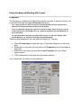
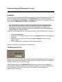
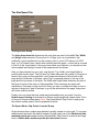
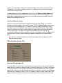
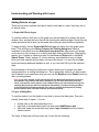
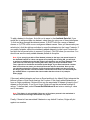
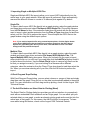
Understanding & Working with Layers in Origin - Part 1
- Ryan Toomey
Layers are the fundamental building blocks of all Origin graphs. Creating
complicated graphical presentations would not be possible without them. Yet
many Origin users have never even attempted to utilize the power of layers. If you
are among those people, you owe it to yourself to check out this series of
articles.
Over the next four articles the specific areas covered will be:
•
•
•
•
•
•
•
Definition & Properties - Part 1
Adding data to a layer - Part 1
Displaying the same data plot on two different axis scales - Part 2
The double-Y graph - Part 2
Creating an inset graph - Part 3
The Zoom graph template - Part 3
Creating and arranging multi-panel graph windows - Part 4
Understanding and Working with Layers
Definition
A layer is an Origin object consisting of one set of controlling axes. Furthermore, any,
none, or all of the 4 axes (the top and bottom X and right and left Y) that make up the
layer may or may not be displayed. A layer can contain objects, such as labels, or data
plots, that also may or may not be displayed. A graph window must contain at least one
layer and may include as many as 50 layers.
The properties and contents of a layer can be manipulated through user interfaces such
as the Layer n, Layer Properties, Select Columns for Plotting, and Select Data for
Plotting dialog boxes. The Tools toolbar may also be used to affect the contents of a
layer.
Note: See your Origin User's Manual for more information about the Select Columns for
Plotting and Select Data for Plotting dialog boxes. Also, why not take a look at two
previous Technical Review articles for more information about the Select Data for Plotting
dialog box:
Working with Excel Inside Origin: Part 1 - July98
Working with Excel Inside Origin: Part 2 - Aug98
Many of the properties of a layer can also be read or set through LabTalk, Origin's builtin programming language. To learn more about manipulating layer properties and
methods through script, see your Origin LabTalk Manual. Only a small amount of
scripting will be mentioned during this four part lesson.
The Active Layer
Definition
The active layer is the only layer in a graph window that is receptive to program
commands. For example, when a graph window is active, any data or objects added to
the graph will be added to the active layer. Only one layer can be active at a time.
Indication
The active layer is denoted by a depressed layer icon in the upper-left corner of the
graph window. For instance, here layer 1 is the active layer:
If you do not wish to see the layer icons, choose View:Show:Layer Icons to disable
this feature. Also in the View:Show submenu is the Active Layer Indicator selection.
Choose this and the axes that are contained within the active layer become highlighted.
It is important to note that this is true for the active graph window only. Selecting this
command is page specific, meaning you must select it for each graph window.
Activation
To activate another layer, simply click on the layer icon of the layer you want to be
active. Alternatively:
•
•
•
Click on the X or Y axis within the layer
Click anywhere within the layer frame (see Note below for definition). This tends
to be a bit tricky when layers are superimposed, so you may want to stick with
the other three methods.
Click on the plot type icon in the legend that corresponds to a dataset plotted in
that layer
Note: Frame - a rectangular box that describes the default position of the four axes in a
layer. The frame is independent of the axes so that an axis can be offset from the frame.
Now that you know what a layer is and how to activate it, what can we do to change it?
Find out by moving on to Properties (Origin 4.1 and 5.0) | Properties (Origin 6.0).
Understanding and Working with Layers
Properties
The first thing you need to know about the properties of a layer is that most of them can
be controlled through the Layer n Properties dialog box.
Note: The properties of a layer can also be controlled through script by using the Layer
object and its many associated sub-objects and properties.
If you are unfamiliar with the term 'object' as it relates to Origin, take a look at pp. 132-134
of the English 4.0/4.1 LabTalk Manual or pp. 195-202 of the English 5.0 LabTalk Manual for
more information.
For more information about the layer object itself, see pp. 137-144 of the English 4.0/4.1
LabTalk Manual or pp. 239-253 of the English 5.0 LabTalk Manual.
There are several ways that you can reach this dialog box. They are:
•
•
•
•
Choose Format:Layer to open the Layer n Properties dialog box for the active
layer.
Double-click on the layer icon and click on the Properties button in the Layer n
dialog box.
Right-click on the layer icon and select Layer Properties from the context
sensitive menu.
CTRL+double-click on the layer icon (the fastest method)
Here's what you'll see once you have selected it:
The Measurement Group
In general, the first thing to consider in this group is the Units drop-down list. This is
because the selection made here determines the units that are used for the Left, Top,
Width, and Height measurements. Choose from % of Page, inch, cm (centimeter), mm
(millimeter), pixel (smallest unit on the screen), point (1 point=1/72 inches or 0.0353
mm), or % of Linked Layer (useful when creating an Inset graph - a topic that will be
covered in Part 3 of this 4 part lesson). Once you have made your selection, you should
see the values update accordingly in each of the measurement text boxes.
After you have decided on your units, use the Left, Top, Width, and Height fields to
position and size the layer. The Left and Top fields determine the position of the layer in
terms of the units you have selected. Left is measured relative to the left side of the
page and the left border of the layer, while Top is measured relative to the top of the
page and the top border of the layer. The Width and Height fields determine the size of
the layer in terms of the units you have specified. Their meanings are pretty selfexplanatory. One thing to keep in mind is that if you size or position the layer in such a
way as to cause all or part of the layer to go off the white area of the page, it will not be
visible if printed.
Finally, the Axes Tick Length field controls the length of the major tick marks for all 4
axes in the layer, visible or not. In this field, length is measured in terms of 0.1 of a point
(1/720 inch or 0.00353 mm). Therefore, the default entry of 80 corresponds to 8 point. In
case you were wondering, the maximum entry in this field is currently 255, or 25.5 point.
If you enter 256, you will actually obtain a major tick length of 0.
Note: Since minor tick length is measured in terms of a percentage of major tick length, all
minor ticks will resize accordingly.
The Scale Elements Group
Select the Scale with Layer Frame radio button so that any elements that are in the
layer, including axes, data plot symbols, axis titles, and text labels, scale proportionately
when the layer is rescaled (either manually or through this dialog box). Select the Fixed
Factor radio button and enter a value in the text box to its right to cause any such
elements in the layer to scale according to that fixed factor. In this case, you'll notice the
effects of the Fixed Factor value as soon as you click OK to close out of this dialog box.
Note: There are additional controls for objects (labels, rectangles, circles, etc.) that control
the size attribute. These controls are located in the Label Control for each individual
object. To open the Label Control dialog box for an object, simply right click on the object
and choose Label Control (Origin 5.0 only). Alternatively, click on the object and then
select Format:Label Control. Select the Page radio button to prevent any Fixed Factor from
having an effect on that particular object. Choose Layer and Scales if you want the Fixed
Factor to have an effect and want the object to retain its location in the layer with respect
to the X and Y scales.
The Data Drawing Options Group
When checked, the Clip Data to Frame check box hides any data that extends beyond
the layer frame. Furthermore, if the Horizontal or Vertical Clipping Margins (%)
contain any values other than 0 (zero), enabling Clip Data to Frame acts to hide all data
beyond the specified margin values. For example, if you enter a positive value for either
margin, your data will be hidden past that percentage value outside of the layer frame.
Conversely, if you enter a negative number, the clipping will start at that percentage
value inside the frame.
In cases where your data overlaps the layer's axes, click on the Data on Top of Axes
check box to superimpose both the data plot and its symbols over the axes. Similarly, if
you would like to superimpose grid lines on top of your data plots and symbols, select
the Grid on Top of Data check box.
The Background Group
When the Color check box is checked, select a color from the associated drop-down list
and it will be displayed within the layer (as defined by the default axes positions). When
this check box is left unchecked, the layer is transparent. As such, it takes on the color
of the page.
When the Border check box is checked, select a border style from the associated dropdown list and it will be displayed surrounding the default positions of all elements
contained in the layer (including the X and Y axis titles). Click on the outer edge of the
border to move and resize it independently of the layer.
The Show Elements Group
This group of check boxes does just what its name suggests. Each check box allows
you to control whether a particular aspect of the layer is visible. The X and/or Y axes
check boxes allow you to control whether the X and/or Y axes are visible for that layer.
The Labels check box allows you to hide or make visible any objects that are
associated with the current active layer. The types of objects that are affected include,
but are not necessarily limited to axis titles, text labels, arrows, and shapes. Finally, the
Data check box allows you to hide or make visible any datasets contained in the current
layer.
Note: The X and Y axes check boxes override the settings in the Axis dialog box since
they affect the entire layer.
The Link Axes Button and Link To Drop-down List
If a graph window contains two or more layers, and you want to force a certain layer to
resize proportionately and move relative to another layer, you will need to link the two
layers. To do so, first select the % of Linked Layer setting from the Units drop-down list
in the Measurement Group. Then, select the layer you want to 'link to' from the Link to
drop-down list. Selecting a layer to "link to" creates a "parent to child" relationship. The
layer you have just linked to is referred to as the parent. Any changes that are to be
made need to be made to this parent layer, and not to the other layer (referred to as the
child layer).
Once you have selected a layer to link to, the Link Axes button becomes available. (If
the layer already has an existing link to another layer, this button will already be
available.) If you click on the Link Axes button, you are taken to the Link Axes dialog
box. Once there, you can create a fixed relationship between the X, Y, or X and Y axis
scales in the linked layers. The fixed relationship can be defined as none, straight 1-to1, or custom. The custom link is is particularly helpful in situations such as viewing the
same data on two different temperature scales (such as Fahrenheit and Celsius).
Note: As far as we know, the custom linking feature can handle any mathematical
expression. However, the visual presentation of a custom link is limited since Origin only
offers a finite number of scale types. These scale types can be seen by going to the Type
drop-down list on the Scale Tab of any Axis dialog box.
For more information on how to create a link using the Link Axes dialog box, see page
247 in the English Origin 5.0 User's Manual (page 141 of the English Origin 4.0/4.1
User's Manual). Also, be sure to check out Part 2 of this 4 part lesson which will provide
some detailed examples of how to use the Link Axes feature.
If you would like to learn more about layers, continue on to the next page. There you will
learn how to add data to a layer.
Understanding and Working with Layers
Properties
The first thing you need to know about the properties of a layer is that most of them can
be controlled through the Layer level of the Plot Details tree. This level consists of
three tabs: Background, Size/Speed, and Display for 2D plots. For 3D plots, this level
also includes a Miscellaneous, Axis, and Planes tab.
Note: The properties of a layer can also be controlled through script by using the Layer
object and its many associated sub-objects and properties. If you are unfamiliar with the
term 'object' as it relates to Origin, take a look at the Object Reference chapter of the
LabTalk Manual. For more information about the layer object itself, turn to the Alphabetical
Listing of Objects in the same chapter.
There are several ways that you can reach this level of the Plot Details tree. They are:
•
•
•
•
Choose Format:Layer.
Double-click on the layer icon and click on the Properties button in the Layer n
dialog box.
Right-click on the layer icon and select Layer Properties from the context
sensitive menu.
CTRL+double-click on the layer icon (the fastest method)
Here is a discussion of the features provided by tab:
The Background Tab
Select a color from the Color drop-down list and it will be displayed within the layer (as
defined by the default axes positions). When None is selected, the layer is transparent.
As such, it takes on the color of the page.
Select a border style from the Border Style drop-down list and it will be displayed
surrounding the default positions of all elements contained in the layer (including the X
and Y axis titles). Click on the outer edge of the border to move and resize it
independently of the layer.
The Size/Speed Tab
The Layer Area Group
The Units drop-down list determines the units that are used for the Left, Top, Width,
and Height measurements. Choose from % of Page, inch, cm (centimeter), mm
(millimeter), pixel (smallest unit on the screen), point (1 point=1/72 inches or 0.0353
mm), or % of Linked Layer (useful when creating an Inset graph - a topic that is covered
in Part 3 of this 4 part lesson). Once you have made your selection, you should see the
values update accordingly in each of the measurement text boxes.
After you have decided on your units, use the Left, Top, Width, and Height fields to
position and size the layer. The Left and Top fields determine the position of the layer in
terms of the units you have selected. Left is measured relative to the left side of the
page and the left border of the layer, while Top is measured relative to the top of the
page and the top border of the layer. The Width and Height fields determine the size of
the layer in terms of the units you have specified. Their meanings are pretty selfexplanatory. One thing to keep in mind is that if you size or position the layer in such a
way as to cause all or part of the layer to go off the white area of the page, that portion
will not be visible if printed.
Finally, once you have the layer sized and positioned the way you want it, set the
Grahic Image Caching drop-down list to Raster and the graph will redraw faster. Set it
to None for normal redraw speed. Note: The Speed Mode, Skip Points if need group
also affects redraw speed. See the explanation below.
The Speed Mode, Skip Points if needed Group
Graph windows that contains large datasets typically redraw at a slow rate. To increase
redraw speed and make the data plot easier to read, make use of the Worksheet data,
maximum points per curve (formerly Speed Mode, Skip Points if needed at the Page
level) or Matrix data, maximum points per dimension features.
Select the Worksheet data, maximum points per curve check box to affect the number
of points displayed in the 2D data plots located in that specific layer. Enter a value in the
associated text box that is smaller than the total number of points in the largest dataset
(in the layer) to increase redraw speed and decrease the number of points displayed.
Select the Matrix data, maximum points per dimension check box and enter values into
the associated X and Y text boxes to change the maximum number of points displayed
for 3D Surface or Contour plots in the X and Y directions.
The Display Tab
The Scale Elements Group
Select the Scale with Layer Frame radio button so that any elements that are in the
layer, including axes, data plot symbols, axis titles, and text labels, scale proportionately
when the layer is rescaled (either manually or through this dialog box). Select the Fixed
Factor radio button and enter a value in the text box to its right to cause any such
elements in the layer to scale according to that fixed factor. In this case, you'll notice the
effects of the Fixed Factor value as soon as you click OK or Apply.
Note: There are additional controls for objects (labels, rectangles, circles, etc.) that control
the size attribute. These controls are located in the Label Control for each individual
object. To open the Label Control dialog box for an object, simply right click on the object
and choose Label Control. Alternatively, click on the object and then select Format:Label
Control. Select the Page radio button to prevent any Fixed Factor from having an effect on
that particular object. Choose Layer and Scales if you want the Fixed Factor to have an
effect and want the object to retain its location in the layer with respect to the X and Y
scales.
The Data Drawing Options Group
When checked, the Clip Data to Frame check box hides any data that extends beyond
the layer frame. Furthermore, if the Horizontal or Vertical Clipping Margins (%)
contain any values other than 0 (zero), enabling Clip Data to Frame acts to hide all data
beyond the specified margin values. For example, if you enter a positive value for either
margin, your data will be hidden past that percentage value outside of the layer frame.
Conversely, if you enter a negative number, the clipping will start at that percentage
value inside the layer frame.
In cases where your data overlaps the axes, click on the Data on Top of Axes check
box to superimpose both the data plot and its symbols over the axes. Similarly, if you
would like to superimpose grid lines on top of your data plots and symbols, select the
Grid on Top of Data check box.
The Show Elements Group
This group does just what its name suggests. Each check box allows you to control
whether a particular aspect of the layer is visible. The X, Y, and/or Z axes check boxes
allow you to control whether the X, Y, and/or Z axes are visible for that layer. (The Z
axis check box is only available when working with a 3D graph window.) The Labels
check box allows you to hide or make visible any objects that are associated with the
current active layer. The types of objects that are affected include, but are not
necessarily limited to axis titles, text labels, arrows, and shapes. Finally, the Data check
box allows you to hide or make visible any datasets contained in the current active
layer.
Note: The X, Y, and Z axes check boxes override the settings in the Axis dialog box since
they affect the entire layer.
The Link Axes Scales Tab
The Link To Drop-down List
If a graph window contains two or more layers, and you want to force a certain layer to
resize and move relative to another layer, try linking the two layers. To do so, first select
% of Linked Layer from the Units drop-down list on the Size/Speed tab. Then, click the
Apply button, return to this tab, and select the layer you want to 'link to' from the Link to
drop-down list. Selecting a layer to "link to" creates a "parent to child" relationship. The
layer you have just linked to is referred to as the parent. Any changes that need to be
made should be made to this parent layer, and not to the other layer (referred to as the
child layer).
The Link Axes in Child Layer to Parent Group
Once you have selected a layer to link to, this section of the Link Axes tab becomes
available. (If the layer already has an existing link to another layer, this section of the
tab will already be available.) At this point, a fixed relationship can be created between
the X and/or Y axis scales in the linked layers. This fixed relationship can be defined as
None, Straight 1-to-1, or Custom by selecting the appropriate radio button and
entering your formulas in the text boxes provided. The custom link is particularly helpful
in situations such as viewing the same data on two different temperature scales (e.g.
Fahrenheit and Celsius).
Note: As far as we know, the custom linking feature can handle any mathematical
expression. However, the visual presentation of a custom link is limited since Origin only
offers a finite number of scale types. These scale types can be seen by going to the Type
drop-down list on the Scale Tab of any Axis dialog box.
For more information on how to create a link using the Link Axes dialog box, read about
it in the Plotting: Graph Layers chapter in your Origin User's Manual. Also, be sure to
check out Part 2 of this 4 part lesson which provides some detailed examples of how to
use the Link Axes feature.
If you would like to learn more about layers, continue on to the next page. There you will
learn how to add data to a layer.
Understanding and Working with Layers
Adding Data to a Layer
There are five basic methods that can be used to add data to a layer. Here they are in
no special order:
1. Graph:Add Plot to Layer
To use this method, click once on the graph you are interested in to make it the active
window. Next, activate the layer that will be receiving the additional data. Recall from an
earlier discussion that a layer can be made active through several different methods.
To begin plotting, choose Graph:Add Plot to Layer and select from the graph types
listed. This will bring up the Select Columns for Plotting dialog box. Select a
worksheet or workbook from the Worksheet drop-down list. Next, select and assign
an X column by first clicking on it in the list and then clicking the X button. Alternatively,
specify your X values by entering a value for the From and Step fields in the Set X
Values Group. Finally, assign a Y column and any associated error bars or labels.
Once you have selected all your data, you have two choices. You can click the Add
button and assign additional datasets to plot, or you can click OK to plot the selected
data.
One advantage of clicking the Add button is that it allows you to preview your data
assignments prior to exiting the dialog box. This is particularly useful if you have made
any mistakes in your selections since you can use the Replace and/or Delete buttons to
alter your assignments.
Note: If you have selected an Excel workbook from the Worksheet drop-down list, keep in
mind that the only columns that will be available to you are those that reside in the top
sheet. If you want to select columns from a different sheet, you will need start over by first
selecting that sheet from the Excel workbook. Alternatively, use either the Drag and Drop
or the Select Data for Plotting methods since they are specifically designed for plotting
Excel workbook data. These two methods are discussed below.
2. Layer n Dialog Box
To use this method, you first need to know how to access the dialog box. There are
actually three ways to open it. You can:
•
•
•
double-click on the associated layer icon.
right-click on the associated layer icon and select Add/Remove plot.
right-click inside the actual layer and select Layer Contents from the context
sensitive menu.
The Layer n Dialog box will then come up. It looks like the following:
To add a dataset to the layer, first click on its name in the Available Data list. If you
would like to add more than one dataset, select them by using one of three techniques:
1) click and drag through the dataset names, 2) SHIFT+click on a range of dataset
names, or 3) CTRL+click on non-contiguous dataset names. Once you have made your
selection(s), click the right arrow button to move the datasets into the Layer Contents. If
you make a mistake, select the mistakenly added dataset(s) in the Layer Contents list
and click the left arrow button to remove it (or them). Click OK when you are done. You
should now see the newly added datasets plotted as line plots.
Note: If you are trying to add an Excel dataset (column) to the layer, but cannot locate it in
the Available Data list or it does not appear to be plotting after clicking OK, you will need
to perform an additional step that lets Origin know that there are new Excel datasets. First,
click Cancel to close the Layer n dialog box. Next, make your Excel workbook active.
Then, right-click on its title bar and select Update Origin. If your Excel workbook contains
data in more than one sheet, you should perform this step for each sheet. Once you do,
you should see that all the columns of each sheet become available and plot correctly in
the Origin graph window. Columns located in sheets other than sheet 1 are denoted by the
@n notation where n represents the sheet number that the column is in (example:
book1_b@2).
If the newly added datasets are from an Excel workbook, by default Origin interprets the
leftmost column of that Excel sheet as the X values. If the newly added datasets are
from an Origin worksheet, Origin will first use the associated X dataset (closest to the Y
dataset on its left side). If one is not found, Origin will use the worksheet's default X
values. To define them, select Format:Set Worksheet X and enter a starting X value
and X increment.
Note: This feature is only available if there are no X columns present in the worksheet. It
can be used across all Origin worksheets in a project.
Finally, if there isn't an associated X dataset or any default X values, Origin will plot
against row number.
3. Importing Single or Multiple ASCII Files
Single and Multiple ASCII file imports allow you to import ASCII data directly into the
active layer in your graph window. When the import is performed, Origin automatically
assumes the leftmost column to consist of X data and plots against it by default.
Single File
To import data from an ASCII file directly into a graph window, make the graph window
and target layer active and select File:Import ASCII:Single File. Choose the filename
from the File Name list box. If the extension listed does not match with the file that you
want to import, select another extension from the Files of Type drop-down list and then
select your file. Click OK to perform the import. This will import the ASCII file into the
graph window using the default import options.
Note: If you need to import the file using custom import options, click the Option button
on the Import ASCII dialog box and make any necessary changes to the ASCII Import
Options for graph dialog box. Once you are done, click OK twice to close out of both
dialog boxes and perform the import.
Multiple Files
To import data from multiple ASCII files directly into a graph window, make the graph
window and target layer active and select File:Import ASCII:Multiple Files. The
Import Multiple ASCII dialog box opens. When you find each file you want to import,
either double-click on it or click on it once and then click the Add File(s) button to add it
to the list box at the bottom. Use the Delete File(s) button to remove any files from the
list that you assign incorrectly. If you are looking for a filename with a different
extension, select the extension from the Files of Type drop-down list and then select the
file. When you are done selecting all of your files, click the OK button to perform the
import.
4. Excel Drag and Drop Plotting
With Excel Drag and Drop plotting, you can select columns or ranges of data and simply
drag them onto the graph. Once you do so, the data is automatically added to the active
layer. For more information on Excel drag and drop plotting, check out the August 1998
Technical Review.
5. The Add Plot button on Select Data for Plotting (Excel)
The Select Data for Plotting dialog box provides you with an interface to cooperatively
work with an embedded Excel workbook and an Origin graph. You can either plot your
selected data in a new graph, or make an already existing graph active and plot into the
active layer of that graph. For this reason, the Add Plot button is necessary. To learn
more about using this feature, check out the August 1998 Technical Review.
Coming Up...
That does it for Part 1 of this four part lesson. Check back later to learn more about
using layers in Origin when Part 2 of this four part series is made available. Part 2 will
concentrate on a couple of special uses of layers in plotting. The first discussion will
show you how to display the same data plot on two different axis scales, while the
second will cover the use of the double-Y graph.