1
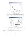
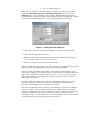
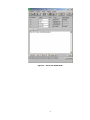
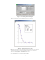
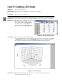
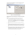
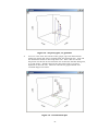
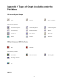
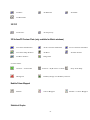
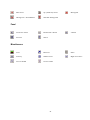
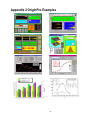
Getting Started with OriginPro 7.5 (Part 2) An introduction to OriginPro, a scientific charting package. AUTHOR Information Systems Services University of Leeds DATE September 2005 EDITION 2.1 TUT 77 Contents Task 9 Curve Fitting: Pre-defined 2 Task 10 Curve Fitting: User-defined 6 Task 11 Creating a 3D Graph 8 Task 12 Creating a Surface Plot 12 Task 13 Quitting OriginPro 14 Further Information Documentation Help 15 15 15 Appendix 1 Types of Graph Available under the Plot Menu16 Appendix 2 OriginPro Examples 19 Format Conventions In this document the following format conventions are used: Input which must be replaced by your details is given in bold italics. Menu items are given in a bold, Arial font. LOGIN server/username Keys that you press are enclosed in angle brackets. Toolbar buttons for some menu commands are displayed in the left hand margin. <Enter> Windows Applications Feedback If you notice any mistakes in this document please contact the Information Officer. Email should be sent to the address [email protected]. Copyright This document is copyright University of Leeds. Permission to use material in this document should be obtained from the Information Officer (email should be sent to the address [email protected]). Print Record This document was printed on 9-Jun-09. This document continues from ‘Getting Started with OriginPro 7.5 (Part 1)’. 1 Task 9 Curve Fitting: Pre-defined Objective To introduce the concept of curve fitting. Instructions You will use a pre-defined function as an example. When you are in a graph window, OriginPro's automatic fitting commands are located in the Analysis menu. Parameter initialisation and fitting is carried out automatically when fitting from these menu options. A fitted curve is displayed in the graph window while the fitting parameters and statistical results are recorded in the Results Log window. The Analysis menu contains the following automatic pre-defined fitting models: Linear Polynomial Exponential Decay (First Order, Second Order, and Third Order) Exponential Growth Sigmoidal Gaussian Lorentzian Multi-peaks (Gaussian and Lorentzian) Users can have more control over fitting parameters of a pre-defined function or can add their own fitting function by using the Non-linear Curve Fit option from the Analysis menu. This option contains over 150 pre-defined functions which are divided into the following categories: Activity 9.1 Origin Basic Functions Chromatography Exponential Growth/Sigmoidal Hyperbola Logarithm Peak Functions Pharmacology Polynomial Power Rational Spectroscopy Waveform We will now consider a curve fitting session using one of the pre-defined functions. To try this example you should open FITEXMP1.OPJ, an OriginPro project file which can be found in C:\Program Files\OriginPro75\Tutorial. Click on File > Open to open the project file. As you can only have one project file open at a time, you will be asked if you want to save any existing work first. Figure 22 shows the plot in FITEXMP1.OPJ which will be used for this example. 2 Figure 1. A scatter graph Click on the graph and choose Fit Exponential Decay > First Order from the Analysis menu. OriginPro will do the necessary initialisation and fit a curve to the data. The result of this operation is shown in Figure 23. Figure 2. First order exponential decay curve fitting Details of the fitting parameters appear in both the graph window and the Results Log window. Activity 9.2 The above case fits the following exponential equation to the data: y = y0 + A1*exp(-x/t1) This is a specific case of the equation: 3 y = y0 + A1*exp(-(x-x0)/t1) where x0, the x offset, is assumed zero. To allow an x offset you should choose the Non-linear Curve Fit > Advanced Fitting Tool option from the Analysis menu. The NonLinear Curve Fitting: Fitting Session dialog box should appear containing details of the fitting session just performed. If this box does not look like Figure 24, click on Basic Mode at the bottom. Figure 3. Fitting Session dialog box Click Select Function and choose ExpDecay1 from the Functions list. Click Start Fitting, followed by Yes. Make sure the Vary? check box for x0 is checked and set the following values: y0 to 0, x0 to 0, A1 to 10, and t1 to 1. Click the 100 Iter. button and then click Done. This will update the plot with a new curve and the new fitting parameters will appear in both the graph window and the Results Log window. Figure 24 shows the Basic NLCF Mode. The Advanced NLCF Mode can be accessed by clicking on the More button at the bottom of the Basic Mode (see Figure 25). While both modes enable you to fit a curve to your data, they differ substantially in the options they provide as well as in the degree of complexity they entail. The Basic Mode is simpler and is used for selecting or defining your own function, selecting a dataset for fitting, performing an iterative fitting procedure and displaying the results on the graph. The Advanced Mode includes the above and allows you to define a LabTalk script or Origin C code to initialise parameters, impose linear constraints, specify a weighting method and termination criteria, display the residue plot, parameter worksheet, variance-covariance matrix and confidence and prediction bands. It also allows the user to fit multiple datasets with a choice of shared parameters and change parameter names. 4 Figure 4. Advanced NLCF Mode 5 Task 10 Curve Fitting: User-defined Objective Curve fitting using a user-defined function. Instructions You will use an example of a user-defined function. Activity 10.1 Consider a curve fitting session using a user-defined function. To try this example you should open the file FITEXMP2.OPJ which is available under C:\Program Files\OriginPro75\Tutorial. To enter a new fitting function, from the Analysis menu choose the Non-linear Curve Fit > Advanced Fitting Tool option and then select Basic Mode. The following dialog box will be displayed: Figure 5. Select a new function Click on the New button. Enter 3 in the Number of Param. box. Next enter the following into the box at the bottom: Figure 6. Define a new fitting function y=P1*exp(-x^P2/P3) and click the Save and then the Accept button. Activity 10.2 To start the fitting session from the dialog box in Figure 26, click on the Start Fitting button. You will be prompted for a choice of fitting the curve for the active dataset or any other. Choose the active dataset. The Fitting Session dialog box appears (see Figure 28) and you need to set the starting values for P1, P2, P3 in the boxes adjacent to the parameters e.g. try P1=7, P2=2, P3=2. If you want to fix the value of any of the parameters you must clear the box next to the value box that says Vary?. If the Vary? boxes are checked it allows the parameters’ values to change during the iterations. Click in the 1 Iter. or 100 Iter. box to do the curve fit. Repeat the iterations until you get a satisfactory fit. Once you are happy with the curve, click the Done button to terminate the fitting session. 6 Figure 7. The Fitting Session dialog box Figure 29 shows the result of fitting the function to the plot. Figure 8. Fitting a function to a plot Note: The option More during the fitting session provides the user with more sophisticated options to control the fitting parameters. See the NLCF (Advanced Mode) Options > Constraints menu item. Close FITEXMP2.OPJ by clicking on File > Close. 7 Task 11 Creating a 3D Graph Objective To create a 3D graph. Instructions Enter data into a worksheet and produce a 3D plot. Comments Enter the data as shown. Activity 11.1 Add a third column to an OriginPro worksheet as done in Task 2 previously. Activity 11.2 You will need to change the name of the third column to C(Z). To do this, click on the column heading and then click on the Column menu. Choose the Set as Z option. Enter the data shown in Figure 30. Figure 9. 3D graph data entry Activity 11.3 To draw a 3D scatter graph, click on the C(Z) heading in the third column of the worksheet. Next click on the Plot > 3D XYZ menu and choose the 3D Scatter option. The data will be plotted into a new plot window and the 3D Rotation toolbar will also appear. Figure 10. Scatter plot Activity 11.4 The Plot Details dialog box allows you to choose and change various parameters of a 3D scatter plot. 8 To open the Plot Details dialog box you can either double-click on a plotted data point or click on the Format menu and choose the Plot option. The following dialog box appears: Figure 11. The Plot Details dialog box If the left-hand side of the Plot Details dialog box looks different from above, expand the graph structure by clicking on the +’s. Make sure that Original is selected. As you can see, the 3D plot is not particularly easy to interpret at the moment. The following formatting procedures should be carried out: 1. To join the points with straight lines (a trajectory plot) click on the check box next to Connect Symbols in the Line tab. (Alternatively you could have chosen the 3D Trajectory option, instead of the 3D Scatter option, when creating the plot.) 2. To add drop lines choose the Drop Lines tab and select Parallel to Z Axis. 3. To remove the grid lines from all three axes click on Layer 1 in the left hand side of the Plot Details dialog box and choose the Display tab. In the Show Elements section de-select the X Axes, Y Axes, and Z Axes options. Then click OK. The plot should now resemble that in Figure 33. 4. To make the points bigger and to number them you should re-open the Plot Details dialog box as before. Select Original from the left hand side of the dialog box. Click on the Symbol tab. Choose Show Construction, Row Number Numerics, select the Outline box and choose Size 24 from the drop down list. Then click OK. 9 Figure 12. Trajectory plot, no grid lines 5. To trace a line onto the bottom of the graph, open the Plot Details dialog box again and select Original from the left hand side. Turn off the Parallel to Z Axis in the Drop Lines tab. Then click on the XY Projection check box in the left hand side of the Plot Details dialog box, so a tick shows. Finally click on the check box next to Connect Symbols in the Line tab. Click on OK and the graph should now resemble Figure 34 below: Figure 13. Formatted 3D plot 10 The 3D Rotation toolbar (see Figure 35) has several buttons that can be used to rotate and change the perspective of the 3D graph. The six buttons on the left rotate and tilt the 3D plot by the specified rotation angle, in this case 10. The next two increase and decrease the perspective angle by 3. The last two fit the graph to the layer frame and reset the rotation angles. If the 3D Rotation toolbar is not displayed, open it by selecting View > Toolbars and then 3D Rotation. Figure 14. The 3D Rotation toolbar 11 Task 12 Creating a Surface Plot Objective To create a surface plot from 3D data stored in a matrix window. Instructions Create a matrix from worksheet data and plot as a 3D surface. Comments Use the matrix details given. Surface plots can only be plotted from matrix windows. Matrix data can be input in several ways: it can be created from a formula, copied and pasted from another application, imported, or created from an existing worksheet as in the following example. Activity 12.1 Open a new worksheet and import the ASCII data file Tutorial_5.DAT from C:\Program Files\OriginPro75\Tutorial. The worksheet displayed should have three columns A(X), B(Y) and C(Y). Change the name of the third column to C(Z), as in Activity 11.2. Activity 12.2 Highlight column C(Z) and select Convert to Matrix from the Edit menu and choose Random XYZ. Activity 12.3 Select the Correlation gridding method. The box shown in Figure 36 should now appear. Select the number of rows and columns, search radius and amount of smoothing required for the data. The values selected will determine how fine/blocky your plot will be. From your XYZ data, OriginPro will interpolate values for each cell in the matrix - the more cells, the finer the plot but too many cells will take much longer to calculate and could be meaningless if there is not sufficient data. The search radius value is used to determine which of your XYZ data points will be used to compute each cell value - this needs to be big enough to cover small gaps in the data but should not be so big that values at one end of the dataset have an effect at the other end. Figure 15. Adjusting the number of cells If you are not sure about values for your dataset, try several different ones. For this example, accept the default values as above, de-select Show Plot and click OK. The following matrix shown in Figure 37 appears (note, you may need to increase the column width to display the values). 12 Figure 16. The Matrix window Activity 12.4 The graph is now ready to be drawn. Open the Plot menu and click on the 3D Color Map Surface option. The graph which is plotted is shown in Figure 38. Figure 17. Surface plot Activity 12.5 Now open the Plot Details dialog box by double-clicking on one of the grid data points. If Matrix1 is not selected on the left-hand side of the Plot Details dialog box, expand Layer1 by clicking on the + and then select it. Most of the options are self-explanatory so try and play around with them, especially experimenting with the Plot Type options at the bottom left of the dialog box. 13 Task 13 Quitting OriginPro Objective To quit OriginPro. Instructions You will use the Exit option from the File menu. Activity 13.1 Select the Exit option from the File menu. Note: If you have not saved the project, you are now given the opportunity to do so before exiting. 14 Further Information Documentation To find out more about OriginPro 7.5 the following documents are available for reference or loan from the ISS Help Desk (these manuals can also be purchased, for more information please contact ISS Sales): Getting Started Manual Peak Fitting Module Manual There are also the following manuals available for previous versions: Microcal Origin User’s Manual Microcal Origin 3D/Contour Manual Microcal Origin LabTalk Manual Programming Guide Documentation is also available as pdf files under C:\Program Files\OriginPro75: GettingStarted.pdf Origin_V75_User's_Manual.pdf PFM_Manual.pdf (The first is available on the OriginPro 7.5 CD whilst the second and third can be downloaded from OriginLab’s website.) Help OriginPro incorporates an on-line help system which includes a search facility. You can access help by choosing the Help menu. You can also contact the ISS Help Desk if you have any questions about using OriginPro (e-mail [email protected] or phone ext. 33333). 15 Appendix 1 Types of Graph Available under the Plot Menu 2D Line and Symbol Graphs Line Scatter Line + Symbol Vertical Drop Line 2 Point Segment 3 Point Segment Vertical Step Horizontal Step Spline Double-Y Line Series Waterfall Zoom Y Error XY Error Special Line/Symbol: 2D Bar, Column and 2/3D Pie Charts Bar Column Special Bar/Column: Stack Bar Stack Column Floating Column Pie 3D XYY 16 Floating Bar 3D Bars 3D Ribbons 3D Walls 3D Waterfall 3D XYZ 3D Scatter 3D Trajectory 3D Surface/2D Contour Plots (only available for Matrix windows) 3D Colour Fill Surface 3D X Constant with Base 3D Colour Map Surface 3D Bars 3D Wire Surface Image Plot 3D Y Constant with Base 3D Wire Frame Contour Plots: Contour – Colour Fill Histogram Contour – B/W Lines + Labels Gray Scale Map Profiles/Image and Profiles/Contour Bubble/Colour Mapped Bubble Colour Mapped Statistical Graphs 17 Bubble + Colour Mapped Box Chart QC (X Bar R) Chart Histogram + Probabilities Stacked Histograms Vertical 2 Panel Horizontal 2 Panel 9 Panel Stack Histogram Panel 4 Panel Miscellaneous Area Fill Area Polar Ternary Smith Chart High-Low-Close Vector XYAM Vector XYXY 18 Appendix 2 OriginPro Examples 19 20