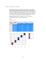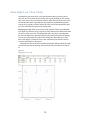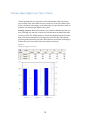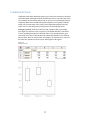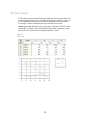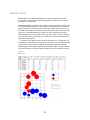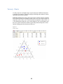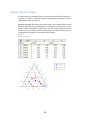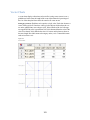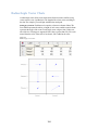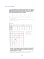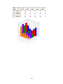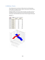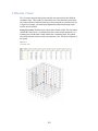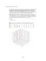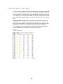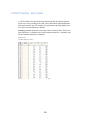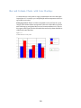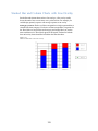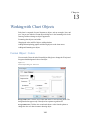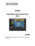
1
DeltaGraph 7 for Windows User’s Guide Red Rock Software, Inc. 10 West Broadway, Suite 205 Salt Lake City, Utah 84101 801.322.4322 http://www.redrocksw.com 1 2 DeltaGraph 7 User’s Guide for Windows Copyright © 2013 by Red Rock Software, Inc. All rights reserved. Printed in the United States of America. No part of this publication may be reproduced, stored in a retrieval system, or transmitted in any form or by any means, electronic, mechanical, photocopying, recording, or otherwise, without the prior written permission of the publisher. The SOFTWARE and documentation are provided with RESTRICTED RIGHTS. Use, duplication, or disclosure by the Government is subject to restrictions as set forth in subdivision (c)(1)(ii) of The Rights in Technical Data and Computer Software clause at 52.227-7013. Contractor/manufacturer is Red Rock Software, Inc. 10 West Broadway, Suite 205 Salt Lake City, Utah 84101. DeltaGraph and the DeltaGraph logo are registered trademarks of Red Rock Software Inc. Microsoft, Windows, and their respective logos are registered trademarks of Microsoft Corporation in the United States and other countries. Adobe, the Adobe logo, Acrobat, the Acrobat logo, PhotoShop, Illustrator, PostScript, and the PostScript logo are trademarks or registered trademarks of Adobe Systems Incorporated in the U.S. and/or other countries. Oracle and Java are registered trademarks of Oracle and/or its affiliates. All other brand and product names used in this manual are or may be trademarks or registered trademarks of their respective companies. ISBN 1-56827-238-3 June 18, 2013 3 Preface DeltaGraph® 7 for Windows® is a powerful charting application that you can use to create charts from a wide variety of data sources. With more than eighty base charts to choose from and customizable chart options, DeltaGraph provides you with virtually endless ways of presenting your data. DeltaGraph 7 also offers a variety of features, including seamless integration with Microsoft Office applications; the Chart Wizard, which walks you through the process of creating charts; the Document Manager, which provides Explorer-type control over the different elements in your document; and the Data window, which lets you view your data and charts simultaneously. System Requirements DeltaGraph 7 minimum system requirements. DeltaGraph 7 may be installed on any Windows computer running Microsoft Windows XP with Service Pack 3, Microsoft Windows Vista, Microsoft Windows 7, or Microsoft Windows 8. While DeltaGraph 7 is a 32-bit application, it may be installed on 64-bit operating systems. At least 185 MB of free disk space are required for installation, including space for Java and QuickTime. The computer’s processor should be at least 1.5 GHz. The computer should have at least 1 GB of RAM installed. DeltaGraph 7 requires installation of Apple Computer’s ® QuickTime for Windows ™ version 7 or better. The DeltaGraph 7 installer will check the target computer for the presence of QuickTime. This must be present in the default location determined by the QuickTime installer. If you have installed QuickTime, but changed the location during installation or have a version older than 7.0, the DeltaGraph installer will exit. You can download the QuickTime installer from Apple’s website at http://www.apple.com/quicktime/download DeltaGraph 7 requires installation of the 32-bit Java HotSpot ™ virtual machine for those users who want to import data from Excel (.xls & xlsx) files. If you do not have Java installed and attempt to import data from an Excel file, DeltaGraph will post a warning and abort the import operation. If you have a 64-bit OS installed, you will need to install the 32-bit version of Java. Both 64-bit and 32-bit versions of Java can be installed at the same time. You can download the latest JRE installer from Oracle’s web site at http://www.java.com 4 If you are not sure whether your computer meets these minimum requirements, check the User’s Manual that came with your system to find out how to determine its capabilities. Technical Support For 24-hour support, visit our support site at: http://support.redrocksw.com For email support send your question to: [email protected] 5 Table of Contents Welcome to DeltaGraph 7................................................................... 6 What’s New in DeltaGraph 7? .............................................................................. 6 Setting Up, Saving, and Exporting Documents .................................................... 6 Canvas Size and Orientation ............................................................................... 6 Add Headers and Footers .................................................................................... 6 Preparing the Data .............................................................................. 6 Working in the Data Window ................................................................................ 6 Bringing Data into DeltaGraph ............................................................................. 6 Links Dialog Box .................................................................................................. 6 Selecting and Editing Data ................................................................................... 6 Formatting Data ................................................................................................... 6 Format Cells: Data Type ...................................................................................... 6 Format Cells: Text................................................................................................ 6 Format Cells: Appearance ................................................................................... 6 Sort Dialog Box .................................................................................................... 6 Labeling Data ....................................................................................................... 6 Calculated Data ................................................................................................... 6 Formula Builder.................................................................................................... 6 Functions List ....................................................................................................... 6 Creating Charts ................................................................................... 6 Chart Wizard: Choose a Chart Category ............................................................. 6 Chart Wizard: Choose a Chart Type .................................................................... 6 6 Chart Wizard: Pick Data ....................................................................................... 7 Chart Wizard: Add Titles ...................................................................................... 7 Chart Wizard: Chart Placement ........................................................................... 7 Chart Gallery ........................................................................................................ 7 Chart Overlay Dialog Box .................................................................................... 7 Bar and Column Charts ...................................................................... 7 Bar and Column Charts ....................................................................................... 7 Stacked Bar and Column Charts......................................................................... 7 Bar and Column Segmentation Charts ................................................................ 7 Stacked Bar and Column Segmentation Charts ................................................. 7 Floating Bar and Column Charts .......................................................................... 7 Floating Stacked Bar and Column Charts ........................................................... 7 Build-Up Charts.................................................................................................... 7 Stacked Build-Up Charts ..................................................................................... 7 XY Column Charts ............................................................................................... 7 Line, Step, and Range Charts ............................................................ 7 Line Charts .......................................................................................................... 7 Step Charts .......................................................................................................... 7 Range Charts ....................................................................................................... 7 High Low Charts .................................................................................................. 7 High Low Close Charts ........................................................................................ 7 Open High Low Close Charts .............................................................................. 7 Volume Open High Low Close Charts ................................................................. 7 Candlestick Charts ............................................................................................... 7 XY Line Charts ..................................................................................................... 7 7 Paired XY Line Charts ......................................................................................... 8 Time Line Charts.................................................................................................. 8 Scatter Charts ..................................................................................... 8 Paired Scatter Charts........................................................................................... 8 Scatter Charts ...................................................................................................... 8 Paired Intensity Scatter Charts ............................................................................ 8 Intensity Scatter Charts ........................................................................................ 8 Polar Charts ......................................................................................................... 8 Bubble Charts ...................................................................................................... 8 Ternary Charts ..................................................................................................... 8 Ternary Percent Charts ........................................................................................ 8 Area, Pie, and Table Charts................................................................ 8 Area Charts .......................................................................................................... 8 Spider and Radar Charts ..................................................................................... 8 Pie and Donut Charts........................................................................................... 8 Stacked Pie Charts ............................................................................................. 8 Multiple Pie Charts ............................................................................................... 8 Table Chart .......................................................................................................... 8 Contour and Vector Charts ................................................................ 8 Contour Fill Charts ............................................................................................... 8 XYZ Contour Fill Charts ....................................................................................... 8 Contour Line Charts ............................................................................................. 8 XYZ Contour Line Charts ..................................................................................... 8 Vector Charts ....................................................................................................... 8 Radius/Angle Vector Charts ................................................................................. 8 8 XY Vector Charts ................................................................................................. 9 Statistical and Quality Control Charts ............................................... 9 Histograms ........................................................................................................... 9 Pareto Charts ....................................................................................................... 9 Ogive Charts ........................................................................................................ 9 Box Charts ........................................................................................................... 9 Survival Charts.................................................................................................... 9 Quality Control Charts.......................................................................................... 9 XBar-R and XBar-S Charts .................................................................................. 9 Fraction Defective (p) and Number of Defectives (np) Charts ............................ 9 Defects Per Unit (u) and Number of Defects (c) Charts ....................................... 9 3-D Charts ........................................................................................... 9 3-D Column Charts .............................................................................................. 9 3-D Ribbon Charts ............................................................................................... 9 3-D Scatter Charts ............................................................................................... 9 3-D Scatterline Charts.......................................................................................... 9 3-D Area Charts ................................................................................................... 9 3-D Wireframe Charts .......................................................................................... 9 3-D Surface Fill Charts ........................................................................................ 9 3-D Surface Line Charts ..................................................................................... 9 3-D XYZ Surface Fill Charts ................................................................................ 9 3-D XYZ Surface Line Charts.............................................................................. 9 Combination Charts............................................................................ 9 Bar and Column Charts with Line Overlays ......................................................... 9 Stacked Bar and Column Charts with Line Overlay ............................................ 9 9 Axes, Symbols, and Legends .......................................................... 10 Types of Chart Axes .......................................................................................... 10 Modifying Symbols ............................................................................................. 10 Symbols Dialog Box ........................................................................................... 10 Modifying Legends ............................................................................................. 10 Legends Dialog Box ........................................................................................... 10 Showing Values ................................................................................................. 10 Show Values Dialog Box .................................................................................... 10 Working with Chart Objects ............................................................. 10 Format Object: Colors ........................................................................................ 10 Format Object: Lines.......................................................................................... 10 Format Object: Arrows ....................................................................................... 10 Format Object: Shadows ................................................................................... 10 Format Object: Text ........................................................................................... 10 Format Object: Spacing ..................................................................................... 10 Format Object: Bullets ....................................................................................... 10 Using the Drawing Toolbox ................................................................................ 10 Insert Image ....................................................................................................... 10 Export Image Dialog Box ................................................................................... 10 Copying and Duplicating Charts and Objects .................................................... 10 Equations, Error Bars, and Curve Fits ............................................ 10 Equations ........................................................................................................... 10 Error Bars .......................................................................................................... 10 Configuring Error Bars ....................................................................................... 10 Curve Fits .......................................................................................................... 10 10 Configuring Curve Fits ....................................................................................... 11 Custom Curve Fits ............................................................................................. 11 Custom Curve Fit ............................................................................................... 11 Standardizing Charts and Documents ............................................ 11 Using Layouts .................................................................................................... 11 Using Backgrounds ............................................................................................ 11 Using Libraries to Store Charts and Images ................................... 11 Adding Pictographs to Charts ........................................................................... 11 About Chart Templates ...................................................................................... 11 Add Chart Template to Library ........................................................................... 11 Preparing Your Document for Printing ........................................... 11 Working with Color ............................................................................................. 11 Edit Colors ......................................................................................................... 11 Preparing a Print Job ......................................................................................... 11 Using a Service Bureau ..................................................................................... 11 Using DeltaGraph Charts in Other Applications............................. 11 To Create DeltaGraph Charts in Other Applications .......................................... 11 Customizing the DeltaGraph Desktop ............................................. 11 To Minimize the Document Manager ................................................................. 11 Rulers and Grid Dialog Box ............................................................................... 11 Preferences: General ......................................................................................... 11 Preferences: Charts ........................................................................................... 11 Symbols Preferences ......................................................................................... 11 Preferences: Data .............................................................................................. 11 Preferences: Profiles.......................................................................................... 11 11 Preferences: Libraries ........................................................................................ 12 Preferences: Drawing Toolbox ........................................................................... 12 Text Box Preferences ........................................................................................ 12 Preferences: Software Update ........................................................................... 12 12 Chapter 1 Welcome to DeltaGraph 7 Welcome to DeltaGraph 7, the powerful charting application that you can use to create charts using data from a wide range of sources. Whether you need charts to present your sales information or to explain highly technical data, DeltaGraph provides the tools you need to create visually compelling charts with maximum impact. This section shows you how to get started with DeltaGraph 7, whether you are an experienced user and want to check out the new features or whether you are a new user and want basic information about setting up and saving files. What’s New in DeltaGraph 7? DeltaGraph 7 includes several important new features and enhancements. Show data at cursor. Via the Show Values dialog, user can now select Cursor as the location for value labels. As the cursor passes over chart elements which are data related, the floating window above the cursor will show the formatted value string. (Show Values is not supported for 3D charts.). See the section, “Show Values Dialog Box” in chapter 12 for more information. Highlight chart data. Clicking on a chart will go to the correct data tab and highlight the chart's data, if the data sheet window is visible. Clicking further on a chart element which is data related will cause the appropriate row(s) & column(s) in the data sheet to be highlighted. Choose View -> Highlight Chart Data to toggle this feature. Compressed file format. New file format produces files that are 20% - 500% smaller than v6 files. Files open as much as 20% faster. Version 7 supports the saving of both v6 & v7 files. See the section on “Setting up, Saving, and Exporting Documents” for more information. Improved handling of license activation. A new interface has been added to display activation information. License information can be copied to the clipboard for convenience. To view license information choose View -> License Info… Object rotation. Draw objects (not lines or arrows) may be rotated to any angle. They can also be edited while rotated. Charts may be rotated, but cannot be edited while rotated. See the section, “To Rotate an Object” in chapter 13. 13 Cross-platform library files. Library template files use the new lb7 format and are fully cross-platform. (However, they are not backwardly compatible.) See chapter 16, “Using Libraries to Store Charts and Images” for more information. Improved control over chart fonts. Charts generated from library files can now be created using either the font that was used to initially create the chart or the default chart font set in the Preferences. For more information see the section on Preferences in chapter 18 as well as the section on the Chart Gallery in chapter 3. Color swatches. DeltaGraph no longer provides direct support for PANTONE colors. Users who have a license for Adobe products can use their licensed files (xxx.ai) or the xxx.dgc files that shipped with previous versions of DeltaGraph to provide named colors. See “Working with Color” in chapter 17 for more information. Java requirement eased. Java need not be installed prior to installation of DeltaGraph 7. Now when the user selects either an .xls or .xlsx file for data import, the application checks for the Java VM. If it is not found, the import is aborted and a dialog is posted to the user. Setting Up, Saving, and Exporting Documents When you first launch DeltaGraph, it automatically opens a new document. You can use this document to create new charts, or you can open a DeltaGraph document from a previous session. The Document Manager shows you which documents you have open. A saved DeltaGraph 7 document has the extension .dg7 and includes any data that you have imported, along with all of the charts that you have created. You can also save charts and data separately by exporting charts as images and exporting data as text files. DeltaGraph 7 documents are compatible with version 7 releases for both Windows and Macintosh, but are not compatible with older DeltaGraph versions. DeltaGraph 7 also supports saving documents in version 6 format. Documents saved as version 6 will have the extension .dg6. These documents are compatible with all version 6 releases, providing backward compatibility. Exporting Data Files You can export data to a .txt file as comma separated values. In this format the data can easily be imported into another application or back into a new DeltaGraph document. Exporting Charts as Images 14 You can export charts and chart objects as any of the following file types: .bmp (Windows bitmap) .jpg (JFIF/JPEG image) .png (Portable Network Graphics) .tif (TIFF bitmap) .eps (Encapsulated PostScript file) .wmf (Windows Metafile) .emf (Enhanced Windows Metafile) .pdf (Portable Document Format) To Create Documents From the menus, choose: File -> New Tip: You can also create a new document by clicking the New Document tool on the Standard toolbar. To Open Documents From the menus, choose: File -> Open… In the Open dialog box, browse to the location of the document and select it. Click Open. Tip: You can also open a document by clicking the Open tool on the Standard toolbar. To Save Documents From the menus, choose: File -> Save In the Save As dialog box, browse to the directory in which you want to save the document. From the dropdown menu, choose either version 7 (.dg7) or version 6 (.dg6) format. In the File name text box, type a name for the document. DeltaGraph will automatically add the proper file extension to your document’s name. Click Save. Tip: You can also save a document by clicking the Save tool on the Standard toolbar. 15 Canvas Size and Orientation You can use the Page Setup dialog box to specify the size and orientation of the chart canvas . Figure 1-1 Page Setup dialog box From the menus, choose: File -> Page Setup… Choose a paper type such as Letter or A4. You can also choose the page orientation, either portrait or landscape. Click OK. The DeltaGraph canvas size and orientation will match the printer’s paper. Add Headers and Footers From the menus, choose: File -> Header/Footer Setup… Click the Show Header/Footer checkbox. 16 Click OK. Header/Footer Properties: Contents Use the Contents tab to specify what is displayed in the header or footer. 7 Figure 1-2 Header/Footer Properties: Contents tab Page Number. Select to show page numbers. Choose a format from the drop-down list. Show on last line. Select to display the page number on the last line of the header or footer. File. Select to show the file name. Choose a format from the drop-down list. Date. Select to show the date. Choose a format from the drop-down list. Time. Select to show the time. Choose a format from the drop-down list. The controls in the Use Date and Time At group let you select options for the date and time used in the header or footer. Print. Select to use the time and date at the time of printing. Save. Select to use the time and date from the last save. Document Creation. Select to use the time and date from when you created the document. Header/Footer Properties: Position Use the Position tab to specify the position of the header or footer on the canvas. Click one of the six marked areas on the thumbnail to set the position. 17 Figure 1-3 Header/Footer Properties: Position tab Show on first page. Select to display the header or footer on the first canvas of the document. Header/Footer Properties: Text Use the Text tab to change the font properties of headers or footers. Figure 1-4 Header/Footer Properties: Text tab 18 Font. Specifies the font type. To change the font, choose another type from the drop- down list. Style. Specifies the font style. To change the style, choose another from the drop- down list. Size. Specifies the font size. To change the size, choose another from the drop-down list. Color. Displays the text color. To change the color, click the swatch and choose anoth- er from the palette. 19 Chapter 2 Preparing the Data The first stage in creating a chart is to prepare the data that you want to use. This includes bringing the data into DeltaGraph and editing and formatting the data as necessary. Working in the Data Window The Data View can remain open while you work in the Chart window. This makes it possible for you to view your data and charts simultaneously. o The Data window provides you with many advanced features for organizing and editing your data, such as: o o o o o Multiple data sheets that can handle large amounts of data Formatting options for specific data types Individual cell and border formatting Sort features Column and row titles The Formula Builder, which you can use to create new, calculated columns o 20 Figure 2-1 Data window To Open Multiple Data Windows If you have more than one document open, you can display multiple Data windows so that you have easy access to all of the data. If you do not have multiple Data windows open, the Data window reflects the data for the active document. On the Data window toolbar, click the Always Open tool (the pushpin). Tip: Because the Always Open tool is on the far right of the Data window toolbar, you may need to resize the Data window to see it. To Show or Hide the Data Window From the menus, choose: View -> Data Tip: You can also show or hide the Data window by clicking the Data Window tool on the Chart window toolbar. To Roll Up the Data Window Click the arrow in the upper right corner of the Data window title bar. Tip: To unroll the Data window, click the arrow again. To Add Data Sheets From the menus, choose: Data -> Insert -> Sheet Tip: You can also add new data sheets by clicking the New Data Sheet tool on the Da- ta window toolbar. 21 To Remove Data Sheets You can remove a data sheet only if its contents are not used in a chart. In the Data window, click the tab of the data sheet that you want to remove. From the menus, choose: Data -> Delete -> Sheet Click OK. Tip: You can also remove data sheets by right-clicking the tab of the data sheet and choosing Delete Sheet. To Rename Data Sheets In the Data window, double-click the data sheet tab. Type a new name for the data sheet. Press Enter. Tip: You can also rename data sheets by right-clicking the tab of the data sheet and choosing Rename. Bringing Data into DeltaGraph Bringing data into DeltaGraph can include importing data, copying and pasting from external files, dragging and dropping from other DeltaGraph data sheets or documents, or typing data directly into the grid. Importing Data You can import data from any of these file types: ASCII text (.txt, .dat, .asc, .csv) Excel 2.1 and above (.xls) Select the Import Range You can use the Select the Import Range dialog box to specify whether you want to import all of the data that a file contains or only a range of cells. You can also specify where in the data sheet you want the new data to be inserted and whether you want the new data to overwrite the existing data. 22 Figure 2-2 Select the Import Range dialog box The Source group controls how your source file is imported. Import from. Choose whether to import the whole data sheet or a range of cells. Worksheet Name. For multiple-worksheet files, choose the desired source work- sheet. You can choose to import a range of cells within a single worksheet or the entire worksheet. Promote first selected row for column labels. Select this option if you want your first row of data to be used as column labels. The Destination group controls the location of the new data in the Data window. Import to. Specify the starting cell for the data that you are import- ing. Set Insert Mode On. Deselect this option if you want the new data to overwrite the existing data. To Import Data Click the Data window to make it active. If the data you are importing contain row labels, click the first row label to select it as the insertion point. From the menus, choose: File -> Import Data… 23 In the Select File for Import dialog box, select the data file that you want to import and click Open. Under Import From in the Select the Import Range dialog box, choose whether you want to import the entire worksheet or only a range of cells. On the Worksheet Name drop-down list, choose the worksheet that you want to import. In the Destination group, choose where you want to insert the new data. Click OK. Tip: You can also access the Select File for Import dialog box by clicking the Import Data tool on the Data window toolbar. Select the Export Range You can use the Select the Export Range dialog box to specify a range of data to export and also to specify whether to include row and/or column labels in the exported data file. Figure 2-3 Select the Export Range dialog box Entire Worksheet. Select to export the entire contents of the data sheet. Selected Cells. Select to export selected cells only. Cell Range. Select to export a range of data. 24 Include Column Labels. Select to include column labels in the exported data file. Include Row Labels. Select to include row labels in the exported data file. To Export Data Click the Data window to make it active. From the menus, choose: File -> Export -> Data… In the Export to File dialog box, browse to the directory in which you want to save the file. In the Save as Type drop-down list, choose a file type. In the File Name text box, type a name for the data file. Click Save. In the Select the Export Range dialog box, choose whether you want to export the whole data sheet, the currently selected cells, or a range of cells. Click OK. Tip: You can also copy and paste or drag and drop data from the Data window into other open applications. To Paste Data into DeltaGraph With DeltaGraph running, open the data file in its native application (for example, open an Excel spreadsheet in Microsoft Excel). Select the range of data that you want to copy to DeltaGraph. From the menus, choose: Edit -> Copy Switch back to DeltaGraph. In the Data window, click a cell on the data grid to select it as the insertion point. From the menus, choose: Edit -> Paste Tip: You can also drag and drop tab-delimited data from other applications. 25 Links Dialog Box You can use the Links dialog box to update, modify, or break the links you have to data in external files. Figure 2-4 Links dialog box Links. Displays all of the links in the current document. Click a link to select it. Update Now. Click to reload the data for the selected link. Open Source. Click to open the source file in its native application. Change Source. Click to open the Change Source dialog box, which you can use to change the source file of the link. Break Link. Click to break the selected link. The data remain in your DeltaGraph document but are no longer connected to the external file. The Update area controls whether the linked data update automatically when you make changes to the source file, or whether the data are updated only when you open the DeltaGraph document. Automatic. Select if you want the linked data to update automatically when you mod- ify the source file. If you have the DeltaGraph document open when you modify the source file, the linked data update in one second. If DeltaGraph is not running when you modify the source file, the linked data update the next time you open the document. Manual. Select if you want the linked data to update only when you open the DeltaGraph document or click Update Now. To Link to Data in Excel Files 26 You can link the data from an Excel file to your DeltaGraph document. By default, the linked data are set to update automatically, which means they reflect any changes you make to the source file within one second. If you prefer, you can set the data so that changes to the source are not reflected until you manually update them. With DeltaGraph running, open the file in Excel. Select the range of data that you want to link to your DeltaGraph document. From the menus, choose: Edit -> Copy Switch back to DeltaGraph. In the Data window, click a cell to select it as the insertion point. From the menus, choose: Edit -> Paste Excel Data Link Note: To set the data to update manually, choose Links, Manage Links from the Edit menu, select the link in the list, and click the Manual radio button. Anytime you want to update the data, choose Links, Manage Links from the Edit menu, select the link in the list, and click Update Now. To Break Links with Excel Files When you break a link with an Excel file, the data remain in your document but are no longer updated when you open the document. From the menus, choose: Edit -> Links -> Manage Links… In the Links dialog box, select the link that you want to break. Click Break Link. To Type Data into Cells To ensure that your data are plotted correctly, remember that a column usually represents a series and a row usually represents a category. Click a cell to select it as the insertion point. 27 Type in the data. Do one of the following: 1. Press Enter to apply the changes and move to the cell below the current one. 2. Press an arrow key to apply the changes and move to the cell in the direction of the arrow. Selecting and Editing Data You can edit the contents of the Data window in a variety of ways, including: Adding and removing columns and rows Transposing columns and rows Renaming data sheets Formatting data types Note: If you have your data linked to an Excel file, any changes that you make to the data in the Data window will be lost the next time you open the document and its contents are synchronized with the source file. If you want to make changes to the data within DeltaGraph, consider breaking the link with the Excel file first. To Select Data You can select data in DeltaGraph just as you would in any standard spreadsheet. To select a… Do this… Cell Row or column Range of cells Click the cell. Click the header of the row or column. Click the first cell of the range, and then press Shift while you click the last cell. If the cells are not adjacent, press Ctrl while clicking additional cells. Click the header of the first row, and then press Shift while you click the header of the last row. If the rows are not adjacent, press Ctrl while clicking additional rows. Click the header of the first column, and then press Shift while you click the header of the last column. If the columns are not adjacent, press Ctrl while clicking additional columns. Range of rows Range of columns Data sheet Choose Select All from the Edit menu, or click the Select All tool at the top left corner of the data grid. Tip: You can also select a range of data by clicking and dragging across the data cells. To Modify Data Do one of the following: 28 1. To replace the cell contents, click the cell and type the new text in the cell or in the cell contents area on the Data window toolbar. 2. To edit the existing contents, double-click the cell and make changes as necessary. Press Enter. To Add Columns and Rows New rows shift the cells down, while new columns shift the cells to the right. Click a cell to select it as the insertion point. From the menus, choose: Data -> Insert -> Row or Column Tip: You can also add columns and rows by right-clicking the data grid and choosing Insert, Row or Insert, Column. To Remove Columns and Rows Click the label of the column or row that you want to delete. From the menus, choose:. Data -> Delete Row or Column Tip: You can also remove columns and rows by right-clicking the column or row and choosing Delete, Row or Delete, Column. To Resize Columns or Rows In the Data window, hover your mouse pointer over the split between two column or row headers until the mouse pointer becomes a double-headed arrow. Click and drag until the columns or rows are the size you want. To Transpose Columns and Rows You can switch the position of rows and columns in the Data window so that rows become columns and columns become rows. From the menus, choose: Data -> Transpose Note: This affects all of the columns and rows in the data sheet, not just the select- ed data. To Plot Data Series from Rows 29 You can plot data series from rows instead of from columns. This has the same effect as transposing rows and columns, except that it does not change the way that the data are arranged in the Data window. From the menus, choose: Data -> Series in Rows Note: To plot series from columns again, choose Series in Columns from the Data menu. Formatting Data You can apply formatting to the cells in your data sheets. For example, you can: Select a data type and display style. Change the font size, name, and color. Add colored borders to cells. Format Cells: Data Type You can use the Data Type tab in the Format Cells dialog box to specify the type of data that the cell contains and how they are formatted. Start by specifying a data type. The options that are available depend on the data type that you choose. Keep in mind that if you format numerical data as text, you can plot those data only as chart labels. Figure 2-5 Format Cells: Data Type tab with Numeric data selected 30 For Numeric Data Choose a number format for the data. The Example area at the bottom displays how your data will look using the current settings. Decimal Places. Choose the number of digits that you want to be displayed to the right of the decimal point. Use Commas. Select to use commas as separators between thousands. Minus Sign. Select to display negative numbers using a minus sign. Parentheses. Select to display negative numbers using parentheses. 31 Figure 2-6 Format Cells: Data Type tab with Date/Time data selected For Date/Time Data Choose a format for the data. The Example area at the bottom displays how your data will look using the current settings. You can choose a date format, a time format, or both. Figure 2-7 Format Cells: Data Type tab with Currency data selected 32 For Currency Data Choose a currency type. If you want to use the default currency for your operating system, select Use Current Language Default. Keep in mind that this default may change if you open the document on another computer. For Text Data Text data have no options in this dialog box. To Format by Data Type DeltaGraph includes many types of preset formatting that you can apply to data, depending on their type. For example, you can specify that numeric data display using scientific notation, using fixed precision, as percentages, and so on. Select the cell(s) whose data type and formatting you want to specify. From the menus, choose: Data -> Format Cells… In the Data Type group, select Numeric, Date/Time, Currency, or Text. Specify options for the data type as desired. For information about specific options, click the Help button. Click OK. Tip: You can also access the Format Cells dialog box by clicking the Format Cells tool on the Data window toolbar or by right-clicking any cell. To Format Label Cells You can add special formatting, such as backslashes, line breaks, and subscript characters, to axis and data point labels, as well as axis titles. Click the label cell that you want to format. Add any of the following before the data that you want to format: For… Subscript text Superscript text Line breaks Normal text Backslashes Type this… \\+ \r \= \\ 33 Null characters \0 Example: For a label to appear as E 0 = mc 2 type: E\-0\==mc\+2. To Treat Date/Time or Numeric Data as Text You can specify that date or numeric data should be treated by DeltaGraph as text. For example, if you want to use the custom date format 12.18.2001, you can prevent it from being reformatted to one of the set date formats by specifying it as text. Bear in mind that once you format numeric or date data as text, these data can be used only as labels. Double-click the cell that contains the numeric data. Press Home. Type an apostrophe (’) at the beginning of the string. Press Enter. Format Cells: Text You can use the Text tab in the Format Cells dialog box to specify the font name, size, style, and color for any type of data in your cells. Figure 2-8 Format Cells: Text tab The Font list controls which font name, style, and size are applied to the contents of the cell. 34 Font. Specifies the name of the current font. Font Style. Specifies the formatting of the font, such as italic or bold. Size. Specifies the point size of the cell contents. The Effects group controls the formatting of the cell contents. Strikeout. Draws a line through the selected cell contents. Underline. Adds an underline to the cell contents. Color. Displays the color of the cell contents. To change the color, click the arrow and choose a color from the palette. Script. Displays the script type of the cell contents. Example. Displays how the cell will look using the current settings. To Change Text Properties Select the cell(s) that you want to format. From the menus, choose: Data -> Format Cells… In the Format Cells dialog box, click the Text tab. Specify the properties as desired. Click OK. For information about specific options, click the Help button. Tip: You can also access the Format Cells dialog box by clicking the Format Cells tool on the Data window toolbar or by right-clicking any cell. Format Cells: Appearance You can use the Appearance tab in the Format Cells dialog box to control how the data in your cells appear. You can specify the horizontal and vertical alignment of the data, as well as the cell border style and the background color. 35 Figure 2-9 Format Cells: Appearance tab The Cell Border group controls the line style, color, and thickness of cell borders. Cell Border. Specifies the style of the border. Border Color. Specifies the color of the border. To change the color, click the arrow and choose a col- or from the palette. The Apply To group controls where the borders are placed. All Borders. Select to apply borders to the top, bottom, left, and right sides of cells. Top. Select to apply borders to the tops of cells. Bottom. Select to apply borders to the bottom of cells. Left. Select to apply borders to the left side of cells. Right. Select to apply borders to the right side of cells. The Vertical Alignment group controls whether cell contents are aligned to the top, bottom, or center of cells. Top. Click to align cell contents to the top of the cell. Center. Click to align cell contents to the center of the cell. Bottom. Click to align cell contents to the bottom of the cell. The Horizontal Alignment group controls whether cell contents are aligned to the left, right, or center of cells. Left. Click to align the cell contents to the left of the cell. Center. Click to align the contents in the center of the cell. Right. Click to align the contents to the right of the cell. Cell Color. Displays the color of the cell background. To change the color, click the arrow and choose a color from the palette. 36 Example. Displays how the cell will look using the current settings. To Change the Alignment of Data Select the cell(s) that you want to format. From the menus, choose: Data -> Format Cells… In the Format Cells dialog box, click the Appearance tab. In the Vertical Alignment group, select Top, Center, or Bottom. In the Horizontal Alignment group, select Left, Right, or Center. Click OK Tip: You can also access the Format Cells dialog box by clicking the Format Cells tool on the Data window toolbar or by right-clicking any cell. To Add Cell Borders Select the cell(s) that you want to format. From the menus, choose: Data -> Format Cells… In the Format Cells dialog box, click the Appearance tab. In the Cell Border list, select a line style. To change the border color, click the Border Color swatch and choose a color from the palette. Do one of the following: Select All Borders to apply borders to the top, bottom, left, and right of cells. Select any of the Top, Bottom, Left, and Right check boxes to apply those borders to cells. Click OK. Tip: You can also access the Format Cells dialog box by clicking the Format Cells tool on the Data Window toolbar or by right-clicking any cell. 37 To Change the Cell Color Select the cell(s) that you want to format. From the menus, choose: Data -> Format Cells… In the Format Cells dialog box, click the Appearance tab. Click the Cell Color swatch and choose a color from the palette. Click OK. Tip: You can also access the Format Cells dialog box by clicking the Format Cells tool on the Data window toolbar or by right-clicking any cell. Sort Dialog Box You can use the Sort dialog box to sort data by selected columns. You can use up to three sort keys. For each sort key, choose whether to sort in ascending or descending order. Figure 2-10 Sort dialog box First. Choose the column that you want to use as the first sort key. 38 Second. Optionally, choose a column to use as the second sort key. Third. Optionally, choose a column to use as the third sort key. To Sort Data Use care when sorting your data. If your rows and columns are arranged in a meaningful matrix, you can destroy the matrix with a single sort. It is important to select all of the columns that you want to be affected by the sort before performing it. Select the rows or columns that you want to sort. Select all rows or columns that you want to be sorted, even if you do not want to use them as sort keys. From the menus, choose: Data -> Sort… Select the first sort key (column to be sorted by), and, optionally, a second and third. Click OK. Labeling Data Labels help you to keep your data organized. They also categorize and serialize data for your chart axes and legends. The labels you need will depend on the type of chart that you want to create. For example, a bar chart uses both row and column labels, while a paired scatter chart uses only every second column label. A contour fill chart does not use labels at all. The top row and leftmost column in the data grid are reserved for labels. Unlike regular data cells, label cells are automatically formatted as text cells and cannot be formatted using the Format Cells dialog box. Some chart labels are taken from the Data window: The labels for the series are displayed as part of the chart legend. The row labels in the Data window are the value labels of the categorical axis, usually the x axis. If you select a range of data from somewhere in the middle of the grid and the first row and/or column of the selected range is text, then that row or column is treated as a label. To Add Column or Row Labels If the first row and/or column that you select in the Data window contains text, you can use it as an axis label when you plot your chart. If there are no labels in the data, you can add them in the Data window. 39 In the Data window, click the label cell of the row or column that you want to label. If a data series contains more than one column, click the label cell of the first column. Type the label text, and press Enter. Note: When you select data for the chart, make sure that the label column or row is the first that you select. Calculated Data The Formula Builder provides dozens of mathematical, statistical, and data analysis functions that you can use to create new calculated columns from the values in your existing columns. For example, you can create a calculated column called Profit that calculates the difference between your expenses and revenue. You can also create a variety of custom mathematical functions by combining operators with columns or numbers. When you create custom functions, the standard order of operations applies. You can override this order by using parentheses. 40 Formula Builder You can use the Formula Builder dialog box to perform calculations on data and enter the results in a new column. Figure 2-11 Formula Builder dialog box Source Columns. Lists the populated columns in each data sheet in the Data win- dow. Choose the data sheet in the top list, and then choose the column that you want to use to perform the function or calculation. Functions. Displays the available functions. Double-click a function to choose it. Operators. Displays the available operators. Click a button to insert its operator in- to your formula. Some of the operators require explanation: ^ Exponentiation. For example, 10^2 means 10 squared. % # Indicates a row number. For example, B[4] refers to the entry in the fourth row of column B. Used with the Fill function to surround a date or time entry. For example, @’July 4, 1999’ or @’11:21:33’. Divides a number by 100. For example, 25% equals 0.25. Identifies a constant. For example, #True, #False, or #Rand. Formula. Displays the formula as you build it. In addition to clicking functions or operators to insert them, you can type formulas directly into this area. 41 Column selector buttons. The column selector buttons let you choose a destina- tion column for your calculated data. To Create Calculated Columns Select the column that will contain the calculated data. From the menus, choose: Data -> Insert Formula... Select a function to use, or build your own using operators. For information about specific options, click the Help button. Select source columns from the list, or type column letters into the Formula text box. Once you are satisfied with the calculation, click OK. Tips: If you want to create more than one calculated column, click Calculate Now when you are finished with the formula for the first column. This creates your first calculated data column. You can then create the next calculated column without first returning to the Data window. You can also access the Formula Builder by clicking the Formula Builder tool on the Data window toolbar. To Regenerate Calculated Columns Calculated columns reflect the initial values of the data that you used to create them. If you subsequently make changes to the source data, you must regenerate the calculated column to reflect those changes. To update the charts associated with the data, click the Update All Charts tool on the Data window toolbar. From the menus, choose: Data -> Recalculate Formulas Tip: You can also update your calculated data by clicking the Recalculate Formulas tool on the Data window toolbar. Functions List The Formula Builder contains a number of mathematical functions to help you create calculated data items. The topics in this section provide brief 42 descriptions of each function. The syntax entries shown in square brackets [] are optional. Abs Function Writes the absolute value of each number in the source column to the corresponding cell in the destination column. Syntax: Abs(one column or number) Examples: Abs(A), Abs(-9) Avg Function Writes the average of each row of numbers for two or more source columns to the corresponding cell in the destination column. Syntax: Avg(two or more columns or numbers) Examples: Avg(A,B), Avg(5,14) TAvg Function Writes the average of all of the cells in the source column(s) to the first cell of the destination column. Syntax: TAvg(one or more columns or numbers) Examples: TAvg(A,B), TAvg(5,14,21) Diff Function Writes the difference between each source value and the one that follows it to the corresponding cell in the destination column. Syntax: Diff(one column) Examples: Diff(A), Diff(B) Exp Function Writes the constant e (2.71828...) to the power of each value in the source column to the corresponding cell in the destination column. Syntax: Exp(one column or number) Examples: Exp(A), Exp(200) Fill Function 43 Generates and writes data starting with the value, time, or date that you specify, incrementing by the value that you specify, to fill the number of cells that you specify in the destination column. Optionally, you can specify units, such as random numbers or days of the week. The permitted values for units are #Sec, #Min, #Hr, #Day, #Wk, #Wkday, #Mon, #Yr, and #Rand. Syntax: Fill(start value, increment, number of cells to fill [,units]) Examples: Fill(0,5,10), Fill(0,100,10,#Rand), Fill(@’Oct 31, 93’,2,10,#Day) Filter Function Evaluates values in the source column. If a value fulfills the logical expression that you specify, the value if true is output to its corresponding cell in the destination column. Optionally, you can also specify a value to output if the expression is false. The value to output can refer to a column or it can be a constant value. Syntax: Filter(logical expression, value if true [,value if false]) Examples: Filter(A<5,A), Filter(A>10,1,0) In the first example, all values in column A that are less than 5 are output to their corresponding cells in the destination column. In the second example, a 1 is output for all values in column A that are greater than 10, while a 0 is output for all values that are not greater than 10. Freq Function Counts the number of times the source value appears in the source column and then lists the frequency of each source value in the destination column. Optionally, you can define bins, or categories of numbers, by referring to an additional column containing bounding specs. In this case, the source column is compared to the bounding specs and the number of cases that fall within each bin is output. If you use bounding specs, the default rounding flag is less than (parameter is 0). To specify a rounding flag of less than or equal to, use 1 for the rounding flag parameter. Syntax: Freq(one column [,one column for bounding spec [,rounding flag of 0 or 1]]) Examples: Freq(A), Freq(A,B) In the first example, the frequency of each value in column A is listed in the corresponding cell in the destination column. In the second example, meaningful bins in column B must be defined. 44 If the data values range from 15–35 and you want the data to be grouped in bins incremented by 5, column B should contain the values 15, 20, 25, 30, and 35. The output for the first cell in your destination column would be the number of values in column A that are less than 15. The output for the second cell would be the number of values in column A that are greater than or equal to 15 but less than 20, and so on, for each bin up to the last, values greater than or equal to 35. FreqL Function Often used in conjunction with the Freq function, this function automatically generates labels that you can use in bar or column charts (custom histograms). You define bins, or categories of numbers, by referring to an additional column containing bounding specs. The source column is compared to the bounding specs and a label for each bin is output. For example, if your source data values range from 15–35 and your bounding specs are 15, 20, 25, 30, and 35, then your output would be [15–20) for the first bin, [20–25) for the second bin, etc. [15–20) means greater than or equal to 15 but less than 20. If you use bounding specs, the default rounding flag is less than (parameter is 0). To specify a rounding flag of less than or equal to, use 1 for the rounding flag parameter. If you elect not to specify a column for bins, your output is simply an ordered list of all values in your source column. These list items are enclosed by brackets to indicate exactly equal to; for example, [25]. Syntax: FreqL(one column [,one column for bounding spec [,rounding flag of 0 or 1]]) Examples: FreqL(A), FreqL(A,B) Ln Function Writes the natural logarithm of each value in the source column to the corresponding cell in the destination column. Syntax: Ln(one number or column) Examples: Ln(A), Ln(9) Log Function Writes the base 10 logarithm of each value in the source column to the corresponding cell in the destination column. Syntax: Log(one number or column) Examples: Log(A), Log(9) 45 Median Function Writes the median of each row for two or more source columns to the corresponding cell in the destination column. Syntax: Median(two or more columns or numbers) Examples: Median(A,B,C,D,E), Median(45,26,39,22,43) TMedian Function Writes the median of all of the cells in the source column(s) to the first cell of the destination column. Syntax: TMedian(one or more columns or numbers) Examples: TMedian(A,B,C,D,E), TMedian(B) Mn Function Writes the minimum value of a column to the first cell of the destination column. Syntax: Mn(one column) Example: Mn(A) Mod Function Divides the first parameter by the second and writes the remainder to the corresponding cell in the destination column. Syntax: Mod(one column, one number or column for the divisor) Examples: Mod(A,9), Mod(A,B) In the first example, each value in column A is divided by 9, and the remainder is written to the corresponding cell in the destination column. The second example is the same, but each value in column A is divided by the corresponding value in column B. Mx Function Writes the maximum value of a column to the first cell of the destination column. Syntax: Mx(one column) Example: Mx(A) 46 RSum Function Creates a running sum of all of the values in the source column. Writes the sum of each value plus all of its preceding values to the corresponding cell in the destination column. Syntax: RSum(one column) Example: RSum(A) Smooth Function Adds the value in each cell in a column to the values in a specified number of following cells. Writes the average of these values to the corresponding cell in the destination column. Syntax: Smooth(one column, number of following cells) Example: Smooth(A,5) This example calculates the average of each cell in column A plus the five cells following it. It outputs that average value to the corresponding cell in the destination column. Sqrt Function Writes the square root of each value in the source column to the corresponding cell in the destination column. Syntax: Sqrt(one column or number) Examples: Sqrt(A), Sqrt(16) Squash Function Compresses all entries in a column by removing all empty cells. Syntax: Squash(one column) Example: Squash(A) Std Function Writes the standard deviation for each row in the source columns to the corresponding cell in the destination column. Syntax: Std(two or more columns or numbers) Examples: Std(A,B,C,D), Std(6,4,8,12) 47 TStd Function Writes the standard deviation for all of the cells in the source column(s) to the first row in the destination column. Syntax: TStd(one or more columns or numbers) Examples: TStd(A), TStd(A,B,C,D) Trigonometric Functions These functions write the sine, cosine, tangent, etc., for each value in the source column to the corresponding cell in the destination column. Note that values are always assumed to be in radians. Syntax: sin(one column or number) Examples: sin(A), sin(3.14) The following table lists the trigonometric functions available for use in the Formula Builder. ZScore Function Converts each value in the source column into a standard score. To do this, the computer determines the mean of all values in the source column and then calculates the deviation (absolute value of the difference) of each source value from the mean. It converts the difference to a number of standard deviation units and writes that number to the corresponding cell in the destination column. Syntax: ZScore(one column) Example: ZScore(A) 48 Chapter 3 Creating Charts DeltaGraph offers an extensive selection of chart types. Whether you are an engineer, marketing manager, or financial analyst, DeltaGraph has the right chart for your data. With more than 80 customizable chart types, DeltaGraph provides you with virtually endless ways of visually presenting your data. You can create charts using either the Chart Wizard or the Chart Gallery. The Chart Wizard steps you through each stage of the process, while the Chart Gallery provides all of the controls that you need within a single dialog box. You may want to use the Chart Wizard the first few times that you create a chart until you become more familiar with the process, or you may decide that you prefer its more linear approach to that of the Chart Gallery. For information about specific chart types, as well as what types of data they are suited for, see the chapters that follow. 49 Chart Wizard: Choose a Chart Category This panel of the Chart Wizard lets you choose your chart category. The area on the left displays a thumbnail image of the selected chart category, as well as a short description. Many chart categories contain subtypes, which appear after you select a category. Select a chart category from the list, and click Next. Figure 3-1 Chart Wizard: Choose a Chart Category Chart Wizard: Choose a Chart Type This panel of the Chart Wizard lets you choose the subtype of the chart that you want to create. The subtypes that are available depend on the category that you chose on the previous panel. The area on the left displays a thumbnail image of the selected subtype, as well as a short description. Select a subtype from the list, and click Next. Figure 3-2 Chart Wizard: Choose a Chart Type 50 Chart Wizard: Pick Data You can select data for the chart before you launch the Chart Wizard, or you can select it in the Data window while the Chart Wizard is open. Figure 3-3 Chart Wizard: Pick Data Chart Wizard: Add Titles This panel of the Chart Wizard lets you specify chart and axis titles. Chart title. Specifies the title for the chart. The default chart title is the chart type. You can type a new name for the chart. X Axis Title. Specifies the title for the x axis. Y Axis Title. Specifies the title for the y axis. Z Axis Title. Specifies the title for the z axis. This option is available only if you have chosen a 3-D chart. You can select axis titles in any of the following ways: Click one of the axis title boxes, and type in the coordinates of the cell that you want to use as a title. Click one of the axis title boxes and, in the Data window, click the cell that you want to use. Choose one of the axis titles in the drop-down list. The list contains the titles you have used most recently. 51 Figure 3-4 Chart Wizard: Add Titles Chart Wizard: Chart Placement This panel of the Chart Wizard lets you choose a destination chart canvas for the new chart. Figure 3-5 Chart Wizard: Chart Placement To Use the Chart Wizard You can select the range of data that you want the chart to plot before you open the Chart Wizard or while you have it open. You can even change the range of data used by the chart after it is plotted. From the menus, choose: Chart -> Wizard… 52 Select a chart category from the list, and click Next. Select a chart type from the list, and click Next. Ensure that the data you have selected is what you want plotted by the chart, and click Next. Choose a destination chart canvas for the new chart, and click Finish. Tips: You can also access the Chart Wizard by clicking the Chart Wizard tool on the Charting toolbar. If you have previously completed the Chart Wizard, you can click Finish at any time. The remaining settings will be the same as the last chart you created. Chart Gallery Use the Chart Gallery to create charts from the data that you have selected in the Data window. The Chart Gallery provides all of the controls that you need to create a chart in a single dialog box. If you prefer to work in a linear fashion, use the Chart Wizard. Figure 3-6 Chart Gallery dialog box The View group controls how the chart types are displayed. 53 Thumbnail. Click to display thumbnail images of the chart types. List. Click to display a list of the chart types. The Charts group controls which charts are displayed in the area to the left. 2-D Charts. Click to show 2-D charts. 3-D Charts. Click to show 3-D charts. All. Select to show all 2-D or 3-D chart types. Bars/Columns. Select to show all subtypes in the bar and column chart category. Lines. Select to show all subtypes in the line chart category. Scatters. Select to show all subtypes in the scatter chart category. Areas. Select to show all subtypes in the area chart category. Pies. Select to show all subtypes in the pie chart category. Tables. Select to show all subtypes in the table chart category. Contours. Select to show all subtypes in the contour chart category. Statistical. Select to show all subtypes in the statistical chart category. Vectors. Select to show all subtypes in the vector chart category. The Source group lets you choose which charts to offer in this dialog box. You can choose whether to display charts from the base chart list, the standard library, custom libraries, or any combination of these. Base charts. Select to view the charts in the base chart list. Custom. Select to view the charts from all libraries that are currently open. Custom Libraries. Displays all libraries that are currently open. Open Library. Click to access the Open dialog box, which you can use to select and open additional chart libraries. The Chart Options group controls how the new chart is plotted in the Chart window; for example, you can choose whether you want DeltaGraph to automatically position the new chart on the page or whether you want to place and size it yourself. Plot Chart On. Specifies the chart canvas on which the new chart is placed. Auto plot. Select if you want DeltaGraph to automatically size and position the chart in the Chart window. Use all data. Select to create a chart using all of the data in the active worksheet. Deselect this check box if you have more than one chart’s worth of data on a single data sheet. Sample data. Select to create a chart using the sample data. Set axis titles. Select if you want to create axis titles before creating the chart. You can use cells from the Data window as axis titles, or you can type in new titles. The Chart Font group controls the font used to generate the chart from the template. Select “Use Chart Template’s Font Settings” to keep the font that was originally used when the chart template was created. Select “Use Default Chart Font Settings from Preferences” to generate the chart using the default chart font. See the Preferences section for details on setting this font. To Use the Chart Gallery 54 You can select the range of data that you want the chart to plot before you open the Chart Gallery or while you have it open. You can even change the range of data used by the chart after it is plotted. From the menus, choose: Chart -> Gallery… In the Charts group, select the chart categories that you want to display. In the Source group, select a source for the charts. Select a chart type by clicking it in the left pane. In the Plot Chart On drop-down list, choose the canvas on which you want to place the chart. If you want DeltaGraph to automatically size and place the chart on the chart canvas, select Auto plot. If you have not already selected data in the Data window, you can do one of the following: Select Use all data. Deselect this if you have more than one chart’s worth of data on the data sheet. Select Sample data to plot a chart using sample data. Select whether to add axis titles. Click OK. If you deselect Auto plot, the cursor changes to the chart area cursor when you close the Chart Gallery. Click and drag on the chart canvas to specify the size and position of the chart. 55 Chart Overlay Dialog Box A combination chart combines two different chart types. The first chart is the base chart. The second chart is the overlay chart. You can use only certain chart types to create a combination chart. 3-D charts, nonrectangular 2-D charts, and 2-D charts with the depth effect do not support overlay charts. You can use the Chart Overlay dialog box to create or apply an overlay chart to a base chart. Figure 3-7 Chart Overlay dialog box Show Overlay. Select to apply an overlay chart. Deselect to hide an overlay chart. Overlay chart. Choose a chart type for the overlay chart. Series Selection. You can use the right and left arrows to select the series for the base chart and for the overlay chart. You can use the up and down arrows to set the order of the data series. Display overlay legend separately. Select to display the overlay legend in a box separate from the base legend. Value axis. Select to display an additional value axis. Category axis. Select to display an additional category axis. 56 To Create Combination Charts A combination chart is a base chart with a second chart (known as an overlay chart) drawn on top of it. For example, to clearly illustrate the percentage of revenue that is taken up by expenses, you can create a column chart that displays your revenue for each product, and then add a line chart overlay that displays each product’s expenses. Create the base chart. You must select the data for the overlay chart at the same time that you select the data for the base chart. From the menus, choose: Chart -> Overlay… In the Overlay Chart area, choose the type of chart that you want to plot over the base chart. Choose whether to display the legend for the overlay chart separately from that of the base chart. In the Series Selection area, choose which series will be used to create the overlay chart. You can add and remove series by double-clicking them. At least one series must be in both the overlay and base charts series lists. Select Value axis if you want to add a value axis to the chart. Select Category axis if you want to add a category axis to the chart. Click OK. To Refresh Charts If you revise the data that is associated with a chart, you must refresh the chart to reflect those changes. From the menus, choose: Data -> Update Charts Tip: You can also refresh charts by clicking the Update All Charts tool on the toolbar of the Data window. To Add Chart Axis Titles Click the chart to make it active. From the menus, choose: 57 Chart -> Revise Data In the Select Data dialog box, click Set Axis Titles. Enter axis titles into the Set Axis Titles dialog box, or specify the cells to be used as titles. Click OK. To Change a Chart’s Data Range From the menus, choose: Chart -> Revise Data Select a new range of data in the Data window. In the Select Data dialog box, click Plot Chart. 58 Chapter 4 Bar and Column Charts Bar and column charts summarize data so that you can instantly draw conclusions and make decisions. For example, you can create a column chart to show revenue for several products or to show the amount of research and development that a product will require. This chapter describes the following chart types: Bar and column charts Stacked bar and column charts Bar and column segmentation charts Stacked bar and column segmentation charts Floating bar and column charts Floating stacked bar and column charts Build-up charts Stacked build-up charts XY column charts 59 Bar and Column Charts A bar or column chart compares one item to another or compares the same or different items over a period of time. Bar or column charts effectively show dramatic changes from one category to another. For example, a sportscaster could display the number of home runs that a baseball player hits each year. Setting up your data. Each row of data corresponds to one set of columns for a given category. Each column of data corresponds to a data series. Each column within a given category represents a value in the data sheet. The vertical, or y, axis shows values; the horizontal, or x, axis shows categories. Row labels name each category, and column labels name each data series. Figure 4-1 Column chart 60 Stacked Bar and Column Charts Stacked bar and column charts show how all categories in a series compare over time or compare parts to a sum. For example, a sportscaster could display the number and types of hits a baseball player makes. Setting up your data. Each row of data corresponds to one segmented bar (catego- ry). Each column of data corresponds to one segment of the bar in the chart. Each bar segment represents a value in the data sheet. The y axis shows categories; the x axis shows values. The series are stacked one after another within a single bar, rather than placed side by side as in a regular bar chart. Row labels name each category and column labels name each data series. These labels appear in the legend. Figure 4-2 Stacked column chart 61 Bar and Column Segmentation Charts Segmentation charts let you add a second value to a column or bar chart. This second value is represented by the comparative widths of each column or bar. Segmentation charts are also referred to as variable-width column charts. The width of the column showing the greatest second value is represented at 100%, with the other columns represented as proportions. In addition to series legends, segmentation charts display segmentation legends by default. Column and bar segmentation charts show two values per series. As with column charts, they are especially effective in showing dramatic changes between categories. In particular, you can show that series perform in markedly different ways between two sets of values. For example, you could see if there was a significant difference in rainfall based on temperature. Setting up your data. Place category names in the Label column. Each series of data requires two columns. In the first column, enter values representing the height (or length) of the bar graphic. The label that you enter at the top of the first column will appear in the legend. In the series’ second column, enter values representing the width of the column, which will be displayed against the segmentation legend. You can create multiple series in segmentation charts by entering two columns of data for each series. Figure 4-3 Column segmentation chart 62 Stacked Bar and Column Segmentation Charts A stacked bar or column segmentation chart groups series and displays them as a stack, with a second value for each series displayed as width. With this kind of chart, you can clearly show that categories perform in markedly different ways between two sets of values. Differences in widths become much more apparent in stacked segmentation charts. For example, you could see if there was a significant difference in rainfall based on temperature and season. Setting up your data. Each row represents a bar or column. Each series represents a segment within each bar. Each series requires two columns of data. Figure 4-4 Stacked column segmentation chart 63 Floating Bar and Column Charts Floating bar and column charts display ranges of data. You specify the lowest and highest value for each bar. The plotted bars float without being attached to the category axis. For example, you could display the average high and low temperatures for various cities. Setting up your data. Two columns of data are required for each data series: the first column contains the starting value and the second column contains the ending value. The order in which you enter values does not matter. However, if you are using the range to display positive or negative change, you may want to use Show Values (on the Chart menu) to display the order in which the values were entered. Row labels name each category; column labels name each data series. Because only the first label for each range appears on the legend, you should label every second column. Figure 4-5 Floating column chart 64 Floating Stacked Bar and Column Charts A floating stacked bar or column chart specifies ranges of data so that each range is composed of parts of a total. Setting up your data. The first data column is the baseline, and each subsequent da- ta column is stacked in a series. Each row of data corresponds to a single segmented bar graphic (category). Each series of data corresponds to a colored segment in a bar graphic. Row labels name each category, and column labels name each data series. Figure 4-6 Floating stacked column chart 65 Build-Up Charts Build-up charts typically show a progression of values that make up the total sum. Each category’s bar starts where the previous one leaves off. For example, you might plot a starting sales figure and then build it up monthly, with each month’s sales appearing in a separate category. The final category’s ending value would be the cumulative sales figure. You could also plot conference attendance across several days. Setting up your data. Data rows correspond to categories, while data columns corre- spond to series. Row labels name each category; column labels name each data series. Figure 4-7 Build-up chart 66 Stacked Build-Up Charts Stacked build-up charts plot several categories that build up to a total. Stacked build- up charts are typically used to show a progression of values that make up a total. Each category’s bar starts where the previous one leaves off. For example, you might plot a starting purchasing figure for supplies of wood, concrete, and steel. You then increase it monthly, with each month’s purchases appearing in a separate category. The final category’s ending value would be the cumulative purchasing figure. You could also plot a conference across several days and by seminar. Setting up your data. Data rows correspond to categories, while data col- umns correspond to series. You may have multiple series. Figure 4-8 Stacked build-up chart 67 XY Column Charts An XY column chart (also known as a Marimekko chart) shows the relationship between data points from one or more data series. Each x coordinate is paired with a corresponding y coordinate. Drop lines from the data points to the x axis are added to create columns, representing changes in values and differences between values. For example, you could examine the relationship between real estate sales, profits, and neighborhoods. Setting up your data. Each data series has two adjacent columns of data. The first column contains the x coordinate of the point, and the second column contains the y coordinate of the point. Because the XY column chart uses values on both axes, there are no category axis labels. Figure 4-9 XY column chart 68 Chapter 5 Line, Step, and Range Charts Line charts show trends over time, while step charts compare items that do not necessarily show a trend. A range chart shows highs and lows, such as the high and low temperature for a day. This chapter describes the following chart types: Line charts Step charts Range charts Open high low close charts High low charts High low close charts Volume open high low close charts Candlestick charts XY line charts Paired XY line charts Time line charts 69 Line Charts Line charts show trends among data points over a period of time. Line charts are best for plotting long series of data points. For example, you could see if there was a trend in the election polls for various candidates. Setting up your data. Each series of data corresponds to one line in the chart. You can have more than one series per data sheet. The y axis shows values; the x axis shows categories. Row labels are used to name each category. Column labels are used to name each data series; these labels appear in the legend. Figure 5-1 Line chart 70 Step Charts Step charts are the same as line charts, except that they use steps rather than sloped lines to connect points in a series. Setting up your data. Each column of data corresponds to one series of steps (a data series) on the chart. You can have more than one series per data sheet. The y axis shows values; the x axis shows categories. Row labels are used to name each category. Column labels are used to name each data series; these labels appear in the legend. Figure 5-2 Step chart 71 Range Charts Range charts show the highs and lows of an item, as well as the midpoints between the two. You typically show changes in these values over time. For example, you could examine how many calls are coming into a customer service center each work day. Setting up your data. Three columns of data are required for each data series--the first two columns produce values for the high and low points, and the third column produces values for the midpoints. You can have more than one series per data sheet. The y axis shows values; the x axis shows categories. Row labels are used to name each category. To name the data series, enter a label in the first column of each series; these labels appear in the legend. Figure 5-3 Range chart 72 High Low Charts High low charts show the highs and lows for different items or different periods of time. They are commonly used for market analysis and are also seen in investment publications. Setting up your data. Two columns of data are required for each data series--the first column is used for the high point, and the second is used for the low point. You can have more than one series per data sheet. The y axis shows values, and the x axis shows categories. Row labels are used to name each category. To name the data series, enter a label in the first column of each series. Figure 5-4 High low chart 73 High Low Close Charts High low close charts show values that fluctuate within a given time period, such as a day. These charts plot the high, the low, and the final value (close). They are commonly used for market analysis and are also seen in investment publications. High low close charts have an additional legend, besides the series legend, to indicate which side of the vertical line represents the opening value and which side represents the closing value. Setting up your data. Each series must have three columns of data, representing the high, low, and close values, respectively. The first column of data must be left empty. Each data sheet can contain more than one series of data at one time. The default chart has a vertical line extending from the low to the high values and a horizontal line projecting to the right for the closing value. Row labels are used to name each category. To name the series, enter a label in the first column of each series; these labels appear in the legend. Figure 5-5 High low close chart 74 Open High Low Close Charts Open high low close charts show values that fluctuate within a given time period, such as a day. These charts plot the starting value (open), the high, the low, and the final value (close). They are commonly used for market analysis and are also seen in investment publications. Open high low close charts have an additional legend, besides the series legend, to indicate which side of the vertical line represents the opening value and which side represents the closing value. Setting up your data. Each series must have four columns of data, representing the open, high, low, and close values, respectively. Each data sheet can contain more than one series of data at one time. The default chart has a vertical line extending from the low to the high values, and a horizontal line projecting to the left for the opening value and one projecting to the right for the closing value. Row labels are used to name each category. To name the series, enter a label in the first column of each series; these labels appear in the legend. Open high low close charts have an additional legend to indicate which side of the vertical line represents the opening value and which side represents the closing value. Figure 5-6 Open high low close chart 75 Volume Open High Low Close Charts Volume open high low close charts show values that fluctuate within a given time period, such as a day. These charts have two vertical axes. On one, the volume is plotted as a column for each category; on the other, high, low, open, and close values are plotted as in an ordinary open high low close chart. Setting up your data. Each series must have five columns of data that represent vol- ume, open, high, low, and close, respectively. Each data sheet can contain more than one series of data. The default chart has a vertical line extending from the low to the high values, and a horizontal line projecting to the left for the open value and one projecting to the right for the close value. Row labels are used to name each category. To name the series, enter a label in the first column of each series. Figure 5-7 Volume open high low close chart 76 Candlestick Charts Candlestick charts show whether the open or close activity has increased or decreased within the bounds of the highs and lows for different items over a period of time. They are commonly used for market analysis and are also seen in investment publications. Candlestick charts have an additional legend, besides the series legend, to indicate which color is an increasing value (closing value higher than opening value) and which color is a decreasing value (closing value lower than opening value). Setting up your data. Each series must have four columns of data, representing open, high, low, and close values, respectively. The default chart has a vertical line, or wick, extending from the low to the high values; a box extends from the open value to the close value. Each data sheet can contain more than one series of data at one time. Row labels are used to name each category. To name the series, enter a label in the first column of each series; these labels appear in the legend. Figure 5-8 Candlestick chart 77 XY Line Charts XY line charts show the relationship between data points from one or more data series in which each point has the same x coordinate and a unique y coordinate. A line connects each data point to the next, based on the ascending order of the x coordinates. For example, a farmer could display the crop yields from various fields. Setting up your data. Each data series uses the same x coordinates. The first column contains the x coordinates. The second and following columns contain the y coordinates. Each series is plotted in the ascending order of the x values. Figure 5-9 XY line chart 78 Paired XY Line Charts Paired XY line charts show the relationship between data points from one or more data series. Each x coordinate is paired with a corresponding y coordinate. A line connects each data point to the next, based on the ascending order of the coordinates. For example, a financial analyst could report values for the GNP on a total and per capita basis. Setting up your data. Each data series has two adjacent columns of data. The first column contains the x coordinate of the point, and the second column contains the y coordinate of the point. Each series is plotted in the ascending order of the x values. To label each data series of a paired XY line chart, enter labels over each column of y coordinates. Because the paired XY line chart uses values on both axes, there are no category axis labels. If you want your data to remain unsorted, create a paired scatter chart and select Connect Data Points in the Options dialog box. The line will connect the data points in the order in which they appear in the Data window. Figure 5-10 Paired XY line chart 79 Time Line Charts A time line chart can display a project schedule, time line, or even a product comparison based on a predetermined scale. For example, you could map the product release history of a company. Setting up your data. A time line uses two columns per data series. Enter the labels for your time line in the first column and the numbers or times in the second column. You can create additional series on the same data sheet. Once the time line is plotted, you can select and reposition chart labels as a group or individually. When you drag a category label to a new location, the arm connecting it to the time line follows. Figure 5-11 Time line chart 80 Chapter 6 Scatter Charts Scatter charts work well for displaying relationships between data series. For example, you could use a paired scatter chart to examine the relationship between age and income. Bubble charts add a third dimension to a scatter chart. Ternary charts map ratios. This chapter describes the following chart types: Paired scatter charts Scatter charts Paired intensity scatter charts Intensity scatter charts Polar charts Bubble charts Ternary charts 81 Paired Scatter Charts A paired scatter chart shows the relationship between data points from one or more pairs of data columns. Each x coordinate is paired with a corresponding y coordinate. For example, a catalog order company could plot revenues by advertising expense for several products in one chart. Setting up your data. Each data series has two adjacent columns of data. The first data column contains the x coordinates, and the second column contains the y coordinates. Because the paired scatter chart uses values on both axes, there are no category axis labels. Figure 6-1 Paired scatter chart 82 Scatter Charts A scatter chart shows the relationship between data points from one or more data series, in which each point has the same x coordinate and a unique y coordinate. For example, a catalog order company could plot quarterly purchases by sales cost for new, repeat, and valued customers. Setting up your data. Each data series uses the same x coordinates, which are con- tained in the first column. The second and following columns contain the y coordinates. To label each data series of a scatter chart, enter labels over each column of y coordinates. Because the scatter chart uses values on both axes, there are no category axis labels. Figure 6-2 Scatter chart 83 Paired Intensity Scatter Charts A paired intensity scatter chart is a paired scatter chart in which each point is colored or shaded along a spectrum to show its value on a third (z) value. For example, a company could plot the cost of each sale by the revenue from each sale for three customer types, with color used to show the time required to close each sale. Setting up your data. Each data series has three columns of data. The first column contains the x coordinate of the point, the second column contains the y coordinate of the point, and the third column contains the z value, or color of the point. Because the paired intensity scatter chart uses values on both axes, there are no category axis labels. Figure 6-3 Paired intensity scatter chart 84 Intensity Scatter Charts An intensity scatter chart is a scatter chart in which each point is colored or shaded along a spectrum to show its value on a third (z) value. For example, a catalog order company could plot a customer profile for the number of new, repeat, and valued customers, including the average sale amount as another value. Setting up your data. Each data series uses the same x coordinates; only the y coor- dinates and z coordinates vary. The first column contains the x coordinates. The second column contains the y coordinates. The third column contains the z coordinates. To label each data series of a scatter chart, enter labels over each column of y coordinates. Because the scatter chart uses values on both axes, there are no category axis labels. Figure 6-4 Intensity scatter chart 85 Polar Charts A polar chart shows the relationship between an angle measured in degrees and some other quantity—for example, volume versus direction of the listener measured at some fixed distance from a loudspeaker, the strain at a particular point on a cam shaft as it rotates through 360 degrees, or the quantity of measured airborne contaminants near a pollution source versus wind direction. This chart can also be used to show cyclical trends by scaling time into degrees. For example, a catalog order company could examine how many calls come in each hour. Setting up your data. The polar chart requires two columns of data for each data series. The first column of data corresponds to the distance from the center of the chart, the radius. The second column corresponds to the number of degrees on the perimeter of the chart, the angle. Figure 6-5 Polar chart 86 Bubble Charts Bubble charts use circular-shaped graphics on a grid to represent a third value. For example, a catalog order company could explore the effectiveness of various promotions on product sales. Setting up your data. In a bubble chart, each data series requires three columns of da- ta: the first column produces the values for the x coordinate points, the second column produces the y coordinate points, and the third column determines the size of the bubbles. Each data point represents a measurement that is the intersection of two values in a row and the diameter of a bubble. All of the coordinates entered in a bubble chart measure values; therefore, both axes show values. To label each data series, enter labels above each column of x coordinates in the data sheet; these labels appear in the chart legend. A separate value legend provides a scale for the bubble size. To change the size of the bubbles with respect to the data in the z component, click and drag on the end of the small axis in the bubble size legend. Stretching the legend axis makes the bubbles bigger; shrinking the legend makes the bubbles smaller. To ensure that you do not have bubbles covering each other, change the fill of all the bubbles to None. Figure 6-6 Bubble chart 87 Ternary Charts A ternary chart uses a triangular map to represent the ratio of different elements to a sum total. For example, a chemical company could display the amount of various ingredients that make up a product. Setting up your data. The ternary chart requires three columns of data for each data series. The first column corresponds to values on the x axis. The second column corresponds to values on the y axis. The third column corresponds to values on the z axis. In a default ternary chart, the x axis is on the right, the y axis is on the bottom, and the z axis is on the left. Each row defines a point. The position of the points is calculated by dividing each value by the sum of the row. Figure 6-7 Ternary chart 88 Ternary Percent Charts A ternary chart uses a triangular map to represent the ratio of different elements to a sum total. For example, a chemical company could display the percentage of various ingredients that make up a product. Setting up your data. The ternary percent chart requires two columns of data for each data series. Data must be in percentage form, represented as a value between 0 and 1. The first column corresponds to values on the x axis. The second column corresponds to values on the y axis. Based on the two percentages given, a third value for the z axis is automatically calculated as a percentage of the remainder. Figure 6-8 Ternary percent chart 89 Chapter 7 Area, Pie, and Table Charts Area charts emphasize the size or volume of a series. For example, you can use an area chart to compare the amount of products that a country exports and imports over a decade. Pie charts provide a quick summary of a category’s proportion in relation to the total. This chapter describes the following chart types: Area charts Radar and spider charts Pie charts Stacked pie charts Multiple pie charts 90 Area Charts An area chart emphasizes the volume or size of a data series over time. Each data series is stacked on the preceding series in the chart. For example, you could compare the number of units sold over time for several products in a company division. Setting up your data. Each column of data corresponds to a data series, a filled area on the chart. The y axis shows values and the x axis shows categories. Row labels name each category. Column labels name each data series; these labels appear in the legend. Figure 7-1 Area chart 91 Spider and Radar Charts A spider chart shows values for multiple variables arranged along different radii of a circle (spokes). For example, you could examine the effectiveness of a media campaign to promote several new products. You can create a radar chart by plotting a spider chart and changing some settings in the Options dialog box. A radar chart uses a circular grid system like a bull’s-eye target. Setting up your data. This chart requires three or more rows of data. Each row cor- responds to a category or spoke in the chart. Each column of data corresponds to a data series. Row labels name each category or spoke. Column labels name each data series; these labels appear in the legend. If one or more of the chart’s spokes fall into a group, you may want to enter additional labels to provide additional detail. Supercategory labels appear beyond the category labels around the perimeter of the chart and lie midway between the first category of the group and the last. Figure 7-2 Spider and radar charts 92 Pie and Donut Charts A pie chart shows the relationship of the parts to the whole. You can create a donut chart by plotting a pie chart and changing some settings in the Options dialog box. The center section of a donut chart can display the sum of the values of all parts. For example, to show the number of units sold in various regions, use a pie chart. To show the total number of unit sales as well, use a donut chart. Setting up your data. This chart type uses one column of data. Each wedge of the pie represents a row value. Row labels name each pie slice; these labels also appear in the legend. A pie chart does not use column labels. Figure 7-3 Pie and donut charts Figure 7-4 Exploded pie and 3-D pie chart 93 94 Stacked Pie Charts A stacked pie chart shows the relationship of the parts to the whole for two or more data series. Data series are represented as concentric circles within the main pie. For example, you can compare the number of units sold by age group and region. Setting up your data. The stacked pie chart requires at least two data series or columns of data and at least two categories or rows of data. Row labels name each pie slice, and column labels name the pies in the stack. Figure 7-5 Stacked pie charts 95 Multiple Pie Charts A multiple pie chart shows the relationship of the parts to the whole for two or more data series. It plots a separate pie for each series. For example, you can compare the number of units sold by income bracket and region. Setting up your data. This requires at least two data series or columns of data and at least two categories or rows of data. Each wedge of the pie represents a row value. Row labels name each pie slice; these labels also appear in the legend. Column labels name each pie. Figure 7-6 Multiple pie charts 96 Table Chart Use a table chart to display the data associated with a chart or any other information. You can also attach a data table to 2-D charts with a categorical axis. The category labels also act as the column headers in the attached data table. For example, you could attach a table chart to an area chart to show the specific number of units sold. Setting up your data. Enter the table data, including row and column labels, as you want it to appear in the table chart. You can use the upper-left cell in the data sheet to enter a title over the row labels in the table. Figure 7-7 Area chart with attached table 97 Chapter 8 Contour and Vector Charts While contour charts emphasize every nuance of the data, vector charts emphasize a single direction in the data. An elevation map is an example of a contour chart. You could use a vector chart to map the effect of wind speed on pollution. This chapter describes the following chart types: Contour fill charts XYZ contour fill charts Contour line charts XYZ contour line charts Vector charts Radius/angle vector charts XY vector charts 98 Contour Fill Charts A contour fill chart shows surface variation based on two sets of evenly spaced values (such as latitude and longitude at 10° intervals) and a unique number (such as elevation at a given point). The values vary in pattern or color. Setting up your data. Contour fill charts require at least two columns and two rows of data. The vertical, or y, axis shows the category; the horizontal, or x, axis shows the series. Row labels name each category on the y axis. Column labels name each series on the x axis. Figure 8-1 Contour fill chart 99 XYZ Contour Fill Charts An XYZ contour fill chart shows variations and relationships over three sets of varying values—for example, latitude, longitude, and elevation. The values vary in pattern or color and are represented in the legend. For example, an engineer could plot the strain on a metal part in various areas. Setting up your data. Each data series requires three columns of data. The first col- umn contains the values for the x coordinate points. The second column contains the y coordinate points. The third column contains the z coordinates or legend. You are limited to 32,767 data points when creating an XYZ contour fill chart. Labels are not used in an XYZ contour fill chart. Figure 8-2 XYZ contour fill chart (Not all data shown) 100 Contour Line Charts A contour line chart shows surface variation based on two sets of evenly spaced values (such as latitude and longitude at 10° intervals) and a unique number (such as elevation at a given point). The values are shown as a variation in line contours. For example, you could compare which lubricants and which amounts work best to reduce friction. Setting up your data. Contour line charts require at least two columns and two rows of data. The y axis shows the category, and the x axis shows the series. Each row of data corresponds to a category. Each column of data corresponds to a series. Row labels name each category on the y axis. Column labels name each series on the x axis. Figure 8-3 Contour line chart 101 XYZ Contour Line Charts An XYZ contour line chart shows variations and relationships over three sets of values—for example, latitude, longitude, and elevation. The values vary as in line contours. Setting up your data. Each data series requires three columns of data. The first column contains the values for the x coordinate points, the second column contains the y coordinate points, and the third column (z) represents an elevation. You are limited to 32,767 data points when creating an XYZ contour line chart. The third dimension of values is shown as an annotated elevation on the chart. An XYZ contour line chart does not require labels or a legend. Figure 8-4 XYZ contour line chart (Not all data shown) 102 Vector Charts A vector chart displays a direction (such as airflow) using vectors (arrows) over a gridded area. In this chart, the length of the vector is determined as a percentage of the size of the chart plot frame and is the same for all vector arrows. Setting up your data. Each data series requires a single value. Each value becomes a vector within a grid cell. Since these values give the angle at which to draw the vector on the gridded chart, enter a degree value. Values outside of the 0 to 360 range are supported. If the value is greater than 360, 360 is subtracted from the value. If the value is less than 0, 360 is added to the value. All vectors on this chart are drawn at the same length. Row labels name each category on the y axis. Column labels name each series on the x axis. Figure 8-5 Vector chart 103 Radius/Angle Vector Charts A radius/angle vector (R/A vector) chart shows direction (such as airflow) using vectors (arrows) over a gridded area. The length of the vectors varies according to the data. For example, you could plot wind direction and speed. Setting up your data. Each data series requires at least two columns of data. The first column represents the radius, or length, of each vector, and the second column represents the angle of the vector. For the angle, enter a degree value. Values outside of the 0 to 360 range are supported. If the value is greater than 360, 360 is subtracted from the value. If the value is less than 0, 360 is added to the value. Figure 8-6 Radius/angle vector chart 104 XY Vector Charts An XY vector chart displays a direction (such as airflow) using vectors and a magnitude (dependent on the endpoint calculation method). The XY vector chart specifies the origin point based on the x and y axes scaling. For example, you could track how the wind disperses pollen from various plants. Setting up your data. Each data series requires four columns of data. The first two columns represent the origin, or tail, of the vector. The third and fourth columns represent the x and y coordinates of the end point of the vector. To label each series, enter labels over the first column of each data series. These labels appear in the chart legend. Because the XY vector chart uses values on both axes, there are no category axis labels. You can edit vectors in the chart by double-clicking the arrows or by choosing Edit Arrows from the Draw menu. Figure 8-7 XY vector chart Delta (Change). The ending point is computed from delta values specified in the Da- ta window. The first and third columns of the chart’s data are summed to compute the x coordinate of the ending value. The second and fourth columns are summed to compute the y coordinate. XY Coordinates. The end point is determined from x and y coordinates specified in the Data window in the third and fourth columns of the chart’s data. 105 Radius and Angle. The end point is determined from radius values and angle values in the third and fourth columns of the chart’s data. 106 Chapter 9 Statistical and Quality Control Charts Statistical charts, such as histograms, provide another way of summarizing your data. By reviewing the distribution of your data, you have a better understanding of the data series than what you would get by looking at its average. Quality control charts allow you to monitor processes, such as manufacturing lines. This chapter describes the following chart types: Histogram charts Pareto charts Ogive charts Box charts Survival charts XBar-R and XBar-S charts Fraction defective (p) and number of defectives (np) charts Defects per unit (u) and number of defects (c) charts 107 Histograms A histogram chart shows the occurrence frequency of ranges of values in your data. The chart automatically divides your data into a set of equal ranges and plots the count (total number of values) for each range, or bin. After you create the chart, you can redefine the bins using the Binning tab in the axis dialog boxes. For example, you could find out which age groups are more likely to purchase a product based on a taste test promotion. Setting up your data. Enter your data values into a single column. If you select multi- ple columns of data, the columns are treated as one series. Any labels for the categories or series are ignored. Histogram bin labels take the place of category labels. Figure 9-1 Histogram chart (Not all data shown) 108 Pareto Charts A Pareto chart shows the occurrence frequency of ranges of values in your data sorted in descending order. The chart automatically divides your data into a set of equal ranges and plots the count (total number of values) for each range, or bin. After you create the chart, you can redefine the bins using the Binning tab in the axis dialog boxes. For example, you could find out which age groups are more likely to purchase a product based on a taste test promotion. A Pareto chart highlights the most important age groups. Setting up your data. Enter your data values into a single column. If you select multi- ple columns of data, the columns are treated as one series. Any labels for the categories or series are ignored. Pareto bin labels take the place of category labels. Figure 9-2 Pareto chart (Not all data shown) 109 Ogive Charts An ogive chart uses a line to show the cumulative frequency across ranges. The chart automatically divides the data into a set of equal ranges and creates a count (total number of values) for each range, or bin. The plotted line represents the cumulative sum of the bin counts. It is often useful to overlay an ogive chart over a histogram or Pareto chart. To do this, select Show Ogive in the Options dialog box. For example, you could find out which age groups are more likely to purchase a product based on a taste test promotion. An ogive overlay would emphasize the sample size. Setting up your data. Enter your data values into a single column. If multiple columns of data are selected, the columns are treated as one series. Any labels for the categories or series are ignored. Ogive bin labels take the place of category labels. After you create the chart, you can redefine the bins using the Binning tab in the Axis dialog boxes. Figure 9-3 Ogive chart (Not all data shown) 110 Box Charts A box chart summarizes the distribution of your data by showing the mean, median, and quartiles. The top, bottom, and middle line of the box corresponds to the 75th percentile (top quartile), 25th percentile (bottom quartile), and 50th percentile (median), respectively. The whiskers extend from the 10th percentile (bottom decile) and the top 90th percentile (top decile). While the box chart does not display individual outliers, outlier caps appear at the top and bottom of the decile whiskers. Any value falling beyond these caps is considered an outlier. The symbol within the box represents the mean for the data range. For example, a real estate agent could compare land values in the various areas of the city. Setting up your data. Each row corresponds to a box or category. Row labels are used to name each box, while the column labels become the categorical labels in your box chart. Figure 9-4 Box chart (Not all data shown) 111 Survival Charts Survival charts plot surviving elements, expressed either as absolute numbers or as percentages. A stepped line traces the gradual decline in survival rate. For example, a chart might show the survival of patients during an epidemic. The plot typically starts at 100% but could begin at any starting numeric value that you enter on the y axis. For example, a chemical company researcher could report the effectiveness of a substance as a disinfectant. Setting up your data. In column A, enter periods of time elapsed, concentration of a chemical, or other values. In column B, enter the number of surviving people. Figure 9-5 Survival chart 112 Quality Control Charts Quality control charts, also known as Shewhart charts, are specialized graphs used for the control of continuous processes. They highlight variation in a process that exceeds established control limits. Quality control charts consist of x- and y-data points plotted as symbols connected by line segments. The plotted values result from computations based on the type of quality control chart selected. A horizontal line is also plotted to represent the average of all plotted values. The following types of quality control charts are available: XBar-R or XBar-S Fraction defective (p) Number of defectives (np) Defects per unit (u) Number of defects (c) Within DeltaGraph, these charts are found under names beginning with QC, as in QC XBar-R. 113 XBar-R and XBar-S Charts When you plot an XBar-R chart, two charts are created in the slide window. The first chart drawn is the XBar chart, which plots the mean value of each subgroup. The subgroup numbers are plotted along the x axis. The average of the measured data for each subgroup is plotted along the y axis. The mean line is the average of all of the values in the data set. Control and warning limits show which data values fall outside of the control range. The upper and lower warning limits represent the values that are two standard deviations, or two sigmas, away from the mean. The upper and lower control limits represent the values that are three standard deviations, or three sigmas, away from the mean. The second chart drawn is the R or the S chart. The R chart is the default display. To display an S chart, change the chart type to Standard Deviation (S) in the chart options. The R chart plots the difference between the high and low values within each subgroup. The mean line represents the mean of the between-group variance. The S chart plots the standard deviation within the subgroups. The upper and lower warning limits represent the values that are two standard deviations, or two sigmas, away from the mean. The upper and lower control limits represent the values that are three standard deviations, or three sigmas, away from the mean. Setting up your data. Each row represents a subgroup or lot number. Each column represents the time each measurement was taken or a part within the lot. To label your data, enter your time or part sample in the label column. Enter your lot or subgroup numbers in the label row. Figure 9-6 XBar chart data 114 Figure 9-7 XBar chart with XBar-R chart Figure 9-8 XBar chart with XBar-S chart Fraction Defective (p) and Number of Defectives (np) Charts When you plot a p chart, the exact type of chart that results depends on your subgroup sizes. Variable subgroup sizes produce a fraction defective (p) chart. Fixed subgroup sizes produce a number of defectives (np) chart. Control and warning limits show which data values fall outside of the control range. The upper and lower warning limits represent the values that are two standard deviations, or two sigmas, away from the mean. The upper and lower control limits represent the values that are three standard deviations, or three sigmas, away from the mean. The fraction defective (p) chart plots the fraction of defective items in each subgroup. The x axis shows the subgroups or lot numbers, and the y axis shows the percent defective, the number of defectives divided by the subgroup size. The control warnings and limits vary in a fraction defective chart because the sample sizes vary. The number of defectives (np) chart plots the number of defective items in each subgroup. The x axis shows the subgroups or lot numbers, and the y axis shows the number of defectives. Setting up your data. The first column represents subgroup size. The second column represents the number of defects in the subgroup. To label your data, enter your lot or subgroup numbers in the label row. Figure 9-9 Fraction defective (p) chart 115 Figure 9-10 Number of defectives chart (np) Defects Per Unit (u) and Number of Defects (c) Charts When you plot a chart, the exact type of chart that results depends on your subgroup sizes. Variable subgroup sizes produce a defects per unit (u) chart. Fixed subgroup sizes produce a number of defects (c) chart. The mean line is the average number of defects. Control and warning limits show which data values fall outside of the control range. The upper and lower warning limits represent the values that are two standard 116 deviations, or two sigmas, away from the mean. The upper and lower control limits represent the values that are three standard deviations, or three sigmas, away from the mean. The defects per unit (u) chart plots the number of independent defects per unit. This chart is appropriate for a complex assembly where many independent defects are possible. The x axis shows the subgroups or lot numbers, and the y axis shows the number of defects. The number of defects (c) chart plots the number of defects in each subgroup. The x axis shows the subgroups or lot numbers, and the y axis shows the number of defects. Setting up your data. The first column represents subgroup size. The second column represents the number of defects in the subgroup. To label your data, enter your lot or subgroup numbers in the label column over the first column of data. Enter your label for the defects in the label column over the second column of data. Enter your subgroup or lot numbers in the label row. Figure 9-11 Number of defects (c) chart 117 Chapter 10 3-D Charts 3-D charts allow you to divide your data into a variety of categories. For example, you could use a 3-D column chart to display product sales by region and business units. You could also use a 3-D XYZ surface fill chart to display a pattern among many data values, such as elevation, longitude, and latitude. This chapter describes the following chart types: 3-D column charts 3-D ribbon charts 3-D scatter charts 3-D scatterline charts 3-D area charts 3-D surface fill charts 3-D surface line charts 3-D wireframe charts 3-D XYZ surface fill charts 3-D XYZ surface line charts 3-D Column Charts A column chart compares one item to another or compares the same or different items over a period of time. Column charts effectively show dramatic changes from one category to another. For example, a financial analyst could display how investors distribute their investments in a region. Setting up your data. Rows define categories and are displayed along the x axis. The columns (series) are displayed along the z axis. The y axis shows values. Row labels name each category, and column labels name each data series. Series labels appear on the chart and in the legend. Figure 10-1 3-D column chart 118 119 3-D Ribbon Charts The 3-D ribbon chart is a variation of a 2-D line chart. It is useful for showing trends in data. For example, an insurance adjuster could summarize financial losses from natural and man-made disasters. Setting up your data. Each column of data corresponds to one ribbon or data series on the chart. You can have more than one series per data sheet. Row labels name each category, and column labels name each series. These will appear in the legend. Figure 10-2 3-D ribbon chart 120 3-D Scatter Charts The 3-D scatter chart plots data points created by the intersection of three different coordinate values. Those points are connected to one of the chart planes with a drop line. Each of the three values that make up a point corresponds to a particular axis in a 3-D grid. For example, you could explore high and low temperatures and precipitation for various locations. Setting up your data. Each data series requires three columns of data. The first column contains the values for the x coordinate points, the second column contains the y coordinate points, and the third column contains the z coordinate points. The column label for the first data column of each series names the series. The labels will appear in the legend. Figure 10-3 3-D scatter chart 121 3-D Scatterline Charts A 3-D scatterline chart plots data points created by the intersection of three different coordinate values. A line connects the points in each data series. A 3-D scatterline chart also works well to measure something that moves in space as a function of time, such as a satellite orbiting the earth. For example, an engineer could explore the relationship among horsepower, engine displacement, and fuel efficiency. Setting up your data. Each data series requires three columns of data. The first col- umn contains the values for the x coordinate points, the second column contains the y coordinate points, and the third column contains the z coordinate points. The column label for the first data column of each series names the series. Figure 10-4 3-D scatterline chart 122 3-D Area Charts A 3-D area chart emphasizes the volume or size of a data series, usually over time. For example, a product developer could analyze the various properties of new plastics. Setting up your data. Each column of data corresponds to a data series, or a filled ar- ea on the chart. Row labels name each category, and column labels name each series. These will appear in the legend. Figure 10-5 3-D area chart 123 3-D Wireframe Charts A 3-D wireframe chart shows surface variations based on two sets of evenly spaced values. For example, a product developer could see which fabric type and which fabric count is the strongest. Setting up your data. This chart requires at least two series and two categories per chart. The x and y axis represent the fixed intervals. The row and column labels name the categories and the series. Figure 10-6 3-D wireframe chart 124 3-D Surface Fill Charts A 3-D surface fill chart shows surface variations based on two sets of evenly spaced values. For example, an engineer could demonstrate how much fuel turns to vapor with increased temperatures in various fuel tank prototypes. Setting up your data. This chart requires at least two series and two categories per chart. The x and y axis represent the fixed intervals. The row and column labels name the categories and series. Figure 10-7 3-D surface fill chart 125 3-D Surface Line Charts A 3-D surface line chart shows surface variations based on two sets of evenly spaced values. For example, a plant grower could determine the best amount of light to increase the growth of various flowers. Setting up your data. This chart requires at least two series and two categories per chart. The x and y axis represent the fixed intervals. The row and column labels name the categories and series. Figure 10-8 3-D surface line chart 126 3-D XYZ Surface Fill Charts A 3-D XYZ surface fill chart shows three-dimensional data. One quantity (plotted on the z axis) varies depending on x and y values, producing a solid, three-dimensional, color-coded plane. An elevation map, representing latitude, longitude, and elevation, is an example of a 3-D XYZ surface fill chart. For example, a sociologist could examine the relationship among the birth rate, death rate, and literacy rate in various countries. Setting up your data. Each data series requires three columns of data. The first col- umn contains the x coordinates, the second column contains the y coordinates, and the third column contains the z coordinate points. Each data point represents a measurement that is the intersection of the three values in a row. You are limited to 32,767 data points when creating an XYZ surface fill chart. To label each data series, enter labels in the first column of each series in a data sheet. Figure 10-9 3-D XYZ surface fill chart (Not all data shown) 127 128 3-D XYZ Surface Line Charts A 3-D XYZ surface line chart shows three-dimensional data. One quantity (plotted on the z axis) varies according to the x and y values and contains a three-dimensional plane represented by lines. For example, you could examine the fish population in a river where various pollutants are detected. Setting up your data. Each data series requires three columns of data. The first col- umn contains the x coordinates, the second column contains the y coordinates, and the third column contains the z coordinates. Figure 10-10 3-D XYZ surface line charts (Not all data shown) 129 130 Chapter 11 Combination Charts Combination charts combine two different types of numeric charts. You can use the combination chart to present different concepts within the same chart or to highlight relationships among similar items. For example, you could combine a bar chart with a line chart to represent the portion of business income that goes toward expenses. You can obtain a combination chart by selecting an existing chart that contains two or more series, opening the overlay dialog from the chart menu, and selecting one or more series to present as an overlay. The allowed overlay types are shown in this dialog, and you can choose which one you want for your overlay chart. You can also choose whether to place the overlay on the existing axes or create a new axis. 131 Bar and Column Charts with Line Overlays A column with line overlay chart is simply a column chart with a line chart superimposed onto it. For example, you could plot high and low temperatures with average rainfall as an overlay. Setting up your data. Each row of data corresponds to one set of bars for a given category. Each column of data corresponds to a data series. Row labels are used to name each category, and column labels are used to name each data series. These labels appear in the legend. The data for both the base and overlay charts should be included on the same data sheet. Figure 11-1 Column with line overlay chart 132 Stacked Bar and Column Charts with Line Overlay Stacked bar and column charts can have line overlays. A line overlay usually shows the trend of one or more items over a period of time. For example, you could display quarterly expenses with average expenses as an overlay. Setting up your data. Each row of data corresponds to a single segmented bar or column in the chart (category). Each series of data corresponds to a segment of a bar. Row labels are used to name each category, and column labels are used to name each data series. These labels appear in the legend. The data for both the base and overlay charts should be included on the same data sheet. Figure 11-2 Stacked column chart with a line overlay 133 Chapter 12 Axes, Symbols, and Legends Axes, symbols, and legends provide visual clues that allow you to interpret your charts and data values. Customizing these chart elements can make your charts easier to understand. You can also use the Show Values command to display additional detail in a chart, such as exact values, category groups, and percentages. There are two ways to customize these elements. First, you can modify the axis, symbol, or legend properties. For example, you can change the axis scale or tick increments. Second, you can format the appearance of the axis, symbol, or legend, such as changing the color or line width of an item. This chapter shows you how to modify axis, symbol, and legend properties and how to display values within a chart. Types of Chart Axes Every chart has two or more axes. Two-dimensional charts typically have a value axis and a category axis, each of which may have a secondary or overlay axis. Three- dimensional charts typically have a value axis, category axis, and series axis. Charts, such as polar and ternary, have specialty axes specific to each chart. The following are the various axis types that you may encounter: Value. The value axis displays a continuum of values, such as numbers, dates, or currency amounts. For example, in a column chart representing product sales for the year, the amount of sales for a product is a value. In a 2-D chart, the value axis is usually the y axis, or vertical axis. In a 3-D chart, the value axis is usually the z axis, or vertical axis. Category. The category axis displays the various categories that divide the data into smaller groups. For example, in a column chart representing product sales for the year, the products represent categories. A category axis uses text to label the data and does not have any of the scale properties of a value axis. In a 2-D chart, the category 134 axis is usually the x axis, or horizontal axis. In a 3-D chart, the category axis is usually the x axis, or the back right axis. Series. The series axis works as another category axis in that it divides the data into smaller groups. For example, in a column chart representing product sales for the year by region, each region represents a series. A series axis uses text to label the data and does not have any of the scale properties of a value axis. In a 3-D chart, the series axis is usually represented on the y axis, or the back left axis. Primary. By default, each chart contains a primary value axis on the left and a primary category axis on the bottom. Secondary. Value axes and category axes may have a secondary axis displayed op- posite the primary axis. The secondary axis can display the same axis scale as the primary axis or a different one. For example, a primary axis may display degrees in Fahrenheit while the secondary axis displays degrees in Celsius. Overlay. An overlay chart combines two different types of numeric data. For example, in a column chart representing revenue, the line overlay may represent expenses. The primary value axis displays the scale of revenue in millions of dollars, and the overlay value axis displays the scale of expenses in thousands of dollars. You must add an overlay chart to display an overlay axis. Angle. Polar charts use a unique axis system consisting of a radius and an angle. The angle axis sets the reference angle. Bubble. Bubble charts use a supplementary axis legend to represent a third data val- ue with bubbles of varying size. Radius. XY vector charts use a radius axis to represent a third data value with vec- tors of varying length, if you choose to compute the end points using radii and angles. Polar charts use a radius axis to set the distance from the center of the plot to its edge. Segmentation. These charts use a supplementary axis legend to represent a third data value with segments of varying width. Ternary. Ternary charts use a special axis system in which the three value axes have the same attributes. Time Line. Time line charts use a special axis to control tick marks. Z Color. Some charts use a color-coded axis or legend to represent a third data se- ries. Z Contour. Some charts use contour or elevation lines to represent a third data se- ries. To Modify Chart Axis Properties 135 You can increase the increment of the major ticks to create a simpler axis scale, change the font size and style of the axis title, or even change the position of the axis in relation to the other axis. From the menus, choose: Chart -> Axis -> X axis, Y axis, or other axis Click the tab that corresponds to the type of changes that you want to make. Make your changes as desired. For information about specific options, click the Help button. Click Apply to apply the changes, or click OK to accept the changes and close the dialog box. Tip: You can also access the axis dialog box by double-clicking the axis or by selecting the chart and using the right-click context menu. To Format the Chart Axis Appearance You can change the color, line width, or other aspects of the axis’ appearance. Click the chart. Then, click the axis component that you want to modify. From the menus, choose: Format [object name] Make changes as desired. Click OK. Modifying Symbols Symbols distinguish the various series in a chart. DeltaGraph comes with a font, DeltaSymbol, to display symbols. If you share your documents with others, the symbols will not display properly unless the others also have the DeltaSymbol font installed. You have several options to ensure that the symbols display correctly: Download the DeltaSymbol font from the Red Rock Web site (www.redrocksw.com). 136 Use the Built-in DeltaGraph symbol setting in the Symbols dialog box. The symbols are based on geometric shapes, which do not need a font available to display properly. Use a font, such as Symbol, that will be available on all computers. 137 Symbols Dialog Box You can use the Symbols dialog box to change symbol properties, such as color. Figure 12-2 Symbols dialog box Series list. Select all series whose display properties you wish to modify. When you select other options in this dialog box, only the series you have selected here are affected. Built-in DeltaGraph symbol. Use a built-in set of symbols that is not dependent on font availability. Font. Select a font. Library pictograph. Select a pictograph to use as a symbol. No symbol. Select to hide symbols. Color. Select a color. Size. Select a size. Character. Select a character or symbol. Key. Select a character symbol by entering a keyboard stroke. To Modify Chart Symbol Properties Click the chart. From the menus, choose: Chart -> Symbols… 138 In the series list, select all series whose symbols you want to modify. Make the desired selections. Click OK. Tip: You can double-click the symbol to display the Symbols dialog box, or select the symbols and use the right-click context menu. Also, the text toolbar in the document window works with symbols as well as text. Modifying Legends Legends distinguish the various series in a chart. The type of legend available depends on the type of chart. Here is a list of the various legend types: Base Legend. Displays the color or symbol that represents each se- ries. Overlay Legend. Displays the color or symbol that represents the overlay se- ries. Base and Overlay Legend Combined. Combines the base legend and overlay leg- end into one legend box. Scale Legend. Displays a scale to represent the data value. For example, in a bub- ble chart, the diameter of the bubble represents a data value. Series Legend. Displays the color or symbol that represent each se- ries. The Legends dialog box allows you to edit the symbol size and show/hide the legend. The Format Object dialog box allows you to edit the appearance of the legend, the color of the symbols and legend frame, and so forth. 139 Legends Dialog Box The Legends dialog box lets you change legend properties, such as symbol size. Figure 12-3 Legends dialog box Show. Check to display legend(s) and uncheck to hide legend(s). Some legends are available only for certain chart types. Reverse order. Select to reverse the display order of the items in the legend. This setting does not change the order of the data. Width. Enter a size for the width of the legend symbol. Height. Enter a size for the height of the legend symbol. To Modify Legend Properties You can use the Legends dialog box to change the order of the legend items or the size of the symbols. Select the chart. From the menus, choose: Chart -> Legend… To Format the Legend Appearance 140 You can use the Format Object dialog box to change the color, line width, or other aspects of the legend’s appearance. Select the legend frame or legend symbol. From the menus, choose: Format [object name] Make the desired changes. Click OK. To Move the Legend Click the legend and drag to a new position. To Change the Size of the Legend Click the legend. Use the drag handles to change the size or dimensions of the legend frame. Showing Values You can label the data graphics in a chart to add more detail or to show the exact value. For example, you can add numeric values and/or percents to each piece of a pie chart, show what percentage of the whole each column in a column chart represents, or add category labels to a chart that has no category axis. This command is available for the following charts: (stacked) bar/column, (stacked) build-up, floating bar/column, all segmentation, line, step, all pie, (paired) scatter, (paired) XY line, XYZ contour line, bubble, polar, ternary, spider, histogram, Pareto, and ogive. 141 Show Values Dialog Box You can use the Show Values dialog box to display values, categories, and percentages in a chart. Figure 12-4 Show Values dialog box Location. Select a location for the labels in relation to the chart elements. Differ- ent chart types offer different locations. DeltaGraph 7 supports showing labels at the cursor location. As the cursor passes over any chart element which is related to the chart’s data set, the formatted value string will be shown at the cursor’s location. This makes it easy to inspect individual data points in a chart. Note: Value strings shown at the cursor cannot be rotated. Text. Select one of the following text display formats: Value. Displays the numeric value of each data element. Percent. Displays the numeric value of each data element as a percentage of the whole. Category. Displays the row labels from the data sheet. Value (Percent). Displays the numeric value and percentage of each data element. Category (Percent). Displays the row labels from the data sheet and their percentages. Category (Value). Displays the row labels from the data sheet and their numer- ic values. For stacked charts, you can also select one of the following text display formats: Summations. Displays the cumulative values of the series as they climb or pro- ceed along the bars. 142 Summations (Percent). Displays the cumulative values and the cumula- tive percentages of the columns and bars. Category (Summation). Displays the category names and the cumulative values of the columns or bars. Rotation. Select the rotation angle of the text box. 90 degrees reads top to bottom. 270 degrees reads bottom to top. 180 degrees flips the text box. To Display Values or Categories within a Chart Select the chart. From the menus, choose: Chart -> Show Values… Choose a location and text label format. Click OK. Note: If the label will not fit inside the graphic element, the label appears outside. Tips: Here are several tips for working with the Show Values text boxes: You can resize the chart for the text box to fit inside the graphic element. You change the location or rotation of the text boxes. You can click and drag the text box to a different position. You can change the fill of the text box to make the label easier to read. Change the fill to No Fill to create a transparent text box. 143 Chapter 13 Working with Chart Objects Each chart is composed of several elements or objects, such as rectangles, lines, and text. You can use either the Format Object dialog box or the formatting tools on the Drawing Toolbox to change an object’s appearance. Formatting chart objects can include: Changing the color and fill of objects, adding shadows Adding and manipulating graphics and drawing objects on the chart canvas Adding and formatting text objects Format Object: Colors You can use the Colors tab in the Format Object dialog box to change the fill style and foreground and background colors of an object. Figure 13-1 Format Object dialog box: Colors tab Background Color. Click the color swatch and choose a color from the palette. The background color appears only if the object has a pattern or gradient fill. Foreground Color. Click the color swatch and choose a color from the palette to change the color of a chart element or drawing object. 144 Transparency. Move the slider to set the object’s transparency. Blends are also drawn using the transparency setting. Pattern fill. Select to apply a pattern fill to a selected object. To select the colors that appear in the pattern, select a foreground and background color. (Pattern) Style. Click the arrow to select a pattern from the palette. Gradient fill. Select to apply a gradient or blended fill to a selected object. To select the beginning and ending color of the gradient, choose a foreground and background color. (Gradient) Style. Choose a gradient style to set a color blend pattern. Steps. Enter a larger number to create a smooth blend. Enter a smaller number to cre- ate a striped blend that uses fewer colors. Gradient direction. Click the gradient preview along the edge, in the center, or in the corner to set the direction of the gradient. To Apply a Gradient Fill If the toolbox is not visible, from the menus, choose: View -> Drawing Toolbox Select the object. Click the Gradient Fill tool . To keep the tool selected, double-click it. Tips: Press the N key as a shortcut for the Gradient Fill tool. You can also use the Format Object dialog box to apply a gradient fill. To Change a Gradient Fill Style From the menus, choose: Format [object name] Click the Colors tab. Click the background color swatch, and choose a color from the palette. Click the foreground color swatch, and choose a color from the palette. Select Gradient fill. Click the thumbnail to set a direction for the gradient. In the Style drop-down list, choose a gradient type. 145 In the Steps text box, enter the number of shades you want between the foreground and background colors. Click OK. To Apply a Pattern Fill If the toolbox is not visible, from the menus, choose: View -> Drawing Toolbox Select the object. Click the Object Fill Pattern tool . To keep the tool selected, double-click it. To Change the Default Pattern Fill From the menus, choose: Format [object name] Click the Colors tab. Choose a background color. Choose a foreground color. Choose a pattern style. Click OK. To Change the Object Fill Pattern If the toolbox is not visible, from the menus, choose: View -> Drawing Toolbox Click the Selection tool and select the object. Click the Object Fill Pattern tool . To keep the tool selected, double-click it. Choose a pattern from the palette. Tip: You can also use the Format Object dialog box to change the fill pattern. To Change the Object Color 146 If the toolbox is not visible, from the menus, choose: View -> Drawing Toolbox Click the Selection tool and select the object. Click the Foreground or Background Color tool and choose a color from the palette. Tip: You can also use the Format Object dialog box to change the object color. Format Object: Lines You can use the Lines tab in the Format Object dialog box to change the color, width, dash style, and fill style of any line. Figure 13-2 Format Object dialog box: Lines tab Background Color. Click the color swatch and choose a color from the palette. The background color appears only if the line has a pattern fill. Foreground Color. Click the color swatch and choose a color from the palette to change the line color of an object or chart item. Fill Style. Click the arrow and select a pattern style from the palette to apply it to a selected line. To select the colors that appear in the pattern, select a foreground and background color. To create a colorful border, create a thick line with a pattern fill. Width. Choose a line width. Custom. Enter a value to create a custom line width. Dashes. Select to create a dashed line. Style. Click the arrow and choose a line style from the palette. Scale. Choose the scale or proportion of the dashes. 147 Round ends. Select to round the ends of the dashes. To Change the Line Color If the toolbox is not visible, from the menus, choose: View -> Drawing Toolbox Click the Selection tool and select the line. Click the Line Color tool . To keep the tool selected, double-click it. Choose a color from the palette. Tip: You can also use the Format Object dialog box to change the line color. To Change the Line Dash Style If the toolbox is not visible, from the menus, choose: View -> Drawing Toolbox Click the Selection tool and select the line. Click the Line Dash Style tool . To keep the tool selected, double-click it. Choose a line style from the palette. Tip: You can also use the Format Object dialog box to change the line dash style. To Change the Line Width If the toolbox is not visible, from the menus, choose: View -> Drawing Toolbox Click the Selection tool and select the line. Click the Line Width tool . To keep the tool selected, double-click it. Choose a line width from the palette. Tip: You can also use the Format Object dialog box to change the line width. Format Object: Arrows You can use the Arrows tab in the Format Object dialog box to modify the position and size of arrowheads. Figure 13-3 148 Format Object dialog box: Arrows tab End. Select to display an arrowhead on the end of the line. Start. Select to display an arrowhead at the start of the line. Height. Enter a value for the arrowhead height. Width. Enter a value for the arrowhead width. To Draw Arrows If the toolbox is not visible, from the menus, choose: View -> Drawing Toolbox Click the Arrow tool . To keep the tool selected, double-click it. Click and drag to extend the arrow. Release the mouse button to complete the arrow. Tip: You can also select the Arrow tool by pressing A on your keyboard. To Change the Length of Lines and Arrows Click the line or arrow to select it. Drag the handles to adjust the length. To Change the Arrowhead Size 149 From the menus, choose: Format -> [object name] Click the Arrows tab. Enter new values in the Height and Width text boxes. Click OK. To Change the Color of the Arrowhead From the menus, choose: Format -> [object name] Click the Colors tab. Click the foreground color swatch, and choose a color from the palette. Click OK. To Change the Color of the Arrow Line From the menus, choose: Format [object name] Click the Lines tab. Click the foreground color swatch, and choose a color from the palette. Click OK. Format Object: Shadows You can use the Shadows tab in the Format Object dialog box to add a shadow and to change the fill style and background and foreground colors of the shadow. You can add a shadow to any object, including lines. Figure 13-4 Format Object dialog box: Shadows tab 150 No shadow. Select to remove a shadow. Drop shadow. Select to add a shadow to an object. Inset shadow. Select to add a beveled effect to lines or borders. This effect works best for lines with a width of at least three points. Shadow Foreground Color. Click the color swatch and choose a color from the palette. Shadow Background Color. Click the color swatch and choose a color from the palette. The background color appears only if the shadow has a pattern fill. Shadow Fill Style. Click the arrow to choose a shadow style from the palette. Horizontal. Enter a number to define the horizontal displacement of the shadow. Vertical. Enter a number to define the vertical displacement of the shadow. Shadow direction. Drag the preview square to set the direction of the shadow or enter horizontal and vertical values. Text shadow color. Click the color swatch and choose a color for the text shadow. To Apply a Shadow If the toolbox is not visible, from the menus, choose: View -> Drawing Toolbox Select the object. Click the Shadow tool . Tips: You can also select the Shadow tool by pressing D on your keyboard. You can also use the Shadows tab in the Format Object dialog box to apply a shadow to an object. To Change the Shadow Style Select the object with the shadow. From the menus, choose: 151 Format [object name] Click the Shadows tab. Select the shadow type that you want. Click the shadow foreground color swatch, and choose a color from the palette. Click the shadow background color swatch, and choose a color from the palette. Click the shadow fill swatch, and choose a pattern fill from the palette. Enter values in the Horizontal and Vertical text boxes to determine the size and offset of the shadow, or drag the shadow in the thumbnail. Click OK. 152 Format Object: Text You can use the Text tab in the Format Object dialog box to change the properties of chart text or text objects. Figure 13-5 Format Object dialog box: Text tab Font. Choose a font type, such as Arial or Times New Roman. Style. Choose a font style, such as bold or italic. Size. Choose a font size. Color. Click the color swatch and choose a color from the palette. Alignment. (Available for text objects.) Choose a text alignment style: left justified, centered, or right justified. Effects. Choose a font effect, such as an underline or a strikeout. Script. Choose a font script, such as Western or Greek. Text shadow. Enter horizontal and vertical values to set the direction of the shadow. You can also drag the preview letter to set the font shadow direction. Shadow Color. Click the color swatch and choose a color from the palette. 153 Format Object: Spacing You can use the Spacing tab in the Format Object dialog box to change line spacing and paragraph spacing. Figure 13-6 Format Object dialog box: Spacing tab Increments. Choose a value to set the space between lines. Select Custom to enter a custom value in the Leading text box. Leading. Enter a value to adjust the spacing between lines. Paragraph Spacing. Enter a value to adjust the spacing between paragraphs. To Add Text Objects to Canvases If the toolbox is not visible, from the menus, choose: View -> Drawing Toolbox Click the Text tool . To keep the tool selected, double-click it. Click and drag to draw the text box. Type or paste your text (up to 32,000 characters). A live hyperlink is automatically generated if you type text that begins with a MIME type prefix (for example, http://, telnet://, mailto://, etc.). Click outside of the text object to close the edit field. Note: If you click outside of the text box without entering any text, it will close and be deleted. 154 To Modify Text Spacing Select the text. From the menus, choose: Format [object name] Click the Spacing tab. Choose a value for the space between lines and for the space between paragraphs. Click OK. To Set Margins Double-click the text box. This replaces the canvas rulers with text box rulers. Click and drag the margin stops to change the margin within the text box. Click outside the text box to close the edit field. To Set Indents You can set a first line indent or a hanging indent with the indent marker. A first line indent indents the first line of the paragraph. A hanging indent indents all the text under the first line of the paragraph. Double-click the text box. This replaces the canvas rulers with text box rulers. Do one of the following: Click and drag the indent marker to the right of the left margin to set a first line indent. Click and drag the indent marker to the left of the left margin to set a hanging indent. Click outside the text box to close the edit field. To Set Tab Stops Double-click the text box. This replaces the canvas rulers with text box rulers. Select a tab type by clicking the tab aid in the left hand corner of the canvas frame. 155 Click in the ruler to set the tab stop. Click outside the text box to close the edit field. Tip: You can also right-click a ruler to set a tab stop. Format Object: Bullets You can use the Bullets tab in the Format Object dialog box to create bulleted lists and to change the appearance of the bullets. Create bulleted list from text. Select to place bullets in front of paragraphs. Font. Choose a font. Bullet. Choose a bullet style. Size. Enter a value to set the point size of the bullets. Color. Choose a color for the bullet. To Format Text as a Bulleted List Select the text. From the menus, choose: Format [object name] Click the Bullets tab. Select Create bulleted list from selected text. Click OK. Using the Drawing Toolbox The Drawing Toolbox contains drawing tools for creating objects of all shapes and sizes, and it also contains shortcuts for editing the appearance of charts and objects. The drawing tools allow you to add text, arrows, lines, curves, freehand shapes, and polygons. The formatting tools allow you to change line color, line style, line thickness, object pattern, and object color. You can also add a gradient or a shadow effect. Draw objects can rotated to any angle. 156 To Zoom In and Out If the toolbox is not visible, from the menus, choose: View -> Drawing Toolbox Click the Zoom tool . To keep the tool selected, double-click it. Do one of the following: To zoom in, click the chart canvas. To zoom out, press the Ctrl key while clicking the chart canvas. When you are finished, press Esc or click the Zoom tool to deselect it. Tip: You can also select the Zoom tool by pressing Z on your keyboard. To Draw Lines If the toolbox is not visible, from the menus, choose: View -> Drawing Toolbox Click the Line tool . To keep the tool selected, double-click it. Click and drag to draw a line. Tip: You can also select the Line tool by pressing L on your keyboard. To Draw Bezier Curves If the toolbox is not visible, from the menus, choose: View -> Drawing Toolbox Click the Bezier tool . Click once to mark the starting point of the curve. Position the cursor at the end point of the curve, and click and drag to draw it. A tangent line appears to help gauge the position of the curve; it disappears after the shape is completed. Do one of the following: Double-click to finish the curve. Continue adding more curves to the line. Tip: You can also select the Bezier tool by pressing B on your keyboard. 157 To Change the Bezier Curve Size Select the curve. Drag the handles to adjust the size. To Change the Bezier Curve Angle Select the curve. From the menus, choose: Format -> Reshape Object Drag the handles at either end of the arc to change the angle. To Draw Curves If the toolbox is not visible, from the menus, choose: View -> Drawing Toolbox Click the Curve tool . To keep the tool selected, double-click it. Click and drag diagonally in any direction to extend the curve. Tip: You can also select the Curve tool by pressing C on your keyboard. To Change the Curve Size Select the curve. Drag the handles to adjust the size. To Change the Curve Angle Select the curve. From the menus, choose: Format -> Reshape Object Click and drag the handles at either end of the arc to change the angle. To Draw Freehand Objects 158 If the toolbox is not visible, from the menus, choose: View -> Drawing Toolbox Click the Freehand tool . To keep the tool selected, double-click it. Click and drag to draw a segment. Release the mouse button to complete the shape. Tip: You can also select the Freehand tool by pressing F on your keyboard. To Edit the Shape of a Freehand Object From the menus, choose: Format -> Reshape Object Drag the handles to change the object’s shape. To Draw Filled Shapes If the toolbox is not visible, from the menus, choose: View -> Drawing Toolbox Click the Rectangle, Rounded Rectangle, or Circle tool . Click and drag to draw the shape. To create a square or circle, press the Shift key while dragging. To Change Round Rectangle Corners Select the rounded rectangle. From the menus, choose: Format -> Reshape Object Drag the handles to adjust the arc. To Draw Polygons If the toolbox is not visible, from the menus, choose: View -> Drawing Toolbox Click the Polygon tool . Click once to begin the first segment. 159 Click again to complete the segment. Single click to continue adding segments. Double-click to complete the polygon. Tip: You can also select the Polygon tool by pressing P on your keyboard. To Change the Shape of a Polygon Select the polygon. From the menus, choose: Format -> Reshape Object Drag the handles to change the object’s shape. To Rotate an Object Select the element. From the menus, choose: Format -> Rotate -> Angle Note: If the Rotate menu item is grayed out, rotation is not available for the selected element. Enter the angle of rotation and click OK. Draw objects may be edited when rotated. Charts cannot be edited when rotated. 160 Insert Image You can use the Insert Image dialog box to import clip art or other graphic images. Figure 13-7 Insert Image dialog box You can import the following image formats: .bmp (Windows bitmap) .jpg, .jpe, .jpeg (JFIF/JPEG image) .png (Portable Network Graphics) .tif, .tiff (TIFF bitmap) .eps (Encapsulated PostScript file) .wmf (Windows Metafile) .emf (Enhanced Metafile) If an .eps file has an embedded TIFF or Windows Metafile image, the preview window displays the image. To Import Images From the menus, choose: Insert -> Image... Select the file. 161 Click OK. Tip: You can also click the Insert Image tool on the Document toolbar. Export Image Dialog Box You can use the Export Image dialog box to select export options for graphic files. Save in. Specifies the save location of the file. File name. Type a name for the image file. Save as type. Specifies the type of image file that you want to export. Selected objects. Select to export any objects that you currently have selected on the chart canvas. All objects. Select to export all objects on the current chart canvas. Entire canvas. Select to export all objects on the current chart canvas and its background. Resolution. Specifies the resolution of the exported image file in pixels per inch. To Export Image Files You can export charts and the objects that they contain as images, which you can then access through your favorite image editing application. If you want to export specific objects rather than the entire chart, select them before you begin. Click the Chart window to make it active. From the menus, choose: File -> Export Image… In the Export Image dialog box, choose whether you want to export selected objects, all objects, or the entire chart canvas. Click the Save button. In the Save As dialog box, browse to the directory in which you want to save the file. In the File Name text box, type a name for the exported file. In the Save as Type drop-down list, choose a file type. 162 Click Save. Copying and Duplicating Charts and Objects The copy and duplicate functions handle chart data differently. If you copy a chart, the paste function inserts a copy of the chart data into a new data sheet and places the chart on the active page. If you duplicate a chart, the duplicate chart uses the same data sheet as the original chart, and the duplicate appears slightly offset from the original chart. If you copy an object, you can paste the object onto any page. Also, dragging an object to a different document does not move the object but places a copy of the object on the page of the second document. If you duplicate an object, it appears on the same chart canvas. To Copy a Chart and Data If you copy a chart, the paste function inserts a copy of the chart data into a new data sheet and places the chart on the active canvas. Select the chart. From the menus, choose: Edit -> Copy Tip: You can also right-click and choose Copy from the context menu (or press Ctrl+C). To Copy a Chart without Copying the Data If you duplicate a chart, the duplicate chart uses the same data sheet as the original chart, and the duplicate appears slightly offset from the original chart. Select the chart. From the menus, choose: Edit -> Duplicate 163 To Move Objects to a Different Page When you copy an object, you can paste the object onto any page. Dragging an object to a different document does not move the object but places a copy of the object on the page of the second document. Select the object(s). From the menus, choose: Edit -> Cut Move to the other page. From the menus, choose: Edit -> Paste Tip: You can also right-click and choose Cut or Paste from the context menu (or press Ctrl+X for Cut or Ctrl+V for Paste). To Move Objects on a Page Select the object. Handles appear, indicating that you have selected the image. Drag the object to the new position. Tip: The following keyboard actions also help you to position charts or objects: The arrow key moves the object one pixel. The Ctrl key plus the arrow key centers the object on the chart canvas. The Shift key plus the arrow key moves the object one grid increment. To Group Objects Select the objects. From the menus, choose: Format -> Grouping -> Group Tip: You can also right-click and choose Group from the context menu. To Ungroup Objects 164 Select the object group. From the menus, choose: Format -> Grouping -> Ungroup Tip: You can also right-click and choose Ungroup from the context menu. To Change the Order of Layered Objects To place an object underneath or on top of another object, select the object and from the menus, choose: Format -> Order -> Send to Back or Bring to Front To adjust the position of an object within several layers of objects, from the menus, choose: Format -> Order -> Send Backward or Bring Forward Tip: You can also right-click and choose the command from the context menu. To Lock Objects To lock objects, from the menus, choose: Format -> Locking -> Lock To unlock the objects for editing, from the menus, choose: Format -> Locking -> Unlock To Flip Objects To flip an object 180 degrees, select the object and from the menus, choose: Format -> Flip -> Vertical or Flip Tip: You can also right-click and choose the command from the context menu. To Rotate Objects To rotate an object 90 degrees to the right or the left, select the object and from the menus, choose: Format -> Rotate -> Right or Left To rotate an object to a specified angle, select the object and from the menus, choose: Format -> Rotate -> Angle Tip: You can also right-click and choose the command from the context menu. 165 To Align Objects Select the objects that you want to align. The first object that you select serves as the reference point for the alignment commands. From the menus, choose: Format -> Align -> Left, Center, Right, Top, Middle, Bottom, or To Grid Tip: You can also right-click and choose the command from the context menu. 166 Chapter 14 Equations, Error Bars, and Curve Fits With equations, error bars, and curve fits, you can insert additional technical details into your charts. You can add equations and formulas for reference, and you can add error bars to illustrate several statistical measurements. Also, you can add curve fits to display an equation that most closely models or fits your data. This chapter shows you how to add equations, create error bars, and apply curve fits. Equations The Equation Editor is a specialized text tool that you can use to insert mathematical equations or chemical formulas into your chart canvases. To Add Equations to a Chart Canvas From the menus, choose: Insert -> Equation Create your equation using the controls that appear. To complete the equation, from the menus, choose: File -> Exit and Return Note: For additional assistance with the Equation Editor, use the Help menu within the Equation Editor. When the Equation Editor is open, F1 or the standard Help menu opens the Equation Editor Help. Error Bars Error bars graphically illustrate errors, confidence intervals, or spreads in your data. For example, for some survey results, you might show experimental errors in measurement or a 95 percent confidence interval. Error bars appear as two short dashes, 167 called caps, for the upper and lower values of the spread with a vertical line connecting the two dashes. The measurement of the error bar can reflect the individual error of each data point, the standard deviation or standard error of one or multiple series, a specified numeric value, or a specified percentage. You can add error bars to the following types of charts: Bar and column Bar and column segmentation Intensity scatter Line Paired intensity scatter Paired XY line Paired scatter Scatter Step XY column XY line 168 Configuring Error Bars You can use the Error Bars dialog box to add error bars to selected charts. Scatter, intensity scatter, paired intensity scatter, XY column, and XY line charts support error bars for both axes or dimensions. You can display error bars for the X dimension and/or the Y dimension. Figure 14-2 Error Bars dialog box Series. Select any combination of series. Whiskers. Select a width for the error bar cap. Show Error Bars. Select to display error bars. Equal ends. Click to display the upper and lower ends of the error bar. Unequal ends. Click to display upper and lower ends with different error bar measurements. Upper end. Click to display only the upper end of the error bar. Lower end. Click to display only the lower end of the error bar. Measure. Choose an error bar measurement. If you choose Unequal ends, you will be able to choose a different measure for the upper and lower end. Variable. Displays the individual error for each point in a series. Select a series from the Series list on the left and choose a series from the Measure list to create an association between the data series and the error series. (You should have already calculated or entered the error amount in a separate column in the data sheet.) 169 Standard Deviations. Displays the error bar in standard deviation units based on the sum of data values for all series selected. Within series displays the error bar in standard deviation units based only on the data for the individual series. Pooled displays the error bar in standard deviation units based on the sum of all data values for all series selected. Value. Displays the error bar at a fixed numeric distance. Enter a positive numeric value. Percentage. Displays the error bar as a fixed percentage based on the percentage times the data value. Enter a percentage value. Standard Errors. Enter a value in the Number field to set the number of standard errors. Within series displays the error bar in standard error units based only on the data for the individual series. Pooled displays the error bar in standard error units, based on the sum of data values for all series selected. To Add Error Bars to a Chart Select the chart. From the menus, choose: Chart -> Error Bars… Select one or more series. Select your options. Click OK. For more information on specific options, click the Help button. To Format Error Bars You can use the Format Object dialog box to change the appearance of the error bars. Select the error bar. From the menus, choose: Format [object name] Make any desired changes. Click OK. For more information on specific options, click the Help button. 170 Curve Fits Curve fitting attempts to describe the data that you have plotted by fitting an equation to the data points. The resulting curve is plotted with your data so that you can see how well the equation fits. There are two classes of curve fits. Equation curve fits assume that the selected model (curve fit type) describes the data being fit. By minimizing the differences between the equation and the data, the model represents the best approximation of a curve based on all data points. Spline curve fits are not true curve fits because the curve is not determined by a single function. Rather, a spline curve is determined by a series of unique functions; each function connects one data point to the next in order. You can apply curve fits to the following chart types: Line Paired scatter Paired XY line Scatter Step XY line Configuring Curve Fits You can use the Curve Fit dialog box to add curve fits to one or more series in your chart. Series. Select one or more series. Function. Choose a function to define the curve type. You may want to experiment with the func- tions because some functions will model different data patterns more effectively. None hides any existing curve fits. Custom lets you specify the independent variable, parameters, and constants of the curve fit. Formula. Displays the mathematical equation and the R-squared value for the currently selected function. Display Digits. Enter a number between 1 and 15 to set the number of decimal digits shown for parameter estimates in the Formula field. The number of digits selected does not affect the calculation, only what is displayed. Direction. Choose the direction of the function. With Y=F(x), you are trying to predict the value of Y, given the value of X. With X=F(y), you are trying to predict the value of X, given the value of Y. Domain. Choose the length of the curve fit. If you choose Axis, the curve fit runs from axis to axis. If you choose Data, the curve fit runs from the smallest domain value to the largest domain value. 171 Bezier Nodes. Enter a value to set the number of Bezier nodes used to plot the curve. This affects only the appearance of the drawn curve. Higher numbers yield smoother lines. Force curve through origin. If you choose the Linear or Polynomial function, you can select Force curve through origin to make sure that the curve fit includes the origin. Figure 14-3 Curve Fit dialog box To Apply a Curve Fit to a Chart You can draw curves for one data series, a selection of series, or all of the series. Curves are displayed within the boundaries of the axes only. If you need to see more of the curve, extend the range of your value axis. Select the chart. From the menus, choose: Chart -> Curve Fit… Select the series to which you want to fit a curve. Select a curve type or function. Change the options as necessary. Click OK. 172 Custom Curve Fits You can define your own curve fits by choosing functions to represent or describe your data. When you fit a linear curve to a scatter chart, for example, the software picks the best values of a and b, such that the plotted function lies as close as possible to the data points, according to the linear least-squares method. However, as long as both axes follow a linear scale, this curve is not curvy at all—it is always a straight line. Other curve fit options (for example, a second-degree polynomial) may give a curvier curve, but each curve fit type has a limited set of possibilities. Fitting your own curves offers more freedom to define particular curves. For example, a linear curve fit uses only addition and multiplication and the two parameters a and b. Custom-defined curve fits can use any operators, any functions (with a few restrictions on the arguments for some functions), and any number of parameters. Custom Curve Fit You can use the Custom Curve Fit dialog box to define your own custom curve fits. Figure 14-4 Custom Curve Fit dialog box The Model controls let you set up a custom curve fit. Independent Variable. Type a name for the independent variable (the model’s predictor variable). Parameters. Enter the starting value for the model parameter (for example, m = 1). Separate two or more parameters with semicolons. 173 Constants. If desired, enter the value(s) for the constant(s) in the formula (for example, b = 5). Formula. Enter your curve fit formula. You can type any name for the dependent variable, and it must be followed by an equals sign. Your formula must contain the independent variable and at least one parameter, but it does not need to include a constant. For example, your formula could be Melting=b+(m*Temp). Estimate. Click to start the estimation process. Reinitialize Parameters. Click to update the initial values in the Parameters field us- ing the final parameter values in the Statistics field. Statistics. Displays parameter estimates and model fit statistics. Chi-squared shows how well the curve fits the data, and the smaller the number, the better the fit. R- squared equals the proportion of the variability in the dependent variable that is explained by the independent variable; the higher the number, the better the fit. DeltaGraph estimates parameter values using an iterative process. The Estimation controls set stopping rules and define estimation weights. The settings take effect the next time you click Estimate. Maximum Iterations. Enter a value between 1 and 32,767 to set the maximum num- ber of iterations before the estimation process terminates. Minimum Chi-Square. Enter a value between 0 and 99,999 to set the minimum chi- squared value before the estimation process terminates. Weights. None weights each data point equally. If you have a column in a data sheet that contains weight values, you can choose this column from the list to apply the weights. You can use the Display controls to set the contents of the Statistics field the next time you run an estimation. Steps. Choose whether to display all steps or only the last step. Partial derivatives. Select to display partial derivatives in the Statistics field. Param- displays parameter names in the derivative expressions, and Estimates displays parameter estimates in place of parameter names in the derivative expressions. eters Attempted parameter values. Select to display both attempted and best parame- ter values. Rules for Name Definition Each entry you make in the Independent Variable, Formula, Constants, and Parameters fields within the dialog box begins with a name followed by an equals sign. These names must: Be limited to 63 characters Be followed by an equals sign (except the independent variable) 174 Be unique and not used to name any other function anywhere in the dialog box Not start with a number Not contain an underscore (_) or spaces After the equals sign, the Constants and Parameters fields should each contain a definition for the name. The following rules apply: Constants may contain references to previously defined constants. Parameters may be initialized with references to previously defined parameters or constants. Letters of the alphabet may be used in the expression to represent columns of data within the Data window. If you want to use letters in the expression to refer to something other than columns of data, you must define them in the Constants or Parameters fields. Letters that refer to columns are automatically capitalized. Refer to a single cell by using brackets (for example, B[3]). You can define multiple parameters or constants in a window (be sure to separate each definition with a semicolon). Rules for Using Functions You can use functions from the Formula Builder dialog box to define a curve fit. Formulas are appropriate in three places: The constant expression in a constant definition The initial value in a parameter definition The model formula in the model definition For constants and parameters, you can use all of the functions from the Formula Builder with no restrictions. You can use the following functions without restriction in the Formula field: Sqrt Exp Log Ln All trigonometric functions (remember that values are in radians) Formula for the nth root For all of the other functions, do not use the independent variable or any parameter as a function argument. This restriction ensures that the other function has zero-valued partial derivatives with respect to the independent variable and each parameter. Achieving Better Custom Curve Fits Defining custom curve fits usually requires several cycles of trial and error to attain the best curve. The following tips can help you to achieve more accurate results: 175 Check that the graph on the screen matches the function at the nodes. Be sure that the nodes are evenly spaced along the curve in the x axis direction. The placement of nodes can be controlled in the Bezier Nodes field in the Curve Fit dialog box. Sometimes a graph can look different from the model because the number of nodes is too small. Remember that some functions have values for which they are undefined. Avoid selecting initial values of parameters that cause the evaluation of the model function at any x value to be undefined. In this case, you may see a calculation error message. Avoid selecting initial values of the parameters that cause the evaluation of the model function at any node’s x coordinate to be undefined. The graph may be drawn strangely in the vicinity of such a node. Be sure that the parameters initialized in the Parameters field match those used in the model function in both spelling and number. Compare the chi-squared error values with the chi-square value. Estimate/Reinitialize Parameter cycles are not necessary if the Stop Below value adequately describes your requirement for terminating the iteration process. Curve fits may not always return expected results. In the process of iterating, the general method does not always converge to what you would get with the same formula chosen from the standard curve fit types. It may not converge to what looks like the best answer. It does not necessarily converge to the smallest possible chi- squared value; in fact, it does not necessarily converge at all. If it picks a value for a parameter that produces undefined results, it may not be able to improve upon the solution from that point. All curve fits depend on the data values supplied, the formula, and the initial values of the parameters. Changing the data and initial values of parameters can make a big difference in the final result. To Create a Custom Curve You can name and save your curve fits as you would any other file. Select the chart. From the menus, choose: Chart -> Curve Fit… Select the data series to which the curve fit will apply. For the curve fit type, select the Custom function. Click Define at the bottom of the function list. In the Custom Curve Fit dialog box, enter a name for the independent variable. Enter initial values for the parameters and define any constants that you may have used. Enter 176 a formula, making sure that it includes at least one parameter as well as the independent and dependent variables. Choose the estimation settings as desired. Click Estimate. Check the output to see if the final model is acceptable. If not, make changes to the various settings and try again. If it is acceptable, click Continue to return to the main Curve Fit dialog box. The final model formula for the custom curve fit now appears in the Formula field in the Curve Fit dialog box. The parameters in the formula have been replaced by numbers; these numbers are derived from the iteration with the best fit. Click OK. To Reinitialize Curve Fit Parameters Reinitializing the parameters of a custom curve fit can improve its accuracy and result in a much better fit. Enter a different chi-squared value if desired. Increase the maximum iterations to a value appropriate to your model, computer speed, and computer math capabilities. This value can be as low as 1 for simple equations and as high as 32,767 for more complex ones. Click Estimate. Click Reinitialize Parameters. Repeat these steps as necessary. Click OK. To Open a Custom Curve Fit From the menus, choose: Chart -> Curve Fit… Select the data series to which the curve fit will apply. For the curve fit type, select the Custom function. Click Define at the bottom of the function list. 177 In the Custom Curve Fit dialog box, click Open. Choose .dcf from the Files of Type list. Browse to the location of the file. Click OK. To Save a Custom Curve Fit In the Custom Curve Fit dialog box, click Save. Enter a filename. Click Save. 178 Chapter 15 Standardizing Charts and Documents DeltaGraph provides a number of features to help you streamline chart production and provide a consistent appearance across one or more documents. Document Templates The document template is a DeltaGraph file called DocumentTemplate.dg5. It includes information on color schemes, layouts, and backgrounds, and serves as the basis for all new documents, as well as any new charts you create in existing documents. Style Sets A style set is a file with the extension .dsy that contains three basic components: color palette, backgrounds, and layouts. When you load a style set into a document, you can load any or all of these components. To Select the Document Template From the menus, choose: Edit -> Preferences... Click the General tab. Click the Browse button, and browse to the location of the DeltaGraph document that you want to use as the document template. Click OK. To Load Style Sets You can use style sets to load different layouts and backgrounds into your document. From the menus, choose: File -> Style Set -> Open... 179 In the Open Style Set dialog box, browse to the location of the file, and select it. In the Load area, select which components you want to load. Click Open. To Save Style Sets Backgrounds and layouts are saved with their associated documents. If you want to use the backgrounds and layouts in a different document, you can save them in a style set and load the style set into the other document. From the menus, choose: File -> Style Set -> Save... Type a name for the style set in the File Name text box. Click Save. To Import Layouts into Style Sets You can add layouts from another style set to the current style set. To append the layouts to the list of current layouts, the imported layout names must be different from the current layout names. From the menus, choose: File -> Style Set -> Open... Select the style set to which you want to add the layouts, and click Open. From the menus, choose: File -> Style Set -> Open... Select the style set that contains the layouts that you want to import. In the Load area, ensure that the Layouts check box is selected. Click Open, and then click Add. Note: If you want to import a layout from another document, you must first save the style set from that document and then import the layout from the style set. Using Layouts 180 A layout is a template for arranging charts, titles, text, and graphics on the chart canvas. You can apply a layout to a canvas with or without elements. When you apply a layout to a chart canvas that already contains elements, any elements that match the placeholders are snapped to the placeholder’s size and position and take on any properties assigned to the placeholder. When you apply a layout to a blank canvas, the layout placeholders appear on the canvas. You can add the element simply by doubleclicking the placeholder. To Show or Hide the Layouts Window From the menus, choose: View -> Layouts To Create Layouts If the Layouts window is not visible, from the menus, choose: View -> Layouts Click the New Layout tool on the Layouts window toolbar. Add any of the following placeholders by clicking the appropriate tool on the Layouts window toolbar: Chart, Title, Text, and/or Graphics. Click and drag to size the placeholder. Click the Exit Edit Mode tool on the Layouts window toolbar to return to apply mode. To Modify Layouts If the Layouts window is not visible, from the menus, choose: View -> Layouts Select a layout. Click the Edit Layout tool on the Layouts window toolbar. Change the placeholders as desired. Click the Exit Edit Mode tool on the Layouts window toolbar to return to apply mode. Tip: You can also double-click or right-click the layout and select Edit. 181 To Duplicate Layouts If the Layouts window is not visible, from the menus, choose: View -> Layouts Select a layout. Click the Duplicate Layout tool on the Layouts window toolbar. To Rename Layouts If the Layouts window is not visible, from the menus, choose: View -> Layouts Select the layout you want to rename. Right-click, and choose Rename. To Add Placeholders to Layouts If the Layouts window is not visible, from the menus, choose: View -> Layouts Double-click the layout. Click one of the placeholder tools on the Layouts window toolbar. Click and drag to draw the bounding rectangle or dimensions of the placeholder. Click the Exit Edit Mode tool on the Layouts window toolbar to return to apply mode. To Format Title and Text Placeholders If the Layouts window is not visible, from the menus, choose: View -> Layouts Double-click the layout. Select the placeholder. Right-click on the placeholder and select Format -> Object... 182 Click the Text tab, and choose your formatting options. Click OK. Tip: You can also right-click the placeholder and select Format Object. To Show or Hide Placeholders in Layouts From the menus, choose: View -> Layout Placeholders To Delete Layouts If the Layouts window is not visible, from the menus, choose: View -> Layouts Select the layout you want to remove. Right-click, and choose Delete. Tip: You can also select the layout and press the Delete key. To Apply Layouts to Canvases If the Layouts window is not visible, from the menus, choose: View -> Layouts In the Layouts window, select a layout. Do one of the following: Click the Apply Layout tool on the Layouts window toolbar to apply the layout to the current canvas only. Click the Apply to All Canvases tool on the Layouts window toolbar to apply the layout to all canvases in the open document. Tip: You can also drag a layout from the Layouts window onto the chart canvas. To Remove Layouts from Canvases If the Layouts window is not visible, from the menus, choose: View -> Layouts 183 Drag and drop the Blank layout from the Layouts window onto the chart canvas. Using Backgrounds Backgrounds form the backdrop of a chart canvas, like a sheet of paper with the company letterhead. There are three types of backgrounds: master backgrounds, which apply to all canvases in your document; custom backgrounds, which apply to individual canvases; and linked backgrounds, which are linked to specific layouts. To Show or Hide Backgrounds From the menus, choose: View -> Backgrounds To Create Backgrounds From the menus, choose: Format -> Backgrounds -> New Create the background by doing any of the following: „ Add colors, shadows, or gradients using the Format Object dialog box. „ Add drawing objects or text using the Drawing Toolbox. „ Add graphics by importing images. Click the Exit Background Mode tool on the Background toolbar to save your changes and return to the Chart window. To Create Linked Backgrounds You can create an association between a background and a layout so that whenever you apply the layout, the linked background is automatically applied to the chart canvas as well. Create or edit an existing background. From the menus, choose: View -> Layouts In the Layouts window, double-click the layout. Click the Background tool on the Layout toolbar and choose a background. 184 Click the Exit Edit Mode tool on the Layouts window toolbar to return to apply mode. To Apply Backgrounds Select the canvas. From the menus, choose: Format -> Backgrounds -> Apply Background Select a background, and click Apply. To Modify Backgrounds From the menus, choose: Format -> Backgrounds [background name] Do any of the following: Add or modify colors, shadows, or gradients using the Format Object dialog box. Add or modify drawing objects or text using the Drawing Toolbox. Import graphics. Click the Exit Background Mode tool on the Background toolbar to save your changes and return to the Chart window. To Remove Backgrounds from Chart Canvases From the menus, choose: Edit -> Delete Background Click Yes and the chart is linked to the master background. or From the menus, choose: Format -> Backgrounds -> Apply Drag and drop the Blank background onto the chart canvas. Note: You cannot delete the master background. However, you change the mas- ter background to white to create a blank background. To Delete Backgrounds 185 From the menus, choose: Format -> Backgrounds -> [background name] From the menus, choose: Edit -> Delete Background To Relink to the Master Background If you applied a different background to a canvas, you can reset the canvas to use the master background. Select a chart canvas. From the menus, choose: Format -> Backgrounds -> Relink to Master Click Yes. 186 Chapter 16 Using Libraries to Store Charts and Images Libraries are container objects with the file extension .lbr that you use to store images and charts. You can use the images within libraries as pictographs, which are images used to represent data. For example, you can apply the image of a dollar sign to the bars of a chart to represent revenue. You can create a chart template by saving the chart in a library without its data. This retains any formatting that you have applied to the chart. When you want to use the template to create a chart, you apply it to a canvas and then select the data that you want to use. When you create or open a library file, it is displayed in the Libraries window. When you want to use a chart or image from the library in a document, simply drag it from the Libraries window onto the canvas. To Show or Hide Libraries When you open or create a library, the Library window automatically opens. If you have multiple libraries open, you can switch between them using the menu in the Libraries window. Closing the Libraries window does not close your open libraries. From the menus, choose: View -> Libraries Note: You can display the Libraries window only if you have one or more libraries open. To Create a Library From the menus, choose: File -> Library -> New… In the Create New Library dialog box, browse to the directory in which you want to save the library. 187 DeltaGraph 7 allows creation of version 6 or version 7 libraries. Version 7 libraries are cross-platform compatible with DeltaGraph for Macintosh. Choose the library format from the dropdown In the File Name text box, enter a name for the library. Click Save. Tip: You can also create a library by using the Open Library tool on the Standard toolbar or by using the menu in the Libraries window. To Open a Library From the menus, choose: File -> Library -> Open… In the Open Library dialog box, browse to the location of the library file and select it. Click Open. Tip: You can also open a library by using the Open Library tool on the Standard toolbar or by using the menu in the Libraries window. To Close a Library From the Libraries window menu, choose Close. Note: If the Libraries window is not visible, choose Libraries from the View menu. To Add Items to a Library You can store images and charts in libraries. Charts and chart templates (which are simply charts that are saved without data) are stored on the Chart Templates tab, while images, which can be used as pictographs or simply as graphics, are stored on the Pictographs tab. Open the library to which you want to add the item. Select the item in the chart window. From the menus, choose: Insert -> Add to Library Tip: You can also drag and drop the image into the Libraries window. The Librar- ies window automatically places the item on the correct tab. 188 To Rename Library Items In the Libraries window, right-click the item and choose Rename. Enter a new name for the item. Press Enter. To Delete Library Items In the Libraries window, right-click the item and choose Delete. In the Delete Library Item dialog box, click Yes. To Use Library Items in Documents Open the library that contains the item that you want to use. Do one of the following: To use an image as a pictograph, select the chart element that you want represented by the pictograph, and drag the image onto it. In the Pictographs dialog box, choose a scaling type, and click OK. To use a chart template, drag the template onto the chart canvas. Select the data that you want to use in the Data window, and click Plot Chart. To use an image on a chart canvas, drag the image to the desired location on the canvas. To use a stored chart, drag the chart onto the appropriate chart canvas. Adding Pictographs to Charts Pictographs are images that you apply to chart elements to represent the data. For example, you could add a pictograph of a dollar sign to a bar chart to represent revenue. The image of the dollar sign appears in the bars of the chart. Pictographs are small, easily scalable vector drawings that can be filled with vector or raster images. Pictographs You can use the Pictographs dialog box to choose formatting options for pictographs. Figure 16-1 Pictographs dialog box 189 Type. Determines the type of scaling used to display the pictograph in the select- ed object. The thumbnail on the right displays a preview of the selected option. Anchor. Determines the starting point for tiling or alignment of scaled images. Align to plot frame. Select to align the image to the plot frame of any 2-D chart or to the actual bounding box of a 3-D chart. This option is available only if you drop an image onto a chart element. Overlap edges. Select to prevent overlapping edges. Hide fill line. Select to hide the destination object lines and fills when you apply a pictograph. Remove Pictograph. Select to remove the pictograph from the chart or object. To Create Pictographs You can add a pictograph to any chart, background, symbol, or object as long as the object does not contain a gradient fill. Select the object to which you want to add a pictograph. In the Libraries window, select the image that you want to use as a pictograph. From the menus, choose: Insert -> Apply Library Pictograph In the Pictographs dialog box, choose a scaling option in the Type drop-down list. The thumbnail on the right displays a preview of the selected option. 190 In the Anchor drop-down list, choose an alignment option. Click OK. Tip: You can also add a pictograph by dragging and dropping an image from a library onto a selected chart element or by placing the image on the clipboard and then choosing Paste As Pictograph from the Edit menu. To Remove Pictographs from Charts Select the pictograph. From the menus, choose: Format -> Pictograph… Select Remove Pictograph. Click OK. To Modify the Scaling Style of Pictographs Pictographs offer several styles for creating various visual effects, including stretched, tiled, stacked, and scaled. Select the pictograph. From the menus, choose: Format -> Pictograph… In the Type drop-down list, choose a different pictograph type. The thumbnail on the right displays a preview of the selected option. Click OK. To Modify Pictograph Alignment Select the pictograph. From the menus, choose: Format -> Pictograph… In the Anchor drop-down list, choose a different alignment setting. The thumbnail on the right displays a preview of the selected option. 191 Click OK. To Use an Image as a Chart Background Select the chart. Drag the image from the Libraries window onto the selected chart. In the Pictographs dialog box, select Align to plot frame. Deselect the Hide fill line check box. Click OK. To Create a Stretch Pictograph In a stretch pictograph, the size of the image reflects the data. For example, if you use a pencil to represent the number of students in various schools, the body of the pencil stretches as the number of students increases. With a two-piece image, the top image remains the same size, while the bottom image stretches to fill the selected object. With a three-piece image, the middle image stretches to fill the space. The destination object does not determine the orientation of the pictograph. For best results, size your pictograph so that it is no wider than the destination object. Create or import two or three images that you want to use to create the pictograph. Position the images so that they appear as one complete object. Select the images, and from the menus, choose: Format -> Align If the pictograph contains three images, select the middle image, and from the menus, choose: Format -> Order -> Send to Back Select all of the images by pressing Ctrl while clicking them. Drag the selected images into an open library. Note: You can group several elements together to make one image or part of the pictograph. Grouping all of the images will prevent the pictograph from stretching Figure 16-2 Creating a stretched pictograph 192 About Chart Templates A chart template is simply a chart that you save in a library with its formatting but without its associated data. You choose data to plot when you actually apply the template to a canvas. You can make chart templates available in the Chart Gallery by loading your library into the Chart Gallery. When you create a chart template, give some thought to your data range and color schemes. For example, if you create a chart template with a custom value axis range of 0 to 20, you will not be able to see any data values above 20 (even if your plotted data range contains values above 20) unless you first change the axis scale to display the higher values. If your data values vary widely, use the automatic settings for the axis controls to let DeltaGraph calculate the best axis range. If your chart template uses custom or scheme colors that are different from the current schemes, make sure that you open the matching color schemes so that your colors will display properly. For example, if you assign blue to the first data series in your chart template but the current chart color scheme uses red for the first data series, your applied chart will use red for the first data series. To make the first data series use blue, open the chart color scheme that uses blue for the first series, or change the first series color in the Edit Colors dialog box. The chart template stores the position of the color in your current color palette, rather than the absolute color value. 193 Add Chart Template to Library You can use the Add Chart Template to Library dialog box to add charts and chart templates to libraries. Figure 16-3 Add Chart Template to Library dialog box Name. Enter a name for the chart or chart template. Save chart as template. Click to save the chart with all of its formatting options but without its data. Save chart with data. Click to save the chart with its formatting options and its data. To Create Chart Templates Open the library in which you want to store the template. Drag the chart that you want to use as the template from the chart canvas into the Libraries window. In the Add Chart Template to Library dialog box, enter a name for the template. Select Save chart as template. Click OK. To Create Charts from Templates Open the library that contains the template. Drag the template from the Libraries window onto the chart canvas. In the Data window, select the data that you want to use to plot the chart. In the Select Data dialog box, click Plot Chart. 194 To Add Chart Templates to the Chart Gallery From the menus, choose: Chart -> Gallery… Select Custom to enable the Open Library button. Click Open Library. Select the library that contains the chart template. Note: All chart templates in an open library automatically appear in the Chart Gallery. 195 Chapter 17 Preparing Your Document for Printing DeltaGraph supports a wide variety of printing technologies, including PostScript and GDI. You can print your document on a printer attached to your computer or local area network, or you can prepare it for a service bureau for high-end production. This chapter shows you how to: Manage the color in your document so that the colors of the printed document will match what you see onscreen. Prepare your document to take to a service bureau. Print your document. Working with Color Color is an important part of your document. Whether you are going to print your document or display it onscreen, the colors used and how they appear can impact the effectiveness of your charts. Color Calibration Without color management, the colors that you see on your monitor may not match the colors of the printed document or exported image file. Each color device used in the production of your document, such as a monitor or printer, has a specific range of colors that it can reproduce. This range is known as a color gamut and is dependent on a number of things, such as the color model that the device uses and even the manufacturer and age of the equipment. The gamut of your monitor, which is based on the RGB color model, will be different from the gamut of your printer, which is usually based on the CMYK color model. To ensure that your colors are accurately reproduced, you need to account for the differences between the color spaces of each device. You can do this by setting up a color profile and identifying any colors in your document that fall outside of the color gamut of any device; you can then map those colors to others that the device can reproduce. Color profiles help to control how the different color devices com- 196 municate color information. Some file formats, such as .jpg, .png, .tif, .pct, .qtf, and .eps, support embedded color profiles, which means that the information travels with the file when you export it. This helps to ensure that the colors you see in DeltaGraph match the colors that come out of your printer and also that the colors will be accurately reproduced on other display devices. Edit Colors You can use the Edit Colors dialog box to select and modify the colors in your document. Figure 17-1 Edit Colors dialog box Scheme colors. Select to view or modify the colors associated with the current color scheme with- in the active document. Custom colors. Select to view or modify the colors in the custom palette. Choose Item to Edit. Displays the colors in the document and the objects in the document with which they are associated. Click a swatch in the palette to select a color for editing or to associate an object with a new color. Color Model. Specifies the current color model. You can choose from additive color models (RGB and HSL) and subtractive color models (CMY and CMYK). Additive color models create color by adding light and are generally used when an image is going to be viewed onscreen. Subtractive color models create color by absorbing some colors and reflecting others and are generally used by printers and other devices that produce hard copies of documents. The Edit Color group lets you modify the selected color by adjusting its components. The available options depend on the color model you have chosen. 197 For RGB colors: Red. Specifies the percentage of red in the selected RGB color. Green. Specifies the percentage of green in the selected RGB color. Blue. Specifies the percentage of blue in the selected RGB color. For CMY and CMYK colors: Cyan. Specifies the percentage of cyan ink in the selected CMY or CMYK color. Magenta. Specifies the percentage of magenta ink in the selected CMY or CMYK color. Yellow. Specifies the percentage of yellow ink in the selected CMY or CMYK color. Black. Specifies the percentage of black ink in the selected CMYK color. For HSL colors: Hue. Displays the hue of the selected HSL color. You can choose a different hue using the arrow buttons. Saturation. Displays the intensity of the selected HSL color. If you set the saturation to 0, the col- or will appear as gray. If you set the saturation to 100%, the color will appear intense. Lightness. Displays the lightness of the color. If you set the lightness to 0, the color will appear as black. If you set the lightness to 100%, the color will appear as white. Monitor Color (working space). Displays the selected color as it will appear on your monitor. Compare this to how the color appears in the CMYK color space, which is used by most printers. If you have chosen to show the RGB color swatch in the Color Edit dialog box (available from the Preferences dialog box), this swatch shows how the color will look on the RGB device described by the current RGB color profile. This is useful for generating color-calibrated RGB image files. System Colors. Opens the Color dialog box. Use to select a new system color to add to the palette. Swatch Colors. Opens the Swatch Color Picker dialog box. Use to select a color swatch to add to the palette. Color Name. Displays the name of the selected color, if there is one. CMYK. Displays the selected color as it will appear when printed using CMYK. Compare this to how the color appears on your monitor (your working space). If one of the colors in your document is outside of the range of one of your color devices, you can remap to a system color that the device is capable of reproducing. RGB. Displays the selected color as it will appear when printed using the RGB color model. Compare this to how the color appears on your monitor (your working space). If one of the colors in your document is outside of the range of one of your color devices, you can remap to a system color that the device is capable of reproducing. Load. Opens the Load Palette File dialog box. Use to load a previously saved color palette. Save. Displays the Save Palette File dialog box. Use to save the current color scheme or custom colors as a .dpl color palette file. 198 To Change Color Models A color model refers to the way different elements can be combined to create color. For example, in the 24-bit RGB color model, each of more than sixteen million colors is created using a combination of red, green, and blue light. From the menus, choose: Edit -> Color Palette… In the Color Set group, click Scheme colors or Custom colors. From the Color Model drop-down list, choose one of the following color models from the list: RGB is an additive color model that uses red, green, and blue to create colors. CMY is a subtractive color model that uses cyan, magenta, and yellow to create colors. CMYK is a subtractive color model that is based on CMY color, but with the addition of a black ink (K). The black ink allows true black and increases the tonal range of the rest of the colors. HSL is an additive color model that uses hue, saturation, and lightness to create colors. Hue represents a color, such as blue; saturation represents color depth; and lightness represents the amount of white in the color. Click OK. Tip: You can also access the Edit Colors dialog box by double-clicking Scheme Colors or Custom Colors on the Documents tab in the Document Manager. To Modify Document Colors From the menus, choose: Edit -> Color Palette… In the Color Set group of the Edit Colors dialog box, select Scheme colors or Custom colors. In the Choose Item to Edit area, click the swatch of the object whose color you want to edit. Do one of the following: Modify the color by adjusting its component levels in the Edit Color group. Change the color by clicking the System Colors button and using the Color dialog box. You can choose a new color by clicking a swatch in the Basic Colors palette, or you can click the color you want on the color matrix. Click OK to close the Color dialog box. 199 Click OK. Tip: You can also access the Edit Colors dialog box by double-clicking Scheme Colors or Custom Colors on the Documents tab in the Document Manager. To Create a Custom Color Scheme From the menus, choose: Edit -> Color Palette… In the Color Set group of the Edit Colors dialog box, select Scheme colors. In the Choose Item to Edit area, click a color swatch. Do one of the following: Create the color by adjusting the levels of its components in the Edit Color group. Choose the color by clicking the System Colors button and using the Color dialog box. You can click a swatch in the Basic Colors palette, or you can click the color you want on the color matrix. Click OK when you have finished. Repeat until all of the swatches in the Choose Item to Edit area have been assigned colors. Click Save. Enter a name for the color scheme in the File Name text box, and click Save. Click OK. Tip: You can also access the Edit Colors dialog box by double-clicking Scheme Colors or Custom Colors on the Documents tab in the Document Manager. To Load a Custom Color Scheme From the menus, choose: Edit -> Color Palette… Click Load. In the Load Palette File dialog box, browse to the location of the .dpl file. Select the file, and click Open. 200 Click OK. Tip: You can also access the Edit Colors dialog box by double-clicking Scheme Colors or Custom Colors on the Documents tab in the Document Manager. To Select Colors F rom the menus, choose: dit -> Color Palette… E I n the Color Set group of the Edit Colors dialog box, select Scheme colors o r Custom colors. I n the Choose Item to Edit area, click the swatch to which you want to assign a color. U se the Color Picker dialog box to choose a color. Click OK to close the Color Picker di- alog box. C lick OK. T ip: You can also access the Edit Colors dialog box by double-clicking Scheme Colors or Custom Colors on the Documents tab in the Document Manager. To Set Up Color P rofiles F rom the menus, choose: dit -> Preferences… E C lick the Profiles tab. I n the Monitor Profile drop-down list, choose a profile. This affects the appearance of colors onscreen, also known as your working color space. I n the RGB Profile drop-down list, choose a profile. If you have selected Include Color Profiles on Export in the Image Files group, this will affect how your colors are repre- sented when you export charts and objects as graphics. I n the Printer Profile drop-down list, choose a profile. This affects how your colors are printed. If you have selected Include Color Profiles on Export in the Image Files group, then all of the colors within any .eps file that you create are calibrated to the CMYK profile that you select. C lick OK. 201 Preparing a Print Job DeltaGraph supports a wide variety of printing technologies, making it easy for you to print your charts and data sheets on virtually any printer. You can also prepare your print job for production on a commercial press. Note: Different color devices reproduce color differently. If you are going to use a color printer, you should select a color profile that is calibrated to your output device on the Profiles tab of the Preferences dialog box. This helps to ensure that the colors you see onscreen will match the colors of the printed document. To Print Charts a nd Objects C lick the Chart window to make it active. F rom the menus, choose: F ile -> Print Canvas… C hoose an option in the Print Range group. C hoose an option in the Print What drop-down list. C lick OK. To Print Data C lick the Data window to make it active. If you want to print selected data only, select it now. F rom the menus, choose: F ile -> Print Data… C hoose an option in the Print Range group. C hoose an option in the Print What drop-down list. C lick OK. To Preview a Print Job Because each chart page can span one or more printer pages, it is a good idea to preview your print job to see where the page breaks occur. 202 F rom the menus, choose: F ile -> Print Preview Using a Service Bureau You can print your document directly to disk as a .prn file, which creates a PostScript file, or as an .eps file, which creates an Encapsulated PostScript file. You can then send the file to a service bureau for printing on a Linotronic device or other high-resolution imagesetter that produces film directly from the file. When you give the disk to the service bureau, you should also provide them with a printout of the document, even if it is only in grayscale, so that they will have an idea of what you expect the document to look like. To Create P ostScript F iles If you are preparing a file for a service bureau, you can save it as a .prn file. F rom the menus, choose: F ile -> Print Canvas… I n the Print Canvas dialog box, select Print to file. C lick OK. I n the Print to File dialog box, browse to the directory in which you want to save the file. T ype a name for the file in the File Name text box. E nsure that .prn is selected in the Save as Type drop-down list. C lick Save. To Create E ncapsulated PostScript F iles C lick the Chart window to make it active. F rom the menus, choose: F ile -> Export -> Image… I n the Export Image dialog box, browse to the directory in which you want to save the file. 203 T ype a name for the file in the File Name text box. F rom the Save As Type drop-down list, select .eps. C lick Save. 204 Chapter 18 Using DeltaGraph Charts in Other Applications You can add the charting power of DeltaGraph to Microsoft Word, PowerPoint, Ex- cel, and any other application that supports OLE 2 embedding. You can link, embed, and edit any DeltaGraph object—charts, chart objects, data sheets, and so on. You can either embed an object, which means that the object resides in the file to which you add it, or you can link an object so that it is updated every time you change the source file. To Create DeltaGraph Charts in Other Applications If you already have data selected when you create a DeltaGraph chart from within Excel, the data are automatically linked to the DeltaGraph datasheet and selected, making it easy to plot them as a chart. Any changes you make to the data from within Excel are reflected in the DeltaGraph document one second later. I n the other application, open the file to which you want to add the chart. I f you are working in Microsoft Excel, select the data that you want to plot as a chart. F rom the menus, choose: I nsert -> Object… O n the Create New tab in the Object dialog box, select DeltaGraph 5 Document from the Object Type list. C lick OK. 205 DeltaGraph’s Chart Gallery, Data window, Chart window, toolbars, and menus appear. If you are working in PowerPoint or Word, you will have to add data to the Data window within the embedded document and then select them for the chart, or DeltaGraph will create the chart using sample data. When you are finished, click any area outside of the DeltaGraph windows to return to the other application. ip: You can also access the Chart Gallery by clicking the Chart Gallery tool on the Charting toolbar or by choosing DeltaGraph Chart from the Insert menu. T To Add Linked Charts to Other Applications Linking is useful when you want to use the chart in several different places. When you update the source document, every linked instance of the chart updates automatically. I n the other application, open the file to which you want to add the chart. I n the Windows Explorer, select the DeltaGraph document that contains the chart. F rom the menus, choose: dit -> Copy E S witch back to the other application. F rom the menus, choose: dit -> Paste Special… E I n the Paste Special dialog box, click Paste Link, and select DeltaGraph 5 Document Object from the list. C lick OK. To Embed Charts in Other Applications I n the other application, open the file to which you want to add the chart. I n DeltaGraph, open the document that contains the chart, and select it. F rom the menus, choose: dit -> Copy E S witch back to the other application. F rom the menus, choose: dit -> Paste Special… E 206 I n the Paste Special dialog box, click Paste, from the list. and select DeltaGraph 5 Document Object C lick OK. ip: You can also drag and drop copies of DeltaGraph charts into other applications. These charts are copies and will not be updated automatically if you modify the original chart. T To Modify Charts in Other Applications You can modify any embedded DeltaGraph object, including data, from within the other application. When the object is activated, DeltaGraph’s menus and toolbars replace those of the other application. When you have finished editing the object, you can return to the other application by clicking any area outside of the DeltaGraph windows. O pen the file that contains the embedded DeltaGraph object. D ouble-click the DeltaGraph object. The DeltaGraph menus and toolbars replace those of the other application. M odify the object as required. ip: You can also edit an object by right-clicking it and choosing Edit. If you want to edit the object in DeltaGraph, click Open. T To Position Charts in Other Applications I n the other application, drag the object to its new location. 207 Chapter 18 Customizing the DeltaGraph Desktop W hen you initially launch DeltaGraph, the desktop opens a Chart window and a Data window for the new document. The Document Manager on the left is minimized. In subsequent sessions, the windows open where you last left them (for example, docked, floating, minimized, or hidden). ou can customize your workspace in several ways. You can: Y M inimize, resize, dock, float, or close the Document Manager. S how or hide various screen elements, such as toolbars, rulers, and grid lines. D ock, resize, or close the Data window. S et application defaults, such as which document to use as the template, and whether to show the Welcome to DeltaGraph dialog box when you launch DeltaGraph. hen you are moving items such as the Document Manager, Libraries window, toolbox, or toolbars, you can prevent them from docking by pressing Ctrl while you drag them. W To Minimize the Document Manager C lick the arrow button at the top right corner of the Document Manager. he Document Manager is minimized along the side of the screen. To restore it, click the arrow button again. T To Show or Hide the Document Manager 208 F rom the menus, choose: iew -> Document Manager V Tip: You can also close the Document Manager by clicking the x at its top right corner. To Show or Hide Toolbars F rom the menus, choose: iew -> Toolbars V S elect the toolbar that you want to show or hide. A check mark means that the toolbar is displayed. T ip: You can also show or hide the toolbars by right-clicking an empty portion of the main DeltaGraph window or any toolbar. To Show or Hide the Toolbox F rom the menus, choose: iew -> Drawing Toolbox V Tip: You can also close the toolbox by clicking the x at its top right corner. To Show or Hide the Rulers and Grid F rom the menus, choose: iew -> Rulers and Grid… V T o show the rulers, select Show rulers. T o show the grid, select Show grid. C lick OK. To Show or Hide the Status Bar The status bar displays information about the menu and toolbar items that are under the mouse pointer. F rom the menus, choose: iew -> Status Bar V Note: A check mark means that the status bar is displayed. 209 To Move Toolbars You can move toolbars, the Document Manager, the Libraries window, and the toolbox to any location on your desktop. C lick anywhere on the toolbar outside of the toolbar buttons. D rag the toolbar to its new location. Dragging the toolbar to the top, bottom, or side of the window docks the toolbar at that location. You can also leave the toolbar as a floating palette in the window. ips: T Y ou can dock and undock a toolbar by double-clicking anywhere outside of its buttons. Y ou can prevent a toolbar from docking by pressing Ctrl while you drag it. Rulers a nd Grid D ialog B ox You can use the Rulers and Grid dialog box to change the settings for the rulers and grid. Figure 19-1 Rulers and Grid dialog box Show rulers. Select to display the rulers along the left and top side of your Chart window. nits. Choose a unit of measurement from the drop-down list. U how grid. Select to display the grid in the Chart window. S nap to grid. Select to snap objects automatically to the nearest grid intersection. S 210 ize. Enter a size for the grid increments. This control uses the unit of measurement that you choose in the Units drop-down list. S To Change Rulers and Grid Settings The rulers appear along the left side and top of your Chart window. You can use rulers to keep track of the actual size of your chart. The ruler also displays the position of your cursor. The grid overlay makes it easier to size and align objects. If you enable the Snap to Grid feature, each object that you add to the Chart window automatically aligns to the closest grid point. F rom the menus, choose: iew -> Rulers and Grid… V T o show the rulers, select Show rulers. T o show the grid, select Show grid. C hoose a unit of measurement in the Units drop-down list. E nter a size for the grid squares in the Size text box. This control uses the unit of measurement that you chose in the Unit drop-down list. I f you want objects on the chart canvas to automatically snap to the nearest grid intersection, select Snap to grid. C lick OK. Preferences: General 211 You can use the General tab in the Preferences dialog box to set defaults, such as start- up behavior, how many files are listed in the recently used file list, and which DeltaGraph document you want to use as the basic template. Figure 19-2 Preferences dialog box: General tab Template. Use the Browse button to select the file that you want to use as the docu- ment template. rompt for style set. Select if you want DeltaGraph to prompt you to load a style set when you create a new document. P ulers & Grid. Click to set defaults for rulers and grids. R isplay start-up dialog. Select if you want the Welcome to DeltaGraph dialog box to display when you launch DeltaGraph. D ecently Used File List. Enter the number of recently used files that you want the File R menu to display. eparate metafile images into distinct objects. Select to import metafile images as separate objects so that you can manipulate them individually. S To Modify General Preferences 212 F rom the menus, choose: dit -> Preferences… E C lick the General tab. D o any of the following: T o change the document template, click Browse, and browse to the location of the file that you want to use. I f you want to be prompted to load a style set when you create new documents, select Prompt for style set. T o change the rulers and grid settings, such as the unit of measurement and whether to snap objects to the grid, click Rulers & Grid. I f you want the Welcome to DeltaGraph dialog box to appear when you launch DeltaGraph, select Display start-up dialog. T o change the number of files displayed in the File menu, enter a value in the Recently Used File List text box. C lick OK. To Modify Ruler and Grid Defaults F rom the menus, choose: dit -> Preferences… E C lick the General tab. C lick Rulers & Grid. T o show the rulers, select Show rulers. T o show the grid, select Show grid. C hoose a unit of measurement in the Units drop-down list. E nter a size for the grid squares in the Size text box. This control uses the unit of measurement that you chose in the Unit drop-down list. I f you want objects on the chart canvas to automatically snap to the nearest grid intersection, select Snap to grid. C lick OK. C lick OK in the Preferences dialog box. 213 Preferences: Charts You can use the Charts tab in the Preferences dialog box to set chart defaults, such as whether to use color or patterns to differentiate series and whether to update charts automatically. Figure 19-3 Preferences: Charts tab Distinguish Series Using. Choose Colors Only, Patterns Only, or Colors and Patterns to determine how to differentiate series. pdate charts automatically. Select to automatically update charts if any changes are made to the source data for the chart(s). U T ext. To set the default text appearance for chart labels, click Text. Choose the desired text properties and then click OK. ick Marks. To set the default axis tick appearance, click Tick Marks. Choose the desired measurements and then click OK. T ymbols. To set the default appearance of symbols, click Symbols. Choose the desired symbol properties and then click OK. S Reduce superscripts and subscripts. Select to automatically reduce superscripts and subscripts by 20%. se perspective labels for 3D charts. Select to position chart labels at an angle to the U chart axis. 214 To Modify Chart Preferences F rom the menus, choose: dit -> Preferences… E C lick the Charts tab. M ake the desired selections. C lick OK. Chart Text Preferences ou can use the Format Object dialog box to set default text properties for chart labels. Y Figure 19-4 Format Object dialog box Font. Choose a font type, such as Arial or Times New Roman. Style. Choose a font style, such as bold or italic. Size. Choose a font size. Color. Click the color and choose a color from the palette. Alignment. Choose an alignment type. Effects. Choose a font effect, such as underline or strikeout. Script. Choose a font script, such as Western or Greek. 215 Text shadow. Enter horizontal and vertical values to set the direction of the shadow. You can also drag the preview letter to set the font shadow direction. Shadow Color. Click the color and choose a color from the palette. To Set Default Text/Object Properties F rom the menus, choose: Edit -> Preferences… C lick the Charts tab. C lick Text. M a k e the desired selections. C lick OK. C lick OK in the Preferences dialog box. 216 Tick Mark Preferences You can use the Tick Mark Preferences dialog box to set the defaults for chart tick marks and grid lines. Figure 19-5 Tick Mark Preferences dialog box Style. Select a location for the ticks relative to the axis. Length. Enter a value for the length of the ticks. To Set Default Tick Mark Properties F rom the menus, choose: Edit -> Preferences… C lick the Charts tab. C lick Tick Marks. M ake the desired selections. C lick OK. C lick OK in the Preferences dialog box. 217 Symbols Preferences You can use the Symbols dialog box to set default symbol properties, such as font type, size, and color. Figure 19-6 Symbols dialog box Series list. Displays the current settings for all 21 possible chart series. Select all series whose display properties you wish to modify. When you select other options in this dialog box, only the series you have selected here are affected. Built-in DeltaGraph symbol. Select to use a built-in set of symbols that is not dependent on font availability. Font. Select a font. Library pictograph. Select a pictograph to use as a symbol. No symbol. Select to hide symbols. Color. This option is disabled when you are setting Symbols preferences because the symbol color is tied into the series color of specific charts. Size. Select a size. Character. Select a character or symbol. Key. Select a character symbol by entering a keyboard stroke. 218 To Set Default Symbol Properties F rom the menus, choose: Edit -> Preferences… C lick the Charts tab. C lick Symbols. I n the Series list, select the chart series whose properties you wish to modify. You can select up to 21 possible chart series. M ake the desired selections. C lick OK. C lick OK in the Preferences dialog box. Preferences: Data You can use the Data tab in the Preferences dialog box to set defaults for the century range and data text properties. Figure 19-7 Preferences: Data tab 219 Automatic. Automatically defines the century value of date-format data entered with two digits. The range begins 69 years prior to the current date and ends 30 years after the current date. Custom. Defines the century value with a custom range for date-format data entered with two digits. Enter a four-digit year for the beginning of the century range. New Worksheets. To set the default font appearance for data values, click Cell Text. Choose the desired text properties and then click OK. To Modify Data Preferences F rom the menus, choose: Edit -> Preferences… C lick the Data tab. M ake the desired selections. C lick OK. To Set Text Default for the Data Window F rom the menus, choose: Edit -> Preferences… C lick the Data tab. C lick Cell Text. M ake the desired selections. C lick OK. C lick OK in the Preferences dialog box. 220 Preferences: Profiles You can use the Profiles tab in the Preferences dialog box to set color management features. Figure 19-8 Preferences: Profiles tab Monitor Profile. Select a device profile to use as the color profile for your document window. RGB Profile. Select a device profile to use for the image export color profile. DeltaGraph will calibrate the colors within the exported image to match the selected profile. If you choose to embed profiles within exported images, this profile will match the selected RGB profile. Printer Profile. Select a device profile to describe the target device for exporting .eps files. If you choose to embed profiles within exported images, DeltaGraph also embeds the CMYK profile within the image file. Rendering Intent. Select a color rendering intent for displaying, printing, and export- ing files. A color management model maps colors from one device's color space to another according to a rendering intent. The rendering intent determines how the CMM maps colors. The four rendering intents are absolute colorimetric, perceptual, relative colorimetric, and saturation. A bsolute Colorimetric. Select to create the closest absolute match to the onscreen colors. If you have an image with a blue-white color, the printer will print a light blue in the area rather than leave the spot blank to let the white paper show through. This rendering intent makes no changes to the white point or black point that would affect brightness. 221 R elative Colorimetric. To create the closest match to the onscreen colors, select rela- If you have an image with a blue-white color, the printer will leave the spot blank to let the white paper show through. When a color in the current color space is out of gamut in the target color space, this rendering intent maps the color to the closest possible color in the target color space. S aturation. Select to create bright or saturated images for business presentations. This sacrifices the exact color representation to maintain color vividness when converting from one color space to another. P erceptual. Select to improve the appearance of scanned graphics. This compresses the gamut of one device's color space into the gamut of another device's color space when colors in the original image are out of the gamut of the destination color space. tive colorimetric. Color Illuminant. Select a light source intensity. D65 uses a brighter light source than D50, and produces lighter values. Include color profiles on export. Select to include a color profile, usually an RGB profile, when exporting objects from the document window. However, .eps files embed a CMYK profile within the postscript for printing and embed an RGB profile for the .tiff preview image. Read color profiles during import. Select to import the color profile when importing files. DeltaGraph uses a profile-to-profile color conversion to map the source colors into the current working space (monitor profile), based upon the embedded source profile. Show RGB Profile Colors. Select to display color squares in the Edit Colors dialog box to enable closer color management with RGB image exports. Note: The following file formats support color profile embedding and extracting: .jpeg, .png, .tiff, .pict, .qtif, and .eps. To Modify P rofile Preferences F rom the menus, choose: Edit -> Preferences… C lick the Profiles tab. M ake the desired selections. C lick OK. 222 Preferences: Libraries You can use the Libraries tab in the Preferences dialog box to select which libraries will automatically load when you launch DeltaGraph. Figure 19-9 Preferences: Libraries tab Available Libraries. Initially, the list displays all libraries located in the DeltaGraph Libraries folder. Select a library to automatically load or open when you launch DeltaGraph. Browse. Click Browse to find and add a library to the Available Libraries list. To Modify L ibrary P references F rom the menus, choose: Edit -> Preferences… C lick the Libraries tab. M ake the desired selections. C lick OK. 223 Preferences: Drawing Toolbox You can use the Drawing Toolbox tab in the Preferences dialog box to set default text properties for text objects. Figure 19-10 Preferences: Drawing Toolbox tab Buttons Stick On. Select Single click to keep a tool active until you select another tool or press Es- cape. With Double click, a double mouse click keeps the tool active and a single click keeps the tool active for a single instance. New Text Boxes. To set the default text appearance for text objects, click Text. Choose the desired text properties and then click OK. To Modify D rawing T oolbox Preferences F rom the menus, choose: Edit -> Preferences… C lick the Drawing Toolbox tab. M ake the desired selections. C lick OK. 224 Text Box Preferences You can use the Format Object dialog box to set default text properties for any new text objects. Figure 19-11 Format Object dialog box Font. Choose a font type, such as Arial or Times New Roman. Style. Choose a font style, such as bold or italic. Size. Choose a font size. Color. Click the color and choose a color from the palette. Alignment. Choose a text alignment style: left justified, centered, or right justified. Effects. Choose a font effect, such as underline or strikeout. Script. Choose a font script, such as Western or Greek. Text shadow. Enter horizontal and vertical values to set the direction of the shadow. You can also drag the preview letter to set the font shadow direction. Shadow Color. Choose a color by clicking it on the palette. To Set Default T ext Box Properties F rom the menus, choose: 225 Edit -> Preferences… C lick the Drawing Toolbox tab. C lick Text. M ake the desired selections. C lick OK. Preferences: Software Update You can use the Software Update tab to automatically check for new releases of DeltaGraph. This preference can be configured to check automatically every week, or you can click the Check Now button to check immediately. Figure 19-10 Preferences: Drawing Toolbox tab 226