1
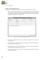
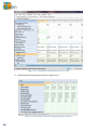
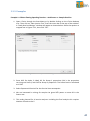
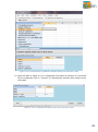
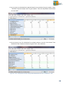
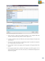
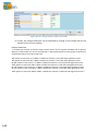
14. Another feature that enables us to compare designs side-by-side is by using the
Power vs. Sample Size plot. Multiple columns can be plotted together by simply
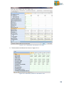
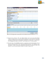
highlighting the desired columns and clicking on the “Plot Power vs Sample Size”
button on the menu bar.
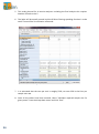
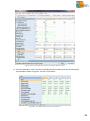
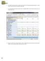
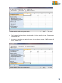
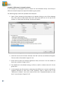
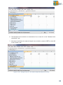
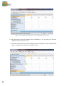
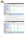
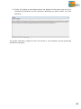
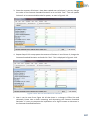
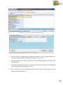
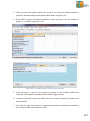
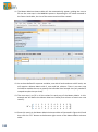
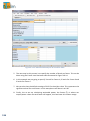
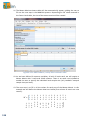
15. To highlight the desired columns, click on the column title for Column 1 and drag
across to Column 4.
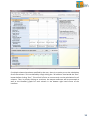
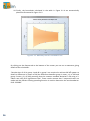
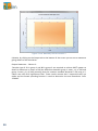
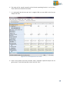
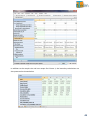
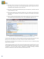
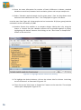
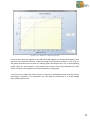
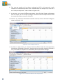
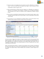
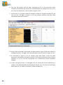
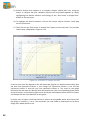
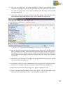
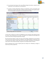
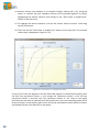
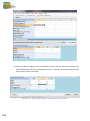
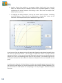
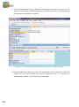
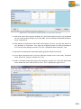
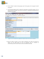
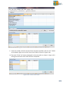
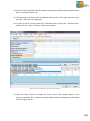
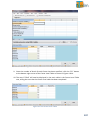
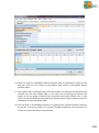
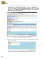
16. Then click on the “Plot Power vs Sample Size” button on the menu bar. The multiple
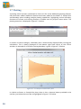
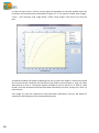
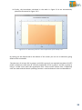
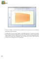
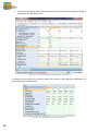
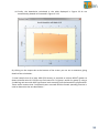
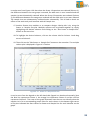
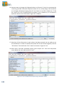
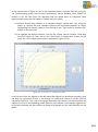
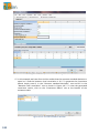
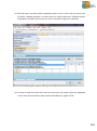
column plot is displayed in Figure 4.3.13.
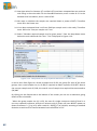
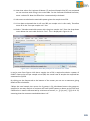
Figure 4.3.13. Power vs. Sample Size Plot
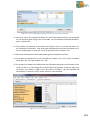
It can be seen from the legend on the left-hand side (legend can be altered manually) that
the blue line represents Column 1, the orange line represents Column 2, the red line
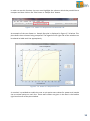
represents Column 3 and the navy line represents Column 4. The cross on the graph
illustrates how the user can identify what the sample size is for a corresponding power value
for each column. In the bottom right corner of the plot indicated the exact values for Power
and Sample Size for each identifier on the graph.
98