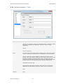
1
QuintusVisuals® for TIBCO Spotfire®
User Manual
Author:
Version:
Date:
Quintus consultants b.v.
v0.9
15 September 2011
Quintus consultants b.v. provides and implements IT solutions. Quintus is specialized in IT
implementations for financial organizations such as banks and insurance companies, but also
provides services to financial departments (including mergers and acquisitions) in other business
areas, such as energy companies.
QUINTUSVISUALS® FOR TIBCO SPOTFIRE®
USER MANUAL
Disclaimer
The information contained in this document is the proprietary and exclusive property of
Quintus consultants b.v. except as otherwise indicated. No part of this document, in whole or
in part, may be reproduced, stored, transmitted, or used for design or development purposes
without the prior written permission of Quintus consultants b.v..
The information in this document is provided for information purposes only. Quintus
consultants b.v. specifically disclaims all warranties, express or limited, including, but not
limited, to the implied warranties of merchantability and fitness for a particular purpose,
except as provided for in a separate software license agreement.
TIBCO® and TIBCO Spotfire® are registered trademarks of TIBCO.
QuintusVisuals® is a registered trademark of Quintus consultants bv.
Intended audience
This document is intended for:
- TIBCO Spotfire end-users and administrators
Version history
Version
v0.9
Author
Quintus
consultants b.v.
Description
Lay-out of chapters changed.
Contact information
For questions and information: www.quintusvisuals.com
Quintus consultants b.v.
-i-
Date
2011-09-06
QUINTUSVISUALS® FOR TIBCO SPOTFIRE®
USER MANUAL
Table of contents
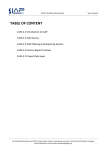
1
Cascade visualization .................................................................................................... 1
1.1
1.2
1.3
1.4
1.5
1.6
1.7
1.8
1.9
1.10
1.11
1.12
2
Dashboard visualization .............................................................................................. 16
2.1
2.2
2.3
2.4
2.5
2.6
2.7
2.8
3
What is a Cascade visualization? ............................................................................ 1
How to use the Cascade graph ................................................................................ 4
Cascade Properties .................................................................................................. 6
Cascade Properties – General ................................................................................. 7
Cascade Properties – Data ...................................................................................... 8
Cascade Properties – Font....................................................................................... 9
Cascade Properties – Colors ................................................................................. 10
Cascade Properties – X Axis ................................................................................. 11
Cascade Properties – Label ................................................................................... 12
Cascade Properties – Tooltip ................................................................................. 13
Cascade Properties – Legend ................................................................................ 14
Cascade Properties – Trellis .................................................................................. 15
What is a Dashboard visualization? (Speed dial and Traffic light) ......................... 16
How to use the Speed dial and Traffic light............................................................ 17
Speed dial and Traffic light Properties ................................................................... 19
Speed dial and Traffic light Properties – General .................................................. 20
Speed dial and Traffic light Properties – Data ....................................................... 21
Speed dial and Traffic light Properties – Segments ............................................... 22
Speed dial and Traffic light Properties – Presentation ........................................... 23
Speed dial and Traffic light Properties – Trellis ..................................................... 24
Spider plot visualization .............................................................................................. 25
3.1
3.2
3.3
3.4
3.5
3.6
3.7
3.8
3.9
3.10
3.11
3.12
3.13
3.14
What is a Spider plot visualization? ....................................................................... 25
How to use the Spider plot ..................................................................................... 26
Spider plot Properties ............................................................................................. 27
Spider plot Properties – General ............................................................................ 28
Spider plot Properties – Data ................................................................................. 29
Spider plot Properties – Appearance ..................................................................... 30
Spider plot Properties – Formatting ....................................................................... 31
Spider plot Properties – Fonts ................................................................................ 32
Spider plot Properties – Dimensions ...................................................................... 33
Spider plot Properties – Colors .............................................................................. 34
Spider plot Properties – Labels .............................................................................. 35
Spider plot Properties – Tooltip .............................................................................. 36
Spider plot Properties – Legend ............................................................................. 37
Spider plot Properties – Trellis ............................................................................... 38
Quintus consultants b.v.
- ii -
QUINTUSVISUALS® FOR TIBCO SPOTFIRE®
USER MANUAL
1
Cascade visualization
1.1
What is a Cascade visualization?
A Cascade visualization, also known as a waterfall plot, is a barchart-like graph
that is used to show the effect of sequentially positive and negative values. It
has a begin situation, optional intermediate situations and an end situation.
Using the sequentially positive and negative values the visualization shows how
the begin situation transitions to the intermediate and finally to the end
situation.
For analytical purposes a Cascade graph can assist in explaining transitions in
quantitative data. For example, it can show how the net result transitions over
years via a dimension such as a physical location or a product type.
There are two Cascade flavors available.
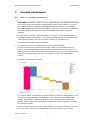
The first flavor is the so-called manual column based cascade.
This flavor shows how values can be broken down into individual parts. As
shown in the example below, each column is represented by a bar chart. The
sales are broken down into several cost components so it can be identified how
total sales are distributed over the cost categories. Each bar represents a
column.
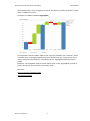
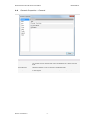
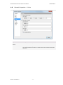
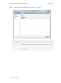
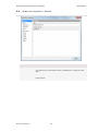
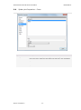
Example column based cascade:
The column based visualisation as shown above provides an explanation on the
composition of a profit and loss statement. The columns in the dataset are
[Sales], [Purchases], [Salaries], [Rent], [Depreciation], [Other costs] and
[Profit]. [Sales] values are positive, all costs are shown as negative, including
the remaining profit.
These columns are listed on the x-axis (shown as “Multiple columns”). On the yaxis, the sum of values are automatically shown for each of the columns.
Quintus consultants b.v.
-1-
QUINTUSVISUALS® FOR TIBCO SPOTFIRE®
USER MANUAL
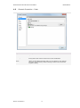
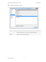
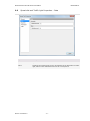
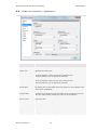
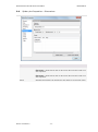
Each column starts at the end result of the previous column.
Hence, the first column starts at 0 and since the values for [Sales] are positive,
the bar goes up to the sum([Sales]), here at 635. The second column starts at
635 and since sum([Purchases]) is -272, the bar shown is from 635 to 363. The
third bar in this case starts at 363 and since sum([Salaries]) is -32, the bar
shown is from 363 to 331, etc.
Since filtering, trellis and other functions can be applied, this visualisation allows
for explanations of the profit & loss statement in a visual way, showing the
impact of each cost category for the total result.
The second flavor is the so-called automatic row based cascade.
Instead of using multiple data table columns to show transitions, this flavor is
based on the combination of a snapshot, dimension and a single steps column
expression to show transitions. This flavor requires that the data table contains
for example time, location or person structured sequential quantitative
information.
This flavor has two sub-flavors.
The first sub-flavor is the row based delta cascade. This cascade visualization
shows how one snapshot total transitions to the next snapshot total.
The second sub-flavor is the row based aggregate cascade. This cascade
visualization shows how one snapshot total transitions to the next snapshot
total, where a snapshot total is the aggregated total of the current snapshot and
all preceding snapshot totals.
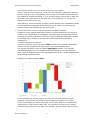
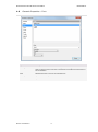
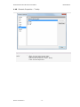
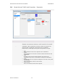
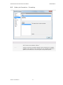
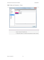
Example row based cascade delta:
In this example we see the impact over time on the projected [Profit] per
[Region]. We see that the [Profit] is shown starting at [Year] 2014 (value
1679), then steeply increases via [Year] 2015 (value 3952) to a substantially
lower profit in [Year] 2016 (value 551). We can see how each of the regions
influences the profit year over year. For example, [Region] Africa has in 2015 a
Quintus consultants b.v.
-2-
QUINTUSVISUALS® FOR TIBCO SPOTFIRE®
USER MANUAL
decreasing profit, when compared to 2014, but has an increasing profit in 2016,
when compared to 2015.
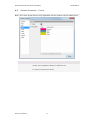
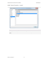
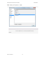
Example row based cascade aggregate:
This example uses the same data as the previous cascade row. However, what
is shown here is the aggregated projected [Profit] over the [Year] 2014 up to
2016, and how each [Region] contributes to the aggregated snapshot profit
totals.
Example: the snapshot total for 2016 shown here is the aggregated [Profit] of
[Year] 2014 plus [Year] 2015 plus [Year] 2016.
See also:
How to use the Cascade graph
Cascade Properties
Quintus consultants b.v.
-3-
QUINTUSVISUALS® FOR TIBCO SPOTFIRE®
1.2
USER MANUAL
How to use the Cascade graph
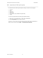
1. To create a new Cascade:
Click on the new Cascade icon
on the toolbar.
Comment: You can also select Insert → New Visualization → Cascade from the
menu.
Response: A first attempt to set up a suitable manual column based cascade is
made by the application.
2. To adjust the Cascade:
Right click on the visualization, select Properties and click on the Data tab to
select the applicable data table. Then adjust the Cascade to display either a
manual column based or automatic row based. To switch between manual
column based and automatic row based cascade right click on the visualization,
select Properties and then the X Axis tab.
For a manual column based Cascade:
The column based Cascade requires columns that need to be displayed, in what
order and which aggregation method will be used.
Select one by one the columns that need to be displayed in the cascade. The
default aggregation method will be sum, however, by clicking on each column,
this can be changed using aggregation. Also, using right click, a custom
expression can be defined here for each column.
The “offset” defines where the next column will start. To maintain a direct
connection from one bar to the next (as in the examples) keep them as they
are. However, if there is a need to adjust the offset, you can change the offset
for each column by right clicking and then change the custom expression.
To change the order of the columns, you can right click on each column and
then “move right” or “move left”. The outer columns (the one most left and the
one most right) will obviously show only one of these options.
For an automatic row based Cascade:
The axis dimension column has the attribute values over which the steps
measure is aggregated. For example: You want to display for each Location
(dimension) the Net Result (steps).
The axis snapshot column has the attribute value indicating the viewing
sequence. For example: You want to display per Year (snapshot) the Net Result
(steps) for every Location (dimension).
The axis steps column has the quantitative attribute value. For example: You
want to display the Profit (steps) or Sales Volume (steps) or Safety Incidents
(steps) per Year (snapshot) for each Location (dimension).
Quintus consultants b.v.
-4-
QUINTUSVISUALS® FOR TIBCO SPOTFIRE®
USER MANUAL
Comment: For the Axis Steps you can also select Custom Expression... (right
mouse click on value) from the menu and create your own expression.
Response: The automatic row based Cascade is updated to show the new
information.
Comment: For more information about how to change or what to show on the
several axes, see Properties.
Quintus consultants b.v.
-5-
QUINTUSVISUALS® FOR TIBCO SPOTFIRE®
1.3
USER MANUAL
Cascade Properties
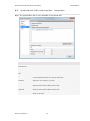
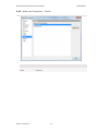
The Cascade Properties dialog consists of several tabs:
General
Data
Font
Colors (only available for manual column based flavour)
X Axis
Label
Tooltip
Legend
Trellis
To reach the Cascade Properties dialog:
1. Right-click on the Cascade visualization.
2. Select Properties from the pop-up menu.
Comment: You can also click on the Cascade visualization to make it active and
then select Edit → Visualization Properties.
Quintus consultants b.v.
-6-
QUINTUSVISUALS® FOR TIBCO SPOTFIRE®
1.4
USER MANUAL
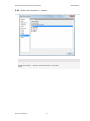
Cascade Properties – General
Option
Description
Title
The title of the visualization.
Tip: Double-click on the title bar of the visualization for a shortcut to this
field.
Show title bar
Specifies whether or not to show the visualization title.
Description
A description of the visualization. This description can optionally be shown
in the Legend.
Quintus consultants b.v.
-7-
QUINTUSVISUALS® FOR TIBCO SPOTFIRE®
1.5
USER MANUAL
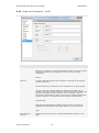
Cascade Properties – Data
Option
Description
Data table
Specifies the data table on which the visualization will work.
Marking
Specifies the marking (hence, the color and relationships to other marked
items) that will be used to mark items in this visualization.
New...
Opens the New Marking dialog where you can specify a new marking.
The color of a previously created marking is edited in the Document
Properties dialog.
Quintus consultants b.v.
-8-
QUINTUSVISUALS® FOR TIBCO SPOTFIRE®
1.6
USER MANUAL
Cascade Properties – Font
Option
Description
Setting for
Lists all items for which the font settings can be changed.
Click to select an item in the list to change the font settings for that item in
the visualization.
Font
Specifies the font to use for the selected item.
Font style
Specifies the font style to use for the selected item.
Size
Specifies the font size to use for the selected item.
Quintus consultants b.v.
-9-
QUINTUSVISUALS® FOR TIBCO SPOTFIRE®
1.7
USER MANUAL
Cascade Properties – Colors
Note: the Colors properties are only applicable for the manual column based flavor.
Option
Description
Fixed
Use this option to apply a single fixed color in a manual column based
cascade. Use the palette to change to a different color.
By column
Use this option to apply a color scheme with different colors for all columns
in a manual column based cascade.
Quintus consultants b.v.
- 10 -
QUINTUSVISUALS® FOR TIBCO SPOTFIRE®
1.8
USER MANUAL
Cascade Properties – X Axis
Option
Description
Manual column
based
Use this option to setup the axes of a manual column based cascade.
Automatic row based
Use this option to setup the axes of an automatic row based cascade. Use
the Cascade Delta Row tickbox to switch between the Delta and Aggregate
sub-flavor.
Quintus consultants b.v.
- 11 -
QUINTUSVISUALS® FOR TIBCO SPOTFIRE®
1.9
USER MANUAL
Cascade Properties – Label
Option
Description
Show labels for
Determines whether to show labels on all bars (All), bars containing marked
rows only (Marked rows), or not to show any labels at all (None).
Display labels for
markers
Determines whether to show labels for markers. The list of columns shown
depends on the selected cascade flavor.
Quintus consultants b.v.
- 12 -
QUINTUSVISUALS® FOR TIBCO SPOTFIRE®
USER MANUAL
1.10 Cascade Properties – Tooltip
Option
Description
Display the following
values
Specifies what information is to be shown when a cascade is hovered.
Offset: the value where the bar starts
Total: the value where the bar ends
Value: the size of the bar (= Total – Offset)
X Axis: the Axis Steps name
Quintus consultants b.v.
- 13 -
QUINTUSVISUALS® FOR TIBCO SPOTFIRE®
USER MANUAL
1.11 Cascade Properties – Legend
Option
Description
Show legend
Specifies whether or not the legend is shown in the visualization.
Display the following
values
Specifies the items that will be shown in the legend.
Quintus consultants b.v.
- 14 -
QUINTUSVISUALS® FOR TIBCO SPOTFIRE®
USER MANUAL
1.12 Cascade Properties – Trellis
Option
Description
Rows and columns
Splits the visualization into different panels for all categories in the selected
columns. The number of values in the specified column or hierarchy controls
the number of panels to be displayed in each row, column or page,
respectively.
Rows
A row with trellis panels will be created for each value in the selected
column.
Columns
A column with trellis panels will be created for each value in the selected
column or hierarchy.
Pages
A new page with trellis panels will be created for each value in the selected
column or hierarchy. Scroll down in the visualization to see the next page.
Panels
Splits the visualization into different panels for all categories in the selected
column or hierarchy, without binding any dimensions to either rows or
columns. This means that the number of actual values in the column to split
by does not control the number of shown rows or columns in any way.
The number of panels that is visible on each page is instead specified using
the Max number of rows and Max number of columns controls below.
Split by
Specifies the column or hierarchy to define the categories by which the
visualization should be split.
Manual layout
Select the check box to manually specify the number of rows and columns
that should be visible without scrolling. If the check box is cleared, the
application will automatically specify the number of rows and columns.
Max number of rows
Specifies the maximum number of panels that should be visible on each
page.
Max number of
columns
Specifies the maximum number of panels that should be visible on each
page.
Quintus consultants b.v.
- 15 -
QUINTUSVISUALS® FOR TIBCO SPOTFIRE®
USER MANUAL
2
Dashboard visualization
2.1
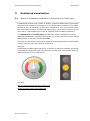
What is a Dashboard visualization? (Speed dial and Traffic light)
A dashboard consists of a number of graphs, plots and tables that are generally
financial which reproduce information or key performance indicators in a logical,
structured way. A dashboard is also often compared to your car’s cockpit, which
also uses dials, counters and warning lights to give you a clear overview of your
car’s status. This enables you to see at a glance what the state of affairs is.
The Speed dial and Traffic light provided here make it possible to build an
attractive dashboard in Spotfire which gives you a clear overview of your targets
and whether or not they are still attainable.
The status of the metric is shown by using minimum and maximum values (KPI
values) that you have been defined in advance.
Example:
A data table contains sales figures for a number of different products and shops.
The speed dial and traffic light can show the current total sum of Sales Amount
against the KPI for the current year.
See also:
How to use the Speed dial and Traffic light
Speed dial and Traffic light Properties
Quintus consultants b.v.
- 16 -
QUINTUSVISUALS® FOR TIBCO SPOTFIRE®
2.2
USER MANUAL
How to use the Speed dial and Traffic light
1. To create a new Speed dial or Traffic light:
Click on the new Speed dial
or Traffic light
button on the toolbar.
Comment: You can also select Insert → New Visualization → Speed dial or
Traffic light from the menu.
Response: A first attempt to set up a suitable Speed dial or Traffic light is made
by the application.
2. To adjust the Speed dial or Traffic light to display the categories and measures
of your choice:
Right click on the visualization, select properties and click on the Data tab.
Select the data table, then select the measure. You can also drag and drop a
column from the filter panel on the visualization.
For changing the aggregation left mouse click on value and select Aggregation,
then select a new aggregation method from the submenu.
Comment: You can also select Custom Expression... (right mouse click on
value) from the menu and create your own expression.
Response: The Speed dial or Traffic light is updated to show the new
information.
3. To apply changes to the segments and colors:
Right click on the visualization, select properties and click on the Segments tab
and create your own segments. By default three segments are created. You can
add new segments, change the name, color and values for the low and high
boundaries.
Low boundary:
visualization.
This is the minimum value limiting the range of the
Max boundary: This is the maximum value limiting the range of the
visualization.
4. To apply changes to presentation:
Right click on the visualization, select properties and click on the Presentation
tab. You can hide or show the measurement, scale and the text elements from
the visualization.
In the text editor you create your own text which will be displayed in the
visualization.
Text example: "€ " & Sum([SalesAmount])/1000 & " (*10^3)"
You can use the expression builder to change the expression.
When your dataset contains large numbers you can round these using an
expression. For example: {0}/1000
In the steps and labels option you can change the number of steps and the
number of labels on the scale.
Quintus consultants b.v.
- 17 -
QUINTUSVISUALS® FOR TIBCO SPOTFIRE®
USER MANUAL
In the decimals option you can change the number of decimal point digits shown
in the scale.
Quintus consultants b.v.
- 18 -
QUINTUSVISUALS® FOR TIBCO SPOTFIRE®
2.3
USER MANUAL
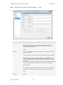
Speed dial and Traffic light Properties
The Speed dial and traffic light Properties dialog consists of several pages:
General
Data
Segments
Appearance
Presentation (only available for speed dial)
Trellis
To reach the Speed dial and Traffic light Properties dialog:
1. Right-click on the Speed dial or Traffic light visualization.
2. Select Properties from the pop-up menu.
Comment: You can also click on the Speed dial and Traffic light visualization to
make it active and then select Edit → Visualization Properties.
Quintus consultants b.v.
- 19 -
QUINTUSVISUALS® FOR TIBCO SPOTFIRE®
2.4
USER MANUAL
Speed dial and Traffic light Properties – General
Option
Description
Title
The title of the visualization.
Tip: Double-click on the title bar of the visualization for a shortcut to this
field.
Show title bar
Specifies whether or not to show the visualization title.
Description
A description of the visualization. This description can optionally be shown
in the Legend.
Quintus consultants b.v.
- 20 -
QUINTUSVISUALS® FOR TIBCO SPOTFIRE®
2.5
USER MANUAL
Speed dial and Traffic light Properties – Data
Option
Description
Data table
Specifies the data table on which the visualization will work.
Value
Specifies the measurement value to be displayed in the Speed dial or Traffic
light, based on the defined KPI value for the current period.
Quintus consultants b.v.
- 21 -
QUINTUSVISUALS® FOR TIBCO SPOTFIRE®
2.6
USER MANUAL
Speed dial and Traffic light Properties – Segments
Option
Description
Continuous
Specifies a start color and end color for the speed dial (this option is only
available in the speed dial) Continuous coloring is based on one segment.
With segments
The Segments option is used for defining the segments making up the
visualization. Both visualizations must have at least one segment. The
segments make up differently colored areas in the visualization
background. For traffic light each segment corresponds to one light.
Quintus consultants b.v.
Add
Click this button to add a new segment to the visualization.
Delete
Click this button to remove the currently selected segment from the
visualization.
Title
Specifies a name for the selected segment. This name is for
identification only and is not relevant for drawing the visualization.
Color
Specifies the color for a segment. Change the color with a color picker.
Low boundary
This is the minimum value for the segment.
High boundary
This is the maximum value for the segment.
- 22 -
QUINTUSVISUALS® FOR TIBCO SPOTFIRE®
2.7
USER MANUAL
Speed dial and Traffic light Properties – Presentation
Note: The presentation tab is only available in the Speed dial.
Option
Description
Display
measurement
Hide or show the measurement title in the visualization.
Display scale
Hide or show the scale in the visualization.
Display the following
text
Hide or show text in the visualization.
Expression
In the expression text box you can create your own expression. You can
use the expression builder to create an expression.
Expression for
rounding
When your dataset contains large numbers you can round these using an
expression. For example: {0}/1000
Steps
With the steps and display labels option you can change the number of
steps and the number of labels on the scale.
Display labels on
each step
With the steps and display labels option you can change the number of
steps and the number of labels on the scale.
Decimals
With the decimals option you can change the number of decimal point digits
shown in the scale.
Quintus consultants b.v.
- 23 -
QUINTUSVISUALS® FOR TIBCO SPOTFIRE®
2.8
USER MANUAL
Speed dial and Traffic light Properties – Trellis
Option
Description
Rows and columns
Splits the visualization into different panels for all categories in the
selected columns. The number of values in the specified column or
hierarchy controls the number of panels to be displayed in each row,
column or page, respectively.
Rows
A row with trellis panels will be created for each value in the selected
column.
Columns
A column with trellis panels will be created for each value in the selected
column or hierarchy.
Pages
A new page with trellis panels will be created for each value in the selected
column or hierarchy. Scroll down in the visualization to see the next page.
Panels
Splits the visualization into different panels for all categories in the
selected column or hierarchy, without binding any dimensions to either
rows or columns. This means that the number of actual values in the
column to split by does not control the number of shown rows or columns
in any way.
The number of panels that is visible on each page is instead specified using
the Max number of rows and Max number of columns controls below.
Split by
Specifies the column to define the categories by which the visualization
should be split.
Manual layout
Select the check box to manually specify the number of rows and columns
that should be visible without scrolling. If the check box is cleared, the
application will automatically specify the number of rows and columns.
Max number of rows
Specifies the maximum number of panels that should be visible on each
page.
Max number of
columns
Specifies the maximum number of panels that should be visible on each
page.
Quintus consultants b.v.
- 24 -
QUINTUSVISUALS® FOR TIBCO SPOTFIRE®
USER MANUAL
3
Spider plot visualization
3.1
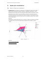
What is a Spider plot visualization?
A Spider plot, also known as a radar plot, is a diagram in the form of a web
that is used to indicate the relative influence of different parameters. This is
usually done when there are more than three factors that can influence a result.
Spider plots can be used to show the different causes of a problem situation.
The factors that have most influence are mainly located on the periphery of the
web and parameters that have little influence on problem situations are located
at the web’s centre.
Example:
A data table contains sales figures for a number of different products and shops.
The Spider plot can show the Sales Amount against the number of orders.
See also:
How to use the Spider plot
Spider plot Properties
Quintus consultants b.v.
- 25 -
QUINTUSVISUALS® FOR TIBCO SPOTFIRE®
3.2
USER MANUAL
How to use the Spider plot
1. To create a new Spider plot:
Click on the new Spider plot button
on the toolbar.
Comment: You can also select Insert → New Visualization → Spider plot
from the menu.
Response: A first attempt to set up a suitable Spider plot is made by the
application.
2. To adjust the Spider plot to display the dimensions and measures of your
choice:
The dimension has the attribute value where the measure is over the
aggregated value, for example: You want to display the Sales amount
(measure) for every shop (dimension attribute).
Right click on the visualization, select Properties and click on the Data tab.
Choose the appropriate data table and the measure and dimension values on
the Dimension tab or drag and drop the values from the filter panel on the
visualization.
For changing the aggregation left mouse click on the column and select
Aggregation, then select a new aggregation method from the submenu.
Comment: You can also select Custom Expression... (right mouse click on
value) from the menu and create your own expression.
Response: The Spider plot is updated to show the new information.
Comment: For more information about how to change or what to show on the
two axes, see Properties.
3. To apply changes to the ranges of the axes.
Right click on the visualization, select Properties and click on the Dimension tab.
In the range section you can change values for low and high ranges.
By default the minimum and maximum values for the measure value are used.
Low range:
visualization.
This is the minimum value limiting the range of the
Max range:
visualization.
This is the maximum value limiting the range of the
4. To apply changes to presentation settings.
Right click on the visualization, select Properties and click on the Appearance
tab. On this tab you can change many properties for the visualization. You can
hide or show the markers, labels, grid lines, thickness of lines, reverse the scale
and toggle the chart. Toggling a chart means swapping the measures and the
dimension in the visualization. Toggling requires at least two measures.
Quintus consultants b.v.
- 26 -
QUINTUSVISUALS® FOR TIBCO SPOTFIRE®
3.3
USER MANUAL
Spider plot Properties
The Spider plot Properties dialog consists of several pages:
General
Data
Appearance
Formatting
Fonts
Dimensions
Colors
Labels
Tooltip
Legend
Trellis
To reach the Spider plot Properties dialog:
1. Right-click on the Spider plot visualization.
2. Select Properties from the pop-up menu.
Comment: You can also click on the Spider plot visualization to make it active
and then select Edit → Visualization Properties.
Quintus consultants b.v.
- 27 -
QUINTUSVISUALS® FOR TIBCO SPOTFIRE®
3.4
USER MANUAL
Spider plot Properties – General
Option
Description
Title
The title of the visualization.
Tip: Double-click on the title bar of the visualization for a shortcut to this
field.
Show title bar
Specifies whether or not to show the visualization title.
Description
A description of the visualization. This description can optionally be shown
in the Legend.
Quintus consultants b.v.
- 28 -
QUINTUSVISUALS® FOR TIBCO SPOTFIRE®
3.5
USER MANUAL
Spider plot Properties – Data
Option
Description
Data table
Specifies the data table on which the visualization will work.
Marking
Specifies the marking (hence, the color and relationships to other marked
items) that will be used to mark items in this visualization.
New...
Opens the New Marking dialog where you can specify a new marking.
The color of a previously created marking is edited in the Document
Properties dialog.
Quintus consultants b.v.
- 29 -
QUINTUSVISUALS® FOR TIBCO SPOTFIRE®
3.6
USER MANUAL
Spider plot Properties – Appearance
Option
Description
Show markers
Specifies showing of markers on the Spider plot.
Marker size
Specifies the marker size.
Show dimension lines
If a checkmark is shown in the check box, then the reference line is shown
in the visualization. Clear the check box to hide the lines.
With line thickness you can specify the thickness.
Show measure lines
If a checkmark is shown in the check box, then the reference line is shown
in the visualization. Clear the check box to hide the lines.
With line thickness you can specify the thickness.
Scales
Inside offset
With the inside offset setting you can specify an offset from the centre of
the Spider plot. Use this offset when many points are close together to the
centre of the visualization.
Scales
Outside offset
With the outside offset setting you can specify an offset from the outer side
boundary of the Spider plot. Use this option to force points to move from
the outer side boundary towards the centre of the visualization.
Scales
Reverse scale
Reverses the current sort order, so that the lowest value is displayed at the
top of the scale.
Show grid lines
Specifies whether or not gridlines should be visible.
Number of grid lines
To change the number of grid lines.
Grid line thickness
With line thickness you can specify the thickness.
Toggle chart
Swap the measures and the dimension in the visualization.
Art board
Change the continuous coloring.
Quintus consultants b.v.
- 30 -
QUINTUSVISUALS® FOR TIBCO SPOTFIRE®
3.7
USER MANUAL
Spider plot Properties – Formatting
Option
Description
Axes
Displays which axes are currently being used in the Spider plot. Click an
axis to change its formatting category.
Category
Lists the available formatting categories for the selected axis. Each
category in this list has separate settings. Which categories are available
depends on the data type of the selected axis. See Formatting Settings in
Spotfire documentation for a full description of all possible options.
Quintus consultants b.v.
- 31 -
QUINTUSVISUALS® FOR TIBCO SPOTFIRE®
3.8
USER MANUAL
Spider plot Properties – Fonts
Option
Description
Settings for
Lists all items for which you can change the font settings. Click to select an
item in the list to change the font settings for that text in the visualization.
Font
Specifies the font to use for the selected items.
Font style
Specifies the font style to use for the selected items.
Size
Specifies the font size to use for the selected items.
Quintus consultants b.v.
- 32 -
QUINTUSVISUALS® FOR TIBCO SPOTFIRE®
3.9
USER MANUAL
Spider plot Properties – Dimensions
Option
Description
Dimension
Specifies the selected dimension. Comment: You can also select Custom
Expression... (Right mouse click on value) from the menu and create your
own expression.
Measure line
Specifies the selected measures. Comment: You can also select Custom
Expression... (Right mouse click on value) from the menu and create your
own expression.
Range
Specifies the boundaries for drawing the plot with the Low and High values.
Quintus consultants b.v.
- 33 -
QUINTUSVISUALS® FOR TIBCO SPOTFIRE®
USER MANUAL
3.10 Spider plot Properties – Colors
Option
Description
Measure line
Use this option to apply a single, fixed color per measure line. Use the
palette to change to a different color.
Marker
Use this option to apply a color scheme with different colors for all values in
a (categorical) column, or a continuous color gradient for numeric columns.
Quintus consultants b.v.
- 34 -
QUINTUSVISUALS® FOR TIBCO SPOTFIRE®
USER MANUAL
3.11 Spider plot Properties – Labels
Option
Description
Show labels for
Determines whether to show labels on all bars (All), bars containing marked
rows only (Marked rows), or not show any labels at all (None).
Display labels for
markers
Determines whether to show labels for markers.
Quintus consultants b.v.
- 35 -
QUINTUSVISUALS® FOR TIBCO SPOTFIRE®
USER MANUAL
3.12 Spider plot Properties – Tooltip
Option
Description
Display the following
values
Defines what to show in the tooltip label and in what order it should be
presented.
Quintus consultants b.v.
- 36 -
QUINTUSVISUALS® FOR TIBCO SPOTFIRE®
USER MANUAL
3.13 Spider plot Properties – Legend
Option
Description
Show legend
Specifies whether or not the legend should be shown in the visualization.
Display the following
values
Specifies what will be shown in the legend.
Quintus consultants b.v.
- 37 -
QUINTUSVISUALS® FOR TIBCO SPOTFIRE®
USER MANUAL
3.14 Spider plot Properties – Trellis
Option
Description
Rows and columns
Splits the visualization into different panels for all categories in the selected
columns. The number of values in the specified column or hierarchy controls
the number of panels to be displayed in each row, column or page,
respectively.
Rows
A row with trellis panels will be created for each value in the selected
column.
Columns
A column with trellis panels will be created for each value in the selected
column or hierarchy.
Pages
A new page with trellis panels will be created for each value in the selected
column or hierarchy. Scroll down in the visualization to see the next page.
Panels
Splits the visualization into different panels for all categories in the selected
column or hierarchy, without binding any dimensions to either rows or
columns. This means that the number of actual values in the column to split
by does not control the number of shown rows or columns in any way.
The number of panels that is visible on each page is instead specified using
the Max number of rows and Max number of columns controls below.
Split by
Specifies the column to define the categories by which the visualization
should be split.
Manual layout
Select the check box to manually specify the number of rows and columns
that should be visible without scrolling. If the check box is cleared, the
application will automatically specify the number of rows and columns.
Max number of rows
Specifies the maximum number of panels that should be visible on each
page.
Max number of
columns
Specifies the maximum number of panels that should be visible on each
page.
Quintus consultants b.v.
- 38 -