1
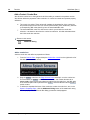
User and Reference Manual
Altova MobileTogether Designer
User & Reference Manual
All rights reserved. No parts of this work may be reproduced in any form or by any
means - graphic, electronic, or mechanical, including photocopying, recording, taping, or
information storage and retrieval systems - without the written permission of the
publisher.
Products that are referred to in this document may be either trademarks and/or
registered trademarks of the respective owners. The publisher and the author make no
claim to these trademarks.
While every precaution has been taken in the preparation of this document, the
publisher and the author assume no responsibility for errors or omissions, or for
damages resulting from the use of information contained in this document or from the
use of programs and source code that may accompany it. In no event shall the publisher
and the author be liable for any loss of profit or any other commercial damage caused or
alleged to have been caused directly or indirectly by this document.
Published: 2015
© 2015 Altova GmbH
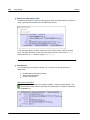
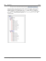
Table of Contents
1
Altova MobileTogether Designer
3
2
New Features
6
3
Introduction
3.1
MobileTogether
.......................................................................................................................
Overview
11
3.2
Terminology
.......................................................................................................................
Q&A
13
3.3
Design
.......................................................................................................................
Steps
15
3.4
XPath
.......................................................................................................................
in MobileTogether
17
4
Tutorials
4.1
QuickStart
.......................................................................................................................
(Part 1)
24
4.1.1
Create
...........................................................................................................
a New Design
25
4.1.2
Set...........................................................................................................
Up a Page
27
4.1.3
Add...........................................................................................................
a Page Data Source
28
4.1.4
Format
...........................................................................................................
the Design
32
4.1.5
Add...........................................................................................................
a Control: Combo Box
34
4.1.6
Add...........................................................................................................
a Control: Image
37
4.1.7
Define
...........................................................................................................
Control Actions
40
4.1.8
Validate
...........................................................................................................
the Project
43
4.1.9
Run...........................................................................................................
a Simulation
44
4.1.10 Deploy
...........................................................................................................
to Server
47
4.2
QuickStart
.......................................................................................................................
(Part 2)
50
4.2.1
Load
...........................................................................................................
Data from a File
51
4.2.2
Change
...........................................................................................................
Source Node
55
4.2.3
Run...........................................................................................................
a Simulation
57
4.2.4
Use...........................................................................................................
File Data for Combo Box Entries
59
4.2.5
Set...........................................................................................................
Data File as Default File
62
4.2.6
Create
...........................................................................................................
Dynamic Links to Web Pages
64
4.2.7
Save
...........................................................................................................
Data Back to File
66
4.3
Database-And-Charts
....................................................................................................................... 68
4.3.1
The...........................................................................................................
Project Structure
70
Altova Mob ileTogether Designer
10
22
1
4.3.2
4.3.3
4.3.4
4.3.5
4.3.6
4.3.7
4.3.8
2
The...........................................................................................................
Main Page
71
Data
...........................................................................................................
Sources of the Main Page
74
The...........................................................................................................
Combo Boxes
78
The...........................................................................................................
Tabular Report
81
The...........................................................................................................
Charts
82
Edit...........................................................................................................
Offices Table
87
Edit...........................................................................................................
Sales Table
92
4.4
SubPages-And-Visibility
....................................................................................................................... 98
4.4.1
Design
...........................................................................................................
Structure
100
4.4.2
Data
...........................................................................................................
Source Listings
102
4.4.3
Top
...........................................................................................................
Page: Data Sources
104
4.4.4
Top
...........................................................................................................
Page: Customers Table
106
4.4.5
Top
...........................................................................................................
Page: Action Group, Go to Sub Page
108
4.4.6
Top
...........................................................................................................
Page: Show All Orders Action
111
4.4.7
Sub
...........................................................................................................
Page: Data Sources
112
4.4.8
Sub
...........................................................................................................
Page: Orders Table
114
4.4.9
Sub
...........................................................................................................
Page: Visibility Property
116
4.4.10 Sub
...........................................................................................................
Page: Decimal Totals in XPath
117
4.4.11 Simulation
...........................................................................................................
and Testing
119
5
The User Interface
5.1
Main
.......................................................................................................................
Window
124
5.1.1
Page
...........................................................................................................
Design
125
5.1.2
DB
...........................................................................................................
Query
127
5.2
Pages
.......................................................................................................................
Pane
128
5.3
Files
.......................................................................................................................
Pane
130
5.4
Controls
.......................................................................................................................
Pane
132
5.5
Page
.......................................................................................................................
Sources Pane
134
5.6
Overview
.......................................................................................................................
Pane
136
5.7
Styles
.......................................................................................................................
& Properties Pane
137
5.8
Messages
.......................................................................................................................
Pane
140
6
The Project
6.1
Location
.......................................................................................................................
of Project Files
145
6.2
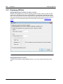
Deploying
.......................................................................................................................
the Project
147
6.3
Project
.......................................................................................................................
Properties
151
6.4
Localization
....................................................................................................................... 156
6.5
Namespaces
....................................................................................................................... 157
122
144
Altova Mob ileTogether Designer
6.6
Global
.......................................................................................................................
Resources
158
6.7
Performance
....................................................................................................................... 159
6.7.1
Embed
...........................................................................................................
XML in Design File
160
6.7.2
Data
...........................................................................................................
Querying with XQuery 3.1
161
6.7.3
Data
...........................................................................................................
Storage on Servers
162
6.7.4
Persistent
...........................................................................................................
Data Storage on Clients
164
7
Data Sources
7.1
Adding
.......................................................................................................................
Page Data Sources
168
7.2
Types
.......................................................................................................................
of Data Sources
169
7.3
Page
.......................................................................................................................
Source Options
175
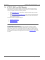
7.4
HTTP/FTP,
.......................................................................................................................
REST, and SOAP Requests
177
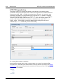
7.4.1
HTTP/FTP
...........................................................................................................
Request Settings
178
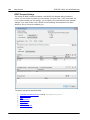
7.4.2
REST
...........................................................................................................
Request Settings
180
7.4.3
SOAP
...........................................................................................................
Request Settings
188
7.5
Root
.......................................................................................................................
Nodes
190
7.6
Page
.......................................................................................................................
Source Trees
192
7.6.1
Tree
...........................................................................................................
Structure
195
7.6.2
Tree
...........................................................................................................
Data
197
7.7
Namespaces
.......................................................................................................................
in the Project
200
7.8
Caches
....................................................................................................................... 201
7.9
Context
.......................................................................................................................
Menus
204
8
Page Design
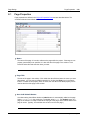
8.1
Page
.......................................................................................................................
Properties
219
8.2
Controls
....................................................................................................................... 222
8.2.1
Assertion
...........................................................................................................
Message
226
8.2.2
Button
........................................................................................................... 229
8.2.3
Chart
........................................................................................................... 236
8.2.4
Check
...........................................................................................................
Box
240
8.2.5
Combo
...........................................................................................................
Box
246
8.2.6
Date
........................................................................................................... 251
8.2.7
DateTime
...........................................................................................................
(iOS)
256
8.2.8
Edit
...........................................................................................................
Field
261
8.2.9
Horizontal
...........................................................................................................
Line
269
8.2.10 Image
........................................................................................................... 271
8.2.11 Label
........................................................................................................... 277
8.2.12 Radio
...........................................................................................................
Button
283
Altova Mob ileTogether Designer
166
218
3
8.2.13
8.2.14
8.2.15
8.2.16
8.2.17
4
Signature
...........................................................................................................
Field
290
Space
........................................................................................................... 296
Switch
........................................................................................................... 298
Table
........................................................................................................... 303
Time
........................................................................................................... 310
8.3
Events
....................................................................................................................... 315
8.3.1
Page
...........................................................................................................
Events
316
8.3.2
Control
...........................................................................................................
Events
318
8.4
Actions
....................................................................................................................... 320
8.4.1
User
...........................................................................................................
Interactions
323
Message
...........................................................................................................
Box
325
Send
...........................................................................................................
Email To
326
Send
...........................................................................................................
SMS To
331
Make
...........................................................................................................
Call To
332
Open
...........................................................................................................
URL
333
8.4.2
Database
........................................................................................................... 334
DB
...........................................................................................................
Begin Transaction
335
DB
...........................................................................................................
Execute
337
DB
...........................................................................................................
Commit Transaction
340
DB
...........................................................................................................
Rollback Transaction
341
8.4.3
Page
........................................................................................................... 342
Go
...........................................................................................................
to Page
344
Go
...........................................................................................................
to Subpage
345
Close
...........................................................................................................
Subpage
349
Solution
...........................................................................................................
Execution
350
Scroll
...........................................................................................................
to Bottom
352
Hide
...........................................................................................................
Keyboard
353
Update
...........................................................................................................
Display
354
8.4.4
Geolocation
...........................................................................................................
Services
355
Start
...........................................................................................................
Geolocation Tracking
356
Read
...........................................................................................................
Geolocation Data
357
Stop
...........................................................................................................
Geolocation Tracking
361
Show
...........................................................................................................
Geolocation on Map
362
8.4.5
Images
........................................................................................................... 364
Let
...........................................................................................................
User Choose Image
365
Save
...........................................................................................................
Image to File
366
8.4.6
Miscellaneous
........................................................................................................... 367
Comment
........................................................................................................... 368
Execute
...........................................................................................................
On
369
8.4.7
Update
...........................................................................................................
Data
370
Update
...........................................................................................................
Node(s)
372
Altova Mob ileTogether Designer
8.4.8
8.4.9
8.4.10
Insert
...........................................................................................................
Node(s)
376
Append
...........................................................................................................
Node(s)
380
Delete
...........................................................................................................
Node(s)
384
Page
...........................................................................................................
Sources
385
Reload
........................................................................................................... 387
Load/Save
...........................................................................................................
File
388
Load/Save
...........................................................................................................
HTTP/FTP
389
Load
...........................................................................................................
from SOAP
390
Save
........................................................................................................... 392
Reset
........................................................................................................... 394
Execute
...........................................................................................................
SOAP Request
395
Execute
...........................................................................................................
REST Request
397
If,...........................................................................................................
Loop
398
If-Then
........................................................................................................... 399
If-Then-Else
........................................................................................................... 400
Loop
........................................................................................................... 401
Action
...........................................................................................................
Groups
403
Creating
...........................................................................................................
and Editing Action Groups
404
Using
...........................................................................................................
Action Groups
407
8.5
Tables
....................................................................................................................... 408
8.5.1
Static
...........................................................................................................
Tables
409
8.5.2
Repeating
...........................................................................................................
Tables
411
8.5.3
Dynamic
...........................................................................................................
Tables
414
8.5.4
Table
...........................................................................................................
Properties
417
8.5.5
Table
...........................................................................................................
Context Menu
420
8.6
Images
....................................................................................................................... 422
8.6.1
Image
...........................................................................................................
Source
423
8.6.2
Base64-Encoded
...........................................................................................................
Images
425
8.6.3
Exchangeable
...........................................................................................................
Image File Format (Exif)
428
8.6.4
Images
...........................................................................................................
Chosen by End User
435
8.6.5
Transforming
...........................................................................................................
Images
441
8.6.6
Images
...........................................................................................................
in Databases
442
8.7
Charts
....................................................................................................................... 443
8.7.1
Creating
...........................................................................................................
and Configuring Charts
444
8.7.2
Chart
...........................................................................................................
Data Selection
447
Chart
...........................................................................................................
Data Selection: Simple
451
Chart
...........................................................................................................
Data Selection: Flexible
456
8.7.3
Chart
...........................................................................................................
Settings and Appearance
463
Basic
...........................................................................................................
Chart Settings
464
Advanced
...........................................................................................................
Chart Settings
470
Altova Mob ileTogether Designer
5
Dynamic
...........................................................................................................
XPath Settings
487
8.8
Hyperlinking
.......................................................................................................................
to Solutions
489
8.9
Page
.......................................................................................................................
Refresh
493
8.10 Server
.......................................................................................................................
Connection Errors
495
9
XPath/XQuery: Expressions, Functions,
Variables
500
9.1
XPath/XQuery
.......................................................................................................................
Expressions and Functions
501
9.1.1
Edit
...........................................................................................................
XPath/XQuery Expression Dialog
502
XPath/XQuery
...........................................................................................................
Expression Builder
504
XPath/XQuery
...........................................................................................................
Expression Evaluator
507
9.1.2
MobileTogether
...........................................................................................................
Extension Functions
509
9.1.3
User-Defined
...........................................................................................................
XPath/XQuery Functions
520
9.1.4
FAQ
...........................................................................................................
about XPath/XQuery
523
9.2
Global
.......................................................................................................................
Variables
525
9.2.1
Static
...........................................................................................................
Global Variables
527
9.2.2
Dynamic
...........................................................................................................
Local Variables
530
9.2.3
User
...........................................................................................................
Variables
533
10 Databases
536
10.1 DBs
.......................................................................................................................
as Data Sources
538
10.2 Connecting
.......................................................................................................................
to a Database
542
10.2.1 Starting
...........................................................................................................
the Database Connection Wizard
544
10.2.2 Database
...........................................................................................................
Drivers Overview
546
10.2.3 Setting
...........................................................................................................
up an ADO Connection
549
Connecting
...........................................................................................................
to an Existing Microsoft Access Database
552
Creating
...........................................................................................................
a New Microsoft Access Database
553
Setting
...........................................................................................................
up the SQL Server Data Link Properties
554
Setting
...........................................................................................................
up the Microsoft Access Data Link Properties
555
10.2.4 Setting
...........................................................................................................
up an ODBC Connection
557
Viewing
...........................................................................................................
the Available ODBC Drivers
559
10.2.5 Setting
...........................................................................................................
up a JDBC Connection
560
Configuring
...........................................................................................................
the CLASSPATH
562
10.2.6 Setting
...........................................................................................................
up a SQLite Connection
564
Connecting
...........................................................................................................
to an Existing SQLite Database
565
Creating
...........................................................................................................
a New SQLite Database
566
10.2.7 Using
...........................................................................................................
a Connection from Global Resources
567
10.2.8 Examples
........................................................................................................... 568
6
Altova Mob ileTogether Designer
Connecting
...........................................................................................................
to Firebird (ODBC)
569
Connecting
...........................................................................................................
to Firebird (JDBC)
572
Connecting
...........................................................................................................
to IBM DB2 (ODBC)
574
Connecting
...........................................................................................................
to IBM DB2 for i (ODBC)
580
Connecting
...........................................................................................................
to IBM Informix (JDBC)
583
Connecting
...........................................................................................................
to Microsoft Access (ADO)
585
Connecting
...........................................................................................................
to Microsoft SQL Server (ADO)
587
Connecting
...........................................................................................................
to Microsoft SQL Server (ODBC)
591
Connecting
...........................................................................................................
to MySQL (ODBC)
594
Connecting
...........................................................................................................
to Oracle (ODBC)
597
Connecting
...........................................................................................................
to PostgreSQL (ODBC)
602
Connecting
...........................................................................................................
to Sybase (JDBC)
604
10.3 Database
.......................................................................................................................
Connections on Linux and Mac
606
10.3.1 SQLite
...........................................................................................................
connections on Linux and Mac
607
10.3.2 JDBC
...........................................................................................................
connections on Linux and Mac
608
10.3.3 Oracle
...........................................................................................................
Connections on Mac OS X Yosemite
609
10.4 Selecting
.......................................................................................................................
DB Objects as Data Sources
610
10.5 Editing
.......................................................................................................................
DB Data
613
10.6 Saving
.......................................................................................................................
Data to the DB
617
10.7 The.......................................................................................................................
DB Execute Action
622
10.8 Displaying
.......................................................................................................................
DB Data
626
10.9 Database
.......................................................................................................................
Query
628
10.9.1 GUI
...........................................................................................................
Overview and Toolbar
630
10.9.2 Connecting
...........................................................................................................
to Data Sources
632
10.9.3 Browser
...........................................................................................................
Pane
634
10.9.4 Query
...........................................................................................................
Pane: Description
638
10.9.5 Query
...........................................................................................................
Pane: Working With
642
10.9.6 Results
...........................................................................................................
and Messages Pane
643
11 Altova Global Resources
646
11.1 Defining
.......................................................................................................................
Global Resources
647
11.1.1 Files
........................................................................................................... 650
11.1.2 Folders
........................................................................................................... 656
11.1.3 Databases
........................................................................................................... 658
11.2 Using
.......................................................................................................................
Global Resources
661
11.2.1 Assigning
...........................................................................................................
Files and Folders
662
11.2.2 Assigning
...........................................................................................................
Databases
663
11.2.3 Changing
...........................................................................................................
the Active Configuration
664
Altova Mob ileTogether Designer
7
12 Simulation
666
12.1 Simulation
.......................................................................................................................
in MobileTogether Designer
667
12.2 Simulation
.......................................................................................................................
on Server
670
12.3 Simulation
.......................................................................................................................
on Client
674
12.4 Geolocation
.......................................................................................................................
Settings
676
12.5 Messages
.......................................................................................................................
Pane
680
13 AppStore Apps
684
13.1 Generate
.......................................................................................................................
Program Code from Project
685
13.2 Deploy
.......................................................................................................................
Workflow to Server
693
13.3 Compile
.......................................................................................................................
Program Code
695
13.3.1 Android
........................................................................................................... 696
13.3.2 iOS
........................................................................................................... 698
13.3.3 Windows
...........................................................................................................
App
699
13.3.4 Windows
...........................................................................................................
Phone
702
13.4 SPL
.......................................................................................................................
Templates
703
13.4.1 SPL
...........................................................................................................
Syntax
705
13.4.2 String
...........................................................................................................
Mechanisms
708
13.4.3 Properties
...........................................................................................................
of $Options
710
13.4.4 Properties
...........................................................................................................
of $Application
713
13.4.5 Miscellaneous
...........................................................................................................
Objects
714
14 Menu Commands
716
14.1 File....................................................................................................................... 717
14.1.1 New
........................................................................................................... 718
14.1.2 Open
........................................................................................................... 719
14.1.3 Reload
........................................................................................................... 723
14.1.4 Close,
...........................................................................................................
Close All, Close All But Active
724
14.1.5 Save,
...........................................................................................................
Save As, Save Copy As, Save All
725
14.1.6 Deploy
...........................................................................................................
to MobileTogether Server
730
14.1.7 Open
...........................................................................................................
from MobileTogether Server
732
14.1.8 Delete
...........................................................................................................
from MobileTogether Server
734
14.1.9 Generate
...........................................................................................................
Program Code for AppStore Apps
736
14.1.10 Send
...........................................................................................................
by Mail
737
14.1.11 Print
........................................................................................................... 738
14.1.12 Print
...........................................................................................................
Preview, Print Setup
739
8
Altova Mob ileTogether Designer
14.1.13 Recent
...........................................................................................................
Files, Exit
741
14.2 Edit....................................................................................................................... 742
14.2.1 Undo,
...........................................................................................................
Redo
743
14.2.2 Cut,
...........................................................................................................
Copy, Paste, Delete
744
14.2.3 Select
...........................................................................................................
All
746
14.3 Project
....................................................................................................................... 747
14.3.1 Validate
........................................................................................................... 748
14.3.2 Reload
...........................................................................................................
Page Source Structures
749
14.3.3 Simulate
...........................................................................................................
Workflow
750
14.3.4 Trial
...........................................................................................................
Run on Client
751
14.3.5 Use
...........................................................................................................
Server for Workflow Simulation
752
14.3.6 Global
...........................................................................................................
Variables
753
14.3.7 List
...........................................................................................................
Usages of All Global Variables
755
14.3.8 List
...........................................................................................................
Usages of All Page Source Variables
756
14.3.9 XPath/XQuery
...........................................................................................................
Functions
757
14.3.10 List
...........................................................................................................
Usages of All User-Defined XPath/XQuery Functions
760
14.3.11 Action
...........................................................................................................
Groups
761
14.3.12 List
...........................................................................................................
Usages of All Action Groups
763
14.3.13 Cache
...........................................................................................................
Overview
764
14.3.14 Localization
........................................................................................................... 765
14.3.15 Simulation
...........................................................................................................
Language
771
14.3.16 List
...........................................................................................................
All File and Directory References
772
14.3.17 List
...........................................................................................................
All External Data References
773
14.3.18 List
...........................................................................................................
Unused Functions, User Variables, and Action Groups
774
14.3.19 Maintain
...........................................................................................................
OAuth Settings
775
14.3.20 Import
...........................................................................................................
OAuth Settings
777
14.4 Page
....................................................................................................................... 778
14.4.1 Page
...........................................................................................................
Actions
779
14.4.2 Actions
...........................................................................................................
Overview
780
14.4.3 Jump
...........................................................................................................
to Control
781
14.5 View
....................................................................................................................... 782
14.5.1 Status
...........................................................................................................
Bar and Panes
783
14.5.2 Zoom
...........................................................................................................
Levels
784
14.6 Tools
....................................................................................................................... 785
14.6.1 Global
...........................................................................................................
Resources
786
14.6.2 Active
...........................................................................................................
Configuration
787
14.6.3 Customize
........................................................................................................... 788
Commands
........................................................................................................... 789
Toolbars
........................................................................................................... 791
Keyboard
........................................................................................................... 793
Altova Mob ileTogether Designer
9
14.6.4
14.6.5
Menu
........................................................................................................... 795
Options
........................................................................................................... 797
Restore
...........................................................................................................
Toolbars and Windows
798
Options
........................................................................................................... 799
14.7 Window
....................................................................................................................... 805
14.7.1 Cascade
...........................................................................................................
and Tile
806
14.7.2 Close,
...........................................................................................................
Close All, Close All But Active
807
14.7.3 Currently
...........................................................................................................
Open Window List
808
14.8 Help
....................................................................................................................... 809
14.8.1 Table
...........................................................................................................
of Contents, Index, Search
810
14.8.2 Activation,
...........................................................................................................
Order Form, Registration, Updates
811
14.8.3 Other
...........................................................................................................
Commands
813
15 Frequently Asked Questions
816
16 Appendices
820
16.1 XSLT
.......................................................................................................................
and XPath/XQuery Functions
821
16.1.1 Altova
...........................................................................................................
Extension Functions
823
XPath/XQuery
...........................................................................................................
Functions: Date and Time
824
XPath/XQuery
...........................................................................................................
Functions: Geolocation
838
XPath/XQuery
...........................................................................................................
Functions: Image-Related
847
XPath/XQuery
...........................................................................................................
Functions: Numeric
856
XPath/XQuery
...........................................................................................................
Functions: Sequence
860
XPath/XQuery
...........................................................................................................
Functions: String
867
16.2 License
.......................................................................................................................
Information
873
16.2.1 Electronic
...........................................................................................................
Software Distribution
874
16.2.2 Software
...........................................................................................................
Activation and License Metering
875
16.2.3 Intellectual
...........................................................................................................
Property Rights
876
16.2.4 Altova
...........................................................................................................
MobileTogether Designer End User License Agreement
877
Index
10
885
Altova Mob ileTogether Designer
Chapter 1
Altova MobileTogether Designer
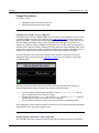
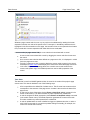
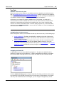
Altova MobileTogether Designer
1
3
Altova MobileTogether Designer
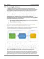
MobileTogether Designer is an entirely free-to-use product for Windows machines that
establishes your mobile solutions precisely the way you want them. With an easy-to-comprehend
approach, you employ drag-and-drop functionality to create elegant mobile solutions.
MobileTogether Designer comes equipped with a complete mobile simulator so that you can
instantly simulate your mobile solution in the designer. You can also run the mobile solution
directly on your mobile device to view your project in real-time.
MobileTogether Designer video demos
At the Altova website you can view video demos that show how to use MobileTogether Designer
to build a variety of MobileTogether solutions. These videos provide a fast introduction to the
powerful features of MobileTogether Designer.
This documentation
This documentation is the user manual of MobileTogether Designer. It is organized into the
following sections:
Introduction
Tutorials
The User Interface
The Project
Data Sources
© 2015 Altova Gmb H
Altova MobileTogether Designer
4
Altova MobileTogether Designer
Page Design
XPath/XQuery: Expressions, Functions, Variables
Databases
Altova Global Resources
Simulation
AppStore Apps
Menu Commands
Frequently Asked Questions
Appendices
Current version: 2.0
Last updated: 09 November 2015
Altova MobileTogether Designer
© 2015 Altova Gmb H
Chapter 2
New Features
6
New Features
2
New Features
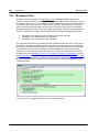
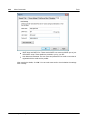
Features that are new in MobileTogether Designer version 2.0 are listed below. These are followed
by the new-features lists of previous versions.
Version 2.0
New features and updates in MobileTogether Designer Version 2.0 are listed below.
Designers can create their own MobileTogether custom apps that end users can
download to mobile devices. We call these apps AppStore Apps. The section AppStore
Apps describes how to generate the program code for such apps from MobileTogether
Designer. Code can be generated for Android, iOS, Windows (touch-enabled devices and
PCs), and Windows Phone. After the code has been generated, it can be compiled into
the corresponding AppStore App.
Solutions on mobile devices can be suspended (paused and minimized). A new project
property, On Switch to Other Solution, can be set to suspend the solution when the enduser switches to another solution. The end-user can switch back to the minimized
solution by clicking its icon in the Running tab of MobileTogether Client. Another way to
specify whether a solution is canceled or suspended is via the Solution Execution action.
A Signature Field control enables end-user signatures to be stored as images in a data
source node.
You can define and test actions to take when server connection errors occur.
Simulations have been enhanced to better emulate actions defined in the design. For
example, server connection errors are simulated by an option to prevent server access.
JSON data sources can be used as page sources.
Page data can be accessed and saved via REST requests. Such data can be used in
page sources, and can also be accessed or saved via page source actions.
REST requests support OAuth authorization. Each design has a pool of settings that can
be used anywhere in the document. The settings can be managed in the Maintain OAuth
Settings dialog. Furthermore, settings can be imported into the active document from
other open MobileTogether Designer documents.
Page data can be accessed and saved via SOAP requests. Such data can be used in
page sources and page source actions.
New actions: Execute SOAP Request, Execute REST Request.
The data retention option for page sources offers considerable flexibility about whether
data is stored on the client or server.
A page event, OnServerConnectionError, has been added.
Two dynamic, local variables have been added: MT_HTTPExecute_Result and
MT_ServerConnectionErrorLocation.
Commands to list all files, directories, and external data sources that are used in the
project.
Cells of Repeating Tables and Dynamic Tables are associated with page source nodes
via XPath expressions, and were previously read-only. The content of such cells are now
editable.
Version 1.5
Altova MobileTogether Designer
© 2015 Altova Gmb H
New Features
7
New features and updates in MobileTogether Designer Version 1.5 are listed below.
A Send Email To action enables emails to be sent during the execution of a solution.
The MobileTogether extension function mt-email-attachment creates text and image
attachments for emails that are sent with the Send Email To action.
Links can be placed in the body of emails that are sent as HTML. These links can target
Internet pages and MobileTogether solutions.
The control events and page events of a solution can trigger links that go to other
MobileTogether solutions. Furthermore, the URLs that point to the MobileTogether
solutions can contain URL query strings, which allow specific page contents to be
displayed. See Hyperlinking to Solutions.
Hyperlinks that target solutions pass their URL query parameters to the targeted solution.
These parameters can be stored in the $MT_InputParameters global variable, from where
they can be referenced.
Three link-related MobileTogether extension functions have been added: mt-runsolution-url, mt-run-solution-url-parameters, and mt-html-anchor.
A powerful Loop action enables reiteration over a set of nodes, and thereby provides more
design possibilities and solution functionality.
Two other actions have been introduced: Hide Keyboard, and Update Display.
A new radio button control has been introduced.
The strings of a solution automatically appear in the language of a mobile device if the
solution has been localized in that language. In this release, the default and localization
strings can be exported/imported between the project and separate XML files for each
language. This enables individual translators to work independently of each other
translating the default-language strings into their different target languages. Each
translated XML file can be imported separately back into the project.
When entering the mt-load-string function in an XPath expression in the Edit XPath/
XQuery Expression dialog, all the custom strings defined in the project are displayed in a
popup. The value of the string in the simulation language currently selected in
MobileTogether Designer is also displayed.
A new function, mt-localized-string-name, returns the control name or string name of
the submitted (localized) string.
The button control has the new Button Look property that enables an icon to be added
as the button display from a predefined selection of icons.
The horizontal line control has the following new properties: Line Style, Margin Top,
Margin Bottom.
The width of all controls can be specified as a percentage of the page width (via the
control's ControlWidth property).
Click events have been differentiated according to how long the user clicks the control.
Taps on the control are On Click events, while longer presses are On Long Click
events. Click events are available for the following controls: Buttons, Charts, Images, and
Labels.
The Insert Node(s) and Append Node(s) actions have an option to remove the inserted/
appended node/s from their original locations in project data sources.
Keyboard shortcuts for adding actions to the definition of an event.
Each control in the design can have one or more class names assigned to it via its
Browser CSS Class property. Rules for class selectors can be defined in an external
CSS file, which must be deployed to the server. The reference to this external CSS file is
defined in the project's browser settings.
An external CSS file can be used to store additional CSS styles.
A new dialog for a project's browser settings collects the settings that define the behavior
of the browser in the client mobile device.
Custom fonts can be embedded in a design.
© 2015 Altova Gmb H
Altova MobileTogether Designer
8
New Features
Enhancements to the XPath/XQuery Expression dialog include interactive functions-andoperators information in popups, information about global variables and custom strings.
User-Defined XPath/XQuery Functions can be ordered in the ascending/descending/dialog
order of function names.
Updating server settings on client devices.
Version 1.4
New features and updates in MobileTogether Designer Version 1.4 are listed below.
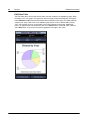
Support for geolocation retrieval and processing, which is a vital feature for transportationbased mobile solutions. Actions to track, read, and display geolocation data can be
defined for events. Additionally, Altova XPath extension functions for manipulating
geolocation data can be used in the design's XPath expressions. Geolocations can also
be set for designer and server simulations so that geolocation input can be tested in the
simulator.
Support for XQuery 3.1, which provides new features for using maps, arrays, data in the
JSON format, and more. You can use the Edit XPath/XQuery Expression Dialog to create
and check XQuery expressions.
String localization (translation into additional languages) enables translations of the
strings of a solution to be stored with a project. The language in which the solution runs is
automatically selected to be the same as that of the mobile device. You can test
localized solutions by running simulations in a specific language.
Specific headers can now be added to HTTP requests. This is in addition to parameters
that can be specified in the HTTP request.
Solutions can be chained to execute one after the other. The next solution to execute is
specified in an option of the Cancel Solution action. [The Cancel Solution action is
obsolete since v2.0; it is superseded by the Solution Execution action.]
Simulations have been enhanced for iOS7/8 rendering and for XML tree editing. Being
able to modify the XML tree in the simulator and see the resulting changes immediately in
the simulation speeds up testing.
The Project menu contains commands to show: (i) used global and page source
variables; (ii) used user-defined XPath/XQuery functions; (iii) used action groups; (iv) as
well as unused variables, functions, and action groups. This improves the maintenance
and development of large, complex solutions.
Altova MobileTogether Designer
© 2015 Altova Gmb H
Chapter 3
Introduction
10
Introduction
3
Introduction
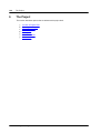
This section provides an overview of MobileTogether and MobileTogether Designer. It contains the
following sections:
MobileTogether Overview
Terminology Q&A
Design Steps
XPath in MobileTogether
Altova MobileTogether Designer
© 2015 Altova Gmb H
Introduction
3.1
MobileTogether Overview
11
MobileTogether Overview
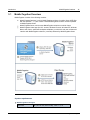
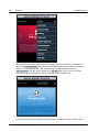
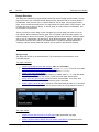
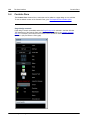
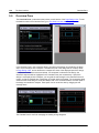
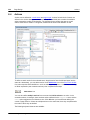
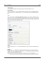
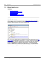
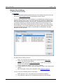
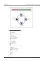
MobileTogether consists of the following modules:
MobileTogether Designer, in which MobileTogether solutions for mobile clients (MTD files
with the extension .mtd) are created. These MobileTogether solutions are then uploaded
to MobileTogether Server.
MobileTogether Server, which serves MobileTogether solutions to mobile clients.
MobileTogether Client apps (for iOS, Android, Windows Phone 8, Windows RT, Windows
Metro, web clients, web-based smartphones/tablets), on which the end user receives and
interacts with MobileTogether solutions (.mtd files) delivered by MobileTogether Server.
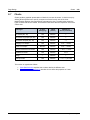
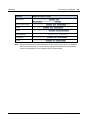
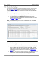
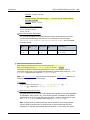
System requirements
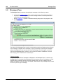
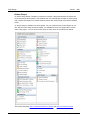
MobileTogether Designer
Windows
© 2015 Altova Gmb H
XP (SP2 for x64, SP3 for x86), Vista, 7, 8, 10
Altova MobileTogether Designer
12
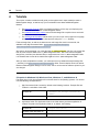
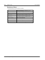
Introduction
Windows Server
MobileTogether Overview
2008 R2 or newer
MobileTogether Server
Windows
XP (SP2 for x64, SP3 for x86), Vista, 7, 8, 10
Windows Server
2008 R2 or newer
Linux
Mac OS X
CentOS 6 or newer
RedHat 6 or newer
Debian 6 or newer
Ubuntu 12.04 or newer
10.8 or newer
MobileTogether Client
iOS
6 and higher for Apple mobile devices
Android
4.0 and higher for Android mobile devices
Windows Mobile
Windows Phone 8 for Windows phones
Windows RT, Metro
Windows 8, 10; Windows RT for Windows touchenabled PCs and tablet computers
HTML
HTML browsers for any other mobile devices
Altova MobileTogether Designer
© 2015 Altova Gmb H
Introduction
3.2
Terminology Q&A
13
Terminology Q&A
How does the MobileTogether system work?
In MobileTogether Designer, you create MobileTogether Design files (MTD files), which
have the file extension .mtd.
These files are deployed to a MobileTogether Server, from where they are served to the
mobile client device as MobileTogether solutions.
The data files that are used to populate the design template/s in the MTD file may reside
at their original locations or can be deployed to MobileTogether Server together with the
MTD file.
On the mobile client, the end user can view reports presented in a format defined in the
MTD file. End users can also update data files from their mobile client devices (via
MobileTogether solutions).
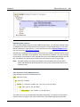
What's in an MTD file and in a MobileTogether project?
An MTD file is a native MobileTogether Designer document.
Each MTD file contains one MobileTogether project.
A MobileTogether project consists of one or more pages. A page is what the end user
sees on the mobile client device.
If there is more than one page in the MTD file, then these pages are connected to one
another in a simple sequence, with the first page leading to the next, and so on, till the
last page is reached. (The order can be changed by setting page actions when page or
control events are triggered.)
Sub-pages can also be defined, and these can be accessed from within main pages with
the GoToSubpage action.
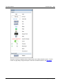
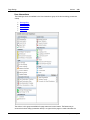
What does a page consist of?
A page consists of page controls (also called 'controls' for short), formatted for viewing on
the mobile client device and set up for user-interaction.
Each control has different properties. These properties define associated content,
formatting, and action/s to perform when an event of a control (control event, for short) is
triggered.
For each page, a set of data sources can be defined in the Page Sources Pane of that
page.
The content associated with a control can come from one (or more) of these data
sources. Such data is accessed using the XPath or XQuery language.
Via its controls, therefore, a page presents data to the end user and can accept
modifications to its data sources.
What are the different kinds of events and actions in a design?
© 2015 Altova Gmb H
Altova MobileTogether Designer
14
Introduction
Terminology Q&A
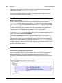
Control events and their actions: Each control on a page can have events that trigger
actions you can specify. For example, the combo box control has the OnFinishEditing
event, which occurs when an item from the dropdown list of the combo box is selected.
This event can be defined by you to trigger a desired action, such as changing data as a
result of the combo box selection.
Page events and their actions: The page itself (as a single entity) can be associated with
events that trigger actions. For example, OnPageLoad is a page event. This event can be
defined by you to trigger a desired action, such as loading data into the page from a
certain data file.
Altova MobileTogether Designer
© 2015 Altova Gmb H
Introduction
3.3
Design Steps
15
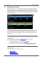
Design Steps
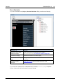
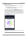
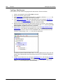
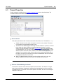
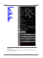
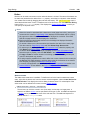
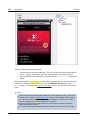
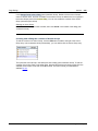
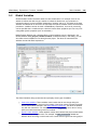
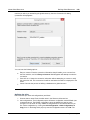
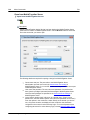
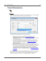
Given below is a broad outline, in steps, of how to create a MobileTogether Design file (MTD file).
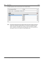
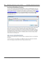
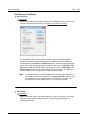
1.
Create a new MTD file
Each MTD file represents a project consisting of one or more pages in a simple
sequence. When a new MTD file is created, it has one default page that has no data
source. You can add data sources to the default page, and you can add more pages to
the project (see the points below). Create a new MTD file with the File | New
command. The file is created in memory and must be saved with the File | Save
command to store it on disk. Define Project Properties and specify other project-related
settings.
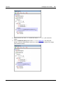
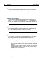
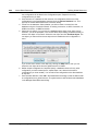
2.
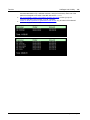
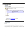
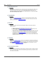
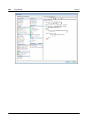
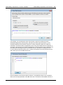
Add data sources for the page (page sources)
Each page is assigned data sources, from which it obtains the data that will be
displayed in the page. The data sources of a page are added via the Page Sources
Pane and are shown there as a tree of nodes. Data from these nodes is used by the
controls in the page design, for display, or for processing that leads to some kind of
data representation (such as charts or images). Nodes in data source trees are
addressed using XPath expressions. Client data input can also be saved back to the
data sources if desired. See the section Page Sources for details.
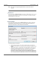
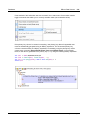
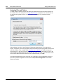
3.
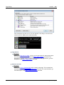
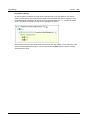
Add controls to the page, and define their properties and event-actions
Page controls are added to a page from the Controls Pane. Each control has a set of
properties (defined in the Styles & Properties Pane) and data (from the data source
trees) associated with it. A control can also have one or more predefined events. You
can specify the action/s to be performed when a control event is triggered. For
example, a button control has the event OnButtonClicked, and this event can have an
Open URL action associated with it. For more information, see the sections Events and
Actions. Additionally, pages also have events, and you can specify actions to perform
when a page event is triggered. For example, when a page is loaded (a page event), an
action can be specified that loads data from a specified XML file into a given page data
source.
4.
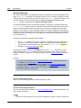
If required, add more pages to the project and design these
Additional pages can be added to the initial page. A new page can be added as a top
page or a sub page by clicking the Add Page icon in the Page Pane's toolbar. The
sequence of top pages in the Pages Pane determines the sequence of the workflow.
5.
Create a flow between top pages and sub pages
You can further structure the solution's workflow by using sub pages. These are
accessed from within top pages with the GoToSubpage action (of control or page
events). Other page-related actions provide for more movement between pages.
© 2015 Altova Gmb H
Altova MobileTogether Designer
16
Introduction
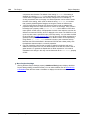
6.
Design Steps
Optionally, add additional design and user-related functionality to the project
After all the pages have been added and the structure of the workflow has been
finalized, you can revise your page designs and workflow. Any additional design
components or actions can be inserted in the project now.
7.
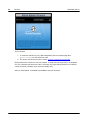
Run a simulation of the MobileTogether solution
You can test the design by running a workflow simulation within MobileTogether
Designer. The simulation shows (in MobileTogether Designer itself) how the workflow
will be executed on the client device. Select Project | Simulate Workflow or press F5
to start the simulation. The Messages Pane provides a detailed and step-by-step report
of workflow activity, enabling effective and easy debugging.
8.
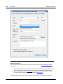
Deploy the MTD file to MobileTogether Server
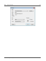
After making final changes and re-testing the file, save it, and then deploy it to
MobileTogether Server. The MobileTogether solution is now ready to be accessed by
mobile client devices.
9.
Optionally, create the solution as an AppStore App
You can create a MobileTogether custom app that end users can download to mobile
devices. We call these apps AppStore Apps. The section AppStore Apps describes
how to generate the program code for such apps from your MobileTogether Designer
project. Code can be generated for Android, iOS, Windows (touch-enabled devices and
PCs), and Windows Phone. After the code has been generated, it can be compiled into
the corresponding AppStore App.
Altova MobileTogether Designer
© 2015 Altova Gmb H
Introduction
3.4
XPath in MobileTogether
17
XPath in MobileTogether
The XPath language plays a crucial part in the design of MobileTogether solutions. XPath is used
to locate, access, manipulate, generate, and save data in the various data trees used in the
design and to define the functioning of different design components. Some important ways in
which XPath is used in a MobileTogether design are given below. This overview is intended to give
you a broad sense of the flexibility and power of XPath and of how XPath is used in
MobileTogether designs.
For more information about XPath, see the XPath 3.1 Recommendation of the W3C, which is the
latest version of the language available and is the version supported by MobileTogether Designer.
To get you started using a more learning-based approach, see the following:
Altova's A Gentle Introduction to XPath
Altova's XPath 3.0 Training
W3C's XPath Tutorial
Locator expressions
The locator expressions of the XPath language are used to locate nodes in XML trees. A locator
expression typically consists of a path that locates the required node. Here are some examples:
/Company/Office: Locates all Office child elements of the Company element, which is
the top-level document node. We know that the Company element is the top-level
element because it occurs directly under the root node, which is indicated by the first
forward slash.
/Company/Office[3]: Locates the third Office child element of the Company element.
/Company/Office[3]/@location: Locates the location attribute of the third Office
child element of the Company element.
//Office[@location='US']: Locates all Office elements that have a location
attribute having a value of US.
The list above shows just a few basic locator expressions. There are many more ways in which
locator expressions can be constructed.
Operators
Operators allow you to apply filters, build conditions, and manipulate selections and data. For
example, here are just two operators:
if (Selection='US') then //Office[@location='US'] else //
Office[@location!='US']: This if operator selects US or non-US offices depending
on the content of the Selection child element.
for $i in //Office return $i[@location='US']: This for operator returns all
Office elements that have a location attribute having a value of US.
© 2015 Altova Gmb H
Altova MobileTogether Designer
18
Introduction
XPath in MobileTogether
XPath functions
XPath functions enable the manipulation, calculation, and generation of data. For example, a
function can take a string as input (the function's argument), and convert into lowercase or even
remove a part of the string. The XPath functions that can be used in MobileTogether designs are of
the following types:
Built-in functions
The XPath language contains a large library of built-in functions which enable you to extract
data as well as metadata related to the XML tree, and even to generate data. For example:
count(Office): Returns the number of Office child elements.
day-from-date("2015-04-26"): Returns the number 28, which is the day part of
the function's date argument.
User guides and references for the built-in functions are widely available on the Internet. A full
list of the functions can be found in the XPath 3.1 Recommendation of the W3C.
Altova extension functions
This is a set of of XPath extension functions that Altova is developing to provide developers
with more functionality in XPath. There are currently some 60 extension functions, ranging
from functions that provide geolocation information to those that convert integers to
hexadecimal strings and vice-versa. For example:
format-geolocation(33.33, -22.22, 2) returns the xs:string "33.33N 22.22W"
hex-string-to-integer('1') returns 1
Altova extension functions are available for use in all MobileTogether designs. For usage
information, see the Altova Extension Functions section in the MobileTogether Designer user
manual.
MobileTogether extension functions
These are XPath extension functions developed by Altova for specific uses in MobileTogether
designs. For example:
mt-has-server-access(10) returns true if server access is possible within the
time in seconds that is specified as the argument of the function, false otherwise.
mt-load-string('MyCourier') returns the localized MyCourier string that is
stored in the solution's string pool. The language of the localization is selected
automatically according to the language of the mobile device.
MobileTogether extension functions are available for use in all MobileTogether designs. For
usage information, see the MobileTogether Extension Functions section in the
MobileTogether Designer user manual.
Altova MobileTogether Designer
© 2015 Altova Gmb H
Introduction
XPath in MobileTogether
19
User-defined extension functions
These are XPath extension functions that you, the user, can define in a design for some
special purpose you have in mind and for which no suitable function exists in the function
libraries listed above. For example, you might want to define a function to convert
temperatures between the Celsius and Fahrenheit scales. User-defined functions are defined
within a single MobileTogether project and are used in that specific project. How to define
such custom functions is described in the User-Defined XPath/XQuery Functions section of
the MobileTogether Designer user manual.
Global variables
Global variables contain information about the client mobile device. For example, there is one
variable to indicate the device's type, another to indicate its dimensions, and yet another to
indicate the device's current orientation (landscape or portrait), and so on. The values of all these
variables are obtained at run-time from the client device as part of standard mobile communication
procedures. Variables can then be used in XPath/XQuery expressions. As a result, processing
can be specified that is conditional upon a device's inherent static properties (such as size) or its
changeable dynamic properties (such as orientation).
MobileTogether's global variables are predefined and are listed in the section Global Variables
together with each variable's description and possible values. The example below of the MT_iPad
global variable (possible values: true() | false()) shows how global variables are called in
XPath expressions. The $ symbol is used to indicate that what follows is the name of a global
variable, which is the usual way to indicate variables in XPath.
if ( $MT_iPad=true() ) then "Apple" else ""
© 2015 Altova Gmb H
Altova MobileTogether Designer
Chapter 4
Tutorials
22
Tutorials
4
Tutorials
This section contains tutorials that will guide you through the basic steps needed to create a
MobileTogether design, as well as help you to understand more advanced MobileTogether
features.
The QuickStart Tutorials takes you through the basics, all the way up to deploying the
MTD file and associated files on MobileTogether Server.
The Database-And-Charts tutorial uses a finished design file to explain how to work with
databases and how to create charts.
The SubPages-And-Visibility tutorial shows you how to open a sub page from a top page,
and how to filter the display of a data structure using the Visible property.
Finished design files, as well as the data sources and image files used in the tutorials, are
available in the (My) Documents folder: Altova\MobileTogetherDesigner1
\MobileTogetherDesignerExamples\Tutorials.
We strongly recommend that you create the folder C:\MobileTogether and then copy all the files
that are in the Tutorials folder to the C:\MobileTogether folder. This is because the supplied
design files (.mtd files) use absolute URLs to target resources in the C:\MobileTogether folder.
It is therefore best to save all the tutorial files together in the C:\MobileTogether folder.
After you have completed the tutorials, you could open the more advanced example design files
(.mtd files) in the MobileTogetherDesignerExamples folder. These examples show how various
features of MobileTogether Designer can be used, and so can be used as reference points for your
own designs.
File paths in Windows XP, Windows Vista, Windows 7, and Windows 8
File paths given in this documentation will not be the same for all operating systems. You should
note the following correspondences:
(My) Documents folder: Located by default at the following locations. Example files are
located in a sub-folder of this folder.
Windows XP
C:\Documents and Settings\<username>\My
Documents
Windows Vista, Windows 7/8
C:\Users\<username>\Documents
Application folder: The Application folder is the folder where your Altova application is
located. The path to the Application folder is, by default, the following.
Windows XP
C:\Program Files\Altova\
Windows Vista, Windows 7/8
C:\Program Files\Altova\
32 bit Version on 64-bit OS
C:\Program Files (x86)\Altova\
Altova MobileTogether Designer
© 2015 Altova Gmb H
Tutorials
23
File URLs in example files
File URLs in example files might be absolute URLs. In such cases, they will probably not
correspond to the directory structures of your work environment. If you use the supplied
example files, make sure that file URLs in
them—and any XPath expressions that build such URLs—point to the correct file locations on
your machine or network.
© 2015 Altova Gmb H
Altova MobileTogether Designer
24
Tutorials
QuickStart (Part 1)
4.1
QuickStart (Part 1)
This QuickStart tutorial guides you through the basic steps of creating a MobileTogether design
for a MobileTogether solution. The solution displays the splash screen of an Altova product which
the end user selects in a combo box. The tutorial shows you how to set up a page, its data
source, how to add controls, and make the display of the splash screen conditional upon end-user
input. It also explains validation, how to deploy the design file to MobileTogether Server, and how
to run simulations. After you have finished with this QuickStart tutorial, you should have a good
understanding of the broad working principles of MobileTogether designs. You will then be ready
to tackle more complex designs.
This tutorial is organized into the following sections, each of which deals with one key aspect of
creating a MobileTogether design.
Create a New Design
Set Up a Page
Add a Page Data Source
Format the Design
Add a Control: Combo Box
Add a Control: Image
Define Control Actions
Validate the Project
Run a Simulation
Deploy to Server
The tutorial files
The files for this tutorial are located in your (My) Documents MobileTogether folder:
MobileTogetherDesignerExamples\Tutorials\. You can save the splash screen image files
that are used in the tutorial to any other location and use them from there if you like.
The file you will end with should be similar to: QuickStart01.mtd
The image files used in the tutorial are the *.bmp files in the folder
Altova MobileTogether Designer
© 2015 Altova Gmb H
Tutorials
QuickStart (Part 1)
25
Create a New Design
In this part, you will:
Create a new MobileTogether design
Save the design to file
Set up the design's preview properties: the preview device and magnification level
Familiarize yourself with the GUI of MobileTogether Designer
A MobileTogether design is created in an MTD (MobileTogether Design) file, which has the .mtd
extension and is native to MobileTogether Designer.
To create a new MobileTogether design, do the following:
1.
Click File | New. This opens a new design file in the main window of the GUI (figure
below). It will have a default page called New Page1.
2.
The new design will be in a tab called New Design1. Click File | Save, and save the file
with any name to any location you like. Make sure, however, that you save your design
file in the same folder as the splash screen images. (Since your design, when complete,
will show the splash screens of Altova products, you could, for example, call it
AltovaSplashScreens.mtd.) The new file name, which will have a .mtd extension,
replaces New Design1 in the file's tab. The file name also appears in the application's title
bar.
In the Main toolbar of MobileTogether Designer, you can select your preview device and
set the magnification of the design. Select the options you want. Since mobile devices
have different background colors and dimensions, selecting an appropriate preview device
3.
© 2015 Altova Gmb H
Altova MobileTogether Designer
26
Tutorials
4.
5.
QuickStart (Part 1)
will help you visualize your design better. You can change the preview device at any time
if you wish to visualize the design on another device. Note that these settings will also be
applied to simulations.
Familiarize yourself with the Main Window and its tabs, and with the different panes that
are located around the main window. The user interface is described in the section, The
User Interface.
Switch between the Page Design and DB Query tabs of the Main Window, and see how
the contents of the panes change.
Altova MobileTogether Designer
© 2015 Altova Gmb H
Tutorials
QuickStart (Part 1)
27
Set Up a Page
A MobileTogether design can consist of one or more pages. A page is what the end-user sees on
the mobile client device. If there are multiple pages in a design, the page sequence is defined by
their sequential order in the Pages Pane. Within a page, controls can be set to go to sub pages
(that typically contain reusable modules). In this part of the tutorial, in order to keep things simple,
we will create a project that has only one page. For more information about pages, see the
description of the Pages Pane.
We are building a design that has one page. In this part, you will:
Give the default page a name
Add a label control so as to display a title for the page
Format this label
Page name and the label control
Give the default page of the new design a name as follows:
1.
In the Pages Pane (screenshot below), double-click New Page1 and rename it to
SplashScreens.
2.
From the Controls Pane, drag and drop the Label control into the design. The control will
be placed at the top of the page. A red exclamation mark appears in the control when you
click anywhere outside the control. On hovering over the exclamation mark, a message is
displayed, warning that the label has no content.
The content of the label can be static or dynamic. If dynamic, the content can be taken
from an XPath expression or from a node in one of the page's data sources. (No data
source has been defined for the SplashScreens page as yet. This will be done in the next
part.) Enter static content by double-clicking the label and entering the text, Altova
Splash Screens, and then pressing Enter.
In the Table toolbar, click Center to center the text. Then click Text Color and/or
Background Color (also in the Table toolbar) if you wish to set these properties.
With the Label control selected, the label's properties are displayed in the Styles &
Properties Pane. If you like, modify any of the label's formatting properties available in this
pane, such as the margin-bottom property to create empty space below the label.
3.
4.
5.
© 2015 Altova Gmb H
Altova MobileTogether Designer
28
Tutorials
QuickStart (Part 1)
Add a Page Data Source
You have so far created a page and given it a title. In this part, you will:
Add an empty XML data source for this page
Since this data source has neither structure or content, create structure and content
directly in the Page Sources Pane
Set a default XPath context node
Buttons in this section
Add Source
A page can have one or more data sources from where data can be obtained. Data sources are
defined in the Page Sources Pane and can be specified to be read-only or editable. They can be
external sources, or can be created directly in the Page Sources Pane and contain static data.
The types of data sources that can be used are described in the section Data Sources. In this
tutorial, we will add one type of data source, an editable empty XML source, for which we will then
create a structure and content directly in the Page Sources Pane.
To add the data source for the page, do the following:
1.
Click the Add Source button in the toolbar of the Page Sources Pane to display the Add
Page Source dialog (screenshot below).
Altova MobileTogether Designer
© 2015 Altova Gmb H
Tutorials
QuickStart (Part 1)
2.
3.
29
Select New, empty XML, and click Next.
In the next screen, keep the default settings (XML, Editable, Data is copied to client,
Load data on first use), and click OK. (When a data source is created as editable, data in
it can be modified.) A root node called $XML1 is added to the Page Sources tree in the
Page Sources Pane (screenshot below).
© 2015 Altova Gmb H
Altova MobileTogether Designer
30
Tutorials
4.
5.
6.
QuickStart (Part 1)
Notice that the XML tree with the root node $XML1 is empty. Right-click $XML1 and select
Add Child | Element, then enter the element name, Products.
Add a child element to Products (by right-clicking it and selecting Add Child |
Element), and name the child element Product. If you wish to rename the elements,
double-click the element names and edit them.
Right-click the Product element, select Ensure exists on load (fixed value), then
enter xmlspy (see screenshot below). This will be the Product element's default content
when the page loads.
Notice that there is no default XML file assigned to $XML1. A default file would provide the
data that goes into the nodes of the data source's tree. The data provided by a default file
can be overridden by data that is manually entered in a tree node. In our case, there is a
single data node: $XML1/Products/Product, and it has the string xmlspy as its default
content. The XML data structure is:
<Products>
<Product>xmlspy</Product>
</Products>
Set a Page XPath Context Node
Each page has a Page XPath Context Node, which is used as the context node for relative XPath
expressions defined on that page. The Page XPath Context Node is indicated in the Page
Sources Pane with the label XPath Context (see screenshot below). Note that each page has its
own Page XPath Context Node.
We will change the Page XPath Context Node to the Products node. Do this by right-clicking
Products and selecting Set As Page XPath Context. The element Products will be set as the
Page XPath Context Node—this is indicated by the node being labeled XPath Context (see
screenshot below).
Altova MobileTogether Designer
© 2015 Altova Gmb H
Tutorials
QuickStart (Part 1)
Note:
31
If you wish, in your XPath expression, to reference a node in a data source tree other than
that of the Page XPath Context Node, use an absolute path to that node, starting with the
root node of that tree. For example: $XML2/SomeRootElement/SomeOtherElement.
© 2015 Altova Gmb H
Altova MobileTogether Designer
32
Tutorials
QuickStart (Part 1)
Format the Design
The design page now has a name (SplashScreens), a display title (Altova Splash Screens), and a
data source ($XML1). In this part, you will:
Add a Table control for presentation purposes
Add formatting: the horizontal line control, spacing, and color
Copy-paste controls to other parts of the design
Add a table
We will add a table for presentation purposes.
1.
2.
3.
From the Controls Pane, drag the Table control into the design and drop it below the
label.
In the New Table dialog that appears, specify that the table should have two static
columns and one static row, and then click OK. The table is created with a single row
and two columns.
From the Controls Pane, drag and drop the Label control into the left-hand cell, and give it
a static text value of Altova Product (see screenshot below, which shows the table
highlighted).
Add a horizontal line, spacing, and color
Add a horizontal line to separate the title from the table as follows:
1.
From the Controls Pane, drag and drop the Horizontal Line control between the title and
the table (see screenshot below; the horizontal line is dark blue).
2.
With the line selected in the design, in the Styles & Properties Pane, set the color and
width of the line.
Copy the line, by selecting it and pressing Ctrl+C, and paste it below the table (using
Ctrl+V). The line will be copied with all the properties that you defined for it.
You can change the background color of the label, the table, and individual table cells.
Try this by placing the cursor in the respective components, and selecting different
3.
4.
Altova MobileTogether Designer
© 2015 Altova Gmb H
Tutorials
QuickStart (Part 1)
5.
6.
33
background colors in the Styles & Properties Pane.
Select the label control and set Margin Top and Margin Bottom properties in the Styles
& Properties Pane.
Try copying different components to various parts of the design.
© 2015 Altova Gmb H
Altova MobileTogether Designer
34
Tutorials
QuickStart (Part 1)
Add a Control: Combo Box
We will add a combo box to the right-hand cell of the table you created in the previous section.
We will then define the properties of the combo box. A combo box needs two important property
definitions:
The combo box values: These values will populate the dropdown list of the combo box
and provide the options the user can choose (visible entries). Each visible entry will have
a corresponding XML value that will go into the associated XML node.
The associated XML node: This data source node is synced with the combo box
selection. It receives its value from the combo box selection. Its initial value determines
the initial combo box selection.
Buttons in this section
Additional Dialog
Add a combo box
Add the combo box and define its properties as follows:
1.
From the Controls Pane, drag and drop the Combo Box control into the right-hand cell of
the table (see screenshot below).
2.
Drag the Product node from the Page Sources Pane, and drop it on to the combo box.
This associates the Product node with the combo box, and creates what we call a
source node. When the end user selects an option from the combo box, the XML value
of the selected option will be passed to the Product node and will become the Product
node's content.
To define the dropdown list items of the combo box, select the combo box, and, in the
Styles & Properties Pane, click the Additional Dialog button of the Combo Box Entry
Values property. The Edit Combo Box dialog (screenshot below) appears.
3.
Altova MobileTogether Designer
© 2015 Altova Gmb H
Tutorials
QuickStart (Part 1)
4.
5.
35
Select Use list of values, and then Use different text and XML values. Enter values for the
visible entry (which is what will appear in the dropdown list of the combo box) and for the
corresponding XML value (which is what will be written into the Product node). When we
add the Image control, you will find out why we want the XML values lowercased. (Hint:
The image names are lowercased, for example, xmlspy.bmp.) You can add up to nine
Altova products to this list in any order you like: XMLSpy, Authentic, StyleVision,
MapForce, DiffDog, DatabaseSpy, MobileTogether, SchemaAgent, UModel.
Select the Sort values check box at the bottom of the dialog to sort the list when it is
displayed, and click OK to finish.
When the completed solution is executed or a simulation of the completed project is run, the
dropdown list of the combo box (screenshot below) will display the values listed in the Visible
Entry column definitions (see screenshot above).
© 2015 Altova Gmb H
Altova MobileTogether Designer
36
Tutorials
QuickStart (Part 1)
The objective of our project is this: When the end user selects an entry from the dropdown list, the
XML value corresponding to that entry (see screenshot of the combo box definition above) will be
passed to the Product node of the data source. Note that the default content of Product is
xmlspy (defined when the node was created). We can then use the value in the Product node to
build the URL of the splash screen image to display. We will do this in the next part of the
tutorial, Add a Control: Image.
Altova MobileTogether Designer
© 2015 Altova Gmb H
Tutorials
QuickStart (Part 1)
37
Add a Control: Image
We will now add an image to the design. This image will be the splash screen of the Altova
product that the end user selects in the combo box (see previous section). The most important
property of an image is the Image URL property, which selects the image to display. The URL we
will build is a relative URL that looks for the image file in the same folder as the design file. You
could, of course, use an absolute file URL or an image at an Internet location.
In this part, you will:
Add an image control
Define the Image URL property using an XPath expression that allows the URL to change
dynamically with the combo box selection. The images referred to in this tutorial are
located in the folder, MobileTogetherDesignerExamples\Tutorials, located in your
(My) Documents folder. If you like you can save the images to another folder.
Buttons in this section
XPath
Add an image
Add the image and define its properties as follows:
1.
2.
3.
4.
From the Controls Pane, drag and drop the Image control below the table.
In the Styles & Properties Pane, name the image by setting its Name property to Image:
SplashScreen.
Select the Image Source property, and click the XPath button in the toolbar of the
Styles & Properties Pane. This displays the Edit XPath/XQuery Expression dialog.
Enter the XPath expression: concat(Product, '.bmp'), and click OK.
This XPath expression produces a relative URL that locates a .bmp file in the same folder as the
design file. You should specify the location that is correct for you, that is, the location where the
image files have been saved. If you need to, you can use an absolute URL (see example below).
The filename (for example, xmlspy) is obtained from the Product node, which in turn gets its
content from the selection that the end user makes in the combo box. The default value of the
Product node was set to xmlspy, so the XPath expression and starting image URL will be as
below:
concat(Product, '.bmp')
This XPath expression:
Produces this absolute URL: xmlspy.bmp
© 2015 Altova Gmb H
Altova MobileTogether Designer
38
Tutorials
QuickStart (Part 1)
When the end user selects a product from the dropdown list of the combo box (see screenshot
above), say MobileTogether, the splash screen of MobileTogether will be displayed (screenshot
below). This is because the XML value corresponding to the MobileTogether selection is
mobiletogether. This XML value is passed to the Product node, and it is used in the XPath
expression to dynamically build the relative image URL: mobiletogether.bmp.
To ensure that the image is reloaded whenever a combo box selection is made, a Reload action
Altova MobileTogether Designer
© 2015 Altova Gmb H
Tutorials
QuickStart (Part 1)
39
must be set on the combo box. How to do this is described in the next section, Define Control
Actions.
© 2015 Altova Gmb H
Altova MobileTogether Designer
40
Tutorials
QuickStart (Part 1)
Define Control Actions
Control actions define what action a control takes in response to an event such as a button click
or combo box selection. Actions that can be taken include: updating data nodes, reloading or
saving page sources, or executing database commands.
In this part, you will:
Look at all the page actions and control actions defined for the page
Add a combo box action that updates the image whenever the combo box is edited
Overview of page actions
To go to an overview of all actions of the SplashScreens page, click Page | Actions Overview.
The Page Actions Overview dialog (screenshot below) appears. It displays all the events and their
actions as currently defined for the page. The display includes page events and control events,
and their respective actions. The SplashScreens element in the screenshot below refers to the
page; all the other elements are the different controls of the page design. You can see that there
is currently no action defined for any event.
Define the Reload action on the combo box control
Defining a control action consists of two parts: (i) selecting the control event that triggers the
action; and (ii) specifying the action to perform when the event occurs. In our example, we want to
do the following: When the end user makes a combo box selection, the image must be reloaded.
This is because we want the image URL to be re-evaluated with the new value of the Product
node (selected in the combo box). So, when combo box editing is finished, we want the Reload
action to reload the image. Define this combo box event-and-action as follows.
Altova MobileTogether Designer
© 2015 Altova Gmb H
Tutorials
QuickStart (Part 1)
1.
Right-click the XML:Product combo box and select Control Actions on
OnFinishEditing. This opens the Control Actions dialog for the combo box (screenshot
below). There is only one combo box event: OnFinishEditing (see the right-hand-side
pane). If additional events were available they would be shown as additional tabs of the
right-hand pane. All the available actions for events are listed, in groups, in the left-handside pane.
2.
Drag the Reload action from the Page Sources group and drop it in the OnFinishEditing
tab (screenshot below). This specifies that a reload action must be carried out when the
combo box has been edited.
Click the drop-down arrow (next to $XML1), select Image: SplashScreen, and click OK.
This specifies that the image control will be updated when the combo box value is
changed.
3.
41
If you now check the Page Actions Overview dialog, you will see that a Reloads Image action is
defined for the combo box's OnFinishEditing event.
© 2015 Altova Gmb H
Altova MobileTogether Designer
42
Tutorials
Altova MobileTogether Designer
QuickStart (Part 1)
© 2015 Altova Gmb H
Tutorials
QuickStart (Part 1)
43
Validate the Project
Now that the design of the page is complete, you should validate the project (Project | Validate)
to check for errors. On validating, you will get a message saying that there are no errors or
warnings.
Warnings indicate design issues that might need your attention, but these issues are not
fatal and will not prevent the solution from running.
An error message, on the other hand—as opposed to a warning—would be fatal and
should be remedied.
Note:
A number of messages in the Messages window can be expanded to reveal more detail,
and often contain clickable links that provide more information.
© 2015 Altova Gmb H
Altova MobileTogether Designer
44
Tutorials
QuickStart (Part 1)
Run a Simulation
You can run a simulation of the project workflow directly within MobileTogether Designer. The
simulation device will be the device currently selected in the preview device combo box of the
Main toolbar. You can change the preview device to see the simulation on different devices. To run
the simulation, select Project | Simulate Workflow or F5. This opens the simulator and starts
the simulation.
The XMLSpy splash screen is displayed because the default value of Product was set to xmlspy.
You can see this in the XML Data pane on the right if you expand the $XML1 node (screenshot
below).
Now, in the simulation, click the combo box to display its dropdown list (screenshot below).
Altova MobileTogether Designer
© 2015 Altova Gmb H
Tutorials
QuickStart (Part 1)
45
Select a product from the list and notice how the image and value of the Product node changes.
(Note that, for iOS devices, you will need to press Set to confirm selections.)
After you have finished, click Close or press Esc to close the simulator.
© 2015 Altova Gmb H
Altova MobileTogether Designer
46
Tutorials
QuickStart (Part 1)
Running a server simulation
A server simulation uses MobileTogether Server to run the simulation (Project | Use Server for
Workflow Simulation). In the Web UI of MobileTogether Server, you must set the solution's
working directory (Settings | Server Side Solution's Working Directory, see screenshot
below). All relative paths in the design will be resolved relative to the directory specified in this
setting. In order for server simulation to work correctly, enter the path of the directory where your
referenced files are saved. The directory setting shown in the screenshot (C:\MobileTogether\)
means that both the design and image files must be in the folder C:\MobileTogether\ (since the
relative image URLs in the design indicate that the image files are to be found in the same
directory as the design).
Altova MobileTogether Designer
© 2015 Altova Gmb H
Tutorials
QuickStart (Part 1)
47
Deploy to Server
After you have successfully validated the project and tested the simulations, you are ready to
deploy the project to MobileTogether Server. When the project is deployed to the server, it
becomes a solution that a MobileTogether Client app can run. For more information about
deploying the project and files, see the sections Deploying the Project and Location of Project
Files.
In order to deploy the project to MobileTogether Server, you will need to access the server as a
user having the privilege, Save Work flow from Designer. The access rights of users of
MobileTogether Server are defined in the Web UI of MobileTogether Server. See the
MobileTogether Server user manual for information about setting user privileges.
Deploying the project to MobileTogether Server
Deploy the project and its associated (image) files to MobileTogether Server as follows:
1.
In the Files Pane (screenshot below), right-click Image Files, and, in the context menu
that appears, select Add File.
2.
3.
4.
Browse for the image file and add it to the Image Files list.
Repeat Steps 1 and 2 for all the image files that are required.
Select File | Deploy to MobileTogether Server. This displays the Deploy to
MobileTogether dialog (screenshot below).
© 2015 Altova Gmb H
Altova MobileTogether Designer
48
Tutorials
5.
6.
7.
8.
QuickStart (Part 1)
Enter the MobileTogether Server address and administrator port (default HTTP port is
8085, HTTPS is 8086).
Enter the user name and password with which you want to access MobileTogether
Server. Note that this user must have the Save Work flow from Designer privilege in order
for deployment to be successful. See the MobileTogether Server user manual for
information about user privileges.
In the Deploy As | Path field, enter the name under which you wish to deploy this solution
on the server. For example, in the screenshot above, the solution will be saved in the /
public container and will have the name QuickStart01. On MobileTogether Server, you
will see only the one entry: QuickStart01. The image files will be contained in this entity
and will not be visible as separate files.
Click OK when done. The project and the files selected for deployment are now deployed
to MobileTogether Server as the workflow, QuickStart01.
That's it!
Altova MobileTogether Designer
© 2015 Altova Gmb H
Tutorials
© 2015 Altova Gmb H
QuickStart (Part 1)
49
Altova MobileTogether Designer
50
Tutorials
QuickStart (Part 2)
4.2
QuickStart (Part 2)
The second part of this QuickStart tutorial continues where Part 1 left off. It focuses on using an
external XML file as its data source. You will learn how to generate a dynamic dropdown list for
the combo box from the data in the XML file, how to create dynamic links to website pages, and
how to save data back to the XML file.
This tutorial is organized into the following sections, each of which deals with one key aspect of
creating a MobileTogether design.
Load Data from a File
Change Source Node
Run a Simulation
Use File Data for Combo Box Entries
Set Data File as Default File
Create Dynamic Links to Web Pages
Save Data Back to File
The tutorial files
The files for this tutorial are located in your (My) Documents MobileTogether folder:
MobileTogetherDesignerExamples\Tutorials\. The Tutorials folder also contains the splash
screen images referred to in the tutorial. You can save these images and the XML file to any other
location and use them from there if you like.
The file to start with is the file you created in Part 1. Alternatively, you can use the
supplied design file, QuickStart01.mtd
The file you will end with should be similar to QuickStart02.mtd
The XML data file is AltovaProducts.xml
The image files are: *.bmp
Altova MobileTogether Designer
© 2015 Altova Gmb H
Tutorials
QuickStart (Part 2)
51
Load Data from a File
In this part, you will:
Specify that the data for the solution be taken from an XML file when the solution page is
loaded. The file, located in the Tutorials folder, is called AltovaProducts.xml and its
listing is given below. It has a similar structure to the data source created in Part 1, with
the only difference being that there is one new element: Selection.
Modify the tree structure of the data source to match the different structure of the XML
data file.
Listing of the XML file, AltovaProducts.xml
Located in the MobileTogether folder of the (My) Documents folder:
MobileTogetherDesignerExamples\Tutorials\AltovaProducts.xml.
<?xml version="1.0" encoding="UTF-8"?>
<Products>
<Selection></Selection>
<Product>XMLSpy</Product>
<Product>MapForce</Product>
<Product>StyleVision</Product>
<Product>MobileTogether</Product>
<Product>DatabaseSpy</Product>
<Product>DiffDog</Product>
<Product>SchemaAgent</Product>
<Product>UModel</Product>
<Product>Authentic</Product>
</Products>
Specify data file to use on page load
To specify that data for the page data source be taken from an XML file, do the following:
1.
2.
Open QuickStart01.mtd, which is located in the MobileTogether folder of the (My)
Documents folder: MobileTogetherDesignerExamples\Tutorials\.
Click Page | Page Actions. This displays the Page Actions dialog (screenshot below).
© 2015 Altova Gmb H
Altova MobileTogether Designer
52
Tutorials
3.
4.
5.
6.
7.
QuickStart (Part 2)
Drag and drop the Load/Save File action into the tab of the OnPageLoad event.
Make sure that the Load from File option is selected (see screenshot below).
Click the Additional Dialog button of the Source entry. This displays the Specify File
dialog.
Select Absolute/Relative Path and browse for the file, AltovaProducts.xml.
You will be asked whether you want to deploy this file together with the design file to
MobileTogether Server. Click Yes. The file will be set as the data file to load for the data
source $XML1 when the page is loaded (screenshot below).
Altova MobileTogether Designer
© 2015 Altova Gmb H
Tutorials
QuickStart (Part 2)
8.
53
Click OK to finish.
Modify the data structure of the page source
The XML data file has an extra Selection element. So, in order for the XML tree to hold the data
from this element, we will now add a Selection element to the XML tree of the data source in
the Page Sources Pane (see screenshot below and listing above). Add the Selection element to
the tree by right-clicking either Products or Product and selecting, respectively, Add Child or
Append, and then Element. Rename the element to Selection by double-clicking the element
and then editing the name.
© 2015 Altova Gmb H
Altova MobileTogether Designer
54
Tutorials
QuickStart (Part 2)
We will not add any default value for Selection. This is because, when the page is loaded, we
want the data for the page to come from the file AltovaProducts.xml. It was the action we
defined for the OnPageLoad event of this page (see above). If we were to set a default value for
Selection, then this default value would override the value obtained from the Selection node in
AltovaProducts.xml. So with no default values assigned in the Page Sources Pane, when the
page is loaded, the Selection node will be empty. This is because the Selection node in
AltovaProducts.xml is empty (see the file listing above). We will test this in simulations later in
the tutorial.
Altova MobileTogether Designer
© 2015 Altova Gmb H
Tutorials
QuickStart (Part 2)
55
Change Source Node
In this part, you will:
Change the source node of the combo box
Save the XPath expression of the image
Change source node of the combo box
Each page control can have a source node, which is a node in one of the data sources. The link
is made by dragging the data source node from the Page Sources Pane onto the control in the
design. Essentially, a source node transfers data from the XML node to the control. But how the
data in the XML node relates exactly to the control depends on the type of control it is. For
example: A combo box selection updates its page source link—an XML node—and that value is
reflected in the combo box display, whereas the source node of an image provides the URL of the
image. When you hover over a control, the popup indicates how the source node will be used, for
example, as an XML node to edit (for combo boxes), or as a data originator (for images).
We will change the source node of the combo box, from Product to Selection. Do this by
dragging the Selection node from the Page Sources Pane onto the combo box control (see
screenshot below).
We do this because we want to put the end user's combo box selection in the Selection
element rather than the Product element. The reasons for wanting this are:
There are multiple sibling Product elements in the file AltovaProducts.xml, each of
which contains data we do not want to change.
If the source node were Product, only the first Product element (Product[1]) would be
updated with the combo box selection. This is undesirable.
The best solution would be to store the end user selection in a separate element.
After changing the source node from Product to Selection, the combo box selection will update
the Selection node—and not the Product node.
Change XPath expression of the image URL
Since the XML value of the combo box selection goes into the Selection node, this node must
© 2015 Altova Gmb H
Altova MobileTogether Designer
56
Tutorials
QuickStart (Part 2)
be used in the XPath expression that constructs the image URL. In the design, select the image,
and click the XPath button of the Image URL property (in the Styles & Properties Pane). In the
Edit XPath/XQuery Expression Dialog that appears, modify the XPath expression so that Product
is replaced by Selection. For example:
If you have:
concat(Product, '.bmp')
Change it to:
concat(Selection, '.bmp')
This XPath expression uses the end user's combo box selection (now stored in the Selection
node) to generate the image file name. Since the image file and design file are in the same folder,
the file name generated by the XPath expression is also the relative path to the image file from the
location of the design file.
Altova MobileTogether Designer
© 2015 Altova Gmb H
Tutorials
QuickStart (Part 2)
57
Run a Simulation
If you run a simulation now (Project | Simulate Workflow or F5), you will see the following:
What you see
Reason
Selection node in XML
Data tree is empty
Value comes from the empty Selection node in
AltovaProducts.xml, the file that is loaded on page open
Combo box is empty
Because the Selection node is empty
Dropdown list has empty
entry
Empty entry added as a result of current combo box selection
(=empty)
No splash screen is
displayed
Image URL is built using the empty Selection node
If you now select a product from the dropdown list (for example, MobileTogether), the splash
screen of that product will be displayed (screenshot below).
© 2015 Altova Gmb H
Altova MobileTogether Designer
58
Tutorials
QuickStart (Part 2)
This is because:
1.
2.
A combo box selection (of, say, MobileTogether) puts the corresponding value
(mobiletogether) into the Selection node.
The value in the Selection node is used to correctly construct the image URL.
Notice also that the combo box, from now onwards, no longer has the empty entry in its dropdown
list. This is because the Selection node is not empty any longer and because the list of defined
combo box entries, therefore, does not have an empty entry.
After you have finished, click Close or press Esc to close the simulator.
Altova MobileTogether Designer
© 2015 Altova Gmb H
Tutorials
QuickStart (Part 2)
59
Use File Data for Combo Box Entries
In this part, you will:
Use the data tree structure to generate the combo box entries
Run a simulation to test the effect of the change
Listing of the XML file, AltovaProducts.xml
Located in MobileTogether folder of (My) Documents folder:
MobileTogetherDesignerExamples\Tutorials\AltovaProducts.xml.
<?xml version="1.0" encoding="UTF-8"?>
<Products>
<Selection></Selection>
<Product>XMLSpy</Product>
<Product>MapForce</Product>
<Product>StyleVision</Product>
<Product>MobileTogether</Product>
<Product>DatabaseSpy</Product>
<Product>DiffDog</Product>
<Product>SchemaAgent</Product>
<Product>UModel</Product>
<Product>Authentic</Product>
</Products>
Edit the combo box entries
Edit the combo box entries as follows:
1.
Select the combo box, and, in the Styles & Properties Pane, click the Additional Dialog
button of the Combo Box Entry Values property. The Edit Combo Box dialog
(screenshot below) appears.
© 2015 Altova Gmb H
Altova MobileTogether Designer
60
Tutorials
2.
3.
4.
5.
QuickStart (Part 2)
Select Use XPath expression, and then Use different XPath for XML Values and Visible
Entries.
Enter the XPath expressions for Visible Entries and XML Values as shown in the
screenshot above.
Select the Sort values check box at the bottom of the dialog to sort the list when it is
displayed.
Click OK to finish.
Remember that the Products node was defined as the default XPath context node for this page.
The XPath for expression iterates over the Product child nodes of Products (the context node)
and returns a sequence of all the unique distinct values, alphabetically sorted. In the case of the
XML Values sequence, the values are transformed to lowercase before being filtered for
uniqueness. These two sequences are the entries of the dropdown list (Visible Entries) and their
corresponding XML values (XML Values). The advantage of using the data tree structure to build
the combo box entries and a data source file to load data is that combo box entries are generated
dynamically from the data source file; they are not hard-coded as items of a list in the design.
Consequently, if a new product is added to the XML file, it will automatically appear as an entry in
the dropdown list.
Run a simulation
When you run a simulation, it will run in exactly the same way as when the combo box entries
were defined as a list (see the previous section, Run a Simulation). The only difference will be that
the entries of the dropdown list will be the values of the Product elements in
AltovaProducts.xml (see listing above). When an entry from the dropdown list is selected, the
corresponding (lowercase) XML value will be entered in the Selection node, and the image URL
will be correctly evaluated.
Change data in the data source file
Altova MobileTogether Designer
© 2015 Altova Gmb H
Tutorials
QuickStart (Part 2)
61
Make the following two changes in the data source file, AltovaProducts.xml (listing above):
Add a lowercase product name to the Selection node as shown in the listing below
Remove a few Product elements from the file, or add some Product elements to the file,
and change the order of the Product elements. In the Edit Combo Box dialog (see
above), also test the effect of selecting/deselecting the Sort values check box.
<?xml version="1.0" encoding="UTF-8"?>
<Products>
<Selection>databasespy</Selection>
<Product>XMLSpy</Product>
...
...
<Product>DatabaseSpy</Product>
</Products>
After making these changes, save the file and run a simulation. The initial splash screen will be
that of the product in the Selection node. Also, the dropdown list of the combo box will not have
any empty entry, and the number of entries in the dropdown list will be equal to the number of
unique Product elements in the XML file.
© 2015 Altova Gmb H
Altova MobileTogether Designer
62
Tutorials
QuickStart (Part 2)
Set Data File as Default File
In this part, you will:
Specify a default file for the page data source
Run a simulation
Buttons in this section
Additional Dialog
Specify a default file for the page data source
The data that goes into a data source can be specified by selecting a default file for the data
source. Do this as follows:
1.
Click the Additional Dialog button of the $XML1 default file (screenshot below).
2.
Select Absolute/Relative Path, check the Mak e path relative to design file check box,
and browse for the file AltovaProducts.xml.
Altova MobileTogether Designer
© 2015 Altova Gmb H
Tutorials
QuickStart (Part 2)
3.
4.
5.
6.
63
On clicking OK, the file will be added as the default file, and its data will populate the data
source tree.
Click Page | Page Actions to open the Page Actions dialog.
In the OnPageLoad tab, select the Load from File entry and delete it. This is because the
Load from File action is now redundant since the file AltovaProducts.xml has been
specified as the default file of the page's only data source.
Run a simulation to test whether the default file is being used.
© 2015 Altova Gmb H
Altova MobileTogether Designer
64
Tutorials
QuickStart (Part 2)
Create Dynamic Links to Web Pages
In this part, you will:
Add a button that links dynamically to a web page (using an XPath expression)
Run a simulation
Add a button that links to a web page
We will now add a button that links to the product description page of the product selected in the
combo box. Do this as follows:
1.
2.
3.
4.
5.
Drag the button control from the Controls Pane and drop it below the image (see the
simulator screenshot below).
Enter the text Go to Product Description.
Right-click the button and select Control Actions for OnButtonClicked.
In the Actions dialog that appears (screenshot below), drag the Open URL action into the
OnButtonClicked tab and drop it below the OnClick and OnLongClick events as shown
in the screenshot below. Since there is no action specified for either type of click, the
Open URL action is performed as the next (additional) action to perform after any of the
two events is triggered.
Click the XPath button, and, in the Edit XPath/XQuery Expression dialog that appears,
enter the XPath expression: concat('http://www.altova.com/', Selection,
'.html')
Altova MobileTogether Designer
© 2015 Altova Gmb H
Tutorials
QuickStart (Part 2)
6.
65
Click OK to finish, and save the file.
Run a simulation
Run a simulation by clicking F5 or Project | Simulate Workflow. When the simulation starts,
select a product in the combo box and then click the Go to Product Description button (see
screenshot below). This will take you to the product description page on the Altova website.
© 2015 Altova Gmb H
Altova MobileTogether Designer
66
Tutorials
QuickStart (Part 2)
Save Data Back to File
In this part, you will:
Save changed data back to file using a control action
Run a simulation to test the success of the Save to File action
Save data to file after editing combo box
You can specify that a change made by editing the combo box is saved back to file. Since the
source node of the combo box is the Selection element, the combo box selection will be saved
to this element. To specify that the change is saved back to the Selection element in the default
file, we will add the Save action to the OnFinishEditing event of the combo box. Do this as
follows:
1.
2.
3.
4.
5.
Right-click the combo box and select Control Actions for OnFinishEditing from the
context menu.
This displays the Control Actions dialog for the combo box, which already has the Reload
action that targets the image.
Drag the Save action below the Reload action, and drop (see screenshot below).
Click OK to finish, and then save the file.
To test whether the change is saved to the default file, open the default file in an editor,
run a simulation, select a combo box entry, and then reload the default file in the editor.
The new combo box selection will appear as content of the Selection element in the
Altova MobileTogether Designer
© 2015 Altova Gmb H
Tutorials
QuickStart (Part 2)
67
default file.
Note:
If you wish to save to some file other than the default file, use the Save to File action
(instead of the Save action). If you wish to save to a web page, use the Save to HTTP/
FTP action. (In this case, you will also need to provide the authentication details that
allow the user to modify the page at the HTTP URL.)
That's it!
© 2015 Altova Gmb H
Altova MobileTogether Designer
68
Tutorials
Database-And-Charts
4.3
Database-And-Charts
This Database-And-Charts tutorial (DBAndCharts.mtd) shows you how to work with databases
(DBs) and charts. It explains how to:
Set up DB tables as data sources so that DB table data can be displayed and edited
How to display DB data based on end user choices
How to create charts that are based on the DB data
The screenshot below shows the first page of the DBAndCharts.mtd solution. The end user can
select the office and year for which sales are to be displayed. These selections are made in
combo boxes at the top of the design. The total sales for that year are then displayed in the
Licenses column of the results table below the combo boxes. Whenever a new office or year is
selected in either of the combo box, the results table is automatically updated to reflect the new
selection. Additionally, a pie chart showing the sales, by year, for the selected office is displayed.
Each slice represents a year, with its sales volume and the percentage of all sales till now that
year represents. Whenever a new office is selected, a pie chart showing the statistics of that
particular office is displayed.
Below the chart are two buttons that each take you to a page in which the relevant DB table data
can be edited.
Altova MobileTogether Designer
© 2015 Altova Gmb H
Tutorials
Database-And-Charts
69
The tutorial files
The files for this tutorial are located in your (My) Documents MobileTogether folder:
MobileTogetherDesignerExamples\Tutorials\.
The design file is DBAndCharts.mtd. Open it and read the descriptions in the tutorial to
see how the design was built and how it works.
The MS Access database, OfficeSales_DB.mdb, contains the tables used as the data
sources of the design.
© 2015 Altova Gmb H
Altova MobileTogether Designer
70
Tutorials
Database-And-Charts
The Project Structure
Open DBAndCharts.mtd and validate it (Project | Validate) to check that the file correctly
connects to the Access DB, OfficeSales_DB.mdb. If there is a connection error, make sure you
correct this before proceeding. (See the section, Data Sources of the Main Page, for more
information.)
As shown in the Pages Pane (screenshot below), the project consists of three top pages:
DB Sales Main Page: This is the start page. It displays the DB data and has two buttons
that go, respectively, to the other two top pages.
Edit Offices Table: Is arrived at via a button click from the main page and enables editing
of the DB's Offices table.
Edit Sales Table: Is arrived at via a button click from the main page and enables editing of
the DB's Sales table.
When the solution runs, note that it is the first top page in the list above, DB Sales Main Page,
that is loaded in the client app.
Altova MobileTogether Designer
© 2015 Altova Gmb H
Tutorials
Database-And-Charts
71
The Main Page
The design of the DB Sales Main Page is show below. Its components are numbered in the
callouts and are described below.
© 2015 Altova Gmb H
Altova MobileTogether Designer
72
Tutorials
Database-And-Charts
All the components are controls that have been dragged from the Controls Pane and dropped into
the design. Each has then been assigned properties in the Styles & Properties Pane. For controls
Altova MobileTogether Designer
© 2015 Altova Gmb H
Tutorials
Database-And-Charts
73
that need to be associated with data from the data sources, the appropriate source node has
been assigned by dragging the data source node onto the control. The combo boxes and buttons
additionally have actions associated with their events. Actions are assigned in the Actions dialog
for the control, which is accessed by right-clicking the control and selecting the Control Actions
for... command.
1
A label control to display the title of the page; style properties applied
2
Combo boxes for end user selection of Office and Year. See detailed description
3
5
7
4
6
A horizontal line control as layout component; style properties applied
Table control with cells that contain DB data. See detailed description
9
8
Chart controls that display DB data in the form of charts. See detailed description
Button controls with OnButtonClicked actions that go to Edit Offices and Edit
Sales pages
The DB Sales Main Page has an action defined for its OnPageLoad event (Page | Page Actions)
that updates a data source node. This action is explained in the next section, Data Sources of the
Main Page.
© 2015 Altova Gmb H
Altova MobileTogether Designer
74
Tutorials
Database-And-Charts
Data Sources of the Main Page
The main page has three data sources: $XML1, $DB1, and $DB2. These are displayed and
managed in the Page Sources Pane (see screenshot below).
The XPath context node of the page is the root node $XML1. This means that all XPath
expressions on this page have $XML1 as their context node. To locate a node in any of the other
trees ($DB1 and $DB2, which are the root nodes of these trees) start the XPath locator path with
the respective root node.
The first data source: $XML1
This data source was created as an editable empty XML. The root node $XML1 contains a root
element (root), which has two attributes (DesiredOffice and DesiredYear). The root node,
$XML1, was set (via its context menu) as the XPath context node for the page two. No default file
is set, so no data is imported into the tree.
This data source ($XML1) has been created to hold the end user's combo box selections:
The DesiredOffice attribute holds the end user's Office selection
The DesiredYear attribute holds the end user's Year selection
In order to hold the data selected in the combo boxes, the two attribute nodes are associated with
the combo boxes as page source links. Each of the two page source links is made by dragging
the attribute node onto the respective comb box (see simulator screenshot below).
Altova MobileTogether Designer
© 2015 Altova Gmb H
Tutorials
Database-And-Charts
75
Each of the nodes has been given an initial value when the page loads (via the context menu
command Ensure Exists before Page Load (XPath Value)). This is because the value of the
node appears in the associated combo box, and we want the combo box to have an initial
selection (see simulator screenshot above). The XPath expressions that provide the initial values
are:
For @DesiredOffice: if (count($DB1/DB/RowSet/Row) > 0) then $DB1/DB/RowSet/
Row[1]/@id else ""
If there is one or more records in $DB1, sets the @id value of the first record as the value
of @DesiredOffice. If there is no record, sets the empty string as the value of
@DesiredOffice.
For @DesiredYear: min(distinct-values($DB2/DB/RowSet/Row[@Office=$XML1/
root/@DesiredOffice]/@Year))
In $DB2, selects all the records of the office selected in @DesiredOffice, collects the
unique years from these records, and then selects the year with the minimum numerical
value.
Additionally, we have specified that the @DesiredOffice node is correctly filled whenever the
main page loads. This is done with an Update Node action on the OnPageLoad event of the main
page (Page | Page Actions).
The action updates the @DesiredOffice node. If this is the first loading of the page, then the ID of
the first office is passed as the content of @DesiredOffice. Otherwise the value is what is
already present in @DesiredOffice. The result of this is that during an execution, the value in
@DesiredOffice is not changed, but the value is initialized whenever the page is loaded for the
first time.
© 2015 Altova Gmb H
Altova MobileTogether Designer
76
Tutorials
Database-And-Charts
The second data source: $DB1
The second data source ($DB1) is the Offices table in the MS Access database,
OfficeSales_DB.mdb. The data for this data tree comes from the DB's Office table.
The Offices table has two columns (id and City), which are represented in the data tree as
attributes of the Row element, which itself corresponds to a row in the DB table. Since the id
column is the primary key and values in it cannot be changed, we cannot edit this column.
However, we need to create id values for new rows. We automate this by writing an XQuery
expression to generate the id value for every new row that is created. The XQuery expression is
inserted by using the context menu command, Ensure Exists before Page Load (XPath
Value):
let $all := $DB1/DB/RowSet/Row/@id
let $ids := remove($all, index-of($all, ""))
let $id := if (empty($ids)) then 1 else max($ids) + 1
return $id
Note that the id value is the unique ID number of the office, whereas the City value is the name
of the city in which the office is. This is important because while it is the id that is used to
uniquely identify an office (via the $XML1/root/@DesiredOffice node), it is the name of the city
that we use to identify an office to the end user.
An OriginalRowSet node must be created (via the context menu) if any node in the data source
is to be edited. This is required so that OriginalRowSet holds the original data while RowSet
holds the current (edited) data. The two sets of data (original and edited) are required so that
MobileTogether Designer can tell the difference between what is new, updated, and deleted, and
can make the necessary changes at the right time. It is also required so that it can create new
primary keys with the XQuery let statement. When the database is updated, the updated data
becomes the new original data and is entered in the OriginalRowSet node.
The third data source: $DB2
The third data source ($DB2) is the Sales table in the MS Access database,
OfficeSales_DB1.mdb. The data for this data tree comes from the DB's Sales table.
Altova MobileTogether Designer
© 2015 Altova Gmb H
Tutorials
Database-And-Charts
77
Each row in the Sales table has five columns (id , Licenses, Month, Year, and Office). The DB
table row corresponds to the Row element in the data source tree. The table's columns correspond
to the attributes of the Row element. The id attribute has an XQuery expression to generate the id
value for every new row that is created. The XQuery expression is inserted by using the context
menu command, Ensure Exists before Page Load (XPath Value):
let $all := $DB1/DB/RowSet/Row/@id
let $ids := remove($all, index-of($all, ""))
let $id := if (empty($ids)) then 1 else max($ids) + 1
return $id
An OriginalRowSet node must be created (via the context menu) if any node in the data source
is to be edited. This is required so that OriginalRowSet holds the original data while RowSet
holds the current (edited) data.
© 2015 Altova Gmb H
Altova MobileTogether Designer
78
Tutorials
Database-And-Charts
The Combo Boxes
The two combo boxes at the top of the page are used to accept end user selections and to
display data based on these selections. The screenshot below shows the combo boxes when the
solution is run; the tabular report below the combo boxes is based on the combo box selections.
The next screenshot shows the combo boxes in the design. The combo boxes have been placed
in separate cells of a table for layout purposes.
The DesiredOffice combo box
The following settings have been made:
A source node link is made between the combo box and the $XML1/root/
@DesiredOffice node by dragging the node onto the combo box. This serves to pass the
combo box selection to the node and the value of the node to the combo box.
The items in the dropdown list of the combo box are defined in the Edit Combo Box dialog
(screenshot below), which is accessed via the Additional Dialog button of the Combo
Box Entry Values property (in the Styles & Properties Pane).
Altova MobileTogether Designer
© 2015 Altova Gmb H
Tutorials
Database-And-Charts
79
Notice that the values in the dropdown list are taken from the $DB1/DB/RowSet/Row/
@City node (that is, the names of the cities). But the value that goes into the $XML1/
root/@DesiredOffice node (because of the source node link) is taken from the $DB1/
DB/RowSet/Row/@id node. Since the Sort Values check box has been selected the
items of the dropdown list will be sorted.
An UpdateNode action has been set for the OnFinishEditing event. Right-click the
combo box and select Control Actions for OnFinishEditing to display the action
definition. The node to be updated is root/@DesiredYear. The update value is provided
by an XPath expression: min(distinct-values($DB2/DB/RowSet/Row[@Office=$XML1/
root/@DesiredOffice]/@Year)). This expression selects all the records of the office
selected in the combo box, then collects the unique years from these records, and finally
selects the year with the minimum numerical value.
So, when Vienna is selected in the first combo box (as in the screenshot above), all the
records in $DB2 with @Office='Vienna' were searched and a sequence of the unique
years in these records was created. The year with the minimum numerical value—in this
case 2010—is passed to the node to be updated—in this case $XML1/root/
@DesiredOffice. Since this node is the source node of the second combo box (the
@DesiredYear combo box), this combo box now displays the minimum year value—in
this case, 2010.
© 2015 Altova Gmb H
Altova MobileTogether Designer
80
Tutorials
Database-And-Charts
The DesiredYear combo box
The following settings have been made:
A source node link is made between the combo box and the $XML1/root/@DesiredYear
node by dragging the node onto the combo box. This serves to pass the combo box
selection to the node and the value of the node to the combo box.
The items in the dropdown list of the combo box are defined in the Edit Combo Box dialog
(screenshot below), which is accessed via the Additional Dialog button of the Combo
Box Entry Values property (in the Styles & Properties Pane).
Notice that both the values in the dropdown list as well as those that will be passed to the
XML node are the same. They are the sequence of all the unique years in which the
selected office has recorded sales. Since the Sort Values check box has been selected
the items of the dropdown list will be sorted.
Altova MobileTogether Designer
© 2015 Altova Gmb H
Tutorials
Database-And-Charts
81
The Tabular Report
The tabular report is displayed in the table below the two combo boxes. When the end user
selects the office and year for which a report is required, the tabular report displays the total sales
of that year (in terms of number of licenses). The screenshot below shows the page when the
solution is run.
The next screenshot shows the tabular report in the design. The table consists of two rows and
four columns, with the first column being used to provide padding. Each of the remaining six cells
contains a label with a text value that is either directly entered text or is calculated by an XPath
expression. See each label's Text property in the Styles & Properties Pane.
The XPath expressions are as follows:
DesiredOffice: Is taken from $DB1. It is the @City value of the Row with an @id equal to
the id value of the combo box selection.
$DB1/DB/RowSet/Row[@id=$XML1/root/@DesiredOffice]/@City
DesiredYear: Is taken from $XML1. It is the value of the @DesiredYear. The year is either
selected by the end user in the combo box, or is the minimum of all unique sales years
for that office.
$XML1/root/@DesiredYear
Licenses Sold: Is taken from $DB2. Sums up all @Licenses values of the Row elements
with @Office and @Year attributes equal to the values of the combo box selections. (Note
that the @Office values in $DB2 are the ID values of the offices, not their city names.)
sum($DB2/DB/RowSet/Row[@Office= $XML1/root/@DesiredOffice][@Year= $XML1/
root/@DesiredYear]/@Licenses)
© 2015 Altova Gmb H
Altova MobileTogether Designer
82
Tutorials
Database-And-Charts
The Charts
There are two charts in the design. The first chart shows the yearly breakdown of all sales of the
office selected in the combo box (see the simulator screenshot below).
XPath context node
The main chart definitions are what goes on the X and Y axes. Since these are determined by
XPath expressions it is important to correctly select the XPath context node for the chart. For the
context node, it is best to select the immediate parent of the nodeset that will be used for the X
and Y axes. Since we are going to use data from the Sales data table, we will use the $DB2 tree
for creating the chart (screenshot below). And since our nodeset for both axes will consist of the
Row element, we select RowSet as the XPath context node. We do this by dragging the RowSet
node onto the chart. The node is displayed bold, indicating that it is a source node.
Altova MobileTogether Designer
© 2015 Altova Gmb H
Tutorials
Database-And-Charts
83
Defining the chart axes
We are now ready to define the chart's axes. Open the chart's Chart Configuration dialog
(screenshot below) by either double-clicking the chart or clicking the Additional Dialog button of
the Chart Settings property (in the Styles & Properties Pane). Note that the chart type is a pie
chart.
© 2015 Altova Gmb H
Altova MobileTogether Designer
84
Tutorials
Database-And-Charts
For pie charts, we need two series (for the X and Y axes). The Flexible option is ideal for defining
the axes for two series. The For-each setting selects the current node (RowSet). We define the
following XPath expressions for the two axes:
X-Axis: Creates a sequence of the unique years during which the selected office recorded
sales.
for $i in distinct-values(Row[@Office=$XML1/root/@DesiredOffice]/@Year)
return $i
Y-Axis: For the selected office and for each of its unique years, sums up the sales
(stored in its @Licenses attribute)
for $i in distinct-values(Row[@Office=$XML1/root/@DesiredOffice]/@Year)
Altova MobileTogether Designer
© 2015 Altova Gmb H
Tutorials
Database-And-Charts
85
return sum(Row[@Office= $XML1/root/@DesiredOffice][@Year=$i]/@Licenses)
Additional definitions
Additionally, the following settings were made:
In the Chart Configuration dialog, click Dynamic XPath Settings and set the title using
an XPath expression. This enables the selected office to be displayed in the title.
In the Chart Configuration dialog, click All Settings. In the Change Appearance dialog
that appears, select Pie and select Add Value to Labels and Add Percent to Labels.
The second chart
The second chart is similar to the first, but is a 3D pie chart (screenshot below). It shows the
sales of each office over all years as a part of total sales over all years.
© 2015 Altova Gmb H
Altova MobileTogether Designer
86
Tutorials
Database-And-Charts
The XPath expressions are as follows:
X-Axis: Creates a sequence of the city names of offices (not IDs), with city names being
taken from $DB1.
for $i in distinct-values(Row/@Office) return $DB1/DB/RowSet/Row[@id=$i]/
@City
Y-Axis: For the selected office, sums up the sales (stored in its @Licenses attribute)
for $i in distinct-values(Row/@Office) return sum(Row[@Office=$i]/
@Licenses)
Altova MobileTogether Designer
© 2015 Altova Gmb H
Tutorials
Database-And-Charts
87
Edit Offices Table
The Edit Offices table has been created on a separate top page. When the solution runs, this
page is accessed from the main page (screenshot below left). Clicking the button Edit Offices
Table loads the Edit Offices table (screenshot below right). The Offices table has seven rows,
each of which has a non-editable ID column, an editable City column, and a Delete control (see
screenshot below right). Additionally, there is an Append Row control below the last row, a
Submit button in the Edit Offices Table bar, and a Back button to go back to the previous page
(the main page in this case).
© 2015 Altova Gmb H
Altova MobileTogether Designer
88
Tutorials
Database-And-Charts
In the design, the Edit buttons (first screenshot below) have both been assigned the Go to Page
action on their respective OnButtonClicked events (right-click the button and select Control
Actions for OnButtonClicked). These Go to Page actions (second screenshot below) load the
respective target pages.
Altova MobileTogether Designer
© 2015 Altova Gmb H
Tutorials
Database-And-Charts
89
Creating the editable Offices table
The Offices table in the DB has the structure displayed in the data tree of $DB1 (screenshot
below). Since the @id attribute is the primary key, it cannot be changed. This means that when a
new record is appended, the end user cannot enter an @id value via the solution. The @id value
must be generated automatically using an XQuery expression. The XQuery expression is inserted
by using the context menu command, Ensure Exists before Page Load (XPath Value):
let $all := $DB1/DB/RowSet/Row/@id
let $ids := remove($all, index-of($all, ""))
let $id := if (empty($ids)) then 1 else max($ids) + 1
return $id
In the design, we will do the following:
To...
How
Display all (Office) rows
Add a repeating table, with the Office row as the repeating
element
Include controls for deletion
and addition of rows
When adding the table, enable the automatic inclusion of Delete/
Append controls
Enable editing of @City
values
Add an Edit Field control that has a source node to @City
Save changes back to DB
Add a Save action to the page's OnSubmitButtonClicked event;
Also, right-click $DB1 and toggle on Create OriginalRowSet
Go back to the main page
Add a Go to Page action to the page's OnBackButtonClicked
event
Add a repeating table that has Append/Delete controls
On dragging the table control from the Controls Pane and dropping it in the design, the New
table dialog appears (screenshot below).
© 2015 Altova Gmb H
Altova MobileTogether Designer
90
Tutorials
Database-And-Charts
Specify that the table will be repeating, enter the number of columns (4) and rows (1),
select the Automatic Append/Delete Controls check box, and click OK. Labels are added to
the first three cells of the row, as shown in the screenshot below. A source node link to the
@id node of $DB1 is created for the second label (DB:id).
Enable editing of @City in $DB1
An edit field control is added to the fourth cell and a source node link to the @City node of
$DB1 is created for it (DB:City). We use an edit field control in this cell because we want the
end user to be able edit @City values; all the other cells have label controls.
Altova MobileTogether Designer
© 2015 Altova Gmb H
Tutorials
Database-And-Charts
91
Page actions: 'Save' and 'Go to page'
Click Page | Page Actions to open the Page Actions dialog (screenshot below).
Actions are defined for the following events:
OnSubmitButtonClicked: Saves all columns of the page to the DB ($DB1) and goes
back to the main page. You might also want to add the Reload action so that the
DB is reloaded with the unmodified data in case the record is not saved to the DB
(see screenshot above).
OnBackButtonClicked: Goes back to the main page.
The tree of the data source must also include an OriginalRowSet element, which is a copy
of the RowSet element. Original data is saved in the OriginalRowSet element, so that the
columns of the RowSet element can be edited. The OriginalRowSet element is updated with
the new value only when the data is saved back to the DB.
© 2015 Altova Gmb H
Altova MobileTogether Designer
92
Tutorials
Database-And-Charts
Edit Sales Table
The Edit Sales table, like the Edit Offices Table, has been created on a separate top page. When
the solution runs, this page is accessed from the main page (screenshot below left). Clicking the
button Edit Sales Table loads the Edit Sales table (screenshot below right). The Sales table has
multiple rows, each of which has a non-editable (sales item) ID column, editable Office, Month,
Year, and Licenses columns, and a Delete control (see screenshot below right). Additionally,
there is an Append Row control below the last row, a Submit button in the Edit Sales Table bar,
and a Back button to go back to the previous page (the main page in this case).
Altova MobileTogether Designer
© 2015 Altova Gmb H
Tutorials
Database-And-Charts
93
In the design, the Edit buttons (first screenshot below) have both been assigned the Go to Page
action on their respective OnButtonClicked events (right-click the button and select Control
Actions for OnButtonClicked). These Go to Page actions (second screenshot below) load the
respective target pages.
© 2015 Altova Gmb H
Altova MobileTogether Designer
94
Tutorials
Database-And-Charts
Creating the editable Sales table
The Sales table in the DB has the structure displayed in the data tree of $DB2 (screenshot below).
Since the @id attribute is the primary key, it cannot be changed. This means that when a new
record is appended, the end user cannot enter an @id value via the solution. The @id value must
be generated automatically using an XQuery expression. The XQuery expression is inserted by
using the context menu command, Ensure Exists before Page Load (XPath Value):
let $all := $DB2/DB/RowSet/Row/@id
let $ids := remove($all, index-of($all, ""))
let $id := if (empty($ids)) then 1 else max($ids) + 1
return $id
In the design, we will do the following:
To...
Do this...
Display all (Sales) rows
Add a repeating table, with the Sales row as the repeating
element
Altova MobileTogether Designer
© 2015 Altova Gmb H
Tutorials
Database-And-Charts
Include controls for deletion
and addition of rows
When adding the table, enable the automatic inclusion of
Delete/Append controls
Enable editing of editable
values
Add a combo box and edit field controls that have page source
links
Save changes back to DB
Add a Save action to the page's OnSubmitButtonClicked
event;
Also, right-click $DB2 and toggle on Create OriginalRowSet
Go back to the main page
Add a Go to Page action to the page's OnBackButtonClicked
event
95
Add a repeating table that has Append/Delete controls
On dragging the table control from the Controls Pane and dropping it in the design, the New
table dialog appears (screenshot below).
Specify that the table will be repeating, enter the number of columns (5) and rows (2),
select the Automatic Append/Delete Controls check box, and click OK. Labels are added for
headers to the cells of the first row. A label is added for the uneditable @id value to the first
cell of the second row. A source node link to the @id node of $DB2 is created on this label
(DB:id).
© 2015 Altova Gmb H
Altova MobileTogether Designer
96
Tutorials
Database-And-Charts
Enable editing of the editable nodes
A combo box is added for the office (with a source node link to @Office), and edit fields are
added for the month, year, and licenses cells, with page source links to the respective
nodes.
Page actions: 'Save' and 'Go to page'
Click Page | Page Actions to open the Page Actions dialog (screenshot below).
Actions are defined for the following events:
Altova MobileTogether Designer
© 2015 Altova Gmb H
Tutorials
Database-And-Charts
97
OnSubmitButtonClicked: Saves all columns of the page to the DB ($DB1) and goes
back to the main page. You might also want to add the Reload action so that the
DB is reloaded with the unmodified data in case the record is not saved to the DB
(see screenshot above).
OnBackButtonClicked: Goes back to the main page.
The tree of the data source must also include an OriginalRowSet element, which is a copy
of the RowSet element. Original data is saved in the OriginalRowSet element, so that the
columns of the RowSet element can be edited. The OriginalRowSet element is updated with
the new value only when the data is saved back to the DB.
© 2015 Altova Gmb H
Altova MobileTogether Designer
98
Tutorials
SubPages-And-Visibility
4.4
SubPages-And-Visibility
This tutorial shows you how to open a sub page from a top page, and how to filter the display of a
data structure using the Visible property. It also describes how to use dynamic tables, action
groups, the Update Node action, and decimals in XPath functions. The top page (first screenshot
below) displays all the customers that are currently stored in the database. If the end user clicks
a customer detail (name, city, etc), a sub page opens showing the current orders of that customer
(second screenshot below).
The data for the design is stored in two data sources: one that stores customer data, and a
second that stores order details. The two data sources have a customer code column in common,
which is used to connect customer data with order details. We use XML files in this tutorial, but
the data sources could as easily be databases, in which the customer code column is used as
the primary key.
The tutorial files
The files for this tutorial are located in your (My) Documents MobileTogether folder:
MobileTogetherDesignerExamples\Tutorials\.
The XML data file that contains customer data is Customers.xml
The XML data file that contains order data is Orders.xml
The design file you will end with should be similar to SubPagesAndVisibility.mtd
Tutorial structure
This tutorial is organized into the following sections:
Design Structure
Data Source Listings
Top Page: Data Sources
Top Page: Customers Table
Altova MobileTogether Designer
© 2015 Altova Gmb H
Tutorials
SubPages-And-Visibility
99
Top Page: Action Group, Go to Sub Page
Top Page: Show All Orders Action
Sub Page: Data Sources
Sub Page: Orders Table
Sub Page: Visibility Property
Sub Page: Decimal Totals in XPath
Simulation and Testing
© 2015 Altova Gmb H
Altova MobileTogether Designer
100
Tutorials
SubPages-And-Visibility
Design Structure
The design file contains a top page (named Customers) and a sub page (named Orders). The top
page (Customers, first screenshot below) displays all the customers that are currently stored in
the database. If the end user clicks a customer detail on the top page, a sub page (the Orders
page, second screenshot below) opens. This page shows the current orders of that customer. The
top page also has an option to display, on the sub page, all current orders in the database, that
is, the orders of all customers.
The key mechanism of this design is that of displaying (in the sub page) the orders of only the
one customer that is selected on the top page. This is achieved with the Visible property of a
table that displays all the current orders. The property specifies which elements should be visible,
and so acts as a display filter. We will specify, via an XPath expression, that only the orders of
the selected customer will be visible. This filtered table is a simple and effective alternative to
creating a customer-specific table that contains only the orders of the selected customer.
Design steps
The design will be built up as described below. (The screenshots show simulations of the
completed design.)
Top page: Customers
Create the top page and two data sources: $XML1 and $CUSTOMERS
Create a dynamic table to contain customer data from $CUSTOMERS. Each row of the table
will correspond to one customer in the XML data source $CUSTOMERS
Create a sub page named Orders
Create an action group that does the following: (i) update nodes in $XML1 with data about
the customer node that the user clicks; (ii) goes to the sub page named Orders
Assign the action group to each label that contains customer data. As a result, when
some customer data is clicked, then the action group is executed
Create a label to show all orders. The action of this label (show all orders) is in contrast to
the other Go to Sub Page actions, which show the orders of a single selected customer
Sub page: Orders
Create the three data sources for the sub page: $XML1 (shared with top page),
$CUSTOMERS (shared with top page), and $ORDERS
Create a dynamic table to display the order details in the data file (screenshots below
Altova MobileTogether Designer
© 2015 Altova Gmb H
Tutorials
SubPages-And-Visibility
101
show the order tables of (i) a selected customer, and (ii) all customers). Each row of the
table will correspond to one order in the XML data source $ORDERS
Set up the visibility property of the table's repeating row group to show (i) only the
customer selected on the top page, or (ii) all customers
Create an XPath expression to generate the total amount of (i) all orders of the selected
customer, or (ii) all current orders
© 2015 Altova Gmb H
Altova MobileTogether Designer
102
Tutorials
SubPages-And-Visibility
Data Source Listings
The design will have three XML data sources:
$XML1 is a tree that is created directly in the design. Its purpose is to store the end-user's
selection of which customer's order details to display in the sub page. The $XML1 data
source is shared by both pages of the design.
$CUSTOMERS contains the details of three customers. The XML tree structure and the
customer data are imported from the XML file Customers.xml (see listing below). The
$CUSTOMERS data source is used in both the top page as well as the sub page.
$ORDERS contains the details of six orders placed by the three customers of
Customers.xml. The XML tree structure and the order details are imported from the XML
file Orders.xml (see listing below). The orders in the $ORDERS data source are displayed
in a table in the Orders sub page.
Listing of the XML data source, Customers.xml
Located in the MobileTogether folder of the (My) Documents folder:
MobileTogetherDesignerExamples\Tutorials\Customers.xml.
<?xml version="1.0" encoding="UTF-8"?>
<Customers>
<Customer code="123">
<Name>New Fashion</Name>
<AddressLine01>56 Tromer Street</AddressLine01>
<AddressLine02></AddressLine02>
<City>Stockholm</City>
<ZipCode>1000</ZipCode>
<Country>Sweden</Country>
<Email>[email protected]</Email>
<Phone/>
</Customer>
<Customer code="456">
<Name>HiDeHo</Name>
<AddressLine01>7 Norsk Street</AddressLine01>
<AddressLine02></AddressLine02>
<City>Oslo</City>
<ZipCode>7065</ZipCode>
<Country>Norway</Country>
<Email>[email protected]</Email>
<Phone/>
</Customer>
<Customer code="789">
<Name>JuniorsRV</Name>
<AddressLine01>81 Bjork Street</AddressLine01>
<AddressLine02></AddressLine02>
<City>Copenhagen</City>
<ZipCode>4538</ZipCode>
<Country>Denmark</Country>
<Email>[email protected]</Email>
<Phone/>
</Customer>
Altova MobileTogether Designer
© 2015 Altova Gmb H
Tutorials
SubPages-And-Visibility
103
</Customers>
Listing of the XML data source, Orders.xml
Located in the MobileTogether folder of the (My) Documents folder:
MobileTogetherDesignerExamples\Tutorials\AltovaProducts.xml.
<?xml version="1.0" encoding="UTF-8"?>
<Orders>
<Order number="001">
<CustomerCode>456</CustomerCode>
<OrderDate>2015-04-03</OrderDate>
<OrderAmount>4906.38</OrderAmount>
<Currency>EUR</Currency>
</Order>
<Order number="002">
<CustomerCode>789</CustomerCode>
<OrderDate>2015-04-03</OrderDate>
<OrderAmount>8345.60</OrderAmount>
<Currency>EUR</Currency>
</Order>
<Order number="003">
<CustomerCode>123</CustomerCode>
<OrderDate>2015-04-04</OrderDate>
<OrderAmount>5645.20</OrderAmount>
<Currency>EUR</Currency>
</Order>
<Order number="004">
<CustomerCode>123</CustomerCode>
<OrderDate>2015-04-05</OrderDate>
<OrderAmount>3805.68</OrderAmount>
<Currency>EUR</Currency>
</Order>
<Order number="005">
<CustomerCode>789</CustomerCode>
<OrderDate>2015-04-06</OrderDate>
<OrderAmount>2786.45</OrderAmount>
<Currency>EUR</Currency>
</Order>
<Order number="006">
<CustomerCode>456</CustomerCode>
<OrderDate>2015-04-07</OrderDate>
<OrderAmount>7460.50</OrderAmount>
<Currency>EUR</Currency>
</Order>
</Orders>
© 2015 Altova Gmb H
Altova MobileTogether Designer
104
Tutorials
SubPages-And-Visibility
Top Page: Data Sources
In this section, we will create the top page and its data sources. Do this as follows:
1.
2.
3.
4.
5.
6.
7.
Create a new design file with the File | New command.
Save the file with any name you like.
In the Pages Pane, rename the top page (which is created by default) to Customers. Do
this by double-clicking the page name and then editing it.
In the Page Sources Pane, add a new empty XML source by clicking the Add Source
icon, and selecting New, empty XML. In the second screen, keep the default selections.
A data source called $XML1 will be created (see screenshot below).
Manually build the structure of this data source so that it is as shown in the screenshot
below. Do this by right-clicking nodes in the tree (starting with $XML1) and using the Add
Child, Append, and Insert context menu commands.
Right-click the CustomerCode node, and select the command Ensure Exists on Load
(fixed value). In the value box that appears for the node, press Enter without having
entered any value. Do the same for the CustomerName node. This ensures that the two
nodes are created empty in the $XML1 tree when the page loads.
At runtime, we plan to have the nodes of the $XML1 tree updated with the data (code and
name) of the customer that the end user selects from the list of customers displayed on
this page.
Create a second data source by clicking the Add Source icon, and selecting New XML
or HTML structure imported from file. Browse for the file Customers.xml and click Open.
When you are prompted about whether to deploy the file, choose Yes. A data source
called $XML2 will be created (see screenshot below).
Altova MobileTogether Designer
© 2015 Altova Gmb H
Tutorials
SubPages-And-Visibility
8.
9.
105
Double-click the root node $XML2 and edit the name to $CUSTOMERS (see screenshot
below).
Click the Additional Dialog button of the $CUSTOMERS default file. In the dialog that
appears, select the Relative paths check box to make the file's path relative to the design
(see screenshot below).
© 2015 Altova Gmb H
Altova MobileTogether Designer
106
Tutorials
SubPages-And-Visibility
Top Page: Customers Table
We will now create a table to display details of all the customers currently stored in the XML data
source Customers.xml. Create the table as follows.
1.
2.
Drag a Table control from the Controls Pane and drop it into the design.
In the New Table dialog that appears (see screenshot below), create the table as a
dynamic table. Do this by selecting Dynamic number of rows. This will create a table with
as many rows as there are corresponding row elements in the data source. Specify that
the table has four columns and one header row (see screenshot below). Click OK to
create the table.
3.
From the Page Sources Pane, drag the Customer element to the Repeating Row icon of
the table in the design. Each customer element will now correspond to one row of the
table, and the customer element will be the XPath context node of the table.
Drag a Label control from the Controls Pane and drop it into the first column of the header
row. Type in Customer as the text of the label (see screenshot below). Create headers for
the other columns similarly: City, Zip, and Country.
Select all four labels (by pressing Ctrl while selecting each label), and apply whatever
label formatting you like (via the Styles & Properties Pane).
Drag a Label control from the Controls Pane and drop it into the first column of the tablebody row. Then, from the Page Sources Pane, drag the Customer/Name element of the
$CUSTOMERS data source onto the label (see screenshot below). This label will display the
contents of the customer's Name element.
Create the contents of the other table columns similarly: by dragging the City, ZipCode,
and Country elements onto the respective labels (see screenshot below).
4.
5.
6.
7.
Altova MobileTogether Designer
© 2015 Altova Gmb H
Tutorials
SubPages-And-Visibility
8.
107
Select all four labels (by pressing Ctrl while selecting each label), and apply whatever
label formatting you like (via the Styles & Properties Pane).
© 2015 Altova Gmb H
Altova MobileTogether Designer
108
Tutorials
SubPages-And-Visibility
Top Page: Action Group, Go to Sub Page
In the previous section, we created a table that displays the details of each customer in a
separate table row. When the end user clicks on any customer detail (say name or city), we want
to display that customer's current orders. We plan to do this by creating a sub page that will filter
all current orders to display only those of the selected customer. When the end user selects a
customer in the top page, the selection will be conveyed to the sub page via the shared $XML1
data source. In the sub page, the selected-customer data is used in the Visible property of the
table row group to filter the orders. We need therefore to do the following when the end user
makes a selection by clicking a customer-detail label:
Convey customer details of the clicked label to the $XML1 tree (which is shared between
top page and sub page).
Go to the sub page, which will show the orders of the selected customer.
These are the actions that will need to be performed when any of the labels in a customer row is
clicked. Since the same sequence of actions must be executed for each label, we can save the
sequence of actions in a common action group, and then assign this action group to each label's
OnLabelClicked event. Before we define the sequence of actions we need to create the sub page
that the Go to Subpage action will target.
Create the sub page
Click any item in the Pages Pane and select Add Sub Page. Rename the added sub page to
Orders (see screenshot below). You can double-click the name of the sub page to edit it.
Create the action group
We will create an action group consisting of the following actions:
Two Update Node actions to update the two nodes of the $XML1 data source.
A Go to Subpage action to go to the Orders sub page.
After we create the action group, we can assign it to the OnLabelClicked event of each of the
four table-body-row labels. At runtime, the action sequence will be executed when the end user
clicks the label of any customer detail.
Altova MobileTogether Designer
© 2015 Altova Gmb H
Tutorials
SubPages-And-Visibility
109
Create the action group as follows:
1.
2.
3.
4.
5.
6.
Right-click any of the four table-body-row labels and select Control Actions for
OnLabelClicked.
In the Actions dialog that appears, in the left-hand pane, click the Manage button of
Action Groups.
In the Manage Group Actions dialog that appears (screenshot below), click the Add a
Group icon in the menu bar. Rename the added group to Show Orders (screenshot
below; you can double-click the name to edit it).
Click the Additional Dialog button of Show Orders to display the Action Groups dialog
(screenshot below).
Define the two Update Node actions and the Go to Subpage action as shown in the
screenshot below, taking care to enter the XPath expressions exactly as shown. For the
Go to Subpage action, select the Orders sub page from the dropdown list of the combo
box.
Click OK when done.
We have set the following updates: (i) the $XML1//CustomerCode element will be updated with
the Customer/@code value of the selected customer (from Customers.xml), and (ii) the the
$XML1//CustomerName element will be updated with the Customer/Name value of the selected
customer (from Customers.xml).
© 2015 Altova Gmb H
Altova MobileTogether Designer
110
Tutorials
SubPages-And-Visibility
Assign the action group to events
We now need to specify that the Show Orders action group is executed when a label is clicked.
Do this as follows.
1.
2.
3.
Right-click the Name label of the first column of the table-body row, and select Control
Actions for OnLabelClicked.
In the Actions dialog that appears, drag the Show Orders action group and drop it below
the On Long Click event as shown in the screenshot below. Click OK to finish.
Repeat Step 2 for each of the three other labels of the table-body row. This ensures that
the Show Orders sequence of actions will be executed when any of the four labels of a
row is clicked.
Altova MobileTogether Designer
© 2015 Altova Gmb H
Tutorials
SubPages-And-Visibility
111
Top Page: Show All Orders Action
In the previous section, we created a sequence of actions to perform when the end user clicks
any one customer in the table of customers. In such an event, the orders of that customer will be
displayed in the subpage. (We plan to do this by using the visibility property of the Orders table.)
In this section, we will create a label that end users can click if they wish to see all the current
orders (of all customers) in the Orders.xml database.
Add the Show all orders label as follows:
1.
2.
3.
4.
Drag a Label control from the Controls Pane and drop it below the Customers table. Type
in Show all orders as the text of the label (see screenshot below).
Format the label as you like with properties from the Styles & Properties Pane.
Open the the Actions dialog via the control's context menu command Control Actions
OnLabelClicked Action, and add a sequence of actions for the OnLabelClicked event
(see screenshot below).
Note that the $XML1/Root/CustomerCode element has been defined to update to 'All' if
the end user clicks the Show all orders label.
Click OK to finish.
© 2015 Altova Gmb H
Altova MobileTogether Designer
112
Tutorials
SubPages-And-Visibility
Sub Page: Data Sources
The sub page has already been created because this step was needed earlier, in order to define
the Go to Subpage action. Our sub page is called Orders. It will have the following data sources:
$ORDERS, which will have the structure and content of Orders.xml. This data source is
needed in order to display the orders contained in Orders.xml
$XML1: This data source is shared with the top page. It is needed in the sub page
because it contains information indicating which orders the end user wants to see.
Specifically, it will contain the code of the customer that the user has selected on the top
page.
$CUSTOMERS: This data source is the same one that is used in the top page and it is
shared with the top page. It is used in the sub page to retrieve customer information, such
as the customer name.
Adding the data sources
Add the three data sources as follows:
1.
2.
3.
4.
5.
6.
In the Page Sources Pane, click the Add Source icon, and select Reuse existing
structure (see screenshot below).
In the option's combo box (screenshot below), select $XML1, and click OK.
The $XML1 source will be added. Next to its name will be an annotation saying that it is
shared with one other page. Note that the structure and content of $XML1, as created in
the top page, is already present.
Add the second shared data source, $CUSTOMERS, in the same way. Note that the
structure, content, and default file will be as created in the top page.
In the Page Sources Pane, click the Add Source icon, and select New XML or HTML
structure imported from file. Browse for the file Orders.xml and click Open. When you
are prompted about whether to deploy the file, choose Yes. A data source called $XML2
will be created.
Double-click the root node $XML2 and edit the name to $ORDERS (see screenshot below).
Click the Additional Dialog button of the $ORDERS default file. In the dialog that appears,
select the Relative paths check box to make the file's path relative to the design (see
screenshot below) and click OK.
Altova MobileTogether Designer
© 2015 Altova Gmb H
Tutorials
SubPages-And-Visibility
113
After the data sources have been added, you are ready to create the design of the sub page.
© 2015 Altova Gmb H
Altova MobileTogether Designer
114
Tutorials
SubPages-And-Visibility
Sub Page: Orders Table
We will now create a table to display the orders of the customer that is selected on the top page
by the end user. The orders are stored in the XML data source Orders.xml. Create the Orders
table as follows.
1.
2.
Drag a Table control from the Controls Pane and drop it into the design.
In the New Table dialog that appears (see screenshot below), create the table as a
dynamic table. Do this by selecting Dynamic number of rows. This will create a table with
as many rows as there are corresponding row elements in the data source. Specify that
the table has three columns and one header row (see screenshot below). Click OK to
create the table.
3.
From the Page Sources Pane, drag the Order element to the Repeating Row icon of
the table in the design. Each order element will now correspond to one row of the table,
and the order element will be the XPath context node of the table.
Drag a Label control from the Controls Pane and drop it into the first column of the header
row. Type in Customer as the text of the label (see screenshot below). Create headers for
the other columns similarly: Order and Amount.
Select all three header labels (by pressing Ctrl while selecting each label), and apply
whatever label formatting you like in the Styles & Properties Pane.
Drag Label controls from the Controls Pane and drop them, respectively, into the three
columns of the table-body row.
Select all three table-body row labels (by pressing Ctrl while selecting each label), and
apply whatever label formatting you like in the Styles & Properties Pane.
4.
5.
6.
7.
The labels of the table-body rows have now been placed in the table cells. Their text will be
specified via the XPath expressions described in the next section.
Altova MobileTogether Designer
© 2015 Altova Gmb H
Tutorials
SubPages-And-Visibility
115
Create XPath expressions for the label texts
The table output we want is shown below. Notice the contents of the different columns.
To create XPath expressions for a label's text, first select the label. In the Styles & Properties
Pane, select the label's Text property and click the XPath icon in the pane's menu bar. In the
XPath dialog that appears, enter the respective XPath expressions. Note that the XPath context
node is the respective $ORDERS/Orders/Order element.
For the Customer column
if ($XML1/Root/CustomerCode!='All')
then concat(CustomerCode, ': ', $XML1/Root/CustomerName)
else concat(CustomerCode, ': ', for $i in CustomerCode return $CUSTOMERS/
Customers/Customer[@code=$i][1]/Name)
For a table with orders of a selected customer, the customer name is obtained from the
$XML1 tree.
For a table showing all orders, the customer name is retrieved from the $CUSTOMERS tree
by using the customer code in the $ORDERS tree as the key. (The customer code is
present in both trees.)
For the Order column
concat(@number, '/', OrderDate)
For the Amount column
concat(Currency, ' ', OrderAmount)
Finishing the Orders table
After having defined the contents of each column, format the labels as you like with properties
from the Styles & Properties Pane. Now we have to specify the visibility property of the table row
group so that only the customer that has been selected on the top page will be displayed in the
table. The visibility property is described in the next section.
© 2015 Altova Gmb H
Altova MobileTogether Designer
116
Tutorials
SubPages-And-Visibility
Sub Page: Visibility Property
The Orders table that we have created in the Orders sub page is a dynamic table that generates
one row for each Order element (or record) in the data source Orders.xml. The Order elements
are presented in the order in which they occur in the data file. But we can control which Order
elements are displayed. This is done with the Visible property of the Table Row Group. The
property takes an XPath expression that selects the Order elements to display
To set the XPath expression of the Visible property, select the repeating row in the design, and,
in the Styles & Properties Pane, go to the properties of the Table Row Group, and click the
XPath icon of the Visible property. In the Edit XPath/XQuery Expression dialog that appears,
enter the following XPath expression:
if ($XML1/Root/CustomerCode!='All') then CustomerCode=$XML1/Root/CustomerCode
else CustomerCode
This XPath expression works as follows:
1.
2.
3.
Note:
The if clause of the expression tests whether the element $XML1/Root/CustomerCode
contains the string All.
If the element $XML1/Root/CustomerCode does not contain the string All, then all
Order elements that have their CustomerCode element content equal to the content of
the $XML1/Root/CustomerCode element will be selected. In effect, these will be the
Order elements of the customer that was selected by the end user. Remember that the
customer's CustomerCode has been stored in the $XML1 data source (see Top Page:
Action Group, Go to Sub Page).
If the element $XML1/Root/CustomerCode contains the string All, then all Order
elements that have a child CustomerCode element will be selected. In effect, this will
select all Order elements in the data file.
The advantage of using the Visible property is that it is a simple, efficient, and effective
alternative to other ways of generating a table containing selected elements only.
Altova MobileTogether Designer
© 2015 Altova Gmb H
Tutorials
SubPages-And-Visibility
117
Sub Page: Decimal Totals in XPath
To complete the design, we will add a label that displays the total amount of the displayed orders.
Do this as follows:
1.
2.
3.
Drag a Label control from the Controls Pane and drop it below the Orders table (see
screenshot below).
In the Styles & Properties Pane, Click the XPath icon of the control's Text property.
In the In the Edit XPath/XQuery Expression dialog that appears, enter the XPath
expression to calculate the total amounts (the expression is given below), and click OK.
The XPath expression to calculate the total amount
We need to calculate totals in two events: (i) for the orders of the selected customer, and (ii) for
all orders. This can be done with the following XPath expression:
if ($XML1/Root/CustomerCode!='All')
then concat('Total: ', xs:decimal(sum ($ORDERS//Order[CustomerCode=$XML1/Root/
CustomerCode]/OrderAmount)))
else concat('Total: ', xs:decimal(sum ($ORDERS//OrderAmount)))
This XPath expression works as follows:
1.
2.
3.
The if clause of the expression tests whether the element $XML1/Root/CustomerCode
contains the string All.
If the element $XML1/Root/CustomerCode does not contain the string All, then the
OrderAmount element of all Order elements that have their CustomerCode element
content equal to the content of the $XML1/Root/CustomerCode element will be selected.
These will be the amounts of those Order elements of the customer that was selected by
the end user. Remember that the customer's CustomerCode has been stored in the
$XML1 data source (see Top Page: Action Group, Go to Sub Page).
If the element $XML1/Root/CustomerCode contains the string All, then all OrderAmount
elements will be selected.
The selected OrderAmount elements are summed using the sum() function of XPath. Since the
sum() function uses the xs:double type and returns an xs:double number, the amount will have
more than the two decimal places we require in a currency. We therefore use the xs:decimal
© 2015 Altova Gmb H
Altova MobileTogether Designer
118
Tutorials
SubPages-And-Visibility
type converter to round the xs:double to a two-decimal place number.
Altova MobileTogether Designer
© 2015 Altova Gmb H
Tutorials
SubPages-And-Visibility
119
Simulation and Testing
After completing the design, run a simulation (by pressing F5) and test your design. The
screenshots below show the top page and sub pages in the MobileTogether Designer simulator.
Top page: Customers
Sub page: Orders (for selected customer and all customers, respectively)
That's it!
© 2015 Altova Gmb H
Altova MobileTogether Designer
Chapter 5
The User Interface
122
The User Interface
5
The User Interface
The Graphical User Interface (GUI) consists of a Main Window (consisting of the Page Design and
DB Query View tabs) and several panes (see screenshot below). By default, the panes are
located around the Main Window, but can be moved around the GUI, minimized, or hidden.
The panes, which are listed below, are described in the sub-sections of this section:
Pages Pane
Files Pane
Controls Pane
Page Sources Pane
Overview Pane
Styles & Properties Pane
Messages Pane
Showing/hiding panes
A pane can be displayed or hidden by toggling it, respectively, on or off in the View menu. A
displayed pane can also be hidden by right-clicking its title bar of the displayed pane and
selecting the command Hide.
Altova MobileTogether Designer
© 2015 Altova Gmb H
The User Interface
123
Floating and docking the panes
An individual pane can either float free of the GUI or be docked within the GUI. When a floating
window is docked, it docks into its last docked position. A window can also be docked as a tab
within another window.
A window can be made to float or dock using one of the following methods:
Right-click the title bar of a window and choose the required command (Floating or
Docking).
Double-click the title bar of the window. If docked, the window will now float. If floating, the
window will now dock in the last position in which it was docked.
Drag the window (using its title bar as a handle) out of its docked position so that it
floats. Drag a floating window (by its title bar) to the location where it is to be docked.
Two sets of blue arrows appear. The outer set of four arrows enables docking relative to
the application window (along the top, right, bottom, or left edge of the GUI). The inner set
of arrows enables docking relative to the window over which the cursor is currently
placed. Dropping a dragged window on the button in the center of the inner set of arrows
(or on the title bar of a window) docks the dragged window as a tabbed window within the
window in which it is dropped.
To float a tabbed window, double-click its tab. To drag a tabbed window out of a group of tabbed
windows, drag its tab.
Auto-hiding panes
The Auto-hide feature enables you to minimize docked panes to buttons along the edges of the
application window. This gives you more screen space for the Main Window and other panes.
Scrolling over a minimized pane rolls out that pane.
To auto-hide and restore panes click the drawing pin icon in the title bar of the pane window (or
right-click the title bar and select Auto-Hide).
© 2015 Altova Gmb H
Altova MobileTogether Designer
124
The User Interface
5.1
Main Window
Main Window
The Main Window (screenshot below) is where you design the pages of the MobileTogether
Designer project and directly query a database to preview table data. It consists of two views, only
one of which can be active at a time: Page Design and DB Query.
MobileTogether Design (.mtd) files in the Main Window
Note the following points:
Any number of MobileTogether Design (*.mtd) files can be open simultaneously. You can
switch among the open documents and edit them.
Each open document has its own window and a tab with its name at the bottom of the
Main Window. To make an open document active, click its tab.
If several files are open, some document tabs might not be visible for lack of space in the
document tabs bar. Document tabs can be brought into view by: (i) using the scroll
buttons at the right of the document tab bar, or (ii) selecting the required document from
the list at the bottom of the Window menu.
You can activate open files in the sequence in which they were opened by using Ctrl
+Tab or Ctrl+F6.
Right-clicking a file tab opens a context-menu that contains a selection of File
commands, such as Print and Close.
Placing the mouse cursor over components in the Main Window displays a popup
containing further information about the function of that component.
Altova MobileTogether Designer
© 2015 Altova Gmb H
The User Interface
Main Window
125
Page Design
The Page Design View (Page View for short) is the view in which the page that is going to be
deployed to the mobile device is designed (see screenshot below).
To design a page, drag-and-drop controls from the Controls Pane into the design, and then
specify, in the Properties Pane, the settings of that control. Controls can be positioned anywhere
on the page. As you drag a control over the page, possible drop positions are indicated with an
arrow. The settings of a control can be edited at any later time by selecting the control in the
design and editing its settings in the Properties Pane. Delete a control in the design by selecting
it and pressing Delete.
© 2015 Altova Gmb H
Altova MobileTogether Designer
126
The User Interface
Main Window
Page View settings
The screenshot below shows the Page View settings in the Main toolbar.
Device Selector: This combo box allows you to select various mobile devices, so that the
design can be previewed for specific devices.
Portrait/Landscape Preview Toggle: Toggles the design preview between portrait and
landscape.
Zoom level: A combo box to select the zoom level in 10% steps from 10% to 100%. The
zoom level can also be modified via the View menu.
Lock all page views to same device and zoom level: The page views of all open
documents will be locked to the currently selected device and zoom level.
Altova MobileTogether Designer
© 2015 Altova Gmb H
The User Interface
Main Window
127
DB Query
The DB Query View (screenshot below) enables you to directly query any major database from
within the MobileTogether Designer GUI. The database could be a data source referenced in the
active document or an external database. Note that each DB Query pane is associated with the
currently active design. You can have connections to multiple databases for a single design.
There can also be multiple designs open in MobileTogether Designer. Queries and actions defined
in the DB Query View are independent of other MobileTogether Designer tabs, and are not saved
as part of the .mtd design file.
See the section, Database Query, for a detailed description.
© 2015 Altova Gmb H
Altova MobileTogether Designer
128
The User Interface
5.2
Pages Pane
Pages Pane
The Pages Pane enables you to add new pages to a project and displays a tree of all the pages
in the project (see screenshot below). To see the default location of the Pages Pane, go to The
Graphical User Interface (GUI).
To display a page, click its entry in the Pages Pane.
Top pages, sub pages, and tabbed pages
There are three kinds of project page:
Top pages: A top page is part of the sequence of pages that makes up a workflow. When
the solution is started, it progresses from the first page to the last, in the order listed in
the Pages Pane. You can change the position of a page in the list by dragging the page
to a new position. Tabbed pages are also part of the workflow sequence, but sub pages
are not.
Sub pages: A sub page is not part of the sequence of pages that make up the workflow of
the project. It is similar to a module that is called by a control in a top page (or tabbed
page). For example, an OnButtonClicked event of a Button control in a top page could
use the GoToSubpage action to go to a particular subpage, and then return to the top
page (or go to another page).
Tabbed pages (or tab splits): A tabbed page (or tab split) is a page with tabs, each of
which, contains a page. For example, in the screenshot above, the tabbed page (Process
Tab Split) is defined to have two tabs that contain, respectively, the pages Office Contact
Details and Office Personnel. Tabbed pages are part of the page sequence that makes
up the project's workflow.
Altova MobileTogether Designer
© 2015 Altova Gmb H
The User Interface
Pages Pane
129
Adding, renaming, and deleting pages
Besides the methods listed in the following table, you can also use context menu commands for
some of these tasks (see further below).
To...
Do this...
Add a page
Click the Add Page icon in the pane's toolbar. From the dropdown
menu, select Add Top Page, Add Tab Split, or Add Sub Page. A
new page is added to the Pages Pane with a name of New Page X or
Process Tab Split, and the empty new page is displayed in the Main
Window.
Rename a page
Double-click the name in the Pages Pane and edit the name.
Delete a page
Select the page you want to delete and click the Delete icon in the
pane's toolbar, or press Delete.
Context menu
The context menu of items in the Pages Pane enables you to insert pages before the selected
item (Insert), or to append pages (Add) to the sequence of top pages and to the list of sub pages.
Child pages can only be added to tabbed pages via the context menu of the tabbed page item.
To...
Do this...
Add a page before a top page, sub page,
tabbed page, or child page of a tabbed page
Right-click the page and select Insert Page
Add a top page at the end of the Top Pages
list
Right-click any item and select Add Top Page
Add a sub page at the end of the Sub Pages
list
Right-click any item and select Add Sub Page
Add a child page at the end of a list of child
pages of a tabbed page
Right-click the tabbed page and select Add
Page as Child
© 2015 Altova Gmb H
Altova MobileTogether Designer
130
The User Interface
5.3
Files Pane
Files Pane
The Files Pane (screenshot below) lists the files of the project that can be deployed to the server.
Some files, such as the default files of data sources, are added automatically to the list of
deployable files when these files are first associated with the project. But you can also add files
directly to the list of deployable files via the context menu (obtained by right-clicking inside the
Files Pane). These deployable files can be image files and other files, such as XML files, and they
are organized in the pane under two headings: Image Files and Other Files (see screenshot
below).
Each file has a check box next to it. To deploy a file, select its check box. To not deploy a file,
de-select its check box.
The following information and actions are available in the Files Pane:
Add or remove files via commands in the pane's context menu (see below).
Make a filepath relative or absolute via the respective commands in the file's context
menu.
The total number of times the file is used across all the pages of the project is displayed
next to the file name.
Check the box in front of each file name to deploy the file to MobileTogether Server when
the project is deployed to the server. Uncheck the box if you do not want to deploy the
file.
About deployed files
Deployed files are read-only files that are stored on the server. Deploying is ideal for default
XML files, image files, and other data files that will be used to only read data. If the data file is
to be written to and stored on the server, do not deploy it, but store it on the server at a
location that the MTD file correctly references. (See the section Location of Project Files for
details.) Files to be deployed are transferred to the server at the time when the solution is
deployed. (See the section Deploying the Project for details.) When a file is deployed, it is
stored with that design. Deploying a file subsequently with another design does not affect
previously deployments.
+
+
+
+
-
Deploy only if the file is used as a read-only file.
Deploy if, for some reason, the file's URL will not be accessible to clients.
Deploy if you want the file in the same unchanged state when accessed by clients.
Deploy if file loading needs to be faster.
Do not deploy if the files needs to be written to.
Do not deploy if the large size of files on the server is an issue.
Do not deploy if the file changes continuously and solutions require the latest version.
Altova MobileTogether Designer
© 2015 Altova Gmb H
The User Interface
Files Pane
131
- Do not deploy if the design is to be sent to others; in this case, consider embedding
data files in the design.
Adding and removing deployable files from within the Files Pane
To...
Do this...
Add a file
Right-click in the Files Pane and, from the context menu that
appears, click Add File, and then browse for the file you want. The
added file appears in the Image Files or Other Files list, according
to what file type it is.
Remove a file
Right-click the file you want to remove and, from the context menu
that appears, click Remove File.
Adding deployable files to the project from outside the Files Pane
Files can be deployed from outside the Files Pane is the following ways:
When a file is added as a page source or when an image file is added to a page design, a
dialog is displayed that asks whether the file should be deployed to MobileTogether
Server. If you click Yes, the file is added to the Files Pane with its check box selected. If
you click No, the file is added to the Files Pane with its check box unselected. You can
select/deselect a file's check box in the Files Pane (see screenshot above) at any later
time.
In the context menu of the root node of a data source in the Page Sources Pane.
Also see
Deploy to MobileTogether Server
Location of Project Files
Deploying the Project
Data Storage on Servers.
© 2015 Altova Gmb H
Altova MobileTogether Designer
132
The User Interface
5.4
Controls Pane
Controls Pane
The Controls Pane shows all the controls that can be added to a page design or to a workflow.
To see the default location of the Controls Pane, go to The Graphical User Interface (GUI).
Page design controls
Page design controls are available when the Page Design tab is selected in the Main Window.
The appearance of the Controls Pane and the controls corresponds to the currently selected
device. For example, the Controls Panes shown in the screenshots below are for Android LG
Optimus 7 (left) and iPhone 6 Plus (right).
Altova MobileTogether Designer
© 2015 Altova Gmb H
The User Interface
Controls Pane
133
The pane's controls are organized into a General section and a Device-Specific section. To add a
control to a page design, drag and drop the control onto the desired location in the page design.
© 2015 Altova Gmb H
Altova MobileTogether Designer
134
The User Interface
5.5
Page Sources Pane
Page Sources Pane
The Page Sources Pane (screenshot below) is where page data sources are managed. These
data sources provide both (i) the structure of data trees used in the design, as well as (ii) the data
held in the data trees.
The pane provides the following main functionality:
Displays all the data sources of the page currently selected in the Pages Pane
Displays all the namespaces declared for the active project
Enables data sources to be added to the page, via the toolbar's Add Source icon
Enables namespaces to be added to the project, via the toolbar's Add Namespace icon
Enables the default data file of a data source to be set. The data file provides the data
that goes into the nodes of the data source
Enables elements and attributes to be added to a tree, relative to the selected node
Enables elements and attributes to be given fixed values or XPath-generated values on
page load
Enables the default XPath context node to be set (the highlighted node in the screenshot
above). The selected node will be the context node for all XPath expressions defined for
that page
Enables nodes to be associated with controls in the page design. This is done by
dragging the node onto the control. The associated node (called the page source link) is
displayed in bold. When you hover over such a node in the data source tree, a popup
provides information about the associated control/s in the design. Controls that are
associated with a page source link have an icon at the control's top left. Hovering over the
icon displays information about the associated page source link.
Altova MobileTogether Designer
© 2015 Altova Gmb H
The User Interface
Page Sources Pane
135
Enables items in the pane (namespaces, trees, elements, and attributes) to be deleted
For detailed information about how to manage and work with page sources, see the section, Page
Data Sources.
Manually creating a tree structure
Elements and attributes can be added relative to any node in a tree structure (including the root
node), and they can be deleted. Select a node in a data source, and click the appropriate toolbar
command (see toolbar screenshot below). Temporary elements and attributes are intended to
hold data used for calculations or data that for any other reason should not be saved to file. The
data of temporary nodes is not saved.
Icon
© 2015 Altova Gmb H
Command
Does this...
Add Source
Displays the Add Page Source dialog. A root node is created for
the data source that is added. Only one child element can be
added to a root node.
Add
Namespace
Inserts or appends a namespace declaration under the Namespace
entry. Edit the default prefix if you want, and enter a namespace.
Add Element
Inserts, appends, or adds a child element relative to the selected
node.
Add Attribute
Inserts, appends, or adds a child attribute relative to the selected
node.
Delete
Deletes the selected node.
Altova MobileTogether Designer
136
The User Interface
5.6
Overview Pane
Overview Pane
The Overview Pane (screenshot below) shows a small version of the Page Design View. To see
the default location of the Overview Pane, go to The Graphical User Interface (GUI).
In the Overview Pane in the screenshot above, the extent of the design is indicated by the black
area. The red rectangle is the viewport. It indicates the part of the design that is currently visible
in Page Design View, and its dimensions correspond to those of the displayed part of the design
(compare the screenshots above and below). If a component is selected in the design, the
selected component will be highlighted in the Overview Pane (see screenshots). If part of the
design is not displayed in the viewport, you can grab the red rectangle in the Overview Pane and
move it so that the required part of the design is brought within the viewport. The screenshot above
shows that the entire design is inside the viewport, but in the screenshot below, the lower parts of
the design are outside the viewport. These parts can be moved into view by dragging the red
rectangle down.
The Overview Pane is useful for managing the viewing of large diagrams.
Altova MobileTogether Designer
© 2015 Altova Gmb H
The User Interface
5.7
Styles & Properties Pane
137
Styles & Properties Pane
The Styles & Properties Pane (screenshot below) displays the properties of the currently
selected page controls, pages, and project, and enables these to be conveniently edited in one
place. The Styles & Properties Pane is divided into the following sub-panes: (i) Control, for the
properties of the page control currently selected in the design, (ii) Page, for the properties of the
current page, and (iii) Project, for the properties of the current project. The Table control and its
parts (cells, columns, and rows) are each given a separate pane (see screenshot below). Table
and table-part sub panes are only displayed if, in the design, a part of a table is selected.
© 2015 Altova Gmb H
Altova MobileTogether Designer
138
The User Interface
Altova MobileTogether Designer
Styles & Properties Pane
© 2015 Altova Gmb H
The User Interface
Styles & Properties Pane
139
Styles & Properties Pane toolbar
The commands available in the Styles & Properties toolbar (screenshot below) are listed in the
table below:
Icon
Command
Does this...
List Non-Empty
Toggles between displaying all properties and only those that have
values defined for them. Properties that have default values are
considered empty.
Expand All
Expands all sub-panes.
Collapse All
Collapses all sub-panes.
Edit XPath
Enabled when a property that requires an XPath expression is
selected. It displays up the Edit XPath/XQuery Expression dialog.
Reset
Resets the property to empty or to its default value.
Entering and editing property values
Property values are entered or edited depends on the type of entry field the property has:
Type of entry field
Do this...
Text field
Double-click, and enter or edit the property value.
Combo box
Select a value from the dropdown list.
Color palette
Pops up the color palette to enable selection of a color.
Edit XPath
Pops up the Edit XPath/XQuery Expression dialog to enable the
entry of an XPath/XQuery expression. The expression provides the
value of the property.
Additional dialog
Click to open the associated dialog. This could be, for example,
the Actions dialog or the Open File dialog.
© 2015 Altova Gmb H
Altova MobileTogether Designer
140
The User Interface
5.8
Messages Pane
Messages Pane
The Messages Pane (screenshot below) displays messages in the following contexts:
It reports the validation results of the currently active project. This includes all pages in
the project. If an error is reported, the error message contains a link that points to the
component that generated the error.
During simulations, it provides a detailed and step-by-step report of the progress of the
workflow.
The toolbar of the Messages Pane contains commands that enable the following actions: filtering
of the messages, navigation of the messages, copying of messages, searching the messages,
setting the background colors of server and client log messages, and clearing the current tab.
There are nine Messages tabs. Therefore, you can retain the results of a validation in one tab
while carrying out a simulation with a new tab open.
Filtering messages
You can specify what kind of messages are displayed in the Messages Pane. To do this, click
the Filte button in the toolbar of the Messages Pane (screenshot above). This displays the Filter
Settings dialog (screenshot below). Select the message types you want to display and click
Close. This feature can be very useful, for example, if there are too many messages and you wish
to focus on just one type of message.
Altova MobileTogether Designer
© 2015 Altova Gmb H
The User Interface
Messages Pane
141
Color settings
For messages that are displayed during simulations, different colors can be set for actions that
take place on the server and on the client. If you set clearly distinguishable colors, you can very
easily follow the workflow in the Messages Pane. This can be of great help in debugging. To set
customs colors, click the Colors button in the toolbar of the Messages Pane (screenshot above).
This displays the Color Settings dialog (screenshot below), in which you can set the colors you
want.
© 2015 Altova Gmb H
Altova MobileTogether Designer
Chapter 6
The Project
144
The Project
6
The Project
This section describes options that are relevant at the project level:
Location of Project Files
Deploying the Project
Project Properties
Localization
Namespaces
Global Resources
Performance
Altova MobileTogether Designer
© 2015 Altova Gmb H
The Project
6.1
Location of Project Files
145
Location of Project Files
The project file (aka design or MTD file), which has the .mtd extension, is deployed to the server.
It is the solution that will be accessed by the MobileTogether Client app. When the project file is
deployed to the server it is stored in a MobileTogether Server database, and the server will
reference the file by its name. The project file uses other files (such as XML files and image files),
from which it reads data and to which it can write data. These associated files can be stored at
the following locations:
Deployed to the server with the project file
These data files will be read-only on the server.
The files are stored in the server's database. The advantage is that access to the data
files is internally handled within the project.
A file can be referenced in the design with a relative or absolute path. When the file is
deployed, it is the string that makes up the filepath in the design (relative or absolute) that
will be used as the internal file reference on the server database.
For the details of deployment, see: Deploying the Project, Files Pane, Deploy to
MobileTogether Server.
Embedded within the project file
This applies to XML data files (typically the default files of data sources).
The advantage of embedding is that the XML data and images will be transported together
with the project file, and will be correctly accessed from within the project. Therefore,
server access is not required in order to access these files.
As with deployed files, embedded XML files will be read-only.
The disadvantage is that the size of the project file increases.
To embed a file, right-click its root node in the Page Sources Pane, and select Embed
XML in Design File. You can select whether files are automatically re-embedded when
the user starts a simulation or deploys the solution to the server.
A directory on the server
Files of any type can be stored in any directory on the server. These files can be readwrite.
However, care must be taken to correctly configure (i) the file's location when it is added,
and (ii) MobileTogether Server's Server Side Solution's Work ing Directory setting.
If files are referenced by relative paths, the relative paths are resolved relative to the
Working Directory.
If files are referenced by absolute paths, the directory containing the file must be a
descendant directory of the Working Directory. For example:
If the absolute path of the referenced file is: C:\Altova\MobileTogether\Test
\First.xml
and the Working Directory is set to: C:\Altova\MobileTogether
then the XML file will be accessed correctly.
It will not be accessed correctly if the Working Directory is set to: C:\Altova
\MobileTogether\Files or to C:\Altova\MTD
The advantage of using directories on the server to store data files is that the data
accessed by the solution will always be up-to-date.
© 2015 Altova Gmb H
Altova MobileTogether Designer
146
The Project
Location of Project Files
A URL accessible over the Internet
Files of any type can be stored at any URL that the server can access over the Internet.
If a file is added as a data source, security authorizations can be set when specifying the
properties of the data source.
The advantages of using Internet locations are: (i) data accessed by the solution will
always be up-to-date, and (ii) the solution is portable.
Also see
Deploy to MobileTogether Server
Files Pane
Deploying the Project
Data Storage on Servers.
Altova MobileTogether Designer
© 2015 Altova Gmb H
The Project
6.2
Deploying the Project
147
Deploying the Project
After you have completed the design of your project in MobileTogether Designer, the project (or
design) is ready to be deployed to one or more MobileTogether Servers. In order to deploy the
project to a MobileTogether Server, you need to have an HTTP connection to the machine on
which the targeted MobileTogether Server is running. Once the project is deployed, it is available
as a MobileTogether solution that MobileTogether Client applications running on mobile devices
can access.
Deployment and access control
The available deployment options provide you with considerable flexibility in controlling access to
solutions. There are two broad levels of access control.
On a first level, access can be controlled at the server level, according to the kind of server
access (internal/external) that is allowed:
Deployment to in-house servers behind a firewall automatically restricts access to internal
users, for example, to the employees of a company.
Deployment to servers that allow external access allow external end users to access
MobileTogether solutions, for example, the customers or clients of a company.
On a second level, for each server a set of users can be defined that have access to the solutions
on that server. Access will be available only to those clients that submit the appropriate username and password. The users of a server and their privileges are defined in settings of
MobileTogether Server. See the user manual of MobileTogether Server for details of how to define
users, roles, and user privileges.
How to deploy a project
A project is deployed to the server with the File | Deploy to Server command. This command
displays the Deploy to MobileTogether Server dialog (screenshot below), in which you specify the
server connection details and whether the server uses SSL communication.
© 2015 Altova Gmb H
Altova MobileTogether Designer
148
The Project
Deploying the Project
What is deployed?
The following files are deployed when the project is deployed with the File | Deploy to Server
command:
The project file (aka design or MTD file), which has the .mtd extension, is deployed to the
server. This file is the solution that will be accessed by the MobileTogether Client app.
All the deployable files in the Files Pane that have their check boxes selected. These
files are typically image files and the default files of data sources.
All deployed files will be stored on the server and will be correctly accessed by the design file.
Altova MobileTogether Designer
© 2015 Altova Gmb H
The Project
Deploying the Project
149
This is very convenient because you do not have to worry about the files being correctly
accessed. Note, however, that these files are read-only. So, any files that need to be written to
cannot be deployed, but must be stored manually on the server. The server and the design file
must then be correctly configured to access the writable file. See the section Location of Project
Files | A directory on the server for details of how to do this.
Deployed files and the locations of project files
Deployed files are read-only. If there is a Save action defined for a file that is marked for
deployment (in the Files Pane), then the design will be invalid—since the file will be read-only
when deployed and cannot be written to. Deployed files are saved in the design and are read from
there.
Files that are not deployed must be stored at a server location that is correctly referenced in the
design. To build a correct reference to the file, you must correctly configure (i) the file's location
when it is added, and (ii) MobileTogether Server's Server Side Solution's Work ing Directory
setting. See the section Location of Project Files | A directory on the server for more information.
Updating server settings on client devices
In order for a client device to run a solution, the server's access settings must be configured on
that device. If the server settings change—for example, if the MobileTogether Server is moved to
another machine that has a different IP address—then the server settings on client devices must
be modified accordingly. The MobileTogether function mt-server-config-url generates a URL
that contains the new server settings and looks something like this: mobiletogether://mt/
change-settings?settings=<json encoded settings>. This URL can be sent as an email link
to the MobileTogether Client device. When the link is tapped, server settings on the client are
automatically updated.
The JSON-encoded server settings that are contained in the URL are provided by the argument of
the mt-server-config-url function (described here). For an example of how to use this
function, see the example solution ClientConfiguration.mtd in the MobileTogetherExamples/
SimpleApps folder of your MobileTogether Designer installation.
Note:
At the time of writing (late April 2015), links to update server settings do not work in
Gmail and some other email applications, but they work perfectly in popular clients such
as AquaMail, K9, and MailWise. They have been tested in AquaMail and K9 and work
correctly in these applications.
Also see
Deploy to MobileTogether Server, for a description of the Deploy to Server dialog
(screenshot above)
Location of Project Files
Files Pane
Data Storage on Servers.
© 2015 Altova Gmb H
Altova MobileTogether Designer
150
The Project
Deploying the Project
Altova MobileTogether Designer
© 2015 Altova Gmb H
The Project
6.3
Project Properties
151
Project Properties
Project properties are defined in the Styles & Properties Pane and are described below. The
screenshot below shows default values.
Server Access
This option specifies the level of server access while the solution runs. The default is always.
Always: Connection to the server is required in order to run the solution. The server
is continually accessed while the solution runs.
On Demand: The MobileTogether Client app runs the solution on its own; it connects
to the server only when it needs to exchange data with the server. To run the
solution, the app uses data in the internal $PERSISTENT tree, other persistent data,
or embedded data. You can use the XPath function mt-has-serveraccess to check
whether a server connection exists, and then use actions to save appropriately. For
example, if no connection exists, then the data can be saved as persistent data on
the client. As soon as a connection to the server is established, data can be saved
to databases and/or files on the server.
Never: The MobileTogether Client app runs the solution entirely on its own and
without needing a connection to the server or any data from the Internet.
Timeout: Client Waiting for Server
The amount of time the client waits for a response from the server. The value is an integer
value in seconds that can be entered or selected from the dropdown list of the combo box.
The default value is 15 seconds. If the timeout period is exceeded, then an error message is
displayed on the client.
© 2015 Altova Gmb H
Altova MobileTogether Designer
152
The Project
Project Properties
Timeout: Data Retrieval on Server
The amount of time the server waits for data to be retrieved from a source external to the
server (from a DB or URL, for example). The value is an integer value in seconds that can be
entered or selected from the dropdown list of the combo box. The default value is 10
seconds. If the timeout period is exceeded, then an error message is displayed on the client.
An exception to this is when load actions have the setting On error set to Continue.
Ask User on Exit Workflow
A boolean setting that sets whether the user is asked to confirm (workflow) solution exit.
Select true or false in the combo box. Default value is true. If true, the text defined as
the value of the next property, Exit Work flow Message, is displayed before the solution exits.
Exit Workflow Message
The text of the message that is displayed as a prompt to confirm (workflow) solution exit.
The message is displayed only if the previous property, Ask User on Exit Work flow, is set
to true. The default message is: Do you really want to exit this solution?
On Switch to Other Solution
While a solution is running, the end-user could switch to another solution. If this happens,
the On Switch to Other Solution setting determines whether the original solution is
suspended (paused and minimized), or canceled. If the solution is suspended, then the
solution is paused at that point, and no further solution action is executed: for example, no
timers are executed, no geolocations are used. When the solution is resumed, actions
defined for the On Reopen option of the OnPageRefresh event are executed. The setting's
options are:
Cancel this solution: The default value. The solution is canceled; any unsaved data
will be lost.
Suspend this solution: The solution is paused but is kept open. Its icon will become
available in the device's Running tab. To switch back to the solution, the end-user
clicks the solution's icon in the Running tab.
Note: To test this property, the solution must be deployed to the server and run from there.
Note: Also see the Solution Execution action, which is another way to specify whether a
solution is canceled or minimized.
Altova MobileTogether Designer
© 2015 Altova Gmb H
The Project
Project Properties
153
Note: Web clients do not support suspended solutions; only the active solution is
supported.
Workflow Icon
Clicking the property's Additional Dialog button displays a Browse dialog in which you can
browse for the PNG image file to use as the icon of the project on client apps. By default,
the MobileTogether icon will be used.
Browser Settings
Clicking the Browser Settings property's Additional Dialog button displays the Browser
Settings dialog (screenshot below). Here you can define certain settings related to the
browser of the mobile device. These settings are described below.
The following settings can be defined:
Desk top Browser Orientation: The combo box options enable you to select the
orientation of the browser: Force Portrait and Force Landscape. The default is Force
Portrait.
Trigger Control Actions on Typing Interval: This setting applies to web clients only
(as opposed to MobileTogether Client apps on mobile devices). Since updates of
solution pages that are edited in web clients must be sent to the server for
processing, it is useful to be able to specify when the updated data should be sent
to the server. The value selected here is the time interval after which updated data is
sent. The server processes the updated data and returns it so that all affected page
© 2015 Altova Gmb H
Altova MobileTogether Designer
154
The Project
Project Properties
components are refreshed. The default of this setting is 1000ms. If the setting is
disabled (by selecting disabled in the dropdown list of the combo box), then the
control action is triggered when the end user changes focus, for example, by
clicking somewhere else on the page. An XPath expression can be used to obtain
the value of the setting, which must be either the string 'disabled' or a number
that is read by MobileTogether Designer as being the number of milliseconds.
CSS File: Specifies the external CSS file that is read in order to evaluate CSS
properties assigned to the class selectors of controls in the design. Each control in
the design has a property called Browser CSS Class, which defines a CSS class
name specific to that control. CSS properties for these class selectors can then be
defined in an external CSS file, which is deployed to the server. The CSS file to look
up for the class rules is specified in this (CSS File) setting. You can select the CSS
file via a file path or global resource alias. You can also use an XPath expression to
generate the file path. Alternative CSS files for different clients can be specified by
using XPath's if...then...else conditional construct (see screenshot above).
Note that the CSS rules defined in the external CSS file have a lower priority than
the definitions that are made in a control's properties.
Font File: Specifies a font file that you want to embed in the design and use in
addition to the system fonts.You can either browse for the font file, locate it with a
global resource, or generate its filepath with an XPath expression. A font that is
embedded in the design in this way can be referenced via the font-family property
of CSS.
More Project Settings
Clicking the More Project Settings property's Additional Dialog button displays the More
Project Settings dialog (screenshot below). You can select whether files are automatically
re-embedded when the user starts a simulation or deploys the solution to the server.
Altova MobileTogether Designer
© 2015 Altova Gmb H
The Project
Project Properties
155
The following settings can be defined:
Re-deployment Timeout: The time in hours after a new version of a solution is
deployed that the superseded solution is kept on the server. This overlap time
enables clients currently using the older solution to complete work. The default is 5
hours.
XPath Compatibility Mode: When set to true, XQuery constructs that are invalid in
XPath are resolved so that XQuery statements containing these constructs are
compatible with XPath and can be used where XPath expressions are allowed.
Currently, this concerns XQuery entity and character references, which are allowed
in XQuery, but not in XPath. When XPath compatibility mode is set to true, XQuery
entity and character references are read in XPath as text; they are not resolved. The
default value for this setting is true.
Ignore Default Namespace in HTML Documents: Since only one default namespace
is allowed in an XML document, not ignoring the default namespace in HTML
documents could create errors in reading XML data sources. The default is true:
The HTML default namespace is ignored.
Automatic Re-embedding: Embedding refers to the embedding of data sources in
the project (design) file. If Automatic Re-embedding is enabled (true), then page
data sources are re-embedded when deploying or simulating, ensuring that the
latest data source files are embedded and that the data, therefore, is up-to-date. The
default is true.
© 2015 Altova Gmb H
Altova MobileTogether Designer
156
The Project
6.4
Localization
Localization
A solution is created in a default language. But the text strings used in the solution can be
localized (translated) into multiple languages. When the solution runs in a mobile device, the
language of the solution is automatically selected to be the same as that of the mobile device. If
the solution has not been localized into the language of the mobile device, the default language of
the solution is used (see screenshot below).
The localized strings are defined in the Localization dialog (screenshot below) by adding a column
for each new language and defining the localized strings in this column. For details, see the
description of the menu command, Project | Localization. Additionally, named text strings can
also be localized and subsequently referenced anywhere in the design by using the mt-loadstring extension function in an XPath expression: mt-load-string(NameOfString').
Localized solutions can be tested by selecting the simulation language you want via the Project |
Simulation Language command and then running a simulation.
Altova MobileTogether Designer
© 2015 Altova Gmb H
The Project
6.5
Namespaces
157
Namespaces
Namespaces are important for correctly identifying nodes, and for correctly locating nodes with
the use of XPath expressions. The Namespaces item in the Page Sources Pane (screenshot
below) contains all the namespaces that have been declared for the project, irrespective of what
page is currently active in Page Design View.
Namespaces can be declared in two ways:
Automatic declaration on data import: When an external XML file is added as a page
source, namespaces in the source are automatically imported into the design and
declared for the scope of the entire project. They then appear under the Namespaces
item in the Page Sources Pane (see screenshot above). The namespace prefixes are
automatically set to match the original prefixes if such matching creates no ambiguities
in the design. Prefixes assigned in the namespace declaration are used in node names,
and must be used in XPath expressions that are intended to locate these nodes in the
page source.
User-defined: You can also add namespaces by clicking the Namespace icon in the
toolbar of the Page Sources Pane (screenshot above). Being able to add your own
namespaces to a project enables you to create nodes that belong to one or more userdeclared namespaces. This is useful for disambiguating between nodes that have the
same local name.
To delete a namespace, select it and click Delete in the pane's toolbar.
Note:
A namespace prefix can be renamed at any time in the design process by double-clicking
it in the Page Sources Pane and editing it. All references to the old prefix in XPath
expressions throughout the design will be changed to the new prefix.
Note:
The XPath default namespace (xpath-default-ns='') is used for all XPath/XQuery
functions, including extension functions and user-defined functions.
© 2015 Altova Gmb H
Altova MobileTogether Designer
158
The Project
6.6
Global Resources
Global Resources
Global Resources in MobileTogether allow you to easily specify different database server names,
file locations, or other configuration-specific parameters in a way that lets you easily switch from a
development to a production system—and you can do that independently for each mobile
solution. Because of this, Global Resources enable you to design and test quickly, and, thus, to
save time.
As you develop a mobile solution in MobileTogether Designer, the Global Resources dialog allows
you to identify each file, database connection, or directory with a user-defined name that can then
be used to reference that resource anywhere in your solution. With Global Resources you can set
up different configurations and easily switch your mobile solution modes by selecting a different
Global Resources configuration.
Once you deploy a new mobile solution to MobileTogether Server, you can upload this
configuration with your solution to control the access of your solution to specific servers even after
it has been deployed. Administrators can configure the mobile solution's resource configuration on
the fly, so a mobile solution can switch from a testing to a production environment with one click.
For more information about how to work with Global Resources, see the section, Altova Global
Resources.
Altova MobileTogether Designer
© 2015 Altova Gmb H
The Project
6.7
Performance
159
Performance
You can optimize performance of your MobileTogether solutions by being aware of how
MobileTogether Server and the MobileTogether Client app work together, how MobileTogether
Server can be used to do the most data-intensive processing and store large amounts of data, and
how settings to optimize performance can be made in the project design in MobileTogether
Designer. This section describes important optimization concepts.
Embed XML in Design File
Data Querying with XQuery 3.1
Data Storage on Servers
Persistent Data Storage on Clients
© 2015 Altova Gmb H
Altova MobileTogether Designer
160
The Project
Performance
Embed XML in Design File
Instead of the solution referencing external XML data sources, any XML data can be embedded
directly into the design file. This option is perfect for smaller data sets that are needed on the
client side, such as a list of choices for a combo-box or other static data. This data is then
transmitted to the client as a part of the overall design file and is always instantly available on the
client side every time you run the app. So no additional data transfers between client and server
are needed.
To embed a data source in the design file, right-click the data source and select Embed XML in
Design File.
Altova MobileTogether Designer
© 2015 Altova Gmb H
The Project
Performance
161
Data Querying with XQuery 3.1
Using the powerful XQuery 3.1 language, you can write expressions that significantly reduce the
amount of data being transferred between the server and client. Database views, queries, or web
service calls to external data sources will yield raw data for a mobile application. This often
contains redundancies or may not be the ideal structure for the intended data display in the
mobile application. XQuery’s powerful FLWOR expressions allow you to easily restructure and
regroup the data to ensure the most efficient data transfer from server to client and the most
useful presentation in the client application.
This new version of XQuery has several new features, including support for maps, arrays, and data
in the JSON format.
You can use the Edit XPath/XQuery Expression Dialog to create and check XQuery expressions.
© 2015 Altova Gmb H
Altova MobileTogether Designer
162
The Project
Performance
Data Storage on Servers
The speed with which data for solutions is processed can be enhanced by storing certain types of
data on the server:
Data that is used to generate charts and graphs, which are images, does not need to be
sent to the client; only the image needs to be sent. So the data used to generate the
charts and graphs can be kept on the server, and does not need to be transferred.
Powerful “Keep Data on Server” Setting
To reduce the amount of data transmitted over the mobile data network—which improves the
performance of any mobile solution—MobileTogether lets you select exactly which data you want
to transmit to the client devices and which data to keep on the server. For example, if a certain
data set is only necessary to display a graph, then that data can be kept on the server. The graph
image will be rendered by the server and transmitted to the client without the underlying data
being transferred over the mobile network. For large data sets this produces a significant
performance boost.
This setting (to keep data on the server and not send it to the client) is made for a data source at
the time the data source is added. The setting is in the Data Retention pane (screenshot below) of
the Add Page Source dialog (Screen 2). It is also available as a command in the context menus
of root nodes in the Page Sources Pane.
Caching
Using settings in MobileTogether Designer and MobileTogether Server, you can specify caching
behavior for all data sources. This boosts the speed of MobileTogether greatly because when the
server receives a request from the Mobile App, it will already have the data available. There are
two main reasons to create caches: (i) If a page data source generates reports slowly (for
example, a large database); (ii) If a data source is not modified often. In such cases, execution of
a solution would be faster if data is taken from data caches on the server. In order to keep caches
up-to-date, the frequency of cache updates can be specified when the cache is created. Once a
cache has been defined in MobileTogether Designer, it can be used by the data sources of
different designs, providing the underlying data structure is compatible.
Altova MobileTogether Designer
© 2015 Altova Gmb H
The Project
Performance
163
As pioneered in Altova MapForce and FlowForce Servers, MobileTogether contains more than just
the usual caching parameters such as expiry and refresh time. You can manually determine the
amount of time that passes before caching again. Also you can define how many unique
combinations of multiple query parameters (either for databases or for web services) should
automatically be cached. A client requesting the data will now immediately get it from the cache,
whereas the server will retrieve it only if the cache time has elapsed. This is beyond simple
caching as MobileTogether actually automatically executes the query to whatever interval the
designer specifies. When it is a query with parameters, the designer can specify how many
unique combinations of parameters should be cached, and then the server will follow those
instructions.
A new cache is defined in MobileTogether Designer for a data source. Right-click a data source in
the Page Sources Pane, select Cache Settings, and specify the properties of the cache.
If a data source is defined as having a cache, the cached data will be used when the solution is
run. Caches can be used as soon as the solution has been deployed to the server.
© 2015 Altova Gmb H
Altova MobileTogether Designer
164
The Project
Performance
Persistent Data Storage on Clients
For user-entered data and data that doesn’t change too frequently, you can choose to store data
persistently on each client device. This reduces the amount of data being transferred between the
server and client, and so increases performance speed. Performance is additionally boosted
because the round-trip time between server and client is reduced—even for different sessions of
the same user that are hours apart. Persistent data can be defined in the following ways:
Default persistent trees: By default, a $PERSISTENT tree is defined for every page in a
design. All $PERSISTENT tree data is stored on the client. The data can be static or
dynamic. If a node in the tree is associated with a control that accepts end-user input,
then data in that node of the tree can be edited by the end user.
Trees that can be made persistent: In the Page Sources Pane, right-click the root node
of any tree that is not persistent. In the context menu that appears, select the command
Persist Data on Client. That tree will be made persistent. The data in the tree will be
stored on the client, and will be loaded when the solution starts.
Server access on demand: This setting can be defined in the Styles & Properties Pane. It
specifies that a connection between client device and server is made only when needed.
This effectively means that the solution uses persistent data on the client or data that is
embedded in the solution. A connection to the server will only be made when specifically
required by the design, for example, when the design specifies that data be saved to a
database on the server. This approach is very useful for boosting performance when
working with databases.
Altova MobileTogether Designer
© 2015 Altova Gmb H
Chapter 7
Data Sources
166
Data Sources
7
Data Sources
Each page can have a set of page data sources (or page sources). These sources (see
screenshot below left) are available to controls of that page, and that page only. However, a single
page source can be reused among multiple pages.
New page sources are added via the Add Source command of the Page Sources Pane.
How to add a new page source is described in the section Adding Page Data Sources.
A page can reuse the page sources of other pages. An option for specifying the page
source to reuse is available when adding a new page data source (screenshot below
right).
Note the following points:
Page sources are added in the Page Sources Pane (screenshot above), one source at a
time.
Page sources are added from data sources, which may be XML, HTML, JSON, XQuery,
or DB data sources, data sources accessed via HTTP, FTP, REST or SOAP, or other
Altova MobileTogether Designer
© 2015 Altova Gmb H
Data Sources
167
page sources of the project. See the section Types of Data Sources for more information.
Each page can have multiple page sources based on data sources of different kinds. For
example, the screenshot above left shows a page that has one XML-based and two DBbased page sources.
A page source can be editable or non-editable (read-only). This property is specified at
the time when the page source is added and can be modified with the root node's context
menu toggle command Read Only Data.
Organization of this section
This section is organized as follows:
Adding Page Data Sources: shows how to add a page source
Types of Data Sources: lists and describes the various type of data sources that can be
added to a page
Page Source Options: describes the properties of page sources
HTTP/FTP, REST, and SOAP Requests: explains the settings for making these requests
Root Nodes: explains the concept of root nodes and root elements, and how these are
used in the trees of data sources. This section also gives the naming convention of root
nodes
Page Source Trees: shows how the structure of a source tree and data in the tree's
nodes are used in a page
Namespaces in the Project: explains the significance of namespaces in the project, and
how namespaces are used
Caches: describes how the mechanism for caching data on the server works
Context Menu: describes the context menu commands of the Page Sources Pane
© 2015 Altova Gmb H
Altova MobileTogether Designer
168
Data Sources
7.1
Adding Page Data Sources
Adding Page Data Sources
To add a page data source (or page source), select the page in the Pages Pane, and then do the
following.
Click the Add Source icon in the toolbar of the Page Sources Pane to display the Add Page
Source dialog (screenshot below). Select the type of data source to add (listed below), specify the
properties of this data source, and click Next. The various types of data sources are described in
the next section, Types of Data Sources.
Altova MobileTogether Designer
© 2015 Altova Gmb H
Data Sources
7.2
Types of Data Sources
169
Types of Data Sources
The types of data sources that are available for addition as page sources are listed below:
New empty XML, HTML or JSON
When a new empty XML, HTML, or JSON page source is added in the Add Page Source
dialog, it is created as an XML page source. You must specify, in the next screen of the Add
Page Source dialog, whether the data source is an XML, HTML, or JSON file. A root node
named $XML is created for the new page source (see screenshot below). If the data source is
specified as XML or HTML, then no other node or any namespace is created in the tree. If
the data source is specified as JSON, then a root element called json is created under the
root node. You can now construct an XML document structure under the root node by using
one or both of the following methods:
adding element and attribute nodes to the root node (with the toolbar commands to
do this). See Tree Structure for details.
importing a structure from an XML, HTML, or JSON file via the Import command of
the root node's context menu.
How to add data to the tree (including by assigning a default file) is described in the section,
Tree Data.
Note:
You can change the data type of the page source via the root node's context menu
command Data Type.
Reuse existing structure
This option is useful if you want to reuse a structure that you have already created in another
page of the project. The reusable page source must be in another page—not the same page
—of the project, and the page could be either a top page or a sub page. The Reuse option is
enabled only if a page source exists in another page of the project.
© 2015 Altova Gmb H
Altova MobileTogether Designer
170
Data Sources
Types of Data Sources
The available page sources are listed by the names of their root nodes in the dropdown list of
the options's combo box (see screenshot above). Select the page source you want to reuse
and click OK. A new root node is created with the same name and structure as the reused
page source (see screenshot below). The number of pages with which the page source is
shared is listed (see screenshot below) and the name/s of the sharing pages are displayed
when you place your mouse over the root node's name in the tree. You can subsequently
change the data structure to that of another page source by selecting another reusable page
source in the combo box next to the name of the root node (see screenshot below).
How to add data to the tree (including by assigning a default file) is described in the section,
Tree Data. How to modify the tree structure is described in the section Tree Structure.
New XML, HTML or JSON structure imported from file
If this option is selected (see the screenshot below), clicking Next displays the Add Page
Source dialog, in which you set the usage options of the selected data source.
Altova MobileTogether Designer
© 2015 Altova Gmb H
Data Sources
Types of Data Sources
171
You must specify, in the next screen of the Add Page Source dialog, whether the data
source is an XML, HTML, or JSON file. What happens when you click the Finish button of
this dialog depends on whether the Use XPath-based file name option (see screenshot
above) was selected or not.
If the check box was selected, the Edit XPath/XQuery Expression dialog appears.
You can build an XPath expression here to generate the file URL you need.
If the check box was not selected, a dialog box appears in which you can select the
XML, HTML, or JSON file that provides the structure of the page source. You can
browse for the file, use a file URL, or use a global resource.
The structure of the XML/HTML/JSON file is imported as the structure of the page source
(see screenshot below). XML and JSON file structuresare displayed under the $XML root
node; HTML file structures are displayed under the $HTML root node. The structure of an
HTML or JSON data source is imported as an XML tree structure. An imported JSON
structure will have a root element named json. The XML/HTML/JSON (data source) file is
also automatically defined as the default file of the page source. This means that data from
the file is used as the data of nodes of the new page source. If the file is selected with a
URL, you can use the HTTP or FTP protocol to retrieve the file. The path of the default file
can also be specified with an XPath expression; this allows the dynamic composition of file
paths, for example, paths that are based on node content in other page sources.
© 2015 Altova Gmb H
Altova MobileTogether Designer
172
Data Sources
Types of Data Sources
To change the file URL, double-click the URL entry or click the Additional Dialog icon at
the right-hand side of the entry. If a reusable structure from another project page is available,
a combo box next to the name of the root node enables you to select the reusable structure
(see screenshot above). How to modify the tree structure is described in the section, Tree
Structure.
Note that HTML retrieval is done using a correcting parser. As a result, if an imported HTML
structure has an invalid data object model because of missing elements (according to the
HTML 5 specification), then these missing elements are added to the data source tree in the
Page Sources Pane. For example:
<table>
<tr/>
<tr/>
</table>
will be corrected to:
<table>
<tbody>
<tr/>
<tr/>
</tbody>
</table>
New HTTP/FTP request with parameters
A data source containing data can be added via an HTTP or FTP request and the structure
added subsequently. After you select this option you can specify whether the data source
will be obtained using HTTP/FTP, REST, or SOAP (see screenshot below). If you select
HTTP/FTP or REST, you must specify, in the next screen of the Add Page Source dialog,
Altova MobileTogether Designer
© 2015 Altova Gmb H
Data Sources
Types of Data Sources
173
whether the data source is an XML, HTML, or JSON file. You can subsequently change your
selection in the respective Settings dialog (HTTP/FTP or REST). (If you select SOAP, the
data source must be parsed as XML; this option is automatically set and cannot be
changed.)
On clicking the Finish button of the Add Page Source dialog, the Edit Web Access Settings
dialog (for HTTP/FTP requests), RESTful API Request dialog (for REST requests), or WSDL
File Selection dialog (for SOAP requests) is displayed. See the section HTTP/FTP, REST,
and SOAP Requests for a description of how to specify the settings of these requests.
If the request is carried out successfully, the page source is added (as a root node) and data
from the data source is loaded. The tree structure, however, is not created. It can be
imported and/or created manually. How to create the tree structure is described in the
section Tree Structure.
New DB structure
This option enables you to create a structure and add data from a database. On selecting
this option and clicking OK, the database (DB) Connection Wizard appears. After making
the connection to the DB, you can select the table data to be imported for data source
structure and data content. A root node is inserted, with the database name next to the
name of the root node. The root node also has the DB structure below it. See the Databases
section for more information. The Database-And-Charts tutorial provides an example of how
to use DBs.
New XQuery tree
Selecting this option and clicking OK opens the Edit XPath/XQuery Expression dialog. Enter
an XQuery statement that retrieves the required data, and click OK. A page source is
created that has the structure of the data retrieved by the XQuery statement.
New FlowForce job
Selecting this option and clicking OK opens the Edit FlowForce Settings dialog. Enter the
FlowForce settings to connect to a FlowForce server and specify a FlowForce job. On
clicking OK, a new data source is created that contains data retrieved by running the
FlowForce job. The structure of the data source can be modified subsequently. How to do
© 2015 Altova Gmb H
Altova MobileTogether Designer
174
Data Sources
Types of Data Sources
this is described in the section, Tree Structure. For information about Altova's FlowForce
application, see the FlowForce page on the Altova website.
Altova MobileTogether Designer
© 2015 Altova Gmb H
Data Sources
7.3
Page Source Options
175
Page Source Options
After you have selected the type of data source that you wish to add, and clicked Next, the Add
Page Source dialog displays the usage options of the selected data source (see screenshot
below). Select the options you want, and then click Finish.
Note that some options will not be available for some types of page source. All the available
options are listed below.
Data type
The format of data in the data source being added. Select from XML, HTML, or JSON. After the
© 2015 Altova Gmb H
Altova MobileTogether Designer
176
Data Sources
Page Source Options
page source is added, you can change the data type in the context menu of the page source
node (context command Data Type). The root node of the page source in all three cases is $XML.
However, if you select JSON, then the root element will be named json. Note, however, that page
sources that are read as JSON will also be saved as JSON (not as XML); this applies to saving via
the Save Data project property, and the Save action.
Data modification
Select Editable XML or Read-only XML. When a page source is created as editable, data in its
tree nodes can be modified. Data in read-only page sources cannot be modified. Both types of
page source can be used to display data. But if you want to enable end users to write to data
nodes, create the page source as an editable XML.
Data retention
Specifies whether data is: (i) copied to the client from the server, (ii) kept on the client, or (iii) kept
on the server. There are two issues to consider when making this choice: (i) the calculations that
are possible on client and server respectively, and (ii) how the location of the data can speed up
processing.
Some calculations are done client-side only (for example, the resolving of XPath expressions to
send an SMS); some calculations are done server-side only (for example, the creation of charts;
only the final chart image is transferred to the client); and some calculations can be done both
client-side and server-side (for example, the updating of XML tree nodes). All calculations are first
attempted on the client. If a calculation is not possible on the client, the calculation is passed to
the server. So, in order to save processing time, it is best to keep data where it can be accessed
faster. If all calculations can be carried out client-side, then it is advisable to keep data on the
client. Otherwise, you should consider one of the other two options.
The Persist Data on Client option loads a solution with the client data it had when the solution
was last closed. The client data is said to "persist" between two solution runs.
Load data
Selects whether data is loaded the first time the page is loaded, every time the page is loaded, or
when specified by a page action. The selected option can be changed subsequently via the
context menu of the source tree's root node.
Save data
This option is enabled if the data source is an external file (XML, HTML, or DB). It selects whether
data is saved on (i) leaving the page, (ii) exiting the entire solution, (iii) when the user clicks the
last Submit option, or (iv) when expressly defined as a page or control action. See Page Source
Actions.
Altova MobileTogether Designer
© 2015 Altova Gmb H
Data Sources
7.4
HTTP/FTP, REST, and SOAP Requests
177
HTTP/FTP, REST, and SOAP Requests
This section describes the settings needed to make HTTP/FTP, REST, and SOAP requests.
These requests are made either to load data from external sources or to save data to external
sources. The requests are made in the following situations:
When adding page sources: In this situation, requests are typically made to load data
from external sources
When defining actions related to page sources: Actions can be specified for page events
and control events, and the requests in these actions can be used to either load from or
save to external data sources
This section describes the respective dialogs for:
HTTP/FTP request settings
REST request settings
SOAP request settings
Creating page source structures
The requests that are defined in these settings dialogs are saved in the design, and will be
executed at runtime. The page sources will be created but will not contain a tree structure. In
order to create a structure, you can import the structure from an XML file or create the structure
manually. For example, you can save a SOAP response as an XML file and then import the XML
file to generate the tree structure of the page source. See the section Page Source Trees for more
information.
© 2015 Altova Gmb H
Altova MobileTogether Designer
178
Data Sources
HTTP/FTP, REST, and SOAP Requests
HTTP/FTP Request Settings
The settings for HTTP/FTP requests are defined in the Edit Web Access Settings dialog
(screenshot below). Enter the request kind, the URL of the target resource, the data format of the
target resource (XML, HTML, or JSON), user authentication information, and, optionally, query
parameters and headers. In the screenshot below, for example, the GET request is composed
using an XPath expression: It targets a .rss page on the http://www.ndbc.noaa.gov website.
The name of the RSS page is taken from the /NDBC/buoy node, and the target page will be
parsed as XML. Query parameters and headers can be added to the request. The charset
header, however, is automatically generated by MobileTogether Designer and will not be
overwritten by a charset header that you enter in this dialog.
On clicking OK, the request is carried out.
Note that HTML retrieval is done using a correcting parser. As a result, if an imported HTML
structure has an invalid data object model because of missing elements (according to the HTML 5
specification), then these missing elements are added to the data source tree in the Page
Sources Pane. For example:
<table>
<tr/>
<tr/>
</table>
Altova MobileTogether Designer
© 2015 Altova Gmb H
Data Sources
HTTP/FTP, REST, and SOAP Requests
179
will be corrected to:
<table>
<tbody>
<tr/>
<tr/>
</tbody>
</table>
© 2015 Altova Gmb H
Altova MobileTogether Designer
180
Data Sources
HTTP/FTP, REST, and SOAP Requests
REST Request Settings
The settings for REST requests are defined in the RESTful API Request dialog (screenshot
below). You can choose to (i) define your own settings, (ii) import a URL, or (iii) use a WADL file.
If you choose to define your own settings, you can specify your own definitions for the individual
settings. If you import a URL or use a WADL file, some settings will be defined in the URL or
WADL file, and so cannot be modified by you.
The various settings are described below:
Templates and result parsing, including $MT_HTTPExecute_Result
Request method
URL
Authentication
Parameters
HTTP content
HTTP header fields
Altova MobileTogether Designer
© 2015 Altova Gmb H
Data Sources
HTTP/FTP, REST, and SOAP Requests
181
Templates and result parsing
With templates are meant the three frameworks within which settings can be defined (your own
settings, URL, or WADL; see screenshot above). You can switch between templates at any time
by selecting the appropriate radio button. If the URL or WADL template option is already selected
and you wish to use a different URL or WADL file, click, respectively, Import from URL or Import
from WADL. Selecting the URL or WADL option (or their respective Import button) opens a
dialog in which you can specify the URL or WADL file to use.
Define own settings
If you define your own settings, you can enter the request to a REST server as a URL, specify the
data format of the target resource (XML, HTML, or JSON), then enter user authentication
information, and, where appropriate, query parameters, and HTTP content and headers. See the
descriptions below of each of these settings.
Use a URL
If a URL is long or complex, then it is better to import the URL in the Use a URL template rather
than enter it in the Define Own Settings template. For example, a URL can contain a number of
parameters, as in the example below (which is a Google query that contains five parameters):
https://www.google.at/search?q=REST+WADL&ie=utf-8&oe=utf8&gws_rd=cr&ei=89cDVrDHMIP0Up_5vcAB
If you import this URL, it is entered in the template's URL field, and the parameters are entered
automatically in the template's Parameters table. You can select the data format of the target
resource (XML, HTML, or JSON) and the Request Method (GET, PUT, POST, or DELETE). You can
then enter values for the parameters, but you cannot delete a parameter or change its type. If you
wish to change the URL, click Import from URL. For a description of parameters, see the
Parameters section below.
Use a WADL file
A WADL file is an XML document that defines the resources provided by a web service and the
relationships between the resources. Resources are defined by resource elements. Each
resource contains: (i) param elements to describe the inputs of a resource, and (ii) method
elements to describe the request and response of a resource. The request element specifies how
to represent the input, what types are required and any specific HTTP headers that are required.
The response element describes the service's response, as well as error information.
When you select the WADL option you are prompted for the WADL file you want to use. After
clicking OK, the Choose Method dialog appears (screenshot below). This dialog displays the
methods defined in the WADL file.
© 2015 Altova Gmb H
Altova MobileTogether Designer
182
Data Sources
HTTP/FTP, REST, and SOAP Requests
Select the method you wish to use, and click OK. The URL of the resource is entered in the URL
field of the template, and the parameters, and HTTP content and headers defined in the WADL file
for that resource are entered in the respective tables of the template (see screenshot below). In
the template, you can enter the values of parameters and HTTP content and headers, but
parameter names cannot be edited and parameters cannot be deleted.
Parse Result as
The result is what is returned by the web service in response to the request. In the Own Settings
and URL templates, you must specify how this result is to be parsed (as XML, HTML, or JSON)
so that MobileTogether can process the result correctly. In the WADL template, the information
Altova MobileTogether Designer
© 2015 Altova Gmb H
Data Sources
HTTP/FTP, REST, and SOAP Requests
183
about the result format is taken from the definitions in the WADL file and automatically selected;
as a result these radio buttons are disabled in this template.
You can choose whether the result should be stored in the $MT_HTTPExecute_Result or not. If
stored, you can use the result, via this variable, at other locations in the design.
Request method
In the Own Settings and URL templates, you must specify the Request method (GET, PUT, POST,
or DELETE). In the WADL template, the request method is determined by the selection you make
in the Choose a Method for a Resource dialog (see above for screenshot), and is automatically
selected in the template; as a result these radio buttons are disabled in this template.
URL
The URL field can be edited only in the Define Own Settings template. In this template, you can
enter the URL directly, or as an XPath expression. Use the Reset button to clear the entry in the
URL field.
Authentication
You can supply authentication information if this is required for accessing the server. If no
authentication is required, select None in the RESTful API Request dialog (see screenshot
above).
Authentication information can be supplied in the following ways:
Basic: A user name and password is supplied (see screenshot below)
OAuth 1.0
OAuth 2.0
If you wish to set up authentication information, click Setup Authentication in the RESTful API
Request dialog (see screenshot above). This displays the Authentication Settings dialog
(screenshot below), in which you can select the type of authentication the server requires and
then supply the authentication details.
© 2015 Altova Gmb H
Altova MobileTogether Designer
184
Data Sources
HTTP/FTP, REST, and SOAP Requests
OAuth authentication
OAuth essentially authenticates MobileTogether Designer and authorizes access to the resources
of the web service identified by the URL. This assumes that the web service supports OAuth. As
an example web service that supports OAUTH, see the BitBucket documentation about OAuth
1.0.
The OAuth system works broadly as follows:
1.
2.
3.
At the web service, create an OAuth key (or ID) and secret. Together these are known as
an OAuth consumer.
Make a note of the web service's OAuth endpoints. There are three endpoints for OAuth
1.0 (Initial Endpoint, Authorization Endpoint, and Token Endpoint), and two endpoints for
OAuth 2.0 (Authorization Endpoint and Token Endpoint). The endpoints are usually
constant for all consumers.
Set up the application to access the web service with these five (OAuth 1.0) and four
(OAuth 2.0) pieces of authentication information.
After you have obtained your key and secret from the web service, and noted the endpoints you
need, you are ready to set up MobileTogether Designer to access the web service. Do this as
follows:
1.
In the Authentication Settings dialog (screenshot above), click Setup OAuth 1.0 or
Setup OAuth 2.0. The OAuth Settings dialog (screenshot below) appears.
Altova MobileTogether Designer
© 2015 Altova Gmb H
Data Sources
HTTP/FTP, REST, and SOAP Requests
2.
3.
4.
5.
6.
185
Set Callback Address to http://localhost:8083. This address is fixed; it is the
address of the machine on which you are working.
Create New Settings: Give your settings a name. This enables the settings to be reused
(via the Reuse Settings combo box option) for other solutions that use the same
resources.
Enter the endpoints declared by the web service. These are are usually constant across
the service for all consumers.
Enter your key (or ID) and secret.
Click Authorize to finish.
Parameters
In the Define Own Settings template, parameters can be freely added, edited and deleted. In the
Use URL and Use WADL templates, however, you can only edit the values of parameters; you
cannot add or delete parameters, or edit their names. You can add the following types (or styles)
of parameters (see the 'Styles' column of the screenshot below.):
Template: Template parameters use placeholders to substitute a value in a URL at
runtime. For example, in the screenshot below, there is one template parameter with the
placeholder {product}. This placeholder is used in the URL (see screenshot below). It
has curly braces around it to indicate that it is a placeholder. When the URL is used at
runtime, the value of the placeholder is substituted in the corresponding place in the URL.
The relevant part of the URL would therefore resolve to: https://docs.altova.com/
XMLSpy.../features.
© 2015 Altova Gmb H
Altova MobileTogether Designer
186
Data Sources
HTTP/FTP, REST, and SOAP Requests
Matrix: In the case of matrix parameters, the placeholder in the URL is replaced by a
name=value pair. In the screenshot example below, there are two matrix parameters,
given in the URL by the placeholders {language} and {version}. These placeholders in
the URL would resolve to the parts highlighted in blue: https://docs.altova.com/
XMLSpy;lang=en;ver=2016.../features. The semi-colon separator ; is prefxed to each
parameter as part of the substitution.
Matrix Boolean: If the value of a matrix boolean parameter is set to true, then the
parameter's placeholder is replaced by the parameter's name. If the value is set to false,
then the parameter's placeholder is replaced by the empty string (that is, by nothing). So
in the example shown in the screenshot below, the matrix boolean placeholder would
resolve to the highlighted part: https://docs.altova.com/
XMLSpy;lang=en;ver=2016;sort/features. The semi-colon separator ; is prefxed to
each parameter as part of the substitution.
Query: Query parameters do not use placeholders. All the query parameters are gathered
into a query string and this string is appended at runtime to the path part of the URL. For
example, the URL shown in the screenshot below will resolve at runtime to this:
https://docs.altova.com/XMLSpy;lang=en;ver=2016;sort/features?type=PDF.
The question mark separator ? is prefxed to the query string. Additional queries are
prefixed by the ampersand separator &. So a query string with two queries would look like
this: ?type=PDF&about=json.
Columns of the Parameters table
The Parameters table has four columns. The use of the first three columns is explained in the
description of the types of parameters given above. Notice that template, matrix, and matrix
boolean parameters use placeholders. While template parameter placeholders are replaced by
values, matrix and matrix boolean parameter placeholders are replaced by name-value pairs and
names, respectively. Query parameters have no placeholders; their name-value pairs are
appended to the path part of the URL. The Description column contains descriptions of the
parameter for you, the MobileTogether Designer user.
Parameter table icons and table editing
At the top right of the Parameters table, there are icons that enable you to manage entries in the
table.
Altova MobileTogether Designer
© 2015 Altova Gmb H
Data Sources
HTTP/FTP, REST, and SOAP Requests
187
Appending and inserting parameters: Use Append to add a new parameter as the last
parameter in the table. Use Insert to insert a new parameter directly above the currently
selected parameter. The order in which parameters are entered in the table is
unimportant. It is the order of the placeholders in the URL that counts. All query
parameters are gathered into a query string that is appended to the path part of the URL
at runtime.
Deleting parameters: Click Delete to delete the selected parameter.
XPath expressions for parameter values: When a parameter is selected, click XPath to
open the Edit XPath/XQuery Expression dialog and enter an expression that resolves to a
string. This string is entered as the value of the parameter. In these cases, an XPath icon
appears in the Value column of the parameter. Clicking this icon enables you to edit the
XPath expression.
Resetting parameter values: Click Reset parameter to delete the value of a parameter.
Editing parameter names and values: Click in the respective field and edit.
HTTP content
You can specify content to send with HTTP PUT and POST requests. You can send the content as
a single item in the body of the request (Send content as body) or as multiple items in a multipart
request (Send contents as multipart). Select the appropriate radio button from these two options.
Append or insert a content entry using the icons at top right. Then enter a name for the content
part being sent, and the content part's content type. The content's value is the actual content
being sent. In the screenshot above, the content is obtained, via XPath expressions, from page
source nodes. Images are sent in Base64 format.
HTTP header fields
HTTP header fields are colon-separated name-value pairs, for example: Accept:text/plain. Append
or insert an entry for each header, and then enter the header name and value (see screenshot
below).
© 2015 Altova Gmb H
Altova MobileTogether Designer
188
Data Sources
HTTP/FTP, REST, and SOAP Requests
SOAP Request Settings
MobileTogether Designer enables you to make SOAP requests via WSDL. A WSDL file describes
what operations are provided by a given web service. The SOAP protocol is then used to call one
of these operations over HTTP. The procedure in MobileTogether Designer for making the request
is as follows:
1.
Select the WSDL file that defines the web service operation you want to request. When
you make a SOAP request, the first dialog that appears enables you to select the WSDL
file (screenshot below).
2.
On clicking OK, the Select a SOAP Operation (screenshot below) is displayed. This
dialog displays the web service operations described in the WSDL file. Select the
operation you want to request, and click OK.
3.
The SOAP Request dialog (screenshot below) appears. The URL in the URL field is the
URL of the web service. The Preview pane shows the text of the SOAP request. If the
request contains parameters, then these are listed in the Parameters pane, and you can
enter an XPath expression that generates the value of the parameter. In the screenshot
below, for example, the parameter m:city has been given a value that is generated by the
XPath expression "Boston". If you need to enter authentication information to access the
web service, enter your user name and password in the respective fields. At the right of
the URL field is a Browse button. Click it to choose another WSDL file and make another
SOAP request.
Altova MobileTogether Designer
© 2015 Altova Gmb H
Data Sources
HTTP/FTP, REST, and SOAP Requests
4.
5.
189
Click OK when done. The SOAP request will be saved and will be sent at runtime.
Run a simulation to check the SOAP response.
© 2015 Altova Gmb H
Altova MobileTogether Designer
190
Data Sources
7.5
Root Nodes
Root Nodes
Each page data source is conceptualized as a tree. The root node of each tree is identified by a
variable name that is unique within each MobileTogether design (project). The terminology used
to address and describe the basic parts of page source trees is given below. A listing of all the
page source variables of a project, together with their uses in controls and actions, can be
displayed in the Messages window when you click the command Project | List Usages of All
Page Source Variables.
/ =
$RootNodeName
<RootElement
>
<Element1/>
...
<ElementN/>
The root node is the topmost node of a tree.
A root node is represented by a variable of the form $RootNodeName,
where RootNodeName is a name that identifies a particular tree's root
node. An example is $XML. See Names of Root Nodes below.
The root element is the outermost element of an XML document, and
contains all the other elements of the document. (In XML language,
the root element is also sometimes called the document element.)
The root element is considered to be a child of the root node.
</
RootEleme
nt>
Accessing tree nodes with XPath
The nodes of a tree can be accessed with XPath expressions. When using an XPath expression,
be aware of what the context node is. One node across all the page sources of a page can be set
as the XPath Context Node of the page (by right-clicking that node and selecting Set as Page
XPath Context). This node will be the context node for all XPath expressions on the page.
Exceptions are some controls, such as the chart and repeating table controls, which use their
respective page source links as context nodes for XPath expressions that are used within the
control. Whether a page XPath context node is set or not, a node in any tree is always accessible
by starting the XPath expression with the tree's root node. For example: $XML1/root/element1.
Names of root nodes
The names of root nodes are generated automatically when page data sources are added. The
screenshot below, for example, shows two root nodes, named $PERSISTENT and $XML1. The
name of a root node can be changed by double-clicking it and editing it.
Altova MobileTogether Designer
© 2015 Altova Gmb H
Data Sources
Root Nodes
191
The automatically generated name of the root node depends on the type of the page source: XML,
HTML, HTTP-accessed, DB, XQuery, or FlowForce job
$PERSISTENT
The $PERSISTENT tree is the tree saved on the client.
This tree is created in every new design with an empty root element
called Root (see screenshot above). A structure must be created for
it, either manually, or by importing an XML structure via its context
menu's Import command.
Data can be assigned to the nodes of the $PERSISTENT tree, either
static data or dynamic data (using XPath expressions or by
assigning a $PERSISTENT tree node to a control).
$PERSISTENT tree nodes that are assigned (as page source links) to
a control will be updated on the client. This means that when a
solution is loaded in the client, nodes that are assigned to a control
will take their data from the $PERSISTENT tree—and not from other
data sources.
$XML
XML documents, created manually or imported. Default data file is optional.
$HTML
HTML documents, created manually or imported. Default data file is optional.
$HTTP
Documents accessed via HTTP/FTP, REST, or SOAP. The requested
resource provides the data.
$DB
The selected database table provides both structure and data.
$XQ
XQuery documents.
$FLOWFORCE
FlowForce jobs.
Note:
A root node can be renamed at any time in the design process by double-clicking its
name in the Page Sources Pane and editing the name. All references to the old name in
XPath expressions throughout the design will be changed to the new name.
© 2015 Altova Gmb H
Altova MobileTogether Designer
192
Data Sources
7.6
Page Source Trees
Page Source Trees
Tree structure
A page source has an XML tree structure. The screenshot below shows the XML tree structure of
a page source that is a DB table.
The structure of a page source is created in the following ways:
Imported from an XML or HTML document, or an XQuery statement, when a page source
is added (see Adding Page Data Sources), or subsequently
Created manually in the Page Sources Pane by adding elements and attributes to a new
empty XML tree (via the pane's toolbar icons)
Accessing tree nodes
The nodes of every page source in the page can be accessed by XPath expressions anywhere in
that page.
On each page, any node in any tree can be set as the XPath context node for that page (by
right-clicking the node and selecting Set as Page XPath Context). All XPath expressions on the
page will then be evaluated in the context of that node. The XPath context node of a page is
indicated with the text XPath Context. In the screenshot below, $XML1 is the XPath context node
of the page. All XPath expressions on this page will be evaluated relative to $XML1.
Altova MobileTogether Designer
© 2015 Altova Gmb H
Data Sources
Page Source Trees
193
Whether a page context node is set or not, any node can be addressed by starting the locator
expression with the root node of the specific tree. For example, in the XQuery statement that is
highlighted in the first screenshot on this page, the second line has a let expression that locates
the @id node with a locator expression that starts with the root node $DB2.
A source node (or page source link) is a tree node that is associated with a control.
A source node is associated with control by dragging the source node from its tree onto
the control.
Once a source tree node has been defined as a page source link, it is displayed in a bold
font in the page source tree.
Typically, a page source link is used to display the source node's content in the control;
for example, a Label control would display the content of the associated page source link.
In the case of charts and repeating tables, the control's source node serves as the
context node (XPath origin) of all XPath expressions used to define properties of the
control.
Tree data
The data that is used in a MobileTogether solution is stored in the nodes of the project's page
source trees. This data is obtained in one of the following ways:
A file is specified as the default file of a data source. This file must have a structure that
corresponds to the structure of the page source. Its data is then used as the data of the
page source.
A node can be given a fixed value (via the Ensure exists (fixed value) command in the
node's context menu). This value overrides any value imported from a default file.
A node is assigned an XPath expression (via the Ensure exists (XPath value) command
in the node's context menu). The XPath expression generates the content of the node.
This value overrides any value imported from a default file.
A node is updated when an event is defined to trigger an Update node action, or when a
node is the source node of a control that provides editing functionality (for example, the
combo box and edit field controls).
© 2015 Altova Gmb H
Altova MobileTogether Designer
194
Data Sources
Page Source Trees
Page source links
A source node (or page source link) is a page source tree node that is associated with a
control. In the cases of controls that provide editing functionality—such as the combo box and
edit field controls—data edited by the end user is passed to the tree node. A source node is
assigned to a control by dragging it from the Page Sources Pane onto the control.
The page source link of a control is displayed in bold in the data source tree. When you hover
over a page source link, a popup provides information about the associated control/s in the
design. Conversely, controls that are associated with a page source link have an icon at the
control's top left. Hovering over the icon displays information about the associated page source
link.
Altova MobileTogether Designer
© 2015 Altova Gmb H
Data Sources
Page Source Trees
195
Tree Structure
When a page source is added to a page, a root node is created for that page source in the Page
Sources Pane (screenshot below). Depending upon the type of the page source that is added, a
tree structure might or might not be automatically created. For example, when a new XML tree is
created with the structure being imported from an external XML file, a structure is created
automatically at the time the page source is added. On the other hand, when a page source is
added via an HTTP request, for example, no tree structure is created.
After a page source has been added and a root node has been created, a tree structure can be
added in the following ways:
By importing an XML structure from an external XML file
By manually building up the tree using commands in the toolbar of the Page Sources
Pane
These methods are described below.
Importing an XML structure
Right-click the root node in the Page Sources Pane, click Import Structure from XML in the
root node's context menu, and browse for the XML file to use. The following outcomes are
possible:
If the root node has no descendant tree structure, the XML file's root element and its tree
structure are imported. The XML file's root element is added as the root element of the
page source.
If the root node has a root element, then this root element and all its descendants are
replaced by the root element of the XML file and its tree structure.
The imported tree structure can be modified manually, as described below, and data can be
assigned to its nodes (described in the next section, Tree Data).
© 2015 Altova Gmb H
Altova MobileTogether Designer
196
Data Sources
Page Source Trees
Manually creating a tree structure
Elements and attributes can be added relative to any node in a tree structure (including the root
node), and they can be deleted. Select a node in a data source, and click the appropriate toolbar
command (see toolbar screenshot below). Temporary elements and attributes are intended to
hold data used for calculations or data that for any other reason should not be saved to file. The
data of temporary nodes is not saved.
Icon
Command
Does this...
Add Source
Displays the Add Page Source dialog. A root node is created for
the data source that is added. Only one child element can be
added to a root node.
Add
Namespace
Inserts or appends a namespace declaration under the Namespace
entry. Edit the default prefix if you want, and enter a namespace.
Add Element
Inserts, appends, or adds a child element relative to the selected
node.
Add Attribute
Inserts, appends, or adds a child attribute relative to the selected
node.
Delete
Deletes the selected node.
Adding node content manually
You can manually add content to individual nodes via two commands in the context menu of the
selected node:
Ensure Exists Before Page Load (Fixed Value): A fixed string value is added as content
of the node and displayed in the tree.
Ensure Exists Before Page Load (XPath Value): An XPath expression provides the
content of the node. The XPath expression and Edit XPath icon are displayed in the tree.
The node's content is generated before the page is loaded, and the page is passed with this node
content to the client.
Note that content added manually in this way overrides content added via a default file or with the
Ensure Exists on Load commands.
Altova MobileTogether Designer
© 2015 Altova Gmb H
Data Sources
Page Source Trees
197
Tree Data
Editable and read-only data
Data in tree nodes can be editable or non-editable (read-only), depending on whether the tree is
that of an editable page source or a read-only page source. Whether a page source is editable or
read-only is defined at the time the page source is added. If you wish to change the editable/readonly definition, delete the page source and re-create it with the new definition.
Client actions can change the content of editable nodes. For example, if a combo box is
associated with a node of an editable data source, the end user's combo box selection will be
passed to the associated node and become its modified value. In the case of read-only data
sources, the content of associated nodes is used for display purposes only. These associated
nodes are know as page source links. A source node link is added to a control by dragging the
tree node onto the control.
Assigning data to data sources
Data is assigned to nodes (in both editable and read-only data-source trees) in the following ways:
Assign a default file: The data in the default file is passed to the nodes of the tree and
becomes the content of the nodes. The structure of the default file must be the same as
that of the page source tree.
Add node content manually: The context menu of every node has commands that allow
the content of the node to be specified (the Ensure exists commands). If the node
already has content assigned by another method (such as via a default file), the manually
added node content overrides the previously assigned content.
Assigning a default file
An XML data source can have a default file assigned to it. The data in the default file will be
passed to the page source as its data tree. To assign a default file do the following: Just below
the root node name of the page source is an entry for the default file (see screenshot below).
Click the Additional Dialog button to display the Specify File dialog (screenshot below), select
the required file, and click OK. The assignment is made and the file path appears in the Default
File entry. After a default file has been assigned, you can change the assignment by double-
© 2015 Altova Gmb H
Altova MobileTogether Designer
198
Data Sources
Page Source Trees
clicking the Default File entry and browsing for the new default file.
Data from the default file will be used as the data of the page source. However, in order for the
data to be used, the default file must have the same structure as the page source. Note that,
when a default file is assigned to a page source, its structure is not automatically imported. To
import the structure of the XML file, use the context menu command Import Structure from
XML. You can also manually create the structure of the data source to match the structure of the
default file.
Specify File dialog
The Specify File dialog enables you to browse for a file or specify the file via a global resource.
Select the option you want.
Absolute/Relative Path: You can enter a path or browse for a file. The path can be relative
to the design file, or absolute. If the file is deployed to the server along with the design
file, then the relative/absolute path specified in the dialog will be used internally (in the
server's database) to access the file. If the file is not deployed, then it must be stored in a
directory on the server. In this case: (i) if a relative path is selected in the Specify File
dialog, then, at runtime, this relative path will be resolved on the server with reference to
the Work ing Directory (defined in the MobileTogether Server settings); (ii) if the path in the
Specify File dialog is absolute, the file's containing folder on the server must be a
descendant of the Work ing Directory. See the section Location of Project Files for
details.
Global Resource File Alias: Select a file alias from the file aliases available in the combo
box. The available file aliases will be those currently defined in the Global Resources
Definitions file. Each file alias maps to different file resources according to the currently
active configuration in MobileTogether Designer (selected via the command Tools |
Altova MobileTogether Designer
© 2015 Altova Gmb H
Data Sources
Page Source Trees
199
Active Configuration). See the section Altova Global Resources for details.
Global Resource Folder Alias with path fragment: Select a folder alias from the folder
aliases available in the combo box (see screenshot below).
The available folder aliases will be those currently defined in the Global Resources
Definitions file. Each folder alias maps to different folder resources according to the
currently active configuration in MobileTogether Designer (selected via the command
Tools | Active Configuration). The path fragment specifies the rest of the path to the file
resource. See the section Altova Global Resources for details.
Adding node content manually
You can manually add content to individual nodes via two commands in the context menu of the
selected node:
Ensure Exists Before Page Load (Fixed Value): A fixed string value is added as content
of the node and displayed in the tree.
Ensure Exists Before Page Load (XPath Value): An XPath expression provides the
content of the node. The XPath expression and Edit XPath icon are displayed in the tree.
The node's content is generated before the page is loaded, and the page is passed with this node
content to the client.
Note that content added manually in this way overrides content added via a default file or with the
Ensure Exists on Load commands.
© 2015 Altova Gmb H
Altova MobileTogether Designer
200
Data Sources
7.7
Namespaces in the Project
Namespaces in the Project
Namespaces are important for correctly identifying nodes, and for correctly locating nodes with
the use of XPath expressions. The Namespaces item in the Page Sources Pane (screenshot
below) contains all the namespaces that have been declared for the project, irrespective of what
page is currently active in Page Design View.
Namespaces can be declared in two ways:
Automatic declaration on data import: When an external XML file is added as a page
source, namespaces in the source are automatically imported into the design and
declared for the scope of the entire project. They then appear under the Namespaces
item in the Page Sources Pane (see screenshot above). The namespace prefixes are
automatically set to match the original prefixes if such matching creates no ambiguities
in the design. Prefixes assigned in the namespace declaration are used in node names,
and must be used in XPath expressions that are intended to locate these nodes in the
page source.
User-defined: You can also add namespaces by clicking the Namespace icon in the
toolbar of the Page Sources Pane (screenshot above). Being able to add your own
namespaces to a project enables you to create nodes that belong to one or more userdeclared namespaces. This is useful for disambiguating between nodes that have the
same local name.
To delete a namespace, select it and click Delete in the pane's toolbar.
Note:
A namespace prefix can be renamed at any time in the design process by double-clicking
it in the Page Sources Pane and editing it. All references to the old prefix in XPath
expressions throughout the design will be changed to the new prefix.
Note:
The XPath default namespace (xpath-default-ns='') is used for all XPath/XQuery
functions, including extension functions and user-defined functions.
Altova MobileTogether Designer
© 2015 Altova Gmb H
Data Sources
7.8
Caches
201
Caches
The data in external resources (XML files and DBs) that are linked to a page source can be
cached on the server. Whether a page source has been cached on the server is indicated by the
color of the Cache icon of the data source (see screenshot below). A red cache symbol indicates
that the page source has not been cached. A green symbol indicates that the page source has
been cached. If a page source is not linked to an external resource (for example via a default file),
then it has no cache symbol (as for $XML1 in the screenshot below).
Reasons for caching
There are two main reasons to create caches: (i) If a page data source generates reports slowly
(for example, a large database); (ii) If a page source is not modified often. In cases of both these
types, execution of a solution would be faster if data is taken from data caches on the server.
In order to keep caches up-to-date, the frequency of cache updates can be specified when the
cache is created. Once a cache has been defined in MobileTogether Designer, it can be used by
the page sources of different designs, providing the underlying data structure is compatible. If a
page source is defined as having a cache, the cached data will be used when the solution is run.
Caches can be used as soon as the solution has been deployed to the server.
Creating caches
To create a cache for a page source, or to edit the settings of a cache that has already been
created, click the Cache icon of the page source or select Cache Settings from the context
menu of the root node of the page source. This displays the Configure Caching dialog (screenshot
below).
© 2015 Altova Gmb H
Altova MobileTogether Designer
202
Data Sources
Caches
In this dialog, you can do the following:
Refresh the connection to the server to check for the latest caches that match the
structure of this page source.
Add a new cache for this page source.
Click Change Cache Settings to edit the settings of a cache that already exists.
Activate/deactivate the cache.
Specify whether an error should be displayed if the cache is missing when the solution is
run.
Specify the frequency with which the cache should be filled.
Cache Overview
The Cache Overview dialog (screenshot below) is accessed with the menu command Project |
Cache Overview.
Altova MobileTogether Designer
© 2015 Altova Gmb H
Data Sources
Caches
203
The dialog provides an overview of all the caches on the server. In it, you can also do the following:
Activate/deactivate caches.
Delete caches.
© 2015 Altova Gmb H
Altova MobileTogether Designer
204
Data Sources
7.9
Context Menus
Context Menus
Commands in the context menus of items in the Page Sources Pane are described below. They
are organized into two groups:
Context menus of root nodes
Context menus of tree nodes.
Context menus of root nodes
The commands listed below are available in the context menus of root nodes ($XML, $DB, $HTML,
etc). In addition to the commands that are common across all types of data sources (XML, DB,
HTML, etc), some types of data sources have commands that are specific to its type (for
example, commands for DB page sources). The specificity of such commands is noted where
relevant.
Insert, Append, Add Child
Enables the addition of elements and attributes relative to the selected node. Insert adds the
node before the selected node. Append adds the node after the last node of that type. If you
wish to add a node immediately after the selected node, go to the following node and use
the Insert command.
Keep data on server
To reduce the amount of data transmitted over the mobile data network—which improves the
performance of any mobile solution—MobileTogether lets you specify exactly which data to
transmit to client devices and which data to keep on the server. For example, if a certain
data set is only necessary to display a graph, then that data can be kept on the server. The
graph image will be rendered by the server and transmitted to the client without the
underlying data being transferred over the mobile network. For large data sets this produces
a significant performance boost.
This toggle command specifies whether data in the tree is stored on the server. Note that if it
is stored on the server, then it cannot be defined as persistent. See the Persist data on
client command below.
Read only data
A toggle command which specifies that data in the tree is read only. A read-only data tree is
used to provide data for display and calculations. It cannot be used to hold data that needs
to be edited.
Altova MobileTogether Designer
© 2015 Altova Gmb H
Data Sources
Context Menus
205
Persist data on client
A toggle command that makes a tree a persistent tree. Any number of trees can be defined
as persistent. When a tree is defined as persistent, data in it is retained on the client device
after the solution is exited. When the solution is opened the next time on that client, the
persistent data is displayed. If a tree is defined as persistent, then it cannot be stored on the
server. See the Keep data on server command above.
Load data
This command rolls out a sub-menu with the following mutually exclusive options (only one
can be selected):
On First Use: Loads the tree on entering a page where it is used. Once loaded, it
will not automatically be reloaded anymore. If you share the same tree on multiple
pages, then the first time one of such pages is opened (doesn't matter whether it is
a Top page or Sub page), the tree will be loaded and will remain in memory.
On Every Page: Reloads the tree every time you open a page containing the tree,
whether the page is a Top page or Sub page. You must be careful with this option: It
can slow the processing if loading takes significant time. But this will ensure that
the data is retrieved afresh for every page.
Not Automatically: The tree will not automatically be loaded for you. You must use
the Reload, Load from File, or Load from HTTP actions to load it. Alternatively, it can
be created completely from scratch with the Append Node and Insert Node actions,
without having to load data from any source. Note that you can use any of these five
actions independently of the Load Data setting. That is, these actions can be used
to reload your tree at specific moments even if Load Data is set to On First Use or
On Every Page.
The default is On First Use.
Save data
The Save Data command rolls out a sub-menu with the following mutually exclusive options
(only one can be selected):
© 2015 Altova Gmb H
Altova MobileTogether Designer
206
Data Sources
Context Menus
On Every Page Leave: Data in the tree is saved every time a page containing that
tree is exited.
On Any Solution Finish: Data in the tree is saved when the solution is exited, no
matter at what point or how the solution is exited.
On Last Submit: Data in the tree is saved when the workflow progresses as
designed, from first page to last page, and when the last Submit button is tapped. If
this option is selected and the solution is exited before the last Submit button is
tapped, then data in the tree will not be saved.
Not Automatically: The tree will not automatically be saved. You must use the Save,
Save to File, or Save to HTTP/FTP actions to save data.
The default is Not Automatically.
Set as page XPath context
Sets the selected node as the XPath context node of the page. An annotation to the effect is
displayed below the node (see screenshot below). The XPath context of the page is the
context node for all XPath expressions on the page.
This command can be toggled on and off. So, you can enable a node as the XPath context
node of the page, or you can toggle off a node's setting as the XPath context node of the
page. If a node is set as the XPath context node when another node already has this setting,
Altova MobileTogether Designer
© 2015 Altova Gmb H
Data Sources
Context Menus
207
then the setting is toggled off for the previously assigned node and toggled on for the newly
assigned node.
Choose default file [root nodes with default files]
Displays the Specify File dialog (screenshot below), in which you specify the file to use as
the default file. Data from the default file will be used as the data of the data source.
However, in order for the data to be used, the default file must have the same structure as
the data source. Note that, when a default file is assigned to a data source, its structure is
not automatically imported. To import the structure of the XML file, use the context menu
command Import Structure from XML; see below. You can also manually create the
structure of the data source to match the structure of the default file.
The Specify File dialog enables you to browse for a file or specify the file via a global
resource. Select the option you want.
Absolute/Relative Path: You can enter a path or browse for a file. The path can be
relative to the design file, or absolute. If the file is deployed to the server along with
the design file, then the relative/absolute path specified in the dialog will be used
internally (in the server's database) to access the file. If the file is not deployed, then
it must be stored in a directory on the server. In this case: (i) if a relative path is
selected in the Specify File dialog, then, at runtime, this relative path will be resolved
on the server with reference to the Work ing Directory (defined in the MobileTogether
Server settings); (ii) if the path in the Specify File dialog is absolute, the file's
containing folder on the server must be a descendant of the Work ing Directory. See
© 2015 Altova Gmb H
Altova MobileTogether Designer
208
Data Sources
Context Menus
the section Location of Project Files for details.
Global Resource File Alias: Select a file alias from the file aliases available in the
combo box. The available file aliases will be those currently defined in the Global
Resources Definitions file. Each file alias maps to different file resources according
to the currently active configuration in MobileTogether Designer (selected via the
command Tools | Active Configuration). See the section Altova Global
Resources for details.
Global Resource Folder Alias with path fragment: Select a folder alias from the
folder aliases available in the combo box (see screenshot below).
The available folder aliases will be those currently defined in the Global Resources
Definitions file. Each folder alias maps to different folder resources according to the
currently active configuration in MobileTogether Designer (selected via the
command Tools | Active Configuration). The path fragment specifies the rest of
the path to the file resource. See the section Altova Global Resources for details.
Embed XML in design file
This command is enabled when the root node of an XML page source is selected that has a
default file assigned to it. Selecting it embeds the XML data source in the design (.mtd) file.
After a data source is embedded, the property Embedded is added to the annotation of the
root node. See the sections Location of Project Files and Embed XML in Design File for
more information about (i) the advantages and disadvantages of embedding, and (ii)
alternatives to embedding.
Deploy file with design
This toggle command is enabled when a page source is associated with a deployable file,
typically a default file. The deployable file will already be listed in the Files Pane.
Toggling the command on selects the check box of the file in the Files Pane, thus
deploying it.
Toggling the command off de-selects the file in the Files Pane; the file will not be
deployed.
Altova MobileTogether Designer
© 2015 Altova Gmb H
Data Sources
Context Menus
209
Note that when a file is first added to the design, you are prompted about whether you wish
to deploy the file or not.
List variable usage
The root node of every page source is a variable, for example $XML1 or $DB1. The List
Variable Usage command lists, in the Messages Pane, all the usages of the selected root
node variable. The items in the list are controls and actions in which the variable is used.
(Variables are typically used in XPath expressions.) Clicking an item in the list highlights the
control or opens the Actions dialog containing the variable usage.
Data type
Select XML, HTML, or JSON from the submenu that rolls out. Your selection specifies what
type of data source you plan to target, and enables MobileTogether Designer to correctly
process the incoming or outgoing data. You can change this selection at any time. A
change will cause the data source to be re-parsed for the new data type.
Reload structure
Reloads the structure of the selected page source. The command is enabled only if the
structure is based on an external resource, such as an XML file or DB. In the case of XML
files, this means that if there is a default file, then the command is enabled.
Import structure from XML
Opens a Browse dialog in which you can select the XML or HTML file from which to import
the XML structure of the page source tree. If the tree already contains a structure, you will be
prompted about whether one or multiple nodes of the existing structure should be retained or
not. If you choose to retain the existing structure and the new structure cannot be merged
into the existing structure, then the new structure is imported as a sibling of the existing
structure. This command is not available for tree structures that have a root element named
json and expect data from a JSON data source.
Note: When a structure is imported from an XML file, the file is set as the default file and
the file's data is also imported.
© 2015 Altova Gmb H
Altova MobileTogether Designer
210
Data Sources
Context Menus
Export structure to XML
Opens a Browse dialog in which you can select an XML file to which to export the XML
structure of the page source tree. You can choose an existing XML file or create a new one.
If you choose an existing file, the file's existing data will be overwritten by the exported
structure. This command is not available for tree structures that have a root element named
json and target a JSON data source.
Import structure from JSON
Opens a Browse dialog in which you can select the JSON file from which to import the XML
structure of the page source tree. If the tree already contains a structure, you will be
prompted about whether one or multiple nodes of the existing structure should be retained or
not. If you choose to retain the existing structure and the new structure cannot be merged
into the existing structure, then the new structure is imported as a sibling of the existing
structure. This command is available only for tree structures that have a root element named
json and expect data from a JSON data source.
Note: When a structure is imported from an XML file, the file is set as the default file and
the file's data is also imported.
Export structure to JSON
Opens a Browse dialog in which you can select an XML file to which to export the XML
structure of the page source tree. You can choose an existing XML file or create a new one.
If you choose an existing file, the file's existing data will be overwritten by the exported
structure. This command is available only for tree structures that have a root element named
json and target a JSON data source.
Choose DB data source [$DB only]
This command is enabled for database type ($DB) root nodes. It opens MobileTogether
Designer's Database Connection Wizard, with which you can connect to a DB data source.
After connecting to the DB, you can select the table to add as the page source. If the new
table data cannot be merged into the existing structure, then the new table structure is
created as a sibling of the existing structure.
If the DB is shared (as a data source) by other pages in the design, then you are prompted
to choose from the following options:
Altova MobileTogether Designer
© 2015 Altova Gmb H
Data Sources
Context Menus
211
Modify Shared Structure: The modifications you are about to make to the page
source structure on this page will be shared on the other pages where this DB
structure is used.
Copy Structure: The structure is copied to a new page source, and its root element
is given a different name. The original page source is removed. The new data
structure is not shared any more with any structure on other pages. You can now
modify this page source while leaving data sources on other pages unchanged.
Cancel: Cancels the modification process.
Choose DB tables and views [$DB only]
This command is enabled for database type ($DB) root nodes. It opens MobileTogether
Designer's Database Object Selector window, in which you can select the DB tables and
views to import as a page source.
Create OriginalRowSet [$DB only]
In order for data to be edited and saved, the tree of the page source must also include an
OriginalRowSet element, which is a copy of the RowSet element. The original data is saved
in the OriginalRowSet element, while edited data is saved in the RowSet element. When
the page source is saved, the difference between the two trees, OriginalRowSet and
RowSet, is calculated, and the data source is updated on the basis of the difference. If the
modification is successful, then the modified data is copied to OriginalRowSet so that
OriginalRowSet contains the newly saved DB data, and the modification process can be
repeated.
To create an OriginalRowSet for a page source, right-click the root node of the page source
and toggle on the command Create OriginalRowSet.
The Create OriginalRowSet command is enabled for database type ($DB) root nodes. It is
a toggle command that creates/removes an OriginalRowSet data structure that contains
the original data of the page source. User modified data is saved in the main structure
created from the data source. When modified data is saved back to the DB, the
OriginalRowSet structure is modified to contain the data newly saved to the DB. Till the
time modified data is saved to the DB, the original DB data is retained in the
OriginalRowSet structure. This ensures that the original DB data is still available in the
tree.
Filter columns [$DB only]
This command is enabled for database type ($DB) root nodes. It opens the Database Column
© 2015 Altova Gmb H
Altova MobileTogether Designer
212
Data Sources
Context Menus
Save Settings dialog, in which you can specify which columns should be saved to the DB
data source.
The dialog displays the columns of the data source. Columns that cannot be updated
(because they are user-defined, fixed-value, or calculated-value) will not have an Update
option check box. Deselect the columns you do not want to update. Attributes with empty
values can be converted to NULL values in the DB by checking that column's NULL check
box. Note that missing attributes will always be saved as NULL. If you wish to reset the Save
settings so that all columns are updated, click Reset to default.
HTTP/FTP Request Settings
This command is enabled for root nodes of the HTTP/FTP type ( that is, $HTTP root nodes).
Depending upon whether the current page source request is made with HTTP/FTP, REST, or
SOAP, the appropriate settings dialog will be opened: Edit Web Access Settings, RESTful
API Request Settings, Choose WSDL File.
Cache settings
These two commands are available on root nodes and roll out sub-menus with load and save
options.
Loading options: Data can be loaded when the page source is first loaded, every
time when the page source is loaded, or not loaded at all automatically. In the last
case, loading can be specified via a page action. Default is On First Use, that is, the
Altova MobileTogether Designer
© 2015 Altova Gmb H
Data Sources
Context Menus
213
data source is loaded when it is used for the first time.
Saving options: Data can be saved automatically when the page is left, when a
solution finishes, when the last submit action is carried out, or not at all
automatically. In the last case, saving can be specified via a page action. Default is
Not Automatically.
Context menus of tree nodes
The commands listed below are available in the context menus of tree nodes (all elements and
attributes except the root node). In addition to the commands that are common across all types of
page sources (XML, DB, HTML, etc), some types of page sources have commands that are
specific to its type (for example, commands for DB data sources). The specificity of such
commands is noted where relevant.
Insert, Append, Add Child
Enables the addition of elements and attributes relative to the selected node. Insert adds the
node before the selected node. Append adds the node after the last node of that type. If you
wish to add a node immediately after the selected node, go to the following node and use
the Insert command.
Ensure exists on load (fixed value)
This context menu item is available for tree nodes. A fixed value can be provided for the
selected node when the page is loaded. Click the command and enter the value. This
command is a toggle command. So, clicking it when a fixed value is already assigned will
remove the value.
Ensure exists on load (XPath value)
This context menu item is available for tree nodes. An XPath-generated value can be
provided for the selected node when the page is loaded. On clicking the command, the Edit
XPath/XQuery Expression Dialog is displayed. Enter the XPath expression to generate the
value of the node. This command is a toggle command. So, clicking it when an XPath value
is already assigned will remove the value.
Is temporary
Sets the selected node as a temporary node. Data in temporary nodes is not saved when
© 2015 Altova Gmb H
Altova MobileTogether Designer
214
Data Sources
Context Menus
the tree is saved. Since temporary nodes are outside the framework of valid workflow data,
they are intended for use in calculations and for storage of any data that is not wanted as
part of the final data.
DB field
This context menu item is available for DB nodes, and has a sub-menu with two commands:
Is Primary Key: Sets the selected node as the primary key column if a primary key
has not already been auto-detected during retrieval from the DB.
Is Auto Increment: Sets the selected node to auto increment. The node then
becomes read-only.
Primary keys in MobileTogether Designer
Primary keys in DBs typically are auto-incrementing. When this is the case and a new row
is added to a table, the primary key column of the added row is automatically incremented.
In MobileTogether Designer, when a table is retrieved the primary key and auto-increment
information is automatically retrieved and displayed in the Page Sources Pane (see
screenshot below).
If auto-retrieval of this information was not successful, the context menu of tree nodes
contains toggle commands that enable you to correctly annotate nodes (see screenshot
below).
Altova MobileTogether Designer
© 2015 Altova Gmb H
Data Sources
Context Menus
215
If the primary key column is not auto-incrementing, new primary key values for appended
rows must be automatically generated using an XQuery expression. This is because primary
key columns cannot be edited. The XQuery expression is inserted by using the primary-key
node's context menu command, Ensure Exists before Page Load (XPath Value). In the
example below, a new value is generated for the primary key @id by using the following
XQuery expression:
let $all := $DB1/DB/RowSet/Row/@id
let $ids := remove($all, index-of($all, ""))
let $id := if (empty($ids)) then 1 else max($ids) + 1
return $id
Set as page XPath context
Sets the selected node as the XPath context node of the page. An annotation to the effect is
displayed below the node (see screenshot below). The XPath context of the page is the
context node for all XPath expressions on the page.
© 2015 Altova Gmb H
Altova MobileTogether Designer
216
Data Sources
Context Menus
This command can be toggled on and off. So, you can enable a node as the XPath context
node of the page, or you can toggle off a node's setting as the XPath context node of the
page. If a node is set as the XPath context node when another node already has this setting,
then the setting is toggled off for the previously assigned node and toggled on for the newly
assigned node.
Copy XPath
Copies the XPath locator expression of the node to the clipboard. The locator expression
starts at the root node. For example: $XML1Products/Product is the locator expression of
the Product node.
Select associated controls
Selects the controls in the design diagram that are associated with the selected node. Such
associations are typically page source links between the node and page controls.
Altova MobileTogether Designer
© 2015 Altova Gmb H
Chapter 8
Page Design
218
Page Design
8
Page Design
A page design consists of page controls, such as combo boxes, edit fields, labels, and charts.
Page controls are dragged from the Controls Pane into the design and dropped at the required
location in the page design. Controls can display and process data from data sources. These data
sources are displayed in the form of trees in the Page Sources Pane. Data is associated with a
control, typically, by dragging a data node from the tree onto the control. These data associations
are called the page source links of the control.
Additionally, you can do the following:
Set control properties: With the control selected, set its properties in the Styles &
Properties Pane. The properties of each control are described in the section Controls.
Set control actions: Control actions can be set when control-related events are triggered.
Define control actions by right-clicking a control, and selecting Control Actions. The
various control actions that are available are described in the section Actions.
Set page properties: With the page selected, set page properties in the Styles &
Properties Pane. See Page Properties for a description of properties.
Set page actions: Page actions can be set when page-related events are triggered. Define
page actions by right-clicking in an empty part of the page, and selecting Page Actions.
The various page actions that are available are described in the section Actions.
In this section
This section is organized as follows:
Page Properties, which explains the page properties that are set in the Styles &
Properties Pane
Controls, which describes the various controls available for inclusion in page designs and
their various properties
Events, which describes page events and control events
Actions, which describes a set of common actions that can be defined for both page and
control events
Tables, which explains how to use the three types of table that can be used in a design
Images, which describes the powerful image handling capabilities of MobileTogether
Charts, which explains how charts can be configured in the design
Hyperlinking to Solutions, which describes mechanisms for startin a solution from (i)
another solution, or (ii) a link in an email
Page Refresh, which describes how to define a page refresh event and specify the actions
to take when the event is triggered
Server Connection Errors, which shows how to specify the actions to take when a serverconnection-error event is triggered
Altova MobileTogether Designer
© 2015 Altova Gmb H
Page Design
8.1
Page Properties
219
Page Properties
Page properties are defined in the Styles & Properties Pane and are described below. The
screenshot below shows default values.
Name
The name of the page. It is used to reference the page within the project. If the Page Title
property (see below) is not specified, it is also the title of the page in the solution. Click
inside the value field and enter the name you want.
Page Title
The title of the page in the solution. Click inside the value field and enter the name you want.
Alternatively, you can enter an XPath expression by clicking the XPath icon in the pane's
toolbar. If a value for this property does not exist, then the value of the Name property will be
used as the title of the page in the solution.
Auto-Add Submit Button
A boolean setting that defines whether a Submit button is automatically added to the page.
Select true or false in the combo box. The default value is true. (The Submit button of a
page in the solution is usually located at the top right of the page, and it submits data on the
page for action. Typically, the workflow then moves on to the next page.)
© 2015 Altova Gmb H
Altova MobileTogether Designer
220
Page Design
Page Properties
Submit on Assertion
Allows or disallows a page submission if there are invalid assertions on the page. Select
from the following values:
Disable: The Submit button is disabled if there is an invalid assertion on the page.
This is the default setting.
Enable: The Submit button is enabled even if there is an invalid assertion on the
page.
Ask: The Submit button is enabled even if there is an invalid assertion on the page.
However, if there is an invalid assertion, and the Submit button is clicked/tapped,
then a dialog appears asking the end-user whether submission should proceed or
not.
The default is Disable.
Page Actions
Clicking the property's Additional Dialog button displays the Page Actions dialog, in which
you can select a page event and then define actions to perform when a page event is
triggered. See the sections Page Events and Actions for details of how to do this. Page
events for which actions have been defined are listed in the property's value field.
Assertion
Sets a condition to be met for the page to be valid. If the assertion is invalid, then the text of
the Assertion Message property (see next property below) is displayed in the Assertion
Message control. (If there are multiple Assertion Message controls, then all these controls
will display the text of the Assertion Message property.)
Click the Assertion property's XPath icon to enter an XPath expression that defines the
assertion. For example: The XPath expression LastName != "" asserts that the node
LastName must not be empty. If this node is empty, then the assertion message of the page
(defined in the Assertion Message property) is displayed in the page's Assertion Message
control.
Note that assertions can also be defined for some controls. So it can happen that there are
multiple invalid assertions on a page. If this happens, then the assertion message of the first
invalid assertion (in the sequence in which assertions appear on the page) is displayed.
Control assertions are evaluated before page assertions, and control assertions are
evaluated in the order in which they occur in the design.
Altova MobileTogether Designer
© 2015 Altova Gmb H
Page Design
Page Properties
221
Assertion Message
Sets the assertion message to be displayed if the page assertion (see previous property
above) is not valid. Double-click inside the value field of the property to edit the assertion
message, or click the XPath toolbar button and enter an XPath expression to generate the
required text. The assertion message is displayed by the Assertion Message control. For
example: If the XPath expression of a page assertion is LastName != "", then it asserts
that the node LastName must not be empty. If this node is empty, then the assertion
message of the page is displayed in the Assertion Message control of the page.
Note that assertions can also be defined for some controls. So it can happen that there are
multiple invalid assertions on a page. If this happens, then the assertion message of the first
invalid assertion (in the sequence in which assertions appear on the page) is displayed.
Control assertions are evaluated before page assertions, and control assertions are
evaluated in the order in which they occur in the design.
Background Color
Sets the background color of the object. You can do one of the following to select the color:
Click the color palette to select a background color
Select a color from the dropdown list of the combo box
Double-click in the value field and enter a color code (for example, #FF0000), or click
the XPath toolbar button and enter an XPath expression to generate the (color code)
text you want
Browser Width
Specifies the page width on browsers, either as a percentage of the screen width or as an
absolute pixel value. Select a value from the dropdown list. The default value is calculated
automatically by the browser.
Browser CSS Class
Enter the name of the CSS class that you want to associate with this page. This class can
then be used in a CSS file (specified in the Project Properties) to assign properties for this
control separately.
© 2015 Altova Gmb H
Altova MobileTogether Designer
222
Page Design
8.2
Controls
Controls
A page design (screenshot below) consists of page controls—such as combo boxes, tables, and
images—that are laid out and formatted exactly as the end user will see the page. Controls are
dragged into the design from the Controls Pane. When a control is selected in the design, its
formatting and processing properties are displayed in the Styles & Properties Pane and can be
edited there. Some controls can have a data source node associated with it that is called a page
source link. The association between control and page source link is done by dragging the page
source link node from the Page Sources Pane onto the control.
Notes
When the control is associated with a data source node (page source link), placing the
mouse over the control (in Page Design View) displays the associated node in a popup.
All page source links in the data source tree are displayed in a bold font. Tree nodes
that are not page source links are displayed in normal font.
Placing the mouse over the page source link in the design tree displays information
about the associated control.
To remove a data-source node association (and therefore the data in the control), rightclick the control (in Page Design View) and click Delete Page Source Link.
To reset a style or property (in the Styles & Properties Pane), select the property and
click Reset in the pane's toolbar.
To edit the XPath expression of a style or property (in the Styles & Properties Pane),
select the style or property, and click Edit XPath in the pane's toolbar.
To copy a control to another location in the design, press Ctrl and drag-and-drop the
control to the desired copy location.
To assign specific properties for a control, define one or more classes for the control (via
the Browser CSS Class property), and then assign rules for the class/es in an external
CSS file (that you specify in the Browser Settings dialog).
A control's CSS properties can be defined in the Styles & Properties Pane and/or in an
external CSS file. Those defined in the Styles & Properties Pane have priority.
List of controls
Given below is a list of available controls, arranged alphabetically.
Altova MobileTogether Designer
© 2015 Altova Gmb H
Page Design
Controls
223
Assertion Message
Button
Chart
Checkbox
Combo Box
Date
DateTime (iOS)
Edit Field
Horizontal Line
Image
Label
Radio Button
Signature Field
Space
Switch
Table
Time
Context menu
Each control in the page design has a context menu. The following control-related commands are
common to most context menus.
© 2015 Altova Gmb H
Altova MobileTogether Designer
224
Page Design
Controls
Delete Page Source Link
Description
This command is enabled for those controls that can be associated with a data source
node and for which an association exists. Delete Page Source Link deletes the
association between control and data source. Note that there is no other way to delete
the control's association with a node.
Control Actions
Description
Displays the Control Actions dialog, in which you can set actions for various control
events. For a description of available actions for control events and how to set control
actions, go to the section, Page Design | Actions.
Enter Text
Description
Enabled for controls in which text can be entered. Rolls out a sub-menu with the
following options:
Directly: To enter static text directly as the text of the control
XPath: Displays the Edit XPath/XQuery Expression dialog, in which you can
enter the XPath expression that selects the text of the control
XML Node: Refers to the option of displaying the content of an XML node as the
control's text. Clicking the option displays a hint that a data source node can
be dragged from the Page Sources Pane onto the control. The dragged-anddropped node will be associated with the control, and the node's content will be
entered as the text of the control
Localization
Description
Displays the Localization dialog, in which you can define the localization (translation) of
strings that appear in various controls of the project. This command has the same effect
as the Project | Localization command. For a description of localization, go to the
description of the Project | Localization command.
Device Dependent Visibility
Description
Displays the Device Dependent Visibility dialog (screenshot below). The dialog contains
a list of client-device types. Select the client-device type for which you want the control
to be visible, and click OK.
Altova MobileTogether Designer
© 2015 Altova Gmb H
Page Design
Controls
225
If the client-device type has an icon, this icon appears in the design, to the left of the
control to which it applies (see screenshot below).
Page Actions
Description
Displays the Page Actions dialog, in which you can set actions for various page events.
This command has the same effect as the Page | Page Actions command. For a
description of available actions for page events and how to set page actions, go to the
description of the Page | Page Actions command.
Actions Overview
Description
Displays the Actions Overview dialog of the currently active page. This command has
the same effect as the Page | Actions Overview command. For more information, go
to the description of the Page | Actions Overview command.
© 2015 Altova Gmb H
Altova MobileTogether Designer
226
Page Design
Controls
Assertion Message
The Assertion Message control displays the assertion message of the first invalid assertion of the
page. An Assertion is a property of a page and of some—not all—controls. It specifies a certain
condition (for example that a node may not be empty). If the Assertion property's condition is not
met, the assertion is invalid, and the Assertion Message property associated with that
Assertion property is displayed in the Assertion Message control.
An Assertion Message control can be placed anywhere in the design. It will always display the
Assertion Message property text that is associated with the first invalid assertion on the page. If
there are multiple invalid assertions on a page, then the assertion message of the first invalid
assertion (in the sequence in which assertions appear on the page) is displayed. The Assertion
Message control should therefore be inserted only once on a page. If multiple Assertion Message
controls are placed in the design, they will all display the same assertion message (that of the
first invalid assertion).
Assertions and assertion messages work as follows:
The Assertion property of a control or page sets a condition to be met in order for the
assertion to be valid. The assertion's condition is specified with an XPath expression.
If the assertion is invalid, then the text of the control's Assertion Message property is
displayed in the Assertion Message control.
For example: The XPath expression LastName != "" in the Assertion property of a control
asserts that the node LastName must not be empty. If this node is empty, then the control's
assertion message is displayed in the page at the point where the Assertion Message control is
inserted.
Notes
To reset a style or property (in the Styles & Properties Pane), select the property and
click Reset in the pane's toolbar.
To edit the XPath expression of a style or property (in the Styles & Properties Pane),
select the style or property, and click Edit XPath in the pane's toolbar.
To copy a control to another location in the design, press Ctrl and drag-and-drop the
control to the desired copy location.
Assertion Message events
There is no event associated with the Assertion Message control.
Assertion Message properties
The control's properties are available in the Styles & Properties Pane, and are listed below in the
order in which they appear.
Name
The name is used to reference the control from elsewhere in the page or project. Double-click
Altova MobileTogether Designer
© 2015 Altova Gmb H
Page Design
Controls
227
inside the value field to edit.
Multiline
Sets multiline input/display on or off (true/false). The default is false.
Text Color
Sets the color of the control's text. You can do one of the following to select the color:
Click the color palette to select a text color
Select a color from the dropdown list of the combo box
Double-click in the value field to enter a color code (for example, #FF0000), or click
the XPath toolbar button and enter an XPath expression to generate the required
text
Text Size
Select a size from the dropdown list of the combo box, or double-click in the value field to
enter a text size.
Bold Text
Select true or false from the dropdown list of the combo box. Default is false.
Italic Text
Select true or false from the dropdown list of the combo box. Default is false.
Underline Text
Select true or false from the dropdown list of the combo box. Default is false.
Background Color
Sets the background color of the object. You can do one of the following to select the color:
Click the color palette to select a background color
Select a color from the dropdown list of the combo box
Double-click in the value field to enter a color code (for example, #FF0000), or click
the XPath toolbar button and enter an XPath expression to generate the required
text
Control Width
Sets the width of the control. Select a value from the property's combo box. The following
values are available:
fill_parent: makes the control as wide as the parent, which could be, for
example, a table cell or the page
wrap_content: makes the control only as wide as the control's content requires.
percent value: a percentage of the page width; select a value from the dropdown list,
or enter a value directly
In effect, fill_parent creates a maximum width, while wrap_content creates a minimum
width. The default is fill_parent for all controls except the Image and Chart controls. For
these, the default is wrap_content.
© 2015 Altova Gmb H
Altova MobileTogether Designer
228
Page Design
Controls
Margin
Sets the control's margin offsets relative to the surrounding objects or to the borders of the
containing object. Select a value in pixels from the dropdown list of the combo box, or
double-click in the value field to enter a pixel length.
Margin Left
Sets the control's left margin offset relative to the object to the left or to the left border of the
containing object. Select a value in pixels from the dropdown list of the combo box, or
double-click in the value field to enter a pixel length.
Margin Right
Sets the control's right margin offset relative to the object to the right or to the right border of
the containing object. Select a value in pixels from the dropdown list of the combo box, or
double-click in the value field to enter a pixel length.
Margin Top
Sets the control's top margin offset relative to the object above it or to the top border of the
containing object. Select a value in pixels from the dropdown list of the combo box, or
double-click in the value field to enter a pixel length.
Margin Bottom
Sets the control's bottom margin offset relative to the object below it or to the bottom border
of the containing object. Select a value in pixels from the dropdown list of the combo box, or
double-click in the value field to enter a pixel length.
Browser CSS Class
The name of one or more CSS classes that you want to associate with this control. Use a
space to assign multiple classes: LabelClassOne LabelClassTwo. These classes can then
be used in a CSS file (specified in the Browser Settings dialog) to assign properties
specifically for this control.
Altova MobileTogether Designer
© 2015 Altova Gmb H
Page Design
Controls
229
Button
Buttons can be used to execute an action when the button is clicked. The name of the button can
be static text (entered as the value of the Text property; see below) or a dynamic value obtained
from a data source node (by dragging the node onto the button). The OnButtonClicked event is
associated with the button control. To define an action for this event, click the Additional Dialog
button of the Control Action property. This displays the Control Actions dialog, in which you
can specify the required action.
Notes
When the control is associated with a data source node (page source link), placing the
mouse over the control (in Page Design View) displays the associated node in a popup.
All page source links in the data source tree are displayed in a bold font. Tree nodes
that are not page source links are displayed in normal font.
Placing the mouse over the page source link in the design tree displays information
about the associated control.
To remove a data-source node association (and therefore the data in the control), rightclick the control (in Page Design View) and click Delete Page Source Link.
To reset a style or property (in the Styles & Properties Pane), select the property and
click Reset in the pane's toolbar.
To edit the XPath expression of a style or property (in the Styles & Properties Pane),
select the style or property, and click Edit XPath in the pane's toolbar.
To copy a control to another location in the design, press Ctrl and drag-and-drop the
control to the desired copy location.
To assign specific properties for a control, define one or more classes for the control (via
the Browser CSS Class property), and then assign rules for the class/es in an external
CSS file (that you specify in the Browser Settings dialog).
A control's CSS properties can be defined in the Styles & Properties Pane and/or in an
external CSS file. Those defined in the Styles & Properties Pane have priority.
Button events
The OnButtonClicked event is available. To define actions for the button's OnButtonClicked
event, right-click the button and, from the context menu that appears, select Control Actions for
OnButtonClicked. This displays the Actions dialog for button events. For a description of the
actions that can be defined for this event, see the Actions section.
OnButtonClicked (OnClick, OnLongClick)
The end user can click the control in one of two ways: a short tap or a longer press. A
sequence of different actions can be specified for each type of click. An additional sequence
of actions can be performed after those of the end-user click. The additional sequence is
defined after the On Long Click event.
© 2015 Altova Gmb H
Altova MobileTogether Designer
230
Page Design
Controls
On Click: The action/s to perform when the control is tapped (see screenshot
above left).
On Long Click: The action/s to perform when the control is pressed for a longer
time than a tap (see screenshot above center).
Additional actions: The action/s to perform after the On Click or On Long Click
actions have been executed (see screenshot above right). If no action has been set
for the On Click or On Long Click events, then the additional action/s are
performed directly on a click or long-click.
You can combine actions for the different click events, for example, as shown in the
screenshot below.
The screenshot above shows that the On Click and On Long Click events each has a
sequence of actions defined for it. An additional MessageBox event is defined after the On
Long Click event. This MessageBox event will be executed after the On Click and/or On
Long Click sequence of actions has completed.
Button properties
The control's properties are available in the Styles & Properties Pane, and are listed below in the
order in which they appear.
Name
The name is used to reference the control from elsewhere in the page or project. Double-click
inside the value field to edit.
Text
The Text property takes as its value one of the following:
A fixed value text string to be displayed in the control
An XPath expression that retrieves data from a node in a data source and displays
this value in the control
Altova MobileTogether Designer
© 2015 Altova Gmb H
Page Design
Controls
231
Double-click inside the value field to edit, or click the XPath toolbar button and enter an
XPath expression to generate the required text. For some controls you can choose between
the two methods of entering the property value: right-click the property and select the entry
method you want from the context menu (fixed-value or XPath). For other controls, there is
only one method of entering the property value.
Note: The $MTControlValue variable is not available for the generation of the value of the
Text property. If used, then a validation error results.
Multiline
Sets multiline input/display on or off (true/false). The default is false.
Number Format String
Click the Additional Dialog button and enter a number format in the Format dialog that
appears (screenshot below).
The formatting will be applied to the control's content if the content is numeric, and will be
displayed in the solution, not in the design.
Date/Time Format String
Click the Additional Dialog button and enter a date, time, or date-time format in the Format
dialog that appears (screenshot below).
© 2015 Altova Gmb H
Altova MobileTogether Designer
232
Page Design
Controls
The formatting will be applied to the control's content if the content has the correct lexical
form of xs:date (for the Date control), xs:time (for the Time control), or xs:dateTime (for
the Date, Time, and DateTime controls). Basic examples are:
xs:date: 2014-12-31
xs:time: 23:59:59
xs:dateTime: 2014-12-31T23:59:59
Date/Time Format Language
Select one of the supported languages from the dropdown list of the combo box (EN, DE, ES,
JA). The selected language will be used in the date/time formatting that is set in the Date/
Time Format String property (see description above). If the names of months and
weekdays are used in the format string, then these will be displayed in the language selected
for this property. The default language is English.
Button Look
Adds a predefined icon (instead of text) as the button display. Add an icon by selecting one
from the dropdown list of the property's combo box. The default value of the property is no
icon. When an icon is added as the display of the button, any previously entered text display
is removed. To add a text display (instead of an icon), double-click the button and enter the
text you want to display there.
Control Action
Click the Additional Dialog button to display the control's Actions dialog. You can set
actions to perform when a control event is triggered. The control's events are predefined and
are each shown in a tab in the right-hand pane of the Actions dialog. A library of actions is
displayed in the left-hand pane. You can drag an action from the left-hand pane into an
Altova MobileTogether Designer
© 2015 Altova Gmb H
Page Design
Controls
233
event's tab and then define the properties of the action. For each event, multiple actions can
be set up. They will be executed in the order in which they occur, from top to bottom.
After defining a control's actions, you can access and edit them at any time by clicking the
Additional Dialog button.
Visible
An XPath expression that should evaluate to true() or false(). If the expression evaluates
to false()—and only if it evaluates to false()—is the control not visible. If the expression
evaluates to true() or returns some other value, then the control is visible. The default is
true(). Double-click inside the value field, or click the XPath button, to enter or edit an
XPath expression. The Visible property can be used to render an object visible or not
depending upon whether an XPath expression evaluates to true(). As a result, the display
of an object can be made to be dynamically dependent on the content or structure of data.
Note: The $MTControlValue variable is not available for the evaluation of the Visible
property. If it is used, then a validation error results.
Enabled/Editable
The control is either enabled or disabled, according to whether the value of the property is
true (enabled) or false (disabled). The value can be entered directly (by selecting it in the
combo box or by double-clicking in the value field and entering the value you want). The value
can also be an XPath expression that evaluates to boolean true or false. The default value
is true. Typically the XPath expression of the Enabled/Editable property of a control would
check the presence or value of a node. If the expression evaluates to true, the control will be
enabled.
Text Color
Sets the color of the control's text. You can do one of the following to select the color:
Click the color palette to select a text color
Select a color from the dropdown list of the combo box
Double-click in the value field to enter a color code (for example, #FF0000), or click
the XPath toolbar button and enter an XPath expression to generate the required
text
Text Size
Select a size from the dropdown list of the combo box, or double-click in the value field to
enter a text size.
Bold Text
Select true or false from the dropdown list of the combo box. Default is false.
Italic Text
Select true or false from the dropdown list of the combo box. Default is false.
Underline Text
Select true or false from the dropdown list of the combo box. Default is false.
© 2015 Altova Gmb H
Altova MobileTogether Designer
234
Page Design
Controls
Background Color
Sets the background color of the object. You can do one of the following to select the color:
Click the color palette to select a background color
Select a color from the dropdown list of the combo box
Double-click in the value field to enter a color code (for example, #FF0000), or click
the XPath toolbar button and enter an XPath expression to generate the required
text
Control Width
Sets the width of the control. Select a value from the property's combo box. The following
values are available:
fill_parent: makes the control as wide as the parent, which could be, for
example, a table cell or the page
wrap_content: makes the control only as wide as the control's content requires.
percent value: a percentage of the page width; select a value from the dropdown list,
or enter a value directly
In effect, fill_parent creates a maximum width, while wrap_content creates a minimum
width. The default is fill_parent for all controls except the Image and Chart controls. For
these, the default is wrap_content.
Margin
Sets the control's margin offsets relative to the surrounding objects or to the borders of the
containing object. Select a value in pixels from the dropdown list of the combo box, or
double-click in the value field to enter a pixel length.
Margin Left
Sets the control's left margin offset relative to the object to the left or to the left border of the
containing object. Select a value in pixels from the dropdown list of the combo box, or
double-click in the value field to enter a pixel length.
Margin Right
Sets the control's right margin offset relative to the object to the right or to the right border of
the containing object. Select a value in pixels from the dropdown list of the combo box, or
double-click in the value field to enter a pixel length.
Margin Top
Sets the control's top margin offset relative to the object above it or to the top border of the
containing object. Select a value in pixels from the dropdown list of the combo box, or
double-click in the value field to enter a pixel length.
Margin Bottom
Sets the control's bottom margin offset relative to the object below it or to the bottom border
of the containing object. Select a value in pixels from the dropdown list of the combo box, or
double-click in the value field to enter a pixel length.
Altova MobileTogether Designer
© 2015 Altova Gmb H
Page Design
Controls
235
Browser CSS Class
The name of one or more CSS classes that you want to associate with this control. Use a
space to assign multiple classes: LabelClassOne LabelClassTwo. These classes can then
be used in a CSS file (specified in the Browser Settings dialog) to assign properties
specifically for this control.
© 2015 Altova Gmb H
Altova MobileTogether Designer
236
Page Design
Controls
Chart
The Chart control enables data from a source data file to be displayed in the form of a chart. The
available chart types are: pie charts, bar charts, line graphs, area charts, candlestick charts, and
gauge charts. Data for the X-Axis, Y-Axis, and other chart components is selected with XPath
expressions. The context node for these XPath expressions is set by dragging it from the source
data tree and dropping it onto the chart control in the design.
The chart's display settings within the page are defined in the Styles & Properties Pane. The
settings for chart type, data selection, and appearance are defined in the Chart Configuration
dialog. This dialog is accessed by clicking the Additional Dialog button of the Chart Settings
property, or by double-clicking the chart in the design.
For detailed information about how to configure charts, see the Charts section.
Notes
When the control is associated with a data source node (page source link), placing the
mouse over the control (in Page Design View) displays the associated node in a popup.
All page source links in the data source tree are displayed in a bold font. Tree nodes
that are not page source links are displayed in normal font.
Placing the mouse over the page source link in the design tree displays information
about the associated control.
To remove a data-source node association (and therefore the data in the control), rightclick the control (in Page Design View) and click Delete Page Source Link.
To reset a style or property (in the Styles & Properties Pane), select the property and
click Reset in the pane's toolbar.
To edit the XPath expression of a style or property (in the Styles & Properties Pane),
select the style or property, and click Edit XPath in the pane's toolbar.
To copy a control to another location in the design, press Ctrl and drag-and-drop the
control to the desired copy location.
To assign specific properties for a control, define one or more classes for the control (via
the Browser CSS Class property), and then assign rules for the class/es in an external
CSS file (that you specify in the Browser Settings dialog).
A control's CSS properties can be defined in the Styles & Properties Pane and/or in an
external CSS file. Those defined in the Styles & Properties Pane have priority.
Chart events
The OnChartClicked event is available. To define actions for the chart's OnChartClicked event,
right-click the chart and, from the context menu that appears, select Control Actions for
OnChartClicked. This displays the Actions dialog for chart events. For a description of the
actions that can be defined for this event, see the Actions section.
OnChartClicked (OnClick, OnLongClick)
The end user can click the control in one of two ways: a short tap or a longer press. A
sequence of different actions can be specified for each type of click. An additional sequence
of actions can be performed after those of the end-user click. The additional sequence is
defined after the On Long Click event.
Altova MobileTogether Designer
© 2015 Altova Gmb H
Page Design
Controls
237
On Click: The action/s to perform when the control is tapped (see screenshot
above left).
On Long Click: The action/s to perform when the control is pressed for a longer
time than a tap (see screenshot above center).
Additional actions: The action/s to perform after the On Click or On Long Click
actions have been executed (see screenshot above right). If no action has been set
for the On Click or On Long Click events, then the additional action/s are
performed directly on a click or long-click.
You can combine actions for the different click events, for example, as shown in the
screenshot below.
The screenshot above shows that the On Click and On Long Click events each has a
sequence of actions defined for it. An additional MessageBox event is defined after the On
Long Click event. This MessageBox event will be executed after the On Click and/or On
Long Click sequence of actions has completed.
Chart properties
The control's properties are available in the Styles & Properties Pane, and are listed below in the
order in which they appear.
Name
The name is used to reference the control from elsewhere in the page or project. Double-click
inside the value field to edit.
Chart Settings
© 2015 Altova Gmb H
Altova MobileTogether Designer
238
Page Design
Controls
Click the Additional Dialog button to display the Chart Configuration dialog. The settings
you make in this dialog will apply to the chart that is currently selected in the design. For a
description of how to configure charts, see the section, Charts.
ID
This property must be entered when the chart is placed in a repeating table or repeating row
of a dynamic table. The value of the ID property can be any string, but must evaluate to a
different ID for each instantiated chart. This can be achieved by assigning a dynamic XPath
expression as the value of the property.
Create Before Load
In the combo box, select the value you want: true or false. If true, the chart or Base64
image is created before the page loads. If false, a page sources action must be used to
create the chart or image. The default value is true.
Chart Creation Width
Sets the width, in pixels, of the chart to be generated. Click the Edit XPath icon and, in the
dialog that appears, enter an expression that returns a numeric value. This value will be the
width, in pixels, of the chart to be generated.
Chart Creation Height
Sets the height, in pixels, of the chart to be generated. Click the Edit XPath icon and, in the
dialog that appears, enter an expression that returns a numeric value. This value will be the
height, in pixels, of the chart to be generated.
Visible
An XPath expression that should evaluate to true() or false(). If the expression evaluates
to false()—and only if it evaluates to false()—is the control not visible. If the expression
evaluates to true() or returns some other value, then the control is visible. The default is
true(). Double-click inside the value field, or click the XPath button, to enter or edit an
XPath expression. The Visible property can be used to render an object visible or not
depending upon whether an XPath expression evaluates to true(). As a result, the display
of an object can be made to be dynamically dependent on the content or structure of data.
Note: The $MTControlValue variable is not available for the evaluation of the Visible
property. If it is used, then a validation error results.
Control Width
Sets the width of the control. Select a value from the property's combo box. The following
values are available:
fill_parent: makes the control as wide as the parent, which could be, for
example, a table cell or the page
wrap_content: makes the control only as wide as the control's content requires.
percent value: a percentage of the page width; select a value from the dropdown list,
or enter a value directly
In effect, fill_parent creates a maximum width, while wrap_content creates a minimum
width. The default is fill_parent for all controls except the Image and Chart controls. For
Altova MobileTogether Designer
© 2015 Altova Gmb H
Page Design
Controls
239
these, the default is wrap_content.
Limit Control Height to Canvas
Select one of the allowed values (true or false) in the combo box. In case the control's
height exceeds the device height, a value of true restricts the height to that of the device
display. Default is true.
Margin
Sets the control's margin offsets relative to the surrounding objects or to the borders of the
containing object. Select a value in pixels from the dropdown list of the combo box, or
double-click in the value field to enter a pixel length.
Margin Left
Sets the control's left margin offset relative to the object to the left or to the left border of the
containing object. Select a value in pixels from the dropdown list of the combo box, or
double-click in the value field to enter a pixel length.
Margin Right
Sets the control's right margin offset relative to the object to the right or to the right border of
the containing object. Select a value in pixels from the dropdown list of the combo box, or
double-click in the value field to enter a pixel length.
Margin Top
Sets the control's top margin offset relative to the object above it or to the top border of the
containing object. Select a value in pixels from the dropdown list of the combo box, or
double-click in the value field to enter a pixel length.
Margin Bottom
Sets the control's bottom margin offset relative to the object below it or to the bottom border
of the containing object. Select a value in pixels from the dropdown list of the combo box, or
double-click in the value field to enter a pixel length.
Browser CSS Class
The name of one or more CSS classes that you want to associate with this control. Use a
space to assign multiple classes: LabelClassOne LabelClassTwo. These classes can then
be used in a CSS file (specified in the Browser Settings dialog) to assign properties
specifically for this control.
© 2015 Altova Gmb H
Altova MobileTogether Designer
240
Page Design
Controls
Check Box
Check boxes allow one of two possible values to be entered as the content of a node. In this way
the user can be constrained to select one of two specific values. When you insert a check box
control, you can specify whether the check box should be to the left or right of the check box text,
or in the default system position. Two key properties of the check box control are:
The text that accompanies the check box. This can be static text (entered as the value of
the Text property; see below) or a dynamic value obtained via an XPath expression.
The values that are to be respectively assigned the checked and unchecked states of the
check box. These are assigned with the Checked Values property (see below).
Check boxes have the OnFinishEditing event, which is triggered when the end-user makes a
check box selection. To define an action for this event, click the Additional Dialog button of the
Control Action property. This displays the Control Actions dialog, in which you can specify the
required action.
Notes
When the control is associated with a data source node (page source link), placing the
mouse over the control (in Page Design View) displays the associated node in a popup.
All page source links in the data source tree are displayed in a bold font. Tree nodes
that are not page source links are displayed in normal font.
Placing the mouse over the page source link in the design tree displays information
about the associated control.
To remove a data-source node association (and therefore the data in the control), rightclick the control (in Page Design View) and click Delete Page Source Link.
To reset a style or property (in the Styles & Properties Pane), select the property and
click Reset in the pane's toolbar.
To edit the XPath expression of a style or property (in the Styles & Properties Pane),
select the style or property, and click Edit XPath in the pane's toolbar.
To copy a control to another location in the design, press Ctrl and drag-and-drop the
control to the desired copy location.
To assign specific properties for a control, define one or more classes for the control (via
the Browser CSS Class property), and then assign rules for the class/es in an external
CSS file (that you specify in the Browser Settings dialog).
A control's CSS properties can be defined in the Styles & Properties Pane and/or in an
external CSS file. Those defined in the Styles & Properties Pane have priority.
Check Box events
The OnFinishEditing event is available. For a description of the actions that can be defined for
this event, see the Actions section.
Check box properties
The control's properties are available in the Styles & Properties Pane, and are listed below in the
order in which they appear.
Altova MobileTogether Designer
© 2015 Altova Gmb H
Page Design
Controls
241
Name
The name is used to reference the control from elsewhere in the page or project. Double-click
inside the value field to edit.
Text
The Text property takes as its value one of the following:
A fixed value text string to be displayed in the control
An XPath expression that retrieves data from a node in a data source and displays
this value in the control
Double-click inside the value field to edit, or click the XPath toolbar button and enter an
XPath expression to generate the required text. For some controls you can choose between
the two methods of entering the property value: right-click the property and select the entry
method you want from the context menu (fixed-value or XPath). For other controls, there is
only one method of entering the property value.
Note: The $MTControlValue variable is not available for the generation of the value of the
Text property. If used, then a validation error results.
Multiline
Sets multiline input/display on or off (true/false). The default is false.
Checked Values (true/false)
Provides an XML data value for the selected/unselected state of the control. Click the
Additional Dialog button to display the Edit Checked Values dialog (screenshots below).
Enter a value for the checked (selected) and unchecked (unselected) state. The value
corresponding to the control state (selected/unselected) chosen by the end-user will be
entered as data in the XML node associated with the control.
© 2015 Altova Gmb H
Altova MobileTogether Designer
242
Page Design
Controls
Get Value From XPath
The value returned by the XPath expression is displayed in the control. This enables
alternative ways to enter display values for certain controls. For example, a combo box could
take its display value from either a page source node or the return value of the Get Value
From XPath property.
Note: The $MTControlValue variable is not available for the generation of the value of the
Get Value From XPath property. If used, then a validation error results.
Auto Correct Value
The control has two states: checked and unchecked, each of which is associated with at
least one XML value. These XML values are defined in the Checked Values property.
The Auto Correct Value property has two possible values: true or false. If the property is
set to true, XML values are automatically corrected to the values defined for the checked
and unchecked states in the Checked Values property. For example, if the checked value
has an XML value of child and the unchecked value has an XML value of adult, then, if the
control is checked, the XML value will be corrected to child in case something else is
entered. If the control is unchecked, the XML value will be adult. If there is more than one
XML value assigned to the checked state, then the first XML value is used for the correction.
A correction would be necessary, for example, if the control is associated with a node having
content that is not a legitimate XML value for the current state of the control. The property's
default value is false.
Check Mark Position
Sets the position of the check box relative to the control's text: either to the left or right of the
text. The default is the operating system default.
Control Action
Click the Additional Dialog button to display the control's Actions dialog. You can set
Altova MobileTogether Designer
© 2015 Altova Gmb H
Page Design
Controls
243
actions to perform when a control event is triggered. The control's events are predefined and
are each shown in a tab in the right-hand pane of the Actions dialog. A library of actions is
displayed in the left-hand pane. You can drag an action from the left-hand pane into an
event's tab and then define the properties of the action. For each event, multiple actions can
be set up. They will be executed in the order in which they occur, from top to bottom.
After defining a control's actions, you can access and edit them at any time by clicking the
Additional Dialog button.
Visible
An XPath expression that should evaluate to true() or false(). If the expression evaluates
to false()—and only if it evaluates to false()—is the control not visible. If the expression
evaluates to true() or returns some other value, then the control is visible. The default is
true(). Double-click inside the value field, or click the XPath button, to enter or edit an
XPath expression. The Visible property can be used to render an object visible or not
depending upon whether an XPath expression evaluates to true(). As a result, the display
of an object can be made to be dynamically dependent on the content or structure of data.
Note: The $MTControlValue variable is not available for the evaluation of the Visible
property. If it is used, then a validation error results.
Enabled/Editable
The control is either enabled or disabled, according to whether the value of the property is
true (enabled) or false (disabled). The value can be entered directly (by selecting it in the
combo box or by double-clicking in the value field and entering the value you want). The value
can also be an XPath expression that evaluates to boolean true or false. The default value
is true. Typically the XPath expression of the Enabled/Editable property of a control would
check the presence or value of a node. If the expression evaluates to true, the control will be
enabled.
Text Color
Sets the color of the control's text. You can do one of the following to select the color:
Click the color palette to select a text color
Select a color from the dropdown list of the combo box
Double-click in the value field to enter a color code (for example, #FF0000), or click
the XPath toolbar button and enter an XPath expression to generate the required
text
Text Size
Select a size from the dropdown list of the combo box, or double-click in the value field to
enter a text size.
Bold Text
Select true or false from the dropdown list of the combo box. Default is false.
Italic Text
Select true or false from the dropdown list of the combo box. Default is false.
© 2015 Altova Gmb H
Altova MobileTogether Designer
244
Page Design
Controls
Underline Text
Select true or false from the dropdown list of the combo box. Default is false.
Background Color
Sets the background color of the object. You can do one of the following to select the color:
Click the color palette to select a background color
Select a color from the dropdown list of the combo box
Double-click in the value field to enter a color code (for example, #FF0000), or click
the XPath toolbar button and enter an XPath expression to generate the required
text
Control Width
Sets the width of the control. Select a value from the property's combo box. The following
values are available:
fill_parent: makes the control as wide as the parent, which could be, for
example, a table cell or the page
wrap_content: makes the control only as wide as the control's content requires.
percent value: a percentage of the page width; select a value from the dropdown list,
or enter a value directly
In effect, fill_parent creates a maximum width, while wrap_content creates a minimum
width. The default is fill_parent for all controls except the Image and Chart controls. For
these, the default is wrap_content.
Margin
Sets the control's margin offsets relative to the surrounding objects or to the borders of the
containing object. Select a value in pixels from the dropdown list of the combo box, or
double-click in the value field to enter a pixel length.
Margin Left
Sets the control's left margin offset relative to the object to the left or to the left border of the
containing object. Select a value in pixels from the dropdown list of the combo box, or
double-click in the value field to enter a pixel length.
Margin Right
Sets the control's right margin offset relative to the object to the right or to the right border of
the containing object. Select a value in pixels from the dropdown list of the combo box, or
double-click in the value field to enter a pixel length.
Margin Top
Sets the control's top margin offset relative to the object above it or to the top border of the
containing object. Select a value in pixels from the dropdown list of the combo box, or
double-click in the value field to enter a pixel length.
Margin Bottom
Sets the control's bottom margin offset relative to the object below it or to the bottom border
of the containing object. Select a value in pixels from the dropdown list of the combo box, or
Altova MobileTogether Designer
© 2015 Altova Gmb H
Page Design
Controls
245
double-click in the value field to enter a pixel length.
Browser CSS Class
The name of one or more CSS classes that you want to associate with this control. Use a
space to assign multiple classes: LabelClassOne LabelClassTwo. These classes can then
be used in a CSS file (specified in the Browser Settings dialog) to assign properties
specifically for this control.
© 2015 Altova Gmb H
Altova MobileTogether Designer
246
Page Design
Controls
Combo Box
The Combo Box control provides a mechanism consisting of two parts:
Entry text and XML values: The text of combo box entries (the dropdown list that the end
user sees), and their corresponding XML values (that go into the data source) are
specified with the Combo Box Entry Values property (see below for details).
Associated XML node. A node from the Page Sources Pane is dropped on the combo
box. This is the associated XML node (or page source link) which will receive the combo
box value that is selected by the end user. In order to use the end-user-selected value
elsewhere in the page, the node's content is referenced by either dragging the node onto
controls or selecting the node in XPath expressions.
Notes
When the control is associated with a data source node (page source link), placing the
mouse over the control (in Page Design View) displays the associated node in a popup.
All page source links in the data source tree are displayed in a bold font. Tree nodes
that are not page source links are displayed in normal font.
Placing the mouse over the page source link in the design tree displays information
about the associated control.
To remove a data-source node association (and therefore the data in the control), rightclick the control (in Page Design View) and click Delete Page Source Link.
To reset a style or property (in the Styles & Properties Pane), select the property and
click Reset in the pane's toolbar.
To edit the XPath expression of a style or property (in the Styles & Properties Pane),
select the style or property, and click Edit XPath in the pane's toolbar.
To copy a control to another location in the design, press Ctrl and drag-and-drop the
control to the desired copy location.
To assign specific properties for a control, define one or more classes for the control (via
the Browser CSS Class property), and then assign rules for the class/es in an external
CSS file (that you specify in the Browser Settings dialog).
A control's CSS properties can be defined in the Styles & Properties Pane and/or in an
external CSS file. Those defined in the Styles & Properties Pane have priority.
Combo Box events
The OnFinishEditing event is available. For a description of the actions that can be defined for
this event, see the Actions section.
Combo box properties
The control's properties are available in the Styles & Properties Pane, and are listed below in the
order in which they appear.
Name
The name is used to reference the control from elsewhere in the page or project. Double-click
inside the value field to edit.
Altova MobileTogether Designer
© 2015 Altova Gmb H
Page Design
Controls
247
Multiline
Sets multiline input/display on or off (true/false). The default is false.
Combo Box Entry Values
Provides XML data values for the items of the dropdown list of the combo box. Click the
Additional Dialog button to display the Edit Combo Box dialog (screenshot below).
Alternatively, you can double-click the combo box to display the Edit Combo Box dialog.
To define the entries and values for the combo box, do the following:
1.
© 2015 Altova Gmb H
Select the method with which you wish to define the entries and values by clicking
the appropriate radio button to select values: (i) list of values, or (ii) XPath
expressions.
Altova MobileTogether Designer
248
Page Design
2.
3.
4.
Controls
If you select Use List of Values, you can specify the text of entries that appear in
the dropdown list of the combo box and the XML values that these entries map to.
You can choose between using (i) the entry text as the XML value, and (ii) text-tovalue mappings. You could also use an XPath expression to create the visible
entries and XML values. The items in the sequence returned by an XPath expression
are used for visible entries and/or XML values. You can specify: (i) that the same
XPath expression be used for visible entries and for XML values, or (ii) that different
XPath expressions be used for visible entries and for XML values. In the latter case,
a one-to-one index mapping between the items of the two sequences determines the
correspondence of visible entry to XML value. If the number of items in the two
sequences are not equal, an error is reported.
If you wish to have the items that appear in the drop-down list of the combo box
sorted, check the Sort Values check box.
Click OK to finish.
Note
Using an XPath expression to select the items of the combo box drop-down list
enables you to create combo boxes with dynamic entries from an XML data source.
If the items in the drop-down list of the combo box are obtained from an XML data
source, they will appear, by default, in document order.
Get Value From XPath
The value returned by the XPath expression is displayed in the control. This enables
alternative ways to enter display values for certain controls. For example, a combo box could
take its display value from either a page source node or the return value of the Get Value
From XPath property.
Note: The $MTControlValue variable is not available for the generation of the value of the
Get Value From XPath property. If used, then a validation error results.
Auto Correct Value
Possible values are true or false. If set to true, the display items in the dropdown list
items are automatically corrected so that only those items defined in the list are displayed.
Any non-defined items will be removed. A non-defined item could enter the list, for example,
via the node that is the page source link of the combo box. If the display values are autocorrected, the items of the dropdown list will appear in the order in which they are defined.
The property's default value is false.
Control Action
Click the Additional Dialog button to display the control's Actions dialog. You can set
actions to perform when a control event is triggered. The control's events are predefined and
are each shown in a tab in the right-hand pane of the Actions dialog. A library of actions is
displayed in the left-hand pane. You can drag an action from the left-hand pane into an
event's tab and then define the properties of the action. For each event, multiple actions can
be set up. They will be executed in the order in which they occur, from top to bottom.
After defining a control's actions, you can access and edit them at any time by clicking the
Additional Dialog button.
Visible
Altova MobileTogether Designer
© 2015 Altova Gmb H
Page Design
Controls
249
An XPath expression that should evaluate to true() or false(). If the expression evaluates
to false()—and only if it evaluates to false()—is the control not visible. If the expression
evaluates to true() or returns some other value, then the control is visible. The default is
true(). Double-click inside the value field, or click the XPath button, to enter or edit an
XPath expression. The Visible property can be used to render an object visible or not
depending upon whether an XPath expression evaluates to true(). As a result, the display
of an object can be made to be dynamically dependent on the content or structure of data.
Note: The $MTControlValue variable is not available for the evaluation of the Visible
property. If it is used, then a validation error results.
Enabled/Editable
The control is either enabled or disabled, according to whether the value of the property is
true (enabled) or false (disabled). The value can be entered directly (by selecting it in the
combo box or by double-clicking in the value field and entering the value you want). The value
can also be an XPath expression that evaluates to boolean true or false. The default value
is true. Typically the XPath expression of the Enabled/Editable property of a control would
check the presence or value of a node. If the expression evaluates to true, the control will be
enabled.
Text Color
Sets the color of the control's text. You can do one of the following to select the color:
Click the color palette to select a text color
Select a color from the dropdown list of the combo box
Double-click in the value field to enter a color code (for example, #FF0000), or click
the XPath toolbar button and enter an XPath expression to generate the required
text
Text Size
Select a size from the dropdown list of the combo box, or double-click in the value field to
enter a text size.
Bold Text
Select true or false from the dropdown list of the combo box. Default is false.
Italic Text
Select true or false from the dropdown list of the combo box. Default is false.
Underline Text
Select true or false from the dropdown list of the combo box. Default is false.
Background Color
Sets the background color of the object. You can do one of the following to select the color:
Click the color palette to select a background color
Select a color from the dropdown list of the combo box
Double-click in the value field to enter a color code (for example, #FF0000), or click
the XPath toolbar button and enter an XPath expression to generate the required
© 2015 Altova Gmb H
Altova MobileTogether Designer
250
Page Design
Controls
text
Control Width
Sets the width of the control. Select a value from the property's combo box. The following
values are available:
fill_parent: makes the control as wide as the parent, which could be, for
example, a table cell or the page
wrap_content: makes the control only as wide as the control's content requires.
percent value: a percentage of the page width; select a value from the dropdown list,
or enter a value directly
In effect, fill_parent creates a maximum width, while wrap_content creates a minimum
width. The default is fill_parent for all controls except the Image and Chart controls. For
these, the default is wrap_content.
Margin
Sets the control's margin offsets relative to the surrounding objects or to the borders of the
containing object. Select a value in pixels from the dropdown list of the combo box, or
double-click in the value field to enter a pixel length.
Margin Left
Sets the control's left margin offset relative to the object to the left or to the left border of the
containing object. Select a value in pixels from the dropdown list of the combo box, or
double-click in the value field to enter a pixel length.
Margin Right
Sets the control's right margin offset relative to the object to the right or to the right border of
the containing object. Select a value in pixels from the dropdown list of the combo box, or
double-click in the value field to enter a pixel length.
Margin Top
Sets the control's top margin offset relative to the object above it or to the top border of the
containing object. Select a value in pixels from the dropdown list of the combo box, or
double-click in the value field to enter a pixel length.
Margin Bottom
Sets the control's bottom margin offset relative to the object below it or to the bottom border
of the containing object. Select a value in pixels from the dropdown list of the combo box, or
double-click in the value field to enter a pixel length.
Browser CSS Class
The name of one or more CSS classes that you want to associate with this control. Use a
space to assign multiple classes: LabelClassOne LabelClassTwo. These classes can then
be used in a CSS file (specified in the Browser Settings dialog) to assign properties
specifically for this control.
Altova MobileTogether Designer
© 2015 Altova Gmb H
Page Design
Controls
251
Date
Date controls are used to format dates obtained from a node in a data source. This is useful, for
example, if you wish to format dates differently for different regions: 12-31-2014 (US format) and
31-12-2014 (EU format). The formatting is defined in the Date/Time Format String property
(see below for details). Note that the source node content must be in the correct lexical format as
defined by the XSD specification: YYYY-MM-DD.
Notes
When the control is associated with a data source node (page source link), placing the
mouse over the control (in Page Design View) displays the associated node in a popup.
All page source links in the data source tree are displayed in a bold font. Tree nodes
that are not page source links are displayed in normal font.
Placing the mouse over the page source link in the design tree displays information
about the associated control.
To remove a data-source node association (and therefore the data in the control), rightclick the control (in Page Design View) and click Delete Page Source Link.
To reset a style or property (in the Styles & Properties Pane), select the property and
click Reset in the pane's toolbar.
To edit the XPath expression of a style or property (in the Styles & Properties Pane),
select the style or property, and click Edit XPath in the pane's toolbar.
To copy a control to another location in the design, press Ctrl and drag-and-drop the
control to the desired copy location.
To assign specific properties for a control, define one or more classes for the control (via
the Browser CSS Class property), and then assign rules for the class/es in an external
CSS file (that you specify in the Browser Settings dialog).
A control's CSS properties can be defined in the Styles & Properties Pane and/or in an
external CSS file. Those defined in the Styles & Properties Pane have priority.
Date events
The OnFinishEditing event is available. For a description of the actions that can be defined for
this event, see the Actions section.
Date properties
The control's properties are available in the Styles & Properties Pane, and are listed below in the
order in which they appear.
Name
The name is used to reference the control from elsewhere in the page or project. Double-click
inside the value field to edit.
Date/Time Format String
Click the Additional Dialog button and enter a date, time, or date-time format in the Format
dialog that appears (screenshot below).
© 2015 Altova Gmb H
Altova MobileTogether Designer
252
Page Design
Controls
The formatting will be applied to the control's content if the content has the correct lexical
form of xs:date (for the Date control), xs:time (for the Time control), or xs:dateTime (for
the Date, Time, and DateTime controls). Basic examples are:
xs:date: 2014-12-31
xs:time: 23:59:59
xs:dateTime: 2014-12-31T23:59:59
Date/Time Format Language
Select one of the supported languages from the dropdown list of the combo box (EN, DE, ES,
JA). The selected language will be used in the date/time formatting that is set in the Date/
Time Format String property (see description above). If the names of months and
weekdays are used in the format string, then these will be displayed in the language selected
for this property. The default language is English.
Time Handling
Specifies how to handle the Time part of a value. The three available options are:
Cut time, which removes the Time part
Set time to zero, which keeps the Time part, but changes it to 00:00:00
Keep time, which keeps the Time part
Control Action
Click the Additional Dialog button to display the control's Actions dialog. You can set
actions to perform when a control event is triggered. The control's events are predefined and
are each shown in a tab in the right-hand pane of the Actions dialog. A library of actions is
displayed in the left-hand pane. You can drag an action from the left-hand pane into an
Altova MobileTogether Designer
© 2015 Altova Gmb H
Page Design
Controls
253
event's tab and then define the properties of the action. For each event, multiple actions can
be set up. They will be executed in the order in which they occur, from top to bottom.
After defining a control's actions, you can access and edit them at any time by clicking the
Additional Dialog button.
Visible
An XPath expression that should evaluate to true() or false(). If the expression evaluates
to false()—and only if it evaluates to false()—is the control not visible. If the expression
evaluates to true() or returns some other value, then the control is visible. The default is
true(). Double-click inside the value field, or click the XPath button, to enter or edit an
XPath expression. The Visible property can be used to render an object visible or not
depending upon whether an XPath expression evaluates to true(). As a result, the display
of an object can be made to be dynamically dependent on the content or structure of data.
Note: The $MTControlValue variable is not available for the evaluation of the Visible
property. If it is used, then a validation error results.
Enabled/Editable
The control is either enabled or disabled, according to whether the value of the property is
true (enabled) or false (disabled). The value can be entered directly (by selecting it in the
combo box or by double-clicking in the value field and entering the value you want). The value
can also be an XPath expression that evaluates to boolean true or false. The default value
is true. Typically the XPath expression of the Enabled/Editable property of a control would
check the presence or value of a node. If the expression evaluates to true, the control will be
enabled.
Assertion
Sets a condition to be met for the control to be valid. If the assertion is invalid, then the text
of the Assertion Message property (see below) is displayed in the Assertion Message
control. (If there are multiple Assertion Message controls, then all these controls will display
the text of the Assertion Message property.) Click the property's XPath icon to enter an
XPath expression that defines the assertion. For example: The XPath expression LastName
!= "" asserts that the node LastName must not be empty. If this node is empty, then the
control's assertion message is displayed in the Assertion Message control of the page.
Note that other controls and the page can also have assertions. If there are multiple invalid
assertions on a page, then the assertion message of the first invalid assertion is displayed.
Control assertions are evaluated before page assertions, and control assertions are evaluated
in the order in which they occur in the design.
Assertion Message
Sets the assertion message to be displayed if the control's assertion is not valid. Doubleclick inside the value field of the property to edit the assertion message, or click the XPath
toolbar button and enter an XPath expression to generate the required text. The assertion
message is displayed in the Assertion Message control. For example: If the XPath
expression of a control's assertion is LastName != "", then it asserts that the node
LastName must not be empty. If this node is empty, then the assertion message of the
control is displayed in the Assertion Message control of the page.
© 2015 Altova Gmb H
Altova MobileTogether Designer
254
Page Design
Controls
Note that assertions can also be defined for other controls and the page. So it can happen
that there are multiple invalid assertions on a page. If this happens, then the assertion
message of the first invalid assertion (in the sequence in which assertions appear on the
page) is displayed. Control assertions are evaluated before page assertions, and control
assertions are evaluated in the order in which they occur in the design.
Text Color
Sets the color of the control's text. You can do one of the following to select the color:
Click the color palette to select a text color
Select a color from the dropdown list of the combo box
Double-click in the value field to enter a color code (for example, #FF0000), or click
the XPath toolbar button and enter an XPath expression to generate the required
text
Text Size
Select a size from the dropdown list of the combo box, or double-click in the value field to
enter a text size.
Bold Text
Select true or false from the dropdown list of the combo box. Default is false.
Italic Text
Select true or false from the dropdown list of the combo box. Default is false.
Underline Text
Select true or false from the dropdown list of the combo box. Default is false.
Background Color
Sets the background color of the object. You can do one of the following to select the color:
Click the color palette to select a background color
Select a color from the dropdown list of the combo box
Double-click in the value field to enter a color code (for example, #FF0000), or click
the XPath toolbar button and enter an XPath expression to generate the required
text
Hint
Provides a textual hint to the end-user. For example, the hint could be about an action that
the end-user has to carry out by using the control. Double-click inside the value field of the
property to edit the textual hint, or click the XPath toolbar button and enter an XPath
expression to generate the required text.
Control Width
Sets the width of the control. Select a value from the property's combo box. The following
values are available:
fill_parent: makes the control as wide as the parent, which could be, for
Altova MobileTogether Designer
© 2015 Altova Gmb H
Page Design
Controls
255
example, a table cell or the page
wrap_content: makes the control only as wide as the control's content requires.
percent value: a percentage of the page width; select a value from the dropdown list,
or enter a value directly
In effect, fill_parent creates a maximum width, while wrap_content creates a minimum
width. The default is fill_parent for all controls except the Image and Chart controls. For
these, the default is wrap_content.
Margin
Sets the control's margin offsets relative to the surrounding objects or to the borders of the
containing object. Select a value in pixels from the dropdown list of the combo box, or
double-click in the value field to enter a pixel length.
Margin Left
Sets the control's left margin offset relative to the object to the left or to the left border of the
containing object. Select a value in pixels from the dropdown list of the combo box, or
double-click in the value field to enter a pixel length.
Margin Right
Sets the control's right margin offset relative to the object to the right or to the right border of
the containing object. Select a value in pixels from the dropdown list of the combo box, or
double-click in the value field to enter a pixel length.
Margin Top
Sets the control's top margin offset relative to the object above it or to the top border of the
containing object. Select a value in pixels from the dropdown list of the combo box, or
double-click in the value field to enter a pixel length.
Margin Bottom
Sets the control's bottom margin offset relative to the object below it or to the bottom border
of the containing object. Select a value in pixels from the dropdown list of the combo box, or
double-click in the value field to enter a pixel length.
Browser CSS Class
The name of one or more CSS classes that you want to associate with this control. Use a
space to assign multiple classes: LabelClassOne LabelClassTwo. These classes can then
be used in a CSS file (specified in the Browser Settings dialog) to assign properties
specifically for this control.
© 2015 Altova Gmb H
Altova MobileTogether Designer
256
Page Design
Controls
DateTime (iOS)
DateTime controls are available only on iOS client devices and are used to format dateTimes
obtained from a node in a data source. This is useful, for example, if you wish to format dateTimes
differently for different regions: 12-31-2014 12:00:00 (US format) and 31-12-2014 12:00:00
(EU format). The formatting is defined in the Date/Time Format String property (see below for
details). Note that the source node content must be in the correct lexical format as defined by the
XSD specification: YYYY-MM-DDTHH:MM:SS. Optional timezone and millisecond parts are allowed.
Notes
When the control is associated with a data source node (page source link), placing the
mouse over the control (in Page Design View) displays the associated node in a popup.
All page source links in the data source tree are displayed in a bold font. Tree nodes
that are not page source links are displayed in normal font.
Placing the mouse over the page source link in the design tree displays information
about the associated control.
To remove a data-source node association (and therefore the data in the control), rightclick the control (in Page Design View) and click Delete Page Source Link.
To reset a style or property (in the Styles & Properties Pane), select the property and
click Reset in the pane's toolbar.
To edit the XPath expression of a style or property (in the Styles & Properties Pane),
select the style or property, and click Edit XPath in the pane's toolbar.
To copy a control to another location in the design, press Ctrl and drag-and-drop the
control to the desired copy location.
To assign specific properties for a control, define one or more classes for the control (via
the Browser CSS Class property), and then assign rules for the class/es in an external
CSS file (that you specify in the Browser Settings dialog).
A control's CSS properties can be defined in the Styles & Properties Pane and/or in an
external CSS file. Those defined in the Styles & Properties Pane have priority.
DateTime events
The OnFinishEditing event is available. For a description of the actions that can be defined for
this event, see the Actions section.
DateTime properties
The control's properties are available in the Styles & Properties Pane, and are listed below in the
order in which they appear.
Name
The name is used to reference the control from elsewhere in the page or project. Double-click
inside the value field to edit.
Date/Time Format String
Click the Additional Dialog button and enter a date, time, or date-time format in the Format
Altova MobileTogether Designer
© 2015 Altova Gmb H
Page Design
Controls
257
dialog that appears (screenshot below).
The formatting will be applied to the control's content if the content has the correct lexical
form of xs:date (for the Date control), xs:time (for the Time control), or xs:dateTime (for
the Date, Time, and DateTime controls). Basic examples are:
xs:date: 2014-12-31
xs:time: 23:59:59
xs:dateTime: 2014-12-31T23:59:59
Date/Time Format Language
Select one of the supported languages from the dropdown list of the combo box (EN, DE, ES,
JA). The selected language will be used in the date/time formatting that is set in the Date/
Time Format String property (see description above). If the names of months and
weekdays are used in the format string, then these will be displayed in the language selected
for this property. The default language is English.
Control Action
Click the Additional Dialog button to display the control's Actions dialog. You can set
actions to perform when a control event is triggered. The control's events are predefined and
are each shown in a tab in the right-hand pane of the Actions dialog. A library of actions is
displayed in the left-hand pane. You can drag an action from the left-hand pane into an
event's tab and then define the properties of the action. For each event, multiple actions can
be set up. They will be executed in the order in which they occur, from top to bottom.
After defining a control's actions, you can access and edit them at any time by clicking the
Additional Dialog button.
© 2015 Altova Gmb H
Altova MobileTogether Designer
258
Page Design
Controls
Visible
An XPath expression that should evaluate to true() or false(). If the expression evaluates
to false()—and only if it evaluates to false()—is the control not visible. If the expression
evaluates to true() or returns some other value, then the control is visible. The default is
true(). Double-click inside the value field, or click the XPath button, to enter or edit an
XPath expression. The Visible property can be used to render an object visible or not
depending upon whether an XPath expression evaluates to true(). As a result, the display
of an object can be made to be dynamically dependent on the content or structure of data.
Note: The $MTControlValue variable is not available for the evaluation of the Visible
property. If it is used, then a validation error results.
Enabled/Editable
The control is either enabled or disabled, according to whether the value of the property is
true (enabled) or false (disabled). The value can be entered directly (by selecting it in the
combo box or by double-clicking in the value field and entering the value you want). The value
can also be an XPath expression that evaluates to boolean true or false. The default value
is true. Typically the XPath expression of the Enabled/Editable property of a control would
check the presence or value of a node. If the expression evaluates to true, the control will be
enabled.
Assertion
Sets a condition to be met for the control to be valid. If the assertion is invalid, then the text
of the Assertion Message property (see below) is displayed in the Assertion Message
control. (If there are multiple Assertion Message controls, then all these controls will display
the text of the Assertion Message property.) Click the property's XPath icon to enter an
XPath expression that defines the assertion. For example: The XPath expression LastName
!= "" asserts that the node LastName must not be empty. If this node is empty, then the
control's assertion message is displayed in the Assertion Message control of the page.
Note that other controls and the page can also have assertions. If there are multiple invalid
assertions on a page, then the assertion message of the first invalid assertion is displayed.
Control assertions are evaluated before page assertions, and control assertions are evaluated
in the order in which they occur in the design.
Assertion Message
Sets the assertion message to be displayed if the control's assertion is not valid. Doubleclick inside the value field of the property to edit the assertion message, or click the XPath
toolbar button and enter an XPath expression to generate the required text. The assertion
message is displayed in the Assertion Message control. For example: If the XPath
expression of a control's assertion is LastName != "", then it asserts that the node
LastName must not be empty. If this node is empty, then the assertion message of the
control is displayed in the Assertion Message control of the page.
Note that assertions can also be defined for other controls and the page. So it can happen
that there are multiple invalid assertions on a page. If this happens, then the assertion
message of the first invalid assertion (in the sequence in which assertions appear on the
page) is displayed. Control assertions are evaluated before page assertions, and control
assertions are evaluated in the order in which they occur in the design.
Altova MobileTogether Designer
© 2015 Altova Gmb H
Page Design
Controls
259
Text Color
Sets the color of the control's text. You can do one of the following to select the color:
Click the color palette to select a text color
Select a color from the dropdown list of the combo box
Double-click in the value field to enter a color code (for example, #FF0000), or click
the XPath toolbar button and enter an XPath expression to generate the required
text
Text Size
Select a size from the dropdown list of the combo box, or double-click in the value field to
enter a text size.
Bold Text
Select true or false from the dropdown list of the combo box. Default is false.
Italic Text
Select true or false from the dropdown list of the combo box. Default is false.
Underline Text
Select true or false from the dropdown list of the combo box. Default is false.
Background Color
Sets the background color of the object. You can do one of the following to select the color:
Click the color palette to select a background color
Select a color from the dropdown list of the combo box
Double-click in the value field to enter a color code (for example, #FF0000), or click
the XPath toolbar button and enter an XPath expression to generate the required
text
Hint
Provides a textual hint to the end-user. For example, the hint could be about an action that
the end-user has to carry out by using the control. Double-click inside the value field of the
property to edit the textual hint, or click the XPath toolbar button and enter an XPath
expression to generate the required text.
Control Width
Sets the width of the control. Select a value from the property's combo box. The following
values are available:
fill_parent: makes the control as wide as the parent, which could be, for
example, a table cell or the page
wrap_content: makes the control only as wide as the control's content requires.
percent value: a percentage of the page width; select a value from the dropdown list,
or enter a value directly
In effect, fill_parent creates a maximum width, while wrap_content creates a minimum
width. The default is fill_parent for all controls except the Image and Chart controls. For
these, the default is wrap_content.
© 2015 Altova Gmb H
Altova MobileTogether Designer
260
Page Design
Controls
Margin
Sets the control's margin offsets relative to the surrounding objects or to the borders of the
containing object. Select a value in pixels from the dropdown list of the combo box, or
double-click in the value field to enter a pixel length.
Margin Left
Sets the control's left margin offset relative to the object to the left or to the left border of the
containing object. Select a value in pixels from the dropdown list of the combo box, or
double-click in the value field to enter a pixel length.
Margin Right
Sets the control's right margin offset relative to the object to the right or to the right border of
the containing object. Select a value in pixels from the dropdown list of the combo box, or
double-click in the value field to enter a pixel length.
Margin Top
Sets the control's top margin offset relative to the object above it or to the top border of the
containing object. Select a value in pixels from the dropdown list of the combo box, or
double-click in the value field to enter a pixel length.
Margin Bottom
Sets the control's bottom margin offset relative to the object below it or to the bottom border
of the containing object. Select a value in pixels from the dropdown list of the combo box, or
double-click in the value field to enter a pixel length.
Browser CSS Class
The name of one or more CSS classes that you want to associate with this control. Use a
space to assign multiple classes: LabelClassOne LabelClassTwo. These classes can then
be used in a CSS file (specified in the Browser Settings dialog) to assign properties
specifically for this control.
Altova MobileTogether Designer
© 2015 Altova Gmb H
Page Design
Controls
261
Edit Field
Edit fields can be used to allow input from the end user. If the end-user input is intended to be
stored in an XML node, an association must be made in the design with this node (by dropping
this node from the data source onto the control). In this case, ensure that the edit field is editable
by setting the Enabled/Editable property to true. The value of the associated node is displayed
in the edit field. When the end user modifies the edit field, the associated node is updated
automatically.
Instead of associating a node with the edit field, the content of the edit field can be defined by an
XPath expression in the Text property (see below). If the XPath expression locates an XML node,
the effect is the same as associating a node by dropping it on to the control. The XPath
expression can also be used to calculate an output and display it in the edit field. In this case the
Enabled/Editable property will be set to false automatically, and cannot be edited. It then
functions in the same way as a Label control.
Notes
When the control is associated with a data source node (page source link), placing the
mouse over the control (in Page Design View) displays the associated node in a popup.
All page source links in the data source tree are displayed in a bold font. Tree nodes
that are not page source links are displayed in normal font.
Placing the mouse over the page source link in the design tree displays information
about the associated control.
To remove a data-source node association (and therefore the data in the control), rightclick the control (in Page Design View) and click Delete Page Source Link.
To reset a style or property (in the Styles & Properties Pane), select the property and
click Reset in the pane's toolbar.
To edit the XPath expression of a style or property (in the Styles & Properties Pane),
select the style or property, and click Edit XPath in the pane's toolbar.
To copy a control to another location in the design, press Ctrl and drag-and-drop the
control to the desired copy location.
To assign specific properties for a control, define one or more classes for the control (via
the Browser CSS Class property), and then assign rules for the class/es in an external
CSS file (that you specify in the Browser Settings dialog).
A control's CSS properties can be defined in the Styles & Properties Pane and/or in an
external CSS file. Those defined in the Styles & Properties Pane have priority.
Edit Field events
The OnTyping event is available. For a description of the actions that can be defined for edit field
events, see the Actions section.
Edit Field properties
The control's properties are available in the Styles & Properties Pane, and are listed below in the
order in which they appear.
Name
© 2015 Altova Gmb H
Altova MobileTogether Designer
262
Page Design
Controls
The name is used to reference the control from elsewhere in the page or project. Double-click
inside the value field to edit.
Keyboard
Sets the end-user keyboard type to activate for data entry. Select one of the following options
from the dropdown list of the combo box:
Text
Number
Password
Email
URI
Phone
Text
The Text property takes as its value one of the following:
A fixed value text string to be displayed in the control
An XPath expression that retrieves data from a node in a data source and displays
this value in the control
Double-click inside the value field to edit, or click the XPath toolbar button and enter an
XPath expression to generate the required text. For some controls you can choose between
the two methods of entering the property value: right-click the property and select the entry
method you want from the context menu (fixed-value or XPath). For other controls, there is
only one method of entering the property value.
Note: The $MTControlValue variable is not available for the generation of the value of the
Text property. If used, then a validation error results.
Multiline
Sets multiline input/display on or off (true/false). The default is false.
Number Format String
Click the Additional Dialog button and enter a number format in the Format dialog that
appears (screenshot below).
Altova MobileTogether Designer
© 2015 Altova Gmb H
Page Design
Controls
263
The formatting will be applied to the control's content if the content is numeric, and will be
displayed in the solution, not in the design.
Date/Time Format String
Click the Additional Dialog button and enter a date, time, or date-time format in the Format
dialog that appears (screenshot below).
© 2015 Altova Gmb H
Altova MobileTogether Designer
264
Page Design
Controls
The formatting will be applied to the control's content if the content has the correct lexical
form of xs:date (for the Date control), xs:time (for the Time control), or xs:dateTime (for
the Date, Time, and DateTime controls). Basic examples are:
xs:date: 2014-12-31
xs:time: 23:59:59
xs:dateTime: 2014-12-31T23:59:59
Date/Time Format Language
Select one of the supported languages from the dropdown list of the combo box (EN, DE, ES,
JA). The selected language will be used in the date/time formatting that is set in the Date/
Time Format String property (see description above). If the names of months and
weekdays are used in the format string, then these will be displayed in the language selected
for this property. The default language is English.
Trigger Control Actions During Typing
Control actions can be triggered as soon as typing starts. For example, the page can be
scrolled to bottom when typing starts, or a node can be updated while typing. Property
values are true or false. Default is true. For HTML browsers used as client devices, the
value is always false.
Control Action
Click the Additional Dialog button to display the control's Actions dialog. You can set
actions to perform when a control event is triggered. The control's events are predefined and
are each shown in a tab in the right-hand pane of the Actions dialog. A library of actions is
displayed in the left-hand pane. You can drag an action from the left-hand pane into an
event's tab and then define the properties of the action. For each event, multiple actions can
Altova MobileTogether Designer
© 2015 Altova Gmb H
Page Design
Controls
265
be set up. They will be executed in the order in which they occur, from top to bottom.
After defining a control's actions, you can access and edit them at any time by clicking the
Additional Dialog button.
Visible
An XPath expression that should evaluate to true() or false(). If the expression evaluates
to false()—and only if it evaluates to false()—is the control not visible. If the expression
evaluates to true() or returns some other value, then the control is visible. The default is
true(). Double-click inside the value field, or click the XPath button, to enter or edit an
XPath expression. The Visible property can be used to render an object visible or not
depending upon whether an XPath expression evaluates to true(). As a result, the display
of an object can be made to be dynamically dependent on the content or structure of data.
Note: The $MTControlValue variable is not available for the evaluation of the Visible
property. If it is used, then a validation error results.
Enabled/Editable
The control is either enabled or disabled, according to whether the value of the property is
true (enabled) or false (disabled). The value can be entered directly (by selecting it in the
combo box or by double-clicking in the value field and entering the value you want). The value
can also be an XPath expression that evaluates to boolean true or false. The default value
is true. Typically the XPath expression of the Enabled/Editable property of a control would
check the presence or value of a node. If the expression evaluates to true, the control will be
enabled.
Assertion
Sets a condition to be met for the control to be valid. If the assertion is invalid, then the text
of the Assertion Message property (see below) is displayed in the Assertion Message
control. (If there are multiple Assertion Message controls, then all these controls will display
the text of the Assertion Message property.) Click the property's XPath icon to enter an
XPath expression that defines the assertion. For example: The XPath expression LastName
!= "" asserts that the node LastName must not be empty. If this node is empty, then the
control's assertion message is displayed in the Assertion Message control of the page.
Note that other controls and the page can also have assertions. If there are multiple invalid
assertions on a page, then the assertion message of the first invalid assertion is displayed.
Control assertions are evaluated before page assertions, and control assertions are evaluated
in the order in which they occur in the design.
Assertion Message
Sets the assertion message to be displayed if the control's assertion is not valid. Doubleclick inside the value field of the property to edit the assertion message, or click the XPath
toolbar button and enter an XPath expression to generate the required text. The assertion
message is displayed in the Assertion Message control. For example: If the XPath
expression of a control's assertion is LastName != "", then it asserts that the node
LastName must not be empty. If this node is empty, then the assertion message of the
control is displayed in the Assertion Message control of the page.
© 2015 Altova Gmb H
Altova MobileTogether Designer
266
Page Design
Controls
Note that assertions can also be defined for other controls and the page. So it can happen
that there are multiple invalid assertions on a page. If this happens, then the assertion
message of the first invalid assertion (in the sequence in which assertions appear on the
page) is displayed. Control assertions are evaluated before page assertions, and control
assertions are evaluated in the order in which they occur in the design.
Text Color
Sets the color of the control's text. You can do one of the following to select the color:
Click the color palette to select a text color
Select a color from the dropdown list of the combo box
Double-click in the value field to enter a color code (for example, #FF0000), or click
the XPath toolbar button and enter an XPath expression to generate the required
text
Text Size
Select a size from the dropdown list of the combo box, or double-click in the value field to
enter a text size.
Bold Text
Select true or false from the dropdown list of the combo box. Default is false.
Italic Text
Select true or false from the dropdown list of the combo box. Default is false.
Underline Text
Select true or false from the dropdown list of the combo box. Default is false.
Background Color
Sets the background color of the object. You can do one of the following to select the color:
Click the color palette to select a background color
Select a color from the dropdown list of the combo box
Double-click in the value field to enter a color code (for example, #FF0000), or click
the XPath toolbar button and enter an XPath expression to generate the required
text
Hint
Provides a textual hint to the end-user. For example, the hint could be about an action that
the end-user has to carry out by using the control. Double-click inside the value field of the
property to edit the textual hint, or click the XPath toolbar button and enter an XPath
expression to generate the required text.
Text Color Hint
Sets the text color of the hint for the control. This text color will be the color of the text that is
defined for the Hint property (see above). You can do one of the following to select the color:
Click the color palette to select a background color
Select a color from the dropdown list of the combo box
Altova MobileTogether Designer
© 2015 Altova Gmb H
Page Design
Controls
267
Double-click in the value field to enter a color code (for example, #FF0000), or click
the XPath toolbar button and enter an XPath expression to generate the required
text.
Control Width
Sets the width of the control. Select a value from the property's combo box. The following
values are available:
fill_parent: makes the control as wide as the parent, which could be, for
example, a table cell or the page
wrap_content: makes the control only as wide as the control's content requires.
percent value: a percentage of the page width; select a value from the dropdown list,
or enter a value directly
In effect, fill_parent creates a maximum width, while wrap_content creates a minimum
width. The default is fill_parent for all controls except the Image and Chart controls. For
these, the default is wrap_content.
Margin
Sets the control's margin offsets relative to the surrounding objects or to the borders of the
containing object. Select a value in pixels from the dropdown list of the combo box, or
double-click in the value field to enter a pixel length.
Margin Left
Sets the control's left margin offset relative to the object to the left or to the left border of the
containing object. Select a value in pixels from the dropdown list of the combo box, or
double-click in the value field to enter a pixel length.
Margin Right
Sets the control's right margin offset relative to the object to the right or to the right border of
the containing object. Select a value in pixels from the dropdown list of the combo box, or
double-click in the value field to enter a pixel length.
Margin Top
Sets the control's top margin offset relative to the object above it or to the top border of the
containing object. Select a value in pixels from the dropdown list of the combo box, or
double-click in the value field to enter a pixel length.
Margin Bottom
Sets the control's bottom margin offset relative to the object below it or to the bottom border
of the containing object. Select a value in pixels from the dropdown list of the combo box, or
double-click in the value field to enter a pixel length.
Browser CSS Class
The name of one or more CSS classes that you want to associate with this control. Use a
space to assign multiple classes: LabelClassOne LabelClassTwo. These classes can then
be used in a CSS file (specified in the Browser Settings dialog) to assign properties
specifically for this control.
© 2015 Altova Gmb H
Altova MobileTogether Designer
268
Page Design
Altova MobileTogether Designer
Controls
© 2015 Altova Gmb H
Page Design
Controls
269
Horizontal Line
The Horizontal Line control enables you to add lines that you can style for color and width.
Notes
To reset a style or property (in the Styles & Properties Pane), select the property and
click Reset in the pane's toolbar.
To edit the XPath expression of a style or property (in the Styles & Properties Pane),
select the style or property, and click Edit XPath in the pane's toolbar.
To copy a control to another location in the design, press Ctrl and drag-and-drop the
control to the desired copy location.
Horizontal Line events
There is no event associated with the Horizontal Line control.
Horizontal Line properties
The control's properties are available in the Styles & Properties Pane, and are listed below in the
order in which they appear.
Name
The name is used to reference the control from elsewhere in the page or project. Double-click
inside the value field to edit.
Line Width
Sets the width (thickness) in pixels of the selected horizontal line. Select a width value (in
pixels) from the dropdown list of the combo box, or double-click in the value field to enter a
numeric value. The numeric value is understood to be a pixel value. For this reason, no unit
should be specified.
Line Style
Specifies the style of the selected horizontal line. You can select one of the options from the
dropdown list of the combo box. The default value is solid.
Line Color
Specifies the color of the selected horizontal line. You can do one of the following to select
the color:
Click the color palette to select a line color
Select a color from the dropdown list of the combo box
Double-click in the value field to enter a color code (for example, #FF0000), or click
the XPath toolbar button and enter an XPath expression to generate the required
color code
© 2015 Altova Gmb H
Altova MobileTogether Designer
270
Page Design
Controls
Visible
An XPath expression that should evaluate to true() or false(). If the expression evaluates
to false()—and only if it evaluates to false()—is the control not visible. If the expression
evaluates to true() or returns some other value, then the control is visible. The default is
true(). Double-click inside the value field, or click the XPath button, to enter or edit an
XPath expression. The Visible property can be used to render an object visible or not
depending upon whether an XPath expression evaluates to true(). As a result, the display
of an object can be made to be dynamically dependent on the content or structure of data.
Note: The $MTControlValue variable is not available for the evaluation of the Visible
property. If it is used, then a validation error results.
Margin Top
Sets the control's top margin offset relative to the object above it or to the top border of the
containing object. Select a value in pixels from the dropdown list of the combo box, or
double-click in the value field to enter a pixel length.
Margin Bottom
Sets the control's bottom margin offset relative to the object below it or to the bottom border
of the containing object. Select a value in pixels from the dropdown list of the combo box, or
double-click in the value field to enter a pixel length.
Browser CSS Class
The name of one or more CSS classes that you want to associate with this control. Use a
space to assign multiple classes: LabelClassOne LabelClassTwo. These classes can then
be used in a CSS file (specified in the Browser Settings dialog) to assign properties
specifically for this control.
Altova MobileTogether Designer
© 2015 Altova Gmb H
Page Design
Controls
271
Image
The Image control inserts an image in the design. The image that is selected for insertion can be
an image file referenced by a URL, or it can be a string that is Base64-encoded image data. The
Image Source Type property specifies which of the two types the image is: a URL-located file, or
a Base64 string. To specify that the image (URL or Base64 string) is taken from a data source
node, drop that node onto the image control. The Image control's properties are listed below.
Note: If the image source (URL or Base64 string) is changed during simulation or while the
solution runs, then the image must be explicitly reloaded with the Reload action. For
example, if a combo box selection changes the selection of an image, a Reload action
targeting the image must be defined on the combo box.
Notes
When the control is associated with a data source node (page source link), placing the
mouse over the control (in Page Design View) displays the associated node in a popup.
All page source links in the data source tree are displayed in a bold font. Tree nodes
that are not page source links are displayed in normal font.
Placing the mouse over the page source link in the design tree displays information
about the associated control.
To remove a data-source node association (and therefore the data in the control), rightclick the control (in Page Design View) and click Delete Page Source Link.
To reset a style or property (in the Styles & Properties Pane), select the property and
click Reset in the pane's toolbar.
To edit the XPath expression of a style or property (in the Styles & Properties Pane),
select the style or property, and click Edit XPath in the pane's toolbar.
To copy a control to another location in the design, press Ctrl and drag-and-drop the
control to the desired copy location.
To assign specific properties for a control, define one or more classes for the control (via
the Browser CSS Class property), and then assign rules for the class/es in an external
CSS file (that you specify in the Browser Settings dialog).
A control's CSS properties can be defined in the Styles & Properties Pane and/or in an
external CSS file. Those defined in the Styles & Properties Pane have priority.
Image events
The OnImageClicked event is available. To define actions for the image's OnImageClicked event,
right-click the image and, from the context menu that appears, select Control Actions for
OnImageClicked. This displays the Actions dialog for image events. For a description of the
actions that can be defined for this event, see the Actions section.
OnImageClicked (OnClick, OnLongClick)
The end user can click the control in one of two ways: a short tap or a longer press. A
sequence of different actions can be specified for each type of click. An additional sequence
of actions can be performed after those of the end-user click. The additional sequence is
defined after the On Long Click event.
© 2015 Altova Gmb H
Altova MobileTogether Designer
272
Page Design
Controls
On Click: The action/s to perform when the control is tapped (see screenshot
above left).
On Long Click: The action/s to perform when the control is pressed for a longer
time than a tap (see screenshot above center).
Additional actions: The action/s to perform after the On Click or On Long Click
actions have been executed (see screenshot above right). If no action has been set
for the On Click or On Long Click events, then the additional action/s are
performed directly on a click or long-click.
You can combine actions for the different click events, for example, as shown in the
screenshot below.
The screenshot above shows that the On Click and On Long Click events each has a
sequence of actions defined for it. An additional MessageBox event is defined after the On
Long Click event. This MessageBox event will be executed after the On Click and/or On
Long Click sequence of actions has completed.
Image properties
The control's properties are available in the Styles & Properties Pane, and are listed below in the
order in which they appear.
Name
The name is used to reference the control from elsewhere in the page or project. Double-click
inside the value field to edit.
Image Source
Altova MobileTogether Designer
© 2015 Altova Gmb H
Page Design
Controls
273
The value of the Image Source property references an image in one of the following ways:
The URL of a binary image file (PNG, BMP, etc). The value of the property must be a
URL. The URL is selected in the Specify File dialog (see description below).
An image file represented as a Base64-encoded string. The value of the property
must be a Base64-encoded string. An XPath expression supplies the string, which
could be entered directly or obtained form an XML node.
The type of image source is provided by the property Image Source Type (see next property
below). By default, Image Source Type is set to url. The Image Source property
automatically opens the corresponding dialog: Specify File dialog for url (see below), and
Edit XPath XQuery Expression dialog for base64 (see Base64-Encoded Images).
Note: If the image source is a URL and the URL is changed during simulation or while the
solution runs, then the image must be explicitly reloaded with the Reload action. For
example, if a combo box selection changes the selection of an image, a Reload
action targeting the image must be defined on the combo box.
The Specify File dialog
The Specify File dialog enables you to browse for a file or specify the file via a global
resource. Select the option you want.
Absolute/Relative Path: You can enter a path or browse for a file. The path can
be relative to the design file, or absolute. If the file is deployed to the server
along with the design file, then the relative/absolute path specified in the dialog
will be used internally (in the server's database) to access the file. If the file is
not deployed, then it must be stored in a directory on the server. In this case:
© 2015 Altova Gmb H
Altova MobileTogether Designer
274
Page Design
Controls
(i) if a relative path is selected in the Specify File dialog, then, at runtime, this
relative path will be resolved on the server with reference to the Work ing
Directory (defined in the MobileTogether Server settings); (ii) if the path in the
Specify File dialog is absolute, the file's containing folder on the server must be
a descendant of the Work ing Directory. See the section Location of Project
Files for details.
Global Resource File Alias: Select a file alias from the file aliases available in
the combo box. The available file aliases will be those currently defined in the
Global Resources Definitions file. Each file alias maps to different file resources
according to the currently active configuration in MobileTogether Designer
(selected via the command Tools | Active Configuration). See the section
Altova Global Resources for details.
Global Resource Folder Alias with path fragment: Select a folder alias from the
folder aliases available in the combo box (see screenshot below).
The available folder aliases will be those currently defined in the Global
Resources Definitions file. Each folder alias maps to different folder resources
according to the currently active configuration in MobileTogether Designer
(selected via the command Tools | Active Configuration). The path fragment
specifies the rest of the path to the file resource. See the section Altova Global
Resources for details.
Image Source Type
Sets the type of the image that is selected by the Image Source property above. Two type
options are available:
url: a binary image file, such as a PNG or BMP image file
base64: a base64-encoded string
The default is url.
Username
Sets a user name for user access to the resource. Double-click in the property's value field to
edit.
Password
Sets a password for user access to the resource. Double-click in the property's value field to
edit.
Altova MobileTogether Designer
© 2015 Altova Gmb H
Page Design
Controls
275
Create Before Load
In the combo box, select the value you want: true or false. If true, the chart or Base64
image is created before the page loads. If false, a page sources action must be used to
create the chart or image. The default value is true.
Embed Image
The property is enabled if Image Source Type is url. It takes either true or false. If true,
then the image is embedded in the design file. The binary data of the image file (PNG, BMP,
etc) is converted into text-based Base64-encoding. This text is embedded in the design file.
The default value of the property is false (the file is not converted and not embedded).
Visible
An XPath expression that should evaluate to true() or false(). If the expression evaluates
to false()—and only if it evaluates to false()—is the control not visible. If the expression
evaluates to true() or returns some other value, then the control is visible. The default is
true(). Double-click inside the value field, or click the XPath button, to enter or edit an
XPath expression. The Visible property can be used to render an object visible or not
depending upon whether an XPath expression evaluates to true(). As a result, the display
of an object can be made to be dynamically dependent on the content or structure of data.
Note: The $MTControlValue variable is not available for the evaluation of the Visible
property. If it is used, then a validation error results.
Control Width
Sets the width of the control. Select a value from the property's combo box. The following
values are available:
fill_parent: makes the control as wide as the parent, which could be, for
example, a table cell or the page
wrap_content: makes the control only as wide as the control's content requires.
percent value: a percentage of the page width; select a value from the dropdown list,
or enter a value directly
In effect, fill_parent creates a maximum width, while wrap_content creates a minimum
width. The default is fill_parent for all controls except the Image and Chart controls. For
these, the default is wrap_content.
Margin
Sets the control's margin offsets relative to the surrounding objects or to the borders of the
containing object. Select a value in pixels from the dropdown list of the combo box, or
double-click in the value field to enter a pixel length.
Margin Left
Sets the control's left margin offset relative to the object to the left or to the left border of the
containing object. Select a value in pixels from the dropdown list of the combo box, or
double-click in the value field to enter a pixel length.
Margin Right
© 2015 Altova Gmb H
Altova MobileTogether Designer
276
Page Design
Controls
Sets the control's right margin offset relative to the object to the right or to the right border of
the containing object. Select a value in pixels from the dropdown list of the combo box, or
double-click in the value field to enter a pixel length.
Margin Top
Sets the control's top margin offset relative to the object above it or to the top border of the
containing object. Select a value in pixels from the dropdown list of the combo box, or
double-click in the value field to enter a pixel length.
Margin Bottom
Sets the control's bottom margin offset relative to the object below it or to the bottom border
of the containing object. Select a value in pixels from the dropdown list of the combo box, or
double-click in the value field to enter a pixel length.
Browser CSS Class
The name of one or more CSS classes that you want to associate with this control. Use a
space to assign multiple classes: LabelClassOne LabelClassTwo. These classes can then
be used in a CSS file (specified in the Browser Settings dialog) to assign properties
specifically for this control.
Altova MobileTogether Designer
© 2015 Altova Gmb H
Page Design
Controls
277
Label
Labels are used to display information. The information displayed could be static, entered by the
designer as the Text property of the label. Or it could be dynamic, obtained at runtime from one of
the page data sources. To specify dynamic content for the label, either drag the required data
node from the Page Sources Pane onto the label, or enter, as the Text property of the label, an
XPath expression that retrieves data from nodes or calculates an output.
Notes
To reset a style or property (in the Styles & Properties Pane), select the property and
click Reset in the pane's toolbar.
To edit the XPath expression of a style or property (in the Styles & Properties Pane),
select the style or property, and click Edit XPath in the pane's toolbar.
To copy a control to another location in the design, press Ctrl and drag-and-drop the
control to the desired copy location.
Label events
The OnLabelClicked event is available. To define actions for the label's OnLabelClicked event,
right-click the label and, from the context menu that appears, select Control Actions for
OnLabelClicked. This displays the Actions dialog for label events. For a description of the
actions that can be defined for this event, see the Actions section.
OnLabelClicked (OnClick, OnLongClick)
The end user can click the control in one of two ways: a short tap or a longer press. A
sequence of different actions can be specified for each type of click. An additional sequence
of actions can be performed after those of the end-user click. The additional sequence is
defined after the On Long Click event.
On Click: The action/s to perform when the control is tapped (see screenshot
above left).
On Long Click: The action/s to perform when the control is pressed for a longer
time than a tap (see screenshot above center).
Additional actions: The action/s to perform after the On Click or On Long Click
actions have been executed (see screenshot above right). If no action has been set
for the On Click or On Long Click events, then the additional action/s are
performed directly on a click or long-click.
You can combine actions for the different click events, for example, as shown in the
screenshot below.
© 2015 Altova Gmb H
Altova MobileTogether Designer
278
Page Design
Controls
The screenshot above shows that the On Click and On Long Click events each has a
sequence of actions defined for it. An additional MessageBox event is defined after the On
Long Click event. This MessageBox event will be executed after the On Click and/or On
Long Click sequence of actions has completed.
Label properties
The control's properties are available in the Styles & Properties Pane, and are listed below in the
order in which they appear.
Name
The name is used to reference the control from elsewhere in the page or project. Double-click
inside the value field to edit.
Text
The Text property takes as its value one of the following:
A fixed value text string to be displayed in the control
An XPath expression that retrieves data from a node in a data source and displays
this value in the control
Double-click inside the value field to edit, or click the XPath toolbar button and enter an
XPath expression to generate the required text. For some controls you can choose between
the two methods of entering the property value: right-click the property and select the entry
method you want from the context menu (fixed-value or XPath). For other controls, there is
only one method of entering the property value.
Note: The $MTControlValue variable is not available for the generation of the value of the
Text property. If used, then a validation error results.
Multiline
Sets multiline input/display on or off (true/false). The default is false.
Altova MobileTogether Designer
© 2015 Altova Gmb H
Page Design
Controls
279
Number Format String
Click the Additional Dialog button and enter a number format in the Format dialog that
appears (screenshot below).
The formatting will be applied to the control's content if the content is numeric, and will be
displayed in the solution, not in the design.
Date/Time Format String
Click the Additional Dialog button and enter a date, time, or date-time format in the Format
dialog that appears (screenshot below).
© 2015 Altova Gmb H
Altova MobileTogether Designer
280
Page Design
Controls
The formatting will be applied to the control's content if the content has the correct lexical
form of xs:date (for the Date control), xs:time (for the Time control), or xs:dateTime (for
the Date, Time, and DateTime controls). Basic examples are:
xs:date: 2014-12-31
xs:time: 23:59:59
xs:dateTime: 2014-12-31T23:59:59
Date/Time Format Language
Select one of the supported languages from the dropdown list of the combo box (EN, DE, ES,
JA). The selected language will be used in the date/time formatting that is set in the Date/
Time Format String property (see description above). If the names of months and
weekdays are used in the format string, then these will be displayed in the language selected
for this property. The default language is English.
Control Action
Click the Additional Dialog button to display the control's Actions dialog. You can set
actions to perform when a control event is triggered. The control's events are predefined and
are each shown in a tab in the right-hand pane of the Actions dialog. A library of actions is
displayed in the left-hand pane. You can drag an action from the left-hand pane into an
event's tab and then define the properties of the action. For each event, multiple actions can
be set up. They will be executed in the order in which they occur, from top to bottom.
After defining a control's actions, you can access and edit them at any time by clicking the
Additional Dialog button.
Visible
Altova MobileTogether Designer
© 2015 Altova Gmb H
Page Design
Controls
281
An XPath expression that should evaluate to true() or false(). If the expression evaluates
to false()—and only if it evaluates to false()—is the control not visible. If the expression
evaluates to true() or returns some other value, then the control is visible. The default is
true(). Double-click inside the value field, or click the XPath button, to enter or edit an
XPath expression. The Visible property can be used to render an object visible or not
depending upon whether an XPath expression evaluates to true(). As a result, the display
of an object can be made to be dynamically dependent on the content or structure of data.
Note: The $MTControlValue variable is not available for the evaluation of the Visible
property. If it is used, then a validation error results.
Enabled/Editable
The control is either enabled or disabled, according to whether the value of the property is
true (enabled) or false (disabled). The value can be entered directly (by selecting it in the
combo box or by double-clicking in the value field and entering the value you want). The value
can also be an XPath expression that evaluates to boolean true or false. The default value
is true. Typically the XPath expression of the Enabled/Editable property of a control would
check the presence or value of a node. If the expression evaluates to true, the control will be
enabled.
Text Color
Sets the color of the control's text. You can do one of the following to select the color:
Click the color palette to select a text color
Select a color from the dropdown list of the combo box
Double-click in the value field to enter a color code (for example, #FF0000), or click
the XPath toolbar button and enter an XPath expression to generate the required
text
Text Size
Select a size from the dropdown list of the combo box, or double-click in the value field to
enter a text size.
Bold Text
Select true or false from the dropdown list of the combo box. Default is false.
Italic Text
Select true or false from the dropdown list of the combo box. Default is false.
Underline Text
Select true or false from the dropdown list of the combo box. Default is false.
Background Color
Sets the background color of the object. You can do one of the following to select the color:
Click the color palette to select a background color
Select a color from the dropdown list of the combo box
Double-click in the value field to enter a color code (for example, #FF0000), or click
the XPath toolbar button and enter an XPath expression to generate the required
© 2015 Altova Gmb H
Altova MobileTogether Designer
282
Page Design
Controls
text
Control Width
Sets the width of the control. Select a value from the property's combo box. The following
values are available:
fill_parent: makes the control as wide as the parent, which could be, for
example, a table cell or the page
wrap_content: makes the control only as wide as the control's content requires.
percent value: a percentage of the page width; select a value from the dropdown list,
or enter a value directly
In effect, fill_parent creates a maximum width, while wrap_content creates a minimum
width. The default is fill_parent for all controls except the Image and Chart controls. For
these, the default is wrap_content.
Margin
Sets the control's margin offsets relative to the surrounding objects or to the borders of the
containing object. Select a value in pixels from the dropdown list of the combo box, or
double-click in the value field to enter a pixel length.
Margin Left
Sets the control's left margin offset relative to the object to the left or to the left border of the
containing object. Select a value in pixels from the dropdown list of the combo box, or
double-click in the value field to enter a pixel length.
Margin Right
Sets the control's right margin offset relative to the object to the right or to the right border of
the containing object. Select a value in pixels from the dropdown list of the combo box, or
double-click in the value field to enter a pixel length.
Margin Top
Sets the control's top margin offset relative to the object above it or to the top border of the
containing object. Select a value in pixels from the dropdown list of the combo box, or
double-click in the value field to enter a pixel length.
Margin Bottom
Sets the control's bottom margin offset relative to the object below it or to the bottom border
of the containing object. Select a value in pixels from the dropdown list of the combo box, or
double-click in the value field to enter a pixel length.
Browser CSS Class
The name of one or more CSS classes that you want to associate with this control. Use a
space to assign multiple classes: LabelClassOne LabelClassTwo. These classes can then
be used in a CSS file (specified in the Browser Settings dialog) to assign properties
specifically for this control.
Altova MobileTogether Designer
© 2015 Altova Gmb H
Page Design
Controls
283
Radio Button
Radio buttons can be used to constrain the user to select one of a set of specific values. Each
radio button is associated with one specific value. A set of radio buttons are grouped into a
mutually exclusive set by associating all of them with a single data source node. By "mutually
exclusive" is meant that the user is constrained to select only one radio button from the set. The
value of the radio button that is selected will be entered into the associated data source node.
When you insert a radio button control, you can specify whether the radio button should be to the
left or right of the button text, or in the default system position.
For example, in the screenshot below, all three radio buttons are associated with one XML data
source node: an element called Product. This creates a set of mutually exclusive radio buttons
for the Product node. Each radio button is given a value through its Checked Values property.
The button text is the value of the button's Text property.
When the solution is run, all three radio buttons are initially displayed empty (see screenshot
below). When the user selects a radio button, that button's checked value is passed to the
associated node (the Product element; see the XML Data tree in the screenshot below).
© 2015 Altova Gmb H
Altova MobileTogether Designer
284
Page Design
Controls
Two key properties of the radio button are:
The text that accompanies the radio box. This can be static text (entered as the value of
the Text property; see below) or a dynamic value obtained via an XPath expression.
The checked value of the radio button is assigned with the Checked Values property (see
below).
Radio buttons have the OnFinishEditing event, which is triggered when the end-user selects the
radio button. To define an action for this event, click the Additional Dialog button of the Control
Action property. This displays the Control Actions dialog, in which you can specify the required
action.
Notes
When the control is associated with a data source node (page source link), placing the
mouse over the control (in Page Design View) displays the associated node in a popup.
All page source links in the data source tree are displayed in a bold font. Tree nodes
that are not page source links are displayed in normal font.
Placing the mouse over the page source link in the design tree displays information
about the associated control.
To remove a data-source node association (and therefore the data in the control), right-
Altova MobileTogether Designer
© 2015 Altova Gmb H
Page Design
Controls
285
click the control (in Page Design View) and click Delete Page Source Link.
To reset a style or property (in the Styles & Properties Pane), select the property and
click Reset in the pane's toolbar.
To edit the XPath expression of a style or property (in the Styles & Properties Pane),
select the style or property, and click Edit XPath in the pane's toolbar.
To copy a control to another location in the design, press Ctrl and drag-and-drop the
control to the desired copy location.
To assign specific properties for a control, define one or more classes for the control (via
the Browser CSS Class property), and then assign rules for the class/es in an external
CSS file (that you specify in the Browser Settings dialog).
A control's CSS properties can be defined in the Styles & Properties Pane and/or in an
external CSS file. Those defined in the Styles & Properties Pane have priority.
Radio Button events
The OnFinishEditing event is available. For a description of the actions that can be defined for
this event, see the Actions section.
Radio button properties
The control's properties are available in the Styles & Properties Pane, and are listed below in the
order in which they appear.
Name
The name is used to reference the control from elsewhere in the page or project. Double-click
inside the value field to edit.
Text
The Text property takes as its value one of the following:
A fixed value text string to be displayed in the control
An XPath expression that retrieves data from a node in a data source and displays
this value in the control
Double-click inside the value field to edit, or click the XPath toolbar button and enter an
XPath expression to generate the required text. For some controls you can choose between
the two methods of entering the property value: right-click the property and select the entry
method you want from the context menu (fixed-value or XPath). For other controls, there is
only one method of entering the property value.
Note: The $MTControlValue variable is not available for the generation of the value of the
Text property. If used, then a validation error results.
Multiline
Sets multiline input/display on or off (true/false). The default is false.
© 2015 Altova Gmb H
Altova MobileTogether Designer
286
Page Design
Controls
Checked Values
Provides an XML data value for the selected state of the control. Click the Additional Dialog
button to display the Edit Checked Values dialog (screenshots below). Enter a value for the
checked (selected) state. If the radio button is selected by the end-user, the first value of the
list will be entered as data in the XML node associated with the control.
Get Value From XPath
The value returned by the XPath expression is displayed in the control. This enables
alternative ways to enter display values for certain controls. For example, a combo box could
take its display value from either a page source node or the return value of the Get Value
From XPath property.
Note: The $MTControlValue variable is not available for the generation of the value of the
Get Value From XPath property. If used, then a validation error results.
Auto Correct Value
The control has two states: checked and unchecked, each of which is associated with at
least one XML value. These XML values are defined in the Checked Values property.
The Auto Correct Value property has two possible values: true or false. If the property is
set to true, XML values are automatically corrected to the values defined for the checked
and unchecked states in the Checked Values property. For example, if the checked value
has an XML value of child and the unchecked value has an XML value of adult, then, if the
control is checked, the XML value will be corrected to child in case something else is
entered. If the control is unchecked, the XML value will be adult. If there is more than one
XML value assigned to the checked state, then the first XML value is used for the correction.
A correction would be necessary, for example, if the control is associated with a node having
content that is not a legitimate XML value for the current state of the control. The property's
default value is false.
Check Mark Position
Sets the position of the check box relative to the control's text: either to the left or right of the
text. The default is the operating system default.
Altova MobileTogether Designer
© 2015 Altova Gmb H
Page Design
Controls
287
Control Action
Click the Additional Dialog button to display the control's Actions dialog. You can set
actions to perform when a control event is triggered. The control's events are predefined and
are each shown in a tab in the right-hand pane of the Actions dialog. A library of actions is
displayed in the left-hand pane. You can drag an action from the left-hand pane into an
event's tab and then define the properties of the action. For each event, multiple actions can
be set up. They will be executed in the order in which they occur, from top to bottom.
After defining a control's actions, you can access and edit them at any time by clicking the
Additional Dialog button.
Visible
An XPath expression that should evaluate to true() or false(). If the expression evaluates
to false()—and only if it evaluates to false()—is the control not visible. If the expression
evaluates to true() or returns some other value, then the control is visible. The default is
true(). Double-click inside the value field, or click the XPath button, to enter or edit an
XPath expression. The Visible property can be used to render an object visible or not
depending upon whether an XPath expression evaluates to true(). As a result, the display
of an object can be made to be dynamically dependent on the content or structure of data.
Note: The $MTControlValue variable is not available for the evaluation of the Visible
property. If it is used, then a validation error results.
Enabled/Editable
The control is either enabled or disabled, according to whether the value of the property is
true (enabled) or false (disabled). The value can be entered directly (by selecting it in the
combo box or by double-clicking in the value field and entering the value you want). The value
can also be an XPath expression that evaluates to boolean true or false. The default value
is true. Typically the XPath expression of the Enabled/Editable property of a control would
check the presence or value of a node. If the expression evaluates to true, the control will be
enabled.
Text Color
Sets the color of the control's text. You can do one of the following to select the color:
Click the color palette to select a text color
Select a color from the dropdown list of the combo box
Double-click in the value field to enter a color code (for example, #FF0000), or click
the XPath toolbar button and enter an XPath expression to generate the required
text
Text Size
Select a size from the dropdown list of the combo box, or double-click in the value field to
enter a text size.
Bold Text
Select true or false from the dropdown list of the combo box. Default is false.
Italic Text
© 2015 Altova Gmb H
Altova MobileTogether Designer
288
Page Design
Controls
Select true or false from the dropdown list of the combo box. Default is false.
Underline Text
Select true or false from the dropdown list of the combo box. Default is false.
Background Color
Sets the background color of the object. You can do one of the following to select the color:
Click the color palette to select a background color
Select a color from the dropdown list of the combo box
Double-click in the value field to enter a color code (for example, #FF0000), or click
the XPath toolbar button and enter an XPath expression to generate the required
text
Control Width
Sets the width of the control. Select a value from the property's combo box. The following
values are available:
fill_parent: makes the control as wide as the parent, which could be, for
example, a table cell or the page
wrap_content: makes the control only as wide as the control's content requires.
percent value: a percentage of the page width; select a value from the dropdown list,
or enter a value directly
In effect, fill_parent creates a maximum width, while wrap_content creates a minimum
width. The default is fill_parent for all controls except the Image and Chart controls. For
these, the default is wrap_content.
Margin
Sets the control's margin offsets relative to the surrounding objects or to the borders of the
containing object. Select a value in pixels from the dropdown list of the combo box, or
double-click in the value field to enter a pixel length.
Margin Left
Sets the control's left margin offset relative to the object to the left or to the left border of the
containing object. Select a value in pixels from the dropdown list of the combo box, or
double-click in the value field to enter a pixel length.
Margin Right
Sets the control's right margin offset relative to the object to the right or to the right border of
the containing object. Select a value in pixels from the dropdown list of the combo box, or
double-click in the value field to enter a pixel length.
Margin Top
Sets the control's top margin offset relative to the object above it or to the top border of the
containing object. Select a value in pixels from the dropdown list of the combo box, or
double-click in the value field to enter a pixel length.
Margin Bottom
Altova MobileTogether Designer
© 2015 Altova Gmb H
Page Design
Controls
289
Sets the control's bottom margin offset relative to the object below it or to the bottom border
of the containing object. Select a value in pixels from the dropdown list of the combo box, or
double-click in the value field to enter a pixel length.
Browser CSS Class
The name of one or more CSS classes that you want to associate with this control. Use a
space to assign multiple classes: LabelClassOne LabelClassTwo. These classes can then
be used in a CSS file (specified in the Browser Settings dialog) to assign properties
specifically for this control.
© 2015 Altova Gmb H
Altova MobileTogether Designer
290
Page Design
Controls
Signature Field
The Signature Field control enables the signature of an end user to be stored as a graphic file.
This is useful, for example, in courier-business solutions, where signatures are used to
acknowledge receipt of a couriered item. As the end user starts drawing his signature in the
signature field, the signature is written in Base64 image encoding to a data source node. When
the data source is saved, the Base64 image data is saved in it, in the node designated for it.
The signature image has the following default properties. Its background-color is the inverse of the
page background-color. The signature itself is the same color as the page background-color. The
image width is the smaller of the device's viewport dimensions. The image height is half of its
width. How these values are calculated with XPath expressions is shown in the table below,
together with the control properties you can use to customize these settings.
Signature property
Default value
Custom value via control
property...
Signature color
$MT_PageBackgroundColor
Text Color
Signature
back ground-color
mt-invert-color
($MT_PageBackgroundColor)
Background Color
Signature image
width
min ($MT_CanvasX,
$MT_CanvasY)
Signature Creation Width
Signature image
height
min ($MT_CanvasX,
$MT_CanvasY) div 2
Signature Creation Height
The main settings for the signature field are:
a page source link, which is the data source node where the signature image data is
stored. Drag a data source node onto the control to create/modify the control's page
source link. Delete the page source link to clear the association (see Notes below).
the Signature Creation Width and Signature Creation Height properties; these
specify the dimensions of the image that will be created
the Text Color and Background Color properties; these specify the colors of the
signature text and its background
some Save action that saves the signature image data to the data source; till such an
action is executed, the data is stored only in the temporary XML tree
Notes
When the control is associated with a data source node (page source link), placing the
mouse over the control (in Page Design View) displays the associated node in a popup.
All page source links in the data source tree are displayed in a bold font. Tree nodes
that are not page source links are displayed in normal font.
Placing the mouse over the page source link in the design tree displays information
about the associated control.
To remove a data-source node association (and therefore the data in the control), rightclick the control (in Page Design View) and click Delete Page Source Link.
To reset a style or property (in the Styles & Properties Pane), select the property and
click Reset in the pane's toolbar.
Altova MobileTogether Designer
© 2015 Altova Gmb H
Page Design
Controls
291
To edit the XPath expression of a style or property (in the Styles & Properties Pane),
select the style or property, and click Edit XPath in the pane's toolbar.
To copy a control to another location in the design, press Ctrl and drag-and-drop the
control to the desired copy location.
To assign specific properties for a control, define one or more classes for the control (via
the Browser CSS Class property), and then assign rules for the class/es in an external
CSS file (that you specify in the Browser Settings dialog).
A control's CSS properties can be defined in the Styles & Properties Pane and/or in an
external CSS file. Those defined in the Styles & Properties Pane have priority.
Enabling the end user to edit a signature
The end user's signature is created as an image in a page source node. This being the case, an
end user can only add data to a signature drawing that has been started. If the image needs to be
edited—for example, if the end user has drawn the signature unsatisfactorily—then the image
data must be removed from the node (or the node itself must be deleted), and the signature must
be re-drawn. The simplest way to implement this functionality is to create a button control that
deletes the node. Do this as follows:
1.
2.
Create a button control near the signature field control (see screenshot below).
Add a Delete Node action as the button's OnClick event, and set the signature's page
source node as the node to delete.
3.
Test the button in a simulation. In the screenshot above, notice that the signature is
drawn and the image data is saved to the Signature node. The screenshot below was
taken after the button was clicked. Notice that the node has been deleted and the
signature field has therefore been cleared.
© 2015 Altova Gmb H
Altova MobileTogether Designer
292
Page Design
Controls
4.
If a signature is now drawn in the signature field, then the Signature node is re-created
with the image data of the new signature.
Note:
Alternatively, you can set the button action to update the signature's page source node
with the empty string (see the Update Node action). This would delete the image data
from the node and therefore clear the signature field, but the node itself would not be
deleted.
Signature Field events
There is no event associated with the Signature Filed control.
Signature Field properties
The control's properties are available in the Styles & Properties Pane, and are listed below in the
order in which they appear.
Name
The name is used to reference the control from elsewhere in the page or project. Double-click
inside the value field to edit.
Visible
An XPath expression that should evaluate to true() or false(). If the expression evaluates
to false()—and only if it evaluates to false()—is the control not visible. If the expression
Altova MobileTogether Designer
© 2015 Altova Gmb H
Page Design
Controls
293
evaluates to true() or returns some other value, then the control is visible. The default is
true(). Double-click inside the value field, or click the XPath button, to enter or edit an
XPath expression. The Visible property can be used to render an object visible or not
depending upon whether an XPath expression evaluates to true(). As a result, the display
of an object can be made to be dynamically dependent on the content or structure of data.
Note: The $MTControlValue variable is not available for the evaluation of the Visible
property. If it is used, then a validation error results.
Enabled/Editable
The control is either enabled or disabled, according to whether the value of the property is
true (enabled) or false (disabled). The value can be entered directly (by selecting it in the
combo box or by double-clicking in the value field and entering the value you want). The value
can also be an XPath expression that evaluates to boolean true or false. The default value
is true. Typically the XPath expression of the Enabled/Editable property of a control would
check the presence or value of a node. If the expression evaluates to true, the control will be
enabled.
Text Color
Sets the color of the control's text. You can do one of the following to select the color:
Click the color palette to select a text color
Select a color from the dropdown list of the combo box
Double-click in the value field to enter a color code (for example, #FF0000), or click
the XPath toolbar button and enter an XPath expression to generate the required
text
Background Color
Sets the background color of the object. You can do one of the following to select the color:
Click the color palette to select a background color
Select a color from the dropdown list of the combo box
Double-click in the value field to enter a color code (for example, #FF0000), or click
the XPath toolbar button and enter an XPath expression to generate the required
text
Image Anti-Aliasing
Defines whether anti-aliasing is used when the image associated with the control is created.
(Anti-aliasing is a technique for removing the jagged edges in images.) The property can take
a value of true or false. The default is false. Tip: If image colors are going to be converted
subsequently, it is advisable to set the property's value to false. This is because antialiasing color information in the original image cannot reliably be converted to suitable antialiasing colors in the target color scheme. Note: For web clients, the value of this property is
ignored, and anti-aliasing is always in effect.
Signature Creation Width
A number, in pixels, that specifies the width of the signature image. It is the width of the
canvas on which the signature is drawn. For example, a value of 400 will assign a width of
400 pixels to the signature image. Note that this is the width of the image that is created,
and is not necessarily that of the image rendered on the mobile device. The rendered image
© 2015 Altova Gmb H
Altova MobileTogether Designer
294
Page Design
Controls
is scaled to the width defined in the Control Width property. For example, if the signature
image has a width of 400 pixels, and the Control Width property has a value of 80%, then,
on a device that has a width of 1000 pixels, the image will scale up to a width of 800 pixels
(80% of the device width).
Signature Creation Height
A number, in pixels, that specifies the height of the signature image. It is the height of the
canvas on which the signature is drawn. For example, a value of 200 will assign a height of
200 pixels to the signature image. Note that this is the height of the image that is created; it
is not necessarily the height of the image rendered on the mobile device. The height of the
rendered image is scaled proportionally to the width defined in the Control Width property.
For example, if the signature image has a height of 300 pixels and a width of 400 pixels, and
the Control Width property has a value of 80%, then, on a device that has a width of 1000
pixels, the image will scale up to a width of 800 pixels (80% of the device width) and to a
height of 600 pixels (which maintains the image's aspect ratio).
Control Width
Sets the width of the control. Select a value from the property's combo box. The following
values are available:
fill_parent: makes the control as wide as the parent, which could be, for
example, a table cell or the page
wrap_content: makes the control only as wide as the control's content requires.
percent value: a percentage of the page width; select a value from the dropdown list,
or enter a value directly
In effect, fill_parent creates a maximum width, while wrap_content creates a minimum
width. The default is fill_parent for all controls except the Image and Chart controls. For
these, the default is wrap_content.
Control Height
Sets the height of the control. Select a value from the property's combo box. The following
values are available:
fill_parent: makes the control as high as the parent, which could be, for example,
a table cell or the page
wrap_content: makes the control only as high as the control's content requires.
In effect, fill_parent creates a maximum height, while wrap_content creates a minimum
height. The default is wrap_content for all controls.
Margin
Sets the control's margin offsets relative to the surrounding objects or to the borders of the
containing object. Select a value in pixels from the dropdown list of the combo box, or
double-click in the value field to enter a pixel length.
Margin Left
Sets the control's left margin offset relative to the object to the left or to the left border of the
containing object. Select a value in pixels from the dropdown list of the combo box, or
double-click in the value field to enter a pixel length.
Altova MobileTogether Designer
© 2015 Altova Gmb H
Page Design
Controls
295
Margin Right
Sets the control's right margin offset relative to the object to the right or to the right border of
the containing object. Select a value in pixels from the dropdown list of the combo box, or
double-click in the value field to enter a pixel length.
Margin Top
Sets the control's top margin offset relative to the object above it or to the top border of the
containing object. Select a value in pixels from the dropdown list of the combo box, or
double-click in the value field to enter a pixel length.
Margin Bottom
Sets the control's bottom margin offset relative to the object below it or to the bottom border
of the containing object. Select a value in pixels from the dropdown list of the combo box, or
double-click in the value field to enter a pixel length.
© 2015 Altova Gmb H
Altova MobileTogether Designer
296
Page Design
Controls
Space
The Space control enables you to add vertical space to the design. This is useful if you wish to
have precise control over the space between design components.
Notes
To reset a style or property (in the Styles & Properties Pane), select the property and
click Reset in the pane's toolbar.
To edit the XPath expression of a style or property (in the Styles & Properties Pane),
select the style or property, and click Edit XPath in the pane's toolbar.
To copy a control to another location in the design, press Ctrl and drag-and-drop the
control to the desired copy location.
Space events
There is no event associated with the Space control.
Space properties
The control's properties are available in the Styles & Properties Pane, and are listed below in the
order in which they appear.
Name
The name is used to reference the control from elsewhere in the page or project. Double-click
inside the value field to edit.
Space Height
Sets the height in pixels of the selected space object. Select a height value (in pixels) from
the dropdown list of the combo box, or double-click in the value field to enter a numeric value.
The numeric value is understood to be a pixel value. For this reason, no unit should be
specified.
Visible
An XPath expression that should evaluate to true() or false(). If the expression evaluates
to false()—and only if it evaluates to false()—is the control not visible. If the expression
evaluates to true() or returns some other value, then the control is visible. The default is
true(). Double-click inside the value field, or click the XPath button, to enter or edit an
XPath expression. The Visible property can be used to render an object visible or not
depending upon whether an XPath expression evaluates to true(). As a result, the display
of an object can be made to be dynamically dependent on the content or structure of data.
Note: The $MTControlValue variable is not available for the evaluation of the Visible
property. If it is used, then a validation error results.
Browser CSS Class
Altova MobileTogether Designer
© 2015 Altova Gmb H
Page Design
Controls
297
The name of one or more CSS classes that you want to associate with this control. Use a
space to assign multiple classes: LabelClassOne LabelClassTwo. These classes can then
be used in a CSS file (specified in the Browser Settings dialog) to assign properties
specifically for this control.
© 2015 Altova Gmb H
Altova MobileTogether Designer
298
Page Design
Controls
Switch
A switch is associated with a data source node. The end user can choose between two states:
selected or unselected. Depending on which state is chosen, a corresponding XML value is
entered as content of the associated node. The values corresponding to the respective states
(selected or unselected) are defined in the Checked Values (true/false) property (see property
description below). A typical use case would be: first, let the end-user's switch selection
determine the content of a node; second, let the content of this node determine a page action,
such as, whether a control is enabled/editable.
Notes
When the control is associated with a data source node (page source link), placing the
mouse over the control (in Page Design View) displays the associated node in a popup.
All page source links in the data source tree are displayed in a bold font. Tree nodes
that are not page source links are displayed in normal font.
Placing the mouse over the page source link in the design tree displays information
about the associated control.
To remove a data-source node association (and therefore the data in the control), rightclick the control (in Page Design View) and click Delete Page Source Link.
To reset a style or property (in the Styles & Properties Pane), select the property and
click Reset in the pane's toolbar.
To edit the XPath expression of a style or property (in the Styles & Properties Pane),
select the style or property, and click Edit XPath in the pane's toolbar.
To copy a control to another location in the design, press Ctrl and drag-and-drop the
control to the desired copy location.
To assign specific properties for a control, define one or more classes for the control (via
the Browser CSS Class property), and then assign rules for the class/es in an external
CSS file (that you specify in the Browser Settings dialog).
A control's CSS properties can be defined in the Styles & Properties Pane and/or in an
external CSS file. Those defined in the Styles & Properties Pane have priority.
Switch events
The OnFinishEditing event is available. For a description of the actions that can be defined for
this event, see the Actions section.
Switch properties
The control's properties are available in the Styles & Properties Pane, and are listed below in the
order in which they appear.
Name
The name is used to reference the control from elsewhere in the page or project. Double-click
inside the value field to edit.
Checked Values (true/false)
Altova MobileTogether Designer
© 2015 Altova Gmb H
Page Design
Controls
299
Provides an XML data value for the selected/unselected state of the control. Click the
Additional Dialog button to display the Edit Checked Values dialog (screenshots below).
Enter a value for the checked (selected) and unchecked (unselected) state. The value
corresponding to the control state (selected/unselected) chosen by the end-user will be
entered as data in the XML node associated with the control.
Get Value From XPath
The value returned by the XPath expression is displayed in the control. This enables
alternative ways to enter display values for certain controls. For example, a combo box could
take its display value from either a page source node or the return value of the Get Value
From XPath property.
Note: The $MTControlValue variable is not available for the generation of the value of the
Get Value From XPath property. If used, then a validation error results.
© 2015 Altova Gmb H
Altova MobileTogether Designer
300
Page Design
Controls
Auto Correct Value
The control has two states: checked and unchecked, each of which is associated with at
least one XML value. These XML values are defined in the Checked Values property.
The Auto Correct Value property has two possible values: true or false. If the property is
set to true, XML values are automatically corrected to the values defined for the checked
and unchecked states in the Checked Values property. For example, if the checked value
has an XML value of child and the unchecked value has an XML value of adult, then, if the
control is checked, the XML value will be corrected to child in case something else is
entered. If the control is unchecked, the XML value will be adult. If there is more than one
XML value assigned to the checked state, then the first XML value is used for the correction.
A correction would be necessary, for example, if the control is associated with a node having
content that is not a legitimate XML value for the current state of the control. The property's
default value is false.
Toggle On Text
Sets the text that appears in the control when the control is toggled on. Double-click inside
the value field to edit.
Toggle Off Text
Sets the text that appears in the control when the control is toggled off. Double-click inside
the value field to edit.
Control Action
Click the Additional Dialog button to display the control's Actions dialog. You can set
actions to perform when a control event is triggered. The control's events are predefined and
are each shown in a tab in the right-hand pane of the Actions dialog. A library of actions is
displayed in the left-hand pane. You can drag an action from the left-hand pane into an
event's tab and then define the properties of the action. For each event, multiple actions can
be set up. They will be executed in the order in which they occur, from top to bottom.
After defining a control's actions, you can access and edit them at any time by clicking the
Additional Dialog button.
Visible
An XPath expression that should evaluate to true() or false(). If the expression evaluates
to false()—and only if it evaluates to false()—is the control not visible. If the expression
evaluates to true() or returns some other value, then the control is visible. The default is
true(). Double-click inside the value field, or click the XPath button, to enter or edit an
XPath expression. The Visible property can be used to render an object visible or not
depending upon whether an XPath expression evaluates to true(). As a result, the display
of an object can be made to be dynamically dependent on the content or structure of data.
Note: The $MTControlValue variable is not available for the evaluation of the Visible
property. If it is used, then a validation error results.
Enabled/Editable
Altova MobileTogether Designer
© 2015 Altova Gmb H
Page Design
Controls
301
The control is either enabled or disabled, according to whether the value of the property is
true (enabled) or false (disabled). The value can be entered directly (by selecting it in the
combo box or by double-clicking in the value field and entering the value you want). The value
can also be an XPath expression that evaluates to boolean true or false. The default value
is true. Typically the XPath expression of the Enabled/Editable property of a control would
check the presence or value of a node. If the expression evaluates to true, the control will be
enabled.
Text Color
Sets the color of the control's text. You can do one of the following to select the color:
Click the color palette to select a text color
Select a color from the dropdown list of the combo box
Double-click in the value field to enter a color code (for example, #FF0000), or click
the XPath toolbar button and enter an XPath expression to generate the required
text
Text Size
Select a size from the dropdown list of the combo box, or double-click in the value field to
enter a text size.
Bold Text
Select true or false from the dropdown list of the combo box. Default is false.
Italic Text
Select true or false from the dropdown list of the combo box. Default is false.
Underline Text
Select true or false from the dropdown list of the combo box. Default is false.
Background Color
Sets the background color of the object. You can do one of the following to select the color:
Click the color palette to select a background color
Select a color from the dropdown list of the combo box
Double-click in the value field to enter a color code (for example, #FF0000), or click
the XPath toolbar button and enter an XPath expression to generate the required
text
Control Width
Sets the width of the control. Select a value from the property's combo box. The following
values are available:
fill_parent: makes the control as wide as the parent, which could be, for
example, a table cell or the page
wrap_content: makes the control only as wide as the control's content requires.
percent value: a percentage of the page width; select a value from the dropdown list,
or enter a value directly
In effect, fill_parent creates a maximum width, while wrap_content creates a minimum
© 2015 Altova Gmb H
Altova MobileTogether Designer
302
Page Design
Controls
width. The default is fill_parent for all controls except the Image and Chart controls. For
these, the default is wrap_content.
Margin
Sets the control's margin offsets relative to the surrounding objects or to the borders of the
containing object. Select a value in pixels from the dropdown list of the combo box, or
double-click in the value field to enter a pixel length.
Margin Left
Sets the control's left margin offset relative to the object to the left or to the left border of the
containing object. Select a value in pixels from the dropdown list of the combo box, or
double-click in the value field to enter a pixel length.
Margin Right
Sets the control's right margin offset relative to the object to the right or to the right border of
the containing object. Select a value in pixels from the dropdown list of the combo box, or
double-click in the value field to enter a pixel length.
Margin Top
Sets the control's top margin offset relative to the object above it or to the top border of the
containing object. Select a value in pixels from the dropdown list of the combo box, or
double-click in the value field to enter a pixel length.
Margin Bottom
Sets the control's bottom margin offset relative to the object below it or to the bottom border
of the containing object. Select a value in pixels from the dropdown list of the combo box, or
double-click in the value field to enter a pixel length.
Browser CSS Class
The name of one or more CSS classes that you want to associate with this control. Use a
space to assign multiple classes: LabelClassOne LabelClassTwo. These classes can then
be used in a CSS file (specified in the Browser Settings dialog) to assign properties
specifically for this control.
Altova MobileTogether Designer
© 2015 Altova Gmb H
Page Design
Controls
303
Table
The Table control inserts a static table, repeating table, or dynamic table in the design. On
dropping the control in the design, the New Table dialog (screenshots below) appears.
If you specify a static number of columns and rows (screenshot below left), a static table
is created.
A repeating table is one in which a new table is created for every occurrence of the
element that is associated with the table. To create a repeating table, select the Table
will be repeating check box. Each instance of the element that repeats is created as a
new table. The number of columns and rows are specified as static numbers (see
screenshot below right).
In a dynamic table, it is not the entire table, but a table row group, that repeats. To create
a dynamic table, ensure that the Table will be repeating check box is unselected, and
then select the Dynamic number of rows radio button. Each instance of the element that
repeats is created as a user-specified number of rows. The number of columns is fixed
(static).
© 2015 Altova Gmb H
Altova MobileTogether Designer
304
Page Design
Controls
Repeating and dynamic tables can also have Append/Delete controls automatically added. If
added, each instance of a repeating element will have a Delete control next to it. This allows the
end user to delete this instance of the element. Depending on whether each instance of the
repeating element is created as a table (in repeating tables) or a row (in dynamic tables), the Add
control enables a new table or row (and hence an instance of the corresponding element) to be
added.
The cells of the table (both static and dynamic) can contain the following:
A nested table (static or dynamic)
A page control
A node from a data source
Table formatting properties are available in the Styles & Properties Pane and in the context menu
of the table.
Notes
To reset a style or property (in the Styles & Properties Pane), select the property and
click Reset in the pane's toolbar.
To edit the XPath expression of a style or property (in the Styles & Properties Pane),
select the style or property, and click Edit XPath in the pane's toolbar.
To copy a control to another location in the design, press Ctrl and drag-and-drop the
control to the desired copy location.
Altova MobileTogether Designer
© 2015 Altova Gmb H
Page Design
Controls
305
Table events
There is no event associated with the Table control.
Table properties
The control's properties are available in the Styles & Properties Pane, and are listed below in the
order in which they appear.
Table Cell
Background Color
Sets the background color of the object. You can do one of the following to select the color:
Click the color palette to select a background color
Select a color from the dropdown list of the combo box
Double-click in the value field to enter a color code (for example, #FF0000), or click
the XPath toolbar button and enter an XPath expression to generate the required
text
Table Column
Width
Sets the width of the object. Select fill_parent or wrap_content or a percentage value
from the dropdown list of the combo box. Percentage values are percentages of the parent
object.
Visible
An XPath expression that should evaluate to true() or false(). If the expression evaluates
to false()—and only if it evaluates to false()—is the control not visible. If the expression
evaluates to true() or returns some other value, then the control is visible. The default is
true(). Double-click inside the value field, or click the XPath button, to enter or edit an
XPath expression. The Visible property can be used to render an object visible or not
depending upon whether an XPath expression evaluates to true(). As a result, the display
of an object can be made to be dynamically dependent on the content or structure of data.
Note: The $MTControlValue variable is not available for the evaluation of the Visible
property. If it is used, then a validation error results.
Table Row
Visible
An XPath expression that should evaluate to true() or false(). If the expression evaluates
to false()—and only if it evaluates to false()—is the control not visible. If the expression
evaluates to true() or returns some other value, then the control is visible. The default is
true(). Double-click inside the value field, or click the XPath button, to enter or edit an
© 2015 Altova Gmb H
Altova MobileTogether Designer
306
Page Design
Controls
XPath expression. The Visible property can be used to render an object visible or not
depending upon whether an XPath expression evaluates to true(). As a result, the display
of an object can be made to be dynamically dependent on the content or structure of data.
Note: The $MTControlValue variable is not available for the evaluation of the Visible
property. If it is used, then a validation error results.
Table Row Group
Automatic Append/Delete Controls
Automatically adds append/delete controls to display structures. The Append button in a
solution appends another occurrence of the repeating structure. The Delete button in a
solution is available for each occurrence of a repeating structure, and deletes that
occurrence. The screenshot below shows these buttons in the repeating table structure of a
solution.
This property defines whether the Append and Delete buttons are automatically added to
the design. The property can have values of true and false. The value can be changed at
any time.
Create For Each Item In
Sets the number of times the table repeats to the number of items returned by the property's
XPath expression.
The XPath expression can select a repeating node in a data tree. This is useful if you want
the table to be generated as many times as a certain node occurs and want to set the
number of these repeats dynamically. In this way, if the number of the selected node's
occurrences changes, then the number of table repeats is automatically modified. For
example, if the property's XPath expression is $XML1/Office/Department, then the number
of times that the table is generated will be equal to the number of $XML1/Office/
Department elements.
The XPath expression can also be unrelated to a data tree. In this event, the table is created
once for each item in the returned sequence. For example:
9 times for the expression 1 to 9
Altova MobileTogether Designer
© 2015 Altova Gmb H
Page Design
Controls
307
2 times for "John", "Mary"
2 times for 45, true()
Visible
An XPath expression that should evaluate to true() or false(). If the expression evaluates
to false()—and only if it evaluates to false()—is the control not visible. If the expression
evaluates to true() or returns some other value, then the control is visible. The default is
true(). Double-click inside the value field, or click the XPath button, to enter or edit an
XPath expression. The Visible property can be used to render an object visible or not
depending upon whether an XPath expression evaluates to true(). As a result, the display
of an object can be made to be dynamically dependent on the content or structure of data.
Note: The $MTControlValue variable is not available for the evaluation of the Visible
property. If it is used, then a validation error results.
Table
Repeating
Defines whether the table is repeating or static. Its values are true or false. The value of
this property is automatically assigned at the time a repeating (=true) or static table
(=false) is created. After a table has been created as a particular type (repeating or static),
its type can be changed by changing the value of the Repeating property. The Repeating
property is not available for dynamic tables.
Automatic Append/Delete Controls
Automatically adds append/delete controls to display structures. The Append button in a
solution appends another occurrence of the repeating structure. The Delete button in a
solution is available for each occurrence of a repeating structure, and deletes that
occurrence. The screenshot below shows these buttons in the repeating table structure of a
solution.
This property defines whether the Append and Delete buttons are automatically added to
the design. The property can have values of true and false. The value can be changed at
any time.
© 2015 Altova Gmb H
Altova MobileTogether Designer
308
Page Design
Controls
Create For Each Item In
Sets the number of times the table repeats to the number of items returned by the property's
XPath expression.
The XPath expression can select a repeating node in a data tree. This is useful if you want
the table to be generated as many times as a certain node occurs and want to set the
number of these repeats dynamically. In this way, if the number of the selected node's
occurrences changes, then the number of table repeats is automatically modified. For
example, if the property's XPath expression is $XML1/Office/Department, then the number
of times that the table is generated will be equal to the number of $XML1/Office/
Department elements.
The XPath expression can also be unrelated to a data tree. In this event, the table is created
once for each item in the returned sequence. For example:
9 times for the expression 1 to 9
2 times for "John", "Mary"
2 times for 45, true()
Visible
An XPath expression that should evaluate to true() or false(). If the expression evaluates
to false()—and only if it evaluates to false()—is the control not visible. If the expression
evaluates to true() or returns some other value, then the control is visible. The default is
true(). Double-click inside the value field, or click the XPath button, to enter or edit an
XPath expression. The Visible property can be used to render an object visible or not
depending upon whether an XPath expression evaluates to true(). As a result, the display
of an object can be made to be dynamically dependent on the content or structure of data.
Note: The $MTControlValue variable is not available for the evaluation of the Visible
property. If it is used, then a validation error results.
Background Color
Sets the background color of the object. You can do one of the following to select the color:
Click the color palette to select a background color
Select a color from the dropdown list of the combo box
Double-click in the value field to enter a color code (for example, #FF0000), or click
the XPath toolbar button and enter an XPath expression to generate the required
text
Margin
Sets the control's margin offsets relative to the surrounding objects or to the borders of the
containing object. Select a value in pixels from the dropdown list of the combo box, or
double-click in the value field to enter a pixel length.
Margin Left
Sets the control's left margin offset relative to the object to the left or to the left border of the
containing object. Select a value in pixels from the dropdown list of the combo box, or
double-click in the value field to enter a pixel length.
Altova MobileTogether Designer
© 2015 Altova Gmb H
Page Design
Controls
309
Margin Right
Sets the control's right margin offset relative to the object to the right or to the right border of
the containing object. Select a value in pixels from the dropdown list of the combo box, or
double-click in the value field to enter a pixel length.
Margin Top
Sets the control's top margin offset relative to the object above it or to the top border of the
containing object. Select a value in pixels from the dropdown list of the combo box, or
double-click in the value field to enter a pixel length.
Margin Bottom
Sets the control's bottom margin offset relative to the object below it or to the bottom border
of the containing object. Select a value in pixels from the dropdown list of the combo box, or
double-click in the value field to enter a pixel length.
Browser CSS Class
The name of one or more CSS classes that you want to associate with this control. Use a
space to assign multiple classes: LabelClassOne LabelClassTwo. These classes can then
be used in a CSS file (specified in the Browser Settings dialog) to assign properties
specifically for this control.
© 2015 Altova Gmb H
Altova MobileTogether Designer
310
Page Design
Controls
Time
Time controls are used to format times obtained from a node in a data source. This is useful if you
wish to format times in a special way. The formatting is defined in the Date/Time Format String
property (see below for details). Note that the source node content must be in the correct lexical
format as defined by the XSD specification: HH:MM:SS. Optional timezone and millisecond parts
are allowed.
Notes
When the control is associated with a data source node (page source link), placing the
mouse over the control (in Page Design View) displays the associated node in a popup.
All page source links in the data source tree are displayed in a bold font. Tree nodes
that are not page source links are displayed in normal font.
Placing the mouse over the page source link in the design tree displays information
about the associated control.
To remove a data-source node association (and therefore the data in the control), rightclick the control (in Page Design View) and click Delete Page Source Link.
To reset a style or property (in the Styles & Properties Pane), select the property and
click Reset in the pane's toolbar.
To edit the XPath expression of a style or property (in the Styles & Properties Pane),
select the style or property, and click Edit XPath in the pane's toolbar.
To copy a control to another location in the design, press Ctrl and drag-and-drop the
control to the desired copy location.
To assign specific properties for a control, define one or more classes for the control (via
the Browser CSS Class property), and then assign rules for the class/es in an external
CSS file (that you specify in the Browser Settings dialog).
A control's CSS properties can be defined in the Styles & Properties Pane and/or in an
external CSS file. Those defined in the Styles & Properties Pane have priority.
Time (control) events
The OnFinishEditing event is available. For a description of the actions that can be defined for
this event, see the Actions section.
Time properties
The control's properties are available in the Styles & Properties Pane, and are listed below in the
order in which they appear.
Name
The name is used to reference the control from elsewhere in the page or project. Double-click
inside the value field to edit.
Date/Time Format String
Click the Additional Dialog button and enter a date, time, or date-time format in the Format
dialog that appears (screenshot below).
Altova MobileTogether Designer
© 2015 Altova Gmb H
Page Design
Controls
311
The formatting will be applied to the control's content if the content has the correct lexical
form of xs:date (for the Date control), xs:time (for the Time control), or xs:dateTime (for
the Date, Time, and DateTime controls). Basic examples are:
xs:date: 2014-12-31
xs:time: 23:59:59
xs:dateTime: 2014-12-31T23:59:59
Control Action
Click the Additional Dialog button to display the control's Actions dialog. You can set
actions to perform when a control event is triggered. The control's events are predefined and
are each shown in a tab in the right-hand pane of the Actions dialog. A library of actions is
displayed in the left-hand pane. You can drag an action from the left-hand pane into an
event's tab and then define the properties of the action. For each event, multiple actions can
be set up. They will be executed in the order in which they occur, from top to bottom.
After defining a control's actions, you can access and edit them at any time by clicking the
Additional Dialog button.
Visible
An XPath expression that should evaluate to true() or false(). If the expression evaluates
to false()—and only if it evaluates to false()—is the control not visible. If the expression
evaluates to true() or returns some other value, then the control is visible. The default is
true(). Double-click inside the value field, or click the XPath button, to enter or edit an
XPath expression. The Visible property can be used to render an object visible or not
depending upon whether an XPath expression evaluates to true(). As a result, the display
of an object can be made to be dynamically dependent on the content or structure of data.
© 2015 Altova Gmb H
Altova MobileTogether Designer
312
Page Design
Controls
Note: The $MTControlValue variable is not available for the evaluation of the Visible
property. If it is used, then a validation error results.
Enabled/Editable
The control is either enabled or disabled, according to whether the value of the property is
true (enabled) or false (disabled). The value can be entered directly (by selecting it in the
combo box or by double-clicking in the value field and entering the value you want). The value
can also be an XPath expression that evaluates to boolean true or false. The default value
is true. Typically the XPath expression of the Enabled/Editable property of a control would
check the presence or value of a node. If the expression evaluates to true, the control will be
enabled.
Assertion
Sets a condition to be met for the control to be valid. If the assertion is invalid, then the text
of the Assertion Message property (see below) is displayed in the Assertion Message
control. (If there are multiple Assertion Message controls, then all these controls will display
the text of the Assertion Message property.) Click the property's XPath icon to enter an
XPath expression that defines the assertion. For example: The XPath expression LastName
!= "" asserts that the node LastName must not be empty. If this node is empty, then the
control's assertion message is displayed in the Assertion Message control of the page.
Note that other controls and the page can also have assertions. If there are multiple invalid
assertions on a page, then the assertion message of the first invalid assertion is displayed.
Control assertions are evaluated before page assertions, and control assertions are evaluated
in the order in which they occur in the design.
Assertion Message
Sets the assertion message to be displayed if the control's assertion is not valid. Doubleclick inside the value field of the property to edit the assertion message, or click the XPath
toolbar button and enter an XPath expression to generate the required text. The assertion
message is displayed in the Assertion Message control. For example: If the XPath
expression of a control's assertion is LastName != "", then it asserts that the node
LastName must not be empty. If this node is empty, then the assertion message of the
control is displayed in the Assertion Message control of the page.
Note that assertions can also be defined for other controls and the page. So it can happen
that there are multiple invalid assertions on a page. If this happens, then the assertion
message of the first invalid assertion (in the sequence in which assertions appear on the
page) is displayed. Control assertions are evaluated before page assertions, and control
assertions are evaluated in the order in which they occur in the design.
Text Color
Sets the color of the control's text. You can do one of the following to select the color:
Click the color palette to select a text color
Select a color from the dropdown list of the combo box
Double-click in the value field to enter a color code (for example, #FF0000), or click
the XPath toolbar button and enter an XPath expression to generate the required
text
Altova MobileTogether Designer
© 2015 Altova Gmb H
Page Design
Controls
313
Text Size
Select a size from the dropdown list of the combo box, or double-click in the value field to
enter a text size.
Bold Text
Select true or false from the dropdown list of the combo box. Default is false.
Italic Text
Select true or false from the dropdown list of the combo box. Default is false.
Underline Text
Select true or false from the dropdown list of the combo box. Default is false.
Background Color
Sets the background color of the object. You can do one of the following to select the color:
Click the color palette to select a background color
Select a color from the dropdown list of the combo box
Double-click in the value field to enter a color code (for example, #FF0000), or click
the XPath toolbar button and enter an XPath expression to generate the required
text
Hint
Provides a textual hint to the end-user. For example, the hint could be about an action that
the end-user has to carry out by using the control. Double-click inside the value field of the
property to edit the textual hint, or click the XPath toolbar button and enter an XPath
expression to generate the required text.
Control Width
Sets the width of the control. Select a value from the property's combo box. The following
values are available:
fill_parent: makes the control as wide as the parent, which could be, for
example, a table cell or the page
wrap_content: makes the control only as wide as the control's content requires.
percent value: a percentage of the page width; select a value from the dropdown list,
or enter a value directly
In effect, fill_parent creates a maximum width, while wrap_content creates a minimum
width. The default is fill_parent for all controls except the Image and Chart controls. For
these, the default is wrap_content.
Margin
Sets the control's margin offsets relative to the surrounding objects or to the borders of the
containing object. Select a value in pixels from the dropdown list of the combo box, or
double-click in the value field to enter a pixel length.
© 2015 Altova Gmb H
Altova MobileTogether Designer
314
Page Design
Controls
Margin Left
Sets the control's left margin offset relative to the object to the left or to the left border of the
containing object. Select a value in pixels from the dropdown list of the combo box, or
double-click in the value field to enter a pixel length.
Margin Right
Sets the control's right margin offset relative to the object to the right or to the right border of
the containing object. Select a value in pixels from the dropdown list of the combo box, or
double-click in the value field to enter a pixel length.
Margin Top
Sets the control's top margin offset relative to the object above it or to the top border of the
containing object. Select a value in pixels from the dropdown list of the combo box, or
double-click in the value field to enter a pixel length.
Margin Bottom
Sets the control's bottom margin offset relative to the object below it or to the bottom border
of the containing object. Select a value in pixels from the dropdown list of the combo box, or
double-click in the value field to enter a pixel length.
Browser CSS Class
The name of one or more CSS classes that you want to associate with this control. Use a
space to assign multiple classes: LabelClassOne LabelClassTwo. These classes can then
be used in a CSS file (specified in the Browser Settings dialog) to assign properties
specifically for this control.
Altova MobileTogether Designer
© 2015 Altova Gmb H
Page Design
8.3
Events
315
Events
Events can occur at the page level and the control level. For each event, a range of actions is
available. For example, when a page is reloaded, a message can be displayed, or when a button
control is clicked, an XML tree node can be updated. This section describes how to work with
events and actions, and is organized into the following sub-sections:
Page Events: describes what page events are and how actions for them can be defined
Control Events: describes what control events are and how actions for them can be
defined
© 2015 Altova Gmb H
Altova MobileTogether Designer
316
Page Design
Events
Page Events
Each page in a MobileTogether design has certain predefined events associated with it, for each
of which actions can be defined:
OnPageLoad: Actions to execute when the page is loaded.
OnPageRefresh: Click the page refresh option/s for which you want to create actions, and
then create the actions under the respective option/s. See the Page Refresh section for
details.
OnBackButtonClicked: Actions to execute when the Back button of the solution is
tapped/clicked.
OnSubmitButtonClicked: Actions to execute when the Submit button of the solution is
tapped/clicked.
OnServerConnectionError: Actions to execute when the server cannot be reached. The
error could occur while making the initial connection, or when the connection is lost. Use
the MT_ServerConnectionErrorLocation variable to debug such errors. For an overview
of how this event can be used, see the section Server Connection Errors.
These events are called page events (as opposed to control events), and each can have one or
more actions (page actions). When a page event is triggered, the page action that is defined for
it is carried out. The OnPageLoad and OnPageRefresh events are available for all pages. The
Submit button appears for all Top Pages if it's not turned off in the Page Properties, so such
pages can have an OnSubmitButtonClicked event.
Defining the action to perform when a page event is triggered
The actions to be carried out when a page event is triggered are defined in the Actions dialog
(screenshot below). This dialog is accessed in one of the following ways:
Click Page | Page Actions
Right-click anywhere in the page, and select Page Actions
In the Styles & Properties Pane, go to the Page section. and click the Additional
Dialog button of the Page Actions property
Click Page | Actions Overview to display the Actions Overview dialog. Then click the
Additional Dialog button of the page event you want to define
Altova MobileTogether Designer
© 2015 Altova Gmb H
Page Design
Events
317
Defining page actions
To define what page action is carried out when a page event is triggered, drag the desired page
action from the left-hand pane into the event tab in the right-hand pane. For more information
about the Page Actions dialog and on the different types of available page actions, see the
section Actions.
© 2015 Altova Gmb H
Altova MobileTogether Designer
318
Page Design
Events
Control Events
Most of the controls used in page designs have predefined events associated with them (see
table below). For example a button control has an OnButtonClicked event associated with it.
These events are called control events, and each can have an action (a control action) defined
for it. When a control event is triggered while a MobileTogether solution is being executed, the
control action that has been defined for the event is carried out.
The table below lists controls and their events.
Control
Event
Assertion Message
— none —
Button
OnButtonClicked
Chart
OnChartClicked
Check box
OnFinishEditing
Combo box
OnFinishEditing
Date
OnFinishEditing
DateTime (iOS)
OnFinishEditing
Edit field
OnTyping
Horizontal Line
— none —
Image
OnImageClicked
Label
OnLabelClicked
Radio button
OnFinishEditing
Space
— none —
Switch
OnFinishEditing
Table
— none —
Time
OnFinishEditing
Defining the action to perform when a control event is triggered
The actions to be carried out when a control event is triggered are defined in the Actions dialog
(see screenshot below). This dialog is accessed in one of the following ways:
Right-click the control, and select Control Actions for ...
In the Styles & Properties Pane, click the Additional Dialog button of the Control
Action property
Click Page | Actions Overview to display the Actions Overview dialog. Then click the
Additional Dialog button of the control event you want to define.
Altova MobileTogether Designer
© 2015 Altova Gmb H
Page Design
Events
319
To define what control action is carried out when a control event is triggered, drag the desired
control action from the left-hand pane into the event tab in the right-hand pane. For more
information about the Actions dialog and on the different types of available control actions, see the
section Actions.
© 2015 Altova Gmb H
Altova MobileTogether Designer
320
Page Design
8.4
Actions
Actions
Actions can be defined for control events and page events. Actions for both kinds of events are
defined in the Actions dialog (see screenshot below). The left-hand pane contains the available
actions grouped according to functionality. The right-hand pane contains the page or control
events. Each event is shown in a single tab, and the event's actions are defined in its tab.
To define a certain action for the selected event, drag the action from the left-hand pane into the
event tab. Alternatively, you can add an action via the Add Action icon of the Event Pane toolbar.
If an action requires further definitions—such as selecting an entry from a combo box, or entering
an XPath expression (see screenshot above)—then complete these steps.
Add Action icon
You can also define multiple actions for an event and add child actions to an action. In the
screenshot above, for example, there are three actions defined for the OnPageLoad event, and the
Cancel option triggers the End Solution action. Click OK when you have finished defining the
control or page action/s. If there are multiple actions on the same level, then they are performed in
the order in which they are defined.
The following keyboard shortcuts are available:
Altova MobileTogether Designer
© 2015 Altova Gmb H
Page Design
Actions
Shortcut
What's selected in the event
pane
Result
Ctrl+double-click an
action
Main event (e.g
Action added as last action of the
event
Alt+double-click an
action
OnLabelClicked)
Sub-event (e.g OnClick, On
LongClick)
None
Action
Double-clicked action added as
next action
Main event (e.g
OnLabelClicked)
Action added as last action of first
sub-event
Sub-event (e.g OnClick, On
LongClick)
Action added as last action of subevent
Action
None
321
Action handling
Some actions are executed on the server (generating charts, loading non-embedded files, etc) and
some are executed on the client (message boxes, sending an SMS, etc). Therefore, in order to
improve performance, the order of actions should be defined so as to minimize switching between
server and client for processing.
Disabling an action
You can temporarily disable any individual action that is defined for an event. A disabled action is
ignored, and processing continues as if the disabled action is not defined. To disable an action,
right-click it in the definition of the event's actions and select Disable Action. This command is a
toggle command, so selecting it once more will enable the action again.
Event pane toolbar
The Event Pane toolbar (screenshot below) offers the following commands, starting from the left:
Undo, Redo: Undoes and redoes your Event Pane edits
Cut, Delete: Deletes the selected item in the Event Pane. Cut additionally puts the
selected item on the clipboard
Copy: Copies the selected item to the clipboard
Paste, Append Clipboard Contents: Pastes the clipboard contents relative to the selected
location
Add Action: Drops down a list of available actions that can be placed before, after, or as a
© 2015 Altova Gmb H
Altova MobileTogether Designer
322
Page Design
Actions
child of the selected item in the Events Pane
Show Statements Multiline: Toggles on/off multiline display of statements, such as XPath
expressions
Hide Rarely Used Options: Toggles on/off the display of options that are rarely used
Altova MobileTogether Designer
© 2015 Altova Gmb H
Page Design
Actions
323
User Interactions
The following actions are available in the User Interactions group of the Actions dialog (screenshot
below):
Message Box
Send Email To
Send SMS To
Make Call To
Open URL
The actions in this group are available for page events and control events. The fastest way to
access the Actions dialog (screenshot above) is to right-click the page or control and select the
© 2015 Altova Gmb H
Altova MobileTogether Designer
324
Page Design
Actions
page/control actions command. See also Page Events and Control Events.
Altova MobileTogether Designer
© 2015 Altova Gmb H
Page Design
Actions
325
Message Box
Defines a message box that is displayed when the event is triggered. The combo box enables you
to select the buttons that appear in the message box. Predefined buttons are OK, Yes, No,
Cancel. You can also define from one to three custom buttons. The text of custom buttons is
specified in an XPath expression (for example, in the screenshot below left it is: "Proceed").
The screenshots above show a message box (right) and its definition (left). The definition is for a
message box with a custom button. Notice how the title, message, and button text are defined.
Message boxes with multiple user options
A message box can offer the user multiple options. This is done in the form of multiple buttons,
each of which is linked to its own action. For example, in the screenshot below, two buttons, OK
and Cancel, are defined by selecting them in the combo box. The buttons are automatically
displayed in a hierarchical tree as child objects of MessageBox. Each button can then have
actions assigned to them (see screenshot). These actions are carried out when the button is
pressed by the user. For example, if the Cancel button defined in the screenshot below is
clicked, then the End Solution action is carried out.
© 2015 Altova Gmb H
Altova MobileTogether Designer
326
Page Design
Actions
Send Email To
Sends an email from the email application on the mobile device or silently via the server to one or
more recipients. You can specify the recipients, the subject, and the message of the email body
via XPath expressions. Additionally, text and image attachments can be generated. The settings
of the Send Email To action are shown in the screenshot below and are described further below.
Note:
At the time of writing (late April 2015), links that use the mobiletogether:// scheme do
not work in Gmail and some other email applications, but they work perfectly in popular
clients such as AquaMail, K9, and MailWise. They have been tested in AquaMail and K9,
and work correctly in these applications. The mobiletogether:// scheme is used for
MobileTogether-specific tasks such as opening a MobileTogether solution via the link or
updating the server settings on a client device via the link.
Send email from client or server
Select whether the email is to be sent from the email application of the end user's client
device or from the server. Compare the screenshot below (email sent from server) with the
screenshot at the top of the page (client); the server option has three settings more than the
client option: the As field, the From field, and the OnError action.
Altova MobileTogether Designer
© 2015 Altova Gmb H
Page Design
Actions
327
Client: When the action is executed, it opens an email in the email application. The
email will be filled with the details specified in the action settings (address fields,
subject, body, and attachments). The end user can edit the email and send it, or
close the email without sending it. Whether the email is sent as HTML or text
depends on the client, and cannot be specified in the design.
Server: If the email is to be sent via the (MobileTogether) server, then
MobileTogether Server must be configured to access the ISP's SMTP server. (See
the MobileTogether Server documentation for a description of how to do this.
Essentially, the ISP's SMTP server address and port, and the sender's email user
name and password must be configured in the settings of MobileTogether Server.)
When the end user carries out the event that triggers the action, the email is sent
silently from the server without any further end-user interaction. Choosing to send
the email via the server provides three options more than for sending from the client:
the As field, the From field, and the On Error action to perform. The As field
specifies whether the email should be sent as HTML or text. The From field is
described below. If there is an error when sending the mail from the server, you can
specify whether the Send action should be aborted or continued.
To, Cc, Bcc
The email addresses that go into these fields are entered via XPath expressions. They can
be (i) entered directly as strings in the XPath expression (as shown in the screenshots
above), or (ii) generated from nodes in data sources (see the XPath expression below). If
multiple recipients are to be specified in any of these fields, then it is best to use an XPath
expression that returns a sequence. It is not advisable to hard-code separators (such as
semi-colons or commas) between two email addresses since different email clients use
different separators. Here is an example of an XPath expression that uses a node in an XML
data source to generate an email address line:
if ( $MT_iOS=true() ) then iosGroup/Person/Email else otherGroup/Person/
Email
The expression iterates over a sequence of Person/Email nodes, each of which is expected
to contain one email address. In the case of both iOS clients and non-iOS clients, multiple
recipients are given as a sequence of strings: ("[email protected]",
"[email protected]").
From
If you choose to send the email via MobileTogether Server, then the From setting becomes
available. You can specify the sender's email address in this setting. The From setting must
be filled if the email is sent over an SMTP server that requires a sender's address as
mandatory. If the SMTP server does not require this, you can leave the From setting empty.
© 2015 Altova Gmb H
Altova MobileTogether Designer
328
Page Design
Actions
Email body and subject field
The XPath expressions for these two settings (email body and Subject field) can either be a
string or generate the respective texts from XML data sources.
In the screenshot above, the XPath expression for the Subject field is a directly entered
string. The XPath expression for the email body returns the text content of the Message
element that has its date attribute equal to "2015-04-15".
Attachments
You can attach files and images to emails. You can select one of three options for
attachments:
No attachments (selected by default)
Attachments listed below
Dynamic attachments
Attachments listed below
This option allows attachments to be created individually. To add a new attachment, click
. The screenshot below shows an email with two attachments. To delete an attachment,
click its Delete icon.
Altova MobileTogether Designer
© 2015 Altova Gmb H
Page Design
Actions
329
Each attachment has the following properties:
Filename (XPath): The filename can have any extension. The filename serves solely
as a representation (in the email) of the attachment; it is not an actual path.
Content (XPath): You can select an XML tree fragment, a single XML node, the text
content of one or more nodes, or you can directly enter a string that will be the
content of the attached file. The content will be parsed according to the selection in
the (next) Content type property.
Content type (combo box: XML/Base64): If the content type is XML, then the content
is parsed as XML data. If the content type is Base64, then the content is parsed as
a Base64 image and an image is generated from the Base64 content (see the
second attachment in the screenshot above). Note that the value of the Content
property must be readable according to the selection made for the Content type
property.
Dynamic attachments
The XPath expression uses the mt-email-attachment XPath extension function to create
the attachments.
mt-email-attachment
mt-email-attachment(Filename as xs:string, Content as node(),
ContentType as xs:string) as array(*)
Prepares the XML or Base64 content provided by the Content argument as an email
attachment. Whether the content is parsed as XML or as a Base64 image is
determined by the ContentType argument, which takes either XML or Base64 as its
value. The filename that is associated with the attachment is given by the Filename
argument.
Note: The mt-email-attachment is a requirement when using the Dynamic
Attachments option of the Send Email To action.
Note: Attachments work with Android and iOS clients only.
Examples
mt-email-attachment('MTNewFeatures.txt', $XML2/Releases/
Release[@date='2015-04-15']/Features, 'XML') returns the Features
node
mt-email-attachment('MTLogo.jpg', $XML4/Images/
Image[@name='MTLogo'], 'Base64') returns an image file
Note:
Attachments work with Android and iOS clients only.
Adding links to the email body
You can add a hyperlink to the body of an email that is sent in HTML format. This feature
© 2015 Altova Gmb H
Altova MobileTogether Designer
330
Page Design
Actions
does not work for emails sent as text. The link can target an Internet page or a
MobileTogether solution. To add a link to the email body, use the mt-html-anchor function
in the XPath expression of the Body option (see screenshot below).
The mt-html-anchor function takes two arguments: LinkText and targetURL. It uses
these two arguments to create an HTML hyperlink element: <a
href="targetURL">LinkText</a>
For example:
mt-html-anchor('Unregister from mailing list', 'http://www.altova.com')
generates the HTML code fragment:
<a href="http://www.altova.com'">Unregister from mailing list</a>
The example above links to an Internet page. For a description of how to link to a
MobileTogether solution, see Hyperlinking to Solutions.
Altova MobileTogether Designer
© 2015 Altova Gmb H
Page Design
Actions
331
Send SMS To
Sends an SMS to a specified number with a specified text. The receiver's number and the SMS
text are specified using XPath expressions (see screenshot below). Numbers should not be
enclosed in quotes. Numbers of multiple recipients must be separated by a semi-colon. A static
global variable named $MT_SMSAvailable can be used to test whether SMS services are available
on the client device. Variable values can be true() or false().
You can choose whether to send the message via the SMS application on the mobile device or
silently.
© 2015 Altova Gmb H
Altova MobileTogether Designer
332
Page Design
Actions
Make Call To
Makes a call to the number specified in the XPath expression of the definition (see screenshot
below). Numbers should not be enclosed in quotes. A static global variable named
$MT_TelephonyAvailable can be used to test whether telephony services are available on the
client device. Variable values can be true() or false().
Altova MobileTogether Designer
© 2015 Altova Gmb H
Page Design
Actions
333
Open URL
Opens the URL specified in the XPath expression of the Open URL action's definition (see
screenshot below).
© 2015 Altova Gmb H
Altova MobileTogether Designer
334
Page Design
Actions
Database
The following actions are available in the Database group of the Actions dialog (screenshot below):
DB
DB
DB
DB
Begin Transaction
Execute
Commit Transaction
Rollback Transaction
The actions in this group are available for page events and control events. The fastest way to
access the Actions dialog (screenshot above) is to right-click the page or control and select the
page/control actions command. See also Page Events and Control Events.
Altova MobileTogether Designer
© 2015 Altova Gmb H
Page Design
Actions
335
DB Begin Transaction
When the event is triggered the DB Begin Transaction action begins a transaction with the data
source selected in the Connection combo box. This combo box lists all the data sources of the
project, and also offers the option of setting up an additional database connection specifically for
use with the DB Begin Transaction action.
The Transaction Lock ing option specifies the level enables you to ensure that data is not
corrupted during write actions. The following options are available:
Database Default: Collects DB-related default settings on the DB, server, and client.
Prevent from writing of affected tables: The DB will not be written to if it is currently being
written to via another connection. The Write-transaction will be deferred till the other
Write-transaction has been completed; otherwise an error message will be displayed.
Prevent from reading and writing of affected tables: The DB will not be read from or
written to if it is currently being written to via another connection. The transaction will be
deferred till the other transaction has been completed, or an error message will be
displayed.
About DB Transactions
For each DB access that needs a transaction, one is automatically created and closed
afterwards. This might not be desirable for some setups. For example, when you have two DB
page sources that you want to update atomically together: If both tables are saved
successfully, then the transaction is committed, but rolled back otherwise. To accommodate
this kind of situation, transactions can be created on a connection basis.
If you begin a transaction, all DB operations belonging to the same DB connection will use
this transaction.
Committing a transaction makes changes visible to the world outside your transaction.
Changes can be rolled back. In this case, even if you have done a Save on your page source,
the changes won’t be visible after a rollback! Note that any transaction that is not closed
(committed or rolled back) when the end of the action tree has been reached will be rolled
back automatically! A warning to this effect will be displayed in the Messages window.
It is important to bear in mind that, while the behavior above refers to explicit transaction
actions, this behavior also applies to all DB operations that use the same connection as the
transaction.
© 2015 Altova Gmb H
Altova MobileTogether Designer
336
Page Design
Altova MobileTogether Designer
Actions
© 2015 Altova Gmb H
Page Design
Actions
337
DB Execute
When the event is triggered, the DB Execute action executes the action's SQL statement on the
data source selected in the Connection combo box. This combo box lists all the data sources of
the project, and also offers the option of setting up an additional database connection specifically
for use with the DB Execute action. If the Store results in $MT_DBExecute_Result check box is
selected, then the results are stored in the $MT_DBExecute_Result variable. This variable can
then be used in XPath expressions elsewhere on the page to provide the result of the DB Execute
action.
Note:
Multiple SELECT statements can be used in the DB Execute action.
The SQL statement
To enter or edit the SQL statement, click the Additional Dialog button. This displays the Edit
SQL Statement dialog (screenshot below). The Root Object at the bottom of the dialog is selected
automatically and is based on the selection in the Connection combo box. The Root Object field
cannot be edited. Before proceeding, make sure that this is the root object you want.
© 2015 Altova Gmb H
Altova MobileTogether Designer
338
Page Design
Actions
Fixed statement with optional parameters
To enter an SQL statement, select Fixed statement with optional parameters, and enter the SQL
statement. The use of parameters in the SQL statement provides more flexibility. For example, in
the screenshot above, instead of entering a fixed value for the WHERE clause, a parameter name
idvalue is used to supply the value of a node in an XML data source. In the first line below, a
fixed value is used; in the second line, the parameter idvalue is used.
WHERE id= 7
WHERE id= :idvalue
To use a parameter, write the parameter name prefixed by a colon (:)in the SQL statement where
you want to use it. As soon as you enter the first character after the colon, an entry is created for
the parameter in the Parameters pane. Next, in the Parameters pane, enter an XPath expression
to provide the value of the parameter. You can enter as many parameters as you like.
Note:
In the SQL statement, column and table names are used, since the SQL statement
directly queries the DB. In the XPath expression of parameters, however, you must use
the names of nodes in the design tree (Row, RowSet, etc), since it is the design tree that
is used in the design.
Statement built with XPath/XQuery
You can also use XQuery to build an SQL statement. Select Statement built with XPath, and
enter the XQuery expression. When the XQuery expression is evaluated it generates the required
SQL statement. The advantage of this is that it provides greater flexibility in creating the SQL
statement. For example, you can include design tree nodes, other XQuery constructs, and end
user input to calculate and generate parts of the SQL statement.
SQL statements built with XPath
You can also build the SQL statement using an XPath expression. This is useful if you wish to
use an SQL statement using the specific syntax of a particular kind of DB. The result generated
by the XPath expression is used as the SQL statement submitted to the DB.
To build an SQL statement using XPath, select Statement built with XPath. In the Edit XPath/
XQuery Expression dialog that appears, enter the XPath expression and click OK.
Execute once or for every node
The SQL statement can be executed once on the data source, or it can be executed on all the
nodes of a custom defined nodeset. If you select the latter option, you need to enter an XPath
expression that generates the nodeset. The SQL statement will then be executed for each node in
this nodeset. Additionally, you can query the value of the current node of the nodeset by using the
variable $MT_TargetNode. This variable can be used, for example, in the definition of a parameter
used in the SQL statement (see "SQL statements with parameters" above).
Altova MobileTogether Designer
© 2015 Altova Gmb H
Page Design
Actions
339
The $MT_DBExecute_Result variable
The nodeset or other value returned by (the SQL statement of) the DB Execute action is stored in
MobileTogether Designer's built-in variable $MT_DBExecute_Result. This variable stores the result
of the last DB Execute action of the project, and can used in XPath expressions in other locations
in the project.
Note that a DB Execute action can return nodesets of the kind DB/RowSet/Row, where Row
elements repeat and there are multiple RowSet elements. Multiple RowSet elements are generated
when multiple SELECT statements are used in the DB Execute action.
© 2015 Altova Gmb H
Altova MobileTogether Designer
340
Page Design
Actions
DB Commit Transaction
When the event is triggered the DB Commit Transaction action commits a transaction to the data
source selected in the Connection combo box. This combo box lists all the data sources of the
project, and also offers the option of setting up an additional database connection specifically for
use with the DB Begin Transaction action.
About DB Transactions
For each DB access that needs a transaction, one is automatically created and closed
afterwards. This might not be desirable for some setups. For example, when you have two DB
page sources that you want to update atomically together: If both tables are saved
successfully, then the transaction is committed, but rolled back otherwise. To accommodate
this kind of situation, transactions can be created on a connection basis.
If you begin a transaction, all DB operations belonging to the same DB connection will use
this transaction.
Committing a transaction makes changes visible to the world outside your transaction.
Changes can be rolled back. In this case, even if you have done a Save on your page source,
the changes won’t be visible after a rollback! Note that any transaction that is not closed
(committed or rolled back) when the end of the action tree has been reached will be rolled
back automatically! A warning to this effect will be displayed in the Messages window.
It is important to bear in mind that, while the behavior above refers to explicit transaction
actions, this behavior also applies to all DB operations that use the same connection as the
transaction.
Altova MobileTogether Designer
© 2015 Altova Gmb H
Page Design
Actions
341
DB Rollback Transaction
When the event is triggered the DB Rollback Transaction action rolls back a transaction on the
data source selected in the Connection combo box. This combo box lists all the data sources of
the project, and also offers the option of setting up an additional database connection.
About DB Transactions
For each DB access that needs a transaction, one is automatically created and closed
afterwards. This might not be desirable for some setups. For example, when you have two DB
page sources that you want to update atomically together: If both tables are saved
successfully, then the transaction is committed, but rolled back otherwise. To accommodate
this kind of situation, transactions can be created on a connection basis.
If you begin a transaction, all DB operations belonging to the same DB connection will use
this transaction.
Committing a transaction makes changes visible to the world outside your transaction.
Changes can be rolled back. In this case, even if you have done a Save on your page source,
the changes won’t be visible after a rollback! Note that any transaction that is not closed
(committed or rolled back) when the end of the action tree has been reached will be rolled
back automatically! A warning to this effect will be displayed in the Messages window.
It is important to bear in mind that, while the behavior above refers to explicit transaction
actions, this behavior also applies to all DB operations that use the same connection as the
transaction.
© 2015 Altova Gmb H
Altova MobileTogether Designer
342
Page Design
Actions
Page
The following actions are available in the Page group of the Actions dialog:
Go to Page
Go to Subpage
Close Subpage
Solution Execution
Scroll to Bottom
HIde Keyboard
Update Display
The actions in this group are available for page events and control events. The fastest way to
Altova MobileTogether Designer
© 2015 Altova Gmb H
Page Design
Actions
343
access the Actions dialog (screenshot above) is to right-click the page or control and select the
page/control actions command. See also Page Events and Control Events.
© 2015 Altova Gmb H
Altova MobileTogether Designer
344
Page Design
Actions
Go to Page
The GoToPage action goes to the specified page when the event is triggered. The page to go to is
selected in the combo box of the event (see screenshot below). If no other page exists in the
project, no page will be available for selection in the combo box. In the screenshot below, the
GoToPage action is placed below the two sub-events On Click and On Long Click. This defines
that the action is triggered when the button is either tapped (clicked briefly) or pressed (clicked for
a longer time).
The Load Page Message option (see screenshot above) enables a message to be shown in a
progress dialog while the page loads. If you want to display a message, check this option, and
then define the message as an XPath expression. If the option is unchecked, no message will be
displayed.
Altova MobileTogether Designer
© 2015 Altova Gmb H
Page Design
Actions
345
Go to Subpage
Goes to the specified sub-page when the event is triggered. The subpage to go to is selected from
the Go to Subpage combo box (see screenshot below), which lists all the subpages in the
project. In the screenshot below, an OnButtonClicked event has been set to go to the Addresses
subpage.
The Go to Subpage action has the following settings:
Source XML: Specifies whether and how subpage data should correspond to data
sources in the originating page. This definition is entered in the Subpage Data Mapping
dialog, which is accessed by clicking the Additional Dialog button of the Source XML
field. See the section "Source XML of subpages" below for a detailed description of this
dialog.
Load Subpage Message: In the event that the subpage is transmitted via a server request:
If the check box is selected, this message is shown in a progress dialog while the
subpage loads. See screenshot above.
Close Subpage Message: In the event that the subpage is transmitted via a server
request: If the check box is selected, this message is shown in a progress dialog while
the subpage closes. See screenshot above.
Source XML of subpages
Every subpage must have at least one data source in order for the subpage to be used effectively.
Data in subpage sources can be mapped to data in top page sources, or the data in subpage
sources can be left unmapped. If mapped, then subpage data is transferred to the mapped nodes
of the top page when the subpage is closed. The behavior of the source XML of subpages is
defined in the Subpage Data Mapping dialog (screenshot below left). To access this dialog, click
the Additional Dialog button of the Source XML field of the Go to Subpage action definition (see
description above).
The following subpage data handling possibilities are available:
Subpage data is not mapped. In this case, subpage data sources are handled
independently of the subpage-data-mapping mechanism.
A subpage source is mapped to a top page structure that is exactly the same; even the
names of elements and attributes are the same.
A subpage source is mapped to a top page source that has a different structure and/or
different attribute/element names.
© 2015 Altova Gmb H
Altova MobileTogether Designer
346
Page Design
Actions
In the Subpage Data Mapping dialog (screenshot above left), the subpage data source is
Altova MobileTogether Designer
© 2015 Altova Gmb H
Page Design
Actions
347
displayed in the right-hand source tree pane, while the top page data source is displayed in the
left-hand source tree pane .
Select the subpage data source from the combo box above the (right-hand) subpage
pane. This combo box lists all the data sources of the subpage. Note that the subpage
name is listed above the subpage pane.
To select the top page data source to be mapped, first click the Additional Dialog
button above the (left-hand) top page pane. This displays the Choose XML dialog
(screenshot above right), which contains all the data sources of the top page. Select the
node that you want to map to the subpage data. In the screenshot above, the
PrivateAddresses node has been selected in the Choose XML dialog. As a result, the
descendants of PrivateAddresses are displayed in the top page source tree pane and
PrivateAddresses, the mapped node, is listed above the pane.
In the case described by the screenshot above, the mapping is automatically done between the
two data sources since both XML data structures are identical, right down to the names of
elements. In the screenshot below a mapping between elements is constructed by dragging a
node from the left-hand pane onto a node in the right-hand pane. This is because the two data
structures are not identical (the first element, S, must correspond to the third element, Street).
In the case described by the screenshot below, the content of the subpage data node Income/
Months/Month is mapped to the top page data node Income (indicated by the title of the pane).
© 2015 Altova Gmb H
Altova MobileTogether Designer
348
Page Design
Altova MobileTogether Designer
Actions
© 2015 Altova Gmb H
Page Design
Actions
349
Close Subpage
Closes the active subpage when the event is triggered.
© 2015 Altova Gmb H
Altova MobileTogether Designer
350
Page Design
Actions
Solution Execution
When the event is triggered, the Solution Execution action provides you with the option to either
cancel the solution or leave it suspended (that is, running in the background). In both cases
(cancel or suspend), you can do one of the following: (i) switch to another solution, (ii) switch to
the Solutions Overview (the Solutions page of MobileTogether Client), (iii) do not switch to either a
solution or the Solutions Overview. The various possibilities are given in the table below.
Switch
to...
Cancel solution
Suspend solution
Another
solution
Solution is closed without displaying
any message, and the specified
solution is opened.
The current solution runs "minimized" in the
background, and the specified solution is
opened.
Solution
s
Overvie
w
Solution is closed without displaying
any message, and the display
switches to the Solutions Overview
page of MobileTogether Client.
The current solution runs "minimized" in the
background, and the display switches to
the Solutions Overview page of
MobileTogether Client.
Uncheck
ed
Solution is closed without displaying
any message, and the display
switches to where it was before the
solution was started (see notes
below).
The current solution runs "minimized" in the
background, and the display switches to
where it was before the solution was
started (see notes below).
Note the following points:
Web clients do not support suspended solutions; only the active solution is supported.
A solution that is suspended (running in the background) is displayed minimized as an
icon in the Running page of the MobileTogether Client application, and can be opened by
tapping this icon.
If the solution runs "minimized" in the background, then the solution is paused at that
point, and no further solution action is executed. For example, no timers are executed, no
geolocations are used. When the solution is re-opened, actions defined for the On
Reopen option of the OnPageRefresh event are executed. Also see the project property
On Switch to Other Solution.
The solution to switch to is specified by clicking the Edit XPath Expression button and
entering the location of the solution as a string (that is, within quotes). The location must
Altova MobileTogether Designer
© 2015 Altova Gmb H
Page Design
Actions
351
be on the same server as the current solution and the location string must be exactly the
same as the string that was entered when the target solution was deployed. See
screenshot above. If the target solution is already running (minimized), then it is opened
and continues from where it was when it was switched to its minimized state.
If the Switch to option is unchecked, the display either: (i) returns to the home screen if
the solution was started via its shortcut, or (ii) returns to the Solutions Overview. On iOS,
it always returns to the Solutions Overview page.
Tapping the Back button on the top page of a solution running in parallel suspends the
solution. (i) On Android, Windows App and Windows: It returns to the home screen if the
solution was started via its shortcut; otherwise it returns to the Solutions Overview. In
either case, the return action is performed directly, without any end-user input. (ii) On iOS
(and in non-parallel solutions): The user is asked whether the solution should be exited or
not. If the response is to exit, then the user is returned to the Solutions Overview page.
© 2015 Altova Gmb H
Altova MobileTogether Designer
352
Page Design
Actions
Scroll to Bottom
Scrolls to the bottom of the active page when the event is triggered.
Altova MobileTogether Designer
© 2015 Altova Gmb H
Page Design
Actions
353
Hide Keyboard
Hides the keyboard of the mobile device when the event is triggered. Some mobile devices
automatically show a keyboard when certain page elements, such as text fields, are present or
active on the page. The Hide Keyboard action action is useful if you wish to gain some screen
space for the page display on such devices.
© 2015 Altova Gmb H
Altova MobileTogether Designer
354
Page Design
Actions
Update Display
Updates the display with the latest data when the event is triggered. In cases where a sequence
of multiple actions are carried out when an action is triggered, the display is updated, by default,
after the last action is carried out. The Update Display action enables the display to be updated
as the actions for that event are executed. A good example where the Update Display action can
be used is in the loop action. If the Update Display action is included within the loop, then the
display is updated as the actions in each iteration of the loop are executed.
Altova MobileTogether Designer
© 2015 Altova Gmb H
Page Design
Actions
355
Geolocation Services
The following action is available in the Geolocation group of the Actions dialog (screenshot below):
Start Geolocation Tracking
Read Geolocation Data
Stop Geolocation Tracking
Show Geolocation on Map
The actions in this group are available for page events and control events. The fastest way to
access the Actions dialog (screenshot above) is to right-click the page or control and select the
page/control actions command. See also Page Events and Control Events.
© 2015 Altova Gmb H
Altova MobileTogether Designer
356
Page Design
Actions
Start Geolocation Tracking
When the event is triggered, the Start Geolocation Tracking action adds a $GEOLOCATION tree to
the design and starts tracking the geolocation of the mobile device. A dialog is displayed
informing you that the $GEOLOCATION tree has been added. Once tracking of geolocation data
starts, it continues till stopped with the Stop Geolocation Tracking action or till the solution ends.
Select the geolocation data source that is best suited to the design:
GPS+Network : If the mobile device can be located with GPS, then GPS is used to
provide geolocation data. Otherwise, the cellular network's geolocator mechanism is
used. Geolocation from the network is often less accurate than GPS, but this option has
the advantage that geolocation information is provided by the network, which acts as a
backup information source, if GPS is not available (for example, inside buildings).
GPS: GPS is used to provide geolocation data. The advantage of using this option is that
geolocation data will be accurate. The disadvantage is that, if GPS is not available at a
particular location (for example, inside buildings), then no geolocation data will be
available.
You can specify the geolocations XML file to use for designer and server simulations. The XPath
expression must resolve to a URL that locates the geolocations file. The URL can be absolute, or
one that is relative to the design file. If no geolocations file is specified with this action, then the
default geolocations file defined in the Geolocation Settings dialog is used.
Altova MobileTogether Designer
© 2015 Altova Gmb H
Page Design
Actions
357
Read Geolocation Data
When the event is triggered, the Read Geolocation Data action retrieves data from the
$GEOLOCATION tree, which has two parts: Location and Address (see listings below). The
Location element contains the geolocation coordinates. The Address element contains the
address equivalent plus other details of the geolocation coordinates as determined by a directory
look-up. If no postal address equivalent is available, then this part of the tree will not be filled;
other child elements of Address (such as URL) might also not be filled if the relevant data is not
available.
$GEOLOCATION
<Root>
<Location/>
<Address/>
</Root>
Detailed structure of the $GEOLOCATION tree
$GEOLOCATION
<Root>
<Location
AccuracyHorizontal=""
AccuracyVertical=""
Altitude=""
Latitude=""
Longitude=""
MagneticHeading=""
Provider=""
Speed=""
Time=""
/>
<Address
AddressLines=""
AdminArea=""
CountryCode=""
CountryName=""
FeatureName=""
Locality=""
Phone=""
PostalCode=""
Premises=""
SubAdminArea=""
SubLocality=""
SubThoroughfare=""
Thoroughfare=""
Url=""
/>
</Root>
Geolocation retrieval options
© 2015 Altova Gmb H
Altova MobileTogether Designer
358
Page Design
Actions
In the dropdown box of the action's setting, you can select one of the following:
Current Geolocation: Retrieves the Location element's data
Current Geolocation + Address: Retrieves both the Location and Address elements' data
Address at Given Geolocation: Returns Address element data that corresponds to the
For Geolocation coordinates you enter
Geolocation at Given Address: Returns the geolocation coordinates of the Address
element data that is submitted. For the structure of the Address element that is
submitted, see the listing of the $GEOLOCATION tree above.
The For Geolocation coordinates are entered as an XPath expression that generates an
xs:string. The generated string must have one of the lexical formats described in the
Geolocation input string formats section below.
Geolocation input string formats:
The geolocation input string must contain latitude and longitude (in that order) separated by
whitespace. Each can be in any of the following formats. Combinations are allowed. So
latitude can be in one format and longitude can be in another. Latitude values range from +90
to -90 (N to S). Longitude values range from +180 to -180 (E to W).
Note: If single quotes or double quotes are used to delimit the input string argument, this will
create a mismatch with the single quotes or double quotes that are used, respectively, to
indicate minute-values and second-values. In such cases, the quotes that are used for
indicating minute-values and second-values must be escaped by doubling them. In the
examples in this section, quotes used to delimit the input string are highlighted in yellow (")
while unit indicators that are escaped are highlighted in blue ("").
Degrees, minutes, decimal seconds, with suffixed orientation (N/S, W/E)
D°M'S.SS"N/S D°M'S.SS"W/E
Example: 33°55'11.11"N 22º44'55.25"W
Degrees, minutes, decimal seconds, with prefixed sign (+/-); the plus sign for (N/W)
is optional
+/-D°M'S.SS" +/-D°M'S.SS"
Example: 33°55'11.11" -22°44'55.25"
Degrees, decimal minutes, with suffixed orientation (N/S, W/E)
D°M.MM'N/S D°M.MM'W/E
Example: 33°55.55'N 22°44.44'W
Degrees, decimal minutes, with prefixed sign (+/-); the plus sign for (N/W) is
Altova MobileTogether Designer
© 2015 Altova Gmb H
Page Design
Actions
359
optional
+/-D°M.MM' +/-D°M.MM'
Example: +33°55.55' -22°44.44'
Decimal degrees, with suffixed orientation (N/S, W/E)
D.DDN/S
D.DDW/E
Example: 33.33N
22.22W
Decimal degrees, with prefixed sign (+/-); the plus sign for (N/W) is optional
+/-D.DD
+/-D.DD
-22.22
Example: 33.33
Examples of format-combinations:
33.33N -22°44'55.25"
33.33 22°44'55.25"W
33.33 22.45
Geolocation at Given Address: Returns the geolocation of the address submitted in the
For Address option. The address is entered as a string, for example: "Address Line 1,
Address Line 2". This string is submitted for a geolocation lookup, and the returned
geolocation data components are stored in the $GEOLOCATION tree (see the tree structure
listing at the beginning of the section).
Usage
In order to use geolocation data, it must first be retrieved with the Read Geolocation Data action.
The screenshot below, for example, shows the Read Geolocation Data action retrieving data for
both the Location and Address elements, and then using the Location/@Latitude data to
update a node in another tree.
Units and datatypes of retrieved geolocation data
The geolocation data that is retrieved from the different mobile devices is placed in the
$GEOLOCATION tree as numbers. The units and dataypes of these numbers are given in the
table below.
Android
© 2015 Altova Gmb H
Web
iOS
Windows
Phone
WindowsRT
Altova MobileTogether Designer
360
Page Design
Actions
Latitud
e
Degrees
(as doub le)
Decimal
degrees (as
doub le)
Degrees
(as doub le)
Degrees
(as doub le)
Degrees
(as doub le)
Longitu
de
Degrees
(as doub le)
Decimal
degrees (as
doub le)
Degrees
(as doub le)
Degrees
(as doub le)
Degrees
(as doub le)
Accurac
y
Meters
(as doub le)
Meters
(as doub le)
Meters
(as doub le)
Meters
(as doub le)
Meters
(as doub le)
Altitud
e
Meters above
WGS 84 ref
ellipsoid
Meters
(as doub le)
Meters
(as doub le)
Meters
(as doub le)
Meters
(as doub le)
Speed
Meters/second
(m/s)
Meters/second
(as doub le)
Meters/
second
(as doub le)
Meters/second
(as doub le))
Meters/
second
(as doub le)
Time
UTC time
DOM
TimeStamp
(unsigned long
long)
NSDate (can
b e converted
to TZ)
Int64/
System.Date
timeOffset
(UTC)
Long long
(UTC)
For information about specifying geolocation data for designer and server simulations, see the
section Geolocation Settings.
Altova MobileTogether Designer
© 2015 Altova Gmb H
Page Design
Actions
361
Stop Geolocation Tracking
When the event is triggered, the Stop Geolocation Tracking action stops tracking the geolocation
of the mobile device. The tracking would have been started with the Start Geolocation Tracking
action (see screenshot below).
© 2015 Altova Gmb H
Altova MobileTogether Designer
362
Page Design
Actions
Show Geolocation on Map
When the event is triggered, the Show Geolocation on Map action opens the map application of
the mobile device, and places a pin and label at the specified geolocation.
The Show Geolocation on Map has the following settings:
Geolocation: The geolocation to be shown in the map. The coordinates of the geolocation
are entered as an XPath expression that generates an xs:string. The generated string
must have one of the lexical formats described in the Geolocation input string formats
section below.
Label: The text of the label that is attached to the geolocation shown in the map. The text
is entered as an XPath expression that generates an xs:string.
Zoom: The zoom factor of the map when it is opened in the map application.
Geolocation input string formats:
The geolocation input string must contain latitude and longitude (in that order) separated by
whitespace. Each can be in any of the following formats. Combinations are allowed. So
latitude can be in one format and longitude can be in another. Latitude values range from +90
to -90 (N to S). Longitude values range from +180 to -180 (E to W).
Note: If single quotes or double quotes are used to delimit the input string argument, this will
create a mismatch with the single quotes or double quotes that are used, respectively, to
indicate minute-values and second-values. In such cases, the quotes that are used for
indicating minute-values and second-values must be escaped by doubling them. In the
examples in this section, quotes used to delimit the input string are highlighted in yellow (")
while unit indicators that are escaped are highlighted in blue ("").
Degrees, minutes, decimal seconds, with suffixed orientation (N/S, W/E)
D°M'S.SS"N/S D°M'S.SS"W/E
Example: 33°55'11.11"N 22º44'55.25"W
Degrees, minutes, decimal seconds, with prefixed sign (+/-); the plus sign for (N/W)
is optional
+/-D°M'S.SS" +/-D°M'S.SS"
Example: 33°55'11.11" -22°44'55.25"
Degrees, decimal minutes, with suffixed orientation (N/S, W/E)
D°M.MM'N/S D°M.MM'W/E
Example: 33°55.55'N 22°44.44'W
Degrees, decimal minutes, with prefixed sign (+/-); the plus sign for (N/W) is
Altova MobileTogether Designer
© 2015 Altova Gmb H
Page Design
Actions
363
optional
+/-D°M.MM' +/-D°M.MM'
Example: +33°55.55' -22°44.44'
Decimal degrees, with suffixed orientation (N/S, W/E)
D.DDN/S
D.DDW/E
Example: 33.33N
22.22W
Decimal degrees, with prefixed sign (+/-); the plus sign for (N/W) is optional
+/-D.DD
+/-D.DD
-22.22
Example: 33.33
Examples of format-combinations:
33.33N -22°44'55.25"
33.33 22°44'55.25"W
33.33 22.45
For information about specifying geolocation data for designer and server simulations, see the
section Geolocation Settings.
© 2015 Altova Gmb H
Altova MobileTogether Designer
364
Page Design
Actions
Images
The following actions are available in the Images group of the Actions dialog (screenshot below):
Let User Choose Image
Save Image to File
The actions in this group are available for page events and control events. The fastest way to
access the Actions dialog (screenshot above) is to right-click the page or control and select the
page/control actions command. See also Page Events and Control Events.
Altova MobileTogether Designer
© 2015 Altova Gmb H
Page Design
Actions
365
Let User Choose Image
The end user can select an image that can be saved to a node in of the data source tress (see
screenshot below). This enables the end user to select images that are automatically saved to a
database. An example of a usage scenario would be the reporting of damages for insurance
purposes. The user could run the solution, and take a photograph with the mobile device. The
image would be directly uploaded to the appropriate database.
The action has the following properties:
Image source: Select Gallery to let the user choose an image from the image gallery of
the client device. Select Camera to start the camera app of the mobile device and capture
the next photo taken by the camera.
Target Node: A data source node in which to save the image as Base64-encoded data.
The Let User Choose Image action has three conditions:
On OK: Define actions to perform if the image is correctly imported to target node as
Base64-encoded data. Typical actions to perform would be: (i) Reload the image control
that displays the selected image; this updates the display with the selected image; (ii)
Save Image to File if the image is required to be saved in as a binary image file (as
opposed to being saved in an XML node as Base64-encoded text); (iii) Load/Save to File
saves the XML data, including the newly added Base64-encoded image data to the page
data source.
On Cancel: If the image selection process is canceled by the user, some actions might
be needed to rollback modifications made preparatory to importing the user-selected
image.
On Error: Define actions to take in case the image is not imported correctly into the
target node. For example, the user can be informed that the selection has failed, and/or a
Troubleshooting page can be opened in a web browser.
For an example of how to use this action, see the section Images Chosen by End User.
© 2015 Altova Gmb H
Altova MobileTogether Designer
366
Page Design
Actions
Save Image to File
A Base64-encoded image in a data source node can be saved as an image file at a server-side or
other external location.
Select the data source node where the Base64-encoded image is located (the Source Node
property; see screenshot above). Then select the location on the server where the file is to be
saved (the File Path property).
When entering the file path, the Altova XPath extension function suggested-image-fileextension can be used to determine and specify the filetype of the image. Each image is of a
particular image format, and this format information is stored within the Base64-encoded image
data. The suggested-image-file-extension function returns the extension. Note that entering
the wrong filetype as part of the image filename could render the image file unreadable.
The following XPath expression:
concat('EmployeePhotos/', @name, @surname, '.', suggested-image-fileextension(@photo))
would evaluate to something like this:
'EmployeePhotos/MaxMuster.png
For an example of how to use this action, see the section Images Chosen by End User.
Altova MobileTogether Designer
© 2015 Altova Gmb H
Page Design
Actions
367
Miscellaneous
The following action is available in the Miscellaneous group of the Actions dialog (screenshot
below):
Comment
Execute On
The actions in this group are available for page events and control events. The fastest way to
access the Actions dialog (screenshot above) is to right-click the page or control and select the
page/control actions command. See also Page Events and Control Events.
© 2015 Altova Gmb H
Altova MobileTogether Designer
368
Page Design
Actions
Comment
Comments can be added to the definition of an event's actions (see screenshot below). This is
useful for inserting explanations of the different actions in the definition of the event's actions.
Altova MobileTogether Designer
© 2015 Altova Gmb H
Page Design
Actions
369
Execute On
The Execute On action (see screenshot below) explicitly specifies where the action's sub-actions
must be executed: on the server or the client.
The screenshot above displays how the Execute On action is typically used:
1.
2.
A Let User Choose Image action prompts the user to select an image from a gallery and
save the image as Base64 to the current node (which is located, say, with //image/
base64).
If the image is successfully transferred to the current node, the On OK condition uses the
Execute On action to transform the user-selected image on the server (with the Altova
XPath extension function mt-transform-image) and then update the sibling jpg node.
The node is updated on the server, and, when the processing of actions is completed, is
transferred to the client.
Transformation on client or server
The function mt-transform-image will be executed on the client if not explicitly specified
otherwise. This could create memory problems on some clients. When the transformation is
started, the image is unpacked from the format of its Base64 encoding to a BMP format,
which could be very large. After the transformation is completed, the transformed file is stored
back to the original format. The large BMP format could create memory problems on some
clients, and you should be aware of this.
To avoid the possibility of memory problems on the client, explicitly specify that the
transformation must be carried out on the server. Do this with the Execute On action,
specifying that the child actions be performed on the server. All the child actions of this
Execute On action will then be carried out on the server. You can use an action such as
Update Node to update a node with the result of a transformation. The target node will be
updated with the transformed image. MobileTogether automatically transfers the results to the
client when action handling is complete or when the workflow switches back to the client.
© 2015 Altova Gmb H
Altova MobileTogether Designer
370
Page Design
Actions
Update Data
The following actions are available in the Update Data group of the Actions dialog (screenshot
below):
Update Node(s)
Insert Node(s)
Append Node(s)
Delete Node(s)
The actions in this group are available for page events and control events. The fastest way to
access the Actions dialog (screenshot above) is to right-click the page or control and select the
page/control actions command. See also Page Events and Control Events.
Altova MobileTogether Designer
© 2015 Altova Gmb H
Page Design
© 2015 Altova Gmb H
Actions
371
Altova MobileTogether Designer
372
Page Design
Actions
Update Node(s)
When the event is triggered, the Update Node(s) action updates one or more specified nodes with
the specified value. Both the update node and update value are specified with XPath expressions.
In the screenshot below, the @Updated attribute node of the XPath context element is updated
with the current date (the result of evaluating the XPath function current-date-no-TZ()).
There are a few points to note when specifying the update node/s and update value:
Importance of context node for relative paths
The target node for the update can be referenced with the $MT_TargetNode variable
If the source node is an element with mixed content (text and elements), then only the
text content of the mixed-content element is used for the update. The text content of
descendant elements is ignored.
Importance of context node for relative paths
If the node to be updated is specified as a relative path, then only those nodes are updated that
are descendants of the context node. To update a descendant node of sibling elements, an
absolute locator path will need to be used. This is explained in more detail below.
In the screenshot below, notice that the context node (indicated in the Context field) is
the Row element of the DB. The context node is the node within which the control (for
which the action is being defined) is located (or with which the control is associated).
The @Updated attribute that will be updated is therefore the @Updated attribute of that
particular Row element. What this means is that when a Row element's control event is
triggered, then the @Updated attribute of only that Row element is updated, in this case
with the current date.
Altova MobileTogether Designer
© 2015 Altova Gmb H
Page Design
Actions
373
If the XPath expression were changed so that it addressed the @Updated node starting
from the root node (like this, and as in the screenshot below: $DB2/DB/RowSet/Row/
@Updated), then the @Updated node of all Row elements would be updated.
Notice from the screenshot above, that you have access via XPath expressions to all the
© 2015 Altova Gmb H
Altova MobileTogether Designer
374
Page Design
Actions
nodes of all data sources.
Referencing the specified target node with $MT_TargetNode
After a target node for the update is defined, you can reference this node with the variable
$MT_TargetNode. For example:
Update Node : @Updated
Update Value: concat(current-date-no-TZ(), '-ID-', $MT_TargetNode/../@id)
would give an update value that would have the @id attribute value of the current Row element
suffixed to the current date, as in the screenshot below.
Now, if the update nodes were the @Updated attributes of all Row elements, and the XPath
expression for the update value were the same as in the previous example:
Update Node : $DB2/DB/RowSet/Row/@Updated
Update Value: concat(current-date-no-TZ(), '-ID-', $MT_TargetNode/../@id)
then the @Updated attribute of each Row element would have a value that would have the @id
attribute value of its own Row element suffixed to the current date.
Source elements with mixed content
If an element with mixed content (text and element/s) is located with an XPath locator expression,
then the text content of the mixed-content element only is returned. The text content of
descendant elements is ignored.
This is best explained with an example of the Update Node(s) action. Consider the Update
Node(s) action defined in the screenshot below.
Altova MobileTogether Designer
© 2015 Altova Gmb H
Page Design
Actions
375
If the XML tree had the following structure and content:
<Element1>
<source>AAA
<subsource>BBB</subsource>
</source>
<target></target>
</Element1>
Then the target element would be updated with the text content of the mixed-content element
source, while ignoring the content of its child element subsource. The node named target will
be updated to <target>AAA</target>.
Note:
If you wish to include the text content of descendant node/s, use a string function.
Using the XML example above, for instance, the expression string($XML1/Element1/
source, '') will return "AAABBB".
Note:
Charts use the XPath compliant method of serializing: When a mixed-content element is
located using an XPath locator expression, then the text content of descendant elements
is also serialized.
© 2015 Altova Gmb H
Altova MobileTogether Designer
376
Page Design
Actions
Insert Node(s)
When the event is triggered, the Insert Node(s) action inserts one or more new nodes before the
node/s selected by the XPath expression for the Insert before Node setting. The inserted node/s
can be a single node, sequence of nodes, or an entire tree fragment. These inserted nodes are
constructed using XQuery's XML constructor syntax. All seven XML node kinds can be
constructed using this XQuery syntax: elements, attributes, text, document, comment,
processing-instruction, and namespace.
Note:
The difference between Insert Node(s) and Append Node(s) is that Insert Node(s) adds
the node/s before the selected node/s, whereas Append Node(s) adds the node/s as (first
or last) child nodes of the selected node/s.
Location of inserted node/s
The new node/s are inserted before the node/s returned by the XPath expression for this setting
(Insert before Node). In the screenshot above, the new node/s are inserted before the first
Product element (selected with the XPath expression Product[1]). The context node is the
parent of Product, a node named Products. If the predicate [1] is not used, all the Product
children of Products will be returned by the XPath expression, and the new node/s will be
inserted before each Product element.
New nodes
New nodes can be entered as direct XML constructors as in the screenshot above:
<MyElement-01 myatt="value">Element Content</MyElement-01>
This inserts the element MyElement-01 before the first Product element, as in the screenshot
below.
Altova MobileTogether Designer
© 2015 Altova Gmb H
Page Design
Actions
377
You can also use an XPath locator expression to insert a node (and all its descendants) from a
data source on the page. For example:
$XML2/Row
XQuery's computed node constructors can also be used, for example:
element MyElement-01 {xs:string("Element Content")}
attribute myatt{"value"}
The XPath expression below produces the output shown in the screenshot below, inserted above
the first Product element.
<MyElement-01 myatt="value">Element Content</MyElement-01>,
element MyElement-02 {"Element Content"},
element MyElement-03 {element MyElement-04 {"Element Content"}},
element MyElement-05{attribute myatt{"value"}, element MyElement-06{}}
© 2015 Altova Gmb H
Altova MobileTogether Designer
378
Page Design
Actions
Removing inserted nodes from their original locations
If the inserted node/s are obtained from one of the project's data sources, you can delete the
node/s from their original location by selecting the Remove inserted node(s) from their current
location check box. If new nodes are constructed directly—that is, without reference to the
project's data sources—then selecting this option will have no effect on the data sources.
The $MT_TargetNode variable
The node in the Insert Node(s) definition that is targeted as the node before which to insert child
node/s, is automatically saved in MobileTogether Designer's built-in variable $MT_TargetNode.
This variable can then be used in the second XPath expression of the definition, as has been done
in the screenshot below.
The second XPath expression that creates the new node using the same name as the target node
($MT_TargetNode) as part of the new node's name.
element {concat("MyNew", name($MT_TargetNode))} {"Element Content"}
The result of the Insert Node(s) action defined above is shown in the screenshot below.
Altova MobileTogether Designer
© 2015 Altova Gmb H
Page Design
© 2015 Altova Gmb H
Actions
379
Altova MobileTogether Designer
380
Page Design
Actions
Append Node(s)
When the event is triggered, the Append Node(s) action appends one or more new nodes as a
first or last child (set of nodes) of the node/s selected by the XPath expression for the Append to
Node setting. The appended node/s can be a single node, sequence of nodes, or an entire tree
fragment. These appended nodes are constructed using XQuery's XML constructor syntax. All
seven XML node kinds can be constructed using this XQuery syntax: elements, attributes, text,
document, comment, processing-instruction, and namespace.
Note:
The difference between Insert Node(s) and Append Node(s) is that Insert Node(s) adds
the node/s before the selected node/s, whereas Append Node(s) adds the node/s as (first
or last) child nodes of the selected node/s.
Location of appended node/s
The new node/s are appended as the first or last child node/s of the node/s returned by the XPath
expression for this setting (Append to Node). In the screenshot above, the new node/s are
appended as the last child nodes of the context node, the Products element (selected with the
XPath expression current()). To select whether the new node/s should be appended as the first
or last child nodes/s, select the appropriate radio button in the action's definition.
New nodes
New nodes can be entered as direct XML constructors as in the screenshot above:
<MyElement-01 myatt="value">Element Content</MyElement-01>
This appends the element MyElement-01 after the last Product element, as in the screenshot
below.
Altova MobileTogether Designer
© 2015 Altova Gmb H
Page Design
Actions
381
You can also use an XPath locator expression to append a node (and all its descendants) from a
data source on the page. For example:
$XML2/Row
XQuery's computed node constructors can also be used, for example:
element MyElement-01 {xs:string("Element Content")}
attribute myatt{"value"}
The following XPath expression produces the output shown in the screenshot below, appended as
the last child nodes of the Products element, that is, after the last current child node (the last
Product node).
<MyElement-01 myatt="value">Element Content</MyElement-01>,
element MyElement-02 {"Element Content"},
element MyElement-03 {element MyElement-04 {"Element Content"}},
element MyElement-05{attribute myatt{"value"}, element MyElement-06{}}
© 2015 Altova Gmb H
Altova MobileTogether Designer
382
Page Design
Actions
Removing appended nodes from their original locations
If the appended node/s are obtained from one of the project's data sources, you can delete the
node/s from their original location by selecting the Remove appended node(s) from their current
location check box. If new nodes are constructed directly—that is, without reference to the
project's data sources—then selecting this option will have no effect on the data sources.
A good example of how to use the Remove appended node(s) from their current location option is
the sorting of nodes. Suppose we have a tree with this structure: $XML1/products/product/
@name. We want to sort the product nodes on the basis of their @name values. We can do this
with the Append Node(s) definition shown in the screenshot below.
We append the new nodes as last child to the $XML1/products node.
The new nodes are generated with the XPath expression: for $i in $XML1/products/
Altova MobileTogether Designer
© 2015 Altova Gmb H
Page Design
Actions
383
product order by $i/@name return $i. The order by clause sorts the the sequence
of product items before iterating over them.
The Remove appended node(s) from their current location option removes the original
unordered product sequence. This leaves us with the ordered sequence that was
appended.
The $MT_TargetNode variable
The node in the Append Node(s) definition that is targeted as the node in which to append child
node/s, is automatically saved in MobileTogether Designer's built-in variable $MT_TargetNode.
This variable can then be used in the second XPath expression of the definition, as has been done
in the screenshot below.
The second XPath expression uses the target node ($MT_TargetNode) to find the target node's
last child element and then uses the name of that child element to build the name of the new
element.
element {concat("MyNew", name($MT_TargetNode/*[last()]))} {"Element Content"}
The result of the Append Node(s) action defined above (when the target node is $XML1/Products)
is shown in the screenshot below.
© 2015 Altova Gmb H
Altova MobileTogether Designer
384
Page Design
Actions
Delete Node(s)
When the event is triggered, the Delete Node(s) action deletes the node/s selected in the action's
XPath expression.
The definition in the screenshot above is for an OnFinishedEditing event of a combo box that
updates the $XML1Products/Selection element. The context node is Products. The action
deletes the child Product element that has content, which when converted to lowercase matches
the (lowercase) content of the Selection element. In the screenshot below, mobiletogether has
been selected in the combo box and becomes the value of the Selection element. The Product
element containing the text "MobileTogether" has been deleted.
Altova MobileTogether Designer
© 2015 Altova Gmb H
Page Design
Actions
385
Page Sources
The following actions are available in the Page Sources group of the Actions dialog (screenshot
below):
Reload
Load/Save File
Load/Save HTTP/FTP
Load from SOAP
Save
Reset
Execute SOAP Request
Execute REST Request
© 2015 Altova Gmb H
Altova MobileTogether Designer
386
Page Design
Actions
The actions in this group are available for page events and control events. The fastest way to
access the Actions dialog (screenshot above) is to right-click the page or control and select the
page/control actions command. See also Page Events and Control Events.
Altova MobileTogether Designer
© 2015 Altova Gmb H
Page Design
Actions
387
Reload
Reloads the external resource specified in the action's combo box (see screenshot below).
External resources referenced by the project are available as entries in the combo box, and
include XML files, charts, and images.
Note the following:
Notice that the screenshot above contains entries for chart controls. If selected for
update, the chart image will be updated when the event is triggered. Image controls can
also have their linked images updated with the Update action.
Updates can also be triggered by control events. This means, for example, that when a
combo box is edited, the OnFinishEditing event of the combo box can be set to update
the image linked to an image control. See the Quick Start (Part 1) tutorial for an example
of this.
To reload multiple resources when the event is triggered, add multiple Reload actions, as
has been done in the screenshot above.
© 2015 Altova Gmb H
Altova MobileTogether Designer
388
Page Design
Actions
Load/Save File
You can set the action to either: (i) load data from a file, or (ii) save data to a file. To specify
whether it is a load action or a save action that is carried out, select the appropriate radio button
(see screenshot below).
Load from file
For each LoadFromFile action, you can select one data source from the action's combo box (see
screenshot below). You can then specify a file from which to load data for that data source when
the event is triggered.
To load data for multiple data sources when the event is triggered, add multiple LoadFromFile
actions, as shown in the screenshot above.
Save to file
Saves the data source that is selected in the action's combo box to the XML file specified in the
Target field (see screenshot below). The encoding of the XML file is specified in the Encoding
field. To save data for multiple data sources, add multiple SaveToFile actions.
To save data from multiple data sources when the event is triggered, add multiple SaveToFile
actions. To add another SaveToFile action, drag the Load/SaveFile action into the event tab,
and set its radio button to the SaveToFile action.
Note:
The SaveToFile action cannot be used to save to DBs. For saving to DBs, use the Save
action and select one of the page source trees, or use the DBExecute action.
Altova MobileTogether Designer
© 2015 Altova Gmb H
Page Design
Actions
389
Load/Save HTTP/FTP
You can set the action to either: (i) load data from an HTTP/FTP file, or (ii) save data to a file via
HTTP/FTP. To specify whether it is a load action or a save action that is carried out, select the
appropriate radio button (see screenshot below).
Load from HTTP/FTP
For each LoadFromHTTP/FTP action, you can select one data source from the available page
sources and specify an HTTP/FTP source from which to load data. When the event is triggered,
data from the HTTP/FTP source will be loaded into the page data source you have specified. To
load data for multiple data sources, add multiple LoadFromHTTP/FTP actions.
Save to HTTP/FTP
Saves the data source that is selected in the action's combo box to an XML or HTML file at a
target HTTP or FTP location that is specified in the Target field of action's definition (see
screenshot below). To enter access details of the HTTP/FTP location, click
. This displays
the Edit Web Access Settings dialog for selecting HTTP/FTP sources; here you can enter the
file's URL and security settings.
To save data from multiple data sources or to multiple destinations, add multiple SaveToHTTP/FTP
actions. To add another SaveToHTTP/FTP action, drag the Load/SaveHTTP/FTP action into the
event tab, and set its radio button to the SaveToHTTP/FTP action.
© 2015 Altova Gmb H
Altova MobileTogether Designer
390
Page Design
Actions
Load from SOAP
For each LoadFromSOAP action, you can load data from a SOAP request that is generated from a
WSDL file. To choose the WSDL file, click the Additional Settings button of the Source field
(see screenshot below).
Choose your WSDL file, and select the SOAP operation you want. The SOAP request is
automatically generated from the WSDL file and is displayed in SOAP Request dialog. Click OK
in the SOAP Request dialog to save this as the SOAP request to use. The action now displays
the URL of the web service to which the SOAP request will be sent at runtime (see the Source
field in the screenshot below).
If you wish to change the SOAP request after one has already been defined, click the Additional
Dialog button of the Settings field (see screenshot above). This displays the SOAP Request
dialog (screenshot below). Click the Browse button of the URL field to choose a WSDL file and
restart the process of defining the SOAP request.
Altova MobileTogether Designer
© 2015 Altova Gmb H
Page Design
Actions
391
To load data from multiple data sources when the event is triggered, add multiple LoadFromSOAP
actions.
© 2015 Altova Gmb H
Altova MobileTogether Designer
392
Page Design
Actions
Save
Saves data of the data source that is selected in the action's combo box to the default file of that
data source. The data source must be an editable XML file or DB. To save data for multiple data
sources, add multiple Save actions. Note that page sources that are read as JSON will also be
saved as JSON (not as XML even though the data is presented in the GUI as an XML tree); also
see Page Source Options.
If the data source that is being saved is a DB, then, by default, all editable columns are selected
for being updated (see screenshot below). You can choose to save the modified data only
(primary key needed), or all table rows (no primary key needed).
To select specific columns to update, click
Settings dialog (screenshot below).
. This displays the Database Column Save
The dialog displays the columns of the data source. Columns that cannot be updated (because
they are user-defined, fixed-value, or calculated-value) will not have an Update option check box.
Deselect the columns you do not want to update. Attributes with empty values can be converted
to NULL values in the DB by checking that column's NULL check box. Note that missing attributes
Altova MobileTogether Designer
© 2015 Altova Gmb H
Page Design
Actions
393
will always be saved as NULL. If you wish to reset the Save settings so that all columns are
updated, click Reset to default.
© 2015 Altova Gmb H
Altova MobileTogether Designer
394
Page Design
Actions
Reset
Resets the data source that is selected in the action's combo box to the default values defined in
the Page Sources Pane.
Altova MobileTogether Designer
© 2015 Altova Gmb H
Page Design
Actions
395
Execute SOAP Request
Executes a SOAP request that is generated from a WSDL file. To choose the WSDL file, click
the Additional Settings button of the Settings field (see screenshot below).
Choose your WSDL file, and select the SOAP operation you want. The SOAP request is
automatically generated from the WSDL file and is displayed in SOAP Request dialog. Click OK
in the SOAP Request dialog to save this as the SOAP request to execute. The action now
displays the URL of the web service to which the SOAP request will be sent at runtime (see the
Settings field in the screenshot below). If you wish to store the response to the SOAP request,
then check the Store latest result option (see screenshot below). The SOAP response will be
saved in the $MT_HTTPExecute_Result variable. You can then use this variable to access the
data in the SOAP response at some other location in the design. Note, however, that the
$MT_HTTPExecute_Result variable can also be used by other actions, such as the Execute
REST Request action. So the variable will contain the last result generated by any of the actions
that use it.
If you wish to change the SOAP request after one has already been defined, click the Additional
Dialog button of the Settings field (see screenshot above). This displays the SOAP Request
dialog (screenshot below).
© 2015 Altova Gmb H
Altova MobileTogether Designer
396
Page Design
Actions
Click the Browse button of the URL field to choose a WSDL file and restart the process of
defining the SOAP request that you want to execute.
Altova MobileTogether Designer
© 2015 Altova Gmb H
Page Design
Actions
397
Execute REST Request
Executes a REST request that you define in the RESTful API Request dialog. To define the REST
request, click the Additional Settings button of the Settings field (see screenshot below).
After you have defined the REST request, the URL of the request is displayed in the Settings field
of the action. The request will be executed at runtime. If you wish to store the result of the request
in the $MT_HTTPExecute_Result variable, check the Store latest result option (see screenshot
above). You can then use the $MT_HTTPExecute_Result variable to access the result elsewhere
in the design. Note, however, that this variable can also be used by other actions, such as the
Execute SOAP Request action. So the variable will contain the last result generated by any of the
actions that use it.
If you wish to change the REST request after one has already been defined, click the Additional
Dialog button of the Settings field (see screenshot above). This displays the RESTful API
Request dialog, in which you you can define the new request.
© 2015 Altova Gmb H
Altova MobileTogether Designer
398
Page Design
Actions
If, Loop
The following actions are available in the If, Loop group of the Actions dialog (screenshot below):
If-Then
If-Then-Else
Loop
The actions in this group are available for page events and control events. The fastest way to
access the Actions dialog (screenshot above) is to right-click the page or control and select the
page/control actions command. See also Page Events and Control Events.
Altova MobileTogether Designer
© 2015 Altova Gmb H
Page Design
Actions
399
If-Then
Sets the action to be carried out if the IF condition evaluates to true. The action to be carried out
is dropped as a child of the THEN clause.
The condition in the definition above tests whether the current element has an attribute called
company that has a value of Altova. If true, the Altova website URL is opened.
© 2015 Altova Gmb H
Altova MobileTogether Designer
400
Page Design
Actions
If-Then-Else
Sets the actions to be carried out for both the true and false evaluations of the IF condition. The
action to be carried out for a true evaluation is dropped as a child of the THEN clause. The action
to be carried out for a false evaluation is dropped as a child of the ELSE clause.
The condition in the definition above tests whether the current element has an attribute called
company that has a value of Altova. If true, the Altova website URL is opened. If false, the
solution is exited.
Altova MobileTogether Designer
© 2015 Altova Gmb H
Page Design
Actions
401
Loop
The Loop action (see screenshot below) iterates over a sequence of items that you define using
the For Each and Break Loop If settings. Within the loop you can then define a set of actions to
perform during every iteration. For example, in the screenshot below, for each iteration, an Append
to Node action is carried out.
The sequence over which the loop iterates is defined by the XPath expressions of the For Each
and Break Loop If settings. The key points to note are given below.
For Each: Can be a sequence named in the XPath expression (for example: 1 to 7) or
one obtained from an XML tree (for example: $XML1/Products/Product selects a
sequence of all Product elements in the $XML1 tree; see screenshot above). The For
Each setting can be specified with or without the Break Loop If setting. If there is no
Break Loop If setting, then the loop is exited when all iterations have been completed.
Loop variable: The loop variable is the variable that holds the item of the sequence that is
currently being iterated over. The loop variable is identified by a name, which you enter by
first double-clicking after the $ sign and then typing the name. In the screenshot above,
the loop variable is named MyLoop. It is referenced like any other XPath variable, that is,
with a $ sign before its name ($MyLoop). The variable will be in scope within the loop; this
means that you cannot reference the variable in an XPath expression that is outside the
loop. In the screenshot above, the loop variable is referenced in the New Node setting of
the Append to Node action. This is a valid reference since the Append to Node action has
been created within the loop; the variable is therefore in scope at this point. (It is also
referenced in the Break Loop If setting.)
Break Loop If: This XPath expression is evaluated before each iteration. If the expression
evaluates to true(), then the loop is exited. In the screenshot above, the XPath
expression $MyLoop='' specifies that the loop will be exited when the content of the
$MyLoop variable is evaluated as being empty. This will happen when the first empty
Product element is encountered and placed in the MyLoop variable.
Important: Modifications to the sequence being iterated are not allowed while the loop is
being executed. In the screenshot above, the new nodes that are added with the Append
to Node action are added to another XML tree ($XML2). The sequence being iterated is in
the $XML1 tree, and cannot be modified. However, there is an elegant way to modify the
sequence being iterated over, which is entirely consistent with XPath logic: Instead of
iterating directly over the nodes, iterate over a number sequence that is tied to the node
sequence. For example, instead of iterating over the sequence of Product nodes in the
screenshot example above, we can iterate over a range of numbers that is tied to the
node sequence. The XPath expression of the For Each setting can be changed from
$XML1/Products/Product to for $i in 1 to count($XML1/Products/Product)
return $i. It is a sequence of numbers that is now being iterated over. As a result,
Product nodes are free to be modified within the loop. The current Product node within
© 2015 Altova Gmb H
Altova MobileTogether Designer
402
Page Design
Actions
the loop can be accessed with the XPath expression: $XML1/Products/Product[$i].
The actions defined in the screenshot above create a duplicate tree fragment. When the page is
loaded, the Loop action iterates over the $XML1/Products/Product elements. During each
iteration, the current Product node is stored in the MyLoop variable. This Product node (in the
$MyLoop variable) is then added as the last child of the $XML2/Products node. The loop continues
till the last Product element has been copied from $XML1/Products to $XML2/Products. See
screenshot below.
Altova MobileTogether Designer
© 2015 Altova Gmb H
Page Design
Actions
403
Action Groups
An Action Group defines a sequence of actions to execute. If the same sequence of actions has
to be executed at various points in the workflow, then it is more efficient to create an Action Group
that contains this sequence of actions and then execute this Action Group at the various workflow
points.
An Action Group is created for the entire project. You can create as many Action Groups as you
like. After an Action Group has been created, it is available for use on any page event or control
event of the project. You can use an Action Group as many times as you like across events.
This section describes how to create and edit Action Groups and how to use Action Groups.
© 2015 Altova Gmb H
Altova MobileTogether Designer
404
Page Design
Actions
Creating and Editing Action Groups
An Action Group is created for an entire project and is available for use by all page events and
control events of the project. The process for creating and editing Action Groups is as follows:
Open the Manage Group Actions dialog to create an (empty) Action Group
In the editor pane of an Actions dialog, create the contents of the Action Group
You can edit an Action Group by double-clicking the Action Group entry in the Actions
dialog
You can delete an Action Group in the Manage Group Actions dialog
How to do all this is described in detail below.
Accessing the Manage Group Actions dialog
To access the Manage Group Actions dialog, open an Actions dialog and click Manage in the
Action Groups pane (see screenshot below). The Actions dialog is available for control events and
page events. It can also be accessed via the menu command Project | Action Groups.
The Manage Group Actions dialog is described below.
The Manage Group Actions dialog
In the Manage Group Actions dialog (screenshot below), you can add and delete Action Groups.
Adding an Action Group
Click Add in the toolbar of the dialog. A new Action Group with a default name is added to the list
Altova MobileTogether Designer
© 2015 Altova Gmb H
Page Design
Actions
405
in the Manage Group Actions dialog (see screenshot above). Double-click the Action Group's
name to edit the name, and then click OK. The new Action Group is added to the list of groups in
the Action Groups pane of the Actions dialog. You can now create the contents of the Action
Group (see description below).
Deleting an Action Group
Select the Action Group you want to delete, then click Delete in the toolbar of the dialog (see
screenshot above).
Creating and editing the contents of Action Groups
To edit the content of an Action Group, click the Edit button located to the right of the Action
Group entry (see screenshot below). Alternatively, you can double-click the Action Group entry.
This opens the Action Group in the editor pane of the dialog (see screenshot below). To edit the
contents of an Action Group in the editor pane, drag and drop actions and action groups from the
Available Actions pane on the left. Click OK to finish. The Action Group you have edited is
available for use.
© 2015 Altova Gmb H
Altova MobileTogether Designer
406
Page Design
Altova MobileTogether Designer
Actions
© 2015 Altova Gmb H
Page Design
Actions
407
Using Action Groups
An Action Group is used like any other action. Drag and drop it into the definition of an event's
actions. All the actions in the Action Group will be carried out when the event is triggered. In the
screenshot below, for example, an Action Group is executed within the Then clause of an If-Then
action. (See the Execute Action Group action, highlighted in yellow.)
Note that the Execute Action Group action has a combo box that enables you to select any of the
Action Groups defined in the project. You can click the action's Edit button to edit the currently
selected Action Group.
© 2015 Altova Gmb H
Altova MobileTogether Designer
408
Page Design
8.5
Tables
Tables
Tables can be static, repeating, or dynamic. Static tables are useful for presenting data in neatly
ordered rows and columns. Repeating and dynamic tables can be used to accurately display and
modify the structure of database rows or repeating XML structures. A repeating table creates a
new table for every occurrence of the element that is associated with the table. In a dynamic
table, on the other hand, it is not the entire table, but a table row group, that repeats.
All three types of table are added to the design by dropping the Table control in the design. The
type of table is specified at the time the table is dropped into the design. The internal structure of
the table can be modified at any subsequent time. Properties for the entire table and for individual
columns, rows, and cells are specified by selecting the table component concerned and assigning
it properties in the Styles & Properties Pane.
This section describes how to use different types of tables, and it is organized as follows:
Static Tables
Repeating Tables
Dynamic Tables
Table Properties
Table Context Menu
Altova MobileTogether Designer
© 2015 Altova Gmb H
Page Design
Tables
409
Static Tables
Static tables are useful for presenting data in neatly ordered rows and columns. A table is defined
as a static table at the time when the Table control is dropped into the design. In the New Table
dialog that appears when the control is dropped in the design (screenshot below), specify a static
number of columns and a static number of rows, as shown in the screenshot below. On clicking
OK, a static table with the specified number of columns and rows is inserted. You can now add
content to the cells of the table and specify style properties for the table and for individual
columns, rows, and cells.
The cells of a static table can contain the following:
A nested table (static or dynamic)
A page control (with or without a link to a data source node)
Cell content is typically a page control. The screenshot below shows three static tables in a
design.
© 2015 Altova Gmb H
Altova MobileTogether Designer
410
Page Design
Tables
All the cells in these tables, except two cells, contain one control each.
The two cells of the first table contain combo boxes.
The second table contains two empty cells (used for spacing) and six cells with one
Label control each.
The third table contains two buttons. (The lightning symbols on some controls indicate
that the controls have actions defined for them.)
Table restructuring commands are available in the context menu of the table. Table formatting
properties are available in the Styles & Properties Pane.
Altova MobileTogether Designer
© 2015 Altova Gmb H
Page Design
Tables
411
Repeating Tables
Repeating tables can be used: (i) to accurately display the structure of database rows or
repeating XML structures, and (ii) to allow the end user to conveniently edit content and add or
delete entire DB rows or XML structures. A single DB row, or a single instance of the XML
element that repeats, is associated with one table of the repeating table structure. A repeating
table is different than a dynamic table in that in a repeating table it is the entire table that is
associated with a repeating structure from a data source, whereas in a dynamic table it is a table
row group within a table that is associated with the repeating data structure.
A table is defined as a repeating table at the time when the Table control is dropped into the
design. To change a static table to a repeating table after the table has been created, change its
Repeating property to true.
Creating a repeating table
Set up a repeating table as follows:
1.
In the New Table dialog that appears when the Table control is dropped in the design
(screenshot below), check Table will be repeating to make the table repeating. Note that
it is the table that repeats for every instance of a repeating data row.
2.
Specify the number of static columns and rows that the repeating table will have. You can
subsequently add columns and rows to the repeating table via the table's context menu.
Specify whether automatic Append/Delete controls are to be added. If added, each
repeating table in the solution will have a Delete button and the entire repeating table
structure will have an Append button to append a repeating table to the structure (see
the screenshot of a simulated solution below).
3.
© 2015 Altova Gmb H
Altova MobileTogether Designer
412
Page Design
Tables
4.
On clicking OK in the New Table dialog, the table is added to the design. The repeating
table must now be associated with the repeating element from the data source (see
screenshot below).
5.
Associate a repeating element with the repeating table by dragging and dropping the
element from the Page Sources Pane into the table.
You can now add content to the cells of the table. Cell content can be a nested table
(static or dynamic), or a page control (with or without a link to a data source node), or
even page source nodes. When a page source node is dropped into a cell, the data in
that cell will be editable. In the screenshot below, four controls have been added (from left
to right): a label, edit field, label, and edit field.
6.
This dynamic table produces the following repeating structure in the MobileTogether
solution.
Altova MobileTogether Designer
© 2015 Altova Gmb H
Page Design
Tables
413
Table restructuring commands are available in the context menu of the table. Table formatting
properties are available in the Styles & Properties Pane.
© 2015 Altova Gmb H
Altova MobileTogether Designer
414
Page Design
Tables
Dynamic Tables
Dynamic tables can be used: (i) to accurately display the structure of database rows or repeating
XML structures, and (ii) to allow the end user to conveniently edit content and add or delete entire
DB rows or XML structures. A single DB row, or a single instance of the XML element that
repeats, is associated with one table row group within a table. A dynamic table is different than a
repeating table in that in a dynamic table it is a table row group within a table that is associated
with a repeating structure from a data source, whereas in a repeating table it is the entire table
that is associated with the repeating data structure.
A table is defined as a dynamic table at the time when the Table control is dropped into the
design. To convert a repeating table to a dynamic table, right-click the table row to convert, then
select Dynamic or Repeating Table | Convert this Row to Repeating Row.
Creating a dynamic table
Set up a dynamic table as follows:
1.
In the New Table dialog that appears when the control is dropped (screenshot below),
make sure that Table will be repeating is unchecked. Then select Dynamic number of
rows. This will create a table that contains a table row group that is dynamic (and will be
associated with a repeating data structure).
2.
Specify the number of columns and rows that the dynamic table will have. You can also
specify that the dynamic row group should have a header and/or footer.
Specify whether automatic Append/Delete controls are to be added. If added, each
repeating row in the solution will have a Delete button and the table row group will have
an Append button to append a table row (see the screenshot of a simulated solution
3.
Altova MobileTogether Designer
© 2015 Altova Gmb H
Page Design
Tables
415
below).
4.
5.
On clicking OK in the New Table dialog, the table is added to the design. The repeating
table row group must now be associated with the repeating element from the data source.
Associate a repeating element with the repeating table by dragging and dropping the
element from the Page Sources Pane into the table.
You can now add content to the cells of the table. Cell content can be a nested table
(static or dynamic), or a page control (with or without a link to a data source node), or
even page source nodes. When a page source node is dropped into a cell, the data in
that cell will be editable. In the screenshot below, four controls have been added (from left
to right): a label, edit field, label, and edit field.
This dynamic table produces the following repeating structure in the MobileTogether
solution.
Table restructuring commands are available in the context menu of the table. Table formatting
properties are available in the Styles & Properties Pane.
© 2015 Altova Gmb H
Altova MobileTogether Designer
416
Page Design
Altova MobileTogether Designer
Tables
© 2015 Altova Gmb H
Page Design
Tables
417
Table Properties
Certain properties can be set for a table's cells, columns, and rows, as well as for the entire table.
The screenshot below left shows the properties of static tables and repeating tables; the
screenshot below right shows the properties of dynamic tables. Dynamic tables have an additional
set of Table Row Group properties. All these properties are described in the section Controls |
Table.
© 2015 Altova Gmb H
Altova MobileTogether Designer
418
Page Design
Tables
Property: Repeating
The Repeating property defines whether the table is repeating or static. Its values are true or
false. The value of this property is automatically assigned at the time a repeating or static table
is created. A repeating table has a Repeating property of true, while a static table has a
Repeating property of false. After a table has been created as a particular type (repeating or
static), its type can be changed by changing the value of the table's Repeating property.
The Repeating property is not available for dynamic tables.
Property: Create for each item in
The Create for each item in property is available for tables (repeating tables) and for table row
groups (dynamic tables). It specifies the number of times the repeating table or repeating table
row group is re-created. This number is equal to the number of items in the sequence returned by
the property's XPath expression. The expression can return two types of sequence:
Nodes from a data source tree. This is an alternative to associating a repeating table (or
table row group) with a data source node—an association made by dragging and dropping
Altova MobileTogether Designer
© 2015 Altova Gmb H
Page Design
Tables
419
the node onto the table. An XPath expression of this kind also allows more flexibility in
the node selection. For example, the XPath expression $XML1/Offices/
Office[@location='US'] returns a sequence of Office nodes that have an attribute of
@location='US'. The US filter cannot be applied by using the alternative method of
dropping the Office node onto the table. However, this filter can be achieved with the
Create for each item in property.
Items unrelated to the data source tree. For example, in the month October 2014, the
expression 1 to subsequence(age-details(xs:date("2014-01-01")), 2, 1) returns
a nine-item sequence, namely, the integers from 1 to 9, which is the number of months
that have elapsed between 01 January 2014 and a day in October 2014. This is because
the basic XPath expression is 1 to X. And X (according to the subsequence function) is
the single second item of the three-item sequence returned by the age-details function.
This latter function returns the "age" of the current day (in our month of October 2014)
relative to the input date (01 January 2014) in terms of the three-item sequence years,
months, days (which in this case will be 0 years, 9 months and XX days). The second
item of the three-item sequence is the number of months in the age, which is 9. Since the
returned sequence contains nine items (the range between from 1 to 9), the table will be
created nine times.
Note:
If you wish to preview the results of XPath expressions, run MobileTogether Designer's
built-in simulator (Project | Simulate Workflow), and, in the Simulator dialog that
appears,click Evaluate XPath and then Evaluator.
© 2015 Altova Gmb H
Altova MobileTogether Designer
420
Page Design
Tables
Table Context Menu
The context menu of both static tables and dynamic tables has the same commands (see
screenshot below). These commands allow the structure of the table to be modified after the table
has been created.
Add or Delete Rows/Columns
Hovering over the command displays a submenu (screenshot below) with commands that allow
you to insert/append rows/columns relative to the currently selected cell. The currently selected
row/column can also be deleted.
Join or Split
Hovering over the command displays a submenu (screenshot below) with commands that allow
you to join the currently selected cell with an adjacent cell. The currently selected cell can also
be split horizontally or vertically.
Altova MobileTogether Designer
© 2015 Altova Gmb H
Page Design
Tables
421
Dynamic or Repeating Table
Hovering over the command displays a submenu (screenshot below) with commands that allow
you to convert the table to another type (static, repeating, dynamic). You can also specify that
Append/Delete controls are added automatically.
Delete Table
Deletes the selected table.
© 2015 Altova Gmb H
Altova MobileTogether Designer
422
Page Design
8.6
Images
Images
Images can be added to the design by both the designer and the end-user, and images can be
added via an URL or can be stored as Base64-encoded text in XML files. The basis of image
functionality is provided by the Image control, which positions the image in the design and defines
the basic properties of the image. Key mechanisms and usage are described in the sub-sections
of this section.
Image Source is the property of the Image control that selects the image to display. This
section describes the two types of image sources that can be used: (i) image files
located by URL, and (ii) images as Base64-encoded strings.
Base64-Encoded Images describes how to use Base64-encoded images in your design.
Exchangeable Image File Format (Exif) is a format for storing image metadata with an
image. This section shows how individual pieces of Exif data can be retrieved and used in
a design.
Images Chosen by the End User explains the mechanism with which the end user of a
MobileTogether solution can select images that will be stored in a database. These
images can be stored as image files or as Base64-encoded strings.
Transforming Images describes how to transform Base64 images (for example, resizing or
rotating an image) and the issues related to transforming (loss of Exif data and memory
issues on the client).
Images in Databases lists the ways in which images can be stored in databases.
These mechanisms are enabled by powerful Image actions and image-related Altova XPath
extension functions.
Altova MobileTogether Designer
© 2015 Altova Gmb H
Page Design
Images
423
Image Source
The following types of image sources can be used in page designs:
Binary image files of common formats, such as PNG, BMP, JPG. Images that have binary
file sources reference the URL of the image file.
Base64-encoded strings, which are text encodings of images. Images that have Base64encoded images access the Base64-encoded string via an XPath expression. The XPath
expression typically returns a node containing the Base64 string. MobileTogether reads
the Base64 string and generates the encoded image from the string.
Inserting an image in the design
To insert an image in the design, do the following:
1.
2.
3.
Note:
Drop an Image control into the design.
In the Styles & Properties Pane, set the image property Image Source Type to either
url or base64, to match the type of the image being inserted. The default setting of this
property is url.
Specify the image in the Image Source property. If an image file is being referenced,
specify the URL. If a Base64-encoded image is being referenced, use the Image Source
property's XPath expression either to supply the Base64 string directly or to supply the
XML node containing the Base64 string. Note that, for both source types (url or base64),
there are two alternative ways of specifying the property's value: (i) With the Image
Source property selected, click the XPath toolbar button of the Page Sources Pane, and
enter an XPath expression that evaluates to the URL or the Base64 string; (ii) Drop an
XML node containing the URL or Base64 string from the Page Sources Pane onto the
Image control.
Every time an image source is changed (for example, by a user selection), a Reload
action for the image (unless it is a Base64 image) is required in order to display the new
image.
Inserting image files via URL
Insert the image file by browsing for it or selecting a global resource. For details, see the Image
Source property. For an example of inserting images via a URL, see the QuickStart Tutorial.
Embedding URL-sourced images in the design file
If an image is sourced via a URL (and not as a Base64-encoded image), the image can be
embedded in the design file. Use the Embed Image property of the Image control. If this
property is set to true, the image is converted to Base64-encoding and embedded in the
design file.
© 2015 Altova Gmb H
Altova MobileTogether Designer
424
Page Design
Images
Inserting Base64-encoded images
When an image is encoded as Base64 text, it can be stored as the text content of an XML
element node. As a result it is easier to transport, and its metadata can be easily parsed and
retrieved. In the listing below, the Base64-encoded image is the content of the <png> element.
<images><png>iVBORw0KGgoAAAANSUhEU...</png></images>
To insert a Base64-encoded image, the XPath expression of the Image Source property must
resolve to the image's Base64-encoded text string. You can also drop an XML node that contains
the image's Base64-encoded text string from the Page Sources Pane onto the Image control.
See the next section, Base64-Encoded Images, for an example of how to use Base64-encoded
images.
Altova MobileTogether Designer
© 2015 Altova Gmb H
Page Design
Images
425
Base64-Encoded Images
When an image is encoded as Base64 text, it can be stored as the text content of an XML
element node. In the listing below, the Base64-encoded image is the content of the <png>
element.
<images><png>iVBORw0KGgoAAAANSUhEU...</png></images>
To insert a Base64-encoded image, the XPath expression of the Image control's Image Source
property must resolve to the image's Base64-encoded text string. You can also drop an XML node
that contains the image's Base64-encoded string from the Page Sources Pane onto the Image
control. The example below explains how Base64 images can be used in designs.
Note:
Unlike with other image formats, a Base64 image source does not need to be reloaded
when the image source is changed (for example, by a user selection).
Example file: Base64Images.mtd
The design file Base64Images.mtd is located in your (My) Documents MobileTogether folder:
MobileTogetherDesignerExamples\Tutorials\. You can open this file in MobileTogether
Designer, run it in the simulator (F5), and look through the design definitions.
The design file uses Base64-encoded images that are stored in the XML file Base64Images.xml
(also located in the Tutorials folder). The structure of the XML file is shown in the screenshot
below. The images element has five child elements, each of which has an image of a different
format stored as a Base64 text string. The $PERSISTENT tree is used to save temporary user
selections (ComboBoxValue) and the Exif data of the selected image, if such data exists.
The design (screenshot below) has a label for the page title, and two tables. The first table
contains a combo box and an image. The second table contains a label and an edit field.
© 2015 Altova Gmb H
Altova MobileTogether Designer
426
Page Design
Images
What we want to do is to select an image type in the combo box (see simulator screenshot
below). The combo box selection is used to select the Base64 image (from the XML file) to
display.
Here are the important points to note:
The OnPageLoad event initializes the $PERSISTENT/ComboBoxValue node with a value of
jpg.
The combo box is associated with the node $PERSISTENT/ComboBoxValue (done by
dropping the node from the Page Sources Pane onto the combo box). This association
means that the current value of the node is displayed in the combo box, and that the
combo box selection automatically updates the node.
The dropdown list of the combo box is created with a simple list of values.
The Image Source Type property of the Image control is set to base64.
The Image Source property of the Image control is set to the following XPath expression:
$XML1/images/element()[local-name() eq $PERSISTENT/Root/ComboBoxValue].
This selects the child element of the images element that has a name that is equal to the
content of the node $PERSISTENT/ComboBoxValue. In short, we select the Base64encoded image element in the XML file that has a name that matches the content of the
$PERSISTENT/ComboBoxValue node.
So, when the end user selects an item in the combo box, that item's value is entered in
the node $PERSISTENT/ComboBoxValue. The value in this node is then used to select the
correct Base64 image element in the XML file. For example, if png is selected in the
combo box, then png is entered as the value of the $PERSISTENT/ComboBoxValue node.
The XPath expression of the Image Source property then selects the png element of the
XML file and displays its contents (the Base64-encoded PNG image) as the image.
Altova MobileTogether Designer
© 2015 Altova Gmb H
Page Design
Images
427
There is one important action still left. Every time a new value is selected in the combo
box, we must specify that the image is reloaded. Every time the image is reloaded, it
reads the value in $PERSISTENT/ComboBoxValue, and retrieves the corresponding image
from the XML file.
In the second table, the type of the image is obtained from the Base64-encoded text
string by using the Altova XPath extension function suggested-image-file-extension.
This function takes a string (the Base64 image) as its argument and retrieves the fileextension information from the string. If no file-extension information is available in the
Base64 string, then the empty string is returned. The XPath expression used is:
for $k
in suggested-image-file-extension($XML1/images/element()[local-name() eq
$PERSISTENT/Root/ComboBoxValue])
return if ($k != '') then $k else "Data not available"
The expression creates a variable ($k) that holds the file extension returned by the
suggested-image-file-extension function. If the variable is non-empty, then its
content is displayed; otherwise, an appropriate message is displayed.
The next section, Exchangeable Image File Format (Exif), describes the remaining part of the
design, which deals with Exif data.
© 2015 Altova Gmb H
Altova MobileTogether Designer
428
Page Design
Images
Exchangeable Image File Format (Exif)
Exchangeable image file format (Exif) is a standard that specifies the image formats used by
some digital cameras and smartphone cameras. The metadata tags of the Exif standard hold a
broad range of information ranging from the image's date-time and geolocation to camera settings
and image composition details. When an Exif image is converted to Base64-encoding, the
metadata in the image is also converted to Base64, and is available for retrieval.
Note:
Not all digital cameras or smartphone cameras provide Exif data.
MobileTogether Designer's Exif functionality
MobileTogether Designer provides the following Exif-related functionality:
The Let User Choose Image action provides an option that starts the camera application
on the end user's client device. The photo that is taken is saved in an XML node as a
Base64-encoded image. If the camera application uses the Exif format, then Exif
metadata is also saved in the Base64-encoded image. This data is available for
immediate retrieval from the XML node.
An Altova XPath extension function called image-exif-data takes a Base64 string as its
argument and returns all the Exif metadata contained in the string as attribute-value pairs.
(See the description of the image-exif-data function for details.)
An Altova XPath extension function called suggested-image-file-extension takes a
Base64 string as its argument, parses the Exif metadata or alternative metadata for
image filetype, and returns an image file extension (such as jpg, png, bmp). This is useful
for automatically detecting the correct image format and saving the file with an appropriate
file extension.
The Save Image to File action enables a Base64-encoded image to be saved in a binary
image format (such as jpg, png, bmp). Exif data is saved in the Base64-encoded text.
The example below explains how Exif data can be retrieved from a Base64-encoded image, and
how this data can be used in a solution.
Note:
Exif data will be lost if the image is resized or rotated.
Example file: Base64Images.mtd
The design file Base64Images.mtd is located in your (My) Documents MobileTogether folder:
MobileTogetherDesignerExamples\Tutorials\. You can open this file in MobileTogether
Designer, run it in the simulator (F5), and look through the design definitions. The design's default
file contains one image with Exif metadata.
Basic design
The design file uses Base64-encoded images that are stored in the XML file
Base64Images.xml (also located in the Tutorials folder). The structure of the XML file is
shown in the screenshot below. The images element has six child elements, each of which
Altova MobileTogether Designer
© 2015 Altova Gmb H
Page Design
Images
429
has an image of a different format stored as a Base64 text string. It contains one image with
Exif metadata (the exif element). The $PERSISTENT tree is used to save temporary user
selections (ComboBoxValue) and Exif metadata (ExifData).
The top part of the design (screenshot below) has a label for the page title, and two tables.
The design of this part of the page is described in the previous section, Base64-Encoded
Images. The objective is to allow the end user to select an image type in the combo box.
This selection determines which Base64-encoded image in the XML file is selected for
display in the cell to the right-of the combo box.
If the user selects the exif item in the combo box, then the Base64-encoded image in the
exif element of the XML file is displayed. Exif metadata is displayed in two tables
("Selected Exif data of image" and "Exif metadata of the selected image"; see simulator
screenshot below). In the simulator, if you expand the $PERSISTENT tree in the XML Data
pane (see screenshot below), you will see the Exif data that has been retrieved from the
Base64 string. The design of the two Exif data display tables is described below. See the
previous section, Base64-Encoded Images, for a detailed description of other parts of the
design.
© 2015 Altova Gmb H
Altova MobileTogether Designer
430
Page Design
Images
Selected Exif data of image
Selected Exif data is presented in a static table consisting of two columns and
multiple rows (screenshot below).
The first column contains labels; the second column contains edit boxes, each
having an XPath expression that returns one piece of Exif metadata.
Altova MobileTogether Designer
© 2015 Altova Gmb H
Page Design
Images
431
The Image type information is obtained from the Base64-encoded text string by
using the Altova XPath extension function suggested-image-file-extension. This
function takes a string (the Base64 image) as its argument and retrieves the fileextension information from the string. If no file-extension information is available in
the Base64 string, then the function returns the empty string. The XPath expression
used is:
for $k in suggested-image-file-extension($XML1/images/element()
[local-name() eq $PERSISTENT/Root/ComboBoxValue])
return if ($k != '') then $k else "Data not available"
The expression provides alternative return strings depending on whether the function
returns a non-empty string or an empty string. If a non-empty string is returned, then
the string is displayed; if an empty string is returned, an appropriate message is
displayed.
All the other XPath expressions in the table (besides the first row) use the Altova
XPath extension function image-exif-data to obtain one piece of Exif metadata.
This function takes a string (the Base64 image) as its argument and returns an
element node (named Exif) with attributes holding the Exif metadata. Each
attribute-value pair corresponds to one Exif metadata tag. In the expression below,
the function image-exif-data returns the Exif element with multiple attributes. The
metadata information we want to obtain with this expression is the width of the
image. This information is stored in the @PixelXDimension attribute node of the
Exif element.
for $k in $PERSISTENT/Root/ExifData/Exif
return if ($k/@PixelXDimension !='') then $k/@PixelXDimension else
"Data not available"
The expression checks whether the Exif/@PixelXDimension node is non-empty or
empty. If it is non-empty, then the string is displayed; otherwise, an appropriate
message is displayed.
For more information about the image-exif-data function, see its description in
the Altova extension functions section.
Note the last Geolocation value in the table. It is obtained via an Altova-created
© 2015 Altova Gmb H
Altova MobileTogether Designer
432
Page Design
Images
Exif/@Geolocation attribute.
The $PERSISTENT/Root/ExifData node is populated with the Exif data by
appending a child node to it that contains the result of the image-exif-data
function. This is done by specifying an Append Node action on the combo box that
selects which image to display (see screenshot below). The action is triggered by
the OnFinishEditing event of the combo box.
Note the following points:
(i) The XPath locator expression in the Append Node action locates the node in the
XML file that has the same name as the string in $PERSISTENT/Root/
ComboBoxValue.
(ii) The $PERSISTENT/Root/ExifData node is deleted before the Exif data (in the
Exif node) is appended to ExifData.
(iii) A page action has been set to delete the Exif node in the $PERSISTENT tree.
This prevents a possible incongruence between the initial image (jpg) and old Exif
data in the ExifData node.
All Exif data of image
A table with a repeating row (screenshot of design below left; simulator view below
right) is used to display all the attribute-value pairs returned by the image-exifdata function.
The repeating row is specified with an XPath expression that selects all the
attributes of the Exif element node returned by the image-exif-data function:
$PERSISTENT/Root/ExifData/Exif/@*.
Altova MobileTogether Designer
© 2015 Altova Gmb H
Page Design
Images
433
The table's first column contains the index position of the current attribute: indexof(../@*/name(), ./name() )
The second column contains the name of the current attribute: name(.)
The third column contains the value of the current attribute: current()
Not all images contain the same Exif metadata. In some cases, some metadata
may be absent; in other cases, additional metadata might be present; in still other
cases, metadata might be tagged with non-standard, vendor-specific tags.
Consequently, knowing what metadata is available and under what attribute names
is important. Only with this information can specific attribute values to be retrieved.
If we know the names of the attributes that are returned, we can access its value by
using the image-exif-data function like this: image-exif-data(Base64String)/
@WantedAttribute. Note that the function returns the Exif element.
Populating the $PERSISTENT tree with Exif data
It can be useful to see all the attribute-value pairs returned by the image-exif-data
function. In order to display attribute-value pairs, we can store this output conveniently in
the temporary $PERSISTENT tree.
In our example design, the $PERSISTENT/Root/ExifData node is populated with the Exif
data by appending a child node to the ExifData node that contains the result of the
image-exif-data function.
This is done by specifying an Append Node action on the combo box that selects which
image to display (see screenshot below). The Append Node action is triggered by the
OnFinishEditing event of the combo box.
The XPath locator expression in the Append Node action locates the node in the XML file
that has the same name as the string in $PERSISTENT/Root/ComboBoxValue.
© 2015 Altova Gmb H
Altova MobileTogether Designer
434
Page Design
Images
The $PERSISTENT/Root/ExifData node is deleted before the Exif data returned by the
image-exif-data function is appended to the ExifData node.
If we know the names of the attributes that are returned, we can access the value of any
attribute by using the image-exif-data function like this: image-exifdata(Base64String)/@WantedAttribute. Note that the function returns the Exif
element.
Altova MobileTogether Designer
© 2015 Altova Gmb H
Page Design
Images
435
Images Chosen by End User
The Let User Choose Image action enables a solution to be designed in which the end user can
choose an image to save to a data source. The image that the end user selects could be one that
already exists in an image gallery (folder) or a photo that the user takes with the mobile device's
camera application. In the second case, the Let User Choose Image action automatically opens
the camera application and saves the image that the user takes to the designated data source
node. In both cases (gallery and camera), the image is added to the XML node as a Base64encoded image.
A second action, Save Image to File, saves an image in a data source node to an image file (with
the appropriate image file extension).
The example file UserSelectedImages.mtd has a design that enables the end user to select an
image from a gallery on the mobile device. This image is automatically saved to an XML node in
the data source as a Base64-encoded string. The Base64-encoded image is then also
automatically saved as an image file to a location selected by the designer (and defined in the
design).
Note:
If an image is displayed in the design, then, every time the image source is changed (for
example, by a user selection), a Reload action for the image is required in order to
display the new image in the design.
Example file: UserSelectedImages.mtd
The design file UserSelectedmages.mtd is located in your (My) Documents MobileTogether
folder: MobileTogetherDesignerExamples\Tutorials\. You can open this file in MobileTogether
Designer, run it in the simulator (F5), and look through the design definitions. You will also need
to do the following:
Create the folder C:\MobileTogether\UserSelectedImages since this is the folder that
is defined in the design as the location where user selected images are saved.
Alternatively, you can define some other save location for the Save Image to File action of
the OnImageClicked event.
On the MobileTogether Server settings page, set the Server Side Solution's Work ing
Directory to be an ancestor directory of the design's default file,
UserSelectedImages.xml. This ensures that the default file is updated when the Save to
File action of the OnImageClicked event is triggered. Since the Working Directory will be
the base of all files referenced by the design, we suggest you set the Working Directory
to C:\MobileTogether, and save the default file here. In this way, both the image folder
and the default file folder are relative to the same base URI of C:\MobileTogether.
The design has a single data source, an XML file called UserSelectedImages.xml (also located
in the Tutorials folder). The structure of the XML document is shown in the screenshot below.
The images element can have multiple image child elements. Each image element has an id
attribute, and the image element's content will be the Base64-encoding of the image selected by
the user. Every new image selected by a user is created in an automatically appended image
element.
© 2015 Altova Gmb H
Altova MobileTogether Designer
436
Page Design
Images
The design (screenshot below left) consists of a label that displays the page title and a dynamic
table. The dynamic table has a header row and a repeating row that is associated with the node
$XML1/images/image. This means that the row repeats for every image element. Put another
way, every image element is created in it own row. The screenshot below right shows the solution
being run in a simulator. A description of the design is given below.
Altova MobileTogether Designer
© 2015 Altova Gmb H
Page Design
Images
437
Note the following points about the design:
The dynamic table has Add/Remove buttons (added via the table's context menu). This
enables the user to add a new image-row and to delete any image-row.
Each image-row has four columns: ID; Image Type; Image Preview; and (the name of
the) Saved Image File.
When a new image-row is added, a placeholder for the image is created and can be
clicked (see screenshot above right).
When the image placeholder is clicked, an @id attribute is added to the image element.
The value of the @id attribute is calculated to always be one more than the largest
existing image ID. This ensures the uniqueness of each ID value. If no preceding image
element exists, then the added image will be the first image element and a a value of 1 is
assigned to the element's @id attribute. The XPath expression is defined with the image
element as the context node: attribute id {if (exists(precedingsibling::image)) then max(preceding-sibling::image/@id) + 1 else 1}.
The ID column has a Label control that is associated with the $XML1/images/image/@id
node. This association (created by dropping the node onto the control) has the effect of
displaying the value of the @id attribute of the current image element in the ID cell of the
current row.
The Image Type column has an Edit Field control with an XPath expression that retrieves
filetype information from Base64 text strings. The XPath expression submits the current
node (the current image element) as the argument of the function suggested-imagefile-extension. The function parses the Base64-encoded string for filetype information,
and returns the file extension as a string.
The Image Preview column contains the Image control. The control has the Image
Source Type property set to base64 and the Image Source property set to the XPath
expression current(). The current image element is the current node. The Image
Source Type setting determines that the content of the image element will be read as a
Base64 text (and not as a URL).
The Image control has a number of action defined for its OnImageClicked event. These
are described in detail below.
The fourth column, Saved Image File, gives the name of the image file that is saved to
disk. It uses the Altova XPath extension function suggested-image-file-extension to
provide the image file extension.
© 2015 Altova Gmb H
Altova MobileTogether Designer
438
Page Design
Images
Actions of the OnImageClicked event
The OnImageClicked event of the Image control has been assigned the actions shown in
the screenshot below.
The If condition specifies that if the current node (the image element) is empty, then,
when the image is clicked, a new id attribute is created and appended as a child to the
currently empty image element. (The empty image element was added when the user
added a table row (see the Simulator screenshot further above).) The id attribute is
assigned a calculated value via the XPath expression: if (exists(precedingsibling::image)) then max(preceding-sibling::image/@id) + 1 else 1. This
expression returns a value that is always one more than the largest existing image ID,
thus ensuring the uniqueness of each ID value. If no image is present, then the newly
added image is assigned an ID value of 1.
The Let User Choose Image action specifies that the image must be chosen from a folder
on the mobile device (Gallery). This will allow the user to browse for an image when the
image is clicked. The target node of the action is the location where the Base64-encoded
image will be stored. In our example, the target node is the current node, which is the
Image element.
The Let User Choose Image action has three conditions: On OK, On Cancel, and On
Error, all of which are described separately below.
On OK: Reload Image + Save Image to File + Save to File
The On OK condition defines three actions to carry out if the image is successfully
imported to the designated data source node (see screenshot below): (i) a Reload action
for the image; (ii) a Save Image to File action that saves the image from the data source
node to an image file; (iii) a Load/Save to File action which saves the data in the source
tree (on client/server) to the data source file.
Altova MobileTogether Designer
© 2015 Altova Gmb H
Page Design
Images
439
A Reload action is set for the Image control. This will cause the image specified in the
Image Source property of the Image control to be reloaded. Since the value of the Image
Source property is set to the current node, and since the current node is the Image
element which is the target node of the user-selected image, the image preview cell for
the current row will be reloaded with the user's image.
The Save Image to File action (screenshot below) saves the image from the data source
node to an image file. The Source Node has been set to the current node (which is the
image element). The binary image file will be generated from the Base64 data in this
node.
The File Path setting specifies the location where the binary image file will be saved. The
XPath expression generates strings such as C:\MobileTogether\UserSelectedImages
\1.png. The Altova extension XPath function suggested-image-file-extension
provides the file extension.
The Load/Save to File action saves the data in the data source tree on the server to the
specified data source file.
On Cancel: Delete Node
If the user decides to cancel the image-selection process, the @id node is deleted with the Delete
Node(s) action. Remember: The @id node was created when the image-selection process was
started (by clicking the image placeholder; see the "Example File" section above).
On Error: MessageBox + Delete Node
If there is an error while importing the image as Base64 data to the designated XML node, the
© 2015 Altova Gmb H
Altova MobileTogether Designer
440
Page Design
Images
actions defined for the On Error condition are executed. An error message is displayed and the
@id node is deleted. The @id node was created when the image-selection process was started
(see the "Example File" section above).
Altova MobileTogether Designer
© 2015 Altova Gmb H
Page Design
Images
441
Transforming Images
A Base64-encoded image can be transformed (resized, rotated, and modified for quality/filesize)
with the Altova XPath extension function mt-transform-image:
mt-transform-image(Base64Image as Base64BinaryString, Size as item()+, Rotation
as xs:integer, Quality as xs:integer) as Base64BinaryString
The function takes a Base64-encoded image as its first argument and returns a transformed
Base64-encoded image. The second, third, and fourth arguments are the image parameters that
are transformed: size, rotation, and quality. For a detailed description of the function and usage
examples, see the section XPath/XQuery Functions: Image-Related.
Note the following points:
The input image for the transformation is a Base64-encoded image—not an image file.
Any Exif data in the Base64-encoding will be lost in the transformed image.
If the transformation is done on the client, there could be memory issues on the client.
See note below.
Transformation on client or server
The function mt-transform-image will be executed on the client if not explicitly specified
otherwise. This could create memory problems on some clients. When the transformation is
started, the image is unpacked from the format of its Base64 encoding to a BMP format,
which could be very large. After the transformation is completed, the transformed file is stored
back to the original format. The large BMP format could create memory problems on some
clients, and you should be aware of this.
To avoid the possibility of memory problems on the client, explicitly specify that the
transformation must be carried out on the server. Do this with the Execute On action,
specifying that the child actions be performed on the server. All the child actions of this
Execute On action will then be carried out on the server. You can use an action such as
Update Node to update a node with the result of a transformation. The target node will be
updated with the transformed image. MobileTogether automatically transfers the results to the
client when action handling is complete or when the workflow switches back to the client.
© 2015 Altova Gmb H
Altova MobileTogether Designer
442
Page Design
Images
Images in Databases
Images in databases can be stored in Base64 format, which is a text format into which binary
data can be encoded.
Altova MobileTogether Designer
© 2015 Altova Gmb H
Page Design
8.7
Charts
443
Charts
Charts provide a graphical representation of data in the source document. A chart is set up by
defining XPath expressions to specify a sequence of items for each axis of the chart.
MobileTogether Designer then automatically generates the chart. The table below shows the
types of charts that can be created, and the kind of data items that are required for each of the
chart's axes.
Chart type
X-Axis
(Category)
Y-Axis
(Value)
Number of
Series (on Z-Axis)
Pie Charts (2D, 3D)
Text
Numeric
1
Bar Charts Ungrouped (2D, 3D)
Text
Numeric
1
Bar Charts Grouped (2D, 3D)
Text
Numeric
>1
Category Line Graphs
Text
Numeric
1 line = 1 series
Numeric
Numeric
1 line = 1 series
Area and Stacked Area Charts
Text
Numeric
1 area = 1 series
Candlestick Charts
Text
Numeric
3 or 4
—
Numeric
1
Text
Numeric
= 1 or > 1 per chart
Value Line Graphs
Gauge
Overlay Charts
This section is organized as follows:
Chart Data Selection explains how to select data for the different axes
Chart Settings and Appearance describes how to define the properties of charts
© 2015 Altova Gmb H
Altova MobileTogether Designer
444
Page Design
Charts
Creating and Configuring Charts
This section:
Creating a chart
The context node
The Chart Configuration dialog
Editing chart settings and data selection
Creating a chart
To insert a chart in the design, drag the Chart control from the Controls Pane to the location in the
design where you wish to insert the chart.
The context node
Drag an XML node from the Page Sources Pane onto the chart in the design to make this XML
node the context node of the chart's XPath expressions. You can change the chart's context node
at any time by dragging a new XML node onto the chart. It is important to be aware of the chart's
context node because this context node is the starting point of path locators in XPath
expressions.
The Chart Configuration dialog
A chart can be configured in the Chart Configuration dialog (screenshot below) at the time that the
chart is created. Configuring a chart involves: (i) specifying data selection for the charts's axes,
and (ii) defining the chart's properties. These settings can be edited at any later time. After
assigning an XML context node to the chart, do either of the following to bring up the Chart
Configuration dialog:
Double-click the chart
Select the chart in the design, then click the Edit XPath button of the Chart Settings
property in the Styles & Properties Pane
Altova MobileTogether Designer
© 2015 Altova Gmb H
Page Design
Charts
445
The Chart Configuration dialog has three parts:
Single or Multiple layers: Multiple layers can be selected to create overlay charts, in
which multiple charts can be presented, one overlaid upon the other in a sequence of
layers
Chart Settings: To select the chart type and define the appearance of the chart
Chart Data Selection: To select the data for the various axes of the chart using either the
simple option or flexible option
Editing chart settings and data selection
© 2015 Altova Gmb H
Altova MobileTogether Designer
446
Page Design
Charts
If you wish to change chart settings or a chart's data selection after a chart has been created,
right-click the chart in the design and select Edit Chart Settings. This pops up the Chart
Configuration dialog (screenshot above) of that chart. You can edit the chart's settings or data
selection in the dialog, then click OK to finish.
Altova MobileTogether Designer
© 2015 Altova Gmb H
Page Design
Charts
447
Chart Data Selection
This topic contains simple examples to illustrate how chart data selection works.
XML file used in chart examples: YearlySales.xml
<?xml version="1.0" encoding="UTF-8"?>
<Data xmlns:xsi="http://www.w3.org/2001/XMLSchema-instance"
xsi:noNamespaceSchemaLocation="YearlySales.xsd">
<ChartType>Pie Chart 2D</ChartType>
<Region id="Americas">
<Year id="2005">30000</Year>
<Year id="2006">90000</Year>
<Year id="2007">120000</Year>
<Year id="2008">180000</Year>
<Year id="2009">140000</Year>
<Year id="2010">100000</Year>
</Region>
<Region id="Europe">
<Year id="2005">50000</Year>
<Year id="2006">60000</Year>
<Year id="2007">80000</Year>
<Year id="2008">100000</Year>
<Year id="2009">95000</Year>
<Year id="2010">80000</Year>
</Region>
<Region id="Asia">
<Year id="2005">10000</Year>
<Year id="2006">25000</Year>
<Year id="2007">70000</Year>
<Year id="2008">110000</Year>
<Year id="2009">125000</Year>
<Year id="2010">150000</Year>
</Region>
</Data>
Chart data selection with four XPath expressions
The screenshot below shows the Chart Configuration dialog, at the bottom of which is the Chart
Data Selector pane with fields for entering the four XPath expressions for data selection.
© 2015 Altova Gmb H
Altova MobileTogether Designer
448
Page Design
Charts
The four XPath expressions in the Chart Data Selector pane work together and do the following:
XPath
Description
For-Each
Sets the context for the other three XPath expressions
Sets the number of items in the returned sequence as the number of ticks on
the X-Axis.
In the case of the screenshot above, the Region[1]/Year expression returns
six node items; so there will be six ticks on the X-Axis (see screenshot
below).
X-Axis
The items in the returned sequence provide the label text for the corresponding
ticks on the X-Axis.
In the example shown above, the @id expression returns the id attribute value
of each Year element. These values become the labels of the corresponding
ticks (see screenshot below).
Since we have specified that this will be a bar chart, bars are drawn at the
ticks.
Y-Axis
The Y-Axis can display multiple series, each of which is defined in one row of
the Y-Axis table.
Each series is defined by two XPath expressions: one for the series value, the
other for the series name.
In our example, the self::node() XPath expression (indicated by its
abbreviated form of a period) selects the current node, which is the Year
element that is the context node. So, for each Year element (represented by a
bar on the X-Axis), the Year element's content will be read as the Y-Axis value
of that year, and therefore plotted as the height of the bar (see screenshot
below). The screenshot further below shows a chart with multiple series on the
Y-Axis.
Series name
This expression provides the legend text for the series. In our example, the
legend text (which appears at the bottom of the chart, screenshot below) is
obtained from an XPath expression that is a text string (see screenshot
above).
A bar chart that is generated for the data selection shown in the screenshot above and the XML
data in YearlySales.xml looks like the chart in the screenshot below.
Altova MobileTogether Designer
© 2015 Altova Gmb H
Page Design
Charts
449
The screenshot above shows a bar chart with a single series, while that below is of a stacked bar
chart with multiple series. In the latter example, the value of each series is stacked on to the bar.
© 2015 Altova Gmb H
Altova MobileTogether Designer
450
Page Design
Charts
The XPath expressions of this chart are shown in the screenshot below.
Note:
Pie charts and gauge charts have a single nominal series, which requires no name. So if
a series name is entered in the data selection, it is ignored. For ungrouped bar charts,
however, the name of the single series, if present, is used for the legend. For gauge
charts, in addition to any Series Name entry being ignored, the X-Axis data selection is
also ignored; only the Y-Axis selection is used for gauge charts.
Altova MobileTogether Designer
© 2015 Altova Gmb H
Page Design
Charts
451
Chart Data Selection: Simple
This section:
Introduction
The context node
Data selection for the X and Y axes
If the For-Each expression returns items that are not nodes
Introduction
In the Chart Data Selector pane of the Chart Configuration dialog, the Simple option enables the
data selection to be visualized as a table. We use the XML document that is listed below to
explain the visualization.
XML file used in chart examples: YearlySales.xml
<?xml version="1.0" encoding="UTF-8"?>
<Data xmlns:xsi="http://www.w3.org/2001/XMLSchema-instance"
xsi:noNamespaceSchemaLocation="YearlySales.xsd">
<ChartType>Pie Chart 2D</ChartType>
<Region id="Americas">
<Year id="2005">30000</Year>
<Year id="2006">90000</Year>
<Year id="2007">120000</Year>
<Year id="2008">180000</Year>
<Year id="2009">140000</Year>
<Year id="2010">100000</Year>
</Region>
<Region id="Europe">
<Year id="2005">50000</Year>
<Year id="2006">60000</Year>
<Year id="2007">80000</Year>
<Year id="2008">100000</Year>
<Year id="2009">95000</Year>
<Year id="2010">80000</Year>
</Region>
<Region id="Asia">
<Year id="2005">10000</Year>
<Year id="2006">25000</Year>
<Year id="2007">70000</Year>
<Year id="2008">110000</Year>
<Year id="2009">125000</Year>
<Year id="2010">150000</Year>
</Region>
</Data>
The context node
In the design, drag an XML node from the Page Sources Pane to make this node the context
© 2015 Altova Gmb H
Altova MobileTogether Designer
452
Page Design
Charts
node of the chart's XPath expressions. You can change the chart's context node by dragging a
new XML node onto the chart. It is important to be aware of the chart's context node, since this
context node is the starting point of path locators in XPath expressions.
Selecting data for the X and Y axes
In the Chart Data Selector pane (screenshot below) we make the data selection as shown in the
screenshot. Since the chart has been inserted within the Data node, the context node for the ForEach expression is the Data node.
The chart data table can be visualized as the table below. What happens is that for each
Region[1]/Year element a row is created and the X-Axis and Y-Axis XPath expressions are
evaluated within the respective Region[1]/Year element's context.
For-Each XPath
X-Axis
Y-Axis for Series
Americas
Europe
Asia
Region[1]/Year[1]
@id
text()
XPath-1
XPath-2
Region[1]/Year[2]
@id
text()
XPath-1
XPath-2
Region[1]/Year[3]
@id
text()
XPath-1
XPath-2
Region[1]/Year[4]
@id
text()
XPath-1
XPath-2
Region[1]/Year[5]
@id
text()
XPath-1
XPath-2
Region[1]/Year[6]
@id
text()
XPath-1
XPath-2
The For-Each expression Region[1]/Year returns six nodes (which become the rows of
the table). The number of items in the sequence returned by the For-Each expression
Altova MobileTogether Designer
© 2015 Altova Gmb H
Page Design
Charts
453
determines the number of ticks on the X-Axis.
The XPath expression for the X-Axis returns the @id attribute value of each Region[1]/
Year element. These values will be the labels of the X-Axis ticks. If there are more
labels than ticks then extra ticks will be generated so that all labels are plotted. If there
are fewer labels than ticks, then the latter ticks (for which no corresponding labels exist)
will be unlabeled. The Auto-Enumerated option generates a sequence of integers starting
with 1, and assigns each integer sequentially to an X-Axis tick.
The XPath expression for the Americas series (text()) returns the content of each of
the Region[1]/Year elements. This expression could also have been one similar to that
for the Europe and Asia series (explained below)—as long as it efficiently returns the
values we want.
The XPath expression for the Europe series is: for $i in @id return //Region[2]/
Year[@id=$i]. This expression does the following: (i) looks for the current Region[1]/
Year/@id attribute value, (ii) returns the content of the Region[2]/Year element that has
the same @id value as the @id value of the current Region[1]/Year element.
The XPath expression for the Asia series works in a similar way to the XPath expression
for the Europe series.
The bar chart generated with this data selection would look something like this:
The line graph chart for this data selection would look like this:
© 2015 Altova Gmb H
Altova MobileTogether Designer
454
Page Design
Charts
If the For-Each expression returns items that are not nodes
Since the number of X-Axis ticks is primarily dependent on the number of items returned by the
For-Each XPath expression, the XPath expression in the screenshot below (distinct-values(//
Year/@id)), which returns the six unique year values, will also generate six ticks on the X-Axis.
The items returned by the sequence, however, are atomic values, not nodes. Consequently,
although they can be used as context items, they cannot be used as context nodes for locating
nodes in the XML tree. They can, however, be used to locate nodes on the basis of the equality of
values—which is how we will use them.
Altova MobileTogether Designer
© 2015 Altova Gmb H
Page Design
Charts
455
In the data selection shown in the screenshot above, note the following:
The X-Axis and Y-Axis data selections use the atomic values returned by the For-Each
expression, respectively, as direct output and as filter test values.
Location steps in XPath expressions start at the document node (the $XML in $XML//
Region...). This is necessary because the atomic values provide no locational context.
The chart data table would evaluate to the following:
For-Each
XPath
X-Axis
2005
2006
Y-Axis for Series
Americas
Europe
Asia
2005
XPath-1
XPath-2
XPath-3
2006
XPath-1
XPath-2
XPath-3
2007
2007
XPath-1
XPath-2
XPath-3
2008
2008
XPath-1
XPath-2
XPath-3
2009
2009
XPath-1
XPath-2
XPath-3
2010
2010
XPath-1
XPath-2
XPath-3
© 2015 Altova Gmb H
Altova MobileTogether Designer
456
Page Design
Charts
Chart Data Selection: Flexible
This section:
About flexible chart data selection
One row, one series
Three rows, three series, category values not merged
Three rows, three series, category values merged
One row, three series
Rules for chart data selection
About flexible chart data selection
In the Chart Data Selector pane (screenshot below) of the Chart Configuration dialog, the Flexible
option enables the Series Axis (Z-Axis), X-Axis, and Y-Axis data to be selected freely using
XPath expressions. The XPath expression for an axis returns the sequence of items that are to be
plotted on that axis. These sequences (of items) for the axes are then collated to generate the
chart.
Note the following points:
A series refers to a series of values plotted for a set of X-Axis (Category Axis) ticks. A
second series would plot a second set of values on the same X-Axis ticks. For example,
if the X-Axis represented the years 2008, 2009, and 2010, and the Y-Axis represented
sales turnover, then Series 1 could represent America (sales in America for those three
years) while Series 2 could represent Europe (sales in Europe for those three years). If
this data were selected for a bar chart, then for each year (2008, 2009, 2010) on the XAxis, there would be two bars (America and Europe), one for each series. In the case of
pie charts and single-bar charts, only one series is possible. See the chart type table for
more information about each chart type.
Each row in the Chart Data Selector pane represents a series.
Altova MobileTogether Designer
© 2015 Altova Gmb H
Page Design
Charts
457
The chart's XPath context node is defined by dropping a node from the Page Source Pane
onto the chart control in the design.
The XPath expression in the For-Each column provides the context for the evaluation of
each of the other three XPath expressions. The For-Each XPath expression is itself
evaluated in the context of the node in the design within which it was inserted.
The following examples illustrate important points to consider when selecting data for the axes.
They reference the XML document listed below.
XML file used in chart examples: YearlySales.xml
<?xml version="1.0" encoding="UTF-8"?>
<Data xmlns:xsi="http://www.w3.org/2001/XMLSchema-instance"
xsi:noNamespaceSchemaLocation="YearlySales.xsd">
<ChartType>Pie Chart 2D</ChartType>
<Region id="Americas">
<Year id="2005">30000</Year>
<Year id="2006">90000</Year>
<Year id="2007">120000</Year>
<Year id="2008">180000</Year>
<Year id="2009">140000</Year>
<Year id="2010">100000</Year>
</Region>
<Region id="Europe">
<Year id="2005">50000</Year>
<Year id="2006">60000</Year>
<Year id="2007">80000</Year>
<Year id="2008">100000</Year>
<Year id="2009">95000</Year>
<Year id="2010">80000</Year>
</Region>
<Region id="Asia">
<Year id="2005">10000</Year>
<Year id="2006">25000</Year>
<Year id="2007">70000</Year>
<Year id="2008">110000</Year>
<Year id="2009">125000</Year>
<Year id="2010">150000</Year>
</Region>
</Data>
One row, one series
Say we wish to generate a 2D bar chart for each Region element (there are three such elements:
for the Americas, Europe, and Asia). Let us create the chart in the design by dropping the chart
control at the desired location in the design. We create the Region element node as the chart's
XPath context node by dropping it onto the chart control. The context node of the For-Each XPath
expressions in the Chart Data Selector will therefore be the Region element.
© 2015 Altova Gmb H
Altova MobileTogether Designer
458
Page Design
Charts
In the chart data selection shown in the screenshot above, the For-Each expression returns the
current node (which is the Region element), so the Region element will be the context node for all
the other three XPath expressions (series, X-Axis, and Y-Axis). Since there is only one series in
this chart, we do not need a series name and so we leave this column blank. The X-Axis selection
returns six values. Six will therefore be the number of ticks on the X-Axis and the six items of the
sequence will be the respective labels of the X-Axis ticks. The Y-Axis selection also returns six
items, each of which is plotted on the Y-Axis for its corresponding X-Axis tick. Since the chart
was created within the Region element, a chart will be created for each of the three Region
elements. For each chart, that particular Region element's descendant nodes will be used.
The chart for the Americas region would look something like this in the output:
Altova MobileTogether Designer
© 2015 Altova Gmb H
Page Design
Charts
459
Three rows, three series, category values not merged
To create multiple series, additional rows can be added to the chart data selection, as shown in
the screenshot below.
The important points to note about the data selection above are:
Each row defines a series and all rows have the Data element as its context node (since
the chart has the Data node as its XPath context node).
The first row is set to define the Americas series and is given a string expression as its
series name. The X-Axis values are selected using the Year/@id values of the Europe
region (it doesn't matter which region is selected since all have the same Year/@id
values). The Y-Axis values of the first (Americas) series are selected for the Americas
region using a predicate filter.
The second and third series follow the same pattern as the first series. Note, however,
that the X-Axis selection for each series is identical. But since the Merge Category
Values check box is not checked, the second and third expressions are ignored. (Even if
the values were merged, it would not make a difference because the values of each series
are identical; only new distinct values would be added to the category values.)
The chart generated with the data selection above would look something like this:
© 2015 Altova Gmb H
Altova MobileTogether Designer
460
Page Design
Charts
Three rows, three series, category values merged
The data selection in this example (see screenshot below) is different from the previous example
in three respects: (i) the X-Axis selection for the third series has an extra item (2011) added to the
series, and (ii) the Merge Category Values check box has been checked, and (iii) the Y-Axis tick
interval has been manually set to 20000.
The effect of this change is to add one new item (2011) to the X-Axis result sequence. The chart
would look something like this:
Altova MobileTogether Designer
© 2015 Altova Gmb H
Page Design
Charts
461
One row, three series
The chart in this example has the Data node (see XML document above) as its XPath context
node. Only one row is used for data selection, but it generates three series. This is because the
XPath expression in the For-Each column returns a sequence of three items, thus implicitly
creating three series.
For each series, the series name, X-Axis, and Y-Axis selections will correspond to the different
regions because each series has a different Region element as its context node. The chart for
this data selection will look something like this:
© 2015 Altova Gmb H
Altova MobileTogether Designer
462
Page Design
Charts
Rules for chart data selection
The following points should be noted when using the Chart Data Selector to select data for the
various chart axes:
1.
2.
3.
The number of bars (or pie chart slices, etc) is equal to the number of items in the larger
of the X-Axis or Y-Axis sequences of a single data row selection. So if the X-Axis (which
gives labels) has five items and the Y-Axis (which gives values) has six items, then six
bars will be plotted with the last one being unlabeled. If the X-Axis has six items and the
Y-Axis five items, then six bars will be plotted with the last one being labeled but having a
value of zero.
The number of series is equal to the cumulative number of items in all the sequences
returned by expressions in the For-Each column.
The name of a series is selected with the XPath expression of the Z-Axis (or Series Name
Axis). If, in a data selection row, this XPath expression is left empty, then a no-name
series is created. Also if the XPath expression returns a sequence with a lesser number
of items than the number of series, then some series will have no name.
Altova MobileTogether Designer
© 2015 Altova Gmb H
Page Design
Charts
463
Chart Settings and Appearance
Chart settings are organized as follows:
Basic Chart Settings, which enable you to select the type of chart and its title. Basic
chart settings are defined in the Chart Settings pane of the Chart Configuration dialog
(see screenshot below).
Advanced Chart Settings,which enable you to change the appearance of a chart (its title,
legend, colors, fonts, etc). Advanced settings are defined in the Change Appearance
dialog. To access this dialog, click All Settings in the Chart Configuration dialog (see
screenshot below).
Dynamic XPath Settings, which can be accessed by clicking Dynamic XPath Settings
in the Chart Settings pane (see screenshot below).
© 2015 Altova Gmb H
Altova MobileTogether Designer
464
Page Design
Charts
Basic Chart Settings
This section:
Setting the chart type
List of chart types
Other basic settings
Setting the chart type
The most basic chart setting is the chart type. To select the chart type, click Change Type in
the Chart Settings pane of the Chart Configuration dialog.
Chart types
The various types of charts that are available are listed below. In the Change Type dialog
(screenshot above), select the chart type you want and click OK.
Pie charts
Altova MobileTogether Designer
© 2015 Altova Gmb H
Page Design
Charts
465
In pie charts, one column/axis provides the values, another column/axis provides labels for
these values. The labeling column/axis can take non-numeric values.
Bar charts
Bar charts can have two sets of values used along two axes (below).
They can also use three sets of values, as in the example below: (i) continent, (ii) year, (iii)
sales volume. Bar charts can be displayed in 2D (below) or 3D (above).
© 2015 Altova Gmb H
Altova MobileTogether Designer
466
Page Design
Charts
A three-axis bar chart can also be stacked if you need to show totals. Compare the stacked
chart below with the chart above. The stacked chart shows the total of sales on all
continents.
Line charts
The difference between a line chart (below left) and a value line chart (below right) is that
value line charts only take numerical values for the X-axis. If you need to display line charts
with text values on the X-axis, use line charts.
Altova MobileTogether Designer
© 2015 Altova Gmb H
Page Design
Charts
467
Area charts
Area charts are a variation of line charts, in which the areas below the lines are also colored.
Note that area charts can also be stacked (see bar graphs above).
© 2015 Altova Gmb H
Altova MobileTogether Designer
468
Page Design
Charts
Candlestick charts
A candlestick chart can be used to depict price movements of securities, commodities,
currencies, etc over a period of time. The chart indicates not only how prices developed over
time, but also the daily close, high, low, and (optionally) open. The Y-axis takes three or four
series (close, high, low, and (optionally) open). The screenshot below shows a four-series
candlestick chart.
Gauge charts
Gauge charts are used to illustrate a single value and show its relation to a minimum and a
Altova MobileTogether Designer
© 2015 Altova Gmb H
Page Design
Charts
469
maximum value.
Other basic settings
In the Chart Settings pane, you can also set the title of the chart (see screenshot below).
© 2015 Altova Gmb H
Altova MobileTogether Designer
470
Page Design
Charts
Advanced Chart Settings
This section:
Accessing the advanced settings
Overview of advanced settings
Loading, saving, resetting chart settings
Accessing the advanced settings
To access a chart's advanced settings do the following: Click All Settings in the Chart
Configuration dialog. This displays the Change Appearance dialog for that particular chart type
(the screenshot below shows the Change Appearance dialog of a pie chart).
Overview of advanced settings
The advanced settings are organized into tabs that are common to all chart types and those that
are specific to a single chart type.
Common chart settings
General
Altova MobileTogether Designer
© 2015 Altova Gmb H
Page Design
Charts
471
The chart title (see screenshot below) is the same as the basic setting (see above) and can
be edited as an advanced setting also. Other settings in this dialog are the background color
of the chart and the plot. In the screenshot below, the plot has been given a pale green
background color. An image file can also be set as the background image of the chart and/or
the plot. This image can be stretched to cover the entire area of the chart or plot; zoomed to
fit so that the zoom matches one of the two dimensions (of chart/plot); centered; or tiled. The
legend is the key to the color codes in the chart, and it can be turned on or off.
Color scheme
Four predefined color schemes are available plus a user-defined color scheme. You can
modify any of the color schemes by adding colors to and/or deleting colors from a scheme.
The color scheme selected in this tab will be used in the chart.
Sizes
Sizes of various aspects of the chart can be set, either as pixels or as a percentage ratio.
Font
The font properties of the chart title and of legends and labels can be specified in this tab.
Sizes can be set as a percentage of the chart size or absolutely as points.
Load/Save button
Settings can be saved to an XML file and can be loaded from an XML file having the correct
structure. To see the structure, save the settings of a chart and then open the XML file.
Clicking this button also gives you the option of resetting chart settings to the default.
© 2015 Altova Gmb H
Altova MobileTogether Designer
472
Page Design
Charts
Type-specific chart settings
Pie charts
Settings for: (i) the angle from which the first slice should be drawn; (ii) the direction in which
slices should be drawn; (iii) the outline color; (iv) whether the colors receive highlights (in 3D
pie charts: whether dropshadows and transparency are used); (v) whether labels should be
drawn; and (vi) whether values and percentages should be added to labels and how many
decimal places should be added to the percentages.
Bar charts
Settings for: (General) Drawing the X and Y axes exchanged generates a horizontal bar
chart; (Bar) Bar outlines and dropshadows (dropshadows in 2D bar charts only); (X-Axis)
Label and color of the x-axis, and vertical gridlines; (Y-Axis) Label and color of the y-axis,
horizontal gridlines, the range of values to be displayed, and the tick marks on the y-axis; (ZAxis, 3D only) Label and color of the z-axis; (3D) the vertical tilt, horizontal rotation, and the
width of the view.
Line graphs
Settings for: (General) Drawing the X and Y axes exchanged; (Line) including the plot points
or not; (X-Axis) Label and color of the x-axis, and vertical gridlines; (Y-Axis) Label and color
of the y-axis, horizontal gridlines, the range of values to be displayed, and the tick marks on
the y-axis.
Gauge charts
Settings for: (i) the angle at which the gauge starts and the angular sweep of the scale; (ii)
the range of the values displayed; (iii) the interval and color of major and minor ticks; (iv)
colors of the dial, the needle, and the border.
Area charts
The transparency of areas can be set as a value from 0 (no transparency) to 255 (maximum
transparency). In the case of non-stacked area charts transparency makes parts of areas
that lie under other areas visible to the viewer. Outlines for the areas can also be specified.
Candlestick charts
The fill color can be specified for the two situations: (i) when the closing value is greater than
the opening value, and (ii) when the opening value is greater than the closing value. In the
latter case, the Series color is also available as an option. The Series color is specified in
the Color Schema tab of the Change Appearance dialog.
Altova MobileTogether Designer
© 2015 Altova Gmb H
Page Design
Charts
473
Loading, saving, resetting chart settings
Chart settings that are different from the default settings can be saved in an XML file. These
settings can subsequently loaded as the settings of a chart, which can help you save time and
effort. The Load/Save button (see first screenshot in this section) provides the following options
when clicked:
Set to default: Rejects changes made to the settings, and restores the default settings
to all settings sections.
Load from file: Enables settings to be imported that have been previously saved in an
XML file (see next command). The command displays the Open dialog, in which you
enter the location of the required file.
Save to file: Opens the Save As dialog box. You can specify an XML file in which to
save the settings. This file lists those settings that are different from the default settings.
General
The General section of the Change Appearance dialog box lets you define the title of the chart,
add or remove a legend, and define background pictures and colors and—for bar, line, area, and
candlestick charts—orientation of the chart.
Chart
Enter a descriptive title for your chart into the Chart Title field and select a background color
for the entire chart from the drop-down list. You can choose a solid background, vertical gradient,
or horizontal gradient and define start and end colors for the gradient, if applicable. In addition, or
instead of a colored background, you can also define a background image and choose one of the
available display options from the drop-down list:
Stretched: the image will be stretched to the height and width of the chart
© 2015 Altova Gmb H
Altova MobileTogether Designer
474
Page Design
Charts
Zoom to Fit: the image will be fit into the frame of the chart and the aspect ratio of the
image will be maintained
Center: the image will be displayed in its original size in the center of the chart
Tiled: if the image is smaller than the chart, duplicates of the image will be displayed to
fill the background area
The Draw Legend check box is activated by default, clear the check box if you do not want to
display a legend in your chart.
Plot
The Plot is the area where the actual data of the chart is displayed. You can draw a border around
the plot and specify a different background color and/or image for the plot area. In the screenshot
below, the background color of the chart has been changed to gray (vertical gradient) whereas the
plot is still white, a red border has been drawn around it, and a background image has been
added.
Orientation
If you have a small series of large values it may be convenient to swap the X and Y axis for a
better illustration. Note that in the screenshot below also the background color of the plot has
been set to "Transparent" and the background image has been applied to the chart.
Altova MobileTogether Designer
© 2015 Altova Gmb H
Page Design
Charts
475
Note that this option is not available for pie and gauge charts.
Type-Related Features
For each of the chart types, and even for the various sub-types, the Change Appearance dialog
box provides a section where you can define the type-related features of the chart.
Pie chart
Most settings are the same for the 2d and 3d versions. In 2d pie charts, you can additionally draw
highlights.
In 3d pie charts, you can display drop shadows, add transparency and define the 3d tilt.
© 2015 Altova Gmb H
Altova MobileTogether Designer
476
Page Design
Charts
The Start Angle value defines where the first row of the selected column will be displayed in
the chart. An angle of 0 degrees corresponds to 12 o'clock on a watch.
You can show labels in addition to, or instead of, the legend, add values and/or percentage to the
labels, and define for the percentage values the number of decimal digits to be displayed.
The color that you can select next to the Draw Outline check box is used for the optional
border drawn around the chart and the individual pie segments. The Clockwise check box
allows you to specify whether the rows should be listed clockwise or counter-clockwise.
In 3d pie charts, you can draw a drop shadow and define its color, add transparency to the chart,
and define the 3d tilt. In 2d charts, the Draw Highlights option adds additional structure to the
chart.
Bar chart
For bar charts, you can add an outline to the bars and define its color. In 2d bar charts, you can
also draw a drop shadow and define its color (this option is not available for 3d bar charts). By
default, the shape of the bars resembles a cylinder, however you can also choose "Vertical
Gradient" or "Solid" from the Fill style drop-down list.
Line chart
Altova MobileTogether Designer
© 2015 Altova Gmb H
Page Design
Charts
477
To draw connection shapes that mark the values in line charts, you need to activate at least one
check box in the Draw Connection Shapes group box. You can use five different shapes to mark a
series: square, rhomb, triangle, inverted triangle, and circle. If there are more than five series in
your chart you can combine the connection shapes by selecting more than one option in the Draw
Connection Shapes group box. In the screenshot below, both Filled and Slashed have been
selected and the Slashed type is used for the sixth series and beyond.
Connection shapes are available for both line charts and value line charts.
Area chart
Among the properties that you can change for area charts is transparency; this way you can
prevent that one series is hidden by another series in the chart. In addition, you can add an
outline to the individual data areas and define its color (see screenshot below).
Candlestick chart
© 2015 Altova Gmb H
Altova MobileTogether Designer
478
Page Design
Charts
If both opening and closing value are defined as series, you can choose the colors and whether or
not the candle should be filled if the closing value is greater that the opening value.
Gauge chart
The Start value in the Angles group box defines the position of the 0 mark and the Sweep value
is the angle that is used for display. In the Value Range group box you can define the minimum
and maximum values to be displayed. Tick marks are displayed with (major ticks) or without
(minor ticks) the corresponding value; you can define separate colors for them. In the Colors group
box you can define colors for the dial fill, needle, needle base (hides the first part of the needle in
the center of the chart), and the border that surrounds the chart.
Colors
Depending on the chart type you have selected, MobileTogether Designer provides two different
sections for the definition of colors to be used in charts:
Color Schema for pie, bar, line, area, and candlestick charts
Color Range for gauge charts
Altova MobileTogether Designer
© 2015 Altova Gmb H
Page Design
Charts
479
Color Schema
The Color Schema section of the Change Appearance dialog box provides four predefined color
schemas (i.e., default, grayscale, colorful, and pastel) that can be customized; in addition you
can also define your own color schema from scratch.
The top color will be used for the first series, then the second color and so on. You can change
the order or the colors by selecting a color and dragging it to its new positions with the mouse. To
add a new or delete an unwanted color, click the corresponding button. In candlestick charts, only
the first color will be used.
If you have appended one or several layers of overlay charts to a Charts window, the Color
Schema section of the Change Appearance dialog box contains the additional radio button Use
subsequent colors from previous chart layer which is activated by default.
When the radio button is activated, the color schema from the previous layer will be used and you
cannot choose a separate color schema for the overlay. The series of the active layer will be
displayed using subsequent colors from the color schema of the previous layer. This way, all
series of the Charts window have different colors and can therefore be distinguished more easily.
You can break this link on any additional layer that you add and choose a different color schema
that then can also be re-used in subsequent layers.
© 2015 Altova Gmb H
Altova MobileTogether Designer
480
Page Design
Charts
Color Range
In gauge charts, you can customize the appearance of the gauge by applying colors to certain
value ranges.
The definition shown in the screenshot above will appear in the gauge charts as follows:
X-Axis
In the X-axis section of the Change Appearance dialog box, you can enter a label for the axis,
and define colors for the axis and the grid lines (if displayed). You can also define whether or not
you want to display tick marks and axis values. This section is the same for all bar, line, area,
and candlestick charts.
In Value Line Charts however, you can also define the value range, and define at what interval tick
marks should be displayed.
Altova MobileTogether Designer
© 2015 Altova Gmb H
Page Design
Charts
481
Label
The text entered into the Label field will be printed below the axis as a description of the X-axis.
Range
By default, the Auto radio button is selected in the Range group box. If you want to display a
fragment of the chart in greater detail, activate the Manual radio button and enter minimum and
maximum values into the respective fields.
If the column that is used for the X-axis does not include zero, you can deactivate the Include
zero check box and the X-axis will start with the minimum value that is available in the series.
Line
The axis is displayed in the color that you choose from the Line drop-down-list. You can use one
of the preselected colors, or click the Other color... button to choose a standard color or define a
custom color. Click the Select... button on the Custom tab and use the pipette to pick a color
that is displayed somewhere on your screen.
Grid lines
If the Show Grid lines check box is activated, you can choose a color from the corresponding
drop-down list box.
Tick Interval
If you are not satisfied with the default tick marks, you can activate the Manual radio button in
the Tick Interval group box and enter the difference between the individual tick marks into the
corresponding field.
© 2015 Altova Gmb H
Altova MobileTogether Designer
482
Page Design
Charts
Tick Drawing
You can switch the display of tick marks on the axis and/or axis values on or off.
Axis Position
From the drop-down list, you can choose the position where the axis is to be displayed. When
selecting "At Value / On Category Number", you can also position the axis anywhere within the
plot.
Y-Axis
In the Y-axis section of the Change Appearance dialog box, you can enter a label for the axis,
define colors for the axis and the grid lines (if displayed), define the value range, and decide if and
where tick marks should be displayed and whether or not you want to show the axis values. This
section is the same for all bar and line charts.
Label
The text entered into the Label field will be printed to the left of the axis as a description of the
Y-axis.
Range
By default, the Auto radio button is selected in the Range group box. If you want to display a
fragment of the chart in greater detail, activate the Manual radio button and enter minimum and
maximum values into the respective fields.
If the column that is used for the X-axis does not include zero, you can deactivate the Include
zero check box and the X-axis will start with the minimum value that is available in the series.
Altova MobileTogether Designer
© 2015 Altova Gmb H
Page Design
Charts
483
Line
The axis is displayed in the color that you choose from the Line drop-down-list. You can use one
of the preselected colors, or click the Other color... button to choose a standard color or define a
custom color. Click the Select... button on the Custom tab and use the pipette to pick a color
that is displayed somewhere on your screen.
Grid lines
If the Show Grid lines check box is activated, you can choose a color from the corresponding
drop-down list box.
Tick Interval
If you are not satisfied with the default tick marks, you can activate the Manual radio button in
the Tick Interval group box and enter the difference between the individual tick marks into the
corresponding field.
Tick Drawing
You can switch the display of tick marks on the axis and/or axis values on or off.
Axis Position
From the drop-down list, you can choose the position where the axis is to be displayed. When
selecting "At Value / On Category Number", you can also position the axis anywhere within the
plot.
Z-Axis
In the Z-axis section of the Change Appearance dialog box, you can enter a label for the axis,
define colors for the axis, and decide whether or not you want to show tick marks on the axis.
This section is the same for all 3d bar charts (Bar Chart 3d and Bar Chart 3d Grouped).
Label
The text entered into the Label field will be printed to the right of the axis as a description of the
Z-axis.
Line
The axis is displayed in the color that you choose from the Line drop-down-list. You can use one
of the preselected colors, or click the Other color... button to choose a standard color or define a
custom color. Click the Select... button on the Custom tab and use the pipette to pick a color
that is displayed somewhere on your screen.
Tick Drawing
You can switch the display of tick marks on the axis on or off.
© 2015 Altova Gmb H
Altova MobileTogether Designer
484
Page Design
Charts
3D Angles
In 3d bar charts you can customize the 3d appearance of the chart in the 3d Angles section of
the Change Appearance dialog box.
The Tilt value determines the rotation around the X-axis, whereas the Rotation value defines
the rotation around the Y-axis. You can automatically adapt the size of the chart axis to the Chart
window width by activating the corresponding check box.
If the Automatic Chart Axis Size check box is activated, MobileTogether Designer will
automatically calculate the optimum size of the X-axis as well as the Y-axis for the current Chart
window size. The width and height of the chart will change dynamically when you resize the Chart
window.
Sizes
In the Sizes section of the Change Appearance dialog box, you can define different margins as
well as the size of axis and gauge ticks. Note that not all the properties listed below are available
for all chart types.
General
Outside margin
Title to Plot
Legend to Plot
Pie
Plot to Label
Pie Height
Pie Drop Shadow
Space between the plot and the edge of the Chart window.
Space between the chart title and the upper edge of the plot.
Space between the lower edge of the plot and the legend.
In pie charts, the space between the most left and right edge of the pie and
its labels.
In 3d pie charts, the height of the pie.
In 3d pie charts, the length of the shadow (if it is activated in the Pie
section).
X-Axis
X-Axis to Axis Label In bar and line charts, the space between the X-axis and its label.
X-Axis to Plot
In 2d bar charts and line charts, the space between the X-axis and the
plot.
X-Axis Tick Size
In bar and line charts, the length of the ticks on the X-axis.
Y-Axis
Y-Axis to Axis Label In bar and line charts, the space between the Y-axis and its label.
Y-Axis to Plot
In 2d bar and line charts, the space between the Y-axis and the plot.
Y-Axis Tick Size
In bar and line charts, the length of the ticks on the Y-axis.
Z-Axis
Z-Axis to Axis Label In 3d bar charts, the space between the Z-axis and its label.
Z-Axis Tick Size
In 3d bar charts, the length of the ticks on the Z-axis.
Line Drawing
Altova MobileTogether Designer
© 2015 Altova Gmb H
Page Design
Charts
485
Connection Shape In line charts, the size of the squares that mark the values in the chart.
Size
3d Axis Sizes
Manual X-Axis Size In 3d bar charts, defines the relation between the length of the X-axis and
of Base
the Chart window size. Please note that the Automatic Chart Axis
Size check box in the 3d Angles section must be deactivated, otherwise
the size will still be calculated automatically.
Manual Y-Axis Size In 3d bar charts, defines the relation between the length of the Y-axis and
of Base
the Chart window size. Please note that the Automatic Chart Axis
Size check box in the 3d section must be deactivated, otherwise the size
will still be calculated automatically.
Z-Axis Series Margin In 3d bar charts, the distance on the Z-axis between the individual series.
Gauge
Border Width
In round gauge charts, the width of the border around the gauge.
Gauge Ticks
Border to Tick
In round gauge charts, the space between the inner edge of the border and
Distance
the ticks that mark the values.
Major Tick Length
In round gauge charts, the length of the major ticks (i.e., ticks that show a
label).
Major Tick Width
In round gauge charts, the width of the major ticks (i.e., ticks that show a
label).
Minor Tick Length
In round gauge charts, the length of ticks that do not have a value
displayed.
Minor Tick Width
In round gauge charts, the width of ticks that do not have a value
displayed.
Gauge Needle
Needle Length
In round gauge charts, the length of the needle. (Note that the percentage
is calculated from the diameter of the gauge, so if you choose a value
greater that 50%, the needle will point to somewhere outside the gauge!)
Needle Width at
In round gauge charts, the width of the needle at the center of the gauge.
Base
Needle Base Radius In round gauge charts, the radius of the base that covers the center of the
gauge.
Gauge Color Range
Border to Color
In round gauge charts, the space between the inner edge of the border and
Range Distance
the outer edge of the color range.
Color Range Width In round gauge charts, the width of the customizable color range. (Note
that the percentage is calculated from the diameter of the gauge!)
Fonts
The Fonts section of the Change Appearance dialog box lets you configure fonts for objects in
the Chart window.
© 2015 Altova Gmb H
Altova MobileTogether Designer
486
Page Design
Charts
Font settings
You can choose the font face, size, and style for the individual elements displayed in the Chart
window. You can define the size as a percentage of the chart size and define a minimum size in
points, or specify an absolute value (in points). To apply the same font and/or size to all text
elements, activate the respective Use the same for all check box.
The element names in the list box are defined as follows:
Title: The name of a chart
Legend: The key to the colors used in the chart
Labels: The designation of the pies of a pie chart
Axis Title: The name of the X, Y, and Z axis in a bar or line chart
Axis Values: The units displayed on an axis in a bar or line chart
Tick Values: The units displayed on a gauge chart
Altova MobileTogether Designer
© 2015 Altova Gmb H
Page Design
Charts
487
Dynamic XPath Settings
Dynamic XPath Settings are very useful if you wish to use dynamic data from the XML document
in the settings of the chart. For example, the title of a chart about a Region element might need
to have data about that Region element (such as its name) in the title of the chart. If there are
several Region elements, any one of which will be used at a time for the chart, then the data for
the chart title can only be obtained dynamically via an XPath expression. The Dynamic XPath
Settings dialog enables such data to be accessed via XPath expressions.
To access the chart's Dynamic XPath Settings dialog, click Dynamic XPath Settings in the
Chart Settings pane of the Chart Configuration dialog (see screenshot below).
Dynamic XPath Settings
The Dynamic XPath Settings dialog (screenshot below) is accessed by clicking the Dynamic
XPath Settings button in the Chart Settings pane of the Chart Configuration dialog. A number of
chart settings can be entered in this dialog.
Note the following points:
All entries in this dialog are evaluated as XPath expressions, so string literals must be
© 2015 Altova Gmb H
Altova MobileTogether Designer
488
Page Design
Charts
enclosed in quotes. For example: 'Tahoma', '1', '18pt', and '#FF3366'.
On hovering over a setting or its value, a tooltip appears giving information about
enumerations and formats.
Dynamic XPath settings have precedence over settings made in the Chart Configuration
dialog or Change Appearance dialog. For example, a chart title made as a dynamic XPath
setting has precedence over one set in the Chart Configuration dialog.
The colors of the color schema will be used when the user-defined color schema is
selected in the Change Appearance dialog as the color schema to use. Colors are set in
the RGB hexadecimal format: #RRGGBB. So an XPath expression to specify the color red
would be: '#FF0000'.
Altova MobileTogether Designer
© 2015 Altova Gmb H
Page Design
8.8
Hyperlinking to Solutions
489
Hyperlinking to Solutions
You can create hyperlinks to solutions in the following ways:
Via the Open URL action of page or control events
In an email that the end-user sends
If the URL of the hyperlink does not contain a query string, then the solution is opened at its start
page. If the URL does contain a query string, then the solution is opened in accordance with the
logic of the solution and the query string. As examples of the two types of URLs (without and with
a query string), think about the URL of a search engine such as Google.
This URL, without a query string, opens the Google start page: https://www.google.com/
This URL contains a query string that queries the Google search engine for "Altova
MobileTogether" (everything after the question mark is the query string). The URL directly
opens a page containing the results of the search (and not the start page of Google):
https://www.google.com/search?q=Altova+MobileTogether&ie=utf-8&oe=utf8&gws_rd=cr&ei=3YAaVdDDA4SYsgGOm4A4
Note:
At the time of writing (late April 2015), hyperlinks to MobileTogether solutions do not work
in Gmail and some other email applications, but they work perfectly in popular clients
such as AquaMail, K9, and MailWise. They have been tested in AquaMail and K9 and
work correctly in these applications.
Linking to a solution from a design component
A design component can be linked to a solution via the component's Open URL action. For
example, if a button is clicked, the button's Open URL action can specify that a solution is
opened.
Create a solution link as follows:
1.
2.
For the event on which you wish to specify the solution link, create an Open URL action
(see screenshot below).
Create an XPath expression that uses the mt-run-solution-url function to generate
the URL of the solution. The function is described below.
mt-run-solution-url
mt-run-solution-url(ServerAddress? as xs:string, SolutionName? as xs:string,
InputParameters? as xs:string) as xs:string?
Generates the URL of a solution from the three submitted arguments:
ServerAddress: Takes the name or IP address of the MobileTogether Server on
which the solution that you want to run is deployed
© 2015 Altova Gmb H
Altova MobileTogether Designer
490
Page Design
Hyperlinking to Solutions
SolutionName: Takes the deployed path of the solution on the server. For
example: /public/MySolution (which would point to the MySolution.mtd file in
the /Public container)
InputParameters: Takes the function mt-run-solution-url-parameters as its
input. The argument of the function is a sequence of string values that provide the
values of the query's parameters. The mt-run-solution-url-parameters function
returns a string containing the parameters (names and values) of the URL's query
string, correctly encoded and percent-escaped according to the rules for encoding
URL query strings. The parameter names in the result string are automatically
generated by the function (they are: in1, in2 ... inN), and each is assigned a
value from the string items of the function's argument, with names and values being
paired in index order. (Additionally, the InputParameters argument can be provided
as a string that is already encoded for the query string part of a URL (see fourth
example below).)
The mt-run-solution-url function therefore creates a URL, with or without query
parameters, that accesses a solution on a MobileTogether Server. The query parameters are
passed to the solution when the solution is opened via the URL. The values of these
parameters can be accessed in other design components by using the
$MT_InputParameters global variable.
Examples
mt-run-solution-url('100.00.000.1', '/public/MyDesign', '') returns a
URL that points to the MyDesign solution on the server with the IP address
100.00.000.1. The URL has no query parameters.
mt-run-solution-url('', '/public/MyDesign', '') returns a URL that points to
the MyDesign solution on the current server. The URL has no query parameters.
mt-run-solution-url('', '', mt-run-solution-url-parameters(('2015',
'USA', 'true'))) returns a URL that points to the current solution on the current
server. The argument of the mt-run-solution-url-parameters function is a
sequence of string values that will be the values of the query's parameters. The first
string will be the value of the first parameter, the second string will be the value of the
second parameter, and so on. The mt-run-solution-url-parameters function
returns a string that is correctly encoded and percent-escaped according to the rules
for encoding URL query strings.
mt-run-solution-url('', '', 'in1=value1&in2=value2%3FAndMoreValue2')
returns a URL that points to the current solution on the current server. The
InputParameters argument is submitted as a string already encoded as a URL
query string.
Note the following points:
If the first argument, ServerAddress, is the empty string, then the current server is
used.
The first ServerAddress argument is used to look up server information stored on
the client. The port number, user name, and user password that are associated with
the server name are then used to connect to the server. So if a URL is generated
with a server name that is not recognized by the client, then the URL will not work.
If the second argument, SolutionName, is the empty string, then the current solution
is used.
The second argument, SolutionName: (i) generates the deployed path (on the
Altova MobileTogether Designer
© 2015 Altova Gmb H
Page Design
Hyperlinking to Solutions
491
server) if the solution is run on the server, but (ii) generates a file path for
simulations.
The third argument, InputParameters, uses another MobileTogether-specific XPath
extension function called mt-run-solution-url-parameters to generate and
encode the query's parameter-value pairs. Do not confuse the mt-run-solutionurl-parameters function (which encodes the query parameters) with the mt-runsolution-url function (which generates the whole URL).
Using hyperlink query parameter values in other design components
When a solution is opened by triggering a hyperlink that is associated with a control event or page
event, any parameter values in the hyperlink's URL are passed to the solution and can then be
used in other design components in the target solution. The values are stored as a sequence of
string values in the $MT_InputParameters global variable of the target solution. The order of the
string values in the $MT_InputParameters sequence is the same as that in the sequence
submitted to the mt-run-solution-url-parameters function for generating the URL's query
parameters. Since the order of string values in the $MT_InputParameters is therefore known to
you, each string can be accessed In XPath expressions by using position predicates. For
example: $MT_InputParameters[1] returns the first string value in the sequence, and
$MT_InputParameters[2] returns the second string value.
Linking to a solution from an email that the end-user sends
The Send Email To action enables emails to be sent from the client and server. If an email is sent
as HTML, you can add a hyperlink to the body of the email. The link can open a MobileTogether
solution. To add a link to the email body, use the mt-html-anchor function in the XPath
expression of the Body option (see screenshot below).
The mt-html-anchor function takes two arguments: LinkText and TargetURL. It uses these two
arguments to create an HTML hyperlink element: <a href="TargetURL">LinkText</a>
For example:
mt-html-anchor('Unregister from mailing list', mt-run-solution-url('', '/
public/unregister', ''))
generates an HTML code fragment of the following pattern:
© 2015 Altova Gmb H
Altova MobileTogether Designer
492
Page Design
Hyperlinking to Solutions
<a href="LinkTo unregister.mtd">Unregister from mailing list</a>
The mt-run-solution-url function generates the URL that links to the solution (using the
mobiletogether:// scheme), and this URL is stored as the value of the hyperlink's href
attribute.
Note:
When a link is created with the mt-run-solution-url function, it is created with the
mobiletogether:// scheme (and not the http:// scheme), which enables a solution to
be opened from the email applications of mobile devices. However, if the email is opened
on a web client, the link to open the solution must use the http:// scheme. In this case,
therefore, the http:// link must be manually created; the mt-run-solution-url
function should not be used in this case.
Note:
For web clients, a link can be created that goes directly to a solution on the server, for
example, http://localhost:8085/run?d=/public/BizBudget. If the solution's
container on the server has been configured to allow anonymous access, then the end
user will not need to log in to the server, but can use the solution directly. For information
about setting access levels on the server, see the MobileTogether Server user manual.
Altova MobileTogether Designer
© 2015 Altova Gmb H
Page Design
8.9
Page Refresh
493
Page Refresh
The OnPageRefresh event is a page event that you can define. The event can be defined to occur
in one or more of the following cases (also see screenshot below). For each case, you can
specify a set of actions to perform.
On Reopen: Whenever the page is reopened. Note that the actions defined for this option
are also triggered when a solution that was paused (and is running in the background) is
reopened. (See the project property On Switch to Other Solution and the
SolutionExecution action.)
Every X seconds: The number of seconds to the next refresh. The time can be specified
in an XPath expression. The default is 10 seconds.
On manual refresh: If enabled, the solution will display a Refresh button at the top of the
page (a circle with two arrows). When the end user clicks this button, a page refresh is
carried out.
When you select an option, a node for that option appears in the tree (On Reopen Refresh, On
Timer Refresh, On Manual Refresh). You can define actions for one or more of these options on
their respective nodes (see screenshot below).
In the screenshot above, the page has been set to refresh in two situations: (i) every time the
page is reopened, and (ii) every 10 seconds. In both cases, the same Reload action has been
defined. This means that the Reload action is carried out every 10 seconds and every time the
page is reopened.
Simulating page refreshes
In the Simulator (screenshot below), you can influence page refreshes in the following ways:
If a page refresh is defined on page reopens, then the Simulate Reopen button in the
Simulator is enabled. Click it to simulate a page reopen.
If a time-based page refresh is defined, then the Stop Timers button in the Simulator is
enabled. When the simulation starts, the page is automatically refreshed every X
seconds, where X is the number of seconds you specified for the refresh. If you wish to
stop the time-based page-refresh in the Simulator, click Stop Timers. This is useful if
© 2015 Altova Gmb H
Altova MobileTogether Designer
494
Page Design
Page Refresh
you wish to look at the progress of the simulation more carefully and without the page
being constantly refreshing. When the timers are stopped, the button changes into a
Start Timers button, which you can click to re-start timers.
Altova MobileTogether Designer
© 2015 Altova Gmb H
Page Design
Server Connection Errors
495
8.10 Server Connection Errors
A server connection error could occur while making the initial connection, or when the connection
is lost. For the event that such an error occurs, you can define:
a suitable error message to the end user (client device), and
the subsequent actions to take.
You can also simulate a connection error in the Simulator.
Defining what to do when there is a connection error
You can define what actions to execute when there is a server connection error. These actions
are defined for each page: in the tab of the page event OnServerConnectionError. The actions
you define would typically include a message to the end user and a procedure for the workflow to
follow. The screenshot below shows a sequence of actions that could be performed.
The screenshot above defines a sequence of three actions to perform:
1.
Send an error message to the client (screenshot below).
2.
Use the MT_ServerConnectionErrorLocation variable to save the the action stack that
© 2015 Altova Gmb H
Altova MobileTogether Designer
496
Page Design
3.
Note:
Server Connection Errors
triggered the OnServerConnectionError page event. (The variable should be used for
debugging purposes; see MT_ServerConnectionErrorLocation for details.) Alternatively
to the MT_ServerConnectionErrorLocation variable, you can use the Update Node
action to write your own error codes into a node that you specially create for this purpose.
Send an email to the administrator (from the client) with the error information as an
attachment.
If no action is defined in the tab of the OnServerConnectionError page event, then a
generic Network access disabled message is sent to the mobile device (screenshot
below):
Simulating a server connection error (for testing)
You can use simulations in MobileTogether Designer and simulations on the Server to test the
behavior of a solution. Do this as follows:
1.
Start the simulation (for example, with F5). The simulator starts (screenshot below).
Altova MobileTogether Designer
© 2015 Altova Gmb H
Page Design
Server Connection Errors
2.
3.
4.
497
Click Prevent Server Access. Server access will be disabled, and the button will toggle
into an Enable Server Access button.
Carry out an action that calls for a server connection. Since access is disabled, the
actions defined in the OnServerConnectionError page event are triggered.
To enable server access again, click Enable Server Access in the simulator.
© 2015 Altova Gmb H
Altova MobileTogether Designer
Chapter 9
XPath/XQuery: Expressions, Functions, Variables
500
XPath/XQuery: Expressions, Functions, Variables
9
XPath/XQuery: Expressions, Functions, Variables
This section is organized into the following sections:
XPath/XQuery Expressions and Functions
Global Variables
For a description of functions in Altova's general XPath extension function library, see the section
Altova Extension Functions. (These extension functions work with all Altova products, including
MobileTogether.)
Altova MobileTogether Designer
© 2015 Altova Gmb H
XPath/XQuery: Expressions, Functions, Variables
9.1
XPath/XQuery Expressions and Functions
501
XPath/XQuery Expressions and Functions
This section groups together the XPath/XQuery functionality of MobileTogether Designer: the Edit
XPath/XQueryExpression dialog, and the extension functions and user-defined functions that
MobileTogether Designer makes available to each project.
Edit XPath/XQuery Expression Dialog
MobileTogether Extension Functions
User-Defined XPath/XQuery Functions
FAQ about XPath/XQuery
© 2015 Altova Gmb H
Altova MobileTogether Designer
502
XPath/XQuery: Expressions, Functions, Variables
XPath/XQuery Expressions and Functions
Edit XPath/XQuery Expression Dialog
The Edit XPath Expression dialog (screenshot below) is used to create and edit XPath
expressions for a range of MobileTogether features. For example, file paths in many dialogs can
be composed with XPath expressions; this allows the dynamic composition of file paths, and
enables paths to be based on node content in any page source.
The Edit XPath Expression dialog provides a tree of XML data sources and a library of XPath/
XQuery 3.1 operators and functions (see screenshot below), and thus supports the building of
valid XPath/XQuery 3.1 expressions. The dialog has two modes: (i) Builder mode, for creating
XPath expressions, and (ii) Evaluator mode for checking the result of the XPath expression being
currently edited. You can switch between the two modes by clicking the respective buttons
(Builder and Evaluator).
Click OK when you have completed editing the XPath expression.
Builder mode
In Builder mode, you can build XPath expressions quickly and correctly by either (i) entering the
XPath expression in the Expression text box via the keyboard, or (ii) using the entry helpers of
Builder mode to insert nodes, operators, and functions by double-clicking them in their respective
lists (see screenshot below). When an expression that has been entered in the Expression text
box contains errors, the expression is underlined in red, thus alerting you to the problem. Builder
mode is described in detail in the section, XPath Expression Builder.
Altova MobileTogether Designer
© 2015 Altova Gmb H
XPath/XQuery: Expressions, Functions, Variables
XPath/XQuery Expressions and Functions
503
Evaluator mode
In Evaluator mode, you can see, in the Results pane on the right-hand side of the dialog (see
screenshot below), the results of evaluating the currently entered XPath expression. The
Evaluation Context pane shows the structure and contents of the currently assigned Working XML
document. The Edit XPath Expression dialog's Evaluator mode is described in detail in the
section, XPath Expression Evaluator.
© 2015 Altova Gmb H
Altova MobileTogether Designer
504
XPath/XQuery: Expressions, Functions, Variables
XPath/XQuery Expressions and Functions
XPath/XQuery Expression Builder
When the Builder button in the Edit XPath Expression dialog is clicked (see screenshot below),
entry helper panes to help you build an XPath expression become visible. Double-click an entry in
any of these entry helpers to enter it at the current cursor point in the XPath expression.
There are three entry helper panes:
A schema tree for entering element and attribute nodes in the XPath expression. If the
Absolute XPath check box is unchecked, then the location path to the selected node is
entered relative to the context node (the node in the design within which the XPath
expression is being built). An absolute XPath expression starts at the document root.
Absolute paths are used for the selected node if the Absolute XPath check box is
checked.
An entry helper pane for: (i) axes (ancestor::, parent::, etc), (ii) operators (for
example eq and div), and (iii) expressions (for # in # return #, etc). This pane
displays the axes, operators, and expressions either listed alphabetically or grouped by
functional category. Select the option you want by clicking the appropriate icon above the
pane.
An entry helper with the functions of the active XPath version either listed alphabetically or
grouped by functional category. Select the option you want by clicking the appropriate
icon above the pane. The n and t buttons above the pane display the arguments of
functions, respectively as names and datatypes.
Altova MobileTogether Designer
© 2015 Altova Gmb H
XPath/XQuery: Expressions, Functions, Variables
XPath/XQuery Expressions and Functions
505
Building XPath expressions
The Edit XPath Expression dialog helps you to build XPath expressions in the following ways.
Context node and schema tree
The Context text box in the Select Target XML Attribute or Element pane immediately
shows you the context node. In the schema tree below the Context text box, you can see
where the context node occurs and quickly build the XPath expression by referring to the
schema tree.
Inserting a node from the target XML tree
In the Select Target XML Attribute or Element pane, the structure of the target XML
document is displayed. Double-click a node in the schema tree to insert that node in the
XPath expression. If the Absolute XPath check box is not checked, the selected node
will be inserted with a location path expression that is relative to the context node. For
example, in the screenshot above, the Product element, which is a child of the Products
element (the context node), has been inserted with a location path that is relative to the
context node (that is, as Product). If the Absolute XPath check box were checked, the
Product node would be inserted as $XML1/Products/Product.
Inserting XPath axes, operators and expressions
The Select Operator/Expression pane lists the XPath axes (ancestor::, parent::, etc),
operators (for example, eq and div), and expressions (for # in # return #, etc). The
display can be toggled between an alphabetical listing and a hierarchical listing (which
groups the items according to functionality). To insert an axis or operator in the XPath
expression, double-click the required item. Placing the mouse cursor over an axis/
operator/expression displays a brief description of that item.
Inserting XPath functions
The Select Function pane lists XPath functions alphabetically or grouped according to
functionality (click the respective icon at the top of the pane to switch between the two
arrangements). Each function is listed with its signature. If a function has more than one
signature, that function is listed as many times as the number of signatures. Arguments
in a signature are separated by commas, and each argument can have an occurrence
indicator (? indicates a sequence of zero or one items of the specified type; * indicates a
sequence of zero or more items of the specified type; + indicates a sequence of one or
more items of the specified type). The arguments can be displayed as names or as
datatypes. Select the n or t button above the pane to toggle between the two display
options. Each function also specifies the return type of that function. For example: =>
date ? indicates that the expected return datatype is a sequence of zero or one date
item. Placing the mouse cursor over a function displays a brief description of the function.
© 2015 Altova Gmb H
Altova MobileTogether Designer
506
XPath/XQuery: Expressions, Functions, Variables
XPath/XQuery Expressions and Functions
To insert a function in the XPath expression, double-click the required function.
Note: The XPath default namespace is used for all XPath/XQuery functions, including
extension functions and user-defined functions.
Intelligent editing during direct text entry
If you type an expression directly in the Expression text box, a list of options that are available at
that point are displayed in a popup (see screenshot below).
These include:
elements (such as presswatch in the screenshot above),
descendant nodes (presswatch/selection in the screenshot above),
XPath functions (fn:upper-case above) and XPath axes (ancestor-or-self above)
a list of the global variables defined for the project (displayed when a $ character is
entered in the expression)
a list of the custom strings defined in the Localization dialog (displayed when the mtload-string function is entered in the expression; see the description of mt-loadstring)
Go up and down the list of options using the Up and Down keys, and press Enter if you wish to
select an option and enter it in the expression.
Altova MobileTogether Designer
© 2015 Altova Gmb H
XPath/XQuery: Expressions, Functions, Variables
XPath/XQuery Expressions and Functions
507
XPath/XQuery Expression Evaluator
Clicking the Evaluator button in the Edit XPath Expression dialog switches the dialog to
Evaluator mode (see screenshot below). The dialog in this mode has two panes: the Evaluation
Context pane and the Results pane.
The XPath expression and its evaluation
The XPath expression in the XPath Expression text box can be edited, and the expression can be
evaluated. The results of the evaluation are displayed in the Results pane. In the screenshot
above, for example, the result of evaluating the XPath expression concat(Product[4], '.bmp')
is displayed as the string MobileTogether.bmp (because MobileTogether is the content of the
fourth Product element).
Note:
The XPath default namespace is used for all XPath/XQuery functions, including extension
functions and user-defined functions.
Using Builder mode and switching to Evaluator mode for the results
If you wish to use entry helpers to build the XPath expression, you can switch to Builder mode (by
clicking the Builder button), build the expression in Builder mode, then switch to Evaluator mode
to see the results of the evaluation.
When is the XPath expression evaluated?
© 2015 Altova Gmb H
Altova MobileTogether Designer
508
XPath/XQuery: Expressions, Functions, Variables
XPath/XQuery Expressions and Functions
Evaluation is carried out in two mutually exclusive situations:
Evaluate on typing: If this check box is selected, the XPath expression is evaluated: (i)
with every keystroke used to edit the expression, and (ii) when the mode is switched from
Builder mode to Evaluator mode.
Evaluate now: This button is enabled when the Evaluate on Typing option is not checked.
Click it to evaluate the expression.
The Evaluation Context pane
The Evaluation Context pane shows the structure and contents of the data sources. Nodes in
document trees can be expanded or collapsed by clicking the respective icons of individual nodes.
You can load an XML file structure by clicking Load and browsing for the file you want.
The icons above the pane display or hide the following XML syntactic constructs: (i) processing
instructions, (ii) comments, (iii) attributes, (iv) text nodes. You can therefore see the entire XML
document structure, together with the text contents of nodes, but you can also hide certain
constructs if you wish to reduce clutter in the pane.
Changing the context node for evaluation purposes
You can change the context node of the XPath expression by clicking the node in the document
tree that you want as the new context node and then selecting Set Evaluation Context. If the
Evaluate on Typing or on Context Change option is checked, then the result will appear
immediately in the Results pane.
This feature is useful for checking results with different context nodes. Note, however, that the
actual context node for the expression will be the context node within which the current design
component is being created. At runtime, the actual context node will be used, not the context
node used in the Evaluator.
Altova MobileTogether Designer
© 2015 Altova Gmb H
XPath/XQuery: Expressions, Functions, Variables
XPath/XQuery Expressions and Functions
509
MobileTogether Extension Functions
The following XPath extension functions, created specifically for use in MobileTogether designs,
can be used in XPath expressions anywhere in the design. The XPath default namespace is used
for calls to these extension functions.
Note:
For a description of functions in Altova's general XPath extension function library, see the
section Altova Extension Functions. (The general extension functions work with all Altova
products, including MobileTogether.)
mt-reload-dateTime
Description
Returns the time at which the page-source was reloaded. If not loaded then an empty
sequence is returned.
Usage
mt-reload-dateTime($XML1)
mt-cache-update-dateTime
Description
Returns the time when the page-source cache was updated. If the page source is not cached
then an empty sequence is returned.
Usage
mt-cache-update-dateTime($XML1)
mt-change-image-colors
mt-change-image-colors(Base64Image as xs:base64Binary, SourceColors as
xs:string+, TargetColors as xs:string+, Quality as xs:integer) as
xs:base64Binary
The function takes a Base64-encoded image as its first argument, changes those image
colors that are submitted as the SourceColors argument into the corresponding
TargetColors, and returns the transformed image as a Base64-encoded image.
Base64Image must be text encoded in base64Binary. A node that returns such text
can e submitted.
SourceColors and TargetColors must be sequences with one or more string
items. The number of items in both sequences must be the same.
Quality is an integer from 1 to 100. It specifies the quality level, with 100 being
highest quality.
Examples
mt-change-image-colors(Base64ImageNode, ('#000000'), ('#666666'), 90 )
returns a Base64 image with black (#000000) turned to gray (#666666)
mt-change-image-colors(xs:base64Binary(Base64ImageNode), ('#000000',
'#FF0000'), ('#666666', 'blue'), 90 ) returns a Base64 image with black
(#000000) changed to gray (#666666) and red (#FF0000) changed to blue
mt-db-any-changed-fields
Description
© 2015 Altova Gmb H
Altova MobileTogether Designer
510
XPath/XQuery: Expressions, Functions, Variables
XPath/XQuery Expressions and Functions
Returns true if the row element contains new, modified or deleted columns. Returns false if
the fields are unmodified. The function tests whether there was any modification to the
specified DB row.
Usage
mt-db-any-changed-fields($DB1/DB/RowSet/Row[3])
mt-db-any-changed-rows
Description
Returns true if the $DB variable (which represents a DB source) has new, modified or deleted
rows. Returns false if the DB unmodified. The function tests whether there was any
modification to the DB.
Usage
mt-db-any-changed-rows($DB1)
mt-db-deleted-original-fields
Description
Returns field attributes from the original Row element:
For new rows: no field attributes. If the function is called for a new row, it returns an
empty list.
For modified rows: deleted field attributes. If the function is called for a modified row,
it returns those fields from the corresponding OriginalRow element that are not
listed under the Row element.
For deleted original rows: all field attributes. If the function is called for an
OriginalRow (one for which the corresponding Row element was deleted), it returns
all fields.
Usage
mt-db-deleted-original-fields($DB1/DB/RowSet/Row[1])
mt-db-deleted-original-rows
Description
Returns all OriginalRow elements for which no Row element exists. The function can be
used to determine the modifications to data that was read from the database. Note that this
will only work if OriginalRowSet was enabled on the page source!
Usage
mt-db-deleted-original-rows($DB1)
mt-db-modified-fields
Description
Returns modified field attributes of the specified Row element:
For new rows: all field attributes. If the function is called for a new row, it returns all
fields.
For deleted original rows: all field attributes. If the function is called for an
OriginalRow (one for which the corresponding Row element was deleted), it returns
all fields.
Altova MobileTogether Designer
© 2015 Altova Gmb H
XPath/XQuery: Expressions, Functions, Variables
XPath/XQuery Expressions and Functions
511
For modified rows: the modified field attributes. If the function is called for a modified
row, it returns those fields that have a different value from the one stored in the
corresponding OriginalRow element.
Usage
mt-db-modified-fields($DB1/DB/RowSet/Row[3])
mt-db-modified-rows
Description
Returns a list of the attributes of all the Row elements that were modified. The function can be
used to determine the modifications to data read from the DB. Note that this will only work if
OriginalRowSet was enabled on the page source!
Usage
mt-db-modified-rows($DB1)
mt-db-new-fields
Description
Returns new field attributes of the specified Row element:
For new rows: all field attributes. If the function is called for a new row, it returns all
fields.
For modified rows: the new field attributes. If the function is called for a modified row,
it returns those fields that are not listed for the corresponding OriginalRow
element.
For original rows: an empty list. If the function is called for an OriginalRow element
(one for which the corresponding Row element was deleted), it returns an empty list.
Usage
mt-db-new-fields($DB1/DB/RowSet/Row[1])
mt-db-new-rows
Description
Returns a list of new Row elements, that is, the Row elements that are listed under the
RowSet element but not under the OriginalRowSet element. The function can be used to
determine modifications to data that was read from the DB. Note that this will only work if
OriginalRowSet was enabled on the page source!
Usage
mt-db-new-rows($DB1)
mt-email-attachment
mt-email-attachment(Filename as xs:string, Content as node(), ContentType as
xs:string) as array(*)
Prepares the XML or Base64 content provided by the Content argument as an email
attachment. Whether the content is parsed as XML or as a Base64 image is determined by
the ContentType argument, which takes either XML or Base64 as its value. The filename that
is associated with the attachment is given by the Filename argument.
Note: The mt-email-attachment is a requirement when using the Dynamic Attachments
© 2015 Altova Gmb H
Altova MobileTogether Designer
512
XPath/XQuery: Expressions, Functions, Variables
XPath/XQuery Expressions and Functions
option of the Send Email To action.
Note: Attachments work with Android and iOS clients only.
Examples
mt-email-attachment('MTNewFeatures.txt', $XML2/Releases/
Release[@date='2015-04-15']/Features, 'XML') returns the Features node
mt-email-attachment('MTLogo.jpg', $XML4/Images/Image[@name='MTLogo'],
'Base64') returns an image file
mt-external-error-code
Description
Returns the error code of the last DB, Load, or Save action. Returns the native error code of
the OS or database, such as 404 when a web page cannot be found.
Usage
mt-external-error-code()
mt-external-error-text
Description
Returns the error text of the last DB action, or Load or Save action. The error text is the text
that is provided along with the returned error code.
Usage
mt-external-error-text()
mt-format-number
mt-format-number(Number as xs:numeric, PictureString as xs:string) as
xs:string
Takes a number as the first argument, formats it according to the second (PictureString)
argument, and returns the formatted number as a string. This is useful for formatting difficultto-read numbers into a format that is more reader-friendly. The picture string can also contain
characters, such as currency symbols, and so can also be used to insert characters in the
formatted output. If you wish to insert a zero at a digit position when no digit exists in the
input number at that position, then use a zero in that digit position of the picture string (see
examples below). If you do not wish to force a zero (or other character), use the hash symbol
(#).
Digits before the decimal separator are never foreshortened. The decimal part of a number (to
the right of the decimal separator) as well as the units digit (first digit to the left of the
decimal separator) are rounded off if the picture string of the decimal part is shorter than the
number of decimal places in the input number.
Note: The grouping separator and decimal separator in the formatted output on the mobile
device will be those of the language being used on the mobile device.
Examples
mt-format-number(12.3,
mt-format-number(12.3,
mt-format-number(12.3,
mt-format-number(12.3,
Altova MobileTogether Designer
'$#0.00') returns $12.30
'$00.00') returns $12.30
'$0,000.00') returns $0,012.30
'$#,000.00') returns $012.30
© 2015 Altova Gmb H
XPath/XQuery: Expressions, Functions, Variables
XPath/XQuery Expressions and Functions
513
mt-format-number(1234.5, '$#,##0.00') returns $1,234.50
mt-format-number(1234.5, '$#0.00') returns $1234.50
mt-format-number(123.4, '$0') returns $123
mt-format-number(1234.5, '$0') returns $1235
mt-format-number(1234.54, '$0.0') returns $1234.5
mt-format-number(1234.55, '$0.0') returns $1234.6
mt-has-server-access
Description
Returns true if server access is possible, false otherwise. The function checks whether a
connection to MobileTogether Server can be established within the number of seconds
specified by the TimeoutSeconds argument of the function.
Usage
mt-has-serveraccess(TimeoutSeconds as integer)
mt-html-anchor
Description
The mt-html-anchor function takes two arguments: LinkText and TargetURL. It uses these
two arguments to create an HTML hyperlink element: <a href="TargetURL">LinkText</
a>. The link can be inserted in emails that are sent as HTML by using the Send Email To
action. The link can open a an Internet page or a MobileTogether solution. To add a link to
the email body, use the mt-html-anchor function in the XPath expression of the Body option
(see screenshot below).
Examples
mt-html-anchor('Unregister from mailing list', 'http://www.altova.com/
unregister.html')) returns <a href="http://www.altova.com/
unregister.html">Unregister from mailing list</a>
mt-html-anchor('Unregister from mailing list', mt-run-solution-url('',
'/public/unregister', '')) returns <a href="LinkTounregister.mtd">Unregister from mailing list</a>
mt-invert-color
mt-invert-color(Color as xs:string) as xs:string
The argument Color is the RGB color code (in hexadecimal format). For example
"#00FFFF". Each color component (R, G, and B) in the code is inverted, and the new color
code is returned.
© 2015 Altova Gmb H
Altova MobileTogether Designer
514
XPath/XQuery: Expressions, Functions, Variables
XPath/XQuery Expressions and Functions
Examples
mt-invert-color('#000000')
mt-invert-color('#00FFFF')
mt-invert-color('#AA0000')
mt-invert-color('#AA33BB')
mt-invert-color('#34A6D2')
returns
returns
returns
returns
returns
'#FFFFFF'
'#FF0000'
'#55FFFF'
'#55CC44'
'#CB592D'
mt-load-string
Description
Returns the custom string identified by the StringName argument. Each custom string is
part of a pool of strings that are defined in the Localization dialog. Each StringName is
associated, in the string pool, with multiple localized strings. The language of the localized
string that is selected is the same as the language of the mobile device or simulation
language.
Usage
mt-load-string('StringName')
When the mt-load-string function is being entered in the Edit XPath/XQuery Expression
dialog, all available custom strings are displayed in a popup (see screenshot below). To
display this popup, place the cursor inside the delimiting apostrophes or quotes of
'StringName', and click Ctrl+Spacebar.
Cycle through the list by using the Up and Down keyboard buttons. The value of the
selected custom string is displayed to the right of the popup (see screenshot above). The
localization language of the displayed value is that of the simulation language that is
currently selected in MobileTogether Designer. To enter the name of a custom string in the
XPath expression, select the string, or cycle through the custom string list to the string you
want and press Enter.
mt-localized-string-name
mt-localized-string-name(Text as xs:string) as xs:string*
mt-localized-string-name(Text as xs:string, Lang as xs:string) as xs:string*
The function takes as its (first) argument a text-string value in the default language or a
localized language and returns the name of the control or string that has the submitted textstring value as its text value. See Localization and Project | Localization for more
information. The function has two signatures. In the second signature, the language of the
text-string is the second argument (Lang). The Lang argument should match the name of a
localized language. If Lang is specified, then the strings of that localized language only are
searched for a text-string that matches the text-string submitted in the Text argument.
Altova MobileTogether Designer
© 2015 Altova Gmb H
XPath/XQuery: Expressions, Functions, Variables
XPath/XQuery Expressions and Functions
515
Examples
mt-localized-string-name('City') returns 'CityButton'
mt-localized-string-name('Stadt', 'DE') returns 'CityButton'
mt-localized-string-name('Stadt') returns 'CityButton'
mt-localized-string-name('Stadt', 'ES') returns ''
mt-localized-string-name('Stadt', 'German') returns ''
mt-localized-string-name('Ciudad', 'ES') returns 'CityButton'
The examples above are for a string on a Button control that is named CityButton. The
default language of the string is English and it has been localized for languages named DE
and ES.
mt-refresh-userroles (deprecated)
Description
Loads the currently available user roles from the server. The function updates the user roles
from the server that can be queried via the global variable MT_UserRoles.
Usage
mt-refresh-userroles()
mt-run-appstoreapp-url
mt-run-appstoreapp-url(Scheme? as xs:string, Host? as xs:string,
InputParameters? as xs:string) as xs:string?
Generates the URL of a MobileTogether AppStore App from the three submitted arguments.
The URL will start the app from a hyperlink (that would typically be sent in an email). The
hyperlink's target URL must have the format: <url-scheme>://<url-host>. The scheme
information will be stored in the app's manifest file. It indicates to the device that this app
should be used to open URLs that start with this scheme. If a link having a URL with this
scheme is tapped, then the device will open this AppStore App. See the section AppStore
Apps for details.
Scheme: The unique scheme name that is associated with the app. The scheme is
assigned when the app's program code is generated (in Screen 1 of the Generate
Program Code Wizard).
Host: The unique host name that is associated with the app. The host is assigned
when the app's program code is generated (in Screen 1 of the Generate Program
Code Wizard).
InputParameters: Takes the function mt-run-solution-url-parameters as its
input. The argument of the function is a sequence of string values that provide the
values of the query's parameters. The mt-run-solution-url-parameters function
returns a string containing the parameters (names and values) of the URL's query
string, correctly encoded and percent-escaped according to the rules for encoding
URL query strings. The parameter names in the result string are automatically
generated by the function (they are: in1, in2 ... inN), and each is assigned a
value from the string items of the function's argument, with names and values being
paired in index order. (Additionally, the InputParameters argument can be provided
as a string that is already encoded for the query string part of a URL (see second
example below).)
The mt-run-appstoreapp-url function therefore creates a URL, with or without query
parameters, that opens a MobileTogether AppStore App . The query parameters are passed
© 2015 Altova Gmb H
Altova MobileTogether Designer
516
XPath/XQuery: Expressions, Functions, Variables
XPath/XQuery Expressions and Functions
to the app when the app is opened via the URL. The values of these parameters can be
accessed in other design components by using the $MT_InputParameters global variable.
Examples
mt-run-appstoreapp-url('myappscheme', 'myfirstapp', '') returns the URL
myappscheme://myfirstapp. On a mobile device, the URL will open the AppStore
app that is identified by that scheme and host. The URL has no query parameters.
mt-run-solution-url('myappscheme', 'myfirstapp',
'in1=value1&in2=value2%3FAndMoreValue2') returns the URL myappscheme://
myfirstapp. On a mobile device, the URL will open the AppStore app that is
identified by that scheme and host. The InputParameters argument is submitted as
a string already encoded as a URL query string.
mt-run-solution-url
mt-run-solution-url(ServerAddress? as xs:string, SolutionName? as xs:string,
InputParameters? as xs:string) as xs:string?
Generates the URL of a solution from the three submitted arguments:
ServerAddress: Takes the name or IP address of the MobileTogether Server on
which the solution that you want to run is deployed
SolutionName: Takes the deployed path of the solution on the server. For
example: /public/MySolution (which would point to the MySolution.mtd file in
the /Public container)
InputParameters: Takes the function mt-run-solution-url-parameters as its
input. The argument of the function is a sequence of string values that provide the
values of the query's parameters. The mt-run-solution-url-parameters function
returns a string containing the parameters (names and values) of the URL's query
string, correctly encoded and percent-escaped according to the rules for encoding
URL query strings. The parameter names in the result string are automatically
generated by the function (they are: in1, in2 ... inN), and each is assigned a
value from the string items of the function's argument, with names and values being
paired in index order. (Additionally, the InputParameters argument can be provided
as a string that is already encoded for the query string part of a URL (see fourth
example below).)
The mt-run-solution-url function therefore creates a URL, with or without query
parameters, that accesses a solution on a MobileTogether Server. The query parameters are
passed to the solution when the solution is opened via the URL. The values of these
parameters can be accessed in other design components by using the
$MT_InputParameters global variable.
Examples
mt-run-solution-url('100.00.000.1', '/public/MyDesign', '') returns a
URL that points to the MyDesign solution on the server with the IP address
100.00.000.1. The URL has no query parameters.
mt-run-solution-url('', '/public/MyDesign', '') returns a URL that points to
the MyDesign solution on the current server. The URL has no query parameters.
mt-run-solution-url('', '', mt-run-solution-url-parameters(('2015',
'USA', 'true'))) returns a URL that points to the current solution on the current
server. The argument of the mt-run-solution-url-parameters function is a
Altova MobileTogether Designer
© 2015 Altova Gmb H
XPath/XQuery: Expressions, Functions, Variables
XPath/XQuery Expressions and Functions
517
sequence of string values that will be the values of the query's parameters. The first
string will be the value of the first parameter, the second string will be the value of the
second parameter, and so on. The mt-run-solution-url-parameters function
returns a string that is correctly encoded and percent-escaped according to the rules
for encoding URL query strings.
mt-run-solution-url('', '', 'in1=value1&in2=value2%3FAndMoreValue2')
returns a URL that points to the current solution on the current server. The
InputParameters argument is submitted as a string already encoded as a URL
query string.
Note the following points:
If the first argument, ServerAddress, is the empty string, then the current server is
used.
The first ServerAddress argument is used to look up server information stored on
the client. The port number, user name, and user password that are associated with
the server name are then used to connect to the server. So if a URL is generated
with a server name that is not recognized by the client, then the URL will not work.
If the second argument, SolutionName, is the empty string, then the current solution
is used.
The second argument, SolutionName: (i) generates the deployed path (on the
server) if the solution is run on the server, but (ii) generates a file path for
simulations.
The third argument, InputParameters, uses another MobileTogether-specific XPath
extension function called mt-run-solution-url-parameters to generate and
encode the query's parameter-value pairs. Do not confuse the mt-run-solutionurl-parameters function (which encodes the query parameters) with the mt-runsolution-url function (which generates the whole URL).
mt-run-solution-url-parameters
mt-run-solution-url-parameters((Parameters* as xs:string) as xs:string?
The mt-run-solution-url-parameters function is intended for use as the third argument of
the mt-run-solution-url function. The argument of the mt-run-solution-urlparameters function is a sequence of string values. These are the parameter values of the
query string that will be generated by the mt-run-solution-url function. The mt-runsolution-url-parameters function returns a string containing the parameters (names and
values) of the URL's query string, correctly encoded and percent-escaped according to the
rules for encoding URL query strings. The parameter names in the result string are
automatically generated by the function (they are: in1, in2 ... inN), and each is assigned
a value from the string items of the function's argument, with names and values being paired
in index order.
Note: If the Parameters string contains double quotes, change these to single quotes. This
is required because MobileTogether uses double quotes to build the parameters string. You
can use the XPath replace function to change double quotes to single quotes:
replace(<string>, '"', "'").
The values of these parameters can be accessed in other design components by using the
$MT_InputParameters global variable.
© 2015 Altova Gmb H
Altova MobileTogether Designer
518
XPath/XQuery: Expressions, Functions, Variables
XPath/XQuery Expressions and Functions
Example
mt-run-solution-url-parameters(('2015', 'USA', 'true')) returns
'&in1=2015&in2=USA&in3=true'
mt-server-config-url
mt-server-config-url(ServerSettings as map) as xs:string?
The mt-server-config-url function takes a map as its argument and returns a string that
is a URL. When the URL is sent as a link to client devices, and the link is tapped, then
server settings on the client are automatically updated. The URL will look something like
this: mobiletogether://mt/change-settings?settings=<json encoded settings>
The JSON-encoded server settings that are contained in the URL are provided by the
ServerSettings argument of the mt-server-config-url function. The ServerSettings
map is shown below. For an example of how to use this function, open and test the example
file ClientConfiguration.mtd in the MobileTogetherExamples/SimpleApps folder.
mt-server-config-url(
map{
"DelOthSrv": false(),
(: whether existing server list should be
deleted before import :)
"DetView": true(),
(: whether the details view should be used or
the grid :)
"Refresh": true(),
(: refresh solutions on start :)
"RetToSln": true(),
(: Windows clients only :)
"ActSrvURL": "",
(: the first server with this URL gets the
active one :)
"Servers": array{
map{
"Name": "",
"URL": "",
(: if DelOthSrv is false then this property is
used as key to merge the new settings with the existing ones :)
"LoginProvider": map{
"NameSuffix": "",
"NamePrefix": "",
},
"Port": "",
"User": "",
"StorePW": true(),
"Password": "",
"SSL": false()
}
(: , map {...} to add another server :)
}
}
)
mt-transform-image
See the description of this function in the Image-related Functions section of the Altova
Extension Functions.
Altova MobileTogether Designer
© 2015 Altova Gmb H
XPath/XQuery: Expressions, Functions, Variables
© 2015 Altova Gmb H
XPath/XQuery Expressions and Functions
519
Altova MobileTogether Designer
520
XPath/XQuery: Expressions, Functions, Variables
XPath/XQuery Expressions and Functions
User-Defined XPath/XQuery Functions
You can create your own custom-made XPath/XQuery functions for individual projects, which you
can then use in all XPath expressions in the project. The access point for creating and managing
these user-defined functions is the XPath Functions dialog, accessed with the command, Project
| XPath/XQuery Functions. The XPath Functions dialog (screenshot below) lists all the userdefined XPath functions in the project. You can add and delete functions using the corresponding
icons in the toolbar of the dialog. To edit the definition of a function, click the function's Edit
XPath Expression button.
The function list can be ordered by function name. Do this by clicking the header of the Function
Name column. Each click cycles the ordering through the following ordering sequence: (i)
ascending, (ii) descending, (iii) dialog order. The order in the dialog can be modified by draggingand-dropping functions to other positions in the list. Note that, if you order the list in ascending/
descending order and then move a function to a different position in the list, the newly created
order becomes the new dialog order.
Add a new user-defined XPath function
Adding a new user-defined function involves two steps: (i) declaring the function, and (ii) defining
the function.
To add a new function, do the following, click Add in the toolbar of the dialog (see screenshot
above). This displays the New XPath Function dialog (screenshot below).
Altova MobileTogether Designer
© 2015 Altova Gmb H
XPath/XQuery: Expressions, Functions, Variables
XPath/XQuery Expressions and Functions
521
In this dialog, you can declare the name of the function, specify the number of function
parameters (arguments) and their types, and specify the return type of the function. In the
screenshot above we have declared a function to convert a decimal number from Celsius to
Fahrenheit. The function takes one parameter, which is the input Celsius value as a decimal. It
will output a decimal value, the Fahrenheit temperature. What the function does is defined in the
next step. After declaring the function (screenshot above), click OK. This displays the Edit
Function dialog (screenshot below), which contains the template of the newly declared function
and in which you can now define the function.
Enter the definition of the function within the braces. In the definition shown in the screenshot
above, $a is the input parameter. Click OK. when done. The function will be added to the list of
© 2015 Altova Gmb H
Altova MobileTogether Designer
522
XPath/XQuery: Expressions, Functions, Variables
XPath/XQuery Expressions and Functions
user-defined functions in the XPath Functions dialog and can be used in all XPath expressions in
the project.
Note:
User-defined XPath functions do not need to be placed in a separate namespace.
Consequently, no namespace prefix is needed when defining or calling a user-defined
function. The XPath default namespace is used for all XPath/XQuery functions, including
extension functions and user-defined functions. In order to avoid ambiguities involving
built-in functions, we recommend that you capitalize user-defined functions.
Altova MobileTogether Designer
© 2015 Altova Gmb H
XPath/XQuery: Expressions, Functions, Variables
XPath/XQuery Expressions and Functions
523
FAQ about XPath/XQuery
I have an XPath expression inside the repeating row of a table. Should I use an
absolute or relative XPath expression to target a child attribute?
If your XPath expression is inside the repeating row of a table, then the element
corresponding to the row of the table is the context node, say, Row.
If you use an absolute path, for example $XML/Row/@id, then the XPath
expression will return a sequence of the @id values of all Row elements. If you are
using an operation that expects one atomic value, the operation will generate an
error.
If you use a relative path, for example @id, then, since for every repeating row, you
have a context $XML/Row, the XPath expression will correctly return the single
atomic value of the one @id attribute of the current Row element.
I have an XPath expression that locates a mixed-content element (text and element).
Instead of getting the text value of the located element and its descendants (as
mandated by XPath), I get the text content of the located element only. Why?
If an element with mixed content (text and element/s) is located with an XPath locator
expression, then the text content of the mixed-content element only is returned. The text
content of descendant elements is ignored.
This is best explained with an example of the Update Node(s) action. Consider the Update
Node(s) action defined in the screenshot below.
If the XML tree had the following structure and content:
<Element1>
<source>AAA
<subsource>BBB</subsource>
</source>
<target></target>
</Element1>
Then the target element would be updated with the text content of the mixed-content
element source, while ignoring the content of its child element subsource. The node
named target will be updated to <target>AAA</target>.
Note:
© 2015 Altova Gmb H
If you wish to include the text content of descendant node/s, use a string
Altova MobileTogether Designer
524
XPath/XQuery: Expressions, Functions, Variables
XPath/XQuery Expressions and Functions
function. Using the XML example above, for instance, the expression
string($XML1/Element1/source, '') will return "AAABBB".
Note:
Charts use the XPath compliant method of serializing: When a mixed-content
element is located using an XPath locator expression, then the text content of
descendant elements is also serialized.
Altova MobileTogether Designer
© 2015 Altova Gmb H
XPath/XQuery: Expressions, Functions, Variables
9.2
Global Variables
525
Global Variables
Global variables contain information about the client mobile device. For example, there is one
variable to indicate the device's type, another to indicate its dimensions, and yet another to
indicate the device's current orientation (landscape or portrait), and so on. The values of all these
variables are obtained at run-time from the client device as part of standard mobile communication
procedures. Variables can then be used in XPath/XQuery expressions. As a result, processing
can be specified that is conditional upon a device's inherent static properties (such as size) or its
changeable dynamic properties (such as orientation).
MobileTogether Designer has a standard library of global variables, which is displayed in the
Global Variables dialog (Project | Global Variables, screenshot below). In this dialog, you can
also define custom variables for use throughout the project. The values of customized user
variables are set with XPath expressions.
The Global Variables dialog (screenshot above) displays three types of variables:
Static-value variables: These variables contain values that do not change during the
execution of the project. Notice that the header of the Value column indicates the mobile
device that has been selected in the Device Selector combo box. The values of variables
vary with the client device. For example, the variable $MT_Android has a value of true()
when the mobile device being used is an Android.
Dynamic-value variables: These variables contain device-related and project-related values
that can change during execution. For example, the $MT_ControlNode variable has
different values according to which node is the current node at a given time during project
© 2015 Altova Gmb H
Altova MobileTogether Designer
526
XPath/XQuery: Expressions, Functions, Variables
Global Variables
execution.
User variables: In addition to the standard library of global variables, you can add your
own global variables (called User Variables in the dialog) in the lower pane of the dialog.
You use XPath expressions to give a user variable a value.
Note:
When defining a user variable, do not use a $ symbol in the name of the variable. When
you use any global variable in an XPath expression, however, you must, as usual, use
the $ symbol. For example:
concat('http://www.', $company, '.com')
Altova MobileTogether Designer
© 2015 Altova Gmb H
XPath/XQuery: Expressions, Functions, Variables
Global Variables
527
Static Global Variables
Static-value variables are called Global Variables in the Global Variables dialog. They are
variables that contain static information about the mobile device, such as the device's type and
dimensions. Values of static variables do not change during the execution of the project. They are
displayed in the Global Variables dialog (Project | Global Variables). In the dialog, the header of
the Value column displays the mobile device that is selected in the Device Selector combo box.
For example, the variable $MT_Android has a value of true() when the mobile device being used
is an Android device. (Device information is sent by the device as part of standard mobile
communication procedures.)
Variables that indicate the mobile-device type
Description
These are a set of variables (see table below) that indicate the device type. They can be used
to specify actions that are conditional on the device type. For example: if ($MT_iOS=true())
then 'http://www.apple.com/' else 'http://www.altova.com'. Information about the
client device is sent by the device. If the solution runs on a particular device, then the
corresponding global variable (see table below) is set to true(); all the other variables in the
group are set to false(). All these variables can then be used in XPath/XQuery expressions.
MT_Android
true() | false()
MT_Browser
true() | false()
MT_iOS
true() | false()
MT_iPad
true() | false()
MT_Windows
true() | false()
MT_WindowsPhone
true() | false()
Variables that indicate the device's communications capability
Description
These variables indicate whether SMS and telephony services are available on the mobile
device, and can be used to make checks before initiating SMS or call actions. Information
about the communications capability is received from the client device. Values can be
true() or false().
MT_SMSAvailable
true() | false()
MT_TelephonyAvailable
true() | false()
Variables that indicate the availability of device features
Description
These variables indicate whether a camera application and geolocation tracking are available
on the mobile device. They can be used to make checks before initiating image-taking or
gelolocation-related actions. Information about the feature availability is received from the
© 2015 Altova Gmb H
Altova MobileTogether Designer
528
XPath/XQuery: Expressions, Functions, Variables
Global Variables
client device. Values can be true() or false().
MT_CameraAvailable
true() | false()
MT_GeolocationAvailable
true() | false()
Variables that contain the device's dimensions and resolution
Description
The device's absolute height and width values are held by these variables as pixel values.
The resolution is in terms of dpi (pixels per inch), in the X and Y dimensions. Resolution is
not set on iOS devices, so $MT_DPIX and $MT_DPIY for iOS devices are empty.
MT_DeviceHeight
Length value in pixels
MT_DeviceWidth
Length value in pixels
MT_DPIX
Horizontal pixel density in pixels per inch
MT_DPIY
Vertical pixel density in pixels per inch
Variables that contain default colors of device elements
Description
Pages and some page controls have different default colors on different devices. Knowing the
default colors is useful for designing the look of the page. For example, a label's background
color can be set conditionally according to what the default label text color on the device is:
if ($MT_LabelTextColor = '#000000') then '#FFFFFF' else '#000000'. The default
colors are received from the client device and are hexadecimal values, e.g: #336699 and
#ffaaff.
MT_ButtonBackgroundColor
Back ground color of buttons; Hex values, e.g: #ffaaff
MT_ButtonTextColor
Text color of buttons; Hex values, e.g: #336699
MT_EditFieldBackgroundColor Back ground color of edit fields; Hex values, e.g: #ffaaff
MT_EditFieldTextColor
Text color of edit fields; Hex values, e.g: #336699
MT_LabelBackgroundColor
Back ground color of labels; Hex values, e.g: #ffaaff
MT_LabelTextColor
Text color of labels; Hex values, e.g: #336699
MT_PageBackgroundColor
Back ground color of pages; Hex values, e.g: #ffaaff
Miscellaneous
MT_ClientLanguage
The language on the client device.
MT_InputParameters
Altova MobileTogether Designer
© 2015 Altova Gmb H
XPath/XQuery: Expressions, Functions, Variables
Global Variables
529
Parameter values are passed to the solution when the solution is started. These values
are stored in the MT_InputParameters variable. Currently, parameter values are passed
to the solution when a hyperlink to the solution is clicked. If the hyperlink's URL has a
query string that contains parameter values, then these are passed to the solution
when the link is clicked and the solutioin is started. The MT_InputParameters variable
holds parameter values as a sequence of string-value items. To retrieve a single
parameter value, you must know that parameter's index position in the sequence. You
can then use this position in an XPath locator expression, for example: $MTInputParameters[1]. For more information about hyperlinking and the
MT_InputParameters variable, see Hyperlinking to Solutions.
MT_SimulationMode
Indicates, using the values listed in the table below, the kind of simulation that is
currently running. The empty option indicates that the solution is running in an actual
end-user scenario, and not in a simulation. $MT_SimulationMode is useful, for
example, if you want to provide conditional processing depending on what kind of
simulation (or actual use) is currently running. See the section Simulation for more
information.
"designer"
Simulation runs directly in designer
"designer-server"
Simulation with a standalone server
"designer-client"
Simulation is a trial run on client
""
Server to client/browser, run by end user
MT_UserName
The name with which to log in to MobileTogether Server.
© 2015 Altova Gmb H
Altova MobileTogether Designer
530
XPath/XQuery: Expressions, Functions, Variables
Global Variables
Dynamic Local Variables
Dynamic-value variables are called Local Variables in the Global Variables dialog. They contain
device-related and project-related information that can change during project execution. For
example, the device orientation variables will change according to how the end user is currently
holding the device (see the description of the device orientation variables below).
The variables that contain information about the current control (see below) are particularly useful
because they can be used to refer to different aspects of the control and the node being currently
processed. Being able to identify the current control and node enables conditional processing. For
example, the $MT_ControlNode variable can be used to test which node is the current node at a
given time during project execution, and locate another node on this basis. The
$MT_ControlValue variable holds the content of the node associated with the current control.
Variables that indicate device orientation
Description
The values of MT_Portrait and MT_Landscape can be true() or false()and can change
during the course of project execution. They can be used to specify page or control properties
according to device orientation.
MT_Portrait
true() | false()
MT_Landscape
true() | false()
Variables that indicate the device's viewport dimensions
Description
These variables provide, respectively, the width (X dimension) and height (Y dimension) of the
device's viewport. The values are pixel values and will necessarily be less than the device's
width and height dimensions.
MT_CanvasX
Length value in pixels
MT_CanvasY
Length value in pixels
Variables that contain information about the current control
Description
These variables contain information related to the current control and its associated data
source node (the source node of the control). The values of these variables change during
execution according to which control is being currently processed. For example, the
$MT_ControlNode variable has different values as the associated node changes as the
current control changes. (Note that some controls, such as the space and horizontal line
controls, do not have page source links, while others, like the chart control, will not have an
XML value as the content of its associated node.)
These variables are useful for changing a control's properties based on the control's values.
Altova MobileTogether Designer
© 2015 Altova Gmb H
XPath/XQuery: Expressions, Functions, Variables
Global Variables
531
For example, a $MT_ControlValue variable can be used to change a label's background
color to red in case an error is encountered: if ($MT_ControlValue = 'NaN') then
'#FF0000' else '#FFFFFF'.
MT_ControlKind
String value
MT_ControlName
String value
MT_ControlNode
XML node that is the control's source node
MT_ControlValue
Value of the control's page-source-link node
MT_ControlValueBeforeChange Previous value of the control's page-source-link
node, before the control or node is edited
Note: The $MTControlValue variable is not available for the generation of the values of the
Visible, Get Value From XPath, and Text properties of controls. If used for the values
of these properties, then a validation error results.
Miscellaneous
MT_DBExecute_Result
The XML result of the last executed DB Execute action. Note that any kind of SQL
statement can be used in the DB Execute action. So executing the action could obtain
various kinds of result XML data, including, for example, data from the DB, boolean
values, or computational results.
MT_FirstPageLoad
Set to true() if this is the first time the page is loaded during the current workflow
execution.
MT_HTTPExecute_Result
The XML result of the last executed HTTP execute action (includes SOAP and REST
actions).
MT_PageName
The name of the page.
MT_ServerConnectionErrorLocation
This variable is a sequence of strings that contains the action stack that triggered the
OnServerConnectionError event. Since action names can change from release to
release, this variable should be used only for debugging.
MT_TargetNode
This variable identifies the target node of an Update Node(s), Insert Node(s), or Append
Node(s) action. It can be used to generate update values and new node properties
according to what the target node is. See the descriptions of the respective actions for
examples of how the variable can be used. $MT_TargetNode can also be used with the
© 2015 Altova Gmb H
Altova MobileTogether Designer
532
XPath/XQuery: Expressions, Functions, Variables
Global Variables
DB Execute action and the Ensure Exists on Load (XPath) command.
MT_UserRoles
The roles of the currently logged in user. The roles are those that are assigned to the
user by the MobileTogether Server administrator, and are obtained from MobileTogether
Server.
Altova MobileTogether Designer
© 2015 Altova Gmb H
XPath/XQuery: Expressions, Functions, Variables
Global Variables
533
User Variables
User Variables are variables that you define in the lower pane of the Global Variables dialog
(Project | Global Variables, screenshot below).
To add a user variable, in the lower pane, do the following:
1.
2.
3.
4.
5.
Click the Append or Insert icons (located in the pane's toolbar) to add a new entry to the
list.
Enter the name of your new variable (in the Name column, and without a $ symbol) and
give the variable a description (Description column). See screenshot above.
Click in the Value field to bring up the Edit XPath/XQuery Expression dialog, and enter
the XPath expression that determines the value of the variable.
Select an icon to help identify the new variable as belonging to a particular group.
Click OK to finish. The variable is added as a global variable, and can be used in
programming contexts.
© 2015 Altova Gmb H
Altova MobileTogether Designer
Chapter 10
Databases
536
Databases
10
Databases
You can use databases (DBs) as data sources of MobileTogether designs. This allows data from
DBs to be displayed in MobileTogether solutions. It also allows end users to edit data in DBs from
their mobile devices. You can use multiple editable DB data sources. Data in these DB sources
can then be retrieved, edited, and saved using a variety of mechanisms, including XQuery
expressions.
This section
This section is organized as follows:
DBs as Data Sources
Connecting to a DB
Selecting DB Objects as Data Sources
Editing DB Data
Saving Data to the DB
The DB Execute Action
Displaying DB Data
Database Query
See the database tutorial, Database-And-Charts, for a detailed description of a MobileTogether
design which uses multiple data sources that can be edited in the MobileTogether Client solution.
Also see the video demos of database use.
Database support
The following databases are supported. The available root object for each database is also listed.
While Altova endeavors to support other databases, successful connection and data processing
have only been tested with the databases listed below. If your Altova application is a 64-bit
version, ensure that you have access to the 64-bit database drivers needed for the specific
Altova MobileTogether Designer
© 2015 Altova Gmb H
Databases
537
database you are connecting to.
Database
Root Object
Firebird 2.5.4
database
IBM DB2 8.x, 9.1, 9.5, 9.7,
10.1, 10.5
schema
IBM DB2 for i 6.1, 7.1
schema
IBM Informix 11.70
database
Microsoft Access 2003, 2007,
2010, 2013
database
Microsoft SQL Server 2005,
2008, 2012, 2014
database
MySQL 5.0, 5.1, 5.5, 5.6
database
Oracle 9i, 10g, 11g, 12c
schema
PostgreSQL 8.0, 8.1, 8.2, 8.3,
9.0.10, 9.1.6, 9.2.1, 9.4
database
SQLite 3.x
database
Sybase ASE15
database
Notes
Logical files are supported and shown as
views.
SQLite connections are supported as native,
direct connections to the SQLite database file.
No separate drivers are required.
For connecting to a SQLite DB, use MobileTogether Designer's Connection Wizard.
Note
On Linux and Mac OS X servers, the only database connections supported are JDBC.
© 2015 Altova Gmb H
Altova MobileTogether Designer
538
Databases
DBs as Data Sources
10.1 DBs as Data Sources
This section:
About DB data sources
Tree structure of the DB data source
Switching data sources
About OriginalRowSet
Primary Keys in MobileTogether Designer
About DB data sources
Any number of DB data sources can be added to the design of a page and then used within it.
Whether a DB data source is editable or not is defined at the time the data source is added.
Specify a DB data source to be uneditable if its data is required only for presentation. Make the
data source editable if you want to allow clients to modify DB data.
When a DB source is added, a data tree is generated (see screenshot below and the section Tree
structure below). Each DB table row corresponds to a Row element; the table's columns are added
as attributes of the Row element. If the data source is used on multiple pages, then a single tree
structure can be shared across all instances of the data source. The option to share a tree
structure is available each time a data source is added that is used on another page. When a
shared structure is modified, you are offered the option of modifying the shared data source in its
multiple instances across pages; alternatively, the shared data source is modified only in the
instance in which it is modified..
Altova MobileTogether Designer
© 2015 Altova Gmb H
Databases
DBs as Data Sources
539
Switching data sources
After you have created a design that uses a DB as a data source, you can switch the data source
to another DB that has the same structure and continue to use the original design. To switch the
DBs of a data source, right-click the $DB root node of the tree, select Choose DB Data Source,
and continue with the DB connection process.
Two DBs are considered to have the same structure if the they have the same table names, same
column names, and same column definitions. If the new structure is different in any way, although
the connection to the DB will be made, the data source will not be updated with data from the new
DB. If the DB switch is aborted, then the data source will continue to use the original DB.
Note:
If the DBs involved in the switch have different case-sensitivities, then you will have to
modify SQL statements, XPath expressions, and any other constructs that use the nonmatching names.
Tree structure of the DB data source
Every DB data source has the following structure:
$DBX (the root node)
|
|--DB (the root element)
| |
| |--RowSet (a container element for the rows of the DB table)
| | |
| | |--Row (the rows of the DB table)
| | | |
| | | |--<Attributes> (the columns of the DB table)
The nodes in the tree can be addressed using XPath expressions. If a node is set as the XPath
context node for the page (via the node's context menu), then XPath expressions can be built
© 2015 Altova Gmb H
Altova MobileTogether Designer
540
Databases
DBs as Data Sources
relative to the XPath context node. Otherwise nodes ca be addressed using absolute paths
starting at the root node: $DBX/DB/RowSet/Row/MyAttribute.
You can also use XQuery expressions to retrieve or manipulate data in the DB tree. See the
section on primary keys below for an example.
About OriginalRowSet
In order for data to be edited and saved, the tree of the page source must also include an
OriginalRowSet element, which is a copy of the RowSet element. The original data is saved in
the OriginalRowSet element, while edited data is saved in the RowSet element. When the page
source is saved, the difference between the two trees, OriginalRowSet and RowSet, is
calculated, and the data source is updated on the basis of the difference. If the modification is
successful, then the modified data is copied to OriginalRowSet so that OriginalRowSet
contains the newly saved DB data, and the modification process can be repeated.
To create an OriginalRowSet for a page source, right-click the root node of the page source and
toggle on the command Create OriginalRowSet.
The Create OriginalRowSet command is enabled for database type ($DB) root nodes. It is a
toggle command that creates/removes an OriginalRowSet data structure that contains the
original data of the page source. User modified data is saved in the main structure created from
the data source. When modified data is saved back to the DB, the OriginalRowSet structure is
modified to contain the data newly saved to the DB. Till the time modified data is saved to the DB,
the original DB data is retained in the OriginalRowSet structure. This ensures that the original
DB data is still available in the tree.
Primary keys in MobileTogether Designer
Primary keys in DBs typically are auto-incrementing. When this is the case and a new row is
added to a table, the primary key column of the added row is automatically incremented. In
MobileTogether Designer, when a table is retrieved the primary key and auto-increment
information is automatically retrieved and displayed in the Page Sources Pane (see screenshot
below).
Altova MobileTogether Designer
© 2015 Altova Gmb H
Databases
DBs as Data Sources
541
If auto-retrieval of this information was not successful, the context menu of tree nodes contains
toggle commands that enable you to correctly annotate nodes (see screenshot below).
If the primary key column is not auto-incrementing, new primary key values for appended rows
must be automatically generated using an XQuery expression. This is because primary key
columns cannot be edited. The XQuery expression is inserted by using the primary-key node's
context menu command, Ensure Exists before Page Load (XPath Value). In the example
below, a new value is generated for the primary key @id by using the following XQuery expression:
let $all := $DB1/DB/RowSet/Row/@id
let $ids := remove($all, index-of($all, ""))
let $id := if (empty($ids)) then 1 else max($ids) + 1
return $id
© 2015 Altova Gmb H
Altova MobileTogether Designer
542
Databases
Connecting to a Database
10.2 Connecting to a Database
A database typically resides on a database server (either local or remote) which does not
necessarily use the same operating system as the application that connects to it and consumes
data. For example, while MobileTogether Designer runs on a Windows operating system, the
database from which you want to access data (for example, MySQL) might run on a Linux
machine.
MobileTogether Designer uses a database connection mechanism which relies on the data
connection interfaces and database drivers that are already available on your operating system or
released periodically by the major database vendors. In the constantly evolving landscape of
database technologies, this approach caters for better cross-platform flexibility and
interoperability. More specifically, MobileTogether Designer can access any of the major database
types through the following data access technologies:
ADO (Microsoft® ActiveX® Data Objects), which, in its turn, uses an underlying OLE DB
(Object Linking and Embedding, Database) provider
JDBC (Java Database Connectivity)
ODBC (Open Database Connectivity)
Direct native connections to SQLite databases are also supported. To connect to a SQLite
database, no additional drivers are required to be installed on your system.
The following diagram illustrates a simplified, generic representation of the typical data exchange
between a client application such as MobileTogether Designer and a database.
Typical data exchange b etween a client application and a datab ase server
Whether you should use ADO, ODBC or JDBC as a data connection interface largely depends on
your existing software infrastructure. You will typically choose the data access technology and
the database driver which integrates tighter (preferably natively) with the database system to
which you want to connect. For example, to connect to a Microsoft Access 2013 database, you
would build an ADO connection string that uses a native provider such as the Microsoft Office
Access Database Engine OLE DB Provider. To connect to Oracle, on the other hand, you may
want to download and install the latest JDBC or ODBC drivers from the Oracle website.
While drivers for Windows products (such as Microsoft Access or SQL Server) may already be
available on your Windows operating system, they may not be available for other database types.
Major database vendors routinely release publicly available database client software and drivers
Altova MobileTogether Designer
© 2015 Altova Gmb H
Databases
Connecting to a Database
543
which provide cross-platform access to the respective database through any combination of OLE
DB, ODBC, or JDBC. In addition to this, several third party drivers may be available for any of the
above technologies. In most cases, there is more than one way to connect to the required
database from your operating system, and, consequently, from MobileTogether Designer. The
available features, performance parameters, and the known issues will typically vary based on the
data access technology or drivers used.
This section contains the following topics:
Starting the Database Connection Wizard
Database Drivers Overview
Setting up an ADO Connection
Setting up an ODBC Connection
Setting up a JDBC Connection
Using a Connection from Global Resources
Examples
© 2015 Altova Gmb H
Altova MobileTogether Designer
544
Databases
Connecting to a Database
Starting the Database Connection Wizard
Whenever you take an action that requires a database connection, a wizard appears that guides
you through the steps required to set up the connection.
Before you go through the wizard steps, be aware that for some database types it is necessary to
install and configure separately several database prerequisites, such as a database driver or
database client software. These are normally provided by the respective database vendors, and
include documentation tailored to your specific Windows version. For a list of database drivers
grouped by database type, see Database Drivers Overview.
To start the database connection wizard:
In the Page Sources Pane (of Page Design View), click the Add Source button and
select New DB Structure.
In DB Query View, click the Quick Connect button at the top left of the view.
After you select a database type and click Next, the on-screen instructions will depend on the
database kind, technology (ADO, ODBC, JDBC) and driver used.
For examples applicable to each database type, see the Examples section. For instructions
applicable to each database access technology, refer to the following topics:
Setting up an ADO Connection
Altova MobileTogether Designer
© 2015 Altova Gmb H
Databases
Connecting to a Database
545
Setting up an ODBC Connection
Setting up a JDBC Connection
© 2015 Altova Gmb H
Altova MobileTogether Designer
546
Databases
Connecting to a Database
Database Drivers Overview
The following table lists common database drivers you can use to connect to a particular
database through a particular data access technology. Note that this list does not aim to be either
exhaustive or prescriptive; you can use other native or third party alternatives in addition to the
drivers shown below.
Even though a number of database drivers are available by default on your Windows operating
system, you may still want or need to download an alternative driver. For some databases, the
latest driver supplied by the database vendor is likely to perform better than the driver that shipped
with the operating system.
With some exceptions, most database vendors provide database client software which normally
includes any required database drivers, or provide you with an option during installation to select
the drivers and components you wish to install. Database client software typically consists of
administration and configuration utilities used to simplify database administration and
connectivity, as well as documentation on how to install and configure the database client and
any of its components.
Configuring the database client correctly is crucial for establishing a successful connection to the
database. If you have not installed your database client software yet, it is strongly recommended
to read carefully the installation and configuration instructions of the database client, since they
typically vary for each database version and for each Windows version.
Database
ODBC
JDBC
Firebird
Firebird ODBC driver
( http://
www.firebirdsql.org/en/
odbc-driver/ )
Firebird JDBC driver
( http://
www.firebirdsql.org/en/
jdbc-driver/ )
IBM DB2
IBM DB2 ODBC Driver
IBM Data Server Driver for IBM OLE DB Provider for
JDBC and SQLJ
DB2
IBM DB2
for i
iSeries Access ODBC
Driver
IBM Toolbox for Java
JDBC Driver
IBM
Informix
IBM Informix ODBC
Driver
IBM Informix JDBC Driver
Microsoft
Access
Microsoft Access
Driver
Microsoft
SQL Server Native
Altova MobileTogether Designer
ADO
IBM DB2 for i5/OS
IBMDA400 OLE DB
Provider
IBM DB2 for i5/OS
IBMDARLA OLE DB
Provider
IBM DB2 for i5/OS
IBMDASQL OLE DB
Provider
IBM Informix OLE DB
Provider
Microsoft Jet OLE DB
Provider
Microsoft Access
Database Engine
OLE DB Provider
Microsoft JDBC Driver
Microsoft OLE DB
© 2015 Altova Gmb H
Databases
Connecting to a Database
Database
SQL Server
ODBC
Client
JDBC
for SQL Server ( http://
msdn.microsoft.com/
en-us/data/
aa937724.aspx )
MySQL
Connector/ODBC ( http://
dev.mysql.com/
downloads/connector/
odbc/ )
Connector/J ( http://
dev.mysql.com/
downloads/connector/j/ )
Oracle
Microsoft ODBC for
Oracle
Oracle ODBC Driver
(typically installed
during the installation
of your Oracle
database client)
JDBC Thin Driver
JDBC Oracle Call
Interface (OCI) Driver
These drivers are
typically installed during
the installation of your
Oracle database client.
Connect through the OCI
Driver (not the Thin Driver)
if you are using the
Oracle XML DB
component.
PostgreSQ
L
psqlODBC ( https://
odbc.postgresql.org/ )
Postgre JDBC Driver
( https://
jdbc.postgresql.org/
download.html )
Sybase
Sybase ASE ODBC
Driver
jConnect™ for JDBC
547
ADO
Provider for SQL
Server
SQL Server Native
Client
Microsoft OLE DB
Provider for Oracle
Sybase ASE OLE DB
Provider
* The drivers highlighted in b old are Microsoft-supplied. If not already availab le on Windows system,
they can b e downloaded from the official Microsoft web site.
To understand the capabilities and limitations of each data access technology with respect to
each database type, refer to the documentation of that particular database product and also test
the connection against your specific environment. To avoid common connectivity issues, consider
the following general notes and recommendations:
Since 32-bit and 64-bit drivers may not be compatible, make sure to install and configure
the driver version applicable to your Altova application. For example, if you are using a 32bit Altova application on a 64-bit operating system, set up your database connection
using the 32-bit driver version.
The latest driver versions may provide features not available in older editions.
When setting up an ODBC data source, it is generally recommended to create the data
source name (DSN) as System DSN instead of User DSN.
When setting up a JDBC data source, ensure that JRE (Java Runtime Environment) is
installed and that the CLASSPATH environment variable of the operating system is
configured.
For the support details and known issues applicable to Microsoft-supplied database
drivers, refer to the MSDN documentation.
For the installation instructions and support details of any drivers or database client
© 2015 Altova Gmb H
Altova MobileTogether Designer
548
Databases
Connecting to a Database
software that you install from a database vendor, check the documentation provided with
the installation package. Whether you are using an official or third party database driver,
the most comprehensive information and the configuration procedures applicable to that
specific driver on your specific operating system is normally part of the driver installation
package.
Altova MobileTogether Designer
© 2015 Altova Gmb H
Databases
Connecting to a Database
549
Setting up an ADO Connection
Microsoft ActiveX Data Objects (ADO) is a data access technology that enables you to connect
to a variety of data sources through OLE DB. OLE DB is an alternative interface to ODBC or
JDBC; it provides uniform access to data in a COM (Component Object Model) environment. ADO
is the typical choice for connecting to Microsoft native databases such as Microsoft Access or
SQL Server, although you can also use it for other data sources.
To set up an ADO connection:
1.
2.
Start the database connection wizard.
Click ADO Connections.
3.
Click Build.
© 2015 Altova Gmb H
Altova MobileTogether Designer
550
Databases
4.
Connecting to a Database
Select the data provider through which you want to connect. The table below lists a few
common scenarios.
To connect to this
database...
Microsoft Access
Use this provider...
Microsoft Office Access Database Engine OLE DB
Provider
When connecting to Microsoft Access 2003, you can
also use the Microsoft Jet OLE DB Provider.
SQL Server
Other database
SQL Server Native Client
Microsoft OLE DB Provider for SQL Server
Select the provider applicable to your database.
If an OLE DB provider to your database is not available,
install the required driver from the database vendor (see
Database Drivers Overview ). Alternatively, set up an
ODBC or JDBC connection.
If the operating system has an ODBC driver to the
required database, you can also use the Microsoft OLE
DB Provider for ODBC Drivers.
5.
Click Next and complete the wizard.
Altova MobileTogether Designer
© 2015 Altova Gmb H
Databases
Connecting to a Database
551
The subsequent wizard steps are specific to the provider you chose. For SQL Server, you will
need to provide or select the host name of the database server, as well as the database username
and password. For Microsoft Access, you will be asked to browse for or provide the path to the
database file.
The complete list of initialization properties (connection parameters) is available in the All tab of
the connection dialog box—these properties vary depending on the chosen provider. The following
sections provide guidance on configuring the basic initialization properties for Microsoft Access
and SQL Server databases:
Setting up the SQL Server Data Link Properties
Setting up the Microsoft Access Data Link Properties
© 2015 Altova Gmb H
Altova MobileTogether Designer
552
Databases
Connecting to a Database
Connecting to an Existing Microsoft Access Database
This approach is suitable when you want to connect to a Microsoft Access database which is not
password-protected. If the database is password-protected, set up the database password as
shown in Connecting to Microsoft Access (ADO).
To connect to an existing Microsoft Access database:
1.
2.
Run the database connection wizard (see Starting the Database Connection Wizard).
Select Microsoft Access (ADO), and then click Next.
3.
4.
5.
Select Use an existing MS Access database.
Browse for the database file, or enter the path to it (either relative or absolute) .
Click Connect.
Altova MobileTogether Designer
© 2015 Altova Gmb H
Databases
Connecting to a Database
553
Creating a New Microsoft Access Database
You can create a new Microsoft Access database file and connect to it, as an alternative to
connecting to an existing database file. The database file created by MobileTogether Designer is
empty. To create the required database structure, use Microsoft Access or a tool such as
DatabaseSpy ( http://www.altova.com/databasespy.html ).
To create a new Microsoft Access database:
1.
2.
Run the database connection wizard (see Starting the Database Connection Wizard).
Select Microsoft Access (ADO), and then click Next.
3.
Select Create a new MS Access database, and then enter the path (either relative or
absolute) of the database file to be created (for example, c:\users\public
\products.mdb). Alternatively, click Browse to select a folder, type the name of the
database file in the "File name" text box (for example, products.mdb), and click Save.
Notes
Make sure that you have write permissions to the folder where you want to
create the database file.
Microsoft Access 2007 or later must be installed on your computer if you
intend to create the file in .accdb format. If you are creating the file in .mdb
format, there is no such requirement.
4.
Click Connect.
© 2015 Altova Gmb H
Altova MobileTogether Designer
554
Databases
Connecting to a Database
Setting up the SQL Server Data Link Properties
When you connect to a Microsoft SQL Server database through ADO (see Setting up an ADO
Connection), ensure that the following data link properties are configured correctly in the All tab of
the Data Link Properties dialog box.
Data Link Properties dialog b ox
Property
Notes
Integrated Security
If you selected the SQL Server Native Client data provider
on the Provider tab, set this property to a space character.
Persist Security Info
Set this property to True.
Altova MobileTogether Designer
© 2015 Altova Gmb H
Databases
Connecting to a Database
555
Setting up the Microsoft Access Data Link Properties
When you connect to a Microsoft Access database through ADO (see Setting up an ADO
Connection), ensure that the following properties are configured correctly in the All tab of the Data
Link Properties dialog box.
Data Link Properties dialog b ox
Property
Notes
Data Source
This property stores the path to the Microsoft Access
database file. To avoid database connectivity issues, it is
recommended to use the UNC (Universal Naming Convention)
path format, for example:
\\anyserver\share$\filepath
Jet OLEDB:System
Database
This property stores the path to the workgroup information file.
You may need to explicitly set the value of this property
before you can connect to a Microsoft Access database.
If you cannot connect due to a "workgroup information file"
error, locate the workgroup information file (System.MDW)
applicable to your user profile (see http://
© 2015 Altova Gmb H
Altova MobileTogether Designer
556
Databases
Property
Connecting to a Database
Notes
support.microsoft.com/kb/305542 for instructions), and set the
property value to the path of the System.MDW file.
Jet OLEDB:Database
Password
Altova MobileTogether Designer
If the database is password-protected, set the value of this
property to the database password.
© 2015 Altova Gmb H
Databases
Connecting to a Database
557
Setting up an ODBC Connection
ODBC (Open Database Connectivity) is a widely used data access technology that enables you
to connect to a database from MobileTogether Designer. It can be used either as primary means
to connect to a database, or as an alternative to OLE DB- or JDBC-driven connections.
To connect to a database through ODBC, first you need to create an ODBC data source name
(DSN) on the operating system. This step is not required if the DSN has already been created,
perhaps by another user of the operating system. The DSN represents a uniform way to describe
the database connection to any ODBC-aware client application on the operating system, including
MobileTogether Designer. DSNs can be of the following types:
System DSN
User DSN
File DSN
A System data source is accessible by all users with privileges on the operating system. A User
data source is available to the user who created it. Finally, if you create a File DSN, the data
source will be created as a file with the .dsn extension which you can share with other users,
provided that they have installed the drivers used by the data source.
Any DSNs already available on your machine are listed by the database connection dialog box
when you click ODBC connections on the ODBC connections dialog box.
ODBC Connections dialog b ox
If a DSN to the required database is not available, the MobileTogether Designer database
connection wizard will assist you to create it; however, you can also create it directly on your
Windows operating system. In either case, before you proceed, ensure that the ODBC driver
© 2015 Altova Gmb H
Altova MobileTogether Designer
558
Databases
Connecting to a Database
applicable for your database is in the list of ODBC drivers available to the operating system (see
Viewing the Available ODBC Drivers ).
To connect by using a new DSN:
1.
2.
3.
Start the database connection wizard.
On the database connection dialog box, click ODBC Connections.
Select a data source type (User DSN, System DSN, File DSN).
To create a System DSN, you need administrative rights on the operating system.
4.
5.
6.
Click Add
.
Select a driver, and then click User DSN or System DSN (depending on the type of the
DSN you want to create). If the driver applicable to your database is not listed, download
it from the database vendor and install it (see Database Drivers Overview ).
On the dialog box that pops up, fill in any driver specific connection information to
complete the setup.
For the connection to be successful, you will need to provide the host name (or IP address) of the
database server, as well as the database username and password. There may be other optional
connection parameters—these parameters vary between database providers. For detailed
information about the parameters specific to each connection method, consult the documentation
of the driver provider. Once created, the DSN becomes available in the list of data source names.
This enables you to reuse the database connection details any time you want to connect to the
database. Note that User DSNs are added to the list of User DSNs whereas System DSNs are
added to the list of System DSNs.
To connect by using an existing DSN:
1.
2.
3.
4.
Start the database connection wizard.
Click ODBC Connections.
Choose the type of the existing data source (User DSN, System DSN, File DSN).
Click the existing DSN record, and then click Connect.
To build a connection string based on an existing .dsn file:
1.
2.
3.
4.
5.
Start the database connection wizard.
Click ODBC Connections.
Select Build a connection string, and then click Build.
If you want to build the connection string using a File DSN, click the File Data Source
tab. Otherwise, click the Machine Data Source tab. (System DSNs and User DSNs are
known as "Machine" data sources.)
Select the required .dsn file, and then click OK.
To connect by using a prepared connection string:
1.
2.
3.
4.
Start the database connection wizard.
Click ODBC Connections.
Select Build a connection string.
Paste the connection string into the provided box, and then click Connect.
Altova MobileTogether Designer
© 2015 Altova Gmb H
Databases
Connecting to a Database
559
Viewing the Available ODBC Drivers
You can view the ODBC drivers available on your operating system in the ODBC Data Source
Administrator. You can access the ODBC Data Source Administrator (Odbcad32.exe) from the
Windows Control Panel, under Administrative Tools. On 64-bit operating systems, there are two
versions of this executable:
The 32-bit version of the Odbcad32.exe file is located in the C:\Windows\SysWoW64
directory (assuming that C: is your system drive).
The 64-bit version of the Odbcad32.exe file is located in the C:\Windows\System32
directory.
Any installed 32-bit database drivers are visible in the 32-bit version of ODBC Data Source
Administrator, while 64-bit drivers—in the 64-bit version. Therefore, ensure that you check the
database drivers from the relevant version of ODBC Data Source Administrator.
ODBC Data Source Administrator
If the driver to your target database does not exist in the list, or if you want to add an alternative
driver, you will need to download it from the database vendor (see Database Drivers Overview ).
Once the ODBC driver is available on your system, you are ready to create ODBC connections
with it (see Setting up an ODBC Connection ).
© 2015 Altova Gmb H
Altova MobileTogether Designer
560
Databases
Connecting to a Database
Setting up a JDBC Connection
JDBC (Java Database Connectivity) is a database access interface which is part of the Java
software platform from Oracle. JDBC connections are generally more resource-intensive than
ODBC connections but may provide features not available through ODBC. It is generally
recommended to use a JDBC connection if you are using database features not available through
an ODBC connector, for example, support for the XML DB technology in Oracle databases.
Prerequisites:
JRE (Java Runtime Environment) or Java Development Kit (JDK) must be installed. If you
have not installed it already, check the official Java website for the download package and
installation instructions.
The JDBC drivers from the database vendor must be installed. If you are connecting to an
Oracle database, note that some Oracle drivers are specific to certain JRE versions and
may require additional components and configuration. The documentation of your Oracle
product (for example, the "Oracle Database JDBC Developer's Guide and Reference")
includes detailed instructions about the configuration procedure for each JDBC driver.
The operating system's PATH environment variable must include the path to the bin
directory of the JRE or JDK installation directory, for example C:\Program Files (x86)
\Java\jre1.8.0_51\bin.
The CLASSPATH environment variable must include the path to the JDBC driver on your
Windows operating system. When you install some database clients, the installer may
configure this variable automatically. The documentation of the JDBC driver will typically
include step-by-step instructions on setting the CLASSPATH variable (see also
Configuring the CLASSPATH).
To set up a JDBC connection:
1.
2.
3.
4.
5.
6.
Start the database connection wizard.
Click JDBC Connections.
Do one of the following:
a. Select a JDBC driver from the Driver list. This list contains any JDBC drivers
configured through the CLASSPATH environment variable (see Configuring the
CLASSPATH).
b. Enter a Java class name.
Enter the username and password to the database in the corresponding boxes.
In the Database URL text box, enter the JDBC connection string in the format specific to
your database type (see the JDBC connection formats below).
Click Connect.
JDBC connection formats
The following table describes the syntax of JDBC connection strings for common database types.
Database
JDBC Connection Format
Firebird
jdbc:firebirdsql://<host>[:<port>]/<database path or
alias>
IBM DB2
jdbc:db2://hostName:port/databaseName
Altova MobileTogether Designer
© 2015 Altova Gmb H
Databases
Connecting to a Database
Database
JDBC Connection Format
IBM Informix
jdbc:informix-sqli://hostName:port/
databaseName:INFORMIXSERVER=myserver
Microsoft SQL Server
jdbc:sqlserver://hostName:port;databaseName=name
MySQL
jdbc:mysql://hostName:port/databaseName
Oracle
jdbc:oracle:thin:@//hostName:port:databaseName
Oracle XML DB
jdbc:oracle:oci:@//hostName:port:databaseName
PostgreSQL
jdbc:postgresql://hostName:port/databaseName
Sybase
jdbc:sybase:Tds:hostName:port/databaseName
Note:
561
Syntax variations to the formats listed above are also possible (for example, the database
URL may exclude the port or may include the username and password to the database).
Check the documentation of the database vendor for further details.
© 2015 Altova Gmb H
Altova MobileTogether Designer
562
Databases
Connecting to a Database
Configuring the CLASSPATH
The CLASSPATH environment variable is used by the Java Runtime Environment (JRE) to locate
Java classes and other resource files on your operating system. When you connect to a database
through JDBC, this variable must be configured to include the path to the JDBC driver on your
operating system, and, in some cases, the path to additional library files specific to the database
type you are using.
The following table lists sample file paths that must be typically included in the CLASSPATH
variable. Importantly, you may need to adjust this information based on the location of the JDBC
driver on your system, the JDBC driver name, as well as the JRE version present on your
operating system. To avoid connectivity problems, check the installation instructions and any preinstallation or post-installation configuration steps applicable to the JDBC driver installed on your
operating system.
Database
Sample CLASSPATH entries
Firebird
C:\Program Files\Firebird\Jaybird-2.2.8-JDK_1.8\jaybirdfull-2.2.8.jar
IBM DB2
C:\Program Files (x86)\IBM\SQLLIB\java\db2jcc.jar;C:
\Program Files (x86)\IBM\SQLLIB\java
\db2jcc_license_cu.jar;
IBM Informix
C:\Informix_JDBC_Driver\lib\ifxjdbc.jar;
Microsoft SQL Server
C:\Program Files\Microsoft JDBC Driver 4.0 for SQL
Server\sqljdbc_4.0\enu\sqljdbc.jar
MySQL
mysql-connector-java-version-bin.jar;
Oracle
ORACLE_HOME\jdbc\lib\ojdbc6.jar;
Oracle (with XML DB)
ORACLE_HOME\jdbc\lib\ojdbc6.jar;ORACLE_HOME\LIB
\xmlparserv2.jar;ORACLE_HOME\RDBMS\jlib\xdb.jar;
PostgreSQL
<installation directory>\postgresql.jar
Sybase
C:\sybase\jConnect-7_0\classes\jconn4.jar
Changing the CLASSPATH variable may affect the behavior of Java applications on your
machine. To understand possible implications before you proceed, refer to the Java
documentation.
Environment variables can be user or system. To change system environment variables,
you need administrative rights on the operating system.
After you change the environment variable, restart any running programs for settings to take
effect. Alternatively, log off or restart your operating system.
To configure the CLASSPATH on Windows 7:
1.
2.
Open the Start menu and right-click Computer.
Click Properties.
Altova MobileTogether Designer
© 2015 Altova Gmb H
Databases
Connecting to a Database
3.
4.
5.
6.
563
Click Advanced system settings.
In the Advanced tab, click Environment Variables,
Locate the CLASSPATH variable under user or system environment variables, and then
click Edit. If the CLASSPATH variable does not exist, click New to create it.
Edit the variable value to include the path on your operating system where the JDBC
driver is located. To separate the JDBC driver path from other paths that may already be
in the CLASSPATH variable, use the semi-colon separator ( ; ).
To configure the CLASSPATH on Windows 8:
1.
2.
3.
4.
5.
Right-click the Windows Start button, and then click System.
Click Advanced System Settings.
Click Environment Variables.
Locate the CLASSPATH variable under user or system environment variables, and then
click Edit. If the CLASSPATH variable does not exist, click New to create it.
Edit the variable value to include the path on your operating system where the JDBC
driver is located. To separate the JDBC driver path from other paths that may already be
in the CLASSPATH variable, use the semi-colon separator ( ; ).
© 2015 Altova Gmb H
Altova MobileTogether Designer
564
Databases
Connecting to a Database
Setting up a SQLite Connection
SQLite (http://www.sqlite.org) is a file-based, self-contained database type, which makes it ideal
in scenarios where portability and ease of configuration is important. Since SQLite databases are
natively supported by MobileTogether Designer, you do not need to install any drivers to connect
to them.
Altova MobileTogether Designer
© 2015 Altova Gmb H
Databases
Connecting to a Database
565
Connecting to an Existing SQLite Database
To connect to an existing SQLite database:
1.
2.
Run the database connection wizard (see Starting the Database Connection Wizard).
Select SQLite, and then click Next.
3.
Select Use an existing SQLite database, and then browse for the SQLite database file,
or enter the path (either relative or absolute) to the database. The Connect button
becomes enabled once you enter the path to a SQLite database file.
Click Connect.
4.
© 2015 Altova Gmb H
Altova MobileTogether Designer
566
Databases
Connecting to a Database
Creating a New SQLite Database
You can create a new SQLite database file and connect to it, as an alternative to connecting to an
existing database file. The database file created by MobileTogether Designer is empty; use
queries or scripts to create the required database structure and populate it with data.
To create a new SQLite database:
1.
2.
Run the database connection wizard (see Starting the Database Connection Wizard).
Select SQLite, and then click Next.
3.
Select Create a new SQLite database, and then enter the path (either relative or
absolute) of the database file to be created (for example, c:\users\public
\products.sqlite). Alternatively, click Browse to select a folder, type the name of the
database file in the "File name" text box (for example, products.sqlite), and click Save.
Make sure that you have write permissions to the folder where you want to create the
database file.
4.
Click Connect.
Altova MobileTogether Designer
© 2015 Altova Gmb H
Databases
Connecting to a Database
567
Using a Connection from Global Resources
If you have previously configured a database connection to be available as a global resource, you
can reuse the connection at any time (even across different Altova applications).
To use a database connection from Global Resources:
1.
2.
Start the database connection wizard.
Click Global Resources. Any database connections available as global resources are
listed.
3.
Select the database connection record, and click Connect.
Tip:
To get additional information about each global resource, move the mouse cursor over the
global resource.
© 2015 Altova Gmb H
Altova MobileTogether Designer
568
Databases
Connecting to a Database
Examples
This section includes sample procedures for connecting to a database from MobileTogether
Designer. Note that your Windows machine, the network environment, and the database client or
server software is likely to have a configuration that is not exactly the same as the one presented
in the following examples.
Note:
For most database types, it is possible to connect using more than one data access
technology (ADO, ODBC, JDBC) or driver. The performance of the database connection,
as well as its features and limitations will depend on the selected driver, database client
software (if applicable), and any additional connectivity parameters that you may have
configured outside MobileTogether Designer.
This section includes the following topics:
Connecting to IBM DB2 (ODBC)
Connecting to IBM DB2 for i (ODBC)
Connecting to IBM Informix (JDBC)
Connecting to Microsoft Access (ADO)
Connecting to Microsoft SQL Server (ADO)
Connecting to Microsoft SQL Server (ODBC)
Connecting to MySQL (ODBC)
Connecting to Oracle (ODBC)
Connecting to PostgreSQL (ODBC)
Connecting to Sybase (JDBC)
Altova MobileTogether Designer
© 2015 Altova Gmb H
Databases
Connecting to a Database
569
Connecting to Firebird (ODBC)
This topic provides sample instructions for connecting to a Firebird 2.5.4 database running on a
Linux server.
Prerequisites:
The Firebird database server is configured to accept TCP/IP connections from clients.
The Firebird ODBC driver must be installed on your operating system. This example uses
the Firebird ODBC driver version 2.0.3.154 downloaded from the Firebird website ( http://
www.firebirdsql.org/ ).
The Firebird client must be installed on your operating system. Note that there is no
standalone installer available for the Firebird 2.5.4 client; the client is part of the Firebird
server installation package. You can download the Firebird server installation package
from the Firebird website ( http://www.firebirdsql.org/ ), look for "Windows executable
installer for full Superclassic/Classic or Superserver". To install only the client files,
choose "Minimum client install - no server, no tools" when going through the wizard
steps.
Important:
The platform of both the Firebird ODBC driver and client (32-bit or 64-bit)
must correspond to that of MobileTogether Designer.
The version of the Firebird client must correspond to the version of Firebird
server to which you are connecting.
You have the following database connection details: server host name or IP address,
database path (or alias) on the server, user name, and password.
To connect to Firebird via ODBC:
1.
2.
3.
Start the database connection wizard.
Click ODBC Connections.
Select User DSN (or System DSN, if you have administrative privileges), and then click
Add
4.
.
Select the Firebird driver, and then click User DSN (or System DSN, depending on what
you selected in the previous step). If the Firebird driver is not available in the list, make
sure that it is installed on your operating system (see also Viewing the Available ODBC
© 2015 Altova Gmb H
Altova MobileTogether Designer
570
Databases
Connecting to a Database
Drivers ).
5.
Enter the database connection details as follows:
Data Source Name (DSN) Enter a descriptive name for the data source you are
creating.
Database
Enter the server host name or IP address, followed by a
colon, followed by the database alias (or path). In this
example, the host name is firebirdserv, and the
database alias is products, as follows:
firebirdserv:products
Using a database alias assumes that, on the server side,
the database administrator has configured the alias
products to point to the actual Firebird (.fdb) database file
on the server (see the Firebird documentation for more
details).
You can also use the server IP address instead of the host
name, and a path instead of an alias; therefore, any of the
following sample connection strings are valid:
firebirdserver:/var/Firebird/databases/
Altova MobileTogether Designer
© 2015 Altova Gmb H
Databases
Connecting to a Database
571
butterflies.fdb
127.0.0.1:D:\Misc\Lenders.fdb
If the database is on the local Windows machine, click
Browse and select the Firebird (.fdb) database file directly.
6.
Client
Enter the path to the fbclient.dll file. By default, this is
the bin subdirectory of the Firebird installation directory.
Database Account
Enter the database user name supplied by the database
administrator (in this example, PROD_ADMIN).
Password
Enter the database password supplied by the database
administrator.
Click OK.
© 2015 Altova Gmb H
Altova MobileTogether Designer
572
Databases
Connecting to a Database
Connecting to Firebird (JDBC)
This topic provides sample instructions for connecting to a Firebird database server through
JDBC.
Prerequisites:
Java Runtime Enviroment (JRE) or Java Development Kit (JDK) must be installed on your
operating system.
The operating system's PATH environment variable must include the path to the bin
directory of the JRE or JDK installation directory, for example C:\Program Files (x86)
\Java\jre1.8.0_51\bin.
The Firebird JDBC driver must be installed on your operating system. This example uses
Jaybird 2.2.8 downloaded from the Firebird website ( http://www.firebirdsql.org/ ).
The operating system's CLASSPATH environment variable must include the path to the
Jaybird driver, for example C:\jdbc\firebird\jaybird-full-2.2.8.jar. See also Configuring
the CLASSPATH.
You have the following database connection details: host, database path or alias,
username, and password.
To connect to Sybase through JDBC:
1.
2.
3.
Start the database connection wizard.
Click JDBC Connections.
In the Driver box, select org.firebirdsql.jdbc.FBDriver. If the entry is not available,
check if the CLASSPATH and PATH environment variables are set correctly (see the
prerequisites above).
Altova MobileTogether Designer
© 2015 Altova Gmb H
Databases
Connecting to a Database
4.
5.
573
Enter the username and password to the database in the corresponding text boxes.
Enter the connection string to the database server in the Database URL text box, by
replacing the highlighted values with the ones applicable to your database server.
jdbc:firebirdsql://<host>[:<port>]/<database path or alias>
6.
Click Connect.
© 2015 Altova Gmb H
Altova MobileTogether Designer
574
Databases
Connecting to a Database
Connecting to IBM DB2 (ODBC)
This topic provides sample instructions for connecting to an IBM DB2 database through ODBC.
Prerequisites:
IBM Data Server Client must be installed and configured on your operating system (this
example uses IBM Data Server Client 9.7). For installation instructions, check the
documentation supplied with your IBM DB2 software. After installing the IBM Data Server
Client, check if the ODBC drivers are available on your machine (see Viewing the
Available ODBC Drivers).
Create a database alias. There are several ways to do this:
o From IBM DB2 Configuration Assistant
o From IBM DB2 Command Line Processor
o From the ODBC data source wizard (for this case, the instructions are shown below)
You have the following database connection details: host, database, port, username, and
password.
To connect to IBM DB2:
1.
Start the database connection wizard and select IBM DB2 (ODBC/JDBC).
2.
Click Next.
Altova MobileTogether Designer
© 2015 Altova Gmb H
Databases
Connecting to a Database
3.
575
Select ODBC, and click Next. If prompted to edit the list of known drivers for the
database, select the database drivers applicable to IBM DB2 (see Prerequisites), and
click Next.
© 2015 Altova Gmb H
Altova MobileTogether Designer
576
Databases
4.
Connecting to a Database
Select the IBM DB2 driver from the list, and then click Connect. (To edit the list of
available drivers, click Edit Drivers, and then check or uncheck the IBM DB2 drivers you
wish to add or remove, respectively.)
Altova MobileTogether Designer
© 2015 Altova Gmb H
Databases
Connecting to a Database
5.
Enter a data source name (in this example, DB2DSN), and then click Add.
6.
On the Data Source tab, enter the user name and password to the database.
© 2015 Altova Gmb H
577
Altova MobileTogether Designer
578
Databases
7.
Connecting to a Database
On the TCP/IP tab, enter the database name, a name for the alias, the host name and
the port number, and then click OK.
Altova MobileTogether Designer
© 2015 Altova Gmb H
Databases
Connecting to a Database
8.
579
Enter again the username and password, and then click OK.
© 2015 Altova Gmb H
Altova MobileTogether Designer
580
Databases
Connecting to a Database
Connecting to IBM DB2 for i (ODBC)
This topic provides sample instructions for connecting to an IBM DB2 for i database through
ODBC.
Prerequisites:
IBM System i Access for Windows must be installed on your operating system (this
example uses IBM System i Access for Windows V6R1M0). For installation instructions,
check the documentation supplied with your IBM DB2 for i software. After installation,
check if the ODBC driver is available on your machine (see Viewing the Available ODBC
Drivers).
You have the following database connection details: the I.P. address of the database
server, database user name, and password.
Run System i Navigator and follow the wizard to create a new connection. When
prompted to specify a system, enter the I.P. address of the database server. After
creating the connection, it is recommended to verify it (click on the connection, and
select File > Diagnostics > Verify Connection). If you get connectivity errors, contact
the database server administrator.
To connect to IBM DB2 for i:
1.
2.
3.
Start the database connection wizard.
Click ODBC connections.
Click User DSN (alternatively, click System DSN, or File DSN, in which case the
subsequent instructions will be similar).
4.
5.
Click Add
.
Select the iSeries Access ODBC Driver from the list, and click User DSN (or System
DSN, if applicable).
Altova MobileTogether Designer
© 2015 Altova Gmb H
Databases
Connecting to a Database
6.
Enter a data source name and select the connection from the System combo box. In this
example, the data source name is iSeriesDSN and the System is 192.0.2.0.
7.
Click Connection Options, select Use the User ID specified below and enter the
name of the database user (in this example, DBUSER).
© 2015 Altova Gmb H
581
Altova MobileTogether Designer
582
Databases
Connecting to a Database
8. Click OK. The new data source becomes available in the list of DSNs.
9. Click Connect.
10. Enter the user name and password to the database when prompted, and then click OK.
Altova MobileTogether Designer
© 2015 Altova Gmb H
Databases
Connecting to a Database
583
Connecting to IBM Informix (JDBC)
This topic provides sample instructions for connecting to an IBM Informix database server through
JDBC.
Prerequisites:
Java Runtime Enviroment (JRE) must be installed on your operating system.
The JDBC driver must be installed on your operating system (in this example, IBM
Informix JDBC driver version 3.70 is used). For the driver's installation instructions, see
the documentation accompanying the driver or the "IBM Informix JDBC Driver
Programmer's Guide").
The operating system's CLASSPATH environment variable includes the path where the
Informix JDBC driver (ifxjdbc.jar) was installed. In this example, the Informix JDBC driver
is installed in the directory C:\Informix_JDBC_Driver, and the value of CLASSPATH
variable is C:\Informix_JDBC_Driver\lib\ifxjdbc.jar. For more information, see
Configuring the CLASSPATH.
You have the following database connection details: host, name of the Informix server,
database, port, username, and password.
To connect to IBM Informix through JDBC:
1.
2.
3.
Start the database connection wizard.
Click JDBC Connections.
Select the Informix JDBC driver from the list of available JDBC drivers (in this example,
com.informix.jdbc.IfxDriver). If the list does not contain an Informix driver, it is either
not installed correctly, or not included in the CLASSPATH variable (see the list of
prerequisites above).
4.
Enter the username and password to the database in the corresponding text boxes.
© 2015 Altova Gmb H
Altova MobileTogether Designer
584
Databases
5.
Connecting to a Database
Enter the connection string to the database server in the Database URL text box, by
replacing the highlighted values with the ones applicable to your database server.
jdbc:informix-sqli://hostName:port/
databaseName:INFORMIXSERVER=myserver;
6.
Click Connect.
Altova MobileTogether Designer
© 2015 Altova Gmb H
Databases
Connecting to a Database
585
Connecting to Microsoft Access (ADO)
A simple way to connect to a Microsoft Access database is to follow the wizard and browse for
the database file, as shown in Connecting to an Existing Microsoft Access Database. An
alternative approach is to set up an ADO connection explicitly, as shown in this topic. This
approach is useful if your database is password-protected.
It is also possible to connect to Microsoft Access through an ODBC connection, but there are
some limitations in this scenario, so it is best to avoid it.
To connect to a password-protected Microsoft Access database:
1.
2.
3.
Start the database connection wizard.
Click ADO Connections.
Click Build.
4.
Select the Microsoft Office 15.0 Access Database Engine OLE DB Provider, and then
click Next.
© 2015 Altova Gmb H
Altova MobileTogether Designer
586
Databases
5.
6.
Note:
Connecting to a Database
In the Data Source box, enter the path to the Microsoft Access file. Because the file is on
the local network share U:\Departments\Finance\Reports\Revenue.accdb, we will
convert it to UNC format, and namely \\server1\\dfs\Departments\Finance\Reports
\Revenue.accdb, where server1 is the name of the server and dfs is the name of the
network share.
On the All tab, double click the Jet OLEDB:Database Password property and enter the
database password as property value.
If you are still unable to connect, locate the workgroup information file (System.MDW)
applicable to your user profile (see http://support.microsoft.com/kb/305542 for
instructions), and set the value of the Jet OLEDB: System database property to the path
of the System.MDW file.
Altova MobileTogether Designer
© 2015 Altova Gmb H
Databases
Connecting to a Database
587
Connecting to Microsoft SQL Server (ADO)
To connect to SQL Server using the Microsoft OLE DB Provider:
1.
Start the database connection wizard.
2.
Select Microsoft SQL Server (ADO), and then click Next. The list of available ADO
drivers is displayed.
© 2015 Altova Gmb H
Altova MobileTogether Designer
588
Databases
3.
Connecting to a Database
Select Microsoft OLE DB Provider for SQL Server, and then click Next.
Altova MobileTogether Designer
© 2015 Altova Gmb H
Databases
Connecting to a Database
4.
5.
6.
7.
8.
589
Select or enter the name of the database server (in this example, SQLSERV01). To view
the list of all servers on the network, expand the drop-down list.
If the database server was configured to allow connections from users authenticated on
the Windows domain, select Use Windows NT integrated security. Otherwise, select
Use a specific user name and password, and type them in the relevant boxes.
Select the database to which you are connecting (in this example, NORTHWIND).
To test the connection at this time, click Test Connection. This is an optional,
recommended step.
Do one of the following:
a. Select the Allow saving password check box.
b. On the All tab, change the value of the Persist Security Info property to True.
© 2015 Altova Gmb H
Altova MobileTogether Designer
590
Databases
9.
Connecting to a Database
Click OK.
Altova MobileTogether Designer
© 2015 Altova Gmb H
Databases
Connecting to a Database
591
Connecting to Microsoft SQL Server (ODBC)
To connect to SQL Server using ODBC:
1.
2.
3.
Start the database connection wizard.
Click ODBC Connections.
Select User DSN (or System DSN, if you have administrative privileges), and then click
Add
.
4.
Select SQL Server (or SQL Server Native Client, if available), and then click User
DSN (or System DSN if you are creating a System DSN).
5.
Enter a name and description to identify this connection, and then select from the list the
SQL Server to which you are connecting (SQLSERV01 in this example).
© 2015 Altova Gmb H
Altova MobileTogether Designer
592
Databases
Connecting to a Database
6.
If the database server was configured to allow connections from users authenticated on
the Windows domain, select With Windows NT authentication. Otherwise, select With
SQL Server authentication... and type the user name and password in the relevant
boxes.
7.
Select the name of the database to which you are connecting (in this example,
Altova MobileTogether Designer
© 2015 Altova Gmb H
Databases
Connecting to a Database
8.
593
Northwind).
Click Finish.
© 2015 Altova Gmb H
Altova MobileTogether Designer
594
Databases
Connecting to a Database
Connecting to MySQL (ODBC)
This topic provides sample instructions for connecting to a MySQL database server from a
Windows machine through the ODBC driver. The MySQL ODBC driver is not available on
Windows, so it must be downloaded and installed separately. This example uses MySQL ODBC
driver version 5.3.4 downloaded from the official website (see also Database Drivers Overview ).
Prerequisites:
MySQL ODBC driver must be installed on your operating system (for installation
instructions, check the documentation supplied with the driver).
You have the following database connection details: host, database, port, username, and
password.
To connect to MySQL via ODBC:
1.
Start the database connection wizard.
2.
Select MySQL (ODBC), and then click Next.
Altova MobileTogether Designer
© 2015 Altova Gmb H
Databases
Connecting to a Database
3.
4.
595
Select Create a new Data Source Name (DSN) with the driver, and select a MySQL
driver. If no MySQL driver is available in the list, click Edit Drivers, and select any
available MySQL drivers (the list contains all ODBC drivers installed on your operating
system).
Click Connect.
© 2015 Altova Gmb H
Altova MobileTogether Designer
596
Databases
5.
6.
Note:
Connecting to a Database
In the Data Source Name box, enter a descriptive name that will help you identify this
ODBC data source in future.
Fill in the database connection credentials (TCP/IP Server, User, Password), select a
database, and then click OK.
If the database server is remote, it must be configured by the server administrator to
accept remote connections from your machine's IP address. Also, if you click Details>>,
there are several additional parameters available for configuration. Check the driver's
documentation before changing their default values.
Altova MobileTogether Designer
© 2015 Altova Gmb H
Databases
Connecting to a Database
597
Connecting to Oracle (ODBC)
This example illustrates a common scenario where you connect from MobileTogether Designer to
an Oracle database server on a network machine, through an Oracle database client installed on
the local operating system.
The example includes instructions for setting up an ODBC data source (DSN) using the database
connection wizard in MobileTogether Designer. If you have already created a DSN, or if you prefer
to create it directly from ODBC Data Source administrator in Windows, you can do so, and then
select it when prompted by the wizard. For more information about ODBC data sources, see
Setting up an ODBC Connection.
Prerequisites:
The Oracle database client (which includes the ODBC Oracle driver) must be installed
and configured on your operating system. For instructions on how to install and configure
an Oracle database client, refer to the documentation supplied with your Oracle software.
The tnsnames.ora file located in Oracle home directory contains an entry that describes
the database connection parameters, in a format similar to this:
ORCL =
(DESCRIPTION =
(ADDRESS_LIST =
(ADDRESS = (PROTOCOL = TCP)(HOST = server01)(PORT = 1521))
)
(CONNECT_DATA =
(SID = orcl)
(SERVER = DEDICATED)
)
)
The path to the tnsnames.ora file depends on the location where Oracle home directory
was installed. For Oracle database client 11.2.0, the default Oracle home directory path
could be as follows:
C:\app\username\product\11.2.0\client_1\network\admin\tnsnames.ora
You can add new entries to the tnsnames.ora file either by pasting the connection
details and saving the file, or by running the Oracle Net Configuration Assistant wizard (if
available).
To connect to Oracle using ODBC:
1.
Start the database connection wizard.
© 2015 Altova Gmb H
Altova MobileTogether Designer
598
Databases
2.
Select Oracle (ODBC / JDBC), and then click Next.
3.
Select ODBC.
Altova MobileTogether Designer
Connecting to a Database
© 2015 Altova Gmb H
Databases
Connecting to a Database
4.
Click Edit Drivers.
5.
Select the Oracle drivers you wish to use (in this example, Oracle in
OraClient11g_home1). The list displays the Oracle drivers available on your system
after installation of Oracle client.
© 2015 Altova Gmb H
599
Altova MobileTogether Designer
600
Databases
6.
7.
Connecting to a Database
Click Back.
Select Create a new data source name (DSN) with the driver, and then select the
Oracle driver chosen in step 4.
Avoid using the Microsoft-supplied driver called Microsoft ODBC for Oracle driver.
Microsoft recommends using the ODBC driver provided by Oracle (see http://
msdn.microsoft.com/en-us/library/ms714756%28v=vs.85%29.aspx)
8.
Click Connect.
Altova MobileTogether Designer
© 2015 Altova Gmb H
Databases
Connecting to a Database
601
9.
In the Data Source Name text box, enter a name to identify the data source (in this
example, Oracle DSN 1).
10. In the TNS Service Name box, enter the connection name as it is defined in the
tnsnames.ora file (see prerequisites). In this example, the connection name is ORCL.
11. Click OK.
12. Enter the username and password to the database, and then click OK.
© 2015 Altova Gmb H
Altova MobileTogether Designer
602
Databases
Connecting to a Database
Connecting to PostgreSQL (ODBC)
This topic provides sample instructions for connecting to a PostgreSQL database server from a
Windows machine through the ODBC driver. The PostgreSQL ODBC driver is not available on
Windows, so it must be downloaded and installed separately. This example uses the psqlODBC
driver (version 09_03_300-1) downloaded from the official website (see also Database Drivers
Overview ).
Prerequisites:
psqlODBC driver must be installed on your operating system (for installation instructions,
check the documentation supplied with the driver).
You have the following database connection details: server, port, database, user name,
and password.
To connect to PostgreSQL using ODBC:
1.
Start the database connection wizard.
2.
Select PostgreSQL (ODBC), and then click Next.
Altova MobileTogether Designer
© 2015 Altova Gmb H
Databases
Connecting to a Database
3.
4.
5.
603
Select Create a new Data Source Name (DSN) with the driver, and select the
PostgreSQL driver. If no PostgreSQL driver is available in the list, click Edit Drivers, and
select any available PostgreSQL drivers (the list contains all ODBC drivers installed on
your operating system).
Click Connect.
Fill in the database connection credentials (Database, Server, Port, User Name,
Password), and then click OK.
© 2015 Altova Gmb H
Altova MobileTogether Designer
604
Databases
Connecting to a Database
Connecting to Sybase (JDBC)
This topic provides sample instructions for connecting to a Sybase database server through
JDBC.
Prerequisites:
Java Runtime Enviroment (JRE) must be installed on your operating system.
Sybase jConnect component must be installed on your operating system (in this
example, jConnect 7.0 is used, installed as part of the Sybase Adaptive Server
Enterprise PC Client installation). For the installation instructions of the database client,
refer to Sybase documentation.
The operating system's CLASSPATH environment variable includes the path where the
Sybase JDBC driver was installed. In this example, the JDBC driver is installed in the
directory C:\Sybase, and the value of CLASSPATH variable was configured to include the
path C:\sybase\jConnect-7_0\classes\jconn4.jar. For more information, see Configuring
the CLASSPATH.
You have the following database connection details: host, port, database name,
username, and password.
To connect to Sybase through JDBC:
1.
2.
3.
Start the database connection wizard.
Click JDBC Connections.
Select the Sybase JDBC driver from the list of available JDBC drivers (in this example,
com.sybase.jdbc4.jdbc.SybDriver). If the list does not contain a Sybase driver, it is
either not installed correctly, or not included in the CLASSPATH variable (see the list of
prerequisites above).
Altova MobileTogether Designer
© 2015 Altova Gmb H
Databases
Connecting to a Database
4.
5.
605
Enter the username and password to the database in the corresponding text boxes.
Enter the connection string to the database server in the Database URL text box, by
replacing the highlighted values with the ones applicable to your database server.
jdbc:sybase:Tds:hostName:port/databaseName
6.
Click Connect.
© 2015 Altova Gmb H
Altova MobileTogether Designer
606
Databases
Database Connections on Linux and Mac
10.3 Database Connections on Linux and Mac
If you have licensed any of the following Altova server products—MobileTogether Server, MapForce
Server, or StyleVision Server, a common scenario is to design MobileTogether designs, MapForce
mappings, or StyleVision transformations on a Windows desktop machine, and then deploy them
to a server machine (either Windows, Linux, or Mac) to automate their execution.
In this documentation, the term "server execution files" is used to denote the following file types:
MapForce Server execution files (.mfx)
MobileTogether design files (.mtd)
StyleVision transformations (.sps) packaged as Portable XML Forms (.pxf).
The following scenarios are possible when deploying server execution files:
1.
2.
"Design and execute on Windows". In this scenario, you design the MobileTogether
designs, MapForce mappings, or StyleVision transformations on Windows, and then run
their corresponding server execution files on a Windows system as well (which can either
be the same Windows machine, or a remote Windows server).
"Design on Windows, execute on Linux or Mac". In this scenario, you design all of
the above files on Windows, and then deploy their corresponding server execution files to
Linux and Mac for execution.
In the "Design and execute on Windows" scenario, the selection of available database
technologies and drivers comprises any of ADO, ODBC, JDBC, as well as SQLite
connections (see Database Drivers Overview).
In the "Design on Windows, execute on Linux or Mac" scenario, ADO and ODBC
connections are not supported. In this scenario, you can use direct SQLite connections (see
SQLite connections) and JDBC connections (see JDBC connections).
When you deploy server execution files to a server, databases are not included in the deployed
package (this also applies to file-based databases such as SQLite and Microsoft Access), so a
connection to them must be set up on the deployment server as well. In other words, the same
database configuration must be in place both on the operating system where you design and on
the server to which you deploy the files.
In general, the scenario in which you deploy server execution files to a different operating system
is slightly more complex, since it requires that the same database configuration exist on both
machines. To bypass complexity while designing locally and deploying remotely, consider using
the Global Resources feature available in MapForce, MobileTogether Designer, and StyleVision.
For example, you can define two different Global Resource configurations to connect to the same
database: one which would specify the connection settings using the Windows-style path
conventions, and another one—using Linux-style path conventions. You could then use the first
connection to test your files during the design phase, and the second connection to run the
execution file on the Linux server.
Altova MobileTogether Designer
© 2015 Altova Gmb H
Databases
Database Connections on Linux and Mac
607
SQLite connections on Linux and Mac
There is no need to separately install SQLite on Linux and Mac since support for it is integrated
into Altova server products as well. Therefore, if your server execution files include calls to a
SQLite database, you will be able to run them without having to install SQLite first. You need to
ensure, however, that the server execution files use the correct path to the database file on the
Linux or Mac machine. That is, before running the server execution files on the Linux or Mac
server, make sure that the SQLite database file is referenced through a path which is POSIX
(Portable Operating System Interface) compliant. This assumes that no Windows-style drive
letters are used in the path, and directories are delimited by the forward slash character ( / ). For
example, the path /usr/local/mydatabase.db is POSIX compliant, while the path c:\sqlite
\mydatabase.db isn't.
© 2015 Altova Gmb H
Altova MobileTogether Designer
608
Databases
Database Connections on Linux and Mac
JDBC connections on Linux and Mac
To set up a JDBC connection on Linux or Mac:
1.
2.
Note:
Download the JDBC driver supplied by the database vendor and install it on the operating
system. Make sure to select the 32-bit version if your operating system runs on 32-bit,
and the 64-bit version if your operating system runs on 64-bit.
Set the environment variables to the location where the JDBC driver is installed. Typically,
you will need to set the CLASSPATH variable, and possibly a few others. To find out
which specific environment variables must be configured, check the documentation
supplied with the JDBC driver.
On Mac OS, the system expects any installed JDBC libraries to be in the /Library/Java/
Extensions directory. Therefore, it is recommended that you unpack the JDBC driver to
this location; otherwise, you will need to configure the system to look for the JDBC library
at the path where you installed the JDBC driver.
Altova MobileTogether Designer
© 2015 Altova Gmb H
Databases
Database Connections on Linux and Mac
609
Oracle Connections on Mac OS X Yosemite
On Mac OS X Yosemite, you can connect to an Oracle database through the Oracle Database
Instant Client. Note that, if you have a Mac OS with a Java version prior to Java 8, you can also
connect through the JDBC Thin for All Platforms library, in which case you may disregard the
instructions in this topic.
You can download the Oracle Instant Client from the Oracle official download page. Note that
there are several Instant Client packages available on the Oracle download page. Make sure to
select a package with Oracle Call Interface (OCI) support, (for example, Instant Client Basic).
Also, make sure to select the 32-bit version if your operating system runs on 32-bit, and the 64-bit
version if your operating system runs on 64-bit.
Once you have downloaded and unpacked the Oracle Instant Client, edit the property list (.plist)
file shipped with the installer so that the following environment variables point to the location of the
corresponding driver paths, for example:
Variable
Sample Value
CLASSPATH
/opt/oracle/instantclient_11_2/ojdbc6.jar:/opt/oracle/
instantclient_11_2/ojdbc5.jar
TNS_ADMIN
/opt/oracle/NETWORK_ADMIN
ORACLE_HOME
/opt/oracle/instantclient_11_2
DYLD_LIBRARY_PATH
/opt/oracle/instantclient_11_2
PATH
$PATH:/opt/oracle/instantclient_11_2
Note:
Edit the sample values above to fit the paths where Oracle Instant Client files are installed
on your operating system.
© 2015 Altova Gmb H
Altova MobileTogether Designer
610
Databases
Selecting DB Objects as Data Sources
10.4 Selecting DB Objects as Data Sources
After connecting to a DB, the Insert Database Objects dialog (screenshot below) is displayed. In
this dialog, you can select the DB objects you wish to add as a data source, either by selecting a
table or by using a SELECT statement.
Selecting a table as a data sources
In the screenshot below, the MobileCockpit_Sales table has been selected. Click Show
Preview to display the rows of the selected table in the Preview pane at the bottom of the dialog.
Note:
Only one table can be selected at a time as a data source.
Using a SELECT statement
To select the data source by using a SELECT statement, do the following:
1.
In the Insert Database Objects dialog (screenshot above), click Add/Edit SELECT
Altova MobileTogether Designer
© 2015 Altova Gmb H
Databases
Selecting DB Objects as Data Sources
2.
3.
4.
611
Statement. This displays the Enter a SQL SELECT Statement dialog (screenshot
below).
Enter the SELECT statement you want and give the statement a name. In the screenshot
below, we select, with the WHERE clause, rows that have id=20. We give the statement a
name of Vienna Offices.
Click Add SELECT Statement to add the statement. The SELECT statement appears in
the Source pane (see screenshot below).
Click Show Preview to display the rows of the selected table in the Preview pane
© 2015 Altova Gmb H
Altova MobileTogether Designer
612
Databases
5.
Selecting DB Objects as Data Sources
Click OK to add the data source to the page sources.
Altova MobileTogether Designer
© 2015 Altova Gmb H
Databases
Editing DB Data
613
10.5 Editing DB Data
This section:
About OriginalRowSet
Editing DB data in tables and other controls
Updating, inserting, appending, and deleting nodes
The DB Execute action and $MT_DBExecute_Result variable
Primary Keys in MobileTogether Designer
About OriginalRowSet
In order for data to be edited and saved, the tree of the page source must also include an
OriginalRowSet element, which is a copy of the RowSet element. The original data is saved in
the OriginalRowSet element, while edited data is saved in the RowSet element. When the page
source is saved, the difference between the two trees, OriginalRowSet and RowSet, is
calculated, and the data source is updated on the basis of the difference. If the modification is
successful, then the modified data is copied to OriginalRowSet so that OriginalRowSet
contains the newly saved DB data, and the modification process can be repeated.
To create an OriginalRowSet for a page source, right-click the root node of the page source and
toggle on the command Create OriginalRowSet.
The Create OriginalRowSet command is enabled for database type ($DB) root nodes. It is a
toggle command that creates/removes an OriginalRowSet data structure that contains the
original data of the page source. User modified data is saved in the main structure created from
the data source. When modified data is saved back to the DB, the OriginalRowSet structure is
modified to contain the data newly saved to the DB. Till the time modified data is saved to the DB,
the original DB data is retained in the OriginalRowSet structure. This ensures that the original
DB data is still available in the tree.
Editing DB data that is in tables and in other controls
To create a control in which DB data can be edited, do the following:
Use a control that is editable by the end user, such as a combo box or edit field. A label
control, for instance, is not editable. If a table is used to generate repeating rows, add the
editable controls within the cells of the table. See the sections Edit Offices Table in the
Database-And-Charts tutorial for an example of how to do this. Also see the description
of how to work with tables.
On the control, create a page source link to the data source node that is to be edited. Do
this by dragging the data source node onto the control.
If you use a table with repeating rows, use the option to automatically include Append/
Delete controls when the table is created (see screenshot below).
© 2015 Altova Gmb H
Altova MobileTogether Designer
614
Databases
Editing DB Data
The advantage of using a table with repeating rows that are linked to the repeating Row
elements of a DB data source is that when a table row is added, a DB row is also
automatically added. For more information, see the description of how to work with
tables. For examples, see the Database-And-Charts tutorial and the MobileTogether
Designer DB examples files.
Updating, inserting, appending, and deleting nodes
The Update Data actions enable nodes in DBs to be edited when a page or control event is
triggered.
Update Node(s): Updates one or more nodes, such as DB column, with value/s generated
or obtained by the action's XPath expression.
Insert Node(s): Inserts one or more nodes, such as DB rows, before a node selected by
the action's XPath expression. The structure and contents of the inserted node can also
be defined.
Append Node(s): Appends one or more nodes, such as DB rows, as the first or last child
of a node selected by the action's XPath expression. The structure and contents of the
appended node can also be defined.
Delete Node(s): Deletes one or more nodes, such as a DB rows, specified by the action's
XPath expression.
Note:
These actions are carried out on local data tree. The modified data tree must still be
saved back to the DB for the end user modifications to be passed to the DB.
Altova MobileTogether Designer
© 2015 Altova Gmb H
Databases
Editing DB Data
615
The DB Execute action and $MT_DBExecute_Result variable
The DB Execute action enables you to use powerful SQL statements, including INSERT, APPEND,
UPDATE, and DELETE, to modify a DB. It is different from the actions listed in the previous section
in one important way: The modifications created by DB Execute's SQL statements are
immediately saved to the DB. In the case of the actions listed in the previous section a Save
mechanism must be used to save the modifications to the DB.
After the DB Execute action executes an SQL statement, it stores the result in a variable named
$MT_DBExecute_Result. This variable can then be used in XPath expressions anywhere within
the project. Consequently, structures and data from one DB can be selected (optionally based on
parameters), then held in storage, modified, and inserted at other locations.
Primary keys in MobileTogether Designer
Primary keys in DBs typically are auto-incrementing. When this is the case and a new row is
added to a table, the primary key column of the added row is automatically incremented. In
MobileTogether Designer, when a table is retrieved the primary key and auto-increment
information is automatically retrieved and displayed in the Page Sources Pane (see screenshot
below).
If auto-retrieval of this information was not successful, the context menu of tree nodes contains
toggle commands that enable you to correctly annotate nodes (see screenshot below).
© 2015 Altova Gmb H
Altova MobileTogether Designer
616
Databases
Editing DB Data
If the primary key column is not auto-incrementing, new primary key values for appended rows
must be automatically generated using an XQuery expression. This is because primary key
columns cannot be edited. The XQuery expression is inserted by using the primary-key node's
context menu command, Ensure Exists before Page Load (XPath Value). In the example
below, a new value is generated for the primary key @id by using the following XQuery expression:
let $all := $DB1/DB/RowSet/Row/@id
let $ids := remove($all, index-of($all, ""))
let $id := if (empty($ids)) then 1 else max($ids) + 1
return $id
Altova MobileTogether Designer
© 2015 Altova Gmb H
Databases
Saving Data to the DB
617
10.6 Saving Data to the DB
This section:
Saving on the basis of solution progress
The Save action
The DB Execute action
Filtering the columns to save
About OriginalRowSet
Committing Transactions
Saving on the basis of solution progress
The context menu of a $DB root node has a Save Data command (screenshot below) which
enables the data source represented by the root node to be saved at different points during the
progress of the solution. The options are described below. If the default option, Not Automatically,
is selected, then data is saved only when the Save action of an event is triggered.
The Save Data command rolls out a sub-menu with the following mutually exclusive options (only
one can be selected):
On Every Page Leave: Data in the tree is saved every time a page containing that tree is
exited.
On Any Solution Finish: Data in the tree is saved when the solution is exited, no matter at
what point or how the solution is exited.
On Last Submit: Data in the tree is saved when the workflow progresses as designed,
from first page to last page, and when the last Submit button is tapped. If this option is
selected and the solution is exited before the last Submit button is tapped, then data in
the tree will not be saved.
Not Automatically: The tree will not automatically be saved. You must use the Save, Save
to File, or Save to HTTP/FTP actions to save data.
The default is Not Automatically.
The Save action
Data can be saved to the DB when a page event or control event is triggered for which the Save
action is defined. Such an event could be, for example, the clicking of the Submit button by the
© 2015 Altova Gmb H
Altova MobileTogether Designer
618
Databases
Saving Data to the DB
end user. In the screenshot below, the Submit button is located in the Edit Offices Table bar.
The Save action can be defined on a page action or control action. You can access the respective
Actions dialogs via the All Actions dialog (Page | Actions Overview). The screenshot below
shows a Page Actions dialog with the Save action defined for the OnSubmitButtonClicked event.
Note:
If the DB has a private key, the private key is used to save only those records that have
been modified, added, or deleted. If the DB has no private key, the entire modified table
will be saved to the DB, replacing the original table.
The DB Execute action
In the context menu of $DB root nodes, select the command Filter Columns to display the
Database Column Save Settings dialog (screenshot below) and to select which columns should
be updated or inserted.
Altova MobileTogether Designer
© 2015 Altova Gmb H
Databases
Saving Data to the DB
619
The dialog displays the columns of the data source. Columns that cannot be updated (because
they are user-defined, fixed-value, or calculated-value) will not have an Update option check box.
Deselect the columns you do not want to update. Attributes with empty values can be converted
to NULL values in the DB by checking that column's NULL check box. Note that missing attributes
will always be saved as NULL. If you wish to reset the Save settings so that all columns are
updated, click Reset to default.
Filtering the columns to save
In the context menu of $DB root nodes, select the command Filter Columns to display the
Database Column Save Settings dialog (screenshot below) and to select which columns should
be updated or inserted.
© 2015 Altova Gmb H
Altova MobileTogether Designer
620
Databases
Saving Data to the DB
The dialog displays the columns of the data source. Columns that cannot be updated (because
they are user-defined, fixed-value, or calculated-value) will not have an Update option check box.
Deselect the columns you do not want to update. Attributes with empty values can be converted
to NULL values in the DB by checking that column's NULL check box. Note that missing attributes
will always be saved as NULL. If you wish to reset the Save settings so that all columns are
updated, click Reset to default.
About OriginalRowSet
In order for data to be edited and saved, the tree of the page source must also include an
OriginalRowSet element, which is a copy of the RowSet element. The original data is saved in
the OriginalRowSet element, while edited data is saved in the RowSet element. When the page
source is saved, the difference between the two trees, OriginalRowSet and RowSet, is
calculated, and the data source is updated on the basis of the difference. If the modification is
successful, then the modified data is copied to OriginalRowSet so that OriginalRowSet
contains the newly saved DB data, and the modification process can be repeated.
To create an OriginalRowSet for a page source, right-click the root node of the page source and
toggle on the command Create OriginalRowSet.
The Create OriginalRowSet command is enabled for database type ($DB) root nodes. It is a
toggle command that creates/removes an OriginalRowSet data structure that contains the
original data of the page source. User modified data is saved in the main structure created from
the data source. When modified data is saved back to the DB, the OriginalRowSet structure is
modified to contain the data newly saved to the DB. Till the time modified data is saved to the DB,
the original DB data is retained in the OriginalRowSet structure. This ensures that the original
DB data is still available in the tree.
Altova MobileTogether Designer
© 2015 Altova Gmb H
Databases
Saving Data to the DB
621
Committing transactions
Another way to save data to a DB is to begin an independent transaction and commit it. DB
transactions are available as actions for page and control events.
About DB Transactions
For each DB access that needs a transaction, one is automatically created and closed
afterwards. This might not be desirable for some setups. For example, when you have two DB
page sources that you want to update atomically together: If both tables are saved
successfully, then the transaction is committed, but rolled back otherwise. To accommodate
this kind of situation, transactions can be created on a connection basis.
If you begin a transaction, all DB operations belonging to the same DB connection will use
this transaction.
Committing a transaction makes changes visible to the world outside your transaction.
Changes can be rolled back. In this case, even if you have done a Save on your page source,
the changes won’t be visible after a rollback! Note that any transaction that is not closed
(committed or rolled back) when the end of the action tree has been reached will be rolled
back automatically! A warning to this effect will be displayed in the Messages window.
It is important to bear in mind that, while the behavior above refers to explicit transaction
actions, this behavior also applies to all DB operations that use the same connection as the
transaction.
© 2015 Altova Gmb H
Altova MobileTogether Designer
622
Databases
The DB Execute Action
10.7 The DB Execute Action
The DB Execute action (see screenshot below) is a powerful mechanism for modifying DB data.
You can insert, delete, update, and save data by using SQL statements. This enables the power
of the SQL language to be used whenever an event occurs during the progress of the solution.
In this section, we describe how to insert, update, delete, and save data using DB Execute. The
command to modify DB data is specified in the SQL statement of the action (see screenshot
above). For a detailed description of the settings of the DB Execute action, see the section Page
Design > Actions > Database > DB Execute. Note that the SQL statement of DB Execute
provides additional flexibility since it allows the use of parameters. The values of these parameters
are generated by XPath expressions. See the DB Execute action section for details.
If the DB data is being displayed on the same page as the page on which the action is defined,
you should add a Reload action to update the display of the modified DB (see screenshot above).
In the screenshot above, the $DB1 tree is the root node of the database table OfficeSales_DB.
After OfficeSales_DB has been modified with the INSERT statement, the $DB1 tree on the design
page is reloaded, thus immediately reflecting the modification to the DB.
INSERT: Inserting rows with DB Execute and SQL
The INSERT statement of SQL can be used to insert rows in a database table. The INSERT INTO
statement is used to insert rows with specific values, whereas the INSERT SELECT statement is
used to insert the result of a SELECT statement into a table. You can also use other SQL
statements, such as SELECT INTO, to insert rows in a table.
Altova MobileTogether Designer
© 2015 Altova Gmb H
Databases
The DB Execute Action
623
Insert a single complete row or a single partial row
Use INSERT INTO to insert a single row into a table. The SQL syntax is:
INSERT INTO DestinationTable (ID, City) VALUES ('ID-Value', 'City-Value');
The statement above inserts a row containing two columns (ID and City) into the
DestinationTable table. Note the following points:
Only those columns that are specified in the SQL statement are inserted in the new
row (ID, City in the example above).
To insert a complete row (containing all table columns), specify all table columns in
the SQL statement .
The column names and column values in the SQL statement must correspond to
each other by position. This column order does not need to correspond to the
column order in the DB table. This means that if the layout of the DB table changes
subsequently, the SQL statement will still be correct and does not need to be
updated to reflect the changed layout.
A column value must exist for each column name. Otherwise an error is generated
and the row is not inserted.
If a column is omitted in the SQL statement, then that column must be defined in
the DB to allow NULL values (be empty) or to have a default value; otherwise an error
is generated and the row is not inserted.
To insert multiple rows, specify multiple INSERT INTO statements.
Insert the result of a SELECT statement
Use INSERT SELECT to insert the result of a SELECT statement into a table. Typically,
INSERT SELECT is used to copy a set of rows from one table to another. The SQL syntax is:
INSERT SELECT Offices (ID, City, Country) SELECT ('ID', 'Stadt', 'Land')
FROM Offices_DE ;
The statement above inserts all the rows of the Offices_DE table into the Offices table.
Note the following points:
Only those columns that are specified in the SQL statement are inserted in the new
© 2015 Altova Gmb H
Altova MobileTogether Designer
624
Databases
The DB Execute Action
row (ID, City, Country in the example above).
The columns returned by the SELECT statement will be inserted into the
corresponding columns of the destination table. The correspondence of columns is
determined by position. In the example above, for instance, the column Stadt at
position 2 in the SELECT statement corresponds to the column City at position 2 in
the definition of the destination table. The names of columns in the two definitions do
not need to match; correspondence is fixed by position.
The SELECT statement can use a WHERE clause to filter the data that is inserted.
UPDATE: Updating rows with DB Execute and SQL
The UPDATE statement of SQL can be used to update rows in a database table. The UPDATE
statement has three parts:
The name of the DB table to update
The names of the columns to update and their values
A WHERE clause to filter which rows to update
Here is an example of an SQL UPDATE statement:
UPDATE [AltovaMobile_Offices]
SET
[Office] = 'New York',
[Contact] = 'Altova Johnson'
WHERE [id]
= 11;
This statement updates the row with id=11 from, say, Office='USA' to Office='New York' and
Contact=NULL to Contact='Altova Johnson'. The screenshot below shows this UPDATE
statement example in the SQL statement setting of a DB Execute action.
Note the following points:
The columns to be updated are given by their name=value combinations, with each
name=value combination being separated from the next by a comma. There is no comma
Altova MobileTogether Designer
© 2015 Altova Gmb H
Databases
The DB Execute Action
625
after the last name=value combination.
All the columns to be updated are specified within a single SET clause.
A column's value can be deleted by setting it to NULL, assuming that NULL values are
allowed for that column. For example: SET [Contact] = NULL.
The Reload action reloads the modified DB immediately after the modification has been carried
out. Without the Reload action, the modification will not be displayed on the page.
DELETE: Deleting rows with DB Execute and SQL
The DELETE statement of SQL can be used to delete:
specific rows of a table (by specifying a WHERE clause to select the rows to delete)
all rows of a table (by omitting the WHERE clause)
Here is an example of an SQL DELETE statement:
DELETE FROM [AltovaMobile_Offices]
WHERE [id] = 11;
The SQL DELETE statement above deletes the row with id=11. If the WHERE clause is omitted, then
all the rows of the AltovaMobile_Offices table will be deleted.
An SQL DELETE statement in a DB Execute action.
The Reload action reloads the modified DB immediately after the modification has been carried
out. Without the Reload action, the modification will not be displayed on the page.
© 2015 Altova Gmb H
Altova MobileTogether Designer
626
Databases
Displaying DB Data
10.8 Displaying DB Data
Displaying DB data in tables and other controls
DB data can be displayed in a control by creating a page source link from the control to a data
source node. Typically the best way to display DB data is in a table with repeating rows. Drag a
table control into the design and create a new table as a repeating table (see screenshot below).
Then, drag controls into the cells of the table and make page source links to the column nodes of
the DB row. For an actual demonstration of how this works, see the tutorial, Database-AndCharts.
Displaying DB data as charts
In addition to being able to display DB data directly, you can also create charts based on DB
data.
Altova MobileTogether Designer
© 2015 Altova Gmb H
Databases
Displaying DB Data
627
For an example of how to do this, see the tutorial, Database-And-Charts.
© 2015 Altova Gmb H
Altova MobileTogether Designer
628
Databases
Database Query
10.9 Database Query
The DB Query View (screenshot below) enables you to directly query any major database from
within the MobileTogether Designer GUI. The database could be a data source referenced in the
active document or an external database. Note that each DB Query pane is associated with the
currently active design. The DB Query pane of a design can have connections to multiple
databases open at a time. There can also be multiple designs open at a time in MobileTogether
Designer. Queries and actions defined in the DB Query View are independent of other
MobileTogether Designer tabs, and are not saved as part of the design file.
The Database Query mechanism
The Database Query mechanism is as follows. (It is described in detail in the sub-sections of this
section.)
1.
A connection to the database is established via the Database Query | Connect to a Data
Altova MobileTogether Designer
© 2015 Altova Gmb H
Databases
Database Query
2.
3.
4.
629
Source window.
The connected database or parts of it are displayed in the Browser pane, which can be
configured to suit viewing requirements.
A query written in a syntax appropriate to the database to be queried is entered in the
Query pane, and the query is executed.
The results of the query can be viewed through various filters.
Supported databases
The following databases are supported. The available root object for each database is also listed.
While Altova endeavors to support other databases, successful connection and data processing
have only been tested with the databases listed below. If your Altova application is a 64-bit
version, ensure that you have access to the 64-bit database drivers needed for the specific
database you are connecting to.
Database
Root Object
Firebird 2.5.4
database
IBM DB2 8.x, 9.1, 9.5, 9.7,
10.1, 10.5
schema
IBM DB2 for i 6.1, 7.1
schema
IBM Informix 11.70
database
Microsoft Access 2003, 2007,
2010, 2013
database
Microsoft SQL Server 2005,
2008, 2012, 2014
database
MySQL 5.0, 5.1, 5.5, 5.6
database
Oracle 9i, 10g, 11g, 12c
schema
PostgreSQL 8.0, 8.1, 8.2, 8.3,
9.0.10, 9.1.6, 9.2.1, 9.4
database
SQLite 3.x
database
Sybase ASE15
database
© 2015 Altova Gmb H
Notes
Logical files are supported and shown as
views.
SQLite connections are supported as native,
direct connections to the SQLite database file.
No separate drivers are required.
Altova MobileTogether Designer
630
Databases
Database Query
GUI Overview and Toolbar
The DB Query View (screenshot below) is divided into the following parts:
The Browser window at left, which displays connection info and database tables
The SQL Editor window (Query window), to the right of the Browser window, contains your
SQL queries
The Results tab of the Result/Messages windows displays the query results in tabular
form
The Messages tab of the Result/Messages windows displays warnings or error messages
These windows are described in detail in the sub-sections of this section.
The DB Query View toolbar
The DB Query View toolbar (screenshot below) is located at the top of the view and provides icons
Altova MobileTogether Designer
© 2015 Altova Gmb H
Databases
Database Query
631
for important commands related to the view.
Icon
© 2015 Altova Gmb H
Command
Does this
Quick Connect
Starts the database connection wizard.
Toggle Browser
Toggles the Browser window on and off.
Toggle Results
Toggles the Results/Messages window on and off.
Execute Query
Executes currently selected SQL statement. If script contains
multiple statements and none is selected, then all are
executed.
Import SQL File
Opens an SQL file in the SQL Editor.
Export SQL File
Saves SQL queries to an SQL file.
Undo
Undoes an unlimited number of edits in SQL Editor.
Redo
Redoes an unlimited number of edits in SQL Editor.
Options
Open the Options dialog of SQL Editor.
Open Query in
DatabaseSpy
Opens the SQL script in Altova's DatabaseSpy application.
Altova MobileTogether Designer
632
Databases
Database Query
Connecting to Data Sources
In order to query a database, you have to first connect to the required database, and then select
the required data source and root object from among multiple existing connections.
Connecting to a database
When you switch to DB Query View, any database that the active design uses as a data source
is displayed in the Browser pane. If you wish to query some other database, click Quick Connect
in the DB Query View toolbar.
For a list of supported databases, see Database Query | Supported databases.
Selecting the required data source
All the existing connections and the root objects of each are listed, respectively, in two combo
boxes in the toolbar of the Database Query window (screenshot below). After selecting the
required data source in the left-hand combo box, you can select the required root object from the
right-hand combo box.
Altova MobileTogether Designer
© 2015 Altova Gmb H
Databases
Database Query
633
In the screenshot above, the database with the name StyleVision DB has been selected. Of the
available root objects for this database, the root object ALTOVA_USER has been selected. The
database and the root object are then displayed in the Browser pane.
© 2015 Altova Gmb H
Altova MobileTogether Designer
634
Databases
Database Query
Browser Pane
The Browser pane provides an overview of objects in the selected database. This overview includes
database constraint information, such as whether a column is a primary or foreign key. In IBM
DB2 version 9 and higher databases, the Browser additionally shows registered XML schemas in
a separate folder (see screenshot below).
This section describes the following:
The layouts available in the Browser pane.
How to filter database objects.
How to find database objects.
How to refresh the root object of the active data source.
Browser pane layouts
The default Folders layout displays database objects hierarchically. Depending on the selected
object, different context menu options are available when you right-click an item.
To select a layout for the Browser, click the Layout icon in the toolbar of the Browser pane
(screenshot below) and select the layout from the drop-down list. Note that the icon changes with
the selected layout.
Altova MobileTogether Designer
© 2015 Altova Gmb H
Databases
Database Query
635
The available layouts are:
Folders: Organizes database objects into folders based on object type in a hierarchical
tree, this is the default setting.
No Schemas: Similar to the Folders layout, except that there are no database schema
folders; tables are therefore not categorized by database schema.
No Folders: Displays database objects in a hierarchy without using folders.
Flat: Divides database objects by type in the first hierarchical level. For example, instead
of columns being contained in the corresponding table, all columns are displayed in a
separate Columns folder.
Table Dependencies: Categorizes tables according to their relationships with other
tables. There are categories for tables with foreign keys, tables referenced by foreign
keys and tables that have no relationships to other tables.
To sort tables into User and System tables, switch to Folders, No Schemas or Flat layout, then
right-click the Tables folder and select Sort into User and System Tables. The tables are sorted
alphabetically in the User Tables and System Tables folders.
Filtering database objects
In the Browser pane (in all layouts except No Folders and Table Dependencies), schemas, tables,
and views can be filtered by name or part of a name. Objects are filtered as you type in the
characters, and filtering is case-insensitive by default.
To filter objects in the Browser, do the following:
1.
Click the Filter Folder Contents icon in the toolbar of the Browser pane. Filter icons
appear next to the Tables and Views folders in the currently selected layout (screenshot
below).
2.
Click the filter icon next to the folder you want to filter, and select the filtering option from
the popup menu, for example, Contains.
© 2015 Altova Gmb H
Altova MobileTogether Designer
636
Databases
3.
Database Query
In the entry field that appears, enter the filter string (in the screenshot below, the filter
string on the Tables folder is NHE). The filter is applied as you type.
Finding database objects
To find a specific database item by its name, you can use the Browser pane's Object Locator.
This works as follows:
1.
2.
In the toolbar of the Browser pane, click the Object Locator icon. A drop-down list
appears at the bottom of the Browser pane.
Enter the search string in the entry field of this list, for example name (screenshot below).
Clicking the drop-down arrow displays all objects that contain the search string.
Altova MobileTogether Designer
© 2015 Altova Gmb H
Databases
Database Query
3.
637
Click the object in the list to see it in the Browser pane.
Refreshing the root object
The root object of the active data source can be refreshed by clicking the Refresh button of the
Browser pane's toolbar.
© 2015 Altova Gmb H
Altova MobileTogether Designer
638
Databases
Database Query
Query Pane: Description
The Query pane is an intelligent SQL editor for entering queries to the selected database. After
entering the query, clicking the Execute command of the Database Query window executes the
query and displays the result and execution messages in the Results/Messages pane. How to
work with queries is described in the next section, Query Pane: Working with Queries. In this
section, we describe the main features of the Query pane:
SQL Editor icons in the Database Query toolbar
SQL Editor options
Auto-completion of SQL statements
Definition of regions in an SQL script
Insertion of comments in an SQL script
Use of bookmarks
SQL Editor icons in the Database Query toolbar
The following icons in the toolbar of the Database Query window are used when working with the
SQL Editor:
Icon
Command
Does this
Execute Query
Executes currently selected SQL statement. If script contains
multiple statements and none is selected, then all are
executed.
Import SQL File
Opens an SQL file in the SQL Editor.
Export SQL File
Saves SQL queries to an SQL file.
Undo
Undoes an unlimited number of edits in SQL Editor.
Redo
Redoes an unlimited number of edits in SQL Editor.
Options
Open the Options dialog of SQL Editor.
Open Query in
DatabaseSpy
Opens the SQL script in Altova's DatabaseSpy application.
SQL Editor options
Clicking the Options icon in the Database Query toolbar pops up the Options dialog (screenshot
below). A page of settings can be selected in the left-hand pane, and the options on that page can
be selected. Click the Reset to Page Defaults button to reset the options on that page to their
original settings.
Altova MobileTogether Designer
© 2015 Altova Gmb H
Databases
Database Query
639
The key settings are as follows:
General | Encoding: Options for setting the encoding of new SQL files, of existing SQL
files for which the encoding cannot be detected, and for setting the Byte Order Mark
(BOM). (If the encoding of existing SQL files can be detected, the files are opened and
saved without changing the encoding.)
SQL Editor: Options for toggling syntax coloring and data source connections on
execution on/off. A timeout can be set for query execution, and a dialog to change the
timeout can also be shown if the specified time is exceeded. The buffer for the entry
helper information can be filled on connection to the data source or the first time it is
needed.
SQL Editor | SQL Generation: The application generates SQL statements when you
drag objects from the Browser pane into the Query pane. Options for SQL statement
generation can be set in the SQL generation tab. Use the Database list box to select a
database kind and set the statement generation options individually for the different
database kinds you are working with. Activating the Apply to all databases check box
sets the options that are currently selected for all databases. Options include appending
semi-colons to statements and surrounding identifiers with escape characters.
SQL Editor | Auto-completion: The Auto-Completion feature works by suggesting, while
you type, relevant entries from various SQL syntax categories. It is available for the
following databases: MS SQL Server 2000, 2005, and 2008, MS Access 2003 and 2007,
and IBM DB2 v.9. When the Auto-Completion option is switched on, the Auto-Completion
window (screenshot below) appears, containing suggestions for auto-completion. Select
the required entry to insert it. You can define whether the autocompletion popup should
be triggered automatically after a delay which you can set in the Triggering Autocompletion pane, or if the popup has to be invoked manually. You can also select the
keys to be used to insert the selected completion. The SQL Editor can intelligently
suggest autocompletion entries based on language statistics. If this feature is activated,
items that are frequently used appear on top of the list of suggested entries. In the Autocompletion window (screenshot below) itself, note the buttons at the bottom of the
window. The Context-Sensitive Suggestion button sets whether only entries that are
© 2015 Altova Gmb H
Altova MobileTogether Designer
640
Databases
Database Query
relevant to the context are displayed or all possible entries with that spelling. The Single
Mode button enables you to click a category button to select only that category. The Set
All Categories button selects all categories. You can then deselect a category by clicking
its button. The Clear All Categories button de-selects all categories. The other buttons
are the various category buttons.
SQL Editor | Result View: Options to configure the Result tab.
SQL Editor | Fonts: Options for setting the font style of the text in the Text Editor and in
the Result View.
Definition of regions in an SQL script
Regions are sections in SQL scripts that are marked and declared to be a unit. Regions can be
collapsed and expanded to hide or display parts of the script. It is also possible to nest regions
within other regions. Regions are delimited by --region and --endregion comments,
respectively, before and after the region. Regions can optionally be given a name, which is entered
after the --region delimiter (see screenshot below).
To insert a region, select the statement/s to be made into a region, right-click, and select Insert
Region. The expandable/collapsible region is created. Add a name if you wish. In the screenshot
above, also notice the line-numbering. To remove a region, delete the two --region and -endregion delimiters.
Insertion of comments in an SQL script
Text in an SQL script can be commented out. These portions of the script are skipped when the
script is executed.
To comment out a block, mark the block, right-click, and select Insert/Remove Block
Altova MobileTogether Designer
© 2015 Altova Gmb H
Databases
Database Query
641
Comment. To remove the block comment, mark the comment, right-click and select
Insert/Remove Block Comment.
To comment out a line or part of a line, place the cursor at the point where the line
comment should start, right-click, and select Insert/Remove Line Comment. To remove
the line comment, mark the comment, right-click and select Insert/Remove Line
Comment.
Use of bookmarks
Bookmarks can be inserted at specific lines, and you can then navigate through the bookmarks in
the document. To insert a bookmark, place the cursor in the line to be bookmarked, right-click,
and select Insert/Remove Bookmark. To go to the next or previous bookmark, right-click, and
select Go to Next Bookmark or Go to Previous Bookmark, respectively. To remove a
bookmark, place the cursor in the line for which the bookmark is to be removed, right-click, and
select Insert/Remove Bookmark. To remove all bookmarks, right-click, and select Remove All
Bookmarks.
© 2015 Altova Gmb H
Altova MobileTogether Designer
642
Databases
Database Query
Query Pane: Working With
After connecting to a database, an SQL script can be entered in the SQL Editor and executed.
This section describes:
How an SQL script is entered in the SQL Editor.
How the script is executed in the Database Query window.
The following icons are referred to in this section:
Execute Query
Executes currently selected SQL statement. If script contains
multiple statements and none is selected, then all are
executed.
Import SQL File
Opens an SQL file in the SQL Editor.
Creating SQL statements and scripts in the SQL Editor
The following GUI methods can be used to create SQL statements or scripts:
Drag and drop: Drag an object from the Browser pane into the SQL Editor. An SQL
statement is generated to query the database for that object.
Context menu: Right-click an object in the Browser pane and select Show in SQL Editor
| Select.
Manual entry: Type SQL statements directly in SQL Editor. The Auto-completion feature
can help with editing.
Import an SQL script: Click the Import SQL File icon in the toolbar of the Database
Query window.
Executing SQL statements
If the SQL script in the SQL Editor has more than one SQL statement, select the statement to
execute and click the Execute icon in the toolbar of the Database Query window. If no statement
in the SQL script is selected, then all the statements in the script are executed. The database
data is retrieved and displayed as a grid in the Results tab. Messages about the execution are
displayed in the Messages tab.
Altova MobileTogether Designer
© 2015 Altova Gmb H
Databases
Database Query
643
Results and Messages Pane
The Results/Messages pane has two tabs:
The Results tab shows the data that is retrieved by the query.
The Messages tab shows messages about the query execution.
Results tab
The data retrieved by the query is displayed in the form of a grid in the Results tab (screenshot
below).
The following operations can be carried out in the Results tab, via the context menu that pops up
when you right-click in the appropriate location in the Results tab:
Sorting on a column: Right-click anywhere in the column on which the records are to be
sorted, then select Sorting | Ascending/Descending/Restore Default.
Copying to the clipboard: This consists of two steps: (i) selecting the data range; and (ii)
copying the selection. Data can be selected in several ways: (i) by clicking a column
header or row number to select the column or row, respectively; (ii) selecting individual
cells (use the Shift and/or Ctrl keys to select multiple cells); (iii) right-clicking a cell, and
selecting Selection | Row/Column/All. After making the selection, right-click, and
select Copy Selected Cells. This copies the selection to the clipboard, from where it
can be pasted into another application. To copy the header together with the cells, use
the command Copy Selected Cells with Header.
The Results tab has the following toolbar icons:
Go to Statement Highlights the statement in the SQL Editor that produced the
current result.
Find
© 2015 Altova Gmb H
Finds text in the Results pane. XML document content is also
searched.
Altova MobileTogether Designer
644
Databases
Database Query
Messages tab
The Messages tab provides information on the previously executed SQL statement and reports
errors or warning messages.
The toolbar of the Messages tab contains icons that enable you to customize the view, navigate
it, and copy messages to the clipboard. The Filter icon enables the display of particular types of
messages to be toggled on or off. The Next and Previous icons lets you step through the list,
downwards and upwards, respectively. Messages can also be copied with or without their child
components to the clipboard, enabling them to be pasted in documents. The Find function
enables you to specify a search term and then search up or down the listing for this term. Finally,
the Clear icon clears the contents of the Report pane.
Note:
These toolbar icon commands are also available as context menu commands.
Altova MobileTogether Designer
© 2015 Altova Gmb H
Chapter 11
Altova Global Resources
646
Altova Global Resources
11
Altova Global Resources
Altova Global Resources is a collection of aliases for file, folder, and database resources. Each
alias can have multiple configurations, and each configuration maps to a single resource (see
screenshot below). Therefore, when a global resource is used as an input, the global resource can
be switched among its configurations. This is done easily via controls in the GUI that let you
select the active configuration. For example, you can specify a global resource as the default file
of a page data source and switch resources by switching the active configuration in the GUI.
Using Altova Global Resources involves two processes:
Defining Global Resources: Resources are defined and the definitions are stored in an
XML file. These resources can be shared across multiple Altova applications.
Using Global Resources: Within MobileTogether Designer, files can be located via a
global resource instead of via a file path. The advantage is that the resource can be
switched by changing the active configuration in MobileTogether Designer.
Global resources in other Altova products
Currently, global resources can be defined and used in the following individual Altova products:
XMLSpy, StyleVision, MapForce, Authentic Desktop, MobileTogether Designer, and
DatabaseSpy.
Altova MobileTogether Designer
© 2015 Altova Gmb H
Altova Global Resources
Defining Global Resources
647
11.1 Defining Global Resources
Altova Global Resources are defined in the Manage Global Resources dialog, which can be
accessed in two ways:
Click the menu command Tools | Global Resources.
Click the Manage Global Resources icon in the Global Resources toolbar (screenshot
below).
The Global Resources Definitions file
Information about global resources is stored in an XML file called the Global Resources Definitions
file. This file is created when the first global resource is defined in the Manage Global Resources
dialog (screenshot below) and saved.
When you open the Manage Global Resources dialog for the first time, the default location and
name of the Global Resources Definitions file is specified in the Definitions File text box (see
screenshot above):
C:\Users\<username>\My Documents\Altova\GlobalResources.xml
This file is set as the default Global Resources Definitions file for all Altova applications. So a
global resource can be saved from any Altova application to this file and will be immediately
available to all other Altova applications as a global resource. To define and save a global resource
to the Global Resources Definitions file, add the global resource in the Manage Global Resources
dialog and click OK to save.
© 2015 Altova Gmb H
Altova MobileTogether Designer
648
Altova Global Resources
Defining Global Resources
To select an already existing Global Resources Definitions file to be the active definitions file of a
particular Altova application, browse for it via the Browse button of the Definitions File text box
(see screenshot above).
Note:
You can name the Global Resources Definitions file anything you like and save it to any
location accessible to your Altova applications. All you need to do in each application, is
specify this file as the Global Resources Definitions file for that application (in the
Definitions File text box). The resources become global across Altova products when you
use a single definitions file across all Altova products.
Note:
You can also create multiple Global Resources Definitions files. However, only one of
these can be active at any time in a given Altova application, and only the definitions
contained in this file will be available to the application. The availability of resources can
therefore be restricted or made to overlap across products as required.
Managing global resources: adding, editing, deleting, saving
In the Manage Global Resources dialog (screenshot above), you can add a global resource to the
selected Global Resources Definitions file, or edit or delete a selected global resource. The Global
Resources Definitions file organizes the global resources you add into groups: of files, folders, and
databases (see screenshot above).
To add a global resource, click the Add button and define the global resource in the appropriate
Global Resource dialog that pops up (see the descriptions of files, folders, and databases in the
sub-sections of this section). After you define a global resource and save it (by clicking OK in the
Manage Global Resources dialog), the global resource is added to the library of global definitions
in the selected Global Resources Definitions file. The global resource will be identified by an alias.
To edit a global resource, select it and click Edit. This pops up the relevant Global Resource
dialog, in which you can make the necessary changes (see the descriptions of files, folders, and
databases in the sub-sections of this section).
To delete a global resource, select it and click Delete.
After you finish adding, editing, or deleting, make sure to click OK in the Manage Global
Resources dialog to save your modifications to the Global Resources Definitions file.
Relating global resources to alias names via configurations
Defining a global resource involves mapping an alias name to a resource (file, folder, or database).
A single alias name can be mapped to multiple resources. Each mapping is called a
configuration. A single alias name can therefore be associated with several resources via different
configurations (screenshot below).
Altova MobileTogether Designer
© 2015 Altova Gmb H
Altova Global Resources
Defining Global Resources
649
In an Altova application, you can then assign aliases instead of files. For each alias you can
switch between the resources mapped to that alias simply by changing the application's active
Global Resource configuration (active configuration). For example, in MobileTogether Designer, if
you have a data source with two or more alternative default files, you can assign a global resource
alias as the default file. In MobileTogether Designer, you can then change the active configuration
to use different default files. If Configuration-1 maps FirstDefault.xml to the global resource
alias, and Configuration-1 is selected as the active configuration, then FirstDefault.xml will
be used as the default file. In this way multiple configurations can be used to access multiple
resources via a single alias. This mechanism can be useful when testing and comparing
resources. Furthermore, since global resources can be used across Altova products, resources
can be tested and compared across multiple Altova products as well.
© 2015 Altova Gmb H
Altova MobileTogether Designer
650
Altova Global Resources
Defining Global Resources
Files
The Global Resource dialog for Files (screenshot below) is accessed via the Add | Files
command in the Manage Global Resources dialog. In this dialog, you can define configurations of
the alias that is named in the Resource Alias text box. After specifying the properties of the
configurations as explained below, save the alias definition by clicking OK.
After saving an alias definition, you can add another alias by repeating the steps given above
(starting with the Add | Files command in the Manage Global Resources dialog).
Global Resource dialog
An alias is defined in the Global Resource dialog (screenshot below).
Altova MobileTogether Designer
© 2015 Altova Gmb H
Altova Global Resources
Defining Global Resources
651
Global Resource dialog icons
Add Configuration: Pops up the Add Configuration dialog in which you enter the name of
the configuration to be added.
Add Configuration as Copy: Pops up the Add Configuration dialog in which you can enter
the name of the configuration to be created as a copy of the selected configuration.
Delete: Deletes the selected configuration.
Open: Browse for the file to be created as the global resource.
© 2015 Altova Gmb H
Altova MobileTogether Designer
652
Altova Global Resources
Defining Global Resources
Defining the alias
Define the alias (its name and configurations) as follows:
1.
2.
3.
4.
5.
6.
Give the alias a name: Enter the alias name in the Resource Alias text box.
Add configurations: The Configurations pane will have, by default, a configuration named
Default (see screenshot above), which cannot be deleted or renamed. You can add as
many additional configurations as you like by: (i) clicking the Add Configuration or Add
Configuration as Copy icons, and (ii) giving the configuration a name in the dialog that
pops up. Each added configuration will be shown in the Configurations list. In the
screenshot above, two additional configurations, named Long and Short, have been
added to the Configurations list. The Add Configuration as Copy command enables you to
copy the selected configuration and then modify it.
Select a resource type for each configuration: Select a configuration from the
Configurations list, and, in the Settings for Configuration pane, specify a resource for the
configuration: (i) File, (ii) Output of an Altova MapForce transformation, or (iii) Output of an
Altova StyleVision transformation. Select the appropriate radio button. If a MapForce or
StyleVision transformation option is selected, then a transformation is carried out by
MapForce or StyleVision using, respectively, the .mfd or .sps file and the respective
input file. The result of the transformation will be the resource.
Select a file for the resource type: If the resource is a directly selected file, browse for the
file in the Resource File Selection text box. If the resource is the result of a
transformation, in the File Selection text box, browse for the .mfd file (for MapForce
transformations) or the .sps file (for StyleVision transformations). Where multiple inputs
or outputs for the transformation are possible, a selection of the options will be presented.
For example, the output options of a StyleVision transformation are displayed according
to what edition of StyleVision is installed (the screenshot below shows the outputs for
Enterprise Edition).
Select the radio button of the desired option (in the screenshot above, 'HTML output' is
selected). If the resource is the result of a transformation, then the output can be saved
as a file or itself as a global resource. Click the
icon and select, respectively, Global
Resource (for saving the output as a global resource) or Browse (for saving the output as
a file). If neither of these two saving options is selected, the transformation result will be
loaded as a temporary file when the global resource is invoked.
Define multiple configurations if required: You can add more configurations and specify a
resource for each. Do this by repeating Steps 3 and 4 above for each configuration. You
can add a new configuration to the alias definition at any time.
Save the alias definition: Click OK to save the alias and all its configurations as a global
resource. The global resource will be listed under Files in the Manage Global Resources
dialog.
Altova MobileTogether Designer
© 2015 Altova Gmb H
Altova Global Resources
Defining Global Resources
653
Result of MapForce transformation
Altova MapForce maps one or more (existing) input document schemas to one or more (new)
output document schemas. This mapping, which is created by a MapForce user, is known as a
MapForce Design (MFD). XML files, text files, databases, etc, that correspond to the input
schema/s can be used as data sources. MapForce generates output data files that correspond to
the output document schema. This output document is the Result of MapForce Transformation
file that will become a global resource.
If you wish to set a MapForce-generated data file as a global resource, the following must be
specified in the Global Resource dialog (see screenshot below):
A .mfd (MapForce Design) file. You must specify this file in the Resource will point to
generated output of text box (see screenshot above).
One or more input data files. After the MFD file has been specified, it is analysed and,
based on the input schema information in it, default data file/s are entered in the Inputs
pane (see screenshot above). You can modify the default file selection for each input
schema by specifying another file.
An output file. If the MFD document has multiple output schemas, all these are listed in
the Outputs pane (see screenshot above) and you must select one of them. If the output
file location of an individual output schema is specified in the MFD document, then this
file location is entered for that output schema in the Outputs pane. From the screenshot
above we can see that the MFD document specfies that the Customers output schema
has a default XML data file (CustomersOut.xml), while the Text file output schema
does not have a file association in the MFD file. You can use the default file location in
© 2015 Altova Gmb H
Altova MobileTogether Designer
654
Altova Global Resources
Defining Global Resources
the Outputs pane or specify one yourself. The result of the MapForce transformation will
be saved to the file location of the selected output schema. This is the file that will be
used as the global resource
Note:
The advantage of this option (Result of MapForce transformation) is that the
transformation is carried out at the time the global resource is invoked. This means that
the global resource will contain the most up-to-date data (from the input file/s).
Note:
Since MapForce is used to run the transformation, you must have Altova MapForce
installed for this functionality to work.
Result of StyleVision transformation
Altova StyleVision is used to create StyleVision Power Stylesheet (SPS) files. These SPS files
generate XSLT stylesheets that are used to transform XML documents into output documents in
various formats (HTML, PDF, RTF, Word 2007+, etc). If you select the option Result of
StyleVision Transformation, the output document created by StyleVision will be the global
resource associated with the selected configuration.
For the StyleVision Transformation option in the Global Resource dialog (see screenshot below),
the following files must be specified.
Altova MobileTogether Designer
© 2015 Altova Gmb H
Altova Global Resources
Defining Global Resources
655
A .sps (SPS) file. You must specify this file in the Resource will point to generated
output of text box (see screenshot above).
Input file/s. The input file might already be specified in the SPS file. If it is, it will appear
automatically in the Inputs pane once the SPS file is selected. You can change this
entry. If there is no entry, you must add one.
Output file/s. Select the output format in the Outputs pane, and specify an output file
location for that format.
Note:
The advantage of this option (Result of StyleVision transformation) is that the
transformation is carried out when the global resource is invoked. This means that the
global resource will contain the most up-to-date data (from the input file/s).
Note:
Since StyleVision is used to run the transformation, you must have Altova StyleVision
installed for this functionality to work.
© 2015 Altova Gmb H
Altova MobileTogether Designer
656
Altova Global Resources
Defining Global Resources
Folders
In the Global Resource dialog for Folders (screenshot below), add a folder resource as described
below.
Global Resource dialog icons
Add Configuration: Pops up the Add Configuration dialog in which you enter the name of
the configuration to be added.
Add Configuration as Copy: Pops up the Add Configuration dialog in which you can enter
the name of the configuration to be created as a copy of the selected configuration.
Delete: Deletes the selected configuration.
Open: Browse for the folder to be created as the global resource.
Defining the alias
Define the alias (its name and configurations) as follows:
1.
2.
3.
Give the alias a name: Enter the alias name in the Resource Alias text box.
Add configurations: The Configurations pane will have a configuration named Default (see
screenshot above). This Default configuration cannot be deleted nor have its name
changed. You can enter as many additional configurations for the selected alias as you
like. Add a configuration by clicking the Add Configuration or Add Configuration as
Copy icons. In the dialog which pops up, enter the configuration name. Click OK. The
new configuration will be listed in the Configurations pane. Repeat for as many
configurations as you want.
Select a folder as the resource of a configuration: Select one of the configurations in the
Configurations pane and browse for the folder you wish to create as a global resource.
Altova MobileTogether Designer
© 2015 Altova Gmb H
Altova Global Resources
4.
5.
Defining Global Resources
657
Define multiple configurations if required: Specify a folder resource for each configuration
you have created (that is, repeat Step 3 above for the various configurations you have
created). You can add a new configuration to the alias definition at any time.
Save the alias definition: Click OK in the Global Resource dialog to save the alias and all
its configurations as a global resource. The global resource will be listed under Folders in
the Manage Global Resources dialog.
© 2015 Altova Gmb H
Altova MobileTogether Designer
658
Altova Global Resources
Defining Global Resources
Databases
In the Global Resource dialog for Databases (screenshot below), you can add a database
resource as follows:
Global Resource dialog icons
Add Configuration: Pops up the Add Configuration dialog in which you enter the name of
the configuration to be added.
Add Configuration as Copy: Pops up the Add Configuration dialog in which you can enter
the name of the configuration to be created as a copy of the selected configuration.
Delete: Deletes the selected configuration.
Saving unverified connection info
If the connection information you enter cannot correctly access the database you want, then this
might be because the connection information is correct only when the solution is deployed to the
server but does not work from the local machine. If the connection does not work from the local
Altova MobileTogether Designer
© 2015 Altova Gmb H
Altova Global Resources
Defining Global Resources
659
machine (on which you are defining the global resource), then the Connection Info dialog
(screenshot below) appears.
You now have the following options:
Retry to connect: Enter the connection information that will enable you to connect from
the local machine, and click Retry to Connect. MobileTogether will attempt to make the
connection.
Save info as is: Saves the connection information without attempting to connect or verify
the connection info. This connection info will be used when the solution is deployed to the
server.
Cancel: Cancels the process of defining a database as a global resource.
Defining the alias
Define the alias (its name and configurations) as follows:
1.
2.
Give the alias a name: Enter the alias name in the Resource Alias text box.
Add configurations: The Configurations pane will have a configuration named Default (see
screenshot above). This Default configuration cannot be deleted nor have its name
changed. You can enter as many additional configurations for the selected alias as you
like. Add a configuration by clicking the Add Configuration or Add Configuration as
Copy icons. In the dialog which pops up, enter the configuration name. Click OK. The
© 2015 Altova Gmb H
Altova MobileTogether Designer
660
Altova Global Resources
3.
4.
5.
6.
7.
Defining Global Resources
new configuration will be listed in the Configurations pane. Repeat for as many
configurations as you want.
Start selection of a database as the resource of a configuration: Select one of the
configurations in the Configurations pane and click the Choose Database icon. This
pops up the Create Global Resources Connection dialog.
Connect to the database: Select whether you wish to create a connection to the
database using the Connection Wizard, an existing connection, an ADO Connection, an
ODBC Connection, or JDBC Connection.
Select the root object: If you connect to a database server where a root object can be
selected, you will be prompted, in the Choose Root Object dialog (screenshot below), to
select a root object on the server. Select the root object and click Set Root Object. The
root object you select will be the root object that is loaded when this configuration is
used.
If you choose not to select a root object (by clicking the Skip button), then you can
select the root object at the time the global resource is loaded.
Define multiple configurations if required: Specify a database resource for any other
configuration you have created (that is, repeat Steps 3 to 5 above for the various
configurations you have created). You can add a new configuration to the alias definition
at any time.
Save the alias definition: Click OK in the Global Resource dialog to save the alias and all
its configurations as a global resource. The global resource will be listed under databases
in the Manage Global Resources dialog.
Altova MobileTogether Designer
© 2015 Altova Gmb H
Altova Global Resources
Using Global Resources
661
11.2 Using Global Resources
There are several types of global resources (file-type, folder-type , and database-type). Some
scenarios in which you can use global resources in MobileTogether Designer are listed here: Files
and Folders and Databases.
Selections that determine which resource is used
There are two application-wide selections that determine what global resources can be used and
which global resources are actually used at any given time:
The active Global Resources XML File is selected in the Global Resource dialog. The
global-resource definitions that are present in the active Global Resources XML File are
available to all files that are open in the application. Only the definitions in the active
Global Resources XML File are available. The active Global Resources XML File can be
changed at any time, and the global-resource definitions in the new active file will
immediately replace those of the previously active file. The active Global Resources XML
File therefore determines: (i) what global resources can be assigned, and (ii) what global
resources are available for look-up (for example, if a global resource in one Global
Resource XML File is assigned but there is no global resource of that name in the
currently active Global Resources XML File, then the assigned global resource (alias)
cannot be looked up).
The active configuration is selected via the menu item Tools | Active Configuration or
via the Global Resources toolbar. Clicking this command (or drop-down list in the toolbar)
pops up a list of configurations across all aliases. Selecting a configuration makes that
configuration active application-wide. This means that wherever a global resource (or
alias) is used, the resource corresponding to the active configuration of each used alias
will be loaded. The active configuration is applied to all used aliases. If an alias does not
have a configuration with the name of the active configuration, then the default
configuration of that alias will be used. The active configuration is not relevant when
assigning resources; it is significant only when the resources are actually used.
© 2015 Altova Gmb H
Altova MobileTogether Designer
662
Altova Global Resources
Using Global Resources
Assigning Files and Folders
In certain usage scenarios, file-type and folder-type global resources can be used to specify the
file or folder to use. For example, in the Page Sources Pane, the default file of a data source can
be assigned via a global resource. In such scenarios, the Specify File (screenshot below)
appears.
Select whether you wish to use a file-type or folder-type global resource. The combo boxes
display, respectively, all the file-type global resources and all the folder-type global resources that
have been defined in the currently active Global Resources XML File are. Select the required
global resource. In the case of file-type global resources, the selected alias maps to a file. In the
case of folder-type global resources, the selected alias maps to a folder, so you will have to enter
the rest of the path to locate the resource (see screenshot above). Click OK.
If the selected global resource has more than one configuration, then the database resource for
the currently active configuration is used (check Tools | Active Configuration or the Global
Resources toolbar).
Altova MobileTogether Designer
© 2015 Altova Gmb H
Altova Global Resources
Using Global Resources
663
Assigning Databases
When a command is executed that imports data or a data structure from a DB, you can select
the option to use a global resource (screenshot below).
In the Connection dialog (screenshot above), all the database-type global resources that have
been defined in the currently active Global Resources XML File are displayed. Select the required
global resource and click Connect. If the selected global resource has more than one
configuration, then the database resource for the currently active configuration is used (check
Tools | Active Configuration or the Global Resources toolbar), and the connection is made.
© 2015 Altova Gmb H
Altova MobileTogether Designer
664
Altova Global Resources
Using Global Resources
Changing the Active Configuration
One configuration of a global resource can be active at any time. This configuration is called the
active configuration, and it is active application-wide. This means that the active configuration is
active for all global resources aliases in all currently open files and data source connections. If an
alias does not have a configuration with the name of the active configuration, then the default
configuration of that alias will be used. As an example of how to change configurations, consider
the case in which a file has been assigned via a global resource with multiple configurations. Each
configuration maps to a different file. So, which file is selected depends on which configuration is
selected as the application's active configuration.
Switching the active configuration can be done in the following ways:
Via the menu command Tools | Active Configuration. Select the configuration from the
command's submenu.
In the combo box of the Global Resources toolbar (screenshot below), select the required
configuration.
In this way, by changing the active configuration, you can change source files that are assigned
via a global resource.
Altova MobileTogether Designer
© 2015 Altova Gmb H
Chapter 12
Simulation
666
Simulation
12
Simulation
The following simulation methods are available for running and testing a solution:
Simulation in MobileTogether Designer: A quick way to test whether the design is free
from errors.
Simulation on Server: Additional to testing that the design is error-free, this simulation
enables you to test whether data sources are correctly located, whether URLs are
correct, whether current server settings are appropriate, and whether the server has all
permissions to access the used DBs, URLs, and files.
Simulation on Client: Enables you to test the actual client-server interactions in a trial
run. In this simulation, MobileTogether Designer plays the role of the server.
Note:
You can also deploy a solution to the server, and, in the Work flows tab of the Web UI of
MobileTogether Server, you can click a solution to run it in the web browser.
While the simulation progresses, the Messages Pane of the MobileTogether Designer GUI
provides a detailed and step-by-step report of all the activities taking place. This is an extremely
important feature for testing and debugging design files. If you run a designer or server simulation
of a design containing geolocation actions, then you will need to define the geolocations to use.
How to do this is described in the section Geolocation Settings.
Simulation language
The simulation language for designer and server simulations is selected via the Project |
Simulation Language command. The language of client simulations is the same as the
language of the client mobile device on which the simulation runs.
Altova MobileTogether Designer
© 2015 Altova Gmb H
Simulation
Simulation in MobileTogether Designer
667
12.1 Simulation in MobileTogether Designer
You can run a simulation of the project workflow directly within MobileTogether Designer. The
simulation device will be the device currently selected in the Preview Device combo box of the
Main toolbar. You can change the preview device to see the simulation on different devices. To run
the simulation, select Project | Simulate Workflow or F5. This opens the simulator and starts
the simulation. Simulation in the Designer reports both server and client messages in the
Messages Pane.
Simulation language
The simulation language for designer and server simulations is selected via the Project |
Simulation Language command. The language of client simulations is the same as the
language of the client mobile device on which the simulation runs.
File locations
© 2015 Altova Gmb H
Altova MobileTogether Designer
668
Simulation
Simulation in MobileTogether Designer
When a simulation is run directly in MobileTogether Designer, file locations are resolved exactly
as specified in the design. Relative paths are relative to the design file's location. Compare these
locations to how file locations are resolved when using the server for workflow simulation.
Simulator features
The simulator window provides the following features:
The left-hand pane displays the simulation.
The right-hand (XML Data) pane shows the changes taking place in the XML data as the
simulation progresses.
While the simulation progresses, the Messages Pane of the MobileTogether Designer
GUI provides a detailed and step-by-step report of all the activities taking place. You can
therefore see what is happening at each step in the progress of the workflow. This is an
invaluable feature for testing and debugging design files.
Simulation on the designer reports activities on both server and client.
Simulation on the server reports client messages.
Simulation on the client reports server messages.
Controls that require user interaction are enabled. In the screenshot above, for example,
the combo box is enabled.
You can switch the view to landscape and you can restart the simulation at any time by
using the respective buttons at the bottom of the window.
The Simulate Reopen and Stop Timers buttons are enabled when page refreshes have
been defined to occur on page reopens and at regular intervals. These buttons will then
control page refreshes during simulations.
The Prevent Server Access button disables access to the server, and so allows you to
test the solution's behavior in a server-connection-error scenario. Once clicked, the button
toggles to an Enable Server Access button. For more information about this feature,
see Server Connection Errors.
Clicking Evaluate XPath opens the Edit XPath/XQuery Expression dialog, in which you
can evaluate XPath expressions. XPath expressions can also be evaluated from the
Styles & Properties Pane while the simulation is running.
In the XML Data pane you can use copy-paste to copy parts of the tree to other locations
in the tree. This is useful if you wish to copy data, such as DB records, in order to add
more data for the simulation. The copied nodes are available only for the duration of the
simulation.
Clicking Clear Persistent clears persistent data and restarts the simulation
Clicking Back closes the active subpage, or closes the simulator.
Editing the XML tree in the Simulator
The XML tree in the simulator displays the XML data of the various data source nodes and how
these values change as the simulation progresses. You can edit the XML tree directly in the
Simulator using cut/copy/past/delete and drag-and-drop. (The editing commands are available in
the context menu of the XML tree.) The solution view in the simulator will instantly show the
modified data. This enables you also to test the solution with modified XML data structures
containing different manually entered data. As a result, you can quickly try out alternatives that
contain different data and/or structures.
Altova MobileTogether Designer
© 2015 Altova Gmb H
Simulation
Simulation in MobileTogether Designer
669
The context menu of the XML tree in the simulator offers the following features:
Load XML: Loads an external XML file (that has the same structure and elements as the
XML tree) into the XML tree.
Save XML: Saves the structure and data of an XML tree to any location you like.
View in XMLSpy: Opens the XML tree in Altova's XMLSpy program.
Overwrite $XML structure based on this tree: Overwrites the structure of a page
source with the the structure of the XML tree in the simulator.
© 2015 Altova Gmb H
Altova MobileTogether Designer
670
Simulation
Simulation on Server
12.2 Simulation on Server
A server simulation uses MobileTogether Server to run the simulation (Project | Use Server for
Workflow Simulation). It reports client messages in the Messages Pane. Additional to testing
that the design is error-free, this simulation enables you to test whether data sources are
correctly located, whether URLs are correct, whether current server settings are appropriate, and
whether the server has all permissions to access the used DBs, URLs, and files.
Simulating the workflow on the server works as follows:
1.
2.
The workflow of the active design file in MobileTogether Designer is temporarily passed to
MobileTogether Server. So the design file does not need to be deployed to the server in
order to see how the design will work from the server.
The server serves the workflow to the simulator of MobileTogether Designer. In this way
the simulator plays the role of a client.
Simulation language
The simulation language for designer and server simulations is selected via the Project |
Simulation Language command. The language of client simulations is the same as the
language of the client mobile device on which the simulation runs.
Running the simulation
1.
2.
3.
4.
5.
Start MobileTogether Server. See the MobileTogether Server user manual for information
about how to do this.
In the Web UI of MobileTogether Server, you must set the solution's working directory
(Settings | Server Side Solution's Working Directory, see screenshot below). All
relative paths in the design will be resolved relative to the directory specified in this
setting. In order for server simulation to work correctly, enter the path of the directory
where your referenced files are saved.
In MobileTogether Designer, make sure that the server settings are correctly defined.
In MobileTogether Designer, select Project | Use Server for Workflow Simulation.
If you are prompted for credentials to access the server, you can enter the user-name/
password combination of root/root, or any other user credentials that have been set up
with the privilege of running server simulations. See the MobileTogether Server user
Altova MobileTogether Designer
© 2015 Altova Gmb H
Simulation
Simulation on Server
671
manual for information about assigning privileges to users.
The simulator window is opened and runs the workflow.
File locations
If MobileTogether Server is used for simulation, files referenced by the design must be located
either directly in the directory designated as the Server Side Solution's Work ing Directory, or in a
descendant directory of this directory. (The Working Directory setting is made in the
MobileTogether Server settings page.)
If absolute paths are used, the file must be located in the Working Directory or a
descendant directory of the Working Directory.
If relative paths are used, the path is resolved relative to the Working Directory.
Simulator features
The simulator window provides the following features:
© 2015 Altova Gmb H
Altova MobileTogether Designer
672
Simulation
Simulation on Server
The left-hand pane displays the simulation.
The right-hand (XML Data) pane shows the changes taking place in the XML data as the
simulation progresses.
While the simulation progresses, the Messages Pane of the MobileTogether Designer
GUI provides a detailed and step-by-step report of all the activities taking place. You can
therefore see what is happening at each step in the progress of the workflow. This is an
invaluable feature for testing and debugging design files.
Simulation on the designer reports activities on both server and client.
Simulation on the server reports client messages.
Simulation on the client reports server messages.
Controls that require user interaction are enabled. In the screenshot above, for example,
the combo box is enabled.
You can switch the view to landscape and you can restart the simulation at any time by
using the respective buttons at the bottom of the window.
The Simulate Reopen and Stop Timers buttons are enabled when page refreshes have
been defined to occur on page reopens and at regular intervals. These buttons will then
control page refreshes during simulations.
The Prevent Server Access button disables access to the server, and so allows you to
test the solution's behavior in a server-connection-error scenario. Once clicked, the button
toggles to an Enable Server Access button. For more information about this feature,
see Server Connection Errors.
Clicking Evaluate XPath opens the Edit XPath/XQuery Expression dialog, in which you
can evaluate XPath expressions. XPath expressions can also be evaluated from the
Styles & Properties Pane while the simulation is running.
In the XML Data pane you can use copy-paste to copy parts of the tree to other locations
in the tree. This is useful if you wish to copy data, such as DB records, in order to add
more data for the simulation. The copied nodes are available only for the duration of the
simulation.
Clicking Clear Persistent clears persistent data and restarts the simulation
Clicking Back closes the active subpage, or closes the simulator.
Note:
If you have problems connecting to the server, try checking the settings on the server.
See the MobileTogether Server user manual for information about how to do this.
Editing the XML tree in the Simulator
The XML tree in the simulator displays the XML data of the various data source nodes and how
these values change as the simulation progresses. You can edit the XML tree directly in the
Simulator using cut/copy/past/delete and drag-and-drop. (The editing commands are available in
the context menu of the XML tree.) The solution view in the simulator will instantly show the
modified data. This enables you also to test the solution with modified XML data structures
containing different manually entered data. As a result, you can quickly try out alternatives that
contain different data and/or structures.
The context menu of the XML tree in the simulator offers the following features:
Load XML: Loads an external XML file (that has the same structure and elements as the
XML tree) into the XML tree.
Save XML: Saves the structure and data of an XML tree to any location you like.
View in XMLSpy: Opens the XML tree in Altova's XMLSpy program.
Altova MobileTogether Designer
© 2015 Altova Gmb H
Simulation
Simulation on Server
673
Overwrite $XML structure based on this tree: Overwrites the structure of a page
source with the the structure of the XML tree in the simulator.
Server IP address and network firewall settings
Your server can have a public IP address (accessible over the Internet) and/or a private IP
address (accessible within a private network; for example, via WiFi within a company
network). If a mobile client device tries to connect via the Internet using the server's private IP
address, then the connection will not work. This is because the private IP address is not
known on the Internet and cannot be resolved. If a client device uses a private IP address,
then the client device must already have access to the private network.
To ensure that the server can be accessed, do one of the following:
Provide the server with a public IP address so that it can be reached via the Internet.
On the client device, use this public IP address to access the server.
If you use a firewall and install MobileTogether Server on a server with a private IP
address (inside the private network), then use the network firewall to forward requests
sent to a public IP-address/port-combination to your MobileTogether Server server.
On the client device, use the public IP address.
You must also ensure that the firewall is configured to allow access to the server port used
for MobileTogether Client communication. The ports used by MobileTogether Server are
specified in the Settings page of the the Web UI of MobileTogether Server (see the
MobileTogether Server user manual). On the client device, this is the port that must be
specified as the server port to access.
Tip: Port 80 is usually open on most firewalls by default. So, if you are having difficulties with
firewall settings and if port 80 is not already bound to some other service, you could specify
port 80 as the MobileTogether Server port for client communication.
© 2015 Altova Gmb H
Altova MobileTogether Designer
674
Simulation
Simulation on Client
12.3 Simulation on Client
This simulation method runs the workflow on your mobile device by using MobileTogether
Designer as a server. It reports server messages in the Messages Pane. Simulation on the client
assumes that your mobile device can connect to your PC over wireless LAN. Do a trial run on the
client (simulation on the client) as follows:
1.
Client: Set up a new server
1. Start MobileTogether on the client and click the Settings | Server icon.
2. Add a new server and enter all the relevant data (server address, port number (8083
is the default server port for client access), username, and password).
3. Save the server settings.
2.
PC: Start the simulation
1. If MobileTogether Server is running on your PC and uses the same port as the
designer, stop it running as a service.
2. In MobileTogether Designer, select Tools | Options, click the Trial Run on Client
tab, and enter the PC port number that the client is going to use (8083 is the
default).
3. Open the project (.mtd) file that you want to test on the client.
4. Select Project | Trial Run on Client. This opens a dialog box that will show the
page sources and data structure.
3.
Client: Run the simulation
1. Start the MobileTogether Client app on your mobile device if not already started. Only
the design files that are currently open on the PC are visible on the mobile client (as
solutions) using this type of simulation.
2. Select the solution that you want to test.
3. This opens a prompt on the PC asking if you want to start the solution. Click Yes.
The tree structure now appears in the dialog box of the PC. After a short time, the
solution runs on the client.
4. Click Back/Return to stop the current solution. A prompt appears asking if you want
to stop. Click Yes.
Note:
A design file can be used by only one client at a time for client simulation.
Simulation language
The simulation language for designer and server simulations is selected via the Project |
Simulation Language command. The language of client simulations is the same as the
language of the client mobile device on which the simulation runs.
Editing the XML tree in the Simulator
Altova MobileTogether Designer
© 2015 Altova Gmb H
Simulation
Simulation on Client
675
The XML tree in the simulator displays the XML data of the various data source nodes and how
these values change as the simulation progresses. You can edit the XML tree directly in the
Simulator using cut/copy/past/delete and drag-and-drop. (The editing commands are available in
the context menu of the XML tree.) The solution view in the simulator will instantly show the
modified data. This enables you also to test the solution with modified XML data structures
containing different manually entered data. As a result, you can quickly try out alternatives that
contain different data and/or structures.
The context menu of the XML tree in the simulator offers the following features:
Load XML: Loads an external XML file (that has the same structure and elements as the
XML tree) into the XML tree.
Save XML: Saves the structure and data of an XML tree to any location you like.
View in XMLSpy: Opens the XML tree in Altova's XMLSpy program.
Overwrite $XML structure based on this tree: Overwrites the structure of a page
source with the the structure of the XML tree in the simulator.
© 2015 Altova Gmb H
Altova MobileTogether Designer
676
Simulation
Geolocation Settings
12.4 Geolocation Settings
The Geolocation Settings dialog (screenshot below) enables you to specify geolocations from an
XML file for designer and server simulations. You need to specify geolocations in this way
because these simulations do not use a mobile device and therefore have no geolocation data
available to them.
The Geolocation Settings dialog is accessed via the Simulator dialog:
1.
2.
Click Project | Simulate Workflow (F5) or Project | Use Server for Workflow
Simulation (Ctrl+F5) to access the Simulator dialog.
In the Simulator dialog, click the Geolocation button at bottom left to open the
Geolocation Settings dialog (screenshot below). The settings made here will be used for
both designer and server simulations.
Note: If no geolocation action is used in the design, the Geolocation button will be not be
displayed in the Simulator dialog.
The geolocation settings
You can make the following geolocation settings:
Geolocation XML file: Contains the default geolocations to use for simulations. The XML
file must have the structure listed below. The Browse button enables you to browse for
the file. The Refresh button reads enters the geolocation data of the XML file into the
available geolocation values pane in the lower part of the dialog. The default file can be
overridden by a geolocations simulation file that is specified in the Start Geolocation
Tracking action.
Auto Advance: If Auto Advance is enabled, each geolocation in the XML file is read in turn
during simulation. You can specify the time interval between the reading of each
geolocation. If Auto Advance is not specified, you can change geolocations during
Altova MobileTogether Designer
© 2015 Altova Gmb H
Simulation
Geolocation Settings
677
simulation by clicking the Previous or Next buttons at the bottom left of the Simulator
dialog. Note that these geolocation values run in the simulator only. They are passed to
data source tree nodes (including the $GEOLOCTION tree) only when such an action is
explicitly specified in the design.
Show Location on Map: Selects which map application to open in the web browser when
the Show Geolocation on Map action is executed.
The geolocation XML file structure
In order for MobileTogether Designer to correctly read geolocation data, the geolocation XML file
must have a structure similar to that shown in the listing below. Attributes may be omitted or their
values may be the empty string. However, the //Location/Latitude and //Location/
Longitude attributes need to be present
Example structure of the Geolocation XML file
This example shows one Geolocation element expanded. Not all attributes of the Location
and and Address elements are used. For a complete list of attributes, see the next listing.
For the lexical format of latitude and longitude values, see the section Geolocation Input
String Formats below.
<Root>
<Geolocations>
<Geolocation name="Buckingham Palace">
<Location
Latitude="51.501364"
Longitude="-0.14189"
Provider="gps"
/>
<Address
Locality="London"
SubLocality="Westminster"
CountryName="United Kingdom"
CountryCode="GB"
PostalCode="SW1A"
AdminArea="England"
SubAdminArea="London"
FeatureName="Buckingham Palace"
Thoroughfare="Constitution Hill">
<AddressLine>Buckingham Palace</AddressLine>
<AddressLine>Constitution Hill</AddressLine>
<AddressLine>London</AddressLine>
<AddressLine>SW1A</AddressLine>
© 2015 Altova Gmb H
Altova MobileTogether Designer
678
Simulation
Geolocation Settings
<AddressLine>England</AddressLine>
</Address>
</Geolocation>
<Geolocation/>
...
<Geolocation/>
</Geolocations>
</Root>
All attributes of the Geolocation XML file
<Root>
<Geolocations>
<Geolocation name="">
<Location
AccuracyHorizontal=""
AccuracyVertical=""
Altitude=""
Latitude=""
Longitude=""
MagneticHeading=""
Provider=""
Speed=""
Time=""
/>
<Address
AdminArea=""
CountryCode=""
CountryName=""
FeatureName=""
Locality=""
Phone=""
PostalCode=""
Premises=""
SubAdminArea=""
SubLocality=""
SubThoroughfare=""
Thoroughfare=""
Url="">
<AddressLine/>
AddressLine* elements
<AddressLine/>
</Geolocation>
</Geolocations>
</Root>
Geolocation input string formats:
The geolocation input string must contain latitude and longitude (in that order) separated by
whitespace. Each can be in any of the following formats. Combinations are allowed. So
latitude can be in one format and longitude can be in another. Latitude values range from +90
to -90 (N to S). Longitude values range from +180 to -180 (E to W).
Altova MobileTogether Designer
© 2015 Altova Gmb H
Simulation
Geolocation Settings
679
Note: If single quotes or double quotes are used to delimit the input string argument, this will
create a mismatch with the single quotes or double quotes that are used, respectively, to
indicate minute-values and second-values. In such cases, the quotes that are used for
indicating minute-values and second-values must be escaped by doubling them. In the
examples in this section, quotes used to delimit the input string are highlighted in yellow (")
while unit indicators that are escaped are highlighted in blue ("").
Degrees, minutes, decimal seconds, with suffixed orientation (N/S, W/E)
D°M'S.SS"N/S D°M'S.SS"W/E
Example: 33°55'11.11"N 22º44'55.25"W
Degrees, minutes, decimal seconds, with prefixed sign (+/-); the plus sign for (N/W)
is optional
+/-D°M'S.SS" +/-D°M'S.SS"
Example: 33°55'11.11" -22°44'55.25"
Degrees, decimal minutes, with suffixed orientation (N/S, W/E)
D°M.MM'N/S D°M.MM'W/E
Example: 33°55.55'N 22°44.44'W
Degrees, decimal minutes, with prefixed sign (+/-); the plus sign for (N/W) is
optional
+/-D°M.MM' +/-D°M.MM'
Example: +33°55.55' -22°44.44'
Decimal degrees, with suffixed orientation (N/S, W/E)
D.DDN/S
D.DDW/E
Example: 33.33N
22.22W
Decimal degrees, with prefixed sign (+/-); the plus sign for (N/W) is optional
+/-D.DD
+/-D.DD
Example: 33.33 -22.22
Examples of format-combinations:
33.33N -22°44'55.25"
33.33 22°44'55.25"W
33.33 22.45
© 2015 Altova Gmb H
Altova MobileTogether Designer
680
Simulation
Messages Pane
12.5 Messages Pane
While the simulation progresses, the Messages Pane of the MobileTogether Designer GUI
provides a detailed and step-by-step report of all the solution-related activity taking place, and the
time taken for each action. You can clearly see what is happening at each step in the progress of
the workflow: what is executed on the server, what on the client, what is the order of the flow of
actions, and why the actions happen the way they do. Server and client actions are displayed
with different background colors. Errors are flagged, and warnings and traces are also displayed.
All of this is absolutely necessary and extremely useful for testing and debugging design files.
Simulation on the designer reports activities on both server and client.
Simulation on the server reports client messages.
Simulation on the client reports server messages.
The screenshot below shows a simulation that was completed without any error. At each step of
the workflow, messages detailing the actions taking place on server and/or client are displayed,
as well as the time taken for the different executions. Messages about actions that are executed
on the server and on the client are displayed in different background colors (green and pink,
respectively, in the screenshot below). This helps you to quickly see where the various actions
are taking place. (The background colors can be modified according to your preference.) Links in
the Messages Pane take you to the relevant component in the design or the Page Sources Pane.
Hovering over a message pops up additional information about that particular workflow activity.
When the simulation ends, a summary of errors and warnings is displayed (highlighted in the
screenshot below).
If an error occurs, it is flagged with a red icon (see screenshot below).
Altova MobileTogether Designer
© 2015 Altova Gmb H
Simulation
Messages Pane
681
Filtering messages
You can specify what kind of messages are displayed in the Messages Pane. To do this, click
the Filte button in the toolbar of the Messages Pane (screenshot above). This displays the Filter
Settings dialog (screenshot below). Select the message types you want to display and click
Close. This feature can be very useful, for example, if there are too many messages and you wish
to focus on just one type of message.
Color settings
For messages that are displayed during simulations, different colors can be set for actions that
take place on the server and on the client. If you set clearly distinguishable colors, you can very
easily follow the workflow in the Messages Pane. This can be of great help in debugging. To set
customs colors, click the Colors button in the toolbar of the Messages Pane (screenshot above).
This displays the Color Settings dialog (screenshot below), in which you can set the colors you
© 2015 Altova Gmb H
Altova MobileTogether Designer
682
Simulation
Messages Pane
want.
For more information, see the Messages Pane.
Altova MobileTogether Designer
© 2015 Altova Gmb H
Chapter 13
AppStore Apps
684
AppStore Apps
13
AppStore Apps
You can create MobileTogether apps that can be posted to app stores for end users to download.
These customized AppStore Apps are created in MobileTogether Designer as follows:
1.
2.
3.
4.
Design and test the MobileTogether Designer project from which you wish to generate
your app. Create the project in the same way as any other MobileTogether Designer
design.
Generate the program code of your appstore app from the design via the File | Generate
Program Code for AppStore Apps command. Program code can be generated for
Android, iOS, Windows Phone, and Windows.
Deploy the project to MobileTogether Server. This is done in the same way as for other
project deployments.
Compile the generated program code to build your appstore app for the respective devices
and operating systems.
The program-code generation and code-compilation steps are described in the respective subsections of this section.
Difference between AppStore App and solution on MobileTogether Client
An AppStore App is different than a MobileTogether solution.
A MobileTogether solution is deployed to a MobileTogether Server, and is accessed via a
MobileTogether Client. Multiple client devices can access one or more solutions on one
or MobileTogether Servers.
An AppStore App on the other hand provides a lightweight alternative that directly
accesses only one solution, and does not need to be configured in any way to run.
The differences between the solution and the appstore app are laid out in the table below.
Solution on MobileTogether Client
MobileTogether Client is downloaded from
app store
AppStore App
AppStore App is downloaded from app store
MobileTogether Designer project is deployed MobileTogether Designer project is deployed to
to MobileTogether Server as a solution
MobileTogether Server as an AppStore App
solution
MobileTogether Client can access solutions
on one or more MobileTogether Servers
AppStore App accesses its associated solution.
It is "dedicated" to this one solution
End user needs to configure and maintain
MobileTogether Client. Access to multiple
servers and solutions is possible
No MobileTogether Client required. AppStore App
provides end user with easy and straightforward
access to a single solution
Altova MobileTogether Designer
© 2015 Altova Gmb H
AppStore Apps
Generate Program Code from Project
685
13.1 Generate Program Code from Project
To generate program code for appstore apps that run on Android, iOS, Windows Phone, and
Windows mobile devices, click the command File | Generate Program Code for AppStore
Apps. The command opens a wizard that has seven screens if all mobile formats are selected.
Each screen contains settings for the generated code.
1: General: Names, Version, URL
Executable file name: The name that is used internally to reference the code. You
should use a name that has no spaces.
Visible name: The name of the app that will be visible to the user.
Version: The version number of the app. This must be an integer.
URL scheme and host: The URL that will start the app from a hyperlink. The
hyperlink's target URL will have the format: <url-scheme>://<url-host>. Enter a
unique URL scheme and unique URL host. The scheme information will be stored in
the app's manifest file, and indicates to the device that the app can be used to open
URLs that start with this scheme. If a link having a URL with this scheme is tapped,
then the device will access the resource pointed to by the URL—which is the app.
2: User Interface: Icons, Copyright, Legal
© 2015 Altova Gmb H
Altova MobileTogether Designer
686
AppStore Apps
Generate Program Code from Project
Splashscreens: Browse for the splashscreens that should be used in portrait and
landscape orientations. The corresponding splashscreen will be used on the mobile
device when the device's orientation changes. For iOS apps, the portrait
splashscreen is drawn in both orientations to aspect-fill the screen in both
orientations. If you want individual splashscreens for orientations/devices, then
assign different splashscreens for different dimensions before building the generated
program code as described here.
Launcher icon: The icon that is displayed in the apps screen of the mobile device to
launch the app.
Copyright and legal notice: The text to be displayed in the mobile device.
3: Server: Server and Login Settings
Altova MobileTogether Designer
© 2015 Altova Gmb H
AppStore Apps
Generate Program Code from Project
687
Server: The IP address of the server on which the workflow will be deployed.
Port: The port on the server via which the app can be accessed. The server's client
device access port is set in MobileTogether Server. See the MobileTogether Server
user manual for information.
SSL: If you use SSL, this will need to be set up in MobileTogether Server. See the
MobileTogether Server user manual for information.
Always use anonymous login: Select this option if you want to allow end users to
access the app without providing login details. Otherwise, end users will need a user
name and password to log in. See the MobileTogether Server user manual for
information about setting up login credentials.
4: Privileges: User and App privileges
© 2015 Altova Gmb H
Altova MobileTogether Designer
688
AppStore Apps
Generate Program Code from Project
You can set whether the end user is allowed to reset persistent data or not. App privileges
are privileges that the mobile device OS grants the app. The privileges you select here are
stored in the app's manifest files. When the app is installed, the device checks the app's
manifest and informs the end user about the privileges that the app is requesting. If the end
user allows these privileges, the app will be installed, and the requested privileges are
granted to the app. For example, if the design contains a Send SMS action, then this
privilege will be preset by default and cannot be changed. Location access refers to the GPS
location information of the mobile device.
5: Code Generation: App Formats and SPL Template Location
Altova MobileTogether Designer
© 2015 Altova Gmb H
AppStore Apps
Generate Program Code from Project
689
Select the app formats for which you want to generate program code. SPL templates for the
different app formats are required for generation of the program code. These are provided with
your MobileTogether Designer installation and are located here: C:\Program Files (x86)
\Altova\MobileTogetherDesigner2\MobileTogetherSPL. If you customize one or more
SPL templates, create a copy of the SPL template directory (in which the customized files
will be saved) and specify the location of this directory in this screen (see screenshot above).
The new folder must reproduce the directory structure of the original SPL template directory.
6: Android and iOS
© 2015 Altova Gmb H
Altova MobileTogether Designer
690
AppStore Apps
Generate Program Code from Project
Sets the target directory where the program code will be generated for the respective formats.
You must specify the package name for the Android package and the Bundle ID prefix for
iOS. Make sure that the Bundle ID prefix ends with the dot character .. For example,
com.altova. has the required format. The Bundle ID is constructed by appending the app
name you provided in Screen 1 to the Bundle ID prefix.
7: WindowsApp
Altova MobileTogether Designer
© 2015 Altova Gmb H
AppStore Apps
Generate Program Code from Project
691
Sets the target directory where the program code will be generated for the Windows App
format. You must specify the company Publisher ID and Product ID. The Publisher ID is
commonly set to the Publisher GUID that’s assigned to your developer account (see
Windows App | Requirements; the Publisher GUID can be found on your Account Summary
page in the Dev Center). The Product ID is used for identifying the app.
8: WindowsPhone
© 2015 Altova Gmb H
Altova MobileTogether Designer
692
AppStore Apps
Generate Program Code from Project
Sets the target directory where the program code will be generated for the Windows Phone
format. You must specify the company Publisher ID and Product ID. The Publisher ID is
commonly set to the Publisher GUID that’s assigned to your developer account (see
Windows Phone | Requirements; the Publisher GUID can be found on your Account
Summary page in the Dev Center). The Product ID is used for identifying the app.
After you complete entering the information required by the Generate Program Code Wizard,
click Finish. The wizard closes, and the Deploy App to Server dialog appears.
Altova MobileTogether Designer
© 2015 Altova Gmb H
AppStore Apps
Deploy Workflow to Server
693
13.2 Deploy Workflow to Server
When you click Finish in the Generate Program Code Wizard, the Deploy App to MobileTogether
Server dialog (screenshot below) appears. Fill in the data fields of the dialog as described in the
description of the Deploy to MobileTogether Server command.
On clicking OK, the following happens:
1.
2.
The workflow is deployed to MobileTogether Server.
Program code is generated for all the selected formats in the respective target directories
that you specified.
You can now compile the generated program code for the respective formats (Android, iOS,
Windows App and/or Windows Phone) into the respective AppStore Apps.
© 2015 Altova Gmb H
Altova MobileTogether Designer
694
AppStore Apps
Deploy Workflow to Server
The workflow key
Each time program code is generated and the workflow is deployed to the server, a unique
workflow key is assigned to the program code and to the workflow on the server. When the
program code is compiled, the workflow key is stored in each of the compiled formats. This
workflow key serves as the "handshake" that associates a compiled app with a particular workflow
and allows the app to access the workflow.
If you run the Generate Program Code Wizard again, the program code will be re-generated and
the workflow will be re-deployed to the server. The app/s and the workflow will have a new workflow
key. If the newly deployed workflow overwrites the previous workflow, then previous app versions
will no longer be able to access the new workflow on the server. This is because the workflow key
of the previous app/s will not match the workflow key of the newly deployed workflow. Only apps
generated from the new program code will be able to access the newly deployed workflow (since
both have the same workflow key).
Therefore, every time you modify the solution, assign a new version number (in Screen 1 of the
Generate Program Code Wizard) before generating the code and deploying the workflow to the
server. This way, the previous workflow on the server is not replaced by the new workflow. Apps of
the previous version can continue to use the previous workflow, while apps of the new version can
use the new workflow.
Note:
Even if you have not changed your design, a new unique workflow key is generated every
time you run the Generate Program Code Wizard.
Note:
To ensure that you do not lose compatibility between apps and workflows, we
recommend that you back up your MobileTogether Server periodically. This is so that you
do not lose previously deployed workflows. See the MobileTogether Server manual for
information about backing up MobileTogether Server.
Altova MobileTogether Designer
© 2015 Altova Gmb H
AppStore Apps
Compile Program Code
695
13.3 Compile Program Code
After you complete the Generate Program Code Wizard and click OK in the Deploy Workflow to
Server dialog, the app's workflow will be deployed to the server and program code for the selected
app formats will be generated. Program code is generated for each app format separately, and is
generated in the respective target directories that you specified in the wizard. This section
describes how to compile the respective program codes into the AppStore Apps that you can
upload to the respective app stores.
The program code that is generated by MobileTogether Designer does not usually need modifying
before it is built. However, if you need to modify the project, it is important that you modify the
SPL template files instead of the generated project files. This is so that your changes are not lost
when you subsequently generate the project via the Generate Program Code Wizard. SPL and
SPL templates are described in the section SPL Templates.
Program code is generated for the app formats listed below. The links below take you to the
respective sub-sections. Each sub-section describes how to compile the program code for that
app format.
Android
iOS
Windows App
Windows Phone
© 2015 Altova Gmb H
Altova MobileTogether Designer
696
AppStore Apps
Compile Program Code
Android
When you complete the wizard, MobileTogether Designer creates an Android Studio project. You
can use Android Studio to build this project into an Android app (which is a .apk file).
The Android Studio project
The Android Studio project is created in the directory you selected as the program code's
destination folder (in Screen 6 of the Generate Program Code Wizard).
Given below are the locations of key project files. These files do not need to be changed before
they are compiled in Android Studio. But you can customize their content should the need arise.
app\src\main\AndroidManifest.xml
This is the Android manifest. It contains app-related information—such as package name and
app version—that you entered in the Generate Program Code Wizard.
app\src\main\java\<package-name>\MainActivity.java
app\src\main\java\<package-name>\<binary-name>.java
The values of <package-name> and <binary-name> are taken from the values you entered in
Screen 6 and Screen 1, respectively, of the Generate Program Code Wizard.
The directory app\src\main\res\ contains resource files for the app icon, splashscreens, and
miscellaneous resource strings. The app icon is available in various sizes in the appropriate
subdirectories. The various sizes are created automatically by MobileTogether Designer from the
icon file you specify in Screen 2 of the Generate Program Code Wizard.
Building the Android app
The app will be built with Android Studio. The steps described here apply to Android Studio 1.3
RC 4, which is the version that is current at the time of writing (October 2015).
Open the project (the target directory) in Android Studio. The build will start automatically, and the
result is shown in the Gradle Console. During the build process, you might receive the message:
AAPT err […] libpng warning: iCCP: Not recognizing known sRGB profile that has
been edited. This can be safely ignored. The APK file is not created immediately. You must run
the app in order to create the APK file.
Running and debugging the app
When the build is complete, the app can be run by issuing one of the following Android Studio
commands: Run <app> or Debug <app>. The APK file is created: app\build\outputs\apk
\app-debug.apk.
Altova MobileTogether Designer
© 2015 Altova Gmb H
AppStore Apps
Compile Program Code
697
Releasing the Android app
In order to publish the app, you will need to create a signed APK. Do this as follows:
1.
2.
3.
4.
In Android Studiio, issue the command Build | Generate Signed APK. This starts the
Generate Signed APK Wizard.
Type in the keystore path. You might need to create a new keystore first.
Go through the wizard's screens and fill in the information that is required.
Click Finish to start generating the signed APK.
The signed APK file will be placed in: app\app-release.apk.
Note:
The Generate Signed APK command can cause Android Studio to erroneously report
lint errors in open code files. If this occurs, issuing the command File | Invalidate
Caches / Restart might remove the errors. If you receive the message: AAPT err […]
libpng warning: iCCP: Not recognizing known sRGB profile that has been
edited, you can safely ignore it.
© 2015 Altova Gmb H
Altova MobileTogether Designer
698
AppStore Apps
Compile Program Code
iOS
The generated program code for iOS apps is an XCode project. It is saved in the directory you
specified in Screen 6 of the Generate Program Code Wizard. You must now use XCode to open
the .xcodeproj file and build the iOS app.
Requirements
In order to build, test and publish the iOS App from the generated program code, you will need the
following:
Latest version of XCode, available from Apple's Developer Platform.
iOS 8.1 or higher for testing the app.
Membership in the Apple Developer Program. You will need this to test and publish your
app to the App Store.
Building and distributing the app
The broad outline for building the app is given below. For a complete description, see Apple's App
Distribution Guidelines
1.
2.
3.
4.
5.
6.
Note:
Open the .xcodeproj file in XCode.
Ensure that team, app id, and provisioning profiles are set up. See Configuring Your
XCode Project for Distribution for information about how to do this. Note that test devices
for ad hoc distribution are only active after re-generating the corresponding provisioning
files.
Finalize what splashscreen/s to use. By default, the portrait splashscreen (specified in
Screen 2 of the Generate Program Code Wizard) will be drawn in both orientations to fill
the screen with the same aspect ratio as the original. If, however, you wish to set up
individual splashscreens specific to different devices and orientations, do the folowing: (i)
Go to Supporting Files | Info.plist and delete Launch screen interface file base name;
(ii) Click images.xcassets, then right-click in the view and choose New Launch Image;
(iii) Specify a launch image for each resolution and orientation.
If you have hooked up an iOS device, go to Product | Destination and check your
device. Otherwise, go to Product | Destination and select iOS Device. Note that it is
currently not possible to run the compiled app in the simulator. So if you want to test the
app, you must connect an iOS device.
To test the compiled app on your iOS device, click Product | Run (after having selected
your iOS device under Product | Destination).
For ad hoc and App Store submissions, click Product | Archive and export your app.
Please follow Apple's App Distribution Guidelines.
In iOS apps that have multiple pages, when the Submit button on the app's last page is
tapped, the app will be re-started. This is because an iOS app cannot shut itself down.
Altova MobileTogether Designer
© 2015 Altova Gmb H
AppStore Apps
Compile Program Code
699
Windows App
The Windows App format is for Windows touch devices (such as tablets running Windows RT)
and PCs running Windows 8 or 10. The generated program code for Windows Apps is in C++. It is
generated in the directory you specified in Screen 7 of the Generate Program Code Wizard. You
can open the generated C++ project (some-app-name.vcxproj) in Visual Studio and build the
project into a Windows App. The output of the build process includes a file with the .XAP
extension. This is a zip file that contains all the files required by your app, and it is the file that
you publish to the Windows App Store.
Requirements
In order to build, test and publish the Windows App from the generated program code, you will
need the following:
Visual Studio 2013 (this version only) with Tools for Maintaining Store apps for Windows
8.0 (do not convert to Windows 8.1).
Windows 8.0 or higher for testing the app.
A Windows app developer account. You will need this to publish your app to the Windows
Store. For details, see the Microsoft information about opening an account.
Building the app
The broad outline for building the app is as follows:
1.
2.
Open the generated program code in Visual Studio. The file to open will be a .vcxproj
file in the target directory you specified in Screen 7 of the Generate Program Code
Wizard.
In Visual Studio, set the build configurations to Windows 32, Windows 64, or ARM. For
the Version setting (see screenshot below), use the same version number as you entered
in Screen 1 of the Generate Program Code Wizard. For example: If you entered 10 as the
version number in the wizard, then make sure that the version number in Visual Studio is
10.0.0.0. Also, in Visual Studio, make sure that you uncheck the Automatically
Increment option of the Version setting (see screenshot below). If this option is checked,
the version number will automatically increment each time you build the app, and will lead
to a mismatch with the number entered in the wizard.
© 2015 Altova Gmb H
Altova MobileTogether Designer
700
AppStore Apps
3.
4.
5.
6.
7.
8.
Compile Program Code
In the combo box to the right of the Run button (in the toolbar), select Debug, and then
click Run, or press F5, or select Debug | Start Debugging.
Some exceptions will be reported because Visual Studio cannot check the existence of
some MobileTogether project or workflow files. Ignore these exceptions.
If you need to modify the program code, decide whether the SPL templates that generate
the program code need to be edited or whether the modifications are limited to entries in
the Generate Program Code Wizard. If the former, then edit the SPL template/s. Run the
Generate Program Code Wizard to re-generate the program code, then re-test.
To build the release app, go to the combo box next to the Run button and select
Release. Then choose Project | Store | Create App Packages. This opens a wizard.
In the screens of the wizard, select the options you want and provide the information
requested.
After completing the wizard, press Create. Visual Studio will start building the app.
For each selected platform (Win-32, Win-64, and ARM), an APPXUPLOAD file is created. This is the
file to upload to the Windows Store. Additionally, for each platform, a folder will be created (with
WindowsStore in its name), which contains an installer package that enables you to install the
compiled app on the respective platform. This enables the app to be tested on multiple machines
before it is published to the Windows Store. How to install from this package is described in the
next section.
Installing the app directly
You can install the Windows app directly on PCs or tablets running Windows 8.0 or higher.
Installing in this way (as opposed to downloading the app from the Windows Store) is convenient,
for example, if you wish to test the app on multiple workstations or distribute it directly.
1.
2.
3.
4.
On the PC or tablet, go to the Start page, and search for Windows PowerShell. Rightclick it and choose Run as administrator.
In PowerShell, type: set-executionpolicy unrestricted
Press Enter, and confirm with Y and Enter. (You only have to do this once.)
Type: Show-WindowsDeveloperLicenseRegistration , and press Enter.
Altova MobileTogether Designer
© 2015 Altova Gmb H
AppStore Apps
5.
6.
7.
8.
9.
Compile Program Code
701
Complete the dialog in order to get a Windows Developer License. (You only have to do
this once.)
Copy the files of the compiled App package to your PC or tablet.
In PowerShell, navigate (using the cd command) to where you copied the files.
Type: Add-AppDevPackage.ps1 to start the .ps1 script in that folder, and then press
Enter. (Another way to start the .ps1 script is to use the context menu command Run in
PowerShell (or something similar).)
Your app should then be installed on the Start page and be ready for testing.
© 2015 Altova Gmb H
Altova MobileTogether Designer
702
AppStore Apps
Compile Program Code
Windows Phone
The program code for Windows Phone (8.0 or higher) is in C# and is generated in the directory
you specified in Screen 8 of the Generate Program Code Wizard. You can open the C# project in
Visual Studio and build the project into the Windows Phone app. The output of the build process
includes a file with the .XAP extension. This is a zip file that contains all the files required by your
app, and it is the file that you publish to the Windows Phone Store.
In this section, we provide the broad outline of the app-building process. For detailed information,
please see the Windows Phone App Development Guide and the Visual Studio documentation.
Requirements
In order to generate the program code for Windows Phone and to build the app from the code, you
will need the following:
Visual Studio 2013 (this version only) with the Windows Phone 8.0 SDK (do not convert
to Windows Phone 8.1). The SDK includes the Windows Phone Developer Registration
tool, which you will need to register your phone for development use (installing and
debugging your app).
A Windows Phone 8.0 or higher for testing. The phone must be registered with the
Windows Phone Developer Registration tool so that you can test your app on the phone.
A Windows app developer account. You will need this to publish your app to the Windows
Store. For details, see the Microsoft information about opening an account.
Building the app
The broad outline for building and publishing your app is as follows:
1.
2.
3.
4.
5.
6.
Open the generated program code (the C# project) in Visual Studio.
To test on a Windows Phone, connect the phone to the PC and register it with the
Windows Phone Developer Registration tool.
Next to the Run button in Visual Studio's Standard toolbar are two combo boxes. Go to
the combo box on the right. Select Device to test run the app on the registered Windows
Phone, or select Emulator to test the app on a simulator.
In the combo box on the left, select Debug, and then click Run, or press F5, or select
Debug | Start Debugging.
If you need to modify the program code, decide whether the SPL templates that generate
the program code need to be edited or whether the modifications are limited to entries in
the Generate Program Code Wizard. If the former, then edit the SPL template/s. Run the
Generate Program Code Wizard to re-generate the program code, then re-test.
To build the release app, go to the combo box next to the Run button and select
Release. Then choose Build | Build Solution. When the build finishes, the .XAP file will
be in the Bin\Release sub-folder.
The XAP file is the compiled Windows Phone application that you can publish at the Windows
Store.
Altova MobileTogether Designer
© 2015 Altova Gmb H
AppStore Apps
SPL Templates
703
13.4 SPL Templates
MobileTogether Designer uses Spy Programming Language (SPL) templates to generate the
various files of the program code that is used to build AppStore Apps for Android, iOS, Windows,
and Windows Phone.
The SPL templates are delivered with your installation of MobileTogether Designer and are
located in the folder C:\Program Files (x86)\Altova\MobileTogetherDesigner2
\MobileTogetherSPL.
The SPL templates use variables that are tied to information that you enter in the
Generate Program Code Wizard.
So, if you need to modify the program code in any way, you should not modify the generated
code directly. Instead, you should modify the SPL templates that generate the code. This way
your modifications will not be lost if you were to re-generate program code from the templates.
This section explains how the SPL templates work and what you can edit in them.
Location of the SPL templates
The SPL templates are located in the MobileTogether Designer application folder:
C:\Program Files (x86)\Altova\MobileTogetherDesigner2\MobileTogetherSPL
This folder contains entry-point SPL templates for each app format (Android.spl, iOS.spl,
WindowsApp.spl, and WindowsPhone.spl), a common library SPL template
(CommonLibrary.spl, which must not be modified), and a folder for each app format that contains
additional SPL templates for that format. Inside the folder for each app format is a ZIP file and the
SPL template files for that app format.
Each SPL file is a template that can generate a number of project files and can call other SPL
files. When creating an Android Studio project, for example, MobileTogether Designer begins by
processing Android.spl (in the SPL template directory). This SPL file in turn calls other SPL
files, which then generate other project files and call other SPL files. These SPL template files are
the files that you can modify to alter the generated program code. They are written using SPL
syntax and SPL instructions, which are described in the sub-sections of this section.
Using the SPL templates to modify program code
The steps to customize generated program code are as follows:
1.
2.
3.
Copy either the entire SPL template directory (or only the templates you wish to modify)
to a directory of your choice. In this way a re-installation of MobileTogether Designer will
not overwrite your customized SPL templates. Note that the copy of the directory must
have the same structure as the original directory.
Modify the SPL files as required.
Run the Generate Program Code Wizard with the modified SPL templates. In Screen 5 of
the Generate Program Code Wizard, specify the location of the directory containing your
customized SPL templates.
© 2015 Altova Gmb H
Altova MobileTogether Designer
704
AppStore Apps
SPL Templates
The program code will be generated according to your customized templates.
In this section
This section is organized as follows:
SPL Syntax
SPL String Mechanisms
Properties of $Options
Properties of $Application
Miscellaneous Objects
Altova MobileTogether Designer
© 2015 Altova Gmb H
AppStore Apps
SPL Templates
705
SPL Syntax
An SPL template is constructed in the programming language of the program code you wish to
generate. The template contains snippets of SPL instructions to integrate MobileTogether data
into the generated program code. SPL instructions are enclosed in square brackets. Here, for
example, is a template to generate an XML file (written in XML), with the SPL instructions
highlighted in yellow.
<?xml version="1.0" encoding="utf-8"?>
<manifest xmlns:android="http://schemas.android.com/apk/res/android"
package="[=$Options.androidPackageName]"
android:versionCode="[=$Options.appVersion]"
android:versionName="[=$Options.appVersion]">
<uses-sdk
android:minSdkVersion="15"
android:targetSdkVersion="22"/>
</manifest>
Multiple statements
Multiple statements can be included in a bracket pair. Additional statements have to be separated
from the previous statement by a new line or a colon. Valid examples are:
[$x = 42
$x = $x + 1]
[$x = 42: $x = $x + 1]
Text
Text not enclosed by square brackets is written directly to the output. To generate square
brackets, escape them with a backslash: \[ and \]. To generate a backslash, use \\.
Comments
Comments inside an instruction block always begin with a ' character, and terminate on the next
line, or with a closing square bracket.
Variables
Variables are created by assigning values to them. The $ character is used when declaring or
using a variable. Variable names are case-sensitive. Variables can be of the following types:
Integer: Also used as boolean, where 0 is false and everything else is true
String. See also String Mechanisms.
Object: Provided by MobileTogether. For example, the $Options object.
© 2015 Altova Gmb H
Altova MobileTogether Designer
706
AppStore Apps
SPL Templates
Variable types are declared by first assignment:
[$x = 0] means that x is now an integer.
[$x = "teststring"] means that x is now a string.
Strings
Strings are enclosed in double quotes. \n and \t inside double quotes are interpreted as newline
and tab, \" is a literal double quote, and \\ is a backslash. String constants can also span
multiple lines. String concatenation uses the & character:
[$BasePath = $outputpath & "/" & $JavaPackageDir]
Objects
Objects are MobileTogether structures. Objects have properties, which can be accessed by using
the . operator. It is not possible to create new objects in SPL , but it is possible to assign objects
to variables. For example:
class [=$class.Name]
This example outputs the word class, followed by a space and the value of the Name property of
the $class object.
Conditions
Use IF statements, with or without the ELSE clause, as follows. Do not use round brackets
around the condition.
if condition
statements
else
statements
endif
Example
[if $namespace.ContainsPublicClasses and $namespace.Prefix <> ""]
whatever you want ['inserts whatever you want, in the resulting file]
[endif]
Iterators
Use FOREACH statements to iterate, as follows:
Altova MobileTogether Designer
© 2015 Altova Gmb H
AppStore Apps
SPL Templates
707
foreach object in collection
statements
next
Example
[foreach $class in $classes
if not $class.IsInternal
]
class [=$class.Name];
[
endif
next]
© 2015 Altova Gmb H
Altova MobileTogether Designer
708
AppStore Apps
SPL Templates
String Mechanisms
SPL provides the string manipulation mechanisms that are listed below.
integer Compare(s)
The return value indicates the lexicographic relation of the string to s (case-sensitive):
<0 =
the string is less than s
0
the string is identical to s
=
>0 =
the string is greater than s
integer CompareNoCase(s)
The return value indicates the lexicographic relation of the string to s (case-insensitive):
<0 =
the string is less than s
0
the string is identical to s
=
>0 =
the string is greater than s
integer Find(s)
Searches the string for the first match of a substring s. Returns the zero-based index of the first
character of s or -1 if s is not found.
string Left(n)
Returns the first n characters of the string.
integer Length()
Returns the length of the string.
string MakeUpper()
Returns a string converted to upper case.
string MakeUpper(n)
Returns a string, optionally with the first n characters converted to upper case.
string MakeLower()
Returns a string converted to lower case.
string MakeLower(n)
Returns a string, optionally with the first n characters converted to lower case.
Altova MobileTogether Designer
© 2015 Altova Gmb H
AppStore Apps
SPL Templates
709
string Mid(n)
Returns a string starting with the zero-based index position n.
string Mid(n,m)
Returns a string starting with the zero-based index position n and the length m.
string RemoveLeft(s)
Returns a string excluding the substring s if Left(s.Length()) is equal to substring s.
string RemoveLeftNoCase(s)
Returns a string excluding the substring s if Left(s.Length()) is equal to substring s (caseinsensitive).
string RemoveRight(s)
Returns a string excluding the substring s if Right(s.Length()) is equal to substring s.
string RemoveRightNoCase(s)
Returns a string excluding the substring s if Right(s.Length()) is equal to substring s (case
insensitive).
string Repeat(s,n)
Returns a string containing substring s repeated n times.
string Replace(sOld,sNew)
Replaces the string sOld with the string sNew.
string Right(n)
Returns the last n characters of the string.
String properties
The following properties are available:
Length: returns the length of the string. Example: $Options.deploymentPath.Length
returns the length of the string contained in deploymentPath.
XMLEncode: returns the length of the string in XML-encoded format. Example:
$Options.deploymentPath.XMLEncode returns the the string contained in
deploymentPath as XML-escaped text.
© 2015 Altova Gmb H
Altova MobileTogether Designer
710
AppStore Apps
SPL Templates
Properties of $Options
The $Options object can take the properties listed below. The values of most of these properties
are usually provided in the Generate Program Code Wizard, and are described there. The object's
properties can be accessed by using the . operator. Some SPL template usage examples are
given below.
<data
android:scheme="[=$Options.schemeForRunSolutionUrl]"
android:host="[=$Options.hostForRunSolutionUrl]"/>
@Override
public boolean GetServerUsesSsl()
{
return [if $Options.isUseSSL = 1]true[else]false[endif];
}
Workflow-related properties
The following workflow-related properties are available:
workflowKey: returns the workflow key. Example: $Options.workflowKey returns the
workflow key. Every time program code is generated and the associated workflow is
deployed to the server, both are assigned the same unique workflow key. An appstore
app will be able to access this workflow only if it has the same key as the workflow. See
Deploy Workflow to Server for details.
deploymentPath: returns the path of the deployed workflow. Example:
$Options.deploymentPath returns the workflow path on MobileTogether Server.
Example of a workflow path: /Public/DateTime/.
General properties
The values of these properties are provided in Screen 1 of the Generate Program Code Wizard.
appName
visibleAppName
appVersion
hostForRunSolutionUrl
schemeForRunSolutionUrl
User interface properties
The values of these properties are provided in Screen 2 of the Generate Program Code Wizard.
splashScreenPortraitFilePath
splashScreenLandscapeFilePath
Altova MobileTogether Designer
© 2015 Altova Gmb H
AppStore Apps
SPL Templates
711
launcherIconFilePath
aboutLegal
aboutCopyRight
Server properties
The values of these properties are provided in Screen 3 of the Generate Program Code Wizard.
serverAddress
serverPort
isServerAccessAlwaysAnonymous
isUseSSL
Properties about user and app privileges
The values of these properties are provided in Screen 4 of the Generate Program Code Wizard.
mayResetPersistentData
isAllowSMS
isAllowTelephoneCall
isAllowCamera
isAllowLocationAccess
isAllowExternalStorageAccess
Android and iOS properties
The values of these properties are provided in Screen 6 of the Generate Program Code Wizard.
targetDirectoryAndroid
androidPackageName
androidPackageDir
targetDirectoryIOS
iosBundleIdentifierPrefix
Windows App and Windows Phone properties
The values of these properties are provided in Screen 7 of the Generate Program Code Wizard.
windowsAppCompanyName
windowsPhoneCompanyName
targetDirectoryWindowsApp
windowsAppCompanyPublisherID
windowsAppCompanyProductID
targetDirectoryWindowsPhone
windowsPhoneCompanyPublisherID
© 2015 Altova Gmb H
Altova MobileTogether Designer
712
AppStore Apps
SPL Templates
windowsPhoneCompanyProductID
Altova MobileTogether Designer
© 2015 Altova Gmb H
AppStore Apps
SPL Templates
713
Properties of $Application
The $Application object can take the properties listed below. The object's properties can be can
be accessed by using the . operator. Some SPL template usage examples are given below.
sub CopyFile( byval $sSource, byval $sTarget )
return $Application.CopyFile( $sSource, $sTarget )
endsub
sub UnzipFile( byval $sZipFile, byval $sTargetDir )
return $Application.UnzipFile( $sZipFile, $sTargetDir )
endsub
Properties
CopyFile(sSource, sTarget)
Copies the file at the location sSource to the location sTarget.
UnzipFile(sZipFile, sTargetDir)
Unzips the ZIP archive at the location sZipFile to the directory sTargetDir.
CopyAndResizeImage(sSource, sTarget, nTargetWidth, nTargetHeight)
Copies the image file at the location sSource to the location sTarget, and resizes the copied
image to the pixel dimensions given by nTargetWidth and nTargetHeight.
© 2015 Altova Gmb H
Altova MobileTogether Designer
714
AppStore Apps
SPL Templates
Miscellaneous Objects
The following objects can be accessed as variables:
$Host
MobileTogetherDesigner <version, e.g. 2.0>
$HostShort
MobileTogetherDesigner
$HostURL
http://www.altova.com/mobiletogether
$HostVersion
Major product version (for example 1 when 1.5)
$HostRelease
Minor product version (for example 5 when 1.5)
$RegisteredName
Name of the licensed user
$RegisteredCompany
Licensed company
$CreationDate
Time of SPL code generation
$outputpath
Directory where the code is generated
Altova MobileTogether Designer
© 2015 Altova Gmb H
Chapter 14
Menu Commands
716
Menu Commands
14
Menu Commands
MobileTogether Designer menu commands are organized into the following menus:
File
Edit
Project
Page
View
Tools
Window
Help
Altova MobileTogether Designer
© 2015 Altova Gmb H
Menu Commands
File
717
14.1 File
The File menu contains the following commands:
New
Open
Reload
Close
Close All
Close All But Active
Save
Save As
Save Copy As
Save All
Deploy to MobileTogether Server
Open from MobileTogether Server
Delete from MobileTogether Server
Generate Program Code for Mobile Apps
Send by Mail
Print
Print Preview
Print Setup
Recent Files
Exit
© 2015 Altova Gmb H
Altova MobileTogether Designer
718
Menu Commands
File
New
New
Icon
Shortcut
Ctrl+N
Description
Opens a new document tab in the main window and loads an empty MobileTogether
Design file into this tab. The document is stored temporarily in memory. It must be
saved to disk with the .mtd extension if you want to keep it.
Altova MobileTogether Designer
© 2015 Altova Gmb H
Menu Commands
File
719
Open
Open
Icon
Shortcut
Ctrl+O
Description
Pops up the Open dialog, in which you can select the MobileTogether Design file (.mtd
file) to open. The MTD file is opened in a new tab of the main window.
Selecting and saving files via URLs
In several File Open and File Save dialogs, you can choose to select the required file or save
a file via a URL (see screenshot below). Click Switch to URL to go to the selection process.
To select a file via a URL (either for opening or saving), do the following:
© 2015 Altova Gmb H
Altova MobileTogether Designer
720
Menu Commands
File
1.
Click the Switch to URL command. This switches to the URL mode of the Open or
Save dialog (the screenshot below shows the Open dialog).
2.
Enter the URL you want to access in the Server URL field (screenshot above). If the
server is a Microsoft® SharePoint® Server, check the Microsoft® SharePoint®
Server check box. See the Microsoft® SharePoint® Server Notes below for further
information about working with files on this type of server.
If the server is password protected, enter your User-ID and password in the User and
Password fields.
Click Browse to view and navigate the directory structure of the server.
In the folder tree, browse for the file you want to load and click it. The file URL
appears in the File URL field. The Open or Save button only becomes active at this
point.
Click Open to load the file or Save to save it.
3.
4.
5.
6.
Note the following:
The Browse function is only available on servers which support WebDAV and on
Microsoft SharePoint Servers. The supported protocols are FTP, HTTP, and HTTPS.
To give you more control over the loading process when opening a file, you can
choose to load the file through the local cache or a proxy server (which considerably
speeds up the process if the file has been loaded before). Alternatively, you may
want to reload the file if you are working, say, with an electronic publishing or
database system; select the Reload option in this case.
Altova MobileTogether Designer
© 2015 Altova Gmb H
Menu Commands
File
721
Microsoft® SharePoint® Server Notes
Note the following points about files on Microsoft® SharePoint® Servers:
In the directory structure that appears in the Available Files pane (screenshot
below), file icons have symbols that indicate the check-in/check-out status of files.
Right-clicking a file pops up a context menu containing commands available for that
file (screenshot above).
The various file icons are shown below:
Checked in. Available for check-out.
Checked out by another user. Not available for check-out.
Checked out locally. Can be edited and checked-in.
After you check out a file, you can edit it in your Altova application and save it using
File | Save (Ctrl+S).
You can check-in the edited file via the context menu in the Open URL dialog (see
screenshot above), or via the context menu that pops up when you right-click the file
tab in the Main Window of your application (screenshot below).
When a file is checked out by another user, it is not available for check out.
When a file is checked out locally by you, you can undo the check-out with the
Undo Check-Out command in the context menu. This has the effect of returning the
© 2015 Altova Gmb H
Altova MobileTogether Designer
722
Menu Commands
File
file unchanged to the server.
If you check out a file in one Altova application, you cannot check it out in another
Altova application. The file is considered to be already checked out to you. The
available commands at this point in any Altova application supporting Microsoft®
SharePoint® Server will be: Check In and Undo Check Out.
Altova MobileTogether Designer
© 2015 Altova Gmb H
Menu Commands
File
723
Reload
Reload
Icon
Description
Reloads any open documents that have modified outside MobileTogether Designer. If
one or more documents is modified outside MobileTogether Designer, a prompt appears
asking whether you wish to reload the modified document/s. If you choose to reload,
then any changes you may have made to the file since the last time it was saved will be
lost.
© 2015 Altova Gmb H
Altova MobileTogether Designer
724
Menu Commands
File
Close, Close All, Close All But Active
Close
Description
Closes the active document window. If the file was modified (indicated by an asterisk
after the file name in the title bar), you will be asked if you wish to save the file first.
*
Close All
Description
Closes all open document windows. If any document has been modified (indicated by
an asterisk * after the file name in the title bar), you will be asked if you wish to save
the file first.
Close All But Active
Description
Closes all open document windows except the active document window. If any
document has been modified (indicated by an asterisk * after the file name in the title
bar), you will be asked if you wish to save the file first.
Altova MobileTogether Designer
© 2015 Altova Gmb H
Menu Commands
File
725
Save, Save As, Save Copy As, Save All
Save
Icon
Shortcut
Ctrl+S
Description
Saves the contents of the active document to the file from which it has been opened.
Save As
Description
Pops up the Save As dialog box, in which you enter the name and location of the file
you wish to save the active document as. The newly saved document replaces the
original document in the active tab of the main window.
Save Copy As
Description
Pops up the Save Copy As dialog box, in which you enter the name and location of the
file you wish to save the active document as. The saved document will be a copy of the
active document. The newly saved document will not be opened in MobileTogether
Designer. The original document remains active in the main window.
Save All
Icon
Description
Saves all modifications that have been made to any open documents. The command is
useful if you edit multiple documents simultaneously. If a document has not been saved
before (for example, after being newly created), the Save As dialog box is presented for
that document.
© 2015 Altova Gmb H
Altova MobileTogether Designer
726
Menu Commands
File
Selecting and saving files via URLs
In several File Open and File Save dialogs, you can choose to select the required file or save
a file via a URL (see screenshot below). Click Switch to URL to go to the selection process.
To select a file via a URL (either for opening or saving), do the following:
1.
Click the Switch to URL command. This switches to the URL mode of the Open or
Save dialog (the screenshot below shows the Open dialog).
Altova MobileTogether Designer
© 2015 Altova Gmb H
Menu Commands
File
2.
3.
4.
5.
6.
727
Enter the URL you want to access in the Server URL field (screenshot above). If the
server is a Microsoft® SharePoint® Server, check the Microsoft® SharePoint®
Server check box. See the Microsoft® SharePoint® Server Notes below for further
information about working with files on this type of server.
If the server is password protected, enter your User-ID and password in the User and
Password fields.
Click Browse to view and navigate the directory structure of the server.
In the folder tree, browse for the file you want to load and click it. The file URL
appears in the File URL field. The Open or Save button only becomes active at this
point.
Click Open to load the file or Save to save it.
Note the following:
The Browse function is only available on servers which support WebDAV and on
Microsoft SharePoint Servers. The supported protocols are FTP, HTTP, and HTTPS.
To give you more control over the loading process when opening a file, you can
choose to load the file through the local cache or a proxy server (which considerably
speeds up the process if the file has been loaded before). Alternatively, you may
want to reload the file if you are working, say, with an electronic publishing or
database system; select the Reload option in this case.
Microsoft® SharePoint® Server Notes
© 2015 Altova Gmb H
Altova MobileTogether Designer
728
Menu Commands
File
Note the following points about files on Microsoft® SharePoint® Servers:
In the directory structure that appears in the Available Files pane (screenshot
below), file icons have symbols that indicate the check-in/check-out status of files.
Right-clicking a file pops up a context menu containing commands available for that
file (screenshot above).
The various file icons are shown below:
Checked in. Available for check-out.
Checked out by another user. Not available for check-out.
Checked out locally. Can be edited and checked-in.
After you check out a file, you can edit it in your Altova application and save it using
File | Save (Ctrl+S).
You can check-in the edited file via the context menu in the Open URL dialog (see
screenshot above), or via the context menu that pops up when you right-click the file
tab in the Main Window of your application (screenshot below).
When a file is checked out by another user, it is not available for check out.
When a file is checked out locally by you, you can undo the check-out with the
Undo Check-Out command in the context menu. This has the effect of returning the
file unchanged to the server.
If you check out a file in one Altova application, you cannot check it out in another
Altova application. The file is considered to be already checked out to you. The
Altova MobileTogether Designer
© 2015 Altova Gmb H
Menu Commands
File
729
available commands at this point in any Altova application supporting Microsoft®
SharePoint® Server will be: Check In and Undo Check Out.
© 2015 Altova Gmb H
Altova MobileTogether Designer
730
Menu Commands
File
Deploy to MobileTogether Server
Deploy to MobileTogether Server
Icon
Description
Opens the Deploy to MobileTogether Server dialog, in which you specify: (i) server
connection details, and (ii) deployment properties of the project on the server. On
clicking OK, the currently active MobileTogether design file is deployed to
MobileTogether Server.
The following details are required for deployment:
Altova MobileTogether Designer
© 2015 Altova Gmb H
Menu Commands
File
731
Server name and port: The port refers to the MobileTogether Server
administrator port and must match the Administrator Ports setting of
MobileTogether Server. If you use SSL, make sure that you use the secure port
of MobileTogether Server.
User name and password: The user name and password of a user that has
been given the privilege Save work flow from designer. MobileTogether Server
users and their privileges are specified in the Users and Roles settings of
MobileTogether Server.
Login: Specify whether login is direct or as a domain user. (If login is as a
domain user, then the domain-specific user name and password can be used.)
From the options in the combo box, select Directly or the domain you wish to
use. Only those domains are displayed in the combo box that have been
configured on the server for active directory login. For more information about
configuring the server for active directory login, see the MobileTogether Server
user manual.
Active configuration of global resources: Select the active configuration from
the available configurations in the dropdown list of the combo box. The available
configurations are those that are defined in the Global Resources Definitions file
and are automatically obtained from there. See the section Altova Global
Resources for details.
Deployment path and solution description: The path and name of the deployed
solution, and the description of the solution that will appear on the server.
Save design changes on deploying: The project file is saved before deploying,
so that the latest changes to the design are included.
Reset persistent client data on next work flow run: Resets persistent client data
when the solution is run the next time.
Also see
Location of Project Files
Files Pane
Deploying the Project
Data Storage on Servers.
© 2015 Altova Gmb H
Altova MobileTogether Designer
732
Menu Commands
File
Open from MobileTogether Server
Open from MobileTogether Server
Icon
Description
Opens a MobileTogether design file that has been deployed to MobileTogether Server
server from its location on MobileTogether Server. Use the Browse button to select the
file on the server that you want to open.
The following details are required for opening a design from MobileTogether Server:
Server name and port: The port refers to the MobileTogether Server
administrator port and must match the Administrator Port setting of
MobileTogether Server. If you use SSL, make sure that you use the secure port
of MobileTogether Server.
User name and password: The user name and password of a user that has
been given the privilege Open work flow from designer. MobileTogether Server
users and their privileges are specified in the Users and Roles settings of
MobileTogether Server.
Login: Specify whether login is direct or as a domain user. (If login is as a
domain user, then the domain-specific user name and password can be used.)
From the options in the combo box, select Directly or the domain you wish to
use. Only those domains are displayed in the combo box that have been
configured on the server for active directory login. For more information about
configuring the server for active directory login, see the MobileTogether Server
Altova MobileTogether Designer
© 2015 Altova Gmb H
Menu Commands
File
733
user manual.
Path and name of solution (design): The path and name of the deployed
solution. Click Browse to browse through all deployed solutions on
MobileTogether Server.
© 2015 Altova Gmb H
Altova MobileTogether Designer
734
Menu Commands
File
Delete from MobileTogether Server
Delete from MobileTogether Server
Icon
Description
Deletes a previously deployed design file from MobileTogether Server. Use the Proceed
button to select the file(s) on the server that you want to delete.
The following details are required for connecting to the server:
Server name and port: The port refers to the MobileTogether Server
administrator port and must match the Administrator Port setting of
MobileTogether Server. If you use SSL, make sure that you use the secure port
of MobileTogether Server.
User name and password: The user name and password of a user that has
been given the privilege Save work flow from designer. MobileTogether Server
users and their privileges are specified in the Users and Roles settings of
MobileTogether Server.
Login: Specify whether login is direct or as a domain user. (If login is as a
domain user, then the domain-specific user name and password can be used.)
From the options in the combo box, select Directly or the domain you wish to
use. Only those domains are displayed in the combo box that have been
configured on the server for active directory login. For more information about
configuring the server for active directory login, see the MobileTogether Server
user manual.
On clicking Proceed, a window showing MobileTogether Server folders (containers) and
their solutions (designs) is displayed (screenshot below). Browse for the container or
design you wish to delete, select it, and click Delete Container or Delete.
Altova MobileTogether Designer
© 2015 Altova Gmb H
Menu Commands
© 2015 Altova Gmb H
File
735
Altova MobileTogether Designer
736
Menu Commands
File
Generate Program Code for AppStore Apps
Generate Program Code for AppStore Apps
Description
Opens the Generate Program Code Wizard for creating AppStore Apps (screenshot
below). For a detailed description of how to use the wizard and how to generate
appstore apps, see the section AppStore Apps.
After you finish the wizard (by clicking Finish), the Deploy Workflow to Server dialog
appears. Clicking OK in this dialog (i) deploys the workflow to the server, and (ii)
generates program code for the selected app formats (selected in the Generate
Program Code Wizard.).
Altova MobileTogether Designer
© 2015 Altova Gmb H
Menu Commands
File
737
Send by Mail
Send by Mail
Icon
Description
Sends the active MobileTogether Design document (MTD document) as an email
attachment. On selecting the command, an email is opened with the active MTD
document attached. Enter the name of the recipient/s in the To: field and subject
information in the Subject: field of the email, then click the email application's Send
command.
© 2015 Altova Gmb H
Altova MobileTogether Designer
738
Menu Commands
File
Print
Print
Icon
Shortcut
Ctrl+P
Description
Opens the Print dialog box (screenshot below), in which you can select printing options
for printing the currently active document.
Options that are applicable to the current printing job are enabled. The following options
are available:
What: Whether to print the entire design diagram or only the current selection.
Zoom: The zoom level to use in the printout.
Page-split of pictures: Whether images may be split (Allow) or not (Prevent).
Altova MobileTogether Designer
© 2015 Altova Gmb H
Menu Commands
File
739
Print Preview, Print Setup
Print Preview
Description
Opens the print dialog box (screenshot below). Click Preview to see a preview of the
currently active document according to the settings specified in the dialog.
In Print Preview mode, the Print Preview toolbar at top left of the preview window
provides print-related and preview-related options. The preview can be magnified or
miniaturized using the Zoom In and Zoom Out buttons. When the page magnification
is such that an entire page length fits in a preview window, then the One Page / Two
Page button toggles the preview to one or two pages at a time. The Next Page and
Previous Page buttons can be used to navigate among the pages. The toolbar also
contains buttons to print all pages and to close the preview window.
Note:
To enable background colors and images in Print Preview, do the following: (i)
In the Tools menu of Internet Explorer, click Internet Options, and then click
the Advanced tab; (ii) In the Settings box, under Printing, select the Print
back ground colors and images check box, and (iii) then click OK.
Print Setup
Description
Displays the printer-specific Print Setup dialog box, in which you specify such printer
settings as paper format and page orientation. These settings are applied to all
subsequent print jobs.
© 2015 Altova Gmb H
Altova MobileTogether Designer
740
Menu Commands
Altova MobileTogether Designer
File
© 2015 Altova Gmb H
Menu Commands
File
741
Recent Files, Exit
Recent Files
Description
At the bottom of the File menu is a list of the nine most recently used files, with the
most recently opened file shown at the top of the list. You can open any of these files
by clicking its name. To open a file in the list using the keyboard, press Alt+F to open
the File menu, and then press the number of the file you want to open.
Exit
Description
Quits MobileTogether Designer. If you have any open files with unsaved changes, you
are prompted to save these changes. MobileTogether Designer also saves modifications
to program settings and information about the most recently used files.
© 2015 Altova Gmb H
Altova MobileTogether Designer
742
Menu Commands
Edit
14.2 Edit
The Edit menu contains the following commands:
Undo
Redo
Cut
Copy
Paste
Delete
Select All
Altova MobileTogether Designer
© 2015 Altova Gmb H
Menu Commands
Edit
743
Undo, Redo
Undo
Icon
Shortcut
Ctrl+Z
Description
Supports unlimited levels of Undo. Every action can be undone and it is possible to
undo one command after another. The Undo history is retained after using the Save
command, enabling you go back to the state the document was in before you saved
your changes. You can step backwards and forwards through this history using the
Undo and Redo commands (see Redo command below).
Redo
Icon
Shortcut
Ctrl+Y
Description
Allows you to redo previously undone commands, thereby giving you a complete history
of work completed. You can step backwards and forwards through this history using
the Undo and Redo commands.
© 2015 Altova Gmb H
Altova MobileTogether Designer
744
Menu Commands
Edit
Cut, Copy, Paste, Delete
Cut
Icon
Shortcut
Ctrl+X or Shift+Del
Description
Copies the selected text or items to the clipboard, deleting the selection from its current
location.
Copy
Icon
Shortcut
Ctrl+C
Description
Copies the selected text or items to the clipboard, without deleting the selection from its
current location. The command can be used to duplicate data within MobileTogether
Designer, or to move data to another application.
Paste
Icon
Shortcut
Ctrl+V
Description
Inserts the contents of the clipboard at the current cursor position.
Altova MobileTogether Designer
© 2015 Altova Gmb H
Menu Commands
Edit
745
Delete
Icon
Shortcut
Del
Description
Deletes the currently selected text or items without placing them in the clipboard.
© 2015 Altova Gmb H
Altova MobileTogether Designer
746
Menu Commands
Edit
Select All
Select All
Shortcut
Ctrl+A
Description
Selects the contents of the entire document.
Altova MobileTogether Designer
© 2015 Altova Gmb H
Menu Commands
Project
747
14.3 Project
The Project menu contains commands that apply to the entire project. It contains the following
commands:
Validate
Reload Page Source Structures
Simulate Workflow
Trial Run on Client
Use Server for Workflow Simulation
Global Variables
List Usages of All Global Variables
List Usages of All Page Source Variables
XPath/XQuery Functions
List Usages of All User-Defined XPath/XQuery Functions
Action Groups
List Usages of All Action Groups
Cache Overview
Localization
Simulation Language
List All File and Directory References
List All External Data References
List Unused Functions, User Variables, and Action Groups
Maintain OAuth Settings
Import OAuth Settings
© 2015 Altova Gmb H
Altova MobileTogether Designer
748
Menu Commands
Project
Validate
Validate
Icon
Description
Validates the currently active project. If a project contains multiple pages, all the pages
are validated. Validation results are reported in the Messages Pane in terms of the
number of errors and warnings. If an error or warning is detected, a message about each
is displayed.
Altova MobileTogether Designer
© 2015 Altova Gmb H
Menu Commands
Project
749
Reload Page Source Structures
Reload Page Source Structures
Icon
Description
Reloads the page source data structures that have been defined in the Page Sources
Pane. Use this command to refresh the page's source data while designing the page.
© 2015 Altova Gmb H
Altova MobileTogether Designer
750
Menu Commands
Project
Simulate Workflow
Simulate Workflow
Icon
Shortcut
F5
Description
Starts the local (MobileTogether Designer) simulator in a separate window for testing
purposes (see screenshot below). The simulator goes step-by-step through the workflow
of the currently active project. The mobile client that is currently selected in the Device
Selector of the Page Settings toolbar will be simulated.
Altova MobileTogether Designer
© 2015 Altova Gmb H
Menu Commands
Project
751
Trial Run on Client
Trial Run on Client
Icon
Shortcut
Shift+F5
Description
Tests the active MobileTogether design file on the specified client. MobileTogether
Designer itself acts as the MobileTogether Server and serves the design and related
data files directly to the client. In the MobileTogether Client app on your mobile device,
you must set up a server connection to the local PC running MobileTogether Designer.
Note that, by default, 8083 is the port on your local PC to which the client must
connect. You can change this port in the Trial Run on Client tab of the Options dialog.
After the connection between client and PC is established and the design is selected
on the client, the Sources tree in the Trial Run on Client dialog (screenshot below) is
populated and the trial run (simulation) begins.
© 2015 Altova Gmb H
Altova MobileTogether Designer
752
Menu Commands
Project
Use Server for Workflow Simulation
Use Server for Workflow Simulation
Icon
Shortcut
Ctrl+F5
Description
Displays the Server Settings dialog (screenshot below). Enter the connection and
authentication details of the MobileTogether Server on which you want to run the
simulation. On clicking OK, the simulation starts in a separate window.
Altova MobileTogether Designer
© 2015 Altova Gmb H
Menu Commands
Project
753
Global Variables
Global Variables
Icon
Description
Opens the Global Variables dialog (screenshot below). Global variables are available to
the designer in programming contexts, such as XPath or XQuery, everywhere in the
project. MobileTogether Designer provides a standard library of global variables, which
are listed in the upper pane of the dialog. The values of the global variables are assigned
by MobileTogether during simulation and when the app runs on the client device. Global
variables are of three types, and the list of variables in the dialog is divided into three
parts for these three types:
Static-value variables (called Global Variables in the dialog): These variables
contain information about the mobile device. Values of these variables do not
change during the execution of the project. Notice that the Value column in the
upper pane specifies the currently selected mobile device. The listed values are
for that particular device. For simulations, the client device is considered to be
the device selected in the Device Selector combo box. For example, the
variable $MT_Android has a value of true when the mobile device being used is
an Android. (Device information is sent by the device as part of standard mobile
communication procedures.)
Dynamic-value variables (called Local Variables in the dialog): These variables
contain information related to the design page and its controls. Their values
could change during execution. For example, the $MT_ControlNode variable
has different values according to which node is the page source link of the
current control at a given time during project execution.
User variables: In addition to the standard library of global variables, you can
add your own global variables (called User Variables in the dialog) in the lower
pane of the dialog. You can give a user variable any value, and this value can
then be used subsequently in any XPath/XQuery expression in the project.
© 2015 Altova Gmb H
Altova MobileTogether Designer
754
Menu Commands
Project
To add a user variable, in the lower pane, do the following:
1.
2.
3.
4.
5.
Click the Append or Insert icons (located in the pane's toolbar) to add a line to
the list.
Enter the name of your new variable (in the Name column) and give the variable
a description (Description column). See screenshot above.
Click in the Value field to bring up the Edit XPath/XQuery Expression dialog,
and enter the XPath expression that determines the value of this variable.
Select an icon to help identify the new variable as belonging to a particular
group.
Click OK to finish. The variable is added as a global variable, and can be used
in programming contexts.
See the section, Global Variables for a description of predefined global variables.
Altova MobileTogether Designer
© 2015 Altova Gmb H
Menu Commands
Project
755
List Usages of All Global Variables
List Usages of All Global Variables
Description
Returns a list, in the Messages Pane, of all global variables. Each global variable is
listed together with information about where the variable is used. This listing contains
links that take you directly to the definition containing the usage, enabling you to
quickly locate and edit that definition.
© 2015 Altova Gmb H
Altova MobileTogether Designer
756
Menu Commands
Project
List Usages of All Page Source Variables
List Usages of All Page Source Variables
Description
Returns a list, in the Messages Pane, of all page source variables. Each page source
variable in the listing contains links to the definitions in which the page source is used,
enabling you to quickly locate and edit that definition. Clicking the page source link
itself highlights the page source in the Page Sources Pane.
Altova MobileTogether Designer
© 2015 Altova Gmb H
Menu Commands
Project
757
XPath/XQuery Functions
XPath/XQuery Functions
Icon
Description
Opens the XPath Functions dialog, which lists all the user-defined XPath functions in
the project. These XPath functions can be used in all XPath expressions in the project.
You can add and delete functions using the corresponding icons in the toolbar of the
dialog. To edit the definition of a function, click the function's Edit XPath Expression
button.
Add a new user-defined XPath function
Adding a new user-defined function involves two steps: (i) declaring the function, and (ii)
defining the function.
To add a new function, do the following, click Add in the toolbar of the dialog (see
screenshot above). This displays the New XPath Function dialog (screenshot below).
© 2015 Altova Gmb H
Altova MobileTogether Designer
758
Menu Commands
Project
In this dialog, you can declare the name of the function, specify the number of function
parameters (arguments) and their types, and specify the return type of the function. In
the screenshot above we have declared a function to convert a decimal number from
Celsius to Fahrenheit. The function takes one parameter, which is the input Celsius
value as a decimal. It will output a decimal value, the Fahrenheit temperature. What the
function does is defined in the next step. After declaring the function (screenshot
above), click OK. This displays the Edit Function dialog (screenshot below), which
contains the template of the newly declared function and in which you can now define
the function.
Enter the definition of the function within the braces. In the definition shown in the
Altova MobileTogether Designer
© 2015 Altova Gmb H
Menu Commands
Project
759
screenshot above, $a is the input parameter. Click OK. when done. The function will be
added to the list of user-defined functions in the XPath Functions dialog and can be
used in all XPath expressions in the project.
Note:
© 2015 Altova Gmb H
User-defined XPath functions do not need to be placed in a separate
namespace. Consequently, no namespace prefix is needed when defining or
calling a user-defined function. The XPath default namespace is used for all
XPath/XQuery functions, including extension functions and user-defined
functions. In order to avoid ambiguities involving built-in functions, we
recommend that you capitalize user-defined functions.
Altova MobileTogether Designer
760
Menu Commands
Project
List Usages of All User-Defined XPath/XQuery Functions
List Usages of All User-Defined XPath/XQuery Functions
Description
Returns a list, in the Messages Pane, of all the user-defined XPath/XQuery functions
used by pages in the project, together with the pages in which they occur. Clicking the
links in the listing takes you directly to the dialog defining the XPath/XQuery function or
the definition containing the XPath/XQuery function.
Altova MobileTogether Designer
© 2015 Altova Gmb H
Menu Commands
Project
761
Action Groups
Action Groups
Icon
Description
Displays the Action Groups dialog (screenshot below), in which action groups can be
created and edited.
To create an Action Group, do the following:
© 2015 Altova Gmb H
1.
Click Manage in the Action Groups pane (see screenshot below).
2.
In the Manage Group Actions dialog that appears, click Add in the toolbar of
the dialog. An Action Group with a default name is added to the list of Action
Altova MobileTogether Designer
762
Menu Commands
3.
4.
5.
6.
Project
Groups in this dialog.
Double-click the name of Action Group to a suitable name to change it, and
click OK. The Manage Action Groups dialog closes, and the new Action Group
is added to the list of groups in the Action Groups pane (see screenshot
above).
In the Action Groups pane (screenshot above), click the Edit icon of the Action
Group you want to edit. The group's contents are displayed in the pane on the
right (see screenshot below). The details of an Action Group can also be
displayed by selecting the group in the Action Group combo box (see
screenshot below).
To edit the contents of the active Action Group in the right-hand pane, drag and
drop actions and and action groups from the Available Actions pane on the left.
Click OK to finish. The Action Group you have edited is available for use.
Note: The last selection in this dialog is remembered. As a result, the dialog is always
reopened with the last selection highlighted.
Note:
An action group can be edited at any time. Click its Edit button to display it in
the right-hand editor pane; alternatively, select it in the combo box above the
editor pane.
Altova MobileTogether Designer
© 2015 Altova Gmb H
Menu Commands
Project
763
List Usages of All Action Groups
List Usages of All Action Groups
Description
Returns a list, in the Messages Pane, of all the Action Groups used by pages in the
project. The list is ordered by Action Group. Each Action Group is sub-divided into
direct and indirect usages. Pages that use the Action Group are listed together with the
event that triggers the Action Group. Clicking the links in the listing takes you directly
to the dialog defining the action group or the event for which the action group is defined.
© 2015 Altova Gmb H
Altova MobileTogether Designer
764
Menu Commands
Project
Cache Overview
Cache Overview
Icon
Description
Enables connection to MobileTogether Server and an overview of the server cache:
cache hits, cache size, purges, etc.
The Cache Overview dialog (screenshot below) is accessed with the menu command
Project | Cache Overview.
The dialog provides an overview of all the caches on the server. In it, you can also do the
following:
Activate/deactivate caches.
Delete caches.
See the section Caching for more information about caching.
Altova MobileTogether Designer
© 2015 Altova Gmb H
Menu Commands
Project
765
Localization
Localization
General description
Displays the Localization dialog (screenshot below), in which you can localize
(translate) strings that appear in various controls (for example, the text of a button) or
are related to controls in other ways (for example, the dropdown list values of combo
boxes). In addition to strings related to controls, any custom string can be localized
and subsequently inserted at any location in the design via the mt-load-string
function.
Control-related strings are displayed in the upper pane (see screenshot
below). The columns of this pane are, respectively, from left to right: (i) the page
in which the control appears; (ii) the control's name; (iii) the control property
that contains the text string; (iv) the text string in the default language;
additional columns contain the text string in the localized languages, one
column per language.
Custom strings are displayed in the lower pane. The columns of this pane are,
respectively, from left to right: (i) the custom string's name; (ii) the custom
string in the default language; additional columns contain the custom string in
the localized languages, one column per language.
You can add a column for a localization language with the Add Language icon, and
can add as many columns as you like. To localize a control-related string or custom
string in a particular language, enter the translation in the column for that language. To
save translations, click OK.
All strings (control-related and custom) that have been localized in the Localization
dialog will be used in the localized versions of the solution. If the language setting on
the mobile device specifies a language-country variant (for example, es-US or fr-CH),
then the language of displayed strings is selected according to the cascading order
given below.
1.
2.
3.
The solution's corresponding localized language-country (es-US or fr-CH)
strings are used where these exist
If no language-country localization (es-US or fr-CH) exists for a string, then
the localized language (es or fr) string is used—if it exists
If no language-country localization (es-US or fr-CH) or language localization
(es or fr) exists for a string, then the default language is used
If you wish to see a simulation in any of the languages for which localized strings are
defined, set the simulation language via the Project | Simulation Language
command, and then run a simulation.
© 2015 Altova Gmb H
Altova MobileTogether Designer
766
Menu Commands
Project
Apply Filter
The following filters are available in the Localization dialog; they can be combined:
Page: Select a page from the dropdown list to see the strings of only that
page. To select all pages, leave the option blank or select the empty
entry. This filter applies to control-related strings (upper pane) only.
Control-related strings and custom strings: Enter the text to search for.
All control names (second column of upper pane) and custom string
names (first column of lower pane) that contain the search text are
displayed. This filter applies to both panes.
Incomplete translations only: Check this option to show only incomplete
translations. An incomplete translation is a string with at least one
localization missing. This filter applies to both panes. Note that, if a
translation is entered while this option is selected, then the display must
be refreshed in order to update the filtering. You can refresh the display by
deselecting and then re-selecting the option.
Adding, renaming, and deleting language columns
These icons are located above the upper pane, on the right-hand side.
Altova MobileTogether Designer
© 2015 Altova Gmb H
Menu Commands
Project
Add
Language
Displays the Add Language dialog, in which you can enter
or select a language name. On clicking OK, a column with
that language name is added to both (upper and lower)
panes.
Rename
Language
Place the cursor (in a row in either pane) in the language
column you want to rename, then click Rename
Language. The Change Language dialog is displayed with
the language to change being pre-selected in the edit field.
Change the language name and click OK. The column
name will be changed in both panes.
Delete
Language
Place the cursor (in a row in either pane) in the language
column you want to delete, then click Delete Language.
On being prompted whether you wish to delete the column,
click Yes to delete the column and its entries, No to
cancel.
767
Custom strings (lower pane)
Custom strings can be any text you wish to use in the design.
To add a custom string, click the Add Localization String icon above
the lower pane.
A newly added custom string is created with a default name, which you
can edit; click the name to edit it. The name is used to reference the
custom string from XPath expressions.
Enter the custom string's text value in the default language and in the
localization languages.
To delete a custom string, click anywhere in the custom string row, and
then click the Remove Localization String icon above the lower pane.
To use a custom string in the design, use the mt-load-string function in
an XPath expression, like this: mt-load-string('NameOfString').
Exporting and importing localizations
Localized strings can be exported to XML files. You can choose to export one or
more languages to a single file (see screenshot below). The advantage is that
translators can work independently with their separate language files. The
translated strings in the XML files can then be imported into the project, and will be
placed in their corresponding localization-language columns in the Localization
dialog.
When you click Export in the Localization dialog (see screenshot at the beginning
of this topic), the Export Localizations dialog (screenshot below) appears. The
languages that are displayed in the dialog are the languages that have been
defined as the localization languages of the project. Select one or more languages
to export.
© 2015 Altova Gmb H
Altova MobileTogether Designer
768
Menu Commands
Project
If the Export default text instead of translation option is selected, then the exported
file will contain the default-language text—instead of already-completed
translations—as the values of all the localization-language attributes (see XML file
listings below). The project, however, will retain the translations. Exporting defaultlanguage text can be useful if you use translation tools that work with translation
memories. This is because, when an XML file is imported into the translation tool,
the translation memory will automatically translate all the imported strings on the
basis of what's in its memory. So, if any of the newly imported default text strings
were previously translated, then they will simply be re-translated from the
translation memory. Additionally, however, if previously untranslated strings
contain words or phrases that are in the translation memory, then these words or
phrases will be automatically translated. Any remaining words are then translated
manually. ASWhen the translated XML file is imported into the project, the
translations are entered into the corresponding localization-language columns of
the Localization dialog.
Clicking Export in the Export Localizations dialog, displays a Save dialog in which
you can specify the name and location of the XML file.
XML listing of one-language export
<Localizations version="1">
<Controls>
<Control default="Select Employee" property="Page Title"
name="Select Employee" id="2">
<Languages de="Mitarbeiter auswählen"/>
</Control>
...
</Controls>
<Strings>
<String default="Admin" name="Role-A Name">
<Languages de="Administration"/>
</String>
...
Altova MobileTogether Designer
© 2015 Altova Gmb H
Menu Commands
Project
769
</Strings>
</Localizations>
XML listing of multiple-language export
<Localizations version="1">
<Controls>
<Control default="Select Employee" property="Page Title"
name="Select Employee" id="2">
<Languages de="Mitarbeiter auswählen" es="Seleccionar
empleado" fr=""/>
</Control>
...
</Controls>
<Strings>
<String default="Admin" name="Role-A Name">
<Languages de="Admin" es="Administración" fr=""/>
</String>
...
</Strings>
</Localizations>
Note: Strings that have not been translated into a localization language are
exported as empty strings (if the export of default-language text (instead of
translations) has not been enabled).
Importing a translated XML file
To import a translated XML file, click Import in the Localization dialog (see
screenshot at the beginning of this topic). This displays an Open dialog in which
you can select the XML file to import. When you click Open, the Import
Localizations dialog (screenshot below) is displayed. The languages displayed are
those languages found in the XML file that have corresponding columns in the
Localization dialog. If a localization language is present in the XML file, but no
corresponding localization language name is found in the project, then that
language is not displayed.
© 2015 Altova Gmb H
Altova MobileTogether Designer
770
Menu Commands
Project
Select the language/s you wish to import. If you select the Import empty
localizations option, then empty localization strings in the XML file will overwrite all
existing localization strings, even if these are non-empty. Click Import to finish.
The translated language strings are imported into the project and entered into the
corresponding localization-language column/s of the Localization dialog. Note that
the structure and content of the imported XML file must be such that
MobileTogether Designer can correctly process the XML file. It is therefore
important not to change the values of any other attributes besides the localizationlanguage attributes.
Altova MobileTogether Designer
© 2015 Altova Gmb H
Menu Commands
Project
771
Simulation Language
Simulation Language
Description
When a project is localized, its text strings are translated into the target language. As a
result, the localized project will be available to the end user as a solution in the target
language.
If a project has been localized into one or more languages, these languages are
available in the submenu of the Simulation Language command. In this submenu,
you can select the language used for project simulations. The localized strings of the
selected language will be used for all simulations of the project till the simulation
language is changed.
© 2015 Altova Gmb H
Altova MobileTogether Designer
772
Menu Commands
Project
List All File and Directory References
List All File and Directory References
Description
Returns a list, in the Messages Pane, of all the files and directories that are referenced
in the project. The list also includes controls that reference file sources, even if the
reference is via an XPath expression. For example, an image control references an
image file, so the image will be included in the list. Clicking the links in the listing takes
you directly to the design definition that references the selected file or directory.
Note: The database files of file-based databases, such as MS Access and SQLite, are
not listed.
Altova MobileTogether Designer
© 2015 Altova Gmb H
Menu Commands
Project
773
List All External Data References
List All External Data References
Description
Returns a list, in the Messages Pane, of all the external data sources that are
referenced in the project. These include data sources accessed via HTTP, REST, and
SOAP. Clicking the links in the listing takes you directly to the design definition that
references the selected resource.
© 2015 Altova Gmb H
Altova MobileTogether Designer
774
Menu Commands
Project
List Unused Functions, User Variables, and Action Groups
List Unused Functions, User Variables, and Action Groups
Description
Returns a list, in the Messages Pane, of all the unused XPath/XQuery functions, user
variables, and action groups that are defined in the project. This is useful if you wish to
review these user-defined components and clean up the project. Clicking the links in the
listing takes you directly to the respective definition.
Altova MobileTogether Designer
© 2015 Altova Gmb H
Menu Commands
Project
775
Maintain OAuth Settings
Maintain OAuth Settings
Description
REST requests made in MobileTogether Designer can be authenticated with OAuth. See
the section REST Request Settings for a description of how to do this.
You can create multiple OAuth setting definitions in an MobileTogether Designer project.
These are stored in a pool, and you can use a definition from the pool for authenticating
REST requests defined anywhere in the document. The Maintain OAuth Settings dialog
(screenshot below) lets you manage the OAuth definitions of the active project. The
dialog displays all the OAuth settings definition that are currently in the active project's
pool of definitions. You can delete definitions from the pool, import definitions from other
open MobileTogether Designer projects, copy definitions to the clipboard, and paste
definitions from the clipboard.
The dialog has the following columns:
Name: The name that was assigned to the settings definition when it was
created. The name cannot be edited.
Edit: The button opens the OAuth Settings dialog, in which you can edit the
settings of the selected definition.
Protocol: Whether the definition uses OAuth1 or OAuth2.
# Used: Refers to the number of times the definition is used in the current project
(design).
URL: The longest common part of the URLs of the definition's endpoints.
You can carry out the following actions in this dialog:
Delete Selected: One or more definitions can be selected for deletion..
Copy Selected: Copies one or more definitions as a group to the clipboard.
© 2015 Altova Gmb H
Altova MobileTogether Designer
776
Menu Commands
Project
Paste: This button is enabled when one or more OAuth settings definitions is
currently in the clipboard. Copies the clipboard contents to the current project's
pool of definitions
Import: Opens the Import OAuth Settings dialog, which enables you to import
one or more OAuth definitions from other open MobileTogether Designer files.
See the Import OAuth Settings dialog for details.
Select All: Selects all the definitions.
Select None: Selects none of the definitions.
Altova MobileTogether Designer
© 2015 Altova Gmb H
Menu Commands
Project
777
Import OAuth Settings
Import OAuth Settings
Description
REST requests made in MobileTogether Designer can be authenticated with OAuth.
See the section REST Request Settings for a description of how to do this.
You can create multiple OAuth setting definitions in an MobileTogether Designer
project. These are stored in a pool, and you can use a definition from the pool for
authenticating REST requests defined anywhere in the document. The Import OAuth
Settings dialog (screenshot below) enables you to import definitions from other open
MobileTogether Designer projects into the current project.
The Open Documents pane (see screenshot above) displays all the other documents
that are currently open in MobileTogether Designer. Select one or more documents to
display their OAuth settings definitions in the lower pane. In the lower pane, select one
or more definitions that you want to import into the current MobileTogether Designer
project, and then click Import Selected. The definitions will be imported and can be
viewed in the Maintain OAuth Settings dialog.
© 2015 Altova Gmb H
Altova MobileTogether Designer
778
Menu Commands
Page
14.4 Page
The Page menu contains commands that apply to the currently active page of a project. It
contains the following commands:
Page Actions
Actions Overview
Jump to Control
Note:
Page menu commands are enabled only in Page Design View.
Altova MobileTogether Designer
© 2015 Altova Gmb H
Menu Commands
Page
779
Page Actions
Page Actions
Description
Displays the Actions dialog of the currently active page (see screenshot below). The
left-hand pane of the dialog contains the available actions, organized by functionality.
The right-hand pane contains tabs of available events for that page. The events that are
available depend on the role of that page in the project workflow. For instance, a page
that cannot be returned to by pressing the Back button will not have the
OnBackButtonClicked event tab.
To specify that a particular action (from among the available actions) is carried out when
an available event occurs, drag the action from the left-hand pane into the event's tab in
the right-hand pane. Specify additional properties of the action as required. (For more
information about individual page actions, see the section, Page Actions.) Note that you
can also add any Action Group that might be defined for the project. Click OK to finish.
© 2015 Altova Gmb H
Altova MobileTogether Designer
780
Menu Commands
Page
Actions Overview
Actions Overview
Description
Displays the Actions Overview dialog of the currently active page (see screenshot
below). The dialog shows Control Actions and Page Actions. Each control in the page
design is listed, together with its event/s and corresponding action/s; these are Control
Actions. The dialog also shows available events for the active page; these are Page
Actions. For instance, in the screenshot below, the Income item is a page item: it has
page events that take page actions. All the other items are controls: they have control
events that take control actions.
To create an action for any event or to edit an existing action, click the Edit
icon of that event (see screenshot above). This takes you to the Actions dialog
of that control or to the Actions dialog of the page.
When a control is selected (not the page), then the Jump to Control button is
enabled. Clicking it takes you to that control in the design.
Note: The last selection in this dialog is remembered. As a result, the dialog is always
reopened with the last selection highlighted.
Altova MobileTogether Designer
© 2015 Altova Gmb H
Menu Commands
Page
781
Jump to Control
Jump to Control
Shortcut
Ctrl+J
Description
Displays the Jump to Control dialog (screenshot below). The dialog contains a combo
box with a dropdown list that shows all the controls of the currently active page design.
Page controls are listed alphabetically by the value of their Name properties.
Select a page control from the dropdown list or enter the control's name (autocompletion is available). Click OK to finish. The page control that was selected in the
dialog box will now be selected in the design. If the control is associated with a data
node, that node in the Page Sources Pane will also be selected.
© 2015 Altova Gmb H
Altova MobileTogether Designer
782
Menu Commands
View
14.5 View
The View menu contains the following commands:
Status Bar
Pages
Files
Controls
Page Sources
Overview
Styles & Properties
Messages
All On/Off
Zoom
Zoom In
Zoom Out
Zoom Reset to 100%
Zoom to Selection
Fit to Window
Altova MobileTogether Designer
© 2015 Altova Gmb H
Menu Commands
View
783
Status Bar and Panes
The display of the Status Bar and various panes can be toggled on/off by clicking their commands
in the View Menu:
Status Bar
Pages Pane
Files Pane
Controls Pane
Page Sources Pane
Overview Pane
Styles & Properties Pane
Messages Pane
The All On/Off command toggles all the panes and the status bar together between being
displayed and being hidden.
© 2015 Altova Gmb H
Altova MobileTogether Designer
784
Menu Commands
View
Zoom Levels
The zoom commands taken together provide considerable flexibility in changing the magnification
level of the page design (between 10% and 100%) and the workflow diagram (between 10% and
200%). The zoom commands are enabled in Page Design View.
Zoom
Description
Opens the Zoom dialog, which contains a slide rule that enables you to change the
magnification from 10% to 100% in Page Design View.
Zoom In
Icon
Description
Magnifies the diagram by 10 percent points (100, 110, 120...) each time the command
is executed. In Page Design View, there might be an upper limit due to template size
constraints.
Zoom Out
Icon
Description
Reduces the diagram by 10 percent points (100, 90, 80...) each time the command is
executed.
Zoom Reset to 100%
Description
Resets the zoom factor to 100%. This is a quick way to regain the original size.
Altova MobileTogether Designer
© 2015 Altova Gmb H
Menu Commands
Tools
785
14.6 Tools
The Tools menu contains the following commands:
Global Resources
Active Configuration
Customize
Restore Toolbars and Windows
Options
© 2015 Altova Gmb H
Altova MobileTogether Designer
786
Menu Commands
Tools
Global Resources
Global Resources
Icon
Description
Displays the Global Resources dialog (screenshot below), in which you can:
Specify the Global Resources XML File to use for global resources (Definitions
file).
Add file, folder, and database global resources (or aliases)
Specify various configurations for each global resource (alias). Each
configuration maps to a specific resource. (Edit a global resource to do this.)
Open From Server and Deploy to Server, respectively, enables you to open
a global resource from and deploy a global resource to a MobileTogether
Server.
How to define global resources is described in detail in the section, Defining Global
Resources.
Altova MobileTogether Designer
© 2015 Altova Gmb H
Menu Commands
Tools
787
Active Configuration
Active Configuration
Description
Placing the mouse over the command rolls out a submenu containing all the
configurations defined in the currently active Global Resources XML File.
The currently active configuration is indicated with a bullet. In the screenshot above the
currently active configuration is Default. To change the active configuration, select the
configuration you wish to make active.
© 2015 Altova Gmb H
Altova MobileTogether Designer
788
Menu Commands
Tools
Customize
The customize command lets you customize MobileTogether Designer to suit your personal
needs.
Commands
Toolbars
Keyboard
Menu
Options
Altova MobileTogether Designer
© 2015 Altova Gmb H
Menu Commands
Tools
789
Commands
Commands
The Commands tab enables you to add application commands to menus and toolbars
according to your preference. Note that you cannot create new application commands or
menus yourself.
To add a command to a toolbar or menu, do this:
1.
2.
3.
Select the All Commands category in the Categories list box. The available
commands appear in the Commands list box.
Click on a command in the Commands list box and drag it to an existing menu or
toolbar. An I-beam appears when you place the cursor over a valid position to drop
the command.
Release the mouse button at the position you want to insert the command.
Note the following:
When you drag a command, a small button appears at the tip of mouse pointer:
This indicates that the command is currently being dragged.
An "x" below the pointer indicates that the command cannot be dropped at the
current cursor position.
If the cursor is moved to a position at which the command can be dropped (a
toolbar or menu), the "x" disappears and an I-beam indicates the valid position.
Commands can be placed in menus or toolbars. If you have created you own
toolbar, you can use this customization mechanism to populate the toolbar.
Moving the cursor over a closed menu, opens that menu, allowing you to insert the
© 2015 Altova Gmb H
Altova MobileTogether Designer
790
Menu Commands
Tools
command anywhere in that menu.
To add a command to a context menu, do this:
1.
2.
3.
4.
In the Customize dialog, click the Menu tab.
In the Context Menu pane, select a context menu from the combo box. The selected
context menu appears.
In the Customize dialog, switch back to the Commands tab.
Drag the command you wish to create from the Commands list box and drop it onto
the desired location in the context menu.
To delete a command from a menu, context menu, or toolbar, or to delete an entire menu, do
this.
1.
2.
With the Customize dialog open (and any tab selected), right-click a menu or a
menu command.
Select Delete from the context menu that appears. Alternatively, drag the menu or
menu command till an "x" icon appears below the mouse pointer, and then drop the
menu or menu command.
To reinstate deleted menu commands, use the mechanisms described in this section. To
reinstate a deleted menu, go to Tools | Customize | Menu, and click the Reset button in
the Application Frame Menus pane. Alternatively, go to Tools | Customize | Toolbars,
select Menu Bar, and click the Reset button.
Altova MobileTogether Designer
© 2015 Altova Gmb H
Menu Commands
Tools
791
Toolbars
Toolbars
Application toolbars contain icons for the most frequently used menu commands. Information
about each icon is displayed in a tooltip and in the Status Bar when the cursor is placed over
the icon. You can drag a toolbar to any location on the screen, where it will appear as a
floating window.
The Toolbars tab enables you to do the following:
Activate or deactivate specific toolbars (that is, to decide which ones to display in
the interface)
Set what icons are displayed in each toolbar
Create your own specialized toolbars
The following functionality is available:
To activate or deactivate a toolbar: Click its check box in the Toolbars list box.
To add a new toolbar: Click the New button and give the toolbar a name in the
Toolbar Name dialog that pops up. From the Commands tab drag commands into
the new toolbar.
To change the name of an added toolbar: Select the added toolbar in the Toolbars
pane, click the Rename button, and edit the name in the Toolbar Name dialog that
pops up.
To reset the Menu bar: Select the Menu Bar item in the Toolbars pane, and then
click Reset. This resets the Menu bar to the state it was in when the application was
installed.
© 2015 Altova Gmb H
Altova MobileTogether Designer
792
Menu Commands
Tools
To reset all toolbar and menu commands: Click the Reset All button. This resets all
toolbars and menus to the states they were in when the application was installed.
To delete a toolbar: Select the toolbar you wish to delete in the Toolbars pane and
click Delete.
To show text labels of commands in a particular toolbar: Select that toolbar and
click the Show Text Labels check box. Note that text labels have to be activated for
each toolbar separately.
Note:
To add a command to a toolbar, drag the command you want from the Commands
list box in the Commands tab to the toolbar. To delete a command from a toolbar,
open the Customize dialog, and with any tab selected, drag the command out of the
toolbar (see Commands for more details).
Altova MobileTogether Designer
© 2015 Altova Gmb H
Menu Commands
Tools
793
Keyboard
Keyboard
The Keyboard tab enables you to create new keyboard shortcuts for any command.
Assign a shortcut
To assign a shortcut to a command, do the following.
1.
2.
3.
4.
5.
Select the All Commands category in the Category combo box.
In the Commands list box, select the command to which you wish to assign a new
shortcut or select the command the shortcut of which you wish to change.
Click in the Press New Shortcut Key text box, and press the shortcut you wish to
assign to that command. The shortcut appears in the Press New Shortcut Key text
box. If the shortcut has not yet been assigned to any command, the Assign button
is enabled. If the shortcut has already been assigned to a command, then that
command is displayed below the text box and the Assign button is disabled. (To
clear the Press New Shortcut Key text box, press any of the control keys, Ctrl, Alt
or Shift).
Click the Assign button to assign the shortcut. The shortcut now appears in the
Current Keys list box. You can assign multiple shortcuts to a single command.
Click the Close button to confirm.
Delete a shortcut
A shortcut cannot be assigned to multiple commands. If you wish to delete a shortcut, click
it in the Current Keys list box and then click the Remove button. Click Close.
© 2015 Altova Gmb H
Altova MobileTogether Designer
794
Menu Commands
Tools
Set accelerator for
Currently no function is available.
Altova MobileTogether Designer
© 2015 Altova Gmb H
Menu Commands
Tools
795
Menu
Menu
The Menu tab allows you to customize the two main menu bars (default and application
menu bars) as well as context menus.
Customizing the default menu bar and application menu bar
The default menu bar is the menu bar that is displayed when no document is open in the
main window. The application menu bar is the menu bar that is displayed when one or more
documents are open in the main window. Each menu bar can be customized separately, and
customization changes made to one do not affect the other. To customize a menu bar,
select it in the Show Menus For combo box (see screenshot above). Then switch to the
Commands tab of the Customize dialog and drag commands from the Commands list box to
the menu bar or into any of the menus.
Deleting commands from menus and resetting the menu bars
To delete an entire menu or a command inside a menu, select that menu or menu command,
and then either (i) right-click and select Delete, or (ii) drag away from the menu bar or menu,
respectively. You can reset each of these two menu bars (default and application menu bars)
to its original installation state by selecting the menu in the Show Menus For combo box and
then clicking the Reset button below the combo box.
Customizing the application's context menus
© 2015 Altova Gmb H
Altova MobileTogether Designer
796
Menu Commands
Tools
Context menus are the menus that appear when you right-click certain objects in the
application's interface. Each of these context menus can be customized by doing the
following:
1.
2.
3.
4.
Select the context menu you want in the Select Context Menu combo box. This
pops up the context menu.
Switching to the Commands tab of the Customize dialog.
Drag a command from the Commands list box into the context menu.
If you wish to delete a command from the context menu, right-click that command in
the context menu, and click Delete. Alternatively, you can drag the command you
want to delete out of the context menu.
You can reset any context menu to its original installation state by selecting it in the Select
Context Menu combo box and then clicking the Reset button below the combo box.
Menu shadows
Select the Menu shadows check box to give all menus shadows.
Altova MobileTogether Designer
© 2015 Altova Gmb H
Menu Commands
Tools
797
Options
Options
The Options tab allows you to define general environment settings.
Select the check boxes to toggle on the following options:
Show ScreenTips on toolbar: Displays a popup when the mouse pointer is placed
over an icon in any toolbar. The popup contains a short description of the icon
function, as well as the associated keyboard shortcut, if one has been assigned and
if the Show shortcut k eys option has been checked .
Show shortcut k eys in Screen Tips: Defines whether shortcut information will be
shown in screen tips.
Large icons: Toggles the size of toolbar icons between standard and large.
© 2015 Altova Gmb H
Altova MobileTogether Designer
798
Menu Commands
Tools
Restore Toolbars and Windows
Restore Toolbars and Windows
Description
Shuts down MobileTogether Designer and restarts it with all toolbars and windows reset
to the original state in which they were at installation.
Altova MobileTogether Designer
© 2015 Altova Gmb H
Menu Commands
Tools
799
Options
The Options command displays the Options dialog (screenshot below). The settings available in
the various tabs are described below.
General
In the General tab (screenshot below) you can define the settings shown in the screenshot.
© 2015 Altova Gmb H
Altova MobileTogether Designer
800
Menu Commands
Tools
Program logo: Can be shown at program start and in print output.
Window title: The application window can display either the file name only, or the full
file path and file name.
Editing | Ask : In situations where designer input is required, you are prompted about
whether to go ahead with the action or not. For example, when a shared page
resource is modified, you are asked whether the modifications should be available on
all pages that share the resource, or whether the modifications should apply to the
current page only.
Videos: Shows a message about MobileTogether Designer demo videos when
MobileTogether Designer is started with no design open. (To start MobileTogether
Designer with no design open, close all designs and then close MobileTogether
Designer.) The message contains a link to the demo video page on the Altova
website. The videos on this page provide a quick introduction to the features of
MobileTogether Designer.
File
In the File tab (screenshot below) you can define the settings shown in the screenshot.
Project: If selected, then on program start, all the projects are opened that were
open when the program was last closed.
Reload of changed files: Options to watch for changes made by another user and to
ask whether to reload or not. If a file is reloaded, your own changes from the time of
the last save will be lost.
Altova MobileTogether Designer
© 2015 Altova Gmb H
Menu Commands
Tools
801
Project validation: When to carry out project validation. Select the options you want.
Reload page source structures: When to reload page source structures. Select the
options you want. The Ask before modifying option determines whether the user
should be asked before modifying page source structures that are shared with one or
more other pages. For example, if this option is selected and a shared page source
structure is modified, then the user is asked to select from the following options: (i)
whether the shared structure should be modified in all its occurrences (that is on all
pages where it occurs), (ii) whether a copy of the data structure should be made with
a different name for this page; this data structure can be modified subsequently
without affecting the data structures on the other pages, (iii) whether to cancel the
modification.
Cache validation: Specifies when the cache is validated. Select the options you
want.
Server Settings
In the Server Settings tab (screenshot below) you can define the connection and
authentication settings of the MobileTogether Server to which you wish to connect
MobileTogether Designer. These settings will be used when solutions are deployed to the
server and when the server is used for workflow simulation. The user must have the
corresponding MobileTogether Server rights: Save work flow from designer and Run server
simulation. The access rights of users of MobileTogether Server are defined in the Web UI of
MobileTogether Server. See the MobileTogether Server user manual for information about how
to do this.
If the Active Directory login feature of MobileTogether Server has been enabled for you as a
domain user, then the login information you enter for connecting MobileTogether Designer to
MobileTogether Server can be your domain authentication info. For example, if your Windows
user name and password on your office network domain has been enabled for use as
MobileTogether Server authentication, then you can enter your domain-specific user name
and password.
© 2015 Altova Gmb H
Altova MobileTogether Designer
802
Menu Commands
Tools
To select whether user credentials directly specified in MobileTogether Server or domainspecific user credentials are to be used, select the appropriate option from the Login combo
box (see screenshot above). The button next to the combo box is for updating the
connection with MobileTogether Server.
Trial Run on Client
In the Trial Run on Client tab (screenshot below) you can define the local port via which
MobileTogether Designer connects with the client. For the Trial Run on Client feature,
MobileTogether Designer itself acts as the MobileTogether Server and serves the design and
related data files directly to the client.
SSL: Whether SSL is used.
Private k ey, certificate: Browse for the SSL private key and certificate (if SSL is used).
Simulation
In the Simulation tab (screenshot below), you can specify whether warnings should be issued
about recursive sub pages and whether comment and processing instructions should be
shown in the simulator's XML data tree..
Altova MobileTogether Designer
© 2015 Altova Gmb H
Menu Commands
Tools
803
Simulation check s | Recursive sub pages: Specifies whether warnings should be
issued about recursive sub pages.
Simulation language: A hint about localization options. A project can be localized—
that is, the text strings in the project can be translated—in the Localization dialog
(Project | Localization). If a project has been localized into some language, then
that simulation language can be chosen as the simulation language in the submenu
of the Project | Simulation Language command.
XML data tree: Specifies whether comments and processing instructions should also
be displayed in the simulator's XML data tree.
Email
The settings in the Email tab are used during local simulations for access to the SMTP
server of an email service provider (usually your ISP). They are used by the Send Email (from
Server) action, which enables emails to be sent by the end user via the server. In a live, realtime scenario, the settings to access the SMTP server are configured in MobileTogether
Server. During local simulations, however, the SMTP server information is not available
(because MobileTogether Server is not accessed during local simulations). SMTP server
settings for local simulations are therefore entered in this tab (screenshot below).
© 2015 Altova Gmb H
Altova MobileTogether Designer
804
Menu Commands
Tools
SMTP Host and SMTP Port: These are the SMTP host name and SMTP port of your
ISP's SMTP server. These details are provided to you by your ISP.
User Name and Password: The user name and password of an email account that is
registered with the email service provider.
After entering the details, click OK. You can send a test email to check whether the settings
work correctly.
Altova MobileTogether Designer
© 2015 Altova Gmb H
Menu Commands
Window
805
14.7 Window
The Window menu contains the following commands:
Cascade
Tile Horizontally
Tile Vertically
Close
Close All
Close All But Active
Currently Open Windows List
© 2015 Altova Gmb H
Altova MobileTogether Designer
806
Menu Commands
Window
Cascade and Tile
The Window menu has commands to specify how MobileTogether Designer windows should be
displayed in the GUI (cascaded, tiled, or maximized). To maximize a window, click the Maximize
button of that window.
Altova MobileTogether Designer
© 2015 Altova Gmb H
Menu Commands
Window
807
Close, Close All, Close All But Active
Close
Description
Closes the active document window. If the file was modified (indicated by an asterisk
after the file name in the title bar), you will be asked if you wish to save the file first.
*
Close All
Description
Closes all open document windows. If any document has been modified (indicated by
an asterisk * after the file name in the title bar), you will be asked if you wish to save
the file first.
Close All But Active
Description
Closes all open document windows except the active document window. If any
document has been modified (indicated by an asterisk * after the file name in the title
bar), you will be asked if you wish to save the file first.
© 2015 Altova Gmb H
Altova MobileTogether Designer
808
Menu Commands
Window
Currently Open Window List
All currently open document windows are listed at the bottom of the Window menu by document
name, with the active window being checked. To make another window active, click the name of
the window you wish to make active. This list shows all currently open windows, and lets you
quickly switch between them. You can also use CTRL+TAB or CTRL+F6 keyboard shortcuts to
cycle through the open windows.
Windows dialog
At the very bottom of the list of open windows is an entry for the Windows dialog. Clicking this
entry opens the Windows dialog, which displays a list of all open windows and provides
commands that can be applied to the selected window/s. (A window is selected by clicking on its
name.)
Warning: To exit the Windows dialog, click OK. Do not click the Close Window(s) button. The
Close Window(s) button closes the window/s currently selected in the Windows dialog.
Altova MobileTogether Designer
© 2015 Altova Gmb H
Menu Commands
Help
809
14.8 Help
The Help menu contains commands required to get help or more information about
MobileTogether Designer, as well as links to information and support pages on the Altova web
server. The Help menu also contains the Registration dialog, which lets you enter your license
key-code once you have purchased the product.
The Help menu contains the following commands:
Table of Contents
Index
Search
Software Activation
Order Form
Registration
Check for Updates
Support Center
Show Video Demos
MobileTogether Designer on the Internet
About MobileTogether Designer
© 2015 Altova Gmb H
Altova MobileTogether Designer
810
Menu Commands
Help
Table of Contents, Index, Search
Table of Contents
Description
Opens the onscreen help manual of MobileTogether Designer with the Table of Contents
displayed in the left-hand-side pane of the Help window. The Table of Contents provides
an overview of the entire Help document. Clicking an entry in the Table of Contents
takes you to that topic.
Index
Description
Opens the onscreen help manual of MobileTogether Designer with the Keyword Index
displayed in the left-hand-side pane of the Help window. The index lists keywords and
lets you navigate to a topic by double-clicking the keyword. If a keyword is linked to
more than one topic, a list of these topics is displayed.
Search
Description
Opens the onscreen help manual of MobileTogether Designer with the Search dialog
displayed in the left-hand-side pane of the Help window. To search for a term, enter the
term in the input field, and press Return. The Help system performs a full-text search
on the entire Help documentation and returns a list of hits. Double-click any item to
display that item.
Altova MobileTogether Designer
© 2015 Altova Gmb H
Menu Commands
Help
811
Activation, Order Form, Registration, Updates
Software Activation
Description
After you download your Altova product software, you can activate it using either a free
evaluation key or a purchased permanent license key.
Free evaluation key. When you first start the software after downloading and
installing it, the Software Activation dialog will pop up. In it is a button to
request a free evaluation key-code. Enter your name, company, and e-mail
address in the dialog that appears, and click Request Now! The evaluation key
is sent to the e-mail address you entered and should reach you in a few
minutes. Now enter the key in the key-code field of the Software Activation
dialog box and click OK to start working with your Altova product. The software
will be unlocked for a period of 30 days.
Permanent license key. The Software Activation dialog contains a button to
purchase a permanent license key. Clicking this button takes you to Altova's
online shop, where you can purchase a permanent license key for your product.
There are two types of permanent license: single-user and multi-user. Both will
be sent to you by e-mail. A single-user license contains your license-data and
includes your name, company, e-mail, and key-code.A multi-user license
contains your license-data and includes your company name and key-code.
Note that your license agreement does not allow you to install more than the
licensed number of copies of your Altova software on the computers in your
organization (per-seat license). Please make sure that you enter the data
required in the registration dialog exactly as given in your license e-mail.
Note:
When you enter your license information in the Software Activation dialog,
ensure that you enter the data exactly as given in your license e-mail. For
multi-user licenses, each user should enter his or her own name in the Name
field.
The Software Activation dialog can be accessed at any time by clicking the Help |
Software Activation command.
Order Form
Description
When you are ready to order a licensed version of the software product, you can use
either the Order license key button in the Software Activation dialog (see previous
section) or the Help | Order Form command to proceed to the secure Altova Online
Shop.
Registration
© 2015 Altova Gmb H
Altova MobileTogether Designer
812
Menu Commands
Help
Description
Opens the Altova Product Registration page in a tab of your browser. Registering your
Altova software will help ensure that you are always kept up to date with the latest
product information.
Check for Updates
Description
Checks with the Altova server whether a newer version than yours is currently available
and displays a message accordingly.
Altova MobileTogether Designer
© 2015 Altova Gmb H
Menu Commands
Help
813
Other Commands
Support Center
Description
A link to the Altova Support Center on the Internet. The Support Center provides FAQs,
discussion forums where problems are discussed, and access to Altova's technical
support staff.
Show Video Demos
Description
A link to the MobileTogether Designer video demo page on the Altova website. The
videos on this page show you how to get started with using MobileTogether Designer.
MobileTogether Designer on the Internet
Description
A link to the Altova website on the Internet. You can learn more about MobileTogether
Designer and related technologies and products at the Altova website.
About MobileTogether Designer
Description
Displays the splash window and version number of your product.
© 2015 Altova Gmb H
Altova MobileTogether Designer
Chapter 15
Frequently Asked Questions
816
Frequently Asked Questions
15
Frequently Asked Questions
My project uses MySQL over ODBC. If I deploy my solution to MobileTogether Server and run
it from there, I get the following error: "Database: [Microsoft][ODBC Driver Manager] Data
source name not found and no default driver specified... Retrieval from database resulted in
error." How do I resolve this?
You have to consider that MobileTogether Server is installed as a Windows Service, and
therefore by default doesn't run under your Windows account. Try these options to resolve
your issue:
Your Data Source Name (DSN) is probably defined as a User DSN. Use Windows
Control Panel to move/recreate it as a System DSN. Then, if necessary, redo the
connection in MobileTogether Designer, and redeploy.
Assign the MobileTogether Server service to your Windows user account. After
installation of MobileTogether Server, use Windows Services app to assign your user
account.
Use MobileTogether's Global Resources mechanism to use a different connection,
or even a different database, for MobileTogether Server and MobileTogether
Designer.
I am using an ODBC connection with a Sybase DB (Sybase ASE ODBC Driver 4.10.00.00). It
look s lik e the user name and password are not being stored to the registry or file DSN. Why?
If you create a data source using the ODBC-Administrator, user name and password are
never stored to the registry or the file DSN. In order to make the connection work for
MobileTogether Server, which of course cannot show a popup to enter username and
password, you have to add this information manually. This needs to be done for System
DSNs, UserDSNs (as REG_SZ) and FileDSNs:
Name: UID
Name: PWD
Value: <Your UserID>
Value: <Your Password>
I am using an ODBC connection with an IBM iSeries (iSeries Access ODBC Driver
12.00.00.00). The user name and password are not being saved. What should I do?
The design file (*.mtd) needs to be modified. This is because we currently write information
to the file that the driver returns and is not correct. What is wrong:
The current catalog name is replaced with the default catalog that the ODBC driver
returns.
User ID and Password are not stored in the design file by default and cannot be
stored in the ODBC-Connection information.
The line created by MobileTogether Designer:
Altova MobileTogether Designer
© 2015 Altova Gmb H
Frequently Asked Questions
817
<dbContextInfo catalog="<someInitialCatalog>" connection="DSN=MyISeries"
contextType="odbc" databaseMajorVersion="7" vendor="ibmiseries"/>
Modify it to the following:
<dbContextInfo catalog="MyCatalog"
connection="DSN=MyISeries;PWD=EncryptedPassword;UID=User1"
contextType="odbc" databaseMajorVersion="7" vendor="ibmiseries"/>
If I use a web browser as a client, where is the persistent data stored?
Data that is saved on a web client is saved in the local storage (aka web storage) of your
browser. HTML 5.0 local storage is supported in the following browsers:
IE 8.0
+
© 2015 Altova Gmb H
Firefox
3.5+
Safari
4.0+
Chrome
4.0+
Opera
10.5+
iPhone 2.0 Android
+
2.0+
Altova MobileTogether Designer
Chapter 16
Appendices
820
Appendices
16
Appendices
Information included in this section:
XSLT and XPath/XQuery Functions
License Information
Altova MobileTogether Designer
© 2015 Altova Gmb H
Appendices
XSLT and XPath/XQuery Functions
821
16.1 XSLT and XPath/XQuery Functions
This section lists Altova extension functions that can be used in XPath and/or XQuery
expressions. Altova extension functions can be used with Altova's XSLT and XQuery engines, and
provide functionality additional to that available in the function libraries defined in the W3C
standards.
General points
The fo