1
STATPOINT, Inc.
STATGRAPHICS® Centurion XV
User Manual
STATGRAPHICS ® CENTURION XV
USER MANUAL
© 2005 by StatPoint, Inc.
www.statgraphics.com
All rights reserved. No portion of this document may be reproduced, in any form or by any means,
without the express written consent of StatPoint, Inc.
Reference as: STATGRAPHICS® Centurion XV User Manual
STATGRAPHICS is a registered trademark. STATGRAPHICS Centurion XV, StatPoint, StatFolio,
StatGallery, StatReporter, StatPublish, StatWizard, StatLink, and SnapStats are trademarks. All
products or services mentioned in this book are the trademarks or service marks of their respective
owners.
Printed in the United States of America.
Table of Contents
Table of Contents ...............................................................................................................iii
Preface ............................................................................................................................... vii
Getting Started .................................................................................................................... 1
1.1 Installation ......................................................................................................................................... 1
1.2 Running the Program....................................................................................................................... 6
1.3 Entering Data..................................................................................................................................10
1.4 Reading a Saved Data File.............................................................................................................16
1.5 Analyzing the Data .........................................................................................................................18
1.6 Using the Analysis Toolbar...........................................................................................................22
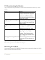
1.7 Disseminating the Results .............................................................................................................27
1.8 Saving Your Work ..........................................................................................................................27
Data Management............................................................................................................. 29
2.1 The DataBook.................................................................................................................................30
2.2 Accessing Data................................................................................................................................32
2.2.1 Reading Data from a STATGRAPHICS Centurion Data File.........................................33
2.2.2 Reading Data from an Excel, ASCII, XML, or Other External Data File .....................34
2.2.3 Transferring Data Using Copy and Paste ............................................................................36
2.2.4 Querying an ODBC Database ...............................................................................................36
2.3 Manipulating Data ..........................................................................................................................37
2.3.1 Copying and Pasting Data ...................................................................................................... 37
2.3.2 Creating New Variables from Existing Columns................................................................38
2.3.3 Transforming Data ..................................................................................................................41
2.3.4 Sorting Data..............................................................................................................................44
2.3.5 Recoding Data..........................................................................................................................46
2.3.6 Combining Multiple Columns ...............................................................................................47
2.4 Generating Data..............................................................................................................................50
2.4.1 Generating Patterned Data..................................................................................................... 50
2.4.2 Generating Random Numbers ..............................................................................................53
2.5 DataBook Properties......................................................................................................................54
Running Statistical Analyses............................................................................................. 57
3.1 Data Input Dialog Boxes...............................................................................................................59
3.2 Analysis Windows...........................................................................................................................61
3.2.1 Input Dialog Button................................................................................................................63
iii / Table of Contents
3.2.2 Tables Button........................................................................................................................... 63
3.2.3 Graphs Button ......................................................................................................................... 64
3.2.4 Save Results Button................................................................................................................. 65
3.2.5 Analysis Options Button ........................................................................................................ 66
3.2.6 Pane Options Button .............................................................................................................. 68
3.2.7 Graphics Buttons..................................................................................................................... 70
3.2.8 Exclude Button ........................................................................................................................ 71
3.3 Printing the Results ........................................................................................................................ 72
3.4 Publishing the Results.................................................................................................................... 74
Graphics .............................................................................................................................75
4.1 Modifying Graphs .......................................................................................................................... 76
4.1.1 Layout Options........................................................................................................................ 77
4.1.2 Grid Options............................................................................................................................ 79
4.1.3 Lines Options........................................................................................................................... 81
4.1.4 Points Options......................................................................................................................... 83
4.1.5 Top Title Options ................................................................................................................... 85
4.1.6 Axis Scaling Options............................................................................................................... 87
4.1.7 Fill Options .............................................................................................................................. 89
4.1.8 Text, Labels and Legends Options ....................................................................................... 90
4.1.9 Adding New Text .................................................................................................................... 90
4.2 Jittering a Scatterplot...................................................................................................................... 91
4.3 Brushing a Scatterplot.................................................................................................................... 93
4.4 Smoothing a Scatterplot ................................................................................................................ 95
4.5 Identifying Points ........................................................................................................................... 97
4.6 Copying Graphs to Other Applications....................................................................................100
4.7 Saving Graphs in Image Files..................................................................................................... 100
StatFolios.......................................................................................................................... 103
5.1 Saving Your Session..................................................................................................................... 103
5.2 StatFolio Scripts............................................................................................................................ 104
5.3 Polling Data Sources.................................................................................................................... 108
5.4 Publishing Data in HTML Format ............................................................................................109
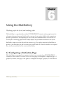
Using the StatGallery ....................................................................................................... 113
6.1 Configuring a StatGallery Page .................................................................................................. 113
6.2 Copying Graphs to the StatGallery............................................................................................ 115
6.3 Overlaying Graphs ....................................................................................................................... 116
6.4 Modifying a Graph in the StatGallery .......................................................................................117
6.4.1 Adding Items.......................................................................................................................... 117
6.4.2 Modifying Items .................................................................................................................... 118
6.4.3 Deleting Items........................................................................................................................ 118
iv / Table of Contents
6.5 Printing the StatGallery................................................................................................................119
Using the StatReporter..................................................................................................... 121
7.1 The StatReporter Window ..........................................................................................................121
7.2 Copying Output to the StatReporter .........................................................................................122
7.3 Modifying StatReporter Output .................................................................................................123
7.4 Saving the StatReporter ...............................................................................................................123
Using the StatWizard........................................................................................................125
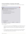
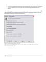
8.1 Accessing Data or Creating a New Study .................................................................................126
8.2 Selecting Analyses for Your Data ..............................................................................................130
8.3 Searching for Desired Statistics or Tests...................................................................................135
System Preferences...........................................................................................................139
9.1 General System Behavior ............................................................................................................139
9.2 Printing...........................................................................................................................................142
9.3 Graphics.........................................................................................................................................142
Tutorial #1: Analyzing a Single Sample...........................................................................145
10.1 Running the One-Variable Analysis Procedure .....................................................................146
10.2 Summary Statistics......................................................................................................................148
10.3 Box-and-Whisker Plot ...............................................................................................................151
10.4 Testing for Outliers....................................................................................................................154
10.5 Histogram ....................................................................................................................................158
10.6 Quantile Plot and Percentiles ...................................................................................................163
10.7 Confidence Intervals..................................................................................................................164
10.8 Hypothesis Tests ........................................................................................................................166
10.9 Tolerance Limits.........................................................................................................................168
Tutorial #2: Comparing Two Samples ............................................................................ 171
11.1 Running the Two Sample Comparison Procedure................................................................171
11.2 Summary Statistics......................................................................................................................173
11.3 Dual Histogram ..........................................................................................................................174
11.4 Dual Box-and-Whisker Plot......................................................................................................175
11.5 Comparing Standard Deviations ..............................................................................................177
11.6 Comparing Means ......................................................................................................................178
11.7 Comparing Medians ...................................................................................................................179
11.8 Quantile Plot ...............................................................................................................................180
11.9 Two-Sample Kolmogorov-Smirnov Test ...............................................................................181
11.10 Quantile-Quantile Plot ............................................................................................................182
Tutorial #3: Comparing More than Two Samples...........................................................183
12.1 Running the Multiple Sample Comparison Procedure .........................................................184
12.2 Analysis of Variance...................................................................................................................188
12.3 Comparing Means ......................................................................................................................190
v / Table of Contents
12.4 Comparing Medians................................................................................................................... 192
12.5 Comparing Standard Deviations.............................................................................................. 194
12.6 Residual Plots.............................................................................................................................. 194
12.7 Analysis of Means Plot (ANOM) ............................................................................................196
Tutorial #4: Regression Analysis..................................................................................... 197
13.1 Correlation Analysis................................................................................................................... 198
13.2 Simple Regression ...................................................................................................................... 202
13.3 Fitting a Nonlinear Model......................................................................................................... 205
13.4 Examining the Residuals ........................................................................................................... 207
13.5 Multiple Regression.................................................................................................................... 209
Tutorial #5: Analyzing Attribute Data............................................................................. 217
14.1 Summarizing Attribute Data..................................................................................................... 218
14.2 Pareto Analysis ........................................................................................................................... 219
14.3 Crosstabulation........................................................................................................................... 222
14.4 Comparing Two or More Samples ..........................................................................................229
14.5 Contingency Tables.................................................................................................................... 233
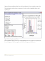
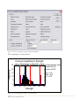
Tutorial #6: Process Capability Analysis.........................................................................235
15.1 Plotting the Data ........................................................................................................................ 236
15.2 Capability Analysis Procedure .................................................................................................. 238
15.3 Dealing with Non-Normal Data.............................................................................................. 241
15.4 Capability Indices ....................................................................................................................... 248
15.5 Six Sigma Calculator .................................................................................................................. 251
Tutorial #7: Design of Experiments................................................................................253
16.1 Selecting a Screening Experiment............................................................................................ 254
16.2 Creating the Design ................................................................................................................... 258
16.3 Analyzing the Results................................................................................................................. 265
16.4 Plotting the Fitted Model.......................................................................................................... 273
16.5 Optimizing the Response.......................................................................................................... 277
16.6 Further Experimentation .......................................................................................................... 278
Suggested Reading .......................................................................................................... 281
Data Sets...........................................................................................................................282
Index ................................................................................................................................283
vi / Table of Contents
Preface
This book is designed to introduce users of STATGRAPHICS Centurion XV to the basic operation
of the program and its use in analyzing data. It provides a comprehensive overview of the system,
including installation, data management, creating statistical analyses, and printing and publishing
results. Since the book is intended to get users up to speed quickly, it concentrates on the most
important features of the program, rather than trying to cover every small detail. The Help menu
within STATGRAPHICS Centurion XV gives access to an extensive amount of additional
information, including a separate PDF file for each of the approximately 150 statistical procedures.
The first nine chapters cover basic use of the program. While you could probably figure out much of
this material on your own while using the program, thorough reading of those chapters will help you
get up to speed quickly and ensure that you don’t miss any important features.
The last seven chapters include tutorials intended to:
1. Introduce you to some of the more commonly used statistical analyses.
2. Illustrate how the unique features of STATGRAPHICS Centurion facilitate the data analysis
process.
It is recommended that you explore the tutorials, since they will give you a good idea of how
STATGRAPHICS Centurion is best used when analyzing actual data.
NOTE: a copy of this manual in PDF format is included with the program and may be accessed from
the Help menu. In the PDF document, all of the graphs are in color. The data files and StatFolios
referenced in the manual are also shipped with the program.
StatPoint, Inc.
July, 2005
vii / Preface
viii / Preface
1
Chapter
Getting Started
Installing STATGRAPHICS Centurion XV, launching the program,
and creating a simple data file.
1.1 Installation
STATGRAPHICS Centurion is distributed in two ways: over the Internet in a single file that is
downloaded to your computer, and as a set of files on a CD-ROM. To run the program, it must
first be installed on your hard disk. As with most Windows programs, installation is extremely
simple:
Step 1: If you received the program on a CD, insert the CD into your CD-ROM drive. After a
few moments, the setup program should begin automatically. If it does not, open Windows
Explorer and execute the file setup.exe in the root directory on the CD-ROM.
If you downloaded the program over the Internet, locate the file that you downloaded and
double-click on it to begin the installation process.
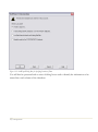
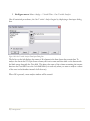
Step 2: A number of dialog boxes will then be displayed. The first dialog box welcomes you to
STATGRAPHICS Centurion. Just press the Next button.
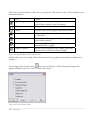
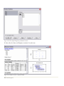
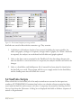
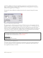
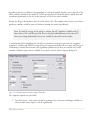
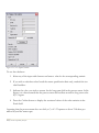
Step 3: The second dialog box displays the license agreement for the software:
1/ Getting Started
Figure 1-1. License Agreement Dialog Box
Read the license agreement carefully. If you accept the terms, click on the indicated radio button
and press Next to continue. If you do not agree, press Cancel. If you do not agree with the terms,
you may not use the program.
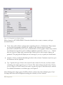
Step 4: The next dialog box requests information about you and the serial number you were
given when you purchased the program:
2/ Getting Started
Figure 1-2. Customer Information Dialog Box
Enter the requested information. If you have not yet purchased the program, leave the serial
number field blank. The program will then run in evaluation mode for 30 days following the first
time you install it on your computer. After 30 days, you must purchase a license to continue to
use the program. Once the evaluation license expires, only the license manager will display.
Step 5: The next dialog box indicates the directory in which the program will be installed:
3/ Getting Started
Figure 1-3. Destination Folder Dialog Box
By default, STATGRAPHICS Centurion is installed in a subdirectory of Program Files named
STATGRAPHICS Centurion XV. If you are installing the program on a network server, install it in
any location where all potential users have read access. Write access by users is not required. Consult
the Support page at www.statgraphics.com for full instructions on network installation.
Step 6: The next dialog box allows you to specify the type of installation to be performed:
4/ Getting Started
Figure 1-4. Setup Type Dialog Box
Select one of the following:
Typical – installs the program, help files, documentation, and sample data files. This
requires a little more than 50MB of space on your hard disk.
Minimal – installs only the program and help files. This requires about 25MB of space
on your hard disk.
Custom – installs only the components you select.
You can save hard disk space by performing a minimal install, but you won’t have access to the
on-line documentation and accompanying sample data files.
Step 7: Follow the remaining instructions to complete the installation. When the installation is
complete, a final dialog box will be displayed:
5/ Getting Started
Figure 1-5. Final Installation Dialog Box
Click on Finish to complete the installation.
1.2 Running the Program
As part of the installation process, a shortcut to STATGRAPHICS Centurion will be added to the
Windows Start menu and also to your desktop. To launch the program:
Step 1: Click on the shortcut that was added to your desktop, or press the Windows Start button
in the bottom left corner of your screen and click on the Statgraphics icon. You may also select
Programs Files – Statgraphics - STATGRAPHICS Centurion XV using Windows Explorer and click
on the sgwin application icon to execute the program.
Step 2: When STATGRAPHICS Centurion loads, it will open up a new window. The first time
you launch the program, the License Manager dialog box will be displayed:
6/ Getting Started
Figure 1-6. License Manager Dialog Box
Within 30 days after receiving your serial number, you must contact StatPoint, Inc. to register
your copy and obtain an activation code. Otherwise, the program will temporarily cease
functioning.
To obtain an activation code, press the Get Code button:
7/ Getting Started
Figure 1-7. Registration Dialog Box
Enter the required information and then contact StatPoint in one of the following ways:
1. Press the Submit via e-mail button to send the information via the Internet.
2. Press the Print for faxing button and fax the printed information.
3. Call the indicated telephone number. Be prepared to supply both the Serial number and
the Product Key shown on the registration dialog box.
Whichever method you use, StatPoint will verify the information you provide and return to you
an activation code. The next time you run the program, enter that code into the Activation code
8/ Getting Started
field on the License Manager dialog box and press the Upgrade button. From then on, the
License Manager dialog box will not be displayed.
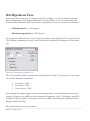
Step 3: The first time you run the program, you will also be asked which menu system you wish
to use:
Figure 1-8. Menu Selection Window
You have a choice of the classic STATGRAPHICS menu, which organizes the statistical
procedures into the headings Plot, Describe, Compare, Relate, Forecast, SPC, and DOE, or the Six
Sigma menu, which organizes the procedures into the headings Define, Measure, Analyze, Improve,
Control and Forecast. Both menus include the same procedures. Only the organization is different.
You may change your initial choice at a later time by selecting Preferences from the Edit menu
within the program, after which you must exit the program for the menu change to take effect.
Step 4: The main STATGRAPHICS window will then be created. The first time you run the
program, an additional dialog box will be displayed with information from the StatWizard:
9/ Getting Started
Figure 1-9. Initial StatWizard Dialog Box
The StatWizard is designed to help new users quickly create a data file and begin analyzing its
contents. You may follow the instructions of the StatWizard or click on Cancel to suppress the
StatWizard. If you don’t want the StatWizard to appear each time you start STATGRAPHICS
Centurion, uncheck “Show the StatWizard at Startup” before you leave this dialog box.
The sections that follow use the StatWizard to create a data file containing data from the 2000 United
States Census.
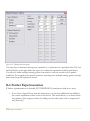
1.3 Entering Data
In order to analyze data in STATGRAPHICS Centurion, it must be placed into the
STATGRAPHICS DataBook. The DataBook consists of 10 datasheets, indicated by the letters A
through J, each containing a rectangular array of rows and columns:
10/ Getting Started
Figure 1-10. The STATGRAPHICS DataBook
In a typical datasheet, each row contains information about an individual sample, case or
observation, while each column represents a variable.
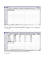
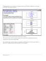
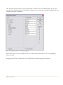
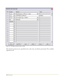
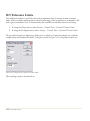
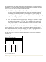
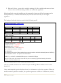
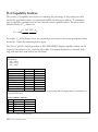
For example, suppose you wished to use STATGRAPHICS Centurion to analyze data from the
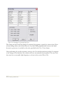
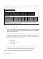
2000 United States Census. A small section of the results of that census is shown below:
State
Alabama
Alaska
Arizona
Arkansas
California
Colorado
Population Median Age % Female Per Capita Income
4,447,100
35.8
51.7
$18,819
626,932
32.4
48.3
$22,660
5,130,632
34.2
50.1
$20,275
2,673,400
36.0
51.2
$16,904
33,871,648
33.3
50.2
$22,711
4,301,261
34.3
49.6
$24,049
Figure 1-11. Data from the 2000 U.S. Census
11/ Getting Started
When entering this data into a STATGRAPHICS Centurion datasheet, the information about
each state would be placed into a different row. Five columns would be created to hold the
names of the states and the census data.
To enter data such as that shown above into STATGRAPHICS Centurion, you have two
choices:
1. Type the data directly into the STATGRAPHICS Centurion DataBook.
2. Enter the data into another program such as Excel and then read or copy it into
STATGRAPHICS Centurion.
In this section, we’ll take the first approach, using the StatWizard to set up the data sheet for us.
When the StatWizard dialog box shown in Figure 1.6 appears, accept the default selection
(“Enter New Data or Import It from an External Source”) and press OK. (Note: If you exited
the StatWizard, you can start it again by pressing the button with the wizard’s hat
on the
main toolbar). On the second dialog box, indicate that you intend to type the data using the
keyboard:
12/ Getting Started
Figure 1-12. StatWizard Dialog Box for Specifying Location of Data
You will then be presented with a series of dialog boxes used to identify the information to be
entered into each column of the datasheet:
13/ Getting Started
Figure 1-13. Dialog Box Used to Define Columns
Each column in a STATGRAPHICS Centurion datasheet has a name, comment, and type
associated with it:
•
Name– Give each column a unique name containing from 1 to 32 characters. These names
are used by the program to identify the variables to be analyzed when a statistical
procedure is selected. They also serve as default labels on most graphs. Names may contain
any characters except those used to indicate arithmetic operations, such as + or - . Names
may not, however, begin with a numeric digit. Names are not case sensitive. Spaces are
permitted. The program will display an error message if you try to specify an invalid name.
•
Comment – Enter a comment identifying the data in the column. Comments may have up to
64 characters and are optional.
•
Type – Specify the type of data to be entered in the column. In this case, the first column
containing state names must be set to Character. The other columns may be left as Numeric
or set to Integer or Fixed Decimal if you want to restrict the type of data that may be entered.
For detailed information on column types, see Chapter 2.
After defining each column, press OK. When all five columns have been defined, press Cancel.
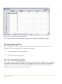
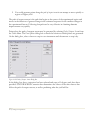
An empty data sheet will be displayed showing the columns you have created:
14/ Getting Started
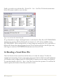
Figure 1-14. STATGRAPHICS Centurion Data Sheet with Column Names
Now enter the data as you would in any spreadsheet, using the arrow keys to move from cell to
cell. DO NOT enter commas when entering large numbers. When done, the datasheet should
have the following appearance:
Figure 1-15. STATGRAPHICS Centurion Data Sheet after Entering 6 Rows of Data
15/ Getting Started
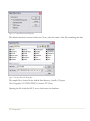
Finally, you need to save the data file. Choose File – Save – Save Data File from the main menu.
Select a file name in which to save the data:
Figure 1-16. Save Data File Selection Dialog Box
It is good practice to assign a meaningful name to each data file. Data files in STATGRAPHICS
Centurion are saved on disk by default with an extension of “.sf6” and are readable only by
STATGRAPHICS. When saving the file, you may change the setting in the Save as type field to a
different file format that other programs can read. Note that data saved in other file types may
take longer to read into STATGRAPHICS than data saved in an SF6 file.
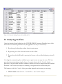
1.4 Reading a Saved Data File
Once the data have been entered into the data sheet, it is ready for analysis. To make the
example more interesting, however, let’s retrieve the census data for all 50 states and the District
of Columbia, which is shipped with STATGRAPHICS Centurion in a file named census2000.sf6.
To open that data file, select File – Open – Open Data Source from the top menu. You will first be
asked to specify the location of the data you wish to access:
16/ Getting Started
Figure 1-17. Open Data Source Dialog Box
The default selection is correct in this case. Next, select the name of the file containing the data:
Figure 1-18. Open Data File Dialog Box
The sample file is located in the default data directory (usually c:\Program
Files\Statgraphics\STATGRAPHICS Centurion XV\Data).
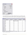
Opening the file loads the full 51 rows of data into the datasheet:
17/ Getting Started
Figure 1-19. Datasheet Showing Contents of Census2000.sf6 File
1.5 Analyzing the Data
Once the data have been loaded into the STATGRAPHICS Centurion DataBook, any of the
more than 150 statistical procedures may be applied to it in any of several ways:
1. By selecting the desired procedure from the main menu.
2. By pressing one of the shortcut buttons on the toolbar.
3. By invoking the StatWizard by pressing the button on the toolbar displaying a wizard’s
cap.
Let’s begin by summarizing the variability in per capita income amongst the states. The best
procedure for summarizing a single column of numeric data is the One Variable Analysis
procedure. This procedure calculates summary statistics such as the sample mean and standard
deviation. It also creates several plots, including a histogram and box-and-whisker plot.
The location of the One Variable Analysis procedure depends on the menu you are using:
1. Classic menu: Select Describe – Variable Data – One-Variable Analysis.
18/ Getting Started
2. Six-Sigma menu: Select Analyze – Variable Data – One-Variable Analysis.
Like all statistical procedures, the One-Variable Analysis begins by displaying a data input dialog
box:
Figure 1-20. One-Variable Analysis Data Input Dialog Box
The list box at the left displays the names of all columns in the data sheets that contain data. To
analyze the data in the Per Capita Income column, click on its name and then click on the button with
the black arrow alongside the Data field. This places the name of the column containing the income
data into the Data field. Leave the Select field blank (it is used only when you want to analyze a subset
of the rows in the datasheet instead of all the rows).
When OK is pressed, a new analysis window will be created:
19/ Getting Started
Figure 1-21. One-Variable Analysis Window
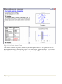
The window contains 4 “panes”, divided by movable splitter bars. The two panes on the left
display tabular output, while the two panes on the right display graphical output. If you doubleclick in the bottom left pane, the table of summary statistics will be maximized:
20/ Getting Started
Figure 1-22. Maximized Summary Statistics Pane
Several interesting statistics are given in the table. Of the n = 51 states plus D.C., per capita
income ranges between $15,853 and $28,766. The average per capita income is $20,934.50.
Beneath the table is the output of the StatAdvisor, which gives a short interpretation of the
results. In this case, the StatAdvisor concentrates on the two statistics displayed in red, which
measure the skewness and kurtosis in the data. As explained by the StatAdvisor, data that come
from a normal or Gaussian distribution should yield standardized skewness and standardized
kurtosis values between –2 and +2. In this case, both statistics are within that range, indicating
that a bell-shaped normal curve is a reasonable model for the observations, although the
skewness is very close to being statistically significant.
Double-clicking on the summary statistics table again will restore the original split display.
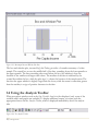
Double clicking on the bottom right pane then maximizes the box-and-whisker plot:
21/ Getting Started
Figure 1-23. Maximized Box-and-Whisker Plot Pane
The box-and-whisker plot, invented by John Tukey, provides a 5-number summary of a data
sample. The central box covers the middle half of the data, extending from the lower quartile to
the upper quartile. The lines extending above and below the box (the whiskers) show the
location of the smallest and largest data values. The median of the data is indicated by the
vertical line within the box, while the plus sign (+) shows the location of the sample mean. The
fact that the upper whisker is slightly longer than the lower, while the mean is somewhat greater
than the median, is a sign of positive skewness in the data.
1.6 Using the Analysis Toolbar
When an analysis window such as the One-Variable Analysis is first displayed, only some of the
available tables and graphs are included. To display additional output, you must push the
appropriate button on the Analysis Toolbar, which is displayed immediately above the analysis
title:
Figure 1-24. The Analysis Toolbar
22/ Getting Started
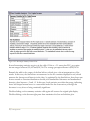
The buttons on the analysis toolbar are very important. The actions of the 7 leftmost buttons are
summarized below:
Name
Input dialog
Tables
Function
Displays the data input dialog box so that the
selected data column(s) may be changed.
Displays a list of other tables that may be created.
Graphs
Displays a list of other graphs that may be created.
Save results
Allows calculated statistics to be saved to columns
of a datasheet.
Selects options that apply to all tables and graphs
in the current analysis.
Selects options that apply only to the currently
maximized table or graph.
Allows you to change the titles, scaling, and other
features of the currently maximized graph.
Analysis options
Pane options
Graphics options
Figure 1-25. Important Buttons on the Analysis Toolbar
Additional buttons to the right allow other actions when a graph is maximized, as explained in
Chapter 5.
For example, if the Graphs button
is pressed, a dialog box will be displayed listing other
graphs available in the One-Variable Analysis procedure:
Figure 1-26. List of Available Graphs
23/ Getting Started
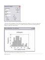
Checking the box next to Frequency Histogram and pressing OK adds a third pane to the righthand side of the analysis window:
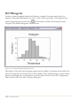
Figure 1-27. One-Variable Analysis Window with Added Frequency Histogram
Note that the bars in the histogram extend a little farther above the peak than below it,
characteristic of positively skewed data.
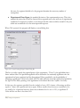
If you double-click on the histogram to maximize it and then press the Pane options button, a
dialog box is displayed with options specific to the histogram:
24/ Getting Started
Figure 1-28. Frequency Histogram Pane Options Dialog Box
Using this box, the number of bars in the histogram can be changed, as well as the range that
they cover. If Number of Classes is set to 15 and the OK button is pressed, the histogram will
change to reflect the new selection:
Figure 1-29. Frequency Histogram After Changing the Number of Classes
25/ Getting Started
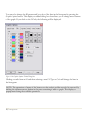
You may also change the fill pattern and/or color of the bars in the histogram by pressing the
Graphics options button. This displays a tabbed dialog box that allows you to change most features
of the graph. If you click on the Fill tab, the following will be displayed:
Figure 1-30. Graphics Options Tabbed Dialog Box
Clicking on radio button #1 and then selecting a new Fill Type or Color will change the bars in
the histogram.
NOTE: The operations of many of the buttons on the analysis toolbar can also be accessed by
clicking the alternate mouse button in the pane containing a table or graph. This displays a
popup menu listing the available operations.
26/ Getting Started
1.7 Disseminating the Results
Once an analysis has been performed, the results can be disseminated in various ways. These
include:
Action
Print the output.
Publish the output for viewing in a
web browser.
Copy the output to another
application.
Save the analysis in a report.
Save a graph in an image file.
Method
Press the printer button on the main
toolbar to print all tables and graphs,
or click on a single pane with the
alternate mouse button and select
Print from the popup menu to print a
single table or graph.
Select Publish as HTML from the File
menu. A dialog box will be displayed
for you to specify the location of the
HTML output.
Click on the table or graph to be
copied and select Copy from the Edit
menu. Then activate the other
application and select Edit – Paste.
Press the alternate mouse button and
select Copy Analysis to StatReporter.
The StatReporter, described in
Chapter 7, can be saved as an RTF
file for import into programs such as
Microsoft Word.
Maximize the graph to be saved.
Then select Save Graph from the File
menu.
Figure 1-31. Methods for Disseminating Analysis Results
Each of these operations is described in later chapters.
1.8 Saving Your Work
You can save the current STATGRAPHICS Centurion session at any time by selecting Save StatFolio
from the File menu and entering a file name:
27/ Getting Started
Figure 1-32. Dialog Box for Saving StatFolio
A StatFolio consists of instructions on how to create each of the analyses in your current
session, with pointers to the files or databases containing your data. If you reload the StatFolio at
a later date, it will automatically reread the data and recreate the analyses. Any options you have
selected for the analyses will be retained.
NOTE #1: If the data in the data sources changes between the time a StatFolio is saved and the
time it is reloaded, the analyses will change to reflect the new values. This provides a simple
method for rerunning analyses that need to be repeated on a periodic basis without having to
recreate them.
NOTE #2: The data and the StatFolio are stored in different files. If you need to move a
StatFolio from one computer to another, be sure to move the data file(s) as well.
28/ Getting Started
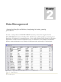
2
Chapter
Data Management
Accessing data from files and databases, transforming data values, generating
patterned data.
In order to analyze data in STATGRAPHICS Centurion, it must first be placed in the
STATGRAPHICS Centurion DataBook. The DataBook is a tabbed window, consisting of 10
datasheets. A datasheet is a rectangular array of rows and columns. Each column in a datasheet
represents a variable. Each row represents a case or observation. For example, the datasheet
below contains information on a number of different makes and models of automobiles.
Figure 2-1. Sample Datasheet
29/ Data Management
This chapter describes everything you need to know data and STATGRAPHICS Centurion,
including how to access it, how to manipulate it, and how to use it in statistical analyses.
2.1 The DataBook
Each column in the STATGRAPHICS Centurion datasheet represents a different variable.
Variables are usually attributes or measurements associated with the items that define the rows
of the datasheet. For example, in the 93cars datasheet, there is a column identifying the make of
each automobile, a column identifying its type, columns containing the recorded miles per gallon
in city and highway driving, columns containing the automobile’s length, height and weight, and
similar information. Each column has a name and type associated with it. The name is used to
identify the data to use in a statistical analysis. The type affects how it will be analyzed. Also
associated with each column is an optional comment, which is used to provide additional
information about the contents of a column. Note: the data were obtained from the Journal of
Statistical Education Data Archive (www.amstat.org/publications/jse/jse_data_archive.html)
and are used by permission.
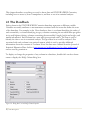
To display or change the properties of any column in a datasheet, double-click on the column
name to display the Modify Column dialog box:
Figure 2-2. Dialog Box Used to Modify Column Properties
30/ Data Management
You may specify:
1. Name: from 1 to 32 characters. When performing statistical analyses, columns are
identified using these names. Each column in a datasheet must have a unique name,
though columns in different datasheets may have the same name. Names may include
any character except the following 19 symbols:
‘“.><~!&,;+-*/^=|( )
The restricted characters are those that need to be parsed when used in algebraic
expressions such as
100*(MPG City/MPG Highway)
In addition, names may not begin with a numeric digit. Spaces are allowed in variable
names. Variable names are not case sensitive.
2. Comment: from 0 to 64 characters, providing additional information about the contents
of the column.
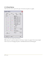
3. Type: the type of data permitted in the column. The following types may be specified:
Type
Numeric
Character
Integer
Date
Month
Quarter
Time (HH:MM)
Time (HH:MM:SS)
Date-Time
(HH:MM)
Date-Time
(HH:MM:SS)
Fixed Decimal
Formula
Figure 2-3. Column Types
31/ Data Management
Contents
Any valid number.
An alphanumeric string
An integer number
Month, day and year
Month and year
Quarter and year
Hour and minute
Hour, minute and second
Month, day, year, hour and
minute
Month, day, year, hour,
minutes and second
Number with 1 to 9 places
Calculated from other columns
Example
3.14
Chevrolet
105
4/30/05
4/05
Q2/05
3:15
3:15:53
4/30/05 3:15
4/30/05 3:15:53
34.10
MPG City/MPG Highway
When entering data into a datasheet, the data must conform to the type of column in which it is
entered. For example, attempting to type a name into a numeric column will result in it being
rejected. When entering data, the format of the data must also match your current Windows
settings. In particular, STATGRAPHICS Centurion honors the current Windows settings for:
1. Decimal separator for numeric values
2. Time format and time separator for times
3. Short date format and date separator for dates
To check the settings of your computer, access the Windows Control Panel.
When entering a date, you must use the format specified on the Edit - Preferences dialog box,
either 4-digits years (as in 4/30/2005) or 2-digit years (as in 4/30/05). If a 2-digit year is used, it
is assumed to fall within the years 1950 through 2049.
More information about formula columns may be found in a later section of this chapter titled
Manipulating Data.
2.2 Accessing Data
Chapter 1 showed how data can be entered into a datasheet by hand. More often, users will
access data that already exists in another file or application. There are 3 basic ways of putting
existing data into a STATGRAPHICS Centurion datasheet:
1. Read an existing data file: If the data has previously been entered into a file, you can
read it into the datasheet by selecting File – Open – Open Data Source. This allows you to
read data stored in various file formats, including Excel XLS files, delimited ASCII text
files, XML files, and STATGRAPHICS files.
2. Copy and paste using the Windows clipboard: If you have the data loaded into a
program such as Excel, you can easily copy it to the Windows clipboard and then paste it
into STATGRAPHICS Centurion by selecting Edit – Paste.
3. Issue a SQL query to retrieve it from a database: If the data resides in an ODBCcompatible database, such as Oracle or Microsoft Access, it can be retrieved by selecting
File – Open – Open Data Source and then selecting ODBC Query.
32/ Data Management
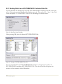
2.2.1 Reading Data from a STATGRAPHICS Centurion Data File
To read data that has already been saved in a STATGRAPHICS Centurion data file, select any
of the 10 datasheets in the DataBook by clicking on its tab. Then select File – Open – Open Data
Source and specify STATGRAPHICS Data File on the dialog box shown below:
Figure 2-4. Open Data Source Dialog Box
After pressing OK, select the desired STATGRAPHICS file:
Figure 2-5. Selecting a STATGRAPHICS Data File
You can read data files from STATGRAPHICS Centurion or any previous version of
STATGRAPHICS, including STATGRAPHICS Plus. The data in the file will replace the
contents of the currently selected datasheet.
33/ Data Management
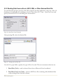
2.2.2 Reading Data from an Excel, ASCII, XML, or Other External Data File
To read data that has been saved in a data file created by another application, select any of the 10
datasheets in the DataBook by clicking on its tab. Then select File – Open – Open Data Source and
specify External Data File on the dialog box shown below:
Figure 2-6. Open Data Source Dialog Box
After pressing OK, select the desired file:
Figure 2-7. Selecting an Excel Data File
Use the Files of type field to specify the type of file to be read. The most common selections are:
1. Excel files (*.xls) – reads a selected sheet from a Microsoft Excel workbook.
2. Text files (*.txt;*.csv;*.dat) – reads an ASCII text file containing either delimited data
or data arranged into uniform columns.
34/ Data Management
3. XML (*.xml) – reads data from a tagged-format XML file.
After the file name is selected, a final dialog box will be displayed to retrieve additional
information about the data in the file. If the selected file is an Excel workbook, the dialog box
will be that shown below:
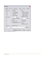
Figure 2-8. Options Dialog Box for an Excel Data File
Specify:
1. Column Header – information contained in the first 2 rows of the specified range. The two
rows immediately above the data to be read may contain column names and/or
comments. If names are not contained in the Excel worksheet, then default names will
be generated.
2. Sheet number – number of the worksheet within the Excel workbook that will be read. Only
one sheet may be read at a time.
3. Start and End row – the range of rows within the worksheet that will be read. This range
includes the variable names and comments, if present.
4. Missing value – any special symbol used in the Excel spreadsheet to indicate missing data,
such as NA. Cells containing the specified value will be converted to empty cells when
placed in the STATGRAPHICS Centurion datasheet.
When OK is pressed, the data from the Excel file will be read into STATGRAPHICS
Centurion. Each column will be scanned and an appropriate column type assigned to it. If any
invalid column names are encountered, reserved symbols will be converted to underscores. The
data is then ready to be analyzed.
35/ Data Management
2.2.3 Transferring Data Using Copy and Paste
The easiest way to transfer data from another application to STATGRAPHICS Centurion is
often via the Windows clipboard. For example, if data resides in an Excel file, Excel may be
started and the data copied to the clipboard by selecting the desired data within Excel and then
choosing Copy from the Excel Edit menu. Upon returning to STATGRAPHICS, the data may be
pasted directly into a STATGRAPHICS Centurion datasheet by selecting Paste from the
STATGRAPHICS Edit menu. When data is pasted into a column of a datasheet,
STATGRAPHICS Centurion automatically scans the data and selects an appropriate type for the
column.
When copying and pasting data, column names and comments may also be transferred. Include
the column names and comments in Excel when copying the data to the clipboard. On the
STATGRAPHICS Centurion side, click in the header row of the STATGRAPHICS Centurion
datasheet before selecting Paste. The information at the top of the clipboard will then be pasted
into the header row(s).
Note: if the Excel file contains column names but not comments, select Edit – DataBook
Properties from the STATGRAPHICS Centurion menu and turn off the Display variable
comments option before pasting the data.
2.2.4 Querying an ODBC Database
STATGRAPHICS Centurion also allows you to read data from an Oracle, Access, or other
database using ODBC. To access data from a database, first select File – Open – Open Data Source.
Then select Query Database from the initial dialog box:
Figure 2-9. Open Data Source Dialog Box
A sequence of additional dialog boxes will be displayed on which you:
36/ Data Management
1. Select the name of the database to be read.
2. Select the fields to be transferred.
3. Specify a filter to limit the records that are retrieved.
4. Specify a sort order for the results.
A SQL query is then constructed and the results placed in the active STATGRAPHICS
datasheet. Detailed information on constructing ODBC queries may be found in the PDF
document titled Data Files and StatLink.
2.3 Manipulating Data
Once data has been placed into a STATGRAPHICS Centurion datasheet, it can be manipulated
in several important ways:
1. The data may be copied and pasted into other locations.
2. Additional columns may be created from existing columns.
3. Data may be transformed using an algebraic expression or mathematical function.
4. The datasheet may be sorted according to one or more columns.
5. Data values may be recoded to form groups or for other reasons.
6. Data extending over multiple columns can be rearranged into a single column if required
by a statistical procedure.
These important operations are described below.
2.3.1 Copying and Pasting Data
The STATGRAPHICS Centurion datasheet supports many normal spreadsheet operations,
including cut, copy, paste, insert, and delete. The one important fact to remember when using these
operations is that every column has a specified type. If you inadvertently paste character data
into a numeric column, STATGRAPHICS Centurion will change the type of that column to
37/ Data Management
accommodate the new data. If you ever have any doubt about a column’s type, click on the
column header to display the Modify Column dialog box. You can change the type of the column
using that dialog box.
2.3.2 Creating New Variables from Existing Columns
STATGRAPHICS Centurion has a wide array of operators to assist in performing mathematical
calculations. One of the most important uses of these operators in data analysis is to create new
variables based on existing columns. In STATGRAPHICS Centurion, new variables may be
created:
1. “On-the-fly” directly within the data fields on data input dialog boxes, without saving the
variable in the datasheet.
2. By creating a new column in any of the 10 datasheets in the DataBook.
For example, suppose information was desired about the ratios of miles per gallon in city driving
versus miles per gallon in highway driving for each automobile in the 93cars data file. That file
contains 2 separate columns, one named MPG City and one named MPG Highway. To summarize
the distribution of the ratios, you could select the One-Variable Analysis procedure and specify the
ratio directly in the Data field of the data input dialog box:
Figure 2-10. Creating a Transformation “On-The-Fly”
When OK is pressed, an analysis will be generated for 100 times the ratio, without ever changing
the data in the datasheet:
38/ Data Management
Figure 2-11. One-Variable Analysis of Transformed Data
The average ratio is approximately 76.3%, ranging from a low of 64.0% to a high of 93.9%. The
ability to do analyses without modifying the datasheets is very important in facilitating the
exploration of data.
If desired, a new column could be created in a datasheet containing the transformed values. For
example, you could return to the window containing the 93cars data and double-click on the
column header labeled Col_27. The Modify Column dialog box could then be used to define a new
variable of type formula with the desired transformation:
39/ Data Management
Figure 2-12. Creating a Formula Column
This will create a new column whose values are calculated from the original two columns
containing the miles per gallon data. Formula columns are displayed in the datasheet using a gray
scale, since they are automatically calculated from other columns:
Figure 2-13. Appearance of a Formula Column in a Datasheet
40/ Data Management
If the values in the MPG City or MPG Highway columns change, MPG Ratio will be automatically
recalculated to reflect those changes.
NOTE: recalculation of formula columns does not normally occur until the data in
those columns is needed for a calculation or is saved or printed. You can force a
recalculation to occur immediately by selecting Update Formulas from the Edit menu.
2.3.3 Transforming Data
STATGRAPHICS Centurion also contains a large number of mathematical functions that may
be used to transform existing data. As when creating new variables, transformations may be
done either directly within fields of a data input dialog box or by creating new columns in a
datasheet.
For example, suppose it was desired to plot the miles per gallon that an automobile obtained
versus the natural logarithm of vehicle weight. Selecting the X-Y Plot procedure from the main
menu displays the following data input dialog box:
Figure 2-14. Transforming Data on a Data Input Dialog Box
Instead of typing the name of a column in a data field, you may type a STATGRAPHICS
Centurion expression. STATGRAPHICS Centurion expressions are formulas that operate on
data using algebraic symbols and special operators. A wide variety of operators are available, as
41/ Data Management
described in the PDF document titled STATGRAPHICS Operators. The table below shows
commonly used operators:
Operator
+
/
*
^
ABS
AVG
DIFF
EXP
LAG
LOG
LOG10
MAX
MIN
SD
SQRT
STANDARDIZE
Use
Addition
Subtraction
Division
Multiplication
Exponentiation
Absolute value
Average
Backward differencing
Exponential function
Lag by k periods
Natural logarithm
Log base 10
Maximum
Minimum
Standard deviation
Square root
Conversion to Z-scores
Example
X+100
X-100
X/100
X*100
X^2
ABS(X)
AVG(X)
DIFF(X)
EXP(10)
LAG(X,k)
LOG(X)
LOG10(X)
MAX(X)
MIN(X)
SD(X)
SQRT(X)
STANDARDIZE(X)
Figure 2-15. Commonly Used STATGRAPHICS Operators
When constructing a STATGRAPHICS Centurion expression, multiple operators may be
combined using normal algebraic precedence rules. For example, the following expression
converts each value in the column named Weight to a fraction equal to the distance between the
minimum and maximum values amongst all of the automobiles:
( Weight – MIN(Weight) ) / ( MAX(Weight) - MIN(Weight) )
The parentheses are necessary to insure that the subtractions are done before the division.
Expressions are not case sensitive, nor is the inclusion of blank spaces relevant.
Every data input dialog box includes a button labeled Transform, as in Figure 2-14. This button
may be used to help create STATGRAPHICS Centurion expressions, if you do not remember
which operators to use. If you place the cursor in a data field and then press Transform, a dialog
box similar to that shown below will be displayed:
42/ Data Management
Figure 2-16. Dialog Box Displayed by the Transform Button
Along the right is a list of all STATGRAPHICS Centurion operators, with an indication of the
number of arguments that must be supplied. Clicking on an operator name places it in the
Expression field. After you replace the question marks with column names or numbers, you may
press the Display button to see the first several values generated by the expression, or press the
OK button to have the expression entered into the data input dialog box.
NOTE: You do not need to use the Transform button if you would rather type the
expression yourself on the data input dialog box.
Once a transformation has been specified on the data input dialog box, as in Figure 2-14, that
transformation will be used when the procedure is run:
43/ Data Management
Figure 2-17. X-Y Plot Procedure Using Transformed values of Weight
STATGRAPHICS Centurion operators may also be used when creating formula columns, similar
to the illustration in the preceding section.
2.3.4 Sorting Data
The contents of a datasheet may be sorted by highlighting the column or columns to be used to
define the sort order and then selecting Sort Data from the Edit menu. For example, to sort the
data in the 93cars file according to miles per gallon, highlight the columns named MPG City and
MPG Highway and then select Sort Data. The following dialog box will be displayed:
44/ Data Management
Figure 2-18. Sort Options Dialog Box
You may specify either one or two columns on which to base the sort, as well the sort order.
Sorting by MPG City and then MPG Highway sorts first by miles per gallon in city driving and
then, for automobiles with the same value of MPG City, by miles per gallon in highway driving:
Figure 2-19. 93cars.sf6 File after Sorting
45/ Data Management
NOTE: The statistical procedures do not require you to sort the data before using them,
since they will automatically sort the data if necessary. Also, the data file on disk is not
changed when you perform a sort unless you resave the data. Sorting only affects the
order in which the rows are displayed in the datasheet.
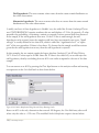
2.3.5 Recoding Data
It is sometimes convenient to recode data, either by grouping it into similar groups or by
assigning new labels. To recode a column of data, first click on the header of the column to be
recoded. Then select Recode Data from the Edit menu. The following dialog box will be displayed:
Figure 2-20. Dialog Box for Recoding Data
For example, the column named Domestic in the 93cars file contains a 1 for each car made by a
U.S. automaker and a 0 for all other cars. To change all 0’s in the column to “Foreign” and all
1’s to “U.S.”, the dialog box above could be used. Up to 7 ranges of values may be specified at
one time for recoding.
46/ Data Management
The PDF document titled Edit Menu has a detailed discussion of two recoding examples.
2.3.6 Combining Multiple Columns
Many statistical procedures in STATGRAPHICS Centurion expect the data to be analyzed to be
in a single column. Sometimes data is not arranged in such a format. As a simple example,
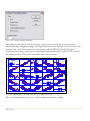
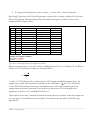
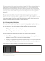
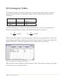
suppose you have a sample of 12 observations, arranged into 4 columns as follows:
Figure 2-21. Sample Data in Multiple Columns
To place this data in a single column, multiple copy and paste operations could be performed. A
simpler solution is to use the Rowwise Statistics procedure, found under Describe if you are using
the classic menu and under Analyze if you are using the Six Sigma menu. This procedure first
presents a data input dialog box requesting the names of the columns containing the data:
47/ Data Management
Figure 2-22. Data Input Dialog Box for Rowwise Statistics
It then takes the data and displays statistics for each row:
Figure 2-23. Rowwise Statistics Analysis Window
48/ Data Management
The Total line in the Summary Statistics pane shows statistics for the combined data. If you now
press the Save Results button on the analysis toolbar, you can save the combined sample back into
a single column of a datasheet:
Figure 2-24. Rowwise Statistics Save Results Dialog Box
Each result that you check will be saved in a column with name equal to the corresponding
Target Variable.
Saving both the Data Column and Code Column creates the following data structure:
49/ Data Management
Figure 2-25. New Columns Created by Rowwise Statistics
The 12 data values are now in a single column for use in other statistical procedures.
2.4 Generating Data
STATGRAPHICS Centurion has the ability to generate data and place it in columns of a
datasheet. This section describes two important examples:
1. Generating data with simple patterns.
2. Generating random numbers.
2.4.1 Generating Patterned Data
Several procedures in STATGRAPHICS Centurion, particularly those that perform an analysis
of variance, expect the data to be analyzed to be placed into a single column of the datasheet,
together with one or more code columns identifying the explanatory factors. For example,
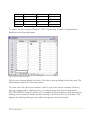
consider the data in the following two-way table:
50/ Data Management
Blend
1
2
3
4
Treatment 1
75
78
77
75
Treatment 2
82
85
84
85
Treatment 3
91
93
92
96
To analyze this data using the Multifactor ANOVA procedure, it needs to be placed into a
datasheet in the following format:
Figure 2-26. Desired Data Structure
The first two columns indicate the levels of the factors corresponding to each data value. The
third column contains all of the observations.
To create such a file, the easiest solution is often to type in the first two columns. However,
since the columns follow simple patterns, you could generate them instead using special
STATGRAPHICS Centurion operators. For example, the blend numbers can be generated by
clicking on the column #1 header and then selecting Generate Data from the Edit menu. This
displays the following dialog box, into which an expression has been entered:
51/ Data Management
Figure 2-27. Generating Blend Numbers
The Generate Data option evaluates a STATGRAPHICS Centurion expression and places the
result into the selected column. In the expression shown above, two important operators are
used:
COUNT(from, to, by) – generates values beginning at from and ending at to, at intervals
equal to by. COUNT(1,4,1) thus generates the integers 1, 2, 3, and 4.
REP(X, repetitions) – repeats each value in X repetitions times, in groups. In this case, each
integer between 1 and 4 is repeated 3 times.
The treatment numbers can be generated in a similar manner by clicking on the column #2
header, selecting Generate Data from the Edit menu, and entering the following:
52/ Data Management
Figure 2-28. Generating Treatment Numbers
This expression uses an additional operator:
RESHAPE(X, size) – repeats the values in X in a circular fashion until size values have
been generated. In this case, the sequence 1, 2, 3 is repeated 4 times.
These pattern generators can be helpful when the data file to be created is large.
2.4.2 Generating Random Numbers
Random numbers may be generated in STATGRAPHICS Centurion in two ways:
1. If the numbers come from an exponential, gamma, lognormal, normal, uniform, or
Weibull distribution, they may be generated within a datasheet by clicking on a column
header, selecting Generate Data from the Edit menu, and entering the appropriate
STATGRAPHICS Centurion expression.
2. For other distributions, the random numbers must be generated from within the
Probability Distributions procedure.
As an example, suppose 100 random numbers are desired from a normal distribution with a
mean of 20 and a standard deviation equal to 2. Click on the header of an empty column in any
datasheet to select that column. Then select Generate Data from the Edit menu and complete the
dialog box as shown below:
53/ Data Management
Figure 2-29. Generating Random Numbers from a Normal Distribution
The syntax of the RNORMAL operator is:
RNORMAL(n, mu, sigma) – generates n pseudo-random numbers from a normal
distribution with mean mu and standard deviation sigma.
Press OK to generate the random numbers and place them into the selected column.
The syntax of the other random number generators is contained in the PDF document titled
STATGRAPHICS Centurion Operators.
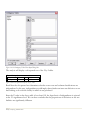
2.5 DataBook Properties
This chapter has described many important aspects of data handling within STATGRAPHICS
Centurion. In particular, it has shown how to read data from files and databases and how to
manipulate that data once it has been placed in a STATGRAPHICS Centurion datasheet. At any
given time, the status of the datasheets may be displayed by activating the DataBook window
and selecting DataBook Properties from the Edit menu or by selecting StatLink from the File menu:
54/ Data Management
Figure 2-30. DataBook Properties Dialog Box
This dialog box shows the current source of the data within each datasheet. If desired,
datasheets may be made read-only so that data in them cannot be changed inadvertently. It is
also possible to poll the data source (reread it) at regular intervals and have the statistical
procedures update automatically. These important features are described in Chapter 5.
55/ Data Management
56/ Data Management
3
Chapter
Running Statistical Analyses
Generating an analysis, selecting additional tables and graphs, selecting
options, changing the input data, and saving the results.
There are over 150 statistical selections on the main STATGRAPHICS Centurion menu. Each
selection accesses a different statistical procedure. All procedures, however, work in the same basic
way:
1. When an analysis is selected from the menu, a data input dialog box is displayed. The fields on
this dialog box are used to specify the variables to be analyzed.
2. The specified data is then read and analyzed, and a new analysis window is created with a set of
default tables and graphs.
3. When first run, default values are selected for all options in the analysis. These options can be
changed using the Analysis Options button on the analysis toolbar, in response to which all
tables and graphs in the analysis window will be updated.
4. If desired, additional tables and graphs may be requested by pressing the Tables and Graphs
buttons on the analysis toolbar.
5. Individual tables and graphs can be modified by maximizing the corresponding pane and
selecting Pane Options from the analysis toolbar.
6. For graphs, the default title, scaling, point types, fonts, etc. may be changed by double-clicking
on the graph to maximize it and then selecting Graphics Options from the analysis toolbar.
57/ Running Statistical Procedures
7. Tables and graphs may be printed, published as HTML files, copied to other applications
such as Microsoft PowerPoint, or saved in the StatReporter.
8. Numerical results may be saved to columns of any datasheet using the Save Results button on
the analysis toolbar.
9. The entire analysis may be saved to disk as a StatFolio for later retrieval.
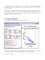
In this chapter, a typical analysis is described in detail. The goal of the analysis is to construct a
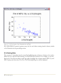
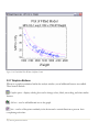
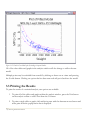
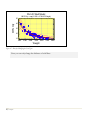
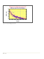
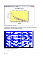
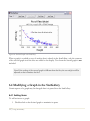
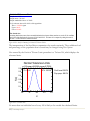
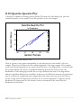
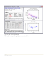
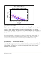
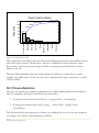
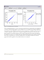
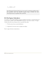
statistical model relating the miles per gallon achieved in city driving for the n = 93 automobiles in the
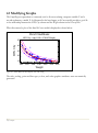
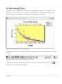
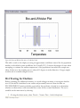
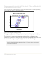
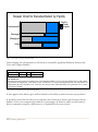
93cars.sf6 data file to their weight. A scatterplot of the data is shown below:
Plot of MPG City vs Weight
MPG City
55
45
35
25
15
1600
2100
2600
3100
3600
4100
4600
Weight
Figure 3-1. X-Y Plot of Miles per Gallon in City Driving versus Weight in Pounds
As might be expected, miles per gallon is negatively correlated with vehicle weight. Some nonlinearity is evident in the relationship, and at least one point appears to be a potential outlier.
The primary procedure in STATGRAPHICS Centurion for fitting a statistical model relating
two variables is the Simple Regression procedure. That procedure fits both linear and nonlinear
models. The simplest model relating one dependent variable Y to one independent variable X is
a straight line of the form
Y=a+bX
58/ Running Statistical Procedures
where b equals the slope of the line and a equals the Y-intercept. Curvilinear models such as the
exponential model
Y = exp(a + b X)
may be used if the relationship is not linear.
3.1 Data Input Dialog Boxes
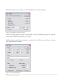
The Simple Regression procedure is located on the main menu:
1. If using the Classic menu, under Relate – One Factor.
2. If using the Six Sigma menu, under Improve – Regression Analysis – One Factor.
It begins by displaying a typical data input dialog box:
Figure 3-2. Simple Regression Data Input Dialog Box
The first two input fields are required:
Y: The dependent or response variable.
X: The independent or predictor variable.
59/ Running Statistical Procedures
In data entry fields, you can enter either the name of a column (such as MPG City) or a
STATGRAPHICS Centurion expression (such as LOG(MPG City).) If more than one datasheet
contains a column with the indicated name, you must precede the name with an indication of the
desired datasheet. For example, if both datasheets A and B contained a column named Weight and you
wanted to use the column in datasheet A, you would have to enter the name as A.Weight.
The Select field may be used to select a subset of the rows in the datasheet. For example, if you enter a
statement such as FIRST(50) in that field, only the first 50 rows in the datasheet will be used. Typical
entries in the Select field are:
Entry
FIRST(k)
LAST(k)
ROWS(start,end)
RANDOM(k)
column < value
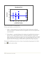
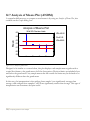
column <= value
column > value
column >= value
column = value
column <> value
condition1 & condition2
condition1 | condition2
binarycolumn
Use
Selects the first k rows.
Selects the last k rows.
Selects rows between start and end,
inclusive.
Selects a random set of k rows.
Selects only rows for which column
is less than value.
Selects only rows for which column
is less than or equal to value.
Selects only rows for which column
is greater than value.
Selects only rows for which column
is greater than or equal to value.
Selects only rows for which column
equals value.
Selects only rows for which column
does not equal value.
Selects only rows that meet both
conditions.
Selects only rows that meet at least
one of the conditions.
Selects only rows for which the
value in binarycolumn does not equal
0.
Figure 3-3. Allowable Entries for the Select field
60/ Running Statistical Procedures
Example
FIRST(50)
LAST(50)
ROWS(21,70)
RANDOM(50)
Passengers < 5
Passengers <= 5
Passengers > 5
Passengers >= 5
Cylinders = 6
Cylinders <> 4
Cylinders = 6 &
Make = “Ford”
Cylinders = 6 |
Make = “Ford”
Domestic
When specifying a condition involving a non-numeric variable, value must be enclosed in double
quotes and is case-sensitive. Multiple conditions may be combined using the conditional AND (&)
and OR (|) symbols.
Each of the allowable entries in the Select field actually generates a sequence of Boolean 0’s and 1’s,
where 0 represents FALSE and 1 represents TRUE. When used in the Select field of a data input
dialog box, the result is the selection of all rows for which the condition is TRUE and the exclusion of
all rows for which the condition is FALSE.
3.2 Analysis Windows
Once the data have been specified, a new analysis window is created:
Figure 3-4. Simple Regression Analysis Window
The window is a “splitter window”, with multiple panes divided by movable splitter bars. Tables are
located along the left side of the window, while graphs are located along the right.
61/ Running Statistical Procedures
You can maximize the table or graph in any pane by double-clicking on it, in which case it will fill the
window:
Figure 3-5. Simple Regression Analysis Window with Maximized Pane
Double-clicking on the pane a second time restores the multiple pane display.
When an analysis window has the focus, a second toolbar is activated directly beneath the main
STATGRAPHICS Centurion toolbar. The analysis toolbar appears as shown below:
Each of the buttons on this toolbar performs an important operation.
62/ Running Statistical Procedures
3.2.1 Input Dialog Button
When pressed, this button displays the data input dialog box originally used to specify the data
variables, as shown in Figure 3-2. If you change the data variables and press OK, the analysis will
change to reflect the new selections. This enables you to try different combinations of data without
having to start a new analysis.
3.2.2 Tables Button
This button displays a list of additional tables that may be added to the analysis window. For
Simple Regression, the available tables are:
Figure 3-6. Simple Regression Tables Dialog Box
For example, if you elect to add tables showing alternative models and unusual residuals, new
text panes will be added to the analysis window:
63/ Running Statistical Procedures
Figure 3-7. Simple Regression Analysis Window with Added Tables
3.2.3 Graphs Button
Clicking on this button displays a list of additional graphs that may be created:
Figure 3-8. Simple Regression Graphs Dialog Box
64/ Running Statistical Procedures
Adding a residual plot places an additional graph in the analysis window:
Figure 3-9. Simple Regression Analysis Window with Added Graph
3.2.4 Save Results Button
This button allows you to save numerical results calculated by the statistical analysis back to
columns of a datasheet. For Simple Regression, it displays the following choices:
65/ Running Statistical Procedures
Figure 3-10. Simple Regression Save Results Dialog Box
To save information, check the items of interest in the Save field. For each item to be saved,
assign a column name under Target Variables and indicate the desired Datasheet. If you wish to
save a comment along with the data, check Save comments.
The Autosave box is used to automatically resave the selected item if and when the analysis is
rerun. This is useful if you intend to save the analysis in a StatFolio, since analyses are rerun
whenever StatFolios are loaded. By checking the Autosave box, you can set up a StatFolio to
automatically calculate and save desired statistics. When combined with the scripting capability
described in Chapter 5, this enables you to automate many tasks.
3.2.5 Analysis Options Button
Most analyses have multiple options. When first run, default values are selected for these options,
which are often sufficient. However, pressing the Analysis Options button within any procedure will
allow these basic settings to be changed. For Simple Regression, the Analysis Options dialog box specifies
the type of model to be fit and the method for estimating the unknown model coefficients:
66/ Running Statistical Procedures
Figure 3-11. Simple Regression Analysis Options Dialog Box
If you examine the output in Figure 3-7, it may be noted from the table of alternative models that
several curvilinear models give a higher R-squared value than the linear model. At the top of the
list is the S-Curve model. If this model is selected on the Analysis Options dialog box and the OK
button is pressed, the entire analysis will change to reflect the new model. As may be seen by
examining the plot of the fitted model, an S-Curve captures the curvature in the data quite well:
67/ Running Statistical Procedures
Figure 3-12. Fitted S-Curve Model
3.2.6 Pane Options Button
In addition to options that apply to the entire analysis window, many individual tables and graphs
have options that apply only to them. These options are accessible by first maximizing the selected
table or graph and then pressing Pane Options. For a Fitted Model Plot, the pane options are:
68/ Running Statistical Procedures
Figure 3-13. Pane Options Dialog Box for the Fitted Model Plot
For example, removing the check mark alongside Confidence Limits and pressing OK will replot
the graph without the inner limits:
69/ Running Statistical Procedures
Figure 3-14. Fitted Model Plot Without Confidence Limits
3.2.7 Graphics Buttons
Whenever a graph is maximized within the analysis window, several additional buttons are enabled.
These buttons include:
Graphics options – displays a dialog box used to change colors, labels, axis scaling, and other similar
features.
Add text – used to add additional text to the graph.
Jitter – used to offset points randomly in the horizontal or vertical direction to prevent their
overplotting each other.
70/ Running Statistical Procedures
Brush – colors points on a scatterplot according to the value of a selected variable.
Smooth/Rotate – smoothes a 2-dimensional plot, or rotates a 3-dimensional plot.
Identify – displays a label identifying a point when clicked on with the mouse.
Locate by name – highlights in red any points with values equal to that entered in the Locate field
(used in conjunction with the Identify button).
Locate by row – highlights in red any points corresponding to the row number entered in the Row
field.
Each of these buttons is described in detail in Chapter 4.
3.2.8 Exclude Button
Some statistical procedures allow you to interactively remove suspected outliers from an
analysis by maximizing a graph, clicking on the suspect point, and pressing this button. For
example, the plot in Figure 3-14 shows one point that is well outside the prediction limits.
Clicking on that point and pressing the Exclude button causes the model to be refit without the
point. The fitted model plot shows the new model, indicating which point (or points) have been
removed with an X:
71/ Running Statistical Procedures
Figure 3-15. Fitted S-Curve Model after Excluding a Suspected Outlier
All of the other tables and graphs in the analysis window will also change to reflect the new
model.
Multiple points may be excluded from a model by clicking on them one at a time and pressing
the Exclude button. Clicking on a point that has been removed will put it back into the model.
3.3 Printing the Results
To print the results of a statistical analysis, two options are available:
1. To print all of the tables and graphs within the analysis window, press the Print button
on the analysis toolbar or select Print from the File menu.
2. To print a single table or graph, click within its pane with the alternate mouse button and
select print from the popup menu that is displayed.
72/ Running Statistical Procedures
When printing the entire analysis, the following dialog box will be displayed:
Figure 3-16. Dialog Box for Printing an Analysis
Under Print Range, specify the panes to be printed. You may simultaneously print the output in
other analysis windows by checking All Analyses.
Additional options used when printing are contained on the dialog box accessible by selecting
Page Setup from the File menu:
Figure 3-17. Page Setup Dialog Box
73/ Running Statistical Procedures
On this dialog box, you can:
1. Specify margins for the printed pages.
2. Indicate header information to be printed at the top of each page.
3. Indicate whether each pane (table or graph) should be displayed on a separate page, or
whether multiple panes should be placed on a page if they will fit.
4. Specify the relative size of graphs as a percentage of the page dimensions.
5. Elect to plot the output in black and white, even if your printer has color capabilities.
6. Print the color background (if any) of your graphs.
7. Plot wide lines using 2 pixels instead of 1. This last option can make graphs appear much
bolder on a high resolution printer.
Other options, such as whether to print the output in portrait or landscape mode, are set by selecting
Print Options from the File menu, which accesses the dialog box supplied with your printer driver.
3.4 Publishing the Results
The output from a statistical analysis may be published in HTML format for viewing from
within a web browser by selecting StatPublish from the File menu. This enables you to make the
output available to everyone in your organization, whether or not they have STATGRAPHICS
Centurion on their computers. Publishing is described in Chapter 5.
You may also copy the analysis to the StatReporter, which allows you to annotate the output and
save it in an RTF (rich text format) file, which may be read directly into programs such as
Microsoft Word. Use of the StatReporter is described in Chapter 6.
74/ Running Statistical Procedures
4
Chapter
Graphics
Modifying graphs, saving graphics profiles, interacting with graphs, saving
graphs in image files, and copying graphs to other applications.
Together, the 150 statistical procedures in STATGRAPHICS Centurion create hundreds of different
types of graphs. To facilitate the data analysis process, default titles, scaling, and other attributes are
selected whenever a new graph is created. For analysis purposes, the defaults often suffice. But when
it comes time to publish the final results, creating a publication quality graph is important.
This chapter describes everything you need to know to work with graphs in STATGRAPHICS
Centurion. It shows you how to dress them up for publication. It shows you how to copy them to
applications such as Microsoft Word and PowerPoint. It also shows you how to interact with graphs.
For example, you might see an interesting point and wish to know more about it. Or you might want
to spin a 3D plot around to get a sense of any relationship that might be present between the variables
portrayed on the X, Y and Z axes.
As an example, we will consider again the data in the 93cars.sf6 file. To begin, the fitted model plot
relating miles per gallon in city driving and vehicle weight will serve to illustrate some of the important
graphics operations.
75/ Graphs
4.1 Modifying Graphs
The Simple Regression procedure is commonly used to fit curves relating a response variable Y and a
second explanatory variable X. As illustrated in the last chapter, an S-Curve model provides a good fit
to the relationship between the MPG City column and the Weight column in the 93cars.sf6 file.
When first created, a plot of the fitted S-Curve model is displayed as shown below:
Plot of Fitted Model
MPG City
55
MPG City = exp(2.1328 + 2799.07/Weight)
45
35
25
15
1600
2100
2600
3100
3600
4100
4600
Weight
Figure 4-1. Fitted Model Plot with Default Titles and Scaling
The titles, scaling, point and line types, colors, and other graphics attributes were automatically
generated.
76/ Graphs
4.1.1 Layout Options
To modify a graph once it has been created, first double-click on it so that it fills the analysis
located on the analysis toolbar. A tabbed
window. Then click on the Graphics Options button
dialog box will be displayed, with tabs corresponding to different graphics elements.
The Layout tab of the Graphics Options dialog box is used to change some of the basic features of
the graph:
Figure 4-2. Layout Tab on Graphics Options Dialog Box
This includes the orientation of the axis tick marks, the thickness of the axes, and the color of
the graph’s background and border. For example, changing the Background color to yellow and
adding 3D Effects modifies the plot as shown below:
77/ Graphs
Plot of Fitted Model
MPG City
55
MPG City = exp(2.1328 + 2799.07/Weight)
45
35
25
15
1600
2100
2600
3100
3600
4100
Weight
Figure 4-3. Plot after Modifying Background Color and Selecting 3D Effects
78/ Graphs
4600
4.1.2 Grid Options
The Grid tab is used to add a grid to the plot:
Figure 4-4. Grid Tab on Graphics Options Dialog Box
Adding a gray, dashed-line grid in Both directions produces the following graph:
79/ Graphs
Plot of Fitted Model
MPG City
55
MPG City = exp(2.1328 + 2799.07/Weight)
45
35
25
15
1600
2100
2600
3100
Weight
Figure 4-5. Plot after Adding a Grid
80/ Graphs
3600
4100
4600
4.1.3 Lines Options
The Lines tab is used to specify the type, color and thickness of lines on a graph:
Figure 4-6. Lines Tab on Graphics Options Dialog Box
A plot such as that of the fitted model has three line sets: the line of best fit, the inner confidence
limits, and the outer prediction limits. To change any of these types, click on radio button #1, #2 or
#3 and then select the desired attributes. Increasing the thickness of the center line and changing the
other line types results in:
81/ Graphs
Plot of Fitted Model
MPG City
55
MPG City = exp(2.1328 + 2799.07/Weight)
45
35
25
15
1600
2100
2600
3100
3600
4100
Weight
Figure 4-7. Plot after Modifying the Line Types
Note: you can only change the thickness of solid lines.
82/ Graphs
4600
4.1.4 Points Options
The Points tab is used to specify the type, color and size of points on a graph:
Figure 4-8. Points Tab on Graphics Options Dialog Box
Radio button #1 controls the attributes of the first set of points on a graph. In the current example,
there is only one set. Changing the points to solid diamonds creates the following plot:
83/ Graphs
Plot of Fitted Model
MPG City
55
MPG City = exp(2.1328 + 2799.07/Weight)
45
35
25
15
1600
2100
2600
3100
Weight
Figure 4-9. Plot after Modifying the Point Type
84/ Graphs
3600
4100
4600
4.1.5 Top Title Options
The Top Title tab is used to specify the text and font type for the information displayed above a
graph:
Figure 4-10. Top Title Tab on Graphics Options Dialog Box
Graphs have up to 2 title lines. An entry such as “{3}” in a title field indicates that the text is
automatically generated by the analysis procedure, usually containing variable names or
calculated statistics. You may change any title, including those that are automatically created.
You may also drag the title to a new location with your mouse:
85/ Graphs
Fitted S-Curve Model from 93cars File
MPG City = exp(2.1328 + 2799.07/Weight)
MPG City
55
45
35
25
15
1600
2100
2600
3100
Weight
Figure 4-11. Plot after Modifying the Top Title
86/ Graphs
3600
4100
4600
4.1.6 Axis Scaling Options
The Graphics Options dialog box also contains tabs that allow you to modify the axis titles and scaling:
Figure 4-12. X-Axis Tab on Graphics Options Dialog Box
There are several important fields on this dialog box:
1. Title: title plotted along the axis.
2. From, To, By, and Skip: sets the tickmark scaling. The value in Skip is used to prevent
displaying certain tickmarks if they run into each other. For example, a value of 1 in the Skip
field would skip showing very other tickmark.
3. Rotate X-axis Labels: changes the tickmark labels to vertical.
4. No Power: suppresses the display of large and small numbers using labels such as (X 1000).
87/ Graphs
5. Log: draws the axis using a base 10 logarithmic scale.
6. Hold: freezes the axis scaling and prevents it from changing. Normally, axes rescale themselves
whenever the data change.
7. Fonts: press these buttons to change the color, size, or style of the title and tickmarks.
The output generated from the above dialog box changes is shown below:
Fitted S-Curve Model from 93cars File
MPG in city driving
MPG City = exp(2.1328 + 2799.07/Weight)
60
50
40
30
20
10
1500
2000
2500
3000
3500
Weight in pounds
Figure 4-13. Plot after Modifying the Axis Titles and Scaling
88/ Graphs
4000
4500
4.1.7 Fill Options
Some plots, such as histograms, contain solid areas. The Fills tab on the Graphics Options dialog box
controls the color and fill type of bars, polygons, and pie slices:
Figure 4-14. Fills Tab on Graphics Options Dialog Box
Radio button #1 controls the first fill type on a graph. In a histogram, all of the bars use the first fill
type. On some graphs, such as piecharts, more than one fill type is used. In those cases, radio buttons
#2 through #20 control the other fill types.
For plots such as histograms, setting a non-solid fill type is often a good idea when printing the results
in black and white:
89/ Graphs
Histogram
percentage
15
12
9
6
3
0
1500
2000
2500
3000
3500
4000
4500
Weight
Figure 4-15. Frequency Histogram with Modified Fill Type
4.1.8 Text, Labels and Legends Options
For graphs containing additional legends or labels, tabs are included on the Graphics options dialog box
that allow you to change the text and fonts.
4.1.9 Adding New Text
Additional text may also be added to any graph by pressing the Add text button
analysis toolbar. A dialog box will be generated in which to enter the new text:
Figure 4-16. Dialog Box for Adding New Text
90/ Graphs
on the
The text string will be initially positioned under the top title, but may be dragged to any location with
the mouse:
Fitted S-Curve Model from 93cars File
MPG City = exp(2.1328 + 2799.07/Weight)
MPG in city driving
60
50
< outlier
40
30
20
10
1500
2000
2500
3000
3500
4000
4500
Weight in pounds
Figure 4-17. Plot after Adding New Text String
After text is added, click on it and then press the Graphics Option button if changes need to be made.
4.2 Jittering a Scatterplot
When one or both of the variables in a scatterplot are discrete, the chance of points being
exactly in the same location and obscuring each other can be large. The analysis toolbar has a
Jitter button that overcomes this problem by randomly offsetting points in the horizontal and/or
vertical direction. For example, consider the following plot of the data in the 93cars.sf6 file:
91/ Graphs
Plot of MPG City vs Cylinders
MPG City
55
45
35
25
15
2
3
4
5
6
7
8
9
Cylinders
Figure 4-18. Scatterplot of Miles per Gallon versus Cylinders
Although there are 93 rows in the datasheet, there are many less points than that on the plot.
If you press the Jitter button, a dialog box will appear allowing you to add a little jitter (random offset)
to the points:
Figure 4-19. Jittering Dialog Box
In this case, adding a small amount of horizontal jitter gives a much better picture of the
location of the points:
92/ Graphs
Plot of MPG City vs Cylinders
MPG City
55
45
35
25
15
2
3
4
5
6
7
8
9
Cylinders
Figure 4-20. Scatterplot after Horizontal Jitter
Each point has been offset a small random amount along the horizontal axis. Jittering a plot
affects only the display. It has no affect on the data in the datasheet or any calculations made
with it.
4.3 Brushing a Scatterplot
An interesting method of visualizing relationships between variables is to color the points of a
scatterplot according to the value of another variable. For example, consider the following
Matrix Plot for selected variables from the 93cars.sf6 file:
93/ Graphs
MPG City
MPG Highway
Length
Weight
Width
Figure 4-21. Matrix Plot for Data from the 93cars File
The scatterplot in each cell of the matrix plots the values of variables corresponding to its row
and column identifiers.
Suppose you wished to visualize how the horsepower of the automobiles was related to the 5
plotted variables. If you press the Brush button
box will be displayed:
on the analysis toolbar, the following dialog
Figure 4-22. Dialog Box for Selecting Brushing Variable
Select a quantitative variable to use to code the points. After selecting the variable to brush with,
a floating dialog box will appear:
94/ Graphs
Figure 4-23. Floating Dialog Box for Selecting Brushing Interval
The two slider bars are used to specify lower and upper limits for the variable. All points in the
plot are colored light blue if they fall within the specified interval. For example, in the plot
below, all automobiles with horsepower between 55.0 and 121.15 are colored light blue:
MPG City
MPG Highway
Length
Weight
Width
Figure 4-24. Matrix Plot after Brushing Points
It is evident from the above plot that Horsepower is strongly correlated with the other variables.
4.4 Smoothing a Scatterplot
To help visualize the relationships between the variables in a scatterplot, a smoother may be
added. To smooth a scatterplot, press the Smooth/Rotate button
will display the following dialog box:
95/ Graphs
on the analysis toolbar. This
Figure 4-25. Scatterplot Smoothing Dialog Box
Smoothing a scatterplot is done by selecting a set of locations along the X-axis and at each
location plotting a weighted average of the specified fraction of the points that are closest to that
location. One of the best methods for smoothing is called LOWESS (LOcally WEighted
Scatterplot Smoothing), usually with a smoothing fraction between 40% and 60%. The result of
smoothing the Matrix Plot of the automobile data is shown below:
MPG City
MPG Highway
Length
Weight
Width
Figure 4-26. Smoothed Matrix Plot using Lowess with a 50% Smoothing Fraction
The smooth helps illustrate the type of relationships between the variables.
96/ Graphs
4.5 Identifying Points
To display the row number and coordinates corresponding to any point on a graph, you may
hold the mouse button down on the point. A small box will be displayed in the upper right
corner of the plot, showing the row number and coordinates of the point:
Figure 4-27. Displaying Information about a Selected Point
At the same time, the row number of the point will be placed into the Row field on the analysis
toolbar:
Figure 4-28. Analysis Toolbar Showing Row Number of Selected Point
Additional information about the point may be obtained by pressing the Identify button
selecting a column from the DataBook:
97/ Graphs
and
Figure 4-29. Point Identification Dialog Box
After selecting a variable, clicking on any point will add the value of that variable to the Label
field on the analysis toolbar:
Figure 4-30. Analysis Toolbar Showing Make of Selected Point
The binoculars buttons
to the right of the Label and Row fields may be used to locate points
on a graph. If you enter a value into either edit field and then press the corresponding Locate
button, all points in the graph matching the entered value will be highlighted. For example, the
plot below colors the points for all Hondas light blue:
98/ Graphs
Figure 4-31. Plot Highlighting All Hondas
This technique is also quite effective on a Matrix Plot. In the following display, all points
corresponding to row #42 have been highlighted:
MPG City
MPG Highway
Length
Weight
Width
Figure 4-32. Matrix Plot Highlighting Row #42
Locating a point in a Matrix Plot can help identify whether it is an outlier with respect to more
than one variable.
99/ Graphs
Note: the color used to highlight the points is specified on the Graphics tab of the
Preferences dialog box, accessible from the Edit menu.
4.6 Copying Graphs to Other Applications
Once a graph has been created in STATGRAPHICS Centurion, it can be easily copied to other
programs such as Microsoft Word or PowerPoint by:
1. Maximizing the pane containing the graph.
2. Selecting Copy from the STATGRAPHICS Centurion Edit menu.
3. Selecting Paste while in the other application.
By default, graphs are pasted in “Picture” format, which corresponds to a Windows metafile. In
rare cases when you wish to paste the graph in some other format, you can select Paste Special
instead of a simple Paste.
To copy an entire analysis to another application, including all tables and graphs, first copy the
analysis to the StatReporter using the alternate mouse button popup menu, and then copy the
StatReporter to the other application. This technique is illustrated in Chapter 7.
To copy both the graph and its enclosing window, as in Figure 4-31 above, a third-party screen
capture tool is recommended. In producing this manual, a program called SnagIt has been used,
which is available for purchase at www.techsmith.com. If you use SnagIt, we recommend that you
set the Input option to “Window” and the Output option to “Clipboard”. You can then paste
images directly into any document.
4.7 Saving Graphs in Image Files
Individual graphs may also be saved in image files by maximizing a graph and then selecting Save
Graph from the File menu. A dialog box will be displayed on which to specify a file name and
image format:
100/ Graphs
Figure 4-33. File Selection Dialog Box for Saving Graph in Image File
For saving graphs that are to be read into Word or PowerPoint, saving the graph as a Windows
metafile gives the most flexibility. If the graph is to be displayed on a web page, saving it as a
JPEG file is recommended.
101/ Graphs
102/ Graphs
5
Chapter
StatFolios
Saving your session, publishing results in HTML format, and automating
analyses using start-up scripts.
Each time you select a statistical analysis from the STATGRAPHICS Centurion menu, a new
analysis window is created. You may save all of the analysis windows at any time by creating a
StatFolio. A StatFolio is a file containing the definition of all statistical analyses that have been
created, with pointers to the data used by them. By saving a StatFolio and later reopening it, you
effectively save and retrieve your current STATGRAPHICS Centurion session.
When a session is saved in a StatFolio, it is the definition of the analyses that is saved, not the
output. When reopening a StatFolio, the data in the associated data sources is reread and all
analyses recalculated. StatFolios thus provide a simple method for repeating analyses at a later
time on different data.
You may also create a script that is executed whenever a StatFolio is loaded. Details of this and
other StatFolio features are described in this chapter.
5.1 Saving Your Session
To save the current status of your STATGRAPHICS Centurion session, select File – Save – Save
StatFolio from the main menu. Enter a name for the StatFolio in the dialog box shown below:
103/ StatFolios
Figure 5-1. File Selection Dialog Box for Saving StatFolio
StatFolios are saved in files with the extension .sgp. They contain:
1. A definition of all analyses that have been created, including the input variables, the
tables and graphs, settings of all options, changes made to graphs, etc. When a StatFolio
is reopened, the analyses are recalculated and all tables and graphs updated.
2. Links to the data sources contained in the DataBook. If the data change between the
time the StatFolio is saved and when it is reopened, the analysis windows will reflect the
changes.
3. Links to a StatGallery and StatReporter file, if material has been placed in them before
the StatFolio was saved. The program will ask you to supply names for the StatGallery
and the StatReporter when the StatFolio is saved.
5.2 StatFolio Scripts
When a StatFolio is first loaded, all of the analysis windows are restored to their previous
condition. STATGRAPHICS Centurion then looks to see whether a Start-up script has been
saved with the StatFolio and executes it if it has. A script may be created by selecting StatFolio
Start-up Script from the Edit menu. A dialog box is displayed with fields to define a sequence of
actions to be performed:
104/ StatFolios
Figure 5-2. A Simple StatFolio Start-Up Script
The desired operations are specified in the order they should be performed. The available
operations are:
105/ StatFolios
Operation
Execute
Assign
Argument
Analysis title
STATGRAPHICS Centurion
expression
Print
Window(s) to print
Target
Column name
Publish
Shell
Delay
Load
Windows command to execute Command
argument
Number of seconds
Name of StatFolio
Exit
Description
Updates the indicated analysis.
Evaluates the expression and
assigns it to the indicated
column.
Prints the contents of the
indicated windows.
Runs StatPublish to publish the
contents of the StatFolio in
HTML format.
Causes Windows to execute a
command.
Pauses for the specified time.
Specifies StatFolio to load after
script is run. This allows
StatFolios to be executed in a
chain.
Exits STATGRAPHICS
Centurion
Figure 5-3. Start-Up Script Operators
In the example shown in Figure 5-2, a Simple Regression is performed. Within that analysis, it is
assumed that Save Results has been set to automatically save the residuals from the fitted model in
a column called RESIDUALS. The residuals are then divided by the original data values and
multiplied by 100 to create percentage errors, which are assigned to a new variable called
PERROR. The values in PERROR are then summarized using the One-Variable Analysis
procedure, after which the results of both analyses are printed.
Note that StatFolios can be chained together using the LOAD operator in one script to load and
start the script in another StatFolio. You can also automatically exit STATGRAPHICS
Centurion using the EXIT operator.
NOTE: You can suppress execution of scripts by selecting Disable Start-Up Scripts on the General
tab of the Preferences dialog box, accessible from the Edit menu:
106/ StatFolios
Figure 5-4. Disabling Start-Up Scripts
107/ StatFolios
5.3 Polling Data Sources
Once a StatFolio has been created containing several analyses, the data in the data sources can
be reread at fixed intervals of time and all of the analyses updated. This is accomplished using
the DataBook Properties dialog box on the Edit menu, or by selecting StatLink from the File menu:
Figure 5-5. DataBook Properties Dialog Box for Polling Data Sources
To query the data sources repeatedly:
1. Place a checkmark in the Poll box for each data source to be reread.
2. Set the radio buttons in the Polling field to On.
3. Specify the frequency for requerying each data source.
4. Check Run Script if you wish to run the StatFolio start-up script each time the data is
read.
108/ StatFolios
By including a Publish step in the start-up script, you can have STATGRAPHICS Centurion
automatically upload the output to a network server.
5.4 Publishing Data in HTML Format
The output of a StatFolio may be published in a format that is viewable using only a standard
web browser by selecting StatPublish from the File menu. A dialog box is displayed to specify
which output to publish and where it should be placed:
Figure 5-6. StatPublish Dialog Box for Creating HTML Output
The fields on this dialog box are used to specify:
•
HTML file on local directory: This is the name of the HTML file that will hold the Table
of Contents for the StatFolio. It will list the contents of the StatFolio and provide links to
other HTML files corresponding to each window in the StatFolio. By default, it is placed in
the same directory as the StatFolio itself, with the same name as the StatFolio but an
extension of .htm rather than .sgp. To view a published StatFolio, a browser would normally
be directed to open this file.
109/ StatFolios
•
FTP site URL: All published output is first placed in the local directory indicated above.
This includes HTML files, image files containing the graphs, and other support files. If an
entry is made in the FTP Site URL field, all of the files will also be uploaded to the location
referred to by the URL. This would commonly be a directory on a server. Note that you
must have FTP write access to the indicated URL, which may have to be set up by the
network administrator.
•
FTP Username: user name for FTP access to the indicated URL.
•
FTP Password: password for FTP access to the indicated URL.
•
Include: Check all StatFolio windows that are to be published.
•
Graph Width and Height in Pixels: the size of the graphs when imbedded in the HTML
files.
•
Image Format: Graphs may be imbedded in the HTML files in one of three formats:
1. JPEG – static images saved in JPEG format. Files are created with names such as
pubexample_analysis1_graph1.jpg.
2. PNG – static images saved in PNG format. Files are created with names such as
pubexample_analysis1_graph1.png.
3. Java applets – dynamic output that can be updated while being viewed by the browser.
While in the browser, the graph will be updated at the specified increment by reading an
auxiliary file with a name such as pubexample_analysis1_graph1.sgz. This option is
designed to be used in conjunction with real-time polling of data using the StatLink
feature, as described in the PDF document titled Dynamic Data Processing and Analysis.
Note: not all graphs will publish properly using this option. If one or more graphs do
not display correctly in the published output, select a different option.
•
Add interactivity to applets: For graphs published as applets, selecting this feature allows
the viewer to display information about data values by clicking on a point with the mouse
while in the web browser.
After completing the input fields, press OK to publish the StatFolio.
110/ StatFolios
To view a published StatFolio, start any web browser and use its File menu item to open the file
specified in the top field in Figure 5-6. You can also view the output by selecting View Published
Results from the STATGRAPHICS Centurion File menu.
NOTE: Tables and graphs are imbedded in the HTML output files with names that are
automatically generated by StatPublish. While in a web browser, you can view the
HTML source code and easily determine the file names. These files can then be
imbedded in your own web pages if you prefer.
111/ StatFolios
112/ StatFolios
6
Chapter
Using the StatGallery
Displaying graphs side-by-side, and overlaying graphs.
The StatGallery is a special window within STATGRAPHICS Centurion where graphs created in
other procedures may be pasted side-by-side or on top of one another. Side-by-side comparisons
provide a powerful tool for comparing two sets of data, two statistical models, or two levels of a
contour plot. Overlaying graphs creates unique displays not producible elsewhere in the system.
StatGallery output is saved in files with the extension .sgg. If you place output in the StatGallery, a
pointer to the StatGallery file will be saved in the current StatFolio. When the StatFolio is reopened
later, it will automatically load the associated StatGallery.
6.1 Configuring a StatGallery Page
The StatGallery is contained in a separate window that is created when STATGRAPHICS
Centurion is first loaded. It consists of one or more pages, each capable of displaying up to 9
graphs. By default, each page of the gallery is configured to display 4 graphs, as shown below:
113/ Using the StatGallery
Figure 6-1. The StatGallery Window
The buttons along the top of the window permit you to navigate to other pages in the gallery. If
you want to change the number of graphs displayed on a page, press the alternate mouse button
and select Arrange Panes. Arrangements containing up to 9 graphs may be selected for a single
page:
Figure 6-2. Alternative StatGallery Page Configurations
The seven arrangements on the left each correspond to rectangular sets of rows and columns.
The By Columns option allows you to create an arrangement with different numbers of rows in
each of 3 columns.
114/ Using the StatGallery
You may also use the slider bars in the StatGallery window to move the panes into any
arrangement you wish.
6.2 Copying Graphs to the StatGallery
To place a graph in the StatGallery, you must first copy it to the Windows clipboard while in the
analysis window where it was created. For example, suppose you wanted to display contour plots
created in the DOE Analyze Design procedure at two different levels of a selected experimental
factor. The steps to be followed are:
1. Configure a selected page of the StatGallery to show plots in a Left and Right format.
2. Generate a contour plot within Analyze Design for one level of the experimental factor
and copy it to the Windows clipboard.
3. Activate the StatGallery window. Click on the leftmost pane with the alternate mouse
button and select Paste from the popup menu to put the contour plot in the StatGallery.
4. Return to the Analyze Design window and generate a second contour plot at a different
level of the experimental factor. Copy it to the Windows clipboard.
5. Return to the StatGallery window. Click on the rightmost pane with the alternate mouse
button and select Paste from the popup menu. This will place the second contour plot in
the StatGallery alongside the first.
The resulting display is similar to that shown below:
115/ Using the StatGallery
Figure 6-3. Side-by-Side Graphs in the StatGallery
In the plot above, the progression of the colors from one plot to the next shows a decrease in
strength with increasing polyethylene.
When pasting a graph into the StatGallery, you may select Paste Link from the alternate mouse
button popup menu rather than Paste. With paste link, the graph in the gallery is hot-linked back
to the analysis window in which it was originally created and will change in the StatGallery
whenever it changes in the original analysis window.
6.3 Overlaying Graphs
When a graph is pasted into a pane in the StatGallery that already contains a graph, you are given
the choice of replacing the graph already there or overlaying the new graph on top of the old.
Overlaying one graph on another can be useful, as when fitting two different statistical models:
116/ Using the StatGallery
Figure 6-4. Overlaid Graphs in the StatGallery
When a graph is overlaid on top of another that is already in the StatGallery, only the contents
of the second graph inside the axes are added to the display. Text from the second graph is not
included.
Note: If the scaling of the second graph is different than the first, the second plot will be
adjusted so that it matches the first.
6.4 Modifying a Graph in the StatGallery
Certain aspects of a graph may be changed after it is pasted into the StatGallery.
6.4.1 Adding Items
To add an item to a graph:
1. Double-click on the desired graph to maximize its pane.
117/ Using the StatGallery
2. Press the alternate mouse button and select Add Item from the popup menu. The
following floating dialog box will appear:
Figure 6-5. Add Item Dialog Box
3. Select the type of item that you want to add to the plot.
The first 5 buttons on the dialog box in Figure 6-5 work by holding the mouse button down and
stretching the line or figure until it fills the desired area. The last button activates text mode so
that a text entry dialog box is displayed the next time you click on the graph. The added text may
then be dragged to the desired location.
6.4.2 Modifying Items
To modify an item in the StatGallery:
1. Double-click on the desired graph to maximize its pane.
2. Click on the item to be changed with the mouse to mark it. Small rectangular blocks will
be placed around an item that has been marked.
3. Press the alternate mouse button and select Modify Item from the popup menu.
A dialog box corresponding to the type of item marked will be displayed, on which desired
changes may be indicated.
6.4.3 Deleting Items
To delete an item in the StatGallery:
1. Double-click on the desired graph to maximize its pane.
2. Click on the item to be deleted with the mouse to mark it.
3. Press the alternate mouse button and select Delete Item from the popup menu.
118/ Using the StatGallery
6.5 Printing the StatGallery
To print the items in the StatGallery:
1. Activate the StatGallery window by clicking on it with your mouse.
2. Press the Print icon on the main toolbar, or press the alternate mouse button and select
Print from the popup menu.
You may print all of the pages or a selected set of pages.
119/ Using the StatGallery
120/ Using the StatGallery
7
Chapter
Using the StatReporter
Copying analyses to the StatReporter, annotating the output, and saving the
results in an RTF file for import into Microsoft Word.
The StatReporter is a window in which output from different statistical procedures can be
integrated into a formal report. It is a standalone version of WordPad, running within
STATGRAPHICS Centurion. The StatReporter allows you to:
1. Create a complete report within STATGRAPHICS, without the necessity of using
another application. This can be very useful where resources are limited, as on a
production floor.
2. Save the contents of the StatReporter in an RTF (Rich Text Format) file, which can be
read directly into programs such as Microsoft Word.
7.1 The StatReporter Window
The StatReporter consists of a separate window within STATGRAPHICS Centurion, created
automatically when the program is loaded. It consists of a single rich-edit control, together with
a toolbar:
121/ Using the StatReporter
Figure 7-1. The StatReporter Window
You may type text in the window or paste output created elsewhere within STATGRAPHICS.
7.2 Copying Output to the StatReporter
STATGRAPHICS Centurion provides three methods for copying output to the StatReporter:
1. To copy a single table or graph to the StatReporter, first copy it to the Windows
clipboard by maximizing its pane and selecting Copy from the Edit menu. Then move to
the StatReporter window, put the cursor at the desired location, and select Edit – Paste.
2. Alternatively, maximize the pane containing the table or graph to be moved by doubleclicking on it. Then press the alternate mouse button and select Copy Pane to StatReporter
from the popup menu. This automatically pastes the table or graph into the StatReporter
wherever the cursor is currently located.
3. To copy all of the output in an analysis window, press the alternate mouse button and
select Copy Analysis to StatReporter from the popup menu. All tables and graphs in the
analysis window will be pasted into the StatReporter.
Each of the above operations does a static paste (the output in the StatReporter will never
change). You can link a table or graph to its source using method #1 above but selecting Paste
Link instead of Paste. The pasted table or graph in the StatReporter will then be “hot”, in the
122/ Using the StatReporter
sense that it will change automatically whenever the source output changes in the analysis
window from which the table or graph was copied.
7.3 Modifying StatReporter Output
The StatReporter toolbar allows you to modify output once it has been placed in the window.
To change text, select the text to be changed and push any of the buttons on the StatReporter
toolbar. You may also insert the current date and time by pressing the Date/Time button.
7.4 Saving the StatReporter
To save the StatReporter output, select File – Save – Save StatReporter from the main menu and
enter a name for the file to be saved. StatReporter contents are saved in files of type .rtf, which
may be read directly into programs such as Microsoft Word.
Whenever a StatFolio is opened, it automatically loads the StatReporter that was present when
the StatFolio was saved. You may also open a StatReporter independently using the File – Open
menu.
123/ Using the StatReporter
124/ Using the StatReporter
8
Chapter
Using the StatWizard
Selecting the right statistical analysis, searching for desired statistics and tests,
and generating multiple windows by factor levels.
The StatWizard is a special feature of STATGRAPHICS Centurion designed to assist you in
several ways:
1. It can help you create a new datasheet or read an existing data source.
2. It can suggest analyses based on the type of data to be analyzed.
3. It can search for desired statistics or tests and take you to analysis procedures that
calculate them.
4. It can help in defining data transformations or in selecting subsets of the data.
5. It can repeat desired analyses for each unique value in a data column.
The StatWizard appears whenever you load STATGRAPHICS Centurion, unless you elect to
suppress it. The wizard can also be invoked at any time by pressing the StatWizard button
on the main toolbar.
125/ Using the StatWizard
8.1 Accessing Data or Creating a New Study
If the DataBook is empty when the StatWizard is activated, it displays a dialog box inquiring
about your data needs:
Figure 8-1. StatWizard Data Input Dialog Box
There are 3 choices:
1. You wish to load new data into the STATGRAPHICS Centurion DataBook. The wizard
will then take you through a sequence of additional dialog boxes in order to define the
columns of a datasheet or select a data source, as described in earlier chapters of this
manual.
2. You wish to design a new study before you collect data. In this case, the wizard will ask
you to specify the type of study to be created and step through a sequence of dialog
boxes in which you define the study to be created.
126/ Using the StatWizard
3. You wish to perform an analysis that does not require data. In this case, the wizard will
list all such analyses, ask you to select one, and then take you immediately to that
analysis.
For example, suppose you want to set up a new gage study in order to estimate the repeatability
and reproducibility of a measurement process. Selecting the second radio button in Figure 8-1
and pressing OK displays the options shown below:
Figure 8-2. StatWizard Study Definition Dialog Box
Select Set Up a Gage R&R Study and press OK to display a third dialog box requesting
information about the study:
127/ Using the StatWizard
Figure 8-3. StatWizard Gage Study Setup Dialog Box
In the dialog box, enter the number of operators who will be involved in the study, the number
of parts that will be measured, and the number of times each operator will measure each part.
You may also specify a header for the study.
A final dialog box requests names for the operators, appraisers, or labs that will be making the
measurements:
128/ Using the StatWizard
Figure 8-4. Dialog Box for Specifying Operator Names
The StatWizard then creates the desired study and places it into a datasheet in the DataBook:
Figure 8-5. Gage Study Created by the StatWizard
The study would then be performed and measurements entered in the datasheet. The StatWizard
could then be invoked again to select an analysis procedure (or you could go directly to the
relevant analyses on the main menu).
129/ Using the StatWizard
8.2 Selecting Analyses for Your Data
If data has already been loaded into the DataBook, clicking on the StatWizard button displays a
dialog box from which to select one or more analyses to perform:
Figure 8-6. StatWizard Dialog Box for Selecting Analyses
There are five options:
1. Select Analysis Based on Type of Data: Displays additional dialog boxes requesting
information about the data to be analyzed, after which a list of relevant procedures is
presented.
2. Select Analysis by Name: Displays all analyses in alphabetical order. Selecting an
analysis by name and pressing OK takes you directly to the data input dialog box for that
analysis, bypassing the usual menus.
130/ Using the StatWizard
3. Select a SnapStat: Allows you to select a SnapStat. SnapStats are streamlined analyses
that produce a single page of preformatted output. They have fewer options than other
analyses but are very easy to create.
4. Search: Displays a pulldown list of statistics, tests, graphs, and other output that may be
created in STATGRAPHICS Centurion. Selecting an item from the list changes the
display in the Select Analysis by Name field to list only those analyses that calculate the
desired item.
5. Select from the Following Quick Picks: Lists some of the more commonly used
analyses. Selecting an analysis and pressing OK takes you directly to the data input dialog
box for that analysis.
If you elect option #1, the StatWizard will next display a dialog box in which to indicate the data
to be analyzed. For example, if the 93cars.sf6 file is loaded into the DataBook, the dialog box
takes the following form:
Figure 8-7. StatWizard Data Selection Dialog Box
131/ Using the StatWizard
The fields on this dialog box are:
•
Data or Response Variables (Y): one or more response variables containing the values to be
analyzed. If only one column contains data to be analyzed, it must be entered here.
•
Type: the type of data contained in the response variable(s). The analyses displayed in
subsequent dialog boxes depend on this choice.
•
Quantitative Explanatory Factors (X): any quantitative factors that are to be used to predict
the response variables. In a regression, the independent variables go here.
•
Categorical Explanatory Factors (X): any non-quantitative factors that are to be used to
predict the response variables. In an ANOVA, the explanatory factors go here.
•
Case Labels: a column containing labels for each of the observations (rows).
The procedures offered in subsequent dialog boxes depend on the data entries made in
Figure 8-7.
The next dialog box asks you which rows of the file to analyze:
132/ Using the StatWizard
Figure 8-8. StatWizard Row Selection Dialog Box
The first six options assume that you wish to create only a single analysis. The last option will
create multiple analysis windows, one for each unique value contained in the indicated column.
This is an easy way to specify a “BY” variable for a set of analyses.
You will next be asked whether you wish to transform any of the indicated variables. If you reply
affirmatively, the following dialog box will be displayed:
133/ Using the StatWizard
Figure 8-9. StatWizard Variable Transformation Dialog Box
You may select a transformation for one or more variables. If a transformation is requested, the
appropriate expression will be created. For example, requesting a square root for MPG City
would create the expression SQRT(MPG City) for use by the analysis procedures.
A final dialog box will then be displayed listing all analyses appropriate for the type of data you
have specified:
134/ Using the StatWizard
Figure 8-10. StatWizard Analysis Selection Dialog Box
Select one or more analyses from the list. When you press OK, an analysis window will be
created for each selected analysis.
8.3 Searching for Desired Statistics or Tests
If you wish to calculate a particular statistic or test and are unsure which of the analyses
calculates it, you may enter your data into a datasheet and then press the StatWizard button on
the main toolbar. On the initial StatWizard dialog box, select Search and pull down the list. A list
of all statistics, tests and other calculations performed by STATGRAPHICS Centurion will be
displayed:
135/ Using the StatWizard
Figure 8-11. Using the StatWizard Search Option
If you select an item from the list, all analyses that calculate the selected item will be displayed in
the Select Analysis by Name field:
136/ Using the StatWizard
Figure 8-12. List of All Analyses Matching the Search Option
To run a selected analysis:
1. Click on the Select Analysis by Name radio button.
2. Highlight an analysis.
3. Press OK.
You will be taken directly to the data input dialog box for the selected analysis, bypassing the
usual menus.
137/ Using the StatWizard
138/ Using the StatWizard
9
Chapter
System Preferences
Setting preferences for system behavior.
STATGRAPHICS Centurion contains hundreds of options, each of which has a default value
that has been selected to meet most users’ needs. If desired, you can set new defaults for many
of these options. There are 3 main places in the program to do this:
1. General system behavior: set on the Preferences dialog box accessible from the Edit
menu.
2. Printing options: set on the Page Setup dialog box accessible from the File menu.
3. Graphs: set by selecting Graphics Options while viewing any graph. The Profile tab of the
Graphics Options dialog box allows you to save multiple sets of graphics attributes.
9.1 General System Behavior
The default values for general system behavior and selected statistical procedures may be
changed by selecting Preferences from the Edit menu. This displays a tabbed dialog box with a
General tab for overall system behavior and other tabs for statistical analysis defaults:
139/ System Preferences
Figure 9-1. Preferences Dialog Box
Some of the most important options that may be set are:
•
Confidence Level: default percentage used for confidence limits, prediction limits,
hypothesis tests, and interpretation of P-Values by the StatAdvisor.
•
Significant Digits: number of significant digits used when displaying numerical results. The
indicated number of digits will be displayed, except for trailing zeroes that will be dropped.
A separate entry is provided for saving numerical results back to the datasheet.
•
System Options: options that apply system-wide.
o Use Six Sigma Menu: display the menu selections under headings corresponding to the
Six Sigma DMAIC arrangement (Define, Measure, Analyze, Improve, Control). The
same selections are available as with the classic menu, except they are arranged under
different menu headings.
140/ System Preferences
o Sort Variable Names: whether to list column names in alphabetic order on data input
dialog boxes. Otherwise, column names will be listed in the same order as in the
datasheets.
o 4-Digit Years: whether dates should be displayed with 4-digit years rather than 2-digit
years. By default, 2-digit years such as 2/1/05 are assumed to represent dates between
the years 1950-2049. Changes to this option will not take effect until the program is
restarted.
o Autosave Enabled: whether to save the current StatFolio and data files automatically in
the background, and the duration of time between saves. If enabled and there is a
computer or program malfunction, you will be given the chance to restore the state of
the StatFolio and datasheets when the program is next restarted.
o Update Links on Each Value: whether to recalculate all statistics whenever a data
value changes in one of the datasheets. Normally, statistics are not recalculated until an
analysis receives the focus, is printed or published, or the StatFolio is saved.
•
Graphics: options that apply to all graphs.
o Maintain 1:1 Aspect Ratio: whether to display all graphs with equal length horizontal
and vertical axes. Normally, the horizontal axis will be longer than the vertical axis.
o Always Black-and-White: whether to display graphs in black and white, overriding any
other color settings.
o Suppress Tickmark Gap: whether to suppress the space normally left between the
intersection of the horizontal and vertical axes and the first tickmark. If the gap is
suppressed, some point symbols may lie directly on the axes.
o Suppress Axis Powers: whether to suppress the special notation for display of large and
small tickmark values, usually shown using notation such as (X1000).
o Decimal Places for Labels: default number of decimal places for legends displayed
along the right margin of graphs. The default font can also be set.
•
StatAdvisor: sets the default behavior of the StatAdvisor.
141/ System Preferences
o Add to Text Panes: whether StatAdvisor output should automatically be added to the
bottom of text panes. StatAdvisor output is always available by pressing the button on
the main toolbar showing the graduation cap.
o Highlight References in Red: whether to highlight in red values on text panes that are
referred to by the StatAdvisor.
•
Analysis Headers: whether to use a blue font to display the analysis title at the top of the
Analysis Summary pane.
•
StatFolios: check Disable Start-Up Scripts to prevent start-up scripts from being run when
StatFolios are loaded.
•
Temporary File Directory: If specified, StatFolios, data files, and other files will first be
written to this directory before being copied to their final location. By specifying a local
drive, this can greatly speed up the time required to save a file over some networks, since it
reduces the number of network requests.
For a description of the options on the other tabs, refer to the PDF document titled Preferences.
9.2 Printing
Two selections on the File menu control printed output:
1. Print Setup: accesses the standard printer options dialog box supplied with your printer
driver. This dialog box typically sets paper size and chooses between landscape and portrait
mode for the output.
2. Page Setup: a STATGRAPHICS Centurion specific dialog box that sets margins, headers,
and other options. This dialog box was discussed in Section 3.3.
9.3 Graphics
Maximizing a pane containing a graph within any analysis window activates the Graphics Options
button on the analysis toolbar. That button displays a tabbed dialog box that allows you to
change the appearance of a graph, as described in detail in Chapter 4. Also included on that
dialog box is a tab labeled Profile, which enables you to save sets of graphics attributes in user
profiles and change the default profile that is used when a new graph is created:
142/ System Preferences
Figure 9-2. Profile Tab on Graphics Options Dialog Box
To change the system defaults:
1. Modify the features of a graph in any analysis window. Set the colors, fonts, and other
options that you want future graphs to reflect.
2. Select Graphics Options from the analysis toolbar and go to the Profile tab.
3. Check Make Default.
4. Select any of the 12 user profiles and press the Save as button (the system profiles are
read-only).
5. Enter a name for the profile to be saved:
143/ System Preferences
Figure 9-3. Save Profile Dialog Box
6. Press OK to save the current set of graphics attributes (colors, fonts, point and line
styles, etc.) in a new profile.
The next graph created will use the newly saved profile.
You can also apply other saved profiles to a new graph by creating the graph with default
settings and then:
1. Select Graphics Options from the analysis toolbar and go to the Profile tab.
2. Select any of the 15 profiles and press the Load button.
The current graph will be immediately updated to reflect the settings in the selected profile.
144/ System Preferences
Chapter
10
Tutorial #1: Analyzing a Single
Sample
Summary statistics, histogram, box-and-whisker plot, confidence intervals,
and hypothesis tests.
A very common problem in statistics is that of analyzing a sample of n observations taken from
a single population. For example, consider the following body temperatures taken from n = 130
individuals:
98.4
97.4
98.6
99.2
97.1
98.8
98.6
98.3
98.6
97.4
98.4
98.4
98.6
98.4
98.8
97.7
97.9
98.4
98.7
98
98.7
98.4
98.8
98.2
97.6
98.3
98.2
99.5
96.7
98.8
97.4
98.8
99.1
96.8
98.2
99.3
99.3
98.4
98.6
97.8
98
98.8
97.6
98.6
98.1
97.8
98
98
98.9
98.5
98
97.4
98
100.8
98.2
98.6
97.8
96.4
97.2
97.2
98
96.3
98.3
98.8
98.1
97.9
97.1
97.5
98.8
98.2
98.8
98.2
97.9
98.2
97.8
99
97.3
97.8
99
98
97.2
98.5
98
98.7
98.7
96.9
97.8
99.9
99.2
98.7
98.2
98.5
98.7
97.4
98.7
98
97.9
98.4
98.3
99
98.4
97.6
98.6
99
98.8
98.9
97.1
97.5
98.3
98.6
98.2
97.8
98.1
99.4
99.1
99.4
99.1
98
99
96.7
97.9
98.6
99.2
97.7
97
97.7
98.7
97.6
100
98.2
The data were obtained from the Journal of Statistical Education Data Archive
(www.amstat.org/publications/jse/jse_data_archive.html) and are used by permission. It has
145/ One Sample Analysis
been placed in a file named bodytemp.sf3, in a column called Temperature that contains 130 rows,
one row for each person in the study.
The primary procedure in STATGRAPHICS Centurion for summarizing a sample taken from a
population is the One-Variable Analysis procedure. The One-Variable Analysis procedure
summarizes the data in both numerical and graphical form and tests hypotheses about the
population mean, median, and standard deviation.
10.1 Running the One-Variable Analysis Procedure
To analyze the body temperature data, first load the bodytemp.sf3 file into a datasheet. To
accomplish this:
1. Select File – Open – Open Data Source from the main menu.
2. On the Open Data Source dialog box, indicate that you wish to open a STATGRAPHICS
Data File.
3. Select bodytemp.sf3 from the list of files on the Open Data File dialog box.
The data should appear as shown below:
Figure 10-1. Datasheet with Body Temperature Data
146/ One Sample Analysis
The body temperatures are in the leftmost column, measured in degrees Fahrenheit.
The One-Variable Analysis procedure can be invoked from the main menu as follows:
1. If using the Classic menu, select Describe – Numeric Data – One-Variable Analysis.
2. If using the Six Sigma menu, select Analyze – Variable Data – One-Variable Analysis.
On the data input dialog box, indicate the column to be analyzed:
Figure 10-2. One-Variable Analysis Data Input Dialog Box
Leave the Select field blank to analyze all 130 rows. Press OK.
An analysis window will appear with four panes:
147/ One Sample Analysis
Figure 10-3. One-Variable Analysis Window
The top left pane indicates that the sample has n = 130 values ranging between 96.3 and 100.8
degrees. The top right pane shows a scatterplot of the data, with the points randomly scattered
in the vertical direction. Note that the points are densest between 98 and 99 degrees, thinning
out at either end. This type of behavior is typical of data that are sampled from a population
whose distribution has a well-defined central peak.
The bottom panes show summary statistics and a box-and-whisker plot, described in the
following sections.
10.2 Summary Statistics
The table in the bottom left pane displays several sample statistics. Additional statistics can be
added by maximizing that pane (double-click on it with your mouse) and selecting Pane Options:
148/ One Sample Analysis
Figure 10-4. Summary Statistics Options Dialog Box
Including the sample median, quartiles, and the interquartile range results in:
Summary Statistics for Temperature
Count
130
Average
98.2492
Median
98.3
Standard deviation 0.733183
Coeff. of variation 0.746248%
Minimum
96.3
Maximum
100.8
Range
4.5
Lower quartile
97.8
Upper quartile
98.7
Interquartile range 0.9
Stnd. skewness
-0.0205699
Stnd. kurtosis
1.81642
Figure 10-5. Summary Statistics Table
A common assumption for measurement data is that it comes from a normal or Gaussian
distribution, i.e., from a bell-shaped curve. Data from a normal distribution are fully described
by two statistics:
n
1. The sample mean or average x =
distribution.
149/ One Sample Analysis
∑x
i =1
n
i
= 98.25 , which estimates the center of the
n
2. The sample standard deviation s =
∑ (x
i =1
i
− x)
n −1
2
= 0.733 , which is related to the spread of
the distribution.
For a normal distribution, approximately 68% of all values will lie within one standard deviation
of the population mean, approximately 95% within two standard deviations, and approximately
99.73% within three standard deviations.
The sample mean and standard deviation fully describe the sample only if it comes from a
normal distribution. Two statistics that may be used to check this assumption are the
standardized skewness and standardized kurtosis. These statistics measure shape:
1. Skewness measures symmetry or lack thereof. A symmetric distribution such as the
normal has zero skewness. Distributions in which values tend to lie farther above the peak
than below have positive skewness. Distributions in which values tend to lie farther below
the peak than above have negative skewness.
2. Kurtosis measures the shape of a symmetric distribution. A normal or bell-shaped curve
has zero kurtosis. A distribution that is more peaked than the normal has positive
kurtosis. A distribution that is flatter than the normal has negative kurtosis.
If the data come from a normal distribution, both the standardized skewness and standardized
kurtosis should be within the range of -2 to +2. In this case, the normal distribution appears to
be a reasonable model for the data.
Another useful summary of the data is provided by John Tukey’s five number summary:
Minimum (smallest data value) = 96.3
Lower quartile (25th percentile) = 97.8
Median (50th percentile) = 98.3
Upper quartile (75th percentile) = 98.7
Maximum (largest data value) = 100.8
These five numbers divide the sample into quarters and form the basis of his box-and-whisker
plot, described in the next section.
150/ One Sample Analysis
Note: Selecting additional summary statistics using Pane Options changes the selection for
the current analysis only. To change the default statistics for future analyses, go to the
Edit menu and select Preferences. The Stats tab on that dialog box allows you to change the
statistics calculated by default when the One-Variable Analysis is run (as well as several
other procedures that display summary statistics):
Figure 10-6. Preferences Dialog Box Used to Select Default Statistics
10.3 Box-and-Whisker Plot
A useful graphical display for summarizing data, invented by John Tukey, is the box-and-whisker
plot displayed in the lower right corner of Figure 10-3 and enlarged below:
151/ One Sample Analysis
Figure 10-7. Box-and-Whisker Plot for Body Temperatures
The box-and-whisker plot is constructed by:
1. Drawing a box extending from the lower quartile to the upper quartile. The middle 50%
of the data values are thus covered by the box.
2. Drawing a vertical line at the location of the sample median, which divides the data in
half. If the data come from a symmetric distribution, this line should be close to the
center of the box.
3. Drawing a plus sign at the location of the sample mean. Any substantial difference
between the median and the mean usually indicates either the presence of an outlier (a
data value that does not come from the same population as the rest) or a skewed
distribution. In the case of a skewed distribution, the mean will be pulled in the direction
of the longer tail.
152/ One Sample Analysis
4. Whiskers extending from the quartiles to the largest and smallest observations in the
sample, unless some values are far enough from the box to be classified as “outside
points”, in which case the whiskers extend to the most extreme points that are not
classified as “outside”. STATGRAPHICS Centurion follows Tukey in flagging two types
of unusual points:
a. “Far outside” points – points more than 3 times the interquartile range above or
below the limits of the box. (Note: the interquartile range is the distance between
the quartiles, which is equal to the width of the box.) Far outside points are
denoted by a point symbol (usually a small square) with a plus sign superimposed
on it. If the data come from a normal distribution, the chance that any point will
be far enough away from the box to be classified as far outside is only about 1 in
300 in a sample of the current size. Unless there are thousands of observations in
the sample, far outside points are usually indicative of true outliers (or of a nonnormal distribution).
b. “Outside” points - points more than 1.5 times the interquartile range above or
below the limits of the box. Outside points are denoted by a point symbol but no
superimposed plus sign. Even when data come from a normal distribution, the
chance of observing 1 or 2 outside points in a sample of n = 100 observations is
about 50% and does not necessarily indicate the presence of a true outlier. These
points should be considered simply worthy of further investigation.
The box-and-whisker plot in Figure 10-7 is reasonably symmetric. The whiskers are about the
same length and the sample mean and median are similar and close to the center of the box.
Three outside points are marked, but no far outside points. Clicking on the rightmost outlier
with the mouse indicates that it corresponds to row #15 in the file.
If you select Pane Options from the analysis toolbar, you can add a median notch to the plot:
153/ One Sample Analysis
Figure 10-8. Box-and-Whisker Plot with a 95% Median Notch
This adds a notch to the display covering an approximate confidence interval for the population
median, at the default system confidence level (usually 95%). It shows the margin of error when
attempting to estimate the median temperature of the population from which the sample was
taken. In this case, the sampling error is about 0.15 degrees in either direction. A larger sample
would result in a smaller margin of error.
10.4 Testing for Outliers
Before estimating any additional statistics, it is worth taking a moment to investigate whether
row #15 should be considered a true outlier and potentially removed from the data set.
STATGRAPHICS Centurion includes a procedure that performs a formal test to determine
whether an observation could reasonably have come from a normal distribution. The test is
available on the main menu by selecting:
1. If using the classic menu, select Describe – Numeric Data – Outlier Identification.
154/ One Sample Analysis
2. If using the Six Sigma menu, select Analyze – Variable Data – Outlier Identification.
Specifying Temperature in the Data field generates a large table of statistics, displayed in the lower
half of the left pane. Of particular interest is the table showing the 5 smallest values in the
sample and the 5 largest values:
Sorted Values
Row
95
55
23
30
73
...
99
13
97
120
15
Value
96.3
96.4
96.7
96.7
96.8
Studentized Values
Without Deletion
-2.65859
-2.52219
-2.11302
-2.11302
-1.97663
Studentized Values
With Deletion
-2.74567
-2.59723
-2.15912
-2.15912
-2.01521
Modified
MAD Z-Score
-2.698
-2.5631
-2.1584
-2.1584
-2.0235
99.4
99.5
99.9
100.0
100.8
1.56955
1.70594
2.25151
2.3879
3.47903
1.59096
1.7323
2.30628
2.45231
3.67021
1.4839
1.6188
2.1584
2.2933
3.3725
Grubbs' Test (assumes normality)
Test statistic = 3.47903
P-Value = 0.0484379
Figure 10-9. Selected Output from Outlier Identification Procedure
The most unusual value is row #15, which is highlighted in red. It has a Studentized Value Without
Deletion of 3.479. Studentized values are calculated from:
zi =
xi − x
s
A value of 3.479 indicates that an observation is 3.479 sample standard deviations above the
sample mean, when the observation is included in the calculation of x and s. The Studentized
Values With Deletion indicate how many standard deviations each observation lies from the
sample mean when that observation is not used in the calculations. If not included in the
calculation, row #15 is 3.67 standard deviations out.
Observations more than 3 standard deviations from the mean are unusual, unless the sample size
n is very large or the distribution is not normal. A formal test may be made of the following
hypotheses:
155/ One Sample Analysis
Null hypothesis: The most extreme value comes from the same normal distribution as
the other observations.
Alternative hypothesis: The most extreme value does not come from the same normal
distribution as the other observations.
A widely used test of these hypotheses is Grubbs’ test, also called the Extreme Studentized Deviate
test. STATGRAPHICS Centurion conducts this test and displays a P-Value. In general, a P-value
quantifies the probability of obtaining a statistic as unusual or more unusual than that observed
in the sample, if the null hypothesis were true. If the P-Value is small enough, the null
hypothesis can be rejected, since the sample would have been an extremely rare event. “Small
enough” is usually defined as less than 0.05, which is called the “significance level” or “alpha
risk” of the test procedure. If there is less than a 5% chance that the sample would have arisen
given that the null hypothesis was true, then the null hypothesis is rejected.
In this example, the test statistic equals the largest absolute Studentized Value Without Deletion,
3.479. It has a P-value equal to 0.0484. Since the P-Value is less than 0.05, we would reject the
null hypothesis, thereby concluding that row #15 is an outlier compared to the rest of the data
sample.
You can remove row #15 by pressing the Data Input button on the analysis toolbar and entering
an expression in the Select field such as that shown below:
Figure 10-10. Outlier Identification Dialog Box with Entry Removing Outlier
Since row #15 is the only observation that exceeds 100 degrees, the Select field entry above will
select only the other n = 129 rows. The modified Outlier Identification output is shown below:
156/ One Sample Analysis
Sorted Values
Row
95
55
23
30
73
...
119
99
13
97
120
Value
96.3
96.4
96.7
96.7
96.8
Studentized Values
Without Deletion
-2.75487
-2.61209
-2.18375
-2.18375
-2.04097
Studentized Values
With Deletion
-2.85205
-2.6956
-2.23455
-2.23455
-2.08332
Modified
MAD Z-Score
-2.698
-2.5631
-2.1584
-2.1584
-2.0235
99.4
99.4
99.5
99.9
100.0
1.6713
1.6713
1.81408
2.3852
2.52798
1.69652
1.69652
1.84516
2.44992
2.60411
1.4839
1.4839
1.6188
2.1584
2.2933
Grubbs' Test (assumes normality)
Test statistic = 2.75487
P-Value = 0.676064
Figure 10-11. Outlier Identification Output after Removing Row #15
The most extreme value among the remaining observations is row #95. Since the P-value for
Grubbs’ test is well above 0.05, all of the remaining observations appear to have come from the
same population.
Ideally, one would go back to the original study and attempt to find an assignable cause for the
abnormal value for individual #15. Since that is impossible to do now, we will accept the results
of Grubbs’ test and remove row #15 from all subsequent calculations. Modifying the data input
dialog box for the One-Variable Analysis in the same manner as in Figure 10-10, the modified
summary statistics are shown below:
Summary Statistics for Temperature
Count
129
Average
98.2295
Median
98.3
Standard deviation 0.70038
Coeff. of variation
0.713004%
Minimum
96.3
Maximum
100.0
Range
3.7
Lower quartile
97.8
Upper quartile
98.7
Interquartile range
0.9
Stnd. skewness
-1.40217
Stnd. kurtosis
0.257075
Figure 10-12. Summary Statistics after Removing Row #15
157/ One Sample Analysis
10.5 Histogram
Another common graphical display that illustrates a sample of measurement data is the
frequency histogram. Returning to the One-Variable Analysis procedure, a histogram may be
on the analysis toolbar and selecting Frequency
created by pressing the Graphs button
Histogram. The default histogram is shown below:
Figure 10-13. Frequency Histogram with Default Classes
The height of each bar in the histogram represents the number of observations that fall in the
interval of temperature covered by the bar. The number of bars and their range is set by default
based on the sample size n, using whatever rule has been selected on the EDA (Exploratory
Data Analysis) tab of the Edit - Preferences dialog box:
158/ One Sample Analysis
Figure 10-14. EDA Tab of the Preferences Dialog Box
Using Sturges’ rule, the number of bars is set to the smallest integer that is not less than
(1+3.322log10(n)). Other rules, such as the 10log10(n) rule, tend to produce more bars by default
and may be preferable if you tend to work with large data sets.
A temporary override for a histogram once it has been created is available by double-clicking on
the histogram to maximize its pane and then selecting Pane Options:
159/ One Sample Analysis
Figure 10-15. Pane Options Dialog Box for Frequency Histogram
In setting the classes, the number of significant digits in the data should be considered. For
example, body temperatures were measured only to the nearest 0.1 of a degree. The width of the
intervals covered by the bars should thus be an integer multiple of 0.1. That way, each bar will
cover the same number of possible measurements. The plot below shows 25 intervals between
96 and 101 degrees, each covering an interval of 0.2 degrees:
160/ One Sample Analysis
Figure 10-16. Frequency Histogram with Redefined Classes
With the greater number of classes, more detail is apparent. The general shape of the
distribution is similar to that of a bell-shaped normal curve.
The data displayed in the histogram may be shown in tabular form by pressing the Tables button
on the analysis toolbar and selecting Frequency Tabulation:
161/ One Sample Analysis
Frequency Tabulation for Temperature
Lower
Upper
Class Limit
Limit
Midpoint
at or below
96.0
1
96.0
96.2
96.1
2
96.2
96.4
96.3
3
96.4
96.6
96.5
4
96.6
96.8
96.7
5
96.8
97.0
96.9
6
97.0
97.2
97.1
7
97.2
97.4
97.3
8
97.4
97.6
97.5
9
97.6
97.8
97.7
10
97.8
98.0
97.9
11
98.0
98.2
98.1
12
98.2
98.4
98.3
13
98.4
98.6
98.5
14
98.6
98.8
98.7
15
98.8
99.0
98.9
16
99.0
99.2
99.1
17
99.2
99.4
99.3
18
99.4
99.6
99.5
19
99.6
99.8
99.7
20
99.8
100.0
99.9
21
100.0
100.2
100.1
22
100.2
100.4
100.3
23
100.4
100.6
100.5
24
100.6
100.8
100.7
25
100.8
101.0
100.9
above
101.0
Mean = 98.2295 Standard deviation = 0.70038
Frequency
0
0
2
0
3
2
6
6
6
10
16
13
14
13
18
7
6
4
1
0
2
0
0
0
0
0
0
Relative
Frequency
0.0000
0.0000
0.0155
0.0000
0.0233
0.0155
0.0465
0.0465
0.0465
0.0775
0.1240
0.1008
0.1085
0.1008
0.1395
0.0543
0.0465
0.0310
0.0078
0.0000
0.0155
0.0000
0.0000
0.0000
0.0000
0.0000
0.0000
Cumulative
Frequency
0
0
2
2
5
7
13
19
25
35
51
64
78
91
109
116
122
126
127
127
129
129
129
129
129
129
129
Cum. Rel.
Frequency
0.0000
0.0000
0.0155
0.0155
0.0388
0.0543
0.1008
0.1473
0.1938
0.2713
0.3953
0.4961
0.6047
0.7054
0.8450
0.8992
0.9457
0.9767
0.9845
0.9845
1.0000
1.0000
1.0000
1.0000
1.0000
1.0000
1.0000
Figure 10-17. Frequency Tabulation Table
Note that observations are counted as falling within an interval if they are greater than the lower
limit of the interval and less than or equal to the upper limit.
The column on the far right is also of considerable interest, since it shows the cumulative
probability that an individual will fall in a selected class or earlier classes. For example, 89.92% of
all data values are equal to or less than 99.0 degrees.
162/ One Sample Analysis
10.6 Quantile Plot and Percentiles
Another way to display cumulative probabilities is by selecting Quantile Plot from the list of
Graphs in the One-Variable Analysis procedure:
Figure 10-18. Quantile Plot
In this plot, the data are first sorted from smallest to largest. The j-th largest data value is then
plotted at Y = (j+0.5)/n. This estimates the proportion of the population at or below the
observed temperature. Like the rightmost column in the frequency table, the curve represents
the cumulative probability of an individual having a temperature less than or equal to that shown
on the horizontal axis. Since the temperature data were only measured to the nearest 0.1 degrees,
there are vertical jumps in the above display.
Figure 10-18 also shows a set of crosshair cursors. These are created by pressing the alternate
mouse button while viewing the graph and selecting Locate from the popup menu. You can then
use your mouse to drag the crosshairs to any location. The small numbers near the crosshairs
indicate their position. In the above plot, the crosshairs have been used to locate the median or
163/ One Sample Analysis
50th percentile, which is the value of temperature at which the proportion displayed on the vertical
axis equals 0.5.
A table of percentiles may also be created by selecting Percentiles from the Tables list:
Percentiles for Temperature
Percentiles Lower Limit
1.0%
96.4
96.34
5.0%
97.0
96.8727
10.0% 97.2
97.1538
25.0% 97.8
97.6152
50.0% 98.3
98.1082
75.0% 98.7
98.5743
90.0% 99.1
98.9761
95.0% 99.3
99.2116
99.0% 99.9
99.6479
Upper Limit
96.811
97.2473
97.4829
97.8846
98.3508
98.8437
99.3051
99.5862
100.119
Output includes 95.0% normal confidence limits.
Figure 10-19. Percentiles Table
The p-th percentile estimates the value of temperature below which p% of the population lies.
Pane Options has been used to add 95% confidence limits to those percentiles, based on the
assumption that the sample comes from a normal distribution.
For example, the 90th percentile is the value of temperature exceeded by only 10% of the
individuals in the population. The best estimate of that percentile based on the sample of data is
99.1 degrees. However, given the limited size of the sample, the 90th percentile could lie
anywhere between 98.98 and 99.31 degrees, with 95% confidence.
10.7 Confidence Intervals
Having removed the outlier from the sample, we can proceed to establish final estimates for the
parameters of the distribution from which the data came. Selecting Confidence Intervals from the
Tables dialog box displays:
Confidence Intervals for Temperature
95.0% confidence interval for mean: 98.2295 +/- 0.122015 [98.1074,98.3515]
95.0% confidence interval for standard deviation: [0.624081,0.798114]
Figure 10-20. 95% Confidence Intervals for the Mean and Standard Deviation
The confidence intervals provide a bound on the potential error in estimating the mean and
standard deviation of the population. Given the remaining n = 129 observations, we can declare
164/ One Sample Analysis
with 95% confidence that the mean population temperature is somewhere between 98.11
degrees and 98.35 degrees. Likewise, the standard deviation of the population is somewhere
between 0.624 degrees and 0.798 degrees.
Selecting Pane Options, additional confidence intervals can be requested using the bootstrap
method:
Figure 10-21. Confidence Intervals Options Dialog Box
Bootstrap intervals, unlike the intervals in Figure 10-20, do not rely on the assumption that the
population follows a normal distribution. Instead, random samples of n = 129 observations are
taken from the data, sampling with replication (the same observations may be selected more
than once). This is repeated 500 times, sample statistics are calculated, and the most central 95%
of the results are used to calculate the confidence intervals. The table below shows bootstrap
intervals for the population mean, standard deviation, and median:
Confidence Intervals for Temperature
95.0% confidence interval for mean: 98.2295 +/- 0.122015 [98.1074,98.3515]
95.0% confidence interval for standard deviation: [0.624081,0.798114]
Bootstrap Intervals
Mean: [98.1132,98.3519]
Standard deviation: [0.621373,0.785949]
Median: [98.1,98.4]
Figure 10-22. Bootstrap 95% Confidence Intervals
The earlier intervals, calculated using Student’s t distribution and the chi-squared distribution,
are closely matched by the bootstrap intervals. This is not unexpected, since the data do not
show significant skewness or kurtosis.
165/ One Sample Analysis
10.8 Hypothesis Tests
Formal hypothesis tests may also be performed. For example, it is often asserted that normal
human temperature is 98.6 degrees Fahrenheit. To test whether or not the current data come
from a normal distribution with such a mean, a hypothesis test may be created to test between:
Null hypothesis: μ = 98.6 degrees
Alternative hypothesis: μ ≠ 98.6 degrees
To run the test within the One-Variable Analysis procedure, select Hypothesis Tests from the list of
Tables. Before examining the results, select Pane Options and specify the attributes of the desired
test:
Figure 10-23. Pane Options for Hypothesis Tests
The value entered for Mean represents the null hypothesis. Under Alt. Hypothesis, you may select
any of three alternative hypotheses:
1. Not equal: μ ≠ 98.6
2. Less than: μ < 98.6
3. Greater than: μ > 98.6
Even though the sample suggests a lower mean temperature, a two-sided alternative has been
selected. Creating a one-sided test with an alternative hypothesis of μ < 98.6 degrees would be
considered “data snooping” at this point, since we would be formulating the hypothesis after
having looked at the data.
The results of the test are shown below:
166/ One Sample Analysis
Hypothesis Tests for Temperature
Sample mean = 98.2295
Sample median = 98.3
t-test
Null hypothesis: mean = 98.6
Alternative: not equal
Computed t statistic = -6.00896
P-Value = 1.81264E-8
Reject the null hypothesis for alpha = 0.05.
signed rank test
Null hypothesis: median = 98.6
Alternative: not equal
Average rank of values below hypothesized median: 67.7099
Average rank of values above hypothesized median: 43.5658
Large sample test statistic = 5.07771 (continuity correction applied)
P-Value = 3.82663E-7
Reject the null hypothesis for alpha = 0.05.
Figure 10-24. Hypothesis Tests Results
The results of two tests are shown:
1. A standard t-test, which assumes that the data come from a normal distribution
(although it is not overly sensitive to departures from this assumption).
2. A nonparametric signed rank test, based on the ranks of the distance of each observation
from the hypothesized median. This test does not assume normality and is less sensitive
to outliers than the t-test.
In both cases, the P-value is way below 0.05, soundly rejecting the hypothesis that the sample
comes from a population with a mean of 98.6 degrees.
NOTE: the notation E-8 after a number means that the number is to be multiplied by
10-8. The P-Value shown as 1.81264E-8 therefore equals 0.0000000181264.
It should be noted that the confidence interval for the mean, given in Section 10.8, did not
include the value 98.6. Any values not within the confidence interval would have been rejected
by the t-test considered here. You can thus think of the confidence interval as containing all
possible values for the population that are supportable by the data sample.
167/ One Sample Analysis
10.9 Tolerance Limits
One additional analysis is useful for the body temperature data. It creates normal tolerance
limits, which are limits within which a selected percentage of the population is estimated to fall
with a given confidence level. Tolerance limits are available on the main menu by selecting:
1. If using the Classic menu, select Describe –Numeric Data – Statistical Tolerance Limits
2. If using the Six Sigma menu, select Analyze – Variable Data – Statistical Tolerance Limits
The procedure begins by displaying a dialog box in which you enter the sample size n and the
sample mean and standard deviation. Using the results in Figure 10-12, the proper entries are:
Figure 10-25. Dialog Box for Statistical Tolerance Limits
The resulting output is shown below:
168/ One Sample Analysis
Statistical Tolerance Limits
Sample size = 129
Sample mean = 98.2295
Sample standard deviation = 0.70038
95.0% tolerance interval for 99.0% of the population
Xbar +/- 2.88436 sigma
Upper: 100.25
Lower: 96.2093
The StatAdvisor
Assuming that the data comes from a normal distribution, the tolerance limits state that we can be 95.0% confident
that 99.0% of the distribution lies between 96.2093 and 100.25. This interval is computed by taking the mean of
the data +/-2.88436 times the standard deviation.
Figure 10-26. Analysis Summary for Statistical Tolerance Limits
The interpretation of the StatAdvisor summarizes the results succinctly. The confidence level
and percentage of the population that is bound may be changed using Pane Options.
Also created by the Statistical Tolerance Limits procedure is a Tolerance Plot, which displays the
tolerance limits:
Normal Tolerance Limits
0.6
0.5
n=129,mean=98.2295,sigma=0.70038
LTL: 96.21
UTL: 100.25
Pop. prop.: 99.0%
0.4
f(x)
Conf. level: 95.0%
0.3
0.2
0.1
0
95
97
99
101
103
x
Figure 10-27. Tolerance Plot
No more than one individual out of every 100 is likely to lie outside the calculated limits.
169/ One Sample Analysis
170/ One Sample Analysis
Chapter
11
Tutorial #2: Comparing Two
Samples
Graphical comparisons and hypothesis tests.
Often, data to be analyzed consists of two samples, possibly from different populations. In such
cases, it is useful to:
1. Display the data in such a way that visual comparisons are possible.
2. Test hypotheses to determine whether or not there are statistically significant differences
between the samples.
Tutorial #1 in the last chapter analyzed a set of body temperatures taken from 130 subjects. Of
those subjects 65 were female and 65 were male. In this tutorial, we will compare the data of the
women to that of the men.
To analyze the body temperatures, open the bodytemp.sf3 data file using Open Data Source on the
File – Open menu.
11.1 Running the Two Sample Comparison Procedure
The main procedure for comparing data from two samples is the Two-Sample Comparison
procedure, invoked from the main menu as follows:
1. If using the Classic menu, select Compare – Two Samples – Independent Samples.
171/ Comparing Two Samples
2. If using the Six Sigma menu, select Analyze – Variable Data – Two Sample Comparisons –
Independent Samples.
The data input dialog box for that procedure is shown below:
Figure 11-1. Two Sample Comparison Dialog Box
The Input field indicates how the data for the two samples have been entered:
1. Two Data Columns – the data for each sample is in a different column.
2. Data and Code Columns – the data for both samples is in the same column, and a second
column contains codes that differentiate between the two samples.
The bodytemp.sf3 file has the second type of structure, with all n = 130 observations in one
column named Temperature, while a second column named Gender contains the label “Female” or
“Male”. In the Select field, an entry has been made to select only rows for which Temperature is
less than or equal to 100. This will exclude row #15 from the analysis, which was determined in
Chapter 10 to be an outlier.
The initial analysis window contains four panes, with a summary of the data, a dual histogram,
summary statistics by group, and a dual box-and-whisker plot:
172/ Comparing Two Samples
Figure 11-2. Two Sample Comparison Analysis Window
After removing the outlier, there are n1 = 64 observations for females, ranging from 96.4 to
100.0 degrees, and n2 = 65 observations for males, ranging from 96.3 degrees to 99.5 degrees.
11.2 Summary Statistics
The Summary Statistics table shows statistics calculated for each sample:
173/ Comparing Two Samples
Summary Statistics for Temperature
Gender=Female
Count
64
Average
98.3562
Median
98.4
Standard deviation
0.684262
Coeff. of variation
0.695697%
Minimum
96.4
Maximum
100.0
Range
3.6
Lower quartile
98.0
Upper quartile
98.8
Interquartile range
0.8
Stnd. skewness
-1.35246
Stnd. kurtosis
1.49635
Gender=Male
65
98.1046
98.1
0.698756
0.712256%
96.3
99.5
3.2
97.6
98.6
1.0
-0.702297
-0.610877
Figure 11-3. Summary Statistics by Sample
Several facts are of particular interest:
1. The average temperature of the females is about 0.25 degrees higher than that of the
males. The difference between the medians is 0.30 degrees.
2. The standard deviation of the females is slightly less than that of the males, indicating
that the body temperatures of the females may be less variable than those of the males.
3. Both samples have standardized skewness and standardized kurtosis values within the
range of -2 to 2. As explained in Chapter 10, values within that range are consistent with
the hypothesis that the data come from normal distributions.
Whether or not the apparent difference between the females and the males is statistically
significant remains to be determined.
11.3 Dual Histogram
The frequency histogram provides a back-to-back comparison of the two samples. Using Pane
Options to rescale the class intervals so that there are 25 intervals between 96 and 101 degrees
generates the following plot:
174/ Comparing Two Samples
Female
17
frequency
12
7
2
3
8
13
96
97
98
99
100
101
Male
Figure 11-4. Dual Frequency Histogram
The histogram for the females is displayed above the horizontal line. The histogram for the
males is inverted and displayed below the line. The shapes of the distributions are similar, with a
possible shift of the females’ distribution to the right of the males.
11.4 Dual Box-and-Whisker Plot
The analysis window also displays box-and-whisker plots for the two samples. As explained in
Chapter 10, the central boxes cover the middle half of each sample. The whiskers extend to the
largest and smallest data values in each sample, except for any points that are unusually far from
the boxes. A vertical line is drawn within each box at the sample median, while small plus signs
indicate the locations of the sample means.
In this case, it is particularly useful to add median notches by accessing Pane Options. The
resulting plot is shown below:
175/ Comparing Two Samples
Box-and-Whisker Plot
Female
Male
96
97
98
99
100
Temperature
Figure 11-5. Dual Box-and-Whisker Plot with Median Notches
Evident in this plot are:
1. An apparent offset of the center of the females’ distribution to the right of the males’
distribution. Both the sample means and medians show a similar difference.
2. The range covered by the females is wider than the range covered by the males, but only
if you include the lowest outside point.
3. The median notch for the females overlaps that of the males slightly. The notches are
drawn in such a way that if the two notches did not overlap, one could declare the two
medians to be significantly different at the default system significance level (which is
currently 5%). A more formal comparison is described in a later section.
Based upon this plot, there appears to be a difference in the center of the two samples, though
the statistical significance of that difference remains in doubt.
176/ Comparing Two Samples
11.5 Comparing Standard Deviations
The first formal comparison between the two samples is to test the hypothesis that the standard
deviations (σ) of the populations from which the data came are equal versus the hypothesis that
they are different:
Null hypothesis: σ1 = σ2
Alternative hypothesis: σ1 ≠ σ2
This will allow us to determine whether the apparent difference between the variability of the
males and females is statistically significant, or whether it is within the range of normal random
variability for samples of the current size.
To perform the test, press the Tables button
Standard Deviations. The result is shown below:
on the analysis toolbar and select Comparison of
Comparison of Standard Deviations for Temperature
Gender=Female Gender=Male
Standard deviation
0.684262
0.698756
Variance
0.468214
0.48826
Df
63
64
Ratio of Variances = 0.958945
95.0% Confidence Intervals
Standard deviation of Gender=Female: [0.582853,0.828723]
Standard deviation of Gender=Male: [0.595887,0.844885]
Ratio of Variances: [0.584028,1.57609]
F-test to Compare Standard Deviations
Null hypothesis: sigma1 = sigma2
Alt. hypothesis: sigma1 NE sigma2
F = 0.958945 P-value = 0.8684
Do not reject the null hypothesis for alpha = 0.05.
Figure 11-6. Two-Sample Comparison of Standard Deviations
The most important output in this table is highlighted in red:
1. Ratio of Variances: displays a 95% confidence interval for the ratio of the variance of the
population of females, σ12, divided by the variance of the population of males, σ22.
Variance is a measure of variability calculated by squaring the standard deviation. (Note:
comparisons of variability amongst more than one sample are usually based on variances
rather than standard deviations, since they have more attractive mathematical properties.)
177/ Comparing Two Samples
The interval for σ12 / σ22 ranges from 0.58 to 1.58. This indicates that the variance of the
females may well be anywhere between approximately 58% of the variance of the males
to 158% of their variance. This lack of precision is typical when trying to compare the
variability of relatively small samples.
2. The P-value associated with an F test of the hypotheses stated above. A P-Value less than
0.05 would indicate a statistically significant difference between the variance of the
females and the variance of the males at the 5% significance level. Since P is well above
0.05, there is no evidence upon which to reject the hypothesis of equal variances (and
thus equal standard deviations).
There is thus no significant evidence upon which to conclude that the variability of the female
body temperatures is different that the variability of male body temperatures.
It should be noted that this test is quite sensitive to the assumption that the samples come from
normally distributed populations, an assumption that was shown to be reasonable based on the
standardized skewness and standardized kurtosis values.
11.6 Comparing Means
The second comparison between the two samples tests the hypothesis that the means (μ) of the
two populations are equal:
Null hypothesis: μ1 = μ2
Alternative hypothesis: μ1 ≠ μ2
To perform this test, press the Tables button again and select Comparison of Means. The results are:
Comparison of Means for Temperature
95.0% confidence interval for mean of Gender=Female: 98.3562 +/- 0.170924 [98.1853,98.5272]
95.0% confidence interval for mean of Gender=Male: 98.1046 +/- 0.173144 [97.9315,98.2778]
95.0% confidence interval for the difference between the means
assuming equal variances: 0.251635 +/- 0.240998 [0.0106371,0.492632]
t test to compare means
Null hypothesis: mean1 = mean2
Alt. hypothesis: mean1 NE mean2
assuming equal variances: t = 2.06616 P-value = 0.040846
Reject the null hypothesis for alpha = 0.05.
Figure 11-7. Two-Sample Comparison of Means
178/ Comparing Two Samples
The most important output in this table is again highlighted in red:
1. Difference between the Means (assuming equal variances): displays a 95% confidence interval for
the mean of the population of females minus the mean of the population of males. The
interval for μ1 - μ2 ranges from 0.01 to 0.49, indicating that the mean female body
temperature is somewhere between 0.01 degrees and 0.49 degrees higher than the mean
body temperature of the males.
2. The P-value associated with a t test of the hypotheses stated above. Since P is less than
0.05, there is sufficient evidence upon which to reject the hypothesis of equal means and
thus declare the two population means to be significantly different at the 5% significance
level.
Note that this test was made assuming that the variances of the two populations are equal, which
was validated by the F test in the previous section. Had the variances been shown to be
significantly different, an approximate t test could have been requested by accessing Pane Options
and removing the checkmark from the checkbox labeled Assume Equal Sigmas.
It thus appears that the females come from a population with a higher mean temperature than
that of the males.
11.7 Comparing Medians
If it is suspected that the data may contain outliers, a nonparametric test can be performed to
compare the medians rather than the means. Nonparametric tests do not assume that data come
from normal distributions and tend to be less affected by outliers if any are present.
Selecting Comparison of Medians from the Tables dialog box generates a Mann-Whitney (Wilcoxon)
W test. In this test, the two samples are first combined. The combined data are then ranked
from 1 to n1+n2, and the original data values are replaced by their respective ranks. A test statistic
W is then constructed comparing the average ranks of the observations in the two samples:
179/ Comparing Two Samples
Comparison of Medians for Temperature
Median of sample 1: 98.4
Median of sample 2: 98.1
Mann-Whitney (Wilcoxon) W test to compare medians
Null hypothesis: median1 = median2
Alt. hypothesis: median1 NE median2
Average rank of sample 1: 71.9219
Average rank of sample 2: 58.1846
W = -443.0 P-value = 0.0368312
Reject the null hypothesis for alpha = 0.05.
Figure 11-8. Two-Sample Comparison of Medians
Interpretation of the Mann-Whitney (Wilcoxon) test parallels that of the t-test described in the
last section, with a small P-value leading to the conclusion that the medians of the two
populations are significantly different.
11.8 Quantile Plot
To illustrate the difference between the two distributions, side-by-side quantile plots of each
sample can be displayed by selecting Quantile Plot from the Graphs dialog box:
Quantile Plot
Gender
Female
Male
proportion
1
0.8
0.6
0.4
0.2
0
96
97
98
99
Temperature
Figure 11-9. Side-by-Side Quantile Plots
180/ Comparing Two Samples
100
101
The quantile plot illustrates the proportion of data in each sample that is below a given value of
X, as a function of X. If the samples come from the same population, the quantile plots should
be close together. Any offset of one plot to the right or left of the other indicates a difference
between their means. A difference in the slope of the curves indicates a difference between the
standard deviations.
In the above plot, it is quite evident that the distribution of the females is shifted to the right of
the males. The overall slopes, however, are similar.
11.9 Two-Sample Kolmogorov-Smirnov Test
One additional nonparametric test that may be performed if the assumption of normal
distributions is not tenable is the two-sample Kolmogorov-Smirnov test. This test is based on
calculating the maximum vertical distance between the cumulative distribution functions of the
two samples, which is approximately the maximum distance between the two quantile plots in
Figure 11-9. If the maximum distance is large enough, the two samples may be declared to come
from significantly different populations.
Selecting Kolmogorov-Smirnov Test from the Tables dialog box displays the following:
Kolmogorov-Smirnov Test for Temperature
Estimated overall statistic DN = 0.242548
Two-sided large sample K-S statistic = 1.37737
Approximate P value = 0.0449985
Figure 11-10. Output from Kolmogorov-Smirnov Test
The maximum vertical distance, denoted by DN, equals approximately 0.24 for the body
temperature data.
The P-value is used to determine whether or not the distributions are significantly different from
each other. A small P-value leads to the conclusion that there is a significant difference. Since the
P-value for the sample data is less than 0.05, there is a significant difference between the male
and female distributions at the 5% significance level.
Warning: If data is heavily rounded, this test may not be reliable since the empirical CDF
may jump in large steps. When possible, it is best to rely on a comparison of selected
distribution parameters such as the mean, standard deviation, or median.
181/ Comparing Two Samples
11.10 Quantile-Quantile Plot
A final plot, available by selecting Quantile-Quantile Plot from the Graphs dialog box, plots the
estimated quantiles of one sample versus the quantiles of the other sample:
Quantile-Quantile Plot
for Temperature
Gender=Male
100
99
98
97
96
96
97
98
99
100
Gender=Female
Figure 11-11. Q-Q Plot of Body Temperature Data
There is a point on this graph corresponding to each observation in the smaller of the two
samples. Plotted on the other axis is the estimated quantile of the larger sample. If the samples
come from identical populations, the points should lie close to the diagonal line. A constant shift
left or right indicates that there is a significant difference between the centers of the two
distributions. Points diverging from the line at a slope different than that of the diagonal line
indicate a significant difference in variability. In this case, the difference between the populations
may be a little more complicated than a simple shift in the mean, since the points are closer to
the line at high and low temperatures than they are at central temperatures. It appears that the
distribution of temperatures for the females is more concentrated in the center than the
distribution for the males.
182/ Comparing Two Samples
Chapter
12
Tutorial #3: Comparing More
than Two Samples
Comparing means and standard deviations, one-way ANOVA, ANOM,
and graphical methods.
When data fall into more than two groups, a different set of techniques need to be employed
than in the previous chapter. For example, suppose you wished to compare the strength of
widgets made from 4 different materials. In a typical experiment, you might make 12 widgets
from each of the four materials in order to compare them. The following data represent the
results of such an experiment:
Material A
64.7
64.8
66.8
67.0
64.9
63.7
61.8
64.3
64.3
65.9
63.6
64.6
Material B
60.4
61.8
63.3
61.6
61.0
63.8
60.9
65.1
61.5
60.0
62.9
60.6
183/ Comparing More than Two Samples
Material C
58.3
62.1
62.4
60.3
60.6
60.0
60.3
62.4
61.9
63.1
60.2
58.6
Material D
60.8
60.2
59.8
58.3
56.4
61.6
59.5
62.0
61.4
58.6
59.5
60.0
It is of considerable interest to determine which of the materials produces the strongest widgets,
as well as which materials are significantly different from which others.
There are two ways to enter data for multiple samples into a datasheet:
1. Use a separate column for each sample.
2. Use a single column for all of the data and create a second column to hold codes
identifying which sample each observation comes from.
For this example, the first approach has been selected. The data for the widgets have been
placed in four columns of a file called widgets.sf6, which you can open by selecting Open - Open
Data Source from the File menu.
12.1 Running the Multiple Sample Comparison Procedure
The Multiple Sample Comparison procedure is available on the main menu under:
1. If using the Classic menu, select: Compare – Multiple Sample Comparisons – Multiple-Sample
Comparison.
2. If using the Six Sigma menu, select Analyze – Variable Data – Multiple Sample Comparisons
– Multiple-Sample Comparison.
The initial dialog box is used to indicate how the data have been structured:
Figure 12-1. Initial Multiple Sample Comparison Dialog Box
In this case, the data have been placed in multiple columns of the datasheet.
The second dialog box requests the names of the columns containing the data:
184/ Comparing More than Two Samples
Figure 12-2. Multiple Sample Comparison Data Input Dialog Box
In the sample data file, the observations have been placed in four columns named A, B, C, and
D.
When the analysis window opens, it will have four panes:
185/ Comparing More than Two Samples
Figure 12-3. Multiple Sample Comparison Analysis Window
The top left pane summarizes the size of each sample and its range. The top right pane shows a
scatterplot of the data, enlarged below:
186/ Comparing More than Two Samples
Scatterplot by Sample
68
response
66
64
62
60
58
56
A
B
C
D
Figure 12-4. Scatterplot of Strength versus Material
Note that many of the observations plot on top of one another. To alleviate this problem,
double-click on the graphics pane to maximize it and then press the Jitter button
on the
analysis toolbar and add a small amount of horizontal jitter by moving the top slider slightly to
the right:
Figure 12-5. Jittering Dialog Box
This randomly offsets each point a small amount in the horizontal direction, making the
individual points easier to see:
187/ Comparing More than Two Samples
Scatterplot by Sample
68
response
66
64
62
60
58
56
A
B
C
D
Figure 12-6. Scatterplot after Jittering
Jittering affects only the display, not the data or any calculations made from it.
12.2 Analysis of Variance
The first step when comparing multiple samples is usually to perform a oneway analysis of
variance (ANOVA). The ANOVA is used to test the hypothesis of equal population means by
choosing between the following two hypotheses:
Null hypothesis: μA = μB = μC = μD
Alternative hypothesis: the means are not all equal
where μj represents the mean of the population from which sample j was taken. Rejection of the
null hypothesis indicates that the samples come from populations whose means are not all
identical.
The output of the ANOVA is contained in the ANOVA table, which is initially displayed in the
bottom left pane of the analysis window:
188/ Comparing More than Two Samples
ANOVA Table
Source
Between groups
Within groups
Total (Corr.)
Sum of Squares
157.882
101.728
259.61
Df
3
44
47
Mean Square
52.6272
2.31201
F-Ratio
22.76
P-Value
0.0000
Figure 12-7. Analysis of Variance Table
The analysis of variance decomposes the variability of the observed data into two components: a
between-group component, quantifying differences between widgets made of different materials,
and a within-group component, quantifying differences between widgets made of the same
material. If the estimated variability between groups is significantly larger than the estimated
variability within groups, it is evidence that the group means are not all the same.
The key quantity in Figure 12-7 is the P-Value. Small P-Values (less than 0.05 if operating at the
5% significance level) lead to a rejection of the hypothesis of equal means. In the current
example, there is little doubt that the means are significantly different.
In the latest edition of Statistics for Experimenters by Box, Hunter and Hunter (John Wiley and
Sons, 2005), the authors present a new display designed to show the results of an ANOVA in
graphical format. Their Graphical ANOVA is displayed by default in the lower right pane:
Graphical ANOVA
Groups
D
C
B
-8
-4
0
A
Residuals
Figure 12-8. Graphical ANOVA
189/ Comparing More than Two Samples
4
8
12
P = 0.0000
Along the bottom of the plot is a dot diagram of the model residuals. In a oneway ANOVA, the
residuals are equal to the difference between each observation and the mean of all observations
in its group. In the current example, the observed variability in the residuals is indicative of the
natural variability amongst widgets made of the same material. Plotted above the central line are
scaled deviations of the group means from the overall mean of all n = 48 observations. These
group deviations are scaled so that their variability can be compared to that of the residuals. Any
groups whose points are too far apart to have easily come from a distribution with spread similar
to that of the residuals likely correspond to different populations.
In Figure 12-8, group A appears to be well separated from the other groups. Separation of the
other three means is less clear. A more formal comparison of the four sample means is described
in the next section.
12.3 Comparing Means
If the P-Value in the ANOVA table is small, then the sample means should be examined to
determine which means are significantly different from which others. A useful plot for this
purpose is the Means Plot, available from the Graphs dialog box:
Means and 95.0 Percent Tukey HSD Intervals
67
Mean
65
63
61
59
A
Figure 12-9. Means Plot
190/ Comparing More than Two Samples
B
C
D
The means plot shows each sample mean, together with an uncertainty interval surrounding it.
Interpretation of the intervals depends upon the type of interval plotted, which may be changed
using Pane Options. The two most commonly used intervals are:
1. Fisher’s LSD (Least Significant Difference) Intervals: These intervals are scaled in such a way
that one can select a single pair of samples and declare their means to be significantly
different if the intervals do not overlap in the vertical direction. While the chance of
incorrectly declaring two samples to be different with this method is fixed at 5%, making
comparisons amongst many pairs of means may result in an error on at least one pair
with a considerably higher probability.
2. Tukey’s HSD (Honestly Significant Difference) Intervals. These intervals are scaled to control
the experiment-wide error rate at 5%. Using Tukey’s method, you will not incorrectly
declare any pair of means to be significantly different when they’re really not in more
than 5% of the analyses you do.
The intervals in Figure 12-9 use Tukey’s method. Since the interval for sample A does not overlap
any of the other intervals, the mean of sample A is significantly different than that of all the
other 3 samples. Sample B is also significantly different than sample D, since their intervals do
not overlap. Sample C, however, is not significantly different than either B or D.
The same analysis can be displayed in tabular form by selecting Multiple Range Tests from the
Tables dialog box:
Multiple Range Tests
Method: 95.0 percent Tukey HSD
Count
Mean
Homogeneous Groups
X
D 12
59.8417
XX
C 12
60.85
X
B 12
61.9083
X
A 12
64.7
Contrast
Sig. Difference +/- Limits
A-B
*
2.79167
1.65755
A-C
*
3.85
1.65755
A-D
*
4.85833
1.65755
B-C
1.05833
1.65755
B-D
*
2.06667
1.65755
C-D
1.00833
1.65755
* denotes a statistically significant difference.
Figure 12-10. Multiple Range Tests
191/ Comparing More than Two Samples
The bottom section of the output shows each pair of means. The Difference column displays the
sample mean of the first group minus that of the second. The +/- Limits column shows an
uncertainty interval for the difference. Any pair for which the absolute value of the difference
exceeds the limit is statistically significant at the selected significance level and is indicated by an
* in the Sig. column. In the current example, four of the six pairs of means show significant
differences.
The top section of the display arranges the samples into homogeneous groups, shown as
columns of X’s. A homogeneous group is a group within which there are no significant
differences. In this case, sample A is in a group by itself, since it is significantly different than all
of the others. Sample C falls in two groups, one with B and one with D. More data would be
required to distinguish which group sample C actually belongs to.
12.4 Comparing Medians
If it is suspected that outliers may be present, a nonparametric procedure may be used as an
alternative to the standard analysis of variance by selecting Kruskal-Wallis and Friedman Tests from
the Tables dialog box. These tests compare the sample medians rather than the means:
Null hypothesis: the medians are all equal
Alternative hypothesis: the medians are not all equal
The type of test may be selected using Pane Options. Two types of tests are provided:
1. Kruskal-Wallis test – appropriate when each column contains a random sample from its
population. In such a case, the rows have no intrinsic meaning.
2. Friedman test – appropriate when each row represents a block, i.e., the level of some other
variable. Typical blocking variables are day of the week, shift, or manufacturing location.
In the example, row has no meaning, so the Kruskal-Wallis test is appropriate:
Kruskal-Wallis Test
Sample Size
Average Rank
A 12
40.7917
B 12
25.7917
C 12
19.25
D 12
12.1667
Test statistic = 27.3735 P-Value = 0.00000491592
Figure 12-11. Multiple Range Tests
192/ Comparing More than Two Samples
The important entry in the above table is the P-Value. Since the P-Value is small (less than 0.05),
the hypothesis of equal medians is rejected.
Pairs of medians can also be compared by selecting Box-and-Whisker Plot from the Graphs dialog
box and using Pane Options to add median notches:
Box-and-Whisker Plot
A
B
C
D
56
58
60
62
64
66
68
response
Figure 12-12. Box-and-Whisker Plots with Median Notches
The range covered by each notch shows the uncertainty associated with the estimate of that
group’s median. The notches are scaled in such a way that any two samples whose notches do
not overlap can be declared to have significantly different medians at the default system
significance level (usually 5%). In the above plot, the notches for samples B, C and D all overlap,
but the median for sample A is significantly higher than that of the other 3 samples.
Note: the folding back behavior observed in Figure 12-12 occurs when a notch extends
beyond the edge of the box.
193/ Comparing More than Two Samples
12.5 Comparing Standard Deviations
It is also possible to test the hypothesis of equal standard deviations:
Null hypothesis: σA = σB = σC = σD
Alternative hypothesis: the standard deviations are not all equal
This is done by selecting Variance Check from the Tables dialog box:
Variance Check
Levene's
Test
0.143286
P-Value
0.933432
Figure 12-13. Comparison of Sample Variances
One of four tests will be displayed, depending on the settings for Pane Options. Three of the
available tests, including Levene’s test, display P-Values. A P-Value less than 0.05 leads to
rejection of the hypothesis of equal sigmas at the 5% significance level. In this case, the standard
deviations are not significantly different from one another, since the P-Value is well above 0.05.
In summary, it appears that the mean strength is different for different materials. However, the
variability amongst widgets made of the same material is about the same across all four materials.
12.6 Residual Plots
Whenever a statistical model is fit to data, it is important to examine the residuals from the fitted
model. In this analysis, there is a residual corresponding to each of the n = 48 widgets, defined
as the difference between a widget’s strength and the average strength of all widgets made of
that same material.
The Graphs dialog box contains an entry for automatically generating plots of the residuals.
Depending on the selection in Pane Options, you may plot the residuals by group, versus
predicted values, or in row order as found in the datasheet. The plot below shows the residuals
plotted versus predicted strength:
194/ Comparing More than Two Samples
Residual Plot
residual
4.5
2.5
0.5
-1.5
-3.5
59
60
61
62
63
64
65
predicted value
Figure 12-14. Plot of residuals Versus Predicted Strength
In these types of plots, you should look for:
1. Outliers – isolated residuals far away from all of the others. Such points would need
further investigation to determine whether an assignable cause exists that explains their
unusual behavior.
2. Heteroscedasticity – a systematic change in the variance as the predicted values increase or
decrease. This condition typically results in a funnel-like appearance in the plot and
might necessitate transforming the original observations by taking logarithms of the data
before performing the analysis. Procedures such as the Multiple Range Tests will not work
properly when the within-group variability differs significantly amongst the groups.
If desired, the residuals may be saved to a column of any datasheet by pressing the Save Results
button
on the analysis toolbar.
195/ Comparing More than Two Samples
12.7 Analysis of Means Plot (ANOM)
A somewhat different way to compare several means is by using an Analysis of Means Plot, also
available on the Graphs dialog box:
Analysis of Means Plot
Mean
65
With 95% Decision Limits
UDL=62.80
64
CL=61.83
63
LDL=60.85
62
61
60
59
A
B
C
D
Figure 12-15. Analysis of Means Plot
Designed to be similar to a control chart, this plot displays each sample mean together with a
vertical line drawn to the grand mean of all the observations. Decision limits are included above
and below the grand mean. Any sample means that fall outside the limits may be declared to be
significantly different than the grand mean.
In this case, the interpretation is that widgets from sample A are significantly stronger than
average, while widgets from samples C and D are significantly weaker than average. This type of
interpretation can sometimes be quite useful.
196/ Comparing More than Two Samples
Chapter
13
Tutorial #4: Regression Analysis
Fitting linear and nonlinear models, selecting the best model, plotting
residuals, and displaying results.
One of the most heavily used sections of STATGRAPHICS Centurion is the set of procedures
that fit statistical regression models. In a regression model, a response variable Y is expressed as
a function of one or more predictor variables X, plus noise. In many (but not all) cases, the
functional form is linear in the unknown coefficients, so that the model can be expressed as:
Yi = β0 + β1X1,i + β2x2,i + β3X3,i + … + βkXk,i + εi
where the subscript i represents the i-th observation in the data sample, the β’s are unknown
model coefficients, and ε is a random deviation, usually assumed to come from a normal
distribution with mean 0 and standard deviation σ.
Given a set of data with a response variable Y and one or more possible predictor variables, the
goal of regression analysis is to construct a model that:
1. Describes the relationships that exist between the variables in a manner that permits Y to
be predicted well given known values of the X’s.
2. Contains no more X variables than it necessary to generate a good prediction.
The latter consideration is sometimes referred to as parsimony. Typically, models involving a small
set of well-selected predictors perform best in practice.
197/ Regression Analysis
This chapter considers several types of regression models. As an example, the miles per gallon in
city driving for the automobiles in the 93cars.sf6 file will serve as the response variable Y. The
goal is to build a model from the other columns in that file that can successfully predict the
miles per gallon of an automobile.
13.1 Correlation Analysis
A useful place to start when beginning to build a regression model is with the Multiple Variable
Analysis procedure. This analysis may be found on the main menu under:
1. If using the Classic menu, select Describe – Numeric Data – Multiple-Variable Analysis.
2. If using the Six Sigma menu, select Analyze – Variable Data – Multivariate Methods –
Multiple-Variable Analysis.
The analysis begins by displaying the following data input dialog box:
Figure 13-1. Multiple Variable Analysis Data Input Dialog Box
Six possible predictor variables have been selected, in addition to MPG City. The potential
predictors are:
198/ Regression Analysis
X1: Engine Size (liters)
X2: Horsepower (maximum)
X3: Length (inches)
X4: Weight (pounds)
X5: Wheelbase (inches)
X6: Width (inches)
Pressing OK displays the analysis window:
Figure 13-2. Multiple Variable Analysis Window
The upper left pane lists the input variables, while the center left pane displays summary
statistics. There are a total of 93 rows in the data file that have complete information on all of
the variables to be analyzed.
The matrix plot on the right displays X-Y plots for each pair of variables:
199/ Regression Analysis
MPG City
Engine Size
Horsepower
Length
Weight
Wheelbase
Width
Figure 13-3. Matrix Plot with Added Smooth
To interpret the plot, find a variable’s label, such as MPG City. The indicated variable is displayed
on the vertical axis of every plot in that row and on the horizontal axis of every plot in that
column. Each pair of variables is thus shown twice, once above the diagonal and once below it.
Robust LOWESS smoothers have been added in the above figure by maximizing the pane and
selecting the Smooth/Rotate button on the analysis toolbar. Of most interest is the top row of
plots, which show MPG City plotted versus each of the 6 potential predictor variables. All of the
variables are clearly correlated with miles per gallon, some in a nonlinear manner. There is also a
great deal of multicollinearity present (correlation amongst the predictor variables), which
suggests that many different combinations of variables may be equally good at predicting Y.
The table at the bottom left shows a matrix of estimated correlation coefficients for every pair of
variables in the analysis:
200/ Regression Analysis
Correlations
MPG City
MPG City
Engine Size
Horsepower
Length
Weight
Wheelbase
Width
-0.7100
(93)
0.0000
-0.6726
(93)
0.0000
-0.6662
(93)
0.0000
-0.8431
(93)
0.0000
-0.6671
(93)
0.0000
-0.7205
(93)
0.0000
Engine Size
-0.7100
(93)
0.0000
0.7321
(93)
0.0000
0.7803
(93)
0.0000
0.8451
(93)
0.0000
0.7325
(93)
0.0000
0.8671
(93)
0.0000
Horsepower
-0.6726
(93)
0.0000
0.7321
(93)
0.0000
0.5509
(93)
0.0000
0.7388
(93)
0.0000
0.4869
(93)
0.0000
0.6444
(93)
0.0000
Length
-0.6662
(93)
0.0000
0.7803
(93)
0.0000
0.5509
(93)
0.0000
0.8063
(93)
0.0000
0.8237
(93)
0.0000
0.8221
(93)
0.0000
Weight
-0.8431
(93)
0.0000
0.8451
(93)
0.0000
0.7388
(93)
0.0000
0.8063
(93)
0.0000
0.8719
(93)
0.0000
0.8750
(93)
0.0000
Wheelbase
-0.6671
(93)
0.0000
0.7325
(93)
0.0000
0.4869
(93)
0.0000
0.8237
(93)
0.0000
0.8719
(93)
0.0000
Width
-0.720
(93)
0.0000
0.8671
(93)
0.0000
0.6444
(93)
0.0000
0.8221
(93)
0.0000
0.8750
(93)
0.0000
0.8072
(93)
0.0000
0.8072
(93)
0.0000
Correlation
(Sample Size)
P-Value
Figure 13-4. Correlation Matrix
The table shows the correlation coefficient for each pair of variables, the number of
observations used to obtain the estimate, and a P-value. A correlation coefficient r is a number
between -1 and +1, which measures the strength of the linear relationship between two
variables. The closer the correlation is to -1 or +1, the stronger the relationship. The sign of the
correlation indicates the direction of the relationship. A positive value means that Y goes up as
X goes up. A negative value means that Y goes down as X goes down.
To determine whether or not two variables are significantly related to each other, a P-Value is
calculated for each correlation coefficient. Any pair of variables for which the P-Value is less
than 0.05 exhibits a statistically significant linear correlation at the 5% significance level.
The top row shows the correlations between MPG City and the 6 predictors. The strongest
correlation is with Weight, at -0.8431. The negative sign implies that as Weight increases, MPG
City decreases, which is not at all surprising.
201/ Regression Analysis
13.2 Simple Regression
The first statistical model that will be fit is a straight line of the form:
MPG City = β0 + β1Weight + ε
In the above equation, β1 is the slope of the line in units of miles per gallon per pound, while βo
is the Y-intercept. To fit this model:
1. If using the Classic menu, select Relate – One Factor – Simple Regression.
2. If using the Six Sigma menu, select Improve – Regression Analysis – One Factor – Simple
Regression.
The data input dialog box should be completed as follows:
Figure 13-5. Simple Regression Data Input Dialog Box
The initial analysis window has four panes providing information about the fitted model and the
residuals:
202/ Regression Analysis
Figure 13-6. Simple Regression Analysis Window
The Analysis Summary in the top left pane summarizes the fit:
203/ Regression Analysis
Simple Regression - MPG City vs. Weight
Dependent variable: MPG City (miles per gallon in city driving)
Independent variable: Weight (pounds)
Linear model: Y = a + b*X
Coefficients
Parameter
Intercept
Slope
Least Squares
Estimate
47.0484
-0.00803239
Standard
Error
1.67991
0.000536985
T
Statistic
28.0064
-14.9583
Analysis of Variance
Source
Sum of Squares
Df Mean Square
Model
2065.52
1
2065.52
Residual
840.051
91 9.23133
Total (Corr.)
2905.57
92
Correlation Coefficient = -0.843139
R-squared = 71.0883 percent
R-squared (adjusted for d.f.) = 70.7705 percent
Standard Error of Est. = 3.03831
Mean absolute error = 1.99274
Durbin-Watson statistic = 1.64586 (P=0.0405)
Lag 1 residual autocorrelation = 0.176433
P-Value
0.0000
0.0000
F-Ratio
223.75
P-Value
0.0000
Figure 13-7. Simple Regression Analysis Summary
Of the many statistics in the above table, the following are the most important:
1. Coefficients: the estimated model coefficients. The fitted model that would be used to
make predictions is:
MPG City = 47.0484 - 0.00803239Weight
2. R-squared: the percentage of the variability in Y that has been explained by the model.
In this case, a linear regression against Weight explains about 71.1% of the variability in
MPG City.
3. Model P-Value: tests the null hypothesis that the fitted model is no better than a model
that does not include Weight. A P-Value below 0.05, as in the current example, indicates
that Weight is a useful predictor of MPG City.
The plot in the top right pane displays the fitted model:
204/ Regression Analysis
Plot of Fitted Model
MPG City
55
MPG City = 47.0484 - 0.00803239*Weight
45
35
25
15
1600
2100
2600
3100
3600
4100
4600
Weight
Figure 13-8. Plot of Fitted Linear Model
The plot shows the least squares regression line and two sets of limits. The inner limits provide
95% confidence intervals for the mean value of Y at any selected X. This indicates how well the
location of the line has been estimated, given that the relationship is linear. The larger the
sample, the tighter the limits. The outer lines are 95% prediction limits for new observations. It
is estimated that 95% of additional observations, similar to those in the sample, would fall within
those bounds.
It is worthy of note that 3 observations at low values of Weight fall fairly far beyond the 95%
prediction limits. This may be indicative either of outliers or of the failure of the model to
account for the nonlinearity of the actual relationship between MPG City and Weight.
13.3 Fitting a Nonlinear Model
The Simple Regression procedure includes the ability to fit a wide variety of nonlinear models. To
assess the relative improvement that various models could make, select Comparison of Alternative
Models from the Tables dialog box. This will fit all of the possible models and list them in
decreasing order of R-squared:
205/ Regression Analysis
Comparison of Alternative Models
Model
Correlation
S-curve model
0.9016
Reciprocal-Y square root-X
0.8995
Reciprocal-Y logarithmic-X
0.8995
Square root-Y reciprocal-X
0.8988
Multiplicative
-0.8981
Reciprocal-Y
0.8969
Logarithmic-Y square root-X
-0.8919
Double reciprocal
-0.8896
Reciprocal-X
0.8888
Square root-Y logarithmic-X
-0.8879
Reciprocal-Y squared-X
0.8852
Exponential
-0.8833
Double square root
-0.8784
Logarithmic-X
-0.8705
Square root-Y
-0.8668
Logarithmic-Y squared-X
-0.8611
Square root-X
-0.8577
Squared-Y reciprocal-X
0.8472
Linear
-0.8431
Square root-Y squared-X
-0.8393
Squared-Y logarithmic-X
-0.8146
Squared-X
-0.8106
Squared-Y square root-X
-0.7957
Squared-Y
-0.7758
Double squared
-0.7346
Logistic
<no fit>
Log probit
<no fit>
R-Squared
81.29%
80.92%
80.90%
80.78%
80.65%
80.44%
79.54%
79.14%
79.00%
78.83%
78.35%
78.03%
77.16%
75.78%
75.14%
74.15%
73.56%
71.77%
71.09%
70.44%
66.35%
65.71%
63.31%
60.18%
53.96%
Figure 13-9. Alternative Nonlinear Models
The models at the top of the list explain the largest percentage of the variation in the response
variable. R-squared is only one criteria that can be used to help pick a model. Models with
somewhat lower R-squared values than the model at the top of the list may be preferable if they
make more sense in the context of the data.
In the current example, an attractive model near the top of the list is the Reciprocal-Y model. This
model takes the form:
1
= β0 + β1Weight + ε
MPGCity
206/ Regression Analysis
In it, the reciprocal of miles per gallon (gallons per mile) is expressed as a linear function of
weight. It is not uncommon that transformations of Y, X, or both may lead to better models.
To fit a Reciprocal-Y model, press the Analysis Options button and select Reciprocal-Y on the dialog
box. The resulting fit is shown below:
Plot of Fitted Model
MPG City
MPG City = 1/(0.00193667 + 0.0000146623*Weight)
55
45
35
25
15
1600
2100
2600
3100
3600
4100
4600
Weight
Figure 13-10. Fitted Reciprocal-Y Model
While linear in the reciprocal of MPG City, the model is nonlinear in the original metric. Note
also that the prediction limits for Weight become larger as the predicted values become larger.
This makes sense in the context of the data, since it implies that there is more variability
amongst the lighter cars than amongst the heavier cars.
13.4 Examining the Residuals
Once a reasonable model has been fit, the residuals from the fit should be examined. In general,
a residual may be thought of as the difference between the observed value of Y and the value
predicted by the model:
residual = observed Y – predicted Y
The Simple Regression analysis automatically plots residuals versus the X variable:
207/ Regression Analysis
Studentized residual
Residual Plot
MPG City = 1/(0.00193667 + 0.0000146623*Weight)
4.3
2.3
0.3
-1.7
-3.7
1600
2100
2600
3100
3600
4100
4600
Weight
Figure 13-11. Plot of Studentized Residuals
Using Pane Options, you may elect to plot either simple residuals or Studentized residuals.
Studentized residuals reexpress the ordinary residuals defined above by dividing them by their
estimated standard errors. A Studentized residual thus indicates how many standard errors the
data value is from the fitted model.
STATGRAPHICS Centurion actually calculates Studentized deleted residuals. Deleted residuals
are calculated by withholding one observation at a time, refitting the model, and determining the
number of standard errors that the withheld observation lies from the newly fitted model. This
keeps outliers from having a large impact on the model when its residual is calculated.
The Unusual Residuals selection on the Tables dialog box lists all Studentized residuals that are
greater than 2 in absolute value:
Unusual Residuals
Row
5
36
42
57
91
X
3640.0
3735.0
2350.0
2895.0
2810.0
Y
22.0
15.0
42.0
17.0
18.0
Predicted
Y
18.0808
17.6366
27.4778
22.5306
23.1816
Figure 13-12. Table of Unusual Residuals
208/ Regression Analysis
Residual
3.91924
-2.63658
14.5222
-5.53064
-5.18157
Studentized
Residual
-2.38
2.41
-3.11
3.60
3.04
Studentized residuals greater than 3, such as row #57, are potential outliers that do not appear to
belong with the rest of the data. Row #57 corresponds to a Mazda RX-7 which is recorded as
achieving only 17 miles per gallon in city driving, although the model predicts 22.5 mpg. Since
the next section adds additional variables to the model, which may help improve its predictive
ability for such sports cars, row #57 will not be excluded from the fit, although careful attention
should be paid to it.
13.5 Multiple Regression
To improve the model, other predictor variables need to be added. This is most easily
accomplished using the Multiple Regression analysis, which may be found on the main menu under:
1. If using the Classic menu, select Relate – Multiple Factors – Multiple Regression.
2. If using the Six Sigma menu, select Improve – Regression Analysis – Multiple Factors – Multiple
Regression.
The data input dialog box takes the following form:
Figure 13-13. Multiple Regression Data Input Dialog Box
209/ Regression Analysis
To begin, all 6 predictors considered in the Multiple-Variable Analysis procedure discussed earlier
will be entered as independent variables. The dependent variable is the reciprocal of MPG City,
which equates to gallons per mile. The resulting analysis summary is shown below:
Multiple Regression - 1/MPG City
Dependent variable: 1/MPG City
Independent variables:
Engine Size (liters)
Horsepower (maximum)
Length (inches)
Weight (pounds)
Wheelbase (inches)
Width (inches)
Parameter
CONSTANT
Engine Size
Horsepower
Length
Weight
Wheelbase
Width
Estimate
0.0155897
0.00072849
0.0000132632
-0.000101355
0.0000149727
-0.000148122
0.000223526
Standard
Error
0.0177088
0.000980504
0.000014911
0.0000608857
0.00000242804
0.000163073
0.00028967
T
Statistic
0.880334
0.742974
0.889485
-1.66468
6.1666
-0.908321
0.771658
Analysis of Variance
Source
Sum of Squares
Df Mean Square
Model
0.00705967
6
0.00117661
Residual
0.001496
86 0.0000173954
Total (Corr.)
0.00855567
92
R-squared = 82.5145 percent
R-squared (adjusted for d.f.) = 81.2946 percent
Standard Error of Est. = 0.00417077
Mean absolute error = 0.00304978
Durbin-Watson statistic = 1.6264 (P=0.0306)
Lag 1 residual autocorrelation = 0.186005
F-Ratio
67.64
P-Value
0.3811
0.4595
0.3762
0.0996
0.0000
0.3662
0.4424
P-Value
0.0000
The StatAdvisor
The output shows the results of fitting a multiple linear regression model to describe the relationship between
1/MPG City and 6 independent variables. The equation of the fitted model is
1/MPG City = 0.0155897 + 0.00072849*Engine Size + 0.0000132632*Horsepower - 0.000101355*Length +
0.0000149727*Weight - 0.000148122*Wheelbase + 0.000223526*Width
Since the P-value in the ANOVA table is less than 0.05, there is a statistically significant relationship between the
variables at the 95% confidence level.
Figure 13-14. Multiple Regression Analysis Summary with 6 Predictor Variables
Notice that the R-squared statistic has risen to 82.5%. However, the model is unnecessarily
complicated. Near the top of the output is a column of P-Values. These P-Values test the
210/ Regression Analysis
hypothesis that the coefficient corresponding to a selected variable equals 0, given that all of the
other variables remain in the model. P-Values greater than 0.05 indicate that a variable does not
contribute significantly to the fit, in the presence of all of the other variables.
Except for Weight, all predictors have P-values above 0.05. This implies that at least one of those
predictor variables could be removed without hurting the model significantly.
Note: It would be wrong at this point to assume that all 5 predictor variables with Pvalues above 0.05 could be removed. Due to the high multicollinearity in the data, all Pvalues may change dramatically if even one variable is removed from the model.
A useful method for simplifying the model is to perform a stepwise regression. In a stepwise
regression, variables are added or removed from a regression model one at a time, with the goal
of obtaining a model that contains only significant predictors but does not exclude any useful
variables. Stepwise regression is available as an option on the Analysis Options dialog box:
Figure 13-15. Multiple Regression Analysis Options Dialog Box
Two stepwise options are provided:
1. Forward Selection – starts with a model containing only a constant and brings variables in
one at a time if they improve the fit significantly.
211/ Regression Analysis
2. Backward Selection – starts with a model containing all of the variables and removes them
one at a time until all remaining variables are statistically significant.
In both methods, removed variables may be reentered at a later step if they later appear to be
useful predictors, or variables entered early may later be removed if they are no longer
significant.
Performing a backward selection results in the following model:
Multiple Regression - 1/MPG City
Dependent variable: 1/MPG City
Parameter
CONSTANT
Horsepower
Weight
Estimate
0.0034427
0.0000260839
0.0000129513
Standard
Error
0.00243602
0.0000124356
0.0000011041
T
Statistic
1.41325
2.09752
11.7302
Analysis of Variance
Source
Sum of Squares
Df Mean Square
Model
0.00696044
2
0.00348022
Residual
0.00159524
90 0.0000177249
Total (Corr.)
0.00855567
92
R-squared = 81.3546 percent
R-squared (adjusted for d.f.) = 80.9403 percent
Standard Error of Est. = 0.00421009
Mean absolute error = 0.00313061
Durbin-Watson statistic = 1.62892 (P=0.0338)
Lag 1 residual autocorrelation = 0.184113
P-Value
0.1610
0.0388
0.0000
F-Ratio
196.35
P-Value
0.0000
The StatAdvisor
The output shows the results of fitting a multiple linear regression model to describe the relationship between 1/MPG City
and 6 independent variables. The equation of the fitted model is
1/MPG City = 0.0034427 + 0.0000260839*Horsepower + 0.0000129513*Weight
Since the P-value in the ANOVA table is less than 0.05, there is a statistically significant relationship between the
variables at the 95% confidence level.
Figure 13-16. Multiple Regression Analysis Summary after Backward Selection
Only two variables remain in the model: Horsepower and Weight. Both variables have P-values
below 0.05.
Once a mathematical equation has been found, it is informative to plot that equation. When the
model contains 2 predictor variables, the equation represents a surface in 3 dimensions, usually
212/ Regression Analysis
referred to as a response surface. In this case, the fitted equation corresponds to a plane, since
Horsepower and Weight enter the model in a linear manner.
To plot the model, you can either:
1. Use the General Linear Models procedure, which will automatically plot a regression model
with respect to two predictor variables. (Note: the GLM procedure is only available if
you have the Professional Edition of STATGRAPHICS Centurion).
2. Use the Surface and Contour Plots procedure. That procedure is available in all editions,
although it requires that you copy in the function to be plotted and define your own
titles and scaling.
Taking the latter approach:
1. If using the Classic menu, select Plot – Surface and Contour Plots.
2. If using the Six Sigma menu, select Tools – Surface and Contour Plots.
On the data input dialog box, enter the model, expressing the two predictor variables as X and
Y. The easiest way to do this is to paste in the equation generated by the Multiple Regression
procedure, changing Horsepower to X and Weight to Y:
213/ Regression Analysis
Figure 13-17 Response Surface and Contour Plot Data Input Dialog Box
The scaling of X and Y should also be changed to be representative of the data used to fit the
model.
When you press OK, a surface plot will be generated. The initial plot takes the form of a wire
frame surface:
214/ Regression Analysis
0.0034427 + 0.0000260839*X + 0.0000129513*Y
Function
(X 0.001)
72
62
52
42
32
22
0
50 100 150 200
250 300
4500
4000
3500
3000
2500
2000
1500
X
Y
Figure 13-18. Surface Plot with Default Labels and Scaling
You can improve the plot greatly by:
Selecting Graphics options from the analysis toolbar and changing the labels and scaling on
the Top Title, X-Axis, Y-Axis, and Z-Axis tabs. In particular:
•
Change the X-axis title to Horsepower.
•
Change the Y-axis title to Weight.
•
Change the Y-axis scaling to run from 1500 to 4500 by 1000.
•
Change the Z-axis title to 1/MPG City.
Selecting Pane Options and changing the type of plot displayed:
215/ Regression Analysis
Figure 13-19. Surface Plot Pane Options
In the dialog box above, Type has been set to Contoured and the Contour field to Continuous. The
final plot is shown below:
Fitted Model
1/MPG City
(X 0.001)
72
62
52
42
32
22
Function
0.02
0.03
0.04
0.05
0.06
0.07
0
50 100 150
200 250 300
Horsepower
4500
3500
2500
1500
Weight
Figure 13-20. Plot of Fitted Model
The cars that use the most fuel are in the back right corner of the plot: big cars with big engines.
216/ Regression Analysis
Chapter
14
Tutorial #5: Analyzing Attribute
Data
Frequency tabulation, contingency tables, and a Pareto analysis.
Each of the first four tutorials deals with variable data, where observations are represented as
numbers along a continuous scale. This tutorial examines a set of attribute data, in which each
observation represents a category into which an attribute has been classified, rather than a
measurement.
As an example, consider the data contained in the file defects.sf6. A portion of that file is shown
below:
Defect
Misaligned
Contaminated
Contaminated
Contaminated
Missing parts
Misaligned
Contaminated
Leaking
Damaged
Contaminated
217/ Analyzing Attribute Data
Facility
Virginia
Texas
Virginia
Texas
Texas
Virginia
Texas
Texas
Virginia
Texas
The data consist of n = 120 rows, each corresponding to a defect that was observed in a
manufactured item. The file also indicates the type of defect and the facility in which the item
was produced.
14.1 Summarizing Attribute Data
Ignoring for a moment the facility in which each item was produced, the data on defect type may
be summarized by:
1. If using the Classic menu, select Describe – Categorical Data – Tabulation.
2. If using the Six Sigma menu, select Analyze – Attribute Data – One Factor - Tabulation.
The data input dialog box expects a single column containing the attribute data:
Figure 14-1. Tabulation Data Input Dialog Box
The procedure scans the column, identifying each unique value. It then displays an analysis
window similar to that shown below:
218/ Analyzing Attribute Data
Figure 14-2. Tabulation Analysis Window
The upper left pane shows that 9 unique values were found in the n = 120 rows. The barchart
and piechart on the right illustrate the observed frequency of each type of defect, which is also
tabulated in the bottom left pane. The most common type of defect is “Contaminated”, which
represents about 44% of all defects.
14.2 Pareto Analysis
The Frequency Tabulation procedure orders the types of defects in alphabetical order. To order the
types from most frequent to least frequent, use the Pareto Analysis procedure instead. The Pareto
analysis is accessed by:
1. If using the Classic menu, select SPC – Quality Assessment - Pareto Analysis.
2. If using the Six Sigma menu, select Analyze – Attribute Data – One Factor – Pareto Analysis.
219/ Analyzing Attribute Data
The data input dialog box should be completed as shown below:
Figure 14-3. Pareto Analysis Data Input Dialog Box
The Pareto Analysis accepts data in two formats:
1. Untabulated data that need to be counted, as in the current example.
2. Counts for data that have already been grouped by defect type. This is applicable if you
have two columns, one identifying the types of defects and a second containing the
number of times each defect type occurred.
The analysis window displays both a summary table and a Pareto chart:
220/ Analyzing Attribute Data
Figure 14-4. Pareto Analysis Window
Of particular interest is the Pareto chart on the right, which plots the frequencies of each type of
defect from most common to least common. Initially, the bar labels overlap badly due to their
number and length. This may be fixed by:
1. Double-clicking on the graph with your mouse to maximize the pane within the analysis
window.
2. Pressing the Graphics options button on the analysis toolbar, clicking on the X-Axis tab,
and checking the Rotate Axis Labels box.
3. After exiting the Graphics options dialog box, the labels may not fit completely on the
screen. If not, you can hold your mouse button down within the main part of the graph
and drag it higher, or you can drag the X-axis up to reduce the size of the vertical axis.
When finished, the Pareto chart should look like that shown below:
221/ Analyzing Attribute Data
Pareto Chart for Defect
120
80.83
frequency
100
96.67 99.17 100.00
91.67 94.17
67.50
80
60
87.50
44.17
40
20
Wrong size
Leaking
Misshapen
Missing parts
Rusted
Poor color
Damaged
Misaligned
Contaminated
0
Figure 14-5. Enlarged Pareto Chart
The vertical bars in the Pareto chart are drawn with height proportional to the number of times
each defect type occurred. The line above the bars is a cumulative count from left to right.
Shown above each bar is the percentage of defects occurring in a particular class or classes
farther to the left.
The basic Pareto principle states that a large majority of defects are usually due to a small
number of possible causes. In this case, the 3 most frequent defect types account for over 80%
of all the defects.
14.3 Crosstabulation
The defects.sf6 data file also contains an identification of which facility produced each defective
item. To summarize the data by both defect type and facility:
1. If using the Classic menu, select Describe – Categorical Data – Crosstabulation.
2. If using the Six Sigma menu, select Analyze – Attribute Data – Multiple Factors Crosstabulation.
The data input dialog box expects two columns, one defining the rows of a two-way frequency
or contingency table and the other defining the columns:
222/ Analyzing Attribute Data
Figure 14-6. Crosstabulation Data Input Dialog Box
Entering the data as shown above creates the following analysis window:
223/ Analyzing Attribute Data
Figure 14-7. Crosstabulation Analysis Window
The table in the bottom left pane tabulates the data by both defect type and facility:
224/ Analyzing Attribute Data
Frequency Table for Defect by Facility
Texas
Virginia
Contaminated 36
17
30.00%
14.17%
Damaged
10
6
8.33%
5.00%
Leaking
2
1
1.67%
0.83%
Misaligned
8
20
6.67%
16.67%
Misshapen
0
3
0.00%
2.50%
Missing parts
2
1
1.67%
0.83%
Poor color
6
2
5.00%
1.67%
Rusted
2
3
1.67%
2.50%
Wrong size
1
0
0.83%
0.00%
Column Total 67
53
55.83%
44.17%
Cell contents:
Observed frequency
Percentage of table
Row Total
53
44.17%
16
13.33%
3
2.50%
28
23.33%
3
2.50%
3
2.50%
8
6.67%
5
4.17%
1
0.83%
120
100.00%
Figure 14-8 Two-Way Table with Table Percentages
As initially displayed, each cell of the table displays the number of rows in the data file
corresponding to a particular row-column combination. It also indicates the percentage of the
entire table represented by that cell. For example, there were 36 contaminated items produced in
the Texas facility, representing 30 percent of all defective items in the sample.
Pane Options allows you to select other items to display in each cell:
225/ Analyzing Attribute Data
Figure 14-9 Pane Options Dialog Box for Crosstabulation
An interesting choice for the current data is to display Row Percentages rather than Table Percentages:
Frequency Table for Defect by Facility
Texas
Virginia
Contaminated 36
17
67.92%
32.08%
Damaged
10
6
62.50%
37.50%
Leaking
2
1
66.67%
33.33%
Misaligned
8
20
28.57%
71.43%
Misshapen
0
3
0.00%
100.00%
Missing parts
2
1
66.67%
33.33%
Poor color
6
2
75.00%
25.00%
Rusted
2
3
40.00%
60.00%
Wrong size
1
0
100.00%
0.00%
Column Total 67
53
55.83%
44.17%
Cell contents:
Observed frequency
Percentage of row
Row Total
53
44.17%
16
13.33%
3
2.50%
28
23.33%
3
2.50%
3
2.50%
8
6.67%
5
4.17%
1
0.83%
120
100.00%
Figure 14-10 Two-Way Table with Row Percentages
The tabled percentage now indicates the percentage that each cell represents of its row. For
example, 67.92% of all contaminated items were produced in Texas, while 71.43% of all
226/ Analyzing Attribute Data
misaligned items were produced in Virginia. This suggests that some defect types may occur
more frequently in one facility than another, a hypothesis that will be tested formally in the
following section.
Various graphical displays are also helpful. For example, the barchart shows the data by both
defect and facility:
Barchart for Defect by Facility
Facility
Texas
Virginia
Defect
Contaminated
Damaged
Leaking
Misaligned
Misshapen
Missing parts
Poor color
Rusted
Wrong size
0
10
20
30
40
frequency
Figure 14-11. Clustered Barchart
The difference between the two facilities is quite apparent. A related plot, called a Mosaic Plot, is
also quite informative:
227/ Analyzing Attribute Data
Mosaic Chart for Defect by Facility
Contaminated
Facility
Texas
Virginia
Damaged
Leaking
Misaligned
Misshapen
Missing parts
Poor color
Rusted
Wrong size
Figure 14-12. Mosaic Plot
In this chart, the height of each bar is proportional to the total number of defects of each type.
The width of the bars is proportional to the relative percentage of each defect type at each
location. Consequently, the overall area of each rectangle is proportional to the frequency of the
corresponding cell in the two-way table.
If desired, the cell frequencies may also be displayed in three dimensions by selecting Skychart
from the Graphs dialog box:
228/ Analyzing Attribute Data
Skychart for Defect by Facility
30
20
Rusted
Wrong size
Poor color
Missing parts
Misshapen
Leaking
Misaligned
0
Damaged
10
Contaminated
frequency
40
Virginia
Texas
Figure 14-13. Three-Dimensional Skychart
In a Skychart, the height of each bar represents the frequency of a cell in the contingency table.
14.4 Comparing Two or More Samples
To determine whether or not the apparent differences between the Texas and Virginia facilities
are statistically significant, select Tests of Independence from the Tables dialog box. For a table of this
size, the procedure displays the results of a chi-squared test:
Tests of Independence
Test
Statistic
Df
Chi-Squared 18.438
8
Warning: some cell counts < 5.
P-Value
0.0182
Figure 14-14. Chi-Squared Test of Independence
The chi-squared test is used to decide between two hypotheses:
Null hypothesis: row and column classifications are independent.
Alternative hypothesis: row and column classifications are not independent.
229/ Analyzing Attribute Data
Independence would imply that the type of defect found in an item had nothing to do with the
facility in which that item was manufactured.
For the chi-squared test, a small P-Value indicates that the row and column classifications are
not independent. In this case, the P-value is less than 0.05, indicating at the 5% level of
significance that the distribution of defect types is different in the Texas facility than in the
Virginia facility.
A warning is also displayed, however, since some cell counts in the two-way table are less than 5.
(Technically, the warning occurs if the expected count in any cell is less than 5 assuming that the
null hypothesis is true). With small cell counts, the P-Value may be unreliable. One solution to
this problem is to group all infrequent defect types into a single class and rerun the test. This is
easily done in STATGRAPHICS Centurion in the following way:
1. Return to the datasheet and click on the header of the Defects column to select it.
2. Press the alternate mouse button and select Recode Data from the popup menu.
3. Complete the Recode Data dialog box as shown below to combine the less common
defect types into a single class labeled “Other”:
230/ Analyzing Attribute Data
Figure 14-15. Recoding Least Frequent Defect Types
The entries on the Recode Data dialog box instruct the program to search for values in the Defects
column falling within each defined interval. Any label falling alphabetically between the limits
shown in a given row is recoded to the value specified in the New Value column.
After performing the recode operation, return to the Crosstabulation analysis window. In response
to the change in the datasheet, the analysis will have automatically been updated. The new Other
class now has a reasonably high frequency, as shown in the revised Mosaic Plot:
231/ Analyzing Attribute Data
Mosaic Chart for Recoded Defect by Facility
Facility
Texas
Virginia
Contaminated
Damaged
Misaligned
Other
Figure 14-16. Mosaic Plot for Recoded Data
After recoding, the chi-squared test still shows a statistically significant difference between the
Texas and Virginia facilities:
Tests of Independence
Test
Statistic
Chi-Squared 11.874
Df
3
P-Value
0.0078
The StatAdvisor
This table shows the results of a hypothesis test run to determine whether or not to reject the idea that the row and column
classifications are independent. Since the P-value is less than 0.05, we can reject the hypothesis that rows and columns are
independent at the 95% confidence level. Therefore, the observed value of Recoded Defect for a particular case is related
to its value for Facility.
Figure 14-17. Chi-Squared Test after Recoding Data
It thus appears that defect type is indeed related to the facility in which an item was produced.
It should be noted that the above test compares the distribution of defect types between the two
facilities. It does not compare the numbers or percentages of defective items at each location.
Such a comparison requires a different test, as explained in the next section.
232/ Analyzing Attribute Data
14.5 Contingency Tables
To determine whether one facility produces more defective items than another, we need to
know the total production at each facility. Suppose the following describes one month’s
production:
Facility
Texas
Virginia
Number of
Defects
67
53
Number of Items
Produced
6,237
7,343
Let θ1 be the proportion of defective items produced in Texas. Let θ2 be the proportion of
defective items produced in Virginia. The estimated proportions are given by:
θˆ1 =
67
= 0.0107
6237
θˆ2 =
53
= 0.0072
7343
Based on this data, it appears that the percentage of defective items produced in Texas may be
greater than the percentage of defective items produced in Virginia. To determine whether this
apparent difference is statistically significant, create a datasheet as shown below:
Figure 14-18. Datasheet for Comparing Two Proportions
The rows hold counts of defective and non-defective items. Then select Contingency Tables from
the same menu as Crosstabulation. Enter:
233/ Analyzing Attribute Data
Figure 14-19. Contingency Tables Data Input Dialog Box
The analysis will display a chi-squared test of the 2 by 2 table:
Tests of Independence
Test
Statistic
Chi-Squared 4.783
Df
1
P-Value
0.0287
Figure 14-20. Chi-Squared test of the 2 by 2 Table
Recall that the chi-squared test determines whether or not row and column classifications are
independent. In this case, independence would imply than whether an item was defective or not
had nothing to do with the facility in which it was produced.
Since the P-value in the above table is less than 0.05, the hypothesis of independence is rejected
at the 5% significance level. We can thus conclude that the proportions of defectives at the two
facilities are significantly different.
234/ Analyzing Attribute Data
Chapter
15
Tutorial #6: Process Capability
Analysis
Determining the DPM or percent beyond the specification limits.
STATGRAPHICS Centurion is widely used by individuals whose job it is to insure that the
products and services they provide are of the highest quality. A common task in such a job is to
collect data from the process and compare it to established specification limits. The output from
this type of capability analysis is an estimate of how capable the process is of meeting those
specifications. Six Sigma, which is a widely practiced methodology for achieving world class
quality, targets a defect rate of 3.4 defects per million opportunities.
As an example, consider a product whose strength is required to fall between 190 and 230 psi.
Suppose that n = 100 samples are taken from the manufacturing process and their strength
measured, as shown in the following table:
213.5
207.0
205.8
197.4
202.8
205.5
195.7
196.7
201.5
199.5
203.3
200.4
200.3
194.8
201.6
203.0
229.5
216.0
200.0
195.5
191.3
197.2
196.1
201.0
197.4
208.1
199.9
211.6
211.8
201.0
235/ Process Capability Analysis
197.1
202.4
205.9
202.5
200.9
200.2
208.1
208.7
195.6
206.0
205.7
205.2
195.1
199.0
203.3
218.2
210.3
199.4
201.9
215.3
215.6
211.0
203.9
200.7
209.4
202.0
202.0
200.8
199.0
202.6
193.7
214.5
192.9
197.6
201.4
209.3
202.6
201.1
200.3
199.9
201.7
201.5
199.0
198.5
199.5
201.2
213.6
195.3
197.8
200.6
201.5
200.9
195.5
205.3
207.8
200.4
198.0
206.8
200.8
197.6
207.1
206.8
203.1
197.1
204.9
201.0
197.8
211.3
194.8
207.4
This chapter describes how to conduct a typical capability analysis for this type of variable data.
15.1 Plotting the Data
The first step in examining any new set of data is to plot it. For a set of data such as that shown
above, the One-Variable Analysis described in Chapter 10 provides several useful tools. To analyze
this data:
1. Open the file called items.sf6.
2. Execute the One-Variable Analysis procedure using the column named Strength.
The initial analysis window is shown below:
Figure 15-1. One-Variable Analysis Window
Several interesting factors are immediately evident:
236/ Process Capability Analysis
1. The data are all within the specification limits, but just barely, ranging from 191.3 to
229.5.
2. The box-and-whisker plot shows a far outside point (a small square with a red plus sign
drawn through it). Such points are often considered to be outliers, if the rest of the data
appear to come from a normal distribution. In this case, however, even discounting that
apparent outlier, the shape of the box is not very symmetric. The upper whisker is longer
than the lower whisker, and the box extends farther above the median (the vertical line
within the box) than it does below.
3. If you expand the Summary Statistics pane, you will see that the standardized skewness
equals 4.94. If the data came from a normal distribution, this value should lie between -2
and +2. Even removing the largest data value only reduces the standardized skewness to
2.81.
A frequency histogram may also be displayed by pressing the Graphs button on the analysis
toolbar and selecting Frequency Histogram on the Graphs dialog box:
Histogram
frequency
25
20
15
10
5
0
190
195
200
205
210
215
220
Strength
Figure 15-2. Frequency Histogram
The data appear quite clearly to be positively skewed, extending farther to the right of the peak
than to the left.
237/ Process Capability Analysis
Non-normal data such as that shown above are commonplace. One typical approach to dealing
with such data, unfortunately, is to simply ignore the non-normality and calculate indices such as
Cpk using formulas designed for data from a normal distribution. As will be seen in this tutorial,
ignoring non-normality can lead to incorrect results, often significantly overestimating or
underestimating the percent of the product that is beyond the specification limits.
15.2 Capability Analysis Procedure
STATGRAPHICS contain procedures for performing a capability analysis on data collected
either one at a time (individuals data) or in subgroups (such as 5 observations every hour).
Assuming the sample data are individuals, a process capability analysis may be conducted by:
1. If using the Classic menu, selecting SPC – Capability Analysis – Variables – Individuals.
2. If using the Six Sigma menu, selecting Analyze – Variable Data – Capability Analysis –
Individuals.
The data input dialog box requests the name of a single column containing the data. The sample
data may be found in a column called Strength in the file named items.sf6:
Figure 15-3. Process Capability Analysis Dialog Box
238/ Process Capability Analysis
Upper and lower specification limits have also been indicated, as has a nominal or target value.
The initial analysis window shows a summary of the data, a table of capability indices, and a
capability plot:
Figure 15-4. Process Capability Analysis Window
When a capability analysis is first run, a normal distribution is fit to the data. The Capability Plot
shows a histogram of the data, together with the best fitting normal distribution:
239/ Process Capability Analysis
Process Capability for Strength
frequency
25
LSL = 190.0, Nominal = 210.0, USL = 230.0
Normal
Mean=202.809
Std. Dev.=6.23781
20
15
Cp = 1.16
Pp = 1.07
Cpk = 0.74
Ppk = 0.68
K = -0.36
10
5
0
180
190
200
210
220
230
240
Strength
Figure 15-5. Capability Plot with Normal Distribution
The tall vertical lines in the plot show the location of the specification limits and the nominal
value. The shorter vertical lines are located at the sample mean plus and minus 3 standard
deviations. Particularly notable in the plot above are:
1. The fitted normal distribution does not match the data very well. Although the normal
bell-shaped curve has the same mean and standard deviation as the data, the skewness in
the data cause the curve to do a poor job in matching the bars of the histogram.
2. The sample mean is located at 202.8, which is considerably less than the nominal value
of 210.
3. Although none of the observations are less than the lower specification limit, a fair
amount of the lower tail of the normal distribution is below that limit.
4. The lines at plus and minus 3 sigma are tight enough to fit within the specs. However,
they are shifted to the left.
The Analysis Summary in the upper left pane quantifies the fit:
240/ Process Capability Analysis
Process Capability Analysis (Individuals) - Strength
Data variable: Strength (specs are 190-230)
Transformation: none
Distribution: Normal
sample size = 100
mean = 202.809
std. dev. = 6.23781
6.0 Sigma Limits
+3.0 sigma = 221.522
mean = 202.809
-3.0 sigma = 184.096
Specifications
USL = 230.0
Nominal = 210.0
LSL = 190.0
Total
Observed
Beyond Spec.
0.000000%
0.000000%
0.000000%
Z-Score
4.36
1.15
-2.05
Estimated
Beyond Spec.
0.000654%
Defects
Per Million
6.54
2.001465%
2.002119%
20014.65
20021.19
Figure 15-6. Capability Analysis Summary
Of primary interest is the lower table, which estimates the percent of the product that is likely to
be out of spec. Based on the fitted normal distribution, the estimated percent of the product
beyond the specification limits is about 2%, equal to 20,021 defects per million (DPM).
15.3 Dealing with Non-Normal Data
The estimated DPM calculated above relies heavily on the assumption that the data come from a
normal distribution. A formal check of that hypothesis may be conducted by selecting Tests for
Normality from the Tables dialog box:
Tests for Normality for Strength
Test
Statistic
P-Value
Shapiro-Wilks W
0.931784
0.0000321356
Figure 15-7. Tests for Normality
Depending on your system preferences, one or more tests for normality will be displayed. Each
of the available tests is based on the following set of hypotheses:
Null hypothesis: the data come from a normal distribution.
Alternative hypothesis: the data do not come from a normal distribution.
241/ Process Capability Analysis
A P-Value below 0.05 leads to rejection of the hypothesis of normality at the 5% significance
level.
In the table above, the Shapiro-Wilks test soundly rejects the hypothesis that the data come from
a normal distribution. Therefore, any estimated DPM values or capability indices based on the
assumption of normality are not valid.
When the data are non-normal, one of two possible approaches may be followed:
1. Select a distribution other than the normal on which to base the analysis.
2. Transform the data so that it follows a normal distribution in the transformed metric.
To assist in selecting a different distribution, STATGRAPHICS Centurion provides an option
called Comparison of Alternative Distributions on the Tables dialog box. This option fits several other
distributions and lists them in order of their goodness-of-fit. Using the default selection of
distributions yields the following output:
Comparison of Alternative Distributions
Distribution
Est. Parameters
Largest Extreme Value
2
Loglogistic
2
Laplace
2
Logistic
2
Lognormal
2
Gamma
2
Normal
2
Weibull
2
Smallest Extreme Value
2
Exponential
1
Pareto
1
KS D
0.0675422
0.0913779
0.0920985
0.0941708
0.13213
0.134136
0.138628
0.177886
0.189989
0.61064
0.628084
A^2
0.372613
1.15081
1.68399
1.27599
1.66564
1.90094
5.67166
6.28546
43.3327
45.3859
Figure 15-8. Fitted Distributions in Order of Goodness-of-Fit
The distributions have been listed according to the value of the Kolmogorov-Smirnov
goodness-of-fit statistic, which measures the maximum distance between the cumulative
distribution of the data and that of the fitted distribution. In this case, the best fitting
distribution is the largest extreme value distribution.
You can switch to the largest extreme value distribution by accessing Analysis Options:
242/ Process Capability Analysis
Figure 15-9. Process Capability Analysis Options Dialog Box
The resulting fit is shown below:
Process Capability for Strength
frequency
25
LSL = 190.0, Nominal = 210.0, USL = 230.0
20
Largest Extreme Value
Mode=200.036
Scale=4.80179
Pp = 1.05
Ppk = 0.96
K = -0.38
15
10
5
0
180
190
200
210
220
Strength
Figure 15-10. Fitted Largest Extreme Value Distribution
243/ Process Capability Analysis
230
240
Notice that the distribution is skewed to the right, matching the observed data much better than
the normal distribution. The short vertical lines have been positioned at “equivalent” 3 sigma
limits, i.e., limits within which the same 99.73% of the fitted distribution is located as is the case
for the mean plus and minus 3 sigma for a normal distribution. Note that these limits are not
symmetrically spaced about the peak of the distribution, due to its positive skewness.
The Analysis Summary shows a dramatic difference in the estimated percent of the product that is
likely to be out of spec, compared to the earlier fitted normal distribution:
Process Capability Analysis (Individuals) - Strength
Data variable: Strength (specs are 190-230)
Transformation: none
Distribution: Largest Extreme Value
sample size = 100
mode = 200.036
scale = 4.80179
(mean = 202.808)
(sigma = 6.15853)
Equivalent 6.0 Sigma Limits
99.865 percentile = 231.761
median = 201.796
0.134996 percentile = 190.969
Specifications
USL = 230.0
Nominal = 210.0
LSL = 190.0
Total
Observed
Beyond Spec.
0.000000%
0.000000%
0.000000%
Z-Score
2.89
1.19
-3.42
Estimated
Beyond Spec.
0.194758%
Defects
Per Million
1947.58
0.030805%
0.225563%
308.05
2255.63
Figure 15-11. Analysis Summary after Fitting Largest Extreme Value Distribution
The estimated percent out of spec is now only 0.23 percent, or 2,256 DPM, one-tenth of what it
was using the normal distribution. In this case, incorrectly assuming a normal distribution makes
the process appear much worse than it really is.
Note: Depending on the specification limits and the true distribution, incorrectly
assuming normality may make the process appear significantly worse or significantly
better than when using the proper distribution.
244/ Process Capability Analysis
An alternative to selecting a different distribution is to transform the data. The Analysis Options
dialog box gives several choices for selecting a Data Transformation:
Figure 15-12. Analysis Options Dialog Box for Selecting Transformation
Choices include a natural logarithm, raising each value to a specified power, or selecting a
transformation according to the methods of Box and Cox. The latter approach considers a
variety of transformations of the form Yp using the methods of Box and Cox and selects an
optimal value for p.
If a transformation is selected, a normal distribution is fit to the transformed data. The plot
below shows the results of taking the Box-Cox approach:
245/ Process Capability Analysis
Process Capability for Strength
frequency
25
LSL = 190.0, Nominal = 210.0, USL = 230.0
20
15
Normal (after transformation)
Mean=9.32622E-14
Std. Dev.=1.47639E-14
Cp = 1.02
Pp = 0.99
Cpk = 0.92
Ppk = 0.89
K = 0.41
10
5
0
180
190
200
210
220
230
240
Strength
Figure 15-13. Capability Plot after Box-Cox Transformation
For the plot, an inverse transformation has been applied to show the fit in the original metric.
The transformation has had a similar effect on the shape of the distribution, although not as
strong as assuming a largest extreme value distribution. The estimated DPM is 4,353, which is
about twice as large as when using the largest extreme value distribution, but still much smaller
than when a normal distribution is assumed.
Note: the mean and standard deviation displayed on the plot correspond to the
transformed data and are not in general very useful. STATGRAPHICS converts
everything back to the original units automatically for you.
To compare the two approaches, the Probability Plot may be selected from the Graphs dialog box
for each approach and pasted side-by-side in the StatGallery:
246/ Process Capability Analysis
Figure 15-14. Probability Plots in the StatGallery
If the assumed distribution is correct, the points should fall along a diagonal line when displayed
on this plot. Both methods appear to have handled the non-normality well, making it difficult to
choose between them. Whichever method is used, it is important to establish a protocol for how
to handle a particular variable (such as Strength) and apply that same protocol every time such
data is analyzed. It would be a mistake to do the type of exploratory data analysis described in
this chapter every time a set of similar data was collected. Instead, this type of analysis should be
done once to determine how a selected variable needs to be handled, and then the selected
approach should be applied to that variable whenever it is analyzed.
247/ Process Capability Analysis
15.4 Capability Indices
The essence of a capability analysis lies in estimating the percentage of the product that falls
outside the specification limits (or equivalently DPM, the defects per million). To summarize
process capability, practitioners have also derived various capability indices. The most widely
calculated index is Cpk, defined as:
⎛ μˆ − LSL USL − μˆ ⎞
C pk = min⎜
,
⎟
3σˆ ⎠
⎝ 3σˆ
Put simply, Cpk is the distance from the estimated process mean to the nearer specification limit,
divided by 3 times the estimated process sigma.
The Process Capability Analysis procedure in STATGRAPHICS displays capability indices on the
Capability Plot and also on the Capability Indices table. If a normal distribution is assumed, both
long-term and short-term indices are calculated:
Capability Indices for Strength
Specifications
USL = 230.0
Nom = 210.0
LSL = 190.0
Short-Term
Capability
5.75525
1.15836
0.741874
1.57485
0.741874
Long-Term
Performance
Sigma
6.23781
Cp/Pp
1.06875
Cpk/Ppk
0.684481
Cpk/Ppk (upper)
1.45302
Cpk/Ppk (lower)
0.684481
K
-0.35955
DPM
13020.9
20021.1
Sigma Quality Level
3.73
3.55
Based on 6 sigma limits. Short-term sigma estimated from average moving range. The Sigma Quality Level includes a 1.5
sigma drift in the mean.
95.0% Confidence Intervals
Index Lower Limit
Upper Limit
Cp
0.997149
1.31931
Pp
0.920008
1.21725
Cpk
0.619618
0.864129
Ppk
0.568904
0.800059
Cpm
0.61885
0.777645
Figure 15-15. Table of Capability Indices
248/ Process Capability Analysis
The short-term indices, which are calculated using an estimate of sigma obtained from
observations close together in time, describe what the process is “capable” of doing if the mean
were held constant. The long-term indices, which are calculated using an estimate of sigma
obtained from the total variability amongst the observations throughout the sampling period,
describe how the process has actually performed. An out of control process in which the mean
has moved significantly over the course of the data collection may show considerably worse
performance than it is capable of if it can be brought under control. By default,
STATGRAPHICS Centurion labels capability indices using the letter “C” and performance
indices using the letter “P”.
The Capability tab of the Preferences dialog box, accessible under Edit on the main
STATGRAPHICS menu, specifies the indices to be calculated by default, as well as other
important options:
Figure 15-16. System Preferences for Capability Indices
The left-hand side of the dialog box lists the indices that may be calculated. In addition to Cpk,
the available indices include:
249/ Process Capability Analysis
1. Cp – a two-sided capability index calculated from
Cp =
USL − LSL
6σ̂
This index measures the distance between the specification limits relative to the distance
covered by six standard deviations. Cp is always greater than or equal to Cpk. A substantial
difference between the two indices indicates that the process is not well centered.
2. K – a measure of how far off center the process is. K is calculated from
K=
μˆ − NOM
(USL − LSL ) / 2
where NOM is the nominal or target value. A value of K close to 0 is indicative of a wellcentered process.
3. Sigma Quality Level – an index used in Six Sigma to indicate the level of quality associated
with a process. A Sigma Quality Level of 6 is usually associated with a defect rate of 3.4
defects per million.
The Preferences dialog box also affects which indices are displayed on the Capability Plot and how
they are labeled. A detailed discussion of the various indices may be found in the PDF document
titled Capability Analysis – Variable Data.
In addition to the capability indices, the table in Figure 15.15 includes confidence intervals that
show the margin of error in estimating those indices. For example, the above table shows a Cpk
of 0.74. The 95% confidence interval extends from 0.62 to 0.86. This indicates that the true Cpk
in the process from which the data were sampled may be anywhere between 0.62 and 0.86.
When the data do not follow a normal distribution, the capability indices need to be modified.
The default option on the Preferences dialog box calculates non-normal indices by first computing
equivalent Z-scores for the fitted non-normal distribution. For a normal distribution, the Zscore measures the number of standard deviations from the process mean to a specification limit
and is directly related to the probability that an observation is beyond that limit. For a nonnormal distribution, an equivalent Z-score is calculated by first determining the probability of
exceeding the limit and then finding the Z-score that equates to that probability. After
calculating equivalent Z-scores for both the upper and lower specification limits, Cpk may be
calculated from
250/ Process Capability Analysis
C pk = min (Z lsl , Z usl ) /3
Note: Although the Preferences dialog box gives the option of calculating capability indices
from percentiles rather than equivalent Z-scores, doing so destroys the usual
relationship between the capability indices and DPM.
15.5 Six Sigma Calculator
As an index, Cpk is a useful summary of process capability. Provided it is calculated properly, it
can be related to DPM. The STATGRAPHICS Centurion Tools menu contains a Six Sigma
Calculator that will convert between the two, provided that either:
1. The data come from a normal distribution.
2. Equivalent Z-scores are used to calculate the indices.
The Six Sigma Calculator is shown below:
251/ Process Capability Analysis
Figure 15-17. Six Sigma Calculator
To use the calculator:
1. Select any of the input radio buttons and enter a value for the corresponding statistic.
2. If you wish to calculate values based the nearer specification limit only, uncheck the twosided checkbox.
3. Indicate the value you wish to assume for the long-term shift in the process mean. In Six
Sigma, it is often assumed that the process mean will oscillate around its long-term value
by 1.5 sigma.
4. Press the Calculate button to display the associated values of the other statistics in the
Results field.
Assuming that the process mean does not shift, a Cpk of 1.33 equates to about 33 defects per
million beyond the nearer spec.
252/ Process Capability Analysis
Chapter
16
Tutorial #7: Design of
Experiments
Designing an experiment to help improve a process.
All data are not created equal. Often, a small but properly planned study provides more information
than a large, badly designed study. This final tutorial examines some of the capabilities of
STATGRAPHICS Centurion for creating and analyzing designed experiments.
Consider the case of an engineer who wishes to determine which of many process variables have the
greatest impact on the final product. She intends to investigate the impact of changing 5 factors: input
temperature, flow rate, concentration, agitation rate, and percent of catalyst. In practice, this problem
could be approached in several ways, including:
1. Trial and error: arbitrarily selecting a different combination of the factors each time she runs an
experiment. Such an approach rarely yields useful information.
2. One factor at a time experimentation: holding all but one factor constant to determine the effect of
that factor. This approach is extremely inefficient and can be misleading if any of the factors
interact.
3. Using a statistically designed experiment: setting out a sequence of experiments to perform that will
yield the most information about the factors and their interactions in as few experiments as
possible.
This tutorial will describe how an experimental design could be constructed using the third approach
and how the resulting data would be analyzed.
253/ Design of Experiments
16.1 Selecting a Screening Experiment
The goal of a screening experiment is to find out, with the minimum number of experimental runs,
which process variables have the biggest impact on the final product. In STATGRAPHICS
Centurion, the first step when designing a screening experiment is to determine what type of
experimental design to run and how many runs are needed. The DOE section contains a procedure
that helps in this regard:
1. If using the Classic menu, select DOE – Design Creation – Screening Design Selection.
2. If using the Six Sigma menu, select Improve – Experimental Design Creation – Screening Design
Selection.
The first dialog box displayed collects basic information about the experiment:
Figure 16-1. Initial Screening Design Selection Dialog Box
254/ Design of Experiments
The input required is:
•
Number of factors: the number of experimental factors (X) to be varied during the
experiment. In the example, the engineer wished to study 5 factors.
•
Designs to Consider: the type of designs to be evaluated. STATGRAPHICS Centurion will
attempt to find the best design of each specified type that meets the requirements. The
available designs are:
1. Factorials – runs are made at all combinations of a high and low level of the factors.
2. Fractional factorials – runs are made at a subset of the runs in the full factorial, where the
subset equals one-half, one-fourth, one-eighth, and so on.
3. Irregular fractions - runs are made at a subset of the runs in the full factorial, but the fraction
is irregular, such as three-eighths of the runs.
4. Mixed level factorials – one factor is run at 3 levels, while all the others are run at 2 levels.
5. Plackett-Burman designs – two-level designs where the number of runs is not a power of 2.
Designs are classified according to their resolution:
o Resolution V designs can estimate all main effects and two-factor interactions.
o Resolution IV designs can estimate all main effects, but some or all of the two-factor
interactions may be confounded (mixed in with) other interactions or block effects.
o Resolution III designs can estimate only main effects, requiring that no interactions
be present for proper interpretation.
•
Maximum Runs per Block: In doing the experiment, the engineer realized that she could
do no more than 10 runs from a single batch of raw material. Since batches might be different
from each other, the experimental runs need to be grouped into blocks of no more than 10
runs each.
•
Minimum Centerpoints per Block: specifies the smallest number of centerpoints that are
desired in each block. Centerpoints are experimental runs in the center of the experimental
region and are often used to create replicates from which to estimate experimental error. In
255/ Design of Experiments
this case, the engineer decided to let the program determine the necessary number of
centerpoints.
•
Experimental Error Sigma: the standard deviation of the experimental process. This is the
standard deviation that would be observed from repeated runs at the same set of experimental
conditions. From previous studies, it was thought that this value would be around 0.5 for yield,
which was considered to be the most important response.
When OK is pressed, the program will display a second dialog box:
Figure 16-2. Second Screening Design Selection Dialog Box
This box is used to specify the required power of the experiment. “Power” is the probability that a
factor with an effect of a specified magnitude will be declared to be statistically significant once the
experiment has been completed and the data analyzed. More specifically, it is the probability of
obtaining a significant P-value in the initial ANOVA table when the true effect equals that specified in
the Effect to Detect field, operating at the significance level inferred from the Confidence Level entry.
In this case, the engineer specified that she wished to have a 90% chance of detecting an effect
equal to 3 times the experimental error sigma. Effects smaller than that were considered to be
too small to be of practical interest. Since the confidence level is set to 95%, a significant PValue will be one that is less than 0.05.
256/ Design of Experiments
Pressing OK once more opens an analysis window listing the smallest experimental designs of
each type that meet the specified requirements:
Screening Design Selection
Input
Number of
Factors
5
Min. Centerpoints
per Block
0
Max. Runs
per Block
10
Exp. Error
Sigma
0.5
Desired
Power
90.0%
Target
Effect
1.5
Confidence
Level
95.0%
Selected Designs
Design
Factorial in 4 blocks 2^5
Half fraction in 2 blocks
Runs
32
20
Resol.
V*
IV*
Corner
Points
32
16
Center
Points
0
4
Error
D.F.
13
4
Reps.
1
1
Blocks
4
2
Power (%)
99.9987
98.4379
The StatAdvisor
The table shows 2 experimental designs which have at least a 90% chance of detecting an effect of magnitude 1.5.
None of the designs have more than 10 runs in each block.
Figure 16-3. Selected Screening Designs
Two designs have been suggested:
1. A full 25 factorial design consisting of all combinations of 2 levels of the 5 experimental
factors. This is a relatively large design with 8 runs in each of 4 blocks. It has much
greater power than requested.
2. A half fraction in 2 blocks of 10 runs each. Each block consists of 8 factorial or corner
points and 2 centerpoints. The design is resolution IV and thus can estimate all of the
main effects and some of the two-factor interactions. A quick calculation reveals that,
given 5 factors, the effects of possible interest are:
a.
b.
c.
d.
1 grand mean
5 main effects
10 two-factor interactions
1 block effect
Without the block effect, the design would be resolution V, since 16 factorial runs is
enough to estimate the mean and the 15 other effects. If this design is chosen, only 1
two-factor interaction will thus need to be sacrificed to the block effects.
Since the second design is much smaller than the first, the engineer selected it.
257/ Design of Experiments
16.2 Creating the Design
Once a design has been selected, you can return to the main menu and:
1. If using the Classic menu, select DOE – Design Creation – Create New Design.
2. If using the Six Sigma menu, select Improve – Experimental Design Creation – Create New Design.
A series of dialog boxes will be presented through which you can configure the design. The first
dialog box requests the type of design, the number of response variables, and the number of
experimental factors:
Figure 16-4. Initial Design Creation Dialog Box
Continuing with the example of the last section, set up the experiment is to involve 2 response
variables and 5 experimental factors.
The second dialog box is used to specify the experimental factors and the range over which they will
be varied:
258/ Design of Experiments
Figure 16-5. Definition of Experimental Factors
To specify the information for the 5 factors, click on the radio buttons labeled A through E one at a
time. Enter the following information for the five factors in the current experiment:
Factor
A
B
C
D
E
Name
temperature
flow rate
concentration
agitation rate
catalyst
Low
150
10
5
125
1
High
180
12
8
150
1.5
Units
degrees C
liters/min
%
rpm
%
Continuous
yes
yes
yes
yes
yes
These limits were set to cover a reasonable operating range for the process.
The next dialog box defines the response variables:
259/ Design of Experiments
Figure 16-6. Definition of Response Variables
The entries for the two responses are:
Name
yield
strength
Units
grams
psi
The fourth dialog box is used to select the design:
Figure 16-7. Design Selection
260/ Design of Experiments
To see the list of screening designs available for five factors, click on the arrow to pull down the
list. The list shows:
1. Name: the name of each available design.
2. Runs: the number of runs in the base design, before any centerpoints or replicate runs are
added.
3. Resolution: the resolution of the design.
4. Error d.f.: the number of degrees of freedom available to estimate the experimental error.
The power of the statistical tests is related to the number of degrees of freedom, as well
as the total number of runs in the experiment. Normally, at least 3 degrees of freedom
should be available, although more is preferable.
5. Block size: the number of runs in the largest block.
In this case, the engineer selected a half-fraction in two blocks of 8 runs each.
The final dialog box is used to add centerpoints or replicate runs:
Figure 16-8. Design Options
The input fields specify:
261/ Design of Experiments
1. Centerpoints: the number of runs to be performed in the center of the experimental region.
Adding centerpoints is a good way to add degrees of freedom for the experimental error.
2. Placement: the placement of the centerpoints. The most common choices are Random, which
spreads the centerpoints randomly throughout the other runs, and Spaced, which spaces the
centerpoints evenly throughout the design.
3. Replicate design: the number of additional times each set of experimental conditions is to be run.
Replicating the entire design this way can increase the number of runs to be done very
quickly.
4. Randomize: whether the runs should be listed in random order. Randomization should be done
whenever possible to prevent external lurking variables (such as changes in the process over
time) to bias the results.
For the current experiment, four centerpoints have been requested, bringing the final design up to 20
runs. It has also been requested that the design be done in random order, which means that the order
of the 10 runs within each block will be randomly generated.
After the final dialog box, a design attributes window is opened:
262/ Design of Experiments
Figure 16-9. Design Attributes Window
This output is used to verify that the design was created properly. At the same time, the design
has been loaded into tab A of the STATGRAPHICS Centurion DataBook:
263/ Design of Experiments
Figure 16-10. Final Design
The datasheet contains a column with block numbers, 5 columns with the settings of the
experimental factors, and 2 columns for entering the responses once the experimental runs have
been performed. After creating the design, save it by selecting File – Save – Save Design File from
the main menu.
Before performing the experiment, it is helpful to select Alias Structure from the analysis toolbar
in the Screening Designs Attributes window, which displays the following:
264/ Design of Experiments
Alias Structure
Contrast
Estimates
1
A
2
B
3
C
4
D
5
E
6
AB
7
AC
8
AD
9
AE
10
BC
11
BD
12
BE
13
CD+block
14
CE
15
DE
The StatAdvisor
The alias structure shows which main effects and interactions are confounded with each other. Since this design is
resolution IV, the main effects will be clear of the two-factor interactions. However, at least one two-factor interaction
will be confounded with another two-factor interaction or a block effect. You will not be able to estimate these
interactions. Check the table to determine which interactions are confounded.
Figure 16-11. Alias Structure of Selected Design
Each line of the above table indicates a quantity that can be estimated from the selected
experiment. An entry such as “A” indicates that the main effect of factor A can be estimated
clear of any other effects. “AB” refers to the interaction between factors A and B, which is also
clear of other effects. The only contrast that shows confounding of two effects is number 13, in
which the CD interaction appears together with the block effect. This implies that the design can
estimate the combination of the CD interaction plus any difference between blocks 1 and 2, but
it cannot separate those two effects.
Note that the design has arbitrarily sacrificed the ability to estimate the interaction between
factors C and D, which are concentration and agitation rate. If this is an interaction that the engineer
believes may be important, she should change the order of the variables so that C and D
correspond to two variables that are not likely to interact.
16.3 Analyzing the Results
After designing the experiment, the engineer performed the indicated 20 runs. She then restarted
the program and entered the measured values of yield and strength into the experiment datasheet.
265/ Design of Experiments
To replicate her analysis, you may load the tutorial7.sfx file in the same manner as you would any
STATGRAPHICS data file, by selecting Open Data Source from the File menu.
After loading the data:
1. If using the Classic menu, select DOE – Design Analysis – Analyze Design.
2. If using the Six Sigma menu, select Improve – Experimental Design Analysis – Analyze Design.
The data input dialog box displays the two response variables:
Figure 16-12. Analyze Design Data Input Dialog Box
Separate models would be built for each.
The analysis window for Yield initially shows the following output:
266/ Design of Experiments
Figure 16-13. Analyze Design Analysis Window
The window displays four panes:
1. Analysis Summary: lists the estimated main effects and interactions.
2. ANOVA Table: contains P-Values then can be used to test the statistical significance of
each effect.
3. Standardized Pareto Chart: display the effects in decreasing order of significance, with a line
by which to determine which effects are statistically significant.
4. Main Effects Plot: plots the estimated change in the response when each of the factors is
moved from its low level to its high level.
The standardized Pareto chart in the upper right corner can be used to quickly determine which
effects are most important:
267/ Design of Experiments
Standardized Pareto Chart for yield
A:temperature
AB
C:concentration
E:catalyst
AC
AE
D:agitation rate
B:flow rate
DE
AD
BD
BE
BC
CE
CD+block
+
-
0
4
8
12
16
Standardized effect
Figure 16-14. Standardized Pareto Chart
The length of each bar is proportional to the value of a t-statistic calculated for the
corresponding effect. Any bars beyond the vertical line are statistically significant at the selected
significance level, set by default at 5%. In this case, there are 3 significant main effects:
temperature, concentration, and catalyst. There is also a significant interaction between temperature and
flow rate.
The Main Effects Plot in the bottom right pane shows how each factor affects yield:
268/ Design of Experiments
Main Effects Plot for yield
86
yield
85
84
83
82
catalyst
concentration
temperature
agitation
rate
flow rate
Figure 16-15. Main Effects Plot
The lines indicate the estimated change in yield as each factor is moved from its low level to its
high level, with all other factors held constant at a value midway between their lows and their
highs. Note that the three factors with significant main effects have a bigger impact on the
response than the others. For example, the average yield at low temperature is approximately 82,
while the average yield at high temperature is approximately 85.4. The difference of 3.4 is called
the “main effect” of temperature.
To plot the interaction between temperature and flow rate, first select Interaction Plot from the Graphs
dialog box. Then use Pane Options to select only those two factors:
269/ Design of Experiments
Figure 16-16. Pane Options Dialog Box for Interaction Plot
The resulting plot shows the average yield as temperature is changed, for each level of flow rate:
Interaction Plot for yield
88
flow rate=12.0
yield
86
84
flow rate=10.0
flow rate=10.0
82
80
flow rate=12.0
150.0
180.0
temperature
Figure 16-17. Interaction Plot for Flow Rate and Temperature
Notice that at low flow rate, temperature has little if any effect. At high flow rate, temperature is a very
important factor.
270/ Design of Experiments
Before using the statistical model underlying this analysis, it is important to remove insignificant
effects. To remove effects:
1. Press the Analysis Options button on the analysis toolbar.
2. Press the Exclude button on the Analysis Options dialog box.
3. On the Exclude Effects Options dialog box, double-click on any effect you wish to exclude,
which moves it from the Include column to the Exclude column:
Figure 16-18. Dialog Box for Excluding Effects
The rule to follow in excluding effects is:
1. Exclude any insignificant two-factor interactions.
2. Exclude any insignificant main effects that are not involved in significant interactions.
In this case, that means removing everything that was not significant on the Pareto chart, except
for the main effect of B. That main effect is retained because it is involved in a significant
interaction with factor A.
Once the effects are removed, the Pareto chart should appear as shown below:
271/ Design of Experiments
Standardized Pareto Chart for yield
+
-
A:temperature
AB
C:concentration
E:catalyst
B:flow rate
0
3
6
9
12
15
Standardized effect
Figure 16-19. Standardized Pareto Chart after Removing Effects
Except for the main effect of factor B, all of the remaining effects are statistically significant.
The final model may be viewed by selecting Regression Coefficients from the Tables dialog box:
Regression coeffs. for yield - Tutorial #7
Coefficient
Estimate
constant
250.074
A:temperature
-1.0595
B:flow rate
-17.4475
C:concentration
0.555417
E:catalyst
2.6175
AB
0.106625
The StatAdvisor
This pane displays the regression equation which has been fitted to the data. The equation of the fitted model is
yield = 250.074 - 1.0595*temperature - 17.4475*flow rate + 0.555417*concentration + 2.6175*catalyst +
0.106625*temperature*flow rate
Figure 16-20. Fitted Regression Model
Note that the underlying model takes the form of a multiple linear regression model. Each
retained main effect is included in the model by itself, while the two-factor interaction is
represented by a crossproduct of temperature and flow rate.
272/ Design of Experiments
16.4 Plotting the Fitted Model
To fully understand the fitted model, it is best to plot it. Several types of plots may be created by
selecting Response Plots from the Graphs dialog box. By default, a wire frame surface plot is
displayed:
Estimated Response Surface
concentration=6.5,agitation rate=137.5,catalyst=1.25
yield
88
86
84
82
12
11.6
11.2
80
10.8
10.4
150 155 160 165
170 175 180 10
flow
temperature
rate
Figure 16-21. Response Surface Plot
In this plot, the height of the surface represents the predicted value of yield over the space of
temperature and flow rate, with the other three factors held constant at their middle values. Highest
yields are obtained at high temperature and high flow rate.
The type of plot and the factors over which the response is plotted can be changed using Pane
Options:
273/ Design of Experiments
Figure 16-22. Pane Options for Response Plots
The types of plots that may be created are:
1. Surface: plots the fitted equation as a 3-D surface with respect to any 2 experimental
factors. The surface may be a wire frame, a solid color, or show contours levels for the
response. Contours below includes contours in the bottom face of the plot.
2. Contour: creates a 2-D contour plot with respect to any 2 experimental factors. Contours
may be shown as lines, as on a topographical map, as painted regions, or using a continuous
color ramp.
3. Square: plots the experimental region for any 2 experimental factors and displays the
predicted response at each corner of the square.
4. Cube: plots the experimental region for any 3 experimental factors and displays the
predicted response at each corner of the cube. To create this plot, you must first press
the Factors button and select a third factor.
274/ Design of Experiments
The Factors button is used to select the factors that define the axes of the plots and the values at
which other factors will be held:
Figure 16-23. Response Plot Factor Options Dialog Box
To create the plot below, the Contours field has been set to Painted, the Surface to Solid with
Contours Below, and the contours have been scaled to range from 81 to 86 by 1:
275/ Design of Experiments
Estimated Response Surface
concentration=6.5,agitation rate=137.5,catalyst=1.25
yield
81.0
82.0
83.0
84.0
85.0
86.0
88
yield
86
84
82
12
11.5
80
11
10.5
150 155 160 165
170 175 180 10
flow
temperature
rate
Figure 16-24. Response Surface Plot with Contours Below
The same plot can be displayed as a contour plot rather than a surface plot:
flow rate
Contours of Estimated Response Surface
concentration=6.5,agitation rate=137.5,catalyst=1.25
12
yield
81.0
11.6
82.0
83.0
11.2
84.0
85.0
10.8
86.0
10.4
10
150
155
160
165
170
175
temperature
Figure 16-25. Contour Plot of Response Surface
High values of yield are obtained in the upper right corner.
276/ Design of Experiments
180
16.5 Optimizing the Response
To determine values of the experimental factors at which best yields are obtained, select
Optimization from the Tables dialog box. This will display the following output:
Optimize Response
Goal: maximize yield
Optimum value = 88.6736
Factor
temperature
flow rate
concentration
agitation rate
catalyst
Low
150.0
10.0
5.0
125.0
1.0
High
180.0
12.0
8.0
150.0
1.5
Optimum
180.0
12.0
8.0
150.0
1.5
Figure 16-26. Optimization Output
The above table estimates that the maximum yield obtainable within the experimental region is
about 88.7 grams, at the factor settings shown in the rightmost column.
If maximization was not the goal, other goals could be selected using Pane Options:
277/ Design of Experiments
Figure 16-27. Optimization Pane Options
You may elect to maximize the response, minimize it, or maintain it at a specified value. The Low
and High fields on the right define the region over which the optimization will be performed.
You may also define multiple starting points from which to start the search for the optimal
conditions. For complicated response functions, searching from multiple starting points can help
insure that the global optimum is found.
16.6 Further Experimentation
If further experimentation is desirable, STATGRAPHICS Centurion can help in two ways:
1. If you select Augment Design from the main menu, you can have additional runs added to
the current experiment at new levels of the factors. This would allow you to better refine
the estimate of the response surface by adding second-order terms such as temperature2
and (flow rate)2.
278/ Design of Experiments
2. You could generate points along the path of steepest ascent in an attempt to move quickly to
regions of higher yield.
The path of steepest ascent is the path that begins at the center of the experimental region and
moves in the direction of greatest change in the estimated response for the smallest changes in
the experimental factors. Following that path can be very effective in obtaining dramatic
improvements very quickly.
Points along the path of steepest ascent may be generated by selecting Path of Steepest Ascent from
the Tables menu. The Pane Options dialog box controls the location at which points are generated.
On the dialog box, select a factor to step in even increments and the amount to step it by:
Figure 16-28. Path of Steepest Ascent Dialog Box
In the dialog box above, temperature has been selected and steps of 5 degrees each have been
specified. STATGRAPHICS Centurion then determines the values of the other factors that
follow the path of steepest ascent, as well as predicting what the yield will be:
279/ Design of Experiments
Path of Steepest Ascent for yield
temperature
(degrees C)
165.0
170.0
175.0
180.0
185.0
190.0
195.0
200.0
205.0
210.0
215.0
flow rate
(liters/min)
11.0
11.0775
11.2385
11.4566
11.711
11.9882
12.28
12.5817
12.8902
13.2036
13.5206
concentration
(%)
6.5
6.73825
6.95299
7.13861
7.2974
7.434
7.55283
7.65747
7.75068
7.83454
7.91067
agitation rate
(rpm)
137.5
137.5
137.5
137.5
137.5
137.5
137.5
137.5
137.5
137.5
137.5
catalyst
(%)
1.25
1.28119
1.3093
1.3336
1.35439
1.37227
1.38782
1.40152
1.41372
1.4247
1.43467
Predicted
yield
(grams)
83.7405
84.5739
85.57
86.8115
88.3439
90.1917
92.3682
94.8813
97.7358
100.935
104.481
Figure 16-29. Predicted Values on the Path of Steepest Ascent
Of course, no one knows what will actually happen when you move outside the experimental
region, but the path of steepest ascent suggests the best direction in which to look.
280/ Design of Experiments
Suggested Reading
The following books are excellent, readable sources of information about the statistical techniques
described in this guide:
Basic statistics: Applied Statistics and Probability for Engineers, 3rd edition, by Douglas C.
Montgomery and George C. Runger (2003). John Wiley and Sons, New York.
Analysis of variance: Applied Linear Statistical Models, 5th edition, by Michael H. Kutner,
Christopher J. Nachtsheim, and John Neter (2004). McGraw Hill.
Regression analysis: Applied Linear Regression, 3rd edition, by Sanford Weisberg (2005). John Wiley
and Sons, New York.
Statistical process control: Introduction to Statistical Quality Control, 5th edition, by Douglas C.
Montgomery (2005). John Wiley and Sons, New York.
Design of experiments: Statistics for Experimenters: Design, Innovation and Discovery, 2nd edition
by George E. P. Box, William G. Hunter, and J. Stuart Hunter (2005). John Wiley and Sons, New
York.
281/ Suggested Reading
Data Sets
93cars.sf6
This data was downloaded from the Journal of Statistical Education (JSE) Data Archive. It was
compiled by Robin Lock of the Mathematics Department at St. Lawrence University and are
used with his permission. An article associated with the dataset appears in the Journal of Statistics
Education, Volume 1, Number 1 (July 1993).
bodytemp.sf3
This data was also downloaded from the Journal of Statistical Education (JSE) Data Archive. It
was compiled by Allen Shoemaker of the Psychology Department at Calvin College and are used
with his permission. The data were derived from an article in the Journal of the American Medical
Association (1992, vol. 268, pp. 1578-1580) entitled "A Critical Appraisal of 98.6 Degrees F, the
Upper Limit of the Normal Body Temperature, and Other Legacies of Carl Reinhold August
Wunderlich" by P. A. Mackowiak, S. S. Wasserman, and M. M. Levine. An article associated
with the dataset appears in the Journal of Statistics Education, Volume 4, Number 2 (July 1996).
Journal of Statistical Education (JSE) Data Archive web site:
http://www.amstat.org/publications/jse/jse_data_archive.html
282/ Data Sets
Index
ABS, 42
activation code, 7
algebraic operators
addition, 42
division, 42
exponentiation, 42
multiplication, 42
subtraction, 42
alias structure, 265
analysis headers, 142
analysis of means, 196
analysis of variance, 188
Analysis Options, 66
analysis toolbar, 22, 62
analysis window, 20
Analyze Design, 266
AND, 61
ANOM, 196
ANOVA, 188
ANOVA table, 267
ASCII files, 34
attribute data, 217
Augment Design, 278
Autosave, 66, 141
average, 149
AVG, 42
barchart, 219, 227
blocking, 255
Boolean expressions, 61
bootstrap intervals, 165
box-and-whisker plot, 22, 151, 175, 193
Box-Cox transformation, 245
283/ Index
brushing a scatterplot, 93
BY variables, 133
Capability Analysis, 238
capability indices, 248
capability plot, 239, 248
centerpoints, 262
chi-squared test, 229, 234
confidence intervals
mean, 164
median, 165
standard deviation, 164
confidence level
setting default, 140
confounding, 265
contingency tables, 222, 233
contour plots, 274
correlation analysis, 198
correlation matrix, 201
COUNT, 52
Cp, 250
Cpk, 248
Crosstabulation, 222
cube plots, 274
cumulative distribution, 162
data
access, 32
combining columns, 47
copy, 37
cut, 37
datasheet, 11
delete, 37
entry, 10
files, 16
generating, 50
insert, 37
new variables, 38
paste, 37
patterned, 50
recoding, 46, 230
sorting, 44
transformations, 41
data column
comment, 14, 31
name, 14, 31
type, 14, 31
data files
polling, 55
reading, 33
read-only, 55
data input dialog box, 59, 63
data sources
polling, 108
DataBook, 10, 29
DataBook Properties, 54
dates, 141
design of experiments, 253
DIFF, 42
DPM, 244, 248
evaluation mode, 3
Excel files, 34, 36
Exclude, 71
excluding effects, 271
EXP, 42
extreme Studentized deviate test, 156
F test, 177
factorial designs, 255
file directory
temporary, 142
FIRST, 60
formulas
absolute value, 42
284/ Index
average, 42
backward differencing, 42
conversion to Z-scores, 42
exponential function, 42
lag by k periods, 42
log base 10, 42
maximum, 42
minimum, 42
natural logarithm, 42
square root, 42
standard deviation, 42
fractional factorial designs, 255
frequency histogram, 24, 158, 174, 237
Frequency Tabulation, 161
Friedman test, 192
FTP, 110
gage R&R studies, 127
Generate Data, 43, 51
goodness-of-fit, 242
graphical ANOVA, 189
Graphics Options, 26
axes, 87
fills tab, 89
grid tab, 79
layout, 77
lines tab, 81
points tab, 83
profiles, 142
text, labels and legends, 90
top title tab, 85
graphs
3D effects, 77
adding text, 90
axis powers, 141
axis scaling, 87
axis titles, 87
background, 77
black-and-white, 141
changing default appearance, 142
copying to other applications, 100
excluding points, 71
fonts, 88
freezing scaling changes, 88
identifying points, 97
labels, 141
log scaling, 88
maintain aspect ratio, 141
modifying, 76
rotating, 95
rotating axis labels, 87
saving in image files, 100
tickmark gap, 141
toolbar buttons, 70
Graphs, 64
Grubbs’ test, 156
heteroscedasticity, 195
HSD intervals, 191
HTML files, 109
hypothesis tests
comparing distributions, 181
comparing means, 178
comparing medians, 179
comparing proportions, 234
comparing several means, 188
comparing several medians, 192
comparing several standard deviations,
194
comparing standard deviations, 177
correlation coefficient, 201
mean, 166
median, 166
normality, 241
outliers, 156
regression, 204
two-way table, 229
installation, 1
interaction plot, 269
jittering a scatterplot, 91, 187
285/ Index
K, 250
Kolmogorov-Smirnov test, 181, 242
Kruskal-Wallis test, 192
kurtosis, 150
LAG, 42
largest extreme value distribution, 242
LAST, 60
launching the program, 6
Levene's test, 194
license agreement, 2
license manager, 6
linear regression model, 205
LOG, 42
LOG10, 42
LOWESS, 200
Lowess smoothing, 96
LSD intervals, 191
main effects plot, 268
Mann-Whitney (Wilcoxon) test, 179
matrix plot, 99, 199
MAX, 42
maximum, 150
mean, 149
means plot, 190
median, 150
median notch, 153
menu systems, 9
MIN, 42
minimum, 150
Modify Column, 30
mosaic plot, 227
multiple range tests, 191
Multiple Regression, 209
Multiple-Sample Comparison, 184
nonlinear regression model, 205
nonparametric methods
Friedman test, 192
Kolmogorov-Smirnov test, 181, 242
Kruskal-Wallis test, 192
Mann-Whitney (Wilcoxon) test, 179
signed rank test, 166
normal distribution, 150, 240
normal probability plot, 246
ODBC queries, 36
One-Variable Analysis, 18, 146, 236
optimization, 277
OR, 61
outliers, 154, 195
outside points, 153
Page Setup, 73
Pane Options, 24, 68
panes, 61
Pareto Analysis, 219
parsimony, 197
path of steepest ascent, 279
percentiles, 150, 164
piechart, 219
Plackett-Burman designs, 255
power, 256
Preferences, 106, 139
Capability tab, 249
EDA tab, 158
Stats tab, 151
Print Setup, 142
printing
analyses, 72
background, 74
header, 74
margins, 74
wide lines, 74
process capability analysis, 235
P-values, 156
quantile plot, 163, 180
quantile-quantile plot, 182
quartiles, 150
RANDOM, 60
random numbers, 53
randomization, 262
286/ Index
Recode Data, 46
references, 281
regression analysis, 197
regression coefficients, 272
REP, 52
RESHAPE, 53
residual plots, 194, 207
residuals, 194, 207
resolution, 255
response surface plots, 274
RNORMAL, 54
ROWS, 60
Rowwise Statistics, 47
R-squared, 204, 206
Save Results, 65
Screening Designs Attributes, 264
screening experiments, 254
SD, 42
searching for tests and statistics, 135
select fields, 60
selecting analyses, 130
serial number, 2
setup.exe, 1
Shapiro-Wilks test, 241
Sigma Quality Level, 250
signed rank test, 166
significant digits
setting default, 140
Simple Regression, 58, 202
Six Sigma, 235
Six Sigma Calculator, 251
Six Sigma menu, 9, 140
skewness, 150
skychart, 228
smoothing a scatterplot, 96
Sort Data, 44
sorting variable names, 141
SQRT, 42
square plots, 274
standard deviation, 150
STANDARDIZE, 42
standardized Pareto chart, 267
StatAdvisor
defaults, 141
StatFolios
publishing, 109
saving, 27, 103
start-up scripts, 104, 108, 142
StatGallery, 246
configuring, 113
copying graphs to, 115
modifying graphs, 117
overlaying graphs, 116
printing, 119
Statistical Tolerance Limits, 168
Statistics for Experimenters, 189
StatLink, 54, 108
StatPublish, 109
StatReporter, 121
copying output to, 122
modifying, 123
287/ Index
saving, 123
StatWizard, 9, 12, 125
stepwise regression, 211
Studentized residuals, 208
Studentized values, 155
Sturges’ rule, 159
Summary Statistics, 21, 148, 173, 237
Surface and Contour Plots, 213
surface plots, 274
t test, 166, 178
Tables, 63
Tabulation, 218
tolerance limits, 168
tolerance plot, 169
transformations, 134
Two-Sample Comparison, 171
two-way tables, 225
Update Formulas, 41
updating links, 141
XML files, 34
Z-scores, 250