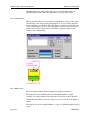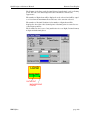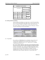
1
QuickDesigner 2
Development Software
User's Manual
MMI-QD2a
Copyright (c) 1997
Ormec Systems Corp.
All rights reserved.
19 Linden Park
Rochester, NY 14625
(716) 385-3520
December 23, 1997
Copyright Notice
Copyright 1997 by Ormec Systems Corporation. All rights reserved. This manual and any software
that it may describe, remain the exclusive property of Ormec Systems Corporation. No part of either
may be reproduced in any form without the prior written permission of ORMEC.
Warranty
ORMEC extends no warranty with respect to the merchantability or fitness of this product for any
particular purpose. It is the customer's responsibility to determine whether it is suitable for the
specific application and whether it meets performance, reliability, and safety requirements when
used in that application. ORMEC reserves the right to make improvements to the product as well as
this documentation at any time without notice.
Terms and Conditions of Sale
All software sold or otherwise provided by ORMEC is made available subject to ORMEC's published
Standard Terms And Conditions Of Sale.
Trademarks
QuickDesigner and QuickPanel are trademarks of Total Control Inc.
MotionDesk is a trademark of Ormec Systems Corp. MotionBASIC and ORION are registered
trademarks of Ormec Systems Corp.
QuickDesigner 2 Software Manual
Table of Contents
Table Of Contents
1 Welcome . . . . . . . . . . . . . . . . . . . . . . . . . . . . . . . . . . . . . . . . . . . . . . . . . . . . . . . . . . . . page 1
2 Introduction . . . . . . . . . . . . . . . . . . . . . . . . . . . . . . . . . . . . . . . . . . . . . . . . . . . . . . . . . page 3
2.1 Basic Panel Operators . . . . . . . . . . . . . . . . . . . . . . . . . . . . . . . . . . . . . . . . . . . . . . . . . . . . . . . . . page 3
2.2 Display . . . . . . . . . . . . . . . . . . . . . . . . . . . . . . . . . . . . . . . . . . . . . . . . . . . . . . . . . . . . . . . . . . . . . . . . page 3
2.3 Panel Tools . . . . . . . . . . . . . . . . . . . . . . . . . . . . . . . . . . . . . . . . . . . . . . . . . . . . . . . . . . . . . . . . . . . . page 4
2.4 Getting Started . . . . . . . . . . . . . . . . . . . . . . . . . . . . . . . . . . . . . . . . . . . . . . . . . . . . . . . . . . . . . . . . page 4
2.5 Core Components . . . . . . . . . . . . . . . . . . . . . . . . . . . . . . . . . . . . . . . . . . . . . . . . . . . . . . . . . . . . . page 5
2.5.1 Bezel . . . . . . . . . . . . . . . . . . . . . . . . . . . . . . . . . . . . . . . . . . . . . . . . . . . . . . . . . . . . . . . . . . . . . . . . . . . page 5
2.5.2 Legend plate . . . . . . . . . . . . . . . . . . . . . . . . . . . . . . . . . . . . . . . . . . . . . . . . . . . . . . . . . . . . . . . . . . . . page 5
2.5.3 Lens . . . . . . . . . . . . . . . . . . . . . . . . . . . . . . . . . . . . . . . . . . . . . . . . . . . . . . . . . . . . . . . . . . . . . . . . . . . . page 6
2.5.4 Data Display . . . . . . . . . . . . . . . . . . . . . . . . . . . . . . . . . . . . . . . . . . . . . . . . . . . . . . . . . . . . . . . . . . . . page 6
2.6 Differences between QuickPanel and QuickPanel 2 unit . . . . . . . . . . . . . . . . . . . . . . . . page 6
2.6.1 New Features . . . . . . . . . . . . . . . . . . . . . . . . . . . . . . . . . . . . . . . . . . . . . . . . . . . . . . . . . . . . . . . . . . . page 6
2.6.2 Differences . . . . . . . . . . . . . . . . . . . . . . . . . . . . . . . . . . . . . . . . . . . . . . . . . . . . . . . . . . . . . . . . . . . . . page 7
3 Installation . . . . . . . . . . . . . . . . . . . . . . . . . . . . . . . . . . . . . . . . . . . . . . . . . . . . . . . . . . page 9
3.1 Basic Requirements . . . . . . . . . . . . . . . . . . . . . . . . . . . . . . . . . . . . . . . . . . . . . . . . . . . . . . . . . . . page 9
3.2 Backing up and restoring your data . . . . . . . . . . . . . . . . . . . . . . . . . . . . . . . . . . . . . . . . . . . . page 9
3.3 Installing QuickDesigner . . . . . . . . . . . . . . . . . . . . . . . . . . . . . . . . . . . . . . . . . . . . . . . . . . . . . . page 10
3.4 Starting QuickDesigner . . . . . . . . . . . . . . . . . . . . . . . . . . . . . . . . . . . . . . . . . . . . . . . . . . . . . . . page 10
4 Quick Tour . . . . . . . . . . . . . . . . . . . . . . . . . . . . . . . . . . . . . . . . . . . . . . . . . . . . . . . . page 11
4.1 Overview . . . . . . . . . . . . . . . . . . . . . . . . . . . . . . . . . . . . . . . . . . . . . . . . . . . . . . . . . . . . . . . . . . . . . page 11
4.2 New Project . . . . . . . . . . . . . . . . . . . . . . . . . . . . . . . . . . . . . . . . . . . . . . . . . . . . . . . . . . . . . . . . . . page 12
4.3 Project Setup . . . . . . . . . . . . . . . . . . . . . . . . . . . . . . . . . . . . . . . . . . . . . . . . . . . . . . . . . . . . . . . . . page 12
4.4 QuickDesigner . . . . . . . . . . . . . . . . . . . . . . . . . . . . . . . . . . . . . . . . . . . . . . . . . . . . . . . . . . . . . . . . page 16
4.4.1 Create a Panel . . . . . . . . . . . . . . . . . . . . . . . . . . . . . . . . . . . . . . . . . . . . . . . . . . . . . . . . . . . . . . . . . page 16
4.4.2 Save the Panel . . . . . . . . . . . . . . . . . . . . . . . . . . . . . . . . . . . . . . . . . . . . . . . . . . . . . . . . . . . . . . . . . page 19
4.5 Tags . . . . . . . . . . . . . . . . . . . . . . . . . . . . . . . . . . . . . . . . . . . . . . . . . . . . . . . . . . . . . . . . . . . . . . . . . page 20
4.6 Download Panel . . . . . . . . . . . . . . . . . . . . . . . . . . . . . . . . . . . . . . . . . . . . . . . . . . . . . . . . . . . . . . page 21
4.6.1 Compile the QuickPanel Program . . . . . . . . . . . . . . . . . . . . . . . . . . . . . . . . . . . . . . . . . . . . . . . page 21
4.6.2 MotionBASIC 3.x - QuickPanel Program Download . . . . . . . . . . . . . . . . . . . . . . . . . . . . . . page 22
4.6.3 MotionBASIC 4.x - QuickPanel Program Download . . . . . . . . . . . . . . . . . . . . . . . . . . . . . . page 23
4.7 Test the Program . . . . . . . . . . . . . . . . . . . . . . . . . . . . . . . . . . . . . . . . . . . . . . . . . . . . . . . . . . . . . page 24
5 QuickManager . . . . . . . . . . . . . . . . . . . . . . . . . . . . . . . . . . . . . . . . . . . . . . . . . . . . . page 25
5.1 Menu Bar . . . . . . . . . . . . . . . . . . . . . . . . . . . . . . . . . . . . . . . . . . . . . . . . . . . . . . . . . . . . . . . . . . . . . page 25
5.2 Tool Bar . . . . . . . . . . . . . . . . . . . . . . . . . . . . . . . . . . . . . . . . . . . . . . . . . . . . . . . . . . . . . . . . . . . . . . page 26
5.3 Menu Buttons . . . . . . . . . . . . . . . . . . . . . . . . . . . . . . . . . . . . . . . . . . . . . . . . . . . . . . . . . . . . . . . . page 26
5.4 Project File List . . . . . . . . . . . . . . . . . . . . . . . . . . . . . . . . . . . . . . . . . . . . . . . . . . . . . . . . . . . . . . . page 27
MMI-QD2a
page i
QuickDesigner 2 Software Manual
Table of Contents
5.5 Status Bar . . . . . . . . . . . . . . . . . . . . . . . . . . . . . . . . . . . . . . . . . . . . . . . . . . . . . . . . . . . . . . . . . . . . page 27
5.6 Project Menu . . . . . . . . . . . . . . . . . . . . . . . . . . . . . . . . . . . . . . . . . . . . . . . . . . . . . . . . . . . . . . . . . page 27
5.6.1 New Project . . . . . . . . . . . . . . . . . . . . . . . . . . . . . . . . . . . . . . . . . . . . . . . . . . . . . . . . . . . . . . . . . . . page 28
5.6.2 Project Setup . . . . . . . . . . . . . . . . . . . . . . . . . . . . . . . . . . . . . . . . . . . . . . . . . . . . . . . . . . . . . . . . . . page 29
5.6.3 Display Button . . . . . . . . . . . . . . . . . . . . . . . . . . . . . . . . . . . . . . . . . . . . . . . . . . . . . . . . . . . . . . . . . . page 31
5.6.4 Project - Delete . . . . . . . . . . . . . . . . . . . . . . . . . . . . . . . . . . . . . . . . . . . . . . . . . . . . . . . . . . . . . . . . page 37
5.6.5 Project - Import . . . . . . . . . . . . . . . . . . . . . . . . . . . . . . . . . . . . . . . . . . . . . . . . . . . . . . . . . . . . . . . . page 37
5.6.6 Project - Export . . . . . . . . . . . . . . . . . . . . . . . . . . . . . . . . . . . . . . . . . . . . . . . . . . . . . . . . . . . . . . . . page 37
5.6.7 Project - Print Setup . . . . . . . . . . . . . . . . . . . . . . . . . . . . . . . . . . . . . . . . . . . . . . . . . . . . . . . . . . . . page 38
5.6.8 Project - Exit . . . . . . . . . . . . . . . . . . . . . . . . . . . . . . . . . . . . . . . . . . . . . . . . . . . . . . . . . . . . . . . . . . . page 38
5.6.9 Project - Print . . . . . . . . . . . . . . . . . . . . . . . . . . . . . . . . . . . . . . . . . . . . . . . . . . . . . . . . . . . . . . . . . . page 38
5.6.10 Project - Download . . . . . . . . . . . . . . . . . . . . . . . . . . . . . . . . . . . . . . . . . . . . . . . . . . . . . . . . . . . . page 41
5.7 Components Menu . . . . . . . . . . . . . . . . . . . . . . . . . . . . . . . . . . . . . . . . . . . . . . . . . . . . . . . . . . . . page 42
5.7.1 Panels . . . . . . . . . . . . . . . . . . . . . . . . . . . . . . . . . . . . . . . . . . . . . . . . . . . . . . . . . . . . . . . . . . . . . . . . . page 42
5.7.2 Tags . . . . . . . . . . . . . . . . . . . . . . . . . . . . . . . . . . . . . . . . . . . . . . . . . . . . . . . . . . . . . . . . . . . . . . . . . . . page 43
5.7.3 Alarms . . . . . . . . . . . . . . . . . . . . . . . . . . . . . . . . . . . . . . . . . . . . . . . . . . . . . . . . . . . . . . . . . . . . . . . . . page 43
5.8 Preferences . . . . . . . . . . . . . . . . . . . . . . . . . . . . . . . . . . . . . . . . . . . . . . . . . . . . . . . . . . . . . . . . . . page 44
5.9 Window Menu . . . . . . . . . . . . . . . . . . . . . . . . . . . . . . . . . . . . . . . . . . . . . . . . . . . . . . . . . . . . . . . . page 44
5.9.1 Toolbar . . . . . . . . . . . . . . . . . . . . . . . . . . . . . . . . . . . . . . . . . . . . . . . . . . . . . . . . . . . . . . . . . . . . . . . . page 45
5.9.2 Status Bar . . . . . . . . . . . . . . . . . . . . . . . . . . . . . . . . . . . . . . . . . . . . . . . . . . . . . . . . . . . . . . . . . . . . . page 45
5.9.3 Buttons . . . . . . . . . . . . . . . . . . . . . . . . . . . . . . . . . . . . . . . . . . . . . . . . . . . . . . . . . . . . . . . . . . . . . . . . page 45
5.9.4 Active Window . . . . . . . . . . . . . . . . . . . . . . . . . . . . . . . . . . . . . . . . . . . . . . . . . . . . . . . . . . . . . . . . . page 45
5.10 Help Menu . . . . . . . . . . . . . . . . . . . . . . . . . . . . . . . . . . . . . . . . . . . . . . . . . . . . . . . . . . . . . . . . . . . page 45
5.10.1 Using Help . . . . . . . . . . . . . . . . . . . . . . . . . . . . . . . . . . . . . . . . . . . . . . . . . . . . . . . . . . . . . . . . . . . . page 46
6 Tags . . . . . . . . . . . . . . . . . . . . . . . . . . . . . . . . . . . . . . . . . . . . . . . . . . . . . . . . . . . . . . page 47
6.1 Valid ORION Tags . . . . . . . . . . . . . . . . . . . . . . . . . . . . . . . . . . . . . . . . . . . . . . . . . . . . . . . . . . . . page 48
6.1.1 Tag Syntax . . . . . . . . . . . . . . . . . . . . . . . . . . . . . . . . . . . . . . . . . . . . . . . . . . . . . . . . . . . . . . . . . . . . . page 48
6.1.2 ID - Discrete Input Tag . . . . . . . . . . . . . . . . . . . . . . . . . . . . . . . . . . . . . . . . . . . . . . . . . . . . . . . . . page 49
6.1.3 OD - Discrete Output Tag . . . . . . . . . . . . . . . . . . . . . . . . . . . . . . . . . . . . . . . . . . . . . . . . . . . . . . page 49
6.1.4 OR - Unsigned Integer Tag . . . . . . . . . . . . . . . . . . . . . . . . . . . . . . . . . . . . . . . . . . . . . . . . . . . . . page 49
6.1.5 LR - Unsigned 24-bit Integer Tag . . . . . . . . . . . . . . . . . . . . . . . . . . . . . . . . . . . . . . . . . . . . . . . page 50
6.1.6 LU - Unsigned Long Integer Tag . . . . . . . . . . . . . . . . . . . . . . . . . . . . . . . . . . . . . . . . . . . . . . . . page 50
6.1.7 OS - Signed Integer Tag . . . . . . . . . . . . . . . . . . . . . . . . . . . . . . . . . . . . . . . . . . . . . . . . . . . . . . . . page 50
6.1.8 LS - Signed 24-bit Integer Tag . . . . . . . . . . . . . . . . . . . . . . . . . . . . . . . . . . . . . . . . . . . . . . . . . . page 51
6.1.9 LI - Signed Long Integer Tag . . . . . . . . . . . . . . . . . . . . . . . . . . . . . . . . . . . . . . . . . . . . . . . . . . . page 51
6.1.10 FR - Floating Point Tag . . . . . . . . . . . . . . . . . . . . . . . . . . . . . . . . . . . . . . . . . . . . . . . . . . . . . . . page 52
6.1.11 MS - String Data Tag . . . . . . . . . . . . . . . . . . . . . . . . . . . . . . . . . . . . . . . . . . . . . . . . . . . . . . . . . . page 52
6.2 Selecting Tags . . . . . . . . . . . . . . . . . . . . . . . . . . . . . . . . . . . . . . . . . . . . . . . . . . . . . . . . . . . . . . . . page 53
6.2.1 Tag Buttons . . . . . . . . . . . . . . . . . . . . . . . . . . . . . . . . . . . . . . . . . . . . . . . . . . . . . . . . . . . . . . . . . . . . page 53
6.2.2 Add Tag . . . . . . . . . . . . . . . . . . . . . . . . . . . . . . . . . . . . . . . . . . . . . . . . . . . . . . . . . . . . . . . . . . . . . . . page 54
ii
ORM-DOCa
QuickDesigner 2 Software Manual
Table of Contents
6.2.3 Delete Tag . . . . . . . . . . . . . . . . . . . . . . . . . . . . . . . . . . . . . . . . . . . . . . . . . . . . . . . . . . . . . . . . . . . . . page 55
6.2.4 UnDelete . . . . . . . . . . . . . . . . . . . . . . . . . . . . . . . . . . . . . . . . . . . . . . . . . . . . . . . . . . . . . . . . . . . . . . . page 55
6.2.5 Purge . . . . . . . . . . . . . . . . . . . . . . . . . . . . . . . . . . . . . . . . . . . . . . . . . . . . . . . . . . . . . . . . . . . . . . . . . . page 55
6.2.6 Tag Attributes . . . . . . . . . . . . . . . . . . . . . . . . . . . . . . . . . . . . . . . . . . . . . . . . . . . . . . . . . . . . . . . . . . page 55
6.2.7 Tag Import . . . . . . . . . . . . . . . . . . . . . . . . . . . . . . . . . . . . . . . . . . . . . . . . . . . . . . . . . . . . . . . . . . . . . page 57
6.2.8 Tag Export . . . . . . . . . . . . . . . . . . . . . . . . . . . . . . . . . . . . . . . . . . . . . . . . . . . . . . . . . . . . . . . . . . . . . page 57
6.2.9 Close . . . . . . . . . . . . . . . . . . . . . . . . . . . . . . . . . . . . . . . . . . . . . . . . . . . . . . . . . . . . . . . . . . . . . . . . . . page 58
6.3 Tools Menu - Tag Validation . . . . . . . . . . . . . . . . . . . . . . . . . . . . . . . . . . . . . . . . . . . . . . . . . . . page 58
6.4 Internal Tags . . . . . . . . . . . . . . . . . . . . . . . . . . . . . . . . . . . . . . . . . . . . . . . . . . . . . . . . . . . . . . . . . page 59
6.4.1 System Variables . . . . . . . . . . . . . . . . . . . . . . . . . . . . . . . . . . . . . . . . . . . . . . . . . . . . . . . . . . . . . . page 59
6.5 Changing Panels . . . . . . . . . . . . . . . . . . . . . . . . . . . . . . . . . . . . . . . . . . . . . . . . . . . . . . . . . . . . . page 61
7 Alarms . . . . . . . . . . . . . . . . . . . . . . . . . . . . . . . . . . . . . . . . . . . . . . . . . . . . . . . . . . . . page 63
7.1 Introduction to Alarms . . . . . . . . . . . . . . . . . . . . . . . . . . . . . . . . . . . . . . . . . . . . . . . . . . . . . . . . page 63
7.1.1 Bit and Word Address Tags . . . . . . . . . . . . . . . . . . . . . . . . . . . . . . . . . . . . . . . . . . . . . . . . . . . . page 64
7.1.2 Alarms Configuration . . . . . . . . . . . . . . . . . . . . . . . . . . . . . . . . . . . . . . . . . . . . . . . . . . . . . . . . . . . page 64
7.1.3 File menu . . . . . . . . . . . . . . . . . . . . . . . . . . . . . . . . . . . . . . . . . . . . . . . . . . . . . . . . . . . . . . . . . . . . . . page 65
7.1.4 Configuration . . . . . . . . . . . . . . . . . . . . . . . . . . . . . . . . . . . . . . . . . . . . . . . . . . . . . . . . . . . . . . . . . . page 67
7.1.5 Edit Menu
. . . . . . . . . . . . . . . . . . . . . . . . . . . . . . . . . . . . . . . . . . . . . . . . . . . . . . . . . . . . . . . . . . . . . page 72
8 QuickDesigner 2 . . . . . . . . . . . . . . . . . . . . . . . . . . . . . . . . . . . . . . . . . . . . . . . . . . . page 77
8.1 QuickDesigner Window . . . . . . . . . . . . . . . . . . . . . . . . . . . . . . . . . . . . . . . . . . . . . . . . . . . . . . . page 77
8.1.1 Menu Bar . . . . . . . . . . . . . . . . . . . . . . . . . . . . . . . . . . . . . . . . . . . . . . . . . . . . . . . . . . . . . . . . . . . . . . page 78
8.1.2 Button Bar . . . . . . . . . . . . . . . . . . . . . . . . . . . . . . . . . . . . . . . . . . . . . . . . . . . . . . . . . . . . . . . . . . . . . page 79
8.1.3 Status Bar . . . . . . . . . . . . . . . . . . . . . . . . . . . . . . . . . . . . . . . . . . . . . . . . . . . . . . . . . . . . . . . . . . . . . page 79
8.2 Creating a Panel . . . . . . . . . . . . . . . . . . . . . . . . . . . . . . . . . . . . . . . . . . . . . . . . . . . . . . . . . . . . . . page 79
8.2.1 Tool Box . . . . . . . . . . . . . . . . . . . . . . . . . . . . . . . . . . . . . . . . . . . . . . . . . . . . . . . . . . . . . . . . . . . . . . . page 79
8.2.2 Placing an Object on a Panel . . . . . . . . . . . . . . . . . . . . . . . . . . . . . . . . . . . . . . . . . . . . . . . . . . . page 80
8.2.3 Dialog Box . . . . . . . . . . . . . . . . . . . . . . . . . . . . . . . . . . . . . . . . . . . . . . . . . . . . . . . . . . . . . . . . . . . . . page 80
8.2.4 Sizing an Object . . . . . . . . . . . . . . . . . . . . . . . . . . . . . . . . . . . . . . . . . . . . . . . . . . . . . . . . . . . . . . . . page 81
8.2.5 Editing the Object . . . . . . . . . . . . . . . . . . . . . . . . . . . . . . . . . . . . . . . . . . . . . . . . . . . . . . . . . . . . . . page 81
8.2.6 Grouping objects . . . . . . . . . . . . . . . . . . . . . . . . . . . . . . . . . . . . . . . . . . . . . . . . . . . . . . . . . . . . . . . page 82
8.2.7 Object Tag Display . . . . . . . . . . . . . . . . . . . . . . . . . . . . . . . . . . . . . . . . . . . . . . . . . . . . . . . . . . . . . page 82
8.2.8 Keypad Tag Display . . . . . . . . . . . . . . . . . . . . . . . . . . . . . . . . . . . . . . . . . . . . . . . . . . . . . . . . . . . . page 82
8.2.9 Changing the Window View . . . . . . . . . . . . . . . . . . . . . . . . . . . . . . . . . . . . . . . . . . . . . . . . . . . . page 83
8.2.10 Tiling and Drawing Grids . . . . . . . . . . . . . . . . . . . . . . . . . . . . . . . . . . . . . . . . . . . . . . . . . . . . . . page 83
8.2.11 Touch Grid . . . . . . . . . . . . . . . . . . . . . . . . . . . . . . . . . . . . . . . . . . . . . . . . . . . . . . . . . . . . . . . . . . . page 83
8.2.12 Part Objects . . . . . . . . . . . . . . . . . . . . . . . . . . . . . . . . . . . . . . . . . . . . . . . . . . . . . . . . . . . . . . . . . . page 84
8.2.13 Tiling Grid for Objects . . . . . . . . . . . . . . . . . . . . . . . . . . . . . . . . . . . . . . . . . . . . . . . . . . . . . . . . . page 84
8.2.14 Tiling Snap System . . . . . . . . . . . . . . . . . . . . . . . . . . . . . . . . . . . . . . . . . . . . . . . . . . . . . . . . . . . page 85
8.2.15 Default Settings . . . . . . . . . . . . . . . . . . . . . . . . . . . . . . . . . . . . . . . . . . . . . . . . . . . . . . . . . . . . . . . page 85
8.2.16 Drawing Grid . . . . . . . . . . . . . . . . . . . . . . . . . . . . . . . . . . . . . . . . . . . . . . . . . . . . . . . . . . . . . . . . . . page 85
MMI-QD2a
page iii
QuickDesigner 2 Software Manual
Table of Contents
8.2.17 Drawing Snap System . . . . . . . . . . . . . . . . . . . . . . . . . . . . . . . . . . . . . . . . . . . . . . . . . . . . . . . . . page 86
8.2.18 Grid Settings Dialog Box . . . . . . . . . . . . . . . . . . . . . . . . . . . . . . . . . . . . . . . . . . . . . . . . . . . . . . page 86
8.2.19 Other Editing Features . . . . . . . . . . . . . . . . . . . . . . . . . . . . . . . . . . . . . . . . . . . . . . . . . . . . . . . . page 86
8.3 Menu Commands
. . . . . . . . . . . . . . . . . . . . . . . . . . . . . . . . . . . . . . . . . . . . . . . . . . . . . . . . . . . . page 86
8.3.1 File Menu . . . . . . . . . . . . . . . . . . . . . . . . . . . . . . . . . . . . . . . . . . . . . . . . . . . . . . . . . . . . . . . . . . . . . page 86
8.3.2 Edit Menu
. . . . . . . . . . . . . . . . . . . . . . . . . . . . . . . . . . . . . . . . . . . . . . . . . . . . . . . . . . . . . . . . . . . . . page 89
8.3.3 Tools Menu
. . . . . . . . . . . . . . . . . . . . . . . . . . . . . . . . . . . . . . . . . . . . . . . . . . . . . . . . . . . . . . . . . . . page 93
8.3.4 View Menu
. . . . . . . . . . . . . . . . . . . . . . . . . . . . . . . . . . . . . . . . . . . . . . . . . . . . . . . . . . . . . . . . . . . . page 96
8.3.5 Options Menu
. . . . . . . . . . . . . . . . . . . . . . . . . . . . . . . . . . . . . . . . . . . . . . . . . . . . . . . . . . . . . . . . . page 98
8.3.6 Settings Menu . . . . . . . . . . . . . . . . . . . . . . . . . . . . . . . . . . . . . . . . . . . . . . . . . . . . . . . . . . . . . . . . . page 99
8.3.7 Grid Settings Dialog Box . . . . . . . . . . . . . . . . . . . . . . . . . . . . . . . . . . . . . . . . . . . . . . . . . . . . . page 100
8.3.8 Preferences . . . . . . . . . . . . . . . . . . . . . . . . . . . . . . . . . . . . . . . . . . . . . . . . . . . . . . . . . . . . . . . . . . page 100
8.4 Help . . . . . . . . . . . . . . . . . . . . . . . . . . . . . . . . . . . . . . . . . . . . . . . . . . . . . . . . . . . . . . . . . . . . . . . . . page 101
8.4.1 Contents . . . . . . . . . . . . . . . . . . . . . . . . . . . . . . . . . . . . . . . . . . . . . . . . . . . . . . . . . . . . . . . . . . . . . page 102
8.4.2 Getting Started . . . . . . . . . . . . . . . . . . . . . . . . . . . . . . . . . . . . . . . . . . . . . . . . . . . . . . . . . . . . . . . page 102
8.4.3 Learning QuickDesigner . . . . . . . . . . . . . . . . . . . . . . . . . . . . . . . . . . . . . . . . . . . . . . . . . . . . . . page 102
8.4.4 About QuickDesigner . . . . . . . . . . . . . . . . . . . . . . . . . . . . . . . . . . . . . . . . . . . . . . . . . . . . . . . . . page 103
8.5 Standard Tool Settings Checkboxes . . . . . . . . . . . . . . . . . . . . . . . . . . . . . . . . . . . . . . . . . . page 103
8.5.1 OK . . . . . . . . . . . . . . . . . . . . . . . . . . . . . . . . . . . . . . . . . . . . . . . . . . . . . . . . . . . . . . . . . . . . . . . . . . . page 103
8.5.2 Cancel . . . . . . . . . . . . . . . . . . . . . . . . . . . . . . . . . . . . . . . . . . . . . . . . . . . . . . . . . . . . . . . . . . . . . . . page 103
8.5.3 Make Default . . . . . . . . . . . . . . . . . . . . . . . . . . . . . . . . . . . . . . . . . . . . . . . . . . . . . . . . . . . . . . . . . page 103
8.5.4 Help . . . . . . . . . . . . . . . . . . . . . . . . . . . . . . . . . . . . . . . . . . . . . . . . . . . . . . . . . . . . . . . . . . . . . . . . . page 103
9 Library Browser . . . . . . . . . . . . . . . . . . . . . . . . . . . . . . . . . . . . . . . . . . . . . . . . . . . page 105
9.1 Library Window . . . . . . . . . . . . . . . . . . . . . . . . . . . . . . . . . . . . . . . . . . . . . . . . . . . . . . . . . . . . . . page 105
9.2 Library Menu . . . . . . . . . . . . . . . . . . . . . . . . . . . . . . . . . . . . . . . . . . . . . . . . . . . . . . . . . . . . . . . . page 106
9.2.1 New . . . . . . . . . . . . . . . . . . . . . . . . . . . . . . . . . . . . . . . . . . . . . . . . . . . . . . . . . . . . . . . . . . . . . . . . . page 106
9.2.2 Open . . . . . . . . . . . . . . . . . . . . . . . . . . . . . . . . . . . . . . . . . . . . . . . . . . . . . . . . . . . . . . . . . . . . . . . . page 106
9.2.3 Exit . . . . . . . . . . . . . . . . . . . . . . . . . . . . . . . . . . . . . . . . . . . . . . . . . . . . . . . . . . . . . . . . . . . . . . . . . . page 107
9.3 Edit Menu . . . . . . . . . . . . . . . . . . . . . . . . . . . . . . . . . . . . . . . . . . . . . . . . . . . . . . . . . . . . . . . . . . . page 107
9.3.1 Cut . . . . . . . . . . . . . . . . . . . . . . . . . . . . . . . . . . . . . . . . . . . . . . . . . . . . . . . . . . . . . . . . . . . . . . . . . . page 107
9.3.2 Copy . . . . . . . . . . . . . . . . . . . . . . . . . . . . . . . . . . . . . . . . . . . . . . . . . . . . . . . . . . . . . . . . . . . . . . . . . page 107
9.3.3 Paste . . . . . . . . . . . . . . . . . . . . . . . . . . . . . . . . . . . . . . . . . . . . . . . . . . . . . . . . . . . . . . . . . . . . . . . . page 107
9.4 View Menu . . . . . . . . . . . . . . . . . . . . . . . . . . . . . . . . . . . . . . . . . . . . . . . . . . . . . . . . . . . . . . . . . . page 108
9.4.1 Toolbar . . . . . . . . . . . . . . . . . . . . . . . . . . . . . . . . . . . . . . . . . . . . . . . . . . . . . . . . . . . . . . . . . . . . . . page 108
9.5 Browser Properties . . . . . . . . . . . . . . . . . . . . . . . . . . . . . . . . . . . . . . . . . . . . . . . . . . . . . . . . . . page 108
9.5.1 Drag 'n Drop . . . . . . . . . . . . . . . . . . . . . . . . . . . . . . . . . . . . . . . . . . . . . . . . . . . . . . . . . . . . . . . . . page 108
9.6 Appearance . . . . . . . . . . . . . . . . . . . . . . . . . . . . . . . . . . . . . . . . . . . . . . . . . . . . . . . . . . . . . . . . . page 109
9.6.1 Text Colors . . . . . . . . . . . . . . . . . . . . . . . . . . . . . . . . . . . . . . . . . . . . . . . . . . . . . . . . . . . . . . . . . . page 109
9.7 Folder Menu
. . . . . . . . . . . . . . . . . . . . . . . . . . . . . . . . . . . . . . . . . . . . . . . . . . . . . . . . . . . . . . . . page 110
9.7.1 New Folder . . . . . . . . . . . . . . . . . . . . . . . . . . . . . . . . . . . . . . . . . . . . . . . . . . . . . . . . . . . . . . . . . . page 110
iv
ORM-DOCa
QuickDesigner 2 Software Manual
Table of Contents
9.7.2 Transfer . . . . . . . . . . . . . . . . . . . . . . . . . . . . . . . . . . . . . . . . . . . . . . . . . . . . . . . . . . . . . . . . . . . . . page 110
9.7.3 Delete Folder . . . . . . . . . . . . . . . . . . . . . . . . . . . . . . . . . . . . . . . . . . . . . . . . . . . . . . . . . . . . . . . . page 111
9.7.4 Folder Properties . . . . . . . . . . . . . . . . . . . . . . . . . . . . . . . . . . . . . . . . . . . . . . . . . . . . . . . . . . . . . page 111
9.8 Object Menu
. . . . . . . . . . . . . . . . . . . . . . . . . . . . . . . . . . . . . . . . . . . . . . . . . . . . . . . . . . . . . . . . page 111
9.8.1 Transfer Object . . . . . . . . . . . . . . . . . . . . . . . . . . . . . . . . . . . . . . . . . . . . . . . . . . . . . . . . . . . . . . page 111
9.8.2 Delete Object . . . . . . . . . . . . . . . . . . . . . . . . . . . . . . . . . . . . . . . . . . . . . . . . . . . . . . . . . . . . . . . . page 112
9.8.3 Object Properties . . . . . . . . . . . . . . . . . . . . . . . . . . . . . . . . . . . . . . . . . . . . . . . . . . . . . . . . . . . . . page 112
9.8.4 Right Mouse Button Options for Folders . . . . . . . . . . . . . . . . . . . . . . . . . . . . . . . . . . . . . . . page 113
9.8.5 Right Mouse Button Options for Objects . . . . . . . . . . . . . . . . . . . . . . . . . . . . . . . . . . . . . . page 113
10 Alarm Window . . . . . . . . . . . . . . . . . . . . . . . . . . . . . . . . . . . . . . . . . . . . . . . . . . . page 115
10.1 Creating an Alarm Window . . . . . . . . . . . . . . . . . . . . . . . . . . . . . . . . . . . . . . . . . . . . . . . . . . page 116
10.1.1 Bezel . . . . . . . . . . . . . . . . . . . . . . . . . . . . . . . . . . . . . . . . . . . . . . . . . . . . . . . . . . . . . . . . . . . . . . . page 116
10.1.2 Legend . . . . . . . . . . . . . . . . . . . . . . . . . . . . . . . . . . . . . . . . . . . . . . . . . . . . . . . . . . . . . . . . . . . . . page 117
10.1.3 Text . . . . . . . . . . . . . . . . . . . . . . . . . . . . . . . . . . . . . . . . . . . . . . . . . . . . . . . . . . . . . . . . . . . . . . . . page 118
10.1.4 Advanced Button . . . . . . . . . . . . . . . . . . . . . . . . . . . . . . . . . . . . . . . . . . . . . . . . . . . . . . . . . . . . page 119
10.2 Using the Alarm Window . . . . . . . . . . . . . . . . . . . . . . . . . . . . . . . . . . . . . . . . . . . . . . . . . . . . page 119
11 Analog Meter . . . . . . . . . . . . . . . . . . . . . . . . . . . . . . . . . . . . . . . . . . . . . . . . . . . . . page 121
11.1 Creating an Analog Meter . . . . . . . . . . . . . . . . . . . . . . . . . . . . . . . . . . . . . . . . . . . . . . . . . . . page 122
11.1.1 Colors . . . . . . . . . . . . . . . . . . . . . . . . . . . . . . . . . . . . . . . . . . . . . . . . . . . . . . . . . . . . . . . . . . . . . . page 123
11.1.2 Tag Variables . . . . . . . . . . . . . . . . . . . . . . . . . . . . . . . . . . . . . . . . . . . . . . . . . . . . . . . . . . . . . . . page 123
11.1.3 Bar Color . . . . . . . . . . . . . . . . . . . . . . . . . . . . . . . . . . . . . . . . . . . . . . . . . . . . . . . . . . . . . . . . . . . page 123
11.1.4 Filled . . . . . . . . . . . . . . . . . . . . . . . . . . . . . . . . . . . . . . . . . . . . . . . . . . . . . . . . . . . . . . . . . . . . . . . page 123
11.1.5 Shape . . . . . . . . . . . . . . . . . . . . . . . . . . . . . . . . . . . . . . . . . . . . . . . . . . . . . . . . . . . . . . . . . . . . . . page 123
11.1.6 Orientation . . . . . . . . . . . . . . . . . . . . . . . . . . . . . . . . . . . . . . . . . . . . . . . . . . . . . . . . . . . . . . . . . . page 124
11.1.7 Face Plate . . . . . . . . . . . . . . . . . . . . . . . . . . . . . . . . . . . . . . . . . . . . . . . . . . . . . . . . . . . . . . . . . . page 124
11.1.8 Scale . . . . . . . . . . . . . . . . . . . . . . . . . . . . . . . . . . . . . . . . . . . . . . . . . . . . . . . . . . . . . . . . . . . . . . . page 124
11.1.9 Simulate . . . . . . . . . . . . . . . . . . . . . . . . . . . . . . . . . . . . . . . . . . . . . . . . . . . . . . . . . . . . . . . . . . . . page 125
12 Bar Graph . . . . . . . . . . . . . . . . . . . . . . . . . . . . . . . . . . . . . . . . . . . . . . . . . . . . . . . . page 127
12.1 Creating a Bar Graph . . . . . . . . . . . . . . . . . . . . . . . . . . . . . . . . . . . . . . . . . . . . . . . . . . . . . . . page 127
12.1.1 Examples . . . . . . . . . . . . . . . . . . . . . . . . . . . . . . . . . . . . . . . . . . . . . . . . . . . . . . . . . . . . . . . . . . . page 127
12.1.2 Tag Variable . . . . . . . . . . . . . . . . . . . . . . . . . . . . . . . . . . . . . . . . . . . . . . . . . . . . . . . . . . . . . . . . page 128
12.1.3 Orientation . . . . . . . . . . . . . . . . . . . . . . . . . . . . . . . . . . . . . . . . . . . . . . . . . . . . . . . . . . . . . . . . . . page 128
12.1.4 Bar Color . . . . . . . . . . . . . . . . . . . . . . . . . . . . . . . . . . . . . . . . . . . . . . . . . . . . . . . . . . . . . . . . . . . page 128
12.1.5 Face Plate . . . . . . . . . . . . . . . . . . . . . . . . . . . . . . . . . . . . . . . . . . . . . . . . . . . . . . . . . . . . . . . . . . page 129
12.1.6 Scale . . . . . . . . . . . . . . . . . . . . . . . . . . . . . . . . . . . . . . . . . . . . . . . . . . . . . . . . . . . . . . . . . . . . . . . page 129
12.1.7 Simulate . . . . . . . . . . . . . . . . . . . . . . . . . . . . . . . . . . . . . . . . . . . . . . . . . . . . . . . . . . . . . . . . . . . . page 130
12.1.8 Advanced . . . . . . . . . . . . . . . . . . . . . . . . . . . . . . . . . . . . . . . . . . . . . . . . . . . . . . . . . . . . . . . . . . . page 130
13 Bitmap . . . . . . . . . . . . . . . . . . . . . . . . . . . . . . . . . . . . . . . . . . . . . . . . . . . . . . . . . . . page 133
13.1 Creating a Bitmap . . . . . . . . . . . . . . . . . . . . . . . . . . . . . . . . . . . . . . . . . . . . . . . . . . . . . . . . . . page 133
13.1.1 Sample Bitmap . . . . . . . . . . . . . . . . . . . . . . . . . . . . . . . . . . . . . . . . . . . . . . . . . . . . . . . . . . . . . page 133
MMI-QD2a
page v
QuickDesigner 2 Software Manual
Table of Contents
13.1.2 Horizontal Justify . . . . . . . . . . . . . . . . . . . . . . . . . . . . . . . . . . . . . . . . . . . . . . . . . . . . . . . . . . . . page 134
13.1.3 Vertical Justify . . . . . . . . . . . . . . . . . . . . . . . . . . . . . . . . . . . . . . . . . . . . . . . . . . . . . . . . . . . . . . page 134
13.1.4 Options . . . . . . . . . . . . . . . . . . . . . . . . . . . . . . . . . . . . . . . . . . . . . . . . . . . . . . . . . . . . . . . . . . . . . page 134
13.1.5 Bitmap Statistics . . . . . . . . . . . . . . . . . . . . . . . . . . . . . . . . . . . . . . . . . . . . . . . . . . . . . . . . . . . . page 134
13.1.6 Edit . . . . . . . . . . . . . . . . . . . . . . . . . . . . . . . . . . . . . . . . . . . . . . . . . . . . . . . . . . . . . . . . . . . . . . . . . page 134
13.1.7 Import . . . . . . . . . . . . . . . . . . . . . . . . . . . . . . . . . . . . . . . . . . . . . . . . . . . . . . . . . . . . . . . . . . . . . . page 135
13.1.8 Export . . . . . . . . . . . . . . . . . . . . . . . . . . . . . . . . . . . . . . . . . . . . . . . . . . . . . . . . . . . . . . . . . . . . . . page 135
14 Circle . . . . . . . . . . . . . . . . . . . . . . . . . . . . . . . . . . . . . . . . . . . . . . . . . . . . . . . . . . . . page 137
14.1 Creating a Circle . . . . . . . . . . . . . . . . . . . . . . . . . . . . . . . . . . . . . . . . . . . . . . . . . . . . . . . . . . . . page 137
14.1.1 Moving a Circle . . . . . . . . . . . . . . . . . . . . . . . . . . . . . . . . . . . . . . . . . . . . . . . . . . . . . . . . . . . . . page 137
14.1.2 Sizing a Circle . . . . . . . . . . . . . . . . . . . . . . . . . . . . . . . . . . . . . . . . . . . . . . . . . . . . . . . . . . . . . . page 137
14.1.3 Line Style . . . . . . . . . . . . . . . . . . . . . . . . . . . . . . . . . . . . . . . . . . . . . . . . . . . . . . . . . . . . . . . . . . . page 138
14.1.4 Filled/Unfilled . . . . . . . . . . . . . . . . . . . . . . . . . . . . . . . . . . . . . . . . . . . . . . . . . . . . . . . . . . . . . . . page 138
14.1.5 Line Color . . . . . . . . . . . . . . . . . . . . . . . . . . . . . . . . . . . . . . . . . . . . . . . . . . . . . . . . . . . . . . . . . . page 138
14.1.6 Fill Color . . . . . . . . . . . . . . . . . . . . . . . . . . . . . . . . . . . . . . . . . . . . . . . . . . . . . . . . . . . . . . . . . . . . page 138
15 Goto Panel Push Button . . . . . . . . . . . . . . . . . . . . . . . . . . . . . . . . . . . . . . . . . . page 139
15.1 Creating a Goto Panel push button . . . . . . . . . . . . . . . . . . . . . . . . . . . . . . . . . . . . . . . . . . page 139
15.1.1 Panel Name . . . . . . . . . . . . . . . . . . . . . . . . . . . . . . . . . . . . . . . . . . . . . . . . . . . . . . . . . . . . . . . . page 139
15.1.2 Bezel . . . . . . . . . . . . . . . . . . . . . . . . . . . . . . . . . . . . . . . . . . . . . . . . . . . . . . . . . . . . . . . . . . . . . . . page 140
15.1.3 Legend Plate . . . . . . . . . . . . . . . . . . . . . . . . . . . . . . . . . . . . . . . . . . . . . . . . . . . . . . . . . . . . . . . page 140
15.1.4 Advanced Button . . . . . . . . . . . . . . . . . . . . . . . . . . . . . . . . . . . . . . . . . . . . . . . . . . . . . . . . . . . . page 141
15.2 Using Goto Panel Buttons . . . . . . . . . . . . . . . . . . . . . . . . . . . . . . . . . . . . . . . . . . . . . . . . . . page 141
16 Illuminated Push Button . . . . . . . . . . . . . . . . . . . . . . . . . . . . . . . . . . . . . . . . . . page 143
16.1 Creating an Illuminated Push Button . . . . . . . . . . . . . . . . . . . . . . . . . . . . . . . . . . . . . . . . page 143
16.1.1 Push Button Tag Variable . . . . . . . . . . . . . . . . . . . . . . . . . . . . . . . . . . . . . . . . . . . . . . . . . . . page 143
16.1.2 Action . . . . . . . . . . . . . . . . . . . . . . . . . . . . . . . . . . . . . . . . . . . . . . . . . . . . . . . . . . . . . . . . . . . . . . page 143
16.1.3 Pilot Light Tag Variable . . . . . . . . . . . . . . . . . . . . . . . . . . . . . . . . . . . . . . . . . . . . . . . . . . . . . . page 144
16.1.4 Bezel . . . . . . . . . . . . . . . . . . . . . . . . . . . . . . . . . . . . . . . . . . . . . . . . . . . . . . . . . . . . . . . . . . . . . . . page 144
16.1.5 States . . . . . . . . . . . . . . . . . . . . . . . . . . . . . . . . . . . . . . . . . . . . . . . . . . . . . . . . . . . . . . . . . . . . . . page 144
16.1.6 Advanced Button . . . . . . . . . . . . . . . . . . . . . . . . . . . . . . . . . . . . . . . . . . . . . . . . . . . . . . . . . . . . page 145
17 Legend Plate . . . . . . . . . . . . . . . . . . . . . . . . . . . . . . . . . . . . . . . . . . . . . . . . . . . . . page 147
17.1 Creating a Legend Plate . . . . . . . . . . . . . . . . . . . . . . . . . . . . . . . . . . . . . . . . . . . . . . . . . . . . page 147
17.1.1 Examples . . . . . . . . . . . . . . . . . . . . . . . . . . . . . . . . . . . . . . . . . . . . . . . . . . . . . . . . . . . . . . . . . . . page 148
17.1.2 Text . . . . . . . . . . . . . . . . . . . . . . . . . . . . . . . . . . . . . . . . . . . . . . . . . . . . . . . . . . . . . . . . . . . . . . . . page 148
17.1.3 Colors . . . . . . . . . . . . . . . . . . . . . . . . . . . . . . . . . . . . . . . . . . . . . . . . . . . . . . . . . . . . . . . . . . . . . . page 148
18 Local Image Display . . . . . . . . . . . . . . . . . . . . . . . . . . . . . . . . . . . . . . . . . . . . . . page 149
18.1 Creating a Local Image Display . . . . . . . . . . . . . . . . . . . . . . . . . . . . . . . . . . . . . . . . . . . . . page 149
18.1.1 Creating States . . . . . . . . . . . . . . . . . . . . . . . . . . . . . . . . . . . . . . . . . . . . . . . . . . . . . . . . . . . . . page 150
18.1.2 Tag Variable . . . . . . . . . . . . . . . . . . . . . . . . . . . . . . . . . . . . . . . . . . . . . . . . . . . . . . . . . . . . . . . . page 150
18.1.3 PLC Value . . . . . . . . . . . . . . . . . . . . . . . . . . . . . . . . . . . . . . . . . . . . . . . . . . . . . . . . . . . . . . . . . . page 151
vi
ORM-DOCa
QuickDesigner 2 Software Manual
Table of Contents
18.1.4 States . . . . . . . . . . . . . . . . . . . . . . . . . . . . . . . . . . . . . . . . . . . . . . . . . . . . . . . . . . . . . . . . . . . . . . page 151
19 Local Message Display . . . . . . . . . . . . . . . . . . . . . . . . . . . . . . . . . . . . . . . . . . . . page 153
19.1 Creating a Local Message Display . . . . . . . . . . . . . . . . . . . . . . . . . . . . . . . . . . . . . . . . . . . page 153
19.1.1 Alarms and Prompts . . . . . . . . . . . . . . . . . . . . . . . . . . . . . . . . . . . . . . . . . . . . . . . . . . . . . . . . page 153
19.1.2 Import . . . . . . . . . . . . . . . . . . . . . . . . . . . . . . . . . . . . . . . . . . . . . . . . . . . . . . . . . . . . . . . . . . . . . . page 154
19.1.3 Import File Layout Settings . . . . . . . . . . . . . . . . . . . . . . . . . . . . . . . . . . . . . . . . . . . . . . . . . . page 154
19.1.4 Tag Variable . . . . . . . . . . . . . . . . . . . . . . . . . . . . . . . . . . . . . . . . . . . . . . . . . . . . . . . . . . . . . . . . page 158
19.1.5 PLC Value . . . . . . . . . . . . . . . . . . . . . . . . . . . . . . . . . . . . . . . . . . . . . . . . . . . . . . . . . . . . . . . . . . page 158
19.1.6 States . . . . . . . . . . . . . . . . . . . . . . . . . . . . . . . . . . . . . . . . . . . . . . . . . . . . . . . . . . . . . . . . . . . . . . page 159
19.1.7 Import FIles . . . . . . . . . . . . . . . . . . . . . . . . . . . . . . . . . . . . . . . . . . . . . . . . . . . . . . . . . . . . . . . . . page 159
19.1.8 Export . . . . . . . . . . . . . . . . . . . . . . . . . . . . . . . . . . . . . . . . . . . . . . . . . . . . . . . . . . . . . . . . . . . . . . page 159
20 Numeric Data Display . . . . . . . . . . . . . . . . . . . . . . . . . . . . . . . . . . . . . . . . . . . . . page 161
20.1 Creating a Numeric Data Display . . . . . . . . . . . . . . . . . . . . . . . . . . . . . . . . . . . . . . . . . . . . page 161
20.1.1 Tag Variable . . . . . . . . . . . . . . . . . . . . . . . . . . . . . . . . . . . . . . . . . . . . . . . . . . . . . . . . . . . . . . . . page 161
20.1.2 Legend Plate . . . . . . . . . . . . . . . . . . . . . . . . . . . . . . . . . . . . . . . . . . . . . . . . . . . . . . . . . . . . . . . page 162
20.1.3 Data Format . . . . . . . . . . . . . . . . . . . . . . . . . . . . . . . . . . . . . . . . . . . . . . . . . . . . . . . . . . . . . . . . page 162
21 Numeric Data Entry . . . . . . . . . . . . . . . . . . . . . . . . . . . . . . . . . . . . . . . . . . . . . . . page 165
21.1 Creating a Numeric Data Entry . . . . . . . . . . . . . . . . . . . . . . . . . . . . . . . . . . . . . . . . . . . . . . page 166
21.1.1 Tag Variable . . . . . . . . . . . . . . . . . . . . . . . . . . . . . . . . . . . . . . . . . . . . . . . . . . . . . . . . . . . . . . . . page 166
21.1.2 Trigger Tag . . . . . . . . . . . . . . . . . . . . . . . . . . . . . . . . . . . . . . . . . . . . . . . . . . . . . . . . . . . . . . . . . page 167
21.1.3 KeyPad Title Off . . . . . . . . . . . . . . . . . . . . . . . . . . . . . . . . . . . . . . . . . . . . . . . . . . . . . . . . . . . . page 167
21.1.4 Input Range . . . . . . . . . . . . . . . . . . . . . . . . . . . . . . . . . . . . . . . . . . . . . . . . . . . . . . . . . . . . . . . . page 167
21.1.5 Bezel . . . . . . . . . . . . . . . . . . . . . . . . . . . . . . . . . . . . . . . . . . . . . . . . . . . . . . . . . . . . . . . . . . . . . . . page 167
21.1.6 Legend Plate . . . . . . . . . . . . . . . . . . . . . . . . . . . . . . . . . . . . . . . . . . . . . . . . . . . . . . . . . . . . . . . page 168
21.1.7 Data Format Settings . . . . . . . . . . . . . . . . . . . . . . . . . . . . . . . . . . . . . . . . . . . . . . . . . . . . . . . page 169
21.1.8 Advanced . . . . . . . . . . . . . . . . . . . . . . . . . . . . . . . . . . . . . . . . . . . . . . . . . . . . . . . . . . . . . . . . . . . page 170
22 Pilot Light . . . . . . . . . . . . . . . . . . . . . . . . . . . . . . . . . . . . . . . . . . . . . . . . . . . . . . . . page 171
22.1 Creating a pilot light . . . . . . . . . . . . . . . . . . . . . . . . . . . . . . . . . . . . . . . . . . . . . . . . . . . . . . . . page 171
22.1.1 Tag Variable . . . . . . . . . . . . . . . . . . . . . . . . . . . . . . . . . . . . . . . . . . . . . . . . . . . . . . . . . . . . . . . . page 171
22.1.2 Style . . . . . . . . . . . . . . . . . . . . . . . . . . . . . . . . . . . . . . . . . . . . . . . . . . . . . . . . . . . . . . . . . . . . . . . . page 172
22.1.3 States . . . . . . . . . . . . . . . . . . . . . . . . . . . . . . . . . . . . . . . . . . . . . . . . . . . . . . . . . . . . . . . . . . . . . . page 172
22.1.4 Legend Plate . . . . . . . . . . . . . . . . . . . . . . . . . . . . . . . . . . . . . . . . . . . . . . . . . . . . . . . . . . . . . . . page 173
23 Print Screen Push Button . . . . . . . . . . . . . . . . . . . . . . . . . . . . . . . . . . . . . . . . . page 175
23.1 Creating a Print Button . . . . . . . . . . . . . . . . . . . . . . . . . . . . . . . . . . . . . . . . . . . . . . . . . . . . . page 175
23.1.1 Standard Push Button . . . . . . . . . . . . . . . . . . . . . . . . . . . . . . . . . . . . . . . . . . . . . . . . . . . . . . . page 175
23.1.2 Simple Push Button . . . . . . . . . . . . . . . . . . . . . . . . . . . . . . . . . . . . . . . . . . . . . . . . . . . . . . . . . page 176
23.1.3 Circular Push Button . . . . . . . . . . . . . . . . . . . . . . . . . . . . . . . . . . . . . . . . . . . . . . . . . . . . . . . . page 176
23.1.4 Style . . . . . . . . . . . . . . . . . . . . . . . . . . . . . . . . . . . . . . . . . . . . . . . . . . . . . . . . . . . . . . . . . . . . . . . . page 177
23.1.5 Bezel . . . . . . . . . . . . . . . . . . . . . . . . . . . . . . . . . . . . . . . . . . . . . . . . . . . . . . . . . . . . . . . . . . . . . . . page 177
23.1.6 Legend Plate . . . . . . . . . . . . . . . . . . . . . . . . . . . . . . . . . . . . . . . . . . . . . . . . . . . . . . . . . . . . . . . page 177
MMI-QD2a
page vii
QuickDesigner 2 Software Manual
Table of Contents
23.1.7 Advanced Button . . . . . . . . . . . . . . . . . . . . . . . . . . . . . . . . . . . . . . . . . . . . . . . . . . . . . . . . . . . . page 178
24 Polyline . . . . . . . . . . . . . . . . . . . . . . . . . . . . . . . . . . . . . . . . . . . . . . . . . . . . . . . . . . page 179
24.1 Creating a Polyline . . . . . . . . . . . . . . . . . . . . . . . . . . . . . . . . . . . . . . . . . . . . . . . . . . . . . . . . . page 179
24.1.1 Polyline Overview . . . . . . . . . . . . . . . . . . . . . . . . . . . . . . . . . . . . . . . . . . . . . . . . . . . . . . . . . . . page 179
24.1.2 Line Style . . . . . . . . . . . . . . . . . . . . . . . . . . . . . . . . . . . . . . . . . . . . . . . . . . . . . . . . . . . . . . . . . . . page 182
24.1.3 Line Color . . . . . . . . . . . . . . . . . . . . . . . . . . . . . . . . . . . . . . . . . . . . . . . . . . . . . . . . . . . . . . . . . . page 182
25 Push Button . . . . . . . . . . . . . . . . . . . . . . . . . . . . . . . . . . . . . . . . . . . . . . . . . . . . . . page 183
25.1 Creating a Push Button . . . . . . . . . . . . . . . . . . . . . . . . . . . . . . . . . . . . . . . . . . . . . . . . . . . . . page 183
25.1.1 Standard Push Button . . . . . . . . . . . . . . . . . . . . . . . . . . . . . . . . . . . . . . . . . . . . . . . . . . . . . . . page 183
25.1.2 Simple Push Button . . . . . . . . . . . . . . . . . . . . . . . . . . . . . . . . . . . . . . . . . . . . . . . . . . . . . . . . . page 184
25.1.3 Circular Push Button . . . . . . . . . . . . . . . . . . . . . . . . . . . . . . . . . . . . . . . . . . . . . . . . . . . . . . . . page 184
25.1.4 Tag Variable . . . . . . . . . . . . . . . . . . . . . . . . . . . . . . . . . . . . . . . . . . . . . . . . . . . . . . . . . . . . . . . . page 184
25.1.5 Style . . . . . . . . . . . . . . . . . . . . . . . . . . . . . . . . . . . . . . . . . . . . . . . . . . . . . . . . . . . . . . . . . . . . . . . . page 185
25.1.6 Action . . . . . . . . . . . . . . . . . . . . . . . . . . . . . . . . . . . . . . . . . . . . . . . . . . . . . . . . . . . . . . . . . . . . . . page 185
25.1.7 Bezel Settings . . . . . . . . . . . . . . . . . . . . . . . . . . . . . . . . . . . . . . . . . . . . . . . . . . . . . . . . . . . . . . page 185
25.1.8 Legend Plate Settings . . . . . . . . . . . . . . . . . . . . . . . . . . . . . . . . . . . . . . . . . . . . . . . . . . . . . . . page 186
25.1.9 Advanced . . . . . . . . . . . . . . . . . . . . . . . . . . . . . . . . . . . . . . . . . . . . . . . . . . . . . . . . . . . . . . . . . . . page 187
26 Rectangle . . . . . . . . . . . . . . . . . . . . . . . . . . . . . . . . . . . . . . . . . . . . . . . . . . . . . . . . page 189
26.1 Creating a Rectangle . . . . . . . . . . . . . . . . . . . . . . . . . . . . . . . . . . . . . . . . . . . . . . . . . . . . . . . page 189
26.1.1 Moving a Rectangle . . . . . . . . . . . . . . . . . . . . . . . . . . . . . . . . . . . . . . . . . . . . . . . . . . . . . . . . . page 189
26.1.2 Sizing a Rectangle . . . . . . . . . . . . . . . . . . . . . . . . . . . . . . . . . . . . . . . . . . . . . . . . . . . . . . . . . . page 190
26.1.3 Line Style . . . . . . . . . . . . . . . . . . . . . . . . . . . . . . . . . . . . . . . . . . . . . . . . . . . . . . . . . . . . . . . . . . . page 190
26.1.4 Filled/Unfilled . . . . . . . . . . . . . . . . . . . . . . . . . . . . . . . . . . . . . . . . . . . . . . . . . . . . . . . . . . . . . . . page 190
26.1.5 Line Color . . . . . . . . . . . . . . . . . . . . . . . . . . . . . . . . . . . . . . . . . . . . . . . . . . . . . . . . . . . . . . . . . . page 190
26.1.6 Fill Color . . . . . . . . . . . . . . . . . . . . . . . . . . . . . . . . . . . . . . . . . . . . . . . . . . . . . . . . . . . . . . . . . . . . page 190
27 Selector Switch . . . . . . . . . . . . . . . . . . . . . . . . . . . . . . . . . . . . . . . . . . . . . . . . . . page 191
27.1 Creating a Selector Switch . . . . . . . . . . . . . . . . . . . . . . . . . . . . . . . . . . . . . . . . . . . . . . . . . . page 191
27.1.1 Number of Positions . . . . . . . . . . . . . . . . . . . . . . . . . . . . . . . . . . . . . . . . . . . . . . . . . . . . . . . . page 191
27.1.2 Position Selector . . . . . . . . . . . . . . . . . . . . . . . . . . . . . . . . . . . . . . . . . . . . . . . . . . . . . . . . . . . . page 192
27.1.3 Position X Tag Variable . . . . . . . . . . . . . . . . . . . . . . . . . . . . . . . . . . . . . . . . . . . . . . . . . . . . . page 192
27.1.4 States . . . . . . . . . . . . . . . . . . . . . . . . . . . . . . . . . . . . . . . . . . . . . . . . . . . . . . . . . . . . . . . . . . . . . . page 192
27.1.5 Bezel . . . . . . . . . . . . . . . . . . . . . . . . . . . . . . . . . . . . . . . . . . . . . . . . . . . . . . . . . . . . . . . . . . . . . . . page 193
27.1.6 Legend Plate . . . . . . . . . . . . . . . . . . . . . . . . . . . . . . . . . . . . . . . . . . . . . . . . . . . . . . . . . . . . . . . page 194
27.1.7 Advanced . . . . . . . . . . . . . . . . . . . . . . . . . . . . . . . . . . . . . . . . . . . . . . . . . . . . . . . . . . . . . . . . . . . page 195
28 Text . . . . . . . . . . . . . . . . . . . . . . . . . . . . . . . . . . . . . . . . . . . . . . . . . . . . . . . . . . . . . . page 197
28.1 Creating Text . . . . . . . . . . . . . . . . . . . . . . . . . . . . . . . . . . . . . . . . . . . . . . . . . . . . . . . . . . . . . . . page 197
28.1.1 Moving Text . . . . . . . . . . . . . . . . . . . . . . . . . . . . . . . . . . . . . . . . . . . . . . . . . . . . . . . . . . . . . . . . page 197
28.1.2 Text Size . . . . . . . . . . . . . . . . . . . . . . . . . . . . . . . . . . . . . . . . . . . . . . . . . . . . . . . . . . . . . . . . . . . page 197
28.1.3 Text Color . . . . . . . . . . . . . . . . . . . . . . . . . . . . . . . . . . . . . . . . . . . . . . . . . . . . . . . . . . . . . . . . . . page 198
viii
ORM-DOCa
QuickDesigner 2 Software Manual
Table of Contents
29 Text Display . . . . . . . . . . . . . . . . . . . . . . . . . . . . . . . . . . . . . . . . . . . . . . . . . . . . . . page 199
29.1 Creating a Text Display . . . . . . . . . . . . . . . . . . . . . . . . . . . . . . . . . . . . . . . . . . . . . . . . . . . . . page 199
29.1.1 Tag Variable . . . . . . . . . . . . . . . . . . . . . . . . . . . . . . . . . . . . . . . . . . . . . . . . . . . . . . . . . . . . . . . . page 199
29.1.2 Legend Plate . . . . . . . . . . . . . . . . . . . . . . . . . . . . . . . . . . . . . . . . . . . . . . . . . . . . . . . . . . . . . . . page 200
29.1.3 Text Format Settings . . . . . . . . . . . . . . . . . . . . . . . . . . . . . . . . . . . . . . . . . . . . . . . . . . . . . . . . page 200
30 Time Display . . . . . . . . . . . . . . . . . . . . . . . . . . . . . . . . . . . . . . . . . . . . . . . . . . . . . page 203
30.1 Creating a Time Display . . . . . . . . . . . . . . . . . . . . . . . . . . . . . . . . . . . . . . . . . . . . . . . . . . . . . page 203
30.1.1 Setting the target display time . . . . . . . . . . . . . . . . . . . . . . . . . . . . . . . . . . . . . . . . . . . . . . . page 203
30.1.2 Options . . . . . . . . . . . . . . . . . . . . . . . . . . . . . . . . . . . . . . . . . . . . . . . . . . . . . . . . . . . . . . . . . . . . . page 204
30.1.3 Text Size . . . . . . . . . . . . . . . . . . . . . . . . . . . . . . . . . . . . . . . . . . . . . . . . . . . . . . . . . . . . . . . . . . . page 204
30.1.4 Text Color . . . . . . . . . . . . . . . . . . . . . . . . . . . . . . . . . . . . . . . . . . . . . . . . . . . . . . . . . . . . . . . . . . page 204
30.1.5 Lens Color . . . . . . . . . . . . . . . . . . . . . . . . . . . . . . . . . . . . . . . . . . . . . . . . . . . . . . . . . . . . . . . . . . page 205
30.1.6 Outline Color . . . . . . . . . . . . . . . . . . . . . . . . . . . . . . . . . . . . . . . . . . . . . . . . . . . . . . . . . . . . . . . . page 205
31 Trend Display . . . . . . . . . . . . . . . . . . . . . . . . . . . . . . . . . . . . . . . . . . . . . . . . . . . . page 207
31.1 Creating a Trend Graph . . . . . . . . . . . . . . . . . . . . . . . . . . . . . . . . . . . . . . . . . . . . . . . . . . . . . page 207
31.1.1 Orientation . . . . . . . . . . . . . . . . . . . . . . . . . . . . . . . . . . . . . . . . . . . . . . . . . . . . . . . . . . . . . . . . . . page 207
31.1.2 Face Plate . . . . . . . . . . . . . . . . . . . . . . . . . . . . . . . . . . . . . . . . . . . . . . . . . . . . . . . . . . . . . . . . . . page 208
31.1.3 Time Axis . . . . . . . . . . . . . . . . . . . . . . . . . . . . . . . . . . . . . . . . . . . . . . . . . . . . . . . . . . . . . . . . . . . page 208
31.1.4 Scale Settings . . . . . . . . . . . . . . . . . . . . . . . . . . . . . . . . . . . . . . . . . . . . . . . . . . . . . . . . . . . . . . page 209
31.1.5 Pens . . . . . . . . . . . . . . . . . . . . . . . . . . . . . . . . . . . . . . . . . . . . . . . . . . . . . . . . . . . . . . . . . . . . . . . page 210
32 Word Push Button . . . . . . . . . . . . . . . . . . . . . . . . . . . . . . . . . . . . . . . . . . . . . . . . page 211
32.1 Creating a Word Button . . . . . . . . . . . . . . . . . . . . . . . . . . . . . . . . . . . . . . . . . . . . . . . . . . . . . page 211
32.1.1 Standard Word Button . . . . . . . . . . . . . . . . . . . . . . . . . . . . . . . . . . . . . . . . . . . . . . . . . . . . . . page 211
32.1.2 Simple Word Button . . . . . . . . . . . . . . . . . . . . . . . . . . . . . . . . . . . . . . . . . . . . . . . . . . . . . . . . . page 212
32.1.3 Circular Word Button . . . . . . . . . . . . . . . . . . . . . . . . . . . . . . . . . . . . . . . . . . . . . . . . . . . . . . . . page 212
32.1.4 Tag Variable . . . . . . . . . . . . . . . . . . . . . . . . . . . . . . . . . . . . . . . . . . . . . . . . . . . . . . . . . . . . . . . . page 213
32.1.5 Style . . . . . . . . . . . . . . . . . . . . . . . . . . . . . . . . . . . . . . . . . . . . . . . . . . . . . . . . . . . . . . . . . . . . . . . . page 213
32.1.6 Action . . . . . . . . . . . . . . . . . . . . . . . . . . . . . . . . . . . . . . . . . . . . . . . . . . . . . . . . . . . . . . . . . . . . . . page 213
32.1.7 Mode . . . . . . . . . . . . . . . . . . . . . . . . . . . . . . . . . . . . . . . . . . . . . . . . . . . . . . . . . . . . . . . . . . . . . . . page 214
32.1.8 Value . . . . . . . . . . . . . . . . . . . . . . . . . . . . . . . . . . . . . . . . . . . . . . . . . . . . . . . . . . . . . . . . . . . . . . . page 214
32.1.9 Bezel . . . . . . . . . . . . . . . . . . . . . . . . . . . . . . . . . . . . . . . . . . . . . . . . . . . . . . . . . . . . . . . . . . . . . . . page 214
32.1.10 Legend Plate . . . . . . . . . . . . . . . . . . . . . . . . . . . . . . . . . . . . . . . . . . . . . . . . . . . . . . . . . . . . . . page 215
32.1.11 Advanced . . . . . . . . . . . . . . . . . . . . . . . . . . . . . . . . . . . . . . . . . . . . . . . . . . . . . . . . . . . . . . . . . page 216
33 QP2 Error Messages . . . . . . . . . . . . . . . . . . . . . . . . . . . . . . . . . . . . . . . . . . . . . . page 217
33.1 PLC COM. ERROR (02:FA, FB, FC, 51) . . . . . . . . . . . . . . . . . . . . . . . . . . . . . . . . . . . . . . . page 217
33.2 RECEIVE DATA ERROR (02:FD) . . . . . . . . . . . . . . . . . . . . . . . . . . . . . . . . . . . . . . . . . . . . . page 218
33.3 PLC NOT RESPONDING (02:FE) . . . . . . . . . . . . . . . . . . . . . . . . . . . . . . . . . . . . . . . . . . . . . page 218
33.4 PLC NOT CONNECTED (02:FF) . . . . . . . . . . . . . . . . . . . . . . . . . . . . . . . . . . . . . . . . . . . . . . page 219
33.5 SYSTEM ERROR . . . . . . . . . . . . . . . . . . . . . . . . . . . . . . . . . . . . . . . . . . . . . . . . . . . . . . . . . . . page 219
MMI-QD2a
page ix
QuickDesigner 2 Software Manual
Table of Contents
33.6 SYSTEM ERROR (03:xx) . . . . . . . . . . . . . . . . . . . . . . . . . . . . . . . . . . . . . . . . . . . . . . . . . . . . page 219
33.7 SYSTEM ERROR (xxx:xxx:xxx) . . . . . . . . . . . . . . . . . . . . . . . . . . . . . . . . . . . . . . . . . . . . . . page 219
33.8 UNSUPPORTED TAG IN SCREEN DATA . . . . . . . . . . . . . . . . . . . . . . . . . . . . . . . . . . . . . page 219
33.9 ILLEGAL ADDRESS IN SCREEN DATA . . . . . . . . . . . . . . . . . . . . . . . . . . . . . . . . . . . . . . . page 219
33.10 SCREEN MEMORY DATA IS CORRUPT . . . . . . . . . . . . . . . . . . . . . . . . . . . . . . . . . . . . . page 220
33.11 CLOCK SETUP ERROR . . . . . . . . . . . . . . . . . . . . . . . . . . . . . . . . . . . . . . . . . . . . . . . . . . . . page 220
33.12 SCREEN TRANSFER ERROR . . . . . . . . . . . . . . . . . . . . . . . . . . . . . . . . . . . . . . . . . . . . . . page 220
x
ORM-DOCa
QuickDesigner 2 Software Manual
Welcome
Chapter 1
Welcome
1 Welcome
This manual tells you about ORMEC's QuickDesigner 2 development
software for the QuickPanel flatpanel touchscreen interface. It provides a
detailed description of the QuickDesigner 2 software and information for
installing and using QuickDesigner 2 for your QuickPanel 2 application
design.
The manual is divided into the following chapters:
MMI-QD2a
Chapter 1
Welcome introduces you to this manual and its organization.
Chapter 2
Introduction provides an overview of the QuickPanel 2 and
the core components of the basic operators (e.g. pilot lights,
push buttons, selector switches, etc.).
Chapter 3
Installation details your development computer hardware
requirements and instructions for installing and starting
QuickDesigner 2.
Chapter 4
Quick Tour provides an overview of designing a QuickPanel
2 application using QuickDesigner 2.
Chapter 5
QuickManager provides detailed information regarding
QuickManager, which is used to manage your QuickPanel 2
application projects.
Chapter 6
Tags provides detailed information regarding all the ORION
Serial Protocol tag types.
Chapter 7
Alarms discusses the QuickManager Alarm Manager utility
which is used for configuring and editing the QuickPanel 2
alarm messages.
Chapter 8
QuickDesigner 2 provides detailed information regarding
QuickDesigner 2, which is used to design the QuickPanel 2
operator interface panels.
page 1
QuickDesigner 2 Software Manual
Chapter 9
Welcome
Library Browser overviews the QuickDesigner 2 Library
browser which is used to develop and maintain QuickPanel 2
standard symbol libraries.
Chapters 10 - 33
QuickPanel 2 Operator chapters provide detailed information
regarding the following QuickPanel 2 operators (each has it's
own chapter)
Chapter 10
Alarm Window
Chapter 11
Analog Meter
Chapter 12
Bar Graph
Chapter 13
Bit Map
Chapter 14
Circle
Chapter 15
Go To Panel Push Button
Chapter 16
Illuminated Push Button
Chapter 17
Legend Plate
Chapter 18
Local Image Display
Chapter 19
Local Message Display
Chapter 20
Numeric Data Display
Chapter 21
Numeric Data Entry
Chapter 22
Pilot Light
Chapter 23
Print Screen Push Button
Chapter 24
Polyline
Chapter 25
Push Button
Chapter 26
Rectangle
Chapter 27
Selector Switch
Chapter 28
Texxt
Chapter 29
Text Display
Chapter 30
Time Display
Chapter 31
Trend Display
Chapter 32
Word Push Button
Chapter 33
page 2
QP2 Error Messages provides detailed explanations and
troubleshooting information for the various QP2 error
messages.
MMI-QD2a
QuickDesigner 2 Software Manual
Introduction
Chapter 2
Introduction
2 Introduction
2.1 Basic Panel Operators
A basic panel object is a push button, pilot light, illuminated push button,
selector switch, or any type of operator control mechanism typically found on
a control panel. The QuickDesigner editor allows the novice Windows
operating system user to easily create basic panel objects and group them in
panels. When the design project is completed in Windows, a project file is
saved to the development computer hard disk for later transfer to a target
display. Using the editor and display combination, you can quickly create and
modify a custom control panel for an ORION motion controller application.
2.2 Display
The 5" & 6" QuickPanel displays are 320 x 240 pixels, which is divided into 24
cells of 80 x 40 pixels. The 9" EL QuickPanel display is 640 x 400 pixels,
which is divided into 80 cells of 80 x 40 pixels. The 10.5" QuickPanel display
is 640 x 480 pixels, which is divided into 96 cells of 80 x 40 pixels. The 5" & 6"
QuickPanel display is shown below. The size of the cells and the grid can be
changed. The grid is an aid for placing objects on the panel.
MMI-QD2a
page 3
QuickDesigner 2 Software Manual
Introduction
240 Pixels
40 Pixels
320 Pixels
80 Pixels
2.3 Panel Tools
The editor presents you with a group of panel object design tools. You simply
select one of the tools from the tool box and place it on the screen. Some
objects require an ORION word or bit to make them active. Some objects are
for internal use, such as the GOTO panel, which is used to move from one
panel to another. The pointer is a special tool, used to select objects already
on the screen.
2.4 Getting Started
In the beginner mode, the editor draws the object in a two cell field. The
objects can be resized to suit the panel design. In the following drawing, a
page 4
MMI-QD2a
QuickDesigner 2 Software Manual
Introduction
Pilot Light object has been placed on the panel.
Light
Off
Once the object appears on the screen, an edit dialog box appears. In the case
of the Pilot Light, you can change the text size and color, change background
and outline color, and assign a discrete bit in the ORION to control the light.
Each type of object can be customized to fit a wide range of applications. It
therefore becomes very easy to place an object on the screen, modify it for
your application and load the project into a target display.
2.5 Core Components
Core Components are the basic building blocks that will allow you to
configure the QuickDesigner objects. These core components are used in the
creation of the basic objects like push buttons, pilot lights, illuminated push
buttons, and selector switches.
2.5.1 Bezel
The bezel presents a visual indication to the operator that the button has
been pressed. The bezel, bezel outline, and touch color can be changed to suit
your application. The above example shows the bezel in two colors. A bezel is
used with a touch button such as Push Button, Illuminated Push Button,
Goto Panel Button and Numeric Data Entry Button.
2.5.2 Legend plate
LEGEND PLATE
+
BEZEL
= PUSH BUTTON
FAN
FAN
STOP
STOP
The legend plate is used to provide text information to the operator. The text
size can be changed, and the text will automatically center itself both
vertically and horizontally. The text color, background color and outline color
can be modified for your application. Legend plate information is static.
MMI-QD2a
page 5
QuickDesigner 2 Software Manual
Introduction
Legend plates are used with Legend Plates, Push Buttons, Goto Panel
Buttons, Numeric Data Display Buttons and Numeric Data Entry Buttons.
POWER
POWER
OFF
ON
2.5.3 Lens
The lens presents a visual indication to the operator of the current status of a
bit in the PLC. The lens is typically presented as a pair of functions, usually
an OFF lens and an ON lens. Text in the lens is used to describe to the
operator what the bit status means. Text size is variable and will
automatically center itself both vertically and horizontally. The text color,
lens color, and outline color can be changed to suit your application.
2.5.4 Data Display
TONS
1234
A numeric readout provides a mechanism to display the numeric contents of
ORION MotionBASIC variables.
2.6 Differences between QuickPanel and QuickPanel 2 unit
Besides the additional tag variable types and panel objects, the following is a
list of the differences between the QuickPanel (MMI-QP/__) and QuickPanel 2
(MMI-QP2/__) units.
2.6.1 New Features
page 6
•
Floating Point and 32-Bit Integer Support - QuickPanel 2 units
(MMI-QP2/___) support floating point and 32 bit integers.
•
Additional Panel Objects - The QuickPanel 2 (MMI-QP2/___) offers a
trending display, 180o and 360o analog meters, local image display for
creating dynamic graphics, panel drawing tools (line, circle, text, etc.),
and a print screen pushbutton.
•
Increased Program Memory - The QuickPanel 2 (MMI-QP2/___) units
have approximately 3 times the program memory as the QuickPanel
units (MMI-QP/___). Refer to the Unit Specifications section of the
QuickPanel 2 Installation & Operation Manual Specification chapter for
further program memory information.
MMI-QD2a
QuickDesigner 2 Software Manual
Introduction
•
Reduced Display Update Time - The QuickPanel 2 (MMI-QP2___) units
utilize a RISC microprocessor and graphics chip to provide significantly
faster screen updates than those of the QuickPanel units (MMI-QP/___).
•
QuickPanel 2 requires MBX-QP ver. 1.2a (or later) for MB3.x or 2.1.0 (or
later) for MB4.x - Versions of the QuickPanel 2 MotionBASIC Extension
will not properly download an application program into a QuickPanel 2
unit, however, the serial communications will function normally.
•
QuickPanel 2 always saves the application program to Flash memory The QuickPanel 2 utilizes an improved (faster) Flash memory burn
algorithm, which saves the application program as it is downloaded. Do
not abort a download once it has begun, otherwise you will need
to use the QuickDesigner 2 Direct Download utility to
re-download the application program.
•
The Serial Communications Port Settings in QuickDesigner affect the
QuickPanel 2 - The serial communications port settings in QuickDesigner
(MDK-QDK/3) did not affect the serial communications of the QuickPanel
(MMI-QP/__). This is not true for the QuickPanel 2, which must have the
correct serial communications port settings (baud rate 19,200, 8 data bits,
1 stop bit, no parity, no handshaking) in QuickDesigner 2 for proper
operation. If you download the wrong serial communications port setting,
you will need to correct them and download the application program
using the QuickDesigner 2 Direct Download utility.
•
The ~System_Comm_Status and ~System_Contrast internal tags are not
supported - Because the QuickPanel 2 displays communications error
message automatically, support for the ~System_Comm_Status variable
has been dropped. QuickPanel 2 units have a built-in contrast
adjustment function which is accessible by simultaneously pressing top
two corners of the touchscreen.
2.6.2 Differences
MMI-QD2a
page 7
QuickDesigner 2 Software Manual
page 8
Introduction
MMI-QD2a
QuickDesigner 2 Software Manual
Installation
Chapter 3
Installation
3 Installation
3.1 Basic Requirements
1) MS-DOS, version 5.0 or later.
2) IBM compatible PC, 386SX or better CPU, 4.0 Mbytes RAM, 10 Mbytes of
free disk space.
3) Microsoft Windows, version 3.1 or later, running in 'Enhanced Mode'.
You may interrogate the mode by inspecting the ABOUT box of the
Program Manager. If you are currently running in Real or Protected
mode, exit Microsoft Windows and start it up by typing WIN /3 at the
DOS prompt (typically C:\).
4) ORMEC MotionDesk, version 1.0a or later.
5) SHARE.EXE, supplied with MS-DOS. The installation will add
SHARE.EXE to your AUTOEXEC.BAT file.
6) Basic knowledge of how to use the Microsoft Windows operating system.
7) Basic knowledge of how to use the ORMEC MotionPRO and/or
MotionDesk communications utility.
3.2 Backing up and restoring your data
We recommend that you backup your data files often. You can use the project
export feature to copy complete project data to a floppy disk.
You may also backup your data by copying the files in your data directory to a
safe place. A simple backup procedure from DOS would be to copy all the
files form the data directory to a blank and formatted floppy disk. For
example: "copy C:\ORMEC\QUICK\DATA\*.* a:\ /v" should suffice.
To restore the data, simply copy the data files from the floppy disks to your
data directory. For example: "copy A:\*.* C:\ORMEC\QUICK\DATA\ /v".
MMI-QD2a
page 9
QuickDesigner 2 Software Manual
Installation
If you are familiar with the 'MS-Windows File Manager", you may use it to
'copy' your files. For more information regarding the 'MS-Windows File
Manager' consult your MS-Windows documentation.
3.3 Installing QuickDesigner
1) Start Windows (type "win" at the DOS prompt).
2) Insert Disk 1 into A or B.
3) Open the Program Manager File menu and choose the Run command.
4) Type A:setup (B:setup if you are using drive B) in the Command Line text
box.
5) Press ENTER or click Ok to start the installation.
6) Follow the instruction on the screen. NOTE: If you are performing
this installation on a system that already has a version of
QuickDesigner installed on it, be sure not to put this version in
the same directory as the previous version. If you install
QuickDesigner over an existing copy you will loose your previous
project data.
3.4 Starting QuickDesigner
1) Start Windows (type "win" at the DOS prompt).
2) Open the Program Manager and locate the MotionDesk program group.
3) Double-click the MotionDesk group icon, and then double click on the
QuickDesigner 2 icon.
4) Go to the Quick Tour section of this manual for a tutorial.
page 10
MMI-QD2a
QuickDesigner 2 Software Manual
Quick Tour
Chapter 4
Quick Tour
4 Quick Tour
4.1 Overview
The Quick Tour section is designed to take you through a simple project using
an ORION motion controller and a 5" QuickPanel. We strongly suggest that
you read this chapter and attempt a simple project. Make sure you are able to
design a simple panel and download it to the QuickPanel. When you have the
QuickPanel communicating with your ORION, then proceed to designing
more extensive panels. You should download each panel and test it before
designing the next.
Click the Quick icon to start the editor. The following dialog is displayed.
MMI-QD2a
page 11
QuickDesigner 2 Software Manual
Quick Tour
Note that there are no projects listed in the window and several menu
buttons and tools are grayed out (inactive). Click the New button to display
the New Project menu.
4.2 New Project
The New Project dialog is used to enter a title for a new project and pick a
target display device.
Type "PROJECT1" for the project name and press TAB to move the cursor to
the Display device pull-down selector.
Select QUICKPANEL jr. Color (5" QuickPanel Monochrome) as the display
device. If your QuickPanel is different, select it from the display device list.
Click OK and the Project Setup dialog will appear.
4.3 Project Setup
The project name will appear in the project name text field at the top of the
dialog box. You can change it by clicking the cursor in the text field and
typing the new name. If you click the More button in the Project Setup dialog
box, the Additional Project Setup (More...) dialog box appears. This dialog box
is used to enter the Author name and project notes.
page 12
MMI-QD2a
QuickDesigner 2 Software Manual
Quick Tour
The next section of the Project Setup dialog box is labeled Display Device.
The model selected is shown in the Model list box. You can change the
display device by clicking the down arrow button and picking a new target
display. The Initial Screen is the first panel displayed when the power is
cycled. Leave this blank for now.
The Display button brings up the Display Configuration dialog box, which is
used to select the initial screen and the Screen Saver timeout. the initial
screen is the one that appears after a power cycle. The Screen saver timeout
is a timer that starts after someone touches the screen. If the screen is not
touched again before the timeout period, the screen goes blank. A setting of 0
will keep the display on constantly. Click Cancel.
The Touch button brings up the Touch Screen dialog box. You can turn the
beeper ON (enable) and OFF (Disable). You may want to turn it OFF when
using the display in an office environment. The Touch button is also used to
enable the operation of an external keypad. Click OK.
The Print button sends the panel image to a printer. Leave this alone for
now.
The next section of the Project Setup dialog box is labeled PLC & Protocols.
This section is used to select the ORION Serial Protocol and setup the
communications for the display. There is only one choice for the main serial
interface port, which is designated CN1. Click on the down arrow located on
the right side of the PLC Type field to display a list of the PLC Types. Click
on the ORION Serial Protocol (which is the only choice available).
When you select the ORION Serial Protocol, the following prompt is
displayed. The prompt reminds you that the protocol you have chosen must
be setup after the change. Click Yes to acknowledge the prompt.
MMI-QD2a
page 13
QuickDesigner 2 Software Manual
Quick Tour
Click the Port button to setup the main serial port (CN1) on the display. The
Serial Parameters dialog box is displayed. This dialog box is one of the most
important, because it defines the communication settings between the display
and the ORION.
The settings MUST be Baud Rate - 19,200, Data Bits - 8, Parity - None, Stop
Bits - 1, and Handshake - None. The settings shown in the dialog box are
default settings, and should not be changed (except for the Electrical Format,
which may not be correct if you are using an ORN-232 or ORN-422 serial
communications adapter in your ORION). Click OK.
Click the Protocol button is used to setup the option parameters for the
ORION Serial Protocol. The unit ID must match the ORION's slave ID
(declared in the QP.OPEN statement). The settings shown are default
settings, and probably won't have to be changed. Click OK.
page 14
MMI-QD2a
QuickDesigner 2 Software Manual
Quick Tour
Click the System button to open the System Configuration dialog box.
The panel trigger tag allows a MAP Reference Number in the ORION to
control the selection of panels. You can allow the operator to select panels
(through the use of the Goto Panel button), the ORION to select panels, or a
combination of the two.
The watchdog MAP Reference Number in the ORION is periodically checked
to determine if the communications link is still operational. Each timeout
period, the display sends a value to the watchdog MAP Reference Number.
The ORION waits for a specified period, then checks the contents of the
register. If there is a value in the register, the link is working. The ORION
then clears the register and begins waiting again. The watchdog operation
requires some MotionBASIC program to implement the operation described
here.
You are now done with the Project Setup dialog, so click the OK button to
return to the QuickManager dialog.
MMI-QD2a
page 15
QuickDesigner 2 Software Manual
Quick Tour
4.4 QuickDesigner
The project now has a title and the necessary configuration information. The
next step is to design the panels for the project. Click the Panels button to
open the QuickDesigner panel editor window.
The panel editor window opens with a new panel ready to edit. It is a good
practice to save the panel as soon as you start working on it.
The first time you open the QuickDesigner panel editor menu, the Tools
menu may be placed on the grid. Place the cursor over the title of the tool box
(Tools), click and hold the left mouse button to move the Tools menu off the
grid.
4.4.1 Create a Panel
Click the illuminated push button on the Tools menu or select the illuminated
push button operator from the Tools pull-down menu. The status line at the
bottom of the screen will indicate which tool you have selected. The
illuminated push button is a combination push button and pilot light.
page 16
MMI-QD2a
QuickDesigner 2 Software Manual
Quick Tour
Illuminated Push Button
Move the arrow cursor into the grid area. A cross hair will appear with a
small image identifying the type of tool selected. Move the cross hair to the
cell shown below and click the mouse. Note the message in the status line at
the bottom of the window.
The illuminated push-button operator will appear across two cells. The
Illuminated Push Button Settings dialog box will also appear.
4.4.1.1 Push Button Tag Variable
The illuminated push button consists of two parts; the push button and the
pilot-light indicator. When the button is pushed, it changes a variable in the
ORION. Generally, the pilot light is assigned to monitor the variable
controlled by the push button.
A "tag" variable name must be assigned to the push button. This tag will be a
single variable in the ORION memory that the QuickPanel can control. Type
OD0001 for the button tag and press TAB.
4.4.1.2 Pilot Light Tag Variable
A "tag" variable name must be assigned to the pilot light. This tag will be a
single variable in the ORION memory that the QuickPanel can read. When
the variable is "ON" (equal to 1) the pilot light is ON. Type ID0002 for the
Pilot Light tag and press TAB.
MMI-QD2a
page 17
QuickDesigner 2 Software Manual
Quick Tour
4.4.1.3 Bezel
The Bezel portion of the push button presents a visual indication to the
operator that the button has been pressed. Click the Bezel button to display
the Bezel Settings dialog. Click the Simulate button to see how the bezel
changes colors. Click OK to return to the main push button dialog.
4.4.1.4 States
Click on the States button to display the State Settings dialog. A push button
has two states; ON and OFF. You can change the text and appearance of each
state. Use the Next and Previous buttons to select a different state. The last
state selected will be the one displayed when you click the OK button. Click
OK to return to the main dialog.
4.4.1.5 Action
The manner in which the push button tag will be controlled is defined by
selecting an "Action". A common action is toggle, where the ORION variable
(tag) is turned "ON" when the push button is pressed and turned "OFF" when
the push button is pressed again. Click the Toggle button.
page 18
MMI-QD2a
QuickDesigner 2 Software Manual
Quick Tour
Click the Ok button to save the illuminated push button settings.
4.4.2 Save the Panel
Click the File menu and select Save from the pull-down menu, or click the
save icon. When the Save Panel dialog appears, type Panel1 for the file
name.
Press TAB until the cursor is located in the Description window. Type
SINGLE ILLUMINATED PUSH BUTTON then click the OK button.
Click the File menu and select Exit. The QuickManager window will return.
MMI-QD2a
page 19
QuickDesigner 2 Software Manual
Quick Tour
4.5 Tags
The tags menu will allow you to view the tags created for the current project.
You can easily add, delete, cut, paste, and copy tags. You can purge (delete)
all of the tags from the current project. Click the Tags button for the following
menu.
page 20
MMI-QD2a
QuickDesigner 2 Software Manual
Quick Tour
If you select Tag Attributes or double click one of the tag names, the Tag
Attributes dialog will appear. Do not change any settings. Click OK to close
the Tag Attributes dialog and return to the Tags dialog. Click the Close
button to exit Tags.
4.6 Download Panel
4.6.1 Compile the QuickPanel Program
Click the Download button or click the Download icon (looks like a phone) to
download the new panel design to the target display. The first operation that
appears on the screen is the compiler (GPC), which compiles the selected
MMI-QD2a
page 21
QuickDesigner 2 Software Manual
Quick Tour
project into code the target device can accept. (Your compiler display may
look slightly different)
When the compile operation is complete, the ORION File Save dialog box is
displayed.
Save the compiled QuickPanel program as PROJECT1.QP2.
4.6.2 MotionBASIC 3.x - QuickPanel Program Download
If your ORION is running MotionBASIC version 3.x, the remainder of the
download process is done using ORMEC's MotionPRO communications
utility, and commands from the QuickPanel Communications MotionBASIC
Extension. You must have a working knowledge of MotionPRO,
MotionBASIC, and the QuickPanel Communications MotionBASIC Extension
to continue downloading your QuickPanel Program into the unit. Refer to the
MotionPRO Installation and Operation manual, MotionBASIC Hypertext
Manual, and the QuickPanel Communications MotionBASIC Extension
Installation and Operation Manual for further information.
1) Using the MotionPRO File Download utility (<F2>, F), download the
QuickPanel application (PROJECT1.QP2) onto the MotionBASIC System
Card root directory (1:\PROJECT1.QP2).
2) QP.OPEN 1,”SRL1:”
This statement configures the ORION Serial Port 1 for QuickPanel
Communications. If you are using another serial port, refer to the
page 22
MMI-QD2a
QuickDesigner 2 Software Manual
Quick Tour
QuickPanel Comm. MotionBASIC Extension Help for the appropriate
serial port ID for use in the QP.OPEN command.
3) QP@ =ON
This statement enables the QuickPanel communications.
4) QP.DNLD “PROJECT1.QP2”
This command downloads the QuickPanel program to the unit.
4.6.3 MotionBASIC 4.x - QuickPanel Program Download
If your ORION is running MotionBASIC version 4.x, the remainder of the
download process is done using ORMEC's MotionDesk 2.x communications
utility, and commands from the QuickPanel Communications MotionBASIC
Extension. You must have a working knowledge of MotionDesk,
MotionBASIC, and the QuickPanel Communications MotionBASIC Extension
to continue downloading your QuickPanel Program into the unit. Refer to the
MotionDesk Help, MotionBASIC Help Manual, and the QuickPanel
Communications MotionBASIC Extension Help Manual for further
information.
1) Add the QuickPanel program (PROJECT1.QP2) to your MotionDesk
Project as a Supporting File in Project Navigator.
2) Create an application program with the following instructions, and add it
to your MotionDesk Project as a Program File in Project Navigator.
QP.OPEN 1,”SRL1:”
This statement configures the ORION Serial Port 1 for QuickPanel
Communications. If you are using another serial port, refer to the
QuickPanel Comm. MotionBASIC Extension Help for the appropriate
serial port ID for use in the QP.OPEN command.
QP@ =ON
This statement enables the QuickPanel communications.
QP.DNLD “PROJECT1.QP2”
This command downloads the QuickPanel program to the unit.
3) Sync the project by pressing the Sync button, or selecting the Sync menu
item from the File Menu. This will download your QuickPanel
application and MotionBASIC programs into the ORION.
After performing the steps listed above, pressing the RUN button in
MotionDesk will automatically update the QuickPanel program after a
change has been made. These changes also allow the ORION to
automatically download a new program into a replacement QuickPanel.
NOTE: You can also Sync only the QuickPanel application program and enter
the commands shown above from the DMODE window.
MMI-QD2a
page 23
QuickDesigner 2 Software Manual
Quick Tour
4.7 Test the Program
When the application download is complete, the MotionBASIC direct mode
prompt will return.
Configure the ORION DIO point 1 (DIO@(1)) as an output, and DIO point 2
(DIO@(2)) as an input. In MotionBASIC 3.x, type IO.MODE@(1)="OI" at the
MotionBASIC direct mode prompt. In MotionBASIC 4.x, configure DIO@(1)
as an input and DIO@(2) as an output in the Unit Settings of the MotionDesk
Project Navigator, and Sync the project. Insert a DC output module and DC
input module into DIO points 1 and 2 respectively. Wire these I/O points
such that asserting DIO point 1 also asserts DIO point 2.
Pressing the push-button on the QuickPanel will turn on DIO 1 (output) on. If
DIO 1 is properly wired to DIO2, DIO 2 will be asserted. The Pilot Light tag
variable for the push-button is tied to OD0002, so it will go on. The
push-button was selected to be a toggle type button. Pressing the push-button
again will cause OD0001 to be set to 0 and OD0002 to be set to 0. The pilot
light section of the push-button will go out.
You had to read about thirteen pages of this tutorial in order to create your
first push-button. It might have taken you about ten minutes to complete the
exercise. Now that you are familiar with the operations, it should take you a
minute or two to create another button or pilot light. Just think how much
time and money you have saved! You can add an operator to your control
panel in less than two minutes with no wiring changes! That's QuickPanel!
page 24
MMI-QD2a
QuickDesigner 2 Software Manual
QuickManager
Chapter 5
QuickManager
5 QuickManager
QuickManager is used to set up a project file that contains the type of display
used, serial communications attributes, and other information required for a
project. From the manager window you can jump to the panel editor, which is
used to design panels. You can jump to the tag editor to add or modify the tag
list. You can jump to the alarm manager to setup the alarm processor. When
you have completed a project, you can click the download button to compile
the completed project for download to a target display. The QuickManager
window is shown below.
Title Bar
Menu Bar
Tool Bar
Project File List
Menu Buttons
Status Bar
5.1 Menu Bar
Windows® commands are listed on menus. Menus are represented by names
in the menu bar at the top of each application window. In Windows®, you
MMI-QD2a
page 25
QuickDesigner 2 Software Manual
QuickManager
select a menu, and then choose a command from that menu. Choosing the
command carries out the action. The menu bar for the QuickManager is
shown below.
The items listed on menus are most often commands that represent actions
you can tell the application to carry out. Some menu items appear dimmed,
some have check marks next to them, some may have ellipses (...) after their
names, and others may have key combinations listed across from them.
Windows® applications all follow certain conventions when listing items on a
menu. These conventions signal that extra information about the menu
commands will follow.
MENU CONVENTION
DESCRIPTION
Dimmed command name
The command is not available at this time.
An ellipsis after the name
A dialog box will appear.
A check mark next to the name
The command is active.
A key combination after the name
A shortcut for this command.
A triangle at the right side
The command leads to a cascading menu.
To choose an item from a selected menu, click the item name.
5.2 Tool Bar
The tool bar contains icons relating to frequently used commands found in
the menu bar. By clicking an icon, you gain instant access to commands. The
QuickManager tool bar is shown below.
New
Setup
Delete
Download
Print
Exit
Help
Alarms
Tag Editor
Panel Editor
5.3 Menu Buttons
The large menu buttons perform the same functions as the icons in the tool
bar, except the buttons are easier to locate and identify their function. The
menu buttons also resize when the window is resized. The QuickDesigner
menu buttons are shown below.
page 26
MMI-QD2a
QuickDesigner 2 Software Manual
QuickManager
5.4 Project File List
The Project File List contains all the projects available to the QuickManager.
You can create multiple projects, each with a different target display type.
Projects can use panels from other projects by using the copy and paste
functions.
5.5 Status Bar
The status bar displays operator prompts to aid you in using the manager
and designer tools.
5.6 Project Menu
The project menu contains options for creating new projects, changing the
setup for existing projects, deleting unwanted projects, and compiling projects
for later download to a target display. The import option allows you to use
projects created on another system, while the export option allows saving an
entire project.
The new tool bar buttons have corresponding entries in the Project menu.
Selecting Store Project in QuickPanel is the same as clicking the Download
Project button on the tool bar. However, if you open the Project menu again,
you will notice a check mark next to Store Project in QuickPanel. This
indicates the option is enabled and will be reset the next time a compile is
started.
The Download option is the same as before, where the current project is
compiled and downloaded.
Upload is the same as the Upload Project button, Compile to File is the same
as the Compile File button and Download from File is the same as the
Download File button. A description of these new items is found in the next
section.
You can exit the project menu by clicking the exit option or by clicking the
exit icon in the tool bar. Note that you can quickly exit the project menu by
using the ALT-F4 key combination.
MMI-QD2a
page 27
QuickDesigner 2 Software Manual
QuickManager
5.6.1 New Project
There are three ways to start a new project; click the New icon in the tool
bar, select New from the Project menu, or click the New button.
5.6.1.1 New Project Name
Enter the project name then use the TAB key to move to the Display device
list box.
5.6.1.2 Display Device
Select a target display device by clicking the drop-down list box and selecting
the target display type (refer to the table below). Click OK to continue.
page 28
ORMEC Part Number
QuickDesigner Description
MMI-QP2/5M_
QuickPanel jr. 5” (QPJ) LCD Monochrome
MMI-QP2/5C_
QuickPanel jr. 5” (QPJ) Color
MMI-QP2/6M_
QuickPanel jr. 6” (QPK) LCD Monochrome
MMI-QP2/6C_
QuickPanel jr. 6” (QPK)Color
MMI-QD2a
QuickDesigner 2 Software Manual
QuickManager
MMI-QP2/9E_
QuickPanel 9” EL Monochrome
MMI-QP2/10MU
QuickPanel 10.5” LCD Monochrome
MMI-QP2/10C_
QuickPanel 10.5” Color
MMI-QP2/10T_
QuickPanel 10.5” Color
5.6.2 Project Setup
The Project Setup dialog box can be selected in three ways; click the Setup
icon in the tool bar, select Setup from the Project menu, or click the Setup
button.
5.6.2.1 Project Name
The Project Setup dialog box will display the name of the project to remind
you of which project you are working on. You can change the name of the
project by deleting the old name and entering a new name.
5.6.2.2 More Button
If you click the More button, the Additional Project Setup dialog box will
appear. This dialog box is used to enter the Author name and project notes.
MMI-QD2a
page 29
QuickDesigner 2 Software Manual
QuickManager
5.6.2.3 Model
The Display Device section will indicate which target display model you
selected for the current project. You can change the display device model by
clicking the arrow button and picking a new target display. The following is a
sample of the display list. The list changes for different versions of software.
5.6.2.4 Initial Screen
The Initial Screen is the first panel displayed when the power is cycled. See
Initial Screen in the next section.
page 30
MMI-QD2a
QuickDesigner 2 Software Manual
QuickManager
5.6.3 Display Button
The Display button brings up the Display Configuration dialog box, which is
used to select the initial screen and the Screen Saver timeout.
Initial Screen
This is the panel that will appear after a power cycle has occurred on the
target display. When you first begin a project, this list box will be empty. If
you know the name of the power-up panel, enter it now. You can come back to
this dialog box after all your panels are completed. If you leave the Initial
Screen entry blank, the target display will prompt the operator to choose a
panel when the power is cycled.
NOTE: If the Initial Screen name does not match a name in the drop-down
list box, the display screen will go black after the panels are downloaded.
Choose the initial screen name from the list box to insure you have the
correct name. Panel names are case sensitive.
Screen Saver Timeout
The screen saver feature will turn off the screen after a selected time period.
Simply touch the screen to turn the display back on. The touch will not affect
panel objects. Enter the timeout period in minutes. The range is 0 to 255
minutes. A value of 0 (0=default) will force the screen to remain on.
5.6.3.1 Touch Button
The Touch button brings up the Touch Screen Configuration dialog box.
MMI-QD2a
page 31
QuickDesigner 2 Software Manual
QuickManager
Disable Beeper
The beeper sounds each time an active screen operator is touched. You can
disable the beep by checking the Disable Beeper checkbox. If you are
developing a project in an office environment, it would be courteous to turn
the beeper OFF.
Keyboard Attached
If you have installed an optional keypad (MMI-QP2-KPD), click this
checkbox. If the display type you are using does not have an available keypad
option, this dialog box message will appear disabled (grayed out).
5.6.3.2 System Button
The System button will display the System Configuration dialog box.
.
Panel Trigger Tag
The Panel trigger tag is a MAP Reference Number in the ORION that can be
used to select a panel for display. Each panel has a unique Panel ID number
which is displayed when you save or open a panel.
When the panel ID number is put in the ORION trigger MAP Reference
Number, the selected panel will be displayed. The panel change occurs ONLY
page 32
MMI-QD2a
QuickDesigner 2 Software Manual
QuickManager
when the value in the MAP Reference Number changes and the change
overrides anything else being displayed. If you leave Panel trigger tag blank,
panel selection is done using the GOTO PANEL button .
You can use a combination of Panel trigger tag and GOTO PANEL buttons.
The operator can select different panels by pressing a GOTO PANEL button,
and the ORION can select a panel by changing the panel ID number in the
Panel trigger MAP Reference Number. In this situation, the GOTO PANEL
button will write the panel ID number to the Panel trigger MAP Reference
Number to initiate the panel change. The important point to remember is
that a new panel is displayed when a change occurs in the trigger MAP
Reference Number.
If you use Panel Trigger Tag, you should also select a Default Panel. If the
Panel Trigger Tag in your ORION is equal to 0 or an unused panel ID
number, and you don't use a Default Panel, the target display screen will be
blank.
Watchdog Tag
The Watchdog tag selection is a MAP Reference Number in the ORION that
is written to in intervals determined by the Timeout setting. The target
display will write this MAP Reference Number in the selected time period.
The ORION requires additional logic to examine and test the data in order to
determine if a communication fault has occurred. A common technique is to
set the watchdog MAP Reference Number to 0, then examine it after the
timeout period has elapsed. If the communication link is good, the watchdog
MAP Reference Number will have a value other than 0. Continue the cycle of
setting the ORION MAP Reference Number to 0 and testing the MAP
Reference Number. At any time after the timeout period the MAP Reference
Number is still set to 0, then there is a possible communication link problem.
The target display will attempt to write an FF to the watchdog MAP
Reference Number.
Define Password Button
Pressing the Define Passwords button will display the Password Setting
dialog box. You can password protect one or more panels in a project. You can
setup passwords for up to 16 users. The password is a numeric value from 0
to 65535 with up to three levels of security. For each protected panel in a
project, a security level of Operator, Supervisor, or Master is selected. During
run time when a protected panel is selected, a numeric data entry panel is
displayed prior to accessing the panel. A proper numeric password must be
entered which is equal to or greater than the assigned security level,
otherwise access is denied. The Master level can access all panels.
To assign a password, select an unused line, enter the password and optional
user name, select a password level, then click the Change button. Edit the
password by selecting the line, making required changes and clicking the
Change button. Remove password assignments by selecting a line, select
Unassign and click the Change button.
MMI-QD2a
page 33
QuickDesigner 2 Software Manual
QuickManager
To set the password for a single panel, start the panel editor then go to the
Settings menu and select Panel. The Panel Settings dialog will appear. From
the Password Level list box, select No Password, Operator, Supervisor, or
Master.
5.6.3.3 Print Button
The Print button brings up the printer setup dialog box. Select the printer
type from the list box. Other printers may work if they are compatible to one
of the printers in the list box.
5.6.3.4 Port Selector
The port selector is a list box that indicates which port is currently being
setup. This list box has only one entry now, but may have more in the future.
The main serial port is generally called the CN1 or SIO port.
page 34
MMI-QD2a
QuickDesigner 2 Software Manual
QuickManager
5.6.3.5 PLC Type
The PLC Type list box shows which protocol you selected for the current
project. Click the down arrow on the right side of the list box, select the
protocol by clicking on ORION Serial Protocol.
When you select a protocol from the PLC Type list, the following prompt is
displayed. The prompt reminds you that the protocol you have just selected
must be setup after the change, ignore this message. The default settings for
the ORION Serial Protocol, except Electrical Format, must not be changed
(Baud Rate: 19200, Data bits: 8, Parity: None, Stop bits: 1, Handshake:
None). Click Yes to acknowledge the prompt.
NOTE: You must select the ORION Serial Protocol to compile and
download a QuickPanel application.
5.6.3.6 Port Button
The Port button will display the Serial Parameters dialog box. Select RS232
or RS422/485 Half or Full Duplex protocol for the target display serial port.
Make sure the other communication settings are (Baud Rate: 19200, Data
bits: 8, Parity: None, Stop bits: 1, Handshake: None). The settings shown in
the dialog box are default settings and must not be changed, except for the
Electrical Format which should be configured as appropriate.
MMI-QD2a
page 35
QuickDesigner 2 Software Manual
QuickManager
Make sure the target display has the correct communication parameters. A
majority of interface problems are related to improper communication
settings and cables.
The table below indicates what the Electrical Format parameter
configuration should be based on the ORION Serial Port being used.
ORION Serial Port
Electrical Format
SRL1:
RS422/485 Full Duplex
SRL2:
RS422/485 Full Duplex
ORN-422
Port 1 (default)
Port 2 (default)
RS232
RS422/485
ORN-232
Port 1
Port 2
RS232
RS232
Notes
The QuickPanel serial ports shown are for the
default ORN-422 card configuration
5.6.3.7 Protocol Button
The Protocol button will display the unique protocol dialog box for the
protocol selected in the PLC Type list box. Make sure the Source Id matches
that of the ORION Slave Id (configured as part of the QP.OPEN statement).
The default protocol configuration is shown below. Refer to the QuickPanel
MotionBASIC Extension (MBX-QP) Help for further information regarding
the ORION Serial Communications Protocol serial port configuration.
page 36
MMI-QD2a
QuickDesigner 2 Software Manual
QuickManager
5.6.4 Project - Delete
This option will delete the selected project from the QuickManager project
list. The name of the project appears in the information box. Select OK to
delete the project or Cancel to abort the delete operation.
Once you delete a project, it is GONE! Be careful when deleting projects!
5.6.5 Project - Import
This feature will allow importing project (*.prj) files. These files contain the
entire project information, including target display type, serial
communications setup and all panels. Files can be imported from floppy disk.
5.6.6 Project - Export
This feature will allow exporting project (*.prj) files. These files contain the
entire project information, including target display type, serial
communications setup and all panels. Files can be exported to floppy disk.
MMI-QD2a
page 37
QuickDesigner 2 Software Manual
QuickManager
DO NOT export projects for use in early versions of QuickDesigner software.
For example, exporting projects from QuickDesigner 2 (MDK-QD2) will NOT
work in QuickDesigner (MDK-QDK).
5.6.7 Project - Print Setup
Displays the standard Print Setup dialog box for Windows®.
5.6.8 Project - Exit
Closes the QuickManager window and returns to the Windows® operating
system Program Manager.
5.6.9 Project - Print
The print function allows printing summary information and panel images
for all or part of a selected project. Selecting Print from the File menu or
clicking the Print icon will display the following dialog box. Select the parts of
the report you want printed by clicking the checkbox next to the item.
Click OK and a Print dialog box will appear. The dialog box will display the
current Windows® driver for your system. Use the Print button in Setup to
configure your printer.
page 38
MMI-QD2a
QuickDesigner 2 Software Manual
QuickManager
Project Information
A sample Project Information page is shown below.
PROJECT NAME
PROJECT INFORMATION
PROJECT: FORMFILLSEAL
Author: name
Created: date
Last Modified: date
notes:
TARGET DEVICE : QUICK PANEL jr. Color
Default Panel Name: name
Panel Trigger Tag: tag name
Screen Saver Timeout: 1.00 minute(s)
Save to FLASH ROM: No
Beeper: Enabled
Watchdog Tag: None
Watchdog Timeout: 1.00 second(s)
Communication Setting: RS422/485 Full duplex
Baud Rate: 9600
Data Bits: 8
Parity: None
Stop Bits: 1
Handshake: None
PROTOCOL: ORION Serial Protocol
Source ID: 0
Timeout(sec): 1.00
Panel Image
The panel image is a bitmap image of the panel as it appears on your
monitor.
Panel Information
A sample panel information summary is shown below.
PANEL: name
Panel ID: 1
Panel Size: 320 x 240
Grid Size: 80 x 40
Grid Display: Boxes
notes:
MMI-QD2a
page 39
QuickDesigner 2 Software Manual
QuickManager
Push Button
Position
Size
Tag
Style
Action
240,160
320,240
OS0200
Standard
0,80
80,80
OS0201
Position
Size
240,160
0,80
Font
Bez
Botl
Tch
Ltxt
Lbkr
Lotl
Text
Momentary 11x16
wht
blk
grn
yel
blu
wht
Motor
Circular
Toggle
5x7
red
wht
wht
blu
grn
blk
Light
Tag
Stxt
Slen
Sotl
SFont
State Text
320,240
OS0203
wht
blk
wht
7x9
REMOTE CONTROL
80,80
OS0204
blk
wht
wht
7x9
LOCAL CONTROL
Pilot Light
Tag Information
All of the tags used for the project are sorted and printed by Tag Name. A
sample is shown below.
Tag Information Sorted by Tag Name
Name
I/O
Elements
Type
Size
Scale Range Low
Scale Range High
OS0200
OS0200
1
Integer
1
-32768.00000
OS0201
OS0201
1
Integer
1
0.000000
32767.00000
1.000000
Alarm Information
ALARM CONFIGURATION
Message Column: 16
Trigger Date Stamp Column: 1
Trigger Time Stamp Column: 10
Acknowledge Time Stamp Column: 37
Clear Time Stamp Column: 44
Date Format: MM/DD/YY
Time Format: 24 Hour
Assume Initial State: Same
Printer: None
Active Queue: On
Size: 10
Font: 7x9
Trigger Text - Text Color: blk, Background Color: wht
Acknowledge Text - Text Color: wht, Background Color: blk
Cleared Text - Text Color: wht, Background Color: blk
Historic Queue: On
Size: 10
Font: 7x9
Trigger Text - Text Color: blk, Background Color: wht
Acknowledge Text - Text Color: wht, Background Color: blk
Cleared Text - Text Color: wht, Background Color: blk
Logged Queue: On
Size: 10
Font: 7x9
Trigger Text - Text Color: blk, Background Color: wht
Acknowledge Text - Text Color: wht, Background Color: blk
Cleared Text - Text Color: wht, Background Color: blk
SYSTEM TAGS
Individual Acknowledge: None
Global Acknowledge: N7:200
Individual Erase: None
Global Erase: None
page 40
MMI-QD2a
QuickDesigner 2 Software Manual
QuickManager
5.6.10 Project - Download
This is used to compile a file for transfer from the computer running the
QuickDesigner software to an ORION motion controller, and then to a
QuickPanel. The application program must be downloaded into the
QuickPanel using the QP.DNLD statement, refer to the MBX-QP Help for
further information.
5.6.10.1 Download using MotionBASIC 3.x
The following is the list of steps required to download a program into a
QuickPanel using MotionPRO and MotionBASIC 3.x. You must have a
working knowledge of MotionPRO, MotionBASIC, and the QuickPanel
Communications MotionBASIC Extension (MBX-QP). Refer to the
MotionPRO Installation & Operation manual, MotionBASIC Hypertext, and
the QuickPanel Comm. MotionBASIC Extension Help for further
information.
•
Using the MotionPRO File Download utility (<F2>, F), download the
QuickPanel application ([filename].QP2) onto the MotionBASIC System
Card root directory (1:\ [filename].QP2).
•
QP.OPEN 1,”SRL1:”
This statement configures the ORION Serial Port 1 for QuickPanel
Communications. If you are using another serial port, refer to the
QuickPanel Comm. MotionBASIC Extension Help for the appropriate
serial port ID for use in the QP.OPEN command.
•
QP@ =ON
This statement enables the QuickPanel communications.
•
QP.DNLD “[filename].QP2”
This command downloads the QuickPanel program to the unit.
NOTE: Programs compiled for use in a QuickPanel (MMI-QP) cannot
be downloaded into a QuickPanel 2 (MMI-QP2).
5.6.10.2 Download using MotionBASIC 4.x
The following is the list of steps required to allow MotionDesk and an ORION
operating MotionBASIC 4.x to automatically download an updated program
into a QuickPanel. You must have a working knowledge of MotionDesk,
MotionBASIC, and the QuickPanel Communications MotionBASIC Extension
(MBX-QP). Refer to the MotionDesk Help, MotionBASIC Help, and the
QuickPanel Comm. MotionBASIC Extension Help for further information.
MMI-QD2a
•
Add the QuickPanel program ([filename].QP2) to your MotionDesk
Project as a Supporting File in Project Navigator.
•
Add a QP.DNLD “[filename].QP2” command at a point during your
MotionBASIC application program after the QuickPanel communications
have been configured and enabled.
page 41
QuickDesigner 2 Software Manual
QuickManager
After performing the steps listed above, pressing the RUN button in
MotionDesk will automatically update the QuickPanel program after a
change has been made. These changes also allow the ORION to
automatically download a new program into a replacement QuickPanel.
NOTE: Programs compiled for use in a QuickPanel (MMI-QP) cannot
be downloaded into a QuickPanel 2 (MMI-QP2).
5.7 Components Menu
The Components menu contains the same selections as the large buttons in
the QuickManager window. You can select Panels to create and edit project
panels, select Tags to create and edit tag variables, or select Alarms to create
alarm files.
5.7.1 Panels
Selecting Panels will open the QuickDesigner window. This window is used to
create and edit project panels. This window and all the options are explained
in the QuickDesigner help file.
page 42
MMI-QD2a
QuickDesigner 2 Software Manual
QuickManager
5.7.2 Tags
Selecting Tags will open the Tags window. This window is used to create and
edit project tags. This window and all the options are explained in the Tags
section of this help file. Go back to the main menu and select Tags.
5.7.3 Alarms
Selecting Alarms will open the Alarms window. This window is used to create
and edit alarm files. The Alarm window and all the options are explained in
the Alarms help file. See the Alarms Guided Tour in the user manual.
MMI-QD2a
page 43
QuickDesigner 2 Software Manual
QuickManager
5.8 Preferences
Selecting Preferences will display the Project Options dialog box. When you
double click on a project name, the default operation is to display the Project
Setup dialog box. You can select a different operation in the Project Options
dialog box.
5.9 Window Menu
Cascade, Tile and Arrange Icons are the standard window options for
arranging your desktop. See the Appendix in the user manual for information
about using Windows.
page 44
MMI-QD2a
QuickDesigner 2 Software Manual
QuickManager
5.9.1 Toolbar
The Toolbar is normally displayed below the menu bar. Clicking one of the
tools is the same as selecting the option from a menu. To remove the toolbar
from the window, click the Toolbar option. When the check mark in front of
the menu is removed, the toolbar will be removed.
5.9.2 Status Bar
The status bar is displayed at the bottom of the window. It gives you
information about the selected menu option and displays the current project
name. You can remove the Status Bar from the window by clicking the Status
Bar option. When the check mark in front of the menu is removed, the status
bar is removed.
5.9.3 Buttons
The large buttons shown in the QuickManager window can be removed to
provide more room for project names. When the large buttons are removed,
you will have to use the toolbar or menu selections to perform the desired
operation. The New, Setup, and Download functions are found in the Project
menu. The Panels, Tags, and Alarms functions are found in the Components
menu. See Tool Bar for a description of the toolbar functions.
5.9.4 Active Window
The bottom section of the Windows menu shows the current active window.
5.10 Help Menu
The on-line Help system gives you quick, easy-to-use information about the
QuickManager and QuickDesigner features. To request Help:
•
MMI-QD2a
Choose a Help category from the Help menu. Some categories take you
directly to the information while others select the topic you want from a
list of topics about the category you chose.
page 45
QuickDesigner 2 Software Manual
QuickManager
•
Press F1 and choose an item from the main Help Index. You can also
search for a topic using the Search command.
•
Click the Help button you'll find in many dialog boxes.
5.10.1 Using Help
Index
An alphabetical list of all Help topics that are available.
Using Help
Instructions on how to use Windows Help.
About
This menu selection will display the About information box which shows the
software name, software revision level, software serial number and copyright
information.
page 46
MMI-QD2a
QuickDesigner 2 Software Manual
Tags
Chapter 6
Tags
6 Tags
Tags are the names of control elements in your host device, either words or
bits. For example, if you have a pilot light, there must be a control element in
your ORION that is used to turn the pilot light ON and OFF. Since a pilot
light has only two states, you can assume the control element is a bit. Bits
have specific names, such as OD0001 or ID0002. In this manual, the name of
the control element is called a tag. Therefore, every panel operator that is
active requires a tag. The tag MUST be a legal tag name for the ORION
Serial Protocol. These tags are external to the display, which means the
display will have to read the tag information from the ORION. You can create
internal tags, which are variables that are controlled and contained within
the display. There are internal tags with specific names, such as the internal
clock with the tag name ~System_Clock. Internal tags are explained in the
next section.
MMI-QD2a
page 47
QuickDesigner 2 Software Manual
Tags
6.1 Valid ORION Tags
The following table contains information for all the valid ORION Serial
Protocol tags.
Tag Prefix
Tag Range
Description
Data Format
ID
ID001 - ID049
(if EIO.MODE@ =0)
ID001 - ID512
(if EIO.MODE@=1)
Discrete input, monitors the 1 bit
status of an ORION DIO
point (DIO@).This is a read
only variable.
0 or 1
OD
OD001 - OD049
(if EIO.MODE@ =0)
OD001 - OD512
(if EIO.MODE@ =1)
Discrete output, monitors
and controls the status of
an ORION DIO point
(DIO@).
1 bit
0 or 1
OR
OR0001 - OR9999
Unsigned integer variable
16 bits
0 to65535
LR
LR0001 - LR9999
Unsigned 24-bit integer
variable
24 bits
0 to16,777,216
LU
LU0001 - LU9998
Unsigned long integer
32 bits(2 x 16 bits) 0 to
variable. Tag specifies first
4,294,967,296
MRN of a pair.
OS
OS0001 - OS9999
Signed integer variable
16 bits
-32,768 to32767
LS
LS0001 - LS9999
Signed 24-bit integer
variable
24 bits
-8,388,608 to
8,388,607
LI
LI0001 - LI9998
Signed long integer
32 bits(2 x 16 bits) -2,147,483,648 to
variable. Tag specifies first
2,147,483,647
MRN of a pair.
FR
FR0001 - FR9998
Floating point variable. Tag 32 bits(2 x 16 bits) -9,999,999.0 to
specifies first MRN of a
9,999,999.0
pair.
MS
MS0001 - MS9999
String variable. Tag
specifies first MRN of a
series.
16 bits per 2
characters
Data Range
127 characters
max.
6.1.1 Tag Syntax
Tag Syntax: XX[0]...n[_Adr]
page 48
XX
Tag Prefix, (lowercase letters are allowed, and are significant at the
QuickPanel, e.g. OR100 and or100 read the same data from the
ORION but each is a separate variable in the QuickPanel).
n
Reference Number (one or more leading zeros are allowed, and are
significant at QP)
Adr
ORION Slave Unit (1 - 247) at which the tag is targeted. The default
slave unit ID is determined by the Source ID configuration accessed
by pressing the Protocol button in the QuickManager Project Setup
dialog box.
MMI-QD2a
QuickDesigner 2 Software Manual
Tags
6.1.2 ID - Discrete Input Tag
A Discrete Input tag is used to monitor the status of an ORION discrete input
or output point, DIO@(###). This is a “read only” variable, and can not be
used to change the status of an ORION DIO point. A one (1) is returned by
the QuickPanel when an ORION DIO point is “on” (asserted), and a zero (0) is
returned when a DIO point is off (unasserted).
A Discrete Input tag can be used to read the status of a DIO point which does
not physically exist (a “virtual” DIO point) For example: If EIO.MODE@ =0,
ID017 can be used to read the status of DIO point 17, even if no EIO board is
connected to the ORION (Note: The ORION can also read/write the status of
this DIO point).
Example:
ID01_2
Discrete input QP Tag, linked to DIO@(1) on an ORION
with station ID #2.
MotionBASIC 3.x MAP Statement:
MotionBASIC 4.x MAP Statement:
None required
None required
6.1.3 OD - Discrete Output Tag
A Discrete Output tag is used to control and/or monitor the status of an
ORION discrete input or output point, DIO@(###). Setting the value of this
type of tag to a one (1) turns on (asserts) the corresponding DIO point, and
setting the value to zero (0) turns off (unasserts) the corresponding DIO
point.
A Discrete Output tag can be used to read/write the status of a DIO point
which does not physically exist (a “virtual” DIO point) For example: If
EIO.MODE@ =0, OD017 can be used to read or write the status of DIO point
17, even if no EIO board is connected to the ORION (Note: The ORION can
also read/write the status of this DIO point).
Example:
OD001
Discrete output QP Tag, linked to DIO@(1) in an ORION.
MotionBASIC 3.x MAP Statement:
MotionBASIC 4.x MAP Statement:
None required
None required
6.1.4 OR - Unsigned Integer Tag
An Unsigned Integer tag is used to read/write the value of an integer or long
integer (32-bit) variable. If the MotionBASIC variable MAPped to this type of
tag is an integer, the data range is 0 to 32767, it a long integer is MAPped to
this type of tag, the data range is 0 to 65535.
MMI-QD2a
page 49
QuickDesigner 2 Software Manual
Tags
Example:
OR0001
Unsigned integer QP Tag, linked to REG(1) in an ORION.
MotionBASIC 3.x MAP Statement:
MotionBASIC 4.x MAP Statement:
MAP 1 TO var%
MAP 1 TO var%
6.1.5 LR - Unsigned 24-bit Integer Tag
An Unsigned 24-bit Integer tag is used to read/write the value of a long
integer (32-bit) variable. Because this type of variable tag cannot use the full
range of long integer values, an Unsigned Long Integer Tag is recommended
for accessing long integer variables.
Example:
LR0001_3
Unsigned integer QP Tag, linked to REG(1) in an ORION
with station ID #3.
MotionBASIC 3.x MAP Statement:
MotionBASIC 4.x MAP Statement:
MAP 1 TO var%
MAP 1 TO var%
6.1.6 LU - Unsigned Long Integer Tag
An Unsigned Long Integer tag is used to read/write the value of a long
integer (32-bit) variable. Because the QuickPanel ORION Serial Protocol
utilizes 16 bit data transfers, this type of variable tag requires two
consecutive MAP Register Numbers to access long integer data.
A Numeric Data Entry object using this tag type is limited to entering 9
digits of data (0 to 100,000,000). To display more than 9 digits in a Numeric
Data Display, highlight the number of Digits in the Data Format dialog box
and type 10.
Example:
LR0001_3
Unsigned integer QP Tag, linked to REG(1) in an ORION
with station ID #3.
MotionBASIC 3.x MAP Statements:
MotionBASIC 4.x MAP Statement:
MAP 1 TO var& [1] :MAP 2 to var& [0]
MAP 1..2 TO var&
6.1.7 OS - Signed Integer Tag
A Signed Integer tag is used to read/write the value of an integer.
The Signed Number checkbox in the Data Format dialog box must be checked
in order for this tag to operate properly.
page 50
MMI-QD2a
QuickDesigner 2 Software Manual
Tags
Example:
OS0001
Signed integer QP Tag, linked to REG(1) in an ORION.
MotionBASIC 3.x MAP Statement:
MotionBASIC 4.x MAP Statement:
MAP 1 TO var%
MAP 1 TO var%
6.1.8 LS - Signed 24-bit Integer Tag
A Signed 24-bit Integer tag is used to read/write the value of a long integer
(32-bit) variable. Because this type of variable tag cannot use the full range
of long integer values, an Signed Long Integer Tag is recommended for
accessing long integer variables.
The Signed Number checkbox in the Data Format dialog box must be checked
in order for this tag to operate properly.
Example:
LS0001
Signed integer QP Tag, linked to REG(1) in an ORION.
MotionBASIC 3.x MAP Statement:
MotionBASIC 4.x MAP Statement:
MAP 1 TO var%
MAP 1 TO var%
6.1.9 LI - Signed Long Integer Tag
A Signed Long Integer tag is used to read/write the value of a long integer
(32-bit) variable. Because the QuickPanel ORION Serial Protocol utilizes 16
bit data transfers, this type of variable tag requires two consecutive MAP
Register Numbers to access long integer data.
The Signed Number checkbox in the Data Format dialog box must be checked
in order for this tag to operate properly.
A Numeric Data Entry object using this tag type is limited to entering 9
digits of data. To display more than 9 digits in a Numeric Data Display,
highlight the number of Digits in the Data Format dialog box and type 11.
Example:
LI0001_3
Unsigned integer QP Tag, linked to REG(1) in an ORION
with station ID #3.
MotionBASIC 3.x MAP Statements:
MotionBASIC 4.x MAP Statement:
MAP 1 TO var& [1] :MAP 2 to var& [0]
MAP 1..2 TO var&
6.1.10 FR - Floating Point Tag
A Floating Point tag is used to read/write the value of a single precision
floating point variable (double precision variables are not supported), using
the IEEE floating point data format. Because the QuickPanel ORION Serial
MMI-QD2a
page 51
QuickDesigner 2 Software Manual
Tags
Protocol utilizes 16 bit data transfers, this type of variable tag requires two
consecutive MAP Register Numbers to access long integer data.
This tag type is limited to 7 digits total of precision, including the digits to the
left and right of the decimal point (i.e. 84.234 represents 5 digits). The
position of the Decimal Point in the Data Format dialog box must be
configured appropriately in order to properly display floating point numeric
data.
Example:
FR0001
Floating point QP Tag, linked to REG(1) and REG(2) in an
ORION.
MotionBASIC 3.x MAP Statement:
MotionBASIC 4.x MAP Statement:
MAP 1 TO var! [1] :MAP 2 to var! [0]
MAP 1..2 TO var!
6.1.11 MS - String Data Tag
A String Data tag is used to read a string. This tag type is supported for use
in the Text Display object only. The string characters are must be broken
into two character segments, converted into their equivalent ASCII codes,
and stored in consecutive MAP Reference Numbers. A subroutine is required
in MotionBASIC 3.x to perform this operation, refer to ORMEC Tech Note
#37 for further information.
In order to properly read and display a string on the QuickPanel, be sure that
the Length Parameter in the Text Display - Text Format dialog box is
configured for the number of characters to be displayed, and that the Size
parameter in the Tag Manager Tag Attributes dialog box is set to half the
Length parameter value (rounded upward) For example: If 59 characters are
to be displayed in a Text Display, the Length parameter should be set to 59
and the Size parameter should be set to 30.
Example:
ms0001
String variable QP Tag, linked to REG(1) through REG(30)
(60 characters) in an ORION.
MotionBASIC 3.x MAP Statement:
MotionBASIC 4.x MAP Statement:
A subroutine is required to convert
the string data.
MAP 1..30 TO var$
6.2 Selecting Tags
To select Tags, click the Tag icon or select Tags from the Components menu.
The tag icon is found in the tool bar and on the Tags button.
Selecting Tags will open the Tags window. This window allows adding new
tags, viewing tag attributes and deleting tags. Tags are the names of ORION
MAP Reference Numbers and special internal variables. Refer to the
page 52
MMI-QD2a
QuickDesigner 2 Software Manual
Tags
QuickPanel MotionBASIC Extension Help (MBX-QP) for further information
regarding QuickPanel tags and ORION MAP Reference Numbers Each
ORION supported by QuickDesigner has a dedicated chapter in the
Communications manual.
Tag names are case sensitive. OR100 and or100 read the same data from the
ORION but each is a separate and distinct variable in the QuickPanel.
6.2.1 Tag Buttons
Some of the selections in the Tag menu have been duplicated in large
buttons. You can use the large buttons or select the option from the tag menu.
MMI-QD2a
page 53
QuickDesigner 2 Software Manual
Tags
6.2.2 Add Tag
You can create a new tag by selecting Add from the Tag menu or clicking the
ADD button. Enter the tag name in the following data entry box. Tag names
are tested to insure they are valid for the ORION you selected. Tags that do
not fit the format for the ORION Serial Protocol can be designated as internal
tags, which are described in the Internal Tags section. You can create a
contiguous group of tags by using the Auto button.
6.2.2.1 Auto...Button
Use the Auto button to generate a list of tags that have a common name and
span a given range. Instead of typing a long list of tag names that all appear
the same except for the last numbers, you can automatically generate the list.
Enter the common tag name in the Tag Create dialog box and click the Auto
button. The following dialog box appears.
page 54
MMI-QD2a
QuickDesigner 2 Software Manual
Tags
Enter the count and press OK to automatically generate the list. For
example, if the starting address is OR200 and the final address is OR204, you
would enter the count as 5.
6.2.3 Delete Tag
To delete a tag from the list, click the tag to highlight it, then click the Delete
button.
6.2.4 UnDelete
Replaces the previously deleted tag.
6.2.5 Purge
To purge ALL tags from the project list, click the Purge button. Use caution
with this button since the operation will remove all tags.
Purging ALL tags from a project will remove all tags!
6.2.6 Tag Attributes
Tags can have attributes, such as type and range. Assigning attributes to a
tag allows you to customize the tag to a particular application. For example,
you can scale a tag so that when the data is displayed, a scaled range is
displayed.
You can view the attributes of a tag by selecting Attributes from the Tag
menu or by double-clicking the tag name. The three sections of the tag
attributes menu are Names, Type and Ranges.
MMI-QD2a
page 55
QuickDesigner 2 Software Manual
Tags
6.2.6.1 Tag Attributes-Names
This section of the Tag Attributes dialog box shows the name of the Tag. The
Var name is for internal use and cannot be changed.
6.2.6.2 Tag Attributes-Type
This section of the Tag Attributes dialog box indicates the type setting and
other attributes of the tag variable. The default setting for tags is Integer.
Set the type to Float when reading Floating Point variables. Set the type to
String when reading ASCII characters. The Text Display object will display
text characters only when the tag type is set to String. Selecting the String
type will activate the Size entry box. The Size is used to select the number of
words to be read from the ORION. For example, if the starting address is
OR100 and the length is 5, then the last address read will be OR104.
If the tag variable type in your ORION is not a string type, you may display
the intended information. ORION's generate two characters for each MAP
Reference Number location.
Period is inactive and is intended for a future option.
Samples is intended for a future option. Do not check this box at this time.
page 56
MMI-QD2a
QuickDesigner 2 Software Manual
Tags
6.2.6.3 Tag Attributes-Ranges
This section of the Tag Attributes dialog box indicates the ranges of the
variable. The ranges are automatically set for each tag type. By changing the
scale ranges, you change the ratio of the input value to the displayed value.
In the following example, if you changed the Scale low to 0 and the Scale high
to 100, when the Input value is -32768 the displayed value would be 0, and
when the Input value is 32767, the displayed value would be 100.
6.2.7 Tag Import
Import tags saved in *.tag format. Do not use a word processor to create or
modify these files.
6.2.8 Tag Export
Save the tag information in a file using the *.tag format.
MMI-QD2a
page 57
QuickDesigner 2 Software Manual
Tags
6.2.9 Close
Closes the tag window and return to the QuickManager.
6.3 Tools Menu - Tag Validation
You can validate the entire tag list by selecting Validate Tags from the Tools
menu. The process is displayed in the Tag Validation Progress dialog box.
Internal tags are displayed in a list box.
page 58
MMI-QD2a
QuickDesigner 2 Software Manual
Tags
6.4 Internal Tags
In certain projects you may want to have an internal storage register, to store
some values or act as a temporary counter. You can create an internal tag by
entering a tag name that is not valid for the ORION. For example, if you
entered the name COUNT1 as a tag name, the tag editor would display the
following prompt.
Click the Yes button to create the internal tag. You can read and write the
internal tag in the same manner as normal tags.
6.4.1 System Variables
The target display has several support functions designed into the hardware,
such as the clock. One of the tools available to the panel designer is a Clock
operator. The method used to connect the Clock operator to the QuickPanel
hardware clock is a series of internal tags call SYSTEM tags. the Clock
operator is connected to three SYSTEM tags, which supply the data for
seconds, minutes, and hours. The tags are called ~System_Second,
~System_Minute, and ~System_Hour respectively. Note the names of the
tags that are designated SYSTEM tags all begin with a tilde (~) and the word
"System". Note also that there is an underscore symbol between the word
"System" and the name of the tag.
In order to use a SYSTEM tag, you must always specify the name of the tag
exactly as it appears in this reference section. To display system seconds, you
can select a Numeric Data Display operator and specify the tag name as
~System_Second. You may get an error message indicating that the tag
name is not valid for the ORION, but that is normal, since you can create
internal tags using any name. However to use the SYSTEM tags, the name
must be entered exactly. If you entered the tag name as "Second, the target
display will create an internal variable called "Second", but it will not be
connected to the internal clock.
6.4.1.1 Clock System Variables
The QuickDesigner software includes a tool for displaying the system time.
This tool displays the value of the internal QuickPanel clock, not the value of
MMI-QD2a
page 59
QuickDesigner 2 Software Manual
Tags
the ORION real time clock. The tool currently does not include a dialog box
for setting the time.
~System_Second
Internal clock seconds.
~System_Minute
Internal clock minutes.
~System_Hour
Internal clock hours
We have developed an interim method for setting the clock. When the final
design of the dialog box for setting the clock is done, there will be an easier
method for setting the clock.
Create a new panel and use any name you like for the panel. The panel will
consist of three Numeric Data Entry operators and one Numeric Data
Display. The three data entry operators will be used for setting the hours,
minutes and seconds. The data display will be used to display the clock
setting.
Select the Numeric Data Entry operator and place it on the panel. When the
Numeric Data Entry Settings dialog box appears, enter the tag name as
~System_Hour. You must type the tag name exactly as shown, including the
tilde (~) at the beginning. Remember to enter the desired text in the legend
plate to identify the operator as system hour.
Create two more Numeric Data Entry operators, using the tag names
~System_Minute and ~System_Second. Remember to enter the desired text
in the legend plates to identify system minute and system second.
Select the clock operator and place it on the panel. Click the seconds box so
the clock displays hours, minutes and seconds. Military time refers to the 24
hour format.
Save the panel and download it to the target display. Use the data entry
operators to set the clock for your display. The target display maintains the
system time between power cycles.
page 60
MMI-QD2a
QuickDesigner 2 Software Manual
Tags
6.4.1.2 Date System Variables
The QuickDesigner software includes a tool for creating an alarm display.
One of the options in the alarm message is the display of a date stamp. The
method for setting the correct date is similar to setting the time.
~System_Day
Internal clock day
~System_Month
Internal clock month
~System_Year
Internal clock year
Select a Numeric Data Entry operator and place it on the panel. When the
Numeric Data Entry Settings dialog box appears, enter the tag name as
~System_Day. You must type the tag name exactly as shown, including the
tilde (~) at the beginning. Remember to enter the desired text in the legend
plate to identify the operator as system day. Repeat the procedure for
~System_Month and ~System_Year.
6.5 Changing Panels
There are two basic ways to change a panel. The first method is to use the
GOTO panel button on a panel. When the operator presses the GOTO
button, a different panel is displayed. The second method uses a MAP
Reference Number in your ORION to control which panel is displayed. Each
panel has a unique ID number. By moving the desired ID number into the
ORION MAP Reference Number, a new panel is displayed. There are several
methods of moving the desired ID number into the ORION MAP Reference
Number and each will be discussed in this section.
To create a GOTO button, select the GOTO panel button tool from the tool
menu and place it on the panel. When the GOTO panel settings dialog box
appears, the Panel Name is typed or selected from the drop-down list box.
This is the panel that will be displayed when the GOTO button is pressed.
Changing panels is handled by the resident software in the QuickPanel. You
do not have to be connected to your ORION to change panels. The ORION
does not know which panel is displayed and cannot control which panel is
displayed.
MMI-QD2a
page 61
QuickDesigner 2 Software Manual
Tags
GOTO
PANEL
PANELS
NAME & ID#
NAME & ID#
NAME & ID#
QUICKPANEL
To allow your ORION to control which panel is displayed, QuickDesigner
software has a feature called "Panel Trigger Tag." The panel trigger tag is a
MAP Reference Number in your ORION that the QuickPanel reads and
writes. The panel trigger tag is an option when you click the display device
setup button and the configuration dialog appears.
When you elect to use a panel trigger tag MAP Reference Number, the
operation of the GOTO button is modified. Instead of the QuickPanel
handling the changing of the panels, the task is now shared between the
QuickPanel and the ORION. When a GOTO panel button is pressed, the ID
number of the desired panel is written to the panel trigger tag MAP
Reference Number in the ORION. The QuickPanel immediately reads back
the MAP Reference Number and changes the panel to the one corresponding
to the ID number in the ORION MAP Reference Number. You can also move
a value into the panel trigger tag MAP Reference Number to force the
QuickPanel to change to a new panel. When the QuickPanel sees a change in
the panel trigger tag MAP Reference Number, it loads the desired panel. In
this situation, you must be connected to your ORION to change panels.
If your panel trigger tag MAP Reference Number in the ORION contains a
value of 0, then the QuickPanel will display a blank screen, since 0 is an
invalid panel number.
GOTO
PANEL
ID #
PANELS
NAME & ID#
DEFAULT PANEL
TAG REGISTER
NAME & ID#
NAME & ID#
QUICKPANEL
PLC
There are other methods available to write the ID number into the panel
trigger tag MAP Reference Number. The Word button and the Numeric Data
Entry button can both write a value into the panel trigger tag MAP Reference
Number.
page 62
MMI-QD2a
QuickDesigner 2 Software Manual
Alarms
Chapter 7
Alarms
7 Alarms
7.1 Introduction to Alarms
Alarms are messages that appear on the display in response to a specific
condition in the host control system. The alarm message informs the operator
of a condition that requires immediate attention. A typical alarm message is
shown below.
DATE TIME MESSAGE
ACK CLEAR
09/18 22:48 HIGH TEMPERATURE ALARM
There are two procedures involved in creating an alarm display. The first
procedure is to configure the alarm manager. You create a table of ORION
MAP Reference Number bits or words and enter the alarm text for each table
entry. The alarm manager reads data from the host and determines if an
alarm condition exists.
You select the format for the alarm message, date stamp and time stamp. You
can change the size and format of the queues (buffer area) where the alarm
messages are stored. When alarm messages exceed the size of the queue, the
oldest alarm messages are deleted. You can select a bit or group of bits in
your ORION that will be set when the alarm Acknowledge and Delete
buttons are used. The alarm table and configuration information are saved in
an alarm file.
For each alarm condition, the alarm manager creates an alarm message
string. The alarm manager adds date and time stamps, add the alarm text
from the alarm table, formats the entire alarm message, and stores the alarm
message in the Active Alarm queue (buffer area). The alarm manager keeps
track of when the alarm was acknowledged and cleared and stores this
information in the Historic queue. The alarm manager also tracks every
alarm activity in a Logged Alarm queue.
MMI-QD2a
page 63
QuickDesigner 2 Software Manual
Alarms
Creating an alarm window is the second procedure required to view alarms.
The alarm window is a tool, similar to other tools, like pilot lights and push
buttons. The alarm window is placed on a panel and is used to view alarm
information from a selected alarm buffer. If the operator touches the alarm
window, the alarm manager screen is displayed. This screen allows the
operator to acknowledge one or all alarms, clear one or all alarms, or view
any alarm message stored in the alarm buffer.
7.1.1 Bit and Word Address Tags
The alarm manager is the control center for alarm operations. The alarm
manager must read the ORION MAP Reference Number you have assigned
as the alarm bit or word. The read operation will cycle very quickly if you
have only one bit or word to read. If you try to read alarm bits that are
scattered throughout the ORION memory, the response time will tend to
become slow. The best method of reading alarm bits or words is to read
consecutive ORION bits and words.
When you first add an alarm table, you select a starting address and then
enter the number of consecutive bits or words. The alarm table is built
automatically. This is the fastest and most efficient way of reading alarm
data from the ORION. When you are done creating the alarm address table
and entering the alarm messages, the alarm table is saved to an alarm file.
There are several examples of the alarm table in this help file.
If for some reason you are unable to create a consecutive alarm table, you can
still enter a single alarm address by setting the number of bits or words to 1.
You can also set the number of bits or words to the maximum size of the
alarm table, and let the alarm manager build the alarm table. Go to the Edit
menu and click the Free Form Address option, which will allow you to edit
any address in the table. You must be careful to enter only valid ORION
addresses. Entering a name like JOE will create an invalid address. The
alarm file is sent to the target display during the download operation.
7.1.2 Alarms Configuration
To configure Alarms, click the Alarms button or select Alarms from the
Components menu.
Selecting Alarms will open the Alarms window and the New bit alarms
dialog. (See New bit alarms in the Edit Menu section). The Alarms window is
used to create and edit alarm files and configure the alarm message and
buffers. The Alarms window appears below.
page 64
MMI-QD2a
QuickDesigner 2 Software Manual
Alarms
The default setting for the window is Bit Alarms. Bit alarms are controlled by
a bit going ON or OFF. You can create a word alarm file by selecting
New-Word from the File menu. Word alarms are based on the value of the
word.
The large buttons at the bottom of the window are convenience buttons,
which allow rapid access to menu selections. The Config and Close buttons
are File menu options, while the Add and Delete buttons are Edit menu
options.
7.1.3 File menu
The file menu option is used to create new word or bit alarm files, to open
existing alarm files, to save new or edited files, to delete unwanted files, to
configure alarm files or to close the alarms manager window.
7.1.3.1 File Menu Buttons
The Config and Close buttons shown in the Alarms window perform the same
function as the Config and Close options in the File menu. The Config button
will open the Configuration dialog and the Close button will close the alarm
window.
You can display the Configuration dialog box by selecting Configuration from
the File menu or by clicking the Config button. You can close the alarm
window by selecting Close from the File menu or by clicking the Close button.
MMI-QD2a
page 65
QuickDesigner 2 Software Manual
Alarms
7.1.3.2 New - Word or Bit
Create an alarm file based on a bit or a word in the ORION. Bit alarms are
controlled by a bit going ON or OFF, while word alarms are based on the
value of the word.
7.1.3.3 File Open
Open an existing alarm file. The Open Alarm File dialog box appears. Select a
file name from the list or type in the file name.
7.1.3.4 File Save
Saves the current alarm file with all the option settings. You must have an
alarm file saved for alarms to work. The Save Alarm File As dialog box
appears. Enter a new file name or select an existing file name to overwrite.
7.1.3.5 File Save As
Saves the current alarm file using the specified file name. The Save Alarm
File As dialog box appears.
7.1.3.6 File Delete
Delete an existing alarm file. The Delete Alarm File dialog is displayed.
Select the filename from the list or type in the filename. Once you delete the
file, it is gone.
7.1.3.7 File Import
Import an existing alarm file. The Import File dialog is displayed. Select the
filename from the list or type in the filename.
page 66
MMI-QD2a
QuickDesigner 2 Software Manual
Alarms
7.1.3.8 File Export
Export an existing alarm file. The Export File dialog is displayed. Select the
filename from the list or type in the filename.
7.1.3.9 File Close
Close the current alarm file. If the alarm table is new or changes were made
to the table, a prompt will appear reminding you to save the file. You MUST
have an alarm file saved for alarms to work.
7.1.4 Configuration
Displays the Alarm Configuration dialog box. See Config Button section.
7.1.4.1 Message Format
This section is used to select the default column where each portion of the
alarm message will begin. Column position is dependent on the type of target
display and the size of the text. See the following chart for text layout
guidelines. The large 16 x 32 character size was not included in the chart.
Character Size
Display Type
Model Number
5x7
7x9
11x16
5” QuickPanel 2
MMI-QP2/5_U
49
37
23
6” QuickPanel 2
MMI-QP2/6_U
49
37
23
9” QuickPanel 2
MMI-QP2/9E_
103
77
47
10.5” QuickPanel 2
MMI-QP2/10__
103
77
47
Use a columnar tablet to help you design the alarm message panel. The
column count begins at column 1. Enter a 0 in the column field to effectively
turn off the feature. For example, if you do not want a Trigger Date Stamp,
enter a 0 in the column field.
Remember to put a space between text elements for easier viewing. The date
format can be 8 characters (mm/dd/yy) or 5 characters (mm/dd). The time
stamp is 5 characters (12:00).
In the following example, the display type is a 5" QuickPanel The Date
Format has been set to mm/dd (month/day). The sample format allows for 25
characters in the message text.
Message Column:
13Trigger Date Stamp Column:
1Trigger Time Stamp Column:
7Acknowledge Time Stamp Column:
38Clear Time Stamp Column: 44
DATE TIME MESSAGE
MESSAGE TEXT
22:50 22:52
MMI-QD2a
ACK CLEAR09/18 22:48 ALARM
page 67
QuickDesigner 2 Software Manual
Alarms
7.1.4.2 Date Format
The date format can be mm/dd/yy or mm/dd format. Each character in the
date stamp requires a space in the alarm message. Therefore, mm/dd/yy will
take 8 spaces, plus an additional space for separation between columns. The
mm/dd format requires only 5 spaces, plus one for column spacing. See
Internal Tags for information about setting the date.
7.1.4.3 Time Format
The time can be displayed in 12 hour or 24 hour format. In 12 hour format,
the lowest number is 1:00 and the highest number is 12:59 (AM or PM). In 24
hour format, the clock starts at 00:01 and counts the hours and minutes up to
23:59. The 24 hour format is sometimes referred to as military or
international time. See Internal Tags for information about setting the time.
7.1.4.4 Printer
The download port, also known as the Tool/CN3 port, has two functions. The
primary use is to print alarm messages to a serial printer. The secondary use
is to download the QuickPanel 2 operating system and serial protocol driver
(executive software) from a computer to the target display. The printer
option in the configuration menu is used to enable the download port
(Tool/CN3) as a printer port. The download port uses TTL signal levels and
requires conversion to RS232. The CBL-PRNS/10 cable will convert the TTL
signals to RS232. This cable is equipped with a 9-pin D connector that is AT
compatible. The download port connector is an 8-pin mini-DIN style. The
port settings are fixed at 9600 Baud, 8 bits, no parity. The pin assignments
are shown in the following drawing.
To enable printing of alarm messages, go to the Alarm Configuration dialog
and set the printer option to Port 1.
page 68
MMI-QD2a
QuickDesigner 2 Software Manual
Alarms
7.1.4.5 Queue Button
Queues are internal storage buffers for alarm messages. The three possible
alarm queues are Active, Historic and Logged. Each queue has a default
setting of ten messages which means the display will store ten messages.
Excess alarms are dumped, oldest alarms first. If you want more messages
stored, increase the size of the queue.
Messages are lost on a power cycle.
7.1.4.6 Alarm Queue Setup
Each alarm queue has a setup button to allow selection of the text size and
color for the alarm management page. See Alarm Page Display.
When an alarm occurs, the message appears in the Alarm Window. When the
operator touches the display over the Alarm Window, the current panel is
removed and the alarm management page is displayed. The Alarm Queue
Settings dialog is used to select the colors and size of the text displayed on the
alarm page.
MMI-QD2a
page 69
QuickDesigner 2 Software Manual
Alarms
7.1.4.7 Alarm Page Display
In the following example, the alarm window is showing three Historic alarm
messages. The Active and Logged alarm windows are similar. The example
shows only three message lines, but there may be more messages in the
historic alarm queue. The first alarm is a triggered alarm, the second has
been acknowledged and the third alarm has been acknowledged and cleared.
See Creating an Alarm Window.
HISTORIC ALARMS
09/19 13:30 ALARM TEXT MESSAGE #1
09/19 13:25 ALARM TEXT MESSAGE #2
09/19 13:20 ALARM TEXT MESSAGE #3
13:26
13:21 13:23
When the operator touches the display panel over the alarm window, the
alarm queue will be displayed on the alarm management page. The buttons
on the bottom of the alarm management page are activated the first time the
panel is touched. The DONE button is always active.
Once the buttons are activated, they can be used to view and modify the
contents of the alarm queue. The Up and Down buttons scroll the alarm
queue messages to the alarm page. Click on a message line and use the ACK
button to Acknowledge the alarm, or use the Del button to delete the
message. Use ACK All to Acknowledge all messages or Del All to delete all
messages in the associated queue. Return to the panel where the alarm
window is located by pressing the DONE button.
page 70
MMI-QD2a
QuickDesigner 2 Software Manual
Alarms
HISTORIC ALARMS
09/19 13:30 ALARM TEXT MESSAGE #1
09/19 13:25 ALARM TEXT MESSAGE #2
09/19 13:20 ALARM TEXT MESSAGE #3
Up
Down Ack
Del
Ack
All
13:26
13:21 13:23
Del
All
DONE
To activate the small buttons on the bottom of the alarm management page,
touch the panel anywhere. The DONE button is always active.
The small buttons on the bottom of the alarm management page can also be
used to set a bit in a ORION, so the ORION is notified when an alarm is
acknowledged or erased. To activate the buttons for ORION notification, a tag
variable is assigned to the button function. The notification tags are
configured in the Advanced Alarm Settings dialog box. See Advanced Button.
7.1.4.8 Advanced Button
The Advanced Button brings up the Advanced Alarm Settings dialog box. See
Assume Initial State and Notification Tags in this section.
Assume Initial State
When the power is turned on, the alarm processor does not know the state of
the alarm bits or words. By assuming an initial state, the alarm processor can
deal with the alarm states until the true states are read from the ORION.
The default setting is Same, which assumes no alarm transitions have
occurred.
MMI-QD2a
•
Opposite: Assume an alarm transition has occurred.
•
Same: Assume no alarm transition has occurred.
•
False: Test for true alarm state and process the alarm if true. No action if
FALSE.
•
True: Test for false alarm state and process the alarm if false. No action if
TRUE.
page 71
QuickDesigner 2 Software Manual
Alarms
Notification Tags
The small buttons on the bottom of the alarm management page can also be
used to set a bit in a ORION, so the ORION is notified when an alarm is
acknowledged or erased. To activate the buttons for ORION notification, a tag
variable is assigned to the button function. The notification tags are
configured in the Advanced Alarm Settings dialog box.
HISTORIC ALARMS
09/19 13:30 ALARM TEXT MESSAGE #1
09/19 13:25 ALARM TEXT MESSAGE #2
09/19 13:20 ALARM TEXT MESSAGE #3
Up
Down Ack
Del
Ack
All
13:26
13:21 13:23
Del
All
DONE
The notification tag buttons are Individual Acknowledge (ACK), Global
Acknowledge (ACK ALL), Individual Erase (DEL) and Global Erase (DEL
ALL). Assign a notification tag the same way you assign other tags. For
example, if you assign Individual Acknowledge (ACK) to OR200, the word
will be set when the ACK button is pressed and reset when the button is
released.
Button Off
The buttons on the bottom of the alarm management page can be deactivated
by clicking the Button Off checkbox.
7.1.5 Edit Menu
You can create an alarm table by selecting Add from the Edit menu or by
clicking the Add button. You can delete elements from the alarm table by
selecting Delete from the Edit menu or by clicking the Delete button. Use
Cut, Copy and Paste to edit alarm text. Select a bit alarm address and the Bit
option will toggle the State setting. Free Form Addressing allows editing the
alarm address.
7.1.5.1 Edit Buttons
The Add and Delete buttons shown in the Alarms window perform the same
function as the Add and Delete options in the Edit menu.
page 72
MMI-QD2a
QuickDesigner 2 Software Manual
Alarms
7.1.5.2 Add
Adds bit or word address tags. Allows single or multiple tag creation in
contiguous blocks. Used to create the alarm address table and alarm
messages.
Adding Bit Alarms
When adding bit alarms, enter the starting address and the number of bits.
The alarm processor will automatically create a contiguous string of
addresses, starting at the specified address.
For example, if you enter OD100 as the starting address and the number of
bits as 5, the alarm processor will create the following alarm table. The first
entry is OD100 with the State set to ON. That means when OD100 goes to a 1
(ON), an alarm will be generated. You can change the State condition by
double clicking the State field to change the ON to OFF.
Adding Word Alarms
MMI-QD2a
page 73
QuickDesigner 2 Software Manual
Alarms
When adding word alarms, enter the word address and the number of words.
The alarm processor will automatically create the alarm table, using the
specified word address. Each table entry will show the word address with a
different value, based on the initial and step settings. The number of table
entries is based on the number of words selected. You can set the initial value
and the number of steps the table will be incremented.
For example, if you enter OR100 as the starting address and the number of
words as 5, the alarm processor will create the following alarm table.
The first entry in the above table is OR100 with a value of 0. That means
when DM100 is equal to 0, an alarm condition exists. MAP Reference
Numbers in an ORION are often reset to 0 during power cycles. You may not
want a value of 0 to produce an error condition. To prevent this situation,
change the Initial setting in the New Alarms dialog box to 1.
Maximum Alarms in a Project
The maximum number of alarms for a project depends on the display model.
For 5" and 6" QuickPanels, the maximum is 512 alarms, consisting of two
files of 256 alarms. For 9" and 10.5" QuickPanels, the maximum is 768
alarms, consisting of three files of 256 alarms. When you first create an
page 74
MMI-QD2a
QuickDesigner 2 Software Manual
Alarms
alarm, the first file of 256 is allocated. When you exceed 256, the next file is
opened.
7.1.5.3 Delete
Deletes the selected number of alarms from the bottom of the table. You can
delete all the alarms by entering a number larger than the table size.
Entering and Editing Alarm Messages
The alarm table is created without any alarm messages. You must enter an
alarm message for each entry in the alarm table. To enter text in the Message
field, move the mouse pointer to the field and click. The field is selected and
you can begin to type the alarm message, up to 127 characters.
You can enter text in a blank message field by clicking on the field and
typing. While typing, you are in the text edit mode. You can use DEL,
BACKSPACE, and cursor keys to edit the text. If you double click a message
field that has text in it, or select a field and press F2, you will be in the text
edit mode. Use ESC to undo typing errors.
7.1.5.4 Cut Message
To cut an entire message, click the message field and use CTRL+X or select
CUT from the Edit menu.
7.1.5.5 Copy Message
To copy an entire message, click the message field and use CTRL+C or select
COPY from the Edit menu.
7.1.5.6 Paste Message
Messages copied or cut can be pasted to other alarm text message fields. Click
the message field and use CTRL+V or select PASTE from the Edit menu.
MMI-QD2a
page 75
QuickDesigner 2 Software Manual
Alarms
7.1.5.7 Free Form Addressing
When checked, free form addressing allows you to edit the address field of the
alarm table. Make sure you enter a valid ORION address. When unchecked,
you cannot edit the address field.
page 76
MMI-QD2a
QuickDesigner 2 Software Manual
QuickDesigner 2
Chapter 8
QuickDesigner 2
8 QuickDesigner 2
8.1 QuickDesigner Window
The QuickDesigner window is used to create and edit panels for each project.
To open the QuickDesigner window, select Panels from the Components
menu, click the Panels button in the QuickManager window or click the
Panels icon on the toolbar. A QuickDesigner window similar to the one
below will appear.
MMI-QD2a
page 77
QuickDesigner 2 Software Manual
QuickDesigner 2
8.1.1 Menu Bar
Windows® commands are listed on menus. Menus are represented by names
in the menu bar at the top of each application window. In Windows®, you
select a menu, and then choose a command from that menu. Choosing the
command carries out the action. The menu bar for the QuickDesigner window
is shown below.
The items listed on menus are most often commands that represent actions
you can tell the application to carry out. Some menu items appear dimmed,
some have check marks next to them, some may have ellipses (...) after their
names, and others may have key combinations listed across from them.
Windows applications all follow certain conventions when listing items on a
menu. These conventions signal that extra information about the menu
commands follows.
MENU CONVENTION
DESCRIPTION
Dimmed command name
The command is not available at this
time
An ellipsis after the name
A dialog box will appear
A check mark next to the name
The command is active
A key combination after the name
A shortcut for this command
A triangle at the right side
The command leads to a cascading
menu
To choose an item from a selected menu, click the item name.
page 78
MMI-QD2a
QuickDesigner 2 Software Manual
QuickDesigner 2
8.1.2 Button Bar
The button bar contains icons relating to commands found in the menu bar.
By clicking an icon, you gain instant access to frequently used commands.
The QuickDesigner button bar is shown below. You can turn off the Button
Bar by unchecking the selection in the Options menu.
Exit
New
To
Update
Undo
Back
Open
Zoom
Library
To Front
Out
Save
Redo Cut
Paste
Delete
Zoom
Check
In
Copy
Change
Align
8.1.3 Status Bar
The status bar is located at the bottom of the window and contains context
sensitive status information. The information changes are based on the
location of the mouse and mouse selections. You can turn off the Status
BarStatus Bar by unchecking the selection in the Options menu.
The center field of the status bar shows the coordinates of the mouse as it is
moved around the panel. The right field shows the view percentage. A 1:1
view is 100%.
8.2 Creating a Panel
When the QuickDesigner window opens, you are presented with a blank
panel and the Tool box.
8.2.1 Tool Box
The tool box contains the icons for each type of available tool. You can also
select a tool from the Tools drop-down menu. The Tool buttons are shown
below.
MMI-QD2a
page 79
QuickDesigner 2 Software Manual
QuickDesigner 2
8.2.2 Placing an Object on a Panel
Point with the arrow cursor to the desired icon in the Tool box and click the
mouse. When the cursor is moved into the screen area, a cross hair will
appear with a small image identifying the type of tool selected. The example
below is the Legend Plate tool. The status bar on the bottom of the window
will tell you which tool is selected.
LEG
END
Move the cross hair to the desired cell and click the mouse. Most objects will
appear across two cells.
If you want to size the object immediately, move the cross hair to the desired
cell, click and hold the mouse button and drag the mouse to size the object.
Release the mouse button and the object is sized.
A dialog box for the selected object will appear. The drawing tools work
slightly different.
The object can be placed on the panel in several different modes, based on the
selections in the Settings/Preferences dialog box.
8.2.3 Dialog Box
The dialog box that appears will depend on the type of object selected. When
the dialog box for a selected object is active, a dashed box appears around the
object.
page 80
MMI-QD2a
QuickDesigner 2 Software Manual
QuickDesigner 2
Dialog boxes may contain buttons that open additional dialog boxes.
When the dialog box selections are completed, click the OK button and the
dialog box is removed. Sizing handles remain around the object until a new
object or tool is selected.
8.2.4 Sizing an Object
You can make objects larger or smaller by following the procedures below.
1. Move the cursor over an object and click the left mouse button. Dashed
lines around the object indicate it is selected. Moving the cursor inside the
dashed lines will change the cursor into a move symbol. Press and hold the
left mouse button to move the object.
2. Move the cursor to one of the sizing handles (small boxes on corners and
centers of edges). Sizing handles in the centers of the edges allow sizing
vertically or horizontally, while corner handles allow diagonal sizing. The
cursor will change to a double ended arrow when you are on top of a sizing
handle.
3. Click and hold the left mouse button and drag the sizing handle in the
direction selected. Click the mouse outside the dashed lines to deselect the
object.
When sizing objects, the selections you make in the Grid Settings and
Preferences dialog boxes will affect how you can size objects.
To make a small pilot light, turn off the "snap size to grid" option in the Grid
Settings dialog box.
All objects (except draw objects) have outlines for resizing. When you select
an object, the outline first changes to a dashed outline and sizing handles
appear. When you touch one of the sizing handles, the object outline changes
to solid lines. The solid outlines aid in sizing the object exactly the way you
want it.
8.2.5 Editing the Object
When you created an object, a dialog box for that object appeared. You can
change the attributes of the object by double-clicking the object, which will
display the dialog box. You can also display the dialog box by selecting the
CHANGE option in the EDIT menu.
You can delete the object by clicking it, then pressing the DEL key or
selecting the DELETE option in the EDIT menu. If you use the CUT option
in the EDIT menu, the cut object is placed on the clipboard and saved until a
new item is placed on the clipboard. You can delete a group of objects by
pressing and holding the left mouse button and drawing a box around the
objects to be deleted.
To copy an object, click the desired object, then use the COPY option in the
EDIT menu. A copy is placed on the clipboard. Use the PASTE option in the
EDIT menu to paste a copy of the clipboard contents to the screen.
Remember, the clipboard is a temporary storage area. Items are kept there
MMI-QD2a
page 81
QuickDesigner 2 Software Manual
QuickDesigner 2
only until new items are copied to it. You can select multiple objects buy
clicking the first one, holding the Shift key and clicking additional objects.
Use DESELECT ALL in the EDIT menu or press the ESC key to deselect all
objects.
When you are done designing a panel, use Save in the File menu to save the
panel. Select New to start a new panel. Continue building and saving panels
until your project is complete. When you have completed designing all panels,
exit QuickDesigner and return to QuickManager to download the project to
the target display.
8.2.6 Grouping objects
Two or more objects on the panel can be grouped together so that they will
act as a single object.
You can use 'select all' to select all objects for grouping. You can select several
objects by clicking and holding the left mouse button as you draw a box
around the objects. You can select multiple objects by holding down the
SHIFT key and clicking the objects you want grouped.
Items remain temporarily grouped only until the next object selection. Select
'Group Objects' from the Edit menu (or use CTRL+G) to maintain the
grouping.
Once you have grouped objects, you can use move, delete, library file, copy,
etc. When objects are grouped using the 'Group Objects' selection, they
remain grouped until they are ungrouped by the 'Ungroup Objects' selection.
8.2.7 Object Tag Display
You can view the Object Tag by enabling the option in the View menu. The
sample drawing shows the tag name displayed in the upper left corner.
8.2.8 Keypad Tag Display
Keypad Tag Display is similar to the object tag display. The keypad tag
operates independently of the object tag display. The keypad tag is displayed
in the bottom left corner of the operator and provides a quick visual check to
see which panel operators have keypads assigned. The keypad tag will appear
page 82
MMI-QD2a
QuickDesigner 2 Software Manual
QuickDesigner 2
with a panel print. You can view the Keypad Tag by enabling the option in
the View menu.
8.2.9 Changing the Window View
You can change the view in the window from a zoomed out view of 50% to a
zoomed in view of 800%. Select Zoom options from the View menu. Zoom
buttons are provided for fast view changes.
8.2.10 Tiling and Drawing Grids
The 5" & 6" QuickPanel displays are approximately 4 inches wide by 3 inches
high. A pixel is a dot of light on the display panel. The 5" & 6" QuickPanel
displays are made up of 320 horizontal by 240 vertical pixels. Each dot has a
unique address, specified by a horizontal and vertical coordinate. The origin
is located in the upper left corner of the display and is designated (0,0). The
opposite corner is the maximum pixel position, designated (319,239).
This drawing shows the two corners of the display with the pixels greatly
enlarged.
0,0 (H,V)
PIXEL
319,239
8.2.11 Touch Grid
The touch screen is made up of cells that are 20 pixels on a side. The touch
cells share the same coordinate system as the display. The first touch cell
uses the pixels from coordinate (0,0) to (19,19). There is no physical display of
the touch grid. You cannot change the number of pixels in a touch cell. The
drawing shows the first touch grid with only the outline pixels.
MMI-QD2a
page 83
QuickDesigner 2 Software Manual
QuickDesigner 2
0,0
TOUCH CELL
19,19
8.2.12 Part Objects
There are two types of part objects: those associated with touch regions and
those not associated with touch regions. A push button is an example of an
object associated with a touch region. A pilot light is an example of an object
not associated with a touch region. Part objects associated with touch regions
always occupy a complete touch cell. All touch objects must occupy a
minimum of four touch cells.
8.2.13 Tiling Grid for Objects
The tiling grid is a series of cells used to assist the designer in placing objects
on the display. The tiling grid can appear as dots, lines or boxes. The cells
appear only in the editor and not on the target display. Objects can occupy
more than one cell as the cells are simply used as a layout guide. The default
size of each cell is 80 pixels wide by 40 pixels high. The first cell origin point
is located at (0,0) and the opposite corner is located at (79,39).
The default cell size of 80 x 40 pixels corresponds to 8 touch cells. The
drawing shows a tile cell of 80 x 40 pixels and 8 touch cells.
0,0
79,39
TILING CELL with TOUCH CELLS
80 x 40 TILING CELL (DEFAULT SIZE)
The next drawing shows the tile grid for the whole 5" & 6" QuickPanel.
displays. The default setting of 80 x 40 pixels produces 24 cells. The default
Preference setting of 'Auto size on create' forces an object to be drawn on two
cells ( 80 x 80).
page 84
MMI-QD2a
QuickDesigner 2 Software Manual
QuickDesigner 2
0,0
80 x40
DEFAULT GRID SETTING
319,239
8.2.14 Tiling Snap System
Another aid for placing objects on the panel is the snap feature. When placing
an object on the tiling grid, the upper left corner of the object will snap to the
upper left corner of a tiling cell. The remaining corners of the object attempt
to come as close as possible to the snap points of the other cells. The object is
restrained from snapping to the other cells in order to remain within the cells
they occupy.
Snapping to grid points forces the object to be sized to the dimension of the
cell. In some cases, the object may cover up the tiling grid. Objects that are
associated with touch areas will first attempt to size themselves to complete
touch regions. If the tiling grid is not an even multiple of the touch grid, part
objects associated with touch areas will size differently than other part
objects. Remember that touch areas are 20 x 20 pixels and touch objects must
occupy a minimum of four touch areas (40 x 40).
Objects on the panel can be aligned to the grid using the snap feature. When
moving an object, the nearest grid line will be the snap point. If you turn off
the snap position option, objects can be placed close together and in some
cases overlap.
8.2.15 Default Settings
The default settings for the tiling grid and snap are selected with the novice
user in mind. These settings make it easy to quickly design a panel. The user
selects a part object from the tool box and places it on the panel. The part
snaps to a cell location and is drawn automatically. One mouse click for a part
object to be created, sized and placed on the panel. The grid and snap system
allows the user to create objects whose edges align and vertices intersect.
8.2.16 Drawing Grid
The drawing grid is a series of equally spaced horizontal and vertical dots
used to assist the user in placement of objects on the display. Each grid point
MMI-QD2a
page 85
QuickDesigner 2 Software Manual
QuickDesigner 2
is a single pixel. The default setting is 10 x 10, which is a dot every ten pixels
in both directions. The grid appears only in the editor but not on the target
display. Object can overlap the points as they are only a drawing aid.
8.2.17 Drawing Snap System
The drawing snap system uses the drawing grid for locating snap points.
When creating a draw object, a grid point nearest the mouse becomes the
snap point. For example, if the grid is set to 5 x 5, and the mouse is located at
position (4,4), the nearest snap point is (5,5). The snap feature and drawing
grid can be turned off.
8.2.18 Grid Settings Dialog Box
You can change the size and style of the tiling grid in the Grid Settings dialog
box. The tiling grid can be dots, lines, or boxes, and can be turned off. The
drawing grid is always dots. The drawing grid can also be turned off. The
snap option can be turned off for both the tiling and drawing grids.
8.2.19 Other Editing Features
The panel editor is designed to operate so that you can quickly design panels.
Once you are familiar with the methods used to add objects and create
panels, you may want to change the way the editor operates. For example,
you may not want the panel tested for overlapped objects. You may not want
to see the grid displayed while editing objects. The Settings menu allows
changing the panel background color, the settings of the grids, and three
levels of user preferences.
8.3 Menu Commands
8.3.1 File Menu
The File menu is shown below.
page 86
MMI-QD2a
QuickDesigner 2 Software Manual
QuickDesigner 2
8.3.1.1 New
Start a new panel editing session. Selecting New will display a blank panel
ready for editing. The panel size is determined by the type of display device
you selected in the Setup dialog.
8.3.1.2 Open
Open an existing panel for editing. The panel name is shown in the Name box
and the panel identification number is shown in the Panel ID box. If you
entered a description of the file when it was saved, the text will appear in the
Description field.
MMI-QD2a
page 87
QuickDesigner 2 Software Manual
QuickDesigner 2
8.3.1.3 Close
Close the current file.
8.3.1.4 Save
Save the current panel using the file name already assigned.
8.3.1.5 Save As
Save the current panel using a new file name. Enter the filename in the
Name field. Move the cursor to the Description field and enter a description.
The Panel ID is the identification number that can be used by an ORION to
select a panel. When the ID number is written to the Panel Trigger Tag MAP
Reference Number in the ORION the associated panel will be displayed. The
Panel Trigger tag is selected in the Quick Panel Configuration dialog box. See
the QuickManager section. The system will automatically assign the panel ID
when the panel is created. You can change it to any number up to 32766.
Panel ID numbers must be unique within a project.
8.3.1.6 Check
Check the panel design for potential errors. Errors are reported in a dialog
box and you will have the option of ignoring one or all errors. Error checking
is automatic each time you save a panel.
8.3.1.7 Delete
Delete a panel from the list of panels for the current project.
8.3.1.8 Importing and Exporting Panels
If you create a custom panel for Project X and you want to use the identical
panel for Project Z, the panel can be exported to an external file format and
later imported to a new project. The exported panel objects have tag variables
that are valid for Project X. When you are working on a different project, the
page 88
MMI-QD2a
QuickDesigner 2 Software Manual
QuickDesigner 2
custom panel is first imported. The panel is then saved with the modified
custom panel.
Procedure:
1) Go to the QuickDesigner program and create a custom panel. Save the
panel.
2) Select Export from the file menu and export the panel using a DOS
filename. The file will be given the *.pnl extension. Example:
filename.pnl
3) Exit the QuickDesigner program and return to the QuickManager
program. Create a new project or select an existing project. Go to
QuickDesigner and select Import from the file menu.
4) Import the desired panel. Save the panel for the new project.
5) Continue to import other panels until the project is complete.
Import
Load a file saved in *.pnl format. When you import a panel with the *.pnl
extension, save it with your own panel name. For example, if you import
PANEL1.PNL, save it immediately to the new panel name of PANEL1.
Export
Save the panel design in *.pnl format. When you import a panel with the
*.pnl extension, save it with your own panel name. For example, if you import
PANEL1.PNL, save it immediately to the new panel name of PANEL1.
8.3.1.9 Exit
Quit the QuickDesigner program.
8.3.2 Edit Menu
The Edit Menu is shown below. To the right of each menu option is a key or
combination of keys. You can select the option from the menu or use the
key/key combinations to perform the function.
MMI-QD2a
page 89
QuickDesigner 2 Software Manual
QuickDesigner 2
8.3.2.1 Undo [last operation] (Alt+BkSp)
Undo the last operation. The undo command will indicate what type of
operation was last performed.
8.3.2.2 Redo [last operation] (Shift+Alt+BkSp)
Redo the last operation. The redo command will indicate what type of
operation it will perform.
8.3.2.3 Cut (Ctrl+X)
Remove the selected object and place it on the clipboard.
8.3.2.4 Copy (Ctrl+C)
Copy the selected object to the clipboard.
8.3.2.5 Paste (Ctrl+V)
Paste a copy of the contents of the clipboard to the panel. The contents of the
clipboard remain until you cut or copy a new object.
8.3.2.6 Store Library Object (Ctrl+L)
The selected object or group of objects are stored in a library. See also Library
Browser and Library Tour.
page 90
MMI-QD2a
QuickDesigner 2 Software Manual
QuickDesigner 2
8.3.2.7 Select All
Selects all objects on the panel.
8.3.2.8 Deselect All (ESC)
Deselects all objects that are currently selected.
8.3.2.9 Align (Ctrl+A)
Aligns the selected object to a vertical or horizontal coordinate. First select
the object, then select align from the Edit menu. A cross hair cursor will
appear on the screen.
The cursor position information box is located in the bottom, right corner of
the screen. Move the cursor to the desired position and click the left mouse
button. The following dialog box appears. Select Horizontal or Vertical
alignment. Click OK and the object will be aligned to the selected coordinates.
8.3.2.10 Change (Alt+Enter)
Change the attributes of the selected object. You can also double click an
object to display the associated settings menu.
8.3.2.11 Change Object Tags (Ctrl+T)
Modify the Tag Attributes of a selected object or group of objects. The Modify
Tag Attributes dialog box appears.
You can edit the Address by clicking the name and typing a new name.
Double click (F2) the name to enter the edit mode. Use ESC to undo the edit
MMI-QD2a
page 91
QuickDesigner 2 Software Manual
QuickDesigner 2
mode. Select a different Address by clicking the down arrow to display a list
box.
The Prompt field is used to enter a description of the tag. The prompt will
appear in any settings dialog box where the tag is used. You can edit the
Prompt text the same way you edit the Address text. The example shows the
Prompt text in the Pilot Light Settings dialog box.
You can also enter a new tag prompt by double clicking in the area above the
tag field. Enter the prompt and press return.
8.3.2.12 Delete (Del)
Delete the selected object from the screen. Object is not placed on the
clipboard.
8.3.2.13 to Background (Ctrl+B)
Selected panel objects can be moved from the foreground to the background.
page 92
MMI-QD2a
QuickDesigner 2 Software Manual
QuickDesigner 2
8.3.2.14 to Foreground (Ctrl+F)
Selected panel objects can be moved from the background to the foreground.
8.3.2.15 Group Objects (Ctrl+G)
Two or more objects on the panel can be grouped together so that they will
act as a single object.
You can use 'select all' to select all objects for grouping. You can select several
objects by clicking and holding the left mouse button as you draw a box
around the objects. You can select multiple objects by holding down the
SHIFT key and clicking the objects you want grouped.
Items remain temporarily grouped only until the next object selection. Select
'Group Objects' from the Edit menu (or use CTRL+G) to maintain the
grouping.
Once you have grouped objects, you can use move, delete, library file, copy,
etc. When objects are grouped using the 'Group Objects' selection, they
remain grouped until they are ungrouped by the 'Ungroup Objects' selection.
8.3.2.16 Ungroup Objects (Ctrl+U)
Objects that are temporarily grouped are ungrouped by selecting another
object. When objects are grouped using the 'Group Objects' selection, they
remain grouped until they are ungrouped by the 'Ungroup Objects' selection.
8.3.3 Tools Menu
The Tools pull-down menu allows selecting Parts (pilot lights, buttons, etc.),
Drawing tools (Polyline, Circle, Rectangle, etc.), or the Select tool . Each
option in the tools pull-down menu is available as an icon in the Tools pop-up
menu box. The Keypad Assignments selection is used with the Keypad option.
See the Keypad help section for additional information.
8.3.3.1 Parts
Parts include all the objects shown in the following list.
MMI-QD2a
page 93
QuickDesigner 2 Software Manual
QuickDesigner 2
8.3.3.2 Draw
Draw tools include any tools used to create static pictures. You can use the
drawing tools to create a picture of an operation, process, or function.
Pictures in BMP format can be added to panels to further enhance the
graphic image. Dynamic parts can be added to create a true interactive
operator interface.
8.3.3.3 Keypad Assignments
Keypad Assignments is a menu selection used only with the Keypad option.
The Keypad Assignment dialog box has a list box for displaying the keypad
assignments and a series of buttons for creating simulated operators, such as
a simulated push button.
page 94
MMI-QD2a
QuickDesigner 2 Software Manual
QuickDesigner 2
You can view all the keypad assignments by clicking the down arrow in the
Key list box. A keypad assignment list similar to the one below will appear.
You can change the attributes of any simulated operator by selecting the
keypad from the list, then clicking the Attributes button. Note that simulated
operators are marked as Simulated. To change the attributes of normal
operators assigned to keypads, you must use the panel editor and double-click
the operator.
You can assign a keypad to simulate a panel object, even though there is no
panel object visible on the screen. You can assign one of the keypads to
simulate the following panel operators:
· Push Button· Goto Panel Button· Print Button· Word Button· Selector
Switch· Numeric Data Entry
The first operation is to select which keypad will be assigned to the simulated
panel operator. Click the down arrow in the Key list box then click an
unassigned keypad.
Next, select one of the operators to simulate by clicking a button in the Key
Assignment area. When you click one of the simulate keys, the rest of the
buttons will be grayed out. Click the Attributes button to display the setup
dialog. A simulated Goto Panel dialog box is shown below.
MMI-QD2a
page 95
QuickDesigner 2 Software Manual
QuickDesigner 2
Note that the Touch Disabled, Bezel, Legend, Make Default and Advanced
options are disabled (grayed out). You only have to enter the Panel Name and
click the OK button.
When you download the project file to a QuickPanel (with the Keypads
option) the keypads can simulate a panel operator. For example, if you press
the A0 keypad, which was selected to simulate a Goto Panel, the panel name
you selected will be displayed. This is the same operation as the GoTo Panel
Button, but without the panel operator taking up screen space.
8.3.4 View Menu
8.3.4.1 Zoom In
This selection enables the zoom in tool. Click the mouse while the zoom tool is
present to zoom to the next level. Click and hold the mouse to draw a box
around an area to zoom in. You can also use the zoom in button on the
toolbar.
8.3.4.2 Zoom Out 1:1
Resets the view to a standard 1:1.
8.3.4.3 Zoom to ...
This option allows selection of several zoom settings.
page 96
MMI-QD2a
QuickDesigner 2 Software Manual
QuickDesigner 2
8.3.4.4 Preview
The preview mode produces a full-screen image of the panel at a 1:1 viewing
ratio. This preview will give you a good idea of what the panel will look like
when it is viewed on the target display.
8.3.4.5 Object Tag Display
You can view the Object Tag by enabling the option in the View menu. The
sample drawing shows the tag name displayed in the upper left corner.
8.3.4.6 Keypad Tag Display
The keypad tag display is similar to the object tag display. The keypad tag
operates independently of the object tag display. The keypad tag is displayed
in the bottom left corner of the operator and provides a quick visual check to
see which panel operators have keypads assigned. The keypad tag will appear
with a panel print.
MMI-QD2a
page 97
QuickDesigner 2 Software Manual
QuickDesigner 2
8.3.4.7 Dim Flashing Colors
When you are creating panels, you have the option of selecting Flashing
Colors. Flashing occurs only when the panel has been downloaded to a target
display. To see which colors have been selected as Flashing, check the Dim
Flashing Colors option in the View menu. Flashing colors will then appear as
a different shade, or a dimmed version of the corresponding color.
8.3.5 Options Menu
The options menu allows removing or replacing the button bar, status bar or
tool box. The tool box can be added or replaced by clicking the right mouse
button.
8.3.5.1 Library Browser
Selecting Library Browser from the Options menu will display the Quick
Designer Library window. See Library Tour and Library Browser in the user
manual. See Library help file.
page 98
MMI-QD2a
QuickDesigner 2 Software Manual
QuickDesigner 2
8.3.6 Settings Menu
The Settings menu has three options; Panel Settings for changing the color of
the panel, Grid for selecting the grid type, and Preferences for changing
object preferences.
8.3.6.1 Panel Setting
You can change the background color of the QuickDesigner panel. The default
setting is black. The following dialog box is for color units.
You can also change the Serial Communications Inter-Session Delay for the
current panel using the Panel Settings dialog box. The default Inter-Session
Delay is 100 milliseconds.
8.3.6.2 Inter-Session Delay
The QuickPanel polls the ORION for the variable values of all the objects
displayed on a panel, this is called a Serial Communications Session. The
Inter-Session Delay is the delay between consecutive Serial Communications
Sessions, the default is 100 milliseconds. Extending the delay between Serial
Communications Sessions reduces the percentage of it's processing time that
the ORION spends responding to the QuickPanel's requests for data. You
MMI-QD2a
page 99
QuickDesigner 2 Software Manual
QuickDesigner 2
can adjust the Inter-Session Delay for any time from 0 to 2 seconds,
depending on your application.
8.3.6.3 Panel Password
To set the password for a single panel, go to the Settings menu and select
Panel. The Panel Settings dialog will appear. From the Password Level list
box, select No Password, Operator, Supervisor, or Master.
8.3.7 Grid Settings Dialog Box
You can change the size and style of the tiling grid in the Grid Settings dialog
box. The tiling grid can be dots, lines, or boxes, and can be turned off. The
drawing grid is always dots. The drawing grid can also be turned off. The
snap option can be turned off for both the tiling and drawing grids. See Tiling
and Drawing Grids for more information about grids.
8.3.8 Preferences
The QuickDesigner is set up to allow the novice user to quickly design panels.
Some of the operations appear automatically, such as deselecting a tool after
using it and automatically checking the panel when the file is saved. Some of
the automatic operations can be turned off. If you are a beginner, most of the
automatic operations are turned on. The intermediate level turns off a few of
the automatic operations. The Advanced level allows you to pick the
automatic operations you prefer.
page 100
MMI-QD2a
QuickDesigner 2 Software Manual
QuickDesigner 2
8.3.8.1 Preference Options
New at startup: opens a new panel when QuickDesigner starts.
Auto size on create: If checked, the selected object will be a fixed size when
created. For example, a push button would be 80 x 80. Otherwise, the size of
the selected object will be determined by the grid size settings. Some objects
have a minimum size (push buttons are 40 x 40) and cannot be made smaller.
Size also depends on whether the "snap size to grid" option in the grid dialog
box is checked.
Tool de-select after use: when you are done using an object, the cursor will
change to a pointer. If this box is not checked, the cursor remains the same as
the last object selected.
Check panel on save: The panel design is checked for errors when SAVE is
selected.
Warning: Overlap Check: warns that objects are overlapped on the panel.
Panel settings on New: displays the Panel Settings menu when a New file is
started. Allows selection of black or white panels.
Change after object create: When an object is placed on the panel, a dialog
box will appear. The dialog box is used to change settings for the object. If the
box is not checked, the object is placed on the panel without the dialog box.
Object de-select after use: When you are done working with an object, it
remains selected, indicated by a dashed line around it. Checking this box will
de-select the object after using it.
Auto move on object select: You can select and move an object by clicking it
and holding down the mouse button as you move it.
Object to fore after move: Places the object in the foreground after it is
moved.
8.4 Help
The Help file contains most of the information found in the user manual,
except it is in electronic format and in easy reach.
MMI-QD2a
page 101
QuickDesigner 2 Software Manual
QuickDesigner 2
8.4.1 Contents
If you click on Contents, the QuickDesigner help screen is displayed.
8.4.2 Getting Started
Getting Started has been reduced to provide only a message box about the
best way to get started using QuickDesigner.
8.4.3 Learning QuickDesigner
A message box describing the tools available to learn QuickDesigner
software.
page 102
MMI-QD2a
QuickDesigner 2 Software Manual
QuickDesigner 2
8.4.4 About QuickDesigner
Clicking the About option will display the splash screen for QuickDesigner 2.
This screen will show the current software revision level, the user name and
serial number. A new 'QD System Info' button can be used to display
information about the QuickDesigner 2 software or Windows. A list box
allows selecting different file types.
8.5 Standard Tool Settings Checkboxes
As part of each panel tool settings dialog box are an Ok, Cancel, Make
Default and Help checkbox. Unless otherwise noted in the corresponding
tools chapter, these checkboxes perform the functions listed below.
8.5.1 OK
Click the OK button to apply the information in the settings dialog box and
close it.
8.5.2 Cancel
Cancel all changes to the settings dialog box and exit the dialog box.
8.5.3 Make Default
If you decide that you want to have the initial appearence of a tool to appear
the same way in the future, you can click the Make Default button in the
settings dialog box. The current settings in the settings dialog box will be
saved. The next time you create that tool, the saved settings will
automatically be applied.
8.5.4 Help
Click the Help button to gain access to help files relating to current tool's
settings.
MMI-QD2a
page 103
QuickDesigner 2 Software Manual
page 104
QuickDesigner 2
MMI-QD2a
QuickDesigner 2 Software Manual
Library Browser
Chapter 9
Library Browser
9 Library Browser
9.1 Library Window
Selecting Library Browser from the Options menu will display the
QuickDesigner Library window. The tool bar contains icons for creating new
libraries and opening an existing library. There are icons for cut, copy and
paste. The window displays the contents of the current folder. You can select
a different folder and any item within the folder with drop down list boxes.
MMI-QD2a
page 105
QuickDesigner 2 Software Manual
Library Browser
9.2 Library Menu
9.2.1 New
Creates a new database. Enter the file name and select the destination drive
and directory. The default library file name extension is *.mdb. Click OK to
complete the operation.
9.2.2 Open
Open a new Library database. Enter the file name and select the destination
drive and directory. The default library file name extension is *.mdb. Click
OK to complete the operation.
page 106
MMI-QD2a
QuickDesigner 2 Software Manual
Library Browser
9.2.3 Exit
Close the Quick Designer Library dialog box.
9.3 Edit Menu
Standard Cut, Copy, and Paste editing features.
9.3.1 Cut
Deletes the selected item from the Library. A delete confirmation dialog box
appears. Click Yes to delete the object or No to abort the delete operation.
There is no UNDO.
9.3.2 Copy
Copies the selected object to the clipboard.
9.3.3 Paste
Takes the contents of the clipboard and pastes it to a selected library and
folder. The Transfer Library Object dialog appears. Select the destination
library and folder, enter the name of the object and a description and click
OK to complete the transfer.
MMI-QD2a
page 107
QuickDesigner 2 Software Manual
Library Browser
9.4 View Menu
Allows changing the view of the toolbar.
9.4.1 Toolbar
When checked, the toolbar is visible in the dialog box. Unchecking the option
removes the toolbar from the window.
9.5 Browser Properties
Allows changing the properties of the Library Browser. The properties are
arranged in a file box format. The tabs are: Drag 'n Drop, Appearance, and
Text Colors.
9.5.1 Drag 'n Drop
You can disable the Drag 'n Drop feature by unchecking the box. When an
object is dragged from the library to a panel, the QuickDesigner editor floats
to the top. You can disable this feature by clicking No.
page 108
MMI-QD2a
QuickDesigner 2 Software Manual
Library Browser
9.6 Appearance
You can change the spacing of objects by entering a new value in the selection
box. The default setting is 3.
9.6.1 Text Colors
Select the text color and background color for the library objects name.
MMI-QD2a
page 109
QuickDesigner 2 Software Manual
Library Browser
9.7 Folder Menu
Folders provide a convenient way of storing objects that are related in some
way. You may want to store all push buttons in a folder, or panels from a
project. You can copy objects from one folder to another and copy the entire
contents of one folder to another.
9.7.1 New Folder
Creates a new folder. Enter the folder name and click OK.
9.7.2 Transfer
Transfer is used to move the contents of the current folder to another. Select
the library destination and the folder name and click OK.
page 110
MMI-QD2a
QuickDesigner 2 Software Manual
Library Browser
9.7.3 Delete Folder
Deletes the selected folder. A confirmation dialog is presented. Click Yes to
delete the folder.
9.7.4 Folder Properties
The properties are arranged in a file box format. The name tab allows
changing the name of the folder.
9.8 Object Menu
Options to work with objects in the library database.
9.8.1 Transfer Object
Moves the selected object to a new destination. Select the destination library
and folder, enter the name of the object and a description and click OK to
complete the transfer. This is the same operation as an Edit/Paste.
MMI-QD2a
page 111
QuickDesigner 2 Software Manual
Library Browser
9.8.2 Delete Object
Deletes the selected item from the Library. A delete confirmation dialog box
appears. Click Yes to delete the object or No to abort the delete operation.
There is no UNDO. This is the same operation as an Edit/Cut.
9.8.3 Object Properties
The properties are arranged in a file box format. The Name/Desc tab allows
changing the name and description of the object.
page 112
MMI-QD2a
QuickDesigner 2 Software Manual
Library Browser
9.8.4 Right Mouse Button Options for Folders
Clicking the right mouse button when the cursor is located in the gray area of
the object window will display the following options menu. If you had placed
an object on the clipboard, the Paste option will be active. (Inactive menu
selections are grayed out). Paste will copy the object on the clipboard to the
open folder. Selecting Properties will display the Browser Properties dialog
box.
9.8.5 Right Mouse Button Options for Objects
Opening a folder in a library will display all objects in the folder. Clicking the
right mouse button when the cursor is ON TOP of an object will display the
following options menu. The menu is tied to the object directly below the
cursor, NOT the selected item.
Adjust Size
MMI-QD2a
page 113
QuickDesigner 2 Software Manual
Library Browser
Adjust Size to display sizing handles on the object below the cursor. Use any
of the handles to proportionally size the objects in the folder.
Cut Object
Removes the object below the cursor and places the object on the clipboard.
The Delete Object Confirmation dialog box is displayed.
Copy Object
Copies the object below the cursor to the clipboard.
Transfer Object
Transfers the object below the cursor to the selected library and folder.
Displays the Transfer Library Object dialog box.
Delete Object
Deletes the object below the cursor from the folder. The object is NOT placed
on the clipboard. The Delete ObjectDelete Object Confirmation dialog box is
displayed.
Properties
Displays the Object PropertiesProperties dialog box.
page 114
MMI-QD2a
QuickDesigner 2 Software Manual
Alarm Window
Chapter 10
Alarm Window
10 Alarm Window
The alarm window is used to display alarm messages, which consist of the
alarm text message and can include time and date stamps. The alarm
window can display Active alarms, Historic alarms or Logged alarms. The
alarm messages for each type of alarm are stored in a queue. For example, if
there are 20 active alarms, the Active Alarm queue will contain all 20 alarms
but the display may show only the most recent 5 alarms. The size of the
queue can be changed and the number of alarms that are displayed can be
changed. A typical alarm message is shown below.
DATE TIME MESSAGE
MESSAGE TEXT
22:50 22:52
ACK CLEAR09/18 22:48 ALARM
An alarm window consists of a legend and multiple lines of alarm text. In the
example, the alarm window is displaying three alarms from the Historic
alarm queue. The alarm of 13.30 is still active. The alarm of 13:25 has been
acknowledged at 13:26. The alarm of 13:20 has been acknowledged at 13:21
and cleared at 13:23. Touching the alarm window causes the alarm manager
page to appear. The alarm page has buttons for scrolling through the queue,
acknowledging, and deleting alarms. The done button returns the operator to
the alarm window panel.
MMI-QD2a
page 115
QuickDesigner 2 Software Manual
Alarm Window
ALARM WINDOW
HISTORIC ALARMS
09/19 13:30 ALARM TEXT MESSAGE #1
09/19 13:25 ALARM TEXT MESSAGE #2
09/19 13:20 ALARM TEXT MESSAGE #3
13:26
13:21 13:23
ALARM PAGE MANAGER
HISTORIC ALARMS
09/19 13:30 ALARM TEXT MESSAGE #1
09/19 13:25 ALARM TEXT MESSAGE #2
09/19 13:20 ALARM TEXT MESSAGE #3
Up
Down Ack
Del
Ack
All
13:26
13:21 13:23
Del
All
DONE
10.1 Creating an Alarm Window
Click the Alarm Window icon (shown above) on the Tools menu. Move the
cross hair to the top of the two cells where you want the Alarm Window to
appear and click the mouse.
The Alarm Window Settings dialog box will appear. Click on any part of the
dialog box for more information.
10.1.1 Bezel
You can select the outline and bezel colors for the Alarm Window by clicking
the Bezel button. The touch color appears when the operator touches the
panel over the alarm window. (The alarm processor is so fast, the system
screen appears before you get a chance to see the touch color.) Click the
Flashing checkbox for flashing color. Click OK to accept the color selections.
page 116
MMI-QD2a
QuickDesigner 2 Software Manual
BEZEL
OUTLINE
Alarm Window
BEZEL &
TOUCH
ALARM WINDOW
-TRIGGERED ALARM -ACKNOWLEGED ALARM
-CLEARED ALARM -TRIGGERED ALARM -
10.1.2 Legend
You can change the title of the alarm window by clicking the legend button
and entering the new title in the Text box. You can change the Text Size by
clicking one of the Text Size radio buttons. Justify text by clicking one of the
Justify buttons. Select a solid or flashing color for the text, the legend
background, and the legend outline. Click OK to apply the changes and
return to the settings dialog.
MMI-QD2a
page 117
QuickDesigner 2 Software Manual
Alarm Window
LEGEND
BACKGROUND
LEGEND LEGEND
OUTLINE TEXT
ALARM WINDOW
-TRIGGERED ALARM -ACKNOWLEGED ALARM
-CLEARED ALARM -TRIGGERED ALARM -
10.1.3 Text
You can select the color and text size of the alarm message as it will appear in
the alarm window. A common practice is to display the active alarm in red,
the acknowledged alarm in yellow, and the cleared alarm in green.
Remember that the active alarm queue will not contain any cleared alarms.
Click OK to apply the changes and return to the settings dialog.
page 118
MMI-QD2a
QuickDesigner 2 Software Manual
Alarm Window
TEXT
BACKGROUND
ALARM TEXT
ALARM WINDOW
-TRIGGERED ALARM -ACKNOWLEGED ALARM
-CLEARED ALARM -TRIGGERED ALARM -
10.1.4 Advanced Button
Clicking the Advanced button will display the Advanced Settings Dialog box.
The Alarm Button operation can be assigned to an external keypad. Once a
keypad is assigned, you can disable the touch screen by checking the Touch
disable box. If you leave the touch disable box unchecked, then the touch
screen and the keypad can both operate the button.
For more information about Keypads, click the Quick Help button to return to
the main help screen.
10.2 Using the Alarm Window
When you place an alarm window on a panel, it becomes a panel object just
like buttons and pilot lights. When an alarm condition occurs, the alarm
panel is NOT automatically displayed. You can force the operator to view the
Alarm window by using the procedure below.
1. Place an Active Alarm window on a panel. Save the panel and note the
panel ID number.
2. Go to the Project Setup menu and click the Display Device setup button.
Locate Panel Trigger Tag in the Options section. The Panel Trigger Tag is a
MAP Reference Number in your ORION that will control which panel will be
displayed. This MAP Reference Number should contain the ID number of the
panel you want to display.
3. Connect the QuickPanel to your ORION. The QuickPanel will read the
ORION MAP Reference Number that you assigned as the Panel Trigger Tag
MMI-QD2a
page 119
QuickDesigner 2 Software Manual
Alarm Window
MAP Reference Number. Move the panel ID number of the alarm screen into
the panel trigger tag MAP Reference Number and the QuickPanel will
display the alarm panel.
10.2.0.1 Queue
A queue is a portion of memory that holds alarm information. The size of the
queue is selected in the alarm configuration setup. The alarm display shows
only a portion of the queue. There are three types of alarms and a queue for
each type.
Select an alarm queue. Data from that queue will be displayed in the alarm
window.
10.2.0.2 Active Alarms
The alarm message is displayed when the alarm trigger becomes active. The
alarm message appears in the color selected in the configuration table. When
the alarm is acknowledged, the alarm message changes colors. The
acknowledged alarm appears in the color selected in the configuration table.
When the alarm is cleared the message is erased from the active alarm
display and the active alarm queue.
10.2.0.3 Historic Alarms
This type of alarm operates in the same fashion as the active alarm with an
important exception. Instead of erasing the alarm message when the trigger
event is cleared, the alarm message changes color. The message remains in
the historic queue and is updated.
10.2.0.4 Logged Alarms
This type of alarm simply copies each alarm event message to a queue,
similar to printing each alarm message.
10.2.0.5 Scroll Direction
The alarm window will display messages from the Active, Historic or Logged
queues. As new messages are triggered, they will scroll into the alarm
window either from the top or the bottom. Setting the scroll direction to scroll
up will show the latest alarm message on the bottom of the window.
page 120
MMI-QD2a
QuickDesigner 2 Software Manual
Analog Meter
Chapter 11
Analog Meter
11 Analog Meter
The Meter tool allows creation of two analog meters. Since the meters share
several common dialog boxes, they are combined into one tool. The default
shape for a meter is the 180 degree meter shown below. You can click the
filled checkbox to fill the area from the min value to the current value.
TEMP
TEMP
0.0
212.0
UNFILLED
0.0
212.0
FILLED
The 360 degree meter is shown below. You can click the filled checkbox to fill
the area from the min value to the current value.
212.0
0.0
212.0
0.0
TEMP
TEMP
UNFILLED
FILLED
When you select the 360 meter, the Orientation list box appears. The 360
degree meter can be selected to have the starting point (min setting) at the
top of the meter or the bottom. The bar on the meter face moves clockwise
from the min value to the max value.
MMI-QD2a
page 121
QuickDesigner 2 Software Manual
TEMP
0.0
212.0
FILLED
BOTTOM TO TOP
Analog Meter
212.0
0.0
TEMP
FILLED
TOP TO BOTTOM
11.1 Creating an Analog Meter
To add a Meter to a panel, click the Meter icon in the floating Tools menu.
Move the mouse cursor to the panel and observe that the cursor is a cross
hair with a meter symbol. Move the cross hair to the cells where you want the
meter to appear and click the mouse. The meter face appears on the panel
and the Meter Settings dialog appears.
NOTE: The following picture shows the dialog box for 360 degree meters,
which includes the Orientation list box. The default dialog box shows the 180
degree meter without the Orientation list box. Click on any part of the dialog
box for more information.
page 122
MMI-QD2a
QuickDesigner 2 Software Manual
Analog Meter
11.1.1 Colors
TEMP
BACKGROUND COLOR
SCALE COLOR
BAR COLOR
OUTLINE
0.0
212.0
11.1.2 Tag Variables
Tag variables are ORION Map Reference Numbers and special internal
variables which a QuickPanel can read and/or write. Each piece of
information in a QuickPanel that is to be communicated to an ORION
controller must be given a tag.
Tags can be edited by clicking the panel object and selecting Change Object
Tags (Ctrl+T) from the Edit menu. This will display the Modify Tag Address
dialog box. Tag prompts can be added in the Modify Tag Attributes dialog
box. You can also add or edit tag prompts by double clicking above the tag
field. For more information about changing tag attributes, click the
QuickHelp button to jump to the main help screen. Follow the path from
QuickDesigner, Menu commands, Edit menu, to Change Object Tags.
11.1.3 Bar Color
The movable portion of the meter is the bar color, similar to a bar graph.
Click the Flashing checkbox for flashing colors.
11.1.4 Filled
The movable portion of the meter can be a single line, similar to the needle on
a pressure gauge. Clicking the Filled checkbox will fill the area from the
minimum position (usually 0) to the current bar position. The fill color is
same as the bar color.
TEMP
0.0
212.0
UNFILLED
TEMP
0.0
212.0
FILLED
11.1.5 Shape
Select either the 180 or the 360 meter. If you select the 360 meter, the
Orientation list box appears.
MMI-QD2a
page 123
QuickDesigner 2 Software Manual
Analog Meter
11.1.6 Orientation
Selecting the 360 meter causes the Orientation dialog to appear.
The 360 degree meter can be selected to have the starting point (min setting)
at the top of the meter or the bottom. The bar on the meter face moves
clockwise from the min value to the max value. Use Simulate to see the
action.
11.1.7 Face Plate
This dialog is used to select a background color and outline color for the meter
face plate. The outline color is the outline around the meter face and the
outline around the face plate.
11.1.8 Scale
The Scale Settings menu is used to customize the meter. Enter the Text and
select the Text Size to appear on the meter legend.
Enter the Scale Range, Min (minimum) and Max (maximum) values.
Number Size refers to the numbers on the scale. Select the number of Digits
and Decimal Positions. A decimal position is the number of digits to the right
of the decimal point. The decimal point counts as a digit.
Tick marks are placed around the meter face to delineate the meter into
equal segments. Select the number of tick marks for the meter.
Select the Scale Color and click OK to complete the meter.
page 124
MMI-QD2a
QuickDesigner 2 Software Manual
Analog Meter
11.1.9 Simulate
Simulate allows viewing the meter as the data value is changed between the
minimum and maximum values with the scroll bar.
MMI-QD2a
page 125
QuickDesigner 2 Software Manual
page 126
Analog Meter
MMI-QD2a
QuickDesigner 2 Software Manual
Bar Graph
Chapter 12
Bar Graph
12 Bar Graph
12.1 Creating a Bar Graph
Click the bar graph icon (shown above) on the Tools menu. Move the cross
hair to the top of the two cells where you want the bar graph to appear and
click the mouse.
The Bar Graph Settings dialog box will appear. Click on any part of the
dialog box for more information.
12.1.1 Examples
The following examples illustrate the variety of bar graphs you can easily
create. Experiment with different size text, changing the number of ticks,
min and max values and other settings to make the desired graph. Remember
that you can resize the bar graph to fit more than two cells.
MMI-QD2a
page 127
QuickDesigner 2 Software Manual
300
Bar Graph
300
T
E
M
P
0
0
RANGE
50
0
12.1.2 Tag Variable
Tag variables are ORION Map Reference Numbers and special internal
variables which a QuickPanel can read and/or write. Each piece of
information in a QuickPanel that is to be communicated to an ORION
controller must be given a tag.
12.1.3 Orientation
There are four ways to orient the bar graph:
•
Bottom to top: as the value is increased from min to max, the graph will
grow from the bottom to the top.
•
Top to bottom: as the value is increased from min to max, the graph will
grow from the top to the bottom.
•
Left to right: as the value is increased from min to max, the graph will
grow from the left to the right.
•
Right to left: as the value is increased from min to max, the graph will
grow from the right to the left.
12.1.4 Bar Color
This is the color of the active bar. The background color and the outline
around the bar are selected by clicking the Face Plate button.
page 128
MMI-QD2a
QuickDesigner 2 Software Manual
OUTLINE
COLOR
Bar Graph
SCALE
212.0
T
E
M
P
0.0
TICKS
BAR COLOR
BACKGROUND
COLOR
12.1.5 Face Plate
The face plate settings allow you to select different background and outline
colors for the bar graph. Text color is set by clicking the SCALE button.
12.1.6 Scale
The Scale Settings menu is used to customize the bar graph. Enter the Text
in the Text box and select the Text Size to appear on the graph. Text is
vertical for top-to-bottom and bottom-to-top graphs, and horizontal for
left-to-right and right-to-left graphs.
Enter the Scale Range, Min (minimum) and Max (maximum) values.
Number Size refers to the font size of the numbers on the scale. Select the
number of Digits and Decimal Positions. A decimal position is the number of
digits to the right of the decimal point. The decimal point counts as a digit.
Tick marks are placed next to the bar graph to delineate the graph into equal
segments. Select the number of tick marks for the graph.
Select the Scale Color and click OK to apply the selections and return to the
settings dialog.
MMI-QD2a
page 129
QuickDesigner 2 Software Manual
Bar Graph
12.1.7 Simulate
Simulate allows viewing the graph as the data value is changed between the
minimum and maximum values with the scroll bar.
12.1.8 Advanced
Clicking the Advanced button brings up the Alarm Settings dialog box. The
bar graph can be divided into different sections, based on the range value.
The bar graph can therefore show different colors for different tag variable
values.
The Alarm Settings dialog is shown with the number of Alarms set to 1. The
color is the same as the bar color from the Bar Graph Settings dialog.
To add a new alarm, click the up arrow next to the Alarms list box. A new
Value box and Color selector will appear between the existing values that
page 130
MMI-QD2a
QuickDesigner 2 Software Manual
Bar Graph
were established with the Min (0) and Max (212) settings in the Scale dialog.
Click in the new Value box and type the value where the color will split. In
the following example, the color will change from red to yellow when the
value reaches 100. Remember that the Min and Max values shown in this
dialog can be changed in the Scale settings dialog while the values between
them are changed in this dialog.
MMI-QD2a
page 131
QuickDesigner 2 Software Manual
page 132
Bar Graph
MMI-QD2a
QuickDesigner 2 Software Manual
Bitmap
Chapter 13
Bitmap
13 Bitmap
13.1 Creating a Bitmap
Click the bitmap icon (shown above) on the Tools menu. Move the cross hair
to the cell where you want the bitmap to appear and click the mouse. The
bitmap frame will appear over the selected cell.
The Bitmap Settings dialog box will appear. Click on any part of the dialog
box for more information.
The bitmap dialog box will appear next to the bitmap frame. The selections
allow you to determine how the bitmap will be placed in the empty frame.
The default settings place the bitmap at the top, left corner of the frame.
Selecting the 'Stretch fit' option will automatically size the bitmap to the
empty frame.
13.1.1 Sample Bitmap
The bitmap tool is used to place a bitmap image on a panel. The bitmap can
be created using Windows ä Paintbrush or imported from another bitmap
source. The bitmap becomes a static image on the panel. The following
picture is a sample bitmap.
MMI-QD2a
page 133
QuickDesigner 2 Software Manual
Bitmap
13.1.2 Horizontal Justify
Select Left, Center, or Right to justify the bitmap to the frame. The default
setting is Left justify, which forces the bitmap to the left side of the frame.
13.1.3 Vertical Justify
Select Top, Center, or Bottom to justify the bitmap to the frame. The default
setting is Top, which forces the bitmap to the top of the frame.
13.1.4 Options
Bitmaps that exceed the screen size can be displayed by clicking the Stretch
fit checkbox. The screen size is 320 x 240 for 5" and 6" displays, 640 x 400 for
9" displays, and 640 x 480 for 10.5" displays.
13.1.5 Bitmap Statistics
The statistics for each bitmap are presented in the Bitmap Settings dialog
box. The statistics include the Width, Height, Colors, and Size.
QuickDesigner supports monochrome or 16 color bitmaps.
13.1.6 Edit
Clicking the Edit button will launch the Windows ä Paintbrush program.
Using the paint and draw tools, you can create a bitmap image that can be
placed on a panel. The image size that appears in Paintbrush is based on the
size of the frame on the panel. (Note: Edit is not available under Windows
95).
page 134
MMI-QD2a
QuickDesigner 2 Software Manual
Bitmap
13.1.7 Import
You can import a bitmap image from any program that generates bitmap
images. These sources include paint, icon editors, and capture programs. You
can import bitmap images from any directory or drive. Click the Import
button to display the Import dialog box.
13.1.8 Export
You can export a bitmap image from a panel to any directory or drive. Click
the Export button to display the Export dialog box.
MMI-QD2a
page 135
QuickDesigner 2 Software Manual
page 136
Bitmap
MMI-QD2a
QuickDesigner 2 Software Manual
Circle
Chapter 14
Circle
14 Circle
14.1 Creating a Circle
Click the circle icon (shown above) on the Tools menu. Move the cross hair to
the top of the two cells where you want the circle to appear and click the
mouse.
The Circle Settings dialog box will appear. Click on any part of the dialog box
for more information.
The dialog box allows changing the line style and color, selecting filled or
unfilled circles, and selecting the circle fill color.
14.1.1 Moving a Circle
To move a circle, move the cursor over the object, click and hold the left
mouse button, and move the object to the desired location.
14.1.2 Sizing a Circle
To select an object for sizing, click on the object and sizing handles should
appear on the corners. To size an object, move the cursor over one of the
MMI-QD2a
page 137
QuickDesigner 2 Software Manual
Circle
sizing handles and observe that the pointer changes into a double end arrow.
Click and hold the left mouse button and adjust the size.
14.1.3 Line Style
The line style can be solid, dashed, dotted, dash-dot, dash-dot-dot, and none.
14.1.4 Filled/Unfilled
Check the Filled box to create a filled circle.
14.1.5 Line Color
Select the color of the circle outline.
14.1.6 Fill Color
Select the color for the inside of the circle.
page 138
MMI-QD2a
QuickDesigner 2 Software Manual
Goto Panel Push Button
Chapter 15
Goto Panel Push Button
15 Goto Panel Push Button
15.1 Creating a Goto Panel push button
Click the Goto Panel icon (shown above) on the Tools menu.
Move the cross hair to the cells where you want the Goto Panel button to
appear and click the mouse. The Goto Panel Button Settings dialog box will
appear. Click on any part of the dialog box for more information.
15.1.1 Panel Name
Use the drop-down list box or type the name of the panel you want to Goto
when this push button is pressed.
Each panel you design must be saved with a unique file name. This file name
is the only name that is valid for the Goto panel name. You can see a list of
current panel names when you select File/Open or File/Save.
There is a dilemma in creating a Goto panel button when the panel you
intend to go to has not been created yet. For example, if you are working on
your very first panel and you create a Goto pushbutton that will be used to go
MMI-QD2a
page 139
QuickDesigner 2 Software Manual
Goto Panel Push Button
to the next panel, what name will be used in the Panel Name field? The name
you pick must be exactly the same name as the panel you intend to go to. For
example, assume that you intend to go to the panel called MAIN. You must
enter the panel name as "MAIN". You cannot use, "main." When you create
the panel called "MAIN", make sure you save it using the name "MAIN."
15.1.2 Bezel
The Bezel portion of the Goto Panel push button presents a visual indication
to the operator that a new panel will be displayed when it is pressed. The
bezel, outline, and touch color can be modified to enhance the visual impact of
the Goto Panel push button. When the push button is not pressed the bezel
color is displayed, but when the Goto Panel push button is pressed the touch
color will be displayed. The outline color remains constant whether the Goto
Panel push button is pressed or not. The default settings are: bezel color =
white, outline color = black, touch color = white. Press the Simulate button to
observe the action of the bezel color change.
15.1.3 Legend Plate
The legend plate allows you to provide text information to the operator about
which panel will be displayed when the Goto Panel push button is pressed .
This text is constant and will not change when the Goto Panel push button is
pressed. You can change the Text Size by clicking one of the Text Size radio
buttons. Justify text by clicking one of the Justify buttons. Select a solid or
flashing color for the text, the legend background, and the legend outline.
Click OK to apply the changes and return to the settings dialog.
page 140
MMI-QD2a
QuickDesigner 2 Software Manual
Goto Panel Push Button
15.1.4 Advanced Button
Clicking the Advanced button will display the Advanced Settings Dialog box.
The Goto Panel Button operation can be assigned to an external keypad.
Once a keypad is assigned, you can disable the touch screen by checking the
Touch disable box. If you leave the touch disable box unchecked, then the
touch screen and the keypad can both operate the button.
For more information about Keypads, click the Quick Help button to jump to
the main help screen.
15.2 Using Goto Panel Buttons
The Goto Panel button has two modes of operation. In the local mode,
pressing the Goto Panel button will display the designated panel. No
connection to the ORION is required. In the ORION mode, a MAP Reference
Number in the ORION is used to trigger the desired panel. The Goto button
writes the Panel Id number to the ORION MAP Reference Number. When
any new Panel Id is written to the ORION MAP Reference Number, the
target display reads the value and the new panel will be triggered.
The mode is determined by the Panel Trigger Tag option in the display device
Configuration dialog box.
If the Panel Trigger Tag is left blank, then the Goto button works in the local
mode. When you press the Goto button, the selected panel will be displayed.
You do not have to be connected to a ORION for the Goto button to work
properly.
If you designate a Panel Trigger Tag, the target display MUST be connected
to the ORION for the Goto button to work properly. Pressing the Goto button
causes the target display to write the Panel ID number to the Panel Trigger
Tag. The target display will then read the Panel Trigger Tag MAP Reference
Number, and when it sees a change in value, it will trigger the designated
panel. You must have a good communication link to the ORION for the Panel
Trigger Tag to work correctly.
To reach the display device configuration dialog box, go to Projects and click
Setup. In the Project Setup dialog box, click the Setup button for the display
device. The target display Configuration dialog will appear.
MMI-QD2a
page 141
QuickDesigner 2 Software Manual
page 142
Goto Panel Push Button
MMI-QD2a
QuickDesigner 2 Software Manual
Illuminated Push Button
Chapter 16
Illuminated Push Button
16 Illuminated Push Button
16.1 Creating an Illuminated Push Button
Click the illuminated push-button icon (shown above) on the Tools menu.
Move the cross hair to the top of the cells where you want the illuminated
push button to appear and click the mouse.
The Illuminated Push Button Settings dialog box will appear. Click on any
part of the dialog box for more information.
16.1.1 Push Button Tag Variable
A "tag" variable name must be assigned to the pilot light. Tag variables are
ORION Map Reference Numbers and special internal variables which a
QuickPanel can read and/or write. Each piece of information in a QuickPanel
that is to be communicated to an ORION controller must be given a tag.
16.1.2 Action
The manner in which this tag will be controlled is defined by selecting an
"Action". The most common action is momentary, where the bit is turned ON
MMI-QD2a
page 143
QuickDesigner 2 Software Manual
Illuminated Push Button
when the push button is pressed and turned OFF when the push button is
released. The ON selection will turn the bit ON when the push button is
pressed and no action is taken when the push button is released. The OFF
selection will turn the bit OFF when the push button is pressed and no action
is taken when the push button is released. Toggle is used to change the bit to
the opposite state when the push button is pressed and no action is taken
when the push button is released.
16.1.3 Pilot Light Tag Variable
A "tag" variable name must be assigned to the pilot light. Tag variables are
ORION Map Reference Numbers and special internal variables which a
QuickPanel can read and/or write. Each piece of information in a QuickPanel
that is to be communicated to an ORION controller must be given a tag.
16.1.4 Bezel
The Bezel portion of the push button is used to give a visual indication to the
operator that the button was pressed. The bezel, outline, and touch color can
be modified to enhance the visual impact of the push button. When the push
button is not pressed the bezel color is displayed, but when the push button is
pressed the touch color will be displayed. The outline color remains constant
whether the push button is pressed or not pressed.
BEZEL &
TOUCH
BEZEL
OUTLINE
TEXT
LENS
OFF
LENS
OUTLINE
16.1.5 States
The States button will display the State Settings menu. An illuminated push
button has two states, ON and OFF. Use the Next and Previous buttons to
select a different state. The last state selected will be the one displayed when
you click the OK button. You can change the Text Size by clicking one of the
Text Size radio buttons. Justify text by clicking one of the Justify buttons.
page 144
MMI-QD2a
QuickDesigner 2 Software Manual
Illuminated Push Button
Select a solid or flashing color for the text, the lens color and the outline color.
Click OK to apply the changes and return to the settings dialog.
BEZEL &
TOUCH
BEZEL
OUTLINE
TEXT
LENS
OFF
LENS
OUTLINE
16.1.6 Advanced Button
Clicking the Advanced button will display the Advanced Settings Dialog box.
The Illuminated Push Button operation can be assigned to an external
keypad. Once a keypad is assigned, you can disable the touch screen by
checking the Touch disable box. If you leave the touch disable box unchecked,
then the touch screen and the keypad can both operate the button.
For more information about Keypads, click the QuickHelp button to jump to
the main help screen.
MMI-QD2a
page 145
QuickDesigner 2 Software Manual
page 146
Illuminated Push Button
MMI-QD2a
QuickDesigner 2 Software Manual
Legend Plate
Chapter 17
Legend Plate
17 Legend Plate
17.1 Creating a Legend Plate
Click the legend plate icon (shown above) on the tool menu. Move the cross
hair to the top of the two cells where you want the legend plate to appear and
click the mouse.
The legend plate dialog box will appear. Click on any part of the dialog box
for more information.
The following dialog box is for color displays. If you select a monochrome
target display, the menu will have only black and white for color choices.
MMI-QD2a
page 147
QuickDesigner 2 Software Manual
Legend Plate
17.1.1 Examples
17.1.2 Text
Enter the text for the legend plate. You can change the Text Size by clicking
one of the Text Size radio buttons. Justify text by clicking one of the Justify
buttons.
17.1.3 Colors
Select a solid or flashing color for the text, the background color (color behind
the text), and the legend plate outline color.
page 148
MMI-QD2a
QuickDesigner 2 Software Manual
Local Image Display
Chapter 18
Local Image Display
18 Local Image Display
Local Image Display consists of a two or more states. Each state can contain
graphic elements such as polylines or rectangles, a bitmap, text, or
combinations of graphics and text. Only one state is visible at a given time.
The local image display Display can be used to show a single state from a
group of states by assigning each state to a variable in the ORION. The
following drawing shows some examples of states.
STATE 0
STATE 1
STATE 2
TEXT
TEXT
18.1 Creating a Local Image Display
Click the local image display icon (shown above) on the Tools menu.
Move the cross hair to the top of the two cells where you want the local image
display to appear and click the mouse. If you want to size the local image
display immediately, move the cross hair to the desired cell, click and hold
the mouse button and drag the mouse to size the local image display. Release
the mouse button and the local image display is sized. The Local Image
Display dialog box will appear.
The Local Image Display dialog box will appear. Click on any part of the
dialog box for more information.
MMI-QD2a
page 149
QuickDesigner 2 Software Manual
Local Image Display
18.1.1 Creating States
A state can contain a single element, such as a polyline or a bitmap image.
States can also contain complex images that are made of bitmaps, text, or
polylines. You can think of states as a stack of pictures. States can be created
by designing the elements for each state on an unused area of a panel,
copying the elements to the clipboard, then pasting the grouped elements to
the desired state. Once the elements are pasted, they cannot be edited. If you
want to change the state, you must recreate the picture elements. This
process works well for a small number of states.
Another method of creating states is to design the elements for each state and
save the design in a library. The library feature allows you to view all the
designs and make changes before creating the Local Image Display. This
method is recommended for a Local Image Display with many states. The
States dialog box has a Library button for easy access to your designs.
A major design consideration for the Local Image Display is the final size of
the display. Once you create all the states, you can size the Local Image
Display like other panel objects. When sizing the Local Image Display down,
the minimum size is determined by the largest object or group of objects on
any one state. For example, if you paste a large bitmap to one of the states,
then you cannot size the Local Image Display any smaller than the size of the
bitmap. Therefore, consider the size of objects before you begin creating
states.
To ensure all states are the same size, you may want to consider using a
common graphic element for each state. First, create an unfilled rectangle.
Place all elements within the rectangle. Copy the rectangle and all elements
to the clipboard or library, then paste them to a state. Do the same procedure
for each state. When you size the Local Image Display, the smallest size will
be the size of the rectangle, and all states will be exactly the same.
18.1.2 Tag Variable
The Tag is an ORION variable. You can select whether the variable is read
as a numeric value Word) or as discrete Bits (Bit). If you read the variable as
a word value, then there will be 256 possible states. When the variable is read
as discrete bits, then there are 17 possible states (16 bit positions and 0).
Enter the tag variable name and click the Word or Bit button.
Tags can be edited by clicking the panel object and selecting Change Object
Tags (Ctrl+T) from the Edit menu. This will display the Modify Tag Address
dialog box. Tag prompts can be added in the Modify Tag Attributes dialog
page 150
MMI-QD2a
QuickDesigner 2 Software Manual
Local Image Display
box. You can also add or edit tag prompts by double clicking above the tag
field. For more information about changing tag attributes, click the
QuickHelp button to jump to the main help screen. Follow the path from
QuickDesigner, Menu commands, Edit menu, to Change Object Tags.
18.1.3 PLC Value
Select Word to control the selection of the state by the value of a ORION
word. If the value of the Word is 0, then state 0 will be displayed. When the
value changes to 10, then state 10 is displayed. There are 256 states using
Word.
Select Bit to control the selection of the state by the bit assignment of a
ORION word. If no bits are set then state 0 is displayed. If bit 4 is set then
state 4 is displayed. When multiple bits are ON, the highest order bit in the
ON condition determines the selected state. There are 17 states using Bit.
18.1.4 States
The States button will display the State Settings dialog box. A Local Image
Display has two or more states, the maximum number depending on whether
you selected the ORION variable as a word or a group of bits. You can
change the image of each state. Use the NEXT and PREV buttons to select a
different state. The last state selected will be the one displayed when you
click the OK button.
Cut will remove the contents of the current state. Copy will duplicate the
contents of the state to the clipboard. Paste will copy the contents of the
clipboard to the current state. If the image you paste to the current state does
not fill the entire window, it will be forced to a position determined by the
Justify selection. Remove will remove the selected state.
MMI-QD2a
page 151
QuickDesigner 2 Software Manual
Local Image Display
The Library button opens the library browser. Select an object from the
library and copy it to the clipboard or drag it to the current state. Use the
library to store state images prior to creating the Local Image Display. For
more information about Library, click the QuickHelp button to jump to the
main help screen.
page 152
MMI-QD2a
QuickDesigner 2 Software Manual
Local Message Display
Chapter 19
Local Message Display
19 Local Message Display
19.1 Creating a Local Message Display
Click the local message display icon (shown above) on the Tools menu.
Move the cross hair and local message display image to the top of the two
cells where you want the local message display to appear and click the mouse.
The Local Message Display dialog box will appear. Click on any part of the
dialog box for more information.
19.1.1 Alarms and Prompts
The primary purpose of the Local Message Display is to present simple alarm
messages or operator prompts. The drawing shows a Local Message Display
sized to fit across four cells. The display can be sized to fit almost any length
message.
MMI-QD2a
page 153
QuickDesigner 2 Software Manual
Local Message Display
Do not confuse alarm messages in a Local Message Display with alarm
messages created by the Alarm operator.
19.1.2 Import
Import Local Message Display files (*.lmd). These files are text files saved
with the *.lmd extension. A sample file is shown in the Import Local
Messages dialog box. Selecting a file to import will display the Import File
Layout Settings dialog box.
19.1.3 Import File Layout Settings
The format and layout of the import files are defined in the Import File
Layout Settings dialog. A sample text file is used for illustration.
page 154
MMI-QD2a
QuickDesigner 2 Software Manual
Local Message Display
19.1.3.1 Sample Text File
The following text file contains all of the default fields. The file is comma
separated into fields which correspond to the fields shown in the Import File
Layout Settings dialog box. A comma separated file is easy to create but you
can use any of the delimiters shown in the Delimiter list box.
0,7x9,UL,RED,OFF,CYAN,OFF,RED,OFF,"State
0"1,7x9,UL,GREEN,OFF,CYAN,OFF,RED,OFF,"State
1"2,7x9,UL,BLUE,OFF,CYAN,OFF,RED,OFF,"State 2"
19.1.3.2 Default Fields
Select which fields will be specified in the import file format. Fields not
specified will be set to the default values shown in the table below. You can
change the default values by using the Save to Default button. Use the
Restore Default button to reset the default values to the original settings.
Default values are: Text Size - 5x7, Text Justify - Center, Text Color - White,
Text Flash - Off, Lens Color - Black, Lens Flash - Off, Outline Color - White,
Outline Flash - Off
In the following text file, only the STATE and TEXT fields are used. The
default values are used where no field is specified.
0,"State 0"1,"State 1"2,"State 2"
19.1.3.3 Selected Fields
Each field in the Default Fields section that is checked will appear in the
Selected Fields section. You can change the sequence of the fields by clicking
a field name, then use the up and down arrows to change its position in the
list. In the following example, the State, Text Size, and Text fields are used.
However, the Text Size field has been moved to the last position. The text file
for the example is shown below.
MMI-QD2a
page 155
QuickDesigner 2 Software Manual
Local Message Display
19.1.3.4 Current Contents
The Current Contents section contains the first group of selected fields.
0,"State 0",7x91,"State 1",7x92,"State 2",7x9
Once you have selected a layout format for the text file, click the Save to
Default button. This will save the format for the next time you import a *.lmd
file.
19.1.3.5 Delimiter
A delimiter is a character that separates items in a file. The most common is
a comma separated file, similar to the following example.
Bears,dogs,cats,lions,sheep,whales,elephants
Items can also be separated by Tabs, periods, exclamations, pound, dollar,
percent, etc. Items can also be listed in one column with no separators.
Design the format of the text file so that it is easy to read and edit.
19.1.3.6 1st Line in File
The first line of the imported file is shown in this section. You can use this
line to check the layout settings for proper format. The path and file name
are listed next to the section title.
page 156
MMI-QD2a
QuickDesigner 2 Software Manual
Local Message Display
19.1.3.7 Define Values
You can further define the attribute values of the text file by clicking the
Define Values button. In the Color section, all the colors have their common
default names. You can change BLACK to BK or any other attribute. The 5x7
Text Size can be changed from 5x7 to SMALL. Any attribute changed in this
dialog box must match attributes in the text file. That is, you cannot use 5x7
in the text file if you change the attribute to SMALL. The dialog box shows
the default settings for the Color, Color Flashing, Text Justification and Text
Size attribute values.
Save to Default
Saves the current selections in the Define Attributes Values dialog box as the
new default values.
Restore Default
Changes all selections in the Define Attributes Values dialog box to the
default values.
19.1.3.8 Export
Export Local Message Display files (*.lmd). These files are text files saved
with the *.lmd extension. The format and layout of the files are defined in the
Export dialog. When you enter a file name and select a location to export a
file, the Export File Layout Setting dialog is displayed.
MMI-QD2a
page 157
QuickDesigner 2 Software Manual
Local Message Display
19.1.4 Tag Variable
The Tag is a ORION variable. You can select whether the variable is read as
a numeric value (Word) or as discrete Bits (Bit). If you read the variable as a
word value, then there will be 256 possible states When the variable is read
as discrete bits, then there are 17 possible states (16 bit positions and 0).
Enter the tag variable name and click the Word or Bit button.
Tags can be edited by clicking the panel object and selecting Change Object
Tags (Ctrl+T) from the Edit menu. This will display the Modify Tag Address
dialog box. Tag prompts can be added in the Modify Tag Attributes dialog
box. You can also add or edit tag prompts by double clicking above the tag
field. For more information about changing tag attributes, click the
QuickHelp button to jump to the main help screen. Follow the path from
QuickDesigner, Menu commands, Edit menu, to Change Object Tags.
19.1.5 PLC Value
Select Word to control the selection of the state by the value of an ORION
variable. If the value of the variable is 0, then state 0 will be displayed. When
the value changes to 10, then state 10 is displayed. If the PLC Value was set
to Word, the state dialog box would appear similar to the following picture.
(There are 256 states using Word)
Select Bit to control the selection of the state by the bit assignment of an
ORION variable. If no bits are set then state 0 is displayed. If bit 4 is set then
state 4 is displayed. When multiple bits are ON, the highest order bit in the
ON condition determines the selected state. The following drawing shows the
states are controlled by the PLC Value set to Bit. (There are 17 states using
Bit)
page 158
MMI-QD2a
QuickDesigner 2 Software Manual
Local Message Display
19.1.6 States
The States button will display the State Settings dialog box. A Local Message
Display has two or more states, the maximum number depending on whether
you selected the PLC variable as a word or a group of bits. Use the NEXT
and PREV buttons to select a different state. Select the text size by clicking
one of the radio buttons. Justify the text by clicking one of the Justify
buttons. Select the Text color, Lens color, and Outline color for each state.
The last state selected will be the one displayed when you click the OK
button.
To make a blank state, enter one or more spaces in the state. States should
not be completely empty.
19.1.7 Import FIles
Import Local Message Display files (*.lmd). These files are text files saved
with the *.lmd extension. See IMPORT for more information.
19.1.8 Export
Export Local Message Display files (*.lmd). These files are text files saved
with the *.lmd extension. See EXPORT for more information.
MMI-QD2a
page 159
QuickDesigner 2 Software Manual
page 160
Local Message Display
MMI-QD2a
QuickDesigner 2 Software Manual
Numeric Data Display
Chapter 20
Numeric Data Display
20 Numeric Data Display
20.1 Creating a Numeric Data Display
Click the Numeric Data Display icon (shown above) on the Tools menu. Move
the cross hair and the Numeric Data Display image to the top of the two cells
where you want the Numeric Data Display to appear and click the mouse.
The following Numeric Data Display dialog box will appear. Click on any part
of the dialog box for more information.
20.1.1 Tag Variable
Tag variables are ORION Map Reference Numbers and special internal
variables which a QuickPanel can read and/or write. Each piece of
information in a QuickPanel that is to be communicated to an ORION
controller must be given a tag.
Tags can be edited by clicking the panel object and selecting Change Object
Tags (Ctrl+T) from the Edit menu. This will display the Modify Tag Address
dialog box. Tag prompts can be added in the Modify Tag Attributes dialog
box. You can also add or edit tag prompts by double clicking above the tag
field. For more information about changing tag attributes, click the
MMI-QD2a
page 161
QuickDesigner 2 Software Manual
Numeric Data Display
QuickHelp button to jump to the main help screen. Follow the path from
QuickDesigner, Menu commands, Edit menu, to Change Object Tags.
20.1.2 Legend Plate
The legend plate allows you to provide text information to the operator about
the meaning of the current value being displayed. You can change the Text
Size by clicking one of the Text Size radio buttons. Justify text by clicking one
of the Justify buttons. Select a solid or flashing color for the text, the legend
background, and the legend outline. Click OK to apply the changes and
return to the settings dialog.
LGND TEXT
LEGEND
BACKGROUND
LGND
DATA TEXT
LEGEND OUTLINE
20.1.3 Data Format
The data format window allows setting up the display information.
The Text Size selected will determine the maximum number of digits
available for viewing. Smaller text allows more characters in the text field.
Justification determines if the text characters are forced to the Left, Right, or
Center.
The display can show a Signed Number (+/- sign), the ORION supports signed
values.
page 162
MMI-QD2a
QuickDesigner 2 Software Manual
Numeric Data Display
The Format of the data can be decimal, binary, hexadecimal, octal, or floating
point. The text color and background can be modified to enhance the
appearance.
The number of Digits that will be displayed can be selected and will be equal
to or less than the maximum allowed because of the text size selected.
The number of Decimal Positions is the number of digits that will be
displayed to the right of the decimal point. A decimal point is counted as one
of the Digits positions.
The default text size is set to 7x9, justification is set to Right, Decimal format,
4 digits and 0 decimal places.
LGND
DATA TEXT
DATA TEXT
BACKGROUND
COLOR
MMI-QD2a
page 163
QuickDesigner 2 Software Manual
page 164
Numeric Data Display
MMI-QD2a
QuickDesigner 2 Software Manual
Numeric Data Entry
Chapter 21
Numeric Data Entry
21 Numeric Data Entry
When the Numeric Data Entry push button is pressed, a data entry panel
(keypad) will be displayed. The legend text from the Numeric Data Entry
button will be displayed on the top of the panel as the keypad title. You can
delete the keypad title by checking the KeyPad Title Off box in the Numeric
Data Entry Settings dialog box. Removing the keypad title allows room for
larger keypads. Both versions of the keypad are shown below.
The current variable value is displayed in the Current Value field. The min
and max entry values are displayed. Press the numeric buttons and the
ENTER button to enter a new value. If the value is out of range or otherwise
incorrect, the display will beep and a warning message will flash. If the data
is valid when you press the ENTER button, the value will be sent to the PLC.
Press the DONE button to return to the normal display.
MMI-QD2a
page 165
QuickDesigner 2 Software Manual
Numeric Data Entry
NUMERIC DATA ENTRY
55
Current Value:
Minimum >>>
65535
55
Minimum >>>
0
1
2
3
BK SP
4
5
6
ENTER
7
8
9
+/-
0
.
DONE
21.1 Creating a Numeric Data Entry
Click the Numeric Data Entry icon (shown above) on the Tools menu. Move
the cross hair and the Numeric Data Entry image to the top of the two cells
where you want the Numeric Data Entry to appear and click the mouse.
The following Numeric Data Entry Settings dialog box will appear. Click on
any part of the dialog box for more information.
21.1.1 Tag Variable
Tag variables are ORION Map Reference Numbers and special internal
variables which a QuickPanel can read and/or write. Each piece of
information in a QuickPanel that is to be communicated to an ORION
controller must be given a tag.
Tags can be edited by clicking the panel object and selecting Change Object
Tags (Ctrl+T) from the Edit menu. This will display the Modify Tag Address
dialog box. Tag prompts can be added in the Modify Tag Attributes dialog
box. You can also add or edit tag prompts by double clicking above the tag
field. For more information about changing tag attributes, click the
QuickHelp button to jump to the main help screen. Follow the path from
QuickDesigner, Menu commands, Edit menu, to Change Object Tags.
page 166
MMI-QD2a
QuickDesigner 2 Software Manual
Numeric Data Entry
21.1.2 Trigger Tag
This tag will be an ORION MAP Reference Number that the target display
can write to. A bit is set when the ENTER key is pressed and reset when the
ENTER key is released. If a word is selected for the trigger tag, the low order
bit is set. Tags can be edited by clicking the object and selecting Change
Object Tags (Ctrl+T) from the Edit menu. Tag prompts can be added in the
Modify Tag Attributes dialog box. You can also add or edit tag prompts by
double clicking above the tag field.
21.1.3 KeyPad Title Off
When you touch a Numeric Data Entry button, the current panel is erased
and replaced by a numeric data entry panel. The legend text from the
Numeric Data Entry button will normally appear at the top of the data entry
panel. Checking the KeyPad Title Off box will remove the text from the top of
the data entry panel. See the Data Entry Panel samples in this section.
21.1.4 Input Range
The input range allows establishing a minimum value and a maximum value
that the operator will be allowed to enter and send to the "tag" variable.
21.1.5 Bezel
The Bezel portion of the Numeric Data Entry is used to give a visual
indication to the operator that the button was pressed. The Bezel Color
changes to the Touch Color when the button is pressed. The outline color
remains constant whether the push button is pressed or not pressed.
The bezel, outline, and touch color can be modified to enhance the visual
impact of the Numeric Data Entry button.
Press the Simulate button to observe the action of the bezel color change.
MMI-QD2a
page 167
QuickDesigner 2 Software Manual
Numeric Data Entry
BEZEL & TOUCH
BEZEL OUTLINE
LGND
DATA TEXT
21.1.6 Legend Plate
The legend plate allows you to provide text information to the operator about
the meaning of the current value being displayed. You can change the Text
Size by clicking one of the Text Size radio buttons. Justify text by clicking one
of the Justify buttons. Select a solid or flashing color for the text, the legend
background, and the legend outline. Click OK to apply the changes and
return to the settings dialog.
page 168
MMI-QD2a
QuickDesigner 2 Software Manual
Numeric Data Entry
LGND TEXT
LEGEND
BACKGROUND
LGND
DATA TEXT
LEGEND OUTLINE
21.1.7 Data Format Settings
The data format settings dialog box allows setting up the data display
information.
The Text Size selected will determine the maximum number of digits
available for viewing. Smaller text allows more characters in the text field.
Justification determines if the text characters are forced to the Left, Right, or
Center.
The display can show a Signed Number (+/- sign), the ORION supports signed
values.
The Format of the data can be decimal, binary, hexadecimal, octal, or floating
point.
The number of Digits is the number of characters in the display field.
The number of Decimal Positions is the number of digits that will be
displayed to the right of the decimal point. A decimal point is counted as one
of the Digits positions.
Select a solid or flashing Text Color and the data field background color.
MMI-QD2a
page 169
QuickDesigner 2 Software Manual
Numeric Data Entry
LGND
DATA TEXT
DATA TEXT
BACKGROUND
COLOR
21.1.8 Advanced
Clicking the Advanced button will display the Advanced Settings Dialog box.
The Numeric Data Entry Button operation can be assigned to an external
keypad. Once a keypad is assigned, you can disable the touch screen by
checking the Touch disable box. If you leave the touch disable box unchecked,
then the touch screen and the keypad can both operate the button.
For more information about Keypads, click the QuickHelp button to jump to
the main help screen.
page 170
MMI-QD2a
QuickDesigner 2 Software Manual
Pilot Light
Chapter 22
Pilot Light
22 Pilot Light
22.1 Creating a pilot light
Click the Pilot Light icon (shown above) on the Tools menu. Move the cross
hair to the top of the two cells where you want the Pilot Light to appear and
click the mouse.
The following Pilot Light Settings dialog box will appear. Note: the Legend
button is normally grayed out for a Standard Pilot Light. Click on any part of
the dialog box for more information.
22.1.1 Tag Variable
Tag variables are ORION Map Reference Numbers and special internal
variables which a QuickPanel can read and/or write. Each piece of
information in a QuickPanel that is to be communicated to an ORION
controller must be given a tag.
Tags can be edited by clicking the panel object and selecting Change Object
Tags (Ctrl+T) from the Edit menu. This will display the Modify Tag Address
MMI-QD2a
page 171
QuickDesigner 2 Software Manual
Pilot Light
dialog box. Tag prompts can be added in the Modify Tag Attributes dialog
box. You can also add or edit tag prompts by double clicking above the tag
field. For more information about changing tag attributes, click the
QuickHelp button to jump to the main help screen. Follow the path from
QuickDesigner, Menu commands, Edit menu, to Change Object Tags.
22.1.2 Style
Select either the Standard or Circular style Pilot Light. For the Standard
pilot light, the Legend button will be grayed out (inactive). If you select the
Circular pilot light, the Legend button will be active.
22.1.2.1 Standard Pilot Light
The elements of the standard pilot light are shown below. The standard pilot
light is a square lens with text inside. The lens has two states, either ON or
OFF. You can select the lens color, outline color, text color and text size for
each state.
STANDARD
LENS COLOR
OUTLINE
PILOT LIGHT
TEXT
22.1.2.2 Circular Pilot Light
The elements of the circular pilot light are shown below. The circular pilot
light is a round lens and a legend plate. The lens has two states, either ON or
OFF. For each state, you can select the lens color and the lens outline color.
Although the lens can change color, the legend plate and text remain
constant. You can select the legend plate text color and size, legend plate
outline color and legend plate background color.
LEGEND PLATE TEXT
LEGEND PLATE OUTLINE
PILOT LIGHT
LEGEND PLATE BACKGROUND
LENS
LENS OUTLINE
22.1.3 States
The States button will display the State Settings menu for either the
standard pilot light or the circular pilot light.
page 172
MMI-QD2a
QuickDesigner 2 Software Manual
Pilot Light
22.1.3.1 Standard Pilot Light States
The States button will display the State Settings menu. A standard pilot light
has two states, ON and OFF. You can change the text and appearance of each
state. Use the Next and Previous buttons to select a different state. Select
text size by clicking a Text Size radio button. Justify the text by clicking one
of the justify buttons. Select a solid or flashing color for the Text, Lens, and
Outlines colors. Click OK to apply the settings and return to the setup dialog.
The last state selected will be the one displayed when you click the OK
button.
22.1.3.2 Circular Pilot Light States
The States button will display the State Settings menu. A circular pilot light
has two states, ON and OFF. You can change the lens color and lens outline
color of each state. Use the Light Off and Light On buttons to select a
different state. The last state selected will be the one displayed when you
click the OK button.
22.1.4 Legend Plate
The legend plate describes the operation of the circular pilot light. This text is
constant and will not change when the pilot light changes states. Select text
size by clicking a Text Size radio button. Justify the text by clicking one of the
justify buttons. Select a solid or flashing color for the Text, Background, and
Outlines colors. Click OK to apply the settings and return to the setup dialog.
MMI-QD2a
page 173
QuickDesigner 2 Software Manual
Pilot Light
page 174
MMI-QD2a
QuickDesigner 2 Software Manual
Print Screen Push Button
Chapter 23
Print Screen Push Button
23 Print Screen Push Button
23.1 Creating a Print Button
Click the Print Screen icon (shown above) on the Tools menu. Move the cross
hair to the top of the two cells where you want the Print Screen button to
appear and click the mouse.
The Print Screen Settings dialog box will appear. Click on any part of the
dialog box for more information.
The print screen button prints the current screen (panel) to a printer
attached to the Tool/CN3 port. For information about hardware connections,
see the QuickPanel 2 Installation & Operation Manual and Printer Port in
the Alarms chapter of the QuickDesigner 2 Users Manual.
There are three styles of the print button available: standard, circular and
simple.
23.1.1 Standard Push Button
A standard print button consists of a bezel and a legend plate.
MMI-QD2a
page 175
QuickDesigner 2 Software Manual
Print Screen Push Button
LEGEND PLATE + BEZEL = PRINT SCREEN BUTTON
PRINT
PRINT
SCREEN
SCREEN
The elements of the standard print button are shown below. The bezel is the
frame around the legend plate. The bezel can be one color when the button is
idle and a different color when the button is touched. The bezel color, the
touch color and the bezel outline color can be changed. The legend plate
contains the text and the background. The text color, legend plate
background color and legend plate outline colors can be changed. There are
several text sizes available.
LEGEND PLATE OUTLINE
LEGEND PLATE BACKGROUND
LEGEND PLATE TEXT
1234567890
BEZEL
BEZEL OUTLINE
23.1.2 Simple Push Button
The elements of the simple print screen button are shown below. The simple
button is similar to the standard button except it has no bezel. The simple
button is a legend plate and text. The text color, legend plate background
color and legend plate outline colors can be changed. There are several text
sizes available. The simple button has more room for text characters than the
standard button.
LEGEND PLATE BACKGROUND
LEGEND PLATE OUTLINE
123456789012
LEGEND PLATE TEXT
23.1.3 Circular Push Button
The elements of the circular print screen button are shown below. The
circular button consists of a bezel and legend plate. The bezel is the circular
section in the center of the button. The ring around the bezel is the touch
indicator. The touch indicator can be one color when the button is idle and a
different color when the button is touched. The bezel color, the touch color
and the bezel outline color can be changed. The legend plate contains the text
and the background. The text color, legend plate background color and legend
plate outline colors can be changed. There are several text sizes available.
page 176
MMI-QD2a
QuickDesigner 2 Software Manual
Print Screen Push Button
LEGEND PLATE TEXT
LEGEND PLATE OUTLINE
PUSH BUTTON
LEGEND PLATE BACKGROUND
BEZEL TOUCH
BEZEL
BEZEL OUTLINE
23.1.4 Style
The style list box is used to select the style of the button. Select Standard,
Circular or Simple.
23.1.5 Bezel
The simple button has no bezel so the bezel dialog box should be ignored.
The bezel on a standard button serves both as a bezel indicator and a touch
indicator. When using a standard button, the bezel portion of the button can
change color when the button is pressed.
A circular button has a separate bezel and touch indicator. The bezel on a
circular button is the center area of the button. The ring around the center is
the touch indicator.
The bezel, outline, and touch color can be modified to enhance the visual
impact of the button. The outline color remains constant whether the button
is pressed or not.
Press the Simulate button to observe the action of the bezel color change.
23.1.6 Legend Plate
The legend plate allows you to provide text information to the operator on the
action that will occur when the print button is pressed . This text is constant
and will not change when the button is pressed. Enter the text message in the
Text box and select the text size by clicking one of the radio buttons in Text
Size. Justify the text by clicking a button in Justify. Select a solid or flashing
Text, Background, and Outline color. There is more room for text on a simple
MMI-QD2a
page 177
QuickDesigner 2 Software Manual
Print Screen Push Button
button than on a standard button. Click OK to apply the selections and close
the dialog box.
23.1.7 Advanced Button
Clicking the Advanced button will display the Advanced Settings dialog box.
The Print Button operation can be assigned to an external keypad. Once a
keypad is assigned, you can disable the touch screen by checking the Touch
disable box. If you leave the touch disable box unchecked, then the touch
screen and the keypad can both operate the button.
For more information about Keypads, click the QuickHelp button to jump to
the main help screen.
page 178
MMI-QD2a
QuickDesigner 2 Software Manual
Polyline
Chapter 24
Polyline
24 Polyline
24.1 Creating a Polyline
Click the polyline icon (shown above) on the Tools menu. To create a line
segment, move the cross hair to the point where you want to begin drawing a
line. Click and HOLD the left mouse button. Move the mouse so that the
cross hair is now at the second point of the line. Release the left mouse button
to complete the line. A small box appears on each end of the line. This small
box is called a NODE.
Move the cross hair over one of the nodes and double click. The
Line/Polyline/Polygon Settings dialog box will appear. Please read the
additional information below. Click on any part of the dialog box for more
information.
24.1.1 Polyline Overview
A line segment has two points. To create a line segment, move the cross hair
to the point where you want to begin drawing a line. Click and HOLD the left
mouse button. Move the mouse so that the cross hair is now at the second
point of the line. Release the left mouse button to complete the line. A small
box appears on each end of the line. This small box is called a NODE.
MMI-QD2a
page 179
QuickDesigner 2 Software Manual
Polyline
NODE
Note that the polyline tool is still active and you can continue to draw
additional line segments or add segments to existing lines. You can add
segments to existing lines ONLY when the nodes are visible. To add
additional segments to the line shown above, move the cross hair over a node,
click and hold the left mouse button, move the cursor to a new point and
release the mouse button.
You can continue to add line segments to create a polygon. A true polygon is a
closed figure bounded by three or more sides. The last leg of a polygon must
connect to the node of the first leg so that the figure is closed. The drawing
shows the sequence of adding segments to create a filled polygon.
To exit the polyline drawing mode, click on the pointer tool.
24.1.1.1 Moving a Polyline Object
To move a polyline object, point to the object, then click and hold the left
mouse button. The object nodes will appear. Move the object to a new location
and release the mouse button. This method of moving polyline objects is the
same for all objects.
24.1.1.2 Editing Nodes
When you click on a polyline object, the object nodes will appear. To move a
node, move the cross hair over a node, then click and hold the left mouse
button. Move the node to a new location and release the mouse button.
To display the edit menu, move the cross hair over a node, then and click and
hold the RIGHT mouse button. Click a menu item to execute the function.
page 180
MMI-QD2a
QuickDesigner 2 Software Manual
Polyline
Insert mode adds a node between the current node and the next node in a
counter clockwise direction.
Append mode adds a node between the current node and the next node in a
clockwise direction.
Delete mode removes the selected node.
Open polygon removes the line segment between the current node and the
next node in a clockwise direction. Removing a segment from a polygon
converts it to a polyline. This menu option appears when you select a polygon
and changes to Close polygon when you are working with a polyline.
Close polygon adds a line segment between the ends of a continuous polyline
to form a polygon. This menu option appears when you select a polyline and
changes to Open polygon when you are working with a polygon.
About Tool is an information box about the polyline tool.
24.1.1.3 Sizing a Polyline Object
To select the entire object for sizing, click on the object to select it, then click
on it again to change from the editing mode to the sizing mode. The sizing
handles should appear around the object. If you click too fast, you will get the
Line/Polyline/Polygon Settings dialog box. To size an object, select one of the
sizing handles and observe the pointer changes into a double end arrow.
Click and hold the left mouse button and adjust the size. Sizing handles on
the corners are for diagonal sizing. Handles between the corners are for
horizontal and vertical sizing. The drawing shows an object resized in the
horizontal direction.
HORIZONTAL
VERTICAL
DIAGONAL
24.1.1.4 Cautions
When creating a polygon, be careful drawing when the grid is set to snap. The
cursor will attempt to snap to the nearest grid point on the drawing grid. The
mouse cursor may be in a different location when you start to create the next
line. This will cause problems if you attempt to make a polygon. Make sure
you draw lines from grid point to grid point, or turn off the snap to grid
feature.
MMI-QD2a
page 181
QuickDesigner 2 Software Manual
Polyline
24.1.2 Line Style
The line style can be solid, dashed, dotted, dash-dot, dash-dot-dot, and none.
Filled/Unfilled
Check the Filled box to fill the polygon with color.
24.1.3 Line Color
Select the color of the polyline and polygon outline.
Fill Color
Select the color for the inside of the polygon.
page 182
MMI-QD2a
QuickDesigner 2 Software Manual
Push Button
Chapter 25
Push Button
25 Push Button
25.1 Creating a Push Button
Click the push button icon (shown above) on the Tools menu. Move the cross
hair to the top of the two cells where you want the push button to appear and
click the mouse.
The Push Button Settings dialog box will appear. Click on any part of the
dialog box for more information.
25.1.1 Standard Push Button
The elements of the standard push button are shown below. The standard
push button consists of a bezel and legend plate. The bezel is the frame
around the legend plate. The bezel can be one color when the button is idle
and a different color when the button is touched. The bezel color, the touch
color and the bezel outline color can be changed. The legend plate contains
the text and the background. The text color, legend plate background color
and legend plate outline colors can be changed. There are several text sizes
available.
MMI-QD2a
page 183
QuickDesigner 2 Software Manual
Push Button
LEGEND PLATE OUTLINE
LEGEND PLATE BACKGROUND
LEGEND PLATE TEXT
1234567890
BEZEL
BEZEL OUTLINE
25.1.2 Simple Push Button
The elements of the simple push button are shown below. The simple push
button is similar to the standard push button except it has no bezel. The
simple push button is a legend plate and text. The text color, legend plate
background color and legend plate outline colors can be changed. There are
several text sizes available. The simple push button has more room for text
characters than the standard push button.
LEGEND PLATE BACKGROUND
LEGEND PLATE OUTLINE
123456789012
LEGEND PLATE TEXT
25.1.3 Circular Push Button
The elements of the circular push button are shown below. The circular push
button consists of a bezel and legend plate. The bezel is the circular section in
the center of the button. The ring around the bezel is the touch indicator. The
touch indicator can be one color when the button is idle and a different color
when the button is touched. The bezel color, the touch color and the bezel
outline color can be changed. The legend plate contains the text and the
background. The text color, legend plate background color and legend plate
outline colors can be changed. There are several text sizes available.
LEGEND PLATE TEXT
LEGEND PLATE OUTLINE
PUSH BUTTON
LEGEND PLATE BACKGROUND
BEZEL TOUCH
BEZEL
BEZEL OUTLINE
25.1.4 Tag Variable
Tag variables are ORION Map Reference Numbers and special internal
variables which a QuickPanel can read and/or write. Each piece of
page 184
MMI-QD2a
QuickDesigner 2 Software Manual
Push Button
information in a QuickPanel that is to be communicated to an ORION
controller must be given a tag.
Tags can be edited by clicking the panel object and selecting Change Object
Tags (Ctrl+T) from the Edit menu. This will display the Modify Tag Address
dialog box. Tag prompts can be added in the Modify Tag Attributes dialog
box. You can also add or edit tag prompts by double clicking above the tag
field. For more information about changing tag attributes, click the
QuickHelp button to jump to the main help screen. Follow the path from
QuickDesigner, Menu commands, Edit menu, to Change Object Tags.
25.1.5 Style
The style list box is used to select the style of the push button. Select
Standard, Circular or Simple. For more information see the button styles in
the Related Items section at the bottom of the screen.
25.1.6 Action
Momentary: the bit is turned ON when the push button is pressed and turned
OFF when the push button is released. ON: turn the bit ON when the push
button is pressed and no action is taken when the push button is released.
OFF: turn the bit OFF when the push button is pressed and no action is
taken when the push button is released. Toggle: change the bit to the opposite
state when the push button is pressed and no action is taken when the push
button is released.
25.1.7 Bezel Settings
The simple push button has no bezel.
When using a standard push button, the bezel portion of the push button will
change color when the button is pressed.
A circular push button has a separate bezel and touch indicator. The bezel on
a circular push button is the center area of the button. The ring around the
center is the touch indicator. The outline color remains constant whether the
push button is pressed or not.
Press the Simulate button to observe the action of the bezel color change.
MMI-QD2a
page 185
QuickDesigner 2 Software Manual
Push Button
BEZEL & TOUCH
BEZEL OUTLINE
OFF
25.1.8 Legend Plate Settings
The legend plate allows you to provide text information to the operator about
the action that will occur when the push button is pressed . This text is
constant and will not change when the push button is pressed. Enter the text
message in the Text box and select the text size by clicking one of the radio
buttons in Text Size. Justify the text by clicking a button in Justify. Select a
solid or flashing Text, Background, and Outline color. There is more room for
text on a simple button than on a standard button. Click OK to apply the
selections and close the dialog box.
page 186
MMI-QD2a
QuickDesigner 2 Software Manual
Push Button
LGND TEXT
LEGEND
BACKGROUND
OFF
LEGEND OUTLINE
25.1.9 Advanced
Clicking the Advanced button will display the Advanced Settings Dialog box.
The Push Button operation can be assigned to an external keypad. See
Keypads and Keypad Assignment for additional information. Once a keypad
is assigned, you can disable the touch screen by checking the Touch disable
box. If you leave the touch disable box unchecked, then the touch screen and
the keypad can both operate the button.
MMI-QD2a
page 187
QuickDesigner 2 Software Manual
page 188
Push Button
MMI-QD2a
QuickDesigner 2 Software Manual
Rectangle
Chapter 26
Rectangle
26 Rectangle
26.1 Creating a Rectangle
Click the rectangle icon (shown above) on the Tools menu. Move the cross
hair to the top of the two cells where you want the rectangle to appear. Click
and HOLD the left mouse button. Move the mouse to size the rectangle and
release it to finish drawing.
The Rectangle Settings dialog box will appear. Click on any part of the dialog
box for more information.
The dialog box allows changing the line style and color, selecting filled or
unfilled rectangles, and selecting the rectangle fill color.
26.1.1 Moving a Rectangle
To move a rectangle, move the cursor on top of an object, click and hold the
left mouse button. As you move the mouse, the object is moved to the desired
location.
MMI-QD2a
page 189
QuickDesigner 2 Software Manual
Rectangle
26.1.2 Sizing a Rectangle
To select an object for sizing, click on the object and sizing handles should
around the object. To size an object, move the cursor over one of the sizing
handles and observe that the pointer changes into a double end arrow. Click
and hold the left mouse button and adjust the size.
HORIZONTAL
VERTICAL
DIAGONAL
26.1.3 Line Style
The line style can be solid, dashed, dotted, dash-dot, dash-dot-dot, and none.
26.1.4 Filled/Unfilled
Check the Filled box to create a filled rectangle.
26.1.5 Line Color
Select the color of the rectangle outline.
26.1.6 Fill Color
Select the color for the inside of the rectangle.
page 190
MMI-QD2a
QuickDesigner 2 Software Manual
Selector Switch
Chapter 27
Selector Switch
27 Selector Switch
27.1 Creating a Selector Switch
Click the Selector Switch icon (shown above) on the Tools menu. Move the
cross hair and selector switch image to the top of the two cells where you
want the selector switch to appear and click the mouse.
The following Selector Switch Settings dialog box will appear. Click on any
part of the dialog box for more information.
27.1.1 Number of Positions
You can select the number of positions that the selector switch will have by
clicking one of the Positions option buttons. The default setting is two
positions. The following drawing shows all three options.
MMI-QD2a
page 191
QuickDesigner 2 Software Manual
Selector Switch
LEGEND
LEGEND
LEGEND
POS 1
POS 1
POS 2
POS 2
POS 3
POS 1
POS 2
POS 3
POS 4
2 POSITION
SELECTOR SWITCH
3 POSITION
SELECTOR SWITCH
4 POSITION
SELECTOR SWITCH
27.1.2 Position Selector
The current position selector ( Next and Previous buttons) allow you to
choose which position of the selector switch you are editing. When you choose
a position, the tag and states for that position can be edited. To edit other
tags and states, change the current position selector. The following drawing
shows Position 1 and Position 2 of a two position selector switch.
27.1.3 Position X Tag Variable
A "tag" variable name must be assigned to each position of the selector
switch. These tags will be a single discrete bit in the ORION memory that the
target display can control. If you have selected a 2 position selector switch
then you must define a tag bit for position 1 and another tag bit for position 2.
If position 1 tag bit is ON and the selector switch is pressed, position 1 tag bit
is turned OFF and position 2 tag bit is turned ON. Each time the selector
switch is pressed, the current position tag bit is turned OFF and the next
position tag bit will be turned ON.
27.1.4 States
The States button will display the State Settings menu. Each position of the
selector switch has two states, ON and OFF. Select the text size by clicking a
radio button in Text Size. Justify the text by clicking one of the Justify
buttons. Select a solid or Flashing text color, lens color and lens outline color.
Use the Next and Previous buttons to select a different state. The last state
selected will be the one displayed when you click the OK button.
page 192
MMI-QD2a
QuickDesigner 2 Software Manual
Selector Switch
LENS OUTLINE
LEGEND
POS1 ON
POS2 OFF
TEXT
LENS
27.1.5 Bezel
The Bezel portion of the selector switch is used to give a visual indication to
the operator that the button was pressed. The bezel, outline, and touch color
can be modified to enhance the visual impact of the selector switch. When the
selector switch is pressed the touch color will be displayed. The outline color
remains constant whether the selector switch is pressed or not pressed. Press
the Simulate button to observe the action of the bezel color change.
MMI-QD2a
page 193
QuickDesigner 2 Software Manual
Selector Switch
BEZEL & TOUCH
BEZEL OUTLINE
LEGEND
POS1 ON
POS2 OFF
27.1.6 Legend Plate
The legend plate allows you to provide text information to the operator on the
action that will occur when the selector switch is pressed . This text is
constant and will not change when the selector switch is pressed. Select the
text size by clicking a radio button in Text Size. Justify the text by clicking
one of the Justify buttons. Select a solid or Flashing text color, background
color and outline color.
page 194
MMI-QD2a
QuickDesigner 2 Software Manual
Selector Switch
LEGEND TEXT
LEGEND
BACKGROUND
LEGEND
POS1 ON
POS2 OFF
LEGEND OUTLINE
27.1.7 Advanced
Clicking the Advanced button will display the Advanced Settings Dialog box.
The Selector Switch operation can be assigned to an external keypad. Once a
keypad is assigned, you can disable the touch screen by checking the Touch
disable box. If you leave the touch disable box unchecked, then the touch
screen and the keypad can both operate the button.
For more information about Keypads, click the QuickHelp button to jump to
the main help screen.
MMI-QD2a
page 195
QuickDesigner 2 Software Manual
page 196
Selector Switch
MMI-QD2a
QuickDesigner 2 Software Manual
Text
Chapter 28
Text
28 Text
28.1 Creating Text
Click the text icon (shown above) on the Tools menu. Move the cross hair to
the top of the two cells where you want the text to appear and click the
mouse.
The Text Settings dialog box will appear. Click on any part of the dialog box
for more information.
28.1.1 Moving Text
To move text, move the cursor over the text, click and hold the left mouse
button, and move the text to the desired location. Text will snap to grid
positions like other objects. For fine placement of text, turn off the tiling-snap
to grid option.
28.1.2 Text Size
Select the text size for the text characters by clicking one of the Text Size
radio buttons. Text is not scaleable.
MMI-QD2a
page 197
QuickDesigner 2 Software Manual
Text
28.1.3 Text Color
Select the color for the text characters. Click the Flashing box for flashing
text.
page 198
MMI-QD2a
QuickDesigner 2 Software Manual
Text Display
Chapter 29
Text Display
29 Text Display
29.1 Creating a Text Display
Click the Text Display icon (shown above) on the Tools menu. Move the cross
hair and the Text Display image to the top of the two cells where you want
the Text Display to appear and click the mouse.
The following Text Display dialog box will appear. Click on any part of the
dialog box for more information.
29.1.1 Tag Variable
A tag variable must be assigned to the numeric Text Display. This tag will be
the first in a series of ORION Map Reference Numbers in the ORION
memory that the QuickPanel can read. For example the MAP Reference
Numbers OR100 and OR101 contain 4 ASCII characters (2 per MAP
Reference Number). You must change the tag variable type to String.
The Tag variable type must be set to String. See Tag Attributes under the
Components menu in the QuickManager section.
MMI-QD2a
page 199
QuickDesigner 2 Software Manual
Text Display
29.1.2 Legend Plate
The legend plate allows you to provide text information to the operator about
the meaning of the current text being displayed. The legend text size can be
changed , and the legend text will automatically center itself both vertically
and horizontally. The legend text color, background color, and outline color
can be modified in appearance to enhance the application. The default
settings are: text color = white, background color = black and outline color =
white.
LGND TEXT
LEGEND
BACKGROUND
LGND
DATA TEXT
LEGEND OUTLINE
29.1.3 Text Format Settings
The text format dialog box has option buttons for selecting the text size and
text justification. The text color and background can be modified to enhance
the appearance. The default text size is set to 7x9 and justification is set to
Center.
The Length field is used to select how many characters will be displayed in
the text field. For example, entering the Length as 3 will display 3 characters.
page 200
MMI-QD2a
QuickDesigner 2 Software Manual
Text Display
LGND
DATA TEXT
DATA TEXT
BACKGROUND
COLOR
MMI-QD2a
page 201
QuickDesigner 2 Software Manual
page 202
Text Display
MMI-QD2a
QuickDesigner 2 Software Manual
Time Display
Chapter 30
Time Display
30 Time Display
30.1 Creating a Time Display
Click the Time Display icon (shown above) on the Tools menu. Move the cross
hair and time display image to the top of the cell where you want the time
display to appear and click the mouse. The time display will be displayed in a
single cell.
The following Time Display Settings dialog box will appear. Click on any part
of the dialog box for more information.
The Time Display indicates the internal QuickPanel clock setting, not the
ORION system clock.
30.1.1 Setting the target display time
The QuickDesigner software includes a tool for displaying the internal clock
time. The tool currently does not include a dialog box for setting the time.
Here is one method for setting the time.
MMI-QD2a
page 203
QuickDesigner 2 Software Manual
Time Display
Create a new panel and use any name you like for the panel. The panel will
consist of two Numeric Data Entry operators and one Time Display operator.
The two data entry operators will be used for setting the hours and minutes.
The time display will show the current clock setting. You can add a third
Numeric Data Entry operator for setting seconds if needed.
Select the Numeric Data Entry operator and place it on the panel. When the
Numeric Data Entry Settings dialog box appears, enter the tag name as
~System_Hour. You must type the tag name exactly as shown, including the
tilde character at the beginning. Enter the desired text in the legend plate to
identify the operator as system hour.
Create a second Numeric Data Entry operator and enter the tag name as
~System_Minute. Enter the desired text in the legend plate to identify
system minute.
Select the time display operator and place it on the panel. The default setting
is set to display hours and minutes. Military time refers to the 24 hour
format. If you want to display seconds, click the seconds checkbox. If you
want to set seconds, create a third data entry operator and use
~System_Second for the tag.
Save the panel and download it to the target display. Use the data entry
operators to set the clock for your display. The target display maintains the
system time between power cycles.
30.1.2 Options
The default setting for time is hours and minutes, in 12 hour format. You can
add seconds to the clock display by checking the Seconds box. Military time is
displayed in 24 hour format. For example, 2:30PM would be 1430 hours.
30.1.3 Text Size
Select the text size for the clock digits. Justify the text by clicking one of the
Justify radio buttons.
30.1.4 Text Color
Select the color for the clock digits.
page 204
MMI-QD2a
QuickDesigner 2 Software Manual
Time Display
30.1.5 Lens Color
Select the lens color for the clock.
30.1.6 Outline Color
Select the outline color for the clock.
MMI-QD2a
page 205
QuickDesigner 2 Software Manual
page 206
Time Display
MMI-QD2a
QuickDesigner 2 Software Manual
Trend Display
Chapter 31
Trend Display
31 Trend Display
31.1 Creating a Trend Graph
Click the Trend Graph icon (shown above) on the Tools menu. Move the cross
hair to the top of the two cells where you want the Trend Graph button to
appear and click the mouse.
The Trend Graph Settings dialog box will appear. Click on any part of the
dialog box for more information.
31.1.1 Orientation
Orientation refers to the direction the trend will be displayed. The number of
samples determines how many data points will appear on the screen. The
sample rate determines how often a new sample is taken. Background color is
the color behind the trend display.
A sample trend operator is shown below.
MMI-QD2a
page 207
QuickDesigner 2 Software Manual
Trend Display
31.1.2 Face Plate
The face plate is the area around the trend display. You can select the
faceplate color and the outline color. A sample is shown below.
To select the faceplate colors, click the Face plate button. Select the desired
colors and click OK.
31.1.3 Time Axis
The time axis displays the trend samples as a function of time. If the display
is Left-to-right, the time axis will be on the bottom of the display. You can
display tick marks to show time marks. For example, you can display a tick
mark every 20 samples so the operator can clearly see that 20 samples have
been taken. Select the time axis color and click OK.
page 208
MMI-QD2a
QuickDesigner 2 Software Manual
Trend Display
The following example illustrates a display with a time axis. There are 250
samples and the time axis tick marks are set to 25 samples.
31.1.4 Scale Settings
In a Left-to-right display, the scale will be located on the left side of the trend
display. The scale settings dialog allows selecting different attributes to
customize the scale to suit your application.
Enter the Text and select the Text Size to appear on the trend. Text is
vertical for left-to-right and right-to-left trends, and horizontal for
top-to-bottom and bottom-to-top graphs. Blank spaces are ignored.
Enter the Scale Range, enter Min (minimum) and Max (maximum) values.
The Min and Max values are for the display only and this setting does not
MMI-QD2a
page 209
QuickDesigner 2 Software Manual
Trend Display
automatically scale the input variable. Use the Pens button to setup the input
and scale ranges. Number Size refers to the numbers on the scale. Select the
number of Digits and Decimal Positions. A decimal position is the number of
digits to the right of the decimal point. The decimal point counts as a digit.
Tick marks are placed next to the trend to delineate the graph into equal
segments. Select the number of tick marks for the display.
Select the Scale Color and click OK to complete the trend.
31.1.5 Pens
Pens are the plots of the data set samples. The plots produce a trace in the
display. Each pen is tied to a single variable so the pen shows the data set for
the variable.
NOTE: Any variable assigned to a Trend MUST be a 16 bit integer type
variable.
Each pen has a default name that can be changed in the Name data entry
box. Enter the tag name and the values for the Input Range and the Scale
Range will appear. You can change the Min and Max values by clicking the
Edit button.
Note: If you edit the Input or Scale range in the Pen Setup dialog, you will
change the Tag attributes. Every other tool that uses the same tag name will
be affected. However, if you change the tag attributes through the Tag editor,
you will not change the settings in the Pen Setup.
You can have up to eight pens for each trend display, up to a maximum of 20
pens for an entire project. The number of pens available for the current trend
and the number of total pens used is displayed in a status box at the bottom
of the dialog box.
To add a new pen, click New and the next available default pen name
appears. Remember that the name can be changed.
page 210
MMI-QD2a
QuickDesigner 2 Software Manual
Word Push Button
Chapter 32
Word Push Button
32 Word Push Button
32.1 Creating a Word Button
Click the Word Button icon (shown above) on the tool bar. Move the cross
hair to the top of the two cells where you want the word button to appear and
click the mouse.
The Word Button Settings dialog box appears next to the word button. Click
on any part of the dialog box for more information.
32.1.1 Standard Word Button
The elements of the standard word button are shown below. The standard
word button consists of a bezel and legend plate. The bezel is the frame
around the legend plate. The bezel can be one color when the button is idle
and a different color when the button is touched. The bezel color, the touch
color and the bezel outline color can be changed. The legend plate contains
the text and the background. The text color, legend plate background color
and legend plate outline colors can be changed. There are three text sizes
available.
MMI-QD2a
page 211
QuickDesigner 2 Software Manual
Word Push Button
32.1.2 Simple Word Button
The elements of the simple word button are shown below. The simple button
is similar to the standard button except it has no bezel. The simple button is a
legend plate and text. The text color, legend plate background color and
legend plate outline colors can be changed. There are three text sizes
available. The simple button has more room for text characters than the
standard button.
32.1.3 Circular Word Button
The elements of the circular word button are shown below. The circular
button consists of a bezel and legend plate. The bezel is the circular section in
the center of the button. The ring around the bezel is the touch indicator. The
touch indicator can be one color when the button is idle and a different color
when the button is touched. The bezel color, the touch color and the bezel
outline color can be changed. The legend plate contains the text and the
background. The text color, legend plate background color and legend plate
outline colors can be changed. There are three text sizes available.
page 212
MMI-QD2a
QuickDesigner 2 Software Manual
Word Push Button
LEGEND PLATE TEXT
LEGEND PLATE OUTLINE
PUSH BUTTON
LEGEND PLATE BACKGROUND
BEZEL TOUCH
BEZEL
BEZEL OUTLINE
32.1.4 Tag Variable
Tag variables are ORION Map Reference Numbers and special internal
variables which a QuickPanel can read and/or write. Each piece of
information in a QuickPanel that is to be communicated to an ORION
controller must be given a tag.
Tags can be edited by clicking the panel object and selecting Change Object
Tags (Ctrl+T) from the Edit menu. This will display the Modify Tag Address
dialog box. Tag prompts can be added in the Modify Tag Attributes dialog
box. You can also add or edit tag prompts by double clicking above the tag
field. For more information about changing tag attributes, click the
QuickHelp button to jump to the main help screen. Follow the path from
QuickDesigner, Menu commands, Edit menu, to Change Object Tags.
32.1.5 Style
The style list box is used to select the style of the button. Select Standard,
Circular or Simple. For more information, see the Related items section at the
bottom of the screen.
32.1.6 Action
This pull-down list box is used to select the action to be performed on the PLC
word register. The available action options are:
Set: Set the register equal to the number in the Value field.
Add: Add the number in the Value field to the PLC word register.
Subtract: Subtract the number in the Value field from the PLC word register.
AND: Perform the logical AND operation between the number in the Value
field and the PLC word register.
OR: Perform the logical OR operation between the number in the Value field
and the PLC word register.
XOR: Perform the logical XOR operation between the number in the Value
field and the PLC word register.
MMI-QD2a
page 213
QuickDesigner 2 Software Manual
Word Push Button
32.1.7 Mode
The mode pull-down list box is used to select the number base for the Value
field. The default setting is Decimal. The available options are shown below.
32.1.8 Value
This field contains the number value used in the modes of operation. The
base number system for the value represented in the field is selected in the
Mode list box. You can use the up and down arrows to increment or
decrement the value in the field. You can also enter a value directly in the
number field by clicking anywhere in the field.
32.1.9 Bezel
The Bezel portion of the word button is used to give a visual indication to the
operator that the button was pressed. The bezel, outline, and touch color can
be modified to enhance the visual impact of the word button. When the word
button is not pressed the bezel color is displayed, but when the word button is
pressed the touch color will be displayed. The outline color remains constant
whether the word button is pressed or not pressed. Press the Simulate
button to observe the action of the bezel color change.
page 214
MMI-QD2a
QuickDesigner 2 Software Manual
BEZEL &
TOUCH
BEZEL
OUTLINE
LEGEND
TEXT
LEGEND
BACKGROUND
LEGEND
OUTLINE
Word Push Button
OFF
32.1.10 Legend Plate
The legend plate allows you to provide text information to the operator on the
action that will occur when the word button is pressed . This text is constant
and will not change when the word button is pressed. The text size can be
changed , and the text will automatically center itself both vertically and
horizontally. The text color, background color, and outline color can be
modified in appearance to enhance the application.
MMI-QD2a
page 215
QuickDesigner 2 Software Manual
BEZEL &
TOUCH
BEZEL
OUTLINE
LEGEND
TEXT
LEGEND
BACKGROUND
LEGEND
OUTLINE
Word Push Button
OFF
32.1.11 Advanced
Clicking the Advanced button will display the Advanced Settings Dialog box.
The Word Button operation can be assigned to an external keypad. Once a
keypad is assigned, you can disable the touch screen by checking the Touch
disable box. If you leave the touch disable box unchecked, then the touch
screen and the keypad can both operate the button.
For more information about Keypads, click the QuickHelp button to jump to
the main help screen.
page 216
MMI-QD2a
QuickDesigner 2 Software Manual
QP2 Error Messages
Chapter 33
QP2 Error Messages
33 QP2 Error Messages
This section explains the various QuickPanel error messages, and how to
correct the problems they indicate. After correcting the problem, it may be
necessary to cycle power on the QuickPanel to remove the error message.
33.1 PLC COM. ERROR (02:FA, FB, FC, 51)
Indicates a fault in the QuickPanel device driver software configuration or
tag address configuration.
PLC COM. ERROR (02:FA)
This error occurs when the address set for a tag is out of the allowable range.
Determine which tag is incorrectly configured, correct it, and re-download the
application.
PLC COM. ERROR (02:FB)
This error occurs when the address for a tag is no longer valid in the ORION,
usually as a result of issuing the MotionBASIC CLEAR command and not
restoring the variable mappings. Change your application program so that it
executes the appropriate MAP statements after executing a CLEAR
command.
PLC COM. ERROR (02:FC)
This error occurs when the communications settings between the ORION and
the QuickPanel do no match. Correct the serial communications port
parameter settings, and re-download the application using the QuickDesigner
2 Direct Download utility.
PLC COM. ERROR (02:51)
This error occurs when the address set for a tag is out of the allowable range.
Determine which tag is incorrectly configured, correct it, and re-download the
application.
MMI-QD2a
page 217
QuickDesigner 2 Software Manual
QP2 Error Messages
If these steps do not resolve the problem, contact the ORMEC Service
Department at (716) 385-3520.
33.2 RECEIVE DATA ERROR (02:FD)
RECEIVE DATA ERROR (02:FD)This error message occurs when there is a
problem with the data sent to the QuickPanel, usually as a result of an
exception response from the ORION.
·
Verify that all the tag variables for the objects on the currently displayed
QuickPanel screen have corresponding MAP statements linking them to
MotionBASIC variables in the ORION's MotionBASIC application program.
Verify that 32 bit data (long integers, floating point, and set data) or string
data tag variables have all the required MAP Reference Numbers properly
configured. NOTE: These types of variables require 2 or more MAP
Reference Numbers per tag variable.
If these steps do not resolve the problem, contact the ORMEC Service
Department at (716) 385-3520.
33.3 PLC NOT RESPONDING (02:FE)
PLC NOT RESPONDING (02:FE)This error occurs when there is a reply
timeout.
Verify that the ORION power is on, which is indicated by the flashing
Watchdog OK LED on the front of the unit.
Verify that the communications cable (CBL-MOD8) and adapter connector
(CON-QPMOD8 Rev. B) are properly connected to the QuickPanel.
Verify that the communications cable (CBL-MOD8) is connected to the
appropriate serial port (i.e. SRL1, SRL2, etc.) on the ORION.
Verify that the ORION QuickPanel communications have been enabled in the
MotionBASIC application program. Refer to the QuickPanel
Communications MotionBASIC Extension (MBX-QP) for further information.
If PLC NOT RESPONDING message is flashing at the QuickPanel
communications timeout rate (Project | Setup | Protocol), which is
configured for 3 seconds default, the QP.OPEN statement has not been
executed.
If the PLC NOT RESPONDING message is flashing at a high rate, the
QP.OPEN statement has been executed, but the QP@ variable is not set to
ON.
If these steps do not resolve the problem, contact the ORMEC Service
Department at (716) 385-3520.
page 218
MMI-QD2a
QuickDesigner 2 Software Manual
QP2 Error Messages
33.4 PLC NOT CONNECTED (02:FF)
PLC NOT CONNECTED (02:FF)This error occurs when there is a problem
with the QuickPanel's serial communications hardware handshaking lines.
·
Verify that the serial communications adapter connector (CON-QPMOD8
Rev. B) is properly connected to the QuickPanel.
If this does not resolve the problem, contact the ORMEC Service Department
at (716) 385-3520.
33.5 SYSTEM ERROR
Indicates a fault in the QuickPanel operating system or device driver
software. An error code in one of the two formats shown below will appear
following the error message.
33.6 SYSTEM ERROR (03:xx)
Re-download the application program directly from the development PC
using the QuickDesigner 2 Direct Download utility. If problem persists,
download the application program and the QuickPanel executable software
(click on the "Update display device executable" box in QuickCourier).
33.7 SYSTEM ERROR (xxx:xxx:xxx)
Download the application program and the QuickPanel executable software
(click on the "Update display device executable" box in QuickCourier) directly
from the development PC using the QuickDesigner 2 Direct Download utility.
If these steps do not resolve the problem, contact the ORMEC Service
Department at (716) 385-3520.
33.8 UNSUPPORTED TAG IN SCREEN DATA
This error occurs when there is an improperly defined tag variable in the
QuickPanel.
Note the screen on which the error is displayed, and verify in QuickDesigner
that all the tag variables on that screen as well as the Panel Trigger tag are
properly defined.
If this does not resolve the problem, contact the ORMEC Service Department
at (716) 385-3520.
33.9 ILLEGAL ADDRESS IN SCREEN DATA
This error occurs when a tag is configured as a read only variable on one
QuickPanel screen, and a read-write variable on another. An example of this
MMI-QD2a
page 219
QuickDesigner 2 Software Manual
QP2 Error Messages
would be configuring a tag as an Alarm tag, and setting up a Numeric Data
Entry button to write to the same tag.
Determine which tag(s) are the source of the problem and change them
If this does not resolve the problem, contact the ORMEC Service Department
at (716) 385-3520.
33.10 SCREEN MEMORY DATA IS CORRUPT
This error occurs when the checksum of the QuickPanel screen memory data
is incorrect because of a corruption in the screen files. The SCREEN
MEMORY DATA IS CORRUPT is preceded by a SCREEN MEMORY
CHECKSUM ERROR.
Re-download the application program and executable software (by clicking
the "Update display device executable" box in QuickCourier) using the
QuickDesigner 2 Direct Download utility.
33.11 CLOCK SETUP ERROR
This error occurs when the backup battery for the internal QuickPanel clock
is dead.
Call the ORMEC Service Department at (716) 385-3520 to obtain a
replacement battery.
After replacing the battery you will need to set the internal clock.
33.12 SCREEN TRANSFER ERROR
This error occurs when there was a problem downloading the screen data into
the QuickPanel. Re-download the application program using the
QuickDesigner 2 Direct Download Utility.
If this does not resolve the problem, contact the ORMEC Service Department
at (716) 385-3520.
page 220
MMI-QD2a