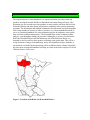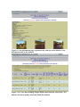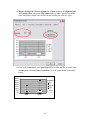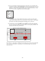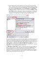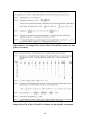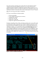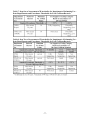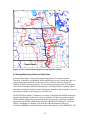
1
Table of Contents
1.0 INTRODUCTION .................................................................................................................................. 4
2.0 DATA STORAGE .................................................................................................................................. 6
2.1 DATABASE DESIGN AND AGENCY COORDINATION ............................................................................... 6
2.2 DATA STORAGE IN MICROSOFT EXCEL ............................................................................................... 12
3.0 DATA ANALYSIS................................................................................................................................ 18
3.1 USING CENSORED DATA ..................................................................................................................... 20
3.2 STATISTICAL ANALYSIS PROCEDURES ................................................................................................ 23
3.21 Statistics ...................................................................................................................................... 24
3.22 QA/QC Calculations ................................................................................................................... 27
3.23 Conversions................................................................................................................................. 28
3.24 Graphical Methods ..................................................................................................................... 30
3.25 Measures of Association ............................................................................................................. 43
3.26 Pivot Tables ................................................................................................................................ 46
3.3 TREND ANALYSIS ............................................................................................................................... 52
3.31 Graphical Trend Analysis Methods ............................................................................................ 52
3.32 Statistical Trend Detection Methods........................................................................................... 55
3.4 DEVELOPING LOAD ESTIMATES .......................................................................................................... 62
3.5 OTHER DATA ASSESSMENT TECHNIQUES ........................................................................................... 71
3.51 Carlson’s Trophic State Index .................................................................................................... 71
3.52 Temperature and Oxygen Profiles .............................................................................................. 73
3.53 Assessment for Determination of Impairment............................................................................. 74
3.54 Comparisons to Ecoregion Reference Streams........................................................................... 79
3.55 Biological Assessments ............................................................................................................... 84
3.56 Creating Rating Curves from Flow Measurement Data ............................................................. 85
3.6 STATISTICAL SOFTWARE RECOMMENDATIONS ................................................................................... 86
4.0 REPORTING MONITORING RESULTS ........................................................................................ 87
4.1 AUDIENCE DEFINITION ....................................................................................................................... 87
4.2 REPORT FORMAT ................................................................................................................................ 88
4.3 SUBMITTING DATA TO STORET ........................................................................................................ 88
5.0 MONITORING NETWORK DESIGN .............................................................................................. 92
5.1 AGENCIES INVOLVED IN DATA COLLECTION ...................................................................................... 92
5.2 SETTING MONITORING GOALS AND OBJECTIVES ................................................................................ 93
5.3 NETWORK DESIGN TECHNIQUES ......................................................................................................... 98
5.4 RESOURCES ...................................................................................................................................... 100
6.0 GIS, DATABASE DESIGN, AND WEBSITE DEVELOPMENT ................................................ 101
6.1 GIS SOFTWARE RECOMMENDATIONS............................................................................................... 101
6.2 WEBSITE DEVELOPMENT AND PROCEDURES .................................................................................... 103
7.0 STANDARD OPERATING PROCEDURES AND QUALITY ASSURANCE PROJECT PLAN
DEVELOPMENT..................................................................................................................................... 104
7.1 STANDARD OPERATING PROCEDURES MANUAL DESCRIPTION ......................................................... 104
7.2 PROCEDURES FOR DEVELOPMENT OF A QAPP.................................................................................. 105
7.3 RESOURCES AND TRAINING OPPORTUNITIES .................................................................................... 116
8.0 REFERENCES AND FURTHER READING. ................................................................................ 117
-1-
List of Figures
Figure 1. Location of the Red Lake Watershed District ..................................................... 4
Figure 2. Red River Basin................................................................................................... 5
Figure 3. RLWD Water Quality Database.......................................................................... 6
Figure 4. Online data entry form that was used by the RLWD. ......................................... 7
Figure 5. Microsoft Access Database Entry Form.............................................................. 8
Figure 6. Interactive Map on the RLWD Website............................................................. 9
Figure 7. A report card webpage is linked to the water quality data table in the database to
create "grading curves” and give a site a grade based upon the curves...................... 9
Figure 8. A site information page is generated for each site and is linked to a site
information table in the database. ............................................................................. 10
Figure 9. The View Data webpage simply displays data from the selected site - it is
linked to the water quality data table within the database. ....................................... 10
Figure 10. Analyze or Download Data Page. .................................................................. 11
Figure 11. Adding a validation rule to a data entry form cell........................................... 12
Figure 12. Example Frequency Plot.................................................................................. 31
Figure 13. Example of Generating a Histogram and a Frequency Plot. ........................... 32
Figure 14. Boxplot of TSS results within the Thief River Watershed with map.............. 33
Figure 15. Example of a Correlation Matrix..................................................................... 44
Figure 16. Equations and Directions for Calculating Pearson’s Correlation Coefficient by
Hand.......................................................................................................................... 45
Figure 17. "Upper Triangular" Data for Basic Mann-Kendall Trend Test with a Single
Measurement at Each Time Point (EPA Guidance for Data Quality Assessment) .. 57
Figure 18. An Example of Mann-Kendall Trend Test for Small Sample Sizes (EPA
Guidance for Data Quality Assessment)................................................................... 58
Figure 19. Directions for the Mann-Kendall Procedure Using Normal Approximation for Samples Sizes Greater Than 10 (from EPA Guidance for Data Quality
Assessment). .............................................................................................................. 60
Figure 20. Example of Mann-Kendall Trend Test by Normal Approximation for Sample
Sizes of 10 or More (From EPA Guidance for Data Quality Assessment). ............. 60
Figure 21. Lotus Spreadsheet Configured for FLUX. ...................................................... 64
Figure 22. FLUX Input Screen. ........................................................................................ 64
Figure 23. FLUX Calculated Loads Screen...................................................................... 66
Figure 24. Choosing a Load Calculation Method in FLUX. ............................................ 67
Figure 25. Breakdowns Screen. ........................................................................................ 68
Figure 26. Path Through the Menu to Stratification. ........................................................ 68
Figure 27. Stratification Screen. ....................................................................................... 69
Figure 28. Noting the Coefficient of Variance. ................................................................ 70
Figure 29. Carlson's Trophic State Index.......................................................................... 72
Figure 30. Stratified Profile. ............................................................................................. 74
Figure 31. Mixed Profile................................................................................................... 74
Figure 32. Minnesota Ecoregions and Hydrologic Basins. (From MPCA Website)........ 79
Figure 33. Rating Curve Example. ................................................................................... 86
Figure 34. River Watch Monitoring Sites in the Red River Basin. .................................. 93
Figure 35. Stream Type Classes of the Rosgen Classification System............................. 98
-2-
List of Tables
Table 1. Suggested Statistical Summaries for General Chemical and Physical Parameters
(Adapted from We Have Stream Data, Now What).................................................. 23
Table 2. Useful Conversions for Water Quality Data Analysis........................................ 29
Table 3. Table A-11 from Appendix A of the EPA Guidance for Data Quality
Assessment. ............................................................................................................... 59
Table 4. Critical Values of t Distribution. Table A-1 from Appendix A of the EPA
Guidance for Data Quality Assessment (for Steps 5-6 in Figure 20). ...................... 61
Table 5. Minnesota State Water Quality Standards. ......................................................... 76
Table 6. Summary of Data Requirements and Exceedance Thresholds for Assessment of
Conventional Pollutants and Water Quality Characteristics (MPCA Guidance
Manual for Assessing the Quality of Minnesota Surface Waters for Determination of
Impairment)............................................................................................................... 76
Table 7. Step One of Assessment of Waterbodies for Impairment of Swimming Use Data Requirements and Exceedance Thresholds for Fecal Coliform Bacteria......... 77
Table 8. Step Two of Assessment of Waterbodies for Impairment of Swimming Use Data Requirements and Exceedance Thresholds for Fecal Coliform Bacteria......... 77
Table 9. Data Requirements for Statewide Water Quality Assessments. ......................... 78
Table 10. Water quality of least impacted streams by ecoregion – Red River Basin
Ecoregions within Minnesota (at 75th percentile). ................................................... 80
Table 11. Ecoregion lake water quality summary (summer avg. values by ecoregion) .. 80
Table 12. Water quality summary of reference streams by ecoregion: interquartile range
(25th – 75th percentile) and 5th - 95th percentile range........................................... 81
Table 13. Ecoregion Lake Water Quality Summary (Summer Average Water Quality
Characteristics for Lakes by Ecoregion)................................................................... 82
Table 14. Minnesota Lake Water Quality Summary (1994). Distribution of Carlson TSI
Values and Lake Basin Morphometry Measurements by Ecoregion (N = Number of
Lakes)........................................................................................................................ 83
Table 15. Sources and Associated Pollutants for Volunteers to Consider Monitoring
(from MPCA Volunteer Surface Water Monitoirng Guide). .................................... 95
Table 16. Water Quality Problems and Monitoring Parameters for Volunteers to Consider
(from MPCA Volunteer Surface Water Monitoirng Guide). .................................... 95
Appendices
Appendix A: Statistical Methods for Analyzing Censored Water Quality Data Sets
Appendix B: STORET Project Establishment Form
Appendix C: RLWD Laboratory Information for STORET Data Entry
Appendix D: STORET Monitoring Station Establishment Form
Appendix E. Example Spreadsheet for Submitting Data for Entry into STORET.
-3-
1.0 Introduction
The original objective of this handbook is to report/explain the procedures used and
products developed from the Red River Watershed Assessment Protocol Project. This
document was also created to provide guidance to water quality staff from the Red Lake
Watershed District and other groups and agencies conducting water quality monitoring
programs. The information and methods contained in this document were pulled together
from a large number of sources in order to provide a very robust methods document. It
serves as a methods handbook for water monitoring project development, water quality
data collection, and data management. This document helps ensure continuity in data
analysis, even throughout changes in personnel. Although it is, at times, focused on the
Red Lake Watershed District and the Minnesota side of the Red River Basin, it is
intended to also be useful to other agencies collecting water quality data. This will be a
living document. Changes in methodology, newly developed data analysis methods, or
any methods overlooked by this document will be included in future editions. Hopefully,
the time spent creating this handbook will help save time in the future and prove to be an
efficient resource for its users.
Figure 1. Location of the Red Lake Watershed District
-4-
Figure 2. Red River Basin.
The purpose of the Red River Watershed Assessment Protocol Project was to establish
procedures for developing water quality reports, field and lab standard operating
procedures, quality assurance project plans, and statistical analysis techniques for the Red
River Basin, providing needed coordination as identified in county water plans. The
project was funded by a Minnesota Board of Water and Soil Resources Challenge Grant.
There are many organizations that are monitoring water quality within the Red River
Basin. However, until recently, the sharing of data among agencies was limited. The Red
River Watershed Assessment Protocol project is meant to help agencies take a step in the
right direction towards better coordination of monitoring efforts and comparability of
data. This project recommends the use of standard methods by all these agencies so that
data is comparable due to similar collection and analysis methods. The coordination of
data collection efforts among agencies will lead to less duplication of sampling efforts,
and greater number of sites that will be monitored across the RLWD by one agency or
another. Other products of the Red River Watershed Assessment Protocol Project include
the RLWD website and water quality database, Standard Operating Procedures for Water
Quality Monitoring in the Red River Valley, Statistical Methods for Analyzing Censored
Water Quality Data Sets, 2004 Red Lake Watershed District Water Quality Report, River
Watch Quality Assurance Project Plan (QAPP), and the RLWD QAPP.
-5-
2.0 Data Storage
2.1 Database Design and Agency Coordination
Some of the RLWD’s needs that were fulfilled by the Red River Watershed Assessment
Protocol Project were the needs for a website for public outreach, a central database for
the storage of water quality data, a tool for viewing GIS data and creating maps, and data
analysis tools. Houston Engineering was contracted to create the RLWD website, which
meets all of the aforementioned needs. Along with the other features of the website that
were created (see Section 6.3), a central Microsoft Access database was created. It is
stored, along with all other files related to the website, on a Houston Engineering-owned
server. Data is stored in a set of interrelated tables. There are tables within this database
for water quality data, site information, organization information, and site pictures. The
tables are linked by site ID number and organization name. A set of web pages are used
to display the data within these tables.
Figure 3. RLWD Water Quality Database.
-6-
The database was originally updated RLWD staff using an online data entry form. The
data entry pages were password protected so only RLWD staff can enter data. Data is
entered into the database by the RLWD. This page features a blank cell and a flag cell for
each water quality parameter that may be entered into the database. For the online data
entry form to work properly, a numerical value must be entered in every cell. There are
cases, however, when data results are not represented by a number. A method was needed
for distinguishing among results below the reporting limit, zero values, and missing
values. For results that fall into one of these categories, a zero is entered into the cell and
a value is selected from a flag field that specifies whether the value is below the detection
limit, equal to zero, or if there is no value for the field. The online data entry format was
not as convenient as it was intended to be. The RLWD has gotten rid of the online data
entry form and has switched to a more direct and simpler method of data entry.
Figure 4. Online data entry form that was used by the RLWD.
-7-
Data entry forms have recently been added to the Access database itself that make data
entry even easier than online entry. After data has been added to the Microsoft Access
database, the database file located on the ftp server is simply replaced with the new,
updated version.
Figure 5. Microsoft Access Database Entry Form.
Data in the database can be downloaded by anyone visiting the RLWD website
(www.redlakewatershed.org). After a successful search for water quality data from a
particular monitoring site on the RLWD website, this set of web pages will appear for the
site. These pages include a report card page, site information page, data viewing page,
analyze and download data page, and a site location map. Information displayed on the
site information page is stored in the site and picture tables in the database. The report
card page performs calculations using data in the water quality data table (entitled “wq”)
and compares the results to the standards in the percentiles table in order to produce a
letter grade for each monitoring site. The View Data and Analyze and Download Data
pages link to the water quality data table to display the data, calculate summary statistics,
create time series plots of the data, and load data into the StatCrunch program for
additional statistical analysis options.
-8-
Click this button and then click on a star to
find information about a monitoring site
Red Stars Represent Water Quality Monitoring Sites
Figure 6. Interactive Map on the RLWD Website.
Figure 7. A report card webpage is linked to the water quality data table in the
database to create "grading curves” and give a site a grade based upon the curves.
-9-
Figure 8. A site information page is generated for each site and is linked to a site
information table in the database.
Figure 9. The View Data webpage simply displays data from the selected site - it is
linked to the water quality data table within the database.
- 10 -
Figure 10. Analyze or Download Data Page.
Quality control measures can be incorporated into an Access database. Examples include
a range of allowable values for a data entry cell, or even special procedures for entering
data into a database. The Red Lake Department of Natural Resources uses a data entry
system that involves duplicate data entry and data verification. If any data entered during
the second round of entry does not match data from the first round of entry, an error
message is displayed and the user must double-check the original data sheet to verify the
correct value. This helps to eliminate data entry errors. Some common types of data entry
errors include entering data into the wrong cell or field, misplacing a decimal point,
adding an additional digit (accidentally hitting too many keys), and omitting data
altogether.
In a data entry form like the figure below, validation rules can be added to each field.
Number fields should accept only number values. Fields can also be made to reject or
question values that do not fall within a specified range. For pH, for example, the range
of possible values is 0-14, so if a value of 72.6 is entered, the value will be rejected and
the user will have to check the results and enter the correct value. So, for example, a user
may have misplaced the decimal point on the first try and, after receiving an error
message, has a chance to replace 72.6 with the correct value of 7.26.
- 11 -
A normal range can be defined for a parameter as well. This function would question the
data entry personnel about whether a value is correct or not if it falls outside a normal
range for the parameter. Abnormally high values can still be recorded by verifying the
number, but false values caused by extra or misplaced keystrokes will be checked and
corrected. Validation rules can be added within the design view of the database. Right
click on the cell and select Properties to access the window, shown below, in which
validation rules and other controls can be added to the cell.
Figure 11. Adding a validation rule to a data entry form cell.
Finding these errors during data entry is important for getting data into STORET since
the database will reject data that is out-of-range. Data will then have to be corrected and
re-submitted, thereby delaying the entry of the data into STORET. See Section 4.3 for
more tips on getting data into the STORET database.
2.2 Data Storage in Microsoft Excel
Although Microsoft Access is one of the best options for storing a large amount of data,
especially for linking tables and querying data, Microsoft Excel is the program most
likely to be used for data analysis. There are two ways to have data available in Microsoft
Excel for the purposes of data analysis. It can either be entered directly or it can be
imported from another program. An alternative method of data storage and analysis
would be to export data from Microsoft Access and import it into Microsoft Excel or
another statistical analysis program to analyze the data. The RLWD has entered data
directly into both Microsoft Access and Microsoft Excel. Having updated Microsoft
Excel spreadsheets on-hand is valuable because data analysis can be performed quickly.
- 12 -
The RLWD will be switching to Excel spreadsheets that are linked to the Access
database. This way, there will be updated Excel spreadsheets available for analyzing data,
but data can be imported from the RLWD’s Access database instead of entered cell by
cell.
1. Know the location of the Microsoft Access database from which you will be
importing data.
2. Begin a new query: Data => Get external Data => Database Query (you may
need to have your Microsoft Office CD ready in order to install this feature)
3. Select MS Access Database in the Choose Data Source window and click OK.
- 13 -
4. Browse to the location of the database from which you will be importing data and
click on the OK button.
5. In the Query Wizard – Choose Columns window, choose the table and columns
that you want to import into your spreadsheet. Click on the Next button.
- 14 -
6. In the next window (Filter Data), you may choose to filter the data by date, site,
etc. If your water quality data table within Access contains data for more than one
site, for example, you may filter the data by site name and only import data from
one particular site.
7. The Sort Order window of the Query Wizard is where you can signify how the
data should be organized within the table. The example below will place the data
in a chronological order.
- 15 -
8. In the next window, leave “Return Data to Microsoft Excel” selected and click
Finish.
9. Choose a worksheet as a destination for the data.
10. You now have an excel spreadsheet that can be updated from the Access database
with a push of a button.
- 16 -
11. Display the External Data toolbar to make refreshing data easy:
View=>Toolbars=>External Data
Refresh Data Button on
External Data Toolbar
No strict protocols will be established by this document for the organization of data in
Microsoft Excel due to the different needs of different monitoring projects and the
flexibility of the program. There are, however, some relatively universal tips that help
make a clean, useful Microsoft Excel spreadsheet for water quality data. The name of
each parameter in its respective column (or row) heading should be clearly stated. Units
(mg/L, NTU, ft, etc.) should be indicated if applicable. Dates should be in Excel format
(mm/dd/yyyy or mm/dd/yy). A Microsoft Excel workbook (entire file) can contain many
worksheets (separate spreadsheets). Each worksheet is represented by a tab at the bottom
of the window (defaults = Sheet 1, Sheet 2, and Sheet 3). Some user may choose to have
only one workbook for all their monitoring sites, or a separate workbook for each site
with multiple worksheets dedicated to data analysis results. The RLWD uses a separate
workbook for each long-term monitoring site, but will also combine sites into one
workbook for smaller, short-term monitoring projects. Within a workbook, raw data
should be stored in one worksheet. Other worksheets can be used for pivot tables,
summary tables, assessments, graphical analysis, and statistical analysis. Methods for
conducting these different types of analysis can be found in the following chapter.
One thing that can cause problems with data entry and analysis is water quality parameter
data that isn’t represented in numerical format. This may include lab results that are
below the minimum detection limit (MDL). These results are reported with a < symbol in
- 17 -
front of the value of the MDL. Lab results that are too numerous to count are another
example. If you wish to use your data for analysis, it will be necessary to create modified
columns next to the original data columns into which data can be transformed into
useable numeric data. If your data is going to be submitted to a database such as the
EPA’s STORET database, fields containing flags or remark codes will need to be added
next to the original data. When data that is below the minimum detection/reporting limit
or greater than the maximum detection limit is submitted to STORET, the detection limit
is entered into a column under the parameter and units heading and the remark code is
placed in a column directly to the right of this one (with a heading of RC of FLAG). See
Section 3.1 for more information on using censored data.
A limitation of Microsoft Excel is its storage efficiency for large amounts of data.
Microsoft Access can efficiently handle a larger amount of data than Excel. Even Access
has its limitations and large scale databases will require programs such as Microsoft SQL
and Oracle. The EPA’s modern STORET water quality data, for example, is stored using
an Oracle database. These databases are generally only used by agencies that need to
store a very large amount of data (USEPA, USGS) and large companies that need to store
a large amount of transaction data.
3.0 Data Analysis
Before beginning data analysis, think about what questions you want to answer. Here are
some examples:
•
Are designated uses generally supported in the watershed?
•
Did the levels of pollutants violate state water quality standards? How many times
or what percent of the samples at each site? Where? When?
o See section 3.53 for directions on assessing water quality data for the
determination of impairment.
•
How does the water quality compare with ecoregion water quality standards?
Ecoregion values are often expressed as percentiles, so you will need to calculate
the corresponding percentiles for your results in order to compare them to the
ecoregion values.
o See Section 3.54 for ecoregion values and Section 3.21 to learn about
calculating percentiles.
•
How do results compare over time? How might any changes be explained?
o See Section 3.3 to learn about trend analysis.
- 18 -
•
How does one parameter compare to another?
o See Section 3.25 to learn about measures of association.
•
How do sites compare spatially (upstream vs. downstream)? How might any
changes be explained?
o This can be done by comparing summary statistics (Section 3.21).
•
Are specific stressors affecting the health or human use of the water body?
•
How do the results upstream of a suspected source of pollution compare with the
results from downstream?
•
Would any of the monitoring streams qualify as reference (unimpacted, pristine)
streams?
•
What is the natural background water quality like in the watershed?
•
Did you collect the required number of samples from the minimum number of
sites (completeness)?
o See Section 3.22 to learn about quality assurance calculations.
•
How will the sensitivity of the methods and equipment you used affect the
results? (Section 3.22)
•
How did quality assurance results (from split, duplicate, spiked, replicate, known,
unknown, and blank samples) compare with expected results? Did they meet your
data quality objectives? (Section 3.22)
•
Did you sample frequently enough and at the right times?
•
What is the degree of change that is significant for each parameter, considering
natural baseline and variability?
•
Do the field notes coincide with the data? Are there any data entry errors?
o See Section 2.0 on data storage.
•
How much of a particular water quality parameter (i.e. sediment) is being
transported past a monitoring site?
o See Section 3.4 to develop load estimates.
- 19 -
•
How healthy is a particular lake? How suitable is it for recreation or aquatic life?
o See Sections 2.51 and 2.52 to learn about the Carlson’s Trophic State
Index and water column temperature and dissolved oxygen profiles.
3.1 Using Censored Data
One thing that can cause problems with data entry and analysis is water quality parameter
data that isn’t represented in numerical format. This may include lab results that are
below the minimum detection limit (MDL). Laboratory analysis techniques have a
limited accuracy. The smallest amount of a parameter such as nitrates, total suspended
solids, or fecal coliform that laboratory methods can detect is referred to as the minimum
detection limit (MDL). Results that fall below this limit are reported as either BDL or < a
number. These values are not useable when calculating summary statistics such as the
mean or median. Removing this data from the data set is not a good option because the
statistical analysis results would be biased and misleading. Since the value of these
measurements is unknown, questions arise as to what should be done with this data so
that it can still be used for statistics.
Lab results that are too numerous to count are another example. Transparency tubes are
also recorded in such a way that analysis cannot be performed on raw, untransformed
data. There are two readings taken for each measurement and sometimes transparency
values are greater than the highest reading possible on the tube as well.
In order to be able to use this data for analysis without losing the original results, a
modified column can be created to the right of the original data column for each
parameter. The modified column is a numerical representation of the original data. While
the modified field is needed for analysis, a different field, the flag or remark code field is
required for the submission of data to the MPCA’s STORET database.
If you plan on using your Excel spreadsheet for storing data in a STORET acceptable
format, you will need to insert a flag field (or remark code) column to the right of any
data columns that include any results that are MDL, BDL, > than detection limit, etc.
Place the value of the minimum/maximum detection/reporting limit in the data column
and, in the flag field column, input the appropriate flag character. See Section 4.3 for
more details on these flag fields and entering data into STORET. If you will be using the
spreadsheet for analysis only, then follow the directions in the following paragraph.
Lab results that are less than the minimum detection limit (BDL , <.02, <1, etc.) can be
transformed to a numerical format in the modified column. This allows the censored data
to be used in data analysis. The value in the modified column should be equal to one half
of the minimum detection limit. The same value should be used in place of every BDL
result for a parameter even if the reporting limits change over time.
A study entitled Statistical Methods for Analyzing Censored Water Quality Data Sets was
completed by Houston Engineering, Inc. for the Red Lake Watershed District in 2002.
- 20 -
This study was conducted as a part of the Red River Watershed Assessment Protocol
Project. The purpose of the study was to find the best method for dealing with censored
data. The study examined the simple substitution method; distributional methods such as
the probability plot, maximum-likelihood estimation (MLE), and fill-in with expected
MLE values techniques; and the Helsel’s Robust Method.
The study recommended using the simple substitution method when dealing with BDL
values. For the simple substitution method, the BDL result is replaced by an actual value.
This value may be 0, the MDL, or a value equal to one-half the MDL. Since substituting
0 or the MDL may still bias the results of statistical analysis. Therefore, the study
recommends using either the ½ MDL value, or calculating summary statistics from the
substitution of both 0 and 1 and averaging these results. The study is included in this
document in Appendix A. This topic is also covered in Sections 2.1 and 4.3.
Detection limits may change over time and may differ among laboratories, equipment,
and methods. If detection limits, for example, get smaller over time and different ½ BDL
values are entered into the modified column for use in data analysis, the decreasing BDL
values may impart a false decreasing trend. The reason this trend would be false is
because, whether the reporting limit is .4 mg/L or .1 mg/L, the actual value is unknown,
so one cannot automatically assume that the actual concentration of a sample is higher
with a MDL of .4 than it is with a MDL of .1 mg/L. So, if there are multiple reporting
limits, what value should be used for all the results? The censored data study completed
by Houston Engineering (see Appendix A and/or Section 3.1) recommends applying the
highest MDL to all data, while We Have Stream Data, Now What?! recommends
applying the smallest MDL to all the data. The justification for using the smallest MDL is
that ½ of the larger MDL may be equal to an actual reading that was recorded while the
smaller MDL was in use. The justification of using the larger (less sensitive) MDL is that
it is necessary to censor quantified values that are less than the largest MDL in order to
prevent artificial trends. The RLWD will follow the recommendations of the Houston
Engineering censored data study.
Now, what is to be done with results that exceed the highest value that can possibly be
measured? A value can be entered into the modified column that is equal to the highest
possible reading plus one. So, if a transparency reading is recorded as >100 cm, it may be
recorded as 101.
However, we run into a problem with changing maximum detection limits that is similar
to the problem we have with minimum detection limits. The solutions discussed in the
following paragraphs will use transparency tube readings as an example since they are a
widely used water quality measurement device and there are several different tube
lengths available. The concepts discussed in the following paragraphs can also be applied
to other parameters such as turbidity.
Since there are different lengths of transparency tubes, there may be data sets that contain
values of 60+ cm, 100+ cm, or even 120+ cm. For these, We Have Stream Data, Now
What?! recommends using the lower of these two numbers and even excluding data from
- 21 -
the longer tube. This method has some merit because some of the actual transparency
conditions recorded as 60+ cm may not have been greater than 100 cm. So, this method
avoids any false statements by not changing 60+ cm to 100+ cm. Also, when the lower
maximum value is used for all measurements, any results from the 100 cm tube that are
greater than 60 cm must be transformed from their original value to 60+ cm. If it is
necessary to transform 100+ cm readings to 61 cm, than all readings greater than 60 cm
must be transformed to 61 cm, not just the “100+” readings. This does avoid false
statements or assumptions about the data. For example, results from the 100 cm tube of
65, 80, or 100+ cm are greater than 60 cm.
Censoring all the data that is greater than the maximum value of the shortest tube used in
a dataset may prevent the appearance of false trends, but may prevent the determination
of any trend at all. For example, a stream was monitored for 5 years with a 60 cm tube
and then for five years with a 100 cm tube. If the water quality in this stream has been
deteriorating over the last 10 years from an average transparency of <100 to an average
transparency of 70 cm, this trend wouldn’t be detectable if all values were changed to 61
cm. With this method, you are losing data for both periods of time. An argument for this
method would be that all the values would be true (100 is greater than 60). This method
would work better for streams with transparency values that are normally below the
maximum of the shorter tube than it would for cleaner streams with transparencies that
are normally greater than the shorter tube’s maximum.
Increasing all the “greater than the detection limit” values to the maximum height on the
taller tube would allow for more of the data from the taller tube to be used. Data from at
least one of the tubes will be completely represented in the analysis data set. No data
censoring occurs in this method beyond the limitations of the equipment at the time that
the data was recorded. This method may be helpful in cleaner waters that exhibit
transparencies that are close to the maximum value on the taller tube – where trends
would be masked if all results are reduced to the maximum of the smaller tube (plus one).
This method may create false assumptions about the data from the shorter tube,
unfortunately. If values are rarely near or above the maximum of the taller tube and/or are
frequently below the maximum on the shorter tube, this method definitely should not be
used. Using a value of 101 cm in the modified column for a reading of 60+ cm for a
stream with an average transparency of 45 would be unacceptable. Using a value of 101
cm in the modified column for a reading of 60+ cm for a stream that has an average
transparency of 99 cm may be more acceptable.
The method you use for your analysis may depend upon your data. You may even have to
try multiple methods for you may find a trend with one method that you couldn’t find
with another. The best solution to the problem, however, is to use consistent methods and
equipment so the problem of multiple maximum readings is not encountered.
Another option is to conduct separate trend analysis for different monitoring methods or
equipment. This, perhaps, may be the best method to use if more than one type of tube
has been used and values are frequently greater than the lesser of the maximum detection
limits that were used.
- 22 -
3.2 Statistical Analysis Procedures
There are many different types of statistical analysis that can be performed on water
quality data sets for reporting and interpretation purposes. Many inferences can be made
about data from simple statistics such as mean, minimum, maximum, median, range, and
standard deviation. Here is a quick review of how these statistics are calculated and how
they can be used for analysis of water monitoring data. Also included in this section are
some slightly more advance statistics. The following table, derived from the MPCA’s
Volunteer Surface Water Monitoring Guide, provides some guidance on the particular
uses of these statistical methods.
Total Suspended Solids
Temperature
Dissolved Oxygen
Turbidity
Nutrients
Conductivity
pH
Alkalinity
Chlorophyll-a
Flow
Water
Clarity/Transparency
Bacteria
- 23 -
Geometric Mean
Minimum
Maximum
Seasonal Median
Seasonal Average
Confidence Intervals or
Standard Deviation
Quartiles
Range
Flow-Weighted
Average
Median
Parameter
Average
Table 1. Suggested Statistical Summaries for General Chemical and Physical
Parameters (Adapted from We Have Stream Data, Now What)
Statistical Summary
3.21 Statistics
Median: The median of a data set is the middle value after all the values have been
ranked in order of value. The median can easily be picked out in small data sets, or can be
calculated with the =MEDIAN() equation in Microsoft Excel for large data sets.
Mean: The mean, or average, of a set of samples is one way of finding the center value of
a data set. Divide the sum of the results by the number of results. Mean can be
automatically calculated using the =AVERAGE() equation in Microsoft Excel.
Geometric Mean: A geometric mean can be used to calculate a mean that is not skewed
by extreme values. It is one of the calculations used when assessing waters for
impairment for the TMDL program, particularly for fecal coliform. Fecal coliform levels
can be very low on one day and too numerous to count the next day on some streams.
The geometric mean is normally close to the median for positively skewed data sets.
Where G represents the geometric mean and the xn values represent a series of numbers
in a data set:
G (x1, x2) = √(x1*x2) = (x1*x2)1/2;
G (x1, x2, x3,) = (x1*x2*x3)1/3;
And so on...
Note that geometric mean takes the product of all the numbers in the data set to the power
of one over the number of values in the data set. Geometric mean can also be calculated
automatically using a function in Excel: =GEOMEAN(A1:A5), where A1:A5 is the
range of cells that contain the data to be analyzed (for the example). The geometric mean
cannot be calculated for data sets that include values of zero. Therefore, values that are
below the minimum detection limit (represented by <(MDL) in lab reports) must be
represented by a positive number such as one-half of the MDL.
Trimmed Mean: This is another way to remove the influence of outliers in data sets. To
calculate a trimmed mean, calculate the mean of only the data that falls between the 25th
and 75th percentiles of a data set. Trimmed mean can be automatically calculated in
Microsoft Excel by using the equation: =TRIMMEAN(). See the following section on
quartiles to learn how to calculate the 25th and 75th percentiles.
Percentiles and Quartiles: Percentiles are a measure of the relative position of a single
value within a data set. They are more valuable when applied to large data sets versus
small ones. Percentiles are labeled P1, P5, P25, etc. The subscript number refers to the
percentage of the values in the data set that are smaller than the value of the percentile.
So, if the P30 percentile of a data set equals 10, 30% of the measurements are less than 10
and 70% of the measurements are greater than 10. Three particular percentiles are used
quite frequently in statistical analysis. These are P25, P50, and P75. These percentiles are
also referred to as the 1st, 2nd, and 3rd quartiles or Q1, Q2, and Q3, respectively. Other
percentiles that are commonly used include the 5th and the 95th percentiles.
- 24 -
Percentiles and quartiles are another type of statistical analysis that can be performed
using Microsoft Excel and other computer programs. Many programs that calculate a set
of summary statistics will include the 1st, 2nd, and 3rd quartiles. To perform this
calculation using a Microsoft Excel function, simply go to Insert >> Function, click on
statistical, and then choose either PERCENTILE or QUARTILE. Choose the
PERCENTILE function for percentiles other than the quartiles because you can input the
percentile you wish to calculate (between 0 and 1). QUARTILES is a simplified version
of the PERCENTILE function. The desired quartile is entered into the Quart field (0 for
minimum, 1 for Q1, 2 for Q2, 3 for Q3, and 4 for maximum). Whichever function you
choose, a window with two fields will appear. Enter the range of values to be analyzed
into the Array field and indicate the desired percentile or quartile in the bottom field.
Click OK when the information has been correctly entered into the fields.
Loads: Loads are calculated by multiplying concentration by flow volume. Daily average
concentrations and/or flows can be used for continuous monitoring programs. Often,
however, only one measurement for each will be available for each sampling day.
Instantaneous loads can still be calculated with this data. Loads in milligrams (mg) per
second (sec) can be calculated by multiplying the concentration in milligrams per liter
(mg/L or ppm) by the flow in cubic feet per second (ft3/sec or cfs) and then multiplying
by a conversion factor of 28.31685 L/1 ft3. Milligrams per day can be calculated by
multiplying the mg/sec result by a conversion factor of 86,400 sec/day. After this, any
other conversion factors can be applied. Kilograms per day can be calculated by
multiplying the mg/day result by a conversion factor of 1 Kg/1,000,000 mg. Tons per day
can be calculating by multiplying the kilograms per day by a conversion factor of 1
ton/907.1847 Kg.
Flow-Weighted Mean: Calculating the flow-weighted mean concentrations of water
quality parameters places more importance to concentrations recorded during higher
flows when calculating an average concentration. High flow periods can contribute the
majority of the total flow volume for a given year. The concentrations of water quality
parameters during periods of high flows can have a greater impact on receiving waters
than the concentrations during periods of low flow. Weighted means are calculated by
multiplying each individual datum in a data set by a weighting factor, finding the sum of
these products, and then dividing this sum by the sum of the weighting factors. In other
words, to find flow weighted mean concentrations, first multiply parameter concentration
by flow for each sampling event. Find the sum of the products from all sampling events.
Finally, divide this sum by the sum of all the flow values. No conversions of
concentration or flow should be needed. Any conversion factors added to the equation
would need to be applied to both the divisor and the dividend and will, therefore, cancel
each other out and will be a waste of time. The following equation will calculate the flow
weighted mean using a data set of concentrations (c1…c4) and flows (f1…f4):
Flow weighted mean = (c1*f1 + c2*f2 + c3*f3 + c4*f4)
(f1 + f2 + f3 + f4)
- 25 -
Minimum, maximum, and range: These statistics are self-explanatory. The minimum is
the lowest value in the data set. The maximum is the highest value in a data set. Range is
the difference between the minimum and the maximum. Minimum and maximum values
can easily be found in small data sets, but equations like the MIN and MAX functions in
Microsoft Excel can help find these values in a more numerous set of values in a
spreadsheet.
Standard Deviation: Standard variation is a measure of the amount of variance in a data
set. It is equal to the square root of the variance. This calculation can be useful in
determining precision for a set of replicate samples, for example. The standard equation
for standard deviation is:
In the equation above, s = standard deviation, n = the number of values in the data set; X1
= the first number of the data set, X2 = the second number, and so on; and = the mean
of the data set. Another way to calculate the standard deviation is shown below.
s = the square root of (∑X2 – (∑X)2/n)
n-1
∑X2 = Sum of the squares of the values
∑X = Sum of the values
n = Number of values
The easiest way to calculate standard deviation, however, is by using the Microsoft Excel
equation: =STDEV(A1:A5), where A1:A5 is an example of a range of cells that contain
the data to be analyzed.
- 26 -
3.22 QA/QC Calculations
Relative Percent Difference: Calculating the relative percent difference (RPD) between
samples and duplicates can be used to measure the precision of water quality
measurements. A smaller RPD indicates greater precision. Standards for RPD may be set
at the beginning of a monitoring program and included in a quality assurance project plan
(QAPP). Acceptable RPD standards range from <20% to <30% in existing quality
assurance plans from various agencies and laboratories. The RPD between a sample and
its duplicate is calculated by dividing the difference between the two samples by their
average.
RPD = (Result 1 – Result 2)/[(Result 1 + Result 2)/2]*100
Percent Recovery: Percent recovery is a test of the accuracy of laboratory methods. It is
essentially a ratio of the measured value versus the expected value. This test can be
applied to performance evaluation sample results. Performance evaluation samples are
prepared by a third party and have a known concentration. The percent recovery for a set
of performance evaluation samples is equal to the measured concentration divided by the
actual concentration, then multiplied by 100.
Percent recovery calculations can also be used as a method of quality control to
determine if there is something in the sample or in the analytical technique that is
interfering with the test. A set of duplicate samples is created from the original, real
sample. A matrix spike with a known concentration of the target analyte is added to one
of the duplicate samples. Both the spiked sample and the unmodified sample are analyzed
at the same time. The percent recovery of a matrix spike is calculated by dividing the
difference in concentration between the results for the spiked sample and the results for
the original sample by the concentration of the spike that was added. Greater values for
percent recovery indicate a higher level of accuracy. The lab tests a spiked sample and
the non-spiked sample.
When the percent recovery is calculated, it should be within the range of 90 to 110
percent. A perfect percent recovery is 100 percent. If the percent recovery is low, there
may be something in the sample that is interfering with the test. The percent recovery
equation for matrix spikes is shown below.
% Recovery = (Conc. of Spiked Sample – Conc. of Non-spiked Sample) X 100
Concentration of Spike Added
- 27 -
3.23 Conversions
Conversions are often necessary when managing and analyzing water quality data.
Results from different sources may be in different units. Conversions are nearly always a
necessity when working with loads since the units of volume in concentration data are
usually milligrams and the units of volume in flow measurements are usually cubic feet.
When converting data, knowing conversion factors between units is essential. Lists of
conversion factors are available in table form (see below), but they are also very handy
when they are in an electronic form. Conversions can be performed with advanced
calculators and with computer programs such as Convert. Convert can be downloaded for
free at http://www.joshmadison.com/software/convert/.
Now that you know, for example, that one Liter equals 0.03531467 cubic feet, you still
need to be able to conduct conversions based upon these conversion factors. You will
need to think back to your chemistry classes. The point of a conversion is to arrive at the
desired units. For example, if the average concentration of total suspended solids for a
day is 50 milligrams per Liter (mg/L) and the average rate of flow for the day is 500
cubic feet per second (cfs), how many tons per day were going through the monitoring
site? The desired units are tons/day. The beginning units are mg/L and ft/sec. Equations
can be created in Microsoft Excel to automate these calculations, but first, write out the
equation and multiply by conversion factors to cancel out units until the desired units are
achieved. In this example, we want to change seconds to days, and milligrams to tons.
Liters and cubic feet (ft3) are both measures of volume and will be canceled out of the
equation.
50 mg * 500 ft3 = 50 mg * 500 ft3 * 1 L
*
1L
1 sec
1L
1 sec .03531467 ft3
86,400 sec *
1 kg
1 day
100,000 mg
=
611,643.83 kg
1 day
611,643.83 kg * 1 ton
1 day
907 kg
= 674.36 tons/day
After writing this conversion on paper, it can be translated into a Microsoft Excel
equation by noting the multiplication and division factors that are applied to the original
values. If the 50 mg/L is in cell A2, the 500 ft/sec value is in cell B2, and you wish to
calculate the load in tons/day in cell C2, here is what the equation should look like in cell
C2:
=(A2*B2*86400)/(.03531467*100000*907)
or a simplified version:
=(A2*B2*86400)/(3203040.569)
- 28 -
Table 2. Useful Conversions for Water Quality Data Analysis
Common Conversions for the Water Quality Monitor
Mass
1 gram (g) = 1000 milligrams (mg)
1 ton (tn) = 2000 pounds (lbs)
1 kilogram (kg) = 1000 grams (g)
1 kilogram (kg) = 2.20462 pounds (lbs)
1 pound (lb) = 453.5924 grams (g)
Distance
1 mile (mi) = 5280 feet (ft)
1 mile (mi) = 1.609344 kilometers (km)
1 kilometer (km) = 1000 meters (m)
1 hectometer (hm) = 100 meters (m)
1 meter (m) = 3.28083 feet (ft)
1 meter (m) = 39.36996 inches (in)
1 meter (m) = 100 centimeters (cm)
1 centimeter (cm) = 10 millimeters (mm)
1 meter (m) = 1.09361 yards (yd)
1 yard (yd) = 3 feet (ft)
1 inch (in) = 25.4 millimeters (mm)
Time
1 year (yr) = 365 days
1 day = 24 hours (hrs)
1 hour (hr) = 60 minutes (min)
1 minute (min) = 60 seconds (sec)
1 hour (hr) = 3600 seconds (sec)
1 day = 86,400 seconds (sec)
Flow
1 cubic foot/second (cfs) = 646316.9
gallons/day = 2446576 liters/day =
101940.6 liters/day = 2446.576 cubic
meters/day = 3600 cubic feet/hour
Area
1 township (twp) = 36 sections (sect)
1 section (sect) = 1 square mile (mi2)
1 township (twp) = 36 square miles (mi2)
1 acre (ac) = 43,560 square feet (ft2)
1 square mile (mi2) = 640 acres (ac)
1 square mile (mi2) = 2.589988 square kilometers (km2)
1 square foot = 144 square inches (in2)
1 square meter (m2) = 10.76391 square feet (ft2)
1 hectare (ha) = 2.471044 acres (ac)
1 square meter (m2) = 1.19599 square yards (yd2)
Computer Terminology
1 kilobyte (KB) = 1024 bytes
1 megabyte (MB) = 1024 kilobytes (KB)
1 gigabyte (GB) = 1024 megabytes (MB)
Pressure
1 inch of mercury = 25.4 millimeters of mercury
1 inch of mercury = 3.386388 kilopascals (kPa)
1 inch of mercury = 33.86388 millibars (mb)
Volume
1 liter (L) = 1000 milliliters (ml)
1 cubic foot (ft3) = 28.31685 liters (L)
1 gallon = 3.785412 liters (L)
1 liter (L) = 33.81402 ounces (oz)
1 cubic yard (yd3) = 27 cubic feet
Concentration
1 milligram/liter (mg/L) = 1 part per million (ppm) = 1000
micrograms/liter (μg/L)
1 microgram/Liter (μg/L) = 1 part per billion (ppb)
Temperature
Fahrenheit to Celsius: C = (F-32) * 5/9 (Subtract 32, multiply by 5, and then divide by 9.)
Celsius to Fahrenheit: F = 32 + C * 9/5 (Multiply by 9, divide by 5, and then add 32)
Miscellaneous Conversions
1 cubic yard of sediment = about 2,500 pounds or 1.25 tons
Amount of sediment in a two-axle, 5 yard dump truck load = 6.25 tons
Amount of sediment in a tri-axle, 12 yard dump truck load = 15 tons
- 29 -
3.24 Graphical Methods
Other forms of statistical analysis are often needed. Summarizing analysis results in
tables, graphs, or charts for reporting purposes can be very helpful to the reader. Some of
the descriptive statistical analysis performed for the Red River Watershed Assessment
Protocol Project include the determination of minimum detection limits, recommending
methods for addressing values below the minimum detection limit, histograms, boxplots,
time series plots (next section), correlation matrixes, and flow duration curves. It is
important to make graphs neat, informative, and understandable. The graphs should be
useful for interpreting the meaning of data and presenting findings from data. There are
many techniques involved in creating quality graphs. Here are some tips:
9 Graphing data is part of a process. You may end up graphing more data than you
will use in a report or presentation. Some data you graph will be more valuable
than others. If graphs are used as part of the process of understanding data, their
meanings, indications, and other results may be summarized in another form and
the graphs may not necessarily appear in the final report or presentation.
9 Column graphs should be used with discrete data (data that is not continuous).
Line graphs are used with continuous data. Line graphs that are used for discrete
measurements may mislead the viewer into thinking the data is continuous. An
example of a good line graph would be flow data that is collected at regular
intervals (hourly, every 15 minutes).
9 Have a clear title.
9 Make sure you have simple clear label on the axes that shows reporting limits.
9 Use a scale size that reveals trends, adjust it from the default scale to meet your
needs.
9 Avoid clutter.
9 Illustrate information that allows the reader to get to the point quickly. Use graphs
only when they convey meaningful information.
9 When displaying data from multiple sites, displaying information from upstream
to downstream is an intuitive way to organize and present your results.
9 Consider the background and graph colors. Do they print well? Adjust colors to
create a color scheme that will make sense to the reader.
9 Just do it! Start in and play around with different types of graphs…thankfully,
there is an undo button.
- 30 -
Histogram/Frequency Plot: Histograms and frequency plots show the distribution of
observations within a sample set. They are usually used to visually assess the degree of
scatter and whether the observations are normally distributed. Meaning, if the
observations are normally distributed, the heights of the columns should be roughly
shaped like the Normal distribution curve (the superimposed blue line in the example
below. These graphs can be used to interpret the symmetry and variability of data.
Symmetric data will be structured symmetrically around a central point. The extent and
direction to which data is being skewed will also be indicated by boxplots and frequency
distributions.
30
25
Frequency
20
15
10
5
0
Figure 12. Example Frequency Plot
Both histograms and frequency plots split data into intervals, count the number of values
in each group, and displaying the data in the form of a bar chart (green bars in Figure 12).
There are two differences between the two graphs. The vertical axis of a histogram
represents the percentage of the total data set that is included in each interval. The
vertical axis of a frequency plot represents the number of observations within an interval.
These plots can either be created manually (see example in figure 2) or using a computer
program. Analyse-it, an add-in for Microsoft Excel ($100), histogram creating add-ins for
Microsoft Excel (around $30), the (free) data analysis add-in for Microsoft Excel, and
StatCrunch (free online at http://www.statcrunch.com/) are some of the programs that can
be used to create histograms.
The Webstat/StatCrunch program is an online statistical analysis tool that can be accessed
through the RLWD website on the Analyze or Download Data page for each monitoring
site. To get to this page, go to the RLWD website at www.redlakewatershed.org, click on
the Water Quality section, search for a site using the interactive map or text search tools,
click on a blue site ID number (the link to the informational pages for the monitoring
site), and then click on the Analyze or Download Data tab. Scroll down to the blue link
for the current version of StatCrunch.
After you have created an (free) account, the software will automatically load the data
from the monitoring site into the program. The data can then be analyzed using nearly
- 31 -
any type of applicable statistical or graphical analysis. The statistics available in
StatCrunch include correlation, covariance, summary statistics for columns or rows,
frequency tables, contingency tables, z statistics, proportions, variance, regression, t
statistics, ANOVA, and control charts. The options available in StatCrunch for graphical
analysis include bar plots, pie charts, histograms, stem and leaf plots, boxplots, dot plots,
means plots, QQ plots, scatter plots, index plots, chart group statistics, parallel
coordinates, pairs plots, 3D rotating plots, and color schemes.
Figure 13. Example of Generating a Histogram and a Frequency Plot.
The most common available option for the creation of a histogram within a spreadsheet is
likely to be the data analysis add-in for Microsoft Excel. Before starting, you will need to
create a column of values that will specify the borders of the intervals within the
histogram you will be creating. To see if this add-in is loaded in your version of Excel,
click on Tools menu. If you do not see Data Analysis in the Tools menu, click on Addins instead. A window will appear that shows a list of possible add-ins for Excel. Check
the box for Analysis ToolPak and click OK to install the add-in. You will likely need to
insert your Microsoft Office CD in order to complete the installation. Once the
installation process is complete, you can open the data analysis window by clicking on
Data Analysis in the Tools menu. Within this window, you can see all the different types
of statistical analysis that can be performed with this tool. To create a histogram, double
click on Histogram in the list of options. The histogram window will then appear. In this
window, you will need to specify the input range. This is the set of values you want to
- 32 -
analyze. The BIN range is the column of numbers that you created at the beginning of
these instructions. Indicate where you want the histogram to appear by specifying an
output range or by telling the program to create a new worksheet. Check the chart
output box to get a bar chart histogram. When you click OK, the program will create the
histogram.
Boxplots: Creating boxplots (or box and whisker plots) is another method for visually
representing the distributions within a data set. Boxplots show the relative positions of
Q1, Q2, Q3, minimum, and maximum are shown above a scaled real number line. The
minimum and maximum values of the data set are represented by lines drawn from the
ends of the box. The left side of the box represents Q1, the first quartile. 25% of the
samples are less than the value of Q1. Q3 is represented by the right side of the box and
Q2 is represented by a line drawn in the middle of the box. They can be used to compare
sites by placing a boxplot for each site on the same graph. Box and whisker plots can also
be used to determine if sites are even comparable. If the boxes of two sites do not
overlap, the sites are not comparable. This is because the best water quality of one site at
its best is almost always worse than the water quality of the other site at its worst.
MAX
Q3
Q2
Q1
MIN
Figure 14. Boxplot of TSS results within the Thief River Watershed with map.
Several different methods for generating boxplots and histograms using software have
been used by the RLWD. One of these is the Analyse-It software that can be purchased
for approximately $100 as an add-on for Microsoft Excel. Existing Excel data can easily
be used for the calculation of “over 30 parametric & non-parametric statistics, including
descriptive statistics, box-whisker plots, correlation, multiple linear regression analysis,
ANOVA, & chi-square statistics.” This program basically creates a worksheet that is set
up as a report and includes histograms, percentiles, and summary statistics along with the
boxplots. Another way to create boxplots, along with nearly any type of statistical
analysis can be performed, is by using the Webstat/StatCrunch program.
- 33 -
The preceding methods definitely work, but a user sometimes may want a worksheet
dedicated to boxplots. In this case, boxplots can be created using the Chart Wizard in
Microsoft Excel. Since there is no preset setting (as of Office 2000) for boxplots, the
program needs to be tricked into creating a boxplot. The following step-by-step methods
expound upon those found in We Have Data, Now What?, a manual compiled for the
Data Analysis and Interpretation Pilot Training Workshop for Citizen Volunteer Water
Quality Monitoring Programs workshop by the Red River Basin Monitoring Network,
Rivers Council of Minnesota, and the River Network.
1. The first step to creating a box and whisker plot, or boxplot, is to determine which
monitoring sites will be featured on the graph and create the summary statistics
that will be used to create the plot. In the summary statistics table, sites should be
placed in a significant order, such as upstream to downstream. The summary
statistics necessary for creating a boxplot are the 25th percentile (Q1), minimum,
median (50th percentile or Q2), maximum, and the 75th percentile (Q3). If the
columns are in this order, as shown below, you will be able to skip Step 13. Also,
after saving the boxplot as a custom chart type, having summary data arranged in
this order will make the creation of boxplots easier in the future.
2. Select the site name, 25th percentile, minimum, median, maximum, and 75th
percentile column headings and data.
3. Select the Chart Wizard Button.
4. In the Chart Wizard Step 1 of 4, click on the Standard Types tab and choose
the Line chart. Choose the chart sub-type labeled “line with markers displayed
at each data value.”
- 34 -
5.
Click Next to continue.
6. In Chart Wizard Step 2 of 4, the data range box should automatically contain the
summary data cells you selected in Step 2. Click the round button that puts the
series into Columns. Click Next to continue.
- 35 -
7. Skip the Chart Wizard Step 3 of 4 for now by clicking Next to continue.
8. In the Chart Wizard Step 4 of 4 – Chart Location, you can choose the location
of the graph. It can either be placed in its own worksheet, or in another worksheet
that, for example, is dedicated to graphic analysis.
9. Now you have the beginnings of a chart that should look something like the one
below. You may need to adjust the scale and fonts to make sure the chart is
readable. This and other aspects of the appearance can also be adjusted when the
chart is completed so it is not necessary at this point.
350.0
300.0
250.0
200.0
150.0
100.0
50.0
0.0
min
25th%
median
75th%
max
CR23
SG130
10. In the chart, double click on the line that represents the maximum values in the
data set. In the Patterns tab, remove the line by choosing None under Line,
change the Marker Style to a dash (-), and change the Marker Foreground
Color to black.
- 36 -
11. Now the graph should look similar to this:
350.0
300.0
250.0
200.0
150.0
100.0
50.0
0.0
min
25th%
median
75th%
max
CR23
SG130
- 37 -
12. Repeat Step 10 for the minimum and median lines. When you are done, the
graph should look like this:
350.0
300.0
250.0
200.0
150.0
100.0
50.0
0.0
min
25th%
median
75th%
max
CR23
SG130
13. Double-click on the line for the 25th or 75th data series to bring up the Format
Data Series window. This time, select the Series Order tab. Make sure that the
order of the series to the following: 25th percentile, minimum, median,
maximum, 75th percentile. This series order can be changed, if needed, by using
the MOVE UP and MOVE DOWN keys.
- 38 -
14. Before clicking OK, click the Options tab. Check the boxes for High-low lines
and Up-down bars. Adjust the Gap width number to 150. A smaller gap width
value will produce larger boxes in the box and whisker plot, and vice-versa.
15. Click on the Patterns tab and repeat Step 10 for the 25th and 75th percentile lines
to remove the remaining lines and markers. Now the graph should look similar
to this:
350.0
300.0
250.0
200.0
150.0
100.0
50.0
0.0
25th%
min
median
max
75th%
CR23
SG130
- 39 -
16. Now you can begin to format the appearance of the chart. You can double-click
on the boxes to bring up the Format Up Bars window and change their color, add
shading, etc. Remove the legend and make your own (like the one below). Excel
doesn’t seem to have a legend that works for these graphs.
17. To change the scale or fonts, double-click on those specific parts of the graph
(such as the site names on the X axis or the numeric values on the Y axis) to open
the Format Axis window and change the formatting, scale, or font size.
18. To add a title, go to the ChartÎChart OptionsÎTitle and fill in the appropriate
title. Also, lines can be added to the chart to indicate water quality standards. The
final box and whisker may look like this:
2004 Fecal Coliform TMDL Monitoring
350.0
col/100 ml.
300.0
250.0
200.0
Standard = 200 col/100ml
150.0
100.0
50.0
0.0
CR23
SG130
Note: If there is a large degree of difference between the sites you may want to adjust the
scale to show the sites that are “crunched up” in a small data range. You could also
remove the sites.
- 40 -
19. After completing the box and whisker plot, save the style so that you can skip
steps 1-12 the next time you want to create a box and whisker graph. Do save the
style, right click on the chart and select Chart Type. Click on the Custom Types
tab. Select the User-defined button. Click the Add button. The Add Custom
Chart Type window will appear. Name the new custom type “Boxplot” or “Box
and Whisker” and type a description. The necessary series order is an important
piece of information to put in the description box. Click OK when you are done.
An option for creating boxplots will appear among the chart type options.
If a custom chart type has been created for box and whisker plots, additional boxplots can
be made very easily and efficiently. Some of the steps in the process can be skipped. To
create a box and whisker plot using the custom chart type that was created in step 19, first
complete Steps 1 – 3. Instead of choosing the chart type indicated in Step 4, choose the
custom chart type created in Step 19: Chart WizardÎCustom TypesÎUserdefinedÎ(Name of custom box and whisker plot chart type). Perform steps 5-8, and then
skip to step 13. If your columns were in the correct order
(25thÎminÎmedianÎmaxÎ75th), step 13 is also unnecessary and can be skipped. For
step 14, look at the preview of the chart under the Format Data SeriesÎOptions tab to
determine whether or not you need to adjust the gap width. Step 15 and 19 can be
skipped, but steps 16-18 are still needed in order to adjust the appearance of the graph,
add a title, etc. The following page shows what Steps 4-6 will look like when using the
custom chart type for boxplots (created in Step 19).
- 41 -
↓
- 42 -
3.25 Measures of Association
Correlation matrixes, Pearson’s correlation coefficient, Spearman’s rank correlation
coefficient and serial correlation coefficient are all measures of association in data sets. In
other words, the purpose of determining correlation is to tell how closely x and y values
are related (i.e. water temperature and dissolved oxygen or turbidity and total suspended
solids).
Correlation matrixes are a graphical method of determining correlation. In Microsoft
Excel, x values can be plotted against y values in a scatter plot. This scatter plot can be
created using methods similar to those described in section 2.3. A time series plot may be
considered a correlation matrix of comparing water quality data to time. This can be used
as a quick way to determine correlation between two sets of data. The difference between
time series plots and correlation plots is that the data points are not chronological on
correlation matrixes and correlation matrixes can have parameters on both the x and the y
axis instead of just on the y axis.
In Microsoft Excel, a trendline can be added to the data plot by right clicking on the data
points and selecting “Add Trendline” and checking the “Display R2” box under the
“Options” tab in the Add Trendline window. A user can visually assess how well the
plotted points are clustered along the trendline and by observing the R2 value. The R2
value also shows how reliably the equation of the trendline can be used to predict y
values based on x values. It is the square of the correlation coefficient. An R2 value that is
close to 1 indicates a close association between x and y values.
Since not all trends are linear, using a trendline in Excel gives the user the advantage of
being able to create polynomial, exponential, logarithmic, and moving average trendlines.
When reporting results from trend analysis, creating a summary table of trend analysis
results may be preferable to pages and pages of correlation matrix graphs.
Plotting correlation matrixes is very helpful, but not always necessary. Direct calculation
of a correlation coefficient may be a desirable alternative for measuring the amount of
association between two sets of data. Correlation matrixes can be used to find
relationships between turbidity and total suspended solids, turbidity and transparency
tube readings, water temperature and dissolved oxygen, turbidity and dissolved oxygen,
turbidity (or total suspended solids) and phosphorus, flow and temperature, flow and
dissolved oxygen, or other parameter combinations.
- 43 -
Organic P
vs TP
1.8
2
R = 0.9319
1.6
Organic
Phosphorus
Red Lake River
Crookston - Sampson Bridge
1.4
1.2
1.0
0.8
0.6
0.4
0.2
0.0
0
0.5
1
Total Phosphorus
1.5
2
Figure 15. Example of a Correlation Matrix
Regression: Regression, as a statistic, can be used to find a relationship between two
variables and to estimate the value of one variable based upon the value of another.
Finding a relationship between two variables using regression is particularly useful
because, especially in water quality monitoring, rarely, if ever, is there a direct
mathematical relationship between variables. Although linear regression can be
calculated and plotted by hand using the equations and methods found in textbooks, the
goal of this document is to increase efficiency in data analysis. Therefore, the use of
Microsoft Excel for the creation of scatter plots and trendlines is recommended. In Excel,
a trendline (regression line) can easily added to a scatter plot. Sections 2.25 and 2.31 give
further instructions for creating and analyzing xy scatter plots in Excel. The equation
(including the slope) and the R2 (coefficient of determination) value for the line can be
displayed on the graph as well.
Pearson’s product-moment correlation coefficient: This is a commonly used method of
correlation analysis that measures a linear relationship between two variables. Possible
values for the Pearson’s correlation coefficient range from -1 to 1. Negative values
signify a negative slope and positive values signify a positive slope. A value of -1
represents a perfectly negative linear correlation. A value of +1 indicates a perfectly
positive linear correlation. Values close to 0 indicate very little correlation between the
two variables. The closer the correlation coefficient is to -1 or +1, or the closer its square
is to 1, the more correlation there is between the two variables. The Pearson’s correlation
coefficient is calculated using the equation shown in the figure below, taken from the
EPA’s Guidance for Data Quality Assessment –Practical Methods for Data Analysis,
EPA QA/G-9.
- 44 -
It can also be calculated using the Microsoft Excel equation: =PEARSON(,). To insert
this function into a cell, go to Insert>Function, highlight the statistical category of
available functions, and then double-click PEARSON or highlight it and click OK. A box
will then appear that will ask for the two data sets that will be analyzed for correlation
(array 1 and array 2). Excel also has a CORREL(,) function for calculating a correlation
coefficient.
Figure 16. Equations and Directions for Calculating Pearson’s Correlation
Coefficient by Hand
Spearman’s correlation is a method for calculating correlation coefficient that is less
sensitive to extreme values than the Pearson’s correlation coefficient and is not affected
by transformed data. For this method, the same equation is used for calculating the
coefficient as the Pearson’s coefficient, but there is a data transformation involved. The
values for each variable are changed to their rank within their respective data sets. This is
relatively simple to do in Microsoft Excel. New columns can be added to a spreadsheet
next to each column of raw or transformed data that is going to be used for the correlation
analysis. Input the rank of each value into its respective new column (Hint: the
Data>Sort function and the sort ascending ( ) button are useful for this task). Once the
ranks have been entered, the correlation efficient is determined for each variable’s
ranking data. If there is not a good statistical relationship between each variable
(Pearson’s coefficient), this type of correlation analysis will determine if larger values of
x correlate with larger values of y and smaller values of x correlate with smaller values of
y.
- 45 -
For example, the Pearson’s correlation coefficient calculated to determine the correlation
between total suspended solids and flow at site #760 on the Thief River was only .27.
This indicates that there is not a strong relationship between the two variables. However,
the Spearman’s method resulted in a correlation coefficient of .74, which indicates a
stronger relationship than the Pearson’s correlation coefficient. This tells us that higher
flows at the monitoring site may be related to higher levels of total suspended solids,
even though there is not a linear relationship between the two parameters.
Using a correlation matrix to identify and remove outliers can help increase any
correlation coefficient. This affects the Pearson’s correlation coefficient more than it
affects the Spearman’s correlation coefficient, since the Spearman’s coefficient is
affected less by extreme values. After removing only two outliers in the site #760 TSS vs.
flow data set, the Pearson’s correlation coefficient increased from .27 to .55, while the
Spearman’s correlation coefficient only increased to .74 from .76. Since a data set with
nearly zero correlation can be made to look like one with a good correlation if enough
outlying data is removed, the practice of removing a large number of outliers in order to
improve correlation plots is not encouraged. Instead, analysis for association using the
Spearman’s correlation coefficient, transformation of data to natural log values, or using
polynomial trendlines in Microsoft Excel may be used if a correlation is not found with
other methods.
3.26 Pivot Tables
The user guide for Microsoft Excel describes a pivot table as “an interactive worksheet
table that quickly summarizes large amounts of data using a format and calculation
methods you choose. It is called a pivot table because you can rotate its row and column
headings around the core data area to give you different views of the source data.” (sic).
They are useful for summarizing large amounts of data, such as continuous monitoring
data, from which daily averages can be calculated from hourly data by creating a pivot
table. Tables can be created that summarize a data set using sum, average, maximum,
minimum, standard deviation, variance, count, or product calculations. The following is a
set of step-by-step directions that show how to create a basic pivot table. Although menu
composition, precise methods, and window appearance may vary among different
versions of Microsoft Excel, the basic process for creating the tables should be the same.
1) Open an Excel file that contains a worksheet with the raw data you wish to analyze.
2) Arrange the data so that columns represent fields and rows represent records.
3) Start the PivotTable wizard. There are two ways to do this.
a. Click on the Pivot Table Wizard button ( ) in the standard toolbar.
- 46 -
b. Go to: View Æ Toolbars and select Pivot Table Wizard. The pivot table
toolbar will then be visible. Click on Wizard in the PivotTable pull-down
menu on the toolbar.
4) The first step of the pivot table wizard will then appear as a window. For this
example, a pivot table will be created from an Excel database. Select the Microsoft
Excel List or Database option and the Pivot Table option and click Next.
5) The next window will be PivotTable Wizard Step 2 of 3. Select the spreadsheet that
contains the source data. In the spreadsheet, select the range of cells containing the
data you’ll be working with, including the column headings (a must!). Select the
entire range at once. In the example window below, the “rvsdata1101!$B$2:$K$237”
text in the box refers to the file name (rvsdata1101) range of cells (B$2:$K$237) that
were selected. Click the Next button.
- 47 -
(Before Selecting)
Click here to select the data that will
be used to create the pivot table.
(After Selecting)
6) Now you’ll see the final step of the pivot table wizard (PivotTable Wizard Step
3 of 3 – see below). Click the appropriate option to tell the program whether you
want the table in a new worksheet, or in the one you are working in (in this case,
it will place the table in the existing worksheet with the upper left corner in cell
I26. Note that you can specify a location by clicking the icon just to the right of
the box and selecting the location in the spreadsheet. Click the Layout button.
- 48 -
7) You’ll see the following window (PivotTable – Layout). The boxes on the right
are the column headings (“field buttons”) in the cell range you selected in Step 6
(above).
8) Select and drag each of the field buttons to its appropriate place in the diagram. In
this case, we want to create a table with the sites on the left of the table and the
dates across the top. This is shown by the window below. Note that you can
double click on the Count of pH field and you can proceed to the procedures
described in step 13 at this point. After dragging the fields to their desired
locations and/or selecting the desired summary statistics, Click OK to go back to
the PivotTable Wizard Step 3 of 3.
- 49 -
9) Next, click the Options button and make selections so that the options window
looks like the window below or make modifications to suit your needs, and then
click OK.
10) The window for PivotTable Wizard Step 3 of 3 will be active again. Click
Finish and the table will appear in the spreadsheet. Here’s the upper left corner of
the table based on this example. Note the field names.
11) If the values for pH (in this case) are not the ones from the source data, it may be
because they are actually calculated values. In this case, the values that appear in
the cells are actually a count of the number of values in each cell of the source
data. This is stated in the upper left cell which says Count of PH. What if we
want to show the actual pH values? Unfortunately, PivotTables only display the
results of calculations (functions). In this case, the table is displaying the results
- 50 -
of calculation which counts the number of values in each cell. This is easy to
work around. If we wish to view daily results for each site, we just need to select
another function that will return the original values.
12) To change the type of calculation, the Pivot Table toolbar will need to be open. If
it was not opened in Step 3 of these directions, open the View menu by clicking
on it, move your cursor to Toolbars, and select PivotTable. This toolbar will then
appear:
13) Select a cell from the results area or a data label (Count of pH) in order to alter
the type of calculation. Click on PivotTable in the upper left corner of the
PivotTable toolbar. This is a pull-down menu. Select Field Settings from this
menu. The Field Settings option will only be available if a cell is selected as
described at the beginning of this step. The PivotTable Field window will open.
In the example below, Average was selected.
14) Click OK to view your completed pivot table.
- 51 -
3.3 Trend Analysis
Most trend analysis that uses long term monitoring data is conducted to determine if there
are changes in water quality over time. It can even be used on data that spans a relatively
short period of time to show, for example, changes in water quality throughout the
duration of a storm event. Trend analysis can be used to show spatial trends, like changes
in water quality along the length of a stream. Whether it is applied temporally or
spatially, trend analysis can be used to identify areas where water quality is being
improved or degraded.
3.31 Graphical Trend Analysis Methods
Spreadsheet programs such as Microsoft Excel are a popular method for the easy creation
of graphs showing trends in data. Time series plots are created easily within this program.
Due to the seasonal variability of water quality measurements, however, identifying
trends can still be difficult. Software based regression analysis can be applied in order to
“smooth out” the variation and show overall trends over a period of time. Regression
analysis can be easily applied within Excel using a trendline. The methods below list the
steps necessary for creating a simple time series plot and add a trendline to see if there is
a trend in the data.
1. The quickest and easiest way to start a time series plot is to highlight the two
columns (or rows) of data that you will be using. Highlight the values within the
date column/row that you wish to use for the graph and, while holding the control
key down, select the corresponding values for your parameter as well.
2. Now that your data is selected, there are two ways to get to the chart wizard.
a. Click the chart wizard button on your tool bar.
b. Click on the Insert pull-down menu and then click on Chart.
3. You are now at Step 1 of 4 in the chart wizard process. Select XY (Scatter) from
the list of chart types. You may choose what you want the chart to look like from
the sub-type options on the right. Click Next > when you are finished.
- 52 -
4. When you get to Step 2, you will see a preview of your chart. Click the Series
tab.
5. At this point, you can enter a name for your data series in the Name box, check to
see if your graph will turn out the way you want it to. If you want to add
additional data series to the chart, you can use the Add button to add another data
series for the purpose of comparing data sets. Once everything looks the way you
want it to, proceed to the next step by clicking Next. At any point, from this step
forward, you can click the Finish button and skip to Step 9 if you are satisfied
with the appearance of the graph. However, going through all the steps will result
in a more presentable graph.
- 53 -
6. In Step 3, you can edit details of your chart such as the chart title and axis labels.
Click next when you are finished to go to the next step.
7. In Step 4 of the chart wizard process, simply select where you want the chart to
appear and click finish.
8. Your time series graph is now complete. There are several aesthetic alterations
that can be made to the graph at this point by right clicking on the axis, data
series, or chart area and using the respective formatting windows.
9. To apply regression to your graph to try to find a trend, right click on your data
series and select Add Trendline.
10. The Add Trendline window will now be visible on your screen. Select Linear
for the graph type, and then click on the Options tab. Under this tab, you may
choose to display the equation on the chart, or display the r-squared value if you
so desire. Press OK.
- 54 -
11. A trendline will now be visible on your chart. The slope of this line will indicate
the direction of the trend in your data.
If a linear trendline doesn’t show a trend, there are other types of trendlines to try. The
types available in Microsoft Excel include logarithmic, polynomial, power, exponential,
and moving average trendlines. A moving average trendline is particularly useful for use
on long-term monitoring data sets from sites that have experienced both upward and
downward trends over time.
3.32 Statistical Trend Detection Methods
If a trend is not easily detected by a time series plot or linear regression, this does not
necessarily mean that it does not exist. There may simply be some complicating factors
involved that will necessitate further statistical analysis. There are many factors that can
affect the determination of trends. These include seasonal variation, day-to-day variation,
and concentrations that vary with flow. One thing to consider when conducting trend
analysis is to try to compare “apples to apples” instead of “apples to oranges.” For
example, instead of viewing all data results at once, view just the results for one season
(or month) at a time to determine a trend. This concept and others are incorporated into
some more technical methods of statistical analysis for the detection of trends. Some of
the concepts introduced by the more technical methods found in Statistical Methods in
Water Resources by D.R. Helsel and Hirsch’s Statistical Methods in Water Resources
and the EPA Guidance Manual for Data Quality Assessment (G-9) can be applied to the
trend analysis that can be done with Excel. Most of the descriptions of statistical methods
found in Helsel and Hirsch are very technical while the EPA guidance manual (EPA
QA/G-9) and, hopefully, the manual you are reading right now do a better job of
explaining these methods in a more understandable fashion.
The different methods mentioned in Statistical Methods in Water Resources include the
Mann-Kendall test, parametric regression, LOWESS, seasonal Kendall test, data
transformations, and step-trend analysis. The EPA Guidance for Data Quality Assessment
covers trend detection methods such as regression, Sen’s slope estimator, seasonal
Kendall slope estimator, and hypothesis tests for detecting trends. A concept behind some
types of statistical analysis for trend detection involves disproving the null hypothesis,
which states that there is no trend. In other words, if there is not enough proof to say there
is not a trend, than a trend may exist. Some of the tests and techniques do approximately
the same thing that the Excel method described in Section 2.31 can do for you. Some
involve data transformations (natural log) to improve the performance of statistical tests.
Others involve techniques to determine a trend by reducing variability (seasonality) or by
reducing the influence of flow on results.
LOWESS (LOcally WEighted Scatterplot Smooth) is a nonparametric method used to
create a smooth line through a scatterplot. It is useful when there is a non-linear
relationship between time (x) and concentration (y). Adding a moving-average trendline
to a scatter plot in Microsoft Excel will essentially accomplish this type of plot.
- 55 -
Dealing with seasonality: There are many exogenous variables (external factors) that can
affect sample results and make trend detection difficult. The variation of environmental
conditions from season to season is one of these exogenous variables. Sample results vary
from season to season within a year. This variation, due to weather, biological activity,
natural activities (wildlife), agricultural activity, groundwater influence, and surface
runoff influence, can make discerning a trend from an entire data set difficult. A
particular level of discharge can either come from either ground water or surface runoff,
depending on the time of the year, so seasonal stratification makes more sense than flow
stratification for trend analysis (unless there is enough data to stratify by both season and
flow).
In order to minimize the influence of seasons, data can be stratified by season. This way,
the sample results within each data set will have been influenced by similar
environmental factors. Finding a trend from summer data, for example, may be more
successful than trying to find a trend from data from all seasons. There may be upward
trends in some seasons and downward trends in others, even at the same monitoring site.
Trends may appear in seasonally stratified data that do not appear in the entire data set.
This may happen if both upward and downward trends exist for separate seasons that may
cancel each other out when all the data is combined. Seasonal strata can be quarterly
(four per year) or monthly (twelve per year). Quarterly stratification will yield a more
manageable amount of results than monthly stratification. Once data has been stratified,
the Excel method described in this document can be applied to each season’s data set to
create time series plots. The seasonal Kendall test and regression analysis are two
statistical methods that can be applied to seasonally stratified data in order to find a trend.
Sen’s Slope Estimator: For this nonparametric alternative method for finding a slope, the
slopes between each set of points in time are calculated first. The median of all these
slopes is then used as the overall slope.
Seasonal Kendall Test: This slope test can be used to account for cyclical trends. The
concept presented by this test is that a trend may be evident if slope is calculated for each
season, month, or week.
Mann-Kendall Trend Test: This method is used for testing a hypothesis for the purpose
of trend detection. This test involves calculating the statistic S by examining the
individual slopes between all possible pairs of data. A large negative value for S indicates
a decreasing trend. A large positive S value represents an increasing trend. The null
hypothesis, or H0, is that there is no trend. The alternative hypothesis, HA, is that there is
either an upward trend or a downward trend.
To calculate the Mann-Kendall trend test, list all observations in chronological order
from left to right horizontally across the top of the table beginning in the same corner of a
table as the horizontal lists. Also list all measurements except for the last chronologically
vertically from the top to bottom along the left side of the table. Each measurement is
then compared to previous measurements to determine whether there is a positive
difference or a negative difference.
- 56 -
Within this matrix, the horizontal measurements are compared with those of vertical
measurements. The value from the vertical axis is subtracted from the value of the each
measurement on the horizontal axis. A plus or a minus is recorded to indicate whether the
relationship is positive or negative (values of 0 are not recorded on the table). The
number of pluses and the number of minuses are then added for each row and totaled at
the bottom of the table. The total number of minuses is subtracted from the total number
of pluses.
Figure 17. "Upper Triangular" Data for Basic Mann-Kendall Trend Test with a
Single Measurement at Each Time Point (EPA Guidance for Data Quality
Assessment)
- 57 -
Figure 18. An Example of Mann-Kendall Trend Test for Small Sample Sizes (EPA
Guidance for Data Quality Assessment).
To save a little time, an equation can be used to arrive at the final table in Microsoft
Excel. An if-then equation like =IF(H15<0,"-","+") can be used. This equation will
determine whether or not the value in a cell is below zero and if it is, it will display a
negative sign in its cell. It will display a positive sign for every value greater than or
equal to zero.
Create a copy of the table containing the difference calculations and replace the values in
the copy with the if-then equation. Start by placing the equation in one of the cells and
making sure that it works properly. Make sure the cell reference (H15 in the example)
points to the corresponding place in the original table. Copy the equation to the other
cells within the table where it is needed. If the cell reference is correct in the first cell, it
should be correct in the others as well because the cell reference within the equation
based upon the receiving cells position relative to the cell the equation is copied from.
Zero values will have to be entered manually if an if-then equation if an if-then equation
such as the example is used because zero values will be transformed into + signs when
the equation is initially copied across the table.
- 58 -
Table 3. Table A-11 from Appendix A of the EPA Guidance for Data Quality
Assessment.
- 59 -
Figure 19. Directions for the Mann-Kendall Procedure Using Normal
Approximation - for Samples Sizes Greater Than 10 (from EPA Guidance for Data
Quality Assessment).
Figure 20. Example of Mann-Kendall Trend Test by Normal Approximation for
Sample Sizes of 10 or More (From EPA Guidance for Data Quality Assessment).
- 60 -
Table 4. Critical Values of t Distribution. Table A-1 from Appendix A of the EPA
Guidance for Data Quality Assessment (for Steps 5-6 in Figure 20).
Alternative Methods and Data Transformations: Some data sets may have non-linear
trends that won’t be found using methods for determining a linear slope coefficient. In
these cases (although not in all cases) transforming data before trend analysis may
increase the chance of success in finding a linear trend. Transforming the data into
natural log units is one way to do this. Create a linear trend line using the transformed
- 61 -
data by using the methods described in a text book for linear regression or by using
Microsoft Excel (the easier way) to create a trendline through a time series plot or a time
graph of the data. Once a trend is found, the trend slope will be expressed in log units and
m
the percentage of change can be calculated by using the equation: (e – 1)*100, where m
is the slope of the linear trend in log units. Remember that m = slope in the equation of a
line (y = mx + b). Therefore, in the equation y = 2x + 3, the slope is equal to 2. For
example, the slope of the linear trend of the natural logs of spring total suspended solids
results from the Clearwater River at the USGS gauge near the town of Plummer,
Minnesota is .1804. When m (in log units) =.1804, the percentage of increase in spring
total suspended solids concentrations each year is 19.77%.
If events have occurred within the watershed of a particular monitoring site that may have
had an effect on water quality and the dates of these actions are known, they should be
considered during trend analysis. These actions could include the removal of a dam, an
upgrade to a waste water treatment plant, erosion control projects, impoundments,
implementation of buffers within the watershed, and lake restoration projects. The
original data set may be split into “before” and “after” data sets. Make sure that the data
split is based on the timing of the event and not based upon an examination of water
quality data, or bias may be introduced into the analysis processes and trend analysis may
show changes that aren’t really there. For more information on statistical methods for
trend detection, consult a statistics textbook or a free resource like the EPA Guidance for
Data Quality Assessment – Practical Methods for Data Analysis – EPA QA/G-9 – QA00
Update that is available for free online at http://www.epa.gov/quality/qs-docs/g9final.pdf.
3.4 Developing Load Estimates
Load estimates are used to determine the mass of a substance being carried by a river or
stream through a sampling site within a particular amount of time. Loads can be
calculated on an annual or a seasonal basis, depending upon how much data is available.
Annual loads can only be accurately estimated when there is a full year’s worth of data. If
a full year’s worth of data is not available, seasonal estimates can be done for the period
of time for which there is data available (i.e. April through October). By comparing
annual or seasonal loads, the relative impact that a watersheds or subwatershed is having
on water quality can be quantified.
There are a number of software programs that calculate loads and can estimate
annual/seasonal loads based upon flow and water quality data. Some of these are free
such as FLUX and Basins. Others can be somewhat expensive. The free versions are, in
some cases, preferred by resource professionals because the models and the methods used
within the models do not change as much as purchased software. This makes it easier to
compare results from different monitoring programs. The RLWD currently uses FLUX
for load estimation. It is a DOS-based program distributed by the U.S. Army Corps of
Engineers that was developed by Dr. William W. Walker. Some of the advantages of this
program are that it is reliable, relatively accurate, and provides a lot of information for
each data set. There are some negatives and annoyances that have been encountered with
- 62 -
FLUX. The old version that was not Y2K compliant (this has since been fixed). Data has
to be transferred into Lotus spreadsheets before it can be loaded into the model - causing
extra work for Excel and Access users. The program is very fussy about the organization
of data within the spreadsheets. The user manual does not always cover the quirks of the
program very well. This section will provide some tips that will hopefully make the
learning process a little smoother for those who wish to use the FLUX program.
The first step in creating load estimates is the collection of data. Higher numbers of
samples will generally result in load estimations of higher accuracy. Also, the collection
of flow data is very important. Daily average flow data should be obtained for the entire
period of record that will be modeled. This can be done using flow data from a nearby
USGS gauge or by installing continuous stage recording equipment, collecting a range of
flow measurements, and creating rating curves to estimate flows based on the stage data.
For more information on stream gauging, flow monitoring, and the creation of rating
curves, see Section 9.0 of the Standard Operating Procedures for Water Quality
Monitoring in the Red River Watershed and Section 3.56 of this manual.
The next step is the preparation of data so that it can be used by FLUX. For this step, data
can be prepared and organized in Excel much more quickly and easily than in Lotus 1-23. A separate work sheet is needed for each parameter and for flow. Creating a workbook
for each site and worksheets for each parameter within each workbook is recommended.
This is because there usually is less sampling data than flow data available.
If there is not a sample result for each day that there is a value for flow, there will be gaps
in the parameter data if it is placed in a column next to the flow data (within the same
table). FLUX reads from the top down in each column of data and when it encounters a
blank or zero value, it stops reading values, so if there are blank cells between results, not
all of the data will read by the FLUX program.
In the spreadsheet, a title on the first line of the table, and column headings in the second
row are another necessity. The DATE column headings should be typed in all capital
letters. Use consistent column headings for flow and other parameters. You will need to
remember what these column headings are (writing them down helps) when you are
telling FLUX where to find the data. Each individual worksheet within the workbook will
need to be saved as a .WK1 file if it has been created in Excel.
When saving the worksheets, put them in a location where the file path is easy to
remember (C:\model\Data\) The Lotus spreadsheet below is formatted to work with
FLUX. Keeping track (recording) file names, column headings, and date ranges is highly
recommended so a quick reference is available when bringing data into FLUX.
- 63 -
Name of the Site or other title in A1
Remember the column heading (B2) of the
parameter data for later (write it down).
Use DATE as the date column heading (A2) for all worksheets.
No Gaps in Data
Figure 21. Lotus Spreadsheet Configured for FLUX.
When the data to be analyzed has been set up in this fashion, the FLUX program can be
started. Once you have gotten to the main menu, you will need to tell the program to read
your data. Use the arrow keys to navigate the menu system from DATA down to READ,
and then down to RESET and then hit enter. The program will then switch to the FLUX
INPUT SCREEN shown below.
Figure 22. FLUX Input Screen.
- 64 -
On the FLUX Input Screen (Figure 12), enter a title, such as the site name and the
parameter being analyzed. Then enter the DOS PATH, which is the location of the folder
in which the data is stored (store the flow data and parameter data in the same folder) as it
would appear in the address bar of Windows Explorer. In figure 12, the DOS path is
C:\model\DMData\. Be sure to include a backslash ( \ ) at the end of the DOS path. If you
are unsure of the exact path for your data file, use Windows Explorer to find the file and
use the path shown in the address bar to get the correct file location. The FLOW DATA
FILE is the name (FLOW760) and extension (.wk1) of the Lotus file in which the flow
data is stored. FLOW LABEL is simply the column heading for flow within this
spreadsheet. SAMPLE DATA FILE is the name and extension of the file containing the
sample data and CONC VARIABLE is the column heading for the sample data.
Entering LOOKUP for the flow variable will tell the program to lookup the
corresponding flow for each sample result. SAMPLE DATE RANGE and FLOW
DATE RANGE are filled in with the beginning date on the left and the ending date on
the right. Press F2 when you are done. If everything goes right, you will get a screen with
the information listed below that lists statistics, such as the number of flow records and
the number of samples, like the one below. You can then hit escape until you get back to
the main menu.
Locating Sample File....
OPENING SAMPLE FILE = TSS760.WK1
SAMPLE CONCENTRATION FIELD = TSS
CONCENTRATION UNITS FACTOR = 1000.000000
Flow Scale Factor =
.8937
Conc Scale Factor = 1000.0000
Reading Samples...
THIEF RIVER #760
NUMBER OF SAMPLES =
16
Reading Flows...
OPENING FLOW FILE = FLOW760.WK1
FLOW FIELD = FLOW
THIEF RIVER #760
NUMBER OF FLOW RECORDS =
6999
Substituting Daily Flows for Sample Flows
Flow/Concentration Pairs =
16
Missing or Zero Flows on Sample Dates =
0
If you receive an error instead of a list similar to the one above, you will need to check
the information entered into the FLUX INPUT SCREEN, especially the data file
location and file name. Check to make sure that the data in the spreadsheets is entered
correctly, and make sure the data is arranged correctly on the spreadsheet.
Once data is loaded into FLUX, one of the programs primary functions is calculating the
load over the time period specified. If multiple years of data are used, it will calculate the
average annual load. If the data is stratified by season and includes multiple years of data,
it can calculate the average load for each season.
- 65 -
One of the most time consuming parts of using FLUX is the determination of which
calculation and stratification methods produce the most accurate results. The best
calculation method is found first, and then that calculation method is applied to several
different stratification schemes in an effort to find the lowest coefficient of variance. The
coefficient of variance is a measure of the accuracy of the estimate. A lower CV means a
higher level of accuracy in the model’s calculations.
FLUX uses several different calculation methods:
1.
2.
3.
4.
5.
6.
Direct mean loading
Flow-weighted concentration (ratio estimate)
Modified ratio estimate
Regression, first order
Regression, second order
Regression, applied to individual daily flows
Fortunately, knowledge of how all these calculation methods work is not needed in order
to run the model. In order to choose the best calculation method for your data, you will
need to determine which method is the most accurate, or which method has the lowest
coefficient of variance. FLUX calculates this value. To find the method with the lowest
coefficient of variance, use your arrow keys to highlight CALCULATE in the main
menu. Highlight LOADS in the submenu that appears and press the ENTER key. In the
resulting window, there will be a list of annual load results for each calculation method.
Make note of which method has the lowest CV and press the Esc key to get back to the
main menu. In the example below, method 5 (CV = .147) will be the most accurate of the
six methods.
Figure 23. FLUX Calculated Loads Screen.
- 66 -
The program must now be told to use the desired calculation method (#5 in the example)
for use in the subsequent calculation of loads. The program will apply the selected
calculation method to each stratification method that you apply to the data. To select a
calculation method, return to the MAIN MENU and highlight METHOD. Then, in the
submenu, highlight the chosen method and press the ENTER key.
Figure 24. Choosing a Load Calculation Method in FLUX.
Stratification is a process that splits the data into groups by flow or by time. A maximum
of five strata can be created in FLUX. Stratifying data can improve the accuracy of load
estimates, as long as there are enough samples. As with finding the best calculation
method, finding the best stratification method also involves trying to get the lowest CV
possible. In this example, data will be stratified by flow. FLUX will automatically set the
boundaries of flow strata.
To stratify using dates or another stratification system, use the General stratification
option and the number of strata needed under Stratify in the MAIN MENU. Then input
dates or other values to specify boundaries between strata.
After choosing the best calculation/estimation method, highlight LIST and then
BREAKDOWNS in the submenu and press ENTER to get the breakdowns by stratum.
Since the default stratification scheme is one stratum (no stratification), the breakdown
results will be for one stratum the first time you do this. Breakdowns show the number of
samples, flow volume per year in HM3/yr, FLUX in Kg/yr, total volume in HM3, total
mass in Kg, mean concentration in ppb, and the coefficient of variance (CV). Note the
CV value (.147 in the example below) and press ESC to return to the main menu. Now,
you will try to use additional strata in an attempt to decrease the CV.
- 67 -
Figure 25. Breakdowns Screen.
This step demonstrated in the screen shot below is used to test other stratification
schemes based upon flow by increasing the number of strata. In the main menu, with
DATA highlighted, use the arrow keys to get to Stratify, then Flow, then 2 Strata, and
then press ENTER.
Figure 26. Path Through the Menu to Stratification.
FLUX will automatically stratify the flow into two categories.
- 68 -
Figure 27. Stratification Screen.
FLUX will automatically use the mean flow volume as the boundary between Stratum 1
and Stratum 2. The flow levels for each category can be modified, but for the sake of
sticking to the basics, press the F2 key and then the ESC key to go back to the MAIN
MENU. To see if this stratification improves the CV, go to LIST => BREAKDOWNS
once again to see if the overall CV (the average values are in the bottom rows of each
table shown on this screen) is larger or smaller than the previous CV. If it is smaller, try
using 3 strata, or even 4 to find the smallest possible CV. A limiting factor for the amount
of stratification that can be applied to data is the number of samples in each stratum.
When there are too few samples per strata (too many strata), the FLUX program will
inform the user of this problem by displaying an illegal stratification error.
After you have achieved the lowest possible coefficient of variance, record the
breakdowns for the calculation method and stratification method combination with the
lowest CV. Note that, in Figure 17, the CV was lowest using calculation method #5
(regression, second order) and, using this calculation method, the CV was lower with two
strata than for one stratum (.130 vs. .147, respectively). Adding another strata did not
reduce the CV any further.
- 69 -
Figure 28. Noting the Coefficient of Variance.
When the most accurate method has been found, the values for flow (cubic hectometers
per year), flux (Kilograms per year), total volume (hectometers), mass (Kilograms), and
flow-weighted concentration (parts per billion) can be recorded from the breakdowns
page.
FLUX can also be used to evaluate your monitoring program. Modeling results can be
biased based upon the distribution of samples. Since most of the sediment and nutrient
loading from rivers occurs during high flows, the majority of samples should be collected
during high flows to achieve the most accurate annual load estimations. FLUX contains a
function that determines the optimal percentage of samples that should be collected for
each stratum. When the data has been stratified by FLUX, whether by flow or temporally,
the distribution of the sample data with the optimal distribution of samples can be
compared. For example, under a flow stratification system of high versus low flows, the
majority of samples may have been collected during low flows, but the optimal
distribution that FLUX calculates will show that the majority of the samples should be
collected during high flow periods. Using this comparison, a monitoring program can be
adjusted to, for example, collect more samples during high flow periods than during low
flow periods if one of the goals of the program is the calculation of annual or seasonal
loads. These calculations of optimal sample distributions are found in the optimal sample
allocation section of the breakdowns screen (see Figure 28). NE% is the actual
percentage of samples in each stratum. NEOPT% is the optimal percentage of samples
in each stratum. Below this section, FLUX gives the CV that would have been obtained if
the samples were optimally distributed among the strata. In the Figure 28, the CV could
have been reduced from .130 to .093 with an optimal sample allocation.
- 70 -
3.5 Other Data Assessment Techniques
Complicated statistical analysis is not always needed for the assessment of data. Water
quality results for a monitoring site can be assessed using techniques that involve only
simple statistics and/or calculations. Calculations can be performed on data in order to
assess the health of a lake (Carlson’s Trophic State Index). Data can also be compared to
standards in order to determine if a body of water is impaired.
3.51 Carlson’s Trophic State Index
The Carlson’s Trophic State Index (TSI) is a means of measuring the level of
productivity of a lake. Higher TSI scores are caused by higher phosphorous levels, higher
chlorophyll-a levels and lower Secchi disk (transparency) levels. Lower TSI scores mean
better water quality for recreation, greater transparency, and an absence of nuisance algae
blooms. Higher TSI scores indicate poor water quality for recreation (not suitable for
swimming), low transparency, and the frequent occurrence of nuisance algae blooms.
Although clear water is desirable for recreation, some nutrients are needed to support
aquatic life (fish). If too little nutrients are available, the lake is considered oligotrophic
(oligo = few, trophic = nutrients).
An example of an oligotrophic lake would be a lake that has recently formed in a gravel
pit. When there is a medium amount of nutrients available in a lake, it is considered to be
mesotrophic (meso = medium, trophic = nutrients) and has a good balance between
nutrients for aquatic life and water quality for recreation. A lake that has a high amount
of nutrients is considered to be eutrophic (eu = good, trophic = nutrients). If a lake has an
excessive amount of nutrients, it is considered hypereutrophic (hyper = over or
excessive). Many lakes become eutrophic or hypereutrophic over time. This progression
occurs naturally over time, but has often been hastened by human activities, such as the
disposal of raw sewage. Lake restoration projects that reduce the amount of nutrients
within a lake’s water column can help reduce the TSI level and improve water quality.
A Carlson’s TSI value can be calculated for each of three water quality parameters: total
phosphorous (limiting nutrient for algae growth), chlorophyll-a (amount of algae
present), and Secchi disk readings (transparency). There is a different equation for each
parameter. Phosphorous and chlorophyll-a readings should be converted to parts per
billion (ppb or μg/L) and Secchi depth readings should be expressed in meters. See the
Standard Operating Procedures for Water Quality Monitoring in the Red River
Watershed for sampling techniques. Remember that ln refers to the natural log of a
number.
Total Phosphorous TSI = 14.42 ln(Total Phosphorus concentration in ppb) + 4.15
Chlorophyll-a TSI = 9.81 ln(Chl-a concentration in ppb) + 30.6
Secchi Disk TSI = 60 – 14.41 ln(Secchi Disk depth reading in meters)
- 71 -
The following information is a description of Carlson’s Trophic State Index system based
upon the EPA’s Lake and Reservoir Restoration Guidance Manual with a color diagram
from the Volunteer Surface water Monitoring Guide.
TSI <30 Classical oligotrophy: Clear water, oxygen throughout the year in the
hypolimnion (bottom of lake), salmonids fisheries (trout) in deep lakes.
TSI 30 - 40 Deeper lakes still exhibit classical oligotrophy, but some shallower lakes
will become anoxic in the hypolimnion during the summer.
TSI 40 – 50 Water moderately clear, but increasing probability of anoxia in
hypolimnion during summer.
TSI 50 – 60 Lower boundary of classical eutrophy: Decreased transparency, anoxic
hypolimnia during the summer, macrophytes problems evident, warmwater fisheries only.
TSI 60 – 70 Dominance of blue-green algae, algal scums probable, extensive
macrophytes problems.
TSI 70 – 80 Heavy algal blooms possible throughout the summer, dense macrophytes
beds, but extent limited by light penetration. Often would be classified as
hypereutrophic.
TSI > 80 Algal scums, summer fish kills, few macrophytes, dominance of rough
fish.
Figure 29. Carlson's Trophic State Index.
- 72 -
3.52 Temperature and Oxygen Profiles
Lakes undergo processes called mixing and stratification. When a lake is stratified it
forms three layers. These layers are stratified by both temperature and dissolved oxygen.
The top layer, or epilimnion, is well-mixed, relatively warm, and has plenty of dissolved
oxygen. The bottom layer, the hypolimnion, is isolated from mixing during periods of
stratification and is significantly colder than the epilimnion. The hypolimnion may also
experience hypoxia (low levels of dissolved oxygen). In-between these two layers is a
transition layer that is referred to as the thermocline or the metalimnion.
Mixing is caused by wind and wave action, as well as turnover in stratified lakes. Mixing
can introduce nutrients from the bottom of the lake into the water column. Stratification
can prevent mixing below a certain depth in the lake, below which dissolved oxygen will
begin to be depleted. Shallow lakes may remain mixed all year due to wave action.
Deeper lakes are likely to be stratified during the summer. The extent of mixing that is
experienced by a lake may increase during storm events with strong winds, or by
increased boating and personal watercraft activity.
Knowing whether or not a lake is stratified can be useful in interpreting water quality
data. This is why water temperature and dissolved oxygen profiles should be collected
when conducting lake monitoring. A lake that was previously stratified and has become
mixed may have higher TSI scores during the mixed period. Anoxia in the hypolimnion
of a lake may have a negative effect upon benthic macroinvertebrates, which are a food
source for fish. Sometimes, the fact that a lake is stratified or mixed is easy to discern by
simply looking at the field data sheet. To confidently assess whether or not a lake is
stratified and to determine the depth of layer boundaries, the creation of graphs using a
program like Microsoft Excel may be necessary. This can be done by simply creating an
XY scatter plot with depth on the Y axis (with 0 at the top and the largest number at the
bottom) and dissolved oxygen and/or temperature on the X axis. If the plot is a nearly
vertical line or has a consistent slope, then the lake is mixed. If the plot starts out straight
for a few meters at the top of the profile (near the water surface), then is angled (usually
indicating decreasing temperature and dissolved oxygen), and then becomes nearly
vertical again at the bottom of the profile (at a lower temperature or dissolved oxygen
concentration than at the top of the profile), the lake is stratified. See the examples below.
- 73 -
9/18/02 Clearwater Lake Profiles
0
5
10
15
20
25
0
2
4
Depth
6
8
10
12
14
DO
16
Temp
18
Figure 30. Stratified Profile.
10/15/02 Clearwater Lake Profiles
8
9
10
11
0
2
4
Depth
6
8
10
12
14
16
18
DO
Temp
20
Figure 31. Mixed Profile.
3.53 Assessment for Determination of Impairment
One major use of water quality data is for the assessment of streams, rivers, and lakes for
impairment. The USEPA requires that states conduct water quality assessments. The
MPCA conducts these assessments in Minnesota. When waters are found to be impaired,
a TMDL (Total Maximum Daily Load) study is conducted on the water body to
determine the cause of the impairment and to determine the extent of nutrient reductions
that are needed for the stream to meet its designated uses. The MPCA uses water quality
data from the EPA STORET database for these assessments. This is likely due to the
accessibility of the data (central location) and the fact that data has to pass a certain
amount of QA/QC requirements before it is entered into the database. These assessments
currently take place on a biennial basis. The assessments are conducted on odd years.
Reports and lists of impaired waters are published on even years. There are two reports
that are required by the Federal Clean Water Act. The 305(b) report is a report of all
- 74 -
assessed waters. Waters that have been found to be impaired are listed in the 303(d) list.
The assessments rely heavily upon locally collected data from agencies and volunteers.
Submitting updated data to the MPCA prior to these assessments is important for
ensuring that the waters being monitored are accurately assessed by the MPCA. There are
different assessment methods for different types of parameters. There are also minimum
data requirements for each parameter. The methods are described in detail in the MPCA
Guidance Manual for Assessing the Quality of Minnesota Surface Waters for
Determination of Impairment 305(b) Report and 303(d) List.
RLWD water quality data is used for the assessment of fecal coliform levels, as well as
conventional water quality parameters such as dissolved oxygen, pH, turbidity, and
temperature. Fecal coliform assessment uses numeric standards for the protection of
recreation. Conventional water quality parameters are assessed using numeric standards
for the protection of aquatic life. The percentages of samples that exceed the numeric
standard are calculated for all parameters and are used in the assessment process. If
greater than 10% of the most recent 10 years of conventional pollutants and water quality
characteristics (dissolved oxygen, pH, turbidity, and temperature) exceed the standard,
then the site is listed on the 303(d) list of impaired waters. The site is also listed in the
305(b) report as either partially supporting or not supporting instead of fully supporting,
based upon the percentage of Exceedances (see Tables 5-9 below).
The fecal coliform assessment process adds a second step to the assessment process. The
calculation of the percentage of samples that exceed the numeric standard is used as a
screening process to weed out sites which are not likely to be impaired. If less than 10%
of the samples exceed the standard, then the site is listed in the 305(b) report as fully
supporting of recreation. However, if 10% or more of the samples exceed the standard,
then another assessment is performed on the data. All fecal coliform data from the most
recent 10 years is grouped by calendar month. For example, all results collected during
the month of July in the last ten years would be in one group. A geometric mean is then
calculated for each month. If any months have a geometric mean greater than the
standard (200 col/100ml), there is impairment for fecal coliform at the monitoring site.
Assessment un-ionized ammonia also involves methods that differ from conventional
parameters. The un-ionized form of ammonia is toxic to aquatic life, particularly for
sensitive species and fish in sensitive early life stages. The level of un-ionized ammonia
is dependant upon pH, temperature, and the total ammonia concentration. Temperature
and pH are used to determine what fraction of the total ammonia concentration is in the
un-ionized form. There are two standards for un-ionized ammonia. For Class 2A waters,
the standard is 0.016 mg/L, and the standard for Class 2Bd, B, C, and D waters is 0.04
mg/L. To calculate the fraction of total ammonia that is in the un-ionized form, use the
following equation (from an Excel spreadsheet given to the RLWD by the MPCA –
AMMACUTE.xls) and then multiply the result by the total ammonia concentration.
Percentage of total ammonia that is in the un-ionized form =
(((2730 / (temperature + 273.16)) + 0.09) - pH)
[1 / ((10^
- 75 -
) + 1)] x 100
Table 5. Minnesota State Water Quality Standards.
Pollutant Category
Conventional Pollutants and
Water Quality Characteristics
• Low Dissolved Oxygen
• pH
• Turbidity
• Temperature
Fecal Coliform, Step 1
Fecal Coliform, Step 2
Fecal Coliform, Step 2
Method for Comparison
Percent exceedance of daily minimum, daily average
(minimum of 10 values in most recent 10 years)
Dissolve Oxygen Criteria
• Class 2A. Not less than 7 mg/L as a daily minimum
• Class 2Bd, 2B, 2C. Not less than 5 mg/L as a daily
minimum
• Class D. Maintain background
• Class 7. Not less than 1 mg/L as a daily average
pH Criteria
• Results should fall within the range: 6.5 – 8.5
Tubidity
• Class 2A: 10 NTU
• Class 2Bd, 2B, 2C, 2D: 25 NTU
Temperature
• No material increase*
Percent exceedance of criterion of 200 col/100ml.
(minimum of 10 values in 10 years)
Number of months with exceedances of the criterion of a
geometric mean of 200 col/100 ml.
(minimum of 5 values over 10 years for each aggregated
calendar month)
Percent exceedance of criterion of 2000 col/100ml.
(minimum of 10 values in 10 years)
*A demonstration of a “material increase” means that temperature data must show a statistically
significant increase when measured, for example, upstream and downstream of a stream modification,
upstream an downstream of a point or nonpoint heat source, or before and after a modification that might
impact stream temperature. Temperatures must be for similar time frames such a weeks or seasons.
Table 6. Summary of Data Requirements and Exceedance Thresholds for
Assessment of Conventional Pollutants and Water Quality Characteristics (MPCA
Guidance Manual for Assessing the Quality of Minnesota Surface Waters for
Determination of Impairment).
- 76 -
Table 7. Step One of Assessment of Waterbodies for Impairment of Swimming Use Data Requirements and Exceedance Thresholds for Fecal Coliform Bacteria.
Table 8. Step Two of Assessment of Waterbodies for Impairment of Swimming Use Data Requirements and Exceedance Thresholds for Fecal Coliform Bacteria.
- 77 -
Table 9. Data Requirements for Statewide Water Quality Assessments.
- 78 -
3.54 Comparisons to Ecoregion Reference Streams
Official water quality assessments by the MPCA are conducted using standards that apply
to the whole state. However, water quality can very naturally among different soil types,
land uses, land surface forms, and potential natural vegetation. Therefore, assessing
results from a water quality monitoring program by comparing them with standards that
reflect local conditions may be desirable. The MPCA and the EPA have each created
standards based upon ecoregions. Ecoregions are areas of homogenous ecological
characteristics and are defined by climate, landform, soil, potential natural vegetation,
hydrology, or other ecologically relevant variables. Ecoregion standards are particularly
useful in the Red Lake River Watershed, which falls within four different ecoregions.
In order to correctly compare water quality data, some statistical analysis is necessary.
Since these standards are listed as quartiles, you will need to find the corresponding
quartiles for your monitoring data before you can compare the results with the ecoregion
values. See Section 2.21 for instructions for finding quartiles. An example use of this
analysis for a water quality report would be a table of the 75th percentile values for each
parameter for each monitoring site, with the ecoregion values listed at the top of each
parameter’s column as a reference.
Figure 32. Minnesota Ecoregions and Hydrologic Basins. (From MPCA Website).
- 79 -
Table 10. Water quality of least impacted streams by ecoregion – Red River Basin
Ecoregions within Minnesota (at 75th percentile).
Parameter
NLF NCH RRV NMW NGP WCB
Conductivity
270
340
658
250
1100
790
pH
7.9
8.1
8.3
7.9
8.2
8.2
Total Suspended Solids
6.4
16.1
56.5
17.2
65.5
57.5
Total Ammonia
0.20
0.22
0.29
0.20
0.31
0.39
Nitrates and Nitrites
0.09
0.29
0.20
0.08
0.52
5.62
Total Phosphorus
0.052 0.170 0.322 0.092 0.271 0.340
Fecal Coliform
20
330
230
50
700
790
Temperature (Celsius)
17.6
20.0
19.9
17.2
20.5
19.2
Turbidity
4.3
8.5
23.0
10.0
23.7
22.0
Biological Oxygen Demand (BOD)5 1.7
3.4
4.2
2.2
4.5
5.6
Table 11. Ecoregion lake water quality summary (summer avg. values by
ecoregion)
- 80 -
Table 12. Water quality summary of reference streams by ecoregion: interquartile
range (25th – 75th percentile) and 5th - 95th percentile range.
- 81 -
Table 13. Ecoregion Lake Water Quality Summary (Summer Average Water
Quality Characteristics for Lakes by Ecoregion).
- 82 -
Table 14. Minnesota Lake Water Quality Summary (1994). Distribution of Carlson
TSI Values and Lake Basin Morphometry Measurements by Ecoregion (N =
Number of Lakes).
- 83 -
3.55 Biological Assessments
Another way to assess the condition of a stream is through biological monitoring. This
can involve sampling of macroinvertebrates, fish sampling, habitat assessment, and
physical characteristic assessments. The end result of a biological assessment should be
an Index of Biotic Integrity (IBI). An IBI score is calculated for each sampling event at a
monitoring site. Scores can be calculated for fish, macroinvertebrates, and habitat. This
IBI data can then be analyzed like water quality data to compare sites, discover trends,
and identify problems.
The methods for biological assessments are not described in detail here because the focus
of this document is management of water quality data and the methods are described well
enough in other manuals. The RLWD uses the EPA’s Rapid Bioassessment Protocols for
Use in Streams and Wadeable Rivers: Periphyton, Benthic Macroinvertebrates, and
Fish. This manual should be used as a source of all biological sampling and data
management methods used by the RLWD. The use of similar methods from study to
study is recommended. Due to the limited amount of biological assessments being
conducted in the RLWD, cooperation among agencies and volunteer groups and the use
of similar methods is beneficial for making comparisons among monitoring sites.
Although everyone should use the same methods, there are other manuals and documents
that may be helpful, especially to volunteer monitors.
EPA: Volunteer Stream Monitoring: A Methods Manual. Chapter 4 Macroinvertebrates
and Habitat.
Minnesota Pollution Control Agency: Volunteer Surface Water Monitoring Guide. Pages
68-73. Using biometrics for assessing wetlands, streams, and rivers; Using habitat indices
for streams and rivers. http://www.pca.state.mn.us/publications/manuals/vswmgsection6.pdf
Dates, G. and J. Byrne. River Watch Network Benthic Macroinvertebrate Monitoring
Manual. 1995. River Watch Network. 153 State St., Montpelier, VT 05602 ($25).
State of Connecticut Department of Environmental Protection: Rapid Bioassessment in
Wadeable Streams & Rivers by Volunteer Monitors. This simplified set of methods
contains color photo demonstrations of sampling methods. Also included on this website
is a set of macroinvertebrate field identification cards.
http://dep.state.ct.us/wtr/volunmon/volopp.htm.
EPA: Wadeable Streams Assessment Field Operations Manual.
http://www.epa.gov/owow/monitoring/wsa/index.html
EPA Bioassessment webpage. http://www.epa.gov/owow/monitoring/bioassess.html
- 84 -
3.56 Creating Rating Curves from Flow Measurement Data
When coupled with discharge measurements, stage measurements can be used to create
rating curves. Rating curves created using a range of paired stage and discharge
measurements. Microsoft Excel can be used to get an equation for the rating curve that
can be used in water quality data to convert stage measurements to flow. The relationship
between stage and flow at some streams may change significantly at a particular stage
(floodplain elevation, for example). These changes may be sufficiently represented by a
polynomial equation, or may even require two separate curves. The equation that is the
final product of a rating curve plot that involves two curves will require an if-then type of
function in Microsoft Excel that will apply one equation if the stage is below a certain
value and another if it is at or above that breakpoint.
A rating table may be also be a desired product of flow/stage correlation. These tables list
a discharge for each level of stage. In these tables there will likely be a row for each tenth
of a foot of stage. There will be one column for each tenth of a foot (.00 through .09).
The flow at a stage of 10.18 would be located in the cell that lines up with row 10.1 and
the column .08 (10.1 + .08 = 10.18).
Instructions for creating a rating curve:
a) Basically, to create a rating curve, plot the measurements by using graph paper, or
by using spreadsheet software such as Microsoft Excel to create an X–Y plot of
the stage and discharge data.
b) On graph paper, a draw a curve through the points. In Microsoft Excel, create a
trendline through the points by right-clicking on the data points on the chart and
then clicking on “add trendline.” When adding the trendline, click on the options
tab and check the box to display the equation on the chart and check the box to
display the R-squared value on the chart.
c) Adjust the type of curve by changing the level of polynomial equation in order to
get the R-squared value as close to 1 as possible. The closer the R-squared value
is to 1, the more accurately the equation will estimate the amount of flow based
upon a stage measurement. A 2nd order polynomial equation should be sufficient.
Increasing the order of the equation may create a curve that may peak and start
decreasing after a certain stage or a curve that returns negative flows below a
certain stage. These types of curves should be avoided.
d) A larger amount of stream gauging records, greater accuracy of stream gauge
measurements, and the removal of outliers will all improve the accuracy of a
rating curve. The resulting equation can be incorporated into databases to
calculate flow based upon stage measurement data.
- 85 -
Stream Gauge #128 (CR 25 Near Bagley) Flow Rating Curve
100
2
y = 3.4113x - 50.631x + 188
90
2
R = 0.9896
80
Flow (cfs).
70
60
50
40
30
20
10
0
0.0
1.0
2.0
3.0
4.0
5.0
Measure Down (ft)
6.0
7.0
8.0
Figure 33. Rating Curve Example.
3.6 Statistical Software Recommendations
For the purpose of storing data, creating time series plots, and performing other types of
statistical analysis, Microsoft Excel is a popular and versatile program. The majority of
the statistics needed for analysis of water quality data can be calculated using Microsoft
Excel alone, although there are plenty of alternatives available. In Microsoft Excel, the
Insert > Function feature is very useful and can be used for many different types of
statistics, including average, median, count, percentiles, quartiles, standard deviation,
correlation coefficients, maximum, minimum, range, t-tests, and variance. The Analysis
ToolPak add-in for Microsoft Excel adds a data analysis feature under the tools menu.
This add-in analyzes data to find results for the mean, median, mode, standard deviation,
skewness, range, minimum, maximum, sum, count, variance, correlation, covariance,
histogram, moving average, rank and percentile, regression, t-tests, and z-test. The data
analysis feature is beneficial because it does not require the entry of equations. Analyse-It
is an add-on for Microsoft Excel that is capable of creating boxplots, descriptive statistics
(mean, variance, and standard deviation), correlation plots, and linear regression. It is
available at http://www.analyse-it.com/. Webstat, or StatCrunch, is a free tool provided
by the University of South Carolina Statistics Dept. for online data analysis. This
program is available at http://www.statcrunch.com/. In the “analyze and download data”
page for each water quality monitoring site on the RLWD webpage
(www.redlakewatershed.org), there is a link that opens up a new window for the
StatCrunch program and automatically enters the data from the monitoring site into the
program. Almost any type of statistical analysis imaginable can be conducting using
StatCrunch.
- 86 -
4.0 Reporting Monitoring Results
4.1 Audience Definition
The audience for RLWD water quality reports will be broad, covering many levels of
education and understanding of water quality issues. This audience includes, but is not
limited to other water quality professionals, RLWD staff members, the RLWD Board of
Managers, local decision makers, technical advisory committee members, and lake
associations. The report should be complete and technical enough to be referenced by
other water quality professionals. It should be understandable enough so that decisionmakers that are not necessarily water quality experts can still understand the main points
within the reports. When creating tables and graphs, they should summarize data as much
as possible so that there aren’t just pages and pages of time series plots. For example,
instead of including many pages of time series plots for the reader to interpret, the writer
of the report can summarize these plots in a table that describes the trends for each
parameter at each site. This way, the document is more useful as a reference to the reader
and a hundred pages of information can be summarized into one or two pages. Great care
should be taken in ensuring the accuracy of the results reported within the document.
These reports will likely be used as references in water quality discussions, studies,
reports, decision making, etc (the 2004 report already has been frequently used in this
fashion).
- 87 -
4.2 Report Format
A standard water report format was developed for the RLWD as part of the Red River
Watershed Assessment Protocol Project. The first report in this format was completed in
July of 2004. A similar report will be completed once every two years. The general
outline of the report is organized in the following manner:
1.0 Executive Summary
2.0 Program Description
2.1 History and Reasons for Initiating the Program
2.2 Overview of RLWD Monitoring Locations
2.3 Purpose of the Report
3.0 Monitoring Goals and Objectives
3.1 Organization of the Program
3.2 Goals by Program Aspect (long-term, special studies, investigative)
4.0 Statistical Analysis Methods
4.1 Frequency Distributions of the Data
4.2 Transformation Methods
4.3 Data Censoring Methods
4.4 Trend Detection Methods
5.0 Status of Water Quality Within the District
5.1 General Comparison
5.1.1 Comparison of mean concentrations between sites and by region
5.1.2 Comparison to MPCA “minimally impacted streams”
5.1.3 Comparison to background levels
5.2 Trend Analysis
5.2.1 Annual Concentrations
5.2.2 Annual Loads
5.2.3 Annual Yields
6.0 Recommendation for Future Monitoring Activities
6.1 Modifications to Goals and Objectives
6.2 Modifications to Monitoring Network
6.3 Future Monitoring Costs
6.4 Potential Funding Sources
7.0 References
4.3 Submitting Data to STORET
The EPA STORET (STOrage and RETrieval) data base houses environmental data
from the entire United States of America and is used by states for water quality
assessments. The data can also be used by anyone who needs it. STORET data can be
downloaded from the STORET website (http://www.epa.gov/storet/) or from the
MPCA’s Environmental Data Access (EDA) web page
(http://www.pca.state.mn.us/data/edaWater/index.cfm). The MPCA’s EDA website
features an interactive map and displays data from search results in a spreadsheet to
- 88 -
makes finding and acquiring data relatively easy. Because the data in STORET is used to
assess the state’s waters, groups and agencies that are conducting monitoring programs
should place a high importance on getting data into STORET. The most common way
data is entered into STORET in Minnesota is by sending data to the MPCA. Usually,
there is a member of the local MPCA staff that is responsible for collecting data for entry
into STORET. Because the data entered into STORET needs to meet certain quality
assurance qualifications, there are some things that need to be sent with data. Two types
of forms also need to be completed before data can be entered into STORET. These are
the project establishment form and the station establishment form. A lab
establishment form is also required but it isn’t necessary for each monitoring entity to
fill out one of these sheets since the MPCA already has lab establishment forms for the
major Minnesota Department of Health Laboratories.
Data entered into STORET is usually entered under a particular project. All data entered
under a project name should have been collected and analyzed according to the
laboratory and sampling methods that were submitted to the MPCA for the project. The
project establishment form (Appendix B) is used to submit information about the
project such as the project ID, project name, project purpose, start date, planned
duration, project manager, data manager, laboratory information, field procedure
information, sample collection methods and gear, field measurements collected, a
list of monitoring stations, and data format. All water quality data entered into
STORET needs to be collected using approved methods, so a set of sampling and
analysis plans or standard operating procedures (SOP) needs to be sent to the MPCA with
the project establishment form. The RLWD uses the Standard Operating Procedures for
Water Quality Monitoring in the Red River Watershed for this purpose. Other
organizations may also use this manual as their SOP so they don’t have to write their
own. Also, laboratory analysis needs to be conducted by a Minnesota Department of
Health certified laboratory, so the MPCA will need to know which laboratory was used
for the sample analysis. This lab information needs to be included on the project
establishment form and will need to be updated if there is a change in testing methods or
reporting limits at the lab, or a switch of laboratories. RLWD lab information is shown in
Appendix C.
A station establishment form is needed for each monitoring site. The information
needed for this document includes the name of the project for which the site is being
monitored, a station ID, STORET station ID, station name, station type, station
description, GPS coordinates and methods, state, county, HUC code, and RF1 river
reach. The first step in completing a station establishment form is to search the STORET
database to determine if there is already a site established at the location of your
monitoring site. If there is, than you can use the site information to enter the station ID
and station name into their appropriate blanks. If there are no sites established at the
location of your monitoring site, leave the station ID blank and create a good station
name and description for the monitoring site. The EPA will create a station ID for a new
monitoring station. The HUC code is a number identifying the watershed in which the
site is located. For example, the HUC codes for the major subwatersheds in the RLWD
are 09020302 for the Red Lakes subwatershed, 09020303 for the Red Lake River
- 89 -
subwatershed, 09020304 for the Thief River subwatershed, 09020305 for the Clearwater
River subwatershed, and 09020306 for the Grand Marais Creek/Red River subwatershed.
RF1 river reach data is not essential to the completion of the form, but can be found with
the help of information and GIS data available on the EPA’s river reach index website:
http://www.epa.gov/waters/doc/rfindex.html.
There are several tips that can help the STORET entry process go smoother.
1. First of all, project and station establishment sheets should be submitted prior to
sampling. Since project and station establishment can be a lengthy process,
getting sites established early will help facilitate faster entry of monitoring data
into STORET once it has been submitted. The forms are available for download
on the MPCA’s STORET webpage (www.pca.state.mn.us/water/storet.html).
2. If one of your monitoring sites is already an established site in the STORET
database, you don’t need to complete a station establishment form for that site.
What you do in this case is to look up the STORET Station ID and include it in
the project establishment form. To see if your site has a STORET Station ID:
a. The easiest way is to use the Minnesota Pollution Control Agency’s
Environmental Data Access website. There is a map-based search tool that
makes locating established monitoring sites very easy
(http://www.pca.state.mn.us/data/edaWater/index.cfm).
b. The MPCA also has lists of established sites available on its STORET
webpage (http://www.pca.state.mn.us/water/storet.html).
c. In other states, you may need to use the EPA’s STORET website to find
established sites.
3. The MPCA conducts assessments of the states waters every odd year and lists of
impaired waters are completed in even years. Data should be submitted in a
timely manner so that updated data is available for each assessment.
4. Submit updated project establishment forms if there is a change in staff,
laboratories, methods, sites, etc.
5. Use correct station Ids, project names, and site names.
6. Check data for errors. STORET will reject data that does not fall into an
acceptable range. So, for example, if a pH reading of 7.5 is entered as 75,
STORET will reject the data and it will be returned to you so that the errors can
be fixed. If you use a Microsoft Access database, you can create allowable ranges
for each cell that will prevent out-of-range data to be entered.
- 90 -
7. Use column headings that match the ones on templates provided by the MPCA or,
at least, include the parameter’s units.
a. See Appendix E for one example spreadsheet that was provided by the
MPCA.
b. Download a template from the MPCA’s website
(http://www.pca.state.mn.us/publications/wq-s5-04.xls).
8. Flag codes (also known as remark codes) are used to mark data that is higher than
the maximum detectable level, below the detection limit, etc. Flag codes for a
parameter are placed in a column directly to the right of the column containing
data. See the example spreadsheet in Appendix E. Using flag codes that match
those used by the MPCA will help your data get entered into the database more
quickly.
a. D = Actual value is known to be less than the method detection limit
given by the lab [Below Detection Limit (BDL)]
b. E = Actual value is known to be less than the reporting limit given
by the lab (< Reporting Limit)
c. ~ = estimated value
d. Q = Exceeds holding time
e. > = Greater than the maximum measurable value.
i. This will be used for transparency tube readings that are greater
than 100 cm (the maximum length of tubes are either 60 cm or 100
cm), fecal coliform levels that are too numerous to count, and
turbidity readings that are off the charts.
9. Visit the MPCA’s STORET website for the most recent information, forms, and
templates. http://www.pca.state.mn.us/water/storet.html.
10. Contacts:
a. Local MPCA representative
i. Mike Vavricka, [email protected], 218-846-0776
b. Data manager at the MPCA Headquarters
i. Jennifer Oknich, [email protected], 651-297-8466
c. RLWD Staff
i. Corey Hanson, [email protected], 218-681-5800
- 91 -
5.0 Monitoring Network Design
A monitoring plan should be a written document that includes a clear statement of the
goals and objectives of the program, potential uses of data, a description of the area to be
studied, background information, descriptions of monitoring sites, which water quality
aspects will be measured, the frequency and timing of sampling, project partners, a
budget, quality assurance and quality control measures, any training needed, necessary
equipment, and a project schedule. The following sections will explore the monitoring
network design process in further detail.
5.1 Agencies Involved in Data Collection
The Red Lake Watershed District works with other agencies and citizen monitoring
programs when choosing monitoring sites. In addition to the RLWD monitoring program,
other agencies and groups collecting water quality data within the RLWD include the
Minnesota Pollution Control Agency, Soil and Water Conservation Districts, River
Watch, United States Geological Survey, volunteers, cities, and Red Lake Department of
Natural Resources. The MPCA’s monitoring program is entitled the Red River Basin
Monitoring Network and monitors several sites along the main-stem of the Red River of
the North and also monitors the major tributaries of the Red River within the State of
Minnesota. The Soil and Water Conservation Districts within the RLWD that have
conducted water quality monitoring include the Marshall-Beltrami SWCD, Marshall
County SWCD, Beltrami County SWCD, Clearwater SWCD, Pennington County
SWCD, and the Red Lake SWCD. The Red Lake DNR monitors Upper and Lower Red
Lakes, the rivers and streams that flow into them, and the beginning of the Red Lake
River at the Lower Red Lake outlet. The RLWD sponsors River Watch programs at
schools within the RLWD. The schools participating in the River Watch program within
the RLWD include Clearbrook-Gonvick, Red Lake County Central, Grygla, Red Lake
Falls, Crookston, Fisher, Win-E-Mac, Sacred Heart, East Grand Forks, Fosston, Red
Lake, and Bagley. Additional schools may participate in the future.
- 92 -
Figure 34. River Watch Monitoring Sites in the Red River Basin.
5.2 Setting Monitoring Goals and Objectives
A water quality and/or water quantity monitoring program is a large investment.
Therefore, it should be well-planned. Before monitoring sites are selected, the goals of a
monitoring program should be clearly stated. There are many different reasons for
initiating a water monitoring program. A water monitoring program may be designed to
collect data for baseline characterization purposes, planning and policy-making, public
education, management and operational information, regulation and compliance, resource
assessments, response to an emergency, and other uses.
The RLWD Water Quality Coordinator is in charge of designing the RLWD monitoring
program and making sure that correct sites get monitored at the correct times using the
correct methods. Monitoring plans created by the Water Quality Coordinator should be
approved by the RLWD Administrator and the RLWD Board of Managers. The Water
Quality Coordinator is a member of the Red River Basin Monitoring Advisory
Committee (RRBMAC) and the Red River Basin Water Quality Team (RRBWQT). The
- 93 -
RRBMAC focuses on coordinating monitoring efforts throughout the Red River Basin.
These meetings are held at the Sand Hill Watershed District in Fertile. The committee
directs projects such as the MPCA’s Red River Basin Monitoring Network and the River
Watch program. Reports and updates are shared among the members of the committee.
Through this committee, the RLWD can work with other agencies to prioritize potential
monitoring sites, share information, coordinate efforts, and prevent duplication of efforts.
The RRBWQT committee is a meeting of minds on water quality issues. The group
serves as an advisory committee for the Red River Basin Water Quality Plan. The group
discusses strategies for improving water quality, monitoring programs, and project
funding opportunities. It has also taken on a role as the directing committee for a turbidity
TMDL study on the Red River and its tributaries.
When setting monitoring goals and objectives, there are several points to consider:
1. Determine what questions the monitoring program should be able to answer.
a. Which streams, rivers, and lakes in the watershed are impaired?
b. Which streams are safe for swimming, boating, and other forms of
recreational uses?
c. What is the effect of a project on water quality, habitat, or water quantity?
d. What are the overall water quality trends in the watershed?
e. To what extent are the designated uses of the water body being
threatened?
f. How does water quality/quantity or habitat quality change over time?
- 94 -
Table 15. Sources and Associated Pollutants for Volunteers to Consider Monitoring
(from MPCA Volunteer Surface Water Monitoirng Guide).
Table 16. Water Quality Problems and Monitoring Parameters for Volunteers to
Consider (from MPCA Volunteer Surface Water Monitoirng Guide).
2. Cooperation with other agencies should be considered.
3. A nationwide goal of the United States Environmental Protection Agency (EPA)
is the assessment of waters. This goal not only applies to water quality
- 95 -
assessments, but also applies to biological assessments of wadeable streams.
Providing data for statewide assessments of streams, rivers, and lakes are
becoming increasingly important. Local input to the assessment process can come
from local monitoring programs. Methods should be used that meet the data
quality requirements of these assessments. Data should be submitted to a local
representative of the Minnesota (or other respective state’s) Pollution Control
Agency so that it can be entered into the EPA STORET database for use in
assessments.
4. Completeness is a goal that can be applied to the selection of monitoring sites,
selection of parameters, and collection of data.
5. A monitoring program may be designed to locate problem areas so that projects
can be implemented to address correctable problems.
6. Specific projects can have an impact on a monitoring program. Some may need
their own separate water quality monitoring plan (stormwater projects). They may
also influence frequency of sampling, site locations, parameters monitored, and
project partners.
7. Accuracy should be a major goal of a monitoring program.
8. A monitoring program should have goals/objectives of providing some form of
public education or scientific report based upon the sampling results.
9. A goal of a monitoring program may be to monitor a body of water that has a
unique value, such as a trout stream, or a lake that is well-known for its good
fishing. Long-term monitoring of these resources can be part of a water quality
protection plan for the water body. Any alarming changes in water quality can be
documented and corrective actions can be taken by local agencies if necessary.
10. Monitoring of a specific stream reach or lake may also be one of the main goals of
a monitoring program if it has been negatively impacted in some way. Lakes that
are suffering from increased eutrophication, streams that are experiencing heavy
erosion in their watersheds, and streams that receive water from a wastewater
treatment plant are some examples of bodies of water that have been negatively
impacted. Monitoring results from these sites may be of great interest to the
general public as well. To assess the impact of a pollution source, there should be
a site located upstream as a reference site, another site immediately downstream
of the potential problem to determine the amount of impact it is having on water
quality, and another further downstream of the potential problem to evaluate how
well the stream is recovering from the impact of the potential source of pollution.
This can be referred to as bracketing the problem for impact assessment.
- 96 -
11. If a water quality monitoring program will be focusing on a river, assessment of
the impact of its tributaries on water quality should be incorporated into the
monitoring program.
12. How frequently will monitoring sites be sampled? The answer to this question
may depend on how the data will be used. MPCA assessments, for example, have
data requirements for each parameter. Assessments for most parameters require a
certain number of samples, and some even recommend a particular sampling
frequency (fecal coliform). Greater number of samples can allow for greater
accuracy in assessments.
13. Which parameters will be monitored?
14. Consider the audience that will be viewing water quality monitoring results
during the planning process. The EPA publication, Volunteer Stream Monitoring:
A Methods Manual, lists potential users of water quality monitoring data may
include state agencies, county agencies, local groups and agencies, the monitors
themselves, fisheries biologist, universities, school teachers, environmental
organizations, parks and recreation staff, local planning and zoning agencies, state
environmental agencies, state and local health departments, soil and water
conservation districts, federal agencies such as the U.S. Geological Survey and
the U.S. EPA. The level of QA/QC measures that are implemented may depend
upon who will be using the data. Higher quality data is needed if it will be used
for assessments of impairment based upon water quality standards, proof of
compliance (or non-compliance) with regulations, and planning decisions.
A water monitoring program may include other types of monitoring in addition to water
quality monitoring. One of these other types is biological monitoring. There are many
biological indicators of water quality. Negative effects of pollution and habitat losses are
often evident through biological monitoring. Bioassessments can also be used to measure
the success of habitat improvement projects.
Another type of monitoring that can be conducted on rivers, streams, and lakes is
physical monitoring. This can involve habitat assessments, watershed surveys, and stream
classifications. Habitat assessments of streams and rivers examine characteristics such as
in-stream habitat, pool substrate, pool variability, sediment deposition, channel flow
status, channel alteration, channel sinuosity, bank stability, vegetative stream bank
protection, and riparian vegetative zone width. Watershed surveys look at land use
patterns, past and present sources of pollution, water uses, diversions, and stream
obstructions. Geomorphic stream classification is used to predict a stream’s behavior
based upon its appearance, develop hydraulic and sediment relationships for a stream,
provide a method to extrapolate site specific data to other sites with similar
characteristics, and to provide a frame of reference when communicating the morphology
and condition of a stream. The Rosgen classification system is the standard method for
stream classification. Surveyed cross sections can be used to monitor physical changes in
a channel over time.
- 97 -
Figure 35. Stream Type Classes of the Rosgen Classification System.
5.3 Network Design Techniques
Designing a monitoring network is not always an easy task. There usually are a large
number of potential monitoring sites, but only limited funds for a monitoring program.
Prioritization of monitoring sites is often necessary. A monitoring program may need to
cover a large watershed, or it may focus on one reach of a stream or river. The scope of
projects can vary greatly. The following paragraphs provide some ideas and advice for
anyone designing a monitoring network.
Before selecting sites, create a map of the major and minor subwatersheds of the
watershed you are monitoring. For broad-scale condition monitoring, a goal may be to
monitor what is coming from each of the streams within the monitoring area. A goal of a
water-quality monitoring program may be condition monitoring in streams to see what is
coming from watersheds. To meet this goal, a monitoring site should be located at the
end of the watershed, most likely at the last road crossing before the stream empties into
another body of water. Even distribution of monitoring sites should be considered in a
large watershed such as the RLWD for long-term monitoring programs. Travel time,
however, may also need to be considered when choosing monitoring sites. Monitoring on
a smaller scale can be much more intensive. A monitoring site could be located at nearly
every crossing of a river if the study is intensive enough. The intensity of a localized
monitoring program can depend upon the number of potential monitoring points,
- 98 -
potential sources of pollution, funding, and time. One type of short term, intensive
monitoring is investigative monitoring. Investigative monitoring sites may be located
upstream and downstream (and ideally, one more site further downstream) of a suspected
source of pollution in order to assess its impact.
The goals and monitoring activities of other agencies should be considered when
choosing monitoring sites. Find out what locations are currently being monitored and
which sites have been monitored in the past. Monitoring a site with historical data may be
beneficial. The locations of current projects should be considered when choosing the
locations of monitoring sites if knowing the effects of the projects on water quality is
desirable. Choose monitoring sites and sampling frequencies that can facilitate a proper
assessment of the streams and rivers to be monitored. Know which water bodies have
been assessed by the state pollution control agency (Minnesota Pollution Control
Agency).
A more detailed analysis of the watershed to be monitored may aid in choosing
monitoring sites. Sites should be typical and representative of the stream reach in which
they are located. Land use, stream order, elevation, slope, soils, and pollution sources can
all change throughout a watershed. Choosing site locations that can detect changes in
water quality with changes in the features of the watershed should be considered when
choosing monitoring sites. If a stream has a designated use, monitoring sites should be
located where these uses occur (swimming, canoeing, fishing…). If there is a location
that can be used as a reference site, it should be monitored. A reference site is a site that
has been impacted by human development to a very minor extent, if at all. Data from
these sites can be useful in estimating the extent to which other sites have been impacted.
Choosing sites that monitor waters with a unique value may be desirable. These could
include trout streams and other areas that provide habitat for sensitive species.
The feasibility of each monitoring site should be evaluated when designing a monitoring
network. Sites should be chosen where accurate stage, water quality, and flow
measurements can be collected. There should be a good relationship between flow and
stage. Beaver dams near the site, especially downstream can make flow estimations based
on stage and can affect the natural water quality conditions in the river. A permanent
structure or gauge from which to measure stage is helpful in collecting reliable stage
measurements. Note whether or not debris in the channel may hinder the collection of
water quality or flow measurements. Choose sites that are accessible and can be safely
monitored. Use bridges or culverts if possible. If no staff gauges are present, being able to
measure down to the water from a set location (benchmark) on these structures allows for
reliable and accurate stage measurements.
The degree of impact of a tributary on a river may be a question that can be answered
through a water quality monitoring program. The number of monitoring sites needed to
do this can vary based upon desired accuracy. If water quality in the main river is already
being monitored sufficiently, a monitoring site near the mouth of the tributary may be
sufficient. Water quality on the tributary can be compared with water quality on the main
river to get a general idea of whether the impact of the tributary is positive or negative.
- 99 -
This method was applied when the MPCA was choosing sites for the Red River Basin
Monitoring Network. Main-stem monitoring sites were located along the Red River of
the North. Primary monitoring sites were then chosen for the main tributaries of the Red
River. These sites were located near the mouth of these tributaries. Secondary sites were
also chosen near the mouths of streams that were tributaries to the main tributaries of the
Red River.
If a goal is to estimate the impact of the tributary as accurately as possible, as many as
four sites can be used for each tributary. There should be a site near the mouth of the
tributary itself, but not so close that backwater can have an effect on the site. A site on the
main river located just upstream of the tributary will assess the quality of water before it
is influenced by the tributary. Results from this site can be compared with results from a
site downstream of the tributary to determine its impact. A fourth site may be located
further downstream to assess how well the river recovers from any impact the tributary
might have had on water quality.
5.4 Resources
There are many informational resources available that can be utilized when designing a
monitoring program and monitoring network. This document has utilized a large number
of these. Information from these sources has been combined to produce as robust a
document as possible. Although this document contains much information on the creation
and management of a water monitoring program, there is no end to the additional
knowledge available from the multitude of water quality resources that are available.
Many of these resources are available for free over the internet. Some come in the form
of textbooks or other documents that must be purchased. Two excellent sources of free
information are the United States Environmental Protection Agency and the Minnesota
Pollution Control Agency. They provide manuals for differing levels of monitoring
including local volunteer monitoring, intensive TMDL studies, and statewide monitoring
programs. Most of these are available online. There also are guidance documents
available relating to monitoring methods. The monitoring of lakes, rivers, and streams
can involve more than just water quality monitoring. Biological monitoring is a good way
to measure the overall health of an aquatic ecosystem. It is also a very good educational
tool when it is part of a volunteer monitoring program. Biological monitoring methods
are also available from both the USEPA and the MPCA.
Many of the manuals and guides listed in the References and Further Reading section
of this document provide information useful for the creation of a monitoring plan, design
of a monitoring network, and selection of sampling methods. Since most of these are
available online, their respective website addresses are included in the citations. Below is
a listing of the titles of some of the most useful resources.
•
•
•
MPCA Website: http://www.pca.state.mn.us/
EPA Website: http://www.epa.gov/
USGS Website: http://www.usgs.gov/
- 100 -
•
•
•
•
•
•
•
•
•
•
Minnesota Department of Natural Resources (DNR) Website:
http://www.dnr.state.mn.us/index.html
EPA: Guidance for Quality Assurance Project Plans.
EPA: EPA Requirements for Quality Assurance Project Plans.
EPA: The Volunteer Monitor’s Guide to Quality Assurance Project Plans
EPA: Volunteer Stream Monitoring: A Methods Manual.
MPCA: Guidance Manual for Assessing the Quality of Minnesota Surface
Waters for Determination of Impairment – 305 (b) Report and 303(d) List.
World Health Organization/United Nations Environment Programme: Water
Quality Monitoring – A Practical Guide to the Design and Implementation of
Freshwater Quality Studies and Monitoring Programmes.
River Watch Network: Testing the Waters: Chemical & Physical Vital Signs of a
River.
MPCA: Volunteer Surface Water Monitoring Guide.
USGS: National Field Manual for the Collection of Water-Quality Data.
Other resources that may be useful when designing a monitoring network are reports and
studies from other agencies or groups. The monitoring plans for previously conducted
studies can be used as examples when a new program is being created. Often, when
designing a monitoring plan, using methods similar to those used by other monitoring
programs within the same area will allow for comparison of results from multiple studies.
For nearly all project reports and other documents created by or related to the RLWD, see
the RLWD projects website at http://www.redlakewatershed.org/projects.html or the
RLWD water quality page at http://www.redlakewatershed.org/h2oquality.html.
6.0 GIS, Database Design, and Website Development
6.1
GIS Software Recommendations
At the time that the majority of this document was written (winter 2004-05), the RLWD
was using ArcView 3.1 for GIS work. This version is commonly used for the general
creation of maps for the RLWD. Many natural resources professionals are familiar with
this program. By creating a well organized project with multiple views for different
projects and areas, maps can be created relatively quickly and easily. This program can
also be used for spatial analysis, for example, finding the area of a complex polygon.
A newer version of ArcView is also available. The RLWD has begun using ArcGIS 9.1,
but is still in a transition period. This version allows the user to do things not possible
with version 3.1, 3.2, or 3.2a. For example, ArcGIS 9.1 allows users to view data from
different projections with the same view. It is also more user-friendly, has tools for better
data management, has more intuitive controls, allows the use of a scroll button, provides
more options for editing the appearance of maps, provides additional tools to improve
and ease the process of making layouts, along with many other features. A central
database, ArcGIS-based ditch inventory, and an easy-to-use GIS interface are being
- 101 -
developed as part of the RLWD Ditch Inventory Project, which is being funded by a
Minnesota Board of Soil and Water Resources Challenge Grant.
There are some tricks of the trade for ArcView 3.x that are included in this manual even
though it is not the latest version. It is still a widely used version of ArcView.
Basically, the georeferenced data that can be pulled into ArcView includes shapefiles
(lines, points, and polygons) and image files (aerial photos and scanned topographic
maps). These themes can be layered on top of one another to create maps. New shapefiles
can be created by the user. Shapefiles can be created and used to mark features on the
landscape. Each shapefile has a query database associated with it. The area of polygons
can be calculated. The RLWD uses the DNR ArcView tools extension for calculation of
area. This is available at
http://www.dnr.state.mn.us/mis/gis/tools/arcview/extensions/tools/tools.html. The main
resource for GIS data in Minnesota is the DNR Data Deli website:
http://deli.dnr.state.mn.us/. 2003 color orthophotos (aerial photos) are available on the
Data Deli website and the Land Management Information Center (LMIC) website:
http://www.lmic.state.mn.us/chouse/airphoto_usda.html#fsa.
Sometimes it is desirable to know the GPS coordinates of a set of points. In ArcView 3.x,
there is a quick and easy way to add UTM coordinates to the attribute table of a point
shapefile. Make the theme you will be working on active by clicking on it. Open the
attribute table for the theme. Make sure the table is in the editing mode. Add two fields
to the table. One should be named latitude or X and the other should be named
longitude or Y. In the add field window, make sure there are enough characters to fit the
coordinates, make sure it is a number field, and tell it to display 4 decimal places. After
both fields have been created, select one of the fields and make sure that no records are
selected (they will be highlighted in yellow if they are). Click on field, and then calculate
in the pull-down menu. The calculate window will now be showing. If you have selected
the latitude field, double click on the word [shape] in the upper left corner box in the
window. The word [shape] will appear in the (name of field)= box. Then type .getx after
the word [shape]. For the longitude field, do everything the same except that the formula
will be [shape].gety instead of [shape].getx.
Creating and saving a project that contains several often used views can save the user a
great deal of time. Maps can be created much quicker once a project is established
because most of the necessary GIS data is already loaded into the project. Theme legends
and color schemes are already configured the way the user wants them, so editing legends
doesn’t have to be done every time a map is to be made. Each view can be of a different
project area or can include a different set of themes. Views may be of a particular county,
city, or subwatershed. Multiple views with different themes may be created for the same
area. ArcGIS 9.x offers some improvements related to this process as well through the
creation of layer files that include legend information in the file so that the file looks the
same (desired) way every time it is loaded into a new project. In 3.x, shapefiles that are
loaded into a new project are given a random, default color shceme that seldom looks the
way you want it to. It is necessary to change the legend around or load a saved legend file
- 102 -
every time the file is loaded into a new project unless the project establishment method
described earlier in this paragraph is used.
The organization of GIS data is very important. Whenever an ArcView project is created
and saved, it remembers where each theme within it is located. Therefore, organization is
crucial to efficient utilization of GIS technology. Storing GIS files in a sensible hierarchy
within a central GIS folder is highly recommended. Before adding new GIS files to a
project, save them in a place that will be permanent and makes sense. If GIS files are
moved to a new location on a computer, existing projects won’t be able to find them.
Another advantage to placing all GIS data and project files within the same folder (in
sensibly organized subfolders), is that a GIS project can be moved from one computer to
another this way.
Another technique for GIS data management that some offices use is to store the majority
of GIS data on one computer (particularly large files). ArcView users can access this data
over a local area network (LAN). In order for ArcView to browse a network for files,
mapping a network drive is necessary. This is done by clicking on the Tools menu in My
Computer. Click on the words: Map Network Drive. When the Map Network Drive
window is visible, choose the letter you wish to assign to the drive. Click the Browse
button, then find and highlight the folder located on another computer that you wish to
access using ArcView. Click Finish to add the drive. Now, when you add a theme to
ArcView, you will be able to add a theme that is stored on another computer to your
project.
6.2 Website Development and Procedures
The RLWD website was developed by Houston Engineering. The website has nine major
sections: home, about RLWD, permits, projects, water quality, maps, contacts, related
sites, and watershed plan update. The first three sections are mainly informational,
although the permits section will feature a permit database in the future as part of a
separate project. The projects section contains a list of RLWD projects and links to any
available reports associated with these projects. There currently are 19 project reports
available on this page. The water quality page includes links to annual water quality
reports, Standard Operating Procedures for Water Quality Monitoring in the Red River
Watershed, and water quality data search tools (text and interactive map). Website
visitors can use the text form to find a water quality monitoring site based on site ID, site
name, county, subwatershed, or ecoregion. The interactive map tool can be used for the
creation of maps, but also can be used to find water quality data. Clicking on the identify
) button, clicking on a star marking a monitoring site (or click and drag to select a
(
larger area or several sites), and then clicking on the site ID link (combination of latitude
and longitude in blue) in the results window will bring you to the set of webpages for that
particular monitoring site. There are five pages for each site. A report card page compares
fecal coliform, total phosphorus, total suspended solids, and dissolved oxygen levels at
that site to other sites within the same subwatershed, the entire Red Lake River
watershed, and minimally impacted stream data form the same ecoregion. A site
information page displays information on the location of the sampling site along with
- 103 -
pictures of the site. The third page displays all the data for the site. The “Analyze or
Download Data” page allows users to create summary statistics, create time series graphs,
use the StatCrunch data analysis software, download data, and download quality
assurance information.
7.0 Standard Operating Procedures and Quality Assurance Project Plan
Development.
7.1 Standard Operating Procedures Manual Description
To ensure that the assessments and decisions made from data results are accurate,
following proper procedures during project planning, implementation, and assessment is
very important. These procedures should be documented in a Quality Assurance Project
Plan (QAPP), set of Standard Operating Procedures (SOP), and/or a Sampling and
Analysis Plan The rigorous application of standard protocols ensure that the river, stream,
lake, and wetland data collected for a project is accurate, precise, and comprehensive, and
representative. The application of a set of uniform methods also ensures continuity in
methodology and comparability of results among projects administered and carried out
among different agencies. Bringing data together from multiple sources can improve
efficiency, coordination, and assessment.
The Standard Operating Procedures for Water Quality Monitoring in the Red River
Watershed document was created to provide the benefits described above to monitoring
projects taking place in the Red River Basin, and anywhere else. The creation of this SOP
is part of the Red River Watershed Assessment Protocol Project. A BWSR Challenge
Grant and matching funds from the Red Lake Watershed District provided the funding
for this project. The overall purpose of this project is to provide a model for water quality
monitoring activities throughout the Red River Basin. The SOP has been reviewed by
individuals from the Minnesota Pollution Control Agency, United States Environmental
Protection Agency, United States Geological Survey, Red River Basin Board, University
of Minnesota Crookston, University of North Dakota, City of Grand Forks
Environmental Laboratory, Red Lake Department of Natural Resources, Red River Basin
Monitoring Advisory Committee, and the Red River Watershed Assessment Protocol
Technical Advisory Committee. The SOP was composed using existing standard
methods, existing standard operating procedures, manuals, and the experience of those
involved with its creation.
The Standard Operating Procedures for Water Quality Monitoring in the Red River
Watershed document is available online at
http://www.redlakewatershed.org/waterquality/Entire%20SOP%20Document.pdf.
- 104 -
7.2 Procedures for Development of a QAPP
The information in this section is a compilation of information found in several QAPP
and water quality monitoring guidance documents from the EPA. These resources are
listed in the reference section of this document.
A Quality Assurance Project Plan (QAPP) is a formal document that presents a plan for
obtaining environmental data. Confidence in data is necessary for a monitoring program
to be successful. A QAPP, therefore, describes how quality assurance and quality control
measures are applied to a monitoring program to assure that the results are of the needed
type and quality for a particular use or decision.
A QAPP should be developed through a systematic planning process. Quality assurance
ensures that data will meet required quality standards with a sufficient level of
confidence. While the planning process of a monitoring program may be time consuming,
the penalty for a lack of planning may be worse and can include unusable or insufficient
data, greater cost, and/or lost time. Different QAPPs are needed for different monitoring
programs because data quality objectives differ along with intended uses. For example,
the data quality objectives for a volunteer monitoring program with a main focus on the
education of those involved will probably not have data quality objectives that are as
strict as those for a monitoring program from which data will be used for regulatory
compliance enforcement.
The management system of a water monitoring project, including the organization,
planning, data collection, quality control, documentation, evaluation, and reporting
activities, are all forms of quality assurance. Quality control measures are technical
activities that are used to reduce the amount of error in sampling results. Internal quality
control refers to the measures used by a project’s own samplers and within its own
laboratory. External quality control refers to laboratories and individuals outside of
monitoring project. The EPA recommends that at least 10% of the samples collected for a
water quality monitoring program are quality control samples. Quality assurance/quality
control (QA/QC) procedures help a monitoring program achieve precision, accuracy,
representativeness, completeness, comparability.
Accuracy in water quality monitoring refers to how closely water quality measurements
agree with the actual values. Since accuracy is largely affected by equipment and
procedures, following appropriate calibration schedules and using quality assurance and
quality control techniques are some methods of achieving accuracy in a monitoring
program. Accuracy can be tested using standard solutions of known concentrations.
These spiked samples can be referred to as blind or double-blind samples. These
techniques are covered in more detail in the Standard Operating Procedures for Water
Quality Monitoring in the Red River Watershed. The accuracy of a set of measurements
on a spiked sample or standard solution is equal to the difference between the average
value measured and the actual, “True” value. In biological monitoring, the collection of
voucher specimens (a preserved archive of organisms that were collected and identified)
can be used to determine accuracy.
- 105 -
Precision refers to how well results can consistently be reproduced on the same sample
or multiple samples taken from the same place at the same time. Analyzing duplicate
(sampling precision) and split/lab replicate (laboratory precision) samples is one way to
measure the precision of sampling techniques. This method is described in detail in the
Standard Operating Procedures for Water Quality Monitoring in the Red River
Watershed. The precision of the results can be measured by calculating the standard
deviation, relative standard deviation, or the relative percent difference among samples.
Representativeness refers to the degree to which data collected from a stream resembles
the actual condition of the stream being monitored. Sampling site location can have an
effect on representativeness. Also, sampling techniques can have an effect on
representativeness. Sampling techniques designed to maximize representativeness, such
as entering the stream downstream of the sampling site and sampling upstream of any
areas disturbed by wading, are listed and described in the Standard Operating
Procedures for Water Quality Monitoring in the Red River Watershed.
Completeness can be measured by comparing the amount of valid, usable data actually
obtained to the amount of data expected too be obtained. Incomplete data can be a result
of human error (forgetfulness), equipment failures/damage, weather, and any other
factors that would hinder or prevent the collection of data. When creating a QAPP,
determine the number of samples that need to be collected in order for the data to be
useful. Plan to collect more samples than you need in case the results are not 100%
complete.
Comparability of results among sites, sampling dates, and projects is also important.
Creating a set of standard operating procedures and using the same methods for each
monitoring site are ways to ensure comparability.
The guides available from the EPA are very helpful in setting up a QAPP. They provide
recommendations for QAPP development. The general steps to developing a QAPP are
as follows:
1) Establish a QAPP team.
⇒ Make sure all participating groups are represented and establish contact with
agencies and experts that may be of assistance or have approval power.
2) Determine the goals and objectives of your project.
⇒ Specific goals can help make the QAPP creation process easier. During the goal
creation process, consider how the data will be used who will be using it.
- 106 -
3) Collect background information.
⇒ More knowledge about the area to be monitored will lead to the creation of a
more effective monitoring plan. Contact groups and agencies that are already
monitoring in the area to coordinate site selection, types of data collected, and
monitoring methods. Obtain any existing data. Conduct a watershed survey
(methods for watershed surveys are found in the EPA document: Volunteer
Stream Monitoring: A Methods Manual).
4) Refine the project.
⇒ A review of background information may reveal the need to revise the project
goals and objectives.
5) Design the project’s sampling, analytical, and data requirements.
⇒ Prioritize the parameters and other characteristics that will be monitored.
⇒ Determine the necessary level of data quality.
⇒ Describe how sampling sites will be chosen and identified.
⇒ Determine what methods will be used for sampling and analysis.
⇒ Determine when the monitoring will be conducted.
⇒ Determine how data will be managed.
⇒ Develop a budget for the project. This amount of money available will affect the
amount of monitoring and sampling that can be accomplished.
6) Develop an implementation plan.
⇒ Decide who will be implementing the individual aspects of the program.
⇒ Create a project schedule that shows when tasks such as recruitment, hiring,
training, sampling, lab work, and report writing will occur.
7) Draft your standard operating procedures (SOP) and the QAPP.
⇒ The Standard Operating Procedures for Water Quality Monitoring in the Red
River Watershed and other SOP documents are available for any group use. See
Section 6.1 for more information.
⇒ Standard operating procedures to the finished QAPP.
- 107 -
8) Solicit feedback on the draft SOP and QAPP.
⇒ A draft QAPP can be sent to other water quality professionals from the MPCA,
SWCDs, EPA, DNR, universities, research groups such as the Energy and
Environmental Research Center (EERC), and other experts for comments.
9) Revise the QAPP and submit it for final approval.
⇒ Incorporate any feedback into the QAPP. Submission of a QAPP for approval is
only necessary for EPA sponsored monitoring projects.
10) Begin your monitoring project.
⇒ Follow the procedures outlined in the QAPP and SOP.
11) Evaluate and refine your project over time.
⇒ Opportunities for improvement of sampling techniques, site selection, lab
procedures, or other elements of the plan may develop.
⇒ If any changes in the plan need to be made, it is better that they are made during
the sampling season instead of waiting until the sampling is completed and the
changes can’t be implemented.
- 108 -
Each recommended element of a QAPP is explained in detail in the EPA manuals.
QAPPs generally cover project management, data acquisition, assessment, oversight, data
validation, and data usability. Below is a composite summary of the elements described
in the three EPA QAPP manuals. Although, not all of these suggested elements may be
applicable to a particular program, as many as possible should be included in a water
monitoring QAPP.
Project Management - This group of elements ensure that a project has a defined goal,
that the participants understand the goal and the approach to be used, and that the
planning outputs have been documented.
1) Title and approval page
⇒ Include the title and date of the QAPP.
⇒ Include the names of the organizations involved.
⇒ Include the names, titles, and signatures of the project manager, those approving
the document, and others that may be appropriate.
2) Table of contents
⇒ List sections, figures, and tables.
⇒ Any attached SOPs should be included in the appendices.
3) Distribution list
⇒ List all the individuals who will need to receive a copy of the QAPP and
subsequent revisions.
⇒ Copies may be distributed in electronic format.
4) Project/task organization
⇒ Identify key personnel and organizations.
⇒ List specific roles and responsibilities.
5) Problem identification/background
⇒ Draft a narrative stating the problem that the monitoring program will address.
⇒ Include any pertinent background information.
- 109 -
⇒ State what methods are currently being used.
⇒ Identify how the data will be used and who will be using it.
6) Project/task description
⇒ Summarize the work to be performed and the products expected from the project.
⇒ Describe the kinds of samples will be taken, kinds of analysis will be performed,
other characteristics will be monitored, and sampling sites.
⇒ Specific sampling sites may be described in detail in a project-specific QAPP, but
do not need to be described in a generic QAPP because it is intended to be
applicable to sampling done at multiple (and possibly changing) sites over a long
period of time (like the RLWD long-term monitoring program).
⇒ Provide any maps and tables that describe the project area.
⇒ Include information on how the monitoring results will be evaluated.
⇒ Include a timeline for the project showing sampling frequency, laboratory
schedules, and reporting cycles.
7) Data quality objectives for measurement data
⇒ Data quality objectives refer to concepts used to describe the quality of data
needed to meet project objectives, such as precision, accuracy, representativeness,
completeness, measurement range, and comparability.
⇒ Set specific goals, if possible. Precision, accuracy, and range information for
water quality monitoring equipment is usually available in product literature.
⇒ Identify any potential limitations on the use of the data collected.
8) Special training requirements/certification
⇒ Discuss how and when training will be provided.
⇒ Discuss how the necessary skills will be assured and documented.
9) Documentation and records
⇒ Identify the field and laboratory information records that will be collected form
the project, including raw data, QC data reports, field data sheets, laboratory
forms, calibration records, and voucher collections.
- 110 -
⇒ Ensure that project personnel will have the most current approved version of the
QAPP.
⇒ Discuss how records will be stored, where they will be stored, and how long they
will be stored.
Measurement/Data Generation and Acquisition – Implementation of these elements
ensures that appropriate methods for sampling, measurement, analysis, data collection,
data handling, and QC activities are employed and are properly documented.
10) Sampling process design
⇒ Include information on the types of samples required, sampling frequency,
sampling period, site selection methods, and site identification methods.
⇒ Discuss how factors such as weather, seasonal variations, stream flow, and site
access might affect sampling activities.
⇒ Include any safety plans.
⇒ The SOP being used for the project may be cited in this section instead of
describing methods in detail.
11) Sampling methods
⇒ Describe the parameters to be sampled, sampling methods, equipment, sample
preservation methods, equipment decontamination and cleaning, sample volumes,
and holding times.
⇒ Use standard methods.
⇒ You may choose to refer to sections of the project’s SOP in place of describing
methods in detail in this section of the QAPP.
12) Sample handling and custody methods
⇒ Explain how samples will be labeled, preserved, handled, packaged, and
transported from the field to the laboratory.
⇒ These efforts should all be aimed at making sure that concentrations of parameters
within the sample remain the same from the time it is sampled until analysis is
complete.
⇒ Include information on chain of custody forms that will be used to keep track of
samples delivered or shipped to a laboratory.
- 111 -
⇒ Refer to sections of the project’s SOP in place of describing methods in detail in
this section of the QAPP.
13) Analytical methods
⇒ This section should include equipment, field methods, and standard laboratory
methods used for analysis of samples.
⇒ Identify, if needed, any sub-sampling, extraction, laboratory decontamination,
waste disposal methods and their respective performance requirements.
⇒ Explain any corrective actions that may be necessary if there is a failure in the
analytical system.
⇒ You may choose to refer to sections of the project’s SOP in place of describing
methods in detail in this section of the QAPP.
14) Quality control
⇒ This section should include frequency, number, and type of quality control
samples that will be collected for sampling, analytical, and measurement
techniques.
⇒ Include the desired level of data quality and list any corrective measures.
⇒ Biological monitoring quality control checks may involve replicate samples,
cross-checks, sorting checks, and voucher samples.
15) Instrument/equipment testing, inspection, and maintenance
⇒ List the equipment that will need periodic maintenance, testing, or inspection.
⇒ Include maintenance schedules.
⇒ Describe how maintenance should be documented.
⇒ Describe corrective actions that may be necessary (replacing DO membranes,
replacing batteries, repair, cleaning, etc).
16) Instrument calibration, frequency, and record-keeping
⇒ List the equipment that will need to be calibrated
⇒ Describe calibration methods or where they are located in the associated SOP.
- 112 -
17) Inspection/acceptance requirements for supplies
⇒ Describe how to determine if supplies such as sample bottles, de-ionized water,
nets, standard solutions, and reagents that will be needed in order to obtain quality
data.
⇒ Describe how to determine whether supplies are acceptable or not.
⇒ Identify the people who will be responsible for the supplies.
18) Data acquisition requirements
⇒ This section will refer to the acquisition of data that will be collected from other
sources.
⇒ Examples of this data include historical data, aerial photos, USGS flow data, and
reports from other monitoring groups.
19) Non-direct measurements
⇒ This section describes any data necessary for the project that may come from
sources other than direct measurements such as computer databases,
meteorological data, Geographical Information System (GIS) data, scientific
studies, historical data, literature files, and computer programs (i.e. modeling
software).
⇒ Describe how this data will be used and any limitations that may apply to its use
or reliability.
20) Data management
⇒ This section should describe how data is processed, stored, and used.
⇒ Specific actions that may be outlined in this section may include the recording,
transcribing, digitizing, downloading, transformation, reduction, transmittal,
management, storage, and retrieval of data.
⇒ Include examples of forms or checklist.
⇒ Details addressed in this section may include checking for data entry errors,
calculations, minimizing error in calculations, report writing, electronic media,
data backup procedures, software to be used, and hardware to be used.
⇒ If data will be submitted to the EPA STORET database, include instructions for
doing so or cite the SOP section that describes this process.
- 113 -
Assessment and Oversight – These elements address procedures for evaluating the
effectiveness of the project and ensure that the QA plan is correctly implemented.
Assessments will increase confidence in the information obtained.
21) Assessment and response actions
⇒ This section describes how performance of the samplers and the laboratory will be
evaluated and corrected if necessary. This process may involve scientific and
statistical evaluations of data to determine if it is of the right type, quality, and
quantity to support the intended uses.
⇒ Provide a schedule for these assessments.
⇒ Describe how assessment results will be reported.
⇒ There are some additional assessment techniques listed by the EPA. These are just
examples and may or may not be applicable to a particular monitoring program.
The EPA document Guidance on Technical Audits and Related Assessments (G-7)
(EPA, 2000d) describes the different types of assessments.
i) Performance evaluations of laboratories (blind or double-blind samples)
ii) Determining if personnel, equipment, procedures, and facilities are ready for
the collection of data (readiness reviews)
iii) Documenting the degree to which specified procedures are being implemented
by field, laboratory, and management personnel (technical systems audits)
iv) Continuous assessment of implementation activities (surveillance)
v) Documenting the capabilities of a project’s data management system (audits
of data quality).
22) Reports
⇒ Identify the frequency, content, and distribution of reports.
⇒ Explain which details of the project are going to be included in the report.
⇒ Including an expected report outline in this section.
⇒ Indicate who is responsible for writing the reports.
- 114 -
Data Validation and Usability – These elements are applied after the completion of the
data collection phase of the project and ensure that the data conform to the specified
criteria and achieve the program’s objectives. These elements involve data verification,
data validation, and data quality assessment. Data verification is a performance
evaluation conducted by those collecting data with the purpose of verifying that data has
been collected using specified methods. It is conducted to show that the reported results
reflect the actual results. During the verification process, records are reviewed from
sample collection, sample receipt, sample preparation, and sample analysis. Data
validation involves the identification of project requirements and inspection of verified
data and methods by an independent party. Inputs to the data validation process may
include project-specific planning documents (QAPPs), program-wide planning
documents, SOPs, approved sampling or analytical methods, calibration records, field
notebooks, sample collection logs, chain-of-custody forms, and verified data. During the
data quality analysis process, data is evaluated to ensure that it can effectively and
credibly provide support for environmental decision-making. The level of stringency of
these data evaluation techniques will vary from project to project.
23) Data review, validation, and verification requirements
⇒ Briefly address how decisions will be made regarding accepting, rejecting, or
qualifying data.
⇒ Data validation refers to a parameter or sample-specific process that extends the
evaluation of data beyond method, procedural, or contractual compliance.
⇒ Data verification is the process of evaluating the completeness, correctness, and
conformance/compliance of a specific data set against the method, procedural, or
contractual specifications.
24) Validation and verification methods
⇒ Methods described in this section may include checking computer entries against
field data sheets, looking for gaps in data, discovering outliers or out-of-range
readings in the data, detecting errors, analyzing quality control data, using tables,
interpreting graphs and charts, and writing a statement certifying that the data has
been verified.
⇒ This section basically describes methods for verifying that tasks from the data
management section of the QAPP are done correctly.
25) Reconciliation with data quality objectives
⇒ This section should describe any data quality analysis that will be performed to
decide whether or not the data collected meets the objectives specified in the
QAPP.
- 115 -
⇒ Compare the project’s actual data quality indicator calculations to those specified
in the project QAPP.
⇒ Provide options for actions that can be taken if the data does not meet the
specified objectives, such as discarding the data, setting limits on the use of data,
or revising the data quality objectives.
7.3 Resources and Training Opportunities
RLWD staff should participate with all water quality monitoring training sessions held
within the Red River Valley when deemed necessary and feasible. In some cases they
will be conducting the training. There is always room for improvement in a monitoring
program. Opportunities to share ideas on improving sampling techniques should not be
missed.
- 116 -
8.0 References and Further Reading.
Analyse-It Home Page. Analyse-It. November 17, 2004. http://www.analyse-it.com/.
Behar, Sharon. Testing the Waters: Chemical & Physical Vital Signs of a River. River
Watch Network. Kendall/Hunt Publishing Company. Dubuque, Iowa. 1996.
Blaisdell, Ernest A. Statistics in Practice. Saunders College Publishing. 1993.
Brookhaven National Laboratory. Site Environmental Report 2000, Chapter 9.
http://www.bnl.gov/bnlweb/PDF/00SER/ch9.pdf
Capitol Community College Library. A Guide for Writing Research Papers Based on
Modern Language Association (MLA) Documentation. May 2004.
<http://www.ccc.commnet.edu/mla/>.
DonnaYoung.org. Greek Prefixes.
<http://donnayoung.org/language/sp/greek_prefixes.htm>.
Envirocast Weather and Watershed Newsletter Toolkit website.
<http://www.stormcenter.com/envirocast/2002-12-01/envirocast-article2.php>.
Environmental Protection Agency. Learning Module 18.
<http://www.epa.gov/Region2/desa/hsw/module_18.pdf>.
Helsel, D.R., and R.M. Hirsch. Statistical Methods in Water Resources. Elsevier, 1992.
Houston Engineering, Inc. Statistical Methods for Analyzing Censored Water Quality
Data Sets. November 2002.
Microsoft Corporation. Microsoft Excel Version 5.0 User’s Guide. 1993-1994.
Minnesota Pollution Control Agency. 305b Assessments of Lake Conditions in
Minnesota's Major River Basins.
<http://www.pca.state.mn.us/water/basins/305blake.html>.
Minnesota Lakes Association. Minnesota Lakes Association Reporter. Volume 5, No. 2.
March/April, 2001. <http://mnlakes.org/main_dev/News/PDF/March_April_01.pdf>.
Minnesota Pollution Control Agency. Guidance Manual for Assessing the Quality of
Minnesota Surface Waters For Determination of Impairment. 305(b) Report and 303(d)
List.
Minnesota Pollution Control Agency. Volunteer Surface Water Monitoring Guide. 2003.
<http://www.pca.state.mn.us/water/monitoring-guide.html>.
- 117 -
Mississippi Headwaters Board. River Monitors Manual. 1997.
Moore, 1. and K. Thornton, [Ed.] 1988. Lake and Reservoir Restoration Guidance
Manual. (Doc. No. EPA 440/5-88-002).
National Atmospheric & Oceanic Administration. Service Hydrologist Reference
Manual. Rating Curves. November 5, 2002.
<http://www.nws.noaa.gov/om/hod/SHManual/SHMan040_rating.htm>.
Pacific Northwest National Laboratory. Hanford Site Surface Hanford Site
Environmental Report for Calendar Year 2003. September 2004. <http://hanfordsite.pnl.gov/envreport/2003/Hanford04/14687.htm>.
Red Lake Watershed District. Standard Operating Procedures for Water Quality
Monitoring in the Red River Watershed, Revision 6. Thief River Falls, MN. October 24,
2003.
RMB Environmental Laboratories, Inc. RMB Environmental Laboratories, Inc.
Laboratory Quality Assurance/Quality Control Manual. June, 1999.
Rivers Council of Minnesota, River Network, Red River Watershed Management Board.
We Have Stream Data, Now What? Data Analysis and Interpretation Pilot Training for
Citizen Volunteer Water Quality Monitoring Programs – Internal Draft. November 2004.
Rivers Council of Minnesota, River Network, Red River Watershed Management Board.
We Have Stream Data, Now What? Data Analysis and Interpretation Pilot Training for
Citizen Volunteer Water Quality Monitoring Programs. December 2004.
Walker, William W. Simplified Procedures for Eutrophication Assessment and
Prediction: User Manual. U.S. Army Corps of Engineers. September 1996.
United States Environmental Protection Agency. EPA Requirements for Quality
Assurance Project Plans. March 2001. <http://www.epa.gov/quality/qs-docs/r5final.pdf>.
United States Environmental Protection Agency. “Fundamentals of the Rosgen Stream
Classification System.” <http://www.epa.gov/watertrain/stream_class/>.
United States Environmental Protection Agency. Guidance for Data Quality Assessment
– Practical Methods for Data Analysis. EPA QA/G-9 QA00 Update. Office of
Environmental Information. Washington, D.C. July 2000.
<http://www.epa.gov/quality1/qs-docs/g9-final.pdf>.
- 118 -
United States Environmental Protection Agency. Guidance for Quality Assurance Project
Plans. December 2002. <http://www.epa.gov/quality/qs-docs/g5-final.pdf>.
United States Environmental Protection Agency. Guidance on Environmental Data
Verification and Data Validation. EPA QA/G-8. Office of Environmental Information.
Washington, D.C. November 2002.
United States Environmental Protection Agency. Guidance on Technical Audits and
Related Assessments for Environmental Data Operations. EPA QA/G-7. Office of
Environmental Information. Washington, D.C. January 2000.
<http://www.epa.gov/quality/qs-docs/g7-final.pdf>.
United States Environmental Protection Agency. “Monitoring and Assessing Water
Quality.” <http://www.epa.gov/owow/monitoring/monintr.html>.
United States Environmental Protection Agency. Overview of the EPA Quality System for
Environmental Data and Technology. Office of Environmental Information. Washington,
D.C. November 2002. <http://www.epa.gov/quality/qs-docs/overview-final.pdf>.
United States Environmental Protection Agency. Volunteer Stream Monitoring: A
Methods Manual. EPA 841-B-97-003. November 1997.
<http://www.epa.gov/owow/monitoring/volunteer/stream/>.
United States Environmental Protection Agency. The Volunteer Monitor’s Guide to
Quality Assurance Project Plans. Office of Wetlands, Oceans, and Watersheds.
September 1996.
United States Geological Survey. National Field Manual for the Collection of WaterQuality Data. September 1998.
- 119 -