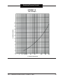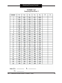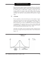
1
STATISTICAL PROCESS CONTROL Statistical Process Control Statistical Process Control Table of Contents I. STATISTICAL PROCESS CONTROL....................................................................1 A. INTRODUCTION.........................................................................................1 1. Concepts...........................................................................................1 2. What is SPC?....................................................................................1 3. The Terms.........................................................................................2 4. Control Methods................................................................................3 Figure 1-1 The Classic Control Cycle...............................................3 Figure 1-2 The SPC Control Cycle...................................................4 5. SPC Benefits.....................................................................................4 6. For Success......................................................................................5 7. Deming and the SPC Story...............................................................6 8. Obligations of Management..............................................................8 9. Deming's 14 Points...........................................................................8 10. Calculator..........................................................................................9 B. GLOSSARY.............................................................................................. 10 1. SPC Terms..................................................................................... 10 2. Basic Symbols................................................................................ 20 C. VARIABILITY............................................................................................ 22 1. Variability Defined.......................................................................... 22 2. Distributions................................................................................... 23 3. Causes of Variability....................................................................... 23 Inherent Causes............................................................................. 24 Assignable Causes........................................................................ 24 4. The Role of SPC............................................................................ 25 5. Variables and Attributes................................................................. 26 6. Summary........................................................................................ 27 D. DATA DISPLAY AND DISTRIBUTION...................................................... 27 1. Tabulated Data............................................................................... 28 Figure 1-3 Sample Data Sheet...................................................... 28 2. Frequency Tally.............................................................................. 29 Figure 1-4 Frequency Tally............................................................ 29 3. Histograms..................................................................................... 30 Figure 1-5 Histogram..................................................................... 30 4. Normal Distribution......................................................................... 32 Figure 1-6 Normal Distribution....................................................... 32 Figure 1-7 Normal Distribution - Few Classes............................... 33 5. Constructing a Histogram.............................................................. 34 k-Graph.......................................................................................... 34 AIDT - Statistical Process Control - October 5, 2006 Statistical Process Control E. F. Figure 1-8 The k-Graph................................................................. 35 Example Data................................................................................ 37 Figure 1-9 Conventional Histogram or Frequency Tally................. 38 Figure 1-10 Completed Histogram................................................. 41 6. Interpretation.................................................................................. 42 Figure 1-11 Variation Example (Ideal Situation)............................. 42 Figure 1-12 Variation Example (Off Center)................................... 43 Figure 1-13 Variation Example (Well Centered)............................ 43 Figure 1-14 Variable Example (Out-Of-Limit Pieces)..................... 44 Figure 1-15 Variable Example (Parts Outside Both Limits)............ 44 Figure 1-16 Variable Example (Double Distribution)...................... 45 Figure 1-17 Variable Example (Total Spread Greater)................... 45 Figure 1-18 Variable Example (Off-Center)................................... 46 Figure 1-19 Variable Example (100% Inspection Ineffective)........ 46 Figure 1-20 Variable Example (Salvage Limit, Incorrect Gage Set-Up, Operator Difficulties.......................................................... 47 Figure 1-21 Variable Example (Well Centered Principle Distribution).................................................................................... 47 Figure 1-22 Variable Example (Favorite Readings)....................... 48 7. Histogram Exercise........................................................................ 49 Figure 1-23 Sample Data Sheet 1................................................. 49 DESCRIPTIVE STATISTICS..................................................................... 51 1. Measures of Central Tendency...................................................... 51 Mean.............................................................................................. 51 Median........................................................................................... 52 Mode.............................................................................................. 52 Example......................................................................................... 53 2. Measures of Dispersion................................................................. 54 Range............................................................................................ 54 Standard Deviation........................................................................ 54 3. Descriptive Statistics Exercise....................................................... 56 NORMAL DISTRIBUTION CURVE........................................................... 57 1. General Shape............................................................................... 58 Figure 1-24 Normal Distribution Curve.......................................... 58 2. Symmetry....................................................................................... 58 Figure 1-25 Symmetrical Distributions........................................... 59 3. Probability...................................................................................... 59 4. Area Under the Curve.................................................................... 60 5. Capability....................................................................................... 60 Figure 1-26 Standardized Normal Distributions............................. 61 6. Using the Normal Distribution........................................................ 62 AIDT - Statistical Process Control - October 5, 2006 ii Statistical Process Control G. H. I. 7. Exercises........................................................................................ 62 Figure 1-27 Normal Distribution Exercises.................................... 63 SAMPLE VERSUS POPULATIONS......................................................... 64 Figure 1-28 Plotted Graph........................................................................ 64 Figure 1-29 Completed Histogram............................................................ 65 1. Central Limit Theorem.................................................................... 66 Figure 1-30 Control Limits.............................................................. 67 Figure 1-31 Factors for Control Charts.......................................... 68 Figure 1-32 Sampling Distribution of Averages.............................. 69 Figure 1-33 Sampling Distribution of Averages.............................. 70 2. Sample Versus Population Exercises............................................ 71 CONTROL CHARTS................................................................................. 71 Figure 1-34 Sampling Data Sheet 2......................................................... 72 1. Preparation.................................................................................... 74 2. Process Control Charts.................................................................. 74 3. Control Chart Functions................................................................. 75 4. Variables Control Charts................................................................ 76 Average-Range Charts.................................................................. 76 Construction Steps for X-R Charts................................................. 77 Figure 1-35 Factors For Control Charts......................................... 80 Exercises........................................................................................ 82 Figure 1-36 Sampling Data Sheet 2............................................... 83 Figure 1-37 X-R Chart Exercise 1.................................................. 84 Figure 1-38 X-R Chart Exercise 2.................................................. 85 Median-range Charts..................................................................... 86 Summary of Median Range Charts Steps..................................... 87 Median-range Charts Exercises..................................................... 88 Figure 1-39 Sampling Data Sheet 2............................................... 89 Figure 1-40 X-R Chart Exercise..................................................... 90 Average-Standard Deviation Charts.............................................. 91 Average-Standard Deviation Charts Summary.............................. 91 5. Attribute Control Charts................................................................. 92 p Charts.......................................................................................... 93 Construction Steps For Constructing p Charts.............................. 93 Figure 1-41 p Chart Conversion Chart........................................... 93 p Chart Exercise............................................................................. 97 Figure 1-42 Attribute Data Sheet 1................................................ 97 Figure 1-43 Attribute Control Chart................................................ 98 INTERPRETATIONS................................................................................. 99 1. Nonrandom Patterns...................................................................... 99 Figure 1-44 Random Pattern........................................................100 AIDT - Statistical Process Control - October 5, 2006 iii Statistical Process Control 2. 3. 4. 5. 6. 7. 8. 9. 10. 11. 12. Freaks...........................................................................................101 Figure 1-45 Freaks........................................................................101 Sudden Shift In Level....................................................................102 Figure 1-46 Sudden Shift In Level................................................102 Trends...........................................................................................104 Figure 1-47 A Trend......................................................................104 Cycles...........................................................................................105 Figure 1-48 Cycles........................................................................105 Grouping.......................................................................................106 Figure 1-49 Grouping....................................................................106 Instability.......................................................................................107 Figure 1-50 Instability....................................................................107 Mixtures.........................................................................................108 Figure 1-51 Mixture.......................................................................109 Stratification..................................................................................110 Figure 1-52 Stratification...............................................................110 Process Capability........................................................................111 z Scores........................................................................................113 Figure 1-53 z Scores.....................................................................113 Figure 1-54 Capability Index.........................................................114 Capability Options.........................................................................115 AIDT - Statistical Process Control - October 5, 2006 iv Statistical Process Control I. STATISTICAL PROCESS CONTROL A. Introduction Through the use of Statistical Process Control (SPC) industry can improve productivity, quality, human relations and profit. These results take time, patience, and commitment on the part of everyone in an organization - from management to manufacturing personnel. SPC is not a quick fix for problems. It is a method of quality management that operates on facts rather than guesswork. It is a tool for the more efficient management of business. The goal of SPC is to reduce process and product variability to increase the quality level of goods as they are produced. 1. Concepts The basic philosophies of SPC are: • Improved quality leads to improved productivity. • Improved productivity leads to lower costs and lower prices. • Improved quality and lower prices lead to improved market share. • 2. Improved market share leads to more jobs. What Is SPC? Statistical Process Control is more than the use of statistics to solve business problems. It is a way of thinking about how to manage operations by continuing to improve both processes and people. SPC is a fast feedback system. It evaluates people, materials, methods, machines, and processes by stressing prevention rather than detection. SPC is a method of managing a process by gathering information about it and using that information to adjust the process to prevent the same problem from happening again. AIDT - Statistical Process Control - October 5, 2006 Statistical Process Control 3. The Terms The meaning of the words which make up SPC’s name — statistics, process, and control — should be understood. • Statistics is a scientific method of collecting, classifying, presenting, and interpreting numerical information. Statistics is a science that aids in making reasonable decisions in an uncertain world. It is a body of techniques for gathering accurate knowledge from incomplete information. • A process is any set of conditions, or set of causes, which work together to produce a given result. In manufacturing, it refers to the combination of machines, equipment, people, raw materials, methods and environment that produces a given product or a specific property of a product. A process can be a single machine, a group of many machines, a single person, a group of many people, a piece of test equipment, a method of measurement, a method of assembly, or a method of processing. • Control is measuring the actual performance of the process, comparing the results to the standard, and acting on the difference. Control is how a process is made to behave the way it should. Remember: SPC is the use of statistical techniques to analyze a process or its output so that appropriate actions can be taken to achieve and maintain a state of control. AIDT - Statistical Process Control - October 5, 2006 Statistical Process Control 4. Control Methods Traditionally, American quality control has been inspection; a sorting method in which the good is sorted from the bad after production is completed. This method has led to high costs, high scrap, and lower quality products. It is referred to as the “Classic” Control Cycle (Figure 1-1). FIGURE 1-1 The Classic Control Cycle AIDT - Statistical Process Control - October 5, 2006 Statistical Process Control The SPC Control Cycle (Figure 1-2) is different. In SPC, the process is monitored during the production and adjustments are made to the process before it produces out-of-specification parts or products. This reduces variability, scrap, and inspection costs while improving quality. FIGURE 1-2 The SPC Control Cycle 5. SPC Benefits The SPC method of quality control, rather than the inspection-sorting method, is good because it: • Increases customer satisfaction by producing a more troublefree product. • Decreases scrap, rework, and inspection costs by controlling the process. • Decreases operating costs by increasing the frequency of process adjustments and changes. AIDT - Statistical Process Control - October 5, 2006 Statistical Process Control • Improves productivity by identifying and eliminating the causes of out-of-control conditions. • Sets a predictable and consistent level of quality. • Reduces the need for receiving inspection by the purchaser. • Provides management with an effective and impersonal basis for making decisions. • Increases the effectiveness of experimental studies. • Helps in selecting equipment and processes. • Helps people to work together to solve problems. 6.For Success Six areas should be evaluated in any manufacturing process if a successful quality control program is to exist. They are: • Control of the quality of the materials coming into the process (this is beyond the scope of this training). • The accuracy, stability, and variation of the measuring system. • The capability of the process measured over a short period of time. • The ability and method to control the process over a long period of time. • An audit of the process to ensure that the control techniques are operating properly. • Ways to ensure continuous improvement. AIDT - Statistical Process Control - October 5, 2006 Statistical Process Control Statistical Process Control is not an overnight cure for production problems. To work well, SPC must be used as an ongoing program involving all levels of personnel with a joint goal of improving quality efficiently and continuously. We know how the process acts normally, and we know how each cause affects the process; then we can make educated corrections when the process strays from the norm. Remember: If the effect each cause has on the process and what can be expected from that process are known, then corrective action can be taken when the results are not those desired. This is a key concept in SPC. 7.Deming and the SPC Story Dr. W. Edwards Deming has been called the “Father of SPC” because his work in developing and promoting its basic concept played an important role in SPC’s growing use. In the mid-1920s Deming left a teaching post at the University of Wyoming to join the Federal Bureau of Statistics as a mathematical advisor. In Washington, he was also responsible for teaching courses in mathematics and statistics for the Department of Agriculture from 1933-1946. His interest in process control, however, was apparently sparked by his meeting Dr. W. W. Shewhart in 1928. Dr. Shewhart, developer of the SPC control charts still in use today, was then a member of the technical staff at Bell Telephone Laboratories. Deming recognized the impact Shewhart’s methods could have on American industry and he soon had a chance to put those methods to work. After the beginning of World War II, Stanford University wanted to aid the war effort. Deming suggested that Stanford teach the simple yet powerful techniques of statistics to engineers and others. He believed this would bring about better precision and higher productivity to the nation’s plants. Stanford accepted his offer to teach the first few courses, and after the first class in July of 1942, Deming AIDT - Statistical Process Control - October 5, 2006 Statistical Process Control taught 23 similar courses at various universities. The courses taught by Deming and others were attended by more than 10,000 people from 800 organizations. Despite his success, Deming’s course had little effect on the quality control functions of most organizations because it failed to involve and educate top management in the use of these techniques. As a result, control charts had appeared in many organizations, and were very effective — to a point. Management did not want to hear the bad news the charts often brought, and gradually the charts disappeared from use. In 1945, the Japanese government asked Deming for help in its studies of nutrition, housing, agriculture, and fishing. He was invited back for the same reasons in 1948. Then, in 1949, the Japanese Union of Scientists and Engineering asked him to teach statistical methods to industry. Deming had his doubts, and feared that SPC would be used for a short time before “burning itself out.” Deming’s fears were never realized. After 45 top-level executives were brought together to hear Deming speak, SPC gained the foothold it needed to begin changing Japanese industry. The change did not occur overnight, and Deming made many trips to Japan after 1950. But the Japanese eagerly accepted Deming’s advice to view quality improvement as part of a total system. Today, the term “Made in Japan” no longer means “cheap, poorlymade products.” Japanese products have risen to high levels of quality, while many U.S. products are now considered inferior or over-priced. It may be that the quality of U.S. products has not gotten worse, but that the quality of foreign products has improved. The Japanese industrial success story is now known worldwide, and Japan has recognized Deming’s contribution by naming its highest award for industrial excellence, “The Deming Prize.” AIDT - Statistical Process Control - October 5, 2006 Statistical Process Control 8. Obligations of Management According to Deming, 85 percent of a company’s problems can be solved solely by management, and only 15 percent can be solved by the workers. If a company is to see significant gains in productivity, Deming said, it must change its management methods and styles. Deming developed his “Fourteen Obligations of Management” to ensure success in a company’s attempts to improve quality, productivity, and its competitive position. The 14 points can apply anywhere - to small organizations and large ones, to service industries, and manufacturing. They can even apply to a division within a company. 9.Deming's 14 Points Here is a summary of Deming’s 14 management points: 1. Work toward improving products and services, in order to be competitive, to stay in business, and to provide jobs. 2. Adopt a new philosophy. With foreign competition, American’s can no longer live with old styles of management, with commonly accepted levels of delays, mistakes, and defective products. 3. Build quality into the product first. Don’t depend on inspection to achieve quality. 4. Keep the total cost as low as possible. Don’t award business on the basis of price tag. 5. Improve the production and service system to improve quality and productivity, and so constantly lower costs. 6. Train on the job. AIDT - Statistical Process Control - October 5, 2006 Statistical Process Control 7. Improve supervision. Supervision should be able to help people and machines do a better job. Provide training for management and production workers. 8. Drive out fear so that everyone can work well for the company. 9. Break down barriers between departments. All departments must work as a team to find and solve problems that may be found in the product or service. 10. Use slogans and targets that are realistic for the work force. Unrealistic targets, such as "zero defects" or production levels that are too high, only create bad feelings between management and workers. Most of the causes of low quality and low productivity belong to the system, and cannot be corrected by the work force alone. 11. Use aids and helpful supervision to meet production requirements. Don’t use work standards that set numerical quotas for the day. 12. Encourage “pride of workmanship,” both for hourly workers and management. Stress quality instead of sheer numbers. 13. Start a strong program of education and training. 14. Put everyone in the company to work to accomplish the transformation. The transformation is everyone’s job. 10. The Calculator The electronic calculator is a tool used to solve mathematical problems more quickly and easily than relying on pencil and paper. Since the calculator is able to do only what the user tells it to do, its features and functions must be understood. AIDT - Statistical Process Control - October 5, 2006 Statistical Process Control Calculator functions will vary from manufacturer to manufacturer. Some calculators feature only the most basic functions, such as addition, subtraction, multiplication and division. More advanced scientific calculators feature keys for more complex algebraic, mathematical and statistical work. For calculating some of the formulae used in SPC, the calculator should carry these more advanced statistical functions. Because calculators differ, this manual will not attempt to detail steps for computing the formulae used in SPC. The calculator’s functions as described in its individual user’s manual or handbook, or as outlined by the instructor, should be understood. B. GLOSSARY 1. SPC Terms Accuracy - Freedom from mistake or error. Attribute Data - Qualitative data that typically shows only the number of articles conforming and the number of articles failing to conform to a specified criterion. Sometimes referred to as Countable Data. Average - The sum of the numerical values in a sample divided by the number of values. Average Line - The horizontal line in the middle of a control chart that shows the average value of the items being plotted. Also called the centerline. Axis - One of the reference lines of a coordinate system. Bar Chart - A chart that uses bars to represent data. This type of chart is usually used to show comparisons of data from different sources. Bimodel Distribution - A distribution with two modes that may indicate mixed data. 10 AIDT - Statistical Process Control - October 5, 2006 Statistical Process Control Binomial Distribution - A distribution resulting from measured data from independent evaluation, where each measurement results in either success or failure and where the true probability of success remains constant from sample to sample. Capability - The competency, power, or fitness of a process for an indicated use or development. Cells - The bars on a histogram with each cell representing a subgroup of data. Central Tendency - A broad term for numerous characteristics of the distribution of a set of values or measurements around a value or values at or near the middle of the set. The standard measures of central tendency are the Mean (average), Median, and Mode. Class Interval - Interval for dividing variable's values: any of the variables into which adjacent discrete values of variables are divided. Common Cause - A factor or event that produces normal variation that is expected in a given process. Control Chart - A chart that shows plotted values, a central line, and one or two control limits and is used to monitor a process over time. The types of control charts are: a. X-bar chart - A control chart where the average of a subgroup is the measure that is being calculated and plotted. b. R chart – The range of a subgroup is the measure that is being calculated and plotted. c. Median chart – The middle value (median) of a subgroup is the statistical measure that is being plotted. AIDT - Statistical Process Control - October 5, 2006 11 Statistical Process Control d. p chart – Used for data that consists of the ratio of the number of occurrences of a defect as compared to total occurrences. Generally used to report the percent non-conforming. e. np chart – Similar to a p chart but tracks the number of occurrences of a defect or event. f. c chart - Used for data that counts the number of units that contain one or more occurrences of a characteristic. g. u chart - Similar to a c chart but is used to track the average number of defects per unit in a sample of n units (constant sample size). Control Limits - A line or lines on a control chart used as a basis for judging the significance of variation from subgroup to subgroup. Variation beyond a control limit shows that special causes may be affecting the process. Control limits are usually based on the three standard deviations around an average or centerline. Coordinate - Any set of numbers used in specifying the location of a point on a line, surface, or in space. Countable Data - The type of data obtained by counting. Attribute data. Curve - a. A graphic representation of a variable affected by conditions. b. A graphic indication of development or progress. Data - Facts, usually expressed in numbers, used in making decisions. Data are gathered by either counting or measurement. Data Collection - The process of gathering information upon which decisions to improve the process can be based. 12 AIDT - Statistical Process Control - October 5, 2006 Statistical Process Control Detection - A form of product control, (not process control), that is based on inspection that attempts to sort good and bad output. This is an ineffective and costly method. Dimension - Physical form or proportions. Distribution - A group of data that is described by a certain mathematical formula. A common distribution observed in industry is the Normal Distribution. A graphical representation of the variability. Environment - The complex system of factors including climate, humidity, temperature, light, etc. which surrounds any process. Fluctuation - Uncertain, unstable shifts in a sequence of values or events. Frequency Distribution - A visual means of showing the variation that occurs in a given group of data. When enough data have been collected, a pattern can usually be observed. It exhibits how often each variable occurs. Graph - a. b. A diagram, which represents the variation of a variable in comparison with that of one or more other variables. The collection of all points whose coordinates satisfy a given functional relation. Histogram - A bar chart that represents data in cells of equal width. The height of each cell is determined by the number of observations that occur in each cell. Horizontal Axis - The line across the bottom of a chart. k - The symbol that represents the number of subgroups of data. For example, the number of cells in a given histogram. AIDT - Statistical Process Control - October 5, 2006 13 Statistical Process Control k-graph - A graph representing the optimum number of class intervals for the number of measurements available. Lower Control Limit - The line below the centerline on a control chart. Mean - The average value of a set of measurements; see Average. Median - The middle value (or average of the two middle values) of a set of observations when the figures have been arranged according to size. Mode - The most frequent value in a distribution. The mode is the peak of a distribution. Measurable Data - The type of data obtained by measurement. This is also referred to as Variables data. An example would be diameter measured in millimeters. n - The symbol that represents the number of items in a group or sample. np - [np-bar] — The symbol that represents the number of nonconforming items in samples of a constant size. np - The symbol that represents the centerline on an np chart. Nonconformities - Something that does not conform to a drawing or specification; an error or reason for rejection. Non-random - Having a definite plan, purpose, or pattern. Relating to a set of elements that do not have a definite probability of occurring with a specific frequency. Normality - Occurring naturally. Numerical - Denoted by a number. 14 AIDT - Statistical Process Control - October 5, 2006 Statistical Process Control Out-of-Control - The condition describing a process from which all special causes of variation have not been eliminated. This condition is evident on a control chart by the presence of points outside the control limits or by nonrandom patterns within the control limits. p - The symbol on a p chart that represents the proportion of nonconforming units in a sample. p [p bar] - The symbol on a p chart that represents the average proportion of nonconforming units in a series of samples. Pareto Charts - A bar chart that arranges data in order of importance. For example, the bar representing the item that occurs or costs the most is placed on the left-hand side to the horizontal axis. The remaining items are placed on the axis in descending (most to least) order. Typically, a few causes account for most of the output; hence the phrase “vital few and trivial many.” Points Beyond Control Limits - The occurrence of points above or below the control limits on a control chart. This may be an indication that a special cause of variation is present. Poisson Distribution - An approximation to the Binomial distribution. This distribution is used for np charts. Population - All members, or elements, of a group of items. For example, the population of parts produced by a machine includes all of the parts the machine has made. Typically, in SPC we use samples that are representative of the population. Prevention - A process control strategy that improves quality by directing analysis and action towards process management that is consistent with the philosophy of continuous quality improvement. Probability - A mathematical basis for prediction that for an exhaustive set of outcomes is the ratio of the outcomes that would produce a given event to the total number of possible outcomes. AIDT - Statistical Process Control - October 5, 2006 15 Statistical Process Control Process - Any set of conditions or causes working together to produce an outcome. For example, how a product is made. Process Capability - The common cause variation of a process; the short-term variation under controlled conditions. This variation will always be present in a process and the capability measured is the best the process will ever produce unless changed. This is sometimes called the short-term capability. Process Control - Using data gathered about a process to control the output. This may include the use of controls including SPC techniques and the establishment of a feedback loop to prevent the manufacture of nonconforming products. Process Flow Chart or Diagram - A chart that presents a picture of the steps followed in making a product. Process Performance - The statistical measure of the two types of variation exhibited by a process, within subgroup and between subgroup. Performance is determined from a process study, which is conducted over an extended period of time under normal operating conditions. Product - What is produced; the outcome of the process. Proportion - A comparison of the number of nonconformities to the total number of items checked. Quality - Conformance to requirements or specifications; i.e., how well a product is made. Quantitative - Able to be expressed in terms of quantity or amount. Random - Lacking a definite plan, purpose, or pattern. 16 AIDT - Statistical Process Control - October 5, 2006 Statistical Process Control Random Sampling - A data collection method used to ensure that each member of a population has an equal chance of being part of the sample. This method leads to a sample that is representative of the entire population. Range - The difference between the highest and lowest values in a subgroup. Run Chart - A line chart that plots data from a process to indicate how it is operating. Regression Analysis - A mathematical method of modeling the relationships among three or more variables. It is used to predict the value of one variable given the values of the others. For example, a model might estimate sales based on age and gender. A regression analysis yields an equation that expresses the relationship. Sample - A small portion of a population. Sampling - A data collection method in which only a portion of everything produced is checked on the basis of the sample being representative of the entire population. Scale - The way in which an axis is divided to show measurements. Scales are shown on horizontal and vertical axis. Scatter Diagram - A diagram that shows if a relationship exists between two variables. Skewed Distribution - A distribution that tapers off in one direction. It indicates that something other than normal, random factors are affecting the process. Special Cause - Intermittent source of variation that is unpredictable, or unstable; sometimes called an assignable cause. It is signaled by a point beyond the control limits or a run or other nonrandom pattern or points within the control limits. The goal of SPC is to control the special cause variation in a process. AIDT - Statistical Process Control - October 5, 2006 17 Statistical Process Control Specification - The established limits of acceptable variation for a product. Spread - The extent by which values in a distribution differ from one another; the amount of variation in the data. Standard Deviation ( σ ) - The measure of dispersion that indicates how data spreads out from the mean. It gives information about the variation in a process. Also called sigma. Statistical Control - The condition describing a process from which all special causes of variation have been eliminated and only common causes remain, evidenced by the absence of points beyond the control limits and by the absence of non-random patterns or trends within the control limit. Statistical Methods - The means of collecting, analyzing, interpreting, and presenting data to improve the work process. Statistical Process Control (SPC) - The use of statistical methods and techniques (such as control charts) to analyze a process or its output so as to take appropriate actions to achieve and maintain a state of statistical control. Statistics - A branch of mathematics that involves collecting, analyzing, interpreting, and presenting masses of numerical control. Subgroup - A group of consecutively produced units or parts from a given process. Successive - Following each other without interruption. Symmetrical - Capable or being divided by a longitudinal plane into similar halves. Tabular - Set up in rows and columns. 18 AIDT - Statistical Process Control - October 5, 2006 Statistical Process Control Tally or Frequency Tally - A display of the number of items of a certain measured value. A frequency tally is the beginning of data display and is similar to a histogram. Tolerance - The allowable deviation from standard; i.e., the permitted range of variation about a nominal value. Tolerance is derived from the specification and is not to be confused with a control limit. Trend - A pattern that changes consistently over time. u - The symbol used to represent the number of nonconformities per unit in a sample which may contain more than one unit. Upper Control Limit - The line above the central line on a control chart. Variables - A part of a process that can be counted or measured, for example, speed, length, diameter, time, temperature and pressure. Variable Data Measurable Data. Data that can be obtained by measuring. See Variation - Measurements of the differences in product or process. A change in the value of a measured characteristic. The two types of variation are within subgroup and between subgroup. The sources of variation can be grouped into two major classes: common causes and special causes. Vertical Axis - The line that runs up and down on the left side of a chart or graph. z Score - The number of sigma units between the process average and the specification limits. AIDT - Statistical Process Control - October 5, 2006 19 Statistical Process Control 2.Basic Symbols 20 A2 Multiplier of R for calculating X chart control limits. X refers to sample averages. A2 Multiplier of A for calculating X-chart control limits. X refers to sample medians. A3 Multiplier of s for calculating X-chart control limits. This is when for calculating X-chart control limits. This is when sample standard deviation is plotted instead of sample ranges. B3 Multiplier of s to determine s-chart LCL. B4 Multiplier of s to determine s-chart UCL. c Number of nonconformities or defects in a specified inspection unit [sample size]. d2 Factor for estimating σ from R. D3 Multiplier of R to determine A-chart LCL. D4 Multiplier of R to determine A-chart UCL. k Number of subgroups or samples such as the number of cells in a histogram. LCL Lower Control Limit LSL Lower Specification Limit µ True population average: "mu". n Sample size: number of items in sample. AIDT - Statistical Process Control - October 5, 2006 Statistical Process Control np Number of nonconforming items or defectives in a sample of size n. np The central line on a np chart - average number nonconforming. p The central line on a p chart - average number nonconforming. R Range: X highest - X lowest. R Average of sample ranges. s Sample standard deviation s Average of sample standard deviations. σ Standard deviation. σx Standard deviation of a frequency distribution of individual measurements [X's]. σx Standard error of the mean. σ True population standard deviation "sigma prime". X A random variable: an individual measurement upon which other subgroup statistics are based. X Sample average: X1 + X2 + ... + Xn/n. X Average of the averages: "grand average". X True population average: "X-bar prime" = µ. X Sample median. X The average of the medians. AIDT - Statistical Process Control - October 5, 2006 21 Statistical Process Control u Nonconformities or defects per inspection unit. UCL Upper Control Limit. LCL Lower Control Limit. C. VARIABILITY No two snowflakes examined closely under a magnifying glass have exactly the same structure or dimensions. They will melt at different rates when exposed to heat. It cannot be predicted, based on observing two snowflakes, what the next one will look and act like if it is observed for the characteristics mentioned above. In manufacturing a product, it is also impossible to build each part exactly like the one before it. Each part or product, though it appears identical, will not be perfectly identical to the one produced before or after it. No two things are exactly the same, neither in nature nor in a manufacturing process, due to the law of variability. Understanding how variability works is vital to producing products that meet some standard of acceptance. 1. Variability Defined Variability is defined as the net result of the many (sometimes immeasurable) factors, which are constantly affecting the process. In the case of snowflakes, both fall through the same obvious environment, and therefore some force other than wind, temperature, humidity, etc., has acted on the snowflakes to make them slightly different from each other. In the case of a manmade product, again many factors are acting at the same time to affect the finished dimension. Bearing wear, tool wear, material hardness, dye concentration, pigments, paint viscosity, temperature and constancy of the power supply are just a few of the factors that could ultimately affect the finished product. Remember: By observing natural and manmade products, it must be concluded that: 22 AIDT - Statistical Process Control - October 5, 2006 Statistical Process Control • Variability is always present. • No two objects are exactly alike. • Variability in manufacturing is inevitable. From a manufacturing viewpoint, the total variation must be traced back to its source and an attempt made to control that variation if quality products are to be produced every time. 2.Distributions In any manufacturing process, pieces vary from each other. If only one measurement is taken, very little about the variability of the process can be learned. By continuing to take measurements, however, and plotting the individual measurements on a chart or graph, a form of distribution occurs that resembles a “bell-shaped” curve. This distribution could be displayed as a “point-to-point” distribution, a histogram (which will be discussed later) or a normal bell-shaped curve. Distribution (or a graphic representation of the variability) may differ in location (a situation where the central value has shifted either to left or the right), in size (where the central value has been reduced and the spread of the distribution has increased), or in shape (where most of the measurements are clustered at a point that is not the central value). Because distributions are subject to all of the above, some method is needed to measure and control the variability that always exists. Even though individual things are unpredictable, groups of things sampled together from the same system of causes form a predictable distribution and so are predictable when analyzed as a group. 3. Causes of Variability The causes of variability can be categorized into those causes that are inherent and those that are assignable. AIDT - Statistical Process Control - October 5, 2006 23 Statistical Process Control Inherent Causes Inherent causes are those, which randomly affect the system. They are always present and built into the process itself. Inherent variation represents random changes in the manufacturing process, equipment, environment, etc. Inherent variation is also called common or chance variation. Inherent variation generally cannot be identified to a particular cause because of lack of knowledge or because identification would be too costly. These are usually many small, sometimes immeasurable causes which when acting together add to the total variability. In general, they cannot be reduced or eliminated without major changes in the process itself. Assignable Causes Variation due to assignable causes represents nonrandom variations in the process, which can be identified to a particular cause. Because assignable variation can be identified, it is usually worth the cost to discover the reason for the variation and correct or eliminate it. Normally, only a few assignable causes are acting on a system and are usually things that come and go over time. Assignable variation might be caused by any one, or more, of the following: 24 • People – setup (speeds, feeding), accuracy, training, experience, motivation, etc. • Machines – accuracy, calibration, wear, sensitivity, etc. • Materials – different compounds, mixing accuracy, calibration, etc. • Measurements – repeatability, precision, accuracy, calibration, etc. • Environment – temperature, humidity, etc. AIDT - Statistical Process Control - October 5, 2006 Statistical Process Control 4. The Role of SPC Any process can vary due to inherent causes and assignable causes. SPC’s job is to help determine when the variation is only due to the small, random causes that are inherent, or common, in any system, or to signal the operator when assignable causes are at work adding to the overall variation. Assignable variation might occur suddenly in a process, or over a considerable period of time. A sudden change in the performance of a process can generally be detected immediately (for example, operator change, material change, etc.). A gradual change (trend), or cyclical change in the performance of a process cannot be detected immediately (for example, bearing wear, slow loss of calibration, a gradual change in ambient conditions, arterial changes between lots, etc.). Process control can be achieved only when the assignable causes in the system can be identified and controlled. Remember the following differences between inherent and assignable causes: Inherent Causes Assignable Causes 1. A large number are in 1. effect at any time. Very few are in effect at any time. 2. Each has an individual effect that is too small to mention. The effect is measurable. 3. Only a change in the system 3. will reduce that part of the variability. 2. They can be found and eliminated. 4. Only management has the 4. ability to make changes. The machine operator is best able to discover and make changes. 5. Occur infrequently in unpredictable fashion. Chance causes remain 5. constant over time. AIDT - Statistical Process Control - October 5, 2006 25 Statistical Process Control If a process is said to be in control, it means only inherent causes of variation are present. When a process is said to be out-of-control, it means that assignable causes of variation are present. If a process is to be controlled, and quality parts produced, it must be determined which category of variability is acting on the process at any time. The variability must be categorized, because the responsibility for improvement action may lie with different levels of management. In the case of inherent causes of variability, this can usually be considered a system fault. Management (design engineers, manufacturing engineers, and/ or industrial engineers) must spearhead the effort to reduce the variability. In the case of assignable causes of variation, the fault is usually the responsibility of the operator or the first-line supervisor. In SPC, statistics provide a method of identifying when assignable causes are present in a process. SPC also helps in separating assignable causes from the inherent causes in a manufacturing process. The primary objective of SPC is to identify and correct the assignable causes within the process at the time they occur, rather than find that a large number of bad or unacceptable products must either be scrapped or reworked. 5. Variables and Attributes One of the important distinctions in the technical language of statistics is the distinction made between variables and attributes. A variable is generally known as a measurable characteristic. This can be inches, meters, thousandths of an inch, temperature, viscosity or any other measurable characteristic. 26 AIDT - Statistical Process Control - October 5, 2006 Statistical Process Control An attribute is generally referred to as countable data. For example, a record showing only the number of articles conforming to specifications and the number failing to conform would represent attribute data. These two concepts will be discussed in more detail in the sections that deal with the actual construction of control charts. The two major divisions in control charts occur between Variables Control Charts and Attribute Control Charts. 6. Summary Remember: • All manufacturing processes have variability. • The control of quality is largely the control of variability. • Causes of variability are either inherent or assignable. • Assignable causes may be found and eliminated. • The future can be predicted in terms of past behavior. • The only economical way to improve a process that is "in control" is to change the system. D.DATA DISPLAY AND DISTRIBUTION Very little can be learned about a process if only one measurement, or sample, is taken from it. If a series of measurements are taken, however, the differences, or variability, between them can be discovered and steps taken to eliminate that variability if it is due to assignable causes. When collecting data, or a series of measurements, it is necessary to display it in a form that is easily understood. There are several different ways of displaying data. Each is important, but none by themselves can provide all the information that might be needed about a process. AIDT - Statistical Process Control - October 5, 2006 27 Statistical Process Control 1. Tabulated Data It is a common practice to first tabulate, or list, a series of measurements or readings on a sample data sheet as shown in Figure 1-3. FIGURE 1-3 Sample Data Sheet Data displayed as tabulated successive readings may be of limited use because it does not accurately portray the nature of the distribution from which the sample was drawn. Tabulated data is only useful when the order of the samples is important. 28 AIDT - Statistical Process Control - October 5, 2006 Statistical Process Control 2.Frequency Tally A type of presentation similar to tabulated data is the frequency tally. However, the frequency tally provides more information than the simple tabulation. A frequency tally of the data provided in Figure 1-3 is shown as Figure 1-4. FIGURE 1-4 Frequency Tally A frequency tally is simply a tally, or number, of times a particular measurement or reading occurs in the data. This tally provides the analyst with the general shape of the distribution he or she is working with. More than that, specification tolerances could be added to the distribution which would show if any measurements were outside the specification tolerances. AIDT - Statistical Process Control - October 5, 2006 29 Statistical Process Control 3. Histograms Another way of presenting data is a histogram, or bar chart. Histograms are special types of frequency distributions. Histograms are the recommended method of displaying data because they aid in analyzing the distribution of data for centering, spread, and shape. Histograms can be used to determine whether the process is operating the way it is desired. Histograms can also be used to identify the factors that cause the process to vary from what is wanted. A histogram created from the data in Figure 1-3 is shown as Figure 1-5. FIGURE 1-5 Histogram The histogram in Figure 1-5 is constructed with the measured dimensions (collected data) shown on a horizontal line, and the frequency of the readings shown on a vertical line. 30 AIDT - Statistical Process Control - October 5, 2006 Statistical Process Control One of the problems with using histograms is that the data may be distorted if the sample is large with small frequencies for some values, or if the sample is small with a large spread of data values. It is important that a method be found for grouping the data to provide a more compact variation pattern. The best method of grouping data for histogram construction will be covered in detail later. To show as much information as possible about the distribution, the number of class intervals in histogram construction must be chosen carefully. A class interval is an interval for dividing variable's values: any of the variables into which adjacent discrete values of variables are divided. If the number of class intervals is too small or too large, the population’s estimated true shape may not be easily seen. The bases of the histogram rectangles are always equal, and one class interval in width. All measurements within any class are characterized by the midpoint of the interval. Each rectangle height is proportional to the class frequency in such a way that the histogram total area is proportional to the total frequency. AIDT - Statistical Process Control - October 5, 2006 31 Statistical Process Control 4. Normal Distribution If there is enough data to form a large number of classes, in most cases the histogram takes on the shape of what is referred to as a normal distribution. Figure 1-6 shows a histogram with a very large number of classes, representing a normal distribution. Even in a histogram with fewer classes (Figure 1-7), the shape of the normal distribution can be seen. FIGURE 1-6 Normal Distribution 32 AIDT - Statistical Process Control - October 5, 2006 Statistical Process Control FIGURE 1-7 Normal Distribution - Few Classes A histogram will generally be tall in the center and shallow toward the ends if it follows a normal distribution. If a smooth curve is traced over the peaks of the histogram bars, the familiar bell-shaped curve can be seen. AIDT - Statistical Process Control - October 5, 2006 33 Statistical Process Control 5. Constructing a Histogram Before constructing a histogram, the optimum number of class intervals for the number of measurements available must be determined. A kgraph is provided for this purpose. k-Graph A k-graph is shown in Figure 1-8. The horizontal axis on the k-graph is scaled for the number of measurements available. The number of classes (“k”) is shown on the vertical axis of the graph. 34 AIDT - Statistical Process Control - October 5, 2006 Statistical Process Control FIGURE 1-8 The K-Graph AIDT - Statistical Process Control - October 5, 2006 35 Statistical Process Control To determine the number of classes to use for a histogram: 1. Locate on the horizontal axis the number of measurements taken. 2. Project upward from that location to the intersection of the curve. 3. At the intersection of the curve, read directly across the graph to the intersection of the vertical axis. 4. At the intersection of the vertical axis, read the optimum number of classes to be used for the measurements available. The number of classes will seldom be located at a whole number; therefore, the closest whole number of classes should be selected when developing a histogram. 36 AIDT - Statistical Process Control - October 5, 2006 Statistical Process Control Example Data The following measurements are for the width of 30 bolts of cloth: Width (Inches) 61.5 61.4 61.3 61.2 61.1 61.0 60.9 60.8 60.7 60.6 60.5 60.4 60.3 60.2 60.1 60.0 59.9 59.8 59.7 59.6 59.5 59.4 59.3 59.2 59.1 No. of Bolts of Fabric 1 1 3 3 3 7 5 3 3 1 AIDT - Statistical Process Control - October 5, 2006 37 Statistical Process Control If the data is plotted on a histogram that has on the horizontal axis all the data points that might be encountered, the histogram would be like the plot in Figure 1-9. FIGURE 1-9 Conventional Histogram or Frequency Tally Although the data appears to be taking on the shape of the normal, bell-shaped distribution, a much better histogram could be created by determining the class size using the k-graph. The following are step-by-step instructions for constructing a histogram, using the data for the 30 bolts of cloth in the previous example: 1. Determine the range of the data. The range is found by subtracting the lowest value from the highest value: 61.5" - 59.1" 2.4" 38 AIDT - Statistical Process Control - October 5, 2006 Statistical Process Control 2. Determine the number of classes and class size. • From k-graph for 30 samples, the number of classes is 6. • Class size is range divided by the number of classes: 2.4 '' ÷ 6 = 0.4 '' 3. Express class width as class size rounded up to the next half number: Use 0.5" AIDT - Statistical Process Control - October 5, 2006 39 Statistical Process Control 4. Establish class midpoints and class limits. a. Select either the highest or the lowest reading for the following midpoint: Midpoint 61.5 61.0 0.5'' 0.5'' 60.5 60.0 59.5 59.0 b. 0.5" 0.5" 0.5" Determine the class limits by dividing the class width by 2 and adding and subtracting the result from the midpoint. Class limits = Midpoint ± (Class width ÷ 2) Upper Class Limit = Midpoint + (.5'' ÷ 2) UCL = Midpoint + .25 Lower Class Limit = Midpoint - (.5'' ÷ 2) LCL = Midpoint - .25 Midpoint UCL 61.5 61.0 60.5 60.0 59.5 59.0 61.75 61.25 60.75 60.25 59.75 59.25 LCL 61.25 60.75 60.25 59.75 59.25 58.75 Frequency 1 7 10 8 3 1 (Note: The frequency of the data is found by determining within what class each of the data points lie.) 40 AIDT - Statistical Process Control - October 5, 2006 Statistical Process Control 5. Construct the histogram (Figure 1-10). a. The frequency scale of the vertical axis should slightly exceed the largest class. b. The measurement scale on the horizontal axis should be at regular intervals independent of class width. FIGURE 1-10 Completed Histogram AIDT - Statistical Process Control - October 5, 2006 41 Statistical Process Control 6. Interpretation The simplest histogram is helpful in making an analysis, but its use is limited because it: • Requires many measurements. • Does not take time into consideration. • Does not separate the two kinds of variation - assignable and inherent. • Does not show trends. A histogram is a picture of the process at one particular time. It portrays a situation that has already occurred. Since the histogram does not consider the time factor, it may provide a false picture if a change in the process over a specific time frame is being determined. Following are variation examples using histograms (Figures 1-11 through 1-22). An explanation is provided with each example. FIGURE 1-11 Variation Example (Ideal Situation) 42 An ideal situation where the process spread is substantially within the specified limits and is well-centered. AIDT - Statistical Process Control - October 5, 2006 Statistical Process Control FIGURE 1-12 Variation Example (Off Center) The process has drifted off center and is producing pieces outside the limits. FIGURE 1-13 Variation Example (Well Centered) A process with a spread approximately the same as the specification limits and is well-centered. AIDT - Statistical Process Control - October 5, 2006 43 Statistical Process Control FIGURE 1-14 Variable Example (Out-Of-Limit Pieces) A process with a spread approximately the same as the specification limits which has drifted off-center and is producing out-oflimit pieces. FIGURE 1-15 Variable Example (Parts Outside Both Limits) A process with a spread greater than the specification limits producing parts outside both limits. 44 AIDT - Statistical Process Control - October 5, 2006 Statistical Process Control FIGURE 1-16 Variable Example (Double Distribution) A double distribution suggesting that two different machines or two different setups are involved. FIGURE 1-17 Variable Example (Total Spread Greater) A double distribution with total spread greater than Figure 1-16 resulting in increased rework and/ or scrap. AIDT - Statistical Process Control - October 5, 2006 45 Statistical Process Control FIGURE 1-18 Variable Example (Off-Center) A process operating off-center where pieces have been 100% inspected and the defective ones removed. This might also indicate a histogram of run-out where only plus readings from zero are being measured. FIGURE 1-19 Variable Example (100% Inspection Ineffective) A process resembling Figure 1-18 in which 100% inspection has not been entirely effective. 46 AIDT - Statistical Process Control - October 5, 2006 Statistical Process Control FIGURE 1-20 Variable Example (Salvage Limit, Incorrect Gage Set-Up, Operator Difficulties) A process similar to Figure 1-18 and 119, but indicating the possibility of the use of a salvage limit, the gage being set up incorrectly, or an operator having difficulty deciding borderline cases. FIGURE 1-21 Variable Example (Well Centered Principle Distribution) A well-centered principle distribution with another small distribution that may be the result of set-up pieces being included in the lot. AIDT - Statistical Process Control - October 5, 2006 47 Statistical Process Control FIGURE 1-22 Variable Example (Favorite Readings) A distribution where the operator has favorite readings because the gaging was inadequate or difficult to interpret. 48 AIDT - Statistical Process Control - October 5, 2006 Statistical Process Control 7. Histogram Exercise Using the data provided in Sample Data Sheet 1 (see Figure 1-23), construct a histogram of the data following all steps. Blank graph paper on which to draw the histogram is also provided on back of this sheet. FIGURE 1-23 Sample Data Sheet 1 AIDT - Statistical Process Control - October 5, 2006 49 Statistical Process Control 50 AIDT - Statistical Process Control - October 5, 2006 Statistical Process Control E.DESCRIPTIVE STATISTICS Basic statistics are used to define how like items compare with each other - that is, how they tend to be the same as a group and, at the same time, how they differ from each other individually. For example, one group of people will have an “average” age, yet each person will have a unique age which is probably different from all the others. To quantitatively describe large sets of data, two general categories of statistical measure must be used: the measure of central tendency and the measure of dispersion. These concepts will be important in the next sections dealing with normal distributions and control charts. 1. Measures Of Central Tendency A frequency distribution shows approximately where the data is clustered, but usually a closer estimate (one number) is needed. This closer estimate can be found by calculating the measure of central tendency, which indicates where the center of the distribution is located. The three measures of central tendency are the mean, median and mode. Of the three, the most frequently used is the mean, also called the average. Mean The mean is calculated by adding all the observations and dividing the total by the number of observations. The advantages of using the mean as a measure of central tendency are that it: • Is the most commonly-used measure of central tendency. • Is easy to compute. • Is easily understood. • Lends itself to algebraic manipulation. AIDT - Statistical Process Control - October 5, 2006 51 Statistical Process Control The disadvantage of using the mean is that it is strongly affected by extreme values and so may not be representative of the distribution. The mean is commonly calculated with the formula: ∑ X = nX X = The sum of X divided by n. X = an individual value or score. n = the number of individual values or observations in the subgoup or sample. ∑ = the sum of the observations or values. Median If the sample values (the number of the sample values is n) are arranged in ascending or descending order, the median is the middle value. However, if there are an even number of values, the median is the average of the two middle values. Mode The sample mode is defined as the value that has the largest frequency. In most cases this value can be read directly from the frequency distribution. 52 AIDT - Statistical Process Control - October 5, 2006 Statistical Process Control Example The following measurements of a quality characteristic, X, were made during a day shift: 60 62 59 60 63 58 58 61 62 60 60 57 63 62 60 60 61 61 60 61 59 58 59 59 61 A frequency distribution could be an easy way of summarizing and displaying the data. Expressed in a tabular fashion, the frequency distribution is: 57 58 59 60 61 62 63 1 3 4 7 5 3 2 The sample mean can be found by adding all the Xs and dividing by the number of measurements (in this case 25). X = (60 + 62 +... 61 ÷ 25 X = 60.16 The sample median can be found by finding the value, n/2+.5, in the data listed above. The sample median is the 13th value. Counting down from the tabular frequency distribution, the 13th value is 60. Since the sample mode is the value that has the highest frequency, it can be read directly from the frequency distribution. The sample mode is 60. Remember: When the data is a true normal distribution, the value of the mean, median, and mode will be identical. AIDT - Statistical Process Control - October 5, 2006 53 Statistical Process Control 2. Measures Of Dispersion Not only is it important to know the central tendency of a distribution, but also to know the amount of scatter around the central point. It is possible that the data may be closely grouped near the central point. It may be uniform or there may be relatively large numbers of extreme values. It is obvious that some description of spread is needed. This can be done by calculating a measure of dispersion, which is an indication of the amount of scatter, or spread, around the central point. The most important measurements of dispersion are the range and the standard deviation. Range The range is calculated by subtracting the smallest observation from the largest. The advantages of using the range are: • It is easily understood. • It is easily calculated. The disadvantages are that the range is affected by extreme values and is inefficient because it ignores some information. Range, defined in statistical terms, is: R = X (max) - X (min) Standard Deviation Standard deviation, also known as sigma , ( σ ) is a more efficient estimator of dispersion. Unfortunately, it is somewhat more difficult to calculate. 54 AIDT - Statistical Process Control - October 5, 2006 Statistical Process Control The sample standard deviation can be found by the following formula: σ (X2 - X )2 n-1 Because statistical calculators are available, calculators will generally be used to obtain the standard deviation. The standard deviation of the previously discussed data is 1.57. AIDT - Statistical Process Control - October 5, 2006 55 Statistical Process Control 3.Descriptive Statistics Exercise Find the median, mean, mode, range and standard deviation of the following sample data: 16.7 17.0 16.8 16.9 17.1 17.1 17.0 16.9 16.8 16.9 16.9 17.0 16.8 16.7 16.6 Mean _________________ Median _________________ 56 Mode _________________ σ _________________ R _________________ AIDT - Statistical Process Control - October 5, 2006 Statistical Process Control F. NORMAL DISTRIBUTION CURVE The primary distribution utilized in SPC is the normal distribution. Many things in nature, such as the heights of all males in the United States, follow what has become known as the normal distributions. In the late 1800s, a group of scientists in Great Britain who were studying the human anatomy discovered that the data they collected followed a certain pattern. As the researchers recorded other data, such as the length of the thigh bones, they again found that the data displayed similar patterns. Many other researchers studying different subjects discovered the same types of patterns in their data. All data sets, however, do not follow the normal distribution. For example, the distribution of all the heights of the people in the United States, both male and female, would have two separate groupings. One grouping would be for females, who are typically smaller than males, and another grouping for males. In industry, a machine might run to the “high side” and produce a distribution that would have a larger number of higher values. The data collected from this machine would not follow a normal curve. AIDT - Statistical Process Control - October 5, 2006 57 Statistical Process Control 1. General Shape A normal distribution curve is shown in Figure 1-24. Because the mean, median, and mode are exactly equal, the curve has the bell shape, which is characteristic of a normal distribution. FIGURE 1-24 Normal Distribution Curve 2. Symmetry The curve in Figure 1-24 is also exactly symmetrical. If the curve were cut in half, each side would be a mirror image of the other. Although the normal distribution is symmetrical, all symmetrical distributions are not normal distributions. Characteristics other than symmetry must be examined before the normality of the data can be determined. 58 AIDT - Statistical Process Control - October 5, 2006 Statistical Process Control FIGURE 1-25 Symmetrical Distributions In Figure 1-25, all four of the distributions are symmetrical. Only one (distribution D) is normal. This illustrates that all symmetrical distributions are not normal, but a normal distribution is symmetrical. 3. Probability Under a normal curve, the total area of the distribution is 1. This means that if the probabilities of all possible outcomes in a set of data are considered, the total of those probabilities must equal 1. When a single die is tossed, the probability of getting a one is 1/6; the probability of getting a two is 1/6; the probability of getting a three is 1/6 and so on. In fact, the probability of getting any number between one and six is 1/6, and if all of the probabilities are added together, the total would be 1. This characteristic of the normal distribution can be applied to a variety of situations. AIDT - Statistical Process Control - October 5, 2006 59 Statistical Process Control 4. Area Under The Curve In a normal distribution, the area under the curve can be determined because the curve is completely described by a mathematical formula. Combining two characteristics of the normal distribution (the fact that the total area is equal to 1 and the fact that this area can be determined) allows the areas of the normal curve to be converted to probabilities. If the mean, or average, and the standard deviation are known (each is described in the previous section), the normal distribution can be fully described. 5. Capability The normal distribution has a number of other important characteristics, as follows: • The areas on either side of the mean are equal. • About 68.25 percent of the total area is included within a distance of ± 1 standard deviation from the mean. • About 95.45 percent of the total area is included within a distance of ± 2 standard deviations from the mean. • About 99.73 percent (or nearly all) of the area is included within a distance of ± 3 standard deviations from the mean. The curves in Figure 1-26 are the percentages of area under the curve for ± 1, 2 and 3 standard deviations for a distribution with a mean of 0 and a standard deviation of 1. 60 AIDT - Statistical Process Control - October 5, 2006 Statistical Process Control FIGURE 1-26 Standardized Normal Distributions Since almost all of the area under the curve is included within ± 3 standard deviations from the mean, American industry has defined capability as ± 3 standard deviations, or 6 standard deviations. This 6-sigma rule of capability will be discussed in greater detail in the section covering Control Chart Interpretation. AIDT - Statistical Process Control - October 5, 2006 61 Statistical Process Control 6.Using The Normal Distribution The normal distribution is important in quality control for two reasons: 7. • Many distributions of quality characteristics of a product are reasonably similar to the normal distribution. This makes it possible to use the normal distribution or estimating percentages of product that are likely to fall within certain limits — that is, a process’s capability. • Even when the distribution of product is quite far from normal, many distributions of statistical quantities, such as averages, tend to distribute themselves in accordance with the normal distribution. For this reason, the normal distribution has important uses in statistical theory, including some of the theory that underlines control charts. Exercises 1. 2. 62 Using the fours sets of data provided in the Normal Distribution Exercises (see Figure 1-27), use the concepts of normal distribution to calculate the largest and smallest parts that could be expected. Do this by calculating: a. The mean and standard deviation of each data set. b. The value of ± 3 standard deviations for each data set. Compare this rough estimation of capability obtained in each of the Normal Distribution Exercises with the specifications listed on the data sheet. Can these processes be improved? AIDT - Statistical Process Control - October 5, 2006 Statistical Process Control figure 1-27 Normal Distribution Exercises 80 PCS 45 PCS 1.249 1.250 1.251 1.252 1.253 1.254 1.255 1.256 1.250 1.255 ( x ) Mean ( ) STD. DEV x+3 x -3 75.25 mm 75.35 mm 75.25 75.26 75.27 75.28 75.29 75.30 75.31 75.32 75.33 75.34 75.35 75.36 75.37 75.38 75.39 75.40 ( x ) Mean ( ) STD. DEV x+3 x -3 .869 .875 .8 mm .4 mm 20 PCS 80 PCS .867 .868 .869 .870 .871 .872 .873 .874 .875 .876 .877 .6 .8 .7 .5 .6 .4 .8 .9 .6 .4 .5 .6 .7 .5 .6 .7 .8 .5 .7 .6 ( x ) Mean ( x ) Mean ( ) STD. DEV ( ) STD. DEV x+3 x+3 x -3 x -3 AIDT - Statistical Process Control - October 5, 2006 63 Statistical Process Control G. SAMPLE VERSUS POPULATIONS Often, data is presented in a chart that looks like this: 356 358 361 357 350 349 356 355 358 357 359 359 365 355 354 360 361 361 359 358 The chart above really does not provide much information about the data. Few conclusions can be drawn from it. The data is simply a group of numbers with little meaning. The same data can also be plotted on a graph. A graph of the above data is shown in Figure 1-28. FIGURE 1-28 Plotted Graph A plotted graph provides a little more information about the data, but still not enough for many conclusions to be drawn. How often each number occurs is, however, more readily seen. 64 AIDT - Statistical Process Control - October 5, 2006 Statistical Process Control A histogram will provide even more information about the data. A histogram of the same data is shown in Figure 1-29. FIGURE 1-29 Completed Histogram The histogram provides considerably more information about the data. It provides a clearly understood picture how often each number or measurement occurs. Using the histogram, the data can be analyzed for spread, centering and shape. If the same average (mean) and the standard deviation (sigma) are calculated, there is even more information which can be used to analyze the data. For the data discussed here, the average is 357.4 and the standard deviation is 3.73. After the data has been seen in several different forms, and the average and standard deviation have been calculated, conclusions about both the sample itself and the population from which it can be drawn. In order to draw conclusions about an entire population based on sample data, it is important to understand the applications of the Central Limit Theorem. AIDT - Statistical Process Control - October 5, 2006 65 Statistical Process Control 1. Central Limit Theorem A population, also called a universe, parent distribution, or distribution of individuals, can be thought of as the potentially unlimited output of a manufacturing process, or as a particular lot of manufactured articles. Because it is obviously impractical to measure every item produced by a process, samples must be relied on to provide information about the process. Samples and populations from which they are taken are related by a mathematical law called the Central Limit Theorem. Because of this relationship, the population actually determines the center and spread (mean and standard deviation) of the sample, and to a certain extent, the sample distribution’s shapes. Some of these relationships are beyond the scope of this SPC manual, but it is important to understand the concepts behind the sample distribution of averages. The most common control chart used in SPC, the average-range chart (X-R chart) is based on sample averages, the average of sample averages, and the standard deviation of sample averages (standard error of the mean, σ or x ). According to the Central Limit Theorem: 66 • The average (center) of the sample averages will be the same as the population average. • Samples selected from a normally distributed population will also be normally distributed. • The averages ( Xs ) of sample selected from an abnormally distributed population will be normally distributed for sample sizes of 30 or more. • The standard deviation of the distribution of sample averages (or standard error of the mean) will equal the standard deviation of the population divided by the square root of the number of samples per subgroup. Control limits on X - R charts (Figure 1AIDT - Statistical Process Control - October 5, 2006 Statistical Process Control 30) are actually the 3 sigma limits for the sampling distribution of averages, or ± 3 σ x . This factor has already been calculated for different subgroup sizes and included in the Table of Control Chart Factors in Figure 1-31. This table will be used in calculating control limits on control charts. FIGURE 1-30 Control Limits Several examples of samples taken from different distributions are shown on the following pages as Figures 1-32 and 1-33 to further demonstrate the Central Limit Theorem. In each of the four different cases, the averages remain the same. The Central Limit Theorem holds true in almost all cases when samples of 30 or more are selected from a population, regardless of the population’s distribution. As the sample size increases, the bellshaped pattern or the normal distribution becomes more evident when the samples are plotted onto the graph. Remember: The Central Limit Theorem provides critical information needed to understand and analyze how any process is operating based on random samples of 30 or more selected from the population. Using this theorem, it is unnecessary to inspect or measure a large portion of the population. AIDT - Statistical Process Control - October 5, 2006 67 Statistical Process Control FIGURE 1-31 Factors For Control Charts 68 AIDT - Statistical Process Control - October 5, 2006 Statistical Process Control FIGURE 1-32 Sampling Distribution of Averages AIDT - Statistical Process Control - October 5, 2006 69 Statistical Process Control FIGURE 1-33 Sampling Distribution of Averages 70 AIDT - Statistical Process Control - October 5, 2006 Statistical Process Control 2. Sample Versus Population Exercises For the 125 data points on Sample Data Sheet 2 (Figure 1-34), calculate: 1. The average and standard deviation of the 125 values. 2. The sample average and range of the 25 subgroups of 5 values each. 3. The average of the averages from Step 2 and the standard deviation of the subgroup average. Compare them to the values calculated in Step 1. 4. Construct histograms of the individual values and of the sample averages using the blank graph paper provided with Figure 134). Note the similarities and differences between the two. (Note: A histogram of the individual values was done in Section D on the Display/Distribution of Data.) H. CONTROL CHARTS The Control Chart is one of the most important tools of SPC. Control charts are simple, yet powerful tools for checking the stability of a process over time, as well as verifying the results of any improvement actions taken. Remember: The measured quality of any manufactured product is subject to a certain amount of variation as the result of chance. A stable “system of chance causes” is inherent in any scheme of production and inspection. This variation is unavoidable as long as the production and inspection system remain unchanged. However, causes of variation outside this stable pattern can be discovered and corrected. The power of the control chart is in its ability to separate these assignable causes of quality variation from inherent, unavoidable causes. AIDT - Statistical Process Control - October 5, 2006 71 Statistical Process Control FIGURE 1-34 Sampling Data Sheet 2 72 AIDT - Statistical Process Control - October 5, 2006 Statistical Process Control AIDT - Statistical Process Control - October 5, 2006 73 Statistical Process Control In this regard, the purpose of control chart analysis is to identify: • Evidence that the inherent process variability and the process average are no longer operating on stable, controlled levels. • Evidence that one or both are out of control (unstable). • The need for corrective action. While the term “control chart” is widely accepted and used, it must be remembered that the control chart does not actually control anything. It simply provides a basis for taking action. It is effective only if those who are responsible act on the information the chart reveals. 1. Preparation Before a control chart can be used, several steps must be taken: 2. 1. Management must prepare a responsive environment. 2. The process that is to be studied must be understood. 3. The characteristics to be controlled must be determined. 4. The measurement system must be defined. 5. Unnecessary variation must be minimized. Process Control Charts A control chart is a simple, three-line graph — a graphic display of how data occurs over time. Special, assignable causes of variability (process instabilities suggesting a process which is out-of-control) occur or evolve in unusual ways, which will be reflected by the data. Determining the presence of such a source of variability (assignable causes) in the presence of the stable variability (inherent causes) is possible by identifying unusual patterns and unexpected data points on the control chart. 74 AIDT - Statistical Process Control - October 5, 2006 Statistical Process Control In this three-line graph, the centerline represents the average performance of the process for a particular statistic (mean, range, percent, defective, etc.). The two outer lines are called control limits. These control limits are usually set up symmetrically above and below the centerline so that there is a 97.7 percent chance that a point will fall between the two limits as long as the average performance of the process has not changed. A point outside the control limits or nonrandom (unusual) patterns in the data within the two control limits indicate that a change in the average performance of the process has occurred. If the control chart shows no points outside the control limits, and no unusual patterns within the control limits, then the process is under control and there are no assignable variations present. 3. Control Chart Functions Awareness of the reference distribution underlying a particular control chart is of primary importance. The control chart provides clear documentation of process variation in an easily understood form. As variability is reduced, there is also less masking of the smaller effects of any corrective actions made in a process. Some basic functions of control charts are to: • Monitor process performance over time. • Describe what control there is. • Help attain control by detecting change in the performance of the process. • Estimate the capability of the process. • Signal when corrective action is needed. • Verify the results of any corrective action. AIDT - Statistical Process Control - October 5, 2006 75 Statistical Process Control The remainder of this section will discuss the two categories of control charts: Variables Control Charts and Attribute Control Charts. 4. Variables Control Charts Variables Control Charts are used to record and monitor process performance with respect to the selected variable. Remember: Variables are those parameters which can be measured. The three types of variables charts are: • Average and Range Charts ( X - R charts). • Median and Range Charts ( X - R charts). • Average and Standard Deviation Charts ( X - S charts). Average-Range Charts Average and Range charts are developed from measurements of particular characteristics of the process output. The X - R is one of the most powerful and sensitive SPC tools. An X chart and an R chart, as a pair, represent a single product characteristic. The data is reported in small subgroups, usually including from 2 to 5 consecutive pieces, with subgroups taken periodically (for example, once every 15 minutes, twice per shift, etc.). In order for the charts to be effective: 76 • Each item must be accurately measured for the characteristic being observed. • The subgroups must be chosen so that the variation among the units represents the variability that cannot be controlled in the short-run. However, variation between subgroups can reflect changes in the process that can be controlled. AIDT - Statistical Process Control - October 5, 2006 Statistical Process Control Construction Steps for X-R Charts In preparing to plot and construct X - R charts, first the inspection data must be gathered, recorded and plotted on the chart according to a definite plan. For an initial study of a process, the subgroup should consist of 4 to 5 consecutively produced pieces that represent production from a single tool, machine, head, die cavity, etc. This will ensure that the pieces within a subgroup are all produced under very similar conditions during a short time interval. Following are step- by-step procedures to be used in constructing X - R charts: 1. 2. Label the chart. a. Enter the name of the part. b. Enter the part number. c. Enter the specifications. d. Enter the plant identification. e. Identify department. f. Enter the machine number. g. Enter operation number or other information needed to identify the process. Enter basic information for each sample, including: a. Date and time the sample was taken. b. The initials of the checker (operator). c. The shift on which the samples were taken. AIDT - Statistical Process Control - October 5, 2006 77 Statistical Process Control 3. Enter measured data. Raw data for at least 25 subgroups (representing 125 or more individual readings) should be collected before accurate control limits can be established. 4. Calculate total, average and range for each subgroup. Place the result in the space provided on the control chart form. 5. Establish scales. The establishment of the vertical scales is generally determined by the person doing the plotting. Scales should be developed which make it easy to plot the data. As a rule of thumb, the range of values of the scale should at least include the larger of: • The product specification or • Two times the difference between the highest and lowest subgroup averages. For the R chart, values should extend from a lower value of zero to an upper value of 1.5 to 2 times the largest range encountered during the initial period. 6. Plot data. On the chart form, there are lines drawn from the center of the piece number data blocks to the bottom of the chart. These lines are used to plot the average and range data calculated from the samples taken previously. Plot the data points, both average and range, on their respective charts. Connect the points with lines so that patterns and trends can be seen. 78 AIDT - Statistical Process Control - October 5, 2006 Statistical Process Control 7. Determine centerline. Calculate X (the average of the averages). X will be the centerline for the X chart. Calculate R (the average of the ranges.) R will be the centerline for the R chart. a. To find X, add all of the subgroup averages together and divide by the number of subgroups. b. To find R, add all of the sample ranges together and divide by the number of subgroups. Locate the corresponding points on the vertical axis on the scales established on the respective charts. Draw the centerlines on the chart form as solid lines. 8. Calculate control limits. Without control limits, there is no way to determine if a process is operating in control. The control limits represent the mean range and the process average plus or minus an allowance for the inherent variation that can be expected. Control limits are based on the subgroup sample size and the amount of variability reflected in the range. The upper and lower control limits are based on moving out 3 standard deviations from the average. Since a subgroup sample that exceeds the upper or lower control limits is a signal to look for assignable causes in the process, control limits must be wide enough so that time will not be spent searching for assignable causes when the signal is false. If the limits are too widely spread, there is a risk that a timely or significant change in the process will not be found. Remember: Most American industries accept the 3-sigma limit, which limits the false signals to 0.27 percent in normal populations. AIDT - Statistical Process Control - October 5, 2006 79 Statistical Process Control Tables have been developed to assist in calculating the control limits (see Figure 1-35). Using relationships between samples and populations derived from the Central Limit Theorem, the following formulae indicate how to calculate the 3-sigma control limits. FIGURE 1-35 Factors For Control Charts 80 AIDT - Statistical Process Control - October 5, 2006 Statistical Process Control UCL for X = X + A2R LCL for X = X - A2R UCL for R = D4R LCL for R = D3R The values for X and R have already been calculated. The other values in the formulae are found in Figure 1-35 and depend on the size of the sample subgroup. 9. Plot the control limits. The control limits are drawn as dashed horizontal lines starting at the corresponding points on the chart scale. These lines should be labeled UCL an LCL respectively. 10. Interpret the chart. If the process short-term variability and the process average remain constant at their present levels, the individual subgroup ranges and averages would vary by chance alone, but they would seldom go beyond the control limits. The object of control chart analysis is to identify that the process variability or the process average are no longer operating at previously established levels of acceptance, and to signal the need for appropriate corrective action. Summary of Steps Here is a summary of the steps used in preparing an X - R chart: 1. Properly label the chart. 2. Collect and record data. 3. Select scales. AIDT - Statistical Process Control - October 5, 2006 81 Statistical Process Control 4. Plot data. 5. Develop R chart first. a. Establish centerline (R). b. Calculate control limits. UCL for R = D4R LCL for R = D3R 6. Develop X chart: a. Establish centerline (X). b. UCL X = X + A2R LCL X = X - A2R 7. Draw lines on control chart. 8. Interpret chart. Exercises 1. Using the 125 data points on Sample Data Sheet 2, Figure 1-36, construct an X - R chart. A blank Control Chart Form (Figure 1-37, X - R Chart Exercise 1) is provided. 2. Using the data recorded on the Control Chart Form (Figure 138) labeled X - R Chart Exercise 2, do the following: a. b. 82 Construct a histogram. Complete X - R chart. AIDT - Statistical Process Control - October 5, 2006 Statistical Process Control FIGURE 1-36 Sampling Data Sheet 2 AIDT - Statistical Process Control - October 5, 2006 83 Statistical Process Control FIGURE 1-37 X - R Chart Exercise 1 84 AIDT - Statistical Process Control - October 5, 2006 Statistical Process Control FIGURE 1-38 X - R Chart Exercise 2 AIDT - Statistical Process Control - October 5, 2006 85 Statistical Process Control Median-range Charts Median and Range control charts X - R charts is very similar to those for X - R charts, but fewer calculations are needed. The steps for constructing X - R charts are as follows: 1. Label chart. 2. Enter basic information for each sample. 3. Enter measured data. Usually a sample size of 3 or 5 will be used on X - R charts. If a sample size of 3 is used, 40-50 subgroups are needed in order to establish control limits. The median and range must be calculated for each subgroup. Important: Medians are calculated by arranging the observations in ascending or descending order and selecting the middle observation, rather than calculating the actual middle value as previously discussed. 4. Establish scales. 5. Plot the data. For X - R charts, every individual piece of data is plotted. The middle data points (medians) should be connected by lines. 6. Establish the centerlines. For the X chart, the centerline is the average of the medians (X). For the R chart, the centerline is the median of the ranges (R). Draw the centerlines on each chart as solid lines. 7. Calculate control limits. The control limits for X - R charts are based on the 3-sigma limits, just as in X - R charts. The formulas used to calculate these control limits are as follows: 86 AIDT - Statistical Process Control - October 5, 2006 Statistical Process Control UCL R = D4R LCL R = D3R UCL X + X + A2R LCL X = X - A2R The values for A, D, and D depend on the size of the subgroup. Typically, subgroup sizes of 3 or 5 are used and the values of these constants are given in the table below. A 2 D 3 D 4 8. n = 3 1.19 0.00 2.574 n=5 0.69 0.00 2.114 Plot the control limits. The control limits are drawn as dashed lines on the chart and labeled UCL and LCL respectively. 9. Interpret the chart. The same rules for interpreting X - R charts apply to X - R charts. Summary of Median Range Charts Steps Here is a summary of the steps used to develop X - R charts: 1. Label chart. 2. Collect data, establish scales and plot all data. 3. Develop R chart first. a. Centerline = R b. UCL = D4R; LCL = D3R AIDT - Statistical Process Control - October 5, 2006 87 Statistical Process Control 4. Develop X chart. a. Centerline = R b. UCL = X + A2 R; LCL = X - A2 R 5. Draw centerlines and control limits. 6. Interpret chart. Median-Range Charts Exercise Using Sampling Data 2, Figure 1-39, construct an X - R chart. Use the Blank Control Chart Form labeled X - R Chart Exercise 1 (Figure 1-40). 88 AIDT - Statistical Process Control - October 5, 2006 Statistical Process Control FIGURE 1-39 Sampling Data Sheet 2 AIDT - Statistical Process Control - October 5, 2006 89 Statistical Process Control FIGURE 1-40 X - R Chart Exercise 90 AIDT - Statistical Process Control - October 5, 2006 Statistical Process Control Average-Standard Deviation Charts The same approach is taken in developing Average and Standard Deviation Charts ( X - S ) as for X - R charts. The difference in these two types of charts is that the sample standard deviation is plotted instead of the sample range. All of the steps used in constructing X - R charts apply to these charts, but the standard deviation ( σ ) must be calculated instead of R. X - S charts are used for sample sizes greater than 10, and are seldom used by operators in production facilities. The X - S chart is used primarily in laboratories and in research and development work. Average-Standard Deviation Charts Summary Because the X - S chart is seldom used in production operations, the steps for developing them are simply summarized below: 1. Label chart. 2. Collect data. Calculate X and S for each sample. Establish scales and plot data. 3. Calculate X and S to develop the centerlines. Draw the centerlines on the chart as solid lines. 4. Calculate the control limits. The values for the constants in the formulae below are found in special tables for X - S charts. Those tables are not included in this manual. UCL S = B4S LCL S = B3S UCL X = X + A2S LCL X = X - A2S AIDT - Statistical Process Control - October 5, 2006 91 Statistical Process Control 5. 5. Draw the control limits on the chart as dashed lines. 6. Interpret the chart. Attribute Control Charts Although variables charts have their advantages for use in a production operation, their use is limited to only a fraction of the quality characteristics specified for manufactured products. They are charts for variables, or quality characteristics that can be measured and expressed in numbers. Many quality characteristics can be observed only as attributes, which cannot be listed and plotted on a numerical chart. Attributes generally fall into two classes: either good or bad, go or no-go, conforming or nonconforming. In some cases, characteristics, which could be measured and plotted as variables data, are controlled by attribute data strictly due to the number of dimensions that would have to be controlled if the data were handled as variable data. There are several different types of attribute control charts, which may be used in these cases: • p charts, for the fraction rejected as nonconforming to specification. • np charts, for plotting the number of nonconforming items. • c charts, for the number of nonconformities. • u charts, for the number of nonconformities per unit. This manual will outline the steps for constructing p charts, because they are the most widely used attribute charts. 92 AIDT - Statistical Process Control - October 5, 2006 Statistical Process Control p Charts Remember: The p chart is a control chart for the fraction rejected as nonconforming to specifications, often referred to as defects. Construction Steps For Constructing p Charts The following are steps for constructing p charts. A graphical display of the steps are shown in Figure 1-41. FIGURE 1-41 p Chart Conversion Chart AIDT - Statistical Process Control - October 5, 2006 93 Statistical Process Control 1. Gather data. For p charts to be used effectively, the sample size should be at least 50. If possible, the sample size should be the same for each sample, but because the p chart is often used to monitor lots, the sample size may vary. Generally, if the sample size does not vary more than 25 percent, control limits based on the average sample are acceptable. If the sample size varies more than 25 percent, control limits for that individual sample must be calculated based on that sample size. The frequency of the sample should be often enough to detect variation in the process being charted. The sample size should be great enough to include a number of the nonconforming units per sample. Another rule of thumb is that the sample size should be large enough to include 4 or 5 nonconforming unit spc sample, to ensure that process variability can be detected. 2. Calculate p. After the number of nonconforming units per sample have been recorded, the fractions of nonconformities (p) are calculated. As an example, if a sample of 500 is found to have 12 nonconforming units, the fraction of nonconformities would be calculated as follows: p = the number of nonconformities divided by the total number of items in the sample. In the example above: p = 12 ÷ 500 p = .024 This calculation must be done for each sample. 94 AIDT - Statistical Process Control - October 5, 2006 Statistical Process Control 3. Plot the data. The p chart form is different from a variables control chart form. Because only one value, the fraction nonconforming, is plotted, it has only one section. Like the X - R chart, an appropriate scale must be established. The scale should start at 0 and should include at least 1.5 times the highest sample point. Once the scale has been established, the fractions of nonconformities per sample (or p values) are plotted. 4. Calculate control limits. First, the average proportion of nonconformities per sample ( p ) is calculated. The average proportion is determined by summing all the nonconforming items and dividing the total by the total number of items inspected. As an example, if 405 nonconformities were found in a total of 12,500 inspected items: p = ∑np ÷ ∑n p = 405 ÷ 12,500 p = .0324 p becomes the centerline of the p chart. Next, the control limits for the process are calculated. UCL is the upper control limit for the fraction of nonconforming items. LCL is the lower control limit for the fraction of nonconforming items. These are the 3 sigma limits previously discussed. UCL and LCL are calculated using the following formulae: UCL = p + 3 p(1-p) n LCL = p + 3 p(1-p) n AIDT - Statistical Process Control - October 5, 2006 95 Statistical Process Control p = the average proportion of nonconforming parts. n = the number of items per sample. In a case where the sample size varies, if the sample size does not vary more than 25 percent, then the average sample size could be used for n. Figure 1-41 contains the completed calculations using these formulae: 1. Plot the upper and lower control limits on the chart using dashed lines. 2. In some cases where p and n are small, the LCL may become a negative number when it is calculated. In this event, 0 should be used for the LCL. Note: There is no set rule for calculating control limits when sample subgroup sizes vary. They may be calculated as detailed above, or for each individual subgroup. Other techniques include calculating a single set of control limits based on the average subgroup size, or calculating using separate sets of control limits based on each subgroup size. Another widely used method is to calculate three sets of control limits - one based on the average subgroup size, a second based on the smallest subgroup size, and a third based on the largest subgroup size. When using these methods, either color code or clearly label the control limits on the chart to avoid confusion over which control limits apply for the data points. Each of the preceding steps is illustrated in Figure 1-41. 96 AIDT - Statistical Process Control - October 5, 2006 Statistical Process Control p Chart Exercise Construct a p chart from the data contained in Attribute Data Sheet 1 ( Figure 1-42). Because the sample size is not constant, a control limit for each data point should be calculated. The formulae for nonconstant sample size is the same as the calculation for constant sample size. Note: Since the formulae “3 times the square root of p times (1 - p) will be a constant, it is only necessary to divide the sample size by the square root of n in each case to find 3-sigma. When the 3-sigma value is added or subtracted from p , the upper and lower control limits for each sample are found. A Blank Attribute Control Chart is shown in Figure 1-43. FIGURE 1-42 Attribute Data Sheet 1 A value assembly is inspected 100%. Data on 3 weeks production is given below. Day Production Nonconforming 1 2 3 4 5 6 7 8 9 10 11 12 13 14 15 80 80 80 95 95 95 95 60 60 60 60 60 115 115 115 3 2 2 7 2 2 1 3 0 2 3 2 4 0 3 AIDT - Statistical Process Control - October 5, 2006 97 Statistical Process Control FIGURE 1-43 Attribute Control Chart 98 AIDT - Statistical Process Control - October 5, 2006 Statistical Process Control I. Interpretations 1. Nonrandom Patterns A control chart is used to determine if a process is in control or out of control. When a process is in control, there are no assignable variations working in that process. When it is out of control, there are assignable variations influencing the process. The following basic criteria should be used for determining an out-of control process: • A point outside the control limits. This indicates that an external influence, or influences, exists or that an assignable cause is present. • A run. A change in the process can occur even when no points fall outside the control limits. The change can be observed when successive points are on one side of the centerline but still within the control limits, a rule of thumb for detecting a run is 7 or more points on the same side of the centerline. • A trend. Sometimes there is a steady, progressive change in the performance of the process. This is called a trend, and may be caused by wear or deterioration. A rule of thumb for detecting a trend is 6 or more points moving upward or downward. If the points on a chart fluctuate near the centerline without a distinct pattern, then the process can be considered a randomly operating system. However, joints in a nonrandom system will form a distinct pattern. The ability to interpret a control chart depends on the ability to distinguish between random and nonrandom patterns. AIDT - Statistical Process Control - October 5, 2006 99 Statistical Process Control If the pattern is random (Figure 1-44), the process is under control. FIGURE 1-44 Random Pattern When a process is in control, no point will fall outside the control limits and the points within the control limits will not exhibit any unusual patterns. A process that is in control will also show the following characteristics on a control chart: • Most of the points will be near the centerline. • A few of the points will be near the control limits. • None of the points will exceed the control limits. All three of these characteristics must occur simultaneously to consider the process under control. If the pattern is nonrandom, the process is not under control. Nonrandom patterns always involve the absence of one of the three characteristics of a random pattern. Nonrandom patterns either fluctuate widely about the centerline, do not fluctuate widely enough, or group themselves on one side of the centerline. 100 AIDT - Statistical Process Control - October 5, 2006 Statistical Process Control The following patterns are considered nonrandom: • Freaks • Grouping • Sudden Shifts • Instability • Trends • Mixture • Cycles • Stratification The patterns named above are the most commonly encountered nonrandom patterns, but there are others that might be encountered. 2.Freaks Freaks (Figure 1-45) are the result of a single unit or a single measurement being greatly different from the other units or measurements. Freaks are generally due to outside causes. On rare occasions, measurements that appear to be freaks are in reality a normal part of the process. FIGURE 1-45 Freaks AIDT - Statistical Process Control - October 5, 2006 101 Statistical Process Control Another common cause of freaks is a mistake in calculation. Failure to divide by the proper number in calculating the average, or not subtracting correctly to obtain the range point will sometimes have this effect. A freak may also be caused by a plotting error, as when a person plotting the point misreads the scale on the charts. Accidental damage or mishandling may also result in freaks. Freaks are the easiest of the nonrandom patterns to recognize, and in most cases their causes are the easiest to identify. Typical causes of freaks on the X or p chart may include: a wrong setting, corrected immediately; an error in measurement, an error in plotting, an incomplete operation, an omitted operation, an equipment breakdown or accidental inclusion of experimental items. Typical causes of freaks on the R charts may include: accidental damage of items, an incomplete operation, an omitted operation, equipment breakdown, inclusion of experimental items, inclusion of setup items, an error in subtraction, a measurement error or a plotting error. 3. Sudden Shift In Level A sudden shift in level (Figure 1-46) will be indicated by a positive change in direction, either up or down, on the chart. Sudden shifts may appear on any of the control charts. FIGURE 1-46 Sudden Shift In Level 102 AIDT - Statistical Process Control - October 5, 2006 Statistical Process Control On an X or p chart, this indicates the sudden appearance of a new element or cause into the process which moves the center of distribution and then ceases to act on it further. The process shifts up or down rapidly and is then established at the new level. On an R chart, a sudden increase in level generally indicates the introduction of a new population. A sudden drop in level might indicate that one or more populations have been removed. Typical causes of sudden shifts on X or p charts may include: a change to a different type of material, a new operator, a new inspector, the use of new test equipment, use of a new or modified machine, a new machine setting or a change in setup or production method. Typical causes of sudden shifts on R charts may include: a change in motivation on the part of the operator, a new operator, use of new or modified equipment, use of different material or supplies. On R charts, the following causes will make the pattern rise: • Greater carelessness on the operator’s part. • Inadequate maintenance. • Positioning or holding devices in need of repair. • Use of a less uniform material. The following causes will make the pattern drop on R charts: • Improved workmanship. • Improved materials. • Improved machines or equipment. AIDT - Statistical Process Control - October 5, 2006 103 Statistical Process Control 4. Trends A trend (Figure 1-47) is a continuous movement, up or down, indicated by a long series of points without a change in direction. Trends can result from any causes which work on the process gradually rather than suddenly. FIGURE 1-47 A Trend If a trend appears on an X or p chart, the cause is one which moves the center of the distribution steadily from low to high or from high to low. If it appears on the R chart, the cause is gradually increasing or decreasing the spread. Typical causes of trends on X and p charts include: tool wear (wear of bearings, threads, holding devices, gauges, etc.), aging, deterioration of solutions, inadequate maintenance, seasonal affects (including temperature and humidity), operator fatigue, changes in production or poor housekeeping. 104 AIDT - Statistical Process Control - October 5, 2006 Statistical Process Control On an R chart, typical causes of an increasing trend include: the dulling of tools, something loosening or wearing gradually or the existence of two or more populations (machines, shifts, etc.) Decreasing trends on R charts are frequently caused by: a gradual improvement in an operator’s performance, an improved maintenance program, implemented process controls or the production of a more uniform product. 5. Cycles Cycles (Figure 1-48) are short trends in data which occur in repeated patterns. Any tendency of the pattern to repeat by showing a series of high points interspersed by a series of low points is called a cycle. FIGURE 1-48 Cycles The causes of cycles are generally processing variables that come and go on a more or less regular basis. They may be associated with fatigue patterns, schedules, shifts, etc. They may also be associated with seasonal effects, which come and go more slowly. AIDT - Statistical Process Control - October 5, 2006 105 Statistical Process Control Typical causes of cycles on the X or p chart include: seasonal effects (temperature, humidity, etc.), worn positions or treads on locking devices, concentric dies, rollers, etc.; operator fatigue, rotation of people, differences between gauges used by operators, voltage fluctuations or shift changes. On the R chart, typical causes of cycles include: maintenance schedules, operator fatigue, the rotation of fixtures, gauges, etc.; shift change, wear of tool or die or a tool in need of sharpening. 6. Grouping On a control chart, grouping (Figure 1-49) is represented by the clustering or bunching of measurements in a nonrandom manner. FIGURE 1-49 Grouping Grouping is an indication that assignable causes are present. When measurements cluster in a nonrandom fashion, it indicates that a different system of causes has been introduced to the process. Grouping generally occurs on R charts or on individual charts, but sometimes occurs on an X chart. 106 AIDT - Statistical Process Control - October 5, 2006 Statistical Process Control Typical causes for grouping on an X chart include: measurement difficulties, changes in calibration of the test equipment, a different person taking the measurements, the existence of two or more populations (machines, shifts, etc.) or sampling mistakes. On R charts, typical causes of grouping include freaks in the data or the existence of two or more populations (machines, shifts, etc.). 7. Instability Instability (Figure 1-50) on a control chart will be indicated by unusually large fluctuations between data points. This pattern is characterized by scattered ups and downs, resulting in points on both sides of the control chart. The fluctuations between points appear to be too great for the control limits. FIGURE 1-50 Instability Instability patterns may arise in either of two ways: • A single cause capable of affecting the average or spread of the distribution. • A group of causes, each capable of shifting the average, the spread, or both. AIDT - Statistical Process Control - October 5, 2006 107 Statistical Process Control For both X and p charts, the common causes can be broken into simple and complex categories. Common causes of instability on X or p charts include: • Simple causes Over-adjustment of machine, fixtures not holding work in place properly, carelessness of operator in setting temperature or time device, different lots of material mixed in storage, different codes, difference in test equipment, deliberately running on high or low side of specification, erratic behavior of automatic controls. • Complex causes Effect of many process variables on the characteristic, effect of screening and sorting at different stations, effect of experimental or development work being done. Common causes of instability on R charts include: 8. • On the high side Instability on high side, untrained operator, too much play in holding fixture, mixture of material, machine in need of repair, unstable test equipment, operator carelessness, assemblies offcenter, equipment worn or not fitting together properly. • On the low side Instability on low side, better operator, more uniform material, better work habits, possible effect due to implementing control charts. Mixtures Mixtures (Figure 1-51) are indicated when the points on a control chart tend to fall near the upper and lower limits with an absence of fluctuations near the centerline. This pattern can be recognized by the unusual length of the lines joining the points, which create an obvious seesaw appearance. 108 AIDT - Statistical Process Control - October 5, 2006 Statistical Process Control FIGURE 1-51 Mixture Mixture patterns may appear on X or p charts when samples are taken separately from different sources of product. The mixture pattern may appear on an R chart when random samples are taken from different sources (machines, shifts, departments, etc.). Mixture patterns are closely related to instability, grouping and freaks. Generally, the detection and elimination of mixtures will make other nonrandom patterns easier to interpret. Common causes of mixture patterns on X and p charts include: consistent differences in material, operators, machines, shifts, etc.; different lots of raw material, differences in codes, differences in test equipment, improper sampling, lack of machine alignment, overadjustment by operators. On R charts, common causes for mixture include: different lots of raw materials, a frequent drift or jump in automatic controls, difference in test equipment or unreliable holding devices or fixtures. AIDT - Statistical Process Control - October 5, 2006 109 Statistical Process Control 9. Stratification Stratification (Figure 1-52) is a form of mixture. If differs, however, in that instead of fluctuating near the control limits, a stratification pattern appears to hug the centerline with a few points at any distance from the centerline. Stratification, then, is indicated by unnaturally small fluctuations or an absence of points near the control limits. FIGURE 1-52 Stratification Stratification may be caused by any element in the process, which is consistently being spread across the samples. For example, the cause will probably be the machine, if one item is taken from each machine. It will probably be the spindle, if items are taken from each spindle. It will be the boxes of product, if one item for the sample is taken from each box. Common causes of stratification on X or p charts include: differences between materials, machines, operators, etc.; differences in lots of raw materials, differences in test equipment, improper sampling technique, misplacing a decimal point during the calculation or an incorrect calculation of control limits. 110 AIDT - Statistical Process Control - October 5, 2006 Statistical Process Control On R charts, common causes of stratification include: different lots of raw materials, differences in test equipment, frequent changes in operating conditions and a mixing of product lines. 10. Process Capability After it is determined from a control chart that a process is in control, the next step is to determine if the process is capable. This is done by comparing the average and range of the process’ output with the specifications. But because the control chart contains only the average and range of samples taken from the process, the average and range of the total process output (the process population) is not known. To estimate the possible range of values for the total process output, the standard deviation (sigma) must first be calculated. The standard deviation was discussed in detail in the sections on Descriptive Statistics, Normal Distributions and Samples Versus Populations. Remember: Standard deviation is a measure of how closely values are grouped around the average. When the standard deviation is known for a sample taken from a process, which has a normal distribution, the possible range of values for the total process output can be computed. Remember: When a process has a normal distribution, 68 percent of the values will occur under the center of the curve within an area which is 2-sigmas wide; 95 percent of the values will occur within an area which is 4-sigmas wide; 99.7 percent of the values will occur within an area which is 6-sigmas wide. Since a 6-sigma range includes 99.7 percent of the population, a 6-sigma process is generally considered capable. That 6-sigma range, however, must remain within the specification limits for the process to be considered capable. AIDT - Statistical Process Control - October 5, 2006 111 Statistical Process Control As an example, a completed control chart has a centerline or average ( X ) of .2. Based on the sample data appearing on the chart, sigma is calculated to equal 1.7. σ = 1.7 X = .2 By adding 1-sigma to the average, and subtracting 1-sigma from the average, it can be predicted that 68 percent of the values in the total population from which the sample was taken will fall between - 1.5 and 1.9. .2 .2 -1.7 -1.5 € + 1.7 1.9 € There is a risk of not knowing where 32 percent of the values will fall. By adding and subtracting 2-sigmas from the average, it can be predicted that 95 percent of the total values in the population from which the sample was taken will fall between -3.2 and 3.6. .2 -3.4 -3.2 .2 +3.4 3.6 € Still, there is a risk of not knowing where 5 percent of the values will fall. By adding and subtracting 3-sigmas to the average, it can be predicted that 99.7 percent of the total values in the total population from which the sample was taken will fall between -3.2 and 3.6 .2 -5.1 -4.9 .2 +5.1 5.3 € There is risk of not knowing where only .3 percent of the values will fall. 112 AIDT - Statistical Process Control - October 5, 2006 Statistical Process Control Each time another sigma is added to both sides of the curve, the risk of finding values outside the range is reduced. Most American industries are satisfied with a 6-sigma range (3-sigmas on either side of the average). With 99.7 percent of the values falling within this range, a manufacturer may produce 1,000 pieces using a process with this capability, and only three could potentially fall beyond the 6-sigma range. 11. z Scores Process capability is often described in terms of the number of sigma units between the process average and the specification limits. These specification limits are not the responsibility of the machine or process operator to set, but are established by the process engineers or management. The operator, however, can use control charts and standard deviation to determine the number of sigma units between the average and the specification limits, or the z score. Generally, to be capable, a process must have at least 3-sigmas between the process average and each specification limit. This is illustrated in Figure 1-53. FIGURE 1-53 z Scores AIDT - Statistical Process Control - October 5, 2006 113 Statistical Process Control The following formulae are applied to determine z scores: (USL - X ) ÷ σ = Upper z (5 - 1) ÷ 1.33 = Upper z 4 ÷ 1.33 = 3.007 (LSL - X ) ÷ σ = Lower z [(-5) - 1)] ÷ 1.33 = Lower z -6 ÷ 1.33 = 4.511 Generally, a process must have at least 3-sigmas between the process average and each specification limit. The process in Figure 1-53 is capable because the smallest z score (also called z minimum) is greater than 3-sigma. To determine a process’ capability index (Cpk), divide z minimum by 3. In the example above, z minimum divided by 3 equals a capability index greater than 1. z min. ÷ 3 = Cpk 3.007 ÷ 3 = 1.002 1 < 1.002 Study the process illustrated in Figure 1-54. FIGURE 1-54 Capability Index 114 AIDT - Statistical Process Control - October 5, 2006 Statistical Process Control The z score formulae would be used to determine the capability index of the process in Figure 1-54, as follows: (LSL - X ) ÷ σ = Lower z [(- 3) - (-.22) ÷ 1.74 = Lower z -2.78 ÷ 1.74 = 1.59 σ 1.59 ÷ 3 = Cpk 1.59 ÷ 3 = .53 (USL - X ) ÷ σ = Upper z [3-(-.22)] ÷ 1.74 = Upper z 3.22 ÷ 1.74 = 1.85 σ 1.85 ÷ 3 = Cpk 1.85 ÷ 3 = .61 1 > .53 1 > .61 The process in Figure 1-54 is not capable, because neither the lower nor the upper z score is greater than 3-sigma. Either z score divided by 3 gives a capability index of less than 1. 12. Capability Options If a process is capable, it should be allowed to continue running. If the process is only marginally capable, a choice must be made to either stop the process and make the necessary adjustments or continue to run it, sorting a certain segment of process output for defects (nonconformities). If the process is not capable, the process should be stopped and the necessary corrections made. When a process is not capable, management should be alerted immediately to determine why the process is not performing as desired. AIDT - Statistical Process Control - October 5, 2006 115 Statistical Process Control This page intentionally left blank. 116 AIDT - Statistical Process Control - October 5, 2006