1
Allen-Bradley
PanelBuilder1400e
Configuration
Software for
Windows
(Cat. No. 2711E–ND1)
Reference
Manual
Important User
Information
Because of the variety of uses for the products described in this publication,
those responsible for the application and use of this control equipment must
satisfy themselves that all necessary steps have been taken to assure that
each application and use meets all performance and safety requirements,
including any applicable laws, regulations, codes and standards.
The illustrations, charts, sample programs and layout examples shown in
this guide are intended solely for purposes of example. Since there are
many variables and requirements associated with any particular installation,
Allen-Bradley does not assume responsibility or liability (to include
intellectual property liability) for actual use based upon the examples shown
in this publication.
Allen-Bradley publication SGI-1.1, Safety Guidelines for the Application,
Installation, and Maintenance of Solid-State Control (available from your
local Allen-Bradley office), describes some important differences between
solid-state equipment and electromechanical devices that should be taken
into consideration when applying products such as those described in this
publication.
Reproduction of the contents of this copyrighted publication, in whole or in
part, without written permission of Allen-Bradley Company, Inc., is
prohibited.
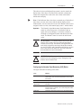
Throughout this manual we use notes to make you aware of safety
considerations:
!
ATTENTION: Identifies information about practices
or circumstances that can lead to personal injury or
death, property damage, or economic loss.
Attention statements help you to:
• identify a hazard
• avoid the hazard
• recognize the consequences
Important:
Identifies information that is critical for successful
application and understanding of the product.
PanelBuilder, PanelView, Data Highway Plus, DH+, ControlNet, and SLC are trademarks, and
PLC, PLC-2, and PLC-3 are registered trademarks of Allen-Bradley Company, Inc.
RSView and RSLinx are trademarks of Rockwell Software, Inc.
IBM, PC, PS/2, VGA, and PC-DOS are registered trademarks of International Business Machines
Corporation.
Epson is a registered trademark of Seiko Epson Corporation.
Ethernet is a registered trademark of Digital Equipment Corporation, Intel, and Xerox
Corporation.
Microsoft, Windows, MS, and MS-DOS are registered trademarks of Microsoft Corporation.
Mouse Systems is a trademark of MSC Technologies, Inc.
AutoCAD is a registered trademark of Autodesk Inc.
Taylor, and ProWORXPLUS are registered trademarks of Taylor Industrial Software, Inc.
MODICON, MODSOFT, Quantum, and Modbus are registered trademarks of
AEG Schneider Automation, Inc.
All other brand and product names are trademarks of their respective companies
and are hereby acknowledged.
Table of Contents
Preface
Welcome to PanelBuilder 1400e Configuration Software
for Windows . . . . . . . . . . . . . . . . . . . . . . . . . . . . . . . . . . . . . .
Registering Your Copy of PanelBuilder 1400e . . . . . . . . . . . . . . . .
Available Documentation . . . . . . . . . . . . . . . . . . . . . . . . . . . . . . .
What’s in the Reference Manual? . . . . . . . . . . . . . . . . . . . . . . . . .
Who Should Read the Reference Manual? . . . . . . . . . . . . . . . . . . .
Terminology Used . . . . . . . . . . . . . . . . . . . . . . . . . . . . . . . . . . . .
Before You Begin . . . . . . . . . . . . . . . . . . . . . . . . . . . . . . . . . . . . .
Technical Support Services . . . . . . . . . . . . . . . . . . . . . . . . . . . . . .
P–1
P–1
P–1
P–2
P–3
P–3
P–4
P–4
ASCII Displays
About ASCII Displays . . . . . . . . . . . . . . . . . . . . . . . . . . . . . . . . . .
ASCII Display String Format . . . . . . . . . . . . . . . . . . . . . . . . . . .
Special Characters and Control Sequences . . . . . . . . . . . . . . . .
Invalid Control Sequences . . . . . . . . . . . . . . . . . . . . . . . . . . . .
Configuring the ASCII Display Object . . . . . . . . . . . . . . . . . . . .
1
3
3
3
4
ASCII Inputs
About ASCII Inputs . . . . . . . . . . . . . . . . . . . . . . . . . . . . . . . . . . .
ASCII Input Object Displays . . . . . . . . . . . . . . . . . . . . . . . . . . .
Buttons of the ASCII Input Object . . . . . . . . . . . . . . . . . . . . . . .
Configuring the ASCII Input Object (Large or Small) . . . . . . . . . .
5
6
7
9
Bar Graphs
About Bar Graphs . . . . . . . . . . . . . . . . . . . . . . . . . . . . . . . . . . . .
Configuring the Bar Graph . . . . . . . . . . . . . . . . . . . . . . . . . . . .
11
12
Control Selectors
About Control Selectors . . . . . . . . . . . . . . . . . . . . . . . . . . . . . . . .
Control List Selector with Enter Key . . . . . . . . . . . . . . . . . . . . . . . .
Configuring a Control List Selector with Enter Key . . . . . . . . . . .
Control List Selector without Enter Key . . . . . . . . . . . . . . . . . . . . .
Configuring a Control List Selector without Enter Key . . . . . . . . .
Set Bit Cursor Points (Keypad Terminals Only) . . . . . . . . . . . . . . . .
Using the Set Bit Cursor Point on the PanelView Terminal . . . . . .
Cursor Point Default Operation . . . . . . . . . . . . . . . . . . . . . . .
Cursor Point Operation after Screen Change . . . . . . . . . . . . .
Cursor Point Operation on a Terminal Powerup . . . . . . . . . . .
Defining the Set Bit Cursor Point Character and Display Field . . .
Configuring the Set Bit Cursor Point . . . . . . . . . . . . . . . . . . . . .
13
14
15
17
18
20
21
22
23
23
24
25
Drawings
About Drawing Objects . . . . . . . . . . . . . . . . . . . . . . . . . . . . . . . . .
Arc . . . . . . . . . . . . . . . . . . . . . . . . . . . . . . . . . . . . . . . . . . . . . . .
Ellipse . . . . . . . . . . . . . . . . . . . . . . . . . . . . . . . . . . . . . . . . . . . .
Line . . . . . . . . . . . . . . . . . . . . . . . . . . . . . . . . . . . . . . . . . . . . . .
Arrows . . . . . . . . . . . . . . . . . . . . . . . . . . . . . . . . . . . . . . . . . .
27
27
28
28
28
Publication 2711E-820 – January 1998
toc–ii
Table of Contents
Panel . . . . . . . . . . . . . . . . . . . . . . . . . . . . . . . . . . . . . . . . . . . . .
Rectangle . . . . . . . . . . . . . . . . . . . . . . . . . . . . . . . . . . . . . . . . . .
Wedge . . . . . . . . . . . . . . . . . . . . . . . . . . . . . . . . . . . . . . . . . . . .
29
29
29
Goto Configure Mode
About the Goto Configure Mode Button . . . . . . . . . . . . . . . . . . . . .
Software Mode Switching at the PanelView Terminal . . . . . . . . .
Configuring the Goto Configure Mode Button . . . . . . . . . . . . . . .
31
33
34
Graphic Images
About Graphic Images . . . . . . . . . . . . . . . . . . . . . . . . . . . . . . . . .
Importing Graphic Images . . . . . . . . . . . . . . . . . . . . . . . . . . . .
Sizing Graphic Images . . . . . . . . . . . . . . . . . . . . . . . . . . . . . . .
Copying and Exporting Graphic Images . . . . . . . . . . . . . . . . . . .
35
35
36
36
Indicators
About Indicators . . . . . . . . . . . . . . . . . . . . . . . . . . . . . . . . . . . . .
Multistate Indicator . . . . . . . . . . . . . . . . . . . . . . . . . . . . . . . . . . . .
Configuring the Multistate Indicator . . . . . . . . . . . . . . . . . . . . . .
List Indicator . . . . . . . . . . . . . . . . . . . . . . . . . . . . . . . . . . . . . . . .
Configuring the List Indicator . . . . . . . . . . . . . . . . . . . . . . . . . .
39
39
40
41
42
Local Message Displays
About Local Message Displays . . . . . . . . . . . . . . . . . . . . . . . . . . .
How a Local Message Is Triggered . . . . . . . . . . . . . . . . . . . . . .
Triggering Messages on Multiple Local Message Displays . . . .
Configuring the Local Message Display . . . . . . . . . . . . . . . . . . .
43
44
44
44
Numerics
About Numerics . . . . . . . . . . . . . . . . . . . . . . . . . . . . . . . . . . . . . .
Increment and Decrement Value Buttons . . . . . . . . . . . . . . . . . . . .
Increment Value Button (with or without Display) . . . . . . . . . . . .
Configuring the Increment Value Button . . . . . . . . . . . . . . . . . . .
Decrement Value Button (with or without Display) . . . . . . . . . . . .
Configuring the Decrement Value Button . . . . . . . . . . . . . . . . . .
Numeric Data Display . . . . . . . . . . . . . . . . . . . . . . . . . . . . . . . . .
Configuring the Numeric Data Display . . . . . . . . . . . . . . . . . . . .
Numeric Keypad Enable Button (Keypad Terminals Only) . . . . . . . .
Configuring the Numeric Keypad Enable Button . . . . . . . . . . . . .
Numeric Input Cursor Point (Keypad Terminals Only) . . . . . . . . . . .
Using the Numeric Input Cursor Point on the PanelView Terminal
Defining the Numeric Input Cursor Point Character . . . . . . . . . . .
Using the Decimal Point (Display Component) . . . . . . . . . . . . . .
Configuring the Numeric Input Cursor Point . . . . . . . . . . . . . . . .
Name . . . . . . . . . . . . . . . . . . . . . . . . . . . . . . . . . . . . . . . . .
Numeric Input Configuration . . . . . . . . . . . . . . . . . . . . . . . . .
Display Configuration . . . . . . . . . . . . . . . . . . . . . . . . . . . . . .
Controls . . . . . . . . . . . . . . . . . . . . . . . . . . . . . . . . . . . . . . .
Numeric Entry Keypads (Touch Screen Terminals only) . . . . . . . . . .
Configuring the Numeric Entry Keypad . . . . . . . . . . . . . . . . . . .
47
48
48
49
51
52
53
55
57
58
60
60
62
62
63
63
64
65
66
69
70
Publication 2711E-820 – January 1998
Table of Contents
toc–iii
Examples: Editing an Array of Numeric Values . . . . . . . . . . . . . . .
Using the Decimal Point . . . . . . . . . . . . . . . . . . . . . . . . . . . . . . . .
Enter Key Handshake Operation . . . . . . . . . . . . . . . . . . . . . . . . . .
Using Write Expressions . . . . . . . . . . . . . . . . . . . . . . . . . . . . . . .
72
75
78
79
Push Buttons
About Push Buttons . . . . . . . . . . . . . . . . . . . . . . . . . . . . . . . . . . .
How the Different Push Buttons Work . . . . . . . . . . . . . . . . . . . .
Normally Open Momentary (N/O) Push Button . . . . . . . . . . . . . . . .
Configuring the Normally Open Momentary (N/O) Button . . . . . . .
Normally Closed Momentary (N/C) Push Button . . . . . . . . . . . . . . .
Configuring the Normally Closed Momentary (N/C) Button . . . . . .
Latched Push Button . . . . . . . . . . . . . . . . . . . . . . . . . . . . . . . . . .
Configuring the Latched Push Button . . . . . . . . . . . . . . . . . . . . .
Maintained Push Button . . . . . . . . . . . . . . . . . . . . . . . . . . . . . . . .
Configuring the Maintained Push Button . . . . . . . . . . . . . . . . . .
Multistate Push Button . . . . . . . . . . . . . . . . . . . . . . . . . . . . . . . . .
Configuring the Multistate Push Button . . . . . . . . . . . . . . . . . . .
Interlocked Push Button . . . . . . . . . . . . . . . . . . . . . . . . . . . . . . . .
Configuring the Interlocked Push Button . . . . . . . . . . . . . . . . . .
81
81
82
83
85
86
87
88
89
90
91
92
94
95
Scales
About Scales . . . . . . . . . . . . . . . . . . . . . . . . . . . . . . . . . . . . . . . .
Configuring the Scale . . . . . . . . . . . . . . . . . . . . . . . . . . . . . . . .
97
98
Screen Print Buttons
About Screen Print Buttons . . . . . . . . . . . . . . . . . . . . . . . . . . . . . .
Configuring the Screen Print Button . . . . . . . . . . . . . . . . . . . . . .
99
99
Screen Selectors
About Screen Selectors . . . . . . . . . . . . . . . . . . . . . . . . . . . . . . . .
Goto Screen and Return to Previous Screen Buttons . . . . . . . . . . .
Configuring the Goto Screen and Return to Previous
Screen Buttons . . . . . . . . . . . . . . . . . . . . . . . . . . . . . . . . .
Screen List Selector . . . . . . . . . . . . . . . . . . . . . . . . . . . . . . . . . . .
Configuring the Screen List Selector . . . . . . . . . . . . . . . . . . . . .
Screen Select Keypad (Large and Small) (Touch Screen
Terminals Only) . . . . . . . . . . . . . . . . . . . . . . . . . . . . . . . . . . .
Configuring the Screen Select Keypad . . . . . . . . . . . . . . . . . . . .
Screen Keypad Enable Button (Keypad Terminals Only) . . . . . . . . .
Configuring the Screen Keypad Enable Button . . . . . . . . . . . . . .
101
102
105
105
106
106
About Scrolling Lists . . . . . . . . . . . . . . . . . . . . . . . . . . . . . . . . . .
Cursor List . . . . . . . . . . . . . . . . . . . . . . . . . . . . . . . . . . . . . . . . .
Configuring the Cursor List . . . . . . . . . . . . . . . . . . . . . . . . . . . .
Configuring Preview States . . . . . . . . . . . . . . . . . . . . . . . . . . . .
Configuring Retained Last List States . . . . . . . . . . . . . . . . . . . .
The Cursor List Controls . . . . . . . . . . . . . . . . . . . . . . . . . . . . . .
Configuring Cursor List State Values . . . . . . . . . . . . . . . . . . . . .
107
108
108
110
111
112
114
Scrolling Lists
102
103
104
Publication 2711E-820 – January 1998
toc–iv
Table of Contents
Configuring Skipped States . . . . . . . . . . . . . . . . . . . . . . . . . . .
Configuring the Cursor List Buttons . . . . . . . . . . . . . . . . . . . . . .
Configuring the Cursor List Font . . . . . . . . . . . . . . . . . . . . . . . .
Optimizing Scrolling List Performance . . . . . . . . . . . . . . . . . . . .
Object Lists . . . . . . . . . . . . . . . . . . . . . . . . . . . . . . . . . . . . . . . . .
Multistate Indicator Object List . . . . . . . . . . . . . . . . . . . . . . . . . . .
Configuring Labels for Multistate Indicator Object Lists . . . . . . . .
Configuring the Multistate Indicator Object List . . . . . . . . . . . . . .
Local Message Object List . . . . . . . . . . . . . . . . . . . . . . . . . . . . . .
Configuring the Local Message Object List . . . . . . . . . . . . . . . . .
Numeric Data Display Object List . . . . . . . . . . . . . . . . . . . . . . . . .
Configuring the Numeric Data Display Object List . . . . . . . . . . . .
Scrolling List Example . . . . . . . . . . . . . . . . . . . . . . . . . . . . . . . . .
Step 1: Create the Cursor List . . . . . . . . . . . . . . . . . . . . . . . . .
Step 2: Create the Object Lists . . . . . . . . . . . . . . . . . . . . . . . . .
Assembly Stations . . . . . . . . . . . . . . . . . . . . . . . . . . . . . . . .
Luxury Option . . . . . . . . . . . . . . . . . . . . . . . . . . . . . . . . . . .
Station Status . . . . . . . . . . . . . . . . . . . . . . . . . . . . . . . . . . .
Option Command . . . . . . . . . . . . . . . . . . . . . . . . . . . . . . . .
Option Style Number . . . . . . . . . . . . . . . . . . . . . . . . . . . . . .
Assigning Addresses for Object Lists . . . . . . . . . . . . . . . . . . .
Step 3: Program the PLC . . . . . . . . . . . . . . . . . . . . . . . . . . . . .
Create the Block Transfer Rungs . . . . . . . . . . . . . . . . . . . . . .
Create the Auto Mode Rung . . . . . . . . . . . . . . . . . . . . . . . . .
Create the Manual Mode Rung . . . . . . . . . . . . . . . . . . . . . . .
Create the Toggle Command Rungs . . . . . . . . . . . . . . . . . . .
Create the Set Command Input Rung . . . . . . . . . . . . . . . . . .
Create the Option Style Number Input Rung . . . . . . . . . . . . . .
Create the Manual On / Manual Off Input Rung . . . . . . . . . . .
Create the Visible State File Copy Rung . . . . . . . . . . . . . . . .
Create the Auto Mode Simulation Rungs . . . . . . . . . . . . . . . .
115
116
118
118
119
121
121
123
124
124
125
125
128
129
130
130
130
131
131
132
132
133
134
135
136
137
139
139
140
141
142
Symbols
About Symbols . . . . . . . . . . . . . . . . . . . . . . . . . . . . . . . . . . . . . .
Available Graphic Images . . . . . . . . . . . . . . . . . . . . . . . . . . . . .
Sizing Symbols . . . . . . . . . . . . . . . . . . . . . . . . . . . . . . . . . . . .
Configuring Symbols . . . . . . . . . . . . . . . . . . . . . . . . . . . . . . . .
145
145
146
146
Text
About Text . . . . . . . . . . . . . . . . . . . . . . . . . . . . . . . . . . . . . . . . . .
The Extended ASCII Character Set . . . . . . . . . . . . . . . . . . . . . .
149
149
Time and Date Displays
About Time and Date Displays . . . . . . . . . . . . . . . . . . . . . . . . . . .
Time Display . . . . . . . . . . . . . . . . . . . . . . . . . . . . . . . . . . . . . .
Date Display . . . . . . . . . . . . . . . . . . . . . . . . . . . . . . . . . . . . . .
Configuring the Time and Date Display . . . . . . . . . . . . . . . . . . .
151
151
151
152
Publication 2711E-820 – January 1998
Table of Contents
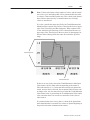
Trends
About Trends . . . . . . . . . . . . . . . . . . . . . . . . . . . . . . . . . . . . . . .
Configuring the Trend . . . . . . . . . . . . . . . . . . . . . . . . . . . . . . . .
Configuring the Pens . . . . . . . . . . . . . . . . . . . . . . . . . . . . . .
Configuring the Pen Value Labels . . . . . . . . . . . . . . . . . . . . .
ISA Symbols
Appendix A
Symbol Icons . . . . . . . . . . . . . . . . . . . . . . . . . . . . . . . . . . . . . . .
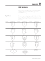
DIN Symbols
A–1
B–1
Appendix C
Arrows . . . . . . . . . . . . . . . . . . . . . . . . . . . . . . . . . . . . . . . . . . . .
Equipment Parts . . . . . . . . . . . . . . . . . . . . . . . . . . . . . . . . . . . . .
ASCII Character Set
153
157
158
159
Appendix B
Symbol Icons . . . . . . . . . . . . . . . . . . . . . . . . . . . . . . . . . . . . . . .
Arrows and Parts
toc–v
C–1
C–2
Appendix D
ASCII Character Set . . . . . . . . . . . . . . . . . . . . . . . . . . . . . . . . . .
D–1
Index
Publication 2711E-820 – January 1998
Welcome to
PanelBuilder 1400e
Configuration Software for
Windows
Welcome to Allen-Bradley’s PanelBuilder 1400e Configuration
Software for Windows, Version 4. With this software you can create
applications in the Microsoft Windows 3.1 (or later) operating
system, Windows 95, and in Windows NT 4.0. You can use the
PanelBuilder applications in PanelView 1000e, 1200e, or 1400e
terminals, or PanelView 1200 Series F and later terminals that have
been enhanced to -MC catalog numbers.
PanelBuilder 1400e Configuration Software for Windows, Version 4
provides the advantages that PanelBuilder 1400e Version 3 offered,
as well as other enhancements. These include running on Windows
NT 4.0, increased ControlNet station addressing, an Ethernet/RIO
Pass-Through File Transfer, RSLinx communication driver
compatibility, and a CD–ROM install.
For a more comprehensive description of each of these features, see
“What’s New in PanelBuilder 1400e, Version 4” in Chapter 1 of
Getting Started with PanelBuilder 1400e Configuration Software for
Windows.
Registering Your Copy of
PanelBuilder 1400e
To register your software, mail the registration card from the front of
this manual to this address:
Rockwell Software
Software Services
6680 Beta Drive
Mayfield Village, Ohio 44143
or fax the card to 1-440-646-7701.
Available Documentation
Your PanelBuilder 1400e software comes with several types of
documentation to meet your different needs:
• Getting Started with PanelBuilder 1400e Configuration Software
for Windows (Publication Number 2711E-818) guides you
through setting up PanelBuilder 1400e and introduces you to
PanelBuilder 1400e basics. It includes a tutorial to give you
hands-on experience working with a PanelBuilder 1400e
application.
• The PanelBuilder 1400e Configuration Software for Windows
User Manual (Publication Number 2711E-819) explains
PanelBuilder 1400e in detail, and provides step-by-step
instructions for planning, creating, and working with applications.
Publication 2711E-820 – January 1998
P–2
Preface
• The PanelBuilder 1400e Screen Objects Reference Manual
•
•
•
•
•
What’s in the Reference
Manual?
Publication 2711E-820 – January 1998
(Publication Number 2711E-820) provides detailed reference
information for application screen objects.
The PanelBuilder 1200/1400e Transfer Utility User Manual
(Publication Number 2711E-6.8) provides detailed instructions
for transferring files using the Transfer Utility that comes with
PanelBuilder 1400e Version 3.
Context-sensitive online Help provides a reference for any
procedures or commands you need explained, or problems you
may encounter. To get help, press F1 or choose the Help button if
you’re in a dialog box.
The PanelBuilder 1400e Readme file is a Microsoft Windows
Notepad file that is copied to your hard disk when you install
PanelBuilder 1400e. It informs you of any software changes after
the manuals were printed.
The PanelView 1000e, 1200e, and 1400e Operator Terminals
User Manual (Publication Number 2711E-821) describes the
features, operation, and specifications of PanelView operator
terminals.
The PanelBuilder 1400e Modbus User Manual (Publication
Number 2711E-6.12) describes how to create PanelBuilder
applications for the Modbus communications network. This
manual is supplied as part of the optional Modbus
Communications Kit, Catalog Number 2711E-UMOD.
The Reference Manual is a guide to the objects you can create for
application screens. It contains the following chapters:
• ASCII Displays
• ASCII Inputs
• Bar Graphs
• Control Selectors
• Drawings
• Goto Configure Mode
• Graphic Images
• Indicators
• Local Message Displays
• Numerics
• Push Buttons
• Scales
• Screen Print Buttons
• Screen Selectors
• Scrolling Lists
• Symbols
Preface
P–3
• Text
• Time and Date Displays
• Trends
The titles of the chapters match the selections on the Objects menu,
which appears when you open a screen in PanelBuilder. If a selection
on the Objects menu has a submenu, the group of related objects on
the submenu is described in the same chapter. For example, numeric
objects are described in the chapter called Numerics. The drawing
objects are combined in the chapter called Drawings. Chapters are
arranged alphabetically for easy reference.
Who Should Read the
Reference Manual?
This manual is intended as a reference guide for users who are
experienced with PanelBuilder 1400e, and have a good knowledge of
Microsoft Windows. Users who are not familiar with PanelBuilder
1400e should read Getting Started with PanelBuilder 1400e
Configuration Software for Windows and the PanelBuilder 1400e
Configuration Software for Windows User Manual first.
Users who are not familiar with Microsoft Windows should read
their Microsoft Windows User’s Guide (for users of Windows 3.1),
Introducing Microsoft Windows 95 (for users of Windows 95), or
Introducing Microsoft Windows NT Workstation (for users of
Windows NT).
Terminology Used
The term PanelBuilder refers to PanelBuilder 1400e Configuration
Software for Windows. Where confusion may arise between the
current and previous versions of the software, the current release of
software is “PanelBuilder 1400e, Version 4.”
PanelView terminal and terminal refer to a PanelView 1000e
terminal, an enhanced PanelView 1200 Series F or G terminal, a
PanelView 1200e terminal, or a PanelView 1400e terminal.
The terms programmable controller and PLC refer to a
programmable logic controller, or any other controlling device.
The term control is a generic term that refers to the PLC addresses
that dynamic objects write to or read from. Some controls use tags
only, while others can use tags or expressions. All dynamic objects
use one or more controls. In this manual, the configuration table for
each object lists the controls for the object, and specifies which
controls use tags only and which can use expressions. For more
information about expressions see Chapter 7, Creating Expressions,
in the PanelBuilder 1400e Configuration Software for Windows User
Manual.
Publication 2711E-820 – January 1998
P–4
Preface
User Manual refers to the PanelBuilder 1400e Configuration
Software for Windows User Manual. Other user manuals are referred
to by their full names.
Before You Begin
Before you begin, you should install and know how to operate the
following equipment and software:
• a personal computer with at least a 486, 25-MHz microprocessor;
at least 8 MB Random Access Memory (RAM) for Windows
3.1/95 (although 16 MB RAM is recommended for Windows 95);
at least 32 MB RAM for Windows NT; and a SVGA monitor with
256 colors (recommended). For users working with imported .dxf
files, at least 16 MB RAM is required.
If you want to resize graphic images in PanelBuilder, set your
display adapter to 65,536 colors.
• Microsoft Windows 3.1 and above, Windows 95, or
Windows NT 4.0
• the family of PLCs you’ll be monitoring and controlling
You should also be familiar with these manuals:
• Getting Started with PanelBuilder 1400e Configuration Software
for Windows
• PanelBuilder 1400e Configuration Software for Windows User
Manual
Technical Support
Services
If you have questions about PanelBuilder, please consult the manuals
or the online Help first. If you can’t find the answer, take advantage
of our Technical Support Fax Back system, available 24 hours a day,
7 days a week at 1-440-646-5436, or browse through our technical
support document library at http://www.ab.com/mem/prodserv/
services/technotes/techmain.html on the World Wide Web.
Alternatively, contact:
Allen-Bradley
Technical Support
1 Allen Bradley Drive
Mayfield Heights, Ohio 44124-6118
or call 1-440-646-6800 or fax 1-440-646-6890 for technical support
between 8 AM and 5 PM (EST), Monday to Friday.
Please have the serial number for your software ready when you call,
or include it on your fax. You can find this number:
• on the Software Registration card that was shipped with your
software
• on the screen that appears when you start PanelBuilder
• in the main Help menu, when you choose “About”
Publication 2711E-820 – January 1998
ASCII Displays
ASCII Displays
This chapter tells you:
• how the ASCII Display object functions
• about special characters and control sequences
• which characters are in the ASCII character set
• about invalid control sequences
• how to configure the ASCII Display object
About ASCII Displays
The ASCII Display object is used to display on the PanelView
terminal a character string sent from the PLC. The display is updated
whenever the string changes.
The ASCII Display object can display any character in the IBM
extended character set. Special control characters can be included, to
provide special formatting for the displayed characters. The
characters displayed are controlled exactly as specified by the data in
the string. Characters are processed sequentially until a null character
(all bits 0) is received. Any characters after a null character are
ignored.
The maximum character string length is 82 characters.
If only 10 displayable characters (not control characters) are in the
string, only 10 positions on the screen will be filled. Any previously
existing text anywhere else within the display area will be
unaffected.
Words wrap within the area defined for the ASCII Display object,
but if the character string is too long to be displayed, the extra
characters are ignored.
Publication 2711E-820 – January 1998
2
ASCII Displays
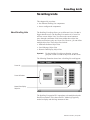
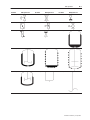
Example 1: Character String Display and Overwrite
The display is defined as 10 characters wide by 3 characters
high. The characters are single height and single width. The
string to be displayed is “A long string for the ASCII display.”
The object will show:
A long
string for
the ASCII
The last word of the string is lost, because the object isn’t large
enough for the whole string.
A second string, “This shows how characters overwrite,” is sent
while the first one is displayed.
This shows
how ng for
characters
Any character which was not directly covered by a new character
remained in the display. This feature can be useful for updating
portions of an ASCII display while leaving portions unchanged. If
you want to clear the display, or clear a line in the display, embed
control characters for those purposes in the string.
To properly display the second string shown above, a “clear to
end of display” control sequence, ESC[J, could have been
included at the beginning of the string.
The string would then be: “ESC[JThis shows how characters
overwrite,” which would display:
This shows
how
characters
Notice that there is no space between the control sequence and
the text. Also see “Special Characters and Control Sequences,”
and “Invalid Control Sequences,” later in this chapter.
Publication 2711E-820 – January 1998
ASCII Displays
3
ASCII Display String Format
The format of the data string must be as in the following table. For
more characters see the ASCII character set in Appendix D, or see
Appendix B, The Extended Character Set, in the PanelBuilder 1400e
Configuration Software for Windows User Manual.
ÁÁÁÁÁÁÁÁ
ÁÁÁÁÁÁÁ
ÁÁÁÁÁÁÁÁ
ÁÁÁÁÁÁÁÁ
ÁÁÁÁÁÁÁ
ÁÁÁÁÁÁÁÁ
ÁÁÁÁÁÁÁÁ
ÁÁÁÁÁÁÁ
ÁÁÁÁÁÁÁÁ
ÁÁÁÁÁÁÁÁ
ÁÁÁÁÁÁÁ
ÁÁÁÁÁÁÁÁ
ÁÁÁÁÁÁÁÁ
ÁÁÁÁÁÁÁ
ÁÁÁÁÁÁÁÁ
Bit
15
8
7
0
1st word
1st character
2nd character
2nd word
3rd character
4th character
…
…
Special Characters and Control Sequences
The ASCII Display uses character 255 (G) to align display strings of
odd length. Fill characters are not printable and will not occupy
space on the display. For a list of the ASCII character set, see
Appendix D in this manual.
The following table lists the control sequences used by the
PanelView terminal.
ÁÁÁÁÁÁÁ
ÁÁÁÁÁÁÁ
ÁÁÁÁÁ
ÁÁÁÁÁÁÁÁÁÁÁÁÁÁÁÁÁ
ÁÁÁÁÁÁÁ
ÁÁÁÁÁÁÁ
ÁÁÁÁÁ
ÁÁÁÁÁÁÁÁÁÁÁÁÁÁÁÁÁ
ÁÁÁÁÁÁÁ
ÁÁÁÁÁÁÁ
ÁÁÁÁÁ
ÁÁÁÁÁÁÁÁÁÁÁÁÁÁÁÁÁ
ÁÁÁÁÁÁÁ
ÁÁÁÁÁÁÁ
ÁÁÁÁÁ
ÁÁÁÁÁÁÁÁÁÁÁÁÁÁÁÁÁ
ÁÁÁÁÁÁÁ
ÁÁÁÁÁÁÁ
ÁÁÁÁÁ
ÁÁÁÁÁÁÁÁÁÁÁÁÁÁÁÁÁ
ÁÁÁÁÁÁÁ
ÁÁÁÁÁÁÁ
ÁÁÁÁÁ
ÁÁÁÁÁÁÁÁÁÁÁÁÁÁÁÁÁ
ÁÁÁÁÁÁÁ
ÁÁÁÁÁÁÁ
ÁÁÁÁÁ
ÁÁÁÁÁÁÁÁÁÁÁÁÁÁÁÁÁ
ÁÁÁÁÁÁÁ
ÁÁÁÁÁÁÁ
ÁÁÁÁÁ
ÁÁÁÁÁÁÁÁÁÁÁÁÁÁÁÁÁ
ÁÁÁÁÁÁÁ
ÁÁÁÁÁÁÁ
ÁÁÁÁÁ
ÁÁÁÁÁÁÁÁÁÁÁÁÁÁÁÁÁ
ÁÁÁÁÁÁÁ
ÁÁÁÁÁÁÁ
ÁÁÁÁÁ
ÁÁÁÁÁÁÁÁÁÁÁÁÁÁÁÁÁ
ÁÁÁÁÁÁÁ
ÁÁÁÁÁÁÁ
ÁÁÁÁÁ
ÁÁÁÁÁÁÁÁÁÁÁÁÁÁÁÁÁ
ÁÁÁÁÁÁÁ
ÁÁÁÁÁÁÁ
ÁÁÁÁÁ
ÁÁÁÁÁÁÁÁÁÁÁÁÁÁÁÁÁ
ÁÁÁÁÁÁÁ
ÁÁÁÁÁÁÁ
ÁÁÁÁÁ
ÁÁÁÁÁÁÁÁÁÁÁÁÁÁÁÁÁ
ÁÁÁÁÁÁÁ
ÁÁÁÁÁÁÁ
ÁÁÁÁÁ
ÁÁÁÁÁÁÁÁÁÁÁÁÁÁÁÁÁ
ÁÁÁÁÁÁÁ
ÁÁÁÁÁÁÁ
ÁÁÁÁÁ
ÁÁÁÁÁÁÁÁÁÁÁÁÁÁÁÁÁ
Name
Sequence
Hex
Action
Carriage Return
CR
0D
Move to the beginning of the current line.
Line Feed
LF
0A
Move to the next line below the current one. If the current position is
the last line, no more data from the string is displayed.
Clear to End of Display
ESC[0J or ESC[J
1B5B4A
Clear from the current display position to the end of the display.
Clear to End of Line
ESC[0K or ESC[K
1B5B4B
Clear from the current display position to the end of the line.
Position Text
ESC[row;columnH
ESC[;columnH
ESC[rowH
ESC[H
1B5Bxx3Byy48
1B5B3Byy48
1B5Bxx48
1B5B48
Move the display position to the specified row and column number.
The top left corner of the display area is row and column number
0,0. If either row or column number is omitted, the missing
coordinate will be 0.
Note: The coordinates are character positions. For example,
position (1,1) refers to pixel coordinates (8,20) in the object.
Reverse Video Text On
ESC[7m
1B5B376D
Begin displaying text in reverse video. This flips the foreground and
background colors.
Reverse Video Text Off
ESC[27m
1B5B32376D
End the reverse-video text block.
Invalid Control Sequences
If an incorrect control sequence is detected, the invalid portion is
displayed as part of the string.
For example, in the display area shown earlier, the string:
“ESC[3;0HThis sequence is invalid” would be invalid: the display is
10 characters by 3 lines, and a line specification of 3 would start
printing at the fourth line.
Publication 2711E-820 – January 1998
4
ASCII Displays
If the current display position were 0;0, the string would display:
←[3;0HThis
sequence
is invalid
The left arrow character in the display represents ESC.
Other invalid sequences:
• nested Reverse Video On, for example,
“ESC[7mOneESC[7mTwo”
The second command is invalid and, if possible, is displayed as
part of the string.
"
Note: If the Reverse Video On is without an Off, the terminal
automatically turns off the reverse video at the end of the string.
• nested Reverse Video Off, for example,
“ESC[27mOneESC[27mTwo”
The second command is invalid and, if possible, is displayed as
part of the string.
• wrong characters in text position sequence. The text position
coordinates must not contain any characters other than 0 to 9, for
example, “ESC[a3;4HThe string.”
Configuring the ASCII Display Object
Configure the ASCII Display object according to this table:
Field
Meaning
Name
Assign a name, up to 15 characters, to document the object for
printed reports. This increases the application’s size by 1 byte
per character.
Control
ASCII Text indicates the PLC location of the string this object
displays. The display is updated whenever this string changes.
Assign a String type tag up to 82 characters long.
You can adjust the size of the ASCII Display and format its
foreground color, background color, font style, border style, and
blink and underline attributes. For details on formatting objects see
“Changing Object Appearance,” in Chapter 9, Creating Objects, in
the PanelBuilder 1400e Configuration Software for Windows User
Manual.
"
Publication 2711E-820 – January 1998
Note: If you use the Extra Large Font, the application will be
compatible only with PanelView Version 2 or later. The application
will not be compatible with earlier versions.
ASCII Inputs
ASCII Inputs
This chapter tells you:
• how the ASCII Input object functions
• how to configure the ASCII Input object
About ASCII Inputs
The ASCII Input object allows the operator to send an alphanumeric
string (up to 82 characters) to the PLC.
There are two types of ASCII Input objects:
• large ASCII Input object
• small ASCII Input object
These function differently on keypad and touch screen terminals.
• On the Large ASCII Input object for a touch screen terminal, the
operator selects characters by touching the keyboard on the
screen. The selected character appears in the scratchpad. When
the character string in the scratchpad is complete, the operator
sends it to the ASCII Input control by pressing the ENT button on
the keyboard.
• On the Small ASCII Input object for both touch screen and
keypad terminals, and on the Large ASCII Input object for
keypad terminals, the operator selects characters from the
keyboard by moving the screen cursor (with the arrow keys) to
the desired character and pressing the SEL button. The selected
character appears in the scratchpad. When the character string in
the scratchpad is complete, the operator sends it to the ASCII
Input control by pressing the ENT button.
The following table shows the scratchpad input and contents of the
ASCII Input control.
Scratchpad Input
ASCII Input
leftmost character
high byte – 1st word
2nd character
low byte – 1st word
3rd character
high byte – 2nd word
4th character
low byte – 2nd word
The ASCII Input control’s initial value is sent to the PLC when the
application first runs. The initial value is also displayed with the
object.
Publication 2711E-820 – January 1998
6
ASCII Inputs
RIO
DH+
Important:
In Remote I/O applications, depending on how the
Application Startup screen is configured, the PanelView
terminal retains the current value of the ASCII Input
control even after the terminal is turned off.
In DH+ applications the value is not retained.
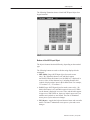
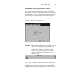
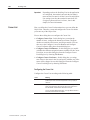
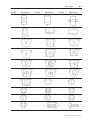
ASCII Input Object Displays
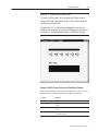
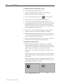
The following illustration shows the Large ASCII Input object for a
touch screen terminal.
Publication 2711E-820 – January 1998
ASCII Inputs
7
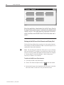
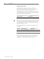
The following illustration shows a Small ASCII Input Object for a
keypad terminal.
Buttons of the ASCII Input Object
The object’s buttons function differently, depending on the terminal
type.
The following buttons are used to edit the string displayed in the
scratchpad:
• SHF (Shift) (Large ASCII Input object for touch screens
only)—By default this button is off, and labels appear
non-shifted. When this button is on, the Shift key is displayed in
reverse video. All the character keys, including numbers and
symbols, display and are input in their shifted state. For example,
“a” becomes “A”; “2” becomes “:”.
• CAPS (Large ASCII Input object for touch screens only)—By
default this button is off, and labels appear in lower case. When
on, the button is displayed in reverse video, and the labels appear
in upper case. With CAPS on, letters are input in upper case, but
numbers and symbols are not shifted. The state is maintained
across power cycles and screen changes.
• INS (Insert)—toggles the keyboard between insert and overstrike
modes. The state is maintained across power cycles and screen
changes.
Publication 2711E-820 – January 1998
8
ASCII Inputs
•
•
•
•
•
•
•
•
Publication 2711E-820 – January 1998
When the keyboard entry is in insert mode the button appears in
reverse video. New characters appear at the current cursor
position. The cursor also moves one character to the right for
each new character. The string in the scratchpad scrolls; however,
if the maximum number of input characters has been entered in
the scratchpad, the new character will not be inserted.
When the keyboard entry is in overstrike mode and the INS
button is in normal video, new characters type over existing
characters.
DEL (Delete)—deletes the character at the current scratchpad
cursor position.
<<—moves the cursor in the scratchpad to the left.
>>—moves the cursor in the scratchpad to the right.
CLR (Clear)—clears the scratchpad.
SEL (Select)—places the highlighted character into the
scratchpad at the cursor position. (For all ASCII Input objects
except the Large ASCII Input object for touch screens.)
ENT (Enter)—When the operator presses the ENT button, the
leftmost character is placed in the high order byte of the first PLC
word, the next character to the right in the low order byte, and so
on. If the character string is too large for the configured tag, the
terminal displays an “out of range” error message. In this case,
the character string is not sent to the PLC.
The ASCII input object supports a scrollable scratchpad area so
the operator can enter a long character string in a small
scratchpad. Pressing ENT sends all the characters to the PLC, not
only the visible characters. For example, if the scratchpad is five
characters wide, and the operator enters ten characters and presses
Enter, all ten characters are sent, assuming the “Number of Input
Characters” is configured to ten or more.
The string in the scratchpad is highlighted after the ENT button is
pressed. If the operator selects an ASCII character immediately,
the terminal clears the scratchpad and displays that character.
However, if the operator presses an editing key (INS, DEL, or the
cursor keys << and >> ), the terminal continues to display the
existing string (no longer highlighted), allowing the operator to
edit it without having to retype it.
Arrow keys (Large and Small ASCII Input objects for keypad
terminals)—The operator uses the arrow keys on the PanelView
terminal to select characters from the keyboard.
Arrow keys (Small ASCII Input object for touch screen
terminals)—The operator uses the four directional arrows that are
part of the object to select characters from the keyboard.
ASCII Inputs
9
Configuring the ASCII Input Object (Large or Small)
Configure the ASCII Input object according to the following table:
Field
Meaning
Name
Assign a name, up to 15 characters, to document the object for
printed reports. This increases the application’s size by 1 byte
per character.
Type (keypad only)
Select Small ASCII Input or Large ASCII Input.
Fill Characters
Specify which character you want the ASCII string padded with
if it is less than the number of input characters when the
character string is sent to the PLC. Choices are:
Spaces
Zeroes
FF*
Null (default)
* F is the hexadecimal equivalent of setting 4 bits to 1; FF
means to set all 8 bits to 1. Each character takes up one byte
(8 bits), so padding the string with FF means that all 8 bits of
each unused character in the string are set to 1.
Number of Scratchpad
Characters
Specify the number of characters (from 1–64) that will be
visible in the scratchpad. This must be less than or equal to the
number of input characters.
Number of Input
Characters
Specify the number of characters (1–82) that will be sent to the
PLC. If this number is greater than the number of scratchpad
characters, the scratchpad will scroll to allow more characters
to be entered.
Button Function Key
Assignments (keypad
only)
Specify a function key for each of the buttons associated with
this object.
Control
The ASCII Input object uses the following controls.
ASCII Input identifies which PLC location the string will be
written to.
Note: This must be a string tag.
Enter Key Control and Enter Key Handshake must be used
together to provide handshaking between the PLC and the
terminal. You can assign a tag only to the Enter Key Control.
You can assign a tag or expression to the Enter Key
Handshake.
When the operator presses the ENT button to send the value to
the PLC, the terminal sets the Enter Key Control value to 1
(after the Enter Key Control delay, as specified in the Timing
Parameters tab of the Terminal Setup dialog box). To inform the
terminal that the handshake has been received, put a line in
your PLC program to cause a 0 to non-0 transition in the Enter
Key Handshake. When the terminal sees this value change
from 0 to non-0, it changes the Enter Key Control value back
to 0.
Publication 2711E-820 – January 1998
10
ASCII Inputs
Field
Meaning
Control (con’t)
If the terminal does not receive acknowledgment (transition
from 0 to non-0) within the Enter Key Handshake Time (as
specified in the Timing Parameters tab of the Terminal Setup
dialog box), it displays an error message in the Fault Window
and resets the Enter Key Control. If the Enter Key Handshake
is unassigned, the Enter Key Control remains set for the
duration of the Push Button Hold Time or for as long as the
button is pressed, whichever is longer.
Because this control uses only two values, a digital tag is
recommended.
Important: If the Enter Key Control is assigned, all keypad
and touch screen input is disabled when the Enter Key is
pressed, until the Enter Key Control is reset to 0.
You can adjust the size of the scratchpad and format the ASCII Input
object’s foreground color, background color, font style, and border
style. For details on formatting objects see “Changing Object
Appearance,” in Chapter 9, Creating Objects, in the PanelBuilder
1400e Configuration Software for Windows User Manual.
"
Publication 2711E-820 – January 1998
Note: If you use the Extra Large Font the application will be
compatible with PanelView Version 2 or later. It will not be
compatible with earlier versions.
Bar Graphs
Bar Graphs
This chapter tells you:
• how bar graphs function
• how to configure bar graphs
About Bar Graphs
Bar graphs are useful for monitoring analog conditions that change,
such as temperature or fluid levels. You can create vertical and
horizontal bar graphs across the height or width of the screen.
Vertical bars can be configured to fill from bottom to top or
vice-versa. Horizontal bars can be configured to fill from left to right
or vice versa.
"
Tip: Use the following suggestions to customize bar graphs:
• To show the bar’s fill level, make an axis with incremental ticks
alongside the bar graph by using the Scale object, or by using
lines or graphic images.
• To have a bar graph change color at certain values, cascade bar
graphs together. To do this, remove the border from the graphs,
place the high end of one graph at the low end of the next, and
adjust each graph’s data range accordingly. To add a border to the
cascading graphs, place a hollow or solid panel behind the bar
graphs.
• To create a fully functional “template,” group bar graphs with
other objects. For example, position two or three bar graphs
together and put numeric display objects immediately below the
bar graphs to display the process variable, set point, and control
variable. You can use any of the numeric entry objects
interactively with these values.
Publication 2711E-820 – January 1998
12
Bar Graphs
Configuring the Bar Graph
Configure the bar graph according to this table:
Field
Meaning
Name
Assign a name, up to 15 characters, to document the object for
printed reports. This increases the application’s size by 1 byte
per character.
Graph Type
Specify Vertical Bar Graph or Horizontal Bar Graph.
Fill Direction
Specify the direction you want the bar to fill.
For vertical graphs, specify either Top Down or Bottom Up.
For horizontal graphs, specify either Left to Right
or Right to Left.
Maximum Value
Specify the maximum value to be displayed in the graph. When
the PLC value reaches (or exceeds) this value, the bar graph is
completely full. Enter a value between -2,147,483,648 and
2,147,483,647.
The maximum value must be greater than the minimum value.
Minimum Value
Specify the minimum value to be displayed in the graph. When
the PLC value drops to (or falls below) this value, the bar graph
is completely empty. Enter a value between -2,147,483,648
and 2,147,483,647.
The minimum value must be less than the maximum value.
Control
Bar Graph Value identifies the value to be displayed. Assign a
tag or expression to the Bar Graph Value control.
You can adjust the size of the bar graph and format its foreground
color, background color, border style, and blink attributes. For details
on formatting objects see “Changing Object Appearance,” in
Chapter 9, Creating Objects, in the PanelBuilder 1400e
Configuration Software for Windows User Manual.
Publication 2711E-820 – January 1998
Control Selectors
Control Selectors
This chapter discusses:
• the different types of Control Selectors
• how to use Control Selectors
• how to configure Control Selectors
About Control Selectors
Control Selectors allow operators to select items from a list. When
the application is running, the operator can move through the list
using the Up and Down Cursor buttons and select items.
The choice the operator makes is always indicated by the value of
the Selector Control.
There are three Control Selectors:
"
This Control Selector
Does this
Control List Selector with Enter
Key
Allows the operator to move through a list and select
a list item by pressing Enter.
Control List Selector without Enter
Key
Allows the operator to move through a list. The
current list item is automatically selected.
Set Bit Cursor Point
(Keypad applications only)
Points to a screen character and allows the operator
to select from a list or an array of objects.
Tip: You can position Control Selectors so they point at other
objects on the same screen. For example, a Control List Selector
could point to an adjacent list of Numeric Display objects. Values
entered using the selector could be directed (by the PLC program) to
the Displayed Value tag or expression of the numeric object being
displayed.
Control List Selectors consist of a list of entries. Consider each entry
in the Control List Selector as a state, where state 0 is the first entry
and state ‘n’ is the last entry.
Each state in the list corresponds to a value. This value is written to
the Selector Control.
Publication 2711E-820 – January 1998
14
Control Selectors
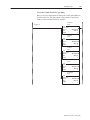
Control List Selector with
Enter Key
The Control List Selector with Enter Key object allows the operator
to choose items in a list by selecting them and then pressing Enter.
The maximum number of items in this list is determined by the size
of the list component. For information on changing the size of the
list component, see Chapter 9, Creating Objects, in the PanelBuilder
1400e Configuration Software for Windows User Manual.
The Control List Selector with Enter Key consists of the following
components:
This component
Does this
Selector List
This vertical list can have up to 24 different states (each list
item represents a state). With Double High or Large Font, the
list can contain 12 states. If you use the Extra Large Font, the
list can contain only 6 states.
Up Cursor Button
When the operator presses the Up Cursor button, the arrow
in the list moves up by one list entry. If the Down Cursor
button is enabled, you can disable the Up Cursor button. Only
one of the Up and Down Cursor buttons needs to be enabled.
The Up Cursor button auto-repeats at the rate specified in the
Timing Parameters tab of the Terminal Setup dialog box.
Down Cursor Button
When the operator presses the Down Cursor button, the
arrow in the list moves down by one list entry. If the Up
Cursor button is enabled, you can disable the Down Cursor
button. Only one of the Up and Down Cursor buttons needs
to be enabled.
The Down Cursor button auto-repeats at the rate specified in
the Timing Parameters tab of the Terminal Setup dialog box.
Enter
When the operator presses Enter, the desired option is
chosen and the Selector Control value is updated.
As the operator presses the Up or Down Cursor buttons, an arrow
indicator moves through the list states, wrapping around the top and
bottom. To make a choice, the operator presses Enter. When Enter is
pressed, the list state is chosen, and the terminal updates the Selector
Control with the value assigned to that state.
Because the operator can move through the list and select different
states at will, the states are not necessarily executed consecutively.
The new state is determined by the cursor’s position in the list when
Enter is pressed.
Publication 2711E-820 – January 1998
Control Selectors
15
The Control List Selector with Enter Key recognizes when the
Selector Control value is changed externally. For example, if the tag
assigned to the Selector Control is also assigned to another object,
and this object sends a new value to the tag, the Control List
Selector’s highlight bar moves to the list state that has this value
assigned. If the state value doesn’t match the tag value, the highlight
bar will be removed. An error state also occurs if the Selector
Control is not assigned. In this case also, no highlight bar appears.
If the Selector Control cannot accommodate a state value, an error
message is displayed, and the PLC value is not changed. The
operator must clear the fault before continuing.
RIO
Important:
In Remote I/O applications, the PanelView terminal can
retain the current value for the Control List Selector
with Enter Key, even after the terminal is turned off.
Depending on how the Application Startup operation is
defined, the retained value (last state) or initial value
(default) is sent to the PLC when power is re-applied.
For details on configuring Application Startup
operation, see “Application Startup” in Chapter 5 in the
PanelView 1000e, 1200e, and 1400e Operator
Terminals User Manual.
Configuring a Control List Selector with Enter Key
Configure the Control List Selector with Enter Key according to this
table:
Field
Meaning
Name
Assign a name, up to 15 characters, to document the object for
printed reports. This increases the application’s size by 1 byte
per character.
Control List Type
Specify Control List Selector with Enter Key.
Initial State
Specify the state that the cursor defaults to when the
application is run for the first time. Choose any of the states in
the list.
Instead of assigning a state, you can enter a blank value in the
Initial State field. This means that the object will always use the
Selector Control’s initial value to set the initial state.
Edit States
Change the values of the states. You can assign any unique
value from –2,147,483,648 to 2,147,483,647. For more
information, see “Configuring List Object States,” in Chapter 9,
Creating Objects, in the PanelBuilder 1400e Configuration
Software for Windows User Manual.
Note: To minimize the size of the application file, use state
values that increment by one for each state. Do not configure
more states than you need.
Publication 2711E-820 – January 1998
16
Control Selectors
Field
Meaning
Up Cursor
Specify whether the Up Cursor button is enabled, and, if you
have a keypad application, select a function key. You must
have at least one of the Up and Down Cursor buttons enabled.
Down Cursor
Specify whether the Down Cursor button is enabled, and, if you
have a keypad application, select a function key. You must
have at least one of the Up and Down Cursor buttons enabled.
Enter
If you have a keypad application, specify which function key the
operator will press to choose the highlighted selection.
Control
The Control List Selector with Enter Key uses the following
controls:
Selector Control records the state value of the list item
currently selected. You can assign a tag only to the Selector
Control.
Note: If you do not assign this control, an error state occurs
when the object is displayed on the PanelView terminal. No
highlight bar appears on the list, alerting the operator to the
error state.
Enter Key Control records that the Enter Key has been
pressed. You can only assign a tag to this control.
When Enter is pressed after the Enter Key Control Delay time
has elapsed, the control is set to 1 for the Enter Key
Handshake Time (specified in the Timing Parameters tab of the
Configure Terminal Setup dialog box) or until the Enter Key
Handshake makes a 0 to non-0 transition. When either occurs,
the Enter Key Control is reset to 0.
Since this control uses only two values, a digital tag is
recommended.
Enter Key Handshake is set by the PLC to confirm that it has
recorded the change for the Enter Key Control. You can assign
a tag or expression to the Enter Key Handshake control.
The PanelView terminal sets the Enter Key Control to 1 when
the operator presses the button. PLC logic must set the Enter
Key Handshake to non-0 when the Enter Key Control is set.
When the terminal detects a 0 to non-0 transition in the Enter
Key Handshake, it resets the Enter Key Control to 0. PLC logic
must then reset the Enter Key Handshake to 0.
If this control is left unassigned, the Enter Key Control is reset
after the Push Button Hold Time.
You can adjust the size of each component of the Control List
Selector with Enter Key and format the object’s foreground color,
background color, font style, button margins (touch screen
applications only), border style, fill style, and blink attributes. For
details on formatting objects see “Changing Object Appearance,” in
Chapter 9, Creating Objects, in the PanelBuilder 1400e
Configuration Software for Windows User Manual.
"
Publication 2711E-820 – January 1998
Note: If you use the Extra Large Font, the application will be
compatible only with PanelView Version 2 or later. The application
will not be compatible with earlier versions.
Control Selectors
Control List Selector
without Enter Key
17
Unlike the Control List Selector with Enter Key, the selections in the
Control List Selector without Enter Key list are highlighted and sent
to the PLC as the operator moves the cursor to each item.
The number of items in this list is determined by the size of the list
component. For information on changing the size of the list
component, see Chapter 9, Creating Objects, in the PanelBuilder
1400e Configuration Software for Windows User Manual.
The Control List Selector without Enter Key consists of these
components:
This component
Does this
Selector List
This vertical list can have up to 24 different states (each list
item represents a state). With Double High or Large Font,
the list can contain 12 states. If you use the Extra Large
Font, the list can contain only 6 states.
Up Cursor Button
When the operator presses the Up Cursor button, the
arrow in the list moves up by one list entry. If the Down
Cursor button is enabled, you can disable the Up Cursor
button. Only one of the Up and Down Cursor buttons
needs to be enabled.
The Up Cursor button auto-repeats at the rate specified in
the Timing Parameters tab of the Terminal Setup dialog
box.
Down Cursor Button
When the operator presses the Down Cursor button, the
arrow in the list moves down by one list entry. If the Up
Cursor button is enabled, you can disable the Down
Cursor button. Only one of the Up and Down Cursor
buttons needs to be enabled.
The Down Cursor button auto-repeats at the rate specified
in the Timing Parameters tab of the Terminal Setup dialog
box.
"
Tip: Build a simple two-position Control List Selector and include
only the Down Cursor button. Functionally, the result is the same as
a Maintained Push Button or a hard-wired, two-position selector
switch. However, you also have a two-position list with the current
selection highlighted.
"
Note: The Control List Selector without Enter Key recognizes when
the Selector Control value is changed externally. For example, if the
tag assigned to the Selector Control is also assigned to another
object, and this object writes a new value in the tag, the Control List
Selector indicates the new value. If the Selector Control value does
not match any of the list’s state values, the highlight bar is removed.
If the Selector Control cannot accommodate the state value, an error
message is displayed, and the PLC value is not changed. The
operator must clear the fault before continuing.
Publication 2711E-820 – January 1998
18
Control Selectors
RIO
Important:
In Remote I/O applications, the PanelView terminal can
retain the current value for the Control List Selector
without Enter Key, even after the terminal is turned off.
Depending on how the Application Startup operation is
defined, the retained value (last state) or initial value
(default) is sent to the PLC when power is re-applied.
For details on configuring Application Startup
operation, see “Application Startup” in Chapter 5 in the
PanelView 1000e, 1200e, and 1400e Operator
Terminals User Manual.
!
ATTENTION: A control function should require
operator confirmation. Do not use this object on its
own to initiate a control function. Also, a retained
value could be used when the terminal is powered back
on, which could result in a control function starting
without the operator’s knowledge.
Configuring a Control List Selector without Enter Key
Configure the Control List Selector without Enter Key according to
this table:
Publication 2711E-820 – January 1998
Field
Meaning
Name
Assign a name, up to 15 characters, to document the object for
printed reports. This increases the application’s size by 1 byte
per character.
Control List Type
Specify Control List Selector without Enter Key.
Initial State
Specify the state that the cursor defaults to when the
application is run for the first time. Choose any of the states in
the list.
Instead of assigning a state, you can enter a blank value in the
Initial State field. This means that the object will always use the
Selector Control’s initial value to set the initial state.
Edit States
Change the values of the states. You can assign any unique
value from –2,147,483,648 to 2,147,483,647. For more
information, see “Configuring List Object States” in Chapter 9,
Creating Objects, in the PanelBuilder 1400e Configuration
Software for Windows User Manual.
Note: To minimize the size of the application file, use state
values that increment by one for each state. Do not configure
more states than you need.
Auto-Repeat Rate
Set the number of times per second the Up and Down Cursor
buttons will repeat when pressed and held down by the
operator. A value of 0 disables auto-repeat.
Auto-Repeat Start
Delay
Set the time that should pass before the Up and Down Cursor
buttons go into Auto-Repeat mode when pressed and held
down by the operator. The range is 200 milliseconds to 2.5
seconds.
Control Selectors
19
Field
Meaning
Up Cursor
Specify whether the Up Cursor button is enabled, and if you
have a keypad application, select a function key. You must
have at least one of the Up and Down Cursor buttons enabled.
Down Cursor
Specify whether the Down Cursor button is enabled, and if you
have a keypad application, select a function key. You must
have at least one of the Up and Down Cursor buttons enabled.
Control
Selector Control records the state value of the list item
currently selected. You can assign a tag only to the Selector
Control.
When the application is run for the first time, if initial values are
defined, the value of the initial state is written to the Selector
Control. Each time the button is pressed, the value of the next
state is sent to the Selector Control. After the value for the last
state is sent, the next button press wraps back to the first state.
The button recognizes external control value changes. If the
Selector Control value changes to one that does not match any
of the state values, the next button press will set the button to
state 0.
Note: If you do not assign this control, an error state occurs
when the object is displayed on the PanelView terminal. No
highlight bar appears on the list, alerting the operator to the
error state.
You can adjust the size of each component of the Control List
Selector without Enter Key, and format the object’s foreground color,
background color, font style, button margins (touch screen
applications only), border style, fill style, and blink attributes. For
details on formatting objects see “Changing Object Appearance,” in
Chapter 9, Creating Objects, in the PanelBuilder 1400e
Configuration Software for Windows User Manual.
"
Note: If you use the Extra Large Font, the application will be
compatible only with PanelView Version 2 or later. The application
will not be compatible with earlier versions.
Publication 2711E-820 – January 1998
20
Control Selectors
Set Bit Cursor Points
(Keypad Terminals Only)
A group of Set Bit Cursor Point objects allows the operator to select
from a list or an array of objects.
The Set Bit Cursor Point object consists of a cursor character, a
display field, and a unique control.
To use the Set Bit Cursor Points at runtime, the operator must press
the Select button on the PanelView terminal, thereby enabling the
arrow and Home keys. The arrow keys move the cursor to the
desired Set Bit Cursor Point on the terminal display. The Home key
moves the cursor to the home position (the cursor position at the top
left of the screen).
When the operator selects a Set Bit Cursor Point, the PanelView
terminal sets the selected Set Bit Cursor Point’s control to 1 and
displays the Set Bit Cursor Point character highlighted and blinking.
To turn off the Set Bit Cursor Point feature and disable the keys, the
operator must press the Cancel button on the PanelView terminal.
Only the selected Set Bit Cursor Point will have a control value set
to 1. All other Set Bit Cursor Points will have a Control value of 0.
Important:
!
The Cursor Point operation status (Select or Cancel)
and the current cursor point position for each
application screen are maintained even after the
terminal is turned off and back on. This is true for DH+,
ControlNet, and Remote I/O applications.
ATTENTION: A control function should require
operator confirmation. Do not use this object on its
own to initiate a control function. Also, a retained
value could be used when the terminal is powered back
on, which could result in a control function starting
without the operator’s knowledge.
When you create a screen in PanelBuilder 1400e, all Set Bit Cursor
Point characters are visible. However, when you display the screen
on a PanelView terminal, only one Set Bit Cursor Point character is
visible and blinking.
Place successive Set Bit Cursor Points above, below, or beside
existing Set Bit Cursor Points (any distance apart). Refer to the X
and Y coordinates in the status bar to make sure the Set Bit Cursor
Points line up. At runtime, if the Set Bit Cursor Points aren’t
properly lined up, the operator may not be able to navigate from
point to point as expected. There is no warning if the Set Bit Cursor
Points don’t line up.
Publication 2711E-820 – January 1998
Control Selectors
21
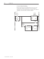
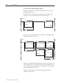
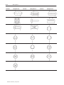
Example 1: Using Set Bit Cursor Points
To monitor all the motors on a conveyor belt, draw a line to
represent the belt, and place Set Bit Cursor Points pointing to
each motor along the belt.
Program the PLC so that when you display this screen on a
terminal you can move the cursor to the desired motor and see
its status in a Local Message Display or Multistate Indicator.
Using the Set Bit Cursor Point on the PanelView Terminal
When the application is running, the operator can use these keys on
the PanelView terminal to control the Set Bit Cursor Point:
This key
Does this
Select
Enables the arrow keys and Home key.
Arrow keys
Move the cursor through the Set Bit Cursor Points on the
screen.
Home
Moves the cursor to the home position (at the top left of the
screen).
Cancel
Turns the Set Bit Cursor Point feature off and disables the
arrow and Home keys.
Publication 2711E-820 – January 1998
22
Control Selectors
When selected, the Cursor Point character is highlighted and
blinking. The Control is set to 1. To turn off the Set Bit Cursor Point
feature and disable the keys, the operator must press the Cancel
button on the PanelView terminal.
The Set Bit Cursor Point values are not changed when the Set Bit
Cursor Point feature is cancelled. The last selected Set Bit Cursor
Point remains on.
"
Note: By default, when the Cancel button is pressed, the Set Bit
Cursor Point character becomes invisible. To keep the character
visible, even after the Cancel button is pressed, enable the Retain
Cursor On Cancel check box in the Object Setup tab of the Terminal
Setup dialog box. For more information about terminal setup
options, see Chapter 12, “Configuring Terminal Setup Options,” in
the PanelBuilder 1400e Configuration Software for Windows User
Manual.
"
Note: If you enable the Retain Cursor On Cancel option, the
application will be compatible only with PanelView Version 2 or
later. The application will not be compatible with earlier versions.
Cursor Point Default Operation
1. When the application is run for the first time, the PanelView
terminal scans all Set Bit Cursor Point objects in the screen from
left to right, top to bottom. The first Set Bit Cursor Point object
with its control value set to 1 is as the active Cursor Point for that
screen.
2. If none are found, the Cursor Point object (Set Bit or Numeric
Input) nearest the home position of the screen is the active Cursor
Point object for that screen. If this is a Set Bit Cursor Point, its
control is set to 1.
3. All other Set Bit Cursor Point objects in the selected screen have
their control values reset to 0. Any other Numeric Input Cursor
Point objects on the screen remain inactive.
4. In a Remote I/O application, when the screen is selected and the
Screen Number to PLC option is enabled, both the new screen
number and the new Set Bit Cursor Point values are transferred to
the PLC in the same PLC scan.
"
Publication 2711E-820 – January 1998
Note: When the application is first run, the Cursor Point operation is
enabled.
Control Selectors
23
Cursor Point Operation after Screen Change
1. When a screen is re-selected, the Set Bit Cursor Point object that
was last active is active again.
2. The object’s control value is set to 1.
3. All other Set Bit Cursor Point objects in the screen have their
control values reset to 0.
Cursor Point Operation on a Terminal Powerup
The Set Bit Cursor Point operation status (Selected or Cancelled) is
always saved. On powerup, as well as when you switch to a new
screen, the Set Bit Cursor Point object that was active when the
screen was last displayed is active.
!
ATTENTION: The Set Bit Cursor Point object should
not share tags with objects used for control purposes.
Sharing tags could cause control functions to start
without the operator’s knowledge.
The following example shows how the PanelView terminal
determines which Set Bit Cursor Point is active.
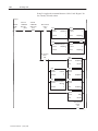
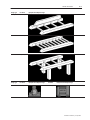
Example 2: When a Screen Uses Multiple Set Bit Cursor Points
The Application Startup screen has five Set Bit Cursor Points:
three in a row at the top of the screen and two in a row below.
The first two Set Bit Cursor Points in each row are aligned in
columns.
Publication 2711E-820 – January 1998
24
Control Selectors
When the application is downloaded, the Set Bit Cursor Point at
the top left corner of the screen is selected as the default and its
control is set to 1. If the right arrow key is pressed, its control is
set to 0 and the second Set Bit Cursor Point in the same row is
set to 1.
Defining the Set Bit Cursor Point Character and Display Field
The Set Bit Cursor Point object consists of a cursor point character
and a display field. By default the Set Bit Cursor Point object uses a
small arrow as the cursor character.
"
Note: You can change the attributes of the cursor as you would any
other text character. For example, you could increase the size of the
arrow by selecting another font from the Format menu. See Chapter
9, Creating Objects, in the PanelBuilder 1400e Configuration
Software for Windows User Manual.
To define the Set Bit Cursor Point character:
1. Create the Set Bit Cursor Point object.
2. Choose Text from the Objects menu, or
from the toolbar.
3. Position the I-beam to the immediate left of the arrow on the Set
Bit Cursor Point. Use the DELETE key to delete the arrow.
Publication 2711E-820 – January 1998
Control Selectors
25
4. To use a character from the keyboard, type that character. You can
type only one character. To use a character from the extended
character set, hold down the ALT key while you enter the
character’s ASCII code on the numeric keypad. See Appendix B,
The Extended Character Set, in the PanelBuilder 1400e
Configuration Software for Windows User Manual for more
information.
You can use text or a graphic image as the Set Bit Cursor Point
display.
To define the Set Bit Cursor Point display field:
1. Create the Set Bit Cursor Point object.
2. Type the text you want to see associated with the cursor point, or
import and place a graphic image in the display.
You can position the display on another area of the screen, instead
of next to the character.
If you don’t want a display with the cursor point, remove the
border and change the field’s background color to the screen
color. This will make the field disappear.
Configuring the Set Bit Cursor Point
Configure the Set Bit Cursor Point according to this table:
Field
Meaning
Name
Assign a name, up to 15 characters, to document the object for
printed reports. This increases the application’s size by 1 byte
per character.
Set Bit Control
Set Bit Control records the status of the Set Bit Cursor Point.
You can only assign a tag to this control.
When it is selected, the control is set to 1. Otherwise it is 0.
Since this control uses only two values, a digital tag is
recommended.
You can adjust the size of the Set Bit Cursor Point’s display and
format the object’s foreground color, background color, font style,
border style, fill style, and blink attributes. For details on formatting
objects see “Changing Object Appearance,” in Chapter 9, Creating
Objects, in the PanelBuilder 1400e Configuration Software for
Windows User Manual.
"
Note: If you use the Extra Large Font, the application will be
compatible only with PanelView Version 2 or later. The application
will not be compatible with earlier versions.
Publication 2711E-820 – January 1998
This chapter tells you how to use the PanelBuilder drawing objects
to illustrate your application.
"
About Drawing Objects
Tip: To simplify screen editing and maximize runtime performance,
convert all text and drawing objects into wallpaper. See Chapter 9,
Creating Objects, in the PanelBuilder 1400e Configuration Software
for Windows User Manual, for detailed information.
Use the following drawing objects to illustrate your application
screens:
• arcs
• ellipses
• lines
• panels
• rectangles
• wedges
"
Arc
Note: For information about Scales, see the Scales chapter, later in
this manual.
You can draw arcs from one to four quadrants. You can size the arc,
configure it to appear hollow or solid, and change the line style or
width.
When you first draw an arc, it appears as an ellipse. Select one of the
handles and drag the pointer around the circumference of the ellipse
to reduce the curve to three, two, or one quadrant of the ellipse.
"
Tip: To draw quadrants of a perfect circle, hold the Shift key as you
first draw the arc.
For more details on drawing and configuring arcs, see Chapter 9,
Creating Objects, in the PanelBuilder 1400e Configuration Software
for Windows User Manual.
Publication 2711E-820 – January 1998
28
Drawings
Ellipse
You can create any size and shape of ellipse.
You can configure the ellipse as hollow or solid, and change the line
style or width.
"
Tip: To create or edit a perfect circle, hold the Shift key as you draw
or edit the ellipse. You can draw any size of circle.
For details on drawing and configuring ellipses, see Chapter 9,
Creating Objects, in the PanelBuilder 1400e Configuration Software
for Windows User Manual.
Line
Lines can be used for emphasis, to divide the screen, to connect
symbols, or to represent physical devices like pipes or conveyors.
You can draw lines in any direction.
"
Tip: To create exact 45_ angles when drawing or moving a line,
hold the Shift key while you move the mouse.
Five line styles are available:
• Solid, in four widths (1, 2, 4, and 8 pixels)
• Dash
• Dot
• Dash-Dot
• Dash-Dot-Dot
For more information on lines and line styles, refer to Chapter 9,
Creating Objects, in the PanelBuilder 1400e Configuration Software
for Windows User Manual.
Arrows
You can use the arrow graphic images to place arrows on lines. The
arrow images are contained in the IMAGES directory. If you
followed the default installation, the directory will be
C:\AB\PB1400E\IMAGES\ARROWS.
You must import the arrow images into the graphic images library
before you can place them on the screen. For instructions on
importing Graphic Images, refer to Chapter 9, Creating Objects, in
the PanelBuilder 1400e Configuration Software for Windows User
Manual.
Publication 2711E-820 – January 1998
Drawings
Panel
29
Panels are similar to rectangles, except panels can have a border.
They are useful for providing emphasis.
You can configure the border style of the panel and assign a hollow
or solid fill pattern.
"
Tip: To draw or edit a perfect square, hold the Shift key as you draw
or edit the panel. You can draw any size of panel.
For details on drawing and configuring panels, see Chapter 9,
Creating Objects, in the PanelBuilder 1400e Configuration Software
for Windows User Manual.
Rectangle
Use rectangles to emphasize text or any other object. You can draw
any size of rectangle. You can configure the rectangle as hollow or
solid and change its line style or width.
"
Tip: To draw or edit a perfect square, hold the Shift key as you draw
or edit the rectangle. You can draw any size of square.
For details on drawing and configuring rectangles, see Chapter 9,
Creating Objects, in the PanelBuilder 1400e Configuration Software
for Windows User Manual.
Wedge
Wedges or pie-shapes are partial ellipses or closed arcs. You can
draw wedges from one to four quadrants. Wedges always have a fill
style and can have any line style or width.
When you first draw a wedge, it appears as an ellipse. Select one of
the handles and drag the pointer around the circumference of the
ellipse to reduce the curve to three, two, or one quadrant of the
ellipse.
"
Tip: To draw quadrants of a perfect circle, hold the Shift key as you
draw the wedge.
For more details on drawing and configuring wedges, see Chapter 9,
Creating Objects, in the PanelBuilder 1400e Configuration Software
for Windows User Manual.
Publication 2711E-820 – January 1998
Goto Configure Mode
Goto Configure Mode
This chapter shows you how to create the Goto Configure Mode
object. This object allows operators to switch the PanelView terminal
from Run Mode to Configure Mode without using the terminal’s
hardware keyswitch (where applicable). In addition, this chapter
provides tips on how to configure the Goto Configure Mode object
to avoid accidental switching of the terminal to Configure Mode.
About the Goto Configure
Mode Button
When the operator presses the Goto Configure Mode button, the
terminal displays the Confirm Configure Mode screen.
After the operator presses OK the terminal switches from Run Mode
to Configure Mode and displays the Terminal Configuration Screen.
Pressing Cancel returns the operator to the application currently
executing on the terminal without interrupting communications or
execution of the application in any way.
Publication 2711E-820 – January 1998
32
Goto Configure Mode
The screen shown below is for a 1000e or 1400e touch screen
terminal; the screen for the 1200e touch screen terminal includes an
Align Screen function. The screen includes function key labels for
1000e, 1200e, and 1400e keypad terminals.
"
Publication 2711E-820 – January 1998
Note: The Goto Configure Mode button switches the terminal from
Run Mode to Configure Mode only if Software Mode Switching is
enabled on the PanelView terminal’s Configure Mode Security
screen. For more information about Software Mode Switching and
about how the Goto Configure Mode button’s twin, Run Mode,
functions at the terminal, see the PanelView 1000e, 1200e, and
1400e Operator Terminals User Manual.
Important:
When the terminal is switched to Configure Mode, the
application that was previously running on the terminal
is terminated and all communication with the PLC
stops. You may therefore want to put the Goto
Configure Mode button on a screen to which security
has been assigned, so an operator does not inadvertently
switch the terminal out of Run Mode.
Important:
If Software Mode Switching is enabled on the
PanelView terminal’s Configure Mode Security screen,
a Goto Configure Mode button will be present on all
Major Fault windows and on the Application Transfer
screen. The Goto Configure Mode button cannot be
protected by screen security in these instances and any
operator can switch the terminal to Configure Mode.
Goto Configure Mode
33
Software Mode Switching at the PanelView Terminal
For the Goto Configure Mode Button to operate, the Soft Mode
Switch must be enabled, and the terminal’s hardware keyswitch must
be in Run mode. The Goto Configure Mode button allows operators
to switch between Run and Configure modes without using the
hardware keyswitch.
When in Configure Mode, press the Mode Switch tab in the Security
window to display the following screen.
Important:
If the Software Mode Switch is set to Enable, the Goto
Configure Mode button is displayed without access
restrictions on both the Transfer Application screen and
the Major Fault window. (See below for a screen
display.) This may pose a security issue, because all
operators will be able to switch between Run and
Configure modes.
The presence of the Goto Configure Mode button in an application
running on the PanelView terminal does not disable the terminal’s
hardware keyswitch; the terminal can still be switched from Run
mode to Configure mode using the keyswitch or remote keyswitch
(if fitted).
Publication 2711E-820 – January 1998
34
Goto Configure Mode
The following table shows the behavior of the terminal at power up:
If the terminal is powered up with
Then the terminal powers up in
The Software Mode Switching option
disabled
The mode indicated by the hardware
keyswitch
The Software Mode Switching option
enabled, and the hardware key switch in
Run Mode
The same mode it was in at power down
The Software Mode Switch option enabled
and the hardware keyswitch in Configure
Mode
Configure Mode
The Software Mode Switch button also lets you enable or disable the
Run Mode button on the Terminal Configuration screen.
• EnableIf you enable the software mode switch, operators can
switch the terminal from Run mode to Configure mode using the
Goto Configure Mode button. Also the Run Mode button on the
Terminal Configuration screen is enabled.
• DisableIf you disable the software mode switch, the Goto
Configure Mode button is disabled, and the Run Mode button on
the Terminal Configuration screen is disabled.
Configuring the Goto Configure Mode Button
Configure the Goto Configure Mode button according to this table:
Field
Meaning
Name
Assign a name, up to 15 characters, to document the object for
printed reports. This increases the application’s size by 1 byte
per character.
Function Key
(Keypad only)
Specify which function key the operator must press to activate
this button.
You can adjust the size of the button and format its foreground color,
background color, button margins (touch screen applications only),
border style, fill style, and blink attributes. For details on formatting
objects see “Changing Object Appearance,” in Chapter 9, Creating
Objects, in the PanelBuilder 1400e Configuration Software for
Windows User Manual.
Publication 2711E-820 – January 1998
Graphic Images
Graphic Images
This chapter tells you how to use graphic images.
For step-by-step instructions about importing, placing, sizing,
copying, and exporting graphic images, refer to Chapter 9, Creating
Objects, in the PanelBuilder 1400e Configuration Software for
Windows User Manual.
"
About Graphic Images
Tip: To simplify screen editing and maximize runtime performance,
convert all graphic images except object labels into wallpaper. See
Chapter 9, Creating Objects, in the PanelBuilder 1400e
Configuration Software for Windows User Manual, for detailed
information.
Use graphic images to illustrate screens, objects, functions, and so
on. You can add graphic images to the screen background, or add
them to an object as object labels. See Symbols later in this manual
for information about using graphic images as object labels.
If you followed the default installation, you’ll find a set of bitmap
(.bmp) files in the folders contained in the
C:\AB\PB1400E\IMAGES directory. The images in these folders
include all ISA symbols, arrow images, DIN symbols, and other
color bitmaps. See Appendix A, ISA Symbols, Appendix B, DIN
Symbols, and Appendix C, Arrows and Parts, for samples of these
graphic images.
Importing Graphic Images
You can import bitmaps from any other application into PanelBuilder
1400e’s bitmap graphic image library. You can also import 2-D
AutoCAD graphics saved in the .dxf file format into PanelBuilder
1400e’s DXF Image library. Transparent AutoCAD .dxf images are
made solid when converted for use in PanelBuilder. Color bitmaps
and .dxf graphics are converted into 16-color images; monochrome
bitmap images are imported as monochrome. The maximum graphic
image size is 640 by 480 pixels. If you import a file larger than this,
PanelBuilder automatically shrinks it to 640 by 480 pixels.
"
Note: AutoCAD (.dxf) graphics are converted to bitmap files when
PanelBuilder creates the application’s .pvd file for downloading to
the PanelView terminal.
Publication 2711E-820 – January 1998
36
Graphic Images
"
Tip: Convert two-color bitmaps to monochrome before you import
them. Monochrome images use less memory and therefore provide
better runtime performance. You can configure a monochrome
image’s foreground and background colors, fill style, and blink
attributes. You can’t change the format of 16-color images.
"
Tip: Because PanelBuilder converts color images to 16-color
bitmaps, a 256-color image may not convert as expected. To achieve
a photographic appearance for your color bitmaps, import images
that use few colors. Screen 10 of the demonstration applications
shows a good example: TANK16.BMP uses grays and greens and
has the quality of a photographic image. If you followed the default
installation, the demonstration application files are in the
PB1400E\DEMO folder.
Once bitmaps and .dxf files are imported into the application’s
graphic image libraries, you can select the files and place them on
the application screen or in objects as labels.
Sizing Graphic Images
You can increase or decrease the size of the graphic images once you
place them on screens in PanelBuilder. You can use multiple copies
of the same graphic image and change the size of any or all of them.
The size of the source image remains unchanged; PanelBuilder saves
each new size of the image as a separate graphic when the
application’s .pvd file is created.
"
Note: The application’s size increases each time you resize an
image. Limit the number of images you resize to ensure that your
application will fit in the terminal’s memory.
Copying and Exporting Graphic Images
If you copy a graphic image to another PanelBuilder application, its
size attributes are copied as well. If you export a graphic image, it is
exported with its original size dimensions, or with the size 640 by
480 pixels, if it was originally larger than this. When exporting, if
the source image was a .dxf file, the exported file is a bitmap (.bmp)
representation of the source image.
Publication 2711E-820 – January 1998
Graphic Images
"
37
Note: If you are concerned about minimizing the size of your
application, use as few graphic images as possible. For each graphic
image you use, the application file’s size increases the number of
bytes in the image. Copies of a graphic image take much less space
than the original, so you might consider using the same image on
several screens rather than placing a unique image on each screen.
Ensure that all copies are the same size as the original, however,
otherwise each copy is saved as a separate image. Monochrome
graphic images take less file space than 16-color images that are the
same height and width.
Publication 2711E-820 – January 1998
Indicators
Indicators
This chapter tells you about:
• the different types of Indicators
• how to configure each Indicator
About Indicators
You can create these two types of Indicators:
• Multistate Indicator
• List Indicator
Indicators do not retain their values when the terminal is turned off.
Multistate Indicator
The Multistate Indicator is a display object that enables the operator
to display the state of a PLC operation on the screen.
You can use the Multistate Indicator for various purposes. For
example, create a Multistate Indicator that is only two pixels high to
simulate flow in a pipe or indicate the motion of an object. Use a
two-state solid rectangle to simulate an indicator light, add
descriptive text to the object, or add a graphic image. Or, use a
Multistate Indicator to hide text until it is needed or becomes
applicable.
You can configure the state values of Multistate Indicator objects. At
runtime, the object displays the state whose value matches the
Indicator State control value.
"
Note: If the Indicator State control contains a value that doesn’t
match any of the Multistate Indicator’s assigned state values, an error
state occurs and the highest numbered state is displayed without its
label. An error state also occurs if the Indicator State control is not
assigned. In this case also, the highest numbered state is displayed
without its label.
"
Tip: If you plan to use the same graphic image for each state, use a
Symbol instead of a Multistate Indicator. You can configure the
Symbol to display different colors or blink attributes for different
states, and the Symbol uses less memory. PanelView also processes
the information more quickly for Symbols than for Multistate
Indicators. For more information, see Symbols, later in this manual.
Publication 2711E-820 – January 1998
40
Indicators
Configuring the Multistate Indicator
For each Multistate Indicator, you must specify the number of states
(from 2 to 255), and define an Indicator State control. At runtime,
the value at the Indicator State control determines the state that is
displayed on the PanelView terminal.
Configure the Multistate Indicator according to this table:
Field
Meaning
Name
Assign a name, up to 15 characters, to document the object for
printed reports. This increases the application’s size by 1 byte
per character.
Number of States
Specify the number of states, from 2 to 255, this object will
display.
Edit States
If you increase the number of states beyond the default of 4,
you must assign state values. You can also change the default
state values for the default 4 states.
To assign different values to the states, choose Edit States. You
can assign any unique value from -2,147,483,648 to
2,147,483,647. See “Configuring Object States,” in Chapter 9,
Creating Objects, in the PanelBuilder 1400e Configuration
Software for Windows User Manual for information on assigning
state values and configuring state attributes.
Note: To minimize the size of the application file, use state
values that increment by one for each state. Do not configure
more states than you need.
You should configure colors, text, graphic images, and other
attributes for each state.
Control
Indicator State controls the state for this object. You can assign
a tag or expression to this control.
When the PLC changes the control’s value, the terminal
displays the state with the assigned value.
Note: If you do not assign this control, an error state occurs
when the object is displayed on the PanelView terminal. The
highest numbered state is displayed without its label, alerting
the operator to the error state.
You can adjust the size of the Multistate Indicator and format its
background color, border style, and blink attributes. For details on
formatting objects see “Changing Object Appearance,” in Chapter 9,
Creating Objects, in the PanelBuilder 1400e Configuration Software
for Windows User Manual.
Publication 2711E-820 – January 1998
Indicators
List Indicator
41
The List Indicator displays a list of states for a particular PLC
operation and highlights the current state.
The font size determines the maximum number of states possible in
the list. Small and Double Wide fonts allow up to 24 states; Double
High or Large fonts allow up to 12 states. If you use the Extra Large
font the maximum number of states is 6.
"
Note: List text can be in only one font size. The List Indicator
supports text labels only, not graphic image labels.
At runtime, the operator can see all the states for a particular
operation and see which state is current. The current state is
highlighted. The size of the list component determines the number of
states. For information on changing the font size, resizing the list,
and adding state text, see “Changing Object Appearance,” in
Chapter 9, Creating Objects, in the PanelBuilder 1400e
Configuration Software for Windows User Manual.
The List Indicator is similar to the Control List Selector, except the
PLC, rather than the operator, controls the display.
You can configure the state values of List Indicator objects. At
runtime, the object highlights the state whose value matches the
Indicator State control’s value.
"
Note: If the Indicator State control contains a value that doesn’t
match any of the List Indicator’s assigned state values, an error state
occurs and no state is highlighted. An error state also occurs if the
Indicator State control is not assigned. In this case also, no highlight
bar appears.
Publication 2711E-820 – January 1998
42
Indicators
Configuring the List Indicator
The size of the List Indicator, font size, and border configuration
determine the maximum number of states. To increase or decrease
the number of states, resize the list. Configure the List Indicator
according to this table:
Field
Meaning
Name
Assign a name, up to 15 characters, to document the object for
printed reports. This increases the application’s size by 1 byte
per character.
Edit States
Assign different values to the states. You can assign any unique
value from –2,147,483,648 to 2,147,483,647. See “Configuring
List Object States” in Chapter 9, Creating Objects, in the
PanelBuilder 1400e Configuration Software for Windows User
Manual for information on assigning state values.
Note: To minimize the size of the application file, use state
values that increment by one for each state. Do not configure
more states than you need.
Control
Indicator State controls the state for this object. You can assign
a tag or expression to the Indicator State control.
When the PLC changes the control’s value, the terminal
highlights the state with the assigned value.
Note: If you do not assign this control, an error state occurs
when the object is displayed on the PanelView terminal. No
highlight bar appears on the list, alerting the operator to the
error state.
You can adjust the size of the List Indicator and format its
foreground color, background color, font style, border style, and
blink attributes. For details on formatting objects see “Changing
Object Appearance,” in Chapter 9, Creating Objects, in the
PanelBuilder 1400e Configuration Software for Windows User
Manual.
"
Publication 2711E-820 – January 1998
Note: If you use the Extra Large Font, the application will be
compatible only with PanelView Version 2 or later. The application
will not be compatible with earlier versions.
Local Message Displays
Local Message Displays
This chapter explains:
• how the Local Message Display object functions
• how to configure the Local Message Display object
About Local Message
Displays
The Local Message Display provides information to the operator by
displaying one message from a list.
There are two components to a local message: the Local Message
Display object, and the list of local messages. You add Local
Message Display objects to screens; you define the messages in the
Local Messages editor. You can create up to 2000 messages per
application. The message’s text can contain any characters, including
those in the extended ASCII character set. For information about
creating messages, see Chapter 10, Creating Messages, in the
PanelBuilder 1400e Configuration Software for Windows User
Manual.
Each Local Message Display object is assigned a Message Control.
The value of this control determines which message is displayed. For
example, if the control value is 39, the local message that has trigger
value 39 is displayed. You can program the PLC to set this value, or
you can add objects to the screen so the operator can control which
local message is displayed.
The Local Message Display object can display single or multiple
lines of message text, depending on the object size and font size. A
local message can contain up to 256 characters. You can select any
font size, including the Extra Large font.
At runtime, if the display is wide enough to display the full message
on one line, the text appears centered within the display area. If the
message is longer than the display area, it is left-justified.
If the display is not wide enough, automatic word wrapping occurs
so the message is displayed on multiple lines, and the text is
left-justified. If the message uses the newline character (\n), the text
after the character begins on a new line of the display. If the message
is longer than the display, the message is truncated to fit. The “>”
character at the end of the message indicates it has been truncated.
Publication 2711E-820 – January 1998
44
Local Message Displays
How a Local Message Is Triggered
A message is triggered when the value of the Message Control
changes. This value must correspond to the trigger value of a local
message. For example, a control value of 19 would cause the
message with trigger value 19 from the Local Message list to appear
in the display. If the control value changed to 27, the message with
trigger value 27 would appear, replacing the previous message. The
Local Message Display is cleared when the trigger value is 0. If no
matching trigger value is found, the display is cleared and displays
“????”.
Triggering Messages on Multiple Local Message Displays
Each application has only one local message list but you can have
several Local Message Displays for different purposes. To trigger
different messages for different displays, create a subset of the local
message list for each display.
To trigger different messages on multiple Local Message Displays,
create the display objects using controls with different tags or
expressions that don’t overlap addresses. Then create all messages
using the Local Message editor.
The PLC can then write different values to each object control,
causing different messages to appear in each display.
For an example of using Local Message Displays with a Scrolling
List Object, see “Scrolling Lists”, later in this manual.
Configuring the Local Message Display
Configure the Local Message Display according to this table:
Field
Meaning
Name
Assign a name, up to 15 characters, to document the object for
printed reports. This increases the application’s size by 1 byte
per character.
Control
Message Control records the trigger value of the local
message to be displayed. You can assign a tag or expression to
the Message Control.
The control must be able to accommodate the trigger values of
all messages to be displayed for the object.
Publication 2711E-820 – January 1998
Local Message Displays
45
You can adjust the size of the Local Message Display and format its
foreground color, background color, font style, border style, and
blink and underline attributes. For details on formatting objects see
“Changing Object Appearance,” in Chapter 9, Creating Objects, in
the PanelBuilder 1400e Configuration Software for Windows User
Manual.
"
Note: If you use the Extra Large Font, the application will be
compatible only with PanelView Version 2 or later. The application
will not be compatible with earlier versions.
Publication 2711E-820 – January 1998
This chapter describes:
• the different Numeric objects
• how to configure each Numeric object
• how different Numeric objects can work together
About Numerics
There are six Numeric objects:
• Increment Value Button (with and without Display)
• Decrement Value Button (with and without Display)
• Numeric Data Display
• Numeric Keypad Enable Button (keypad terminals only)
• Numeric Input Cursor Point (keypad terminals only)
• Small or Large Numeric Entry Keypad (touch screen terminals
only)
Numeric objects can be divided into two groups: input objects
(which are used for numeric entry) and display objects (which
display numeric values on the screen). Some numeric objects belong
to both groups.
The following table outlines which objects are input and which are
display. It also outlines which objects support polarity, decimal
points, and floating decimal points.
Object
Input
Increment Value Button
n
Increment Value Button with Display
n
Decrement Value Button
n
Decrement Value Button with Display
n
Display
Numeric Keypad Enable Button
n
Numeric Input Cursor Point
n
Numeric Entry Keypad
n
Decimal Point
Floating
Decimal
n
n
n
n
n
n
Numeric Data Display
Polarity
n
n
n
n
n
n
n
n
n
n
n
n
Publication 2711E-820 – January 1998
48
Numerics
The following table lists tag types, data types, and the valid range of
values available when assigning tags to numeric objects.
Tag Type
Analog
Data Type
Range of Values
Default
Address dependent (for Device tags)
0 to 65535 (for RIO tags)
0 to 65535
–32768 to 32767
–2,146,483,648 to 2,147,483,647
Unsigned Integer
Integer
Long Integer
Floating Point
Byte
Binary
Bit Position
1-Digit BCD to
8-Digit BCD
Increment and Decrement
Value Buttons
–3.402823 × 1038 to –3.402823 × 10–37, 0,
+3.402823 × 10–37 to +3.402823 × 1038
0 to 255
Address dependent
Address dependent
0 to 99,999,999
Digital
0 or 1
String
1 to 82 characters
Block
1 to 1024 bits
Increment and Decrement Value Buttons are input objects that the
operator presses to change a current value.
Increment Value Button (with or without Display)
When the operator presses the Increment Value Button, the value of
the Button Control increases by a specified integer or floating-point
amount.
"
Note: If you configure the Increment Value Button for floating-point
values, the application will be compatible only with PanelView
Version 2 or later. The application will not be compatible with earlier
versions.
You can control the value range by assigning an upper limit to the
button. If the operator tries to increment the Button Control above
the upper limit, an error message is displayed, and the value is not
sent to the PLC.
You can choose to have the Increment Value Button’s numeric value
displayed. You can place the Numeric Display component anywhere
on the screen.
Publication 2711E-820 – January 1998
Numerics
49
"
Tip: If you want immediate indication of the value you’re sending
to the PLC, use the button’s Numeric Display component instead of a
Numeric Data Display. This is especially important for DH+ and
ControlNet applications when Auto-Repeat is enabled. Since the
DH+ and ControlNet network response can be slow, you don’t want
to overshoot the target value when the button is auto-repeating. The
Numeric Display component shows the last value sent to the PLC.
Use a separate Numeric Data Display object if you want to feed back
the value you’ve written.
"
Note: When the button is released, the Numeric Display component
will be aware of any external changes to the Button Control and
update itself.
At runtime, if the numeric value cannot be displayed—for example,
if the field is too small—the Numeric Display component is filled
with asterisks (***).
RIO
Important:
In Remote I/O applications, the PanelView terminal can
retain the current Button Control value, even after the
terminal is turned off. Depending on how the
Application Startup operation is defined, the retained
value (last state) or initial value (default) is sent to the
PLC when power is re-applied.
For details on configuring Application Startup
operation, see “Application Startup” in Chapter 5 in the
PanelView 1000e, 1200e, and 1400e Operator
Terminals User Manual.
!
ATTENTION: A control function should require
operator confirmation. Do not use this object on its
own to initiate a control function. Also, a retained
value could be used when the terminal is powered back
on, which could result in a control function starting
without the operator’s knowledge.
Configuring the Increment Value Button
Configure the Increment Value Button according to this table:
Field
Meaning
Name
Assign a name, up to 15 characters, to document the object for
printed reports. This increases the application’s size by 1 byte
per character.
Button Type
Specify Increment Value Button.
Function Key
(Keypad only)
Specify which function key the operator must press to activate
this button.
Publication 2711E-820 – January 1998
50
Numerics
Field
Meaning
Auto-Repeat Rate
(per second)
Specify a number between 0 and 20. When the operator holds
down the Increment Value Button, the terminal begins
increasing the value at the Button Control by the “Amount per
Increment” value at the rate you specify in this field.
A value of 0 disables auto-repeat. When the button is pushed
and held, the value at the Button Control increases once by the
amount specified in the Amount per Increment field. The button
must be released and pushed again for the next increment.
Auto-Repeat Start
Delay
Specify the time, between 200 milliseconds and 2.5 seconds,
that the operator must hold down the Increment Value Button
before the auto-repeat function starts.
Amount per Increment
Enter an integer or floating-point value between 0.0000000001
and 2,147,483,647. Floating-point values are accurate to 10
significant digits The value at the control increases by this
amount each time the operator presses the button or at each
auto-repeat.
Maximum Value
Define a maximum value above which the Increment Value
Button value will stop increasing. If the value is already at or
above the maximum you define here, and the Increment Value
Button is pressed, the value will not change. Instead, an error
message appears. Enter a value between –2,147,483,648 and
2,147,483,647. Floating-point values are accurate to 10
significant digits.
Show Numeric Display
Check this field if you want the button’s value to be displayed. If
you choose this, it will be an Increment Value Button with
Display object.
Number of Digits
If you choose to show the numeric display with the button, you
can specify the number of digits that will appear. Choose from 1
to 16. Keep in mind that a minus sign uses one digit.
Fill Left With
If you choose to show the numeric display with the button, you
can specify how the left portion of the display appears when
fewer than the maximum number of digits are displayed. You
can choose either spaces or zeroes.
Control
Button Control . The control’s value increases by the specified
amount each time the operator presses the Increment Value
Button or when the button auto-repeats. You can assign only a
tag to this control.
You can adjust the size of the Increment Value Button and format its
foreground color, background color, button margins (touch screen
applications only), border style, fill style, and blink attributes. If you
choose the Show Numeric Display option you can also format the
display’s font style and underline attributes. For details on formatting
objects see “Changing Object Appearance,” in Chapter 9, Creating
Objects, in the PanelBuilder 1400e Configuration Software for
Windows User Manual.
"
Publication 2711E-820 – January 1998
Note: If you use the Extra Large Font, the application will be
compatible only with PanelView Version 2 or later. The application
will not be compatible with earlier versions.
Numerics
51
Decrement Value Button (with or without Display)
When the operator presses the Decrement Value Button, the value of
the Button Control decreases by a specified integer or floating-point
amount.
"
Note: If you configure the Decrement Value Button for
floating-point values, the application will be compatible only with
PanelView Version 2 or later. The application will not be compatible
with earlier versions.
You can control the value range by assigning a lower limit to the
button. If the operator tries to decrement the Button Control below
the lower limit, an error message is displayed and the value is not
sent to the PLC.
You can choose to have the Decrement Value Button’s numeric value
displayed. You can place the Numeric Display component anywhere
on the screen.
"
Tip: If you want immediate indication of the value you’re sending
to the PLC, use the button’s Numeric Display component instead of a
Numeric Data Display. This is especially important for DH+ and
ControlNet applications when Auto-Repeat is enabled. Since the
DH+ and ControlNet network response can be slow, you don’t want
to overshoot the target value when the button is auto-repeating. The
Numeric Display component will show the last value sent to the
PLC. Use a separate Numeric Data Display object if you want to
feed back the value you’ve written
"
Note: When the button is released, the Numeric Display component
will recognize any external changes to the Button Control and update
itself.
At runtime, if the numeric value cannot be displayed—for example,
if the field is too small—the Numeric Display component is filled
with asterisks (***).
RIO
Important:
In Remote I/O applications, the PanelView terminal can
retain the current Button Control value, even after the
terminal is turned off. Depending on how the
Application Startup operation is defined, the retained
value (last state) or initial value (default) is sent to the
PLC when power is re-applied.
For details on configuring Application Startup
operation, see “Application Startup” in Chapter 4 in the
PanelView 1200e and 1400e Operator Terminals User
Manual.
Publication 2711E-820 – January 1998
52
Numerics
!
ATTENTION: A control function should require
operator confirmation. Do not use this object on its
own to initiate a control function. Also, a retained
value could be used when the terminal is powered back
on, which could result in a control function starting
without the operator’s knowledge.
Configuring the Decrement Value Button
Configure the Decrement Value Button according to this table:
Field
Meaning
Name
Assign a name, up to 15 characters, to document the object for
printed reports. This increases the application’s size by 1 byte
per character.
Button Type
Specify Decrement Value Button.
Function Key
(Keypad only)
Specify which function key the operator must press to activate
this button.
Auto-Repeat Rate
(per second)
Specify a number between 0 and 20. When the operator holds
down the Decrement Value Button, the terminal begins
decreasing the value at the Button Control by the “Amount per
Decrement” value at the rate you specify.
A value of 0 disables auto-repeat. When the button is pushed
and held, the value at the Button Control is decreased once by
the amount specified in the Amount per Decrement field. The
button must be released and pushed again for the next
decrement.
Publication 2711E-820 – January 1998
Auto-Repeat Start
Delay
Specify the time, between 200 milliseconds and 2.5 seconds,
that the operator must hold down the Decrement Value Button
before the auto-repeat function starts.
Amount per Decrement
Enter an integer or floating-point value between 0.0000000001
and 2,147,483,647. Floating-point values are accurate to 10
significant digits. The value at the control will decrease by this
amount each time the operator presses the button or at each
auto-repeat.
Minimum Value
Define a minimum value below which the Decrement Value
Button will stop decrementing the value. If the value is already
at or below the minimum you define here, and the Decrement
Value Button is pressed, the value will not change. Instead, an
error message appears. Enter a value between –2,147,483,648
and 2,147,483,647. Floating-point values are accurate to 10
significant digits.
Show Numeric Display
Check this field if you want the button’s value to be displayed. If
you choose this, it will be a Decrement Value Button with
Display.
Number of Digits
If you choose to show the numeric display, you can specify the
number of digits that will appear. Choose from 1 to 16. Keep in
mind that a minus sign uses one digit.
Numerics
53
Field
Meaning
Fill Left With
If you choose to show the numeric display with the button, you
can specify how the left portion of the display will appear when
fewer than the maximum number of digits are displayed. You
can choose either spaces or zeroes.
Control
Button Control . The control’s value increases by the specified
amount each time the operator presses the Increment Value
Button or when the button auto-repeats. You can assign only a
tag to this control.
You can adjust the size of the Decrement Value Button and format its
foreground color, background color, button margins (touch screen
applications only), border style, fill style, and blink attributes. If you
choose the Show Numeric Display option you can also format the
display’s font style and underline attributes. For details on formatting
objects see “Changing Object Appearance,” in Chapter 9, Creating
Objects, in the PanelBuilder 1400e Configuration Software for
Windows User Manual.
"
Numeric Data Display
Note: If you use the Extra Large Font, the application will be
compatible only with PanelView Version 2 or later. The application
will not be compatible with earlier versions.
The Numeric Data Display object allows the operator to monitor a
PLC process. This object displays PLC values such as temperature,
level, and speed.
Depending on how you configure the Numeric Data Display object,
it can display a decimal point and a minus sign.
"
Tip: Use Numeric Data Displays with other objects. For example,
include a Numeric Keypad (for touch screen terminals), or a
Numeric Keypad Enable Button (for keypad terminals) on the same
screen as a Numeric Data Display. Assign the same Control to both
objects so the display can show the control’s current value as entered
by the input object.
Important:
The Numeric Data Display does not retain its value
when power is switched off and on.
The following examples show how the Numeric Data Display works.
They illustrate how the Decimal Display and polarity options affect
the way numbers are displayed.
Publication 2711E-820 – January 1998
54
Numerics
Example 1: Displaying a Negative Fractional Value
The Displayed Value control has a fractional value. The value
displayed depends on the assigned Decimal Display option and
the value of the Polarity control.
"
Note: Implicit (floating-point) values are accurate up to 7
significant digits. If there are more than 7 significant digits, the
number is rounded off.
The following table illustrates how the Decimal Display option
determines the display. The Displayed Value control is set to
–3124.798.
If Polarity is unassigned, and the
Decimal Display option is set to
This value is displayed
Disabled
–3125
Implicit
–3124.798
PLC Controlled at 1 digit
–3124.8
Fixed Position at 5 digits
–3124.79800
The following table illustrates how the value of the Polarity
control determines the display. The Displayed Value control is
set to –3124.798.
If the Decimal Display is set to Implicit,
and the Polarity control is this value
This value is displayed
Unassigned
–3124.798
0
3124.798
1
–3124.798
Example 2: Displaying an Integer Value
The Displayed Value control has an integer value. The value
displayed depends on the assigned Decimal Display option and
the value of the Polarity control.
The following table illustrates how the Decimal Display option
determines the display. The Displayed Value control is set to
3124.
Publication 2711E-820 – January 1998
Numerics
If Polarity is unassigned, and the
Decimal Display option is set to
This value is displayed
Disabled
3124
Implicit
3124
PLC Controlled at 1 digit
312.4
Fixed Position at 5 digits
.03124
55
The following table illustrates how the value of the Polarity
control determines the display. The Displayed Value control’s
value is –3124.
If the Decimal Display is set to Implicit,
and the Polarity control is this value
This value is displayed
Unassigned
–3124
0
3124
1
–3124
Configuring the Numeric Data Display
Configure the Numeric Data Display according to the following
table:
Field
Meaning
Name
Assign a name, up to 15 characters, to document the object for
printed reports. This increases the application’s size by 1 byte
per character.
Fill Left With
Choose whether the left portion of the display will be filled with
zeroes or blank spaces when fewer than the maximum number
of digits are displayed.
Number of Digits
Specify the number of digits to display, up to a maximum of 16.
Keep in mind that a decimal point and minus sign each take one
digit.
At runtime, if the value can’t be displayed within the number of
digits specified for the object, a string of asterisks (*) is
displayed.
Decimal Display
How you configure the decimal display and polarity determines
the appearance and behavior of the Numeric Data Display. (See
the examples before this table.) The configuration also
determines the tags or expressions you must assign. Each
Numeric Data Display can have only one configuration.
Disabled—Select this item if you don’t want any decimal point
displayed. If the Displayed Value control contains a decimal
point, it will be rounded off.
Publication 2711E-820 – January 1998
56
Numerics
Field
Meaning
Decimal Display (con’t)
Implicit—The value from the Displayed Value control will be
displayed as it is, without any external decimal manipulation.
For example, a value of “1” is displayed as “1”. A value of “1.3”
is displayed as “1.3.” If the number of digits following the
decimal point is too large to fit in the display, the fraction is
rounded off to fit the number of digits. For example, if the
display has four digits, and the value is “1.237,” the display will
show “1.24.” If an integer value or the integer portion of a
number can’t be displayed fully, asterisks (***) are displayed
instead.
PLC Controlled—Select this item if you want the position of the
decimal point to be determined by the PLC. This means that the
decimal point is not in a fixed position, and the PLC controls the
number of digits after the decimal point. If the Displayed Value
control is a fractional number and has fewer than the specified
number of digits to the right of the decimal point, the value will
be padded with zeroes. If the value has more than the number
o digits,
i it the value will
ill be rounded
oun e off.
o . The PLC
P Controlled
ont olle
of
decimal position can display 1 to 15 decimal digits. If the value
returned by the Decimal Point Position control is outside this
range, the display field is filled with asterisks (***). If you check
this button, define the Decimal Point Position control.
Fixed Position—Select this item if you want the decimal point
to appear always in the same position. See Digits after Decimal
Point, next.
Tip: Use Fixed Position with an analog tag that has scale and
offset defined to achieve the version 5.10 Scaled Numeric Data
Display capability. Or, define an expression so that it will
manipulate the PLC output to achieve the same effect.
If the Displayed Value control is a fractional number and has
fewer than the specified number of digits to the right of the
decimal point, the value is padded with zeroes. If the value has
more than the number of digits, the value is rounded off.
Digits after Decimal
Point
If you specify the decimal point as Fixed Position, enter the
number of digits that will appear after the decimal point. The
maximum is 15.
Control
The Numeric Data Display uses the following controls. You can
assign a tag or expression to each control.
Displayed Value contains the value to be displayed. If the
control uses a tag with a float address or a non-standard scale
and offset value, the object can display a fractional value.
Important: If you assign the Polarity control, when you define
the Displayed Value control use a digital or analog tag with any
of the following unsigned data types: byte, binary, bit position,
or 1 to 8 BCD. If you use a signed data type, do not assign the
Polarity control unless you want to override the value’s own
polarity.
Decimal Point Position determines the position of the decimal
point. Define this control if you specified the Decimal Display
field as PLC Controlled. The value of this control determines the
number of digits after the decimal point.
Polarity determines whether or not a minus sign is displayed. If
the Polarity control’s value is other than 0, the minus sign is
always displayed; if it is 0, the sign is never displayed. If this
control is assigned, it overrides the Displayed Value control’s
polarity. Remember to account for the minus sign in the number
of digits you assign.
Publication 2711E-820 – January 1998
Numerics
57
You can adjust the size of the Numeric Data Display and format its
foreground color, background color, font style, border style, and
blink and underline attributes. For details on formatting objects see
“Changing Object Appearance,” in Chapter 9, Creating Objects, in
the PanelBuilder 1400e Configuration Software for Windows User
Manual.
"
Numeric Keypad Enable
Button
(Keypad Terminals Only)
Note: If you use the Extra Large Font, the application will be
compatible only with PanelView Version 2 or later. The application
will not be compatible with earlier versions.
The Numeric Keypad Enable Button object calls up the Numeric
Keypad scratchpad. The operator enters a numeric value in the
scratchpad to be sent to the PLC. If you assign the Optional Keypad
Write Expression, the PanelView terminal can perform a
mathematical calculation or logical operation on the value the
operator enters, and then send the result to the PLC.
While the Numeric Keypad scratchpad is on the screen, the Cancel
key, numeric keypad, backspace, decimal point, minus sign and
Home/Arrow keys remain active. All other keys and buttons are
disabled.
The Numeric Keypad scratchpad is removed when:
• the Cancel key is pressed
• the screen changes
• the operator moves the cursor to a Set Bit Cursor Point
• mode is switched
The Numeric Keypad scratchpad can display up to 16 digits. The
decimal point and minus sign use one digit each.
"
RIO
Note: The Numeric Keypad scratchpad appears over the top
60 pixels of the screen. Keep this in mind before you place objects in
this area.
Important:
In Remote I/O applications, the PanelView terminal can
retain the current values for the object’s controls, even
after the terminal is turned off. Depending on how the
Application Startup operation is defined, the retained
value (last state) or initial value (default) is sent to the
PLC when power is re-applied.
For details on configuring Application Startup
operation, see “Application Startup” in Chapter 4 in the
PanelView 1200e and 1400e Operator Terminals User
Manual.
Publication 2711E-820 – January 1998
58
Numerics
Configuring the Numeric Keypad Enable Button
Configure the Numeric Keypad Enable Button according to the
following table:
Field
Meaning
Name
Assign a name, up to 15 characters, to document the object for
printed reports. This increases the application’s size by 1 byte
per character.
Scratchpad
Specify whether you want the Numeric Keypad scratchpad to
be retained or removed after the operator presses the Enter
key:
Retain after Enter retains the scratchpad on the screen.
Remove after Enter removes the scratchpad from the screen.
Decimal Point
Specify whether the operator can enter a number with decimal
points, and how the decimal points appear in the scratchpad.
Disabled—the operator can’t enter a decimal point.
Implicit—allows the operator to enter the number and decimal
point. Assign an analog tag with Floating Point data type.
Fixed Position—you specify where the decimal point is
positioned in the scratchpad display. See Digits after Decimal
Point, next.
PLC Controlled—allows the PLC to determine the number of
digits that appear after the decimal point by specifying a value
in the tag for the Decimal Point Position control.
The PLC Controlled decimal position can display 1 to 15
decimal digits. If the value returned by the Decimal Point
Position control is outside this range, the decimal point
character is replaced by a single asterisk (*).
Decimal Key Controlled—allows the operator to enter the
number and decimal point. The terminal calculates the decimal
point position and writes this value to the Decimal Point Position
control.
See “Using the Decimal Point” later in this chapter for more
information.
Publication 2711E-820 – January 1998
Digits after Decimal
Point
If you specify the decimal point as Fixed Position, enter the
number of digits that will appear after the decimal point. The
maximum is 15.
Function Key
Specify which function key the operator must press to call up
the scratchpad.
Numerics
59
Field
Meaning
Control
The Numeric Keypad Enable Button uses the following controls:
Keypad Numeric Input identifies the PLC location to which the
terminal writes the value that the operator enters in the
scratchpad. You can assign only a tag to this control.
Define this control for all Decimal Point options.
Optional Keypad Write Exprn performs a mathematical
calculation or logical operation on the value the operator enters
at the PanelView terminal, then sends the result to the Keypad
Numeric Input control. Use of this control is optional. You can
assign only an expression to this control. See “Using Write
Expressions” later in this chapter for information about
assigning this control.
Decimal Point Position determines or indicates the position of
the decimal point.
If you specified the Decimal Point field as PLC Controlled, you
can assign a tag or expression to this control.
If you specified the Decimal Point field as Decimal Key
Controlled, you can assign only a tag.
Enter Key Control and Enter Key Handshake are used
together to provide handshaking between the PLC and the
terminal. See “Enter Key Handshake Operation” later in this
chapter for more information. You can assign only a tag to the
Enter Key Control. You can assign a tag or expression to the
Enter Key Handshake control.
Important: All function keys are disabled while the terminal is
waiting for handshake acknowledgement.
You can adjust the size of the Numeric Keypad Enable Button and
format its foreground color, background color, border style, fill style,
and blink attributes. For details on formatting objects see “Changing
Object Appearance,” in Chapter 9, Creating Objects, in the
PanelBuilder 1400e Configuration Software for Windows User
Manual.
"
Note: If you assign a write expression, or configure the Numeric
Keypad Enable button for implicit decimal point operation, the
application will be compatible only with PanelView Version 2 or
later. The application will not be compatible with earlier versions.
Publication 2711E-820 – January 1998
60
Numerics
Numeric Input Cursor
Point (Keypad Terminals
Only)
The Numeric Input Cursor Point object allows the operator to select
from an array of numbers. Each Numeric Cursor Point has an
associated Keypad Numeric Input control that communicates the
value to the PLC. At the terminal, the keypad’s arrow and Home
keys are used to select a cursor point. The keypad’s Select button
enables the arrow and Home keys while Cancel disables them.
Numeric Input Cursor Point
Refer to the section “Cursor Point Default Operation” in the chapter
on Control Selectors.
"
Note: Numeric Input Cursor Points can be used with Set Bit Cursor
Points on the same application screen.
Using the Numeric Input Cursor Point on the PanelView Terminal
When the application is running, the operator can use the following
keys to control the Numeric Input Cursor Point:
Publication 2711E-820 – January 1998
This key
Does this
Select
Enables cursor point operation and activates the arrow and
Home keys.
Arrow keys
Move the cursor to the desired Numeric Input or Set Bit Cursor
Point in the screen.
Home
Moves the cursor to the Home position (the top left Numeric
Input or Set Bit Cursor Point) in the screen.
Cancel
Turns off the Numeric Input Cursor Point feature and disables
the keys.
Numerics
61
When a Numeric Input Cursor Point is selected, the Numeric Entry
scratchpad prompt “Enter New Value or Press Cancel”
appears on the top of the display. The operator then uses the Numeric
Keypad keys to type the new value, and presses the Enter key to send
the value to the Keypad Numeric Input control. If you assign the
Optional Keypad Write Expression, the PanelView terminal can
perform a mathematical calculation or logical operation on the value
the operator enters, and then send the result to the PLC.
If the operator uses the Raise or Lower keys while the scratchpad’s
value field is blank, the Keypad Numeric Input control value is
incremented or decremented directly, without the Enter key being
pressed. The Raise and Lower keys are disabled as soon as a digit is
entered into the Numeric Entry scratchpad. They remain disabled
until the value in the scratchpad has been entered or cleared.
"
Note: If you assign the Optional Keypad Write Expression, the
Raise and Lower keys are disabled.
The operator can enter up to 16 digits in the window. By default, 5 of
these are displayed. Pressing Enter validates the value. If the value
entered is valid, the window clears. The new value is then sent to the
PLC.
If the value is invalid, an error message appears. The value remains
in the window and is not sent to the PLC. The operator must clear
the error message from the display.
"
RIO
Note: The Numeric Entry scratchpad occupies the full screen width
of the top 60 pixels of the screen. When displayed, the scratchpad
covers any objects in this area. Keep this in mind before you place
objects in this area.
Important:
In Remote I/O applications, the PanelView terminal can
retain the current values for the object’s controls, even
after the terminal is turned off. Depending on how the
Application Startup operation is defined, the retained
value (last state) or initial value (default) is sent to the
PLC when power is re-applied.
For details on configuring Application Startup
operation, see “Application Startup” in Chapter 4 in the
PanelView 1200e and 1400e Operator Terminals User
Manual.
Publication 2711E-820 – January 1998
62
Numerics
Defining the Numeric Input Cursor Point Character
By default, the Numeric Input Cursor Point object uses a small arrow
as the cursor character. You can change this character to either a
keyboard character or a character from the extended character set.
For information about the extended characters and their ASCII
codes, see Appendix B, The Extended Character Set, in the
PanelBuilder 1400e Configuration Software for Windows User
Manual.
"
Note: By default, when the Cancel button is pressed at the terminal,
the Numeric Input Cursor Point Character becomes invisible. To
keep the character visible, even after the Cancel button is pressed,
enable the Retain Cursor On Cancel check box in the Object Setup
tab of the Terminal Setup dialog box. For more information about
terminal setup options, see Chapter 12, “Configuring Terminal Setup
Options,” in the PanelBuilder 1400e Configuration Software for
Windows User Manual.
"
Note: If you enable the Retain Cursor On Cancel option, the
application will be compatible only with PanelView Version 3 or
later. The application will not be compatible with earlier versions.
Using the Decimal Point (Display Component)
The Numeric Input Cursor Point has both a display and an input
component. See “Using the Decimal Point” later in this chapter for
information about the decimal point options for the input component.
The following options let you determine how the decimal point will
be displayed.
• Disabled—Select this option if you don’t want any decimal point
displayed. If the Displayed Value control contains a decimal
point, it is rounded off.
• Implicit—The value from the Displayed Value control is
displayed as it is, without any external decimal position
manipulation. For example, a value of “1” is displayed as “1”. A
value of “1.3” is displayed as “1.3”. If the number of digits
following the decimal point is too large to fit in the display, the
fraction is rounded off to fit the number of digits. For example, if
the display has four digits, and the value is “1.237,” the display
shows “1.24”. If an integer value or the integer portion of a
number can’t be displayed fully, asterisks (***) are displayed.
Publication 2711E-820 – January 1998
Numerics
63
• PLC Controlled—Select this option if you want the position of
the decimal point to be determined by the PLC. This means that
the decimal point is not in a fixed position, and the PLC controls
the number of digits after the decimal point.
If the Displayed Value control is a fractional number and has
fewer than the specified number of digits, the value is padded
with zeroes. If the value has more than the number of digits, the
value is rounded off.
If you select this option, you must define the Displayed Decimal
Point Position control.
If the PLC’s value is invalid or greater than 15, this field is filled
with asterisks (***).
• Fixed Position—Select this option if you want the decimal point
to appear always in the same position. You must specify the
number of digits to appear after the decimal point. Enter a value
between 1 and 15.
"
Tip: Use Fixed Position with an analog tag that has scale and
offset defined to achieve the version 5.10 Scaled Numeric Data
Display capability. Or, define an expression for the Displayed
Value control to achieve the same result.
Configuring the Numeric Input Cursor Point
Configure the Numeric Input Cursor Point according to the
following tables.
Name
Field
Meaning
Name
Assign a name, up to 15 characters, to document the object for
printed reports. This increases the application’s size by 1 byte
per character.
Publication 2711E-820 – January 1998
64
Numerics
Numeric Input Configuration
How you configure the numeric input determines the values the
operator can enter at runtime.
Field
Meaning
Decimal Point
Specify whether the operator can enter a number with decimal
points.
Disabled—the operator can’t enter a decimal point.
Implicit—allows the operator to enter the number and decimal
point. Use an analog tag with Floating Point data type.
Fixed Position—you specify where the decimal point is
positioned in the scratchpad display.
PLC Controlled—allows the PLC to determine the number of
digits that appear after the decimal point by specifying a value
at the Numeric Decimal Point Position control.
The PLC Controlled decimal position can display 1 to 15
decimal digits. If the value returned by the Numeric Decimal
Point Position control is outside this range, the decimal point
character is replaced by a single asterisk (*).
Decimal Key Controlled—allows the operator to enter the
number and decimal point. The terminal calculates the decimal
point position and writes this value to the Numeric Decimal
Point Position control.
See “Using the Decimal Point” later in this chapter for more
information.
Digits after Decimal
Point
If you’ve selected the decimal point as Fixed Position, specify
the number of digits to follow the decimal point, up to a
maximum of 15.
Auto-Repeat Rate
(per second)
When the operator holds down the Raise or Lower key, the
terminal begins changing the value in the Keypad Numeric Input
control by the specified Amount per Increment/Decrement
value, at the rate entered in this field. Specify a number
between 0 and 20 (per second).
A value of 0 disables auto-repeat.
Auto-Repeat Start
Delay
Specify the time, between 200 ms and 2.5 seconds, that the
operator must hold down the Raise or Lower key before the
auto-repeat function starts.
Amount per Increment/
Decrement
Enter a value between 1 and 2,147,483,647 if the decimal point
is disabled. If the decimal point is enabled, enter any value
between 0.0000000001 and 2,147,483,647. The number can
have a maximum of 10 digits. The decimal point is not
considered a digit.
The value at the Keypad Numeric Input control will change by
this amount each time the operator presses the Raise or Lower
key.
Publication 2711E-820 – January 1998
Numerics
65
Field
Meaning
Maximum Value
Specify a maximum value greater than the minimum value. The
range of possible values is any number between
–2,147,483,647 and 2,147,483,647. The number can have a
maximum of 10 digits. The decimal point is not considered a
digit.
Note: If the Decimal Point type is Implicit, the valid range is
–2,147,483,000 to 2,147,483,000. Implicit (floating–point)
values are accurate up to 7 significant digits; additional digits
are rounded off at the PanelView terminal.
At runtime, if the operator enters a value above the value you
specify, the terminal won’t write the value to the PLC.
Minimum Value
Specify a minimum value less than the maximum value. The
range of possible values is any number between
–2,147,483,648 and 2,147,483,646. The number can have a
maximum of 10 digits. The decimal point is not considered a
digit.
Note: If the Decimal Point type is Implicit, the valid range is
–2,147,484,000 to 2,147,482,000. Implicit (floating-point) values
are accurate up to 7 significant digits; additional digits are
rounded off at the PanelView terminal.
At runtime, if the operator enters a value below the value you
specify, the terminal won’t write the value to the PLC.
Display Configuration
How you configure the display determines how the values appear to
the operator at runtime.
Field
Meaning
Number of Digits
Enter the number of digits that can be displayed on the screen.
The maximum number is 16.
Fill Left With
Choose whether the left portion of the display will be filled with
zeroes or blank spaces when fewer than the maximum number
of digits is displayed.
Decimal Point
How you configure the decimal display determines the
appearance of the display. It also determines the controls you
must assign.
Disabled—Select this option if you don’t want any decimal point
displayed. If the Displayed Value control contains a decimal
point, it will be rounded off.
Implicit—The value from the Displayed Value control will be
displayed as it is, without any external decimal position
manipulation.
Fixed Position—Specify where the decimal point is positioned
in the numeric display. See Digits after Decimal Point, next.
Publication 2711E-820 – January 1998
66
Numerics
Field
Meaning
Decimal Point (con’t)
PLC Controlled—Select this option if you want the position of
the decimal point to be determined by the PLC. This means that
the decimal point is not in a fixed position, and the PLC controls
the number of digits after the decimal point.The PLC Controlled
decimal position can display 1 to 15 decimal digits. If the value
returned by the Displayed Decimal Point Position control is
outside this range, the display field is filled with asterisks (***).
See the section “Using the Decimal Point (Display Component)”
earlier in this chapter for more information.
Digits after Decimal
Point
If you specify the decimal point as Fixed Position, enter the
number of digits that will appear after the decimal point. The
maximum is 15.
Controls
Field
Meaning
Control
The Numeric Input Cursor Point uses the following controls:
Keypad Numeric Input identifies where the terminal writes the
value to the PLC. You can assign only a tag to this control.
Define this control for all Decimal Point options.
Optional Keypad Write Exprn performs a mathematical
calculation or logical operation on the value the operator enters
at the PanelView terminal, then sends the result to the Keypad
Numeric Input control. Use of this control is optional. You can
assign only an expression to this control. See ”Using Write
Expressions” later in this chapter for information about
assigning this control.
Numeric Decimal Point Position indicates or determines the
position of the decimal point.
If you specified the decimal point as PLC Controlled, you can
assign a tag or expression to this control.
If you specified the decimal point as Decimal Key Controlled,
you can assign only a tag to this control.
Enter Key Control and Enter Key Handshake are used
together to provide handshaking between the PLC and the
terminal. You can assign only a tag to the Enter Key Control.
You can assign a tag or expression to the Enter Key Handshake
control.
See “Enter Key Handshake Operation” later in this chapter for
more information about basic handshake operation.
Publication 2711E-820 – January 1998
Numerics
67
Field
Meaning
Control (con’t)
When the Raise or Lower buttons are pressed, PanelView sets
the Enter Key Control (after the delay specified in the Enter Key
Control Delay field in the Configure Terminal Setup dialog box)
and ignores the Enter Key Handshake control. After the button
is released, PanelView monitors the Enter Key Handshake
control for a 0 to non-0 transition. If this does not occur within
the specified Enter Key Handshake Time, a minor fault occurs.
If the Raise or Lower button is released before the Enter Key
Control Delay has expired, the terminal waits until that time
expires before setting the Enter Key Control. After the Enter Key
Control is set, the terminal monitors the Enter Key Handshake
control for up to the Enter Key Handshake Time for a 0 to non-0
transition.
The terminal resets the Enter Key Control in these situations:
•an error message appears if the terminal does not receive
acknowledgement (transition from 0 to another value) within
the Enter Key Handshake Time specified in the Timing
Parameters tab of the Configure Terminal Setup dialog box.
•if the Enter Key Handshake is unassigned, the Enter Key
Control remains set for the duration of the Push Button Hold
Time if the value is entered using the Enter key. If the raise or
lower keys are used, the Enter Key Control waits for the
duration of the Enter Key Delay time after the Raise or Lower
key is released.
•if the handshake occurs.
Define these controls for all Decimal Point options.
Displayed Value identifies the value to be displayed in the
numeric display. You can assign a tag or expression to this
control.
You can assign the same tag you assigned to the Keypad
Numeric Input control. Whatever value appears in this tag will
be displayed. However, if you are using the Enter Key Control
and Enter Key Handshake control, use a different PLC address
for the Displayed Value control. You should program your PLC
to read the value at the Keypad Numeric Input control and copy
it to the Displayed Value control. This will provide loop-back
confirmation for the value entered.
Define this control for all Decimal Point options.
Displayed Decimal Point Position indicates the position of the
decimal point. You can assign a tag or expression to this
control.
The value of this control determines the number of digits
displayed to the right of the decimal point.
Define this control if you specified the Decimal Point as PLC
Controlled.
Place successive Numeric Input Cursor Points any distance above,
below, or beside existing Numeric Input Cursor Points. Refer to the
X and Y coordinates in the status bar to check that the cursor point
characters align properly.
Publication 2711E-820 – January 1998
68
Numerics
When you create the screen, you’ll be able to see all the cursor point
characters. However, when you display the screen on a PanelView
terminal, only one cursor point character will be blinking and
highlighted. The display component is shown for all Numeric Input
Cursor Points.
You can assign an upper and lower limit to the Numeric Input Cursor
Point. These limits apply whether the value is entered using the Enter
key or using the Raise and Lower keys.
"
Note: If you assign the Optional Keypad Write Expression, the
Raise and Lower keys are disabled.
You can configure a display as part of the object to provide feedback
of the control’s value as it is changed by the cursor point input.
You can adjust the size of the Numeric Input Cursor Point and format
its foreground color, background color, font style, border style, fill
style, and blink and underline attributes. For details on formatting
objects see “Changing Object Appearance,” in Chapter 9, Creating
Objects, in the PanelBuilder 1400e Configuration Software for
Windows User Manual.
Publication 2711E-820 – January 1998
"
Note: If you use the Extra Large Font, assign a write expression, or
configure the Numeric Input Cursor Point for implicit decimal point
operation, the application will be compatible only with PanelView
Version 2 or later. The application will not be compatible with earlier
versions.
"
Note: By default, when the Cancel button is pressed at the terminal,
the Numeric Input Cursor Point Character becomes invisible. To
keep the character visible, even after the Cancel key is pressed,
enable the Retain Cursor On Cancel check box in the Object Setup
tab of the Terminal Setup dialog box. For more information about
terminal setup options, see Chapter 12, “Configuring Terminal Setup
Options,” in the PanelBuilder 1400e Configuration Software for
Windows User Manual.
"
Note: If you enable the Retain Cursor On Cancel option, the
application will be compatible only with PanelView Version 3 or
later. The application will not be compatible with earlier versions.
Numerics
Numeric Entry Keypads
(Touch Screen Terminals
only)
69
The Small or Large Numeric Entry Keypads enable an operator to
send numeric data to the PLC from a touch screen terminal. If you
assign the Optional Keypad Write Expression, the PanelView
terminal can perform a mathematical calculation or logical operation
on the value the operator enters, then send the result to the PLC.
Large Numeric Entry Keypad
Small Numeric Entry Keypad
The two keypads differ only in size. The large keypad is 384 pixels
wide by 480 pixels high. The small keypad is 192 pixels wide by
480 pixels high.
Both keypads operate in exactly the same way. They include number
keys, Clear, Delete, Enter, and the minus sign. The keypad may
include a decimal point, depending on which Decimal Point option
you choose.
RIO
Important:
In Remote I/O applications, the PanelView terminal can
retain the current values for the object’s controls, even
after the terminal is turned off. Depending on how the
Application Startup operation is defined, the retained
value (last state) or initial value (default) is sent to the
PLC when power is re-applied.
For details on configuring Application Startup
operation, see “Application Startup” in Chapter 4 in the
PanelView 1200e and 1400e Operator Terminals User
Manual.
A maximum of 16 digits can be displayed on the scratchpad of the
Small and Large Numeric Entry Keypads. The decimal point and
minus sign use one digit each. The assigned tag’s data type
determines the range of PLC values.
Publication 2711E-820 – January 1998
70
Numerics
Configuring the Numeric Entry Keypad
Configure the Numeric Entry Keypad according to the following
table:
Field
Meaning
Name
Assign a name, up to 15 characters, to document the object for
printed reports. This increases the application’s size by 1 byte
per character
Type
Specify Small Numeric Entry Keypad or Large Numeric Entry
Keypad.
Decimal Point
Specify whether the operator can enter a number with decimal
points, and how the decimal points appear in the scratchpad.
Disabled—the operator can’t enter a decimal point.
Implicit—allows the operator to enter the number and decimal
point. Assign an analog tag with Floating Point data type.
Fixed Position—you specify where the decimal point is
positioned in the scratchpad display. See Digits after Decimal
Point, next.
PLC Controlled—allows the PLC to determine the number of
digits that appear after the decimal point by specifying a value
at the Decimal Point Position control.
The PLC Controlled decimal position can display 1 to 15
decimal digits. If the value returned by the Decimal Point
Position control is outside this range, the decimal character is
replaced by a single asterisk (*).
Decimal Key Controlled—allows the operator to enter the
number and decimal point. The terminal calculates the decimal
point position and writes this value to the Decimal Point Position
control.
For more details, see “Using the Decimal Point” earlier in this
chapter.
Digits after Decimal
Point
Publication 2711E-820 – January 1998
If you specify the decimal point as Fixed Position, enter the
number of digits that will appear after the decimal point. The
maximum is 15.
Numerics
Field
Meaning
Control
The Numeric Entry Keypad uses the following controls:
71
Keypad Numeric Input identifies where the terminal writes the
value. You can assign only a tag to this control.
Optional Keypad Write Exprn performs a mathematical
calculation or logical operation on the value the operator enters
at the PanelView terminal, then sends the result to the Keypad
Numeric Input control. Use of this control is optional. You can
assign only an expression to this control. See “Using Write
Expressions” later in this chapter for information about
assigning this control.
Decimal Point Position determines or indicates the position of
the decimal point.
If you specified the Decimal Point field as PLC Controlled, you
can assign a tag or expression to this control.
If you specified the Decimal Point field as Decimal Key
Controlled, you can assign a tag only.
Enter Key Control and Enter Key Handshake are used
together to provide handshaking between the PLC and the
terminal. You can assign only a tag to the Enter Key Control.
You can assign a tag or expression to the Enter Key Handshake
control.
See “Enter Key Handshake Operation” later in this chapter for
more information.
Important: All touch screen input is disabled while the terminal
is waiting for handshake acknowledgement.
You can format the Numeric Entry Keypad’s foreground color and
background color. For details on formatting objects see “Changing
Object Appearance,” in Chapter 9, Creating Objects, in the
PanelBuilder 1400e Configuration Software for Windows User
Manual.
"
Note: If you assign a write expression, or configure the Numeric
Entry Keypad for implicit decimal point operation, the application
will be compatible only with PanelView Version 2 or later. The
application will not be compatible with earlier versions.
Publication 2711E-820 – January 1998
72
Numerics
Examples: Editing an
Array of Numeric Values
The following examples show different ways of displaying numeric
values on a screen and allowing an operator to change them.
Example 3: Set Bit Cursor Points (for keypad terminals)
Numeric Keypad Enable Button
I:011/0–17 — Keypad Numeric Input (RIO)
N7:11 — Keypad Numeric Input (DH+/CNet)
I:010/1 — Enter Key Control (RIO)
N7:10/1 — Enter Key Control (DH+/CNet)
Set Bit Cursor Point
I:010/0 – Control (RIO)
N7:10/0 – Control (DH+/CNet)
Numeric Data Display
O:010/0–17 – Displayed Value (RIO)
N7:12 – Displayed Value (DH+/CNet)
"
Note: Although the above illustration shows both Remote I/O
and DH+ or ControlNet addresses, an application can have only
one type of address. The illustration is meant as an example
only, for all types of applications.
The operator enters numeric values via the Numeric Keypad that
appears when the Numeric Keypad Enable Button is pressed.
Numeric Data Displays display values in the PLC. Set Bit Cursor
Point objects are placed next to each Numeric Data Display to
provide a means of selecting which value to change.
The following PLC-5/15 rungs show how the data can be read
into the PLC and transferred to the corresponding Numeric Data
Display.
Rung for Remote I/O Application
I:010
] [
0
Enter Bit
I:010
] [
1
MOV
MOVE
SOURCE:
DEST:
I:011
O:010
20383
Publication 2711E-820 – January 1998
Numerics
73
Rung for DH+ or ControlNet Application
N7:10
] [
0
Enter Bit
N7:10
] [
1
MOV
MOVE
SOURCE:
DEST:
N7:11
N7:12
20383
To select the value to change, press the SELECT button on the
PanelView terminal to enable the Set Bit Cursor Point object.
Use the arrow keys to select the value, then press the Numeric
Keypad Enable Button and enter the new value.
Example 4: Numeric Input Cursor Point (for keypad terminals)
Numeric Input Cursor Point
Numeric Input Cursor Point objects change an array of values.
To select which value to change, press the SELECT button on
the PanelView terminal to enable the Numeric Input Cursor
Points and to open the scratchpad at the top of the screen. Use
the arrow keys to select the value to change, then use the
Numeric Keypad to enter the data in the window. Use the Enter
key to send the data to the PLC.
Publication 2711E-820 – January 1998
74
Numerics
Example 5: Numeric Entry Keypad (for touch screen terminals)
Small Numeric Entry Keypad
I:011/0–17—Keypad Numeric Input (RIO)
N7:11—Keypad Numeric Input (DH+/CNet)
I:010/1—Enter Key Control (RIO)
N7:10/1—Enter Key Control (DH+/CNet)
Interlocked Push Button
I:012/0–17—Button Control (RIO)
N7:13—Button Control (DH+/CNet)
Numeric Data Display
O:010/0–17—Displayed Value (RIO)
N7:12—Displayed Value (DH+/CNet)
"
Note: Although the above illustration shows both Remote I/O
and DH+ or ControlNet addresses, an application can have only
one type of address. The illustration is meant as an example
only, for all types of applications.
In this example, all numeric values are entered using one
Numeric Keypad. Numeric Data Displays display the values in
the PLC. Interlocked Push Buttons are placed next to each
Numeric Data Display to provide a means of selecting which
value to change. The Interlocked Push buttons have been given
control values 0 to 3.
The following PLC-5/15 rungs show how the data can be read
into the PLC and transferred to the corresponding Numeric Data
Display.
Rung for Remote I/O Application
EQU
EQUAL
SOURCE A
SOURCE B
Enter Bit
I:010
] [
I:012
0
1
MOV
MOVE
SOURCE:
DEST:
I:011
O:010
20383
Publication 2711E-820 – January 1998
Numerics
75
Rung for DH+ or ControlNet Application
EQU
EQUAL
SOURCE A
SOURCE B
Enter Bit
N7:10
] [
N7:13
0
1
MOV
MOVE
SOURCE:
DEST:
N7:11
N7:12
20384
To select which value to change, press the Interlocked Push
Button beside the value, and use the Numeric Keypad to enter
the new value.
Using the Decimal Point
You can determine whether or not the operator can enter numbers
with decimal points in the scratchpad for the Numeric Keypad
Enable Button, Numeric Input Cursor Point, and Numeric Entry
Keypad objects.
"
Note: With the exception of the Implicit decimal point option, any
decimal point entered is implied only. With the Implicit option, a
floating-point value is written to the PLC. For all other decimal point
options, the value sent to the Keypad Numeric Input control is
stripped of the decimal point.
Choose from the following decimal point options:
• Disabled specifies no values with decimal points can be entered
in the scratchpad. Only integer values can be entered.
• Implicit allows the operator to enter the number and decimal
point. Unlike the Decimal Key Controlled option, Implicit does
not use a (Numeric) Decimal Point Position control. The Keypad
Numeric Input control, which uses a floating-point address in the
PLC, contains all the information.
Implicit (floating-point) numbers are accurate up to 7 significant
digits. Leading or trailing zeroes do not count as significant
digits. If there are more than 7 significant digits, the number is
rounded off. The following table illustrates how the PanelView
terminal calculates the number of significant digits.
ÁÁÁÁÁÁ
ÁÁÁÁÁÁÁÁÁ
ÁÁÁÁÁÁÁ
ÁÁÁÁÁÁ
ÁÁÁÁÁÁÁÁÁ
ÁÁÁÁÁÁÁ
ÁÁÁÁÁÁ
ÁÁÁÁÁÁÁÁÁ
ÁÁÁÁÁÁÁ
ÁÁÁÁÁÁ
ÁÁÁÁÁÁÁÁÁ
ÁÁÁÁÁÁÁ
ÁÁÁÁÁÁ
ÁÁÁÁÁÁÁÁÁ
ÁÁÁÁÁÁÁ
Number Entered
Number of Significant Digits
Number sent to the
PLC
.000012
2
.000012
.000012345678
8
.00001234568
123.45000
5
123.45
123.45678
8
123.4568
Publication 2711E-820 – January 1998
76
Numerics
"
The control you assign must use an analog tag with a Floating
Point data type. If you use Device tags (for ControlNet or DH+),
the tag must specify a floating-point address in the programmable
controller. If you use RIO, the tag must be configured with a
Block Transfer File address. For more information see Chapter 6,
Defining Tags, in the PanelBuilder 1400e Configuration Software
for Windows User Manual.
Note: If you use the Implicit option, the application will be
compatible only with PanelView Version 2 or later. The
application will not be compatible with earlier versions.
• Fixed Position specifies that a decimal point always appears in a
fixed position, and a fixed number of digits is always displayed
after the decimal point. You can specify the number of digits to
follow the decimal point.
The number of digits after the decimal determines the minimum
number of digits in the value to be sent to the control. For
example, if the setting was for three digits after the decimal, an
operator’s entry would appear as follows:
"
Digits Entered
Number Displayed
Keypad Numeric Input Value
(to PLC)
1
.1
100
12
.12
120
123
.123
123
1234
1.234
1234
12345
12.345
12345
ÁÁÁÁÁÁÁ
ÁÁÁÁÁÁ
ÁÁÁÁÁÁÁÁÁ
ÁÁÁÁÁÁÁ
ÁÁÁÁÁÁ
ÁÁÁÁÁÁÁÁÁ
ÁÁÁÁÁÁÁ
ÁÁÁÁÁÁ
ÁÁÁÁÁÁÁÁÁ
ÁÁÁÁÁÁÁ
ÁÁÁÁÁÁ
ÁÁÁÁÁÁÁÁÁ
ÁÁÁÁÁÁÁ
ÁÁÁÁÁÁ
ÁÁÁÁÁÁÁÁÁ
ÁÁÁÁÁÁÁ
ÁÁÁÁÁÁ
ÁÁÁÁÁÁÁÁÁ
Note: Although you can configure up to 15 digits after the
decimal point, 10 or more digits may generate a Mistake message
on the PanelView terminal. PanelView converts the decimal
number into a signed long value, with a range of –2,147,483,648
to 2,147,483,647. If the converted number is outside this range,
the Mistake message appears.
If the setting was for 15 digits after the decimal, an operator’s
entry would appear as follows:
Digits Entered
Number Displayed
Keypad Numeric Input Value
(to PLC)
ÁÁÁÁÁÁÁ
ÁÁÁÁÁÁ
ÁÁÁÁÁÁÁÁÁ
ÁÁÁÁÁÁÁ
ÁÁÁÁÁÁ
ÁÁÁÁÁÁÁÁÁ
ÁÁÁÁÁÁÁ
ÁÁÁÁÁÁ
ÁÁÁÁÁÁÁÁÁ
0000000000000015
0.000000000000015
15
0100000000000015
0.100000000000015
ERROR
(100000000000015)
• PLC Controlled allows the PLC to set the number of digits to be
displayed after the decimal point.
Publication 2711E-820 – January 1998
Numerics
77
If you choose the PLC Controlled decimal point, assign a
Decimal Point Position control. For the Numeric Input Cursor
Point object, use the Numeric Decimal Point Position control (not
the Decimal Point Position control).
This control should use analog tags.
The following examples illustrate how the (Numeric) Decimal
Point Position control’s value affects the appearance of the
scratchpad:
• If the control’s value is zero, no decimal point is displayed.
• If the control’s value is three, three digits are displayed to the
right of the decimal point.
• If the control’s value is seven, seven digits are displayed to the
right of the decimal point.
• If the control’s value changes, the display changes
accordingly.
"
Note: If the Decimal Point control’s value is greater than 15, the
decimal point is replaced by a single asterisk (*). Pressing Enter
when the asterisk is displayed displays an error message.
The number of digits after the decimal determines the minimum
number of digits in the value to be sent to the control. For
example, if the setting was for three digits after the decimal, an
operator’s entry would appear as follows:
ÁÁÁÁÁÁÁ
ÁÁÁÁÁÁÁ
ÁÁÁÁÁÁÁÁ
ÁÁÁÁÁÁÁ
ÁÁÁÁÁÁÁ
ÁÁÁÁÁÁÁÁ
ÁÁÁÁÁÁÁ
ÁÁÁÁÁÁÁ
ÁÁÁÁÁÁÁÁ
ÁÁÁÁÁÁÁ
ÁÁÁÁÁÁÁ
ÁÁÁÁÁÁÁÁ
ÁÁÁÁÁÁÁ
ÁÁÁÁÁÁÁ
ÁÁÁÁÁÁÁÁ
ÁÁÁÁÁÁÁ
ÁÁÁÁÁÁÁ
ÁÁÁÁÁÁÁÁ
"
Digits Entered
Number Displayed
Keypad Numeric Input Value
(to PLC)
1
.1
100
12
.12
120
123
.123
123
1234
1.234
1234
12345
12.345
12345
Note: Although you can configure up to 15 digits after the
decimal point, 10 or more digits may generate a Mistake message
on the PanelView terminal. PanelView converts the decimal
number into a signed long value, with a range of –2,147,483,648
to 2,147,483,647. If the converted number is outside this range,
the Mistake message appears.
If the setting was for 15 digits after the decimal, an operator’s
entry would appear as follows:
Digits Entered
Number Displayed
Keypad Numeric Input Value
(to PLC)
ÁÁÁÁÁÁÁ
ÁÁÁÁÁÁÁ
ÁÁÁÁÁÁÁÁ
ÁÁÁÁÁÁÁ
ÁÁÁÁÁÁÁ
ÁÁÁÁÁÁÁÁ
ÁÁÁÁÁÁÁ
ÁÁÁÁÁÁÁ
ÁÁÁÁÁÁÁÁ
0000000000000015
0.000000000000015
15
0100000000000015
0.100000000000015
ERROR
(100000000000015)
Publication 2711E-820 – January 1998
78
Numerics
• Decimal Key Controlled allows the operator to enter the number
and decimal point. The terminal notes the position of the decimal
point and sets the Decimal Point Position control to that value.
For the Numeric Input Cursor Point object, use the Numeric
Decimal Point Position control (not the Decimal Point Position
control).
This control should use analog tags.
To send a decimal point value to the PLC, define a (Numeric)
Decimal Point Position control. The value stored at this control
determines the number of digits to the right of the decimal point.
The relationship between the number and decimal point is
implied; the number sent to the PLC does not contain a decimal
point.
Digits Entered
Number Displayed
Keypad Numeric
Input
(Numeric)
Decimal Point
Position Value
123
123
123
0
1.23
1.23
123
2
.12345
.12345
12345
5
ÁÁÁÁÁ
ÁÁÁÁÁÁ
ÁÁÁÁÁÁ
ÁÁÁÁÁÁ
ÁÁÁÁÁ
ÁÁÁÁÁÁ
ÁÁÁÁÁÁ
ÁÁÁÁÁÁ
ÁÁÁÁÁ
ÁÁÁÁÁÁ
ÁÁÁÁÁÁ
ÁÁÁÁÁÁ
ÁÁÁÁÁ
ÁÁÁÁÁÁ
ÁÁÁÁÁÁ
ÁÁÁÁÁÁ
Enter Key Handshake
Operation
You can assign controls to provide handshaking between the PLC
and terminal for the Numeric Keypad Enable Button, Numeric Input
Cursor Point, and Numeric Entry Keypad objects. To use this option,
assign the Enter Key Control and the Enter Key Handshake.
When the operator presses the Enter key to send the value to the
PLC, the terminal sets the Enter Key Control to 1 (after the delay
specified in the Enter Key Control Delay field in the Timing
Parameters tab of the Configure Terminal Setup dialog box). To
inform the terminal that the handshake has been received put a rung
in your PLC program to cause a 0 to non-0 transition in the value of
the Enter Key Handshake control. When the terminal sees this non-0
value, it resets the Enter Key Control value.
The Enter Key Control is also reset:
• if the terminal does not receive acknowledgement (transition
from 0 to a non-0 value) within the Enter Key Handshake Time
specified in the Timing Parameters tab of the Configure Terminal
Setup dialog box. An error message appears.
• if the Enter Key Handshake control is unassigned. The Enter Key
Control remains set for the duration of the Push Button Hold
Time.
Publication 2711E-820 – January 1998
Numerics
Using Write Expressions
79
Optionally, you can assign write expressions to perform a
mathematical calculation or logical operation on the value the
operator enters through the Numeric Keypad Enable Button,
Numeric Input Cursor Point, and Numeric Entry Keypad objects. To
use this option, assign the Optional Keypad Write Expression.
When the operator presses the Enter key to send the value to the
PLC, the PanelView terminal performs the mathematical calculation
or logical operation specified in the Optional Keypad Write
Expression, then sends the result to the Keypad Numeric Input
Control.
Write expressions use the same syntax as read expressions. However,
you must also include the User Entry Character, to indicate the
position in the expression of the value entered by the operator. The
User Entry Character is the question mark symbol “?”. For example,
if the operator enters a 5 at the Numeric Entry Keypad, the
expression:
tag1 + ?
evaluates to the value of tag1, plus 5.
You can enter multiple question marks in the write expression, for
example, if you are using a Case statement in the expression. See
“Assigning Write Expressions” in Chapter 7, Creating Expressions,
in the PanelBuilder 1400e Configuration Software for Windows User
Manual.
"
Note: If you assign a write expression, the application will be
compatible only with PanelView Version 2 or later. The application
will not be compatible with earlier versions.
Publication 2711E-820 – January 1998
Push Buttons
Push Buttons
This chapter tells you:
• what push buttons are
• how the different types of push buttons function
• how to configure each type of push button
About Push Buttons
Push buttons are application screen objects that function like
mechanical push buttons on industrial control panels. Operators use
push buttons to control processes.
There are six types of push buttons:
• Normally Open Momentary
• Normally Closed Momentary
• Latched
• Maintained
• Multistate
• Interlocked
"
Note: Some PanelBuilder objects consist of several components,
including buttons. For example, Control List Selectors have two or
three associated buttons. These buttons are configured as part of the
object that contains them, not as independent push buttons.
!
ATTENTION: Push buttons can be used as stop
buttons but not for emergency stops. Emergency stop
buttons must be hard-wired.
How the Different Push Buttons Work
Each push button has an assigned Button Control at the PLC. When
the button is pressed, the value of this control changes and initiates
an action.
The six types of push buttons differ in these ways:
• number of states
• how they respond to being pressed
• how they respond to screen changes, mode switches, and power
cycles
Publication 2711E-820 – January 1998
82
Push Buttons
The following table shows the differences between the push buttons:
Push Button
States
Response to button-press
Response to
screen
changes/mode
switch
Response to power
cycles
Normally Open or
Closed Momentary
2
State changes to open (0) or closed (1).
Returns to its initial
state.
Returns to its initial
state.
Latched
2
Returns to its initial
state.
Returns to its initial
state.
Retains its changed
state.
Retains its changed
state or returns to its
initial state,
depending on the
terminal’s
Application Startup
setting.
When released, the button returns to its
initial state.
State changes to latched, and remains
latched when released.
The button remains latched until unlatched
by the handshake value from the PLC.
Maintained
2
State toggles, and remains changed when
released.
Pressing the button a second time returns
the button to its initial state.
Multistate
2 to 255
Cycles through a pre-configured set of
states. Pressing the button triggers the
change of state. The state’s value is then
written to the Button Control.
Retains its changed
state.
Retains its changed
state or returns to its
initial state,
depending on the
terminal’s
Application Startup
setting.
Interlocked
1
Usually functions as a group of buttons.
Pushing one button cancels out the function
of the previous button pressed, and sets the
Button Control to the newly pressed button’s
control value.
Retains its changed
state.
Retains its changed
state or returns to its
initial state,
depending on the
terminal’s
Application Startup
setting.
A single Interlocked Push Button can also
be used to set a value.
Normally Open Momentary
(N/O) Push Button
Use a Normally Open Momentary Push Button to initiate a
PLC-controlled process or action.
The Normally Open Momentary Push Button controls the value at
the Button Control. Normally, the control’s value is 0. When the
button is pressed, the control is set to 1. When the button is released,
the control is reset to 0. If the button is being pressed at the moment
a window (Information Message, Alarm Message, or Fault Window)
appears on the screen, the button’s value is reset to 0. In other words,
a window appearing is treated as an automatic button release.
"
Publication 2711E-820 – January 1998
Note: You can assign more than one Normally Open Momentary
Push Button to the same Button Control. Normally Open Momentary
Push Buttons using the same control will function like their
hard-wired equivalents wired in parallel.
Push Buttons
83
This object also has an Indicator State control, used to control the
display state of the object. The PanelView terminal evaluates the
control and compares the result to the state values to determine
which state to display.
"
Note: If the Indicator State value does not match any of the defined
state values, an error state occurs and the button displays state 1
without labels. An error state also occurs if the Button Control is not
assigned. In this case also, the button displays state 1 without labels.
Important:
!
!
The Normally Open Momentary Push Button does not
retain its value when power is switched off and on
again, after screen changes, or when the terminal is
switched to Configuration mode and then back to Run
mode. The Button Control is reset to the initial state
value.
ATTENTION: If a communication error occurs, the
control value remains in its last state and the Button
Control will not reset. For Remote I/O applications, the
rack fault bit should be monitored when these buttons
are used. For DH+ and ControlNet applications, use the
active node bits in the status file. See your controller
documentation for more information.
ATTENTION: You can use this button as a stop
button but not for emergency stops. Emergency stop
buttons must be hard-wired.
Configuring the Normally Open Momentary (N/O) Button
Configure the button according to this table:
Field
Meaning
Name
Assign a name, up to 15 characters, to document the object for
printed reports. This increases the application’s size by 1 byte
per character.
Button Type
Specify a Normally Open Momentary Push Button.
Function Key
(Keypad only)
Specify which function key the operator must press to activate
this button.
Number of States
Only two states are possible. The value of state 0 is fixed at 0;
the value of state 1 is fixed at 1. You cannot change the number
of states or their values.
Initial State
The button’s initial state is fixed at 0. You cannot edit this value.
Publication 2711E-820 – January 1998
84
Push Buttons
Field
Meaning
Control
The Normally Open Momentary Push Button uses the following
controls:
Button Control records the status of the button: 1 when the
button is pressed and 0 otherwise. You can assign only a tag to
this control.
The Push Button Hold Time, as selected in the Timing
Parameters tab of the Configure Terminal Setup dialog box,
ensures that the value at this control is held for at least the
specified duration.
Note: If you do not assign this control, an error state occurs
when the object is displayed on the PanelView terminal. The
button displays state 1 without its label, alerting the operator to
the error state.
Indicator State controls the display state of the object. You can
assign a tag or expression to this control.
If you assign just the Button Control and not the Indicator State
control, the button state is displayed as soon as the button is
pressed and released. The feedback for this control is local and
immediate. It does not necessarily reflect the Button Control’s
value.
If you assign the same tag to the Button Control and Indicator
State control, the terminal displays the button state based on
the Button Control value. The button displays state 1 when the
operator presses it, and displays state 0 when the operator
releases it. This is a more reliable way of configuring the button;
however, if traffic is heavy over DH+ or ControlNet, the display
response may be delayed.
To provide a visual handshake with the PLC, assign different
PLC addresses to the Button Control and Indicator State
control. Program the PLC to set the Indicator State control to 1
when the Button Control is 1, and the button displays state 1.
If the Indicator State control value does not match any of the
state values, an error state occurs and the button displays state
1 without labels.
Since these controls use only two values, digital tags are
recommended.
You can adjust the size of the Normally Open Momentary Push
Button and format its foreground color, background color, button
margins (touch screen applications only), border style, fill style, and
blink attributes. For details on formatting objects see “Changing
Object Appearance,” in Chapter 9, Creating Objects, in the
PanelBuilder 1400e Configuration Software for Windows User
Manual.
Publication 2711E-820 – January 1998
Push Buttons
Normally Closed
Momentary (N/C) Push
Button
85
The Normally Closed Momentary Push Button controls the value at
the Button Control. Normally, this control’s value is 1. When the
button is pressed, the control is set to 0. When the button is released,
the control is reset to 1. If the button is pressed at the moment a
window (Information Message, Alarm Message, or Fault Window)
appears on the screen, the button’s value is reset to 1.
"
Note: You can assign two or more of these buttons to the same
Button Control. When this is the case, Normally Closed Momentary
Push Buttons function like their hard-wired equivalents wired in
series: pressing either button, rather than both, turns off the PLC
control.
This object also has an Indicator State control, used to control the
display state of the object. The PanelView terminal evaluates the
control and compares the result to the state values to determine
which state to display.
"
Note: If the Indicator State value does not match any of the defined
state values, an error state occurs and the button displays state 1
without labels. An error state also occurs if the Button Control is not
assigned. In this case also, the button displays state 1 without labels.
Important:
!
!
The Normally Closed Momentary Push Button does not
retain its value when power is switched off and on
again, after screen changes, or when the terminal is
switched to Configuration mode and then back to Run
mode. The Button Control is reset to the initial state
value.
ATTENTION: If a communication error occurs, the
control value remains in its last state and the Button
Control will not reset. For Remote I/O applications, the
rack fault bit should be monitored when these buttons
are being used. For DH+ and ControlNet applications,
use the active node bits in the status file. See your
controller documentation for more information.
ATTENTION: You can use this button as a stop
button but not for emergency stops. Emergency stop
buttons must be hard-wired.
Publication 2711E-820 – January 1998
86
Push Buttons
Configuring the Normally Closed Momentary (N/C) Button
Configure the button according to this table:
Field
Meaning
Name
Assign a name, up to 15 characters to document the object for
printed reports. This increases the application’s size by 1 byte
per character.
Button Type
Specify a Normally Closed Momentary Push Button.
Function Key
(Keypad only)
Specify which function key the operator must press to activate
this button.
Number of States
Only two states are possible. The value of state 0 is fixed at 1;
the value of state 1 is fixed at 0. You cannot change the number
of states or their values.
Initial State
The button’s initial state is fixed at 0. You cannot edit this value.
Control
The Normally Closed Momentary Push Button uses the
following controls:
Button Control records the status of the button: 0 when the
button is pressed and 1 otherwise. You can assign only a tag to
this control.
The Push Button Hold Time, as selected in the Timing
Parameters tab of the Configure Terminal Setup dialog box,
ensures that the value at the control is held for at least the
specified duration.
Note: If you do not assign this control, an error state occurs
when the object is displayed on the PanelView terminal. The
button displays state 1 without its label, alerting the operator to
the error state.
Indicator State controls the display state of the object. You can
assign a tag or expression to this control.
If you assign only the Button Control and not the Indicator State
control, the button state is displayed as soon as the button is
pressed and released. The feedback for this control is local and
immediate. It does not necessarily reflect the Button Control’s
value.
If you assign the same tag to the Button Control and Indicator
State control, the terminal displays the button state based on
the Button Control value. The button displays state 1 when the
operator presses it, and displays state 0 when the operator
releases it. This is a more reliable way of configuring the button;
however, if DH+ or ControlNet network traffic is heavy, the
display response may be delayed.
To provide a visual handshake with the PLC, assign different
PLC addresses to the Button Control and Indicator State
control. Program the PLC to set the Indicator State control to
the value of the Button Control, and the button changes to the
state with that value.
If the Indicator State control value does not match any of the
state values, an error state occurs and the button displays state
1 without labels.
Because these controls use only two values, digital tags are
recommended.
Publication 2711E-820 – January 1998
Push Buttons
87
You can adjust the size of the Normally Closed Momentary Push
Button and format its foreground color, background color, button
margins (touch screen applications only), border style, fill style, and
blink attributes. For details on formatting objects see “Changing
Object Appearance,” in Chapter 9, Creating Objects, in the
PanelBuilder 1400e Configuration Software for Windows User
Manual.
Latched Push Button
A Latched Push Button changes state when pressed and remains in
the latched state until unlatched by the PLC. This button uses a
Handshake control as well as the Button Control and Indicator State
control.
Pressing the button sets the Button Control to the state 1 value.
When this happens, the PLC program must set the Handshake
control to a non-0 value. When the terminal detects that the
Handshake control has made a 0 to non-0 state transition, it resets the
Button Control to the state 0 value. Your PLC must be programmed
to set the Handshake control back to 0.
If the Button Control cannot accommodate the state value (if the
value is too large for the control’s address), an error message is
displayed, and the PLC value is not changed. The operator must
clear the fault before continuing.
Use the Latched Push Button when you want the Button Control to
remain on until a particular process within the PLC is completed.
"
Tip: Use a Latched Push Button if you have a PLC with long
program or I/O scan times. Use the Handshake control to signal that
the program has read the Button Control. You can accomplish the
same thing by creating a Normally Open Momentary Push Button
with a long enough Push Button Hold Time, but a Latched Push
Button takes the guesswork out of estimating the program or I/O
scan times, or the network responsiveness in DH+ and ControlNet
applications.
"
Note: If the Indicator State value does not match any of the defined
state values, an error state occurs and the button displays state 1
without labels. An error state also occurs if the Button Control is not
assigned. In this case also, the button displays state 1 without labels.
Important:
The Latched Push Button does not retain its value when
power is switched off and on again, after screen
changes, or when the terminal is switched to
Configuration mode and then back to Run mode. The
Button Control is reset to the initial state value
Publication 2711E-820 – January 1998
88
Push Buttons
Important:
Operator screen changes are not permitted while the
Button Control is set to the state 1 value (if the
handshake is still outstanding). If the PLC initiates a
screen change, the Button Control is reset to the state 0
value.
Configuring the Latched Push Button
Configure the Latched Push Button according to the following table:
Field
Meaning
Name
Assign a name, up to 15 characters to document the object for
printed reports. This increases the application’s size by 1 byte
per character.
Button Type
Specify a Latched Push Button.
Function Key
(Keypad only)
Specify which function key the operator must press to activate
this button.
Number of States
Only two states are possible. You cannot change this number.
Initial State
The initial state is fixed at 0. You cannot change the initial state.
Edit States
Although you can’t change the initial state, you can change the
state values. For example, you could assign 100 to state 0, and
557 to state 1.
To change the state values, choose Edit States. You can assign
any unique value from –2,147,483,648 to 2,147,483,647. See
“Configuring Object States” in Chapter 9, Creating Objects, in
the PanelBuilder 1400e Configuration Software for Windows
User Manual for more information.
Note: To minimize the size of the application file, use state
values that increment by one for each state. Do not configure
more states than you need.
Control
The Latched Push Button uses the following controls:
Button Control records the status of the button: state 1 value
when the button is pressed and state 0 value otherwise. You
can assign only a tag to this control.
Note: If you do not assign this control, an error state occurs
when the object is displayed on the PanelView terminal. The
button displays state 1 without its label, alerting the operator to
the error state.
Indicator State controls the display state of the object. You can
assign a tag or expression to this control.
If you assign just the Button Control and not the Indicator State
control, the button state is displayed as soon as the button is
pressed and released. The feedback for this control is local and
immediate. It does not necessarily reflect the Button Control’s
value.
If you assign the same control to the Button Control and
Indicator State control, the terminal displays the button state
based on the Button Control value. The button displays state 1
when the operator presses it, and displays state 0 when the
operator releases it. This is a more reliable way of configuring
the button; however, if traffic is heavy over DH+ or ControlNet,
the display response may be delayed.
Publication 2711E-820 – January 1998
Push Buttons
89
Field
Meaning
Control (con’t)
You can provide a visual handshake with the PLC by assigning
different PLC addresses to the Button Control and Indicator
State control. If the PLC is programmed to match the value of
the Indicator State control to the value of the Button Control, the
button changes to the state with that value.
If the Indicator State control value does not match any of the
state values, an error state occurs and the button displays state
1 without labels.
Handshake is set by the PLC to confirm that it has recorded the
change for the Button Control. You can assign a tag or
expression to this control. A digital tag is recommended.
The PanelView terminal sets the Button Control to the state 1
value when the operator presses the button. PLC logic must set
the Handshake control to a non-0 value when the Button
Control is set. When the terminal detects a 0 to non-0 transition
in the Handshake control, it resets the Button Control to state 0.
PLC logic must then reset the Handshake control to 0.
If the Handshake control is not assigned, the Button Control
value remains at the state 1 value.
You can adjust the size of the Latched Push Button and format its
foreground color, background color, button margins (touch screen
applications only), border style, fill style, and blink attributes. For
details on formatting objects see “Changing Object Appearance,” in
Chapter 9, Creating Objects, in the PanelBuilder 1400e
Configuration Software for Windows User Manual.
Maintained Push Button
A Maintained Push Button has two states. It changes state when
pressed and remains in the changed state when released. Pressing the
button a second time changes the button back to its original state.
This button is also known as “Push-On, Push-Off.”
When the application first runs, the Maintained Push Button is in its
initial state. When the button is pressed, the corresponding Button
Control is set to its other state’s value. The control remains set even
after the button is released. The operator must press the button a
second time to reset the control to the initial state value.
If the Button Control cannot accommodate the state value (if the
value is too large for the control’s address), an error message is
displayed, and the PLC value is not changed. The operator must
clear the fault before continuing.
"
Note: If the Indicator State value does not match any of the defined
state values, an error state occurs and the button displays state 1
without labels. An error state also occurs if the Button Control is not
assigned. In this case also, the button displays state 1 without labels.
Publication 2711E-820 – January 1998
90
Push Buttons
RIO
Important:
In Remote I/O applications, depending on how the
Application Startup screen is configured, the PanelView
terminal can retain the current value for the button
setting even after the terminal is turned off. For this
reason, don’t use a Maintained Push Button to initiate a
PLC-controlled machine or process. Instead use a
Latched or Momentary Push Button.
Configuring the Maintained Push Button
Configure the Maintained Push Button according to the following
table:
Field
Meaning
Name
Assign a name, up to 15 characters to document the object for
printed reports. This increases the application’s size by 1 byte
per character.
Button Type
Specify a Maintained Push Button.
Function Key
(Keypad only)
Specify which function key the operator must press to activate
this button.
Number of States
Only two states are possible. You cannot change this number.
Initial State
You can assign either state to be the button’s initial state. This
state’s value will be written to the Button Control when the
application is run for the first time. This value will override the
control’s initial value.
You don’t need to assign any state as the initial state. You can
instead assign the button’s initial state to be blank. If you do, the
object will write the tag’s initial value to the Button Control.
Edit States
If you wish, you can edit the values of each state. For example,
you could assign 100 to state 0, 200 to state 1.
To change the state values, choose Edit States. You can assign
any unique value from –2,147,483,648 to 2,147,483,647. See
“Configuring Object States” in Chapter 9, Creating Objects, in
the PanelBuilder 1400e Configuration Software for Windows
User Manual for more information.
Note: To minimize the size of the application file, use state
values that increment by one for each state. Do not configure
more states than you need.
Control
The Maintained Push Button uses the following controls:
Button Control records the status of the button. You can
assign only a tag to this control.
When the button is first pressed, the control is set to the value
of the state not configured as the initial state. This value
remains until the button is pressed a second time, resetting the
control to the initial state value.
The button is aware of external control value changes. If the
Button Control value changes to one that does not match any of
the state values, the next button pressed sets the button to
state 0.
Publication 2711E-820 – January 1998
Push Buttons
91
Field
Meaning
Control (con’t)
Note: If you do not assign this control, an error state occurs
when the object is displayed on the PanelView terminal. The
button displays state 1 without its label, alerting the operator to
the error state.
Indicator State controls the display state of the object. You can
assign a tag or expression to this control.
If you assign just the Button Control and not the Indicator State
control, the button state is displayed as soon as the button is
pressed and released. The feedback for this control is local and
immediate. It does not necessarily reflect the Button Control’s
value.
If you assign the same tag to the Button Control and Indicator
State control, the terminal displays the button state based on
the Button Control value. The button displays state 1 when the
operator presses it, and displays state 0 when the operator
presses it again. This is a more reliable way of configuring the
button; however, if traffic is heavy over DH+ or ControlNet, the
display response may be delayed.
You can provide a visual handshake with the PLC by assigning
different PLC addresses to the Button Control and Indicator
State control. If the PLC is programmed to match the value of
the Indicator State control to the value of the Button Control, the
button changes to the state with that value.
If the Indicator State control value does not match any of the
state values, an error state occurs and the button displays state
1 without labels.
You can adjust the size of the Maintained Push Button and format its
foreground color, background color, button margins (touch screen
applications only), border style, fill style, and blink attributes. For
details on formatting objects see “Changing Object Appearance,” in
Chapter 9, Creating Objects, in the PanelBuilder 1400e
Configuration Software for Windows User Manual.
Multistate Push Button
The Multistate Push Button enables the operator to send a
pre-configured series of values to the PLC.
Each button state can be configured with different attributes such as
text and graphic image labels and colors.
At runtime, if the Button Control cannot accommodate the state
value (if the value is too large for the control’s address), an error
message is displayed, and the PLC value is not changed. The
operator must clear the fault before continuing.
"
Note: If the Indicator State value does not match any of the defined
state values, an error state occurs and the button displays the highest
state without labels. An error state also occurs if the Button Control
is not assigned. In this case also, the button displays the highest state
without labels.
Publication 2711E-820 – January 1998
92
Push Buttons
RIO
Important:
In Remote I/O applications, depending on how the
Application Startup screen is configured, the terminal
can retain the current value for the button setting even
after the terminal is turned off. For this reason, don’t
use a Multistate Push Button to initiate a
PLC-controlled machine or process. Use a Momentary
Push Button instead.
Configuring the Multistate Push Button
Configure the Multistate Push Button according to the following
table:
Field
Meaning
Name
Assign a name, up to 15 characters, to document the object for
printed reports. This increases the application’s size by 1 byte
per character.
Button Type
Specify a Multistate Push Button.
Function Key
(Keypad only)
Specify which function key the operator must press to activate
this button.
Number of States
Assign from 2 to 255 states to the button. If you increase the
number of states from the default of 2, you must assign state
values. To do so, choose Edit States, described below.
Initial State
You can assign any state to be the button’s initial state. This
state’s value is written to the Button Control when the
application runs for the first time. This value overrides the
control’s initial value.
You don’t need to assign any state as the initial state. You can
instead assign the button’s initial state to be blank. If you do, the
object writes the tag’s initial value to the Button Control.
Edit States
If you wish, you can edit the values of each state. For example,
if you assign three states, you could assign 100 to state 0, 200
to state 1, and 57 to state 3.
To assign different values to the states, choose Edit States.
Assign a unique value from –2,147,483,648 to 2,147,483,647
for each state. See “Configuring Object States” in Chapter 9,
Creating Objects, in the PanelBuilder 1400e Configuration
Software for Windows User Manual for more information.
Note: To minimize the size of the application file, use state
values that increment by one for each state. Do not configure
more states than you need.
Publication 2711E-820 – January 1998
Auto-Repeat Rate
Specify how many times the button will repeat per second, if
held down. A value of 0 disables auto-repeat.
Auto-Repeat Start
Delay
Specify how long the button must be held down before it starts
to auto-repeat.
Push Buttons
Field
Meaning
Control
The Multistate Push Button uses the following controls:
93
Button Control records the status of the button. You can
assign only a tag to this control.
When the application runs for the first time, the value of the
initial state is written to the Button Control. Each time the button
is pressed, the value of the next state is sent to the Button
Control. After the value for the last state is sent, the next button
press wraps back to the first state.
The button recognizes external control value changes. If the
Button Control value changes to one that does not match any of
the state values, the next button pressed sets the button to
state 0.
Note: If you do not assign this control, an error state occurs
when the object is displayed on the PanelView terminal. The
highest state is displayed without its label, alerting the operator
to the error state.
Indicator State controls the display state of the object. You can
assign a tag or expression to this control.
If you assign just the Button Control and not the Indicator State
control, the button state is displayed as soon as the button is
pressed and released. In this case, the feedback for this control
is local and immediate. It does not necessarily reflect the Button
Control’s value.
You can assign the same tag to the Button Control and Indicator
State control. In this case, the terminal displays the button state
based on the Button Control value. This is a more reliable way
of configuring the button; however, if traffic is heavy over DH+ or
ControlNet, the display response may be delayed.
You can provide a visual handshake with the PLC by assigning
different PLC addresses to the Button Control and Indicator
State control. If the PLC is programmed to match the value of
the Indicator State control to the value of the Button Control, the
button changes to the state with that value.
If the Indicator State control value does not match any of the
state values, an error state occurs and the button displays the
highest state without its label.
You can adjust the size of the object and format its foreground color,
background color, button margins (touch screen applications only),
border style, fill style, and blink attributes. For details on formatting
objects see “Changing Object Appearance,” in Chapter 9, Creating
Objects, in the PanelBuilder 1400e Configuration Software for
Windows User Manual.
Publication 2711E-820 – January 1998
94
Push Buttons
Interlocked Push Button
An Interlocked Push Button is one of a group of buttons that have
the same control. The buttons function together in much the same
way as the station selector buttons on a car radio: pressing one
cancels the other and makes a new selection. Although Interlocked
Push Buttons function as a group, you must add them to the screen
one at a time.
When the operator presses an Interlocked Push Button, the
PanelView terminal places the button’s control value at the Button
Control address in the PLC and highlights the selected button.
The Interlocked Push Button remains highlighted as long as the PLC
value is the same as the value of the button. Therefore only one
button in the group is active and highlighted at any time.
If two or more Interlocked Push Buttons have the same control
value, both are highlighted whenever the associated Button Control
contains that value.
"
Note: If the Button Control value does not match any of the
Interlocked Push Buttons’ Control Values, an error state occurs and
no button is highlighted. An error state also occurs if the Button
Control is not assigned. In this case also, no button is highlighted.
You can use different groups of Interlocked Push Buttons on the
same screen, as long as each group uses a different Button Control.
"
RIO
Note: You can also add a single Interlocked Push Button to the
screen. When pressed, it sends its control value to the PLC. This acts
as a Set Value Button.
Important:
In Remote I/O applications, the PanelView terminal can
retain the current value for the button setting, even after
the terminal is turned off. Depending on how the
Application Startup operation is defined, the retained
value (last state) or initial value (default) is sent to the
PLC when power is re-applied.
For details on configuring Application Startup
operation, see “Application Startup” in Chapter 4 in the
PanelView 1200e and 1400e Operator Terminals User
Manual.
"
Publication 2711E-820 – January 1998
Tip: While a Control List Selector with Enter Key serves a similar
purpose, you have much more flexibility in placing Interlocked Push
Buttons on your screen.
Push Buttons
95
Configuring the Interlocked Push Button
Configure each Interlocked Push Button according to this table:
Field
Meaning
Name
Assign a name, up to 15 characters to document the object for
printed reports. This increases the application’s size by 1 byte
per character.
Control Value
Enter a value from –2,147,483,648 to 2,147,483,647. This value
should be unique for each button in the group.
Function Key
(Keypad only)
Specify which function key the operator must press to activate
this button.
Control
Button Control records the status of the button. You can
assign only a tag to this control.
You define a series of Interlocked Push Buttons to function as a
group. Assign the same tag to each button. When the operator
presses an Interlocked Push Button, the Control Value is written
to the Button Control and the button appears highlighted. The
button remains highlighted for as long as the value at the tag
remains the same as the Control Value.
Note: If you do not assign this control, an error state occurs
when the object is displayed on the PanelView terminal. No
button is highlighted, alerting the operator to the error state.
You can adjust the size of the Interlocked Push Button and format its
foreground color, background color, button margins (touch screen
applications only), border style, fill style, and blink attributes. For
details on formatting objects see “Changing Object Appearance,” in
Chapter 9, Creating Objects, in the PanelBuilder 1400e
Configuration Software for Windows User Manual.
Publication 2711E-820 – January 1998
Scales
Scales
This chapter tells you about:
• what scales are used for
• how to configure scales
About Scales
A scale consists of a line with ticks, used to provide an illustrative
measurement scale beside bar graphs and Trend objects. You can
create vertical and horizontal scales across the height or width of the
screen.
Vertical scales can be configured so the ticks extend from left to right
or vice versa. Horizontal scales can be configured so the ticks extend
from bottom to top or vice versa.
"
Note: If you use scales, the application will be compatible only with
PanelView Version 2 or later. The application will not be compatible
with earlier versions.
"
Tip: Use the following suggestions to customize scales:
• Position text labels on or near the scale object for static
descriptions, or use display objects for changing descriptions.
• Specify the number of major and minor ticks to reflect
accurately the range of values in the bar graph or Trend object.
For example, if a bar graph has a minimum value of 0 and a
maximum value of 50, you could specify 6 major ticks for the
scale, and 9 minor ticks between each major tick.
• To have a scale use different colors for different value ranges,
cascade scales together. To do this, remove the border from
the scales, place the high end of one scale at the low end of the
next, and adjust each scale’s color accordingly. To add a
border to the cascading scales, place a hollow or solid panel
behind the scales.
• Group scales with other objects to create a fully functional
“template.” For example, position two or three pairs of scales
and bar graphs together and put numeric display objects
immediately below the scale/bar graph pairs to display the
process variable, set point, and control variable.
Publication 2711E-820 – January 1998
98
Scales
Configuring the Scale
Configure the scale according to this table:
Field
Meaning
Tick Direction
Specify the direction in which you want the ticks to extend from
the line.
For vertical scales specify either Left or Right.
For horizontal scales specify either Up or Down.
Major Ticks
Specify the number of major ticks on the line. Major ticks are
twice the length of minor ticks.
The range is from 2 to 20. If you choose 2, one mark appears at
either end of the scale.
Minor Ticks
Specify the number of minor ticks between each major tick.
Minor ticks are half the length of major ticks.
The range is from 0 to 20.
You can adjust the size of the scale and format its foreground color,
background color, border style, line style, fill style, and blink
attributes. For details on formatting objects see “Changing Object
Appearance,” in Chapter 9, Creating Objects, in the PanelBuilder
1400e Configuration Software for Windows User Manual.
Publication 2711E-820 – January 1998
Screen Print Buttons
Screen Print Buttons
This chapter tells you:
• how the Screen Print Button works
• how to configure the Screen Print Button
About Screen Print
Buttons
The Screen Print Button is a static object; it doesn’t interact with the
PLC. The operator uses the Screen Print Button to print the current
screen. When this button is pressed, a monochrome bitmap image of
the screen is sent to the printer. If a window is open, the window is
printed also.
Important:
"
Only Epson FX-80 compatible printers are supported.
Note: For best print results, design the screens you intend the
operator to print with black text on a white screen background.
Screen print requests are ignored when the printer is already busy
with a previous screen print. Enabling the Screen Print Active to
PLC option in the PLC I/O Control Options dialog box allows the
PanelView terminal to inform the PLC that a screen print is in
progress. For details on setting this option, as well as information
about screen prints, see Chapter 12, Configuring Terminal and PLC
Options, in the PanelBuilder 1400e Configuration Software for
Windows User Manual.
The PLC can also trigger screen prints. If the PLC-controlled screen
print and screen change happen at the same time, the current screen
is printed before the screen changes.
Configuring the Screen Print Button
Configure the Screen Print Button according to this table:
Field
Meaning
Name
Assign a name, up to 15 characters, to document the object for
printed reports. This increases the application’s size by 1 byte
per character.
Function Key
(Keypad only)
Specify which function key the operator must press to activate
this button.
Publication 2711E-820 – January 1998
100
Variable Content TTL:Chap Is Linked To HD:Running
You can adjust the size of the Screen Print Button and format its
foreground color, background color, button margins (touch screen
applications only), border style, fill style, and blink attributes. For
details on formatting objects see “Changing Object Appearance,” in
Chapter 9, Creating Objects, in the PanelBuilder 1400e
Configuration Software for Windows User Manual.
Publication 2711E-820 – January 1998
Screen Selectors
Screen Selectors
This chapter tells you about:
• the different types of Screen Selectors
• how to configure the Screen Selectors
About Screen Selectors
Screen Selectors are static objects; they don’t interact with the PLC.
At runtime, the operator uses Screen Selectors to move to another
screen, or to return to a previously displayed screen. Every screen
should have a Screen Selector, so an operator is not stranded at a
particular screen.
"
Note: Enabling the Screen Number Change to PLC option in the
PLC I/O Control dialog box allows the PanelView terminal to inform
the PLC of a new screen.
There are five types of Screen Selectors:
This Screen Selector
Does this
“Goto Screen” button
Displays the screen associated with the button.
“Return to Previous Screen”
button
Returns to the screen displayed previously.
Screen List Selector
Allows the operator to select from a list of screens.
Screen Select Keypad
(Touch Screen terminals
only)
Allows the operator to choose the next screen to be
displayed by entering its number on the screen’s keypad.
Screen Keypad Enable
button (Keypad terminals
only)
Allows the operator to choose the next screen to be
displayed by entering its number on the terminal’s numeric
keypad.
Depending on how the application is configured, the operator can’t
always use these objects to control screen changes. The operator
can’t change the screen when:
• the PLC Controlled Screen Change option is enabled and the
value of the associated control is not 0
• “Minimum Push Button Hold Time,” “Latch Button PLC
Handshakes” or “Enter Key Handshakes” are outstanding
• the screen is security-coded, and the operator doesn’t have
authority to access it
If one of these situations occurs, or if the operator selects a screen
that does not exist, an error message is displayed and the screen does
not change.
You can use screen selectors to call up any screens in the application,
including Alarm History and Alarm Status screens.
Publication 2711E-820 – January 1998
102
Screen Selectors
Goto Screen and Return to
Previous Screen Buttons
When the operator presses the Goto Screen button, the screen
associated with the button is displayed. When the operator presses
the Return to Previous Screen button, the previously displayed
screen re-appears.
"
Tip: Include a Goto Screen button labeled “View Current Status” in
a screen and configure the button to go to a screen displaying the
current status. That screen would include a Return to Previous
Screen button, so the operator could easily return. For a touch screen
application, configure a Goto Screen button labeled “Select New
Screen” to go to a screen displaying a Screen Select Keypad. For a
keypad application, use a Screen Keypad Enable button. The
operator could then select the desired screen by entering the screen
number.
"
Note: The PanelView terminal remembers only the last screen. You
can’t back up through a succession of screens with Return To
Previous Screen buttons.
Important:
In PanelBuilder, if you delete or renumber a screen that
is assigned to Goto Screen buttons, you must assign a
new screen to each of the affected buttons. Otherwise
the application will not run properly.
Configuring the Goto Screen and Return to Previous Screen
Buttons
Configure the Goto Screen and Return to Previous Screen buttons
according to this table:
Publication 2711E-820 – January 1998
Field
Meaning
Name
Assign a name, up to 15 characters, to document the object for
printed reports. This increases the application’s size by 1 byte
per character.
Button Type
Select Goto Screen Button or Return to Previous Screen
Button.
Go to Screen
For Goto Screen buttons, specify which screen will be displayed
when the operator presses this button.
Function Key
(Keypad only)
Specify which function key the operator must press to activate
this button.
Screen Selectors
103
You can adjust the size of the buttons and format their foreground
color, background color, button margins (touch screen applications
only), border style, fill style, and blink attributes. For details on
formatting objects see “Changing Object Appearance,” in Chapter 9,
Creating Objects, in the PanelBuilder 1400e Configuration Software
for Windows User Manual.
Screen List Selector
With a Screen List Selector, the operator presses Up and Down
buttons to scroll through a list of screen names, then presses the
Enter key to switch to a selected screen. The Screen List Selector is
similar to the Control List Selector with Enter Key, but it is used to
control screen changes.
"
Note: The size of the Selector List object’s list component
determines the number of screens you can display. To increase or
decrease the number, you must resize the list. For information on
resizing the list, see Chapter 9, Creating Objects, in the PanelBuilder
1400e Configuration Software for Windows User Manual. You’ll
also find information on adding list text in that chapter.
The Screen List Selector consists of the following components:
This component
Does this
List
Displays up to 24 different items (12 with Double High or
Large font; 6 with Extra Large font) in a vertical list. You can
use only one font size. Using a border decreases the
maximum possible number of items.
Up Cursor
Moves the arrow indicator up one entry in the list. Because
only one of the Up and Down Cursors must be enabled,
you can disable this cursor.
Down Cursor
Moves the arrow indicator down one entry in the list.
Because only one of the Up and Down Cursors must be
enabled, you can disable this cursor.
Enter
Changes to the selected screen.
Publication 2711E-820 – January 1998
104
Screen Selectors
Configuring the Screen List Selector
Configure the Screen List Selector according to this table:
Field
Meaning
Name
Assign a name, up to 15 characters, to document the object for
printed reports. This increases the application’s size by 1 byte
per character.
Up Cursor
Specify whether the Up Cursor is enabled, and, if you have a
keypad application, which function key it uses. You must have
at least one of the Up and Down Cursor keys enabled.
Down Cursor
Specify whether the Down Cursor is enabled, and, if you have a
keypad application, which function key it uses. You must have
at least one of the Up and Down Cursor keys enabled.
Enter
(Keypad only)
Specify which function key the operator will press to select the
highlighted choice.
Screens
The list must have at least 2 lines or states, to a maximum of 24
(0 – 23 states). To assign a screen to a state, highlight the line
for the state and choose Assign Screen. The Assign Screen
dialog box appears. Choose the screen to assign to this state
from the list of existing screens.
You can adjust the size each component of the Screen List Selector
and format the object’s foreground color, background color, font
style, button margins (touch screen applications only), border style,
fill style, and blink attributes. For details on formatting objects see
“Changing Object Appearance,” in Chapter 9, Creating Objects, in
the PanelBuilder 1400e Configuration Software for Windows User
Manual.
"
Publication 2711E-820 – January 1998
Note: If you use the Extra Large font, the application will be
compatible only with PanelView Version 2 or later. The application
will not be compatible with earlier versions.
Screen Selectors
Screen Select Keypad
(Large and Small)
(Touch Screen Terminals
Only)
105
A Screen Select Keypad is a numeric keypad that enables the
operator to choose the next screen to be displayed by entering its
number.
"
Tip: Configure a Goto Screen button labeled “Select New Screen”
to go to a screen displaying a Screen Select Keypad. The operator
can then select the desired screen by entering the screen number.
Screen Select Keypads come in two sizes: the large keypad is
384 pixels wide, while the small keypad is 192 pixels wide. Both
keypads are 480 pixels high, and both operate in the same way.
The following table lists and explains the object’s components.
This component
Does this
Enter
Removes the current screen and displays the screen with
the screen number that was in the scratchpad.
Scratchpad
Shows the screen number being entered.
Delete
Deletes the most recent digit entered.
Number keys
Specify the number of the screen to select.
Clear
Clears the scratchpad.
Configuring the Screen Select Keypad
Configure the Screen Select Keypad according to this table:
Field
Meaning
Name
Assign a name, up to 15 characters, to document the object for
printed reports. This increases the application’s size by 1 byte
per character.
Type
Specify Large Screen Select Keypad or Small Screen Select
Keypad.
You can format the Screen Select Keypad’s foreground color and
background color. For details on formatting objects see “Changing
Object Appearance,” in Chapter 9, Creating Objects, in the
PanelBuilder 1400e Configuration Software for Windows User
Manual.
Publication 2711E-820 – January 1998
106
Screen Selectors
Screen Keypad Enable
Button
(Keypad Terminals Only)
This button allows the operator to choose the next screen to be
displayed by entering the screen number on the terminal’s numeric
keypad.
At runtime, when the button is pressed, a scratchpad appears on the
top 60 pixels of the screen. The operator enters the screen number in
the scratchpad using the terminal’s numeric keypad.
The keys on the numeric keypad function as follows:
"
This key
Does this
Enter
Removes the scratchpad and current screen and displays
the screen with the screen number that was in the
scratchpad.
Number keys
Enter numbers in the scratchpad.
Delete
Deletes the last digit entered in the scratchpad.
Cancel
Removes the scratchpad and cancels the screen change.
Note: Operator input is disabled for a short time when the
scratchpad is first displayed. This may result in a delay before the
first digit can be entered.
Configuring the Screen Keypad Enable Button
Configure the Screen Keypad Enable Button according to this table:
Field
Meaning
Name
Assign a name, up to 15 characters, to document the object for
printed reports. This increases the application’s size by 1 byte
per character.
Function Key
Specify which function key the operator must press to activate
this button.
You can adjust the size of the Screen Keypad Enable Button and
format its foreground color, background color, fill style, and blink
attributes. For details on formatting objects see “Changing Object
Appearance,” in Chapter 9, Creating Objects, in the PanelBuilder
1400e Configuration Software for Windows User Manual.
Publication 2711E-820 – January 1998
Scrolling Lists
Scrolling Lists
This chapter tells you about:
• the different Scrolling List components
• how to configure the components
About Scrolling Lists
The Scrolling List object allows you to define and view a list that is
bigger than the screen. The Scrolling List consists of a Cursor List
and one or more Object Lists. You can use the cursor buttons to
move through a maximum of 999 items within these object lists.
Each screen can have only one Cursor List. However, you can define
multiple object lists. These object lists include:
• Multistate Indicator Object Lists
• Local Message Object Lists
• Numeric Data Display Object Lists
Important:
For the Scrolling List object to function, you must
group the Cursor List and all object lists on the screen.
The following illustration shows how a Scrolling List could appear:
Cursor List
Cursor List Buttons
Numeric Data Display
Object List
The Scrolling List permits PLC output data to be multiplexed to the
PanelView terminal. This reduces the PLC ladder logic typically
needed to display and edit large amounts of data.
Publication 2711E-820 – January 1998
108
Scrolling Lists
Important:
Cursor List
Depending on how the Scrolling Lists in the application
are configured, the terminal can retain the last (that is,
most current) list state for all the Cursor List and Object
List settings even after the terminal is turned off. See
Configuring Retained Last List States, later in this
chapter, for more information.
How you define the Cursor List determines how you can define the
Object Lists. Therefore, create and configure the Cursor List before
you create any of the Object Lists.
You use three dialog boxes to configure the Cursor List:
• Configure Cursor List—In this dialog box you assign the
number of states, configure the button-repeat times, configure
whether to retain the last list state, and assign controls. You can
also access the Configure Cursor List Buttons and Configure
Cursor List States dialog boxes from this dialog box.
• Configure Cursor List Buttons—In this dialog box you enable
or disable the different navigation buttons available for the Cursor
List object. Access this dialog box from the Configure Cursor
List dialog box by choosing Edit Buttons.
• Configure Cursor List States—In this dialog box you assign
state values to the states in the list, and specify whether any of the
states will be skipped. Access this dialog box from the Configure
Cursor List dialog box by choosing Edit States.
Configuring the Cursor List
Configure the Cursor List according to the following table:
Field
Meaning
Name
Assign a name, up to 15 characters, to document the object for
printed reports. This increases the application’s size by 1 byte per
character.
Number of States
Specify the total number of states or items in the Scrolling List
object. The valid range is from 2 to 999. This value cannot be less
than the Number of Visible States defined for the object.
You can accept the default state values, or assign different values to
each state, as described in this chapter.
Publication 2711E-820 – January 1998
Scrolling Lists
109
Field
Meaning
Number of Visible
States
Define the height of the scrollable list that is visible to the operator.
The valid range is from 1 to 24. The value you enter cannot be
greater than the Number of States defined for the object and must
be greater than the Number of Preview States.
You can also configure the number of visible states by sizing the
Cursor List graphically. See Chapter 9, Creating Objects, in the
PanelBuilder 1400e Configuration Software for Windows User
Manual for details.
Note: You cannot size the Cursor List to accommodate fewer states
than the number of the highest assigned Visible State control. For
example, if you assigned a tag to Visible State 5, you cannot
graphically size the list to display fewer than 5 states. If you size the
list to display fewer than 5 states by entering a lower number in the
Number of Visible States field, you will receive a warning, and, if you
choose to proceed, Visible State controls with a higher number will
be deleted.
Each visible state can have a Visible State control assigned.
Number of Preview
States
Define the minimum number of visible states above or below the
cursor before the list begins to scroll.
The minimum number you can enter is 0. See Configuring Preview
States, later in this chapter, for information about the maximum
Number of Preview States.
Auto-Repeat Rate
(per second)
Set the number of times per second the Up, Down, Page Up, and
Page Down cursor buttons will repeat when pressed and held down
by the operator. Valid values are between 0 and 20. A value of 0
disables auto-repeat.
Auto-Repeat Start
Delay
Set the time that should pass before the Up, Down, Page Up, and
Page Down cursor buttons go into Auto-Repeat mode when pressed
and held down by the operator. Valid values are between 200
milliseconds and 2.5 seconds.
Retain Last List
State
Select Yes or No. If you select Yes, PanelView retains the last (that
is, most current) list state for the Cursor List and related Object Lists
even after a screen change, mode change, or after the terminal is
turned off. If you choose No, the list state for the Cursor List and
related Object Lists are not retained even after a screen change,
mode change, or after the terminal is turned off.
See Configuring Retained Last List States, later in this chapter, for
more information.
Note: If you select Yes, the application will be compatible only with
PanelView Version 2 or later. The application will not be compatible
with earlier versions.
Publication 2711E-820 – January 1998
110
Scrolling Lists
Configuring Preview States
The Number of Preview States you define for a cursor list
determines the minimum number of visible states that will appear
above or below the cursor before the list begins to scroll.
In PanelBuilder, Version 2, the maximum Number of Preview States
is calculated differently than in earlier versions. The following table
illustrates the different calculation methods:
"
Formula for Maximum Number of Preview
States, pre-Version 2
Formula for Maximum Number of Preview
States, Version 2
Number of Visible States/2 – 1
(Number of Visible States + 1)/2 – 1
Note: If you use a maximum number that is higher than the number
obtained using the earlier method, the application will be compatible
only with PanelView Version 2 or later. The application will not be
compatible with earlier versions.
The following table illustrates the different results produced by the
two methods:
Number of
Visible States
Maximum Number of Preview
States, pre-Version 2
Maximum Number of Preview
States, Version 2
5
5/2 – 1 = 1.5 = 1 (rounded down)
(5 + 1)/2 – 1 = 2
6
6/2 – 1 = 2
(6 + 1)/2 – 1 = 2.5 = 2 (rounded down)
The following illustration shows an example of how the preview
state option works when the Number of States is 7, the Number of
Visible States is 5, and the Number of Preview States is 1.
Publication 2711E-820 – January 1998
Scrolling Lists
1. Home Position
"
1
2
3
4
5
2. Cursor Down
3. Cursor Down
1
2
3
4
5
1
2
3
4
5
"
"
5. Cursor Down
6. Cursor Down
7. Cursor Down
2
3
4
5
6
3
4
5
6
7
3
4
5
6
7
"
9. Cursor Up
"
3
4
5
6
7
"
10. Cursor Up
"
3
4
5
6
7
"
11. Cursor Up
"
2
3
4
5
6
111
4. Cursor Down
"
1
2
3
4
5
8. Cursor Up
"
3
4
5
6
7
12. Cursor Up
"
1
2
3
4
5
13. Cursor Up
"
1
2
3
4
5
23664
Configuring Retained Last List States
PanelBuilder, Version 2 allows you to configure applications so that
PanelView retains the last (that is, most current) list state for the
Cursor List and related Object Lists, even after a screen change,
mode change, or after the terminal is turned off. If you choose not to
retain the last list states, they will not be retained at screen change,
mode change, or after the terminal is turned off. Specify whether to
Retain Last List State in the Configure Cursor List dialog box.
If a screen contains a Cursor List that has a Retain Last List State
value, when you display the screen PanelView positions the cursor
on that state’s value, and sends the value to the Cursor Indicator
control. PanelView then updates the Top Position and Visible State
controls.
Publication 2711E-820 – January 1998
112
Scrolling Lists
"
Note: A Cursor List will not have a Retain Last List State value
until its parent screen has been displayed, or if the application has
been newly selected as the current application. If it has no Retain
Last List State value, and the list is under operator control,
PanelView positions the cursor on the Cursor Indicator state value, if
non-skipped. Otherwise, PanelView positions the cursor on the first
non-skipped state. See Configuring Skipped States, later in this
chapter, for more information.
"
Note: If the PLC controls the list, the PanelView terminal ignores
any Retained Last List State values. In this case, the list position is
determined by the Cursor List control. PanelView then updates the
Cursor Indicator, Top Position, and Visible State controls.
Important:
When the operator switches to a new screen, there could
be a slight delay before the Cursor List values are
updated from the PLC.
If you load Application Initial Values in Configure Mode, the Retain
Last List State values will be cleared. However, Application Startup
settings have no effect on Retain Last List State values.
"
Note: If you choose Yes to Retain Last List States, the application
will be compatible only with PanelView Version 2 or later. The
application will not be compatible with earlier versions.
The Cursor List Controls
The Cursor List object uses the following controls:
Control
Meaning
Cursor Control
from PLC
Lets the PLC inform the terminal where to position the cursor in the
Scrolling List. The control contains the value of the state to place the
cursor on. You can assign a tag or expression to this control. The
control, Enable PLC Controlled List, must be on (non-0) for this
control to work.
Note: For the PLC to control the cursor, the value of the Enable
PLC Controlled List must be non-0. Pressing the cursor buttons at
the terminal will generate a Mistake message.
Note: If no state matches the Cursor Control value, or if the value
points to a skipped state, an error state occurs and the arrow cursor
and highlight bar disappear.
Publication 2711E-820 – January 1998
Scrolling Lists
113
Control
Meaning
Cursor Indicator to
PLC
This control informs the PLC of the cursor’s location in the Scrolling
List. You can assign only a tag to this control. The control contains
the value of the state that the cursor is pointing to. The terminal
updates this value when the cursor position changes.
If the Enable PLC Controlled List value is 0 (under the operator’s
control), the Cursor List buttons control the Cursor Indicator value. If
the Enable PLC Control value is not 0 (and the list is therefore under
the control of the PLC), the Cursor Indicator value reflects the Cursor
Control value.
Note: For the PLC to control the cursor, the value of the Enable
PLC Controlled List must be non-0. Pressing the cursor buttons at
the terminal will generate a Mistake message.
Important: Do not share the Cursor Indicator tag with other objects.
Shared tags can cause unpredictable results.
Top Position to
PLC
This control informs the PLC of the value of the state displayed at
the top of the Cursor List. You can assign only a tag to this control.
This value directs the PLC to the value that should be placed in the
first or “Top” Visible State control of the object lists.
Important: Do not share the Top Position tag with other objects.
Shared tags may cause the PLC to display the wrong range of
numbers.
Enter Key Control
and Enter Key
Handshake
These controls work together to provide handshaking between the
PLC and the terminal. You can assign only a tag to the Enter Key
Control. You can assign a tag or expression to the Enter Key
Handshake.
When the operator presses the Enter button, the terminal sets the
Enter Key Control to 1 (after the Enter Key Control Delay specified in
the Timing Parameters tab of the Configure Terminal Setup dialog
box). Put a line in your PLC program to cause a 0 to non-0 transition
in the Enter Key Handshake’s value, to inform the terminal that the
Enter Key Control value has been received. When the terminal sees
this value, it sets the Enter Key Control’s value to 0.
If the terminal does not receive acknowledgment (transition from 0 to
another value) within the specified delay time, it displays an error
message in the Fault Window and resets the Enter Key Control to 0.
If the Enter Key Handshake is unassigned, the Enter Key Control will
remain set for the duration of the Push Button Hold Time or for as
long as the button is pressed, whichever is longer.
Enable PLC
Controlled List
This control informs the terminal whether the PLC or the terminal
operator (using the Scrolling List buttons) controls the cursor list. You
can assign a tag or expression to this control. If the control’s value is
0, the operator controls the cursor using the buttons. If the value is
other than 0, the PLC controls the cursor, using the Cursor Control
value.
Note: For the PLC to control the cursor, the value of the Enable
PLC Controlled List must be non-0. Pressing the cursor buttons at
the terminal generates a Mistake message.
Note: If you don’t assign the Enable PLC Controlled List, ensure
that you have at least one of the Cursor List buttons enabled,
because the operator must be able to control the cursor.
Visible State
This control is assigned for each configured visible state. You can
assign only tags to this control. The state value for each visible state
is sent to the PLC via its control.
Publication 2711E-820 – January 1998
114
Scrolling Lists
Configuring Cursor List State Values
To configure the Cursor List State Values, choose Edit States in the
Configure Cursor List dialog box. Configure the Cursor List State
Values according to the following table.
Column
Meaning
State Value
Assign a value to each state the Cursor List will use. Also assign
values to skipped states. To assign different values to the states,
choose Edit States. You can assign any unique value from
–2,147,483,648 to 2,147,483,647.
For more information, see “Configuring List Object States” in
Chapter 9, Creating Objects, in the PanelBuilder 1400e
Configuration Software for Windows User Manual.
Skip State
Specify whether this state will be skipped. If you choose Yes, neither
the PLC nor the operator can select it. When the operator scrolls
through the Cursor List, the cursor will skip the state.
If the Cursor List is under PLC control, and the PLC sends a state
value for a skipped state to the terminal, the terminal treats the value
as invalid and removes the arrow cursor and highlight. The terminal
will not send a value to the Cursor Indicator control. However, if the
state is a visible state, the state’s value will still be written to the
Visible State control. See “Configuring Skipped States,” earlier in this
chapter, for more information.
Note: If you choose Yes to assign skipped states, the application
will be compatible only with PanelView Version 2 or later. The
application will not be compatible with earlier versions.
The state values you assign determine how the Cursor List object
operates at runtime, that is, whether the PLC or the Cursor List has
primary control over the Object List values.
• If the PLC has main control over the Object List values, the
Cursor List object lets the operator use a set of control values
stored in your PLC ladder logic.
To have the Cursor List operate this way, assign consecutive state
values in ascending order, starting from 1 for State 0. Also assign
the Top Position and Cursor Indicator controls. These controls
inform the PLC of the top-most visible state displayed and the
state the cursor is pointing to. The PLC can then determine the
values to be sent to the Object Lists.
Assign the Enable PLC Control, Cursor Control, Enter Key
Control, and Enter Key Handshake control as needed. With this
configuration, the Cursor List’s Visible State controls are not
needed and can be left unassigned.
See the keypad demonstration file provided with PanelBuilder
1400e for an example of a Cursor List that is configured this way.
If you followed the default installation, the file is in the
\AB\PB1400E\DEMO directory. The Scroll List screen contains a
Cursor List grouped with several Object Lists.
Publication 2711E-820 – January 1998
Scrolling Lists
"
"
115
Note: If the Cursor List is under PLC control, and the PLC sends
a state value that does not match any of the defined state values,
an error state occurs and the arrow cursor and highlight bar are
removed. An error message appears.
If the control values are stored in the Cursor List, the Cursor List
routes these values to the PLC. The PLC in turn routes the values
to the Object Lists.
To have the Cursor List operate this way, assign values to the
Cursor List states, in the order most suitable for your application.
Assign the Visible State controls. These controls will be updated
with the state values of the currently displayed visible states. The
PLC can route these directly to the Object Lists’ Visible State
controls.
Assign the Cursor Indicator control to inform the PLC of the
current cursor position. Assign the Enable PLC Control, Cursor
Control, Enter Key Control, and Enter Key Handshake control as
needed. Because the Top Position control is not needed, leave it
unassigned.
Note: When this configuration is used in a DH+ or ControlNet
application, the Scrolling List’s performance can be somewhat
slow if the number of visible states is large.
Configuring Skipped States
PanelBuilder, Version 2, allows you to configure individual states as
“skipped.” While skipped states appear in the Scrolling List, neither
the operator nor the PLC can select them. When the operator scrolls
through the Cursor List, the cursor skips the state.
For example, you can configure the first and last states in the list to
be skipped, so that these states act as a “buffer” to prevent the cursor
from going to the very top or very bottom of the list.
"
Note: You cannot configure every state to be skipped. At least one
state must not be skipped.
Skipped states cannot have the same value as a non-skipped state.
PanelBuilder will report a validation error if a skipped state has the
same value as a non-skipped state. However, skipped states can have
the same value as other skipped states. For example, you could
assign every skipped state the value 0.
Publication 2711E-820 – January 1998
116
Scrolling Lists
If the Cursor List is under PLC control, and the PLC sends a state
value for a skipped state to the terminal, the terminal treats the value
as invalid and removes the arrow cursor and highlight. An error
message appears. The terminal does not send a value to the Cursor
Indicator to PLC control. Nothing on the Cursor List is highlighted
until the PLC sends a value for a non-skipped state.
"
Note: If you use skipped states, the application will be compatible
only with PanelView Version 2 or later. The application will not be
compatible with earlier versions.
Configuring the Cursor List Buttons
The Scrolling List object supports several buttons that control the
cursor position of the Cursor List and of all the Object Lists. Specify
the buttons for the Scrolling List in the Cursor List object.
You can enable or disable any or all of the buttons, move them to
different locations on the screen, change their colors, and add labels
(text or bitmaps).
To configure the Cursor List Buttons, choose Edit Buttons in the
Configure Cursor List dialog box. Configure the Cursor List Buttons
according to the following table.
Field
Meaning
Up Cursor
Specify whether the Up Cursor button is enabled, and, if you have a
keypad application, select a function key.
Up Cursor moves the cursor to the previous non-skipped state in the
scrolling list. If the cursor is at the top-most or first position in the list,
or if all previous states are skipped states, pressing this button has
no effect.
Down Cursor
Specify whether the Down Cursor button is enabled, and, if you have
a keypad application, select a function key.
Down Cursor moves the cursor to the next non-skipped state in the
scrolling list. If the cursor is at the bottom-most or last position in the
list, or if all remaining states are skipped states, pressing this button
has no effect.
Publication 2711E-820 – January 1998
Scrolling Lists
117
Field
Meaning
Page Up
Specify whether the Page Up button is enabled, and, if you have a
keypad application, select a function key.
Page Up scrolls up the list by the defined Number of Visible States.
The cursor is in the same position on the new page unless that
position is occupied by a skipped state. In that case, the cursor is
placed on the first non-skipped state on the new page. If no
non-skipped states appear on the page, PanelView scrolls another
Page Up until a non-skipped state is found. If the cursor is at the
top-most or first non-skipped position in the list, pressing this button
has no effect.
Page Down
Specify whether the Page Down button is enabled, and, if you have
a keypad application, select a function key.
Page Down scrolls down the list by the defined Number of Visible
States. The cursor is in the same position on the new page unless
that position is occupied by a skipped state. In that case the cursor is
placed on the first non-skipped state on the new page. If no
non-skipped states appear on the page, PanelView scrolls another
Page Down until a non-skipped state is found. If the cursor is at the
bottom-most or last non-skipped position in the list, pressing this
button has no effect.
Home
Specify whether the Home button is enabled, and, if you have a
keypad application, select a function key.
Home positions the cursor at the top-most or first non-skipped
position in the list. The configured Number of Preview States appear
above the cursor if sufficient skipped states are defined to appear
above the first non-skipped state.
End
Specify whether the End button is enabled, and, if you have a
keypad application, select a function key.
End positions the cursor at the bottom-most or last non-skipped
position of the list. The configured Number of Preview States appear
below the cursor if sufficient skipped states are defined to appear
below the last non-skipped state.
Enter
The Enter button is always visible, but it is enabled only when the
Enter Key Control is set. If you have a keypad application, select a
function key.
If the Enter Key Control is defined (in the Configure Cursor List
dialog box), the terminal sets this control’s value after the Enter
button is pressed (after the Enter Key Control Delay time specified in
the Timing Parameters tab of the Configure Terminal Setup dialog
box). If the Enter Key Handshake control is defined, the terminal
resets the Enter Key Control when the Enter Key Handshake makes
a transition from 0 to another value after the Enter Key Control is set.
If the Enter Key Handshake control does not make this transition
within the specified time, the terminal displays a message, and
automatically resets the Enter Key Control. If the Enter Key
Handshake is not defined for this object, the Enter Key Control is
reset when the Push Button Hold Time elapses.
"
Note: Except for the Enter button, the cursor buttons are active only
when the value of the Enable PLC Control for the Cursor List is set
to 0. If this value is other than 0, the PLC controls the cursor. The
Enter button is always active, regardless of the state of the Enable
PLC Control. Pressing a cursor button at the terminal while the PLC
controls the Cursor List generates a Mistake message at the terminal.
Publication 2711E-820 – January 1998
118
Scrolling Lists
Configuring the Cursor List Font
You can apply most of the font sizes in the Format menu to the
Cursor List; the only font you cannot use for Cursor Lists is the
Extra Large font. The font height you choose determines the size of
the list. A Large or Double High font doubles the vertical size of the
list, reducing the number of entries by half. If the font is Large or
Double High, the maximum number of visible states is 12. If not, it
is 24.
"
Note: All Object Lists should have the same font height as the
Cursor List. If screen space is limited, use a smaller font.
Optimizing Scrolling List Performance
The Scrolling List object operates faster in Remote I/O applications
than in DH+ and ControlNet applications. If your application is
configured for DH+ or ControlNet, the following tips will help
maximize performance:
• The Scrolling List performs faster if Visible State write tags are
not used. If Visible State tags are used, assign as few visible states
as possible.
• If there are several visible states, use the Top Position to PLC and
Cursor Indicator to PLC controls, and keep control values for the
list at the PLC instead of with the Cursor List Object.
• Use a low auto-repeat rate, because the Scrolling List repeats one
at a time only. How fast it can repeat depends on the DH+ or
ControlNet network traffic.
You can adjust the size of each component of the Cursor List and
format the object’s foreground color, background color, font style,
button margins (touch screen applications only), border style, fill
style, and blink attributes. You cannot use the Extra Large Font for
the Cursor List or its object lists. For details on formatting objects
see “Changing Object Appearance,” in Chapter 9, Creating Objects,
in the PanelBuilder 1400e Configuration Software for Windows User
Manual.
Publication 2711E-820 – January 1998
Scrolling Lists
Object Lists
119
An Object List consists of a list of objects of the same type. The
Object Lists and the Cursor List together make up the Scrolling List.
You can create any number of Object Lists for each screen, as long
as there is sufficient space on the screen.
Although you define the Cursor List and Object List components
separately, they are in fact components of a single Scrolling List
object.
An object list can have up to 24 visible states. Each visible state
constitutes one object. You can’t configure individual visible states;
the configuration applies to all objects in the list.
The number of items in each object list is determined by the Number
of Visible States specified in the Cursor List. You can choose from
three types of Object Lists:
• Multistate Indicator Object List—This Object List consists of
individual Multistate Indicator objects.
The Multistate Indicator objects can have up to 255 different
states. You can define only one set of state labels per Multistate
Object List.
• Local Message Object List—This Object List is a list of
individual Local Message Display objects.
• Numeric Data Display Object List—This Object List is a list of
individual Numeric Data Display objects.
You can define only one type of numeric display for each
Numeric Data Display Object List.
The following illustration shows a sample Scrolling List object,
consisting of a cursor list and two object lists. The number of visible
states is the same for all three lists.
Publication 2711E-820 – January 1998
120
Scrolling Lists
Cursor List with
Six Visible States
Cursor List Buttons
Local Message
Object List
Numeric Data
Display Object List
"
Note: Use the same font height (font sizes Large and Double High
are the same height; Small and Double Wide are the same height) for
the object lists that you use for the cursor list. Otherwise
PanelBuilder will display a validation error. You must also group the
cursor list and its Object List together before downloading the file, to
avoid validation errors.
The Object List’s width determines the size of the objects to be
displayed in the list:
• For Multistate Indicator Object Lists, the size of the state label
determines the appropriate width of the list.
• For Local Message Object Lists, the minimum width should be
the longest defined message that will be displayed.
• For Numeric Display Data Object Lists, the minimum width
depends on the range of values you are expecting to display.
"
Publication 2711E-820 – January 1998
Note: You can size the Object List height to increase or decrease
the number of Visible States. However, you cannot size the
Object List to accommodate fewer states than the number of the
highest assigned Visible State control. For example, if you
assigned a tag to Visible State 5, you cannot size the list to
display fewer than 5 states. If you size the list to display fewer
than 5 states by entering a lower number in the Number of Visible
States field, you will receive a warning, and, if you choose to
proceed, Visible State controls with a higher number will be
deleted.
Scrolling Lists
Multistate Indicator Object
List
121
Each Multistate Indicator object in the Multistate Indicator Object
List allows the operator to view the state of a PLC operation on the
screen. The Number of Visible States you define for the Multistate
Indicator Object List must be the same as for the Cursor List.
Because the objects function as a list, they are configured as a group.
You can define from 2 to 255 states for the objects. For each state,
you can define unique labels, colors and attributes, using text and
bitmap images. The PanelView terminal then monitors the Visible
State control and displays the state labels and colors appropriate to
the control value.
Configuring Labels for Multistate Indicator Object Lists
As part of configuring the Multistate Indicator Object List, you may
want to add text or graphic images to different states.
"
Note: To add a graphic image, you can use monochrome or color
bitmaps, but not PanelBuilder drawing objects.
By default the text is configured as Small Font. You can change the
font size. Different states can have different font sizes. However, you
cannot use the Extra Large font for Scrolling List objects.
The lines of text, the font size, and the maximum size of the graphic
image depend on whether or not the Double Height States option is
selected in the Configure Multistate Indicator Object List dialog box.
• If the Double Height States option is not selected, you can enter
only a single line of Small or Double Wide text. You can add
graphic images that are 20 pixels or less in height.
• If the Double Height States option is selected you can enter a
single line of Large or Double High text, or two lines of Small or
Double Wide text. You can add graphic images that are 40 pixels
or less in height.
Publication 2711E-820 – January 1998
122
Scrolling Lists
To change the text font to Double High or Large:
1. Draw the Multistate Indicator Object List.
2. Select the Double Height States option in the Configure
Multistate Indicator Object List dialog box.
3. Select Text from the Object menu, or
from the toolbox.
4. Choose the text size you want from the Format menu.
5. Click the I-beam in the Multistate Indicator Object List. The
cursor automatically appears at the top of the list. If you selected
Double Height States, and you are using the Small or Double
Wide font, the cursor can appear on the first or second line of the
object, depending on where you click.
6. Type the text. It is automatically formatted as a label, and you
cannot move the text outside the boundaries of the object.
7. With the Multistate Indicator Object List selected, select the next
state to format. Either select from the list box on the tool bar, or
choose Next State from the View menu.
8. Repeat steps 1 through 6 to add text to the next state. Or, follow
the steps in the next section to add a graphic image.
To add a graphic image as a label:
1. Place the graphic image on the screen, and move it into the
Multistate Indicator Object List. Position the image near the top
of the object. For information on importing, placing, and moving
graphic images, see Chapter 9, Creating Objects, in the
PanelBuilder 1400e Configuration Software for Windows User
Manual.
Depending on how close to the top of the object you position the
graphic image, it may be repositioned and converted into a label
automatically.
If the selected graphic image is surrounded by solid handles, it is
still an independent graphic. If the handles are solid, go to step 2.
If the handles are hollow, it is a label.
Independent Graphic
Publication 2711E-820 – January 1998
Label
Scrolling Lists
123
2. With the graphic image selected, choose Make Label from the
Edit menu.
A message informs you if the image is too large to fit into the
line; if this message appears, the image is not converted to a
label.
If the image is not converted to a label, and you know the image
is small enough, move the graphic image closer to the top of the
object and choose Make Label again.
"
Note: To deselect the Double Height States option after you have
entered Double High or Large text, two lines of text, or a graphic
image that is larger than 20 pixels, change the text size, delete the
second line of text, or remove the graphic image. Remember that
you must do this for every state with Large or Double High text,
or two lines of text.
Configuring the Multistate Indicator Object List
Configure the Multistate Indicator Object List according to the
following table:
Field
Meaning
Name
Assign a name, up to 15 characters, to document the object for
printed reports. This increases the application’s size by 1 byte
per character.
Number of States
Specify the number of states this object will display, from 2 to
255. You can specify different values for each state. To do so,
choose Edit States in the dialog box. You can assign any
unique value from –2,147,483,648 to 2,147,483,647. For more
information on configuring states, see “Configuring List Object
States” in Chapter 9, Creating Objects, in the PanelBuilder
1400e Configuration Software for Windows User Manual.
For each state, you should configure colors, labels, and other
attributes.
Note: To minimize the size of the application file, use state
values that increment by one for each state. Do not configure
more states than you need.
Number of Visible
States
Define the number of objects from the whole list that the
operator can see at any given time. For the scrolling list to be
valid, the Number of Visible States must be the same as the
Cursor List’s Number of Visible States.
Double Height States
Check this box if you want each list state to appear twice as
large as normal. If you choose this option, each list item
doubles in size. Note that Double Height States reduce the
maximum number of visible states to 12. The states’ height
should be the same as that of the Cursor List.
Control
Visible State controls allow you to attach an individual control
to each visible object or state in the list. You can assign tags or
expressions to these controls.
Publication 2711E-820 – January 1998
124
Scrolling Lists
You can adjust the size of the Multistate Indicator Object List and
format its background color, border style, and blink attributes. For
details on formatting objects see “Changing Object Appearance,” in
Chapter 9, Creating Objects, in the PanelBuilder 1400e
Configuration Software for Windows User Manual.
After you configure the Multistate Indicator Object List and any
other object lists that are part of the same Scrolling List, group the
object lists with the Cursor List. You must group all the components
of the Scrolling List at the same time or PanelBuilder will report a
validation error. For more information about grouping objects see
Chapter 9, Creating Objects, in the PanelBuilder 1400e
Configuration Software for Windows User Manual.
For an example of how to configure Multistate Indicator Object Lists
that would be displayed with your Cursor List, see “Scrolling List
Example” at the end of this chapter.
Local Message Object List
The number of Local Message objects in a list is determined by the
Number of Visible States you defined for the Cursor List. The list
should be wide enough to accommodate the longest Local Message
on a single line.
Configuring the Local Message Object List
Configure the Local Message Object List according to the following
table:
Publication 2711E-820 – January 1998
Field
Meaning
Name
Assign a name, up to 15 characters, to document the object for
printed reports. This increases the application’s size by 1 byte
per character.
Number of Visible
States
Define the number of objects that the operator can see at any
given time. For the scrolling list to be valid, the Number of
Visible States must be the same as the Cursor List’s Number of
Visible States.
Highlight Bar
Check this box if you want the current state (controlled by the
Cursor Control or cursor buttons) to appear highlighted in
reverse video.
Control
Visible State controls are used to attach an individual control to
each visible object or state in the list. You can assign tags or
expressions to these controls.
Scrolling Lists
125
You can adjust the size of the Local Message Object List and format
its foreground color, background color, font style, and blink and
underline attributes. You cannot use the Extra Large Font for the
Local Message Object List. For details on formatting objects see
“Changing Object Appearance,” in Chapter 9, Creating Objects, in
the PanelBuilder 1400e Configuration Software for Windows User
Manual.
After you configure the Local Message Object List and any other
object lists that are part of the same Scrolling List, group the object
lists with the Cursor List. You must group all the components of the
Scrolling List at the same time or PanelBuilder will report a
validation error. For more information about grouping objects see
Chapter 9, Creating Objects, in the PanelBuilder 1400e
Configuration Software for Windows User Manual.
For an example of how to configure Local Message Object Lists that
would be displayed with your Cursor List, see “Scrolling List
Example” at the end of this chapter.
Numeric Data Display
Object List
The number of Numeric Data Display objects in a list is determined
by the Number of States you defined for the Cursor List.
Configuring the Numeric Data Display Object List
Configure the Numeric Data Display Object List according to the
following table:
Field
Meaning
Name
Assign a name, up to 15 characters, to document the object for
printed reports. This increases the application’s size by 1 byte
per character.
Fill Left With
You can choose whether the left portion of the display will be
filled with zeros or blank spaces, when fewer than the maximum
number of digits is displayed.
Number of Digits
Specify the number of digits to display, up to a maximum of 16.
Keep in mind that a decimal point and minus sign each take the
place of one digit. If you choose to display several digits after
the decimal point, be sure to take these into account also.
Number of Visible
States
Define the number of objects that the operator can see at any
given time. For the scrolling list to be valid, the Number of
Visible States must be the same as the Cursor List’s Number of
Visible States.
Highlight Bar
Select this option if you want the current state (controlled by the
Cursor Control or cursor buttons) to appear highlighted.
Publication 2711E-820 – January 1998
126
Scrolling Lists
Field
Meaning
Decimal Display
How you configure the decimal display and polarity determines
the appearance and behavior of the Numeric Data Display. It
also determines the controls you must assign. Each Numeric
Data Display Object List can have only one configuration.
Disabled—Check this button if you don’t want a decimal point
displayed. If the Visible State value contains a decimal point, it
is rounded off.
Implicit—The value from the Visible State control is displayed
as it is, without any external decimal position manipulation. For
example, a value of “1” is displayed as “1” and a value of “1.3”
is displayed as “1.3”. If the number of digits following the
decimal point is too large to fit in the display, the fraction is
rounded off to fit the number of digits. For example, if the
display has four digits, and the value is “1.237”, the display
shows “1.24”. If an integer value or the integer portion of a
number can’t be displayed fully, asterisks (***) are displayed.
PLC Controlled—Check this box if you want the position of the
decimal point to be determined by the PLC. This means that the
decimal point is not in a fixed position, and the PLC controls the
numbe oof digits
i it aafter
te the decimal
ecimal point.
oint.
number
Generally, use this option with integer values so the decimal
point is only implied. If the value is an integer value, the decimal
point is displayed within the number string.
If the Visible State value is a fractional number and has fewer
than the specified number of digits, the value is padded with
zeros. If the value has more than the number of digits, the value
is rounded off.
If you check this button, define the Decimal Point Position
control.
Fixed Position—Check this box if you want the decimal point
to always appear in a certain position. Specify the number of
digits to appear after the decimal point. Enter a value between 0
and 15. The maximum number you can enter is the Number of
Digits (above) less 1.
Tip: Use Fixed Position with a tag that has scale and offset
defined to achieve the version 5.10 Scaled Numeric Data
Display capability, or define an expression to achieve the same
effect.
Digits after Decimal
Point
Publication 2711E-820 – January 1998
If you specify the decimal point as Fixed Position, enter the
number of digits that will appear after the decimal point, up to
15. The maximum is the Number of Digits (above) less 1.
Scrolling Lists
127
Field
Meaning
Control
The Numeric Data Display Object List uses the following
controls. You can assign tags or expressions to these controls.
Decimal Point Position determines the position of the decimal
point. Define this control if you specified the Decimal Display
field as PLC Controlled.
Polarity determines whether or not a minus sign is displayed. If
the Polarity control’s value is other than 0, the minus sign is
always displayed; if it is 0, the sign is never displayed. If this
control is assigned, it overrides the Visible State value’s polarity.
Remember to account for the minus sign in the Number of
Digits you assign.
Visible State controls allow you to attach an individual control
to each visible state in the list.
Important: If you assign the Polarity control, when you create
the Visible State controls use digital or analog tags with any of
the following unsigned data types: byte, binary, bit position, or 1
to 8 BCD. If you use a signed data type, do not assign the
Polarity control unless you want to override the values’ own
polarity.
You can adjust the size of the Numeric Data Display Object List and
format its foreground color, background color, font style, border
style, and blink and underline attributes. You cannot use the Extra
Large Font for the Numeric Data Display Object List. For details on
formatting objects see “Changing Object Appearance,” in Chapter 9,
Creating Objects, in the PanelBuilder 1400e Configuration Software
for Windows User Manual.
After you configure the Numeric Data Display Object List and any
other object lists that are part of the same Scrolling List, group the
object lists with the Cursor List. You must group all the components
of the Scrolling List at the same time or PanelBuilder will report a
validation error. For more information about grouping objects see
Chapter 9, Creating Objects, in the PanelBuilder 1400e
Configuration Software for Windows User Manual.
For an example of how to configure Numeric Data Display Object
Lists that would be displayed with your Cursor List, see “Scrolling
List Example” at the end of this chapter.
Publication 2711E-820 – January 1998
128
Scrolling Lists
Scrolling List Example
In this example you create a Scrolling List in a keypad terminal that
allows you to monitor an automobile luxury-option assembly
operation. This example is part of the demonstration files that are
provided with the PanelBuilder 1200 and 1400e software.
The Scrolling List object allows you to control a sequential assembly
operation with up to 999 individual steps. This example
demonstrates an assembly operation of 57 sequential station
operations.
The Scrolling List object allows you to scroll through all 57
assembly stations, five at a time. The table below lists the 57 luxury
option stations.
1. AM/FM Radio
20. Mahogany Dash
39. Deluxe Mud Flaps
2. Cassette Player
21. Tilt Wheel
40. Front Spoiler
3. CD Player
22. Leather Seats
41. Rear Spoiler
4. Sound Equalizer
23. Split Seats
42. Cruise Control
5. Speakers Plus
24. Bucket Seats
43. Air Ride
6. Power Antenna
25. Mileage Computer
44. Gold Trim
7. CB
26. Pin Striping
45. Door Guards
8. Phone
27. Sports Gauge
46. Password Locks
9. Television
28. Window Speed
47. White Walls
10. Power Windows
29. Voice Computer
48. Wire Wheels
11. Power Locks
30. Glove Bar
49. Mags
12. Power Seat Driver
31. Rear Window Defrost
50. Air Scoop
13. Power Seat Passenger
32. Scotch Guard
51. Turbo Plus
14. Tint Glass
33. Sound Proofing
52. Security Plus
15. Vanity Mirror
34. Headlight Retract
53. Sun Roof
16. Vanity Lights
35. Headlight Washer
54. Party Trunk
17. Cup Caddy
36. Fog Lights
55. Luggage Rack
18. Tape Storage
37. Deer Alert
56. Trailer Package
19. Wet Bar
38. Bumper Guards
57. Search Light
Creating a Scrolling List with some additional button objects allows
you to monitor and control the entire operation, using either manual
or automatic modes. To build the Scrolling List, you must first create
a cursor list. Then you will create three different types of object lists:
• Multistate Indicator Object Lists
• Numeric Data Display Object Lists
• Local Message Object List
Publication 2711E-820 – January 1998
Scrolling Lists
129
The following illustration shows how the screen for the Automobile
Luxury-Option Assembly Scrolling List will appear in a keypad
terminal when you have finished it.
Cursor List Object
Numeric Display
Object List
Local Message
Object List
Multistate Indicator
Object List
Multistate Indicator
Object List
Numeric Display
Object List
Standard Cursor List Buttons
Standard Interlocked Buttons
Standard Momentary Buttons
Numeric Keypad Enable Button
Standard Momentary Buttons
Step 1: Create the Cursor List
As the figure shows, the cursor list includes the cursor and the
standard cursor list buttons.
When you define the cursor list, you also need to define the main
scrolling list parameters. How you define these determines the size
of the scrolling list, and how the cursor and buttons function with the
object lists.
For this example, use the parameters and addresses shown in the
following two tables:
Scrolling List Object Parameters
Quantity
Number of States
57
Number of Visible States
5
Number of Preview States
1
Publication 2711E-820 – January 1998
130
Scrolling Lists
Cursor List Object
Addresses
Block Transfer
Address
Number of Bits
PLC Address
Cursor Control Address
BO50
16
N30:10
Cursor Indicator
Address
BI50
16
N30:1
Top Position Address
BI51
16
N30:2
Enter Key Control
Address
Not used
Enter Key Handshake
Address
Not used
After you have defined the Cursor List object addresses, you are
ready to begin creating the object lists.
Step 2: Create the Object Lists
To monitor and control all the stations of the Automobile
Luxury-Options Assembly, create these five object lists:
• two Numeric Data Display Object Lists
• two Multistate Indicator Object Lists
• one Local Message Object List
In this application, each object list serves a different function. These
functions are outlined below.
Assembly Stations
A Numeric Display Object List displays the station number of the
automobile assembly sequence. The station numbers range from
1 to 57. Because five visible states are configured, five stations are
always visible. The values displayed depend on where the cursor
moves and the number of preview states selected.
Luxury Option
The Local Message List contains the luxury option descriptions for
each station from 1 to 57. The Local Message Object List for the
Scrolling List object displays the appropriate luxury option
description for each of the five stations currently visible based on the
cursor position.
Publication 2711E-820 – January 1998
Scrolling Lists
131
Station Status
A Multistate Indicator Object List displays the status of each of the
five visible stations. The following table shows the eight different
states that are possible for each station, and the PLC value.
State
Message
0
PLC Value
0
1
Stand-by
1
2
On
2
3
Complete
3
4
Bypassed
4
5
Manual On
5
6
Manual Off
6
7
Alarm
7
Option Command
A Multistate Indicator Object List displays command state text for
each of the five currently visible stations.
State
Message
0
PLC Value
0
1
Select
1
2
Bypass
2
3
Manual On
3
4
Manual Off
4
In this example you can use a momentary button identified as
TOGGLE COMMAND to toggle and display between “Select” and
“Bypass” for the station currently selected by the cursor. Another
momentary button, labeled SET COMMAND, activates the toggled
command.
You can also modify the command for the station currently selected
by pressing the standard momentary buttons “Manual On” or
“Manual Off”. The PLC uses the Cursor Indicator Address to change
the selected station’s command.
Publication 2711E-820 – January 1998
132
Scrolling Lists
Option Style Number
A Numeric Display Object List displays the style numbers of the
currently visible stations. The values displayed in this list also
depend on cursor movement.
The Numeric Keypad Enable Button allows you to modify the style
number of the selected luxury option station in manual mode.
Assigning Addresses for Object Lists
These tables list the addresses and files used in the example PLC
program for each of the object lists.
The following table displays the addresses for each of the object
lists:
Publication 2711E-820 – January 1998
Object List
Visible State
BLK Transfer
Start Address
Number of
Contiguous
Addresses
Number of
Bits per
Address
Visible State
PLC Start
Address
ASSEMBLY
STATION
Numeric
Display
BO51
5
16
N30:11
LUXURY
OPTION
Local Message
BO56
5
16
N30:16
STATION
STATUS
Multistate
Indicator
BO511
5
16
N30:21
OPTION
COMMAND
Multistate
Indicator
BO516
5
16
N30:26
OPTION
STYLE NO.
Numeric
Display
BO521
5
16
N30:31
Scrolling Lists
133
The following table displays the addresses for each of the additional
buttons:
Additional Buttons
Command BLK
Transfer Address
Indicator State
BLK Transfer
Address
AUTO MODE
BI52/1 (Value = 1)
N30:3/1 (Value = 1)
MANUAL MODE
BI52/1 (Value = 0)
N30:3/1 (Value = 0)
TOGGLE
COMMAND
BI52/3
N30:3/3
BI52/1
SET COMMAND
N30:3/1
BI52/0
N30:3/0
BI52/1
MANUAL ON
BI52/4
MANUAL OFF
BI52/5
PLC Address
N30:3/1
N30:3/4
BI52/1
N30:3/1
N30:3/5
BI52/1
N30:3/1
NUMERIC KEYPAD
ENTER KEY FOR
STYLE NUMBER
BI52/6
N30:3/6
CHANGE STYLE
NO. CONTROL
ADDR
BI53/0 — 3/15
N30:4
The following table displays the addresses for the Object List PLC
files:
Object List PLC Files
PLC File Addresses
PLC File Data Presets
ASSEMBLY STATION
N31:1 through N31:57
1 through 57
LUXURY OPTION
N32:1 through N32:57
1 through 57
STATION STATUS
N33:1 through N33:57
1
OPTION COMMAND
N34:1 through N34:57
1
OPTION STYLE NO.
N35:1 through N35:57
100
When you have assigned all the addresses for the Object List PLC
files, you are ready to begin programming the PLC.
Step 3: Program the PLC
To program the PLC, follow the ladder diagrams shown in the
following pages.
Publication 2711E-820 – January 1998
134
Scrolling Lists
Create the Block Transfer Rungs
The illustration below shows the Rungs 2:0, 2:1, and 2:2. These three
rungs read and write Scrolling List data to and from the PanelView
terminal. This is a bi-directional block transfer. For more information
about block transfers, see Chapter 2, “Planning Applications,” in the
PanelBuilder 1400e Configuration Software for Windows User
Manual.
Rung 2:0
READ
ENABLE
N36:0
] / [
15
Rung 2:1
READ
ENABLE
N36:0
] / [
15
Rung 2:2
READ DONE
N36:0
]
[
13
WRITE
ENABLE
N36:5
] / [
15
WRITE
ENABLE
N36:5
] / [
15
BTR
BLOCK TRNSFR READ
Rack
01
Group
6
Module
1
Control Block
N36:0
Data File
N37:1
Length
4
Continuous
N
BTW
BLOCK TRNSFR WRITE
Rack
01
Group
6
Module
1
Control Block
N36:5
Data File
N30:10
Length
30
Continuous
N
(EN)
(DN)
(ER)
(EN)
(DN)
(ER)
MOVE READ
FILE TO
“VERIFIED”
READ FILE
FAL
FILE ARITH/LOGICAL
Control
R38:5
Length
4
Position
3
Mode
ALL
Dest
#N30:1
1
Expression
#N37:1
(EN)
(DN)
(ER)
23669
Publication 2711E-820 – January 1998
Scrolling Lists
135
Create the Auto Mode Rung
When Rung 2:3 is energized, the Auto mode bit latches and the
sequencer resets to its safe state (position 0). When the sequencer
increments its position above Step 0, the Scrolling List cursor is
controlled by the PLC via the Sequencer Position Word Move to the
Cursor Control Address, and the Manual Cursor List buttons are
disabled automatically.
Rung 2:3
AUTO
FROM PLC
B40
] [
2
AUTO
FROM PV
N30:3
] [
1
AUTO MODE
B40
(L)
SEQUENCER 1
POSITION
RESET
AUTO
ONE SHOT
B40
MOV
[ONS]
MOVE
3
Source
Dest
MOV
MOVE
Source
Dest
0
R38:0.POS
5
N31:202
1
N34[N31:200]
3
CURSOR
CONTROL
ADDRESS
MOV
MOVE
Source
Dest
R38:0.POS
5
N30:10
0
23700
Publication 2711E-820 – January 1998
136
Scrolling Lists
Create the Manual Mode Rung
Rung 2:4 places the process in Manual mode. It moves a 0 to the
Cursor Control Address and permits the Cursor List buttons to
control the cursor. This rung also places the currently “On” station to
“Stand-By” when Auto mode is switched to Manual.
Rung 2:4
CURSOR
CONTROL
ADDRESS
MANUAL
FROM PLC
B40
] [
0
MOV
MOVE
Source
MANUAL
FROM PV
N30:3
] / [
1
0
Dest
N30:10
0
AUTOMODE
B40
(U)
1
MANUAL
ONE SHOT
B40
[ ONS ]
7
EQU
EQUAL
Source A N33[N30:1]
1
Source B
2
MOV
MOVE
Source
Dest
1
N33[N30:1]
1
23701
Publication 2711E-820 – January 1998
Scrolling Lists
137
Create the Toggle Command Rungs
Rung 2:5 handles the toggle command variables when a cursor
change or mode change occurs.
Rung 2:5
PRE-TOGGLE
LATCH
B40
] [
6
CURSOR
CHANGE
NEQ
NOT EQUAL
Source A
Source B
AUTOMODE
B40
] [
1
N30:1
1
N31:200
3
MOV
MOVE
Source
Dest
MOV
MOVE
Source
Dest
MOV
MOVE
Source
Dest
N31:202
1
N34[N31:200]
3
N30:1
1
N31:200
3
N34[N30:1]
1
N31:202
1
PRE-TOGGLE
LATCH
B40
(U)
6
23719
Publication 2711E-820 – January 1998
138
Scrolling Lists
Rung 2:6 toggles the command between “Select” and “Bypass” for
the currently selected station.
Rung 2:6
MANUAL
MODE
B40
] / [
1
TOGGLE
COMMAND
BUTTON
N30:3
] [
3
TOGGLE
COMMAND
ONE SHOT
B40
[ONS]
4
PRE-TOGGLE
LATCH
B40
] [
6
EQU
EQUAL
Source A
Source B
N34[N30:1]
1
1
GEQ
GRTR THAN OR EQUAL
N34[N30:1]
Source A
1
2
Source B
PRE-TOGGLE
LATCH
B40
] / [
6
MOV
MOVE
Source
Dest
Dest
Dest
Source B
N31:202
1
1
GEQ
GRTR THAN OR EQUAL
Source A
N31:202
1
Source B
2
N34[N30:1]
1
1
(JMP)
MOV
MOVE
Source
MOV
MOVE
Source
EQU
EQUAL
Source A
2
MOV
MOVE
Source
Dest
MOV
MOVE
Source
Dest
MOV
MOVE
Source
Dest
1
N34[N30:1]
1
N34[N30:1]
1
N31:202
1
2
N34[N30:1]
1
1
N34[N30:1]
1
N30:1
1
N31:200
3
PRE-TOGGLE
LATCH
B40
( L )
6
Publication 2711E-820 – January 1998
23702
Scrolling Lists
139
Create the Set Command Input Rung
Rung 2:7 enables the Set Command function. When the Set
Command button is pressed, the currently displayed command value
is placed in the command variable address. This secures the new
command value when the cursor position or mode changes. This
rung also sets the Station Status file according to which command is
set.
Rung 2:7
PRE-TOGGLE MANUAL SET COMND
MODE
LATCH
BUTTON
B40
B40
N30:3
1
] / [
] [
] [
[LBL]
1
0
6
MOV
MOVE
Source N34[N30:1]
1
N31:202
Dest
1
EQU
EQUAL
Source A N34[N30:1]
1
Source B
1
MOV
MOVE
Source
EQU
EQUAL
Source A N34[N30:1]
1
Source B
2
MOV
MOVE
Source
Dest
Dest
1
N33[N30:1]
1
4
N33[N30:1]
1
23703
Create the Option Style Number Input Rung
When the operation is in Manual mode and the numeric keypad
enable object Enter key is pressed, Rung 2:8 transfers the new
Option style number value to the currently selected station’s option
style address. The PLC ladder logic uses the Cursor Indicator address
as its pointer.
Rung 2:8
MANUAL
MODE
B40
] / [
1
CHANGE
STYLE NO.
ENTER KEY
N30:3
] [
6
MOV
MOVE
Source
Dest
N30:4
0
N35[N30:1]
100
23722
Publication 2711E-820 – January 1998
140
Scrolling Lists
Create the Manual On / Manual Off Input Rung
Rung 2:9 allows you to change the command value for the selected
station to Manual On or Manual Off while in Manual mode. This
rung uses the Cursor Indicator Address to place the command value
in the proper command file (N34, word address 1 through 57). It also
updates the Status File (N33) accordingly.
Rung 2:9
MANUAL
MODE
B40
] / [
1
MANUAL ON
BUTTON
N30:3
] [
4
PRE-TOGGLE
LATCH
B40
(U)
6
MOV
MOVE
Source
Dest
MOV
MOVE
Source
Dest
3
N34[N30:1]
1
5
N33[N30:1]
1
PRE-TOGGLE
LATCH
B40
(U)
6
MANUAL OFF
BUTTON
N30:3
] [
5
MOV
MOVE
Source
Dest
MOV
MOVE
Source
Dest
4
N34[N30:1]
1
6
N33[N30:1]
1
23705
Publication 2711E-820 – January 1998
Scrolling Lists
141
Create the Visible State File Copy Rung
Rung 2:10 copies appropriate file data to the visible state addresses
for each object list. The data copied is based on the Top Position
Address value from the PanelView terminal.
Rung 2:10
STATION
FILE
COP
COPY FILE
Source
Dest
Length
#N31[N30:2]
#N30:11
5
OPTION
FILE
COP
COPY FILE
Source
Dest
Length
#N32[N30:2]
#N30:16
5
STATUS
FILE
COP
COPY FILE
Source
Dest
Length
#N33[N30:2]
#N30:21
5
COMMAND
FILE
COP
COPY FILE
Source
Dest
Length
#N34[N30:2]
#N30:26
5
STYLE NO.
FILE
COP
COPY FILE
Source
Dest
Length
#N35[N30:2]
#N30:31
5
23706
Publication 2711E-820 – January 1998
142
Scrolling Lists
Create the Auto Mode Simulation Rungs
Rungs 2:11 through 2:14 simulate a sequential process. This is for
example purposes only.
Rung 2:11 sets a variable N30:8 to 1 when an Auto mode restart
occurs. This sets up a station status reset in the next rung.
Rung 2:11
EQU
EQUAL
Source A R38:0.POS
5
Source B
0
MOV
MOVE
Source
Dest
1
N30:8
57
R38:0
] [
DN
23720
Rung 2:12 resets all STATION status indicators to “Stand-By” whose
Station Commands are “Select”.
Rung 2:12
2
[ LBL ]
EQU
EQUAL
Source A R38:0.POS
5
Source B
0
EQU
EQUAL
Source A N34[N30:8]
1
1
Source B
R38:0
] [
DN
LES
LESS THAN
N30:8
Source A
57
57
Source B
MOV
MOVE
Source
Dest
ADD
ADD
Source A
Source B
Dest
1
N33[N30:8]
1
1
N30:8
57
N30:8
57
2
(JMP)
23721
Rung 2:13 includes the Simulation Sequencer driven by the timer in
rung 2:14. Rung 2:13 also sets the currently selected station status to
“On”, and the previous station status to “Complete” as the sequencer
increments through the 57 steps.
Rung 2:14 includes the timer that increments the simulation
sequencer each second.
Publication 2711E-820 – January 1998
Scrolling Lists
143
Rung 2:13
AUTOMODE
B40
] [
1
SQO TIMER
T39:0
] [
DN
SQO
SEQUENCER OUTPUT
File
#N41:0
Mask
FFFF
Dest
N30:10
Control
R38:0
Length
57
Position
0
(EN)
(DN)
SET STATUS
TO ON
EQU
EQUAL
Source A N34[N30:10]
0
Source B
1
MOV
MOVE
Source
Dest
2
N33[N30:10]
3
CURSOR
CONTROL
ADDRESS
GRT
GREATER THAN
Source A
N30:10
0
Source B
1
SUB
SUBTRACT
Source A
N30:10
0
Source B
1
Dest
N30:9
4
SET STATUS
TO
COMPLETE
EQU
EQUAL
Source A
Source B
N34[N30:9]
1
1
MOV
MOVE
Source
Dest
Rung 2:14
SQO TIMER
TON
TIMER ON DELAY
Timer
T39:0
Time base
1.0
Preset
1
Accum
0
SQO TIMER
T39:0
] / [
DN
3
N33[N30:9]
1
(EN)
(DN)
Rung 2:15
] END OF FILE [
23707
Publication 2711E-820 – January 1998
Symbols
Symbols
This chapter tells you about:
• what Symbols are
• available labels for Symbols
• how to configure Symbols
About Symbols
Symbols are identical in function to Multistate Indicators, except that
the same graphic image label appears for every state. Symbols use
less memory than Multistate Indicators, and the PanelView terminal
processes information more quickly for Symbols. You can include
any number of Symbols in your screen.
A Symbol can have up to 255 different states. You can assign unique
attributes such as color and blink to every state, but the monochrome
graphic image you assign to it is used for all states. You assign a
Symbol State control to the Symbol object. The value of this control
determines the state that is displayed at runtime.
If a value that has not been assigned to any of the states is written to
the control, or if no control is defined, an error state occurs and the
highest numbered state is displayed without the image. This will
cause the Symbol to disappear.
Available Graphic Images
Your PanelBuilder 1400e install set includes a set of 32 standard ISA
Industrial Symbol bitmaps in two sizes. These are monochrome
bitmaps you can use as Symbols. If you followed the default
installation, the bitmaps will be in PanelBuilder 1400e’s
\IMAGES\ISA directory. Appendix A, ISA Symbols, shows the ISA
symbols available.
There is also a set of monochrome DIN symbols in the
\IMAGES\DIN directory. Appendix B, DIN Symbols, shows the DIN
symbols available. The IMAGES\ARROWS and IMAGES\PARTS
directories contain sets of arrows and equipment parts, respectively.
They are listed in Appendix C, Arrows and Parts. Some of the
arrows are monochrome and can be used as symbols. The equipment
parts cannot be used as Symbols because they are not monochrome.
"
Note: You can use any monochrome bitmap for a Symbol, including
bitmaps you import from another application. You cannot use .dxf
images for Symbols.
Publication 2711E-820 – January 1998
146
Symbols
"
Tip: To use .dxf images as Symbols, export them. The .dxf images
are exported as bitmap (.bmp) images, and you can use any bitmap
image for a Symbol. Ensure that the size of the .dxf image is correct
before you export it as a bitmap image, because bitmap images do
not resize well.
Sizing Symbols
You can increase or decrease the size of the symbols once you place
them on screens in PanelBuilder. You can use multiple copies of the
same symbol and change the size of any or all of them. The size of
the source graphic image remains unchanged; PanelBuilder saves
each new size of the symbol as a separate graphic when the
application’s .pvd file is created.
"
Note: The application’s size increases each time you resize a
symbol. Limit the number of symbols you resize to ensure that your
application will fit in the terminal’s memory.
Configuring Symbols
For information about placing Symbols on the screen, refer to
Chapter 9, Creating Objects, in the PanelBuilder 1400e
Configuration Software for Windows User Manual. Configure each
Symbol according to this table:
Field
Meaning
Name
Assign a name, up to 15 characters, to document the object for
printed reports. This increases the application’s size by 1 byte
per character.
Number of States
Assign the number of states you want the Symbol to have. The
maximum number you can assign is 255.
Edit States
Change the value of each state. To do so, choose Edit States.
You can assign any unique value from –2,147,483,648 to
2,147,483,647. For more information about changing state
values, see “Configuring Object States,” in Chapter 9, Creating
Objects, in the PanelBuilder 1400e Configuration Software for
Windows User Manual.
Note: To minimize the size of the application file, use state
values that increment by one for each state. Do not configure
more states than you need.
Publication 2711E-820 – January 1998
Symbols
147
Field
Meaning
Select Graphic Image
To change the bitmap, choose Select Graphic Image from the
Configure Symbol dialog box. The Select Symbol dialog box
appears, with all the graphic image library’s bitmaps listed.
Choose the graphic image you want to use, or import it. You can
select monochrome bitmaps only.
Control
Symbol State determines which state is shown. You can assign
a tag or expression to this control.
Important: If a value that has not been assigned to any of the
states is written to the control, or if no control is defined, an
error state occurs and the highest numbered state is displayed
without the image. This will cause the Symbol object to
disappear.
You can format the Symbol’s foreground color, background color,
border style, fill style, and blink attributes. The fill and border style
you assign apply to every state, but you can configure individual
colors and blink attributes for each state. For details on formatting
objects see “Changing Object Appearance,” in Chapter 9, Creating
Objects, in the PanelBuilder 1400e Configuration Software for
Windows User Manual.
Publication 2711E-820 – January 1998
This chapter tells you about text.
"
About Text
Tip: To simplify screen editing and maximize runtime performance,
convert all text and drawing objects into wallpaper. See Chapter 9,
Creating Objects, in the PanelBuilder 1400e Configuration Software
for Windows User Manual, for detailed information.
Text is used for describing screens, objects, functions, and so on.
You can add text to the screen background, or add it to an object as
an object label.
A text label is part of an object. For example, you can add text labels
to a List Indicator or to a button to provide information to the
operator. If you configure an object to change appearances for
different states, you can also have different text labels appear for
each state.
You can format the foreground color, background color, font style,
and blink and underline attributes of the text.
"
Note: If you use the Extra Large Font for your text, the application
will be compatible only with PanelView Version 2 or later. The
application will not be compatible with earlier versions.
For step-by-step instructions about creating and editing text and text
labels, see Chapter 9, Creating Objects, in the PanelBuilder 1400e
Configuration Software for Windows User Manual.
The Extended ASCII Character Set
For a list of the ASCII character set, see Appendix D, ASCII
Character Set, in this manual. You can also use PanelBuilder 1400e
to create characters not found on your keyboard by pressing ALT and
typing a number on the numeric keypad. See Appendix B, The
Extended Character Set, in the PanelBuilder 1400e Configuration
Software for Windows User Manual or refer to the online help.
Publication 2711E-820 – January 1998
Time and Date Displays
Time and Date Displays
This chapter tells you:
• about Time and Date Displays
• how to configure Time and Date Displays
About Time and Date
Displays
Use the Time Display and the Date Display to show time and date
information on your application.
Time Display
The Time Display shows the current time at a specified location on a
screen.
Use the PanelView terminal’s Configuration Menu or the PLC
Controlled Time & Date option in the PLC I/O Control Options
dialog box (see Chapter 12, Configuring Terminal and PLC Options,
in the PanelBuilder 1400e Configuration Software for Windows User
Manual) to set the correct time on your PanelView terminal. Use the
terminal’s Configuration Menu to configure the time display format.
"
Note: Only one time or date object will run per screen.
Date Display
The Date Display shows the current date at a specified location on a
screen.
Use the PanelView terminal’s Configuration Menu or the PLC
Controlled Time & Date option in the PLC I/O Control Options
dialog box (see Chapter 12, Configuring Terminal and PLC Options,
in the PanelBuilder 1400e Configuration Software for Windows User
Manual) to set the correct date on your PanelView terminal. Use the
PanelView terminal’s Configuration menu to configure the date
display format.
"
Note: To display the full year (four digits) on the PanelView
terminal, make the object large enough for the full format. If the field
is not large enough, the full year will not be displayed.
Publication 2711E-820 – January 1998
152
Time and Date Displays
Configuring the Time and Date Display
Configure the Time and Date Display according to the following
table:
Field
Meaning
Name
Assign a name, up to 15 characters, to document the object for
printed reports. This increases the application’s size by 1 byte
per character.
Display Type
Specify Time Display or Date Display.
You can adjust the size of the Time or Date Display and format its
foreground color, background color, font style, border style, and
blink and underline attributes. For details on formatting objects see
“Changing Object Appearance,” in Chapter 9, Creating Objects, in
the PanelBuilder 1400e Configuration Software for Windows User
Manual.
"
Publication 2711E-820 – January 1998
Note: If you use the Extra Large Font, the application will be
compatible only with PanelView Version 2 or later. The application
will not be compatible with earlier versions.
Trends
Trends
This chapter tells you about:
• how Trends function
• how to configure Trends
About Trends
Trends allow the operator to track process variables over a period of
time. The Trend is a dynamic, graphical display object with time on
the horizontal axis and the value range of the process variable on the
vertical axis. For example, you can use Trends for Proportional
Integral Differential (PID) loop tuning or for data analysis.
"
Note: If you use the Trend object the application will be compatible
with PanelView Version 2 or later. It will not be compatible with
earlier versions.
You can use up to four Trend objects per screen. The Trend object
consists of a panel, up to four pens, value indicators for maximum,
median and minimum, and time and date displays for the maximum,
median and minimum values. Time is displayed on the horizontal
axis; values are displayed on the vertical axis. You cannot change
this orientation of the Trend object.
The Trend uses a pen to plot each variable. You can use up to four
pens per Trend object to track up to four process variables. The
values plotted on a Trend object are called data points. The number
of data points is determined by the number of pens in the Trend, the
sample rate, and the time span covered by the Trend. The number of
data points that can be displayed on the screen is determined by the
width of the Trend object. Each pen can display a maximum of 640
data points at a time on the screen. An example of a Trend object is
shown below.
Publication 2711E-820 – January 1998
154
Trends
Panel
Maximum
Median
Minimum
Pens
Time & Date labels
for Minimum
Time & Date labels
for Median
Time & Date labels
for Maximum
All pens in a Trend can be configured to plot values either in the
foreground or in the background, or the individual pens in a trend
can be configured (independently of the trend as a whole) for
foreground or background plotting.
If one or more pens are configured to use background plotting, the
Trend begins to plot values for those pens when the application
enters Run mode, and continues to plot values whether or not it is
displayed. The Trend does not retain data when you switch modes or
select a new application. It also does not retain data across power
cycles of the PanelView terminal. For pens not configured to use
background screen plotting, the Trend object begins to plot values
when it is displayed on the PanelView terminal. These values are not
saved when you switch to a different screen.
You can configure up to 85 pens in your application for background
plotting, but the total number of data points cannot exceed 3000 for
all pens using background plotting. You can see the total number of
data points in use for background plotting in your application in the
Configure Trend Object dialog box, when you enable the background
screen for one or more pens.
The Trend plots from the right side, scrolling to the left to make
room for a new data point each time a new point is plotted. The time
labels on the horizontal axis, if used, are updated every time a data
point is collected.
The Trend object includes Trend Minimum Value and Trend
Maximum Value controls to specify the range of values to display at
a given point in time. The Minimum and Maximum values allow the
Trend to zoom in and out by adjusting the range of values displayed
on the vertical axis. If you change the value for the minimum or
maximum value displayed, the Trend is re-plotted at the new range
of values.
Publication 2711E-820 – January 1998
Trends
"
155
Note: If the trend contains a large number of values, and the sample
rate is fast, a few unreliable points will be generated while the trend
is re-drawn. These unreliable points may cause a break in the plotted
data, similar to that caused by a communication error. Existing
values are not affected.
If a value is outside the range specified by the Trend Minimum and
Maximum Value controls, the pen line is drawn to the lower or upper
edge of the Trend object and then disappears. When a plotted value
is next within the specified range, a line is drawn from the lower or
upper edge of the Trend object to the new point. No data appears for
the time interval during which the values are outside the specified
range.
Out of Range Plots
Communication Error
If there is an error in the value of the Trend Minimum or Maximum
Value control, the Pen Value label corresponding to the control is
filled with asterisks (***). Values that have already been plotted are
erased, and new data is collected, but not plotted, until the error state
no longer exists. An error state also occurs when the Trend Minimum
Value control value is greater than the Trend Maximum Value control
value, and when there is an overflow or underflow in the value of
either control.
If a communication error occurs, there is a break in the plotted data
until communication is resumed. New values are plotted beginning at
the point in time when communication resumes.
Publication 2711E-820 – January 1998
156
Trends
Publication 2711E-820 – January 1998
"
Tip: Use the Scale object to provide a scale along the axes of the
Trend object, as shown in the example below. Configure the number
of ticks in the Scale to correspond to the frequency with which the
Trend is updated and to represent the value ranges of the activity you
are tracking.
"
Note: When placing the Trend object on the screen, ensure that no
other objects overlap it. Objects overlapping a Trend object will
cause an error when the application is validated.
Trends
157
Configuring the Trend
Configure the Trend according to this table:
Field
Meaning
Name
Assign a name, up to 15 characters, to document the object for
printed reports. This increases the application’s size by 1 byte
per character.
Number of Pens
Specify the number of process variables to track, from 1 to 4.
Choose Configure Pens and choose a pen to specify the pen’s
color, line style, and plotting symbol, and the control each pen
monitors. See “Configuring the Pens” later in this chapter.
Note: Each Pen uses the same Sample Rate, Time Span and
Minimum and Maximum Values. If the Pens’ controls do not
contain similar values, or if you want to plot the Pens at different
rates, use separate Trend objects.
Note: You can configure up to 85 pens for background plotting
(across all Trends in your application). The total number of data
points for all pens using background plotting in your application
cannot exceed 3000.
Background Screen
Plotting for All Pens
Select the check box if you want the Trend to continue tracking
process variables even when the screen containing the Trend
object is not displayed. Deselect the check box if you don’t need
the Trend to track the processes when the screen is not
displayed.
You can configure each pen to specify whether to continue
tracking its process when the screen is not displayed, as
described in “Configuring the Pens” later in this chapter. The
individual pen configuration overrides the Background Screen
Plotting for All Pens option.
Note: You can configure up to 85 pens for background screen
plotting (across all Trends in your application). The total number
of data points for all pens using background plotting in your
application cannot exceed 3000.
Sample Rate
Specify the rate at which to plot new values. The range is
0.25 seconds to 86400 seconds (1 day).
Time Span
Days — Specify the number of days covered by the Time Span
on the horizontal axis, from 0 to 7.
Hours — Specify the number of hours covered by the Time
Span on the horizontal axis, from 0 to 23.
Minutes — Specify the number of minutes covered by the Time
Span on the horizontal axis, from 0 to 59.
Seconds — Specify the number of seconds covered by the
Time Span on the horizontal axis, from 0 to 59.
Note: The total time span of a Trend must be at least
2 seconds.
Time
Specify whether to display labels for the time at which the data
is collected. The Maximum time is the time of the most recent
point displayed on the Trend object. The Minimum time is the
Maximum time less the Time Span. The Median time is
calculated at the Maximum time less half the Time Span.
The time label is displayed using the format configured at the
PanelView terminal’s Time and Date configuration screen.
Publication 2711E-820 – January 1998
158
Trends
Field
Meaning
Date
Specify whether to display labels for the date at which the data
is collected. The Maximum date is the date of the most recent
point displayed on the Trend object. The Minimum date is the
date of the earliest point displayed on the Trend object. The
Median date is the date of the median point.
The date label is displayed using the format configured at the
PanelView terminal’s Time and Date configuration screen.
Pen Value
Specify whether to display labels for the Pen values for the
range of data collected. The Minimum Pen value is the value of
the Trend Minimum Value control. The Median Pen value is the
average of the Minimum and Maximum values. The Maximum
Pen value is the value of the Trend Maximum Value control.
Choose Configure Labels to specify the appearance of the Pen
Value labels. See “Configuring the Pen Value Labels” later in
this chapter.
Control
Trend Minimum Value controls the minimum value of the
vertical axis. Assign a tag, expression, or constant to this
control.
Trend Maximum Value controls the maximum value of the
vertical axis. Assign a tag, expression, or constant to this
control.
Configuring the Pens
Configure the pens according to this table:
Publication 2711E-820 – January 1998
Field
Meaning
Background Screen
Plotting
Select the check box if you want the Trend to continue plotting
this Pen even when the screen containing the Trend object is
not displayed. Deselect the check box if you don’t need the
Trend to plot this particular Pen when the screen is not
displayed. This selection overrides the Background Screen
Plotting for All Pens option for this pen.
Pen Color
Select the color to use for the pen’s line and symbol.
Symbol
Select a symbol to display at each data point. Leave this field
blank if you do not want the Trend object to display symbols for
this pen.
Line Style
Select the style of line to use to connect the data points for this
pen.
Control
Pen Value specifies the location of the values you want this pen
to track. Assign a tag or expression to this control.
Trends
159
Configuring the Pen Value Labels
Configure the Pen Value Labels according to this table:
Field
Meaning
Fill Left With
Choose whether the left portion of the display will be filled with
zeros or blank spaces when fewer than the maximum number
of digits is displayed.
Number of Digits
Specify the number of digits that can be displayed on the
screen, from 1 to 16.
Decimal Display
Specify how you want decimal points to appear in the label:
Disabled — Select this option if you don’t want a decimal point
displayed. If the Pen Value control contains a decimal point, it
will be rounded off.
Implicit — The Pen Value will be displayed as it is, without any
external decimal position manipulation.
Fixed Position — Specify where the decimal point is positioned
in the display. See Digits after Decimal Point, next.
Digits after Decimal
Point
If you specify the Decimal Display as Fixed Position, enter the
number of digits that will appear after the decimal point. The
maximum is 15.
You can adjust the size of the Trend panel and format its background
color and border style. You can format each Trend label’s foreground
color, background color, font style, border style, and blink and
underline attributes. For more information about configuring objects,
see Chapter 9, “Creating Objects,” in the PanelBuilder 1400e
Configuration Software for Windows User Manual.
Publication 2711E-820 – January 1998
Appendix
A
ISA Symbols
This appendix lists all the ISA symbols provided with PanelBuilder
1400e. If you followed the default installation, they are in the
\IMAGES\ISA directory.
Symbol Icons
You can use any monochrome image as a Symbol object, including
these bitmaps of standard ISA symbols. You can also use these
bitmaps as Graphic Images. Each bitmap is available in two sizes. The
file name containing the ‘l’—for example, ‘agitatrl.bmp’—indicates
the bitmap is the large size.
Symbol Name
File Names
Agitator
agitatr.bmp
ISA Symbol Icon
agitatrl.bmp
Blower
blower.bmp
blowerl.bmp
Compressor
comprsr.bmp
comprsrl.bmp
Conveyor
conveyr.bmp
conveyrl.bmp
Cyclone Separator
cyclone.bmp
cyclonel.bmp
Distillation Tower
distowr.bmp
distowrl.bmp
Exchanger
exchngr.bmp
exchngrl.bmp
Liquid Filter
ftrliqd.bmp
ftrliqdl.bmp
Vacuum Filter
ftrvacm.bmp
ftrvacml.bmp
Furnace
furnace.bmp
furnacel.bmp
Inline Mixer
inlmixr.bmp
inlmixl.bmp
Publication 2711E-820 – January 1998
A–2
ISA Symbols
Symbol Name
File Names
Motor
motor.bmp
motorl.bmp
Pressure Storage Vessel
presves.bmp
presvesl.bmp
Pump
pump.bmp
pumpl.bmp
Reactor
reactor.bmp
reactorl.bmp
Rotary Feeder
rotfeed.bmp
rotfeedl.bmp
Rotary Kiln
rotkiln.bmp
rotkilnl.bmp
Screw Conveyor
scrconv.bmp
scrconvl.bmp
Storage Bin
storbin.bmp
storbinl.bmp
Turbine
turbine.bmp
turbinel.bmp
Vessel
vessel.bmp
vessell.bmp
Horizontal Valve with Actuator
vlvacth.bmp
vlvacthl.bmp
Vertical Valve with Actuator
vlvactv.bmp
vlvactvl.bmp
Butterfly Valve
vlvbfly.bmp
vlvbflyl.bmp
Check Valve
vlvchck.bmp
vlvchckl.bmp
Horizontal Valve with Manual
Actuator
vlvmach.bmp
Vertical Valve with Manual
Actuator
vlvmacv.bmp
Relief Valve
vlvrelf.bmp
vlvmachl.bmp
vlvmacvl.bmp
vlvrelfl.bmp
Publication 2711E-820 – January 1998
ISA Symbol Icon
ISA Symbols
Symbol Name
File Names
Horizontal Valve with Throttling
Actuator
vlvthrh.bmp
Vertical Valve with Throttling
Actuator
vlvthrv.bmp
Weigh Hopper
weihopr.bmp
A–3
ISA Symbol Icon
vlvthrhl.bmp
vlvthrvl.bmp
weihoprl.bmp
Transformer
xformer.bmp
xformerl.bmp
Publication 2711E-820 – January 1998
Appendix
B
DIN Symbols
This appendix lists all the DIN symbols provided with PanelBuilder
1400e. If you followed the default installation, they are in the
\IMAGES\DIN directory.
Symbol Icons
File Name
DIN Symbol Icon
You can use any monochrome image as a Symbol object, including
these bitmaps of standard DIN symbols. You can also use these
bitmaps as Graphic Images. The symbols are listed alphanumerically
by file name.
File Name
DIN Symbol Icon
File Name
DIN Symbol Icon
din001.bmp
din002.bmp
din003.bmp
din004.bmp
din005.bmp
din006.bmp
din007.bmp
din008.bmp
din009.bmp
din010.bmp
din011.bmp
din012.bmp
din013.bmp
din014.bmp
din015.bmp
Publication 2711E-820 – January 1998
B–2
File Name
DIN Symbols
DIN Symbol Icon
File Name
DIN Symbol Icon
File Name
din016.bmp
din017.bmp
din018.bmp
din020.bmp
din021.bmp
din023.bmp
din024.bmp
din025.bmp
din026.bmp
din027.bmp
din028.bmp
din029.bmp
din030.bmp
din031.bmp
din032.bmp
din033.bmp
din034.bmp
din036.bmp
din037.bmp
din038.bmp
din040.bmp
din042.bmp
din050.bmp
din054.bmp
din055.bmp
din056.bmp
din057.bmp
din062.bmp
din078.bmp
din079.bmp
din080.bmp
din081.bmp
din083.bmp
din086.bmp
din087.bmp
din088.bmp
din089.bmp
din090.bmp
din091.bmp
din092.bmp
din093.bmp
din094.bmp
Publication 2711E-820 – January 1998
DIN Symbol Icon
DIN Symbols
File Name
DIN Symbol Icon
File Name
DIN Symbol Icon
File Name
B–3
DIN Symbol Icon
din095.bmp
din096.bmp
din097.bmp
din098.bmp
din099.bmp
din100.bmp
din101.bmp
din102.bmp
din103.bmp
din104.bmp
din105.bmp
din106.bmp
din107.bmp
din108.bmp
din109.bmp
Publication 2711E-820 – January 1998
B–4
File Name
DIN Symbols
DIN Symbol Icon
File Name
DIN Symbol Icon
File Name
din110.bmp
din111.bmp
din112.bmp
din113.bmp
din114.bmp
din115.bmp
din116.bmp
din117.bmp
din118.bmp
din119.bmp
din120.bmp
din121.bmp
din122.bmp
din123.bmp
din124.bmp
din125.bmp
din126.bmp
din127.bmp
Publication 2711E-820 – January 1998
DIN Symbol Icon
DIN Symbols
File Name
DIN Symbol Icon
File Name
DIN Symbol Icon
File Name
B–5
DIN Symbol Icon
din128.bmp
din129.bmp
din130.bmp
din131.bmp
din132.bmp
din133.bmp
din134.bmp
din135.bmp
din136.bmp
din137.bmp
din138.bmp
din139.bmp
din140.bmp
din141.bmp
din142.bmp
din143.bmp
din144.bmp
din145.bmp
din146.bmp
din147.bmp
din148.bmp
din149.bmp
din150.bmp
din151.bmp
din152.bmp
din153.bmp
din154.bmp
din155.bmp
din156.bmp
din157.bmp
Publication 2711E-820 – January 1998
B–6
File Name
DIN Symbols
DIN Symbol Icon
File Name
DIN Symbol Icon
File Name
din158.bmp
din159.bmp
din160.bmp
din161.bmp
din162.bmp
din163.bmp
din164.bmp
din165.bmp
din166.bmp
din167.bmp
din169.bmp
din170.bmp
din171.bmp
din172.bmp
din173.bmp
din174.bmp
din175.bmp
din176.bmp
din177.bmp
Publication 2711E-820 – January 1998
DIN Symbol Icon
Appendix
C
Arrows and Parts
This appendix lists the graphic images of arrows and equipment parts
provided with PanelBuilder 1400e. If you followed the default
installation, they are in the \IMAGES\ARROWS and
IMAGES\PARTS directories.
Arrows
File Name
You can use any monochrome image as a Symbol object, including
some of these bitmaps of arrows (the first eight arrows are not
monochrome). You can also use these bitmaps as graphic images.
The images are presented alphabetically by file name in the tables
that follow, to match the order in which they are listed in the Select
Image and Select Symbol dialog boxes.
Arrow Shape
File Name
arrow1.bmp
arrow2.bmp
arrow3.bmp
arrow4.bmp
arrow5.bmp
arrow6.bmp
arrow7.bmp
arrow8.bmp
arrowdn.bmp
arrowdnt.bmp
arrowlf.bmp
arrowlft.bmp
Arrow Shape
arrowret.bmp
Publication 2711E-820 – January 1998
C–2
Arrows and Parts
File Name
Arrow Shape
File Name
arrowrt.bmp
arrowrtt.bmp
arrowup.bmp
arrowupt.bmp
arrwldn.bmp
arrwldnt.bmp
arrwlup.bmp
arrwlupt.bmp
arrwrdn.bmp
arrwrdnt.bmp
arrwrup.bmp
arrwrupt.bmp
Equipment Parts
Image Type
File Name
Buttons
button10.bmp
Arrow Shape
You can use these bitmaps of equipment parts as graphic images.
Since they are not monochrome you cannot use them as Symbols.
The images are presented alphanumerically by file name in the tables
that follow, to match the order in which they are listed in the Select
Image dialog box.
Equipment Part Graphic Image
button12.bmp
Publication 2711E-820 – January 1998
File Name
button11.bmp
Equipment Part Graphic Image
Arrows and Parts
Image Type
File Name
Conveyors
cnv2.bmp
C–3
Equipment Part Graphic Image
cnv3.bmp
cnvy1.bmp
Image Type
File Name
Motors
mtr1.bmp
Equipment Part Graphic Image
File Name
Equipment Part Graphic Image
mtr2.bmp
Publication 2711E-820 – January 1998
C–4
Arrows and Parts
Image Type
File Name
Motors
mtr3.bmp
Equipment Part Graphic Image
mtr6.bmp
Image Type
File Name
Equipment Part Graphic Image
Pipes
pipe1.bmp
pipe14.bmp
pipe15.bmp
pipe16.bmp
pipe2.bmp
pipe21.bmp
pipe22.bmp
pipe23.bmp
Publication 2711E-820 – January 1998
File Name
Equipment Part Graphic Image
Arrows and Parts
Image Type
File Name
Pipes
pipe24.bmp
Equipment Part Graphic Image
pipe25.bmp
File Name
pipe26.bmp
pipe27.bmp
pipe28.bmp
pipe29.bmp
pipe3.bmp
pipe34.bmp
pipe35.bmp
pipe4.bmp
pipe5.bmp
pipe6.bmp
C–5
Equipment Part Graphic Image
Publication 2711E-820 – January 1998
C–6
Arrows and Parts
Image Type
File Name
Pipes
pipe7.bmp
Equipment Part Graphic Image
File Name
pipe8.bmp
pipe9.bmp
Switches
sw1.bmp
sw2.bmp
sw3.bmp
Tanks
tanka.bmp
Publication 2711E-820 – January 1998
tanke.bmp
Equipment Part Graphic Image
Arrows and Parts
Image Type
File Name
Tanks
tankf.bmp
Equipment Part Graphic Image
File Name
tankg.bmp
tankh.bmp
tanki.bmp
tankj.bmp
tankk.bmp
C–7
Equipment Part Graphic Image
Publication 2711E-820 – January 1998
C–8
Arrows and Parts
Image Type
File Name
Tanks
tankl.bmp
Valves
vlv1.bmp
Equipment Part Graphic Image
Publication 2711E-820 – January 1998
Valves
vlv3.bmp
D
Appendix
ASCII Character Set
The following table lists the ASCII character set. For characters 0 to
31, see Appendix B, The Extended Character Set, in the PanelBuilder
1400e Configuration Software for Windows User Manual.
ÁÁÁÁ
ÁÁÁ
ÁÁÁÁ
ÁÁÁÁ
ÁÁÁ
ÁÁÁÁ
ÁÁÁÁ
ÁÁÁ
ÁÁÁÁ
ÁÁÁÁ
ÁÁÁ
ÁÁÁÁ
ÁÁÁÁ
ÁÁÁ
ÁÁÁÁ
ÁÁÁÁ
ÁÁÁ
ÁÁÁÁ
ÁÁÁÁ
ÁÁÁ
ÁÁÁÁ
ÁÁÁÁ
ÁÁÁ
ÁÁÁÁ
ÁÁÁÁ
ÁÁÁ
ÁÁÁÁ
ÁÁÁÁ
ÁÁÁ
ÁÁÁÁ
ÁÁÁÁ
ÁÁÁ
ÁÁÁÁ
ÁÁÁÁ
ÁÁÁ
ÁÁÁÁ
ÁÁÁÁ
ÁÁÁ
ÁÁÁÁ
ÁÁÁÁ
ÁÁÁ
ÁÁÁÁ
ÁÁÁÁ
ÁÁÁ
ÁÁÁÁ
ÁÁÁÁ
ÁÁÁ
ÁÁÁÁ
ÁÁÁÁ
ÁÁÁ
ÁÁÁÁ
ÁÁÁÁ
ÁÁÁ
ÁÁÁÁ
ÁÁÁÁ
ÁÁÁ
ÁÁÁÁ
ÁÁÁÁ
ÁÁÁ
ÁÁÁÁ
ÁÁÁÁ
ÁÁÁ
ÁÁÁÁ
ÁÁÁÁ
ÁÁÁ
ÁÁÁÁ
ÁÁÁÁ
ÁÁÁ
ÁÁÁÁ
ÁÁÁÁ
ÁÁÁ
ÁÁÁÁ
ÁÁÁÁ
ÁÁÁ
ÁÁÁÁ
ÁÁÁÁ
ÁÁÁ
ÁÁÁÁ
ÁÁÁÁ
ÁÁÁ
ÁÁÁÁ
ÁÁÁÁ
ÁÁÁ
ÁÁÁÁ
ÁÁÁÁ
ÁÁÁ
ÁÁÁÁ
ÁÁÁÁ
ÁÁÁ
ÁÁÁÁ
ÁÁÁÁ
ÁÁÁ
ÁÁÁÁ
ÁÁÁÁ
ÁÁÁ
ÁÁÁÁ
ÁÁÁÁ
ÁÁÁ
ÁÁÁÁ
ÁÁÁÁ
ÁÁÁ
ÁÁÁÁ
ÁÁÁÁ
ÁÁÁ
ÁÁÁÁ
ÁÁÁÁ
ÁÁÁ
ÁÁÁÁ
ÁÁÁÁ
ÁÁÁ
ÁÁÁÁ
ÁÁÁÁ
ÁÁÁ
ÁÁÁÁ
ÁÁÁÁ
ÁÁÁ
ÁÁÁÁ
ÁÁÁÁ
ÁÁÁ
ÁÁÁÁ
ÁÁÁÁ
ÁÁÁ
ÁÁÁÁ
ÁÁÁÁ
ÁÁÁ
ÁÁÁÁ
ÁÁÁÁ
ÁÁÁ
ÁÁÁÁ
ÁÁÁÁ
ÁÁÁ
ÁÁÁÁ
ÁÁÁÁ
ÁÁÁ
ÁÁÁÁ
ÁÁÁÁ
ÁÁÁ
ÁÁÁÁ
ÁÁÁÁ
ÁÁÁ
ÁÁÁÁ
ÁÁÁÁ
ÁÁÁ
ÁÁÁÁ
ÁÁÁÁ
ÁÁÁ
ÁÁÁÁ
ÁÁÁÁ
ÁÁÁ
ÁÁÁÁ
ÁÁÁÁ
ÁÁÁ
ÁÁÁÁ
ÁÁÁÁ
ÁÁÁ
ÁÁÁÁ
ÁÁÁÁ
ÁÁÁ
ÁÁÁÁ
ÁÁÁÁ
ÁÁÁ
ÁÁÁÁ
ÁÁÁÁ
ÁÁÁ
ÁÁÁÁ
ÁÁÁÁ
ÁÁÁ
ÁÁÁÁ
ÁÁÁÁ
ÁÁÁ
ÁÁÁÁ
ÁÁÁÁ
ÁÁÁ
ÁÁÁÁ
ÁÁÁÁ
ÁÁÁ
ÁÁÁÁ
ÁÁÁÁ
ÁÁÁ
ÁÁÁÁ
ÁÁÁÁ
ÁÁÁ
ÁÁÁÁ
ÁÁÁÁ
ÁÁÁ
ÁÁÁÁ
ÁÁÁÁ
ÁÁÁ
ÁÁÁÁ
ÁÁÁÁ
ÁÁÁ
ÁÁÁÁ
ÁÁÁÁ
ÁÁÁ
ÁÁÁÁ
ÁÁÁÁ
ÁÁÁ
ÁÁÁÁ
ÁÁÁÁ
ÁÁÁ
ÁÁÁÁ
ÁÁÁÁ
ÁÁÁ
ÁÁÁÁ
ÁÁÁÁ
ÁÁÁ
ÁÁÁÁ
ÁÁÁÁ
ÁÁÁ
ÁÁÁÁ
ÁÁÁÁ
ÁÁÁ
ÁÁÁÁ
ÁÁÁÁ
ÁÁÁ
ÁÁÁÁ
ÁÁÁÁ
ÁÁÁ
ÁÁÁÁ
ÁÁÁÁ
ÁÁÁ
ÁÁÁÁ
ÁÁÁÁ
ÁÁÁ
ÁÁÁÁ
ÁÁÁÁ
ÁÁÁ
ÁÁÁÁ
ÁÁÁÁ
ÁÁÁ
ÁÁÁÁ
ÁÁÁÁ
ÁÁÁ
ÁÁÁÁ
ÁÁÁÁ
ÁÁÁ
ÁÁÁÁ
ÁÁÁÁ
ÁÁÁ
ÁÁÁÁ
ÁÁÁÁ
ÁÁÁ
ÁÁÁÁ
ÁÁÁÁ
ÁÁÁ
ÁÁÁÁ
ÁÁÁÁ
ÁÁÁ
ÁÁÁÁ
ÁÁÁÁ
ÁÁÁ
ÁÁÁÁ
ÁÁÁÁ
ÁÁÁ
ÁÁÁÁ
ÁÁÁÁ
ÁÁÁ
ÁÁÁÁ
ÁÁÁÁ
ÁÁÁ
ÁÁÁÁ
ÁÁÁÁ
ÁÁÁ
ÁÁÁÁ
ÁÁÁÁ
ÁÁÁ
ÁÁÁÁ
ÁÁÁÁ
ÁÁÁ
ÁÁÁÁ
ÁÁÁÁ
ÁÁÁ
ÁÁÁÁ
ÁÁÁÁ
ÁÁÁ
ÁÁÁÁ
ÁÁÁÁ
ÁÁÁ
ÁÁÁÁ
ÁÁÁÁ
ÁÁÁ
ÁÁÁÁ
ÁÁÁÁ
ÁÁÁ
ÁÁÁÁ
ÁÁÁÁ
ÁÁÁ
ÁÁÁÁ
ÁÁÁÁ
ÁÁÁ
ÁÁÁÁ
ÁÁÁÁ
ÁÁÁ
ÁÁÁÁ
ÁÁÁÁ
ÁÁÁ
ÁÁÁÁ
ÁÁÁÁ
ÁÁÁ
ÁÁÁÁ
ÁÁÁÁ
ÁÁÁ
ÁÁÁÁ
ÁÁÁÁ
ÁÁÁ
ÁÁÁÁ
ÁÁÁÁ
ÁÁÁ
ÁÁÁÁ
ÁÁÁÁ
ÁÁÁ
ÁÁÁÁ
ÁÁÁÁ
ÁÁÁ
ÁÁÁÁ
ÁÁÁÁ
ÁÁÁ
ÁÁÁÁ
ÁÁÁÁ
ÁÁÁ
ÁÁÁÁ
ÁÁÁÁ
ÁÁÁ
ÁÁÁÁ
ÁÁÁÁ
ÁÁÁ
ÁÁÁÁ
ÁÁÁÁ
ÁÁÁ
ÁÁÁÁ
ÁÁÁÁ
ÁÁÁ
ÁÁÁÁ
ÁÁÁÁ
ÁÁÁ
ÁÁÁÁ
ÁÁÁÁ
ÁÁÁ
ÁÁÁÁ
ÁÁÁÁ
ÁÁÁ
ÁÁÁÁ
ÁÁÁÁ
ÁÁÁ
ÁÁÁÁ
ÁÁÁÁ
ÁÁÁ
ÁÁÁÁ
ÁÁÁÁ
ÁÁÁ
ÁÁÁÁ
ÁÁÁÁ
ÁÁÁ
ÁÁÁÁ
ÁÁÁÁ
ÁÁÁ
ÁÁÁÁ
ÁÁÁÁ
ÁÁÁ
ÁÁÁÁ
ÁÁÁÁ
ÁÁÁ
ÁÁÁÁ
ÁÁÁÁ
ÁÁÁ
ÁÁÁÁ
ÁÁÁÁ
ÁÁÁ
ÁÁÁÁ
ÁÁÁÁ
ÁÁÁ
ÁÁÁÁ
ÁÁÁÁ
ÁÁÁ
ÁÁÁÁ
ÁÁÁÁ
ÁÁÁ
ÁÁÁÁ
ÁÁÁÁ
ÁÁÁ
ÁÁÁÁ
ÁÁÁÁ
ÁÁÁ
ÁÁÁÁ
ÁÁÁÁ
ÁÁÁ
ÁÁÁÁ
ÁÁÁÁ
ÁÁÁ
ÁÁÁÁ
ÁÁÁÁ
ÁÁÁ
ÁÁÁÁ
ÁÁÁÁ
ÁÁÁ
ÁÁÁÁ
ÁÁÁÁ
ÁÁÁ
ÁÁÁÁ
ÁÁÁÁ
ÁÁÁ
ÁÁÁÁ
ÁÁÁÁ
ÁÁÁ
ÁÁÁÁ
ÁÁÁÁ
ÁÁÁ
ÁÁÁÁ
Dec
Oct
Hex
Char
Dec
Oct
Hex
Char
Dec
Oct
Hex
32
040
20
SP
64
100
40
@
96
140
60
\
Char
33
041
21
!
65
101
41
A
97
141
61
a
34
042
22
”
66
102
42
B
98
142
62
b
35
043
23
#
67
103
43
C
99
143
63
c
36
044
24
$
68
104
44
D
100
144
64
d
37
045
25
%
69
105
45
E
101
145
65
e
38
046
26
&
70
106
46
F
102
146
66
f
39
047
27
‘
71
107
67
G
103
147
67
g
40
050
28
(
72
110
48
H
104
150
68
h
41
051
29
)
73
111
49
I
105
151
69
i
42
052
2A
*
74
112
4A
J
106
152
6A
j
43
053
2B
+
75
113
4B
K
107
153
6B
k
44
054
2C
,
76
114
4C
L
108
154
6C
l
45
055
2D
–
77
115
4D
M
109
155
6D
m
46
056
2E
.
78
116
4E
N
110
156
6E
n
47
057
2F
/
79
117
4F
O
111
157
6F
o
48
060
30
0
80
120
50
P
112
160
70
p
49
061
31
1
81
121
51
Q
113
161
71
q
50
062
32
2
82
122
52
R
114
162
72
r
51
063
33
3
83
123
53
S
115
163
73
s
52
064
34
4
84
124
54
T
116
164
74
t
53
065
35
5
85
125
55
U
117
165
75
u
54
066
36
6
86
126
56
V
118
166
76
v
55
067
37
7
87
127
57
W
119
167
77
w
56
070
38
8
88
130
58
X
120
170
78
x
57
071
39
9
89
131
59
Y
121
171
79
y
58
072
3A
:
90
132
5A
Z
122
172
7A
z
59
073
3B
;
91
133
5B
[
123
173
7B
{
60
074
3C
<
92
134
5C
\
124
174
7C
|
61
075
3D
=
93
135
5D
]
125
175
7D
}
62
076
3E
>
94
136
5E
^
126
176
7E
~
63
077
3F
?
95
137
5F
—
127
177
7F
DEL
Publication 2711E-820 – January 1998
A
Arcs, 27
Arrows, 28, 35
ASCII display, D–1
about, 1
configuring, 4
control sequences, 3
invalid control sequences, 3
special characters, 3
string format, 3
ASCII extended character set, 149, D–1
ASCII input, 5
about, 5
buttons, 7
configuring, 9
displays, 6
B
Bar graph, 11
about, 11
configuring, 12
Bitmaps. See Graphic images
local message object list, 124
maintained push button, 90
multistate indicator, 40
multistate indicator object list, 123
multistate push button, 92
normally closed momentary push
button, 86
normally open momentary push button,
83
numeric data display, 55
numeric data display object list, 125
numeric entry keypad, 70
numeric input cursor point, 63
numeric keypad enable button, 58
return to previous screen button, 102
scales, 98
screen keypad enable button, 106
screen list selector, 104
screen print button, 99
screen select keypad, 105
set bit cursor point, 25
symbols, 146
time display, 152
pens, in trends, 158
scales, 97
write expressions, 79
Control, defined, P–3
C
Configuring
decimal point, for input objects, 75
Enter key handshake, 78
objects
ASCII display, 4
ASCII input, 9
bar graph, 12
trends, 157
control list selector with enter key, 15
control list selector without enter key,
18
cursor list, 108
date display, 152
decrement value button, 52
goto configure mode button, 34
goto screen button, 102
increment value button, 49
interlocked push button, 95
latched push button, 88
list indicator, 42
local message display, 44
Control list selector with enter key, 13, 14,
94
configuring, 15
Control list selector without enter key, 13,
17
configuring, 18
Control selectors, 13
about, 13
controls, 13
Controls, in trends, 154
Copying, graphic images, 36
Cursor list
See also Scrolling list
buttons, configuring, 111, 116
configuring, 108
control values, configuring, 114
font, configuring, 118
number of states, 108
number of visible states, 109
preview states, 110
skipped states, configuring, 115
Publication 2711E-820 – January 1998
I–2
Index
D
Data points, in trends, 154
Date display, 151
about, 151
configuring, 152
importing, 35
ISA symbols, 35
library, 35
sizing, 36
symbols, A–1, B–1, C–1
Decimal point, configuring for input objects,
75
H
Decrement value button, 47, 48
configuring, 52
Handshaking, with the PLC, 78
Display objects, about, 47
Help. See Online help
Hardware, requirements, P–4
Drawing objects, 27, 35
I
E
Editing, array of numeric values, 72
Icons. See Symbols
Ellipses, 28
Increment value button, 47, 48
configuring, 49
Emergency stops, push buttons, 81, 83, 85
Input objects, about, 47
Enter key handshake, configuring, 78
Exporting, graphic images, 36
Interlocked push button, 81, 94
configuring, 95
Expressions, using write expressions, 79
ISA symbols, 35, 145
K
F
Foreground/Background plotting, in trends,
154
Keypad screen selector, 105
L
G
Goto configure mode, 31
Goto configure mode button
configure mode, 31
configuring, 34
description, 31
run mode, 31
security, 32, 33
software mode switching, 32
Goto screen button, 101, 102
configuring, 102
Graphic images, A–1, B–1, C–1
arrows, 35
copying, 36
exporting, 36
IMAGES directory, 35
Publication 2711E-820 – January 1998
Labels, configuring, in trends, 159
Latched push button, 81, 87
configuring, 88
Lines, 28
List indicator, 39, 41
configuring, 42
Local message display, 43
about, 43
configuring, 44
Local message object list, 119
configuring, 124
number of states, 124
number of visible states, 124
Local messages, 43
triggering, 44
Index
M
Maintained push button, 81, 89
configuring, 90
Multistate indicator, 39
configuring, 40
Multistate indicator object list, 119
configuring, 123
number of states, 123
number of visible states, 123
Multistate push button, 81, 91
configuring, 92
N
Normally closed momentary push button,
81, 85
configuring, 86
Normally open momentary push button, 81,
82
configuring, 83
Numeric data display, 47, 53
configuring, 55
decimal point position, 55
polarity, 55
scaling formula, 54
Numeric data display object list, 119, 125
configuring, 125
Numeric entry keypad, 47, 69
configuring, 70
Numeric input cursor point, 47, 60
configuring, 63
decimal point, 62
defining character, 62
using at runtime, 60
Numeric keypad enable button, 47, 57
configuring, 58
Numerics, 47
about, 47
editing array of numeric values, 72
O
Object list
See also Scrolling list
local message, 119
multistate indicator, 119
numeric data display, 119
types, 119
I–3
Objects
arcs, 27
arrows, 28
ASCII display, 1
ASCII input, 5
control list selector with enter key, 13, 14
control list selector without enter key, 13,
17
cursor list. See Scrolling list
date display, 151
decrement value button, 47, 48
drawing objects, 27
ellipses, 28
goto screen button, 101, 102
graphic objects, 35
increment value button, 47, 48
interlocked push button, 81
ISA symbols, 145
latched push button, 81
lines, 28
list indicator, 39, 41
local message display, 43
maintained push button, 81
multistate indicator, 39
multistate push button, 81
normally closed momentary push button,
81
normally open momentary push button,
81
numeric data display, 47, 53
numeric data display object list, 125
numeric entry keypad, 47, 69
numeric input cursor point, 47, 60
numeric keypad enable button, 47, 57
object list. See scrolling list
panels, 29
rectangles, 29
return to previous screen button, 101,
102
screen keypad enable button, 101, 106
screen list selector, 101, 103
screen print button, 99
screen select keypad, 101, 105
scrolling list, 107
set bit cursor point, 13, 20
symbols, 145
text, 35
time display, 151
wedges, 29
Online help, P–4
Out of range values, in trends, 155
Publication 2711E-820 – January 1998
I–4
Index
P
PanelBuilder 1400e
README.TXT file, P–2
related publications, P–1
software registration, P–1
support services, P–4
Version 4 features, P–1
Safety considerations, push buttons, 81, 83,
85
Panels, 29
Screen keypad enable button, 101, 106
configuring, 106
Pen value labels, configuring, 159
Pens
configuring, 158
configuring value labels, in trends, 159
maximum in trends, 153
PLC
handshaking, 78
message triggering, 44
Printers, and screen prints, 99
Publications, related, P–1
Push buttons, 81
differences between, 82
emergency stops, 81, 83, 85
function, 81
interlocked, 94
latched, 87
maintained, 89
multistate, 91
normally closed momentary, 85
normally open momentary, 82
safety considerations, 81, 83, 85
types, 81
R
README.TXT file, about, P–2
Publication 2711E-820 – January 1998
S
Scales, 97
about, 97
configuring, 97, 98
customizing, 97
Screen list selector, 101, 103
configuring, 104
Screen print button, 99
about, 99
configuring, 99
printer compatibility, 99
Screen select keypad, 101
configuring, 105
Screen selectors, 101
about, 101
Scrolling list, 107
about, 107
example, 128
ladder logic, 134
security, 32
Set bit cursor point, 13, 20
configuring, 25
default operation, 22
defining character, 24
defining display field, 25
operation on power-up, 23
retained default operation, 23
using, 21
Sizing, graphic images, 36
Rectangles, 29
Skipped states, configuring, in scrolling
lists, 115
Registering PanelBuilder 1400e, P–1
Software, requirements, P–4
Related publications, P–1
Requirements
hardware, P–4
software, P–4
Software mode switch, 32, 33
disable, 34
enable, 34
terminal behavior at power–up, 34
Retain cursor on cancel, 22, 62, 68
Software registration, P–1
Return to previous screen button, 101, 102
configuring, 102
Support services, P–4
Symbols, 145, A–1, B–1, C–1
about, 145
configuring, 146
states, 145
Index
T
Technical support services, P–4
Terminology, P–3
Terms, P–3
Text, 35
about, 149
label, 149
Time display, 151
about, 151
configuring, 152
Trends, 153
about, 153
configuring, 157
controls in, 154
data points, maximums, 154
foreground/background plotting, 154
maximums, 153
out of range values, 155
pens, maximums, 153
Triggering, local messages, 44
W
Wedges, 29
Write expressions, using, 79
Publication 2711E-820 – January 1998
I–5
Rockwell Automation helps its customers receive a superior return on their investment by bringing
together leading brands in industrial automation, creating a broad spectrum of easy-to-integrate
products. These are supported by local technical resources available worldwide, a global network
of system solutions providers, and the advanced technology resources of Rockwell.
Worldwide representation.
Argentina • Australia • Austria • Bahrain • Belgium • Bolivia • Brazil • Bulgaria • Canada • Chile • China, People’s Republic of • Colombia • Costa Rica • Croatia • Cyprus
Czech Republic • Denmark • Dominican Republic • Ecuador • Egypt • El Salvador • Finland • France • Germany • Ghana • Greece • Guatemala • Honduras • Hong Kong
Hungary • Iceland • India • Indonesia • Iran • Ireland • Israel • Italy • Jamaica • Japan • Jordan • Korea • Kuwait • Lebanon • Macau • Malaysia • Malta • Mexico • Morocco
The Netherlands • New Zealand • Nigeria • Norway • Oman • Pakistan • Panama • Peru • Philippines • Poland • Portugal • Puerto Rico • Qatar • Romania • Russia • Saudi
Arabia • Singapore • Slovakia • Slovenia • South Africa, Republic of • Spain • Sweden • Switzerland • Taiwan • Thailand • Trinidad • Tunisia • Turkey • United Arab Emirates
United Kingdom • United States • Uruguay • Venezuela
Rockwell Automation Headquarters, 1201 South Second Street, Milwaukee, WI 53204-2496 USA, Tel: (1) 414 382-2000 Fax: (1) 414 382-4444
Rockwell Automation European Headquarters, Avenue Hermann Debroux, 46, 1160 Brussels, Belgium, Tel: (32) 2 663 06 00, Fax: (32) 2 663 06 40
Rockwell Automation Asia Pacific Headquarters, 27/F Citicorp Centre, 18 Whitfield Road, Causeway Bay, Hong Kong, Tel: (852) 2887 4788, Fax: (852) 2508 1846
World Wide Web: http://www.ab.com
Publication 2711E-820 – January 1998
Supersedes Publication 2711E-820 – July 1997
40061–297–01(D)
Copyright 1998 Allen-Bradley Company, Inc. Printed in USA
Publication 2711E-820 – January 1998