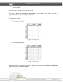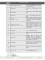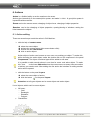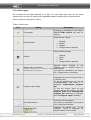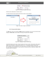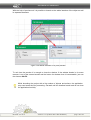
1
User Manual for GUI Machine
Revised: 07.12.10
Version 1.0.0 (© 2007-2010 Alee Software)
page 1/176
User Manual for GUI Machine
Content
1. INTRODUCTION..................................................................................................................... 4
1.1. ABOUT THE PROGRAM............................................................................................................. 4
1.2. HOW TO USE THE MANUAL........................................................................................................8
1.3. SUPPORT.............................................................................................................................. 9
2. INSTALLATION INSTRUCTION...........................................................................................10
2.1. SYSTEM REQUIREMENTS.........................................................................................................10
2.2. INSTALLATION....................................................................................................................... 11
2.3. LAUNCH............................................................................................................................. 16
2.4. UNINSTALL.......................................................................................................................... 19
3. WORKSPACE....................................................................................................................... 21
3.1. BASIC INFORMATION ABOUT WORKSPACE.....................................................................................22
3.2. WORKSPACE SETTING UP.........................................................................................................23
3.2.1. Hide/show tools....................................................................................................................... 23
3.2.2. Panel position.......................................................................................................................... 23
3.3. MAIN MENU........................................................................................................................ 27
3.3.1. File.......................................................................................................................................... 27
3.3.2. Edit.......................................................................................................................................... 28
3.3.3. Format..................................................................................................................................... 29
3.3.4. Preview................................................................................................................................... 30
3.3.5. Windows.................................................................................................................................. 31
3.3.6. Help......................................................................................................................................... 31
3.4. EDIT PANEL......................................................................................................................... 32
3.4.1. Edit area.................................................................................................................................. 33
3.4.1.1. Scales................................................................................................................................................33
3.4.1.2. Grid....................................................................................................................................................34
3.4.1.3. Guidelines..........................................................................................................................................35
3.4.2. Tools panel.............................................................................................................................. 37
3.4.2.1. Settings for action representation......................................................................................................37
3.4.2.2. Settings for object form......................................................................................................................37
3.4.2.3. Object text format...............................................................................................................................38
3.4.2.4. Positioning and alignment of objects..................................................................................................41
3.4.2.5. Setting and start the preview..............................................................................................................43
3.4.3. Settings for edit area from menu............................................................................................. 44
3.4.3.1. Print settings......................................................................................................................................44
3.4.3.2. Settings for edit area view..................................................................................................................46
3.4.3.3. Guidelines settings.............................................................................................................................47
3.4.3.4. Navigation settings.............................................................................................................................47
3.4.4. Page manager......................................................................................................................... 48
3.5. STATUS BAR........................................................................................................................ 50
4. TOOLS.................................................................................................................................. 52
4.1. COMPONENTS...................................................................................................................... 52
4.2. OBJECT PROPERTIES.............................................................................................................60
4.2.1. List of properties and its description........................................................................................61
4.2.2. Auxiliary tools.......................................................................................................................... 70
4.2.2.1. HTML/Text editor...............................................................................................................................70
4.2.2.2. Image choosing..................................................................................................................................75
4.2.2.3. Tabs Editor.........................................................................................................................................76
4.2.2.4. Table values editor.............................................................................................................................77
4.2.2.5. Tree editor..........................................................................................................................................78
4.2.2.6. List values editor................................................................................................................................79
4.2.2.7. Check box list values editor...............................................................................................................80
4.2.2.8. Popup menu items editor...................................................................................................................81
4.2.2.9. Menu bar editor..................................................................................................................................82
4.2.2.10. Choosing the object.........................................................................................................................84
4.2.2.11. Choosing the cursor.........................................................................................................................85
Revised: 07.12.10
Version 1.0.0 (© 2007-2010 Alee Software)
page 2/176
User Manual for GUI Machine
4.3. LAYERS.............................................................................................................................. 86
4.3.1. Objects list............................................................................................................................... 86
4.3.2. Objects tree............................................................................................................................. 87
4.3.3. Panel tools.............................................................................................................................. 88
4.4. HISTORY............................................................................................................................ 89
4.5. TEMPLATES......................................................................................................................... 91
4.5.1. Object templates..................................................................................................................... 91
4.5.2. User's templates...................................................................................................................... 92
4.5.3. Simple and complex templates............................................................................................... 93
4.5.4. Templates import/export.......................................................................................................... 93
5. WORK WITH GUI MACHINE................................................................................................94
5.1. GENERAL............................................................................................................................ 94
5.2. WORKING WITH STATIC LAYOUTS...............................................................................................97
5.3. WORKING WITH DYNAMIC LAYOUTS............................................................................................98
5.3.1. Grid lines................................................................................................................................. 98
5.3.2. Cell size................................................................................................................................... 98
5.3.3. Object placement in several cells.......................................................................................... 102
5.3.4. Cell background.................................................................................................................... 103
5.4. RECOMMENDATIONS AND EXAMPLES.........................................................................................111
5.5. PROJECT OPERATIONS..........................................................................................................118
6. ACTIONS............................................................................................................................. 119
6.1. ACTION ADDING.................................................................................................................. 119
6.2. ACTION EDITING AND DELETING...............................................................................................123
6.3. EVENT TYPES.................................................................................................................... 124
6.4. ACTION TYPES...................................................................................................................128
6.4.1. Object insert or cells clear..................................................................................................... 130
6.4.1.1. Inserting the object to layout cells....................................................................................................130
6.4.1.2. Layout cells clearing.........................................................................................................................132
6.4.2. Open/Close window.............................................................................................................. 133
6.4.3. Window move/resize............................................................................................................. 136
7. REAL-TIME PREVIEW........................................................................................................138
8. CONTEXT MENU................................................................................................................ 141
9. IMAGE EDITOR..................................................................................................................148
9.1. TOOLS............................................................................................................................. 150
9.2. HISTORY.......................................................................................................................... 152
9.3. MAIN MENU....................................................................................................................... 153
9.3.1. File........................................................................................................................................ 153
9.3.2. Edit........................................................................................................................................ 154
9.3.3. Image.................................................................................................................................... 154
9.4. IMAGE SAVING.................................................................................................................... 156
10. PIXEL GRABBER.............................................................................................................157
11. PRINT SCREEN................................................................................................................ 159
12. EDIT AREA PREVIEW......................................................................................................163
13. USER MANUAL AND THE INFORMATION......................................................................168
14. SHORTCUTS.................................................................................................................... 169
15. SUMMARY........................................................................................................................ 171
ANNEX 1. TABLES LIST........................................................................................................172
ANNEX 2. FIGURES LIST.......................................................................................................173
Revised: 07.12.10
Version 1.0.0 (© 2007-2010 Alee Software)
page 3/176
User Manual for GUI Machine
1. Introduction
1.1. About the Program
GUI Machine is a unique tool for design and debugging of software graphical interfaces.
Interface (Graphical user interface, GUI) in computer engineering is the
system for interaction between user and machine, based on the presentation
of all available for user system objects and functions as graphical
components of the screen (windows, icons, menus, buttons, list boxes, etc.).
User have a random access (through keyboard and mouse) to all visible
screen objects, limited with the internal logic of the software, that are the
part of this software.
What features does GUI Machine have?
GUI Machine has impressive set of features:
Creation of graphical interfaces for any software.
Creation of web application graphical interfaces.
Creation from single interfaces the united interactive graphical pilot system, at most
close to the real software.
Preview of graphical pilot system, any of its part or single object in interactive mode.
Functionality for rapid reconfiguration of the interface without the necessity it recreating.
Rapid creation and structuring of the screenshots (screen grabs).
Rapid editing of images, used in the project.
Rollback of alterations made.
Detail setting up of every object.
Creation of multiply reusable templates.
Preview of created interfaces in various styles of operating system.
Revised: 07.12.10
Version 1.0.0 (© 2007-2010 Alee Software)
page 4/176
User Manual for GUI Machine
What advantages does GUI Machine have?
Work at GUI Machine is easy, intuitive, convenient, nice and needs no special training.
The set of the most in-demand components, including the set of web-components with
original décor made by Vaadin, is integrated into the application.
The application contains helpful and useful subprograms:
➢ Image Editor
➢ Print Screen tool
➢ Pixel Grabber — the program for color determination at any point of the screen in
RGB format.
To create and preview an interactive pilot system there is no need to program and
compile.
Pilot systems made in GUI Machine look real.
Why GUI Machine is necessary for design?
Using GUI Machine for software design will lead to important and significant benefits:
Meaningful increasing of satisfaction level of the software customer.
Increasing of design «transparency» — the customer will have an opportunity to see
how the program will look like and work even on design stage.
Minimizing the disagreements between the customer and the developer about the output
product — situations, when the customer gets «pig in a poke», are excepted.
Increasing of the software design quality.
Design acceleration (time decreasing).
Increasing of the software testing quality using the pilot system.
Revised: 07.12.10
Version 1.0.0 (© 2007-2010 Alee Software)
page 5/176
User Manual for GUI Machine
What platforms GUI Machine is compatible with?
GUI Machine — cross-platform application, that can function at the most popular operating
systems:
✔ Windows:
Figure 1. GUI Machine for Windows
Revised: 07.12.10
Version 1.0.0 (© 2007-2010 Alee Software)
page 6/176
User Manual for GUI Machine
✔ Linux:
Figure 2. GUI Machine for Linux
✔ Mac OS:
Figure 3. GUI Machine for Mac OS
Revised: 07.12.10
Version 1.0.0 (© 2007-2010 Alee Software)
page 7/176
User Manual for GUI Machine
1.2. How to use the Manual
Each item of the content in e-version document, besides having the number of the adequate
page, is also the link to required page, so passing to the desired section can be done easily with
the click at the corresponding item in the content. Document preview system (for example in
Adobe PDF Reader) is equipped with the key words search. To make this, you just need to refer
to the manuals of used viewer.
Revised: 07.12.10
Version 1.0.0 (© 2007-2010 Alee Software)
page 8/176
User Manual for GUI Machine
1.3. Support
Useful links
The following links will help you to contact quickly with the group of developers of this software
and to stay informed with all details of the application.
http://www.guimachine.com/ - please visit our web-site, where you can get the
information for resolving any problems with application.
Contacts
The majority of the questions are solved by referencing to the e-mail: [email protected].
List of works
The list of works for software maintenance and support includes the following:
Stage: Software installation.
Support and setting up help for software product (SP).
Stage: Software operating.
Clarification of SP function nuances;
Describing the occurred bugs at the support site to include its correction the the next
update;
Advices for bypassing uncritical errors in application;
Stage: Software updating.
Instructions for SP updating.
Revised: 07.12.10
Version 1.0.0 (© 2007-2010 Alee Software)
page 9/176
User Manual for GUI Machine
2. Installation instruction
2.1. System requirements
Necessary facilities for application operation
System requirements for application launch and operation are indicated in Table 1.
Table1. System requirements
Operating system*
CPU
RAM
HDD
Windows XP, 2000, 2003, Vista, 7
1.5gHz/2+ gHz
512 M / 1024+ M
200+ Мб
Mac OS X 10.4 (Power PC или Intel)
1.5gHz/2+ gHz
512 M / 1024+ M
200+ Мб
Linux 2.2.6+, Solaris 10
1.5gHz/2+ gHz
512 M / 1024+ M
200+ Мб
* GUI Machine is able to work with any operating system supporting JDK 6 Update 10 and
higher.
Notes:
Parameters, indicated with «/», are to be regarded as minimum and recommended
values.
Parameters, indicated without «/», are to be regarded as minimum value.
Attention!
Project size and complexity increasing leads to severization of minimum system
requirements.
Revised: 07.12.10
Version 1.0.0 (© 2007-2010 Alee Software)
page 10/176
User Manual for GUI Machine
2.2. Installation
Run the setup file Alee_Gui_Designer_xxx_1.0.0.zzz, where ххх is operating system (unix,
windows, macos), for which this file is intended, and zzz — extension of setup file (exe, sh или
tgz).
Installation consists of several stages.
After launching the setup program, choose the desired language for application installation in
appeared window «Select language» and click Yes.
Figure 4. Select language window
After that you will see the installation wizard welcome on the screen.
Figure 5. Setup window
Revised: 07.12.10
Version 1.0.0 (© 2007-2010 Alee Software)
page 11/176
User Manual for GUI Machine
Click Next to continue the installation.
The next dialogue box will suggest you to choose the destination directory. Default destination
directory in Windows:
X:\Program Files\AleeGuiDesigner\, where Х — the letter of system disk.
Figure 6. Destination directory input box
Note. The destination directory input box will have the destination chosen at the first application
installation during next installations.
Revised: 07.12.10
Version 1.0.0 (© 2007-2010 Alee Software)
page 12/176
User Manual for GUI Machine
To select another destination directory, put the installation path by hand to the box Destination
Directory, or click Browse, and the following dialog box will appear:
Figure 7. Select destination directory box
Select the folder for installation and click Yes.
Click Next to go to another stage of installation.
Revised: 07.12.10
Version 1.0.0 (© 2007-2010 Alee Software)
page 13/176
User Manual for GUI Machine
After that the following box will appear, where you can create the program's shortcut.
Figure 8. Select shortcuts directory box
Select the folder from the list of existing folders, to which the shortcuts will be placed, or put the
name of a new folder. You can also refuse to create the shortcuts by putting the mark at the
checkbox Don't create a Start Menu folder.
Click Next to go to the final stage of installation.
Revised: 07.12.10
Version 1.0.0 (© 2007-2010 Alee Software)
page 14/176
User Manual for GUI Machine
During the setup process files will be installed on your computer's drive.
Figure 9. Setup box
After installation has completed click Ready to quit the installation wizard .
Figure 10. Installation completion box
The application is ready to use.
Revised: 07.12.10
Version 1.0.0 (© 2007-2010 Alee Software)
page 15/176
User Manual for GUI Machine
2.3. Launch
Click Start to start the program.
In start menu choose All programs > GUI Machine > Alee GUI Machine (default folder with
the shortcuts).
If you have refused to create shortcuts during the installation, you need to go directly to the
program file (Alee GUI Machine.ехе), in the installation directory and to make a double click on
it.
When GUI Machine is launching on the screent the dialogue box Project Manager appeares,
where you can choose one of the mode.
Figure 11. Project Manager
In the box you can choose one of 4 modes:
Create new project
Load last opened project
Load project
Start working without creating a project — to start working without creating of a project
file, to save it later or do not save at all.
Revised: 07.12.10
Version 1.0.0 (© 2007-2010 Alee Software)
page 16/176
User Manual for GUI Machine
To create a new project
To create the project it is necessary to choose Create new project and click Next. Indicate the
name of the project in the box Project name. Default name for the project is GUI Machine
Project. After that it is necessary to choose the directory to save the project.
Figure 12. Creating new project
Directory by default:
C:\Documents and Settings\<User name>\GUI Machine Project\
To change the directory it is necessary to click «…», and after that the standard box for
choosing the directory.
If it is necessaty that in chosen directory for the project a special sub-directory for the project
was created, mark the checkbox Create sub-directory.
The project would be created by clicking Create.
To load last opened project
To load the last opened project, with which you have worked before, it is necessary to choose
the item Load last opened project. By selecting of this option the last opened project will be
loaded.
Revised: 07.12.10
Version 1.0.0 (© 2007-2010 Alee Software)
page 17/176
User Manual for GUI Machine
To load the project
To load already created project it is necessary to choose item Load project.
Figure 13. Project opening window
By clicking Load project a standard system box of file selection will appear. It is necessary to
select the file of GUI Machine you have been created before, with the file extention .GUI.
Click Open to load the project.
To start working without creating a project
If you would like to start working with the program without creating the project or you plan to
save it late, it is necessary to select the item Start working without creating a project.
By selecting this option a new project wouldn't be created.
Revised: 07.12.10
Version 1.0.0 (© 2007-2010 Alee Software)
page 18/176
User Manual for GUI Machine
2.4. Uninstall
To delete the program click Start. In menu Start choose All programs → GUI Machine → GUI
Machine Uninstaller.
If during the installation you have been refused from creating shortcuts, so you can run the
Uninstall file directly, from the installation directory by double click on it.
Figure 14. Program uninstall
The uninstallation wizard will be activated to delete the program. Click Next to confirm the
uninstallation or Cancel to cancel uninstallation.
By clicking Next the removing of program files from your computer will start.
Revised: 07.12.10
Version 1.0.0 (© 2007-2010 Alee Software)
page 19/176
User Manual for GUI Machine
After completion the wizard will inform you about the results of uninstallation. Click Finish to
complete it.
Figure 15. Uninstall completion box
It is possible that there are several files and folders in the GUI Machine installation directory
after application uninstallation. Delete them manually.
Revised: 07.12.10
Version 1.0.0 (© 2007-2010 Alee Software)
page 20/176
User Manual for GUI Machine
3. Workspace
GUI Machine workspace is organised to help the user to concentrate at the creation and editing
of program interfaces.
Figure 16. GUI Machine workspace
Revised: 07.12.10
Version 1.0.0 (© 2007-2010 Alee Software)
page 21/176
User Manual for GUI Machine
3.1. Basic information about workspace
GUI Machine workspace is organised as the following:
➢ In Main Menu, located in the upper part of the аpplication window, the main functions
are grouped together;
➢ Edit displays the project, which you are working on right now; there are buttons for
launching several useful sub-programs at this panel:
•
Pixel Garbber
•
Print screen tool
➢ Components contains the set of components for creation and editing of the project;
➢ Templates contains saved components with specific settings and ready-made
interfaces;
➢ Layers structures objects used in the project;
➢ Object properties displays the settings for the selected object or group of objects in the
object edit area;
➢ History keeps the records about all manipulations made in the course of working on the
project;
➢ Status bar displays some information about the program and the project.
Revised: 07.12.10
Version 1.0.0 (© 2007-2010 Alee Software)
page 22/176
User Manual for GUI Machine
3.2. workspace setting up
All tools of the workspace can be moved with the mouse, you can change its size and close
them if necessary.
3.2.1. Hide/show tools
To enlarge the space at the edit area or at the tool panel, other unused panels can be hidden.
There are two ways to hide/show all tools:
➢ to choose in the main menu the item Windows → Hide all tools;
➢ with the shortcut key Ctrl+H.
Every tool can be minimised individually by pressing the button
Toggle auto-hide.
Hide tool tabs are displayed on the borders of the workspace. While hovering the cursor over
the tab, it is popuped. For the rehiding of the opened tool just hover the cursor out of the tool
panel, or click
on the header.
To return the panel to the original position click
on the header of the popuped panel.
3.2.2. Panel position
Panels fixing/unfixing
Joint — is a set of panels and panel groups displayed together, and more often displayed
vertically. Panels can be fixed and unfixed by dragging into area.
➢ To fix the panel drag it with the tab to the joint and put it above or under other panels or
between them.
➢ To fix the group of panels drag it with the group tab (empty one-colour bar above the
tabs).
➢ To delete the panel or the group of panels, drag it with the tab or header bar from the
joint area, or make the left mouse button double click on the panel header.
Revised: 07.12.10
Version 1.0.0 (© 2007-2010 Alee Software)
page 23/176
User Manual for GUI Machine
Figure 17. Panel joint
Figure 18. Jointed panels
Revised: 07.12.10
Version 1.0.0 (© 2007-2010 Alee Software)
page 24/176
User Manual for GUI Machine
Panel replacement
While panel replacement, highlighted with grey color drag areas are displayed. These are the
areas where the panel can be dragged.
Figure 19. Panel replacement
To make this, it is necessary to drag the panel to the narrow grey area. If the panel is dragged
no to this area, it will become floating panel.
➢ To replace the panel, drag it with the tab.
➢ To replave the group of panel, drag this group or stack, drag it with the panel header.
Add and delete joints and panels
If all panels are deleted from the joint so the joint will disappear. New joints are created by panel
replacment to the drag areas, located near existing joints or to the periphery of workspace.
➢ To delete the panel, click the "Close" (symbol "Х" in the right upper corner of the tab) or
remove the corresponding checkbox in the menu Tools.
➢ To add the panel, mark the corresponding checkbox in the menu Tools.
Revised: 07.12.10
Version 1.0.0 (© 2007-2010 Alee Software)
page 25/176
User Manual for GUI Machine
Panel groups control
➢ To add the panel to the group drag the tab of this panel to the selected drag area in the
upper part of the group.
➢ To change the order of panel in the group, drag the panel tab to the new place in this
group.
➢ To delete the panel from the group and make it floating, drag it with the tab out of the
panel group.
➢ To display the panel in the group, click the tab of this panel.
➢ To replace the group of panel drag it with the panel header (above the tabs).
Creating the floating panels stack
If drag the panel from the joint area, but don't place it to the drag are, it will become floating, that
allows put it to any place of the workspace. In addition, panels can be floating just after its
selection in the menu Tools. Floating panels of group of panels can be grouped together, so
with the dragging the upper panels thy all wil be replaced in block. Panels that are the part of
joint, can not be place in stack or replaced in such manner.
Floating panels stack
➢ To make the stack of floating panels, drag it with the tab to the drag area in the lower
part of another panel.
➢ To change the panel order in the stack, replace the panel with the tab up or down.
Note. Tab should be placed above the narrow drag area between the panels, but not
above the wide drag area at the panel header.
➢ To take away the panel or group of panel from the stack and to make it floating, drag the
panel with the tab out of the stack.
Resizing and collapsing of the panels
➢ To resize the panel replace any of its borders or use the resize icon, which located in the
bottom right conner.
➢ To change the width of all panels in the joint, drag the selec area, which located in the
upper left part of the joint.
➢ To collapse the panel, group of panels or stack, click "Collapse" on the header panel.
Revised: 07.12.10
Version 1.0.0 (© 2007-2010 Alee Software)
page 26/176
User Manual for GUI Machine
3.3. Main Menu
Main Menu panel is represented on the following figure:
Figure 20. Main menu
The Main menu consists of 6 items:
1.
2.
3.
4.
5.
6.
File;
Edit;
Format;
Preview;
Windows;
Help.
3.3.1. File
File menu is represented on the following figure:
Figure 21. File
“File” menu consists of following items:
1. New project;
2. Open project;
3. Recent projects:
a) List of recently opened projects;
b) Clear list;
4. Save project;
5. Save project as...;
6. Save image as...;
7. Show print pages size;
8. Print page settings;
9. Print;
10. Exit.
Revised: 07.12.10
Version 1.0.0 (© 2007-2010 Alee Software)
page 27/176
User Manual for GUI Machine
3.3.2. Edit
“Edit” menu is represented on the following figure:
Figure 22. Edit
“Edit” menu consists of following items:
1. Undo;
2. Redo;
3. Cut;
4. Copy;
5. Paste;
6. Double object;
7. New page;
8. Rename page;
9. Delete opened page;
10. Rename selected object;
11. Delete selected objects;
12. Select all objects;
13. Clear selection.
Revised: 07.12.10
Version 1.0.0 (© 2007-2010 Alee Software)
page 28/176
User Manual for GUI Machine
3.3.3. Format
“Format” menu is represented on the following figure:
Figure 23. Format
“Format” menu consists of following items:
1.
2.
3.
4.
5.
6.
7.
Align objects by left side;
Center objects horizontally;
Align objects by right side;
Align objects by top side;
Center objects vertically;
Align objects by bottom side;
Equalize objects width:
a) Equalize by object...;
b) Equalize by maximum sides;
8. Equalize objects height:
a) Equalize by object...;
b) Equalize by maximum sides;
9. Put objects one after another.
Revised: 07.12.10
Version 1.0.0 (© 2007-2010 Alee Software)
page 29/176
User Manual for GUI Machine
3.3.4. Preview
“Preview” menu is represented on the following figure:
Figure 24. Preview
“Preview” menu consists of following items:
1. Run Preview;
2. Show object size tooltip;
3. Show object outline;
4. Show right side-bar;
5. how right side-bar;
6. Show actions;
7. Show guidelines;
8. Lock all guidelines;
9. Snap to guidelines;
10. Delete all guidelines;
11. Show large grid;
12. Show small grid;
13. Show background.
Revised: 07.12.10
Version 1.0.0 (© 2007-2010 Alee Software)
page 30/176
User Manual for GUI Machine
3.3.5. Windows
“Windows” menu is represented on the following figure:
Figure 25. Windows
”Windows” menu consists of following items:
1.
2.
3.
4.
5.
6.
7.
8.
9.
Components;
Templates;
Layers;
Object properties;
History;
Show Print Screen tool;
Show Pixel Grabber tool;
Show Image Efitor tool;
Hide/Show all tools.
Selecting or nonselecting of corresponding tool icons means whether the tool window is
displayed in the work are of GUI Machine or not. Description of tool interfaces see in section 4.
Tools.
3.3.6. Help
«Help» menu is represented on the following figure:
Figure 26. Help
“Help” menu consists of following items:
1. User Manual
2. About this program ...
Revised: 07.12.10
Version 1.0.0 (© 2007-2010 Alee Software)
page 31/176
User Manual for GUI Machine
3.4. Edit panel
Edit panel is the main work panel, where the pilot system is created.
The panel consists of:
➢ edit area;
➢ Tool panel;
➢ Page manager.
Figure 27. Edit panel
Revised: 07.12.10
Version 1.0.0 (© 2007-2010 Alee Software)
page 32/176
User Manual for GUI Machine
3.4.1. Edit area
Edit area is a 10000 х 10000 pixels area, where single objects, inteface elements or pilot
system as block are arranged.
Edit area navigation
Edit area navigation can be done in several ways:
➔ With horizontal and vertical scroll.
➔ With the mouse with held down middle button (wheel).
➔ With the buttons Page Up and Page Down for screen-by-screen scrolling up or down
respectively.
➔ With the buttons Page Up and Page Down with held down Ctrl for screen-by-screen
scrolling left of right respectively.
➔ With the buttons End and Home with held down Ctrl for scrolling to the bottom right
corner or to the upper left corner of the edit area respectively.
➔ With the double click in the left upper corner of edit area (icons
,
or
depending
on the current position on the edit area) for scrolling to the upper left corner of the list;
while being in the upper left corner of the edit area the icon is not dispayed.
The edit area is set up with the vertical tool panel: there is an option to show/hide large/small
grid, area background or guidelines.
For detailed information about the vertical tool panel see the section 3.4.2. Tools panel.
3.4.1.1. Scales
Scales help to arrange objects and set its size with accuracy. Scales are located along the
upper and left borders of edit area. Marks on the scale indicate the position of the coursor while
its moving. Scale reference point adjustment (mark (0, 0) on the upper and left scales) provides
start of measurement from the specific point on the object. Scale reference point also identifies
the grid reference point.
Scale dimension: pixels.
1 scale point = 10 pixels
Marks are place for every fifth point (every 50 pixels).
Revised: 07.12.10
Version 1.0.0 (© 2007-2010 Alee Software)
page 33/176
User Manual for GUI Machine
3.4.1.2. Grid
The Grid helps to arrange objects with accuracy.
The grid is helpful for symmetrical arrangement of the objects. The grid is the set of
nonprintable lines. It can be modified and hidden.
The mesh size is fixed:
➢ 50 pixels for large grid:
Figure 28. Large grid
➢ 10 pixels for small grid:
Figure 29. Small grid
Switching on/off of the large or small grid is made by the menu items Preview → Show large
grid and Preview → Show small grid.
Revised: 07.12.10
Version 1.0.0 (© 2007-2010 Alee Software)
page 34/176
User Manual for GUI Machine
3.4.1.3. Guidelines
Guidelines, as well as th grid, help to arrange objects with accuracy.
Guidelines are nonprintable blue lines, covering the edit area. It can be added, replaced, hidden
or deleted. It can be also disabled to prevent unintended replacement. The distance between
the guidelines can be any. While replacing the guideline its colour is changed to red.
Guidlines are working as the follows:
➢ Selected objects are snapped to the guidelines while objects replacement is within 8
screen pixels.
To prevent snapping of the objects to guidelines it is necessary to choose the menu item
Preview → Snap to guidelines
How to add the guideline
There are several ways to add the guideline:
➔ Double click right or left mouse button on the horizontal scale to add the vertical
guideline or on vertical scale to add the horizontal guideline.
➔ Click left mouse button when the cursor is on the vertical or horizontal scale, and,
holding it, move the cursor to the edit area to make the vertical or horizontal line
respectively.
➔ Click left mouse button when the cursor is on the crossing of horizontal and vertical
scales and, holding it, move the cursor to the edit are to make two guidelines, crossing in
the point of cursor.
How to replace the guideline
to replace the guideline it is necessary to point the cursor onto it (in this moment the cursor
should change its form) and move it to the desired place on the edit area.
It is also possible to move two crossing guidelines simultaneously. To make this it is necessary
to point the cursor onto the guidelines crossing point and move it to the desired place on the
edit area.
How to hide the guideline
To hide all guidelins it is necessary to choose the menu item Preview → Show all guidelines.
To show all guidelines it is necessary to choose this menu item again.
Revised: 07.12.10
Version 1.0.0 (© 2007-2010 Alee Software)
page 35/176
User Manual for GUI Machine
How to lock the guideline
To lock all guidelines it is necessary to choose the menu item Preview → Lock all guidelines.
After that the replacing of the guidelines becomes impossible.
If it is necessary to replace the guidelines choose this menu item again.
How to delete the guideline
To delete the guideline, move it with the mouse to the region where the scale is located.
If it is necessary tp delete all guidelines choose the menu item Preview → Delete all
guidelines. The box appeares on the screen:
Figure 30. Guidelines removal
The list consists of the types of guidelines to be deleted:
✗
✗
✗
All;
Horizontal only;
Vertical only.
Make the choise and click OK.
Revised: 07.12.10
Version 1.0.0 (© 2007-2010 Alee Software)
page 36/176
User Manual for GUI Machine
3.4.2. Tools panel
Figure 31. Tools panel
1 — buttons to switch on/off actions and some object properties;
2 — set of tools for object text format;
3 — set of tools for object alignment and positioning;
4 — object preview button;
5 — list of saved objects for preview;
6 — buttons to add/delete objects for preview.
3.4.2.1. Settings for action representation
Hide/show actions in edit area
Actions between the interface objects are shown in edit area as a blue arrow from the object,
defining the event, to the object on which the action is performed with indication of event and
action types.
Detailed information about action representation see in section 6. Actions
Button
allows to hide or show action in edit area.
To hide action can be especially useful if there are a lot of actions have been made between
objects, visualization of which prevent the clear view of interface or its part in full. If it is required
to determine what objects connected with the actions, you just need to show actions.
3.4.2.2. Settings for object form
Show/hide the object field
The button shows/hides the object field. The field is presented by black dotted line.
This function is helpful while using the objects with uneven borders.
Example.
or
Figure 32. Without borders
Figure 33. With borders
Hide/show object size
The button show/hide the size of selected objects. Size is indicated in pixels.
Example.
Revised: 07.12.10
Version 1.0.0 (© 2007-2010 Alee Software)
page 37/176
User Manual for GUI Machine
или
Figure 34. With size
Figure 35. Without size
3.4.2.3. Object text format
With the help of this set of tools it is possible to format the object text or several object's at the
same time.
Choose the object or several objects in edit area that should be format.
Select and set up the font of the object text:
Figure 36. Setting the font
It is possible to set up the following font properties:
✔ Font;
✔ Size;
✔ Style:
• Bold;
• Italic.
Revised: 07.12.10
Version 1.0.0 (© 2007-2010 Alee Software)
page 38/176
User Manual for GUI Machine
Select the font colour:
Figure 37. Setting the colour
Choose:
✔ One of proposed colours;
✔ None to select default colour of component font;
✔ More Colors for precision colour select if there is no desired colours among proposed:
Figure 38. Precision colour select
in appeared panel choose the colour from the extended colour box or set the colour manually in
HSB or RGB format, by choosing the corresponding tab.
Revised: 07.12.10
Version 1.0.0 (© 2007-2010 Alee Software)
page 39/176
User Manual for GUI Machine
Choose the text position:
Figure 39. Text position
Select the text position:
✔ Vertical:
• Top;
• Centre;
• Bottom;
✔ Horizontal:
• Left;
• Centre;
• Right;
Note: Not all types objects have text; and not for all objects containing text settings for fonts,
colour or position are available, so object text format can be used not with all abjects or not in
full (for example, you can set up the colour or the font only).
In case when for selected object in edit area the text format is nor available, the set of tools for
format will be disabled:
Figure 40. Text format is disabled
Revised: 07.12.10
Version 1.0.0 (© 2007-2010 Alee Software)
page 40/176
User Manual for GUI Machine
3.4.2.4. Positioning and alignment of objects
Horizontal alignment of objects
This set of buttons provides horizontal alignment of objects flush left, centre or right.
To align it is necessary to select several objects and click the desired button for horizontal
alignment.
Figure 41. Horizontal alignment of objects
Vertical alignment of objects
This set of buttons provides vertical alignment of objects flush top, centre or bottom.
Figure 42. Vertical alignment of objects
To align it is necessary to select several objects and click the desired button for vertical
alignment.
Revised: 07.12.10
Version 1.0.0 (© 2007-2010 Alee Software)
page 41/176
User Manual for GUI Machine
Equalizing objects by width/height
The button
provides to equilize the width of selected objects.
By clicking the button the drop-down list appears to choose 2 options for equalizing objects by
width:
➔ Equalize by object...
➔ Equalize by maximum sides
While choosing the first option you will be offered to select the object with the width of which
others should be equalized:
Figure 43. Object selection
While choosing the second option the width of selected objects will equalize with the mazimum
object width.
Example.
Figure 44. Equalizing the object width
The button
Example.
provides to equalize the height of selected objects.
Figure 45. Equalizing the object height
Revised: 07.12.10
Version 1.0.0 (© 2007-2010 Alee Software)
page 42/176
User Manual for GUI Machine
Placement the objects one after another
The button provides to place the objects one after another.
By clicking the button you will be offered to choose the placement settings:
➢ Gap between objects, in pixels;
➢ Place:
◦ Horizontally;
◦ Vertically;
➢ Objects order.
To place the object in order drag it with the mouse.
Figure 46. Settings for object order
By clicking Place the objects will be placed according to the selected settings:
Figure 47. Placement the object order
3.4.2.5. Setting and start the preview
–
Figure 48. Preview tools
This set of tools is intended for setting and start the
preview.
Detailed description of tools function see in section 7. Real-time preview
Revised: 07.12.10
Version 1.0.0 (© 2007-2010 Alee Software)
page 43/176
User Manual for GUI Machine
3.4.3. Settings for edit area from menu
Besides the tool panel, edit area can also be set up with the help of main menu of the program.
3.4.3.1. Print settings
File → Show print pages size
This menu item is intended for showing page borders as it will be printed.
By first click the panel for page set up appeares:
Figure 49. Print page set up box
In this box you can choose the following print page settings:
➔
➔
➔
➔
Size;
Source;
Orientation;
Margins.
Set the required settings and click OK.
Now on edit area the print page borders are shown with the solid red line, and the printable field
(without margins) — with dotted red line (see Figure 50).
Revised: 07.12.10
Version 1.0.0 (© 2007-2010 Alee Software)
page 44/176
User Manual for GUI Machine
In show the print page borderrs mode it is usefull to arrange single interfaces on the
printable pages, so that in print they (the interfaces) wouldn't be cutted on several pages.
Figure 50. Print page borders
File → Print pages settings
This menu item is intended for changing print page settings. By clicking it the interface like on
Fig. 49, described in previous section, appears. By choosing this item you can always change
the page settingsm and unlike the item
- the set up page appears only be first click.
Revised: 07.12.10
Version 1.0.0 (© 2007-2010 Alee Software)
page 45/176
User Manual for GUI Machine
3.4.3.2. Settings for edit area view
Preview → Show background
This menu item is intended for showing/hidding the white edit area background.
In case when the background is hidden, the edit area will look like the following:
Figure 51. Edit area without background
This function is usefull for more visual representation of transparent and opaque objects.
Example.
или
Figure 52. White background
Figure 53. Without background
Preview → Show large grid
This menu item show/hide large grid in edit area.
Preview → Show small grid
This menu item show/hide small grid in edit area.
Revised: 07.12.10
Version 1.0.0 (© 2007-2010 Alee Software)
page 46/176
User Manual for GUI Machine
3.4.3.3. Guidelines settings
Preview → Delete all guidelines
This menu item is intended to delete only horizontal guidelines or only vertical guidelines or
both. Detailed information about tool function see in section 3.4.1.3. Guidelines.
Preview → Snap to guidelines
After switching off this fuction, the objects stop snapping to the guidelines which work as
reference points here.
Preview → Lock all guidelines
This menu item is intended to lock all guidelines. After that its replacement will become
impossible.
If it is necessary to move the guidelines you need to choose this menu item once again.
Preview → Show all guidelines
While choosing this menu item alla guidelines will be hidden. Second click will returns them
back.
3.4.3.4. Navigation settings
,
Preview → Show right/bottom side-bar
Object placement in edit area is shown in the right bottom part of region as corresponding icons
(see Fig. 27 Edit panel).
For example, on the Fig. 27 Edit panel you can find that in the left upper part of edit area the
window is; below and a little bit to the right - the table; righter and higher — the tree.
This function is usefull if objects are far from each other on the edit area to find the desired
object.
Revised: 07.12.10
Version 1.0.0 (© 2007-2010 Alee Software)
page 47/176
User Manual for GUI Machine
3.4.4. Page manager
Figure 54. Page manager
While developing multi-interface pilot system it is helpful to create single interfaces or its parts
on separate pages.
Page manager provides:
➔
➔
➔
➔
➔
to create new pages;
to delete unnecessary pages;
to rename the pages;
to see the list of all pages;
to switch between the pages.
There are several ways to create a new page:
➢
➢
➢
➢
➢
to click the button
in the left part of page manager;
to click the right mouse button on the tab of any page and to choose the item New Page;
by the shortcut Ctrl+N;
to choose the main menu item Edit → New Page;
to double click the left mouse button on the empty region right to the existing pages tabs.
There are also several ways to delete an unnecessary page:
➢ to click the right mouse button on the tab of the page and to choose the item Delete
Page;
➢ to choose the main menu item Edit → Delete Selected Page;
➢ by the shortcut Ctrl+W.
There are several ways to rename the page:
➢ to double click the left mouse button on the tab of the page that should be renamed;
➢ to click the right mouse button on the tab of the page and to choose the item Rename
Page;
➢ to choose the main menu item Edit → Rename Page;
➢ by the shortcut Ctrl+F2.
Revised: 07.12.10
Version 1.0.0 (© 2007-2010 Alee Software)
page 48/176
User Manual for GUI Machine
To review the list of all pages click the button
Figure 55. Page list
There are 3 ways to switch between the pages:
➢ to click the left mouse button on the tab of the required page. If the tab is out of the
visible region, you can use buttons
or mouse wheel;
➢ choose the page from the list;
➢ by the buttons ← and → , preliminary select the tab of any page (in the page tab the
dotted frame will appear).
Revised: 07.12.10
Version 1.0.0 (© 2007-2010 Alee Software)
page 49/176
User Manual for GUI Machine
3.5. Status bar
Status bar shows som usefull data about the program, the project, single page and also gives
an opportunity to clear RAM and cashe.
Figure 56. Status bar
1 — application/project status;
2 — button to clear the cashe;
3 — position the mouse cursor;
4 — information about the objects and actions;
5 — used RAM capacity;
6 — button to clear the RAM.
Application/project status
Messages that can be displayed in the field Application/project status are indicated in Table
2:
Table 2. Application/project status
Message
Remark
The application is successfully launched, ithout
errors and ready for work
Ready
Project saved successfully (hh:mm:ss) The project has been saved successfully (time)
Action adding cancelled
Action addition is cancelled, the object for this
action is not selected
Operation on action cancelled
Operation on action is cancelled, in the action
settings box the button Cancel is clicked
Action successfully added
Action is successfully add
Action successfully edited
Action is successfully edited
Action successfully deleted
Action is successfully deleted
Choose action target
Choose the object-action target. From contextual
menu the item Add action is selected but not the
object-target yet.
Now You can edit action settings
Now you can edit the action settings. The box for
action setting is shown when it is added.
Choosen object has no available
Selected object can't be the action-object
actions
Project open failed.
It may by old .GUI file version,
or You have choosen incompatible file
Project open failed.
It may by old version of GUI file,
or you have choosen incompatible file.
Unable to link object with layout It is impossible to put the object into the layout
because of object minimum size limit
because of object minimum size limits.
Revised: 07.12.10
Version 1.0.0 (© 2007-2010 Alee Software)
page 50/176
User Manual for GUI Machine
You cannot preview image yet
You can't preview the capture of edit area because
there are no any objects there.
Clear the cashe
To clear the cashe just click the button Clear Cashe.
To clear the cashe may be useful if during the work you have noticed that some objects
«dashed out» by its self from the layout or modified.
Position of mouse cursor
Position of the mouse cursor is indicated as coordinated of the cursor relatevely to the left upper
corner of the edit area.
Dimension of coordinate system: pixels
Coordinates of the left upper edit area corner: x=0 y=0
Coordinates of the right bottom edit area corner: x=10 000 y=10 000
Information about the objects and actions
In this field the information about the number of objects and actions on the current page is
displayed.
RAM
In this field the RAM capacity used in this moment from the memory marked out for the
application. If required, the capacity of memory marked out for the application can be
automatically increased up to the value, idicated in parameter
-Xmx
of the file guidesigner.vmoptions.
Detail information about the work with the file guidesigner.vmoptions see in the section
Ошибка: источник перекрестноé ссылки не наéден
By clicking the button to clear the cashe the capacity of the memory used for this moment will
be dramaticaly decreased.
Revised: 07.12.10
Version 1.0.0 (© 2007-2010 Alee Software)
page 51/176
User Manual for GUI Machine
4. Tools
This section covers the functions of the following tools:
➔
➔
➔
➔
➔
Components
Object properties
Layers
History
Templates
4.1. Components
The tool Components is the main operating tool for interface developing, including a lot of
different components
Figure 57. Components
Revised: 07.12.10
Version 1.0.0 (© 2007-2010 Alee Software)
page 52/176
User Manual for GUI Machine
For convinience the panel tree view can be change to more compact by clicking the right mouse
button anywhere inside the panel field:
Figure 58. Compact view of Components panel
To show the Components tool panel choose in the main menu the item Windows
Components.
By default the tool Components is switched on.
→
Figure 59. Switching on the tool Components
The tool is intended to add objects to the edit area.
There are 2 ways to add the object to edit area:
➢ double click on the component;
➢ dragging with the mouse to the edit area.
Components descriprion is given in Table 3.
Revised: 07.12.10
Version 1.0.0 (© 2007-2010 Alee Software)
page 53/176
User Manual for GUI Machine
Table 3. Components
Element
Name
Function
Standard
Buttons
Button
Control element in the form of button for action
initiation, comands performing, program
launching.
Toggle button
Switch is analogue of the check-box, visually
formed as the buton. It has 2 states: "pushed"
and "pushed up".
Images
The component used for displaying the graphic
picture.
Image
Layouts
Dynamic layout
The frame for dynamic interface. It provides to
line the region and arrange the objects inside.
It is possible to change the settings for each
column or row. During the preview of the pilot
system it dynamically change the size of the
objects inside of itself.
Static layout
It provides to arrange the objects inside inself
without lining. Automatically enlarged to the
size of the object content (group of objects).
During the preview of the pilot system it don't
dynamically change the size of the objects
inside of itself.
Panel
Used for visual splitting an interface screen to
the logic parts and as a basket for arrangement
othe control elements.
Tabbed pane
Used for multi-page interfaces developing that
provides to switch between different tabs in
one window.
Revised: 07.12.10
Version 1.0.0 (© 2007-2010 Alee Software)
page 54/176
User Manual for GUI Machine
Panel, divided into 2 adjacent parts with
changeable sizes. It is allowed to drag with the
mouse the dividing line of the panel to increase
one part and decrease another.
Split-panel
Text
Label
Used for label creating. During the review of
the pilot system is nonedited. HTML is
supported.
Separator
Used for visual dividing of interface parts.
Text field
Is used for text input during the review of the
pilot system.
Password field
Is used for password input during the review of
the pilot system. It provides to mask the input
data by replacing entered symbols to the
masking signs.
Text area
Area for arrangement and edition of multiline
text information.
Text/HTML edit panel
Area for arrangement and edition of multiline
text information with HTML support.
Conditional
Check box
Radio button
A typical check box which is used to choose
the options not related to each other.
Radio button provides to choose ont option
(item) from the predeclared set (group).
Составные
Placeholder
Revised: 07.12.10
Is used as a lint to the object. Is intended for
distribution of one interface to the whole edit
area for work convinience.
Version 1.0.0 (© 2007-2010 Alee Software)
page 55/176
User Manual for GUI Machine
Values list
List to choose one or several values from the
suggested values list.
Dropdown values list
Dropdown list to choose one value.
Scroll bar
Vertical or horizontal scroll bar, used for
navigation on the interface screen.
Values slider
Is used for choosing the value by scrolling the
slider.
Values spinner
Spin box that changes its current value or date
for 1 unit by clicking.
Progress bar
Illuminates the state of any operation.
Table
Allows to create tables.
Tree
Is used to display the hierarchical objects lists
in terms of tree-like structure. «Plus» (+) and
«minus» (-) are used to show and hide the
single branches.
Windows
Window
The component used for window creation.
Menu
Menu Bar
Revised: 07.12.10
Provides the hierarchical menu, where there is
a horizontal list of root elements by clicking at
which the popup menus appear. It has
automatically settled height (the height
automatically changed depending on a menu
element size).
Version 1.0.0 (© 2007-2010 Alee Software)
page 56/176
User Manual for GUI Machine
Popup menu, appearing becuse of some
events.
Popup menu
Extended
Layout
The panel,
expanded.
Collapsible pane
which
can
be
collapsed
or
Compound
The list which elements are the check-boxes.
Every check-box can has the status selected /
non selected, disabled / enabled.
Check box list
Actions
Is used to delay the actions or action executing
after indicated time intervals.
Timer
Forms
Simple
Oval
Allows to add the geometric pattern — oval.
Rectangle
Allows to add the geometric pattern —
rectangle.
Rhombus
Allows to add the geometric pattern —
rhombus.
Polygon
Allows to add the geometric pattern —polygon.
Revised: 07.12.10
Version 1.0.0 (© 2007-2010 Alee Software)
page 57/176
User Manual for GUI Machine
Vaadin components
Buttons
Button
Control element in the form of button for action
initiation, comands performing, programs
launching.
Toggle button
Switch is analogue of the check-box, visually
formed as the buton. It has 2 states: "pushed"
and "pushed up".
Text
Text field
Is used for text input during the review of the
pilot system.
Password field
Is used for password input during the review of
the pilot system. It provides to mask the input
data by replacing entered symbols to the
masking signs.
Date
Date field
Displays the preset date. By clicking the popup
calendar appears for choosing the required
date. It is possible to set the date manually.
Calendar
Calendar for choosing the required date.
Compound
Dropdown values list
Dropdown list to choose one value.
Values list
List to choose one or several values from the
suggested values list.
Values slider
Is used for choosing or changing the value by
scrolling the slider.
Tree
Is used to display the hierarchical objects lists
in terms of tree-like structure. «Plus» (+) and
«minus» (-) are used to show and hide the
single branches.
Table
Allows to create tables.
Revised: 07.12.10
Version 1.0.0 (© 2007-2010 Alee Software)
page 58/176
User Manual for GUI Machine
Tabbed panel
Used for multi-page interfaces developing that
provides to switch between different tabs in
one window.
Progress bar
Illuminates the state of any operation
Windows
Window
Revised: 07.12.10
The component used for window creation.
Version 1.0.0 (© 2007-2010 Alee Software)
page 59/176
User Manual for GUI Machine
4.2. Object properties
The tool Object properties is intended for displaying and editing the object properties. While
choosing the object in edit area, its properties are displayed in the window Object properties.
Set of object properties depends on its type. For each type of object there can be unique
(related only to this type of objects) and repeated (related to several type of objects) properties.
On the tool panel object properties are divided onto 2 sets:
➢
➢
set of properties for this type of objects;
set of standard properties, same for all types of objects.
Figure 60. Properties of the Panel type objects
Revised: 07.12.10
Version 1.0.0 (© 2007-2010 Alee Software)
page 60/176
User Manual for GUI Machine
Using the tool Object properties you can change preset default object properties. Part of these
object propertis, for instance, panel header (Figure 60), can be preset by editing on the edit
area. Some standard object properties are noneditable, as, for instance, the ID or object type.
By selecting several objects of one type you can apply the settings fo all selected objects in one
time.
4.2.1. List of properties and its description
All properties (unique, repeated, standard) and its description are indicated in Table 4.
Table 4. Object properties
Icon
Property
Description
Default object properties
Object type
Displays the object type. It is non editable
property.
Object ID
Displays the object ID number in the
program. It is non editable property.
Min.size
Allows to set the minimum object size.
This property is editable not for all
objects. It is impossible to set the
miminum size less than default size.
Name
Displays the object name.
Tooltip text
Allows to add the popup tips with the help
of Text Editor and HTML Editor.
Resizable width
On/off width resize.
Resizable height
On/off height resize.
Movable
On/off object moving.
Visible
On/off object visibility in edit area.
Revised: 07.12.10
Version 1.0.0 (© 2007-2010 Alee Software)
page 61/176
User Manual for GUI Machine
Allows to change the opacity of the object
within 0 (absolutely transparent) to 1
(absolutely opaque)
Opacity
Sсroll bars
On/off scroll-bars.
Horizontal scroll
Setting up the horizontal scroll-bar. It is
possible to change the property only
when the property Scroll bars is switched
on.
It can have 3 possible states:
•
•
•
Always show ;
Show when needed;
Never show.
Setting up the horizontal scroll-bar. It is
possible to change the property only
when the property Scroll bars is switched
on.
It can have 3 possible states:
Vertical scroll
•
•
•
Always show ;
Show when needed;
Never show.
Object properties (Настройки компонентов)
Image
Allows to add graphic pictures from the
file system or from the previously used
images.
Selected Image
Allows to add images to the object, when
it is selected (for example, for toggle
buttons, check-boxes).
Gap
Image shift from the text.
Text
Displays the object text. Text editing is
made in Text Editor and HTML Editor.
Horizontal alignment
Allows to set the horizontal object
position. There are 3 possible positions:
Center, Left, Right.
Revised: 07.12.10
Version 1.0.0 (© 2007-2010 Alee Software)
page 62/176
User Manual for GUI Machine
Vertical alignment
Allows to set the vertical object position.
There are 3 possible positions: Center,
Top, Bottom.
orizontal text position relative to the
image
Allows to set the text position by the
horizontal level towards the image. There
are 3 possible positions: Left, Center,
Right
Vertical text position relative to the
image
Allows to set the text position by the
vertical level towards the image. There
are 3 possible positions:Top, Center,
Bottom
Font color
Is used to choose the font colour.
Font
Allows to choose type, style and size of
the font.
Enabled
Allows to disable/enable the object.
Opaque
Allows to make the object be opaque.
Decorated
On/off object decorating.
Grouping
Allows to group the objects. To make the
object group just select the objects of one
type and set the group number as a value
for observed property.
Checked
Выбран
On/off the status «Checked» for objects
with to states (for example, toggle
buttons, check-boxes, radio-buttons)
Allows to arrange the image:
Orientation (for image)
Revised: 07.12.10
•
•
•
Fit to image size;
Fit to object size;
As background image.
Version 1.0.0 (© 2007-2010 Alee Software)
page 63/176
User Manual for GUI Machine
Scale
Horizontal and vertical scaling.
Rotation angle
Sets the angle (from 0 to 359 °), to which
the image will be rotated.
Cursor
Allows to choose the poiner for the
cursor.
Spacing
Set the space (in pixels) between the
layout cells.
Layout property
Displays the number of rows
columns. It is non editable property.
Linked objects
Displays the number of linked (inserted)
objects to layout. It is non editable
property.
Border color
Allows to choose the border colour.
Background color
Allows to set the background colour.
and
Used to choose the border type. There 7
types of the border:
•
•
•
•
•
•
•
Border type
Empty;
Line;
Rounded;
Lowered bevel;
Raised bevel;
Lowered etched;
Raised etched.
Border width
Allows to set the border width.
Border dark side color
Цвет тёмного бордера
Is used to set the colour of the border
dark side.
Border light side color
Цвет светлого бордера
Is used to set the colour of the border
light side
Border title
Allows to put the border title.
Revised: 07.12.10
Version 1.0.0 (© 2007-2010 Alee Software)
page 64/176
User Manual for GUI Machine
Tab's properties
Displays the tab number. Allows add ans
edit tabs with the help of Tabs editor.
Selected tab
Displays the selected tab, and also is
used for switching between the tabs.
Tab placement
Allows to change the tab placement: Top,
Bottom, Left, Right.
Divider location
Displays the location of split panel divider.
Range of value: 0 to 1.
Divider size
Allows to change the divider size.
Orientation
Sets the object placement. Horizontal or
Vertical.
Allows to add the link:
•
•
Link URL
•
•
to the web site (for example,
http://www.google.com);
to the local address (for example,
С:\);
to the e-mail opening (for
example, mailto:[email protected]);
to the FTP resource (for example,
ftp://files.alee.ru).
Empty field text
Текст пустого поля
The text, that displayed in case that the
property Text has a blanc value.
Empty field font
Шрифт пустого поля
Allows to set the font of empty field text.
Empty field font color
Цвет шрифта пустого поля
Allows to set the font colour of empty field
text.
Empty field text horizontal alignment
Allows to set the empty field text
horizontal location. There are 3 possible
positions: Center, Left, Right.
Shown character
Allows to choose the character displayed
during password entry.
Revised: 07.12.10
Version 1.0.0 (© 2007-2010 Alee Software)
page 65/176
User Manual for GUI Machine
Text wrap
On/off text warp.
Full words wrap
On/off full words wrap.
Content type
Allows to choose the type of displayed
content. Can be displayed as text, or in
terms of HTML.
Editable
On/off editing.
Object to replace with
Allows to choose the object replacing the
PlaceHolder while previewing.
List settings
Displays the element number in the list.
Allows to add and edit elements with the
help of List Values Editor or Check box
list values Editor.
Rows height
Allows to set the list row height.
Indices of selected elements
Displays the indeices of selected list
elements. Index of the 1st element — 0.
Sets the orientation of list elements:
Orientation (for Values List)
•
•
•
Vertical;
Vertical with wrap;
Horizontal with wrap.
Visible range
Sets the visible range of list elements —
the number of displayed rows while
choosing Vertical with wrap or Horizontal
with wrap.
Selected element
Displays the selected element. Allows to
choose the element that would be
displayed in the field.
Min. Value
Minimum range value
Max. Value
Maximum range value
Current value
Sets the current value
Revised: 07.12.10
Version 1.0.0 (© 2007-2010 Alee Software)
page 66/176
User Manual for GUI Machine
Visible range (for Scroll bar)
Sets the area, visible under the current
posiont of the Scroll bar slider, that allows
to set the slider length.
Small division
Sets the size of small division of the
scale.
Coarse division
Sets the size of coarse division of the
scale.
Show values
Switch on the displaying of scale division
values.
Show ticks
Показывать отметки
Allows to display the small and coarse
divisions of the scale with intervals equal
to the sizes of small and coarse divisions
respectively.
Snap slider to divisions
Притягивать бегунок к отметкам
On/off the snap of the slider to the scale
divisions. With selected property the
slider can have only multiple to the
divisions values, when setting it into the
in-between position, slider goes to the
nearest division.
Current value
Is used to set the current value.
Value type
Allows to choose the value type: Number
or Date.
Indeterminate
Alternative
way
for
status
bar
visualization when it is impossible to
evaluate the scale of performed task or in
case whe the task performing progres
cann't be expressed in percents.
Table settings
Displays the row and column number in
the table. Allows to add and edit it with
the help of Table Values Editor.
Tree settings
Allows to edit tree structure, to add the
elements.
Show tree root
Allows to display the tree root.
Revised: 07.12.10
Version 1.0.0 (© 2007-2010 Alee Software)
page 67/176
User Manual for GUI Machine
Window style
Allows to choose the window style. There
are: Windows XP, Ubuntu, Windows
Vista, Gnome, Mac OS, Windows, Mac
OS Grey.
Header style
Allows to choose the window header
style. There are: Blank, Internet Explorer
8, Firefox 3.6, Opera 10, Safari 5.
Dialog window
Switchs on the function to display the
window as the dialog window.
Resizable
Switchs on the possibility to change the
window size.
Close on focus loss
Allows to close the window automatically
when the focus is lost.
Pack height
Сжать по высоте
Allows to pack the window on height (on
the content) during the preview.
Pack width
Сжать по ширине
Allows to pack the window on width (on
the content) during the preview
Menu bar settings
Displays the number of menu bar
elements. Allows to add new elements
with the help of Menu-bar editor.
Popup menu settings
Displays the number of popup meny
items. Allows to add new items with the
help of Popup menu items editor.
Allows to choose the style of collapsible
pane:
Style
Placement
Revised: 07.12.10
•
•
•
•
Dropdown list;
Tree;
Separator;
Plain.
Allows to choose the placement of the
panel. There are several positions: Top,
Left, Right, Bottom.
Version 1.0.0 (© 2007-2010 Alee Software)
page 68/176
User Manual for GUI Machine
Emphasized
Подчеркнут
Allows to mark the header of collapsible
pane.
Expandable
Allows to switch on the function of panel
expanding.
Collapsed
Свернут
Sets the collapsible
«Collapsed» state.
Delay (in ms)
Displays and allows to change the timer
delay.
Cycling
Switchs on the function of timer cycle.
Corners rounding
Закругление углов
Allows to smooth the corners.
Polygon corners
Точек в мноугольнике
Displays
polygon.
Snap points to sides
Allows to switch on the fuction that snaps
the points on the object sides.
Selected date
Выбор даты
Displays selected date, and also allows to
select the date with the help of calendar.
Window menu bar
Allows to choose the menu for window.
While launching the window will be
displayed with the selected menu. In the
opened object tree for choosing it is
allowed to choose the Menu Bar type
objects.
Revised: 07.12.10
the
number
Version 1.0.0 (© 2007-2010 Alee Software)
pane
of
into
corners
the
in
page 69/176
User Manual for GUI Machine
4.2.2. Auxiliary tools
During the editing of some object properties auxiliary tools are used. Its description is presented
in this section.
4.2.2.1. HTML/Text editor
HTML/Text editor is intended for composing, editing and formatting the text. The advantage of
the editor is the high functionality and simple, traditional interface. This tool is necessary during
the development of high-quality pilot system.
For activation HTML/Text Editor it is necessary to:
➢ choose the object properties;
➢ choose the property Text;
➢ click on the icon right to the text.
Figure 61. HTML Editor activation
If there is no need in object text editing in HTML, so no need to activate HTML/Text
editor. It is enough to type-in the new text into the property field Text.
Revised: 07.12.10
Version 1.0.0 (© 2007-2010 Alee Software)
page 70/176
User Manual for GUI Machine
The tool tabbed panel has 3 tabs:
✔ HTML editor;
✔ HTML code;
✔ Text editor.
HTML editor
HTML editor allows to apply decoration to HTML text (HyperText Markup Language). It is not
necessary to have programming skills or knowledge of HTML to work in HTML editor.
Work space consists of:
➢ Set of tools;
➢ Box for text entry.
Figure 62. HTML editor
Tool panel is divided into the upper and bottom tool lines.
The upper tool line consits of tools for:
➢
➢
➢
➢
➢
➢
➢
working with the buffer (copy, paste);
object pasting — images, symbols, tables, links;
undo/redo of actions;
coping the text format;
table editing;
scaling;
figure drawings.
Revised: 07.12.10
Version 1.0.0 (© 2007-2010 Alee Software)
page 71/176
User Manual for GUI Machine
The bottom tool line is intended for direct text format and control the following text properties:
➢
➢
➢
➢
➢
➢
➢
➢
➢
➢
header type;
font;
font size;
font style (bold, italics, underlined);
super/sub script;
horizontal text alignment;
shift size;
numbered/marked list;
font colour;
background colour.
After saving the edited in HTML editor text, it can be changed in edit area without activating the
HTML editor. Just make the double click on the object to edit its content (on Fig. 63 text tab
with HTML content is shown). Typed-in text will be decorated as the text on the left:
Figure 63. Object text changing in edit area
It is possible to change the text decoration with the help of shortcuts:
➢ Ctrl+I — italics;
➢ Ctrl+B — bold;
➢ Ctrl+U — underlined.
Revised: 07.12.10
Version 1.0.0 (© 2007-2010 Alee Software)
page 72/176
User Manual for GUI Machine
HTML code
After text editing in HTML editor you can see automatically composed HTML code by clicking
the tab HTML code.
Figure 64. HTML code tab
If you know HTML, you can edit HTML code manually, by imbounding the text into required
tags. After manual editing of HTML code, return to the tab HTML editor to see the changes.
Revised: 07.12.10
Version 1.0.0 (© 2007-2010 Alee Software)
page 73/176
User Manual for GUI Machine
Text editor
If there is no need to apply HTML decoration to the text (standard text is necessary), switch to
the Text editor tab. The text, previously edited in HTML editor, will be cpied without
decoration.
Figure 65. Text editor tab
While saving the object text from this tab, it will be saved without the decoration (without HTML
code).
While editing the object text on Text editor tab, don't use multi-line text (text with
transfers by Enter), as the program understands and displays this text as a oneline text.
If during the editing the transfers were used, so while previewing - different lines would
be combined in one without any separators.
Revised: 07.12.10
Version 1.0.0 (© 2007-2010 Alee Software)
page 74/176
User Manual for GUI Machine
4.2.2.2. Image choosing
The tool for image choosing allows to choose the image from the file system, as well as from
the images used earlier.
To open the interface of image choosing it is necessary to select object properties, choose the
Image property and click the button, right to the text, or to make a doublt click on the image in
edit area.
Figure 66. Image choosing
There are 2 tabs in the window:
➢ From file — standard system window for choosing the image from the file system;
➢ From used before — the window, displaying the patterns of images used earlier in the
project.
Revised: 07.12.10
Version 1.0.0 (© 2007-2010 Alee Software)
page 75/176
User Manual for GUI Machine
4.2.2.3. Tabs Editor
Tabbed panel Editor allows:
➢
➢
➢
➢
➢
to add new and delete existing tabs with the buttons
and ;
to set the order of the tabs, by moving it to the right or left with the buttons
to add the image to the tab by the button
;
to enable/disable the tab by the button
;
to rename tabs by double click of left mouse button.
and
;
Figure 67. Tabbed panel Editor
Revised: 07.12.10
Version 1.0.0 (© 2007-2010 Alee Software)
page 76/176
User Manual for GUI Machine
4.2.2.4. Table values editor
Table values Editor allows:
➢ to add and delete the rows and columns with the buttons
and ;
➢ to set the order of the rows and columns, by its moving up and down, left or right, with
the buttons
and ;
➢ to add the image to the table cell by the button
Icon;
➢ to rename the table columns by the double click of left mouse button;
➢ to allow/forbid the cell editing with the help of the check-box Editable;
➢ to choose the cell type from 6 options:
◦
◦
◦
◦
◦
◦
Text;
Integer;
Float;
Date;
Boolean;
Icon.
Figure 68. Table values Editor
Revised: 07.12.10
Version 1.0.0 (© 2007-2010 Alee Software)
page 77/176
User Manual for GUI Machine
4.2.2.5. Tree editor
Tree Editor allows:
➢
➢
➢
➢
➢
to add and delete the tree elements with the buttons
and ;
to change the level of the element with the buttons
and ;
to set the order of the elements, by its moving up and down, with the buttons
to add images to the element by the button ;
to rename the elements by the double click of left mouse button.
and
;
Figure 69. Tree Editor
Revised: 07.12.10
Version 1.0.0 (© 2007-2010 Alee Software)
page 78/176
User Manual for GUI Machine
4.2.2.6. List values editor
List values Editor allows:
➢
➢
➢
➢
➢
➢
to add and delete the list elements with the buttons
and ;
to set the order of the elements, by its moving up and down, with the buttons
and
to add and delete background to the lines with the buttons
and ;
to rename the elements by the double click of left mouse button;
to choose the element icon by the double click of left mouse button on the field Icon;
to set horizontal and vertical alignment of the text in respect to the image.
;
Figure 70. List values Editor
Revised: 07.12.10
Version 1.0.0 (© 2007-2010 Alee Software)
page 79/176
User Manual for GUI Machine
4.2.2.7. Check box list values editor
Check box list values editor includes all the functionality of the List values editor and also
allows:
➢ to enable/disable list elements, by editing the column Enabled;
➢ to set the check-box Chosen / Unchosen , by editing the column Checked.
Revised: 07.12.10
Version 1.0.0 (© 2007-2010 Alee Software)
page 80/176
User Manual for GUI Machine
4.2.2.8. Popup menu items editor
Popup menu items Editor allows:
➢ to add and delete the list items with the buttons
and ;
➢ to set the order of the items, by its moving up and down, with the buttons
➢ to choose the items type from 4 options (column Type):
and
;
Separator;
Text;
Check-box;
Radio-button.
➢ to make the menu itemto be chosen by setting the check-box Checked (only for checkboxes and radio-buttons);
➢ to set the menu item in state «disable» or «enable» (column Enabled);
➢ to change the menu item texts, including in HTML Editor;
➢ to choose the item icon from the file system or from the images used earlier (column
Icon);
➢ to set the hotkeys for menu items (column Hotkey).
Figure 71. Popup menu items Editor
Hotkeys are intended not only for displaying the shortcut keys, they are active. Clicking
on it while previewing the hotkeys is equal to the «choosing of popup menu item».
Revised: 07.12.10
Version 1.0.0 (© 2007-2010 Alee Software)
page 81/176
User Manual for GUI Machine
The menu with the settings, indicated above, looks like the following:
Figure 72. Просмотр всплывающего меню
4.2.2.9. Menu bar editor
Menu bar editor allows:
➢ to add and delete the list items with the buttons
and ;
➢ to set the order of the items, by its moving from the left to the right, with the buttons
and ;
➢ to set the menu item in the state «disable» or «enable» (column Enabled);
➢ to choose the item icon from the file system or from the images used earlier (column
Icon);
➢ to set the mnemonic sign to choose the menu item with the help of shortcut keys
Alt+<mnemonic>;
➢ to choose the popup menu for every menu item (column Popup menu). By clicking the
button
the object tree is opened, where it is allowed to choose only the popup menu;
➢ to choose the menu item text, including in HTML Editor.
Figure 73. Menu bar editor
Revised: 07.12.10
Version 1.0.0 (© 2007-2010 Alee Software)
page 82/176
User Manual for GUI Machine
The correlation between the menu and popup menu is displayed in edit area with the help of
grey arrow from the menu to the popup menu:
Figure 74. Menu and popup menu
connection
The menu with the settings, indicated above, looks like the following:
Figure 75. Menu
To underline the mnemonic signs in the menu items click while previewing the button Alt. To
choose the menu item click the required key (in the Fig. 75 it is E).
If the menu item text would be edited with the help of HTML Editor, so its mnemonic
sign wouldn't be underlined. HTML-format has top-priority.
Revised: 07.12.10
Version 1.0.0 (© 2007-2010 Alee Software)
page 83/176
User Manual for GUI Machine
4.2.2.10. Choosing the object
The window is intended for for choosing the object from any page of the project.
In the left part of the window the page tabs shown, in the central part — the objects of selected
page.
Figure 76. Choosing the object
Revised: 07.12.10
Version 1.0.0 (© 2007-2010 Alee Software)
page 84/176
User Manual for GUI Machine
4.2.2.11. Choosing the cursor
In the window of choosing the cursor it is possible to choose the cursor type from two sets:
➢ Default system cursors;
➢ User's cursor.
Default system cursors while previewing is formed in the style, that setted in the operating
system in mouse cursor settings. They don't match with the cursors from the list Default system
cursors, where only examples of cursors for different events are shown.
User's cursor while previewing is formed as it is shown in the list User's cursors, where it is
possible to choose the cursor from one of the following styles:
➢ Blue;
➢ Yellow;
➢ Hand;
➢ Static;
➢ Arrows;
➢ Cross;
➢ Tools;
➢ Windows Aero.
If it is required that developed pilot system should be realistic, it is desirable to use the
default system cursors that natural combined with the system style.
Figure 77. Choosing the cursor
Revised: 07.12.10
Version 1.0.0 (© 2007-2010 Alee Software)
page 85/176
User Manual for GUI Machine
4.3. Layers
The tool Layers is the main facility that is used for solving a lot of problems, appeared during
the interface development.
The Layers increase work effectivity and are irreplaceable while editing the interfaces.
The tool Layers gives the information about the position of of objects in the layers, about the
hierachy of objects and actions between the objects.
By the means of the tool Layers it is possible to show and hide objects, delete the objects and
add and edit the actions.
The layers numbers set the order of the layers displaying in edit area and while previewing.
Thus, the object located in the layer with the maximum number will be on the top (above all),
and the layer with the minimum number — on the bottom (under all).
Displaying the tool Layers:
➢ choose the menu Windows → Layers
The panel content can be displayed as the list or tree of objects.
4.3.1. Objects list
Figure 78. Objects list
Objects are displayed in order of layers from the upper to the lowest layer from top downward.
The correlations between the objects and actions don't displayed.
Interface is intended for accurate changing of object layer. To change the object layer drag the
object with the mouse up or down in the list to the desired place. This function is specially useful
for interface developing where the object positions are crossed.
Revised: 07.12.10
Version 1.0.0 (© 2007-2010 Alee Software)
page 86/176
User Manual for GUI Machine
4.3.2. Objects tree
Figure 79. Objects tree
Objects are displayed as tree-like structure, which is built on the base of the object correlations.
Events and actions are also displayed in the tree.
The tree vivdly displays interface structures. Such scheme is the most useful and frequently
used for interface development.
It is possible to edit the object and action names. To rename the object or action select it and
click the button F2 or make a triple click on it in object tree.
Context menu
Click right mouse button on the object tree to activate the context menu.
Figure 80. Object tree context menu
Revised: 07.12.10
Version 1.0.0 (© 2007-2010 Alee Software)
page 87/176
User Manual for GUI Machine
Context menu allows to Sort the objects and Show/Hide actions.
To show/hide actions select the option Show actions
Sorting settings:
➢ Settings for sort order:
➔ ascending the properties;
➔ descending the properties;
➔ no sort.
➢ Settings for sort property:
➔
➔
➔
➔
sort by object layer number;
sort by object name;
sort by the property «Text» of the object;
sort by object type.
4.3.3. Panel tools
Description of panel tools is indicated in Table 5.
Table 5. Layers panel tools
Icon
Revised: 07.12.10
Name
Function
Move the object for 1 layer upward
Ascend the object to 1 layer
up
Move the object to 1 layer downward
Descend the object to 1 layer
down
To hide selected object(s)
Hide the selected object
To show selected object(s)
Show the hidden earlier object
in the workspace
To delete selected object
Delete the layer and all its
subelements
To add the action
Open the window to add the
action
To edit the action
Open the window to edit the
action
To show the object list
Show the list of all objects
To show the object tree
Show all objects as the tree
Version 1.0.0 (© 2007-2010 Alee Software)
page 88/176
User Manual for GUI Machine
4.4. History
With the help of tool History it is possible to return to any previous stage of the project file.
The number of saved events is an adjustable value.
Every time while performing the operation in the project, a new record is adding to the History
tool. Some operations lead to appearance of several records.
For example, if you add any element to the project, and then change its properties, so all of
these operations a new record would separatly add to list of History. If choose one of these
records, all changes made after the corresponding operation will be cancelled. It is possible to
continue work from this point.
Figure 81. Project history
The number of keeping records in the list of History is an adjustable value. While excessing this
number the earliest records. New records are added to the end of the list. It means that the
oldest operations are on the begining of the list, and the latest — in the end.
The History lists are saved separately for every page of the project. If in the list a big number of
records are kept, so it may result in the increasing of the size of a project file. If there is no need
to save the records of all operations on page, the History list for page can be cleared:
➢ activate the tool context page by clicking right mouse button inside the panel History:
Revised: 07.12.10
Version 1.0.0 (© 2007-2010 Alee Software)
page 89/176
User Manual for GUI Machine
Figure 82. Clear page history
➢ select the option Clear page history.
History list will be cleared.
How to get back to the previous state of the project
There are 2 ways to rollback the changement and return to the previous state:
➢ shortcut Ctrl+Z. Every click results to the rollback of the last operation. To rollback to
required state just click the shortcut Ctrl+Z for so times as required.
➢ Click left mouse button on the operation record to the moment of which it is necessary to
rollback.
How to redo the action, that has been cancelled
When the rollback is incorrect there are 2 ways to redo the previously done and recorded
operations:
➢ shortcut Ctrl+R. Every click results to the activation of the nearest to the rollback
cancelled operation To rollback to required state just click the shortcut Ctrl+Z for so
many times as required.
➢ Click left mouse button on the operation record to the moment of which it is necessary to
rollback.
Attention: If after the rollback of several operations a new operation has been made, so the
records about cancelled opertaions would be deleted and to its place a new record would be
added. After that redo of opertations that were cancelled would be impossible!
Revised: 07.12.10
Version 1.0.0 (© 2007-2010 Alee Software)
page 90/176
User Manual for GUI Machine
4.5. Templates
Template is a prepared pattern of frequently used objects.
Using of these templates is significantly accelerate and simplify the pilot system development,
especially when different interfaces of the pilot system has the similar objects and interface
parts.
Templates are devided into:
➢ Object's;
➢ User's.
4.5.1. Object templates
Object templates are the patterms of the given type object with specific properties. Object
templates are saved separatly for every type of the component.
To open the object template choose the object type in the panel Components.
Figure 83. Object templates
Table 6. Tools of object template panel
Icon
Function
Create new template
Remove template
Revised: 07.12.10
Version 1.0.0 (© 2007-2010 Alee Software)
page 91/176
User Manual for GUI Machine
To create the object template it is necessary:
➔
➔
➔
➔
➔
to add the object to edit area;
to alter the object;
to select component in the panel Components, for which th template will be added;
to click the button Create new template;
to name new template.
Object in the edit area should be the representative of the component, selected on the
panel Components.
To use the template in the project drag it with the mouse to edit area.
4.5.2. User's templates.
User's templates are the patterns of objects of any type.
Figure 84. User's templates
The storage of user's template is organized as a tree-like structure. It is possible to
create/delete folders to structurize the templates.
Table 7. Tools of user's templates panel
Icon
Function
Create new template
Remove template
Create new folder
Remove folder
Revised: 07.12.10
Version 1.0.0 (© 2007-2010 Alee Software)
page 92/176
User Manual for GUI Machine
To create the user's template it is necessary:
➔
➔
➔
➔
to add the object to edit area;
to alter the object;
to click the button Create new template;
to name new template.
To use the template in the project drag it with the mouse to edit area.
4.5.3. Simple and complex templates
When creating the object template with sub-objects, after choosing the name the dialog box will
be opened:
Figure 85. Creating complex object templates
By clicking Yes all sub-objects of this object will be copied to the template and Complex
template will be created.
Images can also be the object sub-objects.
If any actions were created between the object sub-objects they would be also copied in
the template.
By clicking No only the template with selected object without sub-objects will be created Simple template will be created.
4.5.4. Templates import/export
Createed templates are memorized in the folder /templates/data of the destination directory of
GUI Machine. Each template is kept in individual files extension .xml. To each template the
resources (images) are kept in the individual folder. Thus the template is not attached to the
specific project and it will be available for you during the work with any of the projects or even
without them.
If it is necessary to import the created templates to another machine or to another destination
directory, it would be enough to copy the folder templates content to the new destination
directory of GUI Machine.
Revised: 07.12.10
Version 1.0.0 (© 2007-2010 Alee Software)
page 93/176
User Manual for GUI Machine
5. Work with GUI Machine
In this section the basic information about the work with GUI Machine is presented.
5.1. General
Operations and tips
Before the description of project development procedure important operation and tips will be
described.
To insert one object to another just drag the insertable one to that, into which it should be put.
The object region for inserting will be highlighted with the blue background. Drop the object.
List of object types that can't be inserted into another:
✗
✗
✗
Window — standard and Vaadin's
Popup menu;
Timer.
List of object types that can contain another objects:
✔
✔
✔
✔
✔
✔
✔
Window;
Dynamic Layout;
Static Layout;
Panel;
Tabbed Panel;
Split-panel;
Collabsible Pane.
Do not forget to use the templates. It allows to cut down the time and man-hours.
Use the hotkeys. It is expirienced that this is the most speedy and handy way to perform
operations. The complete list of hotkeys is indicated in the section 14. Shortcuts.
Use the context menu. If there is no possibility to perform the operation with the help of
hotkeys or you forget the required shortcuts, click the right mouse button on the region or the
object to open the context menu. This way is much faster than using the main menu. Context
menu description is indicated in the section 8. Context menu.
Revised: 07.12.10
Version 1.0.0 (© 2007-2010 Alee Software)
page 94/176
User Manual for GUI Machine
If on edit area the object or the group of objects is selected, the right mouse button click
will result to opening the context menu specially for the selected object.
Use the PlaceHolder. Add to edit area the PlaceHolder. Put it to the place where you planned
to place the object. There are 2 ways to choose the replaceble object:
➢ click the property Object to replace with and choose the required object from the opened
object tree;
➢ in the context menu of the PlaceHolder select the item Choose placeholder's object and
click the left mouse button on required object in edit area.
After that try to launce the preview of the object contained the PlaceHolder — on its place the
replaceable object shoud be displayed.
Using of the PlaceHolder allows not to create multi-layer, heavy, unhandy interfaces, by
distributing it on the whole page edit area or even several pages.
It is recommended to create single interfaces on different pages. It allows not to overload the
page.
If there are a lot of objects and actions on the page, so the navigation and work at this page
may be difficult.
Work start
To start the work choose the work mode (см. раздел 2.3. Launch).
While developing the software pilot system it is useful to design the project from the top
downward, so at first create its large inteface parts and only then прорабатывать the details.
First of all add the Window to edit area, set its properties, choose the header style and change
the size of edit area if necessary. Window size should be set taking into account the size and
resolution of the screen, where this pilot system will be previewed, in other case, for example,
while previewing of big window on the small monitor, the window may be bigger than the
monitor screen and be outside its limits.
While adding objects to edit area it is recommended to name it according to its function.
It will help you to find bearings in the project with a great number of objects.
Revised: 07.12.10
Version 1.0.0 (© 2007-2010 Alee Software)
page 95/176
User Manual for GUI Machine
Layout: dynamic and static
Layouts is the basement of pilot system and its parts, and multiply used during its
developing. All interfaces and interface parts are created using layouts.
Nominally, three ways to develop the project in GUI Machine can be marked out:
➢ using, generally, static layouts;
➢ using, generally, dynamic layouts .
➢ mixed development.
Development using static layouts is, possibly, the most speedy and easy way, however,
sometimes it can't meet the specified requirements.
It is recommended to use this method if the final purpose is to create the screenshots (screen
grab), because created in such way pilot system while previewing will look like not so realistic
and vivid. While previewing of the pilot system resize of the window wouldn't change the
objects, so it is reasonable to disable window resizing in its properties. It is also recommented to
use frequently the guidelines and object alignment functions, as static layout don't have its own
grid lines.
Development using dynamic layouts allows more massive possibilities. С created in such way
a highquality pilot system looks maximally realistic and vivid. It is recommended to use this
method if the final purpose is to create an interactive pilot system, simulating the work of real
software. Such pilot system can only be presented to the customer with your control, but also
give to the customer test it by himself.
Mixed development consists of combitation dynamic as well as static layouts in one pilot
system. This way is the best for the speed and quality of result pilot system, however it is
necessary to have some skilss — to intelligently combine layouts of different types. To make
this there is no need in special training but to try two first way for development and find the
cases, when it is more helpful to use this or that layout.
After choosin the development method add the suitable layout to edit area and then insert it to
the window.
Revised: 07.12.10
Version 1.0.0 (© 2007-2010 Alee Software)
page 96/176
User Manual for GUI Machine
5.2. Working with static layouts
Static layout may contain several objects without grid lines.
To create the interface just move the objects to the required place in layout. Not all objects can
be inserted to the layout (for example, the window can not be inserted). If the object bigger that
the layout is inserted into the static layout, so the layout will be automatically expanded to
required size.
If objects placed into layout overlaied incorrectly, so it is necessary to change the object layers
with the help of the panel Layers in such way that the number of the layer would be bigger at
that object that should be displayed on top of others.
Static layout limit is also insufficient set of actions. To solve this problem you can insert a
dynamic layout to the static one and use the functions of the former. Detailed description of
actions see in section 6. Actions.
Example.
Figure 86. Interface based on static layout
Figure 87. Interface preview
Revised: 07.12.10
Version 1.0.0 (© 2007-2010 Alee Software)
page 97/176
User Manual for GUI Machine
5.3. Working with dynamic layouts
5.3.1. Grid lines
Grid lines allow to divide the layout into several rectangular cells.
To set the grid lines to the layout select it and click the button
➢ under layout to add the column;
➢ right to layout to add the row.
Click the button
to delete the column or the row.
Attention: while deleting the column or the row of the layout, it is automatically deleted all
objects in these columns or rows.
Figure 88. Layout grid lines
5.3.2. Cell size
The size of each are (column and row) can be set:
➢ right in pixels;
➢ equal to the optimal object size, inserted to the corresponding layout cell - Prefered
Size;
➢ in percents from the layout free space.
Revised: 07.12.10
Version 1.0.0 (© 2007-2010 Alee Software)
page 98/176
User Manual for GUI Machine
Area size, set in pixels, is a fixed one. While layout reviewing areas with the fixed size consume
the space that was specified during layout editing. Nothing while previewing (for example,
layout resize) can change the size of such areas.
Area size, set as Prefered Size, while layout reviewing is getting equal to the optimal object
size, inserted to the corresponding layout cell. Optimal object size — is a minimum object size,
when its text, images and other components are clearly seen (please do not mixed up with the
Minimum size that defines the size down to which the object can be decreased in the edit
area). in edit area acts like areas in pixels but while previewing changes its size just to the
necessary for objects — areas with objects take as much space as it needs for complete object
displaying.
Area size, set in percents from the layout free space, can dynamically change. Free layout
space is a space left after sellecting the areas, which size is set in pixels or as Prefered Size.
When resizing the layout in the edit area or under the preview, the changes are applyed exactly
to these areas. In layout, the size of at least one area should be set in percents It is possible to
set the sizes of all areas in percents.
Revised: 07.12.10
Version 1.0.0 (© 2007-2010 Alee Software)
page 99/176
User Manual for GUI Machine
To set the area size in percents from the layout free space click the button , in pixels — .
Above the latest area with the size in percents from the layout free space the button for change
into pixels is disabled: .
To set the area size into Prefered Size click the button , in pixels — .
Example:
Figure 89. Layout area size types
At the Fig. 89 you can see that while previewing:
➔ area 1, with size in pixels, didn't change its size;
➔ area 2, with size in Prefered Size, diminished its size to the optimal size of the object,
inserted to the layout cell;
➔ areas 3 and 4, with size in percent from the layout free space increased 25% and 75%
on the space free owing to the area 2, respectively.
The Layout consists of 1 column, that should has size in percents from the layout free space
and couldn't be changed, so above the column the disabled button is displayed.
At the Fig. 89 you can see on the right layout that while decreasing its size:
➔ areas 1 and 2 haven't changed;
➔ areas 3 and 4 decreased 25% and 75% from the space to which the layout has been
decresed, respectively.
Revised: 07.12.10
Version 1.0.0 (© 2007-2010 Alee Software)
page 100/176
User Manual for GUI Machine
To compare and accurate setting of the pixel columns and rows which size is set in pixels,
select from the layout context menu the item
➢ Set all px column width;
or
➢ Set all px rows height.
In opened window set the desired area size in pixels. The size of columns or rows will be set
according to the value indicated by you:
Figure 90. Comparison of columns and rows size
Besides, in the opened window it is possible to set the size for every n-area (column or row)
comma separated. For instance, if you indicate «10,20», so sizes 1, 3, 5 etc. areas would be
equal to 10 pixels, and 2,4,6 etc. — to 20 pixels. So if you put the number of values equal to
number of areas, you can set the size of each cell individually.
Figure 91. Area sizes accurate setting
It is also possible ot change the size of columns and rows manually, with the help of slider.
Revised: 07.12.10
Version 1.0.0 (© 2007-2010 Alee Software)
page 101/176
User Manual for GUI Machine
5.3.3. Object placement in several cells
There are 2 ways toto insert the objects into several cells of layout:
➢ stretch the object onto several cells:
Figure 92. Object stretching onto 2 layout cells
➢ activate the layout context menu and select the option Add object by cells. Holding on
the left mouse button select the cell to insert. Choose the inserted object.
Figure 93. Object inserting into 2 layout cells
If inserted object is bigger than the size of layout, so the object would be decreased to the
layout cell size. If the decreasing of the object to the cell size is impossible because of the
minimum size limit so the object wouldn't be inserted to the layout and above the status bar the
following message would appear:
Figure 94. Object insert to the layout error
Follow the instruction messages to solve the problem.
Revised: 07.12.10
Version 1.0.0 (© 2007-2010 Alee Software)
page 102/176
User Manual for GUI Machine
5.3.4. Cell background
There is a possibility to change the background of selected layout cells in GUI Machine:
➢ activate the layout context menu, the cell background of which should be changed;
➢ select the context menu item Change cells background;
➢ holding on the left mouse button select the cells, which background should be changed:
Figure 95. Cells selection to change the background
After cell sellection release the left mouse button. Background settings window will be opened:
Figure 96. Layout cells background settings
There is a possibility to set as a cell background:
➢ Color;
➢ Alpha layer;
➢ Image.
Revised: 07.12.10
Version 1.0.0 (© 2007-2010 Alee Software)
page 103/176
User Manual for GUI Machine
Choose the most appropriate option from the list:
Figure 97. Background type selection
You can also choose the background type with the help of tabs on background settings window
(Figure 96), doubling the list (Figure 97).
While choosing the Color, the background of selected cells will be filled with the solid colour.
Just choose the background colour:
Figure 98. Background colour selection
Colour selection tool is described in details on page 39.
After backgound olour selection in the bottom part of the window cell preview will be displayed:
Figure 99. Background colour example
Revised: 07.12.10
Version 1.0.0 (© 2007-2010 Alee Software)
page 104/176
User Manual for GUI Machine
While choosing the Alpha layer, the background of selected cells will be filled with alpha-layer.
Figure 100. Alpha-layer background
Alpha-layer is a sequence of squares of different colours. It is use to mark the transparent
zones.
In the field Alpha rectangle width the value of square side in pixels should be indicated. Set
the required size. Default value: 10 pixels.
Lower, the tools for choosing the square colour are placed. Set the required colours. Default
colours: white and light-gray.
In example you can see the alpha-layer with 7 pixels square side and set of colours: red and
light-gray:
Figure 101. Alpha-layer background example
Revised: 07.12.10
Version 1.0.0 (© 2007-2010 Alee Software)
page 105/176
User Manual for GUI Machine
While choosing the Image, the image will be placed as a background of selected cells.
Set in the field Image the image from the previously used or from the file system. Use for it the
tool, described in the section 4.2.2.2. Image choosing.
Choose the appropriate option for image placement in the list Placement:
➢ Fit to image size;
➢ Fit to full object size;
➢ As background image:
Figure 102. Вimage placement type selection
While choosing the option Fit to image size the image will be placed in the centre of selected
cells without size changing:
Figure 103. Placement: Fit to image size
Revised: 07.12.10
Version 1.0.0 (© 2007-2010 Alee Software)
page 106/176
User Manual for GUI Machine
While choosing the option Fit to full object size the image will be streched to the size of
selected cells:
Figure 104. Placement: Fit to full
object size
While choosing the option As background image the image will be installed as a background
— repeated image without changing the size:
Figure 105. Placement: As background
image
Revised: 07.12.10
Version 1.0.0 (© 2007-2010 Alee Software)
page 107/176
User Manual for GUI Machine
Example.
In example you can see the layout with all possible backgrounds. In the first column of layout
the type and settings are indicated and in the 2nd and 3rd - the background preview.
Figure 106. Cell background example
Revised: 07.12.10
Version 1.0.0 (© 2007-2010 Alee Software)
page 108/176
User Manual for GUI Machine
While previewing the layout, presented on Fig. 106, looks like the following:
Figure 107. Layout preview
Revised: 07.12.10
Version 1.0.0 (© 2007-2010 Alee Software)
page 109/176
User Manual for GUI Machine
Such situations are possible when to the one and the same layout cell several backgrounds will
be place in turn. Thereby there are 2 options to clear the layout cell background:
➢ complete clearing;
➢ selective clearing.
Complete clearing means to delete all installed previously backgrounds in selected cells,
irrespectively how many background layers were in the each cell. To clear the cell:
➢ choose the context menu item Clear cells background and, holding up the left mouse
button to clear.
While clearing the layout cell background, the cells will have a background indicated in the in
the layout property Background color.
Selective clearing allows to delete one selected background from the previously installed:
➢ choose the context menu item Change cells background. Holding up the left mouse
button, select the cells with the background that is necessary to clear. Click the
buttonClear in the oppened window.
While making selective clearing it is necessary to choose the same cells, where the
background was installed (not less or greater). Otherwise the button Clear will be
disabled.
Layout property Background color is independent on the background set by the
method mentioned above. For example, even while setting the background to all layout
cells the property value Background color will be unchanged.
Layout cell background is always displayed over the layout background indicated in the
property Background color.
The important advantage of dynamic layouts over the static one is more complete set of actions.
Detail description of actions see in the section 6. Actions
Revised: 07.12.10
Version 1.0.0 (© 2007-2010 Alee Software)
page 110/176
User Manual for GUI Machine
5.4. Recommendations and examples
Some recommendations and examples of creating frequently used intefaces are given in this
section.
Avoid the situations when the size of layout cell (height or width) is equal to the minimum
size of the object inserted to it. In this case it is possible to loose the link between the
object and layout cell.
If you can't decrease the layout in the edit area, check the areas with the size set in
percents from the layout free space, because the layout size decreasing is possible only
owing to decreasing these areas. Most likely one of this areas comes to its minimum
size (minimum possible size of layout cell — 2 pixels or minimum size of the objects,
inserted to the corresponding layout cell).
If with adding of a new column or row to the layout one of the areas with the size set in
percents from the layout free space comes to its minimum size, the layout size will be
encreased 10 pixels.
How to put 2 objects in 1 cell of dynamic layout
During the work on project you may need to place 2 or even more objects in 1 layout cell.
Standard methods to insert the objects to layout do not give such an opportunity.
Let assume that there is a layout with two cells with objects inserted by one. It is neccesary to
place the object 2 to the same cell, where the object 1 is already placed. Strech the object 2 to
two cells. Decrease the size of object 2 so it would occupy the cell of the object 1. Now in the 1 st
layout cell 2 objects are placed.
Figure 108. Object placement to 1 cell
How to hide header of the table
To hide the header of the table it is just enough to disable its property Scrolls. Besides, it will
lead to removal of the object border.
Figure 109. Table without header
Revised: 07.12.10
Version 1.0.0 (© 2007-2010 Alee Software)
page 111/176
User Manual for GUI Machine
About scrolls
Be careful while using the scroll bars.
On the Fig. 110 you can see one and the same layout was previewed with disabled (on the left)
and enabled (on the right) property Scroll bars.
While previewing the layout without scroll bars it looks like an edit area. In the latter case the
enabled horizontal scroll bar allowed to enlarge the width of the first column, which size was set
in percents from the layout free space. So, therefore, the images moved to the right.
Sometimes there are situations when it is necessary that with the enabled scroll bars some
layout columns do not enlarged. To prevent the column enlargement, it is enough to set its size
in pixels, to promote enlargement — in percents from the layout free space. If it is necessary to
prevent the enlargement of all columns if required (but the size of one should be set in percents
from the layout free space) just add an empty column of minimum size and set its size as 100%
of free space.
Figure 110. Scroll bars influence to layout view
Revised: 07.12.10
Version 1.0.0 (© 2007-2010 Alee Software)
page 112/176
User Manual for GUI Machine
Alternative way to choose the image
In addition to standard methods there is an alternative prompt and useful way to choose the
image from the previously used ones:
➢ click on existing image/object with the image;
➢ copy or remember the value of property Image;
➢ paste the copied value (or type) to the property Image of a new image/object .
So there is no need to search the image from the list of previously used ones, that is very
helpful specialy if you have already used a big number of images.
How to create a pop-up window
To create a pop-up window add the Window to edit area. In the window properties disable the
check-box Decorated and set the Close on focus loss. Now this window while launching will
looks like the pop-up window (without decoration) and will close on focus loss, inspite of that on
edit area it is displayed with decoration.
Example: pop-up window is opened by clicking the button.
Figure 111. Pop-up window
Note: decoration disabling is possible only for standard windows and not for Vaadin's one.
Revised: 07.12.10
Version 1.0.0 (© 2007-2010 Alee Software)
page 113/176
User Manual for GUI Machine
Object grouping
The objects, such as Radio Button and Toggle Button can be united into groups. To make
this it's enough to select objects grouping and put the group number into the property
Grouping.
While previewing these objects will act like the group:
➢ only one object from the group can be in the state «selected»;
➢ the object's state «selected» automatically makes other objects «unselected».
How to make text one- or multiline
Sometimes it is necessary to make the text in the label one- or multiline.
To make the text automatically placed in several lines, open the label property Text, and in
opened window choose the tab HTML code. Text will be collected in HTML tags (you can see
them in the tab Text Editor). After that click Save. The text, collected in HTML tags, is
displayed in several lines. In the figure, in the first line of layout the text is displayed without
HTML, and in the second — with HTML-decoration.
The reverse situation may occur, when it is necessary that the text, decorated in HTML (for
example, underlined text), is displayed in one line. Open the property Text, and in the opened
window choose the tab Text Editor. Collaps the text into the tags <nobr> text </nobr>. In the
figure 113, in the third line of layout the HTML-decoration text in several lines is displayed, and
in the last one — in oneline text.
Figure 112. One- and multiline text
In HTML code tab you can use not only the tags described, but also any other HTML
tags.
Revised: 07.12.10
Version 1.0.0 (© 2007-2010 Alee Software)
page 114/176
User Manual for GUI Machine
Operations on the image in edit area
Additional operations are available for image in edit area:
➢ decreasing or incresing the object size to the size of the image;
➢ rotation of the image about its centre.
These operations are made with the help of buttons above the image:
Figure 113. Operations on the image
How to make the border for the object/region
As a region border it is possible to use Panel. To make this add the panel to the required
region, delete the value of the property Border Title, choose the suitable type, width and colour
(properties Border Type, Border Width and Border Color respectively). Now the panel is the
border.
How to make the check-box as a switch icon
To cast the check-box into switch icons:
➢ choose the image-analogue of not selected check-box in property Image;
➢ choose the image-analogue of selected check-box in property Image for checked
state;
➢ delete the value of property Text.
The same mechanism is applicable for Radio Button.
For Toggle Button, appart from indicated steps, it is necessary to disable the property
Decorated.
Copying of the objects with action
To copy the objects with actions it is necessary to select and copy the event-object and actionobject of the actions together.
If only the event-object or only the action-object is copied, the action wouldn't be copied.
Revised: 07.12.10
Version 1.0.0 (© 2007-2010 Alee Software)
page 115/176
User Manual for GUI Machine
Particularities of work with Polygon
To add the angle polygon it is necessary to click the icon , to delete the angle — click the
angle holding Ctrl, to move the angle — drag the angle point. To drag the angle point not only
on the sides of the objects but also inside of it, disable the property Snap points to sides.
To distort the polygon sides it is necessary to disable the property Snap points to sides and
move the angle point holding Shift.
Figure 114. Polygon sides distortion
How to add menu to the window
There are 2 ways to add menu to the window:
➢ in edit area activate the window context menu and select the item Choose window
menu bar, after that click the left mouse button on the menu that should be inserted to
the window;
➢ in window properties choose the property Window menu bar, in opened object tree
select the menu that should be inserted to window.
After that instal the opoup menu for every item of the menu, that also can be done in 2 ways:
➢ click the right mouse button on the menu item for which it is required to choose the
popup menu and in context menu select the item Choose popup for menu «<Menu
item text>», after that click the left mouse button on required popup menu;
➢ in Menu bar Editor for menu item, for which it is necessary to choose the popup menu
choose the column Popup menu and click the button . In opened object tree choose
the required popup menu.
The window with menu and popup menu, set according to Figs. 73 Menu bar editor and 71
Popup menu items Editor, is shown below:
Revised: 07.12.10
Version 1.0.0 (© 2007-2010 Alee Software)
page 116/176
User Manual for GUI Machine
Figure 115. Window with menu
To delete the link between menu and the window activate the context menu and select the
menu item Unlink window menu bar .
Revised: 07.12.10
Version 1.0.0 (© 2007-2010 Alee Software)
page 117/176
User Manual for GUI Machine
5.5. Project operations
To save the project
To save the project at the point where it was created, choose the main menu item File → Save
project or use the shortcut Ctrl+S.
If it is necessary to save the project in other place, with other name or if the work was carrying
out without project creation, so choose main menu item File → Save project as... The interface
of project saving would be opened, where you can choose the directory to save the project file
and its name.
It is recommended to make regulary the backups of your project. It allows in case of any
force-majeure situations (false deleting of any interfaces, application internal error, work
machine abruption) to roll back to the saved version of the project and continue work on
it.
To open the project
There are 2 ways to open the project:
➢ search of project file in file system and its opening:
➔ choose the main menu item File → Open project;
➔ find and select the project file in file system;
➔ click on Open;
➢ open the project from the recent one
➔ choose the main menu item File → Recent project;
➔ select the required file from the list.
To create the project
To create the project choose the main menu item File → New project or use the shortcut
Ctrl+N. The interface of project creating would be opened, where you can choose the directory
to create the project file and its name.
Attention: while opening and creating the project, the current project wouldn't be saved.
All changes will be lost. Before these operations save the current project.
Revised: 07.12.10
Version 1.0.0 (© 2007-2010 Alee Software)
page 118/176
User Manual for GUI Machine
6. Actions
Action is a flexible facility to set the reaction to the event.
Actions give interactivity to the created pilot system, and make it «vivid». A good pilot system is
impossible without actions.
Events can be the mouse events, changing of object focus, changing of object properties.
Reaction can be the changing of object properties, opening/closing of windows, setting the
links between the objects.
6.1. Action adding
There are several ways to add the action in GUI Machine:
➢ with the help of context menu:
➔
➔
➔
➔
select the event-object;
activate the context menu (right mouse button click);
choose the item Add action;
click on action-object.
Action-object of action can become a new, even non-existing yet object. To make this,
while choosing the action-object, make the double click on the component in the panel
Components. The object of selected type will be added to edit area.
It is possible to add several actions in one time for event- and action-object. To make
this, choo
se the item Add action from the context menu as many times as number
of actions you need to add. After adding the first action the interface of adding another
action will be opened.
➢ with the button on the panel Layers:
➔ select the event-object of action;
➔ click the button
on the panel Layers.
Attention: not all types objects can be event-object and action-object.
List of objects, which can't be event-objects:
✗
✗
All forms:
◦ Oval;
◦ Rectangle;
◦ Rhombus;
◦ Polygon;
Placeholder.
Revised: 07.12.10
Version 1.0.0 (© 2007-2010 Alee Software)
page 119/176
User Manual for GUI Machine
List of objects, which can't be action-objects:
✗
✗
All forms:
◦ Oval;
◦ Rectangle;
◦ Rhombus;
◦ Polygon;
Placeholder.
One and the same object can be event-object and action-object in one time.
After the steps mentioned above the interface of action adding is opened:
Figure 116. Action adding
In the field Action Name it is suggested to put the action name. Default name — New Action
with indication of index number in parantheses.
It is recommended to name the actions according to its purpose. This will help you to
find your bearings among them, when one and the same object is multiprly used as
object of several events and action.
In the region of event settings — Event settings — the selected event-object is displayed,
which can be changed if required with the help of the button
, and also the event type, that
can be chosen from the dropdown list.
Revised: 07.12.10
Version 1.0.0 (© 2007-2010 Alee Software)
page 120/176
User Manual for GUI Machine
Figure 117. Choosing event-object/action-object
Objects, that can't be event-objects (see the list on page 119) is disabled for selection.
In the region of action settings — Action Settings — the selected action-object is displayed
(selected during the adding of context menu or the first in object lists, able to perform the
actions, while action adding on the panel Layers), which can be changed if required with the
help of the button , and also the event type. Region for action settings is displayed below.
Event-object and action-object can be located on different pages. In this case the action
is called interpaged.
After selection of event-object, action-object, event type, action type and action setting, click
Add Action to action adding.
In object tree on the panel Layers for event-object and action-object, child elements with icons
и
will be created to label event and action respectively.
Figure 118. Labels for events and actions in the object tree
Double click on any of them will result to action editing interface opening.
Also the action will be displayed in edit area by the arrow from event-object to action-object with
indication of event type and action type in terms of icons.
Revised: 07.12.10
Version 1.0.0 (© 2007-2010 Alee Software)
page 121/176
User Manual for GUI Machine
Figure 119. Action label in edit area
While deleting event-object or action-object the action will be also deleted.
The same object can by multiply used as event-object and action-object.
In the sections 6.3. Event types and 6.4. Action types the description of event and action types
is presented.
Revised: 07.12.10
Version 1.0.0 (© 2007-2010 Alee Software)
page 122/176
User Manual for GUI Machine
6.2. Action editing and deleting
There are 2 ways to open the interface for action editing:
➢ double click on event or action in the object tree of the panel Layers;
➢ the button
of the panel Layers. The button is enable only with selection of event or
action in the tree.
Interface for editing is similar to the interface of action adding:
Figure 120. Action editing
The difference is only in the window header and in control buttons.
After setting the necessary changes to save it click Save changes, to rollback — Cancel. To
delete the action click Delete Action.
There are several ways to delete the action:
➢ from interface for action editing with the button Delete Action;
➢ with the button
of the panel Layers. To delete the action it should be selected in
object tree;
➢ while deleting event-object or action-object.
Revised: 07.12.10
Version 1.0.0 (© 2007-2010 Alee Software)
page 123/176
User Manual for GUI Machine
6.3. Event types
Set of events for the object depends on its type. For each object type there can be unique
(related only to this type of objects) and repeated (related to several type of objects) events.
Events types are presented in Table 8.
Table 8. Event types
Icon
Setting
Description
While choosing this option, the action will be
performed on button click. The click can be
made with dragging the mouse cursor after
clicking. Before releasing the nouse button,
the cursor should be placed into the button
region. Also the action will be performed by
the click the buttons Space and Enter on the
keyboard.
Button click
Action will be performed
gaining/loosing of the object.
Focus gain/loss
Получение/потеря фокуса
while
focus
Settings:
➢ Focus gain;
➢ Focus loss;
➢ Focus state change.
Action will be performed depending on the
state of the object.
Check state change
Settings:
➢ Checked;
➢ Unchecked;
➢ Opposite to the current.
Action will be performed while selecting the
item from the list. To indicate the required
item just put its index. The numeration starts
from 0.
Item selection
Revised: 07.12.10
Settings:
➢ -1 — any item;
➢ 0 — the 1st item;
➢ 1 — the 2nd item;
and so on.
Version 1.0.0 (© 2007-2010 Alee Software)
page 124/176
User Manual for GUI Machine
Action will be performed by the selected
mouse event:
➢ Mouse click:
Left button;
Middle button (wheel);
Right button;
Any button;
➢ Mouse press:
Left button;
Middle button (wheel);
Right button;
Any button;
➢ Mouse release:
Mouse event
Left button;
Middle button (wheel);
Right button;
Any button;
➢ Mouse enter (Mouse cursor entering
to the object region);
➢ Mouse exit (Mouse cursor exit from
the object region);
➢ Mouse wheel sroll (Scrolling of mouse
wheel):
Up;
Down;
Any way (В любую сторону).
For this event mouse cursor should be in
object region.
To the indicated set of events the control
from the keyboard is impossible.
Revised: 07.12.10
Version 1.0.0 (© 2007-2010 Alee Software)
page 125/176
User Manual for GUI Machine
Action will be performed while choosing the
specific item from the dropdown list.
Dropdown list item selection
Settings:
➢ Any element selection;
➢ Empty element selection;
➢ Specific element selection.
Action will be performed while choosing the
specific cell of the table. To indicate the cell
put the index of the row and the column.
Numeration starts from 0.
Settings:
Cell selection
➢ -1 — any column/row;
➢ 0 — the 1st column/row;
➢ 1 — the 2nd column/row ;
and so on.
Popup menu item selection
Action will be performed while choosing the
specific item of a popup menu. While
choosing the item, which has a type Radio
Button or CheckBox, the addition list of
Settings is available:
➢ Popup menu item selected;
➢ Popup menu item deselected;
➢ Any action.
Action will be performed while expanding /
collapsing the panel.
Collapsible pane expand
Разворачивание панели
Revised: 07.12.10
Settings:
➢ Expanded;
➢ Collapsed;
➢ Any state change.
Version 1.0.0 (© 2007-2010 Alee Software)
page 126/176
User Manual for GUI Machine
Action will be performed while the occurence
of set timer cycle. Numeration starts from 0.
Settings:
Timer event
➢ -1 — every cycle;
➢ 0 — the 1st cycle;
➢ 1 — the 2nd cycle;
and so on.
Action will be performed while closing the
window by any means:
➢ with the close window button;
➢ by the shortcut Alt+F4;
➢ with the option Window Close.
Window close
Settings:
➢ Before window close — the action
will be performed before window
closing;
➢ After window close — the action will
be performed after window closing .
Revised: 07.12.10
Version 1.0.0 (© 2007-2010 Alee Software)
page 127/176
User Manual for GUI Machine
6.4. Action types
Set of events for the object depends on its type. For each object type there can be unique
(related only to this type of objects) and repeated (related to several type of objects) actions.
Actions types are presented in Table 9.
Table 9. Action types
Icon
Setting
Description
Changing or formatting of text object.
Text & HTML editors are used for
settings.
Text change
Object activity change.
Settings:
➢ Enable;
➢ Disable;
➢ Change state to opposite.
Enable/Disable
Object visibility change.
Settings:
➢ Show;
➢ Hide;
➢ Change state to opposite.
Visibility
Selected object inserting to the
Object insert or cells clear
indicated cells of dynamic layout or
Вставка объекта или очистка ячеек cells clearing.
динамического лэéаута
The action is described in the section
6.4.1. Object insert or cells clear
Progress state change
Changing of the view of progress bar or
its current value.
To set the progress bar into the the
неопределённыé view there is a
check-box Indeterminate progress
bar.
To set the current value for the
progress bar put the value to the field
Progress value. While Indeterminate
progress bar check-box is selected,
the field Progress value is disabled.
Show/Hide window
To show / hide the window.
This action is described in the section
6.4.2. Open/Close window
Window reduction
Changing the window size
to the
optimum,
which is necessary for
objects inserted to the window.
Revised: 07.12.10
Version 1.0.0 (© 2007-2010 Alee Software)
page 128/176
User Manual for GUI Machine
If the dynamic layout was inserted to
the window its areas in percents from
the layout free space will act like
theareas with Prefered Size..
Window move/resize
Moving or resizing of the window.
This action is described in the section
6.4.3. Window move/resize
Show popup menu
Showing of popup menu under the
event-object.
Perform click
Выполнить клик
After perfomance of the event the click
will be performed on the action-object,
as the left mouse button click was
made on the object.
Timer start action
Запуск таéмера
Timer start. If the timer is not a n eventobject of any other action, so while
previewing
the
action
doesn't
displayed.
Timer stop action
Остановка таéмера
Timer stop. f the timer is not a n eventobject of any other action, so while
previewing
the
action
doesn't
displayed.
Revised: 07.12.10
Version 1.0.0 (© 2007-2010 Alee Software)
page 129/176
User Manual for GUI Machine
6.4.1. Object insert or cells clear
Inserting the selected objects to the indicated cells of dynamic layout or cells clearing. This
action is necessary to design an interactive pilot system, and frequently used in developing.
Action-object: dynamic layout.
There are 2 ways for action work:
➢ inserting the object to layout cells;
➢ clearing the layout cells.
6.4.1.1. Inserting the object to layout cells
To insert the object to layout cells the check-box Object should be selected.
Figure 121. Settings for object insert action
Choose the inserted object from the object tree (Figure 117) by click on the button .
In the field on the left from the button the name of selected object will be dispalyed.
In the fields below, set the index of columns and rows of the layout, to which the object will be
inserted.
In the field from you should indicate the index of the start column and row, and in the field to —
the final.
Thus the cells range will be defined.
Numeratuon starts from 0:
➢ 0 — the 1st column/row;
➢ 1 — the 2nd column/row;
and so on.
If it is necessary to insert the object to one cell of layout, so the values of the fileds from and to
should be the same, as for the row and for the column.
If it is necessary to insert the object to one row of the layout, so the values of the fields from
and to for the row should be the same and can be different for the column.
If it is necessary to insert the object to one column of the layout, so the values of the fields from
and to for the column should be the same and can be different for the row.
Revised: 07.12.10
Version 1.0.0 (© 2007-2010 Alee Software)
page 130/176
User Manual for GUI Machine
Example.
Let assume that it is necessary to insert the calendar to the layout cells labeled on the Fig. 122
with the green colour, by the click on the button Insert calendar.
Figure 122. Example for object insert action
Add the action Object insert or cells clear:
➢ event-object: the buttom Insert calendar;
➢ action-object: dynamic layout.
Figure 123. Object insert action adding
Action setting:
Revised: 07.12.10
Version 1.0.0 (© 2007-2010 Alee Software)
page 131/176
User Manual for GUI Machine
Figure 124. Setting the object insert action
Click the button Add action to add the action.
To check launch the layout preview and click the button Insert calendar.
Figure 125. Work of object insert action
6.4.1.2. Layout cells clearing
To clear layout cells the check-box Object should be unselected, the text of the check-box will
change to Clear cells, and the field for choosing the object will be disabled.
Figure 126. Settings for layout cells clearing
In the fields below set the index of layout columns and rows to clear. Choosing the cells range is
similar to the description in the previous section 6.4.1.1. Inserting the object to layout cells.
Action added, set up and performed in the way similar to the object inserting to the layout, with
the only difference that instead of insert action the selected cells are cleared (all objects from
selected objects are deleted).
Revised: 07.12.10
Version 1.0.0 (© 2007-2010 Alee Software)
page 132/176
User Manual for GUI Machine
6.4.2. Open/Close window
In this section open/close window action with the possibility for placement of opening window
setting in detail.
As the majority of interfaces has windows, the development of adequate pilot systemа without
this action is impossible.
Action-object:
➢ Window;
➢ Vaadin window.
Figure 127. Setting of an opening window
First of all select the required option for the action:
➢ Open;
➢ Close;
➢ Change state to opposite.
While choosing the option Close all other settings fields will be disabled:
Figure 128. Seetings for window closing
to close the window there is no need for any other additional settings. Save the action and
check the correctness of its performing.
Revised: 07.12.10
Version 1.0.0 (© 2007-2010 Alee Software)
page 133/176
User Manual for GUI Machine
While choosing the options Open or Change state to opposite addition settings are available.
The check-box Do not move outside screen bounds controls the window placement in regard
to the screen bounds: enable/disable window placement out of the bounds of the screen.
Disable is active even in the case when the placement of the opening window is set by the
settings out of the bonds of the screen.
Placement settings for the opening window on the screes has 4 options:
➢ As event object advice;
➢ Middle of screen (По центру экрана);
➢ Relative to object;
➢ Exact x,y coordinates.
While choosing the option As event object advice the window will be opened under the eventobject. Setting fields for x,y coordinates will be disabled.
While choosing the option При выборе варианта Middle of screen the window will be opened
exactly on the centre of the screen. Setting fields for x,y coordinates will be disabled.
While choosing the option Relative to object the offset of the opening wingow is set as x,y
coordinates in relation to the left upper point of the event-object.
While choosing the option Exact x,y coordinates the offset of the opening wingow is set as x,y
coordinates in relation to the left upper point of the screen (taking into account Task bar and
Menu bar).
Offset setting for the opening window in x,y coordinates
There are 2 ways to set X,Y coordinates:
➢ with exact number of screen pixels;
➢ with special parameters.
While setting the coordinates with exact number of screen pixels it is possible to set them as:
➢ 0,0 to place the left upper point of the window exact to the left upper point of the eventobject (above the object) or the screen (there is no offset);
➢ -1,-1, in this case:
◦ while choosing the option Relative to object the window will be placed above the
object;
◦ while choosing the option Exact x,y coordinates the coordinates of window
placement will remain unaltered after its previous opening (or the window will be
place in the centre of the screen, if it was the first window opening);
➢ Any integral value, including negative, for offset to the left and upward.
While coordinates defining with special parameters it is possible to use the values:
➢ {x} and {y} — coordinates of event-object location relative to the left upper point of the
screen;
➢ {width} and {height} — width and height of event-object;
➢ {window.width} и {window.height} — width and height of the window;
➢ {screen.width} и {screen.height} — width and height of the screen.
Revised: 07.12.10
Version 1.0.0 (© 2007-2010 Alee Software)
page 134/176
User Manual for GUI Machine
Besides, it is allowed to use mathematical operations:
➢
➢
➢
➢
+ addition;
- subtraction;
* multiplication;
/ division.
While clicking the right mouse button on the field, the context menu with the list of
available parameters will appear. Click on the requiered parameter to insert into editing
field.
Example of coordinates setting with special parameters:
➢ with the option Relative to object:
➔ X=0, Y={height} — window placement under the object (is similar to the option As
event object advice selection):
Figure 129. Window under the object
➔ X={width}, Y=-{window.height} — window placement above the right upper corner
of the object:
Figure 130. Window above the right upper corner
➢ with the option Exact x,y coordinates:
➔ X={screen.width}-{window.width},
Y={screen.height}-{window.height}
window placement in the right bottom corner of the screen;
—
➔ X={screen.width}/2-{window.width}/2, Y={screen.height}/2-{window.height}/2 —
window placement in the centre of the screen;
➔ X=0, Y=0 — window placement in the left upper corner of the screen.
Revised: 07.12.10
Version 1.0.0 (© 2007-2010 Alee Software)
page 135/176
User Manual for GUI Machine
6.4.3. Window move/resize
Window move/resize action.
Action-objects:
➢ Window;
➢ Vaadin window.
Figure 131. Настройки действия Window move/resize
The check-box Do not move outside screen bounds controls the window placement in regard
to the screen bounds: enable/disable window placement out of the bounds of the screen.
Disable is active even in the case when the placement of the opening window is set by the
settings out of the bonds of the screen.
To move the window set X,Y coordinates. The offset of the opening wingow is set as x,y
coordinates in relation to the left upper point of the screen (taking into account Task bar and
Menu bar).
To resize the window set the parameters Width, Height.
Settings for window move/resize
X,Y coordinates and parameters Width, Height can be defined in 2 ways:
➢ with exact number of screen pixels;
➢ with special parameters.
While setting the coordinates with exact number of screen pixels it is possible to set them as:
➢ 0,0:
◦ X,Y to move the window to the left upper corner of the screen;
◦ Width, Height to decrease the size of the window to as low as practicable;
➢ -1,-1, in this case the window will not be moved or resized;
➢ any integral value to set the window placement or size in pixels.
While coordinates defining with special parameters it is possible to use the values:
➢ {x} and {y} — coordinates of window location relative to the left upper point of the
screen;
➢ {width} и {height} — width and height of the window;
➢ {screen.width} и {screen.height} — width and height of the screen.
Besides, it is allowed to use mathematical operations:
➢ + addition;
➢ - subtraction;
Revised: 07.12.10
Version 1.0.0 (© 2007-2010 Alee Software)
page 136/176
User Manual for GUI Machine
➢ * multiplication;
➢ / division.
While clicking the right mouse button on the field, the context menu with the list of
available parameters will appear. Click on the requiered parameter to insert into editing field.
Examples:
➢ X={x}+{width}, Y={y}+{height} — window moving to the right for the width and
downward for the height of the current window position:
Figure 132. Window move to the right and downward
➢ Width={Width}, Height={Width} — set the window height equal to the width;
➢ Width={Width}*2, Height={Width}*2 — 2 times increase the size of the window;
➢ X=0, Y=0, Width={screen.width}, Height={screen.height} — the window will be
expanded for the whole screen;
➢ X={x}-100, Y={y}-200 — moving of the window for 100 pixels to the left and 200 pixels
upward from the current position.
Revised: 07.12.10
Version 1.0.0 (© 2007-2010 Alee Software)
page 137/176
User Manual for GUI Machine
7. Real-time preview
The tool allows to preview in real-time mode the whole pilot system, its interfaces or its parts
and individual objects, to make captures (screenshots) of interfaces. While previewing a well
developed pilot system looks like a real working program.
While previewing, object or interface view is differe from its view in edit area. During the
development it is recommended to preview the interface regularly, after making some
changes, to roll it back on the early stages if the view is incorrect.
Not all objects can be previewed.
The list of objects, that cann't be previewed:
✗
✗
Popup menu;
Timer.
There are several ways to launch selected object (interface) to the preview:
➢
activate the context menu of the object (interface) and choose the item Preview.
Figure 133. Preview launch from the context menu
➢
click the button
on the upper tool panel :
Figure 134. Preview launch with the button on the upper tool panel
Revised: 07.12.10
Version 1.0.0 (© 2007-2010 Alee Software)
page 138/176
User Manual for GUI Machine
➢ choose the item Preview → Run preview in the main menu:
Figure 135. Preview launch from the main
menu
➢ click the button F12.
If several objects were selected in edit area in the same time, the preview couldn't be launched.
However there is a possibility to launch several objects preview separately, or one and the
same object for a few times. This function is helpful when it is necessary to preview one and the
same object with different properties to choose the best one:
Figure 136. Preview of the object with different properties
It is possible to save the tab for the object for fast start in the future. To make this it is necessary
to select the object and click the button
on the upper tool panel.
Figure 137. Tab saving for the object
Tab for the object will be add to the list. For the fast start it is enough to choose the required
object from the list and click the button .
To delete the object select it in the list and click the button
on the upper tool panel.
To return to the launch mode selected in edit area of the object choose from the the list
Selected object.
Revised: 07.12.10
Version 1.0.0 (© 2007-2010 Alee Software)
page 139/176
User Manual for GUI Machine
With the help of preview tool it is possible to launch as the whole interface of the object as well
its separate elements:
Figure 138. Whole interface or its parts preview
To exit from the preview it is enough to close the window. If the window header is for some
reasons is out of the screen bounds and the button for window close is inaccessable, just use
the shortcut Alt+F4.
While launching the project with a big number of objects and actions, the application
may need some time for processing. Just wait until the interface launch and do not close
the application forcidely.
Revised: 07.12.10
Version 1.0.0 (© 2007-2010 Alee Software)
page 140/176
User Manual for GUI Machine
8. Context menu
Context menu gives an access to the most popular for developing application functions and
allows to make some operations on the objects.
To activate the object (or group of objects) context menu select it and click the right mouse
button at any place of edit area. To activate the context menu, that doesn't connected with the
object(s) make sure that there are no selected objects in edit area and click the right mouse
button.
Figure 139. Object context menu
Depending on the place of context menu activation, settings of the project and objects
properties, presence/absence of link between the context menu and the object(s), some
of its items can be disabled.
Context menu items functions are described in Table 10.
Revised: 07.12.10
Version 1.0.0 (© 2007-2010 Alee Software)
page 141/176
User Manual for GUI Machine
Table 10. Context menu item
Icon
Command
Function
Preview
Launchs the preview of selected object
Add action
Creates an action with selected object as eventobject. After selecting of this menu item it is
necessary to choose the action-object
Undo
Cancels the lastest operation (transition in
history to one record upward)
Redo
Back out the lastest cancelled operation
(transition in history to one record downward)
Cut (X)
Cuts selected objects: x — the number of
selected objects
Copy (X)
Copies selected objects: x — the number of
selected objects
Paste
Inserts the contents from the buffer
Double object
Doubles the object (is similar to the operation
copy → paste)
Delete selected objects (X)
Deletes the selected objects: x — the number of
selected objects
Hide selected objects (X)
Hides the selected objects: x — the number of
selected objects
Show all hidden objects
Показать все слои
Allows to show all hidden objects in edit area: x
— the number of hidden objects
Move object to top layer
Поместить слоé на самыé вверх
Sets the selected object to the top layer
Move on 1 layer up
Moves the object to 1 layer upward
Поднять объект на 1 слоé вверх
Move on 1 layer down
Опустить объект на 1 слоé вниз
Moves the object to 1 layer downward
Move object to back
Поместить слоé в самыé низ
Sets the object to the bottom layer
Revised: 07.12.10
Version 1.0.0 (© 2007-2010 Alee Software)
page 142/176
User Manual for GUI Machine
Some specific items are added to the context menu of some types.
Specific items for Menu Bar context menu
Figure 140: Specific items for Menu Bar context menu
Context menu specific items functions are described in Table 11.
Table 11. Specific items for Menu Bar context menu
Icon
Command
Function
Delete menu «<name>»
Allows to delete the selected item from the
menu-bar
Add menu before «<name>»
Allows to add to the menu a new item with the
name Menu in front of selected item. To
rename make the double click on menu item.
Add menu after «<name>»
Allows to add to the menu a new item with the
name Menu beyond of selected item.
Allows to choose the popup menu for selected
menu item. After selection of this menu item it
Choose popup for menu «<name>»
is necessary to click on the required poppup
menu in edit area.
Specific item for Placeholder context menu
Figure 141. Specific item for Placeholder context
menu
Menu item Choose placeholder's object allows to select the object, replaced with the
Placeholder. After selection of this menu item it is necessary to click on required object. Detail
description of this function see on page 95.
Revised: 07.12.10
Version 1.0.0 (© 2007-2010 Alee Software)
page 143/176
User Manual for GUI Machine
Specific items for Window context menu
Different items can be added to the Window context menu depending on the fact if this window
is connected to the Menu bar or not.
If the window has no attached menu, only 1 item is added to the context menu:
Figure 142. Specific item for Window context menu without menu bar
Menu item Choose window menu bar allows to select the menu for window. After selecting the
menu item it is necessary to click on required menu in the edit area.
If the window has attached menu, 2 items are added to the context menu:
Figure 143. Specific items for Window context menu with
menu bar
Menu item Change window menu bar allows to change the menu for window. After selecting
the menu item it is necessary to click on required menu in the edit area.
Menu item Unlink window menu bar оallows to delete the link between the menu bar and
window.
Detail description of this function see on page 116.
Specific items for Image context menu
Figure 144. Specific item for Image context
menu
Menu item Edit Image opens Image editor to change the images.
Detail description of the Image editor see in the section 9. Image editor.
Revised: 07.12.10
Version 1.0.0 (© 2007-2010 Alee Software)
page 144/176
User Manual for GUI Machine
Specific items for Dynamic Layout context menu
Figure 145. Specific items for Dynamic Layout context menu
Context menu specific items functions are described in Table 12.
Table 12. Specific items for Dynamic Layout context menu
Icon
Command
Function
Add object by cells
Вставить объект по ячеéкам
Allows to insert the object to several layout cells.
After choosing this menu item it is necessary to
select cells to insert and then — choose the
object to be insert in the edit area.
Change cells background
Изменить фон ячеек
Allows to change the background of selected
layout cells. It is possible to set the solid colour,
alpha-layer or image as the cell background.
After choosing this menu item it is necessary to
select cells
which background has to be
changed, and the background settings window
would be opened.
Clear cells background
Очистить фон ячеек
Allows to clear the previously set background of
selected layout cells.
Set all px columns width
Установить
ширину
пиксельных колонок
всех
Allows to set the width of all pixel columns of
layout.
Set all px rows height
Установить
высоту
пиксельных строк
всех
Allows to set the height of all pixel rows of
layout.
Detail description of tools, indicated in the table, see in the section 5.3. Working with dynamic
layouts.
Revised: 07.12.10
Version 1.0.0 (© 2007-2010 Alee Software)
page 145/176
User Manual for GUI Machine
In the bottom section of the context menu the objects, placed under the mouse cursor is
indicated. Objects are ordered by the layers downwards from bottom to the top layer.
Up to 10 objects can be displayed in the context menu. If under the mouse cursor more than 10
objects ara placed, so the bottom section of the context menu will look like the following:
Figure 146. Bottom section of the context menu
To display all the objects choose the last menu item …(elision marks) .
Single inteface for object selection will be opened.
Figure 147. List of objects under the mouse cursor
Revised: 07.12.10
Version 1.0.0 (© 2007-2010 Alee Software)
page 146/176
User Manual for GUI Machine
If the objects connect between each other and form the object tree, so in the object selection
interface it would be also display in terms of the tree:
Figure 148. Object tree under the mouse cursor
Specific item of the context menu of objects with two states
Figure 149. Item of context menu of objects with 2 states
The context menu item Toggle check state is available for the objects with 2 states:
➢ Toggle button;
➢ Radio button;
➢ Check box.
While choosing this menu item the property Checked of selected objects changes its meaning
to the opposite.
Revised: 07.12.10
Version 1.0.0 (© 2007-2010 Alee Software)
page 147/176
User Manual for GUI Machine
9. Image editor
Image editor is a useful and effective tool for correction of images used in the project. Due to
built-in editor, there is no need for you to use special graphic editors. Image editor has the
most actual and popular tools for image editing.
Image editor launch
Add to edit area the object Image. Choose the image with one of the following methods:
➢ make a double click on the object and choose the image from the file system or from the
previously used images;
➢ set the property Image , thereafter choosing the image from the file system or from the
previously used images, or set the name of the previously used image by hand;
➢ paste the image from the buffer (for instance, screenshot) with the help of context menu
or the shortcut Ctrl+V.
Activate the image context menu (right mouse button click) and select the item Edit image.
Image editor will be opened:
Moreover, Image editor can be launched with the help of the application main menu, by
choosing the item Windows → Show Image editor tool.
Revised: 07.12.10
Version 1.0.0 (© 2007-2010 Alee Software)
page 148/176
User Manual for GUI Machine
Figure 150. Image Editor
Revised: 07.12.10
Version 1.0.0 (© 2007-2010 Alee Software)
page 149/176
User Manual for GUI Machine
9.1. Tools
Image editor tools are indicated in Table 13.
Table 13. Image editor tools
Icon
Name
Desription
Marquee tool
Allows to select the part of the image
Move tool
Allows to move the selected region
Crop tool
Allows to select the part of image and crop it
by pressing Enter
Pencil tool
The tool for drawing with possibility to change
the marker colour opacity
(the property
Opacity) from 0% (absolutely transparent) to
100% (absolutely opaque) with the help of
slider.
Paint Bucket tool
Allows to fill with the colour the regions of
similar colout The property
Tolerance
defines permissible variation of colour of
filled regions from the the selected point,
values from 0 (regions with the colour that
exactly match with the colour of selected point
will be filled) to 239 (filling the regions with
colours that can vary greatly from the colour
of selected point).
Check-box Save pixels transparency allows
do save the transparency level of the image
pixels after the fill.
Eraser Tool
Allows to clean (draw with the alpha-layer). It
works as Pensil tool.
Magic Eraser tool
Allows to fill the region with the alpha-layer. It
works as Paint Bucket tool.
Eyedropper tool
Allows to set the colour of selected point of
the region as a work colour.
Сглаживание (AntiAliasing)
Smooths the lines made with the Pensil and
Eraser tools.
Revised: 07.12.10
Version 1.0.0 (© 2007-2010 Alee Software)
page 150/176
User Manual for GUI Machine
Лупа (Zoom tool)
Allows to set the image scale 100% up to
3200%. With the left mouse button click it is
possible to change the scale for increasing
and right mouse button — for decreasing, or
do it with the help of slider. Decreasing is also
possible with the left mouse button while Ctrl
is pressed.
Show/hide grid
Allows to show/hide the grid above the image.
Show/hide alpha-layer
Allows to switch the background colour
between alpha-layer and selected colour.
А. Field for foreground colour selection
B. Icon “Default colours” (black and white):
Work colour selection
C. Icon for colour switching
D. Field for additional colour selection
In the tools Pencil and Paint Bucket use the
left mouse button to draw/fill with the work
colour and right
- to draw/fill with an
additional one.
Background colour selection
Revised: 07.12.10
Allows to set the background colour of image.
The function is similar to Work colour
selection.
Version 1.0.0 (© 2007-2010 Alee Software)
page 151/176
User Manual for GUI Machine
9.2. History
With the help of History it is possible to return to any previous state of the image, during the
current working session. Each time while make changes to the image, its new state is added to
this tool.
For instance, if you will fill, crop and then delete the part of the image, so all of these states will
be separately added to the History. If you will choose one of these states, the image will be
restored in the form of which it was before adding this change. It is possible to continue working
from this state.
Figure 151. Image Editor history
Operations for adjustment of image editor (for example tool changes or colour settings
changes) do not displayed in History tool, as it is not a change of specific image.
If you will close and reopen Image Editor, all states of the image of the last working
session are deleted from the History.
States are added to the end of the list. It means that the 'earliest' state is in the begining
of the list, and the latest — in the end.
Navigation methods through the History:
➢
➢
➢
➢
click on the state, to which you would like to return;
choose the command Undo (Redo) in the menu Edit;
use the shortcuts Ctrl+Z and Ctrl+R ;
Select the current state in the History. Use the buttons Up and Down (up and down
arrows).
Revised: 07.12.10
Version 1.0.0 (© 2007-2010 Alee Software)
page 152/176
User Manual for GUI Machine
9.3. Main menu
The panel of the Image editor main menu is presented in the figure below:
Figure 152. Image editor main menu
Main menu consists of 3 items:
➢ File;
➢ Edit;
➢ Image.
9.3.1. File
Menu File is presented below:
Figure 153. File
Therе are several items in the menu File:
➢ Insert image;
➢ Save image as....
While choosing the item Insert image the interface for choosing the image from the file system
or from images used before in the project (see Figure 66. Image choosing) is opened.
There are 2 tabs in the window:
➢ From file — standard system window for choosing the image from the file system;
➢ From used before — the window displaying the templates of images, used before in the
project.
While choosing the item Save image as... the interface for image saving in selected directory,
with required name and extension, is opened.
Extension types for the saved image:
➢
➢
➢
➢
➢
*.jpeg;
*.jpe;
*.jpg;
*.gif;
*.png.
Revised: 07.12.10
Version 1.0.0 (© 2007-2010 Alee Software)
page 153/176
User Manual for GUI Machine
9.3.2. Edit
Menu Edit is presented below:
Figure 154. Edit
Therе are several items in the menu Edit:
➢
➢
➢
➢
➢
Undo — cances the last made operation;
Redo — reverses the last 'Undo' operation;
Cut Selection — deletes and saves to the buffer the selected region;
Copy Selection — copies to the buffer the selected region;
Paste — puts the image from the buffer. After inserting the Move tool is automatically
selected to move the image.
9.3.3. Image
Menu Image is presented below:
Figure 155: Image
Therе are several items in the menu Image:
➢ Image size (Размер изображения);
➢ Canvas size (Размер области).
Revised: 07.12.10
Version 1.0.0 (© 2007-2010 Alee Software)
page 154/176
User Manual for GUI Machine
While choosing the item Image Size the window for setting the image size is opened:
Figure 156. Image size
Set the required image size in pixels and click Ok.
While choosing the item Canvas Size the window for setting the canvas size and image
placement is opened:
Figure 157. Canvas size
To change the canvas size set the canvas width and height in pixels.
To set the image placement in the canvas, use the arrows. 10 options is setted for the image
placement in the canvas.
Revised: 07.12.10
Version 1.0.0 (© 2007-2010 Alee Software)
page 155/176
User Manual for GUI Machine
9.4. Image saving
After completing the image editing click Save to save the image. The window with message to
save the changed image to the separate file:
Figure 158. Image saving
By clicking Yes in the folder with project images a new image will be created, and initial image
will remain unchanged.
By clicking No initial image file will be overwritten.
Revised: 07.12.10
Version 1.0.0 (© 2007-2010 Alee Software)
page 156/176
User Manual for GUI Machine
10. Pixel Grabber
Pixel Grabber is a useful and simple tool to define the colour of any screen point. It can be
activated from GUI Machine, as well as independently.
To launch Pixel Grabber from GUI Machine choose the main menu item Windows → Show
Pixel Grabber tool.
To launch Pixel Grabber without GUI Machine click the button Start.
In start menu chooseAll programs → GUI Machine → Pixel Grabber.
If you have refused from creating the shortcuts during the program installation, so you need to
find directly the program file (Pixel Grabber.ехе), located in the destination directory and make
a double click on it.
With the help of Pixel Grabber it is possible to define the colour for any screen point in RGB
format. Pixel Grabber is very simple and helpful.
Figure 159. Pixel Grabber
1.
2.
3.
4.
5.
6.
Visible region
The button to show/hide the crossmark in the centre of visible region
Zoom
Colour index
Colour sample
the button Pause/Continue
Revised: 07.12.10
Version 1.0.0 (© 2007-2010 Alee Software)
page 157/176
User Manual for GUI Machine
To define the colour index of a screen point:
1. hover a mouse cursor over required part of the screen;
2. click Space. Pixel Grabber captures the image;
Figure 160. Pixel Grabber stop
3. you can zoom in or zoom out the captured image by choosing the required value from
the dropdown list Zoom. The scale is changing from 100% (1x) to 6400% (64x);
4. hover a mouse cursor over required point of the captured image;
5. RGB colour index will be displayed in the field Color, and colour sample will be
displayed in the field Example;
6. To continue defining the colour of the screen points click Space or the button Continue.
Revised: 07.12.10
Version 1.0.0 (© 2007-2010 Alee Software)
page 158/176
User Manual for GUI Machine
11. Print Screen
Print Screen is a flexible and useful tool for prompt creation and structurizing of screenshots of
interfaces developed.
To launch Print Screen choose the application main menu item Windows → Show Print
screen tool.
Figure 161. Print Screen
In addition, the tool will be launched automatically while launching the preview of any
object/interface. To enable/disable this option click the button
on the tool panel.
Tool interface is divided into 3 parts:
➢ tool panel;
➢ screenshot tree;
➢ available windows.
Tool panel
Description of tool panel buttons is indicated in Table 14:
Revised: 07.12.10
Version 1.0.0 (© 2007-2010 Alee Software)
page 159/176
User Manual for GUI Machine
Table 14. Print Screen Tool panel
Icon
Function
To add a new screenshot
To delete the screenshot selected in the tree
To create a new folder in the screenshot tree
To delete the folder selected in the tree
To reload (refresh) the screenshot tree
To enable/disable the option to launch Print Screen automatically while launching the
preview of any object/interface
Screenshot tree
Before to start the screenshot creation it is recommended to make a screenshot tree to
structurize the screenshots.
By clilck on the button for creating a new folder there will be a message to enter the folder
name:
Figure 162. Folder name input
To rename of the folder/screenshot use one of the following methods:
➢ select the folder/screenshot in the tree and click the button F2;
➢ triple click of left mouse button on the folder/screenshot.
Created tree is doubled in full in file systeme in the folder Screenshots in the project directory.
If you have changed the tree in the file system, it is necessary to press the button for reloading
of the tree on the tool panel so the changes will be displayed in the window Print Screen also.
By pressing the button to delete the folder/screenshot the message to confirm the deleting will
appear. After confirmation the folder/screenshot will be deleted irreversible.
Attention: while deleting the folder all its child elements will be also removed.
Available windows
In the list of available windows the following is displayed:
➢ launched in preview intefaces;
➢ objects, connected with the launched interfaces with the help of actions.
Window list functions:
Revised: 07.12.10
Version 1.0.0 (© 2007-2010 Alee Software)
page 160/176
User Manual for GUI Machine
➢ not launched intefaces are displayed as disabled;
➢ click on the launched interface results to its displaying on top of all windows;
➢ double click on the launched interface results to creation of its screenshot.
Screenshot creating
By pressing the button for adding the screenshot, the Print Screen tool window will be hidden
and above the displayed launched current interface the semitransparent layer will appear:
Figure 163. Screenshot creating
The layer sets the screen region, that will be captured in the screenshot. The Layer can be
randomly resized by dragging the corners. If you click the right mouse button on the layer, it will
take the content window region:
Figure 164. Screenshot of the window content
To restore the layer size to the size of the window just click repeatedly with the right mouse
button on the layer.
Revised: 07.12.10
Version 1.0.0 (© 2007-2010 Alee Software)
page 161/176
User Manual for GUI Machine
To create a screenshot of the region under the layer, click the button
in the region or the
button Print Screen. The message for created screenshot name entering will appear:
Figure 165. Screenshot name entering
A window of Print Screen tool will be expanded and to the last selected between the
screenshot creation folder a new screenshot will be added.
By pressing the button
the screenshot creating will be cancelled, and the window of Print
Screen tool will be expanded
If a few windows were simulteneously launched to the preview and it is necessary to move the
semitransparent layer to another window, make the following:
➢ click the button ;
➢ click on any window point, where it is necessary to move the layer.
The layer can be connected with not only the windows launched to the preview, but also with
the windows inside GUI Machine or its own windows. For example, the layer can be connected
with the stack of floating panels:
Figure 166. Connection with the stack of floating panels
Where you can find the created screenshots
All created screenshots are kept in the project directory in the folder Screenshots.
Revised: 07.12.10
Version 1.0.0 (© 2007-2010 Alee Software)
page 162/176
User Manual for GUI Machine
12. Edit area preview
There is a tool in GUI Machine, which allows to create adjustable snapshot f edit area.
To activate this tool use one of these methods:
➢ in GUI Machine main menu select the item File → Save image as... ;
➢ press the shortcut Ctrl+Q.
The tool window will be opened:
Figure 167. edit area preview
Tool window consists of 3 parts:
➢ Images panel;
➢ Settings panel;
➢ workspace.
Revised: 07.12.10
Version 1.0.0 (© 2007-2010 Alee Software)
page 163/176
User Manual for GUI Machine
Workspace
Workspace is a snapshot of edit area part, where some objects are located. There is no edit
area part free from the objects.
Snapshot navigation is made using one of these methods:
➢ middle mouse button;
➢ left mouse button whill holding Space;
➢ buttons Up, Down, Right, Left, Page Up, Page Down and shortcuts Ctrl+Home,
Ctrl+End.
Blue frame on the workspace forms the schapshot borders. You can drag the frame with the left
mouse button and resize it. The region outside of the frame is shadowed with the
semitransparent layer. Transparence of this layer is an adjustable value.
If there were several shapshot made in the work are, for each of them their own frame is
diplayed. The frame of any of created snapshots can be changed at any time.
While start the first snapshot is automatically created, its frame selects the region occupied by
all objects.
Images panel
Panel tools are described in Table 15.
Table 15. Images panel tools in edit area preview
Button
Function
Add the snapshot
Add the «smart» snapshot
Delete the selected shapshot
Delete all snapshots
Under the tools the list of created shapshots is displayed. To rename the snapshot make the
double click on it with the left mouse button and enter a ew name in the opened window:
Figure 168. Snapshot rename
Revised: 07.12.10
Version 1.0.0 (© 2007-2010 Alee Software)
page 164/176
User Manual for GUI Machine
Settings panel
Background is a set of background settings.
The check-box Fill Background enable/disable background displaying. With disabled checkbox the background will be displayed as alpha-layer, and background colour settings will be
ignored.
Background colour setting:
А. Field for selecting the main background colour
B. Icon for “Default colours” (black and white)
С. Icon for colour switching
D. Field for selecting an additional background colour
Unused space opacity — layer opacity, shadowing space outside of the snapshot, from 0% to
100%, where 0% - absolutely transparent, 100% - absolutely opaque.
Smart selection border — shift from the object, while using the «smart» snapshots.
Shift can be set manually as T; L; B; R, where:
T
L
B
R
—
—
—
—
shift from the top;
shift from the left;
shift from the bottom;
shift from the right;
or with the help of setting window, popuped by clicking the button on the rigth from the filed for
manual setting:
Figure 169. Shifts setting
Revised: 07.12.10
Version 1.0.0 (© 2007-2010 Alee Software)
page 165/176
User Manual for GUI Machine
Snapshot creating
To create a new snapshot:
➢ click the button for creating the snapshot or A;
➢ on the workspace select the snapshot region, holding the left mouse button.
To the list of snapshots a new snapshot will be added.
«Smart» snapshot creating
Besides creating a typical snapshot, it is possible to make a «smart» snapshot.
The particularity of «smart» snapshot creating is that there is no neeed to choose th snapshot
region manually. It is selected automatically by clicking on the object. Snapshot region is set
over the object on which the click was made, with taking into account the shift indicated in
settings.
To create the «smart» snapshot:
➢ click the button for creation the «smart» snapshot or S;
➢ on the workspace click on the object which snapshot should be added.
Example for creating the «smart» snapshot is presented in the figure 170. Click of the lift mouse
button was made on the panel inside the window. As the shifts on the figure 170 are set as (0;
0; 0; 0), snapshot region located exact over the panel.
Figure 170. "Smart" snapshot creating
Revised: 07.12.10
Version 1.0.0 (© 2007-2010 Alee Software)
page 166/176
User Manual for GUI Machine
Snapshot saving
After completing the creation of all required snapshots, click Save in the right bottom window
corner to save the snapshots in the file system. In the opened window choose the directory for
saving the snapshots and click Save.
If there are files in the selected directory with the names that match with the nakes of created
snapshots, the window for you next step will appear:
Figure 171. Conflict of file saving
Options for the next step:
➢ Replace existing file — to replace existing in the directory file with the new;
➢ Skip this file — existing in the firectory file wouldn't be deleted, the cnapshot with the
matching name will not be saved;
➢ Save both files — to save both files. New snapshot will be saved with another name.
Marking the check-box Do same action for all conflicts, you cen make the selected option for
all further conflicts.
Revised: 07.12.10
Version 1.0.0 (© 2007-2010 Alee Software)
page 167/176
User Manual for GUI Machine
13. User Manual and the information
To open this User Manual choose the menu item Help → User's manual.
To open the information about the application choose the menu item Help → About this
program...
Figure 172. About the program
There will be following information in the opened window:
➢ Team (with e-mail addresses):
◦ Developers;
◦ Testers;
◦ Managers;
➢
➢
➢
➢
Information about operating system;
JVM (Java Virtual Machine) version;
GUI Machine official site;
The Company-license holder.
Revised: 07.12.10
Version 1.0.0 (© 2007-2010 Alee Software)
page 168/176
User Manual for GUI Machine
14. Shortcuts
In this section the shortcuts for propmt access to the application functions are indicated.
Table 16. Shortcuts
Shortcut
Function
General
Ctrl+Shift+N
Create a new project
Ctrl+O
Open the project
Ctrl+S
Save the project
Ctrl+Shift+S
Save the project as...
Ctrl+Q
Open the tool for making the edit area captures
Ctrl+P
Print the project (edit area)
Alt+F4
Close the project
Ctrl+N
Create a page
Ctrl+W
Delete the page
Ctrl+ →
Go to the next page
Ctrl+ ←
Go to the previous page
Ctrl+Z
Undo the last made operation
Ctrl+R
Redo the last 'undo' operation
Ctrl+H
Show/hide all tools
F12
Lauch the preview of the object/interface
F2
Rename the object
Ctrl+F2
Rename the page
For edit area
Ctrl+C
Copy the object
Ctrl+X
Cut the object
Ctrl+V
Paste the object
Ctrl+D
Double the object
Ctrl+A
Select all the object on the edit area
Ctrl+Shift+D
Ctrl+End
Ctrl+Home
Ctrl+ Page Up
Deselect all objects
Move to the right bottom corner of the edit area
Move to the left upper corner of the edit area
Move to the left for screen size in edit area
Ctrl+ Page Down
Move to the right for screen size in edit area
Shift+ →, ←, up or
down
Move the object for division size of small grid to the left, right, up or
down
Revised: 07.12.10
Version 1.0.0 (© 2007-2010 Alee Software)
page 169/176
User Manual for GUI Machine
Alt+ →, down
Increase the width or height of selected object
Alt+ ←, up
Decrease the width or height of selected object
Page Up
Page Down
Delete
→ , ← , up , down
Move to the top for screen size in edit area
Move to the bottom for screen size in edit area
Delete the selected objects
Move the selected object to the left, right, up or down
Space+mouse move Free moving in edit area
For edit area Preview
Ctrl+End
Ctrl+Home
Ctrl+ Page Up
Move to the right bottom corner of the workspace
Move to the left upper corner of the workspace
Move to the left for screen size in the workspace
Ctrl+ Page Down
Move to the right for screen size in the workspace
Page Up
Move to the top for screen size in the workspace
Page Down
Move to the bottom for screen size in the workspace
A
Create a new snapshot
D
Create a «smart» snapshot
For Print Screen
Print Screen
Make a snapshot of the region under the semitransparent layer
Enter
Make a snapshot of the region under the semitransparent layer
Revised: 07.12.10
Version 1.0.0 (© 2007-2010 Alee Software)
page 170/176
User Manual for GUI Machine
15. Summary
GUI Machine — a unique tool for successful design process
Today, in the field of GUI editors there are a lot of different application, but to our opinion none
of them meet in full the requirements during graphic interface designing.
We examined existing GUI editors and united the best decisions in one product — GUI
Machine, and we also add a lot of unique features.
Important advantage of GUI Machine is a low cost under the high функциональности. GUI
Machine is the best product by the quality/price ratio.
GUI Machine was used by Alee Software while developing different graphic interfaces of real
projects and shows a high quality, большую функциональность, способность решать
сложные задачи в короткие сроки.
Continuous improvment concept
GUI Machine is a dynamicaly developing product.
Choosing GUI Machine, you can be sure that all your requests, notes and recommendations
will be taken into account in further versions. Aplication will be continuously improved, new
functions and features will be added.
GUI Machine is a fully supported product.
You can always contact with you specialists regarding the questionsпо интересующим вас
вопросам. Мы с удовольствием поможем вам решить возникшие в ходе работы проблемы.
Revised: 07.12.10
Version 1.0.0 (© 2007-2010 Alee Software)
page 171/176
User Manual for GUI Machine
Annex 1. Tables list
Tables list
Table1. System requirements....................................................................................................10
Table 2. Application/project status.............................................................................................50
Table 3. Components................................................................................................................54
Table 4. Object properties..........................................................................................................61
Table 5. Layers panel tools........................................................................................................88
Table 6. Tools of object template panel.....................................................................................91
Table 7. Tools of user's templates panel....................................................................................92
Table 8. Event types................................................................................................................124
Table 9. Action types............................................................................................................... 128
Table 10. Context menu item...................................................................................................142
Table 11. Specific items for Menu Bar context menu...............................................................143
Table 12. Specific items for Dynamic Layout context menu.....................................................145
Table 13. Image editor tools....................................................................................................150
Table 14. Print Screen Tool panel............................................................................................160
Table 15. Images panel tools in edit area preview...................................................................164
Table 16. Shortcuts..................................................................................................................169
Revised: 07.12.10
Version 1.0.0 (© 2007-2010 Alee Software)
page 172/176
User Manual for GUI Machine
Annex 2. Figures list
Figures list
Figure 1. GUI Machine for Windows............................................................................................6
Figure 2. GUI Machine for Linux..................................................................................................7
Figure 3. GUI Machine for Mac OS..............................................................................................7
Figure 4. Select language window.............................................................................................11
Figure 5. Setup window............................................................................................................. 11
Figure 6. Destination directory input box ..................................................................................12
Figure 7. Select destination directory box..................................................................................13
Figure 8. Select shortcuts directory box.....................................................................................14
Figure 9. Setup box...................................................................................................................15
Figure 10. Installation completion box........................................................................................15
Figure 11. Project Manager.......................................................................................................16
Figure 12. Creating new project.................................................................................................17
Figure 13. Project opening window............................................................................................18
Figure 14. Program uninstall......................................................................................................19
Figure 15. Uninstall completion box...........................................................................................20
Figure 16. GUI Machine workspace...........................................................................................21
Figure 17. Panel joint................................................................................................................. 24
Figure 18. Jointed panels...........................................................................................................24
Figure 19. Panel replacement....................................................................................................25
Figure 20. Main menu................................................................................................................27
Figure 21. File............................................................................................................................ 27
Figure 22. Edit........................................................................................................................... 28
Figure 23. Format...................................................................................................................... 29
Figure 24. Preview.....................................................................................................................30
Figure 25. Windows...................................................................................................................31
Figure 26. Help.......................................................................................................................... 31
Figure 27. Edit panel..................................................................................................................32
Figure 28. Large grid................................................................................................................. 34
Figure 29. Small grid..................................................................................................................34
Figure 30. Guidelines removal...................................................................................................36
Figure 31. Tools panel............................................................................................................... 37
Figure 32. Without borders........................................................................................................37
Figure 33. With borders............................................................................................................. 37
Figure 34. With size...................................................................................................................38
Figure 35. Without size..............................................................................................................38
Figure 36. Setting the font..........................................................................................................38
Figure 37. Setting the colour......................................................................................................39
Figure 38. Precision colour select..............................................................................................39
Figure 39. Text position............................................................................................................. 40
Figure 40. Text format is disabled..............................................................................................40
Figure 41. Horizontal alignment of objects.................................................................................41
Figure 42. Vertical alignment of objects.....................................................................................41
Figure 43. Object selection........................................................................................................42
Figure 44. Equalizing the object width.......................................................................................42
Figure 45. Equalizing the object height......................................................................................42
Figure 46. Settings for object order............................................................................................43
Figure 47. Placement the object order.......................................................................................43
Figure 48. Preview tools............................................................................................................43
Figure 49. Print page set up box................................................................................................44
Revised: 07.12.10
Version 1.0.0 (© 2007-2010 Alee Software)
page 173/176
User Manual for GUI Machine
Figure 50. Print page borders....................................................................................................45
Figure 51. Edit area without background....................................................................................46
Figure 52. White background.....................................................................................................46
Figure 53. Without background..................................................................................................46
Figure 54. Page manager.......................................................................................................... 48
Figure 55. Page list....................................................................................................................49
Figure 56. Status bar................................................................................................................. 50
Figure 57. Components............................................................................................................. 52
Figure 58. Compact view of Components panel........................................................................53
Figure 59. Switching on the tool Components............................................................................53
Figure 60. Properties of the Panel type objects ........................................................................60
Figure 61. HTML Editor activation..............................................................................................70
Figure 62. HTML editor..............................................................................................................71
Figure 63. Object text changing in edit area...............................................................................72
Figure 64. HTML code tab.........................................................................................................73
Figure 65. Text editor tab...........................................................................................................74
Figure 66. Image choosing........................................................................................................75
Figure 67. Tabbed panel Editor..................................................................................................76
Figure 68. Table values Editor...................................................................................................77
Figure 69. Tree Editor................................................................................................................78
Figure 70. List values Editor......................................................................................................79
Figure 71. Popup menu items Editor..........................................................................................81
Figure 72. Просмотр всплывающего меню...............................................................................82
Figure 73. Menu bar editor.........................................................................................................82
Figure 74. Menu and popup menu connection...........................................................................83
Figure 75. Menu......................................................................................................................... 83
Figure 76. Choosing the object..................................................................................................84
Figure 77. Choosing the cursor..................................................................................................85
Figure 78. Objects list................................................................................................................86
Figure 79. Objects tree..............................................................................................................87
Figure 80. Object tree context menu..........................................................................................87
Figure 81. Project history...........................................................................................................89
Figure 82. Clear page history.....................................................................................................90
Figure 83. Object templates.......................................................................................................91
Figure 84. User's templates.......................................................................................................92
Figure 85. Creating complex object templates...........................................................................93
Figure 86. Interface based on static layout................................................................................97
Figure 87. Interface preview......................................................................................................97
Figure 88. Layout grid lines........................................................................................................98
Figure 89. Layout area size types............................................................................................100
Figure 90. Comparison of columns and rows size....................................................................101
Figure 91. Area sizes accurate setting.....................................................................................101
Figure 92. Object stretching onto 2 layout cells.......................................................................102
Figure 93. Object inserting into 2 layout cells...........................................................................102
Figure 94. Object insert to the layout error...............................................................................102
Figure 95. Cells selection to change the background...............................................................103
Figure 96. Layout cells background settings ...........................................................................103
Figure 97. Background type selection......................................................................................104
Figure 98. Background colour selection...................................................................................104
Figure 99. Background colour example....................................................................................104
Figure 100. Alpha-layer background........................................................................................105
Figure 101. Alpha-layer background example..........................................................................105
Figure 102. Вimage placement type selection.........................................................................106
Figure 103. Placement: Fit to image size.................................................................................106
Figure 104. Placement: Fit to full object size............................................................................107
Figure 105. Placement: As background image........................................................................107
Figure 106. Cell background example.....................................................................................108
Revised: 07.12.10
Version 1.0.0 (© 2007-2010 Alee Software)
page 174/176
User Manual for GUI Machine
Figure 107. Layout preview......................................................................................................109
Figure 108. Object placement to 1 cell.....................................................................................111
Figure 109. Table without header............................................................................................111
Figure 110. Scroll bars influence to layout view.......................................................................112
Figure 111. Pop-up window.....................................................................................................113
Figure 112. One- and multiline text..........................................................................................114
Figure 113. Operations on the image.......................................................................................115
Figure 114. Polygon sides distortion........................................................................................116
Figure 115. Window with menu................................................................................................117
Figure 116. Action adding........................................................................................................120
Figure 117. Choosing event-object/action-object.....................................................................121
Figure 118. Labels for events and actions in the object tree....................................................121
Figure 119. Action label in edit area.........................................................................................122
Figure 120. Action editing........................................................................................................123
Figure 121. Settings for object insert action.............................................................................130
Figure 122. Example for object insert action............................................................................131
Figure 123. Object insert action adding....................................................................................131
Figure 124. Setting the object insert action..............................................................................132
Figure 125. Work of object insert action...................................................................................132
Figure 126. Settings for layout cells clearing............................................................................132
Figure 127. Setting of an opening window...............................................................................133
Figure 128. Seetings for window closing..................................................................................133
Figure 129. Window under the object......................................................................................135
Figure 130. Window above the right upper corner...................................................................135
Figure 131. Настроéки деéствия Window move/resize..........................................................136
Figure 132. Window move to the right and downward.............................................................137
Figure 133. Preview launch from the context menu.................................................................138
Figure 134. Preview launch with the button on the upper tool panel........................................138
Figure 135. Preview launch from the main menu.....................................................................139
Figure 136. Preview of the object with different properties.......................................................139
Figure 137. Tab saving for the object.......................................................................................139
Figure 138. Whole interface or its parts preview......................................................................140
Figure 139. Object context menu.............................................................................................141
Figure 140: Specific items for Menu Bar context menu............................................................143
Figure 141. Specific item for Placeholder context menu..........................................................143
Figure 142. Specific item for Window context menu without menu bar....................................144
Figure 143. Specific items for Window context menu with menu bar.......................................144
Figure 144. Specific item for Image context menu...................................................................144
Figure 145. Specific items for Dynamic Layout context menu..................................................145
Figure 146. Bottom section of the context menu......................................................................146
Figure 147. List of objects under the mouse cursor.................................................................146
Figure 148. Object tree under the mouse cursor......................................................................147
Figure 149. Item of context menu of objects with 2 states.......................................................147
Figure 150. Image Editor.........................................................................................................149
Figure 151. Image Editor history..............................................................................................152
Figure 152. Image editor main menu.......................................................................................153
Figure 153. File........................................................................................................................ 153
Figure 154. Edit....................................................................................................................... 154
Figure 155: Image....................................................................................................................154
Figure 156. Image size............................................................................................................155
Figure 157. Canvas size..........................................................................................................155
Figure 158. Image saving........................................................................................................156
Figure 159. Pixel Grabber........................................................................................................157
Figure 160. Pixel Grabber stop................................................................................................158
Figure 161. Print Screen.......................................................................................................... 159
Figure 162. Folder name input.................................................................................................160
Figure 163. Screenshot creating..............................................................................................161
Revised: 07.12.10
Version 1.0.0 (© 2007-2010 Alee Software)
page 175/176
User Manual for GUI Machine
Figure 164. Screenshot of the window content........................................................................161
Figure 165. Screenshot name entering....................................................................................162
Figure 166. Connection with the stack of floating panels.........................................................162
Figure 167. edit area preview..................................................................................................163
Figure 168. Snapshot rename..................................................................................................164
Figure 169. Shifts setting.........................................................................................................165
Figure 170. "Smart" snapshot creating.....................................................................................166
Figure 171. Conflict of file saving.............................................................................................167
Figure 172. About the program................................................................................................168
Revised: 07.12.10
Version 1.0.0 (© 2007-2010 Alee Software)
page 176/176