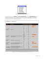
1
Jadu XFP User Manual
Version 1.3.1
Page 1 of 148
NOTE: The Jadu XFP User Manual contains confidential information and should not be circulated outside your
organization.
Jadu XFP User Manual Version 1.3.1
Copyright © 2012 Jadu® Limited, Universe House, 1 Merus Court, Leicester, LE19 1RJ, 0116 222 7242,
[email protected], www.jadu.net. All rights reserved.
Screenshots in this manual may show a different representation of the Jadu Control Center depending upon the
exact build of your system.
Page 2 of 148
Contents
Contents
Chapter One: About Jadu XFP
Chapter Two: Getting started
Creating a new form
Creating a form page
Page details
Form structure
Adding branching rules to a form’s structure
Make the form live
Chapter Three: Adding Questions/Form components
Overview
Question
Components
Name
Requires answering
Additional Fields When Adding A Question
Validation
Maximum Characters
Default Value
Help Comment
Permissions
Managing questions within a page
Managing Integrated Component Error Messages
Preview
Chapter Four: Complete Pages
Overview
Editing master complete page
Chapter Five: Form templates
Creating templates
Creating a new template
Page 3 of 148
Creating a template from an existing page
Inserting templates
Managing templates
Chapter Six: Actions
Overview
Action types
Email Alerts
Generic processing replies
PDF Generation
File Output
CSV output format
XML output format
Managing XML Templates
Formatting an output field
CRM Service Request Types
Data retention policies
Chapter Seven: Restricting Administrator Access
Configuring access groups
Configuring access levels
Applying access restrictions
Managing access restrictions
Requesting access
Granting access
Chapter Eight: Exporting/importing existing forms and form submissions
Exporting form structure (prior to Jadu 1.12.x)
Exporting form structure (Jadu 1.12 or above)
Importing form structure
Copying an existing form (prior to Jadu 1.12)
Copying an existing form (Jadu 1.12 or above)
Exporting form submissions
Manual Exports
Scheduled Exports
Chapter Nine: Statistics
Viewing statistics
Abandoned forms reporting
Page 4 of 148
Chapter Ten: Disabling, deleting and archiving forms
Disabling a form
Archiving a form
Deleting a form
Chapter Eleven: Processing Received Forms
Starting to process a form
Completing the process
Chapter Twelve: Internal Forms
Viewing internal forms
Internal forms - new
Internal forms - incomplete
Chapter Thirteen: Validation Routines & Error messages
Editing validation routines
Example regular expressions
Creating and editing validation messages
Deleting validation routines
Chapter Fourteen: Reporting
Dashboard overview
Chapter Fifteen: Content Scheduling
What is content scheduling?
Adding a schedule to your XForm
How to re-visit your scheduled content
How to review a scheduled form
How to re-schedule your form
How to remove a content schedule from your form
Chapter Sixteen: URLs and End User interfaces
Readable Urls
Dynamic URLs
Friendly URLs
Additional channel options
Touch
Mobile
Page 5 of 148
Appendix One: The Jadu Document Editor
How to use the Jadu CMS Text Editor
How to create a link within your content
How to edit a link within your content
How to remove a link within your content
How to prepare an image for upload to the central image library
How to upload an image to the central image library
Common fields and buttons throughout the image upload process
The Upload Image window
The Image Properties window
How to save or save and use your uploaded image
How to add an image into your content
Common fields and buttons throughout the image insertion process
Adding an image to your content via the View by Category method
Adding an image to your content via the View by Thumbnail method
Adding an image to your content via the Search method
How to remove an image from within your content
How to add advanced content such as movies into your content
How to add code snippets into your content
How to edit an existing code snippet
How to remove an existing code snippet
Appendix Two: Assigning Metadata
What is Metadata?
How to apply Metadata to your content
The Standard Metadata area
The Advanced Metadata area
Appendix Three: Navigation structure
How to apply a navigation category to your content
Using your site’s navigation structure to apply a category to your content
Validation Routines
BS7666 - PAON
BS7666 - UPRN
BS7666 - USRN
UK Postcode
Page 6 of 148
Page 7 of 148
Chapter One: About Jadu XFP
Jadu XFP is an enterprise level form creation and management platform, enabling nontechnical web editors and webmasters to create easy to use online forms that comply with
web standards for both accessibility and design.
Sophisticated management and processing tools help ensure your online forms are
managed with the same robust approach as any business critical system or application,
with information collected and processed through business rules that help to ensure data
accuracy and efficient form processing.
XFP provides developers with the functionality to customise and extend the product to
better suit your organizations transactional needs. For more detailed information on how to
develop for XFP, please refer to the Jadu Developer Guide.
Page 8 of 148
Chapter Two: Getting started
Accessing Forms via the Jadu Control Center menu system in a 1.12 platform implementation
Page 9 of 148
Accessing Forms via the Jadu Control center menu system prior to 1.12
Within the Jadu Control Center, select XForms Pro > Forms to display the main area for
managing your forms and associated data.
Within a 1.12 platform implementation, the XForms Pro menu option is found with the
Open menu. You can also use the main Jadu Universe search facility to access a particular
form.
An Administrator’s Form List view
Any existing online forms are listed displaying the Form Title, the Categories assigned,
whether the form is currently Live and Visible or not (with the ability to quickly change this
setting), a View Live link to review the form as the end user would see it, and the number
of Submissions to date (with a link to view all submissions) along with the form owner’s
name (with the option to change ownership).
Page 10 of 148
Use the tabs displayed across the top to filter between Online, Offline and Archived form
listings.
At the very bottom of the list is a Create New Form button to quickly start creating a new
Jadu XForm.
Page 11 of 148
Creating a new form
●
Click the Create New Form button. You will be taken to the Form Details area,
where you can set up the properties for your new form.
Setting up your form properties
●
●
Title will be the name of the form that will be displayed to end users looking for a
form to fill in. Type in the full form name/title in the textual entry field provided.
Categories are assigned to forms to place them in your website’s navigation
structure. Click the Assign Categories button to add the relevant categories for this
form. Available categories can be managed within Utilities > Category Builder.
Page 12 of 148
(Instructions for using this interface are included within the Jadu Utilities Manual.)
Assigning categories to your new form
●
Click the Assign Metadata button to open up the Assign Metadata window. In this
window, you should set basic Metadata properties; Keywords and Description for
improved Search Engine Optimization (SEO). You can also schedule your form to be
made live, not live or invisible on a particular date as necessary, as well as configure
the Advanced Metadata settings. Please see Appendix two for further details.
Page 13 of 148
Assigning Standard Metadata to your new form
●
●
●
●
●
●
Allow Unregistered Users? allows you to determine whether visitors need to be
logged in as a registered user of the website to complete the form.
Resume at start? means that if a user exits the form before completion, by
selecting Yes you can force them to begin at the start of the form again when they
return to the form rather than resume from the last page that they completed (in
case they should need to review their previous answers for example).
If your form is spread over multiple pages, you can select the option to display a
progress to visually illustrate to your end users how much progress they have made
through the form so far. From the Display progress bar? area dropdown menu,
select Yes if you would like to display a progress bar.
Require ReCaptcha before submission? if enabled, will require the form user
to enter a response to an image captcha before being allowed to submit the
form for processing. For further information about captcha, please see http://
www.captcha.net.
General Form Instructions provides a Jadu Document Editor WYSIWYG interface.
Type or paste the form’s description/summary, instructions along with any
relevant content or media into this area. This should include a list of any additional
information that will be required to complete the form, any special circumstances or
conditions for completion, etc.
Once you have completed all of the stages above you can save your form by
clicking on the Save button, allowing you to move on to setting up the first page of
questions within your form.
Page 14 of 148
Creating a form page
A page within Jadu XFP consists of a title, optional supplemental information that the user
might require when completing this page, and questions to which they will respond.
Page details
You will be presented with an interface similar to the one used when you initially created
your form. This is where you will give an overview of the sorts of questions that will be
contained on this particular page within the form (allowing for a clear, concise division
between each set of questions you may wish to include throughout the form).
The form page details interface
●
●
●
The Page Title should be relevant to the set of questions that are on this page
alone.
The Page Instructions should provide any essential information that will make
questions within this page easier for the end user to answer. You may find that
over time the clarity of this information reflects the reliability and accuracy of the
responses that you receive. Use formatting options to enhance them as necessary.
Click Save Page once all of your page details are complete to save your changes.
Page 15 of 148
●
●
●
Use the Preview link to get a representation of how the page will appear to the end
user within the context of your design.
Use the Edit questions link to begin managing the questions within this form page.
Use the Form structure link to return to the overall form structure page (detailed
below).
Links from the form page details interface (once saved)
Form structure
Viewing the structure of a branched form in the diagram viewing mode
●
The form’s current structure can be viewed as a diagram (default) or as a table for
when working with large forms containing large numbers of branched routes. To
switch, select the link at the top left; View as a Table or View as a Diagram,
Page 16 of 148
depending on your current mode. If your form has any branching rules, View as a
Diagram will show you all possible routes through your form.
Viewing the structure of a branched form in the table viewing mode
●
●
To continue adding pages to your form, click the Create New Page button. In
Diagram view mode, you may find one located at the top and bottom of the diagram.
Various icons are available in both View as a Diagram and View as a Table mode
to allow you to jump to certain pages or tasks within the form’s setup. The various
icons available are described below.
Instructions: This icon will open the page instructions area
Questions: This icon will open the page questions area
Branching: This icon will allow you to manage the branching rules from this page
Preview: This icon will take you to a preview of the form page
Delete: This icon will remove the page from your form
Down: This icon will move the page below the next page (when branching rules allow)
Up: This icon will move the page above the previous page (when branching rules allow)
Page 17 of 148
Adding branching rules to a form’s structure
Branches can be added to a form so that form fillers can be routed to only the relevant form
pages based upon particular responses to questions during their form journey. All pages
relating to the rule must be created before you can add it (i.e. it is not possible to create
a branching rule to a page that does not yet exist). You should therefore define the broad
structure of your form before beginning to add Branching rules.
Note: Branching rules may only be applied to questions of type; Dropdown Menu, Radio
Button components and Integrated Components that have been developed to include a
static option (always available). It is not possible to branch from a dynamic value of an
Integrated Component.
To add a new branching rule, click the Branching rule icon on the question page from
which you want to branch end users. This will open the Branching Rules interface as
shown below.
Adding a new rule in Direct rule mode
The default mode when setting up a new Branching rule is a Direct Rule. This does not
branch, but simply allows you to bypass existing form pages that exist within the form’s
structure by jumping the user from the current page to the page chosen from within the
dropdown menu of other page choices called I want to go directly to. In the example
above, the end user will move from the Disability Living Allowance - Yes / No? page
directly to the Disability Living Allowance End Date page. This can be useful to remove
any Branching Rules that you may have previously added and later decide to remove or
to archive an old page of questions without actually removing it from the form (essentially
making a page unvisited by any route).
Click Save Direct Rule to add your new Direct rule to your form.
Changing the Rule Type to Branching will change the interface to allow you to configure
more complex Branching logic based upon user choices.
Managing a form's branching rules
Page 18 of 148
1. From the IF dropdown, select the question that the branch is based upon. You will
see a list of all previous Radio button or Dropdown questions from any pages prior to
or including the current page displayed here.
2. From the IS dropdown, select the particular option from the question selected in
point 1 that determines the branch that the end user will take if they pick this value.
3. From the Go to dropdown, select the page that you want the form filler to be
branched to, based upon the response being selected in point 2.
4. Clicking Add Another Branch allows you to build up multiple different routes based
upon a different option from the other options available in the question as were
picked from in point 2. This is optional and depends upon your requirements as to
whether it will be necessary in each case. Once clicked, an additional Otherwise,
if it is decision will appear (similar to point 2), and another corresponding Go to
decision (as was the case in point 3).
5. From the Otherwise, go to, select the alternative page that you want the form filler
to be branched to based upon them not meeting any of the other options that you
set out above (a catch all other cases option).
Any number of rules can be added to a form branch by clicking the Add Another Branch
button. The system will identify when a redundant rule is added, whereby it would take
the user to the same page as the Otherwise, go to option, and will prompt you to
remove it accordingly. To remove an Otherwise condition within a rule, simply click the
corresponding Remove button for the option to be removed.
A redundant Otherwise rule attempts to be added to the Branching Rule logic
Once branching rules have been saved, and the form structure is being viewed as a
diagram, the branching rules are visible within the structure of the form, offering a
representation of all the potential user journeys through a form.
Make the form live
Once your form is structured and set up as you would like, and you have taken the relevant
measures to ensure that you are happy with its operation (previewed the form, checked
validation routines, etc.), you will then need to make your form Live before users can
complete it. This can be done from the main Form details/instructions interface (assuming
that you have saved the form).
Page 19 of 148
Form Live and Visible settings
Upon making a form Live, another option becomes available to make the form Visible.
Making a form visible tells the platform to provide automated navigation within the front
end design to this form through the form list, form search, form category listings and other
dynamically generated navigation.
If a form remains invisible, XFP and the underlying platform will not link to the form and it
will be up to the web administrators to promote the existence of this form through other
systems, direct promotional links, signposts, etc.
A live but invisible form can be accessed if the URL is known to the end user. A non-live
form cannot be accessed by any end user.
You can also change a form’s live and visible settings from the forms list page as necessary.
Page 20 of 148
Chapter Three: Adding Questions/Form
components
Overview
Adding questions to a form can be achieved with ease. You can choose from all of the
available form elements that the HTML language has to offer, giving you a wide range of
options for creating your questions and collecting your visitors' answers.
Mandatory fields when adding a question
Question
Before selecting the relevant component for your answer, you must type the Question in
the space provided. Providing the same question text does not already appear within the
form, you should not need to change the corresponding (automatically generated) Name,
which must remain unique throughout the form. You can however change this to be more
suitable for your own internal needs once suggestion has been pre-filled for you (after the
choice of Component type has been made).
Components
There are a number of components that you can select from which will determine the way
in which your end user will provide their answer to your question. Often, the appropriate
component is dictated by the question itself, but it is worth taking time to carefully plan
which components you wish to use.
Text Field
This is an input box within which a visitor can enter a single line of text. It is ideally suited
to capturing information such as names, telephone number, email addresses, etc.
Page 21 of 148
Text Area
This is similar to a text field, but is designed for capturing larger responses. If your question
needs a longer, typed response such as comments or feedback, then you should choose this
component.
Checkbox
If you want your visitor to select from a number of options, from which they can select
more than one response, then a checkbox should be the component type that you choose.
Due to this being a 'multiple choice' type component, further inputs will be made visible
at the bottom of the page for you to provide the set of options that the end user can pick
from.
Radio button
If you want your visitor to select from a number of options, but they are only able to give
one response, then a radio button could be the option that you choose.
Due to this being a 'multiple choice' type component, further inputs will be made visible
at the bottom of the page for you to provide the set of options that the end user can pick
from.
Note: to ensure the user does provide an answer, you can either select a default option,
or set this question as being required.
Page 22 of 148
Dropdown menu
If you want your visitor to select from a larger number of options than would suitably
display inline within the form page, but to only give one response, then a dropdown could
be the option that you choose.
Due to this being a 'multiple choice' type component, further inputs will be made visible
at the bottom of the page for you to provide the set of options that the end user can pick
from.
Password
This has all the same options as a normal text input field, except that to the end user, the
characters will appear as asterisks (******) as they type, so as to prevent anyone watching
the user fill in the from learning a password, for example. You should always use this when
asking for a password for security reasons.
Table
Jadu XFP provides you with the flexibility to create a Table combining a number of form
components into a tabular format. An example of this might be when collecting details of
household members and wanting each person's forename, surname, and date of birth.
Questions asked within Tables are structured within columns. The number of residents
(maximum) to gather following with this example could then be set to be 3 by setting
the Number of Rows to 3. You can then specify the number that are required (minimum)
with the Required Rows dropdown. Therefore, you could specify that at least 1 person’s
details must be supplied within the table.
Page 23 of 148
Table Settings displayed after clicking Setup Fields
The total Number of Rows can be set from 1 up to 25. The Required Rows can be set from
0 to whatever is specified as the Number of Rows. You can also decide whether to show
or hide the question text within each of the cells. Use the Display Cell Labels dropdown to
turn on or off the output of labels.
Table validation adopts the following conventions:
Row Not Required
None of the Columns Required
The end user can enter, all, none or some responses
into the table columns for this row.
Row Required
None of the Columns Required
The end user can enter none or some responses into
this row.
Row Not Required
Some or All Columns Required
The end user can enter no responses into this row
or if the user enters a response all required columns
must be completed.
Row Required
Some or All Columns Required
The end user is required to provide responses to all
required columns in this row.
Page 24 of 148
All question inputs must validate against the validation routine assigned to the question
within a particular column.
Columns can be shifted left and right, removed or updated as necessary after
clicking Setup Fields and choosing the column/question to be edited.
Note: It is not possible to use the following components within a table; Integrated
Components and File Uploads.
File Upload
This component allows end users to upload files as part of their form submission. There is
no additional configuration required in terms of setting up the question itself.
There is, however, underlying system configuration that imposes various limitations on what
file types the end user is allowed to upload. The Jadu platform configurable options are:
●
File types allowed to be uploaded within standard configuration
allows: 'doc', 'docx', 'pdf', 'txt', 'jpg', 'rtf', 'zip', 'xls', 'xlsx', 'ppt', 'pptx'
● Attaching uploaded files to any email alerts that contain the file upload question.
Standard configuration is set to 'true' to allow this. This should be disabled if you
have no virus checking capabilities.
● Depending on the system's implementation, include the allowed file upload size.
Changes to any of these will need to be discussed with your systems administrator and
subsequently, Jadu Support if deemed necessary.
Note: The File Upload component is not supported when used in Preview mode and there is
no validation on unsupported file types in this mode.
Calculation
Calculations allow you to collect a value as part of the form completion process that may
not have come from direct user input. This could be as a result of some other input provided
by the user, or from a formula that you define when setting up the question. You can
determine whether the user sees the calculated value or whether it stays hidden within the
form submission.
Additional settings for the question when setting up a Calculation include:
Page 25 of 148
●
Formula: The formula that will be used to determine the calculated value. This can
include static numeric values e.g. 20 to represent VAT or sales tax for example,
and can use responses to existing answers supplied by the user in their responses
prior to the current page. Variables can be inserted by double clicking the variables
from the Variables list displayed with the basic formula operators "+", "-" etc.
e.g. "([Response - Car_worth_today] / 100) * 12.75" would calculate the amount of
depreciation for a car next year.
When using a Calculation within the column question within a table component,
it is also possible to build up Microsoft Excel style calculations through the exposed
variables. These variables consist of those for the Current Row (good for using
when calculating something based on values entered in the current row only) or a
specifically numbered row (good for adding up all the row totals), so that you could
have a Calculation for each row, and then a Calculation question after the table
which summed up all the calculations to provide a grand total.
Depending upon your system’s configuration it is also possible to add PHP scripting
within the Formula area, with the result being applied to the $calculationResult
variable. Please see the Jadu Developer Guide for further information on this
capability.
●
Precision: The precision to which to provide the resulting calculation after the
formula has been processed, e.g. 2 decimal places would round the result to two
decimal places for a monetary value.
●
Editable: Whether or not the end user can edit the amount that has been
calculated. Useful for when calculating a suggested amount, but the end user can
later amend the value as necessary before submitting it.
●
Visible: Whether or not the Calculation should be displayed to the end user or
not when completing the form. If visible, the Calculate button will be automatically
added to the form by XFP.
Once Calculation has been set as your question type, the user interface will change to
provide all of the above options, as shown below.
Page 26 of 148
Calculation Question settings
Note: Warning messages associated with Calculation components will not be displayed
when used inside a Table component.
Hidden text
This is a text field that is not visible to the form user. It enables the form designer to pass
information along with a form submission that is not seen by the end user e.g. a reference
code. To use a hidden text component you must supply a default value and a validation
routine.
Hidden text component values will appear in an Email alert where the '[Form - All
Questions/Answers]' variable is included. If you do not wish hidden values to appear in
an Email alert, instead use the '[Form - All Visible Questions/Answers]' variable within the
email body. Email alerts are discussed in Chapter Six of this manual.
Page 27 of 148
Email confirmation
The Email confirmation integrated component forces the end user to enter their email
address a first time, and then confirm that input a second time. The two entries are checked
against one another to make sure they are an exact match. The initial input box is also
validated against the email validation routine. Copying and pasting is disabled on this
component in Internet Explorer 6+, FireFox 3+, Safari and Chrome. Disabling copy and
paste is implemented through JavaScript, therefore if JavaScript is disabled this functionality
fails gracefully and will allow the user to copy and paste.
Name
The value of the question name should be unique to each question created. You will not
usually need to amend this value from the default value suggested as it will be based on
your entry for the Question text, but can do so if you so wish. The value must not contain
any white space or other invalid characters.
Requires answering
The end user will not be able to progress further with their form submission without giving
a valid response if you choose to make the question mandatory.
Additional Fields When Adding A Question
Some of the below options may require configuration during the creation of your new
question. Which ones display depends upon the Component that you selected at the first
stage.
Validation
Below are the standard validation routines that come out of the box with your XFP
implementation, though it is also possible to add your own. Validation routines are covered
in further detail in Chapter Thirteen of this manual. Some of the below routines specifically
relate to British Standards. Please refer to Appendix Four for supplemental information on
the specifics of these standards.
●
Allow Anything
No validation will occur, the end user will be able to enter whatever they like and it
will be submitted successfully.
Page 28 of 148
●
Alphabetic
Only alphabetic letters a-z and A-Z will be accepted.
●
Alphanumeric
Only alphabetic letters a-z and A-Z and numbers 0-9 will be accepted.
●
Date (DD/MM/YYYY)
Only numerical values entered in this UK date format will be accepted. When this
option is selected, and the end user has Javascript enabled within their browser, a
calendar icon will be displayed, which can be clicked to allow the end user to choose
a date from a calendar picker interface.
Text input with Date validation applied displays calender interface
●
Date (MM/DD/YYYY)
Only numerical values entered in this US date format will be accepted. When this
option is selected, and the end user has Javascript enabled within their browser, a
calendar icon will be displayed (as above), which can be clicked to allow the end user
to choose a date from a calendar picker interface.
●
Email Address
Only letters, numbers, a selection of safe symbols (e.g. dots (.), dashes (-),
underscores (_) and the @ symbol) will be accepted. No spaces, no slashes (/,\),
etc.
●
Float (Floating point number)
Any numerical value will be accepted with a decimal point allowed.
Page 29 of 148
●
Integer (Whole number)
Any whole numerical value will be accepted, no decimal point allowed.
●
Money
Any numerical value with one decimal point optionally allowed, commas are allowed
as a thousand's separator, as well as an optional currency symbol before the
numbers (£, $, € supported).
●
National Insurance Number
Must use a valid format for a UK National Insurance Number. An optional single
space entered by the customer to reflect formatting on the actual card, but within
the correct format, will be allowed.
●
Non empty
Must not be left blank, but anything else is allowed.
●
PAON/SAON (Primary/Secondary Addressable Object Name)
A textual string of an address, where the formatting of the field is important in order
to conform to BS7666.
The SAON field is only used for flats or units which are subdivisions of larger
buildings, in which case the PAON is the name of the parent block common to all
units. The secondary and primary addressable object names are both in the format
nnnnsnnnnsaaaaaaaaaaaaa... where:
Characters 1-4 are the start number, right justified, spaces padding
Character 5 is start suffix
Characters 6-9 are the end number, right justified (used for addresses with a range
of number e.g. 6-8 Acacia Avenue)
Character 10 is the end suffix
Characters 11-100 are for a text string (for named properties)
●
Passport Number
UK Format, must be 9 numeric characters in length to comply with UK passport
validation. Non-UK passports which may vary in format will not be accepted.
●
Postcode
UK Format, prefix must consist of one letter + one number, one letter + two
numbers, two letters + one number, or two letters + two numbers. Suffix must
consist of one number + two letters. Space between prefix and suffix is optional.
Follows the rules from the Data Standards Catalogue.
●
Telephone
UK Format, must begin with zero (0), and be 11 digits in length. Numerical
characters only.
●
UPRN (Unique Property Reference Number)
A numeric identifier for a property within the UK.
Page 30 of 148
●
URL
Must begin "http://" or "https://", and contain the domain (e.g .com, .co.uk, .net)
and HTML-safe characters only.
●
USRN (Unique Street Reference Number)
A numeric identifier for a street within the UK.
Maximum Characters
You can limit the length of an end user's response by entering a numeric value here. This
limits the input at the point of displaying the field to the end user.
Note: some browser extensions exist (such as the Firefox Web Developer Toolbar) that
allow users to remove maxlength limits placed upon text input fields.
Default Value
This is what will be displayed to the visitor within the relevant field before they enter any
information, an example could be "John Smith" or "Name" in a component requesting the
end user’s full name.
Help Comment
This is textual assistance that is displayed inline with the form question text and associated
input component in order to provide contextual help specific to this question, for example,
to describe what information the end user should enter, possibly explaining acronyms in
more detail, etc.
Permissions
This functionality allows you to set whether or not the question is available to view publicly.
If you choose Private, end users will not be able to see the question. This can then be
used for administrative purposes (e.g. “For office use only” type questions used on printed
forms). Questions set to Private do display administrators who fill in forms from within the
XFP interface for completing forms on behalf of an end user.
Managing questions within a page
A list of all current questions available within a page is listed at the bottom of the question
setup page.
Page 31 of 148
List of all current questions within a form page
Questions can be re-ordered within a page by using the orange Up or Down arrows next to
each question. They can also be deleted by clicking the Delete link to the far right of each
question. Editing an existing question is achieved by clicking the question text from this list.
Integrated Components
Integrated Components provide a mechanism to pull in data from external sources into an
XForms question, sometimes in an interactive manner depending upon the number of user
input elements that make up the Integrated Component. Some examples include:
●
Pulling in a set of options for a dropdown menu of all records in an external database
managed by another system e.g. all of a particular resource managed from within
your Jadu CMS e.g. all published Events information, or all University courses from
an internal database.
● Pre-filling a value from a global object e.g. pre-filling the user’s forename from their
authenticated and signed in user account.
● Free text input, followed by data retrieval and user selection to provide a verified
user response e.g. Address lookup via ZIP code search.
Once an Integrated Component has been developed (see the Jadu Developer Guide for how
to build new Integrated Components) and registered within your implementation, it will
appear in the Component dropdown list with a asterisk (*) next to the component name,
for form designers to include within their forms.
Page 32 of 148
Integrated Components displayed within the Component options
These are more interactive in that they can communicate with an external data source to
pull in and display data for the end user. A typical example would be an Address search
facility which begins with a ZIP code lookup, whereby the end user simply enters a ZIP
code into a simple text component (with appropriate validation applied), but then clicks a
Lookup button (automatically added by Jadu XFP), after which the page refreshes and data
that has been collected from the data source (e.g. either by a database connection or via a
webservice call) is then displayed back into a second form component.
In this example, a list of properties might be rendered in a dropdown menu for the user to
pick their address, therefore minimizing manual data input errors/inaccuracies and allowing
additional data to be gathered that the end user may not have otherwise known, in this
case the UPRN (Unique Property Reference Number), for example.
Page 33 of 148
Address Lookup - ZIP code search Integrated Components displayed to end user
Integrated Components can be written by developers in a generic way, and then offer
the form's designer some additional configuration options as part of the question setup
process. The options that could be provided would be the decision of the Integrated
Component developer(s). Where options are available to be set, they will appear in the
Integrated Component Setup area when setting up your question.
Integrated Component options displayed in the question setup area
The development of these Integrated Components is a technical task for either internal
developers to undertake or Jadu Professional Services, and is beyond the scope of this
document. Please refer to the Jadu Developer Guide or your Jadu Account Manager if further
information is required.
Managing Integrated Component Error Messages
To edit an existing Integrated Component’s error message you must first select
the Integrated Components option in the main XForms Pro module menu.
Page 34 of 148
Integrated Component Control
Select the Integrated Component that you wish to manage the error messages for.
The page will then refresh to list the current error message(s) configured for each of the
elements that make up the chosen Integrated Component.
Predefined error messages for the Verified Address - Postcode Search Integrated Component
To add a new message, possibly due to adding support for additional languages to your
implementation, click the New Message button. This will give you a new row to select the
Language to which the message will apply, as well as inserting the translated version of
the error Message text.
New row added for inserting Polish language version of Error message
Once you are happy with the message click the Save button to add the message to the
system. This message will now be used if a form is set up in the Polish language, and the
end user has an error in their input for this element of the Integrated Component used
within that form.
Page 35 of 148
To edit an existing error message, load the Integrated Component through the dropdown
list, make your changes and click the Update button to the right of the message that you
wish to update.
To delete an error message click the Delete button to the right of the error message you
wish to delete.
Preview
It is possible to preview forms from within the Jadu Control Center before they have been
published to the website. This provides an environment where you can test form logic
such as branching rules and individual field validation routines in your current form’s
configuration.
There are two ways of accessing the Preview area to test a form from within the Jadu
Control Center. You can click the Preview tab from the top of the Control Center when
viewing a specific form. This will take you to the Instructions page of your form, enabling
you to preview the form from start to finish.
Form Preview tab
The second alternative is to use the Preview icon from the form’s structure view (either in
Diagram or Table viewing mode).
Preview icon
Clicking this will take you directly to a preview of the specific page within your form that you
clicked the icon from.
Note: Answers to questions entered within preview mode are not saved. This will affect
testing if you have any branching rules which rely upon answers from a question on a
different page than the page that you currently have open. The file upload component also
does not function when in preview mode.
Page 36 of 148
Form page preview from within the Jadu Control Center
Page 37 of 148
Chapter Four: Complete Pages
Overview
Form complete pages are the very last page of the form, following successful submission
of the end user’s data, and traditionally show a “Thank You” style message. As a form
designer, you can change the contents of this page on a per form basis to meet the needs
of the specific form being completed by the end user. The page can be edited specific to a
particular route through the form when branching rules have been used within the form’s
design.
When a form is first created, a form complete page is automatically created with default
text. This page is called the Master Complete Page. If a branch doesn't have its own
specific form complete page set up by the form designer, then the master page is used for
all routes.
Editing master complete page
To edit your form’s completion page, click the Instructions icon on the Complete page
within the form structure diagram or the Edit form completion page link when managing
a form within Table view mode. You will then be taken to the Form Complete Page setup
area.
Click the Instructions icon when in Diagram mode to customize the Complete page
Page 38 of 148
Click the Edit form completion page link when in Table view mode to customize the Complete page
Here you will be able to change the Title and Description that is displayed within the page.
You can insert variables to personalize the message, or make the content displayed on the
form completion page more relevant.
Page 39 of 148
Editing the master complete page
The content can be personalized by clicking the Insert Variables button and selecting the
variables that you wish to be inserted from the Variables library.
Insert Variables: located bottom left of the document editor toolbar; clicking this
button will load the Variables library lightbox.
The [Form - Generated User PDF] variable is unique. It is replaced with consistent text
and a dynamic link for the end user to download their completed form as a PDF file (where a
suitable PDF action has been configured for a given form).
Page 40 of 148
Choosing a variable to insert into your Completion page message
When the form is completed, the variables are transformed into the values that either the
end user supplied or the system is aware of (such as the IP address of the server). An
example of a generated page can be seen below.
Complete page view on front-end with variables replaced automatically
Creating a new complete page
If your form has more than one possible route through it, you can save different form
complete pages for each individual branching route. Begin by bringing up the Form
Complete Page area as you did in the previous section. Before saving your changes, to
create a page for the current route change the Save As dropdown to the value This Route
Only.
Save As setting for this form complete page to become route specific
Page 41 of 148
This will save the form complete page and apply it just for this particular route. If there
is more than one complete page configured, you will be able to reuse a complete page by
using the dropdown list at the top of the setup page.
To return it back to the master version, simply change the form complete page back to the
master page by clicking the Revert to Master Page button.
Reverting this form complete page back to the Master complete page
Page 42 of 148
Chapter Five: Form templates
A form template is a collection of questions that can be inserted into a form with speed and
ease. Templates are a useful way to speed up the creation of consistent forms, by allowing
commonly used questions and the associated components to be pre-defined and inserted
into a form as required. A typical example of how a template might be used is for such
collection of data for common questions that exist within most online transactions, such as
personal details (name, address, telephone number, etc.).
Creating templates
Creating a new template
To create a template you must first select the Form Templates option in the main XForms
Pro menu option. This will provide a listing all of your existing templates.
Form templates list
●
●
To create a new template, click the New Template button. You will be asked to
enter the title of the template. Enter the title and click Save Template.
After saving, the template will be added to the full list of templates. Click the title of
your new template to edit it, or Change title to amend the name of your template.
Creating a template from an existing page
●
●
It is also possible to create a template from an existing form page. To do this, when
viewing a normal form question page, click the Form Template button.
Clicking this button will cause a window to appear. Click the Create From Page
button at the bottom, and you will then be asked to enter a title for your new
template. Enter a relevant title and click Continue.
Page 43 of 148
Naming your new form template
●
A small report will be generated to let you know which questions have been
successfully added to your new template.
Template created from existing form page questions report
Inserting templates
Templates are inserted into form pages in a copy and paste style approach.
When viewing a form page, click the Form Template button at the top of the page. A box
will then appear, from which you can select a template to insert into the current form page
being created/edited.
Page 44 of 148
Navigation is provided to cycle through multiple pages of templates if you have built up a
comprehensive library of templates.
Inserting a Form template into a Form page
●
●
●
Navigate through the list to find the template that you wish to insert, then click the Add
button alongside the template’s title to start inserting its contents into the current form
page being viewed.
You can click Cancel or the X in the top right hand corner to close the box without taking
any action.
The box will then refresh to display a list of all questions inserted into the Form page
from the template. Note: It is possible for a question to not be inserted if a question of
an identical name already exists within the form, in which case the existing question will
remain untouched, and the template question will be skipped over.
Managing templates
From the initial template list it is possible to delete templates and change the title of a
template. To change the title of a template, click the Change title link. You will then be
prompted to change the title of the template.
To delete a template, tick the checkbox next to each of the template(s) that you wish to
delete and click the Delete button.
Taking either of these actions will have no impact upon existing forms using any of the
templates that you might have used previously.
Page 45 of 148
Chapter Six: Actions
Overview
The Actions tab of a form enables form designers to specify a number of actions that will
be triggered when a form is submitted/completed by an end user. These Actions allow
rules to be specified in relation to both communications (i.e. automatic email/confirmation
receipts) and data transmission from XFP to another third party system (e.g. delivery of a
data file to a back office system/systems).
Configuring Actions for a form
Action types
Page 46 of 148
Enabling Action types for a form
Actions available include the following:
1. Jadu Database
This action is required by XFP and cannot be turned off, it inserts the form filler’s
answers into the Jadu backend database for audit trail purposes.
2. PDF Generation
This action enables the generation of a PDF receipt after form submission by
mapping the form filler’s answers to the relevant question areas within the PDF form.
This action is optional (it can be removed through configuration), but is enabled by
default.
3. CRM Schema
This action enables form questions to be mapped to a CRM schema representation of
data to be pushed. Professional services are required to provide a suitable schema,
and transportation layer. This Action is optional and disabled by default.
4. ePayments
If the Jadu ePayments module is implemented within your Jadu platform, this Action
allows the integration of a form with a Payment Service Provider (PSP). This Action is
optional and disabled by default.
5. File Output
This Action allows output of the form filler’s answers to be generated in either flat
XML or CSV formats and transported using a connector to a specified destination.
6. Data Retention
This action enables the form administrator to determine how long data should be
retained for each individual form.
Selecting the individual Action checkboxes and clicking the Save Actions button within
the Actions area will generate an additional tab in the header of the form administration
interface. Form administrators can then specify further rules to be associated with the
additional Action type upon a form's submission. The exact nature of these configurations is
described in more detail below.
Email Alerts
This interface enables form designers to configure multiple email communications to be sent
upon form submission. Clicking the New Alert button takes the form designer to the Email
Alerts configuration interface.
Page 47 of 148
Setting up an email alert as a receipt to the end user
Page 48 of 148
There are six mandatory steps to create an email alert:
1. Format
The format of the email alert, which can be plain text or HTML.
2. From address
The email address from which the email will be sent.
3. To address
The email address to which the email alert will be sent after form submission. This
can be the submitting user or other recipients. Multiple recipients of the same email
alert can be configured by comma separating a list of email addresses.
4. Subject
The subject line of the email alert that will be sent.
5. Message
The content of the email alert. This can be formatted using the Jadu Document Editor
tools when in HTML mode (see Appendix 1 - Jadu Document Editor).
6. Attachment
The standard attachment type is none (i.e. no attachments), but the attachment
Format dropdown box enables you to specify that the data received can be delivered
in a number of email attachment types, including HTML, CSV, HTML, text or PDF.
If the attachment Format type selected is PDF, an additional option becomes available, to
Attach the Generated PDF from the PDF Generation Action (if applicable). This option
should only be set to Yes if you wish to attach the PDF that will be generated through the
separate PDF Generation action. If the form administrator sets this option to No, then an
additional option becomes available, where the generated PDF can be the Same message
structure as the original email message if desired.
If the form designer sets the Same message structure to the value No, then a new
message can be defined for inclusion within the file that will be generated and attached. The
option for Same message structure appears for all other attachment format types.
Existing email alerts can be edited by clicking the corresponding Edit Alert link and new
alerts can be added by clicking the New Alert button. Multiple email alerts can be created,
which can be useful for disseminating only relevant information to internal departments or
system(s) through the use of a form’s Variables.
Creating new and editing existing Email Alerts
Note: It is possible to include Variables within each Email Alert's settings (e.g. To,
Subject) by copying and pasting from within the main message content area.
Page 49 of 148
Inserting Variables for inclusion within a PDF attachment for an Email Alert
Generic processing replies
The Generic Processing Replies area provides text boxes in which to insert standard
messages for an Approved or Declined Application as the form progresses through its
workflow. When the form has been put into progress (has begun to be processed) from
within the Jadu Control Center, the forms processor will have the option to send an email to
the submitting user. The text supplied here will be the default message to be sent, but can
be amended as the forms processor progresses the form submission.
Generic processing replies within the Actions interface
Further information on sending generic processing replies is included in the Completing
the process section within Chapter Eleven of this manual.
PDF Generation
Page 50 of 148
The PDF Generation tab provides an interface to enable form designers to configure PDF
Form receipts upon form submission.
Upon entering the PDF Generation area, the interface displays all routes/possible end
user journeys through the form, according to its Branching Rule settings. If this is a
linear form (no Branching rules applied), then only a single route will be displayed. If you
have introduced Branching Rules into your form’s structure, then multiple routes will be
displayed.
Each route through the form can be used to deliver a different PDF form if appropriate. For
Branched forms, a Master route option will also be displayed. The Master route allows you
to create a general set of mappings for ease of application throughout forms with a large
number of routes.
Viewing form routes for PDF Generation
The first step in the process to providing generated PDF receipts is to create a suitable PDF
form using a tool such as Adobe® Acrobat® Professional or Adobe® LiveCycle. The full
process for doing this lies outside the scope of this document, but in principle consists of
taking an existing document, converting it to a basic PDF format (if it is not already), and
adding PDF Form fields in the relevant locations where you expect to output the data within
the outlying document.
Depending on your version of Acrobat® you can have some quick success setting up your
PDF form by clicking either Convert An Existing Document, or Scan A Paper Form in
the Getting Started window, or by opening an existing PDF and choosing Forms > Run
Page 51 of 148
Form Field Recognition or Create.
Acrobat® PDF Form preparation
In Acrobat® you add a form field by choosing one of the form tools, dragging it onto the
relevant page of the PDF, before setting the size and location of the field, and giving it
an appropriate name. Please name the fields in a logical manner (ideally similar names
as those given to your Jadu XForms Questions) as this will assist in the mapping stages
described later. For each field type, you can set a variety of options through the form field
Properties dialog box such as appearance, font and so on.
After you create form fields, you may need to rearrange, resize, or move them to give
Page 52 of 148
the page a cleaner and more professional appearance. To make adjustments in the layout
of form fields, you must be in editing mode (choose Forms > Edit Form In Acrobat or
choose Tools > Advanced Editing > Select Object Tool).
Once your PDF Form is complete, you will need to upload it for the relevant form route.
Do this simply by clicking the New PDF Form button at the bottom of the list of available
form routes. You will then need to click Choose File and browse for the PDF Form file from
your local device and select it.
The second option enables you to provide the PDF Form as a download alternative within
the XFP front end interface, so that it can be manually completed, printed and sent back to
your organization for manual processing.
You should then click the Save PDF Form button and the PDF Form will be uploaded to
your Jadu XFP system for processing.
Uploading a new PDF Form
As part of the import routine, all of the PDF Form fields are extracted from the PDF Form
by Jadu and displayed so that the forms designer can step through each PDF form field in
turn and map it to a corresponding value/variable. This is the data that will be embedded
within the PDF Form template and delivered to the end user. Some basic data manipulation
functions exist to allow you to pre-format the expected data value before it is embedded
within the PDF.
Page 53 of 148
Editing the PDF Form mappings
To map a PDF Form field, simply click the dropdown menu that states Please
Choose ... within the XForm Variable column, at which point a series of initial options will
be displayed to you.
Initial PDF Form variable mapping options
●
●
Clicking Questions allows the responses to any questions asked to the user during
their form (taking into consideration the route through the form that they will have
taken) to be placed within this field.
Clicking Variables allows known system values to be placed within this field,
examples of which are the Form reference number, the date/time the form was
started or completed by the user, their IP address, etc.
Page 54 of 148
●
Clicking Manual Text allows the form administrator to enter what will be static text
within this field e.g. N/A.
● Clicking Leave Empty will essentially disregard the field and leave it in its default
state.
If the field being mapped is of type Text, then you can choose to apply a Pre-formatting
function to the output. Pre-formatting functions manipulate the value of the output by
applying a function to the value. For more information about pre-formatting functions, refer
File Output action section of this document.
Once all fields have been successfully mapped, click Save PDF Mapping to save all
mappings for this route. This route’s mappings can then be made Live.
Note: The Master route cannot be made live as it has no relationship to an actual user
journey.
This process should then be completed for all routes that you plan to provide PDF Form
receipts for. If you have more than one route through the form, there will be a Save As link
that corresponds with each route, allowing you to apply the mappings within this route to
All or specific numbered routes to save time during the mapping process.
Save As on PDF Form routes
If at any point your mappings are incorrect, you can simply edit a single field mapping, or
alternatively click the Delete PDF Mappings button to remove all of the mappings for this
route to start again.
If you wish to change the PDF file applied to a particular route, click on the PDF Form
filename link within the routes table for the route/file that you wish to change. This will
display the PDF Form upload interface previously described. Uploading a new PDF Form will
replace the selected PDF Form file with the new file being uploaded. If possible, mappings
will be preserved during this process.
Page 55 of 148
Orphaned PDF Routes list displayed under the normal route mapping list when applicable
Orphaned routes can appear when the form’s structure and therefore associated routes
have changed after PDF mappings have been applied. Rather than lose previous mappings,
Jadu XFP provides a list of orphaned routes in order to recover any previous mappings.
Orphaned mapping routes will appear in a table at the bottom of the PDF Generation
area. You can Reapply As or Delete an orphaned route’s mappings. Choosing the Reapply
As option will take the mappings saved in the orphaned route and attempt to apply them to
a current chosen route. The orphaned route is then removed from the system. Alternatively,
you can choose to Delete the orphaned route without reapplying the mappings to another
route.
File Output
The File Output action creates a data file of the user’s form data and passes it to a
Connector which then transports it to another location/database (that you configure) for
further processing. Data can be manipulated before transportation and you can choose
which form fields are included in the output. This action has no output shown to the end
user.
Before you can use a File Output action you need to set up an appropriate Connector.
Once a new connector is made available, form designers can then apply this to the File
Output Action.
To assign the Connector to a form, select the form that you wish to add a File Output
Action to from the Forms list page. Select the Actions tab for this form. To enable the File
Output Action, select the File Output checkbox under the Actions heading.
Enable the File Output action
Click on the Select Connector button to load up the Select Connector lightbox. The Select
Connector lightbox searches as you type (from three characters onwards). You can either
browse though available connectors or if you know the specific connector you require you
can search for it using the search box provided.
Page 56 of 148
Search for an existing Connector
Choose the appropriate Connector from the returned results list by clicking
the Select button.
File Output Connector selection complete, here showing ‘Local Dropbox’
The Connector is now assigned to the form. Save the newly created Action by clicking on
the Save Actions button at the bottom of the Actions area. A new File Output tab will
appear.
New File Output tab
Before you can use the File Output Action, you need to specify which questions are to
be included within the data file, and in what format the data file should be sent. Clicking
the File Output tab displays the File Output interface.
Page 57 of 148
Setting up new File Output settings
First, select a Format for the output to be generated within. The available options
are CSV and XML.
CSV output format
Page 58 of 148
CSV File Output options
After selecting CSV Format option, you can set up some basic options for how you wish the
CSV file to be structured.
●
●
●
CSV Header: If checked, the CSV file will contain the field names above relevant
columns within the first row of the data file.
Field Terminator: A single character used to separate fields. Defaults to comma (,).
Line Terminator: Choose a line ending type, from DOS/Windows (\r\n), UNIX/Linux
(\n) and Macintosh (\r). Defaults to use the DOS/Windows option.
XML output format
XML File Output options
The XML Format option allows you to use a standardized key/value pair structure or
specify a custom XML output structure per form as necessary.
Note:
The principles of working with XML data is beyond the scope of this document and a basic
understanding of markup structure is required for the following section of this document.
First, you must choose an XML template. Options available are:
● Current: This template option is the current XML assigned to the File Output.
● Default: Jadu's default out of the box XML Key/Value pair structure.
● Advanced: A blank canvas for creating your own custom XML structure.
In XML Format mode, three placeholders exist for use within your XML. The placeholders
are replaced when the output file is generated.
●
●
●
[FIELD_NAME] = the name of the question or variable.
[FIELD_TEXT] = the question text or variable name.
[FIELD_VALUE] = the question answer or variable value.
When creating custom XML, you will need to create an XML template. The template is used
to create the outputted XML structure. The default XML template is:
<?xml version="1.0" encoding="UTF-8"?>
Page 59 of 148
<!-- Output generated by Jadu XFP (http://www.jadu.co.uk/forms) -->
<formAnswers>
[FIELD_XML]
</formAnswers>
The [FIELD_XML] placeholder is replaced by the XML generated from the Field
XML option configuration.
The Field XML specifies the output for any single field that is to be included within the data
file. It is then inserted into the XML Template when generating the output file.
<field>
<name>[FIELD_NAME]</name>
<value>[FIELD_VALUE]</value>
</field>
When output is generated, the XML will be output similar to that shown below if using the
Default XML structure:
<?xml version="1.0" encoding="UTF-8"?>
<!-- Output generated by Jadu XFP (http://www.jadu.co.uk/forms) -->
<formAnswers>
<field>
<name>Form - Identifier</name>
<value>1</value>
</field>
<field>
<name>Form - Title</name>
<value>Sample XForm</value>
</field>
<field>
<name>Form - Reference Number</name>
<value>123</value>
</field>
<field>
<name>Surname</name>
<value>Bloggs</value>
</field>
<field>
<name>Forename</name>
<value>Joe</value>
</field>
</formAnswers>
Managing XML Templates
It is possible to save and reuse XML templates. To save custom XML, after creating the
XML template and Field XML, click the Manage XML Template button. This will prompt
you to provide a Template Title, after which you should click Ok.
Page 60 of 148
Providing an XML File Output Template name
The template has now been saved and will be available for use with other forms when
setting up further File Output actions.
You can manage existing templates by selecting them from the Choose XML Template list
and clicking the Manage XML Template button. The interface is slightly different; here you
will be able to Update the template title or Delete the XML template.
Updating an existing XML File Output Template
When you use saved XML on a form, the saved XML is copied to the form properties.
Deleting or updating an existing template will therefore have no impact upon existing forms
using that template.
Formatting an output field
It is possible to do some basic formatting of the output value for a field if necessary. For
example, an external system may expect a date question response in MM/DD/YYYY format
but the answer is supplied in DD/MM/YYYY. Using the built in tools you can manipulate the
answer to the required format.
To select the format you require outputting for a given field, tick the corresponding
checkbox for that field. You can use the arrow buttons to reorder the output if necessary
and also assign a formatting function on the data. Formatting options include:
●
●
●
●
●
●
●
Upper Case All: All characters in the user response are converted to upper case.
Lower Case All: All characters in the user response are converted to lower case.
Upper Case First Character Only: The first letter of the string is converted to
upper case.
Upper Case First Character Every Word: The first letter of every word in the user
response is converted to upper case.
Reverse: The user’s response is reversed in order.
Length: The length of the user’s response is output instead of the actual value.
Date Format: Date formatting is only available to text fields which validate against
the date validation routine. Choosing this option, you can reformat the user input
into a different format as you require, e.g. the user may be adding a date entry in
the format DD/MM/YYYY, but you may wish to receive it as YYYY/MM/DD.
Page 61 of 148
Setting a specific date pre-formating rule for text fields with Date validation applied
This formatting option uses the php date function. Formatting options can be found at http:/
/uk2.php.net/manual/en/function.date.php under the parameter format.
●
●
●
●
Remove Non-alphanumeric: All non alphanumeric characters are removed from
the user’s response.
Remove Non-alpha: All non alphabetic characters are removed from the user’s
response.
Remove Non-numeric: All non numeric characters are removed from the user’s
response.
Remove Whitespace: All whitespace is removed from the user’s response.
Note: If an incorrect format is applied, an error message will be displayed for the field
in question and all the other fields will be unchecked. It will be necessary to recheck the
required fields.
Once you are happy with your settings, use the Live dropdown to make the the File Output
Action live and click the Save button. All submissions for this form from this point on shall
generate and transmit the data file through the selected Connector.
CRM integration
This option will become enabled if your system has undergone integration with an internal
system through strict use of an XML Schema, such as where integrating with a Customer
Relationship Management (CRM) system or Enterprise Service Bus (ESB) such as Microsoft
BizTalk.
Enabling the CRM Schema Action
Once the CRM Schema option is checked, an Initial status dropdown appears, which
allows you to specify the default form status once the form is submitted by the end user.
This enables you to bypass the standard XFP workflow steps if, for example, this case will
now be handled directly from within your central CRM system. Once saved, a CRM Schema
tab will appear within the row of tabs for this particular form, allowing you to further
Page 62 of 148
configure this Action’s settings.
CRM Schema Routes listing
Upon entering the CRM Schema area, a list of routes that the end user can take through
the form completion process will be displayed. This allows you to define CRM integration at
the per-form, per-route level. This can be useful in instances where you may wish to raise
a service request in your CRM system only if the user has been identified as a local resident
for example, throughout the questions and appropriate branching rules embedded within
the form’s structure.
Simply click the Edit link for the route that you wish to map into CRM to get started. The
page will then refresh to show a representation of the CRM Schema that has been designed
to allow relevant data collection for your internal CRM system. The screenshot below may
not therefore be identical to your own Schema.
The form designer must then step through and map relevant element names from the
CRM Schema with appropriate data values. These values can be any of those previously
specified in the PDF Generation section of this document (Questions, Variables, Manual
Text or Leave Empty). An additional option (Service Request Types) is also available
for instances where your system has undergone CRM integration. There is a section below
explaining how these can be set up and configured.
Page 63 of 148
CRM Schema element mappings
Page 64 of 148
Please consult with your internal team(s) regarding any of the specific field’s purpose within
your implementation of the CRM Schema.
Once your mappings are complete, simply click the Save Mappings button to apply the
mappings to this route.
Once saved, the system will update the Schema Status column of the routes table to give
an indication if all fields within the CRM Schema have now been successfully mapped or not,
and will display as Complete or Incomplete to represent this.
CRM Service Request Types
In instances where CRM integration is enabled, the CRM Request Types page provides you
with an area to define all Service Request Types that are configured within your internal
CRM system that you wish to allow to be integrated within the Jadu XFP system. The values
that you configure here will appear within all mapping interfaces under the heading Service
Request Types.
CRM Service Request Type interface
Jadu ePayments integration
When both the Jadu XFP and Jadu ePayments modules are installed on your Jadu platform,
it is possible to map individual XForms with ePay Services, so that payment can be taken at
the end of a traditional form structure, but prior to completion and submission of the form,
in order to ensure that payment has been successful.
Once the Jadu ePayments action has been added to a particular form, the ePayments tab
will appear across the top of the relevant form’s area. Upon entering the ePayments area,
you will be presented with all the available routes possible through this form according to
the form’s structure and branching rules. A particular payment type (as managed within the
Jadu ePayments module) can be applied to any route through the form if required (e.g. if
offering multiple methods of payment at the final stage of a form).
Page 65 of 148
Editing the Jadu ePayments applied to form routes
The Jadu ePayment Service that you wish to apply to the form route must first be
configured within the Jadu ePayments module. (See the separate Jadu ePayments Manual
for how to do this.)
Once a Service is chosen, depending upon how that service has been configured, you might
then be requested to set an Amount within the mapping interface. This setting will only
appear if the service is configured to have a Payment type of XForms Pro Integrated. If
it is, then you can set the amount that the user will need to pay should they take this route
Page 66 of 148
through the form. The amount applied could therefore be based upon a calculated amount
embedded within one of the form’s questions, or could simply be a static numeric value
value e.g. “27.50”.
Choosing the amount to be applied for an end user taking this route
Once the mappings have been applied by clicking the Save button, you must ensure that
the mapping is also made Live, and that the Jadu ePayment Service is also set to Live
before the end users will start to be charged automatically as part of the form submission
and ePayments payment process.
Data retention policies
By enabling the Data Retention Action upon a form, it becomes possible to restrict how
long submitted data for this particular form is retained within the system. This enables
adherence to internal data retention policy restrictions for different types of data captured
during any end user transactions with the organization.
After enabling the Data Retention Action, a new tab will appear called Data Retention.
Navigate into the new Data Retention area to begin setting up rules specific to this form.
No Data retention policies set up
Page 67 of 148
If there are existing data retention policies set up for this form, these will be listed with an
Add Policy button for setting up a new policy, otherwise a link will be presented to Create
one now.
List of existing Data Retention policies
You can specify the Progress level of data that is to be removed (Completed or Started)
that is older than the Period which is defined as a number of Hours, Days, Weeks,
Months or Years, and the current Status of this data within the form’s workflow
(Incomplete, Pending, In Progress, Completed - Approved, Completed - Declined
or Terminated) and whether the clear down should include a Limit to unregistered users
only, registered users only or all users.
Setting up a new Data Retention policy
For example, if your policy is to remove all approved form submissions that were completed
longer than one day ago for all types of user, you would set up the policy as:
●
●
●
●
Progress: Completed
Period: 1 Days
Status: Completed - Approved
Limit To: All
Another example would be to remove all incomplete forms from unregistered users that
are more than a day old so as to ensure redundant data that can no longer be completed is
removed from your system.
Note: Policies run until they are removed from the system. Removing registered users’ form
submissions will result in the users’ form submissions to be inaccessible from the users’
account page, and also affect the Statistics and Reporting features of Jadu XFP.
Chapter Seven: Restricting Administrator Access
Page 68 of 148
Your organization may wish to restrict administrator accounts in terms of who can access
particular settings or submitted data on a per form basis. Forms can be restricted by
resources (form tabs) and privilege level, with access granted upon the following breakdown
of criteria:
●
●
●
●
●
If there are no access restrictions in place on the form, then global restrictions for
the administrator as set up through Utilities > Admin Privileges are used.
If the form has access restrictions applied and the currently logged in administrator
is the form owner, then complete access to the form tabs is granted according to any
global restrictions as set up through Utilities > Admin Privileges.
If the form has access restrictions applied and the administrator trying to access is
not the form owner, access is granted according the level of access applied to the
group(s) that the administrator is within.
If the form has access restrictions applied and the administrator trying to access
the resource is not the form owner, and none of the groups that the administrator
is within have access to the resource, but the administrator has requested specific
access to the resource that has been granted, then the restrictions set up in Utilities
> Admin Privileges are used.
If the form has access restrictions applied and the administrator trying to access
the resource is not the form owner, and none of the groups that the administrator
is within have access to the resource and the administrator has not been granted
specific access to the form resource, a request individual access link is shown, which
can then be approved or declined by the current form owner.
Note: If an administrator has Change Ownership privileges applied, it is possible for them
to take ownership of a form and have unrestricted access.
Configuring access groups
To set up Access Privileges groups, navigate from the XForms Pro menu to Access
Privileges and then click the Groups tab within that page.
Viewing existing Access Privilege groups
Here you will see all the workflow groups currently configured within your system. To create
a new group click the Create New Group button.
Page 69 of 148
Creating a new Access Privileges Group
Give the group a Title and choose from the available list of Excluded administrators
to create the group. Click on the administrator to be added so that it turns green, and
then drag it over to the Included administrators list. If you need to remove an existing
administrator, click their name within the Included administrators list, and then drag them
back to the excluded list. The buttons at the bottom of the lists can also be used to move
administrators between the two lists if necessary.
Once you are happy with the set of Administrators included within the group, click the Save
Group button.
Configuring access levels
Each group needs to be assigned an access level. A level determines what actions can be
performed upon a resource/tab within all of the form’s possible settings. To set up a new
level, navigate from the XForms Pro menu to Access Privileges and the Levels tab.
Page 70 of 148
Listing Access Privilege levels
Here you will see a list of existing access levels and will be able to create your own levels as
required within your organization’s structure. To create a new level click the Create New
Level button.
Creating a new Access Privileges level
Give the level an appropriate Title and use the matrix of checkboxes provided to determine
what actions can be performed for each tab of the form that will apply to administrators
assigned to this level (via their addition to groups and their corresponding level setting).
Page 71 of 148
Once complete, click the Save Access Level button.
Applying access restrictions
In order for a form to be restricted by anything more than an administrator’s global Admin
Access permissions, at least one group must be assigned an access level on the form. To
do this, navigate to the form that you wish to restrict access to, and from the form setup
interface, select the Privileges tab.
Setting up a form’s access privileges restrictions
Choose a Group of administrators that you wish to grant an access level to, and then
choose the associated access Level that should apply to all administrators within that
group. Alongside the individual levels is a View details link which allows you to refresh
your understanding of just what this access level grants access to.
Page 72 of 148
Viewing the details for an access level whilst setting up form level access permissions
When happy with the administrator group and levels that will be allowed for them, click the
Save Privileges button to apply the access restrictions to this form. If this form previously
had no restrictions in place, it will now be locked down to only those with specific access
granted in this way to this or other groups added.
Use the See who can access areas of this form link that appears within the Privileges
area to view precisely which administrators have access to specific resources/tabs for this
form.
Page 73 of 148
Accessing the report for a form’s access privilege restrictions
Viewing the report for a form’s access privileges restrictions
Under each heading will be listed each administrator that has access and what actions they
can perform on each specific resource/tab. As well as viewing this within your browser, you
can click Print Report to print off the expanded version.
Managing access restrictions
From the Privileges tab, clicking on the group or level title in the list table will display
details about that particular Level or Group. You can also remove previously created
restrictions via this interface.
Page 74 of 148
Requesting access
If an administrator attempts to access a form that has restrictions applied, which the
particular administrator does not comply with, they can request access to the form when
they are told that they do not have sufficient privileges.
Access to form resource restricted - request access
Clicking the Request access now! link will generate an interface allowing you to request
access to be granted to the relevant resource by the current form owner.
Adding comments to your request to access a restricted form
You can optionally provide a comment to go along with your access request. The request is
sent to the form owner after clicking the Request Access button.
Granting access
Page 75 of 148
The form owner will be alerted to an access request via email and through a new task
displayed within their Task List.
The Form owner’s To Do list after the access request has been submitted
From the link within the email or the Request For Access link within the To do item within
the Task List, the form owner is able to review the administrator’s specific request for
access.
The Form owner’s To Do list after the access request has been submitted
The form owner can now review the administrator’s request for access and can choose to
either Approve Access or Decline Access. Access can be granted until a particular date
by entering a date or using the calendar tool for the Grant Access Until input. The form
owner can provide optional comments with their decision. If access is granted, the user
requesting access is emailed the decision along with any comments made regarding their
request.
Page 76 of 148
Chapter Eight: Exporting/importing existing forms
and form submissions
When a form has been created within XFP, it can be exported in a distributable file as either
a backup or perhaps to share with other XFP users.
How you export your form will depend upon what version of the Jadu platform XFP is
running upon.
Exporting form structure (prior to Jadu 1.12.x)
To export a form go to the form instructions page details, accessible from the form structure
page and click on the Form Details button for the form instructions page.
The Form Export Interface prior to Jadu platform 1.12
Clicking the Download button will start the download of a form package. This download
file will only contain the structure of the form, its setup and associated resources (PDFs,
images, etc.), but no personal/end user data is exported using this method.
Exporting form structure (Jadu 1.12 or above)
To export a form on a 1.12 platform or above, you can click the Actions button and choose
Download from the list of available actions.
Page 77 of 148
The Form Export interface in Jadu platform 1.12 and above
Importing form structure
To import an XForm, navigate to the Import XForm page and Browse for a previously
exported XForm file from your local machine. The file should be a TAR archive (and
therefore have a .tar file extension) that was previously exported from an XFP installation.
Importing an exported Jadu XForm file
Once the form has been successfully imported you will be able to administrate it just like
any other form within your system.
Page 78 of 148
Form import successful report
Note: The imported form will be made not live automatically upon import in order to
provide you with the opportunity to review the form prior to making it available from your
system. Click the Administrate the imported form here link to undertake any required
configurations for your imported form, or click Import another form to import a second
form.
Copying an existing form (prior to Jadu 1.12)
It is possible to create an exact copy of an existing form that you have built by using the
Save As feature. This can be achieved by going to the main form instructions page, and
clicking on the Save As button at the bottom of the page. This will then display a lightbox
to set some basic options, which will be described in the next section.
The Save As button in form instructions page prior to Jadu platform 1.12
Copying an existing form (Jadu 1.12 or above)
Navigate to the form that you wish to copy, click the Actions button, and choose Save
As from the list of available actions.
Page 79 of 148
The Save As interface in Jadu platform 1.12 and above
Upon clicking Save As, a lightbox will display with some basic options.
The Save Form As settings lightbox
When creating a copy of a form, you can first assign the copied form a new Title. XFP
suggests a name which is the same as the old form’s name, but with “Copy” appended to
the end.
You can create a straight copy of your original form, or use this feature to generate a
version of the form that is to be made available in an alternative language by setting Save
as alternative language? to Yes. If Yes is selected, an Alternative Language dropdown
will appear for the forms designer to choose the target language for this form.
Page 80 of 148
The Save Form As settings lightbox showing alternative language options
This will correctly set the language metadata value and also create a relationship between
the new form and the copied form, so that the system recognizes there is an alternative
language choice available for both forms. Currently, English (default), Welsh and Polish are
available as standard. The copied form can then be passed to a translator to convert any
English question text into the target language. XFP will change any system level messages
based upon the metadata language setting. If you require additional languages, please
contact your Jadu Account Manager.
You can also choose to retain/disregard any existing access privileges applied to the current
form during the copy process. Select Yes from the Retain Privileges option to do this.
Click Save to go ahead and create the copy of the form under its new title.
Note: The copied form will be offline (not live) automatically in order to provide you with
the opportunity to review the form prior to making it available from your system.
Exporting form submissions
Exporting form submissions/end user data is configurable. If you do not wish to have this
functionality enabled, discuss this with your webmaster and subsequently Jadu Support if
required.
To export form submissions, navigate into the relevant form and go to the Data Export
tab.
Navigate to the Data Export tab of the form to extract data from
The data can be exported in either XML or CSV format and provides an interface for
exporting specific pieces of data regarding the user’s form submission. Additionally, the
data of each field can be formatted prior to export by selecting one of the available Pre-
Page 81 of 148
formatting routines. Please see the File Output Action section for details on each of the
available Pre-formatting routines and CSV settings, etc.
To include a piece of data within an export, simply tick the corresponding Export checkbox
to the data field name. To Pre-format that data, simply choose from one of the available
Pre-formatting routines and where necessary, provide any supplemental settings e.g.
Date formatting.
Applying pre-formatting rules to data that is to be exported
When you have configured which data is to be exported, you can choose to either perform a
one off Manual Export or set up a Scheduled Export.
Manual Exports
When manually exporting form submissions, you can filter the data that is to be exported
by Status and Date range or pre-defined Recent Period. You must select whether to
export form submissions of status, i.e. Pending, In-progress, Completed - approved or
Completed declined submissions and the period for which this data is to be extracted.
Filtering the data set to be exported
When the Manual Export button is clicked, you will be presented with the exported data
preview, where you can check over the export contents. You can supply an alternative
export file name to the one suggested by Jadu XFP if you wish to do so. Download the
export file to your local machine by clicking the Export File button.
Page 82 of 148
Previewing a sample of the exported dataExport schedule
Scheduled Exports
Export schedules allow you to run multiple export tasks per form according to a schedule.
To set up an export schedule, click the Schedule Data button on the Data Export action
page after you have set up you export criteria.
Existing schedules can be reviewed from the list of schedules on the Data Export page. Here
you can see, edit and delete existing export schedules for the form. You can also create new
export schedules by clicking on the New Scheduled Export button.
Review existing schedules from the data export page
As with the Manual Export, you can filter the data that will be exported by Status and predefined Recent Period.
You must select whether to export form submissions of status, i.e. Pending, In-progress,
Completed - approved or Completed declined submissions and the period for which this
data is to be extracted.
Data can either be emailed to a nominated email address (email addresses can be comma
separated to email more than one recipient) or use a pre-configured File Output Connector
to transfer the data instead. Select one or both output methods for the export file’s
destination.
Choose when you wish the export to occur by using the Schedule section. You can schedule
the export for Every Day or Every Week, at a specific time, or on a specific day of the
week (when scheduled weekly). You can set the export to run Until a specified date only, or
Page 83 of 148
to run indefinitely by leaving this field blank.
Save the schedule by clicking the Save Schedule Export button.
Setting up a scheduled export of data
Page 84 of 148
Chapter Nine: Statistics
The Statistics interface provides a high-level overview of how form users have interacted
with multiple choice questions (i.e. radio buttons, checkboxes or dropdown lists) within a
particular form.
Viewing statistics
To view statistical reporting for a particular form, click on the Statistics tab from within the
form that you wish to gather Statistics from.
Form Statistics - filtering form data
There are two settings when filtering data for a particular form. The Status relates to the
end user’s form status, i.e whether it is Abandoned, Pending, In Progress or Completed
(Approved or Declined).
Filtering data by form status
After selecting the Status, the second filtering option relates to time periods. You can filter
form data by either:
●
●
Date Range: a fixed time period e.g. 01/05/2012 to 02/05/2012.
Recent Period: pre-set periods e.g. Last 24 hours, Last 7 days.
Page 85 of 148
Filtering statistical form data by recent period
After selecting the form Status and Date range/period, click the Get Statistics button
to generate statistics for the particular form you are viewing. This displays responses to
multiple choice questions with the breakdown of responses expressed as a percentage,
complemented by bar chart representations.
Breakdown of statistics relating to multiple choice questions in a form
Page 86 of 148
Abandoned forms reporting
It is possible to see the last page that a user successfully completed when a form is
abandoned, assuming that Data Retention policies are not configured to remove incomplete
forms.
To obtain this report, navigate to the form that you wish to analyse and click the Statistics
tab. Within this area, select Abandoned from the Status dropdown list, and then either
fill in the date range you would like to report on or select a defined time period from the
dropdown list, and click Get Statistics.
You will then be shown the drop out rate for each page that makes up the form (i.e. the
number of users that abandoned the form, with the page that is referenced being the last
one that they successfully completed). The percentage displayed is as a percentage of all
abandoned pages.
Form page drop out analysis from Statistics
Page 87 of 148
Chapter Ten: Disabling, deleting and archiving
forms
There are three options to remove a published form from your website so that it is no longer
available to end users:
1. Disabling the form
2. Archiving the form
3. Deleting the form
These actions can all be taken when editing a form's main details (main instructions page)
prior to Jadu platform 1.12. From Jadu 1.12 onwards, Archive and Delete are options that
are available via the Actions dropdown (available upon all form pages).
The Actions menu in Jadu 1.12
Disabling a form
Making a form not live means that any end users who try to access this form from any
bookmarked links, etc. will be presented with a message stating that this form is not
currently available. The form itself can still be accessed from within the Jadu Control Center
in the normal way (from the Offline Forms tab within available from the XForms Pro >
Forms menu option), and all end user data remains intact.
Note: The exact message text may have been customized during your implementation.
Another alternative is for the the form to remain Live, but be made Invisible. This
removes any links that are dynamically generated by the Jadu platform to point to this
form, but the form remains accessible for anyone who knows its direct URL. Any links within
external systems or bookmarks, etc. will not be affected by changing the Invisible setting,
Page 88 of 148
and so anyone following these links will still be able to access the form even though it is not
being promoted through the dynamic navigation within your Jadu powered website.
Archiving a form
Archiving the form with the Archive Form button (pre Jadu platform v.1.12) or Archive
option from the Actions menu (Jadu platform v.1.12 and above) removes the form from
your site so that it is no longer accessible by the end user. It also moves the form from
the lists of online/offline forms within the Control Center, and instead puts it into a list
accessible from the Archived Forms tab.
Any existing form submission data will remain intact for audit/statistic/reporting purposes.
We recommended using the Archive feature for any forms that have had submitted data
associated with them for your audit purposes. You can reactivate an archived form by using
the Reactivate option in the archived forms list.
Reactivating an archived form
Deleting a form
Deleting the form with the Delete button/Action removes the form from your website so
that it is no longer accessible by the end user, and also from all form lists within the Jadu
Control Center. All records of the form are deleted including any associated end user data.
This option should only be used where removing old test or dummy forms as deleted forms
cannot be recovered.
Page 89 of 148
Chapter Eleven: Processing Received Forms
To view all forms that end users have submitted for processing, select the Received Forms
option from the XForms Pro menu.
Viewing all received forms (any form)
Initially, only forms with a Pending status will be displayed in date completed (descending)
order. You can refine what is displayed by clicking on the Find a user form link to open the
filtering options.
Received forms filter shown
From the dropdown menu you can choose to filter completed forms by various stages of
the form's workflow status, including:
●
●
●
●
●
●
●
All: Forms at any stage of submission.
Incomplete: Partially completed forms that have not been submitted.
Pending: New forms waiting to be dealt with.
In Progress: Forms in the process of being dealt with.
Completed - Approved: Forms that have been completed and approved. These are
simply stored for reference purposes and require no further attention.
Completed - Declined: Forms that have been completed and declined. These are
simply stored for reference purposes and require no further attention.
Terminated: Forms which have been terminated.
Page 90 of 148
To further refine the received forms list, you can specify a Date range or search by a
Keyword. By providing only the From Date the search will return forms completed
between the date provided and the current date. Specifying the same From Date and To
Date will return forms completed throughout that day. Keyword searches can be used to
match forms on the Form Title, Reference Number, Sequence ID and the IP Address
of the completing user.
All inputs are taken into account when filtering, therefore it is possible to search for forms
with a keyword between two dates by combining the Keyword and Date Range filters.
The list of applicable received forms provides the following information for each form:
●
●
●
Reference number: the unique reference number for the submitted form.
Date/Time Completed: the date and time that the form was completed.
User: the name of the user will appear here if they are registered on the website
and were signed in when completing the form, otherwise it will display “Unregistered
User”.
● Form: the name of the form that was submitted.
It is then possible (assuming the relevant access permissions allow) to view individual form
submission details by clicking on the reference number, which will take you to the particular
data for the individual form submission.
It is also possible to view all submitted forms for a specific form from the Received tab of
that form. As this list view provides all submissions for the same form type, the Form name
column is replaced by the current Status of the form submission. You can filter and search
for user forms in the same way as was described in the Received Forms page described
above.
Viewing received form submissions for a specific form
Page 91 of 148
You can change the order in which the list is sorted by clicking on the Reference No,
Date/Time Completed column headings. Click once to sort in ascending order, twice to
sort in descending order for both specific form and all forms received views.
You can also access all of a particular form’s submissions from the full Forms list view. The
Submissions to date column displays the total number of form submissions that this form
has received, depending upon any data retention policies that you may have configured
against this form, and links the administrator straight into this form's Received tab.
Form list view - Submissions column includes a link to the forms Received tab
Starting to process a form
The submitted form view provides details including the form's Web Reference Number,
date and time Started, date and time Completed, Status, IP Address of where the form
was submitted from, Receipt Email Address supplied by the individual who submitted the
form, and the Form name.
Page 92 of 148
A submitted form viewed by the forms processor
Further down the page, you will find the Form Details area displays all of the data
submitted by the individual as part of their form transaction. The User account details
provides a link to the registered user’s account within the Jadu Marketing module if a signed
in user completed the form. Otherwise, it will state that the form was completed by an
unregistered user or user who is not logged in.
A submitted form’s data viewed by the form processor
When a form has first been submitted, the form's status will ordinarily be Pending (this
could be different on a per form basis if a CRM Schema action has been enabled, for
example).
In the Process Received Form section you can Put into progress or Terminate the form
after making any necessary Comments in the text box provided. These comments will not
Page 93 of 148
be seen by a visitor but act as a reference for administrators only. Comments are stored
as a single entry with the form submission and can be amended as the form progresses
through workflow (either to remove a previous comment or amend an existing comment).
Putting a received form into progress
After clicking the Put Into Progress button, the particular form submission will now appear
under the In Progress list rather than Pending list for submissions of that particular form.
Completing the process
When a form submission is in the In Progress state, the Process Received Form area
will include new options for the completion of the form’s workflow, including Approve and
Complete, Decline and Complete, and Terminate.
Completing a form submission
●
●
●
●
You can still add Comments into the space provided before completing the form's
progress. These comments will not be seen by a visitor but act as a reference for
administrators when viewing the form submission at a later date.
Select Approve and Complete if the form is to be approved. This will open a
window in order that you can (optionally) contact the individual who submitted the
form with your decision.
Select Decline and Complete if the form is to be declined. This will open a window
in order that you can (optionally) contact the individual who submitted the form with
your decision.
Select Terminate if the form is not an authentic submission (e.g.
[email protected], [email protected]).
Page 94 of 148
Form approval response
●
●
●
●
The customer's email address (supplied when requesting a receipt or through being
logged in at the time of form completion) is displayed along with the Subject of
the email to be sent. The subject is made up from the form's Title and the Web
Reference number.
The message may be prefilled, based upon any generic candidate email replies
created within the Actions interface of the particular form. If generic replies
have been set up, you can amend or append the relevant messages if required.
If no generic replies have been set up, the message area will appear blank.
Further information on setting up generic email replies is included in the Generic
processing replies section of the Actions chapter.
Click Approve and Send to complete the form's progress and send an email
to the individual who submitted the form. The form's Status will now change to
Completed - Approved.
There may be an instance where you wish to approve and complete the form, but
not send the customer an email. For example, they may have requested a phone call
instead of email notification. If this is the case, click the Approve Only button. The
form's status will change to Completed - Approved, but no corresponding email
communication will be sent to the individual who submitted the form.
Page 95 of 148
Form declined response
●
If the form has been declined, select the Decline and Complete option. This will
open a window similar to that shown above with the exception that you will have
options to Decline and Send or Decline Only. When either of these options are
selected, the form's Status will change to Completed - Declined.
When a form has been put through workflow (approved or declined), the form processing
area within the Control Center will display any Comments assigned during processing
(which can no longer be changed), along with an option to View Email Log, which will
display any email communications that have been sent through Jadu XFP during processing
to the individual who submitted the form. Any email attachments will display as links for you
to download the file if necessary.
Page 96 of 148
Viewing an email log within the form processing area
Note: A website user who is registered and signed into their account can ordinarily track
the progress/status for any of their form submissions through their account homepage.
Chapter Twelve: Internal Forms
Viewing internal forms
Page 97 of 148
The Internal Forms interface provides a view of an XForm from within the Jadu Control
Center. This allows internal staff (e.g. customer service representatives) within an
organization to complete forms on behalf of a customer.
The Internal Forms list view allows forms to be viewed that are New (enabling internal
completion of a live form from scratch) and Incomplete (enabling completion of a partially
completed form) where some data has already been submitted and a reference number has
been assigned.
Internal forms - new
The list view of New internal forms includes the Form Title, the Categories assigned for
the particular form within the website's information architecture and a link to view existing
Submissions for the particular form.
It is also possible to search for forms in relation to a Form ID, Keywords (Authors, Title,
Metadata) and the Categories within which a form has been assigned in the website's
information architecture.
List view of new internal forms
Clicking on the Form Title will take you to a new instance of the form within the Jadu
Control Center, which can then be completed on behalf of a customer. All form logic, such
as validation routines and mandatory questions are preserved for the Internal Forms view
and form behaviour will be the same as if the form is being completed on the main website
other than:
●
●
The Internal Forms interface also displays any form fields that have been set up
as Private (invisible within the website’s live form instance) which the administrator
must complete, and the end user would not see.
Instructions are hidden during the form completion stages, but can be shown if
required.
Page 98 of 148
An internal form view
As pages of the form are completed, they can be revisited by clicking the relevant buttons
beneath the form details and above the current page being completed.
Internal forms - incomplete
The list view of Incomplete internal forms includes the Reference Number for a
particular form submission, Form Title, the Date/Time when the incomplete form
submission was started and the option to Delete an incomplete form submission if
necessary.
Page 99 of 148
List view of Incomplete internal forms
Accessing an incomplete form internally is the same as accessing a new form internally,
except certain data will already exist and the incomplete form will therefore have a unique
reference number.
Page 100 of 148
Chapter Thirteen: Validation Routines & Error
messages
In addition to the standard validation routines shipped with Jadu XFP, form administrators
can create custom validation routines to meet specific validation requirements.
It is not possible to edit the validation rules of standard routines, but you can edit a
standard routine validation message.
By default, Jadu XFP provides validation messages in English, Welsh and Polish. It is also
possible to add additional languages to the standard validation routines.
Editing validation routines
To edit an existing validation routine, you must first select the Validation Routines option
from within the main XForms Pro menu. Upon doing so, you will be presented with an
interface for setting up a new Validation Routine.
Validation Routine set up interface
Page 101 of 148
Select a Validation Routine from the dropdown list. Validation Routines are listed in
alphabetical order.
Existing Validation Routine Selection
When selecting a standard validation routine to edit, you can only change the validation
messages for that routine and not the regular expression or way in which the validation
happens.
Validation messages for the standard alphanumeric validation routine
If you wish to edit a non-standard validation routine you will be able to edit the Title and
the regular expression of the routine as well as the language specific error messages.
Page 102 of 148
Creating new validation routines
First, ensure that Create a new validation routine is selected within Create / Edit
Validation Routine dropdown list.
Creating a new validation routine. The regular expression matches valid Master Card numbers
The Validation Title should be descriptive of what the validation routine does.
The Regular Expression is used to validate the end user’s input when applied to a text
based component type. The regular expression can be as simple or complex as you require
it to be in order to satisfy that the user has inputted valid data.
If you are not comfortable creating your own regular expressions you can use the Build
Regular Expression button to get some guidance and test your regular expression as you
build it to completion.
Page 103 of 148
Regular expression builder lightbox
To use the regular expression builder you first need to enter some text that you wish to
match against within the Test text area. On the bottom left hand side is a collection of
common regular expression components. Single clicking on a component will bring up a
brief description within the Help section.
Using help within the Regular Expression builder
As you build up your regular expression within the Expression area, it is tested against
the Test text.
Page 104 of 148
Regular expression builder lightbox matched text example
The blue highlighted text is the text that is matched when comparing the Expression
against the Test text value. In the above example if you wanted to ensure your form user
entered the word “Example” you could use the expression “[Example]” to successfully
match that the user did input that value.
Example regular expressions
Validate a date is after 1950:
(0[1-9]|[12][0-9]|3[01])\/(0[1-9]|1[012])\/20\d\d|(0[1-9]|[12][0-9]|3[01])\/(0[1-9]|
1[012])\/19[5-9]\d
Validate a valid MasterCard:
^5[1-5][0-9]{14}$
Numeric Value between 0 and 999:
^([0-9]|[1-9][0-9]|[1-9][0-9][0-9])$
When your regular expression is completed, you will need to provide some validation error
messages in the various languages that you wish to support.
Creating and editing validation messages
To add a new Validation Message for an existing validation routine, select the routine you
wish to add a message to and click the New Message button towards the bottom of the
screen. This will give you a new row to choose from the list of available Languages and
supply an appropriate translated Message for this.
Page 105 of 148
Entering a new validation message
Once you are happy with the message click the Save Validation button to add the
message.
To edit an existing Validation Message, simply load the validation routine through the
dropdown list as normal, make your changes and click the Save Validation button.
To delete a Validation Message, click the Delete button to the right of the particular
validation message that you wish to be removed.
Deleting validation routines
To delete a custom validation routine, first select the routine from the Validation
Routine dropdown list and click the Delete Validation button. You will be asked to confirm
that you wish to continue.
If the validation routine is still in use on any forms when you attempt to delete it, you will
be shown a summary of the forms, pages and questions where it is currently in use.
Summary of usage for the MasterCard validation routine before deleting
If you wish to continue deleting the validation routine, click Continue. This action will
remove the validation for all the questions using it. Click the Cancel button if you do not
wish to continue deleting the routine. Alternatively, you can replace each occurrence of
a routine’s use with a suitable alternative in the dropdown under the Assign validation
Page 106 of 148
routine column.
Chapter Fourteen: Reporting
The XForms Reporting interface generates data that provides a view of activity across the
forms within your system. It is possible to extract data by entering a specific date range in
the Date Range fields or by selecting from a predefined Recent period dropdown list and
clicking Go.
Selecting a date range or recent period for form reporting
The generated report includes the following datasets:
●
Period Summary: Confirmation of the date range to which the form report applies,
along with the total number of uncompleted and completed forms for that period.
Report period summary
●
Popular XForms: A list of completed forms for the date range, most popular forms
first, with corresponding number of submissions, and percentage of all submissions
against all submissions for the time period.
Page 107 of 148
Popular Forms Report
●
Completed Form Status Overview: Percentage representation of the status of
completed form submissions that are pending, in progress, complete - approved,
complete - declined or terminated.
Completed Form Status Report
●
User Form Type Overview: Percentage representation of forms submitted by
registered users, unregistered users or through internal forms/administrative staff.
User Form Type Report
●
Administrator Form Performance: Percentage representation of which
administrators have completed the most forms on behalf of customers.
Page 108 of 148
Administrator Form Performance Report
Dashboard overview
If Jadu XFP has been implemented upon a Jadu 1.12 platform, additional reporting will be
available via the Dashboard area within the Jadu Control Center. The Dashboard provides
a snapshot of the current forms within the system, their popularity, etc.
Accessing the Dashboard within your 1.12 Jadu platform
Standard Forms Dashboard Report
The forms table is customizable by clicking on the Add/Remove Columns link which loads
a lightbox where you can choose which columns to display and the time duration to apply to
the data sample.
Page 109 of 148
Add/Remove Columns from Forms Dashboard Report
Selections for Recent Period and Columns are remembered by the system and will be
displayed on subsequent visits to the dashboard.
●
●
●
●
●
●
●
●
●
●
●
●
●
●
Form Title: The title of the form the data relates to. This column is always displayed
and cannot be turned off.
Submissions: The number of submissions within the system for the specified period
(data retention policy permitting).
Views: The number of form views during the period.
Conversion Rate (%): The percentage of submissions against views for the given
period.
Pending: The number of submissions which have a status of Pending for the given
period.
In Progress: The number of submissions which have a status of In Progress for
the given period.
Approved: The number of submissions which have a status of Completed Approved for the given period.
Declined: The number of submissions which have a status of Completed Declined for the given period.
Terminated: The number of submissions Terminated for the given period.
Unregistered User Submissions: The number of submissions by unregistered
users in the given period.
Registered User Submissions: The number of submissions by registered users in
the given period.
CSO Submissions: The number of submissions made through Internal Forms by
administrative staff for the given period.
EPayment Submissions: The number of submissions which resulted in a payment
for the given period (only applicable where Jadu ePayments module is implemented).
EPayment Total Value: The value of payments for a given period (only applicable
where Jadu ePayments module is implemented).
Page 110 of 148
●
CRM Requests Raised: The number of CRM Schema requests raised in the given
period.
Customized Forms Dashboard Report
Page 111 of 148
Chapter Fifteen: Content Scheduling
What is content scheduling?
You may occasionally want to create a form that will have a limited life span and will need
to be removed from your organization's site on a specific date, for example any form
regarding seasonal information or a limited life questionnaire or survey.
Content scheduling allows you to specify the period for which your form is relevant and will
automatically remove that form from public view on the date specified.
If you do schedule a form to expire on a certain date, the form in question will be displayed
in the Content Schedule section of your Task List.
Content Schedules displayed within the Task List area
In a pre 1.12 Jadu platform, you can enter the Task List area by pressing the View your
task list link (the clipboard icon), in the top right hand corner of your Jadu Control Center.
The default view of the Task List area is the To Do List. To visit the scheduled content area
click the Content Schedule tab.
In a 1.12 Jadu platform, you can access your task list from the top right hand area, by
clicking on your administrator name, and then clicking on My Tasks.
Page 112 of 148
Accessing the Task list in a 1.12 Jadu platform
Adding a schedule to your XForm
Assign Metadata window
●
●
●
●
The Content Schedule area is accessed through the Assign Metadata button.
The Assign Metadata window contains three main areas; the Standard Metadata
area, the Content Schedule area and the Advanced Metadata area.
Each of the three sections can be hidden or shown by using the hide and show links
next to the area titles (you can not show more than one area at a time).
If you wish to exit the Assign Metadata window, please be aware that any
information you have entered will be lost if you have not saved it first by pressing
the Assign Metadata button.
Page 113 of 148
●
By default when the Assign Metadata window first opens, the Standard Metadata
area will be shown. In order to view the Content Schedule area click the show icon
next to the section title.
The Content Schedule section of the Metadata window
●
●
●
●
●
●
If you wish for the form you are creating to be automatically scheduled, make sure
the Use Content Scheduling checkbox has been selected.
In the Valid to field, enter the date that you require your form to expire on (when
the action will take place).
The Action dropdown menu has two options named Make invisible and Make not
live. If you choose the Make invisible option, your form will be made invisible from
automated navigation when the Valid to date has been reached, but will not be
removed from complete access by those who have been provided a link directly to
the form.
If you choose the Make not live option, your form will be removed from all end user
access once the Valid to date has been reached.
The final field named Number of Email Alarms allows you to specify the
notification period of your about to expire form. For example if you enter 3 into this
field, you will be emailed an expiry notification 3 days before your form is about to
expire. You will then be sent a notification 2 days before, 1 day before and the day of
the expiry for your form as well.
Once you have finished entering all your content schedule information, press the
Assign Metadata button, and the information you have entered will be saved and
the window will close.
Page 114 of 148
How to re-visit your scheduled content
●
●
●
●
●
●
At the top of the Content Schedule area there are two links that allow you to view
either Upcoming content or Expired content (the information and tasks you will be
able to perform will be the exactly the same in either the Upcoming or the Expired
section).
The Page title contains all the content titles that have had a schedule applied to
them (the title of the form also works as a link to view the details of each form).
The Valid from displays the data specified in the metadata as to when the form was
valid from.
The Action on expiry column informs you of what action is due to be taken/has
been taken once the expiry date has been reached.
The Expires on column informs you of what date the content is due to/has expired
on and in the case of expired content it will also inform you of how many days ago
each piece of content expired.
You can navigate through the pages of scheduled content by using the page number
links below the list of scheduled content names.
How to review a scheduled form
●
●
Select the name of the scheduled form that you wish to review. You will then be
taken to the Form Structure area.
Within the Form Structure area you can review or change any of the content or
information regarding this form.
How to re-schedule your form
●
●
From the Form Instructions area use the Assign Metadata button to enter the
Assign Metadata window and from within this window enter the Content Schedule
area.
Change the form’s scheduled details to those required and re-save the form.
How to remove a content schedule from your form
●
●
●
From within the Form Instructions area use the Assign Metadata button to enter
the Assign Metadata window and from within this window enter the Content
Schedule area.
Uncheck the Use Content Scheduling checkbox and resave your form.
Once saved, your form will ignore any information present in the Content Schedule
area unless you re-check the Use Content Scheduling checkbox.
Page 115 of 148
Chapter Sixteen: URLs and End User interfaces
The Jadu platform has a simple utility that enables switching the URL structure to better
meet your needs. This can be either dynamic ID driven or human readable URLs, which can
be changed at the push of a button.
Note: Whilst all examples below use the “.php” file extension, you may have a Jadu .Net
implementation with “.aspx” file extensions. These two values are interchangeable with all
URLs listed below.
Readable Urls
When the platform is set to generate human readable URLs, web form URLs will have the
following structure:
www.mysite.net/forms/form/100/en/my_form_title
Where:
● 100: the form identifier within XForms Professional
● en: language code (ISO 639-1)
● my_form_title: SEO friendly use of form title within the URL
Note: An optional parameter can be added to bypass the instructions page when externally
linking to the form. This should be a “1/” placed after the language code, i.e:
www.mysite.net/forms/form/100/en/1/my_form_title
Activating Readable URLs
Dynamic URLs
Page 116 of 148
When the platform is set to generate dynamic ID driven URLs, form URLs will have the
following structure:
www.mysite.net/site/scripts/xforms_form.php?formID=100&language=en
Where:
● formID=100: the form identifier within XForms Professional
● language=en: language code (ISO 639-1)
Note: An optional parameter can be added to bypass the instructions page when externally
linking to the form. This should be a “&pageNumber=1” placed after the language code i.e:
www.mysite.net/site/xfp/scripts/xforms_form.php?
formID=100&language=en&pageNumber=1
Disabling Readable URLs
Friendly URLs
Jadu provides an interface for creating your own Friendly URLs via the Utilities module. An
example of a Friendly URL could be: http://www.mysite.net/formname
Friendly URLs make it easier to publicize your forms, and in some cases assist in the
smooth transition from an old version of a form to a new version.
1. Create the first version of your form and make it live.
2. Create a friendly URL to the current version of your form.
3. Any manual links/signposts sending end users to the form should be set up to use
this friendly URL.
4. Some time passes.
Page 117 of 148
5. When changes to a form become a requirement, then create a copy of the old form
(Form > Export > Save As).
6. Amend the copied form and and carry out relevant configurations/testing and make
live.
7. Adjust friendly URL to point to new form URL and not old form URL.
8. Users that had already begun a form can now continue and submit their old form
version without any loss, whilst new people coming to fill out the form will be
directed to use the new form.
9. Allow sufficient time for people on the old form to complete, and then make not live
or archive the old form version.
To create a friendly URL, select the Friendly URLs option from the Utilities menu and go
to the Friendly URLs index.
The Friendly URLs index
●
●
●
●
Friendly name: This is the friendly name that can be added to the end of your site
address to access the web page in question (e.g. www.jadu.net/mobile).
Actual address: This is the actual address of the page that the Friendly URL points
to.
View Live: Click on this link to be taken to the page in question.
To delete a Friendly URL you must tick the checkbox at the end of the appropriate
row and then click the Delete button.
There is also the facility to search for a particular Friendly URL that you wish to edit by
clicking on the Find a friendly URL link towards the top left of the screen.
Creating a Friendly URL
●
To create a new Friendly URL, click on the Add Friendly URL button.
Page 118 of 148
●
●
●
Friendly name: Type the name you wish to use for your Friendly URL in the space
provided. For example, to set up the Friendly URL http://www.yoursite.com/contact
simply type ‘contact.’
Actual address: Type or paste the actual URL you wish to link to in this space.
When the previous steps are completed, you can save your Friendly URL by clicking
on the Save Friendly URL button.
Note: Illegal characters should NOT be used within a friendly name. For example @, £, #,
>, *. Also, spaces between words should NOT be used. If either are used, this will result in
error messages on your website. Only letters and numbers can be used.
Additional channel options
There are three channels/front end templates that are now available for each form that is
deployed within your XForms Professional implementation. These are:
●
●
●
Web templates: aimed at standard web browsers for desktops, laptop devices.
Touch templates: aimed at tablets and kiosk type devices.
Mobile templates: aimed at smartphone devices such as iPhones.
Note: Please be aware that the Mobile template can only be used where an existing Weejot
license is active.
There is currently no built-in automated method for detecting such devices and using
the most relevant template for that device at this time. For now, all automated links and
navigation assume the use of the Web templates. You can however promote a link to an
alternative template for a form having already determined the best fit template for your end
user or given them the relevant choice.
The difference in URL structures is detailed below, with the only differences highlighted with
bold text.
Touch
Readable URL version:
www.mysite.net/forms/kioskform/100/en/1/my_form_title
Non Readable URL version:
Page 119 of 148
www.mysite.net/site/xfp/scripts/xforms_form_kiosk.php?formID=100&language=en
Example Touch interface for form rendered on an iPad
Page 120 of 148
Mobile
Readable URL version:
www.mysite.net/forms/mobileform/100/en/1/my_form_title
Non-readable URL version:
www.mysite.net/site/xfp/scripts/xforms_form_mobile.php?formID=100&language=en
Example Mobile interface for form rendered on an iPhone through Weejot service
Page 121 of 148
Appendix One: The Jadu Document Editor
How to use the Jadu CMS Text Editor
The Jadu CMS Text Editor allows you to format the content you produce for your
organization’s website. Basic word processing skills are enough to create pages that look
consistent with the rest of your site in terms of font use, layout and colour, etc.
Although the Text Editor will allow you to paste in copied content from the internet, a
Microsoft Word® document or similar, we advise that you first paste your content into
Notepad and then copy it from Notepad into the Text Editor. This will strip out any
formatting that might have existed in the original content and makes sure that all the
formatting that is present in your content has been set by you, delivering a consistent look
throughout your site.
Your Text Editor area looks and functions very much like Microsoft Word ® or any similar
word processing application.
We will run through the entire range of tools available within your Text Editor, but be aware
that your Jadu platform set up is completely customizable. Therefore, your organization will
be able to specify precisely which tools will be available to each user.
The Jadu Text Editor area
Page 122 of 148
Above the main Text Editor area there are numerous tool buttons, many of which
will be familiar to you. Below is a list of the tools and a brief explanation of each tool’s
functionality.
Maximize/minimize editor: maximizes or minimizes the editor screen.
Print document: Allows you to print out your content.
Undoes your last action: Undoes the last action you performed.
Re-does your last action: Re-does the last action you performed.
Note: The multiple undo/redo functionality within the Jadu Document Editor has a limitation
of 20 (twenty) actions. Each action is separated by a time delay of half a second before the
browser will remember the action. Therefore, rapid text or data entry may result in entire
sections becoming subject to a single undo/redo action.
Copy selection: Copies the area you have selected.
Paste from clipboard: Pastes the content you have copied to your clipboard.
Cut selection: Cuts the area you have selected.
Superscript: Allows you to add superscript text.
Subscript: Allows you to add subscript text.
Bold: Allows you to add bold text.
Italic: Allows you to add italic text.
Underline: Allows you to add underlined text.
Strikethrough: Allows you to add strikethrough text.
Format (example of dropdown menu options are Heading, Subheading,
Normal, Address): Allows you to use predetermined font styles and colours for the
different elements of your content such as headings and normal text.
Insert/Modify link: Allows you to insert a link to another site or item of content or to
modify a previously added link.
Remove web link: Allows you to remove a previously added link to another site or item
of content.
Ordered list: Allows you to add a numbered list.
Bulleted list: Allows you to add a bulleted list.
Blockquote: Allows you to add blockquoted text.
Abbreviation: Allows you to define the full meaning of an abbreviated term.
Page 123 of 148
Justify left: Justifies your text to the left of the page.
Justify center: Justifies your text to the center of the page.
Justify right: Justifies your text to the right of the page.
Decrease indent: Allows you to decrease the text indent.
Increase indent: Allows you to increase the text indent.
Insert/Modify image: Allows you to insert an image or to modify the properties of a
previously added image.
Insert/Modify multimedia object: Allows you to insert an image or to modify a
previously added multimedia object.
Insert special character: Allows you to insert a special character into your text, such
as the copyright symbol.
Horizontal rule: Allows you to add a horizontal line.
Insert time: Allows you to add the current time.
Insert date: Allows you to add the current date.
Insert table: Allows you to insert a table.
Merge cells: Allows you to merge two cells within a table.
Insert cell before: Allows you to insert a table cell before the one you have selected.
Insert cell after: Allows you to insert a table cell after the one you have selected.
Delete column: Allows you to delete a table column.
Split column: Allows you to split a table column.
Insert row after: Allows you to insert a table row after the one you have selected.
Insert row before: Allows you to insert a table row before the one you have selected.
Table properties: Allows you to specify exact table properties.
Split row: Allows you to split a table row.
Delete row: Allows you to delete a table row.
Highlight row or cell: Allows you to highlight a table row or cell.
Insert column before: Allows you to insert a table column before the one you have
selected.
Insert column after: Allows you to insert a table column after the one you have
selected.
Delete cell: Allows you to delete a table cell.
Page 124 of 148
Spell check document: Allows you to check the spelling of your content.
Calculate readability: Performs a readability score and informs you of the average
reading age of your content.
In linguistics, the Gunning fog index is a test designed to measure the readability of a
sample of English writing. The resulting number is an indication of the number of years of
formal education that a person requires in order to easily understand the text on the first
reading (http://en.wikipedia.org/wiki/Gunning_fog_index).
Toggle HTML source: Allows you to see and edit the HTML source code.
Find and replace: Allows you to search for a specific word or phrase and replace all
occurrences with another word or phrase.
Content statistics: Performs a word and paragraph count.
Insert code snippets: Allows you to add snippets of HTML code or client-side script
e.g. embedded YouTube videos, Google Maps.
Try to include a paragraph return after every other full stop or after every full stop if your
paragraphs are long. This makes the text on a computer screen much easier to read.
Keep headlines and headings consistent, and avoid using CAPITALS for headlines or
headings.
Only use the underline tool where absolutely necessary - underlining words in your content
will make them look like links and may confuse your website's visitors.
Use headings sparingly and avoid using headings or sub headings on full paragraphs within
your content.
How to create a link within your content
●
●
Highlight the area of text that you wish to make into the link.
Click the Insert/Modify Link button to open the Insert Link window.
The Insert/Modify Link window
Page 125 of 148
●
●
●
●
The Insert/Modify Link window contains one entry field and two buttons named
Insert Link and Cancel.
In the Web or Email Address field enter the email address or website address you
wish the text to link to (you can paste into this field if you have cut the link from the
address bar of your browser or other material).
In the Title field you can insert a more detailed description of the content that the
link points to. This will be visible if the cursor is placed over the link on your website
and will aid accessibility.
Once you have entered your information into the URL field and you are happy with
your link details, press the Insert Link button. Once pressed, the window will close
and you will notice that your highlighted text will now be coloured and underlined.
(Please be aware that the colour and decoration of the link text within the Text
Editor is for editing purposes only, and styles for links within your organization’s
website will have been set so that once your content has been saved, these styles
will be applied to your content.)
Text Editor area with an added link
When creating a link avoid adding your link to the term ‘Click here’ for a location map.
Instead, create a link with more appropriate words, e.g. ‘A location map download is
available’.
How to edit a link within your content
●
Highlight the area of text that exists as the link you wish to edit. You can also place
the cursor within the link text area as the link will be altered for all text associated
with that link.
●
Click the Insert/Modify Link button and within the Insert/Modiy Link window,
make your changes and then press the Insert Link button.
How to remove a link within your content
●
Highlight the area of text that exists as the link you wish to remove. You can also
place the cursor within the link text area as the link will be removed from all text
associated with that link.
Page 126 of 148
●
Click the Remove Web Link button. You will be asked to confirm your changes
before the link is removed.
How to prepare an image for upload to the central image library
●
●
●
●
●
●
●
●
●
Within your content you have the option to add images. To control the use of images
within your organization’s website, associated images that can be used are stored
within a central image library.
Although there is an option to add additional images to this central image library,
this function may not be available to all users due to the customizable nature of your
Jadu platform, your relevant permissions and your organization’s requirements.
The process of uploading and using an image is straightforward, but the image itself
requires attention in terms of its relevance and quality.
It is important that good quality images are used - avoiding images such as clip art.
All images should be saved at 72 dpi (dots per inch), as this is the standard for
usage on the web.
Images must be a relevant size as images that are too big result in unprofessional
looking content pages.
Images should be saved as a JPG if they are photographs, or GIF if they are a flat
graphic.
All image file names must contain no spaces and use letters or numbers only.
Most importantly, your images should be relevant to the content you are adding.
How to upload an image to the central image library
●
●
Place your cursor in an area within your content that you wish for the image to
appear (you need to do this even though we will only be dealing with uploading your
image in this section).
Click the Insert/Modify Image button to open the Image Library window.
Common fields and buttons throughout the image upload process
Page 127 of 148
The Image Library window
●
●
There are several elements within the Image Library window that will stay present
throughout the image upload process, including; the Search box and Search
button, the Browse by Title and Upload Image icons and the three main buttons
named Use This Image, No Image and Cancel.
Within the Image Library window click the Upload Image button (the plus sign
icon) in the top right of the window. Once clicked you will be shown the Upload
Image window.
The Upload Image window
Page 128 of 148
The Upload Image window
●
●
●
●
●
●
●
●
The Upload Image window’s main area consists of one entry field, one dropdown
menu, one tick box and two buttons named Browse and Upload.
To start, click the Browse button to open a standard computer browser window.
Within this window, navigate through your computer or organization’s file structure
and find the image you require.
Once you have picked the image you require you will notice there will now be a route
address (file path) present within the Browse field.
If you have selected an incorrect image you can press the Browse button again and
repeat the process until you have the correct image.
In the Resize Image dropdown menu there will be a list of resize options for your
image. This list’s options are customizable from within your CMS. Therefore, the
specific options will vary (essentially you will be able to select an option that will
resize the image you are uploading to fit a specific area within your organization’s
website).
If you do not wish to resize your image, use the standard Keep original image size
option.
The Optimise Image checkbox should be ticked if you require your image to
be compressed. Once compressed your image will download faster and therefore
allow your website to be viewed quicker (we advise that all images be optimized to
contribute to improved site performance).
Once you have ensured the route address points to the image you wish to upload,
and that all the details you have picked are correct for that image, press the Upload
button. The Upload Image window will change to the Image Properties window.
Page 129 of 148
The Image Properties window
The Image Properties window
●
●
●
●
●
●
●
●
Displayed within the main area of the Image Properties window are three panels.
The left panel will show the central image library file structure. From here, select an
appropriate folder category in which to store your uploaded image.
Once you have decided which category you wish to use, press the Add Category
button and your selected category will appear at the bottom of the middle panel
under the Categories field.
If you have selected an incorrect category use the Remove button next to the
category name from within the middle panel to remove this assigned category.
In the middle panel you will be asked to provide some essential details about the
image you are uploading.
You need to enter an appropriate title for your image within the Title field.
In the Tags field enter keywords that you think might be used when searching the
central image library for your uploaded image (make sure all your keywords are
comma separated and are all lower case).
In the Alternative text field enter a short but informative description of the image
you are uploading (this description is essential in order to keep your organization’s
website compliant to the latest usability standards). This text will be displayed on
your organization’s website in the form of text that appears when you place your
Page 130 of 148
●
●
●
mouse over the image and therefore requires an accurate description.
The Caption field entry of a brief caption to display underneath the image when it
appears on your website.
Finally, the right panel will contain a preview of the image you are uploading
alongside automatically populated information on the File name, File format,
Dimensions and Image size.
This right panel also contains two buttons named Save and Save And Use.
How to save or save and use your uploaded image
●
●
●
If you wish to save your image and its associated information, press the Save
button. Once pressed the, Images Properties window will close and you will be
returned to your content within the Text Editor.
If you wish to save and use the uploaded image within your content, press the Save
And Use button. Once pressed, the Image Library window will close and you will
be returned to your content with your selected image present.
If you press either the Use This Image, No Image or Cancel button your image
will not be saved into the central image library.
How to add an image into your content
●
●
Place your cursor in an area within your content that you wish your image to appear.
Click the Insert/Modify Image button to open the Image Library window.
The Image Library window
Page 131 of 148
●
The Image Library window functions like any computer browser window. This
window contains several ways to find and insert an image into your content.
Common fields and buttons throughout the image insertion process
●
●
●
There are several elements within the Image Library window that will stay present
throughout the image insertion process. These are the Search box and Search
button, the Browse by Title and Upload Image icons, the View by Category and
View by Thumbnail links and the three main buttons named Use This Image, No
Image and Cancel.
If at any time you wish to leave the Image Library window without inserting an
image into your content, you can use the Cancel button.
There are three main methods to add an image to your content and include; View
by Category, View by Thumbnail and Search.
Adding an image to your content via the View by Category method
●
●
The first method of inserting an image into your content is the View by Category
method. You are likely to be the most familiar with this method and it is the default
view of the Image Library window.
The central area of the Image Library window is split into three panels.
The Browse by Title window
Page 132 of 148
●
●
●
●
●
●
●
●
●
The left panel will contain a list of all the folder categories present within your
organization’s central image library.
If you select a folder category, all images within this folder will be displayed within
the middle panel.
If you select an image from this list, a preview of the selected image will be
displayed within the right panel along with information regarding this image.
Also present in this right panel are two Alignment selection boxes labelled Left
and Right, enabling you to specify whether your image sits either to the left or the
right within your content.
Also within the right panel are two buttons named Edit and Delete.
If you wish to edit the details of the image you have selected, press the Edit button
to open the Image Properties window from where you can change any information
regarding this image.
To delete the selected image from within your organization’s central image library
press the Delete button. You will be asked to confirm your changes before the
image is deleted.
If the image you have selected is the image you wish to use within your content and
you have ensured that you have selected your required Alignment option, press the
Use This Image button. Once pressed, the Image Library window will close and
your selected image will be displayed within your content.
If you have selected an incorrect image you can select another image from the
middle panel or even a different folder category until you find the required image.
Adding an image to your content via the View by Thumbnail method
●
●
The second method of inserting an image is the View by Thumbnail method.
The central area of the window is split into two panels.
Page 133 of 148
The View by Thumbnail window
●
●
●
●
●
●
The panel on the left contains thumbnails of all the images contained within all the
folder categories found in your organization’s central image library.
Also in this left area is a line of text telling you that you are viewing a specified
number of images out of the total amount, plus two links allowing you to skip to the
Next page and back to the Previous page.
Once you have selected an image from the thumbnails, your image will preview in
the right panel along with information regarding this image.
As before there will be the two Alignment selection boxes labelled Left and Right
and the Edit and Delete buttons.
If the image you have selected is the image you wish to use within your content and
you have ensured that you have selected your required Alignment option, press the
Use This Image button. Once pressed the Image Library window will close and
your selected image will be displayed within your content.
If you have selected an incorrect image you can continue to select another image
from the thumbnail panel until you find the required image.
Adding an image to your content via the Search method
●
●
The third method for inserting an image is the Search method, which combines a
search function and the file and image selection process present within the first or
second method, depending on which area you are in.
Within the Search box at the top left of the Image Library window, type the
keyword for the image you are trying to find, then press the Search button.
Page 134 of 148
●
●
●
Once pressed your search results will be displayed in the same format as the area
you are in, for example, your results will display as thumbnails if you are in the View
by Thumbnail area.
You will be able to use your selected area to select an image you require from the
search results.
If your search did not return the results you require or any results at all you can
perform the search again using another keyword.
How to remove an image from within your content
●
●
Within your content, click the image you wish to remove. A holding box will appear
around your image once it has been selected.
Press the backspace or delete button on your keyboard to remove this image from
the Text Editor and ultimately from within your content.
How to add advanced content such as movies into your content
Note: This section discusses the Insert Code Snippet feature of the CMS.
The purpose of the Snippets tool is to allow you to embed advanced content into the content
item you are creating, by using appropriate HTML code. Embedding this advanced content
via the Snippets tool ensures that the Jadu Text Editor’s in built HTML filter does not remove
it.
How to add code snippets into your content
●
●
Place your cursor in an area within your content that you wish for your advanced
content to appear.
Click the Insert code snippets button to open the Insert Snippet window.
Page 135 of 148
The Insert Snippet window
●
●
●
Either write or paste your code snippet into the Insert Snippet window.
Once you have entered your code snippet, press the Insert Snippet button to close
the window.
You will notice that a Placeholder has been inserted into the area within your
content where you added your code snippet. This placeholder appears instead of
your code snippet in order to ensure that multimedia content is not played while you
are within the Text Editor.
Text Editor area with an added code snippet placeholder
Developers should note that code pasted into the Insert Snippet window will not be
interpreted within the Text Editor and so any server-side code will not be executed until
your content has been saved and viewed from within your organization’s website.
How to edit an existing code snippet
●
●
●
Click onto your code snippet’s Placeholder that you wish to edit within your
content.
Click the Insert code snippets button to open the Insert Snippet window.
Within the Insert Snippet window make your required changes and press the
Insert Snippet button.
How to remove an existing code snippet
Page 136 of 148
●
●
Click onto your code snippets Placeholder that you wish to delete from within your
content and then click onto the Insert Code Snippets button.
Within the Insert Snippet window, remove your code snippet and press the Insert
Snippet button. The window will close and your code snippet will be removed from
within your content.
Page 137 of 148
Appendix Two: Assigning Metadata
What is Metadata?
Metadata gives any kind of data context. Any item of data is a description of something.
Metadata is a type of data where the something being described is data. Or, as it is often
put, metadata is data about data.
http://en.wikipedia.org/wiki/Metadata
Metadata is used to label your content and describe it in order for other websites, search
engines and your organization’s website itself to understand what your content is about.
Standard Metadata consists of keywords relevant to your content along with a description
of what your content is about, advanced Metadata gives you an array of information
options that can be stored alongside your standard Metadata to give your content further
meaning.
How to apply Metadata to your content
As you will be required to assign Metadata to every piece of content you create for your
organization’s website, your CMS makes it very easy for you to add relevant Metadata to
your content.
●
When you start to add content to your organization’s website, press the Assign
Metadata button to open up the Assign Metadata window.
Page 138 of 148
The Assign Metadata window
●
●
●
●
The Assign Metadata window contains three main areas; the Standard Metadata
area, the Content Schedule area and the Advanced Metadata area (the areas
you will see will vary with the type of content you are creating).
Each of the three areas can be hidden or shown by using the hide and show icons
next to the titles of the areas (you cannot show more than one area at a time).
Also present within the window are two buttons named Assign Metadata and
Cancel.
If you wish to exit the Assign Metadata window please be aware that any
information you have entered will be lost if you have not saved it first by pressing
the Assign Metadata button.
The Standard Metadata area
●
By default, when the Assign Metadata window first opens, the Standard
Metadata area will be shown.
Page 139 of 148
The Standard Metadata window
●
●
●
●
●
●
Within the Standard Metadata area you will be shown two entry fields.
The first field is named Additional Keywords. This field should be used if you
feel that when you assigned navigation categories to your content, they did not
effectively describe what your content is about (when entering additional keywords
make sure they are all comma separated and are all entered in lower case).
The Description field is the only mandatory field and all information you enter
should be in lower case and contain no punctuation. Here you are required to type
a general description of what your content is about. Remember when you compose
your description to consider writing it from the point of view of your reader. Imagine
if they were to perform a search what would accurately summarize the topic of your
content.
Once you have completed the appropriate fields within the Standard Metadata area
you have a choice of either assigning the Metadata you have already entered or you
can continue to add more specific Metadata in the Advanced Metadata area.
If you choose to add the Metadata you have entered press the Assign Metadata
button. Once pressed the data you have entered will be saved and the window will
close.
Or if you choose to enter further Metadata about your content, click the show icon
next to the Advanced Metadata section.
Page 140 of 148
The Advanced Metadata area
The Advanced Metadata window
●
●
●
●
Within the Advanced Metadata area you will be shown nine entry fields and two
dropdown menus.
You will notice that when you open the Advanced Metadata area numerous fields
have been automatically populated. This information has been gathered from other
relevant segments of your CMS.
The Creator field is used to include the name of the creator of the content that you
are adding. This field will be automatically populated with the name that you are
logged into your CMS with, but this name can also be changed if required.
If any of the content you are creating was contributed to by other parties, for
example your content consists of photographs, illustrations or diagrams that were
not created by you, these contributor details can be entered into the Contributor
field.
Page 141 of 148
●
●
●
●
●
●
●
●
●
●
The Publisher field is used to add the name of the organization whose website you
are adding content to. This field will be automatically populated with the name of
your organization, but can be changed if required.
The Rights field is used to add the name of the organization that has the rights to
the content you are adding. Normally this will be your organization and is therefore
what will appear in this field as standard, but can be changed if required.
If the content you are adding comes from another source, e.g. you are copying a
document from a government site, within the Source field you should enter these
original source details.
The Status field is used to add the development status of your content, e.g. if
the content you are adding is complete then it would generally be classed as V1.0
Public Consumption. As this is the general case for most of the content that you will
create, this is what is automatically populated into this field, but can be changed if
required.
If the content you are entering concerns a wider area than just your local area you
should enter these details into Coverage field. Typically this field will automatically
be populated with the local area relating to your organization, but these details can
be changed if required.
The Created date field is used to document the date your content was created on,
the current date will be automatically populated in this field. Although this field can
be edited if required, we advise for organization purposes, that it isn’t.
If you are revisiting an item of content for the purpose of editing, you should enter
the date these alterations were undertaken into the Modification date field.
The Format.Medium dropdown menu is used to describe the type of media that
you are creating. For example, if you are just adding a JPG picture and no other
content, you would select the image/jpeg category. This type of content would
be very unusual for you to add as the majority of the time, you will be creating
or editing additional pages to your site referenced under the text/HTML selection.
Therefore, the text/html selection is automatically selected for you, but you can
choose other appropriate selections by using the dropdown list if required.
The Language dropdown menu is used to describe the language that your content
is written in. Although the dropdown menu will automatically show English as the
default selection you can select another language if required.
Once you have finished entering all the Advanced Metadata information you wish to,
press the Assign Metadata button. Once pressed, the data you have entered will
be saved and the window will close.
Page 142 of 148
Appendix Three: Navigation structure
How to apply a navigation category to your content
Every piece of content authored in Jadu requires assignment to a category from a list that
represents your website’s information architecture. The system makes it very easy for you
to add relevant categories to your content.
For instances where a website’s information architecture may contain hundreds or more
categories, the categories are arranged hierarchically to assist with easily locating and
selecting relevant categories to the content you are authoring.
Consider carefully where within your site’s categories your content should appear. Very
often there will be just one subject area, but in some cases there could be two or even
more. If you were a user where would you look to find the information you are adding?
Only for a wide-ranging document should you consider using more than three navigation
categories.
●
When you start to add content to your organization’s website, press the Assign
Categories button to open the Apply Categories window.
The Apply Categories window
●
Within the Apply Categories window there are two main panels and two buttons
named Apply Categories and Cancel.
Page 143 of 148
●
If you wish to exit the Apply Categories window please be aware that any
categories you have selected will be lost if you have not saved them first by pressing
the Apply Categories button.
Using your site’s navigation structure to apply a category to your content
●
●
●
●
Within the dropdown menu situated at the top left of the Apply Categories window,
select your organization’s navigation option.
Once selected, your organization’s top-level-categories will appear in the left panel
(top-level means these categories will be directly viewable from your website's
homepage).
Read through the list and decide which category you think your content would best
fit into and click onto that categories title.
The contents within the left panel will now change to a list of the sub-categories
present within the selected top-level-category.
The Apply Categories window with sub-categories
●
●
●
You will notice at the top of the new list is a link named Back, which allows you to
move back to the list of the top-level-categories if you have selected an incorrect
one.
Also within this new content, above the sub-categories list, is an area containing
a description of the selected top-levels-categories details. Although this maybe of
some interest to you this information is used more for the function of the CMS rather
than something you are required to use.
If you wish to assign the selected top-level-category to your content press the Add:
(your selected category name) button.
Page 144 of 148
●
●
Or you can continue to click into a sub-category and then sub-sub-category and so
on until you have entered the category area you wish to assign to your content.
Once you have selected your required category press the Add (your selected
category name) button, once pressed you will notice your selected category
name will appear within the right panel under the Selected (your organization’s
navigation name) Categories area.
The Apply Categories window with a selected category
●
●
●
If you have selected an incorrect category, use the Remove button next to
the category name and return to the left category selection panel to re-select
your category, (make sure you remove the selected category from within your
organization’s navigation if it has been automatically selected for you, before you
start selecting a new category).
If at the beginning of your category selection process you are already familiar with
your organization’s category structure and you know the exact category you wish to
assign your content to, you can use the A-to-Z links at the top of the window to find
this category.
Once the list of categories associated with the selected letter has loaded into the
left panel, select the category you require and use the Add (your selected category
name) button to assign this category as before
Page 145 of 148
The Apply Categories window with A-to-Z shown
●
You also have the ability to assign more than one category to your content. You can
repeat either process to select other top-level or sub-categories but remember only
for a wide-ranging document should you consider using more than three navigation
categories.
Page 146 of 148
Appendix Four: Further information on standards
Below are references to some of the British Standards which are utilized within the
software.
Validation Routines
BS7666 - PAON
The Primary Addressable Object Name (PAON) is the designated premise number, and/
or the premise name, where neither of these exist then the PAON is the name of the
organisation in occupation, or a description of the addressable object.
http://www.cabinetoffice.gov.uk/govtalk/schemasstandards/e-gif/datastandards/address/
bs7666_address/primary.aspx
BS7666 - SAON
The Secondary Addressable Object Name (SAON) is the number, name or description used
to identify the secondary addressable object within or related to a primary addressable
object.
http://www.cabinetoffice.gov.uk/govtalk/schemasstandards/e-gif/datastandards/address/
bs7666_address/secondary.aspx
BS7666 - UPRN
A Unique Property Reference Number (UPRN) identifier for each land and property unit.
http://www.cabinetoffice.gov.uk/govtalk/schemasstandards/e-gif/datastandards/address/
bs7666_address/unique_property.aspx
BS7666 - USRN
A Unique Street Reference Number (USRN) identifier for each street.
http://www.cabinetoffice.gov.uk/govtalk/schemasstandards/e-gif/datastandards/address/
bs7666_address/unique_street.aspx
UK Postcode
http://interim.cabinetoffice.gov.uk/govtalk/schemasstandards/e-gif/datastandards/address/
postcode.aspx
Page 147 of 148
Jadu XFP User Manual Version 1.3.1
by Jadu® Limited.
Copyright © 2011 Jadu® Limited, Universe House, 1 Merus Court, Leicester, LE19 1RJ, 0116 222 7242,
[email protected], www.jadu.net. All rights reserved.
Screenshots in this manual may show a different representation of the Jadu CMS depending on the exact build of
your system.
Page 148 of 148