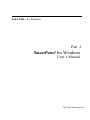
1
Lab-LINKTM for Windows
Part 2
SmartPanel for Windows
User’s Manual
Top Team Technology, Inc.
Table of Contents
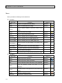
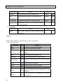
Ch1 Basic Concept
TAG _______________________________________________________________ 1-1
Panel TAG __________________________________________________________ 1-1
Tag Name___________________________________________________________ 1-1
Data structure of Tag __________________________________________________ 1-2
System TAG _________________________________________________________ 1-2
Objects_____________________________________________________________ 1-3
Panel Structure ______________________________________________________ 1-4
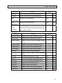
Ch2 Panel Editor
Panel Files __________________________________________________________ 2-1
Coordinate System____________________________________________________ 2-1
Foreground, Background and Object Orders ________________________________ 2-1
Graphic Objects and Genie Objects_______________________________________ 2-2
Panel Editor _________________________________________________________ 2-3
Menu ______________________________________________________________ 2-4
Toolbar _____________________________________________________________ 2-8
Cursor ____________________________________________________________ 2-15
Scale Adjustment ____________________________________________________ 2-16
Panel Setup ________________________________________________________ 2-16
Exit Panel Editor_____________________________________________________ 2-18
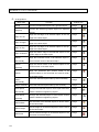
Ch3 Tutorial
Open a New Project ___________________________________________________ 3-1
Create the First Object _________________________________________________ 3-2
Define Properties _____________________________________________________ 3-2
Define Other Objects __________________________________________________ 3-3
TAG Definition _______________________________________________________ 3-4
Saving the Panel _____________________________________________________ 3-4
Running the Example__________________________________________________ 3-4
Ch4 Configure Genie Objects
Object Categories ____________________________________________________ 4-1
Object Definition______________________________________________________ 4-2
Selecting Objects _____________________________________________________ 4-2
Position and Size Definition _____________________________________________ 4-3
Object Properties Definition _____________________________________________ 4-3
Basic Page__________________________________________________________ 4-6
Special Page - Basic __________________________________________________ 4-7
Special Page - Details _________________________________________________ 4-8
Color Designation____________________________________________________ 4-11
Edge, Retreat and Frame______________________________________________ 4-14
TAG Linking ________________________________________________________ 4-15
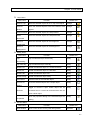
Ch5 Configure Graphic Objects
Adding Graphic Objects ________________________________________________ 5-2
Graphic Object Properties ______________________________________________ 5-6
Basic Page__________________________________________________________ 5-8
Border Page________________________________________________________ 5-10
Fill Page ___________________________________________________________ 5-11
Polygon Page_______________________________________________________ 5-14
Text Page __________________________________________________________ 5-15
Picture Page _______________________________________________________ 5-16
Defining Colors _____________________________________________________ 5-17
Node Editing _______________________________________________________ 5-19
Ch6 Arranging Objects
Selecting Objects _____________________________________________________ 6-1
Operations on Objects _________________________________________________ 6-3
Rotate an Object _____________________________________________________ 6-5
Object Layout________________________________________________________ 6-6
Modify an Object _____________________________________________________ 6-9
Foreground and Background ___________________________________________ 6-10
Use of Layers_______________________________________________________ 6-11
View Control________________________________________________________ 6-12
Other Tools_________________________________________________________ 6-14
Color Setting for Multiple Objects________________________________________ 6-15
Ch7 Panel Objects
Panel _____________________________________________________________________ 7-1
Popup Window and Child Window ________________________________________ 7-1
Panel Box_______________________________________________________ 7-2
Popup Panel ____________________________________________________ 7-4
Panel Player_____________________________________________________ 7-8
Ch8 Action Objects
Initiator _________________________________________________________ 8-2
AND ___________________________________________________________ 8-4
OR ____________________________________________________________ 8-6
NOT ___________________________________________________________ 8-8
Exlndex _______________________________________________________ 8-10
Multiplexer _____________________________________________________ 8-12
Scanner _______________________________________________________ 8-14
Counter _______________________________________________________ 8-16
Timer _________________________________________________________ 8-18
Multi-Timer _____________________________________________________ 8-20
Delay Timer ____________________________________________________ 8-22
Clock _________________________________________________________ 8-24
Calculator______________________________________________________ 8-26
Runner ________________________________________________________ 8-30
Executer_______________________________________________________ 8-32
WAV Player ____________________________________________________ 8-34
Ch9 Control Objects
Button__________________________________________________________ 9-2
LED Button______________________________________________________ 9-5
Rocker _________________________________________________________ 9-6
Set Button ______________________________________________________ 9-8
Spin Button_____________________________________________________ 9-11
BMP Button ____________________________________________________ 9-13
WMF Button ____________________________________________________ 9-16
Horizontal Slider_________________________________________________ 9-19
Vertical Slider ___________________________________________________ 9-22
Edit Box _______________________________________________________ 9-25
Number Pad____________________________________________________ 9-27
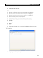
Ch10 Static Display Objects
ShowBMP _____________________________________________________ 10-2
ShowWMF _____________________________________________________ 10-5
MemoBox______________________________________________________ 10-8
Ch11 Dynamic Display Objects
Log Box ___________________________________________________ 11-2
Static Text _________________________________________________ 11-4
Dynamic Text _______________________________________________ 11-7
lndicator__________________________________________________ 11-10
Lamp ____________________________________________________ 11-13
Shape ___________________________________________________ 11-16
Digit Meter ________________________________________________ 11-18
Text Meter ________________________________________________ 11-20
Level ____________________________________________________ 11-23
Ch12 Graph Objects
Horizontal Bar ______________________________________________ 12-2
Vertical Bar ________________________________________________ 12-6
Scroll Trend _______________________________________________ 12-10
Horizontal Trend ___________________________________________ 12-14
Data Trend________________________________________________ 12-18
X-Y Chart_________________________________________________ 12-24
Ch13 Alarm Objects
Alarm Concentrator __________________________________________ 13-2
Annunciator ________________________________________________ 13-4
Alarm WAV Player ___________________________________________ 13-7
Alarm Bar _________________________________________________ 13-9
Alarm Log ________________________________________________ 13-12
Group Annunciator__________________________________________ 13-14
Appendix
Object Icons _________________________________________________________ P1
Reference Path ______________________________________________________ P2
Chapter 1
Basic Concept
TAG
TAG works as the data carrier in Lab-LINK.
All modules are linked by Tags and any changed in
the values will be sent to the modules used them.
There are two kinds of Tags in Lab-LINK: system Tag and user Tag.
System Tags are built-in to
show or control some kind system information and their name always begin with the character “$”.
User Tags are user defined to suit their purpose and their names are given by users.
Panel TAG
Some Tags are only used by panels for user interface and thus do not belong to any workstation.
These Tags are called Panel Tags. Though they are not included in workstations’ Tag database,
they will be store by Lab-LINK projects and can be used when configuring panels.
Tag Name
There are restrictions on the name of Tag:
All Alpha-Numeric characters can be used as well as some of the special characters such
as “-“ and
“_”.
The following special characters cannot be used in Tag name:
! . [ ] ` / \ : * ? “ < > | # $ % & ‘( ) + , ; = @ ^ { } ~
Tag name cannot start with a numeric character.
The limit on the length if Tag name is 8 characters.
Tag name is case sensitive.
1-1
SmartPanel for Windows User’s Manual
Data structure of Tag
Name: Unique identification of a Tag.
Status: Communication related status of a Tag.
Possible status value of a Tag include:
Unknown: Initial status of a Tag.
Reserved: Reserved fo future application.
On-line: Tag is on-line and its value is valid for an IO Tag.
Off-line: Tag is off-line probably due to a communication problem.
Output Failure: The last Write action to the IO Tag failed.
Date: The date when the latest Tag value or message change occurred.
Time: The time when the latest Tag value or message change occurred.
Value: The latest data value obtained for a Tag.
Values are stored as a floting number
with range: Negative:-1.797693134862316E+308~-4.94065E-324
Positive: 4.94065E-324~1.797693134862316E+308.
Message: The latest text message stored in a Tag with the maximum length of 80
characters.
System TAG
All System Tags are system built-in and with names begin with character “$”.
Meanings of
System Tags are described as follows:
$DISK:Its value indicates the remaining space in MB on the system hard disk.
$EXIT:The execution of Lab-LINK is terminated when its valu is set to “1”
$TIME:Its value is incremented by 1 each second since the execution of Lab-LINK.
$USER:Its value indicates the privilege, ranged 0~255, of the current logged-in user, and
its message indicate the name of the current user.
$ALARM*:Its value indicates the number of current alarm, and it message is the newest
alarm message.
$ALM_PRI*:Its value is the priority of the alarm with the highest priority of current active
and unacknowledged alarms.
1-2
Its range is between 0~255.
$NEW_ALM*:Its value will be set to “1” when any new alarm occurs.
$LOGOUT:Current logged-in user will be logged out when its value is set to “1”.
Chapter 1 Basic Concept
*These system TAGs are related to Alarm Module.
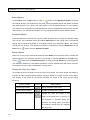
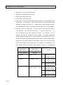
Objects
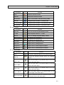
There are seven categories of more than fifty kinds of objects:
Category
Description
Objects
Control the open and
Panel
close of panels
objects
providing
logic,
calculation, timing, and
program
Popup Panel
Panel Player
Invisible
Action
Panel Box
execution
functions
Initiator
AND
OR
Inverter
ExIndex
Multiplexer
Scanner
Counter
Timer
Multi-Timer
Delay Timer
Clock
Calculator
Runner
Executer
Button
LEDButton
Rocker
SetButton
SpinButton
BMPButton
WMF Button
Horizontal Slider
Vertical Slider
Edit Box
WAV Player
Object to control and
adjust parameters
Control
Number Pad
Static
Display
Objects to display static
graphics and text
Objects to dynamically
display the change of
Dynamic
lamps, text and graphics
Display
ShowBMP
ShowWMF
Memo Box
Log Box
Static Text
Dynamic Text
Indicator
Lamp
Shape
Digit Meter
Text Meter
Level
Objects showing graphs
Graphs
and charts
Objects to show alarm
Alarm
status
Horizontal Bar
Vertical Bar
Scroll Trend
Horizontal Trend
Data Trend
X-Y Chart
Alarm Concetrator
Alarm WAV Player
Annunciator
AlarmBar
1-3
SmartPanel for Windows User’s Manual
Category
Description
Objects
Alarm Log
Group Annunciator
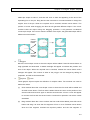
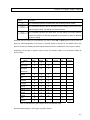
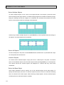
Panel Structure
Panels are organized into a tree structure with a single root panel for each work station.
Root
panel is also the first panel that is automatically opened when a Lab-LINK project is executed.
As shown in the figure below, Wks1.pnl is the root panel containing three panel objects used to
open its three child panels, namely A.pnl、B.pnl 及 C.pnl.
A.pnl and C.pnl will contain three and
two panel objects respectively to open the second level of child panels.
Level 0 Panel
Wks1.pnl
Level 1 Panels
Level 2 Panels
A.pnl
A1.pnl
A2.pnl
B.pnl
C.pnl
A3.pnl
C1.pnl
C2.pnl
Parent panels on upper layer must be opened first before opening child panels on lower layer.
When parent panels are closed, their child panels will also be closed.
objects inside the panel will be cleared and cease functioning.
your panel structure.
When a panel is closed, all
Beware of this when designing
Extra care should be taken when decide which panel to place action
objects since their logical function will stop when the panel they reside is closed.
1-4
Chapter 2
Panel Editor
Panel Editor is the tool used to define objects and panels.
It is started when a panel is selected
by double clicking a panel file in a project. The new Panel Editor 4 is a major upgrade with new
user interface and abundant new features.
Panel Files
When a panel is edited and saved, two files are created by Panel Editor. These two files have the
same name with the panel but with different extension names of pnl and pnd respectively. The pnl
file is the file that is actually displayed at run time, and the pnd file contain the definition used by
Panel Editor for editing.
Note: For previous version of Lab-LINK, only pnl files are created and used. If an old pnl file
created by previous version of Panel Editor is edited by Panel Editor 4, it may become
incompatible for older version of Panel Editor.
Coordinate System
Two types of Coordinate Systems are used:
Absolute Coordinates: This is used by Panel Editor to define objects. The unit is pixel in this
coordinate system with origin at the top left corner of a panel.
Relative Coordinates: This is used to define runtime panel size by Popup Panel and Panel
Player, the two objects used to control panel display, in their definition.
Note: Previous version of Panel Editor use relative coordinates only. When a older version panel
file is edited by Panel Editor 4, all coordinates definition in objects will be converted to absolute
coordinates automatically.
Foreground, Background and Object Orders
2-1
SmartPanel for Windows User Manual
To help users arrange the objects when editing a panel, Panel Editor 4 introduces foreground and
background. For example, users can move objects that’s need not to be adjusted to background
and edit other objects in foreground to avoid change those object accidentally. The action to move
objects to foreground or background is only used in Panel Editor for convenience.
Order is used to determine which object is on top of another when they overlap. By pushing an
object backward or forward can change its order in display. The orders of objects are treated
separately in foreground and background while objects in foreground are always on top of objects
in background. The order of objects displayed is shown as follows:
Top object in foreground
…
Bottom object in foreground
Top object in background
…
Bottom object in background
When two objects overlap, only the object on top can be operated. Care should be taken when
arrange the order of objects.
Graphic Objects and Genie Objects
Graphic Objects are new features of Panel Editor 4. Graphic objects can be used to draw static
background graphics in Panel Editor. Users no longer need to draw these graphics using a graphic
application first, outport them as a bmp or wmf file, and then use ShowBMP or ShowWMF objects
to display them in a panel. The Graphics Object are static and runtime which cannot be related to
Tags and will not change with Tag values changes.
The original dynamic SmartPanel objects are renamed as Genie Objects to avoid the confusion
with the new static Graphic Object. Genie Objects are completely compatible and have the same
settings as defined in previous version.
2-2
Chapter 2 Panel Editor
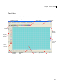
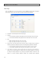
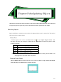
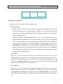
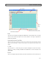
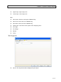
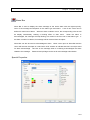
Panel Editor
The user interface of Panel Editor is shown as below. Usage of the menu and toolbars will be
discussed in the following sections.
Standard Toolbar
View Toolbar
Scale Toolbar
Color
Toolbar
Modify
Toolbar
Graphic
Object
Toolbar
Vertical
Slider
Genie
Object
Toolbar
Arrange
Toolbar
Horizontal
Slider
Edit Area (Paper)
Status Bar
2-3
SmartPanel for Windows User Manual
Menu
Menu provides the following function selections:
File Menu
Menu Item
Function
Toolbar Icon
New
Create a new panel and start editing
Standard
Open
Open an existed panel for editing
Standard
Import a panel created by previous version Panel
Import
Editor
Close
Close the panel being edited
Standard
Save
Save the panel being edited to disk
Standard
Save As
Save the edited panel as a different name
Standard
Save As BMP
Save the edited panel as a BMP graphic file.
Save As EMF
Save the edited panel as an EMF graphic file.
Define the size and grid setting of the panel being
Standard
Panel Setup
edited
Print Setup
Setup printer option of the panel being edited
Print Preview
Preview the printout of the panel being edited
Print
Print the panel being edited
Exit
End the execution of Panel Editor and return to PAM
Edit Menu
Menu Item
Function
Toolbar Icon
Undo
Undo the previous operation
Standard
Redo
Redo the previous undone operation
Standard
Cut
Cut the selected content and store it in the clipboard
Standard
Copy the selected content and store it in the
Standard
Copy
clipboard
Past the content in the clipboard into the panel being
Standard
Paste
edited
2-4
Erase
Delete the selected content
Standard
Duplicate
Duplicate the selected content
Standard
Chapter 2 Panel Editor
Menu Item
Function
Toolbar Icon
Select All
Select every objects in the panel being edited
Erase All
Delete every objects in the panel being edited
Edit
Edit objects in the foreground
View
Edit objects in the background
View
Foreground
Edit
Background
Copy the details and style parameters of the base
Copy
Genie Object and assign them to all selected Genie
Properties
Object of the same type
View Menu
Menu Item
Function
Standard Toolbar
Toggle to show or hide the Standard Toolbar
Color Toolbar
Toggle to show or hide the Color Toolbar
Graphic Toolbar
Toggle to show or hide the Graphic Object
Toolbar Icon
Toolbar
Arrange Toolbar
Toggle to show or hide the Arrange Toolbar
Modify Toolbar
Toggle to show or hide the Modify Toolbar
Layer Toolbar
Toggle to show or hide the Layer Toolbar
Status Bar
Toggle to show or hide the Status Bar
Toggle to show or hide the object properties
Properties
dialog
1:1 View
Show the panel content in 1:1 scale
View
Zoom In
Zoom in to enlarge the panel display 2 times
View
Zoom Out
Zoom out to shrink the panel display to half
View
Grid Marks
Toggle to show or hide grid marks
View
Grid Lines
Toggle to show or hide grid lines
View
Foreground
Toggle to show or hide foreground objects
View
Background
Toggle to show or hide background objects
View
2-5
SmartPanel for Windows User Manual
Arrange Menu
Menu Item
Group
Ungroup
Function
Convert the selected objects into a grouped object
Arrange
Convert the selected grouped object into separate
Arrange
objects
Align the left edge of all selected object to the left
Align To Left
Arrange
bottom edge of the base object
Center
Align the horizontal center of all selected object to
Horizontally
the horizontal center of the base object
Center
Align the vertical center of all selected object to the
Vertically
vertical center of the base object
Align the horizontal and vertical center of all
Center
Arrange
edge of the base object
Align the bottom edge of all selected object to the
Align To Bottom
Arrange
edge of the base object
Align the top edge of all selected object to the top
Align To Top
Arrange
edge of the base object
Align the right edge of all selected object to the right
Align To Right
Toolbar Icon
Arrange
Arrange
Arrange
selected object to the horizontal and vertical center
of the base object
Place the selected objects side by side horizontally
Arrange
Attach Vertically
Place the selected objects side by side vertically
Arrange
Even Space
Arrange the selected object to have equal horizontal
Arrange
Horizontally
distance between neighboring objects
Even Space
Arrange the selected object to have equal vertical
Vertically
distance between neighboring objects
Attach
Horizontally
Set the width of all selected objects to be the same
Same Width
2-6
Arrange
as the base object
Set the width and height of all selected objects to be
Same size
Arrange
as the base object
Set the height of all selected objects to be the same
Same Height
Arrange
the same as the base object
Arrange
Chapter 2 Panel Editor
Layer Menu
Menu Item
Function
Toolbar Icon
Send To Top
Move the selected objects to be on top of all objects
Arrange
Send To
Move the selected objects to be at the bottom of all
Arrange
Bottom
objects
Send Forward
Move the selected objects one step forward
Arrange
Send
Move the selected objects one step backward
Arrange
Move the selected objects to the foreground
Arrange
Move the selected objects to the background
Arrange
Backward
Move To
Foreground
Move To
Background
Modify Menu
Menu Item
Flip
Function
Toolbar Icon
Flip the selected object horizontally
Modify
Flip Vertically
Flip the selected object vertically
Modify
Rotate -90°
Rotate the selected object 90° counterclockwise
Modify
Rotate 90°
Rotate the selected object 90°clockwise
Modify
Rotate 180°
Rotate the selected object 180°
Modify
Rotate Freely
Rotate the selected object freely
Modify
Edit Nodes
Edit the nodes of the selected object
Modify
Convert To
Cover the selected object into a shape object
Modify
Toggle to convert a open outline object into an
Modify
Horizontally
Shape
Enclose
enclosed area or convert an enclosed area into an
open outline object
Open the properties dialog of the selected object for
Modify
Properties
editing
Window Menu
Menu Item
New Window
Function
Open a new window for the panel being edited
Toolbar Icon
Standard
2-7
SmartPanel for Windows User Manual
Menu Item
Function
Toolbar Icon
Cascade
Arrange all open windows in cascade mode
Standard
Tile
Arrange all open windows in horizontal tile mode
Standard
Arrange all open windows in vertical tile mode
Standard
Horizontally
Tile Vertically
Automatically arrange all the minimized window
Arrange Icon
icons at the bottom
Help Menu
Menu Item
About
Function
Toolbar Icon
Show version, license and other information about
Panel Editor
Toolbar
Toolbars contain frequently used menu item for user’s convenience.
Standard Toolbar:
Tool Button
Icon
Function
New
Create a new panel and start editing
Open
Open an existed panel for editing
Import a panel created by previous version Panel
Import
Editor
Save
Save the panel being edited to disk
Save As
Save the edited panel as a different name
Define the size and grid setting of the panel being
Panel Setup
edited
Undo
Undo the previous operation
Redo
Redo the previous undone operation
Cut
Cut the selected content and store it in the clipboard
Copy the selected content and store it in the
Copy
clipboard
Past the content in the clipboard into the panel
Paste
being edited
2-8
Chapter 2 Panel Editor
Tool Button
Icon
Function
Erase
Delete the selected content
Duplicate
Duplicate the selected content
New Window
Open a new window for the panel being edited
Cascade
Arrange all open windows in cascade mode
Tile Horizontally
Arrange all open windows in horizontal tile mode
Tile Vertically
Arrange all open windows in vertical tile mode
View Toolbar
Tool Button
Icon
Function
Zoom Out
Zoom out to shrink the panel display to half
1:1 View
Show the panel content in 1:1 scale
Zoom In
Zoom in to enlarge the panel display 2 times
Edit Foreground
Edit objects in the foreground
Edit Background
Edit objects in the background
Grid Marks
Toggle to show or hide grid marks
Grid Lines
Toggle to show or hide grid lines
Foreground
Toggle to show or hide foreground objects
Background
Toggle to show or hide background objects
Arrange Toolbar
Tool Button
Group
Icon
Function
Convert the selected objects into a grouped object
Convert the selected grouped object into separate
Ungroup
objects
Align the left edge of all selected object to the left
Align to Left
edge of the base object
Align the right edge of all selected object to the right
Align to Right
edge of the base object
Align the top edge of all selected object to the top
Align to Top
edge of the base object
Align the bottom edge of all selected object to the
Align to Bottom
bottom edge of the base object
Align the horizontal center of all selected object to the
Align to Horizontal
horizontal center of the base object
2-9
SmartPanel for Windows User Manual
Tool Button
Icon
Function
Center
Align to Vertical
Align the vertical center of all selected object to the
Center
vertical center of the base object
Align the horizontal and vertical center of all selected
Align to Center
object to the horizontal and vertical center of the base
object
Attach Horizontally
Place the selected objects side by side horizontally
Attach Vertically
Place the selected objects side by side vertically
Even Space
Arrange the selected object to have equal horizontal
Horizontally
distance between neighboring objects
Even Space
Arrange the selected object to have equal vertical
Vertically
distance between neighboring objects
Set the width of all selected objects to be the same as
Same Width
the base object
Set the height of all selected objects to be the same
Same Height
as the base object
Set the width and height of all selected objects to be
Same size
Send To Top
the same as the base object
Move the selected objects to be on top of all objects
Move the selected objects to be at the bottom of all
Send To Bottom
objects
Send Forward
Move the selected objects one step forward
Send Backward
Move the selected objects one step backward
Move To
Move the selected objects to the foreground
Foreground
Move To
Background
2-10
Move the selected objects to the background
Chapter 2 Panel Editor
Modify Toolbar
Tool Button
Icon
Function
Flip Horizontally
Flip the selected object horizontally
Flip Vertically
Flip the selected object vertically
Rotate -90°
Rotate the selected object 90° counterclockwise
Rotate 90°
Rotate the selected object 90°clockwise
Rotate 180°
Rotate the selected object 180°
Rotate Freely
Rotate the selected object freely
Edit Nodes
Edit the nodes of the selected object
Convert To
Cover the selected object into a shape object
Shape
Toggle to convert a open outline object into an
enclosed area or convert an enclosed area into an
Enclose
open outline object
Open the properties dialog of the selected object for
Properties
editing
Graphic Toolbar
Tool Button
Icon
Function
Select Tool
Select objects to be edited
Node Tool
Edit nodes of the selected object
Rotate Tool
Rotate the selected object
Line
Draw a straight line
Rectangle Tool
Draw a rectangle
Rounded
Draw a rectangle with rounded
Rectangle
corners
Ellipse
Draw an ellipse or a circle
Pie
Draw a pie shape
Polyline
Draw a polyline
Polygon
Draw a polygon
Curve
Draw a curve
Bezier Curve
Draw a Bezier Curve
Shape
Draw a shape
2-11
SmartPanel for Windows User Manual
Frame
Draw a 3-D rectangular frame
Text
Insert a text box
Picture
Insert a picture
Genie Object Toolbar。
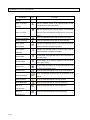
Type
2-12
Icon
Tool Button
Panel
Panel Box
Panel
Popup Panel
Panel
Panel Player
Action
Initiator
Action
AND
Action
OR
Action
NOT
Action
ExIndex
Action
Multiplexer
Action
Scanner
Action
Counter
Action
Timer
Action
Multi-Timer
Action
Delay Timer
Action
Clock
Action
Calculator
Action
Runner
Action
Executer
Action
WAV Player
Control
Button
Control
LED Button
Control
Rocker
Chapter 2 Panel Editor
Type
Icon
Tool Button
Control
Set button
Control
Spin Button
Control
BMP Button
Control
WMF Button
Control
Horizontal Slider
Control
Vertical Slider
Control
Edit Box
Control
Number Pad
Static Display
Show BMP
Static Display
Show WMF
Static Display
Memo Box
Dynamic Display
Log Box
Dynamic Display
Static Text
Dynamic Display
Dynamic Text
Dynamic Display
Indicator
Dynamic Display
Lamp
Dynamic Display
Shape
Dynamic Display
Digit Meter
Dynamic Display
Text Meter
Dynamic Display
Level
Chart
Horizontal Bar
Chart
Vertical Bar
Chart
Scroll Trend
Chart
Horizontal Trend
Chart
Data Trend
Chart
X-Y Chart
Alarm
Alarm OR
2-13
SmartPanel for Windows User Manual
Type
Icon
Tool Button
Alarm
Annunciator
Alarm
Alarm WAV Player
Alarm
Alarm Bar
Alarm
Alarm Log
Alarm
Group Annunciator
Color Toolbar: Used for quick selection of colors. Its usage will be discussed in later
chapters.
Status Bar: Shows information regarding the status of Panel Editor operation.
Information displayed includes brief description of the tool button or the menu item
selected, location and size of the object selected, and keyboard lock status.
2-14
Chapter 2 Panel Editor
Cursor
During the operation of panel editor, the shape of cursor may change to indicate its function. This
is explained as follows.
Cursor
Name
Function
Standard
Used for general editing operation that includes menu and tool button
selection.
Locate
After a graphic or genie object is selected from the toolbar, this cursor
indicates the location on the panel where a new object can be inserted.
Grab
This cursor indicates that the interior of an object is grabbed and can be
moved to new location in the panel.
Move
This cursor indicates that the Outline of an object is grabbed and can be
moved to new location in the panel.
Resize
This cursor indicates that the width of an object can be resized.
Width
Resize
This cursor indicates that the height of an object can be resized.
Height
Resize
This cursor indicates that the width and height of an object can be
resized simultaneously.
Node
This cursor indicates that the Node Tool is selected.
Tool
Select
This cursor indicates that a node can be selected for operation.
Node
Rotate
This cursor indicates that the Rotate Tool is selected.
Tool
Rotate
This cursor indicates the node of an object can be selected to do free
rotation.
Text Tool
This cursor indicates that the Text Tool is selected.
Picture
This cursor indicates that the Picture Tool is selected.
Tool
2-15
SmartPanel for Windows User Manual
Scale Adjustment
For the convenience of panel editing, tools are provided to adjust the display scale of panel. User
can either enlarge or shrink the display scale at any time depending on the detail level of display
they need to edit on the objects. Besides the scale related menu items and toll buttons described
before, there are some other tool can be used to adjust the display scale of the panel:
Scale Toolbar: Pressing left mouse button to drag the slider can adjust the display
scale dynamically. The number on the right of the tool indicates the percentage of
the display scale. 100% means each pixel on the panel is equal to a pixel on the
screen.
Horizontal Slider: Dragging the slider can pan the view horizontally to show the
portion of the panel that was outside of the view.
Vertical Slider: Dragging the slider can pan the view vertically to show hidden
portion of the panel that was outside of the view.
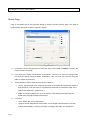
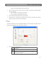
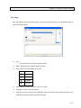
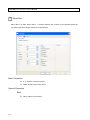
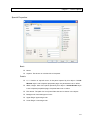
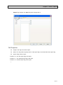
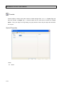
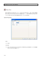
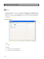
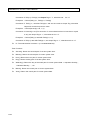
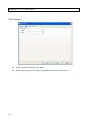
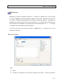
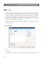
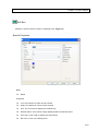
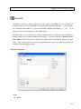
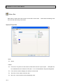
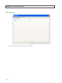
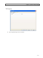
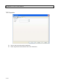
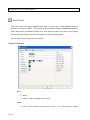
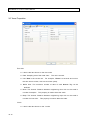
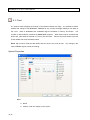
Panel Setup
Panel size can be defined by selecting Panel Setup from File menu or Standard toolbar to open
the Panel Setup dialog.
Settings in the dialog include:
2-16
Area
Item
Description
Panel size
Width
Width of the panel in pixels.
Chapter 2 Panel Editor
Grid
Height
Height of the panel in pixels.
X
minor
The horizontal distance between minor grids in pixels.
minor
The vertical distance between minor grids in pixels.
major
Define the number of minor grids between horizontal major grids.
major
Define the number of minor grids between vertical major grids.
grid
Y
grid
X
grid
Y
grid
Color
Panel
The color of the panel. This definition is used in panel editor only
and will not affect the color of panels during runtime
Background
The color of the desktop background. This definition is used in
panel editor only since the desktop will not be displayed during
runtime
Minor grid
The color of the minor grid lines.
Major grid
The color of the major grid lines.
Grid is used as an auxiliary tool for object editing. When grid is set to be shown, mouse operation
on objects, such as moving and resizing, will lock to grids automatically. When the arrow keys on
keyboard are used to move object, the movement distance will also be based on grid size. They
can also help users visually to align objects. Grids are displayed in Panel Editor only, and will not
be shown at runtime.
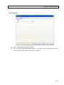
To define colors, please right click on the color setting box to open the color pallet. Click on the tab
“Pallet”, “Standard”, “System” and “Custom” to switch among different color pallets, and then click
on the colors on the pallet to define color properties. Click on any area outside of the color pallet to
cancel color selection and close the pallet.
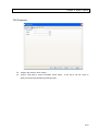
2-17
SmartPanel for Windows User Manual
When panel setup is finished, please OK button to close the dialog and the new setting will take
effect. To give the modification, press Cancel button to close the dialog without saving the setting.
At runtime, since Lab-LINK will stretch the panel to fit the screen resolution, all objects will be
converted to a logical relative coordinates and displayed with correct relative position and size
maintained. To have the best display quality, It is recommended to set the panel size to be the
actual window of the panel at run time.
Exit Panel Editor
Select Exit from the File menu or press the
button on the upper right corner of the panel
editor window to exit the application. If any modification has been made to the panel, a dialog will
appear to ask for confirmation on saving the panel file.
2-18
Chapter 3 Tutorial
A simple example is used to illustrate the using of Panel Editor to create a panel.
Example for the Tutorial
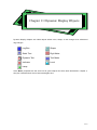
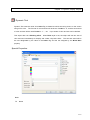
Open a New Project
Press New button on the tool bar of PAM to open a new project.
Enter a project name and add a
workstation by accepting its default name “Wks1” as requested by the New Project Wizard.
new project will be created and the Project windows is shown.
File page in the Project window.
panel files.
A
Click on the File tab to select the
Double click on Panel File node to expand it and shows the
Double click on the root panel file “Wks1.pnl” to run Panel Editor to edit the panel file.
3-1
SmartPanel for Windows User’s Manual
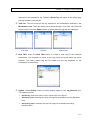
Create the First Object
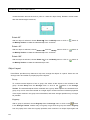
A Button object will be created as the first object in our example.
Objects Toolbar and click on
its selection.
icon to select it.
Move the cursor to the Genie
The selected object icon will sink to indicate
Move cursor to where you want to have the button the Edit Area.
Click left mouse
button and drag to right and lower direction and a black will appear and resize as you drag your
mouse.
The square indicates the size of the Button object.
Release mouse button when the
sized desired is shown and our first object is created on the Edit Area.
Add a Button object
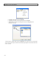
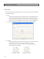
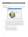
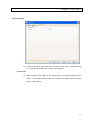
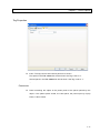
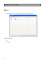
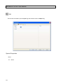
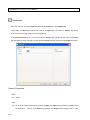
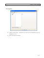
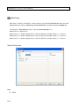
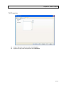
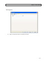
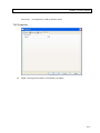
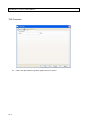
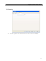
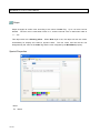
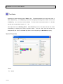
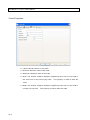
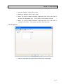
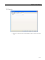
Define Properties
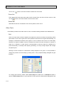
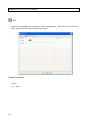
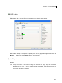
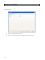
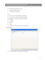
After the creation of the Button object, double click it to open its Properties dialog.
Click on the
Caption field in the Basic area of the dialog box, an editing cursor appear to allow editing of this
property.
Erase the default text of “Button” by pressing “Backspace” key and then enter “Switch”
to change the caption (that is the text shown on the button).
3-2
Move the cursor to the Close button
Chapter 3 Tutorial
in the dialog box and click on it.
The dialog box will be closed and the text shown on the Button
object can be seen to change to “Switch”.
Button Properties Dialog Box
Define Other Objects
Please select and create the following objects using similar methods described in the previous
section.
Indicator
Vertical Slider
Level
Digit Meter
Button
Double click on each object one by one to open their properties dialog to edit their properties
described below:
Vertical Slider:Change Caption in Basic area to “Level Adjustment” and check on the
3-3
SmartPanel for Windows User’s Manual
Continuous check box in the Style area.
Digit Meter: Change the content of Digits in Properties area into “3” and Dec. Digit into
“0”.
Button: Change Caption in the Basic area of the second button object into “Exit”.
TAG Definition
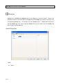
Objects must be linked to tags to relate them to IO data.
Two tags are used in our example: led
represent the status of the indicator and level represents the height of some liquid in a tank.
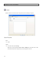
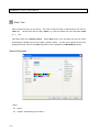
Move the cursor to the Indicator object and right click on it.
to allow definition of the tag linked to this object.
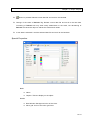
A Tag Setting dialog box will appear
Enter “led” into the Index field.
Since the first
Button object with “Switch” caption we created will be used to control this Indicator object, please
right click on it and enter the same tag name of “led” into its Target field.
Since tag name is case
sensitive, please take care on your typing to avoid mistake.
Open Tag Setting dialog of the three objects related to tank level one by one and enter tag names
as described below:
Vertical Slider: Enter “level” into Target field.
Level: Enter “level” into Source field.
Digit Meter: Enter “level” into Source field.
A special system Tag named $EXIT will be used to end the execution of Lab-LINK.
Whenever
it’s set to “1”, it will cause Lab-LINK to end.
Please right click on the Button object with Caption
“Exit” and enter “$EXIT” into its Target field.
This button will be used to end the ruuning of our
example project.
Saving the Panel
After the editing of objects, save the panel file by selecting Save from the File Menu.
After the
saving is completed, end Panel Editor by select Exit from the File Menu and return to PAM.
Running the Example
Exit Panel Editor and return to PAM.
3-4
Select Generate from Run Menu to generate the
Chapter 3 Tutorial
configuration needed to run the project.
completes successfully.
project.
Click OK button to close message box when generation
Select Run from Run Menu to execute Lab-LINK runtime and load the
The panel configured in this example will be shown on the screen and is ready for
testing.
Move the cursor onto the button with caption “Switch”.
hand indicating that it is an operable object.
sink.
The cursor will turn into the shape of a
Press the button by left clicking it and the button will
The indicator will be lit and its color becomes bright red.
Click on the button again and the
indicator will be turned off.
Move the cursor onto the slider, click on its marker and drag it upward or downward.
The color
bar on the Level object will change accordingly and the number on the Digit meter will also
change.
The testing shows that your first panel is correctly built.
Click on the “Exit” button to end the
running of this project and return to PAM.
3-5
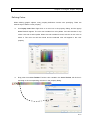
Chapter 4 Configure Genie Objects
A simple example is used to illustrate how a panel can be configured. The configuration of genie
objects will be explained with further details in this chapter. Since there are many genie objects,
and each genie object has its own unique functions and properties. This chapter will only discuss
the usage of the panel editor user interface when creating objects and some of the properties
common to most genie objects. Detail discussion of the unique functions and properties will be
presented in later chapters.
Object Categories
SmartPanel provides more than fifty kinds of objects.
These objects can be classified into seven
categories:
Panel Objects: Use to control the display, hide or switch of panels.
Action Objects: Provide logical operation such as math calculation, timing control,
application execution…, etc. These objects are all invisible at runtime.
Control Objects: Use to simulate the operational components on a control panel.
Static Display Objects: Use to display static graphics or text.
Dynamic Display Objects: The content they display may changed with Tag values
Graph Objects: Provide several dynamic graph and chart display showing the
change of tag values.
Alarm Objects: Used to display alarm status of tags.
Despite the differences of their looks and features, all genie objects are configured in a similar
manner using the properties dialog provided by panel editor.
4-1
SmartPanel for Windows User’s Manual
Object Definition
Creating a genie object is a four-step process:
1. Select the object needed from the Genie Objects Toolbar.
2. Define the position and size of the object in the Edit Area.
3. Set object properties.
4. Set Tag linking to the object.
Selecting Objects
Objects are displayed as icons in Genie Objects Toolbar.
clicking on the icon representing the object.
Select the object needed by left
The icon will sink to indicate the object is selected.
An object will remain selected until another object or the Selector icon is selected.
4-2
Chapter 4 Configure Genie Objects
Genie Objects Toolbar
Position and Size Definition
After the selection of object, move the cursor to where you want to put the object.
mouse and drag to right and bottom direction.
Left click your
A square appears to indicate the size of the object.
Release mouse button when the appropriate size is reached and a new object is created.
Some invisible objects such as action objects will be shown as icons and their size cannot be
adjusted.
The icons are only for the convenience of editing and they will be hidden during
runtime.
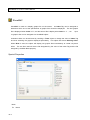
Object Properties Definition
Double click on a object to open its properties dialog box to define its properties.
among objects of different types.
Properties vary
However, they can be classified into the following categories:
Basic: Size and position of objects, disable and other options
Special: Properties specific to each type of genie object. Depending on the type of
genie objects, these property entries may need user to enter a value, select a file
4-3
SmartPanel for Windows User’s Manual
or a color. They can be further divided into these subcategories:
x
Basic: Basic information of the object including Name, Caption, size and
privilege, etc.
x
Details: Properties related to how an object looks and the characteristics of
its functions.
x
Style: Options related to how an object looks and the characteristics of its
functions.
They are defined using Check Box. An item is selected when the
Check Box shows
。
Properties Dialog
TAG: Define the Tags related to the object. Most genie objects need to be
specified one or more tags that related to it. The usage of the tag reference differs
among genie objects. For objects not related to any tags, the tag definition page
may not appear in their properties dialog.
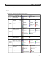
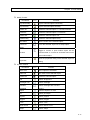
Axes: Axes properties my include X Axis, Y Axis and XY Axes pages. These
property pages appear only in the dialog of genie objects which will display one or
more coordinate axes. The table below shows the genie objects with axes:
4-4
Chapter 4 Configure Genie Objects
Genie Object
Horizontal Slider
X Axis
Vertical Bar
XY Axes
ˇ
Vertical Slider
Horizontal Bar
Y Axis
ˇ
ˇ
ˇ
Scroll Trend
ˇ
Horizontal Trend
ˇ
Data Trend
ˇ
X-Y Chart
ˇ
Different genie objects have different properties. The following sections will discuss some of the
properties which are common to most objects. For those properties specific to certain kinds of
genie objects, they will be discussed in later chapters.
4-5
SmartPanel for Windows User’s Manual
Basic Page
In Basic page of the properties, only Position, Size, Lock-Size, Lock-Position and
Others-Disable apply to genie objects. Other properties are used by graphic objects and need not
to be set for genie objects.
Position
Position is defined by X and Y properties. They represent the coordinates of the upper-left corner
of the object. The unit for the coordinates is pixel. At run time, since relative coordinates are used
to fit Lab-LINK panel with the screen resolution, the object may be stretched in proportional to the
panel window size. However, the relative location and size among objects will be automatically
maintained.
Size
Width and Height define the size of the object. Similar to Position definition, their units are pixels,
and the actual size may be stretched at runtime according to screen resolution.
4-6
Chapter 4 Configure Genie Objects
Lock
Lock options are used to prohibit direct change of object properties in panel editors. This is to
prevent careless operation mistakes to change object properties accidentally. These setting are
only used in the Panel Editor, they have no effect at runtime. Due to object characteristics, only
the following options apply to genie objects:
Size: Prohibit the change of object size properties.
Position: Prohibit the change of object position properties.
Others - Disable
If checked, the genie object will be disabled. When an object is disabled, it will be invisible and
have no functions at runtime.
Special Page - Basic
Name
Name is a required property of all objects, but it is only for reference and uniqueness is not
required or obligated.
Caption
Caption is used by several objects to show text on them.
All alpha-numeric and most symbol
characters can be used.
Privilege
Some operable objects such as those in the control category have this property.
Privilege is
related to Security Module and is used to determine whether an operator is permitted to operate
an object or not.
At runtime, each time such a object is operated, security module will compare
the privilege of current logged-in user with this properties.
Only those users with privilege greater
than or equal to this setting can successfully operate this object.
User privilege has a value between 0 and 255 while higher value indicates higher privilege.
A
number between 0 and 255 should be entered into this property.
4-7
SmartPanel for Windows User’s Manual
Special Page - Details
Details properties vary for object of different types, some of the commonly seen properties
editing interface include:
Number input
Text input
Font selection
File designation
Color designation
Combo box selection
Number Input
A number is needed.
Meaning and range of the number depends on the property itself.
Text Input
A text string is needed.
Meaning and length limit of the text depends on the property itself.
Usually, all alpha-numeric and most symbol characters will be accepted.
Multiple Number or Text Input
Several text strings or numbers are needed.
Meaning and limits depends on the property itself.
Number or text is entered in an editor box, and buttons are used to insert, remove and replace a
number or string.
To insert a new text entry at the end of the list, please right click on the list bottom and select
Insert from the popup menu, an empty element appears in the list. Use keyboard to enter the
new text and press enter key when finished. The new entry will appear at the end of the list. To
insert a new entry before an existed entry, right click on the existed entry and select Insert. The
new entry will appear right before the existed entry.
To modify an existing text in the list, right click on the entry and select Modify from the popup
menu. Use keyboard to edit it, and press enter key after the new file path is entered.
To delete a text from the list, right click on the entry and select Delete from the popup menu.
4-8
Chapter 4 Configure Genie Objects
To adjust the order of entries in the list, left click to select an entry and drag it upward or
downward until the new position is reached.
Font
Font is used to determine the font used to display text on the object, usually its caption.
the button next to Font to open the Font dialog.
Press
Select font using the drop list in the dialog.
If a True Type font is selected, size of the text is controlled by the number of characters defined
by Number of char field entry.
This properties means the number of characters to be shown
and will determined the width of each character.
File Designation
Some objects require one or more file to be selected for some properties.
next to the file name to open a dialog for selecting file.
Press the button
Reference path notation as discussed
in the appendix of this manual is recommended when designating a file path.
If the property allows multiple files designation, the file property field should be a list. Please
4-9
SmartPanel for Windows User’s Manual
right click on the list and select Insert from the popup menu, an empty element appears in the
list. Use keyboard to enter the file path and press enter key when finished. The new entry will
appear in the list. To insert a new entry before an existed entry, right click on the existed entry
and select Insert. The new entry will appear right before the existed entry.
To modify an existing path in the list, right click on the entry and select Modify from the popup
menu, and use keyboard to edit it. Press enter key after the new file path is entered.
To delete a file path from the list, right click on the entry and select Delete from the popup
menu.
To adjust the order of entries in the list, left click to select an entry and drag it upward or
downward until the new position is reached.
File path in the list can also be entered using the Open dialog. By selecting Insert… from the
popup menu, the Open dialog will appear to allow the selection of a file path instead of entering
it directing into the list.
To replace a file entry in the list using the Open dialog, right click on the entry to be replaced
and select Replace from the popup menu. The Open dialog will appear to allow the selection of
a new file path. The newly selected file path will replace the original file after the dialog is
closed.
Please note that if the file selected by the Open dialog is located in one of the system defined
reference path, panel editor will change the path into reference notation. For example, if a file in
pnl subfolder in the project folder is selected, its path will be changed to “~1\” automatically. This
is because the pnl folder is the path for panel files and its reference path notation is~1.
Reference paths and their notations are shown in the table below. For detail discussion on
4-10
Chapter 4 Configure Genie Objects
reference path, please see the appendix section.
Reference
Path
Notation
Path
Description
~1\
Project path\pnl\
Used to store panel files
~2\
Project path\bmp\
Used to store bmp files
~3\
Project path\wmf\
Used to store wmf files
~4\
Project path\wav\
Used to store wave files
~5\
Project path\txt\
Used to store text files
~6\
Project path\dat\
Used to store data files
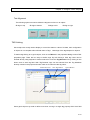
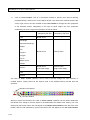
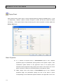
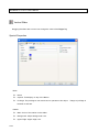
Color Designation
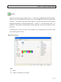
There are several ways to specify a color property:
Use Popup Color Tool: Right click on a color box in the property dialog, and the
Popup Color Tool will appear. The color tool includes four color pallets. Left click
the tabs on top of the color tool to select pallet. When the color needed is found,
left click on the color to select it, and the color tool will be closed and the selected
color will appear in the color property.
4-11
SmartPanel for Windows User’s Manual
Drag color from Color Toolbar: Find the color needed in the Color Toolbar, left
click on it and drag to the corresponding color box in the property dialog.
Click on Color Toolbar: This is a convenient method to specify color without
opening properties dialog. Select one or more objects whose color need to be
modified, and the left click or right click on the color needed on the Color Toolbar
to change the color properties of the selected objects. Depending on the type of
genie object, the color properties modified by left click or right click operation are
shown below:
Genie Object
Color Property
Color Property
changed by left click
changed by right click
─
Background
Popup Panel
─
Background
Panel Player
─
Background
Button
Text Color
Background
LED Button
Text Color
Lit Lamp Color
Rocker
Mark Color
Background
Set Button
Text Color
Background
Spin Button
Arrow Color
Background
BMP Button
─
Background
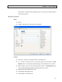
Panel Box
4-12
Chapter 4 Configure Genie Objects
Genie Object
Color Property
Color Property
changed by left click
changed by right click
─
Background
Horizontal Slider
Mark Color
Background
Vertical Slider
Mark Color
Background
Edit Box
Text Color
Box Color
Lit Color
Ext color
Show BMP
─
Background
Show WMF
─
Background
Memo Box
Text Color
Box Color
Log Box
Text Color
Box Color
Static Text
Text Color (First)
Background
Dynamic Text
Text Color (First)
Background
Indicator
Text Color
Lamp Color(First)
Lamp
Text Color
Lamp Color(First Lit)
Shape
Color(First)
Color(Second)
Digit Meter
Lit Color
Ext Color
Text Meter
Text Color (First)
Background
Liquid Color
Background
Horizontal Bar
Bar Color(First)
Chart Background
Vertical Bar
Bar Color(First)
Chart Background
Scroll Trend
Curve Color(First)
Data Window Color
Horizontal Trend
Curve Color(First)
Data Window Color
Data Trend
Curve Color(First)
Data Window Color
X-Y Chart
Curve Color
Data Window Color
Text Color
Normal Color
Alarm Bar
Normal Color
Background
Alarm Log
Normal Color
Log Box Color
Text Color
Normal Color
WMF Button
Number Pad
Level
Annunciator
Group Annunciator
4-13
SmartPanel for Windows User’s Manual
Combo Box Selection
Some properties are selected using a combo box.
Special Page - Style
Some of the common style definitions used by many objects are discussed as follows.
Edge, Retreat and Frame
Many of the objects are 3D and have these style options:
Thin Edge: Add thin edge around the object for 3D effect.。
Thick Edge: Add thick edge around the object for 3D effect.。
Retreat:Shrink the content such as graphics and text shown in the object so the
background color will become visible.
Frame: Add an extra 3D frame around the graphics or text shown in an object.
Three color properties are used to define the color of edge and frame:
Background
4-14
Upper Edge
Lower Edge
Chapter 4 Configure Genie Objects
Text Alignment
The following styles are used to define the alignment of text on an object:
Align to top
Align to bottom
Align to left
Align to right
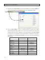
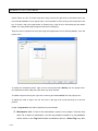
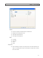
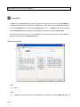
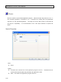
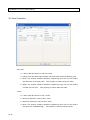
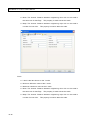
TAG Linking
Since object are mostly used to display or control the status or value of IO data, their configuration
of objects is not complete without linked them to Tags.
Meanings of the tags depend on objects.
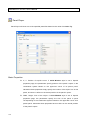
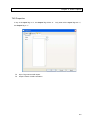
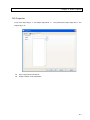
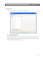
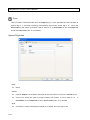
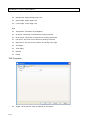
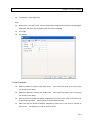
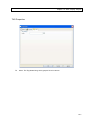
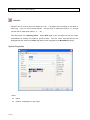
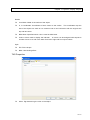
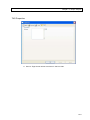
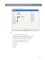
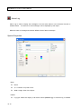
To define tags linking to an genie object, click on the TAG tab in the properties dialog to show TAG
properties page. There are two ways to define tags. By left clicking a field, tag name can be
entered directly using keyboard. Another method is to use the Tag Browser tool by clicking on the
button next to each tag field. With Tag Browser, tags can be selected from the Tag database
already created in the project and users need not to memorize the tag name.
Workstation List
New Tag Button
Option Button
TAG List
Some genie object may need to define more than one tag in a single tag property field. Such field
4-15
SmartPanel for Windows User’s Manual
will be shown as a list. To insert a tag name entry into the list, right click on the blank area in the
list and select Insert from the popup menu. Use keyboard to enter the tag name and press enter
key. To insert a tag name right before an existing entry, right click on the existing tag and select
Insert. The newly added tag will appear before the existing tag.
Tags can also be inserted into a tag list using the Tag Browser tool by selecting Insert… from the
popup menu..
To modify am existed tag name, right click on the tag and select Modify from the popup menu.
Use keyboard to edit the tag and press enter key when finished.
To delete a tag from the tag list, right click on the tag and select Delete from the popup menu.
To adjust the order of tags in the list, left click on the tag to be moved and drag it to the new
position.
Usage of Tag Browser tool will be explained in further details:
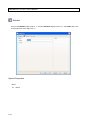
Workstation List: It lists all the workstation names in the project. Use the drop
down list to select a workstation, and the tag already created in its tag database
will be shown in the Tag List. Besides workstation names, a Panel Tag entry also
4-16
Chapter 4 Configure Genie Objects
appears in the workstation list. Selecting Panel Tag will show all the panel tags
already created in the project.
TAG List: The list shows all the tag created for the workstation selected in the
Workstation List. There are three way to show the tags: Icon View, List View and
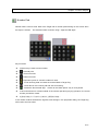
Report View. Press the Option button to select how the tags will be displayed.
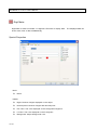
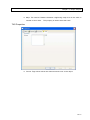
Icon View
List View
Report View
New TAG: Press the New TAG button to create a new tag for the selected
workstation. Use keyboard to enter a new tag name and press enter key when
finished. The newly added tag will be added into the tag database of the
workstation automatically.
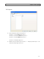
Option: Press Option button to select display option in the Tag Browser tool.
The options include:
System Tag: Select this option to show system tags in the tag list.
Ascending order: Selecting this option and tags will be display ascending alphabetic
order.
Descending order: Selecting this option and tags will be display descending
alphabetic order.
4-17
SmartPanel for Windows User’s Manual
Icon View: Show tags as icons in the Tag List.
List View: Show tags as a list of tag name entries in the Tag List.
Report View Show tags as a list of tag name entries in the Tag List but with
description of the tags.
To add a tag into a property field using the Tag Browser tool, simply left click on the tag name
from the TAG List and drag it to the field. The selected tag will appear in the field when left mouse
button is released.
4-18
Chapter 5 Configure Graphic Objects
Graphic Objects are new type of objects introduced by Panel Editor 4. They can be used to
create graphic in a panel. Graphic objects are not linked to any tags, and they are static at runtime.
The following graphic objects are provided in Panel Editor 4:
Line
Rectangle
Rounded Rectangle
Ellipse
Pie
Polyline
Polygon
Curve
Bezier Curve
Shape
Frame
Text
Picture
Graphic Object Toolbar
5-1
SmartPanel for Windows User’s Manual
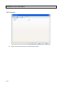
Adding Graphic Objects
In Panel Editor, graphic objects can be selected by left clicking it in the Graphic Object Toolbar.
The selected object button will be highlighted.
After an object type is selected, it can be added into the panel. However, the method to add an
object is different for different types of objects and will be discussed separately as follows:
Line,
Rectangle,
Rounded Rectangle,
Ellipse,
Frame
Move the cross shape cursor to where the object will be added. Press left mouse button to
drag rightward and downward. A dotted rectangle will appear to indicate the position and
size of the object. When the required size is reached, release the mouse button and the
object is added.
Pie:
Move the cross shape cursor to where the object will be added. Press left mouse button,
drag rightward and downward, and release the mouse button. A 360° Pie shape appears.
Left click on
5-2
in the Graphic Toolbar to select the Select Tool. Left click on the newly
Chapter 5 Configure Graphic Objects
added pie shape to select it, and then left click on blue dot appearing at the end of the
separating line on the pie. Drag the blue dot clockwise or counterclockwise to change the
angular size of the pie. When the required size is reached, release mouse button. The
position of cursor when dragging the blue dot will generate different shape. If the cursor
remains inside the object during the dragging operation, it will generate a traditional
concave pie shape. If the cursor remains outside of the object, the generated shape will be
different as shown below.
Cursor
remains
inside
Cursor
remains
outside
Polygon
Move the cross shape cursor to where the object will be added. Press left mouse button to
drag rightward and downward. A dotted rectangle will appear to indicate the position and
size of the object. When the required size is reached, release the mouse button and a
hexagon will appear. The number of sides of the polygon can be changed by editing its
properties, and will be discussed later.
Polyline,
Curve
These graphic objects require the definition of multiple nodes. Two methods can used to
define the nodes:
(1)
Click method: Move the cross shape cursor to where the first node will be added and
click left mouse button. The first node is added. Move the cursor to the position of the
second node and left click again to add the second node. A line or curve will appear
to connect the first and the second node. Continue this operation until all the nodes
are added.
(2)
Drag method: Move the cursor to where the first node will be added, press left mouse
button and drag it to show the first segment of line or curve. Release mouse button
when the first segment reached the required position and the first segment is
5-3
SmartPanel for Windows User’s Manual
completed. Press left mouse button again on any position on the panel and drag to
show the second segment. Drag the second segment until the required position is
reached and release mouse button. Continue this operation until all the segments are
added.
Press right mouse button to end the configuration of the object, and a completed line or
curve object is shown. The adjustment of nodes will be discussed later.
Bezier Curve:
A Bezier curve is consisted of multiple connected segments. A Bezier segment is
composed of two nodes and two control points. Two connected segment share a common
node. If the first control point of the second segment is at the mirror position of the second
control point of the first segment, the two segments can be connected smoothly. With this
concept in mind, a smooth and complex Bezier curve can be constructed by properly
defining each node and control point.
Similar to the Drag method described in the previous section of the Polyline and cure
object configuration, a Bezier curve object can be added by move curser to where the first
node is and drag to show the dotted reference line formed by the first node and the first
control point. Press left mouse button when the position of the first control point is reached.
Move cursor to the location of the second node. Press left mouse button to set the second
node. This is also the first node of the second segment. Drag to show the reference line
formed by the first node and the first control point of the second control point. A mirrored
second control point of the segment is automatically generated, and a dotted first segment
is also shown. Continue this operation until all segments are constructed. Press right
mouse button to end the configuration of the object, and a completed Bezier curve is
shown. The adjustment of nodes and control points will be discussed later.
Shape:
A Shape is a complex geometric shape consisted of multiple connected Bezier curve
segment and/or line segments. To configure a shape object, please refer to the description
5-4
Chapter 5 Configure Graphic Objects
in adding Polyline objects and Bezier Curve objects. When a polyline segment is to be
added, use the Click method. If a Bezier curve segment is to be added, use the Drag
method. Continue the operation of adding polyline or Bezier curve segment until all
segments are configured. Press right mouse button to end the configuration of the object,
and a completed shape is created. The adjustment of nodes and control points will be
discussed later.
Text:
Move cross shape cursor to where the object will be added. Click left mouse button, and a
text editing box appears. Use keyboard to enter text. Click on the OK button when finished.
Text fonts, size and content can be edited using the properties dialog which will be
described later.
Picture:
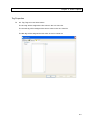
Move cursor to where the object will be added and click left mouse button. An Open dialog
will appear to allow a picture file to be chosen. Select a file using the Open dialog and
press Open button to close the dialog. The selected picture will appear in the panel as a
picture object.
Note that is the file selected located in one of the system defined reference path, its path
will be replaced with the corresponding reference path notation. For example, if a picture
file located in the bmp subfolder of the project is selected, its path will be covert to ~2\.
Please refer to the appendix section of this manual for further discussion of reference path.
5-5
SmartPanel for Windows User’s Manual
The standard reference path notation of picture files aer shown below:
Reference
Path
Location
說明
~2\
Project folder\bmp\
Used to store bmp picture files
~3\
Project folder\wmf\
Used to store wmf picture files
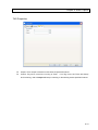
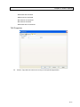
Graphic Object Properties
Each graphic object has some properties, and the looks of the graphic object can be modified by
editing its properties. Properties of graphic objects can only be edited in the panel editor, and they
will remain static at runtime.
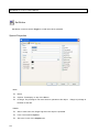
To modify properties, the object must be right clicked and select Properties from the popup menu.
The properties dialog of the object will appear to allow editing.
There are three buttons at the bottom of the properties dialog: OK, Cancel and Apply. This
provides three selections after the editing of properties is finished:
5-6
Chapter 5 Configure Graphic Objects
Button
Function
The modified properties will take effect and the dialog will be closed.
The modified properties will be discarded, and all setting will be reset to the
values before editing. The dialog will remain opened.
The modified properties will take effect, but the dialog will remain opened.
Users can continue to edit the properties of the object or select a different
object for editing.
Note that after the editing of the properties of a object, either OK or Apply button must be press to
apply the edited properties to the object. If another object is selected or any blank area in the
panel is clicked, the edited properties will be discarded and no modification of the object is made.
Depending on the type of graphic objects, there are different pages in the properties dialog as
shown below:
Object
Basic
Border
Fill
Polygon
Line
X
X
Rectangle
X
X
X
Rounded
X
X
X
Ellipse
X
X
X
Pie
X
X
X
Polyline
X
X
X
Polygon
X
X
X
Curve
X
X
X
Bezier Curve
X
X
X
Shape
X
X
X
Frame
X
X
X
Text
X
Picture
X
Text
Picture
Rectangle
ˇ
X
X
Note: X indicates the type of object has this properties page.
Not all properties apply to every type of graphic objects
5-7
SmartPanel for Windows User’s Manual
Basic Page
Click on the Basic tab on top of the properties to select the Basic properties page. This page is
used to define position, size, anchor point, lock option and other basic properties.
Information: A brief description about the object type.
Position:
X: The horizontal coordinate of the upper left corner of the object. The unit is in pixel.
Y: The vertical coordinate of the upper left corner of the object. The unit is in pixel.
Size
Width: The width of the object. The unit is in pixel.
Height: The height of the object. The unit is in pixel.
Anchor point: The anchor point will be used the center of rotation when the object is
rotated. Its position also affects the center of color filling when gradient fill is selected.
X: The horizontal coordinate of the anchor point of the object. The unit is in pixel.
Y: The vertical coordinate of the anchor point of the object. The unit is in pixel.
Lock: Options in this area is used to prohibit users from using direct mouse operation or
indirect menu or toolbar operation to change some of the object properties. The only way
to modify the locked properties is by opening the properties dialog to edit them. This
design is to prevent careless operation mistake from changing object properties
5-8
Chapter 5 Configure Graphic Objects
accidentally. For example, if the Lock option of Position is check, users will not be able to
move the object by using mouse to drag it. All lock options are for panel editor operation
only and have no effect at runtime.
Size: Prohibit the change of object size.
Enclose/open: Prohibit the change of enclose/open characteristic of the object.
Node: Prohibit the editing of nodes.
Rotate: Prohibit the rotation of the object.
Position: Prohibit the moving of object position.
Properties: Reserved and has no effect.
Others
Enclose: Define whether the object is treated as an enclosed area or not. Unchecked
the option will cause the object to become a open border without the interior area. This
option only applies to polyline, curve, Bezier curve and shape. Other geometric graphic
objects must be converted to shape for the option to take effect.
Hide: When the option is set, the object will become invisible. Although it can still be
added, it will not be shown at runtime.
Disable: When the option is set, the object will become invisible. Although it can still be
added, it will not be shown at runtime.
5-9
SmartPanel for Windows User’s Manual
Border Page
Click on the Border tab in the properties dialog to switch to border property page. This page is
used to define the border features of graphic objects.
Line Style: Use the drop down list to select the style of the border. If Hidden is chosen, the
object will have no border.
Line Thickness: Define the thickness of the border. The unit is in pixel. An integer value
can be enter directly using keyboard. Alternately, users can also use mouse to drag the
slider to adjust the thickness.
Thickness Base: Define what the thickness is based on.
Center: Use the edge of the object as the center of the border and extend the border in
both directions, inner and outer. It is possible for the border to exceed the edge of the
object if the thickness is greater than 1.
Edge: The border extends only in inner direction. This setting guarantees that the
border won’t exceed the edge of the object.
Line Color
Color: Define the color of the border.
Opaque: Define opaqueness of the border. It is an integer value between 0 and 255
and can be adjusted by entering a number or dragging the slider. The smaller the
5-10
Chapter 5 Configure Graphic Objects
number is, the more transparent the border becomes.
Line Tip: Define the shape of both ends of the border. This property only affects objects
that is not enclosed.
Start: The shape of the starting tip of the border.
End: The shape of the ending tip of the border.
Corner: Define the shape of each corner of the border.
Dotted Line Tip: If a dotted line is selected as the line style of the border, this property
defines the shape of the tip of each line segment.
Fill Page
Left click on the Fill tab on top of the properties dialog to show the Fill page. The page is used to
define the fill characteristics of the interior area of objects.
Type: The type of color filling used.
Type
Description
No filling. The interior area will be transparent.
Solid fill: Use the first (upper) color in color properties to fill
interior area of the object.
5-11
SmartPanel for Windows User’s Manual
Type
Description
Pattern fill: Use the first (upper) color in color properties as
background color to fill the interior area of the object, and use
the second color to draw the selected pattern.
Texture Fill: Use the selected texture tile to fill the interior area of
the object. The direction the texture tiles are arranged depends
on the Mosaic properties.
Centered Gradient Fill: Use both color defined in color properties
to create centered gradient fill. The center of the filling is the
anchor point.
Linear Gradient Fill: Use both color defined in color properties to
create linear gradient fill. If the selected style isn’t based on
center or edges, the Split properties can determine the split
position of both colors. The split point is defined as a percentage
of the width or height of the object. If the Direction property is
defined as Custom, the Orientation properties can be defined
to adjust the inclined angle.
Note: If an object is set as
(No Filling), its interior area will not be considered as
part of the object. Therefore, when selecting the object, its border must be clicked
on. Clicking on its interior area will fail to select the object.
Color: Define the color and opaqueness of the filling. The meaning of both color and
opaque properties depends on the style of filling.
Pattern: Used to select a pattern for filling. This property applies only when
(Pattern
Fill) is selected as the filling style.
Texture: Used to select a texture tile for filling. The property applies only when
(Texture Fill) is selected as the fill style
Mosaic: Used to define the direction of the texture tile when forming texture filling. This
property applies only when
5-12
(Texture Fill) is selected as the filling style.
Blend: These properties are used to define how the two colors should be blended to create
Chapter 5 Configure Graphic Objects
a gradient filling.
Style: Used to define the blend style. This property applies only when
or
is
selected as the filling style.
Direction: Specify the direction of the gradient filling. This property applies only when
is selected as the filling style.
Split: Specify the split point to blend the two colors. The unit is in percentage of the
width or height of the object. This property applies only when the blend style is not
based on center or both edges of the object.
Orientation: Specify the inclined angle of the linear gradient fill. This property applies
only when the Direction property is selected as Custom.
5-13
SmartPanel for Windows User’s Manual
Polygon Page
Only polygon objects have this property page. Left click on Polygon tag on top of properties dialog
to show this property page.
Basic
Sides: Specify the number of sides of the polygon object. It is an integer between 3 and
12. Users can enter a value directly in the field on the right, or drag slider to adjust it.
Orientation: Specify the rotation angle of the polygon object. Note that a polygon object
cannot be rotated using the Rotate tool unless it is first converted into a Shape object.
Preview: Properties modification will be shown immediately in this area as a preview.
Distortion
Starlike: Checking this property will convert the polygon into a concave star shape, Two
more properties can be set to control the extent of distortion of the object.
Concavity: Specify the percentage of concavity of the star shape polygon object.
Twist: Specify the extent of twisting.
Concavity 50%, Twist 50%
5-14
Concavity 50%, Twist 25%
Chapter 5 Configure Graphic Objects
Text Page
Only Text objects have this property page. Left click on the Text tab on top of properties dialog to
show this property page.
Font
Font: Select the font used to display the text.
Color: Select the color used to display the text.
Style: Select the style applied to the text:
Style
Description
Bold
Italic
Underline
Cross line
Size: Specify the size of the text. The unit is point.
Example: Preview of the text format.
Content: The text content to be displayed. Users can edit the text content directly in this
area using keyboard. Multi-lines text is allowed.
5-15
SmartPanel for Windows User’s Manual
Picture Page
Only Picture objects have this property page. Left click on the Picture tab on top of the properties
dialog to show this property page.
File
File name: Specify the picture file to be displayed. A file path can be entered directly in
the field. Alternately, users can press the button on the right to use the Open dialog to
locate and select a picture file. Note that id a file located in the system defined
reference path is selected, its path will be shown using the reference path notation/ For
example, if a file located in the bmp folder of the project is selected, its path ill be
converted into “~2\”. See the appendix section of this manual for reference path details.
Preview: The selected picture file will be displayed in this area.
Information
5-16
File type: The file type of the selected picture file.
Width: The width of the selected picture file in pixels.
Height: The height of the selected picture file in pixels.
Color depth: the color depth of the selected picture file.
Chapter 5 Configure Graphic Objects
Defining Colors
When defining graphic objects, many property definitions involve color specifying. There are
several ways to define a color property:
Use Popup Color Tool: Right click on a color box in the property dialog, and the popup
Color Tool will appear. The color tool includes four color pallets. Left click the tabs on top
of the color tool to select pallet. When the color needed is found, left click on the color to
select it. The color tool will be closed and the selected color will appear in the color
property.
Drag color from Color Toolbar: Find the color needed in the Color Toolbar, left click on it
and drag to the corresponding color box in the property dialog.
5-17
SmartPanel for Windows User’s Manual
Click on Color Toolbar: This is a convenient method to specify color without opening
properties dialog. Select one or more objects whose color need to be modified, and the left
click or right click on the color needed on the Color Toolbar to change the color properties
of the selected objects. Depending on the type of genie object, the color properties
modified by left click or right click operation are shown below:
Object
Line
Color Property
Color Property
changed by left click
changed by right click
Border Color
─
Rectangle
Rounded Rectangle
Ellipse
Pie
Polyline
Border Color
First Fill Color
Border Color
First Fill Color
(Left Upper edge)
(Right lower edge)
Polygon
Curve
Bezier Curve
Shape
Frame
Text
Picture
Text color
─
─
─
The Click on Color Toolbar operation can be used to quickly change the color definition of
multiple objects. Simply select all the objects need to be modified before proceed with this
operation.
Border Color Default
Fill Color Default
When no objects are selected, the “Click on Color Toolbar” operation can be used to determine
the default color setting for all new objects to be added after this default color setting. The color
selected by left mouse button click will appear on the Border Color Default on the left of the color
toolbar, and the color selected by right mouse button click will appear on the Fill Color Default.
5-18
Chapter 5 Configure Graphic Objects
When a new graphic object is added, this default color setting will be applied automatically to
define the new object. However, these default color settings do not apply to genie objects.
Node Editing
For graphic objects with multiple segments border, nodes are the end point of each segments.
Panel Editor provide node editing tool to edit them after the objects are created. Graphic objects
supporting node editing include polyline, curve, Bezier curve and shape. Line, rectangle, rounded
rectangle, ellipse, pie and polygon objects must be converted to shape objects first, and they can
then have nodes to be edited. Since frame and picture objects cannot be converted to shape
objects, so node editing do not applies to these objects. For text object, despite that it is possible
to convert them into shape objects, it is not recommended because it will be converted to
extremely complex shape.
There are three methods to select the object whose nodes will be edited:
Select the object by clicking on it with Select tool, and then select Edit Node from the
Modify menu.
Select Node Tool from the Graphic Object Toolbar by click on the
will be shown as
icon. The cursor
. Left click on the object to edit its nodes.
Right click on the object and select Edit Node from the popup menu.
The object selected for node editing will have show their nodes as blue dot with square edges,
with the exception of the first node which is a red dot with square edge. The anchor point will be
shown as a red circle with a cross mark on top of it. For Bezier curve objects, their control point
will be shown as square yellow dots.
Nodes
Anchor Point
Control Point
First Node
Add a new node: Right click on the node where a new node next to it will be added and
select Add Nodes from the popup menu. For every new node, two control points will also
be added for a Bezier curve object. Since the newly added node will appear on top of the
selected existing node, use mouse to drag the new node to its new position.
5-19
SmartPanel for Windows User’s Manual
Selecting a node: Before moving or deleting a node, it must be selected first. Multiple
nodes can be selected to move or delete them altogether.
Select a node: Left click on a node to select it. The selected node will be shown as a
solid blue square.
Select multiple nodes: To select multiple nodes, move cursor to a blank spot on the
upper left side of all the nodes to be selected and drag the cursor to show a dotted
rectangle.
Keep dragging the cursor until all the nodes to be selected are enclosed by
the rectangle and release the mouse button. All the nodes in the dotted rectangle will
be selected. Another way to select multiple nodes is left click on the nodes while
pressing the Shift key on the keyboard.
Unselect a node. To unselect all the selected nodes, simply click on a blank area in the
panel. To unselect some of the selected nodes, left click the nodes while pressing the
Shift key on the keyboard.
Move nodes: Move cursor to any of the selected node, the cursor becomes
to indicate
it is ready to move the node. Left click the node and drag it to the desired position.
Release the mouse button and all selected nodes are moved. Anchor points and control
points can also be moved using this operation.
Delete nodes: Right click on a selected node and select Delete Nodes from the popup
menu to delete all the selected nodes. Another way is simply press the Delete key on the
keyboard, and all the selected nodes will be deleted. When a node on a Bezier curve is
deleted, its corresponding control points will also be deleted.
5-20
Chapter 6 Manipulating Objects
Panel Editor provides convenient functions to help users modify objects after they are created and
arrange the layout of objects in a panel. These features will be explained in this chapter.
Selecting Objects
Before modifying or operating on any objects, the target objects must be select first. This section
will discuss how to select objects.
Select Tool
To select objects, Left click on the Select Tool icon
in the Graphic Object Toolbar. After
the action, the cursor will change to indicate that the Select Tool is used and system is ready
for object selection:
Cursor
Description
The cursor is on a blank area in the panel.
The cursor is inside of an object
The is on the border of an object.
Note: Another convenient way to select the Select Tool without clicking on the toolbar is to
simply right click on a blank area in the panel.
Select a Single Object
After the Select Tool is chosen, left click on any object to select it. Eight squares will appear
around the object to indicate that it has been selected.
6-1
SmartPanel for Windows User’s Manual
Select Multiple Objects
To select multiple objects, move cursor to the upper-left side of the objects, press left mouse
button and drag lower-right direction. A dotted rectangle appears to indicate the selecting range.
Drag the rectangle until all the objects to be selected are enclosed and release the mouse
button. All the objects inside the rectangle will be selected,
Another way to select multiple objects is to press Shift key on the keyboard while left clicking on
the objects. All clicked objects will be selected.
Select All Objects
To select all objects in the panel, choose Select All from the Edit menu or press Ctrl and A keys
on the keyboard at the same time.
Unselect Objects
To unselect all the selected objects, simply left click on a blank spot in the panel. To unselect
some of the selected objects, left click these objects while pressing Shift key on the keyboard.
The square around the clicked objects will disappear to indicate that they have been
unselected.
Select the Base Object
Some object operations need to specify one of the selected objects as the base object. To
specify the base object, left click on it and the squares around it will turn to solid red indicating
that it is selected as the base object. When selecting multiple objects, the last selected object
will always be set as the base object by default.
6-2
Chapter 6 Manipulating Objects
Operations on Objects
Operations can be conducted on selected objects include:
Moving Objects
Mouse operation: Press left mouse button on any of the selected objects to drag
all the selected objects to a new position. If Ctrl key on the keyboard during this
operation, the movements of objects will be confined to horizontal, vertical and 45°
diagonal directions only.
Keyboard operation: Pressing direction keys ← and → on the keyboard can move
selected objects horizontally to left or right. Pressing ↑ and ↓ keys on the keyboard
can move the selected objects vertically upward and downward. The movement for
each keystroke is defined by the X minor grid and Y minor grid properties in the
Panel Setup. If the Ctrl key is also pressed when using the direction keys to move
objects, the movement for each keystroke will be twice of the grid size. If Shift key
is pressed while using the direction key to move objects, the movement will always
be one pixel for each keystroke.
Cut Objects
Right click on any of the selected objects and select Cut from the popup menu to cut the
selected objects from the panel. The cut objects will be removed from the panel and moved to
the clipboard. This operation can also be conducted by choosing Cut from the Edit menu or
button from the Standard Toolbar. The shortcut key combination of pressing Ctrl and X on the
keyboard at the same time has the same function, too.
Copy Objects
Right click on any of the selected objects and select Copy from the popup menu to copy the
selected objects and store them in the clipboard. This operation can also be conducted by
choosing Copy from the Edit menu or
button from the Standard Toolbar. The shortcut key
combination of pressing Ctrl and C on the keyboard at the same time has the same function,
too.
6-3
SmartPanel for Windows User’s Manual
Paste Objects
Choose Paste from the Edit menu or click on
button on the Standard Toolbar can paste
the objects stored in the clipboard to the panel. Since the pasted objects will appear at where
they were original cut or copied, user may need to move the pasted objects to a new location.
The shortcut key combination of pressing Ctrl and V on the keyboard at the same time has the
same function, too. Panel Editor support cut, copy and paste feature across different panels.
Duplicate Objects
Duplicate operation combines the copy and paste operation without using the clipboard. Right
click on any of the selected objects and select Duplicate from the popup menu, the selected
objects will be copied and pasted on its original position. The duplicated objects can then be
moved to a new location. This operation can also be conducted by choosing Duplicate from the
Edit menu or
button from the Standard Toolbar.
Delete Objects
Right click on any of the selected objects and select Delete from the popup menu to delete the
selected objects. This operation can also be conducted by choosing Delete from the Edit menu,
clicking
button from the Standard Toolbar, or simply pressing Delete key on the keyboard.
The difference between cut and delete operations is that a deleted object will not be moved to
the clipboard and thus cannot be pasted to another panel.
Change the Size of an Object
To Change the size of an object, move the cursor to its border. The cursor shape will change to
indicate the size changing feature allowed. Drag the border to change the size of the object.
The location of the cursor on the border will affect the shape of the cursor and the sizing
functions:
Cursor Location
Cursor
Sizing Feature
Left and right border
Chang the width of the object
Top and bottom border
Change the height of the object
Four corner of the object
Change the width and height of the
object at the same time. If Ctrl key on
the keyboard is pressed during the
operation, the sizing action is confined
to horizontal, vertical and 45° diagonal
directions only.
6-4
Chapter 6 Manipulating Objects
Rotate an Object
Among the graphic objects, Pie, polygon, frame, picture and text objects can only be rotated to
three angles: 90° clockwise, 90° counterclockwise and 180° rotations. Other graphic objects can
be rotate to any angle. Genie objects cannot be rotated.
When an object is rotated, its anchor point will be used as the center of rotation. The position of
the anchor point can be moved by dragging it with the Rotate Tool if necessary.
Choose a Rotating Object
Left click on the
become
button (Rotate Tool) in the Graphic Toolbar, and the shape of cursor will
. Move the cursor and left click on the object to be rotated. Four blue dots will
appear on the four corners of the selected object indicating the rotating spot used to conduct
free rotation with mouse dragging. The anchor point will also appear and is marked as a red
circle with a cross on it. Another way to choose a rotating object is to select the object with the
Select Tool first, and choose Rotate Freely from the Modify menu or click on the
button
in the Modify Toolbar.
Note that only one object can be rotate at a time. Since pie, polygon, frame, picture and text
objects do not support free rotation, they cannot be selected as a rotating object.
Move the Anchor Point
After a rotating objected is selected, press left mouse button on the anchor point and the cursor
shape will change to
. Drag the anchor point to a new position and release the mouse button.
Another way to move the anchor point is to open the properties dialog of the selected rotating
object, and edit its anchor point coordinates directly. This is also the only way to change the
anchor point of pie, polygon, frame, picture and text objects since they cannot be operated by
Rotate Tool.
Free Rotation
After a rotating object is selected, move cursor to one of the blue spot at the corners of the
object and the cursor change to
. Press left mouse button and drag clockwise or
6-5
SmartPanel for Windows User’s Manual
counterclockwise around the anchor point to rotate the object freely. Release mouse button
after the desired angle is reached,
Rotate 90°
After an object is selected, choose Rotate 90° from the Modify menu or click on
button in
the Modify Toolbar to rotate the selected object 90° clockwise.
Rotate -90°
After an object is selected, choose Rotate -90° from the Modify menu or click on
button in
the Modify Toolbar to rotate the selected object 90° clockwise.
Rotate 180°
After an object is selected, choose Rotate 180° from the Modify menu or click on
button in
the Modify Toolbar to rotate the selected object 180°.
Object Layout
Panel Editor provides many features to help user arrange the objects in a panel. Users can use
Arrange menu and toolbar to properly layout the objects.
Group
To combine several objects to form a group, first select all the objects to be included in the
group. Choose Group from the Arrange menu or click on the
button in the Arrange
Toolbar. The selected objects will be combined into a group. When objects are combined into a
group, they can be move and resized as a single object. However all other individual properties
of the object member in the group cannot be edited, and some arrange operation may no longer
be possible.
Ungroup
After a group is selected, choose Ungroup from the Arrange menu or click on the
button
in the Arrange Toolbar. Another way to ungroup is right click the group and select Ungroup
from the popup menu. After the ungroup operation, each member is a unique object again and
6-6
Chapter 6 Manipulating Objects
its properties can be edited independently.
Align to Left
After all the objects to be aligned are selected, left click on an object to select it as the base
object. Choose Align to Left from the Arrange menu or click on the
button in the Arrange
Toolbar. The left edges of all the selected objects are aligned to the left edge of the base
object.
Align to Right
After all the objects to be aligned are selected, left click on an object to select it as the base
object. Choose Align to Right from the Arrange menu or click on the
button in the
Arrange Toolbar. The right edges of all the selected objects are aligned to the right edge of the
base object.
Align to Top
After all the objects to be aligned are selected, left click on an object to select it as the base
object. Choose Align to Top from the Arrange menu or click on the
button in the Arrange
Toolbar. The top edges of all the selected objects are aligned to the top edge of the base
object.
Align to Bottom
After all the objects to be aligned are selected, left click on an object to select it as the base
object. Choose Align to Bottom from the Arrange menu or click on the
button in the
Arrange Toolbar. The bottom edges of all the selected objects are aligned to the bottom edge
of the base object.
Center Horizontally
After all the objects to be aligned are selected, left click on an object to select it as the base
object. Choose Center Horizontally from the Arrange menu or click on the
button in the
Arrange Toolbar. The horizontal centers of all the selected objects are aligned to the horizontal
center of the base object.
Center Vertically
After all the objects to be aligned are selected, left click on an object to select it as the base
object. Choose Center Vertically from the Arrange menu or click on the
button in the
Arrange Toolbar. The vertical centers of all the selected objects are aligned to the vertical
center of the base object.
6-7
SmartPanel for Windows User’s Manual
Center
After all the objects to be centered are selected, left click on an object to select it as the base
object. Choose Center from the Arrange menu or click on the
button in the Arrange
Toolbar. The vertical and horizontal centers of all the selected objects are aligned to the vertical
and horizontal center of the base object.
Attach Horizontally
After all the objects to be arranged are selected, choose Attach Horizontally from the Arrange
menu or click on the
button in the Arrange Toolbar. The selected objects will be placed
side by side in horizontal direction.
Attach Vertically
After all the objects to be arranged are selected, choose Attach Vertically from the Arrange
menu or click on the
button in the Arrange Toolbar. The selected objects will be placed
side by side in vertical direction.
Even Space Horizontally
After all the objects to be arranged are selected, choose Even Space Horizontally from the
Arrange menu or click on the
button in the Arrange Toolbar. The selected objects will be
placed together with even space in between in horizontal direction.
Even Space Vertically
After all the objects to be arranged are selected, choose Even Space Vertically from the
Arrange menu or click on the
button in the Arrange Toolbar. The selected objects will be
placed together with even space in between in vertical direction.
Same Width
After all the objects to be resized are selected, left click on an object to select it as the base
object. Choose Same Width from the Arrange menu or click on the
button in the Arrange
Toolbar. The widths of all the selected objects are resized to be the same with the width of the
base object.
Same Height
After all the objects to be resized are selected, left click on an object to select it as the base
object. Choose Same Height from the Arrange menu or click on the
button in the Arrange
Toolbar. The heights of all the selected objects are resized to be the same with the height of
the base object.
6-8
Chapter 6 Manipulating Objects
Same Size
After all the objects to be resized are selected, left click on an object to select it as the base
object. Choose Same Size from the Arrange menu or click on the
button in the Arrange
Toolbar. The widths and heights of all the selected objects are resized to be the same as the
same with the base object.
Modify an Object
Except for rotation, there are other operations can be used to modify an object.
Flip Horizontally
Select the object to be flipped, and choose Flip Horizontally from the Modify menu or click on
the
button in the Modify Toolbar. The selected object will be flipped horizontally and can
be seen to become the mirrored image of the original object.
Flip Vertically
Select the object to be flipped, and choose Flip Vertically from the Modify menu or click on the
button in the Modify Toolbar. The selected object will be flipped vertically and can be seen
to become the mirrored image of the original object.
Convert to Shape
This feature can be applied to line, rectangle, rounded rectangle, ellipse, pie, polygon and text
objects. To convert an object into a shape object, it must be selected with Select Tool first. After
the object is selected, choose Convert to Shape from the Modify menu or click on the
button in the Modify Toolbar.
Please note that this operation is irreversible. If a non-shape object is converted into a shape
object, it can no longer be converted back to its original object type.
Enclose
Enclose is one of the basic properties of most types of graphic objects. An object whose
Enclose property is not checked is an open object. An open object contains its border only and
does not include the interior area circled by its border. Therefore, the Fill properties setting have
no effect on an open object. An object whose Enclose property is set is an enclosed object. An
enclosed object contains its border and the interior area inside the border. Rectangle, rounded
rectangle, ellipse, pie, and polygon objects are enclosed object by default. By unchecking their
Enclose property in the properties dialog, these object can become open objects. Polyline,
6-9
SmartPanel for Windows User’s Manual
curve, Bezier curve and shape are open objects by default. They can be turned into enclosed
object by setting their Enclose property. Line objects are one-dimensional object and its
Enclose property has no effect.
To enclose an object, the object must be selected first. Choose Enclose from the Modify menu,
click on the
button in the Modify Toolbar, or right click on the object and select Enclose
from the popup menu can turn the object into an enclosed object. The same operation can also
turn a enclosed object into an open object.
Foreground and Background
Panel Editor 4 introduces the Foreground/Background concept into the editing user interface.
Users can choose to edit objects in the foreground or background. This design is convenient for
arranging and modifying objects. For example, the configured objects that no longer need to be
modified or arranged can be moved to background layer while users are editing in the foreground
layer. Since the object in the background cannot be modified or moved in any manner, this can
prevent careless action to ruin hours of work accidentally.
The following features are provided to work between foreground and background.
Edit Foreground
Select Edit Foreground from the Edit menu or click on the
button to switch to editing in
the foreground mode. In this editing mode, only objects in the foreground can be operated.
Edit Background
Select Edit Background from the Edit menu or click on the
button to switch to editing in
the background mode. In this editing mode, only objects in the background can be operated.
Show/Hide Foreground
This operation is used to determine whether the foreground will be displayed or not. Please
note that the foreground cannot be hidden when the editing mode is set to be in foreground.
There are two ways to show or hide the foreground:
Menu operation: Select Foreground from the View menu to switch between
showing and hiding the foreground. When the foreground is set to show, there will
be a checked sign V in front of the menu item.
6-10
Toolbar operation: Click on the
button in View Toolbar to switch the display of
Chapter 6 Manipulating Objects
foreground.
Show/Hide Background
This operation is used to determine whether the background will be displayed or not. Please
note that the background cannot be hidden when the editing mode is set to be in background.
There are two ways to show or hide the background:
Menu operation: Select Background from the view menu to switch between
showing and hiding the foreground. When the background is set to show, there will
be a checked sign V in front of the menu item.
Toolbar operation: Click on the
button in View Toolbar to switch the display of
foreground.
Move to Foreground
This operation can move the selected objects to the foreground. After the objects to be moved
are selected, choose Move to Foreground from the Layer menu or click on the
button in
the Arrange Toolbar to send the selected objects to the foreground. Please note that this
operation can only be applied when the editing mode is set to be in background. If the
foreground is set to be hidden, the moved object will become invisible because they are sent to
the hidden foreground.
Move to Background
This operation can move the selected objects to thebackground. After the objects to be moved
are selected, choose Move to Background from the Layer menu or click on the
button in
the Arrange Toolbar to send the selected objects to the foreground. Please note that this
operation can only be applied when the editing mode is set to be in foreground. If the
background is set to be hidden, the moved object will become invisible because they are sent to
the hidden background.
Use of Layers
Besides the foreground and background operation, there are layer operation help determine which
object is on top when objects are overlapped.
Send to Top
Move the selected objects to be on top of all objects in the foreground or background. To send
the selected objects to top of other objects, choose Send to Top from the Layer menu or click
6-11
SmartPanel for Windows User’s Manual
on the
button in the Arrange Toolbar.
Send to Bottom
Move the selected objects to be below all objects in the foreground or background. To send the
selected objects to be below other objects, choose Send to Bottom from the Layer menu or
button in the Arrange Toolbar.
click on the
Send Forward
Move the selected object one position forward in the object sequence in the foreground or
background. After the object is selected, choose Send Forward from the Layer menu or click
on the
button in the Arrange Toolbar to send the objects one position forward.
Send Backward
Move the selected objects one position forward in the object sequence in the foreground or
background. After the object is selected, choose Send Forward from the Layer menu or click
on the
button in the Arrange Toolbar to send the objects one position forward.
All the layer operations are conducted independently in the foreground or background. In other
words, the adjustment of sequence of objects in the background does not affect the sequence in
the foreground, and vice versa.
When more than one object are selected for layer operation, only the sequence of the select
objects as a whole are adjusted with respect to other objects. The sequential relations among the
selected objects still remain the same.
View Control
For the convenience of user in object editing and layout, Panel Editor provides functions to control
the view on panels. Users can zoom in or zoom out to adjust the scale of display, or pan to show
different portions of the panel.
6-12
Chapter 6 Manipulating Objects
View Toolbar
Scale
Vertical
View
Slider
Horizontal View Slider
Status bar shows cursor position
Scale
View scale can be adjusted by dragging the Scale slider. The percentage value on the right
shows the view actual with respect to the screen resolution. The range of adjustment is
between 20% and 500%.
Vertical and Horizontal View Slider
When the panel view is enlarged, the screen may be unable to show the whole panel. Use the
sliders to pan horizontally or vertical to show portions of the panel that was outside of the
screen.
1:1 View
Show the panel in 1:1 scale. Every pixel in the panel is displayed as a pixel on the screen.
Select this 1:1 scale by choosing 1:1 View from the View menu or click on the button in the
View Toolbar.
Zoom In
Zoom in to enlarge the panel view scale by two times. Choose Zoom In from the View menu or
6-13
SmartPanel for Windows User’s Manual
click on the
button in the View Toolbar to double the view scale.
Zoom Out
Zoom out to shrink the panel view scale to half. Choose Zoom Out from the View menu or click
on the
button in the View Toolbar to half the view scale.
Status Bar
Status Bar shows the coordinates of the current position of the cursor.
Other Tools
Panel Editor provides some other tools for more convenient editing besides those stated before.
Grid
Grids can help users locate the objects and adjust their size more easily and precisely. When
panel editor is set to show grids, all mouse operations will locked to the grids automatically. For
example, if the distance between minor grids in X and Y direction are set as 5 in Panel Setip,
whenever an object is added, moved or resized, the minimum mouse movement is 5 pixels in
either X or Y direction. In other words, it will impossible to move an object for a distance of 3
pixels horizontally or vertically. With proper grid setting, it is easy to align objects and arrange
the panel layout.
Although mouse movement is restricted as always aligned to the grids, it is still possible to
change the position and size freely by directly them in the properties dialog disregard the grid
limitation.
To change grid intervals, please select Panel Setup from File menu or Standard toolbar to
open the Panel Setup dialog. X minor grid and Y minor grid in the Panel Setup dialog define the
6-14
Chapter 6 Manipulating Objects
distance between grids in horizontal and vertical direction. The units are in pixels. X major grid
and Y major grids define between how many grids a thicker grid line will be drawn and are
simply used for better grid reading. They have no effect on the grid locking feature of mouse
movement.
Show and Hide Grid
There are two way to display the grids on the panel: grid lines and grid marks. Grid lines
indicate the grids as crossed straight lines and grid marks indicates the grids as dots. Whether
grid lines or grid marks are selected, the grid locking feature is the same. The grid display
option can be set as described below:
Grid Marks: Select Grid Marks from View menu, a checked sign ˇ will appear
before the item in the menu to indicate the selection. Another way of doing so is to
left click on the
button in the View Toolbar, the button will appear as
to
indicate the selection.
Grid Lines: Select Grid Lines from View menu, a checked sign ˇ will appear
before the item in the menu to indicate the selection. Another way of doing so is to
left click on the
button in the View Toolbar, the button will appear as
to
indicate the selection.
No Grid: Left click on either Grid Marks or Grid Lines in View menu again to
deselect them. The checked signed before the items will disappear. Alternatively,
the grids can be set to hidden by clicking on the
Toolbar, the button will appear as
and
or
button in the View
to indicate no grid will be shown.
When grids are hidden, the grid locking feature will be turned off and mouse can be moved
freely to adjust the location and size of objects.
Color Setting for Multiple Objects
When more than one object is to be changed to have the same color settings, a convenient
method can be used. Refer to the discussion about color setting for graphic objects and genie
objects in Chapter 4 and 5. Color properties of selected objects can be changed by left or right
clicking on the Color Toolbar. This operation can change the colors of multiple objects
concurrently.
To change the color settings of multiple objects to the same color, select these objects first and
then left click on the desired color in the Color Toolbar. This will change the corresponding left
6-15
SmartPanel for Windows User’s Manual
mouse button color properties the selected objects to the color chosen. Similarly, by right
clicking on the desired color in the Color Toolbar can change the corresponding right mouse
button color properties of the selected objects. The colors corresponding to left and right mouse
button clicks are different for each type of objects. Please see Chapter 4 and 5 of this manual
for details.
Copy Properties of Genie Objects
For genie objects, panel editor provide another convenient tool modify their properties quickly.
To modify Special properties of multiple genie objects of the same type, one of the object can
selected as the base object. Edit the properties of the selected base objects as desired and
then all other object can be modified by copy the properties of the base object to other objects.
This copy operation applies to Special properties of genie objects only, excluding the basic
parameters in the Special properties. I will not affect the Tag properties of the selected objects,
either.
To use this operation, select all genie objects of the same type to be modified, and left click on
one of the object to select it as the base object. Select Copy Properties from the Edit menu
and the properties of the base object are copied to all other selected objects.
This operation can be applied to genie objects of the same type. It will have no effect on the
selected objects which is not of the same type of the base object. This operation cannot be
used with graphic objects.
6-16
Chapter 7 Panel Objects
Panel
Each graphic screen is called a panel in Lab-LINK.
User can design as many panels as he or
she wishes and use panel objects to open and close panels to show operator different graphic
screens.
There are tree types of panel objects:
Panel Box
Popup Panel
Panel Player
Popup Window and Child Window
There are two type of window controlled by panel objects:
Popup Windows: Their coordinate system and size are with respect to the whole screen.
Child Windows: Their coordinate system and size are with respect to their parent windows.
If Window Title Style is set to show the window title of a panel it can be moved around the screen
by dragging its title. A child window can not be seen if moved out of its parent, but a popup
window can.
Popup window will always stay on top of other panel, but child window might be cover by other
panel or object.
Due to the characteristics described above, popup windows are mostly used as a floating
operation panel or as a popup message window. Child window are more offend used a subpanel
as part of larger parent panel since it is easier to layout the objects and control its location with
respect to the objects on the parent panel.
7-1
SmartPanel for Windows User’s Manual
Panel Box
Macro Box is a static panel object.
It always displays the content of the specified panel file.
The panel opened is always treated as a child window.
Basic Properties
X, Y: Position of top-left corner.
Width, Height: Size of the object.
Special Properties
Basic
7-2
Name: Name of the Object.
Chapter 7 Panel Objects
Details
File name: The path of the panel shown in the Macro Box.
Background: Panel background color.
Upper edge: Upper edge color.
Lower edge: Lower edge color.
Style
Thin Edge
Thick Edge
Retreat
Frame
Comments:
Panel containing this object is the parent panel of the panel opened by this
object. If the parent panel closed, the child panel, the panel open by Panel
Box, is also closed.
7-3
SmartPanel for Windows User’s Manual
Popup Panel
Popup Panel can be used to open or close a specified panel by setting its Control Tag to “1” and
“0” respectively.
functioning.
Wwhen a panel is closed, all object it contain will also be closed and cease
If the objects need to keep functioning even when the panel is closed, please set
Always Open style.
Basic Properties
X, Y: Position of top-left corner. If Child Window style is set in Special
properties page, the parameters specify position of the panel it opens in the
coordinates system based on the upper-left corner of its parent panel.
Otherwise these properties simply specify the location of the object icon in this
panel, and have no effect on the actual position of the panel it opens.
Width, Height: Size of the object. If Child Window style is set in Special
properties page, the parameters specify the size of the panel it opens
corresponding to the coordinates system based on the upper-left corner of its
7-4
Chapter 7 Panel Objects
parent panel. Otherwise these properties have no effect on the actual position
of the panel it opens.
Special Properties
Basic
Name
Caption: Text shown on window title of the panel.
Details
File name: The path of the panel shown in the Macro Box.
X, Y: Position of top-left corner of the panel opened by this object. If Child
Window style is set in Special properties page, the parameters has no effect.
Width, Height: Size of the panel opened by this object. If Child Window style
is set in Special properties page, the parameters has no effect.
Background: Panel background color.
Upper Edge: Upper edge color.
Lower Edge: Lower edge color.
7-5
SmartPanel for Windows User’s Manual
Style
Child Window: The opened panel is a child window.
Popup Window: The opened panel is a popup window.
Thin Frame: Show thin frame around panel.
Setting this style enable resizing
of the panel during runtime.
Single Line: Show single line around panel.
Double Line: Show double line around panel.
Window Title: Show window title.
Setting this style enable moving of the
panel during runtime.
Control button: Show control button of the panel.
With this style set, it is
possible for operator to close the panel using window control button to close
the panel during runtime.
Max. button: Show Maximize button of the panel.
With this style set, it is
possible for operator to maximize the panel using window control button to
close the panel during runtime.
Min. button: Show Minimize button of the panel.
With this style set, it is
possible for operator to minimize the panel using window control button to
close the panel during runtime.
Thin Edge
Thick Edge
Retreat
Frame
Always open: The panel is only hidden when it is closed.
contains will remain functioning.
7-6
All objects it
Chapter 7 Panel Objects
Tag Properties
Control: The Tag to control the open and close of the panel.
Setting this tag
to “1” will open the panel, and “0” will close the panel.
Comments:
Panel containing this object is the parent panel of the panel opened by this
object.
If the parent panel closed, the child panel, the panel open by Popup
Panel, is also closed.
7-7
SmartPanel for Windows User’s Manual
Panel Player
Panel Player will show one of the specified panel files based on the value of its Index Tag.
Basic Properties
X, Y: Position of top-left corner. If Child Window style is set in Special
properties page, the parameters specify position of the panel it opens in the
coordinates system based on the upper-left corner of its parent panel.
Otherwise these properties simply specify the location of the object icon in this
panel, and have no effect on the actual position of the panel it opens.
Width, Height: Size of the object. If Child Window style is set in Special
properties page, the parameters specify the size of the panel it opens
corresponding to the coordinates system based on the upper-left corner of its
parent panel. Otherwise these properties have no effect on the actual position
of the panel it opens.
7-8
Chapter 7 Panel Objects
Special Properties
Basic
Name
Caption: Text shown on window title of the panel.
Details
X, Y: Position of top-left corner of the panel opened by this object. If Child
Window style is set in Special properties page, the parameters has no effect.
Width, Height: Size of the panel opened by this object. If Child Window style
is set in Special properties page, the parameters has no effect.
File names: The path of a list of panel files that can be shown in the object.
Background: Panel background color.
Upper Edge: Upper edge color.
Lower Edge: Lower edge color.
7-9
SmartPanel for Windows User’s Manual
Style
Child Window: The opened panel is a child window.
Popup Window: The opened panel is a popup window.
Thin Frame: Show thin frame around panel.
Setting this style enable resizing
of the panel during runtime.
Single Line: Show single line around panel.
Double Line: Show double line around panel.
Window Title: Show window title.
Setting this style enable moving of the
panel during runtime.
Control button: Show control button of the panel.
With this style set, it is
possible for operator to close the panel using window control button to close
the panel during runtime.
Max. button: Show Maximize button of the panel.
With this style set, it is
possible for operator to maximize the panel using window control button to
close the panel during runtime.
Min. button: Show Minimize button of the panel.
With this style set, it is
possible for operator to minimize the panel using window control button to
close the panel during runtime.
7-10
Thin Edge
Thick Edge
Retreat
Frame
Chapter 7 Panel Objects
Tag Properties
Index: The tag used to select which panel to be shown.
First panel in the File names list will be show if the Tag is set to “0”
Second panel in the File names list will be show if the Tag is set to “1”
…
Comments
Panel containing this object is the parent panel of the panel opened by this
object. If the parent panel closed, the child panel, the panel open by Popup
Panel, is also closed.
7-11
Chapter 8
All action objects are invisible during runtime.
of logic, computation or control function.
Action Objects
However, they are designed to perform some kind
Action objects are represented as icons in Panel Editor.
Initiator
Timer
AND
Multi-Timer
OR
Delay Timer
Inverter
Clock
ExIndex
Calculator
Multiplexer
Runner
Scanner
Executer
Counter
WAV Player
Since Basic properties are the same for all genie objects and have been described in
chapter 4, they are omitted and will not be discussed again here.
8-1
SmartPanel for Windows User’s Manual
Initiator
Initiator is used to set the initial values of Tag when the panel containing it is opened.
Special Properties
Basic
Name
Details
Init. Value: Value set to Init. Tags.
Right click on the list and select Insert, Delete or Modify from the popup menu to add,
remove edit value entries. Drag an entry to move its position in the list.
8-2
Chapter 8 Action Objects
Tag Properties
Init. Tag: Tags to be set initial values.
The first tag will be assigned the first value in the Init. Value list.
The second tag will be assigned the second value in the Init. Value list.
…
The Nth tag will be assigned the Nth value in the Init. Value list.
8-3
SmartPanel for Windows User’s Manual
AND
Execute AND calculation upon all Input Tag and send the result to Output Tag.
Special Properties
Basic
8-4
Name
Chapter 8 Action Objects
TAG Properties
If any of the Input Tag is “0”, the Output Tag will be “0”.
Only when all the Input Tags are “1”,
the Output Tag is “1”.
Input: Tag used as AND inputs.
Output: Result of AND calculation.
8-5
SmartPanel for Windows User’s Manual
OR
Execute OR calculation upon all Input Tag and send the result to Output Tag.
Special Properties
Basic
8-6
Name
Chapter 8 Action Objects
TAG Properties
If any of the Input Tag is “1”, the Output Tag will be “1”.
Only when all the Input Tags are “0”, the
Output Tag is “0”.
Input: Tag used as OR inputs.
Output: Result of OR calculation.
8-7
SmartPanel for Windows User’s Manual
Not
Invert the value of Input Tags and send the result to Output Tags.
output Tags can be defined in a single Inverter object.
Special Properties
Basic
8-8
Name
More than on set of input and
Chapter 8 Action Objects
TAG Properties
Output is “1” when Input is “0”, and Output is “0” when Input is “1”.
Input: Tags to be inverted.
Output: Result of Inverting.
Every two tags in the list is a set with the previous one is the output and the later one is the
input. For example, the first tag in the list is the NOT output of the second tag, the third tag in
the list is the NOT output of the forth tag…, etc.
8-9
SmartPanel for Windows User’s Manual
ExIndex
If any of the Member Tags is set to “1”, all other Member Tags are set to “0”, and Index Tag is set
to the sequence of the Tag set to “1”.
Special Properties
Basic
8-10
Name
Chapter 8 Action Objects
TAG Properties
Index: the sequence number of the Tag set to “1”
Its value is “1” if the first Member Tag is set to “1”
Its value is “2” if the second Member Tag is set to “1”
Its value is “3” if the third Member Tag is set to “1”
…
Its value is “0” if all Member Tags are “0”.
Members: Only one member Tag can be set to “1”.
Setting any member Tag to “1” will
cause other member Tags to be set to “0”.
8-11
SmartPanel for Windows User’s Manual
Multiplexer
Send the value of one of the Input Tag selected by Index Tag to the Output Tag.
If the value of Index Tag exceeds the number of Input Tags, the value of Output Tag will be
locked and stop changing with any of the Input Tag.
Is Style Bi-directional is set, not only the value of Output Tag changes as the value of the Input
Tag specified by Index changes, but the specified Input Tag also change as the Output Tag does.
Special Properties
Basic
Name
Style
Bi-direction: Data transmission between Output and Input Tag specified by Index Tag is
Bi-directional.
8-12
That is, if the Input Tag changes, the Output Tag changes with it; if the
Chapter 8 Action Objects
Output Tag changes, the Input Tag also changes with it.
TAG Properties
Output: The Tag acts as the output.
Index: The Tag used to specify which of the input Tag is connected with the output Tag.
Inputs: Tags used as input.
If Index is “0”, the first Input Tag is the input,
If Index is “1”, the second Input Tag is the input,
If Index is “2”, thethird Input Tag is the input,
…I
8-13
SmartPanel for Windows User’s Manual
Scanner
Multiple sets of Controls and Outputs Tags can be assigned to a Scanner object.
Scanner will
determine whether to send the value of the Input Tag to the Output Tag based on the value of the
corresponding Control Tag.
For example, if the first Control Tag is “1”, Input value will be set to
the first Output Tag; if the value of the first Control Tag is “0”, the value of the first Output Tag
won’t change with the Input Tag.
Special Properties
Basic
8-14
Name
Chapter 8 Action Objects
TAG Properties
Input: The Tag used as the input data source.
Outputs: The output Tags.
Controls: Tags used to control the change of Outputs.
Their value should be either “0”
or “1”.
8-15
SmartPanel for Windows User’s Manual
Counter
Counter object is used to Count the number of value changes from “0” to “1” of Input Tags and
send the number to Output Tag.
Inputs.
Every two Tags in its Tag setting is a group with the former Tag as output and the latter
one is input.
Special Properties
Basic
8-16
A Counter object can be used as the counter for multiple
Name
Chapter 8 Action Objects
TAG Properties
Outputs: Counting result.
Increased by one each time the corresponding Input Tag
changes from “0” to “1”.
Inputs: Input Tags to be counted.
8-17
SmartPanel for Windows User’s Manual
Timer
Timer increases or decreases the value of Output Tag by 1 at the specified time interval when its
Control Tag is “1”, and stop increasing or decreasing output when control Tag is “0”.
When the
Count Limit of the output is reached, it will be reset to “0” (if Countdown is set, the Output will
be set to Count Limit when “0” is reached).
Special Properties
Basic
Name
Details
Interval: Output is increased or decrease at this time interval. The unit of Interval is ms.
Count Limit: When the value of output reaches this number, it will be reset to “0”.
Countdown is set, Output will be set to Count Limit when “0” is reached.
Style
8-18
Countdown: Output is decreased instead of increased when the style is set.
If
Chapter 8 Action Objects
TAG Properties
Output: Timer output increased or decrease at specified interval.
Control: Tag use to control the running of Timer.
If no Tag is set, the Timer will always
be functioning, that is Output will keep increasing or decreasing at the specified interval.
8-19
SmartPanel for Windows User’s Manual
Multi-Timer
Multi-Timer increase or decrease a counting value at the specified Time Interval within the limits
determined by the value of Control Tag and Count Interval, and send the result to Output Tag.
For example, if Time Interval is set to “1000” and Count Interval is “3”:
When Input is “0, Output is “0”,
When Input is “1”, Output changes every 1 second (1000 ms) cyclically among “1”, ”2” and ”3”;
When Input is “2”, Output changes every 1 second (1000 ms) cyclically among “4”, ”5” and ”6”;
When Input is “3”, Output changes every 1 second (1000 ms) cyclically among “7”, ”8” and ”9”;
…
Special Properties
Basic
8-20
Name
Chapter 8 Action Objects
Details
Time Interval: The time interval at which Output changes.
Its unit is ms.
Count Interval: Used with Control Tag value to determine the range of Output’s increment
or decrement.
Style
Countdown: Output is decreased instead of increased when the style is set.
TAG Properties
Output: Output of Multi-Timer.
Control: Used to start and stop Multi-Timer.
It also determine the range of the increment
or decrement.
8-21
SmartPanel for Windows User’s Manual
Delay Timer
When Control Tag changes from “0” to “1”, Delay Timer starts timing.
period, Delay Timer will change the value of Output Tag to “1”.
After a specified Delay
When Control Tag changes from
“1” to “0”, Delay Timer will change Output Tag from “1” to “0” immediately.
Special Properties
Basic
Name
Properties
Delay: The delay time from the activation of Control Tag (set Control to “1”) until Output
Tag is activated (set Output to “1”).
8-22
Chapter 8 Action Objects
TAG Properties
Output: Output Tag of the delayed signal.
Control: Tag controlling the delayed Output.
If this tag is not set, Delay Timer will start
timing since the panel containing the object is opened.
8-23
SmartPanel for Windows User’s Manual
Clock
Clock send a sequence of ”0, 1, 0, 1…” pulses at the specified period to the Output Tag when
Control Tag is set to “1”.
Delay Timer.
When Control Tag is set to “0”, Output Tag will remain unchanged by
The length of time for Output Tag to be “0” and “1” when Clock is activated can be
set separately.
Special Properties
Basic
Name
Properties
8-24
On Time: The time of Output being “1”.
Off Time: The time of Output being “0”.
Chapter 8 Action Objects
TAG Properties
Output: Tag used for Clock output.
Control: Tag used to control activation Clock output.
If the Tag is not set, Clock is
always functioning and keeping sending output.
8-25
SmartPanel for Windows User’s Manual
Calculator
Calculator uses Arguments Tag values as inputs and apply them into the specified Equation,
calculate the result and send the result to Output Tag.
The equation will be evaluated whenever
any of the Argument Tag changes unless Trigger Style is set.
If Trigger is set, only the change
of the last Argument Tag will trigger the Calculator to calculate the result of the Equation.
Tag names are not used directly in the Equation, a special function TAG(n) is used istead to
represent the value of the nth Arguments Tag.
Special Properties
Basic
Name
Style
8-26
Triggered: If this style set, only the change in the value of the last Argument Tag will
Chapter 8 Action Objects
trigger the reevaluation of the Equation.
Note that the last Argument Tag can be
unused in the Equation and only used for trigger.
Details
Equation: Equation of the calculation performed on the Argument Tags.
string should be entered in this field.
255 characters.
An equation
The limit on the length of the equation string is
Operators and functions list below can be used in the equation.
Tag
value should be referenced indirectly in the equation string using special function TAG(n).
Operators
Arithmetic operators: +, -, *, /, %(modulus), ^(exponential), !(factorial), 。
Logic operators: AND, OR, NOT
Comparison operators:>, >=, <, <=, = , <>(not equal)
Parentheses (“( “ and “)”)can be used in the equation.
Mathematical Functions
Trigonometric functions: sin(x), cos(x), tan(x)
Anti-trigonometric: asin(x), acos(x), atan(x)
Hyperbolic functions:sinh(x), cosh(x), tanh(x)
Logarithmic functions: exp(x), ln(x), log(x)
Others: abs(x)(absolute value), sqrt(x)(square root), rand(x)(this function generate a
random number with value between 0~x)
Special Functions
INT(x): This function transfers the value of x into an integer.
MIN(a, b): This function returns the smaller number between a and b.
MAX(a, b): This function returns the larger number between a and b.
TAG(n)(1≦n≦N): This function represents the value of the nth Argument Tag.
If n=0, it
represent the value of Output Tag before this calculation.
Choice(c, t, f): c is the condition expression, t and f are both expressions.
of c is true, this function will return the value of t expression.
If the result
Otherwise, if c is false, the
function will return the value of f expression.
Example1:Choice(TAG(1)>=TAG(2),1,0)
8-27
SmartPanel for Windows User’s Manual
Comments: If TAG(1)>=TAG(2), set Output Tag to ”1”, otherwise set
it to “0”
Example 2:Choice(TAG(1)=1, TAG(0)+1, TAG(0))
Comments: if TAG(1)=1, calculate TAG(0)+1 and set the result to Output Tag, otherwise
Output will remain its previous value.
Example 3:Choice(Second()<=30, 1, 0)
Comments: It Second()<=30 (The second s of current absolute time is less than or equal
to 30), set Output Tag to “1”, otherwise set it to “0”.
Example 4:Choice(TAG(1)>=80 AND TAG(2)=1,1,0)
Comments: It TAG(1)>=80 AND TAG(2)=1, set Output Tag to “1”, otherwise set it to “0”.
PI: The mathematical constant π (3.141592653589793).
Time Functions
Second(): Return the second part of current system time.
Minute(): Return the minute part of current system time.
Hour(): Return the hour part of current system time.
Day(): Return the day part of current system time.
Weekday(): Return the day of the week part of current system date.,0 represent Sunday, ,
1 indicates Monday, …, etc.
8-28
Month(): Return the month part of current system date.
Year(): Return the month part of current system date.
Chapter 8 Action Objects
TAG Properties
Output: Tag to be set as the result of the Equation.
Arguments: Tags used as arguments in the Equation.
8-29
SmartPanel for Windows User’s Manual
Runner
Runner is used to run an external application program.
the command specified in Command is run.
required to run the specified application.
only kept for compatibility.
When its Control Tag is set from “0” to “1”,
Command can include path and parameters
This object is from the older version of Lab-LINK and
It is recommended to use a new object Executer to replace this
object.
Special Properties
Basic
Name
Details
Command: the command line of the application program to be run.
include all the required path and parameters the application needs.
8-30
State::The state of the application program when run.
Command line can
Chapter 8 Action Objects
- Minimized and activated
- Maximized and activated
- Normal and not activated
- Normal and activated
- Minimized and not activated
TAG Properties
Control: Tag used the control the running of the specified application.
8-31
SmartPanel for Windows User’s Manual
Executer
Executer is used to execute an external application program or to open an existing document.
When the Control Tag is set from “0” to “1”, Executer will run the specified application.
If the
application specified is a document file, it will activate the appropriate application to open the
document.
Special Properties
Basic
Name
Properties
File name: The file to be executed.
It can be either an executable program file or a
document file which is referenced to an appropriate application.
8-32
Parameters: Parameters needed by the File.
Work folder: the working folder of the specified File.
Chapter 8 Action Objects
State::The state of the application program when run.
- Minimized and activated
- Maximized and activated
- Normal and not activated
- Normal and activated
- Minimized and not activated
TAG Properties
Control: Tag used to control the execution of the specified File.
8-33
SmartPanel for Windows User’s Manual
WAV Player
WAV player can be used to play a Wave file.
When Control Tag is set to “1”, WAV Player uses
Index Tag as the index to choose from a group of Wave files and play the file.
When Control
Tag is set “0”, it stop playing.
Wild card character “?” can be included in the WAV file name in the WAVE File field.
They will
be replaced by the value of Index Tag to specify the Wave file to be played.
Example,
”ALARM-???.WAV”
represent
files: ”ALARM-000.WAV” ~”ALARM-999.WAV”.
be “ALARM-001.WAV”.
Special Properties
Basic
8-34
Name
any
one
of
the
possible
1000
For
Wave
When Index is “1”, the Wave file to be played will
If the file specified by Index doesn’t exist, no wave file will be played.
Chapter 8 Action Objects
Details
File name: The wave file to be played.
File name may include valid path designation.
Use “~4” in path to indicate the reference path for wave files.
“?” in Wave File will be
replaced by Index Tag value.
Style
Repeat: Play the specified repeatedly until Control Tag is set to “0”.
TAG Properties
Index: Tag used to select which wave file to play.
Value of the tag will be used to
replace “?” in Wave File path.
Control: Tag controlling wave file playing.
Start play when the Tag is set to “1” and stop
playing when it is set to “0”.
8-35
Chapter 9 Control Objects
Control objects are used to alter the values of Tags.
They are operable during runtime and may
subject to protection of Check password and privilege.
Button
WMFButton
LED Button
Horizontal Slider
Rocker
Set Button
Vertical Slider
Spin Button
Edit Box
BMPButton
Number Pad
Since Basic properties are the same for all genie objects and have been described in chapter 4,
they are omitted and will not be discussed again here.
9-1
SmartPanel for Windows User’s Manual
Button
Button is one of the most used control objects.
to switch to a different panel…, etc.
It can be used to turn on or turn off an equipment,
When users click on a Button, the value of its Target Tag is
altered.
Special Properties
Basic
Name
Caption: Text display on top of the Button.
Privilege: The privilege a user must have to operate on this object.
between 0 and 255.
Details
9-2
Font: Font used for Caption.
Range of privilege is
Chapter 9 Control Objects
Text: Color of the Caption text.
Background: Object background color.
Upper Edge: Upper edge color.
Lower Edge: Lower edge color.
Style
Push Button: The button is a push button.
Its Target Tag is “1” when the button is
pressed and is “0” when released.
Set Button: The button can only be only used to set Target Tag to “1” when pressed.
The button will remain pressed until the Target is set to “0” with other mechanism.
Reset Button: The button can only be only used to set Target Tag to “0” when pressed.
The button will remain pressed until the Target is set to “1” with other mechanism.
Circular: Set the shape of the button to be circular.
The button is rectangular unless this
style is set.
Transparent: The button is transparent.
Align Top: Align the caption to the top of object.
Align Bottom: Align the caption to the Bottom of object.
Align Left: Align the caption to the left of object.
Align Right: Align the caption to the right of object.
Check password: Always ask for a Check password when operated.
Reconfirm: Show a message to ask for reconfirmation when operated.
Thin Edge
Thick Edge
Retreat
Frame
9-3
SmartPanel for Windows User’s Manual
TAG Properties
9-4
Target: The Tag controlled by this object.
Enable: If this Tag is set, the object is operable only when this Tag is set to “1”.
Chapter 9 Control Objects
LED Button
LED is button with a colored LED on its left-top corner to show is current status.
Most of the settings in the Special properties page and Tag properties page are the same as
Buttons.
Please refer to the Button Section of this Manual.
Special Properties
Details
Lamp color: Color of the LED indicating the status of the Target Tag. Two colors are
defined. The first color is shown when the button is released, and the second color is
used when the button is pressed.
9-5
SmartPanel for Windows User’s Manual
Rocker
Rocker is a button with the shape resemble a rocker switch,
When the side with a marked dot is
pressed, the Target Tag is set to 1”, and when the other side is pressed the Target Tag is set to
“0”.
Special Properties
Basic
Name
Privilege: The privilege a user must have to operate on this object.
between 0 and 255.
Details
9-6
Mark: Color of the marker on the rocker switch.
Background: Object background color.
Range of privilege is
Chapter 9 Control Objects
Upper Edge: Upper edge color.
Lower Edge: Lower edge color.
Style
Push Button: The rocker switch is turned on when clicked with mouse, but it is turned off
immediately when the mouse button is released.
Check password: Always ask for a Check password when operated.
Reconfirm: Show a message to ask for reconfirmation when operated.
Thin Edge
Thick Edge
Retreat
Frame
TAG Properties
Target: The Tag controlled by this object.
9-7
SmartPanel for Windows User’s Manual
Set Button
Set Button is used to set the Target to a fixed value when operated.
Special Properties
Basic
Name
Caption: Text display on top of the Button.
Privilege: The privilege a user must have to operate on this object.
between 0 and 255.
Details
9-8
Value: Value set to the Target Tag when this object is operated.
Font: Font used for Caption.
Text color: Color of the Caption text.
Range of privilege is
Chapter 9 Control Objects
Background: Object background color.
Upper Edge: Upper edge color.
Lower Edge: Lower edge color.
Style
Circular: Set the shape of the button to be circular.
The button is rectangular unless this
style is set.
Transparent: The button is transparent.
Align Top: Align the caption to the top of object.
Align Bottom: Align the caption to the Bottom of object.
Align Left: Align the caption to the left of object.
Align Right: Align the caption to the right of object.
Check password: Always ask for a Check password when operated.
Reconfirm: Show a message to ask for reconfirmation when operated.
Thin Edge
Thick Edge
Retreat
Frame
9-9
SmartPanel for Windows User’s Manual
TAG Properties
9-10
Target: The Tag controlled by this object.
Enable: If this Tag is set, the object is operable only when this Tag is set to “1”.
Chapter 9 Control Objects
Spin Button
Spin Button is used to control the increment or decrement of the Target Tag.
operation can be set.
Increment of each
A limit can also be set to restrict the adjustable range.
Special Properties
Basic
Name
Details
Increment: The increment value each time the spin button is pressed.
For decrementing,
set this filed to a negative value.
Limit: The limit value of increment or decrement.
When the limit is reached, Target Tag
will remain unchanged when the button is clicked.
Arrow: Color of the arrow on the button.
9-11
SmartPanel for Windows User’s Manual
Background: Object background color.
Upper Edge: Upper edge color.
Lower Edge: Lower edge color.
Style
Transparent: The button is transparent.
Up Arrow: The arrow on the button is pointing upward.
Down Arrow: The arrow on the button is pointing downward.
Left Arrow: The arrow on the button is pointing to the left.
Right Arrow: The arrow on the button is pointing to the right.
Thin Edge
Thick Edge
Retreat
Frame
TAG Properties
9-12
Target: The tag whose value is adjusted by this object.
Chapter 9 Control Objects
BMP Button
BMP Button is a Button with graphic attached to it.
Operation on a BMP button not only changes
the value of Target Tag, but also changes the graphics on the button.
to 16 states.
BMP button can have up
Number of state depends on the number of graphic file assigned.
displayed on the button depends on the value of Target Tag.
The graphic file
For example, when Target Tag is “0”,
the first graphic file is displayed, the second graphic file is displayed when it’s “1”…
If no Target
is assigned, only the first graphics will be displayed.
Left click on the button will increase the value of Target Tag by 1, and right click on it will
decrease its value by 1.
Special Properties
Basic
Name
Privilege: The privilege a user must have to operate on this object.
Range of privilege is
9-13
SmartPanel for Windows User’s Manual
between 0 and 255.
Details
File name: A list of BMP file path which is shown on this object.
assigned.
Up to 16 file can be
“~2” can be used in file path to represent the BMP reference path.
Background: Object background color.
Upper Edge: Upper edge color.
Lower Edge: Lower edge color.
Style
Auto resized: Size the specified BMP file automatically to fit into and fill the button.
If
the style is not set, the BMP file will be shown with its original size.
Cyclic: Operation of this button is cyclic.
If this style is set and the limit of Target Tag
value determined by the number of graphic files assigned is reached, click on this object
will reset Target value.
For example, if three graphics are assigned and Target value is
“2”, left click the button will set Target to “0”.
On the other hand, if Target is”0”, then
right click on the button will set Tag value to “2”.
9-14
Check password: Always ask for a Check password when operated.
Reconfirm: Show a message to ask for reconfirmation when operated.
Thin Edge
Thick Edge
Retreat
Frame
Chapter 9 Control Objects
TAG Properties
Target: The Tag whose value is controlled by this object.
9-15
SmartPanel for Windows User’s Manual
WMF 按鈕
BMP Button is a Button with graphic attached to it.
Operation on a WMF button not only changes
the value of Target Tag, but also changes the graphics on the button.
to 16 states.
BMP button can have up
Number of state depends on the number of graphic file assigned.
displayed on the button depends on the value of Target Tag.
The graphic file
For example, when Target Tag is “0”,
the first graphic file is displayed, the second graphic file is displayed when it’s “1”…
If no Target
is assigned, only the first graphics will be displayed.
Left click on the button will increase the value of Target Tag by 1, and right click on it will
decrease its value by 1.
Special Properties
Basic
9-16
Name
Privilege: The privilege a user must have to operate on this object.
Range of privilege is
Chapter 9 Control Objects
between 0 and 255.
Details
File name: A list of WMF file path which is shown on this object.
assigned.
Up to 16 file can be
“~3” can be used in file path to represent the WMF reference path.
Background: Object background color.
Upper Edge: Upper edge color.
Lower Edge: Lower edge color.
Style
Cyclic: Operation of this button is cyclic.
If this style is set and the limit of Target Tag
value determined by the number of graphic files assigned is reached, click on this object
will reset Target value.
For example, if three graphics are assigned and Target value is
“2”, left click the button will set Target to “0”.
On the other hand, if Target is”0”, then
right click on the button will set Tag value to “2”.
Check password: Always ask for a Check password when operated.
Reconfirm: Show a message to ask for reconfirmation when operated.
Thin Edge
Thick Edge
Retreat
Frame
9-17
SmartPanel for Windows User’s Manual
TAG Properties
9-18
Target: The Tag whose value is controlled by this object.
Chapter 9 Control Objects
Horizontal Slider
Dragging the slider with a mouse can change the value of the Target Tag.
Special Properties
Basic
Name
Caption: Text display on top of the Button.
Privilege: The privilege a user must have to operate on this object.
Range of privilege is
between 0 and 255.
Details
Mark: Color of the marker on the slider.
Background: Object background color.
Upper Edge: Upper edge color.
9-19
SmartPanel for Windows User’s Manual
Lower Edge: Lower edge color.
Style
Continuous: If the style is set, value of Target Tag changes as the slider is being dragged.
Otherwise, the value only changes when the slider is released.
Thin Edge
Thick Edge
X-Axis Properties
Minimum: Minimum value of the slider scale.
This is also the lower limit of the range
can be set by the object.
Maximum: Maximum value of the slider scale.
This is also the higher limit of the range
can be set by the object.
Minor tick interval: Distance between neighboring minor tick on the scale in the same unit
of the Target Tag value.
9-20
This property is used to draw the scale.
Major tick interval: Distance between neighboring major tick on the scale in number of
Chapter 9 Control Objects
minor ticks.
This property is used to draw the scale.
TAG Properties
Target: The Tag whose value is controlled by the object.
9-21
SmartPanel for Windows User’s Manual
Vertical Slider
Dragging the slider with a mouse can change the value of the Target Tag.
Special Properties
Basic
Name
Caption: Text display on top of the Button.
Privilege: The privilege a user must have to operate on this object.
between 0 and 255.
Details
9-22
Mark: Color of the marker on the slider.
Background: Object background color.
Upper Edge: Upper edge color.
Range of privilege is
Chapter 9 Control Objects
Lower Edge: Lower edge color.
Style
Continuous: If the style is set, value of Target Tag changes as the slider is being dragged.
Otherwise, the value only changes when the slider is released.
Thin Edge
Thick Edge
Y-Axis Properties
Minimum: Minimum value of the slider scale.
This is also the lower limit of the range
can be set by the object.
Maximum: Maximum value of the slider scale.
This is also the higher limit of the range
can be set by the object.
Minor tick interval: Distance between neighboring minor tick on the scale in the same unit
of the Target Tag value.
This property is used to draw the scale.
Major tick interval: Distance between neighboring major tick on the scale in number of
minor ticks.
This property is used to draw the scale.
9-23
SmartPanel for Windows User’s Manual
TAG Properties
9-24
Target: The Tag whose value is controlled by the object.
Chapter 9 Control Objects
Edit Box
Edit Box is used to enter the value or message of the Target Tag.
Special Properties
Basic
Name
Properties
Low Limit: Minimum value can be entered.
High Limit: Maximum value can be entered.
Font: The font used to display the entered text.
Decimal place: The number of digit displayed after the decimal point.
Text color: Color used to display the entered text.
Box color: Color of the editing area.
9-25
SmartPanel for Windows User’s Manual
Background: Object background color.
Upper Edge: Upper edge color.
Lower Edge: Lower edge color.
Style
Edit Message: The Edit Box is used to enter the message part of the Target Tag.
Edit Value: The Edit Box is used to enter the value part of the Target Tag.
Edit Time: The Edit Box is used to enter the time part of the Target Tag.
Edit Date: The Edit Box is used to enter the date part of the Target Tag.
Taiwan Year: If Edit Date is set, the year part of the Date uses Taiwan Year system.
Thin Edge
Thick Edge
Retreat
Frame
TAG Properties
9-26
Target: The Tag whose data is to be edited by the object.
Chapter 9 Control Objects
Number Pad
Number Pad is used to enter data of the Target with a number pad showing on the screen when
the object is clicked.
The entered number is shown using 7 segment LED digits.
Key Functions
Number keys: Used to enter number.
: Decimal point.
: Time unit marks.
: Date unit marks.
: Exponent symbol in scientific notation if used.
: Finish entering data and send the entered data to Target Tag.
: Clear data on the number pad and wait for entering.
: Delete the last entered digit.
Similar to the “Back Space” key on a keyboard.
If left mouse button is clicked outside of the number pad during keying operation, the virtual
number pad will be closed.
點選數字鍵盤以外的區域可放棄修改並關閉數字鍵盤。
If the number entered exceeds the high/low limit settings in the properties dialog, the Target tag
will be set to the limit value.
9-27
SmartPanel for Windows User’s Manual
Special Properties
Basic
Name
Privilege: The privilege a user must have to operate on this object.
between 0 and 255.
Details
9-28
Low limit: Minimum value can be entered.
High limit: Maximum value can be entered.
Digits: The number of digit can be shown.
Decimal place: The number of digit displayed after the decimal point.
Ext color: Color of the 7 segment LED when extinguished.
Lit color: Color of the 7 segment LED when lit.
Background: Object background color.
Upper Edge: Upper edge color.
Range of privilege is
Chapter 9 Control Objects
Lower Edge: Lower edge color.
Style
Edit Value: The Edit Box is used to enter the value part of the Target Tag.
Edit Time: The Edit Box is used to enter the time part of the Target Tag.
Edit Date: The Edit Box is used to enter the date part of the Target Tag.
Show Limit: Display the limit of Target Tag value.
Check password: Always ask for a Check password when operated.
Reconfirm: Show a message to ask for reconfirmation when operated.
Thin Edge
Thick Edge
Retreat
Frame
Taiwan Year: If Edit Date is set, the year part of the Date uses Taiwan Year system.
TAG Properties
Target: Tag to be edited by this object.
9-29
Chapter 10 Static Display Objects
Static Display objects are used to display graphic or text files.
Despite the name, its content can
still be changed as the referenced Tags change.>>
ShowBMP
MemoBox
ShowWMF
Since Basic properties are the same for all genie objects and have been described in chapter 4,
they are omitted and will not be discussed again here.
10-1
SmartPanel for Windows User’s Manual
ShowBMP
ShowBMP is used to a display graphic file on the screen.
An Index Tag can be assigned to
determine which one of the specified list of graphic files should be displayed.
The first graphic
file is displayed when Index is ”0”, and the second file is display when Index is “1”…, etc.
Up to
16 graphic files can be assigned to a ShowBMP object.
Animation effect can be achieved by combing a Timer object to change the value of Index Tag
and thus switching the graphics displayed periodically.
This object also has a Blinking effect.
When Blink is used, the object will display two graphic files intermittently to create a dynamic
effect.
The two files used will be the file designated by the value of the Index Tag and the file
assigned by the Blink Base property.
Special Properties
Basic
10-2
Name
Chapter 10 Static Display Objects
Details
File name: A list of BMP files to be displayed.
Valid path can be included and use of
reference BMP path “~2” is recommended in the path designation.
Blink Base: Designate which of the graphics file will be used when blinking.
Background: Object background color.
Upper Edge: Upper edge color.
Lower Edge: Lower edge color.
Style
Blink: Use Blinking effect to show the graphics.
Auto resized: Size the specified BMP file automatically to fit into and fill the button.
If
the style is not set, the BMP file will be shown with its original size.
Use mask: Apply mask to the graphics.
Align Top: Align the graphic to the top of the object.
Align Bottom: Align the graphic to the Bottom of the object.
Align Left Align the graphic to the left of the object.
Align Right: Align the graphic to the right of the object.
Thin edge
Thick edge
Retreat
Frame
10-3
SmartPanel for Windows User’s Manual
TAG Properties
10-4
Index: The Tag determining which graphic file to be shown.
Chapter 10 Static Display Objects
ShowWMF
ShowWMF is used to a display graphic file on the screen.
An Index Tag can be assigned to
determine which one of the specified list of graphic files should be displayed.
The first graphic
file is displayed when Index is ”0”, and the second file is display when Index is “1”…, etc.
Up to
16 graphic files can be assigned to a ShowWMF object.
Animation effect can be achieved by combing a Timer object to change the value of Index Tag
and thus switching the graphics displayed periodically.
This object also has a Blinking effect.
When Blink is used, the object will display two graphic files intermittently to create a dynamic
effect.
The two files used will be the file designated by the value of the Index Tag and the file
assigned by the Blink Base property.
Special Properties
Basic
Name
10-5
SmartPanel for Windows User’s Manual
Details
File name: A list of WMF files to be displayed.
Valid path can be included and use of
reference WMF path “~3” is recommended in the path designation.
Blink Base: Designate which of the graphics file will be used when blinking.
Background: Object background color.
Upper Edge: Upper edge color.
Lower Edge: Lower edge color.
Style
Blink: Use blinking effect to show the graphics.
Transparent: The background of the graphic is transparent and allows objects behind it to
be seen.
10-6
Align Top: Align the graphic to the top of the object.
Align Bottom: Align the graphic to the Bottom of the object.
Align Left Align the graphic to the left of the object.
Align Right: Align the graphic to the right of the object.
Thin Edge
Thick Edge
Retreat
Frame
Chapter 10 Static Display Objects
TAG Properties
Index: The Tag determining which graphic file to be shown.
10-7
SmartPanel for Windows User’s Manual
Memo Box
Memo Box is used to show the content of a text file on the screen.
It also allow the editing of the
text in the file and saving of the result.
Special Properties
Basic
Name
Details
File name: The path of a text whose content will be shown by the object.
Valid path can
be included and use of reference TXT path “~5” is recommended in the path designation.
10-8
Font: the font used to display the content of the text file.
Text color: Color used to show the text.
Box color: Color used for the text displaying area,
Chapter 10 Static Display Objects
Background: Object background color.
Upper Edge: Upper edge color.
Lower Edge: Lower edge color.
Style
Save file: Allow users to edit the content of the text file and save the result when finish
editing.
Thin Edge
Thick Edge
Retreat
Frame
TAG Properties
None
10-9
Chapter 11 Dynamic Display Objects
Dynamic Display Objects are visible objects whose color, shape, or text change as its referenced
Tag changes.
Log Box
Shape
Static Text
Digit Meter
Dynamic Text
Text Meter
Indicator
Level
Lamp
Since Basic properties are the same for all genie objects and have been described in chapter 4,
they are omitted and will not be discussed again here.
11-1
SmartPanel for Windows User’s Manual
Log Box
Log Box logs the change of the message part of the Source Tag. The logged data can include
date and time and can be saved in a designated text file and.
Special Properties
Basic
Name
Details
11-2
File name: The text file used to save the logged data.
Font: The font used to display the logged data.
Show Records: The number of records shown.
Text color: The color used to show the data text.
Box color: The color of the text displaying area.
Chapter 11 Dynamic Display Objects
Background: Object background color.
Upper Edge: Upper edge color.
Lower Edge: Lower edge color.
Style
Save File: Save the logged data to the Text File.
No Time: Do not add time to the logged messages.
No Date: Do not add date to the logged messages.
Thin Edge
Thick Edge
Retreat
Frame
Taiwan Year: Use Taiwan year system in the messages.
TAG Properties
Source: The Tag whose message part will be logged.
11-3
SmartPanel for Windows User’s Manual
Static Text
Show a fixed text string on the string.
Index Tag.
The color of the text string is determined by the value of
The first color will be used if Index is “0, and the second color will used when Index
is “1”…, etc.
This object also has a Blinking effect.
When Blink style is set, the object will use two colors
intermittently to display the text and create a dynamic effect.
The two color used will be the color
designated by the value of the Index Tag and the color assigned by the Blink Base property.
Special Properties
Basic
11-4
Name
Caption: Text display by the object.
Chapter 11 Dynamic Display Objects
Details
Font: The font used for the Caption.
Blink Base: Specified which color is used as blink base.
Text: Colors used to display the text.
16 colors can be assigned with sequence number
from 0 to 15 and in the order from left to right and from top to bottom.
Background: Object background color.
Upper Edge: Upper edge color.
Lower Edge: Lower edge color.
Style
Blink: Use blinking effect.
Align to top: Align the text to top of the object.
Align to bottom: Align the text to bottom of the object.
Align to left: Align the text to left of the object.
Align to right: Align the text to right of the object.
Transparent: The background of the text is transparent.
Thin Edge
Thick Edge
Retreat
Frame
11-5
SmartPanel for Windows User’s Manual
TAG Properties
11-6
Index: The Tag whose value determines the color used to display the text.
Chapter 11 Dynamic Display Objects
Dynamic Text
Dynamic Text uses the value of its Index Tag to determine which text string shown on the screen
using which color.
The first set of color and text will be shown if Index is “0”, and the second set
of color and text will be used if Index is “1”…, etc.
This object also has a Blinking effect.
Up to 8 sets of color and text can be defined.
When Blink style is set, the object will use two sets of
color and text intermittently for display and create a dynamic effect.
The two sets used will be
the one designated by the value of the Index Tag and the set assigned by the Blink Base
property.
Special Properties
Basic
Name
11-7
SmartPanel for Windows User’s Manual
Properties
Font: The font used for the Text.
Text: A list of text and colors selected by Index Tag for display.
Blink Base: Specified which color is used as blink base.
Background: Object background color.
Upper Edge: Upper edge color.
Lower Edge: Lower edge color.
Style
11-8
Blink: Use blinking effect.
Align to top: Align the text to top of the object.
Align to bottom: Align the text to bottom of the object.
Align to left: Align the text to left of the object.
Align to right: Align the text to right of the object.
Thin Edge
Thick Edge
Retreat
Frame
Chapter 11 Dynamic Display Objects
TAG Properties
Index: The Tag whose value determines the set of color and text to be displayed.
11-9
SmartPanel for Windows User’s Manual
Indicator
Indicator can be used to show the status of an IO.
Index Tag.
Up to 16 colors can be defined.
It changes color according to the value of
The first color is used when Index is “0”, and the
second color is used when Index is “1”…, etc.
This object also has a Blinking effect.
When Blink style is set, the object will use two colors
intermittently for display and create a dynamic effect.
The two colors used will be the one
designated by the value of the Index Tag and the color assigned by the Blink Base property.
Special Properties
Basic
Name
Caption: Text display on the object.
11-10
Chapter 11 Dynamic Display Objects
Properties
Font: The font used for the Caption.
Blink Base: Specified which color is used as blink base.
Text color: The color used to display the Caption text.
Lamp colors: Colors used to display the indicator.
16 colors can be assigned with
sequence number from 0 to 15 and in the order from left to right and from top to bottom.
Background: Object background color.
Upper Edge: Upper edge color.
Lower Edge: Lower edge color.
Style
Blink: Use blinking effect.
Align to top: Align the text to top of the object.
Align to bottom: Align the text to bottom of the object.
Align to left: Align the text to left of the object.
Align to right: Align the text to right of the object.
Rectangular: The shape of the indicator is rectangular.
Circular shape is used if the
style is not set.
2D edge
Thin Edge
Thick Edge
Retreat
Frame
11-11
SmartPanel for Windows User’s Manual
TAG Properties
11-12
Index: Tag determining the color of the object.
Chapter 11 Dynamic Display Objects
Lamp
Lamp can be used to show the status of an IO.
It differs from an Indicator at the blinking effect.
8 sets of colors can be defined for the value of 0 to 7 for the Index Tag.
two colors.
Each color set contains
For example, if the value of Index Tag is “0”, the two color of the first color set will be
displayed intermittently to create the blinking effect.
If Index is ”1”, the second set is used.
It is
possible for certain state to stop blinking by simply setting the color set for that state to be the
same color.
If the Blink style is not set, only the Lit color defined in the corresponding color set will be used
and no blinking effect is shown.
Special Properties
Basic
Name
Caption: Text display on the object.
11-13
SmartPanel for Windows User’s Manual
Properties
Font: The font used for the Caption.
Text color: The color used to display the Caption text.
Lamp color: Colors used to display the indicator.
8 color sets can be assigned with
sequence number from 0 to 7 and in the order from left to right.
Two colors, namely Lit
and Ext color, form a color set.
Background: Object background color.
Upper Edge: Upper edge color.
Lower Edge: Lower edge color.
Style
Blink: Use blinking effect.
Align to top: Align the text to top of the object.
Align to bottom: Align the text to bottom of the object.
Align to left: Align the text to left of the object.
Align to right: Align the text to right of the object.
Rectangular: The shape of the lamp is rectangular.
not set.
2D edge
Thin Edge
Thick Edge
Retreat
Frame
11-14
Circular shape is used if the style is
Chapter 11 Dynamic Display Objects
TAG Properties
Index: Tag determining the color of the object.
11-15
SmartPanel for Windows User’s Manual
Shape
Shape changes its outline color according to the value of Index Tag.
defined.
Up to 16 colors can be
The first color is used when Index is “0”, and the second color is used when Index is
“1”…, etc.
This object also has a Blinking effect.
When Blink style is set, the object will use two colors
intermittently for display and create a dynamic effect.
The two colors used will be the one
designated by the value of the Index Tag and the color assigned by the Blink Base property.
Special Properties
Basic
11-16
Name
Chapter 11 Dynamic Display Objects
Details
Line Width: Width of the outline of the object.
X, Y Coordinates: Coordinates of each vertex on the outline.
The coordinates map the
size of the object to a scale of 0 to 10000 in both X and Y direction with the origin at the
top and left corner.
Blink Base: Specified which color is used as blink base.
Colors: Colors used to display the indicator.
16 colors can be assigned with sequence
number from 0 to 15 and in the order from left to right and from top to bottom.
Style
Fill: Fill the shape
Blink: Use blinking effect.
TAG Properties
Index: Tag determining the color of the object.
11-17
SmartPanel for Windows User’s Manual
Digit Meter
Digit Meter is used to simulate a 7 segment LED meter to display data.
be the value, time or date of Source Tag.
Special Properties
Basic
Name
Details
Digits: Number of digits displayed on the object.
Decimal place: Number of digits after decimal point.
Ext. Color: The color displayed on the extinguished segment.
Lit Color: The color displayed on the lit segment.
Background: Object background color.
11-18
The displayed data can
Chapter 11 Dynamic Display Objects
Upper Edge: Upper edge color.
Lower Edge: Lower edge color.
Style
Show Value: Show the value part of Source Tag.
Show Time: Show the time of Source Tag.
Show Date: Show the date of Source Tag.
Taiwan Year: Use Taiwan Year system when displaying date.
Thin Edge
Thick Edge
Retreat
Frame
TAG Properties
Source: The Tag whose data is displayed by the object.
11-19
SmartPanel for Windows User’s Manual
Text Meter
Digit Meter is used to display data of Source Tag.
date of Source Tag.
of Index Tag.
The displayed data can be the value, time or
If an Index Tag is also set, text display will change color based on the value
Up to 16 colors can be defined.
The first color is used when Index is “0”, and the
second color is used when Index is “1”…, etc.
This object also has a Blinking effect.
When Blink style is set, the object will use two colors
intermittently for display and create a dynamic effect.
The two colors used will be the one
designated by the value of the Index Tag and the color assigned by the Blink Base property.
Special Properties
Basic
11-20
Name
Chapter 11 Dynamic Display Objects
Details
Font: The font used to display data.
Decimal place: Number of digits after decimal point.
Blink Base: Specified which color is used as blink base.
Text: Colors used to display the data text.
16 colors can be assigned with sequence
number from 0 to 15 and in the order from left to right and from top to bottom.
Background: Object background color.
Upper Edge: Upper edge color.
Lower Edge: Lower edge color.
Style
Show Message: Show the message part of Source Tag.
Show Value: Show the value part of Source Tag.
Show Time: Show the time of Source Tag.
Show Date: Show the date of Source Tag.
Taiwan Year: Use Taiwan Year system when displaying date.
Align to top: Align the text to top of the object.
Align to bottom: Align the text to bottom of the object.
Align to left: Align the text to left of the object.
Align to right: Align the text to right of the object.
Blink: Use blinking effect.
Thin Edge
Thick Edge
Retreat
Frame
11-21
SmartPanel for Windows User’s Manual
TAG Properties
Source: Tag whose data will be displayed.
Index: Tag whose value determine the color of data text.
11-22
Chapter 11 Dynamic Display Objects
Level
Level is usually used to show the level of a tank.
The value of Source Tag will be convert to the
height of level and displayed as a color bar.
Special Properties
Basic
Name
Details
Min.: The minimum value of the level.
Max: The minimum value of the level.
Liquid: The color of the liquid whose level is shown.
The background color of the object.
11-23
SmartPanel for Windows User’s Manual
Style
Translucent: Use translucent effect to show the level.
TAG Properties
11-24
Source: The Tag whose value is converted to the level shown.
Chapter 12 Graph Objects
Graph objects show real time or historical data in the form of graphs and charts.
Horizontal Bar
Horizontal Trend
Vertical Bar
Data Trend
Scroll Trend
X-Y Chart
Since Basic properties are the same for all genie objects and have been described in chapter 4,
they are omitted and will not be discussed again here.
12-1
SmartPanel for Windows User’s Manual
Horizontal Bar
Horizontal bar displays the real time values of multiple Source Tags in the form of a horizontal bar
chart.
Special Properties
Basic
Name
Caption: Title text display on the object.
Details
12-2
Chart: Background color of the chart.
Minor grid: Color of the minor grid lines.
Major grid: Color of the major grid lines.
Background: Object background color.
Chapter 12 Graph Objects
Upper Edge: Upper edge color.
Lower Edge: Lower edge color.
Bar Labels: Label text shown beneath each bar.
Label cannot be omitted.
Blank character can be entered if no label is needed.
Bar Color: Color of each bar. The color box next to the label text is the color
used to show that bar.
Style
Triangular: Show a triangular pointer on the scale to indicate values instead of
showing a bar.
Needle: Show a needle pointer on the scale to indicate values instead of
showing a bar.
Major Grid: Show major grid lines.
Minor Grid: Show minor grid lines.
Thin Edge
Thick Edge
Retreat
Frame
12-3
SmartPanel for Windows User’s Manual
X-Axis Properties
Label: Label text shown on the scale.
Minimum: Minimum value of the scale.
Maximum: Maximum value of the scale.
Minor Tick interval: Distance between neighboring minor tick on the scale in
the same unit of the Source Tag value.
This property is used to draw the
scale.
Major Tick interval: Distance between neighboring major tick on the scale in
number of minor ticks.
12-4
This property is used to draw the scale.
Chapter 12 Graph Objects
TAG Properties
Source: Tags whose values are shown in the bar chart.
12-5
SmartPanel for Windows User’s Manual
Vertical Bar
Vertical bar displays the real time values of multiple Source Tags in the form of a Vertical bar
chart.
Special Properties
Basic
Name
Caption: Title text display on the object.
Details
12-6
Chart: Background color of the chart.
Minor grid: Color of the minor grid lines.
Major grid: Color of the major grid lines.
Background: Object background color.
Chapter 12 Graph Objects
Upper Edge: Upper edge color.
Lower Edge: Lower edge color.
Bar Label: Label text shown beneath each bar.
Label cannot be omitted.
Blank character can be entered if no label is needed.
Bar Color: Color of each bar.
The color box next to the label text is the color
used to show that bar.
Style
Triangular: Show a triangular pointer on the scale to indicate values instead of
showing a bar.
Needle: Show a needle pointer on the scale to indicate values instead of
showing a bar.
Major Grid: Show major grid lines.
Minor Grid: Show minor grid lines.
Thin Edge
Thick Edge
Retreat
Frame
12-7
SmartPanel for Windows User’s Manual
Y-Axis Properties
Label: Label text shown on the scale.
Minimum: Minimum value of the scale.
Maximum: Maximum value of the scale.
Minor Tick interval: Distance between neighboring minor tick on the scale in
the same unit of the Source Tag value.
This property is used to draw the
scale.
Major Tick interval: Distance between neighboring major tick on the scale in
number of minor ticks.
12-8
This property is used to draw the scale.
Chapter 12 Graph Objects
TAG Properties
Source: Tags whose values are shown in the bar chart.
12-9
SmartPanel for Windows User’s Manual
Scroll Trend
Scroll Trend show the change of Source Tags data on a trend chart.
buffered in memory and drawn.
Data of Source Tags are
The number of data buffered is defined by Buffer Size property.
When data number exceeded the buffer size, older data are flushed on a first-in-first-out base.
Close of the panel where the Scroll Trend resides will erase all buffered data.
Up to 8 curves can be drawn on a Scroll Trend.
Special Properties
Basic
Name
Caption: Title text display on the object.
Details
12-10
Curve: Colors used to draw the trend curves.
The colors sequence will be
Chapter 12 Graph Objects
applied to the sequence of tags in the Source Tag definition.
The order of the
color box is from left to right.
Data Window: Background color of the chart.
Minor grid: Color of the minor grid lines.
Major grid: Color of the major grid lines.
Background: Object background color.
Upper Edge: Upper edge color.
Lower Edge: Lower edge color.
Triangular: Show a triangular pointer on the scale to indicate values instead of
Style
showing a bar.
Needle: Show a needle pointer on the scale to indicate values instead of
showing a bar.
Major Grid: Show major grid lines.
Minor Grid: Show minor grid lines.
Thin Edge
Thick Edge
Retreat
Frame
12-11
SmartPanel for Windows User’s Manual
X/Y Axes Properties
Time Axis:
Label: Label text shown on the time scale.
Rate: Sampling rate of the trend chart.
Unit: Rate in time scale unit.
The unit is second.
For example, if Rate is 3 seconds and unit on
the time axis is minute, Unit is 0.05 minute (3/60).
Buffer Size: The maximum number of data of each Source Tag can be
buffered.
Minor Tick interval: Distance between neighboring minor tick on the scale in
number of samples.
This property is used to draw the scale.
Major Tick interval: Distance between neighboring major tick on the scale in
number of minor ticks.
This property is used to draw the scale.
Y Axis:
12-12
Label: Label text shown on the Y scale.
Chapter 12 Graph Objects
Minimum: Minimum value of the Y scale.
Maximum: Maximum value of the Y scale.
Minor Tick interval: Distance between neighboring minor tick on the scale in
the same unit of Source Tags.
This property is used to draw the scale.
Major Tick interval: Distance between neighboring major tick on the scale in
number of minor ticks.
This property is used to draw the scale.
TAG Properties
Source: Tags whose values are drawn as trend curve on the object.
12-13
SmartPanel for Windows User’s Manual
Horizontal Trend
Horizontal Trend shows the change of Source Tags data on a trend chart.
Trend on that it use absolute time to show the data.
show current time.
It differs from Scroll
A separator line is drawn on the chart to
Data on the left of the separator are data of this time period and data on the
right of the separator are data from previous time period.
There are three time period can be
selected:
24 hour with data recorded every minute.
12 hour with data recorded every 30 seconds.
60 minutes with data recorded every 5 seconds.
Data of Source Tags are buffered in memory and drawn.
When data number exceeded the
buffer size defined by the time period selected, older data are flushed on a first-in-first-out base.
Close of the panel where the Horizontal Trend resides will erase all buffered data.
Up to 8 curves can be drawn on a Horizontal Trend.
Special Properties
Basic
Name
Caption: Title text display on the object.
Details
Curve: Colors used to draw the trend curves.
corresponds to that in the Source Tag definition.
from left to right and then from top to bottom.
12-14
Data Window: Background color of the chart.
Minor grid: Color of the minor grid lines.
Major grid: Color of the major grid lines.
Background: Object background color.
Upper Edge: Upper edge color.
The colors sequence
The order of the color box is
Chapter 12 Graph Objects
Lower Edge: Lower edge color.
Draw Dot: Draw each data point as a dot.
Draw Curve: Connect each data point to form trend curves.
Time Major Grid: Show major grid lines on time axis.
Time Minor Grid: Show minor grid lines on time axis.
Y Major Grid: Show major grid lines on Y axis.
Y Minor Grid: Show minor grid lines on Y axis.
Thin Edge
Thick Edge
Retreat
Frame
Style
12-15
SmartPanel for Windows User’s Manual
X/Y Axes Properties
Time Axis:
Label: Label text shown on the time scale.
Range: The time period which define the trend buffer size and sampling rate.
Minor Tick interval: Distance between neighboring minor tick on the scale in
the same unit of the time scale.
This property is used to draw the scale.
Major Tick interval: Distance between neighboring major tick on the scale in
number of minor ticks.
This property is used to draw the scale.
Y Axis:
Label: Label text shown on the Y scale.
Minimum: Minimum value of the Y scale.
Maximum: Maximum value of the Y scale.
Minor Tick interval: Distance between neighboring minor tick on the scale in
the same unit of Source Tags.
12-16
This property is used to draw the scale.
Chapter 12 Graph Objects
Major Tick interval: Distance between neighboring major tick on the scale in
number of minor ticks.
This property is used to draw the scale.
TAG Properties
Source: Tags whose values are drawn as trend curve on the object.
12-17
SmartPanel for Windows User’s Manual
Data Trend
Data Trend reads history data from the Lab-LINK data files and draws them as curves on a trend
chart.
Data Trend Operation:
Date Selection: Click on the Date drop down list on the top and left corner of the object to
select data date.
Refresh Tag can be set to trigger data refresh.
Time Axis Control: Use the buttons on top of the trend chart to control the scrolling and
zooming of the time axis.
:Scroll to the left end of the time axis, that is, the beginning of the day.
:Scroll a screen to the left.
:Scroll a major grid to the left.
:Scroll a major grid to the right.
:Scroll a screen to the right.
:Scroll to the right end of the time axis, that is, the end of the day.
:Zoom in time axis.
:Zoom out time axis.
:Scroll to the last and newest data in the data file.
Y Axis Control: Use the buttons on right of the trend chart to control the scrolling and
zooming of the Y axis.
:Zoom-in Y axis.
:Zoom-out Y axis.
:Scroll a screen upward.
:Scroll a major grid upward.
:Scroll a major grid downward.
:Scroll a screen downward.
Data Trend will reload the data file when:
12-18
Chapter 12 Graph Objects
button is pressed: Reload current data file and scroll to the last data.
Change of the value of Refresh Tag: Reload current data file and scroll to the last data.
Increasing of Refresh will only draw newly added data to the trend, but decreasing of
Refresh will cause the object to redraw the whole trend cahart.
A new date is selected: Load the selected data file and scroll to the last data.
Special Properties
Basic
Name
Caption: Title text display on the object.
Details
Data Window: Background color of the chart.
Minor grid: Color of the minor grid lines.
12-19
SmartPanel for Windows User’s Manual
Major grid: Color of the major grid lines.
Background: Object background color.
Upper Edge: Upper edge color.
Lower Edge: Lower edge color.
Data Index: The index number indicating the position of the trend data Tag in
the data file.
For example, it “Tag1” is the third tag in the data storage group
definition, its Data Index will be ”3”.
Please refer to Data Storage section in
Lab-LINK Manual for detail. Curve colors for each data curve are also defined
Data File: Source of trend data.
XYF data files.
The files must be Lab-LINK XDF, XMF or
File name should include “??” , such as “data??.xdf”.
“??”
will be replaced by the date selected at runtime.
For example, if “06” is
selected, the data file “data06.xdf” will be loaded.
File name designation
should include valid path and it is recommended to use reference path “~6” in
the path if the default Lab-LINK default data file folder is used for data storage.
Depending on the Basic Setting of Data module, there are two extra key words
should be inserted to the Data File path. For example, if a data group in the
Data module has the File Name Prefix setting of “Dat1_??”, the Data File
properties of Data Trend object referencing this data group could be:
Data Group
Data Trend
Basic Setting
Object Properties
Overwrite Data After
Data File
Remark
One Month
~6\dat1_??.xdf
data date can be
??
selected at runtime
One Year
~6\*m\dat1_??.xdf
data date can be
??
selected at runtime
data month can be
*m
selected at runtime
Never
~6\20*y\*m\dat1_??.xdf
data date can be
??
selected at runtime
data month can be
*m
selected at runtime
20*y data year can be
12-20
Chapter 12 Graph Objects
selected at runtime
Please refer to Data Storage section in Lab-LINK Manual for detail about
data group settings.
Style
Draw Dot: Draw each data point as a dot.
Draw Curve: Connect each data point to form trend curves.
Time Major Grid: Show major grid lines on time axis.
Time Minor Grid: Show minor grid lines on time axis.
Y Major Grid: Show major grid lines on Y axis.
Y Minor Grid: Show minor grid lines on Y axis.
Thin Edge
Thick Edge
Retreat
Frame
X/Y Axes Properties
12-21
SmartPanel for Windows User’s Manual
Time Axis:
Label: Label text shown on the time scale.
Interval: If the time difference between any two neighboring data in the data file
exceeds this limit, the two data won’t be connected when drawing the trend
curve.
Range: The default time scale range shown when the object is created, that is,
when the panel containing this object is opened.
Minor Tick interval: Distance between neighboring minor tick on the scale in
seconds.
The unit is in seconds.
This property is used to draw the scale.
Major Tick interval: Distance between neighboring major tick on the scale in
number of minor ticks.
This property is used to draw the scale.
Y Axis:
Label: Label text shown on the Y scale.
Minimum: Minimum value of the Y scale.
Maximum: Maximum value of the Y scale.
Minor Tick interval: Distance between neighboring minor tick on the scale in
the same unit of data Tags.
Major Tick interval: Distance between neighboring major tick on the scale in
number of minor ticks.
12-22
This property is used to draw the scale.
This property is used to draw the scale.
Chapter 12 Graph Objects
TAG Properties
Refresh: The Tag whose value change trigger the object to reload current data
file.
12-23
SmartPanel for Windows User’s Manual
X-Y Chart
X-Y Chart is used to display the change on the relation between two Tags.
It is possible to define
whether the change of Tag X Source, Y Source or any of them will trigger adding a new data on
the curve.
Data of X Source and Y Source Tags are buffered in memory and drawn.
The
number of data buffered is defined by Buffer Size property.
When data number exceeded the
buffer size, older data are flushed on a first-in-first-out base.
Close of the panel where the Scroll
Trend resides will erase all buffered data.
Erase Tag is used to clear the data buffer and the curve in the chart as well.
value of Erase Tag will cause the erasing.
Special Properties
Basic
12-24
Name
Caption: Title text display on the object.
Any change in the
Chapter 12 Graph Objects
Details
Curve: Colors used to draw the curves.
Data Window: Background color of the chart.
Minor grid: Color of the minor grid lines.
Major grid: Color of the major grid lines.
Background: Object background color.
Upper Edge: Upper edge color.
Lower Edge: Lower edge color.
Data buffer: The maximum number of data will be buffered.
Refresh: Choose when to add new data to the curve.
When X updated: Add new data when X Source changes.
When Y updated: Add new data when X Source changes.
When X or Y updated: Add new data when either X Source or Y Source
changes.
Style
Draw Dot: Draw each data point as a dot.
Draw Curve: Connect each data point to form trend curves.
X Major Grid: Show major grid lines on X axis.
X Minor Grid: Show minor grid lines on X axis.
Y Major Grid: Show major grid lines on Y axis.
Y Minor Grid: Show minor grid lines on Y axis.
Thin Edge
Thick Edge
Retreat
Frame
X/Y Axes Properties
X Axis:
Label: Label text shown on the X scale.
Minimum: Minimum value of the X scale.
Maximum: Maximum value of the X scale.
12-25
SmartPanel for Windows User’s Manual
Minor Tick interval: Distance between neighboring minor tick on the scale in
the same unit of data Tags.
This property is used to draw the scale.
Major Tick interval: Distance between neighboring major tick on the scale in
number of minor ticks.
This property is used to draw the scale.
Y Axis:
Label: Label text shown on the Y scale.
Minimum: Minimum value of the Y scale.
Maximum: Maximum value of the Y scale.
Minor Tick interval: Distance between neighboring minor tick on the scale in
the same unit of data Tags.
Major Tick interval: Distance between neighboring major tick on the scale in
number of minor ticks.
12-26
This property is used to draw the scale.
This property is used to draw the scale.
Chapter 12 Graph Objects
TAG Properties
X Source: The Tag whose value is the data source of X.
Y Source: The Tag whose value is the data source of Y.
Erase: The Tag whose value change will erase all data on the object.
12-27
Chapter 13 Alarm Objects
Alarm objects are used to displace alarm status, message and log.
Alarm Concentrator
Alarm Bar
Annunciator
Alarm Log
Alarm WAV Player
Group Annunciator
Since Basic properties are the same for all genie objects and have been described in chapter 4,
they are omitted and will not be discussed again here.
13-1
SmartPanel for Windows User’s Manual
Alarm Concentrator
Alarm Concentrator can combine the alarm status of multiple Source Tags.
Tags remains in alarm condition, the value of Output Tag will be “1”.
“0” only when all the Source Tags become normal.
Special Properties
Basic
13-2
Name
In any of the Source
Output Tag will be rest to
Chapter 13 Alarm Objects
TAG Properties
Output: Combing alarm condition of the Source Tags.
Source: Tags whose alarm condition will be combined by the object.
13-3
SmartPanel for Windows User’s Manual
Annunciator
Annunciator can indicate the alarm status of Source Tag by changing colors.
can be defined for each kind of alarm.
A set of two colors
When an alarm condition occurs, the corresponding color
set will be display intermittently creating a blinking effect to alert user.
When the alarm is
acknowledged, the Annunciator will stop blinking, but remain in the first color of that alarm type.
If the alarm condition is cleared, the Annunciator will resume its normal color.
Annunciator can also be used to acknowledge the alarm of the Tag associated with it.
Move
cursor upon an Annunciator and the cursor will become the shape of a hand with “ACK” notation
to indicate that this is an object used for alarm acknowledge.
blinking acknowledges the alarm of its Source Tag.
acknowledge authorization.
Special Properties
13-4
Left click an Annunciator when it is
Password and privilege can be set for
Chapter 13 Alarm Objects
Basic
Name
Caption: Title text display on the object.
Privilege: The privilege a user must have to operate on this object.
Range of privilege is
between 0 and 255.
Details
Font: Font used for Caption.
Text color: Color of the Caption text.
Lamp color:
Normal: Color of the object when Source Tag is in normal state.
Alarm/HI: Colors of the object when Source Tag is in Alarm or High Alarm state.
HH: Colors of the object when Source Tag is in High-High Alarm state.
LO: Colors of the object when Source Tag is in Low Alarm state.
LL: Colors of the object when Source Tag is in Low-Low Alarm state.
Background: Object background color.
Upper Edge: Upper edge color.
Lower Edge: Lower edge color.
Style
Align to top: Align the caption to the top of object.
Align to bottom: Align the caption to the Bottom of object.
Align to left: Align the caption to the left of object.
Align to right: Align the caption to the right of object.
Rectangular: Set the shape of the object to be rectangular.
The object is circular by
default.
Check password: Always ask for a password when operated.
Reconfirm: Show a message to ask for reconfirmation when operated.
Thin Edge
Thick Edge
Retreat
Frame
13-5
SmartPanel for Windows User’s Manual
TAG Properties
13-6
Source: Tag whose alarm status is indicated by the object.
Chapter 13 Alarm Objects
Alarm WAV Player
Alarm Wav player is used to play a Wave file when any alarm occurs.
whether the will start playing wave file or not.
Control Tag control
If Control is “1” and there is at least one active
alarm, the object uses the alarm Group value of the current alarm with the highest priority as an
index to select the wave to play from the file name definition.
If Control is “0”, the object stops
playing.
Wave file definition contains one or more “?” characters.
alarm Group value at runtime.
These characters will be replace by the
For example, if wave file name is “alarm-??.wav” and the most
severe active alarm has a Group setting of “3”, then the wave file played will be “alarm-03.wav”.
File name should contain valid path and it is recommended reference path “~4” is used if the
wave file path is in the Lab-LINK default wave file folder.
If the designated wave file cannot be found, no sound will be played.
Special Properties
13-7
SmartPanel for Windows User’s Manual
Basic
Name
Details
File name: WAVE file name to be played.
Style
Repeat: Play the wave file repeatedly until Control is “0” or all alarms are cleared.
TAG Properties
13-8
Control: Tag controlling the start and stop of alarm wave file playing.
Chapter 13 Alarm Objects
Alarm Bar
Alarm Bar is used to display the alarm message of the active alarm with the highest priority.
Color of the message text depends on the alarm type and status.
defined for each kind of alarm.
A set of two colors can be
When an alarm condition occurs, the corresponding color set will
be display intermittently creating a blinking effect to alert users.
When the alarm is
acknowledged, the message will stop blinking, but remain in the first color of that alarm type.
If
the alarm condition is cleared, its message will be removed from the object.
Alarm Bar can also be used to acknowledge an alarm.
Move cursor upon an Alarm Bar and the
cursor will become the shape of a hand with “ACK” notation to indicate that this is an object used
for alarm acknowledge.
Left click on the message when it is blinking acknowledges the alarm
related to the message.
Password and privilege can be set for acknowledge authorization.
Special Properties
13-9
SmartPanel for Windows User’s Manual
Basic
Name
Privilege: The privilege a user must have to operate on this object.
Range of privilege is
between 0 and 255.
Details
Font: Font used for alarm message.
Text color:
Normal: Color used for the message text if it’s a normal message.
Alarm/HI: Color used for the message text if it’s an Alarm or High Alarm message.
HH: Color used for the message text if it’s a High-High Alarm message.
LO: Color used for the message text if it’s a Low message.
LL: Color used for the message text if it’s a Low-Low message.
Background: Object background color.
Upper Edge: Upper edge color.
Lower Edge: Lower edge color.
Style
Align to top: Align the caption to the top of object.
Align to bottom: Align the caption to the Bottom of object.
Align to left: Align the caption to the left of object.
Align to right: Align the caption to the right of object.
Check password: Always ask for a password when operated.
Reconfirm: Show a message to ask for reconfirmation when operated.
Thin Edge
Thick Edge
Retreat
Frame
13-10
Chapter 13 Alarm Objects
TAG Properties
Acknowledge: Tag used for external alarm acknowledge.
When the Tag is set to “1”, the
alarm showing on this object will be acknowledged.
13-11
SmartPanel for Windows User’s Manual
Alarm Log
Alarm Log is used to display the messages of all the active alarms or the historical records of
cleared alarms.
A maximum of 1024 messages can be displayed by this object.
Different colors of message text indicate different kind of alarm messages.
Special Properties
Basic
Name
X, Y: Position of top-left corner.
Width, Height: Size of the object.
Details
13-12
Log type: Select the display of all active alarms (Alarm Log) or historical log of cleared
Chapter 13 Alarm Objects
alarm (Resume Log).
Font: Font used for alarm message.
Text color:
Normal: Color used for the message text if it’s a normal message.
Alarm/High: Color used for the message text if it’s an Alarm or High Alarm message.
High-High: Color used for the message text if it’s a High-High Alarm message.
Low: Color used for the message text if it’s a Low message.
Low-Low: Color used for the message text if it’s a Low-Low message.
Log Box: Color of the message display area background.
Background: Object background color.
Upper Edge: Upper edge color.
Lower Edge: Lower edge color.
Style
Thin Edge
Thick Edge
Retreat
Frame
TAG Properties
None.
13-13
SmartPanel for Windows User’s Manual
Group Annunciator
Group Annunciator can combine the alarm status of multiple Source Tags.
It is equivalent to the
combination of an Alarm Concentrator object and an Indicator object.
If any of the Source
Tags remains in alarm condition, the value of Output Tag will be “1” and the color this object
change to alarm color.
If all the Source Tags become normal, Output Tag will be rest to “0” and
the color of the object return to normal color.
Two alarm colors can be define to create a blinking effect.
If Blink style is set and Output is “1”,
the two alarm colors are displayed intermittently to alert user.
Special Properties
Basic
Name
Caption: Title text display on the object.
13-14
Chapter 13 Alarm Objects
Properties
Font: Font used for Caption.
Text color: Color of the Caption text.
Lamp color:
Normal: When all the Source tags are in normal state, the color will be displayed
Alarm: When any of the Source tags is in alarm state, the first color will be used to
display. If Blink style is set, both colors will be displayed in turn to create the blinking
effect.
Background: Object background color.
Upper Edge: Upper edge color.
Lower Edge: Lower edge color.
Style
Blink: Use blinking effect.
Rectangular: Set the shape of the object to be rectangular.
The object is circular by
default.
Align to top: Align the caption to the top of object.
Align to bottom: Align the caption to the Bottom of object.
Align to left: Align the caption to the left of object.
Align to right: Align the caption to the right of object.
Thin Edge
Thick Edge
Retreat
Frame
Thin Frame
13-15
SmartPanel for Windows User’s Manual
TAG Properties
Output: Combing alarm condition of the Source Tags. The tag will be set 0 if all of the
Source tags are in normal state. The tag will be set to 1 if any of the Source tags is in
alarm state.
13-16
Source: Tags whose alarm condition will be combined and indicated by the object.
Appendix
Object Icons
Objects
Type
Visible
Pointer Tool
ˇ
Objects
Type
Visible
Vertical Slider
Control
ˇ
Edit Box
Control
ˇ
Macro Box
Panel
Pop Macro
Panel
Number Pad
Control
ˇ
Macro Player
Panel
Show BMP
Static Display
ˇ
Initiator
Action
Show WMF
Static Display
ˇ
AND
Action
Memo Box
Static Display
ˇ
OR
Action
Log Box
Dynamic Display
ˇ
Inverter
Action
Static Text
Dynamic Display
ˇ
ExIndex
Action
Dynamic Text
Dynamic Display
ˇ
Multiplexer
Action
Indicator
Dynamic Display
ˇ
Scanner
Action
Lamp
Dynamic Display
ˇ
Counter
Action
Shape
Dynamic Display
ˇ
Timer
Action
Digit Meter
Dynamic Display
ˇ
Multi-Timer
Action
Text Meter
Dynamic Display
Delay Timer
Action
Level
Dynamic Display
ˇ
Clock
Action
Horizontal Bar
Graph
ˇ
Calculator
Action
Vertical Bar
Graph
ˇ
Runner
Action
Scroll Trend
Graph
ˇ
Executer
Action
Horizontal Trend
Graph
ˇ
WAV Player
Action
Data Trend
Graph
ˇ
Button
Control
ˇ
X-Y Chart
Graph
ˇ
LED Button
Control
ˇ
Alarm Concentrator Alarm
Rocker
Control
ˇ
Annunciator
Alarm
Set Button
Control
ˇ
Alarm WAV Player
Alarm
Spin Button
Control
ˇ
Alarm Bar
Alarm
ˇ
BMP Button
Control
ˇ
Alarm Log
Alarm
ˇ
WMF Button
Control
ˇ
Group Annunciator Alarm
ˇ
Control
ˇ
Horizontal Slider
ˇ
P1
Appendix
Reference Path
Reference Path is a shorthand notation of file path used by Lab-LINK objects.
recommended to use Reference Path wherever possible.
Six Reference Paths are
defined by Lab-LINK system:
~1
Disk:\LABLINK\PROJECT\ProjectName\PNL
The path contains all panel file of the project.
Panel file path should be: ~1\xxxxxxxx.PNL
Used by:
~2
Macro Box,
Pop Macro,
Macro Player
Disk:\LABLINK4\PROJECT\ ProjectName \BMP
The path contains all BMP files of the project
BMP file path should be: ~2\xxxxxxxx.BMP
Used by:
~3
BMP Button,
ShowBMP
Disk:\LABLINK4\PROJECT\ ProjectName \WMF
WMF file path should be: ~3\xxxxxxxx.WMF
Used by:
~4
WMFButton,
ShowWMF
Disk:\LABLINK4\PROJECT\ ProjectName \WAV
WAV file path should be: ~4\xxxxxxxx.WAV
Used by:
~5
WAV Player,
Alarm WAV Player
Disk:\LABLINK4\PROJECT\ ProjectName \TXT
TXT file path should be:~5\xxxxxxxx.TXT
Used by:
~6
Memo Box,
Log Box
Disk:\LABLINK4\PROJECT\ ProjectName \DAT
Data file path should be:~6\xxxxxxxx.DAT
Used by:
P2
Data Trend
It is highly