1
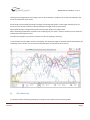
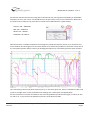
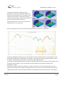
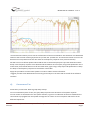
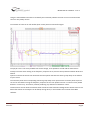
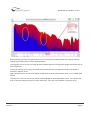
 MOOC DSP A8 + REW V5 – Part 4 9) ANALYSINGTHERESULTS
In this chapter we will discover the main analysing tools that REW offers and collect some precious information for setting up your system the best possible. The following measurement analysis has to be done on the measurements for every speaker in the position 1. a)
ALLSPLTAB
This tab is an overlay graph of all the frequency response curves. It displays all the measurements selected in the left control window. In this tab we can have several actions, to one or more measurements, like averaging or applying math operations. The menu in the blue box allows us to apply those modifications between 2 measurements and to obtain differential measurement curves to those we will apply the before mentioned method. The main function of this tab is to create an average frequency response curve of multiple measurements using the button in the yellow box. WaveFlex Caraudio/ Email :[email protected]©2013Rev02‐2015parWaveFlex‐Caraudio.Tousdroits
réservés.
Page1
MOOC DSP A8 + REW V5 – Part 4 Hitting that tab will generate the average curve of all the frequency response curves that are selected in the menu on the bottom of the screen. A few words to the smoothing settings: During the analysing steps prefer a rather light smoothing of 1/12 octave or even none if necessary to spot problematic strong Q values (narrow band). When generating the average measurement response per speaker use 1/16 octave. When simulating equalizations and filters use smoothing of 1/3 or even ½ octaves will allow you to check the overall look of the response curve. The lower the frequency you want to visualize, the less smoothing is necessary. In the red box the scroll‐down menu for smoothing. This setting will apply to all other tabs of the software; the smoothing value is shown next to each curve denomination on the bottom of the screen. b)
SPL/PHASETAB
It’s the base tab for visualizing the frequency response curve and the phase of each speaker. WaveFlex Caraudio/ Email :[email protected]©2013Rev02‐2015parWaveFlex‐Caraudio.Tousdroits
réservés.
Page2
MOOC DSP A8 + REW V5 – Part 4 Get familiar with the zoom function using the scroll wheel of your pointing device and display an exploitable frequency curve on your screen. You should focus on the part of the curve you are interested in. Make use of the Limits menu to help you. By convention a vertical scale of 5dB allows for a good visibility. Tweeter: 500 – 20000 KHz Mid: 100 – 10000 KHz Woofer: 30 – 2000 Hz Subwoofer: 20 à 500 Hz Now that we have a suitable visualization of the frequency and phase response, we will try to analyse them. I have traced the horizontal green line for visual reference. As some of the problem we encounter can be due to the microphone position always confirm you findings/assumptions by crosschecking with the other positions. Let’s start having a look at the phase response curve, i.e. the lower (pink) one. Here it’s showed on a 180° scale (scale on the right of the screen) to facilitate the readings, this is referred to as wrapped phase. We can see that the curve falls and at 30 Hz rises vertically (dotted line) and then falls again, at 120 Hz, at 760 Hz, and so on… Every vertical rise (dotted line) shows a phase decline of 180°. WaveFlex Caraudio/ Email :[email protected]©2013Rev02‐2015parWaveFlex‐Caraudio.Tousdroits
réservés.
Page3
MOOC DSP A8 + REW V5 – Part 4 Now imagine all the sections between the dotted vertical lines connected together. The curve would start at its actual origin, but on the right the curve would end at multiple thousand degrees down on the chart. That representation of the phase is referred to as unwrapped phase. In plain language we could say that phase represents the way of the arrival of the different frequencies with respect to the time base. The starting point is in the upper limit of the frequencies, which equals to say that the high frequencies are always ahead of the lower frequencies. Let’s get back to the graph and analyse the frequency response curve. The vertical blue lines I traced show that each bump in the in the phase response curve corresponds to a dip in the frequency response curve. There are also some frequency spikes I have marked in green. The orange lines clearly show a SPL dip in the spectrum going from 750 Hz to 1.2 KHz; we anticipated this when talking about impulse response in the last chapter. Moving further on the curve circled in yellow probable cone problems, the zone where the speaker is not acting in a linear way anymore and is producing distortion. The frequency area is pretty common at around 1.66 KHz. The problems highlighted in green and blue are cabin modes due to multiple reflections, similar to what you can find in your listening room. The problems encountered when looking at the frequency response curve are due to the physical dimensions of the passenger compartment, interior height, distance from dashboard to boot, width of the compartment, but also woofer related and length of the door. The higher the frequency is the more modes we get making it impossible to clearly identify them. The frequency response curve is comb filtered. If we roughly measure the dimensions of the passenger compartment of the car the measures where taken in we get: length 273 cm, width 145 cm, height 115 cm. This gives us 1st order modes at 61,114 and 143 and 2nd order modes at 12, 28 and 287 for l/w/h. That pretty much matches the bumps and dips of the frequency response curve… You can make an approximate simulation of your car interior to detect the main common modes by using the room simulator menu (top of the screen), of course (wrongly) assuming that your passenger compartment in rectangular. To give another example, the bump at 250 Hz could most probably be a stationary wave due to the distance between the door and the transmission tunnel roughly measured at 65 cm with the meter that is half a wavelength of a frequency of 250Hz Multiple modes can superpose and create very heavy variations of the frequency response curve, the most destructive you will encounter. We will see later how to identify them. There are also sources of problems. A resonating / oscillating door panel creating ruptures in the directivity by creating various emission points can also be the source of problems. The nature of the panel itself (material, rigidity, fittings, etc.) will influence the parameters. WaveFlex Caraudio/ Email :[email protected]©2013Rev02‐2015parWaveFlex‐Caraudio.Tousdroits
réservés.
Page4
MOOC DSP A8 + REW V5 – Part 4 In the graph on the right a simulation of the behaviour of a door panel at different frequencies. At 100 Hz the sound emission is not centred on the speaker itself, at 200 Hz a second source appears and then decreases again, at 450 Hz finally the sound pressure comes from the speaker only. Other phenomenon may occur, mainly due to the multiple cavities a car interior has. Now let’s apply what we have learned to analyse the frequency response of a mid‐speaker. The bump I highlighted with the grey line and the steep cut‐off (somewhere between 12 and 18 dB / octave) below 200 Hz shows that the mid speaker is installed in a too small volume (over damped, high Qts), creates the bump in the frequency response and a natural pretty steep high‐pass filter. The bumps and dips highlighted in green and blue are probably reflections but could also be directly due to the membrane of the speakers. You can see the impact of those problems on the phase response curve highlighted in purple. The red bump seems to be due to reflections around the instrument cluster and steering wheel. The mid speakers in this example are located on the upper front door, in the rear mirror panel. At 5 kHz the frequency length is 69mm, which matches the distance between the speaker and instrument panel cover. This bump in WaveFlex Caraudio/ Email :[email protected]©2013Rev02‐2015parWaveFlex‐Caraudio.Tousdroits
réservés.
Page5
MOOC DSP A8 + REW V5 – Part 4 the frequency curve is not present in the curve of the right –hand mid speaker, the overall curve being very similar to the one of the left speaker. Above a certain frequency there are so many modes due to the interior of the car that it’s getting tricky to have a precise idea of what’s going on. The microphone position is crucial in that areas, even slight (physical) offsets of the microphone can heavily impact the measured frequency response. For that reason we have done our measurements in multiple points and averaged the results in order to have a representative behaviour of the listening area. Those examples clearly show us how hostile a passenger compartment is for sound reproduction. Some problems can be addressed to with equalization, other cannot. The aim of this document is not to dig too deep in the complex nature of acoustic problems with reference to automotive sound reproduction. All cars are of different size, form and the quality of the interior varies strongly, every interior will have its proper flaws, impacting the sonic signature. All we want is to be able identify the problems. Some encountered problems might give us hints for a better physical installation in the future, but for the moment and to achieve our goal (setting up the car) we will just deal with them as good as we can. c)
DISTORTIONTAB
This tab is about reading the distortion spectrums. It will mainly give us valuable information for the choice of our crossover‐frequencies. As we have seen before, all our measurements are influenced by the car interior; the interpretation of the data in this tab has therefore to be done with some reserves. Generally speaking, if you encounter precise and clearly visible problems on the distortion spectrum, make sure that you check the speaker of the other side and/or with a different microphone position – if the phenomenon persists, chances are they are due to the speaker itself. If the distortion differs from one side to the other, then we can assume they are generated by the car interior, and in a much higher degree than your electronic units. Let’s have a closer look at the mid speaker from the precedent chapter. WaveFlex Caraudio/ Email :[email protected]©2013Rev02‐2015parWaveFlex‐Caraudio.Tousdroits
réservés.
Page6
MOOC DSP A8 + REW V5 – Part 4 I traced a blue line where you can see the confirmation of what was said above. The distortion rises below 300 Hz due to the too small volume (physical that is) of the mid –speaker box. At 1.6 and 2.3 kHz we can see in the distortion curve 2 problems that are also visible in the frequency response curve (vertical red lines). We will have to cut‐off that speaker above 300 Hz with a relative steep slope to reject the distortion and the bump in the frequency response curve between 150 and 300 Hz. As a low‐pass, using some equalization at 1.6 and 3.2 KHz, we should be able to cut‐off at around 3 KHz, again using a steep slope and equalization to damp the bump in the frequency response curve between 3 and 6 KHz. Apply this procedure to all the other speakers in order to obtain similar information. I suggest you take some detailed notes concerning each analysis in the notes tab on the left of the software interface. d)
GROUPDELAYTAB
Some theory to start with: What is group delay exactly? From a mathematical point of view, the group delay represents the derivation of the phase response. For the use we are interested in for our specific situation, it gives us an indication of the time needed for the sound wave to propagate from the speaker through the car interior to our microphone and this for all the different frequencies. WaveFlex Caraudio/ Email :[email protected]©2013Rev02‐2015parWaveFlex‐Caraudio.Tousdroits
réservés.
Page7
MOOC DSP A8 + REW V5 – Part 4 Using the collected data will allow us to identify the acoustical problems that we can correct and those we cannot or only hardly correct. To illustrate let’s look at our left woofer (door mount) we have seen before again: The purple curve is not easily readable. We notice though, some problems around 700 Hz and 3 KHz we already have seen when looking at the frequency response curve, but also some problems between 60 Hz and 160 Hz. Open the controls tab and click on Generate minimum phase and show the Excess group delay on the bottom of your screen. The minimum phase and corresponding minimum group delay curve represent the minimum phase response curve of an installation having the frequency response curve as our speaker and our car interior if they would behave in a linear way. That means, without producing any distortion of whatever nature. This document will not show the mathematical calculus and the theoretical background to obtain those curves. More information on the subject can be found, among others, in the excellent user manual of the REW software. WaveFlex Caraudio/ Email :[email protected]©2013Rev02‐2015parWaveFlex‐Caraudio.Tousdroits
réservés.
Page8
MOOC DSP A8 + REW V5 – Part 4 It’s on the excess group delay that we will observe the areas we can potentially apply corrections to. Those area are called minimum phase. I have highlighted the area with the blue line where the value is close to 0 (zero). In that areas we will be able correct the frequency response curve using a minimum phase IIR filter as available in the DSP A8, it will correct both the time domain (phase variation) and the amplitude. In the areas where the response is not minimum phase (circled in yellow) and showing a bump in the excess group delay curve, the IIR corrections you will apply might not have the expected result. Pay particular attention to the corrections you apply in that areas and control their impact. All the areas where the response is not minimum phase our system in working in a linear way. The origin of the encountered distortions may be of multiple origins: ‐
‐
Superposing of multiple cabin modes at close frequencies (1st order at 114 and 2nd order at 122) for the lower frequencies Cone distortion and multiple reflections on surfaces close to the speaker (from 800 Hz to 3Khz) for the upper part of the spectrum Every time you spot an area that is not minimum phase strong variations of both the frequency and phase response are present Using the DSP NX, applying a FIR filter where Amplitude and phase are independent on from the other will allow you to correct those problems. e)
DECAY/WATERFALL/SPECTOGRAMTAB
Globally those 3 tabs are used to represent the same phenomenon but in a different graphical way. The phenomenon that is shown in those tabs is the decay of energy with respect to time. It’s the evolution of the frequency response on a time base after the emitted signal is stopped. Using those tools allows you to easily see resonances, cabin modes, but also to put the different speaker in phase. Those tools are often used to illustrate the way loudspeakers behave. Speakers that are considered “neutral and transparent” usually have a short decay, speakers considered as being “coloured, grainy” usually have a longer decay. This only to give you rough idea on the subject… All these types of analyses are based on calculation and transformation of the impulse response. It’s very important to take care of proper windowing so that the tools used provide you with adapted data to the phenomenon you wish to analyse. WaveFlex Caraudio/ Email :[email protected]©2013Rev02‐2015parWaveFlex‐Caraudio.Tousdroits
réservés.
Page9
MOOC DSP A8 + REW V5 – Part 4 We will a have a look at a subwoofer using the decay tab, which is the easiest to comprehend, but first let’s try to understand how this tool works. Theoretically speaking, the decay is obtained doing a FFT of different trunks of the impulse response; this allows us to see “the state of the frequency response curve” at different moments in time after the impulse. The beginning of each section corresponds to the parameter time zero we have seen before (and served us to obtain the impulse response curve for the initial impulse using FFT). The analysis acts as if we had displaced the time zero forward in regular steps and will produce different frequency response curves. As a result we can see the evolution of the response term with time. To start the analysis click the generate button in the lower left of your screen. Then set the different parameters to suit the type of analysis you plan to do. If you are dealing with a subwoofer, the time window needs to be sufficiently large to offer a satisfying resolution at low frequencies. If you are dealing with a tweeter on the contrary the parameters needs to be restricted in time. This is the window parameter, defining the size of the time window after the time zero of each section. The slice defines the gap between each start of a section. The time rise parameter defines the size of the window ahead of each section. The bigger it is the more energy from the previous section will be taken into account. If we want to analyze a phenomenon that is very short in duration, less energy from the previous section should be taken in to account; yes it depends on the interval as well. WaveFlex Caraudio/ Email :[email protected]©2013Rev02‐2015parWaveFlex‐Caraudio.Tousdroits
réservés.
Page10
MOOC DSP A8 + REW V5 – Part 4 Before making conclusions using these tools it’s very important to understand the actin of the parameter settings, they render valid or not the obtained results. On the graph you can clearly see 2 long duration problems where the energy takes longer to decrease than at other frequencies. These tools will help you having a clear idea of some phenomenon you might have found in the phase or frequency response curves. Again this document is not aimed to explain another time the theory behind those tools, nor is it a REW usual manual. The subject is a vast one and you will need a solid knowledge to obtain exploitable results. You will have the time to work the subject and return to these tools later… once your car installation is properly set up. WaveFlex Caraudio/ Email :[email protected]©2013Rev02‐2015parWaveFlex‐Caraudio.Tousdroits
réservés.
Page11