1
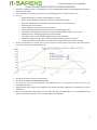
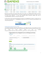
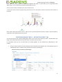
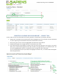
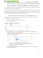
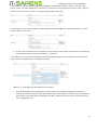
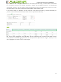
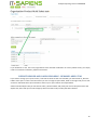
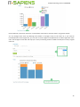
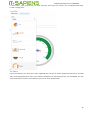
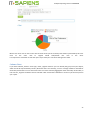
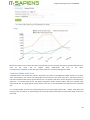
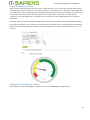
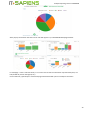
Analytic Reporting Tool for SUGARCRM Analytic Reporting Tool for SUGARCRM USER MANUAL Contents ANALYTIC REPORTING TOOL FEATURE OVERVIEW ........................................................................................................ 2 PRE-DEFINED REPORT LIST AND FOLDERS...................................................................................................................... 3 REPORT AND CHART SETTING OVERVIEW ...................................................................................................................... 5 Print Report, Export to Excel/ PDF.............................................................................................................................. 7 FILTERING REPORT DATA - „REPORT FILTERS” TAB ........................................................................................................ 8 Additional pre-defined date and datetime filters for report viewing and for regular e-mail scheduling: ............... 10 Selection of converted / not converted Leads for Leads Reports ............................................................................ 10 SELECTING COLUMNS FOR YOUR REPORT – „FIELDS” TAB .......................................................................................... 11 CALCULATE YOUR OWN FUNCTIONS – „CALCULATED FIELDS” TAB ............................................................................ 12 SET COLUMNS TO SUM, AVG OR COUNT – „AGGREGATES” TAB................................................................................. 14 „GROUPING & SORTING” TAB ...................................................................................................................................... 15 Grouping and sorting for multi-select picklists......................................................................................................... 18 REPORT HEADER AND LABEL RENAMING - RENAME LABELS TAB ............................................................................... 19 REPORT PERMISSIONS - „SHARING & SCHEDULING” TAB ............................................................................................ 20 REPORT E-MAIL SCHEDULING - „SHARING & SCHEDULING” TAB ................................................................................ 21 MASS EDIT FOR PERMISSIONS AND SCHEDULING ....................................................................................................... 22 CHART TYPES AND SETTINGS ........................................................................................................................................ 24 Pie Chart ................................................................................................................................................................... 26 Column Chart ............................................................................................................................................................ 27 Line Chart .................................................................................................................................................................. 28 Combined (Multi-Axis) Chart .................................................................................................................................... 29 Funnel Chart ............................................................................................................................................................. 30 Gauge (Spidomeeter) Chart ...................................................................................................................................... 32 Adding Chart to Homepage Dashlets ....................................................................................................................... 32 Last updated: June 18th, 2015 1 Analytic Reporting Tool for SUGARCRM ANALYTIC REPORTING TOOL FEATURE OVERVIEW Various pre-defined reports are available for most of SUGARCRM modules containing different summary types and chart types You can modify any of existing reports or can copy existing report – in order to create new You can o add/remove fields or columns to be displayed in a report o Select, what should be summarized, counted or calculate the average o Filter your report data to see specific date range, statuses or any other option o Calculate your own functions o Create detailed, summary, pivot/crosstab reports o Choose report grouping and summary options, incl. the grouping order o Can identify: what should be displayed as row and what should be column in your report o Identify order for unlimited grouping and summary levels o Chart types: Pie, Line, Bar, Combined (Multi-axis), Funnel and Gauge o Change chart types and set options, what should be displayed on which of the axis o In the same report and chart you can summarize and compare data from various modules Charts are interactive: on mouse over or mouse click on the chart area, small pop-up will show you the name and amount of the representing area Reports can be exported to Excel or PDF format Charts can be saved as pictures (.png format) Charts can be added to SUGARCRM Homepage For each report you can set permissions for individual users or user groups: to allow to see, or also edit/delete the report Regular Report auto-creation and emailing as Link and/or PDF/Excel attachment to selected users can be scheduled Reports are organized in the folders, you can move reports in a needed folders. You can edit/delete these folders and you can create your own new main folders or sub-folders. 2 Analytic Reporting Tool for SUGARCRM PRE-DEFINED REPORT LIST AND FOLDERS List of the folders with pre-defined reports will be the first thing you see after click to open „Analytic Reporting” from the main menu. Reports are mainly organized according to SUGARCRM modules, for example, under folder „Invoices”, you will see summary and detailed reports related to Invoices, Quote related reports go under „Quotes” folder. Folder „Combined Reports” contains combined summary reports which apply to multiple SUGARCRM areas, for example, report containing summary of Quotes, Sales Orders, Invoices and Purchase Orders. If the folder is not open, you can click on the folder name to open it and to see the reports in this folder. With another click to the open folder, you will close it. In the folder list, you can drag&drop reports to another folder, - but only if you have edit permissions to this Report. Click to „Edit” on the right side of the folder, if you want to change the Folder name and/or its Description. By click to „Add folder” on the right side of the folder – you can add sub-folder. But if you want to add general, not the sub-folder, you need to click „Add folder” on the top-left side – in Report folders gray headline: By click to „Delete” on the right side of the Report, you can delete the Report. This option is available only if you have permissions to Delete the report. Same way on the right side of the Folder you can click „Delete” to remove the folder, if it doesn’t contain any report. You can delete only empty folders. If there is any report in the Folder, you will not be able to delete it. Note: It can happen that folder looks empty to you, but in fact there are reports, which you don’t have permissions to see. In this case you will not be able to remove the folder. New folders and reports get sorted in the order of their creation date&time (latest will appear at the end of list), but after they re saved, you can easily change their order by drag & drop where you need them. By click on the report name in the report list, you will open the report. To create new report you should start from opening existing report, which contains data of those modules, which you need to see in your new report. Then click „Save as” button and in the pop-up window enter the name, description and folder for your new report, and after click to „Save” new report will be created. 3 Analytic Reporting Tool for SUGARCRM 4 Analytic Reporting Tool for SUGARCRM REPORT AND CHART SETTING OVERVIEW When you have your report open, on the top part of your screen you will see Report editor and Report data. On the 2nd./ bottom part of the screen you will see the chart editor and Chart related to this report. You have to click „Save” button, if you want to save changes of your settings for this Report or Chart. The save button applies to both: Report and Chart settings. 5 Analytic Reporting Tool for SUGARCRM If you want to create new report based on existing report settings, you have to click „Save as”, - you will be prompted to enter new report name, folder and description before saving it. „Delete” button also applies to both: current report and chart. If you confirm the deletion of this report, you will have permanently removed it. Note: „Save”, „Save as” and „Preview” buttons you can see and use only if you have permissions to Edit this report. „Delete” button you can see and use only if you have permissions to delete this report. Click to „Back to reports” button will bring you to the list of Folders and Reports, without saving changes to existing report settings (unless you had saved those changes already). Next line is Report Name. By click to the pencil (on the right side of the report name) you can change the name and description of this report. After Report Name you can see the 4 main big parts of your report – one after another: 1. 2. 3. 4. Report Editor – where you can edit Report settings Report - shows report data according to its settings Chart Editor – for Chart Settings Chart – shows your chart according to report and chart settings Each of these parts has small arrow in front - to close or open each part: If you change settings in Report Editor, you should to click „Preview” to see the report data according to the new settings. It is important to remember to Save (or „Save as”), if Preview gives satisfactory results and you would like to keep new settings for the next time ;). After changing report settings, you need to change the chart settings properly, and then click on the Chart part „Preview” button. New chart settings should be saved as well. In your report data you can collapse (click on „-”) or expand (click on „+”) several or all of the report grouped data, which contain more detailed data. „+” or „-” on the table header will collapse/expand all groups. Click on „+”/”-” on exact group name will expand/collapse only detailed information of that group: 6 Analytic Reporting Tool for SUGARCRM Blue color text inside of your report means that you can open it. For example (picture above), by click on Organization Name „EDFG Group Limited” you will open that Organization Detail View to see all its data; or by Click on Contact Name „Margaret” – you will open Margaret Contact Information detailed view. Click on „sampleSUGARCRM – 1000 units” will open this Opportunity. Format of report numeric values will be displayed according to your SUGARCRM user settings. To change those, you need to go to „My Preferences” – in SUGARCRM top right corner, then set your preferred „Decimal Separator” and „Digit Grouping Separator”: Print Report, Export to Excel/ PDF To print Report, please click to blue link „Print Repplsort” (or „Print Report with Chart” if you would like to print the Chart as well) at the bottom of your report. This will open window with Print Preview and Printing options, where you need to click button „Print” to get it printed. To export the Report Data to Excel, click to the blue link, „Export as .xlsx” at the bottom of your report: 7 Analytic Reporting Tool for SUGARCRM Note: Older Excel versions than .xlsx might have problems with export. To solve them, you can upgrade the Ms Office plug-in or you might need to upgrade the Ms Office version. Click to „Export as PDF” will export your report in PDF format. To save your chart as Picture (.png format), please click on the „Save Chart as Picture” blue link at the bottom of the Chart: Note: Please check your Browser version - older versions of Internet Browser (Chrome, Firefox or Internet Explorer) might have issues with Saving chart as picture. FILTERING REPORT DATA - „REPORT FILTERS” TAB You can limit data in your report by adding filter options. This can be done under tab „Filters”. Selected filters will apply to both: Report data and also the Chart. Filter can also be used as Search. In pre-defined report you can see what filters are already applied. You can modify those, add/remove or edit existing. 1. First you need to select the column (field), by which the filter will be applied, if you start typing any part of needed Field name or module name, the pick-list will return matching list. 8 Analytic Reporting Tool for SUGARCRM 2. Then you need to select the operator for the criteria, for example „Is” – if you need to get a match with your specified criteria, „Isn’t” if you want to set criteria to be dismissed from the report. In our example we want to filter only those Quotes, which have Valid dates between June 1st, 2014 and June 30th, 2014. We choose operator „Between” 3. Then we set criteria. In our sample: since we choose „Between” operator, we can now set start date and end date: 4. If we want to add one more criteria and, for example, do not want to see in a report rejected quotes, first we add 2nd filter row by click to the green „+”, then again choose column to be filtered, which is now „Quote Stage”, argument is now „Isn’t ” – and for pick-list the program offers us to select from a Pick-list values, - we choose „Rejected”: If both filter conditions must strictly match our criteria at the same time for each Quote, we set „And” between both filter rows, - this is our case. In case either one or another filter can be a match, then we would set „Or” in between those rows. You can have groups of Filter conditions to be applied as well (this is needed, if there are complex combinations of and/or criteria), - for such cases you should click the button „Add group”, - and then set another group of filter conditions. Red „x” is there to delete the Filter. Please remember to save the Filter changes, if you would like to keep them for next time, when using this report. If you are not sure, that you want to Save your changed filters, you can click „Preview” to see, and then exit the report without saving, if you want to omit the change. Also you can use „Save as” option, - to keep current report without changes and play with a new report at the same time. 9 Analytic Reporting Tool for SUGARCRM Additional pre-defined date and datetime filters for report viewing and for regular email scheduling: - # of Next days (for example, next 25 days or next 60 days from report viewing/auto-sending date); # of Passed days (for example, last 25 days or last 60 days till report viewing/auto-sending date); # of Greater than days (for example if today (report viewing /auto-sending date) is February 1st. and I enter 5, then report will show data, where Created date is starting from February 6 and more) # of Less than days (for example if today (report viewing /auto-sending date) is February 1st. and I enter 5, then report will show data, where Created date is less than January 26) Also you can use date filters for: this week, last week, this month, last month, this year, last year. Selection of converted / not converted Leads for Leads Reports If you are using Leads module, it might be interesting for you to compare not converted leads versus converted leads. In order to do that, you can select field „Converted” and then Group by this field. Or if you want to see only not converted Leads, you set Filter of „Converted” to „Is empty” – this means that lead is not converted. But if you set „Converted” field filter to „Isn’t empty” – you will see in your report only those leads which are converted. 10 Analytic Reporting Tool for SUGARCRM SELECTING COLUMNS FOR YOUR REPORT – „FIELDS” TAB Under „Fields” tab you can select fields to be shown, grouped or summarized in your Report and Chart: 1. Simply click on the field in the left-side selection box to highlight it (you can scroll down to find needed field or you can type any part of field title and also the module name for search) 2. Click on the green arrow to move the highlighted field from left to right side box 3. All fields, which appear in the right-side box, are selected for your report 4. If you have selected „Include details” check-box, then you will see all field data in your report. The column order in your report will be organized same way as fields in the right-side box, if it is detailed report. You can click to highlight field and then use up/down arrow to change the order of the fields. You can remove field from your report by click to highlight it and then red „x” to delete: field will disappear from the right side box. 11 Analytic Reporting Tool for SUGARCRM 5. If you need to see only the summary data in your report, please keep „Include details” check-box unselected. If this check-box is not selected then in your report you will see only Grouped and Summarized data – only those fields which are selected under tab „Aggregates” and „Grouping and Sorting”. In this case the column order will depend on selected grouping and sorting order under „Grouping and Sorting” tab. In both of the selection boxes you can highlight multiple fields for further operations, if needed, - simply keeping „Ctrl” key pressed, while clicking on necessary fields. Please remember to save the selected Field changes, if you would like to keep them for next time, when using this report. If you are not sure, that you want to Save the changed Field selection, you can click „Preview” to see, and then exit the report without saving, if you want to omit the change. Also you can use „Save as” option, - to keep current report without changes and play with a new report at the same time. CALCULATE YOUR OWN FUNCTIONS – „CALCULATED FIELDS” TAB With Analytic Reporting, you can now calculate your own functions, based on source fields and/or constants. Please follow these steps for function creation: 1. Open the report, where you would like to add the function 2. Open tab „Calculated fields” 3. With a click to green „+” you can add the calculation (you can add unlimited number of calculated functions, just use green „+” for adding one more). 4. You can now replace „Untitled field 0” with the name of the new field. In „Edit formula” column you can first choose, what would you like to do: a. „Add” is like „+” (of one field/constant + another field/constant) b. „Subtract” is like „-„ (following first selected field/constant – next after that) c. „Multiply” for field/constant multiplication d. „Divide” is for dividing 5. After you have selected the necessary operation type, please select fields or constants to which these operation should be applied; 12 Analytic Reporting Tool for SUGARCRM For example, if I want for each Campaign to have Budget cost reduced by 100 USD, I choose: „Subtract”, then I choose „Field” and select „Budget cost”; for 100 I use „Constant” in the next line and write value „100”. I will see the formula in last column „Formula”. The given sample would look like this: In this sample, if I want to make change, to subtract Actual cost from Budget cost, I change „Constant” to „Field” and then select „Actual cost”: 6. In case I need to add some more calculations to my formula, I need to select „Sub-calculation” and this way it is possible to make as many sub calculations, as necessary. For example, if I want to calculate Campaign Actual Response Percentage (%) from Expected, the formula would need „*100” and 2 field division, so it would look like this: With red „x” on the right side of formula you can remove it. 7. In the Detailed Report I can already click „Preview” button to preview the change, but in summary or crosstab, it is better to save the report with a click to green „Save” button – in order to save report with the formula now, and we still need to remember to identify – whether we want to sum or average new value under „Aggregates” tab: 13 Analytic Reporting Tool for SUGARCRM 8. And finally under „Grouping and Sorting” need to remember to identify, if we need to see summaries / grand totals of the new calculated value: 9. Please remember to save the new settings, if you would like to keep them for using next time. SET COLUMNS TO SUM, AVG OR COUNT – „AGGREGATES” TAB Under „Aggregates” tab you can select which fields would you like to Count, Summarize, or calculate Average. Simply select the field in the pick-list value and then mark the chekbox next to selected field. Click Green „+” to add additional field for Sum, Count or Average. Red „X” is there to remove the field from summary options. For each selected field at least one of the summary options must be selected: Sum, Average or Count. All of the options can be selected, but it is recommended to use only Sum or Average for amount and currency fields, while ID or Number should be used for (or any unique field is highly recommended for correct count). 14 Analytic Reporting Tool for SUGARCRM Include details check-box is there to select detailed or summary report type. For more information about „Include details” please see previous „SELECTING COLUMNS FOR YOUR REPORT – „FIELDS” TAB” tab description, point 4 and 5. Please remember to save the selected Summary option changes, if you would like to keep them for next time, when using this report. If you are not sure, if you want to Save the changed Summary settings, you can click „Preview” to see, and then exit the report without saving, if you want to omit the change. Also you can use „Save as” option, - to keep current report without changes and play with a new report at the same time. „GROUPING & SORTING” TAB After you have selected necessary Columns(fields) and what should Summarized in your Report, you can identify, how data should be grouped and sorted – under „Grouping and Sorting” tab. In Grouping & sorting upper table in „Group by” pick-list we select the field, by which the data should be grouped and summarized in our Report. Pick-list contains only those fields, which are selected under „Fields” tab. You can have several grouping levels in your report. The order of selected fields is replicated in your report. First selected group (in the first row) is upper level of the grouping and summarizing in your report, the „Level” no is „1”. The next one, which you add (Level is „2”) will be summary already inside of the 1st group. For example, if we want to see in our report Invoiced amounts by Date and then by Product, we select date first, and Product name 2nd (please see picture below). If you need to have this field grouped for summary, it is important to choose „Group” or „Group and sort” in the „Action” pick-list. „Group and sort” and „Sort” selected options will allow you to identify sort order in column „Sort”: „Ascending” or „Descending”. If your report has selected Aggregates for summaries (under „Aggregates” tab), for selected „Group and sort” option you can choose also to sort by this summary aggregate, for example, if you would like to sort not by Product name, but by product sold amounts. For detailed report (if „Include details” pick-list is selected) you can also select only to „sort” by this column. Include details check-box is there to select detailed or summary report type. For more information about „Include details” please see previous „Aggregates” tab description, point 4 and 5. For date and date-time fields we can identify one of the following grouping levels: Day, Week, Month, Quarter, Year. In our sample below we have selected to group and sort by Month of the Invoice date. In „Sort” pick-list you can identify the sort order (Ascending/ Descending) and also – do you want to sort by the group (in Alphabetic order) or by Sums in this group. For example, if you want to see the the month with best income from invoices first, you need to select Sum(Net Price)+Descending in sort options. In our sample we want this to be sorted as calendar, not by amounts, so we select the Invoice Date Ascending. 15 Analytic Reporting Tool for SUGARCRM Green „+” is to add one more grouping level and red „x” is there to remove it. Next after Grouping and Sorting option is the table „Select summaries to show in this report:” to select, where we want our summaries to be shown/ hided. In our case we have selected to show selected summaries for all our groups and to see the Grand total as well: When our grouping and options are set, we can click „Preview” button to see, what we get: 16 Analytic Reporting Tool for SUGARCRM If you want to see one of the group Items – each as new column (instead of row), you should select the check-box for „Is crosstab”. As soon as „Is crosstab” check-box is selected, we see additional option in our Grouping and sorting table: „Position”. Here we need to select, which group Items should be organized as „Column” for at least one of the groups. In our case it is Invoice Date, while Product name will be as „Row”. In our current sample, we decide to see each month in a new column, we select „Is crosstab” check-box, set „Column” next to Invoice Date and click „Preview”. Now our report looks differently: But, since we have 2 aggregates: Sum of Net Price and Sum of Quantity, each column for each month is shown twice (additional column per aggregate within each month) and our report looks too long. To solve this, we can select „Aggregates as column” and this is what we get: 17 Analytic Reporting Tool for SUGARCRM Each month now has only one column, but Sum of Net Price and Sum of Quantity are organized as rows in our report. Please note that „Is Crosstab” is not available if you have selected „Include details”. Please remember to save the selected Grouping and Sorting changes, if you would like to keep them for next time, when using this report. If you are not sure, if you want to Save the changed Grouping and sorting settings, you can click preview to see, and exit the report without saving, if you want to omit the change. Also you can use „Save as” option, - to keep current report without changes and play with a new report at the same time. Note: If you are using Leads module, it might be interesting for you to compare not converted leads versus converted leads. In order to do that, you can select field „Converted” and then Group by this field. Grouping and sorting for multi-select picklists If you have multi-select picklist and have selected more several picklist values for each e.g. Organization, and you still want to see, how many Organizations have selected each of the value, you can choose option „Separate each value” (on demo versions you will see Report „Organization-Product Multi Select test” in „Test” folder): 18 Analytic Reporting Tool for SUGARCRM If you would like to see, how many organizations have selected combination of certain picklits values, you simply need to un-select the checkbox „Separate each value”. REPORT HEADER AND LABEL RENAMING - RENAME LABELS TAB If you want to change your report column / row titles or labels as well as chart labels, you should click to „Rename Labels” tab to open it. Here in the left column you can see original report labels, while on the right side you can edit and enter new labels which you would like to show in your report. Please see sample below. Please note that Report Title you can edit not under „Rename Labels” tab, but by the click on the pencil next to the Report Title; Chart Title you can edit simply by click on the Chart Title/ inside of the Chart Title box. 19 Analytic Reporting Tool for SUGARCRM Please remember to save Report Label changes, if you would like to keep them for next time, when using this report. If you are not sure, if you want to Save the changed Report Labels, you can click preview to see, and exit the report without saving, if you want to omit the change. Also you can use „Save as” option, - to keep current report without changes and play with a new report at the same time. REPORT PERMISSIONS - „SHARING & SCHEDULING” TAB After you have installed Analytic Reporting module, for security reasons all available pre-defined reports are available only for admin users, or those users, who have in their user preferences set „Admin” to „on” (check-box next to „Admin” is marked). If the user profile has permission to see Analytic Reporting module, then all users without admin permissions can only see empty folders and can not see any of the report, until their report viewing permissions are changed. 1. For each report under „Sharing & Scheduling” tab report owner (who is admin by default after module installation) can set permissions to see, edit and delete for Individual user or for Role (to apply permission for all Users having in this Role). 20 Analytic Reporting Tool for SUGARCRM „View” permission means that user can open and preview report data with current settings, he will not be able to change and save any of the report or chart settings, he will also not be able to use „Save as” button. „Edit” permissions mean – permissions to change any of the report and chart settings and also to use „Save as” option for copying existing report to create new. If user has permission Edit, he certainly can also View the report. 2. Identified user in „Owner” pick-list is the one who can always see, edit and delete the report with chart. 3. You can then set this report to „Public” or „Private” mode. If you set „Public” then all SUGARCRM users, who have Analytic Reporting module enabled for their profiles, will be able to see this report. For Public Report you can identify for all users, - should they be able only to see this report and chart, or can they also edit or even delete it. 4. If you set the Report mode to „Private”, then only Owner can see, edit and delete this report. In addition to the owner you can identify either specific user(s) or user group(s) – to be able to View, edit or even delete current report. Click on the User or Group in the left-side box, then use green arrow to move it to the right-side box. Now, in the right side box for each user or user group you can identify permissions to View, Edit or even Delete the report – by selecting proper pick-list value next to the User/Group name. With gray „x” in the right-side box you can remove this User or Group from here and all permissions to this Report will be denied, this User or Group will no longer see the Report, after changes are saved. All user permission setting changes under „Sharing & Scheduling” become applicable only after saving this Report (click to the „Save” button on the report top). REPORT E-MAIL SCHEDULING - „SHARING & SCHEDULING” TAB You can schedule regular Report sending by e-mail. To enable and schedule automated regular Report sending by e-mail, first need to select the checkbox „Schedule Report” under „Sharing & Scheduling” tab. As soon as the checkbox is selected, options for scheduling will appear. First, you need to select frequency from picklist. For example, if you select „Daily”, then report will be e-mailed once per day; „Weekly” – once per week; „Monthly” – once per month; „Yearly” – once per year. If you have selected „Daily”, then next is what time this e-mail will be sent each day. Weekly – which weekday (e.g. Monday, Tuesday, etc.) and what time. Monthly – which date and and what time; For „Yearly” you can select which month of the year, and date and time. Scheduled e-mail time setting applies to report owner time zone which is identified in his user settings, taking in account SUGARCRM server time zone settings. Under „Send report as format”, you can select one or several of following options: „XLSX” to send report as attachment to the e-mail in Excel format 21 Analytic Reporting Tool for SUGARCRM „PDF” to send report as attachment to the e-mail in PDF format „Send link to report” will send the e-mail with a link to this report Received e-mail subject will contain the report name and sending date. To identify users, user groups or user roles, to which the e-mail with report will be sent, please select needed item in the left side box and then move to right, by click on the green arrow in between. E-mails are sent to the user e-mail address which is identified in SUGARCRM user settings. You can remove e-mail recipient from selected list by click to gray „x” near user or user group or role in the right side box. All users, or users within group or role appearing on the right side box will be receiving e-mail with attached report, according to the scheduled settings after the report will be saved. It is important always to remember to Save e-mail scheduling changes, in order to make them valid. You can do this by click on the green „Save” button on the top of the Report. MASS EDIT FOR PERMISSIONS AND SCHEDULING It is possible to set same permissions and/or report e-mail scheduling options for several reports at the same time. This can be done from the Report and Folder list. 1. Please mark with checkboxes necessary reports for scheduling (if you mark the folder, then all reports within folder will be selected). You can select only those reports, where you have editing permissions. 2. Click on the link „Mass schedule and permissions” will open the window for Sharing and Scheduling options. 22 Analytic Reporting Tool for SUGARCRM 3. Now in the pop-up window, please select checkbox for what you would like to get updated: a. „Update permissions” should be selected, in case you need to update permissions for selected reports (leave „Schedule Report” blank, in case you don’t want to change previous Scheduling Options for those reports.) b. „Schedule Report” should be selected in case certain options of report scheduling via e-mail should be applied to all selected reports. Leave unselected „Update Permissions” checkbox in case you don’t need to change previous permissions for selected reports. c. You can select both „Update Permissions” and „Schedule Report”, in case both – permissions and also the scheduling options should be changed according to the new settings for all selected reports. 23 Analytic Reporting Tool for SUGARCRM 4. Please identify necessary sharing and/or scheduling options (you can find more information about setting changes in previous sections). Please note that if you want to remove e-mail scheduling for all selected reports, you can simply select „Schedule Report” checkbox and then leave the right side box empty. 5. Identified changes will be applied to all selected reports after the click to „Save” button. Or you can click „Cancel”, in case you do not want to apply the changes to selected reports. CHART TYPES AND SETTINGS On the bottom part of the Report Table there is Chart and Chart editor, which is related to the Report table on top. Chart information is strictly related to Report table on top and Report settings, such as Filters, Aggregates and Groups. This means that every time you change the Report settings in Report Editor, you need to Save those settings in order to be able to see them changed accordingly in the Chart Editor before adjusting the Chart Settings. In Chart Editor you can identify chart type and other chart settings. After changing chart settings, click on „Preview” button inside Chart editor to see the new look of the chart. Changed chart settings are saved only after you click „Save” on the very top of your Report. In „Title” area you can enter the Chart title. On mouse-over colored chart area (also on mouse-click) you will see the data represented by this area: Click on the chart legend will hide/unhide its data. 24 Analytic Reporting Tool for SUGARCRM Click on blue link „Save Chart as Picture” on the bottom of the chart to save the Chart in .png picture format. You can enlarge entire chart by selecting from picklist on top-right corner of the chart. Or, if you need to increase/decrease chart height only, you can click on Chart height increase/decrease on bottom-right side of the chart. Chart height increase will also help you in case you have big number of labels and they do not fit by original chart size. 25 Analytic Reporting Tool for SUGARCRM In Chart Editor „Type” pick-list you can select necessary chart type: Pie, Column, Line, Combined (multi-axes), Funnel or Gauge chart: Pie Chart If you have selected „Pie” chart Type, under „Legend & Axis” tab you can choose Legend and Summary or Counted Value to be displayed by your chart. If you mark the checkbox near „Show percent (%)”, the calculated % for each value will be shown next to it (in brackets), as you can see in the sample below. 26 Analytic Reporting Tool for SUGARCRM Mouse-over chart area or click on the chart area will show you the summary information represented by this area. Click on the circle next to Legend would hide/unhide this area in the chart. It is important to remember to Save the report if you want your new chart settings to be saved. Column Chart If you have selected „Column” chart type, under „Legend and Axis” you can identify the group from your Report, which should be represented by Primary Horizontal Axis. The summary, count or average should be selected for Secondary Vertical Axis. You can select more than one of the Summary Aggregates under Secondary Vertical Axis, in this case the „Legend” should be same as selected under Vertical Axis. Otherwise it can be any of the Groups from your report. 27 Analytic Reporting Tool for SUGARCRM For Column chart you can select „Grouped” or „Stacked” way of representing the data in the chart. Mouse-over chart area or click on the chart area will show you the summary information represented by this area. Click on the circle next to Legend would hide/unhide this area in the chart. It is important to remember to Save the report if you want your new chart settings to be saved. Line Chart If you have selected „Line” chart type, under „Legend and Axis” you can identify the group from your Report, which should be represented by Primary Horizontal Axis. The summary, count or average should be selected for Secondary Vertical Axis. You can select more than one of the Summary Aggregates under Secondary Vertical Axis, in this case the „Legend” should be same as selected under Vertical Axis. Otherwise it can be any of the Groups from your report. 28 Analytic Reporting Tool for SUGARCRM Mouse-over chart area (or click on the chart area) will show you the summary information represented by this area. Click on the circle next to Legend would hide/unhide this Line in the chart. It is important to remember to Save the report if you want your new chart settings to be saved. Combined (Multi-Axis) Chart Combined chart has 2 Vertical Axis, which is important if you want to see differently scaled amounts in the same chart, for example, if you need to see Sales Order Sums and Count in the same chart, like in the picture below. In this chart all selected data can be represented as Line or as Column. And also it can be column for one Vertical axis, while Line – for another Vertical axis. The legend should then contain all those values, which are selected under both Vertical Axis. The group (which is date, status, name etc.) is recommended to be selected on the Horizontal axis. In our sample below we have Lines representing Count on the Secondary vertical axis, - (Quote, Sales Order and Invoice Count), and Column is representing Sums on the Third Vertical Axis (Sum of Quote, Sales Order and Invoice Sub total). 29 Analytic Reporting Tool for SUGARCRM Mouse-over chart area (or click on the chart area) will show you the summary information represented by this area. Click on the circle next to Legend would hide/unhide this area in the chart. It is important to remember to Save the report if you want your new chart settings to be saved. Funnel Chart After you have selected „Funnel” chart type, under „Legend and Axis”, you can choose to have the your values accumulated in the Funnel chart or not. Next is selection of Grouped Item and then Value to be displayed on the Funnel. If you have selected to „Cumulated” check-box, you will be able to identify item order to be displayed in your Funnel Chart. All available Items will appear below and you can re-order them by drag and drop. 30 Analytic Reporting Tool for SUGARCRM If you don’t want to cumulate values in the chart, need to un-select „Cumulated” check-box. In this case you will not be able to identify Item order in the Funnel manually, as it will be sorted automatically in Descending order (from largest amount to smallest). Please see the difference in the example below: If you mark the checkbox near „Show percent (%)”, the calculated % for each value will be shown next to the value (in brackets). 31 Analytic Reporting Tool for SUGARCRM Gauge (Spidomeeter) Chart After you have selected „Gauge” chart type, under „Legend and Axis”, you can select one of the Groups and then the Segment (Item) of this Group, then summarized, average or counted Value to be displayed in your Gauge chart. If you select „All” under Grouped Segment, then Gauge will show grand total value. For example, if you only want to see, how many Leads are with the status Qualified, you need to select „Lead Status” for the Group and „Qualified” – for Group Segment, then „Lead No Count” for the value. In the sample below you can see how it would look. But before that, you need to identify the ranges and their colors for your Gauge. In our sample below if Qualified lead number is between 0 and 1, it will be in red colored area; if between 1 and 4 – yellow; the best of 4-10 will be green. The arrow in the Spidomeeter will point to the value, which you can see at the bottom as well – it is „2” in our case. Adding Chart to Homepage Dashlets Click on blue link „Add to Homepage” to add this chart to your SUGARCRM Homepage Dashlets. 32 Analytic Reporting Tool for SUGARCRM After pop-up confirmation the Chart and its Title will appear in your SUGARCRM Homepage Dashlet: In Homepage – chart is still interactive (i.e. on mouse-over shows the information represented by area, can hide/unhide by click on the legend, etc.). Click on blue link „Open Report” inside Homepage Chart Dashlet will open current Report and Chart. 33 Analytic Reporting Tool for SUGARCRM Right next to „Open Report” link there is another link „Enlarge”. Click to „Enlarge” link will open this Chart in a popup window with larger size. Changed and saved Report or Chart settings will apply to selected chart in the Homepage Dashlet as well. You are welcome to contact our IT Sapiens team via: [email protected] for further questions! 34