1
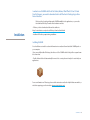
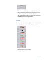
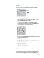
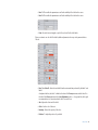
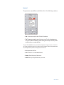
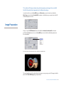
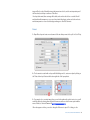
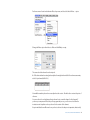
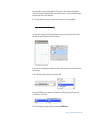
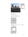
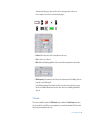
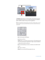
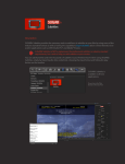
SUGAR fx HUD / HEADS UP DISPLAY User Manual Contents Contents Installation . . . . . . . . . . . . . . . . . . . . . . . . . . . . . . . . . 3 HUD / HEADS UP DISPLAY . . . . . . . . . . . . . . . . . . . . . . . . 4 Using HUD . . . . . . . . . . . . . . . . . . . . . . . . . . . . . . . . . 5 Binoculars . . . . . . . . . . . . . . . . . . . . . . . . . . . . . . . . . . 7 Image Preparation . . . . . . . . . . . . . . . . . . . . . . . . 14 On Screen Display . . . . . . . . . . . . . . . . . . . . . . . . . 20 Target . . . . . . . . . . . . . . . . . . . . . . . . . . . . . . . . . . . . . 29 Presets . . . . . . . . . . . . . . . . . . . . . . . . . . . . . . . . . . . . 38 Support . . . . . . . . . . . . . . . . . . . . . . . . . . . . . . . . . . . 39 Contents 2 In order to use SUGARfx with Final Cut Studio, Motion, After Effects CS3 or CS4 and Final Cut Express, you need to download and install the Free FxFactory plug-in from Noise Industries. FxFactory is the host plug-in that makes SUGARfx available to the applications, so you need to first download FxFactory from the Noise Industries web site. • FxFactory is a free download and the web site address is: http://noiseindustries.com/products/fxfactory/download/index.html Installation • Install and follow the prompts during installation. Installing SUGARfx You should have received the code and information via e-mail, and downloaded the SUGARfx pack on your computer. If you successfully installed FxFactory, then the icon of the SUGARfx should look just like a square brown box shown here. • Double click and it should automatically be moved to its correct place and ready to be used with your applications. For more information on FxFactory, please read the instructions and/or the help file that came with it, or visit their support page on their web site (www.noiseindustries.com). Installation 3 Meet the HUD from SUGARfx The HUD pack is a collection of filters that offer a simulation and custom creation of your own Heads Up Display (HUD) to enhance the look and feel of your video or graphics. The HUD collection includes three distinct elements: • Binoculars : Guides and numeric settings that simulate any and all kinds of binoculars you can imagine, or simply use the basic of all, with the ability to adjust all aspects of seeing through binoculars, like zoom, focus and any other setting you can imagine. HUD / HEADS UP DISPLAY • On Screen Display [OSD] : Allows you to simulate the fact that your video is being seen through a viewfinder HUD with on-screen display data and information. • Target : Just as its name implies, the target filter provides you with a complete system to recreate a target as simple as a cross-hair or as complex as you want, with the ability to move around the screen to follow your target (no pun intended). HUD 4 Open your host application and browse the Effects Menu or Tab. The screen shots shown on this manual are from Final Cut Pro but there should be no difference in the functionality of the SUGARfx plug-in in all of the other host applications. Open Final Cut Pro / Express Using HUD The HUD contains three Filters and you will be able to find the SUGARfx HUD elements under the Filters menu. If you want to use one of the Filters, you need to have a video asset in your time line before you try to access the filters menu. As you may already know, the filters can be accessed in two different ways. One is by going into the Effects tab in the Browser window where you will find the Video Filters folder, and inside there you should find another folder containing the SUGARfx HUD filters with their corresponding names (Binoculars, OSD and Target). If you use this method to apply your filters, then select the filter of your choice and drag it and place it on top of the video asset in your time line until you see the video asset gets highlighted. Then, let the mouse go so the filter gets applied onto your video footage. Using HUD 5 Another method to access the filters is as follows: you need to first select the video asset you want to affect and then go to the menu Effects > Video Filters > SUGARfx HUD > and select the filter of your choice. After applying the filter using either method, you now have to double-click the affected video in the time line in order to see its control parameters in the Viewer window. • Go to the Viewer window and click on the Controls tab to access its parameters. • There you can adjust the parameters to your liking, save presets or load your favorite ones. Every filter included in the SUGARfx HUD has its own set of parameters and their settings vary from one to the other. In the following sections you will be able to learn about the parameters of each individual filter. Using HUD 6 SUGARfx HUD - Binoculars is a filter that provides a way to simulate the look of the point of view when seeing through binoculars. Completely customizing and adjustable in virtually every aspect of its appearance and functionality. Binoculars After applying this filter, double-click the video affected and go to the Viewer window to access the parameters by selecting the Controls Tab. Parameters • User Manual : One of the most important things you need to know about all of our products is Binoculars 7 that when you select the SUGAR logo or the USER MANUAL button on the interface, you will gain access to the on-line manual that you can either download or read on-line. • Presets : If you would like to use a Preset, you can do that with the pull down menu, you can also create your own presets and save them or share them with your peers. Here is where you can save your own Presets after customizing the look and setups you use the most. Main Setup This section allows you to set the main parameters where you can select what other parameters to enable and customize if necessary. • Enable HUD : By enabling this button the HUD elements section gets activated and available for customizing. These HUD elements are the readouts and guides shown inside the viewfinder. • HUD Size : Controls the size of the HUD elements and it is available only when Enable HUD is activated. • Noise Text 1 : Enables the miscellaneous text 1 that is not supposed to be readable but to function as a background noise with movement. • Noise Text 2 : Enables the miscellaneous text 2 that is not supposed to be readable but to function as a background noise with movement. This one is somewhat different or a variation of Noise Text 1. • Position : This is a cross-hair position parameter that provides a way to separate the two circles that represent the binocular lenses. The separation is controlled towards the right side of the screen and its vertical position is controlled by positioning the cross hair up or down. • Diameter : Controls the diameter of the binocular lenses. Binoculars 8 Video Effects This section allows you to enable/disable the video effects that simulate the effect of Night Vision, Infrared, Negative (or possibly a colorful X-ray) and Heat Sensor. • Night Vision : This effect simulates the way Night Vision looks, it doesn’t uncover images on dark footage like a night vision feature works in real life. Once Night Vision and the other effects are selected, the Brightness, Contrast and Saturation parameters become available to tweak the color of the effect to your heart’s content. • Infrared : This effect simulates the infrared look. • Negative : As its name implies, this effect inverses the color scheme of your video footage making it look in the negative form. • Heat Sensor : This effect simulates the Heat Sensing color scheme, and also enables additional color parameters to adjust the look of this effect. Lens Adjustments This section allows you to adjust several parameters related to the lenses of your binocular effect. Binoculars 9 • Border : Allows you to make the border sharp or smooth, being Zero (0) the sharpest possible. • Focus : This is a simulation of focusing your video footage. It actually blurs the video clip and is directly linked to the Circular HUD Element as well as the data in Text Label -1. • Zoom : This parameter simulates the zooming effect on your video footage. This is linked directly to the Numbers HUD Element as well as the data in Text Label-2. HUD Elements In this section you are able to select which elements of the HUD you want to be activated and adjust its parameters. Here you can check to have the right (R) or left (L) element active, or none at all. • Color : Adjust and apply the color of your HUD element. • Intensity : Controls the opacity of the color. Binoculars 10 HUD Animated In this section you are able to select some animated HUD elements from the pull down menu. • Select : This is a selection pull down menu. You have six (6) different options to choose from and use as an animated HUD. The built in elements are High Tech, Line, Data 1, Data 2 and Data 3. You can also use your own HUD image when you select the User HUD. This selection automatically enables an additional parameter in the section, the User HUD Image where you can drop your own image to use as a HUD element being animated. Please refer to the section Image Preparation that follows this chapter, to find out how to create and prepare an optimal image for this purpose. • Adjust Size : Adjusts the size of the element. • Animated L and R : As with the other HUD Elements, you can select which one to be active, the left one (L) or the right side one (R). • Color : Sets the color of the element. • Intensity : Controls the opacity of the color. Text Labels A couple of additional HUD elements not included in the previous sections are the Text Labels that automatically take data from the Focus and Zoom functions from the Lens Adjustment section. Binoculars 11 • Label 1 : This enables the parameters as well as the visibility of the Label on the screen. • Label 2 : This enables the parameters as well as the visibility of the Label on the screen. • Font : Select the font and weight or style of the selected font for both labels. Once you activate one or both of the labels, additional parameters show up on the parameter list as follows. • Label 1 and Label 2 : Enter the text that follows the automatic data produced by the label 1 and label 2. As explained before, the Label 1 is linked to the data of the Focus parameter and the Label 2 to the data of the Zoom parameter in the Lens Adjustment section. – As a general rule, the logical recommendation is to enter text related to the Focus and Zoom • Size : Adjusts the font size of the label. • Color : Sets the color of the text • Intensity : Controls the opacity of the color. • Position : To adjust the position of your label. Binoculars 12 Noise Text These parameters are only available if you enable the Noise Text 1 or 2 in the Main Setup section above. • Font : Select the font and style for both of the Noise Text elements. • Text : This parameter contains the text to be shown on screen. To add or edit existing text you need to click on either the Edit button to edit the existing text, or the Import Text File if you have a text file ready on your computer hard drive. The purpose of these Noise Text elements is to pretend that data is being written or changing at every frame, so it doesn’t have to be coherent or readable. But as always, it is up to you what you decide to do with these elements, and keep in mind that it animates frantically, and that it may be hard to read anyway, hence its name “Noise Text”. • Size : Adjust the size of the font. • Color : Controls the color of the individual element. • Intensity : Controls the opacity of the text color. • Position : Allows you to reposition the text on your screen. Binoculars 13 This section will show you step by step, how to prepare your images to be used with the HUD Animated User Image option in the Binoculars plug-in. In order to be able to use the User HUD image with Binoculars, you need to make sure that in the Main Setup section the button Enable HUD is activated, so the filter knows you want to have the HUD elements displayed on-screen. Image Preparation Next, you open the HUD Animated section and enable the Animated L, Animated R or both, and pull down the Select menu to choose the User HUD option in order for the additional parameters to become available. If you have selected only this element, the Canvas should look something like this: The round graphic in red is the placeholder for the image you are going to provide. The image should be placed in the User HUD Image image well parameter. Binoculars-User HUD Image Preparation 14 In general you can place any type of video or graphic in the User HUD Image well, so if you place a piece of video footage in there, your Canvas may look something like this: Please notice that the video clip adjusts to fit in there as close to perfect as it can, but as you can see, that may not be useful for the purpose of the Binoculars plug-in. You can always put any asset that you desire in the User HUD Image well, but for the purpose of this manual and to show you the proper usage of this feature, we recommend that you look for a graphic that meets the following recommendations: 1.- Be in a square proportion for perfect centering. 2.- Size dimensions between 500 to 1200 pixels. 3.- Has transparency (using the PNG or PSD formats) 4.- Be in white color in order to be able to colorize inside the plug-in 5.- Can also be in color or several colors, but will be unable to achieve a controlled colorization. 6.- Add your own creative input. As you probably know already, you need an image manipulation program like Photoshop, painter or anything of that kind (like Gimp a free application for the Mac). This Manual shows how the image may be created in Photoshop. Just keep in mind that the procedure may be similar if using any other application. In order to prepare an image for the HUD, we may think about how close or how big on screen this Binoculars-User HUD Image Preparation 15 image will be. As a rule of thumb, the image that we want needs to be, not the most important part of the binoculars, but a helper or enhancer of the effect. If we keep that in mind, then our image will be subtle, and can be inside the lens or outside. We will make it white with transparency, so we can colorize it inside the plug-in, and we need to know how to make it transparent so we can see the background images or other HUD elements. Process 1.- Open Photoshop and create a new document of the size that you want. Let’s say 600 x 600 at 72 dpi. 2.- The document is created with one layer called the Background. So, create a new layer by clicking on the “Create a New Layer” button at the bottom right side of the Layers palette. 3.- If you want to do a concentric image, then you need to know where the perfect center is, so we will enable the Rulers by selecting them under the View menu, and then select the menu option with the name of Rulers (or shortcut Command R) If the rulers appear as Inches, you need to change the Preferences to pixels. To do that, go to the Binoculars-User HUD Image Preparation 16 Preferences menu found under the main Photoshop menu, and select the Units & Rulers… option. Change the Rulers option from Inches to Pixels and click Okay to accept. The canvas should now have the rulers in pixels. 4.- Pull a horizontal and a vertical guide and place them right in the middle of the ruler measurements, at the 300 pixel mark (half of 600). Now with the marks in place we know exactly where the center is. We will use the center as the point of reference. You can use the tools and techniques that you know how to create the shapes for this element. If you know your way around Photoshop or the program that you use, you do not need to follow the instructions and steps that we show you here for the creation of the element. Keep in mind that the workflow we show you here to achieve the shape is not important, what is really Binoculars-User HUD Image Preparation 17 important is that you understand the significance of the creation of the element knowing that the center of the element should match with the center of the document so it rotates perfectly fine aligned when placed into the lens of the Binoculars. 5.- As a simple shape we are going to create a line with a dot at the end, something like this: So, make sure the center point of the element where it is supposed to rotate is placed in the center of the image document. The document should look like this: 6.- Next, remove the background layer (which was white on this example) and you will end up with just the shape layer. 7.- Color the shape in white and save the document as a PNG. 8.- Import the PNG file into your application (This manual uses FCP), by going to the File menu and select the Import > Files option 9.- Place the image into the image well of the parameter User HUD Image Binoculars-User HUD Image Preparation 18 10.- The placeholder image should disappear from the canvas window and be replaced with the white line we’ve created. The center of the binocular lens should match with the origin of the line. Your canvas should look something like this: 11.- Move the play head around to see the rotation being animated and centered correctly. 12.- You can now adjust the other parameters to get the color, size and effect you want. Notice that this image at 600 pixels is large enough to look good in high definition. If for any reason you prefer to make it larger or smaller, we suggest that you try to see how it looks before you commit to a size. You can always increase or reduce the size of the element inside the application by using the Size parameter, and make sure the results are acceptable to your expectations. Binoculars-User HUD Image Preparation 19 SUGARfx OSD (On Screen Display) provides an easy way to simulate the look of a viewfinder display with the capability to adjust, customize and create your own combination and custom information. The default look of this filter is shown below. On Screen Display Parameters • User Manual : One of the most important things you need to know about all of our products is that when you select the SUGAR logo or the USER MANUAL button on the interface, you will gain access to the on-line manual that you can either download or read on-line. • Presets : If you would like to use a Preset, you can do that with the pull down menu, you can also create your own presets and save them or share them with your peers. Here is where you can save your own Presets after customizing the look and setups you use the most. OSD - On Screen Display 20 Main Setup Here you can enable three of the most important parts of this filter, the In Camera Data, the Histogram HUD and the TC Readout sections. When you activate these buttons, additional parameters show up in the parameter list. • In Camera Data : If activated, the video clip on your Canvas window changes its size to accommodate the in-camera data that shows up under the video frame. The in-camera data refers to the information that we may never see on-screen, but it is part of the information provided to you by the viewfinder device, just as what we may be able to see in the viewfinder of a photographic camera or a video recording device. • Time Code [TC] : This button enables the TC Readout section that provides an actual time code readout of your video footage taken from the beginning of the applied filter. • Histogram : Not many image recorders and cameras may have a histogram that displays the RGB color values of an image, but with this parameter you can add one of your own that provides a color feedback of the video or image showing in the viewfinder. TIP : If you add a color corrector filter before applying the OSD, you will be able to see how the Histogram reflects the color adjustments you are making with the color corrector. HUD Elements In this section you will be able to pick and activate what elements of your custom HUD you want to OSD - On Screen Display 21 be visible on the screen. The selection of elements range from simple cross hair to full guides that resemble an HD video camera, and many other possible combinations. • Guides : This pull down menu offers several guides to choose from. To know their appearance, go ahead and select each and every one of them to familiarize with them. There are 11 different variations to choose from. The rest of the elements are buttons that you can activate and see for yourself what they look like. They are all lines and designs that resemble actual guides or grid layouts that may be found on video or still cameras. Mix and match and create new combinations to come up with your own OSD. • Color : Sets the color of the HUD elements. • Intensity : Controls the opacity of the HUD elements. In Camera Data - ICD This section gets activated only if the In Camera Data button is selected in the Main Setup. This data is shown at the outside of the full frame of video, so when this feature it is activated, the full screen of video changes to a smaller size where we can see the data under it. All of the data contained here is optional, and it is recommended that you use a special font that looks digital or similar to some of the data readouts found in video or still cameras. There is a total of five (5) data strings that you can use, and they are individually adjustable in the horizontal position. They can also be adjusted vertically, but this adjustment applies to the whole group. OSD - On Screen Display 22 • Font : Select the font and style for the whole group. • Size : Controls the size of the font for the whole group. • Vertical Position : Use this slider to move the whole group of data up or down. • Color : Sets the color of the text. NOTE : The screen shot above shows that only the ICD-1 has been selected, therefore only the parameters for ICD-1 are available in the interface. If you select the ICD-2, 3, 4 or 5, new parameters will appear in the parameter list. –This is done so the parameter list only shows what you are planning to use and nothing more, avoiding confusion and unwanted parameters. • ICD - 1 through 5 : Every data element has its own ICD button that can be activated. Once activated, additional parameters show up in the list. These parameters are: • Text A : Type in here the first part of the data. • Text B : Type in here the second part of the data. • Position : Allows you to adjust the horizontal position of this ICD. On Screen Text This parameter section enables the text that may be presented on top of the video footage. There are four (4) OST’s that you can use, two (2) of them are Left justified and two (2) are Right justified, so you can place them where you may think to be more appropriate. The On Screen Text is used mainly for information that may not be contained in the usual on-screen display, but may be part of a menu or certain options that your virtual viewfinder may have. Just type the text of the information you want to have on screen and choose the appropriate OST. OSD - On Screen Display 23 • Font : Allows you to select the font of your text: • Size : Sets the size of your text. • Color : Refers to the color of the background of the text. • Intensity : Sets the opacity of the background of the text. • OST-1 through 4 : These buttons enable the OST on your screen. Once activated, additional parameters appear in the interface. OSD - On Screen Display 24 • Text : Enter the text here by clicking on the Edit button to edit the information, or the Import Text File button to load a file with the text already typed out. • Position : Allows you to position your text anywhere on the screen. Histogram The histogram refers to the information provided by the RGB pixel values of each frame of the video footage. • Size : Sets the size for the histogram. The Histogram changes and updates automatically depending on the RGB values of each frame of video. Icons This section allows you to enable the icons that may appear in your OSD. As you can see, there are three (3) icons that you can activate. Once you activate one of them, additional parameters show up in the interface. • Overall Size : Sets the size for all three (3) icons. • Icon 1 - Icon 3 : This pull down menu allows you to select one of the built in icons available. If you select one, new parameters appear in the interface. You have 40 different icons to choose from, and they are all available for each of the icon pull OSD - On Screen Display 25 down menus, allowing you to have up to three (3) icons at any given time on the screen. Here is a sample of some of the icons included in the plug-in: • Position : Allows the position of the icon anywhere on the screen. • Color : Sets the color of the icon. • Blink : Enables the blinking capabilities of the icons and adds new parameters to the interface. • Blink Frequency : This parameter controls the speed or frequency rate of the blinking of the icon, being Zero (0) not blinking at all. Notice that this parameter is found under each of the icons that you select, therefore you may have the icons blink at different rates from each other, or have one not blinking at all while the others do. TC Readout This section is available only when the TC Readout button is enabled in the Main Setup menu above. Here you are able to control all the necessary parameters to customize the automatic Time Code reader that you can place anywhere in the screen. OSD - On Screen Display 26 Filter applied to section The TC Readout actually reads the time code from the beginning of the edited clip, in other words, it takes the beginning of the clip as time 00:00:00:00 and starts counting from there, even if the filter is applied to a small section anywhere on the clip, as shown on the graphic above. NOTE : Please keep in mind that this readout has been designed to be part of the on-screen simulation, and its accuracy or functionality is not guaranteed. So, please use it as described here and do not rely on it for time code information when accuracy is crucial or required. • Font : Sets the font and style of the TC Readout. • Size : Adjust the size of the font. • Start Hour : Allows you to start the time code in any hour from 0 to 60. The default readout starts at 00:00:00:00, but you may want to change the first two (2) digits to read any other number as it is usually normal in post production environments. • Label : Enter the text label that precedes the time code information, or leave blank if no label is necessary. • Color : Sets the color of the text. • Position : Allows you to position the TC Readout anywhere in the screen. OSD - On Screen Display 27 Video Effects This section provides a way to simulate defects of viewfinders, like the Cheap Monitor, Film Look, Color Shift and Damaged Tape. When you select Film Look and Damaged Tape, a parameter corresponding to either of these effects will be available in the parameter list, that will allow you to emphasize or modify the effect with a slider. • Vignette : A graphical effect that can be applied on top of the video effects (including when set to Normal). This effect allows you to add a subtle shadow, also known as “vignette”, that in real life usually is created by the curvature of the camera lens. This parameter controls the opacity of the Vignette. Damaged Tape effect with zero (0) opacity Vignette Damaged Tape effect with full opacity Vignette OSD - On Screen Display 28 SUGARfx Target is a filter that provides an easy way to create target objects that are composited on top of your video footage. The default look of the filter is shown below. Target Filter Parameters • User Manual : One of the most important things you need to know about all of our products is that when you select the SUGAR logo or the USER MANUAL button on the interface, you will gain access to the on-line manual that you can either download or read on-line. • Presets : If you would like to use a Preset, you can do that with the pull down menu, you can also create your own presets and save them or share them with your peers. Main Setup This section allows you to enable the target elements that you want to include in your composition. There are a total of fourteen (14) buttons that enable the elements, and at the same time their Target 29 parameters appear in the interface. For better control, select each element and edit its parameters individually before activating all the ones you will be using at the same time. • Target Circles : A set of lines representing the target bull’s eye. • Focus Center : A semi-square rectangle shape that represents the focus icon of a familiar viewfinder. • Label Pointer : A line that points directly to the center and includes a label text. • Cross Hair : A set of lines in a cross formation directly on the center. • Grid : A circular grid. • Gadget : A special gadget that moves in a circular fashion. • Line & Dot : Just as its name implies it, is a set of lines and dots. • Ruler : A cross hair that provides ruler numbers to simulate precision targeting. • Cross Lines : Cross lines that cover the whole screen and meet in the center. • Radar : A circular radar-like swipe. • Brackets : A set of brackets with its own background bars and text to focus your message on the target center. • Spot Light : A spotlight that shines directly on the center of the target. • Noise Text 1 : A special text that simulates the constant writing of data on screen. This text is not supposed to be readable, hence its name Noise Text. • Noise Text 2 : An additional special text that simulates the constant writing of data on screen. This text is not supposed to be readable, hence its name Noise Text. The individual parameter adjustment sections appear once the element you want to use is selected or activated. Every element has its own special adjustments. Target 30 Adjustments This section applies to the general adjustments of the position and rotation of the target element, regardless how many elements have been activated. • Position : Allows you to position the target anywhere in your Canvas. • Rotation : Allows you to rotate the target towards any angle. The Label Pointer and the Bracket Text are not rotated by this parameter. Target Circles • Size : Adjusts the size of the element. • Color : Sets the color of the element. • Intensity : Controls the opacity. • Blend : When Blend is activated, the element is composited into the background using the “Add” transfer mode, which “adds” the luminosity of the color to the background color. If you have set the color of the element as a dark color or black, the Blend button makes the dark colors disappear since they have very low luminosity or none at all. Focus Center Target 31 • Color : Sets the color of the element. • Intensity : Controls the opacity. • Blend : When Blend is activated, the element is composited into the background using the “Add” transfer mode, which “adds” the luminosity of the color to the background color. If you have set the color of the element as a dark color or black, the Blend button makes the dark colors disappear since they have very low luminosity or none at all. Label Pointer • Color : Sets the color of the pointer element. • Intensity : Controls the opacity of the pointer element. LABEL • Font : Adjusts the size of the label element. • Text : Enter the text for the label. • Size : Adjusts the size of the font. • Color : Sets the color of the font. • Intensity : Controls the opacity of the text label. • Blend : When Blend is activated, the element is composited into the background using the “Add” transfer mode, which “adds” the luminosity of the color to the background color. If you have set the color of the element as a dark color or black, the Blend button makes the dark colors disappear since they have very low luminosity or none at all. Target 32 Cross Hair • Size : Adjusts the size of the element. • Color : Sets the color of the element. • Intensity : Controls the opacity of the element. • Blend : When Blend is activated, the element is composited into the background using the “Add” transfer mode, which “adds” the luminosity of the color to the background color. If you have set the color of the element as a dark color or black, the Blend button makes the dark colors disappear since they have very low luminosity or none at all. Grid • Size : Adjusts the size of the element. • Color : Sets the color of the element. • Intensity : Controls the opacity of the element. • Blend : When Blend is activated, the element is composited into the background using the “Add” transfer mode, which “adds” the luminosity of the color to the background color. If you have set the color of the element as a dark color or black, the Blend button makes the dark colors disappear since they have very low luminosity or none at all. Target 33 Gadget • Size : Adjusts the size of the element. • Color : Sets the color of the element. • Intensity : Controls the opacity of the element. • Blend : When Blend is activated, the element is composited into the background using the “Add” transfer mode, which “adds” the luminosity of the color to the background color. If you have set the color of the element as a dark color or black, the Blend button makes the dark colors disappear since they have very low luminosity or none at all. Line & Dot • Size : Adjusts the size of the element. • Color : Sets the color of the element. • Intensity : Controls the opacity of the element. • Blend : When Blend is activated, the element is composited into the background using the “Add” transfer mode, which “adds” the luminosity of the color to the background color. If you have set the color of the element as a dark color or black, the Blend button makes the dark colors disappear since they have very low luminosity or none at all. Target 34 Ruler • Color : Sets the color of the element. • Intensity : Controls the opacity of the element. • Blend : When Blend is activated, the element is composited into the background using the “Add” transfer mode, which “adds” the luminosity of the color to the background color. If you have set the color of the element as a dark color or black, the Blend button makes the dark colors disappear since they have very low luminosity or none at all. NOTE: Keep in mind that this element already has some lines in the element colored in black, so if you select the Blend transfer mode, those parts of the element will completely disappear. Cross Lines • Color : Sets the color of the element. • Intensity : Controls the opacity of the element. • Blend : When Blend is activated, the element is composited into the background using the “Add” transfer mode, which “adds” the luminosity of the color to the background color. If you have set the color of the element as a dark color or black, the Blend button makes the dark colors disappear since they have very low luminosity or none at all. NOTE: Keep in mind that this element already has some lines in the element colored in black, so if you select the Blend transfer mode, those parts of the element will completely disappear. Target 35 Radar • Duration : Allows you to control the speed of the radar wipe. • Size : Adjusts the size of the element. • Color : Sets the color of the element. • Intensity : Controls the opacity of the element. • Blend : When Blend is activated, the element is composited into the background using the “Add” transfer mode, which “adds” the luminosity of the color to the background color. Notice that this element when activated already has the Blend activated, because we recommend using it in this mode. Brackets Target 36 • Aperture : Adjusts the position (or aperture) of the bracket element. This parameter allows you to have the brackets fully open and then close all the way until they cross over each other up until the other side. • Bracket Color : Sets the color of the bracket element. • Intensity : Controls the opacity of the bracket element. • Bar Color : Sets the color of the background bar element. • Intensity : Controls the opacity of the background bar element. • Blend : When Blend is activated, the whole element is composited into the background using the “Add” transfer mode, which “adds” the luminosity of the color to the background color. If you have set the color of any of the elements as a dark color or black, the Blend button makes the dark colors disappear since they have very low luminosity or none at all. This button does not affect the Bracket Text element. • Enable Text : The text box needs to be enabled before you can use on your Canvas. Click here to enable it. BRACKET TEXT • Font : Sets the font and style of your text. • Text : Enter the text here by clicking on the Edit button or Import Text File if you have an external file already typed up. • Size : Controls the size of the font. • Color : Sets the color of the font. • Width Adjust : The width of the text bracket automatically changes the width if the brackets are too close to the text boundaries, so this parameter allows you to overwrite that feature to a certain extent, specially when you want to purposely have the brackets really close to the text boundaries. Target 37 The presets expand your plug-ins even further, specially when you can create your own styles and setups and save them for later use. Some of the SUGARfx filters already include several presets that you can use. Presets In some cases it is a good idea to begin your own customizing by selecting one of the included presets and use it as a starting point to create your own. Have fun and start making your own, and remember that you can share the presets with other users or other computers as long as they have the same versions installed in their system. Presets 38 Every SUGARfx theme or plug-in that you purchase comes with free technical support by sending all your questions via e-mail to our Support Team. Our Technical support team is available to answer your questions via e-mail and should respond within 24 hours or less from the time the e-mail was received. Things to know before contacting Technical Support Support Please visit our web site (http://www.sugarfx.tv) for possible answers to your technical support issues, or visit our tutorial site (http://www.ilearnfast.com) where you may also find a tutorial that will help you find the answer to your question before you contact our Support team. If you cannot find the answer you need, please send us an e-mail to : [email protected] with the following information: • Name and version of the SUGARfx theme. • The version of the FxFactory. • Your system configuration (Mac OS X version, RAM and whatever else you may think to be helpful) • The application name and version with which you are having the problem. • Screen shots of the problem (whenever possible). • Details and any other information you may think appropriate to describe the problem. Feedback The success of our products depend vastly on customer requests and feedback. We welcome all kinds of e-mails that provide useful information on how to improve our products, so we encourage you, as a user of these products, to send us your feedback or comments to our support team. HUD Manual v1.0 / April 2009 Support 39