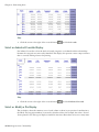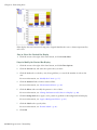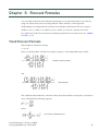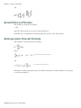
1
IBM Cognos Business Intelligence Series 7
IBM Cognos Series 7 PowerPlay
Version 7.5
PowerPlay Web User Guide
Product Information
This document applies to IBM Cognos Series 7 PowerPlay Version 7.5 and may also apply to subsequent releases. To check for newer versions
of this document, visit the IBM Cognos Information Centers (http://publib.boulder.ibm.com/infocenter/cogic/v1r0m0/index.jsp).
Copyright
Licensed Materials - Property of IBM
© Copyright IBM Corp. 1998, 2010.
US Government Users Restricted Rights – Use, duplication or disclosure restricted by GSA ADP Schedule Contract with IBM Corp.
IBM, the IBM logo, ibm.com, and Cognos are trademarks or registered trademarks of International Business Machines Corp., in many jurisdictions
worldwide. Other product and service names might be trademarks of IBM or other companies. A current list of IBM trademarks is available on
the Web at www.ibm.com/legal/copytrade.shtml.
Adobe, the Adobe logo, PostScript, and the PostScript logo are either registered trademarks or trademarks of Adobe Systems Incorporated in
the United States, and/or other countries.
Microsoft, Windows, Windows NT, and the Windows logo are trademarks of Microsoft Corporation in the United States, other countries, or both.
Table of Contents
Introduction
7
Chapter 1: PowerPlay Web
9
PowerPlay Web Viewer 9
Customize the Report Content 9
View Layers on Pages 10
Explore Reports 10
Accessible Reports 11
PowerPlay Web Explorer 14
The PowerPlay Web Explorer Interface 14
Choose Categories 16
Choose Measures 17
Open a Report or Cube 18
Dimensions 18
Setting Preferences 19
Select Regional Settings 19
Select a Language 19
Chapter 2: Exploring Data
21
Find Specific Dimensions or Measures 21
Scenario Dimensions 22
Drill Down and Drill Up 22
Different Paths to a Category 23
Restricted Data Values 23
Filter Data 23
Nest Categories 24
Move or Copy Rows, Columns, and Nesting Levels 24
Create a Subset of Categories 25
Create Subsets with Top and Bottom Categories 27
Create a Copy of a Subset 27
Add or Remove Categories in a Subset 28
View Details of a Subset Definition 28
Hide Totals or Subtotals 29
Change In Behavior With Custom Subset Category Drag and Drop Functionality 29
Add Calculations 29
Edit Calculations 30
Move Calculations 31
Forecasting Methods 32
Trend (Linear or Straight Line) 32
Growth (Curved or Curved Line) 32
Autoregression (Seasonal) 33
Create a Forecast 33
Work in Design Mode 34
Analyze Alternate Hierarchies 34
Licensed Materials – Property of IBM
© Copyright IBM Corp. 1998, 2010.
3
Table of Contents
View a Chart and Table Together 35
View Explanations 35
Drill Through to Other Reports 35
Chapter 3: Formatting Data
37
Display Types 37
Select a Crosstab Display 37
Select an Indented Crosstab Display 38
Select or Modify a Pie Display 38
Select or Modify a Simple Bar Display 40
Select or Modify a Clustered Bar Display 40
Select or Modify a Stacked Bar Display 41
Select or Modify a Simple Line Display 43
Select or Modify a Multiline Display 43
Select or Modify a 3D Bar Display 45
Select or Modify a Scatter Display 46
Select or Modify a Correlation Display 47
Show Report Values as Percentages 48
Show Statistical Lines 48
Convert Currency Values 48
Custom Exception Highlighting 49
Define a Custom Exception 49
Apply a Custom Exception 50
Highlight Exceptions Automatically 50
Sort Values 51
Swap Rows and Columns 52
Limit the Size of Crosstabs 52
Apply Zero Suppression 53
Apply 80/20 Suppression 54
Modify the Y-Axis 55
Resize Charts 55
Format Legends 56
Add Rank Categories Based on Measure Values 56
Hide Categories 57
Show Short Names 57
Add a Title 58
Valid HTML Tags in Report Titles 58
Show Multiple Measures in a Report 59
Use Layers to Show Multiple Categories in Your Report 60
Change the Patterns and Colors in a Display 60
Apply a Background Color 61
Format Labels 61
Add Format Markers 61
Chapter 4: Distributing Results
63
Publish New Reports 63
Replace Existing Reports 63
Create an Agent 64
Modify an Agent 65
Subscribe to the Agent Notification 66
4 IBM Cognos Series 7 PowerPlay
Table of Contents
Exporting Data to an Alternate Format 66
Export Data in CSV File Format 66
Export Data in XLS Format 68
Export Data in PDF Format 68
Prepare a Bookmark 69
Print Reports 69
Reuse Graphical Displays in Other Applications 69
IBM Cognos BI for Microsoft Office 70
Chapter 5: Forecast Formulas
71
Trend Forecast Formula 71
Growth Forecast Formula 72
Autoregression Forecast Formula 72
Index
73
PowerPlay Web User Guide 5
Table of Contents
6 IBM Cognos Series 7 PowerPlay
Introduction
The PowerPlay Web documentation is HTML-based help that shows you how to view, explore,
format, and distribute PowerPlay reports using your Web browser. You need have only a Web
browser and Adobe Acrobat Reader installed on your computer to open data from PowerPlay
Enterprise Server.
Use IBM Cognos PowerPlay Web to:
●
view reports and multidimensional cube data
●
add calculations to your data
●
choose from a variety of graphical display formats
●
create your own reports
●
send email notification of changes occurring in your data
●
publish your reports to the portal for your colleagues to view
Note: Some Asian languages are not supported by IBM Cognos Impromptu, IBM Cognos Impromptu
Web Reports, and IBM Cognos Visualizer.
Finding information
To find the most current product documentation, including all translated documentation, access
one of the IBM Cognos Information Centers at http://publib.boulder.ibm.com/infocenter/cogic/
v1r0m0/index.jsp.
You can also read PDF versions of the product release notes and installation guides directly from
IBM Cognos product disks.
Samples disclaimer
The Great Outdoors Company, GO Sales, any variation of the Great Outdoors name, and Planning
Sample depict fictitious business operations with sample data used to develop sample applications
for IBM and IBM customers. These fictitious records include sample data for sales transactions,
product distribution, finance, and human resources. Any resemblance to actual names, addresses,
contact numbers, or transaction values, is coincidental. Other sample files may contain fictional
data manually or machine generated, factual data compiled from academic or public sources, or
data used with permission of the copyright holder, for use as sample data to develop sample applications. Product names referenced may be the trademarks of their respective owners. Unauthorized
duplication is prohibited.
Licensed Materials – Property of IBM
© Copyright IBM Corp. 1998, 2010.
7
Introduction
8 IBM Cognos Series 7 PowerPlay
Chapter 1: PowerPlay Web
Use PowerPlay Web to view and explore reports using your Web browser. A report consists of
current data selected from a cube. A cube is a multidimensional data source that contains measures
(data) organized into dimensions. For example, a Sales cube might structure information into
dimensions such as Product Line, Sales Representatives, Channels, and Locations.
You view PowerPlay Web reports in PowerPlay Web Viewer or in PowerPlay Web Explorer. In
PowerPlay Web Viewer, reports appear in PDF format. You can print information or further explore
the report by opening it in PowerPlay Web Explorer.
In PowerPlay Web Explorer, reports appear in an interactive format, which lets you explore the
relationships among different dimensions of your business. You can change the information in the
report, add calculations, and change how the information appears. You can also save the results
for other PowerPlay Web users.
Reports created in PowerPlay for Windows or PowerPlay for Excel open in PowerPlay Web Viewer.
You can open these reports in PowerPlay Web Explorer to further explore the report. Other reports
or cubes that are Web accessible open in PowerPlay Web Explorer.
Cubes are created by your administrator.
PowerPlay Web Viewer
Use PowerPlay Web Viewer to view and analyze reports created by report authors. In PowerPlay
Web Viewer, reports appear as PDF documents. With high resolution formatting, PowerPlay Web
Viewer provides high quality reports on the Web.
Depending on how the report author published the report, you can customize the information in
the report (p. 9). For example, you can use prompts to select dimensions and filters.
You can either print the information or open the report in PowerPlay Web Explorer (p. 14) if you
want to explore the report further. For information about saving reports, see (add xrefs).
Customize the Report Content
Depending on how the report was created, you may be able to customize the information in the
report.
The choices that you can select may include:
●
dimensions (p. 18)
●
row and column content (p. 52)
●
zero suppression (p. 53)
●
short headings (p. 57)
●
currency and currency format
Licensed Materials – Property of IBM
© Copyright IBM Corp. 1998, 2010.
9
Chapter 1: PowerPlay Web
For example, you open a report and use prompts to choose the years and products you want to see
in the report. The report appears with the selected years and products. You can return to the prompts
to change your selections. Each time you change the selections using the prompts, PowerPlay
refreshes the report to show the new information.
Prompts are available only available if the report author included them in the report.
Steps
1. Open a report (p. 18).
2. On the Modify Reports page, select the information using the prompts and click OK.
If the report is already open, you can return to the prompts using the change report settings
button
.
The report appears with the information you selected using the prompts.
If the prompts include dimensions, you can quickly remove all filters from all dimensions using the
reset dimensions button
on the dimension line.
View Layers on Pages
Reports created in PowerPlay for Windows or PowerPlay for Excel may include different categories
of information by using layers. In PowerPlay Web Viewer, each layer appears on a separate page.
You can show layer views when you export the report in PDF format. As well, when enabled by
your administrator, you can view explanations about each category in the report or drill through
the report to reveal more information(p. 35).
Step
●
Scroll to the next page in the report.
The page appears showing the content for the next layer.
Explore Reports
If you want to further explore the data or change a report in PowerPlay Web Viewer, you can open
the report in PowerPlay Web Explorer. For example, in PowerPlay Web Explorer you can change
the report by selecting measures and dimensions, or by drilling down or drilling up to change the
focus of the report.
Step
●
Click the explore button
.
The report opens in PowerPlay Web Explorer.
Note: If the report was created in PowerPlay Reporter, the layout of the report may change after
you click the explore button. This is because some Reporter features are not supported in PowerPlay
Web Explorer.
10 IBM Cognos Series 7 PowerPlay
Chapter 1: PowerPlay Web
Accessible Reports
Cognos is committed to assisting people with disabilities, and promotes initiatives that make
workplaces and technologies accessible. For example, Cognos Series 7 provides a report-reading
solution for accessibility. This report-reading solution is currently available in English. In addition
to the English report-reading solution, the Upfront Accessible theme can be read in English and
French.
Using PowerPlay Web Viewer, you can open PowerPlay Web reports using screen reading technology.
When accessibility is enabled in PowerPlay Enterprise - Server Administration, PowerPlay reports
are published with markup tags that screen readers can read if the reports are in PDF format.
Using screen reading technology, you have full access to
●
the Modify Report page, where you customize the report content (p. 9)
●
PowerPlay Web Viewer reports
Although the reports are accessible, the links in them are not. For example, if you click the
explore button in PowerPlay Web Viewer, the report opens in PowerPlay Web Explorer, but
is not accessible to screen readers.
To return to accessible reports from Web pages that are not accessible to screen reader technology, click the Back button in your Web browser.
The Accessible Modify Report Page
There are a number of ways you can access information and make selections in the Modify Report
page. For example, you can use quick access keys to move to a specific area in the page, and then
use different key combinations to make selections.
Quick Access Keys
Use the quick access keys listed in the table below to move the screen reader to specific areas in the
Modify Report page if your administrator has made these keys available to you. All other accessibility tags conform to the Microsoft standard for accessibility.
Quick access keys
Description
Alt + M
Moves the screen reader to the dimension line section.
Alt + Z
Moves the screen reader to the Options section.
Alt + R
Moves the screen reader to the Currency and Format section.
Alt + O
Activates the OK button.
Alt + C
Activates the Cancel button.
PowerPlay Web User Guide 11
Chapter 1: PowerPlay Web
Dimension Line Section
Use the following keys or key combinations to access information and make selections in the
dimension line section of the Modify Report page.
Keys
Description
Tab
Accesses the first control in the dimension line section or moves from
one list box to the next.
Alt + 1, 2, 3, 4, 5, 6, 7, 8, Moves to individual drop-down lists.
9
Alt + 0
Moves to the last drop-down list.
Shift + Tab
Moves backward among the drop-down lists.
Alt + Down Arrow
Expands the items in a drop-down list.
Down Arrow
Moves down through the items in a drop-down list.
Up Arrow
Moves up through the items in a drop-down list.
Enter
Makes a selection.
Each time the Enter key is pressed to make a selection, the Modify
Report page refreshes and the screen reader returns to the beginning
of the page.
Options Section
Use the following keys or key combinations to access information and make selections in the Options
section of the Modify Report page.
Keys
Description
Tab
Accesses the first control in the Options section or moves from one
Option control to the next.
Space Bar
Toggles the state of a check box.
Alt + Down Arrow
Expands the items in a drop-down list.
Down Arrow
Moves down through the items in a drop-down list.
Up Arrow
Moves up through the items in a drop-down list.
12 IBM Cognos Series 7 PowerPlay
Chapter 1: PowerPlay Web
Keys
Description
Enter
Makes a selection.
Each time the Enter key is pressed to make a selection, the Modify
Report page refreshes and the screen reader returns to the beginning
of the page.
Currency and Format Section
Use the following keys or key combinations to access information and make selections in the Currency and Format section of the Modify Report page.
Keys
Description
Tab
Accesses the first control in the Options section or moves from
one Option control to the next.
Space Bar
Toggles the state of a check box.
Alt + Down Arrow
Expands the items in a drop-down list.
Down Arrow
Moves down through the items in a drop-down list.
Up Arrow
Moves up through the items in a drop-down list.
Enter
Makes a selection.
Each time the Enter key is pressed to make a selection, the Modify
Report page refreshes and the screen reader returns to the beginning of the page.
The Accessible PowerPlay Web Viewer Report Page
There are a number of ways you can access information and make selections in the PowerPlay Web
Viewer report page.
Quick Access Keys
Use the Alt + Y quick access key to move the screen reader to the toolbar. You have access to the
toolbar only if your administrator has made it available.
To use this quick access key, your Web browser must be the active window (not Adobe Acrobat
Reader). To toggle between your Web browser and Adobe Acrobat Reader, press Ctrl + Tab.
PowerPlay Web Viewer Report Page
Use the Tab key to access the first control in the report or to move from one report control to the
next.
PowerPlay Web User Guide 13
Chapter 1: PowerPlay Web
PowerPlay Web Explorer
PowerPlay Web Explorer gives you a multidimensional approach to business analysis. It brings
together the key dimensions of your business and lets you explore any combination of data: up,
down, and across critical dimensions. You can determine the impact that each area of your business
has on overall results and compare that with other dimensions as you explore further. For example,
you can examine sales in South America during 2005, and then filter your analysis for a specific
product line and a specific sales channel. You can publish reports to show query results generated
in HTML format by the PowerPlay server.
When exploring information from your Web browser, you can do things such as
●
adding your own calculations to the results
●
filtering data
●
suppressing, highlighting, and sorting values
●
choosing the type of display, such as crosstab, pie chart, or bar chart, and the amount of data
shown
●
publishing, exporting, printing, or bookmarking reports
Your administrator creates and publishes the cubes that you use.
The PowerPlay Web Explorer Interface
When you open a cube in PowerPlay Web Explorer, the data appears in the interface specified by
your administrator. The interface is one of the following:
●
Generic interface
The Generic interface is based on a generic HTML style and is recommended if you use a dialin Web connection or are accessing larger cubes. This interface is available in all Web browsers.
●
Enhanced interface
The Enhanced interface is based on enhanced Web Technology support and is available if you
use Internet Explorer 5.5 or higher, or Netscape 7.1 (Windows only), as your Web browser.
The Enhanced interface is as follows.
14 IBM Cognos Series 7 PowerPlay
Chapter 1: PowerPlay Web
level selector areas
dimension line
dimension viewer dimension viewer toolbar
display toolbar
display
Dimension Viewer
The dimension viewer shows a full tree view of the dimensions and measures in a cube. This view
helps you understand the data structure and find the items you require. In the dimension viewer,
you see an organized view of all dimensions, levels, and categories in a selected cube in a Windows
folder-like presentation.
In the dimension viewer, you can perform the following actions using drag and drop or rightclicking:
●
change a row or column
●
change a measure or add new measures to your report
●
create a nested crosstab or chart
●
filter
If you prefer to use the full browser window for the display, you can close the dimension viewer
by clicking the hide/show dimension viewer button
.
Dimension Line
You can use the dimension line to add categories to rows and columns, and filter the data in the
cube. You can drag items from the dimension line to the crosstab or chart, or you can right-click
the categories to view information about the data.
Display
In the display, you can right-click to perform actions that are associated with individual data elements. When you right-click the row and column headings, or data cells, the available actions
appear in a flyout menu.
Level Selector Toolbar
You can left-click the row and column level selector areas to open the level selector toolbar that
contains buttons for expanding categories, deleting levels of data, swapping categories, changing
levels, and viewing explanations.
PowerPlay Web User Guide 15
Chapter 1: PowerPlay Web
Display Toolbar
Many of the controls in the Enhanced interface are available from menus or dialog boxes that you
open from the display toolbar.
For example, to open the Calculations dialog box, click the calculations button
.
In this document, the display toolbar is referred to as the toolbar.
Dimension Viewer Toolbar
You can use the dimension viewer toolbar buttons to complete the same tasks as when you drag
items from the dimension viewer.
For example, to add a category as the nested top level in columns, click the insert before the columns
button
.
If you use Netscape as your Web browser, you must use the dimension viewer toolbar for tasks
which also can be completed in Internet Explorer using drag-and-drop. When you use Netscape,
the dimension viewer toolbar is enabled by default.
Choose Categories
When you open a new report, the categories from the first two dimensions on the dimension line
appear as the rows and columns. To explore the categories from other dimensions, choose categories
to replace the current categories or add nested categories (p. 24) to the report.
A category is a set aspect of your business, represented by a row or column in a crosstab. Your
administrator organizes categories into the dimensions of a cube. Each dimension appears as a
folder in the dimension viewer and on the dimension line of your report. For example, the dimensions
in a cube may include Years, Locations, Products, and Channels. The intersection of all the categories
on the dimension line are calculated to give you the values for your report.
Categories appear as hyperlinks in the report. When you click a category, its child categories replace
the categories in the report. When you click a summary category, the parent categories replace the
child categories in the report.
You can also add any calculated categories that your administrator may have defined in a cube so
you can analyze specific combinations of data.
If you use Netscape as your Web browser, you must use the dimension viewer toolbar to switch
categories.
Step Using the Dimension Line
●
Drag the category from the dimension line to the column heading area or the row heading area.
Steps Using the Dimension Viewer Toolbar
1. In the dimension viewer, expand and click the category you want to appear as a row or column.
2. In the dimension viewer toolbar, choose where to add the category.
●
To add the category as the nested top level in the columns, click the insert before the
columns button.
16 IBM Cognos Series 7 PowerPlay
Chapter 1: PowerPlay Web
●
To add the category as the nested top level in the columns, click the insert after the columns
button.
●
To add the category as the nested top level in the columns, click the insert before the row
button.
●
To add the category as the nested top level in the columns, click the insert after the row
button.
●
To replace the category in the rows, click the replace rows button.
If the dimension viewer toolbar does not appear under the dimension viewer, right-click the
area under the dimension viewer and click Show Toolbar.
Choose Measures
A measure is a quantifiable amount built into a cube. It is often used to gauge how a business is
operating, such as in identifying performance indicators.
A measure may be
●
a simple summary of available information such as number of units shipped, revenue, expenses,
inventory levels, or quotas
●
a calculated value such as revenue variance (forecast revenue minus actual revenue)
By default, the display uses the first measure in the list of measures. You can change the default
order of the list (p. 59). You can change the measure used or you can use other measures defined
by your administrator.
For example, you use the Revenue measure to show the data for each product line. You can compare
the product lines using the Cost measure instead, or you can change the measures in the report to
compare Revenue to Cost.
If you use Netscape as your Web browser, you must use the dimension viewer toolbar to change
the measure.
Steps Using the Dimension Line
●
Choose to view one or more measures:
●
To view one measure, drag it to the Measure heading area.
●
To view, in a crosstab, multiple measures from the same parent, click and drag each measure
from the Measures folder to a highlighted area between two column headings.
You can use this method to reorder measures.
●
To view all measures, in a crosstab, drag the Measures folder to the row heading area or
the column heading area.
The display uses the new measure.
Steps Using the Dimension Viewer Toolbar
1. In the dimension viewer, click the measure in the Measures folder.
PowerPlay Web User Guide 17
Chapter 1: PowerPlay Web
2. In the dimension viewer toolbar, click the replace measures button.
If the dimension viewer toolbar does not appear under the dimension viewer, right-click under
the dimension viewer and click Show Toolbar.
The display uses the new measure.
Open a Report or Cube
You open reports or cubes to view, analyze, or explore current data. You open reports and cubes
that are Web accessible from the PowerPlay Web Table of Contents.
You can also open reports or cubes from one of the Cognos portals: Upfront or Cognos Connection.
Upfront is the Web interface for Cognos enterprise applications and other Web data. Cognos
Connection is the portal to Cognos ReportNet, the Web-based reporting solution. For information
about using Upfront, see the Upfront online help. For information about Cognos ReportNet, see
the Cognos ReportNet User Guide.
Before you can open reports or cubes, they must be published to your Cognos portal and added to
PowerPlay Enterprise Server by your administrator.
Step
●
From the PowerPlay Web Table of Contents, click the report or cube.
Reports are identified by the report icon
Cubes are represented by the cube icon
.
.
A report opens in PowerPlay Web Viewer (p. 9) in PDF format. If the report author has defined
prompts for the report, you can customize the information (p. 9) that you want to see in the report
before it opens.
A cube opens in PowerPlay Web Explorer (p. 14) and shows the first two dimensions as the rows
and columns.
Dimensions
Dimensions are a broad grouping of descriptive data about a major aspect of a business, such as
products, dates, or markets. Dimensions are represented by the rows and columns in a report or
cube, and appear as folders.
You can drill down and drill up by selecting categories in a folder. For example, selecting Camping
Equipment from the Products folder narrows the scope of the report to the information for that
product.
You can also choose dimensions to filter information. If you choose a dimension that is not associated
with the rows or columns, the data changes to reflect the new filter. For example, if a report's rows
show Years and the columns show Products, you can choose the North America dimension from
the Locations folder to filter the report content based on North American data.
18 IBM Cognos Series 7 PowerPlay
Chapter 1: PowerPlay Web
Setting Preferences
You can specify regional settings, such as a time zone and currency, and select languages if your
administrator has enabled these settings.
Data formats depend on the locale configuration settings for your IBM Cognos Series 7 product.
By default, Series 7 server products and Impromptu use a data format configuration file named
cerlocale.xml. Architect, Visualizer, PowerPlay Client, and Transformer use Windows Regional
Settings for locale settings and data format information. However, you can configure these products
to use the data format configuration file.
For information about managing data formats, copying data format information, or editing the
data format configuration file, see the Configuration Manager User Guide, or contact your
administrator.
Select Regional Settings
You can format the numeric values of your query results using the settings of a specific country or
region. For example, some regions of Europe use a period (.) as the thousands separator.
The availability of this feature and the individual regions are controlled by your administrator.
Steps
1. From the PowerPlay Web Table of Contents, click the Preferences tab.
If you opened a report from Upfront, contact your administrator.
2. In the Locale box, select the region.
Select a Language
You can select the language to use in the PowerPlay interface. This selection overrides the language
specified in your Web browser. When you change your selection, all elements change, including the
help.
For information about setting language preferences, see the help for your Web browser.
Steps
1. From the PowerPlay Web Table of Contents, click the Preferences tab.
If you opened a report from Upfront, contact your administrator.
2. In the Language box, select the language.
PowerPlay Web User Guide 19
Chapter 1: PowerPlay Web
20 IBM Cognos Series 7 PowerPlay
Chapter 2: Exploring Data
Use PowerPlay to find specific categories or measures for your analysis, or to explore data by drilling
down for more specific details or drilling up for a more general picture. You can also filter data to
get the information you want. To further explore, you can nest child categories under a parent
category or add calculations to show you the exact information you require. Drill through options
may provide access to another cube, report, or data source.
Find Specific Dimensions or Measures
You can search the current report or cube to find specific categories, dimensions, or measures in
your data. Finding specific items in highly complex and large dimensions can significantly speed
up your analysis time.
When you search the current report, PowerPlay searches the data in the current display. When you
search the cube, PowerPlay searches all the data in the cube.
You can search for text in a category or measure based on the following criteria:
●
contains
●
begins with
●
ends with
The search results provide the category name and full path. For example, searching a cube for Star
Lite shows the following results.
●
Category: Star Lite
●
Path: Products/Camping Equipment/Tents
Steps
1. Click the arrow beside the help button and click Find.
2. In the Search String box, select your search criteria and type the text to search for.
3. In the Find Text In box, choose to search a report or a cube, and select the scope of the search.
For example, you can limit the search in a report to rows. For cubes, you can limit the search
to a specific dimension.
4. Click Find.
5. In the Results list, click the category that represents the items you wanted to find and choose
one of the following options:
●
To isolate the data in a category in the current report, click the Go To link.
●
To filter the report on the returned category, click Filter.
Licensed Materials – Property of IBM
© Copyright IBM Corp. 1998, 2010.
21
Chapter 2: Exploring Data
●
To show the returned category in the report rows, click Replace Rows.
●
To show the returned category in the report columns, click Replace Columns.
Scenario Dimensions
A scenario dimension is a dimension in which categories represent different scenarios. For example,
when analyzing financial data, you can analyze several sets of values at the same time, such as
planned, budget, or actual values, or best and worst case values.
Unlike regular dimensions, scenario dimensions do not roll up to a single root category because the
values would not be useful.
A scenario dimension is distinguished from other dimensions by the scenario dimension icon
.
Scenario dimensions are defined by the Transformer modeler. If the modeler identified a default
category for the scenario dimension, the default category appears as a default filter in the dimension
line.
Drill Down and Drill Up
You can drill down and drill up to explore different aspects of your business and move between
levels of information.
For example, you can examine revenue for an entire product line and then drill down to see revenue
for each individual product in the line. When you finish viewing individual product revenue, you
can drill back up. After you familiarize yourself with the hierarchy, you can drill down and drill
up multiple levels at a time. If you want to examine the impact of a single aspect of your business
on the whole, you can drill down to the lowest-level category in a dimension.
The available drill-down and drill-up features depend on the display type you choose.
Step to Drill Down
●
Change the category levels using one of the following:
●
To drill down to a lower-level category, in the dimension line, click the lower-level category.
●
To drill down one category level at a time, click a row or column heading link until you
reach the category level.
●
To drill down one level across all categories, right-click the column or row level selector
area, and click Down a Level.
●
To drill down directly to the categories associated with a specific data value in crosstab
displays, double-click the data value.
Step to Drill Up
●
Change the category levels using one of the following:
●
In the dimension line, click the higher-level category.
22 IBM Cognos Series 7 PowerPlay
Chapter 2: Exploring Data
●
To drill up one level across all categories, right-click the column or row level selector area,
and click Up a Level.
●
To drill up to parent row and column categories, double-click the data value where the
totals for rows and columns intersect.
Different Paths to a Category
The Transformer modeler can define multiple paths in a dimension that lead to the same categories.
A primary drill-down path is the main path in a dimension. An alternate drill-down path is another
path in the same dimension leading to the same categories.
For example, the main path of the years dimension is by year and one of its alternate paths is by
month. Both of these paths converge at the day level.
Restricted Data Values
The Transformer modeler can build security rules into cubes where data is sensitive, for example
in financial applications. When the display shows a category level for which you do not have the
correct security access, you see the word "denied" instead of a data value. When you drill down
on a category, you cannot view a lower level of a restricted data value. The word "denied" also
appears for summary totals of a category that include this restricted data value.
Filter Data
A filter changes the focus of a report by limiting information to a level of a dimension and emphasizing only the information you choose. If you want to examine the impact of a single aspect of
your business on the whole, you can filter to the lowest-level category in that dimension.
For example, you start with a report that shows revenue in all regions for all product lines.
Using the dimension line, you filter the report using the sales region dimension to show revenue for
the Americas.
Step
●
In the dimension line, click the category you want to filter on.
Another option for filtering is to right-click the category in the dimension viewer and then click
Filter.
The filtered category appears bolded in the dimension line and the values in the display change to
reflect the filtered category.
To remove all filters from all dimensions, click the reset button
.
PowerPlay Web User Guide 23
Chapter 2: Exploring Data
Nest Categories
When you open a report, the categories from the first two dimensions of the dimension line appear
in the rows and columns. To view more detail in the report, you can add nested categories from
the current dimension, different dimensions, and measures. A nested report includes summary
information for nested categories.
For example, a report shows Products categories in the columns and Years categories in the rows.
You can add the quarters as nested categories. The summary for each quarter is shown in the following report.
Step
●
In the dimension line, locate the category you want to nest and add it to the row nest level area
or the column nest level area.
The nested category appears in the display as a sublevel within the row or column category.
You can delete a nested category using the right-click menu available from the level selector area
for the nested category.
Move or Copy Rows, Columns, and Nesting Levels
To quickly change the view of your crosstab data in the Enhanced interface, you can move or copy
rows, columns, and nesting levels.
You can also reorder measures in your crosstab (p. 59).
Step
●
Choose whether to move or copy a particular level:
●
To move a level, drag the level selector area of the nested level to a target level area in the
current axis or the other axis.
●
To copy a level, press Ctrl and drag the level selector area of the nested level to a target
level area in the current axis or the other axis.
24 IBM Cognos Series 7 PowerPlay
Chapter 2: Exploring Data
The target level area appears highlighted on the outer edge of an axis.
The level or a copy of the level appears in the new location.
You can delete a nested category using the right-click menu available from the level selector area
for the nested category.
Create a Subset of Categories
You can define subsets of categories based on specified criteria. Subsets help you isolate, explore,
and analyze specific elements of your data.
You can create subsets by search criteria, by measure value, or by individual category selection.
You can also create a subset for a dimension directly from a crosstab. After you create the subset,
it appears in the dimension viewer in the dimension you used to create the subset.
Subsets can be dynamic, meaning that they are updated whenever a change in the cube data affects
the categories in the subset. For example, you are a regional manager for a company that sells
outdoor products. To analyze the sales in your region of the products that are environmentallyfriendly, you create a subset defined by search criteria that all products contain the text "Enviro."
As more products are added to the cube that meet the search criteria, they are added to the subset
dynamically.
You can create, edit, and delete subsets only in PowerPlay Web Explorer. In PowerPlay Web Viewer,
PowerPlay for Windows, and PowerPlay for Excel, you can open PowerPlay Web Explorer reports
that include subsets, but you cannot modify a subset.
Previously, dragging and dropping a category in a particular location in a custom subset redefined
the custom subset. Now you can reorder categories in dimensions. As a result, dragging and dropping
a category in a particular location in a static custom subset now applies the crosstab rendering
functionality. This change in functionality improves efficiency and provides consistent drag and
drop behavior across all crosstab axes and levels.
If you create a subset by individual category selection, it can contain categories from multiple levels,
but only categories in the same dimension. You cannot nest a subset within the dimension from
which it was derived or within another subset if both subsets are from the same dimension.
When you drill through from a report that uses a subset, subset values are not applied to the target
report.
Steps to Use Search Criteria or Measure Value
1. Click the custom subsets button
.
2. Type a name for the subset.
3. Select the dimension on which to create the subset.
4. Define the search criteria or measure value:
●
To define search criteria, click Define Rule by Search Criteria and click Next. Click Add
and create the search definition by providing the search string, starting category to search,
and scope of category levels. Click OK.
PowerPlay Web User Guide 25
Chapter 2: Exploring Data
The search string is not case sensitive.
You can define more than one search definition. You can also edit and delete existing definitions in the Create Custom Subset by Name Search dialog box.
When you finish defining the search definitions, click Next.
●
To define a measure value, click Define Rule by Measure Value and click Next. Define the
measure value by choosing the measure on which you want to base the rule, values you
want returned, category, and scope of category levels you want to search. You can also
apply dimension filters, if appropriate. When you finish defining the measure value, click
Next.
5. Review the search results.
To remove a search result from the subset, click the result and click Remove. To return the
search result to the subset, click the result and click Re-enable.
Categories that are returned in the result set based on the subset rule are dynamic. If there are
changes in the data source, the returned result set reflects those changes, and they are identified
by a binocular icon
.
6. If you want to add categories that were not returned in the result set, in the Available Categories
list, select the categories and click the add to custom subset button.
These categories are static. If you modify the subset rule or if there are changes in the data
source and a different result set is returned, these additional categories are still included in the
subset and remain until you delete them.
7. Click Finish.
In the dimension viewer, the subset appears as a new category.
You can rename, edit, or delete the subset using commands on the right-click menu when you select
the subset.
Steps to Use Category Selection
1. Click the custom subsets button
.
2. Type a name for the subset.
3. Select the dimension on which you want to create the subset.
4. Click Select Categories and click Next.
5. Select the categories you want to appear in the subset and click the add to custom subset button.
6. Click Finish.
In the dimension viewer, the subset appears as a new category. The categories are static and remain
in the subset until you delete them.
26 IBM Cognos Series 7 PowerPlay
Chapter 2: Exploring Data
You can rename, edit, or delete the subset using commands on the right-click menu when you select
the subset.
Steps Using a Dimension in a Report
1. Select rows or columns you want to include in the subset.
2. Right-click in the heading area of a selected row or column and click Create Custom Subset.
You can rename, edit, or delete the subset using commands on the right-click menu when you select
the subset.
Create Subsets with Top and Bottom Categories
You can create subsets that include categories with either the highest or lowest values of a specific
measure.
Users can dynamically select the number of categories to include in the subset, such as the top 10
or the bottom 25.
Steps
1. Click the custom subsets button
.
2. Type a name for the subset, choose the dimension to be used as the basis for the subset, click
Define Rule by Measure Value, and click Next.
3. Set options as follows and click Next:
●
Click the option to include values by top (sorted in descending order) or bottom (sorted
in ascending order).
●
Type the number of categories to include in the subset definition.
●
Select the required dimension level as the starting point for the subset definition and select
an appropriate scoping option.
4. Continue to follow the wizard to the last pane and click Finish.
5. Confirm that the dimension tree is updated to contain your new subset, with the filtered levels
changed accordingly.
Automation developers must update any scripts that include the command to create subsets by
measure. Although users of the current release can still explore reports and cubes with preexisting
subsets and bookmarks, older PowerPlay versions cannot show the new subset definitions. Instead,
they open as an empty subset.
Create a Copy of a Subset
You can create a copy of a static subset. After you create the copy, you can modify it to suit your
needs. For example, you can use copies to create several similar subsets.
PowerPlay Web User Guide 27
Chapter 2: Exploring Data
You must be using the enhanced interface to create a copy of a static subset.
Step
●
In the dimension viewer, right-click a subset and click Duplicate.
A copy of the subset is created with the name Duplicate of original subset name.
You can select the copy and edit it using the Edit command from the right-click menu.
Add or Remove Categories in a Subset
You can add categories to a subset if they are from the same dimension as the subset and from the
same hierarchy from which the subset was initially created. Also, the category cannot be a hierarchy
root.
Steps to Add Categories
1. In the dimension viewer, right-click a subset, click Edit.
2. In the Available Categories list, select the categories you want to appear in the subset.
3. In the Result Set list, select a category.
The added categories will appear above the category you select in the Result Set list.
4. Click the add to custom subset button to move the categories from the Available Categories
list to the Result Set list.
5. Click Finish.
The categories are added to the subset.
Steps to Remove Categories
1. In the dimension viewer, right-click a subset, click Edit.
2. In the Result Set list, select a category.
3. Click the remove from custom subset button to move the categories from the Result Set list to
the Available Categories list.
4. Click Finish.
The categories are removed from the subset.
View Details of a Subset Definition
If a dimension filter or a crosstab row or column contains a subset, the Explain window shows a
concise description of the subset definition, next to an identifiable icon.
For example, instead of just the subset name, categories that are included in the subset are listed in
the form of searchable strings, ranges, or contains expressions. Starting point and scope may also
be shown.
28 IBM Cognos Series 7 PowerPlay
Chapter 2: Exploring Data
The following does not appear in the Explain window:
●
categories in a static pick list
●
explicitly included categories or categories with discarded results
●
in subsets by measure, the top (root) level of a dimension.
Step
1. Right-click a row, column, or cell in the crosstab and click Explain.
2. Scroll as necessary, and observe the detailed description of your subset.
The text appears under any filters and, for multiple subsets, under an appropriate heading.
Hide Totals or Subtotals
Each report using a crosstab display shows a row and column with the total value of each category.
Similarly, when you add nested categories to a report using a crosstab display, PowerPlay adds a
subtotal summary row or column for each level of child categories so that you can see how each
level of categories rolls up to the next level. If you do not want these totals or subtotals, you can
hide them.
The report must use the crosstab or indented crosstab display to hide totals or subtotals.
Steps
1. Right-click one total or subtotal summary row or one total or subtotal summary column, and
click Hide/Show.
2. Clear the Show Summaries check box and click OK.
The total or subtotal summary rows or columns are no longer visible.
Change In Behavior With Custom Subset Category Drag and
Drop Functionality
In the Series 7 Version 3 release of PowerPlay Web, dragging and dropping a category in a particular
location in a custom subset redefined the custom subset.
In the Series 7 Version 4 release of PowerPlay Web, you can reorder categories in dimensions. As
a result, dragging and dropping a category in a particular location in a static custom subset now
applies the crosstab rendering functionality. This change in functionality improves efficiency, and
provides consistent drag and drop behavior across all crosstab axes and levels.
Add Calculations
You can create a custom calculation that combines rows or columns to obtain a new item.
You can perform the following types of calculations:
PowerPlay Web User Guide 29
Chapter 2: Exploring Data
●
Arithmetic: add, subtract, multiply, divide, exponentiate
●
Percentage: percent, percent of base, cumulative percent, percent growth
●
Analytic: average, median, maximum, minimum, percentile, rollup
●
Financial: forecast, accumulate
For example, if your report shows quarters for the year, you can add new items showing the
cumulative percentage that each quarter contributes. After a new calculated category is added, you
can add other calculations using an existing calculated category.
Steps
1. Select the row headings or column headings for which you want to perform a calculation and
click the calculation button
.
2. In the Operation Type box, select the type of calculation.
3. In the Operation box, select the calculation.
4. In the Calculation Name box, type a name for the calculation.
5. In the Includes Categories box, select the categories you want to include in the calculation.
Decide whether you want to include or exclude zero-suppressed categories in your calculation.
Suppressing zero values while still including them in your calculation may confuse other consumers of your report.
6. If you want to use a constant in the calculation, select the check box beside Number and type
the constant.
7. If you want to move the calculation, select the Movable check box.
For more information about moving calculations, see "Move Calculations" (p. 31).
8. Click OK.
The new calculated category appears in italicized text in the display.
Edit Calculations
You can edit calculations that you inserted as columns or rows in a report. You can also change
the name of calculations.
For example, you created calculations for the cumulative percentage that sales for each quarter
contribute to the year. You can change the calculation to show the contribution for each month if
you want more specific details for your report.
30 IBM Cognos Series 7 PowerPlay
Chapter 2: Exploring Data
In the Generic interface, you cannot modify an existing calculation. You must first delete the calculation and then re-create it with its new definition.
Steps
1. Right-click the calculation row heading or the calculation column heading, and click Edit Calculation.
2. Edit the items in the calculation and click OK.
The edited category appears in italicized text in the display.
Move Calculations
You can drag calculations to any location on an axis, using the Enhanced interface. You can also
position the calculation at the top or on the left of the crosstab. When calculations are moved, they
remain fixed in the position that you specify as long as you continue exploring within the same
dimension in the crosstab.
If you move a calculation under a category that is not a parent of the operands for the calculation,
the operand values are set to zero. For example, if you move the calculation Camping Equipment
+1 under a category that is not a parent of Camping Equipment, the calculation produces the value
1 for all rows. This is because the value of Camping Equipment is set to 0. The operand is also set
to 0 when you set the dimension bar filter to a category that is not a direct ancestor of the operands
of the calculation.
You can move calculations in a time dimension, but not in a time category.
The following restrictions apply when dragging calculations in a crosstab:
●
Calculations must be specified as moveable.
●
Calculations can be moved only within the same dimension.
●
Forecast calculations and ranks cannot be moved.
By default, calculations are not moveable unless a setting is enabled when the calculation is created.
Steps
1. Right-click the calculation row heading or the calculation column heading, and click Edit Calculation.
2. In the Calculations dialog box, click Moveable and click OK.
3. Click the calculation and drag it to the new location in the report.
The calculation appears in the new location.
If the crosstab changes, the movable calculation moves relative to the category to which it is related.
It remains next to this category as long as the category is visible in the crosstab and the hierarchy
of the dimension remains the same. Unlike a non-movable calculation, the calculation does not
change locations when the definition of the calculation changes.
PowerPlay Web User Guide 31
Chapter 2: Exploring Data
Forecasting Methods
TERMS OF USE
The forecasting methods used in the Forecasting Function are based on the statistical analysis of
historical information drawn from underlying data sources. The accuracy of the forecasted values
is subject to many variables. These variables include the accuracy of the underlying historical data
and external events which could affect the validity of that underlying historical data for forecasting
purposes. The Forecasting Function is to be used only as a guide of the future values for the measures
being forecasted and is not intended to be used as the basis for complex financial or business decisions.
IBM makes no representations as to the accuracy of the actual future values and does not guarantee
any specific results. You use the Forecasting Function and the data it generates at your own risk.
The Forecasting Function may contain errors or produce inaccurate calculations. You accept the
Forecasting Function and the documentation "AS IS". IN NO EVENT SHALL IBM BE LIABLE
FOR DAMAGES OF ANY KIND INCLUDING, WITHOUT LIMITATION, DIRECT, INDIRECT,
INCIDENTAL, PUNITIVE OR CONSEQUENTIAL DAMAGES, RESULTING FROM THE USE
OF THE FORECASTING FUNCTION OR THE INTERPRETATION OF THE DATA RESULTING
THEREFROM.
For information about the formula for each forecast method, see "Forecast Formulas" (p. 71).
Trend (Linear or Straight Line)
The trend forecasting method is based on the linear regression technique of time series forecasting.
Trend forecasting gives the best forecasting reliability when the driving factors of your business
affect your measures in a linear fashion. For example, when your historic revenue increases or
decreases at a constant rate, you are seeing a linear effect .
A multiline plot of historic data should look linear or close to linear for greatest reliability. For
example, if you are forecasting revenue for the next two quarters based on revenue for the past
four quarters, and if the multiline plot of past quarterly revenue is linear or close to linear, then the
Trend method gives you the best forecasting reliability.
Use the Trend forecasting method when only two data values represent two time periods in your
historic data.
Growth (Curved or Curved Line)
The growth forecasting method is based on the exponential regression technique of time series
forecasting. Growth forecasting gives you the best forecasting reliability when the driving factors
of your business affect your measures exponentially. For example, when your historic revenue
increases or decreases at an increasingly higher rate, you are seeing an exponential effect .
A multiline plot of historic data should look exponential for best accuracy. For example, if your
revenues are growing exponentially due to the introduction of a best selling product, Growth forecasting will provide a more reliable forecast than the Trend method. Similarly, if you hire two
additional sales representatives for your company, you can use Growth forecasting to determine
which product line has the greatest growth potential to allocate your new resources effectively.
32 IBM Cognos Series 7 PowerPlay
Chapter 2: Exploring Data
Autoregression (Seasonal)
The autoregression forecasting method is based on the auto-correlational approach to time series
forecasting. Autoregression forecasting detects the linear, nonlinear, and seasonal fluctuations in
historic data and projects these trends into the future. Autoregression provides the best forecasting
reliability when the driving factors underlying your business are affected by seasonal fluctuations
.
A multiline plot of time and revenue will show up-and-down fluctuations that may reflect seasonal
variations. For example, if your revenues are growing exponentially due to the introduction of a
best selling product, but sales of that product are also seasonal, then autoregression forecasting
provides a more reliable forecast than the Growth method.
Use the autoregression method when you have historic data representing a large number of time
periods (for example, more than 24 monthly periods) and when seasonal variations may occur in
it.
For crosstabs, if you nest multiple levels of time, PowerPlay produces the forecast only at the
highest level of time. For example, if you nest quarters within years for revenue and then insert a
forecast calculation, PowerPlay generates the forecast only at the years level. To generate your
forecast at the quarters level, delete the years level before you generate the forecast.
If you applied ranking in your crosstab, PowerPlay creates the forecast you request, however,
forecasts are not included in the rankings.
If you convert the currency in your crosstab, PowerPlay creates the forecast on the currency-converted
values.
Create a Forecast
You can make predictions about the future performance of your business based on past data by
using one of these time series forecasting methods: trend, growth, or autoregression.
Calculated values can appear as na, or in scientific notation (for example, 1.
7976931348623158e+308). If the values appear as na, PowerPlay does not have appropriate values
on which to base a forecast. If the value appears in scientific notation, the result is larger than 15
digits.
Steps
1. Right-click a time category in your crosstab display or graphic display, and then click Insert
Calculation.
2. In the Operation type box, select Financial.
3. From the Forecast Method list, select the forecasting method you want to use.
The methods are Trend, Growth, and Autoregression.
4. In the Forecast Horizon box, type the number of time periods to forecast.
5. Click OK.
PowerPlay Web User Guide 33
Chapter 2: Exploring Data
Tips
●
To change the label of a calculation, right-click the label and click Rename Calculation. Type
the new label in the Calculation Name box and click OK
●
To see the forecasting method that was used, right-click the label, and click Explain.
Work in Design Mode
When you work with crosstab displays, you can create your report without showing the data. This
can save you time if you are exploring a large cube with many levels. When you find the information
you are interested in, you can quickly show the data in the display.
Some of the options on the toolbar are unavailable while Get Data Later is enabled.
Steps
1. Click the display options button
and click Get Data Later.
2. Explore the report until you are satisfied with its current state.
3. In the display, click Get Data.
Analyze Alternate Hierarchies
You can create crosstabs that show two different hierarchies of the same dimension in the rows
and columns. Do this to isolate and analyze relative data at a fine level of granularity.
For example, you create a report that includes information on retailer types. The Retailers dimension
in your report includes categories for each type of retailer, and an alternate hierarchy category that
represents the vendors by region. Individual retailers are the lowest level in the Retailers dimension.
In the alternate hierarchy, individual vendors are also the lowest level. When you create a crosstab
that has the alternate hierarchy by retailer site in the rows and retailer type in the columns, you can
quickly analyze the relative performance of the retailer type in the different regions.
Steps
1. In the dimension viewer, right-click the dimension category you want to filter on and click
Replace Rows.
The filtered category appears bolded in the dimension line and, in the display, the row headings
and values change to reflect the filtered category.
2. Right-click the alternate hierarchy category in the dimension and click Replace Columns.
The column headings and values change to reflect the addition of the alternate hierarchy filter.
34 IBM Cognos Series 7 PowerPlay
Chapter 2: Exploring Data
View a Chart and Table Together
You can improve your presentation and analytical capabilities by viewing a crosstab and a chart
together in one browser window. In the split view, both displays use the same data and remain
synchronized if you drill or filter in one view.
You can save split views with PDF exports and bookmarks created in PowerPlay. You can also
save split views by publishing your report to the portal.
Steps
1. Click the display options button
.
2. From the Display Options menu, click Split View.
By default, a bar chart and a crosstab appear. You can use the crosstab and chart flyout menus on
the toolbar to change the crosstab or the chart display.
View Explanations
You can see an explanation of the information you are exploring. The explanation contains general
information about the status of the current display and any descriptions of the data that the
Transformer modeler has added to the cube.
In PowerPlay Web Viewer, explanations are available for the row and column headings in the
report. In PowerPlay Web Explorer, explanations provide additional information including details
about suppression settings and whether the report includes custom exceptions.
Step for PowerPlay Web Explorer
●
Choose whether to view explanations for the entire display or for individual cells:
●
To view explanations for the entire display, click the arrow to the right of the help button
and click Explain.
●
To view explanations for individual cells in the display, right-click the cell and click Explain.
Step for PowerPlay Web Viewer
●
In Adobe Acrobat Reader, pause the pointer over the row heading or column heading that you
want an explanation for and click the heading.
A separate HTML window opens containing the descriptive information about the item.
Drill Through to Other Reports
You can drill through to another report or data source to reveal more detailed information from
the current cube. You can drill through to information in another cube or to details in IBM Cognos
Query or Impromptu Web Reports, depending on what the Transformer modeler has set up. For
example, your report shows the 2005 sales for regions in the Americas, but another report contains
PowerPlay Web User Guide 35
Chapter 2: Exploring Data
the specific sales information for the United States region. You drill through to the current report
to see sales for each branch in the United States region.
When you drill through to a report, its current measure and dimension line are applied to the new
report or query. For example, a report uses the Actual Revenue measure and the 2005 level from
the Years dimension. The report that you drill through to also shows revenue for 2005.
When you drill through to a report, your current row and column selections are applied to the new
report or query. This helps you to create a drill-through report that includes only the specific data
and filtering criteria that you are interested in.
Drill-through information is applied when it is valid for the report or query that you drill through
to. For example, you filtered a report by product. If Product is not a dimension in the report or
query that you drill through to, then the filter cannot be applied, and data for all products appears.
If you attempt to drill through to a target that is located on a different computer, you may receive
a IBM Cognos Application Firewall rejection message. If this occurs, contact your administrator.
Drill-through is available only if it has been set up by the Transformer modeler.
Steps
1. Click the drill through button
.
2. Click the report you want to drill through to.
36 IBM Cognos Series 7 PowerPlay
Chapter 3: Formatting Data
PowerPlay includes many formatting options that you can use to make your reports more effective.
For example, you can change from a crosstab display to a graphical display such as a pie chart or
line chart. Graphical displays highlight general trends or relationships in the data. Custom exception
rules emphasize exceptional data so you can quickly identify areas of success and areas that require
more investigation. Other formatting options include changing colors and patterns, ranking data,
and hiding specific categories.
Display Types
A display is a visual representation of the report data. You can change displays to
●
show information from different perspectives
●
find a trend
●
compare variables, show variance, and track performance
●
compare multiple measures
For example, you can change a crosstab display to a pie display to view the relationship of individual
components of your data to the entire data set. Also, you can use more than one display type in the
same report. For more information, see "View a Chart and Table Together" (p. 35).
When you view nested categories in graphic display types, each lowest-level intersection is shown
in a separate display. To isolate the display for a nested category, click the link for the nested category. If there are no nested categories, only one display is shown.
To view summary information in a nested chart, click the zoom in button
.
Tip: To return to the original view of the report, click the display options button and click Reset.
If you prepared a bookmark, you do not return to the initial view.
Select a Crosstab Display
The standard crosstab display is the default display type, and it shows data in tabular format. The
first two dimensions of the cube represent the rows and columns. In the cube for this report, the
first dimension is Years and the second dimension is Products.
If you nest categories, the nested categories appear in rows below or columns to the right of the
top level dimensions. In this report, the Quarters level is nested in the Years level.
Licensed Materials – Property of IBM
© Copyright IBM Corp. 1998, 2010.
37
Chapter 3: Formatting Data
Step
●
Click the arrow to the right of the crosstab button
, and click Crosstab.
Select an Indented Crosstab Display
Use indented crosstabs so that the levels of nested categories are indented and the relationships
between the categories are more easily identified. This display also presents a more compact format
than a crosstab, making it better for printing.
Step
●
Click the arrow to the right of the crosstab button
, and click Indented Crosstab.
Select or Modify a Pie Display
The pie display charts the summary row of each column to show its proportional contribution to
the whole. Any negative numbers are treated as absolute values; for example, the values -50 and
50 are plotted as 50. This type of display is useful for situations where there are not too many items.
38 IBM Cognos Series 7 PowerPlay
Chapter 3: Formatting Data
Categories whose values are less than 10% of the total display are grouped in a slice labeled Other.
The Other slice also contains any categories with 80/20 suppression, whose value is less than 20%
of the total display. For more information, see "Apply 80/20 Suppression" (p. 54).
If the display does not have nested categories, a legend identifies the column and data value associated
with each colored section of the pie.
Step to Select the Pie Display
●
Click the arrow to the right of the chart button, and click Pie.
Steps to Modify the Pie Display
1. Click the arrow to the right of the chart button, and click Chart Options.
2. Click the General tab, and select the options that you want.
For more information about using legends, see "Format Legends" (p. 56).
3. Click the Palette tab to modify the pattern or color of slices.
You cannot modify the pattern or color of the slice labeled Other.
For more information, see "Change the Patterns and Colors in a Display" (p. 60).
4. Click the Labels tab to specify titles.
For more information, see "Format Labels" (p. 61).
5. Click OK.
PowerPlay Web User Guide 39
Chapter 3: Formatting Data
Select or Modify a Simple Bar Display
The simple bar display charts the summary row of each column to show absolute contribution. Use
this display type to show change over a specific time period, contrast two or more variables, and
reveal trends in a clear format. This type of display is useful for discrete data.
Step to Select the Simple Bar Display
●
Click the arrow to the right of the chart button, and click Simple Bar.
Steps to Modify the Simple Bar Display
1. Click the arrow to the right of the chart button, and click Chart Options.
2. Click the Scale tab to scale the Y-axis, show grid lines, or control the number of ticks on the
axis. For more information, see "Modify the Y-Axis" (p. 55).
3. Click the Statistical tab to format statistical lines. For more information, see "Modify the YAxis" (p. 55).
4. Click the Palette tab to modify the pattern or color of bars. For more information, see "Change
the Patterns and Colors in a Display" (p. 60).
5. Click the Background tab to apply a color, pattern, or gradient to the background of the display.
For more information, see "Apply a Background Color" (p. 61).
6. Click the Labels tab to specify titles.
For more information, see "Format Labels" (p. 61).
7. Click OK.
Select or Modify a Clustered Bar Display
The clustered bar display plots the cell values of a crosstab in groups so that you can easily compare
related information, summaries, and categories. One bar group is created for each column. Each
bar in a group represents the row value.
40 IBM Cognos Series 7 PowerPlay
Chapter 3: Formatting Data
If the display does not have nested categories, a legend identifies the row or column represented by
each color.
Step to Select the Clustered Bar Display
●
Click the arrow to the right of the chart button, and click Clustered Bar .
Steps to Modify the Clustered Bar Display
1. Click the arrow to the right of the chart button, and click Chart Options.
2. Click the General tab, and select the options that you want.
3. Click the Scale tab to scale the y-axis, show grid lines, or control the number of ticks on the
axis.
For more information, see "Modify the Y-Axis" (p. 55).
4. Click the Statistical tab to format statistical lines.
For more information, see "Show Statistical Lines" (p. 48).
5. Click the Palette tab to modify the pattern or color of bars. For more information, see "Change
the Patterns and Colors in a Display" (p. 60).
6. Click the Background tab to apply a color, pattern or gradient to the background of the display.
For more information, see "Apply a Background Color" (p. 61).
7. Click the Labels tab to specify titles.
For more information, see "Format Labels" (p. 61).
8. Click OK.
Select or Modify a Stacked Bar Display
The stacked bar display shows trends across columns by plotting the relative proportions of parts
to the whole and the relationship between the parts. One bar is created for each column. Within a
bar, a segment represents the row value.
PowerPlay Web User Guide 41
Chapter 3: Formatting Data
If the display does not have nested categories, a legend identifies the row or column represented by
each color.
Step to Select the Stacked Bar Display
●
Click the arrow to the right of the chart button, and click Stacked Bar.
Steps to Modify the Stacked Bar Display
1. Click the arrow to the right of the chart button, and click Chart Options.
2. Click the General tab, and select the options that you want.
3. Click the Scale tab to scale the y-axis, show grid lines, or control the number of ticks on the
axis.
For more information, see "Modify the Y-Axis" (p. 55).
4. Click the Statistical tab to format statistical lines.
For more information, see "Show Statistical Lines" (p. 48).
5. Click the Palette tab to modify the pattern or color of bars.
For more information, see "Change the Patterns and Colors in a Display" (p. 60).
6. Click the Background tab to apply a color, pattern or gradient to the background of the display.
For more information, see "Apply a Background Color" (p. 61).
7. Click the Labels tab to specify titles.
For more information, see "Format Labels" (p. 61).
8. Click OK.
42 IBM Cognos Series 7 PowerPlay
Chapter 3: Formatting Data
Select or Modify a Simple Line Display
Similar to a simple bar display, the simple line display charts the summary row of each column to
show absolute contribution. Use this display type to show change over a specific time period, contrast
two or more variables, or reveal trends in a clear format. The simple line display is useful for discrete
data.
Step to Select the Simple Line Display
●
Click the arrow to the right of the chart button, and click Simple Line.
Steps to Modify the Simple Line Display
1. Click the arrow to the right of the chart button, and click Chart Options.
2. Click the General tab, and select the option that you want.
3. Click the Scale tab to scale the y-axis, show grid lines, or control the number of ticks on the
axis. For more information, see "Modify the Y-Axis" (p. 55).
4. Click the Statistical tab to format statistical lines.
For more information, see "Show Statistical Lines" (p. 48).
5. Click the Palette tab to modify the pattern or color of lines.
For more information, see "Change the Patterns and Colors in a Display" (p. 60).
6. Click the Background tab to apply a color, pattern or gradient to the background of the display.
For more information, see "Apply a Background Color" (p. 61).
7. Click the Labels tab to specify titles.
For more information, see "Format Labels" (p. 61).
8. Click OK.
Select or Modify a Multiline Display
The multiline display shows trends across columns by plotting the cell values of a crosstab in a line
chart. One line is created for each column, with a segment of the line representing each row value.
PowerPlay Web User Guide 43
Chapter 3: Formatting Data
Use this display type to reveal and compare trends and cycles that show relationships between
variables, or to show time series analysis and relationships between variables.
If the display does not have nested categories, a legend identifies the row or column represented by
each color.
Step to Select the Multiline Display
●
Click the arrow to the right of the chart button, and click Multiline.
Steps to Modify the Multiline Display
1. Click the arrow to the right of the chart button, and click Chart Options.
2. Click the General tab, and select the options that you want.
For more information about using legends, see "Format Legends" (p. 56).
3. Click the Scale tab to scale the y-axis, show grid lines, or control the number of ticks on the
axis.
For more information, see "Modify the Y-Axis" (p. 55).
4. Click the Statistical tab to format statistical lines.
For more information, see "Show Statistical Lines" (p. 48).
5. Click the Palette tab to modify the pattern or color of lines.
For more information, see "Change the Patterns and Colors in a Display" (p. 60).
6. Click the Background tab to apply a color, pattern or gradient to the background of the display.
For more information, see "Apply a Background Color" (p. 61).
7. Click the Labels tab to specify titles.
For more information, see "Format Labels" (p. 61).
8. Click OK.
44 IBM Cognos Series 7 PowerPlay
Chapter 3: Formatting Data
Select or Modify a 3D Bar Display
The 3D bar display shows trends across columns by plotting the cell values of a crosstab in a threedimensional bar. One bar is created for each column, with the top of the bar representing each row
value. Use this display type to show relationships between two or more variables to analyze large
quantities of data that are difficult to interpret otherwise, or to provide a different perspective on
the data.
If the display does not have nested categories, a legend identifies the row or column represented by
each color.
Step to Select the 3D Bar Display
●
Click the arrow to the right of the chart button, and click 3D Bar.
Steps to Modify the 3D Bar Display
1. Click the arrow to the right of the chart button, and click Chart Options.
2. Click the General tab, and select the options that you want.
For more information about using legends, see "Format Legends" (p. 56).
3. Click the Scale tab to scale the y-axis, show grid lines, or control the number of ticks on the
axis.
For more information, see "Modify the Y-Axis" (p. 55).
4. Click the Palette tab to modify the pattern or color of bars.
For more information, see "Change the Patterns and Colors in a Display" (p. 60).
5. Click the Background tab to apply a color, pattern, or gradient to the background of the display.
For more information, see "Apply a Background Color" (p. 61).
6. Click the Labels tab to specify titles.
For more information, see "Format Labels" (p. 61).
7. Click OK.
PowerPlay Web User Guide 45
Chapter 3: Formatting Data
Select or Modify a Scatter Display
A scatter display shows the first measure on the Y-axis and the second measure on the X-axis.
Step to Select the Scatter Display
●
Click the arrow to the right of the chart button, and click Scatter.
Steps to Modify the Scatter Display
1. Click the arrow to the right of the chart button, and click Chart Options.
2. Click the General tab, and select the options that you want.
For more information about using legends, see "Format Legends" (p. 56).
3. Click the Scale tab to scale the y-axis, show grid lines, or control the number of ticks on the
axis.
For more information, see "Modify the Y-Axis" (p. 55).
4. Click the Statistical tab to format statistical lines.
For more information, see "Show Statistical Lines" (p. 48).
5. Click the Palette tab to modify the pattern or color of bars.
For more information, see "Change the Patterns and Colors in a Display" (p. 60).
6. Click the Background tab to apply a color, pattern, or gradient to the background of the display.
For more information, see "Apply a Background Color" (p. 61).
7. Click the Labels tab to specify titles.
For more information, see "Format Labels" (p. 61).
8. Click OK.
46 IBM Cognos Series 7 PowerPlay
Chapter 3: Formatting Data
Select or Modify a Correlation Display
A correlation display compares two measures in the same cube. The first measure in the cube appears
as bars and the second measure appears as lines. By default, PowerPlay uses the first two measures
in the cube for the display. However, you can change the measures that are compared.
Step to Select the Correlation Display
●
Click the arrow to the right of the chart button, and click Correlation.
Steps to Modify the Correlation Display
1. Click the arrow to the right of the chart button, and click Chart Options.
2. Click the General tab, and select the options that you want.
For more information about using legends, see "Format Legends" (p. 56).
3. Click the Scale tab to scale the y-axis, show grid lines, or control the number of ticks on the
axis.
For more information, see "Modify the Y-Axis" (p. 55).
4. Click the Statistical tab to format statistical lines.
For more information, see "Show Statistical Lines" (p. 48).
5. Click the Palette tab to modify the pattern or color of bars.
For more information, see "Change the Patterns and Colors in a Display" (p. 60).
6. Click the Background tab to apply a color, pattern, or gradient to the background of the display.
For more information, see "Apply a Background Color" (p. 61).
7. Click the Labels tab to specify titles.
For more information, see "Format Labels" (p. 61).
PowerPlay Web User Guide 47
Chapter 3: Formatting Data
8. Click OK.
Step to Change a Measure Used in the Correlation Display
●
From the dimension line, select a different measure.
If both measures do not appear in the dimension line, use the scroll options to show the hidden
part of the dimension line.
Show Report Values as Percentages
You can show report values as a percentage of the row or column subtotals or of the report total.
Examining a dimension as a percentage can provide new insights into your business data. For
example, you have Products in the rows of your report and show the revenue values for each
product as a percentage of all rows. You can see which products contributed the most to total
product revenue.
Step
●
Click the display options button and click Display Options.
In the Display Measures box, select a percentage data format and click OK.
The measure description shows the percentage data format used in the display.
Show Statistical Lines
You can use statistical lines to indicate minimum, maximum, mean, standard deviation, logarithmic
regression, linear regression, or custom values. Statistical lines are series-based. When applying a
statistical line to a chart with multiple series, you must specify the series to which the statistical line
applies. You can specify the line type and the color of each statistical line independently.
You can set statistical lines on all displays, except 3D bar and pie displays. You cannot use standard
deviation or logarithmic regression lines in a scatter display.
Steps
1. Click the arrow to the right of the chart button, and click Chart Options.
2. Click the Statistical tab.
3. Select the type of statistical line to use in the display and set the line properties.
If you are defining statistical lines for more than one display, indicate the series to which each
statistical line applies.
4. Click OK.
Convert Currency Values
You can convert the monetary values in your report into a different currency. For example, you
can convert your report values from Canadian dollars to euros. You can select any currency that
48 IBM Cognos Series 7 PowerPlay
Chapter 3: Formatting Data
your Transformer modeler has set up in the cube. The Transformer modeler also defines the default
format for each currency.
When you format a currency value, the currency symbol can be specified separately from the format.
This means that your browser locale settings can be used to format the number (for example, the
decimal and group separators) while still preserving the currency representation.
Steps
1. Click the display options button and click Display Options.
2. In the Currency box, select the currency you want.
If no currencies are available, none were defined in the cube.
If you use a currency other than the default currency defined in the cube, the currency name appears
in the display.
Custom Exception Highlighting
You can emphasize specific data by defining custom exception highlighting rules.
You define custom exceptions as part of a report. PowerPlay stores these definitions so that each
time you open a crosstab view of this report, the exceptions are available. Exception highlighting
must be applied by the report user. You can define up to 20 custom exceptions, each with up to
five value ranges.
Define a Custom Exception
You define a custom exception so that data that falls within a value range appears in a crosstab
view with the defined formatting. For example, you can define a custom exception to show sales
that are below target with a red background.
A custom exception can contain up to five value ranges, with formatting attached to each range.
For each value range there is a minimum value, a maximum value, a font color and a background
color.
Steps
1. Click the custom exception highlighting button
.
2. In the Exceptions dialog box, click Add.
3. Type an exception name.
4. In the From box, enter a minimum value for the first range or click Minimum to have no lower
boundary.
5. In the To box, enter a maximum value for the first range or click Maximum to have no upper
boundary.
6. Select formatting options for the range.
7. Define additional value ranges if required.
PowerPlay Web User Guide 49
Chapter 3: Formatting Data
8. Click OK.
The new definition appears in the Defined Exceptions list. You must apply the exception before
the highlighting appears in the report.
You can edit or delete definitions from the Defined Exceptions list.
Apply a Custom Exception
You must apply a defined custom exception before the highlighting appears in the report. PowerPlay
can show only one custom exception definition for a particular cell at a time. When you apply an
exception to a column, a row, or to the whole report, this application removes any exception that
was previously applied to the same selection.
Where a cell lies at an intersection between two defined custom exceptions, only the most recently
applied exception will be visible for that cell.
PowerPlay shows custom exceptions in crosstab view only. You can define custom exceptions in
any view, but PowerPlay ignores them.
Custom exceptions apply to all cell types, including calculations, calculated categories, and measures.
You can apply one custom exception to a summary category and a different exception to its children.
Apply the exception definition you want for the children to the summary total, expand the summary
to show the children, and then apply the exception you want to the summary total only.
The custom exception must already be defined (p. 49).
Steps to Apply a Custom Exception
1. Click the custom exception highlighting button
.
2. Select a row, column, or measure in the crosstab.
Tip: To select the entire crosstab, click the Measure cell in the crosstab. To clear the selection
of the entire crosstab, click the Measure cell again.
3. From the Defined Exceptions list, click the custom exception you want to apply and click Apply.
4. Click OK.
Steps to Remove the Application of an Exception
1. Click the category where the custom exception is applied.
2. Select (none) from the Defined Exceptions list.
3. Click OK.
Highlight Exceptions Automatically
PowerPlay can automatically highlight exceptional values within new data. Exceptions stand out
in a report or crosstab and call attention to their values.
50 IBM Cognos Series 7 PowerPlay
Chapter 3: Formatting Data
PowerPlay considers a value exceptional if it is significantly higher or lower than the value expected
compared to its row and column totals. By default, automatic highlighting shows low values in a
bold red font and high values in a bold green font.
For example, in the crosstab display below, exceptional values are highlighted in red or green based
on exception rules applied to the data.
With Web browsers that support cascading style sheets, you may see another font or color for
automatic exception highlighting if your PowerPlay administrator has specified different fonts or
colors.
In the Enhanced interface, the exception highlighting button is not on the PowerPlay toolbar by
default. To add the exception highlighting button to the PowerPlay toolbar, contact your administrator.
Step
●
Click the automatic exception highlighting button.
PowerPlay applies the rules and shows Exception highlighting in the display.
Sort Values
In crosstab displays, you can sort the row and column values in ascending or descending order. For
example, a report shows the product sales for the previous ten years. You sort the sales figures to
order them from the highest figure to the lowest figure. The data remains sorted until you drill
down or drill up.
Steps to Sort Values
1. Select the row or column in which you want to sort the values.
The row or column becomes highlighted, and the sort button
heading.
appears in the row or column
2. Click the sort button, and choose to sort by ascending or descending order.
PowerPlay Web User Guide 51
Chapter 3: Formatting Data
The values and the sort icon change to show the type of sort action that you applied to the row or
column.
Step to Remove Value Sorting
●
Click the sort button, and click No Sort.
Swap Rows and Columns
You can exchange the positions of categories in rows and columns. For example, a report contains
few rows but many columns that exceed the width of the printed page. You swap the rows and
columns to fit the report on one page.
You can exchange the positions of categories within a nested crosstab. For example, you have
Products nested within Years but you exchange the positions to see Years nested within Products.
In addition to the toolbar and right-click menu controls described below, you can drag and drop
rows and columns to swap them (p. 24).
Step to Swap Rows and Columns
●
Click the swap button
.
Step to Swap Nested Levels
●
Right-click the level selector area for the nested category, and choose how you want to swap
the nested levels:
●
If the nested category is in a column, click either Swap Up or Swap Down.
●
If the nested category is in a row, click either Swap Right or Swap Left.
The positions of the parent category and the nested category are exchanged.
Limit the Size of Crosstabs
To improve the performance and readability of large reports, you can limit the data that appears
in crosstab displays. For example, you set a row limit of 20 and a column limit of 10. Values that
you set in PowerPlay for the rows and columns override the default row and column limits set by
your PowerPlay administrator.
When you limit the size of a crosstab, PowerPlay provides the following navigation buttons in the
display.
Button
Description
Moves to the next page of columns.
Moves to the previous page of columns.
Moves to the first page of columns.
52 IBM Cognos Series 7 PowerPlay
Chapter 3: Formatting Data
Button
Description
Moves to the last page of columns.
Moves to the next page of rows.
Moves to the previous page of rows.
Moves to the first page of rows.
Moves to the last page of rows.
When you limit the number of rows or columns in a report with nested categories, you must choose
the number of categories you want to show at the lowest level. Subtotal categories are always
included on each page (unless Hide Subtotals is enabled), even if the limit must be exceeded to do
so.
Steps
1. Click the display options button
.
2. Click Display Options.
3. Select the number of rows you want to show.
4. Select the number of columns you want to show.
5. Click OK.
The crosstab shows the limited number of rows and columns.
Apply Zero Suppression
You can ignore categories whose values fall into a low range. For example, sales channels that are
not active contributors to the bottom line are better left out of the report. You can also ignore categories that either do not apply to the report or that return zero values.
The default zero suppression settings remove rows or columns containing all zeros, missing values,
overflow values, or the results of dividing by zero. You can do this for rows, columns, or both.
Zero suppression only applies to the first measure.
When you apply zero suppression to a chart that supports multiple measures, the suppression is
only applied to the first measure. You cannot apply suppression to a second measure, such as the
line of a correlation chart, or to conditions when both measures are zero.
The Explain window includes information about your selected zero suppression options, and any
PowerPlay URLs created by the Prepare Bookmark command retain your changed settings, provided
zero suppression was enabled for the crosstab.
The Rows/Columns Only setting saved with your Web report applies when running in Windows.
However, if you open a Web report in PowerPlay using the Run report in Windows command,
PowerPlay Web User Guide 53
Chapter 3: Formatting Data
your PowerPlay for Windows preferences will override any zero suppression options set on the
Web.
Enabling zero suppression on a large reports may have a negative impact on performance.
The PowerPlay administrator can enable or disable zero suppression options for specific cubes or
reports. If any of the options described below are not available, contact your administrator.
Steps
1. Click the zero suppression options button
.
2. Click Zero Suppression to suppress zeros in the entire report, or click either Rows Only or
Columns Only.
3. To change the default zero suppression settings, click the zero suppression options button and
click Options.
4. Change the suppression settings and click OK.
To remove the suppression, click the zero suppression button again.
If you want to retain your changed settings after you return from a drill-through report or cube,
remember to use Return to Source. Any other navigation method will cause your changes to
be lost, and your report will revert to the default zero suppression settings.
Apply 80/20 Suppression
80/20 suppression removes rows or columns whose absolute values do not contribute to the top
80% of results. It then summarizes the removed rows or columns into a single row or column named
Other.
For example, the Great Outdoors Company records data for eight retailer types. However, four
retailer types contribute 80% or more of the total revenue. When 80/20 suppression is applied to
a retailers report, the retailers that contribute 20% or less of total revenue are grouped in the Other
column.
In Microsoft SQL Server Analysis Services cubes, if the dynamic rollup of the Other category includes
a category that is also filtered as a result of the overall 80/20 suppression, a conflict results that
causes PowerPlay to return an NA value for the Other category.
Step
●
Click the 80/20 suppression button
.
80/20 suppression appears in the display. If a category labeled Other is not shown, all the
categories in the report dimension contribute to 80% of the total.
54 IBM Cognos Series 7 PowerPlay
Chapter 3: Formatting Data
To show all categories, click the 80/20 suppression button again.
Modify the Y-Axis
You can change some properties of the Y-axis. For example, you can increase the number of gridlines
to make it easier to distinguish the differences between categories that have similar values.
Steps
1. Click the arrow to the right of the chart button
, and click a chart type.
2. Click the arrow to the right of the chart button and click Chart Options.
3. Click the Scale tab and select the options that you want:
●
To set the maximum or minimum scale value, select the Use manual axis scale check box,
and enter a value in the appropriate box.
●
To turn grid lines on or off, select the Show the gridlines check box.
For a 3D bar display, select the gridline boxes for the appropriate facings.
●
To reverse the axis so that the largest number is at the bottom, select the Reverse Axis
check box.
●
To specify the number of ticks on the axis, select the Number of Ticks check box and enter
a value in the box.
●
To specify the location of the axis, under Axis Placement, click either Left, Right, or Left
and Right.
The last three options are not available for 3D bar displays.
4. Click OK.
Resize Charts
You can resize a chart to a percentage of the screen. This helps you to view a chart size that suits
your environment.
Steps
1. Click the arrow to the right of the chart button and click a chart type.
2. Click the arrow to the right of the chart button and click Chart Options.
3. Click the General tab.
4. Select the Percentage of screen check box.
5. In the Height and Width box, type a number between 10 and 500.
To maintain a 1:1 aspect ratio in the resized chart, type the same number in both the Height
and Width boxes.
PowerPlay Web User Guide 55
Chapter 3: Formatting Data
6. Click OK.
Format Legends
You can use either an HTML legend, or an embedded legend. An embedded legend has the advantage
of being part of the display, and is included when the display is copied. However, because the
embedded legend is part of the image, it can contain only a limited number of categories. An arrow
indicates if some categories are not visible. An HTML legend lets you perform crosstab operations,
such as drag and drop.
Steps
1. Click the arrow to the right of the chart button, and click Chart Options.
2. Click the General tab.
3. Choose to use an HTML legend or an embedded legend.
4. If you selected an embedded legend, specify where you want it to appear in the display.
5. Click OK.
Add Rank Categories Based on Measure Values
You can add rank categories to your reports to show rank ordinals. Ranking adds ordinals to a
report so you can compare your categories to one another. For example, you have a report that
outlines revenue for all your products. You add a rank category to this report to see which products
generated the most revenue.
Categories are ranked by their value in a specific row or column. The rank ordinals appear in a
new row or column. The labels and values of the rank category are italicized.
The rank results can be unsorted, meaning that they are not in numerical order, or they can be
sorted in ascending or descending order. Rank categories and sort orders are automatically regenerated whenever there is a change to the report data. You can rank more than one row or column
in the same report.
You cannot rank forecast calculation or total summary values.
If the rank option is not available, contact your administrator to enable the ranking feature.
Steps
1. Click the column or row on which you want to base the rank category, and click the rank
button
.
2. Change the ranking properties.
3. Click OK.
The new rank category appears in the report, to the right of the selected column or under the selected
row.
56 IBM Cognos Series 7 PowerPlay
Chapter 3: Formatting Data
Hide Categories
You can selectively show or hide any category in a report, including precalculated categories that
were inserted when the cube was created. When you hide categories, the summaries in the report
are not affected.
Step to Hide Categories
●
Decide whether you want to hide one or several categories.
To hide a single category, right-click the category you want to hide, and click Hide Selection.
To hide more than one category, right-click a category and click Hide/Show. Move the categories
you want to hide to the Hidden Categories box and click OK.
Steps to Hide Precalculated Categories
1. Click the display options button.
2. Click Display Options.
3. Select the Hide Calculated Categories Defined in the Cube check box, and click OK.
Steps to Show Hidden Categories
1. Click the display options button.
2. Click Reset.
All hidden categories reappear in the display regardless of the method used to hide the categories.
Show Short Names
You can switch between long and short category names in your report. A short name is an optional
property that is defined for any category in a cube. You may want to show short category names
so that you can see all the rows or columns without scrolling.
Short names appear in
●
crosstab displays
●
the dimension viewer
●
drill-down views
●
the Explain dialog box
●
the Calculations dialog box
●
exported PDF and CSV reports
●
the Find dialog box
●
the Hide/Show dialog box
PowerPlay Web User Guide 57
Chapter 3: Formatting Data
When you show short names, long names will still appear for any category that does not have a
short name defined in the cube.
Steps
1. Click the display options button.
2. Click Display Options.
3. Select the Show Short Names check box.
4. Click OK.
Add a Title
You can create or edit a title for the report. In addition to typing a name for the title, you can use
variables in the report title. For example, you can use variables to show the cube file name and date
in the report title.
By default, the cube title, if defined by the Transformer modeler, is used for the report title.
Steps
1. Click the display options button, and click Edit Title.
2. Type the title and, if enabled by your PowerPlay administrator, HTML tags to format the title.
For more information about using HTML tags in the report title, see "Valid HTML Tags in
Report Titles" (p. 58).
3. To add information to the title using variables, select items from the Variables box, and click
Insert.
4. To show the dimension bar when you export the report to PDF, select the Display Dimension
Bar Information check box.
5. Click OK.
Valid HTML Tags in Report Titles
The default serve settings limit the embedded HTML content that you can use in the titles of reports.
This helps to ensure that unwanted scripts are not run when a consumer views a published report.
Your administrator can change the server settings to allow any valid HTML tag in a report title.
The following HTML tags are valid when embedded HTML restriction is enabled:
●
<I>, <B>, <U>, <BR> (with no attributes)
●
<P> (with align, dir, style, class, and title attributes permitted)
●
<SPAN>, <DIV> (with dir, style, and class attributes permitted)
To ensure XML compatibility, use closing brackets with all tags.
58 IBM Cognos Series 7 PowerPlay
Chapter 3: Formatting Data
Unrecognized tags, tags with invalid attributes, and any tag containing a style attribute with unexpected values appear as text in the title.
Style Attribute Values
The style attribute, which is permitted on the <P>, <SPAN> and <DIV> tags, can have only the
following values:
●
font
●
font-size
●
font-weight
●
font-style
●
color
●
background-color
●
text-decoration
Some style elements are not permitted. For example, the font-family element is not recognized. The
font-size element can have only numbers after it, and the color element should only be used with
the rgb (#,#,#) format.
For example, to create a title in 24 point bold, red text, type the following in the Title Text box:
<p STYLE="font-size:24;color:rgb(255,0,0);font-weight:bold">My
Customized Report</p>
Show Multiple Measures in a Report
You can show multiple measures in a report. When you use multiple measures, the measures appear
as rows or columns and you can use many of the layout techniques you use for categories. For
example, you can change the layout order by dragging a measure to a different location. Also, you
can hide one or more of the measures (p. 57).
You can reorder only the top-level measures in the measures dimension.
Multiple measures are not appropriate for all display types. You cannot change to correlation display
or scatter display if the report includes multiple measures.
Steps
1. In a crosstab display, add measures to the report from the dimension viewer.
●
To add all measures, right-click the Measures folder, and click either Replace Rows or
Replace Columns.
●
To add individual measures, click the measure and drag it to the highlighted area that
appears above or below another measure.
2. To move a measure, click the measure and drag it to the highlighted area that appears between
two other measures.
PowerPlay Web User Guide 59
Chapter 3: Formatting Data
3. To maintain the measures layout for future use, save the report to the portal, export to .pdf or
.csv format, or prepare a bookmark.
When you close the cube, the revised order of the measures is not saved in the cube.
Use Layers to Show Multiple Categories in Your Report
You can use layers to present data in pages where each page is filtered on a different category from
the same level in a dimension. For example, you need a report that shows revenue by product for
each retailer type. When you export the revenue by product report to PDF format, you choose to
use layers based on the retailers dimension. The PDF report will show revenue by product for each
retailer type on a separate page.
Steps
1. Click the file button
and click Export PDF.
2. On the Display tab, select Include Layers and choose the dimension for which you would like
to apply the layers effect.
3. Click Export.
The PDF report shows each category on a separate page.
Change the Patterns and Colors in a Display
To help highlight different categories in bar and pie displays, you can specify colors, patterns, or
gradients for each series of bars or pie slices. Patterns are especially useful when printing in black
and white. For line displays, you can specify the color, line type and marker type of each line in the
display.
PowerPlay has a 16-color palette. If a display requires more than 16 colors, colors are repeated in
more than one series.
In a pie display, all categories whose values are less than 10% of the total display are grouped in
a slice labeled Other. You cannot modify the default color of this slice.
Steps
1. Click the arrow to the right of the chart button, and click Chart Options.
2. Click the Palette tab.
3. Select the formatting that you want to apply.
4. Click OK.
60 IBM Cognos Series 7 PowerPlay
Chapter 3: Formatting Data
Apply a Background Color
You can apply a color, pattern, or gradient to the background of the display. When you apply a
gradient to the background, you can set the direction of the gradient.
Steps
1. Click the arrow to the right of the chart button, and click Chart Options.
2. Click the Background tab.
3. Specify the background formats that you want to apply.
4. Click OK.
Format Labels
You can customize the labels used in a chart display. For example you can create a custom chart
title and format font properties.
One of the options for horizontal axis labels is to use a vertical or diagonal alignment of labels.
These options require more display space than the default horizontal alignment. If the display does
not include sufficient space for a vertical or diagonal alignment of labels PowerPlay will use the
default horizontal alignment.
Steps
1. Click the arrow to the right of the chart button and click Chart Options.
2. Click the Labels tab.
3. Select the label that you want to edit.
4. Specify the properties for the label.
If the font you require is not listed, contact your administrator.
5. Click OK.
Add Format Markers
You can add markers to simple line, multiline, and correlation displays.
Steps
1. Click the arrow to the right of the chart button, and click Chart Options.
2. Click the General tab and select whether to show markers and values.
3. Click the Palette tab, and select a marker type.
4. Click OK.
PowerPlay Web User Guide 61
Chapter 3: Formatting Data
62 IBM Cognos Series 7 PowerPlay
Chapter 4: Distributing Results
Distribute your results by
●
publishing the report to the IBM Cognos portal for others to view (p. 63)
●
creating an alert that sends an email notification when a specific condition in your data occurs
(p. 64)
●
exporting the report to a different file format, such as Microsoft Excel (.xls) format (p. 66)
●
creating a bookmark to the report that you can save in your Web browser or send to others
(p. 69)
●
printing the report (p. 69)
●
reusing graphical elements from a report, such as a chart, in other applications (p. 69)
Publish New Reports
After opening and exploring a data source, or opening and modifying an existing report, you can
publish a new report to the IBM Cognos portal.
Steps
1. Click the save as button.
If prompted, provide authentication information.
2. Follow the steps in the wizard, and click OK.
You must have write permissions to the portal location that you choose.
The report reappears in your Web browser and is also available for other users from the IBM
Cognos portal.
Replace Existing Reports
If you change a report that was already published to the IBM Cognos portal, you can replace the
report for other report consumers.
You can replace a report only if you access the report from the portal and if you have write access
to the portal location.
Steps
1. From the IBM Cognos portal, open a report.
2. Modify the report.
3. Click the save button.
Licensed Materials – Property of IBM
© Copyright IBM Corp. 1998, 2010.
63
Chapter 4: Distributing Results
The report information is replaced in the portal location, and the report remains open in your Web
browser.
Create an Agent
To help individuals who are responsible for business processes manage business events that are
time-critical, you can create an agent that examines a data source on a predefined schedule to
determine if a business event occurred. When the agent detects a business event, the agent sends a
notification to one or more recipients that includes details about the business event.
For example, you can create an agent that will notify you if a specific customer places an order
with a value greater than $200,000. The notification initiates a follow-up process with the customer.
An agent appears as an entry in Upfront. Agent entries are similar to other Upfront entries. For
example, you can view the properties and create custom views of Agents.
You can provide notification about changes or updates to other types of information delivered
through Upfront. For example, you can deliver notifications that are triggered each time an
Impromptu report runs. For more information, see the IBM Cognos Web Portal User Guide.
Before you create an agent, identify some important information about the data sources and the
individuals responsible for the processes that provide input to the data sources. To select the most
appropriate schedule for the agent, you should know how often the data sources are updated. By
scheduling the agent to run immediately after the data source update, the agent evaluates the most
current data. To ensure that the business event triggers some action, select email recipients that
have control over the processes that contributed to the business event.
To create an agent, the IBM Cognos reporting environment must include IBM Cognos NoticeCast.
Also, you must have owner or write privileges for the NewsBox where the agent will appear.
Anonymous and guest users can’t create agents.
Steps
1. In the crosstab, select the row, column, or cell that you want the agent to evaluate.
2. Click the agent button
.
3. Click the Create Agent link.
4. On the Condition page, enter the parameters for the agent.
5. If you are prompted to select a destination NewsBox, click Other NewsBox, select a NewsBox
in the NewsBox list and click OK.
6. On the Name, Description and Location page, enter the name and description information for
the agent, and select a destination NewsBox.
7. On the Schedule page, choose when to run the agent:
●
If you want the agent to run each time the data source is refreshed, select Run when the
Data Source is refreshed.
64 IBM Cognos Series 7 PowerPlay
Chapter 4: Distributing Results
●
If you want the agent to run on an established schedule, select Run on the following
schedule, and then select the schedule you want to use from the drop-down list.
8. On the Send an Email page, enter the information you want to include in the email notification.
9. If you want to receive duplicate emails, choose one of these options:
●
Clear the Suppress duplicate emails for the selected topics check box, and click Select topics.
●
On the Select topics page, select the topics for which you don’t want duplicate notifications
and click OK.
10. If you want to attach a PDF of the report to the email, select the Include the report as a .pdf
attachment check box.
11. Click Finish.
The agent appears as an entry in Upfront.
For information about editing agents, see "Modify an Agent" (p. 65).
Modify an Agent
After you create an agent in PowerPlay, you can modify the agent in Upfront by modifying the data
evaluated, the schedule, or the notification list.
For information about creating agents in PowerPlay, see "Create an Agent" (p. 64).
Steps to Modify the Data Evaluated
1. In Upfront, click the Actions link for the agent NewsItem.
2. On the Agent Actions page, click Modify the rule.
The PowerPlay cube appears, as well as the Agent tab showing the current agent conditions.
3. Select the row, column, or cell that you want the agent to evaluate and click Update Agent.
The Modify the Rule page appears. The agent description now shows the new data that the
agent evaluates.
4. On the Modify the Rule page, enter the parameters for the agent and click OK.
Steps to Modify the Agent Schedule
1. In Upfront, click the Actions link for the agent NewsItem.
2. On the Agent Actions page, click Schedule.
3. On the Agent Schedule page, choose when to run the agent and click OK.
Steps to Modify the Agent Notification List
1. In Upfront, click the Properties link for the agent Newsitem.
2. On the Agent tab, click Edit email list.
PowerPlay Web User Guide 65
Chapter 4: Distributing Results
3. On the Email Recipient List page, modify the email recipient information as required and click
OK.
4. On the agent Properties page, click OK.
Subscribe to the Agent Notification
You can subscribe to a notification created by another user.
Steps
1. In Upfront, click the Actions link for the agent NewsItem.
2. On the Agent Actions page, click Modify the rule.
The PowerPlay cube appears, as well as the Agent tab showing the current agent conditions.
3. Click Add me to the notification list.
Exporting Data to an Alternate Format
You can export the data in a report for use in other applications. You can export data in
●
delimited text format (.csv) for use in a variety of applications (p. 66)
●
.xls format for use in Microsoft Excel (p. 68)
●
.pdf format to preserve report formatting and distribute the report for use in Adobe Acrobat
Reader (p. 68)
Export Data in CSV File Format
Delimited text format is one of the most popular export formats, because the resulting file can be
used as an import source by many applications. The delimited text format ensures a high degree of
compatibility in multi-language environments. It also ensures reliability when importing into other
applications such as Microsoft Excel.
PowerPlay uses the following format conversions when you create a .csv file.
66 IBM Cognos Series 7 PowerPlay
Chapter 4: Distributing Results
Format
Conversion Details
Numeric data
The decimal symbol for the locale is used, even if the format or
pattern of the number contains an explicit decimal that differs
from the locale.
The digit grouping symbol (the symbol used to group large
numbers such as thousands in the US locale) is not used in the
CSV export.
The negative sign symbol but not the format of the locale is used.
This may also be different from the explicit format used for that
number. The negative symbol is always leading.
For example, for a German locale of DE_DE, a number that was
formatted as (765 000.45) is exported to CSV format as 765000,45.
Currency data
Currency values follow the same rules as numbers. The currency
symbol is not exported.
For example, if the locale is EN_US, and the format of the number
in a PowerPlay report is $123,456.00, PowerPlay exports
123456.00.
Character data
In some products, you can optionally allow quotes to be put
around the text. This technique ensures that a text field containing
the list separator (such as a comma) is not interpreted as multiple
fields in the exported file.
Date and time data
Dates are exported in ISO format, YYYY-MM-DD.
Time is exported as ISO format, hh:mm:ss.The hour value (hh)
uses the 24-hour clock.
Note: In PowerPlay, the date is defined in the Transformer model
and is exported as text.
You can view this data in any application that supports comma separated value files, such as
Microsoft Excel. If you do not have Microsoft Excel installed, you can save the .csv file to your
computer, and then open the file in another application.
If your administrator enabled the Dimension Line in CSV Export setting, the dimension line appears
in your .csv file.
If you have Microsoft Excel installed, you can save the comma-separated value file (.csv) to your
computer or open the data directly in Microsoft Excel.
To open the data directly in Microsoft Excel, your Web browser must be configured to recognize
the CSV format.
PowerPlay Web User Guide 67
Chapter 4: Distributing Results
To configure Internet Explorer Web browsers for Export CSV, you must set the MIME type for
the Microsoft Excel Comma Separated Values File format to text/x-csv for your operating system.
Tip: For more information about associating a file name extension with a file type, see the Microsoft
Windows help.
Steps
1. Create a report.
2. Click the file button
and click Export CSV.
You are prompted to open the file or save it to your computer.
If the cells in your .csv file appear jumbled together, ensure that the regional settings for PowerPlay
are consistent with the regional settings of your operating system.
Export Data in XLS Format
You can export reports as formatted Microsoft Excel spreadsheets (.xls).
You can export a maximum of 65,536 rows, including any headings. For large queries, export to
.csv format.
Steps
1. Create a report.
2. Click the file button and click Export XLS.
You are prompted to open the file or save it to your computer.
Export Data in PDF Format
You can export reports to PDF format. PDF export settings ensure that PDF output closely matches
the original report. You can customize the pagination, word-wrap, status line, paper size and orientation of your PDF report output so that the PDF matches the HTML display as closely as possible.
As well, you can choose to show borders that aid report readability. You can also show layer views
filtered on each sibling in a dimension level.
If you want to present data in pages, where each page is filtered on a sibling of a dimension level,
you must first select a filter in the dimension that you are using for layers. This filter specifies the
dimension whose children you want to use as layers in the PDF report.
Steps
1. Create a report.
2. Click the file button and click Export PDF
3. Select the paper, display, and pagination properties.
4. Decide whether you want to use the settings for the current report or all reports.
●
Click Apply to save the setting for use in other reports and then click Export.
68 IBM Cognos Series 7 PowerPlay
Chapter 4: Distributing Results
The Include Layers and In Dimension settings must be specified for each PDF export.
●
Click Export to use the settings in only the current report.
A PDF is exported using the properties you selected. To return to the default PDF export settings,
click Reset.
Prepare a Bookmark
Bookmarks are a convenient way to return to specific reports. For example, you bookmark a report
showing sales figures filtered for a specific set of products. You then select the name of the report
from the list of bookmarks in the Web browser. The report opens in the browser and shows current
data.
When you prepare a bookmark, PowerPlay defines a complete URL for the report. The URL includes
information about the categories in the report, data formats, and filtering that is not usually included
in the URL. After you prepare the bookmark, you can add the URL to your list of bookmarks or
favorites in your Web browser.
Steps
1. Create a report.
2. Click the file button and click Prepare Bookmark.
The complete URL for the report appears in either the Location or the Address box of your
Web browser.
3. Use the features of your Web browser to add the bookmark to the list of Web browser bookmarks or favorites.
Print Reports
You print reports from PowerPlay Web Viewer using the print options in Adobe Acrobat.
Steps
1. Open a report in PDF format.
2. On the Adobe Acrobat Reader toolbar, click the print button.
Do not use the print command in your Web browser to print reports.
Reuse Graphical Displays in Other Applications
If you use Microsoft Internet Explorer, you can reuse charts and chart legends in other documents,
such as Microsoft Word documents or Microsoft PowerPoint presentations. The copied content
will be an embedded graphical element in the alternate application. A link to the original data source
is not maintained.
PowerPlay Web User Guide 69
Chapter 4: Distributing Results
Chart legends are created using HTML tables. If the target application does not support the HTML
formatting, the legend may look different.
Steps
1. Right-click a chart or chart legend, and click Copy to Clipboard.
Tip: If Copy to Clipboard is not available, press Ctrl while you right-click.
2. Open the document into which you want to paste the chart, and click Edit, Paste.
IBM Cognos BI for Microsoft Office
IBM Cognos BI for Microsoft Office enables integration between PowerPlay Web content and
Microsoft Excel. IBM Cognos BI for Microsoft Office works with PowerPlay cubes and reports
that were published to IBM Cognos BI for Microsoft Office.
IBM Cognos Go! Office is available online from the IBM site (http://www.ibm.com).
70 IBM Cognos Series 7 PowerPlay
Chapter 5: Forecast Formulas
You can make predictions about the future performance of your business based on past data by
using one of these time series forecasting methods: Trend, Growth, or Autoregression.
All PowerPlay forecasting methods use univariate techniques, which means that each category,
whether a row, a column, or a summary row or column, is treated as a separate time series.
For clarification of the forecast functions and the legal explanation of its terms of use, see "TERMS
OF USE" (p. 32).
Trend Forecast Formula
The formula for Trend forecasting is
y = at + b
where y is the dependent variable (for example, revenue), t is the independent time variable,
(the slope of the trend line)
and
(the intercept)
The coefficient of determination, a measure of how closely the trend line corresponds to your historic
data, is defined by the following equation:
where
(sum square of residual errors)
Licensed Materials – Property of IBM
© Copyright IBM Corp. 1998, 2010.
71
Chapter 5: Forecast Formulas
and
Growth Forecast Formula
The formula for Growth forecasting is
y = bt2
where b is the intercept and a is the constant growth rate.
PowerPlay uses a logarithmic transformed regression model to solve this equation.
Autoregression Forecast Formula
The formula for Autoregression forecasting is
where
(dj are the linear prediction (LP) coefficients)
and
(auto-correlation of the historic series)
PowerPlay uses Burg’s algorithm and a data window (M) equal to half the number of data points
to solve these equations.
72 IBM Cognos Series 7 PowerPlay
Index
Symbols
C
.csv
calculations
changing, 30
editing, 30
forecast, 32
inserting, 29
moving, 31
performing, 29
categories
changing, 16
custom subsets, 27
exploring, 16
filtering, 23
hiding, 57
hiding subtotals of nested categories, 29
nesting, 24
nesting from different dimensions, 24
viewing explanations, 35
cells
viewing explanations, 35
cerlocale.xml, 19
changing
calculations, 30
measures, 17
charts
background color, 61
copy, 69
correlation, 47
labels, 61
marker and line type, 60
patterns and colors, 60
resizing, 55
scatter, 46
simple line, 43
child categories
changing, 16
exploring, 16
nesting, 24
choosing
categories, 16
exporting to, 66
.pdf format
printing reports to, 69
3D bar display, 45
80/20 suppression, 53
A
accessibility
reporting solution overview, 11
Acrobat
printing reports using, 69
agents
creating, 64
editing, 65
alerts
notification, 64
alternate hierarchies
analyzing, 34
analyzing
scenario dimensions, 22
applying
80/20 suppression, 53
automatic exceptions, 50
custom exceptions, 50
zero suppression, 53
autoregression forecasting
definition, 33
B
background
color, 61
bookmarks
preparing, 69
browsers
creating bookmarks, 69
Burg algorithm
forecasting and, 72
Licensed Materials – Property of IBM
© Copyright IBM Corp. 1998, 2010.
73
Index
clustered bars
display, 40
setting the y-axis, 55
coefficient of determination, 71
Cognos Go! Office, 70
Cognos ReportNet
publishing to, 63
replacing reports, 63
colors
background, 61
changing, 60
columns
hiding, 57
inserting calculations, 29
setting number of, 52
sorting, 51
swapping, 9
swapping with rows, 52
comma separated value files, 66
exporting to, 66
compare
measures, 46, 47
configuring
data formats, 19
converting
currency values, 48
copy
charts, 69
correlation displays, 47
creating
agents, 64
custom exceptions, 49
forecasts, 32
crosstabs
display, 37
limiting size, 52
CSV files, 66
cubes
drill through, 35
viewing, 14, 19
currencies
choosing, 9, 48
converting values, 48
custom exceptions
applying, 50
creating, 49
74 IBM Cognos Series 7 PowerPlay
custom subsets
categories, 27
creating, 25
viewing definitions, 28
custom values
display, 48
D
data
filtering, 23
get data later, 34
hiding, 34, 57
restricted, 23
showing as percentages, 48
sorting, 51
suppressing, 53
data formats, 19
configuring, 19
definitions
viewing custom subset, 28
design mode
using for larger cubes, 34
dimension line, 15
dimensions
choosing, 9
definition, 18
finding, 21
scenario, 22
dimension viewer, 15
display
background color, 61
copy, 69
labels, 61
marker and line type, 60
patterns and colors, 60
statistical lines, 48
displays, 14, 19
3D bar, 45
clustered bar, 40
correlation, 47
crosstab, 37
Enhanced interface, 14, 15
Generic interface, 14
indented crosstab, 38
multiline, 43
pie, 38
Index
scatter, 46
setting the y-axis, 55
simple bar, 40
simple line, 43
stacked bar, 41
drilling down, 22
drilling up, 22
drill through
reports or cubes, 35
E
editing
agents, 65
calculations, 30
report title, 58
embedding
legends, 56
Enhanced interface, 14
dimension viewer, 15
display, 15
toolbars, 16
Excel
exporting to, 68
integrating with PowerPlay Web, 70
exceptions
automatic highlighting, 50
custom highlighting, 49
explanations
categories, 35
cells, 35
measures, 35
viewing, 35
exploring reports, 10
types of interfaces, 14
exporting
.csv files, 66
.pdf files, 68
.xls files, 68
spreadsheet format, 66
F
filtering
categories, 23
data, 23
filters
changing, 9
finding
dimensions, 21
measures, 21
fitting
reports on a page, 52
forecasts
autoregression (seasonal), 33
autoregression formula, 72
coefficient of determination formula, 71
creating, 32
formulas, 71
growth (curved or curved line), 32
growth formula, 72
terms of use, 32
trend (linear or straight line), 32
trend example, 32
trend formula, 71
format
markers, 61
formats
data, 19
formatting
legends, 56
limiting crosstab size, 52
formulae
autoregression, 72
Burg algorithm, 72
growth, 72
trend, 71
formulas
forecasting, 71
G
Generic interface, 14
growth forecasting
definition, 32
H
hiding
categories, 57
data, 34, 57
multiple categories, 57
subtotals, 29
totals, 29
values, 53
PowerPlay Web User Guide 75
Index
highlighting
custom exceptions, 49
exceptions automatically, 50
HTML
adding tags to report titles, 58
legends, 56
tags in titles, 58
I
indented crosstabs
display, 38
inserting
calculations, 29
introduction to PowerPlay Web, 14, 19
L
labels
format, 61
languages
selecting, 19
layers, viewing, 10
legends
format, 56
levels
swapping nested levels, 52
level selector
areas, 14
toolbar, 15
limiting
crosstab size, 52
linear regression
display, 48
line type
changing, 60
locale
settings, 19
locale settings
configuring, 19
logarithmic regression
display, 48
M
markers
format, 61
marker type
changing, 60
76 IBM Cognos Series 7 PowerPlay
maximum
display, 48
mean
display, 48
measures
changing, 17
compare, 46, 47
exploring, 17
finding, 21
showing as percentages, 48
viewing, 17
viewing explanations, 35
minimum
display, 48
modifying reports
80/20 suppression, 9
change filters, 9
change settings, 9
choosing currency, 9
choosing short names, 9
dimensions, 9
swapping rows and columns, 9
zero suppression, 9
moving
calculations, 31
rows and columns, 24
multiline
setting the y-axis, 55
multiline displays, 43
multiple levels
drilling down and up, 22
N
nested categories
hiding subtotals, 29
nesting
categories, 24
categories from different dimensions, 24
NewsItems
creating, 63
updating, 63
notifications
alerts, 64
number formats
selecting defaults, 19
Index
O
opening
reports, 18
P
pages
fitting reports, 52
patterns
changing, 60
percentages
showing values as, 48
pie display, 38
PowerPlay Web Explorer
design mode, 34
PowerPlay Web Viewer
viewing layers, 10
preferences
languages, 19
preparing
bookmarks, 69
printing, 69
reports, 69
reports in .pdf format, 69
reports using Acrobat, 69
publishing
Cognos ReportNet, 63
reports, 63
Upfront, 63
R
rank categories
adding, 56
regional settings
selecting, 19
reordering
measures, 59
reports
accessibility, 11
adding titles, 58
drill through, 35
exploring, 10
limiting crosstab size, 52
opening, 18
printing as .pdf, 69
printing using Acrobat, 69
replacing in Upfront, 63
saving, 63
saving as bookmarks, 69
resizing
charts, 55
reports, 52
restricted
data, 23
rows
hiding, 57
inserting calculations, 29
setting number of, 52
sorting, 51
swapping (PowerPlay Web Viewer), 9
swapping with columns, 52
S
saving
.csv files, 66
reports as bookmarks, 69
reports to Cognos ReportNet, 63
reports to Upfront, 63
spreadsheet format, 66
scaling
the y-axis, 55
scatter displays, 46
scenario dimensions
analyzing, 22
security, 23
selecting
languages, 19
regional settings, 19
settings
locale, 19
short names
choosing, 9
showing, 57
simple bar display, 40
simple bars
setting the y-axis, 55
simple line display, 43
sorting
columns, 51
data, 51
rows, 51
values, 51
split view, 35
PowerPlay Web User Guide 77
Index
spreadsheet formats
exporting to, 66
stacked bar display, 41
stacked bars
setting the y-axis, 55
standard deviation
display, 48
statistical lines
display, 48
subset of categories
creating, 25
subtotals
hiding, 29
suppressing
80/20, 53
data, 53
values, 53
zeros, 53
suppression
choosing (PowerPlay Web Viewer), 9
swapping
nested levels, 52
T
terms of use
forecasting, 32
three-dimensional bar displays, 45
title
adding to a report, 58
toolbars, 16
level selector, 15
totals
hiding, 29
trend forecasting
definition, 32
example, 32
U
Upfront
publishing to, 63
replacing reports, 63
V
values
converting currencies, 48
show above markers, 61
78 IBM Cognos Series 7 PowerPlay
showing as percentages, 48
sorting, 51
suppressing, 53
viewing
chart and table together, 35
explanations, 35
information, 35
measures, 17
viewing, layers, 10
Z
zeros
suppressing, 53