1
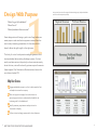
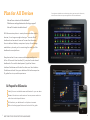
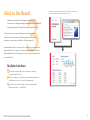
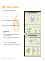
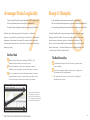
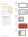
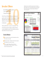
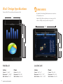
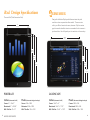
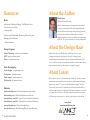
DASHBOARD
AND MOBILE
SURVIVAL GUIDE
What Every BI Dashboard Developer Should Know
Best Practices for Effective Design
Interfaces that Empower Users
Design Specifications for Mobile Apps
By Mike
Erickson
Dashboard Design Manager
v2.0, December 2012
Dashboard and Mobile
Survival Guide
What Every Dashboard Developer Should Know
Dashboards Deconstructed
Proven Survival Techniques
Business Intelligence spans dozens of inter-related components,
This guide is dedicated to all who are challenged with sharing
from key metrics to data architecture. However, few of these
mounds of information in a few hundred pixels, who struggle to
elements will be more visible to business users than dashboards.
clear the clutter from charts and graphs, or need quick-reference
tools to take their presentation to the next level.
Dashboards allow users at all levels, from the CEO to frontline
staff, to access critical performance information and align their
We hope you can benefit from practical solutions and technical
day-to-day tasks with company objectives. They harness the
tips based on our work with hundreds of clients nationwide,
vast collection of raw data that lies at the heart of Business
creating lasting, customized — and most importantly —
Intelligence, and transform it into clear and actionable insights.
actionable dashboards.
Yet for all their merit, few developers receive training in how to
create highly effective dashboards. Part art and part science,
powerful dashboard development requires an analyst’s love of
numbers, a programmer’s bag of tools and a designer’s eye for art.
No small request.
- Mike Erickson
Dashboard Design Manager
Lancet
Inside This Guide
“ ”
A dashboard is a visual display of the most important
information needed to achieve one or more objectives,
consolidated and arranged on a single screen so the
information can be monitored at a glance.
Best Practices for Effective Dashboards
5
1. Design With Purpose
5
2. Plan for All Devices
7
3. Stick to the Brand
9
4. Empower Decisions
11
5. Maximize Space
12
6. Apply the Power of One
13
7. Arrange Data Logically
15
8. Keep it Simple
16
9. Diagram Wisely
17
10. Involve Others
19
Stephen Few, author
Information Dashboard Design
Helpful Resources
21
Design Specifications for iPad® and iPad® 2
21
Design Specifications for the new iPad®
23
Design Specifications for iPhone®
25
Design Specifications for GALAXY Tab 10.1
27
Books
29
Design Programs
29
Stock Photography
29
Websites
29
About the Author
30
About Lancet
30
1
Design With Purpose
What is the goal of the dashboard?
Who will use it?
Using a wireframe as the first stage of dashboard design (top) helps stakeholders
envision the finished product (below).
What information do these users need?
Great design starts with having a goal in mind long before pen
meets paper or web visualizations appear on screen. Even the
most visually interesting presentation of information fails if it
doesn’t deliver the right insight to the right users.
That’s why it’s critical to ask questions and get agreement from
business leaders before starting the design process. For best
results, evaluate user input objectively, and communicate openly
about the time, cost and functionality options required to execute
these requests. Don’t hesitate to offer alternative solutions that
can achieve a better ROI.
Map Your Course
Engage stakeholder support up front to help speed roll-out
and adoption across the company.
Work with project managers, the technical team or
sponsoring executives to understand and establish the
business goals for the dashboard.
Identify necessary requirements and prioritize the
information to display.
Follow an iterative design process with clear milestones.
5
BEST PRACTICES FOR EFFECTIVE DASHBOARDS
6
2
Plan for All Devices
Smart phones and tablets are revolutionizing the way we interact with information,
and will be two of the most important applications for future dashboards.
How will users interact with the dashboard?
What browsers and applications does the design support?
How will it translate to mobile devices?
With the recent explosion in smart phones and other mobile
devices, it’s no longer enough to design a “one size fits all”
dashboard and assume all users will access the information
from a traditional desktop computer or laptop. Smart design
establishes a plan early on for maximizing the usability of the
dashboard across platforms.
Every device has it’s own nuances and design paradigms to
follow. Follow web User Interface (UI) principles for web-based
dashboards. For mobile development, Apple has Human
Interface Guidelines and Android has their own User Interface
Guidelines outlined. Have your dashboard follow the respective
UI guides for a true, mobile experience.
Be Prepared for All Scenarios
Identify the most suitable browsers and devices for your user base.
Research the minimum and maximum live area, screen resolution
and other technical specifications.
Build and test your dashboard in multiple environments.
Refer to the design specifications at the back of this guide.
7
BEST PRACTICES FOR EFFECTIVE DASHBOARDS
8
3
Stick to the Brand
Leverage the colors, fonts and images from corporate communications
to create a dashboard that’s instantly familiar to users.
What elements are key to the company’s visual identity?
Are fonts, colors, images and logos consistent across the dashboard?
Are design elements in line with the current corporate brand?
In the same way a company’s data quality relies on sound
architecture, using brand and design guidelines will ensure
company communications reflect a unified personality.
No dashboard exists in a vacuum; it’s one of many communication
tools used within a company. The corporate brand identity is the
ideal reference when choosing colors, fonts, logos and layouts for
your dashboard.
Take Shelter in Your Brand
Review the company web site or brochures to see the
corporate brand in action.
Ask the marketing or corporate communications department
if guidelines for colors, fonts and logo usage exist.
Utilize autoformat functionality to make your dashboard
designs consistent — and efficient.
9
BEST PRACTICES FOR EFFECTIVE DASHBOARDS
10
4
Empower Decisions
5
Maximize Space
Can users of all levels find information quickly and intuitively?
How much detail is absolutely essential?
Is information logically structured and clearly labeled?
Can multiple items be served with one label or menu?
Are menu choices and drill-down options obvious?
What is the primary focus?
If one word could describe a great dashboard, it might be
Great dashboards mind the details. Once you’ve mocked
“intuitive.” A well-architected dashboard doesn’t require a
up your visual presentation, take time to review and tighten
user manual or a training session. It should present volumes
up each individual element. Every unnecessary decimal
of information at a glance, enable business users to monitor
place, every redundant menu choice or oversized font is an
performance and make data-supported decisions — all from
opportunity to optimize your onscreen real estate.
a single screen. Understand how your business leaders make
decisions and you can engineer the optimal presentation for
their needs.
Follow Your Instincts
Review dashboard navigation and make sure it follows
standard conventions, such as underlining hyperlinks.
Check graphs, charts and grids for easy to follow titles and
captions; avoid acronyms and jargon.
Evaluate overall presentation of information so key items,
like alerts, are readily apparent to even casual users.
Maintain a consistent structure across every dashboard to
train users where to go and what to expect.
Survival Rations
Truncate figures to the shortest suitable format, such as
displaying decimal places to tenths rather than thousandths,
or showing data by quarters rather than months.
Keep text as small as possible while maintaining legibility.
Size fonts from 8-11 points, including heads and sub-heads.
Minimize or eliminate the company name and logo or move
it to a page footer.
Consider a consolidated menu bar that can serve all
elements onscreen, rather than individual menus for each
chart or diagram.
Try to maintain a consistent structure from one dashboard
to the next. This subconsciously trains users where to find
information and what to expect from the BI process.
11
BEST PRACTICES FOR EFFECTIVE DASHBOARDS
12
6
Apply the Power of One
As this “before and after” shows, by prioritizing information and grouping related
information under a common menu structure, users can easily view critical details
without scrolling. Tabs and drill-down links keep details at hand without cluttering
the presentation.
Does critical information fit easily on one screen?
Can users view the entire picture without scrolling?
What information can be relocated to a drill-down category?
When we do the math on successful dashboards, it all adds
up to one: one dashboard that fits on one screen with just
one focus on each tab. Work with your business leadership to
prioritize information and define the most critical material you
need to present. A cluttered presentation that’s overloaded
with information defeats the purpose of the dashboard and will
reduce usability.
Stay on the Trail
Group closely related information together so users don’t
need to flip between tabs.
Optimize your space by showing summary data on the main
tab and using drill-ins so users can access details as needed.
Set up your content so that it fits on one tab, without
scrolling. Test on multiple browsers and devices.
Use information windows for modal tasks, such as drill-downs
or transactional services.
13
BEST PRACTICES FOR EFFECTIVE DASHBOARDS
14
7
Arrange Data Logically
Keep it Simple
8
Can users find Key Performance Indicators (KPIs) right away?
Is the information the most prominent part of the design?
Are like elements designed consistently and grouped together?
Can any design elements be removed without impacting overall focus?
Is there a planned sequence to the flow of information?
Do colors and visuals overpower or support the intake of information?
Studies prove that we approach information in a familiar
Powerful dashboards incorporate great design. However, great
pattern, moving left to right and top to bottom. For dashboard
design should be subtle. Your color, image and layout choices
designers, that means the upper left corner should house the
should support the user’s goals, not distract from them. One
most important information, with critical components flowing in
of the most common dashboard mistakes is failure to highlight
order of priority.
what’s important — the data. Review your finished product with
Use Your Head
Make sure Key Performance Indicators (KPIs) for the
dashboard are located in the top left corner.
Group like displays of information together to speed
readability, such as grids in one area and charts in another.
Place non-essential items like dashboard names, company
logos and instructional text where they are visible to users,
but don’t detract from prominent areas of the screen.
a critical eye. Don’t be afraid to edit.
The Bare Necessities
Avoid design elements that don’t have a purpose. Less is
more in design.
Be sure the image is subtle if using a photo or graphic as
the background to the dashboard.
Try single colors in charts. Use a mix of font weights to
emphasize information.
Humans process information
from left to right and top to
bottom. Use this sequence to
your advantage by placing KPIs
in the top left of any design.
15
BEST PRACTICES FOR EFFECTIVE DASHBOARDS
16
9
Diagram Wisely
Are visualizations used appropriately?
Line Graphs
Daily Sales Over a Quarter
Line graphs work well
with sophisticated data
sets that show trend
metrics over time,
especially when values
are close in range.
Could another approach better present the information?
Is there a clear and compelling rationale for each visualization choice?
Selecting the right visual to display a data set can be tricky,
as it significantly impacts how readily users can absorb the
Bar Graphs
Television Inventory Levels
Bar graphs provide
categorical summaries
of data rather than
independent values.
information at hand. If in doubt, mock up your data in several
different configurations and color schemes, and compare the
results side by side.
Choosing the Right Tool for the Job
Choose a color scheme with just enough contrast to
make each variable stand out. Avoid jarring colors and
monochromatic shading.
Balance variety with appropriateness when selecting
among line and bar graphs, pie charts, gauges and
thermometers, heat maps and other options. Refer to
the examples on the facing page as a guide to choosing
optimal visualizations.
Gauges and Thermometers
Gauges and
thermometers are best
for displaying metrics
versus a goal or forecast.
Heat Maps
Revenue Actual Versus Forecast
Sales by Region and State
Heat maps convey
areas of interest in a
two-dimensional image.
Pie Charts
Marketshare
Pie Charts are a good
choice for three or fewer
dissimilar values.
17
BEST PRACTICES FOR EFFECTIVE DASHBOARDS
18
10
Involve Others
Does the dashboard meet business objectives?
Feedback from peers and stakeholders or the assistance of a professional
graphic designer can transform a good dashboard (top) into a great dashboard
(bottom). Note how much more restrained colors and imagery, and a smaller
logo open up the information and keep the dashboard consistent with
company brand guidelines.
Can users navigate effectively?
Is design assistance required?
As with all facets of Business Intelligence, a team approach
generally yields the best results. Dashboard design is all about
aligning the business around a common set of metrics and
objectives, so it’s natural to involve many players throughout
its development.
Creating a dashboard is a process, not a single event. There
will be multiple iterations throughout its lifecycle. Embrace
constructive feedback openly and don’t hesitate to speak out
when additional resources are required.
Survival in Numbers
Learn how users will interact with the dashboard, and tailor
functionality to their needs.
Ask peers to weigh in on designs and test drive prototypes.
Early feedback can save hours of rework.
Consult a graphic design professional for layout
recommendations or hands-on assistance. There’s no
substitute for experienced input.
19
BEST PRACTICES FOR EFFECTIVE DASHBOARDS
20
iPad Design Specifications
®
iPad and iPad 2 (First and Second Generation iPad)
REMEMBER
By default, MicroStrategy Dashboards have a resolution
of 96 pixels per inch.
8”
768 px
Apple’s AirPlay Mirroring allows you to share your iPad
screen in 1080p, when synced with an Apple TV .
10.667”
1024 px
10.667”
1024 px
10.458”
1004 px
8”
768 px
10”
960 px
7.792”
748 px
7.333”
704 px
PORTRAIT
Inches
Pixels
Inches
Pixels
Maximized: 8” x 10.458”
Maximized: 768 x 1004
Maximized: 10.667” x 7.792”
Maximized: 1024 x 748
Canvas: 8” x 10.667”
With Title Bar: 8” x 10”
21
LANDSCAPE
HELPFUL RESOURCES
Canvas: 768 x 1024
With Title Bar: 768 x 960
Canvas: 10.667” x 8”
With Title Bar: 10.667” x 7.333”
Canvas: 1024 x 768
With Title Bar: 768 x 704
22
iPad Design Specifications
®
The new iPad (Third Generation iPad)
REMEMBER
Design for the Retina Display which features twice the pixel
resolution when compared to older models. The canvas size
8”
1536 px
within your BI tool remains the same, however. Only the custom
graphics need to double in size to accomodate for the increase in
pixel resolution. Use a 96 pixels per inch resolution in the mockup.
10.667”
2048 px
10.667”
2048 px
10.458”
2008 px
8”
1536 px
10”
1920 px
7.792”
1496 px
7.333”
1408 px
PORTRAIT
Inches (document build)
Pixels (document design/mockups)
Inches (document build)
Pixels (document design/mockups)
Maximized: 8” x 10.458”
Maximized: 1536 x 2008
Maximized: 10.667” x 7.792”
Maximized: 2048 x 1496
Canvas: 8” x 10.667”
With Title Bar: 8” x 10”
23
LANDSCAPE
HELPFUL RESOURCES
Canvas: 1536 x 2048
With Title Bar: 1536 x 1920
Canvas: 10.667” x 8”
With Title Bar: 10.667” x 7.333”
Canvas: 2048 x 1536
With Title Bar: 2048 x 1408
24
iPhone Design Specifications
®
All iPhone Generations
6.667”
640 px
REMEMBER
By default, MicroStrategy Dashboards have a resolution
of 96 pixels per inch.
Design for Retina Display, which has twice the
resolution of prior iPhones.
10”
960 px
10”
960 px
9.583”
920 px
8.667”
832 px
6.667”
640 px
PORTRAIT
Inches
Pixels
Working Space: 6.667” x 8.667”
Working Space: 640 x 832
Canvas: 6.667” x 10”
25
LANDSCAPE
HELPFUL RESOURCES
Canvas: 640 x 960
Inches
Canvas: 10” x 6.667”
Pixels
Canvas: 960 x 640
26
GALAXY Tab 10.1
Design Specifications
8.333”
800 px
REMEMBER
By default, MicroStrategy Dashboards have a resolution
of 96 pixels per inch.
13.333”
1280 px
13.333”
1280 px
8.333”
800 px
12.313”
1182 px
PORTRAIT
LANDSCAPE
Inches
Pixels
Inches
Pixels
Working Space: 8.333” x 12.313”
Working Space: 800 x 1182
Working Space: 13.333” x 7.313”
Working Space: 1280 x 702
Canvas: 8.333” x 13.333”
27
7.313”
702 px
HELPFUL RESOURCES
Canvas: 800 x 1280
Canvas: 13.333” x 8.333”
Canvas: 1280 x 800
28
Resources
Books
Information Dashboard Design: The Effective Visual
Communication of Data
– Stephen Few
Performance Dashboards: Measuring, Monitoring, and
Managing Your Business
– Wayne Eckerson
Design Programs
Adobe Photoshop - adobe.com/photoshop
GIMP - gimp.org/downloads
Picasa - picasa.google.com
Stock Photography
Corbis Images - corbisimages.com
iStockphoto - istockphoto.com
Getty Images - gettyimages.com
Shutterstock - shutterstock.com
Websites
dashboardinsight.com - Dashboard galleries and articles
dashboardspy.com - Dashboard galleries and articles
lancetsoftware.com/HIG - Apple’s Human Interface Guidelines
lancetsoftware.com/UIG - Android’s User Interface Guidelines
perceptualedge.com - Blog by Stephen Few
bryanbrandow.com - MicroStrategy Blog by Bryan Brandow
29
HELPFUL RESOURCES
About the Author
Mike Erickson
Dashboard Design Manager
Mike is a seasoned graphic designer who has worked
his magic on thousands of MicroStrategy dashboards.
His background in web design and marketing gives him
a unique and valuable perspective when it comes to
designing usable and attractive dashboards, mobile apps
and GUIs. He is the team leader of Lancet’s Design Haus.
About the Design Haus
Under the direction of Mike Erickson, the Design Haus is a group
of design professionals, dedicated to the craft of designing and
implementing web and mobile Business Intelligence dashboards. Their
role is to deliver concept and production dashboards that exceed industry
expectations for usability, user adoption and general appeal.
About Lancet
Maximize your return on data with strategic leadership, hands-on project
implementation and professional training from the Business Intelligence
specialists at LancetSM. As one of the leading MicroStrategy® partners
in the world, Lancet helps IT professionals and business leaders define,
build, manage and learn the discipline of Business Intelligence – and excel
at its application. More than 100 clients around the globe rely on Lancet
for BI strategy, project execution, platform administration and training.
Learn More:
www.lancetsoftware.com
30
Power Up Your
Next Dashboard
Contact Lancet for design consulting, custom
visualizations or hands-on dashboard development.
in f o @ l a n ce tso ftware.c o m
|
952.230.7369
Learn more:
www.lancetsoftware.com/dashboards
11980 Portland Avenue South • Burnsville, Minnesota 55337 • 952.230.7360 • www.lancetsoftware.com