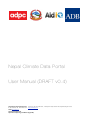
1
Nepal Climate Data Portal
User Manual (DRAFT v0.4)
Asian Disaster Preparedness Center
979/66-70, 24th Floor SM Tower, Phaholyothin Road, Samsen Nai, Phayathai, Bangkok 10400
T +66 2298 0681-92 F +66 2298 0012
http://www.adpc.net
AidIQ http://aidiq.com
Asian Development Bank
Department of Hydrology and Meteorology (DHM)
Asian Disaster Preparedness Center | AidIQ | Asian Development Bank | DHM
Table of Contents
Disclaimer
3
Overview
1
Purpose / intent
1
A useful way to see the Nepal Climate Data Portal
1
Features
1
Definitions
2
Tour of the User interface
3
Map view components 3
Side panel components 3
Climate Data
4
Types of data available
4
Names and naming conventions 4
Basic usage
5
How to display observed data on the map
5
How to download a printable map image
5
How to generate a chart from the map overlay
6
How to filter the map overlay
7
Colour Key
7
Filter Box
7
Examples 7
Nepal Climate Data Portal User Manual
1
Asian Disaster Preparedness Center | AidIQ | Asian Development Bank | DHM
Simple data comparisons
8
Performing a simple comparison
8
Example
Annual aggregation
Explanation
What difference does the Annual aggregation checkbox make?
Month selection
The “Previous December” checkbox
What difference does checking the months make?
Flexible data queries
8
9
9
9
9
10
10
11
Overview
11
Queries are shown in the Legend / Query Box
11
Editing query expressions
12
Example
12
Expressions and operators available in the query syntax
14
Statistical expressions 14
Mathematical operators 14
Expressions used inside aggregation expressions 14
Nepal Climate Data Portal User Manual
2
Asian Disaster Preparedness Center | AidIQ | Asian Development Bank | DHM
Disclaimer
The Nepal Climate Data Portal is a software product designed to meet various requirements of various types of users. As
such it may change in the future, and this manual cannot guarantee that it will adequately describe future versions. Also,
screenshots in this manual may show user interface layouts and data set names that differ slightly to the live version.
Nepal Climate Data Portal User Manual
3
Asian Disaster Preparedness Center | AidIQ | Asian Development Bank | DHM
Overview
Purpose / intent
The Nepal Climate Data Portal is designed to facilitate the analysis of climate/meteorological, geographical and projection
data using a publicly accessible web-based interface. Its intended audience are climate research scientists, meteorologists,
hydrologists and anyone who needs to understand past and future (projected) weather patterns.
It also serves to allow the purchase of data that has been collected by the Department of Hydrology and Meterology in
Nepal.
A useful way to see the Nepal Climate Data Portal
To avoid confusion, it is useful to see the portal as essentially a somewhat sophisticated calculator with its own database. Its
calculation results are maps, time-series charts, or downloadable data. Like a spreadsheet (which is another sophisticated
calculator), it uses a simple language to represent arithmetic and statistical operations.
The point of this is, just like any calculator, it is dumb in the sense that it basically just applies the instructions it is given to the
data it has been given. It isn’t smart, i.e. ultimately it cannot recognise bad data or instructions although it does have some
mechanisms to cope with bad data and it can also use some meta-data (data about data) to help users validate results.
For example, the portal can’t and doesn’t try to detect incorrect outliers, but the map overlay colours will visually and
obviously show those outliers, and the user can edit the colour scale to exclude those outliers and see a useful map.
As another example, the system doesn’t know what the values mean, but does know about units, so it can dimensionally
analyse expressions and then show the output units. The portal will complain when units are incorrectly mixed in an
expression.
Nepal Climate Data Portal User Manual
1
Asian Development Bank | Asian Disaster Prevention Center | AidIQ
Features
• Easy selection and display of:
Observed Station Data.
Observed Gridded Data.
Projected Data.
• Easy comparison of data
• Ability to aggregate data
• Flexible data queries, which allows more sophisticated data analysis by giving the user the ability to enter expressions.
• Dimensional and delta analysis of expressions to aid data validation
• Generation of time-series charts, with regression lines, and ability to combine and resize charts.
• Filtering map by places / values.
• Ability to show observation stations as a separate layer.
• Popup boxes to show values.
• Filtering of places shown on the map with shape files.
• Printable images of the map overlay
• Download of data.
• Data purchase facility
• Management of data purchases.
Nepal Climate Data Portal User Manual
1
Asian Development Bank | Asian Disaster Prevention Center | AidIQ
Definitions
For clarity, certain terms are used with precise meanings in the rest of this document.
Name
Definition
Data
Sets of numeric values of a given variable, specifically:
• at a particular place,
• over a particular time range.
Internally these are stored as positive numbers wherever possible. This is important
These sets of data have associated units (e.g. mm for rainfall). These sets of data are
stored in a database used by the Nepal Climate Data Portal.
Place
A geographical position at a fixed latitude and longitude.
Places may or may not be observation stations.
Places may or may not have other attributes including: elevation, name, station ID, and
a list of regions the place is inside. These attributes may be used in filtering.
Observation Station
A real weather observation station. These usually have names and elevation
information.
Nepal Climate Data Portal User Manual
2
Asian Development Bank | Asian Disaster Prevention Center | AidIQ
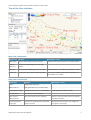
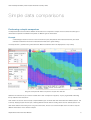
Tour of the User interface
Map view components
Component
Purpose
Description / notes
Map overlay
Shows values above the base map layer.
Values from the query are shown as coloured squares.
Legend /
Controls the data being shown in the map
Query box
overlay.
Filter box
Place/value based filtering of the map overlay
Can filter based on any attribute, e.g. elevation > 1000
Colour Key
Control the colours shown in the map overlay.
This is set to sensible values from the query data. It is
also editable, and lockable.
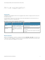
Side panel components
Component
Purpose
Layers
Toggle visible map layers
Select Data: (A)
Easily generates a query to display data.
Compare with data (B)
Easily generates a query to compare data.
Buy data button
Allow the user to purchase data.
Show chart for
Show a time-series chart for selected
selected places.
Description / notes
Used together with Select Data: (A)
Places on the map overlay need to be selected
to enable this button.
Download printable
Downloads a generated (server-side) PNG
Side panel and unnecessary map widgets will
map image
image of the map.
not appear on the image.
Nepal Climate Data Portal User Manual
3
Asian Development Bank | Asian Disaster Prevention Center | AidIQ
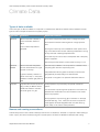
Climate Data
Types of data available
Three main types of data are available. It is important to understand the distinctions between and the limitations of these
types in order to interpret the data from the system properly.
Type name
Explanation
Details and Limitations
Observed
Data that has been collected at
Some areas of Nepal have better station coverage than others.
various observation stations in
Nepal.
It has not been interpolated or
generated.
Some stations have been collecting data for a longer period of
time.
Some types of data may not be available at certain points in time.
E.g. some stations have not been collecting rainfall data for as long
as they have been collecting temperature data.
Some data may be incorrect due to misreported data or temporary
faults in equipment.
Coloured square size remains constant while zooming in or out.
Observed
Data that has been interpolated
Grid sizes may be different. This is important to understand when
Gridded
from the observed data into a grid
comparing data. Data are compared by place.
of points on the map.
A grid is an arbitrary collection of
places on the map. I.e. the system
is flexible in whatever grid pattern is
Interpolated data will have greater uncertainty the further it lies
(geographically and temporally) from observed data.
The places on the grid do not represent Observation Stations.
used.
Projected
Projected Data has been produced
These projections are produced by third parties outside the
using a variety of different climate
system.
models and emissions scenarios.
This is also given on a grid.
The mechanism of producing these projections is too technical to
describe here. Please refer to the documentation for the model
used in the projection.
Some projections may have long gaps in the data. For example,
the earlier data (e.g. 1970 - 2009) can be used to compare the
model against real observed/gridded data. The later data (e.g.
2030 -2060) can be used to make predictions.
Names and naming conventions
Data will always have a name. Names will always start with one of “Observed”, “Gridded” or “Projected”. When referring to
Data in a query, the name must always be given in double quotes. This allows for flexible and therefore clear naming.
Nepal Climate Data Portal User Manual
4
Asian Development Bank | Asian Disaster Prevention Center | AidIQ
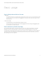
Basic usage
How to display observed data on the map
1. Select Data
On the Select data panel you can select the type of climate data you want to view. You can choose what type of data
you want to view, how you want that data to be aggregated on the map and charts and the time range you wish to
view the data over.
2. Click “Show on Map”
The climate data which you have selected will be overlaid on the map.
The map overlay will show climate data which has been aggregated over time according to the Aggregation option
you have selected on the Select data panel.
How to download a printable map image
Click “Download printable image” to download an image of this map to use in reports and presentations. The image is
generated on the server, so please be patient as it may take some time to generate depending on the server load.
This image will be in the PNG image format to preserve colours correctly, may be of a different size, and will not display the
various map controls. Some other things may not look exactly the same as what you see in the browser, e.g. fonts may
differ, depending on the server configuration.
Nepal Climate Data Portal User Manual
5
Asian Development Bank | Asian Disaster Prevention Center | AidIQ
How to generate a chart from the map overlay
1. Select places on the map overlay
You can click on a single grid on the map or select a range of points by clicking and dragging the mouse or holding
the SHIFT key while you click multiple grids.
2. Click “Show chart for selected places”
A chart window will pop up showing a chart for those places. The chart will show climate data which has been
aggregated from each of the selected grids according to the Aggregation option you have selected on the Select
data panel.
Click “Download” on the chart popup window to download the chart image.
You can resize the Chart popup window to show more detail
You can add more lines to the chart by simply selecting different data.
To clear the chart and start a new one, simply close the chart popup window.
Nepal Climate Data Portal User Manual
6
Asian Development Bank | Asian Disaster Prevention Center | AidIQ
How to filter the map overlay
There are two ways to filter the map overlay.
Colour Key
The Colour Key will filter out any places whose value on the map overlay lies outside the range in the Colour Key. However,
more powerful filtering is possible with the Filter Box.
Filter Box
The Filter Box accepts simple mathematical and logical expressions. You can refer to any attribute of a place, and the value.
The list of attributes depends on what data has been loaded into the system. To see the list of attribute, hover over a place
on the map overlay. All the attributes listed in the popup are available in the expression. For example: latitude / longitude
elevation and name.
The filter expression will be give a boolean (true/false) value. The expression will be evaluated on each place. If the
expression evaluates to true, the place will be shown, otherwise it will not be shown.
Examples
1.
Selecting a region by name:
name = “DARCHULA”
2.
Using the boolean operators “and” and “or”.
elevation > 1000 and value < 10
3.
Once a region shape file has been loaded, you can also use the special function “within”.
within(“FWDR”)
If no filter has been specified, the Filter Box will show “unfiltered” and all places will be shown.
Special filter functions
Filtering can also use some special filter functions that are described in the table below. These filter functions allow filtering by
location.
Special filter function
Effect
within(“Area name“)
Only shows places within the named area. Multiple area
names may be specified, separated by commas.
within_Nepal()
Nepal Climate Data Portal User Manual
Only shows places within Nepal.
7
Asian Development Bank | Asian Disaster Prevention Center | AidIQ
Simple data comparisons
Performing a simple comparison
The Nepal Climate Data Portal allows different climate data to be compared for analysis. These could be the same type of
climate data compared over different time periods or different types of climate data.
Example
A meteorologist needs to know how much the maximum yearly temperature will increase between the years 2030
and 2060 to determine the risk of increased flood hazards due to glacial melting.
The Compare with... (subtract from) panel allows the differences between data to be displayed as a map overlay.
Using the “Compare with Data” sub-panel to compare two data sets
Select the two data sets as you would for “Select data”. Click “Compare on map (B-A)”. A query is generated subtracting
the top selection from the bottom.
Note: Charts can also be used to visually compare different types of climate data and climate data from different places. This
is done by keeping the plot window open, selecting different climate data and clicking Show chart for selected places. This
data will be added to the existing chart. Using the check boxes, the user can combine multiple charts in order to compare
different climate data. This is useful for analysis.
Nepal Climate Data Portal User Manual
8
Asian Development Bank | Asian Disaster Prevention Center | AidIQ
Annual aggregation
Explanation
The checkbox “Annual aggregation” allows the user to aggregate monthly values into a single yearly value for each year of
the selected time range.
This actually makes no difference to the map overlay, but does make notable differences to the time-series charts, i.e. it
aggregates monthly values into a single yearly value:
What difference does the Annual aggregation checkbox make?
Annual aggregation
Difference to the map overlay
Difference to charts
No difference - because values
Charts lines will have one value per year, shown as
displayed on the map overlay must all
circles joined by lines.
checkbox
Checked
Unchecked
be aggregated into a single value
(single coloured square per place)
anyway.
Monthly time series will be shown as just lines without
circle markers.
Over many years this is often a waveform with a period
of one year.
Month selection
Below the “Annual aggregation” checkbox are 13 labelled checkboxes “D J F M A M J J A S O N D”. These allow the user
to select which months to aggregate. For example, the user may only be interested in yearly values for the summer months
only. Thus they might select only J J A (June, July and August).
Nepal Climate Data Portal User Manual
9
Asian Development Bank | Asian Disaster Prevention Center | AidIQ
The “Previous December” checkbox
By default, the checkboxes starting from the first J (January) until the last D (December) are specified. This selects every
month in the year.
However, there is another typical use case wherein a user may wish to look at seasonal changes. Typically, the only
difference this makes is the special treatment of the December of the previous year. I.e. when we talk about “Winter 2011”
we actually mean December 2010, January 2011 and February 2011. The first D checkbox is allowed to make this
possible.
Within the system, to distinguish this concept from the normal concept of December, it is identified with a special name:
“PreviousDecember”. This name can be used in expressions within the Months() filter. PrevDec is a shorter alias of this
name.
When the first D checkbox is checked, then PreviousDecember is specified in the month filtering and two things happen:
1.
The December of the previous year is counted as part of that year.
2.
If the date range is specified in terms of years (no months*), then each year starts in December and ends in November.
i.e. if the year range is From(2000) To(2011), then the actual dates will be from December 1999 to November 2011.
*Note that when months are specified in the date range (e.g. March 2000 to October 2011), together with
PreviousDecember, behaviour is currently undefined.
What difference does checking the months make?
Months selection example
Outcome
Every month in the year will be aggregated into a single value.
(Default)
E.g. 2011 will use values from Jan 2011 to Dec 2011
Only values from the winter months will be aggregated together into a single
(PreviousDecember specified)
value.
E.g. if the date range is 2000 to 2010, the value for 2000 = Dec 1999 + Jan
2000 + Feb 2000. The data for December 2010 will be ignored as it now falls
outside of the range.
The data will differ from the D J F case.
Not allowed - system will complain that it doesn’t make sense to aggregate
annually using both December and the PreviousDecember. The user interface
(PreviousDecember and December)
Nepal Climate Data Portal User Manual
will not allow both D’s to be checked at the same time.
10
Asian Development Bank | Asian Disaster Prevention Center | AidIQ
Flexible data queries
Overview
Internally, the Nepal Climate Data Portal uses a simple, specialised query language which is used to query the database. This
language can be used directly to formulate more complex queries than a simple user interface could easily allow. This feature
can be used for more advanced statistical analysis such as computing Coefficient of Variation to show the dispersion of the
climate data and interpret its reliability.
These query expressions are simple mathematical expressions, similar to those you might write in a spreadsheet. Only
queries can be written. The language is deliberately too simple to allow the writing of general programs (this is important for
security, as the queries run on the server).
Internally, the output of these expressions is a mapping of keys to values. When generating a map overlay, the keys will be
places on the map. When generating a chart, the keys will be time periods. Whether the keys are places or times is implicit
and depends on the context of usage but not on the expression itself. Thus, you do not need to modify their query
expression to generate a graph or a map overlay.
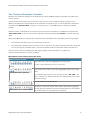
Queries are shown in the Legend / Query Box
You may have already noticed examples of the data query syntax in the preceding chapters. The box at the bottom of the
map shows the expression being evaluated, whilst also serving as a map legend. This is set to an initial expression when the
browser first loads the page. It will also be updated every time you use the graphical user interface in the side panel to
change the data being displayed. Thus you can use this feature to quickly see examples of the syntax.
The Legend / Query box. This is an editable box located at the bottom of the map viewer.
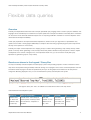
Let’s break down this example into parts:
Maximum(
"Observed Temp Max",
From(1950),
To(2100)
)
Statistic name.
Data set name. This is always in
Start date,
End date,
Remember to
I.e. “Return the
double quotes, and always starts
inclusive. I.e. use
inclusive. I.e.
match closing
maximum value
with “Observed”, “Projected” or
values from 1st
use values until
braces.
for each key”
“Gridded”.
Jan, 1950
31st Dec, 2011
Nepal Climate Data Portal User Manual
11
Asian Development Bank | Asian Disaster Prevention Center | AidIQ
Editing query expressions
To edit query expressions, simply click with the mouse inside the query box. A flashing cursor should appear. You can now
edit the expression. As soon as you start editing, a button will appear labelled “Compute and show on map”. When you are
happy with your edited expression, click the button to update the map overlay.
The “Compute and show on map” button. This appears whenever the query has been edited.
Example
A meteorologist is producing a using projected temperature data for 2030-2060 and needs to understand the C.V. of the
data.
C.V. is Standard Deviation divided by the mean, so we can enter the expression:
StandardDeviation("Projected Temp Max RegCM4 A1B", From(2030), To(2060)) /
Average("Projected Temp Max RegCM4 A1B", From(2030), To(2060))
Nepal Climate Data Portal User Manual
12
Asian Development Bank | Asian Disaster Prevention Center | AidIQ
Directly entering an expression to calculate C.V.
Nepal Climate Data Portal User Manual
13
Asian Development Bank | Asian Disaster Prevention Center | AidIQ
Expressions and operators available in the query syntax
Statistical expressions
These always have a double-quoted data name as their first argument.
Expression
Meaning
Notes
Maximum(dataset, ...)
Maximum sample value
Minimum(dataset,...)
Minimum sample value
Average(dataset,...)
Average of the sample values
StandardDeviation(dataset, ...)
Standard deviation of the sample values
Sum(dataset, ...)
Sum of the sample values.
Count(dataset, ...)
Count of the number of samples.
Gives a delta value
Gives a dimensionless value
Mathematical operators
Operator
Meaning
Notes
+
Plus
It is an error to add or subtract expressions that use different
-
Minus
*
Multiply
/
Divide
^n
Raise to power
^ (1/n)
Root
units.
Only integral powers or integral ratios are allowed. I.e. n must
be a whole number, and not a statistical expression. It may
be an error if the resulting units do not make sense.
Expressions used inside aggregation expressions
Expression
Meaning
Notes
From(Year[, Month[, Day]])
Specify start date*
If month is not given, January will be used.
If day is not given, 1 will be used.
To(Year[, Month[, Day]])
Specify end date*
If month is not given, December will be used.
If day is not given, the last day of the month will be used.
Months(...)
Specify which months*
Only data from the specified months will be used.
to aggregate
* Months can be specified by name or number: i.e. PrevDec = PreviousDecember = 0, Jan = January = 1, Feb = February =
2, ... Dec = December = 12
Nepal Climate Data Portal User Manual
14