1
Faculty of Medicine
Biomedical Engineering
Master of Science Thesis
Analysis of high-speed opto-biological data
from excitable tissues
by
Jonas Reber
from Schangnau, BE
Supervisor: Prof. Dr. Volker M. Koch
Advisor: Prof. Dr. med. Stephan Rohr
Biomedical Engineering Lab, BFH-TI
Institute of Physiology, University of Bern
Bern, December 2011
iii
Abstract
To elucidate and further understand electrical signalling in networks of excitable
cells like cardiomyocytes and neurons, state of the art experimental techniques permitting to assess membrane potential fluctuations with high spatio-temporal resolution
are indispensable. Generally, such experiments are based on the use of voltage sensitive dyes which report membrane potential variations by changing their fluorescence
properties. The resulting light intensity changes are captured by photodiode arrays or
high-speed cameras that are fast enough to follow electrical activation, i.e., the spread
of action potentials with variable spatial resolution from single cells to entire tissues
like the heart or the brain.
Whereas the acquisition of data works very well with these systems, available
software solutions for data analysis are rudimentary and barely meet the specialized
demands of researchers. In particular, they fail to calculate parameters describing
the network behaviour of the excitable tissues under investigation. A solution to
accomplish the task of processing cardiac mapping data is described in this thesis.
The data analysis tool developed in this study provides basic data conditioning and
processing functionalities as well as advanced feature extraction capabilities to statistically analyse the network behaviour of excitable cells. Recorded data is processed in
both the spatial and the temporal domain. The software is based on a plug-in strategy that allows seamless integration of new data processing functionalities without the
need of remodelling the whole architecture.
Raw mapping data from high-speed cameras and other sources like multi-electrode
arrays can be processed using various approaches. Pre-implemented filters and analysis
plug-ins allow the extraction of desired characteristics of recorded signals and the
generation of different feature maps (e.g., activation-, speed- and upstroke velocity
maps). Moreover, the detection and tracking of phase singularities, the clustering of
propagating wave fronts, the creation of velocity profiles or the tracking of activation
paths are implemented in the software. For this, several new algorithms have been
developed, like the tracing of activation waves based on the fast marching method.
The new software drastically reduces the evaluation time of cardiac mapping data
and also improves the general handling during this phase of analysis. It is now possible
to process data in an intuitive way by the graphical user interface that offers direct
feedback, rather than manually writing code for data analysis. The software enables
scientists to obtain a comprehensive analysis of the experiments in short time which
enables them to focus on the understanding and treatment of the causes of heart
diseases.
Acknowledgements
Really great people make you feel
that you, too, can become great.
Mark Twain
A little more than three years ago, as an electronics engineer, I was living in a purely
technical world made from electronic components, wires and formulas. It had been my
world for nearly a decade and it was not until Dr. Roland Schäfer introduced me to a
project he called “Fast Data Acquisition and Processing for Multi-Electrode-Arrays”, when
I first heard of an action potential.
The term action potential seemed slightly hard to grasp at that time, but nevertheless, with
my long time fellow student and partner Christian Dellenbach, I decided to give it a try.
And what we saw would change our world.
The combination of our engineering knowledge with the human body was so spellbinding
that I decided to take a class on Biomedical Engineering. It was Prof. Dr. Volker M. Koch’s
class that eliminated any last doubts that this field was fascinating. I signed up for
the master’s program in biomedical engineering at the University of Bern and because
of the project on action potential detection on a hardware level, I was introduced to
Prof. Dr. med. Stephan Rohr and his team at the Institute of Physiology of the University
of Bern.
It is these four people who have been most relevant in my maturity as a (biomedical)
engineer. I am very grateful to Roland Schäfer for showing me that the field of engineering
is actually huge and would like to thank Volker Koch for being my supervisor and giving me
the opportunity to work in his group at the BMELab at the University of Applied Sciences
in Biel. I owe my sincere gratitude to Stephan Rohr for always having a sympathetic ear
and his support over the past years.
A very special thank goes to Christian Dellenbach with whom I have been working for
the last 10 years. He undoubtably has been a great help and source of inspiration, loyal
collaborator and good friend during our years of education. Further, I would like to thank
Alois Pfenniger for his advice and proof reading of my thesis. Many thanks also to Raphael
Deschler, Lukas Frei and Aymeric Niederhauser for the good time we had at the lab.
I most sincerely thank my parents as well as my brother and sister, for whom I have
great love, for their ongoing support and motivation. Finally, I would like to thank my
Rahel. Thank you for your never ending love, your patience and encouragement.
v
vi
Ich erkläre hiermit, dass ich diese Arbeit selbständig verfasst und keine anderen als die
angegebenen Hilfsmittel benutzt habe. Alle Stellen, die wörtlich oder sinngemäss aus Quellen
entnommen wurden, habe ich als solche kenntlich gemacht. Mir ist bekannt, dass andernfalls
der Senat gemäss dem Gesetz über die Universität zum Entzug des auf Grund dieser Arbeit
verliehenen Titels berechtigt ist.
Bern, December 14th 2011
Jonas Reber
Contents
1 Introduction
1.1 Background and significance . . . . . . . . . . . . . . . . . . . . . . . . . . .
1.2 Objectives . . . . . . . . . . . . . . . . . . . . . . . . . . . . . . . . . . . . .
1.3 Thesis outline . . . . . . . . . . . . . . . . . . . . . . . . . . . . . . . . . . .
1
1
2
2
I Introduction to cardiac electrophysiology and its research
5
2 Cardiac electrophysiology
2.1 The heart and the cardiac cycle . . . . . . . . . . . . . . . . . . . . . . . . .
2.2 The cardiac action potential and its propagation . . . . . . . . . . . . . . .
7
7
10
3 State of the art research
3.1 Computer modelling . . . . . . . . . . . . . . . . . . . . . . . . . . . . . . .
3.2 Mapping of cardiac excitation . . . . . . . . . . . . . . . . . . . . . . . . . .
15
15
16
II Signal processing and quantification of cardiac mapping
23
4 Data conditioning/filtering
4.1 Differential data . . . . . . . . . . . .
4.2 Spatial and Temporal filtering . . . . .
4.3 Baseline wander removal or detrending
4.4 Normalization . . . . . . . . . . . . . .
4.5 Smoothing filters . . . . . . . . . . . .
4.6 Differentiators . . . . . . . . . . . . . .
.
.
.
.
.
.
.
.
.
.
.
.
.
.
.
.
.
.
.
.
.
.
.
.
.
.
.
.
.
.
.
.
.
.
.
.
.
.
.
.
.
.
.
.
.
.
.
.
.
.
.
.
.
.
.
.
.
.
.
.
.
.
.
.
.
.
.
.
.
.
.
.
.
.
.
.
.
.
.
.
.
.
.
.
.
.
.
.
.
.
.
.
.
.
.
.
.
.
.
.
.
.
.
.
.
.
.
.
.
.
.
.
.
.
.
.
.
.
.
.
.
.
.
.
.
.
27
29
29
31
33
33
35
5 Cell
5.1
5.2
5.3
5.4
.
.
.
.
.
.
.
.
.
.
.
.
.
.
.
.
.
.
.
.
.
.
.
.
.
.
.
.
.
.
.
.
.
.
.
.
.
.
.
.
.
.
.
.
.
.
.
.
.
.
.
.
.
.
.
.
.
.
.
.
.
.
.
.
.
.
.
.
.
.
.
.
.
.
.
.
.
.
.
.
.
.
.
.
37
37
41
42
45
6 Quantification of arrhythmias
6.1 Time space plots . . . . . . . . . . . . . . . . . . . . . . . . . . . . . . . . .
6.2 Phase maps and phase singularities . . . . . . . . . . . . . . . . . . . . . . .
53
53
54
network analysis
Signal features of interest . . . . . .
Visualizing features . . . . . . . . . .
Quantification of activation patterns
Propagation speed and direction . .
vii
.
.
.
.
viii
CONTENTS
IIISoftware development
63
7 Software conception
7.1 Requirement and environment analysis
7.2 Data flow and processing architecture
7.3 User interface . . . . . . . . . . . . . .
7.4 Programming language . . . . . . . . .
.
.
.
.
.
.
.
.
.
.
.
.
.
.
.
.
.
.
.
.
.
.
.
.
.
.
.
.
.
.
.
.
.
.
.
.
.
.
.
.
.
.
.
.
.
.
.
.
.
.
.
.
.
.
.
.
.
.
.
.
.
.
.
.
.
.
.
.
.
.
.
.
.
.
.
.
.
.
.
.
.
.
.
.
67
67
68
71
73
8 Software implementation
8.1 Software architecture . . .
8.2 Data architecture . . . . .
8.3 Software operation . . . .
8.4 Feature extraction widgets
8.5 Result data analysis . . .
.
.
.
.
.
.
.
.
.
.
.
.
.
.
.
.
.
.
.
.
.
.
.
.
.
.
.
.
.
.
.
.
.
.
.
.
.
.
.
.
.
.
.
.
.
.
.
.
.
.
.
.
.
.
.
.
.
.
.
.
.
.
.
.
.
.
.
.
.
.
.
.
.
.
.
.
.
.
.
.
.
.
.
.
.
.
.
.
.
.
.
.
.
.
.
.
.
.
.
.
.
.
.
.
.
75
75
75
76
86
92
.
.
.
.
.
.
.
.
.
.
.
.
.
.
.
.
.
.
.
.
.
.
.
.
.
.
.
.
.
.
.
.
.
.
.
IV
95
9 Results
9.1 Specific algorithm verifications . . . . . . . . . . . . . . . . . . . . . . . . .
9.2 Software performance optimization . . . . . . . . . . . . . . . . . . . . . . .
9.3 Example results . . . . . . . . . . . . . . . . . . . . . . . . . . . . . . . . . .
97
97
105
106
10 Discussion, Conclusion
10.1 Discussion . . . . . .
10.2 Conclusion . . . . .
10.3 Outlook . . . . . . .
and Outlook
115
. . . . . . . . . . . . . . . . . . . . . . . . . . . . . . . 115
. . . . . . . . . . . . . . . . . . . . . . . . . . . . . . . 122
. . . . . . . . . . . . . . . . . . . . . . . . . . . . . . . 124
List of Figures
125
List of Tables
125
Bibliography
127
A User Manual
A.1 Introduction . . . . . . . . . . . . . . . . . .
A.2 The main window and the data flow . . . .
A.3 Loading data . . . . . . . . . . . . . . . . .
A.4 Data conditioning . . . . . . . . . . . . . .
A.5 Feature extraction . . . . . . . . . . . . . .
A.6 Filter architecture and custom filter design
A.7 Feature extraction widget architecture . . .
B Maintenance Manual
.
.
.
.
.
.
.
.
.
.
.
.
.
.
.
.
.
.
.
.
.
.
.
.
.
.
.
.
.
.
.
.
.
.
.
.
.
.
.
.
.
.
.
.
.
.
.
.
.
.
.
.
.
.
.
.
.
.
.
.
.
.
.
.
.
.
.
.
.
.
.
.
.
.
.
.
.
.
.
.
.
.
.
.
.
.
.
.
.
.
.
.
.
.
.
.
.
.
.
.
.
.
.
.
.
.
.
.
.
.
.
.
.
.
.
.
.
.
.
.
.
.
.
.
.
.
141
141
144
145
146
160
174
177
183
Chapter 1
Introduction
Discontent is the first necessity of
progress.
Thomas A. Edison
1.1 Background and significance
Every year, thousands of people around the world suffer from cardiac arrhythmia, a phenomenon that is characterized by either too fast (tachycardia), too slow (bradycardia) or
fibrillating electrical activity in the heart. The heart is said to be in fibrillation if an entire
chamber (atrium or ventricle) is affected by chaotic electrical excitation. We distinguish
between two types of fibrillation: (1) Atrial fibrillation and (2) ventricular fibrillation.
Atrial fibrillation is the most common heart rhythm disorder. It is rarely life-threatening,
but has been proven to be a risk factor for secondary complications such as strokes [148] and
therefore to reduce life expectancy or cause permanent disability. Ventricular fibrillation
on the other hand is by far the leading cause of sudden cardiac death in the industrialized
world. Almost one quarter of all human deaths are due to this pathology [86].
Up to this day, the basic mechanisms by which fibrillation is initiated are not fully understood. Further, it has been known for over a century that the application of a strong
electrical potential across the heart may halt fibrillation [103]. However, the detailed mechanisms of defibrillation are not fully understood either.
To develop and improve clinical arrhythmia treatments such as pacemakers and defibrillators, a better understanding of these two phenomena is crucial.
One of the best approaches to obtain the necessary information for understanding both
fibrillation and defibrillation is to study the distribution of potentials over the entire heart,
as well as individual heart muscle cells (cardiac myocytes). Since electrical stimuli alter the transmembrane potential thereby leading to cellular excitation, it is especially the
spatiotemporal distribution of the transmembrane potential during fibrillation and defibrillation that is under intense investigation in cardiac electrophysiology [18].
To elucidate and further understand electrical signalling in networks of excitable cells like
1
2
CHAPTER 1. INTRODUCTION
cardiomyocytes and neurons, state of the art experimental techniques permitting to assess
membrane potential fluctuations with high spatiotemporal resolution are indispensable.
Generally, such experiments are based on the use of voltage-sensitive dyes which report
membrane potential fluctuations by changing their fluorescence properties. The resulting
light intensity changes are captured by photodiode arrays or high-speed cameras that are
fast enough to follow electrical activation, i.e., the spread of action potentials with variable
spatial resolution from single cells to entire tissues like the heart or the brain.
At the Department of Physiology of the University of Bern, such a high-speed camera
is presently in use to investigate action potential propagation under pathological conditions
in cardiomyocyte cultures (Micam Ultima, Brainvision; up to 10’000 frames per second
at a resolution of 100x100 pixels). Although data acquisition works very well with this
system, available software solutions for data analysis are rudimentary and do not meet
the researchers’ demands. In particular, they fail to calculate parameters describing the
network behaviour of the excitable tissues under investigation.
1.2 Objectives
It is the aim of this master thesis to develop a self-contained data analysis software that
is tailored to assess emergent patterns of electrical activity in networks of excitable cells
based on high-speed raw optical data. The software is flexible with respect to the input data
format and offers, besides some basic data conditioning and filtering functionality, the ability
to extract specific activation and propagation features. New and improved algorithms to
process and quantify the excitation patterns are developed.
1.3 Thesis outline
This thesis is divided into four parts:
1. Part I, Introduction to electrophysiology and research in cardiac electrophysiology, covers the background and explains the methods currently used in this
research field. In Chapter 2, a short introduction to basic electrophysiology is given.
The general behaviour of the heart is outlined, in both the normal (healthy) and
pathological arrhythmic state. Chapter 3 outlines the state of the art research in electrophysiology and the basic principles of cardiac mapping, which provides the data
used by the software developed during this master thesis.
2. Part II, Signal processing and quantification of cardiac mapping, introduces
various algorithmic tools that can be used to analyze high-speed optical data. It
reviews the state of the art of data analysis in this field and explains the new algorithms
that have been developed.
3. Part III, Software development, outlines the conception and the implementation
of the software.
4. Finally, Chapter 9 presents some results of the analysis of optical data using the new
software and gives validation outcomes of some implemented algorithms. Chapter
10 discusses and summarizes the results and findings of parts II and III and mentions possible future work, as well as improvements and extensions of the developed
software.
1.3. THESIS OUTLINE
3
The appendices A and B are provided for users of the software and developers who will be
working with the implemented code. The source code is provided on CD.
Part I
Introduction to cardiac electrophysiology and its
research
5
Chapter 2
Cardiac electrophysiology
The heart is the only broken
instrument that works.
T.E.Kalem
Cardiac myocytes, the main contractile elements of the heart, are able to spontaneously
generate electrical impulses. These electrical impulses are essential to all cardiac functions.
They are not only responsible for generating the heartbeat, but also allow coordinated
activation leading to heart contraction. This is only possible because these impulses are
organized by a sophisticated electrical conduction system in the heart, ensuring maximum
mechanical efficiency. Obviously, a malfunction of either the electrical impulses or the
conduction system leads to a breakdown in the rhythm of muscular contraction and may
cause serious complications, including death. This chapter summarizes the basics of the
cardiac cycle and the electrical behaviour of the involved tissues.
2.1 The heart and the cardiac cycle
The heart is an electromechanical organ that supplies the metabolic needs of the organism
by pumping blood to and from all tissues of the body. It is separated into two halves (left
and right) by a septum. Both halves are again divided into atrium and ventricle, leading
to a total of four chambers. The atria collect blood coming either from the pulmonary
circulation at the left atrium (often referred to as the “small circle”) or from the systemic
circulation at the right atrium (“big circle”) (figure 2.1).
By a coordinated muscular contraction cycle, the blood from the atria first reaches the
ventricles through the atrioventricular valves (diastole) and then enters the aorta and the
pulmonary artery through the semilunar valves (systole).
This mechanical activation of the heart is controlled by an underlying electrical conduction system (figure 2.2). Mechanical activity is initiated by electrical waves of excitation
that propagate through the heart and initiate cardiac contraction.
The basic cardiac cycle consists of the aforementioned systole (contraction phase) and
diastole (relaxation phase) and can be outlined as follows (mentioning both mechanical
7
8
CHAPTER 2. CARDIAC ELECTROPHYSIOLOGY
(a) Blood circulation system showing the small and big circle.
(b) Blood flow within the heart.
Figure 2.1: The heart and blood flow (image source: [46]).
and electrical activity):
1. During the diastole, deoxygenated blood fills the right atrium from the superior and
inferior vena cavae, while freshly oxygenated blood from the lungs enters the left
atrium.
Usually, the electrical cycle begins in the sinoatrial (SA) node located in the high
lateral right atrium (RA). Its cells fire an electrical pulse that propagates across both
atria from top to bottom, within about 80-100 ms. Although all the heart cells possess
the ability to generate electrical impulses (spontaneous activity), it is the SA node
which normally initiates the heartbeat by generating the impulses slightly faster. This
quicker activation overrides the pacemaker potential of the remaining cells (see section
2.2.1 for details). Cells in the SA node have a natural discharge rate of about 7080 times/minute. The pacing of the SA node is influenced by the autonomic nervous
Figure 2.2: A graphical representation of the electrical conduction system of the heart showing the
Sinoatrial node, Atrioventricular node, Bundle of His, Purkinje fibers, and Bachmann’s
bundle (image source: Wikipedia, licence: cc-by-sa).
2.1. THE HEART AND THE CARDIAC CYCLE
9
system tone. Increases in parasympathetic tone decrease the pacing of the SA node,
leading to a slowing of the heart rate, while increases in sympathetic tone produce
the opposite effect.
2. Except for the atrioventricular (AV) node, the atria and ventricles are electrically
isolated. Once the electrical wave reaches the AV node, special cells transmit the
impulse very slowly (60-125 ms for ∼1 cm) to a specialized conduction system (the
bundle of His1 and the Purkinje fibers2 ) that is located in the septal wall, dividing
both ventricles. This slowing down is not only necessary to allow proper filling of the
ventricles, but also protects them from racing in response to rapid atrial arrhythmias
by precluding certain impulses from passing through. The specialited conduction
system can also fail to let even the desired impulses through and is therefore the most
common location of heart block. Due to the initiated mechanical activation of the
atrial cells, the pressure in the atria rises and forces the mitral and tricuspid valves
to open so that blood can fill the ventricles.
3. The electrical wave then very rapidly spreads through the conduction system of His
bundles and Purkinje fibres, which carry the contraction impulse through the left
and right bundle branches to the myocardium of the ventricles. The ventricular myocardium is depolarized in about 80-100 ms. In this last phase of the heartbeat, called
ventricular systole, the synchronized contraction of the ventricles pumps blood into
the circulation. Then, the cardiac cycle starts over again (see also figure 2.3).
More information on this subject may be found e.g., in [34].
Figure 2.3: Illustration of the cardiac cycle and its mechanical states (image modified from source:
http://morrisonworldnews.com).
1 named
2 named
after the Swiss cardiologist Wilhelm His, Jr., who discovered them in 1893
after Jan Evangelista Purkinje, who discovered them in 1839
10
CHAPTER 2. CARDIAC ELECTROPHYSIOLOGY
2.2 The cardiac action potential and its propagation
Propagation of excitation in the heart involves action potential generation by cardiac cells
and its spread in the multicellular tissue. Action potential conduction is the outcome of
complex interactions between cellular activity, electrical cell-to-cell communication and the
cardiac tissue structure. We refer to [65] for an in depth review of basic mechanisms of
cardiac impulse propagation and associated arrhythmias.
In this section, only the general mechanisms of action potential generation and propagation are outlined.
2.2.1
The cardiac action potential
A voltage difference can be measured across the cell membrane (inside vs. outside) of a
cardiomyocyte as, e.g., between two poles of a battery. The potential difference between
the intracellular and extracellular environment of a cell is called the transmembrane
potential (Vm ) and exists as a result of different concentrations of ions on the inside and
outside of the cell.
The electrical activity of the heart and other excitable cells is possible because of their
ability to undergo a large excursion of their transmembrane voltage after the application of
a sufficiently large external stimulus (excitability). This change in transmembrane voltage
is referred to as the action potential (AP). Such systems are known as excitable media
and can be found in many areas of biology as well as in chemical and physical systems [158].
(a) The driving force leading to a resting potential: ion concentration
gradient
(b) Most important ion channels of a cardiac myocyte
Figure 2.4: Ion flow due to the concentration gradient and embedded ion channels in the membrane,
some of which can actively pump ions (image source: [46]).
The phenomenon of transmembrane potential can be observed with almost all living cells.
The ion concentration difference exists because the cell membrane is selectively-permeable,
meaning that within the lipid bilayer of the membrane there are embedded “pores” (ionic
channels) that only allow certain ions to pass at specific times between the intra- and
extracellular space. This selectivity and the fact that certain channels are able to actively
“pump” ions in and out of the cell usually cause a higher concentration of negative ions in
the intracellular compartment. This process leads to the polarization of the membrane. At
2.2. THE CARDIAC ACTION POTENTIAL AND ITS PROPAGATION
11
equilibrium, it is called the resting potential (about -85 to -90 mV for most cardiac cells)
(figure 2.4).
Figure 2.5: Ion channel states during excitation (image source: [46]).
For the cardiac cell membrane, the most important of these channels (made of proteins)
are those conducting sodium (N a+ ), potassium (K + ) and calcium (Ca2+ ). How many ions
of a certain type can pass through their corresponding channel at a given time depends on
the driving force (roughly the potential difference for that ion) and whether the channel
allows the passage or not (channel open or closed). Channels open and close in response to
the transmembrane voltage and with a time constant that is associated with the transition
of one state to another (e.g., transition from open to closed or vice-versa) (figure 2.5).
Detailed information on cardiac ion channel behaviour may be found in [46].
(a) Action potential comparison
(b) Action potential phases and ionic currents
Figure 2.6: (a) The action potentials of nerve and cardiac cell in comparison. (b) The action potential
phases and ionic currents (image source: [46]).
By convention, the cardiac action potential is divided into five phases [64] (figure 2.6):
Phase 4 is the resting membrane potential. During this phase, all potassium channels
are open (positive K + -ions leave the cell and the membrane potential thus becomes
more negative inside). At the same time, fast sodium channels and slow calcium
12
CHAPTER 2. CARDIAC ELECTROPHYSIOLOGY
channels are closed. The cell remains in this state until it is stimulated by an external
electrical stimulus (typically by an adjacent cell).
Phase 0 is the rapid depolarization phase, caused by a fast influx of N a+ ions into
the cell that is triggered by an external stimulus. The fast influx of sodium ions
increases the membrane potential. This effect is enhanced by the simultaneous closing
of potassium channels (the outward directed K + current decreases).
Phase 1 represents the initial fast repolarization caused by the inactivation of the
fast N a+ channels and the opening of a special type of K + channels.
Phase 2 is a plateau phase that is sustained by a balance between the inward movement of Ca2+ and the outward movement of K + . This plateau phase prolongs the
action potential duration and distinguishes cardiac action potentials from the much
shorter action potentials found in nerves and skeletal muscles.
Phase 3 is the phase of rapid repolarization. During this phase, calcium channels
close, while potassium channels remain open. This ensures an outward current, corresponding to the negative change in membrane potential, which allows more potassium
channels to open. This outward current causes the cell to repolarize. The cell again
rests in phase 4 until the next stimulus.
The transient property plays a very important role in the cardiac action potential cycle.
It acts as a protective mechanism in the heart by preventing the occurrence of multiple,
compound action potentials. This is important because at very high heart rates, the heart
would be unable to adequately fill with blood, leading to a highly reduced cardiac output.
During the phases 0, 1, 2 and a part of phase 3, the cell is refractory to the initiation
of a new action potential (absolute refractory period). This period is followed by the
relative refractory period, where only high intensity stimuli may provoke AP. However,
the action potentials generated in the relative refractory period have a decreased phase 0
slope and a lower amplitude 3 , because not all of the sodium channels have fully recovered
at this time.
It remains to mention that one distinguishes between non-pacemaker APs (e.g., those
from atrial and ventricular myocytes or Purkinje cells) and APs from SA and AV node
cells. The latter are characterized as having no true resting potential, but instead generate
regular, spontaneous action potentials.
As opposed to skeletal or smooth muscle, the action potential of cardiac muscle is not
initiated by neural activity but rather by those specialized cells from the SA and AV nodes.
Their depolarization phase is slower and they have shorter durations than non-pacemaker
AP. Furthermore, they have no phase 1 and phase 2.
Abnormal action potentials
Non-pacemaker cells may undergo spontaneous depolarizations either during phase 3 or
early in phase 4, triggering abnormal action potentials by mechanisms not fully understood. If of sufficient magnitude, these spontaneous depolarizations (termed afterdepolarizations) can trigger self-sustaining action potentials resulting in tachycardia.
3 important
for part II on signal processing and algorithms
2.2. THE CARDIAC ACTION POTENTIAL AND ITS PROPAGATION
13
Because these afterdepolarizations occur at a time when fast N a+ channels are still
inactivated, the depolarizing current is carried by slow inward Ca2+ [64]. This form of
triggered activity appears to be associated with elevations in intracellular calcium and is
subject of current research (e.g.,[62]).
2.2.2
Action potential propagation
For the heart to pump blood in an efficient way, a coordinated contraction of cells is vital.
To accomplish this, the overall electrical activation must occur very rapidly and reliably.
Determinants for the safe spread of excitation and the conduction velocity of cell-to-cell
transmission include active properties like the speed with which the potential difference
between cells develops (phase 0) and the magnitude of the exciting current. Also, passive
properties like the cellular architecture of the network and the resistance to intercellular
current flow are of major importance.
Figure 2.7: Excitation propagation. Ionic currents flow between adjoining cells and depolarize them
(image source: [46]).
Once a single cardiac myocyte depolarizes, positive charges accumulate inside the sarcolemma (cell membrane of muscle cells, like cardiomyocytes). Because individual cells are
joined together by gap junctions, ionic currents can flow between adjoining cells to depolarize them (figure 2.7). Gap junctions play an important role in the propagation of the
cardiac action potential because they ultimately determine how much depolarizing current
passes from excited to non-excited regions of the cell network [112].
2.2.3
Regional differences in action potentials
After reviewing the basic processes of cardiac excitation, it is important to emphasize that
all of the conducting structures (SA node, AV node, Purkinje network) are made of different
specialized cardiac cells. Thus, action potentials vary from region to region, according to
the cell types (figure 2.8).
14
CHAPTER 2. CARDIAC ELECTROPHYSIOLOGY
Figure 2.8: Regional differences in action potential shape within the heart (image source: [34]).
Chapter 3
State of the art research
You know more than you think
you know, just as you know less
than you want to know.
Oscar Wilde
Besides the broad fields of cell biology and biochemistry that cover the structure, mechanisms and interactions of the cells involved in the cardiac system, there exists a number of
well established techniques and methodologies to elucidate the processes found in cardiac
electrophysiology.
The current chapter describes some of these methods in more detail, although not covering the biochemical, biological or even clinical aspects. A good compilation of current
knowledge and state of the art techniques can be found in [156].
In the following, especially the mapping techniques of cardiac excitation are outlined,
since the task of our software is to process data recorded from such systems. The analysis
and quantification of data, which ultimately allows to draw conclusions on the cell and
network behaviour, is covered separately in part II of this thesis.
3.1 Computer modelling
Computer models of action potentials have been used for a long time in cardiac electrophysiology. They try to model and reproduce the experimental data, allowing simulation
and prediction of not only single cell, but also whole tissue and network behaviour. They
are therefore an important pillar in understanding the complex processes involved.
Different mathematical models exist. In 1952, Hodgkin and Huxley presented a model
that quantitatively approximates the electrical behaviour of a squid giant axon [52] and that
can also be used to model the action potential of cardiac myocytes. They received the Nobel
Prize in Physiology or Medicine in 1963 for their work. It is the most simple model and has
since been improved by several groups around the world. “Examples of active membrane
models range from two variable systems (FitzHugh-Nagumo [43]) to four (Beeler-Reuter
[13]) to ten (DiFrancesco-Noble [36]) in order to replicate the basic current components or
15
16
CHAPTER 3. STATE OF THE ART RESEARCH
ensembles of currents, to more sophisticated and physiologically realistic models with in
excess of fifteen variables (Luo-Rudy II [75] and its successors).”[18]
It is much less expensive and often a lot easier to simulate interactions than to measure
them on real tissue. However, there are a variety of excitable cell types in the heart and the
most sophisticated and detailed models prove to be too complicated to be used in a simple
simulation where one aims e.g., at understanding the qualitative role of action potentials
in a network of tissue (figure 3.1). Therefore, simplified versions, that are tailored for the
specific tissue in question and that still provide suitable results, are used to investigate
certain problems. As with most computational models, a balance between computational
complexity and detail has to be found.
Figure 3.1: Mathematical simulation of a re-entrant cardiac activation (image source: Wikipedia, ccrc).
Usually, a model of the membrane is not sufficient. It needs to be combined with the
underlying spatial domain where the ionic currents act. For excitable media, this coupling
is described by a reaction-diffusion equation applied to a scalar field of concentrations u(r, t)
in the following generalized form:
∂u
= ∇(D∇u) + F (u)
∂t
Where r is the position vector, t is the time, D is the diffusion coefficient tensor and F
is a function of u (often nonlinear) containing the mass-action law terms. Computer models
are mentioned here because several algorithms for quantification were developed on their
basis, as we will later see. More information on computer models and their importance can
be found in part one of [114].
3.2 Mapping of cardiac excitation
3.2.1
Introduction
The transmembrane potential of cells plays an important role in biological systems (see
also section 2.2.1). It is essential in maintaining normal cell function. In excitable cells, it
serves as a signalling mechanism for cell-to-cell communication and as a trigger for regular
organ function. Measuring the membrane potential changes and their effects on multicellular
preparations has long been a basic method in answering questions in biology and physiology.
3.2. MAPPING OF CARDIAC EXCITATION
17
For more than 100 years, researchers in cardiac electrophysiology have been measuring
rhythmic activation of the heart. Over the last century, different technologies contributed to
gain a deeper understanding of the mechanisms and locations of arrhythmias. Traditionally,
cardiac electrical activity has been measured using glass microelectrodes or extracellular
electrograms. However, single point measurements do not provide a full picture of cellular
activation. The advances in miniaturization and integration led to the development of
micro-electrode-arrays that allow to measure the extracellular potential changes at multiple
sites simultaneously. They were first used in electrophysiology in 1972 [136] to record
potential changes from cultured cardiac cells. Shortly after, in 1976, the newly developed
optical fluorescence imaging technique was used as an alternate method to contactless map
activation on cardiac tissue [116].
Ever since, both techniques were widely applied in different fields and became essential
tools in gaining more insight into the mechanisms involved in cardiac or neural excitation.
Of particular interest are the mechanisms on the network level, because very little is known
on this topic in contrast to, e.g., what is known about the properties of single neurons with
their synapses or the cardiomyocytes and their ion channels.
Recent efforts in cardiac mapping have focused on improving multisite recordings [115,
134]. Mostly thanks to the progress in electronic technology, new devices with higher
resolutions, both spatial and temporal, and with the possibility to stimulate the tissue
externally could be developed. Also, the computational methods required to store and
analyse the enormous amount of data generated by these new devices have been significantly
improved. Both have considerably contributed to the understanding of atrial and ventricular
arrhythmias.
3.2.2
Extracellular mapping using multi-electrode arrays
A multi-electrode array (MEA) is in principle a two-dimensional arrangement of voltage
probes for extracellular stimulation and monitoring of the electrical activity of excitable
cells (figure 3.2). Cells are cultured on the MEA surface and the spatial distribution of the
extracellular potentials is measured with respect to a reference electrode located in the bath
solution where the cells reside.
As described earlier (section 2.2.2), the electrical activity and the spread of excitation
is accompanied by the flow of ionic current through the extracellular fluid. Resulting from
this current, the extracellular voltage gradient varies according to the temporal activity
as well as the special distribution and orientation of the cells. This voltage is measured
by the MEA and allows drawing conclusions on cell activity. It is, however, not a direct
measurement of the transmembrane potential.
MEA can also be used for extracellular electrical stimulation. Instead of sensing, a
voltage or current is applied to one or multiple electrodes, which leads to a hyperpolarization and depolarization of cellular membranes. The effects of multisite excitation and
defibrillation can thus be studied.
Multi-electrode arrays are produced in different forms, with different resolutions and
different types of electrodes - refer e.g., to [135] for more details.
18
CHAPTER 3. STATE OF THE ART RESEARCH
Figure 3.2: Example of a multi-electrode array (image source: Axiogenesis, r-e-tox.com).
Disadvantages
“Multisite contact mapping using MEA suffers from several limitations, including technical problems associated with amplification, signal-to-noise ratio and the blanking effect
when stimulating 1 . Further, an intrinsic limitation of current mapping techniques is their
inability to provide information about repolarization characteristics of electrically active
cells, limiting the study of the entire action potentials. In fact, intracellular microelectrode
recordings are still considered the gold standard for the study of action potential characteristics in whole tissue. Microelectrode techniques are limited however, by an inability to
record action potentials from several sites simultaneously, thereby precluding their use in
high-density activation mapping”[5].
3.2.3
Optical mapping
Optical recording techniques are based on the physical principles of wavelength-dependent
light-tissue interaction like reflectance, fluorescence or absorption. It is the fluorescence
imaging that has become a major tool for studying electrical activation of the heart because
optical recordings have several advantages over microelectrode or multi-electrode mapping
techniques: (1) the measurements are in principle non-invasive as they map the activation
in a contactless way, (2) they allow a simultaneous recording from multiple sites, and (3)
different kinds of physiological responses can be detected using the appropriate indicators.
Electrical activity can be monitored directly with voltage-sensitive dyes, or indirectly using
ion indicators or intrinsic optical properties [153]. In the following, the focus is set on describing optical mapping using voltage sensitive dyes (voltage-sensitive dye imaging, VSDI).
But it is to mention that also ion indicators such as calcium indicators play a vital role in
clarifying the understanding of electrophysiological mechanisms [69, 104]. A comparison
between VSDI versus intrinsic signal optical imaging can be found in [133].
Voltage-sensitive dyes
Some decades ago, it was found that various types of cells change their light scattering
properties according to their transmembrane potential without the addition of exogenous
substances [30]. However, because these signals have a very low signal-to-noise ratio (SNR),
a lot of effort has been put into finding molecules that report different physiological parameters of cells (e.g., the membrane potential) via a change in their optical behaviour. After
the discovery that such substances exist [116], thousands of molecules were screened and
tested [29], leading to the development of so called voltage-sensitive dyes.
1 while applying a high-voltage shock, one is unable to see the signals, because due to the shock they
are in saturation
3.2. MAPPING OF CARDIAC EXCITATION
19
Figure 3.3: Properties of the voltage-sensitive dye di-8-ANEPPS. (A) Molecular structure of
di-8-ANNEPPS (di-8-butyl-amino-naphthyl-ethylene-pyridinium-propyl-sulfonate).
(B)
Schematic drawing of the insertion of dye molecules into the outer leaflet of the phospholipid bilayer constituting the cell membrane. (C) Shifts in excitation and emission
spectra upon polarization (Vm− ) and depolarization (Vm+ ) of the cell membrane (image
source: [113]).
Voltage-sensitive dyes are molecules that bind to or interact with the cell membrane.
When excited by external light, their fluorescence changes in direct proportion to the transmembrane potential of the cell (figures 3.3 & 3.4). Therefore, voltage-sensitive dyes function
as highly localized transducers of membrane potential, transforming a change of membrane
potential into a change in fluorescent intensity [114]. Their suitability for use with cardiac action potentials and the effects and properties of action potentials recorded using
voltage-sensitive dyes have been studied extensively [44]. Today, they are widely used in
this field.
In practice, to get a measure for the transmembrane potential, the recorded signals are
normalized as −∆F/FBackground , where FBackground is the fluorescence intensity obtained
from resting tissue and ∆F is the difference between FBackground and the intensity F when
the tissue is excited. When the tissue depolarizes, the fluorescence wavelengths become
shorter (depending on the dye) and the recorded signal experiences a downward deflection.
By convention, the signal is inverted (minus sign) so that the action potentials have the
same orientation as they have when measured electrically.
20
CHAPTER 3. STATE OF THE ART RESEARCH
Figure 3.4: Correlation between transmembrane potential and fractional fluorescence changes (∆F/F )
for the potentiometric dye di-8-ANEPPS. At wavelengths of emission ¡570 nm, depolarization results in an increase of ∆F/F , whereas at wavelengths ¿570 nm, depolarization is
followed by a decrease of ∆F/F . In both cases, the fractional changes in fluorescence are
linearly related to membrane potential (image source: [113]).
Optical mapping systems
Optical mapping systems are divided into three main parts: the tissue preparation itself
(cells stained with voltage-sensitive dye or ion indicators), an optical system to excite the
dyes and to filter the light, and a transducer/photon detector to measure the fluoresced
light (figure 3.5). Voltage-sensitive dyes need to be excited by light in order to induce
fluorescence. Possible light sources include tungsten-halogen lamp, mercury arc lamps or
argon ion lasers.
Because voltage-sensitive dyes have a voltage-dependent emission spectrum (shift to the
left or the right during depolarization, depending on the dye), one can use optical filters
to only record the magnitude of the shift in the emission spectrum. The magnitude of the
shift holds information on the relative change in transmembrane potential.
In contrast to extracellular measurements, voltage-sensitive dyes provide an optical signal that mimics an action potential and not only allow the mapping of the activation, but
also reliably the repolarization processes of the tissue [37, 5].
Even though there have been big technological advances within the last decades, the
optical recording of action potentials and the spread of excitation remains a technological
challenge. Transducers with high acquisition speeds and very wide dynamic range are
needed. Typically, specialized high-speed cameras (the two both dominant technologies
being CCD2 and CMOS3 ) as well as photodiode arrays are used.
The spatial and the temporal resolution of the acquisition system should be high enough
to allow the discrimination of single cells (spatial resolution <10 µm, smaller than the width
of individual cells) and to track the fast events occurring on the tissue (conduction velocity
∼0.5 m/s).
We refer to [111] for an in-depth introduction to optical mapping and impulse propaga2 Charge-Coupled-Device
3 Complementary
Metal Oxide Semiconductor
3.2. MAPPING OF CARDIAC EXCITATION
21
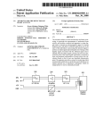
Figure 3.5: Example set-up of an optical mapping system. Interchangeable front-end optics (shaded regions) allow optical action potentials to be recorded from either intact Langendorff-perfused
hearts (top) or tissue bath preparations (bottom). In the tissue bath configuration, simulataneous microelectrode recordings can be obtained. CCD=video camera, CPU=Computer,
i-v=current-to-voltage converter, L=Lenses, ME=Microelectrode (image source: [44]).
tion or to [38] for an up-to-date review on the subject.
Disadvantages
As the electrical mapping techniques, the optical mapping methods also suffer from certain
drawbacks. One of the biggest disadvantage when compared to electrical recordings is the
phototoxic effect exerted by the voltage-sensitive dyes, which alters the electrical signals
on the tissue [89]. This effect precludes the performance of long time recordings. Also,
voltage-sensitive dyes only report relative transmembrane changes and the assessment of
absolute values is strongly dependent on the amount of noise present in the signals [111].
3.2.4
Commercial mapping systems
Several commercial systems to map electrophysiological activation exist. Most of them are
designed to measure neural activity and only few are intended to be used with cardiac
tissues.
One has to distinguish between fabricators of MEA chips and manufacturers of whole
systems that also include data-acquisition hardware. The most prominent company in the
field of MEA systems in Europe is the Reutlingen (Germany) based Multichannel Systems
GmbH. Further to be mentioned are Axion Biosystems in Atlanta (USA), Alpha MED
Scientific Inc (Japan), SciMedia (USA) or Plexon (USA), which provide products in the
field of multi-site recordings.
In the field of optical mapping, mostly custom made experimental setups are in use.
High-speed camera producers, photo diode array manufacturers, as well as general optical
(light sources, filters, beam splitters, etc.) and electronics suppliers are numerous. Notable
22
CHAPTER 3. STATE OF THE ART RESEARCH
producers of high-speed cameras include SciMedia (Brainvision CMOS cameras, figure 3.6)
and RedShirtImaging.
Figure 3.6: Micam Ultima Acquisition System with two high-speed cameras, an acquisition system and
a power unit (image source: www.brainvision.co.jp).
3.2.5
Available software
Despite the wide variety in acquisition systems and hardware, software tools to analyse the
acquired data are almost inexistent.
Brainvision, the Japanese manufacturer of high-speed CMOS cameras that emerged from
the renowned RIKEN Brain Institute, provides acquisition software for their systems and a
data analysis tool called “BVAna”[17] (figure 3.7). Further, RedShirtImaging, a US vendor
of high-speed cameras, offers acquisition and analysis software along with their hardware
products. Other than that, Multichannel Systems with their “Cardio2D” and some universities offer rudimentary analysis software. On the other hand, there exist numerous tools to
analyse neural activity. However, they are of no use in cardiac electrophysiology. Different
other applications like e.g., the “CellProfiler Analyst” exist to analyse image-derived data
from cells. But again, they do not provide the desired quantitative data of multicellular
recordings.
Figure 3.7: Screenshot of the BVAna analyser software [17] (image source: www.brainvision.co.jp).
Part II
Signal processing and quantification of cardiac
mapping
23
Part II - Introduction
All the data generated or acquired during experiments, whether by computer simulation,
optical or electrical mapping or by microelectrode measurements, need to be analysed.
Typically, before anything can be analysed, a pre-processing step is needed; data needs
to be filtered, aligned and normalized in order to allow meaningful comparison or further
calculations. After that, extraction of features and their analysis can be started.
Over the years, the features of interest to the researchers have changed. First, it was
the action potential, its initiation and behaviour that was of interest (it still is). However,
since the ultimate goal is to understand the phenomenon of fibrillation or defibrillation, it is
not sufficient to study single cells only. Rather, it is very important to analyse the network
behaviour of cells, as well as other structural properties.
This second part of the thesis discusses the basic steps needed to prepare the data, i.e.,
the data conditioning or filtering. It is also explained how the cell network analysis is done
and finally, how quantification of fibrillation can be achieved. Not only the current state of
the art is outlined, like the established algorithms and the underlying theory, but also new
techniques or improvements to existing methods are shown (see also figure below).
0.8%, 3.2%, 2.12%, ...
..., 99, 762, 887, 21.2
RAW
Chapter 3
Conditioning
Features
Quantification
Chapter 4
Chapter 5
Chapter 6
Overview of the chapters of part II. Chapter 3 outlined how optical and electrical data
are acquired. Chapter 4 shows how they are conditioned into more meaningful signals.
Chapter 5 explains what features of the signals are of interest and how to extract them.
Finally, chapter 6 describes how the extracted features can be analysed.
25
Chapter 4
Data conditioning/filtering
An ocean traveller has even more
vividly the impression that the
ocean is made of waves than that
it is made of water.
Sir Arthur Stanley Eddington
Wherever signals are to be measured precisely, noise plays an important role. All real-world
measurements are disturbed by noise. Noise can have many sources, including the electrical
circuit of the measuring device, temperature fluctuations, vibrations, cosmic rays and even
the gravitational force of the moon.
Noise is undesired and the reconstruction of a real signal from a perturbed, measured
signal turns out to be a non-trivial task, if not impossible. Nevertheless, techniques exist
to reduce the noise of a signal or to at least condition the signal in a way such that one can
gather meaningful information from it. The signal-to-noise ratio (SNR) is commonly used
in science and engineering to measure the quality of a signal. It is defined as the power
ratio between the desired signal and the background noise (see also figure 4.4).
SN R =
Psignal
Pnoise
It is clear that if no prior information about the noise and the expected signal is known,
the SNR cannot be reliably computed. In fact, noise estimation has its own field in science
and often relies on statistics and previous experiences. Also, mathematical models are often
used as the ground truth or the noise-free gold standard for performance measurements and
comparison of signal processing functions like filters. Fortunately, in most cases, certain
information on properties of the signal and its ideal behaviour is known and one can therefore
distinguish between wanted (signal) and unwanted (noise) parts of the signal (figure 4.1).
The sources of noise in cardiac mapping are diverse. They include lightning variations,
sensor limitations, chemical behaviour of electrodes or dyes, the electronics circuits of the
capturing devices themselves and many more. For most of these noise sources, prior infor27
28
CHAPTER 4. DATA CONDITIONING/FILTERING
Figure 4.1: Illustration of signal and noise.
mation is available to some extent, allowing to reduce the noise and improve the quality of
the desired signal - as illustrated in the following example.
We for instance know that the maximal signal frequency occurring in cardiac
cell cultures corresponds to the maximal upstroke velocity (dV /dtmax ) of the
propagating action potential [113]. We could therefore remove or limit higher
frequencies contained in the signal by applying a low-pass filter with the correct
cut-off frequency. Further, we may be interested only in the changes of the
transmembrane potential. This implies that the DC-component (zero-frequency
component) is of no interest and easily removed by high-pass filtering, thus
enhancing the useful information in the signal that we really are interested in.
Unfortunately, ideal filters do not exist in practice and their use always introduces some
disturbance to the signal. Therefore, to retain the real dynamics of the measured signals and
to avoid a loss of information, some researchers try to minimize filtering and altering of the
captured signals, whereas others use complicated adaptive filters. To establish a consensus
on how much filtering can be afforded without significantly distorting the signal, several
studies have been performed. For example, it has been shown by [81, 131] that filtering
(apart from normalization etc.) can drastically enhance the quality of optical recordings.
In fact, temporal and spatial filtering is not only a tool to enhance optical recordings, but
it is rather one of the key elements of mapping in general. With the high acquisition rates
(nowadays up to 10’000 frames/s) that are needed to successfully record action potentials
and their rapid propagation within the heart (∼0.5 m/s) [81], it is extremely difficult to
achieve high signal-to-noise ratios.
It becomes clear that this first step of raw data conditioning and filtering is essential.
Therefore, the software that was developed during this thesis includes a part that is dedicated to this task only.
The current chapter introduces some of the processing steps that are commonly used to
process and condition cardiac mapping data. Most importantly, it also describes the filters
that have been implemented in the software.
4.1. DIFFERENTIAL DATA
29
4.1 Differential data
When intensity images are acquired, the first step is to remove (subtract) the background
fluorescence: ∆F = Fraw − Fbackground . The background fluorescence is determined by
averaging the intensity over several frames when no activation is present. Camera systems,
like the Brainvision MiCAM Ultima, directly provide difference images by automatically
subtracting the averaged background frames (see figure 4.2).
Figure 4.2: The Micam Ultima high-speed camera provides differential data. The data that is stored
consists of an averaged background frame ARF (background fluorescence of the first four
frames) and difference images only (illustration source: modified from the Brainvision data
format documentation).
4.2 Spatial and Temporal filtering
To increase the SNR, spatial as well as temporal or even spatiotemporal filters can be
applied to the raw signals.
The field of signal and image processing as well as digital filtering is too large to be
covered here - for general background literature in signals and systems, suggested readings
include [93, 96, 77, 92], for the general topic of digital signal processing we suggest [98, 94,
137, 124] and for digital image processing [45] is a good reference. An illustration of the
spatial and temporal components of the acquired data is given in figure 4.3.
Linear filters, including high-pass, low-pass, band-pass and notch-filters, are mainly
used for temporal filtering. Gaussian smoothing and mean filtering are used in the spatial
domain. Often, more complicated operations such as wavelet filters can be used to improve
signal quality [47]. Digital linear filtering is achieved by a discrete convolution of a filter
kernel with the data. This convolution can be done in one dimension (e.g., for spatial
filtering) as well as in two and more dimensions (spatial filtering).
30
CHAPTER 4. DATA CONDITIONING/FILTERING
Figure 4.3: Spatial and temporan components of a cardiac mapping recording. A, illustration of an
electrode array placed on the epicardium. B and C, spatial and temporal components of
the acquired data (illustration modified from [138]).
The advantage of linear filters is that they can be characterized in the frequency domain.
The effects of linear filters on the signal are therefore more comprehensible than those of
non-linear filters, whose frequency behaviour is harder to grasp.
Non-linear filters behave differently and are usually computationally more expensive,
because they scan each datapoint to decide whether it belongs to the valid signal or if it is
noise. A prominent example of a non-linear filter is the median filter that can be applied
to smooth data and to improve signal quality (see also section 4.3). The median filter was
shown to improve signal quality of optical mapping and cause less blurring than the linear
smoothing mean (or averaging) filters [145].
Apparently, the choice of filters that are applied to a dataset is essential for the feature
extraction and interpretation of recordings. Mainly the physical environment, i.e., the
properties of the acquisition system, form the basis for selecting a specific filter. Frequently,
however, technical limitations such as e.g., quantification errors or phase errors are nonapparent and cause alterations of the signals. For example, is has been reported that
phase-shift correction can enhance the quality of optical signal recordings [131], a factor
that is not obvious without detailed knowledge of the involved processes.
At this point, we emphasize that our software meets the needs in terms of multiple and
4.3. BASELINE WANDER REMOVAL OR DETRENDING
31
successive filtering of data.
4.3 Baseline wander removal or detrending
levels
F0
Fmax
F0,rms
B
A
time
Figure 4.4: Schematic representation of a single pixel fluorescence signal acquired from a high-speed
camera. A, shows how a transmembrane potential depolarization causes a decrease in the
fluorescent signal. F0 is the background fluorescence and ∆Fmax is the maximum change
in fluorescence associated with depolarization. The red dashed line indicates the base line
wandering effect caused by bleaching and other influences (see text). B, shows a detail
view of a single action potential and the contained noise in the signal. The SNR is often
calculated as the fraction of ∆Fmax /F0,rms where F0,rms is the standard deviation of the
noise during rest.
With optical mapping using voltage-sensitive dyes, the magnitude of the small fluorescence change corresponding to the transmembrane potential resides on a baseline fluorescence level and is only approximately 2% to 10% of this baseline level [147]. Additionally,
the baseline is subject to a signal drift that is caused by dye bleaching and possible illumination irregularities. Dye bleaching results in declining signals as a function of illumination
duration (figure 4.4).
There are various reasons for the drift introduced by the bleaching effect, including the
quality of the staining procedure [71], the area that has been stained and the light intensity
and time of exposure.
To compensate for this drift and to only retain the fluorescence changes holding information on the transmembrane potential, various methods have been used: They range from
the simple and intuitive linear or exponential fit [17], to the use of adaptive filters [82, 155]
and wavelet based calculations [31, 84]. Most of the baseline removal algorithms that are
tailored for ECG recordings [27, 125, 142, 154] could also be applied to mapping signals.
...by high-pass filtering
The baseline can be interpreted as a slow varying signal to which the signal of interest
has been added. One of the most intuitive ways to remove the baseline is therefore to use
a high-pass filter with a low cut-off frequency. This removes both the DC and the low
frequency components of the signal. High-pass filtering can however change the amplitude,
the timing and the general morphology of the signal. Usually, filters with cut-off frequencies
of 0.05-0.5 Hz are used to remove the baseline drift. Higher corner frequencies (e.g., 25 Hz)
32
CHAPTER 4. DATA CONDITIONING/FILTERING
alter the morphology too much, such that the wave front propagation or action potential
durations have no longer a quantitative meaning. Another method often in use is to lowpass filter the signal and subtract the result from the original signal. This mostly leads
to better results. Although high-pass filtering distorts the signal and reduces its apparent
amplitude, it has been the standard practice for drift removal [129].
...by polynomial, exponential or other functional fit
Another way to remove the drift is by fitting a simple function, such as a linear or exponential
curve, to the baseline. Commonly used functions are [17]:
Pn
polynomial: g(t) = i=0 ai ti
exponential: g(t) = k 1 − exp( −t
A )
N
Often, the fitting function g(t) is optimized for multiple pixels (signals f (t, s) from
different spatial locations s), such that the mean squared error between the fit and the
signals is minimized (where obviously only the baseline should be taken into account).
...by median filter baseline removal
A median filter is an order-statistic (non-linear) filter that is based on ordering (ranking)
of values contained in a section (window) of a signal. It replaces the value of a signal f at
a certain point t by the median of its neighbouring values (windowt , the point at t itself is
included and at the center of the window).
Median filters are popular because for certain types of random noise, they provide excellent noise-reduction capabilities, with considerably less blurring than linear smoothing
filters of similar size [45].
It is hypothesised that by subtracting its median filtered version from a signal (large
window), the baseline drift can be reduced more effectively than when subtracting e.g., a
moving average, as the latter gets highly influenced by the AP peaks in the signal.
fˆ(t) = f (t) − median (f (s)))
s∈windowt
Intuitively, the window size should be chosen such that always more than half of the
values belong to the resting state (resting potential). It is clear that this constantly requires
the reordering of thousands of values. Therefore, to improve the overall performance, a
downsampling is performed prior to the median filtering, thus reducing the amount of
numbers to be ordered. After median filtering, the signal is to be linearly interpolated to
match up with the original samples. A O(1) median filter - i.e., a median filter that uses
a constant time to process - was recently proposed by [99]. This makes the algorithm very
fast.
The suggested baseline removal algorithm based on median filtering with window size
W therefore reads (algorithm 1):
4.4. NORMALIZATION
33
Algorithm 1 Baseline removal based on median filtering
downsample original signal f at a rate M : h(k) = f (M · k)
median filter the downsampled signal h(k) with a window of W/M → h0 (k)
upsample the values of signal h0 by linear interpolation by evaluating M points between
h0 (k) and h0 (k + 1) → f 0 (k).
4: subtract from the original signal to get a baseline free signal fˆbs = f − f 0
1:
2:
3:
...by dual wavelength excitation
The last method of baseline removal to be mentioned does not rely on signal processing
but is based on the use of a second excitation wavelength on the tissue. This wavelength
should be chosen such that the dye shows no voltage sensitivity and thus, the recorded
signal only reflects the drifting baseline. This dual-wavelength procedure (changing the
excitation wavelength periodically or on demand) is frequently applied in practice [143].
4.4 Normalization
As described earlier (section 3.2.3), normalization of data is crucial for later statistical
interpretation and comparison. This has several reasons including the variance of staining
quality on the tissue, non-homogeneous and changing illumination or structural differences.
There exist different normalization approaches and the applied technique depends on
the used dyes or ion indicators. A particular distinction is made between voltage-sensitive
dyes and ion indicators (e.g, calcium indicators):
Because voltage-sensitive-dyes only provide a small signal amplitude on a high background fluorescence intensity, the difference signal (∆F = F − Fmax ) is usually normalized
with respect to the maximum background intensity of the pixel (Fmax ). This solves the
problems of inhomogeneous illumination, but not those of irregular staining of the tissue or
the staining of tissue that has no electrical activity and shows no voltage changes. Also, the
bleaching effect is not taken into account. Nevertheless, it is the method of choice in most
measurements. Calcium indicators on the other hand provide a background fluorescence
intensity that is minimal and is therefore not used for normalization. There, the signal is
normalized towards the maximum intensity within the signal: F/max(F ).
Recently, it was reported that the well established ∆F/F normalizing method can introduce dynamically-changing biases in amplitude quantification of neural activity [132]. This
could also be the case with cardiac measuring.
4.5 Smoothing filters
To enhance the signal-to-noise ratio, smoothing techniques are often applied. Smoothing
algorithms and techniques work on the acquired data not only in the temporal, but also
in the spatial or frequency domain. Smoothing filters attempt to capture the important
patterns in the data, while leaving out noise. Because random noise typically consists
of sharp transitions in signal levels, blurring these transitions by smoothing filters is an
obvious way to reduce noise. Since data from cardiac mapping does not usually have
very sharp edges (the sharp edges contained in the signals originate from noise and not
like e.g., a photography of a house where there clearly is a sharp edge between roof and
34
CHAPTER 4. DATA CONDITIONING/FILTERING
sky), smoothing is a powerful way to increase the SNR. Smoothing of data can lead to
more accurate localization of events, because quantisation errors due to limited temporal
and spatial resolution are reduced. Thus, especially to determine the activation times,
smoothing of the original data is important [10, 45].
Figure 4.5: Illustration of smoothing using a Gaussian spacial kernel with different values for sigma
(image: Lena is one of the most widely used test image for all sorts of image processing
algorithms and related scientific publications).
Different smoothing algorithms exist. The basic idea of most of these filters is to replace
the value at a specific location by an average of its neighbouring values. Usually the number
of neighbours in all directions can be defined by one or multiple filter parameters. Note
that exaggerated smoothing may lead to loss of important details.
Mean filter
A mean filter, or often called moving average filter, effectively smoothes out short-term
signal fluctuations by taking the average value of all neighbours of a point in time or space
(including the value of the current point).
A big drawback of mean filters is that they remove important information on fast rising
slopes. This is why in cardiac data processing the mean filters are avoided for temporal
filtering and only used in the spatial domain. In the spatial domain they perform better
since action potentials at two neighbouring pixels usually occur almost simultaneously.
Median filter
As discussed in the earlier section on baseline removal (4.3), median filters can be used to
reduce noise. They work by ordering the values of a given neighbourhood around a central
point and assigning this point the median value of its neighbours. Adaptive median filters
exist that automatically increase the size of the neighbourhood depending on its content.
4.6. DIFFERENTIATORS
35
Gaussian spatial smoothing
Gaussian smoothing works similar to the mean filter but instead of giving all the values in
the neighbourhood the same weight, the Gaussian smoothing kernel calculates a weighted
average of a point’s neighbours. The size of the neighbourhood is determined by a radius
and the weights are set by σ, the standard deviation of the specific Gaussian kernel in use.
Thus, larger σ filter out more of the high spatial frequencies (figure 4.5).
Savitzky-Golay smoothing
Another type of smoothing filter is the Savitzky-Golay smoothing filter [118] that essentially
performs a local polynomial regression (of degree k) on a series of equally spaced values (of
at least k+1 points) to determine the smoothed value for each point. The main advantage of
this approach is that it tends to preserve special features of the distribution such as relative
maxima, minima and width, which are usually “flattened” by other averaging techniques.
According to [100], these filters are virtually unknown except in the field of spectroscopy.
In this thesis, we propose to use them for noise reduction in cardiac imaging.
Ensemble averaging
A widely used technique to increase the SNR is the ensemble averaging (also called synchronized or coherent averaging) [137, 124]. Here, successive sets of data are collected and
averaged point by point. From multiple action potentials one gets an averaged AP signal
that contains less noise because the repetitive addition of noisy signals tends to cancel out
any zero-mean random noise (figure 4.6). Ensemble averaging is only useful for repetitive
signals and if the interest lies in analyzing the systematic characteristics of a signal. If
SN Ro is the original signal-to-noise
ratio of the signal, the final SN Rf after N repetitions
√
is given by: SN Rf = SN Ro · N [39]. One factor that limits the application of ensemble
averaging is the phototoxic side effects of voltage-sensitive dyes, which alter the signal shape
over time.
Figure 4.6: Ensemble averaging. A, example recordings at different frame rates. B, Ensemble averaging
of 25 sequential action potentials (image source: [47]).
4.6 Differentiators
Besides the filtering of the original signals to reduce their noise and to increase the SNR,
differential data of the signals are needed to describe the dynamic behaviour of the recording.
36
CHAPTER 4. DATA CONDITIONING/FILTERING
It is well known that the calculation of the derivative of a noisy signal even increases
the noise further. This is why a direct differentiation (calculation of the difference from one
sample to the next) is most often avoided in signal processing. Alternative tools like smooth
differentiators [54] or Savitzky-Golay differentiators [76] have been developed. They often
perform much better than the standard method.
Chapter 5
Cell network analysis
The only reason for time is so
that everything doesn’t happen
at once.
Albert Einstein
To understand the mechanisms involved in electrical signalling and excitation, not only the
functioning of single cells is of importance. Impulse propagation becomes only possible
if multiple cells are connected. It is the whole three dimensional architecture of cardiac
tissue that mediates the behaviour of action potential propagation and cellular excitation.
Several scientists have shown the importance of cell network analysis, also with respect to
the formation of life-threatening cardiac arrhythmias [113].
Comparison of different measurements of network behaviour and validation of measurements with computer simulations demand reproducible and reliable identification of signal
characteristics. In addition, these characteristics have to be appropriate for the comparison
of multiple measurements.
The current chapter outlines various properties and data that can be obtained from
optical and electrical mapping of cardiac tissue. Besides the signal characteristics that can
be extracted from measurements, also methods for their further analysis and visualization
are described.
5.1 Signal features of interest
In order to analyze the network characteristics of cardiac cells, several signal properties (in
the following often called features) need to be extracted from the recordings. Relations
between them need to be found and interpreted. Once the mapped data has been preprocessed using filters and other methods described before, feature extraction can begin.
In the following, some of the most prominent and widely used features of interest of single
signals are described.
37
38
5.1.1
CHAPTER 5. CELL NETWORK ANALYSIS
Depolarization time
Among the most important values that are usually extracted from optical or electrical
recordings is the activation or depolarisation time. When this characteristic point
is known at various spatial positions, not only the excitation wave front and the related
direction and velocity of the action potential spread can be constructed, but also further
information such as the front behaviour at obstacles or the propagation dependence on
tissue structure can be deduced.
Depending on the type of recording, different slopes are used to find the activation time.
For optical recordings that reflect the transmembrane voltage, the activation time is not
uniquely defined but is typically taken as the point where the action potential upstroke has
its maximal slope. The action potential upstroke is mainly defined by the fast N a+ influx
(see section 2.2.1) and thus the activation time roughly corresponds to the point where the
N a+ current has its maximum. On the other hand, for electrical, extracellular recordings,
the activation time is instead taken at the downstroke of the signal.
Various algorithms for the determination of the depolarisation time exist. Most commonly, activation times are determined by a fixed threshold criterion (e.g., 50% of the action
potential amplitude) but also used are the detection of the maximum or minimum of the
derivatives of the AP-signal. Alternatively, the maximum change in intensity F between
two frames (dF/dtmax ) can be used to identify activation times [47]. However, it has been
shown that the thresholding method is more accurate than using the maximum derivatives
[41].
Instead of taking the first sampling point where the signal reaches a fixed threshold,
a linear interpolation between two defined points above and below the signal threshold is
often used (depending on the signal type, optical vs. electrical, on the rising or falling slope,
respectively). This interpolation refines the precision of activation time determination [83].
F
F
slope at tact
A1
1
slope at tact
A2
APD1
tact
1
2
APD2
trepol tact
1
2
trepol
time
2
Figure 5.1: Most important features of interest in an action potential.
Activation picking is difficult, especially during complex rhythms, where it is not possible
to group activations into single beats. Several investigators [146, 14, 4] have therefore
studied ways to improve the methods for correctly finding the depolarization time, but no
ultimate solution has been found so far. Highly complex wavelet detection algorithms based
on statistical evaluation might perform best, but their associated computational effort is
high and therefore limit their application to small datasets only.
For the detection of the activation times we propose the following algorithm (algorithm
2 and depicted in figure 5.2). It is not based on a fixed threshold but rather combines a
5.1. SIGNAL FEATURES OF INTEREST
39
threshold peak detection and derivative extrema detection. The activation time is calculated
using a linear interpolation with user selectable threshold points.
Our algorithm relies on the following methods: a smooth differentiator, a peak detector
algorithm and a cost minimization algorithm (logistic transportation algorithm) that will
be described in later chapters (6.2.3).
Algorithm 2 Activation time detection algorithm for optical signals (rough outline)
Require: original signal f [n], algorithm settings (e.g., threshold levels)
1: differentiate original signal f [n] using a smooth differentiator → g[n]
2: detect local peaks of both f [n] and g[n] using a peak detector algorithm → pgi , pfj
3: match local peaks of pgi and pfj using a cost minimization algorithm and remove invalid
peaks → pga , pfb
4: using matched peaks, pga and pfb , detect valid action potentials → apk
5: for every detected action potential apk do
6:
calculate upper and lower threshold values of f [apk ] → upk , lok
7:
find interpolated time points for threshold values upk and lok → tupk , tlok
8:
linearly interpolate (tupk , tlok ) to find activation time tactk
9: end for
10: return activation times tactk
Likewise, the activation time of electrical signals (based on the downstroke rather than
the upstroke) can be found by this algorithm by locating valleys in the derivative instead of
peaks (step 2) and by changing the direction of how the time difference is calculated (step
7).
Repolarisation time
Similarly to the activation time, the repolarisation time is a point in the rapid repolarisation
phase of the action potential that largely depends on calcium ion channels. However,
different definitions of its exact location can be found in literature [37, 47]. Repolarisation
time is only used with optical signals and not with electrical, extracellular measurements, as
the latter do not provide information about repolarisation characteristics (see disadvantages
of electrical mapping in section 3.2.2).
The repolarisation time can be taken as the point where the action potential returns
to the resting potential. It could otherwise be defined as the maximum negative slope in
phase 3 of an action potential (section 2.2.1) or as the point in time where the signal goes
below a certain threshold, i.e., the percentage of repolarisation (e.g., at 50% of the action
potential amplitude). [37] proposes an algorithm based on the second derivative (d2 F/dF 2 )
of an optical signal acquired using voltage-sensitive dyes to find the repolarisation times
and shows that the method provides reliable results.
Finally, the action potential duration time (APD) is formed by the difference of
repolarisation and activation time (figure 5.1).
Other features
Besides the activation, repolarisation and duration times of an action potential as described
above, other features may be of interest. These are usually dynamic properties of the action
40
CHAPTER 5. CELL NETWORK ANALYSIS
Figure 5.2: Illustration of the activation detection algorithm. The interpolation points (green dots) and
the peak detection sensitivity are user definable. Algorithm steps are described in algorithm
2.
potential that reveal more information about the cellular and intercellular behaviour. A
complete review of such features would be out of scope, nevertheless, the following list
names a few:
Upstroke velocity
The upstroke velocity is the speed of activation measured at the activation time or
at the peak of the derivative signal. It is usually expressed as %APA/ms and is a
measure for the excitability of the cell. (APA = action potential amplitude, %APA
= percentage with respect to APA).
Downstroke time
The downstroke time is only used with extracellular electrode recordings. It is a
measure for the excitability of the cell.
Activation Frequency
The activation frequency indicates how often an AP occurs in the recorded signal.
5.2. VISUALIZING FEATURES
41
5.2 Visualizing features
5.2.1
Action potential feature maps
The sole extraction of different features from the tissue recordings does not provide any
insight into the underlying processes of excitation propagation and its possible dependence
on structural factors. It is important to find a way to represent or visualize the extracted information. A common way to do so is to generate different maps that illustrate the recorded
properties and processes of the tissue. Maps show a colour-coded image of the spatial distribution of features such as the action potential duration, the dominant frequencies or the
upstroke velocity (figure 5.3).
Figure 5.3: Examples of feature maps. (a) Activation map. (b) Repolarization map. (c) APD map
(image source: [131]).
5.2.2
Activation maps and isochronal mapping
Like feature maps, also the spatial distribution of activation or depolarization times can be
shown in a map that nicely illustrates the wave front propagation (figure 5.4). Instead of
only color-coding the time of activation, isochrones are usually calculated and displayed.
Isochrones are lines that denote events that occur at the same time. Frequently, isochronal
maps are superimposed onto feature maps to provide additional information about the
sequence of depolarization.
To generate isochronal maps, various contouring algorithms have been developed ranging
from linear interpolation of time points to more complex approaches. They find wide
application in computer graphics and image analysis or wherever a third dimension is to
be displayed on a two dimensional plane, e.g., to add elevation information on geographical
maps (isohypse) or pressure distribution on weather maps (isobares).
However, for cardiac mapping, several limitations to isochrone maps exist. [47] reports
some of them, such as the fact that “if a site exhibits an event twice during the time interval
the map was computed, only one event will be displayed”, or that “displaying data with
isochrone maps often implies that there was smooth and continuous spatial progression of
events. While this is well accepted for propagating wave fronts and depolarization maps,
it is less clear for the repolarisation process”. Most contouring algorithms assume that it
is valid to interpolate between recording sites. This is not true in the presence of obstacles
that block or change the excitation propagation (e.g., non-living tissue).
42
CHAPTER 5. CELL NETWORK ANALYSIS
Figure 5.4: Linear propagating wave and its isochronal activation map created with our software. Top,
single time frames of excitation propagation showing both activation (t=537 ms, 549 ms,
576 ms) and repolarisation (t=620 ms, 640 ms).
5.2.3
Other approaches
Maps and isochrones are one way to visualize the dynamic spatial patterns of cardiac excitation, but they are mostly limited to depicting information about single beats. Furthermore,
a separate figure needs to be created for every new excitation wave. Different methods
like the time-space plots or phase maps (see section 6.1 or 6.2.1) are used to address this
issue. Also, to represent and describe propagation speed and directions as well as wave
front behaviour, various methods have been developed. They are described in later sections
(5.4).
5.3 Quantification of activation patterns
It is not enough to only visualize different features of recorded activation patterns. They
need to be compared and statistically analyzed. To do this, they need to be converted
into corresponding numbers. Various mathematical tools exist to quantify or to decompose
emerging activation patterns into raw numbers. For example dimensionality reduction algorithms such as the principle-component analysis (PCA, also known as Karhunen-Loeve
decomposition or Hotelling transform) have been used to e.g., track changes in spatial organization of activation or to make short term predictions of activity during fibrillation [11].
Also, spectral analysis of the patterns are used to describe the activation [108, 90, 91].
Amongst all these methods, the analysis of the wave fronts seems the most natural one
and has been used by many groups [22, 42].
5.3. QUANTIFICATION OF ACTIVATION PATTERNS
43
One difficulty when analyzing waves of excitation are the boundary conditions. Especially with optical mapping, the tissue preparation under investigation is usually bound
to a defined region. At the boundary, the tissue behaviour is distorted since the cells do
not behave as they would in normal conditions. This bias has to be accounted for when
analyzing mapping data.
5.3.1
Wave front analysis
A wave is an event that travels through space and time. There are different ways to describe
a wave front in cardiac mapping. Intuitively, it is clear that the wave is the electrical excitation travelling across the tissue. However, before a wave can be characterized, the exact
properties of a captured signal representing or defining the wave front must be specified. A
wave and its front could for example be defined as the front of activation times, or the front
of action potential maxima or even the front where the activation is higher than a certain
intensity level.
In the first two of above examples, the wave front will be defined by single points in space
and time, while in the third example, a wave is defined by an active region that changes
over time. Depending on the wave front definition that is used, different ways can be used
to characterize it.
Wave front isolation
To calculate or determine waves, two processes having distinct applications are mostly used
1. Single events in a frame are detected and wave fronts are artificially defined by connecting these events together. Related event fronts of one frame are then linked to
fronts in the next frame to describe wave progress.
2. An activation area is defined and binarized (yielding a frame that consists of 0 for
non-active regions and 1 for active regions). By then computing the difference between
two consecutive, binarized frames, the fronts and tails of a wave can be determined
(the difference gives e.g., values of 1 for the wave front and -1 for the wave tail).
To isolate or to create a wave front from events that occur at points in time which,
due to noise, do not necessarily occur at connected locations (not like e.g., a snake), the
simplest approach seems to be a global interpolation between these points. This is normally
implemented in contouring algorithms. The contouring approach however, does not reflect
the real excitation if e.g., a big wave front breaks into several smaller waves or if multiple
waves merge to a single wave and thus, may render the method of following the activation
area more favourable. However, the latter technique has the drawback that it is not tracking
explicit features (e.g., activation time, max amplitude time).
Wave front graphs
To challenge the issue of wave breaking and merging, [16] and later [110] developed wave
front isolation techniques that make use of graphs. Their approach is to first isolate wave
regions in space by applying a threshold to detect active regions, and to then parse through
time to connect these regions to form wave clouds or wave graphs. With these wave graphs
it is possible to illustrate where waves had their origin, where they disappeared or where
they merged and partitioned (figure 5.5).
44
CHAPTER 5. CELL NETWORK ANALYSIS
(a) Isolated wave fronts in a spatio-temporal coordinate system. Each filled shape represents
one temporal snapshot of an isolated wave.
(b) Graph representation. Each arrow represents a wave front. The horizontal position of
the endpoints locate the wave front in time.
Wave merging and splitting can be traces using a graph representation.
Figure 5.5: Wave front analysis (image source: [108]).
Wave front clustering
In this thesis, an alternate method of extracting wave fronts has been developed (figure 5.6).
It is based on the clustering of features for the distinction of single waves. The advantages of
both methods (being able to follow explicit features as well as wave merging and breaking)
can be combined. The steps are outlined in algorithm 3.
Algorithm 3 Wave front clustering
Label each feature event with location and time ei = [xi , yi , ti ]T , generate an active
event matrix Z and sort Z for increasing activation time.
2: Run a hierarchical clustering algorithm on Z (using single linkage and a maximum
distance criterion) to extract all the wave front clusters Wj ⊂ Z in the recordings.
3: Remove all the wave fronts Wj that do not contain enough feature points ei (i.e., wrong
detections and noise).
1:
The extracted wave fronts could then be triangulated and interpreted as bent sheets in
three dimensional space (see figure 5.6a). The first two axes represent the location whereas
the third one stands for time. Mesh smoothing can be used to remove noise and various
quantification algorithms can be run to e.g., extract the fastest activation path.
One drawback of using single-linkage clustering (also known as nearest neighbour clustering) is that the computational complexity is of order O(n3 ), meaning that doubling the
number of feature events leads to eight times more computation steps.
To reduce the computational effort, a pre-processing step can be done: the histogram
of active points on the tissue can be calculated and whenever a wave is present, more
points will be active. This will result in separable sections of “high activation” and “low
activation”. An algorithm called “Otsu’s method”[95] taken from image processing, that
is frequently used to automatically perform histogram based image thresholding, can then
be used to recursively split the regions of high activation into smaller parts and to perform
the clustering on these smaller parts of cardiac recordings. This method of cutting the time
5.4. PROPAGATION SPEED AND DIRECTION
45
into segments, however, cannot be used if re-entrant activation is present.
(a) Single extracted activation wave sheet
(b) Clustered spiral of re-entrant activation
Figure 5.6: Two example results of wave front clustering extraction. Showing both a linear excitation
wave and a re-entrant excitation.
5.4 Propagation speed and direction
5.4.1
Conduction velocity
An intuitive descriptor for the behaviour of propagating impulses in cardiac tissue is the
speed and direction of the excitation wave fronts. The conduction speeds of the electrical
impulses in the heart have to be very fast in order to allow almost simultaneous contraction
of the ventricles (especially the speed in the Purkinje fibers is very high). Hence, the
understanding of the mechanisms and dependencies of fast impulse transmission in cardiac
tissue is of great interest. Many factors have been found to influence conduction velocity
including the fact that the conduction speed is dependent on the direction of myocardial
fibers [117, 111] or that it is mediated by gap junctions [112]. Depending on the location and
type of tissue, conduction velocities in the heart range between 15 and 80 cm/s [107, 109].
The evaluation of conduction velocity and direction is not an easy task, because the
data is recorded from tissue consisting of a complex network of cells that are arranged
in three dimensions. Thus, the captured activation information origins not only from the
topmost cells but also from the underlying tissue. That is why monolayer recordings provide
good insight into cell-to-cell coupling and propagation. The behaviour in three dimensions
however is rather difficult to assess [57]. Results of monolayer measurements are especially
suited for comparison with computer simulations.
One indicator for the propagation speed of the depolarization front is the distance between isochronal lines: the larger the distance, the faster the speed. Also cross-correlation
and constrained cross-correlation calculations have been used to calculate the time differences between activation at pixels or electrodes in order to determine activation velocity
[9].
46
5.4.2
CHAPTER 5. CELL NETWORK ANALYSIS
Velocity fields for activation wave fronts
In [12] an automated method to estimate vector fields of propagation velocity from extracellular recordings was developed. Similar calculations can be performed on the wave front
sheets described earlier (section 5.3.1).
The calculation of a velocity vector (v = [dx/dt, dy/dt]T ) at a point ei on the wave sheet
Wj is done by fitting a polynomial surface T to a regional subset around ei on the wave
front sheet using a least-squares algorithm. Care has to be taken not to over-fit the points;
a linear or quadratic fit is sufficient.
This fitted surface T (x, y) describes the activation time as a function of position. From
T
the gradient of T (∇T =" [∂T /∂x,
# ∂T /∂y] ), one can then calculate an approximation to
the velocity vector vei =
Tx
Tx2 +Ty2
Ty
Tx2 +Ty2
where Tx = ∂T /∂x and Ty = ∂T /∂y.
Note that the “velocity estimate is not simply obtained by inverting the elements of
the gradient of T : vei 6= [∂x/∂T, ∂y/∂T ]T . This is because x and y both change while
T changes, and the partial derivative operation is only valid if other variables are held
constant” [12].
A velocity field can be constructed from these vectors (figure 5.7) and then analysed
(e.g., by plotting a histogram of directions or speed) (figure 5.8).
Figure 5.7: Velocity vector field estimation, (a)-(d) Snapshots of the wavefronts showing active sites.
(e) The active sites in x,y,t-space. (f) Polynomial surfaces fitted to the active sites. (g)
The computed velocity vector field (image source: [108]).
5.4.3
Finding the propagation direction
If the single, local velocities of a wave front are known, above mentioned histograms of
major directions can be calculated to give a global overview of all directions and speeds
involved in a wave. Nevertheless, the local trajectory information (i.e., direction and speed)
is not contained in these numbers. By looking at a propagating wave front, we can easily
tell what principal path it has taken, an interpretation however that is hard to calculate.
Note: we too are biased by e.g., the scope and boundary conditions of the recordings we
are looking at. The following methods can be considered to address this task.
5.4. PROPAGATION SPEED AND DIRECTION
47
Figure 5.8: Analysis of velocities. Normalized histograms of activation speeds. Normalized rose histograms of the events also indicating directions (image modified from: [132]).
Wave front centroid tracking and optical flow
Once waves have been isolated, a straightforward approach is to compute the spatial centroid
of the active area at every time step and link these points into a trajectory. The velocity of
centroid movement corresponds to the velocity of wave front propagation, as long as there
are no boundary conditions that influence the calculation of the centroid and as long as the
wave spread is uniform. A centroid tracking has been developed and implemented during
this thesis. A similar centroid tracking algorithm was recently proposed by [6].
Another method taken from image processing could be to calculate the optical flow of a
propagating wave (figure 5.9). Optical flow calculations are often used in motion detection,
object segmentation or video compression [128, 21]. Calculation of optical flow is similar
to the velocity field calculation described above: one tries to estimate the motion between
two image frames (taken at time t and t + 1) at every location. The principal velocities of
the motion, coupled with information on wave location, can then provide a useful measure.
A new method to describe wave trajectory
Because the wave area method is strongly influenced by boundary uncertainty (the area
of the wave may be cropped by the observation boundary, which influences the centroid
calculation), centroid and optical flow tracking are non-optimal at both the starting and
ending phases of the wave.
To overcome this, alternative descriptors of the wave propagation path need to be applied. Intuitively, a good measure for the wave trajectory is the shortest activation path of
tissue excitation from initiation to termination, i.e., the effective cell-to-cell activation path
that led from the wave source to the wave sink.
If the sheet of a propagating wave front is known and has been constructed, the gradient
descent or conjugate gradient method could be used to calculate the path of the wave front
by beginning either from the starting or ending point of the wave. Gradient descent (also
called steepest descent) and conjugate gradient are optimization algorithms used to find a
local minimum of a function. To find the local minimum, they proceed step by step with the
48
CHAPTER 5. CELL NETWORK ANALYSIS
Figure 5.9: Illustration of the optical flow between to consecutive frames of activation. Blue arrows
indication flow direction and magnitude. Red arrow is the average flow direction and speed.
help of the negative gradient of the function (the conjugate gradient method usually finds
the minimum in fewer steps) [123]. Starting from the endpoint of the wave, the step trace
of any of these algorithms result in a possible activation path. This path however, does not
necessarily reflect the real activation chain on cellular level and is dependent on the chosen
algorithm parameters. It is therefore well possible, that using one of these methods, the
starting point will never be reached.
A new method for tracking wave fronts is proposed in this thesis. It is based on the
calculation of a geodesic path between the point of first activation and the point where the
wave finished. A geodesic is defined to be (locally) the shortest path between points in a
space, thus, it is a generalization of a straight line to curved spaces. To find this geodesic
path, the proposed method makes use of the fast marching algorithm [121, 102, 1] that has
been developed to numerically calculate solutions to eikonal differential equations of the
form:
V (x)|∇T (x)| = 1
These are often encountered in problems of wave propagation. Typically, such a problem
describes the evolution of a closed curve as a function of time T with speed V (x) in the
normal direction at a point x on the curve. The speed function V is specified and the time
at which the contour crosses a point x is obtained by solving the equation for T .
The algorithm makes use of the fact that information only flows outward from a seeding
area and simulates the wave front propagation from a source. It is used to solve various
types of problems e.g., to find a path through a maze (figure 5.10) or to simulate forest fire
propagation.
At first, this method does not seem to provide any valuable information, as the position
and the activation times are already known and we are looking for the speed function (in
the case of the eikonal equation) and not vice-versa. However, since we aim at finding an
ideal geodesic path from source to sink on the wave sheet, i.e., the shortest path between
5.4. PROPAGATION SPEED AND DIRECTION
49
Figure 5.10: Fast marching method used to find the optimal path through a maze (image source:
Wikipedia).
two points on a surface given the topology and velocity field information, the fast marching
method with geodesic extraction could to provide exactly this path (figure 5.11).
While the effective solving of this type of problem requires calculus of variations, the
proposed approach can be easily explained: It is assumed that the effective distance between
any two points on the recorded tissue is known (can be calculated). Using this information
and the activation times, the speed of activation can be calculated (assuming that the
conduction is either isotropic or the anisotropy of the cells is known). With known speed,
the fast marching algorithm can be run and the distance map of the wave sheet be calculated
(the speed is used as a measure of path cost or flow resistance). Finally, the geodesic
between the point for which the map was calculated and any other point on the tissue can
be extracted. For a full wave propagation, the two points are the starting and ending point
of the wave. Figure 5.12 illustrates this procedure on a topographical map.
The question of why we cannot directly use the activation times to calculate this shortest
path is not yet answered. By only considering the activation times, we would not respect
the wave travel distance and the underlying topology. The result would be the path that
water would take if poured onto the surface. This is not necessarily the shortest path (in
terms of minimal energy used) since water only flows downhill and might take detours to
arrive at the target. It does not even necessarily lead to a solution (there could be multiple
local minima and path endings). By calculating the shortest path of minimal effort from
the artificially generated speed map, we not only get the possible activation trajectory that
is reproducible, but we can even predict activation paths if tissue is damaged. The only
requirement is that the points need to be connected (this is not necessarily the case in
presence of noise).
The fast marching method has been used in many similar problems such as the calculation of reactive trajectories in chemical reactions [35] or the determination of anatomical
connections between regions of the brain [97]. It is often used for segmentation or geodesic
50
CHAPTER 5. CELL NETWORK ANALYSIS
Figure 5.11: Example of linear activation waves and different found activation paths depending on
the used speed function to numerically solve the wave equations. (green & red lines)
indicate the speed function based on the velocity vector field and (yellow & blue) show
the excitation path found based on pure time difference.
trajectography [61] as shown in the examples of the generation of a three-dimensional model
of membrane-bound organelles in ventricular myocytes [152]. Recently, a method for realtime simulation of cardiac electrophysiology using the fast marching method was published
[120].
Figure 5.12: Finding the optimal path between two points on a map. The speed function is defined
by respecting the height differences and environmental effect as e.g., the fact, that one
travels faster on a road than through the forest. A, topographical map. B, evolution of
the fast marching method that calculates the distance map. C, velocity in x (green) and y
(red) direction to find the geodesic path between starting end ending point (D). E, found
optimal path. (image modified based on data by Gabriel Peyré [102]).
5.4. PROPAGATION SPEED AND DIRECTION
5.4.4
51
Describing the trajectory
To go even one step further, the extracted trajectory of wave propagation can itself be
quantified by using one of the various trajectory or shape description methods [70, 73, 15].
A re-entrant activation can then directly be distinguished from a purely linear propagation
by a single number describing e.g., the curvature of the path.
Chapter 6
Quantification of arrhythmias
The sailor cannot see the north,
but knows the needle can.
Emily Dickinson
In a normal situation, the excitation propagation in the tissue is well ordered. During
cardiac arrhythmias such as fibrillation, the activation patterns become abnormal and wave
fronts start to follow complex paths. To elucidate the causes of these arrhythmias, different
techniques have been developed to characterize wave front propagation or wave breaks.
Most importantly, the re-entrant excitation, where a wave of excitation repeatedly activates
the same area of tissue independently of the normal, natural cardiac rhythm, is believed
to play an important role in the initiation of lethal arrhythmias [79, 40]. As a particular
example, it is believed that myofibroblasts (cells that play an important role in wound
healing throughout the body) may severely interfere with the propagation of electrical
signals in the heart by altering the impulse conduction and re-entry dynamics [157, 80].
This chapter introduces some of the quantification and illustration methods that are
commonly used.
6.1 Time space plots
Time space plots (TSP) are one way to study re-entrant activation. In a single picture,
they display the evolution of fluorescence over time at a given region on the tissue. Time
space plots are constructed by taking intensity values of a single line of pixels at different
spatial points or by projecting all of the data from a single temporal snapshot onto a line
(figure 6.1). For every point in time a new line is created and stacked to form an image.
One axis holds the spatial, while the other one holds the temporal information. It is clear
that when constructing such a TSP, one spatial dimension is lost. However, one can for
example (with a rectangular recording array) project the sum of all horizontal values of the
frame to one line, and the sum of all the vertical values to a second line. This yields two
TSP that display total horizontal or vertical activation. Other than that, custom lines can
be defined to create TSP. For more details on TSP, we refer to [48].
53
54
CHAPTER 6. QUANTIFICATION OF ARRHYTHMIAS
(a) Horizontal time-space plots for computer
simulations of a single spiral (A) and a double spiral (B) are shown at the top. Bottom frames show snapshots of activity where
the gray scale indicates the level of excitation (analogous to membrane potential),
with white being the most excited (most depolarized). Horizontal position of the spiral
wave cores is easily discernible in the timespace plots as shown by dashed vertical lines.
(b) Construction of time-space plots for simulated planar wave fronts. The top-left images show a single snapshot of activity. For
each such snapshot in the data set, the rows
and columns of pixels are summed to produce vertical and horizontal lines, respectively. These lines are stacked to respectively
produce the top-right (y-time) and bottomleft (x-time) images (the TSPs). The white
arrows in the top-left images indicate the direction of propagation. The bold gray lines
show the lines in the TSPs corresponding to
the snapshot shown in the top-left images.
Figure 6.1: Time-space plots (image sources: [48] & [108]).
6.2 Phase maps and phase singularities
As the emerging spatiotemporal pattern seen during fibrillation is rather complex, the
identification and analysis of phase singularities (PS) provide one possible way to greatly
simplify the description of these patterns. By analysing phase singularities one can quantify
the fibrillation in terms of rotor (spiral) number, trajectory and lifespan [49], as well as wave
break [139]. Finally, the understanding of the underlying mechanisms for rotor formation
and termination is another step towards the full understanding of cardiac fibrillation.
This section outlines the background and the steps needed for phase and phase singularity analysis. It is also described how it was implemented in their thesis. For an in depth
review and introduction on the subject, we refer to [139].
6.2.1
Phase maps
Introduction
Even though the cardiac action potential differs significantly in different portions of the
heart, the underlying cellular excitation process follows well known phases of opening and
closing of ion channels and thus polarization and repolarisation of the tissue (see section
2.2). An emerging and propagating action potential wave front can therefore not only be
described by the often directly measured extracellular or transmembrane potentials and the
6.2. PHASE MAPS AND PHASE SINGULARITIES
55
methods described earlier, but can also be described by the state in which each excitable
element is at a certain point in time. Such an element spends most of its time at a fixed
point (i.e., the resting potential). After a stimulus, it travels along a closed-loop trajectory
(i.e., the action potential & the repolarisation) to return to the initial state. This state can
be described by the phase (θ) around the aforementioned loop, as is often done in periodic
and non-linear dynamics [130].
Rather than directly looking at the action potential, where a potential value cannot
uniquely be assigned to a depolarization or repolarisation phase1 , the action potential is
described in a phase or state space. In this phase space, every state within the cycle is
uniquely defined.
The concept of state-space encoding taken from non-linear dynamics was introduced
for use in cardiac electrophysiology a little more than a decade ago [49] and led to various
publications on the subject. Amongst others the initiation of re-entry [19] or the mechanisms
of fibrillation and defibrillation [60, 68, 72, 138] were studied.
The use of the phase variable (θ) instead of the fluorescence signal intensity (F ) is
reported to have the following advantages [49]:
1. the need to pick activation times is eliminated
2. it is directly possible to test whether spatial phase singularities exist and are necessary
to maintain fibrillation.
Recently, it was reported that the use of phase maps in the study of ventricular fibrillation dynamics is a valid method for quantification [72].
The phase angle θ, that characterizes the state of the cell in a given location, can also
be used to generate maps of wave fronts and wave tails. By taking the difference between
two phase maps (two consecutive frames), spatial maps of locations where activation and
recovery have taken place can be created. It was also shown that this kind of maps are
very useful for analyzing the wave behaviour after applying electrical shocks to the tissue
(stimulation) [68] (figure 6.3).
Calculation of Phase Maps
To create a phase map, a transformation of the membrane potential into a phase representation (where the phase is a value between −π and π) has to be done. This concept is nicely
visualized in [139] (figure 6.2).
When looking at a vector rotating in the complex plane around a unit circle, one can
plot both the real and imaginary part, yielding two signals that are phase shifted by 90◦
(i.e., cosine and sine). The instantaneous position of the vector can either be given in polar
coordinates (with radius r and angle θ) or as a complex number in cartesian coordinates
a + jb. To calculate the phase between the two signals one can therefore use tan−1 ( ab ) to get
θ which for cosine and sine is 90◦ . Similarly, the phase between any two dependent signals
can be calculated. The problem is that for experimental data, typically only one variable
1 whether upstroke or downstroke, both pass the same potential, e.g., -30 mV, once; without the information of the slope dVm /dt, they are not distinguishable
56
CHAPTER 6. QUANTIFICATION OF ARRHYTHMIAS
Figure 6.2: Illustration of phase-space plots for 3 different scenarios: A, sinusoid; B, sample fibrillation
segment; and C, random noise. Subplots D and E illustrate the phase computation using
phase-space plots of a sinusoid and a fibrillation segment (illustration source: [138]).
is recorded and known (the measured transmembrane potential). It is nevertheless possible
to transform the signals from every recording site into a phase representation (phase-space)
using one of the following tricks and to then create a phase map for every frame.
Time encapsulation
In non-linear dynamics, the input signal (Vm (t)) is plotted against its time delayed version
(Vm (t − τ )). If there is a consistent relation between the present and the past time samples,
the trajectory forms to a definite shape and loops around a central point called the attractor
(Vmc ) [139]. The calculation of phase can thus be carried out using only one variable if the
phase trajectories of plotting Vm (t) vs. Vm (t − τ ) uniquely define the time course of the
action potential. The phase angle in this case is calculated as follows:
θ(t) = tan−1
Vm (t − τ ) − Vmc y
Vm (t) − Vmc x
!
(6.1)
It is clear that the choice of the time delay τ plays a crucial role for successful calculation
of θ and different rules of thumb have been described. One method suggests to pick τ such
6.2. PHASE MAPS AND PHASE SINGULARITIES
57
that the autocorrelation function between Vm (t) and Vm (t − τ ) is zero [59] (the first zero
crossing of autocorrelating Vm with itself). Another method is to chose τ to be 25% of
the cycle length during fibrillation [49]. In [47] even concrete values of τ in the range
of 5..20msec are suggested. In the same publication an alternative calculation of θ, that
does not make
use ofτ but rather calculates θ(t) using the first derivative of the signal
m /∂t
is presented. Using the derivative, however, is only allowed if the
θ(t) = tan−1 V∂V
c
m −Vm
noise in the signal is considerably reduced.
The coordinates of Vmc have to be chosen such that for all the measuring points they lie
within the trajectory (otherwise again, the phase not uniquely defines the action potential
state).
Hilbert transform
To overcome the unreliable choice of τ of the time encapsulation method, a Hilbert transform
based approach has been used to compute instantaneous phase [20, 87]. Using the Hilbert
transform, a phase-shifted signalcan be generated from an original signal and with these
two signals again, the phase can be computed.
For the interested reader: In digital signal processing, the relation between real and
imaginary parts of complex signals are often compared. These relations can be described
by Hilbert transforms H{x(t)} given by
H{x(t)} ≡
1
π
Z
∞
−∞
x(τ )
dτ
t−τ
A Hilbert transform is a process that adds to all negative frequencies in a signal a +90◦
phase shift, and to all positive frequencies a -90◦ phase shift (e.g., if we put a cosine wave
into a Hilbert transformer, we get a sine wave). It follows that the Hilbert transform can be
used to transform a real signal into a complex signal by removing the negative frequencies.
This is done by adding a Hilbert transformed signal (H{x(t)}) as imaginary part to the
original signal (z(t) = x(t) + jH{x(t)}) [66]. Once this is done, the signal is of the form
a + jb and again the phase angle θ can be calculated. Note that several conditions have to
be met by the signal in order to provide reliable phase computations [87].
6.2.2
Phase singularities
Introduction
When analysing phase maps, points around which the phase progresses through a complete cycle from −π to π, that is, sites at which all phase values converge, are called phase
singularities (PS) (figure 6.3). At these points, the phase becomes undefined and the activation wave fronts rotate around them. These points are of special interest and play an
important role in re-entrant excitation, i.e., when a wave repeatedly reactivates the same
region of tissue, independently of the normal heart beat. PS are considered to be the pivot
points of re-entrant circuits [144] and might indicate a structural or a functional anomaly
that initiates curved excitation waves [156]. It has been found that the formation of phase
singularities is necessary, but not sufficient for sustained rotation [49] and that re-entries
themselves are a significant factor in cardiac arrhythmias [40]. Note: one distinguishes
between anatomical and functional re-entry. Anatomical re-entries have an anatomical ob-
58
CHAPTER 6. QUANTIFICATION OF ARRHYTHMIAS
stacle as reason for the re-entry and functional re-entries are due to functional heterogeneity
of the electrophysiological properties of regions of cardiac tissue.
The localization of phase singularities using phase maps has therefore become a welldeveloped method for characterizing the organization of ventricular fibrillation [19, 28, 141].
Figure 6.3: Examples of phase maps. Top panel (A, B, C, D) shows 4 instances of phase maps
constructed from an atrial fibrillation episode of a dog using 7x8 plaque electrode array.
Curved arrows show the direction of rotation. Bottom panel (E and F) shows 2 instances
of phase maps constructed using an experimental murine monolayer model. Curved arrow
shows the direction of rotation; straight arrow shows the location of a wave break (image
source: [139]).
Localization of Phase Singularities
Different procedures to locate phase singularities have been proposed in the past. Before the
introduction of phase maps in electrophysiology, most of the approaches for finding the core
of the spiral used the signal intensity change for PS localization. Because the amplitude
variation decreases gradually towards the center of the core, a localization, by identifying
these variational minima over one complete rotation, is possible [101]. However, this method
does not perform well, not only in terms of computational effort (one whole rotation cycle
has to be analyzed), but also in terms of accuracy and stability to PS drift over time. To
overcome this issue, several other PS finding procedures working on the phase map have
been developed in the past [19, 59]. They only need two frames (needed to calculate the
phase map) to localize the PS. They all rely on describing the PS in terms of topologic
charge, as given in equation 6.2:
6.2. PHASE MAPS AND PHASE SINGULARITIES
1
2
59
I
∇θ · dr = ±π
(6.2)
p
where θ(r) is the local phase. The line integral is calculated over a closed curve p surrounding
the topologic defect (the PS). If the total phase difference is equal to ±1, the path p encloses
a PS. The sign indicates the re-entry’s chirality.
While most of these methods make use of the rectangular, discrete grid of an image,
in [105] it was proposed to use a triangular mesh as often applied with the finite element
method. This approach is particularly appropriate when working with three dimensional
models due to the better localization performance. However, with two dimensional data
(i.e. phase maps), a memory consuming remeshing would have to be done.
In all the methods, the line integral 6.2 must be calculated. This can be implemented as
a convolution with two kernels (for x and y direction) [19]. It turns out that their method is
equivalent to a Sobel edge detector on the phase map that is often used in image processing
(see e.g., [45]).
In this thesis, the phase singularity detection uses the approach proposed by [59]. The
algorithm to find the PS evaluates the phase difference over a discrete path (path length =
8 · r), i.e., the sum of phase differences between two adjoining pixels (a and b) on the path.
The phase difference between two pixels is calculated according to the flow chart, which
ensures that the value of the result is within the range −π to π (see figure 6.4). Depending
on the path length, the localization of the PS is achieved with higher precision (the smaller
the better). PS can only be localized with pixel accuracy.
Instead of calculating the discrete line integral, it would also be sufficient to check
whether there exists exactly one phase jump on the closed path (integration path) around
the point of interest. If this is the case, the path must enclose a phase singularity.
6.2.3
Trajectory linking
When all the phase singularities have been calculated, it becomes of interest to follow
their path and measure their survival time. Often, phase singularities occur and disappear
again shortly after. Some PS however persist for long periods of time. To analyse this
PS behaviour and the underlying tissue properties (functional or anatomical obstacles), a
trajectory linking has to be done. Several groups [49, 60, 19, 68] used this technique. Even
a mathematical interpretation of the resulting spiral meandering was described [8, 127].
To reconstruct the trajectory, a PS found in a single frame needs to be linked to the
correct PS in the next frame. How to achieve this? As an example, a phase singularity
can be thought of as a particle in space. This particle moves around and its position is
known at given points in time (the frames). Since there may be several particles wandering
around in space at the same time, it is not always easy to identify them in two consecutive
images. Further, particles may appear and disappear (they are e.g., not always illuminated
and thus not visible in the frame), making the matching process tricky and sometimes even
ambiguous.
60
CHAPTER 6. QUANTIFICATION OF ARRHYTHMIAS
Several feature point tracking algorithms have been developed that could be useful to
solve this task [26, 25, 2].
The fact that the travel distance d of PS (or particle in this example) between two frames
remains limited facilitates the matching procedure. Additionally, it can be assumed that
a particle does not disappear (is occluded) for more than a maximum number of frames
nmaxdisappear . With these preconditions, the following algorithm has been developed and
implemented. It is an altered version (it can handle more than one type of particles) of the
particle tracking algorithm by [119] and uses cost minimization as described in [32]. The
linking is done using a modification of the logistic transportation algorithm [51] used in
graph theory. The same algorithm is also used by the activation time detection described
earlier (algorithm 2) and is frequently used for determining optimal associations between
two sets.
This following is a detailed description of the modified linking algorithm based on [119]
t
We start with a set of T (total number of frames) matrices C t ∈ RNt ×3 with rows [xp , yp , cp ]N
p=1
where Nt is the total number of phase singularities in frame t, while x and y denote the
spatial position and c ∈ {0, 1} holds the class of the phase singularity (chirality). The
task is to identify the same phase singularity in a subsequent frame and to finally link the
positions {C t }Tt=1 into trajectories. The principle of the algorithm is to determine a set of
associations between two sets of phase singularity locations (a set P of PS pi , i = 1, ..., Nt
yes
no
result = a-b
yes
Identified Pixels
Integration Path
Phase Singularity
(a) Using a path length of eight pixels, the
line integral or change in phase around
the central pixel (arrows) is computed.
Four pixels (stars) are identified by
the PS-finding algorithm after the algorithm has run for all pixels. The PS
exists at the intersection of these four
pixels.
result = a-b-2π
a-b < π ?
a-b > 0 ?
no
result = a-b+2π
(b) The change in phase between two adjacent points with values “a” and “b” is
calculated according to the flow chart.
This algorithm ensures that the value
of the result is withing the range -π to
π.
Figure 6.4: Schematic representation of the algorithm that identifies phase singularities (images modified and enhanced after [49])
6.2. PHASE MAPS AND PHASE SINGULARITIES
61
in frame t and a set Q of PS qj , j = 1, ..., Nt+1 ) in a way such that the associations are
optimal with respect to a cost function Φ. The association matrices At to be found contain
the elements atij that are equal to 1 if pi in frame t is the same particle as qj in frame
t + 1 and 0 otherwise. Since the number of phase singularities may vary between frames
(Nt 6= Nt+1 ), every association matrix is augmented with both a row at0j and a column
ati0 to indicate a link to ghost or dummy particles. Thus, every row i > 0 of At and every
column j > 0 of At contains exactly one entry of value 1, all others are 0. Row (i = 0) and
column (j = 0) may contain more than one entry of value 1. To find this optimal set of
links, the following cost function Φ is defined:
Φ=
Nt N
t+1
X
X
φij aij
i=0 j=0
where φij represents the cost of linking point pi in frame t to point qi in frame t+1. In order
to use the transportation algorithm to minimize cost, the cost function needs to be linear,
that is, φij is independent of the association variables aij . This is true for above defined Φ. φ
may include different properties of the particles including position and other characteristics.
In our case of linking phase singularities, we simply use the euclidean distance between pi
and qj (i > 0, j > 0) as the linking cost and include an additional function r(p, q) that adds
∞ to the cost if cpi and cqj are not of the same class (different class c of phase singularity):
q
φij = (xpi − xqj )2 + (ypi − yqj )2 + r(pi , qj )
The cost of linking a valid particle to a ghost particle, as well as linking a ghost particle to
a ghost particle, is set to the maximum allowed travel distance dmax of a particle between
two frames, thus φi0 = φ0j = φ00 = dmax . All costs {φij > dmax } are set to ∞ and the
corresponding aij will never be considered in the following optimization, since these matches
will never occur.
Initialization
The association matrix At is initialized by assigning each phase singularity in frame t its
nearest neighbor (using φ) in frame t + 1 that is not already assigned to some other particle.
This means that for any given i = I, j = J is chosen such that φIJ is the minimum of all
φIj for which no other aiJ is already set to 1. aIJ is then set to 1. This is done for all the
particles pi and every J for which no aiJ is set, is linked to a ghost by setting a0J to 1.
Frequently, this initial solution will already be close to the optimal linking if the particle
density is low. Yet, the association matrix A is iteratively optimized.
Optimization using the logistic transportation algorithm
In each iteration we scan through all aij (including the ghost particles) to find those associations aIJ that have a value of 0 (no link) but have finite associated cost φij (a link
is possible). The constraints on At state that each row (i > 0) and each column (j > 0)
can only contain one entry with value 1. These entries are found to be at locations aIL
and aKJ . For all these associations we then calculate the change in the overall cost if the
association would be introduced to the matrix (set to 1). This means that if aIJ was to be
set to 1, then aIL and aKJ must turn 0. The change in overall cost (reduced cost) is given
by rcIJ = φIJ − φIL − φKJ + φKL , I, J > 0. If rcIJ is negative, then the entry of aIJ is
favourable and will decrease the cost function Φ. In case of a newly appearing particle, the
reduced cost is rc0J = φ0J − φKJ + φK0 , I, J > 0, L = 0 and for a disappearing particle it
is rcI0 = φI0 − φIL + φ0L , I, J > 0, K = 0.
62
CHAPTER 6. QUANTIFICATION OF ARRHYTHMIAS
After calculating the reduced cost for all aij that were 0 and smaller than ∞, the
aij that corresponds to the most negative reduced cost rcIJ = mini,j ai,j is set to 1, the
corresponding aIL and aKJ to 0 and aKL to 1. All the reduced costs are then recalculated
and the iteration is repeated until the reduced cost rcij ≥ 0 ∀(i, j) which means that the
optimal associations have been found.
For all the dummy entries that were newly created in frame t, a virtual particle is created
in frame t + 1 and an age of 0 is assigned to it. For all the virtual particles in a frame t,
their age is increased by 1 if they are re-linked to a dummy particle (meaning that the
original particle has been occluded for more than one frame). If the age of a virtual particle
is > than the nmaxdisappear , the particle is not linked anymore and is removed from the list.
This process is repeated for all the frames. Subsequently, the linked list representation is
transformed into a graph-like structure.
Part III
Software development
63
Introduction
The objectives of a data analysis software and the associated requirements have been detailed in part I and II of this thesis. In this third part, the conception of our software and
its implementation into a flexible framework are outlined. We describe the general idea
and architecture of the software, as well as the data flow, the handling and other special
features. The full users guide is provided in appendix A and some additional details for
developers can be found in appendix B and on CD.
65
Chapter 7
Software conception
In baiting a mousetrap with
cheese, always leave room for the
mouse.
Greek proverb
The processing and analysis of data from various acquisition sources commonly used in
cardiac electrophysiology, such as high-speed video cameras or multi-electrode arrays, is
usually done by custom software scripts and statistical analysis software. It is the aim of a
new software application or toolbox to ease this data evaluation step. To be implemented
are several analysis algorithms that are well established in the field, but also new methods
that must first be developed (see part II). A newly engineered Multi Mode Sensor Array
(MMSAII) acquisition system is being developed in a parallel master thesis [33]. Displaying
raw data recorded from this system is our primary focus.
This chapter outlines the general software conception, i.e., it shows how the application
is structured, as well as how different objects interact with each other.
7.1 Requirement and environment analysis
7.1.1
Functions
The program to be developed should offer the possibility of displaying recorded raw data
(single pixel data, still images, animation), performing data conditioning (temporal and
spatial filtering) and data extraction based on regions of interest (ROI), as well as subsequent
basic data analysis (determination of signal shapes with parameter extraction, temporal and
spatial signal analysis, calculation of basic statistics). The most challenging feature consists
in developing algorithms that permit (semi-) automatic detection of excitation patterns in
cellular networks and the extraction of appropriate parameters describing given excitation
patterns. Visualization of the results as well as the possibility to export the data to other
programs are further requirements. Finally, the program should be flexible with respect to
the input data format for use with other high-speed cameras that may become available in
the future.
Besides an intuitive user interface, the following main functions should be provided:
67
68
CHAPTER 7. SOFTWARE CONCEPTION
Data import/loading from different sources (MiCAM Ultima, MMSAII, ASCII)
Data display (still images, pixel data, animations)
Data conditioning and filtering (baseline removal, various filters, region of interests)
Feature extraction and data analysis (activation time, propagation velocity, AP frequency)
Multichannel comparison and statistical reports (data ratioing, overlay, difference)
Data export (Excel, plain text, images & movies)
7.1.2
Users
Two types of users can be identified. On one hand, researchers performing electrophysiological measurements will need the software to both validate the experimental success and
to analyse final measurements. On the other hand, software developers contributing to
application improvements and extensions will also be using the code. We do not intend to
create a commercial product for use by anyone, but rather a specialized toolbox to ease the
analysis of experimental data.
Environment
The software will almost exclusively be used by researchers and developers and is expected
to run on a contemporary laboratory computer (recent processor, enough memory) with an
up to date Microsoft Windows operating system. Also, it is assumed that anyone using,
altering or improving the software, knows the underlying theory and mechanisms.
Data sources
Data from the MMSAII acquisition system are to be used once they are available during
the development phase (32x32 superpixels - each of them offering 4 modalities [3x optical
& 1x electrical]). For the software development process, different data sets of raw data,
acquired from a MiCAM Ultima, are available from the Institute of Physiology of the
University of Bern(optical recordings, 100x100 px, sampling frequency 1 kHz, number of
frames per dataset 2048-8192).
7.2 Data flow and processing architecture
The data flow is straightforward. Data is gathered from a raw source, processed during
several steps and finally output for further analysis or printing (figure 7.1). At every step,
data can be visualized and if necessary exported or saved.
Raw Data
Data Loading
Data Filtering
Feature Extraction
Statistics/Result
Comparison
Figure 7.1: Software data flow and main processing block of the developed program.
Each of the processing steps can be considered as an independent block. Our software
relies on a plug-in like architecture. This offers the possibility to easily extend the capability
of every single block without changing the overall structure of the system.
7.2. DATA FLOW AND PROCESSING ARCHITECTURE
7.2.1
69
Processing blocks
Data loading
The first step is to load the data. Several sources, each containing different information and
having different architecture, need to be supported. To ease the whole data processing, only
one common data architecture is used internally. Because of the different types of possible
data input formats (database, binary files, text files), a data loader block is designed to
load various file formats, extract the relevant data and convert it to the internally used
architecture. This data loader block has one single interface towards the rest of the software
and uses either specialized, user defined loading functions or relies on externally loaded
classes to convert the data to the internal format (figure 7.2).
Data Loading
A
A
Raw Data
Original Dataset
AA
AA
AA
Data Definitions
Plugin-based
Figure 7.2: Data loading. The architecture and type of raw data depends on the acquisition system.
The software converts the raw data into an internally used data format.
Currently, the following three input data formats are supported:
MiCAM-Ultima Raw Data
The MiCAM-Ultima raw data is composed of several files - detailed information on
the binary frames can be retrieved from the brainvision website or in appendix B.
One header files contains the general measurement information as well as the names
of the binary frame files that contain a stream of single frames (containing image
information as well as analog data).
Analyzer Experiment
To allow an interruption of work, the software can save its state and to resume the
data analysis at a later point in time. To do so, a special data format is created that
can also be loaded.
MMSAII Raw Data
MMSAII raw data is not a continuous stream of frames but rather a stacking of several
frame bursts. Such a frame burst has a certain length (number of frames) as well as
a defined starting point (time where the burst started). The exact data format has
not yet been defined, as the MMSAII acquisition system is not finished, nevertheless,
a test filesystem is supported.
70
CHAPTER 7. SOFTWARE CONCEPTION
Data conditioning
Once the data is loaded and converted to an internal format, various filtering and preprocessing steps can be applied. Because the exact types of filters and functions may change
according to the researchers’ needs, the filters are designed such that they can be externally
defined. A common interface class allows to manually define whatever functions are needed
(figure 7.3).
Data filtering
B
Filter functions
Plugin-based
B
Figure 7.3: Data filtering. Filter functions are defined externally, the software loads this information
and applies it to the data according to the needs of the researchers.
Feature extraction
Feature extraction comes next in the work flow. This part automatically or semi automatically detects whatever features are desired. It is based on extraction plug-ins, which offer
the flexibility to handle future requests of cardiac electrophysiologists in terms of features
of interest.
These plug-ins (also called widgets) are stand-alone analysis tools that are embedded
in the main application. They point to the datasets or result files and process their contents
to produce and store new result files. Newly created result files are linked to the original
dataset but can also be used independently with the following advantages: (1) results can
be copied, reused and stored without the need for the usually huge (in terms of memory)
raw data files (2) other widgets can use them and process already calculated results further
(figure 7.4).
For example, the quantification of propagation speed does not directly need the dataset
of excitation but can rather be produced by the result file created by the feature extraction
widget for activation times.
Statistics and data comparison
Result files created by a feature extraction widget from one or more datasets can easily be
compared. This data comparison (in case of the existence of multiple result files from one
widget) can be done either within the application (using a data comparison or statistics
widget) or in an external program (e.g., Microsoft Excel).
7.2.2
Data architecture
After each data processing step, a little more information is added to the source dataset
(e.g., filtered data, results of feature extraction). To deal with this dynamic aspect of the
7.3. USER INTERFACE
71
Feature Extraction
Result
Result
Result
C
C
C
Feature Extraction
Plugin-based
Figure 7.4: Feature extraction. Specialized feature extraction widgets (plug-ins) process datasets and
store their results in separate result files, that in turn may be used by other widgets. Every
result file is linked to the original dataset.
data, we conceived the data architecture depicted in figure 7.5.
To account for the fact that the MMSAII system combines electrical and optical mapping
data in the same dataset, multiple modalities are supported.
Data conditioning directly alters the intensity data of the single modalities. Feature
extraction on the other hand does not change the intensity values but rather creates new
information in separate result files.
Experiment
Dataset
Modality
Original Dataset
Modality
Raw Data
Dataset
Statistics/Result
Comparison
Modality
Dataset
Modality
Result
Result Result
Figure 7.5: Data architecture. Raw data is converted into an internal data format (dataset). Loaded
or created (by filters) datasets are stored in a global experiment object. Each dataset can
contain multiple modalities. Such a modality holds the actual intensity information of the
raw data. It is the modality data that is processed by filters and feature extraction plug-ins
and that contains links to created result files.
7.3 User interface
An important aspect in software development is not only how the data is processed in the
background, but also how the user can influence and handle these processes. The user
72
CHAPTER 7. SOFTWARE CONCEPTION
interface is designed to reflect the data flow in an intuitive way. This is done with the help
of a tabbed window, where each processing step is embedded in its own tab (figure 7.6).
Load Data
Conditioning
Feature Extraction
Active Tab Contents
Statistics
Save Data
Visualizations
General Information
Figure 7.6: User interface. The user is guided (with the help of tabs) through the data processing and
analysis procedure.
The user interface also incorporates a general information status bar that provides information on the progress or other information about the experiment.
7.3.1
Data viewer
The possibility to visualize the data at any point in the whole processing chain is a key
element of our software. A dedicated data viewer can display single pixels, whole frames
and animations. Since this data viewer is the main interaction object with the user, it also
supports dataset alterations such as pixel blanking, region selection or data cropping etc.
A fancy addition is the 3D animation of the tissue based on the intensity data. This data
viewer is located in the data conditioning and filtering tab, as this is the place where one
works on intensity data (figure 7.7).
Data Viewer
Figure 7.7: Data viewer. It allows to gain insight into the contents of the datasets. Single pixels and
whole frames can be displayed, animated or exported.
7.3.2
Filter visualizer
In order to keep track of the applied filters, a filter visualizer indicates which filters have
already been applied to the signals and in what order. This filter visualizer enables the user
to directly change certain filter blocks and to see their influence on the input signals. It is
placed in the data conditioning part.
7.4. PROGRAMMING LANGUAGE
Personal knowledge
Object orientation
Signal processing
User interface
Ease of data handling
Processing speed
Maintainability
Complexity
Total
73
weight
2
2
3
3
3
2
4
2
Java
+++
+++
+
++
+
++
+
++
36
C++
+
++
++
++
o
+++
o
o
26
MATLAB
++
+
+++
+
+++
o
+++
+++
45
C#
o
+++
++
++
++
++
++
+++
42
Table 7.1: Programming language decision table. The rating and weights of the different languages is
based on personal experience.
7.3.3
ROI Selection
A special tool was created to allow the definition of multiple regions of interest. Because the
definition of regions of interest is a general task, this tool can be implemented independently
from the data processing. Regions of interest can be stored as masks and reloaded by the
tool at a later time. Regions of interest are defined at the beginning of data processing.
7.3.4
Visualization of feature extraction and data comparison widgets
Because the feature extraction widgets are stand alone tools that could also be run outside
of the application, they have their own user interface. Usually, widgets contain a definition
part, where the user can set certain algorithm or output settings, and a visualization part
to display the results.
7.4 Programming language
The programming language should be selected according to personal knowledge, language
capabilities and target environment. To this end, a decision table was set up (table 7.1),
whereby the weights are based on subjective personal experience.
Based on this evaluation and on request of the Institute of Physiology of the University of
Bern, which will be the primary user of the software, MATLAB was chosen as the preferred
programming tool.
MATLAB is not a classical programming language, such as C++ or Java, but rather
a whole numerical computing environment with an interpreted scripting language. It is a
commercial product (by The MathWorks 1 ) and is widely used in academic and research
institutions as well as industrial enterprises. It is very powerful in terms of numerical
computations and visualization of calculation results. In newer versions also object oriented
programming is possible.
1 The
MathWorks, Natick, MA, USA - the company offering MATLAB
Chapter 8
Software implementation
You’re all clear, kid! Now let’s
blow this thing and go home!
Han Solo, Star Wars
In the following chapter, some of the most important functions and features of the software
are described. The explanations follow the general data flow. Apart from functionality, also
implemented feature extraction widgets are listed.
8.1 Software architecture
The architecture of the software strictly reflects the software conception. A main window
contains multiple tabs and several panels that incorporate the graphical objects. Every step
of the data processing chain is embedded in its own tab.
In recent versions, MATLAB offers the possibility of object oriented programming. A
major part of the software is implemented using this approach. Two types of classes exist:
value and handle classes. A value class constructor returns an instance that is associated
with the variable to which it is assigned. If the variable is reassigned, a copy of the object
is created and new memory is reserved. A handle class constructor, on the other hand,
returns a handle object that is a reference to the created object [58]. Thus, all the objects
of the handle class type only exist once in the memory and it is solely the memory references
(handles) that are passed between functions and objects to access the data. Due to the fact
that the datasets of recorded optical or electrical data are usually big, memory consumption
needs to be kept to a minimum. Therefore, the software almost exclusively makes use of
handle classes.
8.2 Data architecture
Any data processing software can be abstracted into three main parts: the data, the processing functions and the user interface. All these parts may be treated separately, as long
as they provide the necessary interfaces to the outside world.
75
76
CHAPTER 8. SOFTWARE IMPLEMENTATION
To set up the data architecture that was developed in the software conception (figure
7.5), several MATLAB classes were implemented (CExperiment, CDataSet, CModality).
All these classes contain data, however, only the modality class holds the actual recorded
intensity values of the optical recordings. The remaining classes include general information
on the project (e.g., date, system), specific recording properties (e.g., sampling rate, number
of total frames) and others (e.g., background intensity). Their role is to (1) provide structure
and (2) functions that reshape and extract wanted data from the raw recordings (e.g.,
returning a single pixel over time, converting the intensity image to an RGB representation).
The classes with their properties and methods are described in detail in the maintenance
manual (appendix B).
To revisit the topic of structure: to ease the management of objects in memory, MATLAB collects all graphical objects of the main window in a global structure (called handles,
not to be confused with above mentioned handles class). This structure is passed from function to function and allows easy access to the graphical objects. In our software, this global
handles structures was extended by several internally used objects. Naming conventions
are described in appendix B.
To illustrate this structuring we provide the following example: at data loading, an
object of class experiment (CExperiment) is added to the global handles structure. Thus,
in the running application, the experiment object can always be accessed by handles.e and
due to the structured dependence, the datasets contained in the experiment accordingly by
handles.e.dataset(1..N) (since the dataset is not a global object but rather a child of the
experiment), the dataset’s modalities by handles.e.dataset(x).modalities(1..M) and
the actual frame data by handles.e.dataset(x).modalities(y).frames(t,n,m) where
N is the number of datasets, M the number of modalities (handles.e.nModalities), t
the frame number, and n and m the spatial location.
8.3 Software operation
8.3.1
Data loading
Data loading is the first step in the workflow. The type of the selected data file is detected
and the file is parsed to check whether the information is consistent (e.g., if defined source
files exist). Also, general project information such as the type and name of the acquisition
system or the date of measurement are loaded (figure 8.1).
If the data selection and consistency check were successful, a new dataset object is
instantiated (CDataSet). The raw data is loaded from the files and converted into the
internally used format (intensity frames) to be finally stored in the corresponding modality
objects (CModality) of the newly created dataset. At last, if none has been created before,
a new experiment object (CExperiment) is generated and the new dataset linked to it.
The action of locating experiment or measurement files as well as the effective data
loading rely on an object of the data loader class (CDataLoader). This class handles the
conversion from the raw data format to the internal dataset format as well as the loading of
a saved project. In fact, whenever a new data format needs to be loaded by the application,
only the data loader class must be extended with a new method.
8.3. SOFTWARE OPERATION
77
Figure 8.1: Step one in data processing is the loading of data. Before converting data to the internal
architecture, it is checked for consistency.
8.3.2
Data conditioning
Once data is loaded and converted to a dataset, the software automatically switches to the
data conditioning tab. Here, two main sections can be identified: (1) the frame viewer
(upper half) that incorporates an object of class CFrameViewer as well as an object of class
CPlotList and (2) the filter toolbox (lower half) that contains a list of available filters, as
well as the filter viewer that is an object of class CFilterVisualizer (figure 8.2).
The data conditioning tab allows the user to inspect the raw data in an intuitive way and
to apply filtering/conditioning functions as described in chapter 4. The filter functionalities
are fully customizable and the data can be displayed in several ways including animations
and movie export.
The filter toolbox
The filter toolbox is the part of the software where data is altered. It combines the concept
of processing functions with a user interface.
Filter selection and creation
On start-up, the software path is parsed for user defined filters to show them in a filter
list. If a filter or filter macro is selected from this list, an object of the corresponding
filter-class is created and its user interface is drawn in the filter detail view panel. The
drawn user interface includes the name and description of the filter, as well as custom
78
CHAPTER 8. SOFTWARE IMPLEMENTATION
Process tabs (current: Data conditioning)
Pixel data viewer
Single pixel view
Frame viewer
Pixel data
Filterchain preview data
Animation control
Filter toolbox
Filter list
Filter detail view
Filter chain visualization
Dataset list
Figure 8.2: The data conditioning is split into data inspection (upper half) and a filter toolbox (lower
half).
Figure 8.3: The filter toolbox offers several predefined filters. Additional filters can be easily added.
Also, a macro functionality and a preview function is available.
graphical objects such as those that allow to edit the filter parameters. Developer note:
To create these graphical objects, the mother class Filter provides the abstract method 1
createUIObjects(targetpanel).
Filter chain and filter visualization
Computation time depends on computer performance and filter complexity. Usually, not
only a single filter is applied to a dataset, but rather a whole filter chain is needed. To allow
a fast preview of several filters, the filter chain is first applied only to the selected pixels
and frames of the frame viewer (description below). This drastically reduces calculation
time and an immediate feedback on filter performance can be obtained. The filter chain is
applied to the whole dataset only once the optimal filter combination has been determined.
1 methods
that need to be implemented by inheriting classes, also called daughter classes
8.3. SOFTWARE OPERATION
79
To further improve the user friendliness, the filter chain is visualized in a separate panel
above the filter detail view. This filter visualizer allows the user to select filters in the
chain and to change their properties. It also allows the user to define filter macros in an
intuitive way, namely by selecting multiple filters and saving them (right-click) to a macro
file. Further, filters can easily be removed from the chain by a double-click (see user manual
appendix A for more information on filter macros and the filter visualizer).
Combined block of previously applied filters Filters to be applied in the next step
Currently selected filter
Figure 8.4: An example of the displayed filter chain.
At user confirmation (button press), a backup dump is created and filter results are
calculated in the sequence defined by the filter chain. With this backup functionality, it is
possible to undo a filter step. The user is informed of the current data processing step by
a progress information window (figure 8.5). Computation time may vary depending on the
dataset size and the complexity of filters to be applied (e.g., as opposed to adaptive median
filtering, convolutions can be performed much faster due to the possibility of operation
vectorization).
Figure 8.5: The info window shows the current step (green arrow), as well as finished (black) and
future (gray) tasks.
Once a filter chain has been computed, it can be extended by subsequent filter steps. The
software then uses the existing filtered results as starting point for the new filter sequence.
Note: once a filter chain has been applied to a dataset, the chain of single filters is combined
into a single graphical object, indicating that the filters have already been applied. If a filter
step is undone, this block gets expanded again.
If the user wants to compare the same data, filtered with different settings, it is possible
to create a copy of a dataset that is added to the list of datasets in the experiment.
Implemented filters
So far, the following filters have been predefined and implemented as filter-classes and are
loaded into the list of available filters (in parentheses their classname):
a median based baseline removal filter as described in section 4.3.
(BaselineFiler) Parameter: window size
80
CHAPTER 8. SOFTWARE IMPLEMENTATION
an elliptic bandpass filter (cauer filter) with equalized ripple behaviour with 1dB
passband and 80dB stopband ripple and filter order of 10.
(BPFilter) Parameter: first and second passband frequency
an exponential baseline removal filter that removes baseline wander by manual fitting
of an exponential function of the form:
N
−t
fˆ(t) = f (t) − O + k · max(f ) · 1 − exp
A
(ExpBaselineRemove) Parameter: O, A and N .
a spatial gaussian lowpass filter with discrete kernel:
−(n21 +n22 )
exp
2
2σ
h(n1 , n2 ) = PP
−(n21 +n22 )
exp
2
2σ
n1 n2
(GaussSmoothFilter) Parameter: sigma (σ) and kernel size (square)
an elliptic highpass filter (cauer filter) with equalized ripple behaviour, 1dB passband
and 80dB stopband ripple and filter order 10.
(HPFilter) Parameter: lower passband frequency
2
2
∂
∂
a spatial laplacian filter that approximates the 2D laplacian operator (∇2 = ∂x
2 + ∂y 2 )
with a kernel size of 3x3. Alpha controls the shape of the laplacian and the kernel is:
α
4
4
1−α
∇2 =
4
α+1
α
4
1−α
4
α
4
1−α
4
α
4
−1
1−α
4
(LaplacianFilter) Parameter: alpha
an elliptic lowpass filter (cauer filter) with equalized ripple behaviour, 1dB passband
and 80dB stopband ripple and filter order 10.
(LPFilter) Parameter: upper passband frequency
a temporal median filter with variable window size.
(MedianFilter) Parameter: window size
a normalization function that allows various types of normalisation. The following
normalisation can be done (from this list, mostly type 2 or 5 are used):
1. towards the global background maximum ∆Ftxy /max(F0uv )
u,v
2. towards the value of the background pixel scaled by the minimum background
pixel to fill out the color range ∆Ftxy /F0xy · min(F0uv )
u,v
3. towards the maximum value at the current point in time (i.e., current frame)
∆Ftxy /max(Ftuv )
u,v
4. towards the global maximum value in the dataset ∆Ftuv /max(Ff uv )
f,u,v
5. towards the maximum value of the current pixel ∆Ftxy /max(Ff xy )
f
8.3. SOFTWARE OPERATION
81
(Normalization) Parameter: type of normalization and zero threshold (defines a
hard threshold [%] and sets values below it to 0)
an elliptic notch filter (cauer filter) with equalized ripple behaviour with 1dB passband
and 80dB stopband ripple and filter order of 10 .
(NotchFilter) Parameter: first and second passband frequency
a peak detector that detects local maxima and minima in a pixel signal.
(PeakFilter) Parameter: threshold and type of extrema (minima or maxima)
a Sawitzky-Golay smoothing filter as described in 4.5.
(SawitzkyGolaySmoother) Parameter: order of polynomial and number (odd) of
control points
a smooth differentiator filter (noise reducing differentiator - section 4.6) according to
[140].
(SmoothDiffFilter) Parameter: window size
a spatial average filter.
(SpatialMeanFilter) Parameter: size of squared kernel
a temporal mean filter.
(TemporalMeanFilter) Parameter: window size
Wherever possible, internal MATLAB commands such as filter, imfilter or fspecial
are used and calculations are vectorized.
More information on the filters, their configuration and how to implement custom filters
can be found in section A.6.
Data viewer
It is the data viewer that allows final insight into measured data by visualizing the recordings
and filter results in various ways. The frame viewer visualizes the spatial distribution of
intensities as an image or 3D plot, while the pixel data viewer shows the temporal behaviour
of selected pixels on the tissue. Further, the frame viewer allows the animation of a selected
time region or the whole dataset at different frame rates and the export of movies and
images (figure 8.6). Moreover, using the frame viewer, it is possible to crop the dataset or
to blank single pixels (set values to 0).
The frame viewer
The frame viewer shows the intensity values of the selected modality of the current dataset
with a color map ranging from dark blue (darkest intensity value in the modality) to dark red
(brightest intensity) (figure 8.7b). A special function (adjColorMap) finds the maximum
and minimum values contained in a dataset and generates a proper color map. It is to be
noted that the intensity values of a recording are not necessarily symmetric around zero (i.e.,
the maximum negative and positive deflections are not equal in magnitude) and therefore
the color spectrum gets stretched or compressed (fig. 8.7a).
The frame viewer offers two display modes (Frame and 3D) (figure 8.8). Pixel detail
selection however is only possible in frame mode, whereas the 3D mode allows rotation and
panning of the 3D plot. Also, in the 2D view, it is possible to add a scale bar to the image.
82
CHAPTER 8. SOFTWARE IMPLEMENTATION
Figure 8.6: Frame viewer. The left half is dedicated to animation and spatial visualization of the data,
while the right half incorporates a pixel detail viewer that allows the inspection of temporal
data.
min
0
max
(a) Color map used to map intensity values to colors. This map is generated by linear color interpolation and
finding the minimum and maximum intensity change in a dataset. Whenever the contents (i.e., intensity
values) in the dataset are altered, the map is updated.
540ms
557ms
566ms
574ms
582ms
593ms
606ms
(b) Example of a propagating excitation wave (differentiated intensity data) - blue colors correspond to
negative values and red colors to positive values (however, the sign of the actual optical intensity values
has been inverted on loading). These images were created and exported by the frame viewer.
Figure 8.7: Displayed colors.
Animation of frames is realized using a timer function that updates the displayed frame
in a timer callback. Depending on the selected frame rate, some frames are skipped (our eyes
are only able to distinguish approximately 25 frames per second) and/or the timer period
is changed. Developer note: The main trick in speeding up the display of data from within
MATLAB is to not use commonly used functions such as plot or imshow, but to rather
use low level functions that directly access memory objects (e.g., set(h,'CData',img)).
The pixel viewer
Single pixels can be inspected by displaying their data in the pixel viewer by selecting the
desired pixel position in the frame viewer intensity image. A single plot can be maximized
and can display multiple signals (usually this is the data signal in blue and the preview signal
in red). It also has a menu, where the displayed data can directly be exported (copied to
8.3. SOFTWARE OPERATION
83
(a) Frame-mode (2D)
(b) 3D - mode
(c) 3D - mode, different angle
Figure 8.8: Comparison of frame viewer display modes. The images show the exact same frame from
different angles and in the two modes offered by the frame viewer.
the clipboard) or the frequency spectrum be displayed (of both the original and the preview
signal). Further, it offers the possibility to select a data range - this range selection is
needed to define the time range of the displayed animation or to crop the dataset.
Region of interest (ROI)
Often, in a single recording, multiple wells of cells are measured. To allow the user to analyse
these regions independently, i.e., to select multiple regions of interest, a standalone tool has
been implemented (CROIEditor). It offers several possibilities to create complex regions
within an image using various shapes (including polygon, ellipse and freehand). Finally,
independent regions are identified using the connected component labelling algorithm (that
checks, whether pixels belong to the same region and groups these regions). A label matrix
and a mask are generated, which are then used during the remaining data analysis. User
Note: Even though ROIs can be changed/redefined at any point in time (see figure 8.9 &
8.10), the user is advised to define the ROIs as early as possible for speeded up computations.
More functionality
Please refer to the user manual (appendix A) for more information on the many other
functions offered in the data conditioning part. There, a step-by-step guide and detailed
information on how to implement custom filters is given.
84
CHAPTER 8. SOFTWARE IMPLEMENTATION
Figure 8.9: Example instance of a CROIEditor class, which allows the definition of multiple regions
of interest on an image. Masks can be loaded and saved to files. Multiple regions are
identified using connected component labelling for mask and label matrix creation.
Figure 8.10: Example of multiple regions of interest (strands).
8.3. SOFTWARE OPERATION
8.3.3
85
Feature extraction
The third part of data processing is the feature extraction. Similarly to the filter toolbox,
a list of available widgets or feature extraction plug-ins is created and shown (see figure
8.11). The user chooses a dataset to be analysed and already available results are shown
in the results list. Some feature extraction plug-ins may require the user to additionally
select one of these listed results as they do not necessarily process intensity data, but rather
pre-created results by other feature extraction widgets.
The user interface of the selected plug-in is drawn similarly as in the filter toolbox and
the selected widget is provided with the necessary information on the experiment (such as
the current dataset or the selected result file).
A result file is created and linked to the dataset when the user hits the “Save Results”
button on the top right part of the user interface panel. There, it is also possible to clear
previous results and start over with the button “New/Clear”.
Process tabs (current: Feature extraction)
Feature extraction widget area
General widget information
List of datasets
and their descriptions
Result maps
Display settings
List of feature
extraction widgets
List of created results
Export options
Static area
Algorithm settings
Algorithm preview
Figure 8.11: Feature extraction part. The parts in the green box belong to an actual widget and not
to the feature extraction tab.
86
CHAPTER 8. SOFTWARE IMPLEMENTATION
8.4 Feature extraction widgets
Some example feature extraction widgets based on the algorithms provided in part II of this
thesis were implemented and are described in the following. General note: the appearance
(user interface and colors) of the widgets is not final.
8.4.1
General feature extractor widget
Some of the most important features of optical or electrical signal recordings are the activation time and other related signal shape features (upstroke velocity, action potential
duration, etc.) - see chapter 5.
The “general feature extractor” implements the algorithm described in section 5.1 and
offers the possibility to visualize these features using maps and isochrones.
Algorithm preview
Algorithm settings
Preview pixel selection
Map creation options
Map settings
Activation time histogram
Result maps
Map export options
Figure 8.12: User Interface of the general feature extraction widget.
In a first step, the user is asked to set up some general algorithm parameters, such as the
8.4. FEATURE EXTRACTION WIDGETS
87
two interpolation points (% of action potential amplitude) for activation time localization
(user note: these can be set by dragging the lines in the preview window). Remember:
the activation time tact is determined by an interpolation of two points on the rising action
potential slope (AP phase 0) for optical recordings and on the falling slope (downstroke) for
electrical recordings. Peak detection algorithm settings (thresholds) and smooth differentiator settings (filter window size and gain) can be defined and the algorithm performance
can be previewed by selecting pixels and inspecting the results.
Figure 8.13: Inspection of algorithm performance on the selected pixel. This inspection step is an
important validation, before running the algorithm on all the data. Detected activation
times as well as the used interpolation points and other measures (e.g., APD) are displayed
for any selected pixel.
Once the parameters have been tuned to perform well on the dataset (figure 8.13),
the feature extraction can be started. The algorithm then runs for all the pixels within
the defined regions of interest. For every ROI, results are calculated and stored in a cell
structure (MATLAB specific). Not only activation times are calculated, but also upstroke
velocity, AP duration, frequency, AP amplitude, etc. However, no wave front extraction
or clustering is done by this widget. General note: the performance of the algorithms is
strongly depending on the signal quality (SNR, baseline wander) of the dataset. Prior data
conditioning is recommended.
The general feature extractor widget offers more than the sole extraction of activation
times. In a second step, the depolarization times can be inspected using the tools in the
right half of the widget. This includes a histogram of the activation times (with which a
visual clustering of waves can be made) and some more options to define how result maps
are generated (example shown in figure 8.14).
(a) Activation map
(b) Upstroke velocity map
Figure 8.14: Example of result maps generated by the general feature extraction widget from a reentrant activation. Maps show one whole rotation.
88
CHAPTER 8. SOFTWARE IMPLEMENTATION
8.4.2
Phase singularity tracker widget
To find and track phase singularities in recordings, a PS tracking widget was implemented
that offers both described methods for phase map calculation (section 6.2.1, i.e., the Hilbert
transform and time encapsulation). Phase maps are calculated in real-time and found phase
singularities are shown as circles (see figure 8.15). Besides displaying the phase portrait of
any selected pixel with the set up time delay τ , the trajectory linking algorithm (section
6.2.3) to extract the trajectories of found phase singularities and link them into traces is
implemented.
The user can set up various parameter such as the integration radius (for the calculateion
of eq. 6.2), the maximum distance a PS is allowed to move between frames (dmaxwander ),
the maximum number of frames a particle can be occluded (tmaxdisappear ) or the minimum
length that a trajectory needs to have (lmin ) to be kept im memory.
Display of found
phase singularities
Phase portrait of
the selected pixel
Pixel selection for inspection
Algorithm settings
Figure 8.15: Phase singularity tracking widget.
The result file of the PS tracker widget contains a collection of traces that can be analysed
by other plug-ins. Traces (CParticleTrace) contain multiple linked particles (CParticle)
and are used by multiple feature extraction widgets. Every particle has several properties,
such as a location (x,y) and a type (left or right chirality or color) or even the distance it
travelled between consecutive frames or the last appearance. Different traces can be held
together by a trace holder (CParticleTraceHolder) that orders the appearance of a trace
in time.
The optimal linkage method is also used by other widgets.
8.4. FEATURE EXTRACTION WIDGETS
8.4.3
89
Center of mass tracking widget
To quantify wave propagations, a center of mass tracking widget was implemented (as
described in section 5.4.3). The centroids of active areas are calculated for every frame
within a selected range and linked into activation traces. The user can choose between a
weighted centroid calculation (weighted by the intensity) or a normal centroid calculation
of the active area. The active area is defined by upper and lower thresholds that can be
selected by dragging the threshold lines. The user can define whether both (upper & lower)
or just the upper (this might be useful if one wants to track the repolarisation as well)
thresholds should be used to define the active region. Detected centroids are linked into
a path using the trajectory linking algorithm (section 6.2.3). The various found traces
in a recording (or a selected time range) are displayed in a list and can be selected for
visualization. There, unwanted traces can be deleted using the right-click mouse menu.
List of found traces
Overlay of traces
Pixel selection for detail view
Pixel detail view
Draggable lines for threshold selection
Algorithm settings
3D plot of selected traces
Figure 8.16: Center of mass tracking widget.
The result file of the center of mass tracking widget contains a collection of traces that
can be analysed with e.g., a velocity analysing tool.
90
8.4.4
CHAPTER 8. SOFTWARE IMPLEMENTATION
Wave front extraction widget
To automatically extract wave fronts and to later find their activation path using the fast
marching algorithm or other described methods (section 5.4.3), a wave front extraction
widget was implemented (figure 8.17). Wave fronts are extracted by a single-linkage clustering algorithm in either one or three dimensions (time only or time and space) and
with an euclidean distance criterion for cluster cut-off. The used measure is defined as
d(r, s) = min(dist(xri )), i ∈ (i, . . . , nr ), j ∈ (j, . . . , ns ) where dist(xri ) is the euclidean
distance between the point xr and all the other points in the set xi .
Because datasets may contain several ten thousands of datapoints, prior to clustering, a
recursive histogram splitting based on Otsu’s method [95] can be applied. In fact, the wave
front extraction widget should only be used with non-re-entrant activation, as a cluster
of this kind of activation will contain many datapoints and slow down the whole software
(depending on the RAM available to MATLAB on the operating computer).
Algorithm settings
Selection of ROI
Visualization of selected wavefront
List of extracted wavefronts
Figure 8.17: Wavefront extraction widget.
Extracted wave fronts can be inspected for every ROI in the dataset and are then saved
in the result file for further processing.
8.4. FEATURE EXTRACTION WIDGETS
8.4.5
91
Activation tracer widget
To quantify emerging activation patterns, the activation tracer widget implements several
algorithms to detect activation paths on extracted wave fronts (figure 8.18). Besides the
proposed fast marching and geodesic extraction algorithm (section 5.4.3), also linear path
(first activation to last activation), gradient and manual path selection is implemented. The
activation times along the found or defined path are linked into an activation trajectory
for further analysis and comparison (e.g., for velocity-time plots). The widget detects
activation paths for every ROI in the dataset and lets the user inspect them with built-in
preview functionality.
Draw area for manual path creation
Spatiotempral visualization of selected paths
Visualization of activation
paths on current ROI
Algorithm settings
List of activation paths
Example time-distance plot
Figure 8.18: Activation tracer widget.
As with the other widgets, unwanted traces can be removed using the right-click mouse
menu. The result file that is created by this widget contains all the trajectories found for
all the defined ROI.
92
CHAPTER 8. SOFTWARE IMPLEMENTATION
8.4.6
Time-space plot widget
With the time-space plot widget, TSPs can be generated along user definable paths (section
6.1). Similarly to the ROI editor, not only straight lines are supported, but also freehand
or polygon lines. In the user manual (appendix A) it is described how user defined feature
extraction widgets are implemented (section A.7). The example widget developed there is
a simple version of a time-space plot tool. Please refer to the user manual for more details.
8.4.7
Other algorithms
Many other algorithms have been implemented and tested, have however not found their
way into a feature extraction widget yet. Some examples are:
the calculation of the optical flow between multiple frames of an active propagation
area using the Horn and Shunk method [56] (see figure 8.19)
t = 510ms
t = 513ms
t = 518ms
t = 523ms
t = 530ms
t = 538ms
Figure 8.19: Optical flow calculation of the active area, indicating propagation directions.
the linear or quadratic interpolation based on a least squares fit of active points to
represent a wave front. The fit considers both weighted and unweighted data points
(weighted because it might be useful to give certain errors more weight such as to give
activation points with higher amplitude more weight for wave front interpolation).
The propagation direction is detected using the principal component analysis (PCA).
It is assumed that the vector perpendicular to the principal component with the
highest score (eigenvalue) corresponds to the propagation direction, because the wave
front is usually spread out in a longitudinal direction and moves perpendicular to this
spread (see figure 8.20).
Figure 8.20: Interpolation of activation peaks to trace a wave front. Interpolation is done using clustering of peaks and interpolating them by least squares regression.
8.5 Result data analysis
All the result data files contain objects of well defined data (e.g., CFeatureResults,
CWaveFront, CParticleTrace) and a header describing the result. This allows them to
8.5. RESULT DATA ANALYSIS
93
be analysed by any other function or method from within MATLAB. To provide some examples of statistical analysis or the result files, various functions and methods have been
implemented and are provided.
Part IV
95
Chapter 9
Results
I know that you believe you
understand what you think I
said, but I’m not sure you realize
that what you heard is not what
I meant.
Robert McCloskey
The implemented software described in chapter 8 is the main outcome of this thesis. More
than 100’000 lines of code1 were written. The current chapter presents some results of
algorithm verification, as well as example analysis results from real data, the way they will
be produced by users of our software.
9.1 Specific algorithm verifications
9.1.1
Baseline removal using median filter
To verify the performance of the proposed baseline removal algorithm, an original signal
was taken and perturbed by a slow varying sine wave with different amplitudes. The sine
wave frequencies were varied between 0.001 Hz and 1 Hz and three amplitudes were tested
(100%, 200% and 300% of the maximum of the reference signal).
The performance of the proposed baseline removal algorithm was compared to the two
commonly used methods, namely the filtering by a high-pass filter and the subtraction of
a low-pass filtered signal. For all signal perturbations (varying amplitude and frequency),
we adjusted each baseline removal method to perform optimal, i.e., by determining the
parameters that yield the highest cross-correlation between the filtered and the reference
signal. We then compared the best cross-correlation results of the three methods tested.
Figure 9.1c shows the result of the algorithm performance test, illustrating the crosscorrelation between the baseline removed signals and the reference signal. For this test, the
median baseline removal algorithm was run with a down-sampling rate of 10.
1 This
value was calculated using the program CLOC (Count Lines Of Code)
97
98
CHAPTER 9. RESULTS
−1
10
250
1 No Downsampling
Rate 5
Rate 10
Rate 20
reference signal
sine perturbed signal (0.15Hz)
200
calculation time [s]
Amplitude
150
100
−2
10
50
0
−50
0
−3
200
400
600
800
1000
1200
time [samples], fs=1kHz
1400
1600
1800
10
2000
(a) Example of a perturbed signal and the reference
signal. To distort the reference, a sine wave with
an amplitude = 300% of the maximum value of
the original signal and a frequency = 0.15 Hz was
added.
correlation coefficient R between original and resulting signal
correlation coefficient R between original and resulting signal
1
median baseline removal
1−lowpass
highpass
0.9
0.8
0.7
0.6
0.5
0.4
0.3
0.2
0.1
0
0
0.1
0.2
0.3
0.4
0.5
0.6
0.7
frequency of added baseline sinus [Hz]
0.8
0.9
500
window size [samples]
1000
1500
1
median baseline removal
1−lowpass
highpass
0.99
0.98
0.97
0.96
0.95
0.94
0.93
0
1
(c) Quality comparison of the three baseline removal methods. Cross-correlation value in function of the tested disturbances.
0
(b) Computation time of the median baseline
removal algorithm in function of different
down-sampling rates.
0.02
0.04
0.06
0.08
0.1
0.12
0.14
frequency of added baseline sinus [Hz]
0.16
0.18
0.2
(d) Same figure as (c) but the frequency and crosscorrelation range zoomed in to the very low frequencies.
Figure 9.1: Baseline wander removal algorithm performance comparison. (a) A reference signal (blue)
was perturbed by an additional sine wave of different amplitudes and frequencies - the figure
shows the example of f=0.15 Hz and A=300%. (b) Computation time of the median filter
based baseline removal algorithm at different down-sampling rates. (c)&(d) The performance of baseline removal was calculated with best parameter settings (cut-off frequency
or window size) for every method. Figures show the quality of baseline removal depending
on the frequency and amplitude of the perturbation (circle = 100%, cross = 200% and
square = 300% of max(groundtruth)).
In addition to comparing the three methods, the influence of the down-sampling rate
on the computation time of the median filter based algorithm was evaluated. Figure 9.1b
shows the mean computation time needed by our method to remove the baseline of a signal
containing 2048 samples at different down-sampling rates. Rates of 1, 5, 10 and 20 were
measured and the computation time was averaged over 50 algorithm runs.
9.1.2
Feature extraction algorithm validation
Detection on test data
To validate the feature extraction algorithm, an artificial action potential wave was generated on a frame of 100x51 pixels. The action potential at each pixel was modelled by a
9.1. SPECIFIC ALGORITHM VERIFICATIONS
99
single sawtooth wave with an amplitude of 100 and a time from rest to peak of 11 samples
(figure 9.3a). For every vertical position on the frame this sawtooth was moved in time by
one sample, leading to a straight-line activation front as illustrated in part A of figure 9.3b.
Subsequently, the frames were processed by the general feature extraction widget and result
maps were generated (figure 9.3c). The sampling rate was set to fs = 1 kHz.
The target activation time by using upper and lower threshold values of 40% and 60% is
at sample 10 (figure 9.3a). Because the signal was moved by one sample for every vertical
position on the frame, the activation map (figure 9.3c) was expected to show a linear
increasing activation time. Moreover, the action potential duration is defined as the time
between the point of activation (50%) and the point where the signal returns to be below
the same threshold (i.e., at time 15.5), leading to an APD of 5.5 samples at every location.
The upstroke velocity was expected to be 10% APA/ms as the amplitude is 100 and the
signal rises by 10 per sample.
Noise performance
To test the noise performance of the activation time detection, a preprocessed original
optical signal was normalized and perturbed with white Gaussian noise (figure 9.2). The
activation time detection algorithm was then run for several SNRs to find its breaking point
(in terms of false detections).
Figure 9.2: Activation detection algorithm noise performance. To find the breaking point of the activation detection algorithm with respect to noise, a preprocessed optical signal (plot at the
bottom) was normalized and distorted by white Gaussian noise. SNR values as low as 3
were tested. Plots shows distorted signals with SNR values of 3, 4, 6 and 10 (from top).
Red markers indicate reported activation times. The breaking point was found to be at an
SNR of around 6 to 8. Below that, the algorithm still detects activation times, however,
with a few false detections (see discussion).
100
CHAPTER 9. RESULTS
100
80
60
tact
APD
40
20
0
0
5
10
15
20
(a) Artificial AP: single sawtooth modelling an AP.
150
B
A
100
C
50
0
−50
20
40
60
80
100
120
140
(b) Algorithm performance on a single pixel.
Activation Map
Upstroke Velocity
120
AP Duration Map
Speed (∆s/∆t)
10.1
14
30
110
30
10.08
30
5.58
30
40
100
40
10.06
40
5.56
40
50
90
50
10.04
50
5.54
50
60
80
60
10.02
60
5.52
60
70
70
70
10
70
5.5
80
60
80
9.98
80
5.48
80
90
50
90
9.96
90
5.46
90
100
40
100
9.94
100
5.44
100
110
30
110
9.92
110
5.42
110
20
9.9
70
10
8
ps/ms
ms
[%APA/ms]
ms
12
6
4
2
5.4
(c) Result maps of running the feature extraction on the test dataset.
Figure 9.3: Activation detection algorithm performance test. (a) Artificial, discrete action potential and
the values to be calculated by the detection algorithm: tact =activation time, AP D=action
potential duration. Filled, blue dots depict the threshold values of 40% & 60% leaving
the activation time to be at 50% of the maximum amplitude. (b) Algorithm performance
on a single pixel. A, illustrates the propagating sawtooth wave on a frame. B, shows
the interpolation line defined by the upper and lower threshold. C, depicts the detected
activation time and the APD. (c) Result maps generated by the general feature extractor
widget showing an ideal detection of activation times as well as upstroke velocity and APD.
The speed should be 1 px/ms everywhere. This is not the case at wave initiation, which is
due to boundary singularities (see discussion).
9.1. SPECIFIC ALGORITHM VERIFICATIONS
9.1.3
101
Centroid tracking validation
Similarly to section 9.1.2, the centroid tracking algorithm was validated. A vertical activation created by artificial AP (figure 9.3a) over the whole frame was tracked using the
centroid tracking widget. Ideally, a single trace ranging over the whole activation area in the
center of the frame should be extracted. Figure 9.4 shows the outcomes of the calculations.
It is clear that at both endings of the trace the centroid of the active area is not the same
as when the full wave is travelling. This is because not all parts of the propagating wave
are in the field of view and above threshold (boundary effects). Thus, the activation area
is smaller and influences the position of the centroid.
(a) Frames
and
active areas with
their
centroid
(white cross).
(b) Extracted centroid trace overlayed on a sample frame
showing the straight line excitation direction of the test
dataset.
y−position [px]
100
80
60
40
20
0
27
150
26.5
100
26
50
25.5
x−position [px]
25
0
time [samples]
(c) Trace visualized in time and space.
Figure 9.4: Center of mass tracking validation. The centroid of a linear excitation wave front was
tracked. Results show that the centroid tracking is a valid method to qualitatively describe
the general excitation direction of a propagating wave. The red cross indicates the pixel
that was selected for detailed view (figure 9.3b).
102
9.1.4
CHAPTER 9. RESULTS
Wave front extraction by clustering
The same dataset containing an artificially created linear propagating wave front was used
to test the wave front extraction based on clustering. Figure 9.5c shows that a straight
plane was extracted, correctly reflecting the increasing time at constant rate of the test
dataset.
To reduce the computational cost, a recursive application of Otsu’s method was implemented along with the wave front clustering algorithm. Thus, prior to the actual clustering,
the wave front extraction algorithm runs a histogram slicing procedure that reduces the
number of points for clustering and decreases the number of computations needed.
Figure 9.5 shows the extracted test wave as well as a slicing example and an extracted
wave front from real data.
(a) Otsu’s method is used to reduce the computational cost of
clustering by cutting the activation histogram into distinct
sections. The wave front clustering is then run on every single
section rather than the whole dataset.
(b) Example of a clustered wave front from real
data. The mesh is created using a delaunay
triangulation.
(c) Extracted wave front of the test dataset that
contains a linear excitation wave (see section
9.1.2).
Figure 9.5: Wave front extraction validation. (a) Example slicing of the activation histogram using
Otsu’s method, (c) the extracted wave front of the test dataset and (b) an example wave
that was extracted from real data showing a linear wave propagation .
9.1. SPECIFIC ALGORITHM VERIFICATIONS
9.1.5
103
Activation path detection
The activation path detection algorithm using the fast marching method was applied to
both the test dataset and extracted wave fronts from various real measurements (figure
9.6). Two weighting (=cost) functions were used: 1) homogeneous cost that leads to the
extraction of the shortest path in three dimensions, and 2) cost that is inversely proportional
to the local velocity, yielding the fastest path from the first to last activation of the wave.
(a) Activation path on the test (b) Activation path on a wave front (c) Activation path on a differdataset containing a linear
from real data (dataset A).
ent wave front from real data
wave.
(dataset B).
Figure 9.6: Test of the activation path detection using the fast marching method. Green lines indicate
the shortest path from start to end of activation. Red lines indicate the fastest path (by
respecting the measured local velocities) from start to end of activation of a wave.
Figure 9.7 shows the same wave fronts in spatial domain to better illustrate the extracted
activation paths. It also illustrates the local velocity and the resulting cost function.
(a) Spatial view of
the wave from figure 9.6b.
(b) Local velocities.
(c) Log-scaled
function.
cost
(d) Spatial view of
the wave from
figure 9.6c.
Figure 9.7: Two dimensional view (spatial) of the activation paths of the waves from figure 9.6: (a)
dataset A, (b)-(c) dataset B. (b) shows the color fused local velocities (red=y-component,
green=x-component) from which the cost function (c) is calculated. Blue dots indicate
the point of wave initiation, red dots show where the wave had its last activation.
9.1.6
Trajectory linking validation
The trajectory linking algorithm was tested by using several sample particles of different
types that move in space over multiple frames. The fact that particles may be occluded
during several frames was equally taken into account as the possibility of a particle appearance nearby an existing trace. Figure 9.8 shows the outcome of such a test. For validation,
the trajectory linking was performed both manually and by calculation and both results
were compared.
104
CHAPTER 9. RESULTS
(a) Particles of different types (color) were added to test frames (frame 1. . .10). Filled dots represent
particles that actually exist, hollow particles are ghost particles that are kept in memory by the algorithm
for a defined time (tmaxdisappear ) to allow occlusion of particles during one or more frames. The task
of the trajectory linking algorithm is to correctly connect the particles into a trace.
(b) Result of running the particle tracing algorithm with the following settings: maximum distance a particle
is allowed to travel dmax = 2.7, maximum time of occlusion tmaxdisappear = 2 and minimum trace length
lmin = 0. The particles were all correctly linked into traces. Figures on the left show front, side and
top view of the 3D illustration on the right
Figure 9.8: Test of the particle tracing or trajectory linking algorithm, showing both input data (a) and
the resulting trajectories (b).
9.2. SOFTWARE PERFORMANCE OPTIMIZATION
105
9.2 Software performance optimization
Whenever dealing with algorithms that are to be implemented in software, a lot of effort
can be put into optimizing their performance with respect to memory consumption or computation time. In our development, we took care to vectorize the computations whenever
possible and to use low level functions that directly access object properties. Since MATLAB is a high-level and interpreted language, it is natural that it usually performs slower
than lower level languages. Still, we would like to present the following two examples for
how we speeded up certain computations (the source code on CD contains the results of
other measurements).
Image creation optimization
To allow animation of the recordings it is important that the function that ultimately
updates the frame performs fast. One step in displaying the image is to convert the intensity
image into an RGB picture. Often, a gray-scale RGB image is needed, i.e., the color values
of the red, blue and green channel need to be set to the same values. There are various
approaches to do this and all of them perform differently (table 9.1).
MATLAB Code
theBG = gray2rgb(curBG);
theBG = ind2rgb(curBG,gray);
theBG = repmat(curBG,[1,1,3]);
theBG = cat(3,curBG',curBG',curBG');
theBG = zeros(bgx,bgy,3);
theBG(:,:,1)= curBG;
theBG(:,:,2)= curBG;
theBG(:,:,3)= curBG;
processing time (s)
10000 runs in running application
0.699
0.011
4.745
0.023
1.353
0.007
1.088
0.005
0.546
0.010
Table 9.1: A comparison of five different methods for converting an intensity image to a gray-scale
RGB picture shows that it is not always the shortest (in terms of code length) solution that
performs fastest and that test situations and the performance in the real application may
strongly disagree. curBG=intensity image, theBG=gray-scale RGB picture.
Phase singularity detection
The phase singularity detection algorithm is computing a line integral for every pixel on a
phase map and for every frame in the dataset. We implemented the exact same algorithm
once in MATLAB and once in C and compared the computation time (table 9.2).
integration radius
3
9
15
MATLAB (s)
0.2342
1.2754
2.4781
C (s)
0.0007
0.0014
0.0023
speed improvement of C-implementation
>300
>900
>1000
Table 9.2: Speedtest of the MATLAB vs. C implementation of the phase singularity localization algorithm. Table showing the mean calculation time of 30 algorithm runs on two frames of
100x100 px.
106
CHAPTER 9. RESULTS
9.3 Example results
The current section shows results of the data conditioning and feature extraction part of
our software using real data. Also, example data analysis is done. Three datasets were
used to create these results; (1) a 2048 frame recording with linear excitation patterns, (2)
a strands recording with 4096 frames containing 28 strands of cell cultures (=28 ROI) and
(3) a recording of re-entrant excitation containing 8196 frames. Each of these recordings
were made at the Institute of Physiology at the University of Bern using a a Micam Ultima
high-speed camera at a frame rate of 1 kHz and a frame size of 100x100 pixels.
9.3.1
Data conditioning
Prior to feature extraction, data conditioning was done. Figures (9.9 & 9.10) show the
outcomes of data filtering using the developed software and the pre-implemented filters.
A
B
C
502ms
512ms
522ms
532ms
542ms
552ms
562ms
572ms
582ms
592ms
(a) Frames of the linear excitation recording with ∆t = 10 ms. A, shows the originally loaded raw data
mapped to the intensity color map. B, shows the data after a first step of data conditioning. Applied
filters were: 1. Baseline removal filter (window=450), 2. elliptic low-pass filter (fpass=500 Hz), 3.
Sawitzky-Golay Smoother (window=91, order=4), 4. Spatial Gaussian low-pass filter (size=5, σ=11).
C, shows the data after defining a ROI and after normalization towards the background pixel value.
A
B
1350ms
1360ms
1370ms
1380ms
1390ms
1400ms
1410ms
1420ms
1430ms
1440ms
(b) Frames of a strands recording with 28 regions of interest (∆t = 10 ms). A, original raw data. B, same
filters applied as in figure 9.9a and regions of interests defined according to strands locations.
Figure 9.9: Examples of the data conditioning, illustrating filtering outcomes in the spatial domain.
9.3. EXAMPLE RESULTS
107
(a) The original raw data (differential data) shows
the typical baseline wander effect due to dye
bleaching when using voltage-sensitive dyes.
With our software the signal to noise ratio can
be drastically enhanced without loosing important information on the depolarization slopes of
the action potentials.
(b) The recorded data on this pixel contains strong baseline movement
that most probably originates from cell movement or extreme illumination fluctuations. It is less likely that such a baseline movement
is caused by the bleaching effect. It is demonstrated that by applying appropriate filters, not only the baseline can be removed, but also
seemingly lost information on action potentials can be recovered.
Figure 9.10: Example of data conditioning by inspecting single pixels (temporal domain). Applied
filters were in both cases (a) & (b) our baseline removal algorithm, a low-pass filter and
a Sawitzky-Golay smoother that preserves fast slopes on action potentials.
108
9.3.2
CHAPTER 9. RESULTS
Feature extraction
Feature maps
Some examples of feature maps were already shown earlier in this thesis (figures 5.3, 8.14,
9.3c). Figure 9.11 shows examples of the four feature maps currently created by the general
feature extraction widget. Displayed maps are created by extracted features of the linear
excitation dataset (first wave).
(a) Activation time
(b) Propagation speed map (∆s/∆t)
(c) Upstroke velocity map
(d) Action potential duration map
Figure 9.11: Default maps generated by the general feature extraction widget with overlayed isochrones.
Figures show the maps created by signal features of the first propagating wave from the
example datasets containing linear excitation. (a) The tissue activation clearly has a
prominent direction. (b) The propagation speed is higher at areas where the distances in
isochrones are larger, correctly representing the local speed. (c) To find more prominent
area differences with regard to the upstroke velocity, the color scale in the upstroke velocity
map would have to be adjusted to a range of around 2.5 to 4. (d) Action potential
durations strongly vary within the ROI. We know that the APD is largely determined by
the properties of the excitable membrane and not the exciting stimulus. Thus, this map
reflects the underlying tissues.
9.3. EXAMPLE RESULTS
109
Centroid tracking, rotation frequency calculation and phase singularities
The dataset containing the re-entrant activation was analysed with the centroid tracking
widget and the phase singularity tracker. A well defined circulating activation path was
extracted that can be quantified e.g., by the number of turns, the stability of the center
point or the rotation frequency (figure 9.12). Phase maps were obtained with the Hilbert
transform method (section 6.2) and phase singularities calculated with a localization radius
of one pixel (8 pixel line integration). Results are shown in figure 9.13.
(a) Extracted centroid trace of a re-entrant activation, showing a rotation frequency of
6.2 turns/second. The center point (rotation
center per turn) is stable at ± 2 pixels in each
direction.
(b) Centroid spiral overlayed on a
frame of the dataset (screenshot
of the centroid tracking widget).
Figure 9.12: Centroid tracking of re-entrant activation leading to a spiral shaped trace.
Figure 9.13: Phase singularity trace of re-entrant excitation. A, the calculated phase map (left side)
and the detected phase singularity in the center (yellow dot). The algorithm detected a
second phase singularity with opposite chirality (color) at the boundary. This is valid as
at this position the phase around the pixel encloses 2π as well. Colors range from −π
(dark blue) to π (dark red), B-E show the connected phase singularity path in top, side,
front and three dimensional view. The boundary PS was not linked into a valid path.
110
CHAPTER 9. RESULTS
Activation paths using the fast marching method
To test how the activation path detection algorithm behaves on obstacles or non-linear
exciting waves, we cut out distinct activation areas of the wave front (figure 9.14 & 9.15)
and ran the algorithm to let it find an activation path based on the available velocity data.
(a) Original Wave
(b) Small cut
(c) Center cut
(d) Big cut
Figure 9.14: To simulate cell blocks or dead tissue, some activation points of a real activation wave
were removed and the activation path was found based on the velocity information. Red
line indicating the fastest activation path.
Figure 9.15: 3D view of the wave front showing the shortest (green) and fastest (red) path if there is
an inactive area on the wave (e.g, a non-excitable obstacle).
Velocity profiles and activation path properties
The activation paths of the waves in the dataset containing four consecutive linear excitations were extracted and characterized. Table 9.3 lists some of the obtained parameters and
figure 9.16 shows the velocity profiles and the activation traces of the waves in the dataset.
9.3. EXAMPLE RESULTS
wave #
1
2
3
4
mean
start time (ms)
116.3
1140.0
2158.6
3195.7
-
111
duration (ms)
93.8
95.4
95.9
93.8
94.7
wave velocity (px/ms)
0.738
0.716
0.719
0.729
0.726
mean speed on path (px/ms)
1.279
1.251
1.250
1.254
1.259
Table 9.3: General parameters describing the activation paths of four consecutive linear waves extracted
from one of the available datasets. Wave paths and the velocity profiles are shown in figure
9.16
(a) Spatial view of the activation
paths for all four waves contained
in the dataset. All the waves start
at the bottom and progress towards the top.
(b) Velocity profiles
Figure 9.16: Velocity profile of extracted activation paths of four consecutive linear activations. (a)
the waves were all initiated at the same location and they linearly spread over the tissue.
(b) The velocity profile along the four activation paths shows that for all waves the
propagation speed has a tendency to become faster towards the end of the wave, while
in the center it is roughly around 0.5 px/ms.
112
9.3.3
CHAPTER 9. RESULTS
Data analysis
With the stored feature result files that we obtained by processing the three available
datasets, some basic analysis was done to illustrate some of the many possibilities offered
by our software.
Action potential duration vs. upstroke velocity
Two of the example datasets (linear and re-entrant activation) were compared in regard
of their contained action potential duration and the associated upstroke velocities. Figure
9.17 shows the results of this analysis.
(a) Upstroke velocity vs. associated APD of two
consecutive linearly propagating waves.
(b) Upstroke velocity vs. associated APD of reentrant activation showing multiple rotations.
Figure 9.17: Comparison of the upstroke velocity and the action potential duration. Comparing both
figures shows that the action potential duration on re-entrant activation is somewhat
shorter, while the upstroke velocity is in general higher than with linear excitation.
Activation frequency and duration on strands
Often, strands are used to compare multiple concentrations of chemical reactants or different
cell densities within a single recording. The example strands dataset was analysed in regard
of the activation frequencies and the wave propagation speeds in all wells (figure 9.18).
(a) Analysis of activation duration on 28 independent strands. Figure shows the wave durations
in the different wells (ROIs). ROIs all have the
same length and therefore shorter wave duration indicates faster propagation.
(b) Activation frequency on the 28 strands. Activation frequency is calculated by measuring
the period between two wave activations in the
same ROI. Well 10&28 had no activation.
Figure 9.18: Analysis of wave duration and activation frequency on strands. Boxplots show the mean
values (circle) and the value distribution of the whole recording.
9.3. EXAMPLE RESULTS
113
Velocity directions
As described in section 5.4.2, the estimated velocity vector field of wave fronts can be
calculated. The directions of these vectors can be then displayed in a rose histogram,
showing both the direction and how often these directions are contained in the propagating
wave fronts (figure 9.19).
(a) Velocity directions of two consecutive linear
propagating waves.
(b) Velocity direction of four consecutive rotations
of a re-entrant activation.
Figure 9.19: Velocity direction of wave fronts shown in rose diagrams. A value of 0 corresponds
to the horizontal direction. Figures clearly illustrate the difference between directional
propagation and re-entrant activity. Above the rose diagrams, the activation maps of one
of the waves/turns are depicted. These graphs were created based on the data generated
by the wave front extraction widget and the linear (a) and re-entrant (b) test datasets.
Chapter 10
Discussion, Conclusion and Outlook
Success is not final, failure is not
fatal: it is the courage to
continue that counts.
Winston Churchill
10.1 Discussion
10.1.1
Theory and methods
The state of the art review of the first chapters showed that many well known methods have
been applied to quantify emerging patterns of cardiac activation. Most of the presented
methods are included in our software, that also incorporates algorithms which have not
been used in the field so far.
The combination of multiple modalities and the analysis of inter-modality features is
still in the early stages of development. It is to expect that with the data fusion that can be
achieved when having multiple modalities, the underlying processes of cardiac arrhythmias
can be further clarified.
10.1.2
Software implementation in general
Software framework and conception
The conception of the software framework with its flexible data architecture and the possibility of user defined processing functions turned out to be very convenient. Single functions
can easily be added or changed without the need of remodelling the whole software (for specific examples see user manual in appendix A). Also, if the development of a special feature
extraction widget or analysis tool is not desired, the possibility to load result data files from
outside of the application lives up to the idea of versatility.
MATLAB as programming language and user interface
Due to the vast number of predefined methods, MATLAB allows very fast implementation
and tests of algorithms and is therefore perfectly suited to develop data analysis and pro115
116
CHAPTER 10. DISCUSSION, CONCLUSION AND OUTLOOK
cessing functions within a short period of time. Many algorithms could be implemented
and tested on real measurement data.
However, when it comes about hiding these algorithms behind a nice and easy to use
user interface, it is the graphics objects and the handling functionalities that are the weakest
links of MATLAB. Basic features that a normal computer user is used to, like e.g., a mouse
pointer change when hovering over a data line, turn out to not only be very laborious,
but also very slow. Also, for pure data crunching, MATLAB is not very fast. This fact
was demonstrated with our performance measurements and the comparison between C and
MATLAB implementation of the PS algorithm. After all, to have a powerful and fast user
interface and fast processing speeds, a different high-level programming language would be
better suited (e.g., C#).
In general, a lot of thought has been put in providing an intuitive user interface allowing
fast data evaluation and in fact, it was the user interface that took most of the development
time for features like e.g., draggable lines, movie playback, tabs or on-the-fly editable maps.
MATLAB is just not made for offering fancy animations.
Unfortunately, the MATLAB compiler does not yet support the compilation of user
defined classes. This is a big drawback as the application can not be compiled into a
standalone executable and has to be run from within MATLAB. The MathWorks have
announced to correct this deficiency in a future version of their program.
Data handling and memory
The amount of data that is produced by high-speed cameras and other mapping systems is
substantial. At 10’000 fps and a frame resolution of 100x100 pixels (2 Bytes per pixel), already a measurement duration of a single second creates a dataset of more than 190 MBytes
and usually more than one second of recording is desired. The handling of such large datasets
poses a big problem to any data processing software. Once the dataset has reached a certain
size, the operating system starts to swap data between the fast RAM and the slower hard
drive memory, leading to a significant drop in processing speeds. This is also the case with
our software.
The situation is exacerbated in case of data format changes, as often happening when
doing calculations in MATLAB. The original raw data from a Micam Ultima camera is
stored in a 2-Byte data format (int16). Once a calculation leads to fractional result, an
automatic data format change to the MATLAB standard 8-Byte double format is made and
thus increases the memory consumption by a factor of 4. The format change is not only
applied for the resulting number, but rather for the whole dataset, because the intensity
values are stored in a single array (i.e., the data format of the whole array is changed).
Obviously, this data format change is needed because without it and the repeated processing
of data, significant information is lost (e.g., the calculation of 86 · 6 would yield 6 instead of
the correct 8 due to quantisation errors). These sudden increases in memory consumption
may cause the operating system to reduce the memory access priority of MATLAB and
slows down the software.
Supported data formats
It was shown, that the software is able to not only load data created from the Micam Ultima,
but also to support manually generated data as well as testing data from the MMSAII
10.1. DISCUSSION
117
acquisition system. Up to this day, no multi-modal datasets are available. However, all
precautions have been taken to support and process future multi-modal datasets. Slight
changes to the user interface might be necessary.
Software testing phase
An important next step is the testing of the software by end users, as without a proper
testing phase and appropriate feedback, the real world performance and applicability of
the software is hard to examine, even though the implemented processing algorithms were
thoroughly tested on example data. In fact, any statistical evaluation or multi-modality
comparison of resulting data has not been implemented with a user interface, because
parameter statistics strongly depend on the researchers intentions; a parameter of which we
were not fully aware during development. Also, we lacked of existing multi-modal data to
test the multi-modality comparison.
10.1.3
General filtering functions
Most of the implemented filters rely on functions provided by the MATLAB signal and
image processing toolbox. The filtering algorithms contained therein are highly optimized
and widely used in the engineering community. It is therefore not expected, that the
filtering functions behave in an abnormal way. The decision that the provided example
filter functions (lowpass, highpass, bandpass and notch filter) are based on elliptic filters,
was taken because no other filter of equal order can have a faster transition in gain between
the passband and the stoppband for given values of ripple [23]. Very sharp cut-offs can
therefore be achieved with a relatively low filter order (faster calculation). Whether this is
desired needs to be confirmed by users of the software.
Furthermore, every filter has a transient time and filtering usually leads to a phase shift
in the data. Thus, with short (in terms of time or samples) signals one has to remember
that after a filtering step not all of the resulting data is valid any more (depending on the
transient time of the filter). Any user of the software has to be aware of this fact.
The situation is similar in the case of spatial filtering. Linear spatial filters are based
on a two dimensional convolution of a filter kernel with data. After filtering, the values at
the boundary do not represent true data any more simply because the filter kernel does not
have the full information when calculating the boundary resulting values (figure 10.1).
We showed that the data conditioning part of our software is very convenient to use and
powerful for revealing hidden information in recorded raw data by e.g., removing noise or
baselines.
Baseline removal
It was demonstrated that the proposed baseline removal algorithm outperforms the well
recognized methods of “1-lowpass” and “highpass” filtering for baseline wander removal.
For perturbations down to 0.06 Hz it yields a better cross-correlation value than both of
the standard methods. The only drawback of our baseline wander removal method is that
it is not a linear operation and is therefore slightly slower in terms of computation time.
Nevertheless, when using the mentioned O(1) median filter this drawback becomes void.
118
CHAPTER 10. DISCUSSION, CONCLUSION AND OUTLOOK
Figure 10.1: Illustration of the boundary effects of linear spatial filtering using convolution kernels.
The image on the left has twice been filtered using a 3x3 pixel mean filter kernel (i.e.,
a 3 by 3 matrix containing only the values 1/9). Because the kernel is not completely
filled for the boundary values, it assumes the intensities to be 0 (or other value) and
thus returns invalid results for the values at the boundary. This effect is well known in
image processing. The displayed data, is a single frame recorded using the new MMSAII
acquisition system by [33].
Higher down-sampling rates than 20 were found to not perform better, in the sense that
at higher rates the cross-correlation result of the filtered and the reference signal becomes
lower.
Sawitzky-golay smoother
Throughout the development phase of our software, we have repeatedly used the Sawitzkygolay (SG) smoother for noise removal in recorded signals, yielding much better results than
with other methods (e.g., median filters, notch filters). We believe that this smoother is of
great use when conditioning raw data and recommend to validate its applicability.
10.1.4
Feature extraction algorithms
Activation detection algorithm
The activation time detection algorithm performs as expected. All the activation times
on the test dataset were detected accurately. The upstroke velocities and action potential
durations correctly describe the test data values. The speed calculation suffers from a
singularity effect at the boundary, because the time difference of the first detected values
to themselves is 0, leading to an infinite speed (∆s/∆t where ∆t = 0).
Our proposed method for the detection of activation times is very robust in terms of
false detections and SNR. Tests show that even on strongly distorted signals the activation
time detection performs well. It correctly detects all the activation times of an action
potential down to an SNR of 6-8. Below, the accuracy is in the range of ±10 ms with
increasing false detections. It is to point out that the used reference signal (having an SNR
of around 30, calculated using the method mentioned in figure 4.4) was a typical signal
that the algorithm usually has to deal with. In fact, SNR values as low as 10 are not to
be expected with optical signals. Before data conditioning they range around 30 to 40 [47]
and may reach values up to 200 [113]. The wrong detections of our algorithm below SNR
10.1. DISCUSSION
119
values of 10 are compensated by the wave front clustering algorithm. False detections are
pruned as they appear randomly and do not belong to a wave front.
Wave front clustering
The wave front clustering speed-up by recursively using Otsu’s method drastically decreases
processing time on large datasets. If perfect slicing (i.e., every wave front is contained in
a single slice) can be achieved, the computational complexity is reduced from O(n3 ) to
n 3
) ) where n is the total number of samples and w the number of wave fronts. To
O(( w
further improve clustering performance, a multi-step processing similarly to using Otsu’s
method is suggested: in a first step, the time domain is clustered to roughly find activation
fronts and in a second step the clustering is performed in the whole spatio-temporal domain
of regions found during the first run.
Due to the high computational costs of the method, the wave front clustering on long
lasting spiral waves is unreasonable. Because enough prior information on the wave behaviour is available (e.g., we know that activations on neighbouring pixels occur almost
simultaneously or that a single activation without neighbours is most probably a wrong
detection), better methods exist to extract sheets of clusters in three dimensional space,
the most prominent of them being the support vector machines (SVM). Thus, to enhance
the wave front extraction for spiral waves, we suggest to comprise one of these methods in
a future version of the widget.
Phase maps and phase singularity tracking
The concept of calculating phase maps of the activation area and detecting the phase singularities therein is as simple as powerful. We believe that the phase map offers even more
information than just the singularities, e.g., complete wave front tracking could be done by
following certain phase values, similarly to the tracking of activation times. The two methods for calculating the phase maps normally provide very different results. While the time
encapsulation method generally results in much smoother transitioning phase maps than
the Hilbert transform method, it can not always be applied as no globally valid reference
point (Vmc ) can be found (equation 6.1). Furthermore, no general rule on how to choose τ
exists.
The implemented phase singularity detection algorithm correctly detects PS. The boundary effects, i.e., the PS detected at the boundary between ROI and the transition from −π
to π, are wiped out by the trajectory linking and therefore do no harm to the result. In a
future version, one could try to calculate the PS using the convolution method for improved
speed. It was shown that MATLAB performs up to 1000 times slower than the implemented
C version. The widget now uses the C version.
Centroid tracking
The centroid tracking works well on any kind of activation. It’s applicability to electrophysiological recordings has already been described in [6]. Because of the large boundary effects
and the strong dependence on threshold values, we suggest to use the centroid tracking
method mainly to extract global information such as the rotation frequency of a spiral wave
or the illustration of general excitation directions.
120
CHAPTER 10. DISCUSSION, CONCLUSION AND OUTLOOK
Trajectory linking
The trajectory linking algorithm is used in many widgets to connect active points or particles. It in general performs well. As proposed by [119] it would be a good idea to incorporate
momentum of the particles in the cost function and not only the distance for the reason tha
ghost particles would then better predict the particle movement in case of occlusion.
Activation path extraction
In contrast to the centroid tracking where an active area is inspected, the activation path
detector works by finding the location of first and last activation on a plane of active samples
and connecting these by minimizing a cost function. In our test dataset, the first active
point was in the top left pixel (0,0), leading to a straight activation trace in the top row of
the active area. This path was correctly detected.
By creating a surface from the cloud of active points using one of the existing meshing
methods (e.g., delaunay triangulation), it is possible to detect outliers (e.g., by inspecting
the edge distances of the mesh faces). A geodesic path can then be found between any two
points on this surface. This path however, is not necessarily of any physiological meaning.
Nevertheless, the fast marching method can be tuned to extract desired optimal paths
by correctly defining a weight function. Thus, by combining the prior information of cell
location and the measured activation times, it should be possible to reconstruct the real
activation paths between cells.
We demonstrated the activation path extraction using two cost functions: 1) the time
difference (homogeneous) and 2) the local velocity. It was shown that the activation path is
not just a straight line between start- and end-point of a wave front and that the shortest
and the fastest paths are not necessarily the same. This is because the velocity estimation
is not the direct inverse of the gradient of time (see section 5.4.2). Also, by cutting out
parts of a wave front and extracting the activation paths thereof, it could be illustrated that
the extracted fastest paths 1) depend on the underlying structure of the wave, 2) depend
on the desired end point and 3) that also very curved activations can be traced.
On real tissue recordings multiple points of first (or last) activation can occur, caused
by wave fusion or separation. The activation tracing using the fast marching method is able
to take account of this fact.
10.1.5
Statistical analysis
To prove the concept of utility of the feature extraction result files, some possible outcomes
of data analysis were presented. Many more ways to statistically analyse extracted features,
provided by the pre-implemented widgets, can be thought of, even more if other widgets
are available.
It seems obvious that a re-entrant activity contains propagation velocities in all the directions, whereas a straight linear excitation clearly has dominant direction. This presumption
was illustrated and confirmed in one of our example results. The utility of multiple regions
of interest was demonstrated in the analysis of strands recordings. Moreover, the presented
data analysis shows for example that the action potential duration seems to be fairly independent of the upstroke velocity in a single excitation wave. However, in re-entrant activity,
the APD seems to increase with the number of turns.
10.1. DISCUSSION
121
At this point however, it would be pretentious to further discuss the results of our
statistical analysis. We are not in position to draw any conclusion from our example results
and leave it up to the scientists in the field to do the detailed analysis. We only provide the
tools.
122
CHAPTER 10. DISCUSSION, CONCLUSION AND OUTLOOK
10.2 Conclusion
Requirements to a data analysis software for use in cardiac electrophysiology and cardiac
mapping pose a big challenge because of the very specialized needs of scientists in the field.
No universal solution exists and a dedicated software toolbox has not been developed so
far. In this thesis a way to accomplish the task of processing cardiac mapping data was
described.
To provide any further developer of the software with the necessary information and
to reduce the time of initial, lengthy literature research, an in depth review of current
analysis techniques was done, to allow the immediate start of software development. It is,
by intention, rather an exhaustive review of the current state of the art extended by new
approaches, than a short introduction to the topic.
The newly developed data analysis tool provides both basic data conditioning and processing functionalities as well as advanced feature extraction capabilities. It is able to
process raw mapping data from high-speed cameras and other sources in various ways and
to extract desired features. No other commercially available software exists that offers the
detection and tracking of phase singularities as well as the creation of velocity profiles and
different feature maps (e.g., activation- and upstroke velocity maps) or to track activation
paths.
Because of the vast diversity of possible data analysis algorithms and the different needs
of the researchers, the focus was put on an easily extendible basic software framework,
where all the data processing parts act as plug-ins. This allows for an easy implementation
of new filter functions, feature extraction algorithms or statistical evaluation tools. Such a
possibility to create user defined data analysis functions and feature extraction widgets is
a big improvement over available software systems that are strongly limited in this regard.
Even collaborations between multiple research groups that share those plug-ins would be
possible in the future. Moreover, the processing of data from other sources than cardiac
cell mapping, such as neural recordings, should not pose any problems.
The developed software is ready to be tested by end-users. This is an important next
step to evaluate the desired software plug-ins for statistical analysis, as no graphical user
interface for these have been programmed yet. Nevertheless, with the result files that are
created in the feature extraction part, it was shown and is straightforward to run a statistical
evaluation to draw conclusions and to create graphs. The software and the underlying data
architecture is fully ready to incorporate a statistical evaluation part.
Besides the data processing, the software is able to load various types of data formats
and to export the generated results as well as the altered data and created figures. Future
developers can rely on a stable framework that does not need a long training period to get
started. A large number of MATLAB graphical user interface tools were developed that
can be reused in other applications.
Apart from several well established algorithms that are used in the field, some new data
processing and analysis algorithms were developed and tested, e.g., the median filter based
baseline removal, the optical flow calculation, the wave front clustering or the general action
potential feature extraction. The activation tracing algorithm that uses the fast marching
method is a complete novelty and its applicability needs to be confirmed by researchers. It
could become a new standard in evaluating the action potential propagation path. Also, the
10.2. CONCLUSION
123
particle tracing algorithm that supports multiple classes of particles is a new development.
Most of the algorithms have already found their way into a feature extraction plug-in. For
those remaining, it is our hope that the available implementations and the description will
be of great use for anyone who continues and improves the program.
Our new software not only drastically reduces the evaluation time of cardiac mapping
recordings, but also improves the general handling during this phase. It is now possible to
process data in an intuitive way by few mouse clicks and with direct feedback, rather than
manually writing code for data analysis. We are confident that scientists using our software
will appreciate the gain of time to focus on really understanding and treating the causes of
heart diseases.
10.2.1
Personal conclusion
Since I am not a computer scientist and due to the fact that I have never developed a software
in this extent before, the task of this thesis presented me with quite some challenges. Not
only did I learn that a well defined data architecture and structure is very important for
flawless processing and compatibility, but also that software development is more than just
writing code. During the thesis I gained proficiency level in MATLAB programming. I
was contributing to the MATLAB help community, shared some useful tools (like the ROI
Editor) on the international FileExchange community and could even reveal some MATLAB
internal flaws to support the future improvement of the software (e.g., the copyobj() bug).
MATLAB truly is a great language and the fact that I worked with its object oriented
programming capabilities consolidated my understanding of this programming style.
Further and probably most importantly, I learned a lot about cardiac electrophysiology
and the methods that are used to elucidate the causes and mechanisms of fibrillation. I
could apply my knowledge of image processing and thanks to the many papers I read on
the subject, my understanding of science completely changed. I am happy and proud to
hand in my thesis that arose from many hours of work and that, as I believe, can be of
great use for many people dealing with mapping data. I also promise that the next report
will be held shorter.
124
CHAPTER 10. DISCUSSION, CONCLUSION AND OUTLOOK
10.3 Outlook
In contrast to what is common in any software development, a testing phase, where users
of the application report misbehaviour and possible improvements, could not be conducted.
This very valuable user feedback is important and needs to be obtained in order to realize
handling problems or further wishes. As a next step, we therefore suggest to conduct such a
testing phase, by directly working in collaboration with scientists performing and analysing
mapping experiments, to improve the software and implement their ideas.
The statistical evaluation of result data, as well as the multi-modal data comparison
has only partly been implemented to date. To have a complete, self-contained tool, this
implementation has to be done based on the feedback and detailed requirements obtained
by the users during above mentioned testing phase.
The framework of the software is ready to handle multiple modalities and most functions and the general data structure respects the fact that more than one modality will be
processed in the near future. However, the question on how to visualize multiple modalities
in a single image or frame, remains to be answered.
A further challenge is the size of the processed datasets and how the software manages
these datasets in memory. Recordings of just a few seconds generate datasets with sizes
of several hundreds of megabytes. Usually, measurements of longer duration are desired,
leading to extremely large datasets that can barely be managed by MATLAB without
slowing down the processing speed.
It has just recently been unveiled by an unofficial source [3] that The MathWorks are
working on improved GUI capabilities of MATLAB, which will be released in an upcoming version. This is good news as performance improvements can be expected. However,
new GUI components and possible compatibility issues may render some of the developed
features old or even incompatible.
The vision for the future
The vision for the development is that cardiac electrophysiologists performing mapping
experiments, not only approve of the flexibility and possibilities offered by the software, but
also use the developed software with their own, custom widgets (which they share amongst
each and another) to analyse their measurements. It is therefore a big advantage to have
implemented the algorithms in MATLAB, as they can be reused by the scientific community.
Since the software is tailored to support the analysis of multiple modalities, a combination with the newly developed MMSAII data acquisition system [33] is desired. A next
step would be the real-time visualization and analysis of recorded data. However, for speed
reasons and for this to become true, the software needs to be implemented in a lower level
programming language. Certain algorithms could even be implemented on a hardware level
to further improve performance and reduce the large amount of data.
It would be nice to have a standalone executable software that runs on different platforms
and allows the analysis of all the data from commercially available acquisition systems,
while still supporting user defined data processing functions. This could be achieved by
both implementing the software in Java, C++ or C# and working in collaboration with
acquisition system manufacturers.
List of Figures
2.1
2.2
2.3
2.4
2.5
2.6
2.7
2.8
The heart and blood flow . . . . . . . . . . .
Electrical conduction system of the heart . .
Cardiac cycle . . . . . . . . . . . . . . . . . .
Ion currents . . . . . . . . . . . . . . . . . . .
Ion channel states . . . . . . . . . . . . . . .
Action potential phases . . . . . . . . . . . .
Network excitation . . . . . . . . . . . . . . .
Regional differences in action potential shape
.
.
.
.
.
.
.
.
.
.
.
.
.
.
.
.
.
.
.
.
.
.
.
.
.
.
.
.
.
.
.
.
.
.
.
.
.
.
.
.
.
.
.
.
.
.
.
.
.
.
.
.
.
.
.
.
.
.
.
.
.
.
.
.
.
.
.
.
.
.
.
.
.
.
.
.
.
.
.
.
.
.
.
.
.
.
.
.
.
.
.
.
.
.
.
.
.
.
.
.
.
.
.
.
8
8
9
10
11
11
13
14
3.1
3.2
3.3
3.4
3.5
3.6
3.7
Computer simulation of re-entries . .
Multi-electrode array . . . . . . . . .
Properties of voltage-sensitive dyes .
Correlation between fluorescence and
Optical mapping system . . . . . . .
Micam Ultima acquisition system . .
BVAna Software . . . . . . . . . . .
. . . . . . . . . . . .
. . . . . . . . . . . .
. . . . . . . . . . . .
membrane potential
. . . . . . . . . . . .
. . . . . . . . . . . .
. . . . . . . . . . . .
.
.
.
.
.
.
.
.
.
.
.
.
.
.
.
.
.
.
.
.
.
.
.
.
.
.
.
.
.
.
.
.
.
.
.
.
.
.
.
.
.
.
.
.
.
.
.
.
.
.
.
.
.
.
.
.
.
.
.
.
.
.
.
.
.
.
.
.
.
.
.
.
.
.
.
.
.
.
.
.
.
.
.
.
16
18
19
20
21
22
22
4.1
4.2
4.3
4.4
4.5
4.6
Signal and noise . . . . . . .
Differential image data . . . .
Signal representation in space
Baseline wander and noise . .
Gaussian smoothing . . . . .
Ensemble averaging . . . . .
.
.
.
.
.
.
.
.
.
.
.
.
.
.
.
.
.
.
.
.
.
.
.
.
.
.
.
.
.
.
.
.
.
.
.
.
.
.
.
.
.
.
.
.
.
.
.
.
.
.
.
.
.
.
.
.
.
.
.
.
.
.
.
.
.
.
.
.
.
.
.
.
.
.
.
.
.
.
.
.
.
.
.
.
.
.
.
.
.
.
.
.
.
.
.
.
.
.
.
.
.
.
28
29
30
31
34
35
5.1
5.2
5.3
5.4
5.5
5.6
5.7
5.8
5.9
5.10
5.11
5.12
Signal features of interest . . . . . . . . . . . . . .
Activation detection algorithm . . . . . . . . . . .
Example feature maps . . . . . . . . . . . . . . . .
Isochrone activation . . . . . . . . . . . . . . . . .
Wave front analysis . . . . . . . . . . . . . . . . . .
Wave front clustering . . . . . . . . . . . . . . . .
Velocity vector field . . . . . . . . . . . . . . . . .
Velocity analysis . . . . . . . . . . . . . . . . . . .
Optical flow illustration . . . . . . . . . . . . . . .
Fast marching method: finding the path in a maze
Example activation paths . . . . . . . . . . . . . .
Activation path between two points . . . . . . . .
.
.
.
.
.
.
.
.
.
.
.
.
.
.
.
.
.
.
.
.
.
.
.
.
.
.
.
.
.
.
.
.
.
.
.
.
.
.
.
.
.
.
.
.
.
.
.
.
.
.
.
.
.
.
.
.
.
.
.
.
.
.
.
.
.
.
.
.
.
.
.
.
.
.
.
.
.
.
.
.
.
.
.
.
.
.
.
.
.
.
.
.
.
.
.
.
.
.
.
.
.
.
.
.
.
.
.
.
.
.
.
.
.
.
.
.
.
.
.
.
.
.
.
.
.
.
.
.
.
.
.
.
.
.
.
.
.
.
.
.
.
.
.
.
.
.
.
.
.
.
.
.
.
.
.
.
.
.
.
.
.
.
.
.
.
.
.
.
.
.
.
.
.
.
.
.
.
.
.
.
.
.
.
.
.
.
.
.
.
.
.
.
38
40
41
42
44
45
46
47
48
49
50
50
6.1
6.2
Time-space plots . . . . . . . . . . . . . . . . . . . . . . . . . . . . . . . . . . .
Calculation of phase space . . . . . . . . . . . . . . . . . . . . . . . . . . . . . .
54
56
. . . . . .
. . . . . .
and time
. . . . . .
. . . . . .
. . . . . .
.
.
.
.
.
.
125
.
.
.
.
.
.
.
.
.
.
.
.
.
.
.
.
.
.
.
.
.
.
.
.
.
.
.
.
.
.
.
.
.
.
.
.
.
.
.
.
.
.
.
.
.
.
.
.
.
.
.
.
.
.
.
.
.
.
.
.
.
.
.
.
.
.
.
.
.
.
.
.
126
List of Figures
6.3
6.4
Examples of phase maps . . . . . . . . . . . . . . . . . . . . . . . . . . . . . . .
Phase singularity localization algorithm . . . . . . . . . . . . . . . . . . . . . .
58
60
7.1
7.2
7.3
7.4
7.5
7.6
7.7
Software data flow . . . . . . .
Concept of data loading . . . .
Concept of data filtering . . . .
Concept of feature extraction .
Data architecture . . . . . . . .
Concept for the user interface .
Concept for data visualization .
.
.
.
.
.
.
.
.
.
.
.
.
.
.
.
.
.
.
.
.
.
.
.
.
.
.
.
.
.
.
.
.
.
.
.
.
.
.
.
.
.
.
.
.
.
.
.
.
.
.
.
.
.
.
.
.
.
.
.
.
.
.
.
.
.
.
.
.
.
.
.
.
.
.
.
.
.
.
.
.
.
.
.
.
.
.
.
.
.
.
.
.
.
.
.
.
.
.
68
69
70
71
71
72
72
8.1
8.2
8.3
8.4
8.5
8.6
8.7
8.8
8.9
8.10
8.11
8.12
8.13
8.14
8.15
8.16
8.17
8.18
8.19
8.20
Data loading tab . . . . . . . . . . . . . . . . . . . . . .
Data conditioning tab . . . . . . . . . . . . . . . . . . .
Filter toolbox . . . . . . . . . . . . . . . . . . . . . . . .
Filter chain . . . . . . . . . . . . . . . . . . . . . . . . .
Info window . . . . . . . . . . . . . . . . . . . . . . . . .
Frame viewer . . . . . . . . . . . . . . . . . . . . . . . .
Color mapping . . . . . . . . . . . . . . . . . . . . . . .
Different display modes of the frame viewer . . . . . . .
ROI Editor . . . . . . . . . . . . . . . . . . . . . . . . .
ROI Editor with multiple ROIs . . . . . . . . . . . . . .
Feature extraction tab . . . . . . . . . . . . . . . . . . .
General feature extractor . . . . . . . . . . . . . . . . .
Algorithm inspection . . . . . . . . . . . . . . . . . . . .
Example maps created by the general feature extractor
Phase singularity tracking widget . . . . . . . . . . . . .
Center of mass tracking widget . . . . . . . . . . . . . .
Wavefront extraction widget . . . . . . . . . . . . . . . .
Activation tracer widget . . . . . . . . . . . . . . . . . .
Optical flow strands . . . . . . . . . . . . . . . . . . . .
Linear activation interpolation . . . . . . . . . . . . . .
.
.
.
.
.
.
.
.
.
.
.
.
.
.
.
.
.
.
.
.
.
.
.
.
.
.
.
.
.
.
.
.
.
.
.
.
.
.
.
.
.
.
.
.
.
.
.
.
.
.
.
.
.
.
.
.
.
.
.
.
.
.
.
.
.
.
.
.
.
.
.
.
.
.
.
.
.
.
.
.
.
.
.
.
.
.
.
.
.
.
.
.
.
.
.
.
.
.
.
.
.
.
.
.
.
.
.
.
.
.
.
.
.
.
.
.
.
.
.
.
.
.
.
.
.
.
.
.
.
.
.
.
.
.
.
.
.
.
.
.
.
.
.
.
.
.
.
.
.
.
.
.
.
.
.
.
.
.
.
.
.
.
.
.
.
.
.
.
.
.
.
.
.
.
.
.
.
.
.
.
.
.
.
.
.
.
.
.
.
.
.
.
.
.
.
.
.
.
.
.
.
.
.
.
.
.
.
.
.
.
.
.
.
.
.
.
.
.
.
.
.
.
.
.
.
.
.
.
.
.
.
.
.
.
.
.
.
.
.
.
.
.
.
.
.
.
.
.
.
.
.
.
.
.
.
.
.
.
.
.
77
78
78
79
79
82
82
83
84
84
85
86
87
87
88
89
90
91
92
92
9.1
9.2
9.3
9.4
9.5
9.6
9.7
9.8
9.9
9.10
9.11
9.12
9.13
9.14
9.15
9.16
9.17
9.18
Baseline wander algorithm performance . . . . . . .
Activation detection algorithm noise performance . .
Activation detection algorithm performance test . .
Center of mass tracking validation . . . . . . . . . .
Wave front extraction validation . . . . . . . . . . .
Activation path test . . . . . . . . . . . . . . . . . .
Activation path test in two dimensions . . . . . . . .
Trajectory linking test . . . . . . . . . . . . . . . . .
Examples of data conditioning in spatial domain . .
Examples of data conditioning on single pixels . . .
Activation maps of a linear propagating wave . . . .
Centroid of re-entrant activation . . . . . . . . . . .
Phase singularity trace . . . . . . . . . . . . . . . . .
Cut activation area . . . . . . . . . . . . . . . . . . .
Cut activation area 3d . . . . . . . . . . . . . . . . .
Velocity profiles of activation paths . . . . . . . . . .
Activation duration vs. Upstrokevelocity . . . . . . .
Analysis of wave duration and frequency on strands
.
.
.
.
.
.
.
.
.
.
.
.
.
.
.
.
.
.
.
.
.
.
.
.
.
.
.
.
.
.
.
.
.
.
.
.
.
.
.
.
.
.
.
.
.
.
.
.
.
.
.
.
.
.
.
.
.
.
.
.
.
.
.
.
.
.
.
.
.
.
.
.
.
.
.
.
.
.
.
.
.
.
.
.
.
.
.
.
.
.
.
.
.
.
.
.
.
.
.
.
.
.
.
.
.
.
.
.
.
.
.
.
.
.
.
.
.
.
.
.
.
.
.
.
.
.
.
.
.
.
.
.
.
.
.
.
.
.
.
.
.
.
.
.
.
.
.
.
.
.
.
.
.
.
.
.
.
.
.
.
.
.
.
.
.
.
.
.
.
.
.
.
.
.
.
.
.
.
.
.
.
.
.
.
.
.
.
.
.
.
.
.
.
.
.
.
.
.
.
.
.
.
.
.
.
.
.
.
.
.
.
.
.
.
.
.
.
.
.
.
.
.
.
.
.
.
.
.
.
.
.
.
.
.
98
99
100
101
102
103
103
104
106
107
108
109
109
110
110
111
112
112
.
.
.
.
.
.
.
.
.
.
.
.
.
.
.
.
.
.
.
.
.
.
.
.
.
.
.
.
.
.
.
.
.
.
.
.
.
.
.
.
.
.
.
.
.
.
.
.
.
.
.
.
.
.
.
.
.
.
.
.
.
.
.
.
.
.
.
.
.
.
.
.
.
.
.
.
.
.
.
.
.
.
.
.
.
.
.
.
.
.
.
.
.
.
.
.
.
.
.
.
.
.
.
.
.
.
.
.
.
.
.
.
.
.
.
.
.
.
.
.
.
.
.
.
.
.
.
9.19 Velocity direction . . . . . . . . . . . . . . . . . . . . . . . . . . . . . . . . . . .
113
10.1 Spatial mean filter . . . . . . . . . . . . . . . . . . . . . . . . . . . . . . . . . .
118
List of Tables
7.1
Programming language decision table . . . . . . . . . . . . . . . . . . . . . . .
73
9.1
9.2
9.3
Intensity image to grayscale conversion . . . . . . . . . . . . . . . . . . . . . . .
Phase singularity localization speed test . . . . . . . . . . . . . . . . . . . . . .
Activation paths comparison . . . . . . . . . . . . . . . . . . . . . . . . . . . .
105
105
111
127
Bibliography
[1]
D. Adalsteinsson and J. A. Sethian. A fast level set method for propagating interfaces.
Journal of Computational Physics, 118(2):269–277, May 1995.
[2]
R. Adrian. Particle-imaging techniques for experimental fluid mechanics. Annual
Review of Fluid Mechanics, 23:261–304, 1991.
[3]
Y. Altman. Undocumented matlab. http://undocumentedmatlab.com/blog/
matlab-installation-woes/. last checked: 01.11.2011.
[4]
K. P. Anderson, R. Walker, P. R. Ershler, M. Fuller, T. Dustman, R. Menlove, S. V.
Karwandee, and R. L. Lux. Determination of local myocardial electrical activation
for activation sequence mapping. a statistical approach. Circ Res, 69(4):898–917, Oct
1991.
[5]
R. Arora, M. K. Das, D. P. Zipes, and J. Wu. Optical mapping of cardiac arrhythmias.
Indian Pacing Electrophysiol J, 3(4):187–196, 2003.
[6]
A. Ashraf and A. Nygren. Cardiac action potential wavefront tracking using optical
mapping. Conf Proc IEEE Eng Med Biol Soc, 2009:1766–1769, 2009.
[7]
E. Aulisa, S. Manservisi, R. Scardovelli, and S. Zaleski. Interface reconstruction with
least-squares fit and split advection in three-dimensional cartesian geometry. Journal
of Computational Physics, 225(2):2301–2319, Aug. 2007.
[8]
D. Barkley. Spiral meandering. Mathematics Institute, University of Warwick, 3 1998.
[9]
E. Bataillou, O. Meste, H. Rix, and N. Thakor. Estimation of cardiac action potentials
wavefronts. IEEE, Engineering in Medicine and Biology Society, IEEE 17th Annual
Conference, 1:67–68, 1995.
[10]
W. T. Baxter, J. M. Davidenko, L. M. Loew, J. P. Wuskell, and J. Jalife. Technical
features of a ccd video camera system to record cardiac fluorescence data. Ann Biomed
Eng, 25(4):713–725, 1997.
[11]
P. V. Bayly, E. E. Johnson, P. D. Wolf, W. M. Smith, and R. E. Ideker. Predicting
patterns of epicardial potentials during ventricular fibrillation. IEEE Trans Biomed
Eng, 42(9):898–907, Sep 1995.
[12]
P. V. Bayly, B. H. KenKnight, J. M. Rogers, R. E. Hillsley, R. E. Ideker, and W. M.
Smith. Estimation of conduction velocity vector fields from epicardial mapping data.
IEEE Transactions on Biomedical Engineering, 45(5):563–571, 1998.
129
130
BIBLIOGRAPHY
[13]
G. W. Beeler and H. Reuter. Reconstruction of the action potential of ventricular
myocardial fibres. J Physiol, 268(1):177–210, Jun 1977.
[14]
S. M. Blanchard, W. M. Smith, R. Damiano, Jr, D. W. Molter, R. E. Ideker, and
J. E. Lowe. Four digital algorithms for activation detection from unipolar epicardial
electrograms. IEEE Trans Biomed Eng, 36(2):256–261, Feb 1989.
[15]
H. Blum. A transformation for extracting new descriptors of shape. In W. WathenDunn, editor, Models for the Perception of Speech and Visual Form, pages 362–380.
MIT Press, Cambridge, 1967.
[16]
K. D. Bollacker, E. V. Simpson, R. E. Hillsley, S. M. Blanchard, R. J. Gerstle, G. P.
Walcott, R. L. Callihan, M. C. King, W. M. Smith, and R. E. Ideker. An automated
technique for identification and analysis of activation fronts in a two-dimensional
electrogram array. Comput Biomed Res, 27(3):229–244, Jun 1994.
[17]
Brainvision. BVAna Software Manual.
[18]
M. Bray. Visualization and analysis of electrodynamic behavior during cardiac
arrhythmias. PhD thesis, Graduate School of Vanderbilt University, Nashville, Tennessee, 2003.
[19]
M. A. Bray, S. F. Lin, R. R. Aliev, B. J. Roth, and J. Wikswo, Jr. Experimental
and theoretical analysis of phase singularity dynamics in cardiac tissue. Journal of
Cardiovascular Electrophysiology, 12(6):716–722, Jun 2001.
[20]
M.-A. Bray and J. P. Wikswo. Considerations in phase plane analysis for nonstationary reentrant cardiac behavior. Phys Rev E Stat Nonlin Soft Matter Phys, 65(5 Pt
1):051902, May 2002.
[21]
T. Brox, C. Bregler, and J. Malik. Large displacement optical flow. In Proc. IEEE
Conf. Computer Vision and Pattern Recognition CVPR 2009, pages 41–48, 2009.
[22]
G. Calcagnini, F. Censi, A. Michelucci, and P. Bartolini. Descriptors of wavefront
propagation. IEEE Engineering in Medicine and Biology Magazine, 25(6):71–78, 2006.
[23]
W. Cauer. Siebschaltungen. VDI-Verlag G.m.b.H, 1931.
[24]
N. Chattipakorn, B. H. KenKnight, P. V. Bayly, S. Windecker, M. Usui, J. H. Rogers,
C. R. Johnson, R. E. Ideker, and W. M. Smith. Evolution of activation dynamics
during early stages of electrically-induced ventricular fibrillation. In Proc. IEEE 17th
Annual Conf. Engineering in Medicine and Biology Society, volume 1, pages 285–286,
1995.
[25]
D. Chetverikov and J. Verestoy. Feature point tracking for incomplete trajectories.
Computing, 62:321–338, 1998.
[26]
D. Chetverikov and J. Verestoy. Tracking feature points: a new algorithm. In Proc.
Fourteenth Int Pattern Recognition Conf, volume 2, pages 1436–1438, 1998.
[27]
V. S. Chouhan and S. S. Mehta. Total removal of baseline drift from ecg signal. In
Proc. Int. Conf. Computing: Theory and Applications ICCTA ’07, pages 512–515,
2007.
BIBLIOGRAPHY
131
[28]
R. H. Clayton and A. V. Holden. A method to quantify the dynamics and complexity of re-entry in computational models of ventricular fibrillation. Phys Med Biol,
47(2):225–238, Jan 2002.
[29]
L. Cohen and B. Salzberg. Optical measurement of membrane potential. Optical
Measurement of Membrane Potential, 83:35–88, 1978.
[30]
L. B. Cohen, R. D. Keynes, and D. Landowne. Changes in light scattering that accompany the action potential in squid giant axons: potential-dependent components.
J Physiol, 224(3):701–725, Aug 1972.
[31]
D. Cuesta-Frau, D. Novak, V. Eck, and J. Perez-Cortes. Electrocardiogram baseline
removal using wavelet approximations.
[32]
S. B. Dalziel. Decay of rotating turhalence: some particle tracking experiments.
Applied Scientific Research, 49:217–244, 1992.
[33]
C. Dellenbach. Acquisition system for mmsaii. Master’s thesis, University of Bern,
2011.
[34]
A. Despopoulos and S. Silbernagl. Color Atlas of Physiology. Thieme Medical Publishers;, 6 edition, 2009.
[35]
B. Dey, S. Bothwell, and P. Ayers. Fast marching method for calculating reactive
trajectories for chemical reactions. Journal of Mathematical Chemistry, 41:1–25, 2007.
[36]
D. DiFrancesco and D. Noble. A model of cardiac electrical activity incorporating ionic pumps and concentration changes. Philos Trans R Soc Lond B Biol Sci,
307(1133):353–398, Jan 1985.
[37]
I. R. Efimov, D. T. Huang, J. M. Rendt, and G. Salama. Optical mapping of repolarization and refractoriness from intact hearts. Circulation, 90(3):1469–1480, Sep
1994.
[38]
I. R. Efimov, V. P. Nikolski, and G. Salama. Optical imaging of the heart. Circ Res,
95(1):21–33, Jul 2004.
[39]
C. E. Efstathiou. Signal smoothing algorithms. http://www.chem.uoa.gr/applets/
appletsmooth/appl_smooth2.html, 11 2011. last checked: 08.Nov.2011.
[40]
N. El-Sherif. Reentrant mechanisms in ventricular arrhythmias. In Cardiac
Electrophysiology: From Cell to Bedside, pages 567–582. WB Saunders, Philadelphia, 1995.
[41]
V. G. Fast and A. G. Kléber. Cardiac tissue geometry as a determinant of unidirectional conduction block: assessment of microscopic excitation spread by optical mapping in patterned cell cultures and in a computer model. Cardiovasc Res,
29(5):697–707, May 1995.
[42]
V. G. Fast and A. G. Kléber. Role of wavefront curvature in propagation of cardiac
impulse. Cardiovasc Res, 33(2):258–271, Feb 1997.
[43]
R. Fitzhugh. Impulses and physiological states in theoretical models of nerve membrane. Biophys J, 1(6):445–466, Jul 1961.
132
BIBLIOGRAPHY
[44]
S. D. Girouard, K. R. Laurita, and D. S. Rosenbaum. Unique properties of cardiac
action potentials recorded with voltage-sensitive dyes. J Cardiovasc Electrophysiol,
7(11):1024–1038, Nov 1996.
[45]
R. Gonzalez. Digital Image Processing. Prentice-Hall, 2008.
[46]
A. O. Grant. Cardiac ion channels. Circ Arrhythm Electrophysiol, 2(2):185–194, Apr
2009.
[47]
R. Gray and I. Banville. Optical Recording of Cardiac Excitation and Arrhythmias,
chapter Video Imaging of Fibrillation and Defibrillation, pages 623–659. Futura Publishing Company, Inc, 2001.
[48]
R. A. Gray, J. Jalife, A. Panfilov, W. T. Baxter, C. Cabo, J. M. Davidenko, and A. M.
Pertsov. Nonstationary vortexlike reentrant activity as a mechanism of polymorphic
ventricular tachycardia in the isolated rabbit heart. Circulation, 91(9):2454–2469,
May 1995.
[49]
R. A. Gray, A. M. Pertsov, and J. Jalife. Spatial and temporal organization during
cardiac fibrillation. Nature, 392(6671):75–78, Mar 1998.
[50]
M. Halbach, U. Egert, J. Hescheler, and K. Banach. Estimation of action potential changes from field potential recordings in multicellular mouse cardiac myocyte
cultures. Cell Physiol Biochem, 13(5):271–284, 2003.
[51]
F. L. Hitchcock. The distribution of a product from several sources to numerous
localities. Journal of Math. Phys., 20:224–230, 1941.
[52]
A. L. Hodgkin and A. F. Huxley. A quantitative description of membrane current
and its application to conduction and excitation in nerve. J Physiol, 117(4):500–544,
Aug 1952.
[53]
D. Holm and N. Peters. Mechanisms and localised treatment for complex heart rhythm
disturbances. Technical report, UK MMSG Imperial College, 2009. last checked:
12.Oct.2011.
[54]
P.
Holoborodko.
Smooth
noise
robust
http://www.holoborodko.com/pavel/numerical-methods/numericalderivative/smooth-low-noise-differentiators/, 2008.
[55]
J. Hopfield. Pattern recognition computation using action potential timing for stimulus representation. Nature, 376:33–36, July 1995.
[56]
B. K. Horn and B. G. Schunck. Determining optical flow. Artificial Intelligence,
17(1-3):185 – 203, 1981.
[57]
C. J. Hyatt, S. F. Mironov, M. Wellner, O. Berenfeld, A. K. Popp, D. A. Weitz,
J. Jalife, and A. M. Pertsov. Synthesis of voltage-sensitive fluorescence signals from
three-dimensional myocardial activation patterns. Biophys J, 85(4):2673–2683, Oct
2003.
[58]
T. M. Inc. MATLAB-The Language of Technical Computing Version 7.13 (R2011b).
The MathWorks Inc.
differentiators.
BIBLIOGRAPHY
133
[59]
A. Iyer and R. Gray. An experimentalist’s approech to accurate localization of phase
singularities during reentry. Annals of Biomedical Engineering, 29:47–59, 2001.
[60]
J. Jalife. Spatial and temporal organization in ventricular fibrillation.
Cardiovasc Med, 9(5):119–127, Jul 1999.
[61]
S. Jbabdi, P. Bellec, R. Toro, J. Daunizeau, M. Pélégrini-Issac, and H. Benali. Accurate anisotropic fast marching for diffusion-based geodesic tractography. International
Journal of Biomedical Imaging, 2008:12, 2008.
[62]
R. P. Katra and K. R. Laurita. Cellular mechanism of calcium-mediated triggered
activity in the heart. Circ Res, 96(5):535–542, Mar 2005.
[63]
K. Kim, T. H. Chalidabhongse, D. Harwood, and L. Davis. Background modeling and
subtraction by codebook construction. In Proc. Int. Conf. Image Processing ICIP ’04,
volume 5, pages 3061–3064, 2004.
[64]
R. E. Klabunde. Cardiovascular Physiology Concepts. Lippincott Williams & Wilkins,
second edition, 2011.
[65]
A. G. Kléber and Y. Rudy. Basic mechanisms of cardiac impulse propagation and
associated arrhythmias. Physiol Rev, 84(2):431–488, Apr 2004.
[66]
C. Langton. Hilbert transform, analytic signal and the complex envelope. http:
//www.complextoreal.com/tcomplex.htm. last checked: 04.10.2011.
[67]
C. Larson, L. Dragnev, J. Eason, and N. Trayanova. Analysis of electrically-induced
reentrant circuits using nonlinear dynamics tools. In Proc. Second Joint Engineering
in Medicine and Biology 24th Annual Conf. and the Annual Fall Meeting of the
Biomedical Engineering Society EMBS/BMES Conf, volume 2, pages 1455–1456,
2002.
[68]
C. Larson, L. Dragnev, and N. Trayanova. Analysis of electrically induced reentrant
circuits in a sheet of myocardium. Annals of Biomedical Engineering, 31:768–780,
2003.
[69]
K. R. Laurita and A. Singal. Mapping action potentials and calcium transients simultaneously from the intact heart. Am J Physiol Heart Circ Physiol, 280(5):H2053–
H2060, May 2001.
[70]
D. T. Lee. Medial axis transformation of a planar shape. IEEE Transactions on ,
Pattern Analysis and Machine Intelligence, PAMI-4 Issue:4(4):363–369, 1982.
[71]
M. T. Lippert, K. Takagaki, W. Xu, X. Huang, and J.-Y. Wu. Methods for voltagesensitive dye imaging of rat cortical activity with high signal-to-noise ratio. J
Neurophysiol, 98(1):502–512, Jul 2007.
[72]
Y. Liu, A. Peter, S. Lamp, J. Weiss, P. Chen, and S. Lin. Spatiotemporal correlation
between phase singularities and wavebreaks during ventricular fibrillation. Journal of
Cardiovascular Electrophysiology, 14:1103–1109, 2003.
[73]
S. Loncaric. A survey of shape analysis techniques. Pattern Recognition, 31:983–1001,
1998.
Trends
134
BIBLIOGRAPHY
[74]
A. Loza, L. Mihaylova, F. Wang, and J. Yang. Structural Information Approaches to
Object Tracking in Video Sequences. InTech, February 2001.
[75]
C. H. Luo and Y. Rudy. A dynamic model of the cardiac ventricular action potential.
i. simulations of ionic currents and concentration changes. Circ Res, 74(6):1071–1096,
Jun 1994.
[76]
J. Luo, K. Ying, P. He, and J. Bai. Properties of savitzky golay digital differentiators.
Digital Signal Processing, 15(2):122–136, 2005.
[77]
J. McClellan, R. Schafer, and M. Yoder.
Prentice-Hall Inc., 1998.
[78]
G. Miesenböck and I. G. Kevrekidis. Optical imaging and control of genetically designated neurons in functioning circuits. Annu Rev Neurosci, 28:533–563, 2005.
[79]
G. R. Mines. On circulating excitations in heart muscles and their possible relation
to tachycardia and fibrillation. Transactions of the Royal Society of Canada, 4:43–52,
1914.
[80]
M. Miragoli, G. Gaudesius, and S. Rohr. Electrotonic modulation of cardiac impulse
conduction by myofibroblasts. Circ Res, 98(6):801–810, Mar 2006.
[81]
S. F. Mironov, F. J. Vetter, and A. M. Pertsov. Fluorescence imaging of cardiac
propagation: spectral properties and filtering of optical action potentials. Am J
Physiol Heart Circ Physiol, 291(1):H327–H335, Jul 2006.
[82]
M. A. Mneimneh, E. E. Yaz, M. T. Johnson, and R. J. Povinelli. An adaptive
kalman filter for removing baseline wandering in ecg signals. In Proc. Computers
in Cardiology, pages 253–256, 2006.
[83]
G. E. Morley, D. Vaidya, F. H. Samie, C. Lo, M. Delmar, and J. Jalife. Characterization of conduction in the ventricles of normal and heterozygous cx43 knockout mice
using optical mapping. J Cardiovasc Electrophysiol, 10(10):1361–1375, Oct 1999.
[84]
B. Mozaffary. Ecg baseline wander elimination using wavelet packets. Engineering
and Technology, 3(January):14–16, 2005.
[85]
A. Murthy, E. Bartocci, F. Flavio, G. James, R. Gray, S. A. Smolka, and R. Grosu.
Curvature analysis of cardiac excitation wavefronts. In In Proc. of CMSB’11, the 9th
International Conference on Computational Methods in Systems Biology, 2011.
[86]
R. Myerburg, K. Kessler, and A. Castellanos. Sudden cardiac death: Structure function and time-dependence of risk. Circulation, 85:I2–I10, 1992.
[87]
M. P. Nash, A. Mourad, R. H. Clayton, P. M. Sutton, C. P. Bradley, M. Hayward, D. J.
Paterson, and P. Taggart. Evidence for multiple mechanisms in human ventricular
fibrillation. Circulation, 114(6):536–542, Aug 2006.
[88]
J. Ng, A. V. Sahakian, and S. Swiryn. Vector analysis of atrial activity from surface
ecgs recorded during atrial fibrillation. In Proc. Computers in Cardiology, pages
21–24, 2002.
[89]
M. Novakova, K. Nogova, J. Bardonova, and I. Provaznik. Tissue response during
staining and illumination of voltage-sensitive dye in rabbit myocardium. In Proc.
Computers in Cardiology, pages 665–668, 2007.
DSP First: A Multimedia Approach.
BIBLIOGRAPHY
135
[90]
C. N. Nowak, G. Fischer, L. Wieser, B. Tilg, and H. U. Strohmenger. Frequency
spectrum of the intracardiac and body surface ecg during ventricular fibrillation - a
computer model study. In Proc. Computers in Cardiology, pages 405–408, 2006.
[91]
C. N. Nowak, L. Wieser, G. Fischer, B. Tilg, and H. U. Strohmenger. Dominant
frequency maps of epicardial and body surface potentials during ventricular fibrillation
- a computer model study. In Proc. Joint Meeting of the 6th Int. Symp. Noninvasive
Functional Source Imaging of the Brain and Heart and the Int. Conf. Functional
Biomedical Imaging NFSI-ICFBI 2007, pages 312–315, 2007.
[92]
A. Oppenheim and R. Schafer. Discrete-Tijme Signal Processing. Prentice-Hall Inc,
1989.
[93]
A. Oppenheim, A. Willsky, and S. Hamid Nawab. Signals and Systems. Prentice-Hall
Inc., 2nd edition, 1997.
[94]
S. Orfanidis. Introduction to Signal Processing. Prentice-Hall Inc., 1996.
[95]
N. Otsu. A threshold selection method from gray-level histograms. IEEE Transactions
on Systems, Man, and Cybernetics, 9(1):62–66, 1979.
[96]
A. Papoulis. Signal Analysis. Mc Graw Hill, 1977.
[97]
G. J. M. Parker, C. A. M. Wheeler-Kingshott, and G. J. Barker. Estimating distributed anatomical connectivity using fast marching methods and diffusion tensor
imaging. IEEE Trans Med Imaging, 21(5):505–512, May 2002.
[98]
T. Parks and C. Burrus. Digital Filter Design. John Wiley & Sons, Inc., 1987.
[99]
S. Perreault and P. Hebert. Median filtering in constant time. IEEE Transactions on
Image Processing, 16(9):2389–2394, 2007.
[100] P.-O. Persson and G. Strang. Smoothing by sawitzky-golay and legendre filters.
In Mathematical Systems Theory in Biology, Communications, Computation, and
Finance, 2003.
[101] A. Pertsov, J. Davidenko, R. Salomonsz, W. Baxter, and J. Jalife. Spiral waves of
excitation underlie reentrant activity in isolated cardiac muscle. Circulation Research,
Journal of the American Heart Association, 72:631–650, 1993.
[102] G. Peyre. Toolbox fast marching - a toolbox for fast marching and level sets computations. http://www.ceremade.dauphine.fr/~peyre/matlab/fast-marching/
content.html, 2008. last checked: 16.Nov.2011.
[103] J. Prevost and F. Batelli. Sur quelques effets des décharges électriques sur le coeur
des mammiferes. Comptes Rendus des Seances de I’Academie des Sciences, 129:1267–
1268, 1899.
[104] E. J. Pruvot, R. P. Katra, D. S. Rosenbaum, and K. R. Laurita. Role of calcium
cycling versus restitution in the mechanism of repolarization alternans. Circ Res,
94(8):1083–1090, Apr 2004.
[105] L. J. Rantner. Automatische erkennung von phasen-singularitaeten bei der computersimulation von vorhofflimmern. Technical report, UMIT, university for health
sciences, medical informatics and technology, Austria, 2005.
136
BIBLIOGRAPHY
[106] W.-J. Rappel, F. Fenton, and A. Karma. Spatiotemporal control of wave instabilities
in cardiac tissue. Physical Review Letters, 83(2):456–459, July 1999.
[107] M. J. Reiter, M. Landers, Z. Zetelaki, C. J. Kirchhof, and M. A. Allessie. Electrophysiological effects of acute dilatation in the isolated rabbit heart: cycle length-dependent
effects on ventricular refractoriness and conduction velocity. Circulation, 96(11):4050–
4056, Dec 1997.
[108] J. Rogers and P. V. Bayly. Quantitative Mapping of Cardiac Excitation and
Arrhythmias, chapter Quantitative Analysis of Complex Rhythms, pages 403–428.
Futura Publishing Company, Inc, 2001.
[109] J. Rogers and A. D. McCulloch. Nonuniform muscle fiber orientation causes spiral
wave drift in a finite element model of cardiac action potential propagation. Journal
of Cardiovascular Electrophysiology, 5(6):496–509, 1994.
[110] J. M. Rogers, M. Usui, B. H. KenKnight, R. E. Ideker, and W. M. Smith. A quantitative framework for analyzing epicardial activation patterns during ventricular fibrillation. Ann Biomed Eng, 25(5):749–760, 1997.
[111] S. Rohr. Quantitative Cardiac Electrophysiology, chapter Optical Mapping of Microsopic Impulse Propagation, pages 507–554. Marcel Dekker Inc., 2002.
[112] S. Rohr. Role of gap junctions in the propagation of the cardiac action potential.
Cardiovasc Res, 62(2):309–322, May 2004.
[113] S. Rohr and J. Kucera. Optical Mapping Of Cardiac Excitation and Arrhythmias,
chapter Optical Mapping of Impulse Propagation between Cardiomyocytes, pages
113–135. Futura Publishing Company, Inc, 2001.
[114] D. Rosenbaum, editor. Quantitative Cardiac Electrophysiology. Informa Healthcare,
2002.
[115] D. Rosenbaum and J. Jalife, editors. Optical Mapping Of Cardiac Excitation and
Arrhythmias. Futura Publishing Company, Inc, 2001.
[116] G. Salama and M. Morad. Merocyanine 540 as an optical probe of transmembrane
electrical activity in the heart. Science, 191(4226):485–487, Feb 1976.
[117] T. Sano, N. Takayama, and T. Shimamoto. Directional difference of conduction velocity in the cardiac ventricular syncytium studied by microelectrodes. Circ Res,
7(2):262–267, Mar 1959.
[118] A. Savitzky and M. J. E. Golay. Smoothing and differentiation of data by simplified
least squares procedures. Analytical Chemistry, 36:1627–1639, 1964.
[119] I. F. Sbalzarini and P. Koumoutsakos. Feature point tracking and trajectory analysis
for video imaging in cell biology. J Struct Biol, 151(2):182–195, Aug 2005.
[120] M. Sermesant et al. An anisotropic multi-front fast marching method for real-time simulation of cardiac electrophysiology. In F. Sachse and G. Seemann, editors, Functional
Imaging and Modeling of the Heart, volume 4466 of Lecture Notes in Computer
Science, pages 160–169. Springer Berlin / Heidelberg, 2007.
BIBLIOGRAPHY
137
[121] J. Sethian. Evolution, implementation, and application of level set and fast marching
methods for advancing fronts. Journal of Computational Physics, 169:503–555, 2001.
[122] H. J. Sih, D. P. Zipes, E. J. Berbari, and J. E. Olgin. A high-temporal resolution
algorithm for quantifying organization during atrial fibrillation. IEEE Transactions
on Biomedical Engineering, 46(4):440–450, 1999.
[123] J. Snyman. Practical Mathematical Optimization: An Introduction to Basic
Optimization Theory and Classical and New Gradient-Based Algorithms. Springer
Publishing, 2005. ISBN 0-387-24348-8.
[124] L. Soerno and P. Laguna. Bioelectrical Signal Processing in Cardiac and Neurological
Applications. Elsevier Academic Press, 2005.
[125] L. Sörnmo. Time-varying filtering for removal of baseline wander in exercise ecgs. In
Proc. Computers in Cardiology 1991, pages 145–148, 1991.
[126] R. Souvenir, J. P. Kraftchick, and M. C. Shin. Intuitive visualization and querying of
cell motion. In Proceedings of the 4th International Symposium on Advances in Visual
Computing, ISVC ’08, pages 1061–1070, Berlin, Heidelberg, 2008. Springer-Verlag.
[127] J. M. Starobin and C. F. Starmer. Spiral wave meandering, wavefront-obstacle separation and cardiac arrhythmias. In Proc. Computers in Cardiology 1996, pages 233–236,
1996.
[128] F. Steinbrucker, T. Pock, and D. Cremers. Large displacement optical flow computation withoutwarping. In Proc. IEEE 12th Int Computer Vision Conf, pages 1609–1614,
2009.
[129] W. G. Stevenson and K. Soejima. Recording techniques for clinical electrophysiology.
J Cardiovasc Electrophysiol, 16(9):1017–1022, Sep 2005.
[130] S. Strogatz. Nonlinear Dynamics And Chaos: With Applications To Physics, Biology,
Chemistry, And Engineering. Westview Press, 2001. ISBN-13: 978-0738204536.
[131] D. Sung, Cosman JSJP, R. Mills, and A. D. McCulloch. Phase shifting prior to
spatial filtering enhances optical recordings of cardiac action potential propagation.
Ann Biomed Eng, 29(10):854–861, Oct 2001.
[132] K. Takagaki, M. T. Lippert, B. Dann, T. Wanger, and F. W. Ohl. Normalization of
voltage-sensitive dye signal with functional activity measures. PLoS One, 3(12):e4041,
2008.
[133] I. Takashima, R. Kajiwara, and T. Iijima. Voltage-sensitive dye versus intrinsic signal
optical imaging: comparison of optically determined functional maps from rat barrel
cortex. Neuroreport, 12(13):2889–2894, Sep 2001.
[134] M. Taketani and M. Baudry. Advances in Network Electrophysiology:
Multi-Electrode Arrays. Springer, 2006.
Using
[135] M. Taketani and M. Baudry, editors. Advances in Network Electrophysiology Using
Multi-Electrode Arrays, chapter On nicro-electrode array revival: Its development ,
sophistication of rRecording and stimulation, pages 24–37. Springer, New York, 2006.
138
BIBLIOGRAPHY
[136] C. Thomas, Jr, P. A. Springer, G. E. Loeb, Y. Berwald-Netter, and L. M. Okun. A
miniature microelectrode array to monitor the bioelectric activity of cultured cells.
Exp Cell Res, 74(1):61–66, Sep 1972.
[137] W. Tompkins. Biomedical Digital Signal Processing. Prentice-Hall Inc., 1993.
[138] K. Umapathy, S. Massé, E. Sevaptsidis, J. Asta, S. S. Krishnan, and K. Nanthakumar. Spatiotemporal frequency analysis of ventricular fibrillation in explanted human
hearts. IEEE Trans Biomed Eng, 56(2):328–335, Feb 2009.
[139] K. Umapathy, K. Nair, S. Masse, S. Krishnan, J. Rogers, M. Nash, and K. Nanthakumar. Phase mapping of cardiac fibrillation. Circulation Arrhythmia and
Electrophysiology, 3:105–114, 2010.
[140] S. Usui and I. Amidror. Digital low-pass differentiation for biological signal processing.
IEEE Transactions on Biomedical Engineering, 10:686–693, 1982.
[141] M. Valderrábano, P.-S. Chen, and S.-F. Lin. Spatial distribution of phase singularities
in ventricular fibrillation. Circulation, 108(3):354–359, Jul 2003.
[142] J. A. Van Alste and T. S. Schilder. Removal of base-line wander and power-line
interference from the ecg by an efficient fir filter with a reduced number of taps. IEEE
Transactions on Biomedical Engineering, BME-32 Issue:12(12):1052–1060, 1985.
[143] H. Windisch. Optical Mapping of Cardiac Excitation and Arrhythmias, chapter Optical Mapping of Impulse Propagation within Cardiomyocytes, pages 97–112. Futura
Publishing Company, Inc, 2001.
[144] A. Winfree. Electrical instability in cardiac muscle: Phase singularities and rotors.
Journal of Theoretical Biology, 138(3):353–405, June 1989.
[145] F. X. Witkowski, L. J. Leon, P. A. Penkoske, R. B. Clark, M. L. Spano, W. L. Ditto,
and W. R. Giles. A method for visualization of ventricular fibrillation: Design of a
cooled fiberoptically coupled image intensified ccd data acquisition system incorporating wavelet shrinkage based adaptive filtering. Chaos, 8(1):94–102, Mar 1998.
[146] F. X. Witkowski, R. Plonsey, P. A. Penkoske, and K. M. Kavanagh. Significance of inwardly directed transmembrane current in determination of local myocardial electrical
activation during ventricular fibrillation. Circ Res, 74(3):507–524, Mar 1994.
[147] F. Witowski, P. Penkoske, and L. Leon. Optical Mapping of Cardiac Excitation and
Arrhythmias, chapter Optimization of Temporal Filtering for Optical Transmembrane
Potential Signals, pages 79–92. Futu, 2001.
[148] P. A. Wolf, R. D. Abbott, and W. B. Kannel. Atrial fibrillation as an independent
risk factor for stroke: the framingham study. Stroke, 22(8):983–988, Aug 1991.
[149] S. Wu and Y. F. Li. Flexible signature descriptions for adaptive motion trajectory
representation, perception and recognition. Pattern Recognition, 42(1):194–214, 2009.
[150] S. Wu, Y. F. Li, and J. Zhang. Invariant signature description and trajectory reproduction for robot learning by demonstration. In Proc. IEEE/RSJ Int. Conf. Intelligent
Robots and Systems IROS 2008, pages 4060–4065, 2008.
BIBLIOGRAPHY
139
[151] J. Xin. Front propagation in heterogeneous media. SIAM Rev., 42:161–230, June
2000.
[152] Z. Yu, M. Holst, T. Hayashi, C. Bajaj, M. Ellisman, J. Mccammon, and M. Hoshijima.
Three-dimensional geometric modeling of membrane-bound organelles in ventricular
myocytes: Bridging the gap between microscopic imaging and mathematical simulation. Journal of Structural Biology, 164:304–313, 2008.
[153] D. Zecevic, W. Ross, and L. B. Cohen. Voltage-sensitive dye. Scholarpedia, 4(2):3355,
2009.
[154] Z.-D. Zhao and Y.-Q. Chen. A new method for removal of baseline wander and power
line interference in ecg signals. In Proc. Int Machine Learning and Cybernetics Conf,
pages 4342–4347, 2006.
[155] Z. Zhidong and L. Juan. Baseline wander removal of ecg signals using empirical mode
decomposition and adaptive filter. In Proc. 4th Int Bioinformatics and Biomedical
Engineering (iCBBE) Conf, pages 1–3, 2010.
[156] D. Zipes and J. Jalife. Cardiac Electrophysiology: From Cell to Bedside. Saunders, 5
edition, May 2009. ISBN-13: 978-1416059738.
[157] S. Zlochiver, V. Muñoz, K. L. Vikstrom, S. M. Taffet, O. Berenfeld, and J. Jalife.
Electrotonic myofibroblast-to-myocyte coupling increases propensity to reentrant arrhythmias in two-dimensional cardiac monolayers. Biophys J, 95(9):4469–4480, Nov
2008.
[158] V. S. Zykov and A. T. Winfree. Simulation of Wave Processes in Excitable Media.
John Wiley & Sons, Inc., New York, NY, USA, 1992.
Appendices
141
Appendix A
User Manual
A.1 Introduction
This user manual guides you step by step through the data analysis process using the
“Analyzer” software. It is highly recommended, that you follow this guide the first time
you use the program.
Please note: due to the rather large amount of figures illustrating the single steps of
data analysis, it is refrained from adding figure captions and numbers in this chapter, as
whenever a figure is shown, it directly relates to the text above.
A.1.1
Example use case of the application
In the following, a fictional example of a use case of the application is outlined. It includes
all the steps, from idea to experiment to publication and illustrates the aimed for position
of the software in the research process.
Aim: Researchers are interested in action potential upstroke speed alteration on cardiomyocytes if cells are stimulated at two different rates. It is a hypothesis that
stimulation at higher rates leads to higher upstroke speeds.
Measurements: Data is recorded using an optical mapping method (voltage-sensitive
dyes) involving the Micam Ultima high-speed camera. The tissue is prepared such
that the camera records two wells. To each of these wells, a separate external stimulus
is applied each at different rates. One dataset of raw data is stored on the computer
using the acquisition software that is provided by the camera manufacturer (in this
case, Brainvision).
Use of the software: The dataset is loaded, shortly inspected (a few frames are
looked at and several single pixels are plotted) and bleaching effects as well as powerline interference are removed using available filters. Two regions of interest (ROI)
are specified, dead pixels are removed and the signals are normalized. Subsequently,
the activation upstroke velocities of all the action potentials within the two regions
of interest are extracted. Some of the excitation waves are visualized and the results of both ROI are statistically evaluated by calculating a speed distribution. It
is found that there is a significant variation in upstroke velocities between the slower
143
144
APPENDIX A. USER MANUAL
and faster pacing. The data is exported to Excel for further visualization and stored
as MATLAB database.
Post processing: To validate the statistical significance, the data is loaded in a statistical evaluation software and reviewed by other experts - the difference in upstroke
speed is confirmed and the hypothesis accepted.
Publication: A publication is written and reviewed. Some of the figures created by
the software are used to illustrate the findings.
From the use of the software described above, the different processing steps become clear
and a step by step dataflow emerges.
A.1.2
System requirements
To be able to run the software, MATLAB has to be installed on the computer where the
application is to be run. Our program should work on any platform that allows the running
of MATLAB.
A MATLAB version R2011b 7.13 or newer is highly recommended. The software was
mainly implemented using version R2011a, however, running it under R2011b leads to a
significant improvement of performance. It can not be guaranteed, that the software works
with earlier versions, as this has never been tested.
The following additional MATLAB toolboxes are needed:
Image Processing Toolbox (for filtering, feature extraction and data export)
Signal Processing Toolbox (for filtering and signal conditioning)
Statistics Toolbox (for feature extraction and analysis)
Computer Vision System Toolbox (only needed to put text on images)
Further, certain feature extraction widgets need functions provided by the image processing toolbox of Gabriel Peyré that is part of his numerical tour of signal processing toolbox
and can be downloaded from (www.numerical-tours.com). The “Analyzer” software already
includes a version of this toolbox (in folder ./ext/toolbox/)
A.1. INTRODUCTION
A.1.3
145
Nomenclature
To clarify what different expressions refer to in this user manual, the following glossary is
given:
Analyzer
the internally used name of the software
Experiment
refers to what is commonly named “Project” with other software. While working on
data, results and other information is generated and stored in the current experiment.
An experiment can be saved and loaded, such that one can continue to work at a later
point in time.
Dataset
an experiment may contain multiple datasets. Datasets can be created when loading
raw data and during filtering.
Result file
Result files usually are created in the feature extraction part of the software. To
improve performance and to ease the handling, results are stored in separate files that
may be loaded outside of the application for further data analysis.
Modalities
One dataset may contain multiple modalities, e.g., an MMSAII dataset will contain
four: three different color channels (R,G,B) and one electrical. Modalities were introduced so that once data of the MMSAII is available, they can be used with the
Analyzer. Modalities also contain links to result data (see section 7.2.2 of the main
documentation).
Commands are written in verbatim font and Buttons use a bold italic font.
A.1.4
Starting and running the software
The software has to be run from within MATLAB. To do so, navigate
the current folder to the location of the program . The application can
be run by using the command Analyzer.
Optional: it is also possible to add the path of the files to the global ;ATLAB path using
the command:
addpath(genpath(fullfile('replace me by the full path')));
In case you are lost or the program is frozen, the command CTRL+C will abort current
operation.
146
APPENDIX A. USER MANUAL
A.2 The main window and the data flow
Once the application has initialized, the main window is shown. The tabs of the main
window are designed to intuitively outline the general flow of data.
Raw Data
Data Loading
Data Filtering
Feature Extraction
Statistics/Result
Comparison
You will progress through the software from tab to tab and more and more information
and data is generated and added to your experiment.
Above the tabs, you find a panel that allows you to enable and disable the different
modalities of your current dataset (i.e., if you do not only have intensity data, but also
electrical or other types). This feature is not completely implemented, because no multimodal data was available so far - it will be of great use once such data, for example from
the MMSAII, is available.
Also, some known MATLAB functions (Zoom In, Zoom Out, Pan, Datatip and Rotate)
can be enabled and disabled from this toolbar. Once enabled, these functions can be applied
to any plots/axes within the application, allowing you e.g., to zoom into a graph. Please
remember to turn them back off when finished, as the right-click menus change depending
on whether you have enabled one of these functions or not.
The footer of the main window contains a status panel that serves the you with general
information on the current dataset and contains a “debug button” that halts the execution
of the software and allows you to access all the data and handles from within MATLAB.
This might be useful if a feature has not been implemented yet and you still want to access,
export or inspect certain information. To return to normal operation enter return in the
MATLAB command window.
A.3. LOADING DATA
147
A.3 Loading data
The first step in working with the application is to locate experimental data. You do this
by clicking on Locate Experiment.
Currently, four types of data can be loaded by the software:
Micam Ultima Data
Data acquired from the Micam Ultima high-speed camera. You have to select the
header file of the Micam Ultima Experiment (∗.rsh-File). The raw data files (∗.rsd,∗.rsm)
should be in the same folder, just as with the BVAna software. The ∗.rsh file includes
the names of the files containing the raw frame data - these will be loaded.
MMSAII Test Data
This data file is a textfile (∗.txt) that contains header ASCII information and binary
raw data from test measurements from the MMSAII chip.
Analyzer Data
This are previous experimental data generated by the application itself (∗.aef). This
kind of data is created when you save an experiment. It contains the state of the experiment when you saved it, including datasets and filtering history. It does, however,
not contain data backups or resultfiles (it is assumed they did not change or were
deleted from the experiment folder).
Manual Raw Data
Manually saved frames from MATLAB. The file to be loaded must contain a matrix (t,x,y) of frames. Optionally it may contain a header that declares various information on the data matrix and the experiment. For example if you have 100
frames (t = 100) of size 30x40px (x = 30, y = 40) you store them in a matrix A
of dimension t × x × y. Further, you define a header structure with the elements
header.type, header.date and header.nModalities then, you use the command
save('mydata','A','header'); to save the file into a ∗.mat file that can be loaded.
Once data has been located, some general information is shown including date, type and a
list of source files. If the located experiment is what you were looking for, you can continue
by clicking Load it!.
If the data you selected is not a previously stored experiment, a new experiment is
created and raw data is loaded into a new dataset. You are then automatically forwarded
to the data conditioning part of the software (second tab).
148
APPENDIX A. USER MANUAL
A.4 Data conditioning
A.4.1
The data conditioning panel
The data conditioning panel contains all the tools that allow you to inspect your dataset,
display pixel information and edit/filter it according to your needs. It is divided into three
main parts:
1. The frame viewer
2. The pixel data viewer
3. The filter toolbox
Additionally, a list of currently available datasets of the experiment is shown in the bottom
right corner.
A.4. DATA CONDITIONING
A.4.2
149
The frame viewer
The frame viewer in the top left of the data conditioning panel, shows the image/intensity
data of the currently selected dataset. It also is a movie player and capable of editing data
in the dataset.
Settings and control panel
The control panel allows you to start and stop the animation and its speed, to set the
upper and lower thresholds, to select the current frame and to select the animation range.
Frame control
The signal that is displayed in the frame control plot is automatically set to be the average
(mean) of all the pixel signals in the current dataset. The red bar indicates the current
frame position (it is draggable with the mouse). Both dashed white lines are the cut-off
thresholds, that as well are draggable using the mouse (click and hold). The upper threshold
line is the one with the value shown above, on the left and the lower threshold line the one
with the number shown below, on the right side of the plot. The current frame and the total
number of frames in the dataset are shown at the bottom. The slider has the exact same
150
APPENDIX A. USER MANUAL
functionality as the red bar and lets you select the current frame to be displayed. Note: if
you have a mouse wheel, you can use it to fine tune your frame selection.
Thresholds & color
Both sliders let you set the upper and lower cut-off thresholds (i.e., everything between the
two thresholds is not displayed). The left slider is for the upper, the right for the lower
threshold. You can also drag the white dashed lines with the mouse to select the thresholds.
Remember: it is a global threshold.
The checkbox updates the color range (the lowest values of the dataset are set to be dark
blue, the highest values are dark red) and defines whether the color range should respect
the thresholds. Thus, if you have thresholds defined, the color above the upper threshold
will fade into the color below the lower threshold and therefore increase the dynamic range.
If you just want to blank out the region between upper and lower threshold, leave the box
unchecked.
Range selection
To select a range of frames that you would like to be animated, leftclick and hold within
the signal to define the range, as soon as you release the mouse button, the range gets
selected. To move a previously defined range, klick and hold the right mouse button and
move the range left or right. To deselect the range (thus, to select everything), doubleclick
(right or left mousebutton) within the plot. The numbers to the left and to the right of
when selecting a range are the frame numbers that mark the boundary of your selection.
(a) selection of a range
(left mouse button
drag)
(b) moving a range
(hold right mouse
button and drag)
Animation functionality
The bottom left part of the frame viewer is to control the animation. With the slider you
select the frame rate/speed of the animation - the information on the current settings is
displayed on the edit boxes to the right of the play/pause button. Using the play/pause
button you can start and stop the animation. The animation will continuously play the
region that has been selected in the frame control (red region).
A.4. DATA CONDITIONING
151
The animation is implemented using a timer. A timer executes a function (in this case
the display of a new frame) after at a defined period of time (T). Because the frequency,
at which a timer reliably functions, is limited to about 50 frames per second (fps) (F), it
cannot be used to directly animate a movie at a frame rate of e.g., 200 fps (even modern
graphics cards and monitors are usually not capable of displaying at such a high frame
rate). Therefore, after the desired frame rate (R) is set to more than 50 fps, the frame
viewer starts to skip single frames (in powers of two, thus first 2, then 4, ...) allowing it to
reduce the real frame rate (F) as well as the timer period while still achieving the desired
frame rate (R).
The values of the timer and the frame rates are the numbers that are shown: R - the
frame rate on the dataset, T - the timer period, F - is the display frame rate.
Note: you should stop the animation during filtering or editing of data, as the animation
is a process that need a lot of resources.
Displayed Image/Frame
Once you move the slider, the red position indication line (by mouse dragging) or if the
animation is started, the frame will be updated according to the currently selected time
position in the dataset. The area where the frame is displayed (the frame viewer) has several
options to choose from. You can click on any pixel to display the pixel details in the pixel
data viewer (described below). The selected pixel will be indicated by a square of a certain
color (currently chosen at random) - the detailed pixel plot will have the same background
color as the selection square.
To deselect or close one of the pixels, just hit the same pixel again and it will be removed.
Other than that, the detail view can be closed in the top right corner of the detail plot (see
pixel data viewer description below).
152
APPENDIX A. USER MANUAL
Per default, the frame is shown as an intensity image with the color map shown earlier.
You can choose to switch to a 3D mode by selecting the appropriate point in the right-click
pop-up menu (3D view). Remember that you can make use of the rotate functionality in
the top menu, to rotate and align the 3D image according to your needs.
The following shows the two display modes:
(a) 3D mode
(b) frame mode
The right-click pop-up menu
The frame viewer offers a powerful right-click pop-up menu. Depending on which display
mode (“Frame” or “3D”) you are in, the menu looks slightly different.
(a) menu in frame mode
(b) menu in 3D mode
A.4. DATA CONDITIONING
153
The following functionalities are available to edit the dataset, export images and change
display settings.
Menu entry
Save current image/view
Save current selection as movie
Remove all Points
Blank this pixel
Dataset: Remove Selection
Dataset: Keep only Selection
Dataset: Apply Hard Threshold Hi
Dataset: Apply Hard Threshold Lo
Scale settings
3D View / Normal
Function/Effect
Saves the current Image/View to an png-image (you
will be prompted to select the file location). In frame
mode (2D) the image size will be the actual, nonscaled size.
Exports the currently selected time-range as a movie
(you will be prompted to select the file location)
Removes all the detail plot points and closes their
signals
Sets the time data of the selected pixel to zero
Removes the frames of the current selection from the
dataset (time gets renumbered!)
Removes all the frames from the current dataset that
are not within the current selection
Applies the upper threshold (sets all the values in the
dataset that are below the upper threshold to zero)
Applies the lower threshold (sets all the values in the
dataset that are above the lower threshold to zero)
Opens the scale settings dialog
view toggles between 3D Mode and Frame/Intensity
image mode
The scale settings allow you to set up the scale bar (white) that is shown in the frame
image. You can enable/disable the bar, set up its length and decide whether or not to show
the unit. Attention: The scale bar is part of the image itself (that is why the letters look a
bit frayed, they do not when saving the image to a file).
A.4.3
Defining regions of interest (ROI)
To improve overall performance of the software or to analyse different regions independently,
it is crucial to define regions of interest (ROI). To do so, a ROI-Editor is available. You can
invoke it by clicking the ROI Editor button at the bottom left of the data conditioning
tab.
A new window will be opened and you can draw the different regions of interest using
various tools such as polygons, ellipses or rectangles. The ROI editor is able to save defined
ROIs and to load them at a later point in time. This is useful if you often work with the
154
APPENDIX A. USER MANUAL
same kind of data that contains multiple ROIs. Once you hit the Apply button, you will
be informed about the regions of interest that have been found and that will be applied.
If you are happy with the result, close the ROI editor and continue your work. Otherwise
continue to edit the ROI.
(a) The ROI editor
(b) Info
window
informing
about found ROIs
(c) Result of applying the ROIs
to the dataset
Note: The frame viewer swaps x and y lines such that they correspond to the reality. Because the ROI Editor is a general purpose tool, that can also be used for other applications,
x and y are not swapped (MATLAB defines images as image(y,x) and not how we intuitively
use image(x,y)). Never mind, the result will be correct.
A.4. DATA CONDITIONING
A.4.4
155
The pixel data viewer
As described above, the pixel data viewer allows you to display single pixel data for more
detailed inspection. Every selected point has its own axis (plot). In every plot you can select
display ranges as already described (click and drag the mouse, hold right mouse button to
move and double click to select the whole range). Here again, the red frame indication line
is draggable and shows you at which position (in time) you currently are. You can drag the
threshold lines according to your needs. Note that the position line is not updated during
animation to save resources and to speed up the animation.
The top left menu of every plot allows you to copy the data currently shown to the
clipboard (so that you can paste it into excel or a textfile).
(a) Plot menu
(b) Maximize and close plot
The menu also allows you to show the spectrum of the plots (log-frequency). The plots
can be maximized and otherwise are arranged in rectangles.
(a) Example of a spectrum plot
(b) Maximized plot
(c) Arranged plots
156
A.4.5
APPENDIX A. USER MANUAL
The filter toolbox
The filter toolbox allows you to preview and apply different filters (both spacial and temporal) that are all implemented as plug-ins (see later section on “implementing your own
filters”). The filter toolbox is divided into four main regions (filter list, filter detail view,
filter visualization and the general filter panel). It also allows you to record, save and delete
makros.
You start by selecting a filter from the filter list e.g., a high-pass filter. The details of
the selected filter are displayed in the detail filter view.
You can now change the different variables and parameter settings for the current filter,
e.g., we set the passband frequency to 0.8 Hz. Immediately after your change of a parameter
or after a click on Add & Preview Filter, the filter is added to the filter chain (shown
in the filter visualization area). If you have a pixel selected for detail view, the filter result
will be shown as a preview (red signal).
A.4. DATA CONDITIONING
157
You can now continue and add more filters to the filterchain.
If you want to change settings of a single filter in your filter chain, you can select it by
a left click (currently active filter is shown in light blue) and the details of this filter are
shown in the filter detail view.
If a filter could not correctly be generated, the box is colored red (e.g., if there is an
error in one of the filter parameters).
To remove a filter from the filter chain, there are two possibilities: 1) the last filter in
the chain can easily be removed by double clicking on the last box; 2) if you wanted to
remove one of the filters somewhere else, you have to activate the filter and remove it using
the right click menu.
158
APPENDIX A. USER MANUAL
Create filter macros
You can select several filters and save them to a macro so that you can save filter chains
that you often use. To select multiple filters, use the middle button of your mouse (or if
you don’t have one, hold the shift button of your keyboard while clicking on the filters in
the filterchain).
The currently active filter then gets coloured in dark blue, while all the selected filters
become blue. You can deselect a filter the same way as you selected it.
To save a macro to a file, right click on any of the selected filters in the filter chain and
choose the option “Save Selection as Makro”. If you want to remove the selected filters
from the filter chain select “Remove Selection”. This is the only way to remove a filter in
the middle of the chain (the last filter in the chain can be removed by double-clicking it).
If you save a macro, you will be prompted to define a name and a description of the
macro. You also have to specify a location to save the makro-file (∗.filtermakro). Please
save the file somewhere within the application path so that the application detects it when
reloading the filter list. Preferably in the folder ./FilterFunctions/FilterMakros.
A.4. DATA CONDITIONING
159
After you have saved the file at the correct location, the filter list gets reloaded and the
macro is shown in the filter list.
If you now select the macro, the description will be shown and you can add it to the
filter chain by clicking the Add & Preview Filter button as with a normal filter. A filter
macro has no properties that can be changed, but once you have added the filters of the
filter chain, you can edit their properties as usual.
(a) Macro detail view
(b) Macro added to filter chain and single filters expanded
(c) Remove a filter macro
To remove a macro, select it in the filter list and hit the Delete Makro button below
the filter list. Note: you can only delete macros, not single filters. Therefore, the button is
only showed if you have selected a macro in the list.
160
APPENDIX A. USER MANUAL
Applying the filter chain
Once you are happy with your defined filterchain (by inspecting the preview results), select
the button Apply this Filterchain and the filtering process will start. First, a backup of
your current dataset will be made so that you can undo the filtering. Afterwards, each filter
in the chain is applied. This may take some time, depending on the size of your dataset.
Hint: Try to remove frames beforehand, as this will drastically reduce the calculation time.
Once the filter process has started, you will be kept informed by a status window on the
current state.
After the filter process, the applied filters will be displayed in a combined box within the
filter chain. If you want you can continue to add more filters to improve the signal result.
(a) before undo
(b) after undo
Repeat the process and every time you hit Apply this Filterchain a new data backup
will be made. Backups are stored in the application folder and are named BUP <dataset
name> <step nr> <date> <time> .tmp - they will be removed once the dataset is
deleted.
A.4. DATA CONDITIONING
161
Undo a filter step
If you hit Restore/Undo, the last combined filter step will be opened and the dataset
from before the filtering is restored.
(a) before undo
A.4.6
(b) after undo
Creating a new dataset
If you want to take a snapshot of a dataset as it is displayed at the moment, you can hit
Create Dataset for Analysis in the bottom right corner. This is useful if you want to
compare different filter options in the feature extraction part. You will be asked to provide
a description and a dataset name and the newly created dataset will appear in the list
immediately:
(a) create dataset
(b) define dataset information
(c) dataset gets listed
You can delete a dataset by hitting the “-” button that appears if you selected one of
the datasets that you created. Note: currently you can only filter and work on the original
dataset (i.e., the dataset that you have loaded from the hard drive). However, you can
select the other datasets to display them in the frame viewer.
162
APPENDIX A. USER MANUAL
A.5 Feature extraction
Once the dataset is filtered and perpared for analysis, you can move on to the “feature
extraction” tab of the main window.
In the left part of the feature extraction tab, a list of created datasets is shown. Below,
there is a list of available feature extraction widgets (refer to section “creating your own
feature extraction widgets” later in this manual) and on the bottom left, a list of available
results of the currently selected dataset is displayed.
Let’s start with the extraction of general features using the “General Feature Extractor”.
A.5. FEATURE EXTRACTION
A.5.1
163
General feature extractor
The general feature extractor (GFE) allows you to extract general signal features such as
activation time, upstroke velocity, action potential duration, activation frequency, repolarisation time etc. Usually, it is this widget where you start your data analysis, as most other
widgets depend on data created by the GFE.
First, some settings on the calculation and peak detection method have to be made.
Select the type of signal you have (i.e., optical or electrical) and set the upper and lower
interpolation point (in between will be the activation time). This can be done be defining
the values in the settings area or by dragging the lines in the preview window.
The different ROIs and their numbers are displayed as yellow numbers in the selection
image. Change the parameters of the algorithm until you are happy with the detection
result. Make sure to select several different points to ensure your settings are OK, then hit
Extract Features. All the signals for all the ROIs will then be processed.
Once the features for all the available regions of interest are extracted you can start to
display maps.
At the bottom you see the activation time histogram. Select regions of high activation
164
APPENDIX A. USER MANUAL
(a) pixel selection
(b) algorithm preview
(c) algorithm settings
to display the activation map (here again selection/move and deletion of regions works as
before), alternatively you can set the time range by editing the numerical fields. If you
are ready and if you have selected the ROI number that you are interested in, hit Update
Maps! to calculate different maps.
The contours of the activation are calculated according to your settings. you can choose
whether to display a fixed number of lines (then, the distance between the lines will be the
tie range divided by the number [N] of lines) or whether you want to specify a fixed time
spacing (e.g., 10 ms) then, N will define the time (in 1/samplingrate) between the lines.
Every map offers the possibility to change the range individually using the “fly in menu”.
A.5. FEATURE EXTRACTION
165
In the same menu, the isolines can be enabled and disabled. The drop down menu allows
you to export and save the current map or copy the data to the clipboard.
(a) range and isochrones menu
(b) data export menu
The maps can also be displayed in a new window. If you close the window, they will
be put back to where they were before. For our example, let’s change the upstroke velocity
range to get a nicer map of the upstroke velocity:
(a) before range adaptation
(b) after range adaptation
166
APPENDIX A. USER MANUAL
And save it as a high quality image:
Once you are happy with the extracted results, save them using the top left button Save
Results.
The result file is now stored and assigned to the current modality of the active dataset.
The result is also displayed in the result list on the bottom left of the feature extraction
part. You can only create maps for every ROI individually.
The GFE creates result files containing objects of class CFeatureResult.
A.5. FEATURE EXTRACTION
A.5.2
167
Wave front extractor
Once you have extracted features (most importantly activation times) you can progress to
extract activation waves using the wave front extractor widget. This plug-in allows you to
cluster activation fronts in your dataset and to extract them as objects of type CWaveFront.
The clustering is done separately for every ROI you defined.
First, you set up the algorithm properties just as we did before. You can enable the
recursive splitting using Otsus method. This is recommended if your dataset is longer than
3000 frames. Remember: you should not run clustering or wave front extraction on a spiral
wave or if you do, always enable the recursive slicing! You can set the cut-off distance,
that is the maximum allowed distance (in pixels) an activation point can be apart from the
next activation point. Usually, 5 is a good choice. Then, you have to specify the minimum
number of elements to create a cluster. This number should be around the size (in pixels)
of your well. If you are not sure about how big that is, set it to 0 and the algorithm will
try its best to automatically detect the minimum size (it calculates the size of the ROI and
sets a fraction of it to be the minimum, because it is assumed that one activation spreads
over the whole ROI).
Next, you define the ROIs that you want to consider (maybe you already know that in a
certain ROI there are no data of interest) and you select in which dimension the clustering
168
APPENDIX A. USER MANUAL
is run. This can either be time (if you have nice linear excitation with almost no noise, this
is much faster) or in all three dimensions (good if you have noise or outliers, but is slower
than one dimensional clustering).
(a) algorithm settings
(b) histrogram sliced in two parts
Once you are finished stetting up the parameters, hit Extract wavefronts! and wait
for the calculations to be finished. If you enabled the slicer, you will be informed about the
slicing result.
The extracted wavefronts are listed in the wave front list in the left. You can select
them and they will be displayed in the preview axes to the right. By holding the shift key
or by mouse dragging you can select multiple wavefronts. Wavefronts that are of bad shape
or that you don’t like can be deleted with the right-click mouse menu. If you have multiple
ROIs you can select one of them using the drop down menu and its contained wave fronts
will be listed.
(a) the wave list and mouse
menu
(b) two waves are selected
(c) a single wave is selected
Once you have inspected the extracted waves and deleted the bad ones, you can hit the
Save Results button and proceed to analyzing the waves.
A.5. FEATURE EXTRACTION
A.5.3
169
Activation tracer
With previously extracted wave fronts you can run the activation tracing widget.
You select the algorithm properties like the path detection mode and its associated
calculation mode. Four modes are currently implemented:
Automatic Trace
Calculates the activation path using the fast marching algorithm in two dimensions.
It is set up to run the calculations discretely - thus the resulting paths might look a
bit edgy. You can select the kind of weight function it should use: 1) the gradient
on time, 2) the time difference, 3) the gradient on velocity and 4) the difference on
velocity.
Linear
This extracts the straight line path from the first activation to the last.
Manual
This mode allows you to add a straight line in your region of interest. The activations
along this path are then extracted.
170
APPENDIX A. USER MANUAL
Gradient Path
Calculates the activation path in three dimensions using the fast marching method.
That is, it extracts the geodesic (shortest path) from start point to end point. Here,
the algorithm does not run discretely and returns a smoother path.
(a) the algorithm options
(b) the result list containing extracted paths
Again once you have set up the calculation method and your desired paths, hit Run
tracing and the paths will be calculated. The result list shows the found activation paths
and you can select one or more of them to be displayed on the right side of the widget. The
ones you don’t like can be deleted.
(a) the frame overlay of the two
selected paths
(b) the three dimensional visualization of the paths
(c) the activation time along the
paths in function of the path
legth/distance
If you hit the save button, the paths will be stored in a file containing objects of type
CParticleTrace. Don’t mind about the “Particle”. Particles are found at discrete points
in time (frames) but the class also supports continuous values for the time (see also maintenance manual).
A.5. FEATURE EXTRACTION
A.5.4
171
Center of mass tracker
Another way of tracking activation paths is to use the center of mass tracking widget.
First, you select a pixel on the frame for preview. You see the activation on this pixel
and you can drag both (upper and lower) threshold lines such that the activation is clearly
visible. You can move the current frame by dragging the red frame indication line.
A white cross indicates the center of mass of the according active area. You can make the
active area smaller and bigger by changing the thresholds. Try out several frame positions
and select whether you only want to respect the upper threshold or both (i.e., if you only
take the upper, everything below will be cut). You can set up the maximum distance the
centroid is allowed to travel to be considered the same activation and the minimum trace
length the activation must have. Furthermore, you can define how the centroid is calculated.
You can either select centroid (then, the centroid is calculated only using the active area)
or weighted centroid (then, the centroid is calculated by weighting the points according to
the intensity of the pixels).
By hitting Extract Traces!, the algorithm first runs through all frames and calculates
the centroids and then connects the single centroids to traces. The resulting traces are
displayed in the list (where again you can delete certain traces using the right mouse-click
172
APPENDIX A. USER MANUAL
(a) preview frame and overlayed
traces
(b) selected pixels and extraction region as well as thresholds
(c) algorithm options
menu). The traces that you selected are overlayed onto the preview frame and if you hit
Visualize selected traces they will be displayed in the plot on the lower right.
(a) list of found traces
(b) visualization of the traces in time and space
If you hit the save button, the paths will be stored in a file containing objects of type
CParticleTrace. Here the name “particles” is appropriate.
A.5. FEATURE EXTRACTION
A.5.5
173
Phase singularity tracker
If you have re-entrant activity on your mapped data, you can extract the phase singularities
or the phase portrait of your recording using the phase singularity tracker widget.
You start out by selecting various pixels on the pixel selection axes and their phase
portrait with the set-up τ is displayed (see options). Play around with the τ and see how
the phase portrait changes. The red dot shows the reference point for phase map calculation.
Make sure it is in the center of the phase portrait for every pixel in the ROI if you want to
calculate the phase map using the time encapsulation method. The green point shows the
current frame or point in time that you currently selected.
If you are happy with the selected τ you can run the phase map calculation (or you can
use the Hilbert Transform method) by hitting Calculate Phase Map.
Once the phase map calculation is done you can select frames with the slider in the
options part and phase maps will be displayed in the two big plots in the upper half of the
widget. If you have “PS auto recalc” enabled, the phase singularities of the current frame
will be displayed in the left picture as blue and yellow circled (indicating chirality).
Have a look at several frames and the PS found, before you proceed to calculate all the
PS by hitting Calculate All PS.
174
APPENDIX A. USER MANUAL
(a) phase portrait of selected pixel
(b) algorithm options
This step calculates the PS of every phase map. The next step will be to link these phase
singularities into traces. This is done as encountered before: you set up the maximum travel
distance a PS is allowed to move between frames, you set for how many frames the PS can
disappear and still belong to the same trace and you set how long a trace has to be at least
to not be deleted. If you hit Extract Traces the linking algorithm runs and connects the
PS into traces. You will see the result as a three dimensional plot.
If you hit the save button, three result files are created. One containing the phase maps,
one containing the PS particles and one containing the PS particle traces.
(a) found phase singularities of current phase
map
(b) phase map
A.5. FEATURE EXTRACTION
175
(a) algorithm informs you about the current state
(b) visualization of the PS traces
176
APPENDIX A. USER MANUAL
A.6 Filter architecture and custom filter design
The software allows the implementation of custom filters and thus makes the data conditioning part much more flexible than with statically implemented filters. This functionality
is based on an object oriented interface approach where an abstract class (Filter) defines an interface towards the host application. Daughter classes (e.g., BaselineFilter
or BPFilter) inherit general functionality of the mother class and implement the abstract
methods.
To create a list of filters that can later be instantiated and used for filtering, the daughter
classes need to be made available to the software. By checking whether a class inherits from
a super class (ismember('Filter',superclasses(filename)), all daughter classes of
Filter can be found on a given path and their name, description and location is extracted
to generate a list of available filters.
A possible workflow is as follows:
1. First, the filter object is created and its graphical interface is shown
a) a new object of a filter class is created (e.g., myFilt = NewFilter;)
b) the graphical interface of the filter is generated
(e.g, myFilt.createUIObjects(somepanel);)
2. After change in settings have been made (in the user interface), data can be filtered
a) the filter kernel is generated (e.g., myFilt.generateFilter;)
b) if filter generation was OK, the filter is applied to the dataset (datafiltered ...
= myFilt.applyFilter(dataoriginal);)
A.6.1
Example implementation of a custom filter
The abstract class Filter defines constant and abstract values (Name, Type, Description)
as well as three abstract methods (applyFilter, generateFilter, getListOfTasks)
that must all be implemented and assigned by every daughter class. Additionally, the
method createUIObjects is needed to create the user interface (so if a UI is wanted,
also this method has to be provided). Every filter contains a hashtable (specs = ...
java.util.Hashtable;) that contains the filter specifications (specs).
In our software, this structure is slightly different because of more complex actions. It
is often much faster and less memory consuming to filter a whole dataset rather than pixel
by pixel. That is why the filter class offers the possibility to assign it a whole dataset
(myFilt.setDataset(.);) or at least to point it to the data handle, i.e., the matrix of
intensity points (myFilt.setDataHandle(.);). The often huge memory blocks are thereby
only referenced instead of copied. If a dataset or a handle has been assigned to a filter, the
applyFilter method does not need an argument, since it already knows the data locations.
For the data preview, it is sufficient to create a copy of the data and filter it as explained
in section 8.3.2.
In fact, there exists different types of actions a filter may perform on the data. The type
defines on which dimensions the filter acts. If it is a macro, this type needs to be specified
(available types are defined in the enumeration class EFilterType). The following listing
(listing A.1) shows minimalistic example daughter filter class.
A.6. FILTER ARCHITECTURE AND CUSTOM FILTER DESIGN
177
Listing A.1: Example of acustom filter
1
2
3
4
5
6
7
classdef NewFilter < Filter & handle % NewFilter
properties(Constant)
Name
= 'A new filter';
% Name
Type
= EFilterType.Temporal; % Type
Description = ['Here goes the description.
'This filters exponentiates
end
= file and class name
of the Filter
of the Filter
' ... % Short Description
input data'];
8
9
10
11
properties
specs = java.util.Hashtable;
end
% hashtable containing filter properties
properties(SetAccess=private)
thefilter
end
% filter kernel used for filtering
12
13
14
15
16
17
18
19
20
methods
function this = NewFilter(this) % class constructor
this.specs.put('exponent',2); % default value for filter property
end
21
22
23
24
25
26
27
28
29
30
31
32
33
function this = createUIObjects(this, parent)
% create filter Info as defined in Filter parent class
createUIObjects@Filter(this, parent);
% create the filter specific UI Objects
this.UIObjects(end+1) = uicontrol('parent',parent, ...
'style','edit','position',[104 32 100 30], ...
'string',this.specs.get('exponent'), ...
'Callback', @(h,e)this.editSpec(h,'exponent','string'));
this.UIObjects(end+1) = uicontrol('parent',parent, ...
'style','text','position',[2 32 100 30], ...
'string','Exponent to be calculated');
end
34
35
36
37
38
function list = getListOfTasks(this)
% returns a string list of all tasks
list = char('Filter with the new Filter');
end
39
40
41
42
43
44
45
46
47
function data = applyFilter(this, data)
if(nargin > 1) & (¬isempty(data)) % data directly provided
data = sign(data).*abs(data.ˆ(this.thefilter));
else % data provided by datahandle
data = sign(this.Datahandle).*abs(this.Datahandle.ˆ(this.thefilter));
end
notify(this,'TaskDone'); % notify listeners that the filtering was done
end
48
49
50
51
52
53
54
55
56
57
58
59
60
61
function generateFilter(this, src, event)
% callback, called by the application to check the filter state
% propterty 'generated' is set to 1 or to 0 (1=state is ok, filtering
% is allowed. 0=state not ok and filtering is prevented)
try
this.thefilter = this.specs.get('exponent');
this.generated = 1;
catch
this.generated = 0;
end
end
end % end of methods
end % end of classdef
178
A.6.2
APPENDIX A. USER MANUAL
Using the example implementation of a custom filter
The example filter implementation (listing A.1) is placed in a folder on the application path
(folder name: @NewFilter). Note: the @ is a MATLAB specialty and indicates that the
folder contains a class (with name NewFilter).
Once we load the application, the newly created filter appears in the filter list and we
can add the filter to the filter chain (figure shows the result of the implemented example
filter and how it is displayed in the tab).
A.7. FEATURE EXTRACTION WIDGET ARCHITECTURE
179
A.7 Feature extraction widget architecture
Feature extraction (FE) widgets are created and defined the same way as the custom filters.
A FE plug-in inherits from a mother class (CFETool) and implements abstract methods that
define the common interface towards the main software. This mother class contains a static
method that searches the software path for valid FE widgets and defines user interface creation methods as described earlier with the custom filters (createUIObjects(target ...
panel), deleteUIObjects). They also contain constant definitions such as the name and
the description of the widget.
FE widgets work on data from a dataset or linked result files and produce result files
that are linked back to the dataset they were created from (see section 7.2.1 or figure 7.4
for illustration). Thus, other than the custom filters, they also implement the method
saveResults that saves the FE results to a file and stores a link to the result file to the
results property of the current modality of the current dataset.
A main advantage of the widget architecture is, that they all can be used completely
stand-alone and apart from the software (by instantiating an object of the FE widget class
and providing it with a panel or figure where it creates its user interface). In the following,
the procedure on how to define a custom FE plug-in is illustrated (technical details on the
internal structure may be found when looking at the code examples and the pre-implemented
widgets).
A.7.1
Example implementation of a custom feature extraction widget
Let’s define our custom widget! We want to create a simple time-space plot widget. The
time-space plot widget takes the data and projects them onto x or y axes. Both these data
are then displayed in an image (for each direction one).
We can easily project the values of a matrix to one of the dimensions by summing them
up, i.e., sum(A,1) or sum(A,2) where A is the frame. We could also divide the value to
get the mean, this is however not needed as we are interested in intensity differences only
(i.e., we display the images using imshow(B,[]); and let the function itself define its max
and min values.
Now, our user interface therefore needs two axes for displaying the resulting timespace images (horizontal projection and vertical projection). We would also like to be
able to select the frame range (start and end frame) to be considered for the time part
of the plot. Thus, we need two editable fields where we define the range to be displayed and a button to start the calculation. We store the defined range in our specs
array that has to be implemented by any widget. We can store and load variables in
this the following way: store: this.specs.put('yourname',value), load: value = ...
this.specs.get('yourname');. Thats all we need so let’s start to code. Listing A.2
shows how we implement the createUIObjects function.
Note: this always refers to the object itself. So using this.* you can access all the
properties and functions of the object.
180
APPENDIX A. USER MANUAL
Listing A.2: Example implementation of the createUIObjects function for our TSP widget
1
2
3
4
5
function this = createUIObjects(this, parent)
% function responsible to create the UI
this.parentPanel = parent;
% invoke global UI from mother class
createUIObjects@CFETool(this, parent);
6
% create out local UI objects
% horizontal axes and image
this.axhorizontal = axes('parent',this.Panel(1),'units','normalized',...
'position',[0.07 0.55 0.9 0.45]);
this.imhorizontal = imshow(this.Experiment.currentDataset.imgBgRGB,...
'parent',this.axhorizontal);
% vertical axes and image
this.axvertical = axes('parent',this.Panel(1),'units','normalized',...
'position',[0.07 0.1 0.9 0.45]);
this.imvertical = imshow(this.Experiment.currentDataset.imgBgRGB,...
'parent',this.axvertical);
% the Button
this.UIObjects(end+1) = uicontrol('Parent',this.Panel(1),...
'String','Run TSP Calculation ',...
'Position',[270 10 120 30], ...
'Callback',@(h,e)this.calculateTSP(h,e));
% the two editable fields with description header
% the start frame definition
this.UIObjects(end+1) = uicontrol(this.Panel(1),'style','text',...
'position', [10 25 120 15], ...
'string','Start Frame');
this.UIObjects(end+1) = uicontrol(this.Panel(1),'style','edit',...
'String',num2str(this.specs.get('startFrame')),...
'position',[10 10 120 15], ...
'Callback',@(h,e)this.editSpec(h,'startFrame','string'));
% the end frame definition
this.UIObjects(end+1) = uicontrol(this.Panel(1),'style','text',...
'position', [140 25 120 15], ...
'string','End Frame');
this.UIObjects(end+1) = uicontrol(this.Panel(1),'style','edit',...
'String',num2str(this.specs.get('endFrame')),...
'position',[140 10 120 15],...
'Callback',@(h,e)this.editSpec(h,'endFrame','string'));
7
8
9
10
11
12
13
14
15
16
17
18
19
20
21
22
23
24
25
26
27
28
29
30
31
32
33
34
35
36
37
38
39
40
end
You might notice that we did not only use the UIObjects container that is used for
holding graphical objects (as defined by the mother class CFETool), but also define graphical
objects that are properties of our class (axhorizontal, axvertical). We did this, so
that the access to these objects is easier in the processing function. One could also use
findobj('tag','your UI Objects name'); for this.
Now, let’s have a look at the class file of our widget. The only function that we added is
the method that is called when pressing the button calculateTSP. All the other methods
are abstract and need to be implemented by any widget (listing A.3).
Listing A.3: Example implementation of the main class for our TSP widget
1
2
3
classdef CTimeSpaceToolDemo < handle & CFETool
% first we define the constants describing out widget and the type ...
of result data
properties(Constant)
A.7. FEATURE EXTRACTION WIDGET ARCHITECTURE
Name
Type
Description
4
5
6
7
181
= 'Simple Time−Space Tool';
= EResultType.Data;
= ['Create Simple Time Space Plots'];
end
8
9
10
11
12
13
14
15
16
17
% then we define the class properties
properties
specs = java.util.Hashtable; % holds the settings
% our UI objects that we do not put in UIObjects properties
axhorizontal % this holds one of the images
imhorizontal % this holds the second of the images
axvertical
% our tsp images
imvertical
% ``
end
18
19
methods
20
21
22
23
24
25
function this = CTimeSpaceToolDemo(this)
% abstract. constructor, put default values
this.specs.put('startFrame',1);
this.specs.put('endFrame',10);
end
26
27
28
29
30
31
function this = restart(this, varargin)
% abstract. function for restarting (when hitting the ...
New/Restart button)
this.deleteUIObjects;
this.createUIObjects(this.parentPanel);
end
32
33
34
35
36
37
38
39
40
41
42
43
44
function this = saveResults(this, varargin)
% abstract. function to save the results in a result file
this.showInfo('Saving Resultfile');
% create a header information. here we could add more info
header = headerInfo(this, EResultType.Data, 'Time Space Plot');
% retrieve the images to store them
images{1} = get(this.imhorizontal,'CData');
images{2} = get(this.imvertical,'CData');
% save the result
filename = saveResultFile(header, images);
% and update the datasets modality with the new result file
this.Experiment.currentDataset.modalities(1).results([this.Name ...
' − ' header.title]) = filename;
45
disp('results saved');
this.showInfo('');
% inform the main software that new results were created
notify(this,'ResultsReady');
46
47
48
49
50
end
51
52
53
54
55
56
57
58
59
60
61
62
function calculateTSP(this,h,e)
% new. the work horse in our case that gets called when ...
hitting the button
% get the selected range and constrain it to the legal values
startframe = constrain(this.specs.get('startFrame'),1, ...
this.Experiment.currentDataset.nFrames);
endframe = constrain(this.specs.get('endFrame'),1,...
this.Experiment.currentDataset.nFrames);
% project the frames towards the horizontal axes
horizdata = squeeze(sum(this.Experiment.currentDataset ...
.modalities(1).frames(startframe:endframe,:,:),2));
vertdata = squeeze(sum(this.Experiment.currentDataset ...
182
APPENDIX A. USER MANUAL
.modalities(1).frames(startframe:endframe,:,:),3));
% show them in the axes
this.imhorizontal= ...
imshow(horizdata',[],'parent',this.axhorizontal);
this.imvertical= imshow(vertdata',[],'parent',this.axvertical);
% add some text to the axes
xlabel(this.axhorizontal,'time');
ylabel(this.axhorizontal,'horizontal projection');
xlabel(this.axvertical,'time');
ylabel(this.axvertical,'vertical projection');
63
64
65
66
67
68
69
70
71
end
72
end
73
74
75
end
And that’s already it. We created a simple, yet cool widget to show horizontal and
vertical time-space plots of our dataset. We can even select the display range by entering the
start and end frame. You should now understand how we accessed the dataset information
of the first modality in out dataset (this.Experiment.currentDataset.modalities(1))
and how we defined the result file to be stored.
This is how our created widget looks:
A.7. FEATURE EXTRACTION WIDGET ARCHITECTURE
183
As a last thing, let’s load the images that we saved in the result file and display them
from within MATLAB (listing A.4).
Listing A.4: Loading the result file and displaying the content
1
2
3
4
% load the result file (this file name will be different. but you will ...
see Time Space Plot
load FBB'028 06 spontact Time Space Plot Simple Time−Space ...
Tool 12−Dec−2011 1 '
% inspect the header
header
5
6
7
8
9
% display the two images
figure,
subplot(2,1,1), imshow(data{1},[]);
subplot(2,1,2), imshow(data{2},[]);
This creates the following output for the header information (as we defined it in the
code):
header =
date:
time:
title:
widget:
resultType:
datasetName:
modalityNr:
mainFile:
[2011 12 12]
[14 56 51.3390]
’Time Space Plot’
[1x22 char]
[1x1 EResultType]
’Micam Original’
1
[1x23 char]
and the image that is displayed looks as follows:
Congratulations! You have just created your very first data processing widget for our
software.
Appendix B
Maintenance Manual
This maintenance manual contains additional information on the software structure classes.
It is not a complete documentation of the code that was written. Please refer to the code files
themselves, as all the code has been well commented (including performance measurements
etc.).
Code management
The code provided on CD is organized in folders that reflect the structure of the program.
The following folders exist:
Classes
This folder contains most of the MATLAB classes used by the software like the data
architecture classes, the user interface classes (Frame Viewer, Pixel Viewer, Filter
Visualizer) and helper classes e.g., CROI, CStack, etc.
Common
In this folder you find functions that are used by different classes or by other functions.
It is a collection of general helper functions as well as specific data reshaping functions.
FE Functions
This folder contains all the feature extraction widgets and data processing function.
It also contains class files that define the data type of the results and the particle
tracing algorithm.
FilterFunctions
This folder contains the class folders and filter macros for the filter toolbox. It also
contains filter type definition files. All the additional user defined filter functions
should be placed in this folder.
GUIfunctions
This folder contains all the user interface functions. Not data processing functions are
found. It contains e.g. button press function or list selection functions of the main
window. The functions are organized in folders that define the position in the main
window, e.g., all function on the data conditioning tab are found in the folder “DC”
(see naming convention below).
resources
The resources folder contains images used for the user interface.
185
186
APPENDIX B. MAINTENANCE MANUAL
ext
This folder contains external libraries that are used by the software. It e.g., contains
the numerical processing toolbox by Gabriel Peyré.
ROI Masks
This folder contains some pre-defined ROI masks that can be loaded using the ROI
Editor. It is independent of the software.
Object naming convention
For the simple reason that object management may become complicated if many objects
exist, an object naming convention has been set up: [<type><location><name>]. Where
<type> indicates the instance/objects type such as buttons (btn*), lists (lst*), panels
(pnl*), custom class objects (obj*) and texts (txt*), <location> shows the tab where the
object is located (LD = load tab, DC = data conditioning tab, FE = feature extraction
tab, RC = result comparison tab, SD = save data tab) and <name> is a meaningful name
describing the function of the object, e.g., btnDCremoveDataset.
Additional comments on classes
We refrain from explaining the class structures and UML models, as this should have become
clear already from the software conception. Detailed information on the classes and their
dependence is given in the code files.
Data loading
While the data loader object only offers two functions (CExperiment = loadData(mainFile),
locateExperiment()) towards the main application (public methods), it internally uses
specialized data translation commands (private methods) that do the actual data loading
work (e.g., CDataSet = loadMicamData(), CDataSet = loadMMSAData()). If you want
to extend the application and enable it to load other types of data, you only have to add a
new function (have a look at the existing code).
Filter toolbox
The filter toolbox works as follows: on initialization of the application, the application’s path
(i.e., the folder where the application is stored) is, with the help of the static class method1
StringList = getFilterList(directory), parsed to find all class files that inherit from
the mother class Filter (e.g., class BaselineFilter or SawitzkyGolaySmoother). The
method returns a list of all filter names that were found and displays them in the filter
selection list in the right part of the toolbox. The name and description of a custom filter
is a constant, abstract property of the class Filter and is defined by the author of a filter
plug-in. Further, also filter macros are loaded into the list (more information on macros
below).
Once a filter was selected, the user objects are created by calling the function
obj.createUIObjects. The application knows that it is allowed to call this method, no
matter what the selected filter is, as it is guaranteed (by definition) that the method creates
the user interface.
1A
static method is a method that can be called without instantiation of a new object
187
Filter visualizer
A newly created filter object automatically receives general information needed for filtering
(e.g., the sampling rate) and once the user interface (i.e., the filter detail view) is visible, the
user can change parameters according to the implementation and definition of the cutsom
filter object. The filter visualizedr is of class CFilterVisualizer and itself creates some
graphical objects (classes CFilterVisualObject and CPrevFilterVisualObject).
Backup dump
Before a filter chain is applied to the dataset, a backup dump is made (CDataSet offers the
methods backup and restore that load and save a dataset to the hard drive).
The created backup dump is named with date, time and experiment name. This feature
is also respected by the filter visualization: already applied filters that were combined to a
single block, are expanded again.
Data viewer
The data viewer contains two objects of the powerful (in terms of functionality) classes
(CFrameViewer) and (CPlotList).
Frame viewer
The frame viewer is an object created at startup (handles.objDCFrameViewer). The
experiment always holds a reference to the dataset currently selected for modification and
analysis (handles.e.currentDataset). Thanks to this reference, the frame viewer always
shows the intensity values of the selected modality (see user manual appendix A) of the
current dataset with a color map ranging from dark blue (darkest intensity value in the
modality) to dark red (brightest intensity).
This color map is created directly by the dataset as it depends on the data contained
therein. A color map is a look-up table that maps intensity values to RGB color values.
For example, if in an image intensities from 1 to 10 appear, the color map contains 10 rows
with 3 values (RGB); if now a pixel is to be displayed where the intensity value is 3, the
values of the third row of the color map are looked up and displayed as color on screen.
Display modes can be selected by setting handles.objDCFrameViewer.displayMode.
Pixel viewer
On click, a new single pixel plot (CSinglePlot) is created and already existing ones are
rearranged, such that all the plots fit into the area. Thus, the object of class (CPlotList)
contains several children (CSinglePlot) depending on the amount of pixels that are selected
for detailed view. The pixel list object allow the maximization and closing of plots, according
to the display needs of the user.
Events and listeners
Both the frame viewer and the pixel viewer communicate with each other using the principle
of events and listeners. Meaning that if a pixel in the frame viewer is selected, an event is
triggered (e.g., PixelSelectionAdded) and all objects listening to that event (in this case
the pixel data viewer) are notified and can reply to the event by e.g., executing a command
188
APPENDIX B. MAINTENANCE MANUAL
(which in this example is “add a new single pixel object showing the data of pixel x,y”.
Similarly, the frame viewer is listening to the pixel data viewer (since a single pixel view
can be closed there too). This event-listener principle makes the interaction between single
objects much easier than in other programming languages and is a strength of MATLAB.
Several events and listeners are implemented, including the selection and de-selection of
pixels, but also the selection of a display range within a pixel axes or the dragging of the
current frame line (the red line).
Feature extraction
The list of available widgets is loaded similarly to the list of filters. At startup all the
found feature extraction widgets are instantiated. And once a feature extraction plug-in is
selected from the list, their user interface is drawn (obj.createUIObjects(.)).
All the processing is independent of the rest of the application except for the FE handle
this.Experiment.* with which one has access to the whole information of the experiment.
Thus, all the datasets and their modalities and also other experiment information is available
to any widget.
A note: the colorful presentation of the widgets was done to simplify development (e.g.,
one can clearly distinguish underlying and different graphical objects or regions).
Vectorized calculations
Wherever possible, calculations are vectorized, e.g., instead of calculating the scalar product
with a for loop a=[1,2,3,4], b = [4 3 2 1], c = 0, for i = 1:numel(a), c ...
= c + a(i)*b(i), end the calculation is done using the vectors d = a*b', where c==d==20).
189
More on creating result files
To save the result files, predefined saving function (headerInfo(obj, type, name) and
saveResultFile(header, data)) to create header information and assign the result type
are available. Listing B.1 shows an example of saving data.
Listing B.1: Example on how to implement the result file creation
1
2
3
4
5
function this = saveResults(this, varargin)
this.showInfo('Saving Resultfile');
header = headerInfo(this, EResultType.Frames, 'Custom Frames');
filename = saveResultFile(header, this.HereAreMyFrames);
this.Experiment.currentDataset.modalities(1).results([this.Name ' − ' ...
header.title]) = filename;
6
header = headerInfo(this, EResultType.Traces, 'Custom Traces');
filename = saveResultFile(header, this.HerIStoreTheTraceObjects);
this.Experiment.currentDataset.modalities(1).results([this.Name ' − ' ...
header.title]) = filename;
7
8
9
10
disp('results saved');
11
12
this.showInfo('');
notify(this,'ResultsReady');
13
14
15
end
The following types of result files have been defined so far (EResultType):
Frames: Matrices of single frames with size (t,x,y)
Features: Objects of type CFeatureResults
Particles: Objects of type CFrameParticles
Traces: Objects of type CParticleTrace
Wavefronts: Objects of type CWaveFront
Data: other data, here you have to specify a header containing information about it
(have a look at the code from headerInfo)
Multiple: indicating that multiple types are stored. Not used for result files
190
APPENDIX B. MAINTENANCE MANUAL
Micam Ultima data format
The detailed description on the Micam Ultima data format is contained on CD. The following figure shows how data is organized:
A frame is 25.6 kByte. A frame is consisted of 100 lines x 128 columns x 2 bytes (16bits).
The optical image is located at column 20 to 119 and line 0 to 99. Analog and other signals
are located in column 8 to 19 and line 0 to 79 in 4 line group. Averaged data is not divided
by average number, so just added. Saved differential values are the sum of differential value
in each trial and not divided by number of averaging times.