1
Stony Brook University
The official electronic file of this thesis or dissertation is maintained by the University
Libraries on behalf of The Graduate School at Stony Brook University.
©
©A
Allll R
Riigghhttss R
Reesseerrvveedd bbyy A
Auutthhoorr..
Joint Analysis of Gene and Protein Data
A Dissertation Presented
by
Chen Ji
to
The Graduate School
in Partial Fulfillment of the
Requirements
for the Degree of
Doctor of Philosophy
in
Applied Mathematics and Statistics
Stony Brook University
August 2007
Stony Brook University
The Graduate School
Chen Ji
We, the dissertation committee for the above candidate for the Doctor of
Philosophy degree, hereby recommend acceptance of this dissertation.
Wei Zhu
Associate Professor, Department of Applied Mathematics and Statistics,
Stony Brook University
Dissertation Advisor
Nancy Mendell
Professor, Department of Applied Mathematics and Statistics, Stony Brook
University
Chairperson of Defense
Esther Arkin
Professor, Department of Applied Mathematics and Statistics, Stony Brook
University
Wadie Bahou
Professor, Department of Hematology, School of Medicine, Stony Brook
University
Outside Member
This dissertation is accepted by the Graduate School.
Lawrence Martin
Dean of the Graduate School
ii
Abstract of the Dissertation
Joint Analysis of Gene and Protein Data
by
Chen Ji
Doctor of Philosophy
in
Applid Mathematics and Statistics
Stony Brook University
2007
Early detection is critical in the successful treatment of life
threatening diseases such as cancer. A vital component of this research is the identification and correlation of disease-related genetic
and proteomic biomarkers based on gene micro-array data and proteomic mass spectra data from diseased and control subjects. Such
knowledge is crucial in discovering the underlying genetic disease
pathways, in drug development and in early diagnosis.
In this work, we first propose a quality control algorithm to
improve proteomic data acquisition from the mass spectrometer.
We then demonstrate a novel variance component approach for
biomarker detection and for population homogeneity examination.
iii
A major contribution of this thesis is the development of the scoring
method that would yield the predictive disease probability rather
than the traditional crude binary (yes/no) diagnosis. We present
the s-CART and s-RF classifiers - the improved scoring variants of
the binary classification and regression tree (CART) and Random
Forest (RF) classifiers. Finally, we illustrate the biological and
statistical process of integrating the genomic and proteomic data
through a human platelet study conducted at the Stony Brook
University Medical Center.
iv
To my parents.
Contents
List of Figures
xii
List of Tables
xv
Acknowledgements
xvi
1 Introduction
1
1.1
Genomics and proteomics . . . . . . . . . . . . . . . . . . . .
1
1.2
Microarray technology . . . . . . . . . . . . . . . . . . . . . .
4
1.3
Mass spectrometry . . . . . . . . . . . . . . . . . . . . . . . .
5
1.4
Thesis structure and overview . . . . . . . . . . . . . . . . . .
6
2 Data Acquisition and Quality Control
8
2.1
Data acquisition . . . . . . . . . . . . . . . . . . . . . . . . . .
8
2.2
Data quality control . . . . . . . . . . . . . . . . . . . . . . .
13
3 Data Preprocessing, Biomarker Detection and Classification 16
3.1
Data preprocessing . . . . . . . . . . . . . . . . . . . . . . . .
17
3.2
Biomarker detection . . . . . . . . . . . . . . . . . . . . . . .
18
3.3
Classification methods . . . . . . . . . . . . . . . . . . . . . .
24
vi
3.4
Results . . . . . . . . . . . . . . . . . . . . . . . . . . . . . . .
26
3.5
Extension to multiple-group classification . . . . . . . . . . . .
28
4 Scoring Method for CART and Random Forest
4.1
4.2
4.3
30
Classification and regression trees . . . . . . . . . . . . . . . .
30
4.1.1
Tree growing . . . . . . . . . . . . . . . . . . . . . . .
31
4.1.2
Tree pruning . . . . . . . . . . . . . . . . . . . . . . .
34
Random forests . . . . . . . . . . . . . . . . . . . . . . . . . .
36
4.2.1
Bagging sampling . . . . . . . . . . . . . . . . . . . . .
37
4.2.2
Random forests generation . . . . . . . . . . . . . . . .
38
4.2.3
Variable importance . . . . . . . . . . . . . . . . . . .
40
score-CART and score-Random Forest . . . . . . . . . . . . .
41
4.3.1
From s-CART to s-RF . . . . . . . . . . . . . . . . . .
41
4.3.2
Test results . . . . . . . . . . . . . . . . . . . . . . . .
45
5 Correlation of Proteomic and Genomic Data
52
5.1
Data acquisition . . . . . . . . . . . . . . . . . . . . . . . . . .
53
5.2
Integration of gene and protein database . . . . . . . . . . . .
55
5.3
Correlation analysis . . . . . . . . . . . . . . . . . . . . . . . .
61
5.4
Codon adaptation index . . . . . . . . . . . . . . . . . . . . .
70
5.5
Triptic adjustment . . . . . . . . . . . . . . . . . . . . . . . .
72
5.6
Quadrant analysis and clustering . . . . . . . . . . . . . . . .
74
5.6.1
Quadrant analysis . . . . . . . . . . . . . . . . . . . . .
74
5.6.2
Clustering . . . . . . . . . . . . . . . . . . . . . . . . .
78
6 Conclusion and Future Work
87
vii
6.1
Original contribution to knowledge . . . . . . . . . . . . . . .
87
6.2
Future works . . . . . . . . . . . . . . . . . . . . . . . . . . .
88
Bibliography
101
Appendix
102
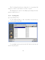
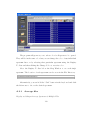
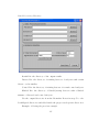
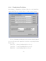
A User Manual of proteoExplorer
102
A.1 Introduction . . . . . . . . . . . . . . . . . . . . . . . . . . . .
103
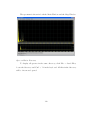
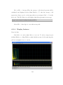
A.2 Visualization . . . . . . . . . . . . . . . . . . . . . . . . . . .
108
A.2.1 Overview . . . . . . . . . . . . . . . . . . . . . . . . .
108
A.2.2 Loading files . . . . . . . . . . . . . . . . . . . . . . . .
110
A.2.3 Average files . . . . . . . . . . . . . . . . . . . . . . . .
113
A.2.4 Display features . . . . . . . . . . . . . . . . . . . . . .
114
A.2.5 Display options . . . . . . . . . . . . . . . . . . . . . .
116
A.2.6 Reset and start over . . . . . . . . . . . . . . . . . . .
120
A.2.7 Workspace . . . . . . . . . . . . . . . . . . . . . . . . .
121
A.3 Data analysis . . . . . . . . . . . . . . . . . . . . . . . . . . .
121
A.3.1 Data preprocessing . . . . . . . . . . . . . . . . . . . .
121
A.3.2 Biomarker detection . . . . . . . . . . . . . . . . . . .
129
A.3.3 Classification/Prediction . . . . . . . . . . . . . . . . .
134
A.3.4 Visualized biomarker pattern . . . . . . . . . . . . . .
137
A.4 Example of head and neck data . . . . . . . . . . . . . . . . .
138
A.4.1 Data description . . . . . . . . . . . . . . . . . . . . .
138
A.4.2 Data preprocessing . . . . . . . . . . . . . . . . . . . .
138
A.4.3 Biomarker selection . . . . . . . . . . . . . . . . . . . .
144
viii
A.4.4 Classification/Prediction . . . . . . . . . . . . . . . . .
ix
152
List of Figures
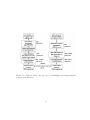
2.1
ProtinChip SELDI Protocol (Modified by William E.Grizzle,O.John
Semmes et al. with permission from Ciphergen Biosystem, Inc.)
9
2.2
”Cold spots” and ”Hot spots”. . . . . . . . . . . . . . . . . . .
10
2.3
m/z = 5997.97 and m/z = 8195.01. . . . . . . . . . . . . . . .
12
2.4
Comparison between the regular and improved methods on sample 3. . . . . . . . . . . . . . . . . . . . . . . . . . . . . . . . .
12
2.5
F-map of the reproducibility test. . . . . . . . . . . . . . . . .
15
3.1
Flow chart of the proteomic mass spectrometry analysis. . . .
17
3.2
Data preprocessing. . . . . . . . . . . . . . . . . . . . . . . . .
18
3.3
Biomarker comparison. . . . . . . . . . . . . . . . . . . . . . .
24
4.1
Tree pruning for head and neck cancer data. . . . . . . . . . .
35
4.2
s-CART mechanism. . . . . . . . . . . . . . . . . . . . . . . .
43
4.3
s-RF mechanism. . . . . . . . . . . . . . . . . . . . . . . . . .
44
5.1
Platelet study: the process of establishing and integrating the
gene/protien database. . . . . . . . . . . . . . . . . . . . . . .
56
5.2
BLAST tool.
. . . . . . . . . . . . . . . . . . . . . . . . . . .
57
5.3
Result of integrating platelet proteomic and genomic datasets.
59
x
5.4
143 gene-protein pairs. . . . . . . . . . . . . . . . . . . . . . .
62
5.5
Distributions of protein and mRNA abundances. . . . . . . . .
62
5.6
Box-Cox transformation of protein abundances. . . . . . . . .
63
5.7
Box-Cox transformation of mRNA abundances. . . . . . . . .
64
5.8
Correlation of the protein data. . . . . . . . . . . . . . . . . .
65
5.9
Pearson, Spearman and canonical correlations between geneprotein expression data for the platelet study. . . . . . . . . .
67
5.10 Pearson correlation between the original gene-protein expression data (a), the normality transformed data on both gene and
protein (b) and the normality transformed data on gene only (c). 68
5.11 Box plot of CAI for highest and lowest expressed platelet transcripts. . . . . . . . . . . . . . . . . . . . . . . . . . . . . . . .
71
5.12 Crystal structure of tripsin. . . . . . . . . . . . . . . . . . . .
73
5.13 Example of triptic fragments for proflin. . . . . . . . . . . . .
73
5.14 Effect of highly abundant proteins on Spearman correlation coefficient for mRNA and protein abundance in platelet. Top 18
highly abuandant proteins has largest correlation of 0.44. . . .
75
5.15 Effect of highly abundant genes on Spearman correlation coefficient for mRNA and protein abundance in platelet. Top 20
highly abundant genes has largest correlation of 0.84. . . . . .
76
5.16 Four quadrants: Q1: highly abundant in protein but low abudant in gene; Q2: highly abundant in both gene and protein;
Q4: highly abundant in gene but low abundant in protein. . .
77
5.17 Hierarchical clustering. average Link, distance = 1-r. . . . . .
78
5.18 Top 9 clusters for hierarchical clustering. . . . . . . . . . . . .
79
xi
5.19 Top 9 clusters shown in the plot of mRNA abundance vs. pro-
6.1
tein abundance. . . . . . . . . . . . . . . . . . . . . . . . . . .
80
Automated gene-protein integration system. . . . . . . . . . .
89
xii
List of Tables
2.1
Proportion of 165 shots that have intensities <6. . . . . . . . .
11
2.2
Description of rats data. . . . . . . . . . . . . . . . . . . . . .
14
2.3
Result of the reproducibility test. . . . . . . . . . . . . . . . .
15
3.1
Head and neck cancer data. . . . . . . . . . . . . . . . . . . .
16
3.2
Comparison of MKNN and classic kNN. . . . . . . . . . . . .
25
3.3
Training classification via cross-validation. Method I is Zhu’s
approach, Method II is Yasui’s and ours is Method III. ”Sen”
= ”Sensitivity” and ”Spe” = ”Specificity”.
3.4
. . . . . . . . . .
27
Testing classification on blinded data(information disclosed after analysis). Method I is Zhu’s method, Method II is Yasui’s
and ours is Method III.
. . . . . . . . . . . . . . . . . . . . .
27
4.1
Recursive tree growing schema for CART. . . . . . . . . . . .
31
4.2
Variable importance schema for RF. . . . . . . . . . . . . . . .
42
xiii
4.3
Classification results on testing samples of different CART
tree constructed by different splitting method. ID is the testing sample index. entropy is Quinlan’s entropy/information
gain method. index is gini diversity index. ratio is gini ratio. entropy+ is entropy information gain with Marshall correction. index+ is gini diversity index with Marshall correction.
emphratio+ is gini ratio with Marshall correction. . . . . . . .
47
4.4
Splitting method comparison for head and neck cancer study. .
48
4.5
Comparison on head and neck cancer testing samples by different method. ID is the testing sample ID; CART is classification
result by original CART; s-CART is the classification result by
score-CART; s-RF is score Random Forest classification given
by this thesis. . . . . . . . . . . . . . . . . . . . . . . . . . . .
4.6
51
Comparison of sensitivity and specificity head and neck cancer
study on eight classifiers. . . . . . . . . . . . . . . . . . . . . .
51
5.1
An example of tblastn. . . . . . . . . . . . . . . . . . . . . . .
60
5.2
An example of blastx.
60
5.3
Taking the average to get the final gene and protein abundances. 61
5.4
Correlation of gene data. . . . . . . . . . . . . . . . . . . . . .
5.5
Correlation of 120 gene-protein pairs before the triptic adjust-
. . . . . . . . . . . . . . . . . . . . . .
ment. * p-values are calculated by bootstrapping . . . . . . .
5.6
5.7
64
70
Triptic adjustment comparison for the correlation of 120 geneprotein pairs. * p-values are calculated by bootstrapping . . .
74
Correlations of the group in four quadrants. . . . . . . . . . .
76
xiv
5.8
Clustering result. . . . . . . . . . . . . . . . . . . . . . . . . .
79
5.9
The gene symbols and names in nine clusters. . . . . . . . . .
86
xv
Acknowledgements
I cannot begin but by expressing my endless gratitude to my adviser,
Professor Wei Zhu, not only for her valuable advice and support, but also for
her warm understanding. I would have been nowhere without them.
I am also deeply indebted to the support of Doctor Wadie Bahou from
School of Medicine. This thesis would not be possible without his guidance
and unquestioning support.
I would like to thank Professor Nancy Mendell and Professor Estie Arkin,
from whom I have learned many important scientific and mathematical skills.
I would like to thank my dear parents for constantly standing beside me
and for keeping alive the place that I will always call home. My thoughts go
to you in all I do.
Many good friends from Stony Brook and some old friends from Boston
have smiled and bestowed me with various graces, through good times and
rough. Dr. Dmitri Gnatenko, Peter Perotta and Melissa Monaghan, I learned a
lot from you, especially on microarray technologies and biological knowledges.
Dr. Jim Ma, Dr. Bin Xu, Dr. Xuena Wang, Dr. Valentin Polishchuk, for your
listening and advice. Kith Pradhan, Xiangfeng Wu, Meimei Wu, Yue Zhang
and Yue Wang. Thank you for your suggestions and help.
My aunt Ye Wu and her family, for their care and optimism. Thank you
Larry and Dan, for all you are.
My thanks, my love to all.
Chapter 1
Introduction
1.1
Genomics and proteomics
The fundamental working units of every living system are defined as
cells. All the instructions needed to direct their activities are contained within
the chemical DNA (deoxyribonucleic acid). Whilst DNA from all organisms is
made up of the same chemical and physical components, the DNA sequence is
the particular side-by-side arrangement of bases along the DNA strand (e.g.,
ATTCCGGA).
This order spells out the exact instructions required to create a particular
organism with its own unique traits. The genome is an organism’s complete set
of DNA. Genomes vary widely in size: the smallest known genome for a freeliving organism (a bacterium) contains about 600,000 DNA base pairs, while
human and mouse genomes have some 3 billion. Except for mature red blood
cells, all human cells contain a complete genome. DNA in the human genome
is arranged into 23 distinct chromosomes–physically separate molecules that
1
range in length from about 50 million to 250 million base pairs. A few types of
major chromosomal abnormalities, including missing or extra copies or gross
breaks and rejoinings (translocations), can be detected by microscopic examination. Most changes in DNA, however, are more subtle and require a closer
analysis of the DNA molecule to find perhaps single-base differences. Each
chromosome contains many genes, the basic physical and functional units of
heredity. Genes are specific sequences of bases that encode instructions on
how to make proteins.
Genes comprise only about 2% of the human genome; the remainder consists of non-coding regions, whose functions may include providing chromosomal structural integrity and regulating where, when, and in what quantity
proteins are made. The human genome is estimated to contain 30,000 to 40,000
genes. Although genes get a lot of attention, it’s the proteins that perform most
life functions and even make up the majority of cellular structures. Proteins
are large, complex molecules made up of smaller subunits called amino acids.
Chemical properties that distinguish the 22 commonly occurring amino acids
cause the protein chains to fold up into specific three-dimensional structures
that define their particular functions in the cell. Whilst humans are estimated
to have between 30,000 and 40,000 genes potentially encoding 40,000 different
proteins, alternative RNA splicing and post-translational modification may increase this number to in the region of 2 million proteins or protein fragments.
The constellation of all proteins in a cell is called its proteome. Unlike the
relatively unchanging genome, the dynamic proteome changes from minute to
minute in response to tens of thousands of intra- and extracellular environmental signals. A proteins chemistry and behavior are specified by the gene
2
sequence and by the number and identities of other proteins made in the same
cell at the same time and with which it associates and reacts. Studies to explore protein structure and activities, known as proteomics, will be the focus
of much research for decades to come and will help elucidate the molecular
basis of health and disease. Specifically, it enables correlations to be drawn
between the range of proteins produced by a cell or tissue and the initiation
or progression of a disease state. As a consequence, the proteome is far more
complex than the genome.
In order to enable the diagnosis for an insidious disease producing few
symptoms in early stages, such as ovarian cancer, proteomics is employed to
detect the protein marker pattern from the database of proteomic mass spectrometry and to make a better understanding of the molecular mechanisms of
cancer development. Proteomics is a scientific discipline which detects proteins
that are associated with a disease by means of their altered levels of expression between control and disease states. It enables correlations to be drawn
between the range of proteins produced by a cell or tissue and the initiation
or progression of a disease state. Whilst humans are estimated to have between 30,000 and 40,000 genes potentially encoding 40,000 different proteins,
alternative RNA splicing and post-translational modification may increase this
number to about 2 million proteins or protein fragments.
Proteins, which carry out and modulate the vast majority of chemical
reactions that together constitute ’life’, are the direct links to diseases and
abnormalities. The proteome reflects both the intrinsic genetic program of the
cell and the impact of its immediate environment.
Proteomics is the study of proteins and one of its central themes is the
3
development of proteomic biomarker-based tests using easily accessible biological fluids such as urine, blood, feces, sputum, and bladder or bronchioalveolar
lavage to identify potential diseases and to monitor the progress of certain
therapeutic treatments.
1.2
Microarray technology
A DNA microarray (also commonly known as gene or genome chip,
DNA chip, or gene array) is a collection of microscopic DNA spots, commonly
representing single genes, arrayed on a solid surface by covalent attachment
to chemically suitable matrices. DNA arrays are different from other types
of microarray. They either measure DNA or use DNA as part of its detection system. Qualitative or quantitative measurements with DNA microarrays
utilize the selective nature of DNA-DNA or DNA-RNA hybridization under
high-stringency conditions and fluorophore-based detection. DNA arrays are
commonly used for expression profiling, i.e., monitoring expression levels of
thousands of genes simultaneously, or for comparative genomic hybridization.
Arrays of DNA can either be spatially arranged, as in the commonly
known gene or genome chip, DNA chip, or gene array, or can be specific DNA
sequences tagged or labelled such that they can be independently identified in
solution. The traditional solid-phase array is a collection of microscopic DNA
spots attached to a solid surface, such as glass, plastic or silicon chip. The
affixed DNA segments are known as probes (although some sources such as
journalists will use different nomenclature), thousands of which can be placed
in known locations on a single DNA microarray. Microarray technology evolved
4
from Southern blotting, whereby fragmented DNA is attached to a substrate
and then probed with a known gene or fragment.
1.3
Mass spectrometry
The most widely used techniques for the characterization of proteins are
two dimensional gel electrophoresis (2-DGE), amino acid composition analysis,
peptide sequence tagging, and mass spectrometry (MS). In particular, the protein mass spectrometry technology, nicked named ”protein chips”, has given
a major impetus to proteomics being the sole high-throughput technology for
protein identification and sequencing. It spans the vast expanse of proteomics
and drug discovery. Three unique ionization techniques facilitated the characterization of proteins by MS. One is electrospray ionization (ESI) [Fenn89]
where a liquid solution of the peptide is sprayed through a fine capillary held
at a high potential. This produces charged droplets that are then rapidly
desolvated producing charged ions of the peptide, which are in turn directed
into a quadrapole type mass analyzer. Another ionization technique, matrixassisted laser desorption ionization (MALDI) [Kar88], involves co-crystallizing
the sample with an organic matrix which strongly absorbs UV laser light. Upon
irradiation under vacuum there is an energy transfer from matrix to peptide
analyte, which produces gaseous ions that are typically measured by a time-offlight (TOF) mass analyzer. The advent of these ionization techniques has extended the application of MS to study proteins in complex biological systems.
The MALDI-MS method is one of the main contemporary analytical methods
reviewed at length in [Gev00]. Surface-enhanced laser desorption-ionization
5
(SELDI), oringinally described by [Hut93], overcomes many of the problems
associated with sample preparations inherent with MALDI-MS. Chiphergen
Biosystems (Fremon, CA) has developed the SELDI PrtoeinChip MS technology that brings to the field of proteomics a user friendly methodology. It is
rapid, highly sensitive and is readily adaptable to a diagnostic format. With
the help of these biological technologies and analytical methods, researchers
have been able to study the pathology of diseases and show a path to cure.
[Pet02] applied the SELDI technology for the early detection of ovarian cancer.
[LZR02] also applied SELDI to identify serum biomarkers for the detection of
breast cancer.
[Adam02] focused on the prostate cancer and [Wads04] the head and
neck cancer. A concise summary on proteomic pattern recognition methods
and their applications for early cancer diagnostics can be found in [Vee04]. Despite the rapid progress in proteomic mass spectrometry technology, there is
substantial room for improvement in the following areas: (1) high-quality acquisition of mass spectra data and (2) identification of significant and meaningful biomarkers. The most commonly used instrument for acquiring proteomic
mass spectra is known as ProteinChip Biomarker System - II (PBS-II). It has
relatively high sensitivity but low resolution and mass accuracy.
1.4
Thesis structure and overview
In Chapter 2, we present a new algorithm to improve the mass spectra
acquisition quality using PBS-II. Furthermore, we also propose a systematic
approach for examining the reproducibility of mass spectrometer results using
6
repeated measures ANOVA for point-wise reproducibility test and the random
field theory for multiple-test correction.
To date, many statistical groups have proposed various proteomic biomarker
identification strategies.
Two notable ones were [Zhu03] where they pro-
posed a continuous marker detection method using the random field theory for
multiple-test correction, and [Yasui03] where they developed a data-analytic
approach to detect biomarkers based on peaks from mass spectrum only.
In Chapter 3, we propose a new strategy for significant biomarker selection by examining the total variance of each data point along the mass spectrum. Comparisons are made between the new strategy and those of [Zhu03]
and [Yasui03] using the head and neck data as an example.
In Chapter 4, we develop the scoring method that would yield the predictive disease probability rather than the traditional crude binary (yes/no)
diagnosis. We present the s-CART and s-RF classifiers - the improved scoring
variants of the binary classification and regression tree (CART) and Random
Forest (RF) classifiers.
In Chapter 5, we examine how integration of transcriptomics and proteomics improves efficiency of protein identification and study correlation between mRNA and protein expression for thoroughly selected group of genes.
Finally, we give the concluding marks and discuss future works in chapter
6.
7
Chapter 2
Data Acquisition and Quality Control
2.1
Data acquisition
Ciphergen’s Protein Chip technology is the mot common pre-chromatography
step prior to mass spectrometry analysis. Patterns are derived from surfaceenhanced laser desorption and ionization (SELDI) protein mass spectra. The
most common analytical platform comprises a ProteinChip Biomarker SystemII (PBS-II, a low-resolution time-of-flight mass spectrometer). We present a
new algorithm for PBS-II to generate a mass spectrum and show its advantage
by an example.
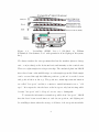
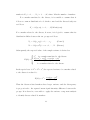
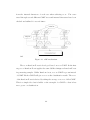
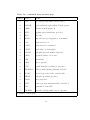
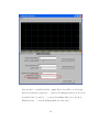
A typical SELDI experiment is illustrated in Figure 2.1. Chip processing i.e., adding the protein sample, washing, adding the energy adsorbing molecule
(EAM). The chips are then processed in the mass reader where the bound
proteins are liberated by ionization, and fly through a ”time-of-flight” tube
where they separate based on mass and charge. The ProteinChip Software
then converts the TOF data to generate a mass spectrum profile. The two
useful formats for viewing the data are the raw spectrum and the grey-scale.
8
'_·0"
,r
... 11'
... ,r
'"
. ~
-----
... ---
-.
Figure 2.1:
ProtinChip SELDI Protocol (Modified by William
E.Grizzle,O.John Semmes et al. with permission from Ciphergen Biosystem,
Inc.)
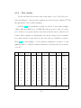
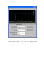
We always analyze the raw spectrum that has the markers (mass-to-charge
ratio or m/z values) as the horizontal axis and intensity as the vertical axis.
There are eight samples in each protein chip. The analytical platform PBS-II
fires a laser beam on the middle stripe on each sample repeatedly. Each sample
can be accessed through 100 different positions: position 1 is at the bottom
and position 100 is at the top. The positions contain important information
are called ”hot spots” and those contain no useful information are a ”cold
spot”. It is expected to fire the laser on the hot spots only, but it is impossible
because ”hot spots” and ”cold spots” are not easy to distinguish.
To extract the information as much as possible from ”hot spots”, PBS-II
fires the laser beam several times at each chosen position, and Ciphergen’s
ProteinChip software takes the average of all shots of chosen positions and the
9
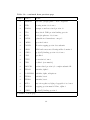
100 ----:
Laser Beam
"Cold Spot"
"Hot Spot"
I
Figure 2.2: ”Cold spots” and ”Hot spots”.
average will be the final mass spectrum of the sample. However, the average
of all shots is not good if the laser beam fired on too many ”cold spots”. The
garbage information is included and this is not acceptable. We use adjusted
mean to generate more accurate mass spectrum:
1) Eliminate the instrument noise. For PBS-II, the intensities without
sample on the protein chip are below 6.
2) Take the average of all shots between 25th percentile and 75th percentile at each m/z value. Example. Eight wild type rats are on one protein
chip. The laser beam starts firing from position 19 to position 79. The interval
between the starting position and ending position is 6. The laser will fire 15
times at each position. Therefore the total number of shots is 11*15 = 165.
The m/z range is (0, 20,000). There are many instrument noises at each m/z
10
Sample M/Z = 5997.97 M/Z = 8195.01
1
72%
59%
2
37%
15%
3
38%
25%
4
27%
0%
5
2%
4%
6
3%
8%
7
10%
0%
8
1%
3%
Table 2.1: Proportion of 165 shots that have intensities <6.
value.
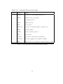
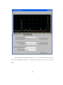
For example, five samples have more than 10% shots below the noise level
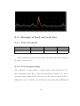
at m/z = 5997.97 and 3 samples have same situation at m/z = 8195.01, more
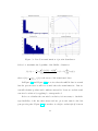
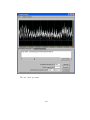
than half of shots for sample number 1 are noises(Figure 2.3). We should not
use those noises to generate mass spectra.
After eliminating the noises, we take the average of shots between 25th
percentile and 75th percentile at each m/z. This algorithm considers only
those stable shots after excluding the noise with small intensities. Therefore
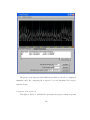
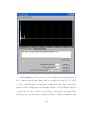
the mass spectra have higher intensities and are more accurate.
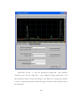
In Figure 2.4 Regular means taking the average of all 165 shots and
then subtract baseline. Improved means eliminating the instrument noise and
take the average of shots between 25th percentile and 75th percentile, finally
subtract the baseline.
11
ro
.,
I<VZ = 5997 97
MIZ=819501
I .J
0
0
a
0.2
\
I. lli . .,
J
a.~
0-6
0.8
~
U
14
1.6
""
2
1.5
• 10'
Figure 2.3: m/z = 5997.97 and m/z = 8195.01.
50 00 5200
5~ OO
560 0 580 0 600 0 6200
6~OO
6600
6800
Figure 2.4: Comparison between the regular and improved methods on sample
3.
12
2.2
Data quality control
In many mass spectrometry datasets, each protein serum sample is gen-
erated multiple times. If the spectra of the same serum sample are not reproducible, we cannot trust them and do further analysis. One-way repeated
measure ANOVA is implemented to perform the reproducibility test.
Method. Suppose we have N protein serum samples, and the mass
spectrum of each sample contains intensities at M markers (mass-to-charge
ratio or m/z). The intensity of each sample has the model:
Yij = αi + βj + ²ij , i = 1, . . . , N, j = 1, . . . , M.
where αi is the ith subject effect (random effect), βj is the jth repeated
measure effect (fixed effect), and ²ij is the random error.
The null hypothesis for test is that data is reproducible, which means the
repeated measure effects are equal.
H0 : β1 = β2 = · · · = βm
It is rejected if
F0 =
M Sw
> FM −1,(N −1)(M −1)
M Sr
This test is performed at each marker. Considering the interactions among
markers, the multiple test correction should be done when we calculate the
F-threshold. It is derived by the Gaussian random field theory:
13
Z
α=
Γ( v+w−2
) w wu w −1
wu − v+w
2
( ) 2 (1 +
) 2 du
v
w
Γ( 2√
)Γ( 2 ) v v
v
f
) wf w−1
2M ln2) Γ( v+w−2
wf − v+w
2
+√
) 2 (1 +
) 2
w (
v
v
π(F W HM ) Γ( 2 )Γ( 2 ) v
∞
where f is the threshold, α is the significant level, FWHM is the smoothing
kernel, v and w are the degrees of freedom. v = N-1, w = (N-1)(M-1).
Rat Age
Inputs
Classes
8 Weeks
10 Weeks
12 Weeks
14 Weeks
21 Weeks
Subjects
4
3
22
22
22
22
22
Replicates Total
19
47
7
2
2
44
3
66
3
66
2
44
3
66
Table 2.2: Description of rats data.
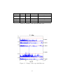
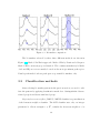
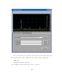
Example. Five groups of mass spectra are generated from twenty-two wild
type rats at their different ages, from 8 weeks to 21 weeks (Data is provided
by Department of Pharmacology, SUNY at Stony Brook. Table 2.2). Each rat
sample is divided into two or three equivalent parts and randomly assigned
to the ProteinChip arrays. The m/z range is from 0 to 20,000 and there are
about 13,500 m/z values for each sample. We will test if those two or three
replicates are reproducible for the rats at different age.
There are less than 40 out of 13,500 markers at which the null hypothesis
is rejected. Thus the data of rats is reproducible. However, when rats are 14
weeks, the mass spectra are relatively less reproducible than those of rats at
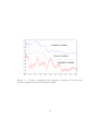
other ages. This difference can also be seen in the F-Map(Figure 2.5), where
the red line is the F-threshold by the Gaussian random field theory.
14
Data Set
8 Weeks
10 Weeks
12 Weeks
14 Weeks
21 Weeks
1st d.f.
1
2
2
1
2
2st d.f.
21
42
42
21
42
F threshold No. Markers Reject H0
26.85
0
12.94
11
12.94
2
26.85
37
12.94
3
Table 2.3: Result of the reproducibility test.
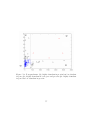
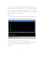
Figure 2.5: F-map of the reproducibility test.
15
Chapter 3
Data Preprocessing, Biomarker Detection and
Classification
In this chapter, we will use the head and neck cancer data set (Table 3.1)
to illustrate the three steps in proteomic biomarker analysis. The flow chart
of the whole procedure is shown in Figure 3.1.
For biomarker detection, we developed a novel method based on variance analysis. In comparison with two previous methods, it improved the
classification results. We proposed a new classification method called majority k-nearest neighbor which is better than the traditional k-nearest neighbor
method. A new classifier combination scoring system is also developed.
Head & Neck Data Set
M/Z Range
0 ∼ 100,000
# M/Z
34,378
HSNCC
73
Normal Control
76
Blinded
49
Table 3.1: Head and neck cancer data.
16
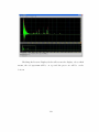
Figure 3.1: Flow chart of the proteomic mass spectrometry analysis.
3.1
Data preprocessing
Preprocessing is an important step for mass spectra based data analysis.
The goal is to remove experimental noise and adjust mass spectra baseline.
1) Calibration and smoothing. Each original mass spectrum has to be
externally calibrated to be in the same coordinate system and to be smoothed
via a Gaussian filter.
2) Baseline subtraction. Eliminate the baseline signal caused mostly by
chemical noise from matrix molecules without contamination of true protein
or peptide peaks. The result is a spectrum with a spectrum with a baseline
signal hovering slightly above zero with protein peaks maintaining their true
intensity.
3) Normalization. Adjust for the system effects between samples due to
varying amounts of protein or degradation over time in the sample or variation
17
in the instrument detector sensitivity. Each spectrum is divided by the average
intensity.
Figure 3.2: Data preprocessing.
In the head and neck cancer study, each raw mass spectrum consists of
34,378 mass-to-charge ratios (m/z values) ranging from 0 to 100,000. The
m/z range of 2,000 to 20,000 is selected because the lower MS range is too
noisy and the signal is too sparse in the higher MS zone. These mass spectra
were also standardized and smoothed using the method developed by Zhu and
colleagues (2003, Figure 3.2). Now the mass spectra are aligned on a common
scale and ready for the next two steps of analysis.
3.2
Biomarker detection
We will present three algorithms. All of them are based on the statgram.
Method 1 detects the biomarkers over the entire m/z range. Method 2 employs
a peak detection algorithm and look for the significant biomarkers at the peak
with maximum intensity. The focus of Method 3 is on those disease related
18
markers that highly appear in the peak region. The new biomarker is the
peak area instead of a single marker intensity. This method is applied by
the variance component analysis. In the last section Head and Neck data is
investigated by the three methods. There are 73 samples that have head and
neck squamous cell carcinoma (HNSCC) and 76 are normal control. In the
validation set, 49 samples (22 HNSCC and 27 control) will be classified using
the detected biomarkers.
Method 1.Zhu’s continuous biomarker approach. (1) Statgram(t-Map). A
two-independent samples t/z test was performed at each m/z value to compare
the intensities between the two training samples (disease and normal control).
The null hypothesis is that the intensities are equal between the two groups
for each particular biomarker, and the alternative one is they are different.
For each biomarker, we calculated a test statistic (t value) and then generated
the t-Map by t values versus m/z values. Suppose n1 and n2 samples are
drawn from the disease group (X) and the control group (Y) respectively. The
samples are independent within and between groups. At each biomarker, m,
the test statistic t(m) is
t(m) = p
X̄(m) − Ȳ (m)
S12 (m)/n1
+ S22 (m)/n2
where X̄(m), Ȳ (m), S12 (m) and S22 (m) are the sample means and variances of
the training samples. When both samples are large ( n1 > 30 andn2 > 30), by
the central limit theorem the test statistic followed approximately the standard
normal distribution under the null hypothesis. Because the mutiple tests are
performed, there is also a false positive problem. Namely, we need to determine
19
a suitable significance level for each test such that at least 95% of all significant
differences identified are real. Traditional methods as Tukey or Bornferroni
tend to be conservative. Thus a less conservative correction method is applied
based on Gaussian random field theory. The threshold t is given by
Z
α=
f
∞
√
Γ( v+1
)
t2 − v+1
u2 − v+1
K ln2)
2
2 du +
)
(1
+
) 2
(1
+
Γ( v2 )
v
π(F W HM )
v
where α is the corrected experimentwise error rate, u and v are the degrees
of freedom of F statistic, f is the threshold of the test and FWHM determines
the Gaussian kernal and it is a constant indicating the number of biomarkers
averaged in the smoothing.
(2) Stepwise Discriminant Analysis. It begins like forward selection with
no variables in the model. At each step the model is examined. If the variable
in the model that contributes least to the discriminantory power of the model
as measured by the following rule fails to meet the criterion to stay, then the
variable is removed. Otherwise, the variable not in the model that contributes
most to the discriminantory power of the model is entered. When all variables
in the model meet the criterion to stay and none of the other variables meets
the criterion to enter, the stepwise selection process stops. During the process
of the stepwise selection, only one variable can be entered into the model at
each step. The selection process does not take into account the relationships
between variables that have not yet been selected.
Sequential F Test Based on a Fixed α Level is the rule. Suppose that
individuals belong to one of the two groups, G1 and G2 , and x̄ = (x1 , · · · , xp )0
represents a full set of p measurements (variables). Assume that the prior
20
probabilities of group membership are equal and that, in Gk , x̄ has a p-variate
normal distribution with mean vector µ̄k and positive definite covariance matrix Σ. The reference samples yield measurements x¯ki = (x¯ki1 , · · · , x¯kip )0 , i =
1, · · · , nk , k = 1, 2 with sample means x¯k and pooled sample covariance matrix S, (n1 + n2 − 2 ≥ p). Let ∆2(q) be the corresponding q-variate Mahalanobis
distance between the two groups given by
∆2(q) = (µ̄1(q) − µ̄2(q) )0 Σ−1
(qq) (µ̄1(q) − µ̄2(q) ))
−1
2
And D(q)
= (x̄1(q) − x̄2(q) )0 S(qq)
(x̄1(q) − x̄2(q) )) is the usual estimate of ∆2(q) .
Test the sequential hypothesis H(q) : ∆2(q) = ∆2(q+1) , q = 0, 1, · · · , (p − 1),
F(q) =
2
2
)
− D(q)
(n1 + n2 − q − 2)n1 n2 (D(q+1)
2
(n1 + n2 )(n1 + n2 − 2) + n1 n2 D(q)
.
where Fα is selected as the best subset either the full set or x̄(q) for which q
is the first step and F(q) ≤ F1−α (1, n1 + n2 − q − 2). The Monte Carlo results
showed that for a fixed α level between .10 and .25, it performs better than
the use of a much larger or a much smaller significance level.
Method 2.Yasui’s peak extraction method.
(1) Peak detection (Yasui, et al 2003). Define peaks by judging, at each
m/z point, whether or not the intensity at that point is the highest among its
nearest ±N-point neighborhood set. Select the peaks above the noise level.
Count the total number of peaks at each m/z, in all samples, that are within
the window of potential shift for the m/z point. The m/z point that has the
highest total number of peaks within its window of potential shift is entered in
21
the new m/z set as a calibrated m/z value. Construct the calibrated dataset
that consists of intensities of each sample that correspond to the points in
the new m/z set. For each sample i, and for each point in the new m/z
set, j, we take the maximum intensity of the sample i, among the intensities
corresponding to the window of potential shift for the point j, as the intensity
at the calibrated m/z point j.
2)Statgram (t-Map). Same as in method 1. The significant peak maximums are the new biomarkers. Classification example SELDI -TOF spectrometry ProteinChip system was used to screen for differentially expressed
proteins in serum from 73 patients with HNSCC and 76 normal controls. The
mass spectrometer is QSTAR which has high resolution. The data was preprocessed. We applied the three methods to detect biomarkers on the 149 training
samples. There are 49 serum samples in the validation set, among which 22
are with HNSCC and 27 are normal controls. Support Vector Machines is
applied to do the classification and the sensitivity and specificity are reported.
Method 3.Marker selection via the variance component analysis. A good
biomarker must be in the peak area and related to the disease, which means
it can differentiate the disease group and the control group. We use the total
variance of all subjects and independent t/z test to detect the disease related
markers at peak
The idea behind the variance component method for marker selection is
that disease related biomarkers tend to have larger variance over the pooled
sample of control and diseased subjects than markers unrelated to the disease.
Suppose we have N subjects, among which n1 are from the disease group and
n2 are from the control group. The intensity for a subject at one specific
22
marker is Xij , i = 1, . . . , N, j = 1, . . . , M , where M is the number of markers.
For a marker unrelated to the disease, it is sensible to assume that it
follows a common distribution for both the control and the diseased subjects
as follows:
Xi ∼ iid(µ, σ 2 ), i = 1, . . . , N (All subjects).
For a marker related to the disease, however, it is logical to assume that its
distribution differs between the two groups as follows:
Xi ∼ iid(µ1 , σ12 ), i = 1, . . . , n1 .
(Control)
Xi ∼ iid(µ2 , σ22 ), i = n1 + 1, . . . , N. (Disease)
Subsequently, the expected value of the sample variance is derived as
σ 2 , for a marker unrelated to the disease.
N (n σ 2 + n σ 2 ) + n n (µ − µ )2
1 1
2 2
1 2
1
2
E(S 2 ) =
,
N (N − 1)
for a marker related to the disease.
In the special case of σ12 = σ22 = σ 2 , the expected variance for a marker related
to the disease is reduced to
E(S2 ) = σ 2 +
n1 n2 (µ1 − µ2 )2
N (N − 1)
Thus the disease-related markers have larger variance and the discrepancy
is proportional to the squared mean signal intensity difference between the
groups. It is therefore, reasonable to apply the variance component analysis
to identify disease related biomarkers.
23
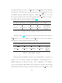
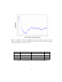
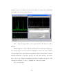
Figure 3.3: Biomarker comparison.
The biomarkers selected by these three different methods are shown in
Figure 3.3. Method I is Zhu’s approach. Method II is by Yasui and colleagues.
Method III is our newly proposed method. The continuous markers (for Methods I and III) are not necessarily located at the most prominent peak region.
Yasui’s peak method selects peak apex as potential biomarkers only.
3.3
Classification methods
After selecting biomarker pattern in the previous section, we need to vali-
date the pattern by applying classification methods to distinguish the diseaserelated group from disease-unrelated group.
Majority k-nearest neighbor (MKNN). MKNN classifier is a generalization
of the k-nearest neighbor classifier. The kNN classifier uses only one integer
parameter k. Given an input x ∈ Rn , it finds the k nearest neighbors of x
24
in the training set and then predicts the label of x as the most frequent one
among the k neighbors. Extended to multi-category case, the principle of kNN
is to use the majority vote of their labels to assign a label to x. MKNN extends
kNN by using the majority vote of a range of k rather than just one k.
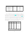
Table 3.2 shows that MKNN has sensitivity of 82% and specificity of 96%
which are much better than the results of original k-NN classifier.
Average KNN
Majority KNN
Sensitivity Specificity
68.18%
88.89%
81.82%
96.30%
Accuracy
79.59%
89.80%
Table 3.2: Comparison of MKNN and classic kNN.
Multi-layer perceptron neural network (MLPNN). The multi-layer perceptron is a hierarchical structure of several perceptrons, and overcomes the
shortcomings of those single-layer networks. It is an artificial neural network
that learns nonlinear function mappings. The multi-layer perceptron is capable of learning a rich variety of nonlinear decision surfaces. Nonlinear functions
can be represented by multi-layer perceptrons with units that use nonlinear
activation functions. Multiple layers of cascaded linear units still produce only
linear mappings.
General regression neural network (GRNN). GRNN is Donald Specht’s
term for Nadaraya-Watson kernel regression, also reinvented in the NN literature by Schioler and Hartmann. (Kernels are also called ”Parzen windows”.)
One can view it as a normalized RBF network in which there is a hidden unit
centered at every training case. These RBF units are called ”kernels” and are
usually probability density functions such as the Gaussian. The hidden-to-
25
output weights are just the target values, so the output is simply a weighted
average of the target values of training cases close to the given input case. The
only weights that need to be learned are the widths of the RBF units. These
widths (often a single width is used) are called ”smoothing parameters” or
”bandwidths” and are usually chosen by cross-validation or by more esoteric
methods that are not well-known in the neural net literature (Specht, 1991,
Rutkowski, 2004).
Support vector machine(SVM). SVM is a supervised learning method used
for classification and regression. The observed m/z ratio for the i th subject
Xi ∈ Rn . An binary classifier would be to construct a hyperplane separating
cancer subjects from normal subjects in this Rn space. The algorithm we
applied here is described by Chang and Lin(2003).
We calculate a score for each classifier. The score is usually a classification
probability and always bounded between 0 and 1. If the score is greater than
0.5, the subject is often classified as diseased, if a binary decision must be
given. If the score is less than 0.5, the subject is classified as normal. To
combine The decisions from the four classifiers, we take the median of the four
scores. The binary decision is derived following the same threshold of 0.5 using
the median score.
3.4
Results
The training set consists of 73 patients with cancer and 76 normal con-
trols. The training data is randomly split into two equal parts and we train
the classifiers using one part (37 of the cancer cases and 38 of the normal
26
cases) and test using the remainder. We repeat this procedure for thousand
times. The average classification sensitivity and specificity are reported in Table 1. We then train the classifiers using the entire training set and classify a
blinded data set of 49 subjects. The prediction sensitivity and specificity for
the blinded data are shown in Table 2.
Training
Method I
Method II
Method III
Classifier
Sen
Spe
Sen
Spe
Sen
Spe
MKNN
GRNN
MLPNN
SVM
Score
.82
.91
.91
.91
.87
.89
.78
.85
.89
.91
.84
.93
.93
.93
.96
.96
.93
.95
.93
.96
.75
.96
.89
.93
.92
.96
.93
.94
.93
.95
Table 3.3: Training classification via cross-validation. Method I is Zhu’s approach, Method II is Yasui’s and ours is Method III. ”Sen” = ”Sensitivity”
and ”Spe” = ”Specificity”.
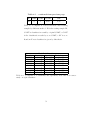
Testing
Method I
Method II
Method III
Classifier
Sen
Spe
Sen
Spe
Sen
Spe
MKNN
GRNN
MLPNN
SVM
Score
.82
.86
.86
.86
.86
.89
.78
.89
.85
.85
.82
.86
.86
.86
.86
.96
.81
.81
.73
.81
.82
.82
.86
.86
.86
.96
.89
.89
.96
.96
Table 3.4: Testing classification on blinded data(information disclosed after
analysis). Method I is Zhu’s method, Method II is Yasui’s and ours is Method
III.
For the training dataset, our method is better than the other two for
GRNN only. However, for the testing data using blinded subjects with a
sensitivity of 86% and a specificity of 96%.
27
3.5
Extension to multiple-group classification
Our approach can be easily extended to the multiple-group classification
problem. For example, if we have two disease stages and one set of normal
control, a marker unrelated to the disease would be
Xi ∼ iid(µ, σ 2 ), i = 1, . . . , N = n1 + n2 + n3 (All subjects).
If a marker is related to the disease, then we have
Xi ∼ iid.(µ1 , σ12 ), i = 1, ..., n1 .
(Disease Stage 1)
Xi ∼ iid.(µ2 , σ22 ), i = n1 + 1, ..., n1 + n2 . (Disease Stage 2)
Xi ∼ iid.(µ3 , σ32 ), i = n1 + n2 + 1, ..., N. (Normal Control)
The expected sample variance of a disease-unrelated marker is σ 2 . The expected sample variance of a disease-related marker is
E[Sr2 ] = σ 2 +
where
1h i
∗ > σ2
N
h
i2
h i
∗ = n1 n2 (µ1 − µ2 ) + n3 (µ1 − µ3 )
h
i2
+n2 n1 (µ2 − µ1 ) + n3 (µ2 − µ3 )
h
i2
+n3 n1 (µ3 − µ1 ) + n2 (µ3 − µ2 )
In summary, we propose a novel approach to identify proteomic biomarkers using the variance component analysis method. Our approach is suitable to
not only two-group but also multi-group classification. Furthermore, it can be
utilized to examine the consistency between the known data and the blinded
28
data by comparing the pooled-variance at each marker between the testing
and the training data sets. This would indicate whether it is reasonable to
classify the training data using the given testing data.
29
Chapter 4
Scoring Method for CART and Random
Forest
The tree based classification and regression method is called CART. It
learns to extract the hidden patterns in the training data and can provide
the predictive information for the future data. Random Forest(RF) combines
many classification trees. Conventionally those two classifiers give binary classification results. In this chapter, we first introduce CART and RF briefly in
Section 4.1 and Section 4.2. Then the scoring methods to improve those two
classifiers are presented in Section 4.3. In Section 4.3.2, we compare and show
the results.
4.1
Classification and regression trees
Basically CART has two steps: recursive partitioning to grow the tree,
and prune to select the correct size of the tree.
30
4.1.1
Tree growing
The the tree growing step of CART is a top-down divide-and-conquer
procedure. A binary decision tree will grow by learning the hidden pattern of
the training samples.
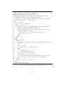
Require node n, dataset D, split selection measure υ
Build classification tree T
1. GrowTree (Node n, dataset D, split selection measure υ)
2. If n meets the stop criteria
3.
label of n ⇐ the majority class label of D;
4. Else
5.
apply υ to D to find the “best” split attribute ϕ for node n;
6.
partition D into Dl , Dr by ϕ;
7.
create children nodes nl with Dl ; nr with Dr ;
8.
label the edge (n, nl ) with predicate q(n, nl ) and (n, nl ) with
predicative q(n, nr ) based on split attribute ϕ;
9.
GrowTree (nl , Dl , υ)
10.
GrowTree (nr , Dr , υ)
11. End If
12. End GrowTree;
Table 4.1: Recursive tree growing schema for CART.
In Table 4.1 n is the input root node and D is the training data set. CART
generates a binary tree. This schema shows only two children after each split.
But it can be modified slightly to describe other decision algorithms (CHAID,
ID4.5, FACT ) that can generate multiple children at each split.
The split selection method υ takes a very important role in tree growing. There are over ten different methods. The most general used are Entropy/Information gain, Gini Index, Gini Ratio and Marshall Correction [Min89].
1. Entropy/Information Gain
31
Entropy/Information Gain is used by Quinlan in ID3, ID4.5 decision
tree.
Entropy for a node T is
entropy(T ) = −
J
X
{P [j|T ] · log(P [j|T ])}
(4.1)
j=1
Where T is the node. J is the number of response categories. P [j|T ] is
the probability of observing an outcome as the j th category in node T .
(0 · log 0 = 0.)
Information Gain (IG) of a split at node T is
IG(T, X, Q) = entropy(T ) −
K
X
{P [qk (X)|T ] · entropy(Tk )}
(4.2)
k=1
Where X is the split attribution. Q is the branch set of node T on the
split attribution X, which will leads the child nodes generated from node
T . K is the child number of node T (e.g. in binary split, it is 2). Tk
is the k th child node. P [qk (X)|T ] is the probability of descending to the
k th branch from T .
2. Gini Index
Gini Index is also called Gini Diversity Index. It is the main split algorithm used in CART.
32
Gini Index for a node T is
gini(T ) = 1 −
J
X
P [j|T ]
(4.3)
j=1
Gini Index of a split at node T is
GI(T, X, Q) = gini(T ) −
K
X
{P [qk (X)|T ] · gini(Tk )}
(4.4)
k=1
In Eq. (4.3) and Eq. (4.4), all legends are same as Eq. (4.1) and Eq.
(4.2).
3. Gini Ratio
Gini Ratio is developed and used to counteract the bias caused of unbalanced data [Qui86].
Gini Ratio of a split at node T is based on Information Gain, Eq. (4.2).
GR(T, X, Q) =
−
P|Dom(X)|
k=1
IG(T, X, Q)
{P [X = xk |T ] · log P [X = xk |T ]}
(4.5)
4. Marshall Correction
In comparison to the Gini Ratio, Marshall Correction [Mar86] favors
attributes which split the examples evenly and avoids those that produce
small splits. It multiplies the splitting method by the product of the row
totals, xi· . Thus it will be the maximum when the row totals are equal.
33
Marshall Correction
M arshallCorrection =
x1· x2·
×
× · · · × kk
N
N
(4.6)
Besides above four common split methods, there are several other methods
such as Misclassification rate, χ2 statistic, F statistic, G statistic, Twoing
criterion, etc.
The stopping criteria of CART growing are as follows:
1. A certain tree depth is reached
2. The number of samples at a node is less than a predefined threshold
3. The node is pure: all samples in the node are in same category.
4. All potential splits of the node are nonsignificant, a F statistic as measure
is given:
F =
SS/(n − 1)
(SSl + SSr )/(n − 2)
The tree depth, the leaf node size and the threshold for F statistic are
control parameters to avoid overfitting a tree. The machine learning is the
ideal procedure to find such parameters through the study on the training
data.
4.1.2
Tree pruning
One should not make more assumptions than the minimum needed. Thus
the tree pruning is an important step. It means we require the tree as simple as
34
possible. Usually the misclassification rate will decrease when the tree grows
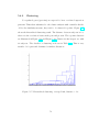
but it will increase again if the tree continues to grow and gets too big.Figure
4.1
Pruning will use the Minimal Cost-Complexity criteria. The key is to
find the weakest-link cutting (WLC ). It generates a decreasing sequence of
subtrees: T1 Â T2 Â T3 Â · · · Â t1 where t1 is the tree which contains the root
node only. It has been proved that the results are the minimum cost subtrees
for a given number of terminal nodes [Bre84].
chch
Figure 4.1: Tree pruning for head and neck cancer data.
The cost-complexity measure Rα (T ) is defined as:
Rα (T ) = R(T ) + α|T̃ |
(4.7)
where R(T) is the misclassification rate of tree T , |T̃ | is the number of leaf
nodes. It is also considered as the tree size and α is the complexity cost.
35
There are two methods for seeking the minimal cost-complexity.
• Independent testing samples, if an independent data set is given, or the
original training data set is big enough to draw out a independent testing
set.
• The v-fold cross-validation method, if the data set is small.
When the best tree is found by the tree growing and pruning, its misclassification rate can be given by resubstitution error rate Rts (T ). A criteria to estimate the variance of the error rate is 1 SE Rule: SE(Rts (T )) =
[Rts (T )(1 − Rts (T ))/N2 ]1/2 . This rule can also be used to select the right size
tree. The purpose of the selection is (1) reduce the instability in pruning;
(2) select a simplest but accuracy-comparable tree. [Bre84] gives more detail
decriptions.
4.2
Random forests
A random forest is ”a classifier consisting of a collection of tree-strutured
classifiers” [Bre01]. The random forest algorithm is based on CART and
bagging sampling.
Bagging sampling causes the first randomness of the random forests algorithm. The second randomness is the variables for selecting the best split
in each tree. There are two methods of random forests, Forest-RI, which uses
a random input selection and Forest-RC, which uses linear combination of
inputs. The voting system is used for the multi-classifier system of Random
Forest.
36
4.2.1
Bagging sampling
Bagging is the acronym of bootstrap aggregating. It was introduced
by L. Breiman in [Bre96]. In recent years, bagging became quite popular as the other sampling methods: boosting (including Adaboosting), v-fold
cross-validation, leaf-one cross-validation, randomization, etc. [Die00, HL03,
HLBR04, DF03]
It has two steps:
• sampling
Each tree is constructed on the different training data set, L(B) . Each
training sample is drawn with replacement from the original training set,
L, about one-third of the samples are left out. The left-out sample will
be the testing data set, called out of bag(OOB) samples.
• voting
Suppose the predictor of the classifier is ϕ(~x, L), the vote is
avB ϕ(~x, L(B) ) y is numerical variable;
ϕB (~x) =
voteϕ(~x, L(B) ) y is categorical variable.
The Step 1 is the kernel and the first randomness in Random Forests.
In paper [Die00], bagging has been simplified only its first phrase, sampling
phrase. And that is been widely accepted. Accuracy and generalization error
(PE.) estimation are two major advantages of using bagging.
Out-of-bag (OOB ) is the most exciting technique developed in Random
Forest, because it can be used for many purposes, such as generalization error
37
estimation, outlier detection, variable importance rank, scaling coordinates,
etc. Each bagging sampling result contains only two third of original training
data set, and the left samples are organized together as OOB data set. Since
the error rate decreases as the number of tree predictions increases in combination, the out-of-bag estimates will tend to overestimate the real error rate
on the testing sample. In [Bre96], the empirical study on error estimates for
the bagged classifiers shows that OOB is as accurate as using a test set of the
same size as the training set.
After generating hundreds of trees, random forest needs apply them predicting the new case. Each individual tree will classify the new case independently. [Bre01] uses majority vote for gathering these internal predictions and
giving its final classification.
Besides the majority vote, the weighted vote can also be applied. It
applies the out-of-bag estimate on the combination of tree decision. Since
out-of-bag is an unbiased estimator, it is used in research for estimating the
strength of each tree [Bre96, Bre01]. In this thesis we take it as the weight
on voting to combine the prediction of the trees vote.
4.2.2
Random forests generation
Random forests is a multi-classifier system consists of numerous trees
as sub-classifiers (or internal classifiers). Each tree is a unpruned CART. The
advantage of using the unpruned tree than using a pruned one is decreasing the
correlation among tress. The unpruned tree has less strength but the reduced
correlation improves the final accuracy after combining all trees. Without
38
pruning, each tree generation will be much simpler and quicker.
Tree generation is a partition process of each node. There are two approaches for split selection in each partition [LS97].
1. For the training data set, all possible splits on each independent variable
will be examined. The most impurity reduction split will be selected as
the best split and used for partition. There are many impurity measures,
such as Entroy/Information gain, Gini (diverse) index, Gini ratio, etc.
as discussed in Section 4.1.
~ 6 c, where f is a linear combination function. FACT
2. Split rule: f (X)
and QUEST are based on this split selection. Both of them use ANOVA
F-statistic to find the split variable, which F-statistic is largest. Then
FACT uses linear discriminant analysis (LDA), while QUEST uses modified quadratic discriminant analysis (mQDA), to find out the split point.
Both above approaches seek the ”global” best split variable from all input
independent variables (denoted as M ). Instead of that, seeking a ”partial”
best split will introduce the the second randomness of Random forests. At
each node, only a partial group of input variables is randomly selected to
find the split rule. They are called random features. There are two types of
Random Forests based on the complexity of random features:
1. Forest-RI is the simplest type of random features. At each node, A
”partial best split” is found by the impurity measure same as CART
from the selected group of variables. It recursively grows the tree until
the tree reaches the maximum size. The number of the variable F in
39
the group is pre-defined, usually log2 M + 1. The selection space of
Forest-RI is CFM .
2. Forest-RC is suitable for the data set consists of a small number of independent variables M . There are two problems when using Forest-RC.
First, the chance of random feature repeat will be significantly increased
and it will reduce randomness. Second, the variable number in the group
(F ) may take big fraction, which leads to much higher correlation. And
such will cause the accuracy reduction.
In Forest-RC, random feature is no longer a variable selected from the
group. It is a linear combination of several variables. Two parameters
are introduced to control the search scope, L and F . From the whole
independent variables M , L variables are selected randomly. Then inside these variables, F coefficients is uniformly randomly picked from
the range of [−1, 1] and be used to compose the combination of the L
variables. Then we use the same idea of impurity reduction as in CART
and Forest-RI to find the best combination as the split rule. In [Bre01],
L is suggested as 3, and F is suggested as 2 and 8.
4.2.3
Variable importance
Our study is not only limited to the considering of accuracy of predicting
a new case, but also on the importance of variables. Since OOB can be used
on the testing data set, we can derive variable ranking by removing the error
change from classification. That is, we permute randomly all values at variable
m in the OOB after each tree generation. We then classify new OOB on the
40
tree to get the error rate. Repeat this procedure for all variable and all trees.
Then the variable ranking is the average of error rate on all tree.
The pseudo code of algorithm is given in Table 4.2.
When viewing the outcome of a variable, the value is the average of the
margin misclassification rate. This rate is raised by permuting the variable,
so it shows the variable role in classification. If the outcome is big, removing
it causes a high misclassification rate, and it plays an important role. On the
contrary, smaller outcome means a lower importance.
4.3
score-CART and score-Random Forest
4.3.1
From s-CART to s-RF
In [Bre84], Gini Diverse Index is used in CART as the splitting method
to construct the tree. However, there are several other splitting methods
[Min89] to grow the tree. Each splitting method has different strength and
will generate different tree. There is no significant advantage that one over
another in general data sets.
We design a new scoring method achieving the benefit from the performance variance of different splitting method. It gathers and combines the
decisions from different CART to give the score. Using the same tree generation technique, it is derived as an internal multi-classifier system.
Some splitting methods are described in Section 4.1.1. Similar as [Bre96,
Bre01], usually vote system will produce a more accurate classification than
that from each individual classifier. Also with the vote system, a probability
41
Require tree number T N ≥ 0, variables M , training sample size X,
category number of dependent variable C
−→
Ensure Variable Importance array V I, (1..M )
1. Variable Importance (tree number T N , variable number M )
2. /* initialize: M E is to save classification result;*/
3. /* times is to count the times of sample x been selected in OOB */
4. M E[X][T N ][M ] = 0;
times[X] = 0;
5. for i = 1 to T N
6. Ti ⇐ RF tree construction;
7. form = 1 to M
8. /* OOB[ ][m]: array of all OOB sample value at variable m */
9.
OOBm ⇐ randomly permute OOB[ ][m]
10.
Classify OOBm on Ti , c[i, x] ← predicted category for case x;
11.
for allx such that x ∈ OOBm
12.
M E[x][i][m] = c[i, x]; /*count as majority vote*/
13.
times[x] = times[x] + 1;
14.
end
15. end
16. end
17. form = 1 to M
18. forx = 1 to X
19. /* initialize: cc is category counter to sum classification result */
20.
cc[C] = 0;
21.
fori = 1 to T N
22.
cc[M E[x][i][m]] = cc[M E[x][i][m]] + 1
23.
end
24.
ct ← true category of x
25.
cm ← maximum category in cc
26.
P roportion[ct] = cc[ct]/times[x];
27.
P roportion[cm] = cc[cm]/times[x];
28.
/* for any m, summary the misclassification rate for all X */
29.
V I[m] = V I[m] + (P roportion[cm] − P roportion[ct])
30. end
31. V I[m] = V I[m]/X; /* average */
32. end
33. End Variable Importance;
Table 4.2: Variable importance schema for RF.
42
will be generated from the votes.
Figure 4.2 shows how the s-CART system works. In this thesis we adopt
Information Gain, Gini index, Gini ratio, and their Marshall Correction algorithms as splitting methods. Six different trees are generated using different
splitting methods. When a new case is input, it will travel down all trees to
get the classification results.
Besides the majority vote to give the final classification of the case, the
probability will be also derived from the vote. it will be regarded as the score
in the scoring system.
chch
Figure 4.2: s-CART mechanism.
The scoring method is more accurate because (1)it may generate different
scores for different cases even if they fall into a same node of a tree. They
may fall into a different node in another tree. (2)it utilizes more information
43
from the internal characters of each case when achieving score. The cases
travel through several different CART trees and internal characters have been
checked and utilized for several times.
chch
Figure 4.3: s-RF mechanism.
The score-Random Forest is developed based on score-CART. In the first
step, score-Random Forest applies the same OOB technique as Random Forest
in generating samples. Unlike Random forest, a score-CART is grown instead
of CART. Each s-CART will give a score as the classification result. The score
of the Random Forest is derived by taking the average on scores of all s-CART.
This is a simple idea but it builds on the strength of s-CART so that it has
more power on classification.
44
4.3.2
Test results
We use the Head-Neck cancer data as the study object. The data is described in Chapter 3. Forty seven biomarkers are selected by proteoExplorerT M (See
the Appendix for the software manual).
In Table 4.3, the classification results are shown on the testing samples
of these different CART trees. s-CART takes the proportion of the vote as the
score. If the score is greater than 0.5 the subject has the disease otherwise it is
normal. Three samples are misclassified: the disease subject #38 is classified
as normal and the normal subjects #17 and #49 are classified as disease.
Table 4.4 shows the number of nodes and the classification accuracy of each
splitting method. s-CART combines all methods and gives the best accuracy
of 93.88%.
ID
Truth entropy index ratio entropy+
index+
ratio+
s-CART
1
1
1
0
0
1
1
1
0.667
2
1
1
1
1
1
1
1
1
3
1
1
1
1
1
1
1
1
4
1
1
1
1
1
1
1
1
5
0
1
0
0
0
0
1
0.333
6
0
0
0
0
0
0
0
0
7
0
0
0
0
0
0
0
0
8
0
0
0
0
0
0
0
0
9
0
0
0
0
0
0
0
0
10
0
0
0
0
0
0
0
0
Continued on next page
45
Table 4.3 – continued from previous page
ID
Truth entropy index ratio entropy+
index+
ratio+
s-CART
11
0
0
0
0
0
0
0
0
12
0
0
0
0
0
0
0
0
13
1
1
0
0
1
1
1
0.667
14
0
0
0
0
0
1
0
0.167
15
0
0
0
0
0
0
0
0
16
0
0
0
0
0
0
0
0
17
0
1
0
1
1
0
1
0.667
18
0
0
0
0
0
0
0
0
19
0
0
0
0
0
0
0
0
20
0
0
0
0
0
0
0
0
21
0
0
0
0
0
0
0
0
22
0
0
0
0
0
0
0
0
23
0
0
0
0
0
0
0
0
24
1
1
1
1
1
1
1
1
25
0
0
0
0
1
0
0
0.167
26
0
0
0
0
0
0
0
0
27
1
1
0
0
1
1
1
0.667
28
0
0
0
0
0
0
0
0
29
1
1
1
1
1
1
1
1
30
1
1
1
1
1
1
1
1
31
0
0
0
0
0
0
0
0
Continued on next page
46
Table 4.3 – continued from previous page
ID
Truth entropy index ratio entropy+
index+
ratio+
s-CART
32
1
1
1
1
1
1
1
1
33
0
0
0
0
0
0
0
0
34
0
0
0
0
0
0
0
0
35
0
0
0
0
0
0
0
0
36
1
1
1
1
1
1
1
1
37
0
0
0
0
0
0
0
0
38
1
0
0
0
1
1
0
0.333
39
1
1
1
1
1
1
1
1
40
1
1
1
1
1
1
1
1
41
1
1
0
0
1
1
1
0.667
42
1
1
1
1
1
1
1
1
43
1
1
1
1
1
1
1
1
44
1
1
1
1
1
1
1
1
45
1
1
1
1
1
1
1
1
46
1
1
1
1
1
1
1
1
47
1
1
1
1
1
1
1
1
48
1
1
1
1
1
1
1
1
49
0
1
0
0
1
1
1
0.667
Table 4.3:
Classification results on testing samples of
different CART tree constructed by different splitting
method. ID is the testing sample index. entropy is Quinlan’s entropy/information gain method. index is gini diversity index. ratio is gini ratio. entropy+ is entropy
information gain with Marshall correction. index+ is gini
47
diversity index with Marshall correction. emphratio+ is
gini ratio with Marshall correction.
Splitting method
Entropy/Information Gain
+ Marshell Correction
Gini Index
+ Marshell Correction
Gini Ratio
+ Marshell Correction
s-CART
Node Number
11
23
3
13
3
13
64
Classification Accuracy
83.67%
87.76%
87.76%
91.84%
89.90%
91.84%
93.88%
Table 4.4: Splitting method comparison for head and neck cancer study.
The score Random Forest is generated by running 200 score CART trees.
The average scores are reported in Table 4.5. In comparison with sCART, sRF misclassified one subject #38 and improved the accuracy. Table 4.6 shows
the comparison of eight classifiers in the head and neck cancer study. s-CART
achieves a better classification than a single CART tree while s-RF is better
than Random Forest. The average score gives s-RF the advantage to achieve
the best classification accuracy among the eight classifiers.
ID
Truth CART s-CART
s-RF
1
1
1
0.667
0.84
2
1
1
1
0.74
3
1
1
1
0.69
4
1
1
1
0.78
5
0
1
0.333
0.47
6
0
0
0
0.20
Continued on next page
48
Table 4.5 – continued from previous page
ID
Truth CART s-CART
s-RF
7
0
0
0
0.03
8
0
0
0
0.02
9
0
0
0
0.00
10
0
0
0
0.41
11
0
0
0
0.46
12
0
0
0
0.37
13
1
0
0.667
0.74
14
0
0
0.167
0.10
15
0
0
0
0.12
16
0
0
0
0.45
17
0
1
0.667
0.39
18
0
0
0
0.09
19
0
0
0
0.25
20
0
0
0
0.03
21
0
0
0
0.07
22
0
0
0
0.01
23
0
0
0
0.43
24
1
1
1
0.58
25
0
0
0.167
0.31
26
0
0
0
0.17
27
1
1
0.667
0.83
Continued on next page
49
Table 4.5 – continued from previous page
ID
Truth CART s-CART
s-RF
28
0
0
0
0.34
29
1
1
1
0.86
30
1
1
1
0.50
31
0
0
0
0.11
32
1
1
1
0.95
33
0
0
0
0.12
34
0
0
0
0.22
35
0
0
0
0.17
36
1
1
1
0.83
37
0
0
0
0.13
38
1
0
0.333
0.21
39
1
1
1
0.73
40
1
1
1
0.58
41
1
1
0.667
0.74
42
1
1
1
0.91
43
1
1
1
0.93
44
1
1
1
0.98
45
1
1
1
0.91
46
1
1
1
0.63
47
1
1
1
0.60
48
1
1
1
0.52
Continued on next page
50
Table 4.5 – continued from previous page
ID
Truth CART s-CART
49
0
1
0.667
s-RF
0.38
Table 4.5: Comparison on head and neck cancer testing
samples by different method. ID is the testing sample ID;
CART is classification result by original CART; s-CART
is the classification result by score-CART; s-RF is score
Random Forest classification given by this thesis.
Classifiers
MKNN
MLPNN
GRNN
SVM
CART
RF
s-CART
s-RF
Head Neck Data Set
Sensitivity Specificity Total Accuracy
95.91%
88.89%
91.84%
86.36%
74.07%
79.59%
86.36%
88.89%
79.59%
90.91%
85.19%
87.76%
90.91%
88.89%
89.80%
86.36%
92.59%
89.80%
95.45%
92.59%
89.90%
95.45%
100.00%
97.96%
Table 4.6: Comparison of sensitivity and specificity head and neck cancer
study on eight classifiers.
51
Chapter 5
Correlation of Proteomic and Genomic Data
Only mRNA expression levels were considered for most of the pathway
models analyzed due to the lack of protein expression data [Bay02, Bay04].
Variables representing protein concentrations were either excluded or substituted with the corresponding mRNA expression levels. With the newly emerging LC-MS/MS technology, the protein expression data can now be readily obtained [Banfi06], including from plants such as Arabidopsis thaliana [Sch05].
Since the technique is much more sensitive, significantly lower sample amounts
are required for LC-MS/MS than for 2-D protein gel electrophoresis. Our
gene-protein integration software module will enable the automated matching
of mRNA’s and their corresponding protein products. A fundamental and
pressing question is the correspondence of transcriptional responses (mRNA
level) to cellular protein abundance, which are also influenced by translational
and post-translational mechanisms [Gyg99, Cox05]. Quantification of the gene
product (mRNA and protein) correlation/concordance strength and their difference in abundance would offer a unique insight on how the information
encoded by a myriad of gene products is integrated at the molecular, cel-
52
lular and organism levels. However, the few comparison studies published
[Gyg99, Cox05] yielded inconsistent results.
The integration of gene and protein data would reveal the correspondence
of cellular protein abundance to transcriptional responses and provide insight
into molecular pathways that determine and link gene and protein expression
patterns.
In this chapter, we fist explain how to obtain the proteomic MS data and
gene microarray data (Section 5.1) and build the correspondence between the
gene and protein data using the human platelet example (Section 5.2). In
Section 5.3 three correlations are calculated in correlation analysis. A codon
adaptation index(CAI) is also introduced as a tool to predict expression level
of a particular protein or a group of proteins(Section 5.4). In Section 5.5, we
propose a new method, use the triptic number to adjust the measurement of
protein abundance which is proved to be a useful method in improving the
correlation. Finally, we applied two techniques to do clustering protein-gene
pairs in Section 5.6.
5.1
Data acquisition
Mass spectrometric analysis. Platelet samples are drawn from four
different donors and then pooled for proteomic studies. They were completed
in duplicate using liquid chromatography coupled to tandem mass spectrometry ( LC-MS/MS), in which the LC steps are interfaced with a fused silica
capillary to maximize peptide resolution and detection sensitivity by tandem
MS/MS.
53
The mass spectrometric analysis was completed using a QSTAR Pulsar
i quadrupole-TOF MS (Applied Biosystems, Foster City, CA) equipped with
nano-electrospray source. The loading and elution of the peptides to and from
the cation exchange column, to the reverse phase column, and to the mass
spectrometer were fully automated, and individual sample runs were completed
in 24 - 36 hours. MS/MS acquisition was completed in a data-dependent
manner by operating the ion trap instrument using dynamic-exclusion lists.
Automated protein identifications were obtained using Pro ID Software 1.0
(Applied Biosystems) linked to the SwissProt database (Version XX containing
XXX proteins). Information provided by the MS analysis included: (1) protein
gi accession number, (2) run, indicating if it was found in the 1st or 2nd run,
(3) protein name, (4) confidence in the protein match, which is based on
the ”distance to next” metric, and (5) number of spectral (peptide) counts
found which represents the total number of MS/MS spectra corresponding to
a particular protein accession.
Spectral (peptide) counts were used as a simple, semi-quantitative means
of establishing protein abundance among complex MS data sets [Cox05, Sand05].
All peptides with confidence levels greater than 70% were used for integrated
proteomic abundance determinations. To ensure compatibility between both
runs, spectral counts were normalized by global scaling to the average spectral
count detected per protein sample; spectral counts in each experiment were
then scaled to ensure compatibility across data sets. Platelet transcripts.
Gene Microarray analysis. Microarray data were derived from a subset of previously reported mRNA profiles of human platelets [Gna03]. Platelets
were collected from volunteer donors (N = 5) by apheresis to obtain sufficient
54
RNA for hybridization to the Affymetrix U133A gene chip (Affymetrix), and
expression data were analyzed using Genespring 7.0 software (Silicon Genetics, Redwood City, CA). A transcript was considered ”platelet-expressed” if
it was ”present” or ”marginal” in 4 of 5 platelet samples. Using these strict
criteria, 1640 mRNAs were expressed at significant levels by platelets [Gna03].
Relative transcript abundance was established by rank-ordering the unique set
of non-redundant mRNAs by determining the mean normalized signal intensities across the individual arrays, using computational algorithms as previously
described.
5.2
Integration of gene and protein database
We use a comprehensive bioinformatic approach to integrate the platelet
proteomic and transcriptomic datasets as in Figure 5.1. Here we applied the
BLAST algorithm for sequence comparison. Figure 5.2 shows it is a heuristic
search method that seeks words of length W that score at least T when aligned
with the query and scored with a substitution matrix. Words in the database
that score T or greater are extended in both directions in an attempt to find
a locally optimal ungapped alignment or HSP (high scoring pair) with a score
of at least S or an E value lower than the specified threshold. HSPs that meet
these criteria will be reported by BLAST, provided they do not exceed the
cutoff value specified for number of descriptions and/or alignments to report.
[Bla]
Amino acid sequences for each accession number identified by LC-MS/MS
were downloaded from the NCBI database [Pru05](NCBI accession could be
55
Figure 5.1: Platelet study: the process of establishing and integrating the
gene/protien database.
56
The BLAST Search Algorithm
",,0"1 """'" (W - l)
--.' ."..""'_u...
,."'~"'" _ ,"" ..."",,,,,ou;,,,,...,,..,,,",,, ..
- -""'
"'
nOi\flo .rIl •• d
n~ 1t'IIl ' rIl "
d
"
'" ........,,..,,"""",""",""',.="1""'''''. '"
~
~_"
""
""
""
""
''' _R,_
~,
:i-
.,,_
100IW 11'<.. 110'.
(TS'J)
.. ,
_,.
, •
..",. ,.. TUw.",,,,,,.,.,,,wa_,"'' ',C>.ll<M'''' ".
Figure 5.2: BLAST tool.
57
assigned to any sequence not for protein only). A total of 2,604 unique NCBI
protein accessions were identified during 2DLC/MS/MS analysis. Each sequence was queried against the protein RefSeq database for human using blastp
(protein-protein BLAST, identifying a query amino acid sequence and for finding similar sequences in protein databases)program. The relative RefSeq sequences(NP ID) are used to build the protein database. 2416 of these have
RefSeq accessions by using blastp against the human NCBI RefSeq database
and 526 among them are unique.
The target nucleotide sequences for each Affymetrix probe set were downloaded from the Affymetrix analysis web database. 1640 of the 22,215 platelets
transcripts were represented on the Affymetrix U133A microarray. These
”non-full length” sequences were then used to download full length platelet
nucleotide sequences from RefSeq, a curated and non-redundant collection of
sequences representing genomic data, transcripts and protein citePru05. Full
length sequences were available for 1,603 of the 1,640 Affymetrix accessions,
of which 1,240 represented unique, non-redundant sequences. Those 1,240
sequences were used for all subsequent platelet transcript analyses.
Finally we derived two databases. The platelet protein database consists of 526 sequences and there are 1240 sequences in the platelet nucleotide
database. Protein sequences were then queried against the platelet nucleotide
sequence database using tBlastN (in BLAST) which allow comparison of platelet
protein amino acid sequences to the six-frame translations of the platelet
nucleotide database. On the other hand, nucleotide sequences were queried
against the plate protein database using blastx which compares the six-frame
conceptual translation products of a nucleotide query sequence (both strands)
58
Figure 5.3: Result of integrating platelet proteomic and genomic datasets.
against a protein sequence database.
As a result shown in Figure 5.3, 379 of 526 proteins (73%) have corresponding nucleotide reference sequences (E-value<0.001) while 511 of 1240
mRNA (41%) transcripts have corresponding protein reference sequences (Evalue<0.001). There are 143 sequences have the same match results between
nucleotide and protein references sequences as in NCBI RefSeq database for
human. The reported E-values provide an estimate of the statistical significance of the match between protein and nucleotide or nucleotide and protein.
An E-value of less than 0.001 was considered statistically significant. Unless
other stated, all relational database analyses are derived using E-values<0.001.
For example, in the query using tblastN program, the sequence with RefSeq accession NP 004479.1 has the same corresponding nucleotide sequence
as the sequence with accession NP 000164.3.(Table 5.1) However, the corre-
59
sponding nucleotide accession of NP 004479.1 is NM 004488.1 in the full RefSeq database. The nucleotide sequence with accession NM 004488.1 is not in
our mRNA database with 1240 sequences. Thus NP 000164.3 is one of the
143 sequences that has the same RefSeq match and NP 004479.1 belongs to
the subset with 236 protein sequences.(Table 5.1)
NCBI
RefSeq
Nucleotide Actual
Protein
Accession Accession
by tblastN Match
Name
gi3183011 NP 004479.1 NM 000173 NM 004488.1 glycoprotein
V precursor
gi121531 NP 000164.3 NM 000173 NM 000173
glycoprotein
Ib alpha
Table 5.1: An example of tblastn.
Similarly, Table 5.2 shows that if we start from the nucleotide sequences,
NM 000419 is one of 143 sequences and NM 003637 is among 368 sequences
which have not same match as in RefSeq database.
Affymetrix
Probeset No.
216956 s at
206766 at
RefSeq
Protein
Actual
Gene
Accession
by blastX
Match
Name
NM 000419 NP 000410.1 NP 000410.1 integrin
alpha 2b
NM 003637 NP 000410.1 NP 003628
integrin
alpha 10
Table 5.2: An example of blastx.
Both protein and mRNA sequences were transformed to reference sequences. If one reference sequence has multiple corresponding protein or
mRNA sequences, we take the average of those abundances. For instance,
four protein sequences with NCBI accessions gi113606, gi113607, gi113608 and
gi113609 have the same reference sequences with accession NP 000025.1. The
60
abundance of this protein sequence is 45 which is the average of four number
of peptide hits. ”1/2” in the column ”Run” means peptides are found in both
two runs and the hit in the column ’No. of Peptide’ is the average.
NCBI accession
gi113606
gi113607
gi113608
gi113609
RefSeq accession
NP 000025.1
NP 000025.1
NP 000025.1
NP 000025.1
No. of Peptide Run
58.5
1/2
40
1/2
46.5
1/2
33
2
Table 5.3: Taking the average to get the final gene and protein abundances.
The protein abundances are denoted by number of peptide which is normalized by the median of the experiment. The mRNA abundances are denoted
by the normalized signal intensities of the microarray gene chips. For the 143
genes, the protein abundances are ranged from 0.29 to 118.36 and the average
gene expressions of 5 platelet chips are ranged from 0.76 to 16.75.
5.3
Correlation analysis
We investigate the gene-protein correlation using three different meth-
ods: Pearson correlation, Spearman rank correlation, and the usual canonical
correlation. Among 143 gene-proteins pairs, there only 120 whose protein
abundances can be detected in both runs of proteomic mass spectrometer. To
calculate the canonical correlation, we will focus on these 120 pairs.
In Figure 5.5, neither protein nor gene data has normal distribution thus
we perform the Box-Cox transformation[Box64]:
x(λ) =
xλ − 1
, λ 6= 0
λ
61
Figure 5.4: 143 gene-protein pairs.
Figure 5.5: Distributions of protein and mRNA abundances.
62
Figure 5.6: Box-Cox transformation of protein abundances.
Select λ to maximize the logarithm of the likelihood function:
n
n
X
X
n
(xi (λ) − x̄(λ))2
f (x, λ) = − log[
] + (λ − 1)
log(xi )
2
n
i=1
i=1
where x̄(λ) =
1
n
Pn
i=1
xi (λ) is the mean of the transformed data.
In Figure 5.6 and Figure 5.7, we notice that the mRNA data is normal
but the protein data is still not normal after the transformation. But we
can still calculate p-values and confidence interval for Pearson correlation and
canonical correlation by applying bootstrap method.
Before we calculate the canonical correlation, it is necessary to check the
reproducibility of the five microarrays and two proteomic runs for the 120
gene-protein pairs. Figure 5.8 shows there is a high correlation(0.9) between
63
Figure 5.7: Box-Cox transformation of mRNA abundances.
the 2 runs for proteomic data generation, which means the protein data is
reproducible. In Table 5.4, we notice that the five microarrays correlate very
well. The correlations are all above 0.8 except those between 3rd array and
the others are above 0.7.
Array
Array
Array
Array
Array
Array 1 Array 2 Array 3 Array 4 Array 5
1
1
0.9154
0.732
0.9105
0.8076
2
1
0.7636
0.9717
0.9168
3
1
0.7178
0.8775
4
1
0.8654
5
1
Table 5.4: Correlation of gene data.
Figure 5.9 shows the gene-protein correlation result using three different
methods: Pearson correlation, Spearman rank correlation, and the canoni64
Figure 5.8: Correlation of the protein data.
65
cal correlation. It is evident that the Spearman rank correlation is the least
powerful and the canonical correlation is the most powerful. Even for the
same method, its correct and incorrect usage would yield drastically different results. Figure 5.10 depicts the Pearson correlation for the platelet study
without the Box-Cox normality transformation Figure 5.10a, with the normality transformation performed on both gene and protein data Figure 5.10b, or
with the normality transformation performed on the gene data only Figure
5.10c. Since both the gene and protein data were found to be non-normal, the
Pearson correlation without the normality transformation indicating that the
correlations are uniformly significant is incorrect Figure 5.10a. The Pearson
correlation with the normality transformation done on both gene and protein
data indicates that the correlations are uniformly insignificant Figure 5.10b.
The Pearson correlation with the normality transformation done on the gene
data only indicates that the correlations are uniformly significant again Figure
5.10c. So which one should we report? Although both Figure 5.10b and Figure
5.10c are correct, Figure 5.10b is too conservative because only one of the two
variables is required to be normal for valid statistical results. Thus the correct
answer is to report the findings in Figure 5.10c - the Pearson correlation sorted
by the top genes are uniformly significant.
The canonical correlations aim to gauge the relationship between two
sets of variables directly. Canonical correlation is essentially the Pearson correlation between the linear combination of variables in one set and the linear
combination of variables from another set. The pair of linear combinations
having the largest correlation is determined first. Next, the pair of linear
combinations having the largest correlation among all pairs uncorrelated with
66
Figure 5.9: Pearson, Spearman and canonical correlations between geneprotein expression data for the platelet study.
67
Figure 5.10: Pearson correlation between the original gene-protein expression
data (a), the normality transformed data on both gene and protein (b) and
the normality transformed data on gene only (c).
68
the initially selected pair is identified, and so on. The pairs of linear combinations are called the canonical variables, and their correlations are called
the canonical correlations. The first canonical correlation, which is often the
only significant one as in our case, is usually adopted to describe the interclass correlation. Here we will report the first canonical correlation, its test
statistic - Wilks’ Lambda, the equivalent F-statistic and the p-value. In our
study, there are five sets of gene microarray data and one set of protein LCtandem MS data. The Pearson correlation and the Spearman correlation can
only gauge the relationship between the protein data and one set of the gene
expression data (e.g. the average of the 5 sets of gene data). Thus they will
be influenced by the quality of all the data sets involved. If one set of gene
data is of poor quality and thus fail to reflect the true nature of the presumably high-correlated mRNA-protein relationship, both Pearson and Spearman
correlation will be less than optimal. On the other hand, the first canonical
correlation (or its nonparametric counterpart based on the ranks) will be larger
than the largest Pearson (or Spearman) correlation between the protein data
and each individual set of gene expression data. Thus, as long as one set of
gene data is of good quality, canonical correlations will preserve and prevail.
In addition, the major Principal Components can be obtained to replace the
original variables to magnify the significance of canonical correlation.
Table 5.5 shows the three correlations for the 120 gene-protein pairs. The
Pearson and Spearman correlations are very small and not significant. The
canonical correlation is 0.53 with a significant p-value less than 0.01. We
will show the adjustment technique using the number of tripsin fragments in
Section 5.5. It improved the Pearson and Spearman correlations a lot.
69
120 gene-protein pairs Correlation P-value
Pearson
0.02
> 0.2*
Spearman
-0.04
0.68
Canonical*
0.53
< 0.01*
Table 5.5: Correlation of 120 gene-protein pairs before the triptic adjustment.
* p-values are calculated by bootstrapping
5.4
Codon adaptation index
Codon usage could be used as a tool to predict expression level of a par-
ticular protein or a group of proteins. The degeneracy of the genetic code
enables the same amino acid sequence to be encoded and translated in many
different ways. Alternative codon usage is not purely random - systemic bias
of degenerate codon usage appears at different level of genetic organization. It
became accepted that biased codon usage could regulate the expression levels
of individual genes by modulating the rates of polypeptide elongation. Historically, the relationship between codon usage and protein/mRNA expression
has been most extensively studied in yeast2. To date, several gene sequence
- based computer algorithms are available to calculate the codon usage for
a particular organism or tissue (EMBOSS, Jcat and etc.) We applied codon
usage analysis to platelets to predict correlation between mRNA and protein
abundances.
Sharp and Li ([Sha87]) proposed to use CAI (codon adaptation index) to
evaluate how well a gene is adapted to the translational machinery. CAI is a
single value measurement that summarizes the codon usage of a gene relative
to the codon usage of a reference set of genes. A higher CAI value usually
suggests that the gene of interest is likely to be highly expressed.
70
50 highest platelet-expressed transcripts were taken as the initial reference set in our studies. We calculated CAI for 156 highest-expressed platelet
transcripts and for 156 lowest-expressed. [Wu05]
The CAI distribution of 156 highest-expressed platelet transcripts is left
skewed, and the median 0.77 is greater than the mean 0.76. Similarly, the CAI
distribution of the lowest-expressed platelet transcripts is right skewed, and
the median 0.73 is less than the mean 0.74.
The mean CAIs for these two groups of genes were 0.76 and 0.74 respectively. The p-value of the two sample t-test is 0.003, which means the two
means are significantly different.
Figure 5.11: Box plot of CAI for highest and lowest expressed platelet transcripts.
At the protein level, we detected 22 proteins belonging to the group of
71
50 highest-expressed platelet transcripts. For the lowest-expressed transcript
group only 12 proteins have been detected.
It is evident that for individual genes correlation between protein and
mRNA expression is low (number). Since correlation depends on the distributions of both parameters compared, it is possible that different types of
transcript and protein abundances distribution Figure 5.11. It may indicate
also that our method of measurement of protein abundance (number of peptide hits per protein) is not optimal for this type of analysis. In summary, CAI
analysis could be used as a tool to predict or compare protein expression levels
for a group of proteins, but requires extra caution if applied to individual gene
products.
5.5
Triptic adjustment
Trypsin is a serine protease found in the digestive system, where it breaks
down proteins. It is used for numerous biotechnological processes. Figure 5.12
shows the crystal structure of a Trypsin. In Figure 5.13, the tripsin fragments
of the protein Proflin are illustrated.
We use the number of peptide hits per protein to measure the protein
abundance in previous correlation analysis. This may not be optimal and
the tripsin cleavage enlightened us to make an adjustment. The new protein
abundance is the peptide hits divided by the number of tripsin framents.
1. Before triptic adjustment:
protein abundance = peptide hits.
72
Figure 5.12: Crystal structure of tripsin.
Pro! l ~
1
,
•
,I
.I I
II
,I
T'jf'Y' , ... ' ' J'
....
Detectod peptido.
Figure 5.13: Example of triptic fragments for proflin.
73
2. After triptic adjustment:
protein abundance =
peptidehits
.
numberof tripsinf ragments
In Table 5.6, the Pearson correlation increases from 0.02 to 0.31 and
the Spearman correlation increases from -0.04 to 0.27. Both correlations are
statistically significant after the triptic adjustment. There is a small change
for the canonical correlation from 0.53 to 0.55 and it is still significant.
Pearson
Spearman
Canonical
Before Triptic Adjustment
Correlation
P-value
0.02
>0.2*
-0.04
0.68
0.53
<0.01*
After Triptic Adjustment
Correlation
P-value
0.31
<0.05*
0.27
0.0014
0.55
< 0.01*
Table 5.6: Triptic adjustment comparison for the correlation of 120 geneprotein pairs. * p-values are calculated by bootstrapping
A hypothesis testing on the change of the correlations is performed and
both p-values for Pearson and Spearman correlations are smaller than 0.01,
which means there are significant changes.
5.6
Quadrant analysis and clustering
5.6.1
Quadrant analysis
First, the set of 120 proteins was ranked by the protein abundance and
the correlation was calculated by including the 15 highest-abundant proteins
and then decreasingly including the remaining 105 ones in order of abundance.
In Figure 5.14, the top 18 highly abundant proteins have the maximum correlation of 0.44 In the other hand, the set of 120 genes was ranked by the mRNA
74
abundance(gene expression). The correlation was calculated by including the
15 highest expressed genes and then decreasingly including the remaining 105
pairs. As shown in Figure 5.15, the most highly expressed 20 genes have the
largest correlation of 0.84 with the proteins.
Figure 5.14: Effect of highly abundant proteins on Spearman correlation coefficient for mRNA and protein abundance in platelet. Top 18 highly abuandant
proteins has largest correlation of 0.44.
Then we can divide all 120 genes into four groups. It is shown as four
quadrants in Figure 5.16. The 18 most highly abundant proteins are in quadrant 1 and 2 and the 20 highest expressed genes are in quadrant 2 and 3.
Table 5.7 shows that the three groups in Q1 Q3 and Q4 have very significant
correlations(p<0.01).
75
Figure 5.15: Effect of highly abundant genes on Spearman correlation coefficient for mRNA and protein abundance in platelet. Top 20 highly abundant
genes has largest correlation of 0.84.
Quadrant Number of Genes
Q1
14
Q2
4
Q3
84
Q4
16
Spearman Correlation P-value
0.36
0.1015
0
0.54
0.33
0.0012
0.91
< 0.0001
Table 5.7: Correlations of the group in four quadrants.
76
Figure 5.16: Four quadrants: Q1: highly abundant in protein but low abudant
in gene; Q2: highly abundant in both gene and protein; Q4: highly abundant
in gene but low abundant in protein.
77
5.6.2
Clustering
Co-regulated genes (proteins) are expected to have correlated expression
patterns. Thus when submitted to the cluster analysis with a suitable threshold for the similarity measure, they tend to be clustered together. Figure 5.17
shows the hierarchical clustering result. The distance between subjects is 1-r,
where r is the correlation between the gene and protein. The top nine cluseters
are illustrated in Figure 5.18 and Figure 5.19. Cluster 4 is the largest one with
92 subjects. The details for clustering is shown in Table 5.9. This is very
useful to biologists and chemists for further discussion.
Figure 5.17: Hierarchical clustering. average Link, distance = 1-r.
78
Cluster No.
1
2
3
4
5
6
7
8
9
Number of protein-gene pairs
6
4
6
92
5
1
2
1
1
Table 5.8: Clustering result.
Figure 5.18: Top 9 clusters for hierarchical clustering.
79
-._.-,
, -,
".
_.-,
,-.-.
C'
::,
-,,
, -_.-,,,
,
0
0
,
':
,
,, ,
, ,
~..
~p~,.,
~.
obood,
:0("'"''',: :f 5 mio'o :
-
,~ .
':~
Figure 5.19: Top 9 clusters shown in the plot of mRNA abundance vs. protein
abundance.
80
Cluster
Symbol
Name
1
EEF1G
eukaryotic translation elongation factor 1 gamma
1
GDI2
GDP dissociation inhibitor 2
1
RAB11A
Ras-related protein Rab-11A
1
ARPC3
actin related protein 2/3 complex subunit 3
1
ZNF185
heat shock 90kDa protein 1, beta
1
TUBA6
myosin regulatory light chain MRCL2
2
CA2
carbonic anhydrase II
2
UBE2L3
ubiquitin-conjugating enzyme E2L 3 isoform 1
2
ACTR3
ARP3 actin-related protein 3 homolog
2
OSTF1
ras suppressor protein 1 isoform 1
3
GSTP1
glutathione transferase
3
RGS10
regulator of G-protein signaling 10 isoform a
3
PPBP
pro-platelet basic protein precursor
3
TIMP1
tissue inhibitor of metalloproteinase 1 precursor
3
DNCL1
dynein light chain 1
3
MYL6
thymosin, beta 4
4
ALDOA
aldolase A
4
F13A1
coagulation factor XIII A1 subunit precursor
4
GP1BA
platelet glycoprotein Ib alpha polypeptide precursor
4
GSN
gelsolin isoform a
4
NP
purine nucleoside phosphorylase
4
PGK1
phosphoglycerate kinase 1
Continued on next page
81
Table 5.9 – continued from previous page
Cluster
Symbol
Name
4
SNCA
alpha-synuclein isoform NACP140
4
TPI1
riosephosphate isomerase 1
4
GPX1
glutathione peroxidase 1 isoform 1
4
FKBP1A
FK506-binding protein 1A
4
ZYX
zyxin
4
SEPT7
cell division cycle 10 isoform 2
4
HSPCA
heat shock 90kDa protein 1, alpha isoform 1
4
ACTB
beta actin
4
ACTN1
actinin, alpha 1
4
ARHGDIB
Rho GDP dissociation inhibitor (GDI) beta
4
CLIC1
chloride intracellular channel 1
4
ENO1
enolase 1
4
FHL1
four and a half LIM domains 1
4
FLNA
filamin 1 (actin-binding protein-280)
4
GDI1
GDP dissociation inhibitor 1
4
HSPB1
heat shock 27kDa protein 1
4
ACTG1
actin, gamma 1 propeptide isoform 4
4
ARF3
ADP-ribosylation factor 3
4
RHOA
ras homolog gene family, member A
4
ENO2
enolase 4
4
EPB49
erythrocyte membrane protein band 49
Continued on next page
82
Table 5.9 – continued from previous page
Cluster
Symbol
Name
4
FYN
protein-tyrosine kinase fyn isoform a
4
GAPDH
glyceraldehyde-3-phosphate dehydrogenase
4
LDHB
lactate dehydrogenase B
4
MPP1
palmitoylated membrane protein 1
4
MSN
moesin
4
MYH9
myosin, heavy polypeptide 9, non-muscle
4
PF4
platelet factor 4
4
PF4V1
platelet factor 4 variant 1
4
PFDN5
prefoldin 5 isoform alpha
4
PGAM1
phosphoglycerate mutase 1(brain)
4
PKM2
pyruvate kinase 3 isoform 1
4
LEK
pleckstrin
4
PRG1
proteoglycan 1
4
CCL5
small inducible cytokine A5 precursor
4
SH3BGRL
SH3 domain binding glutamic acid-rich
4
SPARC
secreted protein, acidic, cysteine-rich
4
THBS1
thrombospondin 1 precursor
4
TPM4
tropomyosin 4
4
TPT1
tumor protein, translationally-controlled 1
4
VCL
vinculin isoform VCL
4
YWHAH
tyrosine 3/tryptophan 5-monooxygenase
Continued on next page
83
Table 5.9 – continued from previous page
Cluster
Symbol
Name
4
TAGLN2
tyrosine 3/tryptophan 5 -monooxygenase
4
SNX3
sorting nexin 3 isoform a
4
SNAP23
synaptosomal-associated protein 23
4
ST13
heat shock 70kD protein binding protein
4
ACP1
acid phosphatase 1 isoform c
4
GSTO1
glutathione-S-transferase omega 1
4
PRDX6
peroxiredoxin 6
4
CAPZB
F-actin capping protein beta subunit
4
LIMS1
LIM and senescent cell antigen-like domains 1
4
PCBP2
poly(rC)-binding protein 2 isoform a
4
PFN1
profilin 1
4
CTTN
cortactin isoform a
4
CFL1
cofilin 1 (non-muscle)
4
ARPC1B
actin related protein 2/3 complex subunit 1B
4
TUBA1
tubulin, alpha 1
4
K-ALPHA-1
tubulin, alpha, ubiquitous
4
TUBB4
tubulin, beta4
4
TUBB2
tubulin, beta2
4
MYL9
myosin regulatory light polypeptide 9 isoform a
4
CAPZA2
capping protein muscle Z-line, alpha 2
4
PCBP1
poly(rC) binding protein 1
Continued on next page
84
Table 5.9 – continued from previous page
Cluster
Symbol
Name
4
TLN1
talin 1
4
CAP1
adenylyl cyclase-associated protein
4
MRCL3
myosin regulatory light chain MRCL3
4
TALDO1
transaldolase 1
4
YWHAE
polypeptide
4
YWHAQ
polypeptide
4
CALM1
calmodulin 1 (phosphorylase kinase, delta)
4
SUMO3
small ubiquitin-like modifier protein 3
4
STXBP2
syntaxin binding protein 2
4
HSPCB
microtubule-associated protein, RP/EB family
4
MAPRE1
osteoclast stimulating factor 1
4
RSU1
coronin, actin binding protein, 1C
4
CORO1C
EH-domain containing 3
4
MYH2
cytochrome c
4
CYCS
PDZ and LIM domain 1 (elfin)
4
PDLIM1
ubiquitin C
4
UBC
smooth muscle and non-muscle myosin alkali
4
TMSB4
X peptidylprolyl isomerase A isoform 1
4
PPIA
coactosin-like 1
4
COTL1
SH3 domain binding glutamic acid-rich
4
SH3BGRL3
tubulin alpha 6
Continued on next page
85
Table 5.9 – continued from previous page
Cluster
Symbol
Name
4
MRLC2
ras homolog gene family, member C
4
RHOC
tubulin, beta polypeptide
5
NP
G-gamma globin
5
HBA1
alpha 2 globin
5
HBB
beta globin
5
AKR7A2
aldo-keto reductase family 7, member A2
5
HBE1
actinin, alpha 1
6
LDHA
lactate dehydrogenase A
7
TXN
thioredoxin
7
PCMT1
protein-L-isoaspartate (D-aspartate)
8
CAPZA1
F-actin capping protein alpha-1 subunit
9
EHD3
myosin, heavy polypeptide 2, skeletal muscle, adult
Table 5.9: The gene symbols and names in nine clusters.
86
Chapter 6
Conclusion and Future Work
This thesis has focused on the discovery of genomics and proteomics
knowledge by mining bioinformatics literature. In the last few years, there
has been a lot of interest within the scientific community to help sort through
this ever-growing huge volume of literature and find the information most relevant and useful for specific analysis tasks. We extend and expand the available
knowledge and provide new strategy in device data acquisition, biomarker detection, classifier combination and data integration.
6.1
Original contribution to knowledge
This thesis makes the following original contributions to knowledge:
1. A new data acquisition algorithm for proteomic ProteinChip SELDI
data.
2. F-random field theory to determine the threshold for the reproducibility test.
3. Majority k-nearest neighbor classification method. It loops over all
87
possible values for k. Based on the Mahalanobis distance, it takes the majority
vote and improved the classic k-NN method.
4. Total variance analysis is a novel method to detect biomarker pattern.
In comparison with previous biomarker detection approaches such as stepwise
discriminant analysis and the traditional peak detection strategy, we found
that the new variance component approach can better distinguish cancer from
non-cancer cases with a sensitivity of 86% and a specificity of 96%.
5. Classifier combination to improve the classification result using the
new biomarker pattern.
6. Conventional CART and random forest are extended to s-CART and
s-RF. The scoring system improves the binary classifiers.
7. Integration of Gene and Protein Data in platelet. A significant correlation is found.
6.2
Future works
In our study, the data set only has two groups, disease and normal. The
extension of the analysis to multiple disease categories can be achieved for
cross-sectional classification and longitudinal profiling. We can also correlate
proteomic markers with other covariates such as age and gender etc.
The limitation of the gene/protein database generation and integration
process is that it was done half manually and for one platelet study only. One
would have to repeat the entire time- and labor-intensive process for another
study. Thus our goal is to establish a customized software module automating
this process. For any future gene-protein integration study, the researchers
88
Gene
Aifymetrix,'KimbleGen
Pruoosel ID
V<:lK S<.:l.ju<.:n<.:<.:s
l
1
(h;'K (Maba,<.:
J ~::
__hla~tx
_ _ _ ___ _ _ __
0
Prote in Datab~,e
thlast\r
RetS eq:'W Acoe,sion
l'rotein Scqucllces
I
blo.tp •.oo.iJ,.t l{oiSoq
\rem G1 Acc ession
Amino Aoid Sequenc e s
Pl'Ot~in
Figure 6.1: Automated gene-protein integration system.
would have the freedom to access the module on-line and integrate their own
gene-protein database with ease.
Figure 6.1 illustrated the flow chart of developing a fully automatic webbased integration on matching gene-protein data. It will be done by coreferencing the microarray data and LC-tandem MS (also referred to as LCMS/MS) data from the same study to the NCBI reference sequence database.
89
Bibliography
[Adam02] Adam B.L., Qu Y., Davis J.W., Ward M.D., Clements M.A.,
Cazares L.H., Semmes O.J., Schellhammer P.F., Yasui Y., Feng Z.
and Wright G.L. Jr.(2002),Serum protein fingerprinting coupled with
a pattern-matching algorithm distinguishes prostate cancer from benign
prostate hyperplasia and healthy men, Cancer Research, 62(13), pp 360914.
[Adl81] Adler R.J. (1981), The Geometry of Random Fields, John Wiley &
Sons, New York.
[Alba04] Alba R, Fei Z, Payton P, Liu Y, Moore SL, Debbie P, Cohn J,
D’Ascenzo M, Gordon JS, Rose JKC, Martin G, Tanksley SD, Bouzayen M, Jahn MM and Giovannoni J.(2004), ESTs, cDNA microarrays,
and gene expression profiling: tools for dissecting plant physiology and
development, Plant J., 39, pp 697-714.
[Alt90] Altschul SF, Gish W, Miller W, Myers EW, Lipman DJ(1990), Basic
local alignment search tool, J Mol Biol., 215, pp 403-410.
[Ars91] Arshad, M., and W.T. Frankenberger (1991), Microbial production of
plant hormones. Dordrecht, the Netherlands, Kluwer Academic Publish90
ers.
[Banfi06] Banfi C, Brioschi M, Wait R, Begum S, Gianazza E, Fratto P,
Polvani G, Vitali E, Parolari A, Mussoni L, Tremoli E(2006), Proteomic
analysis of membrane microdomains derived from both failing and nonfailing human hearts, Proteomics, 2006 Feb 13 [Epub ahead of print].
[Bar04] Barac T, Taghavi S, Borremans B, Provoost A, Oeyen L, Colpaert
J, Vangronsveld J, van der Lelie D(2004), Engineered endophytic bacteria improve phytoremediation of water-soluble volatile organic pollutants,
Nature Biotech., 22, pp 583-8.
[Bash97] Bashan, Y., and G. Holguin (1997), Azosprillum-plant relationships:
environmental and physiological advances (1990-1996), Can. J. Microbiol.,43, pp 103-121.
[Bay02] Bay SD, Shrager J, Pohorille A, Langley P.(2002), Revising regulatory
networks: from expression data to linear causal models, J Biomed Inform.
, Oct-Dec 35(5-6), pp 289-97.
[Bay04] Bay SD, Chrisman L, Pohorille A, Shrager J.(2004), Temporal aggregation bias and inference of causal regulatory networks, J Comput Biol. ,
11(5), pp 971-85.
[Bla] http://www.ncbi.nlm.nih.gov/BLAST/.
[Box64] Box, George E. P.; Cox, D. R. (1964), An analysis of transformations,
Journal of Royal Statistical Society, Series B 26, pp 211-246.
91
[Bre84] L. Breiman, J. H. Friedman, R. A. Olshen and C. J. Stone(1984),
Classification and regression trees, Stanford University.
[Bre01] L. Breiman(2001), Random forests, Machine Learning, 45(1), pp 5-32.
[Bre01a] L. Breiman(2001), Statistical modeling: the two cultures, Statistical
Science, 16, pp 199-215.
[Bre96] L. Breiman(1996), Out-of-bag estimation, Wadsworth International
Group.
[Bre03] L. Breiman(2003), RF/TOOLS: A Class of Two-eyed Algorithms,
SIAM Workshop, Statistics Department, UC Berkeley.
[CAI] http://www.evolvingcode.net/codon/cai/cais.php.
[Car03] Cartieux F, Thibaud M-C, Zimmerli L, Lesssard P, Sarrobert C, David
P, Gerbaud A, Robaglia C, Somerville S, Nussaume L.(2003), Transcriptome analysis of Arabidopsis colonized by a plant-growth promoting rhizobacterium reveals an general effect on disease resistance, Plant J. 36,
pp 177-188.
[Cha03] Chang, C.C. and Lin, C.J.(2003). Software package LIBSVM v.2.3 .
http://www.csie.ntu.edu.tw/ cjlin/libsvmtools/.
[CST00] Cristianini, N. and Shawe-Taylor, J. (2000), An introduction to Support Vector Machine and other kernel-based methods, Cambridge University Press.
92
[Cox05] Cox B, Kislinger T, Emili A.(2005), Integrating gene and protein expression data: pattern analysis and profile mining, Methods., 35(3), pp
303-14.
[Di04] Di Bernardo D.(2004), Modeling genetic networks from expression profiling. SISSA-ICTP, Computational Systems Biology of the Neuronal Cell,
December, pp 6-10, Trieste, Italy.
[DF03] S. Dudoit and J. Fridlyand(2003), Bagging to improve the accuracy of
a clustering procedure, Bioinformatics, 19(9), pp 1090-99.
[Die00] T.G. Dietterich(2000), An Experimental Comparison of Three Methods
for Constructing Ensembles of Decision Trees: Bagging, Boosting, and
Randomization, Machine Learning, 40(2), pp 139-58.
[Fenn89] Fenn JB, Mann M, Meng CK, Wong SF and Whitehouse CM (1989).
Science, 246, pp 64-71.
[Fie00] Fiehn, O., J. Kopka, P. Dormann, T. Altmann, R.N. Trethewey and
L. Willmitzer(2000), Metabolite profiling for plant functional genomics,
Nature Biotech., 18, pp 1157-1161.
[For02] Forster, J., A.K. Gombert and J. Nielsen(2002), A functional genomics
approach using metabolomics and in silico pathway analysis, Biotechnology and Bioengineering, 79, pp 703-712.
[For03] Forster, J., I. Famili, P. Fu, B.O. Palsson and J. Nielsen(2003),
Genome-scale reconstruction of the Saccharomyces cerevisiae metabolic
network, Genome Research, 13, pp 244-253.
93
[Fri04] Friberg M, von Rohr P, Gonnet G.(2004), Limitations of codon adaptation index and other coding DNA-based features for prediction of protein
expression in Saccharomyces cerevisiae., Yeast. 21, pp 1083-1093.
[Fun02] Fung,
proteomics:
E.T. and Enderwick,
C. (2002),
ProteinChip clinical
computational challenges and solutions, Biotechnique,.
Suppl:34(8), pp 40-1.
[Geo02] George E, Glimm J, Li X, Marchese A, Xu Z. A Comparison of Experimental, Theoretical, and Numerical Simulation Rayleigh-Taylor Mixing
Rates.(2002), Proc. National Academy of Sci. 99, pp 2587-2592.
[Gev00] Gevaert, K. and Vandekerckhove, J. (2000), Protein identification
methods in proteomics, Electrophoresis, 21(6), pp 1145-54.
[Gna03] Gnatenko DV, Dunn JJ, McCorkle SR, et al.(2003), Transcript profiling of human platelets using microarray and serial analysis of gene expression, Blood, 101(6), pp 2285-93.
[Gna05] Gnatenko DV, Cupit LD, Huang EC, Dhundale A, Perrotta PL, Bahou WF.(2005), Platelets express steroidogenic 17beta-hydroxysteroid dehydrogenases, Distinct profiles predict the essential thrombocythemic phenotype, Thromb Haemost., Aug 94(2):412-21.
[Gyg99] Gygi SP, Rochon Y, Franza BR, Aebersold R(1999),Correlation between protein and mRNA abundance in yeast, Mol Cell Biol., 19, pp
1720-1730.
94
[Har04] Hardiman G.(2004), Microarray platforms - comparisons and contrasts, Pharmacogenomics, 5, pp 487-502.
[HL03] B. Lausen and T. Hothorn(2003), Double-Bagging: Combining Classifiers by Bootstrap Aggregation, Pattern Recognition, 36(6), pp 1303-309.
[HLBR04] T. Hothorn, B. Lausen, A. Benner and M. Radespiel-Troger(2004),
Bagging Survival Tree, Statistics in Medicine, 23(1), pp 77-91.
[Hol02] Holloway AJ, van Laar RK, Tothill RW, and Bowtell DDL. (2002),
Options available -from start to finish- for obtaining data from DNA microarrays II, Nature Genetics, 32, pp 481-489.
[Hut93] Hutchens, T.W. and Yip, T.T. (1993), New desorption strategies
for the mass spectrometric analysis of macromolecules, Rapid. Commun.
Mass Spectrom, 7, pp 576-580.
[Jan03] Jansen R, Bussemaker HJ, Gerstein M. Revisiting the codon adaptation index from a whole-genome perspective: analyzing the relationship
between gene expression and codon occurrence in yeast using a variety of
models(2003), Nucleic Acids Res., 31, pp 2242-2251.
[Joh04] Johann, D.J., McGuigan, M.D., Tomov, S., Fusaro, V.A., Ross, S.,
Conrads, T.P., Veenstra, T.D., Fishman, D.A., Whiteley, G.R., Petricoin,
E.F., and Liotta, L.A.(2004), Novel approaches to visualization and data
mining reveal diagnostic information in the low amplitude region of serum
mass spectra from ovarian cancer patients, Disease Markers, 19, pp 197207.
95
[Joh04a] Johann, D.J., McGuigan, M.D., Patel, A.R., Tomov, S., Ross, S.,
Conrads, T.P., Veenstra, T.D., Fishman, D.A., Whiteley, G.R., Petricoin,
E.F., and Liotta, L.A. Clinical proteomics and biomarker discovery(2004),
Annals of the New York Academy of Sciences 1022, pp 295-306.
[Joo04] Joo J, Ahn H, Lombardo F, Hadjiargyrou M, Zhu W. (2004), Statistical Approaches in the Analysis of Gene Expression Data Derived from
Bone Regeneration Specific cDNA Microarrays, J. Biopharm. Stat., 14,
pp 607-28.
[Kar88] Karas, M. and Hillenkamp, F. (1988), Anal. Chem., 60, pp 2299-2301.
[Kell02] Kell, D.B.(2002), Metabolomics and machine learning: explanatory
analysis of complex metabolome data using genetic programming to produce simple, robust rules, Molecular Biology Reports, 29, pp 237-241.
[Kur91] Kurland CG (1991), Codon bias and gene expression. FEBS Lett.
285, pp 165-169.
[LS97] Wei-Yin Loh and Yu-Shan Shih(1997), Split selection methods for classification trees, Statistica Sinica, 7, pp 815-40.
[LZR02] Li, J., Zhang, Z., Rosenzweig, J., Wang, Y.Y. and Chan, D.W.
(2002), Proteomics and bioinformatics approaches for identification of
serum biomarkers to detect breast cancer, Clinical Chemistry, 48(8), pp
1296-1304.
[Mar86] R. Marshall(1986), Partitioning methods for classification and decision making in medicine, Statistics in Medicine, 5, pp 517-526.
96
[Mer00] Merchant, M. and Weinberger, S.R. (2000), Recent advancements
in surface-enhanced laser desorption/ionization-time of flight-mass spectrometry, Electrophoresis, 21, pp 1164-1167.
[Min89] J. Mingers(1989), An empirical comparison of selection measures for
decision-tree induction, Machine Learning, 3(4), pp 319-342.
[Per04] Perrotta PL and Bahou WF.(2004), Proteomics in platelet science,
Curr Hematol Rep., 3(6), pp 462-9.
[Pet02] Petricoin, E.F. III, Ardekani, A. M., Hitt, B.A, Levine, P.J., Russo,
V.A., Steinberg, S. M., Mills, G.B., Simone, C., Fishman, D.A., Kohn,
E.C. and Liotta, L.A. (2002), Use of proteomic patterns in serum to identify ovarian cancer, Lancet,359, pp 572-577.
[Pet02a] Petricoin, E.F. III, Ardekani, A. M., Hitt, B.A, Levine, P.J., Russo,
V.A., Steinberg, S. M., Mills, G.B., Simone, C., Fishman, D.A., Kohn,
E.C. and Liotta, L.A. (2002), Proteomic patterns in serum and identification of ovarian cancer, Lancet,textbf360, pp 169-171.
[Pru05] Pruitt KD, Tatusova T, Maglott DR(2005), NCBI Reference Sequence
(RefSeq): a curated non-redundant sequence database of genomes, transcripts and proteins, Nucleic Acids Res., 33(Database issue), pp D501-4.
[Qui86] J. Ross Quinlan(1986), Induction of decision trees,Machine Learning,
1(1), pp 81-106.
[Sand05] Sandhu C., Michael Connor, Thomas Kislinger, Joyce Slingerland,
and Andrew Emili(2005), Global Protein Shotgun Expression Profiling of
97
Proliferating MCF-7 Breast Cancer Cells, Journal of Proteome Research,
4(5), pp 674- 689.
[Sch05] Schad M, Lipton MS, Giavalisco P, Smith RD, Kehr J.(2005), Evaluation of two-dimensional electrophoresis and liquid chromatography–
tandem mass spectrometry for tissue-specific protein profiling of lasermicrodissected plant samples, Electrophoresis, Jul;26(14), pp 2729-38.
[Sha87] Sharp PM, Li WH. (1987), The codon Adaptation Index–a measure of
directional synonymous codon usage bias, and its potential applications,
Nucleic Acids Res. ,15(3), pp 1281-95.
[Scha05] Schad M, Lipton MS, Giavalisco P, Smith RD, Kehr J.(2005), Evaluation of two-dimensional electrophoresis and liquid chromatography–
tandem mass spectrometry for tissue-specific protein profiling of lasermicrodissected plant samples, Electrophoresis, Jul;26(14), pp 2729-38.
[Sor03] Sorace, J.M., Zhan, M. (2003), A data review and re-assessment of
ovarian cancer serum proteomic profiling, BMC Bioinformatics, 4(1), pp
24.
[Sri02] Srinivas, P. R., Verma, M., Zhao, Y. and Srivastava, S. (2002). Proteomics for cancer biomarker discovery, Clinical Chemistry, 48, pp 11601169.
[Tam00] Tamhane, A.C. and Dunlop, D.D. (2000), Statistics and Data Analysis: from elementary to intermediate, Prentice Hall, Upper Saddle River,
NJ.
98
[Tay02] Taylor, J., R.D. King, T. Altmann and O. Fiehn(2002), Application
of metabolomics to plant genotype discrimination using statistics and machine learning, Bioinformatics, 18, pp S241-S248.
[Vee04] Veenstra, T.D., Prieto, D.A., Conrads, T.P. (2004), Proteomic patterns for early cancer detection, Drug Discovery Today, 9(20), pp 889-97.
[Ver01] Verma, M., Wright, G.L. Jr., Hanash, S.M., Gopal-Srivastava, R.,
Srivastava, S.(2001), Proteomic approaches within the NCI early detection
research network for the discovery and identification of cancer biomarkers,
Ann N Y Acad Sci., 945, pp 103-15.
[Wads04] Wadsworth, J.T., Somers, K.D., Cazares, L.H., Malik, G., Adam,
B.L., Stack, B.C. Jr., Wright, G.L. Jr., Semmes, O.J. (2004), Serum
protein profiles to identify head and neck cancer, Clin Cancer Res, 10(5),
pp 1625-32.
[WAF03] Wu, B,, Abbott, T., Fishman, D., McMurray, W., Mor, G., Stone,
K., Ward, D., Williams, K., Zhao, H. (2003), Comparison of statistical
methods for classification of ovarian cancer using mass spectrometry data,
Bioinformatics, 19(13),pp 1636-43.
[Wang06] Wang X, Zhu W, Pradhan K, Ji C, Ma Y, Semmes OJ, Glimm J,
Mitchell J. (2006), Feature Extraction in the Analysis of Proteomic Mass
Spectra, Proteomics, Apr 6(7), pp 2095-100.
[Woo04] Woo Y, Affourtit J, Daigle S, Viale A, Johnson K, Naggert
J, Churchill G. 2004. A comparison of cDNA, oligonucleotide, and
99
Affymetrix GeneChip gene expression microarray platforms. J. Biomol.
Tech. 15, pp 276-284.
[Wright21] Wright S.(1921), Correlation and Causation, Journal of Agricultural Research, 20, pp 557-585.
[Wu05] Wu G, Culley DE, Zhang W. (2005), Predicted highly expressed genes
in the genomes of Streptomyces coelicolor and Streptomyces avermitilis
and the implications for their metabolism, Microbiology, Jul151(Pt 7),
pp 2175-87.
[Yasui03] Yasui, Y., Pepe, M., Thompson, M.L., Adam, B.L., Wright, G.
L. Jr., Qu, Y., Potter, J. D. , Winget, M., Thornquist, M. and Feng,
Z.(2003), A data-analytic strategy for protein biomarker discovery: profiling of high-dimensional proteomic data for cancer detection, Biostatistics,
4, pp 449-463.
[Yasui03] Yasui, Y., McLerran, D., Adam, B.L., Winget, M., Thornquist, M.
and Feng, Z. (2003), Journal of Biomedicing and Biotechnology, 4, pp
242C248.
[Zhu03] Zhu, W., Wang, X., Ma, Y., Rao, M., Glimm J. and Kovach, J.S.
(2003), Detection of cancer-specific markers amid massive mass spectral
data, Proceedings of National Academy of Science, 100(25), pp 1466614671.
[Zhu05] Zhu, W., Zhang, Y., Neophytou, N., Pradhan, K., Chen, J.,
Wu, M., Xu, B. (2005), proteoExplorer - Interactive Analysis of Mass
100
Spectrometry-based Proteomics. Copyright application through the State
University of New York.
[Zhu05a] Zhu, W., Zhang, Y., Neophytou, N., Pradhan, K., Chen, J., Wu,
M., Xu, B. (2005), ViStaMSTM - Software for Gene Microarray and
SAGE Analysis. Copyright application through the State University of
New York.
101
Appendix A
User Manual of proteoExplorer
c
Copyright °2005
Research Foundation of State University of New York
at Stony Brook. All rights reserved.
102
Preface
proteoExplorerTM is a customized software for the analysis and visualization of large-scale proteomic mass spectrum datasets. The combination
of modern mathematical/statistical methodologies and advanced computer
graphical technologies provides the user with a novel environment for an informative and enjoyable data-mining experience. This user manual is prepared
for both the experienced data analysts as well as novice. Detailed data examples and screenshots are provided for each functionality. In particular, a
flow-chart of routine analysis and visualization procedures is provided to guide
new users. Behind this demo version, the software is still under development
to add more functionalities, to implement the latest-developed algorithms, and
to be more robust and user-friendly. We thank the State University of New
York at Stony Brook for sponsoring the development of proteoExplorer.
A.1
Introduction
Structure of proteoExplorerTM
103
&-u!
,
"",.,-''';'-"
~
"-/ '~ '
O u ,_~
.".",,",,<
"_,,,""'_
<~'-~""'-'
n
,
I .
'_,""-.T",",<
_..........._"-,....
(' ,-,- _",,""""" _, '" _.W_,
,'M_ '
,. I " ... ,"
ft
-, ,
C~
..
• ........
'f,_.,·
c:." ........>,.....,u
,~ ,
"";". ""~
-, 1- "P",A
,,'",fA."",,_,
'. "'"_'J'''r,,o.,
'""_....i':"'""''' '" ....
,-"--."'~,---: .
• ,,,' -
=
u
Analysis Procedure
Step 1. Data Quality Control by Visualization
Use the visualization tool provided by the software to easily monitor the
mass spectrum individually, by group, among repeated measures or by any
other experimental factors. A simple function, taking the average of multiple
files or an entire directory, is also implemented in this step both for visualization and for creating the desired average spectrum (for example, group
average). In this step, the user can (1) detect any abnormal-looking mass
spectra /outliers; (2) check reproducibility of repeated measures; (3) compare
group average spectra (e.g. the diseased group versus the control group); (4)
examine whether any processing steps such as baseline correction has been
performed.
104
Step 2. Data Processing
Data Processing usually goes in the order of smoothing, baseline correction and normalization. In all cases, smoothing is necessary as the first
processing step to filter out noise. Depending on whether baseline has been
correction during the generation of the mass spectrum, which is implied by the
absence of negative intensity values in mass spectrum, baseline correction is
an optional processing step. Normalization should be performed on smoothed
and baseline corrected mass spectrum and also is necessary for all cases.
Use the Analysis −→ Preprocessing Window to (1) tune parameters for
each processing step by visualizing the effects of different parameters; (2) save
selected parameters into a profile; (3) apply the saved profile to datasets to be
analyzed and run the preprocessing batches automatically.
Step 3. Select Biomarker Type
The user can choose and generate two types of biomarkers for the ensuing
classification and prediction: Maximum Peak Intensity and Peak Area.
For the choice of Maximum Peak Intensity, one needs to generate the corresponding peak data using three sequential steps: peak identification, peak
refinement and peak alignment. The newly generated peak data will have two
measurements: peak center and maximum peak intensity (or peak area). In detail, the steps of peak data generation implemented in proteoExplorerTM include:
(1) Peak detection: Detect all possible peaks by local maximums;
(2) Peak refinement: Refine peaks above the local noise level;
105
(3) Peak alignment and generation: Align refined peaks across all spectra
in the data sets to be analyzed, and calculate the corresponding biomarker
value - maximal peak intensity.
If Peak Area is chosen, in addition to repeat all the steps for Maximum
Peak Intensity, one needs to select the area width in peak alignment and
generation.
This step is performed using the Analysis −→ Biomarker Detection Window.
Step 4. Classification/Prediction Analysis
Once the biomarkers are determined and/or generated from Step 3, one
can perform the ensuing classification and prediction analysis on the given
training/testing data sets. This is done with the Analysis −→ Classification/Prediction Window.
Methods for choosing significant biomarkers include:
(1) Z/T test
(2) Total variance test
(3) Scoring system
(4) Clustering
(5) Stepwise Discriminant Analysis
Depending on the necessity, select all or part of the above methods to trim
the biomarker pattern. The final model is applied to the classification based
on the training data sets and the subsequent prediction on the testing/blinded
dataset. For the current test version, only option (1) is provided for simplicity.
106
The proteoExplorerTM software implemented the following 7 classifiers
and each classifier will provide both binary classification outputs (e.g. 0 for
control and 1 for diseased) as well as scores indicating the disease-risk probabilities for all testing samples.
The proteoExplorerTM includes classifiers as following:
(1) Marjority K-Nearest Neighbor (MKNN)
(2) Linear Discriminant Analysis (LDA)
(3) Logistic Regression (LOGIT)
(4) Generalized Regression Neural Network (GRNN)
(5) Multiple Layer Perceptron Neural Network (MLPNN)
(6) Support Vector Machine (SVM)
(7) Spherical Support Vector Machine (SSVM)
(8) Classification and Regression Tree (CART)
Our experience indicated that no single classifier is dominantly superior
to the others in protein proteomic data analysis. The performance of classifiers
depends to a large degree on the characteristics of the specific datasets. This
motivated us to combine the decisions from all classifiers for a unanimous and
more robust decision. Several approaches have been developed by our team.
In this test version, we have included the mean score approach to yield the
combined decision across all classifiers. In the output HTML file, you will
see the combined decision labeled as Averaged in the summary table of the
training data, and Combined for the prediction of the status of each subject
in the testing/blinded data set.
Step 5. Reading the Analysis Output
107
The final analysis output is in an html format for user’s review. It can be
opened by clicking on Analysis −→ Display Classification/Prediction Results.
There are four parts in the output.
(1) Analysis Profile;
(2) Summary of cross-validation Results based on the Training data;
(3) Classification Results on the Testing/Blinded Set;
(4) Biomarker Pattern C significant biomarkers used for the classification/prediction.
Step 6. Visualize Biomarker Pattern
Finally, the user can visually examine the set significant biomarkers used
in the above classification/prediction analysis by clicking on Analysis −→ Read
Latest Biomarker Pattern. Please note that you must open up some mass
spectra in the main window first. The biomarker pattern used in the latest
classification/prediction analysis will then be superimposed (in red vertical
lines) to the opened spectrum (spectra).
A.2
A.2.1
Visualization
Overview
Start the software by running ”proteoExplorer.bat”. The following is a screen
shot of the main Graphical User Interface with one spectrum loaded:
108
~f
••
,
W.~_
"
The Main Window displays one single spectrum or multiple spectra. In
the Main Window, you can set up a target region and zoom in by clicking the
right mouse button, click the left mouse button to enlarge/move it and the
right mouse to shrink it. You may also click and drag the left mouse button
on the grey axes area to enlarge or shrink the spectrum.
In the Map Window which is linked to the Main Window, the user can
set (use the right mouse button), resize and move (use the left mouse button)
the yellow rectangular selection bar along the horizontal and vertical axes to
reveal details of the selected region in the Main Window.
The File Directory contains the directory of the file(s) opened.
The Display Toolbar (clicking or dragging by the left mouse button) allows the user to look at each spectrum when multiple spectra are displayed.
109
The Color Setting allows the user to change the color of a spectrum, click
Change Color and choose the desired color in the color panel.
The Transparency Toolbar is for the multiple spectra display, the transparency is defined from 0 to 1.
A.2.2
Loading files
Open Single/Multiple File(s)
To open a single spectrum, go to File → Read Files, locate the directory,
choose the spectrum and click OK.
To open multiple spectra, press down the ’Ctrl’ button in the keyboard
when choosing the spectra.
110
Select the color in the color panel, the default color is yellow.
111
The spectrum is shown in both the Main Window and the Map Window.
Open an Entire Directory
To display all spectra in the same directory, click File → Read Files,
locate the directory and ’Ctrl’ + ’A’ in the keyboard. All files in the directory
will be chosen and opened.
112
The program will promote you to select color for all spectra to be opened.
They will be in the same color but you can change the color of any individual
spectrum later on by selecting that particular spectrum using the Display
Toolbar and then clicking the Change Color to reset its color.
Move the Display Toolbar below the Map Window to see each single
spectrum. The location of each spectrum can bee seen in the File Directory.
Alternatively, you can hold the ”Ctrl” button in the keyboard and click
the left mouse to choose the desired spectrum.
A.2.3
Average files
Display and Output Average Spectrum of Multiple Files
113
Choose File → Average Files, the average of all selected spectra will be
calculated and displayed in the Main Window. To take the average of all
spectra in a directory, choose the target directory and press ’Ctrl’ + ’A’ in the
keyboard. The File Directory will display that this spectrum is an average.
Select File → Save Spec to save this average file.
A.2.4
Display features
Zoom In/Out
Left click to zoom in, right click to zoom out. To select a target region
in Main Window or Map Window, right click the mouse, hold it and drag the
yellow rectangular box to zoom in.
114
The target region is resizable in the Map Window by clicking and dragging its edges using the left mouse button. To zoom out, simply right click
mouse continuously or click [R] button in the right down corner of the Main
Window. (The[R] button is also available in the Preprocessing sub-window
and Biomarker Detection sub-window.)
Move Spectrum
By moving the rectangular bar in the Map Window horizontally, the view
of mass spectrum in the Main Window will move simultaneously as well.
Bring a Specific Spectrum to the front of Multiple Spectra
While holding ’Ctrl’ in your keyboard, left click the target spectrum will
bring it to the front among the multiple spectra on display.
Change Color
115
The spectrum is displayed in white by default. The color can be changed
by clicking Change Color and choosing the color in the color panel.
The color of the spectrum will change from yellow to green.
A.2.5
Display options
Single/Multiple - Spectrum Display
View → Multi Spec: Check this option to display multiple spectra in the
same time. The following example has three spectra on display. They are
colored green, yellow and red for distinction.
116
The transparency can be tuned from 0 to 1 using the Transparency Toolbar. The transparency is 1 in the plot above, which means all three spectra
are shown with the same maximum clarity.
1,·001
]
Transparency
By tuning the Display Toolbar, one can select a particular spectrum of
interest. In the following example, the green spectrum is the chosen spectrum
and its file name appears in the File Directory. By tuning the transparency
down to 0.2, the other unselected spectra (red and yellow) will fade away as
seen in the screen shot below.
117
Change Display Order of Opened Spectra
View → Reverse Display Order: Change the display order. In the previous example, three spectra are opened and the colors are set in the order of
green, yellow and red. Thus the green one is always shown on top.
118
Checking the Reverse Display Order will reverse the display order, which
means, the red spectrum will be on top and the green one will be on the
bottom.
119
Hide/Show Grid
View → Show Grid: If uncheck this option, the grid will disappear.
Hide/Show Map Window
View → Show Map Window: The user may choose to show the Map
Window or not.
Reset View
View → Reset View: Reset View will set the spectra on display to the
their original scale.
A.2.6
Reset and start over
File → Unload Spectrum: Release one selected spectrum.
File → Reset: Release all spectra and back to the status when you open
120
the software (with no spectrum on display).
A.2.7
Workspace
Save all the spectra opened in the Main Window and the display options such
as zoom, color and the transparency. By loading the workspace, it is convenient
to recover the display options without setting them again. The workspace is
in xml format.
A.3
A.3.1
Data analysis
Data preprocessing
To perform preprocessing, click on Analysis → Preprocessing in the manual
bar of main GUI to open the Preprocessing sub-window. The Preprocessing
sub-window has two parts, the top portion is for spectra visualization and the
bottom portion for preprocessing parameter selection. Preprocessing consists
of three sequential steps: smoothing, baseline correction and normalization.
In all cases, smoothing is a required first processing step to filter out noise.
Depending on whether baseline has been corrected during the generation of the
mass spectrum or not, which is indicated by the absence or presence of negative
intensity values in the mass spectrum, baseline correction is an optional step.
Normalization should be performed on smoothed and baseline corrected mass
spectrum and is also necessary for all cases.
Use the Preprocessing Window to (1) Open a single mass spectrum
and tune the parameters for each processing step by visualizing the effects
121
of different parameter settings on the given spectrum; (2) Save selected parameters into a profile for the subsequent batch processing; (3) Choose the
dataset/folder one wish to format using the selected parameter setting; (4)
Apply the saved preprocessing parameter profile to the chosen dataset/folder
and format the entire dataset/folder using the given parameter setting automatically.
For the above 4 steps, the parameter setting steps (1 & 2) are done using the Parameter Selection sub-page; and the batch processing steps (3 &
4) are done with the Batch Processing sub-page. Details are given below.
First, we introduce the layout of the Preprocessing Window.
Display a single spectrum
File → Open Last Selected: the selected spectrum is highlighted when
122
multiple spectra are displayed in the Main Window, display that highlighted
spectrum in the Preprocessing Window.
File → Open New Spectrum: open a spectrum from the directory dialog
directly.
Display Options → Show All: show all spectra at each preprocessing step.
The current preprocessed spectrum is highlighted. In the following example,
one spectrum is smoothed with the parameter 0.003% and baseline corrected
with the parameter 3. The three spectra: raw, smoothed and smoothed baseline corrected, are displayed simultaneously in the visualization window. One
can tune the Display Toolbar to highlight the desired spectrum.
The raw spectrum:
123
The smoothed spectrum:
124
The smoothed and baseline corrected spectrum:
125
The preprocessed spectra with different parameters can also be displayed
simultaneously. By comparing those spectra, you can determine the best parameter profile.
Parameter Selection Page
Description Textbox: identify the spectrum, the preprocessing steps and
126
the parameters.
Display Toolbar: select the target spectrum. It is highlighted and its
location will be displayed in the Description Textbox.
Parameter Setting:
Smoothing: input the percentage of all data points. It determines the
width of the Gaussian Smoother Window at each m/z.
Baseline Correction: input the Fitted Length for the convex hull algorithm to fit the baseline.
Normalization: given the Starting/Ending Points of the m/z range, each
spectrum is divided by the average intensity of its range. If the Starting
Point is zero and the Ending Point is larger than the maximum m/z, use
all data points in the entire range to take the average. The default value is
2,000/20,000, which means we use data points with 2, 000 < m/z < 20, 000
only.
Save Profile...: the preprocessing parameters in the Description Textbox
will be saved in a .prp file. The file will be used later in the Batch Processing
Page to preprocess an entire dataset/folder.
Batch Processing Page
127
Profile Setting: the location of the .prp file with the preprocessed parameters. By default it is the file saved most recently in the Parameter Selection
Page.
Disease Dir: the directory of training data set of subjects with certain
disease or abnormality.
Control Dir: the directory of training data set of normal control subjects.
128
Blinded Dir: the directory of blinded/testing data set with a blinded
mixture of diseased and control subjects.
Output Root Dir: by default it has the same parent directory as the
Input Dir. A subdirectory of the Output Root Dir is created according to the
preprocessing steps. The three groups of preprocessed spectra will be output
to this subdirectory.
For Example, there are three groups of spectra A, B and C. The preprocessing step is smoothing with the parameter 0.003%.
Then Disease Dir is ’dir1/A/’, Control Dir is ’dir1/B/’, Blinded Dir is
’dir1/C/’ and Output Root Dir: ’dir1/Preprocessed/’.
The preprocessed spectra are output to the subdirectory of the Output
Root Dir:
Disease: ’dir1/Preprocessed/Smoothed(3.e-005)/A/’.
Control: ’dir1/Preprocessed/Smoothed(3.e-005)/B/’.
Blinded: ’dir1/Preprocessed/Smoothed(3.e-005)/C/’.
A.3.2
Biomarker detection
Select Analysis → Biomarker Detection. There are two types of biomarkers:
Maximum Peak Intensity and Peak Area.
129
After you choose either Maximum Peak Intensity or Peak Area, the
Biomarker Detection sub-window will pop-up automatically. Similar to the
Preprocessing sub-window, it has two parts, the top portion for spectrum visualization and the bottom portion for parameter selection.
Peak detection consists of three steps: Identification, Refinement and
Alignment. First, the rise and fall within the neighborhood of each m/z point
is identified as a peak. Then, the noise level is determined within the noise
window. The peak above the noise level is called a refined peak. After performing the peak identification and refinement on each spectrum, the program
will then align the peaks across all spectra in the training and test data sets.
Use the Biomarker Detection Window to (1) Open a single mass spectrum
and tune the parameters for peak detection; (2) Save selected parameters into
a profile for the subsequent batch processing; (3) Choose the dataset/folder
one wishes to format using the selected parameter setting; (4) Apply the
saved parameter profile to the chosen dataset/folder and format the entire
dataset/folder using the given parameter setting automatically.
130
For the above 4 steps, the parameter setting steps (1 & 2) are done using
the Parameter Selection sub-page; and the batch processing steps (3 & 4) are
done with the Batch Processing sub-page. Further details are given below.
Parameter Selection Page
Peak Identification: within the neighborhood of each m/z, identify the
local maximum or rise and fall as a peak. Window Size means the number
131
of points within the neighborhood. Click Peak Identification button and the
peaks are displayed in green squares, you can tune the Marker Display Size.
Peak Refinement: The noise level is calculated by the points in the Noise
Window. You need to input a percentage. The number of points in the Noise
Window is the input percentage*total number of points. At each m/z:
noise = mean + Noise Coef*standard deviation
where Noise Coeff is proportional to the signal/noise ratio.
Click Peak Refinement and a yellow noise boundary line will appear.
Peaks below the noise level are represented by red squares and discarded for
the ensuing classification/prediction analysis. Peaks above the noise level are
represented by green squares and are termed refined peaks. The refinded peaks
will be used for further classification/prediction.
Peak Alignment: align peaks across all samples within the Alignment
Window. This parameter is the window size and should be a positive number.
Peak Area: if you choose Peak Area in the Biomarker Detection menu,
this item will be activated. Input the width of the interval to calculate the
peak area. If you input zero, it is equivalent to detect the Maximum Peak
Intensity.
Save Profile...: all parameters will be saved in a .pek file. The file will
be used later in the Batch Processing Page to perform peak detection on an
entire dataset/folder.
Batch Processing Page
132
Profile Setting: the location of the .pek file with parameters in peak detection. By default it is the file saved most recently in the Parameter Selection
Page.
Disease Dir: the directory of training data set of subjects with certain
disease or abnormality.
Control Dir: the directory of training data set of normal control subjects.
133
Blinded Dir: the directory of blinded/testing data set with a blinded
mixture of diseased and control subjects.
We recommend the user to use the preprocessed spectra for biomarkers
detection and the ensuing classification/prediction analysis. Thus the above
input directories should be the output directories in Preprocessing. A subdirectory named ’PeakAligned(*)’ is created automatically in each input directory,
where * are selected parameters. The spectra with detected biomarkers are
output to this subdirectory.
Example: following the example in Data Preprocessing.
Disease Dir: ’dir1/Preprocessed/Smoothed(3.e-005)/A/’.
Control Dir: ’dir1/Preprocessed/Smoothed(3.e-005)/B/’.
Blinded Dir: ’dir1/Preprocessed/Smoothed(3.e-005)/C/’.
The output directories are:
Disease: ’dir1/Preprocessed/Smoothed(3.e-005)/A/PeakAligned(*)/’.
Control: ’dir1/Preprocessed/Smoothed(3.e-005)/B/PeakAligned(*)/’.
Blinded: ’dir1/Preprocessed/Smoothed(3.e-005)/C/PeakAligned(*)/’.
A.3.3
Classification/Prediction
Select Analysis → Classification / Prediction. We perform the Z/T test to
select significant biomarkers. The Bonferroni’s method is applied for multipletest correction to determine the experimentwise critical value. Using the significant biomarkers, we train the classifiers with the training sets (e.g. disease
and control) and then predict the identity of those in the blinded/testing data
set (e.g. test).
134
Batch Processing Directory
Result Dir: the directory of the output results.
Disease Dir: the directory of training data set of subjects with certain
disease or abnormality.
Control Dir: the directory of training data set of normal control subjects.
Blinded Dir: the directory of blinded/testing data set with a blinded
mixture of diseased and control subjects.
Use the output directories from the Biomarker Detection step C i.e. the
PeakAligned directories embedded inside the preprocessed spectra directories.
Example: following the previous example.
135
Disease Dir: ’dir1/Preprocessed/Smoothed(3.e-005)/A/PeakAligned(*)/’.
Control Dir: ’dir1/Preprocessed/Smoothed(3.e-005)/B/PeakAligned(*)/’.
Blinded Dir: ’dir1/Preprocessed/Smoothed(3.e-005)/C/PeakAligned(*)/’.
The PeakAligned directories will have a suffix which is the value of the
Peak Area size chosen in the Biomarker Detection step. For example, peak
data generated using the Maximum Peak Intensity method will have output
directories labeled as PeakAligned(0.). Peak data generated using the Peak
Area method with a chosen area size of 10 will have output directories labeled
as PeakAligned(10.).
Biomarker Selection
Set the parameters for the Z/T test to select the significant biomarkers.
Number of Total Biomarkers: the number of biomarkers detected. It is
determined by any input directory. For the Maximum Peak Intensity or Peak
Area method, this is the number of refined peaks identified in the Biomarker
Detection step.
Significant Level: the significant level of the Z/T test. It is 0.05 by
default. This significance level refers to either the level of a single test at each
biomarker selected or the experimentwise significance level for all biomarker
selected depends on whether you click the Classic or Bonferroni button below.
Critical Value: select biomarkers above the critical value of the Z/T tests.
There are two methods to calculate the critical value, Classic for the single
marker test and Bonferroni for the multiple-test correction to ensure the experimentwise error rate of all biomarkers selected. Click either button will set
the corresponding critical value automatically.
136
Number of Final Biomarkers: the number of biomarkers with the top
largest absolute Z/T values. They will be in your final model. (On rare occasions, the number of biomarkers exceeding the critical value threshold might
be less than the number of markers you have entered. This could occur when
you use the Bonferroni threshold. In this case, the minimum of the number
of available markers and your chosen number will be used for the subsequent
classification/prediction.)
Output Description
The output is in the directory Result Dir. The summary is in an html
file entitled ClassificationReport.htm. A suffix of the date and time the report is generated will be attached to the file name to avoid any confusion.
Select Analysis → Display Classification/Prediction Results to open it. The
biomarkers are saved in a file named ’Biomarkers.pat’. Open a spectrum in
the Main Window and then select Analysis → Read Latest Biomarker Pattern
to visualized the pattern. The biomarkers are displayed in red bars.
A.3.4
Visualized biomarker pattern
The user can visualize the selected biomarker pattern with the individual spectrum or the average spectrum. Open the spectrum in the Main Window before
reading the biomarker file and then select File → Read Biomarker Pattern.
The biomarkers are displayed in red bars.
137
A.4
A.4.1
Example of head and neck data
Data description
Status
Number of Subjects
Training
HNSCC (disease)
73
Training
Testing
Normal (control) Blinded (test)
76
49
Each spectrum has 34,378 data points. All spectra should be saved in
the same parent directory:
A.4.2
Data preprocessing
Select Analysis → Preprocessing to open the preprocessing sub-window, display a spectrum by select File → Open New Spectrum. For instance, we open a
spectrum with the sample ID 11 in the disease group. The Description Textbox
displays the location of the file: ’/proteoExplorer/demodata/disease/HN011.txt’.
138
Click Smooth on the bottom to do smoothing, the default parameter is
0.1%, which means the smoothing window contains 34 points (0.1% * 34378
= 34.37). The description of this preprocessing step, ’#0: type = Smoothed
param = 0.001’ is displayed in the Description Textbox. Select Display Options
→ Show All, one can zoom in to see the change of the preprocessed spectrum.
All the spectra in each preprocessing step will be displayed simultaneously
139
and the most recent preprocessed spectrum (smoothed) is highlighted. The
difference can also be seen by tuning the Display Toolbar below the Description
Textbox.
Next, we can perform the baseline correction and the normalization by
clicking Baseline and Normalize respectively. In this case, we notice that
the baseline is already corrected and there are some negative values. Thus
we perform normalization only. The m/z range between 2,000 and 20,000 is
selected because there is noise in the range of m/z below 2,000 and almost
zero for m/z above 20,000.
140
Click Save Profile..., select the directory and type the name of the file
to save the preprocessing parameters. The file has the extension name ’prp’.
Should you decide to create and rename a new directory, please press the
ENTER key on your key board after typing the name of the new folder created
to confirm the new folder name. For example, create a new directory ’/para’
and save the parameters to ’/proteoExplorer/para/prep1.prp’. (Note, you only
141
need to type prep1, the .prp extension will be added automatically.) Click OK
in the ’Choose a save location’ dialog, the Parameter Selection Page will change
to Batch Processing Page automatically and the most recent saved parameter
filename will appear in the Profile Setting textbox automatically as well.
We will now perform preprocessing on the three groups of spectra. Click
the Browse button to choose the directory for each group.
142
Head&Neck Cancer (disease): ’/proteoExplorer/demodata/disease/’.
Normal Control(control): ’/proteoExplorer/demodata/control/’.
Blinded(test): ’/proteoExplorer/demodata/test/’.
The Output Root Dir will be ’/proteoExplorer/demodata/Preprocessed/’
automatically. Click Start Batch to start the preprocessing procedure.
A subdirectory of ’/proteoExplorer/demodata/Preprocessed/’ is created
and named ’Smoothed(1.e-003)Normalized(2.e+003,2.e+004)’. The name con143
tains the parameters for smoothing and normalization. The preprocessed spectra are saved in this subdirectory as follows:
Head&Neck Cancer (disease):
’/proteoExplorer/demodata/Preprocessed/.../disease/’.
Normal Control (control):
’/proteoExplorer/demodata/Preprocessed/.../control/’.
Blinded (test):
’/proteoExplorer/demodata/Preprocessed/.../test/’.
A.4.3
Biomarker selection
Maximum Peak Intensity
Select Analysis → Biomarker Selection → Maximum Peak Intensity to
open the sub-window to generate the peak data based on the maximum intensity of each peak. First open a (preprocessed) spectrum and tune the
parameters in the Parameter Selection Page to detect, refine and align the
peaks. The spectrum with the sample ID 011 in the disease group is used as
an example. Since we recommend to use the preprocessed spectra, open the
spectrum ’HN011.txt’ in the directory:
’/proteoExplorer/demodata/Preprocessed/.../disease/’.
144
Click Peak Identification to identify peaks. The green squares indicate
the identified peaks and their display size is tunable.
145
Click Peak Refinement to refine peaks. The yellow line indicates the noise
level and the peaks below the noise level are denoted by red squares and are
discarded for the ensuing classification/prediction analysis. The green squares
are refined peaks that are saved for future analysis.
146
Set the parameter Alignment Window, it is the peak shift width with 10
m/z. The alignment window for each peak is indicated by two grey vertical
lines.
147
Click Save Profile... to save the parameter settings into a file with the
extension ’pek’. We save this file to ’/proteoExplorer/para/peak1.pek’. Now
the Parameter Selection Page will change to the Batch Processing Page and the
location of this peak parameter file will appear in the Profile Setting textbox
automatically.
148
Choose the directory of preprocessed spectra as the input directories.
They are the same as the output directories in the preprocessing step:
Input Dir:
Head&Neck Cancer (disease):
’/proteoExplorer/demodata/Preprocessed/.../disease/’.
149
Normal Control (control):
’/proteoExplorer/demodata/Preprocessed/.../control/’.
Blinded (test):
’/proteoExplorer/demodata/Preprocessed/.../test/’.
The refined and aligned maximum peak intensity data/spectra are saved
to subdirectories PeakAligned(*), where * represents the parameters in the
Parameter Selection page.
Output Dir:
Head&Neck Cancer (disease): ’.../disease/PeakAligned(40.,10.,4.,10.,0.)/’.
Normal Control (control): ’.../control/PeakAligned(40.,10.,4.,10.,0.)/’.
Blinded (test): ’.../test/PeakAligned(40.,10.,4.,10.,0.)/’.
Peak Area
Same as Maximum Peak Intensity except there is one more parameter
to choose. Input the interval width to determine the area in the Peak Area
textbox.
150
Save profile to a pek file and the output directories will be as following:
Head & Neck Cancer (disease): ’.../disease/PeakAligned(40.,10.,4.,10.,20.)/’.
Normal Control (control): ’.../control/PeakAligned(40.,10.,4.,10.,20.)/’.
Blinded (test): ’.../test/PeakAligned(40.,10.,4.,10.,20.)/’.
151
A.4.4
Classification/Prediction
Select Analysis → Classification/ Prediction. First, choose the Result Dir to
output results. Then choose the the directory of three groups of spectra.
We choose Maximum Peak Intensity as the biomarkers, thus the input directories are the same as the output directories in the corresponding Biomarker
Detection step:
Disease Dir: ’.../disease/PeakAligned(40.,10.,4.,10.,0.)/’.
Control Dir: ’.../control/PeakAligned(40.,10.,4.,10.,0.)/’.
Blinded Dir: ’.../test/PeakAligned(40.,10.,4.,10.,0.)/’.
152
No. of Total Biomarkers is 47, which means there are 47 refined and
aligned peaks. Select the Significant Level (alpha) which is 0.05 (2-sided) by
default. Click Classic or Bonferroni to determine the corresponding Critical
Value for the Z/T test. The Critical Value is 3.273 if we choose Bonferroni’s
method to ensure an exprimentwise significance level of 0.05 (2-sided).
The No. of Final Biomarkers entered is 10, which means we wish to use
the top 10 biomarkers with the large absolute Z/T values as our final model.
If we want to select all significant markers, input the maximum number (47
in this example) in No. of Final Biomarkers, and the number of significant
biomarkers can be seen in the output file.
Now we are ready to click Start Batch to perform the classification and
prediction using the given training and testing data sets. An html file entitled
’ClassificationReport***.htm’ will be output to the Result Dir, select Analysis
→ Display Classification/ Prediction Results to open it. Please note that ***
is the generation date and time of this html output file to avoid confusion.
In the output file, the summary of training result is listed in the first table
and the detail classification result of each spectrum is in the 2nd table. The
selected biomarkers are also given.
153
A file named ’Biomarker.pat’ is generated in Result Dir and save the
biomarker pattern. To look at the positions of selected biomarkers, open any
spectrum first and then select Analysis → Read Latest Biomarker Pattern to
open ’Biomarker.pat’ or select File → Read Biomarker Pattern to locate the
file. In the figure below, the average spectra of the two groups are displayed,
the green one is for disease and the white one for control, the red bars denote
the selected biomarkers.
154