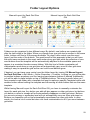
1
Manual
Proloquo2Go
A voice for those who cannot speak
VERSION 4.0
by
AssistiveWare®
AssistiveWare
Laurierstraat 193
1016 PL Amsterdam
The Netherlands
Europe
fax: +31-20-6128266
www.assistiveware.com
Support contact:
[email protected]
Proloquo2Go® © 2008-2015 AssistiveWare®. All rights reserved.
Proloquo2Go manual © 2008-2015 AssistiveWare®. All rights reserved.
AssistiveWare Contributors
Núria Aloy, Enrique Ballesteros, Joe Barnick, Julia Broere, Andrea Berentschot, Pam Harris, Joop Laan,
Marcel de Laat, Sándor Legoza, Rosa Lehmann, Martijn Leopold, Sylwia Malinowska, Jennifer Marden, David
Niemeijer, Marco Niemeijer, José Pérez, Aileen Ryan, Nathan Swett, Anne Verhulp, Carol Villars and Hilde de
Wit.
MacKiev Contributors
Sergey Galagodza, Elena Kovalenko, Andrew Kulynych, Alexey Malyarenko, Semen Martiushev, Sergey
Melnichenko, Dmitriy Naumov, Dmitriy Nizhebetskiy, Tatyana Nurkanova, Iurii Pleskach, Evgeny Reyentenko,
Sergey Ryabchuk, Oleksii Sedun, Sergii Sinenchenko, and Daria Smolianaya.
Acknowledgements
Acapela speech technologies licensed from Acapela Group. SymbolStix Symbols © 2003-2015 SymbolStix
LLC. “Ultralingua ULAPI” © Ultralingua, Inc. “VocaSpaces” vocabulary © 2008-2010 Samuel Sennott.
Proloquo2Go 1.0 was originally created by David Niemeijer and Samuel Sennott. The following persons
contributed to the vocabulary design: Katharine Buckley (activity templates & UK English localization), Russell
Smith (UK English localization) and Aileen Ryan (Australian English localization). Original Proloquo2Go
application icon designed by Giesbert Nijhuis.
Crescendo, VocaPriority, ExpressivePower and PolyPredix are trademarks of AssistiveWare B.V. Proloquo2Go
is a trademark of AssistiveWare B.V registered in the US and other countries. AssistiveWare is a trademark
and a trade name of AssistiveWare B.V. registered in the US and other countries.
Uses parts from: NSData+MD5: © 2008 Geoff Garside; UIApplication+ScreenMirroring: © 2010 Francois
Proulx.
Manual version: 10 April 2015
Table of Contents
Introduction
5
Introduction to Proloquo2Go
6
Startup Wizard
7
Choosing a Vocabulary Level
8
Grid View
9
Recents View
10
Typing View
11
Editing at multiple levels
12
Protecting your data
13
Working with the vocabulary
14
What are core words?
15
Customizing the vocabulary
16
Customizing for Basic Communication
17
Customizing for Intermediate and Advanced Core
18
Personalizing the vocabulary using VocaPriority™
20
Progressing through vocabulary levels
21
Progressing through Core Words
23
Introduction to Templates
25
Templates and Grid Sizes
26
Consistent Fringe Pages with Core Templates
27
Create Activity Specific Pages with Activity Templates
28
Folder Layout Options
29
Grammar Support
30
Grammar popups
31
Grammar Preview
32
Verb Conjugations
33
Customizing Grammar Popups
34
Edit Mode
35
Edit Mode Basics
36
Edit Mode Tools
37
Prioritizing the user's fringe vocabulary
38
Button Basics
39
Adding a button
40
Button Properties
41
Adding a folder
42
Folder Properties
43
Using expressions and sounds with ExpressivePower™
44
Editing a button or folder
45
Button and Folder Actions
46
Quick Options
47
Advanced Editing
48
Options
49
Options Basics
50
New User
51
Appearance
52
Vocabulary
53
Speech and Language
54
Manage Languages
55
Templates
56
Grammar
57
Prediction
58
Access Method - Direct Access
59
Access Method - Switch Access
60
Interaction
61
Restrictions
63
Privacy
64
Editing
65
Lock Options
66
Backup
67
News
68
Support and About
69
Scanning access
70
Switch Control versus Switch Access
71
Scanning Modes and Patterns
72
Setting Up Switches and Scan Rate
74
External Switches
75
Advanced Options
76
Appendices
78
Environmental Inventory
79
Bibliography
80
Introduction
Introduction to Proloquo2Go
Proloquo2Go® is a symbol-based Augmentative and Alternative Communication (AAC) app
designed for people who cannot speak or have difficulty making themselves understood. With
the Crescendo™ vocabulary that supports multiple grid sizes and three levels of language
skills, Proloquo2Go is a solution that can grow with the user. Proloquo2Go also provides a
typing view with word prediction for users with literacy skills. Alternative access methods such
as scanning and Select on Release make Proloquo2Go an AAC solution for a broad range of
people who need access to AAC.
Learn more about how to use and configure Proloquo2Go in this manual.
Note that inside the app, you can access this guide by going to the Options (gear icon), and
then in the top right corner pressing the green Help button. In the Help view, you can
navigate from section to section using the arrow buttons, go to the table of contents and even
export the manual to iBooks.
!6
Startup Wizard
When you first launch Proloquo2Go, a wizard will guide you through the initial configuration
of entering the User Name, selecting your language, region and voice, and picking your
vocabulary level and grid size. You can use the Next and Back buttons to navigate through
the wizard.
Note that the voice you select will be downloaded as soon as you finish the wizard. If your
device is not connected to the internet a lower quality substitution voice will be used until the
app gets a chance to download the voice you chose.
Proloquo2Go’s Crescendo™ vocabulary contains three different research-based
preprogrammed vocabulary levels that allow the user to grow and develop language and
communication skills: Basic Communication, Intermediate Core and Advanced Core.
You can preview the home page for different combinations of vocabulary level and grid size
by using the Back and Next buttons. Note that with Crescendo it is easy to transition
between different vocabulary levels and grid sizes after you have created the user.
Later you can go to the Proloquo2Go Options to create additional users and download more
free voices.
!7
Choosing a Vocabulary Level
Basic Communication Home
Intermediate Core Home
The Crescendo™ vocabulary has three vocabulary levels to support users at different stages
of communication and language development. You can switch vocabulary levels at any time
and still access the customizations you made at the previous vocabulary level.
Basic Communication is designed for users who are just beginning to use AAC to express
their basic needs, and have difficulty navigating between pages. This vocabulary level
provides very limited support for language development.
Intermediate Core is designed to support full language development. It has a home page
designed around the words that are used most frequently in conversation and writing. These
“core words” tend to be pronouns, verbs, and prepositions. Research has shown that a
small number of core words such as “I”, “you”, “want”, “it” make up the majority of what we
say or write. Users can quickly speak many sentences using only the home page. When
more specific but less frequently used words are needed (such as nouns and adjectives),
they can be found using the fringe folders also located on the home page. These folders are
organized by categories, such as food, things, people, and places. Intermediate Core’s fringe
folders have more frequently used fringe words on the top level, and subfolders for more
choices. For example, the top level of the food folder can be customized to contain a user’s
favorite foods, and he can go to a dessert or snack subfolder to get more choices in these
categories.
Advanced Core uses the same core word home page and fringe folder organization as
Intermediate Core. The difference between Intermediate and Advanced Core is that
Advanced Core relies more on subfolders to organize fringe words.
All three vocabulary levels provide access to Activity Templates. These templates are
based on the Home Page of each vocabulary level, and allow easy creation of activity
specific pages with a mix of core words and topic-specific vocabulary.
!8
Grid View
Message
Window
Delete
Secondary
action
indicator
Buttons
Share
Folders
Popup
Views
Keyboard
Edit
Options
To Secondary
Priority Level
News
indicator
Proloquo2Go has several different views. The Grid View is the one most frequently used for
communication.
Tap on the buttons to create a sentence. These words appear in the Message Window. Tap
the Message Window to speak the message.
Tap the Delete button once to delete the last entry in the Message Window, or twice to clear
the Message Window completely. Alternatively, the Message Window can be set to clear
automatically after speaking the message (Options > Interaction).
Folders can be recognized by the folder shape and will take you to another page of buttons.
Hold down on buttons with secondary actions to have access to more options in a pop-up,
such as verb conjugations, etc. Alternatively, the secondary action can be triggered through
double-tapping or automatically on single tap (Options > Interaction).
Tap the More button to go to secondary level with additional buttons that belong to the
current folder but are not used as frequently. Use the Share button to share the contents of
the Message Window via email, Facebook, SMS, Twitter, copy to the global clipboard, or
create a new button from the Message Window contents. Note that services such as
Facebook and Twitter first need to be configured in the Settings app.
Tap on the Views button to access Typing and Recents. Note that on iPhone the Options are
also reached through the Views button.
The keyboard button takes you to the alphabet page. You can also configure this button to
go to the Typing view instead (Options > Interaction).
!9
Recents View
Views
Recents
Add as
button
Back to
Views
The Recents View shows all the recent messages you have spoken by tapping the Message
Window. You can use the Recents view to repeat messages you constructed previously, or
tap the green + button to create a button from the message and save it in the current folder.
Recents stores only messages that have been spoken by tapping the Message Window.
Messages that were cleared before they were spoken are not stored in Recents. Recents can
be cleared by going to Options > Privacy.
!10
Typing View
Back to
Views
Clear text pad
Read text pad
Symbolicate and
add to message
window
Text pad
Predictions
The text pad is for typing. The font, size and color of the text can be customized (Options >
Appearance > Typing View).
Word prediction can significantly reduce the number of keystrokes needed to write a
message, and can help support beginning spellers. Touch and hold any prediction to hear it
spoken aloud. Go to Options to configure the word prediction (Options > Prediction).
Use Insert to insert the written text in the Message Window and add symbols to it to support
comprehension.
Speak reads the text pad. Alternatively, text can be read automatically after typing words,
sentences, or paragraphs (Options > Speech and Language > Speak As You Type).
!11
Editing at multiple levels
Options
Edit Mode
Proloquo2Go provides a wide range of options that allow users to control the appearance of
folders and buttons in detail. To make it really easy to customize the appearance for
individual needs, many appearance properties can be set at multiple levels depending on the
effect that you want to achieve. Properties can be customized at user level, at folder level and
at button level.
Any properties that are set in the Options (user level) apply to all folders and buttons of the
vocabulary, apart from those for which a property is overridden at folder or button level.
In Edit Mode you can customize properties at folder level and at button level. Any properties
that are customized in Edit Mode only apply to the selected button(s) or folder(s).
Customizations in both the Options and Edit Mode are user-specific, so will not affect the
vocabularies of other users within the same app.
!12
Protecting your data
To make sure you do not lose any of your customizations, it is of utmost importance to make
backups regularly.
Proloquo2Go makes internal backups automatically, however, these are stored within the
app. When accidentally removing the app from your device these backups are also lost.
It is possible to prevent the deletion of apps. To activate this feature, on your device go to the
Settings app and then go to General > Restrictions > Enable Restrictions. Now create a four
digit passcode and enter it again when prompted. Then toggle Deleting Apps to OFF.
We strongly recommend that you turn off the ability to delete apps to protect your
Proloquo2Go customizations. However, customizations will still be lost if your device breaks
down or is lost.
To prevent this from happening, make sure you make backups regularly and save them
somewhere safe on your computer or in Dropbox.
For detailed instructions go to www.assistiveware.com/support
!13
Working with the vocabulary
What are core words?
Core words are words that are used most frequently in conversation and writing.
Research has shown that a small number of core words such as “I”, “you”, “want”, “it”
make up the majority of what we say or write. Proloquo2Go’s Intermediate Core and
Advanced Core vocabulary levels provide home pages with quick access to these core
words, so users can quickly produce complete sentences.
Core words alone are not sufficient for specific and detailed communication. For that,
less frequently used words such as “cat”, “octopus”, “sleepy”, and “gold” are needed.
These are called fringe words. Some fringe words are used frequently - for example,
friend and family names, favorite foods and places, and frequently used social phrases
such as “How are you?” Such words can be thought of as “personal core”. Other fringe
words are used much less frequently, but are very useful for talking about new topics,
participating in school, or expanding expressive vocabulary. For example, “octopus”,
“Bermuda”, and “depressed” are not words many people use every day, but it is
important to have access to them when needed.
Proloquo2Go’s Core Word vocabulary levels use the concepts of core and fringe
words. Core words are shown on the "home page", arranged by grammatical category.
The borders of the buttons are color coded, helping to draw the user’s eye to the
appropriate area of the page to find words as they are needed. At the bottom “fringe”
of the home page, folder-shaped buttons provide access to fringe vocabulary,
organized by category (e.g. people, feelings, places, food, etc.).
!15
Customizing the vocabulary
Choosing a grid size
The smaller the grid size, the larger the buttons are for physical access and for visual
processing. However, having more buttons per page reduces the need to navigate to find
additional words. When deciding which grid size to choose, you need to consider what size of
button the user can select accurately most of the time. To allow access to smaller buttons,
you might consider:
•
Increasing the space between buttons (see Options > Appearance: View > Advanced
Options > Button Spacing)
•
Adjusting the amount of time the user needs to be touching a button before it is selected
(see Options > Access Method > Hold Duration)
•
Using Select on Release (see Options > Access Method > Select on Release). This will
allow the user to move a finger over the screen towards the desired button while multiple
fingers on the screen are ignored.
Note that you can always later change the Grid Size (see Options > Appearance > Default
Grid Size) without losing user modifications (modified and added buttons), but that some relearning will be required as not all buttons will be in the exact same place.
!16
Customizing for Basic Communication
Find the following folders and add vocabulary that matches the user’s needs and interests:
•
People, Places, Activities, etc.: Add buttons for the things the user will want to
communicate about into the appropriate folders.
•
I need help: This folder should contain messages the user can use to quickly get
assistance.
•
About Me: In this folder you will find some buttons that contain sentences to which you will
need to add the appropriate information (name, age, address, etc.)
•
Chat: Buttons are included in Chat to hold news from home and news from school. Edit
these buttons frequently, preferably every day, so that the user always has new
information to share.
•
Home: This folder is provided as a place to put any buttons or folders that would help with
home-specific communication.
•
News: This folder contains buttons for home and school news. Edit the news buttons
frequently, preferably every day, so that the user always has new information to share. In
grid sizes 5x4 and smaller, these news buttons can be found in the Chat folder.
!17
Customizing for Intermediate and Advanced Core
For core word users, there are additional considerations when selecting a grid size. The user
will benefit from keeping the location of buttons constant as he or she learns new vocabulary.
Some users may only be ready for a smaller number of words when they start using a core
word vocabulary, but as they learn to use the vocabulary, they will quickly be able to handle
more words on the page. At the same time, they benefit from having the vocabulary they
already know stay in the same locations.
For example, the user may be able to physically access the buttons on an 8x8 grid size, but
not be ready to use 64 buttons on a single screen due to limited language or visual
processing skills. You can start with an 8x8 grid size, and hide more advanced buttons to
show only the 16 buttons that are available in a 4x4 grid size. As the user gains language and
visual skills, you can gradually unhide buttons to give the user access to more language.
Alternatively you can gradually increase the grid size without losing customizations, but this
will lead to some re-learning as buttons will move slightly between grid sizes.
Once you have selected the grid size to use, you can begin to customize the content of the
vocabulary. If you can’t find a folder in the list below on the home page, tap the More button
on the home page to see the folders on the Secondary level.
Each folder has three levels: Primary, Secondary and Storage. You can learn more about this
VocaPriority™ system elsewhere in the manual, but the main idea is to put the most
frequently used words at the Primary level of the page, less frequently used words on the
Secondary level and unused words in Storage, where they are hidden except when editing
the page.
•
About Me: This is found inside the Chat folder, and should be customized with the user’s
personal information (name, address, phone number, age, etc.)
!18
•
Family, Friends, Teachers, and Heath care providers: These folders are found in the
People folder, and should be personalized as necessary with the names (and if available,
photos) of the actual people.
•
Help: This folder should contain messages the user can use to quickly get assistance.
•
Food: For each subfolder in Food, move foods the user is most likely to talk about to the
Primary level and move other foods to Secondary or Storage.
•
Clothing: Make sure any item of clothing that would never be of interest to a user, is not
needed in the user’s climate, or is culturally inappropriate, is moved to Storage. Move
buttons for clothing that is more appropriate from Secondary or Storage to Primary as
needed.
•
Fun: In each subcategory, make sure that buttons the user is most interested in are on the
Primary level, and those of little interest are moved to Secondary or Storage. In Sports
and TV Shows, consider finding photos on line of favorite famous people who belong in
these categories. In Sports, there are folders specific to particular sports. Some of the most popular sports
are on the Primary level, while folders for other sports can be found on the Secondary or
Storage levels. Move these folders as needed to make sure that sports and teams that
your user wants to talk about are readily available.
•
Personal care, Adaptive Equipment: Move buttons as needed to customize the Primary
level of this folder to reflect the user’s needs.
•
School: This folder can be found on the Secondary level of the main page. It contains
folders that may be useful as part of a school curriculum. It is recommended that this
folder be customized in consultation with the user’s teacher.
!19
Personalizing the vocabulary using VocaPriority™
Primary level
Secondary level
Storage (in Edit Mode)
Intermediate and Advanced Core vocabulary levels provide quick access to core words that
research shows make up about 80 - 90% of the words most people use. These words are
located on the Home page. However, the choice of words to show in the fringe folders (such
as people, food, places) will vary from one person to another. Using VocaPriority you can
easily customize the user’s vocabulary without having to create or delete buttons.
VocaPriority divides words into three levels:
• Primary level contains words that are used often
• Secondary level contains words that are used sometimes
• Storage contains words that are unlikely to be used
Words in primary level are always visible, words in the secondary level are accessible to the
user by pressing a More button, while words in storage are hidden from the AAC user but are
accessible in Edit Mode.
We have pre-populated the priority levels for the majority of fringe folders. The Intermediate
Core and Advanced Core provide a vocabulary of 12,000 unique buttons of which 3,000 are
located on primary level, 1,750 on secondary level and 7,250 are located in storage. To
customize the fringe folders simply go into Edit Mode and promote and demote buttons from
one level to another, using the Move to Primary, Move to Secondary or Move to Storage
buttons (see Edit Mode later in this manual).
!20
Progressing through vocabulary levels
Basic Communication
Food folder
Intermediate Core
Food folder
Advanced Core
Food folder
While some users may need to start in the Basic Communication vocabulary level, this level
does not lend itself to language development beyond simple requests. In order to move
beyond requesting, most users will need the features that Intermediate or Advanced Core
offer. If you started out with Basic Communication, you have probably added and moved
buttons to customize certain folders to better meet the user’s communication needs. You will
be able to use these customizations when you move the user up to Intermediate or Advanced
Core. In the table below you can find the folders and any buttons you may have added.
For those buttons that are in the same location, there is nothing you need to do when moving
from the Basic Communication level to the Intermediate or Advanced Core levels. The
buttons located in Storage you can access by going into Edit Mode and moving the buttons
from storage to primary or secondary using the VocaPriority™ system. You may find you
don’t need the buttons you created if equivalent buttons are already in the Intermediate or
Advanced Core folder or a subfolder.
!21
Basic Communication
Folder Name
Intermediate or Advanced Core Folder Path
Where to find buttons added in
Basic Communication
About Me
Chat > About Me
Same location
My TV and DVDs
Fun > Shows
Same location
My News
Chat > News
Same location
Help
Help
Same location
I need help > My Body
Help > My Body
Same location
Chat
Chat
Same location
My Rules
School > My Rules
Same location
Home
Home (secondary)
Same location
People
People
Storage
Feelings
Describing > Feelings
Storage
Food
Things > Food
Storage
Drinks
Things > Food > Drinks
Storage
Toys
Fun > Toys, Things > Toys
Storage
Computers
Things > Computers, Fun > Computers
Storage
Games
Fun > Play Games > Games
Storage
Questions
Questions
Storage
Activities
Fun > Leisure Activities
Storage
Calendar
School > Calendar, Time > Calendar
Storage
Describe
Describing
Storage
Places
Places
Storage
School
School
Storage
Clues
Clues
Storage
!22
Progressing through Core Words
Intermediate Core
3x3
Intermediate Core
4x5
Intermediate Core
5x5
It is important to support progression and growth in a user’s language skills. As a user builds
new receptive and expressive language skills, he or she will need access to more vocabulary.
Intermediate Core and Advanced Core have been designed to grow with the user, offering
more vocabulary as the user is able to take advantage of it. This can be done in one of two
ways - by increasing the number of buttons per page, or by starting out with a larger grid size
than needed and hiding more advanced buttons until they are needed.
1. Progressing by hiding and revealing buttons
Most users benefit significantly from having previously learned buttons stay in the same place
while new buttons are added around them. This minimizes the new learning needed as the
user progresses in vocabulary size.
1. Determine the smallest size button your user can access by setting the grid size on a
page progressively higher on a page and having the user attempt to visually find and
accurately target buttons throughout the page. Call this grid size the target grid size. To
change the grid size, go to Options > Appearance: View > Default Grid Size.
2. Determine the grid size that most closely matches the user’s current language skills. This
can be difficult to do in practice. Remember that you not only need to have words the
user already knows, but words he does not yet know but that you are modeling so he can
learn them. Call this grid size the starting grid size.
3. Set the grid size to the starting grid size and go to the home page. Take a screen shot of
the home page so you will know what words and folders are present on the home page
for this grid size. You may want to print out this screenshot or send it to your computer so
!23
you can see the screenshot while you’re making changes to the home page at the target
grid size.
4. Set the grid size to the target grid size.
5. Go into Edit Mode. Select all regular buttons that do NOT appear on screenshot you
have of the home page at the starting grid size. In the left edit panel, scroll down to the
Visibility row. Tap that row and select Hidden. All these buttons will now appear dimmed
(in Edit Mode), and will be invisible when you leave Edit Mode.
6. Now find the folder buttons that do NOT appear on the screenshot of the home page at
the “starting grid size.” You have three choices in how to handle these. If you think the
user can benefit from having these folders visible at the primary level of the home page,
you can leave them visible. If you think the user would have greater benefit from fewer
buttons on the screen at one time, you can move these buttons to the secondary level. If
you think it is best for the user to not have access to this folder at this point, you can hide
the folder button. You don’t have to do the same thing with all the folders; you can make
this decision on a folder-by-folder basis.
7. Leave Edit Mode. You’ll now see a main page with gaps where buttons have been hidden
or folders moved to Secondary. You can gradually reveal buttons and move folders to
Primary to support the user’s growing language skills. To reveal a button, select it in Edit
Mode and change its visibility to Normal.
2. Progressing by increasing grid size
Proloquo2Go makes it easy to increase the words available to a user by simply increasing
the grid size. Proloquo2Go’s built-in Crescendo™ vocabulary is designed so that increasing
the grid size results in a layout optimized for that grid size which includes new (core) words at
the next level of frequency of use and language development. When the grid size is
increased, all fringe vocabulary, including words added for the user, remains available and
reflows as needed to accommodate the new grid size. Any extra space on the new grid size
is used to provide more core vocabulary to be used to more easily create sentences without
needing to leave the fringe page. This process happens automatically, through the use of
templates on the fringe pages.
To change the grid size, go to Options > Appearance: View > Default Grid Size.
All the buttons from the previous grid size are present on the new one, and every effort has
been made to keep the buttons in the same general area in which they were on the smaller
grid size. However, the buttons will not be in exactly the same place, and they will also be
smaller. Give the user time to adjust to this change. You may want to take a screen shot of
the home page at the previous grid size and print it out, then use it to conduct a tour or
treasure hunt, where you and the user find where all the buttons have moved to on the new
page. If slightly displaced buttons are a significant issue for the user, consider using the
hiding and revealing buttons method described above instead.
!24
Introduction to Templates
Proloquo2Go 4 introduces the concept of templates. Templates provide access to core words
in consistent locations throughout the vocabulary. Using these templates insures that every
folder has core words combine with fringe words in each folder to make simple sentences.
This supports learning through motor planning - it is easier for the user to find commonly
used buttons because they are always in the same place.
The templates included in the Crescendo™ vocabulary were designed to match the home
page at each grid size as closely as possible. That means that any word that appears at a
particular grid size on both the home page and a template will be in the same place. For
example, in the screenshots above for Advanced Core vocabulary level at the 5x5 grid size,
the words I, not, more, you, want, like, and “all done” appear in the same locations for the
home page and the Food template (seen here on the Fruits folder). Note that the words eat
and drink do not appear on the home page, but do appear on the Food template (in place of
the words is and what, which don’t appear on the Food template at the 5x5 grid size).
Except the home folder and a few folders such “Colors", all folders in the Crescendo
vocabulary use a template. The specific template used varies depending on the category of
words a folder contains. Each template is designed to show words that are commonly used to
talk about a particular category of things. For example, you need different words to talk about
people versus food. What you see in Use Mode when you look at a folder is a combination of
buttons belonging to the template and buttons belonging to the folder itself. In Edit Mode you
can clearly see this distinction because the template buttons are slightly dimmed and have a
T badge while the regular buttons are not dimmed. You can only edit the buttons belonging to
the folder, not the buttons belonging to the template.
If necessary templates can be edited. To prevent accidental edits the template editor is not
accessible from Edit mode but from the Vocabulary section of the Options. Note that the
templates are “live”. That means that if you make a change to a template, all folders that use
that template will automatically reflect that change.
!25
Templates and Grid Sizes
Fruit folder 16 buttons
Fruit folder 25 buttons
Fruit folder 36 buttons
For most folders the content buttons are shared across all grid sizes making it really easy to
transition the user from one grid size to another without losing customizations. What does
change when you change the grid size is the number of buttons on the template. As you
increase the grid size the amount of language available to talk about the words specific to the
folder increases. This happens because each template has been optimized for all supported
grid sizes.
!26
Consistent Fringe Pages with Core Templates
A new folder in Edit Mode
Template
button
Add a button
or folder
A Template is a folder that contains buttons laid out in a consistent way, so that the same
buttons can be found in the same place in all folders using that template. This supports
motor-planning making it is easier for the user to find commonly used buttons because they
are always in the same place.
We have created several templates for fringe folders which will save you a lot of time. If
you’re creating a fringe page, like a page for foods or friends, pick a template from the
Nouns, Situational, or Grammar categories. These templates are all based on the Home
page, so words that are useful for your fringe category will be included in the template in the
same place they are found on the home page (and on any other fringe page that uses one of
our templates). Alternatively, use No Template to create your own layout manually.
A Template contains Template buttons. In edit mode, these buttons are dimmed and have a
green T in the upper right corner. Template buttons can only be moved or changed by
editing the template itself. Buttons that you add to your folder will flow around the Template
buttons.
!27
Create Activity Specific Pages with Activity Templates
Template
button
Placeholder
button
Placeholder
folder button
Add a
button or
folder
Template
folder button
A frequently used page type for an AAC system is the “activity specific” page. This kind of
page contains the vocabulary needed to participate in a specific activity, such as drawing,
eating a snack, or playing with a doll. To help the AAC user quickly locate vocabulary on
these displays, it is very useful for the layout to be consistent across different activity specific
pages. One way to make this easy to do is with templates. Proloquo2Go offers a number of
Activity Templates that you can use to create consistently laid out activity specific pages.
The Activity Templates contain two kinds of buttons. Template buttons are used for
vocabulary that is useful in multiple activities - things like “I”, “want”, “more”, and “all done.”
Because they are part of the template, these buttons are always in the same place for all
activities that use the same template. They are typically also positioned such that their
location matches the home page. A template button can be a regular button or a Template
folder button that links to another folder. Template buttons can only be moved or changed
by editing the template itself.
Placeholder buttons are used for vocabulary or folders that are specific to a particular
activity. For example, in a folder that is used for playing with blocks, the words “block”, “big”,
and “build” are very useful. Placeholder buttons are put in the template to act as hints for
which kinds of vocabulary to put in particular locations. So a placeholder button might have a
label “verb 1”, “adjective 1”, or “noun 1”. This is to indicate to the person creating an activity
that it is recommended to create a verb or adjective specific to the activity here. A placeholder
button can be a regular button or a Placeholder folder button. You can use a Placeholder
folder button to link to any existing folder or create a new folder just for this activity.
Tap any placeholder button to create a button for your activity page. You can edit the
properties of your placeholder buttons, but you can’t move them without editing the template
itself.
!28
Folder Layout Options
Manual Layout for Each Grid Size
OFF
Manual Layout for Each Grid Size
ON
Folders can be organized in two different ways. By default, new buttons are created right
after the last button in the folder. When you change from one grid size to another in the same
folder, buttons will flow to fill the space available. You don’t have control over the exact
layout, just the order of the buttons. The great benefit of this approach is that you will have
the exact same contents in the exact same order at any grid size while the selection of core
word buttons from the template will be automatically adjusted to the available space and
appear in a consistent location across folders. With this kind of folder organization all
customization work done on one grid size will automatically carry over to other grid sizes
making it easy to expand the grid as the user’s skills and abilities grow.
If desired, you can have more control over the folder layout by turning ON Manual Layout
for Each Grid Size in Edit Mode > Folder Properties > Contents. In doing so, you will be able
to position buttons anywhere you like, leaving gaps between buttons if desired. Additionally,
you will be able to place buttons on top of Template buttons. This may be useful when you
have created a new folder with a template but want to replace a specific Template button with
another button without editing the template and influencing all other folders that use the same
template.
Whilst having Manual Layout for Each Grid Size ON, you have to manually customize the
layout for each grid size. Any button you add will also appear on other grid sizes, but buttons
you delete or move to storage will not automatically disappear on other grid sizes. Buttons
you move to primary or secondary level will not automatically move on other grid sizes too.
Buttons you reposition will not be automatically repositioned on other grid sizes. In other
words, you have a lot of control but also a lot more customization to do if you move between
grid sizes.
!29
Grammar Support
Grammar popups
Proloquo2Go provides automatic grammar support for nouns, verbs, pronouns and
adjectives. If a button has a colored-in upper right corner, then Proloquo2Go can
automatically give you various grammatical forms of the word. To see a popup of the
inflections available, touch and hold the button until the popup appears. Then tap the
grammatical form you need.
If it is difficult for you to use touch and hold to bring up the popup, you can adjust hold time or
switch to a double tap in Options > Interaction > Buttons : Secondary Trigger. You can even
set popups to open automatically on a single tap in Options > Interaction > Automatic
Navigation : Auto-Open Popups.
!31
Grammar Preview
Preview Button
Buffer Button
Many users may not be able to read the labels on the inflection choices to decide which one
to choose, but they will know the right one when they hear it. To help with this process,
grammar popups have a preview mode.
To enable Preview, tap the Preview Button. When Preview is ON, the Preview button’s
border will be green. Tap it again to turn Preview OFF.
When Preview is on, tapping any inflection choice will say the inflection out loud and put that
choice in the Buffer Button. You can tap as many inflection choices as many times as you
wish until you find the one that sounds right. Then press the Buffer button to put the last
inflection you previewed into the Message Window.
!32
Verb Conjugations
Most languages have many verb conjugations. To give the user access to all the
conjugations, verb grammar popups have multiple pages. To know which conjugations to
show, Proloquo2Go must know what “person” you want to use (I, you, they, he, etc.) and
what time you want (past, present, or future). The first page shows your “person” choices,
and some commonly used conjugations that don’t depend on “person”. When you choose the
“person” you’ll be taken to the time page. This page shows you simple past, present, and
future, and links to pages with more complex forms of past, present, and future.
If you select a pronoun right before you bring up the grammar popup, Proloquo2Go will know
which person you want, and will take you directly to the Time page. You can also go back to
the person or time page to make a different choice.
You can select the “Not” button to get negative conjugations like “didn’t want” or “won’t be”.
The “Not” button toggles ON and OFF. When its border is green, it is ON. Tap it again to turn
it OFF.
!33
Customizing Grammar Popups
For many users, having all possible inflections of all word kinds available can be
overwhelming. To simplify the Grammar Popups, you may want to hide some choices and
gradually re-introduce them over time. To do this, go to Options > Grammar and select
language whose grammar popups you want to customize.
You can turn off all Grammar Support, turn ON or OFF Grammar Support for a particular
word kind, or go into the Advanced Options section for a word kind and turn ON or OFF
specific inflections. Inflections in Advanced Options are listed in the order that they are
acquired by typically developing language learners.
!34
Edit Mode
Edit Mode Basics
To go to Edit Mode tap the pencil icon in the bottom toolbar.
In Edit Mode you can select one or more buttons by tapping on them. A second tap on a
button will unselect the button. Once one or more buttons are selected you can change the
Button Properties or use any of the Edit Mode Tools on the selected button(s).
To navigate to another folder in Edit Mode double-tap the folder.
Press the Done button in the top right corner to exit Edit Mode.
!36
Edit Mode Tools
iPad
Select All
Import / Export
Sort
Deselect All
Swap
iPhone / iPod touch
Primary
Secondary Storage
Copy Paste Delete
Using the edit tools you can easily customize the vocabulary. Note that buttons and folders
(one level down) can be copied between users with Copy. To move button(s) and folder(s)
between devices, use Import/Export.
Use Move to Primary, Move to Secondary or Move to Storage to easily customize the
user’s vocabulary without having to create or delete buttons. We call this system
VocaPriority™.
If you want to order certain buttons alphabetically, select those buttons and tap the Sort
button.
There are three ways to move buttons to a different location on the screen: select two buttons
and use the Swap button to swap places, hold down on a button until it starts to wiggle and
move it on top of another button to swap places, or hold down on a button until it starts to
wiggle and move it in between two other buttons to place it there. This last method is not
available in folders that were set to “Manual Layout for Each Grid Size” in the Contents
section of the folder properties.
!37
Prioritizing the user's fringe vocabulary
Primary level
Move to Secondary
Secondary level
Move to Storage
Storage
Move to Primary
To prioritize the fringe folders to meet the user’s preferences, you can move buttons between
VocaPriority levels. Tap to select the buttons you want to move, then tap the Move to
Primary, Move to Secondary or Move to Storage edit tool to send the selected buttons to
another priority level. Put words that are used frequently in Primary, words that are used only
occasionally in Secondary, and words that are not used at all into Storage.
Of course, it is still possible to add, delete and edit buttons, but in most cases this is not
necessary - always check Storage first before adding a button, as you may find it is already
available and just needs to be moved to Primary or Secondary.
!38
Button Basics
Help overlay
Text to Speak
ExpressivePower
Button label
Button preview
Symbol
suggestions
List of actions
More symbol
suggestions
The Text to Speak field contains the text the button will speak when it is selected. This can
be a single word, a sentence or several paragraphs.
You can use sounds and expressions included in the newer voices, as well as macros.
ExpressivePower™ provides sounds, expressions or macros that you can use for the
buttons.
The button label is by default the same as the Text to Speak. You can type a different label in
the Label field. This is useful when the Text to Speak is too long to fit on the button.
Actions are what the button will do when you tap, double-tap, or tap-and-hold. If the Text to
Speak field is not empty, the default action will be to add the Text to Speak to the message.
Proloquo2Go will show symbol suggestions you may want to use for your button based on
the Text to Speak.
While editing, you can see the button preview. You can choose from 15,000 SymbolStix
symbols, use photos from your Photo Library or take a picture using your device’s camera.
!39
Adding a button
Add a button
Add a folder button
There are two kinds of buttons that you can add in Proloquo2Go: buttons and folder
buttons.
To add a button, go to Edit Mode (the pencil). When you’re in Edit Mode, you can add a
button by tapping on the new button icon. For grid sizes that are large enough, the new
button icon is actually two icons - one for adding a button and one for adding a folder button.
For grid sizes where the buttons are too small to show two icons, a single icon with a + is
shown. When you tap the + you will be asked if you want to add a button or a folder button.
In most folders, you can only put new buttons after the last button in the folder. However,
after you have added the button you can hold down on it until it starts to wiggle and move it to
a different position.
In a few folders, namely those that were set to “Manual Layout for Each Grid Size” in the
Contents section of the folder properties, you can create a button anywhere on the grid.
After adding a button, you can customize it by using the Button Properties.
!40
Button Properties
For each button you can configure the Basics, Appearance, Language and Behavior
properties. Most of these are self-explanatory, but here are a few tips:
The Display property allows you to show the text, the label or both on the button.
The Visibility property allows you to hide or dim buttons. To ensure the user’s progress, you
can select a grid size with more buttons and hide the buttons that the user is not yet ready
for. Later, when the user is ready, you can make the buttons visible again. By dimming
buttons you can reach the same goal, depending on the user’s preference: some users may
find it confusing to see buttons they cannot select, other users prefer to know that something
is there and will become available to them later on.
When creating a new button, Proloquo2Go automatically guesses the word kind. For some
words, such as “fly”, multiple word kinds are correct. Use the Word Kind property to
manually change the word kind in case Proloquo2Go picks the wrong one.
By using button actions, buttons can also open another folder in a popup. These folders
Auto-close by default.
With Snapback you will automatically return the Home page or the Previous page after
making a selection. Both Snapback and Auto-close when in Popup can be defined on button
and folder level in Edit Mode. This setting will then override the user level setting in the
Options.
!41
Adding a folder
Add a folder
button
To add a folder button, go to Edit Mode (the pencil). When you are in Edit Mode, you can add
a folder button by tapping on the new folder icon. Note that if the buttons are too small to fit
separate new button and new folder icons a popover will appear after tapping the new button
icon to let you choose whether to add a button or a folder.
When creating a New Folder you can use a Template for your new folder, or choose No
Template and manually create the layout. After selecting your preferred template, you can
add the folder name and image. Turn ON Open in Popup if you want the user to have a
small set of choices that “pop up” from the current folder and close again as soon as a choice
is made.
If you choose No Template there is one more choice available in the last step: Manual
Layout for Each Grid Size. If this is OFF the same buttons will be available irrespective of the
grid size set in Options, and buttons will reflow if needed to fit the grid size. If this is ON, you
will be able to position buttons anywhere you want on the grid, but will need to make manual
adjustments for each grid size and buttons removed in one grid size will not automatically be
removed in other grid sizes.
With Link to Existing Folder you can create a folder button that links to a folder that already
exists. You will be shown a list of all the folders in the currently vocabulary to choose from.
When you choose Duplicate Existing Folder you will make a copy of an existing folder and
create a folder button that links to the copy. Note that copies only go one level deep.
!42
Folder Properties
For each folder, you can configure its Name and Symbol, Folder Contents, Appearance,
Vocabulary, Language and Default Button Properties. Most of these are self-explanatory,
but here are a few tips:
The Grid Size allows you to change the number of buttons shown in this folder. With
Vocabulary Level you can change the vocabulary level used in this folder. By using different
grid sizes and vocabulary levels per folder, you can customize the vocabulary to the user’s
needs with precision and support gradual growth.
With Display Style you can change the folder’s view from Grid View to List View. Note that
popups, including grammar support, will always be displayed in a grid.
Usually when you tap a folder to open it, the current folder disappears and the new folder
completely covers the screen. Sometimes it is useful to have a small set of choices that “pop
up” from the current folder. The current folder fades into the background, but is still visible
behind the popup. All folders can be opened in a Popup. By default, folders Auto-Close
when in Popup after making a selection.
To open a folder in a popup, select the folder button whilst in Edit Mode. Then go to Basics >
Actions > Open Folder and scroll down to the navigation section. Here, tap on the (i) next to
the name of the folder on the right side.
With Snapback you will automatically return the Home page or the Previous page after
making a selection.
!43
Using expressions and sounds with ExpressivePower™
Expressions,
sounds and
macros
Expressing the way you feel is very important to each and every one of us, which means you
do not want to say everything with the same intonation. For people with communication
difficulties who rely on Augmentative and Alternative Communication (AAC) solutions and
Text to Speech voices, this was impossible in the past.
To address this need, we have developed ExpressivePower™, which combines the benefits
of Text to Speech voices with the ability to communicate in a more expressive way. Now AAC
users can share what they want to say with emotion.
Only the newer voices (all the children’s voices and some adult voices) offer these
expressions, as they need to be recorded by the voice talent.
In the children's Text to Speech voices that we co-developed with Acapela Group, we have
extended the range of expressive recordings to include things children often say, such as "My
turn", "It's not fair!", and “Stupid!", as well as variants of "dad", "daddy", "mom" and "mommy"
in calling, angry, questioning, whining, and wheedling tones.
In addition, the child voice talents recorded sounds children often emulate in play, such as a
barking dog or the siren of a fire truck. Having access to these expressions and sounds in the
proper intonation greatly increases the communicative power of a child using AAC to speak.
You can add ExpressivePower when creating a new button or editing an existing one. In the
button Properties, you will find a little speech bubble on the right side of the Text to Speech
field that gives you access to a list of the available sounds, expressions and macros.
!44
Editing a button or folder
Button Properties
Folder Properties
Select a button or folder button to edit it. The Button or Folder Properties you can edit will
be shown in the edit panel. Select the property you want to edit on the left side of the edit
panel and edit the selected property in the right panel. To edit multiple items at once, select
them all, but note that you can only edit some properties for multiple items at once.
!45
Button and Folder Actions
Buttons and folders can perform one or multiple Actions when they are tapped, such as
controlling the Message Window, speaking text without putting it in the Message Window,
navigate to the Home or Previous folder or open in a popup.
Buttons and folders can also be programmed to perform two different sets of actions. One
action set is triggered on a single tap, the other on a tap-and-hold or a double tap. This
gesture is called the Secondary Trigger. Note that the Secondary Trigger can be configured
in the Interaction section of the Options.
!46
Quick Options
Quick Options
Default Grid Size
Default Vocabulary
Level
Quick Options provides an easy way, while remaining in Edit Mode, to reach some
commonly used default settings usually accessed from the Options. Changing these settings
has the same effect as changing the same setting in the Options.
The Quick Options allow you to quickly “see” what a folder would look like with different
global settings for grid size, vocabulary level, and language. This does not change the actual
properties of the current folder. To set a folder so that it always uses a particular grid size, use
the Grid Size property in the Folder properties.
!47
Advanced Editing
Turning ON Advanced Editing in the Options > Editing will give access to additional folder
properties that are intended primarily for vocabulary designers. Vocabulary designers create
vocabularies that are intended for users with a range of skills, such that folders in the
vocabulary may need to have multiple versions for different grid sizes, vocabulary levels, and/
or languages.
In Edit Mode you will see an additional property in the Contents section of the Folder tab:
Share Content between Vocabulary Levels.
Manual Layout for
Each Grid Size
OFF
Manual Layout for
Each Grid Size
ON
Share Content between
Vocabulary Levels
ON
Share Content between
Vocabulary Levels
OFF
• Buttons flow to fill the space available as
the grid size is changed. You don’t have
control over the exact layout, just the order
of the buttons.
• Buttons flow to fill the space available as
the grid size is changes. You don’t have
control over the exact layout, just the order
of the buttons.
• The content is the same for every grid size
and vocabulary level.
• There are different versions of the folder
depending on the vocabulary level.
Example: most fringe folders.
Example: fringe folders that are appropriate
for all vocabulary levels, but which need
different contents depending on the
vocabulary level. For example, the Food
folder is set up this way, as it has different
content for Basic Communication,
Intermediate Core and Advanced Core.
• Buttons can appear anywhere on the grid
and can have gaps between them.
• Buttons can appear anywhere on the grid
and can have gaps between them.
• Different content can be displayed for each • Different content can be displayed for each
grid sizes. You have complete control over
grid size. You have complete control over
layout at all grid sizes.
layout at all grid sizes and all vocabulary
levels.
• The folder displays the same buttons for all
vocabulary levels.
• Different content can be displayed for each
vocabulary level. You have complete
control over layout for each level.
Example: fringe folders like Little Words that
need a fixed layout and different words for
each grid size, but are usually only needed
Example: Home folder and many templates.
for higher vocabulary levels.
!48
Options
Options Basics
Options
Views
Options
To go to the Options on iPad, tap the Options button (the gears) on the bottom toolbar.
Simply tap anywhere outside of the Options window to exit the Options.
To go to the Options on iPhone or iPod touch, go to the Views button and then tap on the
Options button (the little gears). To exit the Options, tap on the arrow on the top-left until you
see Done, and tap it.
The first set of options is specific to the current user while the second set are General
Options and apply to the whole app (and therefore all users).
Note that on most pages in the Options, there is a green Help button that you can tap to
learn more about that specific option.
!50
New User
In the User section of the Options, you can create multiple users.
Each user can have their own settings, vocabulary, voices, appearance options, etc. This can
be useful in classroom settings where a device is shared by multiple students. It can also be
practical for a therapist assessing Proloquo2Go with clients with very different needs or
simply to explore Proloquo2Go and play with different configurations.
Tap Add User to configure a user from scratch using the Add User wizard, or tap Duplicate
Existing User to base the new user on an existing one.
To switch between users, simply tap the name of the user you want to change to.
To remove users, tap the Edit button and delete the users you no longer need.
!51
Appearance
In the Appearance section of the Options, you can configure the overall appearance of the
Proloquo2Go app and vocabulary. The Appearance Options are divided into sections for the
Message Window, the Toolbars, the Views (the vocabulary Grid), the Buttons, and the
Typing View. Go to the Advanced Options of each section for more detailed fine-tuning. Note
that all these options only apply to the current user.
!52
Vocabulary
In the Vocabulary section of the Options, you can select the user’s Vocabulary Level.
Basic Communication is designed for users who are just beginning to use AAC to express
their basic needs, and have difficulty navigating between pages. This vocabulary level
provides very limited support for language development.
Intermediate Core is designed to support full language development. It has a home page
designed around the words that are used most frequently in conversation and writing. When
more specific but less frequently used words are needed, they can be found using the fringe
folders also located on the home page. These folders are organized by categories, such as
food, things, people, and places. Intermediate Core’s fringe folders have more frequently
used fringe words on the top level, and subfolders for more choices.
Advanced Core uses the same core word home page and fringe folder organization as
Intermediate Core. The difference between Intermediate and Advanced Core is that
Advanced Core requires more navigation to subfolders to find fringe words.
Change the Home Folder if you want to “lock” a user into a particular branch of the
vocabulary.
Edit Templates allows the user to edit existing templates or create new templates. This
feature is for more advanced users who want to modify the built-in templates or create new
ones for different types of pages. Changes made to a template affect all folders that use that
template. If this is not what is intended it is best to duplicate a template and edit the duplicate.
Delete Folders allows you to delete any user created folders that you no longer need.
!53
Speech and Language
In the Speech and Language section of the Options, you can choose the voice(s) and voice
settings to use for each of your Active Languages.
Go to Speak Buttons in the Speech Feedback section to define which buttons are spoken
out loud. If you only want Proloquo2Go to speak when you are done building a sentence and
tap the Message window, pick None. If you prefer to have Proloquo2Go speak only buttons
that are part of the sentence construction, pick the Message Buttons option. If you pick All
Buttons, even buttons that are purely for navigation and not part of the actual sentence you
want to build will speak when tapped.
Tap the language to configure the voice(s). The Primary Voice is the communication voice.
Tap on Speech Rate or Voice Personalization to customize the voice to your preference.
The Secondary Voice is the voice that is used for the preview function in grammar popups
and as auditory cue for Select on Release and Scanning. It enables the user to have a
different voice for the auditory cues and the spoken output used to communicate with others.
Use Relative Volume to adjust the volume of the secondary voice in comparison to the
primary voice.
In the Pronunciation section you can adjust the pronunciation of words for each language
and region. You can also import pronunciations from other users.
!54
Manage Languages
Proloquo2Go supports different language regions (for example, US English, UK English, and
Australian English are considered different language regions). Only one language region can
be active at any one time. The main difference between the language regions is that fringe
vocabulary, such as foods, and spelling is different for each region.
To activate a language region, first select a Primary Voice. Note that the voice may need to
be downloaded first. After selecting a voice, toggle Active to ON.
!55
Templates
Templates are pre-made layouts that will help you quickly create pages that are consistently
arranged and have the words communicators will need to create sentences or participate in
specific activities. Because the templates are “live” any change made to a template will
automatically apply to any folder using that template.
User Templates are templates created by the user. To create your own template, tap the +
button in the navigation bar. Note that only templates you created for this user will appear in
this list. To use templates created in other users, you will need to switch to the other user,
export or copy a folder that uses the template you want, and import or paste the folder into
this user.
Built-in templates are organized based on the different kinds of activities or fringe categories
they are designed for. These templates have appropriate core words in the same location as
they appear on the home page. You can edit these templates if you have made a change to
the home page and want the fringe folders to reflect that change.
!56
Grammar
Proloquo2Go will automatically provide plurals, verb conjugations, and inflections for many
parts of speech. In the Grammar section of the Options, you can control these features.
Toggle Grammar Support to OFF if you feel the user is not yet ready for these features.
Note that you can also hide inflections for particular word kinds, and turn off individual
inflections as needed to introduce the user to the grammar features more gradually. You do
this in the Advanced Options for each word kind.
Elsewhere in the manual more information is provided on Proloquo2Go’s grammar support.
!57
Prediction
In the Prediction options, you can control the behavior of the Word Prediction provided in
the Typing View.
Turn off Auto-Spacing if you do not want automatic spacing after selecting a suggestion or
typing punctuation.
Set Learning to Correctly Spelled Words if you want Proloquo2Go to only learn words that
are in the built-in Apple dictionary, or turn Learning completely OFF. Word prediction will of
course work better if you allow Proloquo2Go to learn All Words because this allows
Proloquo2Go to learn new words and word combinations, and to improve its suggestions.
!58
Access Method - Direct Access
In the Access Method section of the Options, you can configure Proloquo2Go for users with
physical challenges. Set up Direct Access for users who can tap buttons on the screen but
have problems with accuracy.
If the user tends to touch the screen by accident, use Hold Duration to ignore touches that
last less than a certain time.
If the user wants to slide across the screen to find the right button or tends to touch the
screen with multiple fingers at the same time, turn ON Select on Release. With the Mode
setting, you can specify if Proloquo2Go should pay attention to the first finger that touches
the screen, or the first finger that lifts off the screen.
Tap Visual Cue to change color and width of the border that appears around the buttons on
the screen as they are tracked.
For speech feedback while sliding the finger over the screen, select Auditory Cue. Note that
this feature is only available for First Finger Down.
!59
Access Method - Switch Access
Use Switch Access for users who cannot select individual buttons with a finger and need to
use external switches or the screen as a switch.
Proloquo2Go offers five different Scanning modes and advanced settings to fine-tune
scanning behavior to match individual needs.
Tap Mode to select a scanning mode, which will determine how many switches you will use,
and how these switches control the scan.
Go to Pattern to select the order in which items and groups are scanned. Row/Column first
highlights large areas of the screen, and then highlights groups of items within the selected
area. When a row is selected, buttons in that row will be highlighted one by one. Linear
scans items one by one rather than in groups. The Linear (Grid only) is a combination of the
other two patterns: it scans by group, however, when a group is selected it will scan each
button one by one rather than per row first.
In the Switch section, you can define if you want to use the Screen as a switch or use
External switches. Depending on the Mode you have selected, you may need to define a
Stepper and a Picker switch.
In the Advanced section you can further fine tune scanning behavior, including visual cues,
auditory cues, looping, debouncing and hold duration.
Elsewhere in the manual more information is provided on setting up Switch Access.
!60
Interaction
In the Interaction section of the Options, you can find settings to support users with physical
or behavioral challenges. By default, the Message Window clears automatically when you
press a button in the grid after tapping on the message window to speak the current
message. For individuals who tend to repetitively tap the Proloquo2Go screen, have a look at
Repeated Tap. By default, Proloquo2Go will stop speaking the message if the Message
Window is tapped again. However, repetitive taps can also be ignored if necessary. The
Repeat Delay feature can be used to ignore taps during a selectable repeat delay.
In the Toolbars section, you can define whether the Keyboard Button takes you to the Grid
Keyboard or Typing View.
If a user has difficulty scrolling, toggle Show Paging Buttons in the View section to ON. A
Page Up and Page Down button will automatically be added to all the pages.
!61
Proloquo2Go offers ways to simplify navigating between folders in the Automatic
Navigation section. Snapback can return the user to the Home folder or the previous folder
when a button is selected. Auto-Close Popups will automatically close all popups when a
button is selected. Auto-Open Popups will allow users who have difficulty with tap and hold
or double tap actions to automatically open grammar popups with a single tap.
For individuals who tend to repetitively tap the Proloquo2Go screen, consider turning OFF
Allow Repeat for the Buttons. If you turn this feature OFF, Proloquo2Go will not respond to
repetitive taps on the same button until the user has selected another button. Alternatively,
use the Repeat Delay feature to ignore taps during a selectable repeat delay.
Proloquo2Go buttons will respond to two different kinds of actions - a single tap and a
Secondary Trigger. This Secondary Trigger can be configured as holding the button for
more than a certain length of time, or by double tapping the button. Buttons can be
programmed to perform different actions depending on whether they receive a tap or the
Secondary Trigger.
!62
Restrictions
In the Restrictions section of the Options, you can restrict access to certain features of
Proloquo2Go.
Note that if you want to make sure the user cannot access the Options and change the
restrictions, you can password-protect the Options (use the Lock Options feature).
Alternatively you can go to the Proloquo2Go section of your device’s Settings app and turn
“Show options button” OFF, in which case the app will no longer provide access to the
Options.
!63
Privacy
In the Privacy section of the Options, you can Clear Recents to delete any previously stored
information in Recents. This can be used if a user does not want anyone to see what he or
she has been talking about.
!64
Editing
In the Editing section of the Options, you can turn ON Advanced Editing. When advanced
editing is ON, you can specify how a folder is displayed in different vocabulary levels and
languages.
!65
Lock Options
In the Lock Options section of the Options, you can password-protect the Options to prevent
accidental modifications by a user. When Lock is ON, the correct password must be entered
to have access to the Proloquo2Go Options. If you lose the password contact
[email protected] for help in recovering access to the Options.
!66
Backup
Tap Backup [user name] Now to backup the data of the current user, or tap Backup All
Users Now to backup all users of Proloquo2Go. This will produce backups that are stored on
your device. These backups will be lost if the Proloquo2Go app is deleted from the device. To
make sure you do not lose your customizations you should regularly export your backups to
iTunes or Dropbox.
Tap Export Backups to export a backup to iTunes or Dropbox.
To import a backup from iTunes, tap Import Backups. To import a backup from your
Dropbox, open the .p2gbk backup document in the Dropbox app.
To use WiFi to connect to your computer to export or import backups, tap Connect to
Computer and follow the instructions.
To restore an existing backup, use Restore from Backup.
For videos and tutorials with exact steps on how to create, transfer and restore backups,
please visit bit.ly/proloquo2go-resources
!67
News
In the News section of the Options, you can find short news messages that keep you
up-to-date on important product information. A red dot with a number will appear as a
badge on your Options button if there are new messages waiting for you. Make sure
you read these regularly, so you don’t miss out on any new features or other important
news. Once you have tapped all the news messages once to read them, the red dot
on the Options icon will disappear.
!68
Support and About
To learn more about Proloquo2Go, access the About and Support options. In About you can
see what version of the app you have installed. In Support you will find links that take you to
support and community resources on our website. We have lots of support materials
available, such as e-learning videos, step-by-step tutorials and detailed documents that help
you take Proloquo2Go to the next level.
Note that on most pages in the Options, there is a green Help button that you can tap to
learn more about that specific option.
!69
Scanning access
Switch Control versus Switch Access
iOS’ Switch Control
Proloquo2Go’s Switch Access
Proloquo2Go has its own built-in scanning options for switch users, but can also be used with
iOS’ Switch Control.
The benefits of using Switch Control are:
• switch users have access to all apps on the device
• switch users can access the Proloquo2Go Options, Edit Mode and Typing View
The benefits of using Proloquo2Go’s built-in scanning are:
• auto-scroll on folders that have multiple pages
• more scanning modes
• support for step-scanning with the two sides of the screen acting as separate switches
• more options to fine-tune scanning behavior for Proloquo2Go
!71
Scanning Modes and Patterns
Use scanning Mode to select the number of switches to use and the ways the switches will
be used. See the table on the next page for details about the available modes.
The scanning Pattern is how choices are grouped during scanning. Row/Column is the most
commonly used pattern. This pattern will first highlight large areas of the screen,and then
highlight groups of items within the selected area. For example, Proloquo2Go will first
highlight the Message Window, then the grid, etc. If the user activates the switch when the
grid is highlighted, rows in the grid will be highlighted one at the time. When the switch is
activated again, the buttons in the selected row will be highlighted one at a time until an
individual button is selected.
Linear highlights items one by one rather than in groups. This pattern will highlight each item
in the Message Window, then each button in the grid, etc. one by one. It is suitable for
beginning scanners.
Linear (Grid only) is a combination of the Row/Column and Linear patterns. The Message
Window, Grid and Toolbar are scanned as groups. If the grid is selected, each button is
scanned one by one, rather than scanning by row first.
!72
Scanning Mode
Number of
Switches
Screen as
Switch
External
Switch
Automatic Scanning
• Highlight advances automatically from item to item. Hit switch
when desired item is highlighted.
• Best for users who:
- can handle timing and attention demands of watching and
waiting for an item to be highlighted
- can hit switch reliably in a narrow time window
1
Yes
Yes
Automatic Selecting
• Highlight advanced automatically from item to item. If switch
is NOT hit while item is highlighted, the item is selected. If
switch IS activated while item is highlighted, highlight moves
to the next item.
• Best for users who:
- can handle timing and attention demands of watching and
waiting for an item to be highlighted
- can hit switch reliably in a narrow time window
- can hit switch many times in a row without difficulty
1
Yes
Yes
Inverse Scanning
• Highlight advanced automatically from item to item as long as
screen is touched. Lift off of screen to select highlighted item.
• Best for users who:
- can handle timing and attention demands of watching and
waiting for an item to be highlighted
- can keep contact with screen
- can lift off screen reliably in a narrow time window
1
Yes
No
Step Scanning
• Hit Stepper switch to advance highlight. Hit Picker switch to
select highlighted item.
• Best for users who:
- have at least two reliable ways to hit a switch or screen.
Use the most reliable ways as the Stepper: the user user
will hit it most often.
- may have difficulty with timing and attention demands of
watching and waiting for an item to be highlighted, due to
motor issues, distractibility, or being new to the idea of
scanning.
2
Yes
Yes
2
Yes
(Stepper &
Picker)
Yes
(Picker only)
Automatic Step Scanning
• Highlight advances automatically while screen is touched. To
select highlighted item, lift off of screen and then hit Picker
switch.
• Best for users who:
- can keep touching the screen more easily than they can
repeatedly hit the screen or a switch as a Stepper
- can handle some of the timing and attention demands of
watching and waiting for an item to be highlighted, but may
need practice developing this skill
!73
Setting Up Switches and Scan Rate
A switch is something that can be briefly tapped or held to send a signal to the device. A
switch can be the device’s own screen, or an external switch that communicates with the
device using a switch interface.
To use one switch, go to Mode and select Automatic Scanning, Automatic Selecting or
Inverse Scanning.
To use two switches, select Step Scanning or Automatic Step Scanning as your Mode.
One switch will be the Stepper, which will move the highlight to the next item. The other
switch will be the Picker, which will select the currently highlighted item.
You must tell Proloquo2Go what signal to listen for for each switch. To use part of the screen
as a switch, tap Screen to define which part of the screen to use (whole screen, or top,
bottom, left, or right half). To use an external switch, tap External to specify what character(s)
the switch interface will send when the external switch is activated.
All scanning modes except Step Scanning have a Scan Rate. This is the time each item is
highlighted. To set this time, tap the - or + buttons on either side of the Scan Rate control.
You can also tap in the middle of the control to bring up a keyboard and type in a specific
scan rate.
!74
External Switches
When an external switch is activated, the switch interface will send a character to your
device. The manufacturer of the switch interface decided which character(s) the interface will
send for each switch attached to it. See your switch interface’s documentation to find out
which character will be sent to Proloquo2Go when your switch is activated.
Tap on External to specify which character your switch sends. Note that if you want to use
two switches, you need to select the corresponding character(s) in External for both the
Stepper Switch and Picker Switch section of the Options.
If you cannot find information about the character(s) your switch interface sends, contact
[email protected]
!75
Advanced Options
Turn Auto Restart Scan ON to automatically restart scanning after a user selects an item. If
turned OFF, the user needs to activate the switch to restart scanning.
Delay After Hit allows extra time for the first item scanned after a switch is hit. This is for
people who need “recovery time” to get back into position after hitting a switch. The delay is
specified as a percentage of the scan rate. If Delay After Hit is 200% there is twice as much
time given for the first item after a switch is hit as for other items. A Delay After Hit of 100%
means there is no extra time given.
If a page has more than one screenful of buttons, the contents of the page will automatically
be scrolled up so a scanning user can access the rest of the page. Because the buttons are
moving, Delay After Auto-scroll allows extra time to look at the page before making a
selection.
Tap on Visual Cue to change the color and width of the border that appears around the
highlighted object on the screen.
For Auditory Cues, you can select a brief sound to be made when the highlight moves. You
can also have each item’s name or label read aloud when it is highlighted. For items with
longer names, it can take longer to say the name than the Scan Rate. Turn on Cut Off Text
to stop speaking the name if it’s longer than the scan rate time.
!76
To allow the user multiple chances to select an item without having to scan back to the group
the item is in, turn on Looping and set the number of times the scan will repeat.
After Looping specifies what happens if nothing is selected after the scan has looped
through the maximum numbers of times. You can choose between restarting the scan at the
top level, restarting up one level in the scan hierarchy or stopping the scan.
Debouncing sets a time period after a successful switch hit has occurred, during which
switch hits are ignored. This option is useful for people who have trouble moving away from
the switch after activating it, resulting in unintended switch hits.
The Direction feature allows speakers of right-to-left languages to reverse the direction of
scanning.
!77
Appendices
Environmental Inventory
When customizing a user’s vocabulary, it is important to include personal information that the
user may want to communicate about. Use this list to guide conversations with the user and
his or her family, friends, care providers, school or work staff, and any other people important
in the user’s life.
Personal Information
Full name
Address
Phone number
Parent(s) or guardian names:
Parent(s) or guardian address:
Parent(s) or guardian phone number(s):
Birthday (including year):
Name of school or work place:
Job title, if employed:
Work history:
Medical condition(s) the user may need to communicate about:
People
Family (include name and relationship):
Pets (include breed):
Friends:
Acquaintances:
Care providers:
School staff:
Work staff:
Medical and therapy care providers:
Public figures the user may want to discuss (musicians, actors,
politicians, etc):
Places
Places at home (rooms or locations within the home that user might
need to refer to):
Places at school or work (rooms or locations within the school or
workplace that user might need to refer to):
Transportation modes (bus, van, car, etc.):
!79
Bibliography
Alant, E., Kolatsis, A., & Lilienfeld, M. (2010). The effect
of sequential exposure of color conditions on time and
accuracy of graphic symbol location. Augmentative
and Alternative Communication, 26(1), 41-7.
Balandin, S., & Iacono, T. (1998). A few well-chosen
words. Augmentative and Alternative Communication,
14(September), 147-161.
Fey, M. (2008). Thoughts on Grammar Intervention in
AAC. Perspectives on Augmentative and Alternative
Communication, 17(2), 43-49.
Fried-Oken, M., & More, L. (1992). An initial vocabulary
for nonspeaking preschool children based on
developmental and environmental language sources.
Augmentative and Alternative Communication,
8(March).
Balandin, S., & Iacono, T. (1999). Crews, Wusses, and
Whoppas: Core and Fringe Vocabularies of Australian
Meal-Break Conversations in the Workplace.
Augmentative and Alternative Communication,
15(June), 95-109.
Gerber, S. (1992). Use of a Developmental Model of
Language Acquisition: Applications to Children Using
AAC Systems. Augmentative and Alternative
Communication, 8(March).
Banajee, M., Dicarlo, C., & Buras Stricklin, S. (2003).
Core Vocabulary Determination for Toddlers.
Augmentative and Alternative Communication, 19(2),
67-73.
Grove, N., & Walker, M. (1990). The Makaton Vocabulary:
Using manual signs and graphic symbols to develop
interpersonal communication. Augmentative and
Alternative Communication, 6(1), 15-28.
Beukelman, D., Jones, R., & Rowan, M. (1989).
Frequency of word usage by nondisabled peers in
integrated preschool classrooms. Augmentative and
Alternative Communication, 5(4), 243-248.
Lahey, M., & Bloom, L. (1975). Planning a First Lexicon:
Which Words to Teach First. Journal of Speech and
Hearing Disorders, 340-351.
Beukelman, D. R., Yorkston, K., Poblete, M., & Naranjo,
C. (1984). Frequency of Word Occurrence in
Communication Samples Produced by Adult
Communication Aid Users. Journal of Speech and
Hearing Disorders, 49(November), 360-367.
Brew, C., & Schulte im Walde, S. (2002). Spectral
clustering for German verbs. Proceedings of the
ACL-02 conference on Empirical methods in natural
language processing - EMNLP ’02, 10(d), 117-124.
Morristown, NJ, USA: Association for Computational
Linguistics.
Castor, C. I. (2008). Constructing a Linguistic Resource
of Verbs: An Ontology Engineering Approach. Doctoral
Thesis, City University of Hong Kong.
Clendon, S., & Erickson, K. (2008). The vocabulary of
beginning writers: implications for children with
complex communication needs. Augmentative and
Alternative Communication, 24(4), 281-93.
Čulo, O., Erk, K., Padó, S., & Schulte im Walde, S.
(2008). Comparing and combining semantic verb
classifications. Language Resources and Evaluation,
42(3), 265-291.
Dark, L., & Balandin, S. (2007). Prediction and selection
of vocabulary for two leisure activities. Augmentative
and Alternative Communication, 23(4), 288-99.
Fallon, K., & Light, J. (2001). Enhancing vocabulary
selection for preschoolers who require augmentative
and alternative communication (AAC). American
Journal of Speech-Language Pathology,
10(February), 81-95.
Larsson, M., & Sandberg, A. D. (2008). Memory ability of
children with complex communication needs.
Augmentative and Alternative Communication, 24(2),
139-48.
Levin, B. (1993). English Verb Classes and Alternations:
A Preliminary Investigation. University of Chicago
Press.
Light, J., Drager, K., McCarthy, J., Mellott, S., Millar, D.,
Parrish, C., Parsons, A., et al. (2004). Performance of
Typically Developing Four- and Five-Year-Old
Children with AAC Systems using Different Language
Organization Techniques. Augmentative and
Alternative Communication, 20(2), 63-88.
Loncke, F. (2008). Basic Principles of Language
Intervention for Children Who Use AAC. Perspectives
on Augmentative and Alternative Communication,
17(2), 50-55.
Marvin, C., Beukelman, D. R., & Bilyeu, D. (1994).
Vocabulary-Use Patterns in Preschool Children:
Effects of Context and Time Sampling. Augmentative
and Alternative Communication, 10(December),
224-236.
McGinnis, J., & Beukelman, D. (1989). Vocabulary
requirements for writing activities for the academically
mainstreamed student with disabilities. Augmentative
and Alternative Communication, 5(3), 183-191.
Owens, R. (2012). Language Development: An
Introduction (8th ed.). Pearson Education.
Paul, R., & Norbury, C. (2012). Language Disorders from
Infancy through Adolescence (4th ed.). Elesvier.
!80
Schulte im Walde, S. (2006). Experiments on the
Automatic Induction of German Semantic Verb
Classes. Computational Linguistics, 32(02).
Schulte im Walde, S. (2008). Human Associations and
the Choice of Features for Semantic Verb
Classification. Research on Language and
Computation, 1-36.
Stephenson, J. (2009a). Recognition and use of line
drawings by children with severe intellectual
disabilities: the effects of color and outline shape.
Augmentative and Alternative Communication, 25(1),
55-67.
Stephenson, J. (2009b). Iconicity in the development of
picture skills: typical development and implications for
individuals with severe intellectual disabilities.
Augmentative and Alternative Communication, 25(3),
187-201.
Sutton, A., Soto, G., & Blockberger, S. (2002).
Grammatical Issues in Graphic Symbol
Communication. Augmentative and Alternative
Communication, 18(September), 192-204.
Thistle, J. J., & Wilkinson, K. M. (2012). What Are the
Attention Demands of Aided AAC? Perspectives on
Augmentative and Alternative Communication, 21(1),
17-22.
Wilkinson, Krista M., Carlin, M., & Jagaroo, V. (2006).
Preschoolers’ speed of locating a target symbol under
different color conditions. Augmentative and
Alternative Communication, 22(2), 123-133.
Wood Jackson, C., Wahlquist, J., & Marquis, C. (2011).
Visual supports for shared reading with young
children: the effect of static overlay design.
Augmentative and Alternative Communication, 27(2),
91-102.
Yorkston, K., Dowden, P., Honsinger, M., Marriner, N., &
Smith, K. (1988). A comparison of standard and user
vocabulary lists. Augmentative and Alternative
Communication, 4(4), 189-210.
Yorkston, K. M., Beukelman, D. R., Smith, K., & Tice, R.
(1990). Extended communication samples of
augmented communicators. II: Analysis of multiword
sequences. The Journal of Speech and Hearing
Disorders, 55(2), 225-30.
Yorkston, K. M., Smith, K., & Beukelman, D. (1990).
Extended communication samples of augmented
communicators. I: A comparison of individualized
versus standard single-word vocabularies. The
Journal of Speech and Hearing Disorders, 55(2),
217-24.
Thistle, J., & Wilkinson, K. M. (2009). The Effects of Color
Cues on Typically Developing Preschoolers’ Speed of
Locating a Target Line Drawing: Implications for
Augmentative and Alternative Communication Display
Design. American Journal of Speech-Language
Pathology, 18(August), 231-240.
Van Tatenhove, G. M. (2009). Building Language
Competence With Students Using AAC Devices: Six
Challenges. Perspectives on Augmentative and
Alternative Communication, 18(2), 38-47.
Wagner, B. T., Shaffer, L., & Swim, O. (2012). Identifying,
Locating, and Sequencing Visual-Graphic Symbols: A
Perspective on the Role of Visuospatial and Temporal
Memory. Perspectives on Augmentative and
Alternative Communication, 21(1), 23-29.
Wilkinson, K., Carlin, M., & Thistle, J. (2008). The role of
color cues in facilitating accurate and rapid location of
aided symbols by children with and without down
syndrome. American Journal of Speech-Language
Pathology, 17(2), 179-93.
Wilkinson, K.M., & Snell, J. (2011). Facilitating Children’s
Ability to Distinguish Symbols for Emotions: The
Effects of Background Color Cues and Spatial
Arrangement of Symbols on Accuracy and Speed of
Search. American Journal of Speech-Language
Pathology, 20(4), 288. ASHA.
Wilkinson, Krista M, & Jagaroo, V. (2004). Contributions
of Principles of Visual Cognitive Science to AAC
System Display Design. Augmentative and Alternative
Communication, 20(3), 123-136.
!81