1
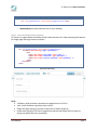
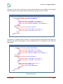
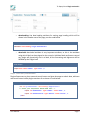
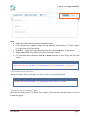
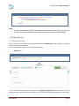
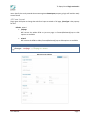
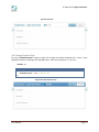
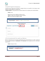
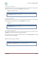
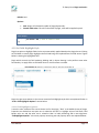
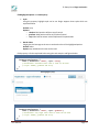
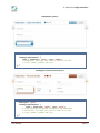
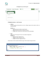
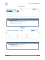
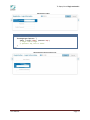
User Manual TS JQuery Form Plugin version 0.1 E-mail: [email protected] Web: http://www.techno-soft.com Table of Contents 1. Getting Started with “TS JQuery Form Plugin” _________________________________ 3 2. External Dependencies: __________________________________________________ 3 3. How to Use “TS JQuery Form Plugin”: _______________________________________ 3 3.1 Include CSS file: _____________________________________________________ 3 3.2 Write an HTML for Plugin: ______________________________________________ 3 3.3 Include JavaScript file: ________________________________________________ 7 3.4 JavaScript to Invoke Plugin: ____________________________________________ 7 4. Plugin Options: _________________________________________________________ 8 4.1 Theme for Plugin _____________________________________________________ 8 4.2 Form Layout _________________________________________________________ 9 4.3 Change Header Style _________________________________________________ 10 4.4 Quick Navigation among Pages _________________________________________ 11 4.5 Use Icons Instead of Save and Cancel Buttons _____________________________ 11 4.6 Show Cancel Button __________________________________________________ 12 4.6 Show Save Button ___________________________________________________ 12 4.7 Form Data Submission ________________________________________________ 12 4.8 Set Plugin Height ____________________________________________________ 13 4.9 Set Plugin Width ____________________________________________________ 13 4.10 Set Field Highlight Style _____________________________________________ 14 4.10.1 Field Highlighter Options __________________________________________ 14 TS JQuery Form Plugin version 0.1 1. Getting Started with “TS JQuery Form Plugin” TS JQuery Form Plugin allows user to develop a decent looking web-form where the plugin will cater the alignment and basic design. There are various options such as control and their respective label positioning, control grouping and also have the ability change the form interface to wizard. 2. External Dependencies: Following are the files which need to be added to use the plugin: jquery-1.8.3.js : The file is added to the package. Latest version can also be used. Visit http://www.jquery.com to get the latest version json2.js : The file is added to the package. Latest version can also be used. Visit https://github.com/douglascrockford/JSON-js/blob/master/json2.js to get the latest version 3. How to Use “TS JQuery Form Plugin”: Follow the procedure described below to use the plugin functionality 3.1 Include CSS file: Include the Plugin’s CSS file as shown in code example below: Code sample: <link rel="stylesheet" href="css/jquery.ts-jform.0.1.css" type="text/css" /> There is another CSS file “jquery.ts-jform-ie-fix.css” in a package, there is no need to include this file as Plugin will detect the IE Browser version, it will be loaded by dynamically against IE 6, 7 or 8 3.2 Write an HTML for Plugin: Plugin takes an html as an input, which needs to be according to the format which is described below: Step 1 – Place Container for Plugin Place the container <div> inside <form> tag; Plugin will use the container div and place the generated form html inside it User Manual Page 3 TS JQuery Form Plugin version 0.1 Code sample: <div id="jFormContainer" data-heading="Registration"></div> o data-heading: this data attribute use for form heading Step 2 – Write an HTML Inside Container For section or pages fieldset should be placed inside container div. Code example given below is for single page and single column structure Code sample: <div id="jFormContainer" data-heading="Registration"> <fieldset data-heading="Login Information"> <div> <input data-label="User Name" type="text" /> <input data-label="Password" type="password" /> <input data-label="Confirm Password" type="password" /> </div> </fieldset> </div> JForm (one column form) NOTE: <fieldset> inside container represents the page/section of a form <div> inside <fieldset> represent the a column Plugin will apply styling on control as well such as width, height etc, Incase inline styling or CSS class is applied on controls then plugin will not apply its styling and adjust the form accordingly User Manual Page 4 TS JQuery Form Plugin version 0.1 Similarly, for more than one page or section another field set can be added, code example below will generate two page or section and both having single column structure Code sample: <div id="jFormContainer" data-heading="Registration"> <fieldset data-heading="Login Information"> <div> <input data-label="User Name" type="text" /> <input data-label="Password" type="password" /> <input data-label="Confirm Password" type="password" /> </div> </fieldset> <fieldset data-heading="Personal Details"> <div> <input data-label="First Name" type="text" /> <input data-label="Last Name" type="text" /> </div> </fieldset> </div> Furthermore, if multiple column structure is required, add div inside fieldset and plugin will generate new column inside page or section and adjust the form accordingly, see the code and figure below Code sample: <div id="jFormContainer" data-heading="Registration"> <fieldset data-heading="Login Information"> <div> <input data-label="User Name" type="text" /> <input data-label="Password" type="password" /> <input data-label="Confirm Password" type="password" /> </div> </fieldset> <fieldset data-heading="Personal Details"> <div> <input data-label="First Name" type="text" /> <input data-label="Last Name" type="text" /> </div> <div> <input data-label="Phone" type="text" /> <select data-label="country"> <option value="USA">USA</option> </select> </div> </fieldset> </div> JForm (two columns form) User Manual Page 5 TS JQuery Form Plugin version 0.1 o data-heading: Use data-heading attribute for setting page heading which will be shown in the header area of the page, see the code below Code sample: <fieldset data-heading="Login Information"> o data-label: data-label attribute is very important attribute, as this is the attribute using which label can be assigned to the controls. Add data-label attribute to control tag, plugin will dynamically use it as label, all the formatting and alignment will be handled by the Plugin itself Code sample: <input data-label="Phone" type="text" /> Step 3 – Place Save/Cancel Button Plugin allows users to place save and cancel button and gives leverage to submit data, add save and cancel button inside plugin container div as shown in code below: Code sample: <div id="jFormContainer" data-heading="Registration"> <!--Place your save/cancel button HTML here --> <input id="btnSaveForm" type="submit" value="Save" /> <input id="btnCancelForm" type="button" value="Cancel" /> </div> User Manual Page 6 TS JQuery Form Plugin version 0.1 Note: Plugin will handle the save and cancel button layout. if no functionality is applied, plugin will apply default functionality to “Cancel” button i.e. it will clear all the form fields, By default “” plugin for further details please see “useCancelButton” Plugin option Plugin submit data using JSON format, see “submitUrl” option For successful data submission add id or name attribute to control tag, see the code below Code sample: <input data-label="First Name" id="txtFirstName" name="txtFirstName" type="text" /> 3.3 Include JavaScript file: Include the Plugin’s JS file in head tag of the form as shown in code example below: Code sample: <script type="text/javascript" src="js/jquery.ts-jform.min.js"></script> 3.4 JavaScript to Invoke Plugin: Now, we are ready to use “TS JQuery Form Plugin”, Place the code sample below in form to invoke the plugin User Manual Page 7 TS JQuery Form Plugin version 0.1 Code sample: <script type="text/javascript" language="javascript"> $(document).ready(function(){ $("#jFormContainer").tsJform(); }); </script> Note: In code example above JQuery $(document).ready function is used, JQuery anonymous function or any other method as per requirement can be used to invoke the plugin 4. Plugin Options: 5.1 Theme for Plugin Built-in themes can be applied on plugin generated form. themeLayout is the property for applying theme on plugin generated form. There are three built-in options i.e. blue, green and brown. Default: blue Code sample: $("#jFormContainer").tsJForm({ themeLayout: "green" // blue, green or brown }); Plugin Theme(green) If it is required to create custom theme, go to file css/jquery.ts-jform.0.1.css and see group of theme classes for green, blue and brown etc. create own set of classes with specifying name in the end of their User Manual Page 8 TS JQuery Form Plugin version 0.1 name. Specify the newly created theme name against themeLayout property; plugin will load the newly custom theme 4.2 Form Layout Plugin gives the option to change the web form layout to wizard or full page. jFormType is the property for that. Default: wizard fullpage: Will convert the whole HTML to just one page, no forward/backward/jump to slide options are available wizard: Will convert the HTML to slides, forward/backward/jump to slide options are available Code sample: $("#jFormContainer").tsJForm({ jFormType: "fullpage" // fullpage or wizard }); Web page layout (fullpage): User Manual Page 9 TS JQuery Form Plugin version 0.1 Page layout (wizard): 4.3 Change Header Style By using “useHeaderLayout” property, plugin can change the header background (i.e. make a main application header) according to the selected theme. There are two options i.e. yes or no Default: no Code sample: $("#jFormContainer").tsJForm({ useHeaderLayout: "yes" // yes or no }); Plugin header (blue header layout): User Manual Page 10 TS JQuery Form Plugin version 0.1 4.4 Quick Navigation among Pages In Wizard layout, Plugin gives the option to navigate directly to any specific for that plugin creates navigation symbols against each page/section “navigationSymbol” is the property for the symbols. Options for this property are mentioned below: Default: circle circle: this will convert navigation symbol to circles square: this will convert navigation symbol to squares none: this will hide the navigation symbols Code sample: $("#jFormContainer").tsJForm({ navigationSymbol: "square" // square, circle or none }); Navigation Symbols(square): 4.5 Use Icons Instead of Save and Cancel Buttons Based on requirement icons can also be placed against save and cancel button, all it need is url/path of an icon to replace the button. “cancelIconUrl” and “saveIconUrl” are the property for that. Code sample is given below Default: empty (no icons) Code sample: $("#jFormContainer").tsJForm({ cancelIconUrl: "css/images/cancel.png", saveIconUrl: "css/images/save.png" }); User Manual Page 11 TS JQuery Form Plugin version 0.1 4.6 Show Cancel Button By default plugin does not show cancel button. If the cancel button is required on form place it html as explained in start of the manual and set “useCancelButton” property to true. Default: false (hide the button) Code sample: $("#jFormContainer").tsJForm({ useCancelButton: true // true or false }); 4.6 Show Save Button By default plugin show the save button if the html is properly placed as explained in start of the manual. If the save button is not required on form, set “useSaveButton” property to false. Default: true Code sample: $("#jFormContainer").tsJForm({ useSaveButton: true // true or false }); 4.7 Form Data Submission Plugin supports submission of data as well, it requires target URL on which it can submit the data. “submitURL” is the property exposed for mentioning the target URL. Code example below is written in php. “submitURL” property is set to “registration.php” and in target form data is being saved in “output.txt”. Note: plugin submits the data in JSON format Code sample: $("#jFormContainer").tsJForm({ submitUrl: "registration.php" // Target source page url }); User Manual Page 12 TS JQuery Form Plugin version 0.1 Sample Code (PHP - registration.php): Example below gets the json and save it in a file name output.txt. Code sample: <?php if(isset($_POST["json"])){ $jsonData = $_POST['json']; $file = fopen("output.txt", "w"); fwrite($file, $jsonData); fclose($file); } ?> 4.8 Set Plugin Height Plugin gives the option to set its height as well as it can also dynamically set the height based on the content. “jFormHeight” is the property for this purpose. There are multiple options which are mentioned below: Default: auto Options: auto: plugin will calculate height and fix all page/slide height autofit: Height of all pages/slide will be calculated dynamically, based on how many controls each column contains Custom height value: This will fix the height of the plugin. Note that numeric value will be applied in pixels Code sample: $("#jFormContainer").tsJForm({ jFormHeight: "autofit" // auto, autofit or numeric value }); OR, Code sample: $("#jFormContainer").tsJForm({ jFormHeight: 400 // auto, autofit or numeric value }); 4.9 Set Plugin Width Plugin gives the option to set its width as well as it can also dynamically set the width based on the content or number of columns. “jFormWidth” is the property for this purpose. There are multiple options which are mentioned below: User Manual Page 13 TS JQuery Form Plugin version 0.1 Default: auto Options: auto: plugin will calculate the width of plugin dynamically. Custom width value: This will fix the width of plugin, value will be applied in pixels Code sample: $("#jFormContainer").tsJForm({ jFormWidth: 800 // auto or numeric value }); 4.10 Set Field Highlight Style Plugin has option to highlight fields. Colors are automatically applied based on the plugin theme. Clicking on field label or control plugin highlights the field and brings the keyboard focus on field control. Figure below is showing the highlighted field Plugin which controls the field rendering labeling and its layout theming it also perform some other functionality i.e. apply effect on field when hover or click functions are called. Field Highlighter (By Clicking on a field (input, textarea, select etc) will highlight it): Plugin also give some options to the user to customize field highlight style which are explained further in “4.10.1 Field Highlighter Options” section below: 4.10.1 Field Highlighter Options It uses the color scheme of the current theme set for the plugin, “blue” is the default theme of plugin. Properties are divided into two parts one is related to the field i.e. highlight style on field focus, field border color etc. and the other one is related to label i.e. label positioning and its text alignment. “fieldHighlighterOptions” is the main property containing two sub property which are explained below: User Manual Page 14 TS JQuery Form Plugin version 0.1 fieldHighlighterOptions -> Field Property: Style: Using this property highlight style can be set. Plugin supports three styles which are explained below: Default: strip Options: o shadow: label position will be at top of control o gradient: label position will be at left side of control o strip: label will be written inside field/control like placeholder Border Color: Plugin gives the leverage to the user to set border color of the highlighted portion Default: white Options: any standard color name can be used Field property is further explained below using the code samples and figures below: Code sample: $("#jFormContainer").tsJForm({ fieldHighlighterOptions: { field: { borderColor: "white", style: "strip"} // borderColor: Standard color name or code can be used // style: shadow, gradient and strip } }); Field Highlighter (strip): Code sample: $("#jFormContainer").tsJForm({ fieldHighlighterOptions: { field: { borderColor: "white", style: "gradient"} // borderColor: any legal color name or value can be used // style: shadow, gradient and strip } }); User Manual Page 15 TS JQuery Form Plugin version 0.1 Field Highlighter (gradient): Code sample: $("#jFormContainer").tsJForm({ fieldHighlighterOptions: { field: { borderColor: "white", style: "shadow"} // borderColor: any legal color name or value can be used // style: shadow, gradient and strip } }); Field Highlighter (shadow) and theme (brown): Code sample: $("#jFormContainer").tsJForm({ themeLayout: "green", fieldHighlighterOptions: { field: { borderColor: "white", style: "strip"} // style color will be applied according to the themelayout // borderColor: any legal color name or value can be used // style: shadow, gradient and strip } }); User Manual Page 16 TS JQuery Form Plugin version 0.1 Field Highlighter (strip) and theme (green): fieldHighlighterOptions -> Label Property: position: Using this property label position can be set. Plugin supports three options which are explained below: Default: top top: label position will be at top of control left: label position will be at left side of control inline: label will be written inside field/control like placeholder align: Plugin gives the leverage to the user to set label text alignment Default: left left: label will be aligned to left right: label will be aligned to right center: label will be aligned to center Label property is further explained below using the code samples and figures below: Code sample: $("#jFormContainer").tsJForm({ fieldHighlighterOptions: { label: { align:"left", position:"left" // align: left or right // position: top, left or inline } }); User Manual } Page 17 TS JQuery Form Plugin version 0.1 Label positioning (left): Code sample: $("#jFormContainer").tsJForm({ fieldHighlighterOptions: { label: { align:"left", position:"inline"} // align: left or right // position: top, left or inline } }); Label positioning (inline): Code sample: $("#jFormContainer").tsJForm({ fieldHighlighterOptions: { label: { align:"right", position:"left"} // align: left or right // position: top, left or inline } }); User Manual Page 18 TS JQuery Form Plugin version 0.1 Label alignment (right): Code sample: $("#jFormContainer").tsJForm({ fieldHighlighterOptions: { label: { align:"right", position:"top"} // align: left or right // position: top, left or inline } }); Label alignment (right) and position (top): User Manual Page 19