1
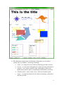
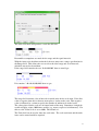
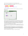
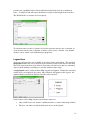
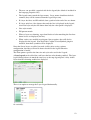
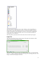
OpenJUMP Printer Extension
User Guide
Version 1.86
By
Geoffrey G Roy
© 2008-13 Cadplan
http://www.cadplan.com.au
1
Introduction
This extension adds printing capabilities to OpenJUMP. It is targeted at users who
would like to print a copy of their map displays directly from the OpenJUMP
Workbench.
The capabilities include:
•
To print a map at a nominated scale on one or more sheets of paper.
•
To save the printer image as an image file in JPG, PNG, SVG or PDF formats.
•
A preview window that shows the current map display with superimposed
printer page boundaries.
•
A printer setup option to set printed page properties.
•
A full page option to scale the map to be printed in a single page.
•
Options to add furniture items to the printed map, including a title, scale, north
symbol, map legend, layer legend, border, images and a multi-line text note.
•
The capability to re-position the map drawing on the printed page(s).
•
Zoom and pan facilities.
•
Internationalization capabilities.
•
From version 1.53:
o Most furniture items can be scaled. There is a size field in the
appropriate dialog which accepts a number between 0.1 and 10.0. This
scale factor is applied to the furniture item when displayed and printed.
o Each project can have multiple printer configuration files that can be
user created and selected.
•
From Version 1.67
o New image type furniture items
o Furniture items are specified on a layer to control the order in which
they are painted.
o Furniture size scaling has been replaced by more options to specify
font sizes. North and Scale items can still be scaled.
o More options to specify text fonts and colors.
o Multiple border items now allowed.
This plugin requires JRE 1.5 or later.
Installation
The java archive file JumpPrinter.jar should be copied into the lib\ext folder of the
OpenJUMP installation folder. The extension will then be loaded next time
OpenJUMP is started.
2
A <Printing> option should appear in the <File> menu. This will be enabled once a
Project containing at least one layer has been created, or loaded.
The following associated libraries must also be installed:
1. iText: from http://sourceforge.net/projects/itext/
2. Batik: from http://xmlgraphics.apache.org/batik/
3. VertexSymbols plugin from Cadplan should also be installed.
Operating Instructions
To prepare a drawing for printing:
1. Selected the required layers, then zoom and pan to show the required map
region to be printed.
2. Select the <Printing> option in the <File> menu or the Printer icon (
from the shortcut bar.
)
3. The Printer Setup window will appear showing the map region. This widow
can be resized to show a greater area for printing.
4. The current page boundaries are shown as red lines.
5. The <Page Setup> button will show a standard Java PageFormat dialog where
paper size, orientation and margins can be set. On <OK> the page boundaries
will be adjusted to match.
6. The <Fit to Page> checkbox will force the scaling to fit the map drawing onto
a single sheet of paper at the currently set paper orientation. If a border is
displayed the scale of the map will be adjusted to fit the border onto the single
sheet of paper. If items of furniture exist outside the single page and the
border placed to enclose them, they will remain there until moved by the user.
7. The <Print Quality> combo sets the optional print quality (see below).
8. The <Scale> field is used to define a required drawing scale. To change the
scale, enter the required value, then the <Enter> key. The page boundaries
will be then adjusted.
9. The zoom buttons are used to change the size of the visible paper area:
a. + means zoom in (by about 20% for each button click)
b. O means zoom to 100%, i.e. the same map size as in the main view
panel.
c.
- means zoom out (by about 20% for each button click)
10. The visible paper area can also be panned using a <Shift Left Click Drag> of
the mouse. Using the Zoom 100% button (<O>) returns the view to the top
left of the print preview.
3
11. The <Furniture> button shows the Furniture dialog that is used to define
various types of “furniture” on the map, including
a. A title - as a single line of text with text formatting and font selection.
b. A scale – as a scale bar, with options to set the scale range and interval.
c. A border – to be drawn around the map, with thickness option and
option to have border adjust to contain maps and furniture or be fixed.
d. A North symbol – from a choice of six, with an orientation option.
e. A note – as a multi-line block of text with text formatting, justification
and font selection.
4
f. A map legend – showing symbols for visible layers, with user
selection.
g. A layer legend - showing the theming values for themed layers.
h. An image - showing images superimposed on the based map.
12. A given printer configuration can be saved using the <Save Cfg> button, as an
XML file with a name like “projectname_PrinterProperties_name.xml” in the
same folder as the project file. Initially there is a default properties file with a
name like “projectname_PrinterProperties.xml”. To create a named
configuration file, type the name into the combobox on the left of the <Save
Cfg> button, then type <Enter>. The name will then appear in the combobox
list. Them click the <Save Cfg> button to save it.
13. A previously saved configuration file can be loaded using the <Load Cfg>
button. First select the required configuration from the combobox, then click
the <LoadCfg> button. The new printer configuration will be applied
(including furniture).
14. To delete a previously saved configuration file, select it in the combobox, then
delete it with <Backspace> or <Delete>, then hit <Enter>. The name will be
removed from the list in the combobox and the named configuration file
deleted when the delete is confirmed.
15. If the <Single Page> checkbox is checked, a single page (of paper) is
displayed (not the multiple sheets as otherwise). If this option is chosen then
only a single page will be printed even if map or furniture items overlap onto
other pages.
16. Once the preview is ready the <Print> button will send the drawing to a
nominated printer.
17. The <Save Image> button will save the print image as an image file, in either
JPEG, PNG , SVG or PDF formats. This button launches the Image Selection
Dialog:
The image type combo chooses the image type. The other fields will be
enabled/disabled depending on this choice. JPG images can be resized and
have their quality set using the slider. PNG images can be resized. SVG
images can be "scaled" by the SVG scale factor. PDF images have no
available options.
5
To change the image size, type the desired size into the width or height fields,
then type <Enter>. If the Aspect Ratio checkbox is checked, the original
aspect ratio will be retained.
For images (JPEG, PNG and SVG) the default size of the image will be the
same number of pixels as would have been required to print it on paper at the
set scale. For example, an A4 page is about 450 x700 pixels in portrait
orientation. To produce a higher resolution image, then adjust the paper scale
to a smaller value.
For PDFs, the image will be constructed on a single page of a size sufficient to
contain the complete image on paper at the correct scale. When printing, this
image may be scaled (Adobe Acrobat Reader allows this) to fit on an available
paper size, or printed without scaling when the available paper is larger than
the PDF image.
Note that to create SVG images the Batik libraries must be available and to
produce PDF images the iText libraries are required.
Furniture
Items of furniture are annotations that can be added to a base map for printing on
paper (or saving as an image file). The available items types are:
1. Title text
2. Scale symbol
3. Border (several)
4. North symbol
5. Note text (several)
6. Map legend
7. Layer legend
8. Image (several)
Each item can be moved (left-click-drag> to a suitable location on the printed page,
and many can be re-sized to suit the final printed scale.
Furniture items are added from the <Furniture> button that launches the Furniture
dialog that appears like this:
6
There is a tab for each type of furniture. Each furniture item can be displayed or not
displayed with the <Show> checkbox. Other fields provide various options for each
of the displayed item. The font sizes specified in the Furniture Dialog tabs refer to the
printed sizes, i.e. how they appear on paper. The colored button shows the current
color for the item, clicking this button will offer a Color Chooser dialog to change the
color. From Java 7, the colors can also have transparency as required.
When a furniture item is displayed, either by using the <Apply> button, or the
<Close> button, the item appears in the Printer Setup widow, with a blue colored
bounding box. The Furniture dialog can be kept open while using the <Apply> button
to see the effects of changing parameters.
The size of each furniture item is set to appear “reasonable” on the printed page.
Each furniture item can be sized to suit individual needs, depending on the type of
item:
•
When the size of the furniture item is largely determined by its font size then
this is user selectable.
•
Some furniture items can be re-sized by the user on the screen by dragging the
resize handles.
•
Some items have a Size parameter that is used to re-size the item.
Title Items
The Title type item is shown above. The actual title to be displayed, the font name,
style and size can be selected, as well as its color. The layer field specifies the layer
number.
Scale Items
The Scale item is used to display a scale on the drawing. The auto range option
estimates a reasonable range for the scale, and a set of intervals. This may not be
optimal in all cases, so a specific range and interval can be set by un-checking the
Auto scale checkbox.
7
The auto scale mode will produce a scale like this one:
Reasonable assumptions are made for the range and the equal intervals.
With the Auto scale checkbox unchecked, the user must enter a range specification in
the Range field. This allows the user to select the ideal range and set of intervals,
which do not need to be uniform.
If the range field contains the text "0,40,100,200" then we would get
If it contains "-40:4,0,40,100,200" then we get:
The range field contains a list of intervals in world units for the scale item. If the first
value is negative then this is taken to mean place a leader on the scale. This negative
value is followed by a colon to specify the number of subintervals in the leader.
The values placed on the scale are in natural units of the map. Sometimes it might be
useful to display values 1000 times smaller (e.g. metres expressed as kilometres). For
this case the Value Scale is set at 1000. The default is 1.
The Units field can be used to show the scale units. The scale ratio item and the units
items can be turned on/off as required.
8
The Size field scales the height of the scale symbol (default is 1.0).
Here is an example with the Value scale set to 10 and the Units field changed to
inform the user. This example has a size of 2.0.
The scale symbol has two possible colors, and the text can have its own color also.
Border Item
The border type item allows the placement of one or more border items. The main
border is specified in the top part of the dialog. This border is intended to be a border
for the whole map. The main border can be fixed or not fixed. A non-fixed border
will automatically adjust to enclose the map part of the drawing. A fixed border is
sized by the user by dragging the re-size handles (top-left and bottom-right), and can
be moved by click-drag inside the border rectangle.
Supplementary borders are added with the Add button. Supplementary borders can be
placed anywhere on the drawing and resized to suit. The Delete button will delete the
border.
The width of the border line, and its color can be set, as well as the color of the fill
(shade) if required (with Java 7 the shading can have transparency allowing lower
level layers to be partially visible behind higher level layers). The size and position of
fixed borders can be adjusted by dragging the top-left and bottom-right handles and
moved by a click-drag inside is shape.
The order in which the borders are painted is set by the Layer number.
9
North Item
The North item provides an option to include a North symbol, a choice of six is
available. The rotation value sets its rotation (in degrees) from the Y-axis, positive
being clockwise.
The Size field specifies a scale ratio to be applied to the size of the North symbol.
Each symbol can be colored according to the selected color, perhaps with a black
outline.
Note Item
The note item places one or more blocks of text on the drawing. The font name, style
and size can be selected as well as its color. The text blocks can also be shaded with a
color background by activating the “Shade” option and choosing the color.
The justification can be left, center, right or full. The note can contain several lines of
text. When entering text, the lines auto-wrap, and a <new line> is defined by using
the <Enter> key.
The justification options work like this:
1. Left: displays each line, aligned on the left.
2. Centre: displays each line, aligned centrally.
3. Right: displays each line, aligned on the right.
4. Full: splits each line over one or more lines with the word spacing adjusted so
that both left and right ends of the text align within the specified width
(specified in the Width field).
When borders or shading is enabled, the width of the border/shaded area is taken from
the Width field. For Full justification the border/shading and the text fit exactly. For
Left, Centre or Right justifications, the border/shading is set to the specified Width. If
the actual text width is greater than Width, then the text will flow outside the
border/shaded area – but it is a simple matter to adjust the Width to suit. This option
10
provides the capability to have fixed-width borders/shaded areas for a number of
notes. A width set to 0 will cause the border to adjust to the length of the text lines
The Width field is a measure in screen pixels.
To add new notes use the ++ button; to view the previous note use the << button; to
view the next note use the >> button; to delete a note use the – button. Any number
of notes can be added, each with their own properties.
Legend Item
Two types of legend are now available to be added to the printed map. The standard
map legend allows the user to include legend items for each visible layer in the map.
The layer legend can be used to show a legend for selected layers that use a theming
style to show shading according to a selected attribute value range.
A map legend can be added with the Map Legend item option. Each of the currently
visible layers are displayed (by name), those checked will appear in the legend. An
optional border can also be displayed and the color selected.
Some features of the Map Legend type furniture items are:
•
Only visible layers are shown; visibility must be set on the main map window.
•
The user can choose to not include some layers in the legend.
11
•
The user can specified a required title for the legend (the default is included in
the language properties file).
•
The legend names match the layer names. Layer names should not include
commas (they will be removed from the legend if present).
•
If a layer has lines and fill enabled, then a patch of color and a line are shown.
•
If a layer only has a line shown, then only the line is displayed in the legend,
also if the layer only has fill shown then only the color patch is displayed.
•
Line styles match
•
Fill patterns match
•
Where a layer uses theming, up to four blocks of color matching the first four
theme levels are displayed (no line).
•
When vertices are enabled on polygons, lines or points, they will also be
displayed in the legend. Note that if the Cadplan VertexSymbols plugin is
installed, then those symbols will be displayed.
Note that if new layers are added (or made visible) after saving a printer
configuration, then they will not be shown checked in the legend when the
configuration is loaded.
The Font options specifies the font size and style to be used in the Legend.
A layer legend can be added for each layer that has color theming enabled. The layer
legend dialog behaves in much the same way as the map legend panel. Only visible
layers that have theming enabled are displayed.
There is an option to arrange the Layer Legend horizontally:
Or vertically:
12
The layer legend is composed on one or more columns, each corresponding to a
selected layer. The values displayed are those set in the Label column of the OJ
Change Styles dialog. It may generally be useful to set these labels to appropriate
values (especially if computed attribute values are used) to limit the number of
decimal places to be displayed.
The Font options specify the font size and style to be used in the layer Legend.
Image Item
The image item allows the user to place images in the print view from the <Add>
button and deleted with the Delete button.
The image files can be jpg, gif, png or svg formatted files. They are located from the
browse <...> button to place the full path to the image file in the Image File field. The
image is loaded into the plugin at this time.
13
For svg files, the graphics specification is converted into a bitmapped image after
loading. The default size is 256x256 pixels. Specific bitmap sizes can be set by
including a size specification in the file name. For example, a file name like
"someimagex512.svg" will create a 512x512 bitmap image. The "x512" at the end of
the stem of the file name is used to identify the required size.
The layer number can be edited to provide the correct overlay ordering.
Each image can be turned on/off with the show checkbox.
An image can have its aspect ratio locked to prevent distortion during placement in
the print view.
The image can be resized by dragging the top-left or bottom-right handles, or dragged
without changing its size by a click-drag inside its enclosing rectangle.
If an image is locked, then resizing will not change its aspect ratio.
The full path to included image files are stored in the printer configuration file and the
images will be reloaded when the configuration file is reloaded. Image files will be
expected to be found in that location.
If an image has had its aspect ratio changed, after first loading, then the original
aspect can only be set exactly by reloading the image file from this dialog.
Large images (greater than 300x300 pixels) will be scaled down for initial display, but
keeping their initial aspect ratio. They can be scaled up again if required without loss
of resolution, the original resolution is retained.
Layering the View
Each furniture item has a default layer number that can be changed by the user. The
default layer numbers are:
•
•
•
•
•
•
•
•
Images
Borders
Title
Notes
Scale
North
Map Legend
Layer Legend
0
10
20
30
40
50
60
70
14
Lower valued layers are painted first so will be overlaid with items with higher valued
layer numbers. The layer numbers for each furniture item can be changed by the user
to suit. Items with the same layer number will be painted in an arbitrary order.
All furniture items are drawn on top of the map layers.
Layer numbers can be any integer value.
With Java 7 the colors given to various furniture items can have a transparency thus
allowing lower level items to partially show through items on higher level layers.
Previewing the Drawing
The following image shows a sample drawing will all furniture items made visible.
Each item can be moved around by clicking (inside its respective bounding box) and
dragging. The Furniture dialog can be left open while manipulating the furniture
items. The color of each furniture item is set to black (default) but can be changed by
the user selecting the Color button in the appropriate Furniture Dialog tab pane.
If a border is displayed (auto adjust mode, i.e. not fixed), then the border will adjust to
contain the map and items of furniture as they are moved. In fixed mode, the border
can be dragged to a fixed position using either/both of the small drag boxes at the
bottom-right or top left of the border.
15
The map drawing initially is located in the top-left of the preview window. This part
of the drawing is also shown with a blue bounding box. Clicking with the mouse (left
button) inside this box (and not inside a furniture item), then dragging the mouse
allows the map drawing to be moved around on top of the sheet(s) of paper. The map
drawing can thus be positioned to suit the user’s needs. The Printer Setup window
can also be re-sized as required by dragging its edges.
Print Quality Options
There are three modes for printing:
1. ISA Renderer: This option has been introduced from Vers 1.49. It uses the
internal renderer and appears to correctly scale lines and pattern and produces
a good quality print. It has been developed with the assistance of Larry
Becker and appears to produce good results, much the same as the External
Renderer (this option may not appear in future releases), except for some line
decorations
2. Core Renderer: this is the old Quality Option, but it does not always produce a
good result, especially when maps are scaled over several sheets of paper, or
onto large paper sizes.
3. External Renderer: The graphics (lines and text and patterns) are scaled to
their natural size regardless of the size of the printed page. The resolution is
only limited by the printer resolution. This renderer produces better results for
some line decorations that are poorly rendered by the core renderer.
Some experimentation is required to find which renderer does the best job for you.
Internationalization
Internationalization properties are defined in the relevant properties file included in
the language folder or the jar file. English, German and Italian files are included
(defined by “en”, “de” and "it" labels in the file name). Others may be added in the
future.
If your locale settings are not built-in then English will be used as the fall back.
Known Issues
External Renderer
The external renderer is provided as a work around until the OJ core renderer is able
to produce printed output at the resolution of the printer. As it stands there are some
variations from the core renderer capabilities.
Label sizes are reduced to 2/3 of the screen size – this appears to be better on paper,
Also, the positioning of labels and the size of decorations may vary from that defined
in the core renderer. The differences are partially due to simplifications in the
external renderer and partially due to other assumptions being made, in particular:
•
Labels on points are always located at the point, i.e. the start of the label is at
the point. Label Height and Angle attributes are implemented.
•
Labels on lines can be above, on or below the line and the Height attribute is
implemented, but Angle attribute is not implemented.
16
•
When a single line is clipped into multiple line segments in the view window,
a label is placed on each line segment.
•
Polygon labels do not have the Angle attribute enabled.
•
When a polygon is clipped into multiple part polygons in the view window a
label is placed in each part polygon.
•
All decorations can be placed at the start or end of a line (or polygon
boundary).
•
Decorations are all scaled to match line widths.
•
When a line is clipped into multiple line segments in the view window,
decorations are placed on each visible segment.
•
Pirol raster images are supported.
A number of new line decorations have been introduced in version 1.1 of OpenJUMP.
These options are now supported in this extension.
The external renderer can require larger amounts of memory and may take a longer
time than the other two options.
Repositioning of Furniture
If the drawing scale of a map, or a visible section of a map, changes after the
positioning of furniture then the furniture may need to be re-positioned. In some
cases the old positions may be off the current preview screen. To make them visible,
so that they can be dragged into a new position, it may be necessary to change the
drawing scale (temporally) to a smaller value so that the furniture items become
visible, or to zoom out to a sufficient extent is visible. Then, drag them back towards
the top-left of the window. Reset the scale, and then position the furniture items as
required.
Restoring PageFormat
The current page format is saved in the printer configuration file, and is restored on
loading the configuration. There are sometimes problems with the margins not being
restored correctly. For the moment, if this occurs, the margins should be manually
corrected. Note that there will always be small differences between set and actual
margin sizes.
Note also that if the default system printer is changed after the configuration is saved,
the page format may not be correct on restore, especially if the available paper sizes
are different for the new default printer.
Tasks to be done
The following are ideas for future developments:
1. Correct scaling to maintain font sizes and line thicknesses on printed page
with the highest quality resolution.
2. Correct scaling of raster image layers in the “accurate” mode.
3. Other furniture items?
17
Feedback
Please send comments and thoughts to the OpenJUMP developer’s mailing list.
License
This software is released under the GNU General Public License as published by the
Free Software Foundation.
18