1
Chapter 1
Design
The design presented in this chapter isn’t particularly aesthetically appealing — it is a simple, down-tothe-wires presentation of how to create CSS tabs without images or tables. Later in this chapter you learn
how to alter this design, both for liquid, stretchable tabs, and for custom borders and backgrounds. But
the initial design is very simple and basic. The following list expands on the goals of the CSS tabs project
covered in the preceding section and discusses the CSS and markup that will play a role in meeting
those goals:
❑
The tabs must be contained in simple, meaningful markup. The first design goal is relatively
trivial to meet. In simple terms, it means the right markup must be used for the data it encloses.
In the tabs project, that means that the tabs are going to be structured in the document as an
unordered HTML list. Because what is being presented is really a sequence of hyperlinks (not
necessarily appearing in a particular order), the <ul> and <li> elements make the most sense.
CSS provides the ability to transform the presentation of an unordered list to that of tabs. This is
done by removing the default list styling provided via the margin, padding, and list-style
properties. Then each list item (<li>) is styled with borders, some margin, and in order to place
the <li> elements next to each other — as you expect to see with tabs — either the float property or absolute positioning via the position: absolute; declaration. For this project, you
use the float property, because it is just a smidge simpler than positioning.
❑
The text of each tab must not be images. The second design goal involves accessibility and
search engine visibility. If the text of the tab is contained in an image, it cannot be read to a blind
user who is accessing the site with a voice browser like JAWS. Placing the text in images also
impedes search visibility, because the text in the image is likely valuable keywords that you’d
want the search engines to pick up on. Later in this chapter you see a method of using background images for each tab while preserving the text and maintaining search visibility and
accessibility.
❑
A mouseover effect must be supplied for each tab so that the tab changes colors when the
user’s mouse is hovering over it. The next design goal is trivial to implement. You merely want
there to be some visual cue to the user that the tab is for navigation. Changing the background
colors or other aspects of it is one way to provide this visual cue. You achieve this in the project
by applying the CSS :hover pseudo-class to some rules in the style sheet.
❑
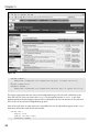
The tab of the currently loaded page must be highlighted. The fourth design goal is a common
one. Put simply, there must be some visual cue that the currently loaded page is the same page
that is linked via a tab. To achieve this, a slightly more verbose approach is available, and this
is demonstrated in the tabs project by marking up five separate XHTML documents. Each
document’s <body> element is provided with a different unique ID name, and then each <li>
element that contains a single tab is also given a unique name. This approach provides some
hooks that allow you to provide a different style for the tab of the currently loaded page.
Without further ado, the code and code explanation for the tabs project are presented in the next section.
Keep in mind that this project’s source code is provided on the CD-ROM accompanying this book, or
you can download it from www.wrox.com.
2