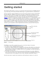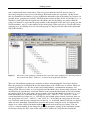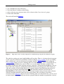
1
JoinMap 4
®
Software for the calculation of genetic linkage maps
in experimental populations
J.W. van Ooijen
Wageningen, July 2006
JoinMap is developed by Kyazma B.V. in collaboration with statistical geneticists
of Biometris of Wageningen UR (www.biometris.wur.nl). The sales and support
are taken care of by Kyazma B.V..
Copyright © 1995-2006 Plant Research International B.V. and Kyazma B.V.
All rights reserved. Unauthorized reproduction and distribution prohibited.
MapQTL and JoinMap are trademarks of Plant Research International B.V. and
Kyazma B.V. registered in the Benelux and the U.S.A.. Kyazma is a trademark of
Kyazma B.V.. Other brand and product names are (registered) trademarks of their
respective holders.
Kyazma B.V.
P.O. Box 182
6700 AD Wageningen
Netherlands
[email protected]
www.kyazma.nl
Contents
Introduction 1
Installation 2
How to cite JoinMap 4 ? 2
Acknowledgement 2
Getting started 3
Using JoinMap 13
General 13
Keyboard shortcuts 13
Tables 14
Printing and exporting 14
Special selection of nodes in tree views 14
Various 15
JoinMap project 15
Dataset node 16
Population node 17
Grouping test statistics 18
Pairwise data population node 19
Creating groups for mapping 19
Grouping node 19
Group node 21
Pairwise data population group node 22
Map integration 22
Mapping node and mapping algorithms 23
Regression mapping algorithm 23
Maximum likelihood mapping algorithm 25
Map node 27
Plain map 27
Regression algorithm map 28
ML algorithm map 29
Chart node 30
Final remarks 30
Tutorial 31
Data files 45
General 45
Data file characteristics 45
Locus genotype file 46
Pairwise data file 51
Map file 53
Default file name extensions 53
Lists and references 55
List of tables 55
List of figures 55
List of examples 55
References 55
Web references 56
Index 57
Introduction
1
Introduction
JoinMap® is a computer program for the calculation of genetic linkage maps in experimental
populations of diploid species. The present version 4 is based on its predecessor, version 3.0 (Van
Ooijen & Voorrips, 2001), the user interface is significantly enhanced, giving more ease of use,
such as marker data management, charts and improved exportability, while at the same time several
powerful analytical methods are added, for instance a new Monte Carlo maximum likelihood
mapping algorithm. The program has virtually all functionality of its predecessor, just some of the
very infrequently used parts are left out.
As in version 3.0, the various elements in a mapping project, such as populations, groups and maps,
are represented by nodes in a so-called tree view as the Folders panel in the Windows Explorer.
After starting of with a new project in JoinMap 4, the marker data can now simply be copied from
an MS-Excel® spreadsheet and pasted into its equivalent within the JoinMap project, the data matrix
of a dataset node. With a simple click of the mouse the program will highlight any possible error in
the data, the data matrix can even be transposed to accommodate for MS-Excel's limited number of
columns (JoinMap's data matrix has no internal limitations in rows and columns). From an error
free dataset a population node can be created, which will be the starting point for the genetic
mapping. In addition to its already large choice of population types, JoinMap 4 is extended with the
possibility to analyse and map data from families of advanced intermated lines and from families of
advanced backcross lines , of any particular number of intermatings, backcrossings and selfings.
The determination of linkage groups turns out to be one of the more difficult tasks in linkage
analysis. In JoinMap 4 this problem is addressed: studying linkage group formation can be based
upon four (!) criteria: (1) independence test LOD score, (2) linkage LOD score, (3) independence
test P-value, and (4) recombination frequency. Or if markers are already mapped in another
population the grouping of that population (as represented in its multiple linkage group map or as a
grouping node within the project) can simply be applied to the new population. The presented
so-called Strongest Cross Link (SCL) parameter even permits inspection whether the assignment of
a marker to a group might be suspicious. The SCL parameter also allows easy assignment of
previously unmapped markers to already established groups.
Once the linkage groups are determined, the linkage map can be calculated for each group. There
are now two algorithms to choose from, the original regression mapping algorithm, and the new
Monte Carlo maximum likelihood (ML) mapping algorithm. Both methods should lead to more-orless the same map orders; if indeed this is the case it will give more confidence in the estimated
map order, but if not this should be seen as an encouragement for trying to identify problematic
markers with a further thorough inspection. The ML mapping algorithm allows for very fast
computation of high density maps: the algorithm needs only a couple of minutes for a 100 markers
linkage group! It can be applied to all population types except the outbreeder full-sib family (CP),
where only pseudo-testcross analyses are possible with this ML algorithm (i.e. a map for each of the
two parental meioses separately). Using the final result an adapted version of the ML algorithm can
be applied to obtain an idea of plausible map positions of the markers. One of the several
possibilities to inspect the final result is to view the marker data as so-called graphical genotypes.
The map charting component, with which high quality charts of the calculated maps are shown, is
enhanced so that now many more options are available to set the chart to your preferences. One of
these is the possibility to draw lines between identical marker names in two neighbouring maps,
2
Introduction
which enables a very easy comparison of map orders. For all analysis results where it can be useful
to study the data with a chart, a chart node can be created, which permits the construction of a bar,
area or XY chart with several options to set the chart to your preferences. All results and charts
presented in the program, except for the groupings tree view which has an equivalent plain text
view, can be exported to files (even in Adobe® pdf format), copied to other MS-Windows®
programs like MS-Word® or MS-Excel®, and printed, and there is also a preview prior to printing.
Installation
JoinMap is a program for the MS-Windows platform on the PC. It was tested extensively to run
under the Windows version XP (Service Pack 2), and is further expected to run flawlessly under all
32-bit PC Windows platforms starting from NT 4.0 Service Pack 6 upwards (NT 4.0 SP6, 2000,
XP); although the program will probably run under 16-bit Windows versions 95, 98, ME and 32-bit
NT versions prior to 4.0, this is not supported. It comes with an InstallShield® installation program
that does most of the installation work. Start the SETUP.EXE program from the set of installation
files, e.g. by double-clicking on it from within Windows Explorer or My Computer (administrator
privileges may be needed for doing this). Choose the settings prompted for and let SETUP.EXE
finish. After this process the license file JOINMAP.LIC will be present in the program directory
(typically: C:\Program Files\JoinMap4). This is the evaluation license file which allows use of the
software with demonstration and other data under certain limitations: there are maxima of two
populations, two groupings per population and two linkage groups per grouping, while printing,
copying to the clipboard and exporting to file are not available. A purchased copy of JoinMap
comes with an individual license file, which usually resides in the Licenses directory of the product
CD. Replace the evaluation license file with the individual license file, and make sure it gets the
name JOINMAP.LIC; in the JoinMap Help menu there is an Install License function that can assist
with this. Successful installation of the individual license removes all above mentioned limitations
and gives unrestricted access to the program; the Help/About-box will show the name of the
licensed organisation.
JoinMap 4 stores its various program settings in the subdirectory JoinMap4 which is created in the
My Documents directory when running the program. Apart from the length of names (maximum of
twenty characters for population, locus and linkage group names) there are no limits built into the
software, memory for storing data is allocated dynamically only for the amount needed. Thus, your
project size is limited only by the amount of RAM in your PC, for which a size of 128 MB is
recommended for reasonably sized projects.
How to cite JoinMap 4 ?
Van Ooijen, J.W., 2006. JoinMap ® 4, Software for the calculation of genetic linkage maps in
experimental populations. Kyazma B.V., Wageningen, Netherlands.
Acknowledgement
I am very grateful to Piet Stam of Wageningen University for his work on the regression mapping
algorithm (Stam, 1993) and the first editions of JoinMap, to Hans Jansen of Biometris for the Monte
Carlo maximum likelihood mapping algorithm (Jansen et al, 2001), and to Roeland Voorrips of
Plant Research International for creating the map charting component from his MapChart program
(Voorrips, 2002).
Getting started
3
Getting started
The intention of this chapter is to give you a general idea of the main concepts of JoinMap and how
to go about using it. The actions described in this chapter are possible under the evaluation license.
Start the program by using the Windows Start menu (the program shortcut resides by default under
Programs / Kyazma). When the program runs you will see a window that is divided into several
main parts: on the top the menu and the tool bar with buttons, on the left-hand side the navigation
panel, on the right-hand side the contents-and-results panel, and on the bottom the status bar
(Figure 1). Once data are loaded, the navigation panel will contain a tree view like the Folders panel
in Windows Explorer, in which each node will represent an element in a mapping project, such as a
population, a linkage group or a map. The contents-and-results panel will contain a set of tabbed
pages, or tabsheets, in which contents and results of analyses will be displayed concerning the node
selected in the navigation tree. When a node becomes selected, its corresponding menu item is
activated, e.g. for a population node the Population menu and for a group node the Group menu.
Menu and tool bar
Tabs
Navigation panel with
navigation tree
Contents-and-results panel
with tabsheets
Status bar
Figure 1.
User interface
In JoinMap 4 your work is organised into a project, so start by creating a new project:
• Use the New Project function from the File menu.
• You will get a dialog in which you are prompted for a file name under which to save the project;
this file name is also used for the project subdirectory name; if necessary change the directory
where the dialog is pointing to (it should be My Documents\JoinMap4), and enter Evaluation in
the dialog's File name field.
• Click on the Save button; this will create your project file Evaluation.jmp, and in addition the
project directory Evaluation.jmd, which will contain all internal files of JoinMap for this project;
a new project is just a new workspace to store results. Check this with Windows Explorer.
Once the new project is opened, the navigation tree will contain just a single project node for
4
Getting started
making your notes that will be stored with the project. Next, you will want to load data into the
project. Because many of you store the marker genotype observations in MS-Excel spreadsheets, an
example spreadsheet file is prepared under the name of Demonstration.xls, which resides in the
DemoData subdirectory of the program directory (typically: C:\Program Files\JoinMap4).
• Open this spreadsheet with MS-Excel, and make sure the BC1 worksheet is visible.
Here you can see a dataset of a first generation backcross population (BC1), consisting of the
genotype scores of 22 markers for 100 offspring individuals. The genotype score a stands for a
genotype like the backcross parent, while the genotype score h stands for a genotype like the F1
hybrid. You would like to get these data into the current project. For this goal you have to prepare
some space in JoinMap, this is called a Dataset:
• Use the Create New Dataset function from the Dataset menu of JoinMap.
You will see that a dataset node is created in the navigation tree, and that the corresponding
tabsheet in the contents-and-results panel contains a tiny data matrix of just two by two cells with at
the bottom of the tabsheet some fields for defining the dataset. Define the dataset by giving it a
name, entering the population type, the number of loci and the number of individuals:
• Enter the name Evaluation in the Pop. name field;
• make sure the type BC1 is in the Pop. type selector (for other population types the x and y fields
are available for entering generation numbers);
• enter 22 in the Nr. of loci field and 100 in the Nr. of indiv. field.
Now the data matrix has enough space to hold the 22 marker names, 100 names (codes) for the
individuals and for each marker 100 genotype codes. To get the data from the spreadsheet into the
data matrix is simply a matter of copy and paste:
• Select the rectangle from cell A2 to cell CW24 in the MS-Excel spreadsheet;
• click the Copy button (or press ctrl-C or ctrl-Insert) in MS-Excel;
• go to JoinMap and select the top left cell in the data matrix;
• paste the copied cells by clicking the Paste button (or press ctrl-V or shift-Insert);
• use the Reset Tabsheet function from the Edit menu.
At this point the data are inside the project and you can close the spreadsheet. Before going towards
mapping, let JoinMap check the data to see if there might be any coding errors:
• Apply the Highlight Errors function from the Dataset menu.
Because some errors were present (i.e. deliberately created), several things will happen (Figure 2):
JoinMap will give cells with an error a red color, the first cell with an error will become selected
(blue), and the first error will be reported on the status bar, in this case: incorrect genotype in row 7,
column 3. These errors can be corrected by editing:
• Click in the cell with an error;
• press the F2 function key and change the genotype;
• change the genotype aa into a;
• change the genotype g into h;
• use the Highlight Errors function again to check that all errors are corrected: the status bar
message should read: no coding errors detected.
When the data are fine, you can create a population node that will be the starting point for the
genetic mapping:
• Use the Create Population Node function from the Dataset menu.
Getting started
Figure 2.
5
The data matrix after the Highlight Errors function is applied
A population node with the name Evaluation is created and becomes automatically selected; several
tabsheets appear in the contents-and-results panel, they can be selected by clicking on their tabs
Figure 3. The Info tabsheet holds a summary of the data. The Data tabsheet holds a non-editable
copy of the data. The Loci and Individuals tabsheets contain overviews of the loci and individuals
with their names and serial numbers, and for each a checkbox in the Exclude column. If at some
point you wish to remove a locus or individual from the analysis, you simply check its
corresponding checkbox and run the analysis again. For convenience the serial numbers will stick to
the locus and individual names in all child nodes that will be created in the navigation tree from this
population node. The Locus Genot. Freq. tabsheet is also used for testing segregation distortion, one
of the first analyses to do in mapping. First, the tabsheet is empty except for a column header no
data; let JoinMap do the analysis:
• Click on the Calculate button (or use the Calculate function from the Calculate menu, or
press the F9 key).
The table gets filled with the results of the analysis: the frequencies of the genotypes for each locus
including the chisquare (X2) test results for segregation according to the Mendelian ratio for the
classification given in the last column (Figure 3). Here, for none of the loci the test is significant.
There is some additional information available, because the Information button is active (blue):
• Click on this button (or use the Info on Tabsheet Contents function from the File menu).
A window opens with (in this case) information on the symbols used for indicating the various
levels of significance and the frequency distribution totals over all loci. Close the window with the
Esc key. Often it is interesting to view a chart with these results, with JoinMap this is easily done:
• Click on the Create Chart button (or use the Create Chart function from the Calculate menu).
A chart node is created and becomes selected. On the Chart Control tabsheet you can set the data
that must be plotted and various chart options. For instance:
• Place a checkmark at the a and h as the data to plot, and place a checkmark at Show data labels.
• Select the Chart tabsheet (Figure 4). The chart is shown using the current Page Setup (paper
size, orientation, margins; these can be changed using the Page Setup button ). You can zoom
into the chart by double clicking, and zoom out by double clicking on the other mouse button; a
zoomed-in chart can be dragged with the mouse within its window to put it in another position.
6
Getting started
active
information
button
Figure 3.
The Locus Genot. Freq. tabsheet becomes filled after the calculations are performed
Figure 4.
A bar chart of the locus genotype frequencies is easily created
In order to proceed towards obtaining the linkage groups, go back to the population node:
• Click in the navigation tree on the population node Evaluation;
• select the Groupings (tree) tabsheet (the tabsheet is empty);
• click on the Calculate button .
The tabsheet will get filled with a Groupings tree, of which in this case all branches are collapsed.
Click on the + symbols next to the tree nodes to expand the branches (Figure 5). Please, take some
Getting started
7
time to understand what is shown here. The tree presents how the loci fall apart in groups at
increasing stringency levels of a test for linkage. Each node in the tree represents a group of loci
that are concluded to be linked at a given significance threshold value of the linkage test statistic (or
possibly better: grouping test statistic). The node names consist of three fields: threshold/nr(size), in
which threshold represents the significance threshold value for the linkage test under which the
group was formed, nr represents the group number at that threshold value (the largest group gets the
smallest number), and size is the number of loci in the group. When you select a certain node in the
groupings tree (by clicking on it), the loci of that group are displayed in the table on the right-hand
side of the tabsheet.
Figure 5.
The results of the grouping calculations after expansion of the groupings tree; the loci present in
the selected node (blue) "2.0/1/(11)" are shown in the right-hand side table
There are four different grouping test statistics to choose from through the Calculation Options.
Here the grouping is based upon the test for independence with a LOD score as statistic. Other test
statistics (parameters) are: P-value of the test for independence, recombination frequency and
linkage LOD. The test is done at several significance threshold values of increasing stringency. Loci
determined to be significantly associated (linked) at the current threshold with at least one member
of a group will be in the same group. In our example, at the first threshold level of the test, i.e. 2.0
LOD, the markers are associated in two groups of 11 loci: "2.0/1/(11)" and "2.0/2/(11)". At the
second threshold level of the test, i.e. 3.0 LOD, the loci of both groups remain associated, there are
two group nodes of 11 loci: "3.0/1/(11)" and "3.0/2/(11)". In fact here the two groups of loci each
stay associated until the most stringent level of the test, i.e. 10.0 LOD, which is why the tree doesn't
show any more branching. Branches that do not branch at more stringent levels are automatically
shown as so-called collapsed branches with the + symbols next to the top level nodes. You can
easily see some branching if you change the grouping parameter settings in the calculation options,
for instance change the Start value of the independence LOD to 0.5 and redo the calculations:
8
Getting started
• Click on the Calculation Options button or use the Calculation Options function from the
Options menu;
• check that the Population tabsheet is visible in the Calculation Options dialog;
• check that in the Grouping box the Parameter to use the independence LOD is; other parameters
are: independence P-value, recombination frequency and linkage LOD;
• under the Threshold ranges for the independence LOD set the Start value at 0.5, and leave the
End value at 10.0 and the Step value at 1.0;
• close the Calculation Options dialog;
• click on the Calculate button .
It will show that all 22 loci are linked when the threshold is taken at 0.5 LOD. When you have seen
this, reset the calculation options by pressing the Preset default button on the Calculation Options
dialog and redo the calculations.
Once you have decided which groups from the groupings tree you want to use for calculating the
linkage map, you need to select their nodes by right-clicking. A node selected this way will become
red (or magenta for the current node):
• Click with the right mouse button on the two nodes labelled "2.0/1/(11)" and "2.0/2/(11)";
• apply the Population menu function Create Groups Using the Groupings Tree.
This action will produce in the navigation tree a grouping node (as a child node of the population
node) and for each group a group node (as child nodes of the grouping node) (Figure 6). The
grouping node has a single tabsheet showing an overview of the division of loci over the groups.
The Grouping tabsheet also presents the so-called Strongest Cross Link (SCL) information: for
each locus another locus is shown with which it has the strongest linkage outside its own group. For
this so-called cross link the locus number and name, the group number and node name, as well as
the value of the linkage test employed are given. This permits inspection whether the assignment of
a marker to a group might be suspicious, for instance when a certain SCL-value is (nearly)
significant this indicates that a locus has linkage outside its current group.
Figure 6.
The grouping node contains the overview of how loci are divided over the groups
Getting started
9
Let's have a quick look at a group node, select Group 1. The node has several tabsheets, most are
empty. The information to present here are the pairwise recombination frequencies. For the sake of
brevity pairwise recombination frequencies are called linkages. Press the calculate button to obtain
them. After successful calculation of the linkages the Data tabsheet will show the original genotype
data, but only for the loci in the group. The Loci tabsheet shows the loci in the group and allows
exclusion of them from further processing. Because the number of pairs grows dramatically in size
with the number of loci (L over 2 for L loci), the information on the linkages is shown from several
selective angles (weak, strong, maximum, suspect). Finally there are tabsheets where you can
specify a start order and one or more fixed orders for use in the map calculations of the group. In
order to calculate a map for the selected group node, all you have to do is:
• Click on the Calculate Map button , or use the Group menu function Calculate Map.
After the map calculations are performed a Mapping node will appear as child of the group node,
and if the calculations are successful a Map node as child of the mapping node. The mapping node
has a single tabsheet containing the Session Log of the calculations, allowing you to study the
details of the procedure. The default mapping algorithm is the regression mapping algorithm, which
can be changed as a calculation option. The procedure is basically a process of building a map by
adding loci one by one, starting from the most informative pair of loci. For each added locus the
best position is searched and a goodness-of-fit measure is calculated. When the goodness-of-fit
reduces too sharply (too large a jump), or when the locus gives rise to negative distances, the locus
is removed again. This is continued until all loci have been handled once. This is the end of the socalled first round. The present data are quite perfect data that only require a first round, otherwise
subsequent rounds would be needed. The results at the end of each round are represented by a map
node.
A map node has several tabsheets, the first three are different representations of the map itself: as a
chart, as a table and in plain text format. The Data tabsheet is similar to this tabsheet of the group
node, but here the loci are ordered according to the map while excluded loci are not shown. A nice
feature is the possibility to view the data as so-called graphical genotypes:
• Click on the (De-)Colorize button , or use the Edit menu function (De-)Colorize.
Figure 7.
The colorized view of the Data tabsheet allows a visual inspection of the estimated order
10
Getting started
These graphical genotypes allow a visual inspection of the ordered genotype data, enabling you to
see for instance whether the recombination breakpoints are reasonably well distributed over the
estimated map (Figure 7). The Mean Chisquare Contribs. tabsheet shows for each locus the average
contribution to the goodness-of-fit. The Genotype Probabilities tabsheet is for the detection of
unlikely genotype scores. The Locus Genot. Freq. tabsheet is similar to this tabsheet for the
population node, but here the loci are ordered according to the map and the pattern of segregation
should reveal only gradual changes over the map.
Now let's try the maximum likelihood mapping algorithm, and see if the same map is obtained:
• Select Group 1 in the navigation tree;
• click on the Calculation Options button ;
• select the Group tabsheet in the Calculation Options dialog;
• select ML (Maximum Likelihood) mapping as the Mapping algorithm, and click OK;
• click on the Calculate Map button .
After the calculations are done a mapping node and a map node will be created. The maximum
likelihood mapping algorithm is implemented as a combination of several numerical methods:
spatial sampling, simulated annealing and Gibbs sampling. Simulated annealing is a general
optimization method used here for estimating the best map order by minimizing the sum of
recombination frequencies in adjacent segments. Gibbs sampling is employed to obtain multipoint
recombination frequency estimates, given the current map order. In order to reduce the influence of
errors and unknown or dominant genotypes in the dataset the map is built gradually by taking
spatial samples of loci, i.e. first a map is calculated for loci some distance apart and subsequently
loci are added that are closer by. The algorithm is very fast for high density maps. Again, the
mapping node will contain the details of the procedure in the session log. The map node will show
similar information as the previous map node, as well as information specific for the maximum
likelihood algorithm: the expected number of recombinations per individual (Expected Rec. Count)
and the nearest neighbour fit and the nearest neighbour stress (Fit & Stress). Finally, an adapted
maximum likelihood algorithm can be used to calculate Plausible positions of all loci starting from
the current map order as best position.
As a final exercise you will compare the maps of both algorithms. First you should check the
orientation of both maps, the algorithms do not "know" what the top and bottom ends of the map
are:
• Check one of the map tabsheets of each node;
• if marker001 is at the bottom of the map, then apply the Invert Map function of the Map
menu;
• when on both maps marker001 is on top, then apply the Combine Maps function of the Join
menu;
• a dialog will appear, do as suggested: click on the two map nodes, so that they become red; the
order of clicking will determine the order of the maps in the final result;
• click on the OK button.
Upon success a map node will appear as child of the group node, displaying the combined map. In
order to visualize map order differences you can use some map chart options:
• Select the Map Chart tabsheet of the combined map;
• click on the Map Chart Options button , or apply the Map Chart Options function of the
Options menu;
• select the Homol-1 tabsheet of the dialog;
Getting started
•
•
•
•
11
put a checkmark at Show Homologs;
select the Homol-2 tabsheet of the dialog;
pick a color of your preference in the Color selector of the Connection style group;
click on the OK button.
The result will look like Figure 8
Figure 8.
Map orders can be visually compared in a combined map using the Show Homologs option
The guide for getting you started with JoinMap will stop here. There is a lot more that the program
can do, you can read about all possibilities in the next chapter Using JoinMap. If you are working
under a full license, you are encouraged to continue with the Tutorial chapter after reading the
Using JoinMap chapter. If you are working under an evaluation license, you are encouraged to try
out some of the possibilities by yourself. There are several example data files available in the
DemoData subdirectory of the program directory (typically: C:\Program Files\JoinMap4); you can
inspect these files simply by opening them with the Windows Notepad program. The various .loc,
.map and .pwd files can be loaded directly into a project with the Load Data function of the File
menu (or by pressing the Load Data button ). The Load Data function also loads files in
MAPMAKER raw data format. You can even load your own data using a dataset node or directly
with the Load Data function if they have the proper format. The data format is described
extensively in the Data files chapter. If you are working under an evaluation license, you may need
to remove nodes from your project because the program limits the number of populations, etcetera;
12
Getting started
removing nodes in the navigation tree can be done by selecting the node and applying the Delete
Node function of the Edit menu, or pressing ctrl-F12.
Using JoinMap
13
Using JoinMap
General
The program can be started in the various ways of MS-Windows, by using the Start menu, by
double-clicking on the JoinMap4.exe file from within Windows Explorer or My Computer, or by
double-clicking on a project file. The latter way is established only after running the program a first
time. When the program runs you will see a window that is divided into several main parts: on the
top the menu and the tool bar with buttons, on the left side there is the navigation panel, on the right
side the contents-and-results panel, and on the bottom the status bar (Figure 1). Once data are
loaded the navigation panel will contain a tree view like the Folders panel in Windows Explorer, in
which each node will represent an element in a mapping project, such as a population, a linkage
group or a map. The contents-and-results panel will contain a set of tabbed pages, or tabsheets, in
which contents and results of analyses will be displayed concerning the node selected in the
navigation tree. When a node becomes selected, its corresponding menu item is activated, e.g. for a
population node the Population menu and for a group node the Group menu. The formats of data
files used by JoinMap are described thoroughly in the Data files chapter. Some example data files
are present in the DemoData subdirectory of the program directory (typically: C:\Program
Files\JoinMap4). Projects of JoinMap 3.0 cannot be opened or imported by JoinMap 4.
Keyboard shortcuts
Because JoinMap is an MS-Windows program, you can expect the many features to be controlled in
the normal MS-Windows way with the mouse and the keyboard. Below is a summary of some
normal and special keys and key combinations:
alt-key
ctrl-A
ctrl-C
ctrl-F
ctrl-N
ctrl-O
ctrl-P
ctrl-V
ctrl-X
ctrl-Ins
shift-Del
shift-Ins
Break
Esc
Tab
F1
F2
F4
F9
key being any underlined character shown in the program: as usual, go to the associated
part of the window or perform the associated action
select all
copy to clipboard
find
create a new project
open an existing project
print current tabsheet contents (or its selection)
paste from clipboard
cut to clipboard
copy to clipboard
cut to clipboard
paste from clipboard
cancel calculations
close popup windows (tabsheet information, print preview), or
cancel (1) options dialogs, or (2) calculations
rotate focus through all visual elements
show the pdf-manual
edit: (1) name of selected node in navigation tree, (2) cell in data matrix
load data
calculate
14
ctrl-F12
alt-F4
Using JoinMap
delete selected node in navigation tree
exit program
Tables
Tables can be sorted on the data in a certain column by clicking on the header of that column;
clicking a second time on the header sorts in the opposite direction. The sorting also works on the
Exclude column with checkboxes. Most tables have a column with a serial number (S/n) or number
(Nr) for each row, so that the tables can be put in the original order by sorting on this column.
Multiple checkboxes in the Exclude column can be (un)set simultaneously by first selecting their
rows by clicking outside the checkboxes while holding the control or shift key and subsequently
(un)setting one of the checkboxes in the selection; if that checkbox is (un)set while holding the
control key the selection remains visible.
When tables become larger than their window, standard scrollbars will enable navigation through
the table. In such cases the top most row(s) and left most column(s) stay frozen, i.e. they stay
visible and do not take part in the scrolling. These frozen rows and columns are behind thin black
lines in the table; these lines can be dragged to change the set of frozen rows or columns. Columns
in the tables can be moved to other positions in the table by dragging the header, they cannot be
dragged before the by default frozen column(s) and the by default frozen column(s) themselves
cannot be moved. Column widths can be resized by dragging the right border of the header, double
clicking there results in resizing such that all cells are completely visible. In the data matrix of a
dataset node the same methods for moving and resizing as for columns can be applied to rows. The
Edit menu function Reset Tabsheet sets the table in original order and sizes.
Printing and exporting
The tabsheet on display in the contents-and-results panel (except the chart control and the groupings
tree tabsheets) can be printed, exported to file and copied to the MS-Windows clipboard to enable
the pasting into for instance an MS-Word document. This can be done using the Print function of
the File menu and the Export to File and Copy to Clipboard functions of the Edit menu. The tool
bar has buttons to perform these functions: , , , respectively. When one or more rows in a
table are selected, or when there is a text selection in a plain text view, the print, export and copy
functions are performed on the selection only; pressing ctrl-A will select all of the current view.
Charts can be exported in the enhanced meta file format, which as an MS-Windows standard can be
used in many other applications. Tables with genotype data (dataset and data tabsheets) can be
exported to loc-files, all tables can be exported to tab separated text format and comma separated
text format. Tables, plain text and charts can all be exported to Adobe pdf format. Prior to printing,
a preview of the print-out can be obtained through the Print Preview function of the File menu or
the tool bar button . From within the Print Preview the pages to be printed can be selected. The
Page Setup and the Print Setup can be modified from within the Print Preview and also from the
File menu.
Special selection of nodes in tree views
For the purposes of combining maps or groups, or for obtaining a grouping for a population based
on a map or other grouping in the project, the map, group or grouping nodes in the navigation tree
can be specially selected for these purposes by right-clicking on the nodes, after which they become
red (or magenta for the current node), and subsequently applying the corresponding menu function.
If these menu functions are applied without nodes being specially selected, then an appropriate
Using JoinMap
15
dialog will appear with the necessary instructions. Nodes in the groupings tree must be specially
selected by right-clicking, in order to create group nodes in the navigation tree that are needed to
calculate the maps. Both trees can also be controlled with the keyboard (after clicking in the tree
window); the up and down arrows let you move up and down in the tree, the right and left arrows
expand and collapse branches, the space bar toggles the special selection of nodes.
Various
In some instances there is some extra information available on a displayed tabsheet. In such cases
the i-button in the tool bar is highlighted. Clicking this button or selecting the Info on Tabsheet
Contents function from the File menu will show this information.
JoinMap 4 stores its various program settings in the subdirectory JoinMap4 which is created in the
My Documents directory when running the program.
The program has preset (i.e. built-in) options for all user adjustable features. These can be adapted
and saved as default options that will apply to all future projects; these Environment, Calculation
and Map Chart options are stored in the My Documents\JoinMap4 directory. Every project has its
own set of environment and calculation options, every map chart has its own set of map chart
options.
This user manual is accessible as an Adobe pdf document though the Help menu.
JoinMap project
In JoinMap 4 your work is organised into a project. You create a new project or open an existing
project using the File menu. A JoinMap project consists physically of (1) the project file with
extension .jmp, and (2) the project data directory with the same name as the project file, but with the
extension .jmd . The project data directory resides in the same directory as the project file; it will
contain all (many) internal data files. When backing up a JoinMap project, always take the project
file as well as the project directory with all its files. Every project has a project node that can be
used to make notes that will be stored with the project.
Once a project is opened, you can load data into the project. This must be done with the Load Data
function in the File menu (or with the corresponding tool bar button ). With this function you can
load three types of data files into the project, and you can load more than one data file. The most
important one is the locus genotype file (also called loc-file), which contains the genotype codes for
the loci of a single segregating population. These data may also be formatted according to the
MAPMAKER raw data format. Such a dataset is referred to as a genotype data population. As an
important new alternative to loading genotype data through loc-files, JoinMap offers the possibility
to load locus genotype observations stored in MS-Excel spreadsheets by copying from the
spreadsheet and pasting into the data matrix of a dataset node. For the case in which the population
type is not handled directly by JoinMap, or if you only have the recombination frequencies between
pairs of loci with their LOD scores (e.g. from literature; the data may be from more populations),
you can organise the available pairwise recombination frequencies into a pairwise data file (also
called pwd-file), which can be loaded into JoinMap and used for map calculations. Such a dataset is
referred to as a pairwise data population. When such population datasets are loaded successfully,
they will be represented by a population node in the root of the navigation tree, the icon of the
pairwise data population in different colours than that of a genotype data population. The third type
of data file that you can load into a project, is a map file. A map file can contain more than one
16
Using JoinMap
linkage group. This will allow you to compare an external map with a map calculated for a
segregating population in the project and it may allow you to use the map for determining the
linkage groups of a new genotype data population. Loaded maps are represented as map nodes in
the root of the navigation tree.
Dataset node
With the Dataset menu function Create New Dataset a dataset node is created. The dataset node
provides a data matrix in which it is possible to enter genotype observations for a population. The
matrix holds space for genotype observations for each locus and each individual, for locus names,
for individual names (codes), and if applicable for segregation, phase and classification types. The
matrix has rows for the loci and columns for the individuals, but this can be exchanged easily by
using the Transpose function of the Edit menu or the Transpose button . The data matrix is
defined by several fields at the bottom of the Dataset tabsheet: the population name and type
(including the generation numbers if applicable), the numbers of loci and individuals. The numbers
of rows and columns is not limited other than by available RAM memory of the computer.
Increasing the numbers of loci or individuals creates extra empty cells, decreasing will cause the
right most columns or bottom most rows to be removed, but this must be confirmed with a warning
dialog. Often it can be handy to create some extra cells to provide some workspace within the data
matrix, that should be removed when ready. Changing the population type will add or remove space
for segregation, phase and/or classification types. As mentioned, there is space for names of the
individuals, in fact these names are required later; if you do not have these you can use the
(Re-)Number all Individuals function from the Dataset menu to let JoinMap create some basic
names.
The standard editing functions, copy , cut and paste , work on groups of cells of the matrix, not
within a cell. Each cell can be edited after pressing the F2 or the Enter key. Although it is possible,
it is not the intention to enter all data in the data matrix by hand. The intention is to use a more
flexible MS-Excel (or similar) spreadsheet for data entry, and subsequently copy the data from the
spreadsheet and paste them into the data matrix of JoinMap. You can even drag an area from
MS-Excel and drop it on the data matrix. Dragging an area is also possible within the data matrix,
but the original area will keep its original values and stays selected so that a cut action is needed to
remove the original values. For the spreadsheet it is not important if you use rows for loci and
columns for individuals or the other way around, as long as you make sure the prepared JoinMap
data matrix is oriented in the same direction using the transpose function prior to the pasting.
Genotype observations should use a coding scheme conform with the scheme described in the Data
files chapter. If another coding scheme is used, then adapting the employed coding scheme to
JoinMap can be straightforward in MS-Excel when its LOOKUP() function or some nested IF()
functions are applied. Applying the Highlight Errors function of the Dataset menu will verify
whether the data in the data matrix complies to the JoinMap coding scheme. Any cell in error will
be highlighted with a red color (the colors are environment options), the first cell in error will
become selected (blue) and the corresponding error will be reported on the status bar. When the
whole dataset is in compliance the status bar will report no coding errors detected.
When the dataset is ready, you can proceed towards the further process of genetic mapping by
creating a population node based on the dataset. This can be done with the Dataset menu function
Create Population Node. This function first checks if there are any coding errors in the data and if
there are has the same result as the Highlight Errors function. In the copying of the genotypes of the
data matrix to the population node, the empty genotype cells will be coded as unknown genotypes
Using JoinMap
17
"-". For populations of type CP (outbreeder full-sib family) it is often useful to study the genetic
mapping per parental meiosis prior to the simultaneous analysis. For this purpose there is the
function Create Maternal and Paternal Population Nodes, which will translate for the maternal
meiosis population the genotype codes from loci with segregation types <abxcd> and <efxeg> to
genotype codes of <lmxll> type loci and for the paternal meiosis population to genotype codes of
<nnxnp> type loci; <hkxhk> and <nnxnp> type loci are ignored for the maternal population, while
<hkxhk> and <lmxll> type loci are ignored for the paternal population.
Population node
When a genotype data population is loaded successfully through a loc-file or from a dataset node a
population node will appear in the root level of the navigation tree and the contents-and-results
panel will contain several tabsheets (e.g. Figure 3). The Info tabsheet will display a summary on the
data in the population. The Data tabsheet will show a non-editable copy of the genotype data. The
Loci and Individuals tabsheets allow exclusion of loci and/or individuals from calculations and
actions using the Exclude checkboxes next to each name. The tabsheets shows the assigned
sequential numbers that will be used for the loci and individuals in all child nodes of the population
node. The other tabsheets are initially empty; they will be filled with results of corresponding
calculations. Clicking on the Calculate button on the tool bar, or pressing F9, will start the
calculations, and after completion the tabsheet will be filled with the results.
The Locus Genot. Freq. tabsheet will display the genotype frequencies for each locus in order to
study segregation distortion. The segregation is tested against the normal Mendelian expectation
ratios with a normal classification of genotypes using the chisquare test (Tables 6, 7). For some
situations you can change the classification for which the test must be done, for instance with
dominance in an F2 you may wish to test against a 3:1 ratio rather than a 1:2:1 ratio. To do this you
must first select the rows in the table that you want to modify, and then apply the Set X2-Test
Classification for Selected Loci function from the Population menu and pick the appropriate choice
from the dialog. (Tip: for easy selection you can sort the table on an appropriate column, for
instance sorting on the genotype c column in an F2 will pool the loci that have c scores). The
Individual Genot. Freq. tabsheet will show the genotype frequencies for each individual. It is
normal that some individuals will resemble the one parent, some the other, while many will be
intermediate, so there is no chisquare test here. But you may use it for instance to detect individuals
that have many missing values. Based upon the chisquare values or the numbers of missing
genotypes you can make a selection of records in these tabsheets, and by subsequently applying the
Population menu function Exclude Selected Items the corresponding loci or individuals will be
checked as excluded in the Loci or Individuals tabsheet, respectively; subsequently you should use
the Calculate function again to renew the current tabsheet.
The Similarity of Loci and Similarity of Individuals tabsheets will show the fraction of identical
genotypes (the calculations include the missing genotypes) for fractions above 0.95 (default). The
0.95 threshold value can be modified with the Calculation Options in the Options menu. By using
the Population menu function Exclude Identicals the second locus (column Locus2) or individual
(column Individual2) in pairs with a similarity of exactly 1 will be checked as excluded in the Loci
or Individuals tabsheet, respectively. Doing this for loci will result in faster calculations, while you
can be certain that identical loci will map at the identical position. For individuals this is not a
normal action, though it is available. For individuals this tabsheet is intended to reveal identical
individuals which should be very rare under high density maps and thus indicate possible errors.
The Groupings (text) and Groupings (tree) tabsheets will show the grouping of loci using the
18
Using JoinMap
genotypes of the currently selected (i.e. not excluded) set of loci and individuals. Both tabsheets are
different views of the same analysis, but the text view is more suitable for printing, while the tree
view (e.g. Figure 5) is used for creating group nodes in the navigation tree necessary for calculating
linkage maps. Each node in the tree represents a group of linked loci. The grouping is based upon
one of the four available test statistics for grouping and will be done at several significance levels
(thresholds) of increasing stringency. The four test statistics (parameters) can be chosen from the
Calculation Options dialog: LOD-value of the test for independence, P-value of the test for
independence, recombination frequency and linkage LOD. Each test parameter has a start value, an
end value and a step size that determine the ranges and steps of significance levels that are used for
the grouping. Loci determined to be significantly associated at the current threshold value with at
least one member of a group will be in the same group. The tree structure arises because at
increasing LOD thresholds, groups of loci fall apart (branch) into unlinked subgroups. The tree
view will show nodes representing linkage groups with names that consist of three fields:
threshold/nr(size), in which threshold represents the significance threshold value under which the
group was formed, nr represents the group number at that threshold value (the largest group gets the
smallest number), and size is the number of loci in the group. When you select a certain node in the
groupings tree (by clicking on it), the loci of that group are displayed in the table on the right-hand
side of the tabsheet. Because the tree can become very large, the branches in the tree that do not
branch any further below a certain node will automatically be shown collapsed at this node.
Clicking on the + symbol at the node expands the branch.
Grouping test statistics
The independence LOD score calculated by JoinMap for the recombination frequency is based on
the G2 statistic for independence in a two-way contingency table:
G = 2 Σ O log(O/E)
2
with O the observed and E the expected number of individuals in a cell, log the natural
logarithm, and Σ the sum over all cells. Under the null hypothesis the statistic has a chisquare
distribution with as degrees of freedom (df) the number of rows minus one multiplied by the
number of columns minus one. The test for independence is not affected by segregation distortion
like the LOD score employed normally in linkage analysis, which is called here the linkage LOD,
thus leading to less incidence of spurious linkage. Because pairs can differ in numbers of cells in the
contingency table the degrees of freedom will differ as well. Therefore the G2 statistic with more
than one df is transformed into a G2 statistic with one df, using an approximation based on equality
of P-values. Finally the value is multiplied by 0.217 (= 0.5*log10(e)) to get to the normal LOD
scale. When there is no segregation distortion in a backcross (and DH, DH1, HAP, HAP1) this LOD
score is equal to the usual linkage analysis LOD score. This property is used in JoinMap to calculate
from a recombination frequency and its LOD score the (virtual) numbers of recombinant and nonrecombinant gametes.
The above mentioned (not transformed) G2 statistic for independence in a two-way contingency
table can be compared to the chisquare distribution with its corresponding degrees of freedom to
obtain the P-value, which is termed here the independence P-value.
The pairwise recombination frequency is estimated with maximum likelihood, either using explicit
formulas or using numerical methods (iterative EM or Brent's numerical method; cf. Maliepaard et
al, 1997; Press et al, 1988). For situations where the linkage phases are not known (DH, HAP, CP),
the linkage phases are determined prior to selecting the appropriate estimate of the recombination
Using JoinMap
19
frequency.
The linkage LOD is the 10-log likelihood ratio comparing the estimated value of the pairwise
recombination frequency with 0.5.
Pairwise data population node
When a pairwise data population is loaded successfully it will be represented by a population node
in the navigation tree, with its icon in different colours than that of a genotype data population, and
it will have a different set of tabsheets: the Info, the Loci and the two Groupings tabsheets are
identical to those of a genotype data population, the Pairs tabsheet presents all loaded pairwise data.
The grouping can only be based on the independence LOD scores or recombination frequencies as
provided in the Pairs tabsheet.
Creating groups for mapping
Once you have decided which groups from the groupings tree you want to use for calculating the
linkage map, you need to select their nodes by right-clicking. A node selected this way will become
red (or magenta for the current node). When you have selected all required groups, you
subsequently apply the Create Groups Using the Groupings Tree function from the Population
menu. If successful, this action will produce in the navigation tree a grouping node (as a child node
of the population node) of and for each group a group node (as child nodes of the grouping node)
(e.g. Figure 6).
Sometimes you may already have information on the grouping, for instance from previous work,
from work of colleagues or from literature. The information may not be complete for all loci in your
current dataset, but it can still be used. The information can be available within the current project
as a grouping node (see below) or a map node with multiple linkage groups. If it is not available
within the project is should be imported as a multiple group map file (it is good to note that for the
sole purpose of grouping the map positions in such a to be imported map file are not used so that all
loci may be given position 0 cM). Subsequently applying the Create Groups Using a Map Node or
the Create Groups Using a Grouping Node function from the Population menu will open a dialog
with the instruction to select the map or grouping node, respectively; after pressing the OK button
the division of loci over the groups as given in this map or grouping node, respectively, is used to
create a grouping and groups for the current population. Loci not present in the map or grouping
will be given group number 0 meaning ungrouped and will be shown as unmapped or missing; the
Strongest Cross Link information (see under Grouping node) will often allow a straightforward
assignment of ungrouped loci to known groups.
Grouping node
The grouping node has a single tabsheet showing an overview of the division of loci over the
groups. The Node name comes from the node in the groupings tree the group is derived from, or
from the group name or number in the map or grouping node used for the grouping. Group number
0 is used for all ungrouped loci, the corresponding Node name provides some extra information: (a)
loci excluded on the Loci tabsheet of the originating population will be shown as excluded; (b) if the
grouping is created from the Groupings (tree) tabsheet, loci not selected though nodes in the
groupings tree will be shown as ungrouped; (c) if the grouping is created using a map node, loci not
present on the map will be shown as unmapped; (d) if the grouping is created using a grouping
node, loci not present in that grouping will be shown as missing; and (e) if they were ungrouped in
20
Using JoinMap
that grouping they will remain ungrouped. As explained below loci can be replaced to other groups,
but the Node name always remains unchanged so that replaced loci can always be put back in their
original group.
A grouping is fully consistent in such a way that any locus is present in one group only or is
ungrouped; the group nodes that are the child nodes of the grouping correspond exactly with the
grouping node. Loci can be moved from one group to another by selecting their rows in the tabsheet
and applying the Move Selected Loci function from the Grouping menu. This function will request a
group number, which should correspond to the group numbers in the grouping. Supplying group
number 0 will make a locus ungrouped, supplying a group number one larger than the last group
will create a new group (including its node) for the locus. This Move function as well as the Assign
Ungrouped Loci to SCL-Groups function described next will adjust the Grouping tabsheet and all
affected group nodes.
The Grouping tabsheet also presents the so-called Strongest Cross Link (SCL) information: for
each locus another locus is shown with which it has the strongest linkage outside its own group. For
this so-called cross link the locus number and name, the group number and node name, as well as
the value of the grouping test statistic that was employed to create the grouping are given. This
permits inspection whether the assignment of a marker to a group might be suspicious, for instance
when a certain SCL value is (nearly) significant this indicates that a locus has linkage outside its
current group. This is especially valuable information when the grouping was created based on a
map or another grouping node: marker techniques applied in different populations sometimes pick
up DNA polymorphisms on other loci, thus verifying the linkage group assignment is a must. The
SCL information is also very useful for assigning ungrouped loci to the group they have the
strongest linkage with. There is a matter of concern, though. At first sight you could simply decide
to assign every ungrouped locus to its strongest cross link. However, the SCL information given is
based upon all loci outside the locus' group, being the "ungrouped group", so that a locus could
have a (much) stronger linkage with another ungrouped locus than the listed SCL-Locus. The
consequence could be an erroneous group assignment of this locus. This is better illustrated with an
example. Say, ungrouped locus A has an SCL value of 2.0 LOD with a locus from group 1, and it
has a linkage value of 5.0 LOD with another ungrouped locus B (which is not visible,
unfortunately). And say, this locus B has a SCL value of 8.0 LOD with a locus from group 2. A
straightforward group assignment simply using the SCL values would assign locus A to group 1 and
locus B to group 2. The resulting revised Grouping tabsheet would now reveal that locus A of group
1 has an SCL value of 8.0 with locus B of group 2, which certainly should awake you concern that
something is wrong! Having this difficulty for just a few loci wouldn't be too much of a problem,
for larger sets of ungrouped loci the assignment to the SCL-Group the problem can be
circumvented: the Grouping menu function Assign Ungrouped Loci to SCL-Groups will prompt for
a threshold value to apply in the assignment. Any ungrouped locus with an SCL-value stronger than
this threshold value will be assigned to its indicated SCL-Group, all others remain ungrouped.
Applying this function repeatedly using a restrictive threshold will solve the assignment in a few
steps without the problem of erroneous group assignment. A final check on the sorted SCL-values
should provide sufficient verification.
[Remark: Depending on the chosen statistic for grouping, strong linkage is indicated either by large
values (independence LOD, linkage LOD) or by small values (recombination frequency,
independence P-Value)].
N.B.: The set of selected (i.e. not excluded) individuals at the time of creating the grouping is fixed
for all actions on the grouping node and all its child nodes. If you want to change the set of
Using JoinMap
21
individuals at a later stage, you must create a new grouping node.
Group node
The group node of a genotype data population has several tabsheets. Initially all tabsheets will be
empty, except for the Loci tabsheet. The results to obtain in the group node are the pairwise
recombination frequencies; for the sake of brevity recombination frequencies are called linkages.
Pressing the calculate button will produce the linkages. After successful calculation of the linkages
the Data tabsheet will show the original genotype data, but only for the loci in the group and for the
individuals selected (not excluded) from the population at the time of creating the (parent) grouping
node. If linkage phases are to be determined (for population types DH, HAP and CP), they will be
given in the Data tabsheet. On the Loci tabsheet the loci in the group are shown and can be marked
for exclusion. Once loci are excluded the linkages should be recalculated, after which all tabsheets,
including the Data tabsheet, are adjusted accordingly; existing child nodes, however, are not
adjusted.
Linkages are calculated for all pairs of loci. Because the number of pairs grows dramatically in size
with the number of loci ("L over 2" = L*(L–1)/2 for L loci), the information on the linkages is
shown from several selective angles (Weak, Strong, Maximum, Suspect). The corresponding
thresholds are set with the Calculations Options in the Options menu. The linkages are estimated
with maximum likelihood, which sometimes comes down to using explicit formulas (population
types BC1, DH, DH1, DH2, HAP, HAP1), sometimes to using iterative EM (F2, CP), and
sometimes Brent's numerical method is used (RIx, BCpxFy, IMxFy) (cf. Maliepaard et al, 1997;
Press et al, 1988). For situations where the linkage phases are not known (DH, HAP, CP), the
linkage phases are determined prior to selecting the appropriate estimate of the recombination
frequency. For this purpose an (independence) LOD threshold is employed that determines if
pairwise data are used for this purpose because very weak associations could lead to erroneous
phase assignments. Linkages can be estimated as larger than or equal to 0.5; such values cannot be
turned into map distances and are substituted with the value 0.499. The cause of estimates larger
than 0.5 often is random sampling; however, larger values, especially when combined with larger
LOD scores, indicate possible errors in the coding scheme of one of the loci in the pair, e.g. the a 's
were used instead of b 's and vice versa. Therefore, the Suspect Linkages tabsheet will show pairs
that have a recombination frequency larger than 0.6 (or whatever value set as calculation option).
The Maximum Linkages tabsheet will show for each locus its two (or the number set as calculation
option) most closely linked loci, based on recombination frequency.
The Start Order tabsheet is the place where you can specify an order the mapping algorithm will
begin with when building the map. The format is simply a sequence of locus names separated by
whitespace that must be typed or pasted into the tabsheet, the succession defines the order. Any
locus not found in the current dataset at the time of mapping will be ignored and reported as not
effective in the mapping session log (see below). The starting order is checked for being in conflict
with any supplied fixed order.
In the Fixed Orders tabsheet you can type or paste fixed orders for use in the map calculations of
the group. Each fixed order should start with an "@" at the beginning of a line and can be followed
by an unlimited series of locus names, separated by whitespace, the succession in the series defines
the order. Any locus name not found in the current dataset at the time of mapping will be skipped,
so you need not adjust any fixed order when excluding a locus on the Loci tabsheet. Fixed orders
are only effective, of course, when they consist of three or more loci. The session log of the map
calculations (see below) will give an overview of the fixed orders that were used, so that you can
22
Using JoinMap
verify the use of the Fixed Orders tabsheet. Often, fixed orders will be derived from other mapping
projects; therefore, the session log gives the resulting map also in the fixed order format, so that this
can be copied from the Session Log tabsheet and pasted into the Fixed Orders tabsheet (and
possibly modified).
From a group node a map can be calculated with the Calculate Map function from the Group menu,
or by pressing the corresponding tool bar button . The map calculations are based on the selected
(not excluded) set of loci and the fixed set of individuals in the group dataset. For genotype data
populations you can choose between the regression mapping and the maximum likelihood mapping
algorithms as calculation option. Upon successful completion a mapping node will be produced in
the navigation tree (as a child node of the group node) and for each resulting map a map node (as
child nodes of the mapping node).
Pairwise data population group node
The group node of a pairwise data population is somewhat different from that of a genotype data
population. The data of the group here are based on the pairwise data rather than original genotype
data. Therefore, the first tabsheet is the Pairs tabsheet giving all the pairwise data for the loci in the
group. It also allows exclusion of specific pairs from the further calculations. In case the pairwise
data come from multiple populations, you can do a test for heterogeneity of recombination rates
between populations. The results will be presented in the Heterogeneity Test tabsheet and the
significant results in detail in the Heterogeneity Test Details tabsheet (the significance threshold is a
calculation option). The map calculation is started similar to the genotype data population group
node. The map is calculated based on the selected set of loci and the selected set of pairs, and
follows the same procedure as that for a genotype data population, however only the regression
mapping algorithm can be used. In case there are pairwise data are from multiple populations, the
map calculations are based on mean recombination frequencies and combined LOD scores.
The heterogeneity test is done in the following way. For each pair of loci the (virtual) numbers of
recombinant and non-recombinant gametes can be calculated from its recombination frequency and
LOD score. Of pairs for which recombination rates were estimated in multiple populations, the total
number of recombinant and non-recombinant gametes over all populations can be calculated by
totalling the numbers of the individual populations; from this the mean recombination frequency is
obtained. The heterogeneity is tested by comparing the (observed) numbers of recombinants and
non-recombinants in the individual populations with the expected numbers based on the mean
recombination frequency using a standard G2 statistic (which has a chisquare distribution under the
null hypothesis, with as degrees of freedom the number of populations minus one). For each pair the
contribution to the G2 test is given in the Details tabsheet, so that it is sometimes possible to locate
the most deviant pair.
Map integration
If you have more than one segregating population of a species in which genotypes of some or all
loci are determined in multiple populations, you can combine the data from the separate populations
in order to calculate an integrated map. To do this you must load each population into the same
project. First you should calculate and study the individual maps for each population, of course. The
navigation tree should have groupings and group nodes for each population. The groups that relate
to the same linkage group with at least two loci in common can be combined by applying the
Combine Groups for Map Integration function from the Join menu. The group nodes can be
preselected by right-clicking on the nodes and next applying the Combine function. If no groups are
preselected applying the Combine function will open a dialog with instructions. The pairwise
Using JoinMap
23
recombination frequencies and LOD scores of the selected sets of loci (and selected sets of pairs in
the case of pairwise data populations) will be combined into a combined group node in the
navigation tree. Such a combined group node is identical to a group node of a pairwise data
population (see above), except that an Info tabsheet is added showing the origin of the group.
Therefore, the pairwise data population group node section above is referred to for a further
description of tabsheets of and actions with the combined group node.
The map calculations are based on mean recombination frequencies and combined LOD scores. For
each pair of loci the (virtual) numbers of recombinant and non-recombinant gametes in the
individual populations are calculated from the estimated recombination frequencies and
corresponding LOD scores. The total numbers of recombinant and non-recombinant gametes over
all populations can be calculated by totalling the numbers of the individual populations. From this
the mean recombination frequency and the combined LOD score are obtained.
For map integration the regression mapping algorithm is used. This means basically that map
distances that are common over populations will be averaged, for distances not in common this
averaging cannot be done. Random variation (recombination is a process that happens by chance)
and possibly biological variation generate differences in pairwise distance estimates between
populations (especially when populations are small), and this occurs on a local scale, not on a
chromosome wide or genome wide scale. For some distances one population will have larger
estimates and for others smaller estimates than the other population. The result is that map
integration is not straightforward if not all loci are in common in both (or all) populations. If for
instance there is a large difference between two populations in the distance estimates from locus A
to locus C, while locus B is in between A and C and only observed in one of the populations, then
the distance A to C will be averaged whereas A to B and B to C will remain their original single
observations in the one population. The result of the integration could be that the goodness-of-fit of
locus B between A and C is poor, in the extreme case a fit of B outside the A to C segment could be
better (i.e. less poor). This is just an example of three loci, things can become really complex with
many more loci where several loci are not in common between the populations. A general approach
towards map integration that tries to avoid above described problem could be the following. First
try to reach a consensus order for the loci in common between the populations, often called the
anchor loci. Subsequently determine the order for all loci in each population, where it may be
necessary to use the order of the anchor loci as a fixed order. Finally determine the integrated order
of all loci, where it is probably necessary to use the orders in each population as fixed order, the
order of the anchor loci being incorporated in these fixed orders. It may also be necessary to relax
the goodness-of-fit criterion as controlled by the jump threshold (see below).
Mapping node and mapping algorithms
After map calculations are done on a group node a mapping node will be created and if successful
one or more map nodes as child nodes. The mapping node has a single tabsheet containing the
Session Log of the map calculations with the details of the procedure. For linkage groups from
genotype data populations you can choose between the regression mapping and the maximum
likelihood mapping algorithms as calculation option, for pairwise data population groups or
combined groups only the regression mapping algorithm is available.
Regression mapping algorithm
The regression mapping procedure (Stam, 1993) is a process of building a map by adding loci one
by one, starting from the most informative pair of loci. For each added locus the best position is
24
Using JoinMap
searched by comparing the goodness-of-fit of the calculated map for each tested position. When at
the best position the goodness-of-fit decreases too sharply (the normalised difference in the
goodness-of-fit measure is called a jump, see below), or when the locus gives rise to negative
distance estimates in the map, the locus is removed again. This is continued until all loci are
handled once in this so-called first round. Subsequently, in a second round a new attempt is made to
add the loci to the map that were removed in the first round. This can be successful since the map
will contain more loci than at the first attempt because now more pairwise data are used. But it may
also be unsuccessful again through too large a jump or negative distances, so that a locus will be
removed once again. In a final third round all loci previously removed are added to the map without
the constraints of maximum allowed reduction in goodness-of-fit and no negative distances. Of
course, when all loci are fitted there will not be a next round. The results at the end of each round
are represented by a map node. The goal of the third round is to obtain a general idea of about
where the poorer fitting loci reside on the map, the third round map should not be seen as a good
quality final result.
In the procedure each map is calculated using the pairwise data of loci present in the map, but only
those that have a recombination frequency smaller than (or equal to) the recombination frequency
threshold (0.4 by default) and a LOD value larger than (or equal to) the LOD threshold (1.0 by
default) . Setting these thresholds to more stringent values (lower rec. freq., higher LOD) results in
ignoring more data from the map calculations and concentrating on more local data. After adding a
locus to the map, more information than previously available is used for the estimation of map
distances for which this locus provides information. Thus, adding a locus may influence the optimal
map order, and to prevent becoming trapped in a local optimum of the goodness-of-fit an action
called ripple is performed each time after adding one (default) locus. In a ripple all permutations
within a moving window of three adjacent markers are considered; for each order the map and the
corresponding goodness-of-fit are calculated and the best order is chosen to go ahead with. The
window moves from one end of the map to the other. A ripple value of 0 means that no ripple is
performed.
The method of calculating the map is a weighted least squares procedure (linear regression) as
described by Stam (1993), with one modification: the squares of the (independence) LODs are used
as weights, thereby putting relatively more weight on more informative (e.g. local) data. For each
pair of loci used to calculate the map two distance measures are available (as rec. freq.): the direct
recombination frequency estimate (i.e. the pairwise data based on the original genotype data of the
two loci involved) and the recombination frequency that can be derived from the map (with an
inverse mapping function). The goodness-of-fit measure is a G2 likelihood ratio statistic that
compares all direct recombination frequencies with the map-derived recombination frequencies.
The likelihood is based on the (virtual) numbers of recombinant and non-recombinant gametes
which are calculated using the direct recombination frequencies and their (independence) LOD
scores. The goodness-of-fit measure is expressed as a chisquare value, although it is only roughly
distributed as chisquare; a poor goodness-of-fit corresponds with a large chisquare value. The
associated degrees of freedom is the number of pairs (with a direct estimate) minus the number of
map distances (which is the number of loci minus one). The normalised difference in goodness-offit chisquare before and after adding a locus is called the jump in goodness-of-fit. A large jump
indicates a poor fit of the added marker. A threshold value for the jump is used to decide whether or
not a locus should remain in the map during the first and second rounds in the process of building
the map. Reasonable values for the jump threshold are in the range 3.0 to 5.0.
Setting the recombination frequency and LOD thresholds to more stringent values in situations
where the fit is poor will often lead to the poorer fitting loci becoming placed outside the region
Using JoinMap
25
they actually belong, because at that region pairwise information with the local markers is absent
and doesn't give rise to a signal of poor local fit. Therefore, it is advised to compare mapping results
of both stringent and non-stringent recombination frequency and LOD thresholds; simulated data
behaving exactly according to Mendelian segregation usually lead to identical mapping results
under both stringent and non-stringent situations. The nearest neighbour fit (N.N. Fit) presented at
the map node is a measurement intended to indicate if loci are placed outside the region they
probably belong.
JoinMap allows the use of the two most generally used mapping functions, Haldane's and
Kosambi's. The selected mapping function is used to translate recombination frequency into a map
distance prior to the weighted least squares map estimation; the inverse function is used in the
goodness-of-fit calculation and in the calculation of genotype probabilities (see below).
Maximum likelihood mapping algorithm
Since the development of the regression mapping algorithm, higher density maps are becoming
more and more common. As the speed of the regression mapping algorithm deteriorates when more
than say 50 loci are mapped on a linkage group, a more efficient algorithm was needed. Jansen et al,
(2001) developed a multipoint maximum likelihood (ML) based algorithm. It uses a combination of
several techniques to order loci and compute their mutual distances: simulated annealing, Gibbs
sampling and spatial sampling. Gibbs sampling is used to estimate multipoint recombination
frequencies that can be used to calculate the likelihoods. Simulated annealing searches for the order
that has the maximum likelihood. Spatial sampling is a technique that is needed to prevent getting
trapped at local optima rather than arriving at the global optimum solution due to missing genotype
information and genotyping errors.
For population types derived from a single meiosis (BC1, DH, DH1, HAP, HAP1) or two
independent meioses (F2, CP) the likelihood is correct, for populations types derived from multiple
subsequent (interdependent) meioses (DH2, RIx, BCpxFy, IMxFy) the likelihood is an
approximation. The likelihood method employed assumes that adjacent chromosome segments are
independent for their recombination events. However, this assumption doesn't hold for population
types derived from multiple (interdependent) meioses. This assumption is also not true if there is
crossover interference; the Haldane mapping function applies to the situation without crossover
interference. Because of a lack of alternative, for all situations independence of adjacent
chromosome segments for recombination is assumed in the computation of the likelihood. For the
multipoint estimation of recombination frequencies using Gibbs sampling, however, the true threelocus genotype probabilities are employed, although here too crossover interference is assumed
absent. Thus, strictly speaking, the method is approximate maximum likelihood for situations with
crossover interference and/or multiple subsequent meioses.
Simulated annealing is a general Monte Carlo optimization method used here for estimating the best
map order. The optimization criterion is the sum of recombination frequencies in adjacent map
segments. Minimizing the order with respect to the sum of adjacent recombination frequencies is
for dense maps approximately equivalent to finding the order with the highest likelihood (Jansen et
al, 2001). This can be seen intuitively: recombination is quite a rare event, with probabilities smaller
than 0.5, in dense maps smaller than 0.05; the likelihood contains the product of terms consisting of
the recombination frequency with for all recombined segments (thus small values) and consisting of
one minus the recombination frequency for all not-recombined segments (thus values close to 1),
therefore any order configuration with many recombined segments will lead to a low likelihood and
similarly will have a large sum of adjacent recombination frequencies. Using recombination
26
Using JoinMap
frequencies rather than the likelihood enormously reduces the amount of computations, thus much
better speeds are attained with the algorithm.
Simulated annealing (Kirkpatrick et al, 1983; Aarts et al, 1997) is a trial and error system, where
steps leading to improvement are always accepted and where deteriorating steps are accepted with a
given acceptance probability. The latter is done in order to circumvent local optima in the target
function (the sum of rec. freq.'s in adjacent segments) and to find the global optimum. In the current
implementation a step in the trial and error system is a random replacement of a random locus. In
order to finalize the search the acceptance probability will be reduced stepwise by applying a
so-called cooling, which is determined by its cooling control parameter; per chain (say 1000) of
trial and errors a constant acceptance probability is maintained, the next chain gets a smaller
acceptance probability. If after a given number of chains (say 1000) no improvement is found, the
system stops. The best solution that was encountered during the whole process is stored. The system
starts with an initial acceptance probability which is a calculation option. The smaller this value is
chosen the faster the system reaches its end, but the higher the chance for finishing at a local
optimum. A similar thing applies to the cooling control parameter: the larger the cooling control
parameter, the earlier the system finishes but the higher the chance for a local optimum. The preset
values of these parameters perform reasonably well for maps of 100 markers on a linkage group.
For denser maps you should try longer chains and a larger stopping criterion and maybe a smaller
cooling control parameter.
Gibbs sampling is employed to obtain maximum likelihood multipoint recombination frequency
estimates, given the current map order. It is a Monte Carlo Expectation Maximization (EM)
algorithm (Dempster et al, 1977). The system has an initial so-called burn-in chain to remove any
possible influence of the start condition. After the burn-in chain there are subsequent so-called
Monte Carlo EM cycles. Each cycle consists of a chain in which in every iteration all the unknown
or partially unknown (i.e. dominant scores) genotypes are sampled, conditional on the map order,
the map distances and the current genotypes at both neighbouring loci. At given intervals (using the
parameter sampling period) in that chain all current values of pairwise recombination frequencies
over all pairs of loci are recalculated, sampled and stored in a matrix. At the end of the chain the set
of sampled recombination frequencies is averaged. These will be used as new map distances
according to which the unknown genotypes are sampled in the next Monte Carlo EM cycle. After 3
to 5 cycles this system stabilises to the multipoint estimates of recombination frequencies. In the
session log this stabilisation can be monitored with the sum of recombination frequencies of
adjacent segments and the mean number of recombinations. If stabilisation is not reached you
should try more EM cycles and longer chains per cycle.
Because the Gibbs sampling results in new and improved recombination frequencies, a new round
of simulated annealing optimization may result in an improved map order, which in turn will
require new multipoint estimates of recombination frequencies. This number of map optimization
rounds of simulated annealing followed by Gibbs sampling is a parameter that can be changed, but
usually 3 rounds are sufficient to see no more changes occurring. Of course, if changes are still
observed you should increase this parameter.
This ML mapping algorithm appears to be sensitive to genotyping errors and having many unknown
genotypes in the dataset and also by dominance in repulsion in an F2. The influence of these matters
is much reduced at larger map distances. That is why the map can be built gradually by taking
so-called spatial samples of loci. For this up to 5 thresholds (of rec. freq.) can be used/set as
calculation option. If you do not wish to use any spatial sampling, set all threshold values at 0.0.
The procedure of spatial sampling is as follows. At each given threshold the loci are put in a list in
Using JoinMap
27
random order, however at all but the first threshold the loci in the preceding sample are put up front.
Starting with the first locus the recombination frequency with all next loci is checked whether it is
below the threshold; if so, then that locus is excluded from the list. Subsequently the next locus not
excluded from the list is dealt with in a similar way, excluding all loci too close to this locus. The
procedure ends with a list of loci that all mutually have a recombination frequency above the
threshold: a spatial sample. For each spatial sample the map is estimated according to the above
procedure, and subsequently a new spatial sample is created by adding loci according to the next
(less stringent) sampling threshold. For the new sample the map is estimated as above, but in the
first optimization round the best map order of the preceding sample is fixed. In the subsequent
rounds the order of all loci is unrestricted (except for a fixed order, if present).
A single fixed order can be imposed upon the mapping algorithm. Multiple fixed orders would
seriously deteriorate the speed of the algorithm, so they are not allowed. The fixed order will be
incorporated in the first spatial sample. A start order will be used by the mapping algorithm as a
situation to start with building the map; as such it will be the start sample prior to the subsequent
spatial samples. A start order will be combined with a fixed order if present.
Because the procedure contains random steps, the results of multiple runs on the same dataset may
be different. Large differences are usually caused by too stringent parameters of the algorithm or by
poor quality of the data. Because the speed of the algorithm is high, it is quite acceptable and even
advisable to do multiple runs.
In any mapping algorithm dominantly scored loci in repulsion phase in an F2 are always difficult to
map, thus also with the present algorithm. Apparently the best approach would be to first estimate
the map for the two subsets of markers in coupling (those with A/C scores combined with those
with A/H/B scores, and those with B/D scores combined with those with A/H/B scores), and
subsequently use one of the obtained orders (the largest set) as a fixed order in the mapping of the
joint set of loci. A final comparison of orders is possible based on the log-likelihoods presented in
the session logs.
Map node
There are several types of map nodes. A separate map file can be loaded into the project as a plain
map. Map files can contain more than one linkage group. They allow you to compare an external
map with a map calculated for a segregating population in the project, they also allow you to use the
map for creating a grouping for a population in the project. Applying the mapping algorithms will
result into maps that are presented in map nodes. Each situation has its own type of map node with
different sets of tabsheets, the tabsheets of the plain map are always included. For the purpose of
presentation or comparison, maps of all types can be combined into a new plain map node,
displaying multiple linkage groups side by side in the chart. For this, you need to preselect the map
nodes in the navigation tree by right-clicking and apply the Combine Maps function from the Join
menu; if no maps are preselected a dialog will appear with instructions. The order of selecting the
map nodes determines the order of the linkage groups in the combined map.
Plain map
A plain map node has three tabsheets with different representations of the map: as a chart, as a table
and in plain text format suitable for MapQTL (Van Ooijen, 2004) and MapChart (Voorrips, 2002).
The map charts are drawn using the current page setup and can be customised in many ways using
the Map Chart Options button . Most of the many options are self-explaining and will not be
28
Using JoinMap
described here. For the comparison of maps the Show Homologs option is very useful, with for
instance the possibility to draw connectors between identical loci (termed homologs) on two
neighbouring maps. Colors are chosen from a palette with numbers, each number defines a color,
which can be modified; the palette can also be extended. Sometimes the options chosen generate a
chart that doesn't fit within the available page setup; in such cases an autofitting mechanism is
employed, which is reported with a message on the status bar: charts generated but autofit needed.
Simple solutions to the page fit problem are changing the page orientation to portrait, changing the
page margins and changing the font size used for the loci. You can zoom into the chart by double
clicking, and zoom out by double clicking on the other mouse button; a zoomed-in chart can be
dragged with the mouse within its window to put it in another position. Further customisation of
charts and combining map charts with QTL data is possible with MapChart.
Regression algorithm map
The application of the regression mapping algorithm on a pairwise data population group will result
in a map node where the Mean Chisquare Contribs. tabsheet will show for each locus the
contribution to the goodness-of-fit averaged over all pairs the locus is part of. Also a simple nearest
neighbour fit (N.N. Fit) measure is presented. It is an indicator whether a locus fits well between its
neighbouring loci. The parameter is calculated using all pairwise data available, ignoring the
thresholds for recombination frequency and LOD score. The nearest neighbour fit is the sum of the
absolute values of the differences between the pairwise distance and the map-based distance for
each locus with its nearest informative neighbours on each side. This is calculated in recombination
frequency units as well as in centiMorgan units. For CP type populations the nearest informative
neighbour may be further than the closest neighbour because due to segregation type the closest
neighbour may not provide pairwise information. For loci at the end of the map the fit is based on
the nearest neighbour on one side only. There is no statistical distribution for the nearest neighbour
fit measure that could be used as a test, but poor fitting loci are expected to really stand out.
Applying the regression mapping algorithm on a genotype data population group will result in
additional tabsheets. The Data tabsheet presents the genotype data sorted according to map
position, which enables to view the data as so-called graphical genotypes. Clicking the
(De-)Colorize button or applying the (De-)Colorize function of the Edit menu will show every
genotype in its own color. This will make a visual inspection of the order genotype data a lot more
practical. The colors can be modified using the environment options. The data matrix can be
transposed with the Transpose button .
The Genotype Probabilities tabsheet will show (after calculation) the genotypes with low
probability (presented as minus the 10-base logarithm of the probability, –Log10(P), for which the
threshold is a calculation option. These probabilities are calculated conditional on the map and
conditional on the genotypes of the neighbouring loci. When the genotype of a flanking locus is
unknown, the first locus with a known genotype beyond it on the map is used; when there is a
known genotype available on one side only, the probability is calculated conditional on one
neighbour only; when there is no known neighbour available on either side, or when the locus itself
is unknown, the probability is not calculated. For partially unknown genotypes (e.g. dominance or
some CP segregation types), all genotype possibilities are taken into account using if needed up to 5
(default) loci further on the map. These probabilities may indicate possible (but not certain!)
genotyping and data entry errors. The subsequent two tabsheets present these probabilities averaged
over loci and over individuals, respectively.
The final tabsheet will show the locus genotype frequencies similar to the Locus Genot. Freq.
Using JoinMap
29
tabsheet for the population node, but here the loci are ordered according to the map. It allows you to
study segregation distortion, which if present should be more or less the same for loci in the same
region on the map.
ML algorithm map
The maximum likelihood mapping algorithm produces some other interesting tabsheets. The
Expected Rec. Count tabsheet presents the expected numbers of recombination events for each
individual. These are computed during the last Monte Carlo EM Cycle of Gibbs sampling. There is
no statistical distribution that could be used as a test for this count, but poor fitting individuals are
expected to really stand out.
The Fit & Stress tabsheet presents in addition to the above described nearest neighbour fit a
measure called nearest neighbour stress (N.N. Stress) . This stress parameter can be used to monitor
the quality of the simulated annealing: if loci are placed at the wrong position there will be a lot of
stress, usually this is a signal that the simulated annealing has stopped too soon. The parameter is
calculated using the first neighbouring loci on both sides of a locus that have a distance larger than
0 on the map, thus all loci in a cluster will have the same value. Of the two adjacent map segments
on either side of a locus and of the joint segment the recombination frequencies are obtained. From
the recombination frequencies of the adjacent segments the recombination frequency of the joint
segment is predicted using the assumption of independence of recombination in adjacent segments
(i.e. no crossover interference). The nearest neighbour stress parameter is simply the difference
between the observed recombination of the joint segment and this prediction. This is calculated in
recombination frequency units as well as in Haldane centiMorgan units.
The Plausible Positions tabsheet presents the positions of loci in samples observed with a
Metropolis algorithm using the current best map order as starting point (cf. Jansen et al, 2001). This
method tries to illustrate some of the uncertainty that is present in a final mapping result which is
always shown as a static outcome of mapping calculations. The Metropolis algorithm runs as an
adapted simulated annealing algorithm using the current best map order and all pairwise
recombination frequencies obtained in the final Gibbs sampling cycle as starting point. While the
pairwise recombination frequencies remain unchanged, new orders are obtained by steps of a
random replacement of a random locus (except those in a fixed order), where improvements are
always accepted and deteriorations are accepted with a given acceptance control at the constant
value of 1.0 (default); as such the simulated annealing algorithm acts as a Metropolis algorithm. (In
the simulated annealing algorithm used for mapping the initial acceptance control is obtained using
the initial acceptance probability which is a given parameter, in subsequent chains the acceptance
control changes using the cooling control parameter). At set periods during the chain the current
order is taken as a sample, in each sample the position of each locus is recorded. The tabsheet
presents the frequencies over all samples with which loci were observed at positions on the map,
where counts of 0 are not shown (i.e. the cell is shown as empty). A normal result should show a
pattern of observations around the main diagonal of the table: loci are observed predominantly at
their best position and occasionally at neighbouring positions, the wider the range around the
diagonal the greater the uncertainty. Clustered loci can all be interchanged, of course, therefore you
should take the map position in cM into account. If the pattern of observations is not around the
main diagonal of the table but very irregular, this usually means that the mapping algorithm has not
converged, possibly due to parameter settings that were too strict for the current dataset: the
simulated annealing and the Gibbs sampling should be allowed to run longer.
30
Using JoinMap
Chart node
For all tabsheets where it is useful to study the data with a chart, the Create Chart button and the
Create Chart function in the Calculate menu are activated. Applying the function or clicking the
button will create a chart node with several options to set the chart to your preferences. The chart
will be shown using the current page setup. The options are self-explaining and will not be
described here, apart from the following note. When the map position is used for the X-axis the
width of bars in bar charts and stacked bar charts is based upon the closest distances where bars
should be drawn; the effect of this is that if some of the loci are in a cluster, the bar may be very
narrow or even invisible. In such cases removing the checkmark at the Use Position option or using
an XY chart will probably give a better picture. You can zoom into the chart by double clicking,
and zoom out by double clicking on the other mouse button; a zoomed-in chart can be dragged with
the mouse within its window to put it in another position.
Final remarks
A genetic map is as good as the data that were used to construct it. With real data you will discover
sooner or later that, depending on the quality of the raw data, maps produced by JoinMap may
slightly, or even seriously, vary with the parameter settings and the selection of subsets of loci and
individuals. No mapping program can ever produce the ultimate genetic map. Whenever data are
being added to existing data, maps will slightly change, if not with respect to order, then most likely
with respect to map distance. Essentially the calculation of a genetic linkage map is a statistical
estimation procedure leading to an answer with a definite amount of uncertainty. As such the
mapping algorithms of JoinMap reflect a balance between statistical rigour and computational
speed, and thus they bear the advantages and disadvantages of a compromise. JoinMap is designed
to allow the user a thorough exploration of his or her experimental data in order to let him or her
arrive at good quality maps.
Tutorial
31
Tutorial
This tutorial will take you through the most important steps of a mapping project using real life data
from an Arabidopsis recombinant inbred line family and some simulated data.
The first thing to do after starting JoinMap is to create a new project:
• Use the New Project function from the File menu;
• you will get a dialog in which you are prompted for a name of the new project file;
• if necessary change the directory where the dialog is pointing to:
it should be My Documents\JoinMap4;
• enter Tutorial in the dialog's File name field;
• click on the Save button.
This will create your project file Tutorial.jmp, and in addition the project directory Tutorial.jmd,
which will contain all internal files of JoinMap for this project; a new project is just a new
workspace to store results. The project file and directory will reside in the My Documents\JoinMap4
directory; check this with Windows Explorer.
You will need to load data into the project before you can actually do anything useful. You can load
data that are stored in MS-Excel spreadsheets and you can load data from prepared locus genotype
files (loc-files). Let's try first to load data from a spreadsheet:
• Open with MS-Excel the prepared spreadsheet file Demonstration.xls that should be present in
the DemoData subdirectory of the program directory (typically: C:\Program Files\JoinMap4);
• go to the worksheet called CP transposed and inspect this worksheet (Figure 9).
Figure 9.
The CP Transposed worksheet of the Demonstration.xls spreadsheet file
32
Tutorial
These are the genotype observations of 12 markers on a population of type CP consisting of 100
individuals. The columns are for the markers, the rows for the individuals. For every marker the
segregation type is given in row two. To get these data into the JoinMap project you have to create
some space there that is called a Dataset:
• Use the Create New Dataset function from the Dataset menu of JoinMap.
You will see that a dataset node is created in the navigation tree, and that the corresponding
tabsheet in the contents-and-results panel contains a tiny data matrix of just two by two cells with at
the bottom of the tabsheet some fields for defining the dataset. Define the dataset by giving it a
name, entering the population type, the number of loci and the number of individuals:
• Enter the name Tutorial in the Pop. name field;
• pick the type CP in the Pop. type selector (the x and y fields are available for entering generation
numbers for other population types);
• enter 12 in the Nr. of loci field and 100 in the Nr. of indiv. field.
The data matrix has now enough space to hold the 12 marker names including their segregation,
phase and classification types, 100 names (codes) for the individuals and for each marker 100
genotype observations. The orientation of the matrix is different, however, from that of the
spreadsheet, here the rows are for the markers and the columns for the individuals. This can be
changed by transposing the data matrix:
• Apply the Transpose function from the Edit menu of JoinMap.
Now the orientation is the same as in the spreadsheet and you can copy the spreadsheet cells and
paste them into the JoinMap data matrix:
• Select the rectangle from cell A1 to cell M103 in the MS-Excel spreadsheet;
• click the Copy button (or press ctrl-C or ctrl-Insert) in MS-Excel;
• go to JoinMap and select the top left cell in the data matrix;
• paste the copied cells by clicking the Paste button (or press ctrl-V or shift-Insert);
• use the Reset Tabsheet function from the Edit menu;
• inspect the data matrix from top to bottom.
You should notice that the genotype observations start in the row that is meant for the classification
type and end at row 99, row 100 is still empty. The cause of this is that in the spreadsheet no phase
and classification types were present. You can correct the problem by cutting and pasting in the data
matrix:
• Select the rectangle with the individual numbers and the genotype data, thus from the cell in row
(Classification:) and column Individual to the cell in row 99 and column 12;
• apply the Cut to Clipboard function (or press ctrl-X or shift-Del);
• select the cell in row 1 and column Individual;
• paste the cut cells by clicking the Paste button (or press ctrl-V or shift-Insert);
• inspect the data matrix from top to bottom, and verify that all genotype observations are now at
the right positions.
All that remains is the removal of the text in the top three rows in the Individual column:
• Select these cells and apply the Cut to Clipboard function (or press ctrl-X or shift-Del).
At this point the data are inside the project and you can close the MS-Excel spreadsheet. Before
going towards mapping, let JoinMap check the data to see if there might be any coding errors:
• Apply the Highlight Errors function from the Dataset menu.
Tutorial
33
Because an error was deliberately created in the spreadsheet data, several things will happen:
JoinMap will give cells with an error a red color, the first cell with an error will become selected
(blue), and the first error will be reported on the status bar, in this case: incorrect genotype in row
92, column 6. These errors can be corrected by editing:
• Click in the cell with an error;
• press the F2 function key and change the genotype;
• change the genotype lll (row 92, column 6) into ll;
• change the genotype nm (row 14, column 9) into nn;
• use the Highlight Errors function again to check that all errors are corrected: the status bar
message should read: no coding errors detected.
The data are now ready. You can create a population node that will be the starting point for the
genetic mapping:
• Use the Create Population Node function from the Dataset menu.
In the navigation tree a population node with the name Tutorial is created and becomes
automatically selected; several tabsheets appear in the contents-and-results panel which will
correspond to the Tutorial population (Figure 10). The Data tabsheet will present a non-editable
copy of the genotype observations.
Figure 10. The status of the project after creating the Tutorial population node from the dataset node
As you have seen the dataset node of JoinMap is quite a versatile system to handle genotype data.
The data matrix can be set to the required size for your number of loci and individuals, it may even
be made larger, temporarily, to create some extra workspace for editing. Individual cells can be
edited, groups of cells can be copied, cut and pasted. The matrix can be transposed (and back) and
the genotype observations can be checked for coding errors.
We will leave the Tutorial population and continue with loading genotype data that are stored in
prepared locus genotype files (loc-files). The DemoData subdirectory contains the loc-file
JM20Demo.loc; it is a plain text file in the standard JoinMap format that can be opened by Windows
Notepad (or MS-Word):
34
Tutorial
• Start Notepad (usually under the Windows Start menu in the Accessories folder) and open
JM20Demo.loc; (DemoData is a subdirectory of the program directory (typically: C:\Program
Files\JoinMap4);
• inspect the file; it is a recombinant inbred line family of generation 8 (RI8), called JM20Demo,
consisting of 101 individuals for which 178 markers (loci) are observed;
• close Notepad.
Load the genotype data file JM20Demo.loc into the project:
• Use the Load Data function from the File menu;
• in the dialog that follows, go to the DemoData directory and click on the JM20Demo.loc file;
• click on the Open button.
Figure 11. The status of the project after loading the JM20Demo population from its loc-file
The data from this file are now inside the project; the original file is not needed for the project
anymore. Your JoinMap screen will now resemble Figure 11: notice a second population node in
the navigation tree and the several tabsheets in the contents-and-results panel. The Info tabsheet will
show a summary of the loaded data and the Data tabsheet holds a non-editable copy of the original
data. Have a look at the Individual Genot. Freq. tabsheet (click on its tab). You will notice that it is
empty apart from a column header no data (Figure 12).
• Click on the Calculate button and the results of this analysis will be shown: for each
individual the frequencies of the genotypes over loci are shown.
• Click on the header of the missing genotypes "–" column; this will sort the table based on the
numbers in this column;
Tutorial
35
Figure 12. The Individual Genot. Freq. tabsheet is empty except for a column header no data; the table will
fill after applying the calculate function
• click a second time and you will see that the table becomes sorted in the opposite direction.
Notice that the top three individuals (7, 19, 51) have many missing genotypes. These will contribute
very little information in the map calculations, in fact they might even cause problems. You decide
you want to remove these individuals from the further analyses:
• Select the three individuals in the table, e.g. while holding the control key click on the three rows
in the table, the records will become blue;
• apply the Exclude Selected Items function from the Population menu;
• click on the Calculate button and the table fills with new results;
• sort on the "–" column and verify that the individuals 7, 19 and 51 are not present anymore;
• go to the Individuals tabsheet, sort with the Exclude column header and see that the three
individuals are now checked in the Exclude column.
Go to the Locus Genot. Freq. tabsheet. Press the F9 function key to fill the table. The results enable
studying segregation distortion. You could, for instance, sort on the X2 (chisquare test) column,
then select some records above a certain X2 value and apply the Exclude Selected Items function
from the Population menu. However, segregation distortion is a normal phenomenon in wide
crosses, so be careful in removing loci, it is better studied after calculating the map. Another
practical use of this table is sorting on the "–" column and removing loci with many missing
observations, here the locus gapB which has no genotypes for 38 individuals.
• Do this removal of gapB in a similar way as you just removed the three individuals.
Notice that the i-button in the tool bar is highlighted. Click on it and you will see a summary of
the information that was used in the analysis for the currently shown tabsheet. Verify that 3
individuals were excluded here. Notice the explanation of the significance levels and the frequency
distribution totalled over all loci.
Go to the Similarity of Loci tabsheet, click on the Calculate button and sort on the Similarity
column so that the largest values are on top. Notice that several pairs are perfectly identical, with a
similarity value 1.000. Identical loci will map at exactly the same position, however they add to the
calculation efforts. Therefore, you could remove the identical loci from the further calculations. But
before you do this, you should store the information on the identical loci somehow, for instance by
printing or exporting to file; you can also copy the part of the table with these loci and paste the
information in the Project Notes tabsheet of the Project node:
• Select the rows in the table with a similarity value 1.000;
36
Tutorial
• click the Copy button ;
• select the Project node and click in the Project Notes tabsheet at the place you wish to paste the
information;
• click the Paste button ;
• write some appropriate notes about the pasted information.
Now you are ready to remove the identical loci; this is simple:
• Select the Similarity of Loci tabsheet;
• apply the Exclude Identicals function from the Population menu;
• click on the Calculate button and the table fills with new results;
• sort on the Similarity column and verify that there are no more pairs with a similarity value
1.000;
• go to the Loci tabsheet, sort with the Exclude column header to see the removed loci together
(Figure 13);
• verify using the information you just stored in the Project Notes that the removed loci were
always listed as the second of each pair.
Figure 13. The Loci tabsheet sorted on the Exclude column shows all temporarily removed loci together
The Similarity of Individuals tabsheet has an identical functionality. In dense map situations it is
virtually impossible to obtain identical individuals, so this information allows you to discover
possibly cloned individuals that should be removed from the further analyses. Under low marker
density many individuals can and will be identical.
Now you come at the two Groupings tabsheets, each is a different view of the same analysis.
Determining the linkage groups is usually not a straightforward task. Ideally you would like to
arrive at a number of linkage groups that is the same as the number of chromosome pairs of the
species you are studying. In practice this is not easily accomplished because of spurious linkage:
just by chance loci on different chromosomes appear to be linked. It used to be advised to take a
LOD score of 3 as the threshold deciding whether or not loci were linked. Experience with modern
datasets with many markers, especially those of species with large numbers of chromosomes, shows
that even using a LOD of 6 may lead to false positive linkage. Therefore JoinMap allows you to
Tutorial
37
study the grouping using four test statistics (parameters), each at increasing levels of significance.
The default parameter is the independence test LOD score, with default significance levels from 2.0
LOD to 10.0 LOD with steps of 1.0 LOD. The results of the calculations show how groups fall
apart at higher (more significant/stringent) LOD levels. It is advisable to start at a stringent level
with more groups than chromosome pairs, calculate the maps, and subsequently try groupings at
reduced stringency. If a group consists of loci from more chromosomes this often leads to many
suspect linkages and to a poor goodness-of-fit of the resulting map.
Press the F9 function key, and study the tree view. Click inside the tree panel, and experience
navigating the tree with the four arrow keys of the keyboard. When a node is highlighted (blue) its
contents are shown in the table in the neighbouring panel. When you are ready, restore the original
situation by pressing F9 again. Because the dataset is of Arabidopsis you would like to end up with
five linkage groups. Notice that there is only one node at 2.0 LOD ("2.0/1(165)")(the node naming
is described in the Using JoinMap chapter, between brackets is the number of loci in the group
node): at the 2.0 LOD threshold all 165 loci are significantly linked. At 3.0 LOD there are 4 nodes.
The lower three nodes ("3.0/2(30)", "3.0/3(30)", "3.0/4(24)") are collapsed (shown with a +
symbol), which means that the loci in these nodes stay together even until LOD 10.0. The first node
forks at 4.0 LOD into two branches, that each do not split further until 9.0 LOD. From this tree we
can be quite certain that the lower three nodes at 3.0 LOD and the upper two nodes at 4.0 LOD
("4.0/1(44)", "4.0/2(37)") will represent the five chromosome pairs of Arabidopsis. Make a note of
the first two or three locus numbers in each of these five nodes. Let's try another grouping
parameter:
• Open the Calculation Options dialog using the Options menu;
• on the Population tabsheet under Grouping, set the Parameter to use: to recombination
frequency and click OK;
• calculate a new grouping tree and inspect it;
• verify that at the recombination frequency threshold 0.250 the lower three nodes ("0.250/2(30)",
"0.250/3(30)", "0.250/4(24)") represent the same three groups that were found in the tree based
on the independence LOD ("3.0/2(30)", "3.0/3(30)", "3.0/4(24)");
• the top node "0.250/1(81)" splits into two nodes at the recombination frequency 0.200; verify
that these two nodes ("0.200/1(44)", "0.200/2(37)") represent the same two groups found in the
independence LOD tree ("4.0/1(44)", "4.0/2(37)").
Select these five nodes ("0.200/1(44)", "0.200/2(37)", "0.250/2(30)", "0.250/3(30)", "0.250/4(24)")
to prepare them for map calculations:
• click in the tree view and use the arrow keys to go to these 5 nodes;
• press the space bar when arrived at each node: the nodes become magenta and when you leave
them they are red, this is a type of preselection;
• apply the Create Groups Using the Groupings Tree function of the Population menu.
Your JoinMap window will now look like Figure 14. The navigation tree obtained a grouping node
and five group nodes as child and grandchild nodes of the population node. Select the grouping
node. Notice that the tabsheet of the grouping node contains a table of loci indicating the group
number and group node name in the grouping tree. At the bottom of the table are the loci that were
removed (excluded) prior to the creation of the grouping; they are given group number 0. The table
also presents the so-called Strongest Cross Link information. The strongest cross link is the locus in
another linkage group that a given locus has the strongest linkage with, which in the present case is
based on the recombination frequency because that parameter was used to create the grouping. If
you sort on the SCL-Value column so that the smallest values are on top, you will be able to see that
all excluded loci (except gapB which was excluded for having many missing observations) have a
38
Tutorial
SCL-Value 0.0000: these loci were excluded because they were identical to other loci, so being in
group 0 they must have a zero recombination frequency with their identicals in another group.
Notice that the smallest SCL-Value for a grouped locus is 0.2250 (for w203 and m226), these were
in the two nodes that were separated at the threshold 0.200 ("0.200/1(44)", "0.200/2(37)").
Figure 14. The Grouping tabsheet shows the chosen division of loci over linkage groups
Most of these markers were already mapped in another project, and you could also use that map to
create a grouping for the present population. For this, the map, available as a map file, must first be
loaded into the project and then can be used for grouping:
• Click the Load Data button , load the file JM20Demo.map from the DemoData directory;
• a map node called JM20Demo will be created and you can inspect the five linkage groups;
• select the JM20Demo population node;
• apply the Create Groups Using a Map Node function of the Population menu;
• follow the dialog instructions: select the JM20Demo map node and press the OK button.
Subsequently the recombination frequencies of the population are recalculated and a new grouping
node (Grouping 2) will be created. Have a look at group 0: it contains loci that were not on the map,
labelled as unmapped, and loci that were excluded, labelled as excluded. The SCL information can
be used to assign the unmapped loci to the group they belong to: you could simply assign the loci in
group 0 to their SCL-Groups:
• Apply the Assign Ungrouped Loci to SCL-Groups function of the Grouping menu;
• use none as a threshold and inspect the new grouping.
All loci from group 0 are now assigned to one of the groups 1 to 5, including the loci labelled
excluded; you can remove these later. If you sort on the SCL-Value you can see that some of the
unmapped loci have a strong cross linkage, stronger than the smallest value 0.2250 for the others,
e.g. for w157 and g17311 the value is 0.0107. Thus, the current group assignments must be
incorrect, how did this happen? Both these loci (w157 and g17311) were unmapped, so their SCL
information was based on linkage between group 0 and the other groups (not within group 0). The
cross linkage of these loci was weaker than the linkage between themselves, and it was that weak
information that was used for the group assignment. If that weak information points to different
Tutorial
39
groups, then one of the two loci will be assigned to the wrong group! Which is what happened. Let's
go back to the original situation:
• Sort on the Node column and select all rows with unmapped and excluded loci;
• apply the Move Selected Loci function of the Grouping menu and enter 0 as the group to move
to.
If you inspect the SCL-Values of g17311 and w157 you can see that indeed these are weak
linkages: 0.3439 and 0.3587, respectively, and each to different groups: 5 and 2. You will now
apply the assignment function in steps using thresholds, each step checking if false assignments are
made:
• Apply the Assign Ungrouped Loci to SCL-Groups function of the Grouping menu;
• use a threshold of 0.2 (recombination frequency) and inspect the new grouping;
• sort on the SCL-Value column so that the smallest values are on top;
• verify that the strongest linkage of any grouped locus has an acceptable SCL-Value of 0.2250;
all smaller values are of loci of group 0 and they are all having group 2 as SCL-Group, thus the
new assignment can be straightforward;
• again apply the Assign Ungrouped Loci to SCL-Groups function of the Grouping menu;
• use none as a threshold;
• verify the minimum SCL-Value of the new grouping, it is the acceptable SCL-Value of 0.2250;
in this example the goal was reached in two steps, in practice sometimes several of these steps
are needed;
• you wish to remove the excluded loci: sort on the Node column and select all rows with excluded
loci;
• apply the Move Selected Loci function of the Grouping menu and enter 0 as the group to move
to;
• compare the final resulting group nodes with those of the first grouping (Grouping 1) using the
Loci tabsheets of the group nodes; you may need to sort on the locus number or name to make
comparison easier; notice that some group numbers are different between the groupings, this is
caused by the different methods of group number assignment.
You have now created a grouping based on external information: another map. It is very important
that the SCL-Values are checked, for the reason that markers can sometimes map on other linkage
groups in other experiments, because a marker technique may sometimes pick up another locus or
there is simply an administrative error. A similar procedure is possible using another grouping
(instead of a map) inside the project. Such an approach is very practical if the dataset of loci for
which you calculated a map is enlarged with an extra set of loci.
Let's proceed now towards calculating the map of a group. Select group node number 5 of grouping
2. Most of the tabsheets are empty, press F9 to get the results. Inspect the tabsheets now. If you
want you can modify the thresholds that determine what is shown in the tables. For instance:
• Open the Calculation Options dialog and select the Group tabsheet;
• set the weak linkages recombination frequency threshold to 0.0;
• close the options dialog and recalculate: press F9;
• go to the Weak linkages tabsheet;
• click on the i-button , and verify that now all pairs are shown (24 over 2 = 24*23/2 = 276).
The Suspect linkages tabsheet is empty, so there is no reason to doubt about the genotype coding in
the original loc-file for this group. In order to obtain the same results as described below, you
should reset the calculation options to the Preset Default and select Kosambi's as the mapping
40
Tutorial
function on the Regression Mapping tabsheet. You are now ready to calculate the map:
• Click on the Calculate Map button .
After the map is calculated, the group node in the navigation tree gets a mapping node and three
map nodes as child and grandchild nodes, respectively. Inspect the Session Log. Notice that mostly
the loci are placed on the map close to the locus they have the largest LOD score with as a pair.
Also notice that the loci that are removed in the first and second rounds two out of three times have
the largest LOD with other loci than where they appear to fit best on the map; apparently there are
somewhat contradictory pairwise data involved. This is usually not easy to discern in the pairwise
data, but in this case try to see the contradiction in recombination frequencies between loci 2 (er),
35 (g6842) and 112 (w238) (using the linkages tabsheets of group 5): 2 and 35 have a
recombination frequency of 0.0254, whereas they have nearly equal recombination frequencies with
112 (0.0887 and 0.0842, respectively). Just from these data you will not be able to tell if (and then
which) a single locus is the cause of this, maybe even each locus contains erroneous genotypes.
Look at the first map node, the results after the first round. The Map tabsheet contains a few loci
having group number 0: these are the loci the were removed during the first round, they do not
appear in the Map Chart tabsheet and just as comment in the Map (text) tabsheet. Go to the Locus
Genot. Freq. tabsheet and calculate the frequencies. Have a good look at the pattern of the realised
segregation ratios while moving from one locus to the next over the map. Closely linked loci can't
differ much in their segregation ratio, due to linkage of course. Notice that locus 2 (er) is a bit out of
the range of its neighbours; its nine missing genotypes should all be an a genotype to get in the
right range, which doesn't appear to be a very random distribution over a and b. Go to the Mean
Chisquare Contribs. tabsheet, and notice that locus 2 (er) also has the largest contribution to the
chisquare goodness-of-fit measure of the map, as well as the highest nearest neighbour fit. These
are signals that this locus doesn't fit very well at this map position.
Go to the Genotype Probabilities tabsheet and press F9. The table gets filled with genotypes that
have a probability of less than one out of hundred (–log10(P)>2). The results point at double
recombination events, i.e. recombination took place twice in adjacent segments. In this case of a
recombinant inbred line family this means genotypes of three loci (in one individual) either being
aba or bab. What is striking, is that locus 2 (er) is involved many times, and that also holds for
individual 43. This means that some original genotype scores should be verified, or that locus 2 (er)
is maybe not completely in the right position due to the presence of contradictions in recombination
frequencies.
The second map node is in this case the same as the first map node, no loci were added in the
second round. In order to compare the maps of the first and third round, you can create a combined
chart:
• Right-click on node Map 1 (in the navigation tree);
• right-click on node Map 3;
• use the Combine Maps function from the Join menu.
You will see that a new map node is created containing both maps side by side in the chart. For the
comparison of the positions it is more practical to have lines drawn between the loci on the maps.
This can be done with one of the many map chart options:
• Click on the Map Chart Options button ;
• select the Homol-1 tabsheet;
• place a checkmark at Show Homologs;
• click on OK and view the resulting chart.
Tutorial
41
You could do a fast check to see what happens if locus 2 (er) is removed from the mapping data:
• Go to the group node;
• exclude locus 2 on the Loci tabsheet;
• click on the Calculate Map button .
A new mapping node and map node appear; as it happens the dataset without locus 2 doesn't need
more than the first round. But if you check the genotype probabilities you will see there are still
several improbable genotypes with this result.
Let's try the maximum likelihood mapping algorithm and see if it produces the same results, but
first include locus 2 (er) again, then change the calculation option, and calculate the map:
• Go to the group node;
• include locus 2 on the Loci tabsheet;
• click on the Calculation Options button ;
• select the Group tabsheet, pick the ML (Maximum Likelihood) mapping method and close the
dialog;
• click on the Calculate Map button .
After the calculations a mapping node and a map node will be created. Use the Combine Maps
function to make a joint chart of the map of the previous regression mapping and the present ML
mapping:
• Check if the orientation in both maps is the same (Mapping 1 > Map 1 and Mapping 3 > 5); if
necessary apply the Invert Map function of the Map menu;
• right-click on node Map 1 under Mapping 1 and right-click on node 5 under Mapping 3;
• use the Combine Maps function from the Join menu.
The map orders appear more or less the same, but around locus 2 (er) there are some
rearrangements. The map lengths differ because in the regression mapping Kosambi's mapping
function was chosen, whereas in the ML mapping always Haldane's mapping function is used.
The map node of the ML mapping procedure provides some interesting tabsheets. The Expected
Rec. Count tabsheet lists the expected numbers of recombination per individual. Sorting the table
will reveal that individuals 6 and 43 stand out. On the Data tabsheet you can check this out more
visually:
• Select the Data tabsheet;
• apply the (De-)Colorize function of the Edit menu;
• verify that individuals 6 and 43 have 20 and 18 numbers of recombination, respectively.
The nearest neighbour fit is shown on the Fit & Stress tabsheet. The values are much better than
those obtained with the regression mapping algorithm. You can view the results as a bar chart:
• Click on the Create Chart button ; a chart node will be created;
• place a checkmark at N.N. Fit under Data to Plot;
• place a checkmark at Show Data Labels;
• select the Chart tabsheet.
Go back to the map node. The Plausible Positions tabsheet shows other positions where loci might
be acceptable, in other words the results try to demonstrate that there is an amount of uncertainty in
the map. Recalculation of this tabsheet will each time generate somewhat different answers. Notice
that loci that are close to each other appear to be interchangeable, whereas loci further apart are
42
Tutorial
100% fixed at their estimated position. The results should also be used to monitor (non-)conversion
of the mapping algorithm. This is best shown with dataset from a high density map:
• Click the Load Data button , load the file F2_101x200_10%m.loc from the DemoData
directory; it is a simulated F2 dataset of 200 individuals for 101 loci on a single 100 cM linkage
group, i.e. 1 cM distance between the loci; a random 10% of the genotypes were made missing
observations;
• use the grouping tree to make a single group node of all loci;
• calculate the map for the group; the resulting map should be about 100 cM long;
• calculate the plausible positions; notice that there is a regular pattern around the main diagonal of
the table;
• change one of the ML mapping parameters just for the purpose of illustrating what can be seen if
the algorithm doesn't converge: open the calculations options dialog and change on the ML
Mapping tabsheet the stopping criterion Stop after # chains without improvement to the value
100 (changes of the other of these parameters can under circumstances generate similar effects);
• click on the OK button of the options dialog and calculate the map with this parameter setting;
The resulting map will be very long, around 500 cM, which is much longer than we know it should
be. Are there some signals that the ML mapping did not converge, and thus did not produce the
global optimum? Yes, there are. The expected recombinations count yields very high values, but of
course these correspond to such a map length, so it is not a very good signal. Look at the nearest
neighbour fit: there will be relatively large values of about 5 cM instead of less than 1 cM. Look at
the nearest neighbour stress: extreme values of about 15 cM will be found, instead of about 1 cM.
Calculate plausible positions. Normally you should see a pattern of positions around the main
diagonal of the table: loci are placed over a range of two or three positions around its current best
position. Here, however, you can observe a very irregular pattern, for instance marker092 in Figure
15 has some occurrences on positions 89, 93, 94, 95 and 98, in other words there are two
interruptions in the range of plausible positions; also, the locus doesn't return to its "best" position.
These three symptoms, a large nearest neighbour fit, a large nearest neighbour stress and irregular
plausible positions, should be seen as signals that the ML mapping algorithm has not converged. If
it did not, you should allow the Monte Carlo algorithm to run longer. Non-convergence of the
algorithm depends importantly on the numbers of loci on the map, if you try the current setting of
parameters on the smaller groups of the JM20Demo population, you will see that normal maps are
estimated and convergence is achieved. The current default parameter settings work well with
groups of 100 loci, if you have many more loci in a group it is expected that the ML mapping
parameters will need to be adjusted.
As a final exercise you will calculate an integrated map. Before you continue, if you happen to have
modified the calculation options you should reset all options to the preset default. Additionally, set
the mapping function to Haldane's, because this function was used for the simulation. Load the two
loc-files of simulated data of a backcross and an F2, with just two linkage groups of each 11 loci:
• Click the Load Data button , load the file DemoBC1.loc from the DemoData directory;
• do the same for the file DemoF2.loc;
• verify that several loci in the F2 are scored in a dominant fashion
(with c 's and d 's)
• on the Groupings (tree) tabsheet, press F9 and prepare the two top level nodes (with each 11
loci) for mapping (by right-clicking, etcetera);
• calculate the map for group 2;
• repeat the previous two steps for the backcross.
Tutorial
43
Figure 15. An irregular pattern of plausible positions is an indication of poor convergence of the Monte
Carlo maximum likelihood mapping algorithm
Notice that the dominantly scored markers are all in group 2 of the F2. Some of these loci have been
scored with a 's and c 's, others with b 's and d 's (usually this means that the band of the one type
is in repulsion phase with the band of the other type in the F1). Just to illustrate the effects of
estimating recombination frequencies between these types of markers, verify with the Maximum
Linkages tabsheet that for marker014 the two most closely linked loci (with estimated
recombination frequency 0.0) are marker016 and marker019; the simulated recombination
frequencies were 0.16 (=20 cM) and 0.32 (=50 cM !). Also notice that the F2 needed two rounds in
the regression mapping, and that the resulting map is not in the simulated order (look with Windows
Notepad in the original loc-file for this). It is marker014 added in the second round that causes the
order to change, prior to this the order was the correct simulated order.
The markers in group 2 of the F2 are the same as those of the backcross. You may combine the
maps of the backcross and the F2 to see the differences, if you like. To calculate an integrated map
you need to combine the group data:
• Right-click on the group nodes (in the navigation tree) of group 2 of the backcross and the F2;
• apply the Combine Groups for Map Integration function from the Join menu;
• a dialog appears in which you are prompted for a name of the combined group; enter "2
combined" and click on the OK button.
A new group node is created in the navigation tree. Go to the Heterogeneity Test Details tabsheet
and press F9. The results appear on the significant differences in recombination frequency estimates
between the two populations. For instance, on top is the combination number 8, between marker012
44
Tutorial
and marker020. You can look up combination number 8 as the serial number (S/n) 8 in the
Heterogeneity Test tabsheet, and the pair numbers 8 and 63 in the Pairs tabsheet. Apparently there
are some significant differences in the recombination between the populations according to these
tests; however the data were simulated without such differences. This illustrates the problems with
dominance. Let's just continue and calculate the map of this combined node:
• Click on the Calculate Map button .
Notice that the mapping session just needs a single round and that the order is the same as for the
backcross. Let's see what happens when you impose the combined group map order on the F2:
• Go to the Session Log tabsheet of the mapping node of the combined group;
• copy the map in fixed order format at the end of the session log; (the to be copied region starts
with the "@" and ends five rows down just beyond the last marker name);
• go to the Fixed Orders tabsheet of the group 2 node of the F2 and paste the fixed order into the
tabsheet;
• click on the Calculate Map button .
The map calculations again need two rounds. Verify the used fixed order in the session log and
check that the final map is identical. The chisquare goodness-of-fit value using the fixed order is
only slightly larger than without the fixed order. As a last exercise calculate the maps of these
simulated populations using Kosambi's mapping function and check out if the chisquare goodnessof-fit is a bit poorer, which confirms that the data were generated according to the Haldane's
mapping function.
Having reached this point you will have seen the main possibilities of JoinMap 4. The DemoData
directory contains several more simulated datasets for which the outcome is known on beforehand.
You are encouraged to continue experimenting with JoinMap using these datasets and try out
various parameter settings of all the calculation options, to see and understand what the
consequences of parameter changes are. It will give you a better insight into the possibilities of the
program and that will be valuable when you start analysing your own datasets.
Data files
45
Data files
General
JoinMap uses plain text files to load the data that must be analysed. A plain text file can be made
with any text editor program, such as Windows Notepad. JoinMap uses several types of data files,
each containing different kinds of information. Besides the actual data the files contain instructions
that guide the program through the information.
First, there is the locus genotype file (also called loc-file), which contains the genotype codes for the
loci of a single segregating population. For the case in which the population type is not handled
directly by JoinMap, or if you only have the recombination frequencies between pairs of loci with
their LOD scores (e.g. from literature), you can organise the pairwise recombination frequencies
into a pairwise data file (or pwd-file), which can be loaded into JoinMap and used for map
calculations. If you want to load a map with the positions of loci, possibly calculated in another
JoinMap project, the map file is the file type to use; it can contain more than one linkage group. A
loaded map can be displayed as a chart and can be combined with other maps in the project, for
instance for the purpose of comparison. A map file may also be used as the basis for grouping
markers in another population. The loc-file, pwd-file and the map file have the same formats as are
used for JoinMap version 3.0 (Van Ooijen & Voorrips, 2001). JoinMap also loads locus genotype
data files that are made up according to the MAPMAKER raw data format.
In addition to loading marker data through text files, JoinMap offers for marker observations that
are stored in spreadsheets the possibility to load them by copying from the spreadsheet and pasting
into the data matrix of a dataset node. Such marker observations should use a coding scheme
conform with the scheme described in this chapter. If another coding scheme is used, then changing
the employed coding scheme to JoinMap can be straightforward in MS-Excel when its LOOKUP()
function or some nested IF() functions are applied.
Data file characteristics
Here we give some important general features with respect to the data files for JoinMap. The
various data files themselves will be described in detail in subsequent sections.
For the sake of readability the data files may contain extra so-called whitespace wherever found
appropriate; this is not allowed, however, within the various instructions, indicators, locus and file
names, etc.. Whitespace is a sequence of one or more of the next characters: space, tab, newline
(linefeed), carriage-return, vertical-tab and formfeed. The software is indifferent to the use of loweror uppercase, both in the instructions and in the actual information. It is possible, and good practice
as well, to put relevant comment in a data file. To make a comment line place a semicolon ";" at the
beginning of the line; to put comment somewhere in a line, place whitespace followed by a
semicolon. Anything on the line behind the semicolon will be ignored by JoinMap.
The layout of the pwd-file and the map file is line-structured, that of the loc-file is sequential. The
choice for a particular layout has to do with readability (by eye) and the amount of data that belongs
together. Good readability is a proper measure for the prevention of errors. But occasionally some
46
Data files
data groups may be so large that they don't fit on a single line. Line-structured means that data
belonging together have to reside on the same single line. For instance in the map file, the locus
name and its map position must be on a single line. Sequential means that the data are read from left
to right, from top to bottom, and there is no requirement to group data on a single line. For instance
in the locus genotype file, the genotype codes belonging to a single locus determined in a large
population may not fit on a single line, and often have to be continued over several lines. Of course,
it is a good measure to obtain proper readability by suitable spacing.
The loc-file and the pwd-file contain in the top of the file instructions regarding the contents of the
data file, e.g. the number of individuals and the number of loci. This part of the file is called the
header. The program is indifferent to the order in which the various instructions in the header are
given. The header always has a sequential structure.
Some data elements are of fixed length, while others are of variable length. For instance, locus
names may be up to 20 characters long, but they may also be shorter. In order to read variablelength data fields they must be separated from other data fields by whitespace. On the other hand,
fixed-length data fields need not be separated by whitespace, although it is allowed (and often to be
recommended). For instance, the genotype codes of individuals from one population are all the
same size, two characters for cross pollinators (CP) and one for other population types, and may be
given without spacing (though this will result in poor readability).
The names of loci, individuals, linkage groups and populations may be up to 20 characters long.
Names cannot include spaces. The (full path) names of files may be up to 255 characters long.
Lines may be up to 1000 characters wide (this only applies to line-structured data).
Locus genotype file
The locus genotype file (loc-file) contains the information of the loci for a single segregating
population. It has a sequential structure. The header of the file contains four instructions on the
contents of the data body. The data body contains the actual genotype information for each locus
and for all individuals. The four instructions define the name of the population (which is for
administrative use only), the type of the population, the number of loci, and the number of
individuals. These instructions can be given in any order within the header. The syntax of the four
instructions is:
name
popt
nloc
nind
=
=
=
=
NAME
POPT
NLOC
NIND
where NLOC and NIND are the numbers of loci and individuals, respectively, NAME is the name
of the population (which cannot contain spaces), and POPT is the code for the population type,
which must be one of the codes given in Table 1.
What happens if NIND or NLOC are incorrect? If NIND is incorrect, then JoinMap will try to
interpret part of a locus name as a genotype code, which in general will lead to an error message,
such as error in genotype. If NLOC is larger than the actual number of loci in the file, then JoinMap
will try to read beyond the end of the file, which will also lead to an error message unexpected end
of file. If NLOC is smaller than the actual number, then no message will be given.
Data files
47
Table 1.
Population type codes
Type
BC1
Description
a first generation backcross population: the result of crossing the F1 of a cross between two
fully homozygous diploid parents to one of the parents; the software detects from the genotype
coding which parent is used for the backcross, A or B
an F2 population: the result of selfing the F1 of a cross between two fully homozygous diploid
parents
a population of recombinant inbred lines in the x-th generation: the result of selfing an F2 with
single seed descent; x must be specified: 2 <= x <= 99, RI2 is equivalent to an F2
a doubled haploid population: the result of doubling the gametes of a single heterozygous
diploid individual, linkage phases originally (possibly) unknown
a doubled haploid population produced from the gametes of the F1 of a cross between two
homozygous diploid parents
a doubled haploid population: the result of doubling the gametes of an F2 population, one
doubled gamete from one F2 plant
a haploid population: the gametes (or derived individuals) of a single heterozygous diploid
individual, linkage phases originally (possibly) unknown
a haploid population derived from the F1 of a cross between two fully homozygous diploid
parents
a population resulting from a cross between two heterogeneously heterozygous and
homozygous diploid parents, linkage phases originally (possibly) unknown
advanced backcross inbred line family: starting from the BC1 repeatedly backcrossing to the
same parent (as used for the BC1) of each individual resulting in a single offspring per
individual, followed by selfing with single seed descent; the backcross parent p and the
generations x and y must be specified: p = A or B, x is the number of backcrosses including
the one for creating the BC1: 1 <= x <= 99, y is the number of selfings: 0 <= y <= 99,
BCa1F0 is equivalent to BC1
advanced intermated inbred line family: starting from the F2 repeatedly random intermating
(preferably chain crossing) the individuals resulting in a single offspring per individual,
followed by selfing with single seed descent; the generations x and y must be specified: x is
the number of intermatings including the two for creating the F2: 2 <= x <= 99, y is the
number of selfings: 0 <= y <= 99, IM2F0 is equivalent to F2, IM2Fy is equivalent to RIx
with x = 2 + y
F2
RIx
DH
DH1
DH2
HAP
HAP1
CP
BCpxFy
IMxFy
The data body contains the information for all loci and individuals, grouped per locus. The data
group for a locus consists of the name of the locus, followed by the genotype codes of all
individuals. In between the locus name and the genotypes there can optionally be up to three
additional instructions, depending on the type of population. JoinMap is indifferent to the order of
these instructions. The instructions are concerned with the type of segregation of the locus (SEG)
(for population type CP), the linkage phases of the locus (PHASE) (for population types CP, DH
and HAP), and the type of classification for the locus (CLAS). In short, the syntax of a data group
for a locus is (optional is indicated with [ ]):
<locus name>
[SEG]
[PHASE]
[CLAS]
<NIND genotypes>
It is important to note that it is absolutely essential that the order of the individuals is identical over
all loci in the file. The genotype codes for population types BC1, F2, RIx, DH1, DH2, HAP1,
BCpxFy and IMxFy are given in Table 2, however for population types DH1, DH2 and HAP1 the
heterozygous and dominant genotypes cannot be used, while the BC1 coding must be consistent
with the backcross parent used. The genotype codes for a DH or HAP population are identical to
those for DH1 and HAP1, but have a slightly different meaning, since the parentage of the alleles is
48
Table 2.
Data files
Genotype codes for population types BC1, F2, RIx, DH1, DH2, HAP1, BCpxFy and IMxFy
Code
Description
a
homozygote or haploid as the first parent
b
homozygote or haploid as the second parent
h
heterozygote (as the F1)
c
not genotype a (the b-allele is dominant)
d
not genotype b (the a-allele is dominant)
–
genotype unknown
.
genotype unknown
u
genotype unknown
Remarks:
1. a BC1 must be coded either with a's and h's, or with h's and b's, depending on the parent used for
backcrossing, dominant scores c and d are not allowed;
2. for DH1, DH2, and HAP1 the heterozygous score h and the dominant scores c and d are not allowed
Table 3.
Genotype codes for population types DH and HAP
Code
a
b
–
.
u
Description
the one genotype
the other genotype
genotype unknown
genotype unknown
genotype unknown
not relevant (Table 3). For population types DH or HAP JoinMap automatically determines the
linkage phases of the loci in the process of the estimation of the pairwise recombination
frequencies. The genotype coding scheme is based on the loci to be in coupling in the parent, i.e. the
a's come from the same one grandparent, the b's from the other grandparent. However, to allow for
linkage phase differences a linkage phase indicator is used, a phase type. Such a phase type must be
one of the following single-letter codes between curly brackets:
{0} or {1}.
For a locus with a phase type 1 the grandparental origin is switched, i.e. the a's originate from the
other grandparent, the b's from the one grandparent. If you happen to know the linkage phases from
other information, you can enter the appropriate phase types for all or part of the loci in the loc-file.
Locus pairs with the same phase code are assumed to be in coupling in the parent, and in repulsion
otherwise; subsequently the appropriate recombination estimator will be used. When phase
indicators are given, it is still possible to obtain estimates larger than 0.5; these will be changed into
0.499, which is the value substituted for any recombination frequency larger than or equal to 0.5.
For population type CP the type of segregation may vary across the loci. Up to four different alleles
may be segregating. Therefore, a code indicating the segregation type must be given in between the
locus name and the genotypes. The segregation type codes are shown in Table 4. The two characters
left of the "x" in these codes represent the alleles of the first parent, the two on the right represent
those of the second parent; each distinct allele is represented with a different character. The
genotypes for a CP population must be coded with two characters, representing the two alleles, per
individual. The coding depends on the segregation type, and is shown in Table 5. JoinMap is
indifferent to the order of the alleles, so: ac is equivalent to ca. In all cases the "." and the u are
Data files
49
treated as equivalent to the "–", so: h. and hu are both equivalent to h–. Although not required,
it is recommended as a good measure against errors to separate the genotype codes of individuals
with a space. The two-character codes themselves may not be separated with whitespace. The CP
coding scheme is enhanced from JoinMap versions 2.0 and 3.0, these older formats are interpreted
correctly by the present version.
Table 4.
Code
<abxcd>
<efxeg>
<hkxhk>
<lmxll>
<nnxnp>
Table 5.
Segregation type codes for population type CP
Description
locus heterozygous in both parents, four alleles
locus heterozygous in both parents, three alleles
locus heterozygous in both parents, two alleles
locus heterozygous in the first parent
locus heterozygous in the second parent
Genotype codes for a CP population, depending on the locus segregation type
Seg. type
Possible genotypes
<abxcd>
ac, ad, bc, bd, ––
(no dominance allowed)
<efxeg>
ee, ef, eg, fg, ––
(no dominance allowed)
<hkxhk>
hh, hk, kk, h-, k-, ––
<lmxll>
ll, lm, ––
<nnxnp>
nn, np, ––
Remarks:
1. each character a to p represents a distinct allele; "–" means unknown allele
2. h– and k– are dominant genotypes:
h– means either hh or hk
k– means either kk or hk
3. "." and u are treated equivalent to "–"
4. the software is indifferent to the order of alleles in the codes, e.g. hk is equivalent to kh
Analogous to the population types DH and HAP, JoinMap automatically determines the linkage
phases of the loci for both parents during the estimation of the recombination frequencies. The
genotype coding scheme is based on the alleles on the same position within the segregation type
codes to be in coupling in the parent, i.e. the a, e, h and l alleles from the first parent come
from the same one grandparent, the b, f, k and m alleles from the first parent from the other
grandparent, and similarly the c, e, h and n alleles to the right of the "x" come from the second
parent's first parent, while the d, g, k and p alleles to the right of the "x" come from the second
parent's second parent. In order to allow for linkage phase differences a linkage phase indicator is
used similar to DH and HAP, but here we need a two-digit phase type, of which the first relates to
the one parent and the second to the other. The phase type must be one of the next two-letter codes
between curly brackets:
for the seg. type <lmxll>:
for the seg. type <nnxnp>:
for the other seg. types:
{0-} or {1-},
{-0} or {-1},
{00}, {01}, {10} or {11}.
Locus pairs with the same digit in the first position of their phase types are assumed to be in
coupling in the first parent, and in repulsion in the first parent otherwise; for the second position the
relation is likewise about the second parent. For instance, if a locus L is of type <hkxhk> {00}
50
Data files
and another locus M is <abxcd> {01}, this means that in the first parent the h-allele of L and the
a-allele of M are in coupling (and thus also their k- and b-alleles), and that in the second parent
the h-allele of L is in repulsion with the c-allele of M (and thus in coupling with the d-allele of M).
If you happen to know the linkage phases from other information, you can enter the appropriate
phase types for all or part of the loci in the loc-file in order to force those linkage phases. The phase
type must be given in between the locus name and the genotypes.
For the chisquare test of the Locus Genotype Frequencies tabsheet the program classifies the
genotypes according to the usual genotype classes. However, you may wish to classify in another
way, e.g. when there is dominance. Although this is easily done from within the program using a
menu function, a classification type can optionally be given in the loc-file in between the locus
name and the genotypes to force a certain classification. The classification type codes are given in
Table 6. The classification type need only be given, when a classification other than the default is
desired. In contrast to previous JoinMap versions, here in JoinMap 4 it is allowed to supply the
default classification type. The defaults and the options are shown in Table 7.
JoinMap 4 allows for the individuals to have names rather than just numbers. It is allowed
(optional) to add individual names (or codes) at the end of the loc-file just below the genotype data.
The names can be up to 20 (non-whitespace) characters in length. In contrast to the previous part of
the loc-file, this section is line-structured, while empty and comment lines will be ignored. The
section should start with the instruction:
individual names:
and must be followed with a single individual name per line in the order identical to how the
genotypes are specified per locus. An error message will be given if less than NIND names are
supplied. If this section is not present the names will be initialised to sequential numbers.
Examples 1 and 2 are demonstrations of locus genotype files.
Table 6.
Classification type codes; Ratio is the expected Mendelian segregation ratio
Code
Ratio
Classification into genotype classes
(a,b)
1:1 *
a and b
(a,h)
1:1 *
a and h
(a,c)
1:3 *
a and c; h and b will be included in class c
(h,b)
1:1 *
h and b
(b,d)
1:3 *
b and d; a and h will be included in class d
(a,h,b)
1:2:1 * a, h and b
(ac,ad,bc,bd) 1:1:1:1 ac, ad, bc and bd
(ee,ef,eg,fg) 1:1:1:1 ee, ef, eg and fg
(hh,k–)
1:3
hh and k–; hk and kk will be included in class k–
(h–,kk)
3:1
h– and kk; hh and hk will be included in class h–
(hh,hk,kk)
1:2:1
hh, hk and kk
(ll,lm)
1:1
ll and lm
(nn,np)
1:1
nn and np
* for RIx, BCpxFy and IMxFy the ratios are adjusted according to the generation numbers x and y
Data files
Table 7.
Default and optional classification types
Pop. type
BC1
DH
DH1
DH2
HAP
HAP1
F2
RIx
IMxFy
BCpxFy
CP
Seg. type
Default
(a,h) or (h,b) *
(a,b)
(a,b)
(a,b)
(a,b)
(a,b)
(a,h,b)
(a,b)
(a,b)
(a,h,b)
<abxcd> (ac,ad,bc,bd)
<efxeg> (ee,ef,eg,fg)
<lmxll> (ll,lm)
<nnxnp> (nn,np)
<hkxhk> (hh,hk,kk)
* automatically determined
51
Optional
none
none
none
none
none
none
(a,c) or (b,d)
(a,h,b), (a,c) or (b,d)
(a,h,b), (a,c) or (b,d)
(a,b), (a,c), (b,d), (a,h) or (h,b)
none
none
none
none
(h–,kk) or (hh,k–)
Example 1. A locus genotype file for an F2 population
; 12 July 2006
; this is a ridiculously small data file
; but it serves only as an example
name
popt
nloc
nind
=
=
=
=
some_demo!
F2
2
6
RFLP05
aahba b
RFLP67 (a,c)
accac a
; these data are from an F2 population
; the file contains data on two loci
; and six plants
; this is a locus name
; these are the genotypes of the six plants
; classify this locus into a and c
individual names:
plant_1
plant_2
plant_3
plant_4
plant_5
plant_6
Pairwise data file
The pairwise data file (pwd-file) contains recombination frequencies of pairs of loci together with
the LOD score. JoinMap can load such a file, which it treats as a population. The data can be from
various sources and need not come from a single segregating population. It can use the data to
determine linkage groups, and it can calculate linkage maps for the derived groups. The layout is
line-structured. The header contains just one instruction, giving the name of the dataset (for
administrative use only). The syntax of the header is:
name = NAME
52
Data files
Example 2. A locus genotype file for a CP type population
; 12 July 2006
; this is another ridiculously small data file
; again, just an example
name
popt
nloc
nind
=
=
=
=
RFLP21
what_a_demo!
CP
3
7
<efxeg>
{01}
ef ee eg fg fg
RAPD17 <hkxhk>
h- h- kk h- kk
ef eg
(h-,kk)
kk h-
RFLP34
{-1}
<nnxnp>
; it is a CP type of population
; it contains data on three loci
; and seven plants
{00}
nn np np np -nn np
;
;
;
;
;
;
;
;
;
;
;
marker RFLP21 segregates with
three alleles
genotypes of the seven plants
classify into h- and kk
the seven genotypes in
identical order as for RFLP21
the linkage phase at this seg.
type defines it only for the
second parent
the autoradiogram was unclear
for plantnr 5
in which NAME is the name of the dataset (cannot have spaces). There is no need to instruct
JoinMap on the number of pairs in the next part of the file, as these are counted automatically.
Following the header, the recombination is given for pairs of loci, each pair on a separate line. First,
the names of the two loci are given, and subsequently the recombination frequency and the LOD
score. The syntax for a pair of loci is:
<1st locus name> <2nd locus name> <recombination> <lod>
A small pairwise data file is demonstrated in Example 3. If you happen to have standard errors of
the recombination frequencies instead of LOD scores, you can use the next formula and a
spreadsheet to transform the standard error to a LOD (r: recombination frequency, s: standard
error):
LOD = [r*(1-r)/(s*s)] * [log10(2) + r*log10(r) + (1-r)*log10(1-r)].
Example 3. A pairwise data file
; data file created on 14 March 1995
name = example
; the data body is line-structured!
; <1st locus> <2nd locus> <rec> <lod>
loc1
loc1
loc2
loc1
loc1
loc2
loc3
loc3
loc2
loc3
0.31
0.24
0.15
0.29
0.27
2.8
4.6
8.1
2.7
4.1
Data files
53
Map file
The map file contains the map positions of all loci. The map file is strictly line-structured and there
is no header. Linkage groups must be started with the instruction:
group
(or: chrom)
on a separate line. On the subsequent lines the loci with their map positions must be given in
ascending order, one locus with its position per line. It is not required to start at map position 0.0. A
following linkage group must start again with the group-instruction. Next to the group-instruction
JoinMap attempts to read a group name of up to twenty characters (no spaces), which, if available,
will be used in the output. A small map file is demonstrated in Example 4.
Example 4. A map file
group a
;<locus>
rapd02
rapd86
rapd08
rapd22
<map position>
0.0
11.1
15.2
17.3
group b
rapd54
rapd66
rapd18
0.0
15.2
22.3
Default file name extensions
For ease of use there are default file name extensions for the various files. The default extensions
are given in Table 8.
Table 8.
Default file name extensions
File
comma separated text file
enhanced metafile
project directory
project file
locus genotype file
map file
Adobe pdf file
pairwise data file
text file
Extension
.csv
.emf
.jmd
.jmp
.loc
.map
.pdf
.pwd
.txt
54
Data files
Lists and references
55
Lists and references
List of tables
Table 1.
Table 2.
Table 3.
Table 4.
Table 5.
Table 6.
Table 7.
Table 8.
Population type codes
Genotype codes for population types BC1, F2, RIx, DH1, DH2, HAP1, BCpxFy and IMxFy
Genotype codes for population types DH and HAP
Segregation type codes for population type CP
Genotype codes for a CP population, depending on the locus segregation type
Classification type codes; Ratio is the expected Mendelian segregation ratio
Default and optional classification types
Default file name extensions
47
48
48
49
49
50
51
53
List of figures
Figure 1.
Figure 2.
Figure 3.
Figure 4.
Figure 5.
Figure 6.
Figure 7.
Figure 8.
Figure 9.
Figure 10.
Figure 11.
Figure 12.
Figure 13.
Figure 14.
Figure 15.
User interface
The data matrix after the Highlight Errors function is applied
The Locus Genot. Freq. tabsheet becomes filled after the calculations are performed
A bar chart of the locus genotype frequencies is easily created
The results of the grouping calculations after expansion of the groupings tree; the loci
present in the selected node (blue) "2.0/1/(11)" are shown in the right-hand side table
The grouping node contains the overview of how loci are divided over the groups
The colorized view of the Data tabsheet allows a visual inspection of the estimated order
Map orders can be visually compared in a combined map using the Show Homologs option
The CP Transposed worksheet of the Demonstration.xls spreadsheet file
The status of the project after creating the Tutorial population node from the dataset node
The status of the project after loading the JM20Demo population from its loc-file
The Individual Genot. Freq. tabsheet is empty except for a column header no data; the table
will fill after applying the calculate function
The Loci tabsheet sorted on the Exclude column shows all temporarily removed loci together
The Grouping tabsheet shows the chosen division of loci over linkage groups
An irregular pattern of plausible positions is an indication of poor convergence of the Monte
Carlo maximum likelihood mapping algorithm
3
5
6
6
7
8
9
11
31
33
34
35
36
38
43
List of examples
Example 1.
Example 2.
Example 3.
Example 4.
A locus genotype file for an F2 population
A locus genotype file for a CP type population
A pairwise data file
A map file
References
Aarts, E.H.L, J.H.M. Korst & P.J.M. Van Laarhoven, 1997.
Simulated annealing. In: Local search in combinatorial optimization. Eds: E. Aarts & J.K. Lenstra. John Wiley &
sons Ltd.
Dempster, A.P., N.M. Laird & D.B. Rubin, 1977.
Maximum likelihood from incomplete data via the EM algorithm. J. R. Statist. Soc. B 39: 1-38.
51
52
52
53
56
Lists and references
Jansen, J., A.G. De Jong & J.W. Van Ooijen, 2001.
Constructing dense genetic linkage maps. Theor. Appl. Genet. 102: 1113-1122.
Kirkpatrick,S., C.D. Gelatt Jr. & M.P. Vecchi, 1983.
Optimization by simulated annealing. Science 220: 671-680.
Maliepaard C., J. Jansen & J.W. Van Ooijen, 1997.
Linkage analysis in a full-sib family of an outbreeding plant species: overview and consequences for applications.
Genetical Research 70: 237-250.
Press, W.H., B.P. Flannery, S.A. Teukolsky & W.T. Vetterling, 1988.
Numerical recipes in C. Cambridge University Press, Cambridge.
Stam, P., 1993.
Construction of integrated genetic linkage maps by means of a new computer package: JoinMap. Plant Journal 3:
739-744.
Van Ooijen, J.W., 2004.
MapQTL ® 5, Software for the mapping of quantitative trait loci in experimental populations. Kyazma B.V.,
Wageningen, Netherlands.
Van Ooijen, J.W. & R.E. Voorrips, 2001.
JoinMap ® 3.0, Software for the calculation of genetic linkage maps. Plant Research International, Wageningen,
Netherlands.
Voorrips, R.E., 2002.
MapChart: Software for the graphical presentation of linkage maps and QTLs. The Journal of Heredity 93: 77-78.
Web references
JoinMap
http://www.joinmap.nl
MapChart
http://www.biometris.wur.nl/uk/Software/MapChart
MapQTL
http://www.mapqtl.nl
Index
57
Index
(de-)colorize 9, 28
(re-)number all Individuals 16
.jmd 15
.jmp 15
acceptance control 29
acceptance probability 26
advanced backcross lines 1
advanced intermated lines 1
assign ungrouped loci 20
calculate 5
calculate map 9, 10, 22
calculation options 7, 15
chart 2
chart control tabsheet 5
chart node 5, 30
checkbox
multiple checkbox setting 14
chisquare test 17
citing joinmap 2
classification
x2-test 17
classification type 47, 50, 51
classification type codes 50
column header 14
combine groups 22
combine maps 10, 27
combined group node 23
combined map 10
comment line 45
contents-and-results panel 3, 13
cooling control 26
copy to clipboard 2, 14
create chart 5, 30
create groups 8, 19
create groups for mapping 19
create maternal and paternal ... 17
create new dataset 16
create population node 16
cross link 20
crossover interference 25
data file characteristics 45
data files 15, 45
data matrix 4, 16
data tabsheet 5, 9, 21
dataset 4
dataset node 4, 16
default classification types 51
default file name extensions 53
degrees of freedom 18, 24
df 18
diploid 1, 47
em cycle 26
enhanced meta file 14
environment options 15
evaluation license 2, 11
example data files 11
exclude 5
exclude celected items 17
exclude identicals 17
expected rec. count 10
expected rec. count tabsheet 29
expected segregation ratio 50
export 2, 14
file
enhanced meta 14
license 2
loc- 15, 17, 45, 46
locus genotype 15, 45, 46
map 15, 45, 53
pairwise data 15, 45, 51
pdf 2, 14
pwd- 15, 45, 51
file name extensions 53
first round 9, 24
fit & stress tabsheet 29
fixed order 9, 27
fixed orders tabsheet 9, 21
fixed-length 46
frozen 14
genotype codes 45, 48, 49
genotype data population 15, 17, 19
genotype probabilities 25
genotype probabilities tabsheet 10, 28
genotyping error 25, 26
gibbs sampling 10, 26
goodness-of-fit 9, 10, 24
graphical genotypes 1, 9, 28
group name 2, 19, 53
group node 3, 8, 21, 22
grouping node 8, 19
grouping test statistic 7
groupings tabsheet 6, 17, 19
groupings tree 18, 19
group-instruction 53
haldane 25
header 14, 46
58
help menu 15
heterogeneity 22
heterogeneity test details tabsheet 22
heterogeneity test tabsheet 22
highlight errors 4, 16
homologs 28
independence lod 18
independence p-value 18
individual genot. freq. tabsheet 17
individuals tabsheet 5, 17
info on tabsheet contents 5, 15
info tabsheet 5, 17, 19, 23
information button 5
initial acceptance probability 26
installation 2
integration 22
invert map 10
jmd 15
jmp 15
joinmap.lic 2
jump 9, 24
jump threshold 24
key combinations 13
kosambi 25
layout 45
length of names 2
license file 2
likelihood 25
limits 2
line-structured 45
linkage group 1
linkage lod 19
linkage phase 18, 21, 47, 48, 49
linkages 9, 21, 22
load data 4, 15
loc-file 15, 17, 45, 46
loci tabsheet 5, 9, 17, 19, 21
locus genot. freq. tabsheet 5, 10, 17, 28
locus genotype file 15, 45, 46
locus genotype frequencies 6, 50
locus name 2
lod score 18
lod threshold 24
-log10(p) 28
map (text) tabsheet 27
map chart 1, 10, 27
map chart options 15
map chart tabsheet 10, 27
map file 15, 45, 53
map integration 22
map node 9, 16, 27
map tabsheet 27
Index
mapmaker 11, 15, 45
mapping algorithm 1, 23
mapping function 25
mapping node 9, 23
mapping procedure 23
maximum likelihood mapping 25
maximum linkages tabsheet 21
mean chisquare contribs. tabsheet 10, 28
mean number of recombinations 26
memory 2
metropolis algorithm 29
ml algorithm map node 29
ml mapping 10, 25
monte carlo 25
monte carlo em cycle 26
move selected loci 20
multiple checkbox setting 14
n.n. fit 10, 25, 28, 29
n.n. stress 10, 29
name-instruction 46, 51
navigation panel 3, 13
navigation tree 3, 13, 15
nearest neighbour fit 25, 28, 29
nearest neighbour stress 29
negative distance 9, 24
new project 3
nind-instruction 46
nloc-instruction 46
no data 5
node
chart 5, 30
combined group 23
dataset 4, 16
group 3, 8, 21, 22
grouping 8, 19
map 9, 16, 27
mapping 9, 23
ml algorithm map 29
plain map 27
population 3, 4, 15, 17, 19
project 3, 15
regression algorithm map 28
not effective 21
nr 14
number of map optimization rounds 26
optional classification types 51
page setup 5, 14
pairs tabsheet 19, 22
pairwise data file 15, 45, 51
pairwise data population 15, 19, 22
pdf file 2, 14
phase type 47, 48, 49
Index
plain map node 27
plain text 45
plausible positions 1, 10
plausible positions tabsheet 29
popt-instruction 46
population name 2
population node 3, 4, 15, 17, 19
population type 15, 16, 45, 46
population type codes 47
print 2, 14
print preview 14
print setup 14
program directory 2, 4
program settings directory 2, 15
project 3, 13, 15
project node 3
project node 15
project notes 15
pwd-file 15, 45, 51
ram memory 2
recombination frequency 19
recombination frequency threshold 24
regression algorithm map node 28
regression mapping 23
repulsion phase 27
reset tabsheet 14
ripple 24
s/n 14
sampling period 26
scl 1, 8, 20
second round 24
segregation distortion 5, 17, 18, 29
segregation ratio 50
segregation type 47, 48
segregation type codes 49
sequential 45
session log tabsheet 9, 23
set x2-test classification 17
settings directory 2, 15
setup.exe 2
show homologs 28
similarity of individuals tabsheet 17
similarity of loci tabsheet 17
simulated annealing 10, 25
sorting tables 14
spatial sampling 10, 26
special keys 13
special selection 14
spreadsheet 4
start order 9, 27
start order tabsheet 9, 21
strong linkages tabsheet 21
strongest cross link 1, 8, 20
sum of rec.freq. of ... 26
suspect linkages tabsheet 21
59
table header 14
tables 14
tabsheet
chart control 5
data 5, 9, 21
expected rec. count 29
fit & stress 29
fixed orders 9, 21
genotype probabilities 10, 28
groupings 6, 17, 19
heterogeneity test 22
heterogeneity test details 22
individual genot. freq. 17
individuals 5, 17
info 5, 17, 19, 23
loci 5, 9, 17, 19, 21
locus genot. freq. 5, 10, 17, 28
map 27
map (text) 27
map chart 10, 27
maximum linkages 21
mean chisquare contribs. 10, 28
pairs 19, 22
plausible positions 29
session log 9, 23
similarity of individuals 17
similarity of loci 17
start order 9, 21
strong linkages 21
suspect linkages 21
weak linkages 21
third round 24
three locus genotype probabilities 25
transpose 16, 28
variable-length 46
weak linkages tabsheet 21
whitespace 45, 46
x2-test
set classification 17