1
Netopia
eSite Builder
Version 2.1
User Manual
Copyright © 2006 Netopia, Inc. All Rights Reserved.
2.1 Revised 042106
eSite Builder User Manual and Training Guide
2.1 Revised 042106
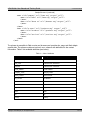
TABLE OF CONTENTS
Table of Contents ............................................................................................................................2
What’s New in 2.1 ...........................................................................................................................6
What’s New in 2.0 ...........................................................................................................................7
Chapter One: Introduction to eSite Builder ........................................................................................8
How eSite Builder Works ..............................................................................................................8
System Requirements ..................................................................................................................9
For Building and Editing eSite Builder ........................................................................................9
For Viewing eSites ....................................................................................................................9
Signing into eSite Builder..............................................................................................................9
Reading Visual Aids....................................................................................................................10
Previewing the eSite ..................................................................................................................10
Chapter Two: Page Layouts............................................................................................................11
Creating a New Page..................................................................................................................11
Editing the Page Properties.........................................................................................................11
Editing the Page <Head> Information .........................................................................................12
Editing the Page Layout..............................................................................................................12
Saving versus Saving As .............................................................................................................13
Saving ...................................................................................................................................13
Saving As...............................................................................................................................13
Navigating between Pages..........................................................................................................13
Setting a new Home page ..........................................................................................................15
Chapter Three: Template Layouts...................................................................................................16
What goes in a Page and what goes in a Template? .................................................................16
Toggling between Layout Environments ......................................................................................17
Switching to the Template Layout Environment........................................................................17
Switching to the Page Layout Environment ..............................................................................17
Creating a New Template ...........................................................................................................17
Choosing a Template Layout.......................................................................................................18
Editing the Template Layout .......................................................................................................19
Saving Templates ...................................................................................................................19
Editing the Page Properties of the Template.............................................................................20
Editing the Color and Font Stylesheet ......................................................................................20
Setting and Clearing the Background Image.............................................................................22
Toggling Browser Centering On and Off...................................................................................22
Adding A Footer to the Template ................................................................................................22
Chapter Four: Working with Widgets...............................................................................................23
Creating New Widgets................................................................................................................23
Interacting with Widgets ............................................................................................................23
Accessing the Properties Dialog of a Widget ................................................................................24
Basic Manipulation of Widgets ....................................................................................................25
Copying, Cutting, and Pasting Widgets ....................................................................................25
Moving and Resizing Widgets ..................................................................................................25
Using the Widget Inspector for Layout.....................................................................................26
Copyright ©2006 Netopia, Inc. All Rights Reserved.
2 of 77
eSite Builder User Manual and Training Guide
2.1 Revised 042106
Applying Hyperlinks to Widgets ...............................................................................................27
Advanced Manipulation of Widgets..............................................................................................28
Alignment ..............................................................................................................................28
Distribution ............................................................................................................................28
Width and Height Matching .....................................................................................................28
Changing Layer Order.............................................................................................................28
Editing Widget Content ..............................................................................................................29
Text Boxes.............................................................................................................................29
Image Boxes..........................................................................................................................31
Adding Images to Text Boxes..................................................................................................32
Color Accent Boxes.................................................................................................................33
Flash Objects .........................................................................................................................33
Applying Backgrounds and Borders to Widgets.........................................................................34
Adding Tables............................................................................................................................35
Special Widgets .........................................................................................................................36
Area Boxes ............................................................................................................................36
Form Fields ............................................................................................................................36
Submit Buttons ......................................................................................................................36
Mortgage Calculator ...............................................................................................................36
Contact Information ...............................................................................................................36
Chapter Five: Additional Editing Tools .............................................................................................37
Using Rulers ..............................................................................................................................37
Using Snap to Grid .....................................................................................................................37
Using Guides .............................................................................................................................38
Using the Color Chooser .............................................................................................................39
Spell-Checking a Page ................................................................................................................40
Displaying the Word Count of a Page ..........................................................................................40
Chapter Six: Forms ........................................................................................................................41
Custom Forms ...........................................................................................................................41
Inserting a New Input Type ....................................................................................................41
Input Types and Their Specific Settings.......................................................................................42
Selecting Form Widgets..............................................................................................................43
Accessing the Advanced Settings of a Form .................................................................................43
Manipulation of Form Widgets ....................................................................................................43
Inserting Additional Text Boxes in a Form....................................................................................43
Creating Multiple Forms..............................................................................................................44
Form Information Retrieval.........................................................................................................44
Chapter Seven: Wizards .................................................................................................................45
Navigation Button Generator ......................................................................................................45
Creating text buttons..............................................................................................................45
Advanced style: Creating buttons with special images...............................................................46
Form Wizard..............................................................................................................................47
Picture Gallery ...........................................................................................................................47
Running the Picture Gallery Wizard..........................................................................................47
Editing Picture Gallery Settings................................................................................................48
Copyright ©2006 Netopia, Inc. All Rights Reserved.
3 of 77
eSite Builder User Manual and Training Guide
2.1 Revised 042106
Previewing Deployment of the Picture Gallery and Detail View ..................................................48
Chapter Eight: Managing eSite Assets .............................................................................................49
Working with the File Manager ...................................................................................................49
Uploading Files ..........................................................................................................................50
Managing Deleted Files ..............................................................................................................52
Making Use of Shared Libraries ...................................................................................................53
Chapter Nine: Managing your eSite.................................................................................................54
Using Search Keywords ..............................................................................................................54
Using Change History .................................................................................................................54
Using Visitor Statistics ................................................................................................................55
Chapter Ten: Super-User Functions ................................................................................................56
Locking Text Boxes ....................................................................................................................56
Engaging the Security Protocol for a Specialized Form..................................................................56
Freezing Layouts........................................................................................................................56
Adding Page Comments .............................................................................................................57
Updating the Dictionary..............................................................................................................57
Services Menu ...........................................................................................................................57
Restrictions to Super-User Privileges ...........................................................................................57
Appendix A: eSite Builder Flash API ................................................................................................58
API Objective.............................................................................................................................58
Requirements ............................................................................................................................58
Dynamic XML.............................................................................................................................58
Script Initialization .....................................................................................................................61
Navigation Menu Scripting ..........................................................................................................62
Advanced Customization.............................................................................................................65
eSite Builder Editor Support........................................................................................................66
Appendix B: Training Guide ............................................................................................................68
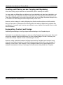
What's the Best Approach to Building a Site? ...............................................................................68
Adopting Ready-Made Elements ..............................................................................................68
Wiping the Slate Clean............................................................................................................69
Creating and Placing versus Copying and Replacing .....................................................................70
Segregating Content and Design.................................................................................................70
Global Settings versus Local Settings...........................................................................................71
Global Settings .......................................................................................................................71
Local Settings.........................................................................................................................71
How to Make a Splash Page........................................................................................................72
Creating the Template Layout .................................................................................................72
Creating the Page Layout........................................................................................................72
Opening and Editing Files in a Text Editor ...................................................................................73
Organizing Your Site ..................................................................................................................73
Widget Properties ......................................................................................................................73
Combining Widgets ....................................................................................................................74
Preferred Image File Formats and Dimensions .............................................................................74
Reverting an Image to its Original Size........................................................................................75
Previewing Deployment of the Mortgage Calculator......................................................................75
Copyright ©2006 Netopia, Inc. All Rights Reserved.
4 of 77
eSite Builder User Manual and Training Guide
2.1 Revised 042106
Bugs Fixes and Work-Arounds ....................................................................................................76
Work-Around: Offering “Unsupported” Files for Download.........................................................76
Work-Around: Creating “Image Maps,” AKA “Hot Spots” ............................................................76
Bug Fix: Inconsistent Display of Text Boxes in Mozilla Firefox....................................................76
Changing the Position of the Sign In logo on a Page ....................................................................77
Copyright ©2006 Netopia, Inc. All Rights Reserved.
5 of 77
eSite Builder User Manual and Training Guide
2.1 Revised 042106
WHAT’S NEW IN 2.1
The following features are available in 2.1:
Enhanced Editing Tools
Use Rulers, Guides, and a Snap to Grid feature to simplify placement and alignment of widgets (such
as images and text) when editing a page or template. See page 37.
Navigation Button Generator Enhancement
Specify additional mouseover and page active properties while creating buttons in the Navigation
Button Generator. See page 45.
Global Footers
Create a global footer that includes such information as company name, address, and telephone
numbers. This information is displayed at the bottom of every page that uses a particular template. See
page 22.
Password-Protected Pages
Password-protect a page to prevent visitors without knowledge of the password from viewing the page.
See page 12.
Picture Gallery Wizard Enhancement
Specify Title Size when creating a look and design for the Picture Gallery. See page 47.
Hyperlink Properties Enhancement
Include Anchor names when specifying hyperlink properties for an image. See page 27.
Keyword Search
View a list of keywords that generate traffic to you eSite. See page 54.
Copyright ©2006 Netopia, Inc. All Rights Reserved.
6 of 77
eSite Builder User Manual and Training Guide
2.1 Revised 042106
WHAT’S NEW IN 2.0
The following features are available in 2.0:
Change the Home page
Set any of your eSite pages to be the new Home page. See page 15.
Uploading, editing, and using Cascading Style Sheets (CSS)
Upload CSS files to your eSite and use them to create your Template. See page 21.
You can also directly edit the CSS files online. See page 73.
Widget inspector
Use the widget inspector as a shortcut to altering the layout of images, text boxes, and other features.
The widget inspector opens a dialog box that enables you to change the position, size, and padding of
these features in real time. See page 26.
Enhanced hyperlink options
Control the design and placement of the pop-up windows you create. See page 27.
Textbox scrolling
Exercise greater control over how text in text boxes flow on your eSite pages. For a given text box
design, you can choose to create a text box large enough for the reader to view all of the text, or you
can create a scrollable text box. See page 31.
Adding images to text boxes
Utilize the ability to add images to a text box and then wrap the text around it. See page 32.
Tables
Add tables to your eSite for a more professional and creative appearance. See page 35.
Sign-in logo positioning
Change the position of the sign in logo when its current position conflicts with your page layout. See
page 77.
Copyright ©2006 Netopia, Inc. All Rights Reserved.
7 of 77
eSite Builder User Manual and Training Guide
2.1 Revised 042106
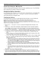
CHAPTER ONE: INTRODUCTION TO ESITE BUILDER
How eSite Builder Works
eSite Builder is an online Web site design and management application that relies fundamentally on a
graphical (visual) interface (the “eSite Builder Editor”) and the principle of “What You See Is What You
Get” (‘WYSIWYG’). The eSite Builder Editor indicates functional elements with graphic cues, responds
to direct user manipulation of on-screen objects, and follows certain conventions for the on-screen
positioning, alignment and distribution of objects.
eSite Builder creates an online application interface by leaving a “Host” window open with all of the
browser’s functionality – menus, buttons, web address field, etc. – and launching the eSite Builder
Editor interface in a new browser window adapted for the purpose. The Host window maintains the
URL of the eSite (you should leave this window alone so as to remain signed in the eSite) and displays
the deployed eSite upon signing out. The eSite Builder Editor appropriates its window for its interface
and functionality.
The eSite Builder Editor comprises a set of menus and toolbars, and two nominally independent editing
environments: the Page Layout Editor and the Template Layout Editor. Upon signing in, the eSite
Builder Editor initially presents the Page Layout Editor, with the Template Layout environment present
in a faded, un-editable form. The buttons in the toolbars are iconographic (icons only; no text). (See
Screenshot 1.) Hovering the mouse pointer over a button yields an identifying label.
Every eSite comes with (at the very minimum) a default Home page, including a prepackaged set of
content-bearing objects, called “Widgets,” as part of its Page Layout. The eSite is also automatically
configured with a default Template Layout, which comprises Widgets of its own. To make an eSite your
own, add to and modify these built-in elements and settings.
Behind the scenes, eSite Builder is comprised of proprietary files (‘.nxg’ and ‘.nxt’ files) rather than
conventional HTML, XML, PHP, CFM or ASP file formats. One consequence of this strategy is that all Web
design must take place within the interface; it is not possible to design offline and upload files via FTP.
Note: eSite Builder, sometimes referred to as eSiteNXG, is a next-generation (NXG) product. Thus, the
terms “eSite Builder” and “eSiteNXG” are used interchangeably.
Copyright ©2006 Netopia, Inc. All Rights Reserved.
8 of 77
eSite Builder User Manual and Training Guide
2.1 Revised 042106
System Requirements
For Building and Editing eSite Builder
In order to build or edit in the eSite Builder environment, you should adhere to the following system
requirements:
•
•
•
Microsoft Windows 2000 or higher, with the most current updates applied
Microsoft Windows XP, Service Pack 2, with the most current updates applied, is preferred.
Microsoft Internet Explorer 6.x or higher, with the most current updates applied
Sun Java JRE 1.4.1 or higher
Note: eSite Builder generates standards-based HTML code which conforms to HTML 4.01 specifications
set by the World Wide Web Consortium (W3C).
For Viewing eSites
You may view eSites on any operating system (Windows, Apple, Linux, etc.) provided you use a
modern browser, which is to say one that supports Cascading Style Sheets level 1 (CSS 1). The
following is a partial list of acceptable browsers:
•
•
•
•
•
Microsoft Internet Explorer 4.x (CSS 1 support is not 100% at this level)*
Microsoft Internet Explorer 5.x or higher*
Mozilla Firefox 1.x or higher
Apple Safari 1.2 or higher
Opera 7 or higher
*Internet Explorer is no longer supported for MAC users due to Microsoft’s discontinued IE support for
MAC.
Signing into eSite Builder
1. In the lower right of the page, click the “Sign-In” icon.
2. In the Sign-In page that launches, enter your username and password, and click the “Submit”
button.
3. If your login is successful, the Host window launches.
4. The eSite Builder Editor window launches.
• If the eSite Builder Editor does not launch automatically, click the “Start Editor” button
in the Host window.
• As the eSite Builder Editor launches, you may check your version of Java to make sure it
meets the system requirements for eSite Builder (see section above).
o In the upper right of the page, click the “Check Java Version” link.
o A pop-up window launches to inform you whether your version of Java complies.
• Give the eSite Builder Editor about 30-60 seconds to load.
o Key commands for eSite Builder do not work until the eSite Builder Editor is fully loaded.
Copyright ©2006 Netopia, Inc. All Rights Reserved.
9 of 77
eSite Builder User Manual and Training Guide
2.1 Revised 042106
Reading Visual Aids
Certain visual aids in the Editor diverge from the WYSIWYG principle, but nonetheless come in handy
while laying out pages. These features do not appear in the site as viewed by visitors, and may also be
disabled manually in the View menu of the eSite Builder Editor to obtain a truer view of how the eSite
looks to visitors, without previewing it (see next section) or signing out.
• Show Borders: These are soft dashed borders that appear around a Widget to show that it is
selected. These borders are not to be confused with the user-set borders that may be applied
to individual Widgets. See “Applying Backgrounds and Borders to Widgets.”
• Fading of Disabled Items: When you are in the Page Layout editing environment, the Template
Layout is faded, and vice versa.
• Startpoint: This is a pointer labeled “Start Content Here.” Its function is to maintain a consistent
reference point across all pages in the site.
Previewing the eSite
User-determined links, such as linked text and images including navigation buttons, do not function in
the Editor itself. Links, including button rollovers, are available only when previewing the eSite, and, of
course, on the deployed eSite (i.e., as viewed when not signed in). Preview the eSite as follows:
• In menu: Tools > Open Browser Window
OR Key [F4]
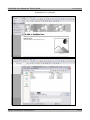
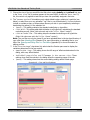
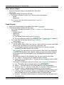
Screenshot 1 – The eSite Builder Editor as it appears upon signing in, showing the Page Layout environment.
<--- End of Chapter --->
Copyright ©2006 Netopia, Inc. All Rights Reserved.
10 of 77
eSite Builder User Manual and Training Guide
2.1 Revised 042106
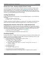
CHAPTER TWO: PAGE LAYOUTS
In a typical eSite, there may be several pages, all keeping to a consistent look, but each addressing
different aspects of your business – like a Home page, a Services page, a Contact page and so on. The
eSite Builder Page Layout environment supports the content of the individual pages, whereas the
Template Layout environment addresses the overall design of the eSite (see Chapter 3).
Should information go into a Page or in a Template? See “What goes in a Page and what goes in a
Template?” (Chapter 3) for more information.
Creating a New Page
There are two ways to create a new page. You may either create a page from scratch (this section), or
you may take an existing page and use the “Save As” command (see the “Saving versus Saving As”
section below).
1. In menu: File > New Page
OR Key [Ctrl]-[N]
OR In toolbar: Click ‘New Page’ icon
2. A “Select Page Layout” dialog launches. Choose between the various predetermined Page
Layouts.
• Following each option’s description, there is a “Preview…” hyperlink, which brings up
sample of the Page Layout in a new window for previewing.
• If you are not sure which option to choose, or would like to start a Page Layout from
scratch, choose the Page Layout titled ‘Blank Page’.
3. Click ‘OK’
Editing the Page Properties
In the “Page Properties” dialog, you may edit certain attributes that affect how the page appears in the
File Manager, how visitors can find the eSite in a Web search, and whether the Sign In link is visible on
the page.
1. In menu: File > Page Properties
OR In toolbar: “Page Properties” icon
2. A dialog appears. Its components are as follows:
• Filename (not editable) – This field identifies the current page in the File Manager, and
includes a ‘.nxg’ extension.
• Page Title – Here you may give the page a title, which appears at the top of the
browser, and is distinct from the filename of the page.
• Automatically add business info to page title (checkbox) – This control
allows you to add your company’s business name to the page title at the top of the browser.
• Nickname – Here you may give the page a name for ease of identification in the File menu
and the File Manager. The Nickname also serves as the default text label when generating
navigation buttons.
Copyright ©2006 Netopia, Inc. All Rights Reserved.
11 of 77
eSite Builder User Manual and Training Guide
2.1 Revised 042106
•
Keywords – This text area allows you to attach a
Meta Tags
sequence of words to the Web site, in the form of “Meta
tags” (see box this page). The words in the sequence
These are words
must be separated by commas.
(“Keywords”) and phrases
• Description – This text area allows you to attach full
(“Description”) that search
sentences in the form of “Meta tags” (see box this
engines like Google and
page).
Yahoo catch. When a
• Password protect page (checkbox) – This allows
potential visitor searches the
visitors to access/view the page only if they have a
Web for sites of a particular
password.
type through a search engine,
• Password – Enter your chosen password if you opt to
the Meta tags help pick your
password protect the page.
Web site out for
• Hide Sign In link to this page (checkbox) –
consideration. Choose words
This control suppresses the appearance of the “Sign In”
and phrases that accurately
icon and hyperlink in the lower right side of the page.
describe your business, and
This feature is desirable in cases where the page is
would appeal to your
designed primarily to appeal visually to visitors, perhaps
prospective customers.
as an invitation to further explore the Web site (often
called a “Splash page”). It is still possible to sign into the site, even though the link is
hidden.
3. Click “OK.”
Editing the Page <Head> Information
The editor provides a way for advanced users to insert custom information in the <HEAD> portion of
the document. For example, you may want to put custom JavaScript on a page, or include additional
<META> tags other than the ones provided by the Page Properties.
• File > Page <Head> Info
Editing the Page Layout
With the WYSIWYG interface of the eSite Builder, editing a page is simply a matter of dressing it up
with elements containing text, image and color on the page, moving them around and resizing them.
• You may add and modify Widgets freely anywhere on the screen.
See Chapter 4 .
•
You may add and modify Custom Forms freely anywhere on the screen.
•
You may run any of the Wizards freely anywhere on the screen.
See Chapter 6 .
See Chapter 7 .
Copyright ©2006 Netopia, Inc. All Rights Reserved.
12 of 77
eSite Builder User Manual and Training Guide
2.1 Revised 042106
Saving versus Saving As
Saving
Saving your work is obviously critical. You should save as often as you make significant changes.
• In menu: File > Save
OR Key [Ctrl]-[S]
OR In toolbar: Click ‘Save’ icon
Saving As
The “Save As” operation is similar to the ‘Save’ operation, but differs in giving you the option to save
the current Page Layout as a new page with a unique file name, or overwrite a previously existing Page
Layout file.
1. In menu: File > Save As…
OR Key [Ctrl]-[Shift]-[S]
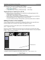
(See Screenshot 2)
2. A “File Chooser” dialog launches (see Screenshot 3).
• If you wish to use the current Page Layout as the basis of a new page in the site, you must
type a unique file name for the Page Layout.
• If you wish to overwrite a previously existing Page Layout file with the current one, you
must select the Page Layout file to be overwritten from among the files listed, or type in its
file name.
a. The “File name” field is selected. You may enter a file name of your choice. See the
description of the Filename in the “Editing the Page Properties” section above.
b. In the “Nickname” field under the “Additional Save Options” section, you may enter
a name of your choice. See the description of the Nickname in the “Editing the Page
Properties” section above.
3. Click the ‘Save’ button
OR Key [Enter]
Navigating between Pages
The eSite Builder Editor provides two ways to get to another page from the current one, as follows:
• In menu: File > {Page Name}
If changes have been made to the current page since the last save, a “Save Changes” dialog
launches.
Choose whether to save the changes, reject them, or cancel back to the current page.
•
In menu: File > Open
OR In toolbar: “Open” icon
a. A “Save Changes” dialog launches if you have made changes (see above).
b. The File Manager launches in the form of a “File Chooser” dialog.
c. Select the file representing the page you wish to open. Note that the files are given with
their file names only, not their Nicknames.
Copyright ©2006 Netopia, Inc. All Rights Reserved.
13 of 77
eSite Builder User Manual and Training Guide
2.1 Revised 042106
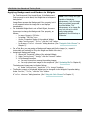
Screenshots 2 & 3 – Saving As
Copyright ©2006 Netopia, Inc. All Rights Reserved.
14 of 77
eSite Builder User Manual and Training Guide
2.1 Revised 042106
Setting a new Home page
Your eSite includes an initial, pre-set Home page but you can make any of your pages the new Home
page.
1. In menu: Tools > Set Home Page…
2. A “Set Home Page” dialog launches. Click the arrow to select the page you wish to make your
new Home page. Click “OK.”
<--- End of Chapter --->
Copyright ©2006 Netopia, Inc. All Rights Reserved.
15 of 77
eSite Builder User Manual and Training Guide
2.1 Revised 042106
CHAPTER THREE: TEMPLATE LAYOUTS
The eSite Builder Template Layout environment governs Template design and implementation, as well
as the application of an overall (global) color scheme and font settings to an eSite. Building Templates,
as with the pages, is simply a matter of dressing them up with various Widgets in specific positions and
sizes. However, it is the role of Template Layouts to present a uniform appearance and style across
some or all of the pages in the eSite, whereas Page Layouts support the content of the particular pages
(see Chapter 2).
What goes in a Page and what goes in a Template?
Information that goes into a Page is fresh and is subject to change. Include information in Templates
that will not change, such as the overall page layout design, the header and footer information, and
the navigation buttons. If you plan to include the same information on every single page in your eSite,
place this information in the Template.
Examples of information that goes in Pages:
• Information that is specific to one page.
• Information that might change frequently.
• Pictures that are specific to a particular page on your eSite.
• Special designs that might look good on one page but not on all pages of your eSite.
Examples of information that goes in Templates:
• Hours of operation
• Business address
• Copyright information
• Search bar
• Contact information
• Link to privacy information
• Company logo or slogan
• Navigation bar that includes links to other pages as well as your sites in different languages.
• Background colors or a special picture you have uploaded. In this case, make sure the layout
will work for all of the Pages you plan to create.
Note: Avoid clutter when creating a Template; keep the design simple and consider keeping logos,
images, and other features on the outer edges of the Template so they will not conflict with
information that will appear on individual pages. Leave enough space for information that will appear
on individual pages.
Copyright ©2006 Netopia, Inc. All Rights Reserved.
16 of 77
eSite Builder User Manual and Training Guide
2.1 Revised 042106
Toggling between Layout Environments
Switching to the Template Layout Environment
The Page Layout environment is the default environment. You must switch to the Template Layout
environment in order to create or modify Templates. Enter the Template Layout environment as
follows:
1. In menu: Edit > Template Layout
OR Key [Ctrl]-[L]
2. The Template Layout environment becomes enabled.
In the Edit menu, “Template Layout” is checked.
If you have the “Fade Disabled Items” setting checked in the Tool menu, the content area turns
paler, and the design elements, like the banner and navigation areas, become brighter.
Switching to the Page Layout Environment
You must be in the Page Layout environment in order to apply Templates to the eSite as a whole or to
specific Pages in the eSite, as well as to create and modify Pages (see Chapter 2 ). Return to the Page
Layout environment as follows:
1. In menu: Edit > Template Layout
OR Key [Ctrl]-[L]
2. The Template Layout environment becomes enabled.
In the Edit menu, “Template Layout” is unchecked.
The Template pales, as when you entered eSite Builder Editor initially, if you have the “Fade
Disabled Items” setting checked in the Tool menu.
Creating a New Template
There are two ways to create new Templates. You may either create a new Template Layout from
scratch (this section), or choose a pre-existing Template Layout and modify it (see following sections).
1. Switch to the Template Layout environment, if you are in the Page Layout environment.
2. In menu: File > New Template
OR Key [Ctrl]-[N]
3. The Template Layout environment clears.
• You may wish to begin editing the new Template immediately. See “Editing the Template
Layout.”
4. In menu: File > Save
OR Key [Ctrl]-[S]
• A “File Chooser” dialog launches. This is a version of the File Manager.
o The “File name” field is selected. You may enter a file name of your choice.
o In the “Nickname” field under the “Additional Save Options” section, you may
enter a name of your choice; it identifies the Template Layout in the “Choose Template
Layout” dialog (see next section).
Copyright ©2006 Netopia, Inc. All Rights Reserved.
17 of 77
eSite Builder User Manual and Training Guide
2.1 Revised 042106
Choosing a Template Layout
1. Switch to the Page Layout environment, if you are in the Template Layout environment.
2. In menu: Edit > Choose New Template...
(See Screenshot 4 below.)
3. In the “Choose a Template” dialog that launches, click on any of the available templates in the
left pane, and preview them in the right pane. (See Screenshot 5 next page.)
• The left pane contains two categories of Template to choose from; they are as follows:
o My Templates – These are Templates that you have created or customized. (Note:
This also includes files you upload from the Shared Libraries directory which can be
accessed by clicking the “Libraries” button at the lower-right bottom of the dialog
window. See “Making Use of Shared Libraries” (Chapter 8) for more information.)
o Built-In Templates – These are Templates that come pre-packaged with every
site; they cannot be overwritten.
4. Choose a template to work with. Your choice does not commit you to using the template “as is”
(see “Editing the Template Layout”), nor does it commit you to applying the template to every
page in the site.
• Select the radio button for “Current page only” only if you wish to apply the template
exclusively to the current page.
• Select the radio button for “All ‘.nxg’ pages on my Web Site” if you have already
applied multiple templates to your eSite, and you wish to replace all of them with your new
selection.
• Otherwise, leave the radio button for “All pages currently using the
‘{Template Name}’ template” selected. (This is the default setting.)
5. Click the ‘OK’ button.
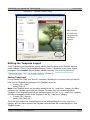
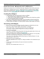
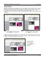
Screenshot 4 – Choose New Template
Copyright ©2006 Netopia, Inc. All Rights Reserved.
18 of 77
eSite Builder User Manual and Training Guide
2.1 Revised 042106
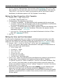
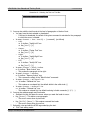
Screenshot 5 – “Choose a Template” Dialog
Click “Libraries”
to access more
Templates from
the Shared
Libraries.
Editing the Template Layout
In the Template Layout environment, you can edit the Page Properties of the Template, add and
modify Widgets (Chapter 4) and Navigation Buttons (Chapter 7) anywhere on the screen. Further
parameters of the Templates become directly editable, including “Color and Font Stylesheet,”
“Background Image,” and “Use Browser Centering” (Chapter 3).
Saving Templates
Choose between the “Save” and “Save As” commands, depending on how much control you want to
have over the File Name and Nickname of the Template Layout file.
• In menu: File > Save
OR Key [Ctrl]-[S]
Note: If the Template Layout you are editing belongs to the “My Templates” category, the Editor
overwrites the Template Layout with your changes. The editor does not overwrite the Built-In
Templates. If the Template Layout you are editing belongs to the “Built-In Templates” category,
the Editor automatically creates a new Template in the “My Templates” category.
• In menu: File > Save As
OR Key [Ctrl]-[Shift]-[S]
This is the right choice if the Template Layout you are editing belongs to the “My Templates”
category, and you want to preserve the Template Layout and save the current changes to a new
Template Layout.
Copyright ©2006 Netopia, Inc. All Rights Reserved.
19 of 77
eSite Builder User Manual and Training Guide
•
2.1 Revised 042106
A “File Chooser” dialog launches. This is a version of the File Manager. The “File name”
field is selected. You may enter a file name of your choice. In the “Nickname” field under the
“Additional Save Options” section, you may enter a name of your choice for ease of
identification; the Nickname appears in the “My Templates” chooser dialog.
Editing the Page Properties of the Template
1. In menu: File > Page Properties
OR In toolbar: “Page Properties” icon
2. A dialog appears. Its components are as follows:
• Filename (not editable) – This field identifies the file associated with the current page.
• Nickname – Here you may give the page a name for ease of identification in the File menu;
the Nickname also appears in the “My Templates” chooser dialog.
• Keywords – This text area allows you to attach a sequence of words to the Web site, in the
form of “Meta tags” (see “Meta Tags” box above). The words in the sequence must be
separated by commas.
• Description – This text area allows you to attach full sentences in the form of “Meta
tags” (see “Meta Tags” box above ).
3. Click “OK.”
Editing the Color and Font Stylesheet
The Color and Font Stylesheet allows you to define an overall color scheme and style to your eSite.
There are a few predefined color schemes available, and you may define your own. Once you have
settled on a color scheme, the colors occupy a designated palette in the “Color Chooser” dialog.
1. In menu: Edit > Colors & Styling > Color and Font Stylesheet…
2. A “Set Stylesheet” dialog appears. (See Screenshot 6 next page.) Its components are as
follows (from left to right, top to bottom):
• Color Theme – list
• Customize… – button
• Font Family – list
• Font Size – list
• Custom Options – list
• Preview pane (not editable)
• Preview Page – drop-down menu
3. In the “Color Theme” list, select among the preconfigured color schemes to preview them in
the pane below. The preconfigured color schemes only apply to Built-In Templates.
OR Click the “Customize…” button to modify the “(Custom)” color theme (see below). Only
one “(Custom)” color theme exists; you cannot create, rename or save new custom color
themes, only modify the existing “(Custom)” settings. To apply the “(Custom)” color theme,
choose it in the “Color Theme” list.
4. Choose the font you would like the Web site to apply globally (i.e. to all Text Boxes on all
pages, both in the Page Layout and Template Layout) as the default font in the “Font
Family” list. A preview appears in the pane below. This control does not override any specific
applications of a particular font to a stretch of text, but only to text to which no particular font
has been applied.
Copyright ©2006 Netopia, Inc. All Rights Reserved.
20 of 77
eSite Builder User Manual and Training Guide
2.1 Revised 042106
5. Choose the size of font you would like the Web site to apply globally as the default font size
in the “Font Size” list. A preview appears in the pane below. As with the “Font Family”
list, this control only applies to text that you have not specifically assigned a font size.
6. The “Custom Options” list enables you to select default options relating to hyperlinks (see
below) or select from your own uploaded “.css” files in your eSite directory. You can choose to
include or exclude as many of these custom files as you wish in your template by selecting or
deselecting the option(s) in the selection list.
• (None) – This setting maintains the standard underlining on hyperlinks.
• Link Bold – This setting adds bold stylization to all hyperlinks, maintaining the standard
underlining as well. (Note: Link colors are set in the “Color Theme” control.)
• Link No Underline – This setting strips the standard underlining on all hyperlinks.
(Note: Link colors are set in the “Color Theme” control.)
Note: The .css files can only be viewed if you have uploaded them in the top-level directory of
your eSite. See Uploading Files (Chapter 8) for more information on uploading files to your
eSite. See Opening and Editing Files in a Text Editor (Appendix B) for more information on
editing css files.
7. In the “Preview Page” drop-down list, select what the Preview pane uses to display the
variations determined in the top controls.
• Sample HTML Tags – This setting shows the full range of effects as determined in the
dialog, with every effect labeled.
• Individual page titles and filenames in the current site – These
settings show how the controls in the dialog affect the respective pages of the site.
• (None) – This setting shows how the current dialog settings affect a blank page.
Screenshot 6 – Color and Font Stylesheet
Copyright ©2006 Netopia, Inc. All Rights Reserved.
21 of 77
eSite Builder User Manual and Training Guide
2.1 Revised 042106
Setting and Clearing the Background Image
•
•
In menu: Edit > Colors & Styling > Background Image… > Set Image
The File Manager launches.
In menu: Edit > Colors & Styling > Background Image… > Clear Image
Toggling Browser Centering On and Off
•
•
Enable the Browser Centering feature if you would like the overall page alignment of the
Template Layout to be set to the center.
In menu: Edit > Colors & Styling > Use Browser Centering
Keep the Browser Centering feature disabled (this is the default setting) if you would like the
overall page alignment of the Template Layout to remain to the left.
If you have enabled the Browser Centering feature, repeat the procedure above to disable it.
Adding A Footer to the Template
A footer includes information you typically wish to display at the bottom of every page that uses a
particular template such as company name, address, and telephone numbers.
To place items in the footer, make certain you are in the template layout environment:
Edit > Template Layout
Drag text or images completely below the footer bar line to make them a part of the footer. When
finished, select File > Save to save your work. Open a new browser window to view your template
(Tools > Open Browser Window).
Global footer line
To toggle the footer line’s appearance while editing, select View > Show Footer Line.
<--- End of Chapter --->
Copyright ©2006 Netopia, Inc. All Rights Reserved.
22 of 77
eSite Builder User Manual and Training Guide
2.1 Revised 042106
CHAPTER FOUR: WORKING WITH WIDGETS
Widgets are the building blocks of eSite Builder Web pages. Regardless of which editing environment
(Page Layout or Template Layout) you are in, Widgets play the role of containing content. Widgets
come in four fundamental forms: Text Boxes, Image Boxes, Color Accent Boxes, and Flash Objects.
Additionally, there are special Widgets, which are adapted to serve specific purposes.
Creating New Widgets
1. The eSite Builder Editor offers three ways to create a new Widget:
• Select the desired type of Widget from the Insert menu.
• In some cases, you may execute the corresponding command with a shortcut key operation.
• Click the corresponding button in the toolbar.
2. In the case of Image Boxes and Flash Objects, you are prompted to choose from among the
existing images, or upload new images to the scrapbook (see “Uploading Files” in Chapter 8).
3. The Editor places new Widgets in an arbitrary position toward the upper middle of the window.
Interacting with Widgets
•
•
Hover the mouse pointer over a Widget; the pointer changes to a 4-directional arrow-cross.
Click (once) to select individual Widgets. (See Screenshot 7 next page.)
Eight “handles” appear, evenly spaced around the border of the selected item.
It is necessary to select a particular Widget before any editing can take place.
•
Double-click to edit Widgets.
In the case of Text Boxes, double-clicking adds a thick diagonally striped border to the box, and
makes the text within the box editable. (See Screenshot 9.)
In the case of Image Boxes, double-clicking brings up a Properties dialog box. You may modify
parameters of the image and containing box, or choose a new image.
In the case of Color Accent Boxes, double-clicking brings up a Properties dialog box. You may
modify parameters of the box only.
•
Right-click to bring up a contextual menu.
In all cases, parameters of the “Properties” dialog are available in the contextual menu (see
below).
•
The two ways to select everything in the given environment are as follows:
Key [Ctrl]-[A]
Right-click; in the contextual menu: Select All.
Copyright ©2006 Netopia, Inc. All Rights Reserved.
23 of 77
eSite Builder User Manual and Training Guide
2.1 Revised 042106
Screenshot 7 – A Selected Text Box
Accessing the Properties Dialog of a Widget
Three
•
•
•
ways exist to access the “Properties” dialog of any selected Widget:
In menu: Edit > Widget Properties
Right-click; in contextual menu: Properties
Key [Alt]-[Enter]
Screenshot 8 –
The Properties Dialog of an Image Box
Copyright ©2006 Netopia, Inc. All Rights Reserved.
24 of 77
eSite Builder User Manual and Training Guide
2.1 Revised 042106
Basic Manipulation of Widgets
Copying, Cutting, and Pasting Widgets
•
There are three ways to copy a selected Widget, as follows:
In menu: Edit > Copy
Key [Ctrl]-[C]
Right-click; in the contextual menu: Copy
•
There are three ways to cut a selected Widget, as follows:
In menu: Edit > Cut
Key [Ctrl]-[X]
Right-click; in the contextual menu: Cut
•
There are three ways to paste a selected Widget, as follows:
In menu: Edit > Paste
Key [Ctrl]-[V]
Right-click; in the contextual menu: Paste
Moving and Resizing Widgets
•
There are three ways to move a selected Widget, as follows:
Click and drag the Widget to the desired location
Arrow keys: Left [ ], Right [ ], Up [ ], Down [ ]
Enter the exact values of the desired position in Properties dialog.
In the “Layout” tab, enter values in the “Size & Position” controls. (You can also
use the Widget Inspector. See below.)
There are two ways to change the dimensions of a selected Widget, as follows:
o
•
Click and drag the Widget’s handles in or out to the desired size.
o
o
For any of the handles located in the center of the Widget’s sides, the handle only
controls the position of the current side, and only in the dimension perpendicular to the
edge. Simply put, only one side may be dragged at a time, and only ‘in’ or ‘out’.
For any of the handles located on a corner of a Widget, the handle simultaneously
controls the horizontal position of the horizontal side and the vertical position of the
vertical side. Hold the [Ctrl] key, click and drag to constrain the aspect ratio of the
Widget as its dimensions change (the effect obtains upon releasing the mouse button).
Enter the exact values of the desired width and height of the Widget in the Properties dialog.
In the “Layout” tab, enter values in the “Size & Position” controls. (You can also use
the Widget Inspector. See below.)
Copyright ©2006 Netopia, Inc. All Rights Reserved.
25 of 77
eSite Builder User Manual and Training Guide
2.1 Revised 042106
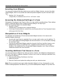
Using the Widget Inspector for Layout
Use the Widget Inspector as a shortcut to the “Layout” dialog box. The Inspector lets you view the size
and position attributes for all widgets (as well as padding options for Text Boxes) as you resize and
reposition them. Enter values in the Widget Inspector as you would the “Layout” dialog box, as shown
below.
Widget Inspector
Web page text
Layout dialog for Text Box
Use either the Widget
Inspector or the Layout
dialog box to move and
resize images, text
boxes, and other
widgets.
Copyright ©2006 Netopia, Inc. All Rights Reserved.
26 of 77
eSite Builder User Manual and Training Guide
2.1 Revised 042106
Applying Hyperlinks to Widgets
•
You can add hyperlinks to Images, Color Accent Boxes, and highlighted text. There are three
ways to apply a hyperlink.
o Key [Ctrl]-[K]
o In menu: Insert > Hyperlink…
o In toolbar: “Hyperlink” icon
•
The “Insert Hyperlink” dialog launches.
o In the “Location” section, select either a
page from your eSite or an outside Web
page. You can also enter an e-mail
address)
o In the “Options” section, enter text in the
“Link Title” box and it will appear over the
image when visitors move their mouse
over it. Enter an “Anchor Name” if you
want visitors to jump to a specific place
on a page.
o
Check the “Open link in new window” box
if necessary. Visitors who click your
hyperlinked image or text will view the
location from a new browser window, or
“pop-up” window.
o
You can control how the pop-up appears
on a visitor’s page by accessing the “PopUp Window.” Set the various attributes in
both the “Layout” and “Features” sections
and then click “Test Pop-Up” to view your
results. When finished, click “OK.”
Copyright ©2006 Netopia, Inc. All Rights Reserved.
27 of 77
eSite Builder User Manual and Training Guide
2.1 Revised 042106
Advanced Manipulation of Widgets
The eSite Builder Editor comprises features that aid in the positioning and sizing of Widgets in relation
to one another. These features save you time when you are satisfied with the position and size of a
particular Widget, and would like to simply make other Widgets conform.
Alignment
1. Select the Widget to which the other Widget(s) should be aligned.
2. Hold the [Shift] key down and click on the Widgets that should align to the first Widget.
3. In menu: Layout > Align {side}
OR In toolbar: “Align {side}” / “Center Horizontally” / “Center Vertically” icon
OR {key binding}
Align Left: [Ctrl]-[ ]
Align Right: [Ctrl]-[ ]
Align Top: [Ctrl]-[ ]
Align Bottom: [Ctrl]-[ ]
Note: You can also use the Widget Inspector for alignment.
Distribution
1. Select a Widget that should be evenly spaced in relation to other Widgets.
2. Hold the [Shift] key down and click on the remaining Widgets that should be evenly spaced
in relation to each other.
3. In menu: Layout > Distribute Horizontally / Distribute Vertically
OR In toolbar: “Distribute Horizontally” / “Distribute Vertically” icon
Width and Height Matching
1. Select the Widget to which the other Widget(s) width or height should be matched.
2. Hold the [Shift] key down and click on the Widgets the width or height of which should be
matched to the first Widget.
3. In menu: Layout > Make Same {Width / Height}
OR In toolbar: “Make Same {Width / Height}” icon
Note: You can also use the Widget Inspector for width and height matching.
Changing Layer Order
•
•
•
•
Widgets may partially or completely obscure other Widgets.
When a Widget obscures another, it is said to be “in front of” the obscured Widget; conversely,
the obscured Widget is said to be “behind” the un-obscured Widget.
Send a selected Widget back as follows:
In menu: Layout > Send Backward
OR In Toolbar: “Send Backward” icon
Copyright ©2006 Netopia, Inc. All Rights Reserved.
28 of 77
eSite Builder User Manual and Training Guide
•
OR
OR
•
•
•
OR
OR
2.1 Revised 042106
Send a selected Widget all the way back as follows:
In menu: Layout > Send to Back
In Toolbar: “Bring to Front” icon
Key [Ctrl]-[]]
Bring a selected Widget up as follows:
In menu: Layout > Bring Forward
OR In Toolbar: “Bring Forward” icon
Bring a selected Widget all the way up as follows:
In menu: Layout > Bring to Front
In Toolbar: “Bring to Front” icon
Key [Ctrl]-[]]
Editing Widget Content
Text Boxes
A. Editing the text within the Text Box
1. Double-click to “enter” the text area.
2. Type the desired text, or paste it in from a plain text editor (like Notepad).
3. Select the text. (See Screenshot 9 below.)
4. Once the text is selected, you may modify a variety of different parameters of the text.
• In menu: Format > Style
o Bold
OR In toolbar: “Bold” icon
OR Key [Ctrl]-[B]
o Italic
OR In toolbar: “Italic” icon
OR Key [Ctrl]-[I]
o Underline
OR In toolbar: “Underline” icon
OR Key [Ctrl]-[U]
• In toolbar: Style
o This is a drop-down menu that offers special formatting.
• In toolbar: Font Face
o This is a drop-down menu that offers different fonts; the name of each font is given in
the font face that the name offers (except for the “Webdings” and “Wingdings” fonts,
which are for typing special symbols and icons).
• In menu: Format > Text Color…
or In toolbar: “Text Color” icon
o A “Color Chooser” dialog launches.
• In menu: Format > Text Highlight…
or In toolbar: “Text Highlight” icon
o A “Color Chooser” dialog launches.
• In menu: Insert > Hyperlink…
OR In toolbar: “Hyperlink” icon
OR [Ctrl]-[K]
Copyright ©2006 Netopia, Inc. All Rights Reserved.
29 of 77
eSite Builder User Manual and Training Guide
2.1 Revised 042106
Screenshot 9 – Selecting the Text in a Text Box
5. You may also edit the text format at the level of paragraphs or blocks of text.
• You may have the text selected or deselected.
o If the text is deselected, the effect of the given command is restricted to the paragraph
in which the cursor is located.
• In menu: Format > Text Justify > {command} (as follows)
o Left
OR In toolbar: “Justify Left” icon
OR Key [Ctrl]-[L]
o Center
OR In toolbar: “Center Text” icon
OR Key [Ctrl]-[E]
o Right
OR In toolbar: “Justify Right” icon
OR Key [Ctrl]-[R]
o Full
OR In toolbar: “Justify Full” icon
OR Key [Ctrl]-[J]
• In menu: Format > Block Indent
OR In toolbar: “Block Indent” icon
o This pushes the paragraph to the right.
• In menu: Format > Outdent
OR In toolbar: “Remove Indent” icon
o This reverses the effect of the “Block Indent” command.
• In menu: Format > Bulleted List
or In toolbar: “Bulleted List” icon
o This creates an unordered list; the default bullet is the solid circle ( )
• In menu: Format > Ordered List
or In toolbar: “Ordered List” icon
o This creates an ordered list; the default ordering is Arabic numerals (1, 2, 3, …)
6. You may also add paragraph and line breaks
• Deselect the text, and place the cursor where you want the break to occur.
• Key [Enter] – This starts a new paragraph.
o The cursor moves down by two lines.
• Key [Shift]-[Enter] – This creates a manual line break.
o The cursor moves down by one line.
7. Optionally, view and edit the HTML tags underlying the text.
a. “Exit” text editing mode.
Copyright ©2006 Netopia, Inc. All Rights Reserved.
30 of 77
eSite Builder User Manual and Training Guide
2.1 Revised 042106
Click once anywhere outside the Text Box.
b. Select the Text Box.
Click once on the Text Box.
c. In menu: Edit > Text Box HTML
OR Key [Ctrl]-[H]
OR Right-click; in the contextual menu: HTML Source…
B. Editing the Properties of the Text Box
1. Access the Properties dialog of the selected Text Box (see above).
2. The Properties dialog is divided into two tabs:
• The first tab, also titled ‘Properties’, offers three sets of parameters:
o Border
o Background
o Overflow – Use this setting to choose how text in the Text Box is displayed. The
default setting is “Visible,” which means that all text is displayed in a Text Box that is
large enough to show it. If you want a smaller text area to appear on a page, select
“Scrollbars” to create a Text Box that contains scrollbars for readers to use. Select
“Hidden” if you want excess text to remain hidden.
• The “Layout” tab (You can also use the Widget Inspector.)
o Size & Position
o Padding – These settings control the internal margins of the Text Box.
Note: Images can be added to text boxes. See “Adding Images to Text Boxes” below.
Image Boxes
1. Access the Properties dialog of the selected Image Box (see above).
2. The Properties dialog is divided into three tabs:
• The first tab, also titled ‘Properties’, offers three sets of parameters:
o Border
o Background
o Picture
The “Browse” button brings up the File Manager.
You may choose from among the existing images (typically, stored in the “images”
folder).
You may upload new images to the scrapbook. (See “Uploading Files” in Chapter 8.)
• The “Layout” tab (You can also use the Widget Inspector.)
• The “Special Effects” tab offers three further sets of options:
o Mouseover – This control allows you to change the image’s appearance when the
mouse pointer moves across it.
Mouseover image – A Mouseover is an effect that swaps the original image with
another when the mouse pointer moves across it.
Background – If your image has transparency, you can add a background color that
appears when the mouse pointer moves across the image.
Border - You can add a border color that appears when the mouse pointer moves
across the image.
Copyright ©2006 Netopia, Inc. All Rights Reserved.
31 of 77
eSite Builder User Manual and Training Guide
o
o
2.1 Revised 042106
Navigation – This control allows you to attach a hyperlink to the image. Click “set”
to access more options for setting hyperlinks (see “Applying Hyperlinks to Widgets” for
more information).
Filter Effects – These controls allow you to apply special filters to the image,
without altering the original image file. You may preview the effect in the “Example
Picture” to the right of the controls.
Grayscale – Casts the image in black, white and shades of gray.
X-Ray – A combination of the Grayscale and Invert Color effects.
Invert Colors
Flip Horizontal
Flip Vertical
Opacity – Lowering the opacity value from 100% makes the Widget more
transparent. Note: Opacity comes in handy when you wish to allow an object that
is “behind” (via layer ordering) a partially transparent Widget to show through the
Widget. Such posterior objects may include elements of the Template Layout, as
well as other Widgets in the Page Layout. For example, you may place a Color
Accent Box with a colored background “behind” a partially transparent Image Box,
and the background color of the Color Accent Box blends with the foreground image.
Note that currently Internet Explorer is the only browser that supports Filter effects.
Other browsers will simply render the image normally.
Adding Images to Text Boxes
1. Select the Text Box to which you wish to add an image
(see the Text Boxes section if you need additional
information).
2. Click the place that you want the image to appear in
the text box.
3. In menu: Insert > Picture and select the image
to insert.
4. Once the image appears in the Text Box, right-click the
image to launch the “Properties” dialog. See Image
Boxes above for additional information.
5. For text wrapping options, go to the “Layout” section
of the “Properties” dialog, as shown at right.
Use the Layout section of the
Image Box dialog to set text
wrapping options.
Copyright ©2006 Netopia, Inc. All Rights Reserved.
32 of 77
eSite Builder User Manual and Training Guide
2.1 Revised 042106
Color Accent Boxes
1. Access the Properties dialog of the selected Color Accent Box
(see above).
2. The Properties dialog is divided into two tabs:
• The first tab, also titled ‘Properties’, offers two sets of parameters:
o Border
o Background
• The “Layout” tab (You can also use the Widget Inspector.)
o Size & Position
Flash Objects
1. Access the Properties dialog of the selected Flash Object (see above).
2. The Properties dialog is divided into three tabs:
• The first tab, also titled ‘Macromedia Flash® Properties’, offers three sets of
parameters:
o Playback Options
o Appearance
o Flash Source
The “Browse” button brings up the File Manager.
You may upload new images to the scrapbook. (See “Uploading Files” in Chapter 8.)
• The “Layout” tab (You can also use the Widget Inspector.)
o Size & Position
• The “Special Effects” tab
o This tab contains an area titled “Navigation,” which checks for a properly coded Flash
file in the site, and enables a set of controls if it finds such a file.
If the Navigation area does not find a suitable Flash file in the site, you see a
message to that effect instead of the controls.
o See Appendix A for instructions on the script required in Flash files for the appearance
of controls in the Navigation area. However, please note that the procedure is likely to
be comprehensible to and executable by only knowledgeable and experienced Flash
developers.
o When there are controls in the Navigation area, the area is split into two panes:
All Pages – This pane shows the pages that exist in the site.
Pages Shown on Navigation Menu – This pane shows the pages for which the Flash
file includes buttons.
o The buttons in the Navigation area are as follows. (See Screenshot 14 in Appendix A.)
Add – This button adds the selected page to the Flash Navigation.
Remove – This button removes the selected page from the Flash Navigation.
Move Up, Move to Top, Move Down, Move to Bottom – These buttons shift
the order in which a selected page is displayed in the Flash Navigation.
Indent – This button shifts the button for a selected page from the category level
to the page level. In most cases, a page is best situated at the page level rather
than the category level; you should make a habit of indenting all pages.
Outdent – This button shifts the button for a selected page from the page level to
the category level.
Copyright ©2006 Netopia, Inc. All Rights Reserved.
33 of 77
eSite Builder User Manual and Training Guide
2.1 Revised 042106
Applying Backgrounds and Borders to Widgets
For Text Boxes and Color Accent Boxes, if the Background
Color property is set to blank, the Widget has a transparent
background.
Image Boxes possess the Background Color property, but it
is only apparent when the image file in use displays
transparency.
•
•
•
•
Note: Of the image file types
capable of displaying
transparency, only GIF image
files are currently supported
by eSite Builder. The
transparency of an image file
may only be set in a thirdparty image-editing
application, like Photoshop or
Fireworks.
For a selected Widget that is not a Flash Object, there are
three ways to change the Background Color property, as
follows:
o In menu: Format > Fill Color…
o In toolbar: “Fill Color” icon
o Via the “Properties” dialog of the selected Widget.
Under “Background,” “Color,” click the “Set” button.
o In all cases, a “Color Chooser” dialog launches. (See “Using the Color Chooser ” in
Chapter 5).
For a Text Box, you may assign a Background Image and tile the image (i.e., repeat it
horizontally and vertically to fill up the height and width of the box).
Assigning a Background Image
1. Access the “Properties” dialog of the selected Widget.
2. Under “Background,” “Image,” click the “Browse” button.
3. A File Manager launches.
You may choose from among the existing images.
You may upload new images to the scrapbook. (See “Uploading Files” in Chapter 8.)
The background image may be tiled as follows:
Under “Background,” check the “Tile Image” checkbox.
The Border property of a selected Widget may be changed via the Widget’s Properties dialog.
Under “Border,” “Color,” click the “Set” button.
A “Color Chooser” dialog launches. (See “Using the Color Chooser” in Chapter 5.)
Copyright ©2006 Netopia, Inc. All Rights Reserved.
34 of 77
eSite Builder User Manual and Training Guide
2.1 Revised 042106
Adding Tables
1. In menu: Insert > Table…
2. Via the “Insert Table” dialog, set your preferred table attributes.
Note: For additional help on creating tables, click the Help (?) button located in the top right-hand
corner of the “Insert Table” dialog and then click any attribute for a description, as shown below:
The Insert Table dialog box
Copyright ©2006 Netopia, Inc. All Rights Reserved.
Click and drag the ?
over any attribute to
learn more about its
function.
35 of 77
eSite Builder User Manual and Training Guide
2.1 Revised 042106
Special Widgets
Area Boxes
The Area Box serves strictly as a container for other Widgets, such as Form Widgets, Submit buttons
(not Navigation Buttons, but script-triggering buttons), and Text Boxes. You cannot invoke an Area Box
as an independent Widget; they emerge only when you initiate certain other special Widgets, namely
Forms, Picture Gallery, and Mortgage Calculator.
The Area Box is most similar to the Text Box, most notably in its acceptance of a color or image
background. The main differences are as follows:
• You cannot type text directly into the Area Box; only subordinate Text Boxes and Submit
buttons placed within an Area Widget may contain text.
• You cannot set padding attributes.
• You cannot view or modify the HTML source for the Widget.
Form Fields
Custom Form Input Types are composed of Fields and Labels. The Fields in Custom Forms, like Area
Boxes, are similar to Text Boxes, but again you may not type text directly into them, modify the
padding attributes or view the underlying HTML Source. However, Fields as well as Area Boxes possess
additional settings over and above those for Text Boxes. The Labels that accompany Fields, however,
are simply Text Boxes and behave as such (see above).
Submit Buttons
Forms contain Submit buttons, which trigger scripts that run as part of the interactive nature of Forms.
Submit buttons, like Fields and Area Boxes, are akin to Text Boxes, but you may not modify the
padding attributes or view their underlying HTML Source. Submit buttons do accept text input, but only
through the Advanced Settings tab of their Widget Properties (see below).
Mortgage Calculator
The Mortgage Calculator is a tool that allows visitors to project how much they would have to pay per
month to buy a new home. The Mortgage Calculator makes use of an Area Box, and contains many
Text Boxes, Fields, and Submit buttons. However, the content of the Mortgage Calculator is fixed; none
of the component Widgets is editable. To view and use the Mortgage Calculator as a visitor would, you
must preview the page or view the eSite in its deployed state (i.e., as it appears when you are not
signed in).
Contact Information
Contact Information Widgets are Text Boxes and behave as such, however they are not editable. If you
wish the data changed, you must contact your Service Provider.
<--- End of Chapter --->
Copyright ©2006 Netopia, Inc. All Rights Reserved.
36 of 77
eSite Builder User Manual and Training Guide
2.1 Revised 042106
CHAPTER FIVE: ADDITIONAL EDITING TOOLS
Using Rulers
Display and use the Ruler to align images, text, and other widgets on a page. To access the ruler,
select: View > Show Rulers from the menu. Select ruler markings that are spaced 10, 25, 50, or
100 pixels apart.
Ruler bar displayed
in the eSite Editor.
In this example, the
marks are spaced 25
pixels apart.
Small carets (marks)
show the start, end,
and midpoints of the
selected image.
Using Snap to Grid
Use the Snap to Grid feature when placing and aligning widgets on a page. When activated, a widget is
automatically aligned by being “snapped” to an invisible grid as you move it. Access this feature by
selecting View > Snap to Grid from the menu. Select a grid spacing option: 5, 10, 25, or 50 pixels
apart.
Copyright ©2006 Netopia, Inc. All Rights Reserved.
37 of 77
eSite Builder User Manual and Training Guide
2.1 Revised 042106
Using Guides
Display the ruler Guides to align images, text, and other widgets on a page. Guides are large, transient
indicator lines that span the entire eSite Editor page. They appear when the widget you are currently
moving aligns with another widget on the page. Display the Guide by selecting View > Show
Guides from the menu. Guides can be used to align the edge (Edge Guides) or center (Center Guides)
of widgets.
Ruler guides appear when the image at
right is centered on the image at left.
Ruler guides appear when the image at
right is edged onto the image at left.
By default, the guides align widgets to other widgets on the page. In cases where you wish to align
widgets in the template as well, select View > Show Guides > Edge Guides/Center Guides
> Align to Template Widgets from the menu.
Ruler guides appear
when the image at
right is centered onto
the image in the
template.
Copyright ©2006 Netopia, Inc. All Rights Reserved.
38 of 77
eSite Builder User Manual and Training Guide
2.1 Revised 042106
Using the Color Chooser
The eSite Builder Editor brings up the “Color Chooser” dialog in a number of different contexts – such
as setting the Background Color of a Widget or the entire site – and offers a variety options for picking
out colors. (See Screenshot 10 next page.) The components of the “Color Chooser” dialog are as
follows:
• Color Palette – This occupies the upper area of the dialog and is configured as a table of
color squares, although in some cases adjacent squares on a single row are the same color and
are merged together into a rectangle.
The columns of color squares are arrayed from left to right in a spectrum.
The rows of color squares are arrayed from top to bottom in shades of light to dark,
respectively.
Click any of the color squares and rectangles to select the displayed color.
•
Red, Green, Blue – These boxes show the numerical values (0-255) of each color picked
elsewhere in the dialog, and also accept manually typed-in entries.
Higher values represent a greater saturation of the given channel. For example, value of ‘0’ in
the Red channel in represents pure white, whereas a value of ‘255’ represents pure red.
For each color, there are also associated “-” and “+” buttons to the right of the value box,
which reduce and augment (respectively) the value in the box.
•
HTML Color – This box shows the hexadecimal value (#000000-#FFFFFF) of each color
picked elsewhere in the dialog, and also accepts manually typed-in entries.
The first two values in the number represent the red channel (‘00’ for pure white, ‘FF’ for pure
red).
The second two values in the number represent the green channel (‘00’ for pure white, ‘FF’ for
pure green).
The last two values in the number represent the blue channel (‘00’ for pure white, ‘FF’ for pure
blue).
The full six-digit value represents the combination of the red, green and blue channels,
respectively. For example, ‘#FFFF00’ is the combination of pure red and pure green, yielding
pure yellow.
For each color, there are also associated “-” and “+“ buttons to the right of the value box,
which reduce and augment (respectively) the value in the box.
•
•
•
Accent Colors – These color squares represent the color scheme currently selected, as set
in the Color and Font Stylesheet.
Grayscale – These color squares give quick access to pure white, pure black, and three
intermediate shades of gray.
Selected Color – This color rectangle represents the color currently set by the “Color
Chooser” dialog.
Associated “-” and “+“ buttons stand to the right of the color rectangle, which darken and
lighten (respectively) the selected color.
•
Related Colors – These color squares represent hues that the Editor computes to bear a
complimentary relationship to the currently selected color, by means of color theory.
Copyright ©2006 Netopia, Inc. All Rights Reserved.
39 of 77
eSite Builder User Manual and Training Guide
•
2.1 Revised 042106
Clear – This button resets all currently selected values to null.
Screenshot 10 – The Color Chooser Dialog
Spell-Checking a Page
You may check the spelling of the text in a page against the dictionary packaged into eSite Builder. The
Editor checks only the current page, not the whole site at once.
• In menu: Tools > Check Spelling
or In toolbar: “Check Spelling” icon
or Key [F7]
Displaying the Word Count of a Page
You may tally up the number of words that a page contains. The Editor counts only the words on the
current page, not the site as a whole.
• In menu: Tools > Display Word Count
or Key [F9]
<--- End of Chapter --->
Copyright ©2006 Netopia, Inc. All Rights Reserved.
40 of 77
eSite Builder User Manual and Training Guide
2.1 Revised 042106
CHAPTER SIX: FORMS
A Form is a set of interactive fields that you may use to request information from visitors, who in turn
use the Forms to submit the requested information to you. You may take advantage of the Form
Wizard (Chapter 7) to configure the Form fields in a guided dialog, or you may compose and structure
individual Form components (Input Types) one by one according to your own designs. The latter
method produces Custom Forms (see below).
All Forms, regardless of the method you use to initiate them, share certain common features:
• In addition to the standard complement of Widget settings, all Input Types bear an additional
array of settings specific to them.
• In addition to the Input Types with which you fill a Form, there are three default elements:
Introductory paragraph (a standard Text Box)
Legend for code indicating what is required for submission (a standard Text Box)
Submit button (not a Navigation Button, but a script-triggering button)
•
As you insert Input Types to a Form, eSite Builder selects the existing Form by default as the
destination for the additions, providing there is only one Form on the page. However, you may
add more than one Form to a page. See “Creating Multiple Forms” below.
Custom Forms
If you are creating a Custom Form, you may use the Tools menu, or the dedicated toolbar titled “Form
Input Controls,” which is disabled by default. You may enable the “Form Input Controls” toolbar as
follows:
• View > Show Toolbars > Form Input Controls
Inserting a New Input Type
1. Insert > Form > {Input Type}… (see Input Types below)
OR In toolbar: {Input Type} icon
2. A dialog launches with the settings specific to the Input Type.
• All Input Types possess the following settings:
o Form Field Label
o Required to Submit Form checkbox (not checked by default)
o Include in E-mail Notification checkbox (checked by default)
• See below for settings specific to the Input Types.
3. Click the “OK” button.
Copyright ©2006 Netopia, Inc. All Rights Reserved.
41 of 77
eSite Builder User Manual and Training Guide
2.1 Revised 042106
Input Types and Their Specific Settings
•
•
•
•
•
•
Simple Text Input
Maximum Number of Characters
Initial Value
Validate field as an E-mail address on form submission
Paragraph Text Input
Maximum Number of Characters
Initial Value
Checkbox
Show checkbox initially checked (unchecked by default)
Selection List
Choices
Text input field
Add button
Delete button
Move Up button
Move Down button
Number of Selections Allowed
Single
Multiple
Radio Group
Choices
Text input field
Add button
Delete button (active at insertion only; subsequently, simply delete the radio button in the Form
proper)
Move Up button
Move Down button
Initial Arrangement
Horizontal
Vertical
Date Selector
Begin the year range with
and end with
Include a time selector with the date selector checkbox (checked by default) (active at insertion
only; subsequently, simply delete the time selector field in the Form proper)
Time Interval (Minutes)
Beginning Time
Ending Time
Automatically initialize to the current date for the visitor (unchecked by default)
Copyright ©2006 Netopia, Inc. All Rights Reserved.
42 of 77
eSite Builder User Manual and Training Guide
2.1 Revised 042106
Selecting Form Widgets
You may select individual Fields and Labels as you would any Widget, however, you may also select
related Widgets, which is to say Fields and Labels that spawned together as part of the same Input
Type.
• Hold the [Alt] key and click
OR Right-click; in contextual menu: Select Related Items
Accessing the Advanced Settings of a Form
Subsequent to inserting an Input Type to a Form, you may modify its specific settings. These settings
appear in Advanced Settings pane of Widget Properties dialog for the Input Type.
Access the Properties Dialog of the selected Widget.
• Key [Alt] + [Enter]
OR Right-click; in contextual menu: Advanced Settings
• In the case of the Area Box for a whole Form, you may also click the “Form Properties” button
at the upper left of the Form.
Manipulation of Form Widgets
The placement and positioning of Forms and associated Widgets functions in the same as with
standard Widgets (see above).
• As you insert Input Types in a particular Form, you may need to make room for additions. To
do so, simply select the existing Widgets and move them down or to one side before inserting
the new Input Types.
• You may move associated Widgets outside the bounds of the Form Area Box. However, such
Widgets always belong to a particular Form, regardless of their placement on the page;
therefore, if you delete the Form, all associated Widgets disappear, even if they are located
outside the bounds of the Form Area Box.
Inserting Additional Text Boxes in a Form
You may superimpose a Widget of any kind over a Form; however, such Widgets are independent of
the Form. If you wish to integrate a standard Text Box in such a way as it belongs to particular Form,
you must do the following:
1. Copy any of the existing Text Boxes in the Form.
2. Paste the Text Box.
3. Enter the Text Box and replace the existing text with your desired content.
Note: This is currently the only way to add a dependent Widget to a Form. Consequently, you are
limited to adding dependent Text Boxes only; you cannot add dependent Widgets of any other kind.
Copyright ©2006 Netopia, Inc. All Rights Reserved.
43 of 77
eSite Builder User Manual and Training Guide
2.1 Revised 042106
Creating Multiple Forms
In contrast to inserting new Input Types to a single Form, it is also possible to place other Forms
supplemental to and independent from the first on a given page. To do so, you must run the Form
Wizard (see Wizards below). If there are multiple Forms on a page, you must first select the Area
Widget of the target Form before inserting a new Input Type.
Form Information Retrieval
Once visitors have submitted information to you by means of a Form, eSite Builder prepares a current
zipped file of the information in comma-separated value (CSV) format. (Examples of applications that
open CSV-formatted files are Excel and any simple text editor.) You may periodically sign in to check
for new data and download it to your computer. Providing that visitors have submitted information
through the Form in the meantime, eSite Builder dispenses an up-to-date file since your last
downloading visit.
1. Access the Advanced Settings of the Form.
2. Click the “Form Submissions” button.
• The “Form Submissions” dialog contains two panes:
o The top pane is for “New Submissions” – This shows the file, if any, of visitorsubmitted information that you have not yet downloaded.
o The lower pane is for “Prior Submissions” – This is an archive of any files that you
have already downloaded and not deleted from the site.
3. To download the most current file, move the file from the “New Submissions” to the “Prior
Submissions.”
• Click the “Retrieve New Submissions” button.
4. Download a file to your computer as follows:
• Double-click the file name in the list of “Prior Submissions.”
OR Select the file name and click the “Download” button.
• In the “File Download” dialog that appears, choose the “Save” option.
5. If you wish, you may delete any of the files from the list of “Prior Submissions.”
• Select file in list and click the “Delete” button.
6. To exit the “Form Submissions” dialog, simply close the window.
Upon downloading the zipped CSV files to your computer, you must un-zip (or extract) them. Windows
XP operating system has its own native file extraction capabilities. Otherwise, WinZip and WinRAR are
the most common applications for compressed file extraction.
<--- End of Chapter --->
Copyright ©2006 Netopia, Inc. All Rights Reserved.
44 of 77
eSite Builder User Manual and Training Guide
2.1 Revised 042106
CHAPTER SEVEN: WIZARDS
Wizards are dialogs specifically designed to lead you through a particular process. In the eSite Builder
Editor, wizards aid in the creation of certain sets of Widgets.
Navigation Button Generator
Use the Navigation Button Generator to easily create simple or unique buttons for your Navigation Bar.
To activate the Generator, select Insert > Navigation Buttons from the menu. Select the
option below that suits your navigation needs.
Creating text buttons
Use these instructions if you plan to: create simple text buttons that may or may not include color
backgrounds or image backgrounds; and/or create buttons that include mouseovers.
Note: The following instructions merely explain functions included in the Generator. Plan to
experiment with a variety of styles until you achieve your desired look. Click “Show Preview” in the
Wizard to view your design as you create it.
1. Select Insert > Navigation Buttons to activate the Navigation Button Generator. Click
“Next.”
2. In the Select Pages section that appears, select the pages for which to generate navigation
buttons. Note: You can change the name that will appear on the button by double-clicking it (in
the column titled “Create buttons . . .”) and then entering a new name. Click “Next” when finished.
3. In the Button Background section, select from a variety of design options based on your needs.
a. Configure Button Background: Maintain the default option of “Display different text
labels . . .”
b. Button Dimensions: Change the default Width and Height values if necessary. Add a value
to the Border Width only if you plan to set a Border Color.
c. Colors and Images: If you wish to generate simple buttons with no colors or images, simply
click “Next” to advance the Wizard and go to Step 4 below. Otherwise, modify the following
settings by clicking “set”:
• Background Color, Border Color, Background Image: When set, the background and border
colors you select appear behind the button text. Instead of background color, you can also
use a background image. Note: If you decide to use a background color and a background
image, you must use a background image with transparency.
• Mouseover Background, Mouseover Border, Mouseover Background Image: When set, the
mouseover background colors and/or images appear when the mouse pointer crosses over
the button.
• Page Active Background, Page Active Border, Page Active Image: When set, these colors or
images appear on the navigation button that corresponds with the currently-viewed eSite
page.
When done, click “Next” to advance the Wizard.
4. In the Text Label section, change the button dimensions if you did not change them in the
Button Background section. Set a Text Color if necessary. When set, the Mouseover Text color
appears when the mouse pointer crosses over the button. When the Page Active Text Color is set,
Copyright ©2006 Netopia, Inc. All Rights Reserved.
45 of 77
eSite Builder User Manual and Training Guide
2.1 Revised 042106
this color appears on the navigation button that corresponds with the currently-viewed eSite page.
Set the Text Alignment, Text Style, and Interior Padding (these are standard editing tools).
When done, click “Next” to advance the Wizard.
5. Click “Finish” to exit the Wizard. Your buttons appear. Move them to the appropriate place on your
template or Web page.
6. Save your changes and then select Tools > Open Browser Window to view your changes.
Advanced style: Creating buttons with special images
Use these instructions if you plan to use a different image for each button. Instead of using text that is
included by the Wizard, your text or symbol will be an integral part of the image selected for each
button.
Note: The following instructions merely explain functions included in the Generator. Plan to
experiment with a variety of styles until you achieve your desired look. Click “Show Preview” in the
Wizard to view your design as you create it.
1. Select Insert > Navigation Buttons to activate the Navigation Button Generator. Click
“Next.”
2. In the Select Pages section that appears, select the pages for which to generate navigation
buttons. Note: You can change the name that appears on the button by double-clicking it (in the
column titled “Create buttons . . .”) and then entering a new name. Click “Next” when finished.
3. In the Button Background section, select from a variety of design options based on your needs.
a. Configure Button Background: Select “Use a different image for each button.”
b. Button Dimensions: Change the default Width and Height values if necessary. Add a value
to the Border Width only if you plan to set a Border Color.
c. Colors and Images: Modify the following settings by clicking “set.” Note: Background
colors will not be visible unless the image you insert has transparency. If you plan to use two
non-transparent images for your background and mouseover, go to Step 4.
• Background Color, Border Color: When set, the background and border colors appear
behind the button image.
• Mouseover Background, Mouseover Border: When set, the mouseover background and
border colors appear when the mouse pointer crosses over the button.
• Page Active Background, Page Active Border: When set, these colors or images appear on
the navigation button that corresponds with the currently-viewed eSite page.
When done, click “Next” to advance the Wizard.
4. Click “Finish” to exit the Wizard. Your buttons appear on the page, but with placeholder images.
Move the buttons to the appropriate place on your template or Web page.
5. Right-click one of your newly-created buttons and select Properties. From the Widget Properties
dialog that appears, enter the image URL you wish to use for the button. Note that this must be an
image with transparency if you set background and mouseover background colors.
6. Select the Special Effects tab in the Widget Properties dialog. If desired, enter the mouseover
and/or page active images you wish to use. Click “OK” when finished to exit the Widget Properties
dialog.
7. Repeat Steps 5 – 6 for each button in the Navigation Bar.
8. Save your changes and then select Tools > Open Browser Window to view your changes.
Copyright ©2006 Netopia, Inc. All Rights Reserved.
46 of 77
eSite Builder User Manual and Training Guide
2.1 Revised 042106
Form Wizard
Run the Form Wizard for a guided interface for creating Forms (Chapter 6).
1. In menu: Insert > Form > Run Form Wizard
At any point in the “Insert Form” dialog, you may click the “Finish” button
2. Click the “Next” button to progress through the various pages of options.
OR Click the name of any of the pages in the left area.
3. Click the “Finish” button.
When you run the Form Wizard, as with Custom Forms, you retain the opportunity to insert particular
Input Types into the existing Form.
Once you have created a Form with the Form Wizard, you cannot return to the “Insert Form” dialog.
The procedure for modifying Forms is given in Chapter 6 .
Picture Gallery
The Picture Gallery Wizard provides a means to present an array of images in an ordered, consistent
and aesthetically pleasing thumbnail layout. The Picture Gallery is a tool with several facets: the Wizard
determining thumbnail and layout settings, the array of thumbnails presenting the images on a given
page in the eSite, and a Detail View launched from the array and presenting the images in a new
window.
•
•
•
The Picture Gallery Wizard is a guided interface that allows you to arrange images in a
sequence, give images titles and descriptions, and set the various parameters by which the
array of thumbnails is presented.
The Picture Gallery thumbnail array is ensconced in an Area Box. You may freely move and size
the Area Box on the page.
The Detail View presents the images in a dedicated, non-customizable window, and comes in
two modes: Slideshow and View All.
Running the Picture Gallery Wizard
1. In menu: Insert > Picture Gallery
2. The Picture Gallery Wizard launches.
3. Click the “Next” button to progress through the various pages of settings.
OR Click the name of any of the pages in the left area.
• In the “Edit Pictures” page, you may choose images for inclusion in the Picture Gallery. You
must have at least one image in the Picture Gallery. Additional, optional settings include
Title and Description fields.
• In the “Appearance” page, you find settings for the visual framing of the thumbnails and
labels. Changing the settings from the default is optional.
• In the “Display Options” page, you find settings for size and spacing of the thumbnails, as
well as for the behavior of the Area Box in the event that the Gallery is larger than the
containing Area Box (overflow). Changing the settings from the default is optional.
4. Click the “Finish” button.
Copyright ©2006 Netopia, Inc. All Rights Reserved.
47 of 77
eSite Builder User Manual and Training Guide
2.1 Revised 042106
Editing Picture Gallery Settings
•
You may return to the Wizard and modify settings.
Double-click the Picture Gallery
Right-click the Picture Gallery; in the contextual menu: Gallery Wizard.
•
You may freely move and size the Area Box on the page, and access and modify the properties
of the Area Box.
Previewing Deployment of the Picture Gallery and Detail View
•
You must preview the eSite or view it in its deployed state to interact with the Gallery as a
visitor would. When you click on an image in the Gallery proper, the Detail View launches.
“Slideshow” mode – Detail View window launches in Slideshow mode. You may manually
advance through the images or engage the “Play” link to view the Slideshow in a timed
presentation.
•
Slideshow mode gives the option of enabling a RSS feed. Visitors using browsers that possess
RSS reading capabilities (such as Mozilla Firefox) or dedicated RSS reader applications may click
on the link to subscribe to your gallery. The visitor is then automatically notified whenever you
add new pictures to the gallery.
“View All” mode – You may click the “View All” link to see all the images arranged top to
bottom.
<--- End of Chapter --->
Copyright ©2006 Netopia, Inc. All Rights Reserved.
48 of 77
eSite Builder User Manual and Training Guide
2.1 Revised 042106
CHAPTER EIGHT: MANAGING ESITE ASSETS
Working with the File Manager
The File Manager represents the files that comprise your eSite. Typically, the File Manager initially
displays the “root” of the site, with the individual files that make up the site, and an ‘images’ folder
that contains all of the image files in use or stored for possible use on the site.
1. In menu: Tools > Manage Files
OR Key [Ctrl]-[M]
2. The File Manager launches. (See Screenshot 11 next page.) Its components are as follows:
• A left pane with three buttons
o My Web Site
This is the default setting whenever you open the File Manager
o Upload Files
o Deleted Files
• A main pane, showing the functional element selected in the left pane
• A drop-down menu titled “Current Folder” at the top left
• A set of toolbar buttons at the top right; hover the mouse pointer over the buttons to
trigger an identifying label.
o Go Up a Level – This control is tied into the drop-down folder selection
o Delete Selected Items – Keying [Delete] also works
o Create New Folder
o Cut Files – Keying [Ctrl]-[X] also works
o Copy Files – Keying [Ctrl]-[C] also works
o Paste Files – Keying [Ctrl]-[V] also works
o Change Thumbnail View – This control toggles between two settings:
Thumbnail View – This setting displays large icons for each file or folder, with its
name below
Details View – This setting displays the files and folders in lines, each with an
associated tiny icon, name, size, type, and date and time last modified.
3. Select files or folders in the main pane prior to attempting Delete, Copy or Paste operations.
• [Shift]-click to select multiple continuous items.
• [Ctrl]-click to select multiple discontinuous items.
4. Double-click folders to open them.
5. Double-click files to bring up a preview of the file in a new window (not editable).
Copyright ©2006 Netopia, Inc. All Rights Reserved.
49 of 77
eSite Builder User Manual and Training Guide
2.1 Revised 042106
Screenshot 11 – The File Manager
Uploading Files
The “Upload Files” function of the eSite Builder Editor is primarily for the uploading of images to
the site, but serves to upload files of other types as well. This is the only means by which you may
upload files to the File Manager; eSite Builder does not support FTP. Upon pressing the “Upload
Files” button in the left pane of the File Manager, an uploading dialog appears in the main center
pane. The top area of the dialog is for the uploading of single files. The lower portion of the dialog is
for the uploading of multiple files. (See Screenshot 12 next page.)
A. For a Single File
1. Press the “Browse” button.
2. A system file browser appears.
3. Find the desired file on the local system.
4. Press “Open”
5. The system file browser disappears. The “Upload Files” dialog of the File Manager assumes
the foreground position.
6. Press “Upload”
Copyright ©2006 Netopia, Inc. All Rights Reserved.
50 of 77
eSite Builder User Manual and Training Guide
2.1 Revised 042106
Screenshot 12 – Uploading Files
B. For Multiple Files
1. If you wish to have the Editor upload images as you saved them on your system, leave the
checkbox titled “Reduce large images to web-friendly sizes” unchecked.
2. Press the “Use Java Uploader” button.
Java Uploader
You may encounter a Java console certificate notice.
The Java Uploader is a file
Click “Yes.”
chooser dialog that allows you to
3. In the same dialog, the area for uploading single and
upload all manner of files to the
multiple image files is replaced with a large folder icon,
File Manager. The Java Uploader
a set of instructions and a button named “Finished
has a slightly different look from
Uploading”
the Windows Explorer interface,
4. You may drag and drop image files from the desktop
but is structured to function
and open folders to the folder icon.
similarly, if not with all the same
Skip to Step 5.
amenities.
OR You may click the hyperlink labeled “click here
You may upload any kind of file,
to choose which files you wish to
and
visitors can download them,
upload.”
although eSite Builder can only
a. A Java file chooser appears.
display and directly interact with
b. Use [Ctrl]-click to select multiple discontinuous
files of type JPEG, GIF and SWF.
items within the same folder.
c. Use [Shift]-click to select multiple adjacent
items within the same folder.
d. Press the “Open” button to add the current selection of files.
e. Optionally, you may change folders, browse for more local files and repeat steps b - d.
5. Press the “Finished Uploading” button.
Copyright ©2006 Netopia, Inc. All Rights Reserved.
51 of 77
eSite Builder User Manual and Training Guide
2.1 Revised 042106
Managing Deleted Files
The “Deleted Files” section of the File Manager catches all of the files and folders you have
deleted in the course of editing you Web site. Here, you can rescue files or folders you have deleted by
accident or misjudgment, or eliminate them for good. The area is divided into two main panes, the
upper for the deleted files and folders themselves and the lower to view those that are available
directly for use on the site. The lower pane is, in fact, the same as the main pane in the “My Web
Site” area. (See Screenshot 13 below.)
• Select items in the upper pane.
[Shift]-click to select multiple continuous items.
[Ctrl]-click to select multiple discontinuous items.
•
•
Delete Selected Items – [Delete] also works
Press the “Restore Items” button to rescue the items.
If you wish to return any rescued items back to where they were originally stored, you have to
manually cut them, navigate to the original folder, and paste them there.
•
Press the “Finished” button to return to the “My Web Site” area.
Screenshot 13 – Deleted Files Section of File Manager
Copyright ©2006 Netopia, Inc. All Rights Reserved.
52 of 77
eSite Builder User Manual and Training Guide
2.1 Revised 042106
Making Use of Shared Libraries
eSite Builder maintains Shared Libraries, which make available resources ranging from stock image files
to Page Layouts and Template Layouts.
Note: The “eSite Builder Shared Libraries” dialog is part of the File Manager, modeled after
the structure of the “Deleted Files” area above.
A. Importing from a Shared Library
1. In menu: Tools > Shared Libraries
OR Open the File Manager; a “Shared Libraries” button is present in the left pane.
2. The “eSite Builder Shared Libraries” dialog launches.
• The upper pane contains the shared assets.
o Double-click Libraries and folders to drill down into them.
o Double-click files to preview them.
• The lower pane functions in the same manner as the main pane in the “My Web Site”
area of the File Manager.
3. In the lower pane, navigate to the folder in your Web site to which you would like the assets
imported.
4. In the upper pane, select the files you wish to add to your Web site.
• [Shift]-click to select multiple continuous items.
• [Ctrl]-click to select multiple discontinuous items.
5. Press the “Import from Library” button to download the selected files to your Web site.
6. Press the “Finished” button to exit the “eSite Builder Shared Libraries” dialog.
B. Exporting to a Shared Library
1. In menu: Tools > Shared Libraries
OR Open the File Manager; a “Shared Libraries” button is present in the left pane.
2. In the upper pane, navigate to the particular folder on a specific Shared Library to which you
would like to export assets.
3. In the lower pane, select the files you wish to add to the Shared Library.
• [Shift]-click to select multiple continuous items.
• [Ctrl]-click to select multiple discontinuous items.
4. Press the “Export to Library” button to upload the selected files to the Shared Library.
Press the “Finished” button to exit the “eSite Builder Shared Libraries” dialog.
<--- End of Chapter --->
Copyright ©2006 Netopia, Inc. All Rights Reserved.
53 of 77
eSite Builder User Manual and Training Guide
2.1 Revised 042106
CHAPTER NINE: MANAGING YOUR ESITE
Use the following features to market and manage your eSite.
Using Search Keywords
View this feature to learn which keywords are generating traffic to your eSite. To access, select View
> Search Keywords from the menu. A “Search Keywords” window appears that shows which words
visitors typed into various search engines in order to find your eSite. You can view the current month
and the previous month’s statistics. Select “Print View” to print and/or save this information.
Using Change History
Use this feature if more than one person edits your eSite. To access, select View > Change
History from the menu. A window that shows who recently changed your eSite appears.
Copyright ©2006 Netopia, Inc. All Rights Reserved.
54 of 77
eSite Builder User Manual and Training Guide
2.1 Revised 042106
Using Visitor Statistics
Use this feature to see how many people have visited your eSite during a given month. To access,
select View > Visitor Statistics from the menu.
If it is available with your plan, consider using the advanced visitor “Reports” and “Customer Lists” that
can be accessed through the Visitor Statistics feature. Enter your username and password, and a
Reports tab appears. This tab includes the following reports to allow you to gain further insight into
customer visits to your eSite: Page Hits, Referrer Domains, Repeat Visitor, and Average Time Per Visit.
Click the report titles to access the specific information.
A Customer Lists tab is also available for creating customer lists so that you can send them e-mail.
Click the Customer Lists tab to access this feature and then follow the online instructions.
Use these advanced
features if they are
available with your
plan.
<--- End of Chapter --->
Copyright ©2006 Netopia, Inc. All Rights Reserved.
55 of 77
eSite Builder User Manual and Training Guide
2.1 Revised 042106
CHAPTER TEN: SUPER-USER FUNCTIONS
In the context of working with eSite Builder, Fulfillment Developers are assigned privileges beyond
those of the standard user (with one exception; see the final section of this chapter). This level of
access is labeled ‘super-user’. You must sign into the eSite with a User Name that grants super-user
access in order to take advantage of the features that follow. If you are not sure what level of access
you have to your eSite, please contact your service provider.
Locking Text Boxes
Locking a Text Box prevents the text content – but not the Widget Properties – of the Text Box from
being edited.
1. Select the Text Box you wish to lock.
2. In menu: Edit > Un/Lock Text Box
The Editor-set borders of locked Text Boxes turn a maroon color. The content of a locked Text Box is
faded to show that it is disabled. Repeat the procedure above on a locked Text Box to unlock it.
Engaging the Security Protocol for a Specialized Form
eSite Builder allows you to enforce a secure protocol for a specialized Form, protecting the sensitive
information visitors may submit in the Form from hackers. Once you have enabled the secure protocol,
eSite Builder automatically hosts the page in which the Form is placed via HTTPS rather than HTTP.
1. Access the Properties dialog of the selected Form (see above).
2. Check the “Secure Form” checkbox.
3. Save the page and sign out of the site. View the secure form.
Freezing Layouts
Freezing a Page Layout or Template Layout locks the position and properties of existing Widgets in the
document, and prevents new Widgets from being added. The content of Text Boxes, however, is still
editable unless you lock each individual Text Box.
1. Open the Page Layout or Template Layout you wish to freeze.
2. Access the “Page Properties” Dialog.
a. In menu: File > Page Properties
OR In toolbar: “Page Properties” icon
b. Check the “Freeze page layout to prevent moving and resizing of
widgets” checkbox.
c. Click the “OK” button.
OR Click the Toolbar Icon
a. In toolbar: “Freeze Layout” icon
•
•
Frozen layouts show a thick dashed maroon border.
Repeat the same procedure on a frozen Page Layout or Template Layout to unfreeze it.
Copyright ©2006 Netopia, Inc. All Rights Reserved.
56 of 77
eSite Builder User Manual and Training Guide
2.1 Revised 042106
Adding Page Comments
Page Comments provide a means to make notes to you or to other super-users; they are not visible to
visitors or users with lesser privileges.
1. In menu: Tools > Show Comments
OR In toolbar: “Page Comments” icon
2. Click the padlock icon to enable editing.
3. Type or edit comments in the text area.
•
•
If the Page Comments are blank, the toolbar icon shows a yellow “Post-It”
If the Page Comments are not blank, the toolbar icon shows a red “Post-It”
Updating the Dictionary
You may customize the Editor’s built-in spell-check dictionary by adding words that you would like to
be considered correct. You may also remove any words that you, or another super-user, have added.
You cannot, however, alter the base lexicon of the built-in dictionary.
• In menu: Tools > Update Dictionary
Services Menu
This menu provides external links to various service-level configuration pages, depending on how your
particular service is configured.
Restrictions to Super-User Privileges
•
Full access to Form information retrieval is only available to “Owner”-level users. Super-users
may access the Form Submissions area and prime new CSV files for downloading, but may not
actually download the file(s) or delete them.
<--- End of Chapter --->
Copyright ©2006 Netopia, Inc. All Rights Reserved.
57 of 77
eSite Builder User Manual and Training Guide
2.1 Revised 042106
APPENDIX A: ESITE BUILDER FLASH API
API Objective
The eSite Builder Flash API enables developers to leverage dynamic data using Macromedia Flash®.
Using the Flash API, Flash movies can be programmed to access and display server-generated XML
data. This allows a Flash movie to be reused on multiple Web sites without requiring any ActionScript
modifications.
Requirements
Macromedia Flash MX or MX 2004 is required. In order to use the Flash API, developers must code in a
version of Flash capable of importing XML. Developers must also be experienced in programming Flash
movies using ActionScript.
Dynamic XML
The eSite Builder Flash API provides a server-generated schema via the following special URL:
<base-site-URL>/tg/siteinfo.xml?smversion=TG2345
A sample schema is shown below:
Sample Schema 1
<?xml version="1.0"?>
<NAV title="Miss"
first_name="Alyssa"
surname="Denneler"
company_name="Alyssa's Flowers"
phone_number="(785) 840-5555"
fax_number="(785) 840-4555"
email_address="[email protected]"
address1="1903 Mass."
address2="Box 2001"
city="Lawrence"
state="KS"
zip="66044"
country="USA"
>
Copyright ©2006 Netopia, Inc. All Rights Reserved.
58 of 77
eSite Builder User Manual and Training Guide
2.1 Revised 042106
Sample Schema 1 (continued)
<MENU title="Company" url="/home.nxg" target=”_self”>
<MENU title="Home" url="/home.nxg" target=”_self”>
</MENU>
<MENU title="About Us" url="/aboutus.nxg" target=”_self”>
</MENU>
</MENU>
<MENU title="E-Store" url="/products.nxg" target=”_self”>
<MENU title="Products" url="/products.nxg" target=”_self”>
</MENU>
<MENU title="Services" url="/services.nxg" target=”_self”>
</MENU>
</MENU>
</NAV>
The schema is accessible to Flash movies and browsers and provides site, page, and flash widgetspecific data. The schema contains a top-level <NAV> element with attributes for site contact
information. Table 1 lists available attributes (see below).
Table 1 – <Nav> Attributes
Siteinfo.xml <NAV> Attribute
Description
title
Contact Person Title
first_name
Contact Person First Name
surname
Contact Person Last Name
email_address
E-mail Address
company_name
Company Name
phone_number
Phone Number
fax_number
Fax Number
address1
Address Line 1
address2
Address Line 2
city
City
state
State
zip
Zip
country
Country
Copyright ©2006 Netopia, Inc. All Rights Reserved.
59 of 77
eSite Builder User Manual and Training Guide
2.1 Revised 042106
Dynamic XML (continued)
The top-level <NAV> element in siteinfo.xml may also optionally contain <MENU> child elements that
represent a menu hierarchy. These menu elements are only available when the schema is requested
with additional parameters. That is, since a navigation menu hierarchy is only associated with a single
flash widget in the eSite Builder editor, page location and flash identifier values must be specified to
locate the correct widget on the corresponding “.nxg” page. The following URL illustrates this:
Sample Schema 2
<base-site-URL>
/tg/siteinfo.xml?smversion=20050412345&sitepage=[pageuri]&flashid=[flashid]
Before requesting the schema via the special URL, the Flash movie can ascertain the correct values for
[pageuri] and [flashid] from the root movie clip, since these values are passed as flashvars to the
Flash movie. For example, the HTML source for the Web page may contain a tag similar to the
following (see Sample Schema 3 below).
Sample Schema 3
<EMBED pluginspage="http://www.macromedia.com/go/getflashplayer"
type="application/x-shockwave-flash"
wmode="transparent"
src="/nxgcircletop.swf"
flashvars="&smversion=TG1234&flashid=TG1269&sitepage=/master.nxt"
menu="false"
loop="false"
play="false">
Copyright ©2006 Netopia, Inc. All Rights Reserved.
60 of 77
eSite Builder User Manual and Training Guide
2.1 Revised 042106
Script Initialization
The following code illustrates how an ActionScript XML object can be initialized using the special eSite
Builder server URL (see Sample Schema 4 below).
Sample Schema 4
// ---------------------------------------------// Routine to load site info into XML object
// ---------------------------------------------_global.nf_loadSiteinfo = function()
{
// stop the movie when loading info
_root.stop();
var siteinfo
= new XML();
// ignore whitespace
siteinfo.ignoreWhite = true;
// set global variables when XML is completely loaded
// using the onLoad callback function
siteinfo.onLoad = function (success)
{
if (success)
{
_global.gNavNode = nf_findNode(this, "NAV");
_global.gSiteinfo = this;
}
else
{
trace("error loading site info xml");
}
_root.play();
}
var siteinfopath = "/tg/siteinfo.xml” +
“?smversion=" + _root.smversion +
“&flashid=”
+ _root.flashid +
“&sitepage=” + _root.sitepage;
// load the siteinfo
siteinfo.load(siteinfopath);
}
_global.nf_findNode = function (node, name)
Copyright ©2006 Netopia, Inc. All Rights Reserved.
61 of 77
eSite Builder User Manual and Training Guide
2.1 Revised 042106
{
Sample Schema 4 (continued)
// utility function to find a named node in an XML object
if (node.nodeName == name)
{
return node;
}
else
{
for (var i = 0; i < node.childNodes.length; i++)
{
var result = _global.nf_findNode(node.childNodes[i], name);
if (result != null)
{
return result;
}
}
return null;
}
}
Navigation Menu Scripting
Navigation menu scripting is typically the most difficult programming task encountered when creating
Flash movies for eSite Builder Web sites. The ActionScript in Sample Schema 5 (see below) illustrates
how a Flash menu can be built from the siteinfo.xml <MENU> element hierarchy. The script
implements top-level menu elements as itemClip movies. The subItemClip movie is used for the
children of top-level menu elements.
Sample Schema 5
// Dynamically create the menu items
//
// For each top level menu element, an "itemClip" movie is attached.
// Each top level menu element has a "subMenuContainerMC" created that
contains all the
// submenus. One "subItemClip" is for each menu is attached to its
subMenuContainer.
// The "itemClip"'s itemButton contains a reference to its subMenuContainerMC
// in the subMenus property.
// how many tabs (itemClips or Sections) are across the top
var numTopLevelMenus = 0;
// start at 100 so the level number does not conflict with title letters
var menuLevelNum = 100;
Copyright ©2006 Netopia, Inc. All Rights Reserved.
62 of 77
eSite Builder User Manual and Training Guide
2.1 Revised 042106
Sample Schema 5 (continued)
// sample position for top level items
var ypos = 70;
var xpos = 20;
var ysubpos = 0;
var xsubpos = 0;
var submenus_mc = null;
// default to displaying the first tab
var currentTab = 1;
function addMenuItems(menuItems, level)
{
for (var i = 0; i < menuItems.length; i++) {
var menuItem = menuItems[i];
if (menuItem.nodeName == "MENU") {
var item;
// is this a top level menu (or tab)?
if (level == 0) {
numTopLevelMenus++;
menuLevelNum++;
item = _root.attachMovie("itemClip",
"itemClip" + numTopLevelMenus,
menuLevelNum);
item._x = xpos;
item._y = ypos;
xpos += item._width;
// create a movie to hold the submenus for this top level
// menu item
menuLevelNum++;
duplicateMovieClip("subMenuContainerMC",
"subMenuContainer" + menuLevelNum,
menuLevelNum);
submenus_mc = this["subMenuContainer" + menuLevelNum];
submenus_mc._visible = false;
// reset the starting position for this submenu
xsubpos = -40;
item.itemButton.subMenus = submenus_mc;
Copyright ©2006 Netopia, Inc. All Rights Reserved.
63 of 77
eSite Builder User Manual and Training Guide
2.1 Revised 042106
Sample Schema 5 (continued)
// when you roll over tab, show the submenus
item.itemButton.onRollOver = function()
{
// make the correct tab visible and show the state
for (var i = 1; i <= numTopLevelMenus; i++)
{
var item_mc = _root["itemClip" + i];
var item selected = (item_mc.itemButton == this);
item_mc.itemButton.subMenus._visible =
(item_mc.itemButton == this);
item_mc.gotoAndStop(item_selected ? "selectedframe" :
"unselectedframe");
}
}
}
else
{
// add the items to the submenu and not the root
// so that can be shown/hidden as a group
++menuLevelNum;
item = submenus_mc.attachMovie("subItemClip",
"subItemClip" + menuLevelNum,
menuLevelNum);
item._x = xsubpos;
item._y = ysubpos;
xsubpos += 92;
}
item.label = menuItem.attributes.title;
item.itemButton.myUrl = menuItem.attributes.url;
item.itemButton.myTarget = menuItem.attributes.target;
item.itemButton.onRelease = function()
{
getURL(this.myUrl, this.myTarget);
};
Copyright ©2006 Netopia, Inc. All Rights Reserved.
64 of 77
eSite Builder User Manual and Training Guide
2.1 Revised 042106
Sample Schema 5 (continued)
// is this the currently displayed page?
if (_root.sitepage == item.itemButton.myUrl)
{
// make sure that this tab is selected
currentTab = numTopLevelMenus;
}
// add the sub menus directly below its parent (preorder)
if (menuItem.hasChildNodes() && level == 0)
{
addMenuItems(menuItem.childNodes, level + 1);
}
}
}
}
// add the menus
addMenuItems(gSiteinfo.firstChild.childNodes, 0);
// select the current tab
_root["itemClip" + 1].itemButton.onRollOver();
Advanced Customization
Flash programmers may also wish to support advanced customization by programming their movie to
process an additional data file. This data file may contain parameter values for text strings and object
dimensions, as well as for colors, sounds and images. The structure and content of this data file is
under the complete control of the Flash programmer; however, the eSite Builder editor supports simple
text file editing via the browser to allow Fulfillment representatives to modify these parameters for a
specific Web site.
Copyright ©2006 Netopia, Inc. All Rights Reserved.
65 of 77
eSite Builder User Manual and Training Guide
2.1 Revised 042106
eSite Builder Editor Support
The eSite Builder editor supports Flash player settings via the Flash widget properties dialog (see Table
2 below).
Table 2 – Flash Movie Parameters
Flash Movie Parameter
Description
play
Start playing when loaded
loop
Loop Playback
menu
Show Context Menu
scale
Object Scaling
salign
Object Alignment
src
Flash movie source file location
flashvars
Additional flash variables
quality
Playback quality
Additionally, the Flash widget properties dialog allows you to specify the navigation menu hierarchy for
a specific Flash widget (see Screenshot 14 below).
NOTE: This feature requires a specific naming convention for the Flash movie file. In order for the
Navigation Menu panel to appear in the properties dialog, the movie file name must begin with “nxg”,
e.g., nxgcircles.swf.
Screenshot 14 –
Navigation Menu in Flash Object
Special Effects Tab
Copyright ©2006 Netopia, Inc. All Rights Reserved.
66 of 77
eSite Builder User Manual and Training Guide
2.1 Revised 042106
eSite Builder Editor Support (continued)
If the assets associated with the Flash movie include an additional data file, you may open the file for
editing using the File menu’s “Open” command. The file opens in a simple text editor window
containing Save and Cancel buttons (see Screenshot 15 below).
Screenshot 15 – Text Editor for Flash Data File
<--- End of Chapter --->
Copyright ©2006 Netopia, Inc. All Rights Reserved.
67 of 77
eSite Builder User Manual and Training Guide
2.1 Revised 042106
APPENDIX B: TRAINING GUIDE
What's the Best Approach to Building a Site?
Adopting ready-made elements, Page Layouts, and Template Layouts versus wiping the proverbial slate
clean.
Adopting Ready-Made Elements
Starting with ready-made elements is useful when you don't have a firm, fixed direction, and lets you
work out ideas as you go. In these cases, you also do best focusing on the Page Layout first, and then
letting the flow of the content suggest the most suitable Template Layout. Tweak and customize the
Widgets on the Page until you maximize their usefulness for your purpose and you realize you have to
create new ones.
1. Sign into the site. The first page you encounter is the Home page. There is an Image Box with
a Color Accent Box layered behind it. There are two Text Boxes as well, one to the right of the
Image and Color Accent Box, and one below these elements.
2. Double-click the top Text Box to edit the text content. Type or paste in an introductory
paragraph on your business. If you are pasting text from another text editing application, make
sure the text is plain text; Microsoft Word, to name the most common culprit, introduces its
own set of HTML codes with the pasted text. This may slip you up when you are setting global
parameters of the text in the Color & Font Stylesheet.
3. Fill the top Text Box with enough text to match the height of the adjacent Accent and Image
Boxes. Once the top Text Box is full, if you have more text you would like to type or paste in,
double-click the lower Text Box and continue there.
4. It is unlikely that you would keep the image in the Image Box, or replace it with another of the
stock images that come with the site and reside in the “Images” folder. For the time being,
however, leave the image in as a placeholder.
5. Optionally, you may add colored borders to any of the Widgets on the page.
6. Optionally, you may change the background color of the Text and Color Accent Boxes.
7. Save the page as you make significant changes.
8. Once you are satisfied with the overall look of the page, save the page as a new page. Give the
new file a name of one of the other pages in the site, for example, “About.nxg”. Similarly, give
the new file a Nickname that befits the content you intend to fill the page with, for example,
“About Us.”
9. You may repeat the “Save As” operation for the remaining pages you project you will have in
the site. Once you have duplicated the Home page as new pages, you may open them and
repeat Steps 2 and 3 above for each of them.
Copyright ©2006 Netopia, Inc. All Rights Reserved.
68 of 77
eSite Builder User Manual and Training Guide
2.1 Revised 042106
Wiping the Slate Clean
If you have a clear idea of what the eSite should look like, it may be a better strategy to wipe the slate
clean before beginning. Web Designers, for example, often put their greatest effort into crafting a
layout and color scheme in Photoshop, and then bring their designs into the framework of the
Template. The Page Layout then takes its cue from the Template.
1. Sign into the site. The eSite Builder Editor presents you with the Home page.
2. Select all and key [Delete] and save the page ([Ctrl]-S]).
3. OR Create a new blank page and overwrite the home.nxg file.
a. In menu: File > New Page
OR Key [Ctrl]-[N]
OR In toolbar: Click ‘New Page’ icon
b. A “Select Page Layout” dialog launches. Choose the ‘Blank Page’ option and Click ‘OK’
c. File > Save As
d. Select the home.nxg file and Click ‘OK’
4. Switch into the Template Layout environment.
• In menu: Edit > Template Layout
OR Key [Ctrl]-[L]
5. Create a new Template
• File > New Template
OR Key [Ctrl]-[N]
6. Save the Template as a new file. Give the Template a sensible file name – perhaps based on
your business name, or “myTemplate01” – and a similarly sensible Nickname.
7. At this point, your new Template and your Home page are totally blank.
8. Customize the Template. You may change the background color for the site. You may add a
Color Accent Box as a backdrop for a banner. You may add a Text Box with your business name
in the banner. You may upload images from, say, your Photoshop design for the site.
9. Once you are satisfied with the initial overall layout of your site, move the Startpoint in relation
to your Template design elements.
10. Save the Template as you make significant changes.
11. Switch back to the Page Layout environment.
12. Apply the template to the site.
a. In menu: Edit > Choose New Template…
b. Select the Template you just created
c. Click ‘OK’
13. Customize your Home page. You may add new Text Boxes, Image Boxes and Color Accent
Boxes as you see fit.
14. You may wish to repeat Step 2 or 3 with the other page that comes pre-packaged with the
eSite. Alternatively, you may simply open the File Manager and delete the page.
Copyright ©2006 Netopia, Inc. All Rights Reserved.
69 of 77
eSite Builder User Manual and Training Guide
2.1 Revised 042106
Creating and Placing versus Copying and Replacing
When does crafting unique elements and customization yield to assembly-line tactics?
You may create new Widget after new Widget, size them individually and place them individually, and
you could end up with a perfectly consistent, neatly aligned site. The alignment and distribution tools,
“Make Same Width/Height” tools, and the Size and Layout tab of the Widget Properties dialog all serve
to coordinate and match Widgets created independently of each other.
However, another strategy for creating Widgets gives effective results and does not stifle creativity.
Once you have put in a certain amount of time and effort into making a Widget look a particular way
and placing it in a specific spot, it may be more efficient to copy it, paste it, and modify it than to start
over from scratch.
Segregating Content and Design
Determining what belongs in the Page Layout and what belongs in the Template Layout.
Technically, it is not absolutely necessary to make use of the Template Layout environment. One could
incorporate navigation elements and banners into every individual page in the site. Conversely, one
could create a unique Template for each individual page in the site.
However, making a distinction between the Page Layout and the Template Layout comes in handy
when you want certain elements to be exactly the same across the whole site or a set of pages. For
example, you may wish to have a banner, a set of navigation buttons and a global header to be in
exactly the same place at the top of each page. Such elements are best placed into a Template.
Copyright ©2006 Netopia, Inc. All Rights Reserved.
70 of 77
eSite Builder User Manual and Training Guide
2.1 Revised 042106
Global Settings versus Local Settings
Using the Color & Font Stylesheet instead of customizing particular elements.
On an eSite, you can either set your settings globally or locally. A global setting is applied to every
page on the eSite by using the Color & Font Stylesheet. A local setting is applied instance by instance
by customizing particular elements on each layout. Keep in mind that local settings override global
settings. If you are looking for a more consistent look and feel throughout the entire site, then you
would edit the global settings.
Global Settings
The settings you modify here appear on every page, and are applied in the Template Layout
environment.
The Color and Font Stylesheet settings allow you to define an overall color scheme and style to your
site and are displayed on every page. There are a few ready-made color schemes available, or you can
define one of your own. Once you have defined a color scheme, the colors are available in a special
palette in the Color Chooser.
With the Color and Font Stylesheet settings you can set the colors for different text elements within the
eSite, font sizes, font faces and link properties.
Local Settings
These settings are applied on a case-by-case basis, and can appear anywhere in the eSite.
As you insert Text Boxes, you may edit the text manually using many different features such as bold,
italics, highlight, font colors, font faces, font size and heading styles. You can change these attributes
independently from other Text Boxes found on the page layout giving you option to customize your
text creatively.
Bearing in mind that settings you apply locally trump the global settings you specify in the Color & Font
Stylesheet, it is sometimes necessary and appropriate to customize a particular span of text. For
example, it is typical for the name of your business to be especially large in the banner, and may be in
a color or font not set in the global color scheme. Basically, apply local settings judiciously.
Copyright ©2006 Netopia, Inc. All Rights Reserved.
71 of 77
eSite Builder User Manual and Training Guide
2.1 Revised 042106
How to Make a Splash Page
Adapting a Template Layout to serve just one page or a selected set of pages
Having a Splash page is an excellent way to welcome the visitors to the eSite. It basically consists of an
eye-catching visual and a button that redirects the visitor to the Home page of the eSite. To apply a
Splash page to your eSite, you will need to create a Template Layout (.nxt) and a Page Layout (.nxg).
Creating the Template Layout
First you must create the Template Layout, which will be applied to the Page Layout. The template
layout will contain the background color and/or graphic and the alignment justifications.
1.
2.
3.
4.
In menu: Edit > Template Layout
In menu: File > New Template
To align the contents of your page, select Edit > Colors & Styling > Use Browser Centering
Change the background color or graphic
a. Background color: Edit > Colors & Styling > Color and Font Stylesheet
b. Click Customize and set the color of the Background Color
c. Background image: Edit > Colors & Styling > Background Image > Set Image…
5. Click Save As… and name the template file so that you can apply it to the page later
Creating the Page Layout
Once you have the Template Layout stored in the File Manager, you can then design your Splash page
on your Page Layout that can include graphics and/or text. On the Page Layout for the Splash page,
you will also incorporate the button that will redirect the visitor to your Home page of the eSite.
1. The first page of the eSite must be named home.nxg. You will need to create your Splash page
on this file.
2. In menu: File > Open… > home.nxg
3. Follow the instructions above under “Wiping the Slate Clean,” Step 2 or 3, to clear the Home
page of extraneous content.
4. Create your Splash page design by inserting your graphics or text
5. Add a link to the “Click here to Enter” button that points to your eSite’s home page.
6. Apply the template file to the Splash page: Edit > Choose New Template…
Then select the template file (.nxt) that you created using the steps above under “Creating the
Template File.”
7. Click Save.
Copyright ©2006 Netopia, Inc. All Rights Reserved.
72 of 77
eSite Builder User Manual and Training Guide
2.1 Revised 042106
Opening and Editing Files in a Text Editor
Files with the extension .txt, .html, or .css, can be edited directly online. Flash data files can also be
edited.
1. In menu: File > Open…
2. Select the desired file. A simple text editor window appears.
3. Edit the file and click “Save” to save your changes and close the file. Select “Cancel” to close
the file without saving your changes.
Note: See Uploading Files for more information on uploading text, html, and css files to your eSite.
Organizing Your Site
Understanding the function of the File Manager
As you build an eSite, it is convenient and easy enough to navigate through the pages using the Open
command in the File menu, and view the Templates at your disposal in the Template File Chooser.
However, to get the clearest picture of the files and folders that the eSite contains, the overall
structure of these resources, and what is slated for deletion, open up the File Manager.
The File Manager (In menu Edit > Manage Files OR Key [Ctrl]-[M]) shows all of the page files – .nxg
files – and all the template files – .nxt – in your site, as well as the “images” folder and any folder you
have created in your eSite.
The interface for the File Manager is simple, flexible and intuitive, and you can “poke around” as much
as you like without destroying or distorting any of the assets. One of the most gratifying features of the
File Manager is the instant preview it gives of any file that you double-click on.
The Deleted Files area of the File Manager serves the function of holding files that you delete while
editing your eSite, until you are ready for housekeeping. You will breathe a sigh of relief if you
mistakenly delete a file or folder, and rescue it in the Deleted Files area. You would do well to review
the Deleted Files area periodically, and get rid of items that may clutter up the area and eventually rob
space in your eSite.
As you browse through the File Manager, keep in mind that resources are displayed by type and in
alphanumeric order. Navigation Buttons are the only key to the order that visitors view pages in.
Widget Properties
Getting the Most out of Your Widgets
It is certainly possible to design a whole site without accessing the Properties dialog of any of the
Widgets on the site. However, you would be missing out on a number of features that are only
available via the Properties dialog. One that stands out is the Borders property. You can add a border
around every kind of Widget, but you must do so from the Properties dialog.
Copyright ©2006 Netopia, Inc. All Rights Reserved.
73 of 77
eSite Builder User Manual and Training Guide
2.1 Revised 042106
If you add a border to a Text Box, it is likely you want to make use of another feature found only in the
Properties dialog: Padding. Once you add a border to a Text Box, you may very well find that the text
and the borders are too close. To remedy this proximity issue, access the Properties dialog and add a
certain amount of padding to all sides of the Text Box (3 – 5 pixels per side is generally advisable).
In the case of Image Boxes, the Filter Effects may only be previewed and applied via the Properties
dialog.
Combining Widgets
Assembling Two or More Widgets for a Singular Effect
Some of the effects that you would previously only consider executing in Photoshop are now possible in
the eSite Builder Editor.
•
•
•
•
Place Color Accent Boxes of the same color flush next to each other to create new shapes.
Give the illusion of a Color Accent Box with a partial border by placing a Color Accent Box of
one color on top of a larger Color Accent Box of another color, and aligning two sides of the two
boxes.
Put a black or gray Color Accent Box behind, below and to one side of an image to mimic a
shadow.
Give an image a color tint by lower the opacity of the image and putting a colored Accent Box
directly behind it.
Preferred Image File Formats and Dimensions
JPEG versus GIF Usage
Whenever possible, pictures should be in JPEG format. JPEG images are generally higher in quality than
GIF images, and the Image Scaling feature of eSite Builder is currently configured only for the JPEG
image file format. When used at all, GIFs should be used for banners, navigation, and generally designoriented uses.
If a GIF absolutely must be used for a picture, it should be kept relatively small. You should keep GIF
images within the 775px by 575px range – such that the image fits on a page without scrolling at
800X600 screen resolution – and aim for even smaller sizes in practice. Examples of satisfactory target
dimensions for GIF images follow:
• 750px in width by 150px in height top navigation banner
• 150px in width by 450px in height side navigation banner
• 400px in width by 300px in height portrait
Copyright ©2006 Netopia, Inc. All Rights Reserved.
74 of 77
eSite Builder User Manual and Training Guide
2.1 Revised 042106
Reverting an Image to its Original Size
Defeating Image Scaling
The eSite Builder Editor optimizes image files automatically when you reduce them in size. This Image
Scaling feature, as it is termed, lets you simultaneously benefit from the smaller size of file that comes
with the reduction in size, while producing a better quality image than you would obtain from the “live”
scaling that the HTML/browser-based method yields. The eSite Builder Editor accomplishes Image
Scaling by creating new versions of the image and storing them “in the background” as it were – you
do not find these scaled-down versions in the File Manager; they are kept out of the way for you so as
to reduce clutter and confusion. However, if you would like to revert a scaled-down image in a
particular Image Box to its original size, simply edit the Image Box and re-select the original image file
in the File Manager.
Previewing Deployment of the Mortgage Calculator
Getting to know the tool your visitors will use.
• To view and use the Mortgage Calculator as a visitor would, preview the page or sign out.
• The Mortgage Calculator is divided into three tabs:
How Much Can I Afford?
Monthly Payment
My Tax Savings
1. Begin with the “How Much Can I Afford?” tab.
a. Enter the Borrower's (and Co-Borrower's, if any) income and expenses in the corresponding
fields.
b. Click the ‘Calculate’ button.
c. If you wish to start over, click the ‘Clear’ button.
2. Proceed to the “Monthly Payment” tab
a. Enter the details of your home loan in the corresponding fields.
b. The Mortgage Calculator carries over the information from the previous tab.
c. Click the ‘Calculate’ button.
d. If you wish to start over, click the ‘Clear’ button.
3. Proceed to the “My Tax Savings” tab.
a. The Mortgage Calculator carries over the information from the previous tab.
b. In the “Combined Tax Bracket” drop-down menu, select the percentage that applies to
you.
c. Click the ‘Calculate’ button.
Copyright ©2006 Netopia, Inc. All Rights Reserved.
75 of 77
eSite Builder User Manual and Training Guide
2.1 Revised 042106
Bugs Fixes and Work-Arounds
Resolving Issues with eSite Builder
Work-Around: Offering “Unsupported” Files for Download
eSite Builder displays and directly interfaces with only a handful of file types, due to its proprietary
nature. However, you may upload a file of any file type whatsoever into the File Manager (Tools >
Manage Files or CTRL-M; then press the “Upload” button in the left pane). Once the file is in the File
Manager, it is a simple matter to type out its location in the site and link to the file. With the correct
link to the file, visitors may download “unsupported” file types, such as Word (‘.doc’) or Acrobat (‘.pdf’)
files.
•
{eSite URL}/{Folder}/…/{Filename}.{File Extension}
(where “…/” is the subfolder or subfolders, if any, in which the file is located)
Work-Around: Creating “Image Maps,”
Superimposing hyperlinked areas over an Image Box
AKA
“Hot Spots”
1. Insert an Image Box with the image over which you wish to lay hyperlinked areas.
2. Insert a new Color Accent Box
3. Place the Color Accent Box over the area of the Image Box to which you wish to attach a
hyperlink, and resize the Color Accent Box to taste.
4. You may wish to make the background color attribute of the Color Accent Box transparent in
the Properties dialog.
5. Additionally, you may wish to make the border color attribute of the Color Accent Box
transparent in the Properties dialog.
6. Insert a hyperlink on the Color Accent Box. Link to the desired page.
7. Repeat steps 2 through 6 for the remaining areas of the Image Box to which you wish to attach
a hyperlink.
Bug Fix: Inconsistent Display of Text Boxes in Mozilla Firefox
In certain circumstances, the browser fails to respect the padding attribute of <div> tags. This bug
affects Text Boxes, causing the text in the box to exceed the designated bounds of the box. You may
recognize this bug as a spilling over of text past the right edge of the background and border of a text
box. Typically, this bug occurs when you set the width of a Text Box to an area smaller than can
contain the width of the longest word in the box. When this happens, the best approach is to increase
the width of the Text Box to a size greater than or equal to the width of the longest word in the box.
Copyright ©2006 Netopia, Inc. All Rights Reserved.
76 of 77
eSite Builder User Manual and Training Guide
2.1 Revised 042106
Changing the Position of the Sign In logo on a Page
Occasionally, the default position of the Sign In logo (which is where you sign in to the eSite) conflicts
with the layout design you have in mind for the eSite. To change the Sign In logo’s position on the
eSite pages, do the following:
1. Open your Template (Edit > Template Layout). Note: If you change only the Home page
or another page (as opposed to the template), the Sign In logo will appear in its default
position on the pages you do not change. By moving the Sign In logo on the template, all pages
which use the template will follow the override values. If changing the Sign In position on the
Home page is your priority, consider hiding the logo on all other pages.
2. In menu: File > Page Properties. A “Page Properties” dialog launches.
3. In the “Override Sign-In Positioning” section, check the “Left” and/or “Right” options and enter
the new pixel (px) values. Click “OK.”
4. Save the page (File > Page), exit the eSite Editor, and then view the eSite to see the new
Sign In position.
Note: To switch back to the default position, simply uncheck the “Left” and/or “Right” options. The
Sign In logo will appear in its default position after you save the page.
<--- End of Chapter --->
Copyright ©2006 Netopia, Inc. All Rights Reserved.
77 of 77