1
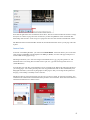
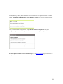
Adobe CQ5 Authoring Basics Print Manual SFU’s Content Management System SFU IT Services CMS Team ABSTRACT A summary of CQ5 Authoring Basics including: Setup and Login, CQ Interface Tour, Versioning, Uploading Images and Other Files, Creating a New Page, Editing a Page, Using the Text Component, Editing a Page, Using the Image Component, Using the 2 Column Component, Using the Reference Component, and Activating a Page. Last updated June 16, 2011. Table of Contents CQ AUTHORING BASICS 2 SETUP AND LOGIN 3 CQ INTERFACE TOUR 4 CQ WCM WCM LEFT PANEL WCM RIGHT PANEL CQ MODULES DIGITAL ASSET MANAGER (DAM) DAM LEFT PANEL DAM RIGHT PANEL CQ EDITING WINDOW SIDEKICK CONTENT FINDER 4 4 5 5 5 6 6 6 7 8 UPLOADING IMAGES AND OTHER FILES 9 CREATING A NEW FOLDER 9 UPLOADING A FILE 10 NOTE: IF YOUR DEPARTMENT IS READ-‐ACCESSIBLE TO OTHERS IN CQ, YOUR FILES WILL BE ABLE TO BE SEEN AND USED BY ANYONE ELSE IN CQ. CONSIDER THEM PUBLIC! 10 CREATING A NEW PAGE 13 EDITING A PAGE 15 LAUNCHING THE EDITING WINDOW ADDING COMPONENTS HOW TO ADD A COMPONENT 15 15 16 USING THE TEXT COMPONENT 17 TEXT COMPONENT EDITING OPTIONS IN-‐COMPONENT EDITING SOURCE EDIT (HTML) IN-‐PLACE EDITING 17 17 19 20 USING THE IMAGE COMPONENT 22 USING THE 2 COLUMN COMPONENT 25 USING THE REFERENCE COMPONENT 27 VERSIONING 30 ACTIVATING A PAGE 32 ACTIVATING A PAGE USING THE WCM ACTIVATING A PAGE FROM THE EDITING WINDOW 32 33 1 CQ Authoring Basics How does CQ work? CQ is an online content management system. This means that authors do not need to install special software in order to use CQ; only a browser is needed. In CQ, authors create, modify and delete content on an authoring environment (https://author.sfu.ca ). Basic authoring activities in CQ such as adding text, images, and basic layouts, do not require the knowledge of HTML. Changes to content in CQ are not made visible to the public until authors activate them (i.e., publish the content). Authors can also deactivate (i.e., unpublish) content if necessary. Please refer to the walkthroughs listed on the right for a tour of basic CQ authoring. 2 Setup and Login System requirements Mozilla Firefox 3 is the browser recommended by the vendor for both PC and Mac. You may use other browsers, but some unexpected behaviour may occur. Logging in To log into CQ, go to https://author.sfu.ca Enter your SFU Computing ID and Password, then click OK. Once successfully logged in, you will be brought to the CQ WCM. The site hierarchy will appear on the left panel of the screen, shown with "page" icons under the folders. 3 CQ Interface Tour • • • CQ WCM o WCM Left Panel o WCM Right Panel o CQ Modules Digital Asset Manager (DAM) CQ Editing Window o Sidekick o Content Finder CQ WCM The CQ WCM is the first screen you will see after logging in. WCM Left Panel The left panel of the WCM represents the site hierarchy. Here, you will find a tree structure of the pages and other content that can be expanded or collapsed. This structure is generated as you nest content pages. This is also how URLs are generated. If it is your first time logging into the system, you will need to expand the "Simon Fraser University" page hierarchy to view your department's space. If you do not see this, contact your Site Administrator. You will only be able to see the page structure for spaces in which you are allowed to author. 4 WCM Right Panel Once you click on a page from the site hierarchy that contains child pages (i.e., pages nested underneath), the child pages will appear on the WCM right panel. You can tell that a page has child pages by the presence of a plus (+) or minus (-) sign beside its icon. In the right panel, you may select one or multiple pages on which you would like to perform actions, including moving, deleting, copying, activating or deactivating. A double-click on the page name expands the tree and opens the page at the same time. CQ Modules Listed near the top of the WCM are icons for the various modules in CQ: WCM, DAM (Digital Asset Manager), Community, Inbox, Users, and Tagging. The arrow indicates that you are currently in the WCM. Authors will normally use the first two of the modules: The WCM and DAM (Digital Asset Manager). The DAM is where you will store any other files you wish to publish on your website that is not a web page, e.g., PDFs and images. Digital Asset Manager (DAM) The DAM is where authors can upload files (other than HTML) for publishing on their websites. Examples include images and PDF documents. The interface is similar to the WCM. 5 DAM Left Panel The folder structure is on the left panel, and can be expanded or collapsed by clicking the appropriate plus (+) or minus (-) symbols. For your first time using the DAM, you will need to navigate to your department's Digital Assets through the tree, beginning with SFU. Contact your Site Administrator if you cannot see your department's Digital Assets space. You can only see those that you have been authorized to. DAM Right Panel The right panel will display the folders and their contents, including thumbnails of images. A double-click on the image will display a larger version and details such as its size, description, tags, and dimensions. While determining the folder structure of the contents within the DAM is entirely to the authors' discretion, keeping it similar to the site structure in the WCM is suggested. This will offer a visual reference between the relationship of the files in the DAM and the pages in the WCM. See Uploading Images and Other Files for more information on how to build content in the DAM. All files must be uploaded to the DAM before they can be used; the system cannot access online files. Each must be activated (the same way as activating a content page), otherwise it will not appear on the published page, and it will only be in the author's editing window. CQ Editing Window Double click on any of the pages in either the left or right panel of the WCM to open the Editing Window, which will launch in a new browser window or tab. The Editing Window is where you will edit the contents of your page. Tip: To launch the WCM from the Editing Window, click on the Websites button located at the bottom of the Sidekick (just to the left of Refresh, it looks like a globe). 6 Sidekick To the right of the Editing Window, you will see the Sidekick. This menu contains the components you may use on the page, plus other properties including versioning and page activation. It can be minimized or expanded by clicking on the little arrow in the top right-hand corner. You can also click and drag the Sidekick around when you need to. The five tabs in the Sidekick are Components, Page, Information, Versioning, and Workflow. The first tab is Components. These are the elements of a page that you must place to tell CQ what type of content to expect, such as text, images, calendars, column structures, forms, and others. The Page tab allows you to view and change page properties; move, copy, delete, lock, or activate the page. It can also create a child page. The Information tab lets you view the log of changes made to the page, and who has access to editing it. Versioning allows you to make a 'snapshot' of the page as it is, make more changes to the page and compare, or restore an old version of the page. The Workflow tab is used to start the process of activation, deactivation, publication, subscriptions, etc. when a page needs to go through approvals by different people to be changed. 7 In the bottom right hand corner of Sidekick, shown above, there are 5 buttons. Edit mode is used to change the layouts or content of a page. Preview mode shows you what the published version would look like. Scaffolding mode is used to create a large set of pages that have the same structure with different content. The Websites button loads the WCM in another tab, and the Refresh button shows you the page with edits in place. Content Finder To the left of the Editing Window, you will see the Content Finder. This menu allows you to locate files (such as images and PDFs) from the Digital Asset Manager (DAM), as well as other pages and pieces of content within existing pages in CQ. The Images tab allows you to search for images in the DAM, such as .jpg, .png, and .gif files, etc. The Documents tab is for locating files in formats such as .pdf, .doc, .ppt and even design files such as .ai (Adobe Illustrator). You can find your video files, such as Flash movies, by searching in the Movies tab. The Pages tab shows you existing pages. You can drag and drop these into a hyperlink field to link to them automatically. The Paragraphs tab will let you search for paragraphs on other pages so that you can drag and drop them into the page you are editing to instantly create a reference. The Browse tab lets you browse through your site's tree to look for content, as opposed to searching. You can Refresh the content finder with the little button just below the search field. To the left are the buttons to switch between Mosaic View and List View. 8 Uploading Images and Other Files • • Creating a New Folder Uploading a File Navigate to the Digital Asset Manager (DAM) from the WCM by clicking on the "camera" icon. The DAM's interface is similar to the WCM; the folder structure on the left, and more information on items within the folders is displayed on the right panel. The design of the DAM folder structure for your website is at your group's discretion. In many cases, authors will find that the DAM folder structure will end up similar to the site structure in the WCM. This enables more of a visual reference of where digital assets belong or are used on the website. Creating a New Folder To create a new folder in the DAM, select an existing folder under which the new folder should be created from the left panel. Click on the arrow beside "New..." to trigger the drop down menu. Click to select "New Folder..." 9 A prompt will appear. The Name of the folder is what will appear as part of the URL. For this reason, keeping it shorter and in all lower case letters is recommended. The Title is an optional field. This is the folder label that will appear on the left side of the DAM. Click Create once you have finished. The new folder will now appear on the left side of the DAM under the parent folder you had selected and on the right panel. If you would like to move this folder, drag and drop it into the new location within the left panel. Uploading a File To upload a file to a folder in the DAM, select the folder to which you would like to place the file from the left panel. Note: If your department is read-‐accessible to others in CQ, your files will be able to be seen and used by anyone else in CQ. Consider them public! 10 Click on the "New..." button. A prompt will appear. Click "Browse..." and select on or more files to upload. After selecting a file, it will appear in the Upload Assets prompt. Once you have finished, click Upload. The progress of the upload will appear on the prompt, and will close once it has completed. 11 After uploading, CQ will take a moment to process the file for its properties. If you wish, you may click on the Refresh icon (two circling arrows) on the top left of the right panel to update its status. Your file is now uploaded and ready to be added to your CQ pages. Note that you will also need to activate files before your visitors can view them. You can also upload files by drag and drop. For more information on how to add images to CQ using the Image component, see Using the Image component. 12 Creating a New Page In the WCM, click on the page in the site hierarchy (left panel) under which the new page should exist. Click "New" from the top of the WCM right panel. A menu to create a new page should appear. For Title, enter the text that will appear on the navigation of your website. This text will also appear on the top of the browser window. For these reasons, keeping the Title text as short as possible is 13 recommended. You may also edit this text anytime after the page is created, by going to Page Properties through the Page tab in the Sidekick. The Name field is for the actual file name of the page (e.g., about.html). Enter the Name without the .html extension. If you leave this field blank, it will take the text from the Title field with dashes in place of spaces. To change the name, choose “Move” in the WCM and edit the “Rename to” field. Select a template, and then click Create. The Template Gallery has more information about each template, including examples. The new page has now been created, and should appear on the WCM left and right panels. If you wish to change the order in which this page appears, simply click and drag to place it into the desired order (e.g., after 'About Us' and before 'Undergraduate Program'). If they do not immediately appear, click on the corresponding "Refresh" buttons (icon with two blue circling arrows) located at the top left corners of each panel. 14 Editing a Page Launching the Editing Window In the WCM, double click on the page you wish to edit. You may do this from either the left panel or the right panel. The Editing Window for the page will launch in a new browser tab or window. This is where you will be adding and changing content on the page. Tip: Keeping the WCM open in another browser tab or window is recommended, as the WCM cannot be launched from the Editing Window. Adding Components Before you can add the actual content to a page (e.g., text, images, etc.), components need to be placed. Components can be seen as "content containers" that tell CQ the type of content to expect, and what properties and fields it should display for editing. 15 The list of available components is located on the first tab in the Sidekick menu. They are grouped under General, Calendar, Columns, Form, and Other, and are listed alphabetically. How to Add a Component To add a component from the Sidekick, drag and drop it either above or below an area marked with "Drag components or assets here". A green checkmark will appear, indicating that the component can be dropped in this area. If you drag the component to an area that cannot contain a component, a red circle with a line through it will appear. Another method is to double click on the "Drag components or assets here" area. A menu similar to the Sidekick will appear for you to select a component. The next several sections will demonstrate how to use some of the more common components in CQ. You may also wish to refer to the list of components in CQ for additional examples. 16 Using the Text Component • Text Component Editing Options o In-‐Component Editing § Bulleted and Numbered Lists o Source Edit (HTML) o In-‐Place Editing To add a Text component, drag and drop it into an area marked with "Drag components or assets here". A green checkmark will appear, indicating that the component can be dropped in this area. If you drag the component to an area that cannot contain a component, a red circle with a line through it will appear. After releasing your mouse button to drop the component into the area, a "paragraph" icon will appear, indicating that a Text component has been placed. Text Component Editing Options Two editing options are available for the Text component: In-Component Editing and In-Place Editing. Advantages for each of these editing options will be explained in the descriptions below. In-‐Component Editing Place your mouse pointer over the Text component, and a blue border will appear. 17 With your mouse pointer still within the blue border, double-click to launch the In-Component Editor. It will appear as a dialogue box within your page. Located near the top of the In-Component Editor is a Rich Text Editing toolbar. Use this toolbar to format the text you wish to place on your page. This is not a "what you see is what you get" or "WYSIWYG" editor - you must click OK to see what the text actually looks like. This is in accordance with SFU's Common Look and Feel style that CQ sites use, defining the look of text and headers. You can create links to other CQ pages by using the drag-and-drop feature of the Content Finder. To do this, start by using the Pages tab of the Content Finder to search for the page you want. Next, open up your text field and highlight the text you want to be a link, then click the link button. Click and drag the page you want from the Content Finder into the Link To field, and drop it when it turns green. Bulleted and Numbered Lists To create bulleted or numbered lists, open up your text field and then click on the bullet button. • • Your text field will immediately start to make bullets like this one. Push Enter to create a new bullet, or push it twice to end the list Like this. To start a numbered list, click on the numbered list button right beside the bulleted list button. 18 1. 2. And then start to type your list, creating new items by pushing enter. Or ending the list by pushing it twice. Below is a picture of the bulleted and numbered list buttons. Source Edit (HTML) If you wish to edit the HTML in the Text component, click on the very last option in the Rich Text Editing toolbar. This will toggle Source Edit. You may then edit any HTML tags in the Text component. If you wish to return to rich text editing, click on the Source Edit button in the toolbar again. Note: CQ will strip out certain HTML tags in Source Edit. To ensure that all changes in HTML are preserved, use the HTML component. Once you have finished editing, click OK on the bottom of the editor to save. 19 After clicking OK, your changes to the text will appear in the styles defined by your site's look and feel. Changes to individual components are automatically saved in CQ; there is no need to save the entire page. In-‐Place Editing In the current version of CQ, In-Place Editing is only available for the Text component. To activate In-Place Editing, click once on the component to select it. An orange border should appear, indicating that you have selected the component. Click on the component again after a brief pause, and the border will turn green. (Note: This is what is referred to as a "slow double click", as performing a normal double click will launch the In-Component Editor). The Rich Text Editing toolbar will also appear near the top of the Editing Window. 20 You may then begin editing the text within the green border, and use the options in the Rich Text Editing toolbar. Note that the toolbar does not contain the full set of options (e.g., headers cannot be defined). Once you have finished editing your text, simply click off of the Text component to save your changes. The green border will disappear, indicating that In-Place Editing is no longer activated. For more tips and examples of Text component usage, see the Text Component page located under the Components section of this site. 21 Using the Image Component • • In-‐Component Editing Options (Map, Crop, Rotate, Info) Advanced Editing Tab (Title, Alt text, Description, Link to, Size, CSS Class) From the Sidekick, drag and drop the Image component onto your page. Search for the image you wish to add to your page in the Content Finder. Double-click on the Image component. The menu for adding images will appear. You can also skip this and just drag the image directly from the Content Finder onto the component, without double-clicking. This will also trigger the in-component editing. Drag and drop the image from the Content Finder into the Image component. 22 (Note: Uploading images from within the Image component is not recommended. Files uploaded this way cannot be found using the Content Finder or the Digital Asset Manager.) In-‐Component Editing Options After dropping the image into the component, you may use the editing options on the bottom to crop, rotate, or create an image map. You can remove or change the image by clicking Clear. To map an image, click Map. Then select how you want to create the image map (rectangle, polygon, and so on) and specify where the different areas of the image should link. Simple mouse cropping of the image can be done by clicking on the Crop button. The image can be rotated by 90 degrees each time you click Rotate. The Info button (the exclamation point) tells you where the image is referenced. Advanced Editing Tab There is also an Advanced tab that you can use to give the picture a title and alt text, which adds information and accessibility. If the alt text is left blank, CQ references the text entered in the Title field and uses it for alt text. 23 You can also use the Advanced tab to add a link, only to other pages in CQ. If you wish to display a caption with the image, type it in the description field. Image size can also be specified by entering the height and/or width; CQ will adjust an unspecified dimension accordingly. Other details and tweaks can be made using the CSS class field, which you can read more about in the Component Styles section. If you are satisfied with the image as it is, click OK. The image has now been added to your page. 24 Using the 2 Column Component In the Sidekick, click to expand the Columns component grouping. Drag and drop the 2 Columns component onto your page. The 2 Columns component now will appear on your page. By default, the columns are each at 50% in width. To edit this, click on Edit and choose an option from the drop down menu. Click OK when you are finished. 25 To add other components and content into the columns, you may drag and drop existing components on your page to move them, or create new components within the columns. Below is an example of Text components placed in each column. You can place as many components within the columns, but note that column components cannot be nested (i.e., you cannot place a column component within another column component). For more tips and examples of 2 Column component usage, see the 2 Columns Component page located under the Components section of this site. 26 Using the Reference Component Drag and drop the Reference component from the Sidekick onto your page. Double click on the icon that appears on your page to edit it. In the menu, click on the down arrow beside the field. A menu with a site structure will appear that will allow you to navigate to the content you wish to reference. Locate and click to select the page that contains the content you wish to reference. You can expand the tree structure by clicking on the 'plus' icons beside the pages. You will notice that once you select a page from the site structure, the available content appears on the right panel of the menu. 27 From the right panel of the menu, click to select the content you wish to reference. Click Select to confirm your selection, then OK in the Reference component menu. Then click OK in the Reference component menu to save the change. The content will now appear on your page. Any future modifications to the content in the original source will also be updated on this page. Note that you cannot edit the actual content in a Reference component. 28 For more tips and examples of Reference component usage, see the Reference Component page located under the Components section of this site. 29 Versioning Sometimes when you are working on a page, you may have multiple ideas for what it should look like, and you might want to play out both designs. Other times, you may be working on a design and made a huge change that you later decide you don't like as much as what you had before. Versioning is a tool found in the CQ Sidekick (the 4th tab, with a picture of a clock) that can help you compare different pages, go back to old versions, or help communicate to other authors what changes you have been working on. When you click on the Versioning tab, notice that you can leave a comment and then click Create Version, or you can click More >> and add a Label first. The Label will appear in place of the version number when an author wishes to manually save a new version of the page. Comments left on versions can be found when you view the timeline under Timewarp. A version of the page is created each time a page is published as well. The options at the bottom of Versioning in Sidekick are Restore Version, and Timewarp. When you want to go back to an old version of the page, go to the 'Restore Version' section. As you create versions, the list will become populated with labels/version numbers, and the times that the versions were created. You can check one of the boxes to return to that version of the page. The 'Diff' button will show you the differences between the current page and the version you have marked the checkbox in to compare. The 'Restore' button changes the page you are actively working on back to the version you choose. 30 When you go to the Timewarp section, you can put in a day and time and click 'Go' to see what the page you're looking at looked like at a particular point in time. When you get to that version of the page, you can click Exit Timewarp to go back to the editing mode of the page. You can also put in an approximate day and time and click 'Show Timeline' to see a timeline of different versions, how long they were up, when they were created, etc. as in the screenshot below. This timeline is also the place where you can view comments left upon creation of versions. Click on any of the big blue dots along the timeline to see what the version number or label was, what the comment was (if any), and from when-to-when that version was up. When the example page in these screenshots was created, a comment 'Added Screenshots' was put up. As you can see, that comment is visible in the bubble below. 31 Activating a Page • • Activing a Page Using the WCM Activating a Page from the Editing Window Activating a Page Using the WCM In the WCM left panel, click to select the parent of the page(s) you wish to activate. The child pages (i.e., pages nested under the parent page) will display on the right panel. Next, select one (or shift + click to select more than one) page in the right panel for activation. With the pages still selected, click Activate on the toolbar just above. The status indicated under the Published column will change from green to orange, indicating that activation is progress. Click the Refresh button on the top left to update the status. Once the status changes back to green, your page has been activated and the changes are now live. 32 Activating a Page from the Editing Window Ensure that you are in the Editing Window of the page you wish to activate. In the Sidekick, click on the second tab (with the "page" icon). Click Activate Page. Once you page has been successfully activated, a prompt will appear briefly on the upper right corner of your page with the message "Page successfully activated". 33