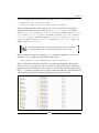
1
Liferay User Interface Development Develop a powerful and rich user interface with Liferay Portal 6 Jonas X. Yuan Xinsheng Chen Frank Yu BIRMINGHAM - MUMBAI Liferay User Interface Development Copyright © 2010 Packt Publishing All rights reserved. No part of this book may be reproduced, stored in a retrieval system, or transmitted in any form or by any means, without the prior written permission of the publisher, except in the case of brief quotations embedded in critical articles or reviews. Every effort has been made in the preparation of this book to ensure the accuracy of the information presented. However, the information contained in this book is sold without warranty, either express or implied. Neither the authors, nor Packt Publishing, and its dealers and distributors will be held liable for any damages caused or alleged to be caused directly or indirectly by this book. Packt Publishing has endeavored to provide trademark information about all of the companies and products mentioned in this book by the appropriate use of capitals. However, Packt Publishing cannot guarantee the accuracy of this information. First published: November 2010 Production Reference: 1191110 Published by Packt Publishing Ltd. 32 Lincoln Road Olton Birmingham, B27 6PA, UK. ISBN 978-1-849512-62-6 www.packtpub.com Cover Image by Asher Wishkerman ([email protected]) Credits Authors Jonas X. Yuan Editorial Team Leader Aanchal Kumar Xinsheng Chen Frank Yu Reviewer Milen Dyankov Acquisition Editor Eleanor Duffy Development Editor Project Team Leader Lata Basantani Project Coordinator Leena Purkait Proofreaders Lesley Harrison Mario Cecere Hyacintha D'Souza Graphics Technical Editors Nilesh Mohite Kavita Iyer Pooja Pande Indexers Hemangini Bari Monica Ajmera Mehta Rekha Nair Production Coordinator Aparna Bhagat Cover Work Aparna Bhagat About the Authors Dr. Jonas X. Yuan is an expert on Liferay Portal and Content Management Systems (CMS). As an open source community contributor, he had published three Liferay books from 2008 to 2010. He is also an expert on Liferay integration with Ad Server OpenX, different search engines, enterprise contents including videos, audios, images, documents, and web contents, and other technologies such as BPM Intalio and Business Intelligence Pentaho, LDAP, and SSO. He holds a Ph.D. in Computer Science from the University of Zurich, where he focused on Integrity Control in Federated Database Systems. He earned his M.S. and B.S. degrees from China, where he conducted research on expert systems for predicting landslides. Previously, he has worked as a Project Manager and a Technical Architect in Web GIS (Geographic Information System). He is experienced in Systems Development Lifecycle (SDLC) and has deep, hands on skills in J2EE technologies. He has developed a BPEL (Business Process Execution Language) Engine called BPELPower from scratch in NASA data center. As the chief architect, Dr. Yuan led and successfully launched several large scale Liferay/Alfresco projects which are used by millions of users each month. He has worked on the following books: Liferay Portal Enterprise Intranets, 2008, ISBN 13: 978-1-847192-72-1; Liferay Portal 5.2 Systems Development, 2009, ISBN 13: 978-1-847194-70-1; and Liferay Portal 6 Enterprise Intranets, 2010, ISBN 13: 978-1-849510-38-7. I would like to thank all my team members at Liferay, specially Raymond Auge, Brian Chan, Bryan Cheung, Jorge Ferrer, Michael Young, Jerry Niu, Ed Shin, Craig Kaneko, Brian Kim, Bruno Farache, Thiago Moreira, Amos Fong, Scott Lee, David Truong, Alexander Chow, Mika Koivisto, Julio Camarero, Douglas Wong, Ryan Park, Eric Min, John Langkusch, Marco Abamonga, Ryan Park, Eric Min, John Langkusch, Marco Abamonga, Michael Han, Samuel Kong, Nate Cavanaugh, Arcko Duan, Richard Sezov, Joshua Asbury, Shuyang Zhou, and Juan Fernández for providing all the support and valuable information. Much thanks to all the friends in the Liferay community. I sincerely thank and appreciate Leena Purkait and Hyacintha D'Souza, Project Coordinator and Development Editor respectively, at Packt Publishing, for criticizing and fixing my writing style. Thanks to Priya Mukherji and the entire team at Packt Publishing; it was really joyful to work with them. Last but not least, I would like to thank my parents and my wife, Linda, for their love, understanding and encouragement. My special thanks to my wonderful and understanding kid Joshua. Xinsheng Chen is an architect for Liferay portal projects, a computer game developer, and a software testing engineer. He holds an MS degree in Computer Science from California State University, San Bernardino. His focus was on online banking applications. He also has a bachelor's degree from Wuhan University, China. Mr. Chen was a QA engineer at VMware, Inc. He later led a team in developing four educational computer games for the Escambia County School District, Florida. He worked on Geographical Information Systems (GIS). Mr. Chen has rich experience in J2EE technologies. He has extensive experience in content management systems (CMS), including Alfreso. He is an expert in web portal technologies. Mr. Chen has hands-on experience in eight Liferay portal projects. I would sincerely thank Leena Purkait, the Project Coordinator and Hyacintha D'Souza, the Development Editor at Packt Publishing. Thank you for reviewing my chapters. I appreciate your invaluable advice; it has helped me improve the quality of my writing. Also, I want to thank Priya Mukherji, Eleanor Duffy, and the team at Packt Publishing. It has been a happy experience working together with you! I would also thank Dr. Jonas X. Yuan and Frank Yu for their friendship and encouragement along the way. Frank Yu is a senior architect with 10 years of portal experience and co-founder of ForgeLife LLC, a San Francisco-based firm specializing in Liferay and CMS consulting and custom development. He manages multiple onshore and offshore teams to build portal and CMS applications. His team leadership, technical know-how, detail-oriented attitude, and result-driven approaches are highly valued by his clients. Frank has extensive software engineering experience in Vignette-based and Liferaybased portal design, development, architecture, and project management, particularly in healthcare portal application development. He has hands-on experience of Liferay training, JSR 168, and JSR 286 portlets, portal themes and skins, the customization of portal frameworks, CMS, architecture, performance tuning, the administration of dozens of Amazon Elastic Compute Cloud (EC2) instances, and so on. He also has broad knowledge of system integration with multiple backends and major RDBMS and Java application servers. Previously, he worked on different portal products or applications at CIGNEX, InterComponentWare, Pay By Touch, and McKesson, a Fortune-14 healthcare company. Frank holds an M.S. degree in Computer & Information Sciences. He received his B.S. degree from Nanjing University, China. I thank my co-authors, each of whom played a valuable role in ensuring that we were able to achieve coverage of a wide range of Liferay user interface feature set. It has been a great pleasure working with them. I greatly appreciate the help from Milen Dyankov for reviewing my chapters. Thanks to Leena Purkait and Hyacintha D'Souza, the Production Coordinator and Development Editor respectively, at PACKT Publishing, for criticizing and editing my writing. Thanks also to Priya Mukherji and the entire team at PACKT Publishing. I'm grateful for the many colleagues who have helped me over the years in different areas. Particularly, I would like to thank Alok Mathur, the CTO at Medicity, who hired me and introduced me to the portal technologies at McKesson in 2000. I also thank my clients, my partners, and my team members across U.S. and China. It is they who make my projects successful and enjoyable. I thank the entire Liferay community, without them neither the project nor this book would be what it is today. Last but not least, I would like to thank my wife, Yuting, for her continuing love and support, and for understanding that there is no separation between working time and spare time in the Liferay consulting world. My special thanks to my two wonderful daughters Marissa and Selina, who make me a proud father every single day. About the Reviewer Milen Dyankov is a Senior IT Architect at AMG.net specializing in designing corporate portals and e-commerce solutions for major telecommunication and financial companies in Poland and abroad. He is also owner of Commsen International, an IT consulting company providing open source solutions for middle size companies. He holds a master's degree of computer science from "Sv. Sv. Kiril i Metodi'" university in Veliko Turnovo, Bulgaria. Since 1997, Milen has been monitoring, using and contributing to a number of Java and JEE open source initiatives. He is the author of "JStopwatch", "APropOS" and "JWebThumb" open source projects. Since 2008, Milen is active Liferay community member and in 2009 he released "liferay-maven-sdk" - an open source port of Liferay 5.2 SDK based on Maven2. In 2010 he started a "Commsen Liferay Plug-ins" project providing various open source portlets for Liferay Portal such like "Custom Global Markup" and "Tailgate". Dr. Jonas X. Yuan This book is dedicated to my wife Linda, my son Joshua, and my parents, Daxian and Zhengzi. This book would not have been possible without your love and understanding. Thank you from the bottom of my heart. Xinsheng Chen This book is dedicated to my elder sister Xinli Chen, who has always been supporting me behind the scene. This book would not have been possible without your encouragement. Thank you from the bottom of my heart Frank Yu This book is dedicated to my father and the memory of my mother. Table of Contents Preface Chapter 1: Customizing your Liferay Portal Liferay functionalities Document stores—CMS Web Content Management—WCM Personalization and internalization Workflow, staging, scheduling, and publishing Social network and Social Office Tagging Leveraging framework and architecture for user interface development Service Oriented Architecture Enterprise Service Bus Standards Customization and development strategies Ext Plugins Hook plugins Portlet and web plugins Customizing user interface through themes development framework Build differences of themes Developing user interface through layout templates development framework Alloy UI customization Structure - HTML 5 Style—CSS 3 Behavior—YUI 3 Forms More useful information Summary 1 7 7 8 8 9 9 9 10 10 11 11 13 14 15 17 18 19 20 21 21 22 22 23 23 24 25 Download from Wow! eBook <www.wowebook.com> Table of Contents Chapter 2: Basic Theme Development The basic structure of a Liferay Portal page Setting up Liferay Plugins SDK for plugin development Recommended tools JDK Ant Maven Eclipse Liferay IDE Other Eclipse Plugins Downloading and installing Liferay files Creating a common workspace folder Liferay Portal bundle Liferay Plugins SDK Liferay Portal source codes Database configuration Starting Liferay Portal 27 28 29 30 30 30 30 31 31 31 32 32 32 32 32 33 34 How to build your own theme Creating your own build properties Creating a new theme skeleton 35 35 35 AlloyUI Cascading Style Sheets – From CSS 2.1 to CSS3 JavaScript – From jQuery to YUI3 HTML5 Images Velocity templates Basic skeleton of themes 40 40 41 42 43 43 43 Pop-up windows Updating the theme with your own files Changing the configuration to enable developer mode Modifying the generated files 51 51 51 53 Running Liferay Plugins SDK to create the theme skeleton Building and deploying the generated theme as WAR file HTML5 DOCTYPE Parsing template initialization file HTML document structure elements CSS and JavaScript includes Portal page DockBar Header The logo of an organization or community Navigation Portal content Global unified breadcrumb Portlet chrome Portlet content Footer [ ii ] 36 38 45 46 46 46 47 47 48 48 49 50 50 50 51 Table of Contents Adding your own theme files to subfolders of _diffs folder Creating your own CSS definitions in /docroot/_diffs/css/custom.css Creating your own JavaScript in /docroot/_diffs/js/main.js Creating your own images in /docroot/_diffs/images folder or subfolders Adding your own velocity templates in /docroot/_diffs/templates folder 53 54 55 55 56 Building the theme as WAR file and deploying It Packaging the theme as WAR File Hot deployment of theme 58 58 59 Summary 61 Deploying theme in file system Deploying theme in Liferay Control Panel Verifying the theme Chapter 3: Layout Templates 59 60 60 63 Using the out-of-box layout templates in Liferay Portal 64 Controlling the look and feel of a page with themes and layout template66 The basic structure of a layout template 67 Liferay out-of-box standard layout templates 68 Liferay out-of-box custom layout templates 70 Creating a new custom layout template 71 Creating the skeleton of a layout template in Plugins SDK 72 Adding your own implementation to the layout template files Building and registering the layout template How is a layout template rendered in Liferay? The Main Servlet in Liferay Portal Page rendering as explained with code flow Default configurations for layout template Setting the default layout template ID Summary Chapter 4: Styling Pages A review of some Liferay terminologies Resources Users User groups Roles Team Role-based access control (permission) Organization Location Community My Community Public pages [ iii ] 73 74 76 76 77 84 84 84 85 86 86 86 86 87 87 87 87 88 88 88 88 Table of Contents Private pages Page Templates The difference between organization and community Setting up an organization Creating an empty Palm-Tree Publications organization Creating a user as organization administrator Adding the newly created user to organization administrator role Finishing other configuration for the Palm-Tree Publications organization UI configuration settings for the organization UI and usability features in Liferay Portal 6 Concise and convenient navigation Dockbar portlet Multiple levels of navigation menus Breadcrumb portlet Site Map portlet Navigation portlet Easy page creation based on Page Template Easy organization or community creation based on Site Template Internationalization (i18n) and Localization (L10n) Database configuration to support Liferay localization Localization in the portal framework Setting up a unique URL for different languages Localization in custom portlets Localization through configuration and customization Remove languages that are not needed Localization of page names in the navigation menus Localization of page names in Breadcrumb portlet Localization of portlet title Localization of web contents UI customizations Changing the default theme Changing the default layout Customization of Dockbar Adding or removing the Dockbar from a theme Adding or removing functionalities in the Add option in Dockbar Adding language selection to the Dockbar Changing the logo in the header Customization of Add Application pop-up panel Registering portlets in a custom category on Add Application pop-up page Removing some out-of-box portlets in Lifery Portal Disabling some out-of-box portlets in Liferay Portal Hiding a portlet when a user doesn't have the required permission Role-based display of portlets in Add Application pop-up Adding custom roles to access portlets in Add Application pop-up [ iv ] 88 89 89 91 91 91 92 92 92 93 93 93 94 94 94 95 95 96 98 99 100 101 102 105 105 106 106 106 107 108 108 109 110 110 110 111 113 114 114 115 116 117 118 120 Table of Contents Portlet UI customization Portlet UI customization through configuration in chrome Customization of Search Container OpenOffice integration for document format conversion Changing the default WYSIWYG online editor Configuration with portlet preferences Changing the default settings of some Liferay out-of-box portlets Customization of Control Panel 122 122 122 123 125 125 126 127 Summary 130 Changing the default theme for Control Panel Changing the portlet display category and order in Control Panel Adding custom portlets to Control Panel Chapter 5: Advanced Theme Changing theme.parent property in theme Adding color schemes to a theme Configurable theme settings Portal predefined settings in theme Embedding non-instanceable portlets in theme Embedding Dockbar and Breadcrumb portlets in a theme Embedding Language and Web Content Search portlets in a theme Embedding Sign In portlet in the header area of a theme Embedding instanceable portlets in theme Theme upgrade Creating a FreeMarker template theme Theme coding conventions Cascading style sheet conventions Image folder and file conventions JavaScript coding conventions Brower compatibility Specifying a DOCTYPE Using CSS reset styles Limited support of CSS3 in Internet Explorer 6, 7, and 8 Dealing with browser bugs Development tools Liferay IDE in Eclipse ViewDesigner Dreamweaver plugin W3school site Firebug Yslow Google Chrome Summary [] 127 128 129 131 132 134 138 141 142 142 143 143 144 147 152 154 154 155 156 157 157 158 159 160 161 161 163 163 163 163 164 164 Table of Contents Chapter 6: Portlet User Interface 165 How to customize the portlet icon 173 The making of a portlet Multiple portlets support JSP portlets Struts portlets JSF portlets Vaadin portlets Spring MVC portlets Deploying a portlet Portlet and layout Portlet content and portlet template Customizing portlet chrome What is portlet chrome? Normal view vs. maximized view AJAX for portlet user interface PDF and Excel reports Vaadin portlets Required software Configuring Tomcat 6.0 in Eclipse Installing Vaadin Eclipse plugin Creating a Vaadin project Deploying a Vaadin project as a portlet Integrating Vaadin portlet and Liferay environment What's happening? Common Liferay tags in portlets AUI tags Liferay portlet tags portlet:defineObjects portlet:actionURL portlet:param portlet:renderURL portlet:resourceURL 165 166 166 167 167 167 167 168 169 171 172 172 174 174 176 178 179 179 179 179 181 181 184 184 185 185 185 186 187 187 187 Liferay liferay-portlet tags 188 Liferay security tags 190 Liferay theme tags 192 liferay-portlet:actionURL liferay-portlet:renderURL liferay-portlet:resourceURL 188 189 189 liferay-security:doAsURL liferay-security:permissionsURL 190 190 liferay-theme:defineObjects liferay-theme:include 192 192 [ vi ] Table of Contents liferay-theme:layout-icon liferay-theme:meta-tags liferay-theme:wrap-portlet 192 192 193 Liferay UI tags Liferay utility tags 193 193 liferay-util:buffer liferay-util:html-top liferay-util:include liferay-util:param UI customization through hooks in Plugins SDK Following Liferay UI coding conventions Source code Summary Chapter 7: Velocity Templates Before we start What is Velocity? Velocity template language Statements and references Conditional statements Loops Directives Velocimacros Comments What is a Velocity template? Velocity portlet Why is Velocity for Liferay? Re-building Classic theme in Plugins SDK Velocity templates in a Liferay theme init_custom.vm navigation.vm portal_normal.vm portal_pop_up.vm portlet.vm Velocity templates and portal page performance What we can do with Velocity templates Adding a Velocity template Updating Velocity templates Customizing a theme through Velocity templates Adding content through a template Including a portlet in a theme Using Liferay services in Velocity templates Liferay API related to Velocity templates [ vii ] 193 194 194 194 195 196 197 197 199 199 200 200 200 201 201 201 202 203 203 204 205 206 208 208 208 208 209 209 209 212 212 212 212 213 215 216 216 Table of Contents Velocity template for e-mail Velocity references for templates References for both themes and web content References for themes References for web content Web content templates What is happening? Freemarker templates What is FreeMarker really about? What's happening? Source code Summary Chapter 8: Alloy User Interface Story of Alloy UI What Alloy UI consists of Goals of Alloy UI What is HTML5? What is CSS3 about? Why YUI3? Alloy UI form tags The button tag The button-row tag The column tag The fieldset tag The input tag The layout tag The legend tag The link tag The model-context tag The option tag The select tag Node and Nodelist Node properties Events More Node methods Manipulating nodelist Node queries Using Ajax in Alloy UI Plugin Widgets in Alloy UI 217 218 218 222 223 224 226 227 227 228 229 229 231 231 232 232 232 235 236 237 238 239 239 239 240 241 241 241 242 242 242 243 245 246 247 247 248 249 251 252 [ viii ] Table of Contents How to do animation Drag and drop Delayed task example Overlay and overlay manager Image gallery SWF file playback Other Alloy UI features Auto-complete Char counter Resize Sortable list Tooltip An overview of Alloy UI modules Alloy UI contributing to YUI3 Source code Summary 253 254 255 256 257 258 258 258 259 260 260 261 261 264 264 264 Chapter 9: UI Taglib 265 Introduction Asset tag and category Settings Configuration 265 267 268 270 What's happening? 271 Search container UI tag Columns Search form and search toggle Columns inside columns Paginator Speed and iterator Configuration 271 272 273 274 275 276 276 277 Custom attributes Settings Configuration 278 279 280 Tabs, toggle, and calendar Using tags liferay-ui:tabs and liferay-ui:section Applying tags liferay-ui:toggle and liferay-ui:toggle-area Applying the tag liferay-ui:calendar in a JSP page 280 281 281 282 What's happening? 277 What's happening? [ ix ] 280 Table of Contents Breadcrumb, navigation, and panel Settings Configuration Social activity and social bookmarks Settings Configuration 283 283 285 285 285 286 Discussion, ratings, diff, and flags Settings Configuration Icon and input Tag icon settings Tag input settings CKEditor 287 287 289 290 290 291 294 Configuration Many other useful UI tags Configuration Special sound UI reCAPTCHA 296 296 300 300 Summary 301 What's happening? Settings What's happening? 286 294 295 What's happening? 300 Chapter 10: User Interface in Production jQuery in plugins jQuery in portlets jQuery in Themes jQuery in Alloy UI Workflow capabilities in plugins How to add workflow capabilities on custom assets in plugins Preparing a plugin—Knowledge Base What's Knowledge Base? Structure Services and models Adding workflow instance link Adding workflow handler Updating workflow status Adding workflow-related UI tags Where would you find sample code—Knowledge Base plugin with workflow capabilities? Custom attributes in plugins Adding custom attributes capabilities How to make custom attributes? [] 303 303 304 306 306 306 307 307 307 308 309 310 310 311 312 313 314 314 315 Table of Contents Adding custom attributes as references Adding custom attributes display Adding custom attributes capabilities when creating, updating, and indexing custom entities Adding custom attributes UI tags Where would you find sample code—Knowledge Base plugin with custom attributes capabilities? OpenSocial, Social Activity, and Social Equity in Plugins OpenSocial How does it work? How to use it? Where do you find sample code? 315 315 316 317 318 318 319 320 321 322 Social Activity 322 Social Equity 323 Registering Social Activity tracking in plugins Adding Social Equity capabilities in plugins What's happening? Friendly URL routing and mapping in plugins URL routing What's happening? Data migration and portal upgrade Data migration Portal upgrade Manual upgrade Explicit auto upgrade Implicit auto upgrade What's happening? Legacy portal properties Plugins upgrade 322 324 324 325 325 326 326 327 328 328 330 331 331 332 333 Ext environment upgrade Themes upgrade Layout templates upgrade Portlets and hooks upgrade 333 334 335 335 Themes deployment Integrating UI CAPTCHA or reCAPTCHA with custom assets through plugins Hooking portal core UI in plugins 336 337 Static content deployment Performance tuning Summary 339 339 341 Setting up hooks Index 336 338 343 [ xi ] Preface Liferay employs a specialized theming system, which allows you to change the look and feel of the user interfaces. As a developer, by using the right tools to create and manipulate themes with Liferay Portal, you can get your site to look any way you want it to. However, the Liferay theming system can be difficult to get started with. This practical guide provides you with a well organized manual for working with Liferay. Liferay User Interface Development is a pioneer in explaining Liferay's powerful theming system by leading you through examples to get you to create your own themes as quickly as possible. It focuses on how portal pages are created and styled and also discusses some simple configuration and customization to change the look and feel of a portal page. Its explicit instructions are accompanied by plenty of source code. With the open source nature of Liferay, you will find a user-friendly environment to design themes with the latest user interface technologies. Liferay User Interface Development unlocks the potential of using Liferay as a framework to develop a rich user interface. The book starts off with how you should go about structuring a Liferay Portal web page. It identifies the components of a portal page: theme, layout, and portlets. This hands-on tutorial explains themes, portlets, and Alloy UI, which is the latest output from the Alloy Project of Liferay, in an easy-to-understand way. It covers all aspects of a theme from its inception and rendering through its consumption by an end user, with in-depth discussion. By the end of this book, you will clearly understand themes, layouts, and the Alloy API. Most importantly you will obtain the skills to write a theme and layout templates, apply them to a portal, and also control the portlet UI through different mechanisms. Preface This clear, concise, and practical tutorial will ensure that you have developed skills to become a competent Liferay themer. The detailed text is accompanied with source code that allows you to play with the examples, update the code, and add custom features. A practical guide to customizing the look and feel of Liferay-based portal applications What this book covers Chapter 1, Customizing your Liferay Portal, discussed Liferay architecture and framework, different kinds of plugins, and related development strategies. Chapter 2, Basic Theme Development, addressed basic theme development, page structure, Plugins SDK, Liferay IDE, and so on. It also covered how to update each individual file in the subfolder, including CSS, images, JavaScript, and templates, and how to package, deploy, and test the themes. Chapter 3, Layout Templates, addressed layout templates in detail. It introduced the basic concepts of Liferay Portal layout template, and how the theme, layout, and portlets work together to generate a portal page, how to create your own layout template, and page rendering code flow, and so on. Chapter 4, Styling Pages, gave you specific and detailed answers on how to style your pages. It reviewed some Liferay terminologies, how to set up an organization, UI and usability features in Liferay Portal 6, internationalization (i18n) and localization (L10n) at different levels, UI customization of portal page, portlets, how to Add Application pop-up panel, use the Control Panel, and so on. Chapter 5, Advanced Theme, provided details about what can be done for advanced themes. It covered how to change the value of the theme.parent property for theme creation, and addressed how to add color schemes, how to use Configurable settings in a theme and pre-defined theme settings, how to embed portlets in a theme, and other topics like theme upgrade, creating a FreeMarker-template theme, browser compatibility, Liferay IDE, and other development tools. Chapter 6, Portlet User Interface, focused on how to customize portlet user interface. Of course, velocity templates will be useful. This chapter addressed multiple portlets support, portlet deployment, portlet and Layout, portlet content and portlet template, portlet chrome customization, Normal view and maximized view of a portlet, AJAX for portlet UI, Portable Document Format (PDF) reports and Excel reports, Vaadin portlets, common tags in portlets, portlet UI customization using hook. [] Download from Wow! eBook <www.wowebook.com> Preface Chapter 7, Velocity Templates, walked through velocity templates with you. This chapter introduced velocity template language, Velocity template, Velocimacro Velocity portlet, Five basic Velocity templates for a theme, Velocity templates and site performance, theme customization through Velocity templates, Velocity template for Web Content portlet, and freeMarker template. Chapter 8, Alloy User Interface, focused on what's Alloy UI and how to use it. This chapter addressed the story of Alloy UI, What Alloy UI consists of, what Liferay wants to achieve with Alloy UI, Alloy form tags, node and nodelist, Ajax in Alloy UI, Alloy Plugin Widgets, and other Alloy UI features. Chapter 9, UI Taglib gave specific details about UI tag libraries—what are they and how to use them in customization. Particularly, this chapter addressed important UI taglib, such as asset tag and categories, search container, custom attributes, tab, toggle, calendar, breadcrumb, navigation, panel, social activity, social bookmarks, discussion, ratings, diff, flags, icon, input, and many other useful UI tags. Chapter 10, User Interface in Production, showed us how to use jQuery UI, Workflow capabilities, custom attributes capabilities in plugins; how to leverage friendly URL routing and mapping; how to use social UI, such as Open Social, Social Activities, and Social Equity; and how to add CAPTCHA or reCAPTCHA, to hook portal core UI and to deploy themes in production. What you need for this book This book uses Liferay portal version 6.0.5 with following settings: • MySQL database 5.1 • Java SE 6.0 • Liferay portal bundled with Tomcat 6.0 Although this book has explored in depth the various technologies used in Liferay user interface, it explains all the topics in an easy-to-understand way. This book is for any Java developers. If you have some basic knowledge in web applications including servlets and portlets, you will understand better the discussions in this book. Most importantly, if you like problem-solving and have an eye for perfection, this book is written for you. We have opened our arms to welcome you to the Liferay world. [] Preface Who this book is for If you have basic knowledge of Java Web applications, know the basic operational functionality of Liferay, and have written a servlet or JSP file, you are ready to get the most out of this book. Whether you are a web portal engineer or an experienced Liferay Portal developer, you can benefit from this book. You are not expected to have prior knowledge of Liferay theming. Conventions In this book, you will find a number of styles of text that distinguish between different kinds of information. Here are some examples of these styles, and an explanation of their meaning. Code words in text are shown as follows: "The layout is a fragment that fits inside a page generated by the velocity file portal_normal.vm of a Liferay theme " A block of code is set as follows: <div id="content"> <nav class="site-breadcrumbs" id="breadcrumbs"> <h1> <span>#language("breadcrumbs")</span> </h1> #breadcrumbs() </nav> When we wish to draw your attention to a particular part of a code block, the relevant lines or items are set in bold: #if ($selectable) $theme.include($content_include) #else $portletDisplay.recycle() $portletDisplay.setTitle($the_title) Any command-line input or output is written as follows: create <layout-template-name> "<layout template simple description>" New terms and important words are shown in bold. Words that you see on the screen, in menus or dialog boxes for example, appear in the text like this: "Therefore, it is necessary for administrators or other users with Manage Pages permission". [] Preface Warnings or important notes appear in a box like this. Tips and tricks appear like this. Reader feedback Feedback from our readers is always welcome. Let us know what you think about this book—what you liked or may have disliked. Reader feedback is important for us to develop titles that you really get the most out of. To send us general feedback, simply send an e-mail to [email protected], and mention the book title via the subject of your message. If there is a book that you need and would like to see us publish, please send us a note in the SUGGEST A TITLE form on www.packtpub.com or e-mail [email protected]. If there is a topic that you have expertise in and you are interested in either writing or contributing to a book, see our author guide on www.packtpub.com/authors. Customer support Now that you are the proud owner of a Packt book, we have a number of things to help you to get the most from your purchase. Downloading the example code for this book You can download the example code files for all Packt books you have purchased from your account at http://www.PacktPub.com. If you purchased this book elsewhere, you can visit http://www.PacktPub. com/support and register to have the files e-mailed directly to you. [] Preface Errata Although we have taken every care to ensure the accuracy of our content, mistakes do happen. If you find a mistake in one of our books—maybe a mistake in the text or the code—we would be grateful if you would report this to us. By doing so, you can save other readers from frustration and help us improve subsequent versions of this book. If you find any errata, please report them by visiting http://www.packtpub. com/support, selecting your book, clicking on the errata submission form link, and entering the details of your errata. Once your errata are verified, your submission will be accepted and the errata will be uploaded on our website, or added to any list of existing errata, under the Errata section of that title. Any existing errata can be viewed by selecting your title from http://www.packtpub.com/support. Piracy Piracy of copyright material on the Internet is an ongoing problem across all media. At Packt, we take the protection of our copyright and licenses very seriously. If you come across any illegal copies of our works, in any form, on the Internet, please provide us with the location address or website name immediately so that we can pursue a remedy. Please contact us at [email protected] with a link to the suspected pirated material. We appreciate your help in protecting our authors, and our ability to bring you valuable content. Questions You can contact us at [email protected] if you are having a problem with any aspect of the book, and we will do our best to address it. [] Customizing your Liferay Portal As the world's leading open source portal platform, Liferay portal provides a unified web interface to the data and tools scattered across many sources. Within Liferay portal, a portal interface is composed of a number of portlets, self-contained interactive elements that are written to a particular standard. As portlets are developed independently from the portal itself and are loosely coupled with the portal, they are apparently Service Oriented Architecture (SOA). This book will show you how to develop and / or customize user interface of intranets or Internets with Liferay. In this chapter, we will look at: • • • • • The features of the user interface you will have by the time you reach the end of this book The Liferay portal framework and architecture for customization The Liferay portal user interface customizing development strategies Theme, layout template, hook, and Alloy UI development customization How to find more technical information about what Liferay is and how it works So let's begin by looking at exactly what Liferay portal and Social Office are, how to customize user interfaces, and how they work. Liferay functionalities Liferay currently has the following four main functionalities: • Liferay portal—JSR-168/JSR 286 enterprise portal platform • Liferay CMS and WCM—JSR-170 content management system and web content management Customizing your Liferay Portal • Liferay collaboration—collaboration software such as blogs, calendar, web mail, message boards, polls, RSS feeds, Wiki, presence (AJAX chat client, dynamic friend list, activity wall, and activity tracker), alerts and announcements, and so on • Liferay Social Office—a social collaboration on top of the portal; a dynamic team workspace solution—all you have to do is log in and work the way you want to, at your convenience. Generally speaking, a website built by Liferay might consist of a portal, CMS and WCM, collaboration, and / or social office. Document stores—CMS Image Gallery is a useful tool to manage images. For instance, within Image Gallery, you would be able to add folders and subfolders for images and moreover, manage folders and subfolders. You can also add images in folders and manage those images, and furthermore, set up permissions on folders and images. Document Library is a useful tool to manage any documents. For example, within Document Library, you can add folders and subfolders for documents to manage and publish documents. The Image Gallery and Document Library make up the Content Management Systems (CMS) available for intranets or Internet. Both of them are equipped with customizable folders and act as a web-based shared drive for all your team members, no matter where they are. As content is accessible only by those authorized by administrators, each individual file (document or image) is as open or as secure as you would need it to be. Web Content Management—WCM Your company may have a lot of HTML text, audios, videos, images, and documents using different structures and templates, and you may need to manage all these HTML text, images, and documents as well. Therefore, you require the ability to manage a lot of web content, and then publish web content in intranets or Internet. We will see how to manage web content and how to publish web content within Liferay. Liferay Journal (called Web Content) does not only provide the availability to publish, manage, and maintain web content and documents, but it also separates content from layout. WCM allows us to create, edit, and publish web content (called Journal articles) as well as article templates for one-click changes in layout. It has built-in workflow, article versioning, search, and metadata features. [] Chapter 1 Personalization and internalization All users can get a personal space that can be either made public (published as a website with a unique, friendly URL) or kept private. In fact users can have both private and public pages at the same time. You can also customize how the space looks, what tools and applications are included, what goes into the Document Library and Image Gallery, and who can view and access all of this content. In addition, you can use your own language. Multilingual organizations get out-of-the-box support for up to 36 languages or called locales (such as Hindi, Hebrew, Ukrainian, and so on). Users can toggle among different language settings with just one click and produce/publish multilingual documents and web content. You can also easily add other languages in your public, private pages, or other organizations. Workflow, staging, scheduling, and publishing You can use workflow to manage definitions, instances, and tasks. You can also use the Web Content article two-step workflow, Staging Workflow, jBPM workflow, Kaleo workflow, Activiti workflow and Intlio | BPMS. jBPM workflow and / or Kaleo workflow and / or Activiti workflow that can be applied on any assets such as Web Content articles, Document Library documents, Image Gallery images, and so on. In addition, Liferay portal allows you to define publishing workflow that tracks changes to web content as well as the pages of the site in which they live. Social network and Social Office Liferay portal supports social networking—you can easily own your accounts in Liferay with Facebook, MySpace, Twitter, and so on. In addition, you can easily manage your instant messenger accounts such as AIM, ICQ, Jabber, MSN, Skype, YM, and so on in Liferay portal. Social Office gives us a social collaboration on top of the portal—a full virtual workspace that streamlines communication and builds up group cohesion. All components in Social Office are tied together seamlessly, getting everyone on the same page by sharing the same look and feel. More importantly, the dynamic activity tracking gives us a bird's-eye view of who has been doing what and when within each individual site. [] Customizing your Liferay Portal Tagging The portal tagging system allows us to tag web content, documents, message board threads, and more, and dynamically publish assets by tags. Tags provide a way of organizing and aggregating content. Folksonomies are a user-driven approach to organizing content through tags, cooperative classification, and communication through shared metadata. The portal implements folksonomies through tags. Taxonomies are a hierarchical structure used in scientific classification schemes. The portal implements taxonomies as vocabularies and categories, including category hierarchy, in order to tag contents and classify them. In particular, the portal provides integrating framework so that you could integrate external applications easily. For example, you can integrate external applications such as Alfresco, OpenX, LDAP, SSO CAS, Orbeon Forms, KonaKart, PayPal, Solr, Coveo, Salesforce, SugarCRM, JasperForge, Drools, jBPM, and so on with the portal. Integrating standalone Java Web applications into the portal is not an easy task. However, Liferay makes it possible to achieve near-native integration with minimal effort via WAI (Web Application Integrator) portlet or IFrame portlet. In addition, the portal uses the OSGi framework. That is, the portal is going to support a module system and service platform for the Java programming language that implements a complete and dynamic component model. For more information, refer to http://www.osgi.org. In a word, the portal offers compelling benefits to today's enterprises—reduced operational costs, improved customer satisfaction, and streamlined business processes. Leveraging framework and architecture for user interface development Liferay portal architecture supports high availability for mission-critical applications using clustering fully–distributed cache and replication support across multiple servers. The following figure depicts the various architectural layers and functionality of portlets. [ 10 ] Chapter 1 Service Oriented Architecture Liferay portal uses Service Oriented Architecture (SOA) design principles throughout and provides the tools and framework to extend SOA to other enterprise applications. Under the Liferay enterprise architecture, not only can the users access the portal from traditional and / or wireless devices, but the developers can also access it from the exposed APIs via REST, SOAP, RMI, XML-RPC, XML, JSON, Hessian, Burlap, and custom-tunnel classes. Liferay portal is designed to deploy portlets that adhere to the portlet API compliant with both JSR-168 and JSR-286. A set of useful portlets are bundled with the portal such as Image Gallery, Document Library, Calendar, Message Boards, Blogs, Wikis, and so on. They can be used as examples for adding custom portlets. In a nutshell, the key features of Liferay include using SOA design principles throughout, such as reliable security, integrating with SSO and LDAP, multitier and limitless clustering, high availability, caching pages, dynamic virtual hosting, and so on. Enterprise Service Bus The Enterprise Service Bus (ESB) is a central connection manager that allows applications and services to be added quickly to an enterprise infrastructure. When an application needs to be replaced, it can be easily disconnected from the bus at a single point. Liferay portal could use Mule or ServiceMix as ESB. [ 11 ] Customizing your Liferay Portal Through ESB, the portal could integrate with SharePoint, BPM (such as jBPM workflow engine, Intalio | BPMS engine), rule engine, BI Xforms reporting, JCR repository, and so on. It supports JSR 170 for Content Management Systems with the integration of JCR repositories such as Jackrabbit. It also uses Hibernate and JDBC to connect to any database. Furthermore, it supports events' system with asynchronous messaging and lightweight message bus. Liferay portal uses the Spring framework for its business and data services layers. It also uses the Spring framework for its transaction management. Based on service interfaces (Spring framework), portal-implementation is implemented and exposed only for the internal usage—for example, they are used for the extension environment or ext plugins. portal-kernel and portal-service (these two are merged into one package, called portal-service) are provided for the external usage (or for the internal usage)—for example, they are used for the Plugins SDK environment. Custom portlets, both JSR-168 and JSR-286, and web services can be built based on portal-kernel and portal-service. In addition, Web 2.0 Mail portlet and Chat portlet are supported as well. More interestingly, scheduled staging and remote staging, and publishing serve as a foundation through tunnel web for web content management and publishing. Liferay portal supports web services to make it easy for different applications in an enterprise to communicate with each other. Java, .NET, and proprietary applications can work together easily because web services use XML standards. It also supports REST-style JSON Web Services for lightweight, maintainable code, and furthermore, it supports AJAX-based user interfaces. Liferay portal uses industry-standard, government-grade encryption technologies, including advanced algorithms such as DES, MD5, and RSA. Liferay was benchmarked as one of the most secure portal platforms using LogicLibrary's Logiscan suite. Liferay offers customizable single sign-on with Yale CAS, JAAS, LDAP, NTLM, Netegrity, Microsoft Exchange, Facebook, and more. Open ID, OpenAuth, Yale CAS, Facebook, Siteminder, and OpenSSO (renamed as OpenAM) integration are offered by the portal out of the box. In short, Liferay portal uses the ESB in general, in order to provide an abstraction layer on top of an implementation of an enterprise messaging system. It allows integration architects to exploit the value of messaging without writing code. As you can see, understanding the framework and architecture would be helpful if you would want to customize the user interface in a proper way. [ 12 ] Chapter 1 Standards Liferay portal is built based on "Standards". This is a more technical benefit, however, a very useful one if you ever want to use Liferay in a more specialized way. Liferay is developed based on standard technologies that are popular with developers and other IT experts. The features of Liferay are listed as follows: • Built using Java: Java is a popular programming language that can run on just about any computer. There are millions of Java programmers in the world, so it won't be too hard to find developers who can customize Liferay. • Based on tried and tested components: With any tool, there's the danger of bugs. Liferay uses lots of well known, widely tested components to minimize the likelihood of bugs creeping in. If you are interested, here are some of the more well-known components and technologies used by Liferay—Apache ServiceMix, Mule, ehcache, Hibernate, ICEfaces, Java J2EE/JEE, jBPM, Intalio | BPMS, JGroups, Alloy UI, Lucene, PHP, Ruby, Seam, Spring and AOP, Struts and Tiles, Tapestry, Vaadin, Velocity, and FreeMarker. • Uses standard ways to communicate with other software: There are various standards established for sharing data between pieces of software. Liferay uses these so that you can easily get information from Liferay into other systems. The standards implemented by Liferay include AJAX, iCalendar, and Microformat, JSR-168, JSR-127, JSR-170, JSR-286 (Portlet 2.0), and JSR-314 (JSF 2.0), OpenSearch, Open platform with support for web services (including JSON, Hessian, Burlap, REST, RMI, and WSRP), WebDAV, and CalDAV. • Makes publication and collaboration tools WCAG 2.0 (Web Content Accessibility Guidelines) compliant: The new W3C Recommendation to make web content accessible to a wide range of people with disabilities, including blindness and low vision, deafness and hearing loss, learning disabilities, cognitive limitations, limited movement, speech disabilities, photosensitivity, and combinations of these. For example, the portal integrates CKEditor—standards support: W3C (WAI-AA and WCAG), 508 (Section 508). • Alloy UI: Supports HTML 5, CSS 3, and YUI 3 (Yahoo! User Interface Library). • Supports Apache Ant 1.8 and Maven 2: Liferay portal could be built through Apache Ant by default, where you can build services, clean, compile, build JavaScript CMD, build language native to ASCII, deploy, fast deploy, and so on. Moreover, Liferay supports Maven 2 SDK, providing Community Edition (CE) releases through public maven repositories as well as Enterprise Edition (EE) customers to install maven artifacts in their local maven repository. [ 13 ] Customizing your Liferay Portal Many of these standards are things that you will never need to know much about, so don't worry if you've never heard of them. Liferay is better for using them, but mostly, you won't even know they are there. Of course, the user interface could be standardized, too. Therefore when developing and / or customizing user interface, you can leverage these standards. Customization and development strategies Liferay is, first and foremost, a platform, where you can build your own applications using the tools you feel most comfortable with, such as JSF 2, Icefaces, Struts 2, Spring MVC, Vaadin, jQuery, Dojo, and so on. Of course, you're not required to write a lot of code for yourself. You can use Service-Builder to generate a lot of code. Generally speaking, the Service-Builder is a tool built by Liferay to automate the creation of interfaces and classes that are used by a given portal or portlets. The Service-Builder is used to build Java services that can be accessed in a variety of ways, including local access from Java code, remote access using web services, and so on. In general, the Service-Builder is a code generator. Using an XML descriptor, it generates: • Java Beans • SQL scripts for database tables creation • Hibernate Configuration • Spring Configuration • Axis Web Services and • JSON JavaScript Interface Plugins SDK Environment is a simple environment for the development of Liferay plugins, for example, ext, themes, layout templates, portlets, hooks, and webs (web applications). It is completely separate from the Liferay portal core services and uses external services only if required. The portal supports six different types of plugins out-of-the-box. They are Portlets, Themes, Layout Templates, Webs, Hooks, and Ext. • Portlets: These are web applications that run in a portion of a web page. • Themes: These dictate the look and feel of your pages. • Layout Templates: These are ways of choosing how the portlets will be arranged on a page. [ 14 ] Chapter 1 • Hooks: These allow hooking into the portal core functionality; • Webs: These are regular Java EE web modules designed to work with the portal, like ESB (Enterprise Service Bus), SSO (Single Sign-On), and so on. Note that a web is a pure web application where a thin layer is added to provide checking for dependencies. A web also adds support for embedding hook definition or Service Builder services within a plain old web application. And finally, you can deploy them using the auto-deploy mechanism the same way that you do with other plugins. • Ext: It uses Ext environment as a plugin; that is, you can use the extension environment as a plugin in Plugins SDK environment. Besides hooks, this is another tool that you can use to customize the portal core functionality. As you can see, you can generate code for plugins Portlets, Webs, and Ext. Normally you can have one project for one plugin, for example, theme, layout template, hook, ext, and web; you can have many portlets in one plugin project portlet. Hook plugins could be standalone, or stand with portlets or webs. That is, in one plugin project portlet, you can have one hook and many portlets in one WAR file. As you can see, user interface can be customized or developed within these plugins, mostly in the same way, such as portlets, themes, layout templates, hooks, and ext. Liferay IDE is used to provide best-of-breed eclipse tooling for Liferay Portal development platform for version 6 and greater. The availabilities of Liferay IDE cover, but not limited, plugins SDK support, plug-in projects support, project import and conversion, wizards, code assist like portlet taglibs, customizable templates, XML catalogue (DAT/XSD) contributions. Ext Plugins The Extension environment provides capability to customize Liferay portal completely. As it is an environment which extends Liferay portal development environment, it has the name "Extension", or called "Ext". By the Ext, we could modify internal portlets, or called the out-of-the-box portlets. Moreover, we could override the JSP files of portal and out-of-the-box portlets. This kind of customization is kept separate from the Liferay portal source code. That is, the Liferay portal source code does not have to be modified, and a clear upgrade path is available in the Ext. [ 15 ] Customizing your Liferay Portal From version 6, Ext environment is available as a plugin called Ext plugin. As shown in the following figure, custom code will override Liferay portal source code in the Ext plugin only. In deployment process, custom code is merged with Liferay portal source code. That is, developers override the Liferay portal source code. Moreover, custom code and Liferay portal source code will be constructed as customized Liferay portal first, and then the customized Liferay portal will be deployed an application server. During customization, we could use the Service Builder to generate models and services. In general, the Service-Builder is a code generator, using an XML descriptor. For a given XML file service.xml, it will generate SQL for creating tables, Java Beans, Hibernate configuration, spring configuration, Axis Web Service, JSON JavaScript Interface, and so on. The JSP files of the portal and the out-of-the-box portlets can be overridden with custom versions in the Ext. Note that the Ext is used for customizing Liferay portal core only, as the WAR files written in the Ext are not hot deployable, moreover, the Ext is a monolithic environment. Under ${ext.plugin.project}/docroot/WEB-INF, you'll see a lot of folders that start with ext-* as shown in the following screenshot. • • • ext-impl/src contains code that will override portal-impl/src ext-lib/global is where you put jars that are available in the global class loader ext-lib/portal is where you put jars that are available only to the portal class loader • ext-service/src contains code that will override portal-service/src • ext-util-bridges/src contains code that will override util-bridges/src • ext-util-java/src contains code that will override util-java/src • ext-util-taglib/src contains code that will override util-taglib/src • ext-web/docroot contains code that will override portal-web [ 16 ] Chapter 1 Note that if you modify ext-web/docroot/WEB-INF/web.xml, these changes are merged into portal-web/WEB-INF/web.xml. The folder ext-web also contains /WEB-INF/*-ext.xml files that are used to override what is in portal-web. As you can see, Ext plugin works very similarly to that of Ext environment, but it is much smaller and more light weight. Hook plugins Hooks are a feature to catch hold of the properties and JSP files into an instance of the portal, as if catching them with a hook. Hook plugins are more powerful plugins that come to complement portlets, themes, layout templates, and web modules. A hook plugin can, but does not have to be combined with a portlet plugin. For instance, the portlet so-portlet is a portlet plugin for Social Office with hooks; a hook plugin can simply provide translation or override JSP page. In general, hooks would be very helpful tool to customize the portal without touching the code part of the portal, as shown in following figure. In addition, you would use hooks to provide patches for the portal systems or social office products. [ 17 ] Customizing your Liferay Portal In general, there are four kinds of hook parameters: • portal-properties (called portal properties hooks) • language-properties (called language properties hooks) • custom-jsp-dir (called custom JSPs hooks) and • service (called portal service hooks) as specified in $PORTAL_ROOT_HOME/dtd/liferay-hook_6_0_0.dtd. <!ELEMENT hook (portal-properties?, language-properties*, custom-jspdir?, service*)> <!ELEMENT portal-properties (#PCDATA)> <!ELEMENT language-properties (#PCDATA)> <!ELEMENT custom-jsp-dir (#PCDATA)> <!ELEMENT service (service-type, service-impl)> <!ELEMENT service-type (#PCDATA)> <!ELEMENT service-impl (#PCDATA)> As shown in the preceding code, the ordering of elements is significant in the DTD (Document Type Definition)—you need to have your own portal-properties (only one marked by ?), language-properties (could be many marked by *), custom-jsp-dir (only one marked by ?), and service (could be many marked by *) declared in the same order. Language properties hooks allow us to install new translations or override few words in existing translations. JSP hooks provide a way to easily modify JSP files without having to alter the core of the portal, whereas portal properties hooks allow runtime re-configuration of the portal. Portal service hooks provide a way to easily override portal services. The portal configuration properties can be altered by specifying an overriding file, where the properties will immediately take effect when deployed. For example, you can enable auditing capabilities using hooks. Note that not all properties can be overridden by hooks. Portlet and web plugins As you can see, the Plugins SDK is a simple environment for the development of Liferay plugins, including portlets, and webs (that is, web applications). It provides capability to create hot-deployable portlets and webs. How does it work? As shown in following figure, the Plugins SDK provides environment for developers to build portlets and webs. Later, it uses the Ant target Deploy or Maven to form WAR file and copy it to the Auto Deploy directory. Then, Liferay portal together with the application server will detect any WAR files in the auto hot-deploy folder, and automatically extracts the WAR files into the application [ 18 ] Chapter 1 server deployment folder. Note that the portal is able to recognize the type of the plugin and enhance it appropriately before hot deploying it. For example, for portlets it will modify web.xml adding required listeners and filters. Customizing user interface through themes development framework A theme specifies styles of all major global portlets and content, so it controls the way the portal will look. In general, a theme uses CSS, images, JavaScript, and Velocity (or FreeMarker) templates to control the whole look and feel of the pages generated by the portal. Therefore, when creating customized themes, we need to consider these four groups as well. The theme is made up of a folder _diffs with four subfolders css, images, javascript, and templates; and a folder WEB-INF with the properties file liferay-plugin-package.properties and, optionally, XML file liferay-look-and-feel.xml. 1. As shown in the following figure, when you deploy a theme, it will copy all files from the folder ${app.server.portal.dir}/html/themes/_ unstyled/ to the folder $PLUGINS_SDK_HOME/themes/${theme-name}/ docroot/ first. In fact this will happen during build time, instead of deploy time. 2. All files from the folder ${app.server.portal.dir}/html/themes/_ styled/ are copied to the folder $PLUGINS_SDK_HOME/themes/${themename}/docroot/, too. 3. Later, it will copy all files from the folder $PLUGINS_SDK_HOME/themes/ ${theme-name}/docroot/_diffs/ to the folder $PLUGINS_SDK_HOME/ themes/${theme-name}/docroot/. It means that you will override existing files with new files and changed files under the folder $PLUGINS_SDK_HOME/ themes/${theme-name}/docroot. Here the ${theme-name} refer to a real theme project name. [ 19 ] Customizing your Liferay Portal Then, you will see four folders such as css, images, javascript, and templates under the folder $PLUGINS_SDK_HOME/themes/${theme-name}/docroot. And each folder will contain all merged files and subfolders from /_unstyled, /_styled, and /_diffs. Build differences of themes The best practice of building customized theme is to put only the differences of customized theme into the folder ${theme-name}/docroot/_diffs. Here ${theme-name} refers to any theme project name such as, for example, book-street-theme. Using the best practice, we need to put customized CSS, images, JavaScript and templates in the folder /_diffs only. In the folder /_diffs/css, create a CSS file custom.css. We should place all of CSS that is different from the other files. By placing custom CSS in this file, and not touching the other files, we can be assured that the upgrading of their theme later on will be much smoother. In the folder /_diffs/images, put all customized images with subfolders. For example, create two images: screenshot.png and thumbnail. png, to record what a page with current theme looks like. And furthermore, create a subfolder searchbar, and put all search-related images in this folder /searchbar. In the folder /_diffs/javascript, create a JavaScript file javascript.js. Liferay portal includes the YUI Library. Thus in the theme, we can include any plugins that YUI supports. In the folder /_diffs/templates, create customized template files (for Velocity, it is *.vm files; for FreeMarker, it is *.ftl files), such as dock.vm, init_custom.vm, navigation.vm, portal_normal.vm, portal_pop_up.vm, and portlet.vm. Note that you can use JSP files in template files under the folder templates. However, you won't have access to the velocity variables if JSP files were in use. [ 20 ] Chapter 1 Developing user interface through layout templates development framework Layout Templates are ways of choosing how portlets will be arranged on a page. Layout templates are usually a grid-like structure, and most often, are created with HTML tables. They make up the body of page, the large area where portlets are dragged and dropped to create pages. In a word, a layout template describes how various columns and rows are arranged to display the portlets. In brief, layout template controls the visual structure of pages in the portal. As shown in following figure, the Plugins SDK provides an environment for developers to build layout templates, similar to that of portlets and webs. It uses the Ant target Deploy or Maven to form WAR file and copy it to the Auto Deploy directory first. Then the portal will detect if there are any WAR files in the auto hot-deploy folder, and automatically extract the WAR files into an application server deployment folder. Note that both WEB and WAP got supported in layout templates. A layout template plugin should include at least two files: a file called .tpl for WEB and a file .wap.tpl for WAP. The WEB version specifies the arrangement of portlets in a page in web browsers; while the WAP version specifies the arrangement of portlets in a page of WAP devices. Alloy UI customization Alloy UI is a user interface meta-framework, providing a consistent and simple API for building web applications across all three levels of the browser: structure, style, and behavior. In brief, Alloy UI is a user interface web application framework, a unified UI library on top of the revolutionary YUI3, and a library of tools. Its purpose is to help make building and designing web applications and enjoyable experience. [ 21 ] Customizing your Liferay Portal Structure - HTML 5 Alloy UI is built based on HTML5's structure, providing reusable mark-up patterns modular. HTML5 is being developed as the next major revision of HTML (HyperText Markup Language), the core markup language of the World Wide Web. HTML5 is the proposed next standard for HTML 4.01, XHTML 1.0, and DOM Level 2 HTML. It aims to reduce the need for proprietary plugin-based Rich Internet Application (RIA) technologies such as Adobe Flash, Microsoft Silverlight, Apache Pivot, and Sun JavaFX. In brief, HTML5 incorporates Web Forms 2.0, another WHATWG (Web Hypertext Application Technology Working Group) specification. HTML5 introduces a number of new elements and attributes that reflect typical usage on modern websites. Some of them are semantic replacements for common uses of generic block <div> and inline <span> elements, for example, <nav> website navigation block and <footer> representing bottom of web page or last lines of HTML code. Other elements provide new functionality through a standardized interface, such as the <audio> and <video> elements. HTML5 will also have a significant impact on Search Engine Optimization (SEO) as Liferay is going to add value to entire sections of content as strong and emphasis elements. In this case, content would be translated to accurate, relevant, and pinpointed search results. In brief, HTML5 is a new version of HTML, which addresses the new challenges we face in modern web development. It covers everything from writing web applications and maintaining sanity, to creating more distinguished content using shiny new elements, acknowledging the huge accessibility advances and opportunities available in HTML5, and offering the future of web media using Video, Audio, and Canvas. All of the mainstream browsers are going to support this new HTML5. For example, Chrome, Safari, Firefox, and Opera have been supporting much of HTML5, and Microsoft will have "all in" in IE9. Older Internet Explorer versions can support the structural markup of these new elements with an enabling script. Style—CSS 3 Cascading Style Sheets (CSS) is a style sheet language used to describe the presentation semantics (that is, the look and formatting) of a document written in a markup language. It's the most common application to style web pages written in HTML and XHTML, but the language can also be applied to any kind of XML document, including SVG and XUL. [ 22 ] Chapter 1 CSS level 3 (CSS3) is modularized. It is both more compact and richer in semantics. The mark-up in the published texts of CSS is also not exactly the same as the mark-up that the authors used when writing the text. The CSS3 has abbreviations that are expanded automatically before a document is published. For example, the authors almost never create links. Instead, they include a tag or a special character that indicates the role of a word, such as a property name, a technical term or a bibliographic reference, and each such word is automatically linked to its definition. Behavior—YUI 3 The Yahoo! User Interface Library (YUI) is an open-source JavaScript library for building richly interactive web applications using techniques such as Ajax, DHTML, and DOM scripting. In addition, YUI includes several core CSS resources. YUI 3 is Yahoo!'s next-generation JavaScript and CSS library. The YUI 3 Library has grown to include the core components, a full suite of utilities, the Widget Infrastructure, and a few Widgets. YUI 3 ships with a lot of examples that illustrate the implementation of its components. The examples can be starting points for your exploration, code snippets to jump-start your own programming, or simply inspiration as to how various interaction patterns can be enabled in the web browser via YUI. YUI modules cover a number of modules including, but not limited to: alignplugin, anim, async-queue, attribute, base, cache, classnamemanager, collection, console, console-filters, cookie, dataschema, datasource, datatype, dd, dom, dump, event, event-custom, event-simulate, galleryformmgr, history, imageloader, intl, io, json, loader, node, node-focusmanager, node-menunav, oop, overlay, plugin, pluginhost, profiler, querystring, queue-promote, shim-plugin, slider, sortable, stylesheet, substitute, swf, swfdetect, tabview, test, widget, widget-anim, widget-parent, widgetposition, widget-position-align, widget-position-constrain, widget-stack, widget-stdmod, yui. Forms The Alloy UI Forms are a great tool to help developers build very nice forms really fast. These are some of the advantages of using these forms: • Usability: Styling of the forms for a better usability; • Unified styling: All the forms look the same and are controlled in one place [ 23 ] Download from Wow! eBook <www.wowebook.com> Customizing your Liferay Portal • Dynamic attributes: Any attribute that can be used for an HTML tag can also be used for an aui tag. For example, you could use onClick, onChange, onSubmit, title, and so on in any aui:form, aui:select, aui:input and it will provide the same behavior as if you use it as a plain HTML form, select or input. These are a set of Alloy UI tags and some attributes that can be used in aui forms. They all support dynamic attributes, that is, you can add any additional attributes. For example, if you add the attribute onFocus to an aui:button in an aui form, the tag <button> will have the onFocus attribute. Alloy UI forms is a set of taglibs built on top of the Alloy UI, that is, JavaScript plus CSS, framework. Alloy UI forms (aui) provide following tags, but are not limited: Form, Field-set, Button, Button Row, Model Context, Input, Select, Option, Link (a), Field Wrapper, Legend, Layout, Column, Other Examples, Text-area, Radio, and so on. Alloy UI covers many modules as follows aui-autocomplete, aui-button, auicalendar, aui-char-counter, aui-color-picker, aui-component, aui-datatype, aui-delayed-task, aui-dialog, aui-editable, aui-event, aui-image-viewer, aui-io, aui-live-search, aui-loading-mask, aui-nested-list, aui-node, auioverlay, aui-paginator, aui-panel, aui-parse-content, aui-portal-layout, aui-rating, aui-resize, aui-textboxlist, aui-toolbar, aui-tooltip, auitree, and so on. More useful information In this chapter, we have looked at what Liferay can do for your corporate intranet, and briefly seen why it's a good choice. If you want more background information on Liferay, the best place to start is the Liferay corporate website (http://www.liferay.com) itself. You can find the latest news and events, various training programs offered worldwide, presentations, demonstrations, and hosted trails. More interestingly, Liferay eats its own dog food; corporate websites within forums (called message boards), blogs, and wikis are built by Liferay using its own products. It is a real demo for the Liferay portal. Liferay is 100 percent open source and all downloads are available from Liferay portal website (http://www.liferay.com/web/guest/downloads/portal) and SourceForge website at http://sourceforge.net/projects/lportal/files. The source code repository is available at svn://svn.liferay.com/repos/public (use the username "Guest" and no password) and source code can be explored at http://svn.liferay.com. [ 24 ] Chapter 1 Liferay website wiki (http://www.liferay.com/web/guest/community/wiki) contains documentation such as tutorial, user guide, developer guide, administrator guide, roadmap, and so on. Liferay website discussion forums can be accessed at http://www.liferay.com/ web/guest/community/forums and the blogs at http://www.liferay.com/web/ guest/community/blogs. The road map can be found at http://www.liferay. com/web/guest/community/wiki/-/wiki/Main/RoadMap. The official plugins are available at http://www.liferay.com/web/guest/downloads/official_plugins. The community plugins available at http://www.liferay.com/web/guest/ downloads/community_plugins are the best place to share your thoughts, to get tips and tricks about Liferay implementation, to know about the road map, and to use and contribute community plugins. If you would like to file a bug or know more about the fixes in a specific release, then you must visit the bug tracking system at http://issues.liferay.com/. Alloy UI Forms is a set of taglibs built on top of the Alloy UI framework. For more information about the framework you can visit: http://alloy.liferay.com. CSS3, CSS level 3, is available at http://www.w3.org/Style/CSS/current-work. A detailed description of HTML5 is available at http://dev.w3.org/html5/spec/ Overview.html.YUI 3 is Yahoo!'s next-generation JavaScript and CSS library and you can find out more at http://developer.yahoo.com/yui/3/. Summary In this chapter, we have looked at what Liferay can offer your intranet and the Internet. Particularly, we saw: • That Liferay portal will provide shared documents, discussions, collaborative wikis, and more in a single, searchable portal • That Liferay is a great choice for intranets and Internets, it's easy to use, it's free and open source, extensible, and well integrated with other tools and standards • The plugins SDK that can provide user interface development and customization environments for ext, themes, layout templates, webs, portlets, and hooks • The various pages on liferay.com that can provide us with more background information In the next chapter, we're going to introduce basic theme development. [ 25 ] Basic Theme Development Liferay Portal is a standards-compliant portal server. The presentation layer of a Liferay-based portal application includes three major parts: data rendered through portlets, a theme that controls the general user interface (look and feel) of portal pages generated by Liferay, and layout templates that control the structures of portal pages. A Liferay theme is basically a user interface component to make the portal application more user-friendly and visually appealing. It typically includes CSS, images, JavaScript, and Velocity or Freemarker templates and is packaged as a Web ARchive (WAR) file for distribution and deployment. Multiple themes can be deployed on a Liferay Portal server for users with appropriate permission to choose from. A theme can be applied to all sites running on the same portal server as the default regular theme. For example, by default all users see the same default Liferay 'Classic' theme for all sites. A theme can also be applied to all public or private pages of any particular site, or any particular page of a site. Liferay Portal provides some tools for theme designers and developers to build new themes or update existing themes. This chapter explains how you can use the right tools to completely customize the look and feel of any Liferay-based portal application to meet your own design. By the end of this chapter, you will have learned: • The basic structure of a Liferay portal page • Setting up Liferay plugins SDK for plugin development ° Recommended tools ° Downloading and installing Liferay files Basic Theme Development • • How to build your own theme ° Creating your own build properties ° Creating a new theme skeleton AlloyUI ° Cascading Style Sheets: From CSS 2.1 to CSS3 ° JavaScript: From JQuery to YUI3 ° HTML5 • Images • Velocity templates ° Basic skeleton of themes • Pop-up Windows • Updating the theme with your own files • ° Changing the configuration to enable developer mode ° Modifying the generated files ° Adding your own theme files to subfolders of _diffs folder Building the theme as WAR File and deploying it ° Packaging the theme as WAR File ° Hot deployment of the theme The basic structure of a Liferay Portal page A typical Liferay Portal page includes components such as a header (with or without a logo), navigation menus (either horizontal or vertical navigation menus, or both), one or multiple portlets in the portlet display area, and footer. Starting with Liferay Portal 6, signed in users will also notice that a DockBar tool, which can be turned off, at the very top of a portal page. These components are constructed in Liferay theme. The layout template is not part of a theme but works with theme together to control the overall look and feel of the generated portal page. The following diagram shows the anatomy of a portal page structure: [ 28 ] Chapter 2 Now we understand the high level components of a portal page. The next question is how we can leverage some existing tools to customize these components and create an appealing portal application? Fortunately, Liferay Portal provides Liferay Plugins SDK for designers and developers to create or modify different Liferay plugins including ext (starting in Liferay 6.0 only), hooks, layout templates, portlets, themes, and webs. Liferay IDE, which will be covered a little more in Chapter 5, Advanced Theme, is also available as an Eclipse plugin so developers who are used to Eclipse IDE can take advantage of this nice tool in the theme development. Setting up Liferay Plugins SDK for plugin development Liferay Portal is a Java-based open source enterprise web platform for building portal solutions. It supports open standards with a very flexible architecture. Its deployment support matrix covers hundreds of different combinations of hardware, operating systems, application servers or servlet containers, relational databases, and integrations with third-party applications. To make the explanation simpler, the following development environment is used across this book. Of course, you can use other operating systems or different versions of the appropriate software. • Windows XP or Windows 7 • Jdk1.6.0_16 [ 29 ] Basic Theme Development • Apache Ant 1.8.1 • Liferay Portal CE 6.0 bundled with Tomcat 6.0.26 • Liferay Plugins SDK 6.0 • Liferay IDE 1.1 (optional) • MySQL Community Server 5.1 • Eclipse with SVN client and Quantum DB plugins • Subversion for source control Recommended tools JDK It is recommended that you install Sun (Oracle) JDK 1.6 in your local file system and set JAVA_HOME system environment attribute as follows: JAVA_HOME=C:\Software\Java\jdk1.6.0_16 You also need to add %JAVA_HOME%\bin; to the beginning of your Windows system environment path setting. You can check your settings by running the command java –version or echo %JAVA_HOME% for Windows or echo $JAVA_HOME for Linux. Based on your operating system, you might need to download and install JDK 64-bit for development environment. Ant Apache Ant is a Java library and command line tool that help building software. The out-of-box Liferay Plugins SDK uses Ant for compiling and packaging plugins such as portlets, themes, and layout templates. You need to install Ant in your local folder and set ANT_HOME system environment attribute such as: ANT_HOME=C:\Software\apache-ant-1.8.1 You also need to add %ANT_HOME%\bin; to the beginning of your Windows system environment PATH setting. You can check your settings by running the command ant –version or echo %ANT_HOME% for Windows or echo $ANT_HOME for Linux. Maven Maven is a high level, intelligent project management, build and deployment tool provided by Apache's software foundation group. It deals with application development lifecycle management. The widely used version is Maven2. [ 30 ] Chapter 2 Ant is simply a toolbox whereas Maven is entirely different. It is about the application of patterns in order to achieve an infrastructure which displays the characteristics of visibility, reusability, maintainability, and comprehensibility. Liferay community is working on official maven artifacts for Liferay Portal as well as porting Liferay Plugins SDK to Maven. Maven support is provided in Liferay Portal 6. The high level configuration steps include: • Installing a maven proxy/repository • Configuring Maven settings in your $HOME/.m2/settings.xml • Installing Liferay artifacts to repository • Installing the Liferay Maven SDK • Creating a plugin • For more details, please refer to the following blog and wiki pages: http://www.liferay.com/web/mika.koivisto/blog/-/blogs/liferaymaven-sdk https://www.liferay.com/community/wiki/-/wiki/Main/Maven+SDK Eclipse Eclipse Galileo or Helios is downloaded and installed locally, such as under C:\Software\eclipse in Widows. Liferay IDE The development of Liferay theme can be challenging and time consuming, especially for those who are not familiar with the Liferay theme architecture and elements. After introducing in Liferay Portal 6.0, Liferay IDE has been introduced to provide Eclipse tooling for Liferay Portal development platform. This Ecplise Plugin supports Windows XP/Vista/7, Linux, and Mac OS X 10.5 or higher. It makes common and trivial tasks easier and allows some to be automated during the development, deployment, and debugging of Liferay Plugins. Please refer to Chapter 5 to find out more details. Other Eclipse Plugins An Eclipse Plugin allows Liferay theme engineers to quickly create or modify Liferay themes. SVN and Quantum DB plugin for Eclipse are recommended for plugin development. [ 31 ] Basic Theme Development Downloading and installing Liferay files To set up a Liferay development environment, we need to have a running Liferay Portal and Liferay Plugins SDK. It is also highly recommended that you download Liferay Portal source codes for reference. All related files can be downloaded from SourceForge website at http://sourceforge.net/projects/lportal/files/ Liferay%20Portal This book is targeted at Liferay Portal 6.0 or later versions, so please download the right version to start with. Also, make sure all three components are for the same version. Creating a common workspace folder Now create a workspace folder in your local environment such as C:\workspace_ 6.0.5_book in Windows. Save your Liferay Portal bundles, Liferay Plugins SDK, and Liferay Portal source codes as three subfolders in this same workspace directory. You can also install these components in different folders but need to make sure you update your environment such as build.{your.username}.properties, which will be explained later in this chapter, to reflect your own installation. Liferay Portal bundle If you have not installed Liferay Portal 6.x yet, you can download the Tomcat bundle, unzip it, and save the files under bundles in your newly created workspace. This bundles folder is referred to as ${liferay.bundles.home} in this book. Liferay Plugins SDK Download Liferay Plugins SDK, unzip it, and save the files under liferayplugins-sdk-{version.number} in your newly created workspace. This folder is referred to as ${liferay.plugins.sdk.home} in this book. Liferay Portal source codes Download Liferay Portal source codes, unzip it, and save the files under liferay-portal-src-{version.number} in your newly created workspace. This folder is referred to as ${liferay.portal.src.home} in this book. [ 32 ] Chapter 2 You should have a folder structure similar to what is displayed in the following screenshot: Database configuration It is necessary to have a database in order to install and run Liferay Portal. By default, Liferay Portal uses a built-in HyperSQL Database (HSQLDB), which is good enough for some theme engineers because there is not much direct interaction with the database when a theme is developed. [ 33 ] Basic Theme Development To build a more stable development environment, particularly if you are a portlet engineer as well, you might want to use your preferred relational database to replace HSQLDB. A local installation of MySQL community edition 5.1 is used in this development environment. To change Liferay's database, please follow the configuration steps below: 1. Install MySQL database, if this has not been done yet. 2. Create a new empty database named lportal for your Liferay installation. 3. Open a command prompt or Windows Explorer. 4. Go to ${liferay.bundles.home}\tomcat-6.0.26\webapps\ROOT\WEBINF\classes\ folder. 5. Create portal-ext.properties file. 6. Add the following MySQL configuration to this file and save the change: # # MySQL jdbc.default.driverClassName=com.mysql.jdbc.Driver jdbc.default.url=jdbc:mysql://localhost/lportal?useUnicode=true&ch aracterEncoding=UTF-8&useFastDateParsing=false jdbc.default.username=<<put your database username here>> jdbc.default.password=<<put your database password here>> Please note that the previous database configuration is for a Liferay Portal database name lportal. Change it to your own database name, if it is different. You need to add the login credentials for a database administrator in your MySQL. If you use another database such as Oracle, you need to set up the configuration differently in this same file. For more details, please refer to Liferay Portal administration guides. Starting Liferay Portal Start Liferay Portal by running ${liferay.bundles.home}\tomcat-6.0.26\bin\ startup.bat|.sh. Log in to the default URL at http://localhost:8080/ with username and password: [email protected] and bruno. You can log in as [email protected] and test if you have un-deployed the sevencogs-hook from ${liferay.bundles.home}\tomcat-6.0.26\webapps directory. Please note that the Tomcat version might be different from 6.0.26 so you will need to refer to your Tomcat version accordingly. [ 34 ] Chapter 2 How to build your own theme Now you have set up Liferay Plugins SDK for your theme development. It is time to take action to build a simple one. Creating your own build properties In order to overwrite the default configurations of the build properties, you need to create your own build properties before you compile your plugins such as portlets and themes. This can be done by following the steps given here: • Find out your current username on your operating system. On Windows, you can run the command echo %username% in command prompt console. Please note that the username is case-sensitive. • Go to the ${liferay.plugins.sdk.home} folder; for example C:\workspace_6.0.5_book\liferay-plugins-sdk-6.0.5. • Copy build.properties and rename it to build.${your.username}. properties such as build.frank.properties. • By default, Liferay Plugins SDK supports Tomcat in the bundles folder (for example C:\workspace_6.0.5_book\bundles\tomcat-6.0.26). You need to modify the default settings in build.${your.username}.properties if you use another application server or servlet container, or use Tomcat installed in a different folder. For example, you will need to change the following lines to point to your own application server or Tomcat installation directory, if you don't use the Tomcat in the default bundles folder: # # Specify the paths to an unzipped Tomcat bundle. # app.server.type=tomcat app.server.dir=${project.dir}/../bundles/tomcat-6.0.26 app.server.deploy.dir=${app.server.dir}/webapps app.server.lib.global.dir=${app.server.dir}/lib/ext app.server.portal.dir=${app.server.dir}/webapps/ROOT Creating a new theme skeleton Now you have installed Liferay Portal and set up Liferay Plugins SDK as a development environment. You can start building your own theme. As an example, we are going to show you how to build a Palm Tree Publications theme from scratch. [ 35 ] Basic Theme Development Running Liferay Plugins SDK to create the theme skeleton The Liferay Plugins SDK provides a script file to create the skeleton of a new theme. Better use of command prompt on Windows If you use Windows XP and haven't done so yet, it is recommended that you add command prompt to your Windows Explorer right-click menu, so that you can go to the desired file folder by right-clicking your target folder and choose command prompt. Otherwise, you need to open command prompt and change directory to your target folder every time. If you use Windows 7, the command prompt is available in your Windows Explorer right-click menu. You can press and hold Shift, then right-click on a folder that you want to open the command prompt for and click on Open Command Prompt Here option. Now navigate to ${liferay.plugins.sdk.home}/themes folder and run create script as follows: For Windows: create <theme-name> "<theme simple description>" For Unix/Linux/Mac: ./create.sh <theme-name> "<theme simple description>" Please make sure that the create.sh file is executable before you run the given command. Where < theme-name> is the theme folder name, which should not contain empty space in the name, within the file structure, and <theme simple description> is the text that will actually be displayed in the Available Themes list within Liferay Portal. The second parameter must have quotes around it to allow spaces in the description of the theme. For example, the following command will create the Palm-Tree Publications theme on Windows: C:\workspace_6.0.5_book\liferay-plugins-sdk-6.0.5\themes>create palmtree "Palm-Tree Publications Theme" [ 36 ] Chapter 2 The following screenshot shows a BUILD SUCCESSFUL message: Now you can go to your Windows Explorer and notice that a theme folder named palm-tree-publications-theme has been created automatically under ${liferay.plugins.sdk.home}/themes folder. The theme's folder name is the same as the theme name with –theme appended to the end of the theme name. It has the following theme skeleton, as highlighted in the next screenshot: [ 37 ] Basic Theme Development Building and deploying the generated theme as WAR file You can run the ant command to build the generated theme. 1. Open Windows command prompt and go to ${liferay.plugins.sdk. home}/themes/palm-tree-publications-theme/ 2. Run ant task command ant clean to clean up the previously generated files by ant tasks, if any. 3. Run ant task command ant to build the theme as WAR file. 4. Please note that the ant command calls the default deploy task defined in ${liferay.plugins.sdk.home}/build-common-plugin.xml. As shown in the next screenshot, this process takes the following actions: ° Compiles the theme and copies many CSS, images, JavaScript, and velocity templates including init_custom.vm, navigation.vm, portal_normal.vm, portal_pop_up.vm, and portlet.vm from Liferay Portal to corresponding subfolders of palm-tree-publications-theme\docroot folder ° Packages the theme in a WAR format ° Copies the packaged theme WAR file to ${liferay.bundles. home}/deploy folder for hot deployment [ 38 ] Chapter 2 Now you can go back to the theme's docroot folder and notice the following folder structure and files: ${your.theme.name}-theme/docroot _diffs css application.css base.css custom.css dockbar.css extras.css forms.css layout.css main.css navigation.css portlet.css images (multiple directories of images) js main.js templates init_custom.vm navigation.vm portal_normal.vm portal_pop_up.vm portlet.vm WEB-INF liferay-plugin-package.properties You can also notice that the theme has been packaged as a WAR file that is palm-tree-publications-theme-{version.number}.war, where the first part of {version.number} that is 6.0.5.1 is configured in lp.version property in your build properties file ${liferay.plugins.sdk.home}/build.{your.username}. properties. This WAR file is saved in ${liferay.plugins.sdk.home}/dist folder for distribution. The same WAR file has also been copied to ${liferay.bundles. home}/deploy folder for hot deployment in Tomcat. If Liferay Portal is up and running already or will be started, ${liferay.bundles.home}/deploy/palm-treepublications-theme-{version.number}.war will be hot deployed in Liferay. You can verify the theme by logging in as a portal administrator, apply this theme to a page, and verify the UI of the generated theme. [ 39 ] Basic Theme Development AlloyUI If you open some of the generated files in your theme, you will notice that some codes are not available in the previous version (pre-6.0) of Liferay Portal. For example, you will notice the following codes: • Some CSS3 definitions such as border-radius and box-shadow codes in ${liferay.plugins.sdk.home}/themes/palm-tree-publicationstheme/docroot/css/extras.css • Some HTML5 element tags such as <header> and <footer> in ${liferay. plugins.sdk.home}/themes/palm-tree-publications-theme/docroot/ templates/portal_normal.vm • AUI().ready in ${liferay.plugins.sdk.home}/themes/palmtree-publications-theme/docroot/js/main.js file instead of jQuery(document).ready, as in pre-6.0 version of Liferay Portal. You might wonder what happened to the UI of Liferay Portal 6.x because these codes were not available in the previous versions of Liferay Portal. This is due to the introduction of Alloy UI, since Liferay Portal 6.0. Alloy UI is a major new feature introduced in Liferay Portal 6.0. According to http://alloy.liferay.com, Alloy is a UI meta-framework that provides a consistent and simple API for building web applications across all the three levels of the browser—structure, style, and behavior. It takes common design patterns and makes them easier to implement. With Alloy UI framework, Liferay developers need to spend less time designing and more time creating usable plugins with usable interfaces. These visual elements are available for common interface elements in Liferay Tag libraries. Alloy UI framework is built on top of CSS3 and Yahoo! User Interface Library (YUI3). It also supports many of the HTML5 conventions. This gives the UI developers freedom to design the portal in the upcoming W3C standard. Cascading Style Sheets – From CSS 2.1 to CSS3 Liferay Portal 6.0 replaces CSS 2.1 with CSS 3. CSS3 specification is split up into modules. Some of these modules include: • Borders: This module helps create visually appealing boxes such as rounded border, colored borders, gradient border, box with a shadow, and box with repetitive images as border. [ 40 ] Chapter 2 • Backgrounds: CSS3 provides the ability to specify in terms of percentage or pixels how large a background image should be, to use multiple backgrounds, and to specify how the position of a background is calculated. • Color: Traditionally, people used colors in CSS with either the hexadecimal format, which looks like #AABBCC, or the RGB format, which looks like RGB(120,100,200). CSS3 comes with several new ways of manipulating colors such as using HSL (Hue, Saturation, Lightness) and opacity/alpha-channels. Unfortunately, the CSS3 elements are not supported by all major browsers yet. For example, Microsoft Internet Explorer does not support CSS3 elements until IE 9. • Text effects: This module in CSS3 enhances the already reasonably versatile text effects and removes some of limitations in CSS2. It makes it much easier to add some of the text effects such as text shadow, word wrapping, and web fonts. These features enhance the typographic layout of the page. • User interface: CSS3 brings some great new properties relating to resizing elements, cursors, outlining, box layout and sizing, and more. • Multi-Column Layout: This module allows the designer to specify how many columns text should be split down into and how they should appear. • Other modules include Selectors, Generated Content, Media Queries, and Speech, and so on. CSS3, obviously, is completely backwards compatible, so it is not necessary to change existing designs to ensure that they work – web browsers will always continue to support CSS2. JavaScript – From jQuery to YUI3 As of versions 4.x and 5.x, Liferay Portal uses jQuery as its base JavaScript framework. jQuery uses the concept of CSS selectors such as #banner or even body > #wrapper to match a set of elements in a document or grab elements on a page and manipulate them. The previous versions of Liferay Portal used jQuery in no conflict mode. By default, jQuery is assigned to the $ variable, which is how you will see it referenced in the jQuery documentation. However, when in no conflict mode, the $ is not used as it may cause conflict with other libraries that use the same variable. In this mode you should use jQuery('.selector') instead of $('.selector'). Liferay Portal uses lots of drag and drop features. These features are implemented in jQuery in the previous versions of Liferay Portal. [ 41 ] Basic Theme Development From version 6.0, Liferay Portal stopped using jQuery in the built-in portlets and plugins, and instead started building everything on top of Alloy UI, which is based on CSS3 and YUI3. In addition to jQuery, there are numerous other JavaScript libraries available. One of the most widely asked questions in the Liferay community is why Alloy UI is based on top of YUI3. According to Nate Cavanaugh, the director of Liferay User Interface Engineering, YUI3 can help build JavaScript utilities and widgets in a much faster way, provide better documentations, and resolve some real problems ranging from a small scale to a large scale, among other benefits. As the default JavaScript platform in multiple versions before Liferay Portal 6.0, jQuery has been heavily used in many existing Liferay-based portal applications, including many enterprise portal solutions. The next question is what happens to the support of jQuery in Liferay Portal 6.x. Liferay Portal 6.x doesn't include jQuery library in the product package. Therefore, there is no out-of-box jQuery support. This means that any jQuery-based portlets and themes will not be fully functional without custom migration efforts. Fortunately, you can package the right version of jQuery library in your portlet or theme WAR file, and include the library in your application include path. If you have multiple WAR files to consume the library, you need to find a better way to share the same library across these WAR files. The detailed instructions on how to support jQuery in your own theme and portlets will be provided in Chapter 5 and Chapter 10. HTML5 Some of the basic elements that have been added in HTML5 include semantic replacements for common uses of generic block and inline elements. Other elements work with standardized interface such as <audio> and <video> elements. Some other elements such as <font> and <centers> have been dropped from HTML5 because they are now achieved using CSS. HTML syntax is no longer based on Standard Generalized Markup Language (SGML). Instead, it now comes with a new introductory line that is similar to SGML document type declaration, allowing standards-compliant rendering in all browsers that use DOCTYPE sniffing (or DOCTYPE switching), a process by which a browser chooses a rendering mode, based on the DOCTYPE declaration. Liferay Portal 6.x supports HTML5 and includes the following DOCTYPE as the very first line in its default theme. It also includes other HTML5 elements such as <header> and <footer>. <!DOCTYPE html> [ 42 ] Download from Wow! eBook <www.wowebook.com> Chapter 2 Images When a theme is built and packaged, some images are copied from Liferay into the new theme's /docroot/images folder and its subfolders. These images are used in the overall portal UIs and many of the out-of-box Liferay portlets. Velocity templates Apache Velocity is an open source template engine. It permits the users to use a simple yet powerful template language to reference objects defined in the Java code. It is written in 100% pure Java and can be easily embedded into your own applications. Velocity templates help for cleaner code and better maintainability. Velocity templates control the different HTML of the portal. With the combination of HTML and Velocity you can restructure how the HTML is served. As explained earlier in this chapter, the following velocity templates are copied from Liferay to your theme's /docroot/templates folder: • init_custom.vm: This file allows you to override and define new velocity variables. • navigation.vm: This file is called by portal_normal.vm and provides the • portal_normal.vm: This file controls the basic skeleton HTML of the page HTML to make the navigation menus. that Liferay will serve. • portal_pop_up.vm: This file controls the layout of portal templates for pop-up notifications. • portlet.vm: This file wraps the content of every portlet. Before you start customizing your theme templates, you might want to have a good understanding about these templates, particularly portal_normal.vm where you can define the structure of your theme. Basic skeleton of themes The file portal_normal.vm controls the basic skeleton of theme. The following source code from the default theme shows the details of this file from Liferay Portal 6.0: <!DOCTYPE html> #parse ($init) <html dir="#language("lang.dir")" lang="$w3c_language_id"> <head> [ 43 ] Basic Theme Development <title>$the_title - $company_name</title> $theme.include($top_head_include) </head> <body class="$css_class"> #if($is_signed_in) #dockbar() #end <div id="wrapper"> <a href="#main-content" id="skip-to-ontent">#language("skip-tocontent")</a> <header id="banner" role="banner"> <hgroup id="heading"> <h1 class="company-title"> <a class="logo" href="$company_url" title="#language("go-to") $company_name"> <span>$company_name</span> </a> </h1> <h2 class="community-title"> <a href="$community_default_url" title="#language("go-to") $community_name"> <span>$community_name</span> </a> </h2> <h3 class="page-title"> <span>$the_title</span> </h3> </hgroup> #if(!$is_signed_in) <a href="$sign_in_url" id="sign-in" rel="nofollow">$sign_ in_text</a> #end #if ($update_available_url) <div class="popup-alert-notice"> <a class="update-available" href="$update_available_ url">#language("updates-are-available-for-liferay")</a> </div> #end #if ($has_navigation) #parse ("$full_templates_path/navigation.vm") #end </header> [ 44 ] Chapter 2 <div id="content"> <nav class="site-breadcrumbs" id="breadcrumbs"> <h1> <span>#language("breadcrumbs")</span> </h1> #breadcrumbs() </nav> #if ($selectable) $theme.include($content_include) #else $portletDisplay.recycle() $portletDisplay.setTitle($the_title) $theme.wrapPortlet("portlet.vm", $content_include) #end </div> <footer id="footer" role="contentinfo"> <p class="powered-by"> #language("powered-by") <a href="http://www.liferay.com" rel="external">Liferay</a> </p> </footer> </div> </body> $theme.include($bottom_include) </html> Now let's take a closer look at this file. HTML5 DOCTYPE This file starts with <!DOCTYPE html>, which is a new DOCTYPE in HTML5 and significantly simpler than most DOCTYPEs that you might have seen. What's really nice about this new DOCTYPE is that all current browsers, such as Internet Explorer, FireFox, Opera, Safari, and Google Chrome will look at it and switch the content into standards mode, even though they don't implement HTML5. This means that you could start writing your web pages using HTML5 today and have them last for a long time. [ 45 ] Basic Theme Development Parsing template initialization file The #parse ($init) code processes the template initialization file ${PORTAL_ROOT_ HOME}/html/themes/_unstyled/templates/init.vm. This initializes variables and properties needed for your theme and the portlets that use this theme. HTML document structure elements You can see that this portal_normal.vm generates the basic web page skeleton, including the HTML document structure elements such as: • <html>...</html>: This is the root element that delimits the beginning and the end of an HTML document. All the other elements are contained in this root element. • <head>...</head>: This is the container for processing information and metadata for an HTML document. • <body>...</body>: This is the container for the displayable content of an HTML document. CSS and JavaScript includes The following line of code within the <head> and </head> element tags is used to include all the CSS and JavaScript definitions for the theme and portlets on each particular portal page: $theme.include($top_head_include) Depending on the device on which the browser is used to access the portal page, it will call either ${PORTAL_ROOT_HOME}/html/common/themes/top_head.jsp or ${PORTAL_ROOT_HOME}/wap/common/themes/top_head.jsp for the normal theme or wireless theme, respectively. As a part of the performance tuning efforts, the following line of code between </body> and </html> is to include some CSS and JavaScript codes that can be loaded after the page is loaded. For example, Google Analytics and monitoring codes are included after the page is loaded this way: $theme.include($bottom_include) Again, depending on the device on which the browser is used to access the portal page, this includes a template called either ${PORTAL_ROOT_HOME}/html/common/ themes/bottom.jsp or ${PORTAL_ROOT_HOME}/wap/common/themes/bottom.jsp for the normal theme or wireless theme, respectively. [ 46 ] Chapter 2 Portal page DockBar The following block of code is used to generate the DockBar for authenticated users. #if($is_signed_in) #dockbar() #end Based on the users' permissions, the functions in this DockBar might include Add Application, Manage Page, Go to a site, Sign Out link, and so on. The following screenshot shows what is displayed on a portal page for a user with administrator permission, when this DockBar is rendered in the default Liferay Classic theme. If you are familiar with the previous versions of Liferay Portal, you might have noticed that most of the functions in the DockBar are the same or very similar to those functionalities in DockBar in version 5.x. A new small ping option to the extreme right is to pin the topmost navigation menu, which has options Add, Manage, and Go to. Header The following is an excerpt from the generated theme's /docroot/_diffs/ templates/portal_normal.vm file: <header id="banner" role="banner"> <hgroup id="heading"> <h1 class="company-title"> <a class="logo" href="$company_url" title="#language("go-to") $company_name"> <span>$company_name</span> </a> </h1> … #if ($has_navigation) #parse ("$full_templates_path/navigation.vm") #end </header> As you might have noticed, this block of code is contained within HTML5 elements <header>...</header> [ 47 ] Basic Theme Development The logo of an organization or community Each portal site (implemented as either organization or community) can have its own custom logo, which is configurable in Control Panel. The logo will be displayed in the portal header area through the following block of code: <hgroup id="heading"> <a class="logo" href="$company_url" title="#language("go-to") $company_name"> <span>$company_name</span> </a> … </hgroup> When the code is executed in Liferay, part of the generated codes looks like the following part to control the display of logo as a background image for the anchor tag: <style type="text/css">#heading .logo{background:url(/image/layout_ set_logo?img_id=19410&t=1286516513835) no-repeat;display: block;font-size:0;height:65px;text-indent:-9999em;width:317px;}</ style> The style applied to the logo is defined in the following section in the theme's custom.css file: #heading .logo { background:url("../images/logo_me.jpg") no-repeat scroll 0 0 transparent; display:block; font-size:0; height:65px; text-indent:-9999em; width:317px; margin-bottom:2px; } Navigation Based on the design of your theme, you can include horizontal and/or vertical menus for easier navigation to different pages of your site. There could also be multiple levels of navigation menus for any particular menu item because Liferay allows the site administrator to create child or grandchild pages without limits. [ 48 ] Chapter 2 The navigation menus are rendered through navigation.vm as called in the following block of code: <header id="banner" role="banner"> … #if ($has_navigation) #parse ("$full_templates_path/navigation.vm") #end </header> A closer look at navigation.vm shows that navigation menus are rendered as an unordered bulleted list with CSS classes to control the look and feel of each menu. The following screenshot shows the default Liferay logo and the horizontal navigation menus in Liferay Classic theme: Portal content The portal application renders its data in the content area, which is through the following block of code: <div id="content"> <nav class="site-breadcrumbs" id="breadcrumbs"> <h1> <span>#language("breadcrumbs")</span> </h1> #breadcrumbs() </nav> #if ($selectable) $theme.include($content_include) #else $portletDisplay.recycle() $portletDisplay.setTitle($the_title) $theme.wrapPortlet("portlet.vm", $content_include) #end </div> [ 49 ] Basic Theme Development Global unified breadcrumb Since version 3.5, Liferay Portal offered the Breadcrumb portlet to keep a track of how deep a user has gone into the navigation of a site. Starting in version 6.0, Liferay introduces the global unified breadcrumb as a new navigation component shown on all the pages at the top and below the navigation menu. This component replaces the old Breadcrumb portlet and is always visible on the screen when the default Classic theme is applied. The following screenshot shows the global unified breadcrumb on the sample 7 Cogs, Inc. site. Portlet chrome Portal chrome is the header area of a portlet. Based on the users' permission, it might include a little icon for the portlet, the portlet title, the icon for links to Look and Feel, Configuration, Export/Import, a minimizing icon, a maximizing icon, and a close icon. The following screenshot shows the chrome of Blogs portlet on the sample 7 Cogs, Inc. site: A user with the right permissions can disable an individual portlet chrome by unchecking the Display Borders checkbox on the Portlet Configuration page. Portlet content The contents of portal application are rendered in individual portlets. This is done through the following block of code, to call all portlets available on each particular portal page. #if ($selectable) $theme.include($content_include) #else $portletDisplay.recycle() [ 50 ] Chapter 2 $portletDisplay.setTitle($the_title) $theme.wrapPortlet("portlet.vm", $content_include) #end In addition to the portlet chrome (portlet header) area, portlet.vm also calls the following Velocity attribute to render the data inside each portlet: $portlet_content Footer The footer of each portal page typically includes copyright and is powered by messages. The footer is rendered by the following block of code in portal_normal.vm file: <footer id="footer" role="contentinfo"> <p class="powered-by"> #language("powered-by") <a href="http://www.liferay.com" rel="external">Liferay</a> </p> </footer> Pop-up windows The pop-up window for Liferay notification message is controlled by portal_pop_ up.vm file, which is similar to portal_normal.vm but has much simpler functions. Updating the theme with your own files Now you know how a new theme skeleton is created with the create theme script and where the files in css, images, javascript, and templates subfolders are copied from, when ant deploy command is executed in Liferay Plugins SDK. You also know the structures of each Velocity template in the theme. It is time to update the theme with your own files. Changing the configuration to enable developer mode Liferay Portal is flexible in the configuration of system properties and portal properties by setting the property name value pair in system.properties and portal.properties, respectively. These two files are packaged in ${PORTAL_ROOT_ HOME}/WEB-INF/lib/portal-impl.jar. [ 51 ] Basic Theme Development By default, some of the portal properties have been preconfigured for faster performance in production. However, these default settings are not suitable for engineers during development mode. Fortunately, Liferay Portal provides a good mechanism for portal administrators and developers to change the default settings and enable the portal server faster and more convenient development of Liferay plugins such as theme and portlet. One simple way to create a more development friendly portal server is to copy the following codes from portal-developer.properties to portal-ext. properties in ${PORTAL_ROOT_HOME}/WEB-INF/classes directory. Create the portal-ext.properties file if it doesn't exist: theme.css.fast.load=false theme.images.fast.load=false javascript.fast.load=false javascript.log.enabled=true layout.template.cache.enabled=false browser.launcher.url= velocity.engine.resource.manager.cache.enabled=false com.liferay.portal.servlet.filters.cache.CacheFilter=false com.liferay.portal.servlet.filters.themepreview. ThemePreviewFilter=true With this approach to enable developer mode, however, the developer would need to modify the portal-ext.properties file any time when switches between development and staging/testing environment. A better approach is to change the JVM parameter on the developer's server as shown follows: "-Dexternal-properties=portal-developer.properties" For more details on the Liferay Developer Mode wiki page, please see: http://www.liferay.com/web/guest/community/wiki/-/wiki/Main/ Liferay+Developer+Mode. Once the Liferay Developer Mode has been enabled, you can now use the Firefox plugin Firebug as a debugging tool in your theme development. Please refer to the documentation at portal.properties in ${PORTAL_ROOT_HOME}/ WEB-INF/lib/portal-impl.jar file for a better understanding of what these properties mean. [ 52 ] Chapter 2 Modifying the generated files The first file you might want to modify is the ${liferay.plugins.sdk.home}/ themes/{your.theme.home}/docroot/WEB-INF/liferay-plugin-package. properties. You might want to change the default values for page-url to your organization's web URL or personal URL, the author to your own name, and the license type. Also, the value of module-incremental-version property is added to the theme WAR file name. For example: name=Palm-Tree Publications Theme module-group-id=liferay module-incremental-version=1 tags= short-description= change-log= page-url=http://www.palmtreepublications.com author=Frank Yu licenses= When the theme is built and packaged, you will see a theme WAR file name has the pattern of <plugin name-theme>-<version number>.< module-incremental-version> with a WAR extension, for example palmtree-theme-6.0.5.1.war. If you wish to change the default values of these entries for each theme generated from the create command, you can unzip ${liferay.plugins.sdk.home}/ themes/theme.zip to a local folder named theme, change the default values in / theme/docroot/WEB-INF/liferay-plugin-package.properties, and re-zip the theme folder to theme.zip, and overwrite the ${liferay.plugins.sdk.home}/ themes/theme.zip. From now on, all themes generated from the create theme command in this Plugins SDK will have your own default values. Adding your own theme files to subfolders of _diffs folder As explained earlier, you can run ant deploy to build, package, and deploy the theme generated from the create theme command. However, the packaged theme has the default files from Liferay Portal and is not what you would like to use for your own application. In order to achieve your own styling of your theme design, you need to create your own CSS, images, JavaScript, and even Velocity templates. In most cases, fortunately, you don't have to create hundreds of such files from scratch. You can leverage most of the existing files copied from Liferay Portal, and create or modify only those files you need for your own design. [ 53 ] Basic Theme Development Theoretically, you can directly modify or overwrite any of the files in the css, images, js, and templates subfolders under the theme's docroot directory that are automatically copied from Liferay Portal. You can then run ant deploy to build the WAR file, deploy the theme in Liferay Portal, and see your changes when the theme is applied to a site or an individual page. However, this is a common mistake for many theme developers for multiple reasons: • With hundreds of files in the theme's docroot folder, it would be difficult for the theme developers to track what was changed for your own theme • More importantly, the direct changes in the css, images, js, and templates subfolders will be lost because these subfolders will be completely deleted when the ant clean task is run • The code base of your theme would not be maintainable Fortunately, Liferay Portal provides a much better and maintainable mechanism for the theme developers to create their own files or modify any existing files, while in the meantime, to be able to leverage most of the existing files copied from Liferay Portal. Inside the newly created theme, you have /docroot/_diffs folder. This _diffs directory is the starting point where all of your new or modified CSS, images, JavaScript, Velocity templates files should be saved. Keep in mind that you put only the differences of the customized theme in this _diffs folder and do not copy the original unchanged Liferay files in this folder. By following this best practice, you will have a much more maintainable code base and a much easier task when migrating the theme to a newer version in the future. Creating your own CSS definitions in /docroot/ _diffs/css/custom.css At the very least, you need to modify the custom.css file to change the way your theme looks. It is highly recommend that all the changes be made to this custom.css, as all the other CSS files are used to provide basic structure to your theme. You do not need to copy the unchanged CSS definitions from Liferay Portal into this file because they will be copied automatically when the theme is built and packaged. You can create a subfolder css in _diffs folder and save custom.css in the /docroot/_diffs/css folder. [ 54 ] Chapter 2 Creating your own JavaScript in /docroot/_diffs/js/ main.js Likewise, you can create main.js file and add all of your custom JavaScript codes in this file and save it under /docroot/_diffs/js folder. Again, as part of the best practice of theme development, you do not need to copy any original unchanged JavaScript codes from Liferay Portal into this main.js. Creating your own images in /docroot/_diffs/images folder or subfolders If you need to overwrite any of the out-of-box images that are copied from Liferay Portal to your theme's /docroot/images folder, you need to create or modify the targeted image, save it as the same file name, and then put it to corresponding subfolder under /docroot/_diffs/images folder. Your own image will overwrite the default image with the same filename. You need to make sure you fully test the modified image including its color, size, and so on in the portal or portlet. If you need to add some new images for your own theme, you can save them in the /docroot/_diffs/images/custom folder or its subfolder, as you wish. This way you can separate your own images from the original out-of-the-box images. You might also want to create two images screenshot.png and thumbnail.png to show how a page with current theme looks like. You can also create a subfolder searchbar and put all the search-related images in this /docroot/_diffs/images/ searchbar subfolder. As you can see here, all the customized images are supposed to be put in the theme's /docroot/_diffs/images folder or its sub-folders. All the theme images can be accessible in your theme through relative path or absolute path. For example, you can use the following relative path in your custom.css: background: url(../images/navigation/bullet_selected.png) no-repeat 5px 50%; You can also use the following absolute path in your Velocity template such as portal_normal.vm: <img src="/{theme-folder-name}/images/custom/home.gif" class="icon"> Where {theme-folder-name} should be replaced with your theme folder name such as palm-tree-publications-theme. [ 55 ] Basic Theme Development Adding your own velocity templates in /docroot/ _diffs/templates folder You might want to create a templates subfolder under the theme's /docroot/_ diffs/ folder and add customized velocity template files such as init_custom.vm, navigation.vm, portal_normal.vm, portal_pop_up.vm, and portlet.vm. A good strategy is to refer to those files with same names in /docroot/templates folder as a starting point. Please note that you can use JSP files in template files under this /docroot/_diffs/ templates. You can use JSP in the template files to gain more flexibility or if you don't know velocity well. However, you won't have access to the velocity variables if JSP files are in use. Now let's look at the individual template and how you might be able to customize it. init_cutom.vm In this file, you can declare all variables used in portal_normal.vm. For example: #set #set #set #set #set ($theme_name = "palm-tree-publications-theme") ($the_title = "Palm Tree Publications Theme") ($company_name = "Palm Tree Publications Inc.") ($community_name = "Palm Tree Publication Reviewers") ($any_custom_name = "This is just a sample custom name") Please note that you can add any new velocity variable declaration such as $any_custom_name above in this init_custom.vm file for use in the theme. You can also overwrite the value of any existing velocity variable such as $company_name above if you have the same variable name here. portal_normal.vm As explained earlier, this is the core file to serve as the main frame for template. Any new or existing variable defined in the init_custom.vm file can be called in this portal_normal.vm. You can also add new or update existing HTML codes, or call the CSS definitions in this file to achieve your own design. For example, you might want to change the display contents and/or look and feel in the header or footer area. [ 56 ] Chapter 2 If you need to customize the footer, you can do so by changing the codes between <footer> and </footer> HTML5 elements in portal_normal.vm file. If you need to add a new velocity template, such as /docroot/_diffs/templates/any_ custom_velocity_file.vm, the following line of code is to include this file in portal_normal.vm: #parse ("$full_templates_path/any_custom_velocity_file.vm") navigation.vm As explained earlier, this navigation template is called, as shown, in portal_normal.vm to display the navigation menu: #if ($has_navigation) #parse ("$full_templates_path/navigation.vm") #end You can customize the navigation.vm file if you would like to change the display of the navigation menu. portlet.vm This Velocity template specifies how a standard portlet would be rendered on a portal page. It is called, as shown next, in portal_normal.vm: $theme.wrapPortlet("portlet.vm", $content_include) The chrome can be customized by adding some other functions such as print and help icons or removing some of the existing icons such as minimize, maximize, or close in the portlet.vm file. Please note that the changes to this file will be applied to all the pages using this theme. Take a closer look at the line of code given earlier; you can see that a list of Velocity tags is available to your theme in the following file: ${liferay.portal.src.dir}\util-taglib\src\com\liferay\taglib\util\ VelocityTaglib.java Each method in this file is available in the theme as a Velocity tag through $theme.{method.name} such as: $theme.iconOptions() $theme.iconMinimize() $theme.iconMaximize() $theme.iconClose() $theme.iconPortlet() $theme.search() [ 57 ] Basic Theme Development portal_pop_up.vm If you need to customize the look and feel of Liferay pop-up notification windows, you need to do so in the theme's /docroot/_diffs/templates/portal_pop_up.vm file. Building the theme as WAR file and deploying It Now the theme has been created and updated with your own files. It is time to build and deploy it in Liferay Portal. Packaging the theme as WAR File As explained in Chapter 1, Liferay Portal packages files in _unstyled directory for a basic skeleton theme and files in _styled directory for basic styling for the skeleton theme. When you customize your own theme, you save your changes in your theme's /docroot/_diffs directory. Now you get the files in the following three directories: ${PORTAL_ROOT_HOME}/html/themes/_unstyled /css /images ${PORTAL_ROOT_HOME}/html/themes/_styled /css /images /js /templates ${PORTAL_ROOT_HOME}/themes/{your.theme}/docroot/_diffs /css /images /js /templates When a new theme is built and deployed, the ant compile task copies all the files from the Liferay's ${PORTAL_ROOT_HOME}/html/themes/_unstyled/ folder to the theme's docroot folder first. It then copies all the files from Liferay's ${PORTAL_ROOT_HOME}/html/themes/_styled/ to the same docroot folder. Later, it copies all the files from the theme's /docroot/_diffs folder to the same docroot folder. This means any existing CSS, images, JavaScript, and template files copied directly from Liferay's _unstyled or _styled folders will be overwritten by your versions of files from the corresponding subfolders in the /docroot/_diffs folder. [ 58 ] Chapter 2 Now the css, images, js, and templates subfolders under the theme's docroot folder contain all the merged files from Liferay's /_unstyled and /_styled folders and then from your own files in the theme's /docroot/_diffs folder, in the order specified. This is how Liferay Plugins SDK makes sure that your own customization in _diff folder will always have the highest priority to overwrite Liferay's default files, and thus achieve your own design's look and feel. As explained earlier, the ant deploy task packages and saves the theme WAR file in ${liferay.plugins.sdk.home}/dist folder, and in the meantime, copies the WAR file to ${liferay.bundles.home}/deploy folder for deployment. If you prefer to build and package the theme but not to deploy it to the ${liferay.bundles. home}/deploy folder, you can simply run the ant war task. Hot deployment of theme Liferay Portal plugin, such as portlet and theme, is a specialized web application. It is packaged in WAR format and can be hot deployed in the application server or servlet container on which Liferay Portal is running. The hot deployment means that Liferay Portal will pick up the deployment of a portlet, theme, layout template, hook, or other plugins without restarting the application server or servlet container. This is a big advantage because the portal administrator can deploy new Liferay plugins without system down time. You can get a theme WAR file from either your own packaged theme or you can download it from somewhere else such as Liferay Plugin repository. The theme WAR files can then be deployed in two different ways—one is through the GUI-based Liferay Control Panel and the other one is to drop the war file to ${liferay.bundles.home}/deploy folder in the file system. Depending on your access permission and whatever is more convenient, either way will do the job equally well. Deploying theme in file system If you have access to the file system of your Liferay Portal, you might want to deploy the theme WAR file by dropping it in the ${liferay.bundles.home}/deploy folder, where Liferay Portal listens to for auto deployment. This default folder location is also configurable. If your Liferay Portal server is up and running already, the hot deployment will be done automatically. If your server is down, you need to bring the server up so the hot deployment can be completed. [ 59 ] Basic Theme Development Deploying theme in Liferay Control Panel Sometimes, you might prefer to take advantage of hot deployment through the GUI in Lifery Control Panel. Here are the steps: 1. Log in as portal administrator. 2. Go to Control Panel. 3. Click on the Plugins Installation in the Server section of menu. 4. Click on the Theme Plugins link. 5. Click on the Install More Themes button. 6. Click on the Upload File link. 7. Click on the Browse button to browse to the location of your theme WAR file such as palmtree-theme-6.0.5.1.war in the ${liferay.plugins.sdk. home}/dist folder. 8. Select the WAR file to be deployed. 9. Click on the Open button. 10. Then click on the Install button. 11. The theme is hot deployed and a message Your request processed successfully will be displayed, if the deployment goes through well. Verifying the theme Now you have your own theme deployed in Liferay. It is time to apply this theme to all the public or private pages of a site (organization or community), or any individual page. To do so, you need to create a site with one or multiple pages. Let's use Palm-Tree Publications as a sample organization site again. You can follow the instructions given as follows: 1. Log in as portal administrator. 2. Go to Control Panel | Organizations | Create Palm-Tree Publications organization. 3. Go to Manage Pages of Palm-Tree Publications. 4. Add a Public Page named Home. 5. Click on the Look and Feel link. 6. Take the default Regular Browsers option and the default Themes tab. [ 60 ] Chapter 2 7. Click on the Palm-Tree Publications theme in the Available Themes section. 8. Now go to the Public Page Home of Palm-Tree Publications organization and verify the look and feel of the home page. The following screenshot shows how a portal administrator can apply Palm-Tree Publications theme to the public pages of Palm-Tree Publications organization in the Control Panel of Liferay Portal 6.0. Summary In this chapter, you have learned the basic concepts of Liferay Portal theme, how to set up Liferay Plugins SDK for theme development, how the theme is created, where files are copied from, and where you are supposed to create your own new files or modify any existing files based on Liferay's source codes. You also learned how to update each individual file in the subfolder, including css, images, js, and templates in the theme's /docroot/_diffs directory, and how to package, deploy, and test the themes. In the next chapter, we are going to look at the layout templates that control the portal page's layouts. [ 61 ] Download from Wow! eBook <www.wowebook.com> Layout Templates As explained in the last chapter, a portal page typically includes a header with a logo, a navigation menu (horizontal and/or vertical navigation tabs), a portlet content area, and a footer. There are two layers of abstraction to generate a portal page in Liferay. The first layer is with a theme, which generates these components in a tightly coupled way on a page. A theme also includes the necessary CSS and images to present these components on a portal page in a visually appealing way. The portlet content area includes one or more portlets. These portlets serve as the functional components of a page. They might be applications with different backend systems and don't necessarily follow one another in a sequential order. Therefore, it is necessary for administrators or other users with Manage Pages permission to be able to add, remove, or rearrange their portlets in a desired way during staging or even runtime. Liferay has abstracted out the ability into a separate component called the Layout. The value of this abstraction becomes evident when a Portal Administrator changes the layout and thereby repositions the portlets on some of the portal pages that all have the same theme applied. The layout is a fragment that fits inside a page generated by theme but wraps the portlets to control how portlets will be arranged on a portal page. They are usually grid-like structures and are mostly created in HTML tables with rows and columns or CSS-based containers separated by div tags. It is also typical to apply CSS definitions to control the characters such as the width and padding of each grid. For each portal page, there will be one corresponding layout template in the main content area, where users with the appropriate permissions can drag-and-drop the portlets into the targeted grids in the desired order. It is the combination of theme and layout that controls how a portal page is presented to end users. We have learned some basic concepts of theme and how to develop a theme in Liferay Plugins SDK in Chapter 2. We are going to look at the details of layout templates in this chapter. Layout Templates By the end of this chapter, you will have learned: • Using the out-of-box layout templates in Liferay Portal • How theme and layout template work together to control the look and feel of a portal page • The basic structure of a layout template • Liferay out-of-box standard layout templates • Liferay out-of-box custom layout templates • Creating a new custom layout template • How is a layout template rendered in Liferay • Default configurations for layout templates Using the out-of-box layout templates in Liferay Portal Liferay Portal has some built-in layout templates in its release. These templates are available for administrator or other users with Manage Pages permission to apply individually on a portal page. They can meet most of the basic use cases. To see what layout templates are available out-of-box, you can log in as a Portal Administrator, go to the Manage | Page Layout link in the Dockbar area, you will see a popup page as shown in the following screenshot to list all preloaded layout templates that are available in Liferay Portal. [ 64 ] Chapter 3 Now let's see how we can dynamically apply a layout template to a portal page. Again, let's use the Palm-Tree Publications as a sample organization and follow the directions below: 1. Log in as a Portal Administrator. 2. Create Palm-Tree Publications organization, if you haven't done so yet. 3. Go to Manage Pages of Palm-Tree Publications organization. 4. Create one public page named Home within this organization. 5. Add this administrator user to this organization. 6. Go to the public Home page of this organization. 7. Click on Manage | Page Layout link in the Dockbar area. 8. Select 2 Columns (50/50) layout template, and then click on Save button to save the change. 9. Now click on Add | More... link in the Dockbar area. 10. Search or browse to Loan Calculator portlet in the Add Application pop_up panel. 11. Add this portlet to the first column of the page by either clicking on the Add link next to the portlet or dragging-and-dropping it to the first column. Repeat the last two steps to add the Currency Converter portlet to the second column of the page. You can see these two portlets loaded on the page side by side, as shown in the following screenshot: As you can see, you have created a public page with 2 Columns (50/50) layout applied. Each of the two portlets takes 50% of the width in the portlet content area. This layout with two equally wide columns in one row is generated from the applied 2 Columns (50/50) layout template. [ 65 ] Layout Templates You can easily change the page's layout to use a different layout template. Click on Manage | Page Layout link in the Dockbar area, then click on 2 Columns (30/70) layout template, and then click the Save button to save the change. Now you can see that your Home page is displayed in a different way as shown in the following screenshot, even though all page components including Dockbar, header, navigation menus, portlet contents, and footer are exactly same as when the 2 Columns (50/50) layout template is applied on the same page. Controlling the look and feel of a page with themes and layout template As explained in Chapter 2, portal_normal.vm file of each theme includes different sections to generate HTML5 elements as well as the theme's components including Dockbar, header with logo, navigation menus, portlet contents, footer, and so on. The CSS, JavaScript, and images in the theme control the general look and feel of a portal page when the theme is applied to all public and/or private pages of the site, or individually on a particular page. This is the first level of abstraction of presentation. The layout is a fragment that fits inside a page generated by the velocity file portal_normal.vm of a Liferay theme. The content area of each portal page consists of a set of portlets wrapped by the layout. This is the second level of abstraction of presentation. While the theme controls the general visual appearance of a page, a layout is a separate component invoked in a theme to wrap the way portlets are rendered and presented on a portal page. Different theme and layout template can be applied independently to a portal page during runtime. However, it is always the combination of one particular theme and one particular layout that works together for the general look and feel of any particular portal page at any particular runtime. [ 66 ] Chapter 3 The portlets on a particular page serve as the third level of abstraction by providing real portal functionalities. We will discuss the look and feel inside the portlet in later chapters in this book. Let's take a look at the following block of code from portal_normal.vm, which is located in ${PORTAL_ROOT_HOME}\html\themes\classic\templates folder. Let's take the Liferay Classic theme as an example to show how the theme, layout template, and portlets work together to create a portal page: <div id="content"> <nav class="site-breadcrumbs" id="breadcrumbs"> <h1> <span>#language("breadcrumbs")</span> </h1> #breadcrumbs() </nav> #if ($selectable) $theme.include($content_include) #else $portletDisplay.recycle() $portletDisplay.setTitle($the_title) $theme.wrapPortlet("portlet.vm", $content_include) #end </div> This code creates a div tagged portlet content area for all portlets to be rendered on a page. The first part is site-breadcrumbs for users to easily identify where the page is located in the navigation. The $content_include velocity attribute above calls either ${PORTAL_ROOT_HOME}/html/portal/layout/view/portlet.jsp or ${PORTAL_ROOT_HOME}/html/portal/layout/edit/portlet.jsp, which in turn calls the static processTemplate method of RuntimePortletUtil.java to generate the applied layout template and calls liferay-portlet:runtime tag library recursively to render all portlets loaded on the page. We will cover how a portal page is rendered in more detail later in this chapter. The basic structure of a layout template By now, we know what a layout can do in a portal page presentation. To better understand the layout and its structure, we are going to use one of Liferay's out-ofbox layout templates as an example before we actually start working on our own custom layout template. [ 67 ] Layout Templates Let's take a look at the following highlighted lines in: ${PORTAL_ROOT_HOME}/WEB-INF/liferay-layout-templates.xml <?xml version="1.0"?> <!DOCTYPE layout-templates PUBLIC "-//Liferay//DTD Layout Templates 6.0.0//EN" "http://www.liferay.com/dtd/liferay-layout-templates_6_0_ 0.dtd"> <layout-templates> // ignore details </layout-templates> As you can see, this XML file starts with a XML version and includes a DTD for the Layout Templates' parameters for Liferay Portal as in the highlighted line. The DOCTYPE definition available at http://www.liferay.com/dtd/liferaylayout-templates_6_0_0.dtd specifies that there are two types of layout templates: standard and custom. Both of them have the same set of parameters. According to the DTD definition, each layout-template includes a template-path element, a wap-template-path element, an optional thumbnail-path element, and an optional roles element. The optional roles element contains a list of role names which designate the names of security roles in Liferay Portal. Users who have any of these roles will be able to apply this layout template to a portal page. Anyone can use this layout template if no role names are set. Liferay out-of-box standard layout templates Before we discuss the standard layout templates, let's take a look at the portlet window states. As defined in javax.portlet.WindowState.java, there are three standard portlet window states specified in JSR 168 portlet specification. • WindowState.MAXIMIZED: The MAXIMIZED window state is an indication that • WindowState.MINIMIZED: When a portlet is in MINIMIZED window state, the portlet should only render minimal output or no output at all. • WindowState.NORMAL: The NORMAL window state indicates that a portlet may a portlet may be the only portlet being rendered on the portal page, or that the portlet has more space compared to other portlets on the portal page. be sharing the page with other portlets. [ 68 ] Chapter 3 There are also two custom Liferay window states as defined in: ${PORTAL_ROOT_HOME}/WEB-INF/portlet-custom.xml <custom-window-state> <window-state>exclusive</window-state> </custom-window-state> <custom-window-state> <window-state>pop_up</window-state> </custom-window-state> These two custom window states are for different purposes: • Exclusive: The custom exclusive window state is used for streaming binary files and does not have a render phase. This is useful when AJAX is used to call the server and get data updated within a particular area of a portlet without refreshing the whole portal page. • pop_up: There are two kinds of pop_up windows: Floating div pop_up and window pop_up. In case of floating div pop_up, we need to have the windowState parameter set to LiferayWindowstate.EXCLUSIVE in order to make an asynchronous call to a portlet URL. On the other hand, a window pop_up such as the Print page of a portlet is loaded in a new browser window. A pop_up portlet must have its windowState parameter in the portlet URL set to LiferayWindowState.POP_UP. Three of the above standard and custom window states are defined in the following file in Liferay: exclusive, maximized, and pop_up. com.liferay.portal.kernel.portlet.LiferayWindowState.java Correspondingly, there are three standard layout templates in Liferay: exclusive, max, and pop_up, which are shown in ${PORTAL_ROOT_HOME}/WEB-INF/liferaylayout-templates.xml file as below: <standard> <layout-template id="exclusive"> <template-path>/layouttpl/standard/exclusive.tpl</templatepath> <wap-template-path>/layouttpl/standard/exclusive.wap.tpl</ wap-template-path> <thumbnail-path>/layouttpl/standard/exclusive.png</thumbnailpath> </layout-template> <layout-template id="max"> <template-path>/layouttpl/standard/max.tpl</template-path> [ 69 ] Layout Templates <wap-template-path>/layouttpl/standard/max.wap.tpl</waptemplate-path> <thumbnail-path>/layouttpl/standard/max.png</thumbnail-path> </layout-template> <layout-template id="pop_up"> <template-path>/layouttpl/standard/pop_up.tpl</template-path> <wap-template-path>/layouttpl/standard/pop_up.wap.tpl</waptemplate-path> <thumbnail-path>/layouttpl/standard/pop_up.png</thumbnailpath> </layout-template> </standard> The files of these three out-of-box standard layout templates are located in the ${PORTAL_ROOT_HOME}/layouttpl/standard directory as a series of .tpl files and .png files. As shown in the following exclusive.tpl file, a layout template includes CSS definitions such as portlet-column in some div tags to control the layout UI. The key code for processing portlet content within each layout column is on the highlighted line. <div class="columns-max" id="main-content" role="main"> <div class="portlet-layout"> <div class="portlet-column portlet-column-only" id="column-1"> $processor.processMax("portlet-column-content portlet-columncontent-only") </div> </div> </div> If you compare a file of one standard layout template, such as exclusive, with the corresponding file of another standard layout template, such as pop_up, you will find that they are exactly the same. The difference is with backend processing. Liferay out-of-box custom layout templates Similar to the above three out-of-box standard layout templates, there are ten out-of-the box custom layout templates defined in: ${PORTAL_ROOT_HOME}/WEB-INF/liferay-layout-templates.xml <custom> <layout-template id="freeform" name="Freeform"> <template-path>/layouttpl/custom/freeform.tpl</template-path> <wap-template-path>/layouttpl/custom/freeform.wap.tpl</waptemplate-path> [ 70 ] Chapter 3 <thumbnail-path>/layouttpl/custom/freeform.png</thumbnail-path> <roles> <role-name>User</role-name> </roles> </layout-template> <layout-template id="1_column" name="1 Column"> <template-path>/layouttpl/custom/1_column.tpl</template-path> <wap-template-path>/layouttpl/custom/1_column.wap.tpl</waptemplate-path> <thumbnail-path>/layouttpl/custom/1_column.png</thumbnail-path> </layout-template> // ignore details <layout-template id="2_2_columns" name="2-2 Columns"> <template-path>/layouttpl/custom/2_2_columns.tpl</template-path> <wap-template-path>/layouttpl/custom/2_2_columns.wap.tpl</waptemplate-path> <thumbnail-path>/layouttpl/custom/2_2_columns.png</thumbnail-path> </layout-template> </custom> These ten out-of-box custom layout templates are available for users with right permission (Manage Pages permission) to apply individually on a portal page. Their source codes are located in the ${PORTAL_ROOT_HOME}/layouttpl/custom directory as a series of .tpl files and .png files. Similar to the file in standard layout templates, the velocity method $processor.processColumn in each .tpl file plays a key role in generating the portlet contents in a particular column ID as shown in the following code snippet: $processor.processColumn("column-1", "portlet-column-content portletcolumn-content-only") Creating a new custom layout template We now know what a layout template is about, what it does, and how to apply one of the Liferay's out-of-box custom layout templates on a portal page. It is time for us to create our own custom layout template. Creation of layout templates is done in a similar manner to the creation of portlets and themes. It can be accomplished using the Liferay Plugins SDK. [ 71 ] Layout Templates Creating the skeleton of a layout template in Plugins SDK There is a layouttpl folder inside the Liferay Plugins SDK where all new layout templates reside. The SDK provides a script file to create the skeleton of a new layout template. To create a new layout template, you run a command in this layouttpl folder similar to the one you use to create a new portlet or theme. Now navigate to ${liferay.plugins.sdk.home}/layouttpl folder and run create script as: For Windows: create <layout-template-name> "<layout template simple description>" For Unix/Linux/Mac: ./create.sh <layout-template-name> "<layout template simple description>" Where <layout-template-name> is the layout template folder name within the file structure, and <layout template simple description> is the text that will actually be displayed on the Manage | Page Layout page. The layout template folder name should not contain empty space in the name. The second parameter must have quotes around it to allow spaces in the description of the layout template to be created. For example, the following command is to create an empty skeleton of 1_3 Columns layout template on Windows: C:\workspace_6.0.5_book\liferay-plugins-sdk-6.0.5\layouttpl>create 1_3_columns "1_3 Columns" Liferay offers Liferay IDE as an eclipse plugin. You can use Liferay IDE to create the layout template including the skeleton folders and files generated by the script executed in the above command. Now you can go to your Windows Explorer and notice that a layout template folder named 1_3_columns-layouttpl has been created automatically under ${liferay.plugins.sdk.home}/layouttpl folder. The folder name is same as the layout template name, which was specified as the first input element in the create script command, with –layouttpl appended to the end of the layout template name. It has the following skeleton: [ 72 ] Chapter 3 You will notice the following three files in the docroot folder of your layout template: • 1_3_columns.tpl: This is the layout template file for regular web browsers. • 1_3_columns.wap.tpl: This is the layout template file for mobile devices. • 1_3_columns.png: This is the default thumbnail image of what the layout looks like. This thumbnail is displayed when a portal user with right permission clicks Manage | Page Layout page from the Dockbar menu. Liferay can automatically detect the client being used to connect to the portal site and serve up the appropriate template. If the client is a mobile device, it will serve the 1_3_columns.wap.tpl file. Otherwise, it will serve 1_3_columns.tpl file for normal web browser. Adding your own implementation to the layout template files Both the above generated 1_3_columns.tpl and 1_3_columns.wap.tpl files are empty. 1_3_columns.png is default image that doesn't represent the actual layout template we need to create. The next steps are to add our own codes to the two template files. Open 1_3_columns.tpl file with your preferred editor, add the following codes, and then save it. <div class="columns-1-3" id="main-content" role="main"> <table class="portlet-layout"> <tr> <td class="portlet-column portlet-column-only" id="column-1" colspan="3"> [ 73 ] Layout Templates $processor.processColumn("column-1", "portlet-column-content portlet-column-content-only") </td> </tr> <tr> <td class="aui-w33 portlet-column portlet-column-first" id="column-2"> $processor.processColumn("column-2", "portlet-column-content portlet-column-content-first") </td> <td class="aui-w33 portlet-column" id="column-3"> $processor.processColumn("column-3", "portlet-columncontent") </td> <td class="aui-w33 portlet-column portlet-column-last" id="column-4"> $processor.processColumn("column-4", "portlet-column-content portlet-column-content-last") </td> </tr> </table> </div> Please notice that this layout template has two rows: the first row has only one column and the second row has three equally wide columns. Each cell defined by the row and column has a unique ID such as column-1, column-2, column-3, and column-4. This unique ID is important to render the right portlet(s) in the right place on the portal page where this layout template has been applied to. Now we copy the same code from 1_3_columns.tpl to 1_3_columns.wap.tpl file. You can modify 1_3_columns.wap.tpl file as you wish to refresh your design of layout template for mobile devices. The third thing we need to do is to use an image manipulation program such as GIMP or Adobe Photoshop to create a 1_3_columns.png that looks like what the layout template is supposed to look like. Building and registering the layout template Now we have all necessary files in place. Open the command prompt, change directory to ${liferay.plugins.sdk.home}/layouttpl/1_3_columns-layouttpl folder, and then run ant command to build the custom layout template into a WAR file, which will be copied to the ${liferay.plugins.sdk.home}/dist folder. The ant command will also copy the generated 1_3_columns-layouttpl-<version number>.war to ${liferay.bundles.home}/deploy folder for hot deployment in Liferay. [ 74 ] Chapter 3 Now log in as a Portal Administrator, and verify the newly created layout template that has been registered in Liferay Portal as shown on Manage | Page Layout page: The next step is to create a test page named Test Page, apply the newly created layout template on this page, and add some sample portlets in each cell of the row and column. You can see that this new layout template has been successfully created, deployed, applied to the test page as shown in the following screenshot: [ 75 ] Layout Templates How is a layout template rendered in Liferay? We know that a portal page includes theme, a layout template, one or multiple portlets arranged in a grid-like column structure of the layout template. These three layers of abstraction control the look and feel of a portal page and how the portlet contents are arranged in the column layout. Now let's take a look at the code flow and explain how these components work together during a portal page rendering process. The Main Servlet in Liferay Portal Liferay Portal is implemented in Struts and includes a Main Servlet with servlet-class of com.liferay.portal.servlet.MainServlet as registered below in ${PORTAL_ROOT_HOME}/WEB-INF/web.xml file. <servlet> <servlet-name>Main Servlet</servlet-name> <servlet-class>com.liferay.portal.servlet.MainServlet</servletclass> <init-param> <param-name>config</param-name> <param-value>/WEB-INF/struts-config.xml,/WEB-INF/strutsconfig-ext.xml</param-value> </init-param> <init-param> <param-name>debug</param-name> <param-value>0</param-value> </init-param> <init-param> <param-name>detail</param-name> <param-value>0</param-value> </init-param> <load-on-startup>1</load-on-startup> </servlet> As shown in the highlighted line above, the Main Servlet includes load-on-startup element. The optional content of this element must be an integer indicating the order in which the servlet should be loaded. The container must guarantee that servlets marked with lower integers are loaded before servlets marked with higher integers. There are more than 20 servlets registered in Liferay Portal web.xml file and the Main Servlet's load-on-startup value of positive integer 1 is lower than any other servlet in this file. This indicates that this servlet should be loaded (instantiated and have its init() method called) on the startup of the web application after the portal application is deployed. [ 76 ] Chapter 3 Let's take a closer look at the source code of com.liferay.portal.servlet. MainServlet.java, which is available in the liferay-portal-src-{version. number}.zip from Liferay download page. This servlet's init() method calls many other initialization methods to initialize different services, events, actions, and so on. The following three methods are related to portlet contents, layout, and the look and feel (theme) of a portal page: • initPortlets method parses all portlets defined in portlet-custom.xml, portlet-ext.xml, liferay-portlet.xml, and liferay-portlet-ext.xml before it calls several other APIs to create the portlets. Depending on your Liferay environment, some of these XML files might not exist. • initLayoutTemplates method parses all layout templates defined in liferay-layout-templates.xml and liferay-layout-templates-ext. xml before it calls the init method of com.liferay.portal.service. LayoutTemplateLocalServiceUtil to start layout templates. • initThemes method parses all themes defined in liferay-look-andfeel.xml and liferay-look-and-feel-ext.xml before it calls the init() method of com.liferay.portal.service.ThemeLocalServiceUtil to initialize the themes. In addition to MainServlet, you might have noticed the existence of com.liferay. portal.struts.PortletActionServlet in the source codes. Both servlets extend from ActionServlet. However, MainServlet is for Liferay Portal itself which uses Struts while PortletActionServlet is for the individual portlet WARs that uses Struts. They have different struts-config.xml files so they need different servlets. Page rendering as explained with code flow Liferay portal pages are rendered via the following mechanism as a series of steps from a browser request through all the way down to rendering an individual portlet. 1. The initial request comes into the Liferay portal server from the browser, and hits the service(request, response) method of servlet com. liferay.portal.servlet.MainServlet. This method is to process service request. Various session attributes such as WebKeys.USER_ID and Globals. LOCALE_KEY are stored in the session. Some request attributes including PageContext.EXCEPTION and WebKeys.CTX are saved in the request as well. These objects are for use by code downstream. 2. The MainServlet.processServicePre method is called. [ 77 ] Download from Wow! eBook <www.wowebook.com> Layout Templates 3. The com.liferay.portal.events.EventsProcessorUtil.process method is called to start the preservice events before Struts processes the request. By default, preservice events are implemented in com.liferay. portal.events.ServicePreAction because of the following line in portal.properties, which is packaged in portal-impl.jar. servlet.service.events.pre=com.liferay.portal.events. ServicePreAction The layout and theme to be displayed are determined in the ServicePreAction.servicePre method. The following list includes some of the request attributes that are stored for downstream code use: ° WebKeys.LAYOUT: The current layout ° WebKeys.LAYOUTS: The other available layouts ° WebKeys.THEME: The theme to display ° WebKeys.COLOR_SCHEME: The color scheme to use for a particular ° theme. The theme and color scheme are usually determined by querying the layout once it has been determined WebKeys.THEME_DISPLAY: All setting related to themeDisplay object You can customize the pre-service events by providing your own implementation such as com.your.own.impl.ServicePreAction.java in Liferay ext plugin and adding the following configuration line to your portal-ext.properties: servlet.service.events.pre=com.your.own.impl.ServicePreAction 4. The theme infrastructure code will call com.liferay.taglib.util. ThemeUtil class to render the content of a theme. It calls either includeJSP() method to include JSP rendered content, or includeVM() method to include Velocity rendered content. 5. When using a Velocity-based theme, the request will flow through com.liferay.portal.velocity.VelocityVariables class and its insertVariables method. This is where various Velocity variables are added to the Velocity context for use by the theme system downstream. 6./html/common/themes/portal.jsp is the "top level" display page. It selects the portal_normal.jsp or portal_pop_up.jsp based on the current state of the theme's display, and includes it using the <liferay-theme:include> custom tag, implemented by com.liferay.taglib.theme.IncludeTag, which in turn calls com.liferay.taglib.util.ThemeUtil.include(). [ 78 ] Chapter 3 7. The MainServlet.callParentService(request,response) method is called before it calls super.service(request,response) method. This service method is defined in the superclass javax.servlet.http. HttpServlet of org.apache.struts.action.ActionServlet. 8. Struts is called to handle the service request. Liferay uses the custom Struts request processor com.liferay.portal.struts.PortalRequestProcessor. Its constructor adds /portal/layout to its _lastPaths attribute and the PortalRequestProcessor.getLastPath(request) method computes the last path visited, and supplies a default path for the first entry into the portal. 9. As specified below in ${PORTAL_ROOT_HOME}/WEB-INF/struts-config. xml, the initial request for /portal/layout is handled by com.liferay. portal.action.LayoutAction. <action path="/portal/layout" type="com.liferay.portal.action. LayoutAction"> <forward name="portal.layout" path="portal.layout" /> </action> 10. The following configuration in ${PORTAL_ROOT_HOME}/WEB-INF/tilesdefs.xml brings the portal page to /portal/layout.jsp, which points to /html/portal/layout.jsp file. <definition name="portal.layout" extends="portal"> <put name="content" value="/portal/layout.jsp" /> <put name="selectable" value="true" /> </definition> 11. In the LayoutAction.execute method, the following code is used to get the themeDisplay and layout: ThemeDisplay themeDisplay = (ThemeDisplay)request.getAttribute (WebKeys.THEME_DISPLAY); Layout layout = themeDisplay.getLayout(); 12. LayoutAction.processLayout calls the includeLayoutContent method as shown below: includeLayoutContent(request, response, themeDisplay, layout); 13. LayoutAction.includeLayoutContent method renders /html/portal/ layout/view/portlet.jsp as part of the portal page as shown below: String path = StrutsUtil.TEXT_HTML_DIR; /* path = "/html" */ [ 79 ] Layout Templates path += PortalUtil.getLayoutViewPage(layout); /* path = "/html/portal/layout/view/portlet.jsp" */ RequestDispatcher rd = ctx.getRequestDispatcher(path); rd.include(req, stringServletRes); 14.LayoutAction.processLayout method renders /html/portal/layout.jsp as part of the portal page. This is achieved as below: return mapping.findForward("portal.layout"); As you can see in steps 13 and 14, the above portlet.jsp and layout.jsp are the two key files in portal page rendering. The portal rendering includes layout content before the page loads because portlets on the page can set the page title and page subtitle. Now let's take a closer look at /html/portal/layout/view/portlet.jsp file. The following line takes velocityTemplateContent as an input attribute. RuntimePortletUtil.processTemplate(application, request, response, pageContext, velocityTemplateId, velocityTemplateContent) If you output this velocityTemplateContent in a console and you should be able to see the output as shown in the following when you use the custom 1_3_columns layout template that we created earlier in this chapter. <div class="columns-3" id="main-content" role="main"> <table class="portlet-layout"> <tr> <td class="portlet-column portlet-column-only" id="column-1" colspan="3"> $processor.processColumn("column-1", "portletcolumn-content portlet-column-content-only") </td> </tr> <tr> <td class="aui-w33 portlet-column portlet-columnfirst" id="column-2"> $processor.processColumn("column-2", "portletcolumn-content portlet-column-content-first") </td> <td class="aui-w33 portlet-column" id="column-3"> $processor.processColumn("column-3", "portletcolumn-content") </td> <td class="aui-w33 portlet-column portlet-column-last" id="column-4"> [ 80 ] Chapter 3 $processor.processColumn("column-4", "portletcolumn-content portlet-column-content-last") </td> </tr> </table> </div> Does this look familiar? This output is exactly same as in 1_3_columns.tpl that we created in the custom 1_3_columns layout template. You see, we have created a custom layout, applied it to a portal page, and this layout template file is assigned exactly as it is to velocityTemplateContent attribute. Now let's come back to RuntimePortletUtil.processTemplate API call in /html/ portal/layout/view/portlet.jsp file and see how it works. First, it generates the following content: <div class="columns-3" id="main-content" role="main"> <table class="portlet-layout"> <tr> <td class="portlet-column portlet-column-only" id="column-1" colspan="3"> [$TEMPLATE_COLUMN_column-1$] </td> </tr> <tr> <td class="aui-w33 portlet-column portlet-columnfirst" id="column-2"> [$TEMPLATE_COLUMN_column-2$] </td> <td class="aui-w33 portlet-column" id="column-3"> [$TEMPLATE_COLUMN_column-3$] </td> <td class="aui-w33 portlet-column portlet-column-last" id="column-4"> [$TEMPLATE_COLUMN_column-4$] </td> </tr> </table> </div> [ 81 ] Layout Templates It then generates the following code if we have four portlets A, B, C, and D on this page and they are loaded in columns 1, 2, 3, and 4, respectively. <div class="columns-3" id="main-content" role="main"> <table class="portlet-layout"> <tr> <td class="portlet-column portlet-column-only" id="column-1" colspan="3"> [$TEMPLATE_PORTLET_A$] </td> </tr> <tr> <td class="aui-w33 portlet-column portlet-columnfirst" id="column-2"> [$TEMPLATE_PORTLET_B$] </td> <td class="aui-w33 portlet-column" id="column-3"> [$TEMPLATE_PORTLET_C$] </td> <td class="aui-w33 portlet-column portlet-column-last" id="column-4"> [$TEMPLATE_PORTLET_D$] </td> </tr> </table> </div> This is accomplished by the following code in RuntimePortletUtil. processTemplate method. Map<String, String> columnsMap = processor.getColumnsMap(); Iterator<Map.Entry<String, String>> columnsMapItr = columnsMap.entrySet().iterator(); while (columnsMapItr.hasNext()) { Map.Entry<String, String> entry = columnsMapItr.next(); String key = entry.getKey(); String value = entry.getValue(); output = StringUtil.replace(output, key, value); } [ 82 ] Chapter 3 For each column in the page's layout, the PortletColumnLogic class processes each portlet using the processContent() method. In this method, the HTML that surrounds every portlet is generated. Further processing is then delegated to the RuntimePortletUtil.processPortlet() method. Eventually, for each portlet, the method com.liferay.portal.util.PortalUtil. renderPortlet() gets called, which calls /html/portal/render_portlet.jsp to render the contents of an individual portlet. That in turn calls /html/common/themes/ portlet.jsp, which ends up calling /html/common/themes/portlet_content.jsp. Finally, the following line at the end of RuntimePortletUtil.processTemplate() API call generates the final output that portlet.jsp needs to render. return StringUtil.replace(output, "[$TEMPLATE_PORTLET_", "$]?", contentsMap); Now the theme, portlets, and layout template on the page are all processed and rendered. The processServicePost(request,response) method of the Main Servlet is called in the finally block inside the servlet's service(request,response) method. The process method of com.liferay.portal.events.EventsProcessorUtil class is called to start the post-service events process after Struts processes the request. By default, post-service events are implemented in com.liferay.portal. events.ServicePostAction because of the following configuration line in portal.properties: servlet.service.events.post=com.liferay.portal.events. ServicePostAction Similar to pre-service events, you can customize the post-service events by providing your own implementation such as com.your.own.impl.ServicePostAction.java in the ext plugin in Liferay 6.x Plugins SDK and adding the following line to your portal-ext.properties: servlet.service.events.post=com.your.own.impl.ServicePostAction This process above outlines some of the main steps to render a portal page with theme, layout template, and one or multiple portlets. It is a pretty complex chain of actions. For simplicity, some other API calls in this process are not listed here. [ 83 ] Layout Templates Default configurations for layout template Liferay Portal set hundreds of default configurations in portal.properties file, which is packaged in ${PORTAL_ROOT_HOME}/WEB-INF/lib/portal-impl.jar file. Some of these configuration settings are related to layout settings and can be overwritten in portal-ext.properties file. Setting the default layout template ID By default, Liferay uses 2_columns_ii layout template as the default layout. If you wish, you can change this default setting to your own layout template such as 1_3_columns layout template that we created early in this chapter. This can be done by adding the following line to the portal-ext.properties file of your Liferay installation. Please note that you can find the layout template ID in liferay-layout-templates.xml file of your layout template. default.layout.template.id=1_3_columns Other default settings such as the default Guest Public Layouts, default User Public Layouts, default User Private Layouts, and so on can also be configured in portal-ext.properties file. You can find more details about the original default settings in portal.properties. Summary In this chapter, you have learnt the basic concepts of Liferay Portal layout template, and how the theme, layout, and portlets work together to generate a portal page, how to create your own layout template, and page rendering code flow, and so on. In the next chapter, we are going to look at the styling of portal pages. [ 84 ] Styling Pages A typical portal application consists of multiple pages, which include public and/ or private pages for users with different access privileges. Each page includes one theme to control its general look and feel, one or multiple portlets to render its contents or services, and a layout template to arrange the location and space of each portlet within the page scope. In Chapter 2, we covered the basic concepts of theming and how to develop a custom theme in Liferay Plugins SDK. In Chapter 3, we then discussed the concepts of layout template, the workflow of page generation in Liferay, and how to develop a custom layout template. Now it is time for us to look at how we can create a portal site by leveraging Liferay Portal's powerful mashup functionalities. We'll focus on how portal pages are created and styled and also discuss some simple configuration and customizations to change the look and feel of a portal page. By the end of this chapter, you will have learned: • • • • • • About some Liferay terminologies such as resources, users, groups, roles, team, permission, organization, community, public/private pages, and page/site templates How to set up an organization or community About the UI and usability features in Liferay Portal 6 such as concise and convenient navigation, easy page and site creation based on templates About Internalization (i18n) and localization (L10n) at different levels including database, portal framework, custom portlets, and other related configurations About UI customizations such as the change of default theme, layout, and logo, and customizations of Dockbar, header, Add Application panel, and Control Panel About portlet UI customizations including UI changes through configuration, Search Container, OpenOffice integration, WYSIWYG online editor, Portlet Preferences API Styling Pages A review of some Liferay terminologies A traditional membership security model includes two aspects: authentication and authorization. • Authentication is the process of verifying a claim made by a subject that it should be allowed to act on behalf of a given principal (person, computer, process, and so on). This process is usually based on a username and password but other mechanisms such as two-factor authentication are also common in enterprise applications. • Authorization, on the other hand, involves verifying that an authenticated subject has permission to perform certain operations or access specific resources. Authentication, therefore, must precede authorization. Liferay Portal extends the traditional membership security model with a role-based, fine-grained, full access control security model. To better understand how this security model works and how to set up a portal application, we need to know some terminologies such as resources, users, user groups, roles, role-based access control (permissions), organizations, locations, communities, my community, and so on. We are going to take a brief review of these terminologies below. Please refer to Dr. Jonas Yuan's book Liferay Portal 6 Enterprise Intranets (PACKT Publishing, May 2010) for more details about these concepts and their relationship with each other. Resources A Resource is a base object. It can be a portlet, an entity such as a post in Message Board portlet, a file, a folder, a user, a role, a group, a page, a content type, and so on. Users Users are individuals who perform tasks within the portal. The user's ability to perform such tasks is controlled by his/her permission through roles. Each user by default can have his/her own public pages and/or private pages in his/her own My Community, which can be turned off through configuration. User groups User groups are loose groups of users, regardless of community or organization membership. Administrators can define a user group and add users to the user group. Administrators can also assign the user group as members of an organization or community if this feature is enabled in portal-ext.properties. Each user group can have its configurable public pages and/or private pages, and when a new user is [ 86 ] Chapter 4 first associated with this user group, the preconfigured public and/or private pages of the user group will be copied to the public and/or private pages of the user's My Community. Roles Roles are collections of permissions. Roles can be assigned to a user, user group, community, location, or organization. If a role is assigned to a user group, community, organization, or location, then all users who are members of that entity receive permissions of the role. Team A Team is a new concept introduced in Liferay Portal 6.0. Users including super administrators and organization/community administrators can go to each organization or community and then click on the Actions button to choose Manage Teams option. What this does is create one or multiple teams inside the selected organization/community. The team is visible within the selected organization or community only. Users within the selected organization/community scope can be added to a team. The notion of a team is very similar to that of a role and you can add permission to a team. However, there is a major difference: a role itself has portal wide scope while a team is limited to a particular organization or community. Role-based access control (permission) Permission is an action on a resource. Portal-level permissions can be assigned to the portal through roles. Group-level permissions can be assigned to groups such as organization and communities. Page-level permissions can be assigned to page layouts. Model permissions can be assigned to model resources such as blogs entries. Portlet-level permission can be assigned to different modes of portlets such as View, Edit, or Configuration. Organization An organization represents the enterprise-department-location hierarchy. It can contain other organizations as its sub-organizations. An organization acting as a child organization of a top-level organization can also represent departments of a parent corporation. Any suborganization can have one and only one parent organization and the top-most level organization doesn't have any parent organization. [ 87 ] Styling Pages Location A location is a special organization with one and only one parent organization associated with it and no child organization associated. Location must be also associated with one country and might include a region for some countries. Organizations can have any number of locations and suborganizations. Both roles and users can be assigned to organizations (locations or suborganizations). By default, locations and suborganizations inherit permissions from their parent organization via roles. Community A Community is a special group with a flat structure. It may hold a number of users who share common interests. Thus we can say that a community is a collection of users who have a common interest. Both roles and users can be assigned to a community. A user can also be assigned to a community indirectly through the user's association with an organization or user group. My Community My Community is a special community for the current user. It can also have public pages and/or private pages. Similar to the private pages of regular Community, the private pages of the current user's My Community are accessible for the current user and super administrator only unless the default permission is changed. Public pages A public page is a page in an organization, community, or a user's My Community that can be accessed by guest users. Any user without authentication has access to the public page as long as he/she knows the appropriate URL of a public page. By default, the public page URL has a format of /web/{site.friendly.url.name}/ {page.friendly.url.name} Private pages A private page is a page in an organization or community that can only be accessed by users who've logged in and are part of the organization or community. A private page in a user's My Community can be accessed only by the user or the Portal Super Administrator. By default, the private page URL has a format of /group/{site. friendly.url.name}/{page.friendly.url.name} [ 88 ] Chapter 4 Page Templates Page Templates (portlet ID 146) allow you to select a page to use and the portlets to be included when creating a page. Administrators may define and edit page templates as well as their permissions. A page template can be applied to a newly created public or private page for the organization, community, My Pages of the current user, My Community of any user with right permissions, and the pages for a user group. The difference between organization and community Organizations represent a hierarchy of users, such as a department or subsidiary. Administrators can add a user, manage user membership, assign user roles, manage teams, and set up the attributes of an organization, and have some other capabilities as shown in the options of Actions button as shown in the following screenshot. [ 89 ] Download from Wow! eBook <www.wowebook.com> Styling Pages Communities, on the other hand, are for a set of users with no hierarchy. Administrators can create communities, manage user membership, assign users to community roles, manage teams, and manage public and/or private pages of the community, and have some other capabilities as shown in the options of Actions button as shown in the following screenshot Both organizations and communities can have public and/or private pages. Liferay provides organization roles and community roles for these two groups, respectively. However, there are some major differences between these two groups. The following list shows some of major ones. • An organization can have a hierarchy including suborganizations and location while community has independent flat structure without hierarchy. • A user "belongs" to an organization. This means that the organization administrator is able to add/edit/delete the user's profile. • On the other hand, a user "joins" a community. This means that the community administrator can only manage (add or remove) the membership through individual users. The community administrator can also add or remove all users in an organization or in a user group through association of an organization or user group to a particular community. • Organizations have identification fields such as addresses, phone numbers, e-mail addresses, services, and miscellaneous information such as custom fields. Communities don't have such identification and custom fields. [ 90 ] Chapter 4 Setting up an organization Let's quickly go through the typical steps to set up a sample organization named Palm-Tree Publications. For more detailed explanation, please refer to Chapter 2 and Chapter 3 in Dr. Jonas Yuan's book Liferay Portal 6 Enterprise Intranets (PACKT Publishing, May 2010). Creating an empty Palm-Tree Publications organization 1. Log in as a Super Administrator such as [email protected]/test or your own login credential. 2. Go to Control Panel | Portal | Organizations | Add. 3. Enter Palm-Tree Publications in the Name field. 4. Keep the default Regular Organization in the Type field. 5. Save to create the new organization. 6. Go through the Identification options on the right panel to add addresses, phone numbers, additional e-mail addresses, websites, and so on. Creating a user as organization administrator 1. Maintain the same Super Administrator login. 2. Go to Control Panel | Portal | Organizations | View All. 3. Click on the Actions button of the newly created Palm-Tree Publications. 4. Choose Add User option. 5. Fill out the form to create a user such as Organization Admin with [email protected] as the e-mail address. 6. Save to create the new user. 7. Change the password for the newly created user. 8. Go through the Identification options on the right panel to add addresses, phone numbers, additional e-mail addresses, websites, Instant Messenger, and so on. [ 91 ] Styling Pages Adding the newly created user to organization administrator role 1. Go to Control Panel | Portal | Organizations | View All. 2. Click on the Actions button of the newly created Palm-Tree Publications. 3. Choose Assign User Roles option. 4. Click on the Organization Administrator link. 5. Click on the Available tab. 6. Check the above newly created user Organization Admin. 7. Click on the Update Associations button. Finishing other configuration for the Palm-Tree Publications organization 1. Log out of the Super Administrator account. 2. Log in as the organization administrator and you will see far fewer functionalities available in the Control Panel. 3. Go to Control Panel | Portal | Organizations | Palm-Tree Publications | Actions, where you can add suborganization, add location, add user, assign members or user roles, manage teams, add pages, and so on. UI configuration settings for the organization 1. Log in as the organization administrator. 2. Go to Control Panel | Portal | Organizations | Palm-Tree Publications | Actions. 3. Click on the Manage Pages option of Action button. 4. Add some public pages and/or private pages. 5. Click on Look and Feel under Public Pages or Private Pages. 6. Select the desired theme. Please note that a different theme can be applied to all public Pages, all private pages, or individually to one particular public or private page. 7. Go to Settings | Logo tab where you can upload a logo for this organization. Make sure you check Use logo checkbox and save the configuration. This logo will be applied to all pages of this organization. Otherwise, the default logo will be applied to this organization. 8. You can also go to Settings | Virtual Host tab to change the Virtual Host URL. [ 92 ] Chapter 4 Please note that there are multiple ways to configure an organization. You don't have to follow the previously mentioned steps in an ordered manner. Similarly, a community can be created and configured. One major difference is that Community Administrator can only add/remove users but can't create/edit user accounts in community. Also, there won't be subcommunity or location in community as you would be able to do so in an organization. UI and usability features in Liferay Portal 6 Liferay Portal 6 introduces some major UI and usability features such as Dockbar, Page Templates, and Site Templates, among many other UI improvements. Concise and convenient navigation As a design best-practice of portal applications, it is recommended that more portal pages be created with fewer portlets on each page. This is to create less crowded portal pages while improving the performance of each page. As a result of this design philology, it is even more necessary to provide a concise and easy navigation system in a portal application. Fortunately, Liferay Portal provides multiple portlets as easy navigation tools. Dockbar portlet As shown in the following screenshot, the Dockbar is a bar of tools and menus that is shown at the top of every page in a Liferay Portal to every user that is logged in. This newly introduced portlet (portlet ID: 145) is designed to make the most common administration operations more readily accessible and intuitive in Liferay Portal 6. The main areas of the Dockbar are: • A red pin, when pressed, makes the Dockbar always visible at the top of the page even when you scroll down the browser window. • The Add menu allows adding new pages or portlets to the current page. It is visible only to users with the appropriate permissions to do such operations. [ 93 ] Styling Pages • The Manage menu allows managing the current page, sitemap, site settings as well as going to the Control Panel. • The Toggle Edit Controls checkbox is used to toggle whether the controls to manage the page are shown or hidden. When unchecked, it simulates what a non-administrator user would see on the current page. • The Go to menu allows the user to go to the public and/or private pages of any of the organizations or communities that the current user belongs to, as well as to his/her own public and/or private pages, if available and enabled. • The current user's profile image is displayed, followed by the full name with a link to go to the user's profile page. • The Sign Out link allows the user to log out. When an administration is impersonating another user, the user name becomes a menu that allows the administrator to switch between the impersonated user and the administrator own account. This is a system portlet and can't be added to a page through Add Application panel. Multiple levels of navigation menus Liferay Portal allows users with the appropriate permission to create portal pages and child pages. The second level child page will be displayed as a level 2 navigation menu. Liferay Classic theme supports two levels of navigation menus. Of course, the theme to display the navigation menus needs to support it if two or more levels of navigation are desired. Breadcrumb portlet The Breadcrumb portlet (portlet ID: 73) displays a trail of parent pages for the current page to let users know where they are and visually guide them through continuing pages. It can be placed on public portal pages as a navigational aid when using Liferay to publish websites. Site Map portlet The Site Map portlet (portlet ID: 85) displays a structured directory of links to all pages in the portal so that it can be used to navigate directly to any page on the site. It can be configured to display the entire site or a subsection of pages. [ 94 ] Chapter 4 Navigation portlet The Navigation portlet (portlet ID: 71) shows a menu of pages to navigate to them. Its configuration UI allows selecting different combinations of navigation style. Portlet content is scoped to the present organization or community and the specific page it appears on (depending on display style) and cannot be altered. What appears within the portlet is dynamic based on the pages which exist for the site (there does not appear to be anyway to filter the pages displayed). Hidden pages are excluded from the list. Easy page creation based on Page Template The newly introduced Page Templates in Liferay Portal 6 allows you to select a page to use and portlets to be included when creating a page. Administrators may, among other actions: • Define and edit a page template • Localization of page name • Check and uncheck the page template as Active • Define the page permissions • Apply a layout template for this page template • Add and configure one or multiple portlets on this page template • Delete an existing page template Now when a user with the right permissions creates a new public or private page, all available active page templates will be displayed in the Template drop-down as shown in the following screenshot so that the user can choose the desired page template for the new page to be created. [ 95 ] Styling Pages Once the Add Page button is clicked, the newly created page will have the same configuration as the page template, so the user doesn't have to go through multiple steps of configuration again. Of course, the user can also modify the newly created page without affecting the original page template on which this new page is based. This page template feature significantly reduces the steps to create same or similar pages in multiple organizations and communities. Easy organization or community creation based on Site Template The newly introduced Site Templates in Liferay Portal 6 allow you to define pages and web content to be included when creating organizations or communities. Administrators may take actions such as: • • • • • Define and edit a site template. Localization of site template name. Check and uncheck the site template as Active. Define the site template permissions. Manage pages of the site template. The pages for the site template can be created based on the page template. Look and feel such as layout template can also be applied to the pages as part of the site template. [ 96 ] Chapter 4 • Configuration of the site template including layout template, portlets, and so on. • Delete an existing site template. Now when a user with right permission creates pages for a new organization, all available active site templates will be displayed in both Public Pages and Private Pages drop downs as shown in the following screenshot so that the user can choose the desired site template for the new public and/or private pages of the organization. Similarly, when a user with right permission creates a new community, all available active site templates will be displayed in both Public Pages and Private Pages drop downs so that the user can choose the desired site template for the new public and/or private pages of the community. This site template feature significantly reduces the number of steps required to create and configure public and/or private pages of organizations and communities because the administrators while creating new site now have the option of selecting the desired site template and then pre-populate the site with pages including portlets in a preconfigured layout. Any unwanted portlet on any of the pre-populated pages can easily be removed. [ 97 ] Styling Pages Internationalization (i18n) and Localization (L10n) Internationalization (i18n) and localization (L10n) are computing terms related to adapting software to different languages and regional differences. Internationalization is the process of designing a software application so that it can be adapted to various languages and regions without engineering changes. Localization is the process of adapting internationalized software for a language or a specific region by adding locale-specific components and translating text. Liferay Portal supports both internationalization and localization out-of-box. The following i18n-related Java settings are from system.properties, which is packaged in portal-impl.jar. Please read the comments below for an explanation. # # The file encoding must be set to UTF-8 in order for the # internationalization to work correctly. # file.encoding=UTF-8 # # Java uses the underlying operating system to generate # images. If you are using Unix and do not start the portal in # a X Windows session, then Java will not know how to generate # images and you'll get lots of nasty exceptions. Setting this # property to true will fix that. Sometimes this property # cannot be set dynamically when the server starts and you'll # need to edit your start script to include this as a system # property. # java.awt.headless=true # # Set the default locale used by Liferay. This locale is no # longer set at the VM level. See LEP-2584. # user.country=US user.language=en # # Set the default time zone used by Liferay. This time zone is # no longer set at the VM level. See LEP-2584. # user.timezone=UTC [ 98 ] Chapter 4 The values of these settings can be overwritten in $(PORTAL_ROOT_HOME}\WEBINF\classes\system-ext.properties. For example, you can change the default language and default country to German and Germany respectively, as shown in the following code snippet: user.country=DE user.language=de Liferay is designed to handle as many or as few languages as you want to support. Liferay Portal 6 supports over 30 different languages and 35 different locales out-ofbox and the numbers are still increasing. Support of multiple languages and locales is implemented at different levels including: • Database • Portal Framework • Portlet GUIs and Contents Database configuration to support Liferay localization To support multiple languages, the database for Liferay Portal needs to be configured to support UTF-8 encoding. All major relational databases including Oracle, MySQL, SQL Server, DB2, and so on are supported in Liferay. You should refer to your own database for UTF-8 support. For example, you can use the following commands to create a MySQL database named lportal for Liferay and verify the encoding as highlighted below. mysql> create database lportal character set utf8 collate utf8_bin; mysql> use lportal; mysql> status; -------------mysql Ver 14.14 Distrib 5.1.44, for Win32 (ia32) Connection id: Current database: Current user: SSL: Using delimiter: Server version: Protocol version: Connection: 3 lportal root@localhost Not in use ; 5.1.44-community MySQL Community Server (GPL) 10 localhost via TCP/IP [ 99 ] Styling Pages Server characterset: Db characterset: Client characterset: Conn. characterset: TCP port: Uptime: utf8 utf8 utf8 utf8 3306 45 min 51 sec Threads: 1 Questions: 12 Slow queries: 0 Open tables: 0 Queries per second avg: 0.4 -------------- Opens: 15 Flush tables: 1 mysql> You then specify the database connection in ${PORTAL_ROOT_HOME}\WEB-INF\ classes\portal-ext.properties for MySQL database: jdbc.default.driverClassName=com.mysql.jdbc.Driver jdbc.default.url=jdbc:mysql://localhost/lportal?useUnicode=true&char acterEncoding=UTF-8&useFastDateParsing=false jdbc.default.username=dbusername jdbc.default.password=dbpassword You will need to change the above highlighted database URL, username, and password to reflect your own MySQL database settings. Please refer to portal.properties for more database configuration for other databases such as Oracle, SQL server, DB2, and so on. Localization in the portal framework The locale is the combination of language code and country code. The following setting in portal.properties specifies the available locales in Liferay Portal: locales=ar_SA,eu_ES,bg_BG,ca_AD,ca_ES,zh_CN,zh_TW,cs_CZ,nl_NL,en_ US,et_EE,fi_FI,fr_FR,gl_ES,de_DE,el_GR,iw_IL,hi_IN,hu_HU,in_ID,it_ IT,ja_JP,ko_KR,nb_NO,fa_IR,pl_PL,pt_BR,pt_PT,ru_RU,sk_SK,es_ES,sv_ SE,tr_TR,uk_UA,vi_VN The portal administrator can view these locales by going to the Control Panel | Settings | Display Settings | Available Languages. The default language in the portal instance is displayed in the Default Language drop-down on the same page. These languages will also be displayed in Language portlet as corresponding national flags. [ 100 ] Chapter 4 Each user in the portal can switch his/her own default language setting on the Control Panel | My Account | Display Settings | Language page. Messages corresponding to a specific language are specified in properties files with file names matching that of content/Language_*.properties. These language properties files are packaged in ${PORTAL_ROOT_HOME}\WEB-INF\lib\portalimpl.jar. These messages can also be overridden in properties files with file names matching that of content/Language-ext_*.properties. Use a comma to separate each entry. This way, when a portal page is loaded, Liferay will detect the language that user selected, pull up the corresponding language properties file, and display the text in the correct language. When a user signs in to the portal site, the out-of-box features such as Dockbar, Control Panel, and Liferay out-of-box portlets on the site will be displayed in the user's default language, if none is set, then the portal default language. The custom theme and portlets need to support the selected language in order to display accordingly. Liferay also provides the Language portlet for the user to reset his/her default language. Setting up a unique URL for different languages Liferay allows the user to provide a unique URL for a specific language via I18nServlet. For example, the URL at http://localhost:8080/en_US/web/guest/home displays the English localization of the Home page of Guest community while the URL at http://localhost:8080/pt_BR/web/guest/home displays the Brazil Portuguese localization of the same page. These servlet mappings are implemented in ${PORTAL_ROOT_HOME}\WEB-INF\web.xml, as shown in the following code: <servlet> <servlet-name>I18n Servlet</servlet-name> <servlet-class>com.liferay.portal.servlet.I18nServlet</servletclass> <load-on-startup>2</load-on-startup> </servlet> ... <servlet-mapping> <servlet-name>I18n Servlet</servlet-name> <url-pattern>/en_US/*</url-pattern> </servlet-mapping> ... <servlet-mapping> <servlet-name>I18n Servlet</servlet-name> <url-pattern>/pt_BR/*</url-pattern> </servlet-mapping> [ 101 ] Styling Pages Localization in custom portlets Liferay out-of-box portlets such as Calendar support the available languages in the portal framework. The portlet engineer can take the following steps to enable multiple language support in your custom protlet. Here we are going to create a simple JSP sample portlet to enable both English and Brazil Portuguese. This sample portlet is created in Liferay Plugins SDK. 1. Open Liferay Plugins SDK console. 2. Navigate (cd) to portlets folder. 3. Run the following command to create a sample portlet skeleton: create palmtree-language-sample "Palm-Tree Multiple Language sample portlet" 4. Navigate (cd) to ${liferay.plugins.sdk}\portlets\palmtreelanguage-sample-portlet\docroot\WEB-INF folder. 5. Create a file named liferay-hook.xml to support both English and Brazil Portuguese <?xml version="1.0" encoding="UTF-8"?> <!DOCTYPE hook PUBLIC "-//Liferay//DTD Hook 6.0.0//EN" "http:// www.liferay.com/dtd/liferay-hook_6_0_0.dtd"> <hook> <language-properties>content/Language_en_US.properties</ language-properties> <language-properties>content/Language_pt_BR.properties</ language-properties> </hook> 6. Navigate (cd) to ${liferay.plugins.sdk}\portlets\palmtreelanguage-sample-portlet\docroot\WEB-INF folder. 7. Run the following command: mkdir src\content 8. Navigate (cd) to ${liferay.plugins.sdk}\portlets\palmtreelanguage-sample-portlet\docroot\WEB-INF\src\content folder. 9. Create three language properties files named Language.properties, Language_en_US.properties, and Language_pt_BR.properties. [ 102 ] Chapter 4 10. Open Language.properties file and add the following line: palmtree-language-sample-display-text=This is a sample display text in default English 11. Open Language_en_US.properties file and add the following line: palmtree-language-sample-display-text=This is a sample display text in English 12. Open Language_pt_BR.properties file and add the following line. Please note that the Portuguese text below is from Google Translator. palmtree-language-sample-display-text=Este é um texto de exibição de amostra em Português 13. Open ${liferay.plugins.sdk}\portlets\palmtree-language-sampleportlet\docroot\view.jsp and add the following lines: <%@ taglib uri="http://java.sun.com/portlet_2_0" prefix="portlet" %> <%@ taglib uri="http://liferay.com/tld/ui" prefix="liferay-ui" %> <portlet:defineObjects /> This is the <b>Palm Tree Multiple Language sample portlets</b> portlet. <br><br> <liferay-ui:message key="palmtree-language-sample-display-text" /> 14. Navigate (cd) to ${liferay.plugins.sdk}\portlets\palmtreelanguage-sample-portlet folder. 15. Run command "ant" to build and package the portlet WAR file. 16. Copy the generated palmtree-language-sample-portlet-<version>. war file from ${liferay.plugins.sdk}\dist folder to your Liferay Portal deploy folder. 17. Start your Liferay Portal server. 18. Log in as the Portal Administrator and add the above portlet to your page. [ 103 ] Styling Pages 19. Use the Language portlet to select English. As shown in the following screenshot, you will see the sample portlet displays the text in English, which is from Language_en_US.properties file: 20. Use the Language portlet to select Brazil Portuguese. As shown in following the screenshot, you will see the sample portlet displays the text in Portuguese, which is from Language_pt_BR.properties file: This sample portlet shows how easy it is to add multiple language support to your custom portlet. Actually, the best practice is that all display texts within the custom portlet such as portlet title, tab names, table headers, field label names, field descriptions, error messages, button names, display texts, and so on should be added to corresponding language bundle properties files instead of being hard-coded in the portlet's frontend files (View in the MVC model) such as view.jsp. We will discuss this topic in more detail later in this book when we explain the Liferay tag library. Java can read Unicode characters or latin1 characters only. To support non-unicode characters such as Arabic, Japanese, and Chinese, you can write a Language_*.properties.native file such as Language_zh_CN.properties. native for Simplified Chinese that uses the native language in the value. You can then use a native to ASCII converter to convert a file with native-encoded characters to one with Unicode-encoded characters. A popular converter is ascii2converter. You can find more details at http://java.sun.com/j2se/1.5.0/docs/tooldocs/ solaris/native2ascii.html. [ 104 ] Chapter 4 This approach to maintaining display texts in language properties files has many benefits, including: • It supports as many languages as needed in your portlet • It separates the language display texts from the portlet codes so language translators and portlet engineers can work independently on the same portlet • It makes it possible to change the display texts without changing the portlet source code Localization through configuration and customization As we have already discussed, Liferay Portal 6 supports over 30 different languages and 35 locales out-of- box. There are some tools such as Language portlet for users to switch to different language and set the default language. Now we will explain how multiple language support can be changed through configuration or customization. Remove languages that are not needed You can remove all unwanted locales from your portal application if you just need to keep a few languages in your portal application. For example, an administrator can just keep Simplified Chinese, English, and Brazil Portuguese by setting the following three locales in Control Panel | Settings | Display Settings | Available Languages field: zh_CN,en_US,pt_BR Once the portal is configured to keep the three languages as the above example, all other languages will be removed from the Language portlet and other language selection drop-down such as on the Edit page of Web Content porltet. Please note that other languages are still accessible through a unique URL such as http://localhost:8080/de_DE/web/guest/home although de_DE is not one of the locales set in the Control Panel. If you really would like to disable those unneeded languages so that they are not accessible from the unique URL, you can delete corresponding I18nServlet servlet mapping from ${PORTAL_ROOT_HOME}\WEB-INF\ web.xml as explained earlier in this chapter. [ 105 ] Styling Pages Localization of page names in the navigation menus Liferay has built-in support for localization of navigation menus (page names). This is done in the Localized Language drop-down and related fields in the Manage Pages section of an organization or community in the Control Panel, as shown in the following screenshot: Localization of page names in Breadcrumb portlet After the page names of an organization or community have been localized as shown in above section, the page names in Breadcrumb are localized correspondingly. Localization of portlet title The titles of Liferay out-of-box portlets have been localized. To localize the titles of your custom portlets, you need to assign the localized portlet title text to a property named javax.portlet.title.{portlet_id} such as the one below in your corresponding language properties files packaged in your custom portlets. You can also add the localization of the portlet description to the language properties files as well. javax.portlet.title.palmtree-language-sample=Palm-Tree Multiple Language support portlet javax.portlet.description.palmtree-language-sample=Palm-Tree Multiple Language support portlet Where palmtree-language-sample is the portlet-name as available in the portlet.xml file. You need to change it to your custom portlet name accordingly. [ 106 ] Download from Wow! eBook <www.wowebook.com> Chapter 4 Localization of web contents Liferay has built-in support for localization of web contents in some of the out-of-box portlets such as Web Content portlet. A user needs to create a new article with contents in the default language first and save it. The user can then edit the article, select a different language in the Language drop down, and then add the localized content by using the WYSIWYG online editor as shown in the following screenshot: Please note that only the article content (body) can be localized while the article title, abstract, category, and/or tag names are not localizable in the out-of-box Liferay Portal. To support the localization of these fields, you need to update the related database tables such as the title column in Liferay journalarticle table and corresponding APIs so that the localized title and abstract can be saved in the database as XML format in the same way as the localized article body is persisted in the content column. [ 107 ] Styling Pages A sample database entry that supports content in both English and Brazil Portuguese is shown in the following code snippet: <?xml version='1.0' encoding='UTF-8'?><root available-locales=""en_ US,pt_BR,"" default-locale=""en_US""><static-content languageid=""en_US""><![CDATA[<p>This is a test article</p>]]></staticcontent><static-content language-id=""pt_BR""><![CDATA[<p><span style=""font-size: 16px""><strong>Este artigo é um teste</strong></ span></p>]]></static-content></root> UI customizations Liferay Portal provides some out-of-box powerful UI mashup functionalities. To build a more visually appearing portal application, however, it is always desirable to make some UI customizations because mashup through configuration itself might not be enough in some cases. Fortunately, Liferay's presentation layer can be easily changed through configuration or customization at different levels. Changing the default theme Liferay theme builder allows for the generation of hyphenated theme IDs such as the following one in liferay-look-and-feel.xml file of the theme: <theme id="palm-tree" name="Palm-Tree Publications Theme" /> Upon loading the extensible property default-regular-theme-id, utility routines will sweep the name of special characters because default-regular-theme-id requires JavaScript safe string (no hyphen, no dash). This causes problems for default theme IDs that contain hyphens. See more details in Liferay JIRA ticket at http://issues.liferay.com/browse/LEP-6725. The following code from ThemeLocalServiceImpl.java shows how the theme ID is modified during theme registration: <pre> String themeId = theme.attributeValue("id"); if (servletContextName != null) { themeId = themeId + PortletConstants.WAR_SEPARATOR + servletContextName; } themeId = PortalUtil.getJsSafePortletId(themeId); </pre> [ 108 ] Chapter 4 For example, if your theme ID is "palm-tree" and theme war is identified as "palm-tree-theme-<version_number>.war", the default-regular-theme-id entry will be set as "palmtree_WAR_palmtreetheme" in the themeId column of Liferay layoutset database table. To change the default theme across the system, the following entry can be added to portal-ext.properties file so when a new organization or community is created, this custom Palm-Tree Publications Theme will be used for newly created public and private pages. Please note that any existing page will keep the old default theme. # # Set the default theme id for regular themes. # default.regular.theme.id=palmtree_WAR_palmtreetheme Similarly, you can overwrite the following default theme IDs for WAP (Wireless Application Protocol for wireless device) and Control Panel: # Set the default theme id for wap themes. default.wap.theme.id=mobile # Set the theme of the Control Panel layout control.panel.layout.regular.theme.id=controlpanel Changing the default layout Liferay Portal sets multiple layout related default settings in portal.properties file. One of the common configurations is to change the default layout template ID for all newly created portal pages across your Liferay portal site. For example, you can add the following line to your portal-ext.properties to set a layout template with ID of 1_3_columns: layout.default.template.id=1_3_columns Please note that it is widely believed in the Liferay community that the following line does the job. However, it has been verified that this doesn't work as expected and you need to use the property name instead. default.layout.template.id=1_3_columns [ 109 ] Styling Pages Customization of Dockbar As explained earlier in this chapter, Dockbar menus are rendered by Dockbar portlet's ${PORTAL_ROOT_HOME}/html/portlet/dockbar/view.jsp. This Dockbar and its functions can be added, deleted, or modified through permission configuration or customizations. Adding or removing the Dockbar from a theme The Dockbar menu has been added to the default Classic theme for signed in users as shown in the following code in ${PORTAL_ROOT_HOME}/html/themes/classic/ templates/portal_normal.vm: #if($is_signed_in) #dockbar() #end You can remove the Dockbar menu from the Classic theme by deleting or commenting out the above lines. However, you might have to implement some of the menus in the Dockbar somewhere else in order to provide access to some of the key administrative tools for your users. You can also add the Dockbar menu to your custom theme by adding the above lines of codes to the portal_normal.vm file in your custom theme. Adding or removing functionalities in the Add option in Dockbar By default, portal.properties includes the following line to set the portlet IDs that will be shown directly in the Add Application menu in Dockbar: dockbar.add.portlets=56,101,110,71 Where these portlet IDs represent the following portlets: • 56: Web Content Display • 101: Asset Publisher • 110: Document Library Display • 71: Navigation You can customize this list of available portlets directly under the Dockbar's Add menu without going to the Add Application pop-up panel through Add | More... in the Dockbar. For example, you can add the following line to your portal-ext. properties file: dockbar.add.portlets=56,101,71,29,77 [ 110 ] Chapter 4 This is to remove portlet ID 110 (Document Library Display) and add portlet IDs 29 (My Communities) and 77 (Web Content Search) to the list. After the server is restarted, you should be able to login and see the Add menu in Dockbar has been customized with the above configuration change as shown in the following screenshot. The portlet names displayed in the list are in the same order as the portlet IDs are added to the dockbar.add.portlets setting in portal.properties or portal-ext. propteries, which overwrites the same setting in portal.properties. Adding language selection to the Dockbar The Liferay Language portlet is available for user to select a different language as the user's default language and apply it immediately across the site for the user. From the usability point of view, however, it is desirable to add language selection flags in the Dockbar area. This can be accomplished by customizing the view.jsp of Dockbar portlet through Liferay hook plugin as following: 1. Open Liferay Plugins SDK console. 2. Navigate to the hooks folder. 3. Run the following command to create a sample portlet skeleton: create palmtree-dockbar "Palm-Tree Dockbar Language hook" 4. Navigate (cd) to ${liferay.plugins.sdk}\hooks\palmtree-dockbarhook\docroot\WEB-INF folder. 5. Open liferay-hook.xml file. 6. Add the following highlighted line between the <hook> and </hook> tags <hook> <custom-jsp-dir>/WEB-INF/jsps</custom-jsp-dir> </hook> [ 111 ] Styling Pages 7. Go back to ${liferay.plugins.sdk}\hooks\palmtree-dockbar-hook\ docroot\WEB-INF folder. 8. Run the following command to create a folder and some subfolders: mkdir jsps\html\portlet\dockbar 9. Navigate (cd) to jsps\html\portlet\dockbar folder. 10. Copy ${PORTAL_ROOT_HOME}\html\portlet\dockbar\view.jsp to ${liferay.plugins.sdk}\hooks\palmtree-dockbar-hook\docroot\WEBINF\jsps\html\portlet\dockbar folder. 11. Open the view.jsp in your preferred editor. 12. Add the following highlighted lines between Toggle Edit Control and Go to drop-down menus. This is to add English, Brazil Portuguese, and Simplified Chinese to the Dockbar menu. You can add more languages or change them to different languages in languageIds String array in the highlighted lines. <c:if test="<%= !group.isControlPanel() && themeDisplay. isSignedIn() %>"> <li class="toggle-controls" id="<portlet:namespace />toggleControls"> <a href="javascript:;"> <liferay-ui:message key="toggle-edit-controls" /> </a> </li> </c:if> <li style="margin-left: 50px;"> <liferay-ui:language displayStyle="0" languageIds='<%= new String[]{"en_US","pt_BR","zh_CN"} %>' /> </li> <c:if test="<%= group.isControlPanel() %>"> 13. Build and package the hook WAR file and deploy it on your Liferay server. 14. Login and you should be able to see that the three language flags have been added to the Dockbar menu as shown in the following screenshot. You might have to refresh your browser multiple times in order to view the correct language selection flags. 15. Now users can use the language selection flags in the Dockbar to reset their default language as they wish. [ 112 ] Chapter 4 Changing the logo in the header The most common change in the header is to apply a custom logo to replace the default Liferay logo. This can be done at two different levels. First, you can change the logo at organization or community level. This can be accomplished at steps below: 1. Log in as the Super Administrator, Organization Administrator, or community administrator. 2. Go to Control Panel | Portal | Organizations (or Communities) | Your targeted organization (such as Palm-Tree Publications) or community | Actions | Manage Pages . 3. Click on the Settings tab. 4. Click on Browse… button to upload your desired logo. 5. Check Use Logo checkbox. 6. Click on Save. Now you can go to the public and/or private pages of this organization or community to verify that the new logo has been applied to the site correctly. Secondly, you can change the logo at the portal system level if you would like to use the same custom logo for all organizations and communities in this Liferay instance. This can be accomplished at steps below: 1. Login as the Super Administrator. 2. Go to Control Panel | Settings | Display Settings. 3. Uncheck Allow community administrators to use their own logo? if you don't allow the communities to have different logos. 4. Click on the Change link under the default Liferay logo. 5. Click on the Browse… button on the pop-up page to upload your desired logo and save your change. 6. You will notice that your custom logo has been uploaded successfully. 7. Go to all organizations and communities to verify this logo change. The logo is rendered as part of the theme used on the page. For example, the following block of code in Liferay default Classic theme does the job: <h1 class="company-title"> <a class="logo" href="$company_url" title="#language("go-to") $company_name"> <span>$company_name</span> </a> </h1> [ 113 ] Styling Pages Customization of Add Application pop-up panel Liferay Portal provides Add Application pop-up page for users with right permission to add portlets to a portal page. This Add Application pop-up page is to list available portlets in different categories. It also provides AJAX like search features. A user with the right permissions can click on Add link or drag-and-drop the desired portlet to a targeted layout area of a portal page. As shown in the following screenshot, the Add Application pop-up panel is accessible from the Dockbar's Add | More... option: Registering portlets in a custom category on Add Application pop-up page One common practice is to display some portlets in a custom category such as Palm Tree Publications. This can be done as shown in the sample below. Open the liferay-display.xml file in your custom portlet folder, add a new category.palmtree.publications category, and include the portlet ids of the portlets that should be under this category. <category name="category.palmtree.publications"> <portlet id="ServiceDesk" /> <portlet id="MyBook" /> </category> [ 114 ] Chapter 4 As category.palmtree.publications is a new category name, you need to add this in the language resource bundle files such as language.properties and language_en_US.properties in your custom portlet folder: #Add Application (Gadget) category.palmtree.publications=Palm Tree Publications Also, you need to use the Liferay hook technology to add your language properties files. Now build and deploy your portlet WAR file and you should be able see both ServiceDesk and MyBook portlets are under Palm Tree Publications category on the Add Application pop-up page. Removing some out-of-box portlets in Lifery Portal Some of the out-of-box Liferay portlets can be completely removed from the registration in Liferay Portal. This can be done in the following files: • ${PORTAL_ROOT_HOME}/WEB-INF/portlet-custom.xml • ${PORTAL_ROOT_HOME}/WEB-INF/liferay-portlet.xml • ${PORTAL_ROOT_HOME}/WEB-INF/liferay-display.xml For example, you can remove the Loan Calculator portlet (portlet ID: 61) by taking the following steps: 1. Comment out the following section in ${PORTAL_ROOT_HOME}/WEB-INF/ portlet-custom.xml <!-<portlet> <portlet-name>61</portlet-name> <icon>/html/icons/loan_calculator.png</icon> <struts-path>loan_calculator</struts-path> <restore-current-view>false</restore-current-view> <private-request-attributes>false</private-requestattributes> <private-session-attributes>false</private-sessionattributes> <render-weight>50</render-weight> <css-class-wrapper>portlet-loan-calculator</css-classwrapper> </portlet> --> [ 115 ] Styling Pages 2. Comment out the following section in ${PORTAL_ROOT_HOME}/WEB-INF/ liferay-portlet.xml <!-<portlet> <portlet-name>61</portlet-name> <icon>/html/icons/loan_calculator.png</icon> <struts-path>loan_calculator</struts-path> <restore-current-view>false</restore-current-view> <private-request-attributes>false</private-requestattributes> <private-session-attributes>false</private-sessionattributes> <render-weight>50</render-weight> <css-class-wrapper>portlet-loan-calculator</css-classwrapper> </portlet> --> 3. Comment out the following section in ${PORTAL_ROOT_HOME}/WEB-INF/ liferay-display.xml <!-<portlet id="61" /> --> If you wish, you can also remove other source codes such as the unneeded portlets in ${PORTAL_ROOT_HOME}/html/portlet folder After the server is restarted, this Loan Calculator portlet is not registered in Liferay and won't be available for any users, including administrator, to add to a page. Disabling some out-of-box portlets in Liferay Portal Each portlet can be disabled by unchecking the Active checkbox on Control Panel | Plugins Configuration | targeted portlet page. If disabled, the portlet will not be displayed in the Add Application pop-up panel. Each portlet can also be disabled by setting show-portlet-inactive to false as shown in the highlighted line in its corresponding section in ${PORTAL_ROOT_HOME}/ WEB-INF/liferay-portlet.xml <portlet> <portlet-name>49</portlet-name> <icon>/html/icons/default.png</icon> <struts-path>my_places</struts-path> <use-default-template>false</use-default-template> [ 116 ] Chapter 4 <show-portlet-access-denied>false</show-portlet-access-denied> <show-portlet-inactive>false</show-portlet-inactive> <restore-current-view>false</restore-current-view> <private-request-attributes>false</private-request-attributes> <private-session-attributes>false</private-session-attributes> <render-weight>50</render-weight> <add-default-resource>true</add-default-resource> <system>true</system> </portlet> This show-portlet-inactive setting can be overwritten by the Active checkbox setting in previous step. Hiding a portlet when a user doesn't have the required permission Role-based access is one of the key features in Liferay Portal. When it comes to portlets, we can deploy multiple portlets on the same portal page. Users with different roles might see different contents rendered in different number of portlets on the same page and this is controlled by role-based permission. If a user doesn't have the appropriate permissions from his/her role(s) to view a particular portlet, a message like Application Portlet is temporarily unavailable! will be displayed in the portlet. The question is: How can I control portlet availability/visibility depending on the roles and not to show this type of message for users without right role to view the portlet? This can be done at system level by adding the following entry in portal-ext. properties file: layout.show.portlet.access.denied=false When it comes to an individual portlet, this above setting will be overwritten by the portlet's own setting as shown in the highlighted line below in the liferay-portlet.xml file: <portlet> <portlet-name>8</portlet-name> <icon>/html/icons/calendar.png</icon> <struts-path>calendar</struts-path> ... <control-panel-entry-weight>5.0</control-panel-entry-weight> <preferences-unique-per-layout>false</preferences-unique-perlayout> [ 117 ] Styling Pages <use-default-template>false</use-default-template> <show-portlet-access-denied>true</show-portlet-access-denied> <show-portlet-inactive>true</show-portlet-inactive> <restore-current-view>false</restore-current-view> <scopeable>true</scopeable> … </portlet> Set the show-portlet-access-denied value to true if users are shown the portlet with an access denied message if they do not have access to the portlet. If this is set to false, users are not shown the portlet as they do not have access to the it. The default value has been set to true in portal.properties file. Role-based display of portlets in Add Application pop-up In liferay-portlet.xml file or liferay-portlet-ext.xml file, there are multiple role-mapper attributes as shown in the following code snippet: <role-mapper> <role-name>administrator</role-name> <role-link>Administrator</role-link> </role-mapper> <role-mapper> <role-name>guest</role-name> <role-link>Guest</role-link> </role-mapper> <role-mapper> <role-name>power-user</role-name> <role-link>Power User</role-link> </role-mapper> <role-mapper> <role-name>user</role-name> <role-link>User</role-link> </role-mapper> Each of the role-mapper entries contains two names specified by role-name and role-link. The role-name value must be a role specified in the role-name inside security-role-ref element of a portlet in portlet.xml, portlet-ext. xml, or portlet-custom.xml files as highlighted in the Blogs portlet below. The role-link value must be the name of a Liferay role that exists in the database. The role-mapper element pairs up these two values to map roles from portlet.xml, portlet-ext.xml, or portlet-custom.xml to roles in the Liferay database. This mapping between these two values is needed because Liferay roles may contain [ 118 ] Chapter 4 spaces whereas roles in portlet.xml, portlet-ext.xml, or portlet-custom.xml cannot contain spaces. This also adds extra flexibility where the portlet vendor does not need to have any knowledge about Liferay's roles. <portlet> <portlet-name>33</portlet-name> <display-name>Blogs</display-name> <portlet-class>com.liferay.portlet.StrutsPortlet</portlet-class> <init-param> <name>view-action</name> <value>/blogs/view</value> </init-param> <expiration-cache>0</expiration-cache> <supports> <mime-type>text/html</mime-type> </supports> <resource-bundle>com.liferay.portlet.StrutsResourceBundle</ resource-bundle> <security-role-ref> <role-name>guest</role-name> </security-role-ref> <security-role-ref> <role-name>power-user</role-name> </security-role-ref> <security-role-ref> <role-name>user</role-name> </security-role-ref> <supported-public-render-parameter>categoryId</supported-publicrender-parameter> <supported-public-render-parameter>tag</supported-public-renderparameter> </portlet> A user must belong to one of the roles in the security-role-ref section in order to add this portlet plugin to a portal page through the Add Application pop-up page. In order to see Add Application, of course, the user must have Manage Pages permissions, or the page has been enabled explicitly or by default (implicitly) for Update by the user's role. The default security-role-ref settings of each portlet can be overwritten by administrator in the Control Panel as explained below: 1. Log in as administrator. 2. Go to Control Panel. 3. Click on Plugins Configuration in the Portal section. 4. Go to Portlet Plugins (default tab). [ 119 ] Styling Pages 5. Click the targeted portlet, such as Blog. You will see a list of roles as shown in the following screenshot under Add to Page: The users with the following roles can add this portlet to the pages they manage. 6. Click on the Change link for the targeted role if you would like to change the permission of a particular role. 7. Uncheck the checkbox for Add to Page actions. You can also limit the scope to a particular community while the default is at portal level. 8. Save your changes. Adding custom roles to access portlets in Add Application pop-up What if we need to add a custom role in the portal and then configure some portlets so that users with this custom role can add them to a page through Add Application pop-up page? This can be done at the code level in the ext plugin of Liferay 6 plugins SDK as below. 1. Create an ext plugin in the Liferay 6 plugins SDK. 2. Add the following highlighted Custom Administrator role mappings to ${liferay.plugins.sdk}/ext/ext-ext/docroot/WEB-INF/liferayportlet-ext.xml. [ 120 ] Chapter 4 <role-mapper> <role-name>custom-administrator</role-name> <role-link>Custom Administrator</role-link> </role-mapper> 3. Update (add, edit, or delete) the security-role-ref elements of each portlet's portlet initialization configuration in ${liferay.plugins.sdk }/ ext/ext-ext/docroot/WEB-INF/portlet-ext.xml. For example, add this custom role to this portlet configuration file: <portlet> <portlet-name>ServiceDesk</portlet-name> <display-name>ServiceDesk</display-name> <portlet-class>com.liferay.portlet.StrutsPortlet</portletclass> <init-param> <name>view-action</name> <value>/ext/servicedesk/view_servicedesk</value> </init-param> <expiration-cache>0</expiration-cache> <supports> <mime-type>text/html</mime-type> </supports> <resource-bundle>com.liferay.portlet.StrutsResourceBundle</ resource-bundle> <security-role-ref> <role-name>administrator</role-name> </security-role-ref> <security-role-ref> <role-name>custom-administrator</role-name> </security-role-ref> </portlet> 4. Add the Custom Administrator regular role to Liferay Portal through Control Panel | Roles | Add page. Now once the ext plugin is built and deployed, the sample ServiceDesk portlet will be available for users with Custom Administrator role to add to a portal page through Add Application pop-up page. Please note that the security-role-ref element in a portlet's XML file is ignored by Liferay Portal if the portlet is from hot-deployed portlet WARs. This is a bug in both Liferay 5.2 and 6.0 versions as documented in Liferay ticket system at http://issues.liferay.com/browse/LPS-8955. [ 121 ] Styling Pages Also, Liferay Portal 6.0 has improved the role-based access by providing better configuration setting in Control Panel. The default settings in any portlet's security-role-ref element can be overwritten by configuration change as below: 1. Go to Control Panel | Roles. 2. Pick the role you would like to give permission to (or the role you want to remove the permission from) and select Define Permissions. 3. In the Add Permissions dropdown, select the Applications category and look for the portlet you are targeting for. 4. Check (or uncheck) the action Add to Page. 5. Save your changes. In other words, you do it just like you would for any other permission of the portal. Portlet UI customization Liferay Portal provides some built-in features for users to configure the UI of portlets. Portlet UI customization through configuration in chrome The portlet chrome includes portlet name, icon for Look and Feel and Configuration, Minimize, Maximize, and Close icons. Only users with the appropriate permissions can see some or all of these icons. The portlet name can be changed directly by users with appropriate permission. Users can go to Look and Feel page to enable/disable portlet borders, change text styles, background styles, border styles, margin and padding, and even apply custom CSS class names for this portlet instance. Customization of Search Container Liferay Search Container is a utility to display tabular data with built-in pagination. Some of the default settings in the Search Container can be configured in portal-ext.properties. The following default property values can be reset to the available values for the number of entries to display per page. An empty value, or commenting out the value, will disable delta resizing. The default of 20 will apply in all cases. Always include 20, as it is the default page size when no delta is specified. The absolute maximum allowed delta is 200. search.container.page.delta.values=5,10,20,30,50,75 [ 122 ] Download from Wow! eBook <www.wowebook.com> Chapter 4 The following default property value can be reset to the maximum number of pages available above and below the currently displayed page. search.container.page.iterator.max.pages=25 The following default property value can be reset to false to remove the pagination controls above or below the tabular data table, respectively. search.container.show.pagination.top=true search.container.show.pagination.bottom=true OpenOffice integration for document format conversion Enabling OpenOffice integration allows some portlets, such as the Web Content Display portlet, to provide document format conversion functionality such as generating Microsoft Word or PDF format documents on the fly. To enable the format conversion, a Portal Administrator needs to perform the following steps: 1. Download Open Office from http://www.openoffice.org/. 2. Install Open Office on the same server to which Liferay Portal is installed. 3. Open a windows console and cd to ${OPENOFFICE_HOME}\program. 4. Start Open Office in the command line as shown below: soffice -headless -accept="socket,host=127.0.0.1,port=8100;urp;" 5. Add the following entries to portal-ext.properties and restart Liferay. openoffice.server.enabled=true openoffice.server.host=127.0.0.1 openoffice.server.port=8100 openoffice.cache.enabled=true 6. Or you can login Liferay as Portal Administrator, go to Control Panel | Server | Sever Administration | OpenOffice, check Enabled, enter the default Open Office port number 8100, and save the change. 7. Now go back to any Web Content Display portlet where you can select your article. 8. Click on Configuration. [ 123 ] Styling Pages 9. Check all or some of the checkboxes in the Enable Conversion To section. You can also check Enable Print, Enable Ratings, Enable Comments, and Enable Comment Ratings as shown in the following screenshot, and save your changes. 10. As shown in the following screenshot, the format conversion icons such as Microsoft Word and PDF icons and Print icon are displayed at the top of the article. The ratings, comments and comment ratings features are displayed at the bottom of the article. [ 124 ] Chapter 4 Changing the default WYSIWYG online editor You can configure individual JSP pages to use a specific implementation of the available WYSIWYG editors: CKEditor, FCKeditor, liferay, simple, TinyMCE, or tinymcesimple. The default editor is CKEditor and can be changed in portal-ext.properties as below: editor.wysiwyg.default=fckeditor Or the editor used in each related portlet can be individually configured in portalext.properties to overwrite the following default settings in portal.properties: editor.wysiwyg.portal-web.docroot.html.portlet.blogs.edit_entry. jsp=ckeditor editor.wysiwyg.portal-web.docroot.html.portlet.calendar.edit_ configuration.jsp=ckeditor editor.wysiwyg.portal-web.docroot.html.portlet.enterprise_admin.view. jsp=ckeditor editor.wysiwyg.portal-web.docroot.html.portlet.invitation.edit_ configuration.jsp=ckeditor editor.wysiwyg.portal-web.docroot.html.portlet.journal.edit_article_ content.jsp=ckeditor editor.wysiwyg.portal-web.docroot.html.portlet.journal.edit_article_ content_xsd_el.jsp=ckeditor editor.wysiwyg.portal-web.docroot.html.portlet.journal.edit_ configuration.jsp=ckeditor editor.wysiwyg.portal-web.docroot.html.portlet.login.configuration. jsp=ckeditor editor.wysiwyg.portal-web.docroot.html.portlet.mail.edit.jsp=ckeditor editor.wysiwyg.portal-web.docroot.html.portlet.mail.edit_message. jsp=ckeditor editor.wysiwyg.portal-web.docroot.html.portlet.message_boards.edit_ configuration.jsp=ckeditor editor.wysiwyg.portal-web.docroot.html.portlet.shopping.edit_ configuration.jsp=ckeditor editor.wysiwyg.portal-web.docroot.html.portlet.wiki.edit.html. jsp=ckeditor Configuration with portlet preferences Another way to change the default behavior of a portlet is through PortletPreferences. This is widely used as a way to change the configuration of each portlet instance. Please keep in mind that when a new portlet instance is created, the configuration you set in a previous portlet instance is not applied to this newly created one and you have to go through the configuration again for this portlet instance. [ 125 ] Styling Pages The following sample processAction method in a sample PatientDemographicsPortlet.java shows how PortletPreferences can be used to save whether social security number should be displayed in the view page of this portlet instance. public void processAction(ActionRequest req, ActionResponse res) throws IOException, PortletException { ... PortletPreferences prefs = req.getPreferences(); String displaySSN = req.getParameter("displaySSN"); if(!isEmpty(displaySSN)) { prefs.setValue("displaySSN", displaySSN); } try { prefs.store(); res.setPortletMode(PortletMode.VIEW); } catch(ValidatorException ve) { String webMsg = ve.getMessage(); res.setRenderParameter("webMsg", webMsg); logger.severe("ValidatorException:" + webMsg); res.setPortletMode(PortletMode.EDIT); } } Changing the default settings of some Liferay out-of-box portlets Liferay Portal provides configuration settings in portal.properties for some of the out-of-box portlets such as Admin, Announcements, Assert, Asset Publisher, Blogs, Breadcrumb, Calendar, Communities, Document Library, Dockbar, Flags, iFrame, Image Gallery, Invitation, Journal, Journal Articles, Journal Content Search, Login, Message Boards, My Places, Navigation, Nested Portlets, Portlet CSS, Search, Shopping, Software Catalog, Tags Compiler, Tasks, Translator, Wiki, and so on. Please refer to portal.properties for a more detailed explanation. These settings can be overwritten in portal-ext.properties. [ 126 ] Chapter 4 Customization of Control Panel Liferay Control Panel is a centralized GUI-based utility where users with different permissions have different administrative tools available within the portal. Changing the default theme for Control Panel The general look and feel of Control Panel is controlled by the theme used on the page. The default Control Panel Theme can be changed to other theme in the dropdown of Default Control Panel Theme on Control Panel | Portal | Settings | Display Settings page. The following default settings including the default theme for Control Panel can be overwritten in portal-ext.properties as well: # # Set the name of the layout. # control.panel.layout.name=Control Panel # # Set the friendly URL of the layout. # control.panel.layout.friendly.url=/manage # # Set the theme of the layout. # control.panel.layout.regular.theme.id=controlpanel # # Set the maximum number of communities that will be shown in # the navigation menus. A large value might cause performance # problems if the number of communities that the user can # administrate is very large. # control.panel.navigation.max.communities=50 # # Set the maximum number of organizations that will be shown # in the navigation menus. A large value might cause # performance problems if the number of organizations that the # user can administrate is very large. # control.panel.navigation.max.organizations=50 # # Set the name of a class that implements [ 127 ] Styling Pages # com.liferay.portlet.ControlPanelEntry. This class denotes # the default value of of the element "control-panel-entry# class" in liferay-portlet.xml and is called by the Control # Panel to decide whether the portlet should be shown to a # specific user in a specific context. # control.panel.default.entry.class=com.liferay.portlet. DefaultControlPanelEntry Changing the portlet display category and order in Control Panel The administrative tools available in the left panel of Control Panel are implemented as portlets. These administrative portlets are grouped into 4 categories: My Account, Content management for any selected organization and community including one for global contents across organizations and communities, Portal administration, and Server. Correspondingly, these four categories are represented by four values: my, content, portal, and server, respectively. Each portlet can be individually removed from the Control Panel. The display category and the order within a particular category can also be changed in ${PORTAL_ROOT_HOME}\WEB-INF\liferay-portlet.xml file. For example, the following highlighted lines specify that the Update Manager portlet is displayed in the Server category and its display order weight is 4.0 within the Server category. This means that any portlets with weight less than 4.0 within this Server category will be displayed before this portlet and any portlets with a weight great than 4.0 within this Server category will be displayed after this portlet. <portlet> <portlet-name>104</portlet-name> <icon>/html/icons/update_manager.png</icon> <struts-path>update_manager</struts-path> <control-panel-entry-category>server</control-panel-entry-category> <control-panel-entry-weight>4.0</control-panel-entry-weight> <control-panel-entry-class> com.liferay.portlet.admin. OmniadminControlPanelEntry </control-panel-entry-class> <use-default-template>false</use-default-template> <private-request-attributes>false</private-request-attributes> <private-session-attributes>false</private-session-attributes> <render-weight>50</render-weight> <header-portlet-css> /html/portlet/update_manager/css/main.jsp </header-portlet-css> <css-class-wrapper>portlet-update-manager</css-class-wrapper> <add-default-resource>true</add-default-resource> </portlet> [ 128 ] Chapter 4 Adding custom portlets to Control Panel You can also create your own custom portlets, and add them to appropriate category in a specified position in Control Panel. For example, you can use Liferay Plugins SDK to create a Palm-Tree Control Panel portlet. The following highlighted lines are the key configurations to make sure it will be displayed in the Portal category in the ninth position (as eighth position has been taken by the out-of-box Liferay administrative Custom Fields portlet). <portlet> <portlet-name>palmtree-controlpanel-test</portlet-name> <icon>/icon.png</icon> <control-panel-entry-category>portal</control-panel-entry-category> <control-panel-entry-weight>8.0</control-panel-entry-weight> <instanceable>false</instanceable> <header-portlet-css>/css/main.css</header-portlet-css> <footer-portlet-javascript>/js/main.js</footer-portlet-javascript> <css-class-wrapper>palmtree-controlpanel-test-portlet</css-classwrapper> </portlet> The following screenshot shows how it looks like after the custom portlet is deployed. [ 129 ] Styling Pages Summary In this chapter, you have reviewed some Liferay terminologies, how to set up an organization, UI and usability features in Liferay Portal 6, internationalization (i18n) and localization (L10n) at different levels, UI customization of portal page, portlets, Add Application pop-up panel, Control Panel, and so on. In the next chapter, we are going to look at some advanced theming topcs. [ 130 ] Advanced Theme A typical portal page consists of a theme, a layout template, and one or more portlets. In Chapter 2, Basic Theme Development, we covered the basic concepts in themes and how to create a simple theme. In Chapter 3, Layout Templates, we covered the concepts in layout templates and how to create your own layouts. In Chapter 4, Styling Pages, we discussed the page styling and some User Interface (UI) customization at different levels. In this chapter, we will explore some aspects of a theme in depth and elaborate on the following theme topics: • Changing the value of the theme.parent property for theme creation • Adding color schemes • Configurable settings in a theme • Pre-defined theme settings • Embedding portlets in a theme • Theme upgrade • Creating a FreeMarker-template theme • Brower compatibility • Liferay IDE and other development tools We will have some lab activities of adding color schemes to a theme and upgrading a theme to Liferay Portal 6. Advanced Theme Changing theme.parent property in theme Liferay provides four different theme implementations out-of-box in the ${PORTAL_ROOT_HOME}/html/themes/ folder as shown in the following screenshot: When you create a new theme in the themes/ directory of the Plugins SDK, the Ant script will copy some files to the new theme from one of these three folders, _styled/, _unstyled/, and classic/, which can be specified in the ${PLUGINS_SDK_HOME}/themes/build-common-theme.xml file. For example, you can go to the ${PLUGINS_SDK_HOME}/themes/ directory and run create.bat palmtree "Palm-Tree Publications theme" on Windows or ./create.sh palmtree "Palm-Tree Publications theme" on Linux, respectively. Or you can use Liferay IDE to create same New Liferay Theme Plugin Project. This will create a theme folder named palmtree-theme in the Liferay Plugins SDK environment. When you run ant to build and deploy the theme and then apply the newly created theme to your page, you will find out that the look and feel of the page is messed up, as shown in the following screenshot: [ 132 ] Chapter 5 If you are familiar with theme development in Liferay Portal 5.2, you may wonder what has happened to the theme created in Liferay Portal 6 Plugins SDK because you would expect a fully working theme with two simple commands, create and ant. This is because the following build.xml file in your theme specifies _styled as the value for the theme.parent property: <?xml version="1.0"?> <project name="palmtree-theme" basedir="." default="deploy"> <import file="../build-common-theme.xml" /> <property name="theme.parent" value="_styled" /> </project> This means that when your newly created theme is built, it will copy all the files from the _styled/ folder in the ${PORTAL_ROOT_HOME}/html/themes/ directory to the docroot/ folder of your theme. The default _styled/ folder does not have enough files to create a completely working theme and that is why you see a messed-up page when the theme is applied to a page. The reason why this default _styled/ folder does not include enough files is that some Liferay users prefer to have minimal set of files to start with. You can modify the build.xml file for your theme in the ${PLUGINS_SDK_HOME}/ themes/palmtree-theme/ folder by changing value of the theme.parent property from _styled to classic, if you prefer to use the Classic theme as the basis for your theme modification. <property name="theme.parent" value="classic" /> [ 133 ] Advanced Theme Now you will see that your page looks exactly the same as that with the Classic theme after you build and apply your theme to the page (refer to the following screenshot): Adding������������������������� color schemes to a theme When you create a theme in the Plugins SDK environment, the newly created theme by default supports one implementation and does not automatically have color schemes as variations of the theme. This fits well if you would like to have a consistent look and feel, especially in terms of the color display, across all the pages that the theme is applied to. In your portal application, you might have different sites with slightly different look and feel for different groups of users such as physicians and patients. You might also need to display different pages such as public pages with one set of colors and the private pages with a different set of colors. However, you don't want to create several different themes for reasons such as easy maintenance. In this case, you might consider creating different color schemes in your theme. Color schemes are specified using a Cascading Style Sheets (CSS) class name, with which you are able to not only change the colors, but also choose different background images, border colors, and so on. In the previous section, we created a PalmTree Publication theme, which takes the Classic theme as its parent theme. Now we can follow the mentioned steps to add color schemes to this theme: 1. Copy the ${PORTAL_ROOT_HOME}/webapps/palmtree-theme/WEB-INF/ liferay-look-and-feel.xml file to the ${PLUGINS_SDK_HOME}/themes/ palmtree-theme/docroot/WEB-INF/ folder. 2. Open the ${PLUGINS_SDK_HOME}/themes/palmtree-theme/docroot/WEBINF/liferay-look-and-feel.xml file in your text editor. [ 134 ] Chapter 5 3. Change <theme id="palmtree" name="PalmTree Publication Theme" /> as shown in the highlighted lines here, and save the change: <look-and-feel> <compatibility> <version>6.0.5+</version> </compatibility> <theme id="palmtree" name="Palm Tree Publications Theme"> <color-scheme id="01" name="Blue"> <css-class>blue</css-class> <color-scheme-images-path>${images-path}/color_schemes/ blue</color-scheme-images-path> </color-scheme> <color-scheme id="02" name="Green"> <css-class>green</css-class> </color-scheme> <color-scheme id="03" name="Orange"> <css-class>orange</css-class> </color-scheme> </theme> </look-and-feel> 4. Go to the ${PLUGINS_SDK_HOME}/themes/palmtree-theme/docroot/ palmtree-theme/_diffs/ folder and create a css/ subfolder. 5. Copy both custom.css and custom_common.css from the ${PORTAL_ROOT_ HOME}/html/themes/classic/_diffs/css/ folder to the ${PLUGINS_SDK_ HOME}/themes/palmtree-theme/docroot/_diffs/css/ folder. This is to let the default styling handle the first color scheme blue. 6. Create a color_schemes/ folder under the ${PLUGINS_SDK_HOME}/themes/ palmtree-theme/docroot/palmtree-theme/_diffs/css/ folder. 7. Place one .css file for each of your additional color schemes. In this case, we are going to create two additional color schemes: green and orange. 8. To make the explanation simpler, copy both the green.css and orange.css files from the ${PORTAL_ROOT_HOME}/html/themes/classic/_diffs/css/ color_schemes/ folder to the ${PLUGINS_SDK_HOME}/themes/palmtreetheme/docroot/_diffs/css/color_schemes/ folder. 9. Copy all images from the ${PORTAL_ROOT_HOME}/html/themes/classic/_ diffs/images/ folder to the ${PLUGINS_SDK_HOME}/themes/palmtreetheme/docroot/_diffs/images/ folder. [ 135 ] Advanced Theme 10. Add the following lines in your ${PLUGINS_SDK_HOME}/themes/palmtreetheme/docroot/_diffs/css/custom.css file: @import url(color_schemes/green.css); @import url(color_schemes/orange.css); If you open either the green.css or the orange.css file, you will be able to identify the styling for the CSS by using a color prefix for each CSS definition. For example, in the orange.css file you would find that each item is defined like this: orange .dockbar { background-color: #AFA798; background-image: url(../../images/color_schemes/orange/dockbar/ dockbar_bg.png); } .orange .dockbar .menu-button-active { background-color: #DBAC5C; background-image: url(../../images/color_schemes/orange/dockbar/ button_active_bg.png); } In the green.css file, the style is defined like this: green .dockbar { background-color: #A2AF98; background-image: url(../../images/color_schemes/green/dockbar/ dockbar_bg.png); } .green .dockbar .menu-button-active { background-color: #95DB5C; background-image: url(../../images/color_schemes/green/dockbar/ button_active_bg.png); } Also, notice that the related images used for the different color schemes are included in the ${PLUGINS_SDK_HOME}/themes/palmtree-theme/ docroot/_diffs/images/color_schemes/ folder. 11. Re-build and deploy the PalmTree Publication theme. 12. Log in as administrator and go to the Control Panel to apply this theme to the PalmTree Publications Inc. organization. You will be able to see three color schemes available under this theme. 13. Select any of them to apply it to the Public Pages. [ 136 ] Chapter 5 14. Take a screenshot of the page when each of the color schemes is applied and save it as thumbnail.png in the corresponding blue, green, and orange subfolders in the ${PLUGINS_SDK_HOME}/themes/palmtree-theme/ docroot/_diffs/images/color_scheme/ folder. Three screenshots are used to distinguish between the three color schemes in the Control Panel as seen in the following screenshot: The following screenshots shows how each of the three color schemes looks when applied to a portal page: As shown in above screenshot, color scheme blue has been applied on the Home page, by default. The following screenshot shows applying color scheme green on the current page. Of course, you would be able to apply color schemes blue or green in the entire site, if required. [ 137 ] Download from Wow! eBook <www.wowebook.com> Advanced Theme Similar to color schemes blue and green, you can apply color scheme orange as well on the current page or the entire site, as shown in following screenshot: So it works! The page background is with a hue of gray color. Now, what if we want to change the page background color to red for the green color schema? Update the ${PLUGINS_SDK_HOME}/themes/palmtree-theme/docroot/_diffs/ css/color_schemes/green.css file as follows. The commented outline is the original content. The next line after the comment is the new content. The #FF0000 code is for the red color. body.green, .green .portlet { /*background-color: #F1F3EF;*/ background-color: #FF0000; } Re-deploy the PalmTree theme and refresh the portal page that uses the green color scheme. Now, you should be able to see the portal page with a red background color. As you can see, you can use theme color schemes to create some variants of the same theme without creating multiple themes. This is useful when you have different but related user roles such as physicians, nurses, and patients and you need to build a different site for each of them. You can use the color schemes to display each of these sites in a slightly different look and feel. Configurable theme settings There are many use cases where you would like to change some default settings in the theme so that you can modify the values after the theme is built and deployed. Fortunately, each theme can define a set of settings to make this configurable. The settings are defined as key-value pairs in the liferay-look-and-feel.xml file of the theme with the following syntax: <settings> <setting key="my-setting1" value="my-value1" /> <setting key="my-setting2" value="my-value2" /> </settings> [ 138 ] Chapter 5 These settings can then be accessed in the theme templates using the following code: $theme.getSetting("my-setting1") $theme.getSetting("my-setting2") For example, I need to create two themes—PalmTree Publications theme and AppleTree Publications theme. They are exactly the same except for some differences in the footer content that includes copyright, terms of use, privacy policy, and so on. Instead of creating two themes packaged as separate .war files, we create one set of two themes that share the majority of the code including CSS, JavaScript, images, and most templates; but with one configurable setting and two different implementations of the footer Velocity files. Here is how this can be done: 1. Open ${PLUGINS_SDK_HOME}/themes/palmtree-theme/docroot/WEB-INF/ liferay-look-and-feel.xml in the above sample PalmTree theme. 2. Copy the PalmTree theme section and paste it in the same file but after this section. 3. Rename the values of id and name from palmtree and PalmTree Publications theme to appletree and AppleTree Publications theme in the second section. 4. Add the following setting to the palmtree section before the color-scheme definition: <settings> <setting key="theme-id" value="palmtree" /> </settings> 5. Add the following setting to the appletree section before the color-scheme definition: <settings> <setting key="theme-id" value="appletree" /> </settings> 6. Find the ${PLUGINS_SDK_HOME}/themes/palmtree-theme/docroot/WEBINF/liferay-look-and-feel.xml file as follows: <look-and-feel> // ignore details <theme id="palmtree" name="PalmTree Publications Theme"> <settings> <setting key="theme-id" value="palmtree" /> </settings> <color-scheme id="01" name="Blue"> // ignore details </color-scheme> [ 139 ] Advanced Theme </theme> <theme id="appletree" name="AppleTree Publications Theme"> <settings> <setting key="theme-id" value="appletree" /> </settings> <color-scheme id="01" name="Blue"> // ignore details </color-scheme> </theme> </look-and-feel> 7. Copy the portal_normal.vm file of the Classic theme from the ${PORTAL_ ROOT_HOME}/html/themes/classic/_diffs/templates/ folder to the ${PLUGINS_SDK_HOME}/themes/palmtree-theme/docroot/_diffs/ templates/ folder. 8. Open the ${PLUGINS_SDK_HOME}/themes/palmtree-theme/docroot/_ diffs/templates/portal_normal.vm file 9. Replace the default footer section with the following code: #set ($theme_id = $theme.getSetting("theme-id")) #if ($theme_id == "palmtree") #parse ("$full_templates_path/footer_palmtree.vm") #else #parse ("$full_templates_path/footer_appletree.vm") #end 10. Create your own version of the two footer Velocity templates in the ${PLUGINS_SDK_HOME}/themes/palmtree-theme/docroot/_diffs/ templates/ folder. 11. Add related CSS definitions for your footer in your custom.css file. 12. Build and deploy the theme .war file. Now you should be able to see both the PalmTree and AppleTree themes when you go to the Control Panel to apply either theme to your page. Based on the theme to be used, you should also notice that your footer is different. Of course, we can take other approaches to implement a different footer in the theme. For example, you can dynamically get the organization or community name and render the footer differently. However, the approach we explained previously can be expanded to control the UI of the other theme components such as the header, navigation, and portlets. [ 140 ] Chapter 5 Portal predefined settings in theme In the previous section, we discussed that theme engineers can add configurable custom settings in the liferay-look-and-feel.xml file of a theme. Liferay portal can also include some predefined out-of-the-box settings such as portlet-setupshow-borders-default and bullet-style-options in a theme to control certain default behavior of the theme. Let us use portlet-setup-show-borders-default as an example to explain how Liferay portal controls the display of the portlet border at different levels. If this predefined setting is set to false in your theme, Liferay portal will turn off the borders for all portlets on all pages where this theme is applied to. <settings> <setting key="portlet-setup-show-borders-default" value="false" /> </settings> By default, the value is set to true, which means that all portlets will display the portlet border by default. If the predefined portlet-setup-show-borders-default setting is set to true, it can be overwritten for individual portlets using the liferay-portlet.xml file of a portlet as follows: <liferay-portlet-app> // ignore details <portlet> <portlet-name>sample</portlet-name> <icon>/icon.png</icon> <use-default-template>false</use-default-template> <instanceable>true</instanceable> <header-portlet-css>/css/main.css</header-portlet-css> <footer-portlet-javascript>/js/main.js</footer-portlet-javascript> <css-class-wrapper>sample-portlet</css-class-wrapper> </portlet> // ignore details </liferay-portlet-app> Set the use-default-template value to true if the portlet uses the default template to decorate and wrap content. Setting it to false will allow the developer to maintain the entire output content of the portlet. The default value is true. The most common use of this is when you want the portlet to look different from the other portlets or if you want the portlet not to have borders around the output content. [ 141 ] Advanced Theme The use-default-template setting of each portlet, after being set to either true or false, in the liferay-portlet.xml file, can be further overwritten by the portlet's popup CSS setting. Users with the appropriate permissions can change it by going to the Look and Feel | Portlet Configuration | Show Borders checkbox of the portlet, as shown in the next screenshot: Embedding non-instanceable portlets in theme One common requirement in theme development is to add some portlets in different components of a theme. For example, you might want to add the Sign In portlet in the header of your theme, the Web Content Search portlet in the navigation area, and the Site Map portlet in the footer area. All the Liferay out-of-the-box portlets can be referred in the ${PORTAL_ROOT_HOME}/WEB-INF/liferay-portlet.xml file. How can this be achieved? Well, it can be quite easy or pretty tricky to embed an out-of-the-box portlet in a theme. Embedding Dockbar and Breadcrumb portlets in a theme As explained in Chapter 4, Styling Pages, the Dockbar portlet is embedded at the very top in the default Classic theme in the portal_normal.vm file as shown next: #if($is_signed_in) #dockbar() #end [ 142 ] Chapter 5 In the same way, the Breadcrumb portlet can be embedded in the content area of the Classic theme in the portal_normal.vm file: #breadcrumbs() Embedding Language and Web Content Search portlets in a theme Some other Liferay out-of-the-box portlets such as the Language and Web Content Search portlets can be embedded in a theme or a layout template easily. For example, the Web Content Search portlet can be added to the far right side of the horizontal navigation area of your theme as follows in the navigation.vm file of your theme. <div id="navbar"> <div id="navigation" class="sort-pages modify-pages"> <div id="custom"> $theme.journalContentSearch() </div> // ignore details </div> </div> In the same way, the Language portlet can be embedded in the portal_normal.vm Velocity template file of your theme: $theme.language() Again, you need to add the necessary CSS definitions in your custom.css file to control the look and feel and the location of your embedded portlet(s). Embedding Sign In portlet in the header area of a theme Sometimes the theme design requires that the Liferay Sign In portlet be in the header area. By default, the Sign In portlet has a portlet border but we need to disable it. The previously mentioned approaches for embedding a portlet in a theme through Velocity attributes in a template do not work in this case because we need to customize the default UI of the embedded portlet. Instead, we can add the following code to the header section in the portal_normal.vm file in our sample PalmTree theme: #if(!$is_signed_in) #set ($locPortletId = "58") [ 143 ] Advanced Theme $velocityPortletPreferences.setValue("portlet-setup-show-borders", "false") #set($locRenderedPortletContent = $theme.runtime($locPortletId, "", $velocityPortletPreferences.toString())) $locRenderedPortletContent $velocityPortletPreferences.reset() #end After the theme is re-built and re-deployed, we can see that the Sign In portlet is rendered in the header area underneath the logo without the portlet border. The next step for us is to modify the custom.css file and the related files by adding CSS definition to control the location and look and feel of this Sign In portlet. The following screenshot shows the Sign In portlet in the header area and the Web Content Search portlet in the navigation area in a working theme in the production environment: Embedding instanceable portlets in theme All these embedded portlets are non-instanceable as defined in the liferay-portlet.xml file. A non-instanceable portlet has only one instance on a portal page and therefore, its portlet ID is static. For instanceable portlets such as the Web Content Display portlet, the portlet ID is generated when an instance of the portlet is created, and therefore, can be unknown when the theme is created. This makes it more difficult to embed such portlets in a theme. [ 144 ] Chapter 5 Custom portlets can also be embedded in a theme. The first thing you need to know is the porlet ID. This can be found out by following these steps: 1. 2. 3. 4. 5. Create a custom portlet to be embedded. Build and deploy the portlet. Log in as portal administrator. Add the portlet on a page. Click on Configuration | Sharing | Any Website. The portlet ID is shown in the JavaScript URL, as displayed in the following screenshot. In this case, the portlet ID is sample_WAR_sampleportlet_INSTANCE_WI4g. Now you can embed this portlet in a theme by adding the following code in your theme Velocity template file: $theme.runtime("sample_WAR_sampleportlet_INSTANCE_WI4g") Please note that the above $theme.runtime(portlet.id) call creates a new portlet on the current page. As a result, it actually creates a new record in the Liferay database table. Each portlet on each page has its own portlet preference, and therefore, you would have to reset its preference when a new page with an embedded portlet in a theme is created. For more details about embedding portlets with portlet preferences, please refer to the forum post at http://www.liferay. com/community/forums/-/message_boards/message/772138. [ 145 ] Advanced Theme Adding runtime portlets to a layout Similar to adding a runtime portlet to a theme, you can add a runtime portlet to a layout in your custom layout template. For example, you can use the following code to add the Web Content Search portlet, which has a portlet ID of 77, to the third column in the second row of the 1_3_ columns.tpl of your custom layout template: <div class="columns-3" id="content-wrapper"> <table class="lfr-grid" id="layout-grid"> <tr> <td class="lfr-column" colspan="3" id="column-1" valign="top"> $processor.processColumn("column-1") </td> </tr> <tr id="column-center"> <td class="lfr-column thirty" id="column-2" valign="top"> $processor.processColumn("column-2") </td> <td class="lfr-column thirty" id="column-3" valign="top"> $processor.processColumn("column-3") </td> <td class="lfr-column thirty" id="column-4" valign="top"> $processor.processPortlet("77") $processor.processColumn("column-4") </td> </tr> </table> </div> The Web Content Search portlet will always be displayed on any page where the above custom layout template is used. The portlet can be configured, minimized or maximized but can't be removed from the page. [ 146 ] Chapter 5 Theme upgrade A common Liferay Portal project is to upgrade a portal application from an older version of Liferay Portal to Liferay Portal 6. The upgrade process typically includes the following steps: • Installation of Liferay Portal 6 • Database upgrade • Theme upgrade • Content repository upgrade • Portlet upgrade • Upgrading the custom code, such as that in the Ext environment, in the previous version to the Ext plugin in Liferay Portal 6 In this section, we will focus on the theme upgrade process. The upgrading of the other components will be discussed in the later chapters. Here, we will use the Natural Essence theme as an example and walk through the upgrading process of it, from Liferay 5.2 to 6. The source code of this theme is downloadable on the Community Plugins page on the Liferay site. Let us first build the theme in the Plugins SDK of Liferay 5.2 and generate the natural-essence-theme-5.2.0.1.war file and then deploy it to liferay-portal-tomcat-6.0-5.2.0. Here is how it looks: [ 147 ] Advanced Theme Now we are going to take the following steps to upgrade it to Liferay Portal 6, but we will keep the original look and feel: 1. Download natural-essence-theme-5.2.0.1.zip from http://www. liferay.com/downloads/liferay-portal/community-plugins/. 2. In the ${PLUGINS_SDK_HOME}/themes/ directory, run the following command to create a theme named Natural Essence in the Plugins SDK environment: create.bat natural-essence "Natural Essence theme" 3. Copy the css/, images/, js/, and templates/ folders of the Classic theme from the ${PORTAL_ROOT_HOME}/html/themes/classic/ folder to the ${PLUGINS_SDK_HOME}/themes/natural-essence-theme/docroot/_ diffs/ folder. 4. Build and deploy it to Liferay Portal 6. You will get a Natural Essence theme with the same look and feel as the Liferay Classic theme. We will start the upgrade process from here. 5. Notice that the Natural Essence theme 5.2.0.1 is unique in body, wrapper, banner, and navigation backgrounds. So we will start the code update in these four parts first. Copy the natural-essence-theme-5.2.0.1/images/ custom/ folder, which contains three image files, to the ${PLUGINS_SDK_ HOME}/themes/natural-essence-theme/docroot/_diffs/images/ directory. This folder contains custom images for the Natural Essence theme. 6. Compare the natural-essence-theme-5.2.0.1/css/custom.css file with the ${PLUGINS_SDK_HOME}/themes/natural-essence-theme/docroot/_ diffs/css/custom.css file. Copy the related content in the former custom. css file to the latter custom.css file. Update the latter custom.css file as follows. The commented out code is the original code: body { /*background: #EEF0F2; font-size: 11px;*/ background: #7C6F5C url(../images/custom/body_bg.jpg); color: #222; padding: 33px 0; } #wrapper { /*background: none; margin: 0 auto; max-width: 90%; min-width: 960px; position: relative;*/ background: #FFF; [ 148 ] Chapter 5 border: 6px solid #332; border-top: 6px solid #332; margin: 0 auto; width: 960px; } #banner { /*background: none; height: auto;*/ background: #DAD7C5 url(../images/custom/banner_bg.jpg) norepeat scroll left bottom; padding: 0 0 220px; position: relative; } #navigation { /*background: #414445 url(../images/navigation/bg.png) repeat-x 0 0; clear: both; margin: 0 auto 5px; min-height: 2.2em; padding: 0 5px;*/ background: #EAE7DF url(../images/custom/navigation_bg.gif); height: 41px; } 7. Deploy the updated Natural Essence theme and compare it with the Natural Essence 5.2.0.1 theme in look and feel. 8. Notice that the Natural Essence 5.2.0.1 theme does not have the breadcrumb of liferay.com | Nature. Instead of the breadcrumb, there is a navigation bar. So we remove the breadcrumb and put the navigation bar in its place. In the ${PLUGINS_SDK_HOME}/themes/natural-essence-theme/docroot/_ diffs/templates/portal_normal.vm file, remove the following section: #if ($has_navigation) #parse ("$full_templates_path/navigation.vm") #end 9. Remove the following section: <nav class="site-breadcrumbs" id="breadcrumbs"> <h1> <span>#language("breadcrumbs")</span> </h1> #breadcrumbs() </nav> [ 149 ] Advanced Theme 10. Instead of the previous snippet of code, add the following code: #if ($has_navigation) #parse ("$full_templates_path/navigation.vm") #end 11. Build and deploy the theme to see the result. 12. There is a white strip above the LIFERAY logo, which does not look good. The logo presentation is controlled by the following code in the ${PLUGINS_ SDK_HOME}/themes/natural-essence-theme/docroot/_diffs/ templates/portal_normal.vm file: <header id="banner" role="banner"> <hgroup id="heading"> <h1 class="company-title"> <a class="logo" href="$company_url" title="#language("goto") $company_name"> <span>$company_name</span> </a> </h1> // ignore details 13. In the custom.css file, find the corresponding style code as follows: #banner .company-title { float: none; margin: 15px 0 0; position: static; } 14. Update the previous snippet of code as follows: #banner .company-title { float: none; margin: 0 0 0; position: static; } 15. Notice that in the present navigation bar, the page names are in white, which are not vivid. The page name font color is controlled by the following code in the ${PLUGINS_SDK_HOME}/themes/natural-essence-theme/docroot/_ diffs/templates/navigation.vm file: <nav class="sort-pages modify-pages" id="navigation"> <h1> <span>#language("navigation")</span> </h1> <ul> [ 150 ] Chapter 5 #foreach ($nav_item in $nav_items) #if ($nav_item.isSelected()) <li class="selected"> // ignore details 16. The corresponding style code in the custom.css file is as follows: #navigation a { color: #FFF; font-size: 1.1em; font-weight: bold; margin: 0 1px; padding: 3px 15px; text-decoration: none; } 17. Update the previous snippet of code as follows: #navigation a { color: #000000; font-size: 1.1em; // ignore details } 18. We have changed the font color into black. Here is how the Natural Essence theme looks now: [ 151 ] Advanced Theme This is the Natural Essence theme 6. It looks almost exactly same as the Natural Essence theme 5.2.0.1. The upgrade of a theme from an old version to Liferay Portal 6 is straightforward. The main difference is the introduction of Dockbar portlet, which includes some of the main administration functionalities in a very compact and short tool bar. This makes most themes in Liferay Portal 6 much simpler and easier to implement because all you need to do is focus on the logo, header, navigation, breadcrumb, portlets, and footer. Another important part of the theme upgrade is to handle the jQuery library. As you might have known already, Liferay Portal 6 has introduced Alloy UI, which is based on HyperText Markup Language 5 (HTML5), Cascading Style Sheets Level 3 (CSS3), and Yahoo User Interface version 3 (YUI3). The widely used jQuery in Liferay 5.x is not packaged in Liferay Portal 6. However, you might have jQuery in your custom portlets. In order to support the jQuery functionalities in your portlets, you need to package the jQuery library in the jquery-1.4.4.min.js file, which can be downloaded from the jQuery site at http://code.jquery.com/jquery1.4.4.min.js and the hypertext link should be changed to http://code.jquery. com/jquery-1.4.4.min.js as well, in your own theme. Your custom jQuery script files such as my-custom.js can also be packaged in your upgraded theme. This can be done by adding the following lines in the portlet_normal.vm file in the ${PLUGINS_SDK_HOME}/themes/{your-custom-theme}/docroot/_diffs/ templates/ folder: </body> #js("$javascript_folder/jquery-1.4.4.min.js") #js("$javascript_folder/my_custom.js") $theme.include($bottom_include) </html> Of course, you also need to add both the mentioned JavaScript files in the ${PLUGINS_ SDK_HOME}/themes/{your-custom-theme}/docroot/_diffs/js/ folder. Creating a FreeMarker template theme The default templates are Velocity templates in the Liferay themes. This can be verified by looking at the following highlighted line in the ${PLUGINS_SDK_HOME}/ themes/build-common-theme.xml file: <if> <not> <isset property="theme.type" /> </not> [ 152 ] Chapter 5 <then> <property name="theme.type" value="vm" /> </then> </if> Liferay engineers can now create a theme with FreeMarker templates in Liferay portal. To create a FreeMarker theme, we need to update the theme type to FreeMarker. This can be done by following the procedure given next: 1. In the ${liferay.plugins.sdk.home}/themes/ folder, run the following command: create.bat|./create.sh] freemarker "FreeMarker Theme" 2. Add a theme.type line in the ${PLUGINS_SDK_HOME}/themes/freemarkertheme/build.xml file as shown next: <property name="theme.type" value="ftl"></property> <property name="theme.parent" value="classic"></property> 3. Copy the css, images, js, and templates folders from the ${PORTAL_ROOT_ HOME}/html/themes/classic/ directory to the ${PLUGINS_SDK_HOME}/ themes/freemarker-theme/docroot/_diffs/ folder. 4. Ant-deploy the FreeMarker theme to a running Liferay environment. The freemarker-theme-{version.number}.war file will be deployed. 5. Copy the ${PORTAL_ROOT_HOME}/webapps/freemarker-theme/WEB-INF/ liferay-look-and-feel.xml file to the ${PLUGINS_SDK_HOME}/themes/ freemarker-theme/docroot/WEB-INF/ folder. 6. Update the ${PLUGINS_SDK_HOME}/freemarker-theme/docroot/WEB-INF/ liferay-look-and-feel.xml file as follows: <look-and-feel> <compatibility> <version>6.0.5+</version> </compatibility> <theme id="freemarker" name="FreeMarker"> <template-extension>ftl</template-extension> </theme> </look-and-feel> 7. Ant-deploy the FreeMarker theme again. Now you have a Liferay theme that uses FreeMarker templates. Right now, it looks the same as the original Liferay Classic theme that uses Velocity templates. [ 153 ] Advanced Theme What are the theme variables available in the FreeMarker templates? Just like the Velocity templates, you have all the theme variables necessary for creation of a theme in the FreeMarker templates. These variables are defined in the com.liferay. portal.freemarker.FreeMarkerVariables.java file and the ${PORTAL_ROOT_ HOME}/html/themes/_unstyled/init.ftl file. Here are some examples: • htmlUtil • languageUtil • themeDisplay • company • user • layout • scopeGroupId • permissionChecker • colorScheme • user_id • is_default_user • language • show_control_panel • bottom_include • date • the_year Theme coding conventions One of the best practices in Liferay theme engineering is to follow some coding conventions in the theme development. You can save time, avoid pitfalls, and make your code consistent by following these standards and conventions. Cascading style sheet conventions The following snippet of CSS code is taken from the ${PORTAL_ROOT_HOME}/html/ themes/_styled/css/application.css file. /* ---------- Menus ---------- */ .lfr-actions.portlet-options .lfr-trigger strong span, .visible. portlet-options .lfr-trigger strong span { background-image: url(../images/portlet/options.png); } [ 154 ] Chapter 5 You can see that the Liferay developers observe the following rules in CSS coding: • Use a comment line to group-related selectors • Put one blank line between the selectors and the comment • Separate multiple selectors with a comma and a newline • Leave one space between the selector name and the starting "{" • Indent the declarations with one tab • Put a space between the property name and its value in the declaration • Leave no space between the URL and the opening "(" for a background image property • Use a relative URL path instead of an absolute one Image folder and file conventions Liferay uses a lot of images as part of themes. These images files are collectively put in, say, the ${PORTAL_ROOT_HOME}/html/themes/classic/images/ directory for the Classic theme. Within this directory, the image files are further grouped in different subfolders. Here are some examples: • add_content: Images files for the Add Application functionality • application: Commonly used image files for all applications • arrows: All shapes of arrow images • aui: Image files used by the newly developed Alloy UI library • blogs: Image files used by the blog portlet and web content portlet Only alphabetical characters (in lowercase) and underscores are allowed in the image folder names and filenames, such as the following: • color_schemes • dockbar • image_gallery/slide_show.png • trees/root.png [ 155 ] Download from Wow! eBook <www.wowebook.com> Advanced Theme JavaScript coding conventions Liferay has a minifier filter that is used to remove empty lines and extra spaces in the page markup file before the application server sends it to a browser. The purpose of this minifier filter is to reduce the bytes to be sent and thus improve network speed. In some Liferay versions this minifier filter removes the comments in the JavaScript functions, while in other versions it does not. This has impact on the way we code in JavaScript. Here is an example. function showMessage() { // comment alert("Hello World!"); } This function will work without the minifier filter. When the minifier filter is working, it removes the extra spaces. The function becomes as follows: function showMessage(){// comment alert("Hello World!");} Now the browser will complain that the showMessage function is not defined. The lesson here is that we should always use multiline comment signs in JavaScript coding, as seen in the following snippet of code: function showMessage() { /* comment */ alert("Hello World!"); } In this case, even if the function is minified, it will still work. This is also true for the functions defined in separate JavaScript files. The following code works fine without the minifier filter: function <portlet:namespace />validateprofile(frm) { var re = /^[a-zA-Z\.-\s]+$/; if(!re.test(frm.<portlet:namespace />firstName.value)) { alert("First name contains invalid characters!"); return false; } // ignore details } [ 156 ] Chapter 5 After the minifier filter is applied, the previous code becomes as follows: function <portlet:namespace />validateprofile(frm){ var re = /^[a-zAZ\.-\s]+$/; if(!re.test(frm.<portlet:namespace />firstName.value)) { … } ... } The browser will complain about an invalid character set (in the regular expression). It will say that the validateprofile function is not defined. To fix this, we need to use the RegExp object: function <portlet:namespace />validateprofile(frm) { var re = new RegExp('^[a-zA-Z- \.]+$'); if(!re.test(frm.<portlet:namespace />firstName.value)) { alert("First name contains invalid characters!"); return false; } } It is also advisable to use a good tool for JavaScript code debugging. Brower compatibility Many CSS styles are displayed differently in different browsers. This is because while major modern browsers support CSS according to the World Wide Web Consortium (W3C) specifications, they implement some CSS rules in different ways. In order for a custom theme to look the same in different browsers, we need to pay attention to three aspects in our theme composing—specifying a DOCTYPE, using CSS reset styles, and limited support of CSS3 in the Internet Explorer 6, 7, and 8. Specifying a DOCTYPE Modern browsers have two rendering modes—standards mode and quirks mode. In quirks mode, a browser renders pages written for older browsers. The quirks mode is for backward compatibility. In standards mode, a browser works according to the W3C specifications as closely as possible. The standards mode complies with W3C standards. In theme coding, we use the DOCTYPE tag to tell a browser that a theme follows standards. After this theme is applied to a page, the browser will render this page according to W3C specifications. One example of the DOCTYPE tag is as follows: <!DOCTYPE html PUBLIC "-//W3C//DTD XHTML 1.0 Transitional//EN" "http://www.w3.org/TR/xhtml1/DTD/xhtml1-transitional.dtd"> [ 157 ] Advanced Theme This markup is used in the Classic theme in Liferay Portal 5.x. This XHTML 1.0 Transitional DOCTYPE will tell a browser to switch to standards mode for rendering this page. The DOCTYPE should be the first tag in the document. In the portal_normal.vm file for the Classic theme in Liferay Portal 6, you will find the HTML5 DOCTYPE as follows: <!DOCTYPE html> Using CSS reset styles A page may still look different in two different browsers even when both the browsers are rendering the page in standards mode. For example, the <ul> tag gets padding in Firefox but a margin in Internet Explorer. To make the <ul> tag look the same in both Firefox and Internet Explorer, we use the following CSS reset style: * { padding: 0; margin: 0; } The * is a universal selector. This style resets the padding and margins on all the elements to zero. Now it does not matter whether the <ul> tag has padding or a margin because both the attributes have the same value—zero. The <ul> tag will look the same in both, Firefox and Internet Explorer. You will find such styles in a base.css file of a Liferay theme. The following is a snippet of code from that file: /* ---------- Browser normalization ---------- */ body, div, dl, dt, dd, ul, ol, li, h1, h2, h3, h4, h5, h6, pre, form, fieldset, input, textarea, p, blockquote, th, td { margin: 0; padding: 0; } This solution is called browser normalization in Liferay. [ 158 ] Chapter 5 Limited support of CSS3 in Internet Explorer 6, 7, and 8 One of the nice features in CSS3 is to use the border-radius property, as seen in the code snippet that follows, in order to create rounded corners with CSS3 easily, without the need for corner images or the use of multiple <div> tags. This is perhaps one of the most talked about aspects of CSS3. -moz-border-radius: 15px; This property is supported well in Firefox, Safari, Google Chrome, and IE 9 browsers. The following screenshot, which was taken in Firefox 3.6, shows how the tabs are displayed with rounded corners without using corner images: [ 159 ] Advanced Theme IE 6, 7, and 8 do not sufficiently support CSS3. Particularly, the previous property is not supported. Therefore, the same tabs controlled by the same CSS3 code appear differently (with straight corners) in IE 6, 7 and 8. Refer to the following screenshot taken in IE 7: Dealing with browser bugs When the previous measures still do not work or you have to deal with a browser bug, you can add browser prefix to a style to target a specific browser issue. The following code is from the custom.css file of the Liferay Classic theme: .ie6 #wrapper { width: 90%; } This style is for Internet Explorer 6 only. For a <div> block whose ID is wrapper, its width is specified as relatively 90%. [ 160 ] Chapter 5 Development tools As you can see from the portal_normal.vm file, the rendering of a theme is the rendering of a whole web page. Any tool suitable for web application development may be usable for theme development. Especially you may use the following tools in writing a theme. Liferay IDE in Eclipse Eclipse is a multi-language software development environment comprising an Integrated Development Environment (IDE) and an extensible plugin system. It is written primarily in Java (and can be used to develop applications in Java) and also, by the means of various plugins, other languages. Liferay IDE is an extension for the Eclipse platform that supports development of plugin projects for the Liferay portal platform. It is available as a set of Eclipse plugins, installable from an update site. The latest version supports five types of Liferay plugins—portlets, hooks, layout templates, themes, and EXT-style plugin. Liferay IDE requires the Eclipse Java EE developer package of versions Galileo or Helios. For more details, please visit the Liferay IDE wiki page at http://www. liferay.com/community/wiki/-/wiki/Main/Liferay+IDE. There are multiple wiki pages available for helping to set up the IDE and create theme plugin in the IDE. Both Liferay Portal and Liferay Plugins SDK can be integrated in this Liferay IDE running on Eclipse platform. You can include the runtime environment and set up debugging tools among other features, as you are able to do for other J2EE and web projects in Eclipse. You can also download and install Quantum DB and Subversion plugins so that you can connect to Liferay database and check in/out code with Subversion. This IDE can significantly improve your Liferay engineering efficiency. [ 161 ] Advanced Theme The following screenshot shows that you can create a Liferay Plugin project in Liferay IDE: After the theme plugin is created in the Liferay IDE, you can add all the necessary files, including CSS, images, JavaScript, and Velocity templates to your theme folders. Any code changes, whenever saved, will trigger the build process and the modified theme will be deployed in the runtime environment for verification. The following screenshot shows a theme plugin project in Liferay IDE: [ 162 ] Chapter 5 ViewDesigner Dreamweaver plugin Web designers would be more comfortable using web designer tools such as Dreamweaver or FrontPage to design the themes rather than using text-based editors. The current approach of putting the CSS changes in the _diffs folder, and doing an ANT to create the theme Web application ARchive (WAR) file is not what web designers are used to. ViewDesigner helps the web designers to easily create or modify Liferay Themes. It is an open source project licensed under Common Development and Distribution License (CDDL). While it currently supports only Windows, a Mac version will be available shortly. For more details, please visit the wiki page at http://www. liferay.com/web/guest/community/wiki/-/wiki/Main/Theme+Development+us ing+the+ViewDesigner+Dreamweaver+Plugin. W3school site You can validate your webpage HTML markup, CSS files, and XHTML files at http://www.w3schools.com/site/site_validate.asp. You can simply enter the URL of your page or file, and click on Validate the page button. Your page or file must be on a running application server or servlet container. Firebug Firebug usually integrates with the Firefox browser. It is a powerful web development tool. You can check the HTML markup and styles of your site in real time with Firebug. Firebug is especially useful in debugging JavaScript code. While some browser is murmuring that there is something wrong with your JavaScript, Firebug will directly tell you that the definition of a particular function is missing. Yslow Yslow is a Yahoo! web development tool. It is a Firefox add-on and integrates with Firebug. Yslow can analyze your web pages and give suggestions in performance improvement. You can read more about Yslow at http://developer.yahoo.com/yslow/. [ 163 ] Advanced Theme Google Chrome Google Chrome has the following tools to help you test your website: • Web Inspector: It has an hierarchy view of the document object models and a JavaScript console • Task Manager: It shows all the Google Chrome processes that are running • JavaScript Debugger Summary In this chapter, we have discussed some of the advanced aspects of theme development in Liferay portal 6. In particular, we have learned that: • A theme developer can specify the value of the theme.parent property to create a theme based on an existing theme • By adding color schemes to a theme, we get variations of a single theme • A theme designer can hide the portlet borders by changing a theme setting or through configuration in the portlet UI • There are different ways to embed instanceable and non-instanceable portlets in a theme • It is easier to upgrade a theme based on a theme that is already running in the target version • FreeMarker-template-based themes are now available in Liferay • To write a good theme, a designer should pay attention to coding conventions, browser compatibility, and choice of development tools In the next chapter, we will investigate the topic of portlet user interfaces. [ 164 ] Portlet User Interface Portlets are basic components of a portal page. A good-looking site has to have a well-formatted user interface (UI) for its portlets. This chapter familiarizes you with the following aspects of portlets in Liferay portal: • Multiple portlets support • Deploying a portlet • Portlet and layout • Portlet content and portlet template • Portlet chrome customization • Normal view and maximized view of a portlet • AJAX for portlet UI • Portable Document Format (PDF) reports and Excel reports • Vaadin portlets • Common tags in portlets • Customizing portlet UI using hook We will use practical examples to explain these points. The making of a portlet A portlet, as the name suggests, is a part of a portal. The making of a portlet is similar to the process of writing a servlet. The major differences are: • A portlet produces only a fragment of the HTML markup of a portal page. So it will not include the <html>, <head>, or <body> markup. The portal will combine the fragments of HTML markup from several portlets and create the full portal page. Portlet User Interface • The Java class responsible for processing the portlet requests must inherit from the javax.portlet.Portlet class; a servlet class must inherit from the javax.servlet.http.HttpServlet class. • A portlet request goes through two phases: ° Action phase: The request is processed in the processAction method. This is an optional phase. ° Render phase: A render method is called. HTML markup is generated in this phase. In some situations, the portlet request goes directly to the render phase. A portlet runs in a portlet container. Liferay portal is such a portlet container. Liferay portal provides a theme for a portal page, offers a layout for locating portlets and runs portlets. It also provides additional functionalities including user and organization administration, permission control, and e-mail notification, among others. Multiple portlets support Liferay portal supports the following portlets: • JavaServer Page (JSP) portlets • Struts portlets • JavaServer Faces (JSF) portlets • Vaadin portlets • Spring Model–View–Controller (MVC) portlets JSP portlets These are the simplest portlets in Liferay. Some out-of-the-box portlets of Liferay are written as JSP portlets. You can easily add Liferay's UI tags to a JSP portlet. Because the logic of a JSP portlet is simple, other developers can quickly understand it and continue with the implementation if the former developer is busy with a new project. Some developers like the JSP portlets, especially when a client's project schedule is very tight. Build files are available in Liferay's Plugins SDK for automatic generation of a default JSP portlet. [ 166 ] Chapter 6 Struts portlets Struts portlets follow the MVC design pattern. Struts is one of the most mature portlet technologies. You write a portlet class that inherits from the com.liferay.portlet. StrutsPortlet class. Then you use struts-config.xml and tiles-defs.xml to configure the portlet. The struts-config.xml file defines the page flow while the tiles-defs.xml file defines the page layout. There are sample Struts portlet Web Application Archive (WAR) files available for free download from the community downloads page at the Liferay site. You can get Struts portlets and Struts 2.0 portlets there. The Struts 2.0 sample portlet uses a form with dependency injection to show how to use that new framework. JSF portlets These portlets are based on Sun's JavaServer Faces APIs, which have been designed to make Web application development easier. On the community downloads page of Liferay, you can get WAR files for both JSF 1.1 and JSF 1.2 portlets. Vaadin portlets The Vaadin portlets are newly supported in Liferay portal, although they can run in old versions through manual installation of shared Vaadin library JAR files and shared resources. Vaadin portlets are interesting—you write a whole portlet purely in server-side Java. You do not have to worry about HTML, CSS, JavaScript, or browser compatibility, which are all taken care of in the Vaadin framework. One section in this chapter is devoted to writing Vaadin portlets. Spring MVC portlets Liferay portal also accepts Spring MVC portlets. Spring is famous for its aspectoriented-programming feature. In a Spring portlet, multiple steps are involved in the rendering of the portlet. You can download a simple Spring portlet WAR files at the Liferay site. A Spring portlet includes two custom configuration files: applicationContext.xml and ${PORTLET_NAME}-portlet.xml. A good starting point for portlet coding is to download a sample portlet package from the community downloads at http://www.liferay.com. You can then customize it. This complies with an important programming practice: Make it run first, and then make it work. [ 167 ] Portlet User Interface Deploying a portlet In this section, we will use a JSP portlet to illustrate the portlet user interface. Assume that the Liferay Plugins SDK has been set up in Eclipse. The Application Server (AS), or servlet container, has been installed and is running. 1. Go to folder $PLUGINS_SDK_HOME/portlets and run create.bat uisix uisix command. This will create a uisix-portlet directory in the portlets folder—this is the uisix-portlet portlet. 2. Go to Eclipse and refresh the $PLUGINS_SDK_HOME project. You will see the uisix-portlet folder. 3. Deploy the uisix portlet. This will create a uisix-portlet-${VERSION}. war file and copy it to the ${AS}/deploy folder. 4. If the AS is running, Liferay portal will detect the existence of uisix-portlet-${VERSION}.war. It will pick it up and automatically deploy it. When you see the 1 portlet for uisix-portlet is available for use message in the log file, the uisix-portlet has been successfully deployed. 5. Open a browser and go to http://localhost:8080/. Log in as [email protected] / test. Click on Add | Page and input FaceOne. Click on the tick—you have created a page named FaceOne. Click on the FaceOne page name. Click on Add | More … Expand the Sample category and find the uisix portlet. Add it onto the current page. There it is, with a message: This is uisix. Drag and drop the uisix portlet to the right-hand side of the page. 6. Click on Add | More … again. Expand the Tools category and add the Sign In portlet to the page—it will reside on the left-hand side of the page. Let us have a look at the screenshot before we forget it. We will test our user interface code in this uisix-portlet. [ 168 ] Chapter 6 Portlet and layout A layout divides a portal page into several areas in Liferay portal. One or more portlets can be put in each area. As you can drag and drop a portlet to any area in a layout, you can change the user interface dynamically. As a word of caution, layout may mean portal page in certain contexts in Liferay. That is why the layout database table contains all the data about a portal page in Liferay. This is the benefit of a portal, or, Liferay portal: you can apply any layout to a page. Theoretically, you can put any portlet in any area of a layout. By drag-and-drop, you can change the outlook of your site in minutes, giving a surprise to frequent visitors to your site. There are ten default layouts in Liferay portal, which basically meet the requirements for most pages in an enterprise portal. (Of course, you can also create your own layouts in Liferay.) The default layouts are: • Freeform • 1 Column • 2 Columns (50/50) • 2 Columns (30/70) • 2 Columns (70/30) • 3 Columns • 1-2 Columns (30/70) • 1-2 Columns (70/30) • 1-2-1 Columns • 2-2 Columns [ 169 ] Portlet User Interface Let us find out which layout is used on the FaceOne page where our uisix-portlet resides. Move the cursor to the Manage drop-down menu at the top on the left-hand side of the page and click on Page Layout. A pop-up window will show. Part of the screenshot is as follows: The 2 Column (30/70) layout is checked. This means that this layout is applied to the FaceOne page. That is why, in the first screenshot of this chapter, the Sign In portlet occupies a small cell on the left-hand side of the page while the uisix portlet is taking the right-hand side cell, which has a 70% width. You may also have noticed that there is a 1 Column layout in the screenshot above at its bottom left corner. This is also a frequently used layout. If you want to apply this layout to a portal page, use the following steps: 1. Click the red x icon to close the layout pop-up. 2. Add another page named FaceTwo. 3. Click on the FaceTwo page name. Move your cursor to the Manage drop-down menu at the top left-hand side. Click on the Page Layout link. 4. Choose the 1 Column layout and click on Save—you have applied the 1 Column layout to the FaceTwo page. 5. Add the uisix portlet onto the FaceTwo page. The uisix portlet now occupies the whole page. When you add a page, the browser did not refresh. However, the next time you visit your site, the FaceTwo page will still be there. How was it saved into the database? It was saved through an AJAX method call. [ 170 ] Chapter 6 Portlet content and portlet template A portlet in Liferay has two parts: • Portlet content: The internal part that shows text and/or images to a user. • Portlet template: The external part that contains icons for configuration of the portlet. This part can be customized with a theme. When a portlet is rendered, Liferay draws a box around it. This behavior has been configured in a $PLUGINS_SDK_HOME/portlets/uisix-portlet/docroot/WEB-INF/ liferay-portlet.xml file. The outlook of this box can be completely customized by the template file $AS_ROOT_HOME/html/common/themes/portlet.jsp. This file is responsible for drawing the template box, as shown in the figure above. The $AS_ROOT_HOME/html/common/themes/portlet.jsp template will draw the buttons that control the portlet, that is: • • • • • • • • Look-and-feel and configuration Minimize Maximize Close Move up Move down Preferences (when edit mode is supported) Help (if help mode is supported) The portal initializes context variables to tell the template which of these buttons to show. Besides the portlet template, the portlet content can also be controlled. This is done through a Cascading Style Sheet (CSS) file and a JavaScript file that are packaged along with the portlet WAR file. The CSS file and the JavaScript file are specified through the following code in the $PLUGINS_SDK_HOME/portlets/uisix-portlet/ docroot/WEB-INF/liferay-portlet.xml file. <header-portlet-css>/css/portlet.css</header-portlet-css> <footer-portlet-javascript>/js/javascript.js</footer-portletjavascript> [ 171 ] Portlet User Interface Customizing portlet chrome A portal page can contain multiple portlets. A portlet is a dynamic part of a portal page. In this section we will talk about how to customize a portlet. What is portlet chrome? In the following screenshot, the following parts are collectively called Portlet Chrome: • The little icon at the top left-hand side corner of the portlet • The portlet title of uisix • The wrench-shaped icon for Look and Feel and Configuration • The minimize icon of - • The maximize icon of + • The removal icon of x We can control the appearance of the portlet chrome with a theme or a style sheet. The portlet icon is specified by the following configuration in the $PLUGINS_SDK_ HOME/portlets/uisix-portlet/docroot/WEB-INF/liferay-portlet.xml file: <portlet> <portlet-name>uisix</portlet-name> <icon>/icon.png</icon> <!-- It is this line --> // ignore details </portlet> The portlet title is specified by the following line in the $PLUGINS_SDK_HOME/ portlets/uisix-portlet/docroot/WEB-INF/portlet.xml file: <portlet-info> <title>uisix</title> <short-title>uisix</short-title> <!-- It is this line --> <keywords>uisix</keywords> </portlet-info> [ 172 ] Chapter 6 How to customize the portlet icon Refer to the following screenshot. Have you noticed the icon.png file under the uisix-portlet/docroot directory? You can replace this image file to get a customized icon for your own portlet. Please make sure that your custom icon is of the same size as this icon. Otherwise it will not align correctly with the text. What if you want to hide this icon? You need to create a custom theme, say, uisix theme, for the uisix-portlet page. Then, in the $PLUGINS_SDK_HOME/themes/ uisix-theme/docroot/_diffs/templates/portlet.vm file, you find the following lines. If you delete the $theme.iconPortlet() part, the icon will not show any more. <h1 class="portlet-title"> $theme.iconPortlet() <span class="portlet-title-text">$portlet_title</ span> </h1> If you want to remove the wrench-shaped icon for Look and Feel and Configuration, you can add the following code to your portlet JSP file: <% ThemeDisplay themeDisplay= (ThemeDisplay)renderRequest. getAttribute(WebKeys.THEME_DISPLAY); PortletDisplay portletDisplay= themeDisplay.getPortletDisplay(); portletDisplay.setShowConfigurationIcon(false); %> [ 173 ] Download from Wow! eBook <www.wowebook.com> Portlet User Interface Normal view vs. maximized view You can click on the - icon to minimize a portlet. When you minimize a portlet, the part of the portlet that is still visible is the Portlet Chrome. When you click on the + maximize button, the said portlet will occupy the whole portal page. The Return to Full Page link will show on the top right-hand side corner. You can click on this link to revert the portlet to its normal state. AJAX for portlet user interface We can use AJAX to add or change page content without refreshing the portal page. In this way we improve performance in user-site interaction—it is an interesting UI experience. This is achieved by using the resource URL with AJAX. We will implement this in the uisix portlet: 1. Create src/com/sample/jsp/portlet/JSPPortlet.java in the $PLUGINS_ SDK_HOME/portlets/uisix-portlet/docroot/WEB-INF directory. 2. In the $PLUGINS_SDK_HOME/portlets/uisix-portlet/docroot/WEB-INF/ portlet.xml file, change <portlet-class>com.liferay.util.bridges. mvc.MVCPortlet</portlet-class> into <portlet-class>com.sample. jsp.portlet.JSPPortlet</portlet-class>. 3. Refresh the $PLUGINS_SDK_HOME project in Eclipse. If necessary, include portal-kernel.jar, portal-service.jar, and portlet.jar files in the Java build path. 4. Download the following files: ° http://ajax.googleapis.com/ajax/libs/jqueryui/1.8/ themes/base/jquery-ui.css ° http://ajax.googleapis.com/ajax/libs/jquery/1.4/jquery. min.js ° http://ajax.googleapis.com/ajax/libs/jqueryui/1.8/ jquery-ui.min.js 5. Put the above downloaded files in the uisix portlet as follows: $PLUGINS_SDK_HOME/portlets/uisix-portlet/docroot/css/ajax/libs/ jqueryui/1.8/themes/base/jquery-ui.css $PLUGINS_SDK_HOME/portlets/uisix-portlet/docroot/js/ajax/libs/ jquery/1.4/jquery.min.js $PLUGINS_SDK_HOME/portlets/uisix-portlet/docroot/js/ajax/libs/ jqueryui/1.8/jquery-ui.min.js [ 174 ] Chapter 6 6. In the $PLUGINS_SDK_HOME/portlets/uisix-portlet/docroot/view.jsp file, add the following lines: <link href="<%= themeDisplay.getPortalURL() + request. getContextPath() %>/css/ajax/libs/jqueryui/1.8/themes/base/jqueryui.css" rel="stylesheet" type="text/css"/> <script src="<%= themeDisplay.getPortalURL() + request. getContextPath() %>/js/ajax/libs/jquery/1.4/jquery.min.js"></ script> <script src="<%= themeDisplay.getPortalURL() + request. getContextPath() %>/js/ajax/libs/jqueryui/1.8/jquery-ui.min.js"></ script> // ignore details ResourceURL currentResUrl = renderResponse.createResourceURL(); currentResUrl.setParameter("updateType", "ajax"); // ignore details <table style="width:100%"> <tr> <td style="width:25%"> <a href="javascript:;" onclick="$('#<portlet:namespace />content').load('<%= currentResUrl.toString() %>');return false;" >Sports</a> </td> <td style="width:75%"> <div id="<portlet:namespace />content"> It is coding time. </div> </td> </tr> </table> 7. In the serveResource method of the com.sample.jsp.portlet. JSPPortlet class, delete any existing code and add the following code: String updateType = ParamUtil.getString(req, "updateType"); if("ajax".equals(updateType)){ res.setContentType("text/html"); PrintWriter out = res.getWriter(); StringBuilder strB = new StringBuilder(); strB.append("Now let us take a break.\n"); strB.append("It is sports time."); out.println(strB.toString()); out.close(); } [ 175 ] Portlet User Interface The <table> tag is used for formatting. We use a link to activate the AJAX functionality. We use jQuery JavaScript API to do it. It loads content with a resource URL and places the content in a <div> area whose ID is content. The serveResource method serves content without decoration. It delivers text, HTML markup, an image or a PDF file. In the snippet of code above, it does these: • Specify the content type as text/html. The content is text of two sentences. • Use the PrintWriter object of the ResourceResponse object to print the content. After that, the application closes the PrintWriter object. Re-deploy the uisix portlet. Now when you click on the newly-shown Sports link, the existing It is coding time message will be changed to Now let us take a break. It is sports time. The page was not re-loaded, but the content has changed. This means that you have made AJAX work in your portlet. You can use this process to access your database and show corresponding information on the portal page—this is your homework. PDF and Excel reports If you can use a portlet to generate a PDF or an Excel file, it will give your users another UI experience. PDF and Excel files are often used as reports in Web applications. The feature of PDF file generation may come in handy sometimes – a future client may ask for that. Using a portlet to generate PDF files became possible with the adoption of the JSR 286 Specification (JSR 286). Prior to JSR 286, PDF files were generated with servlets, even in Liferay portal. The JSR 286 Specification adds a resource URL into the portlet. This URL allows you to generate text, HTML, binary files and images into a portal page, without any customization from themes. Based on the existing code in the uisix portlet, we implement the PDF and Excel reports as follows: 1. Download itext-2.0.8.jar and poi-3.5-beta1.jar into the $PLUGINS_ SDK_HOME/portlets/uisix-portlet/docroot/WEB-INF/lib directory 2. Add the following code to the $PLUGINS_SDK_HOME/portlets/uisixportlet/docroot/view.jsp file: <table> <tr> <td> [ 176 ] Chapter 6 <input type="button" value="PDF Report" onClick="location. href = '<portlet:resourceURL><portlet:param name="reportType" value="pdf" /></portlet:resourceURL>'" /> </td> //ignore details <td> <input type="button" value="Excel Report" onClick="location. href = '<portlet:resourceURL><portlet:param name="reportType" value="excel" /></portlet:resourceURL>'" /> </td> </tr> </table> 3. Add the following code to the serveResource method of the com.sample.jsp.portlet.JSPPortlet.java file: Document document = new Document(); //ignore details document.open(); document.add(new Paragraph(msg)); //ignore details document.close(); res.setContentType("application/pdf"); //ignore details OutputStream out = res.getPortletOutputStream(); baos.writeTo(out); out.flush(); out.close(); // ignore details Workbook wb = new HSSFWorkbook(); // ignore details Sheet sheet = wb.createSheet("new sheet"); Row row = sheet.createRow((short)0); Cell cell = row.createCell(0); cell.setCellValue(1); row.createCell(1).setCellValue(1.2); //ignore details row.createCell(2).setCellValue(createHelper.creat eRichTextString("This is a string")); row.createCell(3).setCellValue(true); res.setContentType("application/vnd.ms-excel"); OutputStream out = res.getPortletOutputStream(); wb.write(out); out.flush(); out.close(); [ 177 ] Portlet User Interface The newly-added JSP code includes a PDF Report button. A resource URL is associated with this button. In that URL the reportType is specified as PDF. The JSP code also includes an Excel Report button. In the resource URL associated with it, the reportType is specified as excel. In the newly-added Java code, if the report type is PDF, a Document object is initialized. A byte array output stream is created for writing content into this Document object. Then the Document object is opened. Two paragraphs are written into it before it is closed. In the response object, the content type is set as application/pdf. Then the content is written to the portlet output stream. The output stream is flushed and closed. If the report type is excel, a Workbook object is initialized. A spreadsheet is created in this workbook. Then a row is created in this spreadsheet—the row index starts at zero. Cell 0 is created in this row; its value is set to 1. Then Cell 1 is created; its value is set to 1.2. Cell 2 is created and its value is set to This is a string. Then Cell 3 is created and its value is set to true. In the response object, the content type is set to application/vnd.ms-excel. Then the content is written to the portlet output stream. After that the output stream is flushed and closed. Now we re-deploy the uisix portlet. You will see a screen as follows: When you click on the PDF Report button, a PDF file will be generated in the browser; when you click on the Excel Report button, an Excel report will be generated. Vaadin portlets Vaadin portlets are developed with Vaadin framework. The Vaadin framework can also be used to develop standalone web applications. Liferay portal supports the Vaadin portlets. In this section, we will write a Vaadin portlet for Liferay portal using the Vaadin Eclipse plugin. [ 178 ] Chapter 6 Required software Install the following software for the development environment, if they are not already there: • Eclipse Java EE IDE • Liferay portal 6.x.x with Tomcat 6.0.x Configuring Tomcat 6.0 in Eclipse If you have not already done so, configure Tomcat 6.0 in Eclipse as follows: 1. Start Eclipse. Click on Window | Preferences. 2. Expand Server. Click on Runtime Environment. 3. Click on Add .... 4. Select Apache Tomcat v6.0. Click on Next. 5. Click on Browse and open the tomcat-6.0.x directory. 6. Click on Finish. Installing Vaadin Eclipse plugin You can automatically create a Vaadin portlet prototype for Liferay portal with the Vaadin Eclipse plugin. Here is how you can install it: 1. Assuming that Eclipse is open. Click on Help. Select Install New Software .... 2. Click on Add .... 3. Input Name: Vaadin, Location: http://vaadin.com/eclipse. Click on OK. 4. Click on Finish. The Vaadin Eclipse plugin will be installed. It will take several minutes. Creating a Vaadin project We can now create a Vaadin project with the Vaadin Eclipse plugin. Our Vaadin portlet will be written in this Vaadin project. Here is the procedure: 1. Click on File | New | Project .... 2. Expand Vaadin. Select Vaadin Project. Click on Next. [ 179 ] Portlet User Interface 3. Input Project name: FirstVaadin. For Project location, Use default location is automatically checked. Input Target runtime: Apache Tomcat v6.0, Configuration: Default Configuration for Apache Tomcat v6.0. For Deployment configuration, select Generic portlet (Portlet 2.0). For Vaadin version, if Vaadin has not yet been installed, click on Download.... Install the latest version of Vaadin, say, 6.4.3. Click on Next. 4. Use default values for the following windows. Click on Finish. A runnable prototype of a Vaadin portlet has been created in this FirstVaadin project. Expanding the FirstVaadin/WebContent/WEB-INF directory, you will find the following files: • liferay-display.xml • liferay-plugin-package.properties • liferay-portlet.xml • portlet.xml These are Liferay portlet configuration files that you are familiar with. The Vaadin Eclipse plugin has automatically generated these files based on the Generic portlet (Portlet 2.0) deployment configuration. Let us have a look at the contents of the portlet.xml file: <portlet> <portlet-name>Firstvaadin Application portlet</portlet-name> <display-name>FirstVaadin</display-name> <portlet-class>com.vaadin.terminal.gwt.server.ApplicationPortlet2</ portlet-class> <init-param> <name>application</name> <value>com.example.firstvaadin.FirstvaadinApplication</value> </init-param> // ignore details </portlet> You may have noticed two things: • The init-param does not introduce a JSP file for the portlet-class. This means that the user interface is implemented by the com.example.firstvaadin. FirstvaadinApplication Java class. • That com.example.firstvaadin.FirstvaadinApplication class may be used as a servlet, which is a standalone web application. In this section, we are only concerned with a Vaadin project as a portlet. [ 180 ] Chapter 6 Deploying a Vaadin project as a portlet We now deploy the Vaadin portlet. 1. Start Tomcat 6.0.x with Liferay 6.0, if it is not running. 2. Highlight FirstVaadin in Eclipse and right-click on it. Click on Export | WAR file. 3. For Destination, click on Browse and select liferay-portal-6.0.x/deploy/. Click on Finish. When you see the 1 portlet for FirstVaadin is available for use message in the log file, the FirstVaadin portlet has been deployed successfully. Log in as the Portal Administrator. Find the FirstVaadin portlet in the Vaadin category. Add the FirstVaadin portlet onto a page. Here is how it looks: Integrating Vaadin portlet and Liferay environment How can we access Liferay database in a Vaadin portlet? Who is the logged in user? Can we generate an action URL? To answer these questions, we need to integrate the Vaadin portlet and the Liferay environment. Let us update the above-mentioned Vaadin portlet as follows: 1. Uncomment the following two lines in the FirstVaadin/WebContent/WEBINF/portlet.xml file: <!-- <portlet-mode>edit</portlet-mode> --> <!-- <portlet-mode>help</portlet-mode> --> 2. Update com.example.firstvaadin.FirstvaadinApplication class in the FirstVaadin/src/ folder as follows: public void init() { mainWindow = new Window("Vaadin Portlet Application"); setMainWindow(mainWindow); //ignore details } [ 181 ] Portlet User Interface public void handleActionRequest(ActionRequest request, ActionResponse response, Window window) { response.setRenderParameter("action", "edit"); } public void handleRenderRequest(RenderRequest request, RenderResponse response, Window window) { String loggedInUserIdStr = request.getRemoteUser(); //ignore details window.setContent(viewContent); } public void handleResourceRequest(ResourceRequest request, ResourceResponse response, Window window) { if (request.getPortletMode() == PortletMode.EDIT) window.setContent(editContent); //ignore details } The edit and help mode configuration works together with the handleResourceRequest method in the com.example.firstvaadin. FirstvaadinApplication class. Now when you click on the wrench-shaped configuration icon, you will see the following screen: When you click on the Preferences link, the UI for the edit mode will open: [ 182 ] Chapter 6 When you click on the Help link, the UI for the help mode will open: Because the Vaadin portlet is running in the Portlet 2.0 context, the handleRenderRequest method of the com.example.firstvaadin. FirstvaadinApplication class will run every time the page is loaded, if the request is not a resource URL request. In this handleRenderRequest method, the code checks if the the user has logged in or not. If the user has logged in, the code will go to the Liferay database, get the user's screen name and display it. In the following screenshot, the default content is displayed: In the above screenshot, an action URL is defined for the Upgrade him! link. After you click on the Upgrade him! link, the handleActionRequest method will run (You can update database and perform other actions in the handleActionRequest method). After that the handleRenderRequest method will run. The handleRenderRequest method will check if the handleActionRequest method has run. If the handleActionRequest has run, the handleRenderRequest will display the corresponding content, as follows: [ 183 ] Portlet User Interface You can see that he has changed from a pauper to a prince. It is amazing! In the above update of the Vaadin portlet, we have achieved the following goals: • Display intended content • Access database • Show the logged-in user • Use render method • Generate an action URL • Call action method • Change content in UI What's happening? As Liferay portal contains Vaadin's widget set, themes, JAR file and all required configuration in portal.properties as follows, the above features are basically sufficient for coding UI in a Vaadin portlet. vaadin.resources.path=/html vaadin.theme=reindeer vaadin.widgetset=com.vaadin.portal.gwt.PortalDefaultWidgetSet As shown in the above code, the portal first specifies the location of the portal-wide Vaadin themes and widget set (that is, client side JavaScript). Then it specifies the base Vaadin theme to load automatically for all Vaadin portlets. A portlet can also include an additional theme that is loaded after the shared theme. Finally it specifies the shared widget set that is used by all Vaadin portlets running in the portal. Common Liferay tags in portlets We often see date input fields, a back button, exception messages, and paginated tables on Liferay portal pages. They have become patterns. As they are frequently used, Liferay has grouped them into custom tags. These tags are concise and practical. If we are familiar with them, they will save us time in coding the portlet user interface. Liferay portal tags are JavaServer Pages Standard Tag Library (JSTL) tags. Using Liferay tags has the following two benefits. • You get a complicated feature with only one tag. • Liferay UI tags have been tested. They do not introduce bugs. This saves testing time. [ 184 ] Chapter 6 Liferay has defined or extended many portlet UI tags. In this chapter, we will talk about seven kinds of frequently used ones: • • • • • • • Alloy (AUI) tags Liferay portlet tags Liferay liferay-portlet tags Liferay security tags Liferay theme tags Liferay UI tags Liferay utility tags In your JSP file, remember to include the following lines for your Liferay tag references: <%@ taglib uri="http://liferay.com/tld/aui" prefix="aui" %> <%@ taglib uri="http://liferay.com/tld/portlet" prefix="liferayportlet" %> <%@ taglib uri="http://liferay.com/tld/security" prefix="liferaysecurity" %> <%@ taglib uri="http://liferay.com/tld/theme" prefix="liferay-theme" %> <%@ taglib uri="http://liferay.com/tld/ui" prefix="liferay-ui" %> <%@ taglib uri="http://liferay.com/tld/util" prefix="liferay-util" %> Also, remember to include the $PLUGINS_SDK_HOME/portlets/uisix-portlet/ docroot/WEB-INF/lib/util-taglib.jar file in your custom portlet package. Eventually the Java classes in this jar file will interpret the tags and generate HTML markup for your page. AUI tags These are Alloy UI tags, which are newly introduced in Liferay portal. They will be illustrated in detail in Chapter 8. Liferay portlet tags Liferay portlet tags define the basic functionalities of a portlet. portlet:defineObjects The portlet:defineObjects tag may be the first tag that you use in portlet development in Liferay. However, you may have overlooked it. <portlet:defineObjects /> [ 185 ] Portlet User Interface A com.liferay.taglib.portlet.DefineObjectsTag class is responsible for its interpretation. The result is that the following objects, among others, are set in the pageContext: • renderRequest • renderResponse • portletPreferences In this way we can directly use these objects in our portlet JSP file coding. This tag does not generate HTML markup. However, we must know this tag. portlet:actionURL The portlet:actionURL tag is one of the most frequently used Liferay portlet tags. We can use the actionURL tag to dynamically generate a URL in our JSP file and use it, say, as an action URL for a form. To achieve this, we can use this portlet tag as follows: <portlet:actionURL var="editArticleActionURL"> <portlet:param name="struts_action" value="/journal/edit_article" /> </portlet:actionURL> This tag is interpreted by the com.liferay.taglib.portlet.ActionURLTag class. It generates an action URL string with page layout ID, portlet ID, portlet mode, window state, and layout information. It will also include a parameter name of struts_action with a value of /journal/edit_article. This URL is set as value for an editArticleActionURL variable. Eventually this variable is used as the action URL for a form as follows: <aui:form action="<%= editArticleActionURL %>" enctype="multipart/ form-data" method="post" name="fm1"> Its final HTML markup is like this: <form action="http://localhost:8080/group/control_panel/ manage?p_auth=78ywGpl1&p_p_id=15&p_p_lifecycle=1&p_p_ state=maximized&p_p_mode=view&doAsGroupId=10147&refererPl id=10503&_15_struts_action=%2Fjournal%2Fedit_article" class="auiform " id="_15_fm1" name="_15_fm1" enctype="multipart/form-data" method="post" > As you can see, the above tag snippets are taken from the Edit Web Content page in the Control Panel. [ 186 ] Chapter 6 portlet:param The portlet:param tag is a very useful Liferay portlet tag. Here is an example portlet:param tag: <portlet:param name="struts_action" value="/journal/edit_article" /> This tag is interpreted by the com.liferay.taglib.util.ParamTag class. It adds the portlet ID as prefix to the parameter name, sets the value of the parameter, and appends the parameter-value pair to a dynamically-generated URL. As you can see, this portlet:param tag example is taken from the above mentioned action URL tag. This tag will append the parameter-value pair to the action URL. The portlet: param tag is used within an action URL tag, render URL tag or a resource URL tag. When you request a portal page with a URL, you usually want to pass some information along with the URL to the application server, telling the application server what to do. So you will use this portlet:param tag often. portlet:renderURL The portlet:renderURL tag will generate a render URL string, which can be used to invoke the render method of the portlet Java class. An example render URL tag is as follows: <portlet:renderURL var="editArticleRenderURL" windowState="<%= WindowState.MAXIMIZED.toString() %>"> <portlet:param name="struts_action" value="/journal/edit_article" /> </portlet:renderURL> This render URL tag is interpreted by the com.liferay.taglib.portlet. RenderURLTag class. portlet:resourceURL The portlet:resourceURL tag generates a resource URL string. A resource URL is different from an action URL and a render URL in that a resource URL returns content without theme or layout markup. It is used to create text, HTML markup or binary files. Here is an example resource URL tag: <portlet:resourceURL> <portlet:param name="reportType" value="pdf" /> </portlet:resourceURL> The resource URL tag is interpreted by the com.liferay.taglib.portlet. ResourceURLTag class. [ 187 ] Portlet User Interface Liferay liferay-portlet tags These are Liferay portlet tag extensions. They are very similar to the abovementioned portlet tags but with additional features. liferay-portlet:actionURL The liferay-portlet:actionURL tag is similar to the portlet:actionURL tag. It is an extension to the portlet:actionURL tag—it has additional attributes: • varImpl: When you set a value to this attribute, the liferay-portlet: actionURL tag will generate a PortletURL object instead of an action URL string • plid: This means page layout ID. You can set its value to the ID of another page. In this way, when this URL is invoked, the browser will display another page • portletName: You can set its value to the name of another portlet. In this • anchor: Set its value to false if you do not want the page to reload and • encrypt: Set its value to true if you want to encrypt the parameter values • doAsUserId: If you want the current user to impersonate another user when • portletConfiguration: Set its value to true if you want to pass the parameter values needed when the user is accessing a portlet that is wrapped by the Portlet Configuration portlet way the URL will invoke another portlet instead of the current portlet anchor to the current portlet this URL is fired, set its value to the ID of the another user This tag is also interpreted by the com.liferay.taglib.portlet.ActionURLTag class, like the portlet:actionURL tag. A liferay-portlet:actionURL tag example follows: <liferay-portlet:actionURL var="publicPagesURL" portletName="<%= PortletKeys.MY_PLACES %>"> <portlet:param name="struts_action" value="/my_places/view" /> // ignore details </liferay-portlet:actionURL> [ 188 ] Chapter 6 liferay-portlet:renderURL The liferay-portlet:renderURL tag is also an extension to the portlet: renderURL tag. It is similar to the portlet:renderURL tag but with the following additional attributes: • varImpl • plid • portletName • anchor • encrypt • doAsUserId • portletConfiguration You can use the above attributes as you do in the liferay-portlet:actionURL tag. The liferay-portlet:renderURL is also interpreted by the com.liferay.taglib. portlet.RenderURLTag class, like the portlet:renderURL tag. liferay-portlet:resourceURL The liferay-portlet:resourceURL tag is an extension to the portlet: resourceURL tag. It has the following additional attributes: • varImpl • plid • portletName • anchor • encrypt • doAsUserId • portletConfiguration You can use the above attributes as you do in the liferay-portlet:actionURL tag. The liferay-portlet:resourceURL tag is also interpreted by the com.liferay. taglib.portlet.ResourceURLTag class, like the portlet:resourceURL tag. [ 189 ] Portlet User Interface Liferay security tags The Liferay security tags are an inseparable part of Liferay's authentication and authorization functionalities. liferay-security:doAsURL The first Liferay security tag is the liferay-security:doAsURL tag. An example follows: <liferay-security:doAsURL doAsUserId="<%= userId %>" var="impersonateUserURL" /> This tag is interpreted by the com.liferay.taglib.security.DoAsURLTag class. It will generate a URL for impersonating another user and put the URL value in the pageContext. That URL will eventually be used in the Impersonate User (Open New Window) link as shown in the following screenshot: liferay-security:permissionsURL Liferay's liferay-security:permissionsURL tag presents the permission interface to the user. It allows a user to set permissions on a resource. This resource can be a portlet, a model, or a page. The following permissions URL tag returns a URL that takes the user to a page where he can configure the permission settings. <liferay-security:permissionsURL modelResource="<%= Layout.class.getName() %>" modelResourceDescription="<%= selLayout.getName(locale) %>" resourcePrimKey="<%= String.valueOf(selLayout.getPlid()) %>" var="permissionURL" /> [ 190 ] Download from Wow! eBook <www.wowebook.com> Chapter 6 The value for the modelResource attribute is the fully qualified Java class name. This name will be translated through the Language.properties file to a more user-friendly name. The value for the modelResourceDescription can be anything. Here it gets the page name by locale. The resourcePrimKey gets the value of the page layout ID. This tag is interpreted by the com.liferay.taglib.security.PermissionsURLTag class. If the var attribute value is not null, it generates a permissions URL and set it as a pageContext attribute with the var value as name. If the var attribute value is null, it just print out the permissions URL as HTML mark up. The above tag is taken from the $AS_ROOT_HOME/html/portlet/communities/ edit_pages_page.jsp file. The permissionsURL is generated for a Permissions button on the page, as follows: <input type="button" value="<liferay-ui:message key="permissions" />" onClick="location.href = '<%= permissionURL %>';" /> In the following screenshot, you can see that this is for the first default page of the Guest community. The page name is Welcome. When you click on the Permissions button, you will see a page where you can configure the permissions for the web/guest/home page. [ 191 ] Portlet User Interface Liferay theme tags The Liferay theme tags are important in the portlet UI coding. liferay-theme:defineObjects This is an important Liferay theme tag that we often use. <liferay-theme:defineObjects /> It is interpreted by the com.liferay.taglib.theme.DefineObjectsTag class. What does this tag do? It puts themeDisplay, company, user, scopeGroupId, and other frequently used objects into the pageContext so that we can directly use them in our portlet JSP files—it is important for us to know how to use this tag. liferay-theme:include The liferay-theme:include tag includes a JSP file in a portal page. An example is as follows: <liferay-theme:include page="portal_normal.jsp" /> This liferay-theme:include tag is interpreted by the com.liferay.taglib. theme.IncludeTag class. liferay-theme:layout-icon The next theme tag is the liferay-theme:layout-icon tag, which may have been used only once in the Liferay Portal. It is as follows: <liferay-theme:layout-icon layout="<%= selLayout %>" /> The liferay-theme:layout-icon tag is interpreted by the com.liferay.taglib. theme.LayoutIconTag class. It sets the layout attribute and its value in the HTTP servlet request object. liferay-theme:meta-tags The liferay-theme:meta-tags theme tag, as follows, may have been used only once in Liferay Portal. <liferay-theme:meta-tags /> [ 192 ] Chapter 6 The liferay-theme:meta-tags tag is interpreted by the com.liferay.taglib. theme.MetaTagsTag class. It includes the meta tag markup in every portal page. The following is an example line: <meta content="text/html; charset=UTF-8" http-equiv="content-type" /> liferay-theme:wrap-portlet Another theme tag is the liferay-theme:wrap-portlet tag, as follows: <liferay-theme:wrap-portlet page="portlet.jsp"> <div class="portlet-content-container" <%= containerStyles %>> <%@ include file="/html/common/themes/portlet_content_ wrapper.jspf" %> </div> </liferay-theme:wrap-portlet> The page attribute is a required attribute for this tag. This tag uses the com.liferay. taglib.theme.WrapPortletTag class for interpretation. It will generate content including the portlet chrome and the portlet content—it is an important tag to know. Liferay UI tags Most of Liferay tags are UI tags. They are used for a lot of purposes. The Liferay UI tags are explained in detail in Chapter 9. Liferay utility tags The Liferay utility tags are for general purposes. liferay-util:buffer Liferay utility has a liferay-util:buffer tag. An example follows: <liferay-util:buffer var="removeGroupIcon"> <liferay-ui:icon image="unlink" label="<%= true %>" message="remove" /> </liferay-util:buffer> [ 193 ] Portlet User Interface This liferay-util:buffer tag is interpreted by the com.liferay.taglib.util. BufferTag class. It sets an attribute-value pair in the pageContext. In the above example, the attribute name is removeGroupIcon; the attribute value is the content returned by the liferay-ui:icon tag. liferay-util:html-top The next Liferay utility tag is the liferay-util:html-top tag. <liferay-util:html-top> <link href="<%= HtmlUtil.escape(rssURL) %>" rel="alternate" title="RSS" type="application/rss+xml" /> </liferay-util:html-top> This liferay-util:html-top tag is interpreted by the com.liferay.taglib.util. HtmlTopTag class. It adds the content in between the liferay-util:html-top tags in the body part of a portal page. liferay-util:include There is also a liferay-util:include tag: <liferay-util:include page="/html/portal/portlet_inactive.jsp" /> It is usually used to include a JSP file. This line comes from $AS_ROOT_HOME/html/ common/themes/portlet_content_wrapper.jspf, which is used to show the content of the portlet concerned or a message depending on, say, whether the viewer has permission to access the portlet. liferay-util:param The last Liferay utility tag is the liferay-util:param tag. <liferay-util:include page="/html/portlet/communities/toolbar.jsp"> <liferay-util:param name="toolbarItem" value='<%= (group == null) ? "add" : "view-all" %>' /> </liferay-util:include> This liferay-util:param tag is interpreted by the com.liferay.taglib.util. ParamTag class. It adds a parameter-value pair in the request object for use by the JSP file in the enclosing tag. In the above example, the JSP file is the $AS_ROOT_HOME/ html/portlet/communities/toolbar.jsp file. [ 194 ] Chapter 6 UI customization through hooks in Plugins SDK In the $PLUGINS_SDK_HOME folder there is a hooks directory. We can create a hook there to change Liferay's out-of-the-box JSP files, thus updating the UI. A hook application is like a portlet application. The story behind the hook is like this: Previously developers could write their own code to update Liferay's core features in its extension environment. This incurs difficulties when Liferay is upgraded to a new version—you have to check which file has been changed and how you can put in your update code. To facilitate customization along Liferay upgrade, the Liferay people introduced the hook feature. Now you can modify Liferay UI with a JSP file in a hook application. When you deploy the hook application, like you deploy a portlet application, the targeted JSP page will be replaced. When you remove the hook application, the original UI will be restored. A hook is like a television remote. Before remotes were invented, one had to personally approach the television set and press buttons. Now, with hook you can remain a couch potato from the beginning of the show to the end. A hook application allows a developer to hook into Liferay's eventing system, model listeners, JSPs, and portal properties. We talk about JSP hooks in this section. Here is a hook configuration file: <?xml version="1.0" encoding="UTF-8"?> <!DOCTYPE hook PUBLIC "-//Liferay//DTD Hook 6.0.0//EN" "http://www. liferay.com/dtd/liferay-hook_6_0_0.dtd"> <hook> <custom-jsp-dir>/WEB-INF/ui/jsps</custom-jsp-dir> </hook> It specifies a custom JSP file folder. After this hook application is deployed, Liferay will come to this folder to look for JSP files. If it finds in it such a JSP file like html/portlet/my_account/view.jsp, Liferay will use it to replace the $AS_ROOT_HOME/html/portlet/my_account/view.jsp file, generating HTML markup and presenting it to the user. Now you do not touch Liferay's core code. You use hook to update it. This works for all JSP files in the portal, portlets, servlets, and tags. All you need to do is follow the same folder structure as the targeted JSP file. You can build, package, and deploy hooks as you do other Plugin SDK applications. [ 195 ] Portlet User Interface Following Liferay UI coding conventions One way of content generation is to copy, paste, and update. Liferay portal is a mature web application framework. When you are developing a custom portlet, you can almost always copy some code snippets from the existing portlets—this saves time. When you copy Liferay's code, you are unconsciously following Liferay's coding convention, which is a good practice: Follow the coding style of the existing Liferay code. Here are some UI coding conventions that we can follow on a Liferay portal project. • For directly called JSP files, use the .jsp extension; for JSP files included in JSP files, use the .jspf extension. Here is an example: <%@ include file="/html/portlet/journal/article_search_results. jspf" %> • Use single quotes for strings in JavaScript, like this: confirm('<%= UnicodeLanguageUtil.get(pageContext, "are-you-sureyou-want-to-delete-the-selected-feeds") %>') • Use a fieldset to group related input fields. An example follows: <form action="..." method="post"> <fieldset class="orchardClass"> <legend>Orchard Fruits</legend> <label for="<portlet:namespace />apple">Apple</label> <input name="<portlet:namespace />apple" type="text" value="1" /> <label for="<portlet:namespace />orange">Orange</label> <input name="<portlet:namespace />orange" type="text" value="2" /> <input type="submit" value="<liferay-ui:message key="pick" />" /> </fieldset> </form> • Use an existing Liferay separator to distinguish page sections of different categories, like this: <div class="separator"><!-- --></div> If you follow these coding conventions, the UI that you create will be more consistent with the existing Liferay portal UI. [ 196 ] Chapter 6 Source code A uisix-portlet-6.0.5.1.war file is attached to this chapter. It contains source code for the uisix portlet. A FirstVaadin.zip file is also attached to this chapter. It is for the development of a Vaadin portlet in Liferay portal. Summary In this chapter, we have learned portlet-related UI in Liferay. Now we have the following knowledge: • Liferay supports multiple portlet technologies • Portlet chrome can be customized through a theme • AJAX and a resource URL can be used to change page content without refreshing a portal page • PDF and EXCEL reports can be generated as a portlet UI • Liferay now fully supports Vaadin • The portal has seven frequently used portlet UI tag types, which are useful in the portlet development • Hooks are used to customize the portlet UI • It is good practice to follow existing UI coding conventions In the next chapter, we will look at another aspect of the Liferay user interface—Velocity templates. [ 197 ] Velocity Templates Liferay uses Velocity templates to accumulate theme components. In Chapter 2, Basic Theme Development, we talked about Velocity templates for themes. In this chapter, we study this topic more extensively. Particularly, we will talk about the following aspects of Velocity templates: • Velocity template language • Velocity template • Velocimacro • Velocity portlet • Five basic Velocity templates for a theme • Velocity templates and site performance • Theme customization through Velocity templates • Velocity template for Web Content portlet • FreeMarker template We will start with some basic concepts. After that, we will try to create our own themes. Before we start Velocity templates are used in three places in Liferay portal: • Theme • Page layout • Web content Velocity Templates We talked about layout templates in detail in Chapter 3, Layout Templates. In this chapter, we look into the Velocity templates in themes. We will also talk about web content templates briefly at the end of this chapter. What is Velocity? Velocity is an open source templating technology developed by programmers all over the world. It is a project of the Apache Software Foundation. Velocity uses its Java-based template engine to merge templates. We can reference objects defined in Java code with the Velocity template language. A Velocity template thus can be used for user interface in web applications. As a result, Velocity helps achieve the separation of the presentation layer and the business logic implementation. It provides an alternative to JavaServer Page (JSP) and Hypertext Preprocessor (PHP). Velocity can also be used to generate source code, format emails and transform XML files. Velocity template language Let us briefly review the syntax of the Velocity Template Language (VTL). Statements and references Here is a VTL statement: #set ($me = "Velocity") A VTL statement begins with a # sign. The word set is a directive. In VTL, a reference begins with a $ character. So $me is a reference, a variable reference in this case. The $me variable is assigned the value of Velocity. Velocity is a string. In VTL a string can be enclosed in single or double quotes. A string in single quotes will be interpreted literally while a string in double quotes can contain variables that will be substituted with their values when the template is merged. There is another way of using references: $witness.getMessage() Here we use a reference to call the method of an object, which has been defined in Java code and added in the Velocity context. The template engine will print out a message returned by the getMessage() method of the bean witness. [ 200 ] Chapter 7 Conditional statements Any scripting language has conditional statements because that logic has been built in the central processing unit (CPU). #if( $ihave > 199 ) <b>Buy iPhone</b> #elseif( $ihave == 199 ) <b>Buy Nexus One</b> #else <b>Play volleyball</b> #end The if directive ends with an end directive. You can see that, no matter what I have, I can always have fun. Loops There is also a loop directive in VTL. <ul> #foreach( $energy in $cleanEnergies ) <li>$energy</li> #end </ul> This directive may print out the following: • Solar energy • Wind power • Hyropower • Geothermal energy Directives Here are some common directives in VTL. The include directive allows the template writer to import a local file. The contents of this local file will be added in the template at the location where the include directive is defined. The contents of the file will not be interpreted by the template engine: #include( "snippet.html" ) [ 201 ] Velocity Templates There is also a parse directive. This directive will take a template file as argument. The template engine will parse this template file and render its content. Here is the command: #parse ("navigation.vm") This will render the navigation.vm template. The stop directive stops the running of the template engine. It can be used for debugging purposes: #stop Velocimacros Velocity templates in Liferay also use Velocity macros called Velocimacros. A Velocimacro is a small function in the VTL. It can be used to process strings. It takes parameters as input and print out text. It does not return values. A template developer can use the macro directive to write a Velocimacro, which may be used more than once in a Velocity template. #macro (printSwimmingPools $val) #if ($val ) #foreach ($e in $val) <tr><td bgcolor="#0000FF">$e</td></tr> #end #end #end Here is how we can use this Velocimacro in a template. #set( $nemoSwimmingPools = ["The Pacific Ocean","The Atlantic Ocean","The Indian Ocean"] ) <table> #printSwimmingPools( $nemoSwimmingPools ) </table> Usually Velocimacros are defined in a file called VM_global_library.vm. This is the case in Liferay. At the same time, Liferay uses its own ${PORTAL_SRC_HOME}/ portal-impl/src/VM_liferay.vm for its custom Velocimacros. In Liferay, the Velocity-related properties are set in the ${PORTAL_SRC_HOME}/portal-impl/src/ portal.properties file (After compilation, this portal.properties file will be in the ${AS_ROOT_HOME}/WEB-INF/lib/portal-impl.jar file): velocity.engine.velocimacro.library=VM_global_library.vm,VM_liferay.vm [ 202 ] Chapter 7 Comments There is another thing that we should know about VTL—how to add comment lines. ## single line comment. #* multi-line comment. *# These lines in a Velocity template will be skipped by the Velocity engine and will not be output to a portal page. Users will not see them. For more information about VTL, you can refer to Velocity User Guide at http://velocity.apache.org/. What is a Velocity template? Let us first see an example of a Velocity template: <html> <head> <title>A Template Based Page</title> </head> <body> <p>I am $me.</p> <p>I am $merit.</p> </body> </html> This Velocity template is in HTML. It is markup for a complete web page. So, a Velocity template is a text file that consists of: • Static text • Velocity references as placeholders • Velocity directives and instructions A Velocity template can be used in HTML, XML, SQL and other formats. [ 203 ] Velocity Templates Velocity portlet We now write a Java Portlet Specification 2.0 (JSR 286) compliant Velocity portlet in Liferay Plugins SDK. 1. Run create.bat velocity Velocity in ${PLUGINS_SDK_HOME}/ portlets/. This will create a velocity-portlet/ folder 2. In the ${PLUGINS_SDK_HOME}/portlets/velocity-portlet/docroot/WEBINF/src/ folder, create a com.sample.jsp.portlet.VelocityPortlet. java file. Its main content is as follows: public void doView( … ) throws PortletException { // ignore details Template template = getTemplate(_viewTemplate); mergeTemplate(template, renderRequest, renderResponse); // ignore details } // ignore details protected Template getTemplate(String name) throws Exception { Properties p = new Properties(); p.setProperty( "resource.loader", "class" ); // ignore details Velocity.init(p); Template template = Velocity.getTemplate( name ); return template; } 3. Create a ${PLUGINS_SDK_HOME}/portlets/velocity-portlet/docroot/ WEB-INF/src/view.vm file with the following content: #set #set <p>I <p>I ($me = "Velocity") ($merit = "fast") am $me.</p> am $merit.</p> 4. Modify the ${PLUGINS_SDK_HOME}/portlets/velocity-portlet/ docroot/WEB-INF/portlet.xml file as follows: <portlet-class>com.sample.jsp.portlet.VelocityPortlet</portletclass> <init-param> <name>view-template</name> <value>view.vm</value> </init-param> [ 204 ] Chapter 7 The ${PLUGINS_SDK_HOME}/portlets/velocity-portlet/docroot/WEB-INF/ src/view.vm file is a Velocity template. It initializes two references. These two references are then used in two paragraphs. The com.sample.jsp.portlet.VelocityPortlet class reads the ${PLUGINS_SDK_ HOME}/portlets/velocity-portlet/docroot/WEB-INF/src/view.vm template and generates an org.apache.velocity.Template object. This object is passed to the mergeTemplate method, which interprets and renders (or merges) the template. Now, deploy this porlet and add it to a page. You will get this: Congratulations! You have successfully created a Velocity portlet in Liferay. You can start from this portlet and create fancier ones for yourself. Why is Velocity for Liferay? Velocity is the default engine for templates in Liferay. Why is this so? Hot-deployable themes are themes that you deploy at runtime. The themes that you deploy from Eclipse in Plugins SDK are hot-deployable themes. These themes are deployed as a Web Application Archive (WAR) file, such as store-theme${VERSION}.war, which has a .war extension. Such themes must use Velocity templates because they cannot access Liferay's classes. Liferay placed its Java Archive (JAR) files in the shared class loader until Version 4.0.0. The intention was to allow all the applications in Liferay to use Liferay's classes because they were in the shared class directory. At that time, both JSP and Velocity templates were supported for themes since those JSP template files can access Liferay's classes in the shared class loader. However, putting Liferay's classes in the shared class loader presented an inconvenience as those classes would override classes in other applications, including custom portlet applications by a client. For example, Liferay might use ehcache-2.1.5.jar while a client's portlet application was written with ehcache-2.0.0.jar. This would cause conflicts. [ 205 ] Velocity Templates So, since Liferay Portal 4.0.0 final, no JAR files have been placed in the shared class loader. This allows Liferay core applications to use different versions of Hibernate, Struts, and other Application Programming Interfaces (API) from those used by a client. Now a client's portlet application can be deployed and run in Liferay without any change of code. However, this also means that the hot-deployed themes can no longer access Liferay's classes because they are not in the shared class loader any more. Liferay has converted all of its community themes to use Velocity. We can study these themes to learn how to build our own themes with Velocity. We can read the com.liferay.portal.velocity.VelocityVariables class for all the Velocity variables that are available for our use in templates. Re-building Classic theme in Plugins SDK What is the role that a Velocity template places in a Liferay theme? To answer this question, we first create a theme. We start with Liferay's Classic theme. The Classic theme is written in Liferay's core environment. We will re-generate this theme in the Plugins SDK. It is worthwhile to do this because we can then base our custom themes on this newly-generated theme. 1. In the ${PLUGINS_SDK_HOME}/themes/ directory, run the following: create.bat store Store This will create a store-theme/ directory, which is for the Store theme 2. Find the css/, images/, js/, and templates/ directories in the ${AS_ROOT_ HOME}/html/themes/classic/ folder. The four directories contain the files for the Classic theme. The templates/ directory contains all the Velocity templates for the Classic theme. 3. Copy the css/, images/, js/ and templates/ directories to the ${PLUGINS_ SDK_HOME}/themes/store-theme/docroot/_diffs/ directory. Or, you may modify the ${PLUGINS_SDK_HOME}/themes/store-theme/build.xml file as follows to achieve the same purpose: <property name="theme.parent" value="classic" /> 4. Ant-deploy the Store theme. [ 206 ] Chapter 7 When you see the 1 theme for store-theme is available for use message in the log file, it means that the Store theme has been deployed successfully. Apply this theme to a page. Here is the screenshot: Congratulations! You have successfully moved the Classic theme to the Plugins SDK. Now you can update this theme to create your own theme. Open the ${PLUGINS_SDK_HOME}/themes/store-theme/docroot/_diffs/ templates/ directory and find the following files in it: • init_custom.vm • navigation.vm • portal_normal.vm • portal_pop_up.vm • portlet.vm • init.ftl • init_custom.ftl • navigation.ftl • portal_normal.ftl • portal_pop_up.ftl • portlet.ftl The five files with .vm extension are Velocity templates while the six files with .ftl extension are FreeMarker templates. We will study the five Velocity templates in the following sections. [ 207 ] Velocity Templates Velocity templates in a Liferay theme Previously there was also an init.vm template besides the above-mentioned five templates in a custom theme. The init.vm template was responsible for initializing some Velocity variables to be used in the other five templates. Now the Velocity variables have been initialized and placed in the Velocity context in the com.liferay. portal.velocity.VelocityVariables class. However, you can still find the init.vm template in the ${AS_ROOT_HOME}/html/themes/_unstyled/templates/ directory for the Classic theme. init_custom.vm You can initialize custom Velocity variables in this template. You can also set values to the existing variables to override their existing values. The variables defined here can be referenced in the other four templates. navigation.vm This template defines the horizontal page navigation bar. When a page name is highlighted, its child page names also show up. Refer to the following screenshot: When you click on a page name, the browser will display that page. This template is called by the portal_normal.vm template. portal_normal.vm The portal_normal.vm template defines the whole portal page. It directly or indirectly calls all the other templates of the theme. Every time a portal page is requested, this template is called, interpreted and rendered. This template controls which content is displayed and which is hidden. If you want to hide part of the page content, you come here to remove or comment out that part of the code. [ 208 ] Chapter 7 portal_pop_up.vm This is a simple version of the portal_normal.vm template. It also defines a complete page. The template is for a popup window. That is why it is simpler than the portal_normal.vm template. portlet.vm This template defines the HTML output for a portlet. It specifies the portlet template and wraps a portlet in it. Eventually it displays the portlet icon, portlet name, configuration icon, maximize icon, minimize icon, removal icon and the content output for the portlet. When a user requests a page with a URL, the browser sends the request to the Application Server (AS). Liferay gets the page name from the URL. It goes to the layout database table and finds the related theme and page layout. Based on the page layout, Liferay finds the portlets added into each area of the page layout. Liferay runs the portlet and adds the output in the portlet.vm template. Liferay interprets the portlet.vm template and adds the output in the page layout. Then Liferay interprets the page layout and adds the output in the portal_normal.vm template. After that Liferay interprets the portal_normal.vm template and returns the output, which is HTML markup, to the browser. The browser renders the HTML markup and presents the portal page to the user. Velocity templates and portal page performance Because the portal_normal.vm template incorporates other Velocity templates and defines the whole portal page, the Velocity templates have direct impact on the site performance. According to the Yahoo! research published at http://developer.yahoo.com/ performance/, if it takes three seconds for a browser to load a portal page, the browser spends 20% of the time in getting the HTML markup from the AS. It spends 80% of the time in rendering the HTML markup, which includes downloading images, Cascading Style Sheets (CSS), and JavaScript files, based on their URLs. The more URL-based components there are in the HTML markup, the more time it will take for the browser to present the page to the end user. [ 209 ] Velocity Templates What does this mean for our template writing? We know that a page request to the AS will cause the portal_normal.vm template to be called and interpreted. When the second request comes to the AS, if the previously requested page has not been cached or the second request is for a different page with the same theme, the same code in the Velocity templates will run again to generate the HTML markup. This may be a place where we can improve for performance. However, this process does not take up the majority of the response time of the site. The loading of the images, CSS, and JavaScript files embedded in the final HTML markup takes 80% of the response time. This observation is significant in our template design and development. Here are some rules that we can follow while designing a theme and writing its Velocity templates: • Reduce the number of HTTP requests, that is, embed fewer images, scripts, and stylesheets in the templates • Put content, say, image files, on a separate server • Put stylesheets in the top section of the HTML markup. This allows a progressive rendering of a page • Put JavaScript code at the bottom of the portal page markup In ten years of evolution, Liferay has taken measures to improve its portal performance: • Use CSS sprites for images. The sprite combines all the images in a theme image folder. Then it uses the CSS background-image and background-position properties to specify the image to be displayed (See sample code that follows). In this way, only one request is needed for the sprite instead of multiple requests for all the images: aui-icon { background-repeat: no-repeat; background: url(../images/icon_sprite.png) no-repeat 0 0; // ignore details } .aui-icon-carat-1-tr { background-position: -16px 0; } • Use a header filter. This filter has the following configuration. It tells the browser to cache image, JSP, HTML, CSS, and JavaScript files. In this way, the number of HTTP requests will be greatly reduced when a user visits the same page for the second time. See the following snippet of code: <init-param> <param-name>Cache-Control</param-name> <param-value>max-age=315360000, public</param-value> </init-param> [ 210 ] Chapter 7 • Use a cache filter. After the portal_normal.vm template has been interpreted and the HTML document is ready, this filter saves the HTML document in cache. When the same URL comes to the AS the next time, the application returns the cached HTML document instead of running the portal_normal.vm template again. • Use a strip filter. Before the final HTML document is delivered to the browser, this filter removes all the redundant white spaces in the HTML document. This reduces the bytes to be transferred over the network • Use GZipFilter. This filter compresses the HTML document, image, CSS and JavaScript files before they are delivered to the browser. It reduces the bytes to be transferred. These filters are defined in the ${AS_ROOT_HOME}/WEB-INF/web.xml file. What else can we try to improve the performance of a Liferay portal site? Consider the following ideas: • • Put JavaScript code after the </html> tag in the portal_normal.vm template. This is not orthodox. However, almost all the major browsers support it. This can improve performance because of the following reasons: ° When the browser tries to run this part of the code the rendering of the page is already done. The end user has a lot of content to read at that moment. ° When the browser is downloading JavaScript files referred to in that part of the code, no image or CSS file downloading is competing for the bandwidth. ° That part of the JavaScript code does not affect a user's visual experience at that moment. Use the portlet event feature and the resource URL newly introduced in JSR 286 together with AJAX to do incremental update of portlet content. How significant is this? This means that all the theme content on a portal page remain unchanged. When the user clicks on a button in a portlet on the page, a request goes to the AS and fetches only the updated content for that portlet – no Velocity templates will be called or interpreted. This dramatically improves site performance. Developers at http://www.portletfaces.org/ have been writing ICEfaces portlets to achieve this goal. They already have sample portlets for demo. Liferay portal has already incorporated ICEfaces portlets [ 211 ] Velocity Templates What we can do with Velocity templates We can add a new template so that it can be called by the portal_normal.vm file. We can also update an existing template. Adding a Velocity template Each template takes care of certain content in a theme. If you want to have some additional content in a portal page, you can add a new template. Just remember to include this additional template in the portal_normal.vm file or the portal_pop_up.vm file. Updating Velocity templates The Velocity templates control what to show on a portal page. We can change the content on a page by doing the following updates: • • Alter the values of Velocity references in the ${PLUGINS_SDK_HOME}/themes/ ${THEME_NAME}/docroot/_diffs/templates/init_custom.vm file Change the content in the supporting templates such as navigation.vm and portlet.vm • Insert custom templates in portal_normal.vm • Add a portlet in a template that will show in the theme We will see how these updates change a theme. Customizing a theme through Velocity templates On any project, there will be a custom theme. A client usually asks for the following customizations: • Update the company logo • Customize the dock or remove it • Change the portlet icon • Hide the maximize, minimize, and remove buttons from the non-admin users • Customize the content in the footer part [ 212 ] Download from Wow! eBook <www.wowebook.com> Chapter 7 As you know, customizing a theme includes work related to images, JavaScript, CSS, and templates. Now that we are focusing on Velocity in this chapter, we will update the portal_normal.vm file to see what can be achieved by editing a template. Adding content through a template We will create a Noir theme first. • Run create.bat noir Noir in the ${PLUGINS_SDK_HOME}/themes/ directory. This will create a Noir theme • Copy the css/, images/, js/, and templates/ folders from ${AS_ROOT_ HOME}/html/themes/classic/ to ${PLUGINS_SDK_HOME}/themes/noirtheme/docroot/_diffs/ • Run ant deploy in ${PLUGINS_SDK_HOME}/themes/noir-theme/ On the basis of the Noir theme, we will first add web content search functionality at the top, right-hand side corner of the page. Add the following snippet of code to the portal_normal.vm template: <div class="search"> $theme.journalContentSearch() </div> This piece of code is introduced with a <div> tag. It will create a web content search input box. You can input a keyword in that input box and press Enter to search for web content based on that keyword. We will also add the following Velocity code in the portal_normal.vm template to display a page navigation line at the bottom, right-hand side corner of the page: <div id="footer"> // ignore details #parse ("$full_templates_path/bottom_navigation.vm") </div> This piece of code will parse a bottom_navigation.vm file, which will output an unordered list of links with page names. The list will be then transformed into a line of text through the CSS. So we will add a bottom_navigation.vm file in the ${PLUGINS_SDK_HOME}/themes/ noir-theme/docroot/_diffs/templates/ folder. Its content is as follows: <ul> #foreach ($nav_item in $nav_items) #if ($nav_item.isSelected()) [ 213 ] Velocity Templates #set ($nav_item_class = "selected") #else #set ($nav_item_class = "") #end <li class="$nav_item_class"> <a href="$nav_item.getURL()" $nav_item.getTarget()><span>$nav_ item.getName()</span> </a> </li> #end </ul> We would also add some CSS code in the ${PLUGINS_SDK_HOME}/themes/noirtheme/docroot/_diffs/css/custom.css file as follows: #footer { background: url(../images/custom/footer_bg.jpg) no-repeat; color: #739ABE; height: 106px; position: relative; width: 962px; } // ignore details After deployment of the Noir theme, here is what you will get on the page: You can see the Search… input box at the top of the screenshot and the Welcome | FaceOne | FaceTwo | page navigation at the bottom. [ 214 ] Chapter 7 Including a portlet in a theme Sometimes it is required that we embed a portlet in a theme. We can embed a portlet in a theme through a Velocity template, say, portal_normal.vm. The embedded portlet usually display a small amount of content. It may be intended for a login screen, for example. It may also be used to display some custom dynamic content. We can use the following steps to add a portlet to a theme: 1. Create a Embed portlet and deploy it. 2. In the portal_normal.vm file of the Noir theme add the following Velocity code: <div> $theme.runtime("embed_WAR_embedportlet_INSTANCE_6CMo") </div> 3. Re-deploy the Noir theme and refresh the page. The embedded portlet shows with borders. 4. Click on the configuration icon of the Embed portlet. Click on Look and Feel. 5. Uncheck Show Borders and click on Save. 6. Close Look and Feel and refresh the page – the portlet borders are gone. You can see This is the Embed portlet in the screenshot above, which is the text displayed by the Embed portlet. You can also use the following configuration in ${PLUGINS_SDK_HOME}/themes/ embed-portlet/docroot/WEB-INF/portlet.xml to turn off the borders: <portlet-preferences> <preference> <name>portlet-setup-show-borders</name> <value>false</value> </preference> </portlet-preferences> You can even embed multiple portlets in a theme. [ 215 ] Velocity Templates Using Liferay services in Velocity templates There is another powerful feature that we can use in Velocity templates: invoking Liferay services. Liferay services can be used to access a lot of resources of the portal. For example, we will try to use the LayoutLocalService. Here is the code: #set($layoutService = $serviceLocator.findService("com.liferay.portal. service.LayoutLocalService")) #set($layouts = $layoutService.getLayouts($layout.getGroup(). getGroupId(), false)) #foreach ($page in $layouts) <span>$page.getName($locale) | </span> #end Copy this snippet of code and paste it at a convenient place in the portal_normal.vm file. When it runs, it will print out the names of all the public pages in this community. The page names will be delimited by a vertical bar. Velocity does not have the functionality to handle exceptions while many Liferay services throw exceptions. To compensate for this, Liferay has defined a findExceptionSafeService method for the $serviceLocator object. So we can do this: #set($layoutService = $serviceLocator.findExceptionSafeService("com. liferay.portal.service.LayoutLocalService")) When we use this method, if an exception is thrown in the $layoutService, it will not crash the Velocity engine. The findExceptionSafeService has wrapped the underlying service with a proxy, which catches the exception and simply returns null. Liferay API related to Velocity templates The following classes either insert the Velocity references and values into the Velocity context or merge Velocity templates: • com.liferay.portal.velocity.VelocityVariables • com.liferay.portlet.journal.util.VelocityTemplateParser • com.liferay.taglib.util.ThemeUtil • com.liferay.taglib.util.VelocityTaglib [ 216 ] Chapter 7 Velocity template for e-mail There are other uses for Velocity templates. For example, we can use a Velocity template for generating the body of an e-mail. We put the e-mail body in a template instead of hard-coding it in Java. We would also put the sender's name and the sender's e-mail address in a portlet.properties file. 1. Run create.bat vmail Vmail in the ${PLUGINS_SDK_HOME}/portlets/ directory to create a Vmail portlet. 2. Create a ${PLUGINS_SDK_HOME}/portlets/vmail-portlet/docroot/WEBINF/src/com/sample/jsp/portlet/etemplate.vm template with the following content: Thank you for your excellent work on $company.getProjectName() for $company.getCompanyName() 3. Create a ${PLUGINS_SDK_HOME}/portlets/vmail-portlet/docroot/ WEB-INF/src/com/sample/jsp/portlet/JSPPortlet.java file with the following content: String template = StringUtil.read(getClass().getClassLoader(), "com/sample/jsp/portlet/etemplate.vm", false); Ecompany eCom = new Ecompany(); // ignore details variables.put("company", eCom); String fromAddress = PortletProps.get("fromEmailAddr"); // ignore details String body = Velocity.evaluate(velocityContext, strWriter, JSPPortlet.class.getName(),template); // ignore details String toEmailAddr = ParamUtil.getString(actionRequest, "emailAddr"); // ignore details InternetAddress from = new InternetAddress(fromAddress, fromName); // ignore details MailServiceUtil.sendEmail(message); 4. Add the following code in the ${PLUGINS_SDK_HOME}/portlets/vmailportlet/docroot/view.jsp file: <aui:form action="<%= emailActionURL %>" method="post" name="fm1"> // ignore details <td><aui:input label="User Name" name="userName" /></td> // ignore details <td><input type="submit" value="Submit" /></td> // ignore details </aui:form> 5. Ant-deploy the Vmail portlet. [ 217 ] Velocity Templates The code reads in the com/sample/jsp/portlet/etemplate.vm email template as a string. A com.sample.jsp.portlet.Ecompany object is initialized and put in a java.util.Map object. The java.util.Map object and the template string are passed into the Velocity engine for merging. The merged template string is sent to the user as the body text of an e-mail. The username and user e-mail address are got from the user interface. After you add the Vmail portlet to a page, you will see this: After you input the username and e-mail address and click on the Submit button, an e-mail will be sent to the user (if the mail server has been set up correctly). The e-mail body will be generated based on the ${PLUGINS_SDK_HOME}/portlets/ vmail-portlet/docroot/WEB-INF/src/com/sample/jsp/portlet/etemplate.vm Velocity template. Velocity references for templates Many Velocity references are placed in the Velocity context in the insertHelperUtilities(…) method of the com.liferay.portal.velocity. VelocityVariables class. Others are added in the doTransform(...) method of the com.liferay.portlet.journal.util.VelocityTemplateParser class. References for both themes and web content These references are put in the Velocity context in the insertHelperUtilities(...) method of the com.liferay.portal.velocity.VelocityVariables class. [ 218 ] Chapter 7 You can use the $ sign to directly reference these objects in theme templates and web content templates: Object arrayUtil Description auditMessageFactoryUtil A com.liferay.portal.kernel.audit. AuditMessageFactory object auditRouterUtil A com.liferay.portal.kernel.audit. AuditRouter object browserSniffer A com.liferay.portal.kernel.servlet. BrowserSniffer object dateFormatFactory A com.liferay.portal.kernel.util. FastDateFormatFactory object dateTool An org.apache.velocity.tools.generic. DateTool object dateUtil A com.liferay.portal.kernel.util. DateUtil_IW object escapeTool An org.apache.velocity.tools.generic. EscapeTool object expandoColumnLocalService A com.liferay.portlet.expando.service. impl.ExpandoColumnLocalServiceImpl object expandoRowLocalService A com.liferay.portlet.expando.service. impl.ExpandoRowLocalServiceImpl object expandoTableLocalService A com.liferay.portlet.expando.service. impl.ExpandoTableLocalServiceImpl object expandoValueLocalService A com.liferay.portlet.expando.service. impl.ExpandoValueLocalServiceImpl object getterUtil A com.liferay.portal.kernel.util. GetterUtil_IW object htmlUtil A com.liferay.portal.kernel.util.Html object httpUtil A com.liferay.portal.kernel.util.Http object imageToken A com.liferay.portal.kernel.servlet. ImageServletToken object iteratorTool An org.apache.velocity.tools.generic. IteratorTool object journalContentUtil A com.liferay.portlet.journalcontent. util.JournalContent object A com.liferay.portal.kernel.util. ArrayUtil_IW object [ 219 ] Velocity Templates Object languageUtil Description unicodeLanguageUtil A com.liferay.portal.kernel.language. UnicodeLanguage object listTool An org.apache.velocity.tools.generic. ListTool object localeUtil A com.liferay.portal.kernel.util. LocaleUtil object mathTool An org.apache.velocity.tools.generic. MathTool object numberTool An org.apache.velocity.tools.generic. NumberTool object paramUtil A com.liferay.portal.kernel.util. ParamUtil_IW object portalUtil A com.liferay.portal.util.Portal object, can be restricted portal A com.liferay.portal.util.Portal object, can be restricted prefsPropsUtil A com.liferay.portal.util. PrefsPropsUtil_IW object, can be restricted propsUtil A com.liferay.portal.util.PropsUtil_IW object, can be restricted portletURLFactory A com.liferay.portlet.PortletURLFactory object velocityPortletPreferences A com.liferay.portal.velocity. VelocityPortletPreferences object randomizer A com.liferay.portal.kernel.util. Randomizer object saxReaderUtil A com.liferay.portal.xml.SAXReaderImpl object serviceLocator A com.liferay.portal.velocity. ServiceLocator object, can be restricted sessionClicks A com.liferay.portal.util. SessionClicks_IW object, can be restricted sortTool An org.apache.velocity.tools.generic. SortTool object staticFieldGetter A com.liferay.portal.kernel.util. StaticFieldGetter object A com.liferay.portal.kernel.language. Language object [ 220 ] Chapter 7 Object stringUtil Description timeZoneUtil A com.liferay.portal.kernel.util. TimeZoneUtil_IW object utilLocator A com.liferay.portal.velocity. UtilLocator object, can be restricted unicodeFormatter A com.liferay.portal.kernel.util. UnicodeFormatter_IW object validator A com.liferay.portal.kernel.util. Validator_IW object accountPermission A com.liferay.portal.service. permission.AccountPermissionImpl object commonPermission A com.liferay.portal.service. permission.GroupPermissionImpl object groupPermission A com.liferay.portal.service. permission.GroupPermissionImpl object layoutPermission A com.liferay.portal.service. permission.LayoutPermissionImpl object organizationPermission A com.liferay.portal.service. permission.OrganizationPermissionImpl object passwordPolicyPermission A com.liferay.portal.service. permission.PasswordPolicyPermissionImpl object portalPermission A com.liferay.portal.service. permission.PortalPermissionImpl object portletPermission A com.liferay.portal.service. permission.PortletPermissionImpl object rolePermission A com.liferay.portal.service. permission.RolePermissionImpl object userGroupPermission A com.liferay.portal.service. permission.UserGroupPermissionImpl object userPermission A com.liferay.portal.service. permission.UserPermissionImpl object A com.liferay.portal.kernel.util. StringUtil_IW object For the Velocity references that can be restricted, we can disable them so that they are not available for use in the web content templates. We disable them by updating the configuration as follows in the portal-ext.properties file: journal.template.velocity.restricted.variables=serviceLocator [ 221 ] Velocity Templates The mentioned configuration says that a developer will not be able to use the serviceLocator reference in a web content template. This is the default setting in the portal.properties file. References for themes These references are placed in the Velocity context in the insertVariables(...) method of the com.liferay.portal.velocity.VelocityVariables class. They are only available for use in a theme template. Refer to the following list: Object request Description portletConfig A com.liferay.portlet.PortletConfigImpl object. renderRequest A javax.portlet.RenderRequest object. renderResponse A javax.portlet.RenderResponse object. xmlRequest An object whose toString() method has been overridden. themeDisplay A com.liferay.portal.theme.ThemeDisplay object. company A com.liferay.portal.model.Company object. user A com.liferay.portal.model.User object. realUser A com.liferay.portal.model.User object. layout A com.liferay.portal.model.Layout object. layouts A java.util.List object, It contains a list of com.liferay. portal.model.Layout objects. plid A string. layoutTypePortlet A com.liferay.portal.model.LayoutTypePortlet object. scopeGroupId A java.lang.Long object. permissionChecker A com.liferay.portal.security.permission. PermissionChecker object. locale A java.util.Locale object. timeZone A java.util.TimeZone object. theme A com.liferay.portal.model.Theme object. colorScheme A com.liferay.portal.model.ColorScheme object. portletDisplay A com.liferay.portal.theme.PortletDisplay object. navItems A java.util.List object. It is a list of com.liferay. portal.theme.NavItem objects. fullCssPath A string. fullTemplatesPath A string. A javax.servlet.http.HttpServletRequest object. [ 222 ] Chapter 7 Object init Description portletGroupId A java.lang.Long object. tilesTitle A string. tilesContent A string. tilesSelectable A string. pageTitle A string. pageSubtitle A string. A string, path to the init.vm template file. You can also define custom references for the theme templates: • Create a your.company.project.OwnServicePreAction class to extend the com.liferay.portal.events.ServicePreAction class. Add custom references in this class. Compile it and put it on the classpath of Liferay • Reference it in the portal-ext.properties file as follows: servlet.service.events.pre=com.liferay.portal.events. ServicePreAction, your.company.project.OwnServicePreAction Your custom references will be picked up and added in the Velocity context by the following code in the insertVariables(...) method of the com.liferay.portal.velocity.VelocityVariables class: Map<String, Object> vmVariables = (Map<String, Object>)request.getAttribute(WebKeys.VM_VARIABLES); // ignore details for (Map.Entry<String, Object> entry : vmVariables.entrySet()) { // ignore details velocityContext.put(key, value); } References for web content These references are placed in the Velocity context in the doTransform(...) method of the com.liferay.portlet.journal.util.VelocityTemplateParser class. • xmlRequest: A string • request: A java.util.HashMap object • company: A com.liferay.portal.model.Company object • companyId: A string • groupId: A string [ 223 ] Velocity Templates • journalTemplatesPath: A string • viewMode: A string • locale: A java.util.Locale object • permissionChecker: A com.liferay.portal.security.permission. PermissionChecker object • randomNamespace: A string As you must have noticed, the request and xmlRequest are not of type javax.servlet.http.HttpServletRequest. Web content templates Velocity templates have also been used in web content management in Liferay. Web content, as displayed in the Web Content Display portlet, consists of three parts: • Structure (optional) • Template (optional) • Content The structure defines placeholders (variables) for content. The content is the value for the placeholder. The template defines where to put the content. A web content template is like the portal_normal.vm template. While the portal_normal.vm template applies to a whole portal page, a web content template applies to the area within the Web Content Display portlet. Here we will construct web content with a Velocity template in the following steps: 1. Log in as [email protected] / test. 2. Click on the Manage dropdown list and click on Control Panel. 3. Click on Web Content link. 4. Click on Structures link and click on Add Structure button. 5. Enter WEEV-STRUCTURE as ID. Enter name and description. 6. Click on the Add Row button five times and type in css as Text Area (HTML), image-url as Text, title as Text, description as Text, link-url as Text and link-name as Text. 7. Save WEEV-STRUCTURE. 8. Click on the Templates link and click on the Add Template button. [ 224 ] Chapter 7 9. Enter WEEV-TEMPLATE as ID. Enter name and description. 10 For Structure, click on Select button and choose WEEV-STRUCTURE 11. Click on the Launch Editor button. Remove all the existing content. Copy and paste the template content (code given after the screenshot) in the box. Click on Update. 12. Click on the Save button 13. Click on the Web Content link and click on the Add Web Content button 14. On the right-hand side under the Template tag, click on the Select button. Choose WEEV-TEMPLATE. A prompt pops up with Selecting a template will change the structure. Click on OK. 15. Fill out the boxes shown, with proper values. For the css and description boxes, first click on the Source button (for HTML markup input). 16. Click on Publish. We are done with web content creation. Click on the Back to liferay.com link on the top, left-hand side of the page. 17. Add a page, called, for example, Content-page, and go to that page. 18. Click on the Add drop-down list and click on Web Content Display link. The Web Content Display portlet will be added to the Content-page. 19. Click on the configuration icon on the bottom, left-hand side corner of the portlet. The configuration window pops up. 20. Click on the WEEV-ARTICLE web content and click on the Save button. Close the popup window. You will see a page similar to the following screenshot: [ 225 ] Velocity Templates The content of WEEV-TEMPLATE is as follows: $css.getData() <table cellpadding="8" cellspacing="20"> <tr> <td><img alt="" src="$image-url.getData()" width="120" /></td> <td> </td> <td> <table> <tr><td><h2>$title.getData()</h2></td></tr> <tr><td>$description.getData()</td></tr> <tr> <td><a class="public_pages" href="$link-url. getData()">$link-name.getData()</a></td> </tr> </table> </td> </tr> </table> The template is defined with HTML tables. Velocity references are used to get dynamically set values. The variables css, image-url, title, description, link-url, and link-name are declared in WEEV-STRUCTURE. Their values are supplied in WEEV-ARTICLE. The Velocity engine will merge this template. Eventually we get the previous screenshot. Simple! What is happening? The Velocity templates for a theme are in the ${THEME_NAME}/templates/ folder while a Velocity template for web content is saved in the database. How does Liferay know where to find them and how to load them? This logic has been implemented in the Velocity resource listeners. It has been configured in the ${PORTAL_SRC_HOME}/ portal-impl/src/portal.properties file as follows: velocity.engine.resource.listeners=com.liferay.portal.velocity. ServletVelocityResourceListener,com.liferay.portal.velocity.Jour nalTemplateVelocityResourceListener,com.liferay.portal.velocity. ThemeLoaderVelocityResourceListener,com.liferay.portal.velocity. ClassLoaderVelocityResourceListener All these listeners, which are separated by commas, inherit from the com.liferay. util.velocity.VelocityResourceListener class. Each of them returns an appropriate java.io.InputStream object for loading their respective Velocity template. [ 226 ] Chapter 7 Freemarker templates In a previous section, you may have noticed a file called ${PLUGINS_SDK_HOME}/ themes/store-theme/docroot/_diffs/templates/portal_normal.ftl. The file extension .ftl means that it is a FreeMarker template. This is a template made using FreeMarker. Liferay is considering FreeMarker as an option to Velocity for template generation. This is an interesting trend for a Liferay fan to pay attention to. The support of FreeMarker for themes in Liferay is new. The use of FreeMarker has not yet been thoroughly tested. However, some Liferay staff and developers are enthusiastic about FreeMarker. What is FreeMarker really about? FreeMarker is another template engine. It can be used to generate text output based on templates, just like Velocity. FreeMarker has the following features: • Charset aware (uses unicode internally) • Locale sensitive number formatting • Locale sensitive date and time formatting • Non-US characters can be used in identifiers (as variable names) • Multiple variations of the same template for different languages In Liferay, you can find FreeMarker templates in the ${AS_ROOT_HOME}/html/ themes/classic/templates/ folder. If a developer wants to write a new theme based on the Liferay Classic theme using FreeMarker, it is possible. The developer can create a FreeMarker theme in the same way as Velocity templates, except the template extension is .ftl instead of .vm. This is defined in the ${PLUGINS_SDK_ HOME}/themes/${THEME_NAME}/docroot/WEB-INF/liferay-look-and-feel.xml file as follows: <look-and-feel> // ignore details <theme id="freemarker" name="FreeMarker"> <template-extension>ftl</template-extension> </theme> </look-and-feel> [ 227 ] Velocity Templates The liferay-look-and-feel.xml file is automatically created in the ${THEME_NAME}/WEB-INF/ folder during deployment of the theme. You can create a theme and deploy it. Then copy the liferay-look-and-feel.xml file from the running AS and paste it in the ${PLUGINS_SDK_HOME}/themes/${THEME_NAME}/ docroot/WEB-INF/ folder. There you update the template extension value. FreeMarker is also an option for web content templates. It is simple to add FreeMarker engine for both themes and web content. FreeMarker has been used in Liferay's ServiceBuilder. Liferay staff started ServiceBuilder using Velocity. They faced difficulty in accessing static fields. So the developers eventually switched to FreeMarker for generating the source code. What is the present situation then? Velocity has been with Liferay for many years. Liferay developers are accustomed to Velocity templates. "It is core to Liferay." (Liferay portal, in a sense, is a Velocity servlet.) Let us wait and see if Liferay is really going to switch to FreeMarker templates or not. What's happening? Like Velocity templates, the FreeMarker templates work behind configurations in the ${PORTAL_SRC_HOME}/portal-impl/src/portal.properties file: freemarker.engine.template.loaders=com.liferay.portal.freemarker.Servl etTemplateLoader,com.liferay.portal.freemarker.JournalTemplateLoader,c om.liferay.portal.freemarker.ThemeLoaderTemplateLoader These FreeMarker template loaders, which are delimited by commas, extend the com.liferay.portal.freemarker.FreeMarkerTemplateLoader class. By running these classes, Liferay will find an applicable loader to read the FreeMarker template specified. freemarker.engine.macro.library=FTL_liferay.ftl This setting, also in the ${PORTAL_SRC_HOME}/portal-impl/src/portal. properties file, specifies where the FreeMarker macros can be found. The FTL_liferay.ftl file should be on the classpath of Liferay. [ 228 ] Chapter 7 Source code The following files include source code for this chapter. They have been attached to this chapter. • embed-portlet.zip: It is for the Embed portlet, which is inserted in the Noir theme • noir-theme.zip: The Noir theme is used to explain how we can change a theme with Velocity templates • store-theme.zip: This goes with the procedure to re-build the Liferay Classic theme in the Plugins SDK • velocity-portlet.zip: This is for the Velocity portlet • vmail-portlet.zip: This explains how we can use a Velocity template • WEEV-ARTICLE.txt: It contains code for the structure, template, and article as needed in explaining the web content template to represent the body of an e-mail Summary In this chapter, we have reviewed the knowledge about Velocity and studied the Velocity templates in a Liferay theme. We have learned about the following: • Velocity is a technology for web applications to separate presentation and business logic • We can use a Velocity template to build a JSR 286 compliant portlet in Liferay • A Liferay theme consists of five Velocity templates. Each template controls a different part of a portal page • We can update a Velocity template from the Classic theme to create our own themes • Good design of the Velocity templates can improve the site performance • Portlets and custom templates can be inserted into the portal_normal.vm template to add content in a theme • A Velocity template can also be used in generating an e-mail • Liferay has various out-of-the-box Velocity references for writing templates • Velocity templates are also used in the Web Content portlet • FreeMarker is another option in creating theme templates [ 229 ] Download from Wow! eBook <www.wowebook.com> Velocity Templates With the expertise that you have gained in this chapter, it is expected that you can now manipulate a theme with Velocity templates in Liferay. In the next chapter, we will look into the newly-added feature in Liferay—the Alloy UI. [ 230 ] Alloy User Interface Alloy User Interface (UI) makes patterns out of the common UI features. A developer can save time by directly applying these patterns. In this way, he can do more creative work for a project. In this chapter, we will learn the following aspects of Alloy UI: • The story of Alloy UI • What Alloy UI consists of • What Liferay wants to achieve with Alloy UI • Alloy form tags • Node and Nodelist • Ajax in Alloy UI • Alloy Plugin • Widgets • Other Alloy UI features We will talk about the technical aspects of Alloy UI and learn with the help of examples. Story of Alloy UI Alloy is one of Liferay's efforts to facilitate UI implementation. Liferay already has build-service for generating database access code. It also has Ant script to create a prototype of a JavaServer Pages (JSP) portlet. Now the view side has been taken care of in its Alloy UI Project. Alloy UI has been developed in collaboration with Yahoo!'s YUI project. Previously, Liferay used jQuery API for its UI. Although a developer can still use jQuery for coding the view side of his application, Liferay people have stopped using it for their portlets and other plugin applications. Alloy User Interface What Alloy UI consists of Alloy UI has combined HyperText Markup Language 5 (HTML5), Cascading Style Sheets Level 3 (CSS3), and Yahoo! User Interface Version 3 (YUI3). It has been constructed with Liferay's best view practices. Alloy UI is robust and flexible. Alloy UI uses markup as defined in HTML5 for structuring of a page. It applies CSS3 style to Document Object Models (DOM). For the dynamic behavior on a portal page, Alloy UI employs YUI3. On its website http://alloy.liferay.com/, there are demos that show image gallery, autocomplete, color picking, and live search. Alloy UI library is an independent package. It is not tied to Liferay. A developer is encouraged to use it in other web applications. Goals of Alloy UI Alloy UI is simple code for professional user interface. It contains custom form tags. It also has classes for autocompletion, animation, character counter, drag-and-drop, delayed task, overlay, plugin IO, ShockWave Flash (SWF), sortable list, tree view, and tool tip. A developer initiates a class in a sandbox and an advanced UI feature is readily available. Alloy UI means richer user experience with less code. Alloy UI helps to improve the coding efficiency as well. With a bunch of user interface components, a UI developer can quickly create various widgets for the portlets and other web applications. In addition, Alloy UI takes care of the browser compatibility. Its API will have been tested with all the major web browsers before it is released. It will work in Firefox, Internet Explorer, Safari, and Opera. What is HTML5? HTML5 is the next major revision of the standard HTML. Its immediate predecessors are HTML 4.0.1 and XHTML 1.1. Although HTML5 is still a work in progress, Safari, Chrome, Firefox, and Opera already support some of its features in their latest versions. Internet Explorer 9 will also be available to support some HTML5 features. HTML5 has introduced some very impressive features: • The content elements such as header, nav, article, section, and footer • The canvas element for drawing [ 232 ] Chapter 8 • The video and audio elements for multimedia • Form control elements including calendar, date, time, email, and search • Improved support for offline local storage How are these new HTML5 elements used? In HTML 4, we may structure a page in the following way: HTML5 has introduced new elements to structure a page. We use the header, nav, article, section, aside, footer, and other new elements to lay out a page: Actually, the page structure given here is for a regular website. For a portal such as Liferay, this is simplistic. In Liferay, the article and aside elements are replaced with a layout, which is populated with portlets. For example, the article of HTML5 is now called web content in Liferay. Liferay has a Web Content portlet and a Web Content Display portlet to take care of this. Here is the simplified code in the portal_normal.vm template of Liferay. It shows the structure of a complete Liferay portal page: <!DOCTYPE html> <html> <head> <title></title> </head> <body class="$css_class"> [ 233 ] Alloy User Interface <div id="wrapper"> <header id="banner" role="banner"> </header> <div id="content"> <nav class="site-breadcrumbs" id="breadcrumbs"> </nav> <!-- layout and portlets come here --> </div> <footer id="footer" role="contentinfo"> </footer> </div> </body> </html> Please notice the <!DOCTYPE html> tag. This is the HTML5 syntax for representing an HTML document. You can also find header, nav, and footer elements in this document. HTML5 has also introduced the <video> and <audio> tags. Right now, video and audio playback is supported by browser plugins such as Flash, RealPlayer, and QuickTime. In HTML5, you can include the following markup in your page: <video src="/hot/trailer/rings.ogg" controls="controls" poster="alt.png" width="600" height="300"> Your browser does not support the video tag. </video> The <video> tag defines a movie clip or other video streams. The controls attribute is optional. When it is present, controls, such as a play button, will be displayed. The optional poster attribute can be used to specify an image to be shown before the video has started. The width attribute sets the width of the video player. Between the start and the end tags you can include text to inform a user when his browser doe not support the <video> tag. This snippet of markup plays the rings.ogg video in Firefox 3.6. The following markup plays a cock crow: <audio src="cock.ogg" controls="controls"> Your browser does not support the audio element. </audio> The <audio> tag defines music and other sound streams. The src attribute defines the URL of the audio to play. [ 234 ] Chapter 8 What is CSS3 about? CSS3 is an improved version of CSS Level 2. It is designed to enforce stricter requirements for standards. Unlike CSS Level 2, CSS3 has been modularized for the ease of upgrading. People have proposed many exciting new functionalities and features for CSS3. For example, it has border-color, border-radius and text-shadow modules. These modules give the following effect in Firefox 3.6: Their CSS code is as follows: <div style="border: 8px solid #000; -moz-border-bottom-colors: #555 #666 #777 #888 -moz-border-top-colors: #555 #666 #777 #888 -moz-border-left-colors: #555 #666 #777 #888 -moz-border-right-colors: #555 #666 #777 #888 padding: 5px 5px 5px 15px;"> border-color effect </div><br /> <div style=" background-color: #ccc; -moz-border-radius: 5px; -webkit-border-radius: 5px; border: 1px solid #000; padding: 10px;"> border-radius effect </div> <div style="text-shadow: 2px 2px 2px #000;"> text-shadow effect </div> [ 235 ] #999 #999 #999 #999 #aaa #aaa #aaa #aaa #bbb #bbb #bbb #bbb #ccc; #ccc; #ccc; #ccc; Alloy User Interface Other CSS3 modules include: • background-size • HSL colors • text-overflow • box-sizing • resize • attribute selectors • overflow-x, overflow-y • content • media queries • multi-column layout Why YUI3? YUI3 is the next-generation JavaScript and CSS library of Yahoo!. YUI has been used to write the Yahoo! website pages. All YUI code is under the Berkeley Software Distribution (BSD) license. The public can use it and contribute to it. A sample piece of YUI3 code is like this: YUI().use('node', function(Y) { var node = Y.one('#greet'); node.setContent("Hi, I am YUI3."); }); YUI3 uses the notion of sandbox. Your UI code is encapsulated in a sandbox. In the previous code snippet, this is the sandbox: YUI().use('node', function(Y) { // your code here }); Here YUI is a global object in the YUI3 library. YUI() will return an instance of the YUI class. The use method allows you to get the modules and load them into your YUI instance. The above code loads the node module into the sandbox so that you can use Y.one('#greet') to get the element with ID greet in the webpage and manipulate it. The function(Y) is the last argument for the use method. That function has an argument Y, which is a reference to the YUI instance. The above code gets the element with ID greet. It then sets the content of the element to Hi, I am YUI3. [ 236 ] Chapter 8 There are other modules that you can load into a YUI instance. YUI().use('dd-drop', 'anim', function(Y) { // Y.DD is available // Y.Anim is available }); This snippet of code loads the drag-and-drop module and the animation module into the sandbox. The use method takes multiple arguments. The preceding ones are module names. The last one must be a function. This function will execute after the YUI instance has loaded all the modules. YUI3 is a complete re-write, although it is based on the experience in YUI2. So it is said to be revolutionary, which means that it is not evolutionary. It has the following new features: • The old YAHOO global object has been changed to YUI global object. • Selector-driven: YUI3 is based on a selector engine. You can pass CSS selector strings to fetch any element on the page. • Cleaner, succinct syntax: You can get an element with code: Y.get('. creator'). A big module in YUI2 has been split into smaller self-contained sub-modules. In this way you do not have to include a whole API to do a single method call. • Using node and nodelist: A node refers to one DOM element while a nodelist contains multiple elements, say, with the same class name. The node reference includes all the functionalities that a developer needs to interact with a node. • Sandboxed: A YUI module is bound to a YUI instance when the use method is called. Every execution of YUI returns a self-contained environment where the library and loaded elements can run without interfering with other instances of YUI on the same page. All YUI3 features apply in Liferay Alloy UI. Alloy UI is built based on YUI3 and it extends YUI3. We will see examples of the mentioned features of YUI3 in Alloy UI. Alloy UI form tags In Alloy UI, Liferay has customized form elements into JavaServer Pages Standard Tag Library (JSTL) tags. The form elements start with aui, like in the following piece of code: <aui:form action="<%= editArticleActionURL %>" enctype="multipart/ form-data" method="post" name="fm1"> </aui:form> [ 237 ] Alloy User Interface These aui tags are defined in ${AS_ROOT_HOME}/WEB-INF/tld/liferay-aui.tld. They are interpreted by classes in the com.liferay.taglib.aui package. Alloy form tags provide another option to regular HTML form tags. While you can still use the regular form tags in Liferay, the customized Alloy form tags make UI coding easier: • Alloy form tags have defined additional attributes for an element, which means that a developer has more power in manipulating the element. • Alloy form tags have added abstraction. For example, they automatically add a prefix to an element name with a portlet namespace. A developer does not have to worry about the portlet namespace when using an Alloy form tag. Let us have a look at the form tag. This tag is interpreted by the com.liferay. taglib.aui.FormTag class. Besides the action, enctype, method, and name attributes, it also has the following optional attributes: • escapedXml: Set this to false if you do not want the action URL to be encoded • cssClass: It provides additional values for the class attribute • inlineLabel: If this attribute is set to true, all the labels will be inline with their respective input fields Other commonly used Alloy UI form tags are given in the following sections. The button tag There is also a button tag: <aui:button name="removeArticleLocaleButton" onClick='<%= renderResponse.getNamespace() + "removeArticleLocale();" %>' type="button" value="remove" /> This tag is translated by the com.liferay.taglib.aui.ButtonTag class. It has the following custom attributes: • cssClass: Its value is style class names for additional styling • first: Set it to true if this button is the first element in the form • last: Set this to true if this button is the last element in the form • value: The label on the button. If it is empty, the value will be Save for submit type buttons and Cancel for cancel type buttons [ 238 ] Chapter 8 The button-row tag The button-row tag includes multiple button tags into a group: <aui:button-row> <aui:button name="previewArticleBtn" value="preview" /> // ignore details </aui:button-row> It is interpreted by the com.liferay.taglib.aui.ButtonRowTag class. It has an additional attribute cssClass that provides additional values for the class attribute. The column tag Here is the column tag. It is used within the layout tag: <aui:layout> <aui:column columnWidth="10" first="true"> // ignore details </aui:column> // ignore details </aui:layout> This tag is interpreted by the com.liferay.taglib.aui.ColumnTag class. It has the following attributes: • columnWidth: It specifies the width of the column. It is a percentage value. • cssClass: It introduces additional CSS class names. • first: Set this to true if this column is the first within the layout tag. • last: Set this to true if this column is the last within the layout tag. Valid values are: 10, 15, 20, 25, 28, 30, 33, 35, 40, 45, 50, 55, 60, 62, 65, 66, 70, 75, 80, 85, 90, 95. The fieldset tag Here is the markup for the fieldset tag: <aui:fieldset> <aui:input name="description" /> // ignore details </aui:fieldset> [ 239 ] Alloy User Interface The Liferay fieldset includes all the input fields into a group. It is interpreted by the com.liferay.taglib.aui.FieldsetTag class. It has these attributes: • cssClass: Its value is custom class names for additional style information • column: Set this to true if you want the field set to be displayed as a column instead of a row The input tag Here is an example of the input tag: <aui:input bean="<%= article %>" model="<%= JournalArticle.class %>" label="name" name="title" /> This input tag is run by the com.liferay.taglib.aui.InputTag class. Besides the traditional attributes for a regular input element, it has additional Liferay-only attributes: • label: This displays the label. If this attribute is used and its value is an • first: Set this to true if it is the first element in the form. It can be used for styling purpose. • last: Set this to true if it is the last element in the form. • helpMessage: This is an interesting one. Its value is the message to display • inlineField: If its value is true, this field will be inline with the next • inlineLabel: Set this to left if you want this field to be inline with its label on the left-hand side of the input field; set it to right if you want the field to be inline with its label on the right-hand side of the input field. • suffix: Message to display to the right of the input field. • prefix: Message to display to the left of the input field. • bean: The object that will be accessed to get the value for this input element. • model: The Java class of the bean object. empty string, no label will be shown. If the attribute is not used, the label will be got from the input name. when the user moves the cursor over a question mark icon next to the field label. form element. [ 240 ] Chapter 8 The layout tag The following is the layout tag: <aui:layout> <aui:column columnWidth="10" first="true"> // ignore details </aui:column> <aui:column columnWidth="90" last="true"> // ignore details </aui:column> </aui:layout> The layout tag divides the page area into several columns. It is interpreted by the com.liferay.taglib.aui.LayoutTag class. It uses the div elements to create those columns. Its attribute is cssClass. Its value is additional CSS class names as the value for the class attribute. The legend tag Here is the markup for the legend tag: <aui:fieldset> <aui:legend value="log-in-through-openid" /> <aui:input cssClass="openid-login" name="openId" type="text" value="<%= openId %>" /> // ignore details </aui:fieldset> The legend tag is used in the fieldset tag. It is interpreted by the com.liferay.taglib.aui.LegendTag class. It has the following attributes: • cssClass: It introduces additional styling class names • label: It is for the label of the legend tag The link tag The following is the link tag: <aui:a href="<%= editArticleURL %>"><%= article.getArticleId() %></ aui:a> [ 241 ] Alloy User Interface The link tag is interpreted by the com.liferay.taglib.aui.ATag class. It has the following custom attributes: • • cssClass: Its value is additional CSS class names as values for the class attribute label: Its value is the content of the link element The model-context tag The model-context tag is used to introduce an object that will be accessed in the page context. <aui:model-context bean="<%= article %>" model="<%= JournalArticle. class %>" /> It is interpreted by the com.liferay.taglib.aui.ModelContextTag class. Its attribute is as follows: • bean: The object that is introduced • model: The Java class of the object The option tag The following is the option tag: <aui:option label="<%= defaultLocale.getDisplayName(defaultLocale) %>" value="<%= defaultLanguageId %>" /> This tag is, of course, used within the select tag. It is interpreted by the com. liferay.taglib.aui.OptionTag class. It has the following custom attributes: • cssClass: It references additional CSS class names for styling, like that in <div class="aui-layout-content <%= cssClasses %>"> • label: Value of this attribute is the label to show for this option The select tag Then there is the select tag. <aui:select disabled="<%= article == null %>" id="languageIdSelect" label="language" name="languageId"> <aui:option label="<%= locales[i].getDisplayName(locale) %>" selected="<%= languageId.equals(LocaleUtil.toLanguageId(locales[i])) %>" value="<%= LocaleUtil.toLanguageId(locales[i]) %>" /> // ignore details </aui:select> [ 242 ] Chapter 8 The select tag is interpreted by the com.liferay.taglib.aui.SelectTag class. It has the following custom attributes: • bean: The object to be referenced. It can only be used together with listType. • listType: Its value is the name of the ListType. The interpreting class will • showEmptyOption: Set this to true to add an empty option as the first option. • cssClass: Its value is custom class names for styling. • first: Set it to true if this select element is the first form element. • last: Set this to true if this select element is the last element in the form. • helpMessage: Message to tell a user how to select items in this element. • label: It is the label to show for this element. • inlineField: If this is set true, this element will be inline with the next use this attribute to generate all the options for this select element. When the user hovers the cursor on the question mark icon, it shows. element in the form. • inlineLabel: Set its value to left if you want the label to be inline with the field with the label on the left-hand side; set its value to right if you want the label to be inline with the field with the label on the right-hand side. • suffix: Its value is the message to display on the right-hand side of the select element. Alloy UI tags are secure, accessible and consistent. They are comprised of explicit labels, accessible help messages and interactive warnings. What is more is that they validate HTML by default! A sample portlet has been attached for this section. The name of the portlet is iShop. In this portlet you can see how the above tags are used in a real situation. You can also use the portlet as a prototype to develop your own portlets in Liferay. Next, we will talk about the JavaScript and CSS aspects of Alloy UI. Node and Nodelist Node is the interface for DOM operations in Alloy UI. The Node API is based on DOM. Additionally, a Node instance (node) has properties and methods that make its manipulation easier—it is a wrapped DOM element. A node is for a single element, while a nodelist (Nodelist instance) is for a collection of elements. [ 243 ] Alloy User Interface To manipulate a node, we must put our JavaScript code in such a sandbox as follows: AUI().use('node', function(A) { var aNode = A.one('#demo'); }); The Alloy UI sandbox is the same as the YUI sandbox, as we have studied in the YUI3 section. AUI() creates an instance of the AUI class. The use method loads the node module including all the required JavaScript files into the context. The function(A) is a callback method. Its only argument A is the AUI instance that has just been created. By A.one('#demo') we get a DOM element whose ID is demo on the page. If the element is really there, we can then add content to it, change its style or remove it from the page. There are other ways to get an element in a webpage, stated as follows: var bNode = A.one('.demo'); This snippet of code looks for an element with a class name of demo in the page. A CSS class may be applied to multiple elements on a page, and if the code finds such an element, it returns it. If it finds none, it returns null, and if it finds more than one, it returns the first one. The following snippet of code looks for an input element with a type of checkbox and returns it: var cNode = A.one('input[type=checkbox]'); Because A.one('#demo') will return null if that element cannot be found on the page, we should take care of the situation with the following code: if(aNode) { aNode.setStyle('width', 100); } This will avoid a null pointer exception. Please notice that we use aNode.setStyle to change the width of the element instead of aNode.width='100'. This is because Alloy UI has wrapped the DOM element. It is now like a Java class object. What if we want to get all the elements on the page with a CSS class name of demo-style? We can use the following snippet of code: A.all('.demo-style'); [ 244 ] Chapter 8 If this snippet of code finds multiple elements with CSS class name of demo-style, it will return all of them. If it finds only one such element, it will return that element, and if it finds none, it will return an empty list. It will not return null. As A.all will not return null, we can use the following code to avoid a null check: A.all('#demo').setStyle('width', 100); Expressions such as #demo, .demo-style, and input[type=checkbox] are selectors. We use these selectors to select HTML elements on a webpage. What other selectors can we use? By default, we can use all the selectors in CSS2. The following are some examples: • div p • li a • [href] • input[name^=lfr] CSS3 selectors are not supported by default with Node. We need to load the selector-css3 module for CSS3 support. Now, we will talk more about Node and Nodelist. Node properties We use get and set to access the Node properties. Assuming that we are in an Alloy UI sandbox with the node module populated, the following snippet of code returns the parent Node instance of aNode: var aNode = A.one('#demo'); var aParent = aNode.get('parentNode'); The following code sets its background color to red: aNode.setStyle('backgroundColor', '#f00'); How can we set multiple styles at once? We can do this as follows: aNode.setStyles({ height: 100, width: 200 }); [ 245 ] Alloy User Interface Events We use the on method to add an event listener to a Node instance. The first argument for the on method is the event name. The second argument is a callback function. It defines what will happen to the node when that event is invoked. AUI().use('node', function(A) { A.one('#demo').on('click', function(e) { e.preventDefault(); alert('event: ' + e.type + ' target: ' + e.target.get('tagName')); }); }); In the previous snippet of code, when the DOM element with an ID of demo is clicked on, the default reaction will be dismissed. Instead, a user will see an alert message about the event. We can also define a mouse-over event. aNode.on('mouseenter', function(event){ this.setStyle('border', '3px solid #555'); }); Please notice that this is a reference to the Node instance we are dealing with. We can also delegate an event in the Alloy UI. What does that mean? In event delegation, you define an event handler with a parent node. This event handler will listen for an event on all the descendant elements of the parent node. In the following snippet of code, demo is the ID of an unordered list. It has multiple list items each with a <li> tag. var aNode = A.one('#demo'); aNode.delegate('click', function(event){ alert(event.currentTarget.html()); }, 'li'); The delegate method has three arguments. The first argument, click, is the event type. The function(event) is the callback method. The third argument is the target of the event. This means that, when a child element of the demo element is clicked on, the callback method will run and display an alert with the list item text. When a new list item is added to this unordered list, the event is automatically attached to that list item. This saves a lot of coding. [ 246 ] Chapter 8 More Node methods The Node API has defined extra methods to help with DOM element manipulation. AUI().use('node', function(A) { var aNode = A.one('#demo'); var bNode = aNode.appendChild(A.one('#Chicago')); bNode.addClass('summer'); }); This snippet of code finds a demo element on the page. It appends to it a child element whose ID is Chicago. The appendChild method returns a Node instance for the Chicago element. The code then adds a summer CSS class to the Chicago node. Additionally, we can update the innerHTML of a DOM element: aNode.html('<b>Updated content</b>'); We can also remove an element from a page: aNode.remove(); We create a new node from scratch: var dNode = A.Node.create('<div id="added">Content</div>'); Manipulating nodelist We use the A.all method to get a Nodelist instance. We manipulate a nodelist in a similar way to that for a node. AUI().use('node', function(A) { A.one('#appleTree').get('children').addClass('ripe'); }); The previous piece of code finds an appleTree element on the page. It gets all its child elements and applies a ripe CSS class to those child elements. Please notice that the get('children') method returns a list of Node instances. The following snippet of code fetches the list items of a demo element on the page and applies a short CSS class to them. AUI().use('node', function(A) { A.all('#demo li').addClass('short'); }); [ 247 ] Download from Wow! eBook <www.wowebook.com> Alloy User Interface Node queries All the Node instances support one, all, and test methods in Alloy UI. AUI().use('node', function(A) { var aNode = A.one('#demo'); var bNode = aNode.one('p'); if (bNode) { bNode.addClass('pear'); } aNode.all('p').addClass('pear'); if (aNode.test('.pear')) { aNode.removeClass('pear'); } }); A.one('#demo') returns aNode, a Node reference to the demo element on the page. aNode.one('p') gets its first child element with a <p> tag and returns bNode. If bNode is not null, the code applies a pear CSS class to the paragraph. aNode. all('p').addClass('pear') applies the pear CSS class to all the child elements of demo with a <p> tag (there is no null check here because the all method does not return null). aNode.test('pear') tests if the demo element has a CSS class of pear. If it has such a class, the code removes the class from it. In the following sections, we will talk about some commonly used Alloy UI code. In order to run these examples, you need to include the following JavaScript files and CSS files in your JSP code: <script src="../../../js/yui/yui.js" type="text/javascript"></script> <script src="../../../js/aui-base/aui-base.js" type="text/ javascript"></script> <link rel="stylesheet" href="../../../css/aui-skins/core/css/main.css" type="text/css" media="screen" /> <link rel="stylesheet" href="../../../css/aui-skins/classic/ css/custom.css" type="text/css" media="screen" title="no title" charset="utf-8" /> You can download these files from the Liferay site at http://alloy.liferay.com/download.php. [ 248 ] Chapter 8 Using Ajax in Alloy UI You may still remember Ajax calls with jQuery in Chapter 6, Portlet User Interface. In this section, we make Ajax calls using Alloy UI API. Let us look at some code first: <% ResourceURL rURL = renderResponse.createResourceURL(); %> // ignore details AUI().ready('aui-io-request', function(A) { // ignore details var io = A.io.request( '<%= rURL.toString() %>', { autoLoad: false, cache: false, on: { start: function(event, id) { log('-'); log(this.get('uri')); log('start'); }, success: function(event, id, xhr) { var data = this.get('responseData'); var out = (dataType.val() == 'json') ? A.JSON.stringify(data) : data; log('success: ' + out); }, complete: function(event, id, xhr) { log('complete'); }, failure: function(event, id, xhr) { log('failure'); }, end: function(event, id) { log('end'); } }, after: { start: function() { log('after start'); } } }); First we create a javax.portlet.ResourceURL object rUrl. We use a resource URL because we do not want to load the whole page. Ajax is used to load content for part of a page. Using a resource URL, we can load content in Extensible Markup Language (XML), HTML, JavaScript Object Notation (JSON), and text formats. [ 249 ] Alloy User Interface Next, we create an Ajax request instance using the A.io.request method. We pass in the string representation of the javax.portlet.ResourceURL object. We set the autoLoad property to false so that the request will not be fired immediately. It will be invoked when a Start connection button is clicked. There are five possible responses from the application server—start, complete, success, failure, and end. In the previous piece of code, all the possible responses are logged. The this.get ('responseData') method will return the content served by the Application Server (AS) if the response is a success. In the code example, if we set the data type to be html and the response is success, we will see the Now let us take a break message on the screen. Here is the screenshot: You can also submit a form to the AS with Ajax, which is an important usage of Ajax on real portal projects. You can code as follows: A.io.request('your-action-url', { form: { id: 'yourFormId' } }); This will serialize all the data in the form and send it with a request to the AS. [ 250 ] Chapter 8 Plugin A plugin is used to add atomic functionality or features to a host object, which can be a node, a nodelist, or a widget. In one use case, we need to load fresh content into a <div> block. While the HTTP request is going to the AS fetching data, we present a waiting sign over the <div> block. When the content comes to the browser, we replace the waiting sign with the latest content. Here is the code for us to do this in Alloy UI: <div id="content1"></div> // ignore details AUI().ready('aui-io-plugin', 'aui-dialog', function(A) { var content1 = A.one('#content1'); content1.plug(A.Plugin.IO, { uri: '/snippet-portlet/jsp/snippet/views/assets/content.html', method: 'GET', data: { key1: 'value1', key2: 'value2' }, on: { success: function(event) { console.log('success user', arguments); }, complete: function(event) { }, start: function(event) { }, failure: function(event) { } } }); }); Please notice that a plugin request is also an Ajax request. So it has the five possible results with regards to the response from the AS. By content1.plug, a plugin is added to the content1 element, which is a <div> block. The /snippet-portlet/jsp/snippet/views/assets/content.html URL is used to fetch content from the AS. With the data attribute, you can specify parameter-value pairs on the URL. If the request succeeds, the fetched content will replace the waiting sign and be presented in the content1 block. [ 251 ] Alloy User Interface In the example portlet (attached to this chapter), this process may happen so fast that your eyes may not catch it. A plugin can be removed in the following way: content1.unplug(A.Plugin.IO); Widgets in Alloy UI A widget is a self-contained UI unit. In this section, we will talk about a TreeView instance, which is a widget. The TreeView class extends the TreeData class, which in turn extends the Base class. The TreeView class provides the widget lifecycle. Here is the code for a TreeView widget: <div id="markupBoundingBox"> <ul id="markupContentBox"> <li> <span>folder</span> <ul> // ignore details </ul> </div> // ignore details AUI().ready('aui-tree-view', function(A) { var treeView = new A.TreeView({ boundingBox: '#markupBoundingBox', contentBox: '#markupContentBox' }).render(); }); In this snippet of code, the ready method waits until all the DOM elements on the page are ready. It populates the sandbox with the aui-tree-view module and all the related files. It then calls the function(A) method. The TreeView constructor takes a configuration object as the argument. The configuration object has a boundingBox attribute and a contentBox attribute. [ 252 ] Chapter 8 When the TreeView instance is rendered, we get the following screen: You can see that an expandable and collapsible directory tree is neatly presented! How to do animation First, we define the HTML part for the animation as follows: <div id="demo" class="aui-module"> <div class="aui-hd"> <h4>Animation Demo</h4> <a href="http://www.liferay.com/" title="remove module" class="aui-remove"><em>X</em></a> </div> <div class="aui-bd"> <p>This an example of what you can do with the Alloy UI Animation Utility.</p> <p><em>Click on the 'X' link to see the animation in action.</ em></p> </div> </div> In the JavaScript code, we load the anim-base module into the sandbox to achieve animation effect on a page. AUI().use('anim-base', function(A) { var anim = new A.Anim({ node: '#demo', to: { opacity: 0 } }); [ 253 ] Alloy User Interface var onClick = function(e) { e.preventDefault(); anim.run(); }; A.one('#demo .aui-remove').on('click', onClick); }); First, we create an A.Anim instance. The constructor takes a configuration object as the argument. The configuration object contains a node that we want to animate. It also includes a to attribute, whose value is a property with a value. The value is the final value at the end of the animation. The onClick function is a callback method that runs when the click event is fired. In our example, it is a link to an URL. So we should prevent the default reaction and run the animation instead. Finally, we add an event listener to the demo element with a CSS class of aui-remove. In this example, when a user clicks on the link, the box with text will fade away and disappear from the page. This example is attached to this chapter in a Snippet portlet. Drag and drop Drag-and-drop is common in a web application. Alloy UI has a Drag class for implementing this feature. <div id="demo_drag">Drag Me</div> // ignore details AUI().use('dd', 'node', function(A) { var dd = new A.DD.Drag({ node: '#demo_drag' }); }); The <div> block with an ID of demo_drag is the container for the drag-and-drop instance. The previous code snippet loads dd and node modules into the sandbox first. dd means drag-and-drop. Then an A.DD.Drag object is instantiated. Its configuration object argument has a node attribute. Its value is the ID of the container. [ 254 ] Chapter 8 Delayed task example A delayed task delays the reaction to an event. In a use case where you enter some digits into an input box, the JavaScript code should wait for a while, confirming that you are done with the typing, and then start validating your input. This feature is useful when the delay is necessary and significant. AUI().ready('aui-delayed-task', function(A) { var demoNode = A.get('#demo'); var FocusTask = new A.DelayedTask( function() { this.addClass('aui-demo-hover'); }, demoNode ); var BlurTask = new A.DelayedTask( function() { this.removeClass('aui-demo-hover', this.get('className')); }, demoNode ); demoNode.on('mouseover', function(event) { BlurTask.cancel(); FocusTask.delay(); }); demoNode.on('mouseout', function(event) { FocusTask.cancel(); BlurTask.delay(1000); }); }); In this example, the A.DelayedTask constructor takes two arguments. The first argument is a callback function that runs when the delayed task is invoked. The second argument is the scope where the delayed task is valid. The code listens for the mouseover and mouseout events on a demo node (a <div> block in this case). When a user moves the cursor over the demo node, BlurTask, the first delayed task cancels itself immediately. FocusTask, the second delayed task, runs with a delay of 0 milliseconds, which adds an aui-demo-hover CSS class to the demo node. This changes the background color of the <div> block. For this event, there is no delay effect. [ 255 ] Alloy User Interface Now, the user moves the cursor out of the <div> block. The FocusTask cancels, which stops applying the aui-demo-hover CSS class to the <div> block. The BlurTask runs, restoring the original CSS class of the <div> block, but with a delay of 1,000 milliseconds. The result is, one second after the user moves the cursor away from the <div> block, its background changes back to its original color. Overlay and overlay manager An Overlay instance is a widget. It is a rectangular box with text. You can use its XY attribute to position it on a page. It has z-index support so that you can drag and drop one Overlay instance over the other. An Overlay instance can be used to present additional information about an existing page element. An Overlay Manager instance is used to group the overlay nodes. It controls the visibility of all overlay nodes that it has registered. <div id="overlay-blue"></div> // ignore details AUI().ready('aui-overlay-manager', 'dd', 'node', function(A) { var overlay1 = new A.Overlay({ bodyContent: 'Overlay1', width: 150, height: 150, xy: [ 200, 100 ] }).render('#overlay-blue'); // ignore details var groupOverlayManager = new A.OverlayManager(); groupOverlayManager.register([overlay1, overlay2, overlay3]); groupOverlayManager.hideAll(); }); We should populate the sandbox with the aui-overlay-manager module first. The A.Overlay constructor takes a configuration object as its argument. The bodyContent attribute gives the text to be shown in the overlay instance. The xy gives the coordinates of the overlay instance relative to its container element, which is a <div> block with an ID of overlay-blue. The groupOverlayManager instance registers three overlay nodes, which includes overlay1. When its hideAll method is called, overlay1, overlay2, and overlay3 will disappear from the page. [ 256 ] Chapter 8 Image gallery The image gallery instance of Alloy UI displays images as if in a slideshow. The focused image is put in an overlay instance. It can also show thumbnails for navigation purposes. <div id="gallery1" class="gallery"> <a href="/snippet-portlet/images/gallery/image-1.jpg" title="Image One"> <img class="picture" src="/snippet-portlet/images/gallery/image1_tn.jpg" /> </a> // ignore details </div> // ignore details AUI().ready('aui-image-viewer-gallery', function(A) { var imageGallery1 = new A.ImageGallery({ links: '#gallery1 a', caption: 'Image Gallery Demo', paginator: { // maxPageLinks: 5 }, delay: 2000 }).render(); }); It is required that the aui-image-viewer-gallery module be loaded into the sandbox for creating an A.ImageGallery instance. The A.ImageGallery constructor takes a configuration object as its argument. The links attribute is used to refer to all the images. The images are specified in the <a> links contained in a <div> block with an ID of gallery1. The caption attribute gives the title for the image gallery. The delay attribute gives the interval in milliseconds for image switching. You can browse the images by clicking on the progress icon. You can also click on the play button to start the autoplay. During autoplay, an image will pause for two seconds, as specified in the previous piece of code. At the Alloy UI site http://alloy.liferay.com/, there is an image gallery demo that is filled up with a warm feeling of family. [ 257 ] Alloy User Interface SWF file playback This allows you to see a video playing on your webpage. The code could be very simple with Alloy UI. <div class="demo" id="demo"> Please download the Flash player to view this content. </div> // ignore details AUI().ready('aui-swf', function(A) { var advancedSWF = new A.SWF( { boundingBox: '#demo', url: '/snippet-portlet/jsp/snippet/views/assets/video_landing. swf', version: 9.115 }); }); The A.SWF constructor takes a configuration object as its argument. This configuration object has three attributes. The boundingBox gives the ID of the container for the video to be played. The url gives the location to find the video file. The configuration object can still take fixedAttributes and flashVars to be passed to the A.SWF instance. Other Alloy UI features In the sample Snippet portlet, there is also other code that shows different Alloy UI features. These features are commonly used in web applications. Auto-complete People are most familiar with this feature at a search engine site. Now in Alloy UI, its code is simple. <div id="autoComplete"></div> // ignore details AUI().use('aui-autocomplete', function(A) { var states = [ ['AL', 'Alabama', 'The Heart of Dixie'], // ignore details ['WY', 'Wyoming', 'Like No Place on Earth'] ]; [ 258 ] Chapter 8 var anAc = new A.AutoComplete({ dataSource: states, schema: { resultFields: ['key', 'name', 'description'] }, matchKey: 'name', delimChar: ',', typeAhead: true, contentBox: '#autoComplete' }).render(); The states variable is a two-dimensional array. It becomes the value for the dataSource attribute. We should also define the schema for the dataSource in the configuration object. The matchKey attribute defines that the user input should match the name column of the dataSource. The contentBox attribute specifies the container of the autocomplete feature. Here it is the <div> block with an ID of autoComplete. Char counter A tweet consists of up to 140 characters. The following code can be used to remind a Twitter user how many characters he has typed in so far. <textarea id="tweets"></textarea> <span id="twitterCounter"></span> character(s) remaining // ignore details AUI().ready('aui-char-counter', function(A) { var ccT = new A.CharCounter({ input: '#tweets', counter: '#twitterCounter', maxLength: 140 }); }); The previous code first loads the aui-char-counter module into the sandbox. It instantiates an A.CharCounter object. The input attribute gives the ID of the input field. The counter attribute gives the ID of the element where the number will go for the remaining characters. The maxLength attribute specifies the maximum number of characters a user is allowed to enter. [ 259 ] Alloy User Interface Resize You can make a DOM element resizable. A user can then enlarge it for better view. <textarea id="resizedField" cols="60" rows="8">Resizable input field </textarea> // ignore details AUI().ready('aui-resize', function(A) { var resize6 = new A.Resize({ node: '#resizedField', proxy: true }); }); In the previous code, the textarea is made resizable because its ID is passed as the value for a node attribute in the A.Resize constructor. When the value for the proxy attribute is true, we are resizing a proxy element instead of the real element. Sortable list You code an unordered list of items on a webpage. A user can sort the list items by drag-and-drop. <div id="sortable"> <ul> <li>Item A</li> <li>Item B</li> // ignore details </ul> </div> // ignore details AUI().use('sortable', function(A) { var sortable = new A.Sortable({ container: '#sortable', nodes: 'li', opacity: '.1' }); }); First the sortable module is loaded into the sandbox. Then an A.Sortable object is instantiated. The A.Sortable constructor takes a configuration object as its argument. The container attribute gives the ID of the container for the sortable list. Now the <div> block with an ID of sortable will listen for mousedown events. The nodes attribute gives the elements that are sortable. The opacity of .1 specifies that, when an element is being dragged and dropped, it is almost invisible. [ 260 ] Download from Wow! eBook <www.wowebook.com> Chapter 8 Tooltip At a Liferay portal site you may have found a question mark icon on the right-hand side of an input field. When you move the cursor over it, a hint message will show up telling you what characters are allowed in that input field. Here, we will see an updated version in Alloy UI: <p> <a href="javascript:void(0);" id="tipOne">Tootip Demo</a> <br/> Please come to see them shooting Transformer film in Chicago on July 24, 2010. </p> // ignore details AUI().ready('aui-tooltip', 'aui-io-plugin', function(A) { var t2 = new A.Tooltip({ trigger: '#tipOne', bodyContent: '<img src="/snippet-portlet/jsp/snippet/views/assets/ cream.jpg" /><br/><div style="text-align: center;">Ice cream for summer</div>', }).render(); }); When a user moves the cursor over the <a> link with an ID of tipOne, it will trigger the A.Tooltip instance. When the tooltip instance is rendered, the user will see an image with text beneath it. Most of the mentioned code works in a Snippet portlet, attached to this chapter. You can experiment with this portlet in an AS of your choice. An overview of Alloy UI modules The following table shows a summary of Alloy UI modules (also called widgets) with name, brief description, and sample code. Most of them have been addressed in detail as mentioned earlier. Some of them don't have such details in the earlier sections. Anyway, the summary will give us a bird view for the available Alloy UI modules / widgets. Module name Brief description AutoComplete Allows to select from a predefined list. Button Allows to give a user an action they can perform. Sample code AUI().use('aui-autocomplete', function(A) { window.AC = new A.AutoComplete( AUI().ready('aui-button-item', function(A) { var labelButtons [ 261 ] Alloy User Interface Module name Brief description Calendar Allows to select from a localized calendar, including multiple dates. Sample code AUI().ready('aui-calendar', function(A) { var calendar1 = new A.Calendar({ Carousel Allows to view an image gallery as a carousel. Chart Allows to present numeric data in graphic ways. Color-picker You can choose colors and present their values. Date-picker Allows you to choose date and present its value. Dialog Displays information to a user in an inline dialog that can be dragged, stacked, or presented as a modal. Editable Allows for quick inline edits of content. Image Gallery Allows to view an image gallery as a slideshow. Layout A CSS Framework for robust, fluid-width layouts. Live-search Allows you to filter data on the fly while you search AUI().ready('aui-live-search', 'aui-tooltip', function(A) { var liveSearch = new A.LiveSearch({ Loading-mask Allows you to indicate to a user that content is still waiting to be loaded. AUI().ready('aui-loading-mask', function(A) { window.overlay = new A.OverlayBase({ Nested list A nested list. AUI().ready('aui-nested-list', function(A) { var nl1 = new A.NestedList({ AUI().ready('aui-carousel', function(A) { var component = new A.Carousel( AUI().ready('aui-chart','dataty pe','substitute','aui-delayedtask',function(A) { AUI().ready('aui-colorpicker',function(A) {window.ColorPicker = new A.ColorPicker() AUI().use('aui-datepicker', function(A) { var simpleDatepicker1 = new A.DatePicker({ AUI().ready('aui-dialog', 'aui-overlay-manager', 'ddconstrain', function(A) {var options AUI().ready('auieditable',function(A) {(new A.Editable( AUI().ready('aui-imageviewer-gallery', function(A) {var imageGallery1 = new A.ImageGaller({ (not applicable – only CSS code available) [ 262 ] Chapter 8 Module name Brief description Overlay manager Gives the ability to create arbitrary collections of overlays that can be managed in groups. Sample code AUI().ready('aui-overlaymanager', 'dd', 'node', function(A) {var overlay1 = new A.Overlay({ Paginator Enables to paginate through a data set. Panel A generic panel that can be reused throughout an application. Rating Enables to rate content. Resize Enables to resize practically any element on a page. Sortable A drag-and-drop implementation that handles sorting elements vertically or horizontally. AUI().ready('auisortable',function(A) {new A.Sortable({ SWF A generic utility to write SWF files to the page Tabs Presents information in a tabbed view, connecting content with visible items. AUI().ready('aui-swf', function(A) {var simpleSWF = new A.SWF({ AUI().ready('aui-tabs', 'substitute',function(A) {var tabs1 = new A.TabView({ Toolbar Allows to provide a toolbar Tree-View A dynamic tree for dragand-drop, AJAX requests, check boxes, and so on. AUI().ready('aui-paginator', function(A) { var pgA = new A.Paginator({ AUI().ready('aui-rating', 'auipanel', 'anim', function(A) {var container = new A.Panel({ AUI().ready('aui-rating', function(A) {var rating1 = new A.StarRating({ AUI().ready('auiresize',function(A) {var resize1 = new A.Resize({ AUI().ready('aui-toolbar', function(A) {var component = new A.Toolbar( AUI().ready('aui-tree-view', 'aui-tooltip', 'datatype-xml', 'dataschema-xml', function(A) { var fileRoot1 = new A.TreeNode({ var tree1 = new A.TreeViewDD({ Note that given summary isn't a complete list of Alloy UI modules / widgets. For more information about Alloy UI and its updates, you may refer to demo site http://alloy.liferay.com/ or a complete list of Alloy UI modules / widgets from svn://svn.liferay.com/repos/public/alloy/trunk/demos. [ 263 ] Alloy User Interface Alloy UI contributing to YUI3 While Liferay bases its Alloy UI on YUI3, Liferay has also been contributing its custom modules to the YUI3 gallery. At the time of writing, the Alloy UI project has published the following utilities and widgets at the YUI3 site: AutoComplete, Dialog, Resize, Calendar, Image Gallery, Sortable, Charts, Paginator, Tabs, ColorPicker, Rating, TextBox List, and others. The open source communities will benefit more from the mutual growth of Alloy UI and YUI3. Source code The following source code files are attached to this chapter: • ishop-portlet.zip: It is for a portlet wherein the Alloy form tags are used. • snippet-portlet.zip: It shows how to use Alloy UI buttons, animation, It is a demo for a fruit store. video playback, delayed task, character counting, and other Alloy UI features as have been explained in the earlier sections. Summary In this chapter, we have learned about Alloy UI form tags and API. From the examples we can see that: • Alloy UI is the product of the Liferay Alloy Project • It is aimed to achieve the goals of consistency, simplicity, and maintainability of UI • Alloy UI is a repository of JavaScript API, CSS toolkit, and HTML • Alloy UI uses HTML5, CSS3, and YUI3 • Alloy form tags have custom attributes for easy manipulation of DOM elements • A node is a wrapped HTML element that has setters and getters • A developer can specify the data type to be HTML, JSON, text, or XML in Alloy Ajax calls • We load an io-plugin module in a sandbox before we use the plugin feature • A widget is a self-contained UI piece that performs a specific functionality In the next chapter, we will explore the UI taglib of Liferay. [ 264 ] UI Taglib Liferay portal provides rich UI tags, and you could take advantage of these to save development time. For example, suppose that you need asset tag and categories on your custom pages, you would be able to add UI tags simply and get complex UI functions ready in a line UI tag. This chapter will address how to use UI tag libraries in the pages or portlets including CKEditor, reCAPTCHA, and others. In this chapter, we will look at the most popular UI tags: • Asset tag and categories • Search container • Custom attributes • Tab, toggle, and calendar • Breadcrumb, navigation, and panel • Social activity and social bookmarks • Discussion, ratings, diff, and flags • Icon and input Introduction Liferay UI tag contains custom user interface tags, for example, error reporting, i18n, and so on. Liferay portal provides a set of UI tags, starting with liferay-ui:* that makes UI development fast and easy. For instance, liferay-ui:error shows user feedback if something goes wrong. It will be shown in the portlet, using the portlet-msg-error CSS class. By default, this renders a red box with the error message. UI Taglib Normally, the tag liferay-ui:error could have optional attributes exception, key, message, rowBreak, and translateMessage, where the key must be unique. The exception shows the name of the Exception class, the message displays relevant message for a given key, the rowBreak adds row breaks in the message, and the translateMessage shows whether to translate the message or not. <liferay-ui:success key="vote_added" message="thank-you-for-your-vote" /> <liferay-ui:error message="message" key="key"/> <liferay-ui:message key="add" /> The tag liferay-ui:success shows user feedback if everything went successfully. It could have optional attributes such as key, message, and translateMessage. The tag liferay-ui:message displays a localized message for a key. The key can be one of the predefined keys from the portal core language properties or a custom key introduced with a hook, such as Language_xx.properties, where a set of key and value has been specified in different languages. Note that the translation doesn't support formatting. Thus, you can't add HTML into language properties file. As shown in previous snippet of code, it will display add translated to your selected language. Note that when the tags liferay-ui:success and liferay-ui: error are used, the message remains on the screen until the page is navigated away. If left unattended, such stagnant data could be confused as a recent message and consequently lead to misunderstandings. The recommendation is to queue a JavaScript function to clear this information after a minute of display. How do you properly use quotes within the tag libraries in a JSP file? For simple quotes, you can use quotes (single or double quotes) directly, as shown in the following: <liferay-ui:icon image="myImage" url="<%= imageURL %>" /> You can also add apostrophes inside the quotes (for double quotes only): <liferay-ui:icon image="myImage" message="this-is-palm's-book" url="<%= imageURL %>" /> When quotes inside quotes are required, you need to add quotes (double quotes) inside quotes (single quotes), such as follows: <liferay-ui:icon image="myImage" message="this-is-palm's-book" url='<%= imageURL + "/myImageBook" %>' /> [ 266 ] Chapter 9 When quotes and apostrophes inside quotes are required, you need to separate them out into a separate Java variable as follows: <% showFullImage = "javascript: " + renderResponse.getNamespace() + "show Image('myImageBook');" %> <liferay-ui:icon image="myImage_thumb" message="show-full-image-message" url= "<%= showFullImage %>" /> As shown in the previous code snippet, we have discussed UI tag liferay-ui:error, liferay-ui:message, and usage of quotes within tag libraries. In addition, you must add the following line to your JSP before you can start using the UI taglib tags. <%@ taglib uri="http://liferay.com/tld/ui" prefix="liferay-ui" %> Asset tag and category The portal tagging system allows us to tag web content, documents, message board threads, and more, and dynamically publish assets by tags (both folksonomies and taxonomies). Tags provide a way of organizing and aggregating the content. Folksonomy is a user-driven approach to organizing content through tags, cooperative classification, and communication through shared metadata. A tag may be associated with many assets, whereas an asset may have many tags associated with it. This is what we called tagging content. Also, a tag may have many properties. Each property is made up of name-value pairs. In general, a tag may be associated with content. Using tags, you can tag almost anything—bookmarks' entries, blogs' entries, wiki articles, document library documents, image gallery images, journal articles, message board threads, and so on. You can also use these tags to pull content within the Asset Publisher portlet. Taxonomies are hierarchical structures used in scientific classification schemes. Although taxonomies are common, it can be difficult to implement them. You can have more than one vocabulary, which forms a top-level item of the hierarchy. Each vocabulary may have many categories; that is, a category cannot be a top-level item of the hierarchy. However, a category can have other categories as its child or siblings. Therefore, vocabulary and categories form a hierarchical tree structure. [ 267 ] UI Taglib Generally, a category may have many properties. Each property is made up of a name and a value. In addition, a predefined category will be applied to any asset. In a word, assets could be managed and grouped by categories. Settings Let's use asset type Blogs as an example to show how to set up tags and categories based on the asset Blogs entry. <aui:input name="categories" type="assetCategories" /> <aui:input name="tags" type="assetTags" /> As shown in the previous snippet of code, the first line shows how to select or remove categories for current asset. The second line shows how to select or remove tags for current asset and how to add new tags for current asset. Behind the scene, it uses UI tags liferay-ui:asset-categories-selector and liferay-ui:assettags-selector as follows: <liferay-ui:asset-categories-selector className="<%= model.getName() %>" classPK="<%= _getClassPK(bean, classPK) %>" contentCallback='<%= portletResponse.getNamespace() + "getSuggestionsContent" %>' /> <liferay-ui:asset-tags-selector className="<%= model.getName() %>" classPK="<%= _getClassPK(bean, classPK) %>" contentCallback='<%= portletResponse.getNamespace() + "getSuggestionsContent" %>' /> The previous code shows how to set up a selection of tags and categories. Attributes className, classPK, contentCallback, curCategoryIds, focus, and hidenInput are options for UI tag liferay-ui:asset-categories-selector; while keywords className, classPK, contentCallback, curTags, focus, and hidenInput are the options for the UI tag liferay-ui:asset-tags-selector. <span class="entry-categories"> <liferay-ui:asset-categories-summary className="<%= BlogsEntry.class.getName() %>" [ 268 ] Chapter 9 classPK="<%= entry.getEntryId() %>" portletURL="<%= renderResponse.createRenderURL() %>" /> </span> <span class="entry-tags"> <liferay-ui:asset-tags-summary className="<%= BlogsEntry.class.getName() %>" classPK="<%= entry.getEntryId() %>" portletURL="<%= renderResponse.createRenderURL() %>" /> </span> The previous code shows how to display a summary of tags and categories. The attributes className and classPK are required. These two attributes identify the asset uniquely. The attributes portletURL, assetTagNames (for liferay-ui: asset-tags-summary only), and message are the options. If keyword portletURL is not null, it will enable tags or categories navigation. Otherwise, tags or categories navigation is disabled. As shown in following screenshot, the keyword portletURL was not null. className: name of class of resource (for example, asset Blogs entry) to retrieve tags for classPK: resource (for example, asset Blogs entry) primary key <liferay-ui:asset-tags-navigation classNameId="<%= classNameId %>" displayStyle="<%= displayStyle %>" hidePortletWhenEmpty="<%= true %>" showAssetCount="<%= showAssetCount %>" showZeroAssetCount="<%= showZeroAssetCount %>" /> The previous code shows asset tags navigation. The attributes are classNameId, displayStyle, hidePortletWhenEmpty, showAssetCount, and showZeroAssetCount. When the keyword showAssetCount is set to true, the keyword displayStyle would have value Number or Cloud. If the keyword displayStyle was set as Cloud, then tags would be displayed as Tags Cloud, otherwise tags would be displayed as Tags Navigation with the associated assets number. [ 269 ] UI Taglib When the keyword showAssetCount is set to false, tags would be displayed as tags navigation only. <c:choose> <c:when test="<%= allAssetVocabularies %>"> <liferay-ui:asset-categories-navigation hidePortletWhenEmpty="<%= true %>" /> </c:when> <c:otherwise> <liferay-ui:asset-categories-navigation hidePortletWhenEmpty="<%= true %>" vocabularyIds="<%= assetVocabularyIds %>" /> </c:otherwise> </c:choose> This code shows asset categories navigation. The attributes hidePortletWhenEmpty and vocabularyIds are the options. Configuration You could refer to JavaScript and Taglib UI pages of tags and categories as follows: • • JavaScript for asset tags selector and asset categories selector: $PORTAL_ROOT_HOME/html/js/liferay/asset_tags_selector.js and $PORTAL_ROOT_HOME/html/js/liferay/asset_categories_selector.js Asset categories navigation: $PORTAL_ROOT_HOME/html/taglib/ui/asset_ categories_navigation/page.jsp • Asset categories selector: $PORTAL_ROOT_HOME/html/taglib/ui/asset_ categories_selector/page.jsp • Asset categories summary: $PORTAL_ROOT_HOME/html/taglib/ui/asset_ categories_summary/page.jsp • Asset tags error: $PORTAL_ROOT_HOME/html/taglib/ui/asset_ categories_error/page.jsp • Asset tag navigation: $PORTAL_ROOT_HOME/html/taglib/ui/asset_tags_ navigation/page.jsp • Asset tag selector: $PORTAL_ROOT_HOME/html/taglib/ui/asset_tags_ selector/page.jsp • Asset tag summary: $PORTAL_ROOT_HOME/html/taglib/ui/asset_tags_ summary/page.jsp [ 270 ] Chapter 9 What's happening? The portal has the following settings by default in portal.properties: asset.categories.properties.default= asset.tag.properties.default= asset.vocabulary.default=Topic As shown in the preceding code, you could input a list of comma-delimited default properties for newly created categories via the property asset.categories. properties.default. Note that each item of the list should have the format key: value. You could also input a list of comma-delimited default tag properties for newly created tags via the property asset.tag.properties.default. Again, each item of the list should have the format key:value. Moreover, you could set a name, other than Topic, as the default vocabulary. Of course, you could override these properties in portal-ext.properties if required. In addition, the portal has the following settings by default in portal.properties: asset.filter.search.limit=5000 asset.categories.search.hierarchical=true As shown in the above code, the property asset.filter.search.limit sets the limit for results used when performing asset searches that are subsequently filtered by permissions. The property asset.categories.search.hierarchical is set to true, thus the child categories are also included in the search. Of course, you can set it to false in order to specify that searching and browsing using categories should only show assets that have been assigned the selected category explicitly. Search container Search container provides a utility to easily paginate search results. UI tags of search container have similar format such as liferay-ui:search*. As shown in the following screenshot, search container includes a set of functions such as checker, order and sort, results, row, column, form, toggle, pagination, iteration, and speed, using Users as an example: [ 271 ] UI Taglib The portal provides a UI tag to display search results, including OpenSearch. In $PORTAL_ROOT_HOME/html/portlet/search/view.jsp, you will find the following code. <liferay-ui:search /> Note that there is no attribute required in UI tag liferay-ui:search. For more details on UI tag <liferay-ui:search>, you can check the JSP files start.jsp and end.jsp in the folder $PORTAL_ROOT_HOME/html/taglib/ui/search. UI tag Search container is able to easily display search results with a lot of options. The following code is the snapshot for the UI tag liferay-ui:search-container. This is the start-point of the search container: <liferay-ui:search-container rowChecker="<%= new RowChecker(renderResponse) %>" searchContainer="<%= new UserSearch(renderRequest, portletURL) %>" > As shown in the preceding code, all the attributes are optional, including curParam, delta, deltaConfigurable, deltaParam, displayTerms, emptyResultsMessage, headerNames, hover, id, iteratorURL, orderByCol, orderByColParam, orderByComparator, orderByType, orderByTypeParam, rowChecker, searchContainer, searchTerms, and var. Note that only a few attributes are present in the preceding code. Once you have the start-point of search container, you are ready to add search container results, for example, as follows: <liferay-ui:search-container-results> <c:choose> <c:when test="<%= PropsValues.USERS_SEARCH_WITH_INDEX %>"> <%@ include file="/html/portlet/enterprise_admin/user_search_ results_index.jspf" %> </c:when> <c:otherwise> <%@ include file="/html/portlet/enterprise_admin/user_search_ results_database.jspf" %> </c:otherwise> </c:choose> </liferay-ui:search-container-results> As shown in the preceding code, liferay-ui:search-container-results was added inside liferay-ui:search-container. Search results would come from index (or database, as in this example). Optional attributes of liferay-ui:searchcontainer-results include results, resultsVar, total, and totalVar. [ 272 ] Chapter 9 After you have added search container results, you should add search container row as follows: <liferay-ui:search-container-row className="com.liferay.portal.model.User" escapedModel="<%= true %>" keyProperty="userId" modelVar="user2" > //ignore details </liferay-ui:search-container-row> Columns The columns should be added inside the UI tag liferay-ui:search-containerrow. A column could be a button, a JSP page, score, or text, as liferay-ui: search-container-column-button, liferay-ui:search-container-columnjsp, liferay-ui:search-container-column-score or liferay-ui:searchcontainer-column-text, respectively. <liferay-ui:search-container-column-text href="<%= rowURL %>" name="first-name" orderable="<%= true %>" property="firstName" /> //ignore details <liferay-ui:search-container-column-jsp align="right" path="/html/portlet/enterprise_admin/user_action.jsp" /> The following table shows the required attributes (with the value True) and optional attributes (with the value False) for a button, a JSP page, score, or text. Empty cell means it is not available. This means that an attribute is not available at all for a given tag. For example, the attribute align is not available for the tag score. Attribute name align Description text button jsp Right-aligned False False False buffer Buffer False colspan Cell spans columns False False False href Page URL False True index Index False False [ 273 ] False score False UI Taglib Attribute name name Description text button jsp score Name False False False False orderable Orderable False orderableProperty Orderable property False path Path property Property False target Target False True score Score title True Title False translate Translate False valign Verticalaligned False value Value False False False Search form and search toggle The UI tag search form liferay-ui:search-form provides a unified form for both basic search and advanced search. It always includes the UI tag search toggle liferay-ui:search-toggle. As shown in the following screenshot, the UI tag search toggle liferay-ui:search-toggle provides capability to toggle basic search form and advanced search form, where you will be able to switch between UI basic search and UI advanced search. <liferay-ui:search-form page="/html/portlet/enterprise_admin/user_search.jsp" /> [ 274 ] Download from Wow! eBook <www.wowebook.com> Chapter 9 As shown in previous example code, tag attribute page is required, while tag attributes searchContainer, servletContext and showAddButton are optional. <liferay-ui:search-toggle id="toggle_id_enterprise_admin_user_search" displayTerms="<%= displayTerms %>" buttonLabel="search" > <aui:fieldset> <aui:column> <aui:input name="<%= displayTerms.FIRST_NAME %>" size="20" value="<%= displayTerms.getFirstName() %>" /> //ignore details </aui:column> </aui:fieldset> </liferay-ui:search-toggle> As shown in previous example code, tag attributes displayTerms and id are required, while tag attribute buttonLabel is optional. Columns inside columns This is in case you need to add columns inside columns. For example, you're planning to make the column Average Rating sort-able as shown in following screenshot. For the previous request, you can use the columns inside columns approach. The following are the snapshots of the UI tag search-container-column-text and liferay-ui:search-container-column-jsp: <liferay-ui:search-container-column-text name = "kb-article-column-average-rating" orderable = "<%= true %>" > <liferay-ui:search-container-column-jsp align="left" path="<%= votesUrl %>" /> </liferay-ui:search-container-column-text> [ 275 ] UI Taglib Paginator You may need to add pagination info separately in your page, thus you could use UI tag liferay-ui:search-paginator as follows: <liferay-ui:search-paginator searchContainer="<%= searchContainer %>" type="<%= paginationType %>" /> As shown in above code, the attribute searchContainer is required and the attribute type is optional, possible values would be none, simple, and regular (or called more, article). For example, in the portlet Asset Publisher, the value of pagination type would be none, simple and regular. Simple pagination type only shows links such as Next and/or Previous; while regular pagination type shows all links such as Next, Previous, First, Last, page number dropdown, current pages number information, and so on. Speed and iterator Search container provides capability to display search performance. As shown in the following screenshot, it took 0 seconds. You would be able to get search performance message by adding UI tag liferay-ui:search-speed in search container as follows. <liferay-ui:search-speed searchContainer="<%= searchContainer %>" hits="<%= results %>" /> <liferay-ui:search-iterator searchContainer="<%= searchContainer %>" /> As shown in the preceding code, liferay-ui:search-iterator is what actually iterates through and displays the list. Attributes paginate, searchContainer, and type are optional. While liferay-ui:search-speed is what actually displays the speed info of search. Attributes searchContainer and hits are required. Note that you should add UI tag liferay-ui:search-iterator before the end of search container, for example, </liferay-ui:search-container>; the UI tag liferay-ui:search-speed is normally resided before the UI tag liferay-ui:search-iterator. [ 276 ] Chapter 9 Configuration You could refer to JavaScript and Taglib UI pages of search container as follows: • JavaScript for search container: $PORTAL_ROOT_HOME/html/js/liferay/ search_container.js • Search container and form: $PORTAL_ROOT_HOME/html/taglib/ui/search/ start.jsp,end.jsp • Search iterator: $PORTAL_ROOT_HOME/html/taglib/ui/search_iterator/ page.jsp • Search paginator: $PORTAL_ROOT_HOME/html/taglib/ui/search_ paginator/page.jsp • Search speed: $PORTAL_ROOT_HOME/html/taglib/ui/search_speed/page. jsp • Search toggle: $PORTAL_ROOT_HOME/html/taglib/ui/search_toggle/ page.jsp What's happening? Search results are displayed in pagination through the search container. Fortunately, a search container is configurable. The portal has specified the following properties in portal.properties: search.container.page.delta.values=5,10,20,30,50,75 search.container.page.iterator.max.pages=25 As shown in the preceding code, the property search.container.page.delta. values sets the available values for the number of entries to be displayed per page. An empty value or commenting out the value will disable delta resizing. The default value of 20 will apply in all the cases. Note that you need to always include 20 because it is the default page size when no delta is specified. The absolute maximum allowed delta value is 200. The property search.container.page.delta.values sets the maximum number of pages available above and below the currently displayed page. Of course, you could override these properties anytime in portal-ext.properties. The portal has specified the following default pagination in portal.properties. search.container.show.pagination.top=true search.container.show.pagination.bottom=true [ 277 ] UI Taglib As shown in the previous code snippet, you can set the property search. container.show.pagination.top or the property search.container.show. pagination.bottom to false to remove the pagination controls above or below the results. Obviously, you would be able to override these properties whenever required in portal-ext.properties. Custom attributes The portal provides a framework to add custom attributes, or custom fields, to any Service Builder-generated entities at runtime, where indexed values, text boxes, and selection lists for input and dynamic UI are available. For example, you can add custom fields for any entity such as a Wiki Page, Message Boards Category, Message Boards Message, Calendar Event, Page, Organization, User, Web Content, Document Library Document, Document Library Folder, Bookmarks Entry, Bookmarks Folder, Image Gallery Image, Image Gallery Folder, Blogs Entry, and so on, and be able to add custom fields to custom entities in plugins. Refer to the following screenshot: There are three tags related to custom attributes—liferay-ui:custom-attributelist, liferay-ui:custom-attributes-available, and liferay-ui:customattribute. The tag liferay-ui:custom-attribute-list generates a list of all the non-hidden and viewable tags for a given entity type and portal instance. The tag liferayui:custom-attributes-available and the tag liferay-ui:custom-attribute generates a view of a specific attribute for the given entity type and portal instance. [ 278 ] Chapter 9 Settings Liferay provides a UI taglib to allow the creation of customized attributes associated with any entity generated by Service-Builder. Obviously, these attributes provide extensibility without any need for extending the Liferay database schema. These UI tags include liferay-ui:custom-attribute, liferay-ui:custom-attribute-list, and liferay-ui:custom-attribute-available. <liferay-ui:custom-attribute className="<%= className %>" classPK="<%= classPK %>" editable="<%= editable %>" label="<%= label %>" name="<%= attributeName %>" /> As shown here, the tag liferay-ui:custom-attribute could have required attributes such as className, classPK, and name; and optional attributes such as editable and label as follows: • className: A fully qualified name of the entity—required: true. For example com.liferay.portal.model.User. • classPK: The primary key of the entity instance (0 if there is no instance currently)—required: true. • editable: This is an invocation to check the UPDATE permission and show as an input field if the check returns true —required: false. • label: This is the label of the field rendered, if not, showing the raw output of the attribute value—required: false. • name: The name of the specific attribute to render—required: true. <liferay-ui:custom-attributes-available className="<%= JournalArticle.class.getName() %>"> <liferay-ui:custom-attribute-list className="<%= JournalArticle.class.getName() %>" classPK="<%= (article != null) ? article.getPrimaryKey() : 0 %>" editable="<%= true %>" label="<%= true %>" /> </liferay-ui:custom-attributes-available> As shown here, the tag liferay-ui:custom-attribute-list could have required attributes such as className and classPK and optional attributes such as editable and label. Similarly, the tag liferay-ui:custom-attribute-display could have required attribute className and optional attribute companyId. [ 279 ] UI Taglib Configuration You could refer to Taglib UI pages of custom attributes as follows. • Tag custom attribute: $PORTAL_ROOT_HOME/html/taglib/ui/custom_ attribute/page.jsp • Tag custom attribute list: $PORTAL_ROOT_HOME/html/taglib/ui/custom_ attribute_list/page.jsp What's happening? The Custom Fields framework allows us to use custom attributes (called custom fields) for any core entities of Liferay portal or any custom entities via plugins. How to add custom attribute capability? Create a CustomAttributeDisplay subclass and register it through liferay-portlet.xml as follows: <custom-attributes-display>com.liferay.portlet.enterpriseadmin. UserCustomAttributesDisplay</custom-attributes-display> As shown in the previous code snippet, the custom-attributes-display value must be a class that implements com.liferay.portlet.expando.model. CustomAttributesDisplay and is called by the custom attributes administration UI. Tabs, toggle, and calendar You may need tabs and toggle in order to get simple and rich message in your pages; and you may need a calendar in your pages too. Thus you can simply use UI taglib like liferay-ui:tabs, liferay-ui:toggle and liferay-ui:calendar. As shown in the following screenshot, it uses tag liferay-ui:calendar to represent a calendar view—month titles and days of the month. Of course, you can use Alloy UI option; refer to Chapter 8, Alloy UI for further information. Moreover, it uses tag liferay-ui:tabs to represent the tabs. There are three tabs in this example—Name, Content, and Admin. Furthermore, it uses tag liferay-ui:toggle to represent the toggle-able content. [ 280 ] Chapter 9 Using tags liferay-ui:tabs and liferay-ui:section Tags liferay-ui:tabs and liferay-ui:section are widely used in both Liferay portal core portlets and custom portlets. The following is the sample snippet code. <liferay-ui:tabs names="Home,Content,Admin" refresh="<%= false %>" > <liferay-ui:section>One body</liferay-ui:section> //ignore details </liferay-ui:tabs> The tag liferay-ui:tabs has required attribute names and optional attributes backLabel, backURL, formName, onClick, param, portletURL, refresh, tabsValue, url, url0 (1-9), and value. The tag liferay-ui:section normally represents section content of the tabs inside the tag liferay-ui:tabs. Applying tags liferay-ui:toggle and liferay-ui: toggle-area Similarly, you can apply tags liferay-ui:toggle-area and liferay-ui:toogle in both Liferay portal core portlets and custom portlets. The following is a sample snippet of code. <liferay-ui:toggle-area id="toggle_id_communities_edit_proposal_activities" showMessage='<%= LanguageUtil.get(pageContext, "show-activities") + " »" %>' hideMessage='<%= "« " + LanguageUtil.get(pageContext, "hideactivities") %>' defaultShowContent="<%= false %>" > //ignore details </liferay-ui:toggle-area> As shown in the preceding code snippet, the tag liferay-ui:toggle-area can have optional attributes such as align, defaultShowContent, hideImage, id, showImage, showMessage, and stateVar. <liferay-ui:toggle id="toggle_id_sample_ui_taglibs" showImage='<%= themeDisplay.getPathThemeImages() + "/arrows/01_down. png" %>' [ 281 ] UI Taglib hideImage='<%= themeDisplay.getPathThemeImages() + "/arrows/01_right. png" %>' defaultShowContent="true" /> </div> <div id="toggle_id_sample_ui_taglibs" style="display: <liferay-ui: toggle-value id="toggle_id_sample_ui_taglibs" />; padding-top: 10px;"> This content is toggable. </div> This code snippet shows that the tag liferay-ui:toggle can have optional attributes such as defaultShowContent, hideImage, id, showImage, showMessage, and stateVar. Applying the tag liferay-ui:calendar in a JSP page You can use the tag liferay-ui:calendar to display simple calendar in your JSP pages. The following is the code snippet: <liferay-ui:calendar month="<%= curMonth %>" day="<%= curDay %>" year="<%= curYear %>" headerFormat="<%= dateFormatDate %>" data="<%= data %>" /> The tag liferay-ui:calendar should have required attributes such as day, month, and year, and optional attributes such as data, headerFormat, headerPattern, and showAllPotentialWeeks. Fortunately, you could refer to Taglib UI pages of tabs, toggle, and calendar as follows: • Tag tabs: $PORTAL_ROOT_HOME/html/taglib/ui/tabs/page.jsp • Tag toggle: $PORTAL_ROOT_HOME/html/taglib/ui/toggle/page.jsp • Tag toggle area: $PORTAL_ROOT_HOME/html/taglib/ui/toggle-area/ page.jsp • Tag calendar: $PORTAL_ROOT_HOME/html/taglib/ui/calendar/page.jsp [ 282 ] Chapter 9 Breadcrumb, navigation, and panel As shown in following screenshot, the tag liferay-ui:breadcrumb could be used to display a trail of parent pages and folders for the current folder of the Document Library. The tag liferay-ui:navigation could be used to display a directory of links reflecting page structure. In addition, you would be able to add a panel by the tag liferay-ui:panel. Settings The tag liferay-ui:breadcrumb displays a series of links representing page hierarchy. It will display links or text depending on the displayStyle parameter. <liferay-ui:breadcrumb showGuestGroup="<%= false %>" showParentGroups="<%= false %>" showLayout="<%= false %>" /> As shown in this code, the tag liferay-ui:breadcrumb can have optional attributes such as displayStyle (1 represents the links to the pages in the child-parent hierarchy, 2 represents text but no links), portletURL, selLayout, selLayoutParam, showGuestGroup, showLayout, showParentGroups, showPortletBreadCrumb, and showPortletBreadcrumb. <liferay-ui:panel-floating-container id="groupSelectorPanel" paging="<%= true %>" trigger=".lfr-group-selector"> <liferay-ui:panel collapsible="<%= true %>" extended="<%= true %>" id="communitiesPanel" persistState="<%= true %>" title='<%= LanguageUtil.get(pageContext, "communities") %>'> </liferay-ui:panel> //ignore details </liferay-ui:panel-floating-container> [ 283 ] UI Taglib As shown in the previous code snippet, the tag liferay-ui:panel-floatingcontainer could have required attribute trigger and optional attributes such as accordion, cssClass, extended, id, paging, pagingElements, persistStage, and width. <liferay-ui:panel-container extended="<%= true %>" id="sessionHistoryP anelContainer" persistState="<%= true %>"> <liferay-ui:panel collapsible="<%= true %>" extended="<%= false %>" id="sessionAccessedURLsPanels" persistState="<%= true %>" title='<%= LanguageUtil.get(pageContext, "accessed-urls") %>'> </liferay-ui:panel> //ignore details </liferay-ui:panel-container> As shown in the previous code snippet, the tag liferay-ui:panel-container could have optional attributes such as accordion, cssClass, extended, id, and persistStage. As you can see, the tag liferay-ui:panel could have required attribute title and optional attributes such as collapsible, cssClass, defaultState, extended, id, and persistStage. Note that the tag liferay-ui: panel always stays inside the tags liferay-ui:panel-container and liferay-ui: panel-floating-container. The tag liferay-ui:navigation displays a directory of links reflecting the page structure. The following is a sample snippet: <liferay-ui:navigation bulletStyle="<%= bulletStyle %>" displayStyle="<%= displayStyle %>" headerType="<%= headerType %>" rootLayoutType="<%= rootLayoutType %>" rootLayoutLevel="<%= rootLayoutLevel %>" includedLayouts="<%= includedLayouts %>" nestedChildren="<%= nestedChildren %>" /> The preceding code shows that the tag liferay-ui:navigation can have a set of optional attributes such as bulletStyle, displayStyle, headerType, includedLayouts, nestedChildren, rootLayoutLevel, and rootLayoutType. BulletStyle can have values 1 and 2, while displayStyle could be 1, 2, 3, 4, 5, and 6 in portal.properties, as shown as follows: navigation.display.style.options=1,2,3,4,5,6 navigation.display.style[1]=breadcrumb,relative,0,auto,true navigation.display.style[2]=root-layout,absolute,2,auto,true navigation.display.style[3]=root-layout,absolute,1,auto,true [ 284 ] Chapter 9 navigation.display.style[4]=none,absolute,1,auto,true navigation.display.style[5]=none,absolute,1,all,true navigation.display.style[6]=none,absolute,0,auto,true As show in the previous code, the portlet defines each mode that represents the form—headerType, rootLayoutType, rootLayoutLevel, includedLayouts, and nestedChildren. Within these styles, you can easily modify the look and the feel of the portlet without changing the JSP. Configuration Of course, you could refer to Taglib UI pages of navigation, breadcrumb, and panel as follows: • JavaScript for navigation: $PORTAL_ROOT_HOME/html/js/Liferay/ navigation.js • JavaScript for panel and panel floating container: $PORTAL_ROOT_HOME/ html/js/Liferay/panel.js, panel_floating.js • Tag breadcrumb: $PORTAL_ROOT_HOME/html/taglib/ui/breadcrumb/ page.jsp, display_style_1.jsp, display_style_2.jsp • Tag panel container: $PORTAL_ROOT_HOME/html/taglib/ui/panel_ container/start.jsp, end.jsp • Tag panel floating_container: $PORTAL_ROOT_HOME/html/taglib/ui/ panel_floating_container/start.jsp, end.jsp • Tag panel: $PORTAL_ROOT_HOME/html/taglib/ui/panel/start.jsp, end. jsp Social activity and social bookmarks You would be able to add social activity tracking to a portlet via the tag liferay-ui:social-activities, and moreover, you can add social bookmarks in a portlet through the tag liferay-ui:social-bookmarks. Settings Social activities could be displayed through the tag liferay-ui:social- activities as follows: <liferay-ui:social-activities activities="<%= activities %>" feedEnabled="<%= true %>" [ 285 ] UI Taglib feedTitle="<%= HtmlUtil.escape(taglibFeedTitle) %>" feedLink="<%= rssURL.toString() %>" feedLinkMessage="<%= HtmlUtil.escape(taglibFeedLinkMessage) %>" /> As shown in the preceding code, the tag liferay-ui:social-activities could have optional attributes such as activities, className, classPK, feedEnabled, feedLink, feelLinkMessage, and feedTitle. <liferay-ui:social-bookmarks url="<%= bookmarkURL.toString() %>" title="<%= entry.getTitle() %>" target="_blank" /> This code shows that the tag liferay-ui:social-bookmarks could have required attributes such as title and url and optional attributes such as target and types. By the way, you could use the tag liferay-ui:social-bookmarks to add social bookmarks in your pages too. The tag liferay-ui:social-bookmark could have the required attributes title, type, and url and an optional attribute such as target. Configuration You may be interested to refer to Taglib UI pages of social activities, social bookmark, and social bookmarks as follows: • • Tag social activities: $PORTAL_ROOT_HOME/html/taglib/ui/social_ activities/page.jsp Tag social bookmark: $PORTAL_ROOT_HOME/html/taglib/ui/social_ bookmark/page.jsp • Tag social bookmarks: $PORTAL_ROOT_HOME/html/taglib/ui/social_ bookmarks/page.jsp What's happening? As you will have noticed, the portal that already provided the tag social-activity-interpreter-class value must be a class that implements com.liferay.portlet.social.model.SocialActivityInterpreter and it is called to interpret the activities into friendly messages that are easily understandable by a human being. [ 286 ] Chapter 9 The tag social-activity-interpreter-class adds social activity tracking to a portlet, and recorded social activities will appear on the Activities portlet. For example, blog entries would be displayed as recorded social activities in the Activities portlet, as the portlet Blogs supports social activities recorded as follows in $PORTAL_ROOT_HOME/WEB-INF/liferay-portlet.xml. <social-activity-interpreter-class>com.liferay.portlet.blogs. social.BlogsActivityInterpreter</social-activity-interpreterclass> Discussion, ratings, diff, and flags Ranking a page or portlet could be used to measure popularity. Fortunately, the portal provides a page-rating portlet, and this can be added to any page. In addition, adding ranking to a portlet can be done with the tag liferay-ui:rating, as the portal provides a way of extending portlet capabilities via the UI tags. Adding comments on a page or an asset could be useful too. The portal provides a page comments portlet, and this can be added to any page. Actually, adding comments to a portlet or any asset can be done with the tag liferay-ui: discussion by extending portlet capabilities via UI tags. Settings As you will have noticed, comments and ratings could be attached to any assets generated by the Service-Builder, either in a portal core or in custom plugins. The attributes className and classPK are used to represent these assets, as shown in the following snippet: <liferay-ui:discussion className="<%= WorkflowInstance.class.getName() %>" classPK="<%= workflowTask.getWorkflowInstanceId() %>" [ 287 ] UI Taglib formAction="<%= discussionURL %>" formName="fm1" ratingsEnabled="<%= false %>" redirect="<%= currentURL %>" subject="<%= LanguageUtil.get(pageContext, workflowTask.getName()) %>" userId="<%= user.getUserId() %>" /> The tag liferay-ui:discussion should have required attributes such as className, classPK, formAction, subject, and userId, and optional attributes such as formName, permissionClassName, permissionClassPK, ratingsEnabled, and redirect. Here, the attributes className and classPK are used to represent any assets generated by the Service-Builder in a portal core or custom plugins. <liferay-ui:ratings-score score="<%= score %>" /> <liferay-ui:ratings className="<%= WikiPage.class.getName() %>" classPK="<%= wikiPage.getResourcePrimKey() %>" url='<%= themeDisplay.getPathMain() + "/wiki/rate_wiki" %>' /> The tag liferay-ui:ratings-score could have only one required attribute score, while the tag liferay-ui:ratings could have multiple required attributes such as className and classPK and optional attributes such as numberOfStars, ratingsEntry, ratingsStars, type, and url. The value of type could be thumbs or stars. For the stars type, you can specify the number of stars, such as 5 or 10. You may be required to display differences by comparing the source ad target. In this case, you can leverage tags liferay-ui:diff and / or liferay-ui:diff-html in your pages or portlets. The tag liferay-ui:diff should be used to compare the text-based content, while the tag liferay-ui:diff-html can be used to compare the html-based content. <liferay-ui:diff diffResults="<%= diffResults %>" sourceName="<%= sourceName %>" targetName="<%= targetName %>" /> As shown in the preceding code, the tag liferay-ui:diff would have required attributes diffHtmlResults, sourceName and targetName. There is no optional attribute at all. <liferay-ui:diff-html diffHtmlResults="<%= diffHtmlResults %>" /> [ 288 ] Chapter 9 As shown in the previous code, the tag liferay-ui:diff-html will have the required attribute diffHtmlResults. The portal provides a framework so that the portlets or pages can allow the users to flag content as inappropriate and send an e-mail to the administrators with this information. This has been applied to the core portlets such as Blogs and Message Boards, which will display a red flag icon to allow the user to flag their blog entries or posts by specifying a reason for doing it optionally. Guest users can be enabled through the properties to the flag content. Of course, you can add flagging capability on any content of custom plugins portlets as well. You may flag content from both portal core portlets and custom plugins portlets as inappropriate, that is, report abuse, via the tag liferay-ui:flags as follows: <liferay-ui:flags className="<%= assetEntry.getClassName() %>" classPK="<%= assetEntry.getClassPK() %>" contentTitle="<%= assetRenderer.getTitle() %>" reportedUserId="<%= assetRenderer.getUserId() %>" /> As shown in the previous code snippet, the tag liferay-ui:flags will have required attributes such as className, classPK, and contentTitle and optional attributes such as message and reportedUserId. Configuration The following are Taglib UI pages of discussions, ratings, diff, and flags: • Tag discussion: $PORTAL_ROOT_HOME/html/taglib/ui/discussion/page. jsp, view_message_thread.jsp • Tag ratings: $PORTAL_ROOT_HOME/html/taglib/ui/ratings/page.jsp • Tag ratings score: $PORTAL_ROOT_HOME/html/taglib/ui/ratings_score/ page.jsp • Tag diff: $PORTAL_ROOT_HOME/html/taglib/ui/diff/page.jsp • Tag diff html: $PORTAL_ROOT_HOME/html/taglib/ui/diff_html/page.jsp • Tag flags: $PORTAL_ROOT_HOME/html/taglib/ui/flags/page.jsp [ 289 ] UI Taglib Icon and input In your pages or portlets, you may need a lot of icons and input forms. Thus, you can leverage UI taglib liferay-ui:icon* and lifray-ui:input*. The following screenshot displays the look and feel of tags liferay-ui:icon-menu, liferay-ui: icon, liferay-ui:icon-delete, and liferay-ui:icon-deactivate. Tag icon settings The following snippet shows how to add tags liferay-ui:icon-menu, liferay-ui:icon, liferay-ui:icon-deactivate, liferay-ui:icon-delete, and liferay-ui:icon-help in your pages or portlets. <liferay-ui:icon-menu> <liferay-ui:icon image="edit" label="true" message="change" url="<%= editURL %>" /> <liferay-ui:icon-deactivate url="<%= deleteUserURL %>" /> <liferay-ui:icon-delete url="<%= deleteURL %>" /> <liferay-ui:icon-help message="properties-are-a-way-to-add-more-detailed-information-to-aspecific-category" /> </liferay-ui:icon-menu> As shown in the preceding code snippet, you will be able to configure optional attributes for the tag liferay-ui:icon-menu, for example, align, cssClass, icon, id, message, showExpanded, showArrow, and showWhenSingleIcon. Meanwhile, you would be able to set up optional attributes such as cssClass, id, image, imageHover, label, lang, message, method, src, srcHover, target, toolTip, and url on the tag liferay-ui:icon, too. Similarly, tags liferay-ui:icon-deactivate and liferay-ui:icon-delete could have non-required attributes label and help, and the tag liferay-ui:icon-help could have non-required attribute message. Where is the image "edit" located? The image is located in the theme folder $PORTAL_ROOT_HOME/html/themes/classic/images/common. These images are automatically populated into the theme by their names such as add, activate, and so on. To add or customize your own icon to work with this tag, it must first have a PNG file in the /docroot/_diffs/images/common of your own theme. Refer to the following code: [ 290 ] Chapter 9 <liferay-ui:icon-list> <liferay-ui:icon image='<%= "../file_system/small/" + extension %>' label="<%= true %>" message='<%= LanguageUtil.format(pageContext, "x-convert-x-to-x", new Object[] {"aui-helper-hidden-accessible", assetRenderer.getTitle(), extension.toUpperCase()}) %>' method="get" url="<%= exportAssetURL.toString() %>" /> </liferay-ui:icon-list> As shown in preceding code, you would be able to configure optional attribute for the tag liferay-ui:icon-list, for example, showWhenSingleIcon. Tag input settings As mentioned earlier, you may need a set of UI taglib lifray-ui:input* in your pages or portlets. The following table shows more details about tags lifray-ui: input*. You can use one or many of them in your own pages, whenever it may be required. Name Tag Sample code Attributes input check box liferayui:inputcheckbox <liferay-ui: input-checkbox param="hidden" defaultValue="<%= hidden %>" /> cssClass, defaultValue, disabled, formName, id, onClick, input date liferay-ui: input-date <liferay-ui:input-date cssClass, dayNullable, dayParam, dayVa lue,disableName space, disable, firstDayOfWeek, forName, imageInputId, monthAndYearNullable, monthAndYearParam, monthNullable, monthParam, monthValue, yearNullable, yearParam, yearvalue, yearRangeStart="<%= yesterday. get(Calendar.YEAR) 100 %>" yearRangeEnd="<%= yesterday. get(Calendar.YEAR) %>" /> required - param Required- yearRangeEnd yearRangeStar [ 291 ] Download from Wow! eBook <www.wowebook.com> UI Taglib Name Tag Sample code Attributes input editor liferay-ui: input-editor <liferay-ui:inputeditor editorImpl="<%= EDITOR_WYSIWYG_IMPL_ KEY %>" /> cssClass, editorImpl, height, initMethod,name, onChangeMethod, toolbarSet, width input field liferay-ui: input-field <liferay-ui:inputfield model="<%= SCFrameworkVersion. class %>" bean="<%= frameworkVersion %>" field="url" /> Bean, cssClass, defaultValue, disable, fieldParam, formName liferayui:inputlocalized <liferay-ui: input-localized name="title" xml='<%= BeanPropertiesUtil. getString(workflowDef inition, "title") %>' /> cssClass, disabled, type liferay-ui: input-moveboxes <liferay-ui:inputmove-boxes cssClass, leftOnChange, leftReorder, rightOnChange, rightReorder input localized input move boxes leftTitle="current" rightTitle="available" leftBoxName="currentAs setVocabularyIds" rightBoxName="availabl eAssetVocabularyIds" Required – field, model required – name, type Required – leftBoxName, leftList, leftTitle, rightBoxName, rightList, rightTitle leftList="<%= typesLeftList %>" rightList="<%= typesRightList %>" /> input permissions liferayui:inputpermissions <liferay-ui:inputpermissions modelName="<%= AssetCategory.class. getName() %>" /> [ 292 ] forName, modelName Chapter 9 Name Tag Sample code Attributes input permissions params liferayui:inputpermissionsparams <liferay-ui:inputpermissions-params modelName="<%= DLFileEntry.class. getName() %>" /> modelName input repeat liferay-ui: input-repeat <liferay-ui:inputrepeat event="<%= event %>" /> cssClass, event input resource liferayui:inputresource <liferay-ui:inputresource url="<%= webDavUrl %>" /> cssClass, url input scheduler liferayui:inputscheduler <liferay-ui:inputscheduler /> (none) input select liferay-ui: input-select <liferay-ui:inputselect param="<%= tab2 %>"/> cssClass, defaultvalue, disable, formName input text area liferayui:inputtextarea <liferay-ui:inputtextarea param="<%= tab2 %>"/> cssClass, defaultvalue, disable, formName input time liferay-ui: input-time <liferay-ui:input-time amPmNullable, amPmvalue, cssClass, disabled, hourNullable, hourValue, minuteInterval, minuteNullable, minuteValue, Required - param Required - param amPmParam='<%= "startDateAmPm" %>' hourParam='<%= "startDateHour" %>' minuteParam='<%= "startDateMinute" %>' /> input time zone liferay-ui: input-timezone Required amPmParam,hourParam, minuteParam name="<%= name %>" cssClass, daylight, disabled, displayStyle, nullable, value /> required - name <liferay-ui:inputtime-zone [ 293 ] UI Taglib CKEditor The portal provides full integration with CKEditor, as shown in following screenshot. CKEditor inherits the quality and strong features people were used to finding in FCKeditor, in a much more modern product, added by dozens of new benefits, such as accessibility and ultimate performance. CKEditor supports standards such as W3C (WAI-AA and WCAG 2.0), 508 (Section 508). Web accessibility is now a reality with the help of CKEditor at http://ckeditor.com/. Settings Spell Check As You Type (SCAYT) is supported in CKEditor, allowing the user to see and correct the misspellings while typing. The misspelled words are underlined. The user just needs to right-click the marked word and select a suggestion to replace it with. How to enable CKEditor SCAYT in Liferay toolbar as shown in the previous screenshot? It is very simple to use SCAYT and CKEditor in Liferay portal 6. The following are simple steps to bring SCAYT into CKEditor: 1. Locate the folder $PORTAL_ROOT_HOME/html/js/editor/ckeditor. 2. Open the JSP file ckconfig.jsp. 3. Add the following updates for CKEDITOR.config.toolbar_liferay and save it: CKEDITOR.config.toolbar_liferay = [ ['Styles', 'FontSize', '-', 'TextColor', 'BGColor'], ['Bold', 'Italic', 'Underline', 'StrikeThrough'], ['Subscript', 'Superscript'], '/', ['Undo', 'Redo', '-', 'Cut', 'Copy', 'Paste', 'PasteText', 'PasteFromWord', '-', 'SelectAll', 'RemoveFormat'], ['Find', 'Replace', 'SpellChecker', 'Scayt'], ['OrderedList', 'UnorderedList', '-', 'Outdent', 'Indent'], [ 294 ] Chapter 9 ['JustifyLeft', 'JustifyCenter', 'JustifyRight', 'JustifyBlock'], '/', ['Source'], ['Link', 'Unlink', 'Anchor'], ['Image', 'Flash', 'Table', '-', 'Smiley', 'SpecialChar'] ]; 4. Click on the CKEditor button Scayt to enable SCAYT—Spell Check as You Type. In the same way, you will be able to enable CKEditor SCAYT in the Liferay article toolbar (that is, CKEDITOR.config.toolbar_liferayArticle), edit-in-place toolbar (CKEDITOR.config.toolbar_editInPlace), and e-mail toolbar (that is, CKEDITOR.config.toolbar_email) in the JSP file ckconfig.jsp. What's happening? The portal has specified the following settings related to the WYSIWYG editor in portal.properties: editor.wysiwyg.default=ckeditor editor.wysiwyg.portal-web.docroot.html.portlet.blogs.edit_entry. jsp=ckeditor editor.wysiwyg.portal-web.docroot.html.portlet.calendar.edit_ configuration.jsp=ckeditor editor.wysiwyg.portal-web.docroot.html.portlet.enterprise_admin.view. jsp=ckeditor editor.wysiwyg.portal-web.docroot.html.portlet.invitation.edit_ configuration.jsp=ckeditor editor.wysiwyg.portal-web.docroot.html.portlet.journal.edit_article_ content.jsp=ckeditor editor.wysiwyg.portal-web.docroot.html.portlet.journal.edit_article_ content_xsd_el.jsp=ckeditor editor.wysiwyg.portal-web.docroot.html.portlet.journal.edit_ configuration.jsp=ckeditor editor.wysiwyg.portal-web.docroot.html.portlet.login.configuration. jsp=ckeditor editor.wysiwyg.portal-web.docroot.html.portlet.mail.edit.jsp=ckeditor editor.wysiwyg.portal-web.docroot.html.portlet.mail.edit_message. jsp=ckeditor editor.wysiwyg.portal-web.docroot.html.portlet.message_boards.edit_ configuration.jsp=ckeditor editor.wysiwyg.portal-web.docroot.html.portlet.shopping.edit_ configuration.jsp=ckeditor editor.wysiwyg.portal-web.docroot.html.portlet.wiki.edit.html. jsp=ckeditor [ 295 ] UI Taglib As shown in preceding code, the default WYSIWYG editor is CKEditor. This WYSIWYG editor is included in the edit page of blog entries, web content, wiki pages, mail configuration, and so on. Of course, you would be able to use other WYSIWYG editors such as fckeditor, liferay, simple, tinymce, or tinymcesimple. How to add a WYSIWYG editor to a portlet? As mentioned in the previous table, you could use the UI taglib liferay-ui:input-editor with Alloy UI tag and script in your pages or portlets, for example, Knowledge Base portlets. <aui:field-wrapper label="content"> <liferay-ui:input-editor width="100%" /> <aui:input name="content" type="hidden" /> </aui:field-wrapper> //ignore details <aui:script>function <portlet:namespace />initEditor() { return "<%= UnicodeFormatter.toString(content) %>"; } </aui:script> Configuration The following are Taglib UI pages of input and icon. • Tag icon*: $PORTAL_ROOT_HOME/html/taglib/ui/icon*/page.jsp, view_message_thread.jsp • Tag input*: $PORTAL_ROOT_HOME/html/taglib/ui/input*/page.jsp Many other useful UI tags Furthermore, you would like to use more UI taglib in your portlets such as captcha, flash, group search, user display, user search, and header, as shown in the following table. Note that the tag liferay-ui:captcha is going to display CAPTCHA by default or reCAPTCHA when reCAPTCHA is enabled in Control Panel | Server Administration | CAPTCHA and both public key and private key are provided as well. [ 296 ] Chapter 9 Name Tag Sample code Attributes captcha liferayui:captcha <liferay-ui:captcha url="<%= captchaURL %>" /> required - url flash liferayui:flash <liferay-ui:flash align, allowFullScreen, allowScriptAccess, base, bgcolor, devicefont, flashvars,height, id, loop, menu, play, quality, salign, scale, swliverconnect, version, width, wmode allowFullScreen="true" allowScriptAccess="true" height="<%= height %>" movie='<%= _SWF_URL + "?" + sb.toString() %>' width="<%= width %>" wmode="opaque" group search liferayui:groupsearch /> required - movie <liferay-ui:group-search Required – groupParems, portletURL, rowChecker portletURL="<%= portletURL %>" rowChecker="<%= rowChecker %>" userParams="<%= userParams %>" /> user display liferayui:userdisplay <liferay-ui:user-display userId="<%= socialRequest. getUserId() %>" displayStyle, url, username required - userId displayStyle="<%= 2 %>" /> user search liferayui:usersearch <liferay-ui:user-search rowChecker, portletURL="<%= portletURL %>" required – portletURL, userParams rowChecker="<%= rowChecker %>" userParams="<%= userParams %>" /> header liferayui:header <liferay-ui:header backURL="<%= redirect %>" title='<%= (company2 == null) ? "new-portalinstance" : company2. getName() %>' /> [ 297 ] backLabel, backURL, cssClass, required - title UI Taglib In the same way, you would like to use the following UI taglib in your portlets: journal article, journal article search, language, my places, and page iterator. Name Tag Sample code Attributes journal article liferayui: journalarticle <liferay-ui:journalarticle groupId="<%= PropsValues.TERMS_ OF_USE_JOURNAL_ ARTICLE_GROUP_ID %>" articleId="<%= PropsValues.TERMS_OF_ USE_JOURNAL_ARTICLE_ID %>" /> articleId, articlePage, articleResourcePrimkey, groupId, languageId, showAvailableLocale, showTitle, templateId, xmlRequest journal article search liferayui: journalcontentsearch <liferay-ui:journalcontent-search /> language liferayui: language <liferay-ui:language languageIds="<%= availableLocales %>" displayStyle="<%= 0 %>" /> Required – url my places liferayui:myplaces <liferay-ui:my-places /> Max page iterator liferayui:pageiterator <liferay-ui:pageiterator delta, deltaConfigurable, deltaParam, formName, jsCall, maxPages, target, total, type, url cur="<%= articleDisplay. getCurrentPage() %>" curParam='<%= "page" %>' delta="<%= 1 %>" maxPages="<%= 25 %>" total="<%= articleDisplay. getNumberOfPages() %>" type="article" url="<%= portletURL. toString() %>" /> [ 298 ] required – cur, curParam Chapter 9 In addition, you could use the following UI taglib in your custom portlets—param, png-image, staging, table iterator, upload process, webdev, and write. Name Tag Sample code Attributes param liferayui:param <liferay-ui:param name="type" value="<%= type %>" /> required – url, name png image liferayui:pngimage <liferay-ui:png-image image='<%= themeDisplay. getPathThemeImage() + "/ icons_nav_main.png" %>' height="50" width="50" /> required - height image, width staging liferayui:staging <liferay-ui:staging /> table iterator liferayui:tableiterator <liferay-ui:table-iterator list="<%= calendars %>" listType="java.util. Calendar" rowLength="3" bodyPage, rowBreak, rowLength(required), rowPadding, rowValign, width required – list, listType rowPadding="30" rowValign="top" > upload process liferayui:uploadprogress <liferay-ui:upload-progress id="<%= uploadProgressId %>" Id, iframeSrc, message, redirect message="uploading" redirect="<%= redirect %>" /> webdav liferayui:webdav <liferay-ui:webdav path='<%= "/image_gallery" + sb.toString() %>' /> path write liferayui:write <liferay-ui:write bean="<%= user2 %>" property="organizations" /> required-bean, property [ 299 ] UI Taglib Configuration You may be interested to refer to JavaScript language and upload process, as shown as follows: • • JavaScript language: $PORTAL_ROOT_HOME/html/js/Liferay/language.js JavaScript upload process: $PORTAL_ROOT_HOME/html/js/Liferay/upload_ process.js Furthermore, all the UI taglib page specifications are available at $PORTAL_ROOT_ HOME/html/taglib/ui. You may use them as a reference. Of course, you can get the UI taglib details, that is, Tag Library Descriptors (TLD), in the $PORTAL_ROOT_HOME/ WEB-INF/tld/liferay-ui.tld file. Special sound UI reCAPTCHA Liferay supports special sound UI reCAPTCHA. reCAPTCHA is a Google service that generates CAPTCHAs. In general, reCAPTCHA is a free, secure, and accessible CAPTCHA, with an audio alternative when users can't interpret images. Of course, you can quickly enable the reCAPTCHA via Control Panel | Server Administration | Captcha by providing public key and private key. After that, it is ready for you to use the reCAPTCHA when creating an account, as shown in following screenshot: What's happening? The portal has specified a set of properties related to reCaptcha in portal.properties. captcha.check.portal.create_account=true captcha.check.portal.send_password=true captcha.check.portlet.message_boards.edit_category=false captcha.check.portlet.message_boards.edit_message=false [ 300 ] Chapter 9 #captcha.engine.impl=com.liferay.portal.captcha.recaptcha. ReCaptchaImpl captcha.engine.impl=com.liferay.portal.captcha.simplecaptcha. SimpleCaptchaImpl captcha.engine.recaptcha.key.private= captcha.engine.recaptcha.key.public= captcha.engine.recaptcha.url.script=http://api.recaptcha.net/ challenge?k= captcha.engine.recaptcha.url.noscript=http://api.recaptcha.net/ noscript?k= captcha.engine.recaptcha.url.verify=http://api-verify.recaptcha.net/ verify As shown in the previous code, the portal sets whether or not to use CAPTCHA checks for actions: create account, send password, edit category of message boards, edit message of message boards. It also sets the engine used to generate CAPTCHAs. Here, reCAPTCHA uses an external service that must be configured independently but provides an audible alternative, which makes the CAPTCHA accessible to the visually impaired. For reCAPTCHA, you would be able to specify your own public key, private key, url script, url non-script, and url verify. Of course, you will be able to overwrite these properties in portal-ext.properties, or you can do the same through UI—Control Panel | Server Administration | Captcha. Summary In this chapter, we addressed how to use UI taglib and how to develop custom portlets by adding UI taglib in pages. Particularly, we saw important UI taglib such as asset tag and categories, search container, custom attributes, tab, toggle, calendar, breadcrumb, navigation, panel, social activity, social bookmarks, discussion, ratings, diff, flags, icon, input, and many other useful UI tags. In the next chapter, we're going to introduce the themes in production. [ 301 ] User Interface in Production In production, you may have a lot of things related to User Interface (UI). For example, you may use jQuery in UI development in Liferay 5.2 or previous versions for a while. Now you are going to use jQuery in UI development again with Liferay portal 6 or above version. The question is: how can you use jQuery in plugins? For the same reason, you may need workflow capability UI, custom attributes UI, social related UI, Friendly URL, and so on. Moreover, UI may get affected when upgrading portal and plugins from old version to latest version. Of course, the UI will get affected too when themes got deployed in production. This chapter will show you how to develop and/or customize user interface through plugins. In this chapter, we will look at: • jQuery in plugins • Workflow capabilities in plugins • Custom attributes capabilities in plugins • Friendly URL routing and mapping • Social UI—OpenSocial, Social Activity, and Social Equity • Themes deployment in production jQuery in plugins jQuery is a fast and concise JavaScript Library that simplifies HTML document traversing, event handling, animating, and Ajax interactions for rapid web development. jQuery is designed to change the way that you write JavaScript. Refer to http://jquery.com. As you may have noticed, Liferay portal 5.2.x or previous versions use jQuery 1.2.6. Upgrading Liferay portal to use a new library would be hard, as new versions of jQuery are not backwards compatible and several features such as drag-and-drop may be broken. User Interface in Production Starting from Liferay 6, the portal uses the Alloy UI (which is built on top of YUI3) instead of jQuery. That is, jQuery is no longer included by default. Therefore, you can use any version of jQuery you need for your custom plugins. There are a couple of ways you can include jQuery or other JavaScript libraries onto the page. Liferay 6 solves JavaScript libraries conflicts by creating unique namespace. As still using a JavaScript library (that is, YUI3), it would be possible to have the same risk of conflicts. So instead of calling YUI() in the portal, Liferay 6 created AUI(). By creating the AUI namespace, Liferay 6 is able to guarantee that the environment won't conflict with someone who wants to upgrade version of YUI3 in the future. This section will address how to include jQuery in portlets, themes, and Alloy UI. For the same reason, you would be able to include other JavaScript libraries such as YUI2 (refer to http://developer.yahoo.com/yui/2/), Dojo (refer to http://www.dojotoolkit.org), qooxdoo (refer to http://qooxdoo.org), Ext JS (refer to http://www.sencha.com), and so on. jQuery in portlets In this section, we're going to build a sample jQuery portlet which will use latest version of jQuery as shown in following screenshot: In order to build a portlet using latest version of jQuery, you should take following steps: • Build a project called sample-jquery-portlet with folder docroot and build.xml • • Add CSS under the folder /docroot/css like jquery-ui.custom.css Add images under the folder /docroot/images [ 304 ] Chapter 10 • Add jQuery under the folder /docroot/js like jquery.js and jquery-ui-custom.js • Add liferay-display.xml, liferay-plugin-package.properties, liferay-portlet.xml, portlet.xml under the folder /docroot/WEB-INF Add following lines to the portlet specification file liferay-portlet.xml. <portlet> <portlet-name>1</portlet-name> <icon>/images/world.png</icon> <header-portlet-css>/css/jquery-ui.custom.css</header-portlet-css> <header-portlet-javascript>/js/jquery.js</header-portletjavascript> <footer-portlet-javascript>/js/jquery-ui-custom.js</footerportlet-javascript> <css-class-wrapper>sample-jquery-portlet</css-class-wrapper> </portlet> Note that the property header-portlet-javascript sets the path of JavaScript that will be referenced in the page's header relative to the portal's context path; and the property footer-portlet-javascript sets the path of JavaScript that will be referenced in the page's footer relative to the portal's context path. Add JSP files under the folder /docroot/jsp. Note that you may include additional JavaScript in JSP file or HTML file like: <script type='text/javascript' src='js/jquery_1.4.4.js'></script> The above code will make jQuery available for everywhere in Liferay. Obviously, if you want to use different jQuery version other than 1.4.4, you can go to the folder ${sample.jquery.portlet.war}/js and update JavaScript libraries jquery.js and jquery-ui-custom.js with the expected version. Suppose that you had developed custom portlets which were heavily using jQuery in Liferay portal 5.1 or Liferay portal 5.2, and now you are planning to migrate to Liferay portal 6. As you can see, you would be able to simply add different version of jQuery JavaScript libraries jquery.js and jquery-ui-custom.js in portlet specification liferay-portlet.xml as follows. <header-portlet-css>/css/jquery-ui.custom.css</header-portlet-css> <header-portlet-javascript>/js/jquery.js</header-portlet-javascript> <footer-portlet-javascript>/js/jquery-ui-custom.js</footer-portletjavascript> That's it. It is simple, isn't it? [ 305 ] User Interface in Production jQuery in Themes Suppose that you are using a URL to latest version like http://code.jquery. com/jquery-1.4.4.min.js, and you are going to add JavaScript Libraries jQuery in themes. Definitely you would be able to add JavaScript Libraries jQuery into your theme. Inside of your theme's /docroot/_diff/templates/portal_normal.vm you would add this line in the head of your theme: <script src="http://code.jquery.com/jquery-1.4.4.min.js"></script> The above code will make jQuery available for everywhere in Liferay portal, including portal core portlet and plugins that you deploy. jQuery in Alloy UI Of course, you can use Alloy UI to load up other JavaScript files including jQuery. This approach would be useful if you don't want to edit either the liferay-portlet.xml or the HTML file or the JSP file. In any JavaScript that gets added to the page, you can add following code: AUI().use('get', function(A){ A.Get.script('http://code.jquery.com/jquery-1.4.4.min.js', { onSuccess: function(){ // add your own jQuery code here } }); }); As shown in the above code, you can add your jQuery code inside the method onSuccess: function(). Note that you would be able to replace a URL to the latest version, like http://code.jquery.com/jquery-1.4.4.min.js with local jQuery JavaScript libraries. Workflow capabilities in plugins Liferay 6 integrates workflow systems such as jBPM or Kaleo on, either core assets or custom assets. Ideally, workflow would be available for any assets, either portal core assets or plugins custom assets. But out-of-the-box Liferay 6 supports workflow capabilities only on core assets such as Blogs Entry, Comments, Document Library the Document, Message Boards Messages, Web Content, and Wiki Pages as shown in following screenshot: [ 306 ] Chapter 10 How to add workflow capabilities on custom assets in plugins This section will introduce how to add workflow capabilities to any custom assets in plugins. Knowledge Base articles will be used as an example of custom assets. In brief, the Knowledge Base plugin enables companies to consolidate and manage the most accurate information in one place. For example, a user manual is always updated; users are able to rate, to add workflow and to provide feedback on these Knowledge Base articles. Preparing a plugin—Knowledge Base First of all, let's prepare a plugin with workflow capabilities, called Knowledge Base. Note that the plugin Knowledge Base here is used as an example only. You can have your own plugin as well. What's Knowledge Base? The plugin Knowledge Base allows authoring articles and organize them in a hierarchy of navigable categories. It leverages Web Content articles, structures, and templates; allows rating on articles; allows commenting on articles; allows adding hierarchy of categories; allows adding tags to articles; exports articles to PDF and other formats; supports workflow; allows adding custom attributes (called custom fields); supports indexing and advanced search; allows using the rule engine and so on. [ 307 ] User Interface in Production Most importantly the plugin Knowledge Base supports import of a semantic markup language for technical documentation called DocBook. DocBook enables its users to create document content in a presentation-neutral form that captures the logical structure of the content; that content can then be published in a variety of formats, such as HTML, XHTML, EPUB, and PDF, without requiring users to make any changes to the source. Refer to http://www.docbook.org/. In general, the plugin Knowledge Base provides four portlets inside: Knowledge Base Admin (managing knowledge base articles and templates), Knowledge Base Aggregator (publishing knowledge base articles), Knowledge Base Display (displaying knowledge base articles) and Knowledge Base Search (the ability to search knowledge base articles). Structure The plugin Knowledge Base has following folder structure under the folder $PLUGIN_SDK_HOME/knowledge-base-portlet. • • • • • • • • admin: View JSP files for portlet Admin aggregator: View JSP files for portlet Aggregator display: View JSP files for portlet Display icons: Icon images files js: JavaScript files META-INF: Contains context.xml search: View JSP files for portlet Search WEB-INF: Web info specification; includes subfolders classes, client, lib, service, SQL, src, and tld As you can see, JSP files such as init.jsp and css_init.jsp are located in the folder $PLUGIN_SDK_HOME/knowledge-base-portlet. [ 308 ] Download from Wow! eBook <www.wowebook.com> Chapter 10 Services and models As you may have noticed, the plugin Knowledge Base has specified services and models with the package named com.liferay.knowledgebase. You would be able to find details at $PLUGIN_SDK_HOME/knowledge-base-portlet/docroot/WEBINF/service.xml. Service-Builder in Plugins SDK will automatically generate services and models against service.xml, plus XML files such as portlet-hbm. xml, portlet-model-hints.xml, portlet-orm.xml, portlet-spring.xml, base-spring.xml, cluster-spring.xml,dynamic-data-source-spring.xml, hibernate-spring.xml, infrastructure-spring.xml, messaging-spring. xml, and shard-data-source-spring.xml under the folder $PLUGIN_SDK_HOME/ knowledge-base-portlet/docroot/WEB-INF/src/META-INF. The service.xml specified Knowledge Base articles as entries: Article, Comment, and Template. The entry Article included columns: article Id as primary key, resource Prim Key, group Id, company Id, user Id, user Name, create Date, modified Date, parent resource Prim Key, version, title, content, description, and priority; the entry Template included columns: template Id as primary key, group Id, company Id, user Id, user Name, create Date, modified Date, title, content, and description; while the entity Comment included columns: comment Id as primary key, group Id, company Id, user Id, user Name, create Date, modified Date, class Name Id, class PK, content and helpful. As you can see, the entity Comment could be applied on either any core assets or custom assets like Article and Template by using class Name Id and class PK. By the way, the custom SQL scripts were provided at $PLUGIN_SDK_HOME/ knowledge-base-portlet/docroot/WEB-INF/src/custom-sql/default.xml. In addition, resource actions, that is, permission actions specification—are provided at $PLUGIN_SDK_HOME/knowledge-base-portlet/docroot/WEB-INF/src/resourceactions/default.xml. Of course, you can use Ant target build-wsdd to generate WSDD server configuration file $PLUGIN_SDK_HOME/knowledge-base-portlet/docroot/WEBINF/server-config.wsdd and to use Ant target build-client plus namespacemapping.properties to generate web service client JAR file like $PLUGIN_SDK_ HOME/knowledge-base-portlet/docroot/WEB-INF/client/known-baseportlet-client.jar. In brief, based on your own custom models and services specified in service.xml, you can easily build service, WSDD, and web service client in plugins of Liferay 6 or above version. [ 309 ] User Interface in Production Adding workflow instance link First, you have to add a workflow instance link and its related columns and finder in $PLUGIN_SDK_HOME/knowledge-base-portlet/docroot/WEB-INF/service.xml as follows. <column name="status" type="int" /> <column name="statusByUserId" type="long" /> <column name="statusByUserName" type="String" /> <column name="statusDate" type="Date" /> <!-- ignore details --> <finder name="R_S" return-type="Collection"> <finder-column name="resourcePrimKey" /> <finder-column name="status" /> </finder> <!-- ignore details --> <reference package-path="com.liferay.portal" entity="WorkflowInstance Link" /> As shown in the above code, the column element represents a column in the database, four columns like status, statusByUserId, statusByUserName, and statusDate are required for Knowledge Base workflow, storing workflow related status, and user info; the finder element represents a generated finder method, the method finder R_S is defined as Collection (an option) for return type with two columns, for example, resourcePrimkey and status; where the reference element allows you to inject services from another service.xml within the same class loader. For example, if you inject the Resource (that is, WorkflowInstanceLink) entity, then you'll be able to reference the Resource services from your service implementation via the methods getResourceLocalService and getResourceService. You'll also be able to reference the Resource services via the variables resourceLocalService and resourceService. Then, you need to run ANT target build-service to rebuild service based on newly added workflow instance link. Adding workflow handler Liferay 6 provides pluggable workflow implementations, where developers can register their own workflow handler implementation for any entity they build. It will appear automatically in the workflow admin portlet so users can associate workflow entities with available permissions. To make it happen, we need to add the Workflow Handler in $PLUGIN_SDK_HOME/knowledge-base-portlet/docroot/ WEB-INF/liferay-portlet.xml of plugin as follows. <workflow-handler>com.liferay.knowledgebase.admin.workflow. ArticleWorkflowHandler</workflow-handler> [ 310 ] Chapter 10 As shown in the above code, the workflow-handler value must be a class that implements com.liferay.portal.kernel.workflow.BaseWorkflowHandler and is called when the workflow is run. Of course, you need to specify ArticleWorkflowHandler under the package com.liferay.knowledgebase.admin.workflow. The following is an example code snippet: public class ArticleWorkflowHandler extends BaseWorkflowHandler { public String getClassName(){/* get target class name */}; public String getType(Locale locale) {/* get target entity type, that is, Knowledge base article*/}; public Article updateStatus( int status, Map<String, Serializable> workflowContext) throws PortalException, SystemException {/* update workflow status*/}; protected String getIconPath(ThemeDisplay themeDisplay) {/* find icon path */ return ArticleLocalServiceUtil.updateStatus(userId, resourcePrimKey, status, serviceContext); }; } As you can see, ArticleWorkflowHandler extends BaseWorkflowHandler and overrode the methods getClassName, getType, updateStatus, and getIconPath. That's it. Updating workflow status As mentioned in the previous section, you added the method updateStatus in ArticleWorkflowHandler. Now you should provide implementation of the method updateStatus in com.liferay.knowledgebase.service.impl. ArticleLocalServiceImpl.java. The following is some example sample code: public Article updateStatus(long userId, long resourcePrimKey, int status, ServiceContext serviceContext) throws PortalException, SystemException { /* ignore details */ // Article Article article = getLatestArticle(resourcePrimKey, WorkflowConstants. STATUS_ANY); articlePersistence.update(article, false); if (status != WorkflowConstants.STATUS_APPROVED) { return article; } // Articles // Asset // Social // Indexer // Attachments // Subscriptions } [ 311 ] User Interface in Production As shown in above code, it first gets latest article by resourcePrimKey and WorkflowConstants.STATUS_ANY. Then, it updates the article based on the workflow status. And moreover, it updates articles display order, asset tags and categories, social activities, indexer, attachments, subscriptions, and so on. After adding new method at com.liferay.knowledgebase.service.impl. ArticleLocalServiceImpl.java, you need to run ANT target build-service to build services. Adding workflow-related UI tags Now it is time to add workflow related UI tags (AUI tags are used as an example) at $PLUGIN_SDK_HOME/knowledge-base-portlet/docroot/admin/edit_article. jsp. First of all, add the AUI input workflow action with value WorkflowConstants. ACTION_SAVE_DRAFT as follows. <aui:input name="workflowAction" type="hidden" value="<%= WorkflowConstants.ACTION_SAVE_DRAFT %>" /> As shown in above code, the default value of AUI input workflowAction was set as SAVE DRAFT with type hidden. That is, this AUI input is invisible to end users. Afterwards, it would be better to add workflow messages by UI tag liferay-ui: message, like a-new-version-will-be-created-automatically-if-thiscontent-is-modified for WorkflowConstants.STATUS_APPROVED, and there-isa-publication-workflow-in-process for WorkflowConstants.STATUS_PENDING. <% int status = BeanParamUtil.getInteger(article, request, "status", WorkflowConstants.STATUS_DRAFT); %> <c:choose> <c:when test="<%= status == WorkflowConstants.STATUS_APPROVED %>"> <div class="portlet-msg-info"> <liferay-ui:message key="a-new-version-will-be-created-automaticallyif-this-content-is-modified" /> </div> </c:when> <c:when test="<%= status == WorkflowConstants.STATUS_PENDING %>"> <div class="portlet-msg-info"> <liferay-ui:message key="there-is-a-publication-workflow-in-process" /> </div></c:when> </c:choose> [ 312 ] Chapter 10 And then add AUI workflow status tag aui:workflow-status at $PLUGIN_SDK_ HOME/knowledge-base-portlet/docroot/admin/edit_article.jsp. <c:if test="<%= article != null %>"> <aui:workflow-status id="<%= String.valueOf(resourcePrimKey) %>" status="<%= status %>" version="<%= GetterUtil.getDouble(String. valueOf(version)) %>" /> </c:if> As you can see, aui:workflow-status is used to represent workflow status. Similarly you can find other AUI tags like a, button, button_row, column, field_wrapper, fieldset, form, input, layout, legend, option, panel, script, and select. Finally you should add the JavaScript to implement the function publishArticle() as follows: function <portlet:namespace />publishArticle() { document.<portlet:namespace />fm.<portlet:namespace />workflowAction. value = "<%= WorkflowConstants.ACTION_PUBLISH %>"; <portlet:namespace />updateArticle(); } As you can see, the workflow action value is set as WorkflowConstants.ACTION_ PUBLISH. You have added workflow capabilities on Knowledge Base articles in plugins. From now on, you will be able to apply workflow on Knowledge Base articles through Control Panel. Where would you find sample code— Knowledge Base plugin with workflow capabilities? You can find a WAR file of the Knowledge Base plugin with workflow capabilities from the attached folder /code. /code/knowledge-base-portlet-6.0.6.1.war Next, deploy it. You will be able to see portlets available like Knowledge Base Admin, Knowledge Base Aggregator, Knowledge Base Display, and Knowledge Base Search. You may be interested in the latest version of Knowledge Base plugin with workflow capabilities. Thus you can find the latest code at. svn://svn.liferay.com/repos/public/plugins/trunk/portlets/knowledgebase-portlet [ 313 ] User Interface in Production Custom attributes in plugins The portal provides a framework to add custom attributes or call custom fields to any Service-Builder generated entities at runtime, where indexed values, text boxes, and selection lists for input and dynamic UI are available. For example, you could add custom fields on any entity like a wiki page, Message Boards category, Message Boards message, Calendar event, page, organization, user, Web Content, Document Library document, Document Library folder, Bookmarks entry, Bookmarks folder, Image Gallery image, Image Gallery folder, Blogs entry, and so on. Note that the custom fields UI displays assets in alphabetical order, instead of a random order. Adding custom attributes capabilities You can also add custom fields to custom entities like Knowledge Base Articles in plugins. As shown in the following screenshot, custom attributes are available on Knowledge Base articles. That is, you would be able to add a set of Custom Fields to Knowledge Base articles. Note that all Custom Fields could be indexed and search performance on custom fields will be very good. As shown in the above screenshot, you can add a custom attribute, for example, Type, on the Knowledge Base Article first. Then you can input or update the value of Type; for instance, when you create a new Knowledge Base Article or update an existing Knowledge Base Article. Of course, you can add many custom attributes on Knowledge Base Articles according to your requirements. This is a nice way to extend your current data model, like Knowledge Base Articles. But how do you make it happen? Refer to the following section for more information. [ 314 ] Chapter 10 How to make custom attributes? In this section, we're going to introduce how to add custom attributes to custom entities in plugins. The entities Knowledge Base Articles will be used as an example. In brief, it should be simple to make it with following steps. Adding custom attributes as references First, you have to add custom attributes as references in $PLUGIN_SDK_HOME/ knowledge-base-portlet/docroot/WEB-INF/service.xml as follows. <reference package-path="com.liferay.portlet.expando" entity="ExpandoValue" /> As shown in above code, the reference element allows you to inject services from another service.xml, that is, from portal core, within the same class loader. For example, if you inject the ExpandoValue entity, then you'll be able to reference the Custom Attributes services from your service implementation via the methods getExpandoValueLocalService and getExpandoValueService. You'll also be able to reference the Custom Attributes services via the variables ExpandoValueLocalService and ExpandoValueService. Then, you need to run ANT target build-service to build service based on newly added custom attributes reference. Adding custom attributes display Liferay 6 provides pluggable custom attributes implementations, where developers can register their own custom attributes' display implementation for any entity they build. It will appear automatically in the Custom Fields admin portlet, so users can associate custom attributes entities with available permissions. To make it happen, we need to add custom attributes display in $PLUGIN_SDK_HOME/knowledgebase-portlet/docroot/WEB-INF/liferay-portlet.xml of plugin as follows: <custom-attributes-display>com.liferay.knowledgebase.admin. ArticleCustomAttributesDisplay</custom-attributes-display> As you can see, the tag custom-attributes-display value must be a class that implements com.liferay.portlet.expando.model.CustomAttributesDisplay and is called by Custom Fields administration UI. [ 315 ] User Interface in Production Then you need to create the class com.liferay.knowledgebase.admin. ArticleCustomAttributesDisplay, which implements com.liferay.portlet. expando.model.CustomAttributesDisplay as follows: public class ArticleCustomAttributesDisplay extends BaseCustomAttributesDisplay { public static final String CLASS_NAME = Article.class.getName(); public String getClassName() { return CLASS_NAME; } public String getIconPath(ThemeDisplay themeDisplay) { return themeDisplay.getPathThemeImages() + "/common/pages.png"; } } As you can see, ArticleCustomAttributesDisplay extends BaseCustomAttributesDisplay and overrode the methods getClassName and getIconPath. That's simple, isn't it? Adding custom attributes capabilities when creating, updating, and indexing custom entities When creating new entities or updating an existing entity, we do need to update custom attribute consequently. How can you do this? First of all, you could update implementation of the methods addArticle and updateArticle before the line // Asset in com.liferay.knowledgebase.service.impl. ArticleLocalServiceImpl.java. The following is sample code: // Expando ExpandoBridge expandoBridge = article.getExpandoBridge(); expandoBridge.setAttributes(serviceContext); As shown in the above code, ArticleLocalServiceImpl gets custom attributes entity, that is, ExpandoBridge, first. Then it sets attributes based on current service content. Next, it tells the portal that custom attributes of current entity will get updated. Afterwards when indexing custom entities, custom attributes should get indexed, too. How? You could update implementation of the method doGetDocument in com.liferay.knowledgebase.admin.util.AdminIndexer. The following is sample code: ExpandoBridge expandoBridge = article.getExpandoBridge(); //ignore details ExpandoBridgeIndexerUtil.addAttributes(document, expandoBridge); return document; [ 316 ] Chapter 10 Note that the line which gets custom attributes entity, that is, ExpandoBridge, should be added before generating document. In the same way, the line which adds custom attributes into the document before returning the document. By these lines, all custom attributes of current entity will get indexed. Adding custom attributes UI tags Last but not least, you need to add custom attributes UI tags in order to take custom attributes as input or to display custom attributes with values for current custom entity, for example, Knowledge Base Article. To do so, you should add custom attributes UI tags to create or update custom attributes values after creating or updating content at $PLUGIN_SDK_HOME/ knowledge-base-portlet/docroot/admin/edit_article.jsp as follows. <liferay-ui:custom-attributes-available className="<%= Article.class. getName() %>"> <liferay-ui:custom-attribute-list className="<%= Article.class.getName() %>" classPK="<%= (article != null) ? article.getArticleId() : 0 %>" editable="<%= true %>" label="<%= true %>" /> </liferay-ui:custom-attributes-available> Logically you could re-arrange UI forms (title, content, description, and custom attributes) as you expected. For example, you can add above code before or after the line <aui:input name="title" />. For the same reason, you should add custom attributes UI tags to display custom attributes with their values after displaying content at $PLUGIN_SDK_HOME/ knowledge-base-portlet/docroot/admin/view_article.jsp as follows: <liferay-ui:custom-attributes-available className="<%= Article.class. getName() %>"> <liferay-ui:custom-attribute-list className="<%= Article.class.getName() %>" classPK="<%= (article != null) ? article.getArticleId() : 0 %>" editable="<%= false %>" label="<%= true %>" /> </liferay-ui:custom-attributes-available> As you can see, the UI tag which is used to display custom attributes and their values is same as that of creating or updating custom attributes values. [ 317 ] User Interface in Production Where would you find sample code— Knowledge Base plugin with custom attributes capabilities? You can simply download WAR of Knowledge Base plugin with custom attribute capabilities from attached code folder: /code/knowledge-base-portlet-6.0.6.1.war And then deploy it. That's it. OpenSocial, Social Activity, and Social Equity in Plugins User interfaces should be sociable. That is, friends should be able to share their social data on the Web using social user interfaces. OpenSocial is a set of common application programming interfaces (APIs) for web-based social network applications. As you will have noticed, friends are fun, but they're only on specific websites. Fortunately OpenSocial provides abilities for these sites to share their social data on the Web. OpenSocial API based applications can be embedded within a social network itself, or it could be able to access a site's social data from anywhere on the Web. In brief, OpenSocial defines a common API for social applications across multiple websites. With standard JavaScript and HTML, users can create applications that access a social network's friends and update feeds. Refer to http://www.opensocial.org. As shown in following screenshot, Social Equity is a dynamic social capital system which measures the contribution and participation of a user and the information value of an asset. A user can gain equity through certain activities performed in communities. [ 318 ] Chapter 10 Currently there are three portlets that use the social equity service. These are the Wiki, Blogs, and Message Boards. In addition, My Equity portlet shows the user's current equity scores and ranking for the group, community, or organization. The portlet is also capable of showing the user's active history of social equity actions on a line chart as well as displaying a selected date in detail in human readable form. Furthermore, a bridge between social equity actions and social activities is expected anyway, so that social activity interpreters could be used as a basis to generate human readable history of social equity actions. This would be used in the My Equity portlet, but it could also be a nice feature for plugins. Moreover, the portal provides Top Valued Users portlet, similar to Friends portlet that shows users in a group ordered by their personal equity ranking. This section will discuss OpenSocial, social activity and social equity in plugins in details. Again, we are going to use Knowledge Base plugin as an example. OpenSocial The portal acts as OpenSocial container, as it uses Apache Shindig as its default OpenSocial container. Apache Shindig is an OpenSocial container and helps us starting hosting OpenSocial applications quickly by providing the code to render gadgets, proxy requests, and handle REST, and RPC requests. As an OpenSocial container, it is hosting social application consisting of four parts: Gadget Container JavaScript, Gadget Rendering Server, OpenSocial Container JavaScript, and OpenSocial Data Server. Refer to http://shindig.apache.org/ for more information. [ 319 ] User Interface in Production How does it work? The portal provides an OpenSocial gadget plugin called opensocial-portlet. This plugin includes several main items as shown in following screenshot. • It includes Apache Shindig open social container 2.0 as WAR. • An entity com.liferay.opensocial.Gadget is specified in service. xml. The entity Gadget contains a few attributes: Company Id, create date, modified date, name, and url. • There are two portlets: Admin portlet and Gadget portlet; the Admin portlet resides in Control Panel | Portal—used to configure gadgets; the Gadget portlet generates OpenSocial gadgets in the Add Application menu. • JSP files of the Gadget portlet are present in the folder /docroot/gadget; CSS files are located in /css/main.css and JavaScript library can be found in /js/main.js. The following is snippet JavaScript code from /gadget/ view.jsp: <aui:script use="liferay-open-social-gadget"> new Liferay.OpenSocial.Gadget( { appId: '<%= gadgetUrl %>', debug: '<%= PortletPropsValues.SHINDIG_JS_DEBUG %>', moduleId: '<%= moduleId %>', nocache: '<%= PortletPropsValues.SHINDIG_NO_CACHE %>', portletId: '<%= portletDisplay.getId() %>', secureToken: '<%= secureToken %>', serverBase: '<%= renderRequest.getContextPath() %>/gadgets/', specUrl: '<%= gadgetUrl %>', store: new Liferay.OpenSocial.Store.Expando({ userPrefsKey: '<%= ShindigUtil.getColumnUserPrefs(renderRespo nse.getNamespace()) %>' }), view: '<%= view %>', viewParams: '<%= ParamUtil.getString(renderRequest, "viewParams") %>' } ).render('#<portlet:namespace />gadget'); </aui:script> [ 320 ] Download from Wow! eBook <www.wowebook.com> Chapter 10 • JSP files of the Admin portlet are located in the folder /docroot/admin. How to use it? Liferay 6 featured an OpenSocial container based on Shindig. To configure gadgets in Control Panel | Portal | Open Social, all you need are gadget URLs, for example, following URLs with names TODO, Horoscope, and Hello World (this is a sample Shindig gadget), respectively. http://www.labpixies.com/campaigns/todo/todo.xml http://www.google.com/ig/modules/horoscope.xml http://localhost:8080/opensocial-portlet/samplecontainer/examples/ SocialHelloWorld.xml OpenSocial gadgets present as first-class citizens via the Add Application menu, just like normal portlets. Especially you would find OpenSocial gadgets under the category Open Social. For above OpenSocial gadget URLs, you would be able to see three gadgets: TODO, Horoscope, and Hello World. Of course, you can add these gadgets anywhere your websites as you would expect. As you can see, it is easy to bring OpenSocial gadgets to your websites. [ 321 ] User Interface in Production Where do you find sample code? You may be interested in latest version of opensocial-portlet plugin. Thus you can find the latest code at: svn://svn.liferay.com/repos/public/plugins/trunk/portlets/opensocialportlet. Social Activity The portal provides a framework via the tag social-activity-interpreter-class called Social Activity Framework will allow registering Social Activity tracking to a portlet, core assets, or custom assets, so that generic portlets such as the Activities portlet, can be used to publish them. How can you register custom assets for social activity tracking? Lets use Knowledge Base plugin as an example. Registering Social Activity tracking in plugins To register custom assets like Knowledge Base article should be simple. You can add social activity tracking on Knowledge Base articles in following steps. 1. Create a class called com.liferay.knowledgebase.admin.social. AdminActivityInterpreter extending (BaseSocialActivityInterpreter has provided a set of social activity functions. Of course, you can implement SocialActivityInterpreter directly.) com.liferay.portlet.social. model.BaseSocialActivityInterpreter which directly implements com. liferay.portlet.social.model.SocialActivityInterpreter as follows: public interface SocialActivityInterpreter { public String[] getClassNames();// get class name public SocialActivityFeedEntry interpret( SocialActivity activity, ThemeDisplay themeDisplay); //social activity interpretation } 2. Add the social-activity-interpreter-class to portlet.xml <social-activity-interpreter-class>com.liferay.knowledgebase. admin.social.AdminActivityInterpreter</social-activityinterpreter-class> [ 322 ] Chapter 10 As you can see, the tag social-activity-interpreter-class adds Social Activity tracking to a portlet, core assets, or custom assets, and recorded social activities will appear on the Activities portlet. Note that the tag social-activity-interpreterclass value must be a class that implements com.liferay.portlet.social. model.SocialActivityInterpreter and is called to interpret activities into friendly messages that are easily understandable by a human being. That's it. As you can see, it is simple to add social activity tracking on custom assets. Social Equity As mentioned earlier, Social Equity can be used to measure the contribution and participation of a user and the information value of an asset. The activities that award equities include, but are not limited to: adding contributions, rating, commenting, viewing content, searching, and tagging. The main values describing engagement in communities could be: • Information Equity (short for IQ): The importance and quality of the information contained in an asset through social activities related to the information. • Contribution Equity (short for CQ): The contribution of a person to the community from the information equity of the contributed assets. • Participation Equity (short for PQ): The active participation of a person by measuring the feedback a person has provided to other community contributions (assets). Viewing a contribution could be regarded as feedback. • Personal Equity (short for PEQ): The ultimate result, a person's achievements and participation in the community and / or the sum of a person's contribution and participation equities. Currently there are three portlets (Wiki, Blogs, and Message Boards) that use the social equity service. The activities and their default values are configured in the /resource-actions/wiki.xml, blogs.xml, messageboards.xml. For the Wiki, configured activities are ADD_PAGE, VIEW, and ADD_DISCUSSION; for Blogs configured activities are ADD_ENTRY, VIEW, and ADD_DISCUSSION; and for Message Boards, configured activities are ADD_MESSAGE, ADD_VOTE, REPLY_MESSAGE, and VIEW. [ 323 ] User Interface in Production Adding Social Equity capabilities in plugins Suppose that configured activity is VIEW in Knowledge Base plugin, how do you make it happen? Loosely speaking, adding social equity capabilities in plugins should is as simple as taking the following steps. First, you can configure the activities and their default values in the resource actions' XML, that is, $PLUGIN_SDK_HOME/knowledge-base-portlet/docroot/WEB-INF/ src/resource-actions/default.xml. You can simply add following lines before the line </model-resource> of the model com.liferay.knowledgebase.model. Article: <social-equity> <social-equity-mapping> <action-key>VIEW</action-key> <information-value>1</information-value> <information-lifespan>365</information-lifespan> <participation-value>1</participation-value> <participation-lifespan>365</participation-lifespan> </social-equity-mapping> </social-equity> Then you should add social equity as references in $PLUGIN_SDK_HOME/knowledgebase-portlet/docroot/WEB-INF/service.xml as follows. <reference package-path="com.liferay.portlet.social" entity="SocialEquityLog" /> Now it is time for you to re-build services by using ANT target build-service. That's it. From now on, you would be able to see that Knowledge base Article is available under Control Panel | Social Equity | Settings, as shown in previous screenshot. What's happening? In fact, the portal has specified following social equity related properties by default in portal.properties. Of course, you would be able to override these properties in portal-ext.properties: social.equity.equity.log.check.interval=1440 social.equity.equity.log.enabled=true As shown in above code, social equity feature is enabled by default and can be turned off by setting the property social.equity.equity.log.enabled to false. The property social.equity.equity.log.check.interval sets the interval like 1140 minutes on which the CheckEquityLogMessageListener will run. The value is set with one minute increments. [ 324 ] Chapter 10 Friendly URL routing and mapping in plugins User Interfaces may get affected when using friendly URL routing and mapping. URL routing or mapping could shorten URL, as you can see in browsers. This section will address URL routing. URL routing A route is a pattern for a URL. It includes named fragments automatically parsed from the URL into the parameter map. Every URL parsed by a route could also be generated from the resulting parameter map. In order to add routes in Knowledge Base plugins' Admin portlet, you could create an XML file admin-friendly-urlroutes.xml with following lines at the package com/liferay/knowledgebase/ admin/portlet. Of course, you can add routing XML for each portlet in one plugin project. <?xml version="1.0"?> <!DOCTYPE routes PUBLIC "-//Liferay//DTD Friendly URL Routes 6.0.0// EN" "http://www.liferay.com/dtd/liferay-friendly-url-routes_6_0_ 0.dtd"> <routes> <route> <pattern>/rss</pattern> <ignored-parameter name="jspPage" /> <ignored-parameter name="p_p_state" /> <implicit-parameter name="p_p_cacheability">cacheLevelPage</ implicit-parameter> <implicit-parameter name="p_p_lifecycle">2</implicit-parameter> <implicit-parameter name="p_p_resource_id">rss</implicitparameter> </route> <!-- ignore details --> </routes> As you can see, the routes element is the root of the deployment descriptor for a set of Liferay friendly URL mapper routes; while the pattern element specifies the pattern of the mapped friendly URL; the implicit-parameter element specifies a parameter that is not present in the route pattern; and the ignored-parameter element specifies a parameter that should be ignored and not included in generated URLs. Note that ignored parameters don't impact URL recognition. Last but not least, the overridden-parameter element specifies a parameter that should be set to a certain value when a URL is recognized. This override value will be set regardless of any pre-existing value, including one from an implicit-parameter or one extracted from the URL. [ 325 ] User Interface in Production You may be interested in the friendly URL routes DTD. You could find liferayfriendly-url-routes_6_0_0.dtd (for 6.0) and liferay-friendly-url-routes_ 6_1_0.dtd (for 6.1) at the folder $PORTAL_SRC_HOME/definitions. What's happening? To make it happen, we need to add Friendly URL Routes in $PLUGIN_SDK_HOME/ knowledge-base-portlet/docroot/WEB-INF/liferay-portlet.xml of plugin as follows. friendly-url-mapper-class>com.liferay.portal.kernel.portlet. DefaultFriendlyURLMapper</friendly-url-mapper-class> <friendly-url-mapping>knowledge_base</friendly-url-mapping> <friendly-url-routes>com/liferay/knowledgebase/admin/portlet/adminfriendly-url-routes.xml</friendly-url-routes> As shown in the above code, the tag friendly-url-routes points to the XML file that defines the friendly URL routes. This file is read by the class loader. The tag friendly-url-mapper-class value must be a class that implements com.liferay. portal.kernel.portlet.FriendlyURLMapper. You should use this if content inside a portlet needs to have a friendly URL. The tag friendly-url-mapping specifies the mapping used to map a friendly URL prefix to a specific portlet. For more details about FriendlyURLMappe, you may refer to Chapter 12 of the book Liferay Portal 5.2 Systems Development. Data migration and portal upgrade User Interfaces may get affected when upgrading portal from old version to latest version, like data migration, portal upgrade, and plugins upgrade. As shown in following screenshot, the portal provides capabilities for database migration from existing database to another database; documents migration from one repository hook to another repository hook—called Document Library hooks migration; images migration from one repository hook to another repository hook— called Image Gallery hooks migration. How can you get it? Go to Server | Server Administration | Data Migration under Control Panel, you would see Database Migration, Documents Migration and Images Migration. [ 326 ] Chapter 10 In addition, if you are currently using permission algorithm 1-5, instead of permission algorithm 6, you would see one more data migration—a message Convert legacy permission algorithm and a button Execute. With this capability, you could convert legacy permission algorithm 1-5 to 6. Furthermore, the portal provides default upgrade processes thus data could get upgraded with these default processes automatically. This section will discuss the details of data migration and portal upgrading. Data migration When doing data migration from one database to another, you need enter the following JDBC information for a new database. jdbc.default.liferay.pool.provider=dbcp JDBC Driver Class Name: like oracle.jdbc.driver.OracleDriver JDBC URL: like jdbc:oracle:thin:@localhost:1521:xe JDBC User Name: like lportal; JDBC Password: like lportal Note that if the target JDBC driver, for example ojdbc6.jar (Oracle database 11 JDBC driver) wasn't included by default at /lib/ext, for example in Tomcat $TOMCAT_AS_DIR/lib/ext, you should add the target JDBC driver at /lib/ext. By default, the portal has included a few JDBC drivers like hsql.jar, mysql.jar, jtds.jar, and postgresql.jar. By default, the portal uses following File System Hook in portal.properties. The Document Library repository will use this hook persist documents. dl.hook.impl=com.liferay.documentlibrary.util.FileSystemHook [ 327 ] User Interface in Production Ideally, you can use Advanced File System Hook, CMIS hook, JCR hook, and S3 hook for Document Library implementation. #dl.hook.impl=com.liferay.documentlibrary.util.AdvancedFileSystemHook #dl.hook.impl=com.liferay.documentlibrary.util.CMISHook dl.hook.impl=com.liferay.documentlibrary.util.FileSystemHook #dl.hook.impl=com.liferay.documentlibrary.util.JCRHook #dl.hook.impl=com.liferay.documentlibrary.util.S3Hook Of course, you would be able to do repository migration from one hook to another as shown in above screenshot. In a word, every combination is possible. #image.hook.impl=com.liferay.portal.image.DatabaseHook #image.hook.impl=com.liferay.portal.image.DLHook image.hook.impl=com.liferay.portal.image.FileSystemHook For the same reason, you can use database hook, Document Library hook, and File System hook for Image Gallery implementation ideally. You can do repository migration from one hook to another. In a word, any combination is possible. Portal upgrade You may use one version of Liferay portal for a while. When new version comes out, you may wish to upgrade your current version to latest version. After upgrading, you would be able to benefit from new features of latest version. How to upgrade existing data to latest version? Let's address portal upgrade processes by an example. Supposed that current version you are using is 5.2.7 (5.2 EE SP3) with database MySQL, you are planning to upgrade it to 6.0.10 (6.0 EE—same database schema as that of 6.0.6). How to upgrade existing data to latest version? In general, there are three approaches: manual upgrade, explicit auto upgrade, and implicit auto upgrade. On the one hand, there are two main differences between version 5.2 and 6.0. That is, 5.2 uses algorithm 5 as default, 6.0 uses algorithm 6 as default; while 5.2 uses image hook DatabaseHook as default, 6.0 uses image hook FileSystemHook as default. On the other hand, both 5.2 and 6.0 use document hook FileSystemHook. Manual upgrade The manual upgrade approach would be useful if you need full control for data upgrade yourself. How to make it? First of all, before upgrading, backup your database and repository. [ 328 ] Chapter 10 Then in latest portal bundle add following lines to portal-ext.properties. permissions.user.check.algorithm=5 image.hook.impl=com.liferay.portal.image.DatabaseHook Then find database SQL scripts from version 5.2.7 to version 6.0.6; and execute database SQL scripts one by one, like update-5.2.7-6.0.0-mysql.sql under / upgrade-5.2.7-6.0.0, update-6.0.0-6.0.1-mysql.sql under /upgrade-6.0.06.0.1, update-6.0.1-6.0.2-mysql.sql under /upgrade-6.0.1-6.0.2, update6.0.2-6.0.3-mysql.sql under /upgrade-6.0.2-6.0.3, update-6.0.4-6.0.5mysql.sql under /upgrade-6.0.4-6.0.5, and update-6.0.5-6.0.6-mysql.sql under /upgrade-6.0.5-6.0.6. Note that database SQL scripts must be executed in order from lower version to higher version. You should not do it in reverse order. Before starting the portal, for example 6.0.6, you need to update buildNumber of the table Release_ with following database SQL script: update Release_ set buildNumber=6006 where releaseId=1; Why? As shown in following screenshot, you could find all database SQL scripts under $PORTAL_SCR_HOME/sql. The buildNumber is the portal version, which auto upgrade process will check. If the buildNumber was less than current portal version, like 6.0.6, the auto upgrade process will get started automatically. Note that the list will be updated when new database SQL scripts have been introduced. [ 329 ] User Interface in Production By default, there are portal generated database schema in a few databases, such as DB2, Derby, Firebird, Hypersonic, Informix, Ingres, jDatastore, MySQL, Oracle, PostgreSQL, SAP, SQL Server, and Sybase. You may use one of them in your production. Explicit auto upgrade Explicit auto upgrade would be helpful, too, if you wanted to upgrade EE version with explicit upgrade processes. First, in the latest portal bundle add the following lines to portal-ext.properties. upgrade.processes=\ com.liferay.portal.upgrade.UpgradeProcess_5_2_7_to_6_0_0,\ com.liferay.portal.upgrade.UpgradeProcess_6_0_1,\ com.liferay.portal.upgrade.UpgradeProcess_6_0_2,\ com.liferay.portal.upgrade.UpgradeProcess_6_0_3,\ com.liferay.portal.upgrade.UpgradeProcess_6_0_5,\ com.liferay.portal.upgrade.UpgradeProcess_6_0_6 permissions.user.check.algorithm=5 image.hook.impl=com.liferay.portal.image.DatabaseHook After you start up the latest bundle, everything should get updated for you. As you can see, the property upgrade.processes got overridden with class names com. liferay.portal.upgrade.UpgradeProcess_5_2_7_to_6_0_0, and so on, where do you find all class names? As shown in following screenshot, you could find upgrade processes utilities at $PORTAL_SRC_HOME/com/liferay/portal/upgrade: [ 330 ] Chapter 10 Implicit auto upgrade Of course, you can use default upgrade processes specified in the portal. For example, you are planning to upgrade your current portal 5.2.3 to 6.0.5. You could set following in portal-ext.properties in the portal 6.0.5 bundle: permissions.user.check.algorithm=5 image.hook.impl=com.liferay.portal.image.DatabaseHook Then start the portal. The portal will upgrade all data from the old version to the current portal version, using the default upgrade processes. What's happening? The portal specifies the following upgrade processes in portal.properties: upgrade.processes= \ com.liferay.portal.upgrade.UpgradeProcess_4_3_0,\ //ignore details com.liferay.portal.upgrade.UpgradeProcess_6_0_0,\ com.liferay.portal.upgrade.UpgradeProcess_6_0_1,\ com.liferay.portal.upgrade.UpgradeProcess_6_0_2,\ com.liferay.portal.upgrade.UpgradeProcess_6_0_3,\ com.liferay.portal.upgrade.UpgradeProcess_6_0_5,\ com.liferay.portal.upgrade.UpgradeProcess_6_0_6,\ com.liferay.portal.upgrade.UpgradeProcess_6_1_0 As shown in the above code, a list of comma delimited class names implement com. liferay.portal.upgrade.UpgradeProcess. These classes will run on startup to upgrade older data to match with the latest version. Note that UpgradeProcess_ 6_0_4 is not required, as there is no change of database schema in version 6.0.4. And moreover, the EE version related upgrade processes are not included in above list. Therefore, if you need to upgrade EE version, you should take either manual upgrade or explicit auto upgrade. When starting, the portal will check version in database and version in current portal first. Then it takes above classes and runs on startup to upgrade older data to match with the current portal version. Note that the buildNumber of the table Release_ will get updated with current portal version at the end of the upgrade processes. [ 331 ] Download from Wow! eBook <www.wowebook.com> User Interface in Production Legacy portal properties If you are using 5.2 and now you are going to upgrade to 6.0, you may use the 5.2 portal properties legacy as follows. users.image.max.height=0 users.image.max.width=0 locale.prepend.friendly.url.style=0 auth.token.check.enabled=false permissions.user.check.algorithm=5 permissions.view.dynamic.inheritance=false image.hook.impl=com.liferay.portal.image.DatabaseHook cdn.host.http=${cdn.host} cdn.host.https=${cdn.host} virtual.hosts.default.community.name= breadcrumb.show.guest.group=false breadcrumb.show.parent.groups=false wiki.page.titles.regexp=([^/\\\\\\[\\]%&?@]+) wiki.page.titles.remove.regexp=([/\\\\\\[\\]%&?@]+) As you can see, default image hook is DatabaseHook and algorithm is 5 by default, while default algorithm is 6 for version 6.0 or above. The default image hook is database hook. Anyway, you would be able to find portal-legacy5.2.properties at $PORTAL_ROOT_HOME/WEB-INF/classes. Of course, you may be in 5.1 at present. And now you may want to upgrade to 5.2. Thus, you use portal-legacy-5.1.properties at $PORTAL_ROOT_HOME/WEB-INF/ classes as follows. resource.repositories.root=${user.home}/liferay theme.portlet.sharing.default=true organizations.country.required[regular]=true organizations.assignment.auto=true organizations.assignment.strict=false organizations.membership.strict=true lucene.dir=${resource.repositories.root}/lucene/ jcr.jackrabbit.repository.root=${resource.repositories.root}/ jackrabbit discussion.thread.view=combination dl.hook.impl=com.liferay.documentlibrary.util.JCRHook dl.hook.file.system.root.dir=${resource.repositories.root}/document_ library [ 332 ] Chapter 10 As you can see, default document hook is JCRHook and algorithm is 5 by default. The default image hook is database hook. Anyway, you would be able to find portal-legacy-5.1.properties at $PORTAL_ROOT_HOME/WEB-INF/classes. For the same reason, you may use portal-legacy-4.4.properties and portallegacy-5.0.properties at $PORTAL_ROOT_HOME/WEB-INF/classes, if you want to upgrade the portal from 4.4 to 5.0, or from 5.0 to 5.1, respectively. Plugins upgrade As you may have noticed, six kinds of plugins are available in Liferay—they are portlets, themes, layout templates, hooks, Ext plugins, and web application integrator (short for WAI, or called webs). Portlets are mini web applications that run in a portion of a web page. They contain the actual functionality in a web page. Themes allow the look of the portal to be changed using a combination of CSS, Velocity templates and / or FreeMarker templates. Layout templates are similar to themes, except that they change the arrangement of portlets on a page rather than its look. Hooks can be used to modify portal properties or to perform custom actions on start-up, shutdown, login, logout, session creation, and session destruction. Ext plugins provide the high degree of flexibility in modifying the portal core, and allow you to replace essentially any class, JSP file, portal properties, or language properties with your own implementations. The Web Application Integrator (WAI) will automatically deploy any standard Java servlet application as a portlet within Liferay. WAI (or called webs) is a pure web application where thin layer was added to provide checking for dependencies. A web-plugin adds support for embedding hook definition or Service Builder services within a plain web application. To use the WAI, you can simply copy an application WAR file into the auto-deploy directory, and then add the portlet to your page. The portal transparently handles the rest. Ext environment upgrade Starting from 6, the Ext environment no longer exists in its previous form. Instead, Ext environment becomes a plugin called Ext Plugins. If you are using the Ext Environment to change core code, now it is time for you to upgrade Ext Environment to Ext Plugin for core customizations. Why Ext plugins? Unlike the Ext Environment, Ext Plugin doesn't require the entire portal code (like portal-impl.jar, portal-web.war, and so on) and it has a smaller footprint as they only contain the differences or called deltas (that is, differences between portal core and custom code in Ext plugins). This makes it much easier to extend, and maintain changes to Liferay core, and is more powerful as util-java and util-taglib are ready to be modified in plugins. [ 333 ] User Interface in Production How do you upgrade the Ext Environment? You can run the following command to migrate the code from the Ext Environment to EXT Plugins: ant upgrade-ext -Dext.dir={ext.dir} -Dext.name=${project.name} -Dext. display.name="${project.name}" Where -Dext.dir is a command line argument point to the location of the Ext environment; -Dext.name is the name of the Ext Plugin that you want to create; -Dext.display.name is the display name, referring to liferay-plugin-package. properties. As you can see, above ANT script created ${project.name}-ext directory by merging changes from your Ext environment. Note that Service-Builder in Ext plugins would be deprecated in future versions, and custom services should be migrated to portlet plugins. Themes upgrade When loading 5.2 themes into 6, you'll find that a lot of things break. The main reason for this is that with a new UI a lot of ID tags and the like changed. There is a systematic process allowing you to convert 5.2 themes into 6 compatible themes. It will take some CSS work, along with a few hours of your time. First, create new theme project, for example, so-theme, with following structure. 1. 2. 3. 4. Copy custom images to the folder /_diffs/images. Copy custom JavaScript to the folder /_diffs/js. Merge custom CSS into custom.css in the folder /_diffs/css. Merge custom VM code into a VM file such as portal_normal.vm, navigate.vm in the folder /_diffs/templates. [ 334 ] Chapter 10 Then rebuild your theme. That's it. You should be able to upgrade your theme properly. Layout templates upgrade The processes to upgrade layout templates are simple. It takes only three steps to upgrade layout templates from 5.2 to 6. 1. Change the header of /WEB-INF/liferay-plugin-package.xml to. <?xml version="1.0"?> <!DOCTYPE plugin-package PUBLIC "-//Liferay//DTD Plugin Package 6.0.0//EN" "http://www.liferay.com/dtd/liferay-plugin-package_6_0_ 0.dtd"> 2. Change the header of /WEB-INF/liferay-layout-templates.xml to: <?xml version="1.0"?> <!DOCTYPE layout-templates PUBLIC "-//Liferay//DTD Layout Templates 6.0.0//EN" "http://www.liferay.com/dtd/liferay-layouttemplates_6_0_0.dtd"> 3. Upgrade compatibility version in /WEB-INF/liferay-plugin-package.xml: <liferay-versions> <liferay-version>6.0.0+</liferay-version> </liferay-versions> For the same reason, if you are using 6.1, you should update 6.0 with 6.1 and 6_0 with 6_1. Portlets and hooks upgrade Hooks always stay with portlets under one plugin project. The processes to upgrade portlets and hooks are little bit complex. It takes seven steps to upgrade portlets and hooks from 5.2 to 6. 1. Change the header of /WEB-INF/liferay-display.xml to: <?xml version="1.0"?> <!DOCTYPE display PUBLIC "-//Liferay//DTD Display 6.0.0//EN" "http://www.liferay.com/dtd/liferay-display_6_0_0.dtd"> 2. Change the header of /WEB-INF/liferay-hook.xml to: <?xml version="1.0"?> <!DOCTYPE hook PUBLIC "-//Liferay//DTD Hook 6.0.0//EN" "http:// www.liferay.com/dtd/liferay-hook_6_0_0.dtd"> [ 335 ] User Interface in Production 3. Change the header of /WEB-INF/liferay-portlet.xml to: <?xml version="1.0"?> <!DOCTYPE liferay-portlet-app PUBLIC "-//Liferay//DTD Portlet Application 6.0.0//EN" "http://www.liferay.com/dtd/liferayportlet-app_6_0_0.dtd"> 4. If possible, change the header of /WEB-INF/service.xml to: <?xml version="1.0"?> <!DOCTYPE service-builder PUBLIC "-//Liferay//DTD Service Builder 6.0.0//EN" "http://www.liferay.com/dtd/liferay-service-builder_6_ 0_0.dtd"> 5. If applicable, re-build services using ANT target build-service. 6. Upgrade the source code against latest portal service API (like portalservice.jar, util-java.jar, util-bridges.jar and util-taglib.jar) 7. And also upgrade JSP files against JSTL 1.2 and latest portal service API (like portal-service.jar, util-java.jar, util-bridges.jar, and util-taglib.jar). Themes deployment When deploying themes in production, static content needs to be organized properly, like images, CSS files, and JavaScript files. And furthermore, the portal core UI may not be sufficient for your own requirements, and you are going to override the portal core UI in plugins. This section will address static content and how to hook the portal core UI in plugins. In addition, it would be nice that your websites could go mobile. WAP (Wireless Application Protocol) browser provides all of the basic services of a web browser, but is simplified to operate within the restrictions of a mobile phone. Of course, you can develop your mobile themes or WAP themes depending on your own requirements. For more details, refer to the Chapter 10 of the book Liferay Portal 6 Enterprise Intranets. Integrating UI CAPTCHA or reCAPTCHA with custom assets through plugins As mentioned earlier, a Knowledge Base article can have a parent article and / or many child articles. When creating a new article, we need ensure that the response is not generated by a computer. In this case, CAPTCHA would be helpful. Furthermore, reCAPTCHA supplies subscribing websites with images of words that optical character recognition (OCR) software has been unable to read. This would also be helpful when users prefer hearing words, rather than reading them. [ 336 ] Chapter 10 How do you integrate UI CAPTCHA or reCAPTCHA with custom assets Knowledge Base articles through plugin? In brief, it will take just three steps to integrate CAPTCHA or reCAPTCHA with custom assets through plugins. 1. First, add the following lines inside the method serveResource of com. liferay.knowledgebase.admin.portlet.AdminPortlet: try { CaptchaUtil.serveImage(resourceRequest, resourceResponse); } catch (Exception e) { e.printStackTrace(); } The above code will generate UI CAPTCHA or reCAPTCHA and returned its content. 2. Then add following line inside the method updateArticle of com. liferay.knowledgebase.admin.portlet.AdminPortlet before creating a Knowledge Base article. CaptchaUtil.check(actionRequest); 3. Last, add the UI tag liferay-ui:captcha to the jsp file, that is, /admin/ edit_article.jsp after the line <aui:input name="title" />: <c:if test="<%= article == null %>"> <portlet:resourceURL var="captchaURL"/> <liferay-ui:captcha url="<%= captchaURL %>" /> </c:if> That's it. You did integrate UI CAPTCHA or reCAPTCHA with custom asset, for example, Knowledge Base Article, through plugins. Hooking portal core UI in plugins In case, you may be interested in overriding the portal UI in plugins, hooks would be helpful feature. Hooks is a feature to catch hold of the properties and JSP files into an instance of the portal as if catching them with a hook. Hook plugins are more powerful plugins that come to complement portlets, themes, layout templates, and web modules. A hook plugin is always combined with a portlet plugin. In general, there are four kinds of hook parameters: portal-properties (called portal properties hooks), language-properties (called language properties hooks), custom-jsp-dir (called custom JSPs hooks), and service (called portal service hooks) as specified in $PORTAL_ROOT_HOME/dtd/liferay-hook_6_0_0.dtd or liferay-hook_6_1_0.dtd. [ 337 ] User Interface in Production Suppose that we are going to override the portal core UI—Sign In portlet UI—in the Knowledge Base plugin, we could leverage the hooking capabilities. Setting up hooks It should be simple to override Sign In portlet UI in plugin Knowledge Base. It takes just five steps. 1. Create the portal properties file portal.properties under the folder /docroot/WEB-INF/src, where you can hook portal properties; you can add your own changes on portal properties here. 2. Create the language properties file Language_en_US.properties under the folder /docroot/WEB-INF/src/content, where you can hook language properties; note that you can hook multiple language properties for many languages. 3. Create a folder called custom_jsps under the folder /docroot/META-INF, where you can hook JSP files. 4. Then locate html/portlet/login/login.jsp under $PORTAL_ROOT_HOME and copy /html/portlet/login/login.jsp with all parent folders to the folder /docroot/META-INF/custom_jsps. From now on, you can update login.jsp as you expected. 5. Finally, create a XML file called liferay-hook.xml under the folder /docroot/WEB-INF/, and add the following lines, according to the above settings: portal properties, language properties, and JSP files. <?xml version="1.0" encoding="UTF-8"?> <!DOCTYPE hook PUBLIC "-//Liferay//DTD Hook 6.0.0//EN" "http:// www.liferay.com/dtd/liferay-hook_6_0_0.dtd"> <hook> <portal-properties>portal.properties</portal-properties> <language-properties>content/Language_en_US.properties</languageproperties> <custom-jsp-dir>/META-INF/custom_jsps</custom-jsp-dir> </hook> You have now overridden the portal core UI—Sign In portlet UI—in the Knowledge Base plugin successfully. In the same way, you would be able to override any portal core UI. Moreover, you can hook portal properties, language properties, and portal services as well. [ 338 ] Chapter 10 Static content deployment For production, at least two Liferay portal nodes are required for a clustering environment. Of course, you can use Apache web server HTTPD for clustering purpose. Clustering allows us to run portal instances on several parallel servers (called cluster nodes). The load is distributed across different servers, and even if any of the servers fails, the portal is still accessible via other cluster nodes. Clustering is crucial for scalable portal enterprise, as you can improve performance by simply adding more nodes to the cluster. For more details, you can refer to Chapter 11 of the book Liferay Portal 6 Enterprise Intranets. It would be better to handle static content like images and CSS in a special way. That is, serve all images and CSS from Apache htdocs directly. How to achieve this? The following is an option. 1. Copy $PORTAL_ROOT_HOME/html to $APACHE_HTTPD_DIR/htdocs. 2. Copy $AS_WEB_APP_HOME/${plugin.name} to $APACHE_HTTPD_DIR/htdocs; where ${plugin.name} represents custom themes, portlets, webs, and so on. 3. Add following lines at the end of $APACHE_HTTPD_DIR/conf/httpd.conf. Jkunmount Jkunmount Jkunmount Jkunmount Jkunmount /*.jpg /*.gif /*.png /*.ico /*.css loadbalancer loadbalancer loadbalancer loadbalancer loadbalancer Note that we have to repeat this process each time we want to upgrade the portal. Performance tuning As you may have noticed, frontend performance is important, because this is where more than 80% of the end-user response time is spent. Thus first performance golden rule is to optimize frontend performance. The following steps would be helpful to optimize frontend performance • Use CSS Sprites as much as possible CSS Sprites are the preferred method for reducing the number of image requests. It combines the background images into a single image and then it uses the CSS background image and background position properties to display the desired image segment. [ 339 ] User Interface in Production • Cache strip filter and compress filter • The portal takes advantage of server filters to manipulate headers, strip spaces from the content and even for GZIP the content. Note that, filters are applied on each file on each request; it's expensive for the server in terms of both processing and memory. Put JavaScript at the bottom • If possible you use the tag footer-portlet-javascript instead of the tag header-portlet-javascript in plugins liferay-portlet.xml. By this, the portal will download unnecessary JavaScript at the end of web page loading. Use the "Never expire" header • As you know, web pages are becoming increasingly complex with more scripts, stylesheets, and images on them. Normally a first-time visit to a page may require several HTTP requests to load all the components. By using Expires headers these components become cacheable, avoiding unnecessary HTTP requests on subsequent page views. De facto for static components it is better to implement "Never expire" policy by setting Expires header. But for dynamic components, it would be better to use an appropriate Cache-Control header to help the browser with conditional requests. Compress server components and scripts with GZIP • Compression reduces response times by reducing the size of the HTTP response in web server. Compressing as many file types as possible is an easy way to reduce page weight and to accelerate the user experience. Fast loading of CSS, images, and JavaScript It would be nice for CSS, images, and JavaScript to be loaded quickly when the portal got started. The portal has specified following properties in portal.properties. theme.css.fast.load=true theme.images.fast.load=true javascript.fast.load=true javascript.log.enabled=false layout.template.cache.enabled=true As shown in above code, the property theme.css.fast.load is set to true in order to load fast the theme's merged CSS files for production. While the property theme.images.fast.load is set to true in order to fast load the themes' merged image files for production. You can set this property to false for easier debugging in development. You can also disable fast loading or called pre-loading by setting the URL parameter images_fast_load to 0. Note that fast loading of images means they [ 340 ] Chapter 10 appear faster and make way for images that may have to be downloaded for the first time. The next time images are taken from the cache instead of being downloaded again. The price of being fast loading will make image loading time longer for the first time. The property javascript.fast.load is set to true to load the packed version of files listed in the properties javascript.barebone.files or javascript. everything.files. Of course, you can set this property to false for easier debugging in development. You can also disable fast loading by setting the URL parameter js_fast_load to 0. For production, set the property javascript.log.enabled to true to disable the display of JavaScript logging. For the same reason, set the property layout. template.cache.enabled to true to cache the content of layout templates. This is recommended because it improves performance for production servers. Of course, you can set this property to false during development if you need to make a lot of changes. Summary In this chapter, we have looked at user interface in productions. Particularly, we saw how to: • Use jQuery and custom UI in plugins • Add Workflow capabilities and related UI in plugins • Add custom attributes capabilities and their UI in plugins • Leverage Friendly URL routing and mapping for UI • Use Social UI—Open Social, Social Activity, and Social Equity • Integrate CAPTCHA and reCAPTCHA with custom assets • Hook portal core UI in plugins • Deploy themes in production [ 341 ] Index Symbols ${PLUGINS_SDK_HOME}/themes/storetheme/docroot/_diffs/templates/portal_normal.ftl 227 $AS_ROOT_HOME/html/common/themes/ portlet.jsp template 171 1-2-1 columns layout 169 1-2 Columns (30/70) layout 169 1-2 Columns (70/30) layout 169 1 Column layout 169, 170 2-2 columns layout 170 2 Columns (30/70) layout 169, 170 2 Columns (50/50) layout 169 2 Columns (70/30) layout 169 3 Columns layout 169 A A.all method 247 A.io.request method 250 accountPermission object 221 Add Application pop-up panel customization about 114 custom roles, adding 120, 121 out-of-box portlets, disabling 116, 117 out-of-box portlets, removing 115, 116 portlets, registering in custom category 114, 115 role-based display, of portlets 118, 119 unaccessible portlets, hiding 117, 118 advanced algorithms DES 12 MD5 12 RSA 12 AJAX for portlet user interface 174-176 using, in Alloy UI 249, 250 Alloy UI about 21, 152 Ajax, using 249, 250 components 232 CSS 3 style 22 Drag class 254 features 258 forms 23 form tags 238 goals 232 history 231 HTML5 structure 22 image gallery 257 modules 24, 261 on YUI3 264 source codes 264 widget 252 YUI 3 behavior 23 Alloy UI, components CSS3 232 HTML5 232 YUI3 232 Alloy UI forms about 23, 24 advantages 23 taglibs 25 anchor 188 animation defining 253 onClick function, using 254 steps 253, 254 Apache Ant 30 Apache Velocity 43 Download from Wow! eBook <www.wowebook.com> appendChild method 247 AppleTree theme 139 Application Programming Interfaces (API) 206 Application Server (AS) 209, 250 arrayUtil object 219 Asset Publisher portlet 276 asset tag about 267 configuration, in JavaScript 270 configuration, in Taglib UI 270 folksonomy 267 navigation 269 setting up 268-270 auditMessageFactoryUtil object 219 auditRouterUtil object 219 AUI tags 185 B basic skeleton, of theme about 43, 45 CSS and JavaScript codes 46 DockBar 47 footer 51 global unified breadcrumb 50 header 47 HTML5 DOCTYPE 45 HTML document structure elements 46 logo 48 navigation 48 portal content 49 Portlet chrome 50 portlet content 50 template initialization file, parsing 46 basic structure, layout template about 67, 68 out-of-box custom layout templates 70, 71 out-of-box standard layout templates 68, 69, 70 Berkeley Software Distribution. See BSD border-radius property 159 boundingBox attribute 252 Breadcrumb portlet about 50, 94 embedding, in theme 143 brower compatibility, theme about 157 browser bugs, dealing with 160 CSS reset styles, using 158 DOCTYPE, specifying 157 limited support of CSS3, in IE 6,7,8 159, 160 quirks mode 157 standards mode 157 browser bugs dealing with 160 browserSniffer object 219 BSD 236 build.xml file 133 bullet-style-options 141 button-row tag, form tags 239 button tag, form tags about 238 cssClass attribute 238 first attribute 238 last attribute 238 value attribute 239 C Cascading Style Sheets Level 3. See CSS 3 category property 268 setting up 268-270 Chat portlet 12 CKEditor about 294 SCAYT, enabling 294 settings 294, 295 WYSIWYG editor-related settings 295, 296 classic theme re-building, in Plugins SDK 206, 207 CMS 8 coding conventions, theme about 154 CSS conventions 154 image folder and file conventions 155 JavaScript coding conventions 156 colorScheme object 222 color schemes adding, to theme 134-138 [ 344 ] column tag, form tags columnWidth attributes 239 cssClass attributes 239 first attributes 239 last attributes 239 com.liferay.portal.freemarker.FreeMarkerTemplateLoader class 228 com.liferay.portal.velocity.VelocityVariables class 206 com.sample.jsp.portlet.VelocityPortlet class 205 comments, Velocity template language (VLT) 203 Common Development and Distribution License (CDDL) 163 commonPermission object 221 community 88 company 223 companyId 223 company object 222 conditional statements, Velocity template language (VLT) 201 configurable theme settings 138-140 container attribute 260 contentBox attribute 253, 259 control panel customizing 127 custom portlets, adding 129 default theme, changing 127, 128 portlet display category and order, changing 128 CSS 3 about 23, 152, 235 code 235 modules 236 CSS 3 style, Alloy UI 22 CSS conventions 154 CSS definitions creating, in /docroot/_diffs/css/custom. css folder 54 custom.css file 144 custom attributes about 278 capability, adding 280 liferay-ui:custom-attribute 278 liferay-ui:custom-attribute-list 278 liferay-ui:custom-attributes-available tag 278 settings 279 Taglib UI pages 280 custom attributes, plugins about 314 adding, as references 315 capabilities, adding 314 creating 315-317 creating, on entity updation 316 display, adding 315, 316 indexing, on entity updation 316 Knowledge Base plugin, with capabilities 318 UI tags, adding 317 updating, on entity updation 316 custom fields. See custom attributes custom layout template building 74 creating 71 custom implementation, adding 73, 74 registering 74 skeleton, creating 72, 73 custom portlets porlet ID, identifying 145 D data migration about 326 steps 327 dataSource attribute 259 dateFormatFactory object 219 dateTool object 219 dateUtil object 219 default layout template ID setting 84 default logo, Liferay changing 113 delay attribute 257 delayed task example 255 delegate method 246 deltas 333 development tools, theme Firebug 163 Google Chrome 164 [ 345 ] Liferay IDE in Eclipse 161 ViewDesigner Dreamweaver plugin 163 W3school site 163 Yslow 163 differences, organization and community 89, 90 directives, Velocity template language (VLT) 201 doAsUserId 188 DockBar 47 Dockbar customization about 110 Dockbar menu, adding or removing 110 functionalities, adding or removing 110 language selection, adding 111, 112 Dockbar portlet about 93 embedding, in theme 142 main areas 93 Document Library 8 Document Object Models. See DOM DOM 232 doTransform(...) method 218, 223 drag-and-drop 254 Drag class 254 E e-mail velocity template for 217, 218 Eclipse 31, 161 Eclipse Plugins 31 encrypt 188 Enterprise Service Bus. See ESB ESB about 11 features 12 escapeTool object 219 events mouseout 255 mouseover 255 Excel report 176, 178 expandoColumnLocalService object 219 expandoRowLocalService object 219 expandoTableLocalService object 219 expandoValueLocalService object 219 Extensible Markup Language. See XML Ext JS URL 304 Ext plugins about 15 using, for Liferay portal customization 16, 17 F features, Alloy UI auto-complete 258, 259 Char counter 259 resizable 260 sortable list 260 tooltip 261 fieldset tag, form tags about 239 column attribute 240 cssClass attribute 240 findExceptionSafeService method 216 Firebug 163 Folksonomies 10 Folksonomy 267 form tags, Alloy UI about 238 button-row tag 239 button tag 238 column tag 239 cssClass attributes 238 escapedXmL attributes 238 fieldset tag 239 inlineLabel attributes 238 input tag 240 layout tag 241 legend tag 241 link tag 241 model-context tag 242 option tag 242 select tag 242, 243 frameworks, for user interface development about 10 ESB 11 SOA 11 Standards 13 Freeform layout 169 [ 346 ] Freemarker templates about 227 features 227, 228 FreeMarker template theme creating 152, 153 theme variables 154 fullCssPath object 222 fullTemplatesPath object 222 function(A) method 252 G get('children') method 247 getMessage() method 200 getterUtil object 219 global unified breadcrumb 50 Google Chrome 164 groupId 223 groupPermission object 221 H hideAll method 256 hidePortletWhenEmpty attributes 270 hook application 195 Hook plugins about 17 custom-jsp-dir, parameters 18 language-properties, parameters 18 parameters 18 portal-properties, parameters 18 service, parameters 18 setting up 338 using 337 HTML5 about 22, 152, 232 animation 253 features 232 page, structuring 233 versions 232 HTML5 DOCTYPE 45 HTML 5 structure, Alloy UI 22 HTML document structure elements 46 htmlUtil object 219 httpUtil object 219 HyperText Markup Language. See HTML HyperText Markup Language 5. See HTML5 Hypertext Preprocessor (PHP) 200 I icon Taglib UI pages 296 tag setting 290 image folder and file conventions 155 Image Gallery 8 image gallery, Alloy UI 257 images creating, in docroot/_diffs/images folder or subfolders 55 imageToken object 219 includeVM() method 78 init() method 76 init_custom.vm 208 initLayoutTemplates method 77 init object 223 initPortlets method 77 initThemes method 77 input Taglib UI pages 296 tag setting 291-293 inputs 290 input tag, form tags about 240 bean attribute 240 first attribute 240 helpMessage attribute 240 inlineField attribute 240 inlineLabel attribute 240 label attribute 240 last attribute 240 model attribute 241 prefix attribute 240 suffix attribute 240 input tag setting input check box 291 input date 291 input editor 292 input field 292 input localized 292 input move boxes 292 input permissions params 293 [ 347 ] input repeat 293 input resource 293 input scheduler 293 input select 293 input text area 293 input time zone 293 nput permissions 292 insertHelperUtilities(...) method 218 insertHelperUtilities(…) method 218 insertVariables(...) method 222 installing vaading eclipse plugin 179 instanceable portlet about 144 embedding, in theme 144, 145 Integrated Development Environment (IDE) 161 internationalization (i18n) 98 Intlio | BPMS 9 iteratorTool object 219 jQuery library 152 jQuery site URL 152 JSF portlets 167 JSON 249 JSP 231 JSP portlets 166 JSTL 184 K Kaleo 306 Kaleo workflow 9 Knowledge Base about 307, 308 Knowledge Base Admin 308 Knowledge Base Aggregator 308 Knowledge Base Display 308 Knowledge Base Search 308 service models 309, 310 J L Java Archive (JAR) files 205 Java Portlet Specification 2.0 (JSR 286) 204 JavaScript creating, in /docroot/_diffs/javascript/ javascript.js folder 55 JavaScript coding conventions 156 JavaScript Object Notation. See JSON JavaServer Pages. See JSP JavaServer Pages Standard Tag Library. See JSTL jBPM 306 jBPM workflow 9 JDK 30 journalContentUtil object 219 journalTemplatesPath 224 jQuery, in portlets building 304 building, steps 305, 306 jQuery, plugins about 303 in Alloy UI 306 in portlets 304 in Themes 306 jQuery functionalities 152 Language portlet embedding, in theme 143 languageUtil object 220 layout object 222 layoutPermission object 221 layouts, Liferay portal 1-2-1 columns 169 1-2 Columns (30/70) 169 1-2 Columns (70/30) 169 1 Column 169, 170 2-2 columns 170 2 Columns (30/70) 169, 170 2 Columns (50/50) 169 2 Columns (70/30) 169 3 Columns 169 Freeform 169 layouts object 222 layout tag, form tags 241 layout template about 21, 63 basic structure 67, 68 default configurations 84 rendering 76 working, with theme 66, 67 layoutTypePortlet object 222 [ 348 ] legend tag, form tags 241 Liferay background information 24 community plugins 25 customization and development strategies 14 features 13 layout template, rendering 76 source code repository, URL 24 SourceForge website, URL 24 UI tag 265 website discussion forums 25 website wiki 25 liferay-look-and-feel.xml file 141 liferay-portlet:actionURL tag anchor 188 doAsUserId 188 encrypt 188 plid 188 portletConfiguration 188 portletName 188 varImpl 188 liferay-portlet.xml file 144 liferay-portlet:renderURL tag 189 liferay-portlet:resourceURL tag 189 liferay-security:doAsURL tag 190 liferay-security:permissionsURL tag 190, 191 liferay-theme:defineObjects tag 192 liferay-theme:include tag 192 liferay-theme:layout-icon tag 192 liferay-theme:meta-tags tag 192 liferay-theme:wrap-portlet tag 193 liferay-ui:table-iterator 299 liferay-ui:toggle tag 280 liferay-ui:* tag 265 liferay-ui:asset-categories-selector 268 liferay-ui:asset-categories-selector tag 268 liferay-ui:asset-tags-selector tag 268 liferay-ui:breadcrumb tag about 283 configuration 285 settings 283 liferay-ui:calendar tag about 280 applying, in JSP page 282 attributes 282 liferay-ui:captcha tag 297, 337 liferay-ui:custom-attribute-list tag 278 about 278 attributes 279 liferay-ui:custom-attributes-available tag 278 liferay-ui:custom-attribute tag about 278 attributes 279 liferay-ui:diff tag about 288 score attribute 288 Taglib UI pages 289 using 288 liferay-ui:discussion tag 287 about 287 Taglib UI pages 289 liferay-ui:error tag 266 liferay-ui:flags tag about 289 attributes 289 Taglib UI pages 289 liferay-ui:flash tag 297 liferay-ui:group-search tag 297 liferay-ui:header tag 297 liferay-ui:icon* tag 290 liferay-ui:icon-deactivate tag adding 290 liferay-ui:icon-delete tag adding 290 liferay-ui:icon-help tag adding 290 liferay-ui:icon-menu tag adding 290 liferay-ui:message tag 266 liferay-ui:navigation tag about 283 configuration 285 directory of links, displaying 284 liferay-ui:page-iterator tag 298 liferay-ui:panel tag about 283 attributes 284 liferay-ui:param tag 299 liferay-ui:png-image tag 299 liferay-ui:ratings tag attributes 288 [ 349 ] liferay-ui:rating tag 287 Taglib UI pages 289 liferay-ui:search* tag 271, 272 liferay-ui:search-container-column-jsp 275 liferay-ui:search-form tag 274 liferay-ui:search-iterator tag 276 liferay-ui:search-paginator tag 276 liferay-ui:search-speed tag 276 liferay-ui:search-toggle tag 274 liferay-ui:section using 281 liferay-ui:social-activities tag 285 liferay-ui:social-bookmarks tag 285 liferay-ui:staging tag 299 liferay-ui:success tag 266 liferay-ui:tabs tag attributes 281 using 281 liferay-ui:toggle-area tag applying 281 liferay-ui:toggle tag applying 281 attributes 282 liferay-ui:upload-progress tag 299 liferay-ui:user-display tag 297 liferay-ui:user-search tag 297 liferay-ui:webdav tag 299 liferay-ui:write tag 299 liferay-util:buffer tag 193, 194 liferay-util:include tag 194 liferay-util:param tag 194 Liferay CMS 7 Liferay collaboration 8 Liferay environment and vaadin portlet, integrating 182-184 Liferay functionalities internalization 9 Intlio | BPMS 9 jBPM workflow 9 Kaleo workflow 9 Liferay CMS and WCM 7 Liferay collaboration 8 Liferay portal 7 Liferay Social Office 8 personalization 9 social network 9 Social Office 9 Staging Workflow 9 Liferay IDE 15, 31, 132, 161 Liferay liferay-portlet tags liferay-portlet:actionURL tag 188 liferay-portlet:renderURL tag 189 liferay-portlet:resourceURL tag 189 Liferay localization. See localization (L10n) Liferay out-of-box custom layout templates 70 Liferay out-of-box portlets Admin 126 Announcements 126 Assert 126 Asset Publisher 126 Blogs 126 Breadcrumb 126 Calendar 126 Communities 126 Dockbar 126 Document Library 126 Flags 126 iFrame 126 Image Gallery 126 Invitation 126 Journal Content Search 126 Login 126 Message Boards 126 My Places 126 Navigation 126 Nested Portlets 126 Portlet CSS 126 Search 126 Shopping 126 Software Catalog 126 Tags Compiler 126 Tasks 126 Translator 126 Wiki 126 Liferay out-of-box standard layout templates 68 Liferay out-of-the-box portlet 142 Liferay Plugin project creating, in Liferay IDE 162 Liferay plugins EXT-style plugin 161 hooks 161 layout templates 161 [ 350 ] portlets 161 themes 161 Liferay Plugins SDK about 63 custom layout template skeleton, creating 72, 73 setting up 29 Liferay Plugins SDK environment 132 Liferay Plugins SDK setup about 29 Liferay files, downloading 32 Liferay files, installing 32 recommended tools 30 Liferay portal about 7 features 7 Main Servlet 76 out-of-box layout templates 64, 65 page rendering 77 pop-up windows 51 theme, working with layout template 66 Liferay portal, upgrading 5.2 portal properties legacy, using 332 about 328 explicit auto upgrade 330 implicit auto upgrade 331 manual upgrade 328, 329 Liferay Portal 6.0 common workspace folder, creating 32 database configuration 33, 34 Liferay Plugins SDK 32 source codes 32 Tomcat bundle 32 UI and usability features 93 Liferay portal customization Ext plugins, used 15 Hook plugins, used 17, 18 portlet plugins, used 18 web plugins, used 18 Liferay Portal page basic structure 28, 29 Liferay Portal theme building 35 CSS3 specification 40 custom build properties, creating 35 generated theme, building 38, 39 generated theme, deploying as WAR file 39 HTML5 42 JavaScript 41 theme skeleton, creating 35 theme skeleton, creating by running Plugins SDK 36, 37 Liferay portlet tags about 185 portle:defineObjects tag 185, 186 portlet:actionURL tag 186 portlet:param tag 187 portlet:renderURL tag 187 portlet:resourceURL tag 187 Liferay security tags liferay-security:doAsURL tag 190 liferay-security:permissionsURL tag 190, 191 Liferay services using, in velocity templates 216 Liferay Social Office 8 Liferay tags Alloy (AUI) tags 185 Liferay liferay-portlet tags 185 liferay portlet tags 185 Liferay security tags 185 Liferay theme tags 185 Liferay UI tags 185 Liferay utility tags 185 Liferay tags, portlets 184 Liferay terminologies authentication 86 authorization 86 community 88 location 88 my community 88 organization 87 organizations and community, differences 89, 90 page templates 89 permission 87 private page 88 public page 88 resources 86 review 86 roles 87 team 87 user groups 86 users 86 [ 351 ] Liferay theme 27 Breadcrumb portlet, embedding 143 brower compatibility 157 building 58 coding conventions 154 color schemes, adding 134-138 configurable theme settings 138-140 deploying, in file system 59 deploying, in Liferay Control Panel 60 development tools 161 Dockbar portlet, embedding 142 FreeMarker template theme, creating 152, 153 hot deployment 59 instanceable portlets, embedding 144, 145 Language portlet, embedding 143 non-instanceable portlets, embedding 142 packaging, as WAR file 58 predefined settings 141, 142 Sign In portlet, embedding in header area 143, 144 theme.parent property, changing 132, 133 updating, with custom files 51 upgrading 147-152 verifying 60, 61 Web Content Search portlet, embedding 143 Liferay theme, updating configuration, changing 51, 52 custom theme files, adding to subfolders of _diffs folder 53, 54 generated files, modifying 53 Liferay Theme Plugin Project 132 Liferay theme tags liferay-theme:defineObjects tag 192 liferay-theme:include tag 192 liferay-theme:layout-icon tag 192 liferay-theme:meta-tags tag 192 liferay-theme:wrap-portlet tag 193 Liferay UI tags 193 Liferay utility tags liferay-util:buffer tag 193 liferay-util:html-top tag 194 liferay-util:include tag 194 liferay-util:param tag 194 Liferay WCM 7 lifray-ui:input* tag about 290 liferay-ui:input-checkbox 291 liferay-ui:input-date 291 liferay-ui:input-editor 292 liferay-ui:input-field 292 liferay-ui:input-localized 292 liferay-ui:input-move-boxes 292 liferay-ui:input-permissions 292 liferay-ui:input-permissions-params 293 liferay-ui:input-repeat 293 liferay-ui:input-resource 293 liferay-ui:input-scheduler 293 liferay-ui:input-select 293 liferay-ui:input-textarea 293 liferay-ui:input-time 293 liferay-ui:input-time-zone 293 link tag, form tags about 241 cssClass attribute 242 label attribute 242 listTool object 220 load-on-startup element 76 locale 224 locale object 222 localeUtil object 220 localization (L10n) about 98 changing, through configuration or customization 105 database configuration 99, 100 in custom portlets 102-105 in portal framework 100 unique URL for different languages, setting up 101 location 88 loops, Velocity template language (VLT) 201 M Main Servlet 76 matchKey attribute 259 mathTool object 220 Maven about 30, 31 configuring 31 [ 352 ] Download from Wow! eBook <www.wowebook.com> maximized view versus normal view 174 maxLength attribute 259 mergeTemplate method 205 minifier filter 156 model-context tag, form tags about 242 bean attribute 242 model attribute 242 modules, Alloy UI AutoComplete 261 Button 261 Calendar 262 Carousel 262 Chart 262 Color-picker 262 Date-picker 262 Dialog 262 Editable 262 Image Gallery 262 Layout 262 Live-search 262 Loading-mask 262 Nested list 262 Overlay manager 263 Paginator 263 Panel 263 Rating 263 Resize 263 Sortable 263 SWF 263 Tabs 263 Toolbar 263 Tree-View 263 mouseover events 255 multiple language support, customization languages, removing 105 localization of Breadcrumb portlet 106 localization of navigation menus 106 localization of portlet title 106 localization of web contents 107 my community 88 N navigation.vm 208 navigation menus multiple levels 94 Navigation portlet 95 navItems object 222 Node about 243, 244 events 246 examples 245 manipulating 244 methods 247 properties 245 queries 248 node attribute 260 Nodelist about 243 manipulating 247 non-instanceable portlets about 144 embedding, in theme 142 normal view versus maximied view 174 numberTool object 220 O onSuccess:function() method 306 OpenSearch 272 OpenSocial, plugins about 319 Apache Shindig, using 319 Gadget Container 319 OpenSocial Container JavaScript 319 OpenSocial Data Server 320 Rendering Server 319 sample code, searching for 322 using, steps 321, 322 working 320, 321 option tag, form tags about 242 cssClass attribute 242 label attribute 242 [ 353 ] organization 87 organization, setting up Palm-Tree Publication organization, creating 91 UI configuration settings 92 user administrator, adding to administrator role 92 user administrator, creating 91 organizationPermission object 221 OSGi framework 10 out-of-box layout templates using, in Liferay portal 64, 65 Overlay instance 256 Overlay Manager instance 256 P page rendering, with code flow 77-83 page structuring, HTML5 <audio> tag 234 <video> tag 234 article 233 aside 233 footer 233 header 233 nav 233 section 233 ways 233 pageSubtitle object 223 page templates 89 page templates, Liferay Portal 6.0 95, 96 pageTitle object 223 Palm-Tree Publication organization configuring 92 creating 91 UI configuration settings 92 user administrator, adding to administrator role 92 user administrator, creating 91 palmtree-theme 132 PalmTree Publications theme 139 paramUtil object 220 passwordPolicyPermission object 221 PDF report 176, 178 permission 87 permissionChecker 224 permissionChecker object 222 plid object 188, 222 plugin content1.plug 251 removing 252 using 251 plugins custom attributes 314 jQuery 303 OpenSocial 318, 319 social activity 322 Social Equity 318, 323 upgrading 333 URL routing 325 workflow capabilities 306, 307 plugins, portal support Ext 15 Hooks 15 Layout Templates 14 Portlets 14 Themes 14 Webs 15 plugins, upgrading Ext plugins 333 hooks 335 layout templates, upgrading 335 portlets 335 themes, upgrading 334 Plugins SDK classic theme, re-building 206, 207 porlet ID 145 portal-implementation 12 portal-kernel 12 portal-service 12 portal.properties settings 271 portal_normal.vm file 143, 208 portal_pop_up.vm 209 Portal chrome 50 portal object 220 portal page performance and velocity templates 209, 211 portalPermission object 221 portal tagging system 10 portalUtil object 220 portle:defineObjects tag 185, 186 [ 354 ] portlet about 165, 166 and layout 169 comments, adding 287 deploying 168 JSF portlets 167 JSP portlets 166 multiple portlets support 166 parts 171 PDF and excel reports 176, 178 portlet chrome 172, 173 portlet content 171 portlet icon, customizing 173, 174 portlet template 171 ranking, adding 287 spring MVC portlets 167 struts portlets 167 vaadin portlets 167 portlet-setup-show-borders-default 141 portlet.vm 209 portlet:actionURL tag 186 portlet:param tag 187 portlet:renderURL tag 187 portlet:resourceURL tag 187 portlet chrome about 172, 173 portlet icon, customizing 173, 174 PortletColumnLogic class 83 portletConfig object 222 portletConfiguration 188 portlet content 171 portletDisplay object 222 portletGroupId object 223 portletName 188 portletPermission object 221 portlet template 171 portlet UI customization about 122 default settings of Liferay out-of-box portlets, changing 126 default WYSIWYG online editor, changing 125 OpenOffice integration, enabling 123, 124 portlet preferences, changing 125, 126 Search Container, customizing 122 through, configuration in chrome 122 portletURLFactory object 220 predefined settings, theme 141, 142 prefsPropsUtil object 220 private pages 88 processContent() method 83 processServicePre method 77 propsUtil object 220 public pages 88 Q qooxdoo URL 304 R randomizer object 220 randomNamespace 224 ready method 252 realUser object 222 recommended tools, Liferay Plugins SDK Ant 30 Eclipse 31 Eclipse Plugin 31 JDK 30 Liferay IDE 31 Maven 30 references, for themes 218, 219, 222 references, for web content 218, 219, 223 references, Velocity template language (VLT) 200 RegExp object 157 renderRequest object 222 renderResponse object 222 request 223 request object 222 resources 86 Rich Internet Application (RIA) technologies 22 rolePermission object 221 roles 87 runtime portlets adding, to layout 146 S saxReaderUtil object 220 SCAYT 294 scopeGroupId object 222 [ 355 ] search.container.show.pagination.bottom property 278 search.container.show.pagination.top property 278 search container about 271 columns 273 columns, attributes 273 columns inside columns, adding 275 configuration, in JavaScript 277 liferay-ui:search:toggle 274 liferay-ui:search-form 274 paginator 276 results, displaying 277 search performance, displaying 276 tag attribute page 275 select tag, form tags about 243 bean attribute 243 cssClass attribute 243 first attribute 243 helpMessage attribute 243 inlineField attribute 243 inlineLabel attribute 243 label attribute 243 last attribute 243 listType attribute 243 showEmptyOption attribute 243 suffix attribute 243 service(request,response) method 77 Service-Builder 14 serviceLocator object 220 Service Oriented Architecture. See SOA sessionClicks object 220 ShockWave Flash (SWF) 232 showMessage function 156 Sign In portlet about 142 embedding, in theme 143, 144 Site Map portlet 94, 142 site templates, Liferay Portal 6.0 96, 97 SOA 11 social activity adding, liferay-ui:social-activities used 285 attributes 286 Taglib UI pages 286 social activity, plugins about 322 tracking, adding on Knowledge Base articles 322, 323 social bookmarks adding, liferay-ui:social-bookmarks used 285 Taglib UI pages 286 Social Equity, plugins capabilities, adding 324 Contribution Equity (CQ) 323 Information Equity (IQ) 323 Participation Equity (PQ) 323 Personal Equity (PEQ) 323 Social Office 9 sortTool object 220 source code embed-portlet.zip 229 noir-theme.zip 229 store-theme.zip 229 velocity-portlet.zip 229 vmail-portlet.zip 229 WEEV-ARTICLE.txt 229 source codes, Alloy UI ishop-portlet.zip 264 snippet-portlet.zip 264 Spell Check As You Type. See SCAYT spring MVC portlets 167 Staging Workflow 9 statement, Velocity template language (VLT) 200 staticFieldGetter object 220 stringUtil object 221 struts portlets 167 SWF file playback 258 T tagging 10 tagging content 267 Tag Library Descriptors. See TLD taxonomies 10, 267 team 87 the liferay-portlet.xml file 141 theme working, with layout template 66, 67 [ 356 ] theme.parent property about 131 changing, in theme 132, 133 themeDisplay object 222 theme object 222 theme plugin project in Liferay IDE 162 themes references for 218, 222 themes deployment about 336 frontend performance, optimizing 339-341 hooks, setting up 338 portal core UI, hooking 337 re CAPTCHA-custom assets, plugins used 336, 337 static content deployment 339 UI CAPTCHA-custom assets, plugins used 336, 337 theme variables, FreeMarker template about 154 bottom_include 154 colorScheme 154 company 154 date 154 htmlUtil 154 is_default_user 154 language 154 languageUtil 154 layout 154 permissionChecker 154 scopeGroupId 154 show_control_panel 154 the_year 154 themeDisplay 154 user 154 user_id 154 this.get('responseData') method 250 tilesContent object 223 tilesSelectable object 223 tilesTitle object 223 timeZone object 222 timeZoneUtil object 221 TLD 300 Tomcat 6.0 configuring, in Eclipse 179 TreeData class 252 TreeView class 252 U UI 231 UI and usability features about 93 Dockbar 93 page templates 95 site templates 96 UI coding conventions, Liferay 196, 197 UI customizations about 108, 131 Add Application pop-up panel, customizing 114 control panel customization 127 default layout, changing 109 default logo, changing 113 default theme, changing 108, 109 Dockbar, customizing 110 UI reCAPTCHA about 300 enabling 300 related properties 300 UI tag, Liferay liferay-ui:* 265 liferay-ui:asset-categories-selector 268 liferay-ui:asset-tags-selector 268 liferay-ui:error 265, 266 liferay-ui:message 267 liferay-ui:success 266 UI tag, search container attributes 272 liferay-ui:search* 271 liferay-ui:search-container-column-jsp 275 liferay-ui:search-iterator tag 276 liferay-ui:search-paginator 276 liferay-ui:search-speed 276 results, adding 272 row, adding 273 search-container-column-text 275 start-point 272 UI Taglib asset tag 267 category 267 custom attributes 278 liferay-ui:calendar 280 [ 357 ] liferay-ui:tabs 280 liferay-ui:toggle 280 search container 271 UI taglib liferay-ui:icon* 290 lifray-ui:input* tag 290 UI taglib, using in custom portlets liferay-ui:param 299 liferay-ui:png-image 299 liferay-ui:staging 299 liferay-ui:table-iterator 299 liferay-ui:upload-progress 299 liferay-ui:webdav 299 liferay-ui:write 299 UI taglib, using in portlets liferay-ui:journal-article 298 liferay-ui:journal-content-search 298 liferay-ui:language 298 liferay-ui:my-places 298 liferay-ui:page-iterator 298 UI tags liferay-ui:captcha 297 liferay-ui:flash 297 liferay-ui:group-search 297 liferay-ui:header 297 liferay-ui:user-display 297 liferay-ui:user-search 297 unicodeFormatter object 221 unicodeLanguageUtil object 220 updateStatus method 311 upgrade process, theme 147-152 URL routing, plugins about 325 Friendly URL Routes, adding 326 use-default-template setting 142 userGroupPermission object 221 user groups 86 User Interface. See UI user interface customized theme, building 20 customizing, through themes development framework 19 developing, through Layout Templates development framework 21 user object 222 userPermission object 221 users 86 utilLocator object 221 V vaading eclipse plugin installing 179 vaadin portlets 167 and Liferay environment, integrating 181, 182, 183 software requisites 179 Tomcat 6.0 in Eclipse, configuring 179 vaadin eclipse plugin, installing 179 vaadin project, creating 179, 180 vaadin project, deploying as portlet 181 vaadin project creating 179, 180 deploying, as portlet 181 validateprofile function 157 validator object 221 varImpl 188 velocimacros, Velocity template language (VLT) 202 velocity about 200 for Liferay 205, 206 velocity portlet 204, 205 velocityPortletPreferences object 220 velocity references for templates 218 for themes 222, 223 for themes and web content 218, 221 for web content 223 velocity template about 43, 152, 199, 200, 203 adding 212 adding, in /docroot/_diffs/templates folder 56 and portal page performance 209, 210, 211 content, adding through template 213, 214 for e-mail 217, 218 init_custom.vm 43 init_cutom.vm, customizing 56 Liferay API, related 216 Liferay services, using 216 navigation.vm 43 [ 358 ] navigation.vm, customizing 57 portal_normal.vm 43 portal_normal.vm, customizing 56 portal_pop_up.vm 43 portal_pop_up.vm, customizing 58 portlet.vm 43 portlet.vm, customizing 57 portlet, including in theme 215 theme, customizing through 212 updating 212 velocity template, Liferay theme init_custom.vm 208 navigation.vm 208 portal_normal.vm 208 portal_pop_up.vm 209 portlet.vm 209 Velocity Template Language (VTL) about 200 comments 203 conditional statements 201 directives 201, 202 loops 201 statements and references 200 velocimacros 202 ViewDesigner Dreamweaver plugin 163 viewMode 224 vocabularyIds attributes 270 W W3school site about 163 URL 163 WAI 333 WCM 8 Web 2.0 Mail portlet 12 Web application ARchive (WAR) 163 Web Application Integrator. See WAI web content references for 218, 223, 224 Web Content Management. See WCM Web Content Search portlet about 142 embedding, in theme 143 web content templates 224-226 widget, Alloy UI about 252 TreeView widget 252 workflow capabilities, adding on custom assets in plugin Knowledge Base, preparing 307 Knowledge Base plugin, with workflow capabilities 313 workflow-related UI tags, adding 312, 313 workflow handler, adding 310, 311 workflow instance link, adding 310 workflow status, updating 311, 312 workflow capabilities, plugins about 306 adding, on custom assets 307 World Wide Web Consortium (W3C) specifications 157 X XML 249 xmlRequest object 222, 223 Y Yahoo! User Interface Version 3. See YUI3 Yahoo User Interface version 3. See YUI3 Yslow about 163 URL 164 YUI2 URL 304 YUI 3 about 23, 152, 236 code 236 features 237 on Alloy UI 264 [ 359 ] Download from Wow! eBook <www.wowebook.com> Thank you for buying Liferay User Interface Development About Packt Publishing Packt, pronounced 'packed', published its first book "Mastering phpMyAdmin for Effective MySQL Management" in April 2004 and subsequently continued to specialize in publishing highly focused books on specific technologies and solutions. Our books and publications share the experiences of your fellow IT professionals in adapting and customizing today's systems, applications, and frameworks. Our solution based books give you the knowledge and power to customize the software and technologies you're using to get the job done. Packt books are more specific and less general than the IT books you have seen in the past. Our unique business model allows us to bring you more focused information, giving you more of what you need to know, and less of what you don't. Packt is a modern, yet unique publishing company, which focuses on producing quality, cutting-edge books for communities of developers, administrators, and newbies alike. For more information, please visit our website: www.packtpub.com. About Packt Open Source In 2010, Packt launched two new brands, Packt Open Source and Packt Enterprise, in order to continue its focus on specialization. This book is part of the Packt Open Source brand, home to books published on software built around Open Source licences, and offering information to anybody from advanced developers to budding web designers. The Open Source brand also runs Packt's Open Source Royalty Scheme, by which Packt gives a royalty to each Open Source project about whose software a book is sold. Writing for Packt We welcome all inquiries from people who are interested in authoring. Book proposals should be sent to [email protected]. If your book idea is still at an early stage and you would like to discuss it first before writing a formal book proposal, contact us; one of our commissioning editors will get in touch with you. We're not just looking for published authors; if you have strong technical skills but no writing experience, our experienced editors can help you develop a writing career, or simply get some additional reward for your expertise. Agile Web Application Development with Yii1.1 and PHP5 ISBN: 978-1-847199-58-4 Paperback: 368 pages Fast-track your Web application development by harnessing the power of the Yii PHP framework 1. A step-by-step guide to creating a modern, sophisticated web application using an incremental and iterative approach to software development 2. Build a real-world, user-based, database-driven project task management application using the Yii development framework 3. Take a test-driven design (TDD) approach to software development utilizing the Yii testing framework Google App Engine Java and GWT Application Development ISBN: 978-1-849690-44-7 Paperback: 515 pages Build powerful, scalable, and interactive web applications in the cloud 1. Comprehensive coverage of building scalable, modular, and maintainable applications with GWT and GAE using Java 2. Leverage the Google App Engine services and enhance your app functionality and performance 3. Integrate your application with Google Accounts, Facebook, and Twitter Please check www.PacktPub.com for information on our titles Liferay Portal 5.2 Systems Development ISBN: 978-1-847194-70-1 Paperback: 552 pages Liferay Portal 5.2 Systems Development 1. Learn to use Liferay tools to create your own applications as a Java developer, with hands-on examples 2. Customize Liferay portal using the JSR-286 portlet, extension environment, and Struts framework 3. Build your own Social Office with portlets, hooks, and themes and manage your own community 4. The only Liferay book aimed at Java developers Liferay Portal 6 Enterprise Intranets ISBN: 978-1-849510-38-7 Paperback: 692 pages Build and maintain impressive corporate intranets with Liferay 1. Develop a professional Intranet using Liferay's practical functionality, usability, and technical innovation 2. Enhance your Intranet using your innovation and Liferay Portal's out-of-the-box portlets 3. Maximize your existing and future IT investments by optimizing your usage of Liferay Portal Please check www.PacktPub.com for information on our titles