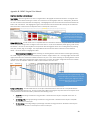
1
How Should the Tennessee Department of Education Encourage Data-Driven Communication Across Districts to Promote Regional Best Practice Sharing? Prepared For: Emily Robertson, The Tennessee Department of Education Prepared by: Anna Bryant Master of Public Policy Candidate The Sanford School of Public Policy Duke University Faculty Advisor: Bill Adair Disclaimer: This student paper was prepared in 2014 in partial completion of the requirements for the Master’s Project, a major assignment for the Master of Public Policy Program at the Sanford School of Public Policy at Duke University. The research, analysis, and policy alternatives and recommendations contained in this paper are the work of the student who authored the document, and do not represent the official or unofficial views of the Sanford School of Public Policy or of Duke University. Without the specific permission of its author, this paper may not be used or cited for any purpose other than to inform the client organization about the subject matter. The author relied in many instances on data provided by the client and related organizations and makes no independent representations as to the accuracy of the data. Table of Contents Executive Summary ii. Background information 1 Literature Review 2 Bright Spot Matching Tool, August 1, 2013 5 Feedback from Tool Users 8 Changes Made: BSMT, April 18, 2014 9 Limitations 14 Recommendations 15 Appendix A 17 Appendix B 20 i Executive Summary Project Question How should the Tennessee Department of Education encourage data driven communication across districts to promote regional best practice sharing? Client: The Tennessee Department of Education Background Information The education policy landscape in Tennessee is changing in many ways. Amidst ambitious goals outlined in Tennessee’s Race to the Top Grant, the adoption of the Common Core State Standards, and the implementation of a more comprehensive teacher evaluation system, the Tennessee Department of Education (TDOE) rests in an ambiguous role as a state education agency. While it enforces compliance for procedural issues, the majority of the TDOE’s efforts revolve around providing district support without enforcement authority. Thus, the materials, training, and supplements provided by the TDOE must be transparent, of high quality, and usable in order for districts to perceive their state education agency as a credible source of management and support that will aid in improving educational outcomes for Tennessee students. The goal of this project is to not only support districts in purposeful data analysis but also to build trust across districts through data transparency in order to foster idea exchanges throughout the state. This project will achieve these goals through the creation of a user-friendly tool that incorporates publicly available district demographic and achievement data. The tool will identify demographically similar districts and subsequently note which of the comparable districts are particularly high achievers. Superintendents will be able to use the tool to choose which districts to visit for professional development credit. Within the context of both the goals outlined in Tennessee’s Race to the Top application and a thorough literature review to provide legitimacy for the tool’s direction, this tool will identify district matches, provide users with the data from which the matches were created, and show differences in achievement outcomes with the ultimate goal of state-wide data-driven conversations around student achievement. Bright Spot Matching Tool in its Original Form Modeled after the DART tool set from the Massachusetts Department of Elementary and Secondary Education, the first iteration of the Bright Spot Matching Tool (BSMT) in Microsoft Excel enabled regional and district staff to review the demographic and achievement data from their own district; it then provided a list of comparable districts to their own based on demographic indicators. Within the list of comparable districts, the tool subsequently identified the district with the highest level of academic achievement in each subject area and student subgroup with available testing data for all students and subgroups. ii TDOE staff could then use the comparable groups to pair high performing districts with those districts struggling in certain subject or subgroup areas in order to facilitate sharing of best practices across districts and better student achievement outcomes. Superintendents and other TDOE staff received professional development credit for participating in a site visit designed by the tool. Feedback from Tool Users Interviews with TDOE staff, data analysts, and regional directors revealed several strengths, areas for growth, and suggested changes to the BSMT. Areas of Strength Organization and labeling of information Quick identification of subject area and/or achievement gap concerns Comprehensive overview of comparable districts Areas for Growth Confusing portrayal of percentages Ambiguous interpretation of color coding Inflexible and unintuitive general navigation Slow performance speed Miscellaneous formula, spelling, and other general presentation errors Suggested Changes Add additional data Incorporate additional features for comparison BSMT in its New Form The second version of the tool incorporates all subject area, grade, and subgroup data available for download from the Tennessee Department of Education website. Additionally, it includes more explicit directions for moving throughout the different tabs of the tool, with an introductory tab that explains the purpose of the tool and how to navigate it. Because all elements of the user manual have now been incorporated into the tool itself, the user manual will no longer be distributed with the tool. Additionally, each tab is numbered by the order of suggested use. The tool also employs a more consistent display, with all “actionable items” colored in orange. This trains users’ eyes to assume that orange sections require action from the user in order for the user to receive feedback. Each tab also links to other tabs within the tool to make navigation more intuitive and flexible. Each tab now displays a side bar with directions and other explanations that orient the user to each tab’s function. Additionally, users must down distinctly define the data they desire the tool to display through a series of drop down menus. iii The tool now incorporates an additional tab that enables users to select three districts of their choice for a deeper look at achievement levels of a smaller group. Similar to the tools offered by Consumer Reports, this tab trades a wide view of one subject area across many different districts for a more holistic view of achievement of three comparable districts. Limitations of the BSMT The BSMT’s greatest limitation is the amount of unavailable data that was not included within the tool. The district files available for download from the TDOE website are inconsistent from year to year regarding subject areas, grades, and subgroups, resulting in an incomplete data set across all subject areas, grades, and subgroups in the BSMT. Sustainability Recommendations Update the BSMT twice per year Incorporate TVAAS data into the BSMT Expand the data set to include school-level data Transition to a web based version. iv Background Information The education policy landscape in Tennessee is changing in many ways. Amidst ambitious goals outlined in Tennessee’s Race to the Top Grant, the adoption of the Common Core State Standards, and the implementation of a more comprehensive teacher evaluation system, the Tennessee Department of Education (TDOE) rests in an ambiguous role as a state education agency. While it enforces compliance for procedural issues, the majority of the TDOE’s efforts revolve around providing district support without enforcement authority. Thus, the materials, training, and supplements provided by the TDOE must be transparent, high quality, and usable in order for districts to perceive their state education agency as a credible source of management and support that will aid in improving educational outcomes for Tennessee students. Of the many reforms outlined in the TDOE’s Race to the Top application, changes to data transparency, quality, and usability were recurring themes. The application highlighted the vast amount of available data within the department, but identified major gaps in the effective use of this data. “But as rich as the data is and as powerful as the current system has grown to be, Tennessee has only scratched the surface of how to use that data to enhance learning, improve teaching, make policy and investment decisions, and pinpoint best practices for scaling across the state. This rich asset is only as powerful as it is accessible, userfriendly, and put into action by educators on a daily basis.” (page 68).1 One of the potential avenues for purposeful data use is to encourage data driven conversations across districts regarding student achievement. Using data to identify and subsequently match districts that are demographically similar but show different levels of student achievement could foster more strategic best practices sharing throughout the state. In her article "Stewardship and usefulness: Policy principles for information-based transparency,” Dawes argues that this type of district communication should be rooted in data analysis from tools that both are user friendly and provide enough evidence for each party involved to create the foundational trust necessary for information sharing. “Intra-governmental information sharing is more likely to succeed when policies are in place and practical tools are available that make sharing both legitimate and feasible, when trusted social networks of relationships underlie the sharing process, and when roles and relationships are clear and widely understood by all participants.”2 Historically, this type of trust across Tennessee districts has been hard to foster, and thus communication regarding successful policies and programs that lead to high student achievement does not occur. With a history of reluctance to conduct site visits to high-performing districts, struggling districts claim that their differences in achievement levels are rooted in basic demographic differences from high performing districts. The subsequent result of a state-wide lack of ideas exchange limits the potential that districts can learn from one another. Professors TN Race to the Top Application, US Department of Education, Accessed October 10, 2013. Dawes, Sharon S. "Stewardship and usefulness: Policy principles for information-based transparency." Government Information Quarterly 27.4 (2010): 377-383. 1 2 1 of education, Wayman, Jimerson, and Cho, argue, however, that “collaboration is a critical attribute of successful efforts to support educators’ efforts at improvement,” and further, “engaging with colleagues brings a new dimension to professional learning as it pressures and supports educators as they try out new knowledge and skills.”3 The goal of this project is to not only support districts in purposeful data analysis but also to build trust across districts through data transparency in order to foster idea exchanges throughout the state. This project will achieve these goals through the creation of a user-friendly tool that incorporates publicly available district demographic and achievement data. The tool will identify demographically similar districts and subsequently note which of the comparable districts are particularly high achievers. Superintendents will be able to use the tool to choose which districts to visit for professional development credit. Within the context of both the goals outlined in Tennessee’s Race to the Top application and a thorough literature review to provide legitimacy for the tool’s direction, this tool will identify district matches, provide users with the data from which the matches were created, and show differences in achievement outcomes with the ultimate goal of state-wide data-driven conversations around student achievement. Literature Review The Need for More Usable Data Initiatives to improve the transparency and quality of data lay the groundwork for state education agencies to build usable data systems that not only simply store and deliver data but also enable educators to better coordinate activity with each other and share knowledge with each other across traditional boundaries.4 Wayman, Jimerson, and Cho argue that information sharing is more than simply adopting systems and providing permissions, but also about promoting access through usability. The easier it is understand the data presented, the more time can be spent analyzing and interpreting the data.5 A user-friendly tool in Excel, the current format of all of the TDOE’s publicly available data, is a low cost way to enable superintendents to quickly draw conclusions from complex amounts of education data.6 This type of transition, however, does not immediately create investment from stakeholders to provide the necessary data and to engage in conversation around it. State education agencies should create a culture of data sharing by providing systems that offer robust information while remaining intuitive and easy to use.7 Usable systems will give districts incentives to share accurate data with the promise of receiving usable tools in return. Florida offers a strong example of a system that employs this “quid pro quo” mechanism. The state manages the collection of most education data and builds tools to encourage the exchange of data Wayman, Jeffrey C., Jo Beth Jimerson, and Vincent Cho. "District policies for the effective use of student data." Annual Convention of the University Council for Educational Administration, New Orleans LA. 2010. 4 Ibid. 5 Ibid. 6 Gurin, Joel, and Beth Simone Noveck. "Corporations and Transparency: Improving Consumer Markets and Increasing Public Accountability." Transparency in Politics and the Media: Accountability and Open Government (2013): 179. 7 Wayman, Jeffrey C., Jo Beth Jimerson, and Vincent Cho. "District policies for the effective use of student data." Annual Convention of the University Council for Educational Administration, New Orleans LA. 2010. 3 2 among districts and between districts and higher education institutions. Districts are motivated to supply timely and accurate data because they know they will receive an aggregated usable data set in return.8 Using data as the basis for statewide best practices sharing as a part of professional learning will not only give district superintendents more insight regarding best practices, but it will also improve communication lines among clusters of educators at the school and district level.9 With the large amounts of student data that districts collect, superintendents have a complex web of information with which to create district profiles and detect trends. A tool that aggregates and displays this data in a dashboard form will show a range of information and district characteristics, moving away from simple static Excel files and towards more interactive and dynamic ones.10 Given the fact that practices that lead to student achievement are often rooted in softer skills that cannot be built into a data set, usable data systems should leverage conversation around the hard numbers in order to elicit new perspectives and ideas regarding soft skills across the state.11 For the Tennessee Department of Education, the creation of a tool that accurately employs the quantifiable measures of district demographic and performance indicators in a userfriendly way must be paired with a strategic protocol that fosters conversations across districts regarding the indicators of performance that cannot be quantified, including experience, intuition, and craft knowledge.12 The tool should serve as a “choice engine,” providing enough contextual information for superintendents to make important decisions about education in Tennessee.13 Using accurate, quantitative measures to provide the context for district conversations about procedures, culture, and other unquantifiable indicators will enable the TDOE to move away from its traditional role regarding data distribution as one of compliance and toward a role of support for districts regarding data use and idea exchange to increase student achievement statewide. State Usable Data Initiatives: Massachusetts The Massachusetts Department of Elementary and Secondary Education offers several sets of interactive tools that employ both district and school level data. Created in Microsoft excel, these District Analysis, Review, and Assistance Tools (DART) enable both the public and the Department itself to analyze five years of student achievement data in the following ways14: Hansen, Janet S. Education data in California: Availability and transparency. Governor's Committee on Education Excellence, 2006. 9 Wayman, Jeffrey C., Jo Beth Jimerson, and Vincent Cho. "District policies for the effective use of student data." Annual Convention of the University Council for Educational Administration, New Orleans LA. 2010. 10 Gurin, Joel, and Beth Simone Noveck. "Corporations and Transparency: Improving Consumer Markets and Increasing Public Accountability." Transparency in Politics and the Media: Accountability and Open Government (2013): 179. 11 Wayman, Jeffrey C., Jo Beth Jimerson, and Vincent Cho. "District policies for the effective use of student data." Annual Convention of the University Council for Educational Administration, New Orleans LA. 2010. 12 Ibid 13 Gurin, Joel, and Beth Simone Noveck. "Corporations and Transparency: Improving Consumer Markets and Increasing Public Accountability." Transparency in Politics and the Media: Accountability and Open Government (2013): 179. 14 MA ESE DART Website, http://www.doe.mass.edu/news/news.aspx?id=6673, accessed August 2, 2013. 8 3 Look at trends over several years View school and district data in charts that are easy to interpret Evaluate and reflect on districts and schools and their progress Find comparable districts and schools based on demographic characteristics Make comparisons with a similar district(s) that has shown promising trends The tool set employs three different types of tools: DART for Districts DART for Schools DART Detail o Staffing and Finance o English Language learners o Success After High School While there is no formal process for the use of the tool, users can reference the User Guide and Quick Reference Guide (Appendix A) regarding each tool’s capabilities. Users can download all tools and User Guides from the Massachusetts DOE website. The website also displays a survey form for DART users to complete should they have problems or discover tool errors. Feedback from these surveys has led to changes in the tool’s functions since its initial creation in 2010. Originally created to make data more accessible to district superintendents to assess their own data, DART was a deliverable that reflected the Commissioner’s vision to make as much data as possible accessible to districts. Four years later, the tool offers numerous options for comparisons across districts. According to internal survey data, 83% of districts use the tool for comparison purposes, and their highest priority for comparison is financial data.15 Introducing comparison functions within the tool required the MA DOE to develop a matching methodology for districts and schools based on demographic and financial indicators. DART for districts creates groups of comparable districts based on the following indicators: Grade Levels served Percent Low Income Percent Low English Proficiency Percent Special Education Total Enrollment The tool employs demographic and enrollment data from the most recent academic year. The matching methodology sums the absolute differences in percentiles of these indicators between a selected district and all others. The tool identifies the 10 districts with the smallest total differences and displays them as “Comparable Districts” in the first tab of the file.16 15 16 Interview with MA ESE Staff members, conducted July 7, 2013 at the request of the TDOE. DART User Guide 4 Each indicator is weighted differently in the equation that calculates the percentile differences. An internal ESE study identified percentage of low income students as the strongest predictor of district performance. Thus, it is more heavily weighted in the equation than the other indicators.17 DART tools use no macros or VBA coding in their methodology. The majority of the formulas employ the vlookup function. DART tools are manually updated two times per year, when new data become available. The tool is updated in January, when demographic data become available, and in the fall, when achievement data become available. This process occurs over the course of two weeks, and tools are reposted to the website after the updating process.18 To ensure that users apply the appropriate amount of context to their findings from their use of the too, the DART User Guide offers the following caveat for use of the tool set: “The data supports analysis and decision-making, but it is not perfect. Some healthy skepticism is appropriate when, for instance, there is a real outlier in the data. The data collection process is subject to difficulties of several kinds, including simple keying errors. Other factors that affect data include: Without being in error, district staff may interpret the Department’s codes differently, so comparison at the detail level may make less sense than comparison at the subtotal level. When the Department requires a new data collection (e.g., EPIMS, course schedules), data is more inconsistent for the first year or two. Department coding is not perfectly aligned across different areas (e.g., staffing and finance.) “19 TDOE’s Bright Spot Matching Tool as of August 1, 2013 Modeled after the DART tool set, the first iteration of the Bright Spot Matching Tool (BSMT) in Microsoft Excel enabled regional and district staff to review demographic and achievement data from their own district; it then provided a list of comparable districts to their own based on the following demographic and other indicators: CORE Regional Office Grades Served Location (ad identified by the US Census) Number of Schools Served Number of Students Served % of students economically disadvantaged % of English Language Learners DART User Guide Ibid 19 Ibid 17 18 5 % of students with disabilities % of students who are African American, Hispanic, Native American The matching methodology used in the Bright Spot Tools is similar (but not identical) to the methodology used in the DART tools. To create the list of comparable districts, the Bright Spot Matching tool first ranks all districts by their percentile score for each of the quantifiable demographic indicators. It then calculates the difference in percent rank between the district of interest and all other districts and sums the differences of each indicator. The tool then filters the list by the non-quantifiable indicators (Regional Office, Grades Served, and Location), and the 20 remaining districts with the lowest sums of all of the percent rank differences are shown as the comparable districts. Unlike the DART tools, however, the BSMT allows users to select their own weights for each quantifiable indicator. Further, users can turn non quantifiable indicators on and off (commanding the tool to stop or start filtering) and adding multipliers to each quantifiable indicator to customize the desired list of comparable districts by indicators of individual interest. Within the list of comparable districts, the tool subsequently identified the district with the highest level of academic achievement in each subject area and student subgroup with available testing data for all students and subgroups. 3rd and 7th grade Reading 3rd and 7th grade Math Algebra I Algebra II English II English III TDOE staff could then use the comparable groups to then pair high performing districts with those districts struggling in certain subject or subgroup areas in order to facilitate sharing of best practices across districts and better student achievement outcomes. Superintendents and other users received professional development credit for participating in a site visit designed by the tool through a protocol created in tandem with the tool. To account for expected travel times, the tool identifies the mileage distance from each district to the selected district using zip codes. Each tab of the tool allowed the user to examine district-level data from a different angle: Your District: This tab presented users with a general overview of a single district’s demographic and achievement data. Districts looking for a match were encouraged to review their own demographic data first. Cells highlighted in red noted achievement levels that fell within the bottom 15% of all districts. Cells highlighted in green noted achievement levels that fell within the top 15% of all districts. Comparable Districts: This tab presented a list of comparable districts to the district selected in the “Your District” tab. The list could be manipulated using a series of weights in the far left column. The list can be filtered by CORE region, grades served, and location. The user can also emphasize how important other demographic factors are in creating the list by selecting none, 6 low, medium, high, or all weight. Using the CORE office (a regional indicator) and the Location weight (the Census identifier of urbanity) together severely limits the number of comparable matches for all districts. Thus, users were advised to select one or the other as “On” when customizing the matched set. This tab also includes each district’s distance from the selected district. The closest distance is highlighted in blue. Compare_All students: This tab enabled the user to compare achievement data for the same list of comparable districts from the “Comparable Districts” tab. The user selected the subject area using the drop down menu in the top left corner of the spread sheet. Achievement data is presented in the following 4 ways: The district with the highest achievement level from each category was highlighted in blue. Compare_Subgroup: This tab enabled the user to compare gap closures for the same list of comparable districts from the “Comparable Districts” tab. The user selected the subgroup using the drop down menu in the top left corner of the spread sheet. All subject areas are shown for each achievement group. The district with the greatest percent change (smallest negative percentage) from each category was highlighted in blue. AllDist_All Students: This tab enabled the user to view a ranked list of achievement data for all districts. The user selected the subject area using the drop down menu in the top left corner of the spread sheet. Achievement data is presented in the same ways as the data presented in the “Compare_All Students” tab. AllDist_Subgroup: This tab enables the user to view a ranked list of gap closures for all districts. The user selected the subgroup using the drop down menu in the top left corner of the spread sheet. All subject areas are shown for each achievement group. Protocol_Printable: This tab enabled the user to select the “Bright Spot” districts to match to the original district selected in the “Your District” tab. The user selected the matching criteria using the first dropdown menu in cell B3, “All Students” or “Subgroup.” Using the next drop down menu in cell C3, the user selected either the subject area or subgroup based on the original matching criteria. For subgroup comparisons, the 2012 and 2013 gap sizes were listed, as opposed to the % changes listed throughout the tool. This tab is printable (landscape orientation) and can be used to facilitate the conversation between CORE office staff and superintendents as they discuss the matching process and can supplement the BSMI Protocol. The BSMT User Manual (Appendix B) further defines the tool’s functions, display patterns, and methodology. In contrast to the DART tools’ use of vlookup formulas, the BSMT used array formulas with index and match to link and present data from back sheets to the front tabs. This methodology affords the tool a more dynamic approach to presentation of data, as index and match does not require the data to be sorted in any certain order. These array formulas matched on multiple indicators—year, district ID, subject area, grade, and subgroup. Additionally, all data was linked to other workbooks. While this formulaic approach offered the benefit of a more 7 dynamic relationship across all tabs of data, this approach resulted in a tradeoff between intuitive formuals and an extremely slow performance speed. Feedback from Tool Users Interviews with TDOE staff, data analysts, and regional directors revealed several strengths, areas for growth, and suggested changes to the BSMT. These interviews were conducted at the request of the TDOE at monthly regional staff meetings. All feedback was collected by TDOE staff and delivered to me. I did not personally collect any feedback for changes to this tool. Areas of Strength BSMT users reported the following positive feedback regarding tool capabilities: Organization and labeling of information: Users commented that the tool organized and labeled a large amount of information that was otherwise hidden in static spreadsheets. Quick identification of subject area and/or achievement gap concerns: Users could quickly identify subject areas or subgroup gap concerns and compare them across several districts in one spreadsheet. Comprehensive overview of comparable districts: Showing demographic data for all districts in the comparable list gave users more confidence in the fidelity of the matches created by the tool. The weighting mechanisms also allowed regional data analysts to quickly see information about districts that were not in their CORE region. Additionally, the mileage distance of each comparable district from the district of choice provided additional insight regarding the possibility of making a particular match. Areas for Growth BSMT users reported the following areas of confusion regarding the tool: Confusing portrayal of percentages: Users reported confusion regarding the interpretation of the percent changes presented throughout the tool. Subgroup gap closure was particularly confusing for presenters, as this was presented in terms of negative percentages (a negative percent change indicated gap closure). Additionally, several subgroups had very few data points, which resulted in very large percentage changes. Users requested that subgroup gap closure be presented in terms of percentage points closed rather than percent change from the prior year. Ambiguous interpretation of color coding: Users found the color coding in the “Your District” tab to be particularly misleading. Focusing only on the data shown in red and green, users were using this tab to identify the areas in which a district scored in the 8 bottom 15% and matching them to districts who scored in the top 15% of the same area. This method did not incorporate the matching methodology employed by the tool. Thus, users were attempting to match districts to each other that were not demographically similar. Further, users commented that the colors shifted focus away from any achievement levels immediately below the 15% threshold, but that could still be high enough for a match. Inflexible and unintuitive general navigation: Users expressed concern regarding navigating the tool, stating that they were unsure whether or not they could move back and forth among the different tabs of the tool. They noted that the explanation regarding how to select weights the “Comparable Districts” tab was unclear. Additionally, while users initially expressed positive remarks regarding the “Protocol Printable” tab, this function was not used in the matching process because it did not allow users to compare more than one subject area per district. Slow performance speed: Users commented that the time required for the tool to start in Excel and the length of time required for automatic saving and backup procedures led to a more frustrating user experience. General technicalities: Several miscellaneous formula, spelling, and general presentation errors were reported by users. BSMT users suggested the following changes to the tool: Add additional data: Users suggested adding additional data to the tool for a more comprehensive assessment of district performance, including: o ACT scores o Science data o Grade-specific data Incorporate additional features for comparison: Users suggested incorporating an additional tab that allowed users to select three districts from the comparable districts for a more detailed comparison. Changes Made: BSMT as of April 18, 2014 General Technical Changes All subject areas, grade levels, and subgroups data are now incorporated into the BSMT, including the Science and ACT data specifically requested by TDOE staff during feedback sessions. Given research from the MA DOE regarding superintendent interest in district funding information, percentages of local, state, and federal funding are also incorporated into the BSMT. To increase the performance speed of the BSMT, all district metadata was concatenated into one unique identifier by year, district ID, subject area, grade, and subgroup. This allowed 9 for more efficient formulas, matching on a single indicator instead of five. Simple index and match formulas are now used instead of array formulas. Any unused information was also deleted in all back sheets of data. These changes increased the BSMT’s speed without having to change the basic formulaic structure to vlookup. Technical Changes by Tab Your District Subgroup information is calculated as the difference in percentage of students scoring proficient or advanced on state End of Course exams between all students and selected subgroups. “HIGH” and “LOW” indicators now show districts whose percentages are either 15 percentage points above or below the state average. Comparable Districts No changes made. Compare_All students and Compare_Subgroup Information from both tabs is now included in a single tab, “Compare with Other Districts.” Subgroup data from the district of interest and its five closest matches are displayed graphically. AllDist_All Students and AllDist_Subgroup Information from both tabs is now included in a single tab, “All District Rankings.” Protocol Printable Removed due to reports of low use. Additional Tabs Included Past Data: This tab enables users to view all publicly available achievement data from 20102013 for all students and subgroups for the district selected in the “Your District” tab. Data is also displayed graphically. Compare With 3: This tab enables users to select three districts from the list of comparable matches created in the “Comparable Districts” tab for a more detailed comparison of achievement levels. Users select both a subject and subgroup area for comparison. This tab incorporates 2013 data only. Compare Additional Factors: This tab enables users to compare the following additional indicators across all districts in the comparable list from 2010-2012: ACT Composite scores Per Pupil Expenditure % of Local Funding % of State Funding 10 % of Federal Funding Data from the district of interest and its five closest matches are displayed graphically. General Usability Changes The tool originally had a limited capability of intuitively guiding the user without a training session or a manual that explains its functions. While it directed the user to operate the tool with commands like “select your district here” and “select a comparable district,” the output itself existed on several different tabs within the Excel file, leaving users unsure of how to navigate the different functions in different tabs. Further, the output originally existed only as lists of districts and their demographic and achievement outcomes; it did not create a holistic picture of a district for any user not familiar with data analysis. Thus, the second version of the tool includes more explicit directions for moving throughout the different tabs of the tool, including an introductory tab that explains the purpose of the tool and how to navigate it. Additionally, each tab is numbered by the order of suggested use The tool also employs a more consistent display, with all “actionable items” colored in orange. This trains users’ eye to assume that orange sections require action from the user in order for the user to receive feedback. Each tab also links to other tabs within the tool to make navigation more intuitive and flexible. Additionally, each tab now displays a side bar with directions and other explanations that orient the user to each tab’s function. Users must now distinctly define the data they desire the tool to display through a series of drop down menus. The original methodology behind the color scheme in the “Your District” tab resulted in large amounts of red and green district displays, leading users to focus only on these areas. Users reported initially matching districts with green areas in those red areas of their own districts instead of using the matching methodology (and other tabs of the tool) as a more strategic and data-driven matching process. Additionally, users commented that the red and green indicators were not comprehensive—several strong districts were not displayed as green simply because their percentage levels were not within the original 15% threshold. The original intent behind the color scheme, however, was to note outliers of high and low performance simply as additional context for the user. Thus, the color scheme resulted in a less comprehensive use of all of the tool’s functions. To mitigate the effects of this issue, the color coding of red and green subject areas based on state score distribution was changed to reflect the districts with percentages at least 15 percentage points above or below the state average (instead of the top or bottom 15% of all districts). Thus, incorporating state averages lowered the number of red and green districts to reflect the true “high and low fliers.” With these changes, users should view the red and green as outliers rather than subject areas upon which districts should be matched. Interviews with users revealed the need for a more nuanced framework for analyzing similar districts. Users remarked that analyzing achievement data from 20 districts at one time was overwhelming. Thus, the tool now incorporates an additional tab that enables users to select three districts of their choice for a deeper look at achievement levels of a smaller group. Similar to the tools offered by Consumer Reports, this tab trades a wide view of one subject area across many different districts for a more holistic view of achievement of three comparable districts. 11 Several items were removed from the tool. The “Protocol Printable” page was removed due to low reported levels of use. Additionally, because all elements of the user manual have now been incorporated into the tool itself, the user manual will no longer be distributed with the tool. Additional usability changes are listed below in a table format. The table incorporates usability suggestions from the following sources: Levi, Michael, and Frederick Conrad. "Interacting with Statistics." SIGCHI Bulletin 31.4 (1999): 31. IOS Human Interface Guidelines, IOS 7 Bosley, John J., and Frederick G. Conrad. "Usability Testing of Data Access Tools." Report to the Bureau of Labor Statistics. Mechanism General Orientation Provide high-level orienting information about the data the tools uses, including who collected the data and for what purposes. Indicate clearly what data are missing from the data set. Inform users what they can cannot legitimately do with the data Definitions and Nomenclature Define the types of data users are looking for. Indicate difference in definitions among types of statistical measures “rate” vs. “level” Provide explanatory information about the data (meta data) that is most relevant to end users. Intuitive Features Enable users to describe the type of data they are looking for. Show as much key guidance on the primary user interface as possible. Default settings should be inclusive. Application to BSMT Introduction tab incorporates purpose and navigation techniques. Introduction tab incorporates assumptions and tool limitations. Introduction tab incorporates assumptions and tool limitations. Introduction tab and side bars give orienting information Define percentages across demographic indicators. Also, define academic indicators (explain that what appears is % proficient or advanced). Introduction tab and side bars give orienting information Additional drop down menus force the user to be more specific in selection of data. Consistency in display and coloring, as well as side bars, orient the user to the tool’s capabilities. Default settings include all students, with subgroup selection as a second-order component. 12 Provide a readily understandable indicator of quality. Tool should not display less useful features with equal prominence. Indicate to users that their specifications will return no results as early as possible. Districts with percentages 15 points higher or lower than the state average are indicated by red and green colors. Additionally, the number of valid tests from each subgroup is included Tabs are numbered in the order of suggested use. Limitations of the tool and missing data are presented in Tab 0 of the BSMT. Additionally, all unavailable data are indicated by blank cells in each tab of the BSMT. Navigation Provide adequate procedural instructions, using clear indicators (“1, 2, 3”). Tabs are numbered in order of suggested use. Tab 0 orients the user to the BSMT’s functions and capabilities. All Indicate clearly how to access “help” page (or user components of the original user manual manual) have been incorporated into the tool itself. Links and tab colors enable the user to Give users flexibility in navigating the tool navigate the tool flexibly. Users select districts, subject area, grade, and subgroup information in each Allow users to first specify an area of particular comparison tab. Additionally the interest and then provide users with an interactive weighting mechanisms in the list of all data and meta data available for that “Comparable Districts” tab enables users area. to specify particular demographic areas to emphasize for a customizable matched set of similar districts. Users tend to… Graphical displays allows for a more Users tend to zero in on a single value. holistic presentation of all values. Compare with 3 tab allows users to Users tend to compare relatively small number of narrow their comparisons across three values. districts instead of all 20 comparable ones. Browse through large sets of values looking for Include a paragraph that notes trends for patterns or trends. each group of comparable districts. 13 Misinterpret data, so Include information about data quality for users (non-response rates, imputation rates, rates of bias, etc) Miscellaneous/General Determine the extent of the tension between making statistical data available to a wide audience and communicating its inherent complexity o Balance the presentation so as not to oversimplify, yet not to intimidate. Number of valid tests is included with subgroup information in the “Your Districts” tab. Inclusion of averages, graphs, and color schemes give the user immediate and simple interpretations of quality and context across a wide range of information. Make it easy to use numerical data and meta data at the same time. Names of subject areas, grades, and subgroups are presented in complete words and sentences in user drop down menus, but correspond to more short hand meta data in linked back sheets. Avoid help links as they de-emphasize instructions and increase the user’s time to access information. All elements of the user manual have been incorporated into the tool itself. Limitations of the BSMT The BSMT’s greatest limitation is the amount of unavailable data that is not included within the tool. The district files available for download from the TDOE website are inconsistent from year to year regarding data from subject areas, grades, and subgroups. This results in an incomplete data set across all subject areas, grades, and subgroups in the BSMT. A list of all unavailable data and the implications of its absence within the BSMT are included below. Social Studies, 2010-2012: The BSMT does not show any trend information for Social Studies. Users are only able to draw conclusions and make comparisons for one year of information, 2013. US History, 2010-2012: The BSMT does not show any trend information for US History. Users are only able to draw conclusions and make comparisons for one year of information, 2013. Additionally, the state average for US History, “All Grades, All Students” is unavailable in the state downloadable file. This leaves the tool unable to provide context for US History percentages of students scoring proficient and advanced on the End of Course exam—users will not know if percentages from their district of interest fall far above or below the state average. English Language Learners, 2011: The 2011 downloadable district file includes no information regarding the English Language Learners subgroup. This gap distorts the graphical presentation of data for this subgroup in the “Compare with Other Districts” 14 tab. Additionally, averages and general trends do not reflect all four years of available data. “All Grades” Grade Category, 2011: This is the greatest omission of data from the tool. All subgroup information is displayed at the aggregate, “All Grades” level. Thus, no subgroup information for 2011 is displayed within the BSMT. This gap distorts the graphical presentation of data for all subgroups in the “Compare with Other Districts” tab. Additionally, averages and general trends do not reflect all four years of available data. Black, Hispanic, and Native American Students, 2010-2012: The aggregated numbers of these three subgroups are not included in the downloadable files for 2010, 11, or 12. This gap distorts the graphical presentation of data for all subgroups in the “Compare with Other Districts” tab. Additionally, averages and general trends do not reflect all four years of available data. Algebra II and English III, 2010-2011: Algebra II and English III were not assessed using End of Course exams until 2012. General Subgroup Data: Several districts do not have enough valid tests for subgroups to allow for public release of their data. Thus, the BSMT’s presentation of data is incredibly noisy, with large amounts of unavailable data or data that reflects very low numbers of students. To compensate for this limitation, the number of valid tests is listed to the right of all subgroup data in the “Your District” tab. Districts not included in the BSMT: Data from the Achievement School District (ASD) was not included in the tool, given the fact that only 2013 achievement data is currently available. Data from the ASD’s profile (and other demographic information) were not available at the time of the tools creation. Thus, data from the ASD could not have been incorporated into the matching methodology, and the ASD would not have had a matched set of comparable districts. Additionally, data from the Tennessee Schools for the Blind and Deaf were left out of the BSMT due to the unique nature of both of these districts. The methodology in the BSMT subsequently did not reveal a robust group of comparable districts for either the School for the Blind or the School for the Deaf. Sustainability Recommendations Update the BSMT twice per year: Given that enrollment data is updated in October and subgroup information for English Language Learners and Students with Disabilities is updated in December, data used in the matching methodology and “Comparable Districts” tab could be updated as early as January of each year. With achievement data released in May or June, this data could be added to the tool in July. This system of updating will afford the TDOE multiple attempts to check for accuracy and make any necessary intuitive changes. Incorporate TVAAS data: With the transition to PARCC assessments, the achievement data for 2015 will be the result of different standards from the achievement data from 2010-2014. Thus, 15 to enable the tool to show a consistent 5 year data set, TVAAS information, which will not change with the introduction of PARCC testing data, will allow users to view consistent achievement indicators across districts. Expand the data set: As the TDOE collects additional district and school-level data, this data should be added to the tool as well. For example, while the tool currently does not include indicators of student, teacher, and staff transience, this data could be included in the tool (modeled after the DART tool set) once it is collected. Additionally, the school and district BSMT tools could be combined, allowing users to analyze whether a single school is driving achievement at the district level. This is an initiative that even the MA Department of ESE has not yet explored. Specific Recommended Data Additions: All missing data as reported in the Limitations section. Indicators of student, teacher, and staff transience Discipline data Transition to a web based version: Because the tool must be updated several times per year, users may not always be sure they are using the most updated version of the BSMT. Additionally, downloading the tool or sending the BSMT via Google Drive or another serverstyle system adds an extra step to the tool’s use that would be unnecessary were this incorporated into a web-based format. 16 17 18 19 Appendix B: BSMT Original User Manual Bright Spot Matching Tool User Manual Your District: This tab is a general over view of a single district’s demographic and achievement data. The original vision for this tab was that districts looking for a match can review their own demographic data first. Subsequently, the district can view its achievement (all students and subgroup). Cells highlighted in red note achievement levels that fall within the bottom 15% of all districts. Cells highlighted in green note achievement levels that fall within the top 15% of all districts. Select the district of interest from the dropdown menu in the top left of the screen. To start, click in this cell, click on the drop down arrow, and select the district you would like to investigate or find a match for from the list Comparable Districts: This tab shows a list of comparable districts to the district selected in the “your district” tab. The list can be manipulated using a series of weights in the far left column. The list can be filtered by CORE region, grades served, and location. The user can also emphasize how important other demographic factors are in creating the list by selecting none, low, medium, high, or all weight. The comparable list also includes each district’s distance from the selected district. The closest distance is highlighted in blue. Troubleshooting with weights: When searching for matching districts within the district’s CORE region (meaning the “CORE” weight is on), users are advised to keep the “location” weight coded to “off.” Including weights for both CORE region and location seem to limit the available matches to only one or two. When searching for matching districts outside of the district’s CORE region (meaning the “CORE” weight is off), turning on the location weight will not limit the available matches. Users are advised to either use “CORE” on and “location” off or vice versa. To customize the matching methodology, select the level of weight you would like to put on each indicator. Selecting “All” weight for students would prioritize this indicator over others in finding match districts. Compare_All students: This tab enables the user to compare achievement data for the same list of comparable districts from the “Comparable Districts” tab. The user can select the subject area using the drop down menu in the top left corner of the spread sheet. Achievement data is presented in the following 4 ways: 2013 %PA: Percentage of students scoring proficient or advanced on the subject’s TCAP/EOC in the 2012-13 school year. 4yr Average %PA: Average percentage of students scoring proficient or advanced on the subject’s TCAP/EOC since the 2010-11 school year. 12-13 %change: Percentage change of percentage of students scoring proficient or advanced on the subject’s TCAP/EOC from the 2011-12 school year to 2012-13 school year. 20 4yr Average %change: Average percentage change of percentage of students scoring proficient or advanced on the subject’s TCAP/EOC since the 2010-11 school year. The district with the highest achievement level from each category is highlighted in blue. Compare_Subgroup: This tab enables the user to compare gap closures for the same list of comparable districts from the “Comparable Districts” tab. Tool users should spot check each gap closure against the department subgroup achievement data to ensure that gap closure occurred because the lower performing group improved rather than because the higher performing group declined. The user can select the subgroup using the drop down menu in the top left corner of the spread sheet. All subject areas are shown for each achievement group. The district with the greatest percent change (smallest negative percentage) from each category is highlighted in blue. AllDist_All Students: This tab enables the user to view a ranked list of achievement data for all districts. The user can select the subject area using the drop down menu in the top left corner of the spread sheet. Achievement data is presented in the same ways as the data presented in the “Compare_All Students” tab. AllDist_Subgroup: This tab enables the user to view a ranked list of gap closures for all districts Tool users should spot check each gap closure against the department subgroup achievement data to ensure that gap closure occurred because the lower performing group improved rather than because the higher performing group declined. The user can select the subgroup using the drop down menu in the top left corner of the spread sheet. All subject areas are shown for each achievement group. Protocol_Printable: This tab enables to user to select the “Bright Spot” districts to match to the original district selected in the “Your District” tab. The user can select the matching criteria using the first dropdown menu in cell B3, “All Students” or “Subgroup.” Using the next drop down menu in cell C3, the user can select either the subject area or subgroup based on the original matching criteria. For subgroup comparisons, the 2012 and 2013 gap sizes are listed, as opposed to the % changes listed throughout the tool. This tab is printable (landscape orientation) and can be used to facilitate the conversation between CORE office staff and superintendents as they discuss the matching process and can supplement the BSMI Protocol. First, select whether or not you want to compare to “All Students” or “Gap Closure.” Then select the specific subject area or subgroup for comparison. Data files used (for future updating): Next, select a district for comparison, and the same achievement information selected above will appear in this section for the comparison district. 21 Achievement data: System_numeric_2013_18jul2013.xls District demographic data: 2012Profile--District CORE region classification: core.list.xls Matching Methodology: The matching methodology in this tool uses percent rank for six different indicators: Number of schools within the district Number of students within the district Per cent of Economically Disadvantaged students Per cent of students with Limited English Proficiency Per cent of Students with Disabilities Per Cent of Black, Hispanic, and Native American students The methodology calculates the sum of the smallest differences in percent rank from the district of interest to all the other districts. The top 20 districts with the least sum of differences in percent rank are the matching districts The methodology also filters by three different indicators: CORE region Grades Served Location 22