1
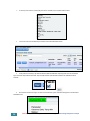
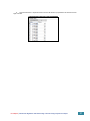
Nepal Climate Data Portal User Manual (v0.6) Asian Disaster Preparedness Center 979/66-70, 24th Floor SM Tower, Phaholyothin Road, Samsen Nai, Phayathai, Bangkok 10400 T +66 2298 0681-92 F +66 2298 0012 http://www.adpc.net Department of Hydrology and Meteorology, Ministry of Environment (Government of Nepal) 406, Babar Mahal, Kathmandu, Nepal T +977-1-4255920 F +977-1-4254890 http://dhm.gov.np [email protected] Asian Development Bank http://adb.org AidIQ http://aidiq.com Table of Contents Disclaimer 3 Preface 4 Overview 9 Purpose / intent 9 A useful way to see the Nepal Climate Data Portal 9 Features 9 Definitions 10 Tour of the User interface 11 Map view components 11 Side panel components 11 Climate Data 12 Types of data available 12 Names and naming conventions 12 Basic usage 13 How to display observed data on the map 13 How to download a printable map image 13 How to generate a chart from the map overlay 13 How to filter the map overlay 14 Colour Key 14 Filter Box 14 Examples 14 Special filter functions 15 Simple data comparisons 16 Performing a simple comparison 16 Example Final Report | Climate Data Digitization and Downscaling of Climate Change Projections in Nepal 16 1 Annual aggregation Explanation 17 17 What difference does the Annual aggregation checkbox make? 17 Month selection 17 The “Previous December” checkbox 18 What difference does checking the months make? Flexible data queries 18 19 Overview 19 Queries are shown in the Legend / Query Box 19 Editing query expressions 20 Example 20 Expressions and operators available in the query syntax 21 Statistical expressions 21 Mathematical operators 21 Projection Ensemble Mean Login and Purchase Data 22 24 Overview 24 Example 24 End Notes 28 Usability and Applicability of the Nepal Climate Data Portal 28 Stakeholder Involvement 28 2 Final Report | Climate Data Digitization and Downscaling of Climate Change Projections in Nepal Disclaimer The Nepal Climate Data Portal is a software product designed to meet various requirements of various types of users. As such it may change in the future, and this manual cannot guarantee that it will adequately describe future versions. Also, screenshots in this manual may show user interface layouts and data set names that differ slightly to the live version. Final Report | Climate Data Digitization and Downscaling of Climate Change Projections in Nepal 3 Preface Sharing of climate information has a huge impact on awareness raising, especially on climate change and allied issues. This is identified as one of the most important elements under the United Nations Framework Convention on Climate Change (UNFCCC) and its subsequent Kyoto Protocol to combat unprecedented climate change. In addition, access to a meteorological/climatological database via a web portal is useful for sector specific policymakers, planners, stakeholders and end users in agriculture & food security, water resources, biodiversity, health, etc. and for the general public to plan their routing activities as well as conducting sector specific impacts and vulnerability assessments for climate change. Therefore, on a technical level, there is a close alignment between the requirements of the Nepal Climate Data Portal for Historical Climate Data (station and gridded) and Projected Climate Data. This will provide users with an integrated platform to access climate data and the ability to compare Historic and Project Data. The Nepal Climate Data Portal is designed to facilitate the analysis of climate/meteorological, geographical and projection data using a publicly accessible web-based interface. The intended audience is climate research scientists, meteorologists, hydrologists and anyone who needs to understand past and future (projected) weather and climate patterns. It also serves to allow the purchase of data that has been collected by the DHM in Nepal. The Nepal Climate Data Portal is developed on Sahana Eden Humanitarian Open Source Software. Python 2.6, R, R multicore library, RPostgreSQL, rpy2, PIL, xvfb, PyQT4, QTWebKit were also used to design the portal. The Nepal Climate Data Portal allows users to view the climate data on an interactive map and generate different information products including exporting the raw data. The Nepal Climate Data portal can be access through http://dhm.gov.np/dpc (alternatively, it can also be reached by clicking on an image called “Climate Data Portal” on the home page of http://dhm.gov.np). The portal is designed to be a rather sophisticated calculator with its own database. Its calculation results are maps, time-series charts, or downloadable data. Like a spreadsheet (which is another sophisticated calculator), it uses a simple language to represent arithmetic and statistical operations. 1. Potential usage of climate data portal for impact and vulnerability assessment for sectoral evaluation Climate change Impact assessment is a branch of science which refers to research and understanding the affects due to change in the climate on individual sectors like water, agriculture, energy demand, resources, technological infrastructure etc. The impacts that are obtained can be quantitative or qualitative dependent on the tools used to arrive and the processes and linked complexities that are added to obtain these impacts. Note that the impacts obtained are based on our prior understanding of climate variability from observations and its linkages to different sectors, however in case of climate change it can introduce new climate change situations which are not presented or risk not included in our experiments. However, the present understanding of impacts is the best approach one has to reduce the uncertainties to a minimal extent as possible as this would provide information, which might be crucial or is in the similar pathway as the climate change would lead us to. Thus, the understanding of varied nature of impacts due to climate change on the individual sectors is essential. In order to perform an impact assessment of any sector, the important points to be taken into consideration are; • Defining the problem: in this we need to define what are the impacts we are interested (for example: is it water sector, if so are we looking at basin level or sub level). • Overall goals of this assessment: If we do this assessment on water basin, what is the final outcome we arrive at, and how is it dependent on different other sectors. For example: direct and indirects effects of water from a river basin on livelihoods, hydropower generated, access to water, surface and ground water linkages etc., • Temporal and spatial extent: To carry forward the impact study what is the time period and spatial extent of the study we are interested in, is it baseline and future (near-future or far future). Need to define the domain and period of interest for the study. • Interlinkages with different sectors: Are we going to include different sectors and their impacts on this sector, what is the depth of the assessment we are going to carry forward in this experiment. • Tools used: Are we looking for a quantitative assessment based on a simple model and a fully dynamical model (in case of water). What are the best tools available? How do we validate this model over our region of interest? Do we have enough observations to validate? What are the steps taken to complete this study. 4 Final Report | Climate Data Digitization and Downscaling of Climate Change Projections in Nepal • Links of this assessment to Adaptation: How can we link the results obtained from the project above to an adaptation assessment. What are the demographic, technological, etc information we have over the region to carry forward this assessment exercise. The data portal provided by this study provides information on observations different models with similar boundary conditions with and without bias corrections to understand the impact of climate change on a particular sector given both conditions and what could be the possible impact. 2. Models Used 2.1 PRECIS model: PRECIS model stands for Providing REgional Climate for Impact Studies (PRECIS) is one of the best dynamical downscaling tools developed at Met Office and Hadley Center. It is based on atmospheric component of the HadCM3 Global Climate Model (Gordon et al 2000, Jones et al 2004). The numerical RCM is a hydrostatic version of full primitive equations and uses a regular latitude-longitude grid in the horizontal and a hybrid vertical coordinate. It has 19 vertical levels and the numerical staggering used in the present version is Arakawa B-grid. More details of the model physics and numeric are given in Jones et al 2004. 2.2 RegCM4 model: Regional Climate Model Version 4 (RegCM4) is the updated version of RegCM3, which is a regional climate model. RegCM4 is a hydrostatic model with sigma vertical coordinate system and the numerical equations are resolved in Arakawa B-grid. More details about the model physics and numeric can be found at Giorgi et al 2012. 2.3 WRF model WRF stands for Weather Research and Forecasting, in this current project we have used the WRF 3.2 version. WRF model is developed at National Center for Atmospheric Research, USA. WRF reflects flexible, state-of-the-art portable code that is efficient in computing environments ranging from massively-parallel supercomputers to laptops. Its modular, single-source code can be configured for both research and operational applications. Its spectrum of physics and dynamics options reflects the experience and input of the broad scientific community. WRF is a free source code available to download and is available in two options Advanced Research WRF (ARW) and Non-hydrostatic Mesoscale Model (NMM). The ARW model is used for research and development purposes both at weather and climate scales. The ARW core consists of fully compressible, Euler non-hydrostatic with a run-time hydrostatic option available. The vertical coordinate is terrain following and horizontal grid scattering is based on Arakawa C-grid. More details about this model is available at (http://www.mmm.ucar.edu/wrf/users/docs/arw_v3.pdf) . 3. Information on Emission Scenarios: In order to understand how anthropogenic emissions might change in future, in 1992 the IPCC committee has developed SRES scenarios – which stands for “Special Report on Emission Scenarios”. These emission scenarios are plausible representations of future emissions of substances that are radiatively active (i.e., GHGs, SO2, Sulphate aerosols etc.) both direct and indirectly impact the radiation. These scenarios were developed based on a coherent and internally consistent set of assumptions about driving forces (such as demographic, socio-economic, technological changes etc.). The scenarios set comprises of four families: A1, A2, B1 and B2. The A1 story line describes a future world of very rapid economic growth, global population that peaks in mid-century and declines thereafter, and the rapid introduction of new and more efficient technologies. Major underlying themes are convergence among regions, capacity building and increased cultural and social interactions, with a substantial reduction in regional differences in per capita income. The A1 scenario family develops into three groups that describe alternative directions of technological change in the energy system. The three A1 groups are distinguished by their technological emphasis: fossil intensive (A1FI), non-fossil energy sources (A1T), or a balance across all sources (A1B) (where balanced is defined as not relying too heavily on one particular energy source, on the assumption that similar improvement rates apply to all energy supply and end-use technologies). In the present project, we have considered A1B scenario which is also termed as Moderate scenario and is used for understand the climate change impacts in a reasonable manner. It is also considered that due to Final Report | Climate Data Digitization and Downscaling of Climate Change Projections in Nepal 5 increasing understanding of climate change impacts the plausible scenarios lie between A1B and A2, thus an additional A2 scenario is considered with RegCM4 model for further understanding. 4. RCM runs and LBC Information As described in the technical report Chapter 6. The models used in this study are PRECIS, RegCM4 and WRF. The lateral boundary conditions used for all the models are ECAM5 – A1B (to be consistent) and ECHAM4 –A2 with RegCM4. The Table below shows the description of simulations performed and available in the data portal, Table1: Specifications of meso-scale models available in Nepal Climate Data Portal 5. Performance of RCMs in Nepal Region: Points to Users The model performance over Nepal region for rainfall, maximum and minimum temperature shows that PRECIS- ECHAM5 and HadCM3 is able to provide reasonable mean and variance values after bias correction when compared to RegCM4 and WRF. However, with bias correction the results improve in all models. Table 2, Table 3, Table 4 show the performance improvements in models after bias correction for rainfall (Table 2), maximum temperature (Table 3) and minimum temperature (Table 4). 6 Final Report | Climate Data Digitization and Downscaling of Climate Change Projections in Nepal Table 2: Rainfall averaged over Nepal Region from Observations and Models. Obs Mean 138.11 RCMHadCM3 RCMBias corrected HadCM3 HadCM3 111.77 138.94 Raw data Bias STD 151.72 101.85 Obs Mean RCMHadCM3 RCMRaw data 138.11 111.77 STD 151.72 101.85 Max- 571.58 Corrcoef Corrcoef rain Min-rain 0.49 Max571.58 rain Min-rain 0.49 0.88 354.73 0.88 0.85 RCMECHAM5 RCMRaw data ECHAM5 128.78data Raw corrected 151.81 138.94 128.78 0.926 0.86 0.9155 109.72 578.67 4 0.9265 71.94 649.06 0.63 3.24 0.67 153.19 6.99 0.9155 RCMWRF RCMRaw data WRF 79.27 Raw corrected data 153.19 71.94 139.81 79.27 1.55 651.16 0.86 2.89 RCMRegCM RCMBias corrected RegCM RegCM 2.7 139.81 Raw data Bias 0.63 152.77 406.26 0.926 RCMRegCM RCMRaw data corrected 152.77 1.55 138.97 2.7 109.72 151.81 RCMECHAM5 RCMBias corrected ECHAM5 138.97 Bias 323.66 0.9265 0.1 0.67 3.04 1.01 RCMWRF RCMBias corrected WRF 139.66 Bias corrected 151.34 139.66 0.9189 151.34 574.85 0.9189 4.03 354.73 578.67 406.26 651.16 6.99 649.06 323.66 574.85 0.85 2.89 4 3.24 0.1 3.04 1.01 4.03 Table 3: Maximum temperature averaged over Nepal region from observations and Models. Obs RCMHadcm3 Raw data RCMRCMECHAM5 ECHAM5 Raw data Bias corrected 17.2 24.39 RCMRCMRegCM RegCM Raw data Bias corrected 22.2 24.31 RCMWRF Raw data 15.92 RCMHadcm3 Bias corrected 24.41 16.04 RCMWRF Bias corrected 24.24 Mean 24.5 Std 4.15 6.48 4.26 6.1 4.28 6.57 4.33 6.74 4.32 0.91 0.9 0.91 0.91 0.9 0.88 0.72 0.91 31.44 28.18 31.79 29.12 32.78 33.65 32.08 26.23 32.61 15.24 2.09 13.02 4.78 14.68 8.01 13.39 3.78 13.42 Corrcoeff Max of tmax Min of tmax Table 4: Minimum temperature averaged over Nepal region from observations and Models. Obs RCMHadcm3 RCMHadcm3 RCMRCMECHAM5 ECHAM5 RCMRegCM RCMRegCM RCMWRF RCMWRF Raw data Raw data Raw data 9.31 Bias corrected 12.91 Raw data 5.12 Bias corrected 12.73 2.72 Bias corrected 12.65 Mean 12.98 6.61 Bias corrected 12.75 Std 5.79 4.55 5.91 7.5 5.93 6.39 5.86 6.94 5.98 0.87 0.95 0.97 0.95 0.97 0.95 0.83 0.96 Corrcoeff Max of tmin 21.13 14.22 22.35 15.95 22.17 18.54 22.19 13.66 22.25 Min of tmin 2.15 -3.77 -0.37 -7.662 2.12 -1.87 1.34 -8.69 0.89 Final Report | Climate Data Digitization and Downscaling of Climate Change Projections in Nepal 7 The above tables show that the performance of RCMs on mean, variance, maximum values and minimum values are much reasonable after the application of bias correction methods to individual models. Thus, it shows that all the models presented in the website could be used, however for detailed assessment individual models could be selected for reasonable, extreme high risk and low risk scenarios. In this case, to perform such an assessment for reasonable climate change impact assessment the PRECIS model inputs from ECHAM5 and HadCM3 conditions could be considered. In order to understand the high risk or low risk scenarios, the WRF model and RegCM4 model could be considered for baseline and future scenarios. Note to Users: Guidelines to use model and observational data from the portal • It is important to consider similar time periods for comparisons between observations and models. For ex: We want to compare the baseline results of PRECIS- ECHAM5 with observations we need to consider 25km PRECIS-ECHAM5 with or without bias correction with observations of the same variable at 25km resolution for 1971-2000. This would provide consistency in the results. • The model future can be compared only with model baseline and similar model. Note that PRECIS-ECHAM5 future can only be compared with PRECIS-ECHAM5 baseline since the climate change signal can be understood better and is reasonable only if you do so. We cannot compare PRECIS-ECHAM5 future with PRECIS-HadCM3 Baseline, this is scientifically not correct since we are comparing two different LBCs which might provide erroneous results. • In area averaging values, when we compare models with observations, the users should always use the similar areas for all the inputs i.e., observations, model baselines and future. We can use the area mask function in the website efficiently to perform this study. • It is a good exercise to check for consistency of your results by doing the exercise in a similar way twice from the dataset and also to check with the IPCC results from the AR4 report. If there are any differences then the assessment needs to be rechecked for its credibility. 8 Final Report | Climate Data Digitization and Downscaling of Climate Change Projections in Nepal Overview Purpose / intent The Nepal Climate Data Portal is designed to facilitate the analysis of climate/meteorological, geographical and projection data using a publicly accessible web-based interface. Its intended audience are climate research scientists, meteorologists, hydrologists and anyone who needs to understand past and future (projected) weather patterns. It also serves to allow the purchase of data that has been collected by the Department of Hydrology and Meteorology in Nepal. A useful way to see the Nepal Climate Data Portal To avoid confusion, it is useful to see the portal as essentially a somewhat sophisticated calculator with its own database. Its calculation results are maps, time-series charts, or downloadable data. Like a spreadsheet (which is another sophisticated calculator), it uses a simple language to represent arithmetic and statistical operations. The point of this is, just like any calculator, it is dumb in the sense that it basically just applies the instructions it is given to the data it has been given. It isn’t smart, i.e. ultimately it cannot recognise bad data or instructions although it does have some mechanisms to cope with bad data and it can also use some meta-data (data about data) to help users validate results. For example, the portal can’t and doesn’t try to detect incorrect outliers, but the map overlay colours will visually and obviously show those outliers, and the user can edit the colour scale to exclude those outliers and see a useful map. As another example, the system doesn’t know what the values mean, but does know about units, so it can dimensionally analyse expressions and then show the output units. The portal will complain when units are incorrectly mixed in an expression. Features Easy selection and display of: Observed Station Data. Observed Gridded Data. Projected Data. • Easy comparison of data • Ability to aggregate data • Flexible data queries, which allows more sophisticated data analysis by giving the user the ability to enter expressions. • Dimensional and delta analysis of expressions to aid data validation • Generation of time-series charts, with regression lines, and ability to combine and resize charts. • Filtering map by places / values. • Ability to show observation stations as a separate layer. • Popup boxes to show values. • Filtering of places shown on the map with shape files. • Printable images of the map overlay • Download of data. • Data purchase facility • Management of data purchases. Final Report | Climate Data Digitization and Downscaling of Climate Change Projections in Nepal 9 Definitions For clarity, certain terms are used with precise meanings in the rest of this document. Name Definition Data Sets of numeric values of a given variable, specifically: • at a particular place, • over a particular time range. Internally these are stored as positive numbers wherever possible. This is important These sets of data have associated units (e.g. mm for rainfall). These sets of data are stored in a database used by the Nepal Climate Data Portal. Place A geographical position at a fixed latitude and longitude. Places may or may not be observation stations. Places may or may not have other attributes including: elevation, name, station ID, and a list of regions the place is inside. These attributes may be used in filtering. Observation Station A real weather observation station. These usually have names and elevation information. Browser Compatibility The Nepal Climate Data Portal has been tested on the following browsers: Firefox 14+ Safari 5.1+ Chrome 18+ Internet Explorer 8+ (basic support) Safari on iOS v5.1 10 Final Report | Climate Data Digitization and Downscaling of Climate Change Projections in Nepal Tour of the User Interface Color Key Filter Box Map Overlay Side Panel Legend/Query Box Map view components Component Purpose Description / notes Map overlay Shows values above the base map layer. Values from the query are shown as coloured squares. Legend / Query box Controls the data being shown in the map overlay. Filter box Place/value based filtering of the map overlay Can filter based on any attribute, e.g. elevation > 1000 Colour Key Control the colours shown in the map overlay. This is set to sensible values from the query data. It is also editable, and lockable. Side panel components Component Purpose Description / notes Layers Toggle visible map layers Select Data: (A) Easily generates a query to display data. Compare with data (B) Easily generates a query to compare data. Buy data button Allow the user to purchase data. Show chart for selected places. Show a time-series chart for selected Places on the map overlay need to be selected to enable this button. Download printable map image Downloads a generated (server-side) PNG image of the map. Side panel and unnecessary map widgets will not appear on the image. Used together with Select Data: (A) Final Report | Climate Data Digitization and Downscaling of Climate Change Projections in Nepal 11 Climate Data Types of data available Three main types of data are available. It is important to understand the distinctions between and the limitations of these types in order to interpret the data from the system properly. Type name Explanation Details and Limitations Observed Data that has been collected at various observation stations in Nepal. Some areas of Nepal have better station coverage than others. It has not been interpolated or generated. Some stations have been collecting data for a longer period of time. Some types of data may not be available at certain points in time. E.g. some stations have not been collecting rainfall data for as long as they have been collecting temperature data. Some data may be incorrect due to misreported data or temporary faults in equipment. Coloured square size remains constant while zooming in or out. Observed Gridded Data that has been interpolated from the observed data into a grid of points on the map. A grid is an arbitrary collection of places on the map. I.e. the system is flexible in whatever grid pattern is used. Projected Projected Data has been produced using a variety of different climate models and emissions scenarios. This is also given on a grid. Grid sizes may be different. This is important to understand when comparing data. Data are compared by place. Interpolated data will have greater uncertainty the further it lies (geographically and temporally) from observed data. The places on the grid do not represent Observation Stations. The mechanism of producing the projected data is too technical to describe in this user guide. Please refer to the technical guide that is available in the climate data portal itself for understanding the same mechanism. Some projections may have long gaps in the data. For example, the earlier data (e.g. 1970 - 2009) can be used to compare the model against real observed/gridded data. The later data (e.g. 2030 -2060) can be used to make predictions. Names and naming conventions Data will always have a name. Names will always start with one of “Observed”, “Gridded” or “Projected”. When referring to Data in a query, the name must always be given in double quotes. This allows for flexible and therefore clear naming. 12 Final Report | Climate Data Digitization and Downscaling of Climate Change Projections in Nepal Basic usage How to display observed data on the map 1. Select Data On the Select data panel you can select the type of climate data you want to view. You can choose what type of data you want to view, how you want that data to be aggregated on the map and charts and the time range you wish to view the data over. 2. Click “Show on Map” The climate data which you have selected will be overlaid on the map. The map overlay will show climate data which has been aggregated over time according to the Aggregation option you have selected on the Select data panel. How to download a printable map image Click “Download printable image” to download an image of this map to use in reports and presentations. The image is generated on the server, so please be patient as it may take some time to generate depending on the server load. This image will be in the PNG image format to preserve colours correctly, may be of a different size, and will not display the various map controls. Some other things may not look exactly the same as what you see in the browser, e.g. fonts may differ, depending on the server configuration. How to generate a chart from the map overlay 1. Select places on the map overlay You can click on a single grid on the map or select a range of points by clicking and dragging the mouse or holding the SHIFT key while you click multiple grids. 2. Click “Show chart for selected places” A chart window will pop up showing a chart for those places. The chart will show climate data which has been aggregated from each of the selected grids according to the Aggregation option you have selected on the Select data panel. Click “Download” on the chart popup window to download the chart image. You can resize the Chart popup window to show more detail You can add more lines to the chart by simply selecting different data. To clear the chart and start a new one, simply close the chart popup window. Final Report | Climate Data Digitization and Downscaling of Climate Change Projections in Nepal 13 How to filter the map overlay There are two ways to filter the map overlay. Colour Key The Colour Key will filter out any places whose value on the map overlay lies outside the range in the Colour Key. However, more powerful filtering is possible with the Filter Box. The traditional temperature colour gradient is blue (cold) to red (hot). The colour gradient is adjustable:First, hover over the colour key to show the gradient list. 1: Select gradient. 2: Reverse gradient if necessary. Filter Box The Filter Box accepts simple mathematical and logical expressions. You can refer to any attribute of a place, and the value. The list of attributes depends on what data has been loaded into the system. To see the list of attribute, hover over a place on the map overlay. All the attributes listed in the popup are available in the expression. For example: latitude / longitude elevation and name. The filter expression will be give a boolean (true/false) value. The expression will be evaluated on each place. If the expression evaluates to true, the place will be shown, otherwise it will not be shown. Examples Selecting a region by name: name = “DARCHULA” Using the boolean operators “and” and “or”. elevation > 1000 and value < 10 Once a region shape file has been loaded, you can also use the special function “within”. within(“FWDR”) or one can use “Region Filter” drop down box in the side panel to do region filtering easily. If no filter has been specified, the Filter Box will show “unfiltered” and all places will be shown. 14 Final Report | Climate Data Digitization and Downscaling of Climate Change Projections in Nepal Special filter functions Filtering can also use some special filter functions that are described in the table below. These filter functions allow filtering by location. Special filter function Effect within(“Area name“) Only shows places within the named area. Multiple area names may be specified, separated by commas. within_Nepal() Only shows places within Nepal. Filter the map to only show EDR using the Region filter (in the side panel): The filter box and map are updated Final Report | Climate Data Digitization and Downscaling of Climate Change Projections in Nepal 15 Simple data comparisons Performing a simple comparison The Nepal Climate Data Portal allows different climate data to be compared for analysis. These could be the same type of climate data compared over different time periods or different types of climate data. Example A meteorologist needs to know how much the maximum yearly temperature will increase between the years 2030 and 2060 to determine the risk of increased flood hazards due to glacial melting. The Compare with... (subtract from) panel allows the differences between data to be displayed as a map overlay. Using the “Compare with Data” sub-panel to compare two data sets Select the two data sets as you would for “Select data”. Click “Compare on map (B-A)”. A query is generated subtracting the top selection from the bottom. Note: Charts can also be used to visually compare different types of climate data and climate data from different places. This is done by keeping the plot window open, selecting different climate data and clicking Show chart for selected places. This data will be added to the existing chart. Using the check boxes, the user can combine multiple charts in order to compare different climate data. This is useful for analysis. 16 Final Report | Climate Data Digitization and Downscaling of Climate Change Projections in Nepal Annual aggregation Explanation The checkbox “Annual aggregation” allows the user to aggregate monthly values into a single yearly value for each year of the selected time range. This actually makes no difference to the map overlay, but does make notable differences to the time-series charts, i.e. it aggregates monthly values into a single yearly value: Note: When choosing rainfall parameter, user can select “Mean (Annual)” statistic to see the annual values on the map overlay instantly. What difference does the Annual aggregation checkbox make? Annual aggregation checkbox Difference to the map overlay Difference to charts Checked No difference - because values displayed on the map overlay must all be aggregated into a single value (single coloured square per place) anyway. Charts lines will have one value per year, shown as circles joined by lines. Unchecked Monthly time series will be shown as just lines without circle markers. Over many years this is often a waveform with a period of one year. Month selection Below the “Annual aggregation” checkbox are 13 labelled checkboxes “D J F M A M J J A S O N D”. These allow the user to select which months to aggregate. For example, the user may only be interested in yearly values for the summer months only. Thus they might select only J J A (June, July and August). Final Report | Climate Data Digitization and Downscaling of Climate Change Projections in Nepal 17 The “Previous December” checkbox By default, the checkboxes starting from the first J (January) until the last D (December) are specified. This selects every month in the year. However, there is another typical use case wherein a user may wish to look at seasonal changes. Typically, the only difference this makes is the special treatment of the December of the previous year. I.e. when we talk about “Winter 2011” we actually mean December 2010, January 2011 and February 2011. The first D checkbox is allowed to make this possible. Within the system, to distinguish this concept from the normal concept of December, it is identified with a special name: “PreviousDecember”. This name can be used in expressions within the Months() filter. PrevDec is a shorter alias of this name. When the first D checkbox is checked, then PreviousDecember is specified in the month filtering and two things happen: The December of the previous year is counted as part of that year. If the date range is specified in terms of years (no months*), then each year starts in December and ends in November. i.e. if the year range is From(2000) To(2011), then the actual dates will be from December 1999 to November 2011. *Note that when months are specified in the date range (e.g. March 2000 to October 2011), together with PreviousDecember, behaviour is currently undefined. What difference does checking the months make? Months selection example Outcome Every month in the year will be aggregated into a single value. E.g. 2011 will use values from Jan 2011 to Dec 2011 (Default) Only values from the winter months will be aggregated together into a single value. (PreviousDecember specified) E.g. if the date range is 2000 to 2010, the value for 2000 = Dec 1999 + Jan 2000 + Feb 2000. The data for December 2010 will be ignored as it now falls outside of the range. The data will differ from the D J F case. Values for January, February and December in the same calendar year will be aggregated together. (PreviousDecember and December) 18 Not allowed - system will complain that it doesn’t make sense to aggregate annually using both December and the PreviousDecember. The user interface will not allow both D’s to be checked at the same time. Final Report | Climate Data Digitization and Downscaling of Climate Change Projections in Nepal Flexible data queries Overview Internally, the Nepal Climate Data Portal uses a simple, specialised query language which is used to query the database. This language can be used directly to formulate more complex queries than a simple user interface could easily allow. This feature can be used for more advanced statistical analysis such as computing Coefficient of Variation to show the dispersion of the climate data and interpret its reliability. These query expressions are simple mathematical expressions, similar to those you might write in a spreadsheet. Only queries can be written. The language is deliberately too simple to allow the writing of general programs (this is important for security, as the queries run on the server). Internally, the output of these expressions is a mapping of keys to values. When generating a map overlay, the keys will be places on the map. When generating a chart, the keys will be time periods. Whether the keys are places or times is implicit and depends on the context of usage but not on the expression itself. Thus, you do not need to modify their query expression to generate a graph or a map overlay. Queries are shown in the Legend / Query Box You may have already noticed examples of the data query syntax in the preceding chapters. The box at the bottom of the map shows the expression being evaluated, whilst also serving as a map legend. This is set to an initial expression when the browser first loads the page. It will also be updated every time you use the graphical user interface in the side panel to change the data being displayed. Thus you can use this feature to quickly see examples of the syntax. The Legend / Query box. This is an editable box located at the bottom of the map viewer. Let’s break down this example into parts: Maximum( "Observed Temp Max", From(1950), To(2100) Statistic name. I.e. “Return the maximum value for each key” Data set name. This is always in double quotes, and always starts with “Observed”, “Projected” or “Gridded”. Start date, inclusive. End date, inclusive. I.e. use values from 1st I.e. use values until Jan, 1950 31st Dec, 2011 Final Report | Climate Data Digitization and Downscaling of Climate Change Projections in Nepal ) Remember to match closing braces. 19 Editing query expressions To edit query expressions, simply click with the mouse inside the query box. A flashing cursor should appear. You can now edit the expression. As soon as you start editing, a button will appear labelled “Compute and show on map”. When you are happy with your edited expression, click the button to update the map overlay. The “Compute and show on map” button. This appears whenever the query has been edited. Example A meteorologist is producing a using projected temperature data for 2030-2060 and needs to understand the C.V. of the data. C.V. is Standard Deviation divided by the mean, so we can enter the expression: StandardDeviation("Projected Temp Max RegCM4 A1B", From(2030), To(2060)) / Average("Projected Temp Max RegCM4 A1B", From(2030), To(2060)) Directly entering an expression to calculate C.V. 20 Final Report | Climate Data Digitization and Downscaling of Climate Change Projections in Nepal Expressions and operators available in the query syntax Statistical expressions These always have a double-quoted data name as their first argument. Expression Meaning Notes Maximum(dataset, ...) Maximum sample value Minimum(dataset,...) Minimum sample value Average(dataset,...) Average of the sample values StandardDeviation(dataset, ...) Standard deviation of the sample values Sum(dataset, ...) Sum of the sample values. Count(dataset, ...) Count of the number of samples. Gives a delta value Gives a dimensionless value Mathematical operators Operator Meaning Notes + Plus It is an error to add or subtract expressions that use different units. - Minus * Multiply / Divide ^n ^ (1/n) Raise to power Root Only integral powers or integral ratios are allowed. I.e. n must be a whole number, and not a statistical expression. It may be an error if the resulting units do not make sense. Expressions used inside aggregation expressions Expression Meaning Notes From(Year[, Month[, Day]]) Specify start date* If month is not given, January will be used. If day is not given, 1 will be used. To(Year[, Month[, Day]]) Specify end date* If month is not given, December will be used. If day is not given, the last day of the month will be used. Months(...) Specify which months* to aggregate Only data from the specified months will be used. * Months can be specified by name or number: i.e. PrevDec = PreviousDecember = 0, Jan = January = 1, Feb = February = 2, ... Dec = December = 12 Final Report | Climate Data Digitization and Downscaling of Climate Change Projections in Nepal 21 Projection Ensemble Mean Example A meteorologist needs to calculate the ensemble mean of WRF projected maximum temperature by averaging the WRF model output for two GCMs (ECHAM5 and HadCM3). (This is possible because they have the same resolution). The data is only needed for the Eastern Development Region (EDR) of Nepal. For these kinds of complex queries, the portal provides a simple but flexible query language. - The flexible query box allows direct editing of a query by more technical users. - These users will typically have some specific formula in mind and wish to quickly visualise it on a map or chart. - In this case we will sum the two models together and divide by two to give an average or ensemble mean. 1. One way to enter a flexible query is to modify a generated expression. E.g. compare two data sets as seen below: Click "Compare on map" to generate a query expression to modify. 2. Edit the query expression to compute the projection ensemble mean as follows: (indentation added for readability) 22 Final Report | Climate Data Digitization and Downscaling of Climate Change Projections in Nepal 3. Click “Compute and show on map”. The map is updated to show the projection ensemble mean. Final Report | Climate Data Digitization and Downscaling of Climate Change Projections in Nepal 23 Login and Purchase Data Overview The climate data portal provides daily data for download by specialist users. Payment handling is performed by the DHM. The portal allows users to order data, make note of payment details, track orders and download data once purchased. Example 24 4. A new user must register an account on the system. 5. Enter user details and click "Register" Final Report | Climate Data Digitization and Downscaling of Climate Change Projections in Nepal 6. Registration is successful 7. 8. From the main menu, the user selects "Purchase Data" for the data purchasing system. Then "Purchase new data". The user selects the desired parameter, station and date range. They specify whether they are a student or other. Final Report | Climate Data Digitization and Downscaling of Climate Change Projections in Nepal 25 1. A summary screen is shown, including the price. Price is calculated only for requested data that exists. 2. The user can see a list of the data they have ordered on the All Purchased Data screen. 3. At this point the customer pays by whatever method available and DHM staff verify the payment. Then an administrator logs in and checks the purchased data screen. They click Open and then check the "Paid" checkbox. This releases the data for download. 4. Now when the customer next logs in, the data can be downloaded. A green download button appears on the Purchased Data Detail screen. 26 Final Report | Climate Data Digitization and Downscaling of Climate Change Projections in Nepal 9. The downloaded data is in simple CSV format so that it can be viewed in any spreadsheet. This makes the raw data highly accessible. Final Report | Climate Data Digitization and Downscaling of Climate Change Projections in Nepal 27 End Notes Usability and Applicability of the Nepal Climate Data Portal Easy accessing historical station data, historical gridded data and projected future climate change scenarios for: Research and Developments Assessing impacts and vulnerability in climate sensitive sectors such as agriculture, water resources, energy, health, etc. Developing adaptation strategies for vulnerable sectors Infrastructure planning as adaptation measures - Contingency planning Stakeholder Involvement The portal has been financed by the Asian Development Bank (ADB) The DHM and ADPC have jointly organized two feedback workshops on the portal, inviting various users from technical and policy-making fields. This was to ensure that the system could serve real needs of real potential users. Much of the feedback from those two workshops has been incorporated into the current system. 28 Final Report | Climate Data Digitization and Downscaling of Climate Change Projections in Nepal