1
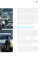
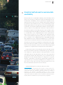
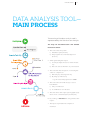
Public Disclosure Authorized Public Disclosure Authorized Public Disclosure Authorized Public Disclosure Authorized 90042 Urban Transport Data Analysis Tool (UT-DAT) USER’S MANUAL Copyright © 2014 International Bank for Reconstruction and Development / The World Bank 1818 H Street NW, Washington DC 20433 All rights reserved. The findings, interpretations, and conclusions expressed in this report are entirely those of the authors and should not be attributed to the World Bank and Energy Sector Management Assistance Program (ESMAP). The World Bank does not guarantee the accuracy of the data included in the tool, which have been collected only from secondary sources and these sources have been referenced. The World Bank accepts no responsibility for any consequences of the use of these data. ACKNOWLEDGMENTS T his work was undertaken by the Transport Anchor of the World Bank, with support from the Energy Sector Management Assistance Program (ESMAP). The World Bank team was led by O. P. Agarwal (Senior Urban Transport Specialist), and included Gouthami Padam, Aroha Bahuguna, and Salvador Pena. Overall guidance for this work was provided by Jose Luis Irigoyen, Marc Juhel, Rohit Khanna, Ivan Jacques, and Sam Zimmerman. The report also benefited from very useful suggestions and comments made by peer reviewers Heather Allen, Georges Darido, Ajay Kumar, Baher El-Hefnawy, and Ashok Sarkar. The team thanks all of them for their input. The work also benefited from comments from various other experts both within and outside the Bank, including Thierry Desclos, Arturo Ardila Gomez, and Shigeyuki Sakaki. The financial and technical support by the Energy Sector Management Assistance Program (ESMAP) is gratefully acknowledged. ESMAP – a global knowledge and technical assistance program administered by the World Bank – assists low- and middle-income countries to increase their know-how and institutional capacity to achieve environmentally sustainable energy solutions for poverty reduction and economic growth. ESMAP is funded by Australia, Austria, Denmark, Finland, France, Germany, Iceland, Lithuania, the Netherlands, Norway, Sweden, the United Kingdom, and the World Bank Group. 5 FOREWORD T he urban population in the developing world is expected to more than double by the middle of the twenty-first century – from 2.3 billion in 2005 to 5.3 billion in 2050. Large cities are growing very rapidly, and services are struggling to keep up. In particular, some cities have been over- whelmed by the increase in travel demand. The result has been a turn to private vehicles, an increase in fossil fuel consumption, and a subsequent rise in greenhouse gas emissions and pollution levels. This has also led to congestion, making it increasingly difficult for goods and people to move from place to place, as well as an increasing incidence of road crashes. The net effect is a decrease in the health and well-being of urban dwellers as well as the economic efficiency of the cities that they live in. It is essential that the growing needs of urban mobility be met more efficiently. There is an urgent need for planning for urban mobility that not only provides the required capacity to meet growing demand but does so in a manner that minimizes the energy used. Mitigation efforts in most cities have addressed the symptoms rather than the underlying causes. Cities have tried to deal with congestion by widening their roads or building mass transit systems, without first looking at whether the city needs additional road/mass transit capacity or whether it needs other interventions like improved intersection design or improved road maintenance. High energy consumption in a given city could be due to any number of supply, demand and performance related factors, –such as excessive trip lengths, poor integration among different modes of public transport, low vehicle fleet fuel efficiency, and highly congested traffic. The precise mix of these factors will be different for each city based on its history, geography, government and local economy. An effective diagnostic tool could clearly identify the underlying causes behind the visible symptoms and would help in better targeting of the urban transport interventions. It is in this context that the Urban Transport Data Analysis Tool has been developed to allow a systematic diagnosis of the urban transport problems in a city before designing remedial measures. It is hoped that cities and decision makers will find this tool useful in designing their policies and other interventions aimed at improving mobility in their cities. Marc Juhel Rohit Khanna Sector Manager, TWITR Program Manager, ESMAP TABLE OF CONTENTS Introduction8 User’s Guide For The UT-DAT12 Data Analysis Tool—Main Process 13 User Instructions 14 Updating / Adding Data To The Matrix 16 To update and/or add data to an existing city 17 To add a new city to the Matrix 19 Generating Reports—Bar/Column/Line 20 Generating Reports—Scatter Plots 29 8 URBAN TRANSPORT DATA ANALYSIS TOOL (UT-DAT) – USER’S MANUAL INTRODUCTION U rbanization is a defining feature of this century. This is especially true in the developing world, where the total urban population is expected to more than double by the middle of the 21st century—from 2.3 billion in 2005 to 5.3 billion in 2050. Overall population growth and increasing urbanization have led to the rapid growth of large cities, which have been overwhelmed by the sudden increase in travel demand. Growing demands for urban travel have led to rapid motorization. For example, in 1990, China had 5.5 million civil vehicles, of which only 800,000 were privately owned. By the end of 2012, it had 120 million civil vehicles, of which 93 million were privately owned. Similarly, the number of motor vehicles in India went up from 21.3 million in 1991 to 141.8 million in 2011. The trend in most other developing countries is similar. Such rapid motorization has led to increased consumption of energy, especially nonrenewable energy, as well as increased emission of Green House Gases (GHG) and other pollutants. It has also led to congestion, increasing the difficulty of moving goods and people from place to place, as well as increasing the incidence of traffic accidents. These have compromised the health and wellbeing of the population as well as the economic efficiency of cities. Therefore, it is essential that the growing needs of urban travel be met more efficiently. There is an urgent need for effective and efficient planning for urban transport—planning that not only provides the required capacity to meet growing travel demand but does so in a manner that minimizes energy use and other negative aspects of excessive private vehicle use. Unfortunately, most cities have addressed the symptoms rather than the underlying causes. Cities have tried to deal with congestion by widening roads or building mass transit systems, without INTRODUCTION 9 first looking at whether the city needs additional road/mass transit capacity or whether it needs other interventions, such as improved intersection design or improved road maintenance. Similarly, efforts to deal with air pollution have imposed more stringent emissions norms on all pollutants, without first looking at the actual cause. High energy consumption in a given city could be due to any number of system supply-, demand-, and performance-related factors, including excessive trip making and trip lengths, low public transport and non-motorized transport opportunities, low vehicle fleet fuel efficiency, and traffic congestion. The precise mix of these factors will be different for each city based on its history, geography, government, and socioeconomic characteristics. This means that an a priori diagnosis to clearly identify the underlying causes of the visible symptoms would help in better targeting urban transport interventions. In the absence of a proper up-front diagnosis, some proposed solutions may waste resources and even be counter-productive. Urban Transport Data Analysis Tool It is in this context that the Urban Transport Data Analysis Tool (UT-DAT) has been developed to look at critical parameters relating to urban transport in a city and compare them with peer cities, to identify the specific areas where each city performs better or worse. This is analogous to a pathologist’s report that helps a doctor diagnose a patient’s ailment more precisely before suggesting the right medication. A diagnostic study will facilitate a diagnosis of the urban transport problems of a city so that remedial measures can be correctly targeted. The UT-DAT compares a series of transport-related indicators for that city (referred to as the “test city”) with similar indicators for a large set of peer cities. Such a comparison allows an understanding of where a city is doing well and where it is not, vis-à-vis its peers, and thereby suggests directions for remedial action. The tool comprises a large set of data items for several cities and allows the user to make comparisons across selected indicators and also choose the peer cities to compare against. Thus, there is a test city (the city that is being subjected to diagnosis) and peer cities (chosen for the comparison). The tool provides an output that compares the test city with the peers through graphs and charts. 10 URBAN TRANSPORT DATA ANALYSIS TOOL (UT-DAT) – USER’S MANUAL The UT-DAT is a Microsoft Excel–based tool, from the available data and for ease of compari- and has been designed to be simple and user son across cities. In all, 30 indicators were selected friendly. The software allows the user to (a) input and have been already computed in the tool for data for a test city, (b) select a set of indicators ease of use. to be used for the comparison, (c) select a set of peer cities to compare against, and (d) carry out the comparison and generate reports. Indicators vs. data items A comparison of performance is more meaningful when it uses specific “indicators” derived through computations of one of more of the data items. For example, a comparison of public transport ridership would not be meaningful, though a Shortcomings with regard to urban transport data Because most of the data collected for the tool came through secondary sources, comparing transport data across multiple cities, particularly across different countries and world regions, is very difficult. While some of the information is recorded in the annual statistics of public trans- comparison of the share of the population using port agencies, other data are not available from public transport would be useful. Similarly, the any single source and are usually scattered across fare charged by public transport system would several different sources. Data vary greatly from not mean much unless local income levels are one organization to another and from one city to also taken into account. another. Even within a city, data are usually scattered among a large number of sources, which Therefore, several indicators that would help do not always use the same definition for a given measure urban transport performance in a city data item. Data are also generally not available were identified. These indicators, derived from for the same year across all cities. Apart from this, the raw data items collected, were selected in several data items do not have a consistent basis such a way that they could be easily calculated for determination in all the cities. INTRODUCTION 11 Analytical method used to overcome data unreliability Because there was considerable variability and unreliability in the data, it was necessary to develop an analytical method that accommodated this unreliability and yet generated acceptable results. Therefore, the tool does not try to compare cities based on absolute performance values. Rather, it tries to classify them based on their relative performance vis-à-vis peer cities. It was recognized that the numerical scores may be viewed either as indexes of relative performance (“ordinal score”), rather than a measure of absolute level of performance against some underlying value scale (“cardinal scale”). For example, given the unreliability of the data, it would be incorrect to consider that a score of 8/10 represents a level of performance that is twice as good as a score of 4/10, on some underlying value scale. Instead, a better interpretation, given the constraints, would be to consider a score of 8/10 as being worse than 9/10, and better than 7/10, which, in turn, is better than 6/10, and so on.1 Such “rank” classification would lead to fewer errors even with relatively unreliable data. It was, therefore, decided that a ranking method would be better than absolute numbers. Further, it would give more reliable results if all the cities that scored close to each other were grouped together into one grade and not assigned a strict merit ranking. For this reason, the tool first ranks the cities in the order of their absolute performance measures and thereafter groups them into five categories or quintiles based on their performance on each individual indicator. The placement of the city in the top quintile (1st quintile) indicates that the primary city is ranked in the top 20 percent for the selected indicator in comparison to its peers, whereas a placement in the bottom quintile (5th quintile) indicates that the city is in the bottom 20 percent in comparison to its peers. The tool lets users assess the cities’ performance across all the selected indicators based on such an analysis. A detailed description on the use of this tool follows.. 1 An analogy may be made with the concept of “utility functions” or “preference functions” that underlie economics. The economic rationale is that while there may indeed be significant variation in strength of preferences over different consumption baskets in terms of some underlying value scale, it is cognitively extremely difficult to do more than assign relative ranks to the baskets. Also, as noted above, cardinal valuations made by different individuals are not interpersonally comparable. 12 URBAN TRANSPORT DATA ANALYSIS TOOL (UT-DAT) – USER’S MANUAL USER’S GUIDE FOR THE UT-DAT This manual contains step-by-step instructions for using the UT-DAT. It explains, with examples, how the outputs can be obtained and how the existing data can be updated. Main Features The UT-DAT is a multipurpose tool and its main zz Two types of reports can be generated: features are the following: i) Report 1 allows the user to easily choose a zz A one-stop-shop database (Matrix) containing test city, manually or automatically select the most relevant urban transport data for peer cities, and generate a bar, column, or several cities around the world. This database line chart graphing the indicators chosen. currently covers 144 data items for 93 cities in ii) Report 2 allows the user to generate a scat- 42 countries. The data items were collected ter plot to better portray the relationship from secondary sources and can be broadly between two data items, which a bar, col- classified into categories such as demograph- umn, or line report cannot do. ics, travel demand, supply of urban transport infrastructure, energy, traffic safety, air quality, and macroeconomic data. zz The user can select multiple indicators to arrive at the best combination for analysis. Report 1 will generate a new Excel file con- zz The user can easily update the database and taining the reports for all indicators chosen, add new cities by using the Update Form. and one Status Across Indicators report that With the main matrix containing more than will show a thermometer view of the test city 160 columns, this feature makes updating the across all indicators. database easier to manage. If users want to add their city, or if they feel that they have Remember that this is a benchmarking tool more recent data for any parameter for their to assess urban transport indicators of a city city than what is in the tool, they will be able by comparing it with peers. It will facilitate to make changes to it before they generate a the analysis and diagnosis of the causes of the particular report. However, the actual data- main issues affecting a city, and combined with base will be locked and any update of the other sources of data and analytical work, it database will require additional verification will aid in the process of creating solutions for by the tool administrator. these issues. INTRODUCTION 13 DATA ANALYSIS TOOL— MAIN PROCESS The running of the data analysis tool is represented by the flowchart on the right. The steps are described below and detailed instructions follow: 1. The user starts the system i) Database opens (matrix) ii)The program runs in the background (macros) 2. When generating the report: i)A form prompts the user to enter the test ii) The user selects the main city to be tested city 3.The user then has the option of selecting the cities for comparison: i) Manually, by selecting each city ii)By range (or indicators) – e.g., “All cities with population <500K” 4.The user selects the indicator(s) to use as benchmark: i) Only one indicator ii) A combination of indicators 5.The user selects the output option (graph style) that is most convenient (bar/column/line) 6.By clicking on Proceed, the user generates the report. 7.The report is printed and comparison finalized. USER INSTRUCTIONS zz Open the UT Data Analysis Tool using Microsoft Excel 2007 or higher. zz Once opened, enable the content of the file in order to allow macros to run properly. USER INSTRUCTIONS 15 The file contains the following sheets: � Matrix � Report 1—Graphs � Update Form � Report 2—Scatter Plots Each sheet contains the following: Matrix Report 1—Graphs The matrix is where all the data pertaining to This is the main part of the diagnostic tool; it each city are located. This matrix is available for allows users to generate bar, column, or line viewing only and any modifications can be done only by authorized users. Update Form This form is to be utilized by the user to enter reports using the available indicators. Report 2—Scatter Plots This report is used to combine data items and data on the test city. This form is also the means generate scatter plots. It is a valuable option to by which the user in charge of database mainte- better portray the relationship between two data nance updates information in the matrix. items, when a bar or line report is not adequate. 16 URBAN TRANSPORT DATA ANALYSIS TOOL (UT-DAT) – USER’S MANUAL Updating / Adding Data to the Matrix zz Pull up the Update Form by clicking on the Update Form tab at the bottom of the tool. USER INSTRUCTIONS To update and/or add data to an existing city: zz Select the city to which data will be added or updated. zz Select the category of data to be updated. 17 18 URBAN TRANSPORT DATA ANALYSIS TOOL (UT-DAT) – USER’S MANUAL zz Enter the corresponding values for each subcategory. zz Click on Save Data. The Matrix will be updated with the data entered and all reports will correspond to the new values. USER INSTRUCTIONS 19 To add a new city to the Matrix: zz Click on New City. zz A form will pop up as shown below. zz Enter the New City name and click OK. zz Add data for that city in each category as explained on pages 11-12. The Matrix will be updated with the data entered and all reports will correspond to the new values. The new city will be available for use when generating reports. 20 URBAN TRANSPORT DATA ANALYSIS TOOL (UT-DAT) – USER’S MANUAL Generating Reports—Bar/Column/Line zz Keeping the Report 1—Graphs sheet active, click on the Generate Report button. USER INSTRUCTIONS 21 zz A form will pop up as shown below. Primary city: Here you will select the name of the city to be tested (test city) from the drop-down menu. Peer cities: These are the cities with which the test city will be compared. They can be selected manually by clicking each box next to them, or automatically with filter categories. Filter category: If peer cities are not selected manually, this is where peer cities will be automatically selected (filtered). Operator 1 and 2: These are the mathematical symbols to define the value range of the filter category. You can use one (for a single value) or both to enclose the category within a range. Value 1 and 2: These are the desired range values for the filter category. Filter cities: This action button will filter peer cities according to the filter category selected and values chosen. Category: Indicators have been classified into several categories depending on what they measure. The indicator category will determine the type of indicator used in the report. Indicators: This is the list of indicators available according to the chosen category. They are the calculated data items, and one or more can be selected at any time to generate reports. URBAN TRANSPORT DATA ANALYSIS TOOL (UT-DAT) – USER’S MANUAL 22 Selected indicators: In this box the list of all selected indicators for the final report will appear. Different indicators from several categories can be selected at any time. Delete: If an indicator was chosen by mistake, selecting the box next to it and clicking Delete will eliminate it from the list of selected indicators. Add: This button is used to add indicators to the selected indicator list. One or multiple indicators can be selected at any time by using the CTRL key or SHIFT key. Chart type: These are the chart options for the final report. For Report 1, a bar, column, or line chart can be selected. Proceed: This action button will generate the final report. It will graph all indicators chosen and generate a new Excel file containing all reports. Cancel: Clicking Cancel will cancel the operation and reset all values. After hitting Cancel, the selected indicators will be emptied. zz Select the primary city (test city) from the drop-down menu. This will be the city used to compare with peers. USER INSTRUCTIONS 23 zz Peer cities can be selected in two different ways: ÆÆ By manually selecting the desired cities in the list: –– Simply click inside the box next to each city. ÆÆ By using filter categories: –– Select the desired category to use as a filter. This can be income, population, area, or any other data item. –– Choose the logic operator from the list.* –– Click on Filter Cities. * The logic operator is the mathematical symbol that will define the value or the range of the filter category. You can use one (for a single value) or both to enclose the category within a range. e.g.: Per Capita GDP > 5,000 5,000,000 < City population > 20,000,000 24 URBAN TRANSPORT DATA ANALYSIS TOOL (UT-DAT) – USER’S MANUAL zz Select the category for the type of indicator desired. Indicators have been classified into several categories depending on what they measure. Each category will have a subset of all the indicators available. zz Select the indicator from the indicator list. Multiple indicators can be selected by holding down the SHIFT key or CTRL key. USER INSTRUCTIONS zz Click the Add button. Indicators from different categories can be added as necessary by repeating the previous steps. zz The Delete button will delete any indicator that was added by mistake. Select the indicator to delete from the list and click Delete. 25 URBAN TRANSPORT DATA ANALYSIS TOOL (UT-DAT) – USER’S MANUAL 26 zz Choose the desired chart type. B A R C O L U M N B A R L I N L IE N E zz Click on Proceed. C O L U M N USER INSTRUCTIONS 27 zz A new Excel file will be generated containing the results of the report as shown below. Each report contains the following information: ÆÆ The primary city ÆÆ The peer cities used in the comparison ÆÆ The value of the indicator for each city ÆÆ A ranking of each city ÆÆ The top-ranked city and its value ÆÆ The bottom-ranked city and its value ÆÆ The quintile in which the primary city is located ÆÆ A graph with the results. The basic features of the graph (colors, fonts, etc.) can be customized by the user with Excel’s chart options, if needed. 28 URBAN TRANSPORT DATA ANALYSIS TOOL (UT-DAT) – USER’S MANUAL Additionally, the first sheet of the new Excel file will be a report called Status Across Indicators. The indicator values of the main city and its peers are ranked. The rankings are then divided into quintile groups (20 percent each). This report shows the quintile placement of the primary city across all the indicators reported. A placement in the 1st (top) quintile indicates a positioning in the top 20 percent (high rank) for the indicator when compared with its peers. A placement in the 5th (bottom) quintile indicates a positioning in the bottom 20 percent (low rank) for the indicator when compared with its peers. This division into quintile groups is based solely on the ranking list of the indicators, and places no qualitative judgment on the result. By showing a high or low rank, the report is not indicating “Good” or “Bad”—this will change depending on the indicator selected and the judgment of the user. Considering that, at the moment, not all data are available for all cities, a mock quintile (6th quintile) was created. When a city is placed in the 6th (no data) quintile, it indicates that the value for the indicator selected has no data available for the main (test) city, and thus cannot be compared to peers. The indicator report will nevertheless show the graph and values of the peer cities, with the main city showing a value of “0.00.” USER INSTRUCTIONS 29 Generating Reports—Scatter Plots This report is used to generate scatter plots if the user would like to compare the performance along one data item with changes in the value of another. It is a valuable option to better portray the relationship between two data items, which a bar, column, or line report cannot do. The data will be displayed as a collection of points, with the value of one data item determining the position of each point on the horizontal axis and the value of the other data item determining the position on the vertical axis. zz While having the Report 2—Scatter Plots sheet active, click on Generate Report. 30 URBAN TRANSPORT DATA ANALYSIS TOOL (UT-DAT) – USER’S MANUAL zz A form will pop up as shown below. Primary city: Here you will select the name of the city to be tested (test city) from the drop-down menu. Peer cities: These are the cities with which the primary city will be compared. They can be selected manually by clicking each box next to them, or automatically with filter categories. Filter category: If peer cities are not selected manually, this is where peer cities will be automatically selected (filtered). Operator 1 and 2: These are the mathematical symbols to define the value range of the filter category. You can use one (for a single value) or both to enclose the category within a range. Value 1 and 2: These are the desired range values for the filter category. Filter cities: This action button will filter peer cities according to the filter category selected and values chosen. USER INSTRUCTIONS Category 1 and 2: 31 Indicators have been classified into several categories depending on what they measure. The indicator category will determine the type of data item that will be used in the report. Data Items 1 and 2: This is the list of data items available according to the category that was chosen. Their values will be placed along the X or Y axis of the scatter plot. Proceed: This action button will generate the final report. It will graph the values of the data items chosen. Cancel: Clicking Cancel will cancel the operation and reset all values. After hitting Cancel, the selected data items will be emptied. zz Select the primary city. zz Peer cities can be selected in two different ways: ÆÆ By manually selecting the desired cities in the list: –– Simply click inside the box next to each city. URBAN TRANSPORT DATA ANALYSIS TOOL (UT-DAT) – USER’S MANUAL 32 ÆÆ By using filter categories: –– Select the desired category to use as a filter. –– Choose the logic operator from the list.* –– Click on Filter Cities. * The logic operator is the mathematical symbol that will define the value or the range of the filter category. You can use one (for a single value) or both to enclose the category within a range. e.g.: Per Capita GDP > 5,000 5,000,000 < City population > 20,000,000 USER INSTRUCTIONS zz Select Category 1 and the corresponding Data Item 1 from the list. This will be the data item located in the horizontal axis of the scatter plot. zz Select Category 2 and the corresponding Data Item 2 from the list. This will be the data item located in the vertical axis of the scatter plot. zz Click on Proceed. zz A Results Report will be generated as shown below. 33 34 URBAN TRANSPORT DATA ANALYSIS TOOL (UT-DAT) – USER’S MANUAL Each report contains the following information: ÆÆ Name of the primary city ÆÆ Names of the peer cities used in the comparison ÆÆ The value of the data items for each city ÆÆ A scatter plot graph with the results with the primary city location highlighted in a different color. The basic features of the scatter plot (colors, fonts, etc.) can be customized with Excel’s chart options, if needed.