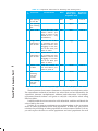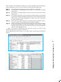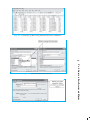
1
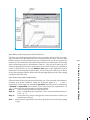
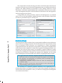
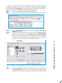
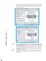
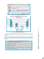
You have learnt various methods of data processing and representation that you
can use to analyse the geographical phenomena in the preceding chapters. You
must have observed that these methods are time consuming and tedious. Have
you ever thought of a method of data processing and their graphical presentation
that can save time and improve efficiency? If you have used a computer for word
processing then you must have noticed that the computer is more versatile as it
facilitates the onscreen editing of the text, copy and move it from one place to
another, or even delete the unwanted text. Similarly, the computer may also be
used for data processing, preparation of diagrams/graphs and the drawing of
maps, provided you have an access to the related application software. In other
words, a computer can be used for a wide range of applications. It must, however,
be clearly understood that a computer carries out the instructions it receives
from the users. In other words, it cannot perform any function on its own. In the
present chapter, we will discuss the use of computers in data processing and
mapping.
What can a Computer do?
A computer is an electronic device. It consists of various sub-systems like memory,
micro-processor, input system and output system. All these sub-systems work
together to make it an integrated system. It is an extremely powerful device,
which is apt to have an important effect on the systems of data processing, mapping
and analysis. A computer is a fast and versatile machine that can perform simple
arithmetic operations, such as, addition, subtraction, multiplication, and division
and can also solve complex mathematical formulae. It also performs simple logical
operations, distinguishing zero from non-zero and plus from minus and discharge
the results. In short, a computer is a data processor that can perform substantial
computation, including numerous arithmetic or logical operations, without
intervention by a human operator during the run.
Provided that you have the basic conceptual clarity, computer can be used
very effectively to represent data through maps and diagrams. It makes your job
extremely fast. The following advantages of a computer make it distinct from the
manual methods:
1. It substantially increases the speed of the computation and data
processing.
2. It can handle huge volume of the data, which is normally not possible
manually.
3. It facilitates copy, edit, save and retrieve the data at will.
4. It further enables validation, checking and correction of data easily.
5. Aggregation and analysis of data becomes extremely simple. Computer
makes it very easy to perform comparative analysis, whether by drawing
maps or graphs.
6. The type of graph or map (i.e. bar/pie or types of shades), heading,
indexing and other formats can be changed very easily.
There are many other advantages that a computer offers, that you will
observe yourselves while carrying out your practical work using a computer.
H ardw
are CConfiguration
onfiguration and SSoftw
oftw
are RRequirements
equirements
ardware
oftware
A computer as an aid to data processing and mapping comprises of hardware
and software. The hardware configurations comprise of the storage, display, and
input and output sub-systems, whereas software are the programs that are made
up of electronic codes. The computer–aided data processing and mapping, hence,
requires both hardware components and related application software.
P ractical W
ork in Geography, P
art-II
Work
Part-II
56
Hardware
The hardware components of a computer include :
(a) A Central Processing Unit (CPU) and Storage System
(b) A Graphic Display Sub-system
(c) Input Devices
(d) Output Devices
A Central Processing Unit and Storage System
The core of modern computers consists of a central processing unit (CPU), which
facilitates the execution of program instructions for processing data and controlling
peripheral equipments. All data together with the operating system and the
application programs occupy space in disk storage unit which functions as
working memory.
The total storage capacity depends upon the types of activity for which the
computer is to be used. The hardware storage capacity for data processing and
mapping should be in the range of 1 GB to 4 GB or more and the Random Access
Memory (RAM) 32 MB or more. Besides the disk storage, the secondary storage
such as floppy disks, CD, pen drives, and magnetic tapes are also used to store
permanently large quantities of data that is not actively being processed.
The operating system is a basic program, which administers the internal
data processing in a computer. The operating systems like MS-DOS, Windows,
and UNIX are in general use, with the Windows being the most preferred one.
A Graphic Display System or Monitor
A graphic display system or monitor serves as the user’s prime visual
communication medium in all computers. A high resolution display system with
a greater range of possible display colours and Look–up Tables (LUT) for rapid
alteration of colour patterns is generally preferred in graphic and mapping
applications.
Input Devices
The instruction and the statistical data are entered into the computer using the
keyboard functions. The keyboard is an important input device that resembles
with a typewriter. It has various keys for different purposes. While working on a
PC you will notice a flash point on the screen. This is known as cursor. When you
press a key on the keyboard, a character is displayed at the point where the
cursor is flashing and the cursor moves one position forward. Besides, scanners
and digitisers of different size and capabilities are also used for spatial data entry.
Output Devices
The output devices include a variety of printers such as ink-jet, laser and colour
laser printers; and the plotters that are available in different sizes ranging from
A3 to A0 size.
Computer Software
Computer software is a written program that is stored in memory. It performs
specific functions as per the instructions given by the user. A data processing
and mapping software requires the following modules :
• Data Entry and Editing Modules
• Coordinate Transformation and Manipulation Modules
• Data Display and Output Modules
These inbuilt modules in the data processing and mapping software facilitate the
data entry system interface, database creation, error removal, scale and projection
manipulations, their organisation, and maintenance of the data. Any of these and
other related data entry, editing and management capabilities might be performed
using displayed menus and icons on the screen. The present day commercial
packages such as MS Excel/Spread sheet, Lotus 1 – 2 – 3, and d – base provide
capabilities for data processing and generation of graphs. On the other hand, Arc
View/Arc GIS, Geomedia, possess modules for mapping and analysis.
Coordinate Transformation and Manipulation Modules
The present day softwares provide a wide range of capabilities used to create
layers of spatial data, coordinate transformation, editing and linking the spatial
data sets with the related non - spatial attributes of data.
Data Display and Output Modules
The data display and output operations vary over a range of functions and are
very much dependent on the skills developed in the field of computer graphics.
Some of the common capabilities that the present day softwares provide are:
Processing
Use of Computer in Data P
rocessing and Mapping
The Data Entry and Editing Modules
57
• Zooming/Windowing to display of selected areas and scale change
operation
• Colour assignment/change operation
• Three dimensional and perspective display
• Selective display of various themes
• Polygon shading, line styling and point markers display
• Output device interface commands for interfacing with plotter devices/
printers
• Graphic User Interface (GUI) based menu organisation for an easy
interface
C omputer SSoftw
oftw
are for YYour
our UUse
se
oftware
In the preceding paragraphs, a number of data processing softwares have been
referred. However, it would be difficult to discuss the capabilities and functions
of each one of these softwares under the constraints of time and space. We will,
therefore, describe the procedure that is followed in data processing and the
preparation of graphs and diagrams using MS Excel or Spreadsheet program.
The spreadsheet enables us to feed data, compute various statistics and represent
the raw data or computed statistics through graphical methods.
MS Excel or Spreadsheet
P ractical W
ork in Geography, P
art-II
Work
Part-II
58
As mentioned earlier, MS Excel, Lotus 1 – 2 – 3, and d – base are some of the
important softwares used for data processing, and drawing graphs and diagrams.
MS Excel being most widely used and commonly available software program in
all parts of the country has been chosen among other software to carry out the
data processing. Besides, it is also compatible with map-making software as one
can easily feed data in MS Excel and attach it to the map-making software to
create maps.
MS Excel is also called a spreadsheet programme. A spreadsheet is a
rectangular table (or grid) to store information. The spreadsheets are located in
Workbooks or Excel files.
Most of the MS Excel screen is devoted to the display of the worksheet, which
consists of rows and columns. The intersection of a row and column is a
rectangular area, which is called a cell. In other words, a worksheet is made up
of cells. A cell can contain a numerical value, a formula (which after calculation
provides numerical value) or text. Texts are generally used for labelling numbers
entered in the cells. A value entry can either be a number (entered directly) or
result of a formula. The value of a formula will change when the components
(arguments) of the formula change.
An Excel worksheet contains 16,384 rows, numbered 1 through 1,6384 and
256 columns, represented by default through letters A through Z, AA through
AZ, BA through BZ, and continuing to IA through IZ. By default, an Excel
workbook consists of three worksheets. If you require, you can insert more, up
to 256 worksheets. This means that in the same file/workbook you can store a
large number of data and charts. Fig.4.1 shows how an excel workbook looks
like.
Fig. 4.1 : MS Excel Workbook
Data Entry and Storing Procedures in Excel
Data Processing and Computation
Often raw data need to be processed for further use. You can easily add, subtract,
multiply, and divide numbers using the keyboard signs of +, -, *, and /,
respectively. These signs are known as operators and they connect elements in
a formula or expression. For example, if you want to solve the expression 5 + 6
– 8 – 5, then you can easily work it out in steps below :
Step 1 :
Click on any cell (with the help of mouse).
Step 2 :
Type =, followed by the expression. Thus, the expression becomes =
5 + 6 – 8 – 5.
Step 3 :
Press enter key, and you will get the result in the same cell that you
had chosen in Step 1.
Note : The numerical operations can only be performed in excel by first typing
= sign.
59
Processing
Use of Computer in Data P
rocessing and Mapping
The data entry and storing procedures are very simple in Excel. You can enter,
copy and move any data from one cell to another and save them. You may also
delete incorrect or unwanted data entry or a complete file, if it is not required for
further use. The elementary functions of Excel that you would require for entering
data and storing them are described in Table 4.1. You can learn more on your
own by exploring other menus and options by yourself. Further, you will find it
easier to feed data if you use the number pad given on the right side of your
keyboard. For entering data column-wise, you need to press ‘enter key’ or ‘down
arrow’ after typing a number. While row-wise pressing right arrow key after typing
a number can enter data.
Table 4.1: Important Functions for Entering and Storing Data
Function
Instructions
Menu
Secondary
Keyboard
Menu (from
Shortcuts
dropdown list)
1.
For opening
a new file
File
New
Ctrl N
For opening
an existing
file
File
Open
Ctrl O
2.
Save a file
Give a file name and
define where you
want to store it (by
default, it is c:\....\my
documents\)
File
Save
Ctrl S
3.
Copy, move Select the set of data
and paste a by pressing the left
set of data mouse button and
dragging it over the
set of the data you
want to select
Edit
Copy
Ctrl C
4.
Cut, move
and paste a
set of data
Select the set of data
by pressing the left
mouse button and
dragging it over the
set of the data you
want to select
Edit
Cut
Ctrl X
60
5.
Paste a set
of data
Take the cursor to
the cell where you
want to paste it
Edit
Paste
Ctrl V
P ractical W
ork in Geography, P
art-II
Work
Part-II
S.
No.
6.
For
undoing
the last
action*
Edit
Undo
Ctrl Z
7.
For redoing
the last
action*
Edit
Repeat
Ctrl Y
Note: * You cannot undo or redo any action if you have saved the file after the last action.
These operators that connect elements in a formula are solved in an order.
The expressions enclosed in ‘brackets’ are solved first and are followed by the
‘exponents’, ‘division’, ‘multiplication’, ‘addition’ and ‘subtraction’. For example,
expression/formula within a cell given as =A8/(A9 + A4) will be solved using
Excel as under:
It will first add the values entered in cells A9 and A4, and then will divide the
value of A8 by the sum.
Further, if you want to supplement your understanding on the percentage
share of urban population to the total population, in that case, you have to
calculate the percentage of urban population in various states of India. To do so,
you will require the data on urban population and total population for each
state of India. The worksheet allows you to easily calculate the percentage of
urban population in each state provided you adopt the following steps :
Step 1 :
Step 2 :
Enter the name of the states in first column (i.e. column A).
In Column B, corresponding to each state, enter the size of urban
population.
Step 3 : In Column C, corresponding to respective state enter the size of total
population.
Step 4 : In Column D and row 2, type = followed by B2/C2 (that is total urban
population of Andhra Pradesh divided by the total population in the
same State) and *100 (multiplied by 100). Thus, the expression
becomes =B2/C2*100
Step 5 : Press enter key. This will give you solution of the expression, that is,
the percentage of urban population in Andhra Pradesh.
Step 6 : Now you need not to write the formula again for calculating percentage
of urban population for other states. Simply, click on the cell D2.
This will copy the formula of the first state/cell to all the downward
cells you have dragged it over.
(Note: the formula =B2/C2*100 that has been written in cell D2, and
becomes B3/C3*100 in cell D3, and so on).
‘Fig. 4.2 graphically shows steps 1 to 5 as given above, while step 6 is shown in
Fig.4.3.
61
Fig. 4.3 : Copying through Dragging over in MS Excel
Processing
Use of Computer in Data P
rocessing and Mapping
Fig. 4.2 : Cell Operation in MS Excel
You have already been introduced to some basic statistical methods such as
measures of central tendency, dispersion and correlation in Chapter 2. You must
have understood the concept and rationale behind these techniques. The use of
worksheet functions to compute these statistics will be discussed in the
subsequent paragraphs.
In MS Excel, there are numerous inbuilt statistical and mathematical
functions. These functions are located in Insert menu. To use the function, click
on the Insert menu, and choose fx (Function) from the dropdown list. Note that
your cursor should be located in the cell where you want the formula to appear.
Some examples of application of statistical functions are given below.
Central Tendencies
Central tendencies are represented by mean, median and mode. Arithmetic mean,
also called as average, is a commonly used method for calculating the central
tendency. In MS Excel, it is denoted by its popular name average. As an example,
we shall calculate mean cropping intensity in India during various decades using
the average function in Excel. The following steps are to be undertaken :
Step 1 : Enter year-wise cropping intensity data in a worksheet, as shown in
Fig.4.4.
Step 2 :
Click on cell B12 using mouse.
Step 3 :
Click on Insert Menu and choose fx (Function) from dropdown list,
this will open Insert Function dialogue box.
Step 4 :
Select Statistical from select a category menu on the dialogue box.
This will bring forth the statistical functions available in Excel in the
box below in the same dialogue box,
Step 5 :
In the box Select a Function, click on Average, and press OK button.
This will open another dialogue box called Function Argument.
Step 6 :
Either enter the cell range of data of the first decade CI_50s (which
shows year wise cropping intensity in 1950s) in the Number 1 box
on Function Argument dialogue box of data, or drag cursor pressing
the left button of mouse over the cell range of data.
Step 7 :
Press OK button on the Function Argument dialogue box. This
calculates mean cropping intensity for the decade 1950s in cell B12,
where you had put your cursor in the beginning.
Step 8 :
Now calculate the mean for other decade either following Steps 1 – 7
given above or dragging cursor right handward in the same row
selecting the small square from rectangle of cell B12 or you can copy
the cell B12 and paste it on D12, F12, H12 and J12. This will give
you mean value of cropping intensity for the decades 1960s, 1970s,
1980s and 1990s, respectively.
P ractical W
ork in Geography, P
art-II
Work
Part-II
62
These steps are further explained in Fig. 4.4 through Fig.4.6.
Fig. 4.4 : Calculation of Mean Using Statistical Function in MS Excel
63
Fig. 4.6 : Defining Range in Function Arguments dialogue box
Processing
Use of Computer in Data P
rocessing and Mapping
Fig. 4.5 : Selection of Statistical Function
The computation of mean for the given data reveals that there has been an
impressive increase in mean decadal cropping intensity over different decades in
general, and 1980s onwards in particular. In fact, during 1980s the “Green
Revolution” underwent a spatial spread and a tremendous increase in area under
tube-well irrigation took place, which facilitated cultivation in the arid regions as
well as during the dry seasons.
Using almost the same procedure used for calculating mean, as outlined
above, you can calculate median, standard deviation, and correlation. Some hints
for this are provided in Fig.4.7 and Fig. 4.8.
Fig. 4.7 : Function for Standard Deviation
P ractical W
ork in Geography, P
art-II
Work
Part-II
64
Fig. 4.8 : Function for Correlation
Construction of Graphs
You know that the data in tabular form, at times make it difficult to draw inferences
about whatever is being presented. On the other hand, the representation of the
data in graphical form enhances our capabilities to make meaningful
comparisons between the phenomena represented, and present a simplified view
of the characteristics depicted. In other words, graphs and diagrams make us to
decipher the contents of data easily. For example, it would be difficult to make
sense of the Cropping Intensity in India if the data for all Fifty years are presented
in tabular form. However, through a line graph or bar diagram, we can easily
draw meaningful conclusions about the trend in Cropping Intensity in India.
Data Types and Some Suitable Graphical Methods of their Presentation
1. Time series data are represented through line graphs or bar diagram.
2. Bar diagrams and histograms are generally used for showing shares
or frequencies of various units.
3. Compound bar diagrams, and pie-charts are used for showing shares
of various units.
4. Maps are used for location-wise representation of data. This helps in
comprehending spatial patterns in the data.
The selection of a suitable graphical method is very important for the
presentation of data. In Chapter 3, you have learnt about graphs and diagrams,
and the kind of data suitable for. Here, you will learn how graphs and diagrams
are constructed in Excel.
Suppose, you want to represent changes in the share of workers in different
industrial categories between 1981 and 2001, the most suitable graphical
methods would be bar diagram as it shows changes over different years clearly.
The construction of bar diagram requires the following steps :
Step 1 :
Step 2 :
Enter the data in worksheet as shown in Fig.4.9.
Select the cells dragging mouse (right button pressed) over the cells.
Fig. 4.9 : Entering data and selecting cells for Construction of Bar Diagram
Step 3 :
Step 4 :
Click on Chart Wizard (Fig.4.9). This will open Step 1 of 4 of Chart
Wizard (Fig.4.10).
Double click on the simple bar diagram in the box ‘Chart Sub-type’
(Fig.4.10). This will lead you to Step 2 of 4 of Chart Wizard
(Fig.4.11), in which worksheet number and selected data range, and
a preview of bar diagram appear. As categories in data are arranged
row-wise, therefore, it is row-wise chart construction.
65
Step 5 :
Fig. 4.11 : Step 2 of 4 of Chart Wizard
Click on the Next radio button, and this will lead you to Step 3 of 4
of Chart Wizard (Fig.4.12). Here you will find various options for
entering ‘title’ ‘name of axes’, options for ‘grid lines’, ‘data labels’ and
Processing
Use of Computer in Data P
rocessing and Mapping
Fig. 4.10 : Step 1 to 4 of Chart Wizard
‘data table’. Chart Titles and axes name entry are shown in Fig.4.12,
while options for ‘legend placement’ are shown in Fig. 4.13. Type the
axes names as shown in Fig.4.13 and select the ‘placement of legend’
as shown in Fig.4.14.
Fig. 4.12 : Entering names of Axes
P ractical W
ork in Geography, P
art-II
Work
Part-II
66
Fig. 4.13 : Choosing Location of Legend
Step 6 :
Step 7 :
When you have finished entering axes titles and legend options, etc.,
click on Next radio button (Fig. 4.13). This will lead you to step 4 of
4 of Chart Wizard, which will let you choose the location of the
constructed bar diagram for the data (Fig.4.14). Choose ‘As Object
in’ and select the same sheet you have entered the data, i.e. Sheet 5
(optionally, you can also place your Bar Diagram in a new sheet
choosing ‘as new sheet’).
Press OK radio button in Fig. 4.14. This will complete the Chart
Wizard and your Bar Diagram as shown in Fig.4.15 will appear in
Worksheet 5.
Fig. 4.14 : Choosing Location of Chart
67
You can change the pattern of bars from colours to shades or vice versa by
clicking on the bars. Similarly, you can also change the fonts or gridlines if
required.
The above diagram shows that the share of cultivators has declined
significantly over the two decades and the share of other workers has appreciably
risen and the shares of agricultural and household labourers have largely been
the same.
Some Important Norms for Data Representation
1. A figure should have its figure number.
2. It should have a suitable title in which time and space it relates to
should also be mentioned.
3. Within title or as sub-title, the unit in which the quantities are shown
should be mentioned.
4. The title, sub-title, title of axes, legend and the main presentation
should be shown with suitable font size and type so that they occupy
space in a balanced manner.
Processing
Use of Computer in Data P
rocessing and Mapping
Fig. 4.15 : The Complete Bar Diagram
Computer Assisted Mapping
The maps may also be drawn using a combination of computer hardware and the
mapping software. The computer assisted mapping essentially requires the creation
of a spatial database alongwith its integration with attribute or non – spatial data.
It further involves verification and structuring of the stored data. What is most
important in this context is that the data must be geometrically registered to a
generally accepted and properly defined coordinate system and coded so that
they can be stored in the internal data base structure within the computer. Hence,
care must be taken while using the computer for mapping purposes.
Spatial Data
The spatial data represent a geographical space. They are characterised by the
points, lines and the polygons. The point data represent positional characteristics
of the some of the geographical features such as schools, hospitals, wells, tubewells, towns and villages, etc. on the map. In other words, if we want to present
occurrence of the objects on a map in dimensionless scale but with reference to
location, we use points. Similarly, lines are used to depict linear features like
roads, railway lines, canals, rivers, power and communication lines, etc. Polygons
are made up of a number of inter-connected lines bounding a certain area and
are used to show area features such as administrative units (countries, districts,
states, blocks); land use types (cultivated area, forest lands, degraded/waste
lands, pastures, etc.) and features like ponds, lakes, etc.
Non–Spatial Data
P ractical W
ork in Geography, P
art-II
Work
Part-II
68
The data describing the information about spatial data are called as non-spatial
or attribute data. For example, if you have a map showing positional location of
your school you can attach the information such as the name of the school,
subject stream it offers, number of students in each class, schedule of admissions,
teaching and examinations, available facilities like library, labs, equipments, etc.
In other words, you will be defining the attributes of the spatial data. Thus, nonspatial data are also known as attribute-data.
Sources of Geographical Data
The geographical data are available in analogue (map and aerial photographs)
or digital form (scanned images).
The procedure of creating spatial data in the computer has been discussed
in Chapter 6.
M apping SSoftw
oftw
are and their Functions
oftware
There are a number of commercially available mapping softwares such as ArcGIS,
ArcView, Geomedia, GRAM, Idrisi, Geometica, etc. There are also a few freely
downloadable softwares that can be downloaded with the help of Internet.
However, it would be difficult to discuss the capabilities of each one of these
softwares under the constraints of time and space. We will, therefore, describe
the procedure in general used in choropleth mapping using a mapping software.
A mapping software provides functions for spatial and attribute data input
through onscreen digitisation of scanned maps, corrections of errors,
transformation of scale and projection, data integration, map design, presentation
and analysis.
A digitised map consists of three files. The extensions of these files are shp,
shx and dbf. The dbf file is dbase file that contains attribute data and is linked to
shx and shp files. The shx and shp files, on the other hand, contain spatial (map)
information. The dbf file can be edited in MS Excel.
You can construct a choropleth map using any of the mapping software
available to you, provided you follow the steps given in the user manual of the
given software. If you experiment with the different options available in the
software, you would be able to construct several types of maps using different
methods.
Excercises
1. Choose the correct option for the alternatives given below :
(i) What type of graph would you use to represent the following data?
States
Madhya Pradesh
Goa
Karnataka
Bihar
Orissa
Andhra Pradesh
Maharashtra
(a) Line
(c) Pie-diagram
Share of Production
of Iron-Ore (in %)
23.44
21.82
20.95
16.98
16.30
0.45
0.04
(b) Multiple bar graph
(d) None of the above
(iii) Which is the operator that is calculated first in a formula given in a cell of
a worksheet?
(a) +
(b) –
(c) /
(d) ×
(iv) Function Wizard in Excel enables you to:
(a) Construct graphs
(b) Carry out mathematical/ statistical operations
(c) Draw maps
(d) None of the above
2. Answer the following questions in about 30 words:
(i) What are the functions of different parts of a computer?
(ii) What are the advantages of using computer over manual methods of data
processing and representation?
(iii) What is a worksheet?
3. Answer the following questions in about 125 words:
(i) What is difference between spatial and non-spatial data? Explain with
examples.
(ii) What is the three forms of geographical data?
69
Processing
Use of Computer in Data P
rocessing and Mapping
(ii) Districts within a state would be represented in which type of spatial data?
(a) Points
(b) Lines
(c) Polygons
(d) None of the above
Activity
1. Carry out the following steps using the given data set:
(a) Enter the given data in a file and store in ‘My Documents’ folder (Name the
file as rainfall).
(b) Calculate the standard deviation and mean for the given data set using
Function Wizard in Excel spreadsheet.
(c) Compute coefficient of variation using the results derived in step (b).
(d) Analyse the results.
2. Represent the data given below using a suitable technique with the help of a
computer and analyse the graph.
Cropping Intensity in India
P ractical W
ork in Geography, P
art-II
Work
Part-II
70
Year_80s
CI_80s
Year_90s
CI_90s
1980-81
1981-82
1982-83
1983-84
1984-85
1985-86
1986-87
1987-88
1988-89
1989-90
123.3
124.5
123.2
125.7
125.2
126.7
126.4
127.3
128.5
128.1
1990-91
1991-92
1992-93
1993-94
1994-95
1995-96
1996-97
1997-98
1998-99
1999-00
129.9
128.7
130.1
131.1
131.5
131.8
132.8
134.1
135.4
134.9