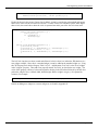
1
Project Documentation Document TN-0089 Rev B Java Engineering Screens User Manual Alan Greer Observatory Sciences Ltd John Hubbard, Steve Wampler ATST Software April 2013 Advanced Technology Solar Telescope 950 N. Cherry Avenue Phone 520-318-8102 [email protected] http://atst.nso.edu Tucson, AZ 85719 Fax 520-318-8500 Java Engineering Screens User Manual Revision Summary: 1. Date: Revision: Changes: 28th October 2005 1.0 Initial version 2. Date: Revision: Changes: 12th December 2005 2.0 Major updates to JES software. No longer uses SWT. Several widgets added. 3. Date: Revision: Changes: 23rd December 2005 3.0 / A Added appendix A and B, creating widgets. Initial document to ATST. 4. Date: Revision: Changes: 14th August 2007 3.0 / A-1 Updated for new location of classes 5. Date: Revision: Change: 28th October 2009 3.0 / A2 Updated JesCircle to reflect changes in the code 6. Date: Revision: Changes: 8th July 2010 3.0 / A3 Updated description of resources used by JES 7. Date: Revision: Changes: 18th August 2010 3.0 / A4 Rewritten to match new JES version 8. Date: Revision: Changes: 7th October 2010 3.0 / A4 New widgets added. 9. Date: Revision: Changes: 7th December 2010 3.0 / A5 Support for custom widgets. 10. Date: Revision: Changes: 15th August 2011 3.0 / A6 New Connections added. 11. Date: Revision: Changes: 2nd December 2011 3.0 / A7 New widgets and features added. 12. Date: Revision: Changes: 4th January 2012 3.0 / A8 New widgets and Connection added TN-0089 Rev B Page i Java Engineering Screens User Manual 12. Date: Revision: Changes: 12th March 2012 3.0 / A9 Wildcard field index support added. 13. Date: Revision: Changes: 16th April 2012 3.0 / A10 Custom connection support added. 14. Date: Revision: Changes: 20th June 2012 3.0 / A New widget added. First formal release. 15. Date: Revision: Changes: 1 July 2012 3.0 / B1 Support added for lockable widgets. 16. Date: Revision: Changes: 1 October 2012 3.0 / B2 Reformatted document. New widgets added. 17. Date: Revision: Changes: 10 January 2013 3.0 / B3 Added ability to disable widgets 18. Date: Revision: Changes: 8 April 2013 3.0 / B Minor improvements to some widgets. TN-0089 Rev B Page ii Java Engineering Screens User Manual Table of Contents 1. 2. 2.1 2.2 2.3 2.4 3. Introduction .......................................................................................................... 1 Requirements and Running................................................................................. 1 New ................................................................................................................................................ 2 Open ............................................................................................................................................... 3 Path ................................................................................................................................................. 4 Exit ................................................................................................................................................. 4 Special features .................................................................................................... 5 3.1 Generic connections ....................................................................................................................... 5 3.1.1 Configuring an Archive Connection ....................................................................................... 7 3.1.2 Configuring a Log Connection................................................................................................ 8 3.2 Custom widget sets ......................................................................................................................... 9 3.3 Live Edits ....................................................................................................................................... 9 3.4 Lockable widgets ............................................................................................................................ 9 3.5 Disabled widgets ............................................................................................................................ 9 3.6 Macros ............................................................................................................................................ 9 3.7 Colors ........................................................................................................................................... 10 3.8 Color Rules ................................................................................................................................... 11 3.9 Image rules ................................................................................................................................... 12 3.10 Text Rules ................................................................................................................................. 12 3.11 Custom widget editors .............................................................................................................. 12 3.12 Resources .................................................................................................................................. 12 4. 5. 5.1 6. Creating JES Engineering Screens .................................................................. 14 Editing JES Engineering Screens ..................................................................... 15 Tabbed Panel JES Widget ............................................................................................................ 17 JesWidgets ......................................................................................................... 18 6.1 Decoration Widgets ...................................................................................................................... 18 6.1.1 Clock ..................................................................................................................................... 18 6.1.2 Program execution mode warning......................................................................................... 18 6.1.3 Rectangle ............................................................................................................................... 19 6.1.4 Static Text ............................................................................................................................. 19 6.1.5 Static Image ........................................................................................................................... 19 6.2 Status Widgets .............................................................................................................................. 20 6.2.1 Attribute Table Display ......................................................................................................... 20 6.2.2 Dynamic Box ........................................................................................................................ 20 6.2.3 Dynamic Circle ..................................................................................................................... 20 6.2.4 Dynamic Image ..................................................................................................................... 21 6.2.5 Dynamic Text ........................................................................................................................ 21 6.2.6 Graph (Stripchart) ................................................................................................................. 21 6.2.7 Monitor Log Messages .......................................................................................................... 22 6.2.8 Progress bar ........................................................................................................................... 22 6.2.9 Table Display ........................................................................................................................ 23 6.2.10 Table 2D Display .................................................................................................................. 23 6.2.11 Text Box ................................................................................................................................ 24 6.2.12 Text Update ........................................................................................................................... 24 6.3 Control Widgets ........................................................................................................................... 25 6.3.1 Attribute Table ...................................................................................................................... 25 6.3.2 Check Box ............................................................................................................................. 25 6.3.3 Combo Box ........................................................................................................................... 25 TN-0089 Rev B Page iii Java Engineering Screens User Manual 6.3.4 Component Get/Set ............................................................................................................... 26 6.3.5 Configuration ........................................................................................................................ 26 6.3.6 Debug Slider.......................................................................................................................... 27 6.3.7 Enter Log Messages .............................................................................................................. 27 6.3.8 Interactive Image ................................................................................................................... 27 6.3.9 Lifecycle/Health Icon ............................................................................................................ 28 6.3.10 Lifecycle/Health Monitor ...................................................................................................... 28 6.3.11 Message Button ..................................................................................................................... 29 6.3.12 Motion Control ...................................................................................................................... 29 6.3.13 Radio Box.............................................................................................................................. 30 6.3.14 Slider ..................................................................................................................................... 30 6.3.15 Spinner .................................................................................................................................. 30 6.3.16 Text Entry.............................................................................................................................. 31 6.4 Composite Widgets ...................................................................................................................... 32 6.4.1 Custom Attribute Table ......................................................................................................... 32 6.4.2 Custom Configuration ........................................................................................................... 32 6.4.3 Hover Link ............................................................................................................................ 33 6.4.4 Nested Screens ...................................................................................................................... 33 6.4.5 Tabbed Panel ......................................................................................................................... 33 6.5 Miscellaneous Widgets ................................................................................................................. 34 6.5.1 Call Button ............................................................................................................................ 34 6.5.2 Close Button .......................................................................................................................... 34 6.5.3 Connection Pipe .................................................................................................................... 35 6.5.4 Help Message Display........................................................................................................... 35 6.5.5 Link Button ........................................................................................................................... 35 7. References .......................................................................................................... 36 Appendix A – Creating a New JesWidget (an example) ........................................... 37 Appendix B – Code Listing ......................................................................................... 41 Appendix C – Adding a custom editor to a new widget ........................................... 47 Appendix D – Custom Widget sets ............................................................................ 48 Describing a custom widget set ............................................................................................................... 48 Including a custom widget set ................................................................................................................. 49 Appendix E: Making a Custom Attribute Table or Configuration Widget ............... 50 A Custom Configuration Panel ............................................................................................................... 50 A Custom Attribute Table Panel ............................................................................................................. 52 Considerations ......................................................................................................................................... 52 Appendix F – An example of a Custom Connection ................................................ 53 TN-0089 Rev B Page iv of 2 Java Engineering Screens User Manual 1. INTRODUCTION The Java Engineering Screens (JES) tool has been developed to allow fast construction of engineering screens for applications that use the ATST common services. No programming knowledge is required to construct a screen; individual parts can be drawn using a mouse. Screens can be saved as XML style files so they can be reopened at a later time. The JES tool runs as a component and therefore has access to the event service and connection service. This means each screen can connect or subscribe and information obtained can be displayed to an operator without the need to program extra applications. 2. REQUIREMENTS AND RUNNING The JES tool uses SWING to create the GUI components. There are no special requirements for running the JES tool. A script is provided for starting JES: JES There are several flags that can be issued and these are described below: --path The path to use for saving and loading JES engineering screens. --file=filename Set this flag to the name of a JES engineering screen that you would like automatically loaded on startup. The named screen becomes the JES top-level screen. Closing the screen terminates JES. --macros=XX Set any macros that are required. See the section on Macros for further information. --rpath The path to where the JES resource files are kept. The resource files include the pictures used as icons, the file containing a list of widgets, and a file containing the current color set. See the resources section for more details. --program Run in "programmed" execution mode. In this mode all connections are disabled. Aside from use when building screens for planned observing, this mode is convenient when building a screen without access to the running components that the screen expects to connect to. The default execution mode is "live", where connections are active. --readonly Run in “read-only” execution mode. In this mode all write methods on connections are disabled, but read methods continue to function. This is useful for screens where monitoring of devices is needed but actual control of those devices should be disabled. The default execution mode is “live”, where connections are fully active. --edit=false Normally JES screens are editable. This flag disables the editing and saving of JES screens. --access=locked The normal access mode is unlocked, allowing users change values on the screen. In locked mode, widgets that have been previously marked as lockable have user control disabled. The default access mode is "unlocked". --manager=classname Allows JES to run using a custom JesManager subclass. The default behavior is to use the JesManager class directly. The custom manager's fully-qualified classname is given as the value of this flag. --name=name Display name in the main window title bar. If required JES can be run as a component within a container using a container manager. For this to work the DISPLAY environment variable must be set correctly. The class that needs loading is the atst.cs.tools.jes.JesManager class. The following attributes must be set: TN-0089 Rev B Page 1 of 54 Java Engineering Screens User Manual “path” “rpath” The path to use for saving and loading JES engineering screens. The path to where the JES resource files are kept. The resource files include the pictures used as icons, the file containing a list of widgets, and a file containing the current color set. See the resources section for more details. “macros” Set any macros that are required. See the section on Macros for further information. “file” Set this flag to the name of a JES engineering screen that you would like automatically loaded on startup. "executionMode" Set this to JesScreen.PROGRAMMED to run the component in programmed mode, and JesScreen.READONLY to run the component in read-only mode. "accessMode" Normally unlocked. If set to locked then all lockable widgets are disabled. "editable" If false, screens cannot be edited or saved. If the "–file=filename" argument is omitted, then on startup the operator is presented with the following screen. Figure 1. JES tool main screen There are four main menu options that can be accessed from the file menu and these are discussed below. 2.1 NEW Selecting this option creates a new JES screen and place it into edit mode ready for construction. How to populate this engineering screen is explained in section 3. There are two modes that an engineering screen can be placed into, edit mode and execute mode. When in edit mode, any items on the screen are not updated, and all items can be dragged, edited, deleted or copied, and new items can be placed. When in execute mode no editing can take place, and all items are updated when required. Figure 2 shows a new engineering screen in edit mode. Whenever a screen is in edit mode the title bar will contain the title of the screen followed by the word “edit” placed in brackets. When in execute mode this text will not be visible. TN-0089 Rev B Page 2 of 54 Java Engineering Screens User Manual Figure 2. New engineering screen. 2.2 OPEN Selecting the open option allows a user to specify an XML formatted document to be used to load a JES engineering screen. The screen will be opened and placed into execute mode. Figure 3. Opening a new JES engineering screen TN-0089 Rev B Page 3 of 54 Java Engineering Screens User Manual 2.3 PATH The path option is used to set the path to where all of the JES saved files are kept. It is important to set this correctly as opening one screen from another uses the path to search for the new screen. The path can be set as an absolute path or a relative path. It defaults to $ATST/resources/screens and can usually be left alone. Figure 4. Setting the path for JES engineering screens. 2.4 EXIT This option shuts down the JES component and exits the program. TN-0089 Rev B Page 4 of 54 Java Engineering Screens User Manual 3. SPECIAL FEATURES JES provides several useful features in addition to the standard widgets described later: 3.1 GENERIC CONNECTIONS Most JES widgets must connect to outside sources, either to obtain information for display or to issue control data. All JES widgets do so through generic connections. Messages may be pushed out of a connection or pulled from a connection. A connection is identified by a target that is typically either an event name or the name of a remote object. Specific fields (e.g. Attribute names) of interest can be associated with the target as well as an update rate. The rate determines how frequently values are pulled from the target. While all Connections allow you to enter multiple field names, many only use the first field and Connections used with those widgets should only define that single field. Figure 5 -- Generic connection editor with two fields specified. There are three fundamental operations available on all connections: void push(IAttributeTable message) – push the message out the connection. If message is empty then no push occurs. void pull(JesConnectionCallback callback) – begin pulling messages from the connection no faster than the specified rate. The callback is invoked each time a pull responds to an incoming message. If a rate of 0 is specified, then no pull occurs. void IAttributeTable grab() – grab a single message from the connection and return its message. The following connection types are currently supported: TN-0089 Rev B An event connection – the target is the name of the event. The rate determines the maximum frequency at which incoming events are processed after a pull command. Some events may be discarded if newer events arrive before event processing occurs. Pushing messages out an event connection results in an event being posted with that message. A direct connection – the target is the name of any remote object implementing the IRemote interface (typically, this is a Component or a Controller). Pulling messages from a direct connection results get() operations on the remote object at the specified rate. Pushing messages uses the set() operation. A control connection – the target must be the name of any remote Controller. This connection type extends the direct connection operations with the standard command/action/response directives (submit, pause, resume, cancel, and abort). Only a few widgets require a control connection. Attempts to submit empty Configurations are ignored. Page 5 of 54 Java Engineering Screens User Manual A submit connection – this is identical to a control connection with the single exception that push operations do so with a submit command instead of a set command. There is no callback associated with this push. A debug connection – the target must be the name of any remote object implementing the IRemote interface. This connection provides simple access to a remote object's debugging control and monitoring interface. This is a specialized connection of limited use. Only a few widgets can do anything meaningful with this connection type. A lifecycle connection – the target must be the name of a remote object implementing the IComponentAdmin interface (i.e. a Component or Controller). This connection provides access to a remote object's lifecycle control and monitoring interface and allows the monitoring of the remote object's health. This is a specialized connection of limited use. Only a few widgets can do anything meaningful with this connection type. An archive connection for access to the Engineering Archive database, including live access to new archived values. See below for details. A log connection for read-only access to the Log message database, including live access to new log messages. See below for details. A shell connection for read-only access to the output of a shell command. The target is the command string and may include pipes. Each grab or pull from the connection returns the entire output of the command (i.e. the command is executed anew each time) as a single string that is the value of a field named value. This is the only field that that can be accessed through the connection. The string contains the command’s output lines separated by newlines. As an example, the target: ssh weaver df –h | awk '/backups/ {print strtonum($5)}' returns the percent used in a disk partition whose mount point includes the string backups. This could be used with a Progress Bar or Strip Chart widget to track available disk space. A null connection – a null connection happily and silently does almost nothing. It is useful for temporarily disabling a connection for GUI testing. An internal connection that can be used to pass information between two or more widgets in the same JES application. This connection is most useful when at least one of the widgets is a Connection Pipe or a custom widget that was developed with sharing information across widgets in mind. It is also possible to introduce domain-specific custom connections. This can often be done by subclassing an existing connection. When using a custom connection the full classpath of the implementing class must be provided. An example of a custom connection implementation is given in an appendix. When configuring a JES widget the user must describe the connection, including the type, the update rate for pulling messages, and any fields of interest. JES managers may force connections into any of three execution modes: live – the connection is fully functional. This is the default mode. readonly – the connection’s control (outgoing) methods (push, submit, pause, resume, abort, and cancel) are disabled, but the incoming methods (pull, grab) still function. programmed – the connections methods are all disabled. Some widgets alter their appearance depending on the execution mode. Most commonly, they may display some buttons only in live mode. TN-0089 Rev B Page 6 of 54 Java Engineering Screens User Manual Field names are the names of Attributes, possibly followed by an optional index (e.g. target[1]). The index can be used to identify a specific element of an array-valued Attribute. If the index is omitted then 0 is assumed. As a special case, the index '*' is a wildcard that denotes the entire value array of the attribute returned as a single comma-separated-value string on incoming connections. When used with fields in an outgoing connections, the index '*' causes the field's value to treated as a comma-separatedvalue string that is split across multiple elements in the outgoing attribute's value array. An optional format specifier may be added after the name and index. The format specifier allows more precise control over the string form displayed for each field. The format specifier uses the same syntax as string format specifiers use by the Java method format in the java.lang.String class. The accepted conversion characters are: s,b,h,d,o,x,e,f,g,a, and A. If the format specifier is omitted then %s is assumed. The A format conversion can be used to convert decimal angles into DMS angle strings. For example %2A would convert -350.49 into -350 29 24.00. Finally, the field description may optionally be suffixed with a default value assignment that can be used on push and submit operations. If a field with a default value does not appear as an attribute name in the table being pushed or submitted then it is added with the default value. The form of the default value assignment is =v1[,v2…] where each of the values to the right of the assignment is the default value to use for that element in the resulting Attribute's value array (embedded commas should be escaped by a backslash to avoid confusion). Some connections (specifically the archive and log connections) require additional configuration information. This information is provided to the connection using special meta-fields. These meta-fields are not the names of Attributes to be transmitted across the connection but are used by the connections to refine the database search criteria. In addition, the target name has special meaning to these connections. 3.1.1 Configuring an Archive Connection The target name for an archive connection identifies the source component or components for archive entries of interest. It can be a simple component name or a comma-separated list of regular expressions identifying the components of interest. For example, a target name of atst.ics.visp.*,atst.ics.vbi.* would select entries from VBI and ViSP components only. The following meta-fields are valid for an archive connection: __name:ENTRY_NAMES – this identifies the name(s) of entries of interest. As with the target name, ENTRY_NAME may be a simple entry name or a comma-separated list of entry names. This is a required meta-field. __start:START – if used, START is the initial date and time (see archive mode below for details) for any extracted archive entries. __stop:STOP – if used, STOP, is the final data and time for any extracted archive entries. __limit:LIMIT – the connection imposes a hard limit on the number of entries that can be extracted with each pull. The default (5000 entries) may be overridden by setting LIMIT to some other value. __preload:PRELOAD – this value is used only when pulling entries in live mode. If non-null then it specifies the number of historical entries to retrieve on the first pull. Queries to the archive result in an AttributeTable for each entry. This table contains the following Attributes. Any or all of these attribute names may be specified as standard fields for processing: TN-0089 Rev B timeStamp – the time the entry was recorded into the archive Page 7 of 54 Java Engineering Screens User Manual source – the source component for the entry name – the entry name value – the value of the entry Pushes through an archive connection record attribute names and values into the engineering archive. Each attribute in the pushed attribute table is recorded as a separate archive entry if the attribute name matches a name specified by the __name meta-field. The fully-qualified prefix for the incoming attribute table is used as the source of each entry. The archive connection operates in two fundamental modes: 3.1.2 live mode – values are extracted from the archive as they are entered into the archive. When pulling from the connection, only LIMIT values inserted since the last pull are processed. A grab from the connection fetches the most recently archived entry matching the search criteria. Omitting the __start meta-field forces live mode. archive mode – values are extracted from the historical record in the archive. The __start metafield must be present and valid to use archive mode. Values are extracted from the archive starting with the START date and time. If the __stop meta-field is present and valid then null is returned for any fetches of entries timestamped after that date and time. Each pull grabs up to LIMIT (default is 5000) entries. A grab fetches the most recently archived entry matching the search criteria. Configuring a Log Connection The target name for a log connection identifies the source component or components for log messages of interest. It can be a simple component name or a comma-separated list of regular expressions identifying the components of interest. For example, a target name of atst.ics.visp.*,atst.ics.vbi.* would select messages from VBI and ViSP components only. The following meta-fields are valid for a log connection: __type:MESSAGE_TYPES – this identifies the types(s) of messages of interest. MESSAGE_TYPES may be a comma-separated list of alarm, debug, note, warning, and severe. __category:CATEGORIES – select the log categories of interest. This can be a single log category name or a common-separated list of regular expressions identifying the log categories. __message:REGULAR_EXPRESSION –a regular expression defining the messages of interest. __start:START – if used, START is the initial date and time (see history mode below for details) for any extracted log messages. __stop:STOP – if used, STOP, is the final data and time for any extracted log messages. __limit:LIMIT – the connection imposes a hard limit on the number of messages that can be extracted with each pull. The default is 5000 messages. __preload:PRELOAD – this value is used only when pulling messages in live mode. If nonnull then it specifies the number of historical messages to retrieve on the first pull. Queries to the log database result in an AttributeTable for each entry. This table contains the following Attributes. Any or all of these attribute names may be specified as standard fields for processing: TN-0089 Rev B timeStamp – the time the entry was recorded into the archive source – the source component for the entry Page 8 of 54 Java Engineering Screens User Manual category – the log category for the message type – the log message type level – the debug level if this message is of debug type message – the log message The log connection operates in two fundamental modes: live mode – messages are extracted from the log database as they are entered into the archive. When pulling from the connection, only LIMIT messages inserted since the last pull are processed. A grab from the connection fetches the most recently logged message matching the search criteria. Omitting the __start meta-field forces live mode. history mode – messages are extracted from the historical record in the log database. The __start meta-field must be present and valid to use history mode. Messages are extracted from the log database starting with the START date and time. If the __stop meta-field is present and valid then null is returned for any fetches of messages timestamped after that date and time. Each pull grabs up to LIMIT (default is 5000) messages. A grab fetches the most recently logged message matching the search criteria. 3.2 CUSTOM WIDGET SETS The CSF-supplied JesManager supports a standard set of widgets that are described later in this document. Subclasses of JesManager may extend this standard set with additional widgets. This allows systems to develop and use widgets that are specific to their problem-domain without having to modify CSF itself. A short introduction on how to use custom widget sets is provided in an appendix. 3.3 LIVE EDITS Some widgets can be configured to support a 'live-edit' mode where key functional parameters may be adjusted while the screen is running by pressing ctrl-right-click on the widget. This feature allows the user of the screen to alter the behavior of the widget dynamically. For example, an engineering screen might supply a Table widget set in live edit mode so the user can select the source of the displayed values so different sources can be monitored as needed. The size and position of a widget cannot be altered during live editing. 3.4 LOCKABLE WIDGETS All widgets are normally unlocked, allowing user interaction with each widget. Individual widgets may be marked as lockable when they are edited. A lockable widget has its user interaction disabled when a JES screen has been started in locked access mode. All widgets are unlocked when the screen's edit mode is enabled. 3.5 DISABLED WIDGETS Any widget can be marked as disabled (inoperable) by the developer. This is particularly useful during development when system capabilities are not fully developed. The decision to disable a widget is made while editing the widget. 3.6 MACROS It’s possible to use macros when constructing JES engineering screens. This allows the altering of names of events or attributes without having to edit screens continuously. To use a macro within a JesWidget TN-0089 Rev B Page 9 of 54 Java Engineering Screens User Manual the name of the macro should be used within curly braces and preceded by a dollar sign. For example, if the macro were called “top” then it would be used as follows: ${top}. This text would then be replaced by the macro specified when JES is started up. All macros that are used by the JES tool should be specified as part of the command line startup. The -macros flag can be used to notify JES of macros. As an example assume there are two macros. “top” will be replaced by “mac1” and “bottom” will be replaced by “mac2”. To specify these issue the following command: JES --macros=top=mac1,bottom=mac2 Commas must separate the macros and there cannot be any spaces between them. The macros can be passed in through an attribute table during initialization if JES has been started from within a container manager. Special characters, such as blanks, commas, quotes, backslashes, and characters syntactically meaningful in XML must be properly escaped. It is recommended that any macro definition containing special characters be enclosed in quotes, as in: JES –macros="a=b\ c\,d\>e",x=y which defines two macros. The first, named a, expands to "b c,d>e" while the second, named x, expands to "y". Macros may be defined as general (applied everywhere) or screen-specific (are only applied to a specific, named screen). Screen-specific macros are defined by including the name of the screen as the prefix to the macro name as in: JES --macros="motor1.min=100,motor2.min=50" Here, the macro min in the screen motor1 expands to 100 while expanding to 50 in screen motor2. Screen-specific macros are expanded before general macros are expanded. Note that macros have limited utility in setups that make use of nested screens (screens embedded in other screens) or in other situations where JES is not used to initiate the screen display. It is cumbersome and difficult to provide macro definitions in these cases. For this reason, it is better to consider screens that contain macro names as templates that can be used to generate custom screens where those macro names have been replaced by their definitions. JES encourages this view by not allowing you directly save a screen that was created by expanding macros back over the original 'template' screen file. This also makes it more difficult to accidently overwrite the template screen file with one that has had macros expanded. 3.7 COLORS The foreground color is displayed as black but can be changed if required. The JES tool allows specific, preferred colors to be quickly selected whenever a color change is offered, but any color selection is possible. The set of preferred colors is defined in a property "colors" in the "csf.jes" Property Table. Each color then has its own property in the same property table. The current set of colors is: TN-0089 Rev B Page 10 of 54 Java Engineering Screens User Manual 0 238 255 0 0 255 255 255 255 255 238 0 238 0 255 0 255 255 204 0 255 238 0 238 0 0 255 255 0 0 0 0 238 Black Grey Red Green Blue White Yellow Orange 150 0 150 150 0 0 0 0 0 Error Warning Moving It is possible to use blinking colors (colors that alternate between two separate values). The last three colors in the above example are blinking colors. These colors are no different to normal colors in the way that they can be used, but they will continuously alternate between the two values. 3.8 COLOR RULES Certain widgets within JES allow color rules to be assigned to them. Depending on the value of an attribute received by the widget its color will change. To assign color rules click on the color rules button. This will open the “color rule selection” window. Choose the color required, type in the value that this color should be assigned to and the click on add to add the rule. Color rules are specific to individual widgets. On the edit window underneath the color rules button the name of the event and attribute to check the values against can be entered. Figure 6. Color rule editor showing range rules. Color rules may be matched using simple strings or numeric ranges. A range is a string of the form: op[range], where op can be: > -- the value is greater than the range >= -- the value is in the range or above it == -- the value is in the range (‘=’ is also accepted) != -- the value is not in the range <= -- the value is in the range or below it < -- the value is less than the range * -- matches any value, regardless of the range and range can be: TN-0089 Rev B N1 – a single value range Page 11 of 54 Java Engineering Screens User Manual N1,N2 – a range bounded by [N1,N2], i.e. both N1 and N2 are in the range. If both N1 and N2 are integer values then integer comparisons are used. Otherwise, a double comparison is used. If the color rule is not in the above form it is treated as a simple string and string equality is used for comparison. 3.9 IMAGE RULES Some widgets support the dynamic selection of an image from a set of images based on the value found in an incoming connection message. The image selection rule matching mirrors the matching found in color rule matching, described above. Figure 7. Image rule editor showing string rules. 3.10TEXT RULES Some widgets support the dynamic selection of a text message from a set of such messages based on the value found in an incoming connection message. The text selection rule matching mirros the matching found in color and image rule matching, described above. The text rules allow specifying the text of the message as well as its font size, font style, and color. 3.11CUSTOM WIDGET EDITORS When building new widgets it is possible to define new editor fields and add them to the edit windows for those widgets. The details for building and using custom editors are beyond the scope of this document but some information is presented in an appendix. 3.12 RESOURCES JES uses a number of resources. There are several icons used in configurations that must appear in the directory given in the resource path. The resource path can be set when the application is started or when it is initialized. The default location is $ATST/resources/jes/. Also, various images files are available for use; these are located in $ATST/resources/images/. Screen descriptions created with JES are typically stored in subdirectories of $ATST/resources/screens/ . TN-0089 Rev B Page 12 of 54 Java Engineering Screens User Manual Several properties are used by JesManagers to identify the widgets that are available to that manager. The default widget set is found in the property set csf.jes. This set of property also includes descriptions for the colors that are available for use by JesManagers when constructing screens and descriptions of the standard widget TN-0089 Rev B Page 13 of 54 Java Engineering Screens User Manual 4. CREATING JES ENGINEERING SCREENS Creating an engineering screen is very simple. Begin by starting JES and selecting “New” from the file menu. This will open a new screen as described in section 2.1. The screen will automatically be placed into edit mode ready for you to draw widgets onto. To draw a new widget onto the screen click and hold the left mouse button somewhere on the screen. Now drag out the mouse to the required size of the widget. As you drag the mouse a rectangle will be drawn showing the outline of the widget. Once satisfied with the outline let go of the mouse button and the new widget menu will open. Figure 8. Creating a new widget. Select the desired widget to add it to the screen. The widget will be added and the corresponding Edit Window will be opened for the widget. From the edit window all of the parameters of the widget can be altered including the width, height and x y position so you are not stuck with the original size and position. The selected widget can also be moved and resized using the mouse once it has been created. Additional individual parameters for each widget are explained in detail in section 6. The exception to the rule for the edit window is the Tabbed Panel widget. This is a special widget and is explained in the next section. TN-0089 Rev B Page 14 of 54 Java Engineering Screens User Manual 5. EDITING JES ENGINEERING SCREENS Editing an engineering screen is very simple and fast. Figure 9 shows a screen generated for a simulation program. This screen was created in a short space of time. Putting a screen into edit mode is achieved by right clicking on the background of the screen and selecting edit from the popup menu. Figure 10 shows the same screen as in figure 9 but in edit mode. Figure 9. Example of an engineering screen. Figure 10. Engineering screen in edit mode. TN-0089 Rev B Page 15 of 54 Java Engineering Screens User Manual Once in edit mode JesWidgets can be moved around by dragging them to the required position or using the arrow keys and resized by dragging one of the displayed 'pinch' points. Right clicking on a JesWidget displays a pop-up menu that allows the widget to be edited, deleted, moved forward, or pushed back. If editing is selected a pop-up edit screen appears, allowing detailed specification of the widget. This same edit screen appears when a JesWidget is initially created. Figure 11. Edit screen for a Configuration JesWidget It’s possible to select a group of JesWidgets to perform operations on them all. To select a group hold down the right mouse button and drag out a rectangle around the widgets that you wish to select. Selected JesWidgets will be outlined in red. You can add to the current group by left clicking on any other JesWidget. If you drag a JesWidget around while a group is selected then the whole group will be dragged by the same amount. Groups can be aligned left or right and evenly distributed vertically. To deselect a group left click on the background of the screen. While in edit mode right clicking on the background of a screen opens the screen menu. The options available in this menu are to put the screen back into execute mode, change the title of the screen, save the screen or adjust some edit properties such as display a grid for positioning and enabling snap-to-grid. Also, if a JesWidget has been copied in this screen then the paste option will be available. The standard control keys can be used to cut (^X), copy (^C), or paste (^V) a widget or group of widgets. Closing the originating screen before pasting a widget causes information about the widget to be lost. Paste the widget before closing the originating screen. TN-0089 Rev B Page 16 of 54 Java Engineering Screens User Manual 5.1 TABBED PANEL JES WIDGET The tabbed panel is a special kind of widget that requires some extra explanation. Creating a Tabbed Panel is the same as creating other widgets; a rectangle is dragged out across the screen and the widget selected from the popup menu. The difference is when editing the tabbed panel. Figure 12. Edit screen for a Tabbed Panel. In this edit window, other widgets can be added, deleted, moved, copied, pasted, grouped and distributed just as if it were a screen. Also, from the menu options new tabs can be added, tabs can be renamed and tabs can be deleted. Be careful when deleting tabs as ALL widgets placed onto the tab will be automatically deleted along with the tab. Resizing the tabbed panel is achieved by simply resizing the edit window to the desired size. Once satisfied with the tabbed panel, close the window and you will return to the main screen. On the main screen the tabbed panel can be moved around just like any other widget. It is possible to copy widgets or groups of widgets from a screen to a tabbed panel and from a tabbed panel to a screen. TN-0089 Rev B Page 17 of 54 Java Engineering Screens User Manual 6. JESWIDGETS This section gives a comprehensive list of the standard JesWidgets, what they can do, and the attributes they possess. The standard parameters (lockable, width, height, and xy position) are not described here. Also, many widgets allow selection of one or both of the foreground and background colors. The edit window for each widget only displays the color selections allowed for the targeted widget. All widgets attempt to optimize their behavior by avoiding actions when there is nothing to do. For example, most widgets that use connections do nothing if there is nothing sent or received through the connections. 6.1 DECORATION WIDGETS The decoration widgets are not involved in status or control activities. They can be used to adorn the cosmetic appearance of a screen. For example, the Rectangle widget might be placed below a collection of other widgets to visually group them. 6.1.1 Clock The clock widget displays a digital clock ticking once a second. The time can be shown in either GMT (the default) or local time and the date can be in either standard (YYYY-MM-DD) or Julian date (YYYY/DDD) format. The size of the font can be scaled (scale factors are 1-7). 6.1.2 Scale – the font scale factor (1-7) Format – standard or Julian date localtime – if true show local time instead of GMT Program execution mode warning The program mode flag widget simply displays a message when placed into a screen running in programmed execution mode. TN-0089 Rev B Preferred – if true, sizes the widget to match text Page 18 of 54 Java Engineering Screens User Manual 6.1.3 Rectangle The rectangle is purely for aesthetic reasons, to group outputs or emphasize text. It has no other purpose. 6.1.4 Fill color – background color of rectangle Static Text This is used for placing labels, headers or any form of text that will not be updated while running. When created the following attributes can be set: 6.1.5 Text – the text that this label will display Size – the size of the text Preferred – check this box to automatically set size Foreground – the color that the label will be displayed in Font style – the text can have a plain or bold appearance Static Image The Static Image widget can be used to place images, figures, etc. as decorations on screens. Images are automatically scaled to fit the surrounding box. The following attributes can be set: TN-0089 Rev B Image – the location of the image to display Page 19 of 54 Java Engineering Screens User Manual 6.2 STATUS WIDGETS Status widgets report status information. They have no control capabilities. When a status widget is placed into a screen that is embedded in some other widget it retains direct status access through its connection and updates at the specified rate for that connection. A status widget embedded in some other widget does not update through the surrounding widget's connection. 6.2.1 Attribute Table Display This is a handy engineering tool widget. It pulls messages from a connection and displays the whole attribute table comprising the message. Useful for finding out all attributes posted on an event, for example. used) 6.2.2 Connection – the target and update rate (the fields are not Live Edit – enable/disable live editing Dynamic Box The box JesWidget is very simple and used purely for displaying status through connection updates. Its internal color can be set through the use of a color rule and so can be updated dynamically as the value of the specified connection field changes. Connection – the target, update rate, and field. Only the first field is used. Color – the color rules to apply 6.2.3 Dynamic Circle The circle JesWidget is very simple and used purely for displaying status through connection updates. Its internal color can be set through the use of a color rule and so can be updated dynamically as the value of the specified connection field changes. Connection – the target, update rate, and field. Only the first field is used. Color – the color rules to apply TN-0089 Rev B Page 20 of 54 Java Engineering Screens User Manual 6.2.4 Dynamic Image The dynamic image can display different images based on the value of a specified connection field. Image rules are used to select the appropriate image to display. Connection – the target, update rate, and field. Only the first field is used. Images – the image rules to apply 6.2.5 Dynamic Text The dynamic text widget can display different text messages (with different font sizes, font styles, and color) based on the value of a specified connection field. Text rules are used to select the appropriate message to display. Connection – the target, update rate, and field. Only the first field is used. Messages -- the text rules to apply 6.2.6 Graph (Stripchart) The graph JesWidget allows plotting (over time) of up to four data sets. Each data set comes from a different connection as the first field. The graph widget expects each data item to be a double, but integer values are automatically converted. The length of time data is remembered can be set as well as the rate of graph update. The following attributes apply to the graph widget: Time – the time (in seconds) to hold data Rate – the update rate of the graph in seconds Max – the maximum y value of the graph Min – the minimum y value of the graph Descriptions for each line, including the connection, line color, and data label, each line may be enabled or disabled (not shown) Show Value -- display the current value from each enabled line in the data label AutoScale – if this is selected then the Max and Min values are meaningless. Instead the yaxis will change to ensure that all values are always visible on the graph Live Edit – enable/disable live editing of graph settings TN-0089 Rev B Page 21 of 54 Java Engineering Screens User Manual 6.2.7 Monitor Log Messages The log message monitor watches the log service database for new log messages and displays new messages as they arrive. The update may be paused to allow scrolling through earlier messages. Some messages may be lost while updating is paused. Toggle display of any of the source, type, category, and debug level columns Filter for any of the log message types (alarm, severe, warning, note, and debug) Max rows -- how many messages to keep in the widget's history. The default is 200. A value of 0 means no limit, but can quickly result in an overwhelming CPU load. Preload count – how many old messages to preload into the widget. Source – filter log messages so only those from the indicated sources are displayed. The default source is '*' – all sources. Category – filter log messages so only those in the indicated categories are displayed. The default is '*' – all categories. Live Edit – enable/disable live edit mode If the log database has many messages in its primary table, it can take some time for this widget to start up, particularly if not preload count has been defined. 6.2.8 Progress bar The progress bar displays values by filling a rectangle (vertical or horizontal) by the ratio of each value to a minimum and maximum. The fill is always along the longer axis of the rectangle. used. TN-0089 Rev B Connection – the target, rate, and field. Only the first field is Color – the color rules to apply to the bar Min – the minimum value expected Max – the maximum value expected. Live edit – enable/disable live editing Page 22 of 54 Java Engineering Screens User Manual 6.2.9 Table Display This widget displays all of a connection's fields of interest on each received message using a JTable. Each row of the table is a separate message. If live editing is enabled, the table display may be adjusted while executing. Connection – the target, rate, and fields MaxRows – limit the display Live Edit – enable/disable live table edit 6.2.10 Table 2D Display This widget displays selected fields from its Connection. It is particularly well suited to displaying fields containing vectors of values. Each field's contents are displayed vertically in a column with the ability to limit the maximum number of rows displayed. Unused cells are greyed out and can be marked with optional text (e.g. "N/A"). Column names default to the corresponding field names but can be overridden - a tool tip for each column header displays the actual field name. The order of the fields given in the Connection determines the order of the columns. Messages are displayed one at a time as they are received. The display can be paused to examine a message in detail – subsequent messages are discarded until the display is resumed. A timestamp shows the time the current message was received, either in long form including the date, or short form with just the time. If live editing is enabled, the table display may be adjusted while executing. TN-0089 Rev B MaxRows – limit number of rows in display (0 implies no limit). The timestamp turns red if any fields have their contents truncated. Custom column names – enable/disable the use of custom column names. Names – custom column names as a comma-separated list. If a name is blank, use the corresponding field name. Short timestamp – enable/disable use of short form for the timestamp Unused cell text – text to place in unused cells Column widths – starting widths for each column (columns are also dynamically resizable) Connection – the target, rate, and fields Live Edit – enable/display live table edit Page 23 of 54 Java Engineering Screens User Manual 6.2.11 Text Box A text box receives messages from a connection and appends them to the display area, allowing scrolling as needed. Connection – the target, rate, and field. Only the first field is used. Track history – enable/disable the appending of messages Update only on change – only update the display if the received value differs from the currently displayed value. Live Edit – enable/disable live editing 6.2.12 Text Update Text updates are used for listening to connections and displaying relevant information from those connections. It is possible to set a connection and field for the widget. When a message is containing that field is received from the connection that field's value will be displayed in the text update JesWidget. While in edit mode, a text update will display the name of the event it is interested in, and when placed into execute mode the text update will display the last value obtained from the most recent post of the event. A separate connection can be used to apply color rules to the text that is displayed. In the example shown here, a matched color rule has changed the color of the displayed text to red. TN-0089 Rev B Connection – the target, rate, and field. Only the first field is used. Precision – if the attribute is a decimal value, this value is the number of decimal places that will be displayed Align – The alignment of text within the text update. Can be set to “Left”, “Right”, “Center”, “Leading” and “Trailing” Colors, Color Connection – These allow color rules to be set for this update. Page 24 of 54 Java Engineering Screens User Manual 6.3 CONTROL WIDGETS Control widgets allow the control of targets. They may also reflect status information from those targets. Unlike status widgets, however, they do not retain direct access through their connection when they are placed into screens that are embedded into other widgets. 6.3.1 Attribute Table An attribute table can be used to get or set values in a Component and behaves similarly to the Configuration JesWidget discussed below. Unlike the Configuration widget, however, arbitrary attributes may be added to the table using the editing form on the left of the widget. Attributes – the initial list of attribute names that can be set or fetched by this widget Connection – the target, rate, and fields with default values (see Section 3.1 for a description on how Connection fields with default values are used). Fields without default values are ignored. Live edit – enable/disable live editing 6.3.2 Check Box A Check Box widget can be configured to send either a true/false value out of a connection or to send a specific arbitrary value out of a connection when checked and a different value when unchecked. This latter mode is called indirect. If the value selected to transmit in indirect mode is empty then no value is transmitted. 6.3.3 Preferred – size the widget to its preferred size Label – text to display Use indirect mode – determine transmission type Checked value – value to send when checked Unchecked value – value to send when unchecked Connection – outgoing connection Live edit – enable/disable live editing Combo Box The combo box allows the selection of an item from a fixed set of choices. Values – the list of choices Connection – the target and field to set. Only the first field is set. TN-0089 Rev B Page 25 of 54 Java Engineering Screens User Manual 6.3.4 Component Get/Set The Get/Set widget is a general-purpose interface for transmitting AttributeTables to and from a Component. Unlike the other widgets that use JesConnections to communicate, this directly connects a Component. Attribute names and values may be added and deleted from the displayed AttributeTable. 6.3.5 Component – name of target component Live edit – enable/disable live editing Configuration A Configuration widget can be used to submit a Configuration to a Controller. It offers many extra features and can be fairly compact no matter how many entries are required. The left hand side of the JesWidget allows configurations to be entered and edited. The right hand side shows the current constructed configuration and has buttons to either apply the configuration or clear it completely. The drop down box at the top-left allows selection of attribute names. These attribute names are set in the edit window and there is no limit to how many are present. Once the attribute name has been selected the value can be entered into the box below. Clicking on Add will enter the attribute into the current configuration and it will be displayed on the right hand side. An attribute can be removed from the current configuration by selecting it in the display window and then clicking on the Remove button. Configurations can be saved and loaded using the two buttons below the Remove. The disk allows you to save your current configuration and the folder will reload a saved configuration. Below is a list of attributes that can be set for this JesWidget. TN-0089 Rev B Show pause/resume – if checked, then the Pause and Resume buttons appear. Note that many Controllers do not respond to pause and resume directives. Show abort – if checked (the default) then the Abort button appears. Attributes – the list of attribute names that can be set by this configuration Connection – the target, rate, and fields with default values (see Section 3.1 for a description on how Connection fields with default values are used). Fields without default values are ignored. Page 26 of 54 Java Engineering Screens User Manual 6.3.6 Debug Slider The debug slider allows the monitoring and control of a component's debug messaging. A log category may be given to affect only those messages in that category. All non-severe messaging in a category may be disabled as well. Moving the slider changes the debug level for the chosen category. Also, if another source alters the debug level the slider will automatically adjust to show the new debug level. 6.3.7 Target – name of target component Orientation – vertical (default) or horizontal slider Enter Log Messages The log message entry widget allows the user to generate messages to be recorded into the log service. User – the source to be recorded with each log message. Defaults to 'Console'. 6.3.8 Interactive Image An interactive image responds to mouse clicks on the image. This widget is meant to be subclassed into a custom widget. Named regions of interest may be defined on the image and actions may be based on the selected region or on absolute positions in the image. All positions are given as (%x,%y) measured from the top left of the image so positions are independent of the scaling of the image. Regions of interest are specified as a percent distance from their center. used. TN-0089 Rev B Connection – the target, rate, and field. Only the first field is Image – custom editor for image editing Class – classname for callback Page 27 of 54 Java Engineering Screens User Manual The widget's behavior can be customized by attaching an implementation class for the interface atst.cs.tools.jes.ICall. That class' call(IAttributeTable table) method will be invoked whenever a mouse click occurs in the image. The table contains the following attributes: button – which button was pressed (1, 2, or 3 for Left, Center, Right) clickCount – number of clicks modifiers – any button modifiers location – the x,y mouse positions as percentages from the image's upper left corner name – the name of the location in the image or null if not at a named location The custom editor allows the selection of the image. Once the image is selected, regions of interest can be added by clicking on the image. You will be prompted for the name of the image and the radius of interest around the selected point. Clicking in an existing region allows you to alter the radius of interest or remove the region. Multiple regions may share a common name to provide the effect of allowing odd-shaped regions. There are no limits to the number of named regions of interest. The view presented by the custom image editor for the interactive image widget. A number of named regions of interest have been added. Note that the Coude area is covered by three regions of interest. They all share the common name 'coude'. 6.3.9 Lifecycle/Health Icon The lifecycle icon widget is a Lifecycle/Health Monitor with all displayed text removed. It has the same parameters as the monitor widget. 6.3.10 Lifecycle/Health Monitor The lifecycle monitor allows the selective monitoring of a component or container's lifecycle state or health status. This is a fixed-size widget. TN-0089 Rev B Mode – "lifecycle" or "health" target – name of the target component or container controlEnabled – enable/disable lifecycle control Page 28 of 54 Java Engineering Screens User Manual When controlEnabled is set, right-clicking on the widget when it is in "lifecycle" mode allows switching among the lifecycle states. Deploying (aka 'Loading') an object is only possible if its description is known to the AppDB service. 6.3.11 Message Button A message button can be used to send a single value out through a connection when it is pressed. Label – label to display on button Value – value to transmit when pushed Live edit – enable/disable live editing 6.3.12 Motion Control The motion control widget allows both the monitoring and control of a singleaxis motion device. Multiple scales, may be added to the widget to allow the display and setting of positions using different scales (e.g. a scienceoriented scale, such as filter positions or names along with an engineering scale of raw encoder units). The thumb button on the slider shows the target position. A small rectangle shows the actual position of the device. The box is green when the target and actual positions coincide and is yellow otherwise. Each connection has two fields – the first field is the name of the attribute (and optional index into that attribute's array of values, if needed) that is used for control. The 2nd field, if present, is the name of the scale to use when accepting or transmitting values across that connection. If the 2nd field is missing then the currently selected scale is used. A text field is provided for precise positioning when the range of values exceeds the pixel width of the slider. A textual display of the actual position is also provided. Optionally, markers for hard and soft limits may be displayed. Any scale may be used to specify those limits. Scales may be integer, real, or string-based. String-based scales are given as labels to display. By default, those labels will be transmitted and received from connections using that scale. However, when specifying the labels, a mapping to connection values may be given – either to numeric values or other strings. The format for associating an alternative connection value with a label is: label:transmitted_value. TN-0089 Rev B Outgoing – the outgoing (control) connection. Only the first field is used. Incoming – the incoming (monitor) connection. Only the first field is used. Page 29 of 54 Java Engineering Screens User Manual Scales – a custom editor for adding, removing, and arranging scales 6.3.13 Radio Box A radio box allows the user to select one of several choices using a sequence of 'radio buttons'. An arbitrary value may be assigned to each button. That value will be transmitted when that button is selected. connection -- the target and field to set. The selected value is transmitted as the value of the first field described in the connection. configure box – allows editing the list of choices 6.3.14 Slider A slider can be used to push values out a connection using a JSlider for user input. Additionally, it can display actual positions received by pulling from a separate connection. Values may be integer or real numbers. The slider self-orients along the longer dimension of the widget. outConnection – the connection used for pushing changes. Only the first field is used. inConnection – the connection used for pulling changes. Only the first field is used. Label – a label to title the slider Min – the minium value expected Max – the maximum value expected. 6.3.15 Spinner TN-0089 Rev B A spinner allows selection of an item from a predefined set. The set may be a sequence of integers or real values or an arbitrary set of strings. Small arrow keys allow the user to quickly 'spin' through the set of values. While spinners are most likely used embedded in some other JES widget it is possible to add a 'push' button (as shown in the bottom spinner here) for directly pushing the selected value out the widget's Connection. Either way, the Connection is used to identify the field being targeted by the spinner. Add push button – enable the push button Current value – the current (default) value of the spinner Numeric – Checked if this spinner is a sequence of numbers. Integer – Checked if this numeric spinner is a sequence of integers Minimum, Maximum –numeric sequence range limits Step – Step size between numeric values in sequence Choices – list of string values if this is a non-numeric spinner Page 30 of 54 Java Engineering Screens User Manual Connection –the target and field to set. Only the first field is used. 6.3.16 Text Entry A text entry widget can display values received from a connection but may also transmit values out a connection via a push operation. The push occurs when a return is pressed inside the text area. Connection – the target and field to set. Only the first field is set. TN-0089 Rev B Page 31 of 54 Java Engineering Screens User Manual 6.4 COMPOSITE WIDGETS Composite widgets may be composed of other widgets, usually by embedding screens. 6.4.1 Custom Attribute Table The custom attribute table widget can be used to build displays for constructing Attribute Tables. The resulting display can then be used to set or get the attribute table from a connection. The example shown is a custom attribute table widget for adjusting a filter and a mask device. The Set button can be used to send the selections to the appropriate component via a set command. The Get button fetches the values from that component via a get command, updating the display. Additional information on writing custom Java panels for use in a custom attribute table widget is provided in an appendix. 6.4.2 Show set – enable/disable the Set button Show get – enable/disable the Get button Auto get – if checked, updates for embedded non-status widgets are automatically pulled from the connection at the rate specified by the connection and the Set button is disabled. Connection – the target connection Panel – Java classname for the embedded custom panel or the screen XML file name for an embeddable JES screen. Custom Configuration The custom configuration widget can be used to build custom displays for constructing Configurations. The view shown at the left is a custom configuration widget as used in the TCS engineering screen. Setting up a custom configuration widget may require writing some custom Java code although it is also possible to use a JES screen. If using a JES screen that screen is executed in run-only mode. Additional information on writing custom Java panels for use in a custom configuration widget is given in an appendix. TN-0089 Rev B Submit – enable/disable the Submit button. connection – the target Controller Show get – enable/disable the Get button Show pause/resume – when checked, the pause and resume buttons appear. Note that many Controllers do not respond to pause and resume directives. Show abort – if checked (the default) then the Abort button appears. Panel – Java classname for the custom embedded panel, or screen XML file name for an embeddable JES screen. Page 32 of 54 Java Engineering Screens User Manual 6.4.3 Hover Link Similar to the Link Button, a Hover Link may be used to open saved JES screens when clicked. However, a Hover Link is invisible until the mouse is moved over it – at which time the border is highlighted. Typically a Hover Link is overlayed on a Decoration or Status widget. 6.4.4 Screen – the JES screen to open when the link is selected. Nested Screens The nested screen widget allows the insertion of an entire JES screen as a single widget inside another JES screen. If the widget is too small to display the entire embedded screen then scroll bars are provided to allow full access to the embedded screen as shown to the left. The contents of the embedded screen cannot be edited while editing the enclosing widget. All screens are given a name – the default name is the name of the corresponding screen file. 6.4.5 Screen name – name to display for this screen Screen – select the screen to embed Tabbed Panel This has already been described in section 5.1. TN-0089 Rev B Page 33 of 54 Java Engineering Screens User Manual 6.5 MISCELLANEOUS WIDGETS There are a few miscellaneous widgets. 6.5.1 Call Button The call button widget allows the execution of arbitrary code. The primary expected use is as a means of validating a screen's values prior to submission. The button may have an instance of the atst.cs.tools.jes.ICall interface attached. The instance method: String call(IAttributeTable table) is invoked when the button is pressed, where the argument consists of all of the attributes taken from all other widgets on the same screen or tab. If the return value is a non-null, non-empty string then a modeless dialog is displayed showing that string. The button cannot be pressed again until that dialog is closed. While the button is activated the background color is changed as a reminder. 6.5.2 Name – label to display for this instance of the widget ClassName – the full classname of the attached class preferred – if checked, size changes are ignored and button sizes itself Close Button The close button widget can be used to close its immediately enclosing screen if and only if that screen has its own frame. In all other circumstances the button is disabled and invisible. TN-0089 Rev B Label – text displayed on the button (default is 'Close') Page 34 of 54 Java Engineering Screens User Manual 6.5.3 Connection Pipe A connection pipe widget connects the pull operation of one connection with the push operation of another connection. A check-box is provided for activating and deactivating the connection dynamically. In the example at left, the incoming connection is a shell connection reporting the system load for some computer while the output connection is an archive connection. When activated, CPU loads are recorded into the engineering archive. By using an event or direct connection as the incoming connection, many different items may be recorded in this fashion. Only fields named in the outgoing connection that also appear in the values pulled through the incoming connection are passed through the pipe. The target of the outgoing connection becomes the source of all attributes passed through the pipe. If the live edit mode is selected, then right clicking on the widget while the screen is active permits changes to the connections. A Connection Pipe works well with an Internal Connection as the outgoing connection to share a single connection with other widgets. 6.5.4 Name – label to display for this instance of the widget In Connection – incoming connection Out Connection – outgoing connection Live edit – enable/disable live editing of connections. Help Message Display The help widget is a button that, when pushed, displays an arbitrary message in a dialog box. The box remains displayed until closed. The help message itself can either be given explicitly in the widget's editor or read from a file. HTML text is supported in either case. Label – text to display on button Use help file – reads from file if selected Help file – name of help file Help message – text to display if not using a help file. 6.5.5 Link Button The link button is used to open saved JES screens from other JES screens without the need to use the main menu. The screen to open can be set as an attribute and the JES tool will attempt to open the screen whenever the link button is clicked. TN-0089 Rev B Label – text displayed on the button File – name of the JES engineering screen to open Images – image rules for optional image on button Page 35 of 54 Java Engineering Screens User Manual Preferred – if this is checked the button will resize to automatically fit the label 7. REFERENCES 1) Steve Wampler, ATST Common Services Java Support, 29th June 2004 TN-0089 Rev B Page 36 of 54 Java Engineering Screens User Manual APPENDIX A – CREATING A NEW JESWIDGET (AN EXAMPLE) This appendix is written for people who wish to add new widgets to the JesWidget application. It outlines all of the steps necessary to create the JesCircle widget. The circle widget itself is fairly simple; it draws a circle on the screen and fills it with a color. The color is chosen using a set of color rules, so the circle can be made to change color dynamically. The code snippets used here are slightly modified from the actual implementation to simplify the discussion. The actual, full source code for the JesCircle widget is listed in appendix B. The requirements of the circle are as follows. It must be able to draw a circle to the screen. It needs to establish a connection to get values of interest. It must keep a set of color rules and use the correct color when drawing the circle. Any new widget must extend the JesWidget class. The constructor must take in order the x, y, width, height and owning JesBox and must call the super constructor. The constructor initializes the member variables. The Canvas class is a private class that simple extends the JPanel and overrides its paint method. The attachDrag method is called and passed the Canvas (but it can accept any JComponent). This sets up the widget so that when placed in edit mode the user can drag it around the screen. Finally the add method is called and again passed the Canvas. /** * Constructor, sets up the drawing canvas and registers it so * the JesWidget can be dragged around when in edit mode. * * @param x -- x coordinate of the circle in pixels * @param y -- y coordinate of the circle in pixels * @param w -- width of the circle in pixels * @param h -- height of the circle in pixels * @param box -- the IJesBox that owns this widget */ public JesCircle(int x, int y, int w, int h, IJesBox box) { super(x, y, w, h, box); m_color = new JesColor(0, 0, 0); m_canvas = new Canvas(); m_canvas.setLayout(null); m_canvas.setLocation(1, 1); m_canvas.setSize(w-2, h-2); attachDrag(m_canvas); add(m_canvas); } The doReSize method overrides an empty method in JesWidget and is called whenever the circle is resized. It simply resizes the Canvas. All widgets must provide at least minimal support for operating in the programmed execution mode. In the case of JesCircle, there is no outgoing control and incoming control simply updates the color of the circle. TN-0089 Rev B Page 37 of 54 Java Engineering Screens User Manual // Support the programmatic interface public IAttributeTable getValue() { return getFields(); } public IAttributeTable getFields() { return new AttributeTable(); } public void setValue(IAttributeTable values) { String target = connect.getTarget(); String fieldName = connect.getFields()[0]; String val = ConnectionCallback.getFieldValue(target, fieldname, values); if (null != val) setColorField(val); } The doGenerateXML method must be implemented for any JesWidget. It is called whenever the user saves the screen and must therefore be used to write out all information that will allow the widget to be reconstructed to the exact same state. The JesAttributeTable passed in will already contain the x, y, width and height as the JesWidget class takes care of this. Add to the table extra information and then return it. The circle widget adds the connection and the set of color rules. public JesAttributeTable doGenerateXML(JesAttributeTable att) { String color = JesColorItem.toString(m_col); att.insert(new Attribute("connection", connect.toString())); att.insert(new Attribute("color", JesColorItem.toString(m_col))); return att; } The initialise method is the opposite of the doGenerateXML method. A JesAttributeTable is passed in and from this the widget is initialized. For the circle this involves resetting the connection and reconstructing the color rules. Also at this point, if the connection is valid then the connection is made to the target, a callback for responding to messages from the target is created, and a pull is initiated on this target. TN-0089 Rev B Page 38 of 54 Java Engineering Screens User Manual public void initialize(JesAttributeTable att) { connect = Connection.fromString(att.getString("connection")); m_col = JesColorItem.fromString(att.getString("color"); if (null != connect) { connect.makeConnection(); attachCallback(); } } public void attachCallback() { final String fieldName = connect.getFields()[0]; if (null != fieldname) { JesConnectionCallback cb = new JesConnectionCallback() { public void callback(String target, IAttributeTable tab) { String val = getFieldValue(target, fieldname, tab); if (null != val) doCallback(val); } }; connect.pull(cb); } } The callback method itself is fairly straightforward for the circle. Using a helper method defined in JesColorItem, it checks to see if the value has changed and if there is a color assigned to that value. If there is, the color is changed and a repaint of the Canvas is forced. public void doCallback(String val) { JesColor newColor = JesColorItem.testString(m_col, val); if (!m_color.eqals(newColor)) { m_color = newColor; m_color.setComponent(m_canvas); m_canvas.repaint(); } } Another method that must be implemented is the editWindow method. This is the method that is called whenever the user right clicks on the widget and selects edit (while in edit mode). This method should open a dialog that lets the user enter all of the required information about the widget. There is a class that has been designed to make this as easy as possible, called the JesEditWindow. The circle creates a new instance of the JesEditWindow and adds all of the necessary items. The method addItem adds a text box, the method addColourRule adds a color rule, and addConnection adds a connection. There are other methods available for adding checkboxes, radio button groups, single colors and others. See the code for the JesEditWindow class. To open the dialog, call the open method. This blocks until the user OKs or CANCELs. The return value from this method is a JesAttributeTable that can be used in the same way as in the initialise method. However, in this situation the moving and resizing is not handled automatically so the following calls should always be made: TN-0089 Rev B Page 39 of 54 Java Engineering Screens User Manual reSize(values.getInt("Width"), values.getInt("Height")); doMove(values.getInt("x"), values.getInt("y")); Finally for the circle the private Canvas class is added. It simply overrides the paint method and ensures that a circle of the correct size and color is drawn. To make it easier for subclasses to draw other shapes than a circle, the actual code to draw the circle is separated out and is part of the JesCircle class itself. private class Canvas extends JPanel { public void paint(Graphics g) { super.paint(g); if (!getMode()) { drawShape(g); } } } public void drawShape(Graphics g) [ g.setColor(m_color); g.fillOval(0, 0, doGetWidth()-3, doGetHeight()-3); g.setColor(new Color(0, 0, 0)); g.drawOval(0, 0, doGetWidth()-3, doGetHeight()-3); } The JesCircle class has now been created and all that is left to be done is to inform the JES that there is a new widget available. Since this is a standard widget, it must be added to the standard widget set. Using the CSF PropertyTool, edit the Property Table "csf.jes". Add the name "JesCircle" to the list of widgets in the "widgets" property. Then add a new property named "JesCircle" to describe the new widget. The value of this property consists of a short description to display in the JES editor followed by the full class path to the widget's class, a default width, default height, and the widget's category ( all separated by commas). For example: Circle,atst.cs.tools.jes.widgets.JesCircle,20,20,Status Details on adding new widgets to a custom widget set are found in Appendix D. TN-0089 Rev B Page 40 of 54 Java Engineering Screens User Manual APPENDIX B – CODE LISTING The full source code for JesCircle.java is shown here, including features that are simplified or omitted in the preceeding discussion: /* * $Id: JesCircle.java,v 1.20 2010/09/22 13:35:52 swampler Exp $ * * Copyright 2008 Advanced Technology Solar Telescope, * National Solar Observatory, operated by the Association of * Universities for Research in Astronomy, Inc., under cooperative * agreement with the National Science Foundation. * * This copy of ATST software is licensed to you under the terms * described in the ATST_LICENSE file included in this distribution. * * * JesCircle.java * * Created: 22-Dec-2005 * * Author: ajg */ package atst.cs.tools.jes.widgets; import java.awt.Color; import java.awt.Graphics; import javax.swing.JPanel; import import import import import import import import import import import atst.cs.data.Attribute; atst.cs.data.AttributeTable; atst.cs.interfaces.IAttributeTable; atst.cs.services.Log; atst.cs.tools.jes.IJesBox; atst.cs.tools.jes.JesAttributeTable; atst.cs.tools.jes.JesColor; atst.cs.tools.jes.JesColorList; atst.cs.tools.jes.JesEditWindow; atst.cs.tools.jes.JesRegisterHelper; atst.cs.tools.jes.JesWidget; import atst.cs.tools.jes.connect.Connection; import atst.cs.tools.jes.connect.ConnectionCallback; /** * JesCircle * * @author ajg, modifed by sbw * * <p> TN-0089 Rev B Page 41 of 54 Java Engineering Screens User Manual * JesWidget that draws a circle (or oval) to the box. The * colour of the circle is set by a colour rule, allowing * dynamic changing of the colour. * </p> */ public class JesCircle extends JesWidget { private Connection connect = null; private Canvas m_canvas = null; private JesColorList m_col = null; private JesColor m_color = null; /** * Constructor, sets up the drawing canvas and registers it so * the JesWidget can be dragged around when in edit mode. * * @param x -- x coordinate of the circle in pixels * @param y -- y coordinate of the circle in pixels * @param w -- width of the circle in pixels * @param h -- height of the circle in pixels * @param box -- the IJesBox that owns this widget */ public JesCircle(int x, int y, int w, int h, IJesBox box) { super(x, y, w, h, box); internalSetup(w, h); } public JesCircle(int x, int y, int w, int h) { super(x, y, w, h); internalSetup(w, h); } private void internalSetup(int w, int h) { m_color = new JesColor(0, 0, 0); m_canvas = new Canvas(); m_canvas.setLayout(null); m_canvas.setLocation(1, 1); m_canvas.setSize(w-2, h-2); attachDrag(m_canvas); add(m_canvas); } // Support the programmatic interface public IAttributeTable getValue() { return getFields(); } public IAttributeTable getFields() { return new AttributeTable(); // No outgoing values! } TN-0089 Rev B Page 42 of 54 Java Engineering Screens User Manual public void setValue(IAttributeTable values) { String target = connect.getTarget(); String fieldName = connect.getFields()[0]; String val = ConnectionCallback.getFieldValue(target, fieldname, values); if (null != val) setColorField(val); } /** * Overrides the doReSize in JesWidget. This method is called * after the user alters the size in edit mode. * * @param w -- new width in pixels * @param h -- new height in pixels */ public void doReSize(int w, int h) { // Force widget to be at least 5x5 pixels in size if (enforceMinSize(w,h, 5,5)) return; m_canvas.setSize((w-2), (h-2)); } public void doDestroy() { finalize(); } public void finalize() { if (null != connect) connect.breakConnection(); connect = null; } /** * <p> * Implements the doGenerateXML method in JesWidget. This method * will get called whenever the user saves the engineering box. * An attribute table will be passed in that contains the x, y, * width and height attributes so they do not need to be set here. * </p> * <p> * Insert into the attribute table all the information required to * recreate the exact same state that this circle is currently in. * This means the following must be added: * <ul> * <li>name - the name of the class so the manager knows to create * a JesCircle</li> * <li>connect - the name of the connection</li> * <li>colour - the set of colour rules for the circle</li> * </ul> * @param att -- the JesAttributeTable containing all information * for saving this * widget to file */ public JesAttributeTable doGenerateXML(JesAttributeTable att) { TN-0089 Rev B Page 43 of 54 Java Engineering Screens User Manual if (null != connect) { att.insert(new Attribute("connection", connect.toString())); } att.insert(new Attribute("color", m_col.toString())); return att; } /** * <p> * Implements the initialise method in JesWidget. This method * will get called whenever the circle is loaded from file. A * JesAttributeTable will be passed in containing all the * information required to put this circle into the correct state. * </p> * <p> * The following information is expected to recreate this widget: * <ul> * <li>connection - the name of the connection</li> * <li>colour - the set of colour rules for the circle</li> * </ul> * </p> * * @param att -- the JesAttributeTable containing all of the * information required to put this circle into the same state as * when it was saved. */ public void initialise(JesAttributeTable att) { m_col = new JesColorList(); m_col.fillFromString(att.getString("color")); String conString = att.getString("connection"); if (null != conString) { connect = Connection.fromString(this, conString); } if (null != connect) { connect.makeConnection(); attachCallback(); } } /** * Attach a callback to the connection. */ private void attachCallback() { if (null != connect) { final String fieldName = connect.getFields()[0]; if (null != fieldName) { ConnectionCallback cb = new ConnectionCallback(connect) { public void callback(String target, IAttributeTable value) { if (!getMode()) { TN-0089 Rev B Page 44 of 54 Java Engineering Screens User Manual String val = getFieldValue(target, fieldname, value); if (null != val) { setColorField(val); } else { // Only warn if there's data at all! Log.warn("JesCircle: Bad index: "+ fieldName); } } } }; connect.pull(cb); } else { Log.warn("No field name given for connection in "+ Log.curLoc()); } } else Log.warn("No connection in "+Log.curLoc()); } private void setColorField(String val) { JesColor newColor = m_col.compare(val); if ((null != newColor) && (!m_color.equals(newColor))) { m_color = newColor; m_color.setComponent(m_canvas); m_canvas.repaint(); } } /** * Implements the editWindow method in JesWidget. This method * will get called whenever the user right clicks on the widget * and selects edit, or when the user creates a new widget. This * method opens the editing panel allowing the user to alter some * or all of the parameters. */ public IAttributeTable editWindow(JesEditWindow edit) { edit.setTitle("Circle"); edit.addItem("x", String.valueOf(getWidgetX())); edit.addItem("y", String.valueOf(getWidgetY())); edit.addItem("Width", String.valueOf(getWidgetWidth())); edit.addItem("Height", String.valueOf(getWidgetHeight())); edit.addConnection("Connection", connect); edit.addColourRule("Color", m_col); JesAttributeTable values = edit.open(); if (values.size() > 0) { reSize(values.getInteger("Width"), values.getInteger("Height")); doMove(values.getInteger("x"), values.getInteger("y")); TN-0089 Rev B Page 45 of 54 Java Engineering Screens User Manual m_col = new JesColorList(); m_col.fillFromString(values.getString("Color")); if (null != connect) connect.breakConnection(); String conString = values.getString("Connection"); if (null != conString) { connect = Connection.fromString(this, conString); } if (null != connect) { connect.makeConnection(); attachCallback(); } } return values; } /** * Canvas. Extends JPanel. Simple class that overrides the * paint method of JPanel and draws our circle in the correct * colour. * * @author ajg * */ private class Canvas extends JPanel { public void paint(Graphics g) { super.paint(g); if (!getMode()) { drawShape(g); } } } /** * Subclasses may override this method to draw different shapes. */ public void drawShape(Graphics g) { g.setColor(m_color); g.fillOval(0, 0, getWidgetWidth()-3, getWidgetHeight()-3); g.setColor(new Color(0, 0, 0)); g.drawOval(0, 0, getWidgetWidth()-3, getWidgetHeight()-3); } } TN-0089 Rev B Page 46 of 54 Java Engineering Screens User Manual APPENDIX C – ADDING A CUSTOM EDITOR TO A NEW WIDGET A new widget may install custom editor controls in its JesEditWindow object using that object's public void addEditor(String label, atst.cs.tools.jes.CustomEditor editor) method. The custom editor can provide an editor interface for the entire widget or for arbitrary parts of the widget. In the latter case, more than one editor may be addied, but each must be uniquely named and labeled. The CustomEditor abstract class extends JPanel and requires implementing subclasses to override the method: IAttributeTable doGetFields(IAttributeTable fields) This method must add values collected from the custom editor to the fields attribute table and then return the resulting table. It is expected that the subclass' constructor builds the GUI element for the editor. This constructor must accept a unique name for the new instance. This name is not displayed, but is used to qualify the attribute fields produced by the editor. The name must be a single word of alphanumeric characters. Custom editors are created in dialog boxes that the user can reach from a button labeled with the label given in the addeditor method call. The results produced by a custom editor are accessible to the widget's editWindow method via the attribute table returned by the JesEditWindow's open method call. Each field from the custom editor is qualified with the custom editor's name. Note that the name set in the custom editor's constructor does not need to match the label given in the addEditor method call. The standard JES motion control widget makes use of a custom editor to set the slider units and serves as an example of the use of custom editors. TN-0089 Rev B Page 47 of 54 Java Engineering Screens User Manual APPENDIX D – CUSTOM WIDGET SETS As mentioned in Section 3.2, it is possible to define and use custom widgets sets to augment the standard CSF widget set. This appendix provides a quick overview of the integration of a custom widget set into JES. DESCRIBING A CUSTOM WIDGET SET Widget sets are described using a set of CSF properties. For example, the standard CSF widget set is described in the property table "csf.jes" (this property table includes additional properties beyond those used to describe the standard widgets). Each widget is described in a separate property. The value of a widget property is an array of 2 or 4 values: a short description of the widget that is displayed in the widget selection menu, the fully-qualified classname for the class that implements the widget, the preferred width (pixels) of the widget [optional], the preferred height (pixels) of the widget [optional], the category in which this widget should be displayed in the selection menu. The category is used to organize the widgets in the selection menu. There are five categories: Decoration – the widget's purpose is purely decorative Status – the widget has no control capability Control – the widget can control something (may also show status) Composite – the widget can be used to connect to other widgets or screens Misc – any other widget If some other string is entered as the category it is automatically converted to Misc. For example, here is the property for the standard CSF Text Box widget: csf.jes.JesTextbox -> ["Text Box","atst.cs.tools.jes.widgets.JesTextBox",150,25,Status] An additional property lists all of the widget properties that belong in the widget set. These widget property names are automatically extended by prepending the name of the widget set. The index property is used by a subclass of the JesManager class to locate the properties for the widgets in the associated widget set. For example, the standard CSF widget set is identified through the index property csf.jes.csfWidgets, which has the value: ["JesRectangle", "JesStaticText", "JesStaticImage", "JesCircle", "JesDynamicImage", "JesProgressBar", "JesTextUpdate", "JesTextEntry", "JesTextBox", "JesComboBox", "JesButton", "JesTable", "JesAttributeDisplay", "JesConfiguration", "JesTabbedPane", "JesSlider", "JesDebugSlider", "JesGraph", "JesInteractiveImage", "JesLinkButton", "JesScreenWidget", "JesMotionControl", "JesLifecycle", "JesProgramMode"] Custom widget names should be unique unless they are meant to override existing widgets. TN-0089 Rev B Page 48 of 54 Java Engineering Screens User Manual INCLUDING A CUSTOM WIDGET SET A custom widget set can be added to a JesManager subclass by overriding the doInit() method. (And JES can be instructed to use this JesManager subclass using the --manager option described in Section 2.) The new method should invoke the overridden one to pick up the standard CSF widgets as well as perform a few other initializations. For example, assuming that the custom widget set is described in the ocs.jes property table with index property ocs.jes.csfWidgets, the following JesManager subclass could be used to gain access to this widget set: package atst.ocs.uss.gui; #import atst.cs.tools.Jes.JesManager public class OcsJesManager extends JesManager { public void doInit() { super.doInit(); addWidgetSet("ocs.jes", "ocsWidgets"); } } The JES application can use this JesManager subclass when building screens with: JES –manager=atst.ocs.uss.gui.OcsJesManager A custom JesManager subclass is only required when creating instances of non-standard widgets, the JesManager class can display and manipulate any existing widget instances in a screen regardless of how they were created. TN-0089 Rev B Page 49 of 54 Java Engineering Screens User Manual APPENDIX E: MAKING A CUSTOM ATTRIBUTE TABLE OR CONFIGURATION WIDGET The Custom Attribute Table and Custom Configuration widgets allow developers to easily construct highly-specialized panels for constructing Attribute Tables and Configurations to be set to or gotten from a target component or controller. There are two ways to construct these panels: embedding an existing JES screen into the widget constructing a custom panel in Java Embedding an existing JES screen into one of the custom widgets is straightforward – just give the name of the JES screen XML source file when editing the widget. The embedded screen is set to READ ONLY mode and all screen update access is done programmatically through the custom widget. In the 2nd approach experience with Java programming is required, but the results may be highly customized to meet exact needs. The remainder of this section gives a quick overview of how a specialized Java panel may be constructed for use with a Custom Attribute Table widget or a Custom Configuration widget. A CUSTOM CONFIGURATION PANEL A Custom Configuration widget provides a frame with simple controls for managing a Configuration and monitoring its execution status: TN-0089 Rev B Page 50 of 54 Java Engineering Screens User Manual Within this frame a Custom Configuration widget can wrap any JPanel subclass that implements the atst.cs.tools.jes.IJesConfigurationPanel interface. For convenience, there is an abstract class atst.cs.tools.jes.parts.JesAbstractConfigurationPanel that provides some of the key functionality required by this interface. It is advisable to subclass JesAbstractConfigurationPanel instead of directly subclassing JPanel. The developer is free to design their panel with any features they need. The only consideration is that, unlike the standard JES widgets, there is no provision for altering the parameters of the panel while running JES – some other mechanism (e.g. editing the Java code for the panel) must be used. A few representative examples to complement the one given in the Custom Configuration section are: TN-0089 Rev B Page 51 of 54 Java Engineering Screens User Manual Note that in the first two of these examples, the Submit button has been disabled and is not visible. These two widgets handle their own submission through the buttons that are provided in the embedded panel. Subclasses of JesAbstractConfigurationPanel widget must correctly implement two key methods in the IJesConfigurationPanel interface: public void setValue(IAttributeTable newValues) -- the Custom Configuration widget passes any Attributes that it receives on to the panel using this method. The panel must locate the Attributes it is interested in and extract their values for updating the displayed information. public IAttributeTable getValue() – the Custom Configuration widget uses this method to obtain all the Attributes that need to be passed out the custom widget's connection or used programmatically. A CUSTOM ATTRIBUTE TABLE PANEL A custom panel for use with a Custom Attribute Table widget can be constructed in exactly the same way as a panel for a Custom Configuration widget. The panels are interchangeable and indistinguishable. CONSIDERATIONS While any screen or IJesConfiguration class can be used in a Custom Attribute Table or Custom Configuration widget, better results are possible if some thought is put into how the enclosed panel is to behave. For example, since the panel is executed in read-only mode, it's possible to configure any individual widgets to pull status values directly from their connections at specific rates. This is useful if you want to pull the status values for different widgets from different sources and/or at differing rates. It's not so useful if you want the status updates to come from a single source and at the same rate. In that case, it would better to set the individual widget connection pull rates to 0 and use the enclosing widget's get (and/or auto get in the case of a Custom Attribute Table) to acquire the status updates. In general, it's probably not a good idea to mix status and control in the same embedded panel, although there are certainly exceptions. Both the Custom widgets are intended mainly for control. The Custom Attribute Table can be configured (by hiding the Set button) to be a status reporting tool. The Custom Configuration widget should never be used as a status-only reporting tool. TN-0089 Rev B Page 52 of 54 Java Engineering Screens User Manual APPENDIX F – AN EXAMPLE OF A CUSTOM CONNECTION A custom connection extends the suitability of the JES widget set to new domains by allowing developers to define new, domain-specific connections for use with the existing widgets. A custom connection must: implement the atst.cs.tools.jes.connect.IJesConnection interface, and provide a parameter-less default constructor performing any necessary initializations through the public void initialize(String targetName, String rate) method. While the details of writing a custom connection are beyond the scope of this document, an example of a custom connection derived from the atst.cs.tools.jes.connect.JesShellConnection class is illustrative of the task. This connection allows any JES status widget to display any of the three CPU load average readings from a designated host computer. package atst.ocs.uss.gui.connect; import import import import import atst.cs.interfaces.IAttributeTable; atst.cs.data.Attribute; atst.cs.data.AttributeTable; atst.cs.tools.jes.connect.JesShellConnection; atst.cs.util.Misc; import java.util.Scanner; /** * A connection suitable for monitoring CPU load on a host. * <p> * The target is the name of the host to monitor. * </p> * <p> * The loadavg values (1 min., 5 min., and 15 min.)are returned as the * first three elements of the attribute named <tt>value</tt>. * </p> * <p> * Instances of this class are usually accessed indirectly through * a <tt>Connection</tt> object. * </p> */ public class CpuConnection extends JesShellConnection { /** * Construct an instance of this class, but rely on call to * superclass' <tt>initialize()</tt> to complete the instance. */ public CpuConnection() { super(); } protected IAttributeTable buildResult(String targetName) { IAttributeTable results = new AttributeTable(); results.setFQPrefix(targetName); String[] result = runCpuCmd(targetName); results.insert(new Attribute("value",result)); TN-0089 Rev B Page 53 of 54 Java Engineering Screens User Manual return results; } /** * Run the shell script and return the result. */ protected String[] runCpuCmd(String targetName) { String cmd = "ssh "+targetName+" cat /proc/loadavg | "+ "awk '{print $1\",\"$2\",\"$3}'"; Process p = Misc.exec(cmd); Scanner s = new Scanner(p.getInputStream()); String value = ""; if (s.hasNextLine()) value = s.nextLine(); p.destroy(); return value.split(","); } } TN-0089 Rev B Page 54 of 54