1
Version 6.5
End-user manual
Last revision: June 29, 2006
-1-
1.
USING THIS GUIDE ....................................................................................................................... 4
1.1.
1.2.
PURPOSE ................................................................................................................................. 4
WHO SHOULD USE THIS GUIDE ................................................................................................... 4
2.
ABOUT R.A.D.EDITOR......................................................ERROR! BOOKMARK NOT DEFINED.
3.
SETTING R.A.D.EDITOR IN EDIT MODE ..................................................................................... 4
4.
R.A.D.EDITOR TOOLBARS .......................................................................................................... 5
5.
SYSTEM MODULES ...................................................................................................................... 6
5.1.
5.2.
5.3.
5.4.
5.5.
6.
TAG INSPECTOR ....................................................................................................................... 6
PROPERTIES INSPECTOR .......................................................................................................... 7
REAL TIME HTML INSPECTOR................................................................................................... 8
STATISTICS .............................................................................................................................. 9
INTEGRATED XHTML VALIDATOR ............................................................................................ 10
DOCKING TOOLBARS AND MODULES.................................................................................... 10
6.1.
6.2.
7.
DOCKABLE TOOLBARS/MODULES ............................................................................................ 10
UN-DOCKING TOOLBARS AND MODULES .................................................................................. 11
TOOLBAR BUTTONS.................................................................................................................. 11
7.1.
7.2.
7.3.
7.4.
7.5.
7.6.
7.7.
8.
FORMATTING TEXT APPEARANCE ............................................................................................ 11
FORMATTING PARAGRAPHS & LISTS ........................................................................................ 12
WORKING WITH PORTIONS OF TEXT ......................................................................................... 13
INSERTING ELEMENTS ............................................................................................................. 14
VIEW...................................................................................................................................... 16
MISCELLANEOUS .................................................................................................................... 16
OTHER KEYBOARD SHORTCUTS ............................................................................................... 17
FORMATTING TEXT.................................................................................................................... 17
8.1.
8.2.
8.3.
8.4.
8.5.
8.6.
8.7.
9.
CHANGING THE TEXT FONT ..................................................................................................... 17
CHANGING THE TEXT SIZE ...................................................................................................... 17
APPLYING TEXT COLORS ........................................................................................................ 18
SETTING TEXT ALIGNMENT...................................................................................................... 18
INDENTATION.......................................................................................................................... 19
APPLYING CSS CLASSES........................................................................................................ 20
APPLYING PARAGRAPH STYLES............................................................................................... 20
COPYING FORMATTED TEXT FROM MICROSOFT WORD AND OTHER APPLICATIONS .. 21
10.
10.1.
10.2.
10.3.
10.4.
10.5.
10.6.
WORKING WITH HYPERLINKS ............................................................................................. 21
INSERTING A HYPERLINK ......................................................................................................... 21
MODIFYING A HYPERLINK ........................................................................................................ 22
REMOVING A HYPERLINK ......................................................................................................... 22
INSERTING ANCHORS .............................................................................................................. 23
INSERTING E-MAIL LINKS ......................................................................................................... 23
INSERTING CUSTOM LINKS ...................................................................................................... 24
11.
FIND AND REPLACE .............................................................................................................. 24
12.
WORKING WITH TABLES ...................................................................................................... 25
12.1.
12.2.
12.3.
12.4.
12.5.
12.6.
12.7.
12.8.
CREATING A TABLE USING THE TABLE BUILDER ....................................................................... 25
CREATING A TABLE USING THE TABLE WIZARD ........................................................................ 26
INSERTING A TABLE FROM MICROSOFT EXCEL® OR OTHER APPLICATIONS ................................. 27
TOGGLE TABLE BORDERS ....................................................................................................... 27
FORMATTING TABLES ............................................................................................................. 27
TABLE PROPERTIES EXPLAINED .............................................................................................. 28
CELL PROPERTIES EXPLAINED ................................................................................................ 29
INSERTING/DELETING ROWS AND COLUMNS ............................................................................ 30
-2-
12.9. MERGING/SPLITTING CELLS .................................................................................................... 31
12.10.
RESIZING TABLES............................................................................................................... 31
12.11.
FORMATTING TABLES WITH CSS CLASSES .......................................................................... 32
13.
CREATING BULLETED/NUMBERED LISTS ......................................................................... 33
14.
INSERTING SPECIAL CHARACTERS (€, ®, ©, ±, Ë, ETC.).................................................. 33
15.
WORKING WITH IMAGES ...................................................................................................... 34
15.1.
15.2.
15.3.
15.4.
15.5.
16.
16.1.
16.2.
16.3.
17.
17.1.
17.2.
17.3.
18.
18.1.
18.2.
19.
19.1.
19.2.
INSERTING AN IMAGE FROM THE WEB-SERVER ......................................................................... 34
UPLOADING IMAGES ON THE WEB-SERVER .............................................................................. 35
CREATING IMAGE THUMBNAILS ................................................................................................ 35
EDITING IMAGE PROPERTIES ................................................................................................... 36
ABSOLUTE POSITIONING ......................................................................................................... 37
WORKING WITH FLASH ANIMATIONS................................................................................. 37
INSERTING A FLASH ANIMATION FROM THE WEB-SERVER ......................................................... 37
UPLOADING FLASH ANIMATIONS ON THE WEB-SERVER ............................................................ 38
SETTING FLASH PROPERTIES .................................................................................................. 38
WORKING WITH WINDOWS MEDIA...................................................................................... 39
INSERTING WINDOWS MEDIA FROM THE WEB-SERVER ............................................................. 39
UPLOADING WINDOWS MEDIA ON THE WEB-SERVER ................................................................ 40
SETTING WINDOWS MEDIA PROPERTIES .................................................................................. 41
WORKING WITH DOCUMENTS ............................................................................................. 41
INSERTING DOCUMENTS ......................................................................................................... 42
UPLOADING DOCUMENTS ON THE WEB-SERVER ...................................................................... 42
WORKING WITH TEMPLATES............................................................................................... 43
INSERTING TEMPLATES ........................................................................................................... 43
UPLOADING TEMPLATES ......................................................................................................... 43
20.
SPELL-CHECKING DOCUMENTS ......................................................................................... 44
21.
USING CODE SNIPPETS ........................................................................................................ 44
21.1.
22.
22.1.
22.2.
22.3.
INSERTING CODE SNIPPETS .................................................................................................... 44
CREATING ACCESSIBLE CONTENT ("SECTION 508"-COMPLIANT CONTENT)............. 45
CREATING ACCESSIBLE TABLES .............................................................................................. 45
CREATING ACCESSIBLE HYPERLINKS ....................................................................................... 46
CREATING ACCESSIBLE IMAGES .............................................................................................. 46
23.
USING THE HTML MODE ....................................................................................................... 46
24.
THE PREVIEW MODE ............................................................................................................. 47
25.
PRINTING CONTENT .............................................................................................................. 48
26.
APPENDIX ............................................................................................................................... 48
-3-
1. USING THIS GUIDE
1.1. Purpose
This guide provides comprehensive guidelines and step-by-step instructions for working with the
telerik r.a.d.editor – the high-end WYSIWYG content editor for ASP.NET.
1.2. Who should use this guide
This guide is for end-users of r.a.d.editor. For deployment and configuration instructions, please, read
the "Deployment Manual" shipped with the product distribution.
2. ABOUT r.a.d.editor
r.a.d.editor is a powerful WYSIWYG (What You See Is What You Get) content editor, which allows
even non-technical users to author and manage HTML content as easily as writing a document. The
product uses a familiar Word®-like interface and tools, which give people the ability to seamlessly
format text, set hyperlinks, build tables, and insert images, Flash, documents, etc.
Some of the features that you see described in this manual may not be available in your specific
application. Please, consult your product developer for availability of features and further instructions.
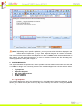
3. SETTING r.a.d.editor IN EDIT MODE
r.a.d.editor can work in two modes: View mode and Edit mode. When it is in View mode the content is
displayed as regular HTML and cannot be modified. In order to set r.a.d.editor in Edit mode you need
to click the pencil button .
-4-
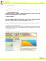
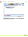
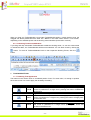
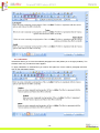
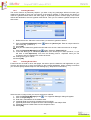
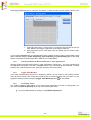
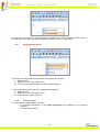
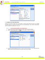
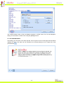
After you set any of the editors above in Edit mode your page will look similar to this:
As you can see, a toolbar with buttons and dropdowns has appeared. Moreover, the content managed
by the specific r.a.d.editor can now be modified as if you are using Microsoft Word®.
Once you have finished editing you need to press the [Update] button to save your work. If you click
the [Cancel] button your modifications will not be applied and the content will be reverted to its original
state.
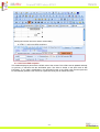
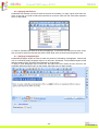
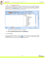
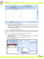
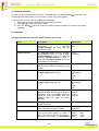
4. r.a.d.editor TOOLBARS
r.a.d.editor toolbars represent a set of buttons and drop-down lists, which allow you to perform
different actions with the content (e.g. make text bold, apply color, build tables, open the image dialog,
etc.) Most of these buttons work in the same way as you would use them in Microsoft Word®.
-5-
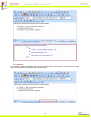
Note: Depending on your specific application, you may not see all of the buttons displayed in the
image above. Furthermore, you may have additional buttons with custom functionality,
which should be explained to you by the developer of the application.
The functions of the various buttons and dropdowns on the r.a.d.editor toolbar are described further in
this manual. You will also find instructions on how to complete common tasks like formatting text,
inserting hyperlinks, working with images, etc.
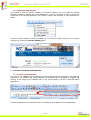
5. SYSTEM MODULES
The System Modules are special tools, used to provide extra information for the users who work with
r.a.d.editor in design mode. Currently, there are five modules shipped out-of-the box with the editor:
•
•
•
•
•
Tag Inspector
Properties Inspector
Real Time HTML Inspector
Statistics Module
XHTML Validator.
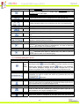
5.1. Tag Inspector
This module displays the path of the selected item (i.e. the DOM path of the current element). It also
allows you to select the last (the most inner) tag in the hierarchy and remove it using the [Remove
Element] button.
-6-
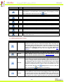
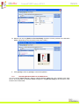
5.2. Properties Inspector
This is a powerful module, which displays the relevant properties of the currently selected element. As
a result, the user can quickly configure the element (e.g. set cell width, shading, image alignment,
hyperlink, etc.) without the need to open dialogs.
-7-
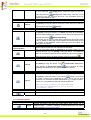
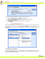
5.3. Real Time HTML Inspector
This module displays a pane with the HTML code of the content. This HTML code is updated and kept
in synchrony in real-time with the WYSIWYG pane. The effect is similar to the Split mode of MS
FrontPage - if you make a modification in the WYSIWYG pane or the HTML pane the other pane will
be automatically updated. This module is a great fine-tuning tool for advanced users.
-8-
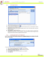
5.4. Statistics
This module provides word/character count or other analysis of the content. It finds its main usage
area for writing articles with given character/word limit.
-9-
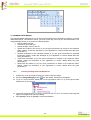
5.5. Integrated XHTML Validator
This module is used for real-time validation of XHTML compliance. You can enable the XHTML
validation module by selecting it from the Modules list. If you do not see the module in the list this
means that it has not been defined in the ToolsFile. Connect the developer of your application for
details.
Once the XHTML validation module is enabled you can check the HTML content you are currently
working on by clicking the [Validate XHTML] button.
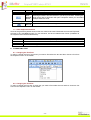
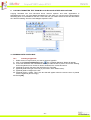
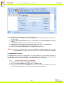
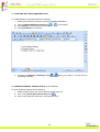
6. DOCKING TOOLBARS AND MODULES
6.1. Dockable Toolbars/Modules
The users of r.a.d.editor have the freedom to organize the workspace according to their personal
preferences. The Toolbars and System Modules of r.a.d.editor can be arranged by dragging and
docking on the edges of the editable area or can be left floating, just like in Microsoft Office
applications.
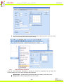
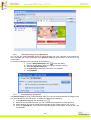
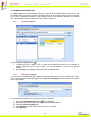
Toolbars and Modules can be docked to one of 5 docking zones as depicted on the image below:
- 10 -
When you drag one Toolbar/Module over another Toolbar/Module within a certain docking zone, the
dragged one will be placed before the other one. "Before" in this case means "above" or "to the left",
depending on the available space and the docking zone orientation (horizontal or vertical).
6.2. Un-docking Toolbars and Modules
If you drag and drop a dockable Toolbar/Module outside the docking areas, i.e. over the content area
or outside the editor, the Toolbar/Module will become undocked. You can dock it back by clicking the
button. To dock all Toolbars/Modules back to their respective Docking Zones, click the
button.
7. TOOLBAR BUTTONS
7.1. Formatting Text Appearance
The buttons in this section work on a selected portion of text. For some tools, it is enough to position
the mouse cursor in a word to apply the necessary formatting.
Bold
Ctrl+B
Italic
Ctrl+I
Underline
Ctrl+U
Applies bold formatting to the selected text.
Select the text and press this button to apply bold formatting. If the
cursor is positioned in a single word, pressing this button will bold the
entire word.
Applies italic formatting to the selected text.
Select some text and press this button to apply Italic formatting. If the
cursor is positioned in a single word, pressing this button will apply italic
to the entire word.
Applies underline formatting to selected text.
Select some text and press this button to apply underline formatting. If
the cursor is positioned in a single word, pressing this button will
underline the entire word.
- 11 -
Strikethrough
Applies strikethrough formatting to selected text.
Select some text and press this button to apply strikethrough formatting.
If the cursor is positioned in a single word, pressing this button will
strikethrough the entire word.
Font Name
Sets the font typeface.
This dropdown allows you to change the font of the selected text.
Font Size
Sets the font size.
These dropdowns allow you to change the font size of the selected text.
Text Color (Foreground)
Changes the color of the selected text.
This dropdown allows you to change the font color of the selected text.
Text Color (Background)
Changes the background color of the selected text.
This dropdown allows you to change the background color of the selected
text.
CSS Class
Applies predefined styles to the selected text.
This dropdown menu contains predefined text styles, which can be
applied to selected sections of the text.
Superscript
Makes text or numbers appear as superscript.
When typing text, you may press this button to make the text that follows
superscript
. The button also works on selected text. You have to press the
button again to switch to normal text typing.
Subscript
Makes text or numbers appear as subscript.
When typing text, you may press this button to make the text that follows
subscript. The button also works on selected text. You have to press the
button again to switch to normal text typing.
7.2. Formatting Paragraphs & Lists
Inserts а new paragraph.
This button lets you insert a new paragraph. There is a difference between
New Paragraph
Ctrl+
Enter
Paragraph Style
pressing this button
and pressing [Enter]. The latter creates a new line
creates a new paragraph,
keeping the paragraph formatting whereas
with different paragraph settings which can be changed later on. This
feature is important when you apply indentation and justification to text.
Applies standard or predefined text styles to selected paragraph.
This dropdown lets you change the paragraph style. Click anywhere in the
paragraph you want to format and select the preferred style from the
dropdown.
Numbered List
Creates a numbered list from the selection.
Select some text or place the cursor inside a paragraph and press this
button to make the text a numbered list. Pressing this button again will turn
the numbered list into a regular paragraph of text.
Bulleted List
Creates a bulleted list from the selection.
Select some text or place the cursor inside a paragraph and press this
button to make the text a bulleted list. Pressing this button again will turn
the bulleted list into a regular paragraph of text.
Increase Indent
Indents paragraph to the right.
This button indents a paragraph to the right. Each time this button is
- 12 -
pressed the paragraph will be indented further to the right.
Decreases paragraph indent to the left.
This button works only if indent has been applied to a paragraph
beforehand. To use this button, click anywhere in the paragraph you want
Decrease Indent
to be indented to the left and press the
button.
Horizontal ruler
Inserts a horizontal line (ruler).
Pressing this button will insert a horizontal line beneath the cursor position.
Align Left
Aligns the selected paragraph to the left.
Pressing this button will align the selected paragraph to the left.
Center
Aligns the selected paragraph to the center.
Pressing this button will center the lines in the selected paragraph.
Align Right
Aligns the selected paragraph to the right.
Pressing this button will align the selected paragraph to the right.
Justify
Justifies the selected paragraph to the left and to the right.
Pressing this button will justify the selected paragraph to the left and to the
right at the same time.
7.3. Working with portions of text
Spellchecker
Launches the spellchecker.
The spellchecker is a tool which checks the spelling of the written text.
It works the same way as in Microsoft Word®. When launched, the
spellchecker dialog will appear and the checking will start automatically
from the beginning of the document. If there is a mistaken word, it will
appear in the spellchecker dialog, where you can either [Ignore] the
suggestion or [Change] the word with the suggested one. Spellchecking
Print
Prints the contents of the r.a.d.editor or the whole web page.
Pressing this button will launch your default printers’ dialog box. Press
[OK] or [Print], to print the current page in your web browser. You can
set your printers’ properties before printing. Printing web page
Ctrl+P
Cut
Ctrl+X
Cuts the selected content and copies it to the clipboard.
The [Cut] button works on a selected text, image and/or table. You first
need to select the content and then [Cut] it. When using this tool, the
cut text or image will be removed from the page and will be stored in
the clipboard for later use. Please, note that only the last cut (or copied)
item will be stored in the clipboard. This tool is very helpful if you have
decided to change the place of a piece of text in the sentence or in the
page: just select the text, press
place, and press the
Copy
Ctrl+C
[Cut], place the cursor on the new
[Paste] button (see below).
Copies the selected content to the clipboard.
The [Copy] button works on selected text, image and/or table. You
need to select the content first and then [Copy] it. When using this tool,
the content will be stored in the clipboard for later use. Note that only
the last copied (or cut) item will be stored in the clipboard. This tool is
very helpful if you need to type the same text many times: just select
- 13 -
the text, press the
[Copy] button, place the cursor on the new
place and press the
[Paste] button (see below). This way you do
not have to type the text over and over. This procedure works for
images and/or tables as well.
Pastes copied content from the clipboard into the editor.
After you have either [Cut] or [Copied] an item (text, image, etc.), you
can [Paste] it using this button. Place the cursor where you want the
Paste
Ctrl+V
item to appear and press
[Paste].
Pastes copied content from the clipboard into the editor.
After you have either [Cut] or [Copied] an item (text, image, etc.), you
can [Paste] it using this button. r.a.d.editor will clean all unnecessary
Microsoft Office related tags. Place the cursor where you want the item
Paste From Word
[Paste From Word].
to appear and press
In case the user is trying to paste Word content with the regular Paste
button or Ctrl+V, a dialog will prompt whether the Word markup should
be cleaned. If the Clipboard content does not come from Word, the
dialog will not be shown.
Paste From Word Cleaning
Fonts and Sizes
Pastes copied content from the clipboard into the editor.
After you have either [Cut] or [Copied] an item (text, image, etc.) in
Microsoft Word ®, you can [Paste] it using this button. r.a.d.editor will
clean all unnecessary Microsoft Office related tags plus font formatting.
Place the cursor where you want the item to appear and press
.
Pastes copied content from the clipboard into the editor.
After you have either [Cut] or [Copied] an item (text, image, etc.), you
Paste Plain Text
can [Paste] it using this button. The
Ctrl+V
[Paste Plain Text] button
, but it removes all HTML
works similarly to [Paste from Word]
formatting and pastes plain text, preserving the line breaks.
Pastes copied content from the clipboard into the editor.
After you have either [Cut] or [Copied] an item (text, image, etc.), you
Paste As HTML
Ctrl+V
allows you to paste
can [Paste] it using this button. This new tool
the HTML content of the Clipboard as code, which may be quite
convenient for developer-oriented applications (e.g. support systems,
forums, etc.) The pasted text will look something like this:
<IMG src="Image_example.gif"><BR><BR><FONT
face="Arial"><STRONG>What's new in version
6.0</STRONG></FONT>
Strips (removes) the formatting from the selected or the whole text.
Removes Word®, custom or all formatting.
Format Stripper
7.4. Inserting elements
Image Manager
Ctrl+G
Pressing this button will open the image dialog which allows you to
manage images – inserting, uploading, creating thumbnails and setting
image properties. Working with images…
- 14 -
Absolute Positioning
Sets an absolute position of an object.
Pressing this button will help you move an object (image, table or media)
freely into the editor.
Flash Manager
Opens the flash dialog
The flash dialog is used for working with flash files - inserting and
uploading animations. Working with flash animation
Windows Media Manager
Opens the media dialog.
The Windows media dialog is used for inserting and uploading media
objects (AVI, MPEG, WAV, etc.). It also lets you set the object’s
properties. Working with Windows media…
Document Manager
Opens the document manager dialog
Pressing this button will open the dialog which will help you insert a
predefined document at the cursor position into the editor. Working with
documents…
Template Manager
Opens the template manager dialog.
Opens the template manager dialog which allows you to manage
templates. Working with templates…
Insert Table
Inserts a table in the r.a.d.editor.
Inserting a table in the r.a.d.editor is as easy as in Microsoft Word® - just
click the button and select how many rows and columns you would like
inserted in the editor. The table will be inserted at the point where the
cursor is. Working with tables…
Insert a Hyperlink
Makes the selected text, number or image a hyperlink.
This button lets you create a hyperlink from the selected text or image.
The hyperlink dialog window will open. It allows you to choose what type
of link you want to insert: Hyperlink, Anchor or E-mail. Working with
hyperlinks…
Ctrl+K
Remove Hyperlink
Ctrl+
Shift+K
Removes hyperlink from selected text, number, and image.
If you press this button after you have selected an image, some text in a
hyperlink, anchor or e-mail link, the link will be removed from this object.
Insert Special Character
Inserts special character(s).
Pressing this button will display a drop-down menu, showing you all
special characters that are built in the r.a.d.editor. The special character
will be inserted at the location of the cursor. If you want to insert a symbol
which you do not see in the drop-down menu, you will need to contact the
developer personnel. Inserting special character…
Insert Code Snippet
Inserts a predefined code snippet.
Pressing this button will insert a predefined code snippet into the selected
place in the editor. The snippet will retain the formatting from the
paragraph. For more information, please contact your developer Using
code snippets…
Insert Custom Link
Inserts an internal or external link from a preset list.
This dropdown lets you create a preset hyperlink on the selected text,
number or image. To create a link, you will firstly need to select the to-bedropdown and select the link that
linked object, then click on
you would like to use. Applying CSS Class
Insert Time
Pressing this button inserts the current time in the editable area.
Insert Date
Pressing this button inserts the current date in the editable area.
- 15 -
7.5. View
Show/Hide Table Borders Shows/hides table borders.
Toggles borders of all tables within the editor ON and OFF. The ON
function works on tables which have hidden borders.
Design Mode
Pressing this button switches the editor WYSIWYG into design mode.
HTML Mode
Pressing this button switches the editor into HTML mode.
Preview Mode
Pressing this button switches the editor into preview mode. The user can
take a look at the result of the editing which has been performed.
Full Screen Mode
F11
Press this button to expand the editor into a full screen. When the editor is
in full screen, pressing this button returns it to the previous state.
Modules
Press the button to select which module to activate (or deactivate) from the
dropdown menu. Modules that are currently active are marked with a check
sign. Those which are inactive are marked with a cross sign.
Docking
Pressing this buttons sets all the toolbars to be dockable.
UnDocking
When a toolbar is dragged and dropped (docked) somewhere on the page
outside the editor’s dockable area, you press this button to un-dock the
toolbar.
Zoom In(Out)
Pressing this will zoom in (or out) the editable area.
7.6. Miscellaneous
Shows the help on every button and its functionality.
Pressing this button will open a window which has short description on
every button, its functions and a keyboard shortcut, if such is available.
Help
Repeat
F4
Undo
Ctrl+Z
Pressing this button repeats the last action
Undoes the previous action
Pressing this button will undo the last action you have made in the editor.
This includes but is not limited to inserting tables, moving images and
formatting text. Pressing the down arrow next to this button will open a
- 16 -
dropdown where you can select multiple actions for undo.
Redoes the last undone action.
Redo
Ctrl+
Shift+Z,
Ctrl+Y
Pressing this button will redo the action you have just undone. Pressing the
down arrow next to this button will open a dropdown where you can select
multiple actions for redo.
Ctrl + F
Opens the Find and Replace dialog.
Find and Replace
7.7. Other keyboard shortcuts
Some of the general keyboard shortcuts that are valid for Microsoft Windows® and Internet Explorer®
will work in the r.a.d.editor as well. For your reference, we have included some of them (in addition to
the keyboard shortcuts described above):
Ctrl+A
Selects the whole content of the editor (text, images, tables, etc.)
Ctrl+W
Closes the active window.
Alt+F4
Closes the active application.
8. FORMATTING TEXT
8.1. Changing the Text Font
In order to change the font of some text you need to first select the text and then choose a font from
the dropdown menu on the toolbar.
8.2. Changing the Text Size
In order to change the font size of some text you need to first select the text and then choose a font
size from the dropdown menu on the toolbar.
- 17 -
8.3. Applying Text Colors
i. To apply a foreground color to some text you need to first select the text and then click on
[Foreground Color] button
on the toolbar. This will open the color picker, from where you
can select the color you want to apply.
ii. To apply a background color to some text you need to first select the text and then click on
[Background Color] button
on the toolbar. This opens the color picker, from where you
can select the color you want to apply.
8.4. Setting Text Alignment
You can set the text/paragraph (paragraph seems more correct because alignment is applied to the
whole paragraph) alignment to left, center, right or justify. In order to set the alignment, select the text
and from the toolbar click on the button for the alignment you want to set.
- 18 -
8.5. Indentation
Indentation allows you to move the selected paragraph to the left (Indent) or to the right (Outdent). The
Outdent works only if Indent has been applied.
To apply indentation to selected text you need to first place the cursor inside a paragraph and then
click on the indentation buttons.
- 19 -
8.6. Applying CSS Classes
Predefined CSS classes are used to ease the process of formatting. To apply a given CSS class to a
piece of text, first you need to select the text and then choose a class from the CSS Class dropdown
menu on the toolbar.
To clear an activated CSS Class is as easy as applying it. To clear the CSS class from a piece of text,
first you need to select the text and then select "Clear Style" from the CSS Class drop-down menu.
8.7. Applying Paragraph Styles
Predefined paragraph styles are used to ease the process of formatting of paragraphs. It allows the
user to consistently apply paragraph styles to a document, effortlessly. The predefined styles include
different heading styles, and other styles defined by the developer.
To apply a given paragraph style to some text, first place the cursor within the text, then from the
paragraph styles drop-down menu on the toolbar select the style you want to apply.
- 20 -
9. COPYING FORMATTED TEXT FROM Microsoft Word AND OTHER APPLICATIONS
Copying formatted text from Microsoft Word, Internet explorer and other applications is
straightforward. Once you have pasted formatted text in the editor you can remove the Word-specific
formatting which is not suitable for the web. To do that, first you need to select the text and then select
the "Word Formatting" from the Code Stripper dropdown menu.
10. WORKING WITH HYPERLINKS
10.1.
Inserting a Hyperlink
i. Select the text or object which you want to set as a hyperlink.
ii. Click on the [Hyperlink Manager] button
. The "Hyperlink Manager" dialog will appear.
iii. In the URL field enter the web address which you want the link to point to or from the Existing
Anchor dropdown menu choose an anchor inserted in the current document.
iv. (Optional)To specify the text of the link fill the Link Text field.
v. (Optional) Select the type of the link (or just leave it at the default value).
vi. (Optional) Select a target for the link.
vii. (Optional) Enter a tooltip. This is the text that will appear when the mouse cursor is placed
over the hyperlink (text or image).
viii. Press [OK].
- 21 -
10.2.
Modifying a Hyperlink
i. Click inside the hyperlink (or on the image if you have an image link)
ii. Right-click to open the context menu and click [Set Link Properties]. Alternatively, you may
click the [Hyperlink Manager] button
again. The "Hyperlink Manager" dialog will appear.
iii. Modify the hyperlink attributes (URL, tooltip, etc.) and click [OK].
10.3.
Removing a Hyperlink
i. Select the text or image, which has been set as a hyperlink.
ii. Click on [Remove Hyperlink] button . You will notice that all formatting, related to links
(blue color, underline, etc.) will be removed from the text. This holds true for the inserted
documents as well.
- 22 -
10.4.
Inserting Anchors
The anchor function is particularly helpful if you have a very long web-page. With this function your
readers will be able to jump from one section of the page to another. In other words, the anchor is
used for hyperlinks which lead to the same page or a particular place in another page. The anchor
defines the destination, where a hyperlink must lead to. Then you can create a hyperlink and point it to
that anchor.
i. Define the Anchor. Place the cursor where you want the hyperlink to lead to.
ii. Click the [Hyperlink Manager] button
. Select the [Anchor] tab. Enter an unique name for
the anchor (e.g. “product1”).
iii. Press [OK].
iv. Now you can create the hyperlink that will lead to the Anchor. Select some text or an image.
v. Click the [Hyperlink Manager] button
again. Select the [Hyperlink] tab.
vi. In the URL filed type “#” followed by the name of the anchor (in our case “product1”, so you
will have to enter #product1). Also, from the Existing Anchor dropdown menu you can
choose an anchor inserted in the current document
vii. Change the Type to “Other”.
viii. Press [OK].
10.5.
Inserting E-mail links
E-mail links do not lead to other web-pages, but rather open the default e-mail application on your
machine and prompt you to send a message to the provided addressee. When creating e-mail links
you can also specify default subject for the message (e.g. "Request for information").
Select the text or image, which you want to set as an e-mail link.
i. Click the [Hyperlink Manager] button
. The "Hyperlink Manager" dialog will appear.
ii. Click on the [E-mail] tab.
iii. Enter the e-mail address in the Address field.
iv. (Optional) Enter a text which will appear as an email link.
v. (Optional) Write down a subject for the e-mail message in the Subject field.
vi. (Optional) Choose a CSS Class from the dropdown menu.
vii. Press [OK].
- 23 -
10.6.
Inserting Custom Links
In some cases, r.a.d.editor may be configured to display and insert a set of frequently-used links.
Such links may be all the web pages of a site (a.k.a. Internal Links). They will appear in the [Custom
. As a result, you can quickly assign a predefined hyperlink to an
Links] dropdown menu
object without the need to remember and type its URL address.
i.
Select the text or image which will become a hyperlink.
.
ii. Click on the [Custom Links] dropdown menu
iii. From the drop-down menu, find and click on the desired link.
11. Find and Replace
To find (and subsequently replace) a word or passage of text in the content you need to use the Find
button on the toolbar. The dialog provides options
and Replace dialog. You can open it using the
like search direction, scope, match case, and match whole words only.
- 24 -
To find and replace a certain abstract of text do the following:
i. Select a range of content (it may contain images and tables as well) if you want to search only
in that content.
ii. Click the [Find and Replace] button or press [Ctrl+F]. The Find and Replace dialog will
appear.
iii. In the Find field type the word or abstract of text you want to find.
iv. (Replace)If you want to replace this text with a different one click on the [Replace] tab.
v. (Replace) Choose other options like search direction, scope, etc.
vi. (Replace) Click [Find Next], [Replace], or [Replace All] respectively.
Note: After you have replaced given text with the Replace or Replace All functions, you can
click [Cancel] and the replacement will be undone. To confirm the replacement click [OK].
12. WORKING WITH TABLES
r.a.d.editor offers two ways for creating tables. The best approach in a given situation depends on
your preferences and the table complexity. For simpler tables we recommend the click-and-drag
Table Builder, while for more complex tables the Table Wizard is more appropriate.
12.1.
Creating a Table Using the Table Builder
i. Position the cursor where you want to create the table.
ii. Click on the [Insert Table] button
on the r.a.d.editor toolbar.
iii. Drag the mouse cursor to select the number of rows and columns you want. Click the left
mouse button. Alternatively, you can click-and-drag to make the selection.
- 25 -
12.2.
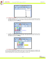
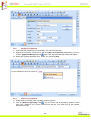
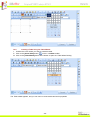
Creating a Table Using the Table Wizard
i. Position the cursor where you want to create the table.
ii. Click on the [Insert Table] button
on the r.a.d.editor toolbar.
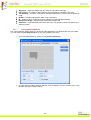
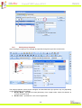
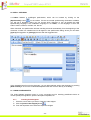
iii. Click on the [Table Wizard] button at the bottom to open the “Table Wizard” dialog.
The Table wizard appears, and you can use it to create a table and set its properties
- 26 -
Press [-] or [+] buttons next to “Columns” and “Rows”, in order to add or remove columns and/or rows.
Press [+] button next to “Column span” to merge the right cell with the cell you
have selected. Pressing the [-] button will unmerge the left cell.
ii. [-] or [+] buttons next to “Row span” work in a similar way as “Column span”
but for rows.
i.
If you click the [Insert] button, the defined table will be created. However, further customization of this
table is allowed using the [Table Properties], [Cell Properties], and [Accessibility] tabs of the Table
Wizard. The next few sections describe in detail how to modify tables.
12.3.
Inserting a table from Microsoft Excel® or other applications
Inserting a table from Microsoft Excel® or other applications is quite easy – just copy the table from
the application and paste it into the r.a.d.editor. Most of the formatting will be preserved, including
borders, text, numbers and cell color. Formulae, however, will not be pasted.
12.4.
Toggle Table Borders
If you have created a table which has no borders by default, you can switch on the auxiliary borders.
They will not be saved in the content but will rather help you locate and work with your table. You can
toggle the auxiliary borders using the [Toggle Table Borders] button
on the toolbar.
12.5.
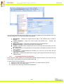
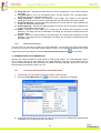
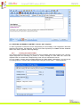
Formatting Tables
The “Table Properties“ dialog allows you to fine-tune the appearance of a new or existing table. You
can reach the [Table Properties] tab in one of the following two ways:
•
From the Table Wizard by clicking on the [Table Properties] tab.
- 27 -
•
By right-clicking inside an existing table and selecting "Table Properties" from the context
menu. This will open the Table Properties dialog.
12.6.
Table Properties Explained
Once the “Table Properties” dialog tab is opened you can set the appearance of the table. This
involves setting one or more of the following table properties:
•
•
Width/Height – specifies the height and the width of the table (in pixels or percent).
Background – sets the background color of the table.
- 28 -
•
•
•
•
•
•
•
Alignment – aligns the table to the left, center or right side of the page.
Cell spacing – increases or decreases the space between the borders of the cells.
Cell padding – increases or decreases the space between the content and the border of
a cell.
Border – includes setting border width, color, and layout.
ID - setting an ID for a table gives some options for advanced table handling
Background Image – sets an image as the table background.
CSS Class – specifies table CSS class and style. This property should be used only by
advanced users.
12.7.
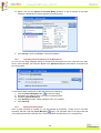
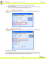
Cell Properties Explained
The “Cell Properties“ dialog allows you to fine-tune the appearance of individual cells of a given table.
You can reach the [Cell Properties] tab in one of the following two ways:
•
From the Table Wizard by clicking on the [Cell Properties] tab.
•
By right-clicking a table cell and selecting "Cell Properties" from the context menu. This
will open the Cell Properties dialog.
- 29 -
Once the Cell Properties dialog tab is opened you can set the appearance of the individual cells. This
involves setting one or more of the following cell properties:
•
•
•
•
•
•
•
•
Width/Height – specifies the height and the width of the selected cell (in pixels or
percent).
Content alignment – aligns the content within the selected cell – vertically and
horizontally.
Background (color) – changes the background color of the selected cell.
Background Image – sets an images as the cell background.
Content – specifies default content for the cell. You can input the content after you insert
the table as well.
ID – setting an ID for a cell gives options for some better cell handling (for advanced users
and developers)
No Wrapping – enables/disables text wrapping (i.e. forces a new line when the text
reaches the Cell border).
CSS Class – specifies cell CSS class and style. This property should be used only by
advanced users.
12.8.
Inserting/Deleting Rows and Columns
Once you have created a table you can easily add or delete rows and columns. This is done from the
context menu, which appears on right-click inside a table cell.
To insert a new row do the following:
i. Place the cursor in the row on top or beneath which you want to insert a new row.
ii. Right-click to open the context menu.
iii. From the menu select the "Insert Row Above/Below".
- 30 -
You can insert new columns in a similar fashion. To delete rows or columns simply place the cursor in
the respective row/column and select "Delete Row/Column" from the context menu.
12.9.
Merging/Splitting Cells
To merge a cell with the adjacent cell below/to the right do the following:
i. Select the cell.
ii. Right-click to open the context menu.
iii. From the menu select "Merge Cells Horizontally/Vertically".
To split a cell that has been previously merged do the following:
i. Select the cell.
ii. Right-click to open the context menu.
iii. From the menu select "Split Cell".
12.10.
Resizing Tables
You can resize an existing table in two ways:
• by specifying dimensions in the [Table Properties] tab (explained in the previous
sections)
• by direct drag-and-drop.
- 31 -
To resize a table with a drag-and-drop do the following:
i. Click on the table border to select the table. Eight small squares will appear in the outer area
of the table (see the screenshot above).
ii. You can drag any of these handles vertically, horizontally or diagonally to resize the table. All
cells, which do not have exact dimensions (specified in pixels), will be resized evenly to
accommodate the new table size.
12.11.
Formatting Tables with CSS Classes
CSS class provides easy and consistent way for formatting tables. In order to use the CSS Class, you
have to first create the table and then open the Table Properties dialog to apply the predefined CSS
class.
To apply a CSS class to a table or an individual cell you need to do the following:
i. Click in the table/cell. Right-click to open context menu.
ii. From the dropdown menu, click on "Set Table/Cell Properties" to open the "Table/Cell
Properties" dialog tab.
iii. Select the CSS class from the dropdown list at the bottom of the dialog.
iv. Click on the [Update] button.
- 32 -
13. CREATING BULLETED/NUMBERED LISTS
To create bulleted or numbered lists do the following:
i. Select the text which you want to convert to bulleted/numbered list.
ii. Click the [Bulleted/Numbered list] button
iii. Press [Enter] to create a new line of the list.
iv. Press [Ctrl+Enter] to end the list.
v. Pressing the [Indent] or [Outdent] button
numbering or bullets.
/
on the toolbar.
/
allows you to enter to an inner level of
14. INSERTING SPECIAL CHARACTERS (€, ®, ©, ±, Ë, etc.)
To insert a special character do the following:
i. Select the place where you want to insert a special character.
ii. Click on the [Insert Special Character] button
.
iii. Click on the respective character in the dropdown menu.
- 33 -
15. WORKING WITH IMAGES
The Image Manager dialog allows you to freely browse folders on the web-server just like in a regular
Windows Explorer. The folders to which you have access are pre-set by the site administrator. The
Image Manager allows you to perform the following tasks:
• browse folders and files
• sort files by name and type
• preview images, zoom in and out
• upload new images to the server (if you are given permissions to upload in the respective
folder. Please, contact the developer of your application to receive details about the given
permissions.)
• generate thumbnails of the uploaded images (if you are given permissions to generate
thumbnails. Please, contact the developer of your application to receive details about the
given permissions.)
• create new sub-folders (if you are given permissions to upload in the respective folder.
Please, contact the developer of your application to receive details about the given
permissions.)
• delete files and folders (if you are given permissions to delete in the respective folder.
Please, contact the developer of your application to receive details about the given
permissions.)
15.1.
i.
Inserting an Image from the Web-Server
Position the cursor at the place where you need to insert the image.
from the toolbar. A dialog box will appear.
ii. Press the [Image Manager] button
iii. To go to a new sub-folder double-click on the sub-folder's name. To go to the parent folder
double-click on the up-arrow.
iv. Locate the image file which you want to insert and click on it once. A preview of the image will
appear in the right-hand side of the dialog.
v. Click [Insert] to finish or [Close] to cancel the operation.
- 34 -
15.2.
Uploading Images on the Web-Server
You can use the "Image Manager" dialog to upload images from your computer to the web-server.
Once uploaded, the image will appear in the [Browse Files] tab at the bottom of the file list in the
current folder.
To upload new images on the web-server do the following:
i.
ii.
iii.
iv.
v.
Click the [Image Manager] button
to open the dialog.
Navigate to the folder in which you want to upload the image.
Press the [Upload Image] tab.
Click [Browse] to select an image from you computer.
Click [Upload].
15.3.
Creating Image Thumbnails
The [Browse Files] tab of the "Image Manager" allows you also to create thumbnails of images, which
you have uploaded on the web-server. To create thumbnails do the following:
i.
ii.
iii.
iv.
In the [Browse Files] tab click thumbnail icon
Define the thumbnail dimensions (you can constrain the proportions to avoid distortion).
Select whether you want to upload the large image as well ("Keep Original: Yes") or not.
Press the [Upload] tab. The thumbnail image will appear at the bottom of the file-list in the
current folder.
- 35 -
15.4.
Editing Image Properties
After inserting an image you can manage its properties through the right-click context menu.
The image properties, which can be managed, are described below (the options may vary depending
on the customization of the dialog):
i. Border Width – specifies the width (thickness) of the image border. Select "No Border" to
remove the border at all.
ii. Border Color – specifies the color of the image border.
- 36 -
iii. Image Alt Text – specifies the alternative text, which is displayed in some cases instead of
the image.
iv. Long description – this is an Accessibility option. The text entered in the "Long Description"
field will be read by the Windows Narrator tool.
v. Image Alignment – specifies the alignment of the image, with respect to the adjacent
text/images. When you choose left or right alignment, the text will wrap around the image.
vi. Horizontal Spacing – specifies the spacing (distance to the left and to the right) between the
image and the adjacent text/images.
vii. Vertical Spacing – specifies the spacing (distance to the top and to the bottom) between the
image and the adjacent text/images.
viii. Width – specifies a custom width for the image (you can constrain the proportions to avoid
distortion). The image will not be resampled or modified, but will rather be displayed with the
specified width.
ix. Height – specifies a custom height for the image (you can constrain the proportions to avoid
distortion). The image will not be resampled or modified, but will rather be displayed with the
specified height.
15.5.
Absolute Positioning
In some cases you may want to position an image absolutely. This will make the image freely floating
so that you can move it around the content with the mouse. To set absolute positioning for a given
image simply select the image and click the [Set Absolute Position] button
on the toolbar.
16. WORKING WITH FLASH ANIMATIONS
Working with Flash animations is quite similar to working with images. The "Flash Manager" allows
you to perform almost the same tasks as the "Image Manager", with the only exception that you
cannot create thumbnails of Flash animations. In addition, the "Flash Manager" allows you to set some
Flash-specific properties like quality, loop, etc.
16.1.
i.
Inserting a Flash Animation from the Web-Server
Position the cursor at the place where you need to inset the Flash.
ii. Press the [Flash Manager] button
from the toolbar. A dialog box will appear.
iii. Locate the Flash file which you want to insert and click on it once. Default Flash properties will
be displayed in the right-hand side of the dialog.
- 37 -
iv. Make a tick into the [Switch to Preview Mode] checkbox to see a preview of the Flash
animation. (Depending on the file size this may take a while.)
v. Click [Insert] to finish or [Close] to cancel the operation.
16.2.
Uploading Flash Animations on the Web-Server
You can use the "Flash Manager" dialog to upload Flash animations from your computer to the webserver. Once uploaded, the Flash will appear in the [Browse Files] tab at the bottom of the file list in
the current folder.
To upload new Flash animations on the web-server do the following:
i.
ii.
iii.
iv.
v.
to open the dialog.
Click the [Flash Manager] button
Navigate to the folder in which you want to upload the Flash.
Press the [Upload Flash] tab.
Click [Browse] to select a Flash animation from you computer.
Click [Upload].
16.3.
Setting Flash Properties
Once a Flash animation is inserted you can still manage its properties. Simply click on the Flash
animation and then open the [Flash Manager]
again. The properties pane in the right-hand side
of the dialog will load the properties of the current animation and will allow you to change them.
- 38 -
17. WORKING WITH WINDOWS MEDIA
Working with Windows Media files is quite similar to working with images and Flash. The "Media
Manager" allows you to perform the same tasks as the "Flash Manager". This includes setting Mediaspecific properties like display size, rate, etc.
17.1.
Inserting Windows Media from the Web-Server
i. Position the cursor at the place where you need to inset the Windows Media.
ii. Press the [Media Manager] button
from the toolbar. A dialog box will appear.
iii. Locate the Windows Media file which you want to insert and click on it once. Default Windows
Media properties will be displayed in the right-hand side of the dialog.
- 39 -
iv. Make a tick into the [Switch to Preview Mode] checkbox to see a preview of the Windows
Media. (Depending on the file size this may take a while.)
v. Click [Insert] to finish or [Close] to cancel the operation.
17.2.
Uploading Windows Media on the Web-Server
You can use the "Media Manager" dialog to upload Windows Media from your computer to the webserver. Once uploaded, the Windows Media will appear in the [Browse Files] tab at the bottom of the
file list in the current folder.
- 40 -
To upload a new Windows Media file on the web-server do the following:
i.
ii.
iii.
iv.
v.
Click the [Media Manager] button
to open the dialog.
Navigate to the folder in which you want to upload the Windows Media file.
Press the [Upload Media] tab.
Click [Browse] to select a Windows Media file from you computer.
Click [Upload].
17.3.
Setting Windows Media Properties
Once a Windows Media file is inserted you can still manage its properties. Simply click on the
Windows Media object and then open the [Media Manager]
again. The properties pane in the
right-hand side of the dialog will load the properties of the current media file and will allow you to
change them.
18. WORKING WITH DOCUMENTS
The "Document Manager" allows you to insert hyperlinks to document files stored on the web-server
by simply selecting them from a list. The dialog is similar to the "Image Manager" and allows you to
browse, upload, and delete documents.
- 41 -
18.1.
i.
Inserting Documents
(Optional) Select some text or an image which will become the hyperlink to the document.
ii. Press the [Insert Document] button
.
iii. A dialog will open to display a list of folders and documents which you are allowed to browse.
Select the document you want to insert.
iv. (Optional) Type a tooltip. This is an Accessibility option as well. The tooltip will be read by the
Windows Narrator.
v. (Optional) Select a target for the link.
vi. Press [Insert]. In case you have selected some text or an image in step (i) it will become a
hyperlink to the document. In case you haven't - the name of the document will appear at the
cursor point and will be set as a hyperlink to the document.
18.2.
Uploading Documents on the Web-Server
You can use the "Document Manager" dialog to upload document files from your computer to the webserver. Once uploaded, the documents will appear in the [Browse Files] tab at the bottom of the filelist in the current folder.
To upload new Document files on the web-server do the following:
i.
ii.
iii.
iv.
v.
Click the [Document Manager] button
to open the dialog.
Navigate to the folder in which you want to upload the Document.
Press the [Upload Document] tab.
Click [Browse] to select a Document file from you computer.
Click [Upload].
- 42 -
19. WORKING WITH TEMPLATES
r.a.d.editor allows you to insert external files (e.g. a file with pre-formatted tables, signatures, etc.) to
the editable area. Those files are called Templates and can be in any format that your server will allow
you to read. Templates are similar to code snippets with the only difference that they are obtained
from individual files, which the user can browse, upload, delete, etc.
19.1.
Inserting Templates
Press the [Insert Template] button .
i. A dialog will open to display a list of folders and template files which you are allowed to
browse. Select the file you want to insert. You see the preview of the file in the preview
window.
ii. Press [Insert]. The template will be inserted in the editable area
19.2.
Uploading Templates
You can use the "Template Manager" dialog to upload template files from your computer to the webserver. Once uploaded, the file will appear in the [Choose Template] tab at the bottom of the file-list
in the current folder.
To upload a new template file on the web-server do the following:
i.
ii.
iii.
iv.
v.
open the dialog.
Click the [Template Manager] button
Navigate to the folder in which you want to upload the template file.
Press the [Upload Template] tab.
Click [Browse] to select a Document file from you computer.
Click [Upload].
- 43 -
20. SPELL CHECKING
r.a.d.editor features a multilingual spellchecker, which can be invoked by clicking on the
[Spellchecker] button
on the toolbar. If there are several spellchecking dictionaries available,
you will see a dropdown where you can choose which dictionary to use. By default the initial
spellchecking language is the localization language of r.a.d.editor, i.e. the language in which the
editor’s menus, toolbars, modules, etc. are set.
When launched, the spellchecker will start checking all words automatically from the beginning of the
document. If there is a mistaken word it will appear in the spellchecker dialog, where you can either
[Ignore] the suggestion or [Change] the word with the suggested one.
If the misspelled word is not in the dictionary, you can either add the word to the dictionary by pressing
[Add Custom] or click on the underlined/misspelled word and correct it directly in the dialog.
21. USING CODE SNIPPETS
The Code snippets dropdown menu is a very convenient tool for inserting predefined chunks of
content (HTML) like signatures, product description templates, etc.
21.1.
Inserting Code Snippets
i. Place the cursor where you want to insert the code snippet.
ii. Click the [Insert Code Snippet] button
.
iii. From the dropdown menu select the respective snippet.
- 44 -
22. CREATING ACCESSIBLE CONTENT ("Section 508"compliant)
In order to generate content that can be interpreted by the Accessibility Tools integrated in Microsoft
Windows (the Narrator, the Magnifier, and the On-Screen Keyboard) r.a.d.editor includes additional
fields in the Table, Hyperlink, and Image dialogs.
22.1.
Creating Accessible Tables
The narrative software uses the information from the Accessibility table fields (heading rows, columns,
caption alignment and summary) to produce a Tooltip message for each table cell. Users with
impaired vision can hear those Tooltips as they hover over the cells with the mouse.
You can create a "Section 508"-compliant table with the Table Wizard. Alternatively, you can convert
an existing table to a "Section 508"-compliant table using the context menu – "Table Properties".
- 45 -
i. Create a new table with the Table Wizard or open the Table Properties dialog.
ii. Click “Accessibility” tab.
iii. In the “Accessibility” tab you fill in the fields: Heading rows/columns, Caption, and Summary
about the table. Click the [Associate cells with headers] checkbox.
22.2.
Creating Accessible Hyperlinks
A hyperlink can be interpreted by the narrative software if you specify an additional description in the
"Tooltip" field.
22.3.
Creating Accessible Images
An image can be interpreted by the narrative software if you specify an additional description in the
"Long Description" field.
23. USING THE HTML MODE
More advanced users sometimes need to modify the HTML code of the content directly. For this
reason, r.a.d.editor provides the so called "HTML mode", which gives you access to the content code.
Please, note that the "HTML mode" may be disabled by the site administrator.
- 46 -
The example below shows a Find and Replace operation in HTML mode. The "Find and Replace"
dialog can be invoked in "HTML mode" using the [Ctrl+F] shortcut.
24. THE PREVIEW MODE
After editing your document in the editor preview, users may like to see how the page looks like before
updating the page. The editor can be switched to the Preview Mode just by a single click of the
preview button
.
- 47 -
25. PRINTING CONTENT
To print the whole web-page including the r.a.d.editor click the [Print] button
Printer Properties dialog where you can choose a printer and printing options.
. It will open the
To print only the content of the r.a.d.editor do the following:
i. Make sure the cursor is positioned inside the editor's content.
ii. Click [Ctrl+A] to select the whole content.
iii. Click the [Print]
button to open the Printing Preferences dialog and confirm the printing
operation.
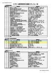
26. APPENDIX
This Appendix describes the cell CSS descriptions and settings
Name
Description
Valid Values
backgroundAttachment
The backgroundAttachment property
determines
if
a
specified
backgroundImage will scroll with the
content or be fixed.
scroll
fixed
backgroundColor
The backgroundColor property specifies
the background color of a cell or table.
backgroundImage should be specified
whenever backgroundColor is used. In
most cases, backgroundImage should be
set to none to work properly.
<color>
transparent
backgroundImage
Through the background-Image property
you can set the background image of a cell
or table.
url(/Img/hello.gif)
backgroundPositionX
Sets or retrieves the x-coordinate of the
backgroundPosition property.
<length>
<percentage>
left
center
right
backgroundPositionY
Sets or retrieves the y-coordinate of the
backgroundPosition property.
<length>
<percentage>
left
center
right
backgroundRepeat
The
backgroundRepeat
property
specifies whether the background image is
repeated or tiled. The repeat-x value will
repeat the image horizontally while the
repeat-y value will repeat the image
vertically.
repeat
repeat-x
repeat-y
no-repeat
behavior
Sets or retrieves the location of the
DHTML Behaviors.
borderBottomColor
The borderBottomColor property sets the
color of the bottom border of a table.
borderBottomStyle
The borderBottomStyle property sets the
style of the bottom border of a table or
cells. This property must be specified for
the border to be visible. The borderStyle
- 48 -
<color>
transparent
none
dotted
dashed
solid
groove
ridge
inset
outset
property
has
borderBottomStyle.
priority
over
double
{1,4}
borderBottomWidth
The borderBottomWidth property is used
to specify the width of a table's bottom
border. The value may be one of three
keywords or a length, which can be used
to achieve relative widths. Negative values
are not allowed.
borderLeftColor
The borderLeftColor property sets the
color of the left border of a cell or table.
borderLeftStyle
The borderLeftStyle property sets the
style of the left border of a table or cell.
This property must be specified for the
border to be visible. The borderStyle
property has priority over borderLeftStyle.
none
dotted
dashed
solid
double
groove
ridge
inset
outset
{1,4}
borderLeftWidth
The borderLeftWidth property is used to
specify the width of a table's left border.
Negative values are not allowed.
thin
medium
thick
<length>
borderRightColor
The borderRightColor property sets the
color of the right border of a table.
<color>
transparent
borderRightStyle
The borderRightStyle property sets the
style of the right border of a table. This
property must be specified for the border to
be visible. The borderStyle property has
priority over borderRightStyle.
none
dotted
dashed
solid
double
groove
ridge
inset
outset
{1,4}
borderRightWidth
The borderRightWidth property is used to
specify the width of a table's right border.
Negative values are not allowed.
thin
medium
thick
<length>
borderTopColor
The borderTopColor property sets the
color of the top border of a table.
<color>
transparent
borderTopStyle
The borderTopStyle property sets the
style of the top border of a table. This
property must be specified for the border to
be visible. The borderStyle property has
priority over borderTopStyle.
none
dotted
dashed
solid
double
groove
ridge
inset
outset
{1,4}
borderTopWidth
The borderTopWidth property is used to
specify the width of a table's top border.
Negative values are not allowed.
thin
medium
thick
<length>
borderCollapse
The borderCollapse property sets the
state of the border.
separate
collapse
borderColor
The borderColor property sets the color of
all borders of a table.
borderStyle
The borderStyle property sets the style of
the bottom border of a table. This property
must be specified for the border to be
visible.
none
dotted
dashed
solid
double
groove
ridge
inset
outset
{1,4}
borderWidth
The borderWidth property is used to set
the border width of a table. You can
specify one to four values, where each
value is a keyword or a length. Negative
lengths are not allowed.
thin
medium
thick
<length>
- 49 -
thin
medium
thick
<length>
<color>
transparent
<length>
<percentage>
auto
bottom
clear
The clear property specifies if a cell or
table allows floating elements to its sides.
A value of left moves the element below
any floating element on its left; a value of
right does the same but to the right. Other
values are none, which is the default
value, and both, which moves the element
below floating elements on both of its
sides.
clip
Sets or retrieves which part of a positioned
object is visible.
color
The color property allows authors to
specify the color of a cell or table.
cursor
The cursor property sets or retrieves the
type of cursor to display as the mouse
pointer moves over the object.
direction
The direction property sets or retrieves
the reading order of the object.
none
left
right
both
<color>
auto
default
hand
move
text
wait
help
crosshair
•
•
•
display
The display property is used to define a
cell or table with one of four values: block,
inline, list-item, none.
Each element typically is given a default
display value by the browser, based on
suggested rendering in the HTML
specification.
The display property can be dangerous
because of its ability to display elements in
what would otherwise be an improper
format. The use of the value none will turn
off display of the element to which it is
assigned, including any children elements!
filter
The filter property sets or retrieves the
filter or collection of filters applied to the
object.
fontFamily
Font families may be assigned by a
specific font name or a generic font family.
Multiple family assignments can be made,
and if a specific font assignment is made it
should be followed by a generic family
name in case the first choice is not
present.
Any font name containing white space
must be quoted, with either single or
- 50 -
•
•
•
•
e-resize
ne-resize
nw-resize
n-resize
se-resize
sw-resize
s-resize
w-resize
ltr - content flows left
to right (default);
rtl - content flows
right to left;
inherit - content flow
is inherited.
block - a line break
before and after the
element;
inline - no line break
before and after the
element;
list-item - same as
block except a listitem
marker
is
added;
none - no display.
<family-name>
Any font name may be
used
<generic-family>
• serif (e.g., Times)
• sans-serif (e.g., Arial
or Helvetica)
• cursive (e.g., ZapfChancery)
double quotes.
•
•
fantasy (Western)
monospace
(e.g.,
Courier)
fontSize
The fontSize property is used to modify
the size of the displayed font. Absolute
lengths (using units like pt and in) should
be used sparingly due to their weakness in
adapting
to
different
browsing
environments. Fonts with absolute lengths
can very easily be too small or too large for
a user.
<absolute-size>
xx-small large
x-small
x-large
small
xx-large
medium
<relative-size>
larger
smaller
<length>
<percentage>
(in relation to parent
element)
fontVariant
The fontVariant property determines if the
font is to display in normal or small-caps.
Small-caps are displayed when all the
letters of the word are in capitals with
uppercase characters slightly larger than
lowercase.
normal
SMALL-CAPS
fontWeight
The fontWeight property is used to specify
the weight of the font. The bolder and
lighter values are relative to the inherited
font weight, while the other values are
absolute font weights.
layoutGridChar
layoutGridChar sets or retrieves the size
of the character grid used for rendering the
text content of an element.
<length>
<percentage>
none
auto
layoutGridLine
layoutGridLine sets or retrieves the
gridline value used for rendering the text
content of an element.
<length>
<percentage>
none
auto
layoutGridMode
layoutGridMode sets or retrieves whether
the text layout grid uses two dimensions.
both
none
line
char
layoutGridType
layoutGridType sets or retrieves the type
of grid used for rendering the text content
of an element.
loose
strict
fixed
normal
bold
bolder
lighter
100
200
300
400
800
<length>
<percentage>
auto
left
letterSpacing
The letterSpacing property specifies the
spacing between the letters in a word. Can
be table or cell specific.
<length>
lineBreak
lineBreak sets or retrieves line-breaking
rules for Japanese text.
normal
strict
lineHeight
The lineHeight property will accept a
value to control the spacing between
baselines of text. When the value is a
number, the line height is calculated by
multiplying the element's font size by the
normal
<number>
<length>
<percentage>
- 51 -
500
600
700
800
900
number. Percentage values are relative to
the element's font size. Negative values
are not permitted.
marginBottom
The marginBottom property sets the
bottom margin of a cell or table by
specifying between one and four values,
where each value is a length, a
percentage, or auto. Percentage values
refer to the parent element's width.
Negative margins are permitted.
<length>
<percentage>
auto
{1,4}
marginLeft
The marginLeft property sets the left
margin of a cell or table by specifying
between one and four values, where each
value is a length, a percentage, or auto.
Percentage values refer to the parent
element's width. Negative margins are
permitted.
<length>
<percentage>
auto
{1,4}
marginRight
The marginRight property sets the right
margin of a cell or table by specifying
between one and four values, where each
value is a length, a percentage, or auto.
Percentage values refer to the parent
element's width. Negative margins are
permitted.
<length>
<percentage>
auto
{1,4}
marginTop
The marginTop property sets the top
margin of a cell or table by specifying
between one and four values, where each
value is a length, a percentage, or auto.
Percentage values refer to the parent
element's width. Negative margins are
permitted.
<length>
<percentage>
auto
{1,4}
padding
padding is the amount of space between
the border and the content in a table or a
cell.
<length>
<percentage>
{1,4}
pageBreakAfter
pageBreakAfter sets or retrieves a string
indicating whether a page break occurs
after the object.
auto
always
pageBreakBefore
pageBreakBefore sets or retrieves a
string indicating whether a page break
occurs before the object.
auto
always
position
The position property sets or retrieves the
type of positioning used for the object.
absolute
relative
static
<length>
<percentage>
auto
right
textAlign
The textAlign property can be applied to
block-level elements (P, H1, etc.) to give
the alignment of the element's text. This
property is similar in function to HTML's
ALIGN attribute on paragraphs, headings,
and divisions.
left
right
center
justify
textAutospace
textAutospace sets or retrieves the
autospacing and narrow space width
none
ideograph-alpha;
- 52 -
adjustment of text.
ideograph-numeric;
ideograph-parenthesis;
ideograph-space;
textDecoration
The textDecoration property allows text to
be decorated through one of five
properties: underline, overline, linethrough, blink, or the default, none.
overline
none
underline
line-through
blink
textIndent
The textIndent property can be applied to
block-level
elements
(paragraphs,
headers, etc.) to define the amount of
indentation that the first line of the element
should receive. The value must be a length
or a percentage; percentages refer to the
parent element's width.
<length>
<percentage>
textJustify
textJustify sets or retrieves the type of
alignment used to justify text in the object.
inter-word
newspaper
distribute-all-lines
distribute
inter-ideograph
auto
textTransform
The textTransform property allows text to
be transformed by one of four properties:
• capitalize (capitalizes first character
of each word);
• uppercase (capitalizes all characters
of each word);
• lowercase (uses small letters for all
characters of each word);
• none (the initial value)
none
capitalize
uppercase
lowercase
textUnderlinePosition
textUnderlinePosition sets or retrieves
the position of the underline decoration
that is set through the textDecoration
property.
above
below
<length>
<percentage>
auto
top
unicodeBidi
unicodeBidi sets or retrieves the level of
embedding with respect to the bidirectional
algorithm.
normal
embed
bidi-override
visibility
visibility sets or retrieves whether the
content of the object is displayed.
visible
hidden
inherit
wordBreak
wordbreak sets or retrieves line-breaking
behavior within words, particularly where
multiple languages appear in the object.
normal
break-all
keep-all
wordSpacing
The wordSpacing property defines an
additional amount of space between
words. The value must be in the length
format; negative values are permitted.
normal
<length>
zIndex
zIndex sets or retrieves the stacking order
of positioned objects.
<value>
auto
zoom
Sets or retrieves the magnification scale of
<percent>
- 53 -
the object.
normal
- 54 -