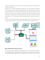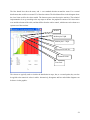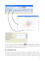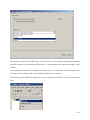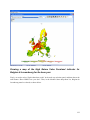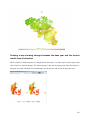
1
The Graphical User Interface for CAPRI version 2013 Wolfgang Britz Institute for Food and Resource Economics Chair of Economic and Agricultural Policy University of Bonn Bonn, February 2013 Acknowledgments Many people have over the years contributed to the development, maintenance and application of the CAPRI modelling system. After more than ten years since a first prototype was constructed, it is almost impossible to list them all and name their specific contributions. The author opted for this rather technical paper to refrain from citing the different (working) papers which shed more light on methodological questions, but rather refers in general to the CAPRI documentation. Nevertheless, it is only fair to mention Hans-Josef Greuel and Andrea Zintl, who both long before CAPRI was born have already developed software concepts and code which underlined to a large extent until 2006 the DBMS of CAPRI, and in parts, its Graphical User Interface. Finally, Alexander Gocht contributed over the last years to the Java code underlying the GUI. Eriona Dashja, a student assistance, checked in 2011 the user manual against the actual interface, changed the text where necessary and corrected typos. The work described in here would have been impossible without the funds by different donors, mainly the EU Commission, with regards to changes in 2009 until 2013 especially under the FP 7 project CAPRI-RD All errors in text and code remain with the author. The author Dr. Wolfgang Britz is a senior researcher and lecturer with the Institute for Food and Resource Economics at the University of Bonn, and has co-ordinated since several years the activities based on the CAPRI modelling system. His responsibilities further on include the methodological concept of CAPRI and, to a larger extent, its software implementation. Contact: Dr. Wolfgang Britz Institute for Food and Resource Economics, University Bonn Nussallee 21 D-53115 Bonn Tel.: ++49-(0)-228-732502 [email protected] 2 Content Background ................................................................................................................................................... 9 Initialization................................................................................................................................................. 10 Logging in ............................................................................................................................................... 10 Choosing a initialization file ................................................................................................................... 10 Linking the GUI to the local CAPRI installation .................................................................................... 11 GAMS settings ........................................................................................................................................ 11 SVN settings ............................................................................................................................................ 12 Case one: Exploiter and runner ........................................................................................................... 13 Usage for installation purposes ........................................................................................................... 16 Getting help ................................................................................................................................................. 18 Basic layout of the GUI ............................................................................................................................... 19 The different work steps .............................................................................................................................. 21 Build database ......................................................................................................................................... 21 The work step “Generate baseline” ............................................................................................................. 24 The task run scenario................................................................................................................................... 26 Define scenario task ................................................................................................................................ 26 Run scenario tasks ................................................................................................................................... 27 Exploiting results......................................................................................................................................... 31 The task: Collect meta information ............................................................................................................. 32 Interaction with GAMS ............................................................................................................................... 34 Utilities ........................................................................................................................................................ 35 Batch execution ........................................................................................................................................... 36 Generate GAMS documentation ................................................................................................................. 38 Exploitation of gdx-files .............................................................................................................................. 40 An example: loading data from the spatial downscaling ..................................................................... 41 Generating co-ordinate files for the exploitations tools from shapefiles ................................................. 44 Editing the table definitions underlying the exploitation tools................................................................ 45 Views as the basic concept for exploitation in CAPRI ....................................................................... 45 Why a XML definition files for views? .............................................................................................. 46 Defining and changing the view definition via the GUI interface....................................................... 47 Defining a table ................................................................................................................................... 48 Defining the list of activities, products, regions or dim5s ................................................................... 49 Exploitation tools ........................................................................................................................................ 50 The structure of the GAMS generated gdx files .................................................................................. 50 Loading the data from gdx files........................................................................................................... 50 Multi-dimensional viewer with pivoting and exporting possibilities .................................................. 51 Pre-defined views .................................................................................................................................... 51 View selection ..................................................................................................................................... 51 Navigating in the outer dimensions of the viewport............................................................................ 52 Column and row selection ................................................................................................................... 52 Predefined selection groups ................................................................................................................. 54 Selection of the view type ................................................................................................................... 54 Manually changing the pivot ............................................................................................................... 54 Changing view options ........................................................................................................................ 55 Showing a histogram window ............................................................................................................. 57 Working with tables ................................................................................................................................ 59 The toolbar .......................................................................................................................................... 59 Tooltips for column and row headers .................................................................................................. 59 Drill-down ........................................................................................................................................... 59 Clipboard export .................................................................................................................................. 60 4 Export to file........................................................................................................................................ 60 Sorting ................................................................................................................................................. 60 Numerical filtering based on cell content ............................................................................................ 60 Changing the row height and column width with the mouse .............................................................. 61 Adding statistics .................................................................................................................................. 61 Outlier detection algorithms implemented .......................................................................................... 64 Working with graphics ............................................................................................................................ 66 General handling of graphs ................................................................................................................. 66 “Walking” through the data ................................................................................................................. 68 Exporting the graphic to file ................................................................................................................ 69 Exporting the graphic to clipboard ...................................................................................................... 69 Bar charts............................................................................................................................................. 69 Line and point charts ........................................................................................................................... 71 Pie charts ............................................................................................................................................. 72 Spider plots .......................................................................................................................................... 73 Box and Whisker charts....................................................................................................................... 74 Histograms........................................................................................................................................... 75 Markov charts ...................................................................................................................................... 76 Flow maps ............................................................................................................................................... 77 Pie chart maps ......................................................................................................................................... 79 Colored thematic maps ............................................................................................................................ 79 Changing the classification and the legend ......................................................................................... 80 Adding a histogram window to a map ................................................................................................. 81 Shrinking polygons according to UAA share ...................................................................................... 82 Area weighted classification................................................................................................................ 83 Excluding zeros from classification and removing small and large values ......................................... 83 5 Classification method .......................................................................................................................... 83 Integration distribution information in the map window..................................................................... 86 Color table ........................................................................................................................................... 86 Changing the way the legend is drawn ................................................................................................ 90 Copying the map to the clipboard or saving to disk ............................................................................ 92 Changing the title of the map .............................................................................................................. 93 Zooming in and out and navigating in the map ................................................................................... 93 Getting data for specific polygons ....................................................................................................... 94 Highlighting specific regions in the map............................................................................................. 95 Updating the map ................................................................................................................................ 99 Adding region label to the map ........................................................................................................... 99 Showing river and cities .................................................................................................................... 100 Storing and re-loading your settings.................................................................................................. 101 Exporting the data underlying the map ............................................................................................. 102 What are the HSMUs and what information is available? .................................................................... 114 How to visualize the HSMU information .............................................................................................. 114 Loading data based on the GUI presets ................................................................................................. 114 Working with several views ...................................................................................................................... 118 Examples ................................................................................................................................................... 120 Drawing a map showing the nitrate surplus for EU27 at regional level in the base year ...................... 120 Drawing a map of the High Nature Value Farmland indicator for Belgium & Luxembourg for the base year ........................................................................................................................................................ 122 Drawing a map showing changes between the base year and the ex-ante results from the baseline. 126 Drawing a map with the base year results next to one showing changes from the base year to the baseline results .................................................................................................................................. 129 The software behind the mapping viewer and the CAPRI exploitation tools ........................................... 132 CAPRI tasks as business model ............................................................................................................ 133 6 Execution of tasks via a GamsStarter and GamsThread........................................................................ 133 Refactoring the mapping part ................................................................................................................ 134 Views as the basic concept .................................................................................................................... 135 Data model ............................................................................................................................................ 136 Client based solution ............................................................................................................................. 137 The geometry model .............................................................................................................................. 137 The structure of the XML definition files for the views............................................................................ 139 General comments ................................................................................................................................. 139 Necessary tags for tables ....................................................................................................................... 139 Defining the items of the table .............................................................................................................. 140 Additional tags ...................................................................................................................................... 141 <defpivot> ......................................................................................................................................... 141 <defview>.......................................................................................................................................... 142 <COO> .............................................................................................................................................. 142 Alternative texts for the dimensions .................................................................................................. 142 Filters for the elements in the different dimensions .............................................................................. 143 Attaching long texts and filters to elements .......................................................................................... 143 Index .......................................................................................................................................................... 145 7 8 Background The use of the CAPRI modelling system is increasing, and the user group becomes more diversified. Whereas in the first years, almost all users had directly contributed to model development and were familiar with the underlying GAMS code, more and more users now get to know about the system during training sessions, and have only a limited knowledge of GAMS and the CAPRI GAMS code. Already a few years back, a Graphical User Interface (GUI) was developed in order to supports users to apply CAPRI for simulations and exploit results. For reasons laid down further in a short chapter, this GUI needs was now revised in major parts. The paper both explains the usage of the new GUI as well the underlying software concept. It is structured as follows. The first chapter gives a short overview over the different work steps necessary to finally allow simulations with CAPRI. The new GUI is as the old one realized in Java. However, it builds now a toolkit developed by Wolfgang Britz called GGIG (GAMS Graphical Interface Generator, http://www.ilr.uni- bonn.de/agpo/staff/britz/ggig_e.htm) which allows designing the GUI via a XML file rather than by direct Java programming. That might mean that developers will add, change or remove controls from the interface more frequently than in the past. The GUI user guide will therefore possibly not document all detailed settings, especially quite specialized settings for debugging purposes. It is generally documented to use the defaults for any non-documented features. 9 Initialization Logging in The first step when the CAPRI GUI is opened for the first time is to set the user name and level. This is done by selecting the “settings” menu from the menu bar. As long as no user name is entered, the user cannot change its type and will only have exploitation rights. The user type “runner” has additionally the right to run scenarios. A user of type “administrator” can perform all operations, including generation of a new data base and calibration of the modelling system. In order to access the user settings, choose from the menu bar. The user and user types can also be seen in the bottom panel of the GUI: Choosing a initialization file Some users require several CAPRI versions installed in parallel. In order to ease the task, the user can call the GUI with a specific ini-file by defining the ini-file in the batch command file calling the GUI. Alternatively, the ini file can be changed via the options menu. Each ini-file may then point to different directories, according to the settings discussed in the following. 10 Linking the GUI to the local CAPRI installation Next, the GUI needs to know where your CAPRI system is installed. The “CAPRI model files directory” points to the location of the GAMS sources for CAPRI whereas the “Result directory” points to the location where results from CAPRI tasks will be read from and written from; and accordingly for “Restart” and “Data Files” directories. Changing these settings allows switching between different installations for advanced users, e.g. when different branches from the CAPRI software versioning system are installed. GAMS settings In order to generate results, a GAMS installation and license are required. The relevant settings are found on the “GAMS” tab: 11 The “Path to Gams.exe” points to the actual GAMS engine to use. Currently, versions 22.8 and higher are supported. It is recommended to use GAMS 23.3 and above to benefit from calling CONOPT in memory. The button “get the number of processors …” will retrieve the number of available processors in the computer. The “Scratch Directory” will be passed to GAMS and determines where GAMS stores temporary files. A directory on a local disk (not one on a file server) should be chosen. The “GAMS options” field allows the user to send its own settings to GAMS, e.g. as shown above, the page width used in GAMS listings and the number of maximal process dirs generates by GAMs. The number of processors used in GAMS will determine how many parallel GAMS processes will be started with threads are in use. The relative processor speed is used in the pre-steps of the market model to determine from the solution time of the sub-model when the next more complex sub-model or the full model will be solved. Going above 100% might speed up solving the market model. SVN settings CAPRI is hosted on the SVN software versioning system (see e.g. http://en.wikipedia.org/wiki/Apache_Subversion) which ensures that CAPRI users and developers can operate smoothly in a distributed network. For developers who need to upload changes made to CAPRI code to the server (a process called “commit”), TortoiseSVN (http://tortoisesvn.tigris.org/) is the recommended tool. TortoiseSVN is integrated nicely into windows, but it might take a while until the logic behind the SVN operations is fully understood by a novice user. For users which do not contribute to the code basis of CAPRI or use TortoiseSVN in other contexts, installing and learning to master TortoiseSVN as an additional tool is an unnecessary burden. Therefore, the client based SVN basic operations which allow a user to keep its local copy synchronized with the 12 server are now embedded in the java code of the GUI. For those who only need read-only access to the CAPRI server repository, an installation of TortoiseSVN is no longer necessary. The changes necessary in the GUI can be summarized as follows. Firstly, new SVN related entries in the initialisation file can be edited by the user. And secondly, a new dialogue allows starting an update. The following sections give a quick overview over the new functionalities. Case one: Exploiter and runner Entering the necessary information to link to the SVN server An exploiter by definition only accesses GDX files from the result directory. He is not allowed to run GAMS programs, and thus does not need access to the GAMS source code, data and restart files read in by the different GAMS based working steps of CAPRI. Accordingly, in order to work with SVN, only three pieces of information have to be entered under “Settings / Edit Settings” The SVN user id The SVN password The url of the result directory in the SVN tab: The first two fields are not visible, and the related entries in the ini file are encrypted. The last entry can be set to a specific branch relating e.g. to a training session. That allows for CAPRI “mini installations”. These mini installations do not need to be distributed as SVN installations as the SVN interface in the GUI will also allow to “checkout” over existing sub-directories and files. That ensures some additional safety regarding access information to sensible branches of the server – a bystander cannot read the user id and password. But users should always place local copies of such branches including the directory from which the GUI is started on secured parts of their file system. The local directory for the GUI is simply taken from the start directory of the GUI; whereas the SVN address for the GUI is stored in the “default.ini” file. 13 The runner can enter the additional SVN urls relating to the different sub-directories of a CAPRI installation. That should give some flexibility when working with branches on the server: Performing an update The second functionality for an exploiter (and runner) is to update all directories with the menu item “Utilities / SVN update” . An update will download updated versions of files into hidden directories, and, if the related files in the local working copy have not been modified, will also replace the local files. Choosing that menu item will open a dialogue with just one button termed “update” and an area into which messages from the SVN updates / checkouts are reported: 14 Pressing the “update” bottom will trigger an unpdate. Possible conflicts, merges etc. are shown in the reporting area: If the directory is not yet under version control, the GUI will perform a checkout instead, i.e. setting up the first installation of the hidden copies from the server. Before an update, a “clean-up” operation will remove any possible local locks related to earlier unsuccessful SVN operations. As long as an internet connection is available, that should ensure smooth updates in most cases and avoid some of the more tricky problems TortoiseSVN users might face. Case two: Administrator An administrator can enter the same SVN directories as a runner, but can trigger updates for the different parts separately: 15 Usage for installation purposes Since quite a while the CAPRI network discusses how installations specifically for training sessions can be organized more easily. The newly embedded SVN functionalities in the GUI should ease that task somewhat, specifically in cases where only exploitation functionalities are asked for. The installation of CAPRI based on the new functionality is relatively straightforward. As before, a JAVA run time engine must be installed for the GUI to run. For an exploiter, only a minimum GUI installation (e.g. without the large geometries for the 1x 1 km layer) and the necessary results files to view can then be copied to a local directory. At first start, the user must then only enter where the results had been copied to (if the result files are not parallel to the GUI) and save the information to his new CAPRI.INI file. 16 The interface is set-up such that only the results of those work steps are visible where result files are found. For a training session concentrating on analysing scenarios, only those result files can be distributed. An installation with four scenarios at NUTS2 level plus all the necessary GUI files will require under 100 MByte disk space. Once the user has optionally entered the results directory, and stored it to the ini file, the user will face a rather clean interface which only allows to exploit existing scenarios and to exploit GDX files (also that option could be removed for exploiters). 17 Getting help The “Help menu” allows opening the online help system, which can be invoked by pressing “F1”. A copy of the content is also stored on the CAPRI web page and can be accessed via the second menu item. “Open GUI document on CAPRI web page” will open the current document. 18 Basic layout of the GUI The GUI is generally structured as seen below. The left upper hand panel allows the selection of the different CAPRI work steps. The left lower hand panel lists the tasks belonging to the work steps. In both cases, only one button will be active. The right hand side offers controls depending on the properties of the task, grouped on different panes. There are buttons allowing starting the task, and a window which collects information at runtime. The footer lists the user name and type, and comprises a progress bar. For tasks linked to a GAMS program, the buttons as shown below will be active: “compile GAMS”: starts the GAMS compiler, but does not execute the program. A listing file will be generated. Used to test if a program compiles without errors. “run GAMS”: tries to execute the GAMS program. A listing file will be generated where possible compilation or run-time errors are reported. “stop GAMS”: sends a “signal interrupt” to the GAMS engine. It may take a while until GAMS reacts and stops with an error message after running its finalization routines. “show results”: open the scenario exploiter Note: for exploiters, the three buttons referring to GAMS will not be visible. The same holds for runners and the work steps “Build data base” and “Generate baseline”. 19 Graph: Basic layout of the GUI 20 The different work steps Each work step may comprise different tasks. No task will require starting more than one GAMS program, but some tasks will start the very same GAMS program with different settings. Some tasks will not start GAMS, but other tools inside the GUI. The different work steps are shown in a panel in the lower left corner of the GUI, and are presented by socalled radio-buttons, which means, that only one button can be selected at any time. Graph: the work step panel Each work step may comprise several tasks, which are shown in the second panel, below the work step panel. The content of the panel hence changes when the user selects a different work step. Again, the different task panels comprise radio buttons for selections purposes. Note: Some utilities which were in older version of the GUI listed as “work steps” can now found under “Utilities” in the menu bar such as the GDX Viewer. Build database Graph: the task panel for “build database” Building up the data base is the logical starting point in sequences of work steps. A new data base for the model needs to be constructed either after updates of the underlying statistical raw data, or after methodological changes in the code affecting content and structure of the data base. Controlling if updating the model yielded satisfactory results, possibly for the different tasks, is a time demanding task 21 which requires in-depth knowledge about the quality of the different in-going data and the logical relations between the different elements of the data base. Users interested in ex-ante policy analysis are usually better off by taking the data base as given, and consequently, the work step is disabled for users which have no “administrator” status. The work step consists of six different tasks: 1. Prepare national data base: Generation of complete and consistent time series at national level, mainly based on Eurostat data (CoCO, from Complete & Consistent). CoCo runs per Member State simultaneously for all years, if data from other Member States are used to derive fallbacks as an? EU average, only the raw statistical data are used. The user can only choose which countries to run, and which years to cover. 2. Finish national data base: Completion of the CoCo data by time series on consumer prices and certain feeding stuffs. In both cases, it turned out that only the complete and consistent time series for all Member States from 1. provide a good basis for that step. The step is hence run simultaneously for all Member States and years, based on the results of the CoCo task. Here, only the years to cover can be chosen by the user. 3. FSS selection routine: Determines the definition of farm type groups. 4. Build regional data base, time series, Generation of time series at regional level (CAPREG). The treatment of years in CAPREG is not identical. For all years, activity levels, output coefficients and input coefficients (excluding feed inputs) are generated. However, only for the base period, a three year weighted average around the chosen base year, feed input coefficients are estimated and the supply models are calibrated based on techniques borrowed from Positive Mathematical Programming. The user can hence choose for which Member States to run CAPREG, for which years and for which base year. Equally, the farm type module may be switched on or off. 5. Build regional data base (CAPREG). Currently the same as three, only that the base year data will be loaded instead of time series. 6. Build global data base (GLOBAL): Building up the international data base. The step includes aggregation of Supply Utilization Accounts and bilateral trade flow matrices from FAO to the product and country definitions of CAPRI, aggregation of the supply and demand elasticities from the World Food Model to the product and country, estimation of bi-lateral transport costs and conversion of the FAPRI baseline to the product and regional aggregation of CAPRI. 7. Build HSMU data base (CAPDIS_GRID): spatial downscaling of regional results for the base year to 1x1 km grid cells. 22 The underlying methodology for the different work steps is described in detail in the CAPRI model documentation. The sequence of the tasks as described above follows the work flows. It should be mentioned that certain preparatory steps, as downloading updated data from EuroStat, and converting these data into GAMS tables read by CoCo and CAPREG are no yet integrated in the GUI. The actual controls available will depend on task. Please use the “F1” button to open the online help to get detailed information on settings for the tasks. 23 The work step “Generate baseline” Graph: the task panel for “Generate baseline” For manifold reasons discussed in methodological papers, economic models as CAPRI are not suited for projections, but as tools for counterfactual analysis against an existing comparison point or an existing set of ex-ante time series. The point in time or these time series are called “base line” or “reference run”. CAPRI “runners” which use the model for ex-ante policy simulation do not need to construct their own baseline, but are typically better off by sticking to the baseline provided on a yearly basis along with the latest version of the GAMS code, data base and software. Accordingly, the step and the included tasks are only for user type “administrator”. According to current planning, the baseline will be updated in close cooperation with DG-AGRI twice a year in early summer and early winter, following the release of a new “medium term market outlook” by DG-AGRI. The CAPRI baseline is a mix of trends, expert knowledge and automated checks for logical consistency, and is constructed by a sequences of tasks: 1. Generation of ex-post results. Albeit not strictly necessary for the base line, the ex –post results often prove quite helpful when analysing the reference run. The ex-post results are model run for the base at base year policy and other exogenous parameters, inflated to the chosen simulation year. 2. Generation of the trend projection. The trend projection task is rather time consuming, and may run several days when the farm types are included. It consists of several sub-tasks. Firstly, independent trend lines for many different variables and all regions are estimated, and for each of these trends lines, statistics as R², variance of the error terms etc. are calculated. These results, together with the base period data and the policy shifts, are used to define so-called supports, i.e. the most probable values for the final projection. These sub-tasks are relatively fast. The final 24 consistency sub-task is broken down in two iterations. In the first iteration, only the Member States consistency problems are solved. For the different projection years, the problem will look for minimal deviation from the supports – which may be interpreted as a priori information in a Bayesian interpretation – such that different necessary logical relations between the data are not violated – the data information in a Bayesian estimator. These relations define e.g. production as the product of yield and activity level or force close market balances. The details can be found in the methodological documentation. Once that step is done, the Member states are added up to the EU level, and new support are defined which take given expert projection into account, currently mainly a baseline provided by DG-AGRI. In the second round, the Member State problems are solved again, and then, problems for all NUTS II regions in each Member State, and, for all farm types inside of each NUTS II region. 3. Baseline calibration market model. In that task, the results from the trend projection as Member State level serve as the major input to generate the baseline, along with input from GLOBAL and CAPREG. 4. Baseline calibration supply model. In that task, the prices from the calibration of the market model are taken as given and the regional or farm type supply models are calibrated. That step can be performed independently for the different countries. 5. HSMU Baseline. Downscales the regional or farm type results from the baseline to clusters of 1x1 km grid cells and calculates indicators at that level. These are up-scaled again to NUTS 2. 6. Calibrate CGE. Calibrates the regional CGEs to the baseline calibration results of the supply models at NUTS2 level. 7. Run test shocks with CGE. Allows to test the CGEs on selected predefined shocks. 25 The task run scenario Graph: the task panel for “Run Scenario” Define scenario task Choosing the task adds the panel with GUI elements shown above. The panel consist of two major panes: 1. A top pane where the user can enter a name for his new scenario, and a description text. 2. A bottom pane where the user can define the base scenario to start with (currently in the trunk “MTR_RD.gms”) and the snippet to add. The available snippets and their structure are shown on the left hand side in an expandable tree which shows the sub-directories found under “gams\scen”, with the exclusion of a sub-directory called “baseScenarios” and the “.svn” directories. Empty directories are not shown. The user may select any number of snippets, even several from the same sub-directory. Double-clicking on one of the snippets shows the content of the file on the 26 right hand side, so that the user can inspect the code as seen below in more detail. GAMS keywords are shown in red, comments in yellow and strings in green. He can also edit the file – changes are shown in blue. Once changes had been saved, the tree shows a (user modified) behind the category. The user can also remove the changes from snippets. Storing the scenario then generates a file as shown below, user name, the reference to CAPMOD.GMS and the date and time are automatically added by the GUI. The files will be added to the files stored in “gams\pol_input”. Run scenario tasks At the core of CAPRI stands its simulation engine, which iteratively links different types of economic models: aggregate programming models at regional or farm type level, with an explicit representation of agricultural production technology, aggregated versions of these models at Member States model linked together to derive market clearing prices for young animals, and finally, a global spatial multi-commodity model for main agricultural products and selected secondary processed products. Differences in results between simulations may be rooted in three different blocks: 1. Differences in the in-going base year data and baseline. CAPRI allows several base years and calibration points to co-exist, and users may choose the base and baseline year. 2. Difference in what economic models are linked together and in the regionalisation level as the user may switch the market modules on or off, may run the model at Member State NUTS II and 27 farm type level or with the regional CGEs switch on or off. The CGE can also used in stand-alone mode. 3. And finally, the most common, differences in the exogenous assumptions including the policy definition. Graph: The interface for the tasks “Run scenario” The following discussed the settings: General Settings Scenario description: the GAMS file which comprises the settings for policy and further exogenous variables for a simulation. The files are stored in “gams\pol_input” and must be valid GAMS code. Use a text editor as e.g. the GAMS GUI to manipulate the files and generate new ones. Generate GAMS child processes on different threads: uses parallel GAMS processor to exploit multi-processor machines. Base year: determines the three year average underlying the regional (see Build regional data base) and global data base (see Build regional data base) and the trends (see Generate trend projection). 28 Simulation years: the years for which results are generated and trends are loaded. Countries: if the global market model is switched off (run scenario without market model), the user may run a simulation for selected Member States, only. Regional break down: the level of regional dis-aggregation in the supply part. It is not longer recommended to use the “Member State” level for production runs. Modules and algorithm Global market model: Switch the spatial global market model for agricultural products on and off. If switched off, output prices will be fixed to the baseline results. If switched on, the supply model will work with prices provided by the global market model, and the global market model will be iteratively calibrated to the results of the supply models aggregated to Member State level. Endogenous bio-fuel markets in global market model: Renders supply, demand and trade for bio-ethanol and bio-diesel endogenous. Endogenous margins between trade blocks and country prices: Renders the difference the average producer prices for a trade block (e.g. EU15) and the countries in that trade block, and the margin between the Armington aggregator prices and the consumer price endogenous depending on the countries net trade position. Regional CGEs: Switches the regional CGEs on and off. Number of iterations: with market models switched on, CAPRI sequentially calibrates the market models to supply model results which are solved at prices from the market models. Usually, the model will automatically converge in between 5 and 20 iterations. It is best to use 99 iterations as the default setting. User lower price iterations weights after iteration: That setting allows fine tuning the convergence process. Normally, a 50:50 weights between current and last iterations prices is used. The lower weights give less weight to the current iteration and more to past ones which might help in some cases with convergence. 29 Update Hessian until iteration: The price elasticities for supply and feed demand for countries with supply models are iteratively updated until the given number of iteration is reached. Reporting The panel allows switching certain part of the post-model reporting on and off. It is usually recommended to use all reports as the reporting part cannot (yet) used independently. If only core results are needed and computing time matters, these reports can be switched off. Debug options Those are options useful when debugging the model which switch either model listings on/off or stop execution at certain points. Methodological switches CGEs Please consult the methodological documentation of the regional CGEs for a detailed discussion of these options. 30 Exploiting results For each work step, pressing the “Exploit results” button: Will load the exploit result exploitation panel. Graph: The interface in ”exploitation” mode The right hand side comprises a set of drop-down boxes from which up to five different scenarios (or result files) can be selected. The first element in each box is empty. The left hand side shows, depending on the work step, selection control for countries, the regional level, base year and simulation year. Operating these control filters out files from the disk shown in the dropdown boxes. In the example above, only results files for the base “04”, simulation year “20” and the regional level 2 (= NUTS2) can be selected. 31 The task: Collect meta information The task scans the GDX files from the different tasks and collects Meta information (user, date of execution etc.) from there and shows it in a table. Besides the result directory stored in the settings, the task performs a “passive crawl” such that it will collect information on all files in the result directory which could technically be generated by the tasks. Settings as base year or simulation year in the interface are not taken into account. The processing depends on availability of the META symbol in the GDX file. Using the new GUI with files based on older version of CAPRI could lead to situations where files are not included in the reporting system. The following information is provided: Member State: the Member State for which Meta information is provided. Depending on the task, the program may have run for that Member State separately (e.g. CAPREG) or along with other Member States (e.g. CAPMOD) Work step: the task run as reported in the GDX file. #: logical order of the work steps. Steps with a higher order build on results of steps with a lower one. Consequently, results from steps with a higher order should be younger then those from steps with a lower order. Item: the different types of Meta data provided. Content: actual Meta data for the item. File name and SVN status: the GDX file from which the meta information is loaded, plus information about its status in the SVN versioning system. “Modified” means that the file in the local copy was modified since the last update and was not committed afterward. “Out of date” means that a newer version is available on the server. “Conflicting” means that an updated version of the file is available to the local copy, but that the file was modified. “Not under version control” means that the file is not handled by the version system. It allows checking the internal consistency, i.e. if results entering certain work steps are outdated. In that case, the line with the date stamp is shown in red. The scroll down boxes above the table can be used to select in the table. The first entry (.*) selects all items. Clicking on the table columns allows sorting. 32 Graph: Table with meta information 33 Interaction with GAMS The interaction with GAMS consists of three parts: Generating GAMS code based on user input Starting GAMS Controlling the GAMS run There are two types of input files generated based on user input. The first one are so-called scenario files and define the exogenous drivers for a CAPRI run as population growth, macro-economic environment or policy definitions. Here, the final aim is to integrate the scenario editor from SEAMLESS into the CAPRI user interface. The scenario files are typically stored for longer period on disk, both to provide templates for other scenarios as well as for documentation purposes. The name of the file to load is passed to GAMS either as an argument or stored in an input file with a fixed name. The second types are rather small files with a fixed name which typically comprise the information for which years and regions to run the GAMS program along with a small number of methodological switches. These files are overwritten with each start of the related GAMS code. GAMS is started as a sub-process in an own thread. The output from GAMS which is typically shown in command processor window is redirected into a pipe and its content read from there and shown in a window on the CAPRI user interface, so that the user can check GAMS execution at run time. The code allows filtering out specific statements generated by GAMS to be shown in the windows title bar to give an indication about program progress. There are two final control mechanisms. Firstly, the return code by GAMS which indicates if the GAMS program was correctly compiled and then executed. Typical execution time errors are math errors as division by zeros or read/write errors on external files. Secondly, the user can apply different type of exploitation tools to check the logical content of the results. 34 Utilities 35 Batch execution The batch execution utility can now be opened from the menu bar under “GUI”. Graph: Batch execution panel The batch execution allows starting a file, defining settings and tasks from the different CAPRI work steps and executing them without user intervention. Once started, the batch processor may be stopped so that the currently running GAMS program ends on its own (“end batch execution after next finalised GAMS step”) or by sending a “CTRL-C” to the GAMS program. It will continue to run until the GAMS processor notices the CTRL-C – which may take a while – and then end with an error code. However, the GAMS processor will run some finalisation tasks as removing temporary files and directories. The batch execution facility is a tool which: 36 Allows executing many different CAPRI tasks after each other without requiring user input. Reports the settings used, any errors and GAMS result codes in a HTML page from which they may queried at a later time. Ensures that each new run generates its own listing file, which can be opened from the HTML page. Allows storing the output of the different runs in a separate directory, while reading input from unchanged result directories. The purpose of the batch execution facility is therefore at least twofold. On the one hand, it allows to set up test suits for the CAPRI GAMS code such as checking for compilation without errors for all tasks and different settings such as with and without market parts etc. Secondly, production runs of e.g. different scenarios can be started automatically. It is planned to add timer facilities to the batch execution so that the GUI will start a suite of runs at a pre-scheduled time. Along with the planned functionalities to compare in a more or less automated way differences in results between versions, the batch facility is one important step towards quality control. For details on the batch execution facility see the technical document “Batch execution of CAPRI tasks” to be found on the Capri web page under technical documents. If the suite of tasks comprises “execute” statements, those can be downgraded to “compile” with “Only compile GAMS programs” check box. The check box “Generate EXP/REF files for HTML documentation” adds settings to the GAMS calls which generate two specific reference files by the GAMS compiler which comprise information of files and symbols used by GAMS. For details on the code documentation facility see the technical document “Javadoc like technical documentation for CAPRI” to be found on the Capri web page under technical documents. The “directory for exp/ref files” defines where those files will be stored. The batch language allows definition of a timer, i.e. to start the execution at a specified time. 37 Generate GAMS documentation The batch execution utility can now be opened from the menu bar under “Utilities”: Graph: Panel to steer GAMS documentation generation The GUI comprises a tool to generate for each GAMS file and each symbol used HTML pages which are interlinked. For details on the code documentation facility see the technical document “Javadoc like technical documentation for CAPRI” to be found on the Capri web page under technical documents. The controls on top allow the user: To define in which directory the “EXP”, “REF” and “GDX” files are stored which serve as input into the documentation generator. 38 To choose the directory where the HTML files will be generated. To select the tasks covered by the documentation generator. 39 Exploitation of gdx-files GDX-files are generated by GAMS and typically serve either an exchange format between different GAMS applications, or for exploitation purposes as the GAMS-IDE comprises a view for GDX-files. Further tools for GDX-files are available from GAMS company and are described in different documents. In opposite to listings generated by GAMS programs, the GDX files store the data in full numerical precision in an internal format. The new CAPRI version passes information from one task to the next with the help of GDX files, so generates CoCo a gdx files with the time series at national level, which is read by CAPREG. And the regional time series generated by CAPREG are inputted by the trend projection tool CAPTRD. These gdx files are accessed when the different tasks of “Data base exploitation” are chosen. The user has on top the possibility to load one or several tables from one or several freely chosen gdx files. The GDX exploitation utility can be reached via the menu bar: Graph: Panel to GDX file exploitation When the task “exploit gdx files” is selected by pressing the related button, four buttons are shown in the task panel. The first one, labelled “load gdx files” will open a file selection menu when pressed. When the ok button of the dialogue is operated, the content of the gdx file is partially loaded, and a table is added to the right upper window of the application showing the parameters and sets comprised in the gdx files, 40 along with their number of dimensions and records. When the close button next to the table is pressed, the table is deleted. Pressing the “load gdx file” again will add more tables. One parameter from each table may be selected (pressing the “crtl” key when clicking with the mouse deselects). If several parameters from one file need to be loaded, the user may open the same file several time. The content of the different parameters is merged together, and the parameters themselves span an additional data dimension. If the user does not provide input in the first column of the tables labelled “user input”, the program will generate names automatically. The data loaded are shown in the table tool described above. The user can use view definitions stored in a XML file to the tables by pressing the enabling the ”Use table definitions from …” tick box, and may use the “Set XML table definition file” button to change the file to use. An example: loading data from the spatial downscaling The option described here is introduced for completeness. The names of the file generated by the disaggregation programs start with “XOBS_” followed with the two character code of the Member state, then an underscore followed by the base year and the simulation year, and if applicable, the code for the simulation which is identical to the name of the GAMS files used from “pol_input” which was used to run the scenario. 41 If one wishes to see the information for several Member States simultaneously, one may click on “Load gdx file” again and add additional files. Afterwards, the lines with the parameters “XOBS” should be selected. 42 Pressing load selected tables will open the following dialogue, choose As otherwise, the program will introduce a new dimension for the data loaded from the different files, and you will not be able to see the information for “DK” and “SE” together in one map. Afterwards, the selected records will be loaded from the files. Depending on the amounts of records, that may take several seconds. Before turning to the mapping view, only one column should be selected. Press on the button left of “SWHE” in the table headers (”Open selection dialog for table column”), and select with the mouse one of the codes, then press o.k. The table should now comprise only one column. Afterwards use the drop-down list with the viewing options and 43 choose map as shown below. Choose “HSMU.” to select the geometry for the HSMUs. The program will now load the geometry for the HSMU and draw the map which takes several seconds. Generating co-ordinate files for the exploitations tools from shapefiles As a first step, the shapefiles must be analyzed by using the “Get field from coofile” button: 44 Once, that is done, the fields from the shapefiles used for keys and the long texts can be chosen, and some other settings. The interface will assume treat line strings as river, points as cities and polygons as regions. Editing the table definitions underlying the exploitation tools Views as the basic concept for exploitation in CAPRI The concept of the CAPRI exploitation tools is centred on the idea of a view. Content wise, each view may be understood as showing one or several indicators relating to results of CAPRI working steps, e.g. environmental effects of farming, prices or market balances. Each view thus extracts a certain collection of numerical values labels them so that they carry information to the user (long texts, units) chooses a matching presentation – as a table, map or graphic and arranges them in a suitable way on screen. The views can be linked to each others, allowing a WEB like navigation through the data cube. Views can be grouped to themes. The user may open several views in parallel, and he may change the views 45 interactively according to its needs, e.g. switch from a map to a tabular presentation, or change the pivot of the table, sort the rows etc. Internally, each view is stored in a XML schema. Technically, a view can be understood as a combination of a pre-defined selection query, along with reporting information. The XML schema allows to attach long texts, units and tooltips to the items of a table, and thus to show meta-data information to the user. The XML schema does hence replace look up tables in a DBMS. It may equally store information regarding the pivoting, the view type (table, map, different graphic types), and for maps, classification, colour ramp and number of classes. The views can be grouped into logical entities, and are shown as a popup menu to the user. Tabular views may feature column and row groups. Empty columns and rows can be hidden; tables can be sorted by column, with multiple sort columns supported. Numerical filter can be applied to columns. User supplied filters View definitions GUI: Selection/pivot… GDX … Java GDX Why a XML definition files for views? The exploitation tools of CAPRI build on a rather simple structure. Each CAPRI work step stores its results as GAMS parameter representing a multi-dimensional sparse cube which is stored as a GDX file. The exploitation loads the non-zeros from one or several GDX files into memory. However, given the 46 length of the different dimensions and the use of short codes, the user would be typically lost on his own in the large tables, which can comprise several million non-zero data and basically an unlimited amount of zero cells. The XML definition file defines the views explained above, and allows a structured and userfriendly way to exploit the results of the different work steps. It also separates raw data from the views and from the GUI code itself, which requires relatively little information about the underlying data and their structure besides what is provided by the definition files. XML is an industry standard to store structured information in non-binary text files, which explains why that format was chosen. The user may change the information in two ways: (1) by using a tool built in the GUI and (2) by editing the XML files directly with an editor. The latter is only recommended for advanced users. Defining and changing the view definition via the GUI interface As a new add-on to the CAPRI GUI, the user can now edit the view interactively. In order to do so, chose “Utilities, Edit table definitions” from the toolbar. Note: The utilities to define GUI components or tasks should not be used in the context of CAPRI. A new window will open as shown below. It may stay open while the GUI is operated, allowing to check the effect of changes directly in the exploitation tools. The changes are only stored to the disk at the end of the session. Experimenting will hence do no immediate harm, a restart without saving to the disk will recover the original views. 47 The new tool is structured according to the underlying logic and file. Tabs in the bottom line let the user select tables, or the different collections of items for regions, activities, products or dim5 (such as premium schemes or trading partners). Defining a table The pane for the table definition shows four sections. The upper left section allows selecting the table to edit. To the right, the basic attributes for the table are shown: its name, to which theme it belongs, the pivot and the view selected when the view is shown, and the coordinate file to use when a map is generated from the data. Below are the descriptions for the logical dimensions for the table and selection strings. Entering a new name allows generation of a new table. The lower part relates the items of the tables. They can be selected on the left hand side according to their key under which they are stored in the GDX file. The right hand side shows the key again. Entering a new key allows adding new items. The link allows placing a hyperlink for that item to another table. Probably, at some later stage, the editor tool and Java code will be changed in a way that allows for more properties of the view (hide empty columns/rows, specificities for the views)to be edited. Beware: before editing a new item, save your last changes! Once all items and properties of a table had been entered, save your changes. 48 Defining the list of activities, products, regions or dim5s The screen shot below shows as an example the list for the products. Their keys under which they are loaded from the GDX file(s) are shown in a selection list on the left hand side. The right hand side shows the properties for each item. Changing the key allows to add a new item to the list. The name is the one shown to the user in the views, setting “Aggreg” to yes will let the item be shown twice: once in a block on top, showing only aggregates, and a second time in the list of all items. Components of aggregates should be placed underneath an aggregate in the list. The selection should be entered comma separated in brackets. The buttons should be self explaining. 49 Exploitation tools The structure of the GAMS generated gdx files The exploitation tools load directly the gdx-files generated by the GAMS processes linked to the tasks described above. The gdx-files only store non-zero numerical values. The main content of a gdx file are two types of records. The first type provides a list of all labels used to identify the numerical data in the gdx file as GAMS does not support numerical indices, but requires character labels. The list does not distinguish for which data dimensions the labels are used. They are hence typically a mix of product, activity, region and further labels. The second type of records belongs to GAMS parameters (scalars, vectors, or multi-dimensional tables). Each non-zero numerical item in each parameter has its own record. Each of these records provides the numerical data in double precision (depending on the parameter type there may be different data stored in one record, as for variables its upper and lower bound, current level and marginal value etc.), and a vector of indices pointing in the list of codes described above. Loading the data from gdx files The data matrices generated by the different tasks as described above and stored in gdx-files are typically rather sparse, so that it seemed appropriate to load the data from the gdx-file into hash tables for exploitation purposes. That is done in a two step procedure. In the first step, all records from the gdx file are read and vectors of all found indices are stored. The length of each data dimension is only known when all data records are read, and is equal to the number of unique indices for each dimension. Once all records are read, the final length of these index vectors then defines a linear index room for the multidimensional table. In a second step, the records are read again, and the index vectors for each record now allow to define a linear index in the total table. A hash code is derived from that linear index to store the numerical values into a hash table. As the number of items to store in the hash table is known beforehand, a rather simple hash table implementation can be used. If necessary, step one can be run over several parameters which may be hosted in several gdx files, so that results from different runs can be merged into one hash table. As the gdx-files provide lists of all labels used in any parameters stored in that gdx-file, the index vectors allows to build lists of labels linked for each index in a data dimension. There exists an additional storage type in the gdx-files to retrieve long-texts to the labels as defined in GAMS set definitions. However, one label may occur in different sets with different long texts, and the gdx-file does not store a possibly user defined relation between a data dimension of a parameter and a specific set, an option termed domain checking in GAMS. In order to link hence long-texts to the labels used for a specific data dimension, two 50 options are possible. Firstly, at run time the user may interactively re-establish the link between data dimensions and specific sets, and thus add long-texts to the labels used on that data dimension based on his knowledge. Or the relation may be hard coded in the JAVA code. Multi-dimensional viewer with pivoting and exporting possibilities The multi-dimensional table is then loaded in a spreadsheet like viewer with pivot-possibilities. The user may switch between a tabular view of the data, or different types of graphs (line, bar, pie, spider) or maps. Scroll-down boxes allow the user to rotate through data dimension not shown in the view port columns and rows. Several data dimensions may be merged into one view port dimension. The user can use column and rows groups, and may apply selection to columns and rows as well as to columns and column groups. Rows carrying zero values may only be hidden. Rows may be sorted by size of the numerical values in one or several columns. The current table may be loaded into the clipboard. Alternatively, all or a selection of tables may be exported to an external file, in different formats (HTML, CSV, tab-separated, GAMS, fixed width tables). There are further possibilities as changing fonts or the number of decimals. Pre-defined views An XML file links pre-defined views to the result content of the tasks. Each view defines selections in the different data dimensions, the view type (table, graph or map) and the pivot, plus some other information. Graph: A pre-defined view View selection The currently selected view is shown as a description of the window title 51 It can be changed by pressing the view button. Pressing the button opens a pop-up menu to select another view. The available views will depend on the results you have loaded. The views are logically grouped under heading, and moving the cursor on the heading will show the single views. Some views will be opened as graphics (see chapter) or maps (see chapter). Navigating in the outer dimensions of the viewport In many views, some data dimensions will not be shown in the columns and rows, but as drop-down boxes in the toolbar. Use the mouse to select within the boxes. You can also use the keyboard to search items by typing. An example for these controls is shown here. . Note: If an outer dimension does only comprise one element, no drop-box list is shown Column and row selection Columns and rows can be hidden and included in the current view by using the buttons shown below. 52 Selection for column groups Selection for columns Selection for rows Double-clicking the button will open a selection dialogue: The selections can be done by mouse, following the convention of the operation systems. Additionally, a selection string can be entered in the field above, with the following possibilities: “*” select all “C*” select all items starting with “C”, “C???” will select a string starting with C followed by any 3 characters. After entering the selection string in the text field, one of the three buttons must be right-clicked. The button will remove any selection and select only those items which 53 match the pattern entered in the text field. matching items, whereas will keep the selection and add the will remove matching items from the selection. Predefined selection groups For some tables, pre-defined selection groups for columns or rows are stored. When the mouse is moved over the selection button and rests there for some time and such groups exists, a dialogue will show as below where the groups can be selected. Selection of the view type As discussed below, the data can be shown as tables, graphics or maps, to do so use the view selection drop-down box: Manually changing the pivot Normally, the predefined views will link the data dimension in an appropriate way to columns and rows. However, the user is free to change the pivot, to e.g. generate a cross-sectional series. A dialog opens when double-clicking the button to pivot the currently shown or selected part of the view: 54 The boxes show the data dimension and their lengths. They can be dragged to the different viewport dimensions as shown in the screen shot above. Assigning several dimensions to the columns leads to “spanned” dimensions Alternatively, columns and rows can have row block: . In combination with the selections for columns and rows, and column and row blocks, the view can be adjusted to the need of the user, e.g. to export the data in a specific ordering to an external file. Changing view options A dialog opens when pressing the button to change various options of the current view: 55 Fonts: set font family, size and style - affects tabular views. Number formatting: chose the number of digits and define the decimal separator. The tool supports rounding numbers before the decimal point by allowing for negative fraction digits. Choosing e.g. -1 will round all numbers to tens. . The numbers shown in graphics or tables are based on the rounded results is applied. Hide empty rows and hide empty columns will suppress in the currently seen view, any columns and rows which would show only blank cells. Cut off limit to determine empty cells . In standard mode, the interface will treat zeros as missing values, and items will be shown as blanks. But the user might also enter a different value (any value, in absolute terms, below the threshold will be treated as if it was zero). Use default pivoting for table: That is the normal mode, where the pivot is defined by the table views. By clicking that off, the currently chosen pivot (from the current table or manually defined) will be kept even if a different table is chosen. Show histogram: A histogram is shown additionally to the current view as a separate window. The current window might however hide the histogram window, so that minimizing other windows might be required. Use classification colors for tables: Use the colours which would be used to colour the regions in a thematic map to colour the numbers shown in tables. Use of short code and/or long texts Comparison output: the exploitation tools can add different types of comparison output. They also affect what is shown in maps and graphics. 56 “Normalisation” means that the value is divided by the comparison points, allowing e.g. also to calculate shares. The “GTAP” difference is a compromise between a percentage and an absolute difference: it multiplies the difference in the logs with the difference (thanks to Rob McDougall from the GTAP team in Purdue for the proposal). In tables, the “and” options will show two lines in each data cell, one with the observations, and one with the comparison output, as seen below. The “Data dimension used for comparisons” offers a drop-down list” to select the “Element used for comparisons” defined the comparison point. Showing a histogram window The system offers different ways to retrieve information about the distribution. For maps and tables, the user can show an additional window with a box and whisker diagram, histogram and some descriptive statistics as shown below. The box and whisker diagram is defined as follows: the green box shows the first (Q1) to third quartile (Q3), so that the width of the box is equal to the so-called inner quartile range (IRQ). The blue “whiskers” are defined by Q1 minus 1.5 times IQR and Q3 plus 1.5 times IQR, but bounded by the minimum and maximum of the observations. In many applications, any value falling outside that range is classified as a mild outlier. The red dotted whiskers are at Q1 minus 3 times IQR and Q3 plus 3 times IQR, but bounded by the minimum and maximum of the observations. In many applications, any value falling outside that range is classified as a stronger outlier. The user can restrict the plotted range as to exclude stronger outliers. If outliers are present, the red dotted whiskers at the tail with strong outliers are removed. 57 The blue dotted lines show the mean, and +/- one standard deviation around the mean. For a normal distribution, that would cover around 2/3 of the observations. The black dotted lines in the histogram show the class limits used for the colour model. The bottom reports some descriptive statistics. The technical implementation is set up according to the way maps are drawn: the population consists of all values in the rows and the columns of the table, and thus differs from the outlier control, which treats each column as a separate set of observations. Median Median plus 3 IQR Median plus 1.5 IQR Mean plus one std. dev. Arithmetic mean Class limit The colours are typically used to visualize the distribution in maps, but, as a second option, they can also be applied to the numerical values in tables. Alternatively, histograms and box and whisker diagrams can be drawn via the graphics. 58 Working with tables Tool bar Controls for column and row selection The toolbar Tooltips for column and row headers For predefined tables, tooltips may be stored which give additional information on the columns and rows. They will appear when the mouse is moved over the respective column or row header. Drill-down Some views comprise hyper-links to other tables. Numbers with hyperlinks are shown in blue , and a tooltip will appear when the mouse is moved over them. Doubleclicking in the cell will jump to the connected table. 59 Clipboard export The content of the currently shown view can be copied to the clipboard by pressing the button. Tables are placed as tab delimited text in the clipboard, so that they can be pasted into spreadsheets. Graphics and maps are placed as graphics in the clipboard and can be copied e.g. into word processing. Export to file A dialog opens when pressing the button to export the full dataset of the view to a file. The action provoked by the button depends on the view type. In tabular view, in opposite to the clipboard export, the export file will scroll through the outer dimensions and will copy all stacked tables after each other into a file. Take the table below as an example. Clipboard export will export the data for Belgium and 1984. File export fill export data for all regions and for all years, if the user does not apply filters in the export dialog. An example is discussed on page 102. Sorting The rows can be sorted by one or several columns by clicking with the left mouse button in the column headers. Adding additional sorting columns is achieved by pressing the “shift”-key and then using the mouse as explained before. A sorting symbol will show sort direction, and its size will show the sorting order. Numerical filtering based on cell content Clicking with the right mouse button on one of the column headers will open the “filter dialog” which can be used to apply numerical filters to remove rows not matching the filter from the view. 60 Changing the row height and column width with the mouse While dragging with the mouse the bottom of the first row header, the cell height of each row (the height of each row) is changed at the same time. But, the column width can be changed selectively per each desired column (if you change the width on one column, the widths of the other columns do not change).The column width can be changed in a similar way by dragging the right border of the column header. Alternatively, the size can set in the “Changing view options” dialogue. Adding statistics The user may add different statistics as rows to the table as reported in the following table. The observations are assumed to be mapped into the rows of the current views. Zeros can be treated as missing values. The statistics summarize the observation separately for each column. Statistics Shortcut Number of observations nObs Arithmetic mean Mean Median Median Standard Deviation StdDev 61 End value in first quartile q1 First value in fourth quartile q4 Minimum of the values min Maximum of the values max Minimum limit for outlier detection as defined minOutlier from user settings Maximum limit for outlier detection as defined maxOutlier from user settings The above related options can be either found in the “customize dialogue” box, which opens by clicking the button on the toolbar, using the “define statistics” button, or by right clicking on any cell inside the table to open the popup menu, and choosing “Statistics”. The dialog has the options as shown below, which in parts are dynamically changing depending on the detection algorithm. 62 The selected statistic options will appear as first rows of the table: Perhaps the most interesting option is to show only the outlier rows besides the statistics in the table, as illustrated below: 63 Outlier detection algorithms implemented The GUI offers currently the following ways to look up possible outliers. For all the methods, the user may additionally define a maximum percentage of observations show in which case only the largest or smallest outliers according to the outlier detection algorithm shown will be selected. Standard deviation around the mean The user can define the factor before the standard deviation. Observations are marked as outliers when their distance to the arithmetic mean exceeds the value defined by the multiplication of the standard deviation σ and a user defined factor : x xi x . Large outliers can easily bias the result as they will change both the mean and the standard deviation of the observation sample. Further on, many time series in the CAPRI data base have by definition a lower limit of zero, so that the assumption of normally distributed data sets cannot hold. Therefore, other outlier detection methods are also implemented as discussed below. The dialog allows changing the factor from its default of 2 which covers 95% of the values for normally distributed data. Standard deviation of values normalized by median The values are all divided by the median and the new series is classified as under the option discussed above. The main advantage of that method is the shift to a mid point which is less vulnerable to large outliers in the observations. 64 Standard deviation of trend line error A regression is estimated by using the index position in the unsorted values as explanatory values. The resulting errors are then classified according to the first option discussed above. The typical application would be a table where consecutive time points – e.g. years – are shown along the rows. Median and inner quartile range Box-and-whisker charts, which are also supported by the graphics view, are using the median and quartile to visualize the distribution. They are also an easy and robust way to detect possible outliers. First, the socalled “inner quartile range (IQR)” is calculated as the difference in values between the beginning value of the first and the ending value of the third quartile. The IQR then consists of the 50% range of values around the median. The IQR is multiplied with a user defined factor β added to Q3 respectively subtracted from Q1 to define the lower and upper bound for regular values. The factor β default value is 1.5. The quartiles and the median are not affected by outliers at the tails of the distribution, allowing for a rather robust way to filter outliers: Q3 IQR IQR xi Q1 IQR IQR Conformity based on relation of distances Here, the following formulae are used, taken from Last & Kandel (2001): n m xi 1 xi xi m xi 1 i ,l 2 1 exp n m xi xi 1 xi 1 xi m1 i ,h 2 1 exp They define “conformity” from below and above by comparing the distance from the current value to its neighbour in relation to the average distance for a predefined group size m. Before the formulae are applied, the values are sorted. In opposite to the outliers based on first and second moment, the method is also able to detect outliers in between “clusters” of values. Inside such a cluster, differences in distances between values are small, so that the relation between the distance to the next neighbour, and the average distance between the neighbour and its m-th neighbour is around unity. The big advantage of the approach is that it does neither assume a certain functional form for the distribution (as in the case of the mean/standard deviation approach), nor a uni-modal distribution as in the case of the IQR method, and it 65 is rather easy to compute. It may be worth to continue with a literature research in the direction of similar outlier detection methods. The factor describes how distances between succeeding values are assessed. Outliers are defined when the maximum of the above and below conformity is above a predefined threshold . max ui ,l , ui ,h Last & Kandel have tested their algorithm for β=0.001, =0.05 and m=10. There seems to be a rich literature on that kind of “neighbourhood distance“, where outlier control based with different algorithms is analyzed in detail. The different parameter can be set by the user interface. Reference: Last M. & Kandel M. (2001), Automated Detection of Outliers in Real-World Data, Proc. of the Second International Conference on Intelligent Technologies Working with graphics The exploitation tools allow showing the current content of a tabular view as a graphic. Most of the graphic types are based on the JFreeChart library (see http://www.jfree.org/jfreechart/). General handling of graphs In the system, the selection of graphs is based under the bottom in the tool bar and the following graphic types are currently supported: Bar charts Line charts Area chart Spider chart Pie chart Box and Whisker chart Histogram Markov chart The selection of rows and columns shown in the graph can be set in three different ways, for all types of graphics: 66 Using the selection dialog (upper left corner of the table, or the buttons next to the graphic type selection drop down box: double click) Selection for column groups Selection for columns Selection for rows Using those buttons in graphic mode: single clicks with the left mouse button will scroll down in the list, right mouse, single clicks will scroll up. Scrolling the table with the scroll bar to a specific position. The column/row in the upper left corner of the table will define the starting point for the graphic. All types of graphics support tooltips to query the numerical values underlying the graphic. The tooltips appear when moving the mouse on a graphic element linked to the value as e.g. a bar. Perhaps an unexpected feature is the zooming in and out with the mouse. The graphs support, saving to the disk via a popup menu and printing. The popup menu also allows changing certain properties for the current graph temporarily. Some settings which will pertain can be edited by opening the graphics option dialogue, press: 67 The chart type’s specific settings are discussed in more detail below. The general options should be selfexplanatory, it is best to try them out interactively. “Walking” through the data As the maximal numbers of elements shown is restricted (see above), typically not all columns and/or rows will be shown in a graph. The user basically has two possibilities to change the visible columns or rows. Firstly, columns and rows can be selected by the selection dialogues. Secondly, the user can click with the right or left mouse button on the buttons for table dimensions to mode one row or column up or down. 68 Exporting the graphic to file The graphics can be saved to file in different formats by pressing the export button. The following dialogue will appear which allows the user to define the file, and a range of different file formats. For MS Office users, the “Windows Enhanced Metafile” format is interesting, as it allows changing later the graphics manually, e.g. by adding new text. Exporting the graphic to clipboard Alternatively, the graphic can be placed into the clipboard where it is stored as a bitmap or as jpeg by double-clicking the “copy to clipboard” button. Bar charts Bar charts treat the columns – typically the table items – as having different units and consequently assign an own plot with a value axis to each of them. The observations are taken from the table rows and define the domain, the horizontal axis. Each groups of bar columns present – typically the scenarios –receives its own colour. An example is given below. 69 The user has a number of options for the bar charts. By pressing the button in the toolbar, a dialog box including the section of “Options for bar charts” opens. The number of plots refers to the number of columns in the underlying tables, each column will receive an own plot with a matching value axis. The bar blocks refer to the rows, each bar block may comprise several bars taken from the column groups (typically scenarios). As seen above, it is also possible to generate stacked bars from the column groups, or to generate cylinders instead of cubes. 70 Line and point charts Line and point charts assume that the columns of the table present some ordered sets e.g. years or iterations. There is currently a default of 25 such observations which can be increased by the user. The different series to plot are taken from the table rows. If different column groups are present, those receive their own plot with an own value axis. 71 The options for line and area charts are similar to the ones for bar charts. The number of plots refers to the column groups, the number of series to the rows of the table. Area charts are equivalent to stacked bars, i.e. the observations are added. The number of observations is linked to the columns. Pie charts Pie charts are useful to show shares on total as e.g. trade flows. The shares are calculated from the columns, whereas each column group – typically scenarios – receives its own pie. Only one row is allowed. The user has the following options to modify the presentation of pie charts: 72 The maximum number of plots refers to the number of elements in the dimensions of the column group., The example above shows two plots. The number of observations defines the numbers of pies – if more columns are available, the cake will eventually give a wrong impression if not all values are used to define the sum and the shares. The “minimum percentage to draw label” defines a lower cut-off limit, if a cake’s size is below the threshold, no label will be drawn. As shown in the example above, setting the threshold to 100% will erase the labels (see Pie chart maps for an example). It is also possible to place the labels in the pies, and not outside of the cake as shown in the example above. Spider plots Spider charts are useful to compare several dimensions simultaneously across a range of alternatives. It is assumed that the columns show the items of which each receives its own axis, whereas the column groups are the alternatives to compare. The axis are not ticked with numerical values, instead they are always scaled to cover the minimum and maximum found in any alternative. 73 The options for spider charts which are found under the button in the toolbar are rather limited. The user can determine how many axes – taken from the columns – are included in the diagram and the maximum number of series, which typically consist of scenarios. Box and Whisker charts In descriptive statistics, a box plot or boxplot (also known as a box-and-whisker diagram or plot) is a convenient way of graphically depicting groups of numerical data through their five-number summaries (the smallest observation (sample minimum), lower quartile (Q1), median (Q2), upper quartile (Q3), and 74 largest observation (sample maximum). A boxplot may also indicate which observations, if any, might be considered outliers. Boxplots can be useful to display differences between populations without making any assumptions of the underlying statistical distribution: they are non-parametric. The spacings between the different parts of the box help indicate the degree of dispersion (spread) and skewness in the data, and identify outliers. Boxplots can be drawn either horizontally or vertically (text so far from Wikipedia). The box and whisker chart uses the rows as the observations, and generates an own graph per column. The box shows +/-25% of the observations around the median which is shown as a grey line, whereas the arithmetic mean is shown as a grey circle. The whiskers show the median +/- three times the inner quartile range. Mild outliers are drawn as dots and strong outliers are indicated by arrows. So far there are no specific options for that type of diagram. Histograms As for whisker charts and statistics shown in tables, the observations are taken from rows, and different columns are charted individually. So far there no specific options for that type of diagram. Please note that it is also possible to generate a separate Histogram window, but then, the observations refer to all columns simultaneously. 75 Markov charts A still explorative type of graphics visualizes flows between entities which are placed in a two dimensional co-ordinate system. It is currently not yet used in CAPRI itself, but applied to show flows between farm groups classified by economic size and specialization. As with the flow maps below, the major code based for the graphics is based on work of Doantam Phan1. The positions on the x and y co-ordinate are deducted from the codes, taken from a specific section of the underlying XML-definitions which refers to a matching of sub-strings of the codes and x respectively y positions. The size of the dots is taken from the diagonal elements. 1 Flow Map Layout, Doantam Phan, Ling Xiao1, Ron Yeh1, Pat Hanrahan, and Terry Winograd, Stanford University, see http://graphics.stanford.edu/papers/flow_map_layout/flow_map_layout.pdf. I would like to thank Doantam Phan for letting the CAPRI team use and modify his source code. 76 Flow maps Flow maps visualize flows between regions - The maps are constructed by taken the elements in the rows as the origins of the flows, and the elements in the columns as the destinations. Flows from the same origin are drawn in the same color, the width of the flows relates to their size. Counterfactuals are taken from the column groups and receive a specific “dash”. The picture below shows a screen shot of a flow map for two scenarios. When pressing the map option button , the following dialogue is opened: 77 The main options of interest for flow maps are the scaling model and the display width. The following scaling models are available: Linear: the width is determined by relating the flow quantity to the sum of all flows for the same scenario. Log: the width is determined by multiplying the log of the relation between the flow quantity and the minimal flow with the log of the relation of the maximal and minimal flows for the same scenario. Polynomial: the relation between the current flow and the maximal flow is raised to a power determined by taking the log of the relation between the maximal and minimal display width divided by the log of the regional between the maximal and minimal flow. The user can prevent that small flows are drawn by setting a minimal width relative to the size of the window; equally, the maximal possible size of a flow relative to the size of the window can be determined. In order to show only a selection of the flows, the selection buttons can be used. The lower left one relates to the rows of the underlying tables, and thus allows excluding origins from the maps. The lower right one opens a dialogue to exclude destinations, whereas the upper right one allows exclusion of scenarios. 78 Most options described below for thematic maps such as zooming and dragging are also available for flow maps. However, classifications and color models cannot be supported. Pie chart maps Another rarely used application of maps is the possibility to place pie charts above the geometry. The regions must – as always with maps – be placed in the rows of the underlying tables, and the cakes are calculated from the data in the columns. It is possible to produce maps for different scenarios when those are placed in the column groups as shown below. The size of the charts depends mainly on the bounds of the underlying polygon, so that smaller countries have smaller pies. The settings for pie chart diagrams (see Pie charts) can be applied to that view. Colored thematic maps The GUI currently provides geometries for NUTS 2 regions, Member States, the regions with behavioral functions in the market model, trade blocks in the market model and finally, the Homogenous Soil Mapping Units (1x1 km resolution) underlying the spatial down-scaling component. The geometries are always linked to the rows of the underlying table. 79 The most obvious way to visualize results is the use of thematic maps. This holds true for NUTS2 results, but even more so for the results at the HSMU level, When starting the GUI, the mapping view uses some pre-sets which can be interactively changed as described below. The following screen-shot shows the result of first loading the base year results from the spatial dis-aggregation for Denmark and then switching from the tabular to the mapping view. As with other views, the content of the map can be changed by working with the drop-down boxes, or by (de)selecting columns and rows. There are specific possibilities to change class limits, colors and further features for maps which are discussed in the following. Selection of table item Selection of tables, will open popup-menu Button to open selection dialog for table columns (in case of several maps) Button to open selection dialog for table rows (HMUs) Changing the classification and the legend In order to change the layout of the map, click the mouse in the area of the legend or double-click the map option button . The following dialogue will open. 80 User options to change colors and classification Current class definitions (labels, limits, colors) Click to show histogram window, showing current class limits and colors Options for output in map window Options for info window It offers different options to change the way the map is drawn on screen and information supporting the classification. Adding a histogram window to a map In the map option dialogue, tick “Show histogram” and a separate window with a Histogram will be shown. It will use the current classification and color model to visualize the distribution of the values, reports some basic statistics and shows a box and whisker diagram. 81 Shrinking polygons according to UAA share The optical impression received of a map where colors are used to distinguish between values, depends to large extent on the area covered by a certain color. If the majority of the pixels is drawn in red, that will send a warning message to the user. In the case of the HSMUs and information relating to agriculture that message can be strongly biased as almost all HSMU comprise some other land cover then agriculture, and some of the HSMU comprise only very little agriculture, but e.g. forest, shrub lands, water bodies or artificial land cover. The HSMU geometry therefore comprises the information about the share of UAA assigned in the base year to each HSMU. That information can be used to shrink the area of the polygons when drawn on screen accordingly. That is done by drawing all points of the polygons towards the centroid of the polygon and then multiplying the distance between the point and the centroid with the square root of the share of the UAA. In the original HSMU geometry, such polygons had been broken down to simpler ones where the connection between a point and a centroid would cut through a segment of the polygon. In such cases, shrinking could let the new polygon hide other ones. The graphs below show the very same map (same input data, classification and coloring) for the High Nature Value indicator for a part of Belgium. The right hand side map draws the HSMUs into their full size, the one on the left hand side one uses shrinking. The message perceived is probably very different. In the unshrinked right map, one may conclude that there is a lot of highly intensive agriculture (low HNV indicator drawn in red) in the lower diagonal triangle and some important areas of high nature farmland in the protruding area. This optical impression differs strongly from the polygons drawn with corrected shares for agricultural cover. It turns out that in the lower diagonal triangle, the density of agriculture is often low, and especially low in the intensively managed HSMUs. Equally, it turns out, that the area covered by High Natural Farmland in the protruding part is relatively small. 82 Area weighted classification The classification can be generally applied treating each “region” (a NUTS II or a HSMU) as an observation with equal weight or using the areas of the underlying polygons as weights. Those weights are multiplied with the share of UAA if shrinking is used as explained above. Excluding zeros from classification and removing small and large values In GAMS, zeros and missing values cannot be distinguished. For certain results, zero results are therefore coded as very small numbers to allow for that distinction. Zero observation can be excluded from classification and the polygons with zero observations will not be filled. Equally, a number of regions with small and large values can be excluded from classification. Classification method A first important feature is called “classification method” and defines how internally the class limits are set. For all types of automatic classification methods a clean-up procedure is used which removes classes with identical limits. It is generally recommended to use a number of classes which can be easily identified by the user, and to consult the frequency or cumulative distribution graphs present in the map option dialogue to check to what extent the class limits chosen represent the data well. The following classification methods are currently supported: 83 Natural breaks Natural breaks classification is a method to cluster the data into classes so that differences between the means of the classes become high while the standard deviation inside the classes becomes low (FISHER, W. D. (1958). "ON GROUPING FOR MAXIMAL HOMOGENEITY," JOURNAL OF THE AMERICAN STATISTICAL ASSOCIATION 53, 789-798. Code based on: HARTIGAN, J. A. (1975). CLUSTERING ALGORITHMS, JOHN WILEY & SONS, INC., NEW YORK. PAGES 130-142.). The algorithm does not only find the approximate best solution, but often gives rather appealing class limit definitions. It works rather well if no extreme outliers are present in the distribution. In the latter case, classes solely comprising the outliers will be generated, and the vast majority of the values will be put in one or two classes. The clustering algorithm is rather expensive to calculate, so that in cases in which the population exceeds 500 observations a somewhat simplified version is implemented in the CAPRI GUI. From the original observations, a “condensed” population is generated whose members represented means of consecutive observations of the original one. The members are set so that the number of observations from which the mean is calculated is not bigger then 1/500 of the original population size and that the spread of those observations is smaller than the minimum of 1/500 of the spread of the total population and 10% of the standard deviation. The actual calculations are then done taking the size of the resulting classes into account. Quantile The observations of the regions are split in a way so that approximately the same number of observations fall into each class . Quantiles are cheap to calculate and are therefore the default setting, and often appealing as colors occupy similar areas in the maps as long as the polygons have approximately the same size. If unique values are found at the end of a quantile, the algorithm will either exclude all observation with that unique value from the class or include all of them. The decision will be based on the fact if with or without inclusion the size of the class comes closer to the desired size. If the user has e.g. chosen five classes, the desired class size should cover 20% of the observations or area weights. Equal interval The differences between the current minimum and maximum value is divided into classes of equal spread. This may lead to rather curious class limits when outliers are present. In those cases, it may be appropriate 84 to exclude some regions from the classification. See below for details how to exclude regions from the classification. Mean standard dev The class limits are defined according to the mean and the portions of the standard deviation of the data. It works best with normally distributed data, but may result in very small classes if the distribution is skewed, e.g. long tailed. The algorithm will always introduce at least four classes, then six, eight, ten and twelve. More than twelve classes are neglected. The algorithm takes into account the spread of the data, and sets the class limits accordingly. If all observations fall into +/-25% of a standard deviation, class limits are introduced at 25% and 10% for four classes. If the number of classes is higher, new limits are introduced at 5%, 2.5%, 1% and 0.5%. In case of +/-50%, the smallest class is dropped and +/-50% added, and so forth up to +/- 3 standard deviations. Nested mean The nested mean classification will only work with 2, 4 or 8 classes. The classes will be defined such that one break is found at the mean of the sample. The resulting two halves of population are then again divided by their mean to get four classes, and the resulting quarters divided by their means to define eight classes. This works well with rather skewed distributions. Manual classification Finally, the user may set the class limits by hand. In order to do so, double click the mouse on the appropriate row in the table with the classification results in the column “class limit”. The value can now be changed with the keyboard. When this is done, click into another cell. The labels will be adjusted accordingly. Afterwards, when all class limits are defined, the user may also overwrite the label (e.g. using words as “low” or “high”). Please keep in mind that currently the values will be lost if you load other data or change the classification, number of classes etc.. 85 Integration distribution information in the map window The GUI allows the user to enter distribution information in the map in different ways. The first possibility is to print a simple frequency diagram above the legend. That gives a rather intuitive feel on how well the class limits represent the data distribution. In our example below, it is obvious, that the majority of the values lie in the first class. Less suitable for final out, but useful while playing around with classification methods and class definition are the distribution dots which can be added. They carry additional information on the locationof values in different classes. Finally, switching to linear or logarithmic may be a way to help reading the map. Color table The color table defines the colors used for the classes. When choosing the color model, keep in mind that colors carry a meaning; red e.g. is generally interpreted as dangerous. Equally, it is important to think about the final medium with which the map will be published. Exporting colored maps to a black-white device will render it almost impossible to read the map. It is best to try different color tables and different classification methods on your data. The following color models are currently available, named according to the data order from minimal to maximal value: 86 Green – Yellow – Red (standard): Normally, the middle class is drawn in yellow, smaller values in shades between yellow and green, and larger ones from green to red. This should be applied e.g. to environmental indicators where the damage increases with the value of the indicator. Red – Yellow – Green: as above, only that high values are shown in green. Should be used e.g. for income indicators or environmental benefits. Red – Gray - Green / Green – Gray – Red: more available for historic reasons as they mimic the color tables of the original JAVA applet. Blue – Gray - Green / Green – Gray – Blue: introduced on demand of DG-AGRI. A good choice if the “good”/”bad” interpretation of the distribution is to be avoided. Shades of grey: sometimes needed for publications when color printing is not available in the final hardcopy. Beware to use a limited number of classes. Shades of blue: useful where the notion of “bad” or “good” inheritably comprised in greenish and reddish colors is to be avoided. Defining an self-created color model Once a color model is chosen, the user can re-define the start, middle and end color using the three buttons on the color table selection row, as shown below, given a lot of freedom to generate color ramps. 87 Changing the value for the medium color Normally, the medium color (yellow or gray) is assigned to the middle class. Sometimes, the user may wish to change the class where the color switches. First, the “Set value for color change” must be ticked. Next, in the now enabled drop-down box, choose the class limit for which the middle color should be used. The effect is shown below. Before, values in the class below “392.70” – the middle class – were drawn in yellow. When the user now selects another class limit, the colors assigned to the classes change. Here one of the shades of green is dropped and shades of red are added. 88 Manual set colors Finally, the user can choose its own colors by double clicking in a color field in the legend table. That should only be done after the final definition of the class limits is set as otherwise, the manually set color will be lost. 89 Changing the way the legend is drawn The map viewer always puts the legend below the map. Currently it offers three options how legends are drawn: 1. Separate, equally sized rectangles which show the upper class limit with the exemption of the lowest class, which shows the lower limit. : 90 2. A continuous linear scaling bar. That gives an optical idea about the distribution of the class limits. Overlapping of the number is avoided by skipping class limits close to each other 3. A continuous logarithmic scaling bar In all the cases, the tool dialogue can be used to set number of digits shown, e.g. reducing the number of digits to zero leads to a linear bar as shown below: The reader is reminded that the label can be changed manually as shown below. 91 Copying the map to the clipboard or saving to disk In order to export the map to other applications, the easiest way is to use the clipboard, in order to do so, press the “copy to clipboard” button. Afterwards, the current map can be imported into other applications as e.g. MS Word. Another possibility is to store the current map in jpeg format on disk, to do so, use the “export” button which will open a file dialog to choose the name of the file and select between different graphic formats. For MS Office users, the “Windows Enhanced Metafile (.emf)” format is especially interesting as it allows to change the graphic afterwards, e.g. by moving the legend or changing the text. 92 Changing the title of the map When using output to clipboard or disk, the user may often prefer to choose his own title or no title at all on top of the map. This will be helpful when producing a caption for the map in another application. In order to refrain from drawing a title on top of the map, click into the legend part of the map, and in the dialog at the bottom, choose “none” in the row labeled “Title on top of map”. Alternatively, the user can simply write something in the box. Zooming in and out and navigating in the map In order to zoom in part of the map, press the button. The mouse pointer will change to a magnifying glass with a cross in it. You can then mark an area on the map by pressing the mouse button, dragging and then releasing the mouse. After the mouse is released, solely the selected zone of the map will be drawn, without changing the class limits or any other setting. Clicking with the mouse while being in zoom in mode will increase the map resolution step-wise by 25% and center the map at the current mouse position. By clicking with the zoom out pointer on a point of the map, the point becomes the new center point of the map and the map resolution is reduced stepwise by 25%. Equally, you may drag the map while keeping the current resolution by choosing the drag pointer full-sized map, use the “full extent” button . Finally, in order to return to the original . The reader should note that the “full extent” button shows a rectangle around the arrows. 93 Getting data for specific polygons The info pointer will open an additional window, as shown below, which displays information on the current polygon – the circle above the “i” being the focus point. The title bar of the new window shows the code and, if available, the long text of the polygon currently pointed to with the info pointer. The content of the info window is continuously updated when the mouse is moved over the map, and all polygons belonging to the same region as the one pointed on with the mouse is highlighted. If the user opts to use one of the comparison options to be shown (percentages, differences, normalization) by clicking on the “customize” button, an additional column is automatically added to the info window showing the comparison value used. That is especially helpful when the map shows only differences. 94 The content shown in the info window is not fixed, rather, the user can decide which data dimensions to use for the columns and rows by using the “map option dialogue” by clicking on the legend of the map. If the user e.g. switches to “items” instead of “activity”, the “info” window will look like shown below. An alternative is to use a second tabular view in addition to the map. Highlighting specific regions in the map Sometimes it may be interesting to see the spatial distribution of specific data or data constellations. All views open the possibility to (de)select columns and rows, allowing e.g. to use the NUTS code in front of the numerical HSMU code to select only the HSMU belonging to specific administrative regions. That possibility is explained in short. First, double-click the row selection button (“Open selection dialog for table rows”) which will open the following dialogue. 95 Now, we may e.g. select only the HSMU belonging to the FSS region DK000_1_2_3 by typing “”DK001_2_3” in the left input box, and then choosing “Clear selection, add pattern to labels”. Afterwards, the map will look as shown below. 96 The tabular view opens up the possibility of using numeric filters, an option discussed in the following. Take for example the task to select all regions where the Nitrogen Fertilizer Consumption is between 100 and 150 kg/ha. First, switch from map to tabular view. In the table click with the right mouse button in the column header of that column holding the values to which the filter should be applied, as shown below. We will need to apply the filter step-wise, first e.g. selecting all values greater than 100 and then removing those which are above 150. After clicking on “clear selection and select according to filter”, and then on “ok”, the table will only show such regions where the value in the column “BASE” is above 100, as shown below. Next, we must exclude the regions above 150 kg/ha. To do so, set the filter to “>” “150”m and then press “remove result of filter from existing selection”. 97 Now, drawing a map with just those regions is not so interesting. However, with the tool dialogue, we can highlight the selected value instead of hiding all others. The selected rows are now shown in red in the tabular view. When we now draw the outlines of the selected polygons only (see map option dialogue), the map will draw the outline of the selected regions in cyan and thus highlight them. The row selection will be maintained when the pivot or the table is changed, as long as one of the selected items can be found in the rows of the new table. The example map shown below is certainly not so interesting, as changed class limits could have done basically the same job. However, we could switch e.g. to grass land shares to see if fertilizer input is more often found on arable or on grass land. 98 Updating the map Generally, the map is updated automatically when the user changes an option with an impact on its layout, as long as the number of visible polygons is below 20.000. If that amount is exceeded, the classification dialogue is updated immediately, but not the underlying map. In order to apply the changes, the “apply” button must be clicked on. The user is informed that the “ok” button will also update the map, so that an “apply” immediately before an “ok” is not necessary. Adding region label to the map In the map option dialogue, tick the box “Show regions labels in map” to add labels to the largest polygon for each region as shown below. 99 By clicking on the button, the “Region label steering” dialogue box opens which allows changing some settings. For maps with just a few regions (or when zooming), it might be worthwhile trying to play around with the action to improve labeling. Showing river and cities The NUTS2 map comprises geometry information about major rivers and cities above around 75.5000 inhabitants, which can be added to the map: 100 Storing and re-loading your settings Open the map option dialogue by pressing the map option button “ ”. Change the settings according to your needs and then press the “store settings” button in the lower part of the dialogue. Choose a file name and a location. You may later use “load settings” to retrieve them again and apply them to another map. 101 Exporting the data underlying the map As mentioned above, the mapping viewer is part of the CAPRI exploitation tools which is in its core based on pivot tables. In order to export the data, e.g. to GIS system, the view must first be changed to tables. Afterwards, the button will open a file dialog as shown below. For GIS-export, e.g. to ArcGIS, DBF is the recommended format. 102 Once next is pressed, the next pane will open a file dialog to choose a file. In the case of export to a Microsoft Access Data Base, the file must exist. 103 If desired, the You can pane allows openening selection lists for the different data dimensions. next the tables for export. 104 Beware: the pre-defined table structure will be lost, as will the long-texts and units attached to the tables. However, in the case of DBF-export, a second file with that information will be automatically created. If you solely want to export the table you have currently up front, use the “copy to clipboard” button. The clipboard export will retain the pivoting and further information. 105 The last pane let you decide for DBF-export if you want a list, or if you want the data dimension spanned across the columns. For exporting the HSMU tables, it is recommended to put “Inputs and outputs” in the columns. If everything has worked well, we should now find two files: one with the data, named as chosen in the file dialog, and a second one with “_meta” introduced before the file extension. The following section will briefly explain how to work with the data in ArcGIS. Under Layers, choose add Data 106 and in the case of the HSMUs, add the “HSMU_EU27.shp” shapefile. Then, choose add layers again, and add the dfb-file you have generated in the step explained above. You may also add the file with the meta data. Next, we need to connect the HSMU geometry with the newly loaded data, a process called “joining” in ArcGis. In the context of “HSMU_EU27”, choose “Join and Relates”, then “Join …”. 107 That will open the join dialogue as shown below. 108 Make sure that “Join attributes from a table” is set in the first drop down box, and under 1., select HSMU, i.e. the filed in the HSMU_27 geometry where the codes for the HSMU polygons are stored. Use the name of the exported dbf-table under 2., and select the field “Regions_a” (the field name are restriced to 10 chars) under 3. Then press the button labeled “advanced”, and chose the radiobutton “keep only matching records”. If you are asked to build index, confirm. 109 If anything has worked well, you should now see the country or countries you had in the original map. There is a trap, though. If you export several tables, or results for several scenarios, your table will normally have several fields used as a row header (e.g. year, scenario, activity). If that is the case, the join will not work properly as several rows for the same regions will be joined to the very same polygon. Unfortunately, ArcGIS will not warn you about that. First you have to execute a definition query in the table, while selecting the rows which you are later going to draw a map from. In order to draw a thematic map now, it may be helpful to add the file with the meta data to the map, and to open the meta-data table with the help of its context menu. It will give us the long description and units belonging to the data fields in the exported data table. 110 Assuming we want to draw a map now with the ruminant stocking density, we find it in row 10 under the key “RUMI”. In order to produce a map now, we have to open the context menu of “HSMU_EU27”, and choose properties, symbology, and choose “Quantities”. Under values, choose “RUMI”, the name before is the name of the DBF-file. 111 Afterwards, under classification, choose your preferred one. As there are many small polygons, the outline of the polygons should not be drawn. Therefore click on one of the colors, choose “Properties for all symbols …” and under “Outline color” chose “No Color”. 112 Afterwards, if everything went well, you should see your map. 113 What are the HSMUs and what information is available? The HSMU are the so-called Homogenous Soil Mapping Units. Each HSMU contains one or several 1x1 km grid cells, which are not necessarily adjacent, and are defined so that these are more or less homogenous regarding climate, soil, slope, CORINE land cover class and NUTS II region. There are about 110.000 HSMUs for EU15. The spatial downscaling introduced in CAPRI-Dynaspat provides the following information per HSMU: - Cropping shares and animal stocking densities - Yields - Economic indicators per crop and animal as well as in relation to UAA - Fertilizer application rates - Environmental indicators How to visualize the HSMU information Given the 1x1 grid resolution, the most obvious way to look at the information is to produce maps with the CAPRI GUI. There is a co-ordinate set available, called “HSMU.zip”, which comprises the geometry for about 1.8 Mio Polygon which represent the HSMUs. There are four options to view HSMU data: 1. Loading data for one or several Member States for the base year (dis-aggregated information from the NUTS II CAPRI data base). 2. Loading data for one or several Member States for the base year and the baseline, the latter representing dis-aggregated data from NUTS II results of the baseline calibration. 3. Loading data for one or more scenarios for a given year. 4. Loading data manually. Loading data based on the GUI presets As for the results at NUTS II level, there are three pre-defined exploitation possibilities included in the CAPRI GUI: 1. Viewing the results for the base year. Given the tremendous number of HSMUs, the user can select for which Member States the information should be loaded. 114 2. Comparing the results for the base with the baseline (projection results), comparison between two points in time. Again, the user can select the Member States. 3. Comparing results from different scenarios (comparisons for one point in time, but changes in drivers/assumptions relevant for the CAPRI economic model). 115 Once the loading is accomplished, the right hand side of the GUI is filled with a tabular view of the results, which can easily be turned into maps (other forms of exploitation, as for example graphs are less suited, given the large number of observations). Details on how to work with the exploitation tools are found in a separate document. The screen-shot below shows results for Denmark as an example. In order to ease the exploitation of the results, pre-defined tables are set up. Currently they are broken down into five categories: 1. Agri-environmental indicators, driving forces (mineral fertilizer consumption, consumption of pesticides, irrigation shares, energy consumption, livestock densities, shares or arable / grass land or permanent crops) 2. Agri-environmental indicators, pressures and benefits (Gross nitrogen and phosphorous balance, greenhouse gas emissions, High Nature Value Farm land indicator) 3. Economic indicators at HSMU level (market revenues, variable production costs, income) 4. Climate, soil, slope and altitude 5. Results from the DNDC meat model (gas losses for different nitrogen compartments, mineralization, leaching) 116 The tables on agri-environmental indicators (driving forces, pressures and benefits) are set-up as close as possible according to the official EU Guidelines for Rural Development indicators. 117 Working with several views The interface allows to open additional views which will be stacked on each other as can be seen below. In addition one can arrange the views on screen, either horizontally ( or vertically ( ) ): 118 119 Examples Drawing a map showing the nitrate surplus for EU27 at regional level in the base year First, we need to select “Exploit data base results” in the work step selection panel, and then choose the radio button “Show CAPREG base year data”. Then, in the Member States drop-down list, right click the mouse, and select “EU27”. The “Load and show button will then load the results. Next, select a different selection of tables by pressing on the button below “Table”, which currently shows the topic “Supply details”. In the drop-down list, go-to “Environment” and select “Nutrient balances, mapping view”. 120 The following map should appear. You may select different elements of the balance now by using the drop-down box below “activity” or change the nutrient, by using the drop-down box under “nutrient”. 121 Drawing a map of the High Nature Value Farmland indicator for Belgium & Luxembourg for the base year Firstly, we need to select “Exploit data base results” in the work step selection panel, and then choose the radio button “Show HSMU base year data”. Then, in the Member States drop-down list, Belgium & Luxembourg must be selected, as shown below. 122 Pressing the “load and show” button will then bring up the first table links to the HSMU results as shown below. Now, according to the guidelines for RD indicators, HNV is to be found under “Pressures and benefits”, which is stored as another table. So opening the drop down list for the tables allows us to select the correct table. Next, we need to find the correct item and in order to do so, the drop-down list for the items must be selected and the indicator 23 selected, as seen below. 123 Those numbers should now be shown as a map. To do so, select “Map” from the drop-down list where “Table” is shown. The “hour glass” cursor is shown and the geometry will be loaded which may take a few seconds. Afterwards, the standard map comes up (green-yellow-red color model, quantile classification, polygons shrinked, no area weights, zeros included in classification). Now, for the HNV indicator ranging from 010, where 10 is the best possible index value, and real zeros indicate missing values, the following settings could be appropriate: Equal interval classification with 10 classes Zeros treated as missing values And, using area weights may be appropriate so that the frequency graph below the maps shows the share of UAA in each of the ten classes As linear scale works nicer for our example, and, as the data only ranges to 9.88, we should round the number to an integer (use the “tools” button , and choose “0” in the “Fraction digits” scroll- down box.) 124 That should give the following map, which then can be exported to other applications via the clipboard or can be send to the printer : 125 Drawing a map showing changes between the base year and the ex-ante results from the baseline When scenarios or different points are compared with each other, it is often useful to draw maps which show relative or absolute changes. The following map is the typical starting point when the baseline is analyzed: two maps with identical class definitions, one for the base and one for the projection year. 126 In order to draw a map with changes, we must first get rid of the base year by de-selecting the first map. This is done by using the “column selection” button which is found in the upper right corner of the window. When the button is double-clicked, a dialog opens, and one can select the projection year with the mouse, only. Afterwards, the left map will no longer be present. Next, we need to change the absolute values shown in the map to relative changes to the base year. That can be accomplished by using the tool dialogue (press button). In the tool dialogue, select “only percentage differences” in the drop-down box labeled “comparison output”, and then put the “data dimension used for comparisons” to “Years”. The “Element used for comparisons” should be “2002”. After pressing o.k., the map will change as shown. 127 Now, there are two things we would most probably like to change: the number of digits shown in the legend, and getting rid of very large values shown in the legend. The number of digits can be changed with the “tool” dialogue by changing the fraction digits. Large numbers can be excluded from the classification by increasing the “Number of regions with larger numbers to exclude from class definition”, in the example below the number had been set to 20. 128 Drawing a map with the base year results next to one showing changes from the base year to the baseline results There are two ways to draw different maps. If more then one column is selected in the underlying table view, several maps with identical coloring and scaling will be drawn as shown in the sample above. That is not advisable – in our example we need two different scales: one appropriate for the absolute values and one appropriate for changes. In order to do so choose “View Handling”, “New Data View” and then “Tile vertical”. We will then see something similar to the one shown below. Now, in the left hand side, only the results for the base year should be shown. That can be accomplished by deselecting the column for “2013” – use the column selection button to do so. The very same trick should be applied for the other view, only deselecting the results for “2002”. Now we see something as below: 129 Now, for the map with the results for 2013, we should switch to percentage difference to the year “2002” by opening the “tool” dialog . There, under “Comparison output”, choose ”Only percentage difference”, Select “Years” under “Data dimension used for comparisons” and ensure that “2002” is selected in “Element used for comparisons”. Now we should get a result as below. Now, for both views, the output should be switched to maps, and there we are … 130 131 The software behind the mapping viewer and the CAPRI exploitation tools Reading the following chapter is not necessary to work with the GUI, but rather intended for a reader who is technically interested. The original software implementation of CAPRI was based on software available at ILR at that time and comprised a DBMS realized in FORTRAN with C/C++ code for the GUI. The very first maps in CAPRI (in 1998) were produced with an MS-EXCEL mapping plug-in which was at that time a cost-free add-on. However, moving the data to EXCEL and then loading them in the viewer was not a real option for the daily debugging work on the data base and the model. Therefore, shortly before the first CAPRI project ended in 1999, a JAVA applet was programmed by W. Britz which was able to draw simple maps from CSV-Files, automatically produced by the CAPMOD GAMS code. That code with slight modification remained active for quite a while, and some of the features are still to be found in the current mapping viewer. Then for a while, the exploitation tools were based on XML/XSLT+SVG and a mapping viewer in SVG was realized. However, the XML solution had the big disadvantage of requiring a large amount of single ASCII input files, and was not really performant when complex pivoting was used. Therefore, the next evolution step was a pure Java GUI with direct access to GDX files which is the current state of the art in CAPRI. GDX files are an internal file format used by GAMS which allows a rather efficient I/O for large sparse tables. An API library allows to access GDX files from other applications. That design has the obvious advantage to be firstly based onto the portable JAVA language. Secondly, as no external DBMS is used, it is possible to use CAPRI by solely executing GAMS programs. CAPRI might hence run on any system supported by GAMS, without the need to install additional software. The GUI consists of three rather independent components. Firstly, a GUI to control the different work steps of CAPRI. The code deals mostly with defining GUI controls (button, scroll-down lists etc.) to manipulate properties of CAPRI tasks, and then to start them as GAMS processes. That part has been thoroughly refactored with the revision of 2008. A second important part is the CAPRI exploitation tool, which are basically generic enough to be used for other modeling systems as well. The current refactoring left most of the code untouched compared to the code developed since 2006, with the exemption of the graphics which is now based on the JFreeChart library. However, as discussed below, in 2007, the mapping viewer was refactored in larger part to host the 1x1 km grid solution developed in the CAPRIDynaspat project. The exploitation tool is a rather unique solution to exploit result sets from economic models based on the definitions of views which are defined in XML tables. It combines features from 132 DBMS reporting, data mining, spreadsheet functionalities and GIS into one package. And thirdly, there are some specialized pieces as the HTML based GAMS documentation generator which are linked into the GUI. CAPRI tasks as business model A core concept in the new layout is a business object called AgpTask. Technically defined as an interface, such an object represents a work task in the overall CAPRI system such a run of CAPREG to build the regional data base. The interface requires getters and setters for properties such as baseYear, simYear or MemberStates. The setters can be accessed either by a GUI interface or by the batch execution facility, formally by a class implementing the interface AgpTaskHandler. Most tasks are GAMS executable tasks according to their isGams property. These tasks also provide access to the name of the related GAMS program via getGamsProgramName. Each of these tasks has also a method called generateIncludeFile which generates the specific so-called include file in GAMS format for that task. The objects also know about the main GDX file they are generating via getGdxResultFiles. Related to that, they allow setting the logical names of the data dimension in the result data set via setDimNames and setXMLTablesDims. Once the properties of a task had been defined, their logical consistency can be checked by invoking the method checkSettings. Check settings returns a string with a description of the first error encountered. That layout eases dramatically the update process of CAPRI. Definition of new tasks or changes to existing ones will generally not require changes in the GUI, but simply creates the necessity of either implementing a new object with the required methods or updating an existing one. Execution of tasks via a GamsStarter and GamsThread Execution of tasks with the property isGams is handled by a GamsStarter object. An instance of GamsStarter lets the task write out the necessary include file(s) in GAMS format to generate a specific instance of the specific task (a simulation run for a specific scenario, simulation year, with the market model switched on or off …). A GamsStarter also knows about the working directory or other specific GAMS settings as the scratch directory. It may generate a pipe for the GAMS output to the console to show it in a GUI. An AgpTask can be executed by a GamsStarter who will then create a GamsThread. A GamsThread extends the SwingWorker interface of Java so that it may communicate with the normal event queue of JVM. A GamsThread can be gracefully terminated by sending a SIGNT signal to the GAMS process. That 133 will let the GAMS execution stop at a specific point determined by the GAMS engine itself and start the finalisation handling of GAMS as well as the removal of intermediate files and directories. Refactoring the mapping part When the 1x1 km grid layer was added to CAPRI during the CAPRI-Dynaspat project it became obvious that the existing JAVA code to produce maps needed some revision, especially regarding the way the geometry was stored. In this context, the question of using an existing GIS independently from CAPRI or the use of existing GIS classes plugged-into the CAPRI GUI was raised again and some tests with opensource products were undertaken. A stand-alone GIS as the sole option was certainly the less appealing solution. Firstly, it would have required producing rather large intermediate files and would have left the user with the time-consuming and often error prone task of exporting and importing the data. Secondly, the user would need to switch between two different programs and GUI standards. And thirdly, all the usual problems with installing and maintaining additional software on a work station would occur. However, as indicated later, the GUI naturally allows passing data over to external applications and does hence not prevent the user from using a full-fledged GIS solution. The main points taken into account during the search of a map viewing solution for CAPRI were: (1) possibility to import data from the CAPRI GUI efficiently, (2) user-friendliness, (3) performance and (4), in the case of plug-in libraries, expected realization and maintenance resource need, and naturally (5) license costs. It turned quickly that an ideal product was not available. Some of the products were not able to allow for the necessary link between newly imported tables with region codes and an existing georeferenced geometry. Others had very complex user interfaces or produced run-time errors, took ages to draw the HSMU maps or were quite expensive. From the different options tested, the gvSIG (http://www.gvsig.com/index.php?idioma=en) freeware GIS seemed to be the only option, allowing the user to import data from a CSV – which must however be semi-colon delimited – and join one of the columns to a shapefile. At least the version installed at that time was however running not very stable. In the end, it was decided to build on the existing code base and let Wolfgang Britz write the additional code “on demand”. The main advantage of that approach is the fact that the mapping view is transparently integrated in the CAPRI GUI, it is sufficient to switch from “Table” to “Map” in a drop-down list to produce a colored map, and that user demands regarding additional functionality may be and had been added, taking into account the specific needs of the CAPRI network. Compared to ArcGIS, where the EU27 HSMU geometry plus codes and centroids requires about 340 Mbytes, the CAPRI version requires about 27Mbytes solely. Reading in the CAPRI GUI is somewhat 134 slower compared to ArcGIS due to unzip on demand. The actual drawing operation takes about the same time as in ArcGIS (about 11 second for the full data set). Classification in Java is typically faster. Views as the basic concept The concept of the CAPRI exploitation tools is centred on the idea of a view. Content wise, each view may be understood as showing one or several indicators relating to results of CAPRI working steps, e.g. environmental effects of farming, prices or market balances. Each view thus: extracts a certain collection of numerical values labels them so that they carry information to the user (long texts, units) chooses a matching presentation – as a table, map or graphic and arranges them in a suitable way on screen. The views can be linked to each other, allowing a WEB like navigation through the data cube. Views can be grouped to themes. The user may open several views in parallel, and he may change the views interactively according to his needs, e.g. switch from a map to a tabular presentation, or change the pivot of the table, sort the rows etc. Internally, each view is stored in an XML schema. Technically, a view can be understood as a combination of a pre-defined selection query, along with reporting information. The XML schema allows to attach long texts, units and tooltips to the items of a table, and thus to show meta-data information to the user. The XML schema hence replaces look up tables in a DBMS. It may equally store information regarding the pivoting, the view type (table, map, different graphic types), and for maps, classification, color ramp and number of classes. The views can be grouped into logical entities, and are shown as a popup menu to the user. Tabular views may feature column and row groups. Empty columns and rows can be hidden; tables can be sorted by column, with multiple sort columns supported. Numerical filter can be applied to columns. 135 User supplied filters View definitions GUI: Selection/pivot… GDX … Java GDX Data model The underlying data model is very simple and straightforward. All data are kept in one large multidimensional data cube, and all values must either be float values or strings. Currently, only read-only is supported. Each data dimension is linked to a vector of string keys. Those keys are the base for the filter definitions. Currently, data cubes with up to six dimensions are used (regions – activities – items – trading partners – years – policy scenarios). The data storage model is equally optimised to the specific needs. As only float values or strings are supported, all data can be stored as one primitive array of either floats or strings. To allow fast and efficient indexing, a linear index is constructed from the multi-dimensional data cube, and the non-zero data and their indices are stored in a hash table. That renders data retrieval very fast. All data are loaded in memory at initialisation time: For moderately long linear indices about 10 Bytes are required to store a non-zero float and its index as an integer. If the maximal linear index is very large, the index is stored as a long and the storage need goes up to about 16 Bytes. For moderately sized data cubes, 20 Million numbers can hence be hosted in about 200 Mbytes. The data are read from a generic file format generated by GAMS (General Algebraic Modelling System, a commonly used software package in economic modelling) called GDX, the software package on which CAPRI is based. Access to GDX is handled via an API provided by GAMS. 136 Client based solution Technically, the exploitation tool is completely client based. That reflects the specific user profile of the CAPRI modelling system where the exploitation tool is integrated with an economic model and tools building up its data base. The main aim of the tool is to support forward looking policy analysis. For this purpose users will create their own scenarios and in some cases even own variants of the export data, which will lead to processes requiring considerable processing and storage resources. A client-server solution where the production process and data storage would need to be hosted on a web server is therefore not a preferred solution, also as users will often develop variants of the modelling system by code modification in GAMS, and contribute to its development. The structure of the data driver would however very easily support linkage to a network or WEB based data bases. It should however be noted that the data base and GAMS code are managed via a Software versioning system, which is a kind of client-server environment. The geometry model The mapping viewer of CAPRI is based on very simple and straightforward concepts. First of all, it basically supports solely polygon geometries not comprising holes, line strings (interpreted as rivers) and points for labelling. The storage model is optimised to host rectangles, and is especially efficient if the polygons vertexes are all points in a raster. The topology is not read from a shapefile, but stored in a generic rather simple format. However, a shapefile interface to generate the generic format is available. The vertices are stored in x,y coordinates, already projected in a rectangular coordinate system, and the viewer does not deal with the geographic coordinate system, but simply scales the rectangular coordinates in the viewport. The viewer in its current version solely supports one layer of quantities. Those restrictions naturally allow reducing memory needs, and, thanks to the rather simple data structures, also rather allow performing drawing operations. It should be noted that the JIT compiler of JAVA is indeed rather fast. The biggest topology currently handled simultaneously covers an intersection of Corinne Land Cover, slope classes and Soil Morphological Units and comprises around 2.7 Million polygons for EU27. As the majority of the polygons are rectangles, not more then 6-7 Million points needed to be stored. The topology handler and the drawing routines separate rectangles, for which only the two outer points are stored, from polygons, for which the vertices and centroids are stored. The viewer is written in Java. There are two variants. One is a stand-alone version of the viewer realised as an applet. It reads from an internal portable binary data format, and java classes, data and geometry can be packed into one jar file, e.g. to ship it to a client. The second version is transparently integrated in the GUI of the CAPRI modelling system. 137 Swing is used for the GUI in order to profit from the most simple implementation, the viewer has been written completely new, and is not based on existing GIS libraries. Even certain standard JAVA classes as e.g. for hash tables, have been replaced by own implementations, to reduce implementation overhead. Some care was given to support flexibility in classification, given that only quantities are supported, so that the tool covers natural breaks, quantiles, equal spread, mean standard and nested means. Area weighting is supported as well. In order to export data to other applications, the tools support first of all tab delimited clipboard export, allowing import e.g. into EXCEL. Maps can be exported as JPEGs over the clipboard. Alternatively, the user may export to external file, in CSV format, DBF, to MS Access or to GAMS. DBF export will generate a second file comprising meta data. The exploitation tools of CAPRI build on a rather simple structure. Each CAPRI work step stores its results as a GAMS parameter, representing a multi-dimensional sparse cube which is stored as a GDX file. The exploitation loads the non-zeros from one or several GDX files into memory. However, given the length of the different dimensions and the use of short codes, the user would be typically lost on his own in the large tables. The XML definition file is the equivalent of a collection of “SQL queries” as it defines views which combine filters in the dimensions of the cube with information on how to show the results (pivot, table, graph or map). 138 The structure of the XML definition files for the views General comments It is not intended to let the user edit this file, but in order to have a complete documentation, some information about the structure is included in here. The XML parser used by the GUI’s java code is not a general XML parser, as tests revealed that the java base general XML parsers were rather slow. For the XML file used for the definition the views (the standard name is “tables.xml”), using a simple parser has some consequences: only one tag is allowed per line, and tags are not allowed to span several lines. Also, error handling is so far only rudimentary as users are not supposed to edit that file. The table viewer currently supports up to 6 dimensions, which are named as: 1. Region 2. Activity 3. Product 4. Scenario 5. Year 6. Dim5 in the XML-file. These “logical dimensions” can be mapped to any dimension of the original data cube read in by the java code. Pivoting can then be used to map these “logical” dimensions to viewport dimensions seen by the user such as the columns and rows of a table. Necessary tags for tables A table definition is found between the <table> … </table> tags. It must at least define: The table theme, such as <theme>Welfare</theme>. The themes are shown as a drop-down menu in the exploitation tools. The table name, such as <name>Welfare comparison between Member States</name>. The names must be unique. The items of the tables. The order of the themes and table names will define their order in the drop-down menu. 139 Defining the items of the table The underlying idea of having a “hand defined” list of items for one of the definitions stems from the observation that most tables have only a very limited number of columns, and that these are normally formatted with care regarding their text comprised. Each table therefore requires a definition of items, but the items must not necessarily be mapped in the column viewport. <item> <itemName>Money metric</itemName> <key>CSSP</key> <unit>Mio Euro</unit> <longtext>Consumer welfare measurement: expenditures necessary to reach utility in current simulation under prices of reference scenario</longtext> <link>Money metric</link> </item> An item definition is enclosed in the <item>…</item> tags. It must at least comprise a <key> and an <itemName> tag. The case sensitive key must match the symbol identifier as found in the GDX file, whereas the itemName can be freely chosen. Facultative tags are: <unit>: a physical unit shown in table <longtext>: a text shown when the mouse hovers of the column <link>: a link to another table for the table cells under the column. <colormode>: the color mode used when a map is drawn for the item. The following modes are supported: GYR Green Yellow Red RYG Red Yellow Green GR Green Red RG Red Green BG Blue Green GB Green Blue 140 WB White Black BW Black White LD Light Blue Dark Blue DL Dark Blue Light Blue Items can only stem from the product or activity dimension. In order to define from which dimension they are taken, the user can set either: <isActivity>NO</isActivity> Which means that the table loops over the products, and the items refer to the activity dimension. A typically example is a table with market balance elements: items such as “FEDM” are found in the columns of the CAPRI tables where also the activities are stored. Consequently, the table will loop over the products, and not over the activities. Alternatively: <isActivity>YES</isActivity> allows only items from the product dimension, and lets the table loop over the activities. A typical example provides a table showing activity levels, yield or economic indicators for the production activities. Additional tags <defpivot> Defines the default pivot used for the table. The pivot string consists of characters. The first character position is for the table row blocks, the second for the table rows, the third for the column blocks and the last for the columns. The logical dimensions are labelled with the following characters: R regions P products I Items S Scenario D Dim5 A Activity 141 The definition <defpivot>0R0S</defpivot> thus means: regions are in the rows, scenarios in the columns. The definition <defpivot>PISR</defpivot> puts the products in the row blocks, the items in the rows, the scenarios in the column blocks and the regions in the columns. <defview> Defines the default view used for the tables, the list of default views is equal to what the user can select in the drop-down box: <COO> This tag defines the geometry to use for maps. Currently, the following geometry files are available: NUTSII.zip NUTS 2 geometry for countries covered by the supply module MS.zip NUTS 0 geometry for the countries covered by the supply module RMS.zip Global geometry for the regions with behavioural functions in the market model RM.zip Global geometry for the trade blocks in the market model HSMU.zip 1x1 km pixel clusters for EU 27 without Malta and Cyprus There are also 1x1 km pixel clusters for individual Member States, but these are internally passed to the viewer when only one country is shown. Alternative texts for the dimensions Normally, the names for the dimensions are passed in the view by Java. However, their name can be changed by: <regionText>….</regionText> <activityText>…<activityText> 142 <regionText>…<regionText> <productText>…<productText> <scenText>…<scenText> <dim5Text>…<dim5Text> <yearText>…<yearText> That text is shown: As In the pivot dialogue: And in gaphics / map titles and the like. description above the outer drop-down selection boxes: Filters for the elements in the different dimensions Without filters, all elements found on a logical dimension will be shown to the user in any table. The exemptions are the items either defined for the product or the activity dimension, see above. In order to restrict the selection in the other logical dimensions, a selection list can be defined in the table definition. Take as an example the following XML tag: <regionSel>MS<regionSel> It means that the table will only show elements with the tag <region> (see below) which comprise MS in their <sel> field. The example would refer to the Member States. There is a specific selection list: <regionSel>FromDataCube<regionSel> Which will neglect the elements under <region> as defined in the file, but rather takes any one found in the data cube. The option was introduced to avoid the necessity to define all 180.000 HSMU codes in the file. Attaching long texts and filters to elements Items for activities, products, regions and dim5 are typically defined in the file, see the following example: 143 <region> <key>SK020038</key> <itemName>SK020 - FT41 / GT100 - Specialist dairying (FT 41)</itemName> <sel>[all, RS, SK, FA, SKFA, FT41, GT100, FT41GT100]</sel> </region> The definitions for one item are enclosed in the tag (<region>…</region>, <activity>…</activity>, <product>….</product>, <dim5>…</dim5>). The order of the items in the tables is defined by these lists. Each item has a key, which corresponds to the symbol identifier found in the GDX file. The keys are case sensitive. The itemName is a long text which is typically shown to the user. The elements found between the <sel> …</sel> tags can be used as filters in table definitions, or interactively by the user. A specific tag is <aggreg>yes</aggreg>. When found for an item in the rows, it will be shown twice in the table: once in the top part, and then again. 144 Index CAPRI installation 11 continuous linear scaling 89 Changing fonts 55 continuous logarithmic scaling bar 90 Column and row selection 51 Loggin in 10 Comparison output 56 map with percentage changes 125 Cut off limit to determine empty cells 55 Maps drag 92 Classification drawing several maps 128 Area weighted classification 82 file export 91 Classification method 82 Flow maps 76 Color table 85 full extent 92 Equal interval 83 Gams settings 11 Excluding zeros from classification 82 Graphics Manual classification 84 Bar charts 68 Mean standard dev 84 Box and whisker charts 73 Natural breaks 83 Clipboard export 68 Nested mean 84 Export to file 68 Quantile 83 Histograms 74 clipboard export 91 Line and point charts 70 Frequency diagram in map 85 Markov charts 75 Getting data for specific polygons 93 Pie charts 71 Highlighting specific regions in the map 94 Spider plots 72 Histogram window 80 Hiding empty columns or rows 55 Info pointer and window 93 Histogram 56 Regional labels in map 98 info pointer 93 Rivers and cities 99 legend 145 Shrinking polygons according to UAA share 81 Store settings 100 Updating the map 98 Number format and rounding 55 numeric filter 96 Online help 19 Pie chart maps 78 Pivoting 53 SVN settings 12 Tables Drill down 58 Filtering 59 Outlier detection 63 Sorting 59 Statistics 60 title of the map 92 View scenario result 114 View data Base year 113 baseline 114 View Selection 50 View type selection 53 zoom in 92 zoom out 92 146