1
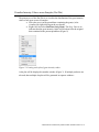
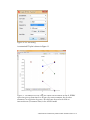
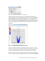
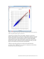
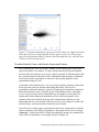
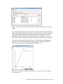
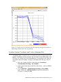
Visualizations of Microarray Data in Partek Genomics Suite 6.6 This tutorial will illustrate how to: Visualize intensity values across samples via a dot plot Visualize intensity values across samples in a plot Visualize intensity values across levels of a categorical factor Visualize intensity value of one probe (time series) Visualize fold change and p-values in a volcano plot and choose genes with particular significance levels Visualize gene expression patterns across two samples (Scatter Plot and MA Plot) Find other genes with similar a similar intensity profile across all samples Create a Manhattan plot showing the –log10(p-value) vs. the genomic location This tutorial assumes the user is familiar with the hierarchy of spreadsheets and analysis in Partek® Genomics Suite™ (PGS). More details about customizing plots can be found in Chapter 6 of the Partek On-line Documentation available from Help > User’s Manual from the main toolbar. The data for visualizations in PGS comes from a spreadsheet. If you only wish to include certain rows or columns in a plot, you may need to apply a filter and/or clone the spreadsheet or select only certain rows or columns. There is no specific dataset for this tutorial; you may use one of your own microarray experiments or use the data from another tutorial. In general, gene intensity values may be visualized from either an ANOVA spreadsheet or a filtered ANOVA spreadsheet. Since the intensity data is stored in the parent spreadsheet, both spreadsheets should be visible in the spreadsheet navigator with the appropriate parent/child relationship (Figure 1). Figure 1: Breast_Cancer is the parent spreadsheet; both ANOVAResults and E2 vs. Control are children of Breast_Cancer.txt Visualizations of Microarray Data in Partek Genomics Suite 6.6 1 Visualize Intensity Values across Samples (Dot Plot) The primary use of the Dot Plot is to visualize the distribution of the gene intensity values of one gene across all samples. Select the row(s) in the spreadsheet containing the gene(s) to be visualized by right-clicking on the row header Right-click and select Dot Plots (Orig. Data). The Orig. Data is an indicator that the gene intensity values will be taken from the original data contained in the parent spreadsheet (Figure 2) Figure 2: Creating a dot plot of gene intensity values A dot plot will be displayed in another window (Figure 3). If multiple probesets are selected, then multiple dot plots will be generated in separate windows. Visualizations of Microarray Data in Partek Genomics Suite 6.6 2 Figure 3: Simple dot plot of a single gene that shows the distribution of probe(set)/gene intensities across all samples The dot plot shown in Figure 3 is perhaps the simplest version of the plot that can be generated. Using either Edit > Plot Properties or the many other customizations may be performed. in top left of the menu, Figure 4: Dot plot visualized by editing plot properties and changing options in the Box&Whiskers tab Visualizations of Microarray Data in Partek Genomics Suite 6.6 3 The default order of the groups in the Dot Plot is alphabetical order. To change the order to match what is specified in the parent spreadsheet, then use either Edit > Configure Plot or the icon and select Categoricals in spreadsheet order. Visualize Intensity Values across Samples (Profile Plot) In contrast to the dot plot which shows one probe(set)/gene per plot, the profile plot is used to visualize how the intensity values from multiple genes compare across all samples. From the spreadsheet where probe(set)s/genes are located on rows, select the rows which should be displayed on the profile plot Right-click on one of the rows and select Profile (Orig. Data) as shown in Figure 5 Figure 5: Generating a profile plot Visualizations of Microarray Data in Partek Genomics Suite 6.6 4 Figure 6: Basic profile plot. Each line represents a different probeset/gene; each column represents a sample from the parent spreadsheet The basic profile plot shown in Figure 6 will likely need customization. To change the labels in the x-axis from Row to the sample name or categorical variable, select either Edit > Plot Properties or . This brings up the dialog shown in Figure 7 Select the Axes tab. In the Label Format section of the dialog, select the pull-down next to Column and choose the label you would like displayed. If the label you have selected is long, you may also want to select Rotate axis labels. The labels will be rotated in a counterclockwise direction If you wish to change the labels on the plot, select Titles Use the Styles tab to vary the line thickness, to add symbols to the lines To add your own text strings to the graph, use the Text tab Select OK or Apply Visualizations of Microarray Data in Partek Genomics Suite 6.6 5 Figure 7: Plot properties dialog Visualizing Dot and Profile Plots for Some Samples The dot and profile plots in the previous section display the intensity profiles across all of the samples in the parent spreadsheet (indicated by the Orig. Data) in the plot commands. If you wish to exclude certain (groups of) samples from these plots, then filter those rows from the parent spreadsheet before generating the plots. Visualize Gene Intensity Values across Groups (Group Profile Plot) If you wish to generate a profile plot across levels of a factor, then the Group Profile plot option is used. Group Profile plots are generated from the parent spreadsheet by selecting the columns that correspond to the probe(set)s you wish to display. The first step is to select the columns from the top-level (parent) spreadsheet. This can be done in a couple of different ways. You may control-left click on the columns corresponding to the probe(set)s you wish to display. Be sure to also select the column that contains the categorical factor which should be used for grouping the intensity values OR From a spreadsheet where probe(set)s are found on rows (like ANOVA or a filtered ANOVA spreadsheet), select the rows which should be displayed. Then right-click on one of the selected row headers and choose Select (Orig. Data). Then open the top-level or Visualizations of Microarray Data in Partek Genomics Suite 6.6 6 parent spreadsheet and Ctrl+left-click on the column with the categorical factor to be used in grouping From the command toolbar, select View > Profiles > Group Profile which brings up the Create Group Profile dialog shown in Figure 8. Notice that the columns which were selected by either of the methods described above are shown next to Selection as List. These numbers are the column numbers of the probe(set)s. Figure 8: Create Group Profile dialog Select the proper column for grouping in the Group by pull-down menu Select Groups for the X-axis option Select either Mean or Median in the Y-Axis option Select OK The basic Group Profile plot is shown in Figure 9. It is likely that you would like to customize the plot using the options shown in the Plot Properties dialog depicted in Figure 7. One customization specific to this plot would be to display the standard deviation or error bars. Customize the plot and use the Error Bars tab to add either standard error bars or standard deviation bars. Visualizations of Microarray Data in Partek Genomics Suite 6.6 7 Figure 9: Group Profile plot across levels of one categorical factor (Treatment) Visualize Intensity of One Probe(Set) Across Two Factors (Time Series) The XY plot can be used to display the effect of two categorical variables like time and treatment or dose and treatment on a response variable. Only one probeset may be visualized at a time. From the top level toolbar, select View > XY Plot/Barchart which invokes the dialog shown in Figure 10 The Spreadsheet that is selected must contain the categorical variables (that is, the top-level spreadsheet) Select the categorical factor like dose or time for the X-axis. Even though the variable is categorical, PGS will recognize the values as numbers if there are no units in the column (use 8, 15, 10 and not 8h or 15ug) Select the categorical factor of choice (like treatment) for Separate by. This category will be used to color the response (lines or symbols) Select the appropriate probe(set) for Y-axis Optionally, choose a Line Style Select OK Visualizations of Microarray Data in Partek Genomics Suite 6.6 8 Figure 10: XY Plot dialog A customized XY plot is shown in Figure 11. Figure 11: Customized XY Plot. Only the control was measured at time 0. DYRK4 expression goes up from time 8 to 48 hours for some treatments, but for other treatments, its expression decreases. This indicates the need to include an interaction term (Treatment*Time) in the ANOVA model Visualizations of Microarray Data in Partek Genomics Suite 6.6 9 Visualize P-values and Fold-Change (Volcano Plot) The volcano plot is used to visualize p-values and fold-changes of genomic features (e.g., genes or probe sets) at the same time and allows for quick identification of differentially expressed genes with a certain level of expression. Please note that the same list generation can be achieved by List Manager (ANOVA Streamlined tab). To invoke the volcano plot, please follow these steps. From the View menu, select the Volcano Plot The Volcano Plot Configure dialog (Figure 12) will instruct you to specify a fold-change column (x-axis) and a matching p-value column (y-axis). The choice of Color by option is arbitrary, but choosing the same p-value enables for quick identification of differentially expressed genes Figure 12: Volcano Plot Configure dialog Once the plot is generated, the key regions of the plot can be highlighted by setting the cut-off lines. Go to Edit and select Plot Properties In the Axis tab select the Set Cutoff Lines (Figure 13) The Vertical Line(s) refer to the cut-off values of the fold-change (for instance +2 or –2), while the Horizontal Line refers to the cut-off value for the p-value If you select the Select all points in a section box, then a left mouse click will not select single genes, but all the genes in a region delimited by cutoff lines Although p-value was used to color the plot, the horizontal cut-off value will not match the default coloring scheme, i.e., some non-significant genes will be colored by a shade indistinguishable from the ones used for significant genes. Select Edit > Plot Properties and select the Color tab In the Mid box of Color scaling section type 0.05 Visualizations of Microarray Data in Partek Genomics Suite 6.6 10 Figure 13: Setting the cutoff lines in the volcano plot The genes (or probe sets) of interest are now in the upper right and upper left sections of the plot. If you have used the Select all points in a section option during the plot formatting (see above), then left-clicking on a section will select all the genes in the section. However, if the Select all points in a section option was not used, it is possible to use the Selection Mode of the plot to manually select genes of interest. An example is shown in Figure 14: probe set IDs of the selected sets are highlighted. Figure 14: Customized Volcano Plot. Each dot represents one probe set. Cut-off lines show critical p-value (horizontal line) and critical fold-change (vertical lines). The dots are colored by p-value with all the significant probe sets having blue color. By using Selection Mode, two probe sets in the upper left were selected. Moreover, if you want to generate a list of selected genes, right-click on the probe set labels in the plot and go to Create List. Please make sure that the Gene Symbol Visualizations of Microarray Data in Partek Genomics Suite 6.6 11 column of the ANOVA spreadsheet is selected before you actually perform the creation. Visualize Differentially Expressed Genes (Scatter plot and MA plot) A simple and common way to visualize the microarray data is the scatter plot, showing the comparison of gene expression values for two samples at one time. While most data points (i.e., genes or probe sets) fall on a 45° line, up- or downregulated genes are positioned above or below the line. To draw a scatter plot, you first need to transpose the original intensities spreadsheet so that the samples are on columns and genomic features (genes or probesets) are on rows: Transform > Create Transformed Spreadsheet… Once the spreadsheet is transposed, proceed as follows. Select the two columns containing the samples you would like to compare Go to View > Scatter Plot to display the plot A regression line can be displayed by editing the plot: Edit > Plot Properties. Once in the Axes tab, select Set Regression Lines In the Set Regression Lines dialog (Figure 15), select Regression line of y on x box and increase the Line Width (e.g., to 5 points). A formatted plot is shown on Figure 16 Use the Selection Mode of the plot to pick the data points of interest. Right-click on the plot and select Create List to dump the list of genomic features to a spreadsheet (note: column with gene ID or probe set ID needs to be selected first) Figure 15: Set Regression Lines dialog Visualizations of Microarray Data in Partek Genomics Suite 6.6 12 Figure 16: Customized scatter plot. Each dot on the plot represents the expression value of a genomic feature (gene or probe set). Alternatively, the MA plot can be used to display a difference in expression patterns. The horizontal axis (A) shows the average intensity while the vertical axis (M) shows the intensity ratio between the two samples for the same data point. In essence, an MA plot is a scatter plot tilted to the side, so that the differentially expressed genes (or probe sets) are located above or below the 0 value of M. An MA plot is also useful to visualize the results of normalization where you would hope to see the median of the values follow a horizontal line. Unlike the scatter plot, the MA plot is invoked on the original intensities spreadsheet: View > MA Plot. The two samples for comparison are then directly selected in the lists on the left (Figure 17). Visualizations of Microarray Data in Partek Genomics Suite 6.6 13 Figure 17: MA plot comparing the expression levels between two samples. Each dot on the plot represents a single genomic feature (gene or probe set). The average signal for each genomic feature is shown on the horizontal axis (A), while the ratio is shown on the vertical axis (M). Visualize/Identify Genes with Similar Expression Patterns PGS’s function Sort rows by prototype enables you to identify genes with similar expression profiles. For instance, if a gene with an interesting expression pattern has been detected, using Sort by prototype makes it possible to find other genes that have a similar pattern of intensity values. Although this functionality is commonly used for time-series experiments, it can also be successfully applied to other experimental designs as well. As the name of the function (Sort rows by prototype) implies, intensity values must be on rows and values on columns when using this feature. The top-level spreadsheet contains the intensity values for all probe(set)s but must be transposed before this function is used. Select the top-level spreadsheet and use Transform > Create Transposed Spreadsheet (the defaults are acceptable so select OK). The column order in the transposed spreadsheet will be used for the graphs. If the columns need to be reordered, then select the column header and drag it to the border adjacent to its new location. When you see the cursor change to a hand with an index finger, you may drop the column in its new location. One of the ways to depict gene expression in a time-series experiment is to include means or lsmeans in the ANOVA spreadsheet. That option can be set by selecting Advanced… in the main ANOVA dialog and adding the groups to be summarized in the ANOVA spreadsheet. An example is shown in Figure 18. Visualizations of Microarray Data in Partek Genomics Suite 6.6 14 Figure 18: Using Advanced ANOVA setup to include group means in the ANOVA output. To get a plot of expression levels across the time points, some changes need to be made to the ANOVA spreadsheet: all the columns need to be removed, except the gene symbol and the columns containing means of each time point. Clone the spreadsheet before deleting columns from the ANOVA spreadsheet. Then an expression profile can be drawn by one of the options discussed in this user guide. For instance, a differentially expressed gene was picked because its expression signature is relevant for the study: the expression goes up from the first to the second time point, and then remains unchanged (Figure 19). Figure 19: An example of expression signature in a time-series study including three time points. Visualizations of Microarray Data in Partek Genomics Suite 6.6 15 To find the genes with similar expression signature, select Tools > Discover > Sort Rows by Prototype… In the Sort Rows by Prototype dialog, select From Row to indicate that the prototype is one of the genes in the spreadsheet and then choose the appropriate spreadsheet row by using Use this row as prototype. Alternatively, you may drag the points in the plot to create a shape of interest or use any of the predefined Pattern types by selecting the appropriate shape icons. The display will automatically be changed to show the profile of the selected gene. Please note that the scale of the y-axis of the original profile plot and the Sort rows by Prototype plot are different (compare Figure 19 and Figure 19) but the data is the same. Figure 20: Sort Rows by Prototype dialog Choose one of the dissimilarity measures (some are parametric and some are nonparametric). Select Sort to proceed. The resulting spreadsheet will have the genes reordered (Figure 21) so that the prototype is in the first row, while the other genes are listed based on their similarity to the prototype gene, as expressed by the Proximity to prototype column. Visualizations of Microarray Data in Partek Genomics Suite 6.6 16 Figure 21: Result of sorting by prototype. The prototype gene is in the first row, while the other genes are listed based on their similarity to the prototype gene. Smaller proximity values imply more similarity to the selected shape You can generate a profile plot of several of the rows (for instance, the top five most similar). Select the row headers of the top 5 rows (shift+select or ctrl+select) On the top menu, select View > Profiles >Row/Column Profiles Specify rows for Curves on Next to Curves, select Selection as List as shown in Figure 22 Figure 22: Generating a profile plot of the five probe(set)s most resembling the specified shape by Sort rows by prototype Visualizations of Microarray Data in Partek Genomics Suite 6.6 17 Figure 23: Profile plot of 4 probe(set)s plus the original prototype most similar to the prototype used in Sort rows by prototype Visualize Genomic Coordinates and P-values (Manhattan Plot) A Manhattan plot is a common way to visualize the results of GWAS study with genomic coordinates on the x-axis and –log10(P-value) of each SNP on the y-axis. Therefore, the starting point for a Manhattan plot is a spreadsheet with SNPs on rows and P-values in a column. To begin, it is needed to take the log10 of the Pvalues. Select the column with the P-values and go to Transform > Normalization & Scaling > On Columns… In the Normalization tab, set the Base of the Log(x + offset) to 10 and select OK Go to Transform > Normalization & Scaling > On Columns… again. Choose the Add/Mul/Sub/Div tab and set the Multiply by Constant to –1 and press OK Visualizations of Microarray Data in Partek Genomics Suite 6.6 18 Invoke the initial plot by View > Genome Dot Plot. To proceed, go to Edit > Plot Properties and select the Dot Plot tab. Uncheck the Show Dot Plot box and select Apply (the plot will become blank) Proceed to the Profiles tab and select Add Profile. The Configure Profile dialog will appear (Figure 24). The Column should point to the spreadsheet column containing the P-values. In addition, set the Smoothing to Manual, set the Style to point, and decrease the Shape Size to 0.5. Select to OK to accept these settings and then OK to show the plot Figure 24: Configure Profile dialog An example of the Manhattan plot is shown on Figure 25. By selecting chromosomes in the upper left corner, it is possible to focus on particular regions of genome. Please note that the ‘lining’ of the dots in Figure 25 is an artifact caused by the small number of samples and will not be apparent in a large study. Visualizations of Microarray Data in Partek Genomics Suite 6.6 19 Figure 25: Customized Genome Dot Plot showing genomic location on the x-axis and –log10(P-value) of a SNP on the y-axis (Manhattan plot). Each dot represents a single SNP End of Tutorial This is the end of the tutorial. If you need additional assistance with these steps, you may call our technical support staff at +1-314-878-2329 or email [email protected]. Last revision: April 2, 2012 Copyright 2012 by Partek Incorporated. All Rights Reserved. Reproduction of this material without express written consent from Partek Incorporated is strictly prohibited. Visualizations of Microarray Data in Partek Genomics Suite 6.6 20