1
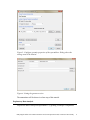
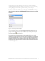
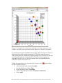
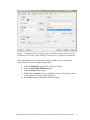
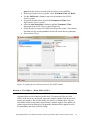
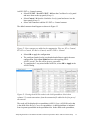
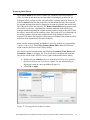
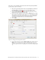
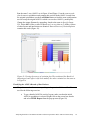
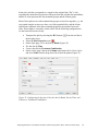
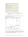
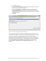
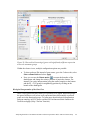
Analyzing the Effect of Treatment and Time on Gene Expression in Partek® Genomics Suite™ (PGS) 6.6: A Breast Cancer Study The data for this study is taken from experiment GSE848 from the Gene Expression Omnibus: http://www.ncbi.nlm.nih.gov/geo/. This study looks at the effects of four different drug treatment combinations at two time points on estrogen receptorpositive breast cancer cells. This experiment was performed using Affymetrix GeneChip Human U95A. The study includes 8 treatment combinations (4 treatments x 2 time points) with two replicates. In addition, 2 control samples were collected, yielding a total of 18 samples. The values are transformed to log base 2 scale by f(x) = log2(x+1). The dataset for this tutorial is a subset of the original experiment and should be downloaded from the Partek® tutorial page rather than from GEO. This tutorial will illustrate how to: Add an annotation link to the data Do exploratory analysis using a PCA scatter plot Identify differentially expressed genes using ANOVA Remove batch effects from the data Generate a list of genes of interest Do exploratory analysis using hierarchical clustering Note: It is recommended that you are already familiar with the information contained in Chapter 6 The Pattern Visualization System of the Partek® Online Help before going through this tutorial. In addition, this tutorial covers only specific topics; for general information, see Partek® On-line Help. Due to software and version changes, the screenshots you see may vary slightly from those shown in this tutorial. The data and library files for this experiment should be downloaded by going to Help > On-line Tutorials from the Partek® Genomics Suite™ (PGS) main menu. This tutorial was written for PGS version 6.6. Download the data and the annotation file to your local disk. Extract the Breast_Cancer-GE zip file to your disk and copy the data files to the directory C:\Partek Example Data\Breast_Cancer-GE. Unzip the annotation file (HG_U95Av2.na32.annot.csv.zip) to the C:\Microarray Libraries directory. These locations are suggestions only and may vary according to the operating system on your computer. Select File > Open… from main menu and use the file selector to choose Breast_Cancer.txt.fmt as shown in Figure 1 If the Analytical Spreadsheet is not open (Figure 2), double click the spreadsheet to open it in Analytical Spreadsheet Analyzing the Effect of Treatment and Time on Gene Expression in PGS: A Breast Cancer Study Figure 1: Opening a data file. The red Partek® file icon is shown next to the fmt file After opening the file in PGS, the summary at the bottom the spreadsheet shows there are 18 rows and 12,631 columns in the spreadsheet. The first column contains the Filename listing the GEO GSM number which also is an identifier for the microarray. Treatment, Time, and Batch are in columns 2, 3, and 4, respectively. Column 6 marks the beginning of the probesets. The data is log2 transformed (Figure 2). Figure 2: Viewing the data in the spreadsheet Analyzing the Effect of Treatment and Time on Gene Expression in PGS: A Breast Cancer Study 2 Adding an Annotation Link to the Data Note: When importing certain forms of data into PGS, the software will automatically link the current annotation file to the spreadsheet upon creation of the spreadsheet. This tutorial shows how to manually add an annotation file to a spreadsheet in case the annotations are missing or to change which annotation file is used. For more information regarding manually adding annotation files to a spreadsheet or creating a custom annotation file, please see the User Guide Adding Annotations from the Partek® Tutorials page. To add an annotation link to a spreadsheet, make sure the spreadsheet is active (spreadsheet highlighted in blue as shown in Figure 2). Select File > Properties from the PGS main menu. This will invoke the Configure Genomic Properties dialog (Figure 3) Select Choose the type of genomic data and select Gene Expression because this is a gene expression chip. You may need to scroll through the list to find Gene Expression Leave Marker ID in column label selected by default Select the Browse button to select the Probeset annotation file by navigating to the C:\Microaarray Libraries folder choosing HG_U95Av2.na32.annot.csv file. The Chip name and Probeset annotation file entries will be automatically filled in once you have selected an annotation file; however, you can manually edit the names Change Species to Homo sapiens and select Edit genome to set the Genome Version to hg19 (Figure 4). Select OK to close the Edit Genome dialog Select OK to make the changes and close the Configure Genomic Properties dialog Notice there is now an * after the spreadsheet name in the Spreadsheet List panel. This indicates that a change has been made to the spreadsheet but has not been saved. To save the changes to the Breast Cancer file, select File > Save to overwrite the existing data file Analyzing the Effect of Treatment and Time on Gene Expression in PGS: A Breast Cancer Study 3 Figure 3: Configure genomic properties of the spreadsheet. Dialog shows the settings used in the tutorial Figure 4: Setting the genome version The annotations will be shown in a later step of this tutorial. Exploratory Data Analysis Explore the data in Analytical Spreadsheet by plotting a Principal Components Analyzing the Effect of Treatment and Time on Gene Expression in PGS: A Breast Cancer Study 4 Analysis (PCA) scatter plot. The PCA scatter plot is an excellent method for visualizing high-dimensional data. Make sure no columns or rows are selected by selecting the upper-left cell of the spreadsheet before you draw the plot. In order to visualize the workflow steps on the right, select Workflows at the top right of the tool bar and choose Gene Expression from the pull-down list as shown in Figure 5. Figure 5: Gene Expression Workflow You can invoke the plot by selecting Principal Components Analysis from the QA/QC section of the Gene Expression workflow or by selecting the scatter plot accelerator button ( ) on the tool bar. In the scatter plot, each point represents a chip (sample) which is a row in the spreadsheet. Selecting any point in the scatter plot will highlight the corresponding row in the spreadsheet and vice versa. The colors of the shapes represent different treatments. Points that are close together in the plot have similar intensities across all probesets on the chip; points that are far apart in the plot represent samples that are dissimilar (Figure 6). Analyzing the Effect of Treatment and Time on Gene Expression in PGS: A Breast Cancer Study 5 Figure 6: Viewing the PCA scatter plot of the data; each shape represents a chip (sample). As shown in the legend and tool bar, shapes are colored by Treatment To rotate the plot, depress and hold the mouse wheel button and move the mouse or choose the Rotate Mode option in the mode bar of the scatter plot viewer. While rotating the plot, examine the grouping pattern or look for outliers in the data on the first three principal components (PCs). Since the treatment groups are intermingled in this view, it is not clear whether there is a separation between different treatments in this data or not. Within the scatter plot viewer, select the Plot Properties icon ( ) and configure the plot as follows (Figure 7): Color the points by the column Treatment Size the points by the column Time Shape the points by the column Batch Connect the points by the column Treatment Combination Select Apply Analyzing the Effect of Treatment and Time on Gene Expression in PGS: A Breast Cancer Study 6 Figure 7: Configuring the scatter plot properties dialog configured with Color by Treatment, Size by Time, Shape by Batch, and Connect by Treatment Combination Notice that the data is now clustered by batches. Another way to visualize the cluster pattern is to draw an ellipse around Batch. Select the Ellipsoids tab on the Plot Properties dialog Select the Add Ellipse/Ellipsoid button Select the Ellipse radio button Double click on Batch to move it from the Categorical Variable(s) panel to the Grouping Variable(s) panel (Figure 8) Select OK to exit the Add Ellipse/Ellipsoid dialog Analyzing the Effect of Treatment and Time on Gene Expression in PGS: A Breast Cancer Study 7 Figure 8: Adding an ellipse to two different batches Next rotate the plot. You can see that the data is separated by batches (Figure 9). PCA is an example of exploratory data analysis and is useful for identifying outliers and major effects in the data. The scatter plot shows that batch is a source of variation which indicates that the effect of treatment or time on the expression data may be masked by the batch effect. Analyzing the Effect of Treatment and Time on Gene Expression in PGS: A Breast Cancer Study 8 Figure 9: Viewing a scatter plot of the data colored by Treatment, sized by Time, and shaped and grouped by Batch. The two ellipses show how the samples are grouped by batch A or B Identifying Differentially Expressed Genes using ANOVA Analysis of variance (ANOVA) is a very powerful technique for identifying differentially expressed genes in a multi-factor experiment. In this data set, ANOVA will be used to generate a list of genes that are significantly regulated by each treatment by two-fold. The ANOVA model should include Treatment and Time since they are the primary factors of interest. Include the Treatment * Time interaction in the model since different treatments behaving differently over time is also of interest. From the exploratory analysis (PCA) done earlier, Batch was found to be a big source of variation; therefore, Batch should be included in the model. To invoke the ANOVA dialog, select Detect differentially expressed Analyzing the Effect of Treatment and Time on Gene Expression in PGS: A Breast Cancer Study 9 genes from the Analysis section of the Gene Expression workflow In the Experimental Factor(s) panel, select Treatment, Time and Batch Use the Add Factor-> button to move the selections to the ANOVA Factor(s) panel To specify the interaction, select both Treatment and Time in the Experimental Factor(s) panel Select the Add Interaction-> button to add the Treatment * Time interaction in the ANOVA Factor panel (Figure 10) Select the Specify Output File check box and specify a name. If you do not check the box, the result spreadsheet will not be saved after its generation Do not select OK yet Figure 10: Adding factors and interactions to the ANOVA model Random vs. Fixed Effects – Mixed Model ANOVA Most factors in analysis of variance (ANOVA) are fixed effects whose levels represent all the levels of interest. In this study, Treatment and Time are fixed effects. If the levels of a factor only represent a random sample of all the levels of interest (for instance, Batch in this study), the factor is a random effect. The two cell culture batches in this study represent only a random sample of the global cell cultures upon which an inference is being made. Random effects appear in red in the spreadsheet and in the ANOVA dialog. Analyzing the Effect of Treatment and Time on Gene Expression in PGS: A Breast Cancer Study 10 Another way to tell if a factor is random or fixed is to imagine repeating the experiment. Would the same levels of each factor be used again? Treatment - The same treatments would be used again - a fixed effect Time - The same time points would be used again - a fixed effect Batch - No, different cell cultures would be used - a random effect You can specify which factors are random and which are fixed by simply rightclicking on the column header corresponding to a categorical variable, selecting Properties, and checking Random effect. By doing that, the ANOVA will automatically know which factors to treat as random and which factors to treat as fixed in the ANOVA model. Linear Contrasts By default, the ANOVA computation only outputs a p-value and F ratio for each factor/interaction; therefore, to get the fold change and ratio between each treatment and control, a contrast must be set-up. Four contrasts will be added to the computation. Select the Contrast button within the ANOVA dialog to invoke the Configure dialog Choose Treatment * Time interaction from the Select Factor/Interaction drop-down list. All of the levels in this factor are listed on the Candidate Level(s) panel on the left of the dialog box Add E2 vs. Control contrast: Select E2 * 8 and E2 * 48 from the Candidate Level(s) panel and move them to the top panel (Group 1) on the right by selecting Add Contrast Level > Select Control * 0 from the Candidate Level(s) panel and move it to the lower panel (Group 2) on the right by selecting the lower Add Contrast Level > button as shown in Figure 11. The lower panel (Group 2) is considered the reference level. Since the data is log2 transformed, PGS will automatically use the geometric mean to calculate the fold change and mean ratio Select Add Contrast to add the E2 vs. Control contrast Analyzing the Effect of Treatment and Time on Gene Expression in PGS: A Breast Cancer Study 11 Figure 11: Adding a contrast between E2 vs. Control at all time points; that is, the data from E2 treatment at times 8 and 48 hours will be combined and compared to the Control at time 0. If Add Combinations had been selected, E2 at 48 hours would be compared to Control at 0 hours and E2 at 8 hours would be compared to Control at 0 hours separately Add E2+ICI vs. Control contrast: Similarly, select E2+ICI * 8 and E2+ICI * 48 from the Candidate Level(s) panel and move them to the top panel (Group 1) on the right Select Control * 0 from the Candidate Level(s) panel and move it to the lower panel (Group 2) on the right Select Add Contrast to add the E2+ICI vs. Control contrast Add E2+Ral vs. Control contrast: Select E2+Ral * 8 and E2+Ral * 48 from the Candidate Level(s) panel and move them to the top panel (Group 1) on the right Select Control * 0 from the Candidate Level(s) panel and move it to the lower panel (Group 2) on the right Select Add Contrast to add the E2+Ral vs. Control contrast Analyzing the Effect of Treatment and Time on Gene Expression in PGS: A Breast Cancer Study 12 Add E2+TOT vs. Control contrast: Select E2+TOT * 8 and E2+TOT * 48 from the Candidate Level(s) panel and move them to the top panel (Group 1) Select Control * 0 from the Candidate Level(s) panel and move it to the lower panel (Group 2) Select Add Contrast to add the E2+TOT vs. Control contrast The added contrasts should appear as shown in Figure 12. Figure 12: Four contrasts are added to the computation. They are: E2 vs. Control, E2+ICI vs. Control, E2+Ral vs. Control, and E2+TOT vs. Control Select OK to apply the configuration The configured model can be saved and reloaded later to apply the same configuration. Select Save Model and save the resulting file as ANOVA_model. The file will be given a .pam suffix To compute the 3-way mixed-model ANOVA, select OK or Apply in the ANOVA dialog Figure 13: Viewing the ANOVA results in the child spreadsheet. Notice that columns 2-5 contain annotations from the annotation file added in the first part of this tutorial The result will be displayed in a spreadsheet (ANOVA-3way (ANOVAResults) that is the child of the Breast_Cancer.txt spreadsheet. A child spreadsheet is indented from its parent spreadsheet in the spreadsheet list. In the child result spreadsheet, Analyzing the Effect of Treatment and Time on Gene Expression in PGS: A Breast Cancer Study 13 each row represents a probeset, and each column represents the computation result for that probeset (Figure 13). By default, the results are sorted in ascending order by the first factor, Treatment p-value, which means the most significant differently expressed gene between different treatments is at the top of the spreadsheet. Viewing the Sources of Variation View the sources of variation across the whole (microarray) genome by selecting View > Sources of Variation from the PGS main menu or from the Analysis > Plot sources of variation menu with the child result spreadsheet active (Figure 14). Make sure the Bar Chart (Signal to Noise) tab is selected. Figure 14: Viewing the Sources of Variation plot. Batch is the biggest source of variation This plot presents the signal vs. noise across all probesets for each of the factors and interactions in the ANOVA model. All the factors in the ANOVA model are listed on the X-axis including random error. The Y-axis represents the average mean square of all the probesets. Mean square is ANOVA’s measure of variance. Compare each signal bar to the error bar; if a bar is higher than the error bar, it means that factor contributed significant variation to the data across all the probesets. Notice that this plot is very consistent with the results in the PCA scatter plot: in this data, on average, Batch is the biggest source of variation. Therefore, the Remove Batch Effect tool will be used in the next step. Note: To view the source of variation for each probeset, right-click on its row header of the ANOVAResults spreadsheet and select Sources of Variation from the pop-up menu. Analyzing the Effect of Treatment and Time on Gene Expression in PGS: A Breast Cancer Study 14 Removing Batch Effects By including Batch in the ANOVA model, the variability due to this technical effect is measured and taken into account when calculating the p-values for the biological effects, so that in effect, the batch effect is already removed. However, in order to visualize what the data looks like with the technical batch effect removed, the original intensity data must be changed to account for what the data would look like if the batch effects are removed. The Remove Batch Effect tool operates much like ANOVA in reverse, calculating the variation attributed to the effect being removed and then adjusting the original intensity values to remove the effect. Once the effect is removed from the intensity values, tools such as PCA or clustering can be used to visualize what the data would look like if the technical effect was removed. This allows the biological effects that were hidden in the technical effects to become more pronounced and easier to identify. Make sure the original (parent) spreadsheet is active by clicking on it (spreadsheet 1(Breast_Cancer.txt)). Select Stat > Remove Batch Effect from the PGS main menu to invoke the Remove Batch Effects dialog. The ANOVA model should include the following: Treatment, Time, Batch, and Treatment * Time (as in Figure 10). You do not need to configure the contrasts. The factors will be in the ANOVA Factor(s) panel in the batch remover dialog. Double click on 4. Batch to move it from the ANOVA Factor(s) panel to the Remove Effect(s) of These Factors panel. Use the default setting to display the results in a new spreadsheet (Figure 15) Select OK or Apply Figure 15: Selecting the batch effect to remove Analyzing the Effect of Treatment and Time on Gene Expression in PGS: A Breast Cancer Study 15 The result is a new spreadsheet. The layout is the same as the parent spreadsheet, but the intensity values are different. Draw a PCA scatter plot on the removeresult spreadsheet by clicking on the Scatter Plot icon while the removeresult spreadsheet is open Select the Plot Properties ( ) icon within the scatter plot viewer to render the data and examine the batch effect On the Style page, change the Drawing Mode to Mixed and leave all the other settings as the default settings (Figure 16). A mixed drawing mode will display all unselected points as small squares and only display the selected point (centroid in this case) with normal attributes Select Apply Figure 16: Change the drawing mode to mixed On the Ellipsoids page, select the Add Centroid button, double click on Batch to move it to Grouping Variable(s) panel from the Categorical Variable(s) panel and leave everything else as the default settings (Figure 17) Analyzing the Effect of Treatment and Time on Gene Expression in PGS: A Breast Cancer Study 16 Figure 17: Adding a centroid to A and B batches Select OK to exit the Add Centroid dialog and OK again Rotate the plot. Notice the centroids (large pink and yellow shapes) of Batch A and Batch B are in the same position (Figure 18) Figure 18: Viewing the PCA scatter plot with coincident centroids of Batch A and Batch B Analyzing the Effect of Treatment and Time on Gene Expression in PGS: A Breast Cancer Study 17 Run the same 3-way ANOVA as in Figure 10 and Figure 11 on the removeresult (batch-remove) spreadsheet and compare this result with the ANOVA result from the original spreadsheet (use the Load Model button to load the same configuration used to set-up the original ANOVA which was saved as ANOVA_model.pam). Change the output filename by appending –batch to the name in Specify Output File. Select OK. All the p-values of Batch are 1 or very close to 1; all the p-values of other factors and interactions are identical. Draw a Sources of Variation plot to examine this result (Figure 19). Figure 19: Viewing the sources of variation plot. The variation of the Batch is 0 (meaning no batch effect is left in the model); the other variations are the same as in Figure 14 Visualizing the ANOVA Results of One Probeset The probeset on the 2nd row corresponding to the gene “trefoil factor 1” will be used for the following exercises. To get a detailed ANOVA result of a gene, make sure that the initial ANOVA spreadsheet is selected. Right-click on the second row header and select HTML Report from the pop-up menu (Figure 20) Analyzing the Effect of Treatment and Time on Gene Expression in PGS: A Breast Cancer Study 18 Figure 20: Part of ANOVA HTML report The ANOVA table in Figure 20 shows that the adjusted R2 value (Adj Rsq) is 0.975514. This means that the ANOVA model explains 97.5% of the variation in “trefoil factor 1” using the factors in the ANOVA model To get a dot plot of a specific probeset, right-click on the row header for the trefoil factor 1 gene from the original ANOVA spreadsheet and select Dot Plot (Orig. Data) from the pop-up menu. Use Plot Properties to add Size by 3. Time (Figure 21) Figure 21: Viewing the dot plot of the differentially expressed TFF1 gene across different treatment groups Analyzing the Effect of Treatment and Time on Gene Expression in PGS: A Breast Cancer Study 19 In the plot, each dot corresponds to a sample in the original data. The Y-Axis represents the normalized expression of the gene from the original data spreadsheet, and the X-Axis represents the four treatment groups and the control group. Most of the replicates in each treatment/time groups are not close together, e.g., the two control samples at time zero show very little reproducibility, and the 8-hour and 48-hour replicates in the three treatment groups do not separate from each other. This actually is caused by a batch effect. Do the following configuration to see the batch effect more clearly: Transpose the plot by selecting the H/V button ( ) from the tool bar in the dot plot viewer Select the Plot Properties icon ( ) On the Style page, Color the dots by Batch (Figure 22) Size the dots by Time Connect the dots by Treatment Combination On the Labels page, choose the Column radio button for In Point Labels, and select Time from the drop-down list to label the points (Figure 23) Figure 22: Configuring the dot plot. Color the dots by Batch, Size by Time, and Connect by Treatment Combination Analyzing the Effect of Treatment and Time on Gene Expression in PGS: A Breast Cancer Study 20 Figure 23: Configuring the dot plot. In Point Labels Column by Time Click Apply to exit the Labels dialog and OK or Apply to exit the Plot Properties dialog Looking at the plot, you can see that the poor reproducibility within time points is largely due to batch effect (Figure 24). Figure 24: Viewing the dot plot that shows a batch effect. Each dot is a sample. The Y-axis represents treatment combinations; the X-axis represents expression value of the TFF1 gene. The dots are Colored by Batch, Sized by Time, Connected by Treatment Combination, and Labeled by Time Analyzing the Effect of Treatment and Time on Gene Expression in PGS: A Breast Cancer Study 21 Next, examine the same gene, trefoil factor 1, after the batch effect removal. Make sure that the second ANOVA spreadsheet is selected. Right-click on the 2nd row header in the spreadsheet, select Dot Plot (Orig. Data) and use the same configuration as in Figure 24 to render the plot (Color by Treatment, Size by Time, Connect by Treatment Combination and Label by Time) (Figure 25). Figure 25: Viewing the dot plot after batch effect removal. Each dot is a sample. The Y-axis represents treatment combinations; the X-axis represents expression value of the probeset (gene). The dots are colored by Treatment, Sized by Time, Connected by Treatment Combination, and Labeled by Time Generating Gene Lists from a List Manager List Manager can be used to generate lists of significant genes by applying filtering criteria such as p-value and false discovery rate (FDR) thresholds. To start, select the first ANOVA spreadsheet ANOVA-3way (ANOVAResults) in the Spreadsheet List then select Create gene list in the Analysis section of the workflow. The ANOVA Streamlined tab will be shown by default (Figure 26). Analyzing the Effect of Treatment and Time on Gene Expression in PGS: A Breast Cancer Study 22 Figure 26: Configuring the List Manager using the ANOVA Streamlined filtering options For this exercise, a list of genes that are differentially expressed (p-value with FDR < 0.1), irrespective or the size of the change, will be created by following these steps. Select the E2 * 48 and E2 * 8 vs. Control * 0 in the Contrast pane Options for setting the contrast options with respect to the p-value and the fold change will appear in the lower pane. Deselect the Include size of the change box and set the p-value with FDR to < 0.1. The # Pass indicates that 545 probesets meet the criteria Select Create to make a list entitled “E2 * 48 and E2 * 8 vs. Control * 0” (alternatively, change it by typing the new name in the Save list as box) The new list will appear in the left pane Repeat the steps described above to make the lists for E2+ICI vs. the control (#pass: 20), E2+Rel vs. the control (#pass: 22), and E2+TOT vs. the control (#pass: 156). The p-value with FDR and Include size of the change box will have to be changed each time. Analyzing the Effect of Treatment and Time on Gene Expression in PGS: A Breast Cancer Study 23 To find the significant genes shared among the four treatments, go to the Venn Diagram tab and select all the four lists generated in the previous step by clicking on them in the pane on the left (Figure 27). Figure 27: Viewing the Venn diagram with intersections of four lists of significant genes In this example, 12 genes are common between the four treatment schemes (intersection of the four ellipses). To save the list of those 12 genes, select the area in the middle of the diagram corresponding to the intersection of the four areas to highlight it, then right-click and select Create List from Highlighted Regions. The new list will appear in the pane on the left with a temporary file name (ptmp). To change the list’s name, right-click on the new list in the left pane of the main Partek® Genomics Suite™ window, select Save as… and save it as fourtreatments. Visualize Differentially Expressed Genes by Hierarchical Clustering Gene lists created by List Manager can now be visualized by hierarchical clustering. Requirement for proper visualization is that a spreadsheet with the list of genes is a child of the spreadsheet with gene intensities. Therefore, close the fourtreatments spreadsheet (File > Close), select the batch-remove spreadsheet, go to File > Open as child… and open the fourtreatments spreadsheet. To invoke hierarchical clustering, follow the steps below. Under the Visualization section in the Gene Expression workflow, choose Cluster based on significant genes and specify the method as Hierarchical clustering. Analyzing the Effect of Treatment and Time on Gene Expression in PGS: A Breast Cancer Study 24 Click OK to proceed Choose the fourtreatments spreadsheet under the Spreadsheet with list of differentially expressed genes (Figure 28) Choose the Standardize – shift genes to mean of zero and scale to standard deviation of one in the Expression normalization panel. This option will adjust all the gene intensities such that the mean is zero and the standard deviation is 1 Click OK Figure 28: Cluster the significant genes dialog box The resulting plot (Figure 29) illustrates the standardized gene expression level of each gene in each sample. Genes, which are unchanged, are displayed as a value of zero and are colored grey. Up-regulated genes have positive values and are displayed in red. Down-regulated genes have negative values and are displayed in blue. Each sample is represented in a row while genes are represented as columns. For more information on the methods used for clustering, refer to the Partek® Manual Chapter 8: Hierarchical & Partitioning Clustering (Help > User’s Manual). Analyzing the Effect of Treatment and Time on Gene Expression in PGS: A Breast Cancer Study 25 Figure 29: Hierarchical clustering of genes with significantly different expression across the treatment groups Within the cluster viewer, multiple configuration options are possible. To show probeset IDs instead of gene names, go to the Columns tab, select Show column labels and select Apply Next, you can use the Rotate mode ( ) to rotate the branches of the dendrogram and change the relative position of particular clusters. For instance, for easier interpretation, bring the control samples to the bottom and the E2 + TOT groups in neighboring position by clicking on the branch of the dendrogram Biological Interpretation of the Gene Lists Once a list of genes has been created, it is possible to see which functional groups the genes fall into as well as how well represented these differentially expressed genes are in the functional groups. To learn more about biological interpretation and gene ontology in PGS, please read the GO Enrichment tutorial found on the Tutorials webpage (Help > On-line Tutorials). Analyzing the Effect of Treatment and Time on Gene Expression in PGS: A Breast Cancer Study 26 End of Tutorial This is the end of the Treatment and Time tutorial. If you need additional assistance with this data set, you may call our technical support staff at +1-314-878-2329 or email [email protected]. Last revision: Nov. 2011 Copyright 2011 by Partek Incorporated. All Rights Reserved. Reproduction of this material without express written consent from Partek Incorporated is strictly prohibited. Analyzing the Effect of Treatment and Time on Gene Expression in PGS: A Breast Cancer Study 27