1
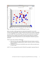
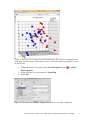
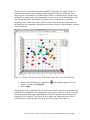
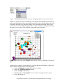
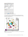
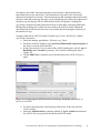
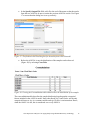
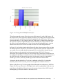
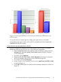
Gene Expression Analysis of an Aging Study Using Illumina® Microarray Technology and Partek® Genomics Suite® 6.6 Overview Using a complex dataset produced using Illumina Microarray (BeadChip) Technology, this tutorial compares the performance of different ANOVA models, and the impact on both genes lists and biological interpretation. This tutorial will illustrate how to: Import Illumina data into Partek Genomics Suite Perform exploratory analysis using the PCA scatter plot Perform inferential statistics using ANOVA Generate lists of genes of interest Understand how different ANOVA models can influence statistical and biological results Note: the workflow described below is enabled in Partek® Genomics Suite® software version 6.6. Please contact the Partek Licensing Team at [email protected] to request this version or update the software release via Help > Check for Updates from the main command line. The screenshots shown below may vary across platforms and across different versions of Partek Genomics Suite software. Description of the Data Set The dataset used is based on 51 subjects run on the Illumina® Human Ref-8 BeadChip™ platform (Melov et al., 2007). Twenty-six of the subjects were categorized as “Young” with an age range of 18 to 28. The other 25 subjects were categorized as “Old” with an age range of 65 to 84. Skeletal muscle, a type of striated muscle tissue, was obtained via a biopsy from each of the subjects. Total RNA from the skeletal muscle cells was extracted, prepared, and run on BeadChips producing the data that is used with this tutorial. By using the appropriate statistical tools with this data set, it is possible to determine if there are any transcriptomic changes in the skeletal muscle tissue as people age. Data and associated files for this tutorial can be downloaded by going to Help > On-line Tutorials from the Partek Genomics Suite software main menu. The data can also be downloaded directly from: http://www.partek.com/Tutorials/microarray/Gene_Expression/Illumina/Illumina_Age_Dat a.zip Gene Expression Analysis of an Aging Study Using Illumina Microarray Technology 1 Importing Illumina® Files and the Data for this Tutorial Data from Illumina’s BeadStudio™ or GenomeStudio™ software package can be exported in a custom report file for seamless importation into Partek Genomics Suite. The BeadStudio™ and GenomeStudio™ plug-in required for the generation of the custom Partek report file, in addition to instructions for its installation, can be found here or by Help > On-line Tutorials >Microarray > Tutorials > Gene Expression. Download the data to your local disk. For this tutorial, the data files are stored in the C:\Partek Training Data\ Illumina_Age_Data folder. Select Gene Expression from the Workflows panel on the right side of the tool bar in the Partek Genomics Suite main window (Figure 1) Figure 1: The Gene Expression workflow Select Import samples under the Import section of the workflow Select Load a project following Illumina GenomeStudio® export and OK Using the file chooser, browse to the C:\Partek Training Data\Illumina_Age_Data folder, select Illumina_Age_Project.ppj file and Open After the Illumina_Age_Project.ppj file has finished importing, the project file will automatically display the data as spreadsheet 1 (Illumina_Age_Data). You will see 51 rows representing 51 samples and 24,360 columns representing the genes in this spreadsheet as well as the sample attributes for each sample. Columns 1-6 describe the sample information, and the rest of the columns provide the probe intensities for the genes (Figure 2). Gene Expression Analysis of an Aging Study Using Illumina Microarray Technology 2 Figure 2: Viewing the Analytical Spreadsheet with probes on columns and samples on rows Note: For additional information about importing data please refer to Chapter 4, Importing and Exporting Data, in the Partek Genomics Suite User Manual (available from the Partek Genomics Suite software menu under Help> User’s Manual). It is recommended that you go through Chapter 6, The Pattern Visualization System, before going through the next section of the tutorial. Finally, be aware that this tutorial covers only a specific type of analysis. For in-depth information covering all available analysis methods, see the Partek Genomics Suite User Manual. Exploratory Data Analysis Explore the data in spreadsheet 1 (Illumina_Age_Data) by plotting a Principal Components Analysis (PCA) scatter plot of the data which is an excellent method for visualizing highdimensional data. Select the Principal components analysis (PCA) step in QA/QC section of the Workflows dialog. The Scatter Plot viewer with the PCA plot will appear as shown in Figure 3 Gene Expression Analysis of an Aging Study Using Illumina Microarray Technology 3 Figure 3 Viewing a PCA scatter plot of the Illumina® age data In the scatter plot, each dot represents one sample and corresponds to a row on the Illumina_Age_Data spreadsheet. Select any point in the scatter plot, and the corresponding row will be highlighted in the spreadsheet. The color of the dot represents the categorized age of the sample: red represents the Old patients and blue represents the Young patients. Points that are close together in the plot have similar expression intensities across the transcriptome assayed, and points that are far apart in the plot have dissimilar expression intensities. The PCA plot can be rotated in 3-dimensions. Select the Rotate Mode option ( ) and drag the left mouse button to rotate the plot to examine the grouping pattern or outliers of the data on the first 3 principal components (PCs) Alternatively, you may press and hold the mouse wheel while moving the mouse to rotate the plot On PC #3, a loose segregation between the Old and Young samples is apparent (Figure 4). Gene Expression Analysis of an Aging Study Using Illumina Microarray Technology 4 Figure 4: Viewing a PCA scatter plot of the Illumina Age data to detect grouping patterns in the data. From this angle, Old samples cluster on the right and Young samples are more on the left side Within the Scatter Plot viewer, select the Plot Properties icon ( Plot Properties) In the Style tab, Color the points by 5. BeadChip Select OK ) (or Edit > Figure 5: Plot Properties dialog to change how the PCA scatter plot is displayed Gene Expression Analysis of an Aging Study Using Illumina Microarray Technology 5 The dots are now colored based upon the BeadChip™ used for each sample (Figure 6). Notice that the samples group together based upon the BeadChip on which they were analyzed; this is an example of a technical batch effect or variability that is not due to the biology but to sample processing. Importantly, because we have now identified this batch effect using exploratory data analysis, the effect can be accounted for by including BeadChip as one of the factors in the ANOVA model. This allows the technical noise of the BeadChip to be minimized, thus allowing for better detection of the biological variation in the experiment. Figure 6: Viewing a PCA scatter plot of the Illumina Age data, colored by BeadChip Return to the Plot Properties dialog box ( points by column 4. Young/Old Select Apply ) and configure the plot: Size the Changing the factor by which the dots in the PCA are colored can also be performed from within the PCA graph instead of going into the Plot Properties dialog. To do so, select the drop-down menus in the upper-right hand side of the PCA graph to select the factor the samples will be colored by. The factors for size, shape, and connect lines may also be selected from the same drop-down menu by first selecting the style (Figure 7). Gene Expression Analysis of an Aging Study Using Illumina Microarray Technology 6 Figure 7: Displaying the pull-down menus for changing graphical styles in the PCA plot Notice now that the data shows both the age of the samples from the different sized dots as well as the BeadChips used for each sample based on the color of the dots (Figure 8). Both Old (small dots) and Young (big dots) samples were run on the same BeadChips (colors) over the entire experiment. By noting that there are both small dots and large dots sharing the same colors, it can be inferred that the experiment design is balanced. Figure 8: Visualizing the scatter plot with data layering: Color by BeadChip™ and Size by Age Another way to visualize a cluster pattern is to overlay the data with ellipses. Follow these steps to include ellipses for the Young/Old groups. Select the Ellipsoids tab in the Plot Properties dialog Select the Add Ellipse/Ellipsoid button Select the Ellipse radio button Double click on 4. Young/Old to move it to the Grouping Variable(s) panel Select OK (Figure 9) Gene Expression Analysis of an Aging Study Using Illumina Microarray Technology 7 Figure 9: Adding ellipses to the Young/Old clusters Now, rotate the plot to the PC#3 plane. You can see from the ellipses that the data is clustered by Young and Old with almost no overlap, signifying a difference in variation between the two groups (Figure 10). Figure 10: Viewing a scatter plot of data colored by BeadChip, sized by Young/Old, and grouped with Young/Old ellipses Gene Expression Analysis of an Aging Study Using Illumina Microarray Technology 8 PCA is an example of exploratory data analysis and is useful for identifying outliers and major effects in the data. From this scatter plot exercise, both age and BeadChip™ categorical factors demonstrate significant sources of variation in the data set based upon the grouping patterns. The variation in Gender is not a significant source of variation as there is no distinct separation of the two groups in the scatter plot. Visualize this on your own using the same steps included used to visualize the other factors in the PCA plot. For additional information on the PCA implementation, refer to Chapter 11 Inferential Statistics in the Partek Genomics Suite User Manual. Identifying Differentially Expressed Genes using a one-way ANOVA Analysis of variance (ANOVA) is a very powerful technique for identifying differentially expressed genes and can be used in either a simple or a complicated multi-factor experiment. One of the key attributes of the Partek® ANOVA is its applicability to a wide range of use cases. In this first example, conducting a one factor ANOVA on a continuous variable such as Age is the equivalent of linear regression analysis. Random vs. Fixed Effects – Mixed Model ANOVA Most factors in analysis of variance (ANOVA) are fixed effects or factors whose levels represent all the levels of interest. In this study, Young/Old is a fixed effect. If the levels of a factor only represent a random sample of all the levels of interest, the factor is a random effect. The 7 BeadChips™ and 51 subjects in this study represent only a random sample of the global subjects about which inferences are made, thus, they are random effects. The random effects (such as BeadChip) appear in red, while continuous variables (such as Age) appear blue on the spreadsheet and in the ANOVA dialog. How the effects are listed for each factor is important to any successful ANOVA analysis as designating the incorrect effects can lead to incorrect p-values. In general, a random effect designated as a fixed effect will produce an over-optimistic p-value, leading to a higher false discovery rate. How can I decide if my effect is random or fixed? A simple way to tell if a factor is random or fixed: if you were to repeat the experiment would the same levels of each factor be used again? Young/Old – Yes, the same age groups would be used again - a fixed effect Gender – Yes, the same genders would be used again - a fixed effect BeadChip - No, the samples would be ran on different BeadChips - a random effect You can specify which factors are random and which are fixed when you import your data, or after importing, by right-clicking on the column corresponding to a categorical variable, selecting Properties, and checking Random effect (Figure 11). By doing that, the ANOVA will deal with the factors appropriately. Gene Expression Analysis of an Aging Study Using Illumina Microarray Technology 9 Figure 11: Configuring the Properties dialog box to display the random effect check-box The rest of this tutorial will discuss how different ANOVA models can affect the statistical and biological results of the data explored thus far, specifically by comparing a one-way ANOVA model and a multi-factor ANOVA model. Setting up a One-Way ANOVA Model To set up the one-way ANOVA with (numerical) Age as the factor, follow these steps: To invoke the ANOVA dialog, select Detect differentially expressed genes in the Analysis section of the workflow In the Experimental Factor(s) panel, select 3. Age. Use the Add Factor > button to move the selection to the ANOVA Factor(s) panel (Figure 12) Select OK to perform the analysis You may be warned that you have not specified contrasts (fold-change) and asked if you would like to specify them now. Select No Figure 12: Configuring the ANOVA model to include Age You may be asked to specify the location of the probeset annotation file (Figure 13) which is located in the same folder as the original project file (named GPL2700.annotation.txt). Gene Expression Analysis of an Aging Study Using Illumina Microarray Technology 10 Figure 13: Specifying the location of the annotation file The ANOVA result will be displayed in a child spreadsheet called Regression-1way (ANOVAResults). In the child results spreadsheet, each row represents a gene, and the columns represent the statistical results of that gene along with corresponding gene annotations. By default, the genes are sorted in ascending order by the p-value of the first factor, Age. Hence, the most statistically significantly differentially expressed gene based on Age is at the top of the spreadsheet. Linear regression can be represented as either a correlation (column 9 of the result sheet) or as a p-value representing the strength of the correlation (column 6): the stronger the correlation between Age and a gene’s expression, the lower the p-value. In some cases, a continuous numerical factor such as Age may be correlated to all of the response variables. With spreadsheet 1 (Illumina_Age_Data) is active, follow these steps to examine these correlations: Select Stat > Correlate > Many to One… Set Correlate to All Response Variables Set With to 3. Age Set Measure to Pearson (Linear) Correlation Select OK A new spreadsheet is created as a child of the intensity spreadsheet called Correlation:corr. Once again, each row represents a gene, and the columns represent the statistical results. The list is sorted in ascending order by the first p-value column in the spreadsheet which is p-value(correlation). Notice that the statistical results of the ANOVA-based analysis and the results of the correlation-based analysis are identical. That is, the gene order and p-values are the same between the two spreadsheets Correlation:corr and Regression-1way(ANOVAResults). Additionally, the r value output in the correlation analysis is equivalent to the Gene Expression Analysis of an Aging Study Using Illumina Microarray Technology 11 PartialCorr(Age) output in the ANOVA analysis. This demonstrates that using ANOVA to analyze a continuous variable is equivalent to performing a linear correlation analysis. Create Gene List Now that statistical results from the microarray experiment have been obtained, the results of the 24,354 genes can be used to create a new spreadsheet of just those genes that pass criteria. This will make analyzing the data more streamlined by focusing on just those genes with the highest degree of differential expression. In Partek Genomics Suite software, the List Manager can be used to specify numerous criteria to use in the generation of the list of genes of interest. The following section will illustrate how to use the List Manager to create a gene list. Select the Regression-1way(ANOVAResults) spreadsheet To invoke the List Manager, select Create gene list in the Analysis section of workflow. The List Manager dialog box will open. Select the Advanced tab. To create criteria for the gene list, select the Specify New Criteria button to open the Configure Criteria dialog box Name the criteria meaningfully, like Oneway in this example For Spreadsheet, ensure that the Regression-1 way (ANOVAResults) is selected as this is the spreadsheet that should be used to create the new gene list Ensure that 6. p-value(Age) is specified for Column In the Configure criteria panel, include p-values significant with FDR of 0.001 as shown in (Figure 14) Figure 14: Create a gene list from the one-way ANOVA In the Configure criteria section of the dialog box, different criteria may be selected for Include p-values, and the numerical cut off may be narrowed or widened to create the gene list. There is additional information regarding the criteria options available in the help bubble, which can be viewed by left-clicking on the yellow bubble with a question mark ( ). The number of genes that pass the cut off criteria will be shown next to the # pass field. In this example, 179 genes pass the criteria of FDR <= 0.001. Gene Expression Analysis of an Aging Study Using Illumina Microarray Technology 12 Select OK if you have not already done so. The will then be listed in the Criteria panel of the List Manager dialog (Figure 15) Select Close Figure 15: Viewing list in the List Manager To save the list into Partek Genomics Suite software: Select Save List in the List Manager dialog box A new dialog box appears with checkboxes for all lists created. Select those you wish to save and select OK The spreadsheet Oneway (Oneway.txt) has been created and added to the spreadsheet list in Partek Genomics Suite. The spreadsheet Oneway.txt includes the 179 genes that passed the FDR 0.001 criteria and with all of the statistical and annotation information from the Regression-1way (ANOVAResults) spreadsheet. Identifying Differentially Expressed Genes using a Two-Way ANOVA By adding additional factors, the ANOVA model might better fit the data if more factors accurately describe the variables that affect the response variables (gene expression). Thus, by incorporating the same variables into the ANOVA that are affecting the microarray data, the technical effects can be accounted for, and the biologically relevant effects become more apparent. Additionally, secondary factors such as gender (which may not be of primary interest in the experiment) provide additional information that could be of interest to a researcher. From the PCA diagram, BeadChip™ was found to be a source of variation, thus inclusion of BeadChip in the ANOVA may make the model fit the data better. The inclusion of BeadChip minimizes or removes the technical artifacts, allowing for the variation attributable to Age to be more accurate. Likewise, variations due to Gender may Gene Expression Analysis of an Aging Study Using Illumina Microarray Technology 13 also improve the model. One factor that may not be obvious is the inclusion of the interaction between Age and Gender. The interaction of Age and Gender will model changes between these two factors. This interaction tests the assumption that muscle tissue between a men and women age the same way by identifying genes where the expression is altered by age, but the age effect is different between the two genders. Omitting the Age*Gender interaction assumes that muscle tissue in men and a women age identically. Biologically speaking, this could be incorrect, and so the ANOVA model without the interaction term would increase the noise in our model, thus decreasing the sensitivity of the statistics for Age. Set up the multi-factor ANOVA model to include Age, Gender, BeadChip™, and the Age*Gender interaction. Select the intensity spreadsheet 1 (Illumina_Age_Data) Invoke the ANOVA dialog by selecting Detect differentially expressed genes in the Analysis section of the workflow In the Experimental Factor(s) panel of the ANOVA dialog box, select 3. Age, 5. BeadChip, and 6. Gender by pressing <Ctrl> and left clicking each factor (Figure 16) Use the Add Factor > button to move the selections to the ANOVA Factor(s) panel Figure 16: Configuring the ANOVA model to include Age, BeadChip, and Gender as factors in the model To specify the interaction, select both Age and Gender in the Experimental Factor(s) panel Select the Add Interaction > button to add the 3. Age*6. Gender interaction in the ANOVA Factor(s) panel for the finalized ANOVA model Gene Expression Analysis of an Aging Study Using Illumina Microarray Technology 14 In the Specify Output File field, add a 2 to the end of the name so that the results from the new ANOVA do not overwrite the previous ANOVA results. Use Figure 17 to ensure that the dialog box is set up correctly Figure 17: The finalized ANOVA dialog box for the multi-factor ANOVA model Before the ANOVA is run, the distribution of the samples can be observed (Figure 18) by selecting Cross Tabs Figure 18: Viewing the Crosstabulation table that describes the distribution of the samples The cross-tabulation table describes the sample distribution based upon the categorical factors included in the ANOVA model. Notice that BeadChip™ and Gender are the only categorical factors as Age is a constant variable and Age*Gender is an interaction. Hence, when the ANOVA is run, this is considered a two-way ANOVA. Gene Expression Analysis of an Aging Study Using Illumina Microarray Technology 15 The samples are evenly distributed between males and females on BeadChips 1353211008, 1353211010, and 1375488010 as there are 4 males and 4 female samples on each of these chips. The rest of the BeadChips are imbalanced with respect to males and females. While perfectly balanced data is preferred for analysis, Partek Genomics Suite software can easily handle imbalances by taking the weighted averages of the samples. If zeros appear in the cross-tabulation table, there is an absence of samples for that factor; Partek Genomics Suite will attempt to estimate the variation for a factor with missing samples in a category in order to continue the analysis. However, if the imbalance is too great, the ANOVA result table will display “?” instead of p-values which means analysis could not be performed because of the overwhelming imbalance. If this occurs, it is best to consult a statistician to determine if a different ANOVA model should be used. Close the crosstabulations viewer and select OK in the ANOVA dialog to conduct the statistical analysis Select No in the dialogue box warning you that no contrast had been specified The result spreadsheet ANCOVA-2way (ANOVAResults2) is created. Just as with the previous ANOVA spreadsheet, the ANCOVA-2way (ANOVAResults2) is a child of the intensity (Illumina_Age_Data) spreadsheet. Again, each row represents a gene, and the columns represent the gene annotations and the statistical calculations for that gene. The genes are sorted in ascending order by p-value(Age). The most noticeable difference in the new spreadsheet is that p-value columns are now included for Age, BeadChip, Gender, and the Age*Gender interaction, instead of just one p-value for Age provided previously in the Regression-1way (ANOVAResults) spreadsheet. Viewing the Sources of Variation The sources of variation plot is a graphical way to assess the relative contribution of each factor to the variation in the response variables (gene expression intensity values) across the whole array. Select Plot sources of variation from the Analysis section of the workflow with the ANCOVA-2way (ANOVA Results2) spreadsheet active Select the Bar Chart (Signal To Noise) tab and select OK. The Sources of Variation plot is shown in Figure 19 Gene Expression Analysis of an Aging Study Using Illumina Microarray Technology 16 Figure 19: Viewing the Sources of Variation plot This plot presents the average effect sizes across all the genes for each of the factors. All the factors in the ANOVA model are displayed on the X-axis along with a bar representing noise (Error) or the variability in the data not explained by the other factors. The Y-axis represents the Mean F-ratio (signal-to-noise) of all the genes. Compare each signal bar to the error bar; if the bar is higher than the error bar, the factor has a larger effect size than the effect size of background noise. If a bar is lower than the background noise, it means that the factor has less of an effect size than the effect size of the background noise. In Figure 19, the biological and technical factors all show a larger average effect size than the background noise. In general, each factor or interaction in the ANOVA mode that has an average effect size larger than the background effect size should be included because that factor improves the statistical results generated in the ANOVA. If a factor or interaction with a significant effect size is not included, the variation that would otherwise be attributed to that factor is considered as noise in the ANOVA model. Increasing noise in the ANOVA model will decrease the p-values of some genes, hence it is important to include Age, Gender, BeadChip, and the Age*Gender interaction in this model. Also notice that the tallest Mean F ratio bar is attributed to BeadChip. By including BeadChip in the ANOVA model, you have already performed a batch correction. Below are the Sources of Variation graphs for both the multi-way and one-way ANOVAs (Figure 20). The Age effect size is 50% higher in the multi-way graph than in the one-way graph because the additional factors decrease the amount of noise in the ANOVA model, boosting the Age effect size relative to the noise (Error). Gene Expression Analysis of an Aging Study Using Illumina Microarray Technology 17 Figure 20: Viewing the Plot Sources of Variation for the multi-way (left) and one-way ANOVA (right) To view the source of variation plot for a single gene, right click on a row header corresponding to the gene in either of the ANOVA spreadsheets and select Sources of Variation from the pop-up menu. Create Gene List for the multi-factor ANOVA In order to compare the differences between the results of the two ANOVAs, generate another gene list from the ANCOVA-2way (ANOVAResults2) spreadsheet. Select Create Gene List in the workflow. In the List Manager dialog, select the Advanced tab. Select the Specify New Criteria button to open the Configure Criteria dialog box \ For Name, specify Multiway Ensure that the ANCOVA-2way (ANOVAResults2) Spreadsheet is selected as this is the spreadsheet that will be used to create the new gene list For Column, select 6. p-value(Age) In the Configure criteria portion, Include p-values significant with FDR of 0.001 as shown in Figure 21 Click OK to add the gene list criteria to the List Manager dialog box as shown in Figure 22 Gene Expression Analysis of an Aging Study Using Illumina Microarray Technology 18 Figure 21: Create a gene list from the multi-way ANOVA Figure 22: Viewing the newly created list in the List Manager To save the list to the spreadsheet navigator within Partek Genomics Suite, follow these steps: Click Save List in the List Manager dialog box A List Creator dialog box listing the spreadsheet criteria that were created. Check Multiway. Select OK and Close The spreadsheet Multiway.txt has been created and added to Partek Genomics Suite (spreadsheet navigator and within List Manager). The spreadsheet Multiway.txt includes Gene Expression Analysis of an Aging Study Using Illumina Microarray Technology 19 the 603 genes that passed the FDR 0.001 criteria along with all of the statistical and annotation information from the ANCOVA-2way (ANOVAResults2) spreadsheet. Comparing the Gene Lists Next, compare the two gene lists created with a Venn diagram to see if genes from the two ANOVA tests overlap with each other. Select Create gene list in the Analysis section of the workflow Highlight both Oneway.txt and Multiway.txt lists in the List Manager dialog Select the Venn Diagram tab (Figure 23) Double-click on any part of the white background surrounding the Venn diagram to invoke the Configure Venn Diagram dialog. Here you can change fonts and give titles to the regions of the diagram. For instance, the List Names were changed to Oneway and Multiway Figure 23: Viewing the Venn diagram that shows the overlap of genes between the two one-way ANOVA and the two-way ANCOVA gene lists The Oneway.txt list completely overlaps with the Multiway.txt list, so those same genes were identified in both lists. Notice that the Multiway list is more than three times larger than the Oneway list and recall that the same criteria including error rates were used to generate both gene lists. Because of the additional factors included in the two-way ANCOVA model, the variation described by those additional factors allows a more precise calculation of the importance of the Age factor, resulting in more genes with lower p-values that passed the gene list creation criteria. By accounting for as many meaningful sources of Gene Expression Analysis of an Aging Study Using Illumina Microarray Technology 20 variation in the experiment as possible and minimizing the technical BeadChip batch effect (simply by including it in the ANOVA model), more genes are detected as being significantly differentially expressed due to Age. Besides having an impact on the size of the gene lists, using an ANOVA model that provides a better fit to the data also impacts the biological interpretation of the data. Below is a side-by-side comparison of the GO Enrichment tool results from both gene lists (Figure 24). The top list is the one-way ANOVA GO Enrichment results, and the list on the bottom is from the multi-way GO Enrichment results. The top 15 functional groups showing gene enrichment are listed in both spreadsheets. Notice that the enrichment scores, which are an indicator for over-representation of genes in a functional group, are higher in the multi-way ANOVA than in the one-way ANOVA and that the p-values are smaller in the Multiway ANOVA results. Also, the top 15 functional groups in the multi-way relate to mitochondrial functional groups more so than in the one-way. Hence, the ANOVA model that is selected for analysis affects not only the statistical analysis but can impact the ultimate biological interpretation of the data. Note: In order to run GO Enrichment, certain properties may need to be associated with the spreadsheets. Right-click on the 1 (Illumina_Age_Data) spreadsheet and select Properties Select Set Name Column and select the Gene symbol radio button Select OK and OK again. This has now identified which field from the annotation file contains the gene symbol (needed for the background genes on the array) Right-click on the gene-list spreadsheet and select Properties In the Properties of Spreadsheet, select Gene Symbol Column from the Add Property pull-down menu Select Add Select 4. Gene Symbol for Gene Symbol Column and select OK To learn more about the GO Enrichment tool in software Genomics Suite, please read the GO Enrichment User Guide available from Help > On-line Tutorials > User Guides. Gene Expression Analysis of an Aging Study Using Illumina Microarray Technology 21 Figure 24: Viewing the GO Enrichment results from the one-way ANOVA (top) and the multi-way ANOVA (bottom) Gene Expression Analysis of an Aging Study Using Illumina Microarray Technology 22 End of Tutorial This is the end of the tutorial. If you need additional assistance with this data set, contact the Partek Technical Support staff at +1-314-878-2329 or email us at [email protected]. References Melov S., Tarnopolsky M.A., Beckman K., Felkey K., Hubbard A. Resistance exercise reverses aging in human skeletal muscle. PLoS One 2007;2(5): e465. Date last updated: Aug. 2015 Copyright 2015 by Partek Incorporated. All Rights Reserved. Reproduction of this material without express written consent from Partek Incorporated is strictly prohibited. Gene Expression Analysis of an Aging Study Using Illumina Microarray Technology 23