1
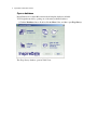
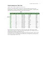
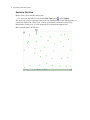
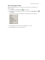
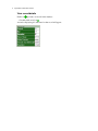
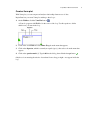
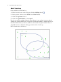
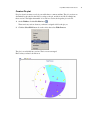
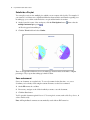
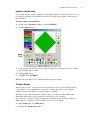
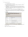
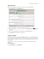
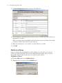
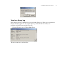
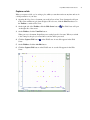
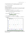
InspireData™ Quick Start Tutorial
This tutorial is a great starting point for learning how to use InspireData. The four lessons are in
small, manageable sections so you can learn the basics quickly. Plan on about an hour from start
to finish.
You use InspireData the same way you use most Windows and Macintosh programs. For
example, you use the mouse to drag objects and to select text. You also click and double-click, as
well as enter information using the keyboard. If you’re not comfortable doing these things, take a
moment now and refer to the user’s guide that came with your computer.
Conventions we use
This tutorial has instructions for both Windows and Mac OS-based computers. The Windows
instructions appear first, and the Mac OS instructions immediately afterward. Here are two typical
examples:
• Use the CTRL (Windows) or Command (Macintosh) key
• Press Enter (Windows) or Return (Macintosh).
When you’re asked to enter specific text, the text you are to type appears in bold. When
instructions refer directly to using a menu item, button or other interface element, the name of that
element also appears in bold.
InspireData offers many ways to do things—from toolbar buttons to menu commands to keyboard
shortcuts, but this tutorial usually shows only one way to do a task. This makes it easier to learn
the task. Check the InspireData Help system and detailed directions about features in the
InspireData User’s Manual for alternatives. Pick the method that you like best.
How we organized the tutorial
Step-by-step instructions lead you through creating a table, plotting data, presenting a slide show
and more.
Each of the four lessons introduces you to InspireData's unique features. When you finish the
tutorial, you will be ready to collect, manipulate and analyze data on your own.
2
InspireData™ Quick Start Tutorial
Lesson One: Introduction to Plot View
In this lesson, you'll open a database containing information about the sleep habits of a group of
students. You'll learn to do the following:
• Start InspireData
• Open a database
• Quick introduction to Table View
• Switch to Plot View
• Show and change icon labels
• View record details
• Create a Venn plot
• Add a Venn loop
• Add color to further represent meaning
• Increase text size for elements in Plot View
• Create a Stack plot
• Show the mean for each level
• Create an Axis plot
• Mark items of interest
• Create a Box plot in an Axis plot
• Create a Pie plot
• Subdivide a Pie plot
• Save a document
InspireData™ Quick Start Tutorial
Start InspireData
To start InspireData on a computer running Windows:
• Click the Start button, point to Programs and click InspireData.
The InspireData Starter screen opens.
To start InspireData on a Macintosh computer:
• Open the InspireData folder from the location you installed it (ideally Applications), then
double-click the InspireData icon.
The InspireData Starter screen opens.
3
4
InspireData™ Quick Start Tutorial
Open a database
InspireData has more than 100 content-rich and template databases included.
You'll begin the tutorial by opening one of the many available databases.
• Click the Databases button. Double-click the More folder, and then open Sleep Survey.
The Sleep Survey database opens in Table View.
InspireData™ Quick Start Tutorial
Quick introduction to Table View
A table consists of fields (columns) and records (rows).
The table for the example database shown below contains information about the sleep and
morning habits of a group of students. Each record represents the sleep habits of a single student.
(Names here have been replaced by letter codes to protect anonymity.)
The fields in the table show data that was collected about the students. The example contains
numeric data (age and hours of sleep) and text data (student, gender, ease of wake process, how a
student wakes up and what size breakfast they eat).
You will learn more about adding records, creating fields and importing data into a table in a later
lesson. Now it’s time to see how Table View and Plot View are integrated by exploring the data
from our sample database in Plot View.
5
6
InspireData™ Quick Start Tutorial
Switch to Plot View
In Plot View you can visually analyze data.
• To view your data in Plot View, click the Plot View button on the Toolbar.
The icons you see below represent each record from the Sleep Survey table. The first time you
switch from Table View to Plot View, icons are plotted freely and are moveable. Using
InspireData's plotting tools, you can arrange the icons in many informative ways.
Here's what the data looks like now:
InspireData™ Quick Start Tutorial
Show and change icon labels
Labels help you identify the icons. You can choose the values from any of the fields in your
database as labels.
1. On the Toolbar, click the Label button
to turn on labels.
2. Experiment by choosing different fields to use for a label. Click the Label Options button
on the Toolbar .
The Label Options menu appears displaying a list of the field names from Table View.
3. Select the field you want to display and see what happens to your plot.
4. Click the Label button again to turn the labels off.
7
8
InspireData™ Quick Start Tutorial
View record details
Each icon
represents one record in the database.
• Double-click on an icon .
A window displaying all of the data for that record will appear.
InspireData™ Quick Start Tutorial
Create a Venn plot
With Venn plots you can compare and analyze relationships between sets of data.
InspireData lets you create Venn plots with up to three loops.
1. On the Toolbar, click the Venn Plot button
.
A Venn loop appears with Field = ? in the corner of the loop. Use this equation to define
which icons you want in the loop.
2. Click on the word Field and select Hours Sleep from the menu that appears.
3. Click on the Operator, which is currently an equals sign (=), then select < from the menu that
appears
4. Click on the question mark (?). Type 8:00 into the dialog, then click the Accept button
.
Only those icons meeting the criteria—fewer than 8 hours sleep per night—now appear inside the
loop.
9
10
InspireData™ Quick Start Tutorial
Add a Venn loop
Now you'll add a second Venn loop.
1. In the lower left corner of the workspace, click the Add Loop button
.
2. In the equation, click on the word Field. Select Wake Process.
3. Click on the operator. Select =.
4. Click on the question mark (?). Select hard.
Records are sorted into multiple categories. Where the two loops overlap, you can see that the
students who get fewer than 8 hours of sleep have a harder time waking up. Students who do not
match the characteristics you have set (in this case, the students who get more than 8 hours of
sleep and don’t have a hard time waking up) remain outside of both loops.
Here's what the data looks like now:
InspireData™ Quick Start Tutorial
Add color to further represent meaning
Color adds another layer of visual detail and meaning to your plot. Choose any field in your plot
to use as a basis for coloring. Colors are assigned to your icons based on the values in the field
you select.
• On the Toolbar, click the Color by Field button
and select Gender.
At the top of the plot, a legend shows how colors have been assigned to the values.
The icons of the boys are yellow; the icons of the girls are purple.
Increase text size for elements in Plot View
Use the Text Size control button in the Toolbar to increase the size of the text in notes and for
elements in your plot. Increasing the text size is especially useful when you are working in a
group around a computer monitor or when using a projector.
1. On the Toolbar, click the Text Size button
.
2. Experiment with each of the three text size settings provided to see which one works best for
your plot.
11
12
InspireData™ Quick Start Tutorial
Create a Stack plot
A Stack plot divides the values within one field into categories, then organizes the icons that fall
into each category into stacks. The more records in a category, the higher the stack.
Stack plots are useful for showing how many records share a particular characteristic.
1. On the Toolbar, click the Stack Plot button
.
When you first switch to Stack plot mode, the icons are arranged into one tall stack. Once you
assign a field to the axis, the icons will move into separate stacks based on their values.
2. On the workspace, click the Axis label of the X axis and select Hours Sleep.
Use the numbers on the left side of the plot to help count the icons in each stack.
Here's what the data looks like now.
InspireData™ Quick Start Tutorial
You may switch to a Bar chart by clicking the Bar chart button
of the workspace.
in the lower left-hand corner
Create a parallel Stack plot
You can divide your Stack plot using different characteristics. To see the relationship between the
length of time a student sleeps and the wake process, for example, you could use a parallel Stack
plot.
1. On the lower-left corner of the workspace, click the Plot Options button
horizontal parallel stack option .
, then select the
A Y axis appears on the left side of your stack plot.
2. Click the Y Axis label and select Wake Process.
The pattern shows that the fewer hours a student sleeps, the harder it is to wake up.
Since the icons representing male students are now yellow and the icons representing female
students are purple, we can quickly see that boys find it harder to wake up after getting fewer
hours of sleep than girls do.
13
14
InspireData™ Quick Start Tutorial
Show the mean for each level
Now that you have two distinct ranges of data you can display the average or mean which, in this
case, would be the average or mean hours of sleep for each group.
• Click the Options button next to the X axis near the lower-left side of the workspace, then
select Show Mean.
Create an Axis plot
Axis plots let you create scatterplots, which are a great way to find and investigate correlations.
For example, you could see if there was a relationship between amount of sleep and age.
1. On the Toolbar, click the Axis Plot button
.
The icons won't move until you assign fields to the X and Y axes.
2. Click the X Axis label and select Hours Sleep.
3. Click the Y Axis label and select Age.
The plot shows that older students tend to get less sleep than younger students.
InspireData™ Quick Start Tutorial
When you create an Axis plot where both axes are numeric and continuous data, you can display
the Line of Best Fit, as shown below, or a Line Graph. To do either one, click the button in the
lower left corner of the workspace.
15
16
InspireData™ Quick Start Tutorial
Mark items of interest
Some icons might have the highest or lowest values for a particular field or seem to defy the
general trend. You can mark these icons and track them through your plots.
For example, in this plot you can see that one student gets a lot of sleep compared to others his
own age.
1. Click on the icon of the student who seems to get more sleep than others in his age group.
2. On the Toolbar, click the Mark button
.
Since the icon is now marked with a box, you can easily identify and track it as you make changes
to the plot.
InspireData™ Quick Start Tutorial
Create a Box plot in an Axis plot
A Box plot visually represents the median, the range and the quartiles of a set of numeric data. In
our example, you could use a box plot to look at the distribution of the students' ages in the sleep
survey.
To create a box plot on your sleep survey:
1. Click on the X axis label and select Age.
2. Click on the Y axis and select Clear Selection.
3. On the Plot menu, choose Box Plot.
-orSelect Box Plot Options from the Plot menu and choose Add numeric labels to box plots.
This will display the 5-number summary (minimum, quartile 1, median, quartile 3 and
maximum) on your box plot.
17
18
InspireData™ Quick Start Tutorial
Multiple box plots can be used to show differences in a numeric field across a second categorical
(Text or True/False) field. In this example, you could examine differences in age across gender.
• Click on the Y axis and select Gender from the list of fields.
Now your plot looks like this:
Although both males and females fall in the same range of ages, the plot shows that the males in
the middle half are older than the females in the middle half.
Applying the IQR method to a box plot
IQR, or “Interquartile range” is an alternative method for drawing the whiskers of a Box plot.
Rather than extending out to the extremes of the data, the whiskers have a length that is
proportional to—usually one and one half times—the interquartile range. (The interquartile range
is the difference between the upper and lower quartiles.)
To apply the IQR method to a box plot:
1. On the Plot menu, choose Box Plot Options...
2. Choose the IQR radio button.
3. If desired, change the multiplier by typing in the text box next to the IQR radio button.
4. Click OK.
InspireData™ Quick Start Tutorial
Create a Pie plot
Pie plots show how many records in your table share a common attribute. The pie's sections are
determined by the values in the field you assign to the pie, and the icons fall accordingly into
these sections. The higher the number of records in a section, the larger the pie section is.
1. On the Toolbar, click the Pie Plot button
.
There aren't any sections because you haven’t assigned a field to the pie yet.
2. Click the Select Field button above the circle, then select Wake Process.
The plot is now divided into sections. The icons are rearranged.
Here's what your data looks like now.
19
20
InspireData™ Quick Start Tutorial
Subdivide a Pie plot
You can split your icons into multiple pies, which you can compare side-by-side. For example, if
you wanted to see if there was a significant difference between males and females regarding ease
in waking up, you could move the males into one pie and the females in another.
1. On the lower-left corner of the workspace, click the Plot Options button
.
multiple horizontal pies option
, then select the
An X axis appears beneath the pie.
2. Click the X Axis label and select Gender.
There is an appreciable difference in ease in waking up between males and females. A higher
percentage of boys report that waking up is hard for them.
Save a document
Save your document on a regular basis. To save a document for the first time, or to save a
document you've already saved using the current file name, use the Save command.
1. On the File menu, choose Save.
2. If necessary, navigate to the folder in which you want to save the document.
3. Click the Save button.
You'll open this document again in Lesson 3. You can give it a name, such as My Sleep Survey, in
order to find it easily.
Note: All InspireData documents are automatically saved with an .IDF extension.
InspireData™ Quick Start Tutorial
Lesson Two: Working in Table View
In Table View, you can directly enter data you have collected, import data that you acquire from
outside sources like web sites, and have students enter their own data through the use of surveys.
Once you have captured the data, you can modify the formatting and even create new data using
formulas.
Working in Table View, you'll learn to do the following:
• Create a new database
• Rename a field
• Add a new field
• Add a new record
• Define fields
• Validate data entered into fields
• Enter record details
• Reorder fields
• Change the default icon
• Import a custom icon
• Create a Survey
• Conduct a Survey
• Create an e-Survey
• Publish an e-Survey
• Take an e-Survey
• End an e-Survey
• View e-Survey results
• View the e-Survey Log
Create a new database
In this lesson, you'll create your own simple sleep survey database.
1. If you quit InspireData after the last lesson, launch the program.
2. From the InspireData Starter screen, click New.
InspireData will open in Table View.
21
22
InspireData™ Quick Start Tutorial
Rename a field
When you create a new table, you will see that fields are named Field 1, Field 2, and so on. You
can rename the fields.
1. Click on Field 1 and type Student.
2. Click on Field 2 and type Age.
3. Click on Field 3 and type Gender.
Add a new field
New tables start with three fields, but you can always add more if you need to.
1. On the Toolbar, click the Add Field button
.
2. Type Hours Sleep to name the new field.
3. Add another new field and name it Wake Process.
Add a new record
More records can be created quickly and easily.
• To create a new record, click the Add Record button
-or-
on the Toolbar
With your cursor in the last cell of the bottom row, press Tab.
InspireData™ Quick Start Tutorial
Define fields
Choosing the kind of data you will put into a field allows you to enter data more quickly. Fields
can be restricted to numbers only, text and numbers, dates or true/false values.
The type of data used for a field is called the field type.
1. Select the field named Student by clicking on its field heading.
2. On the Toolbar, click the Field Type menu
and select Text.
3. Select the next field, Age, by clicking on its field heading.
4. On the Toolbar, click the Field Type menu and select Number.
5. Select the next field, Gender, by clicking on its field heading.
6. On the Toolbar, click the Field Type menu. Select Text because this is also a text field.
7. Select the next field, Hours Sleep, by clicking on its field heading.
8. On the Toolbar, click the Field Type menu and select Number.
Add the following fields by using the Add field button
for each one of them:
and continue to select the field type
• How Do You Wake Up? (Field type: Text)
• Breakfast (Field type: Text)
Now any data you enter into these fields will be consistent with the field types you selected.
Note: You can edit cell data in either the text entry field on the toolbar or in the cell itself. If you
make a mistake while entering text, just select the words you want to change by dragging your
cursor over them and then typing your correction.
23
24
InspireData™ Quick Start Tutorial
Validate data entered into fields
You can control the data entered into fields using Validation settings. For example, you can use
the Validation option to create a drop-down list of choices, allow numbers only within a certain
range or specify the number of characters allowed for a field, as well as other validation choices.
You could, for example, limit the age range for people in the sleep survey to secondary students
only.
1. Click on the field heading for Age.
2. Click on the Validation...button
.
3. A dialog box will appear. Click the radio button next to In range.
4. In the from field, type 11, and in the to field, type 17, then click OK.
Now your Age field will accept only numbers between 11 and 17.
Enter record details
Now that your table is set up, you can start entering data.
1. Click in the top left data cell to select it (it will turn orange when selected). Type A as an
identifier for the first student.
2. Press Tab to move to the next cell. Type 14 under Age.
3. Tab to the Gender field. Type F.
4. Tab to the Hours Sleep field. Type 9.
InspireData™ Quick Start Tutorial
5. Continue to add sample data to the remaining fields and records, using the table below as a
guide.
Increase text size for elements in Table View
You can increase the size of the text in cells and the notes field, as well as field names, using the
text size control in the top toolbar. This is especially useful when you are working in a group
around a computer monitor or when using a projector.
1. On the Toolbar, click the Text Size button
.
2. Choose which of the three sizes works best to view the table.
Reorder fields
To change the order of the fields in your table click on their field headers and drag them.
• Click on the field heading of the Age field, then drag it to the right of the Gender field.
as you drag so you can place the field where you want it. Simply
Watch the carat mark
release the mouse button to place it.
Change the default icon
Changing or customizing the icons that appear in your table adds further meaning to your plots.
InspireData offers a library of more than 120 icons. Icons selected in Table View will also
represent each record when it appears in Plot View.
To change the default icon to a custom icon:
1. Double-click the icon in the top-left corner of the table (the default icon).
25
26
InspireData™ Quick Start Tutorial
The Icon Editor appears:
2. Select a different icon from the Icon Library or use the paint and draw tools in the Icon
Editor to customize your selection.
3. Click OK to make the new icon your default icon for the entire table.
All of the existing records with the old default icon will be updated, and all new records will use
the new default icon.
Note: If you want to return to the original version of the icon, click Revert.
InspireData™ Quick Start Tutorial
Import a custom icon
You can import a photograph or graphic from a drawing program or web browser and use it as an
icon. Imported graphics are automatically resized to fit into the space available on the canvas of
the Icon Editor.
To add a custom icon to Student A:
1. Double-click on Student A's icon to open the Icon Editor.
2. Click the Import button.
3. Locate and click on the file you want to import. InspireData can import most types of image
files, including .GIF and .JPG.
4. Click the Open button.
5. Click OK on the Icon Editor.
Note: Use the Icon Editor tools to further customize an imported image.
Create a Survey
A Survey allows you to create new records and enter data for those records using an onscreen
form, similar to one you might find on a web page. Using the sleep survey as an example,
students can answer the questions you have set up for your fields.
The Survey is especially useful when you have a group of people who aren't familiar with
InspireData. With a Survey, they can enter data directly into your document.
You can set up a computer as a Survey station and let students take turns filling out the form.
When a Survey is completed, its data is added as a record to your database.
1. On the Table menu, select Edit Survey.
2. Click the Use custom title checkbox.
27
28
InspireData™ Quick Start Tutorial
3. Type Student Sleep Survey into the title box.
4. If you want the respondents to have the ability to add their own individual icon, click the
Allow user to select record icons checkbox.
5. The Question area of the form is automatically filled out with the field names. If the field
name is sufficient for the respondent to answer the question, use the field name. If not, enter a
complete question to guide participants in their responses. InspireData allows you to use up to
256 characters for a question.
6. Locate the questions you'd like to make required, then click the Required? checkbox.
When a question is set as required, the words "This value is required" will appear below the
question in the Survey. Respondents will not be able to submit their record until this field is
filled out.
7. Click OK.
Be sure to launch your survey after you have finished editing it to make sure it appears the way
you want it to appear.
Note: The Invitation text applies to e-Surveys only.
InspireData™ Quick Start Tutorial
Launch a Survey
Once you have your Survey set up the way you like, you can start collecting data.
1. On the Table menu, choose Launch Survey.
2. Ask your participants to come to the computer one at a time.
3. Instruct each participant to fill out the form and click the Add Record button
are finished.
when they
4. After all of the participants have entered their data, click the Close button.
5. On the File menu, choose Save to save your data.
Create an e-Survey
An e-Survey allows you to collect data by publishing your database to a web site. Respondents
need not be in the same location and are able to add responses to your e-Survey as long as they
have a connection to the Internet. It is not necessary to have InspireData installed in order to fill
out an e-Survey.
Once responses are complete, you can download your database to InspireData and begin
analyzing data.
To create an e-Survey:
1. On the Table menu, choose Edit Survey.
29
30
InspireData™ Quick Start Tutorial
2. Click the Invitation text check box at the top of the dialog box.
3. Type an invitation to participate in your e-Survey, such as, "Be sure to fill out my e-Survey on
sleep habits for our class!"
When your e-Survey has been published to the web and accessed by respondents, the wording
you type here will be visible at the top of the web page.
4. Make any modifications to your questions or required answers, as needed.
5. Click OK.
Publish an e-Survey
Once your e-Survey has been published, it will be available as a form to fill out on a web site.
e-Survey respondents will need to know the web URL and the Survey ID to take your survey.
Respondents simply use their web browser to load and fill out the e-Survey.
To publish an e-Survey:
1. From the Table menu, choose Publish e-Survey.
2. When the dialog box appears, click the Publish button.
InspireData™ Quick Start Tutorial
When the second dialog box appears, as shown below, you will see both a Survey ID and an
Owner ID for your e-Survey:
Those who participate in your e-Survey will need the Survey ID.
To end your e-Survey you must know the Owner ID.
Since this is the only location where the Owner ID is given to you, it is a good idea to print
this dialog. To print it, click on the Print This Text button at the bottom of the dialog.
You may also end your e-Survey directly from this dialog by choosing the End e-Survey
button.
3. Click Done.
31
32
InspireData™ Quick Start Tutorial
Take an e-Survey
To take an e-Survey you must have access to the Internet.
To take an e-Survey:
• Navigate to http://esurvey.inspiredata.com using your web browser, then enter your
Survey ID and click Start.
When you click start, your e-Survey opens, as shown:
Once you have filled out the survey, click Submit to save the data. All participants who fill out
the e-Survey and click Submit will have their records added to your database.
To print your e-Survey, see Printing a Survey or e-Survey in the User’s Manual.
InspireData™ Quick Start Tutorial
End an e-Survey
You can end an e-Survey immediately after it is created by clicking End e-Survey in the same
dialog you use to create one, as shown:
If you end it before data has been entered, no entry will appear in the
e-Survey log.
If you have received all the data you need and want to stop accepting contributions to your
e-Survey, you must end it from the File menu.
To end an e-Survey:
1. From the File menu, choose End e-Survey...
2. Enter the Owner ID for the e-Survey you want to end (you were provided with the Owner ID
when you originally set up your e-Survey).
3. Click on the End e-Survey button.
4. When asked to confirm, choose Yes to end the e-Survey.
33
34
InspireData™ Quick Start Tutorial
After the survey has ended, no one will be able to add data to the e-Survey even if they know the
Survey ID. However, the database will still be available to download from the InspireData Starter
screen using the e-Survey button.
Note: e-Survey databases can still be downloaded even after the e-Survey has ended and will
remain available for a period of time determined by Inspiration Software ®.
View e-Survey results
The results of an e-Survey can be viewed at any time by opening the database with InspireData.
Once data has been downloaded, it is contained in a new database, which can be modified in any
way and saved. You can do this even when participants are still adding records to your e-Survey.
Each time you or anyone else downloads the data, a new InspireData file is created. Plots and
slides present in the database at the time it was published will also be available, in addition to eSurvey records.
When you no longer want contributions to the database, you can end your
e-Survey.
To view results of an e-Survey:
1. On the InspireData Starter screen, click on the e-Survey button.
2. Enter the Survey ID and click Open.
InspireData™ Quick Start Tutorial
View the e-Survey Log
Every time an e-Survey is published, it is recorded in the e-Survey log. This log is associated with
the user currently logged on to the computer. The log contains the date the e-Survey was
published, the database name and the Survey ID.
• From the File menu, choose View e-Survey Log...
The most recent surveys are listed first.
35
36
InspireData™ Quick Start Tutorial
Lesson Three: Presenting with a Slide Show
A Slide Show is a great way to document and present work. Each slide captures a “live” view of
the data, which means that you can continue to change and work with the captured plots when
viewing your slides.
In this lesson, you will build a slide show as you learn to do these things:
• Capture a slide
• Name a slide
• Reorder a slide
• Add notes
• Make changes to a slide
• Delete a slide
• Present a Slide Show
InspireData™ Quick Start Tutorial
Capture a slide
When you capture a slide, you’re saving a plot, which you can then retrieve at any time and use in
a slide presentation of your data.
1. Open the My Sleep Survey document you saved in Lesson One. Your document should open
in Plot View with the two pie charts displayed. If it does not, click the Plot View button on
the Toolbar to switch to Plot View.
2. On the right side of the Toolbar, click the Slide Sorter button
on the right side of the screen.
. The Slide Sorter will open
3. On the Toolbar, click the Venn Plot button.
When you save a document, InspireData saves each plot mode’s last state. When you switch
to the Venn plot, the plot you created in Lesson One will be preserved.
4. Click the Capture Slide button
Sorter.
on the Slide Sorter. A new slide appears in the Slide
5. On the Toolbar, click the Axis Plot button.
6. Click the Capture Slide button on the Slide Sorter. A second slide appears in the Slide
Sorter.
37
38
InspireData™ Quick Start Tutorial
Name a slide
InspireData automatically creates a name for new slides based on the fields you assigned to axes
on the plot, but you can rename a slide at any time.
1. Click the Slide Options button
appears.
on the second slide, then select Rename from the menu that
2. Type Hours of sleep vs. Age into the text box that appears, then click OK to rename the
slide.
Renaming a slide does not change the content or order of the slide in the Slide Sorter.
Reorder a slide
You can move slides up and down the Slide Sorter to change their order.
1. Click and drag the Hours of Sleep slide to the top of the Slide Sorter.
When you move a slide, the other slides will move to make room for the slide you are
dragging, indicating where the moved slide will be placed.
2. Release the mouse button.
Add notes
To capture thoughts about the data and communicate findings, use notes.
1. On the Toolbar, click the Note button
.
The Notes area appears at the bottom of your screen.
2. Type your comments about the slide.
Make changes to a slide
You can update a slide at any time after the slide has been captured. Always update your slides
after adding or editing a note; otherwise the changes you made will be lost.
• Click the Slide Options button on the Hours of Sleep vs. Age slide, then select Update Slide
from the menu that appears.
Updating a slide will overwrite the old slide. If you want to keep both your old slide and the
changes you've made, create a new slide by clicking the Capture Slide button on the Slide
Sorter.
InspireData™ Quick Start Tutorial
Delete a slide
You can delete a slide at any time.
1. Click on the slide you want to delete.
2. Press the Delete key.
Present a Slide Show
Slides are saved with your work when you save your document. When you are ready to present
your slides, use the Slide Show controls.
• On the Slide Show menu, choose Start Slide Show.
The first slide in the Slide Sorter displays the Slide Show Controls. If you click the Next
Slide button, you will see the second slide on the controls, and so on for all of your slides.
You can also present your slide show by clicking on each slide in the Slide Sorter. However,
using the Slide Show Controls keeps the Slide Sorter hidden and makes more screen space
available for your plots.
39
40
InspireData™ Quick Start Tutorial
Lesson Four: Plotting time series and more
In this lesson, you'll plot time series data and explore some of the many other plotting options
available. You'll learn to:
• Plot time series data
• Add color to time series data
• Group time series data
• Change plot colors
• Clear a plot
• View previous plots
• Add a plot title
• Combine categories
• Compute summary data
InspireData™ Quick Start Tutorial
Plot time series data
You can display and even animate data that changes over time (time series data).
1. On the File menu, point to Open Database. Choose Science, then select Plant Growth.
The table contains data about plants in an experiment, including growing conditions, height
measurements and so on. Notice that the Height field contains subcolumns representing the
number of days elapsed in the experiment. Each subcolumn contains a measurement for a
plant’s height on that day. This is the data that will be used to plot your time series.
2. On the Toolbar, click the Plot View button
to switch to Plot View.
3. On the Toolbar, click the Axis Plot button
.
4. On the lower-left corner of the workspace, click the Plot Options button
Instant Plot: Height by Day.
and select
A new time series graph is created. The Series Playback controls animate the time graph,
showing how the heights of the plants change over time and revealing correlations.
41
42
InspireData™ Quick Start Tutorial
Add color to time series data
Because the plot you created shows all gray lines, it's difficult to see what the data means.
However, you can add color to your plot.
• On the Toolbar, choose the Color by field button
and select Condition.
Now your plot looks like the one below. Notice that you now have a legend at the top that defines
the colors in the plot.
InspireData™ Quick Start Tutorial
Group time series data
Time series graphs display every record individually by default, but you can also group the
records together to make trends in the data easier to see. For example, you can group together
records based on growing conditions.
1. On the lower-left corner of the workspace, click the Plot Options button
Group Lines, and then select Median.
, choose
Now, instead of every record being shown, eight lines represent the median values of the
plants in each of the eight growing conditions.
2. Click the Plot Options button again, choose Group Lines, then select Mean and Standard
Deviation.
43
44
InspireData™ Quick Start Tutorial
This adds areas of translucent shading to the group lines, representing the standard deviation for
the plants in each of the growing conditions.
Change plot colors
Customizing the colors used to represent your data helps you clearly differentiate one set of
records or lines from another.
In the current plot, each grouping is colored according to its growing condition. InspireData
makes it easy to change the colors of these items.
1. On the Legend, click the red square to the left of No Light.
A menu with color choices appears.
2. Select a new color to change the color of the grouping on the plot.
InspireData™ Quick Start Tutorial
Clear a plot
When you clear a plot, only the plot currently displayed on your screen is affected.
• On the Toolbar, click the Clear button
.
The menu you see will give you options to change your settings:
• Clear this Plot maintains the plot type but clears the settings, such as axis title, etc. (To
clear color, click on Color by field and select No Coloring.)
• Reset plotting returns the icons to a Free plot.
• Unmark All takes away labels, colors and the marks around icons you have selected.
View previous plots
You can jump backward or forward through your plots at any time, just like you would with
previously viewed pages in a web browser.
• On the Toolbar, click the Back button
to view your previously created plots, and click the
Forward button
to return to the most recently created plot
Add a plot title
You can add a title to your plot at any time.
1. On the Plot menu, select Plot Title.
2. Type Growth Comparison by Treatment Condition.
3. Click the Accept button to add the title to your plot.
To make changes to an existing title, click directly on the title in your plot and type your changes.
Be sure to click the Accept button to keep your changes.
45
46
InspireData™ Quick Start Tutorial
Combine categories
You might want to group your data by combining two related categories into one. For example,
you can combine the two growing conditions with varying amounts of water into one
supercategory called 1 or More Liters of Water.
1. Click on the Axis label of the X axis and choose Condition.
2. Click on the Y axis and choose Height.
3. Click the 2 Liters of Water category label and drag it onto the 1 Liter of Water category
label.
When a green box appears around the 1 Liter of Water label, release the mouse button.
Use the dialog box to give a name to your supercategory, such as 1 or More Liters of Water.
4. Click OK.
The 2 Liters of Water and 1 Liter of Water categories have now been combined into a
supercategory.
InspireData™ Quick Start Tutorial
You can easily return the plot to the way it looked before you created the supercategory.
1. Click the small diamond
next to the 1 or More Liters of Water category label.
2. Choose Dissolve Supercategory.
Compute summary data
You can calculate summary data for your plots, including count, total, mean, median and smallest
or largest data points. For example, in the plant growth plot you could calculate the mean height
for each growing condition.
1. On the Toolbar, click the Compute button to turn on computations.
The question marks (??) that appear on your plot show where the calculations will be
displayed when you finish specifying what data you want to calculate.
2. Click the Operation button on the Toolbar, then select Mean.
3. To specify which field to calculate the mean of, click the Field button on the Toolbar, then
select Height.
Because this plot includes time series data, you can use the series playback controls to display the
height of the plants on different days. As you move through the different days, computations will
be updated automatically.
47
48
InspireData™ Quick Start Tutorial
Congratulations!
You've finished the InspireData tutorial. Now that you know the basics of this versatile tool,
you're ready to explore further on your own.