1
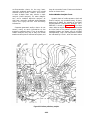
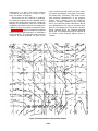
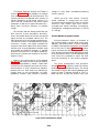
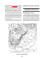
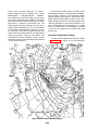
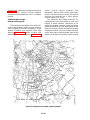
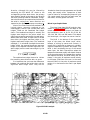
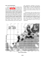
UNIT 4
METEOROLOGICAL AND OCEANOGRAPHIC
PRODUCTS AND THEIR INTERPRETATION
FOREWORD
Today’s Aerographer’s Mates use vast amounts of meteorological and
oceanographic charts and messages. All of these products contain valuable
information. The charted products display information with numbers,
symbols, lines, and shaded areas on a map background. Messages may either
present information in plain language, abbreviated language, code, or alphanumeric plots. As an Airman, you learned how to decode, or interpret, many
different types of observation messages while studying to become a
Meteorological Technician (Observer/Plotter). As an Aerographer’s Mate
Second Class, performing the duties of an Analyst/Forecaster Assistant, and
later as an Analyst/Forecaster, you will be required to interpret information
presented in many different types of charts and messages. In this unit, we
will present information that will help you to interpret the meteorological and
oceanographic messages and charts most frequently used by Navy
Analyst/Forecasters.
In Lesson 1 we will discuss the meteorological and oceanographic models
used by the computers at the Fleet Numerical Oceanography Center (FNOC),
Monterey, California. In Lesson 2, we will discuss the major meteorological
and oceanographic products available from the FNOC computers. The major
numerical models in use by the National Weather Service (NWS) and the
products available from NWS are discussed in Lesson 3. Lesson 4 addresses
the Terminal Aerodrome Forecast Code (TAF). In lesson 5 we discuss
products available from the Tactical Environmental Software System (TESS),
and the Optimum Path Aircraft Routing System (OPARS) products are
discussed in Lesson 6.
4-0-1
UNIT 4—LESSON 1
FLENUMOCEANCEN ANALYSIS MODELS
OVERVIEW
OUTLINE
Identify FLENUMOCEANCEN environmental
analysis models and analysis techniques.
Surface analysis model
Upper-air analysis model
Scale and Pattern Separation model
Frontal analysis model
Tropopause height analysis model
Freezing-level analysis model
Expanded Ocean Thermal Structure (EOTS)
analysis model
Thermodynamic Ocean Prediction System
(TOPS) Coupled EOTS (TEOTS) analysis model
Ocean Frontal analysis model
Ocean wave analysis model
Sea Surface Temperature analysis model
FLENUMOCEANCEN ANALYSIS
MODELS
Learning Objective: Recognize the impact
of grid-point spacing on computergenerated analyses, and identify the
parameters and the analysis technique used
in FLENUMOCEANCEN’s surface analysis model.
There are many computer-generated surface,
upper air, and oceanography products available
from the FLENUMOCEANCEN. You should be
aware of the available products, have an
understanding of how they are derived, and how
they are interpreted.
The heart of computer-generated environmental products is the model or program used to
produce the products. Environmental models are
used in analyses, prognoses, and special programs,
and they are constantly being updated or refined
to produce the best possible product.
SURFACE ANALYSIS MODEL
The FLENUMOCEANCEN surface analysis
model produces hemispheric and regional analyses
of sea-level pressure, wind, and sea-surface
temperature on grids. For example, a hemispheric
4-1-1
analysis is produced on a 63 by 63 grid,
and a regional analysis uses a 125 by 125
grid.
The first-guess field is also useful in keeping
“impossible” observations from being used in the
analysis.
Grids
ASSEMBLY OF NEW IN FORMATION. —
In this step, reports of the parameter being
analyzed, that is, pressure, wind, etc., are placed
at their proper geographic positions on the grid.
These observations are then compared to the firstguess values. If an observed value differs from
a first-guess value by a pre-set limit, the observed
value is termed “impossible” and is thrown out.
There is an inherent problem with the
assembly step. The majority of the oceans are data
sparse. When observations in an area are nonexistent or are termed impossible, the model bases
the analysis of the area on the first-guess data
field. If the first-guess data field in the area is in
error, the analysis ends up in error. Such errors
are especially evident when atmospheric changes
take place in an explosive manner. For example,
if the model does not have an SLP observation(s)
in an area undergoing rapid deepening or if
it discards a report or reports in an area as
impossible, the first-guess values are used. If the
first-guess values in the area do not reflect
explosive deepening, the area will be incorrectly
analyzed. Any incorrectly analyzed region
should be brought to the attention of the
FLENUMOCEANCEN duty officer in order that
the analysis can be corrected. Such corrections
often require the insertion of a bogus report(s)
into the data field. These made-up reports are
designed to correct the analysis in a region in
question.
Grids come in various shapes and sizes. The
grid-point spacing for hemispheric products is
equivalent to approximately 320 kilometers,
whereas that for regional products is equivalent
to 20 to 80 kilometers. The grids used in regional
analysis are known as fine-mesh grids. All
computer calculations are performed at the
grid points, and normally, the closer the gridpoint spacing, the more accurate the analysis,
depending on the accuracy of the input data.
Each grid-point is assigned a value of the
parameter being analyzed. For example, in a sea
level pressure (SLP) analysis, each grid point is
assigned an SLP. The value assigned to a grid
point may be based on past history, current
observations, gradient extrapolation, and/or any
combination of these three variables. This process
is part of the analysis technique used by the
model.
Fields By Information Blending
The surface analysis model currently used
by FLENUMOCEANCEN uses an analysis
technique known as Fields by Information
Blending (FIB). FIB has six component operations
as follows:
1. First-guess field preparation of initialization
2. Assembly of new information
3. Blending for the parameter
4. Computing the reliability field of the
blended parameter
5. Reevaluation and lateral rejection
6. Reanalysis
BLENDING. —Blending is the model step that
corresponds to the drawing of isolines by hand.
To cover data-sparse regions, grid-point values
are adjusted and spread to surrounding grid points
using gradient knowledge and mathematical
gradient formulation. Blending spreads the data
from high reliability grid points (grid points with
values based on observations) to those having
lower reliability (grid points based on the firstguess analysis). The degree of spreading is
increased with higher reliability in the gradient.
FIRST GUESS. —The first guess is an estimate
of what an analysis will look like without considering current data. It is normally a blend of (1) the
previous analysis extrapolated forward to analysis
time, (2) a prognostic chart verifying at analysis
time, (3) persistence from the previous analysis,
and (4) climatology.
The first-guess provides continuity in datasparse areas and gives an estimate of the shape
(gradients, curvature, etc.) of the data field. In
data-sparse areas, the accuracy of a final analysis
depends partly upon the first-guess accuracy.
COMPUTING RELIABILITY FIELD OF
THE BLENDED PARAMETER. —In this step,
the computer assigns weight factors to the blended
grid-point values. The higher the weight factor,
the higher the reliability of the value. For example,
a grid-point value based on an observation(s)
normally has a higher weight than a grid-point
4-1-2
value based on an extension of a gradient. The
reliability of all grid points is increased through
the blending process.
western Pacific Ocean, Indian Ocean, and the
northwestern Atlantic Ocean. The Med and
WestPac regions are run at approximately 03Z
and 15Z, while the Indian Ocean and NW Atlantic
regions are run at 07Z and 19Z. Data from two
other regions are also run through the NORAPS
program: the Eastern Pacific and the North Pole.
However, these two regions are available to the
Fleet only upon request. The number and time
of NORAPS model runs changes with changing
Fleet requirements.
REEVALUATION AND LATERAL REJECTION. —In step 5, FIB uses the blended
parameter field and the weighted values to
reevaluate each piece of information entered
into the analysis. Reevaluation is a quality control
done on each observation. A statistical value is
computed for each report and is compared to the
actual value. The statistical value measures how
accurate a report really is compared to its expected
accuracy as given by its assigned weight factor.
The lateral rejection check takes place when
each grid-point value, with its weight, is removed
individually from the grid and compared with
what remains, or the “background.” If the report
is within its expected reliability range, no change
is made to its weight. If the value is greater than
the expected range but within some upper limit,
its weight is reduced. If the value exceeds the range
limits, the report is rejected (that is, its weight
becomes zero) and it has no effect when the next
assembly and blending is done.
FINE MESH ANALYSIS AND PROGNOSIS. —Fine-mesh products incorporate a
terrain disassociation parameter so that values and
their gradients do not unduly influence each other
on opposite sides of mountains or land features.
For example, cold air that piles up on the north
side of the Alps does not carry over to the south
side.
SST analyses for selected regions of the Gulf
Stream, Labrador, and Kuroshio currents are
conducted using 1/8 size fine-mesh grids. The
disassociation parameter is also applied to these
analyses, because the temperature structure on
opposite sides of peninsulas, etc., can be markedly
different.
REANALYSIS. —After the grid-point values
are reevaluated and new weights are assigned, the
reanalysis step begins. This step is no more than
a repeat of the assembly step, using the first-guess
field and the reevaluated data. The new field may
be reevaluated and reanalyzed two or three times
before the computer accepts it and sends it to the
output section, where it is stored for transmission
and for input into other programs.
Learning Objective: Identify other models
and products to which FIB is applied.
FIB Applications
The FIB technique is also used with the Navy
Operational Regional Atmospheric Prediction
System (NORAPS) model. It is applied to
FLENUMOCEANCEN’s fine-mesh grids.
NAVY OPERATIONAL REGIONAL ATMOSPHERIC PREDICTION SYSTEM. —As of
this writing, NORAPS is used in operational data
runs to provide 36-hour fine-mesh forecasts for
four geographical regions: the Mediterranean Sea,
4-1-3
SPHERICAL SURFACE PRESSURE AND
WIND ANALYSIS. —FIB is also used in the
construction of the spherical surface pressure and
wind analysis. This analysis is produced on a
spherical grid every 6 hours. It is a combination
of a surface pressure analysis and a wind analysis.
The input data include ship reports up to 6 hours
old; land reports, with islands receiving more
relative weight; low-level satellite winds decreased
by 20% of their estimated value (satellite-derived
winds are used in the area between 20°N and 20°S
only); and coded isobaric analysis messages from
various Southern Hemisphere meteorological
organizations.
The FIB-produced Northern and Southern
hemispheres sea-level pressure analyses are
interpolated onto a spherical grid, and a firstguess analysis is produced for the regions
poleward of 20°N and S. The first-guess pressure
analysis is then blended with climatology and the
previous spherical pressure analysis to produce a
pressure analysis of the region equatorward of
20°N and S.
The first-guess wind analysis for mid-latitudes
is derived from the surface-pressure analysis; the
first-guess wind analysis for the tropics is obtained
by blending the previous wind analysis with
climatology. A global marine wind analysis is
performed to blend the mid latitude and tropical
wind fields together.
Optimum Interpolation Technique
The FIB technique will be replaced in the
near future by an Optimum Interpolation (OI)
technique. The OI technique is an objective
analysis methodology widely used in meteorological and oceanographic applications. It differs
from the FIB technique in that it is based upon
the concept that the results of the interpolation
process must contain the same statistical field
properties, that is, time and space statistical
structure of variability, independent of the density
of observations.
Learning Objective: Name the FLENUMOCEANCEN model used to analyze
upper-air data and recognize why the
program is run every 6 hours.
the run. This permits the inclusion of satellite data
and aircraft reports, as well as off-time buoy and
ship reports. This means that during any single
analysis, there can be as much as a 6-hour
difference in observations. The program carries
the off-time data forward to analysis time. This
process is referred to as data assimilation.
NOTE
The 0600Z and 1800Z upper-air
analyses are used as a basis for the 1200Z
and 0000Z data runs. They are NOT
transmitted to the Fleet.
In addition to the NOGAPS-generated
spherical upper-air analyses, FLENUMOCEANCEN also produces global band upper-air analyses
and southern hemispheric polar stereographic
upper-air analyses.
Global Band Upper-air Analysis
Winds and temperatures are analyzed on a
global band grid every 12 hours. The grid is a
Mercator projection true at 22 1/2° degrees
latitude and extends from 40°S to 60°N. The firstguess field south of 22°N is based on persistence,
reverted to climatology. This is primarily due to
the sparseness of data over large portions of this
region. North of 22°N, NOGAPS upper-air
analysis fields are used.
UPPER-AIR ANALYSIS MODEL
The upper-air analysis model is a subset
of the Navy Operational Global Atmospheric
Prediction System (NOGAPS). Geopotential
heights, temperature, and wind are analyzed
for the mandatory levels 1,000 millibars to
100 millibars.
Numerous types of data are used in the
analysis. Convent ional radiosonde and aircraft
reports are used in both the wind and temperature
analyses. The wind analysis also includes Pibal
reports and satellite derived winds. Vertical
temperature profiles obtained from satellite
radiometers are used in the temperature analysis.
The temperature profiles greatly increase the data
base in the Southern Hemisphere.
NOGAPS Model
NOGAPS is the principal model system
in FLENUMOCEANCEN’s operational data
runs which begin at 00Z and 12Z. It starts
approximately 4 hours into a data run. NOGAPS
replaced the Primitive Equation (PE) model
as FLENUMOCEANCEN’s primary forecast
model in 1982. NOGAPS was last updated in
1986.
Southern Hemisphere Polar
Stereographic Analysis
This analysis uses the same technique as is used
in the northern hemisphere upper-air analysis. A
major difference is in the amount of satellite data
used and the greater weight placed on satellitederived 1,000- to 300-millibar thickness values.
NOGAPS upper-air subset is run every
6 hours, even though radiosonde and rawinsonde
observations are taken synoptically at 0000Z and
1200Z only. By running the program every 6
hours, off-time observations can be included in
4-1-4
relationships, in the order given above, are
Z–SD=SR and SR–SV=SL.
Learning Objective: Recognize the most
common charts produced using the scale
and separation pattern model, and the
major problem with the model.
To be totally accurate, the amount of smoothing required to remove any one scale should vary
depending on the time of year. However, the
FLENUMOCEANCEN model employs only the
October smoothing value so as not to disrupt
component continuity. This results in sL
features being somewhat weaker than they
should be in summer, and the SD features
being somewhat stronger. The reverse is true in
winter.
SCALE AND PATTERN
SEPARATION MODEL
The circulation at any level within the
atmosphere shows features of varying scale (size)
and pattern. At the surface, there are micro-lows,
troughs, ridges, migratory cyclones and anticyclones, and the large-scale semi-permanent
pressure systems. Aloft, there are troughs,
ridges, highs, and lows with varying wavelengths and amplitudes. These in turn are all part
of the still larger scale system, the planetary
vortex.
Interaction of features either at the same level
or at differing levels is a major problem faced by
synoptic analysts and forecasters. The problem
stems from distortion in the circulation patterns
caused by the interaction of small-scale and largescale features. The classical example, for instance,
occurs in the vertical; the long-wave patterns are
distorted by short waves. The distortion makes
for subjective positioning of the long-waves, and
the positions are usually inaccurate. An inaccurate
analysis then leads to inaccurate prognoses. To
overcome such subjective determinations, the
scale and separation model was developed.
The scale and separation model provides an
objective measure of scale while retaining
characteristic recognizable patterns. It separates
features of various size into separate parts. For
example, it takes the 500-millibar field and
separates it into a short-wave field (500-millibar
SD), a long-wave field (500-millibar SL), a
residual field (500-millibar SR), and a planetary
vortex field (500-millibar SV). The model uses a
smoothing process to separate each field. For
example, if the small-scale features (SD) are
smoothed out of the total field (Z), a residual field
(SR) remains. The residual field contains the largescale disturbance features (SL) and the planetary
vortex (SV). The SR field at 500 millibars is ideal
for locating long-wave troughs. A more massive
smoothing process continues on the residual (SR)
field until only the planetary vortex remains. The
large-scale disturbance pattern is obtained by
subtracting the planetary vortex field from the
residual field (SL = SR – SV). The smoothing
Learning Objective: Recognize the
parameter used in FLENUMOCEANCEN’s atmospheric frontal model and the
strengths and weakness of the final
product.
FRONTAL ANALYSIS MODEL
The most desirable aspect of the FLENUMOCEANCEN frontal analysis model is its objectivity. The fact that mean potential temperature
is the only parameter used to determine frontal
positions makes it very objective.
Potential temperatures
are obtained by
calculating the 1,000- to 700-millibar thickness
field and converting the thickness to the mean
potential temperature of the 1,000-to 700-millibar
layer. The program then computes the gradient
of the mean potential temperature gradient (GG).
A GG analysis accurately marks the division
between two air masses having different thermal
structures.
The least desirable aspect of the frontal
analysis model is its overall accuracy. Large grid
size, and the possible inaccuracy of upper-air
temperature analyses over data-sparse areas
precludes frontal positions from being more
accurate than ± 100 miles. The program also has
a few other weaknesses, as follows:
Ž
It may indicate fronts in mountainous
regions when no fronts exist.
4-1-5
Ž
It handles occlusions poorly, because of
the lack of thermal contrast across occluded
fronts.
Ž
It handles fast-moving cold fronts poorly,
because the major temperature contrast occurs
well behind the front.
Ž
It produces false frontal indications in
regions where fast-forming strong inversions
develop.
For all the above reasons, CG frontal
analyses should NOT be used as the final determination in positioning fronts. We recommend
that you use the CG analysis as a first guess or
simply as a guide in your analysis procedure. You
should analyze as many frontal placement
parameters as possible before settling on your
final frontal positions.
Learning Objective: Recognize how
FLENUMOCEANCEN models derive the
heights of the tropopause and the freezing
level.
FREEZING LEVEL MODEL
The freezing-level model interpolates the freezing level from the temperatures reported at the
mandatory constant-pressure levels. Starting at
1,000 millibar, the computer checks the temperature at each mandatory level until it encounters
the first level with a temperature below 0°C. The
model uses this level and the one preceding it to
interpolate the freezing level.
There are some problems associated with this
linear interpolation process. It does not account
for the following: (1) poor constant-pressure
height and/or temperature analyses, (2) inversions, or (3) multiple freezing levels. Even with
the above limitations, interpolated heights are
normally within 100 feet of observed values. The
freezing-level chart is widely used in aviation
forecasting. It is used to outline areas of
potential aircraft icing, and in thunderstorm
forecasting. The most severe icing occurs at
temperatures between 0°C and –10°C. With
regard to thunderstorms, lightning strikes are
most prevalent at the freezing level. Pilots must
be advised of this when their aircraft is cleared
through a thunderstorm area. Freezing-level
charts are also used to forecast changes from rain
to snow and vice versa.
Learning Objective: Identify FLENUMOCEANCEN oceanographic analysis
models and their uses.
TROPOPAUSE HEIGHT-ANALYSIS
MODEL
The tropopause is defined by characteristic
changes in the temperature lapse rate. In
computing the height of the tropopause, the
FLENUMOCEANCEN model combines the
lapse rate between the 500- and 400-millibar levels
extrapolated upward and the lapse rate between
150- and 100-millibar level extrapolated
downward. The height of the tropopause is found
at the point where the two lapse rates intersect.
This level averages out to be 700 feet below the
observed tropopause. A 5-year evaluation period
of the above method also showed that, on the
average, the level of maximum winds (in the jet
core) is found 2,300 feet below derived tropopause
heights. The model incorporates a 3,000-foot
constant to account for the 700- and 2,300-foot
deviations. This means a tropopause height chart
actually represents the level of maximum winds.
The true tropopause height is 3,000 feet higher
than indicated on the chart.
EXPANDED OCEAN THERMAL
STRUCTURE (EOTS)
ANALYSIS MODEL
The EOTS model is used to produce temperature versus depth (surface to bottom) analyses,
Sea Surface Temperature (SST) analyses, and
layer depth analyses. EOTS provides the input for
most of the acoustic predictions generated at
FLENUMOCEANCEN.
Data Input
The daily real-time global data base used by
EOTS consists of 150 to 200 XBT observations,
1,200 to 2,000 SST observations (ship injection
or bucket), and 50,000 to 80,000 satellite SST
readouts.
4-1-6
EOTS can also accept synthetic data inputs
such as horizontal surface and subsurface thermal
gradients. The regional centers supply the
synthetic data in message form.
and seas occur over an area of the ocean from
which little or no ocean thermal data is received,
and atmospheric conditions are NOT considered,
EOTS uses the climatological mean of the
layer depth in the area. In such a case, the
LD would be too shallow for the existing
conditions.
The TEOTS model is run once every 24 hours
and is coupled to TOPS in cyclical fashion. The
analysis system is exacting the same as EOTS,
except for the coupling procedure and a different
prescription of certain tuning parameters. Like
EOTS, the FIB technique is used to combine the
various types of data.
TEOTS is used to produce ocean temperature
versus depth profiles and PLD analyses for oceans
of the Northern and Southern hemispheres and
for individual seas, that is, the eastern and western
Mediterranean Sea and the Norwegian Sea.
Analysis
EOTS analyzes 26 thermal parameters in the
upper 400 meters of the sea on a 63 by 63 or 125
by 125 vertical grid. Below 400 meters, the thermal
field is derived from climatology and is modified
to blend smoothly with the temperature profile
analyzed above 400 meters.
The primary layer depth (PLD) is the first
parameter analyzed by the model. This is generally
the depth of the seasonal thermocline. The
remaining 25 parameters are temperatures and
vertical temperature derivatives. They are analyzed at fixed and floating (fluctuating) levels. The
floating levels are relative to the PLD: PLD-25
meters, PLD + 12.5 meters, PLD + 25 meters
and PLD + 50 meters. Consequently, when the
PLD changes, so do the floating levels. FIB
methodology is the heart of the EOTS analysis.
A three-cycle FIB technique is used to analyze the
fixed- and floating-level temperatures on a
horizontal plane and to analyze the vertical
temperature gradients between the fixed levels.
These analyses are based purely on information
blending techniques. EOTS does not consider the
effect of oceanic physics and air-sea interaction
processes.
Learning Objective: Identify the primary
elements used in FLENUMOCEANCEN’s
ocean frontal analysis model.
OCEAN FRONT ANALYSIS MODEL
Ocean fronts separate water of different
physical, chemical, and biological properties.
Ocean fronts are much like atmospheric fronts in
that (1) they move, but are much slower than
atmospheric fronts; (2) they may be sharply
defined or difficult to locate; (3) segments may
be quasi-stationary; and (4) intensity changes
occur with time. Prior to the ocean frontal model
being developed, a large number of oceanic
parameters were tried and tested to see which
parameters would provide the best analysis.
Salinity and biological parameters were not even
considered, because of the lack of synoptic data.
When all the testing was complete, FLENUMOCEANCEN settled on surface and subsurface
temperatures as the parameters it would use. Like
numerical atmospheric frontal analysis, a GG
operator is used to describe oceanic fronts. It is
applied to fine-mesh SST analyses and to finemesh subsurface temperature analyses. The latter
are obtained in the ocean thermal structure
analyses performed by EOTS.
Frontal analyses based on fine-mesh SST fields
are considered very reliable. Frontal analyses
Learning Objective: Identify the model
that couples EOTS with atmospheric
processes.
TOPS-COUPLED EOTS (TEOTS)
ANALYSIS MODEL
The coupling of ocean thermal analyses to
atmospheric forces is accomplished via the physics
incorporated in the Thermodynamic Ocean
Prediction System (TOPS) model. The coupling
prevents mixed-layer depths and mixed-layer
temperatures from following strictly climatological trends. For example, consider a rapidly
deepening low-pressure system with strong winds
and heavy seas. Such a system normally produces
strong mechanical mixing, which in turn produces
deeper layer depths. However, if the strong winds
4-1-7
based on subsurface thermal fields are NOT considered to be overly reliable, because subsurface
data inputs are drastically sparse. You should be
aware of which field is used for input and know
the locations of the observations used to make the
field in order to evaluate the reliability of any
ocean frontal analysis.
OCEAN WAVE ANALYSIS MODEL
Ocean wave analysis is conducted numerically
using the Global Spectral Ocean Wave Model
(GSOWM). This model came into existence in
1985 and replaced the older Spectral Ocean Wave
Model in all areas except the Mediterranean
Sea.
GSOWM functions are performed on the
standard FLENUMOCEANCEN 2.5° latitude
by 2.5° longitude spherical grid in a global
band extending from 77.5°N to 72.5°S.
GSOWM directional wave spectra is used to
derive the following output fields: significant
wave height, maximum wave height, whitecap
probability, and primary and secondary wave
direction and period. These fields are transformed
to a variety of map projections.
4-1-8
Learning Objective: Identify the model
used to produce SST analyses.
SEA-SURFACE TEMPERATURE
ANALYSIS MODEL
Any of the environmental models maybe used
to produce analyses and prognoses for ocean
waves, sea-surface temperature, and ocean
thermal structure. Most often, the Navy Operational Regional Prediction System (NORAPS), is
used to produce regional SST analyses. The
reported sea surface temperatures from ships,
satellite reports, and climatology are weighted and
combined for a data field. The data is then
evaluated in a similar manner as any other data
in the surface analysis routine.
SUMMARY
In this lesson we have discussed some of the
analysis techniques used by the computers at
FLENUMOCEANCEN. This information has
been discussed so that you, the analyst, will have
a basic knowledge of the strengths and weaknesses
of the computer analyses you will be using. With
this knowledge, you will be able to make informed
adjustments to information depicted in
FLENUMOCEANCEN’s computer analyses.
UNIT 4—LESSON 2
FLEET NUMERICAL OCEANOGRAPHY CENTER
METEOROLOGICAL AND OCEANOGRAPHIC
PRODUCTS
OVERVIEW
OUTLINE
Identify and interpret major meteorological and
oceanographic products produced and issued by
the Fleet Numerical Oceanography Center.
Surface weather charts
Upper-air charts
Freezing-level charts
Oceanographic charts
Message products
Acoustic Range Prediction Products
(NOAA) activities, receive FNOC charts and
products via the joint Navy/NOAA Oceanographic Data Distribution System (NODDS). This
system allows charts and products to be received
on desk-top computers using a telephone modem.
The major benefit derived from computergenerated charts is the time saved by not having
to plot and analyze the data. A major problem
with these charts is that analysts and forecasters
work from finished products, and do not analyze
the observations used to produce the charts. A
great deal of meteorological insight is lost when
weather observations are not studied.
Fleet requests for products are sent to FNOC
over the AUTODIN or NEDN communications
networks, using the Automated Products Requests (APR) format.
FLEET NUMERICAL
OCEANOGRAPHY CENTER
METEOROLOGICAL AND
OCEANOGRAPHIC PRODUCTS
The Fleet Numerical Oceanography Center
(FLENUMOCEANCEN or FNOC) Monterey,
California, produces computer-generated
meteorological and oceanographic charts and
messages for use by Naval Oceanography Command (NOC) units, the Navy, and the Department
of Defense.
The data from which meteorological and
oceanographic charts are derived is transmitted
from FNOC to NOC Centers via the Naval Environmental Data Network (NEDN) to Naval Environmental Display System (NEDS) terminals.
The NEDS units (AN/FMC-l) store the data.
NEDS operators are then able to produce the
charts on their NEDS terminals, They are also
able to transmit any or all of this data to NOC
facilities and/or detachments having a NEDS-1A
unit (AN/FMC-2). The centers can also include
these charts as part of their facsimile transmission
schedule to the Fleet.
Many Department of Defense users other than
the Navy, and other U.S. Government agencies,
such as the U.S. Coast Guard and National
Oceanic and Atmospheric Administration
Learning Objective: Interpret various
surface weather charts produced by
FNOC.
SURFACE-WEATHER CHARTS
Manually prepared surface-weather charts are
quite different from the computer-generated
4-2-1
surface-weather charts. At the very least,
manually produced surface charts will include
weather station plots, isobars, and fronts.
A more in-depth chart may contain a nephanalysis (cloud analysis), air mass designators, and a weather depiction analysis. At
their best, manually produced surface-weather
charts are highly colorful and extremely
informative.
Computer-generated surface charts do not
contain nearly as much information as the
manually produced charts. They do provide an
isobaric analysis; they may or may not include
weather station plots or low-level-wind plots; and
they do not contain fronts. Fronts must be handdrawn on these charts.
Surface-Weather Analysis Charts
Synoptic charts of surface pressure, wind, and
frontal analysis are produced every 6 hours,
beginning at 0000Z. An example of an FNOC
surface-pressure preliminary analysis (SFC
PRELIM) is shown in figure 4-2-1. This chart
covers about an eighth of the globe and provides
an initial look at the pressure systems. Highly
smoothed isobars are drawn every 4 millibars
(hectopascales), High- and low-pressure centers
are indicated by H and L, with the exact center
Figure 4-2-1.-Surface preliminary analysis.
4-2-2
indicated by a “+” mark. The central pressure
is printed to the right of the “+” mark in tens,
units, and tenths of millibars.
Shortly after the SFC PRELIM is produced,
the computers complete the more detailed surface
pressure and surface wind analyses. These two
analyses are transmitted to users over the NEDN
as separate data fields, and then are combined at
a NEDS terminal to produce a composite chart.
Figure 4-2-2 shows a more detailed combined
surface wind and pressure analysis, a Global Band
tropical analysis. This Mercator map projection
is typical of charts produced for users in the
tropics. Note the smaller scale; this chart covers
only about one-fifteenth of the globe. The isobars
are drawn every 4 millibars. They show a much
more detailed representation of the pressure
pattern than is shown in the SFC PRELIM
analysis, although smoothing may eliminate
minor, yet significant pressure deviations. Winds
are represented on this chart by standard wind
plots on a five-degree grid. They do not represent
actual reported winds, but computer-averaged
winds over a five-degree-square area. Neither of
the FNOC surface analyses depicts fronts or
troughs.
Figure 4-2-2.-Surface-wind and surface-pressure analysis.
4-2-3
The frontal depiction analysis (GG-Theta) is
shown in figure 4-2-3. This example is an analysis
from central Asia to central North America. The
frontal positions are depicted with contours of
percent probability of the frontal location. It is
up to the user to determine the actual frontal
placement, as well as the type of discontinuity—
warm front, cold front, occlusion, or pressure
trough.
This analysis does not always provide the user
with clear-cut frontal boundaries. Normally,
fronts are located where the isolines are packed
tightly around an elongated central core. The
isolines parallel all fronts except occluded fronts.
The isolines lie more or less perpendicular across
occlusions. Usually, the higher probabilities
surround areas where reports show strong discontinuities, such as large temperature changes, large
wind speed and direction changes, or marked
pressure rises and falls. The higher probability
areas tend to indicate the locations of the more
dynamic fronts.
Notice in the tropical portion of the example
(fig. 4-2-3) that several areas are surrounded by
only 10-percent-probabilit y contours. These areas
indicate that the computer has found only minor
discontinuities. A minor discontinuity maybe a
pressure fall or a wind shear line indicating a
tropical wave. In the mid-latitudes, the lower
probability contours may indicate a pressure
trough or a very weak, non-weather-producing
frontal position.
While you may infer frontal intensity
(weak, moderate, or strong) from this chart,
you would need to compare this chart to previous
charts to infer frontal type (cold, warm,
occluded) and frontal character (undergoing
frontogenesis, undergoing frontolysis, or having
no change).
Surface-Weather Prognostic Charts
Surface prognostic charts, or forecasts of
the surface pressure, surface wind, and frontal
depiction, are produced every 12 hours, beginning
at 0000Z. Surface-pressure prognoses are available
out to 120 hours (5 days). Figure 4-2-4 shows a
typical surface-wind and surface-pressure prognosis. Winds and pressure are depicted the same
as on the analysis charts. Frontal depiction prognosis charts are produced to match the area
and map projection of the surface prognosis
charts.
This polar stereographic map projection
example (fig. 4-2-4) is typical of most of the charts
produced for the mid-latitude users. The winds
are plotted on a grid with spacing between grid
points of about 5 degrees latitude at 15°N, or
about 300 nmi. As you look farther north, you
Figure 4-2-3.-Frontal depiction analysis.
4-2-4
may notice that the same grid spacing is equivalent
to about 7 degrees latitude at 50°N, or about 420
nmi. This means that at 15°N the wind plot
represents an average wind for a 90,000-squaremile area, while at 50°N the wind plot represents
an average wind for a 176,400-square-mile area,
or about one-half the resolution. You must keep
that in mind when using these charts to make your
forecast. Sometimes it is preferable to use a
geostrophic wind scale and isobar spacing to
determine forecast winds, instead of the winds
plotted on the chart.
Learning Objective: Interpret FNOC
constant-pressure and freezing-level charts.
UPPER-AIR CHARTS
The upper-air analyses and prognosis charts
are all very similar. Analyses are routinely
produced for the 850-, 700-, 500-, 400-, and
Figure 4-2-4.-Surface-wind and surface-pressure prognosis.
4-2-5
300-, and 200-millibar levels. Figure 4-2-5 shows
an 850-millibar analysis on a polar stereographic
map projection as used in the mid-latitudes.
Figure 4-2-6 shows a 500-millibar, 48-hour prognosis. Except for the chart identification and
contour labeling, these charts are very similar. The
winds, temperature, and height prognosis data
fields are usually combined on a single chart for
each of the various constant-pressure surfaces.
Winds are represented with standard plots;
height contours (isoheights), by solid lines;
and temperature (isotherms), by dashed lines.
All charts use a 5°C isotherm interval, with
the temperatures labeled in degrees Celsius.
The 850-millibar chart uses a 30-meter isoheight
interval; the 700- and 500-millibar charts use
a 60-meter isoheight interval; and the 400-,
300-, and 200-millibar charts use a 120-meter
Figure 4-2-5.-850-millibar analysis.
4-2-6
Figure 4-2-6.-500-millibar prognosis.
isoheight interval. While the 500-millibar
level is routinely available in 12-hour increments
out to 120 hours, and the other levels are
routinely available in 12-hour increments out
to 72 hours, the charts transmitted on the
Fleet Facsimile broadcasts are usually limited
to the 24- and 48-hour forecasts. Generally,
products distributed to the fleet are tailored
by the NOC centers.
FREEZING-LEVEL CHARTS
The FNOC computers calculate the freezing
level during the analysis and during the forecast model runs. Freezing-level analyses and
4-2-7
prognostic data fields are produced routinely twice
a day out to 72 hours. Figure 4-2-7 shows a typical
freezing-level prognostic chart. Solid lines depict
only the lowest freezing level. The contour labeled
00 indicates the freezing level at the surface.
Additional contours are depicted every 500
meters, and labeled in hundreds of meters. Since
flight weather briefs require freezing levels in feet,
the user must convert the heights in meters to feet.
Always be alert for signs of multiple freezing
levels. The most dangerous aircraft icing, severe
clear ice, can occur when liquid precipitation falls
into a layer of freezing air. Precipitation in areas
with multiple freezing levels may indicate severe
clear icing. This chart will not indicate those
situations properly.
Besides producing meteorological analyses and
forecast charts, FNOC also produces many
oceanographic charts. Several of these oceanographic charts are discussed in the next section.
Learning Objective: Interpret various
oceanographic charts produced by FNOC.
OCEANOGRAPHIC CHARTS
The oceanographic charts produced by the
computers at FNOC provide analyses and forecasts of conditions that directly effect daily operations in the Navy’s antisubmarine warfare effort,
as well as routine ship operations. Computer
interface with the climatological data base and
with data files of current and near-current oceanographic observations allows development of a
Figure 4-2-7.-Freezing-level prognosis.
4-2-8
much more accurate depiction of oceanographic features than is possible by a single
oceanographic
analyst/forecaster.
However,
over-smoothing of the data fields on the largescale charts routinely transmitted via facsimile
may mask significant details necessary for certain
applications. Products transmitted over the
unencrypted facsimile broadcast may be intentionally over-smoothed so as not to yield details
of significant oceanographic features to nonNATO naval forces who routinely intercept and
use the data from the broadcast. For applications
requiring greater accuracy and detail, the
Automated Product Request (APR) system
should be used to receive oceanographic products
via encrypted channels.
In this section we will discuss the Sea Surface
Temperature analysis, the Sea Surface Temperature Anomaly analysis, the Significant Wave
Height analysis and prognosis, the Mixed Layer
Depth analysis and prognosis, and the Sonic Layer
Depth analysis charts. All of these products are
routinely available on Mercator projections or as
polar stereographic-map projections in a wide
range of map scales. The examples provided
in the text are generally the larger scale map
projections.
Sea Surface Temperature Analysis
The sea surface temperature analysis shown
in figure 4-2-8 is typical of the low-resolution
Figure 4-2-8.-Sea surface temperature analysis.
4-2-9
product transmitted via the facsimile broadcast. Solid lines are used to depict sea surface
temperature isotherms every 4°C. A similar,
medium-resolution chart is also transmitted
that uses a 2°C isotherm interval. Very small
scale, high-resolution charts are available on
the NEDS that which use a 1°C interval or
less.
Sea Surface Temperature
Anomaly Analysis
The sea surface temperature anomaly chart
depicts areas that are warmer or cooler than the
climatic normal for the month. Areas enclosed
with an isotherm that show a negative temperature
are colder than normal. The example shown in
Figure 4-2-9.-Sea surface temperature anomaly analysis.
Figure 4-2-10.-Significant wave height (hemispheric) analysis.
4-2-10
figure 4-2-9 is a Mercator hemispheric projection
that uses a 2°C contour interval. Regional
analyses are also available that use a 1°C isotherm
interval.
Significant Wave Height
Analysis and Prognosis
The significant wave height (SIG WAVE HT)
analysis and prognosis charts are very useful for
daily shipboard sea state forecasting, heavy
weather avoidance, and Optimum Track Ship
Routing. Figure 4-2-10 shows a typical lowresolution hemispheric analysis. Figure 4-2-11
shows a typical regional prognosis. The
hemispheric analysis uses a 6-foot wave height
contour interval starting at 12 feet; the regional
analyses and forecasts use a 3-foot contour
interval beginning at 3 feet.
The significant wave height charts do not
specifically show wind wave heights or swell wave
heights. It shows computer calculations of the
significant (highest one-third) of the sea waves
(waves produced by the local winds) based on the
fetch and duration from the analyzed and forecast
surface wind fields. It will not indicate the swell
waves, which may at times be higher than the sea
waves. It also does not indicate a prevailing wave
Figure 4-2-11.-Significant wave height (regional) prognosis.
4-2-11
direction, although this may be inferred by
comparing the SIG WAVE HT charts to the
corresponding surface wind charts; the primary
wave direction should be the same as the direction
the wind is blowing towards. Remember, though,
that wind directions are reported as the direction
the wind is coming from; wave directions are
reported as the direction the waves are moving to.
Most of the Fleet Facsimile Broadcasts also
include charts, manually produced at the
Oceanography Centers, that include swell wave
heights. These are the Combined Sea Height
charts. The combined sea height is actually the
highest wave height at the points where the
significant sea waves merge with the swell wave.
Where these waves meet, a higher wave is formed
than either the highest sea-wave height or the
highest swell-wave height alone. The combined
sea height, C, is calculated from both the sea-wave
height (either the reported significant sea-wave
height or the computer-calculated significant seawave height) and the swell wave height by the
formula
The combined sea height charts also indicate
the prevailing wave direction with an arrow.
It is important that you know the differences
between the combined sea height chart and the
significant wave height chart. They are not
intended to show the same parameters and should
rarely look exactly alike. Comparison of both
types of charts for corresponding times will give
you a good overall picture of the swell wave, the
sea waves, and the general sea state.
Mixed Layer Depth Charts
The mixed layer depth (MLD) analysis chart
shown in figure 4-2-12 depicts the depth of the
mixed layer, in meters. Contours are drawn on
the hemispheric chart at 10, 20, 30, 45, 60, 80,
100, 140, 180, 230, and 280 meters. The deeper
the mixed layer, the larger the contour interval.
The MLD is the bottom of the uppermost
layer of the ocean, the Mixed Layer, which,
because of mixing by waves and currents, is
usually fairly isothermal or shows only a slightly
negative temperature gradient with depth. The
MLD is also considered the top of the second
ocean layer, the Main Thermocline, where the
temperature decreases rapidly with depth. Because
of the sharp decrease in the temperature gradient
with depth at the MLD, the MLD usually, but not
always, is the point of maximum sound velocity
in the upper 1,500 feet of the sea. In the cases
where the MLD is the point of maximum sound
velocity, it is also known as the Sonic Layer Depth
(SLD).
Figure 4-2-12.-MLD analysis.
4-2-12
Prognostic charts of the forecast change in the
MLD are available in addition to the analyses.
Figure 4-2-13 shows a full hemisphere (Northern)
polar stereographic projection of the 24-hour
forecast changes in the MLD, which are due to
increasing or decreasing wave heights. The
contours are in meters, with a 4-meter interval.
Negative values indicate an increasing MLD (the
MLD becomes deeper); positive values indicate
a decreasing MLD.
Figure 4-2-13.-MLD change prognosis.
4-2-13
Sonic Layer Depth Analysis
The Sonic Layer Depth (SLD) analysis chart
as shown in figure 4-2-14 on a Mercator map
projection uses shading instead of contours to
indicate the depth of the maximum speed of sound
near the surface. The different types of shading
indicate ranges of the SLD in feet: no horizontal
shading lines (clear) indicate an SLD between the
surface and 50 feet; widely spaced horizontal lines
(light) indicate SLD depths between 50 and 100
feet; closely spaced lines (medium) indicate depths
from 100 to 350 feet; and very closely spaced lines,
forming the darkest (heavy) shading, indicate
depths deeper than 350 feet. Since the SLD may
coincide with the MLD as deep as 1,500 feet, the
MLD analysis, which contours down to 280
meters (about 900 feet), may be more useful for
many applications. Reanalysis of this chart
by drawing in the 50-, 100-, and 350-foot
contours makes it a better briefing tool and
equates roughly to the 15-, 30-, and 100-meter
contours on the MLD analysis, FNOC also
produces this chart with the contours in feet vice
meters.
You have seen a few of the charts that are
available for oceanographic applications on many
different map projections and scales. The basic
presentation of features on these charts are all very
similar, regardless of the resolution used. Just
about every data field that is presented in chart
form is also available as a message of gridded
point values, which may be transmitted over
various communications circuits to suit your
requirements.
Figure 4-2-14.-SLD analysis.
4-2-14
The NAVOCEANCOM Environmental Tactical
Support Products Manual (U). Request procedures are found in the Automated Product Request (APR) User’s Manual.
Learning Objective: Identify the sources
to obtain information on the request
procedures for message format gridded
data fields.
ASRAP Products
ASRAP is an omni-directional product that
provides the tactician with expected acoustic
ranges for user-specified or default-source
depth/receiver, depth/frequency combinations.
This product supports all aircraft and surface ship
passive sonar systems and is available in four
modes:
MESSAGE PRODUCTS
AWSP 105-52, volume III, Weather Message
Catalog, lists MANOP headers for many predesignated FNOC meteorological and oceanographic products in gridded format, ranging
from surface winds and upper-level winds to
highly detailed sea-wave spectrum predictions
for specified points. In addition, Automated
Product Request (APR) User’s Manual, FLENUMOCEANCENINST 3140.3, describes procedures for requesting various data fields and
specialized meteorological and oceanographic
products. A new instruction, General Acoustic
Conditions Depiction System User’s Guide,
FLENUMOCEANCENINST 3145.3, describes
various acoustic-conditions graphic products, as
well as alphanumeric gridded products available
from FNOC via NEDS, NODDS, and AUTODIN
message.
Ž
ASRAPC—Frequency Mode; the various
source depths and receiver depths are depicted for
each frequency.
Ž
ASRAPR—Receiver Mode; the various
frequencies and source depths are depicted for
each receiver depth.
Ž
ASRAPS—Source Mode; the various
frequencies and receiver depths are depicted for
each source depth.
Ž
ASRAPV—VLAD Mode; for use with the
Vertical Line Array DIFAR (VLAD) sonobouy.
ASRAP one-way propagation-loss information is also applicable to shipboard passive sonar
systems. This product is primarily used by the VP
squadrons.
Learning Objectives: Identify the Acoustic
Range Prediction products available from
FNOC; identify the manual that describes
the request procedures for the products;
and identify the manual that describes the
product format and interpretation guide.
Active ASRAP Products
ACOUSTIC RANGE PREDICTION
PRODUCTS
FNOC provides acoustic range prediction
products in support of active and passive sonar
systems. The Acoustic Sensor Range Prediction
(ASRAP) and the Predesignated High Interest
Tactical Area (PHITAR) products were developed
to support passive systems. Active systems
are supported by the Active ASRAP and the
Ship/Helicopter Acoustic Range Prediction
System (SHARPS) products. Although briefly
described in this section, these products and their
applications are thoroughly described in the
classified NAVOCEANCOMINST C3140.22,
The Active ASRAP product was developed to
support active airborne sonar systems. This
product supports the SSQ-47, SSQ-50, and
SSQ-62 active sonobouys. Range predictions are
provided for different system modes and
source/receiver depth combinations which may
be user-specified. The product is used by both VP
and carrier based ASW squadrons, as well as by
surface combatants.
SHARPS Products
SHARPS was developed to support shipboard
and helicopter active sonar systems, but now
includes support for the passive mode as well. This
product may be fully tailored using specified sonar
parameters for individual ships. The product
4-2-15
displays a 50-percent probability of detection
range as a function of sonar mode, ship’s speed,
and transmission path (direct, convergence zone,
and bottom bounce). Estimated passive and active
counter detection ranges are also provided.
PHITAR Products
PHITAR primarily provides propagation-loss
data to submarines in a communications efficient
form, although it is also used by air and surface
ASW squadrons. It is available in three modes:
Ž
PHITAR—Receiver Mode; the various
frequencies and source depths are depicted for
each receiver depth.
Ž
PHITARF—Frequency mode; the various
source depths and receiver depths are depicted for
each frequency.
Ž
PHITARV—VLAD Mode; used with the
VLAD sonobouy.
PHITAR propagation-loss data is used by the
requestor to plot propagation-loss (proploss)
4-2-16
curves and thereby determine expected passive
acoustic ranges for the sonar systems of interest,
Because of the sensitivity of the information
contained in the actual Acoustic Range Prediction
products, we cannot present meaningful examples
of each product or provide a breakdown of the
message format. To properly interpret these
products, you should consult NAVOCEANCOM
Environmental Tactical Support Products
Manual.
SUMMARY
In this lesson we have discussed a few of the
most widely used products available from the U.S.
Navy’s Fleet Numerical Oceanography Center.
Many specialized computer produced products are
available for your use that we have not even
mentioned. You should take the time some quiet
mid-watch to look through APR User’s Manual,
General Acoustic Conditions Depiction System
Users Guide, and if you have the required
clearance, through the NAVOCEANCOM Environmental Tactical Support Products Manual
to familiarize yourself with some of the other
computer-produced products available.
UNIT 4—LESSON 3
NATIONAL WEATHER SERVICE
CHARTS AND PRODUCTS
OVERVIEW
OUTLINE
Identify the types of National Weather Service
products and the routine methods used to
distribute these products to Naval Oceanography
Command and Fleet Aerographer’s Mates.
General types of National Weather Service
products
Availability of NWS products to Naval
Oceanography Command units
Availability of NWS products to Fleet
Aerographer’s Mates
Informational sources about NWS products,
availability, and schedules
Identify the major numerical prediction models
used by the National Weather Service.
Numerical prediction models used by the National
Weather Service
Identify parameters on the most frequently used
National Weather Service facsimile charts.
Parameters on NWS facsimile charts
Surface analysis
Weather depiction analysis
Radar Summary analysis
Upper-air analysis
Composite analysis
12-hour upper wind forecast
12- to 48-hour Boundary Layer wind forecast
12- to 48-hour surface weather forecast series
NGM 12- to 48-hour forecast series
MOS probability forecast
Mid-range surface forecast
Mid-range temperature forecast
Interpret commonly used National Weather
Service bulletins.
Interpretation of frequently used coded bulletins
NATIONAL WEATHER SERVICE
CHARTS AND PRODUCTS
branch of the National Oceanic and Atmospheric
Administration (NOAA), under the U.S. Department of Commerce.
The National Weather Service computers at
the National Meteorological Center (NMC) in
The National Weather Service (NWS), headquartered in Suitland, Maryland, operates as a
4-3-1
Suitland are the focal point for meteorological
data collection in the United States. As a member
of the World Meteorological Organization (WMO),
NWS also shares selected data and products with
all other member nations in the WMO via the
WMO data collection computer system based in
Geneva, Switzerland.
Learning Objective: Identify the types
of National Weather Service products and
the routine methods used to distribute
these products to Naval Oceanography
Command units and Fleet Aerographer’s
Mates.
GENERAL TYPES OF NATIONAL
WEATHER SERVICE PRODUCTS
Most of the observational and prognostic data
routinely received from foreign countries by NWS
is in the form of digital messages, although some
digital charts are received. The National Weather
Service computers at the National Meteorological
Center (NMC) automatically receive and process
all data received from North America and the
remainder of the world. Selected raw observational data is routinely used in various numerical
prediction models to produce both graphic charts
and numerical bulletins.
NWS also receives copious amounts of digital
satellite imagery and computer-derived digital
data from another branch of NOAA—the
National Environmental Satellite, Data, and
Information Service (NESDIS).
A large portion of the data received at NMC
and the products produced by NMC are available
to the Department of Defense. While most of this
data is provided to DOD as digital data fields
(intended to load a computer with semi-processed
data or computer-derived data), a good portion
is provided to DOD users as either facsimile charts
or electronically transmitted bulletins. In this
lesson we will discuss only a few of the thousands
of charts and bulletins provided by NWS.
AVAILABILITY OF NWS PRODUCTS
TO NAVAL OCEANOGRAPHY
COMMAND UNITS
How do you, as an Aerographer, receive these
facsimile charts and electronic bulletins? Most of
4-3-2
the NWS products you will use will come from
NMC through the Department of Defense/
Defense Communications System (DOD/DCS)
Global Weather Communications System’s
(GWCS) Automated Weather Network (AWN).
The hub of the AWN is the Automated Digital
Weather Switch (ADWS) at Carswell AFB.
Carswell is connected with nearly every DOD
weather facility in the continental United States.
NMC data and bulletins are sent directly from
ADWS to your COMEDS printer or computer
terminal. Additional data is sent to Fleet
Numerical Oceanography Center (FNOC)
Monterey for processing and further distribution
via the Naval Environmental Data System
(NEDS) to Naval Oceanography Command
(NOC) Centers, Facilities, or Detachments. Rota,
Hawaii, and Guam all may receive NWS data and
bulletins via the Naval Environmental Data Network (NEDN).
NWS facsimile charts are retransmitted on the
Air Force Digital Graphics System (AFDIGS), a
second major component of the DOD/DCS
GWCS. NOC Centers may receive this data via
land-line circuits or satellite and retransmit
selected data via their facsimile broadcasts to the
fleet.
NWS operates the direct Satellite Facsimile
(SATFAX) broadcast which is currently used by
most U.S. Marine Corps weather detachments
and many stateside NOC Detachments. NWS also
operates the National Facsimile (NAFAX) circuits
which are available at many CONUS NOC Units.
The NAFAX circuits are being phased out and
replaced by SATFAX. Additionally, NWS maintains localized and specialized facsimile broadcasts, such as the Inter-Alaska Facsimile
(AKFAX) circuit, the Suitland-Honolulu circuit,
the Tropical Analysis (TROPAN) circuit, and a
special circuit for Puerto Rico and the Virgin
Islands. These are available to DOD users. All of
these circuits contain regional and global charts
produced by NWS.
AVAILABILITY OF NWS PRODUCTS
TO FLEET AEROGRAPHER’S MATES
The NOC fleet facsimile broadcasts are
composed mostly of FNOC-produced charts.
Supplemental charts are received directly from
NMC via the NWS SATFAX broadcast, the NWS
Digital Facsimile (DIFAX) broadcast, or received
indirectly from NMC on the AFDIGS broadcast
from the Air Force Global Weather Center
(AFGWC). The Navy’s fleet meteorological data
broadcast, part of the Fleet Multi-channel Satellite
Broadcast, originates at Carswell AFB, with data
received from NWS. This data is supplemented
with data inserted by the NOC Centers. While
most of the data transmitted from outside the
United States is received at the NOC Centers on
the NEDN, the majority of the data, including
the overseas data, is provided by NWS. It may
be interesting to remember the next time you
receive some local weather data aboard ship off
the coast of Malaysia, that the data actually
traveled around the world, from Malaysia to
Switzerland; to Suitland, Maryland; to Carswell
AFB, Texas; to Hawaii; to Guam; and finally to
your ship.
Although the NWS regional HF teletype
broadcasts were discontinued several years ago,
the current operational and planned AFDIGS HF
broadcasts should provide a valuable facsimile
and teletype data source for our use. AFDIGS
actually has four digital graphics weather circuits:
CONDIGS, for the continental United States;
PACDIGS, for the Pacific; HALDIGS, for
Central America; and EURDIGS, for Europe.
Until recently, the only way to receive any of the
AFDIGS products was to be connected to a
dedicated land-line/satellite circuit. Current plans
for the USAF High Frequency Regional Broadcast (HFRB) System include multiple HF radio
broadcast sites for all of the AFDIGS broadcasts.
AWS and NWS facsimile charts are transmitted
on the upper sideband, with AWS, NWS, and
foreign data and bulletins being transmitted via
radioteletype on the lower sideband of each
frequency. As of late 1989, the currently
operational sites are Elmendorf AFB, Alaska and
Elkhorn, Nebraska. Six additional sites will be
brought on line by the end of 1991: Anderson
AFB, Guam, for the western and central Pacific;
Clark AFB, Republic of the Philippines, for the
Far East and the Indian Ocean; Croton AB,
England, for Europe, the eastern North Atlantic
and Barents Sea; Incirlick AB, Turkey, for
Southern Europe, the Mediterranean, and the
Middle East; Homestead AFB, Florida, for the
Caribbean, Central America, and southern United
States; and one additional site for the South
Atlantic, Information on frequencies and data
content is contained in AWSR 55-9. Requests
for frequencies and special support should be
addressed to COMNAVOCEANCOM.
Additionally, limited NWS charts are available
on the satellite Weather Facsimile (WEFAX)
broadcasts from the geostationary Earth-orbiting
satellites (GOES) operated by the National
4-3-3
Environmental Satellite, Data, and Information
Service (NESDIS). Several different NWS charts
are routinely retransmitted by the Soviets, the
British, the Germans, and the Italians on their
meteorological HF broadcasts.
INFORMATIONAL SOURCES ABOUT
NWS PRODUCTS, AVAILABILITY,
AND SCHEDULES
Now that you know that a multitude of NWS
products are available for your use, how do you
find out the purpose of all these charts and
bulletins?
National Weather Service Forecasting Handbook No. 1, Facsimile Products, describes many
of the different NWS analysis and prognosis
charts in detail and gives descriptions of the
numerical prediction models used to produce these
charts. This book should be available in every
U.S. weather office, including the Navy and
Marine Corps weather offices.
The NWS Technical Procedure Bulletins
(TPBs) series describes, in detail, changes
implemented in the various analysis and prognosis
models, formats for various bulletins, a
breakdown of the coding used in many bulletins,
and techniques for making best use of information in the bulletins. SATFAX and NAFAX
schedules are also issued as TPBs. TPBs should
be read by every meteorological technician
and forecaster. Unfortunately, when TPBs are
received, too often they are “pigeon-holed”
somewhere or discarded instead of being held as
ready reference material.
The best overall listing of facsimile product
availability is contained in AWSP 105-52, Volume
I, Facsimile Products Guide, on microfiche. This
lists both NWS and AFGWC facsimile products,
and provides information on MANOP headings
(if they have been assigned), area coverage, and
on what data is provided.
ASWP 105-52, Volume III, Weather Message
Catalog, provides similar information on all
standard and special-use bulletins produced by
the NWS, AFGWC, and Naval Oceanography
Command units, as well as bulletins available
from foreign countries. MANOP headings, area
coverage, coding, and other specifics of each
bulletin are provided if available. This also is
available on microfiche and is updated quarterly.
(Volume II in this series is the Weather Station
Index (worldwide coverage) and does not apply
to this lesson.)
Schedules for the four AFDIGS circuits are
issued as a message on a monthly basis. Any DOD
user of AFDIGS may be placed on distribution
for the appropriate circuit schedule.
WEFAX schedules and frequencies are issued
by NWS to selected users. The Naval Polar
Oceanography Center (NPOC) Suitland re-issues
these schedules and frequencies in their Satellite
Information Notes to naval units.
Frequencies for the foreign weather broadcasts, both facsimile and radioteletype (RATT),
which may contain selected NWS products, are
contained in Selected Worldwide Marine Weather
Broadcasts, DMA WWMARWEATHRBC, and
in AWSR (Air Weather Service Regulation) 100-1,
Global Weather Intercepts. You will find the
AWS source a much better reference when
researching foreign frequencies for shipboard and
mobile team use. Most domestic and foreign
meteorological facsimile broadcasts transmit, at
some time during the day, a detailed transmission
schedule.
Information on the breakdown of many of the
codes used in NWS and foreign weather bulletins
and on some facsimile charts is contained in
NAVAIR 50-1P-11, International Meteorological
Codes, 1984 edition (one of your required
publications).
Learning Objective: Identify the major
numerical prediction models used by the
National Weather Service.
NUMERICAL PREDICTION MODELS
USED BY NWS
tropopause level; and three evenly spaced layers
in the stratosphere, with the top layer at
50-millibars. See figure 4-3-1 for a diagram of the
layer structure of the LFMII model. Forecasts at
each layer are done on a grid with grid points
about 116 kilometers apart at 45° latitude.
Nested Grid Model
Since late 1985 the Nested Grid Model (NGM)
has also been run for the North American
continent in addition to the LFM. The NGM is
part of the NWS Regional Area Forecast System
(RAFS) plan to improve the accuracy of numerical
forecasts for the United States. It uses 16 layers
in its calculations (more than twice as many as
the LFM) and a series of 3 nested grids. The model
makes calculations for the entire Northern
Hemisphere on its coarsest (most widely spaced
grid points) grid, grid A. Grid B is a finer, polarstereographic grid; it generally covers North
America, much of the Pacific, some of the
Atlantic, and the polar region. Grid C is the
smallest and finest-mesh grid; it covers the eastern
Pacific and North America. The resolution of grid
C is 84 kilometers at 45°, much finer than the
LFMII. The larger-amplitude atmospheric waves
are calculated on the course grid, A. When these
features enter the area covered by the finer grids,
information is exchanged and calculations proceed
on all three grids, with constant error checking.
The boundary layer is only 35 millibars above the
surface, or about 986 feet AGL. Figure 4-3-1
shows the vertical structure of the NGM, with the
thickness, in millibars, of each of the layers. We
expect that by the end of 1990, the NGM output
will entirely replace the use of the LFMII output
for regional forecast products in the United States.
Spectral Model
NWS currently uses several different
numerical prediction models for different applications. We will not go into any great detail at this
level, but in AG1&C you will learn the strengths
and weaknesses of each model.
Since 1980, NMC’s Spectral model has run as
the primary operational hemispheric and global
prediction model. The model routinely uses 12
layers of the atmosphere (see figure 4-3-1) and,
as of 1983, calculates out to 60 hours. Resolution
is somewhat finer in the lower atmospheric
levels than in the stratosphere, and the overall
resolution of the model is slightly finer than that
of the original LFM model. Instead of performing
calculations in the horizontal in a grid, like the
LFM, this model calculates “modes” of the
atmosphere, which can be related to calculating
the wave progression and amplitude changes of
the waves in the atmosphere. Some parameters,
Limited Fine Mesh Model II
The Limited Fine Mesh Model II (LFMII) is
still used for many 48-hour forecasts. (These are
called short-range forecasts. ) Basically, it forecasts
seven layers of the atmosphere: a planetaryboundary layer 50 millibars (about 1,500 feet)
above the surface; three evenly spaced layers in
the troposphere, including a layer at the
4-3-4
Figure 4-3-1.-Numerical prediction model layer structure comparison.
4-3-5
such as moisture, are calculated on an LFM-like
grid. As of 1983, the Spectral model was only able
to use 30 modes or waves in its calculations. In
comparison, the LFM provides finer resolution.
The Spectral model would require 40 to 45 modes
to equal the LFMII model.
Three-Layer Global Model
To provide rapid computer calculations of the
atmosphere for long-range forecasts, NWS uses
the NMC 3-Layer Global model. This model
performs calculations on three layers, from the
surface to 150 millibars, and carries calculations
routinely out to 11 days. The model output is
primarily used for the 6- to 10-day forecasts.
Although some accuracy is lost by performing
calculations on fewer levels, this model is used
because it requires much less computer processing time than the more complicated models with
many layers.
Barotropic Mesh Model
Another forecast model is the Barotropic
Mesh Model. It is used for rapid but fairly accurate calculations of certain situations out to 252
hours (10 1/2 days). This model assumes that the
atmosphere is barotropic; that is, both pressure
patterns and thermal patterns are in-phase
(isoheights and isotherms are parallel), no thermal
advection occurs, and there is no slope to pressure
systems in the vertical. While this concept is
invalid for most pressure systems, the model does
handle certain systems better than the other
models, which allow temperature changes due to
advection. The Barotropic model output should
always be used in conjunction with other model
outputs to serve as a comparison and guidance
for only the barotropic-like systems. It is good
guidance for forecasting jet-stream movement.
LFM Model Output Statistics (LFM MOS)
Model Output Statistics (MOS) is a program
that incorporates output from the LFMII model
and compares this output with historical conditions since 1969 for a region or station to produce
a forecast for that region or station. Different
parameters are considered for the warm season
(April through September) and the cool season
(October through March). In some cases, the
model distinguishes differences for four seasons.
Output from the LFM MOS model is available
in bulletin format out to 60 hours, citing best
chances for maximum and minimum temperatures
and probabilities for different types of weather
occurrence, such as low ceilings, fog, and
4-3-6
thunderstorms. Output is also available as a
computer-worded forecast for a region or a
specific location. It is also available as graphic
charts out to 48 hours; these charts indicate
various parameters for the United States, such as
probability of precipitation, maximum and
minimum temperatures, surface winds and winds
aloft, and cloud cover.
NGM Model Output Statistics
(NGM Perfect Prog)
Implemented in April 1987, the NGM Perfect
Prog is very similar to the LFM MOS output in
both graphics and bulletin products. The main
difference is that Perfect Prog uses the forecast
situation from the NGM model, vice the LFMII.
The situation is then compared to the historical
conditions, and probabilities for various types of
weather occurrences are calculated. NGM Perfect
Prog forecasts are referred to as NGM Probability
Forecasts in some publications and product
listings.
Learning Objective: Identify parameters on
the most frequently used National Weather
Service facsimile charts.
PARAMETERS ON NWS
FACSIMILE CHARTS
Although the National Weather Service
produces numerous facsimile charts to distribute
oceanographic and meteorological information to
its own forecast support offices, DOD, and public
users, we cannot describe all of those charts in
this training manual. To do so, we would need
to publish a separate volume dealing with nothing
but the NWS facsimile products. In this section,
we will discuss some of the most frequently used
products.
Surface Analysis
The NWS’s NMC produces four Northern
Hemisphere surface analyses and eight North
American surface analyses daily at synoptic
and synoptic intermediate hours. All of these
analyses are plotted and roughly analyzed by the
computers, then reanalyzed by trained analysts.
Figure 4-3-2 shows a typical section of a Northern
Figure 4-3-2.
4-3-7
Ž
Date and time of the analysis are printed
in an identification block in the lower left (and
upper right on the Northern Hemisphere analysis)
corner of each chart.
Hemisphere analysis as transmitted on facsimile.
It is very similar to the North American analysis
in the type of information presented.
The depiction and coding of various elements
on these charts is as follows:
Weather Depiction Analysis
Ž Fronts and instability lines as indicated in
figure 4-3-3. Frontal type, intensity, and character
are indicated near each front in a three-digit code
followed by a bracket (]). It may help you to
remember this as the “TIC” code—for Type,
Intensity, and Character—but these codes are
actually World Meteorological Organization
(WMO) codes 1152, 1139, and 1133, respectively.
These codes are given in table 4-3-1. Pressure
troughs are also labeled with the phonetic
abbreviation trof.
The weather depiction analysis is a computerplotted, computer-analyzed summary of aviation
terminal conditions and is produced eight times
a day—every 3 hours starting at 0100Z. It is
designed to be primarily a briefing tool to alert
aviation interests to the location of critical and
near-critical operational minimums for the United
States and surrounding land areas. Figure 4-3-4
shows a typical example of this chart.
The following information is depicted on each
chart:
Ž
Plotted data for selected land, ship, and
buoy stations as indicated in figure 4-3-3.
Ž
Instrument Flight Rules (IFR) condition
areas are enclosed by solid lines and are shaded.
These are areas with ceilings below 1,000 feet
and/or visibility below 3 statute miles.
Ž Isobars (lines of equal pressure) are drawn
as solid lines, usually using a 4-millibar interval
and a base value of 1,000 millibars. Intermediate
isobars may be shown as dashed lines. All isobars
are labeled with two figures, for tens and units
of millibars.
Ž
Marginal Visual Flight Rules (MVFR)
condition areas are surrounded by a solid line but
are not shaded. These are areas where the ceilings
are between 1,000 and 3,000 feet and/or the
visibility is between 3 and 5 statute miles
inclusive.
Ž
Pressure centers are indicated by Hs (for
high pressure) and Ls (for low pressure) with
central pressure values given in two figures, for
tens and units of millibars.
Table 4-3-1.-Frontal Type, Intensity, and Character Codes
4-3-8
lowest scattered layer is plotted. Visibilities over
6 statute miles are not plotted.
Ž
Date and time of the analysis are found
in the identification block in the lower left corner
of each chart.
Radar Summary
The Radar Summary chart is a computer
analysis of digital radar reports and is used as
mainly as a briefing aid. This chart is produced
hourly from radar reports taken 35 minutes past
each hour. Figure 4-3-5 shows an example of a
typical Radar Summary.
The following information is routinely
represented on radar summary charts:
Ž
Areas of radar-observed precipitation are
outlined with a solid line and shaded. Isoecho lines
are drawn at levels 1, 3, and 5, Areas of light snow
and drizzle usually do not show up well on radar
and may not be indicated. Levels 3 and 5
contoured within the shaded areas indicate heavier
precipitation.
Ž
Area movement, or the movement of a
general area of precipitation, is indicated by a
wind barb showing the direction and speed of
movement.
Figure 4-3-3.-NMC weather analysis symbols.
Ž
Cell movement, or the movement of the
strongest individual cumulonimbus cloud cell, is
shown by an arrow indicating direction and a
speed, in knots, printed near the point of the
arrow.
Ž
Visual Flight Rules (VFR) condition areas
prevail in all other areas not surrounded by solid
lines. These are areas where the ceilings are greater
than 3,000 feet and the visibility is greater than
5 statute miles.
Ž
Cloud cell tops are indicated by three
underlined digits representing the height, in
hundreds of feet. A thin line is usually drawn from
the end of the underline to a location within a
shaded precipitation area to show the location of
the measurement. Cloud cell bases are shown with
three overlined digits.
Ž
Surface frontal positions from the previous
hour are drawn using the standard NMC
depictions.
Ž
Plotted data for each terminal includes
(1) significant weather symbols; (2) visibility, in statute miles; (3) total sky cover,
in tenths; and (4) ceiling height. All ceiling
heights of the lowest layer with 5/10 or
greater coverage are plotted. When total sky
cover is less than 5/10, the height of the
Ž
Weather Watch areas or boxes are enclosed
with a dashed line and labeled with the watch
number. The valid time of each watch area will
be printed, along with the watch number, next to
the legend in the lower left corner of each chart.
4-3-9
Figure 4-3-3.
4-3-10
Figure 4-3-5.
4-3-11
Ž
The following abbreviations are used on the charts to clarify reports
or information:
Ž
The valid time, date, and day of each chart are located in the lower
right corner of the chart.
Upper-Air Analysis Charts
The NMC produces several upper-air analysis charts twice daily, at 0000Z and 1200Z.
All are done by the computers with limited
analyst intervention. Output from the computer may be grouped into two general categories: the North American charts, with
plotted data, and the Northern Hemisphere
charts, without plotted data. Figure 4-3-6
shows a typical North American upper-air
analysis with plotted data. The North American
charts are routinely available for the standard levels 850, 700, 500, 300, and 200
millibars. The Northern Hemisphere charts
are produced for the 500- and 300-millibar
levels.
These upper-air analyses are sometimes
referred to as constant pressure charts. The
differences in air density/thickness are shown
by isoheight lines, or lines of equal height
of a constant pressure surface above mean sea
level.
4-3-12