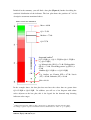
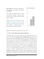
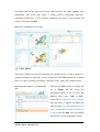
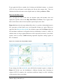
1
WORLD HEALTH ORGANIZATION
REGIONAL OFFICE FOR EUROPE
ORGANISATION MONDIALE DE LA SANTÉ
BUREAU RÉGIONAL DE L'EUROPE
WELTGESUNDHEITSORGANISATION
REGIONALBÜRO FÜR EUROPA
ВСЕМИРНАЯ ОРГАНИЗАЦИЯ ЗДРАВООХРАНЕНИЯ
ЕВРОПЕЙСКОЕ РЕГИОНАЛЬНОЕ БЮРО
Technical meeting to review the project Inequalities in health
System Performance and their Social Determinants in Europe –
Tools for Assessment and Information Sharing – a joint WHOEuropean Commission Action (2006WHO03)
WHO Regional Office for Europe, Copenhagen
18-19 August 2010
Atlas of Health Inequalities in Europe
User Manual
Technical document
12 August 2010
Equity in Health
Inequalities in Health System Performance and Their Social Determinants
in Europe - Tools for Assessment and Information Sharing
Atlas of Health Inequalities in Europe
User Manual
WORLD HEALTH ORGANIZATION
Regional Office for Europe
August 2010
Please do not quote or use these materials without written consent of WHO.
Revised draft 12 August 2010
Contents
Part – I: Introduction ..................................................................................................1
1.1 Context of the Manual .......................................................................................1
1.2 Primary Purpose of the Manual .........................................................................4
1.3 Intended User of the Manual..............................................................................4
1.4 System Requirements.........................................................................................4
Part – II: Basic Features in the Atlases......................................................................6
2.1 Title ....................................................................................................................6
2.2 Buttons ...............................................................................................................7
2.3 Legend................................................................................................................7
2.4 Map ....................................................................................................................8
2.5 Tables.................................................................................................................9
2.6 Charts .................................................................................................................9
Part – III: Descriptive and Correlation Analysis Atlas..........................................11
3.1 Data Button ......................................................................................................11
3.2 The Use of Two Maps and Correlation of Indicators ......................................15
3.3 Filter Button .....................................................................................................16
3.4 Data Tables ......................................................................................................18
3.5 Additional Functions in the Scatter Plot ..........................................................20
Part – IV: Atlas of Social Health Inequalities .........................................................23
4.1 Calculation of Composite Indicators .................................................................23
4.2 Getting Started with Atlases of Social Health Inequalities..............................26
4.3 Bar chart...........................................................................................................27
4.4 Data Tables ......................................................................................................27
Part – V: Regional Profile Comparison Atlas ........................................................33
5.1 Getting Started with Regional Profile Comparison Atlas...............................35
5.2 Pie Chart...........................................................................................................35
5.3 Spine Chart.......................................................................................................36
5.4 New Buttons in Regional Profile Comparison Atlas ......................................39
Part – VI: Additional Generic Features in the Atlases...........................................40
6.1 Dragging Windows ..........................................................................................40
6.2 Resizing Window (Maximize and Restore).....................................................40
6.3 Closing Windows.............................................................................................40
6.4 Context Menu...................................................................................................41
Health Inequalities in Europe: Interactive Atlas User Manual
WHO-EC Equity in Health Project
i
Part – I: Introduction
1.1 Context of the Manual
Inequalities (i) in health are increasing in Europe. They exist between population
groups within the same country and between countries across the European region.
These inequalities lead to increased vulnerabilities in populations as well as increased
differences in health behaviours and outcomes between population groups (whether
measured by education, income, or employment). At the same time, there is a trend in
a number of countries to devolve more responsibility for health systems to the
regional level.
As a result, there is increased demand by policy makers for knowledge on the options
for addressing socially determined health inequalities. In particular how health system
policies and their outcomes in various settings impact on inequalities and actions that
can be taken to improve health equity. This requires not only the systematic collection
and analysis of good policy examples across Europe and an assessment of their
applicability to various contexts but also to making the information available in a
form that supports systematic uptake and application of the learning – know how.
However, routine information required to monitor and assess health inequalities, such
as social determinants of health, intermediate health determinants, population health
outcomes and on the associations and pathways that explain those variations, is rarely
available in a user-friendly way for decision makers.
In response, WHO Regional Office for Europe (WHO/Europe) and the European
Union (DG-SANCO) formed a partnership in 2007 to develop the project Inequalities
in Health system Performance and their Social Determinants in Europe – Tools for
Assessment and Information Sharing (with special focus on the EU and EFTA-EEA
countries within a broader WHO European Region framework), a joint WHOEuropean Commission action (2006WHO03).
One of the main goals of the project is to improve availability of and access to
evidence on inequalities in health system performance, including quality of care and
the structural determinants of such inequalities across countries and regions in
Europe. In general, the project is looking at the distribution and association of social
health determinants and health outcomes indicators and takes the pragmatic view of
maximizing the use of publicly accessible Eurostat data by sub-national geographic
units and defined population groups.
The project aims to improve insight into the regional dimension of social inequalities
in health across counties (regions) in addition to the country dimension. In this way,
the power of international comparisons at the country level is enhanced by
comparisons at the regional level. Studies have also indicated that patterns and trends
of regional socioeconomic development differ, at times very considerably, from those
at the country level. In addition, the project intends to increase awareness and
responsibility to tackle the health implications of inequalities in policies at different
levels. In particular, it aims to increase the engagement of the public and the media in
the dialogue with health policy. A third objective of the project is to provide a feasible
model of regular monitoring and assessment of the magnitude of social inequalities in
health and the impact of the relevant policies, interventions and services.
To meet those purposes, several interactive atlases have been developed with publicly
available data from Eurostat databases (more details on the process and creation of a
new database is given in a separate document). The geographical unit of analysis has
been mostly the second level national administrative territorial units (also know as
NUTS2) or regions, except in circumstances where no health outcome data were
available at such level, in which cases NUTS1 or national level data were used.
The variables displayed in these atlases cover demographic, social, economic, health
status and health system resources categories, including more than 890 individual
indicators. In total there are 281 geographical regions that allow comparisons for
different country subgroups (e.g. EU vs. Non-EU countries) or for regions within
individual countries.
The use of atlases and maps has been increasing in the public health field. Interactive
functions, clickable maps, charts and tables, among other features, provide user
friendly tools that make it easier to understand public health data. In this regards, the
Atlas of health inequalities in Europe presented here represents a tool for assessment
Health Inequalities in Europe: Interactive Atlas User Manual
WHO-EC Equity in Health Project
2
of the relative importance of health system and the social determinants on health
outcomes. It is also an information sharing tool explaining regional gradients of social
inequalities in health.
The following interactive atlases haven been developed for the project:
•
Descriptive and correlation analysis atlas that allows a quick visualization
and analysis of one or two variables in separate maps. Their association is
further described and analysed in a graph. This atlas provides the opportunity
for exploring distributions and identifying patterns of health indicators. Links
to additional resources allow further analysis for the interpretation of the data.
•
Atlases of social inequalities allow visualization of differences in composite
social health inequality indicators between the target value and the value in a
region or group of regions. The target value is the population weighted
average of the most advantaged quintile of the region. Differences between
this target and the individual region are shown as absolute differences (area
target differences) or as relative differences (area target ratios).
•
Regional Profile Comparison atlas allows quick comparison of several key
indicators between a limited numbers of regions.
These atlases have different indicators according to their themes. The detailed list of
NUTS level 2 regions is available in Annex 2 whereas the list of indicators can be
found in Annex 3. An additional annex also provides information on sources of data
and metadata (Annex 1).
This manual explains different available Atlases. The
interactive map of selected health related indicators is available for sub national level
(NUTS level 2) and covers the following dimensions:
•
Structural determinants (e.g. disposable income, GDP)
•
Intermediary determinants (e.g. health care resources such as physicians or
hospital beds)
•
Health outcomes (e.g. mortality and hospitalization rates) and
•
Statistical associations between above categories
Health Inequalities in Europe: Interactive Atlas User Manual
WHO-EC Equity in Health Project
3
1.2 Primary Purpose of the Manual
The main objective of this user manual is to facilitate the effective utilization of the
interactive atlas to describe and analyse statistical data and information relevant to
equity in health.
1.3 Intended User of the Manual
This manual is targeting public health professionals, policy makers and researchers to
facilitate health situation analysis and does not intent to be a substitute for the detailed
development and generic user manual of the underlying InstantAtlas software (which
is available through the Help button).
1.4 System Requirements
The interactive maps are created using InstantAtlas™ from Geowise. To view the
interactive atlases you need Adobe Flash add-on to your Internet browser and PDF
reader to view documents in PDF format.
The best way to check Adobe Flash add-on to your browser is by clicking on the link
for atlas from the menu. After clicking on the atlas link, if you do not get an atlas
appearing then the most likely cause of the problem is that you do not have the Adobe
Flash Player (Ver.8 or higher) installed.
You can test your browser support for Flash add-on by clicking on the Adobe Flash
version test page [http://kb2.adobe.com/cps/155/tn_15507.html]. If you need to install
the free Adobe Flash Player 'plug-in' then you can download it from the Adobe web
site [http://get.adobe.com/flashplayer]. You can download and install free Adobe
Reader from [http://get.adobe.com/reader]. If you have any problems doing this
please read the Help associated with this page.
Health Inequalities in Europe: Interactive Atlas User Manual
WHO-EC Equity in Health Project
4
Please be patient. Loading and re-loading after changes can take a
few moments and it is not always obvious that the tool is still active!
We would welcome any comments and suggestions about these
Interactive Atlases. Please address them to Division of Information,
Evidence, Research and Innovation [[email protected]].
Health Inequalities in Europe: Interactive Atlas User Manual
WHO-EC Equity in Health Project
5
Part – II: Basic Features of the Atlases
When you open any Interactive Atlas available at WHO/Europe (e.g. the Descriptive
and Correlation Analysis Atlas Map), the interface looks similar to the image
displayed below with different windows and functions components (Figure 1). The
full page is also referred to as the Report.
Figure 1: Correlation atlas map window
1
2
2
4
5
3
6
1
2
4
3
This interface shows the following elements:
1
Title
2
Buttons
3
Map/Graph Legend
4
Map
5
Data Table
6
Chart
Common atlas visualization
windows and function
components
2.1 Title
This element shows the selected/displayed indicator. By default, the first indicator
available in the Data or Filter buttons (described below) is shown. When another one
of the list is selected it changes accordingly.
2.2 Buttons
When clicking on a Data or Filter button, a drop down menu in list form is displayed.
The arrow signs (►) indicate further sub division of the list and clicking on them will
open each list which may be on Data/Indicators or Filter/regions. To collapse or close
the subdivision list, click on this arrow sign again. A click on the (+) or (–) signs at
the bottom of the window will expand or collapse the whole list.
Moreover, by clicking on an indicator or region in the list modifies the report display.
Only one variable may be displayed in a map at a time (with up to two maps
depending on the type of Atlas).
By clicking on the Help button, it will display a webpage showing handy tips on using
the Report. Once the help window is opened, you can click on the section (of your
interest) to jump directly to it.
2.3 Legend
The Legend provides information about the way the data values from an indicator are
organized or classified. Try moving your mouse over the data and maps and click on
some of the buttons. You can toggle your contextual geographies by clicking the
checkboxes in the legend as well as toggle the data and filter menu.
Once you load the Atlas Map, Figure 2: Legend properties
the legend is displayed below
the Data and Filter buttons
(Figure 2). You can change the
legend settings by clicking on
the Legend Setting icon .
Health Inequalities in Europe: Interactive Atlas User Manual
WHO-EC Equity in Health Project
7
The legend settings will allow you to do the following:
•
Change the border colour of the geographic regions
•
Adjust map layer transparency (point symbol sizes, when available)
•
Choose colour palettes; reverse the palette
•
Apply a continuous or a divergent shading scheme
•
Increase/decrease the number of classes
•
Choose data classifiers: default is quintile (5 by default for ease of
interpretation) but equal interval, natural break, continuous and standard
deviation are also available. However, these other classifiers are not used in
the subsequent analyses in this project.
Once you change these settings, the colour of map and legend changes instantly. The
boxes or refer either to the country boundaries or rectangle highlighting the
overseas departments and territories of France. Checking on them will show these
features, while they disappear when un-checked.
2.4 Map
The Atlas Map window shows the geographic areas (e.g. the regions) of countries,
which are based mostly on NUTS level 2 classification*. The Map also displays
shades of colours representing values from selected indicators: this is called thematic
shading. By default region values are classified into quintiles as described above.
Change the classification and colour properties in the Legend and see the difference.
*
The Nomenclature of Territorial Units for Statistics or Nomenclature of Units for Territorial
Statistics, (NUTS, after the French nomenclature d'unités territoriales statistiques) is a geocode
standard for referencing the subdivisions of countries for statistical purposes. The standard is
developed and regulated by the European Union, and thus only covers the member states of the EU in
detail. Source: http://en.wikipedia.org/wiki/Nomenclature_of_Territorial_Units_for_Statistics, accessed
4 August 2010
Health Inequalities in Europe: Interactive Atlas User Manual
WHO-EC Equity in Health Project
8
Figure 3: Map showing European project geographic areas (full view).
Also, if you move the cursor over the regions in the Map in any of the Atlases you
will read their country and region code, name and value of the selected indicator. If
you know a region but do not know where it is, you may scroll the table and moving
the cursor over the name will show the specific location, highlighting the region.
Sometimes, visualization of certain areas in a full Map is difficult and you may want
to see more details. You can achieve that by using the zooming tool, which is located
on the top left corner of the Map. Click on Zoom In +, Zoom Out – or Zoom Full
icons to change the zoom to geographic features in the Map. Note that this procedure
will not change the legend as when doing a selection (see Section 3.3 on Filter button
below).
2.5 Tables
Once you select an indicator from the Data button, the data Tables will display the
name of the geographical regions, selected indicator values according to either Maps
1 or 2, and Notes ( ) and Magnifying glass icons (
).
2.6 Charts
Charts allow further analysis of information from selected indicators either in the
form of a scatter plot, a bar graph, a pie chart or a spine graph. The first of two
variables is used in the descriptive and correlation analysis atlas, the second displays
Health Inequalities in Europe: Interactive Atlas User Manual
WHO-EC Equity in Health Project
9
health data by socioeconomic group in the atlases of social health inequalities, and the
second, third and fourth show indicator grouping distributions in the Regional Profile
Comparison
atlas. They will be described in more detail in the context of the
respective atlas section.
For other generic window functions that modify the appearance of Legend, Map,
Table or Chart components, that allow further filtering or printing or exporting the
report outputs, please see Part – VI (on page 40 of this manual).
Health Inequalities in Europe: Interactive Atlas User Manual
WHO-EC Equity in Health Project
10
Part – III: Descriptive and Correlation Analysis Atlas
The descriptive and correlation analysis atlas allows the visualization of one or two
variables in maps at a time together with a correlation analysis. In addition, the
comparison of regions is also possible. After clicking on the link available for this
type of atlas, an active window will open in a new browser page as shown in Figure
4. The default view displays the regional distribution of female life expectancy at
birth; you will be able to change the indicator as you wish.
Figure 4: Descriptive and correlation analysis atlas report
3.1 Data Button
Once you click on it, the Data button lists the available themes (Figure 5): e.g. Life
expectancy, Standardized death rates by sex and age group and Indicators e.g. At
birth – Females. Clicking on the indicator will load new data.
Figure 5: Data button window (descriptive and correlation analysis atlas)
Clicking on the themes, such as life expectancy, will display all the sub-groups
available for the atlas (shown in Figure 6). You can do the same with other themes to
see the available indicators.
Figure 6: Indicators (descriptive and correlation
analysis atlas)
Clicking on the notes icon
(next to the
indicator name) will link to the metadata and
display additional summary information on
data
(geographical
and
statistical
distribution), quality and availability of
indicator selected (shown in Figure 7).
For illustration purposes, we will be taking one indicator, life expectancy at birth
among males, and discuss in the following sections. The display shows a regional
distribution with longer life expectancy in certain northern and south eastern areas and
in the south of the United Kingdom. To highlight them, move the cursor over the
highest value in the legend or click on the colour box; this action may be cancelled by
clicking again. Now, clicking on the notes icon for life expectancy
At birth – Males
will display a PDF formatted one page summary about the selected indicator, as
shown in Figure 7 (the file opens in an external window, for which you need Acrobat
Reader or relevant programme to open PDF files). The one page summary (e.g. life
expectancy at birth for males) shows additional statistical information about the data
distribution and availability.
Health Inequalities in Europe: Interactive Atlas User Manual
WHO-EC Equity in Health Project
12
Figure 7: Summary information
In the above figure, the table summarizes the descriptive statistics about the indicator:
N:
number of regions with available data
Min:
minimum value
Max:
maximum value
Median:
median value
Q1:
first quartile; cuts off lowest 25% of data
Q3:
third quartile; cuts off lowest 75% of data
IQR:
Inter Quartile Range = Q3 – Q1
Q1 – 3*IQR:
outlier; the value lies 3.0 times inter quartile range below first
quartile
Q1 – 1.5*IQR: suspected outlier; the value lies 1.5 times inter quartile range
below first quartile
Q3+1.5*IQR:
suspected outlier; the value lies between 1.5 times and 3.0 times
the inter quartile range above third quartile
Q3+3*IQR:
outlier; the value lies more than 3.0 times inter quartile range
above third quartile
Mean:
mean value
SD:
Standard Deviation
Health Inequalities in Europe: Interactive Atlas User Manual
WHO-EC Equity in Health Project
13
Included in the summary, you will find a box plot (Figure 8) further describing the
statistical distribution of the indicator. The box plot shows the position of 7 of 10
descriptive statements mentioned above.
Figure 8: Box plot explanation
Max = 80.20
Q3 = 78.50
Median = 77.40
Q1=75.70
Suspected outliers2
[Q1–3*IQR ≤ x < Q1–1.5*IQR or Q1+1.5*IQR <
x ≤ Q3+3*IQR]
e.g. Mazowieckie (PL12) = 71.40; Wielkopolskie
(PL41) = 71.40, ´Eszak-Magyarorsz´ag (HU31) =
67.60
Outliers [Q1–3*IQR < x > Q3+3*IQR]
E.g. Outliers are: Estonia (EE) = 67.20; Latvia
(LV) = 65.80; Lithuania (LT) = 64.80.
Min = 64.80
In the example above, the box plot does not have the values that are greater than
Q3+1.5*IQR or Q1+3*IQR. In addition, you will see a bar diagram with colour
codes adjacent to the box plot; this is the legend for the thematic map showing
indicator value ranges.
2
Outliers and suspected outliers in this context refers to data that are showing extreme values
according to a given “expected” distribution and not that the data are “false” or “poor quality”.
Health Inequalities in Europe: Interactive Atlas User Manual
WHO-EC Equity in Health Project
14
Data availability (in the form of a histogram) by
Figure 9: Time histogram
yearly periods is also shown in the summary
page (Figure 9).
In the given time histogram, 60% of regions
have data (life expectancy at birth for males)
available for the year 2007, around 40% for 2006
and <1% for 2003.
Likewise, click on the notes icon for other
indicators (e.g. Income >> GDP at current
market prices – EUR/inhabitant) and see the one
page summary as explained earlier; try to
interpret the box plot and time histogram.
Annex 3 of this manual lists all indicators in the atlas system.
3.2 The Use of Two Maps and Correlation of Indicators
As indicated before, you are able to visualize two different indicators and how they
relate to each other in the descriptive and correlation analysis atlas. The value of
the indicator selected from Data Button (top) will be displayed in the Map on the top,
whereas values of the selected indicator from Data Button (bottom) will display on
the bottom Map. In this example, for the top map choose the per capita disposable
household income (adjusted for purchase parity), and for the bottom one, the life
expectancy at birth for both sexes combined (colour has been changed from the
default to allow improved comparisons). As shown below in Figure 10, you will be
able to see the regional distribution of both indicators side by side and also notice how
the data are correlated. Geographical patterns show that the 20% richest regions
(highlighted in orange) tend to be in the centre and northern areas, while life
expectancy increases towards the south east; however, given the number of regions
and colours it is difficult to determine how they are related in the Map. The
Health Inequalities in Europe: Interactive Atlas User Manual
WHO-EC Equity in Health Project
15
correlation chart of the atlas on the lower right corner of the report provides such
information. The scatter plot shows a strong positive relationship (Pearson’s
correlation coefficient r = 0.73) which is nonlinear; the slope is steep initially and
starts to wane after €10,000.
Figure 10: Correlation/use of two maps
3.3 Filter Button
You may be further interested in analysing the situation of only a single country or a
group of countries; to allow this, you need filter tools. The Filter button lists available
filters (or subset selection possibilities) and their values; follow the example below.
Figure 11: Filter explorer – correlation map
atlas
Click on the Filter button to display the
list
in
Figure
11.
To
select
the
geographic regions of the 12 newer EU
Member States (since 2004 or 2007),
choose EU-12 (EU 15 or 12 >> EU-12).
Once the filter is applied, the Title will
show its name, e.g. Life expectancy >> At
birth – both sexes >> Filter: EU 15 or 12
>> EU-12 and the Map will also display
data for the selected geographic regions.
Health Inequalities in Europe: Interactive Atlas User Manual
WHO-EC Equity in Health Project
16
If you apply the filter at another level selecting an individual country, e.g. Austria
(AT), the view will zoom in and display the data for this country only. You can
eliminate the filter and return to the original status by clicking on Remove Filter.
How does the filter work?
Once you apply the filter to the data, the dynamic report will instantly select and
display the specific values in the Map, Data Tables and Charts. Try to apply some
filters on the data to observe how dynamic reports display new values.
Figure 10 shows the atlas map without filter: there is a positive relationship between
life expectancy at birth (both sexes) and disposable income per capita. When you
apply the filter EU 15 or 12 >> EU-12, the dynamic reports look like Figure 12 while
the correlation coefficient is still positive but the relationship is weaker (r = 0.56). In
addition, there are large regional differences in life expectancy of nearly 8 years while
income varies by nearly €9,000 indicating important disparities among regions of
EU–12 countries.
Figure 12: Correlation atlas map with EU-12 filter
If you change the filter to EU–15, you will find the dynamic reports as shown in
Figure 13. In this case, the distribution is different showing some clustering of
regions of EU–15 countries; the correlation coefficient changes to 0.28, indicating
weaker positive linear association.
Health Inequalities in Europe: Interactive Atlas User Manual
WHO-EC Equity in Health Project
17
Figure 13: Correlation map atlas with filter (EU-15)
3.4 Data Tables
Once you select an indicator from the Data Button, the data Tables will display the
name of the geographic regions, selected indicator values according to either map 1 or
2, and Notes and Magnifying glass icons.
Once you select and apply a filter (e.g. selecting AT), by clicking on a region in the
data Tables (e.g. AT11-Burgenland), the geographical area (AT11-Burgenland) will
be automatically highlighted. Placing your mouse pointer over the geographical area
will display the name of region along with its selected indicator value (Figure 14),
one for each map. If needed, vertical scroll bars are also available if data can not be
viewed within the table dimensions.
Health Inequalities in Europe: Interactive Atlas User Manual
WHO-EC Equity in Health Project
18
Figure 14: Data table – Descriptive and correlation analysis atlas
1
3
2
4
5
When selecting one sub-region or country, note that the legend applies only to the
selected areas (it is modified accordingly).
Selection of Geographic Areas
1
Click the name of the geographic regions to select the area. A selected geographic
area will be shaded. Alternatively, moving the mouse cursor over a region in a
map window displays its name and clicking on it will select and change
temporarily its colour (orange by default). The selected region is also shown in the
table with shaded colour.
The table display may be adjusted for different column width and order.
2
Hold your mouse pointer over the divider between column’s headers and lateral
arrows
3
will appear. Click and drag the divider to adjust the column width.
Click a column header to sort the tables in ascending ▲ or descending ▼ order.
You can sort columns with names (text) as well as data (numbers).
Magnifying Geographical Area
4
Click on the magnifying glass icon
displayed on the left side of geographic area
to zoom to the selected area in the map.
5
Clicking on Notes icon
will automatically display the portrait (a brief profile) of
the respective region (Figure 15).
Health Inequalities in Europe: Interactive Atlas User Manual
WHO-EC Equity in Health Project
19
The link redirects to the webpage of the selected region that is provided by
Eurostat. This webpage provides further information on geography and history,
population, employment, etc. of this selected region.
Figure 15: Portrait of the regions
The above example shows the portrait of the NUTS 2 region – Burgenland in Austria.
3.5 Additional Functions in the Scatter Plot
As shown before, once you choose a couple of indicators and apply a filter (if any),
the atlas system will instantly produce a scatter plot, showing indicator values on each
axis (Figure 16). In the example given below, you can see the data from Data button
– on top (Income >> Disposable household income, net (uses) – PPS based on final
consumption per inhabitant) is displayed in X-axis where as data from Data button –
at the bottom (Life expectancy >> At birth – males) is displayed in Y-axis.
Health Inequalities in Europe: Interactive Atlas User Manual
WHO-EC Equity in Health Project
20
Figure 16: Scatter plot explanation
The above graph shows the positive association between life expectancy (male) and
disposable household income. If you do point the mouse over the dots of the scatter
plot, it will display the name (e.g. FR3-Nord Pas de Calais) and values for each
indicator (x=13.513,4, y=74) of the selected geographic region.
In addition, you will find statistical information about the scatter plot which is
displayed as the title of the graph (in the example, Pearson’s correlation coefficient r
= 0.74, r -squared = 0.55 and the regression equation = y=0.0x + 69.24).
If needed, you can select more than one value or region in the scatter plot. For this
you need to do the following:
•
Put the mouse cursor over the scatter plot
•
Click the left mouse button, hold and the drag mouse pointer over the values
that you would like to select, as shown in Figure 17(a). The selected values
will be instantly highlighted
If you want to select individual values, click on the value then hold down Ctrl Key
and keep on clicking the values that you want to select. Moreover, if you want to
select values from different locations of the scatter plot, you can do that, too. Repeat
Health Inequalities in Europe: Interactive Atlas User Manual
WHO-EC Equity in Health Project
21
the steps mentioned for Figure 17(a) then hold down Ctrl Key and select the values
by holding and dragging mouse pointer as shown in Figure 17(b).
Figure 17: Selection of values in a scatter plot
(a)
(b)
Figure 18: Selection of multiple values in a scatter plot
Once
you
select
the
values from the scatter
plot, the regions in data
Tables as well as in the
Map will instantly be
highlighted (Figure 18).
Health Inequalities in Europe: Interactive Atlas User Manual
WHO-EC Equity in Health Project
22
Part – IV: Atlas of Social Health Inequalities
The reports of the social health inequalities atlases include a single Map, Table and
Chart providing a multi-faceted view of a specific composite indicator. They allow
further exploring social health inequality patterns (e.g. as expressed by health
outcome indicators) while taking into account different socioeconomic status
perspectives (e.g. income, education and employment). Furthermore, these maps
allow visualization of the difference between the variable for a region or group of
regions and a target value (i.e. that of the most favourable situation, which may be
considered an “attainable horizon”).
4.1 Calculation of Composite Indicators
To determine inequalities in health status and resources due to socioeconomic
inequalities, composite indicators of social health inequalities are calculated according
to the following algorithm:
1. First, the regions are sorted according to the socioeconomic indicator value,
from the most advantaged to the most deprived regions.
2. Regions are grouped into five groups taking into account population size of
each region, resulting in 5 groups of regions with approximately the same
population size.
3. Population weighted averages are calculated for the socioeconomic status
indicator and all other indicators of interest for each group (quintile) of
regions.
4. The population weighted average of the most advantaged (Q1) group of
regions is used as benchmark – target value.
5. For each region, the absolute difference between the value of the indicator in
the region and the target “Area Target Difference” and the relative difference
between the regional value and target “Area Target Ratio” (in %) are
calculated. Similarly, quintile target difference and quintile target ratio are also
computed.
The calculation of composite indicators is illustrated below in Table 1.
Area
Socio economic status
(SES) indicator - e.g %
population with high
education
Population
A
B
C
1 Region 1
2 Region 2
3 Region3
4 Region 4
5 Region 5
6 Region 6
7 Region 7
8 Region 8
9 Region 9
10 Region 10
11 Region 11
12 Region 12
13 Region 13
14 Region 14
15 Region 15
Total
Most adv
50.1
49.0
48.1
45.8
43.0
40.6
38.8
37.8
36.8
35.0
34.4
33.0
32.9
32.4
33.4
Most deprived
Cumul. %
% of total
of total
population population
D
4,952,100
6.37%
4,648,000
5.98%
6,222,300
8.01%
4,598,888
5.92%
4,700,109
6.05%
5,023,315
6.47%
3,921,040
5.05%
4,648,000
5.98%
6,348,000
8.17%
5,722,300
7.37%
6,598,888
8.49%
6,010,109
7.74%
3,992,100
5.14%
4,648,000
5.98%
5,656,534
7.28%
77,689,683 100.00%
E
6.37%
12.36%
20.37%
26.29%
32.34%
38.80%
43.85%
49.83%
58.00%
65.37%
73.86%
81.60%
86.74%
92.72%
100.00%
Abbreviations used
SES
Socio Economic Status
PWA
Population Weighted Average
Health Inequalities in Europe: Interactive Atlas User Manual
WHO-EC Equity in Health Project
Quintile
Table 1: Example of calculation of composite indicators
F
Q1
Q2
Q3
Q4
Q5
Weight within quintile SES indicator
PWA for
Indicator e.g.
(% of quintile
quintile
mortality rate
population)
G
31.30%
29.38%
39.33%
32.11%
32.82%
35.07%
26.29%
31.16%
42.56%
31.22%
36.00%
32.79%
27.92%
32.51%
39.57%
H
49.0
43.1
37.6
34.1
32.9
Calculations
SES indicator PWA for quintile (H)
Indicator PWA for quintile (J)
I
75.0
76.8
79.0
86.0
87.0
88.0
90.1
92.3
87.0
90.5
95.5
98.6
99.9
97.4
99.5
Indicator
PWA for
quintile
Area-Target
difference
(absolute
inequality)
Quintile-Target
difference
(absolute
inequality)
J
K
L
77.1
87.0
89.5
95.0
98.9
-2.1
-0.3
1.9
8.9
9.9
10.9
13.0
15.2
9.9
13.4
18.4
21.5
22.8
20.3
22.4
0.0
9.9
12.4
17.9
21.8
Area-Target Quintileratio
Target ratio
(relative
(relative
inequality) inequality)
M
97.27%
99.61%
102.46%
111.54%
112.84%
114.13%
116.86%
119.71%
112.84%
117.38%
123.86%
127.88%
129.57%
126.33%
129.05%
N
100.0%
112.9%
116.0%
123.2%
128.3%
= A1*G1+A2*G2+A3*G3 = 49.0
= G1*I1+G2*I2+G3*I3 = 77.1
24
Given the diverse and large number of variables available, to allow for more specific
analyses, the atlases of social health inequalities are grouped into thematic categories
by either health outcomes or population groups. Below are the two examples prepared
for the project:
1. Avoidable mortality atlases, by socio economic variable, and
2. Child health atlases, by socio economic variable
In each of these categories, six atlases, one for each of the following socioeconomic
indicators are available:
1. Income of households - Disposable income, net (uses) - Purchasing power
standard based on final consumption per inhabitant (PPS are country averages)
2. Percentage of population by highest level of education attained - Pre-primary,
primary and lower secondary education - levels 0-2 (ISCED 1997)3 - Both
sexes - Between 25 and 64 years
3. Percentage of population by highest level of education attained - Tertiary
education - levels 5-6 (ISCED 1997) - Both sexes - Between 25 and 64 years
4. Unemployment rates by sex and age - 25 years and over - Both sexes
5. Long-term unemployment (12 months and more) - Long-term unemployment
rate (on total unemployment)
6. Infant mortality rate (as an indirect measure of overall human development)
The full list of indicators in the social health inequalities atlases (related to avoidable
mortality and child health) is provided in Annex 3b and 3c.
3
ISCED refers to International Standard Classification of Education. For further information see
[http://www.unesco.org/education/information/nfsunesco/doc/isced_1997.htm]. Alternatively you will
find the complete report at [http://www.uis.unesco.org/TEMPLATE/pdf/isced/ISCED_A.pdf].
Health Inequalities in Europe: Interactive Atlas User Manual
WHO-EC Equity in Health Project
25
4.2 Getting Started with Atlases of Social Health Inequalities
Once you click the link to open the dynamic reports for selected indicator of either
Amenable Mortality Atlases or Child Health Atlases, different components will
appear as shown in Figure 19. The indicator selected by default in either atlas is the
socioeconomic variable used for grouping regions into quintiles.
Figure 19: Social Health Inequality Atlas
1
2
4
3
5
7
6
8
9
1
Title
2
Buttons
3
Legend
4
Map
5
6
Tables
7
Context Menu
8
Bar Chart
9
Socioeconomic variable
The atlas of social health inequalities has the same global features as described in
earlier sections (Part-II) of this manual. In this new report, you will also see a bar
Chart and two data Tables which will be explained further in the coming sections.
Health Inequalities in Europe: Interactive Atlas User Manual
WHO-EC Equity in Health Project
26
4.3 Bar chart
8
You will see the ranked bar chart shaded according to the legend, that is, by the
selected indicator. Moving the mouse pointer over the bar chart displays comparison
values for the selected regions (Figure 20).
Figure 20: Ranked Bar Chart
With the mouse pointer over the bar chart, clicking on any bar chart will
automatically highlight the data (in the Table) and its geographic location (in the
Map) for selected bars. You can select single or multiple bars by holding Ctrl key and
clicking on desired bars.
4.4 Data Tables
In the columns of Table
you will see
Name (of geographic location), Value and
5
Group. Here value represents the selected
indicator (e.g. life expectancy at birth – both
sexes) whereas group refers to quintiles of the socioeconomic indicator in which this
region falls. This provides a first glance on whether the regions with the highest life
expectancy (or other indicator as selected) are also the ones with the least deprived
socioeconomic condition (following the example, the 20% highest values of
disposable income).
There will be another, smaller, Table
below the legend where you will see Group
6
Name and Indicator value columns along
with colour codes for groups. Here the
groups are presented from least deprived to
most deprived quintiles. Thus, Group 1 refers to the top 20% of the population who
Health Inequalities in Europe: Interactive Atlas User Manual
WHO-EC Equity in Health Project
27
are least deprived (or better off) based on the socioeconomic variable chosen (e.g.
disposable income of households). The value in the indicator column (e.g. 80.8 for
Group 1) shows the population weighted average life expectancy at birth – both sexes
for the respective groups (quintiles). In this case, the least deprived group has on
average a 5.6 years longer life expectancy compared to the most deprived group,
whose average is 75.2 years.
You can highlight the socioeconomic group thresholds, by clicking on the group
name. This will draw a cut off line in the bar chart. In the illustration below (Figure
21), you can see a cut-off line in the bar chart when Group 4 is selected.
Figure 21: Socioeconomic group average threshold for the selected indicator
To facilitate the interpretation of health differences between socioeconomic groups,
the atlas also includes absolute and relative differences between the value in a region
or group of regions and a target value, that is defined as the average in the most
favourable quintile. The indicators of absolute or relative differences are referred to as
Area Target Difference or Area Target Ratio, respectively. To continue with the
example on life expectancy for both sexes, you need to use the Data button and select
the indicator; the Title should now look like this: Area Target Difference - Life
expectancy >> At birth - Both sexes.
Note that the Map appearance will not change but there will be changes in the values
of the Legend and Tables and scale of the bar Chart showing negative values
(Figure 22). In addition, you will see that the average difference of Group 5 in
relation to Group 1 is -5.6 years (as mentioned above), but there are regions in Group
5 that are farther below (down to -9.9 years), indicating the presence of important life
Health Inequalities in Europe: Interactive Atlas User Manual
WHO-EC Equity in Health Project
28
expectancy inequalities within quintile groups. Likewise, there are a few regions that
are 2 years above Group 1 average.
Figure 22: Example with absolute health indicator differences between socioeconomic groups
Differences between socioeconomic groups can also be displayed as ratios.
This time, the example involves avoidable mortality (e.g. certain preventable causes
of deaths occurring before the age of 65 years of age) for both sexes and all causes
combined. The report Title should look like this: Area Target Ratio – Amenable
mortality - Both sexes - 0-64y >>> Amenable causes of death (02, 11, 17, 18, 27, 34,
36, 38, 39, 43, 50 and 54). The resulting Legend shows the quintile classification
scheme with a large range of values starting at 63.1 and ending at 408.6 (
Health Inequalities in Europe: Interactive Atlas User Manual
WHO-EC Equity in Health Project
29
Figure 23). These values mean that there are regions where the amenable mortality
rate is as low as two thirds as that of the target (Group 1 average) or four times higher
than the target. Moreover, the socioeconomic group figures in the Table and the bar
Chart show a non-monotonic distribution of target ratios, which are skewed towards
the highest values in Group 5. The average value for Group 5 (223.4) indicates that
amenable mortality is more than 100% higher (or two-fold) than in Group 1.
Health Inequalities in Europe: Interactive Atlas User Manual
WHO-EC Equity in Health Project
30
Figure 23: Example with relative health indicator differences between socioeconomic groups
In the next example, we use a filter to compare the EU-15 and the EU-12 countries.
Where do regional health inequalities appear to be more important? Review Figure
24 and Figure 25 below to analyse the results.
Figure 24: Example with relative health indicator differences between socioeconomic groups,
with filter applied to EU-15 countries
Health Inequalities in Europe: Interactive Atlas User Manual
WHO-EC Equity in Health Project
31
Figure 25: Example with relative health indicator differences between socioeconomic groups,
with filter applied to EU-12 countries
In a second example, try using other mortality indicators (e.g. by specific causes such
as tuberculosis or Ischaemic heart disease) and select a filter to analyse the situation in
the EU-12 countries or in Germany. What can you conclude about health inequalities
in these areas?
Health Inequalities in Europe: Interactive Atlas User Manual
WHO-EC Equity in Health Project
32
Part – V: Regional Profile Comparison Atlas
Regional Profile Comparison Atlas allows quick comparison of several key
indicators in a selected region with respect to the whole NUTS2 regions distribution
or between two selected regions and the regional average. In other words, it gives you
a cross-sectional view across multiple indicators for any two regions. The indicator
values are standardized so that they can also be presented consistently within a spine
chart. The indicators are grouped into logical categories.
Given that the interest is to provide fast access to data to compare regional health
systems, this atlas only includes a selected number of variables under the following
categories:
1. Socio Economic Indicators
a. Unemployment rates by sex and age - 25 years and over - Both sexes
b. Percentage of population by highest level of education attained - Preprimary, primary and lower secondary education - levels 0-2 (ISCED 1997)
- Both sexes - Between 25 and 64 years
c. Percentage of population by highest level of education attained - Tertiary
education - levels 5-6 (ISCED 1997) - Both sexes - Between 25 and 64 years
d. Income of households - Disposable income, net (uses) - Purchasing power
standard based on final consumption per inhabitant
e. Long-term
unemployment
(12
months
and
more)
-
Long-term
unemployment rate (on total unemployment)
f. Infant mortality rate
2. Health System Resources
a. Hospital beds (HP.1) by region – Available beds in hospitals (HP.1) – per
100,000 inhabitants
b. Health personnel by region – Physicians or doctors – per 100,000 inhabitants
c. Health personnel by region – Nurses and midwives – per 100,000
inhabitants
3. Mortality
a. Standardized death rate - Amenable causes of death (02, 11, 17, 18, 27, 34,
36, 38, 39, 43, 50 and 54) – Less than 65 years – females
b. Life expectancy - at birth - males
c. Life expectancy - at birth - both sexes
d. Standardized death rate - All causes of death - all ages – females
e. Standardized death rate - All causes of death - all ages – males
f. Standardized death rate - All causes of death - all ages - both sexes
g. Life expectancy - at birth - females
h. Standardized death rate - Amenable causes of death (02, 11, 17, 27, 34, 36,
38, 39, 43 and 54) - Less than 65 years – males
i. Standardized death rate - Amenable causes of death (02, 11, 17, 18, 27, 34,
36, 38, 39, 43, 50 and 54) - Less than 65 years - both sexes
j. Crude death rate - total All causes of death (A00-Y89) - less than 15 years females
k. Crude death rate - total All causes of death (A00-Y89) - less than 15 years both sexes
l. Crude death rate - total All causes of death (A00-Y89) - less than 15 years –
males
4. Hospitalisations
a. Standardized hospitalisation rate - c0000 All causes (A00-Z99 (excluding V,
W, X and Y codes)) - less than 75 years - both sexes
b. Standardized hospitalisation rate - c000e All causes (A00-Z99 (excluding V,
W, X and Y codes)) excluding 'healthy newborn babies' (Z38) - less than 75
years - both sexes
For detailed description of the indicators, please see Annex 3d.
Health Inequalities in Europe: Interactive Atlas User Manual
WHO-EC Equity in Health Project
34
5.1 Getting Started with Regional Profile Comparison Atlas
Once you open the Regional Profile Comparison Atlas, you will see the dynamic
report window as shown below in Figure 26.
Figure 26: Regional Profile Comparison atlas
1
2
3
7
4
5
6
1
Title
2
Buttons
3
Map
4
Bar Chart
5
Legend
6
Pie Chart
7
Spine Chart
The components and the navigation in this type of Atlas are similar to the ones
described before. However, you will find two new components of dynamic report in
this atlas: the Pie and Spine Charts.
5.2 Pie Chart
The pie chart shows the proportion of regions and their value ranges in each quintile
class. Moving the mouse pointer over the chart will display the value in each class. In
the illustration below (Figure 27b), it displays 4.7 – 5.3: 18.5%. This means that the
Health Inequalities in Europe: Interactive Atlas User Manual
WHO-EC Equity in Health Project
35
value of the selected slice of pie ranges from 4.7 to 5.3, which is 18.5% of the total
regions. You can define the number of classes from Legend Options.
Figure 27: Pie chart
(a)
(b)
(c)
You can click on the slice (Figure 27c) to select the regions. Clicking on the slice
instantly shades the Map according to the legend colour as well as displays the values
of selected slice on the Spine Chart.
Figure 28: Features in the slice
5.3 Spine Chart
Spine Chart gives you at a glance an assessment of cross-indicator area profiles as
shown below.
Health Inequalities in Europe: Interactive Atlas User Manual
WHO-EC Equity in Health Project
36
Figure 29: Spine chart
In the spine chart, you will see the indicators, geographic area, and value of the
respective indicator along with a comparison chart. For illustration purposes, if we
take one indicator e.g. life expectancy – at birth – females, you will see the following:
•
Indicator: Life expectancy - at birth - females
•
Area: AT 21 Kärnten
•
Value: 83.7 years
•
Comparison:
•
Legend:
In the above comparison chart, you will see 5 quintiles (each shown with respective
colours; which can be seen in the legend (at the bottom) of the Spine Chart window.
Note that depending on the type of indicator, the sequence of colours changes,
although for same indicators (such as health care resources available) the “optimal”
may not be found at one of the end-points of the interval. Putting the mouse pointer
over the graph will display the quintile information (e.g. 5q: 75.8—80.6). The values
75.8 and 86 shown in the graph represent minimum and maximum figures for the
indicator (female life expectancy at birth), respectively, and represents the background
against which a region is compared.
Health Inequalities in Europe: Interactive Atlas User Manual
WHO-EC Equity in Health Project
37
The bar in the middle of the spine chart represents the value for the region AT 21 i.e.
83.7 years. This region is relatively well positioned since its value is above 60% of all
other regions (light green).
If used systematically, this tool can be used to identify priority regions where many
conditions or indicators of diverse health dimensions are in the “red zone”, suggesting
more unfavourable situations. Scroll the vertical bar if not all the indicators can be
viewed within the spine chart dimensions.
Update Map and Charts
Clicking on a given indicator in the Spine Chart window will instantly update the
displays on the Map, bar and pie Charts.
Area Profile
If you want to see the situation of a particular geographic area regarding all available
indicators, just select the area from the map (Figure 30), and the spine chart will
display the profile of the selected area.
Figure 30: Area profile (N004 - Agder og Rogaland)
Holding Ctrl key and clicking on geographic area (regions) in the map will allow you
to select and compare 2 regions. You can instantly observe the changes in the Bar
chart, pie chart as well as in Spine chart.
Health Inequalities in Europe: Interactive Atlas User Manual
WHO-EC Equity in Health Project
38
Dynamic Linkages
There are dynamic linkages or brushing between the components in Regional Profile
Comparison atlas. This means that if you select any value in one component (for
example in a map) all other components will be updated.
5.4 New Buttons in Regional Profile Comparison Atlas
In addition to the above mentioned features, you will find two more buttons in this
atlas.
Clicking on the
button will display data Table instead of the Map
(Figure 31). You can sort columns by clicking the header. Data for each geographic
region is linked to notes for each map feature. Re-clicking on
will
hide the Table and show the default thematic Map.
Figure 31: Table button function
a. Default report displaying Map
b. Report after clicking on table button.
Finally, although it is not implemented yet, the Atlas allows to show time trends of
selected indicators when the Time button is clicked, replacing the bar Chart with
quintile distribution of indicators. Please note that the time button is currently not in
use, as the Atlases in their current version have no time series available.
Health Inequalities in Europe: Interactive Atlas User Manual
WHO-EC Equity in Health Project
39
Part – VI: Additional Generic Features in the Atlases
There are additional generic window functions to modify the properties in the Atlases.
Every time you move the cursor over the upper right corner of a Legend, Map, Table
or Chart window, you will see the following toolbar
with drag, resize and
close functions. These allow changing their position and appearance.
6.1
Dragging Windows
By clicking and holding on Drag icon
you can drag (move) Legend, Map,
Tables or Charts windows at your desired location.
6.2
Resizing Window (Maximize and Restore)
You can maximize the Legend, Map, Tables or Charts windows by clicking on
Maximize icon
. You may also change the window to a desired size by moving
the cursor to a side or corner and dragging the arrows in the appropriate direction.
Moreover, you can restore the respective window by clicking on the Restore
Down icon
, which is displayed when moving the cursor to the top right corner
of a maximized window.
6.3
Closing Windows
To allow further organization of the report, you can even close the Legend, Map,
Tables or Charts windows by clicking on Close icon . If you wish to re-open a
closed window, you can choose Reset Layout from Context Menu (see below
6.4). All components are visualized in the original way as when the atlas was
loaded for the first time.
Health Inequalities in Europe: Interactive Atlas User Manual
WHO-EC Equity in Health Project
40
6.4
Context Menu
When you click with the mouse right button
Figure 32: Context menu
anywhere over the Legend, Map, Tables, Charts
(Scatter Plot, Pie/Bar/Spine Chart) or in the Dynamic
Report4, a Context Menu will appear as shown in
Figure 32. This menu allows you to do the following:
•
Clear a selection
•
Filter based on the active selection
•
Remove a filter
•
Reset the report layout
•
Print report
•
Export the report
Reset Layout
You can choose this option to bring back all active windows to their original state
(dynamic report with Legend, Map, Tables and Charts).
Filter a Selection
After applying a selection in a window (Legend, Map, Table or Chart) by clicking on
Filter Selection, you can further display regions using same classification criteria
(e.g. quintile) to the selected group. Where as clicking on Clear Filter clears all the
filters applied.
Print Preview
This allows you to print Tables, Charts, Legend, Map or even Full Screen. You can
print the object as vector or bitmap (Figure 33). In addition, you can include buttons,
images or background.
4
A dynamic report is the overall window display where elements are dynamically interrelated: e.g. if a
region (or group of regions) is selected in a map, chart, table or legend they are shown with a distinct
colour in each of the window components.
Health Inequalities in Europe: Interactive Atlas User Manual
WHO-EC Equity in Health Project
41
Figure 33: Print preview window
Export Options
This option allows you to export the Full Screen, Table, Scatter
Plot, Legend or Map to JPEG or PNG format. You can find the
exported object with the given filename in the location you have
chosen on your local/external hard drive.
i For further explanations on terminology, see for example the list of Key Terms from
Whitehead M & Dahlgren G. Levelling up (part 1): a discussion paper on concepts and
principles for tackling social inequalities in health. WHO, 2006.
Health Inequalities in Europe: Interactive Atlas User Manual
WHO-EC Equity in Health Project
42