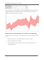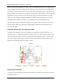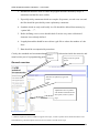
1
GGIG Graphical Interface Generator User Guide Wolfgang Britz, August 2010 - Version January 2015 - GGIG Graphical Interface Generator – User Guide The following user guide documents the outcome of a collaborative effort of University Bonn and the author. Larger parts of the Java code underlying GGIG had been developed over the years in the context of projects related to the CAPRI modelling system, which received considerably funds from the EU research framework programs. Following the general policy in CAPRI, the GGIG pre-compiled code can be used for other scientific projects as well without charge. The document comprises to a larger extent the content of earlier versions of the CAPRI user guide of which the GUI is now realized in GGIG. The author would like to acknowledge the contribution of Alexander Gocht, vTI Braunschweig, to the CAPRI GUI coding efforts. All errors remain with the author. Wolfgang Britz, Version January 2015 2 GGIG Graphical Interface Generator – User Guide Content GGIG Graphical Interface Generator ......................................................................................... 1 User Guide.................................................................................................................................. 1 Content ....................................................................................................................................... 3 Overview .................................................................................................................................... 9 An overview on the GUI .......................................................................................................... 11 Initialization: General interface settings .................................................................................. 12 GAMS and R related settings ............................................................................................... 13 SVN related settings ............................................................................................................. 14 Case one: Exploiter and runner ........................................................................................ 15 Usage for installation purposes ........................................................................................ 17 Settings linked to the exploitation tools ............................................................................... 19 Help system .............................................................................................................................. 20 Starting GAMS from GGIG ..................................................................................................... 20 Viewing results: exploitation tools ........................................................................................... 21 Views as the basic concept for exploitation ......................................................................... 21 Exploiting results.................................................................................................................. 22 The multi-dimensional viewer with pivoting and exporting possibilities ............................ 24 Pre-defined views ................................................................................................................. 25 View selection .................................................................................................................. 25 Navigating through views ................................................................................................ 26 Navigating in the outer dimensions of the viewport ........................................................ 26 Column and row selection ................................................................................................ 27 Predefined selection groups ............................................................................................. 28 Selection of the view type ................................................................................................ 29 Manually changing the pivot ............................................................................................ 29 Wolfgang Britz, Version January 2015 3 GGIG Graphical Interface Generator – User Guide Changing view options: fonts, number formatting and rounding, hiding empty cells, comparisons ...................................................................................................................... 30 Showing a histogram window .......................................................................................... 33 Working with tables ............................................................................................................. 34 The toolbar ....................................................................................................................... 34 Tooltips for column and row headers ............................................................................... 35 Drill-down ........................................................................................................................ 35 Clipboard export ............................................................................................................... 35 Export to file..................................................................................................................... 35 Working with EXCEL export .......................................................................................... 39 Sorting .............................................................................................................................. 40 Numerical filtering based on cell content ........................................................................ 41 Changing the row height and column width with the mouse ........................................... 41 Adding statistics ............................................................................................................... 41 Implemented outlier detection algorithms ........................................................................ 44 Pop-up menu .................................................................................................................... 46 Working with graphics ......................................................................................................... 47 General handling of graphs .............................................................................................. 47 Setting colors manually .................................................................................................... 49 “Walking” through the data .............................................................................................. 50 Exporting the graphic to file............................................................................................. 50 Exporting the graphic to clipboard ................................................................................... 51 Pop-up menu in graphics .................................................................................................. 52 Bar charts .......................................................................................................................... 53 Line and point charts ........................................................................................................ 54 Pie charts .......................................................................................................................... 56 Spider plots ....................................................................................................................... 57 Wolfgang Britz, Version January 2015 4 GGIG Graphical Interface Generator – User Guide Box and Whisker charts ................................................................................................... 58 Histograms ....................................................................................................................... 59 Scatter plots ...................................................................................................................... 61 Deviation renderer ............................................................................................................ 62 How to draw a line chart with mean / min / max etc. over a time series ......................... 63 Markov charts ................................................................................................................... 65 Working with maps .................................................................................................................. 66 Flow maps ............................................................................................................................ 66 Pie chart maps ...................................................................................................................... 68 Colored thematic maps ......................................................................................................... 68 Changing the classification and the legend ...................................................................... 69 Changing the coordinate set ............................................................................................. 70 Adding a histogram window to a map ............................................................................. 71 Shrinking polygons according to UAA share .................................................................. 72 Area weighted classification ............................................................................................ 73 Excluding zeros from classification and removing small and large values ..................... 73 Classification method ....................................................................................................... 73 Integration distribution information in the map window ................................................. 76 Color table ........................................................................................................................ 76 Changing the way the legend is drawn ............................................................................. 80 Changing the title of the map ........................................................................................... 82 Zooming in and out and navigating in the map ................................................................ 82 Getting data for specific polygons ................................................................................... 83 Highlighting specific regions in the map ......................................................................... 84 Updating the map ............................................................................................................. 88 Adding region label to the map ........................................................................................ 88 Showing river and cities ................................................................................................... 89 Wolfgang Britz, Version January 2015 5 GGIG Graphical Interface Generator – User Guide Storing and re-loading your settings ................................................................................ 90 Copying the map to the clipboard or to a file on disk ...................................................... 90 Schemes shown with the mapping viewer ....................................................................... 91 Popup-menu in tables ....................................................................................................... 91 Exporting the data to ArcGIS ............................................................................................... 92 Machine learning ...................................................................................................................... 99 Motivation ............................................................................................................................ 99 Implementation in GGIG ................................................................................................... 101 Interaction between the GGIG GUI and WEKA ............................................................... 103 The WEKA GUI................................................................................................................. 105 Classification .................................................................................................................. 105 Filtering .......................................................................................................................... 106 Attribute viewing and selection...................................................................................... 107 Summary ............................................................................................................................ 108 References .......................................................................................................................... 108 Scenario editor........................................................................................................................ 109 Meta data handling ................................................................................................................. 110 Why meta data? .................................................................................................................. 110 Technical concept ............................................................................................................... 111 File menu ................................................................................................................................ 113 Settings menu ......................................................................................................................... 114 Utilities and GUI menu .......................................................................................................... 114 Utilities: Batch execution ................................................................................................... 114 Format of the batch execution steering file .................................................................... 115 Header ............................................................................................................................ 115 Settings for tasks ............................................................................................................ 116 Using the batch execution facility .................................................................................. 118 Wolfgang Britz, Version January 2015 6 GGIG Graphical Interface Generator – User Guide The output from batch execution.................................................................................... 119 Utilities: Generate GAMS documentation in HTML pages ............................................... 121 Structure of the HTML pages ......................................................................................... 121 Tagged in-line comments ............................................................................................... 122 Refactoring Consequences for Gams Code .................................................................... 123 General overview ........................................................................................................... 124 Example for a Symbol page ........................................................................................... 125 Example for a GamsSourceFile page ............................................................................. 125 Example for a page for the a set ..................................................................................... 126 File list ............................................................................................................................ 126 Set element list ............................................................................................................... 127 Utilities: Equation and variable viewer .............................................................................. 127 Background and motivation ........................................................................................... 127 An overview on the viewer ............................................................................................ 128 Producing input for the view with GAMS ..................................................................... 128 Includes .......................................................................................................................... 131 Loading symbols ............................................................................................................ 132 Working with the equation and variable viewer ............................................................ 133 Utilities: Gdx-file(s) viewer ............................................................................................... 134 Utilities: Generating coordinate files for the exploitations tools from shapefiles .............. 135 Analysis differences in GAMS based data using GGIG ........................................................ 139 Background ........................................................................................................................ 139 Comparing two data sets in GGIG, example from CAPRI ................................................ 139 GGIG as GDXDIFF ....................................................................................................... 140 Using the table definitions.............................................................................................. 143 Comparing two GDX files with GGIG .............................................................................. 143 Index ....................................................................................................................................... 143 Wolfgang Britz, Version January 2015 7 GGIG Graphical Interface Generator – User Guide Wolfgang Britz, Version January 2015 8 GGIG Graphical Interface Generator – User Guide Overview The GAMS Graphical Interface Generator (GGIG) is a tool to generate a basic Graphical User Interface (GUI) for a GAMS or R project1 with five main functionalities: 1. Generation of user operable graphical controls from XML based definitions. The XML file defines the project specific layout of the GUI. The user can then interact with the GUI to change the state of the controls. The state of each control component such as a checkbox can then be mapped to GAMS code ($SETGLOBALS, Set definitions, settings for parameters). It combines hence the basic functionality of a GUI generator and a rudimentary GAMS code generator. 2. Generation of GAMS compatible meta data from the state of the control which can be stored in GAMS GDX format and later accessed, so that scenario definitions are automatically stored along with results. 3. Execution of a GAMS or R project while passing the state of the control to GAMS respectively R as a include file. 4. Exploitation of results from GAMS runs by providing an interface to define the necessary interfacing definitions in text file to load results from a GAMS into the CAPRI exploitation tools. 5. Access to a set of GAMS related utilities. This include e.g. a viewer for GDX files, a utility to build a HTML based documentation of the GAMS code or a batch execution utility. That guide is thought for users of GGIG generated interfaces. It will be typically be complemented with a user guide which is specific for the project, such as the CAPRI user interface documentation. The “GGIG programming guide” comprises the necessary information to set up interfaces based on GGIG. The main parts of GGIG are graphically depicted below. At its core stands the GGIG Control generator, based on Java code. Based on a XML based definition file provided by the project, it generates a project specific GUI which can be operated by the user. The state of these controls such as numerical settings, on/off settings or n of m selection can be passed to 1 The code can also be used from inside Java, but that feature is not discussed in the documentation. Wolfgang Britz, Version January 2015 9 GGIG Graphical Interface Generator – User Guide GAMS by an automatically generated include file which also contains generated meta data documenting the state of the controls. The user can also execute GAMS from the GUI. The GUI can equally load numerical results and meta data in a specific GDX viewer. The latter supports “view definition”, i.e. pre-defined reports to exploit the results. The details of the different elements are discussed below. GGIG Controls and Settings definition file GGIG Control Generator GAMS include file User input Project specific GUI GAMS executable Exploitation tools GAMS project code Meta data Numerical results GDX Diagram: Overview on information flow in GGIG Wolfgang Britz, Version January 2015 10 GGIG Graphical Interface Generator – User Guide An overview on the GUI As shown in the example above, the GUI consists a few elements: 1. A menu bar which allows to change some settings (see the section on general interface settings) 2. A workstep and task selection panel on the left hand side where the user can select between different tasks belonging to the project. 3. A right hand side panel which either shows: i. The generated controls, a button panel to start GAMS and a windows in which the message log from GAMS is shown ii. A panel to select data to view and to start their exploitation iii. The exploitation tools 4. A small window in the left lower corner which present a logo. Before using a GGIG based interface, the users need to edit some project specific settings, see next chapter. Wolfgang Britz, Version January 2015 11 GGIG Graphical Interface Generator – User Guide Initialization: General interface settings The interface has a few standard settings which can also be accessed via the “edit settings dialogue”. These are: Certain file locations: the directory where GDX files for results are assumed to be stored (resDir) , and three directories which can be used to adjust the specific model application: the root of the GAMS file (workDir in GAMS ), called modelDir, a directory for restart files and one for data files. These file locations are passed to GAMS and can be used in the GAMS code to read / include files from the correct locations on disk. In order to make an initialization file portable, locations can be defined relative to the GUI directory. The following screen shot shows entries in the include files generated based on the directory fields. The entries with a “R” at the end such as “resDirR” use unique-style forward slashes as delimiters and should be used with R-projects. The scratch directory stems from the GAMS settings tab discussed below. The “Look and Feel” (L&F), which can be changed via the menu bar: Wolfgang Britz, Version January 2015 12 GGIG Graphical Interface Generator – User Guide The system L&F is the default chosen and will render controls as close as possible to the standard of the operating system. The “Metal” and “Nimbus” are L&Fs which are portable across platform. Especially “Nimbus” has a nice look (compare with the screen shots above): GAMS and R related settings The “Path to Gams.exe” points to the actual GAMS engine to use. It can be entered in the text field. Alternatively, you can use the button to the right of the field to navigate to the directory where “GAMS.EXE” is found via a file selection dialogue. Please do not only enter a Wolfgang Britz, Version January 2015 13 GGIG Graphical Interface Generator – User Guide directory, but the full file name as shown above (and choose GAMS.EXE, not the user interface of GAMS, GAMSIDE.EXE). The “Scratch Directory” will be passed to GAMS and determines where GAMS stores temporary files. A directory on a local disk (not one on a file server) should be chosen. The “GAMS options” field allows the user to send its own settings to GAMS, e.g. as shown above, the page width used in GAMS listings and the number of maximal process dirs generates by GAMs. The number of processors used in GAMS will determine how many parallel GAMS processes will be started with threads are in use. The relative processor speed can be used by the GAMS code to e.g. determine if threads should be used or not. The generated entries in the include file are shown below: SVN related settings The SVN settings can be used to perform checkout and updates in cases where the model code with related data, restart files or result files is under versioning control on a SVN server. If the model is not under version control, the settings “svn=no” renders the tabbed plan invisible. The SVN settings are thus only optional. Wolfgang Britz, Version January 2015 14 GGIG Graphical Interface Generator – User Guide Case one: Exploiter and runner Entering the necessary information to link to the SVN server An exploiter by definition only accesses GDX files from the result directory. He is not allowed to run GAMS programs, and thus does not need access to the GAMS source code, data and restart files read in by the different GAMS based working steps of CAPRI. Accordingly, in order to work with SVN, only three pieces of information have to be entered under “Settings / Edit Settings” The SVN user id The SVN password The url of the result directory in the SVN tab: The first two fields are not visible, and the related entries in the ini file are encrypted. The last entry can be set to a specific branch relating e.g. to a training session. That allows for CAPRI “mini installations”. These mini installations do not need to be distributed as SVN installations as the SVN interface in the GUI will also allow to “checkout” over existing subdirectories and files. That ensures some additional safety regarding access information to sensible branches of the server – a bystander cannot read the user id and password. But users should always place local copies of such branches including the directory from which the GUI is started on secured parts of their file system. The local directory for the GUI is simply taken from the start directory of the GUI; whereas the SVN address for the GUI is stored in the “default.ini” file. Wolfgang Britz, Version January 2015 15 GGIG Graphical Interface Generator – User Guide The runner can enter the additional SVN urls relating to the different sub-directories of a CAPRI installation. That should give some flexibility when working with branches on the server: Performing an update The second functionality for an exploiter (and runner) is to update all directories with the menu item “Utilities / SVN update” . An update will download updated versions of files into hidden directories, and, if the related files in the local working copy have not been modified, will also replace the local files. Choosing that menu item will open a dialogue with just one button termed “update” and an area into which messages from the SVN updates / checkouts are reported: Pressing the “update” bottom will trigger an unpdate. Possible conflicts, merges etc. are shown in the reporting area: Wolfgang Britz, Version January 2015 16 GGIG Graphical Interface Generator – User Guide If the directory is not yet under version control, the GUI will perform a checkout instead, i.e. setting up the first installation of the hidden copies from the server. Before an update, a “clean-up” operation will remove any possible local locks related to earlier unsuccessful SVN operations. As long as an internet connection is available, that should ensure smooth updates in most cases and avoid some of the more tricky problems TortoiseSVN users might face. Case two: Administrator An administrator can enter the same SVN directories as a runner, but can trigger updates for the different parts separately: Usage for installation purposes Since quite a while the CAPRI network discusses how installations specifically for training sessions can be organized more easily. The newly embedded SVN functionalities in the GUI Wolfgang Britz, Version January 2015 17 GGIG Graphical Interface Generator – User Guide should ease that task somewhat, specifically in cases where only exploitation functionalities are asked for. The installation of CAPRI based on the new functionality is relatively straightforward. As before, a JAVA run time engine must be installed for the GUI to run. For an exploiter, only a minimum GUI installation (e.g. without the large geometries for the 1x 1 km layer) and the necessary results files to view can then be copied to a local directory. At first start, the user must then only enter where the results had been copied to (if the result files are not parallel to the GUI) and save the information to his new CAPRI.INI file. The interface is set-up such that only the results of those work steps are visible where result files are found. For a training session concentrating on analysing scenarios, only those result files can be distributed. An installation with four scenarios at NUTS2 level plus all the necessary GUI files will require under 100 MByte disk space. Wolfgang Britz, Version January 2015 18 GGIG Graphical Interface Generator – User Guide Once the user has optionally entered the results directory, and stored it to the ini file, the user will face a rather clean interface which only allows to exploit existing scenarios and to exploit GDX files (also that option could be removed for exploiters). Settings linked to the exploitation tools The “Path to the view definition (tables.xml)” allows to load a XML which defines views into the results (see chapter “exploit results”). If you are using regularly a text editor, you can register it under „Path to Editor”. That will allow to open the GAMS, listing and generator include files from the GUI. Wolfgang Britz, Version January 2015 19 GGIG Graphical Interface Generator – User Guide Help system Many user operable controls are linked to context sensitive help which can be queried with F1. That will open PDFs files. Starting GAMS from GGIG GGIG allows starting the GAMS project directly from the interface, either in compile or run mode. A break request can also be sent to GAMS (“stop GAMS”): Once started, the GAMS project routes its output instead to the console (the DOS prompt) to the lower right part of the interface, such that the user can follow the progress: The pane with the content can be scrolled by a right mouse click in the pane to open a popup menu. If an editor is added under “other options”, the GAMS and the listing file can be opened as well: The pane can hence be “frozen” so that e.g. the status of a model solve can be inspected while the project continues to run. In order to successfully start a project, the ini file for GGIG must Wolfgang Britz, Version January 2015 20 GGIG Graphical Interface Generator – User Guide comprise the information where the GAMS executable can be found, but also where the GAMS code of the project to start is stored, see the discussion on settings above. Viewing results: exploitation tools The basic strategy of the GGIG exploitation tools roots in the CAPRI exploitation tools, which require that all model results are stored into one GAMS parameter which can have up to 10 dimensions and saved to GDX container as a sparse matrix on disk. One or several GDX containers with results are then read from disk and merged. An additional dimension can be added if several files are loaded, e.g. to compare scenarios or years. A specific XML dialect defines views (filters, pivots, view types) into the cube, and allows the user to load several result sets – typically from different scenarios – in parallel. If no table definition file is present, GIGG offers a GDX viewer which some interesting possibilities not found in the standard GDX viewer (such as numerical sorting, statistics, selections). For details, see below. Views as the basic concept for exploitation The concept of the GGIG exploitation tools is centred on the idea of a view. Content wise, each view may be understood as showing one or several indicators relating to results of working steps defined in GGIG, e.g. environmental effects of farming, prices or market balances. Each view thus extracts a certain collection of numerical values (filtering) labels them so that they carry information to the user (long texts, units) chooses a matching presentation – as a table, map or graphic and arranges them in a suitable way on screen. The views can be linked to each others, allowing a WEB like navigation through the data cube. Views can be grouped to themes. The user may open several views in parallel, and she may change the views interactively according to her needs, e.g. switch from a map to a tabular presentation, or change the pivot of the table, sort the rows, add statistics, introduce comparisons etc. Internally, each view is stored in a XML schema. Technically, a view can be understood as a combination of a pre-defined selection query, along with reporting information. The XML Wolfgang Britz, Version January 2015 21 GGIG Graphical Interface Generator – User Guide schema allows to attach long texts, units and tooltips to the items of a table, and thus to show meta-data information to the user. The XML schema does hence replace look up tables in a DBMS. It may equally store information regarding the pivoting, the view type (table, map, different graphic types), and for maps, classification, colour ramp and number of classes. The views can be grouped into logical entities, and are shown as a popup menu to the user. Tabular views may feature column and row groups. Empty columns and rows can be hidden; tables can be sorted by column, with multiple sort columns supported. Numerical filter can be applied to columns. User supplied filters View definitions GUI: Selection/pivot… GDX … Java GDX Exploiting results For each work step, pressing the “Exploit results” button: Which will load the exploit result exploitation panel shown below. Wolfgang Britz, Version January 2015 22 GGIG Graphical Interface Generator – User Guide Graph: The interface in ”exploitation” mode The right hand side comprises a set of drop-down boxes from which up to 15 different scenarios (or result files) can be selected. Each box comprises the list of GDX files found in the result directory registered for that task. The first element in each box is empty. The user can thus select in each box a file or leave it empty. The text fields next to the boxes allow the user to replace the file name normally used as a description of the scenario by a user chosen text. The left hand side shows, depending on the work step, selection control for countries, the regional level, base year and simulation year. Operating these control filters out files from the disk shown in the drop-down boxes. In the example above, only results files for the base “04”, simulation year “20” and the regional level 2 (= NUTS2) can be selected. At the bottom of the panel, pressing the “show results” button will open the exploitation tools, the screen shot shown an example. The “Show meta” option is discussed in the section on “Meta data” and the GDX viewer under “Utilities”. Wolfgang Britz, Version January 2015 23 GGIG Graphical Interface Generator – User Guide The full functionality is only available if a table definition file (see programmer guide) matching the structure of the parameters in the GDX file is provided. The multi-dimensional viewer with pivoting and exporting possibilities The results are – as mentioned above – loaded from one or several GDX containers and comprise the content of one or several GAMS parameters with up to 10 dimensions. The resulting data cube is loaded in a spreadsheet like viewer with pivot-possibilities.2 The user may switch between a tabular view of the data, or different types of graphs (line, bar, pie, spider) or maps. Scroll-down boxes allow the user to rotate through data dimension not shown 2 Both the GDX container and the interface work in “sparse mode”, i.e. only non-zero values require disk or memory space. Introducing additional dimension has therefore limited impact on space requirements. The viewer has proven to work with several 10 Million non-zeros. Wolfgang Britz, Version January 2015 24 GGIG Graphical Interface Generator – User Guide in the view port columns and rows. Several data dimensions may be merged into one view port dimension. The user can use column and rows groups, and may apply selection to columns and rows as well as to columns and column groups. Rows and columns which carry only zero values may be hidden. Rows may be sorted by size of the numerical values in one or several columns. The content of the current table may be copied to clipboard. Alternatively, all or a selection of tables may be exported to an external file, in different formats (HTML, CSV, tab-separated, GAMS, fixed width tables). There are further possibilities available such as changing fonts or the number of decimals. The following chapters give details on the different functionalities available with the exploitation tools. Pre-defined views An XML file can define pre-defined views for the result content of the tasks defined in GGIG. Each view defines selections in the different data dimensions, the view type (table, graph or map) and the pivot, plus some other information. Pre-defined views thus can provide a guided approach to exploit model results, such as showing market balances, trade matrices, crop budgets, a welfare analysis or different environmental indicators. Graph: A pre-defined view View selection The currently selected view is shown as a description of the window title: The number behind the view gives the internal order of the views as several views can be opened in parallel. Wolfgang Britz, Version January 2015 25 GGIG Graphical Interface Generator – User Guide The currently shown view in such as window can be changed by pressing the view button. Pressing the button opens a pop-up menu to select another view. The available views will depend on the results you have loaded. The views are logically grouped under headings, and moving the cursor on the heading will show the single views grouped under that heading. Some views will be opened as graphics (see chapter) or maps (see chapter). Navigating through views The dark triangle to left and right of the view button allow navigating through to the list of available views. The outer triangles in grey allow navigating through the previously visited views. Navigating in the outer dimensions of the viewport In many views, some data dimensions will not be shown in the columns and rows, but as drop-down boxes in the toolbar. Use the mouse to select within the boxes. You can also use the keyboard to search items by typing. An example for these controls is shown here. . Notes: Wolfgang Britz, Version January 2015 26 GGIG Graphical Interface Generator – User Guide If an outer dimension does only comprise one element, no drop-box list is shown If the toolbar gets too large, e.g. by having several drop-boxes with long item descriptions, such that its full content cannot be seen, it can be detached from the window by clicking on the line of small point under the icon and handled independently. Column and row selection The user can selected select specific columns and rows (groups) to be hidden or included in the current view by using the buttons with the filter symbol shown below. Alternatively, selection buttons in the option dialogue can be used, see “Changing view options: fonts, number formatting and rounding, hiding empty cells, comparisons” below. Selection for column groups Selection for columns Selection for rows Double-clicking on one of these buttons will open a selection dialogue for the elements in that view dimension: Wolfgang Britz, Version January 2015 27 GGIG Graphical Interface Generator – User Guide The selections can be done by mouse, following the convention of the operation systems. Additionally, a selection string can be entered in the field above, with the following possibilities: “*” select all “C*” select all items starting with “C”, “C???” will select a string starting with C followed by any 3 characters. After entering the selection string in the text field, one of the three buttons must be rightclicked. The button will remove any selection and select only those items which match the pattern entered in the text field. keep the selection and add the matching items, whereas will will remove matching items from the selection. Predefined selection groups For some tables, pre-defined selection groups are stored. When the mouse is moved over the selection button and rests there for some time and such groups exists, a dialogue will show as below where the groups can be selected. Wolfgang Britz, Version January 2015 28 GGIG Graphical Interface Generator – User Guide Selection of the view type As discussed below, the data can be shown as tables, graphics or maps, to do so use the view selection drop-down box: Manually changing the pivot Normally, the predefined views will link the data dimension in an appropriate way to columns and rows. However, the user is free to change the pivot, to e.g. generate a crosssectional series. A dialog opens when right-clicking the button to pivot the currently shown or selected part of the view (not available with maps): Wolfgang Britz, Version January 2015 29 GGIG Graphical Interface Generator – User Guide The boxes show the data dimension and their lengths. They can be dragged to the different viewport dimensions as shown in the screen shot above. Assigning several leads to “spanned” dimensions to the columns dimensions . Alternatively, columns and rows can have additional block: In combination with the selections for columns and rows, and column and row blocks, the view can be adjusted to the need of the user, e.g. to export the data in a specific ordering to an external file. The pivot can alternatively changed by mouse clicks in the text field above a selection box: A left mouse click puts the items from the selection box into the rows, while moving the items from the rows into a selection box. A double left click generates row groups. A right mouse click puts the items from the selection box into the columns, while moving the items from the rows into a selection box. A double right click generates column groups. The row and columns can be switched by a left click on the “pivot button”. Changing view options: fonts, number formatting and rounding, hiding empty cells, comparisons A dialog opens when pressing the Wolfgang Britz, Version January 2015 button to change various options of the current view: 30 GGIG Graphical Interface Generator – User Guide Fonts: set font family, size and style - affects tabular views, but also the different dialogues. Number formatting: chose the number of digits and define the decimal separator. The tool supports rounding numbers before the decimal point by allowing for negative fraction digits. Choosing e.g. -1 will round all numbers to tens. The numbers shown in graphics or tables are based on the rounded results is applied. Selections for columns, column groups (if present), rows and row groups (if present). The buttons will open selection dialogues, see the section on “Column and row selection” above. Manually settings for column and row width . The buttons will open selection dialogues, see the section on “Column and row selection” above. Alternatively, the row and column size can be changing by dragging with the mouse, a double arrow resize cursor indicates that mode. If the column size is dragged while the shift key is down, the new column size will be applied to all columns. Hide empty rows and hide empty columns will suppress in the currently seen view, any columns and rows which would show only blank cells. Cut off limit to determine empty cells . In standard mode, the interface will treat zeros as missing values, and items will be shown as blanks. But the user might also enter a Wolfgang Britz, Version January 2015 31 GGIG Graphical Interface Generator – User Guide different value (any value, in absolute terms, below the threshold set by the user will be treated as if it was zero). Use default pivoting for table: That is the normal mode, where the pivot is defined by the table views. By clicking that off, the currently chosen pivot (from the current table or manually defined) will be kept even if a different table is chosen. Show histogram: A histogram is shown additionally to the current view as a separate window. The current window might however hide the histogram window. The “Windos” menu can be used to bring the histogram windows to the front. Use classification colors for tables : Use the colours which would be used to colour the regions in a thematic map to colour the numbers shown in tables. Use of short code and/or long texts : Normally, long texts are shown to the user. Experience model developers might prefer to use with the actual GAMS code (short code). Comparison output: the exploitation tools can add different types of comparison output. They also affect what is shown in maps and graphics. “Normalisation” means that the value is divided by the comparison points, allowing e.g. also to calculate shares. The “GTAP” difference is a compromise between a percentage and an absolute difference: it multiplies the difference in the logs with the difference (thanks to Rob McDougall from the GTAP team in Purdue for the proposal). In tables, the “and” options will show two lines in each data cell, one with the observations, and one with the comparison output, as seen below. Wolfgang Britz, Version January 2015 32 GGIG Graphical Interface Generator – User Guide The “Data dimensions used for comparisons” allows to select one or several dimensions used for comparisons. A typical application is the comparison against a scenario. The use of more than one dimension allows e.g. to compare values against a specific year of the reference scenario. For each comparison dimension, a drop-down list allows to select the “Element used for comparisons” defined the comparison point. If statistics had been added to a view, these can be used for comparisons as well, they can be found at the bottom of the selection list. Showing a histogram window The system offers different ways to retrieve information about the distribution. For maps and tables, the user can show an additional window with a box and whisker diagram, a histogram and some descriptive statistics as shown below. The box and whisker diagram is defined as follows: the green box shows the first (Q1) to third quartile (Q3), so that the width of the box is equal to the so-called inner quartile range (IRQ). The blue “whiskers” are defined by Q1 minus 1.5 times IQR and Q3 plus 1.5 times IQR, but bounded by the minimum and maximum of the observations. In many applications, any value falling outside that range is classified as a mild outlier. The red dotted whiskers are at Q1 minus 3 times IQR and Q3 plus 3 times IQR, but bounded by the minimum and maximum of the observations. In many applications, any value falling outside that range is classified as a stronger outlier. The user can restrict the plotted range as to exclude stronger outliers. If outliers are present, the red dotted whiskers at the tail with strong outliers are removed. The blue dotted lines show the mean, and +/- one standard deviation around the mean. For a normal distribution, that would cover around 2/3 of the observations. The black dotted lines in the histogram show the class limits used for the colour model. The bottom reports some descriptive statistics. The technical implementation is set up according to the way maps are drawn: the population consists of all values in the rows and the columns of the table, and thus differs from the outlier control, which treats each column as a separate set of observations. Wolfgang Britz, Version January 2015 33 GGIG Graphical Interface Generator – User Guide Median Median plus 3 IQR Median plus 1.5 IQR Mean plus one std. dev. Arithmetic mean Class limit The colours are typically used to visualize the distribution in maps, but, as a second option, they can also be applied to the numerical values in tables. Alternatively, histograms and box and whisker diagrams can be drawn via the graphics. Working with tables Toolbar Controls for column and row selection bar The toolbar Wolfgang Britz, Version January 2015 34 GGIG Graphical Interface Generator – User Guide Tooltips for column and row headers For predefined tables, tooltips may be stored which give additional information on the columns and rows. They will appear when the mouse is moved over the respective column or row header. Drill-down Some views comprise hyper-links to other tables. Numbers with hyperlinks are shown in blue , and a tooltip will appear when the mouse is moved over them. Double-clicking in the cell will jump to the connected table. Clipboard export The content of the currently shown view can be copied to the clipboard by pressing the button. Tables are placed as tab delimited text in the clipboard, so that they can be pasted into spreadsheets. Graphics and maps are placed as graphics in the clipboard and can be copied e.g. into word processing. Note: If copying numbers from the clipboard to EXCEL, it might be necessary to change the delimiter. If the clipboard content is pasted into a spreadsheet program, e.g. to generate nicely formatted tables or graphics, it is recommended to past the raw data into one sheet from clipboard and place the formatted table or graphic in another one, and use references to the raw data copied from the interface. If an update of the raw data is then necessary, e.g. after the simulation was repeated, the old data might then be simply overwritten with a new paste from the clipboard and the formatting information is not lost. Export to file A dialog opens when pressing the button to export the full dataset of the view to a file – not only the currently seen part. Wolfgang Britz, Version January 2015 35 GGIG Graphical Interface Generator – User Guide The action provoked by the button depends on the view type. In tabular view, in opposite to the clipboard export, the export file will scroll through the outer dimensions and will copy all stacked tables after each other into a file. Take the table below as an example. Clipboard export will export the data for Belgium and 1984. File export fill export data for all regions and for all years, if the user does not apply filters in the export dialog. Generally, the data underlying one or several views can be exported to a wider range of format as shown below. However, the user should be aware that not only the currently visible selection will be exported, but as a default, all tables which can be generated by choosing any combination of elements shown in the drop-down boxes. That can lead to large numbers of tables being exported. If only the content of the current table is to be exported, a clipboard export is generally recommended. Alternatively, the user can use selections (see below), but these only affect the export of the current table, and no table should be selected as discussed below. In order to export the data in a map or a graphic, e.g. to GIS system, the view must first be changed to tables. Afterwards, the button will open a file dialog as shown below. For GIS-export, e.g. to ArcGIS, DBF is the recommended format. Wolfgang Britz, Version January 2015 36 GGIG Graphical Interface Generator – User Guide Once next is pressed, the next pane will open a file dialog to choose a file. In the case of export to a Microsoft Access Data Base, the file must exist. Wolfgang Britz, Version January 2015 37 GGIG Graphical Interface Generator – User Guide If desired, the pane allows openening selection lists for the different data dimensions. These selection only work if the only the currently active table is exported, in which case the table selection (next panel) should be left empty. You can next the tables for export. Beware: the pre-defined table structure will be lost with DBF format, as will the long-texts and units attached to the tables. However, in the case of DBF-export, a second file with that Wolfgang Britz, Version January 2015 38 GGIG Graphical Interface Generator – User Guide information will be automatically created. If you solely want to export the table you have currently up front, use the “copy to clipboard” button. The clipboard export will retain the pivoting and further information. The last pane let you decide for DBF-export if you want a list, or if you want the data dimension spanned across the columns. For exporting the HSMU tables, it is recommended to put “Inputs and outputs” in the columns. In case of DBF format, if everything has worked well, we should now find two files: one with the data, named as chosen in the file dialog, and a second one with “_meta” introduced before the file extension. Working with EXCEL export If the format XLS or XSLX is selected with the data export utility, each view (table) selected by the user will be exported to a separate sheet. A subsequent export to an existing workbook will overwrite only these sheets which match the names of currently exported views. The sheets will take over formatting options from the exploitation tools such as the number of digits, or if percentages or absolute number are selected. As sheets are overwritten, the user should store e.g. graphics or formatted tables on other sheets and use references. Wolfgang Britz, Version January 2015 39 GGIG Graphical Interface Generator – User Guide Sorting The rows can be sorted by one or several columns by clicking with the left mouse button in the column headers. Repeatedly clicking will change the sort order and then return to the unsorted list. Adding additional sorting columns is achieved by pressing the “shift”-key and then using the mouse as explained before. A sorting symbol will show sort direction, and its size will show the sorting order. Wolfgang Britz, Version January 2015 40 GGIG Graphical Interface Generator – User Guide Numerical filtering based on cell content Clicking with the right mouse button on one of the column headers will open the “filter dialog” which can be used to apply numerical filters to remove rows not matching the filter from the view. Changing the row height and column width with the mouse While dragging with the mouse the bottom of the first row header, the cell height of each row (the height of each row) is changed at the same time. But, the column width can be changed selectively per each desired column (if you change the width on one column, the widths of the other columns do not change).The column width can be changed in a similar way by dragging the right border of the column header. Alternatively, the column and row width can be set in the “Changing view options” dialogue. Adding statistics The user may add different statistics as rows to the table as reported in the following table. The observations are assumed to be mapped into the rows of the current views. Zeros can be treated as missing values. The statistics summarize the observations (=rows) separately for each column. Note: The statistics are only calculated for the cells currently visible. Trying to show e.g. percentage differences of statistics against items not visible (e.g. a region in drop down box which is not the currently selected one) will not yield usable results. Wolfgang Britz, Version January 2015 41 GGIG Graphical Interface Generator – User Guide Statistics Shortcut Sum over observations Sum Number of observations nObs Arithmetic mean Mean Median Median Standard Deviation StdDev End value in first quartile q1 First value in fourth quartile q4 Minimum of the values min Maximum of the values max Minimum limit for outlier detection as minOutlier defined from user settings Maximum limit for outlier detection as maxOutlier defined from user settings Free chosen algebraic expression freeEval The above listed statistic options can be either found by pressing the “define statistics” statistics button in the “customize dialogue” box, which opens by clicking the button on the toolbar, using the “define statistics” button, or by right clicking on any cell inside the table to open the popup menu, and choosing “Statistics”. Wolfgang Britz, Version January 2015 42 GGIG Graphical Interface Generator – User Guide The dialog allows to select the different statistics as shown above and allows to select a outlier detection method as described in low. The setting related to the outlier detection method are dynamically changing depending on the chosen detection algorithm. The free evaluation field follows the convention used for the definition of <eval> fields in table definition, see programming guide, that option targets experienced users and can be used to calculate an additional item in each column on the fly derived from the results to be added as an additional row. A possible application is to e.g. normalize a specific item and then use the options to calculate percentage difference against the normalized results. It should be noted that the evaluation field has to define items for the dimension(s) mapped into the rows to avoid arbitrary results. The selected statistic will appear as the first rows of the table: Wolfgang Britz, Version January 2015 43 GGIG Graphical Interface Generator – User Guide Perhaps the most interesting option is to show only the outlier rows besides the statistics in the table, as illustrated below: Implemented outlier detection algorithms The GUI offers different outlier detection algorithms as discussed below. For all the methods, the user may additionally define a maximum percentage of observations shown in which case only the largest or smallest outliers according to the outlier detection algorithm selected will be added to the table view. Standard deviation around the mean The user can define the factor applied to the standard deviation. Observations are marked as outliers when their distance to the arithmetic mean exceeds the value defined by the multiplication of the standard deviation σ and that user defined factor : x xi x . Wolfgang Britz, Version January 2015 44 GGIG Graphical Interface Generator – User Guide That detection works well if the data are (approximately) normal distributed, but might fail if large outliers are present which can easily bias the results as they will change both the mean and the standard deviation of the observation sample. Further on, many time series e.g. in the CAPRI data base have by definition a lower limit of zero, so that the assumption of normally distributed data sets cannot hold. Therefore, other outlier detection methods are also implemented as discussed below. The dialog allows changing the factor from its default of 2 which covers 95% of the values for normally distributed data. Standard deviation of values normalized by median The values are all divided by the median and the new series is classified as under the option discussed above. The main advantage of that method is the shift to a mid point which is less vulnerable to large outliers in the observations. Standard deviation of trend line error A regression is estimated by using the index position in the unsorted values as explanatory values. The resulting errors are then classified according to the first option discussed above. The typical application would be a table where consecutive time points – e.g. years – are shown along the rows. Median and inner quartile range Box-and-whisker charts, which are also supported by the graphics view, are using the median and quartile to visualize the distribution. They are also an easy and robust way to detect possible outliers. First, the so-called “inner quartile range (IQR)” is calculated as the difference in values between the beginning value of the first and the ending value of the third quartile. The IQR then consists of the 50% range of values around the median. The IQR is often used as a robust replacement of the standard deviation, similar to using the median as a robust estimator for the mean. The IQR is multiplied with a user defined factor β added to Q3 respectively subtracted from Q1 to define the lower and upper bound for regular values. The default value for factor β is 1.5. In opposite to the mean and the standard deviation, the quartiles and the median are not affected by outliers at the tails of the distribution, allowing for a rather robust way to filter outliers: Q3 IQR IQR xi Q1 IQR IQR Conformity based on relation of distances Here, the following formulae are used, taken from Last & Kandel (2001): Wolfgang Britz, Version January 2015 45 GGIG Graphical Interface Generator – User Guide n m xi 1 xi xi m xi 1 i ,l 2 1 exp n m xi xi 1 xi 1 xi m1 i ,h 2 1 exp They define “conformity” from below and above by comparing the distance from the current value to its neighbour in relation to the average distance for a predefined group size m. Before the formulae are applied, the values are sorted. In opposite to the outliers based on first and second moment, the method is also able to detect outliers in between “clusters” of values. Inside such a cluster, differences in distances between values are small, so that the relation between the distance to the next neighbour, and the average distance between the neighbour and its m-th neighbour is around unity. The big advantage of the approach is that it does neither assume a certain functional form for the distribution (as in the case of the mean/standard deviation approach), nor a uni-modal distribution as in the case of the IQR method, and it is rather easy to compute. It may be worth to continue with a literature research in the direction of similar outlier detection methods. The factor describes how distances between succeeding values are assessed. Outliers are defined when the maximum of the above and below conformity is above a predefined threshold . max ui ,l , ui ,h Last & Kandel have tested their algorithm for β=0.001, =0.05 and m=10. There seems to be a rich literature on that kind of “neighbourhood distance“, where outlier control based with different algorithms is analyzed in detail. The different parameter can be set by the user interface. Reference: Last M. & Kandel M. (2001), Automated Detection of Outliers in Real-World Data, Proc. of the Second International Conference on Intelligent Technologies Pop-up menu Selected options discussed above can be reached via the a pop-up menu which opens after a right mouse click in the table: Wolfgang Britz, Version January 2015 46 GGIG Graphical Interface Generator – User Guide The different options had been mostly discussed already above Reload: Loads the data anew from disk, useful e.g. when the files are re-written in the background. Copy to Clipboard: see “Clipboard export” Export Data: see “Export to file” Pivoting: see “Manually changing the pivot” Customize: see “Changing view options: fonts, number formatting and rounding, hiding empty cells, comparisons” Statistics: see “Adding statistics” Classify: see ”Machine learning” View: see “Selection of the view type” Working with graphics The exploitation tools allow showing the current content of a view as a graphic. The underlying data are identical to those which would be found in a tabular view, however, in some cases, size restrictions will prevent to e.g. show all columns and rows. Most of the graphic types are based on the JFreeChart library (see http://www.jfree.org/jfreechart/). While certain settings of the graphics can be changed such as fonts to some degree also colors, the graphics are not predominantly built in to provide camera-ready output for publications. Here, exporting the data e.g. via clipboard to a spreadsheet program is often the better option to control layout options. General handling of graphs In the system, the selection of the view type including the different types of graphs is opened by pressing the view type bottom in the tool bar which shows the current active view type (here “Table”). The following graphic types are currently supported, which are discussed in some detail in the following: Bar charts Line charts Wolfgang Britz, Version January 2015 47 GGIG Graphical Interface Generator – User Guide Area chart Spider chart Pie chart Box and Whisker chart Histogram Markov chart The selection of rows and columns shown in the graph can be set in three different ways, for all types of graphics: Using the selection dialogs (upper left corner of the table, or the buttons next to the graphic type selection drop down box: double click) Selection for column groups Selection for columns Selection for rows Using these filter buttons in graphic mode: single clicks with the left mouse button will scroll down in the list, right mouse, single clicks will scroll up. Scrolling the table with the scroll bar to a specific position. The column/row in the upper left corner of the table will define the starting point for the graphic. All types of graphics support tooltips to query the numerical values underlying the graphic. The tooltips appear when moving the mouse on a graphic element linked to the value as e.g. a bar. Perhaps an unexpected feature is the zooming in and out with the mouse. The graphs support, saving to the disk as a png file via a popup menu and printing. The popup menu also allows Wolfgang Britz, Version January 2015 48 GGIG Graphical Interface Generator – User Guide changing certain properties for the current graph temporarily. Additionally, the export button can be used to save in different vector and bitmap formats to disk, see below. Some settings which will pertain can be edited by opening the graphics option dialogue, press: The chart type’s specific settings are discussed in more detail below. The general options should be self-explanatory, it is best to try them out interactively. Setting colors manually The “Set color” button opens up a dialogue Wolfgang Britz, Version January 2015 49 GGIG Graphical Interface Generator – User Guide With a button panel, which shows the currently active color ramp for the series. Pressing on of the buttons opens a color choser as shown above, which allows to change manually the colors used. “Walking” through the data As the maximal numbers of elements shown is restricted (see above), typically not all columns and/or rows will be shown in a graph. The user basically has two possibilities to change the visible columns or rows. Firstly, columns and rows can be selected by the selection dialogues. Secondly, the user can click with the right or left mouse button on the buttons for table dimensions to move one row or column up or down. Exporting the graphic to file The graphics can be saved to file in different formats by pressing the export button. The dialogue shown below will appear which allows the user to define the file and to select from different file formats. The “Options ..” button opens an additional dialogue which is export Wolfgang Britz, Version January 2015 50 GGIG Graphical Interface Generator – User Guide type dependent, for PDF, to give an example, the paper size, orientation etc. can be changed. Generally, high quality are achieved if vector formats are used (PDF, SVG, EPS, EMF). These formats are however not supported by all applications, in opposite to e.g. bitmaps (BMP, which require a lot of disk space) and JPEG, which implies a loss of quality. It might therefore pay-off to try several formats for import into other applications. For MS Office users, the “Windows Enhanced Metafile” (EMF) format is interesting, as it allows changing later the graphics manually, e.g. by adding new text and changing colors. The „Resolution factor“ field allows to improve the quality of the saved file for non vector formats such as JPEG, by drawing the original graphic with more pixels which however drives up disk space. Exporting the graphic to clipboard Alternatively, the graphic can be placed into the clipboard where it is stored as a bitmap or as jpeg by double-clicking the “copy to clipboard” Wolfgang Britz, Version January 2015 button. 51 GGIG Graphical Interface Generator – User Guide Pop-up menu in graphics Selected options discussed above can be reached via the a pop-up menu which opens after a right mouse click in the table: As seen above, part of the pop-up menu, provided by the JFreeChart library, adjust to the language of the Operating System. The entries are briefly discussed below: Eigenschaften / Properties: Opens a dialogue where e.g. headlines can be entered, description changes and fonts selected for specific elements Kopieren / Copy: see “Exporting the graphic to clipboard” Speichern untern / Save as: Open a dialogue which allows to store the graphics in png format Hineinzoomen / Zoom in: Opens a dialogue which allows to choose the axis for zooming in Herauszoomen / Zoom out: Opens a dialogue which allows to choose the axis for zooming in Wolfgang Britz, Version January 2015 52 GGIG Graphical Interface Generator – User Guide Autojustage / auto adjust: Reset the zoom to default. Choose colors: see “Setting colors manually” Customize graphs: see “General handling of graphs” Customize: general options to customize views, see “Changing view options: fonts, number formatting and rounding, hiding empty cells, comparisons” Bar charts Bar charts assume that the columns – typically the table items – have different definitions and units, and consequently assign an own plot with a value axis to each column. The observations are taken from the table rows and define the domain, the horizontal axis. Each groups of bar columns present – typically the scenarios –receives its own colour. An example is given below. Wolfgang Britz, Version January 2015 53 GGIG Graphical Interface Generator – User Guide The user has a number of options for the bar charts. By pressing the button in the toolbar, a dialog box including the section of “Options for bar charts” opens. The number of plots refers to the number of columns in the underlying tables, each column will receive an own plot with a matching value axis. The bar blocks refer to the rows, each bar block may comprise several bars taken from the column groups (typically scenarios). As seen above, it is also possible to generate stacked bars from the column groups, or to generate cylinders instead of cubes. Line and point charts Line and point charts assume that the columns of the table present some ordered sets e.g. years or iterations. There is currently a default of 25 such observations which can be increased by the user. The different series to plot are taken from the table rows. If different column groups are present, those receive their own plot with an own value axis. Wolfgang Britz, Version January 2015 54 GGIG Graphical Interface Generator – User Guide The options for line and area charts are similar to the ones for bar charts. The number of plots refers to the column groups, the number of series to the rows of the table. Area charts are equivalent to stacked bars, i.e. the observations are added. The number of observations is linked to the columns. Wolfgang Britz, Version January 2015 55 GGIG Graphical Interface Generator – User Guide Pie charts Pie charts are useful to show shares on total as e.g. trade flows. The shares are calculated from the columns, whereas each column group – typically scenarios – receives its own pie. Only one row is allowed. The user has the following options to modify the presentation of pie charts: The maximum number of plots refers to the number of elements in the dimensions of the column group., The example above shows two plots. The number of observations defines the Wolfgang Britz, Version January 2015 56 GGIG Graphical Interface Generator – User Guide numbers of pies – if more columns are available, the cake will eventually give a wrong impression if not all values are used to define the sum and the shares. The “minimum percentage to draw label” defines a lower cut-off limit, if a cake’s size is below the threshold, no label will be drawn. As shown in the example above, setting the threshold to 100% will erase the labels (see Pie chart maps for an example). It is also possible to place the labels in the pies, and not outside of the cake as shown in the example above. Spider plots Spider charts are useful to compare several dimensions simultaneously across a range of alternatives. It is assumed that the columns show the items of which each receives its own axis, whereas the column groups are the alternatives to compare. The axis are not ticked with numerical values, instead they are always scaled to cover the minimum and maximum found in any alternative. Wolfgang Britz, Version January 2015 57 GGIG Graphical Interface Generator – User Guide The options for spider charts which are found under the button in the toolbar are rather limited. The user can determine how many axes – taken from the columns – are included in the diagram and the maximum number of series, which typically consist of scenarios. Box and Whisker charts In descriptive statistics, a box plot or boxplot (also known as a box-and-whisker diagram or plot) is a convenient way of graphically depicting groups of numerical data through their fivenumber summaries (the smallest observation (sample minimum), lower quartile (Q1), median (Q2), upper quartile (Q3), and largest observation (sample maximum). A boxplot may also indicate which observations, if any, might be considered outliers (see also http://en.wikipedia.org/wiki/Box_plot). Boxplots can be useful to display differences between populations without making any assumptions of the underlying statistical distribution: they are non-parametric. The spacings between the different parts of the box help indicate the degree of dispersion (spread) and skewness in the data, and identify outliers. Boxplots can be drawn either horizontally or vertically (text so far from Wikipedia). The box and whisker chart uses the rows as the observations, and generates an own graph per column. The box shows +/-25% of the observations around the median which is shown as a grey line, whereas the arithmetic mean is shown as a grey circle. The whiskers show the median +/- three times the inner quartile range. Mild outliers are drawn as dots and strong outliers are indicated by arrows. So far there are no specific options for that type of diagram. Wolfgang Britz, Version January 2015 58 GGIG Graphical Interface Generator – User Guide Histograms As for whisker charts and statistics shown in tables, the observations are taken from rows, and different columns are charted individually. Please note that it is also possible to generate a separate Histogram window, but then, the observations refer to all columns simultaneously. Some tips: Wolfgang Britz, Version January 2015 59 GGIG Graphical Interface Generator – User Guide If the data set comprises zeros which should be interpreted as missing values, check the box “Treat zeros as missing values”. Otherwise, the value axis will show a zero as the lower bound even if “Include zero in value axis range” is not ticked. The number of bars (the so-called bins) can be set with a spinner in the second lower panel in the graphic dialogue. The zero as the default value determines the number of bins automatically as the minimum of 100 or the number of observations divided by 5. It might be worth to increase with transparency of the bars to better capture overlapping parts of the distribution. It might also be worth to use unfilled bars. In order to draw a continuous distribution instead of bars, set “draw outline” and “Filled bars” to off, and use “Draw line” which generates a graph as seen below With “Show mean/median/q1/q3”, switch on the marker lines (mean: normal line; median: dotted; q1/q3: dashed) as seen in the graph below. As the continuous distributions are drawn with a spline renderer, they can be quite nicely smoothed if the number of bins is decreased (in the example below from 1000 to 100 to 10 bins): Wolfgang Britz, Version January 2015 60 GGIG Graphical Interface Generator – User Guide Scatter plots Scatter plots are an extension of Histograms, showing the one-dimensional distribution of items on the diagonal panels as histograms, their combined distribution on the off-diagonal as a scatter plot below the diagonal. The plots above the diagonal cut the x-y observation range in equally sized cells and indicate by the intensity of the color how many observations are found in each cell. The histograms can be customized as discussed in the section above; the way the observation is organized is identical to histograms as well. For the scatter plots, three options can be changed: Changing the number of bins affects the number of xy-cells above the diagonal; a value of 5 generates 5x5 = 25 cells and gives a graph as follows: Wolfgang Britz, Version January 2015 61 GGIG Graphical Interface Generator – User Guide Changing the dot size can ease the visualization of the distribution: Finally (not shown here graphically), the regression lines can be switched on and off. Deviation renderer A deviation renderer shows the median of a series along with a symmetric quantile around it. That makes only sense if one has an ordered series, e.g. points in time. In order to produce such as graph: Put the observations (e.g. years) in the columns Put the draws in the rows Put the scenarios in the column groups The bandwidth of the graph can be changed with the “Quantile around mean” setting in the graphic dialogue, below the bandwidth is 22%: 11% above and 11% below the median. Wolfgang Britz, Version January 2015 62 GGIG Graphical Interface Generator – User Guide The deviation renderer can be expanded to resemble a contour plot which shows the density inside the band by lines which combine point for each observation of equal cumulative probability, if the draw line shapes is switched on: How to draw a line chart with mean / min / max etc. over a time series Alternatively to a deviation renderer, one can also show more statistics as time series. In order to do so: Put the observations (i.e. the stochastic draws) into the rows of a table Put the time dimension in the columns Use the pop-up menu in the table under “statistics” to show the statistics you are interested in the table Wolfgang Britz, Version January 2015 63 GGIG Graphical Interface Generator – User Guide 1. Add the stastistic which you want to show: 2. Switch to line chart views Attention: the statistics do not work correctly if several dimensions are merged in the rows. Wolfgang Britz, Version January 2015 64 GGIG Graphical Interface Generator – User Guide 3. And use the graphic dialogue to select as many series as statistics selected (in the above example 4) Markov charts A still explorative type of graphics visualizes flows between entities which are placed in a two dimensional co-ordinate system. It is currently not yet used in CAPRI itself, but applied to show flows between farm groups classified by economic size and specialization. As with the flow maps below, the major code based for the graphics is based on work of Doantam Phan3. The positions on the x and y co-ordinate are deducted from the codes, taken from a specific section of the underlying XML-definitions which refers to a matching of sub-strings of the codes and x respectively y positions. The size of the dots is taken from the diagonal elements. 3 Flow Map Layout, Doantam Phan, Ling Xiao1, Ron Yeh1, Pat Hanrahan, and Terry Winograd, Stanford University, see http://graphics.stanford.edu/papers/flow_map_layout/flow_map_layout.pdf. I would like to thank Doantam Phan for letting the CAPRI team use and modify his source code. Wolfgang Britz, Version January 2015 65 GGIG Graphical Interface Generator – User Guide Working with maps Flow maps Flow maps visualize flows between regions - The maps are constructed by taken the elements in the rows as the origins of the flows, and the elements in the columns as the destinations. Flows from the same origin are drawn in the same color, the width of the flows relates to their size. Counterfactuals are taken from the column groups and receive a specific “dash”. The picture below shows a screen shot of a flow map for two scenarios. When pressing the map option button Wolfgang Britz, Version January 2015 , the following dialogue is opened: 66 GGIG Graphical Interface Generator – User Guide The main options of interest for flow maps are the scaling model and the display width. The following scaling models are available: Linear: the width is determined by relating the flow quantity to the sum of all flows for the same scenario. Log: the width is determined by multiplying the log of the relation between the flow quantity and the minimal flow with the log of the relation of the maximal and minimal flows for the same scenario. Polynomial: the relation between the current flow and the maximal flow is raised to a power determined by taking the log of the relation between the maximal and minimal display width divided by the log of the regional between the maximal and minimal flow. The user can prevent that small flows are drawn by setting a minimal width relative to the size of the window; equally, the maximal possible size of a flow relative to the size of the window can be determined. In order to show only a selection of the flows, the selection buttons can be used. The lower left one relates to the rows of the underlying tables, and thus allows excluding origins from the maps. The lower right one opens a dialogue to exclude destinations, whereas the upper right one allows exclusion of scenarios. Wolfgang Britz, Version January 2015 67 GGIG Graphical Interface Generator – User Guide Most options described below for thematic maps such as zooming and dragging are also available for flow maps. However, classifications and color models cannot be supported. Pie chart maps Another rarely used application of maps is the possibility to place pie charts above the geometry. The regions must – as always with maps – be placed in the rows of the underlying tables, and the cakes are calculated from the data in the columns. It is possible to produce maps for different scenarios when those are placed in the column groups as shown below. The size of the charts depends mainly on the bounds of the underlying polygon, so that smaller countries have smaller pies. The settings for pie chart diagrams (see Pie charts) can be applied to that view. Colored thematic maps For CAPRI, the GUI currently provides geometries for NUTS 2 regions, Member States, the regions with behavioral functions in the market model, trade blocks in the market model and finally, the Homogenous Soil Mapping Units (1x1 km resolution) underlying the spatial down-scaling component. The geometries are always linked to the rows of the underlying table. Wolfgang Britz, Version January 2015 68 GGIG Graphical Interface Generator – User Guide The most obvious way to visualize results is the use of thematic maps. This holds true for NUTS2 results, but even more so for the results at the HSMU level. When starting the GUI, the mapping view uses some pre-sets which can be interactively changed as described below. The following screen-shot shows the result of first loading the base year results from the spatial dis-aggregation for Denmark and then switching from the tabular to the mapping view. As with other views, the content of the map can be changed by working with the drop-down boxes, or by (de)selecting columns and rows. There are specific possibilities to change class limits, colors and further features for maps which are discussed in the following. Selection of table item Selection of tables, will open popup-menu Button to open selection dialog for table columns (in case of several maps) Button to open selection dialog for table rows (HMUs) Changing the classification and the legend In order to change the layout of the map, click the mouse in the area of the legend or doubleclick the map option button Wolfgang Britz, Version January 2015 . The following dialogue will open. 69 GGIG Graphical Interface Generator – User Guide User options to change colors and classification Current class definitions (labels, limits, colors) Options for output in map window Click to show histogram window, showing current class limits and colors Options for info window Chose coordinate set to use It offers different options to change the way the map is drawn on screen and information supporting the classification. Changing the coordinate set Pressing the button opens a file dialogue which allows selecting an appropriate coordinate set. Wolfgang Britz, Version January 2015 70 GGIG Graphical Interface Generator – User Guide The map viewers assume that the regions are the in rows and searches the short keys for each row in the ids of the coordinate set. Regions for which no matching id is found cannot be drawn. If, to give an example, a coordinate set of EU Member States is used and the table comprises data at NUTS2 level, only those NUTS2 regions will be drawn which are identical to an EU Member state. In that case, one needs to switch to the “NUTSII.zip” coordinate. In most cases, the XML file which defines the view will already comprise the information about the appropriate coordinates to use. The following message will appear if for none of the items in the rows a matching id is found. That is most often the case if the regions are not shown in the rows. The coordinate sets are typically stored in the GUI directory. The map viewer uses a proprietary format which aims at minimizing disk space. A utility (see section on utilities) allows generating the proprietary format based on a so-called shapefile, a format widely used in GIS work. Adding a histogram window to a map In the map option dialogue, tick “Show histogram” and a separate window with a Histogram will be shown. It will use the current classification and color model to visualize the distribution of the values, reports some basic statistics and shows a box and whisker diagram. Wolfgang Britz, Version January 2015 71 GGIG Graphical Interface Generator – User Guide Shrinking polygons according to UAA share The optical impression received of a map where colors are used to distinguish between values, depends to large extent on the area covered by a certain color. If the majority of the pixels is drawn in red, that will send a warning message to the user. In the case of the HSMUs and information relating to agriculture that message can be strongly biased as almost all HSMU comprise some other land cover then agriculture, and some of the HSMU comprise only very little agriculture, but e.g. forest, shrub lands, water bodies or artificial land cover. The HSMU geometry therefore comprises the information about the share of UAA assigned in the base year to each HSMU. That information can be used to shrink the area of the polygons when drawn on screen accordingly. That is done by drawing all points of the polygons towards the centroid of the polygon and then multiplying the distance between the point and the centroid with the square root of the share of the UAA. In the original HSMU geometry, such polygons had been broken down to simpler ones where the connection between a point and a centroid would cut through a segment of the polygon. In such cases, shrinking could let the new polygon hide other ones. The graphs below show the very same map (same input data, classification and coloring) for the High Nature Value indicator for a part of Belgium. The right hand side map draws the HSMUs into their full size, the one on the left hand side one uses shrinking. The message perceived is probably very different. In the unshrinked right map, one may conclude that there is a lot of highly intensive agriculture (low HNV indicator drawn in red) in the lower diagonal triangle and some important areas of high nature farmland in the protruding area. This optical impression differs strongly from the polygons drawn with corrected shares for agricultural cover. It turns out that in the lower diagonal triangle, the density of agriculture is often low, and especially low in the intensively managed HSMUs. Equally, it turns out, that the area covered by High Natural Farmland in the protruding part is relatively small. Wolfgang Britz, Version January 2015 72 GGIG Graphical Interface Generator – User Guide Area weighted classification The classification can be generally applied treating each “region” (e.g. a NUTS II or a HSMU) as an observation with equal weight or using the areas of the underlying polygons as weights. Those weights are multiplied with the share of UAA if shrinking is used as explained above. Excluding zeros from classification and removing small and large values In GAMS, zeros and missing values cannot be distinguished. For certain results, zero results are therefore coded as very small numbers to allow for that distinction. Zero observation can be excluded from classification and the polygons with zero observations will not be filled. Equally, a number of regions with small and large values can be excluded from classification which might help in finding an appropriate coloring scheme and legend. Classification method The “classification method” selects the ways the class limits are defined, i.e. the lower and upper bounds for the numerical values drawn in the same color. Generally, the same quantitative information might generate quite different graphical impressions depending on how classes are defined and colored. For all types of automatic classification methods a clean-up procedure is used which removes classes with identical limits. It is generally recommended to use a number of classes which can be easily identified by the user, and to consult the frequency or cumulative distribution Wolfgang Britz, Version January 2015 73 GGIG Graphical Interface Generator – User Guide graphs present in the map option dialogue to check to what extent the class limits chosen represent the data well. It is generally recommendable to try out different classification. The following classification methods are currently supported: Natural breaks Natural breaks classification is a method to cluster the data into classes so that differences between the means of the classes become high while the standard deviation inside the classes becomes low (FISHER, W. D. (1958). "On Grouping for Maximal Homogeneity”, Journal of the American Statistical Association 53, 789-798. Code based on: HARTIGAN, J. A. (1975). Clustering Algorithms, John Wiley & Sons, Inc, New York, pages 130-142.). The algorithm does not only find the approximate best solution, but often gives rather appealing class limit definitions. It works rather well if no extreme outliers are present in the distribution. In the latter case, classes solely comprising the outliers will be generated, and the vast majority of the values will be put in one or two classes. Here, it might help to exclude some very large and small values from calassification. The clustering algorithm is rather expensive to calculate, so that in cases in which the population exceeds 500 observations a somewhat simplified version is implemented in the CAPRI GUI. From the original observations, a “condensed” population is generated whose members represented means of consecutive observations of the original one. The members are set so that the number of observations from which the mean is calculated is not bigger then 1/500 of the original population size and that the spread of those observations is smaller than the minimum of 1/500 of the spread of the total population and 10% of the standard deviation. The actual calculations are then done taking the size of the resulting classes into account. Quantile The observations of the regions are split in a way so that approximately the same number of observations fall into each class . Quantiles are cheap to calculate and are therefore the default setting, and often appealing as colors occupy similar areas in the overall map as long as the polygons have approximately the same size. If unique values are found at the end of a quantile, the algorithm will either exclude all observation with that unique value from the class or include all of them. The decision will be based on the fact if with or without inclusion the size of the class comes closer to the desired Wolfgang Britz, Version January 2015 74 GGIG Graphical Interface Generator – User Guide size. If the user has e.g. chosen five classes, the desired class size should cover 20% of the observations or area weights. Quantile based classification work not well if the distribution is far from uniform in which case the differences between the classes might be rather different. Equal interval The differences between the current minimum and maximum value is divided into classes of equal spread. This may lead to rather curious class limits when outliers are present. In those cases, it may be appropriate to exclude some regions from the classification. See below for details how to exclude regions from the classification. Mean standard dev The class limits are defined according to the mean and the portions of the standard deviation of the data. It works best with normally distributed data, but may result in very small classes if the distribution is skewed, e.g. long tailed. The algorithm will always introduce at least four classes, then six, eight, ten and twelve. More than twelve classes are neglected. The algorithm takes into account the spread of the data, and sets the class limits accordingly. If all observations fall into +/-25% of a standard deviation, class limits are introduced at 25% and 10% for four classes. If the number of classes is higher, new limits are introduced at 5%, 2.5%, 1% and 0.5%. In case of +/-50%, the smallest class is dropped and +/-50% added, and so forth up to +/- 3 standard deviations. Nested mean The nested mean classification will only work with 2, 4 or 8 classes. The classes will be defined such that one break is found at the mean of the sample. The resulting two halves of population are then again divided by their mean to get four classes, and the resulting quarters divided by their means to define eight classes. This works well with rather skewed distributions. Manual classification Finally, the user may set the class limits by hand. In order to do so, double click the mouse on the appropriate row in the table with the classification results in the column “class limit”. The value can now be changed with the keyboard. When this is done, click into another cell. The labels will be adjusted accordingly. Afterwards, when all class limits are defined, the user may also overwrite the label (e.g. using words as “low” or “high”). Wolfgang Britz, Version January 2015 75 GGIG Graphical Interface Generator – User Guide Please keep in mind that currently the values will be lost if you load other data or change the classification, number of classes etc.. Integration distribution information in the map window The GUI allows the user to enter distribution information in the map in different ways. The first possibility is to print a simple frequency diagram above the legend. That gives a rather intuitive feel on how well the class limits represent the data distribution. In our example below, it is obvious, that the majority of the values lie in the first class. Less suitable for final out, but useful while playing around with classification methods and class definition are the distribution dots which can be added. They carry additional information on the locationof values in different classes. Finally, switching to linear or logarithmic may be a way to help reading the map. Color table The color table or color map defines the colors used for the classes. When choosing the color model, keep in mind that colors carry a meaning; red e.g. is generally interpreted as dangerous. Equally, it is important to think about the final medium with which the map will Wolfgang Britz, Version January 2015 76 GGIG Graphical Interface Generator – User Guide be published. Exporting colored maps to a black-white device will render it almost impossible to read the map. It is best to try different color tables and different classification methods on your data. The following color models are currently available, named according to the data order from minimal to maximal value: Green – Yellow – Red (standard): Normally, the middle class is drawn in yellow, smaller values in shades between yellow and green, and larger ones from green to red. This should be applied e.g. to environmental indicators where the damage increases with the value of the indicator. Red – Yellow – Green: as above, only that high values are shown in green. Should be used e.g. for income indicators or environmental benefits. Red – Gray - Green / Green – Gray – Red: more available for historic reasons as they mimic the color tables of the original JAVA applet. Blue – Gray - Green / Green – Gray – Blue: introduced on demand of DG-AGRI. A good choice if the “good”/”bad” interpretation of the distribution is to be avoided. Shades of grey: sometimes needed for publications when color printing is not available in the final hardcopy. Beware to use a limited number of classes. Shades of blue: useful where the notion of “bad” or “good” inheritably comprised in greenish and reddish colors is to be avoided. If percentage or absolute difference or some other quantitative range is sued which has a natural middle point (for difference that the zero case, i.e. no difference), one should use to chose the class closest to the natural “middle point” for the middle color, see below. Defining an self-created color model Once a color model is chosen, the user can re-define the start, middle and end color using the three buttons on the color table selection row, as shown below, given a lot of freedom to generate color ramps. Wolfgang Britz, Version January 2015 77 GGIG Graphical Interface Generator – User Guide Wolfgang Britz, Version January 2015 78 GGIG Graphical Interface Generator – User Guide Changing the value for the middle color Normally, the medium color (yellow or gray) is assigned to the middle class. Sometimes, the user may wish to change the class where the color switches. First, the “Set value for color change” must be ticked. Next, in the now enabled drop-down box, choose the class limit for which the middle color should be used. The effect is shown below. Before, values in the class below “392.70” – the middle class – were drawn in yellow. When the user now selects another class limit, the colors assigned to the classes change. Here one of the shades of green is dropped and shades of red are added. Manual set colors Finally, the user can choose its own colors by double clicking in a color field in the legend table. That should only be done after the final definition of the class limits is set as otherwise, the manually set color will be lost. Wolfgang Britz, Version January 2015 79 GGIG Graphical Interface Generator – User Guide Changing the way the legend is drawn The map viewer always puts the legend below the map. Currently it offers three options how legends are drawn: 1. Separate, equally sized rectangles which show the upper class limit with the exemption of the lowest class, which shows the lower limit. : 2. A continuous linear scaling bar. That gives an optical idea about the distribution of the class limits. Overlapping of the number is avoided by skipping class limits close to Wolfgang Britz, Version January 2015 80 GGIG Graphical Interface Generator – User Guide each other 3. A continuous logarithmic scaling bar In all the cases, the tool dialogue can be used to set number of digits shown, e.g. reducing the number of digits to zero leads to a linear bar as shown below: The reader is reminded that the label can be changed manually as shown below. Wolfgang Britz, Version January 2015 81 GGIG Graphical Interface Generator – User Guide Changing the title of the map When using output to clipboard or disk, the user may often prefer to choose his own title or no title at all on top of the map. This will be helpful when producing a caption for the map in another application. In order to refrain from drawing a title on top of the map, click into the legend part of the map, and in the dialog at the bottom, choose “none” in the row labeled “Title on top of map”. Alternatively, the user can simply write something in the box. Zooming in and out and navigating in the map In order to zoom in part of the map, press the button. The mouse pointer will change to a magnifying glass with a cross in it. You can then mark an area on the map by pressing the mouse button, dragging and then releasing the mouse. After the mouse is released, solely the selected zone of the map will be drawn, without changing the class limits or any other setting. Clicking with the mouse while being in zoom in mode will increase the map resolution stepwise by 25% and center the map at the current mouse position. By clicking with the zoom out pointer on a point of the map, the point becomes the new center point of the map and the map resolution is reduced stepwise by 25%. Equally, you may drag the map while keeping the current resolution by choosing the drag pointer order to return to the original full-sized map, use the “full extent” button . Finally, in . The reader should note that the “full extent” button shows a rectangle around the arrows. Wolfgang Britz, Version January 2015 82 GGIG Graphical Interface Generator – User Guide Getting data for specific polygons The info pointer will open an additional window, as shown below, which displays information on the current polygon – the circle above the “i” being the focus point. The title bar of the new window shows the code and, if available, the long text of the polygon currently pointed to with the info pointer. The content of the info window is continuously updated when the mouse is moved over the map, and all polygons belonging to the same region as the one pointed on with the mouse is highlighted. If the user opts to use one of the comparison options to be shown (percentages, differences, normalization) by clicking on the “customize” button, an additional column is automatically added to the info window showing the comparison value used. That is especially helpful when the map shows only differences. Wolfgang Britz, Version January 2015 83 GGIG Graphical Interface Generator – User Guide The content shown in the info window is not fixed, rather, the user can decide which data dimensions to use for the columns and rows by using the “map option dialogue” by clicking on the legend of the map. If the user e.g. switches to “items” instead of “activity”, the “info” window will look like shown below. An alternative is to use a second tabular view in addition to the map. Highlighting specific regions in the map Sometimes it may be interesting to see the spatial distribution of specific data or data constellations. All views open the possibility to (de)select columns and rows, allowing e.g. to use the NUTS code in front of the numerical HSMU code to select only the HSMU belonging to specific administrative regions. That possibility is explained in short. First, double-click the row selection button (“Open selection dialog for table rows”) which will open the following dialogue. Wolfgang Britz, Version January 2015 84 GGIG Graphical Interface Generator – User Guide Now, we may e.g. select only the HSMU belonging to the FSS region DK000_1_2_3 by typing “”DK001_2_3” in the left input box, and then choosing “Clear selection, add pattern to labels”. Afterwards, the map will look as shown below. The tabular view opens up the possibility of using numeric filters, an option discussed in the following. Take for example the task to select all regions where the Nitrogen Fertilizer Consumption is between 100 and 150 kg/ha. First, switch from map to tabular view. In the Wolfgang Britz, Version January 2015 85 GGIG Graphical Interface Generator – User Guide table click with the right mouse button in the column header of that column holding the values to which the filter should be applied, as shown below. We will need to apply the filter stepwise, first e.g. selecting all values greater than 100 and then removing those which are above 150. After clicking on “clear selection and select according to filter”, and then on “ok”, the table will only show such regions where the value in the column “BASE” is above 100, as shown below. Next, we must exclude the regions above 150 kg/ha. To do so, set the filter to “>” “150”m and then press “remove result of filter from existing selection”. Now, drawing a map with just those regions is not so interesting. However, with the tool dialogue, we can highlight the selected value instead of hiding all others. The selected rows are now shown in red in the tabular view. Wolfgang Britz, Version January 2015 86 GGIG Graphical Interface Generator – User Guide When we now draw the outlines of the selected polygons only (see map option dialogue), the map will draw the outline of the selected regions in cyan and thus highlight them. The row selection will be maintained when the pivot or the table is changed, as long as one of the selected items can be found in the rows of the new table. The example map shown below is certainly not so interesting, as changed class limits could have done basically the same job. However, we could switch e.g. to grass land shares to see if fertilizer input is more often found on arable or on grass land. Wolfgang Britz, Version January 2015 87 GGIG Graphical Interface Generator – User Guide Updating the map Generally, the map is updated automatically when the user changes an option with an impact on its layout, as long as the number of visible polygons is below 20.000. If that amount is exceeded, the classification dialogue is updated immediately, but not the underlying map. In order to apply the changes, the “apply” button must be clicked on. The user is informed that the “ok” button will also update the map, so that an “apply” immediately before an “ok” is not necessary. Adding region label to the map In the map option dialogue, tick the box “Show regions labels in map” to add labels to the largest polygon for each region as shown below. By clicking on the button, the “Region label steering” dialogue box opens which allows changing some settings. For maps with just a few regions (or when zooming), it might be worthwhile trying to play around with the action to improve labeling. Wolfgang Britz, Version January 2015 88 GGIG Graphical Interface Generator – User Guide Showing river and cities The NUTS2 map comprises geometry information about major rivers and cities above around 75.000 inhabitants, which can be added to the map: The label size for the rivers can be set as discussed above, however city labels are always shown in bold. Wolfgang Britz, Version January 2015 89 GGIG Graphical Interface Generator – User Guide Storing and re-loading your settings Open the map option dialogue by pressing the map option button “ ”. Change the settings according to your needs and then press the “store settings” button in the lower part of the dialogue. Choose a file name and a location. You may later use “load settings” to retrieve them again and apply them to another map. Copying the map to the clipboard or to a file on disk In order to export the map to other applications, the easiest way is to use the clipboard, in order to do so, press the “copy to clipboard” button. Afterwards, the current map can be imported into other applications as e.g. MS Word. Another possibility is to store the current map in different format on disk, to do so, use the “export” button which will open a file dialog to choose the name of the file and select between different graphic formats. The “Options ..” button opens an additional dialogue Wolfgang Britz, Version January 2015 90 GGIG Graphical Interface Generator – User Guide which is export type dependent, for PDF, to give an example, the paper size, orientation etc. can be changed. Generally, high quality are achieved if vector formats are used (PDF, SVG, EPS, EMF). These formats are however not supported by all applications, in opposite to e.g. bitmaps (BMP, which require a lot of disk space) and JPEG, which implies a loss of quality. It might therefore pay-off to try several formats for import into other applications. For MS Office users, the “Windows Enhanced Metafile” (EMF) format is interesting, as it allows changing later the graphics manually, e.g. by adding new text and changing colors. The „Resolution factor“ field allows to improve the quality of the saved file for non vector formats such as JPEG, by drawing the original graphic with more pixels which however drives up disk space. Schemes shown with the mapping viewer Technially, the mapping viewer colors polygons in appropriate columns and allows – as indicated above – to shrink the polygons according to the size of the numerical values. That allows applying the mapping viewer to graphically depict modeling result in a kind of flow chart. The example below depicts monetary flows in an economy simulated with a CGE shown as arrows and total account values as boxes. Popup-menu in tables A right click in the map opens a pop-up menu which gives quick access to some more often used functionalities: Wolfgang Britz, Version January 2015 91 GGIG Graphical Interface Generator – User Guide Back to Table View: Shows the data currently visualized as a table Classify: opens classification dialogue, see “Changing the classification and the legend” Classify current view by machine learning: see “Machine learning” Customize: opens the dialogue for general view options, see “Changing view options: fonts, number formatting and rounding, hiding empty cells, comparisons” Copy region info to clipboard: see the information on the info window in “Getting data for specific polygons”. Its content is copied to clipboard. Apply zoom to all windows: If several map windows are opens, the currently zoom in regions will be (tried to) make also the zoom in all other map windows. Exporting the data to ArcGIS The following section will briefly explain how to work with the data generated with the “Export to file” utility in DBF in ArcGIS. Under Layers, choose add Data Wolfgang Britz, Version January 2015 92 GGIG Graphical Interface Generator – User Guide and in the case of the HSMUs, add the “HSMU_EU27.shp” shapefile. Then, choose add layers again, and add the dfb-file you have generated in the step explained above. You may also add the file with the meta data. Wolfgang Britz, Version January 2015 93 GGIG Graphical Interface Generator – User Guide Next, we need to connect the HSMU geometry with the newly loaded data, a process called “joining” in ArcGis. In the context of “HSMU_EU27”, choose “Join and Relates”, then “Join …”. That will open the join dialogue as shown below. Wolfgang Britz, Version January 2015 94 GGIG Graphical Interface Generator – User Guide Make sure that “Join attributes from a table” is set in the first drop down box, and under 1., select HSMU, i.e. the filed in the HSMU_27 geometry where the codes for the HSMU polygons are stored. Use the name of the exported dbf-table under 2., and select the field “Regions_a” (the field name are restriced to 10 chars) under 3. Then press the button labeled “advanced”, and chose the radiobutton “keep only matching records”. If you are asked to build index, confirm. Wolfgang Britz, Version January 2015 95 GGIG Graphical Interface Generator – User Guide If anything has worked well, you should now see the country or countries you had in the original map. There is a trap, though. If you export several tables, or results for several scenarios, your table will normally have several fields used as a row header (e.g. year, scenario, activity). If that is the case, the join will not work properly as several rows for the same regions will be joined to the very same polygon. Unfortunately, ArcGIS will not warn you about that. First you have to execute a definition query in the table, while selecting the rows which you are later going to draw a map from. In order to draw a thematic map now, it may be helpful to add the file with the meta data to the map, and to open the meta-data table with the help of its context menu. It will give us the long description and units belonging to the data fields in the exported data table. Wolfgang Britz, Version January 2015 96 GGIG Graphical Interface Generator – User Guide Assuming we want to draw a map now with the ruminant stocking density, we find it in row 10 under the key “RUMI”. In order to produce a map now, we have to open the context menu of “HSMU_EU27”, and choose properties, symbology, and choose “Quantities”. Under values, choose “RUMI”, the name before is the name of the DBF-file. Afterwards, under classification, choose your preferred one. As there are many small polygons, the outline of the polygons should not be drawn. Therefore click on one of the colors, choose “Properties for all symbols …” and under “Outline color” chose “No Color”. Wolfgang Britz, Version January 2015 97 GGIG Graphical Interface Generator – User Guide Afterwards, if everything went well, you should see your map. Wolfgang Britz, Version January 2015 98 GGIG Graphical Interface Generator – User Guide Machine learning Motivation A serious challenge for large-scale economic models is the dimensionality of the results generated by model runs. These reflect the high level of dis-aggregation in different dimensions and the many aspects dealt with in these tools, such as relating to economic, social and environmental indicators. A single simulation run e.g. with CAPRI based on the farm type modules produces over 20 Mio non-zeros. Clearly, any of these numbers is generated by a deterministic computer based model and should hence be a non probabilistic outcome depending on the input and the code used. Specifically, the relation between the input and any single number outputted is determined by the model structure and parameterization, and pre and post-processing code. It must hence be possible to track any change quantitatively back to the shock analyzed. But that rather theoretical point of view has very little to do with the task at hand when one has to distill an analysis from a set of model outcomes. The questions here are: what are the most important results, i.e. salient to the questions underlying the analysis and large enough to matter, and how can they be explained? For the client, the story behind the results is often at least equally important as the results themselves. If the story is well told, the “black box” character of the tool is removed and its usefulness in depicting major cause-effect relations becomes evident. Telling a good and right story requires however often quite some time in analyzing results in a systematic way. Wolfgang Britz, Version January 2015 99 GGIG Graphical Interface Generator – User Guide The user will hence have to decide for which items of the huge data set a thorough analysis of underlying drivers is advisable. Limited time and human resources will set tight limits to the extent of such systematic analysis. Typically, in any report, only a few dozen key results (perhaps complemented with a few maps showing several hundredths numbers) will be presented. But these key results, such as changes in aggregate welfare, farm income, GHG emissions or the nitrogen balance are calculated from thousands of simulated items. How can we discover “the story behind the results”, i.e. which regions, activities, price or policy changes etc. are most important for the aggregate changes communicated? The exploitation tools of GGIG with a flexible on-the-fly approach to produce tables, graphs and maps had been an important step to improve the efficiency in exploiting and analyzing results. But in parallel, tools such as CAPRI has grown in scope and scale. It might be the time now to consider new approaches to analyze model outcomes. Wikipedia gives the following definition: “Machine learning, a branch of artificial intelligence, is a scientific discipline concerned with the design and development of algorithms that allow computers to evolve behaviors based on empirical data, such as from sensor data or databases. Machine Learning is concerned with the development of algorithms allowing the machine to learn via inductive inference based on observation data that represent incomplete information about statistical phenomenon. Classification which is also referred to as pattern recognition, is a important task in Machine Learning, by which machines “learn” to automatically recognize complex pattern, to distinguish between exemplars based on their different patterns, and to make intelligent decisions.” That is naturally a very general description. Machine learning has been widely in a wide range of application fields. A typical example is the analysis of which clients of a bank has been given credits. We have many observations with “credit granted” or “credit refused”, and probably a longer list of attributes of the clients (age, sex, income, amount of the credit asked for, time since being a customer with the bank, past bookings … ). Machine learning could be applied to define a set of rules which based on past decisions predict if a credit would be granted for a new application or not. Machine learning will in many cases also be able to tell something about the possible error range linked with the decision. That could e.g. allow the banks to make fast decisions in many cases, and spend more time on the tricky ones. The book by Witten et.al. 2011 gives many such real world examples. It might be interesting to note that one of the often cited applications of the WEKA package used in CAPRI refers to agriculture (Queen et.al. 2005), as the WEKA authors write: “New Zealand has several Wolfgang Britz, Version January 2015 100 GGIG Graphical Interface Generator – User Guide research centres dedicated to agriculture and horticulture, which provided the original impetus for our work, and many of our early applications.” The applications deal mostly with micro level data. A recent application to price agricultural forecasting is found in Ticlavilca et.al. 2010. With the approach used by machine learning, we can e.g. interpret the income changes in each farm type in a simulation compared to the baseline as an outcome we want to predict, and the production program of each farm type and changes in prices and premiums as the attributes used to explain that outcome. Some farm types might exhibit very large income changes, other little ones. What are Possible structural Drivers (e.g. crop shares in baseline) Simulation results common characteristics of the one and the other group? Machine learning might then come up with a “pattern” (e.g. based on a regression model) Machine learning which determines the most important attributes impacting income changes in a given simulation. Machine learning Rules Correlations …. has thus a lot of similarities with statistics – indeed many methods can also be found in statistical packages - but the focus to decide upon which attributes and relations matters is shifted to a certain extent from the human being to the computer. And, the tool box used in machine learning differs to a certain degree from classical statistics. And, not of least, many of the algorithms had also been developed keeping computing time in mind. Implementation in GGIG The implementation in GGIG is based on integrating the WEKA machine learning library (Witten et.al. 2011) into the GGIG exploitations tool, which is possible thanks to the GNU license which includes full access to the underlying Java source code. WEKA is also integrated into other well known packages such as RapidMiner. Relatively few code changes were necessary in the GGIG Java code to pass data from the tables and maps shown in the GUI to the WEKA library (see below). That is done automatically in the background with the aim to reduce user input in the process. Wolfgang Britz, Version January 2015 101 GGIG Graphical Interface Generator – User Guide As a consequence, a very powerful set of filtering and classification as well as related visualization tools from machine learning can be applied to the result sets from CAPRI inside the existing exploitation tools. The current implementation is based on the interaction of two views: A map or a table using classification colors – it defines the class attribute (=dependent variable) of the data to classify. For classification algorithms which require nominal values, the assigned class from the classification defining the color scheme is used. A table with the “explanatory” attributes. Both tables must be, as conventionally in the exploitation tools, the observations in the rows. For maps, each map carries the data for a region. But one might also work with tables where the observations are not strictly geo-referenced entities such as farm types. The GUI will automatically send new data to the WEKA GUI if either the map (or the table using classification colors) or the table providing the explanatory attributes is updated by a user action. The basic data flow is shown in the graphic below. Wolfgang Britz, Version January 2015 102 GGIG Graphical Interface Generator – User Guide Interaction between the GGIG GUI and WEKA Let’s construct an example based on CAPRI: we want to check if the income change in cereals in a simulation depends on the crop shares of cereals and the yields. In order to do so, we first render our map as usual (table “Farm details, mapping view”, use the option dialogue to show percentage changes against the baseline): The regions shown are our instances and the value plotted for a region defines the class attribute we want to analyze. Any one instance consists of a vector of attributes of which one is the “class value”, i.e. the value to classify, which can be numeric or nominal. The other attributes are used for classification or clustering and stem from a second table (see below). Classification methods which use nominal values can also be used. In that case, the class chosen for the region, as seen from the color in which is drawn, defines the class attributes. In our example above, each region would fall into one of five classes. Next, we open a second table with the data we want to use as explanatory attributes. The latest trunk comprises the table “Supply details, cluster view” which comprises promising attributes which are possible candidates to explain many changes in a simulation (for all activity aggregates: crop shares/stocking densities, revenues, income, yields). Wolfgang Britz, Version January 2015 103 GGIG Graphical Interface Generator – User Guide In order to start the clustering/classification, we click in the table to open its popup-men and then select “Classification”: We clicking one of the option if we can then decide to: use numerical classification methods such as different regression methods. The observations in the map define the dependent variable. Use the class assigned by the maps input into nominal classification. To switch classification off. A new window will be opened which shows the WEKA GUI (see below). Wolfgang Britz, Version January 2015 104 GGIG Graphical Interface Generator – User Guide The WEKA GUI The classification is based on the complete functionality of the WEKA GUI regarding attribute selection/visualization, filtering and classification, see http://www.cs.waikato.ac.nz/~ml/index.html. There are very good manuals available from the site (the latest user manual is also available from http://www.caprimodel.org/docs/WekaManual-3-6-5.pdf), so that only a few major tips are given below for fast start. The tabs “Classify”, “Cluster”, “Filter” and “View and select” allow the user to access specific part of the WEKA functionality. The result set from the current classification run can be shown in the lower left panel (result list). For each result set, a popup menu opens options, e.g. to show a graph with the prediction errors. Classification The “choose” button will give access to a wide range of different classifiers, many of which have additionally options which can be edited by users. A multiple linear regression using the Akaide criterion for model selection is used as the default, assuming that most people will start with using numerical values as class attributes. Please not that switching between nominal and numerical class attributes might trigger error messages if the currently selected classifier cannot handle the newly selected class attribute type. It is recommended for our purposes to use under “Test options” “Use training set” (the default in our implementation) as we are typically not interested in an out-of-sample test of the prediction quality. Wolfgang Britz, Version January 2015 105 GGIG Graphical Interface Generator – User Guide The actual classification can be started with the “start” button. If the data in the background are updated, the actually chosen classifier with the chosen options will be started on the new data set automatically. In absence of errors the “Classifier output” on the RHS will hence typically show results based on the latest selected data. The results can be visualized by clicking with the mouse on an item in the result list, the last on in the list always being the newest. If one has tried several classifiers, the old results remain available. However, if the data in the background change, the old results are automatically removed. The reader should note that all the functionality described is from the standard WEKA GUI so that the user manual from WEKA can be used for further information. PS: The cluster panel is not described, it works quite similar. Note however that filters are not applied to the cluster (see below). Filtering The filter panel allows running different types of filters which remove attributes, in many cases reflecting the correlation between attributes. In order to use the result from the filter run, click on the result set in the result list and chose “Use output for classification”: Wolfgang Britz, Version January 2015 106 GGIG Graphical Interface Generator – User Guide The last selected filter will be automatically restarted if a new data set is implicitly loaded (change of the map or of the data in the cluster table with the explanatory results). In order to switch off the use of the filter, select “Do not longer use output for classification” Attribute viewing and selection The last panel available is especially interesting to quickly analyze statistics of the underlying data: The reader can manually remove attributes and the reduced set of attributes will then passed to the filter and classifier. However, the attribute selection is not maintained when new data are loaded. The “Visualize All” button produces graphs of all current attributes: Wolfgang Britz, Version January 2015 107 GGIG Graphical Interface Generator – User Guide Summary The integration of algorithms from machine learning based on the WEKA library and GUI offers new possibilities to systematic analysis of result sets. Thanks to the open source policy of WEKA, it was possible to integrate these powerful tools transparently in the CAPRI GUI. Depending on the experiences made over the next months, further links might be included (e.g. rending clusters in maps). References Ian H. Witten, Eibe Frank, Mark A. Hall (2011). Data Mining Practical Machine Learning Tools and Techniqes. Third edition. Elsevier, Amsterdam. 630 pages Remco R. Bouckaert, Eibe Frank, Mark Hall, Richard Kirkby, Peter Reutemann, Alex Seewald, David Scuse (2011). WEKA Manual for Version 3-6-5. June 28, 2011, University of Waikato, Hamilton, New Zealand. Robert J. McQueen, Stephen R. Garner, Craig G. Nevill-Manning, Ian H. Witten (1995). Applying machine learning to agricultural data, Computers and Electronics in Agriculture, Volume 12, Issue 4, June 1995, Pages 275-293, ISSN 0168-1699 (http://www.sciencedirect.com/science/article/pii/0168169995986019) Ticlavilca, A. M., Dillon M. Feuz and Mac McKee. 2010. “Forecasting Agricultural Commodity Prices Using Multivariate Bayesian Machine Learning Regression.” Proceedings of the NCCC-134 Conference on Applied Commodity Price Analysis, Forecasting, and Market Risk Management. St. Louis, MO. [http://www.farmdoc.illinois.edu/nccc134]. Wolfgang Britz, Version January 2015 108 GGIG Graphical Interface Generator – User Guide Scenario editor The scenario editor is an optional tool to be embedded in a GGIG user interface which supports the user in setting up run specific include files where the content is not stemming from GUI controls. That parallel way to define run specific input is typically necessary for more complex tools where e.g. policy scenarios are defined in GAMS code. The scenario editor is a “predefined” task which must be named “Define scenario”, e.g. A related setting stores the directory where the input files are found: The screen shot below shows an example from CAPRI. Choosing the scenario editor adds the panel with GUI elements shown above. The panel consist of two major panes: 1. A top pane where the user can enter a name for his new scenario, and a description text. Wolfgang Britz, Version January 2015 109 GGIG Graphical Interface Generator – User Guide 2. A bottom pane where the user can define the base scenario to start with (currently in the trunk “MTR_RD.gms”) and the snippet to add. The available snippets and their structure are shown on the left hand side in an expandable tree which shows the subdirectories found under “gams\scen”, with the exclusion of a sub-directory called “baseScenarios” and the “.svn” directories. Empty directories are not shown. The user may select any number of snippets, even several from the same sub-directory. Doubleclicking on one of the snippets shows the content of the file on the right hand side, so that the user can inspect the code as seen below in more detail. GAMS keywords are shown in red, comments in yellow and strings in green. He can also edit the file – changes are shown in blue. Once changes had been saved, the tree shows a (user modified) behind the category. The user can also remove the changes from snippets. Storing the scenario then generates a file as shown below, user name, the reference to CAPMOD.GMS and the date and time are automatically added by the GUI. The files will be added to the files stored in “gams\pol_input”. Meta data handling Why meta data? Meta data are data about data. In many GAMS projects, it is impossible or cumbersome to tell exactly based on which shocks and settings results of a model run had been generated, especially if results are stored separately from the listing file, e.g. in GDX containers or Wolfgang Britz, Version January 2015 110 GGIG Graphical Interface Generator – User Guide EXCEL sheets. But even with a listing file, important settings such the state of environment variables e.g. used in “$if” statements might not be reported. And typically, listing files are regularly overwritten. Later on, result users are often left guessing what exactly the settings underlying the run might have been. In order to overcome that problem, the GGIG, drawing on CAPRI GUI concepts, passes all interface settings, plus the user name and the current time, forward to GAMS in one SET called META. A correctly defined interface with GGIG should allow to steer all run specific settings. If that is the case, the meta data generated by GGIG will provide an exact and sufficient definition of all run specific inputs, ensuring that all relevant meta data about a run are stored along with quantitative results in the same GDX file. Accordingly, GDX files shipped to other desks or committed e.g. to a SVN server still carry all necessary information to identify exactly the run. Technical concept The meta handling is straight forward. The state of the different control is reported as elements of the set META and related long text descriptions report the state of the control as shown below from an example application: That sets can then be stored, with one GAMS statement as shown below, in a GDX file along with the results: The user might then select some scenario: Wolfgang Britz, Version January 2015 111 GGIG Graphical Interface Generator – User Guide And then, by pressing “show meta”, view the settings used for these scenarios: Wolfgang Britz, Version January 2015 112 GGIG Graphical Interface Generator – User Guide As the GDX container with the results comprises at the same time the numerical results and the meta-data, the information about the run is not lost as long as its result are not deleted. Sending the results to third parties or storing them on a SVN automatically also passes the meta-data along. A specific format for META-data handling is available for CAPRI. It is shown in the following screen shot which also reports how the checkbox “Report SVN URLs and local modifications to include file” can be used in conjunction in META to make even more information available with regard to the run available: As seen below, the include file will store the SVN URL for the different directories, the related revision number and will also report which files had local modifications: File menu Wolfgang Britz, Version January 2015 113 GGIG Graphical Interface Generator – User Guide Settings menu The settings dialogue was already discussed above. Utilities and GUI menu Most of the utilities are discussed below. These utilities are discussed below. Utilities: Batch execution The batch execution facility is a tool which: Allows executing many different tasks after each other without requiring user input. Reports the settings used, any errors and GAMS result codes in a HTML page from which they may queried at a later time. Ensures that each new run generates its own listing file, which can be opened from the HTML page. Allows storing the output of the different runs in a separate directory, while reading input from unchanged result directories. The purpose of the batch execution facility is therefore at least twofold. On the one hand, it allows setting up test suits for the GAMS code of a project such as checking for compilation without errors for all tasks and different settings such as with and without market parts etc. Secondly, production runs of e.g. different scenarios can be started automatically. Timer facilities allow starting the batch execution at a pre-scheduled time. Along with functionalities Wolfgang Britz, Version January 2015 114 GGIG Graphical Interface Generator – User Guide to compare in a more or less automated way differences in results between versions, the batch facility is one important step towards quality control. The batch execution allows starting a file, defining settings and tasks from the different CAPRI work steps and executing them without user intervention. Once started, the batch processor may be stopped so that the currently running GAMS program ends on its own (“end batch execution after next finalised GAMS step”) or by sending a “CTRL-C” to the GAMS program. It will continue to run until the GAMS processor notices the CTRL-C – which may take a while – and then end with an error code. However, the GAMS processor will run some finalisation tasks as removing temporary files and directories. Format of the batch execution steering file Generally, each line in the file comprises a keyword following by an equal sign and the related setting. Comment lines start with an asterisk. Blocks comment are between the keyword “ontext” and “offtext”, which thus allows easily excluding blocks of liens from execution. The keyword “exit” prevents further processing. Header A batch execution file starts with a header which defines settings otherwise entered by user under settings dialogue of the GUI, i.e. directories, the GAMS engine the use and some further settings: Wolfgang Britz, Version January 2015 115 GGIG Graphical Interface Generator – User Guide Settings for tasks Each include file generated by GGIG comprises a block, commented out from use by GAMS, which can be pasted into a batch execution file, see example below: Wolfgang Britz, Version January 2015 116 GGIG Graphical Interface Generator – User Guide Settings which do not change between tasks need not to be repeated, executing e.g. different scenarios is then simply done by changing the scenario file, followed by the keyword “execute” as shown below: Wolfgang Britz, Version January 2015 117 GGIG Graphical Interface Generator – User Guide Using the batch execution facility The batch execution utility can now be opened from the menu bar under “GUI”: It will open a separate windows as shown below. Graph: Batch execution panel Wolfgang Britz, Version January 2015 118 GGIG Graphical Interface Generator – User Guide If the suite of tasks comprises “execute” statements, those can be downgraded to “compile” with “Only compile GAMS programs” check box. The check box “Generate EXP/REF files for HTML documentation” adds settings to the GAMS calls which generate two specific reference files by the GAMS compiler which comprise information of files and symbols used by GAMS. For details on the code documentation facility see the technical document “Javadoc like technical documentation for CAPRI” to be found on the Capri web page under technical documents. The “directory for exp/ref files” defines where those files will be stored. The batch language allows definition of a timer, i.e. to start the execution at a specified time. The output from batch execution As it is assumed that batch execution will not be monitored by the user during execution, a logging mechanism is established. Listing files and generated include files are stored in subdirectories of the “output dir” defined in the batch execution file: The sub-directory is named after the time point where the batch execution is started: These sub-directories comprise the listing files and generated include files, labelled according their starting sequences, e.g.: Wolfgang Britz, Version January 2015 119 GGIG Graphical Interface Generator – User Guide Additionally, a HTML page reports all tasks which have been started, the return code of the GAMS process and all major setting, as well as link to open the listing file with the editor. The following screen shot shows the first part of the HTML page resulting from executing a batch file. Tasks which did yield a non-zero GAMS return code and errors are shown in red. Wolfgang Britz, Version January 2015 120 GGIG Graphical Interface Generator – User Guide Utilities: Generate GAMS documentation in HTML pages Graph: Panel to steer GAMS documentation generation The GUI comprises a tool to generate for each GAMS file and each symbol used HTML pages which are interlinked. For details on the code documentation facility see the technical document “Javadoc like technical documentation for CAPRI” to be found on the Capri web page under technical documents. The controls on top allow the user: To define in which directory the “EXP”, “REF” and “GDX” files are stored which serve as input into the documentation generator. To choose the directory where the HTML files will be generated. To select the tasks covered by the documentation generator. Structure of the HTML pages There are basically two types of HTML pages: 1. Pages for individual objects (parameters, sets, variables, equations, models, acronyms, functions, files and source files) 2. Summary pages for classes of objects, per project in alphabetical order. An additional page lists all set elements. Wolfgang Britz, Version January 2015 121 GGIG Graphical Interface Generator – User Guide The pages for the individual objects carry the following information: Name of the object (e.g. DATA) and type (parameter, set, variable etc.) Long text description as given in GAMS declaration Domain information, as hyperlinks to the domain sets. In which files and for which projects (as capmod, capreg …) the object is declared, defined, assigned and referenced. In the case of sets: derived subsets, and objects where the set is used as a domain. Elements of the sets and the subsets. In the case of source files: which symbols are declared, defined, assigned and references in the files. Information from SVN (version, local modification,s out-of-date with server). Included files, and files which include the file. For GDX files: where included and included by which file. “Tagged” in-line comments taken from the source code files, what is called “doclet” (see e.g. Sun document about how to write Doc comment for JavaDoc) in JAVADOC, see .e.g. wikipedia article Tagged in-line comments Similar to the element comments underlying JAVADOC (see e.g. ), “tagged” in-line comments are proposed for the inline code of CAPRI (sometimes called “doclets”, e.g. ) . The following shows a possible implementation which is currently already operational: … * @start * @author W.Britz * @docRef perfect aggregation of production * @seeAlso gams\capreg\cons_levels.gms MODEL CONS_LEVLS / … .. In the example above, the REF file will comprise the information were the model CONS_LEVL will be declared, and the JAVA application will search backwards for lines Wolfgang Britz, Version January 2015 122 GGIG Graphical Interface Generator – User Guide with tags (@..). Those tags will be linked to the object, and integrated in the HTML pages. The @start tag must be used to declare the start of the documentation for the current symbol. Refactoring Consequences for Gams Code 1. All files should carry a header which reports the purpose of the file, and if possible, an author (contact person). The file header should start with a line of stars and end with a line of stares. All lines in the file header should start with a “*”. 2. The use of $GDXIN is discouraged as it may load in huge amounts of data at run-time. Equally, it will load element codes comprised in the data sets even if they are not referenced later in the code. The only exemption is when the symbol must be loaded at run time as in case of META data, instead, execute_load should be used. 3. An “$IF NOT EXIST myFile $ ABORT myFile is missing” statement should be in the line before “execute_load myFile someSymbols”. 4. An “$IF EXIST myFile $ LOG myFile will be overwritten” statement should be in the line before execute_unload myFile someSymbols”. 5. All symbols should be declared with a clear long text description, i.e. statement in the style “SET A;” are discouraged. 6. Code in lengthy files should be moved into new files which are included so that a more modular structure is evolving. The new file should have a clearly defined and encapsulated task which is described in the file header. 7. Symbol declaration should where necessary be preceded by a “doclet” of the form * @start or, alternative, a blank line * @DocRef reference to the methodological documentation (optional) *@ seeAlso reference to other file or symbol (optional) * Any comments Declaration (as SET A “The alternative technologies per production activty” / T1,T2 /; 8. Symbols, especially when they are not widely used across programs should carry meaningful names. Other recommendations arising from analysing the files are: 1. Single lines in the code should not exceed the size of a normal screen width when using medium sized fonts. Wolfgang Britz, Version January 2015 123 GGIG Graphical Interface Generator – User Guide 2. Indentation should be used to render the program structure defined by loops, if statements and the like more visible. 3. Especially tricky statements which use complex $ operators, several cross-sets and the like should be preceded by some explanatory comments. 4. Symbols which are only used locally in a file should be deleted from memory by “option kill= …”.4. 5. Before defining a new set one should check if not the very same collection of elements is not already defined. 6. Lengthy data tables should be moved into a gdx file to reduce the number of code lines. 7. Data should be accompanied by meta data. Clearly, the standards and recommendations require further discussion inside the network, and must become part of a programming guide. Project analyzed Jump to list for specific project General overview Selection of symbols by type and project Alphabetical list of symbols with domain information and description, links to symbol page 4 A feature request was sent to GAMS to support local scope, so that a symbol can be declared local for a file and subdirectory, and the compiler will raise an error when it is used out of scope. Wolfgang Britz, Version January 2015 124 GGIG Graphical Interface Generator – User Guide Example for a Symbol page Name with Domains Files where the symbol is declared Opens declaration in Editor Projects where the declaration is found Example for a GamsSourceFile page SVN information Opens editor Symbol usage in the file Wolfgang Britz, Version January 2015 125 GGIG Graphical Interface Generator – User Guide Example for a page for the a set Superset Elements ofthe current set Subset File list Files which are not in normal SVN state or where a newer version is available on the server are highlighted HTML link to page for file Wolfgang Britz, Version January 2015 126 GGIG Graphical Interface Generator – User Guide Set element list Name of element Sets comprising the elements with HTML link Utilities: Equation and variable viewer Background and motivation Complex GAMS code and related models such as the market model of CAPRI with its ~70.000 equations and variables are very hard to debug. The model listing produced by GAMS from such a model is quite long, and filtering out e.g. all lines belonging to a certain market not possible with all editors. Further on, linking the listing to the equation structure of the model is also far from easy. That paper describes a utility linked into the GGIG, the GUI generator used by CAPRI, which supports working with large model outputs (and more generally complex GAMS projects with many symbols). The new tool also incorporates the functionality of the existing GDXViewer comprised in the GUI. The tool can be used to “track” changes to symbols in the GAMS code by producing a range of GDX files (currently up to 5) at different execution points. Wolfgang Britz, Version January 2015 127 GGIG Graphical Interface Generator – User Guide An overview on the viewer The viewer comprises a number of windows Selection: A window where variables and equations can be selected, and filters for variables and equations defined Options: A window with options for the GDXViewer Gams includes: A tree view of the GAMS includes GAMS: A window showing the GAMS code Symbol from GDX: A view on a current selected GAMS symbol Equations: A view on the current selected equation(s), in linearized form Variables: A view on the currently selected variables The windows can be dragged, resized and minized. Producing input for the view with GAMS The viewer can be used in different configurations, which are available via the “File\run” menu: Wolfgang Britz, Version January 2015 128 GGIG Graphical Interface Generator – User Guide “Load only GDX files into viewer” comprises basically the same functionality as the existing GDXViewer. However, the selection panel and the view on the symbol are both visible at the same time. “Load GAMS files (and if existing GDX files) into viewer”: With a GAMS file and one or several GDX file: browse the source code and click on highlighted symbols to load them from the GDX file(s). That is basically a GDX viewer linked to the GAMS code. The GDX files can be produced in GAMS with “execute_unload someName.gdx;” which will dump all GAMS symbols into a GDX file. Wolfgang Britz, Version January 2015 129 GGIG Graphical Interface Generator – User Guide “Load convert output into viewer”: with Convert output only. Convert is a “solver” shipped with GAMS which generates a linearized version of a model with obfuscated variable and equation names, e.g. to ship it to a solver developer for testing. Convert can produce a dictionary file which allows to link it to the obfuscated names. Wolfgang Britz, Version January 2015 130 GGIG Graphical Interface Generator – User Guide In that case, it will replace working with the output of solprint=1 in combination with limrow/limcol. The necessary output can be produced as seen in the example below from “arm\prep_market.gms” in the CAPRI code: Includes When the viewer is started, only the code for selected GAMS file is loaded in the window titled “GAMS”. The window titled “GAMS includes” will show all the (direct) includes used by that GAMS file which could be successfully read (globals are not yet treated, it is planned to merge the tool with the HTML doc generation such that includes reflect the compilation stage of the GAMS code.). In order to open included files: either double click on a node in the “GAMS includes” tree view or on a “$(bat)include” in the GAMS code view marked in red As seen below, the GAMS code in new file will be opened in an additional tab. In case the new file comprises includes, they will be added to its node. Wolfgang Britz, Version January 2015 131 GGIG Graphical Interface Generator – User Guide Loading symbols The GAMS code highlights in blue all symbols (sets, parameter, variables, and equations) found in the GDX file. These symbols can be opened in the GDX viewer by a mouse click in the GAMS file viewer. If several GDX files are provided, the symbol will be loaded from all the GDX files where there are non-empty records. That allows for a very rapid inspection of the data. Alternatively, select the “GDX symbol table” from the “Views” menu : In table above, symbols can be selected by the mouse. As in the GDXViewer, one might select several symbols with the same number of dimensions. Wolfgang Britz, Version January 2015 132 GGIG Graphical Interface Generator – User Guide Working with the equation and variable viewer Equations and variables can be loaded in the equation and variable viewers (the two windows in the lower part of the main window) by working with the selection boxes (see tab selection). These windows are thought as a replacement of inspecting the equation listings with an editor. If an equation is selected with the “equation selection” control, the equation window will show it in “linearized” form, i.e. any non-linear functions and interactions terms with other variables are converted in a constant. The variable window will report the level and the lower and upper bound for all variables found in the equation. The user can add (or remove) equations with the control as well. If a variable is selected with the “variable selection” control, the variable window will report the level and the lower and upper bound for the selected variable(s). The user can add (or remove) variables with the control as well. Double clicking on a variable in the equation window will show that variable in the variable window as well as load it in the GDX viewer. Double clicking on a variable in the variable window will load all the equations comprising the variable, and also show in the variable window all the variables found in these equations. The first line of selection boxes shown below first allows to select all instances of a variable or an equation: The other boxes show all items found on the dimension of all symbols and allow to filter further. In order to see e.g. all equations which have on the first dimension “AFR_LDC” and on the second “APPL”, put the selection controls as seen below: That produces an equation output as seen below: Wolfgang Britz, Version January 2015 133 GGIG Graphical Interface Generator – User Guide Note: currently, the viewer will not show more than 100 equations and 1000 variables simultaneously. Utilities: Gdx-file(s) viewer GDX-files are generated by GAMS and typically serve either an exchange format between different GAMS applications, or for exploitation purposes as the GAMS-IDE comprises a view for GDX-files. Further tools for GDX-files are available from GAMS company and are described in different documents. In opposite to listings generated by GAMS programs, the GDX files store the data in full numerical precision in an internal format. The new CAPRI version passes information from one task to the next with the help of GDX files, so generates CoCo a gdx files with the time series at national level, which is read by CAPREG. And the regional time series generated by CAPREG are inputted by the trend projection tool CAPTRD. These gdx files are accessed when the different tasks of “Data base exploitation” are chosen. The user has on top the possibility to load one or several tables from one or several freely chosen gdx files. The GDX exploitation utility can be reached via the menu bar: Wolfgang Britz, Version January 2015 134 GGIG Graphical Interface Generator – User Guide Graph: Panel to GDX file exploitation When the task “exploit gdx files” is selected by pressing the related button, four buttons are shown in the task panel. The first one, labelled “load gdx files” will open a file selection menu when pressed. When the ok button of the dialogue is operated, the content of the gdx file is partially loaded, and a table is added to the right upper window of the application showing the parameters and sets comprised in the gdx files, along with their number of dimensions and records. When the close button next to the table is pressed, the table is deleted. Pressing the “load gdx file” again will add more tables. One parameter from each table may be selected (pressing the “crtl” key when clicking with the mouse de-selects). If several parameters from one file need to be loaded, the user may open the same file several time. The content of the different parameters is merged together, and the parameters themselves span an additional data dimension. If the user does not provide input in the first column of the tables labelled “user input”, the program will generate names automatically. The data loaded are shown in the table tool described above. The user can use view definitions stored in a XML file to the tables by pressing the enabling the ”Use table definitions from …” tick box, and may use the “Set XML table definition file” button to change the file to use. Utilities: Generating coordinate files for the exploitations tools from shapefiles The exploitations tools use a proprietary format to store coordinate files. The utility allows to build from shape files a file in that proprietary format. Wolfgang Britz, Version January 2015 135 GGIG Graphical Interface Generator – User Guide Note: Files and settings shown above are the ones used to generate the NUTS II map in CAPRI, the shape files can be found in the “addon\gis” folder As a first step, the shapefiles must be analyzed by using the “Get field from coofile” button: Wolfgang Britz, Version January 2015 136 GGIG Graphical Interface Generator – User Guide Once, that is done, the fields from the shapefiles used for keys and the long texts can be chosen, and some other settings: Simplify: will simplify the geometry by shifting points, using a pre-defined distance in the coordinate room. That distance is current hard-coded and matches data sets in universal meters. Store holes: lake and similar features which are not part of a polygon are drawn by the mapping tool in while. Attention: that should not be used if regions are “island” inside other regions. Minimum size of polygons: will drop polygons below the specified threshold. Try 0 first to avoid that no output is generated. The interface will assume treat line strings as river, points as cities and polygons as regions. The utility assumes that all shapefiles are in the same coordinate system and will simply store the coordinates one to one (applying where set a scaling factor) in the internal format used by GGIG. It generates in parallel to the coordinates a file called with the same name as the outfile file with the extension zip, in the example above, that file would be called “test.gms”. it comprises the list of regions ids read from the shapefile and a GAMS parameter which Wolfgang Britz, Version January 2015 137 GGIG Graphical Interface Generator – User Guide reports any numerical fields found in the shapefile. If no numerical fields are found, the position of the regions are stored in the parameter. The file has accordingly the structure shown below: When it is executed, it generates a GDX file which can be loaded with the GDX Viewer After a switch to mapping view, and the newly generated coordinate set can be loaded and checked: Clearly, that proceeding allows inspecting numerical features in a shapefile without requiring a GIS program. Wolfgang Britz, Version January 2015 138 GGIG Graphical Interface Generator – User Guide Analysis differences in GAMS based data using GGIG Background In result analysis such as when comparing scenarios, but also when comparing different releases of data sets against each other, one frequently wants to see only those values with larger changes. When working with values generated by GAMS, one has different ways to proceed. If the two data sets to compare are comprised in GDX files, one can use the GDXDIFF utility from GAMS. The dis-advantage is that GDXDIFF does not have information about the logical structure of the data or its content, such that it might be cumbersome to filter our large absolute or relative changes which matter. The other extreme is to write a GAMS program which uses rules about the importance of data items to concentrate on changes which matter. In the CAPRI-RD project, to give an example, outlier statistics for many time series for EU Member States were calculated, leading to thousands of potentially “suspicious” values. It is clearly impossible to check manually each and every case, so that algorithms have to deal with the majority of the cases. The expensive manual checks have to concentrate on the items which are deemed important. Hence, by using e.g. national and EU crop shares, animal stocking densities and shares on sectoral revenues, a matrix of importance was constructed which assign a numeric indicator to each time series. A combination of that importance metric for a time series and its outlier statistics combined with a threshold delivers then the potential outliers to compare manually. The following will describe a third way to proceed based on the in-built functionalities of the exploitation tools. Comparing two data sets in GGIG, example from CAPRI Generally, each task in CAPRI also allows viewing its results and selecting “Scenarios”. The example below show the task “Build regional time series”. On the disk, several versions where located, and these can be compared as if they were scenario. If one e.g. wants to compare the current version against the trunk or an earlier release, one can rename the current one .e.g. to “…_current.gdx” and then use “update” or “update to revision” to download the version to compare to from the server. Wolfgang Britz, Version January 2015 139 GGIG Graphical Interface Generator – User Guide There are now different way how to proceed. GGIG as GDXDIFF One can mimic the behavior of GDXDIFF by using as the view “No table” That allows scrolling through any cell, but requires familiarity with the codes and the structure of the data set one analyzes. One might end up with a view as below … the first to do is to pivot. Wolfgang Britz, Version January 2015 140 GGIG Graphical Interface Generator – User Guide Imagine you want to check acreages across the regions. A good way to proceed is to put the regions in the rows and the years in the columns as shown below. Next, one uses the option dialogue to configure the view such that e.g. percentage differences against the old version are displayed: That produces a view as seen below … but it is clearly not inviting to scroll now through about thirty years and almost 400 regions. Wolfgang Britz, Version January 2015 141 GGIG Graphical Interface Generator – User Guide Here, three combined options in the dialogue can help: (1) Use hide empty and empty columns to throw out missing values or hidden cells. (2) Use a (approximate) cut-off for the value to show, e.g. start only with acreage > 1000 [ 1000 ha] (3) Hide cells where the difference is below a threshold, e.g. 1% That delivers a much more usable view at important changes: An interesting option here is to use the “GTAP” difference which is defined as Wolfgang Britz, Version January 2015 142 GGIG Graphical Interface Generator – User Guide m log( x) log( y) abs x y The first term looks at relative differences which are weighted with absolute ones. Using the table definitions For those not familiar with the codes, it might be easier to work with the pre-defined tables. As those tables are not always constructed e.g. to be used with time series, it might be required to pivot them as well. Comparing two GDX files with GGIG GGIG also comprises a GDX viewer: Into which several GDX files can be loaded and compared as discussed above. Index Batch execution 115 Equation and variable viewer 129 Clipboard export 35 Export to file 36 Column and row selection 27 GDX viewer 136 Data export 36 Generate GAMS documentation 122 Data export to ArcGIS 93 Generating coordinate files 137 Data export to EXCEL 40 Graphics 48 Drop-down boxes for selections 26 Wolfgang Britz, Version January 2015 Bar charts 55 143 GGIG Graphical Interface Generator – User Guide Box and whisker charts 60 Nested mean 76 Clipboard export 53 Quantile 75 Cummulative distribution 62 Clipboard export 91 Deviation renderer 63 Coordinates 71 Export to file 52 Drag 83 Histograms 61 File export 91 Line and point charts 56 Flow maps 66 Line chart with mean/min/max 64 Frequency diagram in map 77 Markov charts 66 Full extent 83 Pie charts 58 Getting data for specific polygons 84 Setting colors 51 Highlighting specific regions in the map 85 Spider plots 59 Histogram window 72 Histogram 33 Info pointer 84 legend Info pointer and window 84 continuous linear scaling 81 Legend 81 continuous logarithmic scaling bar 82 Pie chart maps 68 Machine learning 100 Pop-up menu 92 Maps Regional labels in map 89 Classification Rivers and cities 90 Area weighted classification 74 Schemes 92 Classification method 74 Shrinking polygons according to UAA share Color for middle class 80 Color table 77 Equal interval 76 Excluding zeros from classification 74 Manual classification 76 Mean standard dev 76 Natural breaks 75 73 Store settings 91 Title 83 Updating the map 89 Zoom in 83 Zoom out 83 Zooming 83 Menubar Wolfgang Britz, Version January 2015 144 GGIG Graphical Interface Generator – User Guide File menu 114 Starting GAMS 20 Settings menu 115 Tables Utilities and GUI menu 115 Meta data 111 Drill down 35 Filtering 42 Concept 111 Outlier detection 45 SET META 112 Pop-up menu 48, 54 SVN information 114 Sorting 41 Numeric filter 86 Statistics 42 Pie chart maps 69 View options 30 Pivoting 29 Classification colors for tables 32 Predefined selection groups 28 Column and row width 31 Scenario editor 110 Comparison output 32 Select scenarios 22 Cut off limit to determine empty cells 32 Set up Fonts 31 Exploitation tools 19 Hiding empty columns or rows 31 GAMS.EXE 13 Histogram window 32 SVN 14 Number formatting and rounding 31 Work directory 12 Percentage differences 32 Set up 12 Result directory 12 Set up Short codes and/or long texts 32 View Selection 25 View type selection (tables, graphs, maps) 29 Look and feel 12 Wolfgang Britz, Version January 2015 145