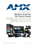
1
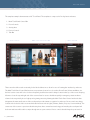
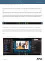
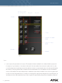
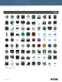
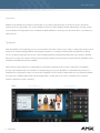
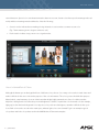
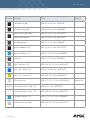
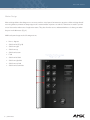
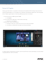
Design Guide
USER INTERFACE
F E B R U A RY 2 0 1 2
DESIGN GUIDE
Table of Contents
Overview.............................................................................................................................................................................................................4
The Importance of a Well-Designed Interface........................................................................................................................................4
The First Experience.................................................................................................................................................................................4
Welcoming..................................................................................................................................................................................................5
Simplicity.....................................................................................................................................................................................................5
User in Control...........................................................................................................................................................................................6
Forgiveness.................................................................................................................................................................................................6
Feedback.....................................................................................................................................................................................................6
Focused Experiences...............................................................................................................................................................................7
Directness....................................................................................................................................................................................................7
Consistency.................................................................................................................................................................................................8
Naming Conventions................................................................................................................................................................................8
Visual Design Principles and Methodologies..........................................................................................................................................8
Design Methodology...............................................................................................................................................................................9
Aesthetics....................................................................................................................................................................................................9
Understanding the End User..................................................................................................................................................................9
Mapping Your Design.............................................................................................................................................................................10
Usability Assessment in the Design Process......................................................................................................................................11
Navigation.........................................................................................................................................................................................................11
Hierarchy of Information........................................................................................................................................................................11
Focus and Emphasis...............................................................................................................................................................................12
Structure and Balance............................................................................................................................................................................12
Relationship of Elements.......................................................................................................................................................................12
2 | U S E R INTERFACE
DESIGN GUIDE
Readability and Flow...............................................................................................................................................................................13
Dimensionality..........................................................................................................................................................................................13
Areas of the Interface Template.................................................................................................................................................................13
Designing in the Template....................................................................................................................................................................16
Icons............................................................................................................................................................................................................17
Consistency & Reuse..............................................................................................................................................................................18
Animation..................................................................................................................................................................................................20
Typography...............................................................................................................................................................................................20
Color...........................................................................................................................................................................................................21
Use of a Limited Set of Colors.............................................................................................................................................................22
General Interaction Techniques.................................................................................................................................................................24
Gestures and Movement.......................................................................................................................................................................24
Motion Design.........................................................................................................................................................................................25
Putting It All Together..................................................................................................................................................................................26
Checklist for a Good Interface...................................................................................................................................................................27
Final Thoughts................................................................................................................................................................................................27
Appendix..........................................................................................................................................................................................................28
Website resources:.................................................................................................................................................................................28
Recommended reading:.......................................................................................................................................................................28
Software and Tools Suggestions.........................................................................................................................................................29
3 | U S E R INTERFACE
DESIGN GUIDE
Overview
AMX touch panels bridge a relationship between humans and technology, one that unfolds intuitively through the natural input of
touch. This relationship is given space and form through the attention to design. Usability of an interface design is essential to
the success of your touch panels. Investment in the design of your interfaces directly affects your customer’s ability to understand
and use the touch panels. The wide use of features such as icons, gestural touch and nested navigation calls for an increased
consistency between computers, mobile phones, kiosks and other platforms. This means it is vital to consider what types of
computer technology your customers use on an everyday basis and incorporate current standards into your interfaces. To design
compelling touch panel experiences, you must think differently about the user interface (UI) than you do when creating traditional
graphical user interface (GUI) products or Web experiences. The goal of this document is to help the developer and designer create
interfaces and user experiences that best utilize touch screen interaction principles through quality, touch-oriented design. The
core principles for optimal user-interaction paradigms in multi-touch applications are also discussed. Subsequent chapters provide
the principles for visual and textual design along with practical guidelines for implementing them. The design guidelines presented
here are not exact specifications for specific AMX touch panels. Instead, the guidelines include approaches to design great
experiences so you can create user interfaces that provide the most natural user experience.
The Importance of a Well-Designed Interface
A good touch panel interface offers a fun, engaging, and visceral experience without any chance of intimidation. Interaction
design defines the interplay of the software experience with users’ behaviors, responses and gestures. In other words,
interaction design principles are geared toward maximizing the user experience by facilitating the ease with which they can
learn, become immersed in and enjoy the software experience. While closely aligned with purely visual graphic design, audio
design, and textual design, interaction design provides an overall enveloping focus on how well and naturally users interact
with technology. A user interface should smoothly take users from their first touch to full engagement with tasks. If help and
instructions are included, integrate them with the natural flow of use and do not steer attention away from content. If you are
trying to reveal the existence of functions, make those functions apparent at the right moment (when they have an effect).
Following are a list of user-centered design principles to consider which will assist you in creating a successful UI.
The First Experience
Users’ overall success with an application can be influenced heavily by their initial experience. The first impression is a
critical moment in which to gain a user’s trust and confidence. After an interface is started, the user should be able to use it
productively within the first five minutes. Keep in mind that users will need to use your interface immediately to complete a
4 | U S E R INTERFACE
DESIGN GUIDE
task. As part of your design, it is recommended to consider adding help tools that describe tasks in further detail; however
the primary system tasks should be clear and understandable without prior review of any help tools. You can help users be
productive by promoting your interface’s key features and functions at the highest level of navigation on the initial start-up
page. At the same time, avoid overwhelming users with all the features in your interface. Instead, consider exposing features
gradually through layered navigation and contextual tips. Remember that your users’ initial experience is not limited to the
first five minutes with your interface. Your users will have an initial experience every time they use a new feature, so consider
the first use of each aspect of your design.
Welcoming
Approachable, discoverable, forgiving, and exploratory: these are all attributes of good interface experiences that can be
heavily influenced by visual design. Colors and forms should be warm and welcoming, and erroneous or mistaken touches
should never be met with jarring results or the perception of failure. There should be no fear or exclusivity in an experience,
but instead provide an environment that is welcoming, inclusive and rewarding.
Simplicity
It is important to keep visual elements to a minimum. An interface should be simple (not simplistic), easy to learn, and easy
to use. A “less is more” design goes a long way towards this goal. Background design elements and shadowing details
should only support the discovery of on-screen controls and functions, and some clue as to their function. Eliminating all
unnecessary ornamentation, excessive detailing, and needless controls will let the content take center stage. The interface
must also provide access to all functionality of an application. Maximizing functionality and maintaining simplicity work
against each other in the interface. An effective design balances these objectives. One way to support simplicity is to
reduce the presentation of information to the minimum required to communicate adequately, avoiding wordy descriptions
for command names or messages. Irrelevant or verbose phrases clutter your design, making it difficult for users to extract
essential information easily. Another way to design a simple but useful interface is to use natural mappings and semantics.
The arrangement and presentation of elements affects their meaning and association. Simplicity also correlates with
familiarity; things that are familiar seem simpler. Try to build connections that draw on your users’ existing knowledge and
experiences. You can also help users manage complexity by using progressive disclosure. Progressive disclosure involves
careful organization of information so that it is shown only at the appropriate time. By hiding information presented to
the user, you reduce the amount of information the user must process. For example, you can use menus to display lists of
actions or choices, and you can use dialog boxes to display sets of options. Progressive disclosure does not imply using
unconventional techniques for revealing information, such as forcing the user through a longer sequence of hierarchical
5 | U S E R INTERFACE
DESIGN GUIDE
interaction. This can make an interface more complex and cumbersome. Minimal doesn’t mean small, but rather elegant and
simple, so be sure to maintain a proper sense of scale to preserve text legibility, the users’ context, and their sense of place
in the interface on the whole.
User in Control
The user should always feel in control of the interface rather than feeling controlled by it. This principle has a number of
implications:
• The operational assumption is that the user - not the interface - initiates actions. The user plays an active rather than reactive role. You can automate tasks, but implement the automation in a way that allows the user to choose or control it.
• The interface should be as interactive and responsive as possible. Avoid modes whenever possible. A mode is a state that excludes general interaction or otherwise limits the user to specific interactions. When a mode is the best or only design alternative - for example, for selecting a particular hardware function - make sure the mode is obvious, visible, the result of an explicit user choice, and easy to cancel.
Forgiveness
Users like to explore an interface and often learn by trial and error; however they expect to have immediate success with the
majority of attempted tasks. An effective interface allows for interactive discovery. It provides only appropriate sets of choices
and warns users about potential situations where they could damage the system or make global changes to the system.
Even in the best-designed interface, users can make mistakes. These mistakes can be both physical (accidentally pointing to
the wrong command or data) and mental (making a wrong decision about which command or data to select). An effective
interface avoids situations that are likely to result in errors. It also accommodates potential user errors and makes it easy for
the user to recover.
Feedback
Always provide feedback for a user’s actions. Good feedback helps confirm that the interface is responding to input and
communicates details that distinguish the nature of the action. Effective feedback is timely and is presented as close to
the point of the user’s interaction as possible. Even when the interface is processing a particular task, provide the user with
6 | U S E R INTERFACE
DESIGN GUIDE
information about the state of the process and how to cancel the process if that is an option. Nothing is more disconcerting
to users than a “dead” screen that is unresponsive to input. A typical user will tolerate only a few seconds of an unresponsive
interface. It is equally important that the type of feedback you use be appropriate to the task. You can communicate simple
information through button changes or a status bar message; for more complex feedback, you may need to display a
progress control or message box.
Focused Experiences
Narrow the number of choices to the minimum essentials, and focus on making the choices the most valuable tasks available
in the interface. Reducing the number of features in your interface allows for the user to easily access needed tasks and
information rather than being lost in puddle of unnecessary functions, additional features add complexity. Instead, provide a
premium experience in the primary tasks that the interface offers. Make sure that the set of features offered is focused to the
particular task. Many interfaces provide lots of functionality that enable many separate tasks. Make sure that your interface’s
task is clear and that its features focus on performing that task well. Reduce the number of available paths and choices, so
that the next step and available options are always available to users. The balance is often apparent by conducting user
testing with someone other than the designer walking through each task that the interface offers.
Directness
Design your interface so that users can directly manipulate buttons and representations of task information. Whether they
are selecting an object to activate it or navigating to a location, users should see how their actions affect the objects on the
panel. Visible information and choices also reduce the user’s mental workload. Users can recognize a command more easily
than they can recall its syntax.
Familiar metaphors provide a direct and intuitive interface for user tasks. By allowing users to transfer their knowledge and
experience, metaphors make it easier to predict and learn the behaviors of interface-based representations. When using
metaphors, you need not limit a computer-based implementation to its real-world counterpart. For example, unlike its
paper-based counterpart, a folder can be used to organize a variety of objects such as hardware, task functions, and other
folders. The purpose of using metaphor in the interface is to provide a cognitive bridge; the metaphor is not an end in itself.
Metaphors support user recognition rather than recollection. Users remember a meaning associated with a familiar object
more easily than they remember the name of a particular command.
7 | U S E R INTERFACE
DESIGN GUIDE
Consistency
Visuals must be consistent to help the users find their way through an interface. Consistency allows users to transfer existing
knowledge to new tasks, learn new things more quickly and focus more attention on tasks. This is because they do not have
to spend time trying to remember the differences in interaction. By providing a sense of stability, consistency makes the
interface familiar and predictable. Consistency is important through all aspects of the interface, including names of tasks,
visual presentation of information, operational behavior, and placement of elements on the screen and within windows.
There should be a standard set of forms, colors, shapes, textures and other design elements in an interface. The set of
controls that help users orient themselves and anticipate what will happen when they touch something should be clear and
the same throughout the interface.
Naming Conventions
When users encounter files, buttons or tools they didn’t create that have meaningless or indecipherable names, they have
no way of knowing which application they belong to or what their function is. You can improve this situation in a number of
ways. Avoid cryptic names, especially those that include obscure abbreviations. Similarly, use appropriate capitalization in
names for a consistent, recognizable appearance. Whenever possible, use common task labels. When you create a new task
or folder type, the user should be able to identify the type with little thought. Finally, password protecting tasks that the user
should not need to edit better ensures that settings which affect the global function of the interface will not be changed.
Folders should not be hidden however, because users may need to access this folder for support reasons at some point in
the future.
Visual Design Principles and Methodologies
While interaction design establishes defining behaviors, gestures, and responses, it is visual design that brings those
elements to life. The key to successful visual design for touch panels is a design that subconsciously teaches the user. The
user can visually see where to touch or slide without explicit instruction. This is challenging because while visual design
should add beauty and branding to the experience, it should never distract from the content. Designing for touch panels
means creating an extensible design vocabulary with specific attributes, a language of shapes, forms, colors, and controls
that help visually guide users through tasks to meet their goals. A well-designed user interface is built on principles and a
development process that center on users and their tasks. The following guidelines provide practical ways to embody the
visual design principles.
8 | U S E R INTERFACE
DESIGN GUIDE
Design Methodology
Effective interface design is more than just following a set of rules. It requires a user-centered attitude and design
methodology. It also requires early planning of the interface and continued work throughout the development process.
Aesthetics
Visual design is an important part of an interface. Visual attributes provide valuable impressions and communicate important
cues to the interactive behavior of particular objects. At the same time, it is important to remember that every visual element
that appears on the screen potentially competes for the user’s attention. Provide a coherent interface that clearly contributes
to the user’s understanding of the tasks and information presented.
Understanding the End User
The design and usability techniques described in the previous sections are a standard for good interaction and interface
design. It is also important to consider the location and goals of end users as well as the location and position of the actual
touch panel. Vertical wall mounted panels will function differently than horizontal panels and tabletop or handheld panels
will have different needs all together.
The initial work on a design can be the most critical. During this phase, you decide the general shape of your interface. If
the foundation work is flawed, it is difficult to correct later. This part of the process involves not only defining your interface’s
objectives and features, but understanding who your users are and their tasks, intentions, and goals. For example, a
residential touch panel will have very different users and requirements than an auditorium or conference room. Designing for
your users involves understanding the following factors:
• Background — age, gender, expertise, experience level, physical limitations and special needs.
• Work environment — equipment, social and cultural influences, and physical surroundings.
• Current task organization — steps required, dependencies, redundant activities and output objective.
Begin defining the conceptual framework to represent your interface with the knowledge and experience of your target
audience. Consider the basic organization and different types of metaphors that can be used. Observing users at their
current tasks can provide ideas about effective metaphors. To develop for the widest audience, design for the most common
user. Consider the following examples:
9 | U S E R INTERFACE
DESIGN GUIDE
• Beginning users often have difficulty using a touch screen. For example, multi-touch gestures are skills that may take time for new users to remember.
• Navigation on a touch panel can be difficult because it requires remembering the hierarchy and path they have traveled, which differs from a website with a crumb trail.
• Sliding a finger is different from a tap selection, so many beginning users have difficulty distinguishing these two actions, or they overdo it.
• Beginning users often have difficulty with window management. They do not always realize that overlapping windows represent a three-dimensional space. As a result, when a window hides another, a user may assume it no longer exists.
• Advanced users want efficiency. The challenge in designing for advanced users is providing efficiency without introducing complexity for less-experienced users. In addition, advanced users may be dependent upon particular interfaces, making it difficult for them to adapt to significant rearrangement of or changes in an interface.
Document your design. Writing down your design plan not only provides a valuable reference and form of communication,
but often helps make the design more concrete and reveals issues and gaps. If you are in doubt about the appropriate look
and feel for a function or tool, look to the template as a reference for conventions.
Mapping Your Design
The sample Modero X Panoramic template provided by AMX demonstrates core visual concepts to maintain consistent
representation and meaning across the interface. Re-use of existing graphics from the template is encouraged and meets
the current standards and user expectations for icons and metaphors in relation to the general public’s knowledge of touch
interfaces and computing platforms. For projects in which you are altering the template, wireframes and interaction diagrams
are useful tools for pre-planning.
Wireframes are a visual guide that represents the skeletal framework of each screen for the touch panel interface. They
depict page layout and arrangement of the interface content. Wireframes can be as simple as sketches or created using a
digital tool such as Microsoft VisioTM. The focus of wireframes can include:
• Information to be displayed on each page
• Range of functions available
• Properties of the information and functions
• Rules for displaying information
• Effects of different scenarios on the interface
1 0 | U S E R INTERFACE
DESIGN GUIDE
Interaction diagrams visualize the sequence of activities within an interface. The flow of actions needed to perform specific
tasks is documented to ensure all needed functions are made available within the interface. Interaction diagrams are
specifically helpful for complex tasks which require multiple actions to complete. Creating them is a key to catching interface
errors early in the design process.
Usability Assessment in the Design Process
As described previously, usability testing is a key part of the design process. Usability assessment should begin early in the
development, when you still have the opportunity to make changes. You then incorporate your findings into the design
process. As the design progresses, usability assessment continues to provide valuable input for analyzing initial design
concepts and, in the later stages of interface design, can be used to test specific tasks. Make sure you allocate adequate
time in your schedule to address the issues that may arise from usability review. Don’t assume that the results will always
confirm your design. How you respond to what assessment reveals determines its value. When you are working through
details of individual features, don’t neglect to evaluate how these integrate into the design. The usability assessment should
include all of the interface’s components. Consider the user’s entire experience as part of the usability assessment. To help
ensure overall usability, define a list of the top twenty most important and frequent tasks users should be able to do, then
test all of these tasks regularly.
Navigation
Visual design serves a purpose greater than decoration; it is an important tool for effective communication. The organization
of information on the screen can make the difference between a message users understand and one that leaves users
feeling overwhelmed. Even the best interface can suffer and be underused if the visual presentation does not communicate
it well. It is important to understand how we function in the real world and interpret it correctly for touch panel interfaces.
For example, we read a screen in the same way we read other forms of information, left to right and top to bottom. The eye
is always attracted to colored elements before black-and-white elements, to isolated elements before elements in a group
and to graphics before text. We even read text by scanning the shapes of groups of letters. Consider the following principles
when you design the organization and composition of visual elements.
Hierarchy of Information
The principle of hierarchy of information addresses the placement of information based on its relative importance to
1 1 | U S E R INTERFACE
DESIGN GUIDE
other visual elements. The outcome of this ordering affects all of the other composition and organization principles. It also
determines which information a user sees first and what a user is encouraged to do first. To further consider this principle,
answer these questions regarding your application:
• Which information is most important to the user?
• What are the user’s priorities when the touch panel is started?
• What does the user want or need to do first, second, third, and so on?
• Will the order of information support or hamper the user’s progression through the interface?
• What should the user see on the screen first, second, third, and so on?
Whenever possible, the visual display should match the user’s priorities, but it can also be shaped by other elements you
want to emphasize.
Focus and Emphasis
The related principles of focus and emphasis guide you in the placement of priority items. Once you identify the central idea,
you can determine the focus, or focal point, for activity. You determine the emphasis by choosing the prominent element
and isolating it from others, or by making it stand out in other ways. Culture and interface design decisions largely determine
where the user looks first for information. People in western cultures, for example, look at the upper left corner of the screen
or window for the most important information. It makes sense to put a top-priority item there, giving it emphasis.
Structure and Balance
Structure and balance are two of the most important visual design principles. Without an underlying structure and a
balance of visual elements, there is a lack of order and meaning that encompasses all other parts of the visual design. More
importantly, a lack of structure and balance makes it more difficult for the user to clearly understand the interface.
Relationship of Elements
The relationship of elements is important in reinforcing the previous principles. The placement of a visual element can
communicate a specific relationship to other elements. For example, if a button affects the content of a list, there should be
1 2 | U S E R INTERFACE
DESIGN GUIDE
a spatial relationship between the button and the list. This helps the user make the connection clearly and quickly just by
looking at the placement.
Readability and Flow
This principle calls for ideas to be communicated directly and simply with minimal visual interference. Readability and flow
can determine the usability of a dialog box or other interface component. When you design the layout of a window, consider
the following questions:
• Could the idea or concept be presented more simply?
• Can the user easily step through the interface?
• Do all the elements have a reason for being there?
Dimensionality
Many elements in the interface template use perspective, highlighting, and shading to provide a three-dimensional
appearance. This emphasizes function and provides real-world feedback to the user’s actions. Be careful not to overdo the
use of dimensionality when designing your own visual elements. Avoid unnecessary nesting of visual elements and the use
of three-dimensional effects for an element that is not interactive. Introduce only enough detail to provide useful visual cues,
and use designs that blend well with the interface.
Areas of the Modero X Panoramic Interface Template
The current Modero X Panoramic template (Fig. 1) was designed using a gridded layout. A global grid determines the
arrangement of content and controls screen-wide. While permitting easy scanning and organization, this forces the entire
interface to be oriented towards the bottom of the screen. If you are laying out elements differently or without a grid, give
careful consideration to content and control orientation. Users find an application easier to use when its interface is visually
unified and presents a consistent and predictable work environment. The following sections will describe each portion of the
global grid as well as assets and functions utilized within the design.
1 3 | U S E R INTERFACE
DESIGN GUIDE
The template example demonstrates a 20” Touch Panel. The template is composed of five key functional areas:
1. Main Touch Panel Control Bar
2. Room Controls
3. Activity Area
4. Device Controls
5. Task Bar
Figure 1
These areas should be used consistently for the labeled functions to allow for ease of learning the interface by end users.
The Main Touch Panel Control Bar functions as a persistent location for tools such as Room Power, Volume and Mute. It is
the first location a user will look to for these frequently used functions and is always located at the top of the screen. Keeping
Volume tools at the top and right side of the screen allows for users to find them quickly in emergency situations where
volume levels may initially be too high upon beginning an activity. Naming the Main Touch Panel Control with a title that
designates the name and location of the touch panel provides instant recognition for end users. Room controls are always
located on the left side of the screen and includes functions such as Lights, Climate, Shades, Projector, Screen and Help. The
center area of the screen is a preview called Activity Area. Here current functions being performed by the touch panel will
be shown and users will be able to swipe through various open activities. Device controls should always be positioned on
1 4 | U S E R INTERFACE
DESIGN GUIDE
the right. Upon beginning an activity, users will naturally look to the right and use their right hand to navigate this area. The
Task Bar fills the bottom of the screen and includes high level functions for specific devices that are accessible to the system.
Secondary tools such as Room Settings and Room Schedule may be placed here as well. Because this is the primary method
of navigating between tasks, this bar should always be placed at the bottom and should be persistent regardless of which
other screens or windows are open. Lower placement allows ease of use, as the user’s hand reaches and travels from bottom
to top on the screen. Primary functions should also be centered to allow for proximity association of current functions being
shown in the Activity Area and what is highlighted on the Task Bar (Fig. 2). Active tasks are shown as highlighted where all
other available tasks are shown without highlight in the background.
Figure 2
The Room and Device Control areas also include secondary windows for additional functionality to be displayed (Fig 3.)
The secondary window for Room Control contains environmental functions such as controls for lights, temperature, shades,
projector and screen. The secondary window for Device Control contains functions related to activities or the source device.
This space displays items such as Contacts and the Audio/Video Conference dialing pad, or transport controls for the DVD
player.
Figure 3
1 5 | U S E R INTERFACE
DESIGN GUIDE
Designing in the Template
Modero X Series Panoramic Touch Panel displays come in two sizes and two orientations per size:
• 20.3” Landscape: 18.7” x 7.8” (475mm x 198mm), 1920x800 pixels
• 20.3” Portrait: 7.8” x 18.7” (198mm x 475mm), 800x1920 pixels
• 19.4” Landscape: 18.7” x 5.9” (475mm x 151mm), 1920x530 pixels
• 19.4” Portrait: 5.9” x 18.7” (151mm x 475mm), 530x1920 pixels
The Touch Panels can be placed horizontally or vertically, which will require alterations in the template to accommodate each
scenario of use. The 20.3” and 19.4” panel size descriptions refer to the viewable area as measured diagonally which is a
traditional way of describing the viewable area of a touch panel or monitor.
Figure 4 demonstrates sizing specifications which should be followed accurately to maximize the provided space and
provide the best user experience when designing in the template. Following are additional recommendations:
• Leave a 10-pixel border between the edge of the window and the Menu title.
• Leave a 20-pixel border between the edge of the window and the nearest controls.
• Leave a 20-pixel spacing between each control.
• Make buttons and control sizes proportional to each other (for example, a 60x60 square button and 120x60 rectangular buttons).
• Designs should be centered around fundamental pixel increments. For example, use multiples of 10. A multiple of 10 is recommended because the TPD layout tools allow elements to be easily positioned in increments of 10.
• Button labels must be concise and make sense when taken out of context. Otherwise, users relying on screen readers or similar assistive technologies will not always be able to immediately understand the relationship between a control and those surrounding it.
• Assign access keys to all editable controls. Ensure that using the access key focuses its associated control.
1 6 | U S E R INTERFACE
DESIGN GUIDE
Figure 4
Icons
• Icons are pictorial representations of objects. The template includes a standard icon set that should be repurposed for iterations of your interfaces. Icon states are the result of an action taken. Once an action is taken on an icon, the icon reflects that action by showing its state. An enabled icon state is consistently the same color and style throughout the interface. This state indicates that a command is active and available for use. A disabled icon state is a dimmed version of the enabled. This state indicates that a command is inactive and not available for use. User recognition and recollection are two important factors to consider in icon design. Recognition means that the user can identify the icon and easily associate it with a particular object. User recognition is supported by using effective metaphors, using real-
1 7 | U S E R INTERFACE
DESIGN GUIDE
world objects to represent abstract ideas allows the user to draw from previous learning and experiences. Recollection is created by designing icons to be simple and distinct, and by using them consistently to build recognition. Icons
are primarily intended to represent objects with which users can interact. Therefore, reference Fig. 5a and Fig. 5b as examples and follow these guidelines for the use of icons:
• Use an icon as the representation of an object — for example, a phone icon in the telephone area of the interface.
• Use an icon to reinforce important information — for example, a warning icon in a message dialog box.
• Use an icon to provide visual anchors to help users quickly navigate through a task
• Icons are designed within an area of 60x60 pixels or a proportion thereof (A 50x50, or 110x50 for rectangular, pixel space is reserved for the image itself; leaving a 10 pixel spacing between the outer edges of the icon and the image to allow for proper alignment of the image within the user interface.)
Consistency & Reuse
AMX encourages consistency and reuse of existing graphical elements and shows the core icon and button concepts in
Fig. 5a and Fig. 5b. A great many icons and graphics have already been created, so there is a good chance that the elements
you might need already exist. Samples of existing core concepts for icons and button graphics are shown below. Each of
these elements carries with it a specific meaning, so care should be taken when using them to ensure consistent meaning is
maintained.
Figure 5a: Simple Icon Set
1 8 | U S E R INTERFACE
DESIGN GUIDE
Figure 5b: Fully Rendered Icon Set
1 9 | U S E R INTERFACE
DESIGN GUIDE
Animation
Animation can illustrate the operation of a particular tool or reflect a particular state. It can also be used to include an
element of fun in your interface. You can use animation effects for objects within a window and interface elements, such as
icons and buttons. Avoid gratuitous use of animation. When animation is used only for a decorative effect, it can distract or
annoy the user.
Typography
Limit the number of fonts and styles you use in your interface. As with too many colors, using too many fonts results in visual
clutter. Use bold fonts sparingly. While bold text attracts attention, overusing it can distract the user and make it difficult
to focus on what is important. Limit its use to titles, headings and key items that should have the user’s attention. Similarly,
limit your use of italic text. Used in isolation, italics may attract attention, but in general it can decrease the emphasis on the
information and make the text less readable.
Sans serif fonts such as Arial are recommended for touch panel design due to their clean look and ease of readability
(see Fig. 6.) For buttons and icon text with no accompanying icon, font sizes should be no smaller than 10 points up to a
maximum size of 42 points for large icon text such as a keypad. If a font is used to further define an icon, then the minimum
size is 8 points. Headline and title bar text should typically be 14-16 points in size. Use a consistent font for common
interface elements for visual consistency.
Figure 6
2 0 | U S E R INTERFACE
DESIGN GUIDE
The wording you use in your interface is a primary form of communication with the user. Keep text in the user interface as
brief as possible, usability studies indicate that users are more likely to read short blocks of text than long ones. Review
your work to eliminate wordiness, and keep user interface text short without sacrificing clarity. Position the text so that
any relationship with a particular control is clear. Use sentence-style capitalization and ending punctuation. Avoid using
abbreviations unless the abbreviated form is as familiar to users as the full word or phrase. You can use an acronym for a term
that is not trademarked or for a well known industry standard. Instructional text helps reduce or eliminate confusion, use
introductory text in dialog boxes to provide additional information. Providing clear direction in error messages is extremely
important. When creating error messages for the interface, ensure that the message clearly communicates the next step a
user should take. Also if a message opens in a pop-up, be sure to allow adequate time for the user to read and understand
the message.
Color
Color is very important in the visual interface. You can use it to identify elements in the interface to which you want to draw
the user’s attention for example, the current selection. Color also has an associative quality; we often assume there is a
relationship between items of the same color. Color also carries with it emotional or psychological qualities — for example, a
color can be categorized as cool or warm. However, when color is used indiscriminately, it can have a negative or distracting
effect. Misuse of color can cause an unfavorable user reaction and can hinder productivity by making it difficult for users to
focus on a task. Here are a few more things to consider about using color in your interface:
• You can use color to reinforce relatedness or grouping, it is not always obvious to the user to associate a color with a particular meaning.
• Color appeal is subjective; what is pleasing to you may be unusable to someone else.
• Interpretation of color can vary by culture. Even within a single culture, individual associations with color can differ.
• Some percentage of the population may have color identification problems. This can affect the accessibility of your software to the widest possible audience. For example, about 9 percent of the adult male population has some form of color confusion.
To achieve a consistent appearance in graphics across the interface, use a common color palette as the basis for creating
your graphical elements. An entire set of graphical elements requires a consistent, family-like appearance across the
interface; contrarily, individual and sub-families of graphics require differentiation. Color choices can either bring unity or
2 1 | U S E R INTERFACE
DESIGN GUIDE
cause distraction. Special color considerations must be taken into account. Certain colors have specific meanings in the real
world, and those meanings must be adhered to. Note the following:
• Green is used to indicate that something is being initiated or is active and as a common accent color.
(Fig. 7 demonstrates green to begin a conference call.)
• Red is used to indicate a stop, an error or to signal an alert.
Figure 7
Use of a Limited Set of Colors
Although the human eye can distinguish millions of different colors, the use of too many colors results in visual clutter and
makes it difficult for the user to discern the purpose of the color information. The colors you use should fit their purpose.
Muted, subtle, complementary colors are often better than bright, highly saturated ones. One color affects another.
Adjacent or background colors affect the perceived brightness or shade of a particular color. A neutral color (for example,
light gray) is often the best background color. Opposite colors, such as red and green, can make it difficult for the eye to
focus. Dark colors tend to recede in the visual space, whereas light colors come forward. Fig. 8 is an example a typical
color palette and is the color palette used in the AMX Modero X Panoramic template.
2 2 | U S E R INTERFACE
DESIGN GUIDE
Swatch
WHITE
Element
Color
Task and Utility Bars
RGB: 24, 24, 24 ; Hex: #181818FF
Horizontal Accent Bars
RGB: 43, 43, 43 ; Hex: #2B2B2BFF
Vertical Accent Bars (Tabs)
RGB: 45, 45, 45 ; Hex: #2D2D2DFF
Sub-nav Background
RGB: 45, 45, 45 ; Hex: #2D2D2DFF
Pane Background
RGB: 72, 72, 72 ; Hex: #484848FF
Button Feedback - Off
RGB: 29, 29, 29 ; Hex: #1D1D1DFF
Button Feedback – On
RGB: 31, 171, 219 ; Hex: #21ABDBFF
Button Fill
RGB: 78, 78, 78 ; Hex: #4E4E4EFF
Icon – Main Nav – Off
RGB: 165, 165, 165 ; Hex: #A4A5A5FF
Icon – Nav – Room – On
RGB: 0, 122, 246 ; Hex: #007AF6FF
Icon – Nav – Source – On
RGB: 184, 216, 0 ; Hex: #B8D800FF
Text – Main Nav
RGB: 217, 217, 217 ; Hex: #D9D9D9DB
Calendar Timeline – Odd – Off
RGB: 0, 0, 0 ; Hex: #FFFFFFFF
Calendar Timeline – Even – Off
RGB: 242, 242, 242 ; Hex: #F2F2F2FF
Calendar Timeline – On
RGB: 33, 171, 219 ; Hex: #21ABDBFF
Calendar Timeline Labels
RGB: 199, 199, 199 ; Hex: #C7C7C7FF
Figure 8: Modero X Panoramic Template Color Palette
2 3 | U S E R INTERFACE
Opacity
Opacity 220
DESIGN GUIDE
General Interaction Techniques
Gestures and Movement
Gestural navigation is an ever increasing method utilized across technology platforms today. This form of navigation differs
from traditional touch navigation in that finger movement is recognized when contact is made with the screen and the
interface responds with the appropriate action. Multi-touch navigation requires a minimum of 1cm (28 pixels) between any
two fingers for the gesture to be recognized as two independent finger actions. Special consideration should be taken when
designing using two-finger swipe to ensure the interface accommodates enough space for the user to touch with both
fingers and complete the gesture while still allowing for the minimum spacing requirement. AMX touch panels support the
following manipulation gestures:
UI Element
Action
Meaning
Make a fast vertical or horizontal movement on the screen. A swipe is like a fast drag, but the
Swipe
finger lifts at the end of the motion. Make the swipe gesture to scroll with momentum; scrolling
continues even after the finger is lifted.
Rotate
A minimum of two fingers touching the screen and making a twisting motion clockwise or
counter-clockwise.
Tap
Touch and quickly release; use to select or activate something.
Double Tap
Two taps in quick succession.
Make a fast vertical or horizontal movement on the screen using two fingers. A two-finger swipe
Two-finger Swipe
is like a fast drag, but the fingers lift at the end of the motion. This gesture could be used to scroll
with momentum; scrolling continues even after the finger is lifted.
Drag
Moving a finger in contact with the screen, to move a card or other object.
Hold & Drag
Press, wait, move, stop, and release.
Figure 9
2 4 | U S E R INTERFACE
DESIGN GUIDE
Motion Design
Motion design defines how things move on-screen, and is a critical part of an interactive experience. Motion design should
never be gratuitous; animations always support the content and the experience as a whole. Transitions are used to provide
critical clues and to make sense of application states. They also allow the user to understand where tools have gone when
they are in a hidden state. (Fig. 9)
AMX touch panels support the following motions:
• None – Appear
• Slide from left (Fig. 10)
• Slide from right
• Slide from top
• Slide from bottom
• Fade
• Slide from left fade
• Slide from right fade
• Slide from top fade
• Slide from bottom fade
Figure 10
2 5 | U S E R INTERFACE
DESIGN GUIDE
Putting It All Together
Creating a good user interface is a compilation of all the principles described thus far. The following scenario describes an
activity flow demonstrating use of color, navigation, motion and status in the appropriate template areas. The following steps
in Fig. 11 illustrate a typical sequence of events using a Blue-ray player device as an example:
1. User selects activity source (Blue-ray) in the Task Bar
a. Icon highlights
2. Device Controls and Secondary Device Controls slides in from the righ
a. Appropriate controls highlight
3. Blue-ray source is shown in the Activity Area
a. A description of the source is shown in the lower left corner of the preview window
b. A close button is included in the lower right corner of the preview window
Figure 11
Secondary navigation is dependent upon the device control selected. The device can be deactivated by x on preview window
or by tapping the device control a second time.
2 6 | U S E R INTERFACE
DESIGN GUIDE
Checklist for a Good Interface
The following checklist summarizes the information described previously. Use it to help you confirm that your interface is
designed to provide the best user experience:
• Tasks are easily accessed and started in a minimum number of steps.
• Users do not have to read instructions before using your interface.
• Interface does not use jargon in its user interface task and folder text.
• Use industry-specific or technical terms only if they are clearly understood by the user.
• Color is used sparingly to enhance the experience
• Shape and layout provide guidance and direction to guide the user’s tasks
Final Thoughts
For nearly thirty years, it has been AMX’s mission to simplify the implementation, maintenance and use of technology to
create effective environments that facilitate productivity and collaboration. The development of the Modero X Panoramic
Series touch panels and the Panoramic User Experience exemplify our continued commitment to this mission through the
creation of a truly simplified user experience in conference rooms and classrooms around the world. It is our hope that the
Modero X Panoramic touch panel templates and this User Interface Design Guide document streamline the implementation
of a simplified user experience and promote simplicity in human interface design.
2 7 | U S E R INTERFACE
DESIGN GUIDE
Appendix
Website resources:
1. http://www.boxesandarrows.com
2. http://adaptivepath.com/ideas/blog
3. http://www.thinkingandmaking.com/
4. http://www.uie.com/brainsparks/
5. http://bokardo.com/
6. http://findability.org/
7. http://uxmag.com/
8. http://usabilitygeek.com/official-usability-web-site-guidelines-of-governments-from-around-the-world/
9. http://www.usability.gov
Recommended reading:
1. Norman, Donald A. The Design of Everyday Things. New York: Basic Books, 1988
2. Krug, Steve. Rocket Surgery Made Easy. California: New Riders, 2010
3. Krug, Steve. Don’t Make Me Think. California: New Riders, 2006
4. Cooper, Alan. The Inmates are Running the Asylum. Indiana: SAMS, 1999
5. Ware, Colin. Visual Thinking for Design. London: Morgan Kaufmann, 2008
6. Weinschenk, Susan. Neuro Web Design. California: New Riders, 2009
7. Roden, Ted. Building the Realtime User Experience. California: O’Reilly Media, 2010
8. Cooper, Alan. About Face 3. Indiana: Wiley Publishing Inc., 2007
9. Lipton, Ronnie. The Practical Guide to Information Design. New Jersey: John Wiley & Sons, Inc., 2007
10.McKim, Robert H. Thinking Visually. California: Wadsworth, Inc., 1980
11.Baer, Kim. Information Design Workbook. Massachusetts: Rockport Publishers, 2008
12.Li, Charlene. Groundswell: winning in a world transformed by social technologies.
13.Apple Inc. Apple Human Interface Guidelines-User Experience. California: Apple Inc, 2009
14.Vredenburg, Karel, Scott Isensee and Carol Righi. User-Centered Design. New Jersey: Prentice Hall PTR, 2002
15.Butow, Eric. User Interface Design for Mere Mortals. New Jersey: Pearson Education, Inc., 2007
16.Tidwell, Jenifer. Designing Interfaces. California: O’Reilly Media, 2006
17.Snyder, Carolyn. Paper Prototyping. California: Morgan Kaufmann, 2003
2 8 | U S E R INTERFACE
DESIGN GUIDE
18.Cato, John. User-Centered Web Design. Great Britain: Pearson Education Limited, 2001
19.Stone, Debbie, Caroline Jarrett, Mark Woodroffe, Shailey Minocha. User Interface Design and Evaluation. California:
Morgan Kaufmann, 2005
20.Porter, Joshua. Designing for the Social Web. California: New Riders, 2008
21.Garrett, Jesse James. The Elements of User Experience. Indiana: New Riders, 2003
22.Raskin, Jeff. The Humane Interface. Massachusetts: ACM Press, 2000
23.Csikszentmihalyi, Mihaly. Flow: The Psychology of Optimal Experience. New York: Harper & Row, 1990
Software and Tools Suggestions:
1. Wireframes - Microsoft VisioTM
2. Design - Adobe PhotoshopTM
3. Design - Adobe IllustratorTM
4. http://www.fivesecondtest.com/
5. http://www.nickfinck.com/blog/entry/visio_stencils_for_information_architects/
2 9 | U S E R INTERFACE