1
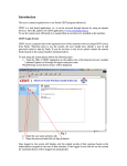
General User Manual
Copyright © 2008-2012, Better Days Enterprises, LLC.
3213 West Main Street #119
Rapid City, SD 57702-2314
Revision: February 4, 2012
Version: 1.917
CleverQ® General User Manual
Table of Contents
Introduction ......................................................................................................................... 4
Dashboards .......................................................................................................................... 4
Viewing Dashboards ....................................................................................................... 4
Tabs ............................................................................................................................. 5
Date Ranges ................................................................................................................ 5
Resize .......................................................................................................................... 6
Multiple Dashboard Windows .................................................................................... 6
Printing........................................................................................................................ 7
Current Dashboard .................................................................................................. 7
ScoreCard ................................................................................................................ 7
Exporting..................................................................................................................... 9
Clipboard................................................................................................................. 9
Web Page ................................................................................................................ 9
Gauges......................................................................................................................... 9
Gauge Drilldown ..................................................................................................... 9
Standard Drilldown ........................................................................................... 10
With Previous Period Drilldown ....................................................................... 11
With Ranges ...................................................................................................... 12
Details Drilldown .............................................................................................. 13
Additional Drilldowns ...................................................................................... 14
Gauge Warning ..................................................................................................... 14
Gauge Tips ............................................................................................................ 14
Gauge Setup .......................................................................................................... 16
Gauge Options ...................................................................................................... 16
Refreshing a Gauge ............................................................................................... 16
Help on a Gauge.................................................................................................... 16
Changing Dashboards ................................................................................................... 16
Renaming a Dashboard ............................................................................................. 19
Changing the Order ................................................................................................... 19
Setting the Default Date Range................................................................................. 20
Setting the Default Filters ......................................................................................... 20
Removing Dashboards .............................................................................................. 20
Creating New Dashboards ........................................................................................ 20
Adding Gauges to Dashboards.................................................................................. 20
Changing Gauges on Dashboards ............................................................................. 20
View Scorecard ......................................................................................................... 20
Gauges............................................................................................................................... 21
Gauge Types ................................................................................................................. 22
Bar Chart ................................................................................................................... 22
Bar Chart by Month by Year .................................................................................... 22
Bar Chart by Qtr by Year .......................................................................................... 23
Bar Chart Ratios ........................................................................................................ 23
Circular Meters ......................................................................................................... 23
Data Query ................................................................................................................ 24
CleverQ® General User Manual
Horizontal Bar – Standard ........................................................................................ 25
Line Charts ................................................................................................................ 26
Net Income by Year .................................................................................................. 26
Net Worth by Year .................................................................................................... 27
Panel Indicators ......................................................................................................... 29
Panel Lights .............................................................................................................. 29
Panel Arrows ............................................................................................................. 30
Pie Chart.................................................................................................................... 30
Text ........................................................................................................................... 31
Vertical Bars ............................................................................................................. 32
Working with Pivot Charts ............................................................................................... 33
Working with Pivot Tables ............................................................................................... 38
Reports .............................................................................................................................. 40
Copyright © 2008-2012, CleverQ
Patent Pending
Designed for use with QuickBooks®
QuickBooks® is a trade mark and service mark of Intuit Inc., registered in the United
States and other countries.
Microsoft Excel® and Microsoft Access® are trademarks and service marks of
Microsoft, registered in the United States and other countries.
®
CleverQ is a trade mark and service mark of CleverQ and Better Days Enterprises, LLC.
CleverQ™ General User Manual
Introduction
This document is to be used as the general user manual for executives and managers that
will use the software without knowing the details of setting the gauges set up. For more
detailed information about the data, parameters, indicators, and gauges refer to the
Customization manual.
Dashboards
Viewing Dashboards
The main user interface for the software is the Dashboard. It automatically loads when
you start the software or you can open the Dashboard by selecting one of the menu items:
View – Active Dashboards
View – Select Dashboards
When you select “Active Dashboards”, the dashboard similar to the one found on the
following figure is displayed. There can be up to 8 active dashboards with each one
being available on a separate tab.
When you select “Select Dashboards”, you will get a list of all dashboards you have
access to, both active and inactive. Select a dashboard and only that one will be
displayed.
Page 4
CleverQ™ General User Manual
Tabs
The Active Dashboard contains 8 tabs that are selected by simply clicking on a tab with
your mouse. Each tab has a name and this can be customized when setting up the
dashboard. This will be covered later in this manual.
Date Ranges
A particular tab on the dashboard may have a default date range saved as part of the
dashboard setup. When this occurs, each gauge will display data based on that date
range. If the dashboard does not have a default date range, then the initial date range
defined for the individual gauges are used. That gauge date range is displayed as part of
the gauge title. When the dashboard date range is used, the gauges will not display a
date range. If a gauge does not have an initial date range and the dashboard does not
have a date range selected, the gauge will assume all dates.
You can change the date range of a dashboard by using the dropdown box on the bottom
of the form.
You will get a list of date ranges to choose, select one, and the “From” date and “To”
date will be updated.
NOTE: You need to press the “Refresh” button to update the gauges based on the new
date range.
Page 5
CleverQ™ General User Manual
You can also select a custom date range by pressing the small calendar buttons just to the
right of the “From” date and “To” date. Pressing these buttons will display a popup
calendar where you can select a date. Use the single arrow buttons to move one month
either forward or backward. Use the double arrow buttons to move one year either
forward or backward.
NOTE: Data is stored as Monthly, Daily, or Current. Depending on the data, one or
more of these data types may or may not be available. It is important that the user have
an understanding of their data and the available types and data ranges available.
To clear out the date range, press the
button to the left of the Refresh button. This
will clear the dates, and refresh the dashboard with the gauge’s initial date range.
Resize
The size of the dashboard is designed to fit a typical screen. If you want to enlarge the
dashboard to fit the entire screen, press the
button to the right of the Refresh button.
Multiple Dashboard Windows
You can open an unlimited number of windows and view multiple dashboards at the
same time. This is ideal when you have a large monitor or multiple monitors. To create
Page 6
CleverQ™ General User Manual
a new dashboard based on the currently selected dashboard, click the
will then need to manually arrange the window to suit your need.
button. You
Printing
Current Dashboard
You can print onto a single sheet of paper the current dashboard displayed by pressing
the “Print” button.
ScoreCard
A ScoreCard report is available by pressing the “ScoreCard” button. This report is
useful for a hardcopy of one of the tabs on the dashboard and provides something a
manager can print and study. It shows the dashboards, gauges, indicators, and tips. You
will first see a preview of the scorecard, then you can print or export the report.
A sample page is displayed in the following figure. You can print this by right mouse
clicking on the report preview.
Page 7
CleverQ™ General User Manual
Page 8
CleverQ™ General User Manual
Exporting
Clipboard
There may be times when you want to capture a view of the dashboard and paste it into
another program like Word, Excel, PowerPoint, or even an Email. This can be simply
done by pressing the “Copy” button on the bottom of the dashboard.
Web Page
With the Report Manager, you can save a dashboard to a webpage. This makes it
possible to have dashboards part of a company website. Refer to the Report Manager
User Manual for details on how to do this.
Gauges
Each dashboard tab can contain up to 8 gauges. The gauge selection and content are
determined by the dashboard setup. When 3 or less gauges are defined for a dashboard,
the size of the gauges will automatically adjust to the size of a dashboard.
While displaying the dashboard, you can right mouse click over a specific gauge and get
a gauge submenu.
Depending on the gauge you may get different results for the various menu items.
Gauge Drilldown
Four different standard drilldowns are available for a gauge: Standard, With Previous
Period, With Ranges, and Details. What you see and what is available varies for each
different gauge type.
Page 9
CleverQ™ General User Manual
Standard Drilldown
Line Chart Drilldown
Standard drilldowns usually provide a line chart showing one or more lines with each line
representing an indicator. The line chart displays the monthly or daily values over the
gauges date range. For example, for a gauge like this…
…the standard drilldown will show the single indicator of “Company Gross Margin” as a
line chart across the time period of “Last Year” as shown in the next figure.
Page 10
CleverQ™ General User Manual
This is referred to as a “Pivot Chart” and you have several things you can do with it.
This is covered in a later section of this manual.
Data Drilldown
Some gauges will drilldown into a data table. The data table will list specific records
that were used to set the gauge. You might be able to further drilldown to another
application if the custom interface was setup for your environment by pressing the “View
Details” button. There are options with the data table to print, preview, export, and
display the data as a pivot table. Working with Pivot Tables is covered in a later section
of this manual.
With Previous Period Drilldown
The “With Previous Period Drilldown” option generally shows a line chart or charts
depending on the number of indicators, which include the data from the previous period.
This would be the previous year for the case of monthly data, or the previous week for
daily data. Using the example in the previous section, the result would look like this….
Note that the blue line represents the current period and the red line represents the
previous year.
Page 11
CleverQ™ General User Manual
With Ranges
The “With Ranges” drilldown will display for single indicator gauges a line chart with
multiple lines and areas representing the ranges setup on the indicator. The areas are
colored in with the specified colors defined on the indicator.
Page 12
CleverQ™ General User Manual
Details Drilldown
If you choose the “Details” drilldown, you get a printable report showing the gauge, the
parameters of the gauge, the indicator detail, and the values for the current view of the
gauge. The current values are printed in blue. See the following figure for an example.
Page 13
CleverQ™ General User Manual
Additional Drilldowns
Some gauges might have additional drilldowns. These additional drilldowns may
include another dashboard, a gauge, a report, an external file, or a webpage.
Gauge Warning
Some gauges will display an icon like this....
This is an indicator that there is an error with the data used to create the gauge. To view
the error, click on the icon. A list of errors including the parameter, formula, data range,
department, and data type will be listed.
NOTE: When data from QuickBooks® is loaded, the process is very controlled and
therefore it is save to not store zero values to save storage and processing time. So
missing data is generally not the case with QuickBooks®. If it is missing, zero is
assumed. But with data from other sources, any zero values must be loaded and stored.
If the data does not exist, a warning icon will be displayed.
Gauge Tips
Some gauges will display an icon like this….
…to indicate a tip is available. Some gauges do not and you will need to use the right
mouse submenu to display a tip. Tips are setup as part of the indicator or indicators. A
tip is related to the value being displayed for the gauge and tips are setup based on
Page 14
CleverQ™ General User Manual
different ranges of values. When you display a tip, you will see the “CleverQ Training
Facilitator” popup window displayed as illustrated in the following figure.
When a tip appears to be long, click into the text of the tip and a vertical scroll bar will
appear to let you move through the text.
A tip may contain one or more links to a website to provide a way to get more
information. Click on the link, and the webpage will be displayed right within the tip
form. You can open a new window by holding down the shift key and clicking on the
link. Since the tip window works like a web browser, additional functions are available
when you right mouse click within the tip area.
Page 15
CleverQ™ General User Manual
Gauge Setup
Choosing the “Setup” from the gauge submenu will display the Gauge Detail form. The
description of this form is covered in the “Customization” manual.
Gauge Options
Some gauges have different options while many have none.
Refreshing a Gauge
You can refresh a single gauge by selecting the “Refresh” option on the gauge’s
submenu.
Help on a Gauge
To understand how a gauge works, the “Help” option on the gauge’s submenu will
display a description of the gauge.
Changing Dashboards
While creating and setting up a gauge is beyond the scope of this manual, selecting
gauges to display on a dashboard is easily done by the casual user. This is done by
selecting the menu item “Setup – Dashboards”
Page 16
CleverQ™ General User Manual
You will then get a form called “Dashboard Detail” as shown in the next figure.
This form has three tabs: Defaults, Gauges, and Notes.
Default Tab
Page 17
CleverQ™ General User Manual
Gauges Tab
Page 18
CleverQ™ General User Manual
Notes Tab
On this form you can select the gauges you want to include on a particular dashboard as
well as several other functions. The top of the form lists the currently selected 8
dashboards. Clicking on any one of these will display the gauges and parameters
associated with that dashboard.
You can also have inactive dashboards. These have a number of zero instead of 1
through 8. You can see these by selecting the Non-active option on the top left of the
form.
Renaming a Dashboard
The name of the dashboard is what appears on the tabs of the main dashboard form. To
rename a dashboard, simple click on the dashboard on the top of the form. Then edit the
Dashboard Name on the bottom of the form. Either closing the form or selecting another
dashboard will save the changes.
Changing the Order
The list of existing dashboards on the top of the form are numbered and this is the order
of the tabs on the main dashboard form. To reorder or renumber the dashboards, select a
dashboard you want to move on the top of the form. Then change the number on the
bottom of the form using the dropdown box labeled “Number”. After making that
change select another dashboard to move. Now enter a new number for that dashboard.
Page 19
CleverQ™ General User Manual
Continue to make whatever number changes you want, but make sure when you are done,
you do not have any duplicate numbers or some of the dashboards will not be displayed.
Setting the Default Date Range
You can set the default date range of a dashboard or leave it blank. If you leave it blank,
the dashboard will then use the Initial Date Range for each of its gauges. If there is no
Initial Date Range for a gauge, then all dates are assumed. To set a default date range,
select the dashboard and then simple use the dropdown list labeled “Default Date Range”
to set it.
Setting the Default Filters
You can set the default filters or leave them blank. This will not override any filters set
by an individual gauge on the Gauges Tab. They will only be used if a gauge does not
have a filter set.
Removing Dashboards
With this form you can delete a previous saved dashboard. First select the dashboard to
be deleted then press the “Delete” button.
Creating New Dashboards
To create a new dashboard, press the “Create New” button will clear out the main part of
the Dashboard Detail form and automatically assign the next available active dashboard
number if it is available, otherwise a zero will be assigned. At this point you will need to
enter a Dashboard Name. Optionally you can enter a Default Date Range, Dept, and/or
Note. You can also copy an existing dashboard to create a new one by pressing the
“Copy” button.
Adding Gauges to Dashboards
To add gauges to the dashboard, you simple need to select from a pull down list of
available gauges, the gauge you want. Once the gauges are selected for up to 8
locations, you are done. You do not have to have all 8 locations filled. For the user
who wants to see the details of a gauge, the small button on the bottom of the gauge
location can be used to open up the Gauge Detail form. Information on the Gauge Detail
form is located in the Customization Manual.
Changing Gauges on Dashboards
To change a gauge on a dashboard, simply select the dashboard and reselect the gauge to
be displayed in the desired location.
View Scorecard
In addition to defining a dashboard to be displayed on the screen, you can also print a
Scorecard report for any dashboard you define. Simple select a dashboard and press the
“View Scorecard” button. You will get a print preview of the Scorecard similar to the
format in the next figure.
Page 20
CleverQ™ General User Manual
Gauges
The fundamental element of the dashboard is the gauge. Gauges come in all types and
flavors depending on the type of data to be displayed. Gauges can be business graphs
Page 21
CleverQ™ General User Manual
that show one or more values over time, text reports, or instruments like you would find
on an automobile dashboard. These instruments could be analog types or digital types.
To understand how to create your own custom gauge, you will need to understand gauge
types and then refer to the Customization manual for details on creating gauges.
The following section explains some of the gauge types available with the program.
Others are available and new ones are added all the time.
Gauge Types
Bar Chart
This vertical bar chart will display the value of an indicator over time with a bar for each
time period.
Advice is given based on the last value displayed.
Bar Chart by Month by Year
This gauge will show a set of bars for each fiscal month where each bar represents a
fiscal year. This is good for comparing an indicators value from year to year by month.
Page 22
CleverQ™ General User Manual
Bar Chart by Qtr by Year
This gauge will show a set of bars for each fiscal quarter where each bar represents a
fiscal year. This is good for comparing an indicators value from year to year by quarter.
Bar Chart Ratios
The horizontal bar chart displays up to 10 ratios/indicators and graphically shows the
value of each indicator.
Circular Meters
There are two circular meter gauges: Circular Meter and Circular Meter Deluxe. The
operation of each gauge is identical. The only difference is the appearance. This circle
meter is used to show a single indicator. The circle meter shows the value in the center
of the gauge. The value is graphically shown with a needle. The range of the gauge is
based on the min and max of the indicator, but will expand if the value goes out of range.
A yellow arrow shows the median or benchmark value. A light blue bar shows the
indicator's desired range. A multicolored bar shows the ranges with the colors as
specified for the indicator.
Page 23
CleverQ™ General User Manual
Data Query
This text based gauge returns a table of data based on the contents selected. Choices that
have previously been setup as a system data view that include:
Top A/R Customers
Top A/P Vendors
Top Salespeople by Month
Top Selling Items
As an option to this gauge, you can select the number of records to display, so for
example you can choose the Top 10 A/R Customers which would display the customers
that owe the most amount of money.
Another option to this gauge is to setup your own data source using the “Contents”
property. This is covered in more detail in the Customization manual.
Page 24
CleverQ™ General User Manual
Horizontal Bar – Standard
This meter is used to show an indicator. The horizontal bar gauge shows the value of an
indicator on the top of the gauge. The value is graphically shown with a white bar in the
center of the gauge. The range of the gauge is based on the min and max of the
indicator, but will expand if the value goes out of range. A red arrow shows the median
or benchmark value. A light blue bar shows the indicator's desired range. A
multicolored bar shows the ranges with the colors as specified for the
indicator.
Page 25
CleverQ™ General User Manual
Line Charts
There are five different line chart gauges available as listed in the following table.
Gauge Name
Line Chart
Gauge Description
This line chart will display the value of a indicator over time with a point for
each time period
Line Chart – 10 Lines This line chart will display the value of up to 10 indicators over time with a
point for each time period
Line Chart - 2 Lines This line chart will display the value of two indicators over time with a point
for each time period. This gauge is particularly good for displaying a
indicator with actuals and a second indicator with the forecast. Other
options include the # Periods to display in Past and Future. When a date
range is selected, the end date in the date range determines the point
where the # Periods to display in Past and Future are determined.
Line Chart Past
This gauge that shows a single line with ratio1 being used for past dates
Future
and ratio2 used for future dates. Typically used for actuals and then
forecasts. This would appear as a single line with the color changing on
the current date.
Line Chart with
This line chart will display the value of a indicator over time with a point for
Previous Period
each time period. A second line is created based on the previous period.
Line Chart with
This line chart will display the value of a indicator over time with a point for
Ranges
each time period. Additional lines and areas are displayed to show
desired ranges, benchmark, and value ranges.
Advice is given based on the last value displayed.
Net Income by Year
This graph shows the value of net income by year. You can drill down to get a larger
graph that shows the net income by month. Drilling down on the larger graph will give
you a pivot table of the Profit and Loss statement.
Page 26
CleverQ™ General User Manual
Net Income by Year – Standard Drilldown
Various options and features exist with the Pivot Chart. Refer to a later section in this
manual for details.
Net Worth by Year
This graph shows the value of assets, liabilities, and net worth by year. You can drill
down to get a larger graph that shows the same items on a monthly basis. Drilling down
on the larger graph will give you a pivot table for the Balance Sheet.
Page 27
CleverQ™ General User Manual
Net Worth by Year - Standard Drill Down
Various options and features exist with the Pivot Chart. Refer to a later section in this
manual for details.
Page 28
CleverQ™ General User Manual
Panel Indicators
There are two different gauges used as panel indicators: one can display 4 indicators and
the other 6 indicators. The indicators are colored based on the value of the indicator and
where it falls with the defined ranges. The name of the indicator is displayed on the
indicator. Use a black color for normal ranges and colors to indicate an alert.
Panel Lights
This gauge is used to show up to 6 indicators. The lights are colored based on the value
of the indicator and where it falls with the defined ranges. The name of the indicator and
the value of the indicator are shown to the right of the light.
Page 29
CleverQ™ General User Manual
Panel Arrows
This gauge is used to show up to 6 indicators. The indicators include an arrow that will
point up if the indicator value as gone up from the previous period. There will be a
down arrow if the value has gone down, and a right pointing arrow if there is no change.
Pie Chart
The gauge plots up to 10 indicators in a pie chart format to illustrate the contribution of
each indicator to a total.
Page 30
CleverQ™ General User Manual
Text
This gauge is used to show up to 6 indicators. The name and the value are shown for
each indicator.
Page 31
CleverQ™ General User Manual
Vertical Bars
This gauge is used to show an indicator. The vertical bar gauge shows the value of an
indicator on the bottom of the gauge. The value is graphically shown with a black bar in
the center of the gauge. The range of the gauge is based on the min and max of the
indicator, but will expand if the value goes out of range. A blue arrow shows the median
or benchmark value. A light blue bar shows the indicator's desired range. A
multicolored bar shows the ranges with the colors as specified for the indicator. A tip
icon appears in the top right to indicate some advice is available based on the range the
value is in.
Page 32
CleverQ™ General User Manual
Working with Pivot Charts
From a number of locations within the software, you will get a “Pivot Chart” similar to
what is displayed in the following figure. A “Pivot Chart” is an interactive way to look at
your data. You can control various properties of the chart.
You can preview this chart by pressing the “Preview” button. This shows you what you
will see if you print it. By pressing the print button, you will be shown a print dialog,
where you can set different printing options. The “Export” button will put a copy of the
image of this chart onto the clipboard. This will give you the ability to paste it into a
Word Document, PowerPoint presentation, Excel worksheet, or any other program.
The View Details button will display the underlining data behind the chart in a Pivot
Table format.
Page 33
CleverQ™ General User Manual
Now if you press the “Export” button, you can send this data directly to Microsoft Excel
for even more options.
Page 34
CleverQ™ General User Manual
The more interesting feature of this Pivot Chart is the ability to change the properties of
it. This can be done in one of three ways (depending on the version of Access you are
using).
1. By right clicking on some object on the chart, you can select “Properties” and a
property dialog box will appear. Depending on where and what you click on, the
properties available will be different.
2. If you are using Access 2007 or later, press Alt-Enter to get to the Properties
dialog box.
3. Press the Properties button on the bottom of the form.
For example, if you right mouse click on the white area to the right, you will get this
dialog box.
Page 35
CleverQ™ General User Manual
On the general tab you can select what object on the chart you want to change. This can
include not only the chart itself as a whole, but also legends, axis, grids, and the plot line.
For the chart workspace, select the “Type” tab and then change the chart type. For
example, change it to a 3D Column Chart.
Page 36
CleverQ™ General User Manual
And then see what happens to the chart….
Use the 3D tab on the properties to change various effects on the chart. You can also
change text sizes, fonts, colors, backgrounds, etc.
Page 37
CleverQ™ General User Manual
Let’s say you want change the background to a gradient, add values to the bars, and add a
linear regression trend line. The result could look something like this…
Now you can print or export your customized graph. At any time, to restore the graph to
the original version, simply press the “Reset Chart to Default”.
To save your customization, press the Save button. This will save the formatting under a
name you specify. You can then use this formatting the next time you view the chart for
the particular gauge. You can save any number of formats, and depending on what the
chart is used for, they formatting may be available at other times. To load a previously
saved format, use the dropdown list next to the “Load” label. To remove a saved format,
load the format first, and then press the
delete button.
For further information about Pivot Charts, go online and search “Microsoft Access Pivot
Charts”.
Working with Pivot Tables
At various places in the software, you can display your data as a “Pivot Table”. This
includes the menu item View – Pivot Tables. From this menu item you will be prompted
for a data range and then be able to see the pivot table for your selection.
Page 38
CleverQ™ General User Manual
An example is shown below. Here you can view or print the data. You can also expand
or collapse various elements of the table as well as filter the data using the dropdown
selections.
There are two ways to export the data to Excel:
1 – Make a selection of all (Ctrl-A) or part of the table and do the following…
Press Ctrl – C (Copies to clipboard)
Now go to a blank Excel Worksheet
Press Ctrl – V (Pastes to program)
Page 39
CleverQ™ General User Manual
2 - You can also export the pivot table into Excel and end up with a Pivot table by
pressing the “Export Data” button.
After Excel automatically opens, drag the item “DataValue” from the Pivot Table Field
List to the section of the worksheet labeled “Drop Data Items Here”.
Reports
Refer to the separate Report Manager User Manual to learn about the Report Manager.
Page 40