1
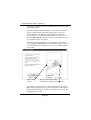
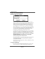
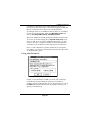
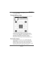
PSAlter and fonts
How PSAlter keeps the look of fonts
PSAlter can keep the appearance of a document, even though
it may not have all of the fonts used in it. It does this using
three techniques, which are automatic for the basic 35 fonts.
1
Choose a similar looking font. PostScript has built-in lists of
what fonts to substitute if the requested font is not available.
These include fonts available in several popular font packages,
so if they are installed, PSAlter will be able to make use of
them with no changes. You can build your own lists for fonts
beyond the 35.
2
Adjust character spacing. The spacing of letters is potentially
different for each font. If another font is substituted without
adjusting the spacing, this will mean that the characters may
not fit the gap left for them on the page. There may be extra
spaces between letters, or letters may overlap. PSAlter has
built-in tables of the sizes of each character in the basic 35
fonts. These ensure that characters fit the space available to
them. You can add tables for other fonts.
3
Horizontal scaling. In some cases the substitute font is too
wide or too narrow to be used effectively, even if the character
spacing is adjusted. This is especially noticeable if the substitute characters are too wide, and overlap. To get over this,
PSAlter can stretch or shrink characters horizontally. This is
done for the entire font, not individual characters, but usually
produces reasonable results. For instance, if the font HelveticaNarrow is not available, PSAlter may use Arial at 82% of its
width.
These techniques are acceptable in many cases. However, they
will not look exactly the same as the original font, and for
some applications close is not good enough.
The accompanying file addfonts.txt (described in Appendix A
on page 146) lists the options which you have for providing
fonts which are a perfect match. Appendix A also shows
samples of the effect of substitution.
Using Windows fonts to add extra fonts to
Page 74