1
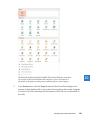
Finally, if you want more control over the appearance of your chart, you can use the commands on the Format tool tab. It is worth exploring these options so that you know how
to do the following:
▪▪ Add shapes.
▪▪ Format individual elements such as titles, axes, data labels, and gridlines.
▪▪ Customize the walls and floor or otherwise manipulate a three-dimensional chart.
▪▪ Customize the look of shapes.
▪▪ Add and format fancy text (WordArt).
▪▪ Arrange objects precisely.
▪▪ Precisely control the overall size of the chart.
You can double-click almost any chart element to change its attributes. For example, you
can double-click an axis to display the Format Axis pane, where you can change the scale,
tick marks, label position, line style, and other aspects of the axis. If you have trouble
double-clicking some of the smaller chart elements, select the element you want to format
from the Chart Elements list in the Current Selection group on the Format tool tab, and
then click the Format Selection button in the same group to display the Format pane for
the selection.
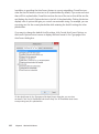
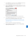
If you make extensive modifications to the design of a chart, you might want to save it as
a template. Then when you want to plot similar data in the future, you can avoid having to
repeat all the changes by applying the template as a custom chart type.
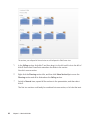
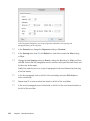
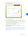
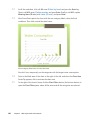
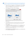
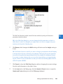
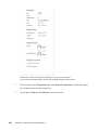
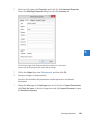
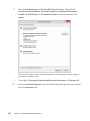
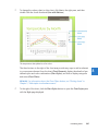
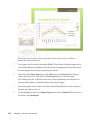
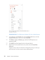
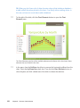
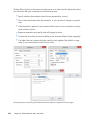
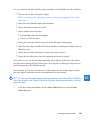
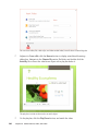
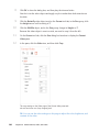
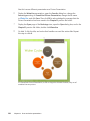
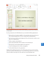
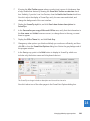
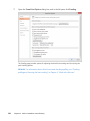
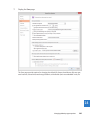
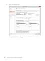
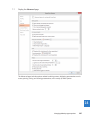
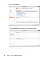
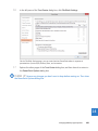
In this exercise, you’ll modify the appearance of a chart by changing its chart type and style.
You’ll change the color of the plot area and the color of two data series. You’ll then hide
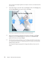
gridlines and change the layout to display titles and a datasheet. After adding an annotation in a text box, you’ll save the chart as a template.
Formatting charts 245
8