1
User Manual
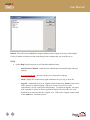
Welcome
Quick Start Guide - Installation
Quick Start Guide - A Step-By-Step Tutorial
Card Design Center Detail
Data Entry Center Detail
Appendix A - Barcode Limitations and Considerations
Appendix B - Advanced Encoding & Printing Settings
User Manual
Welcome
Welcome to the exciting world of Asure ID! Synercard has worked hard to create an application that
brings the most powerful identification and verification technologies to our customers in a friendly,
intuitive and easy-to-use manner. We hope that you will find that Asure ID is the perfect match for your
needs.
This electronic manual covers all of the features and functions of Asure ID, and is intended to serve as a
reference when working with the software. Synercard recommends that all new users begin with the
Installation Guide and then the Asure ID Quick Start Guide portions of this manual. These chapters
will help you to become familiar with the Asure ID concept, and will guide you through examples the
most common tasks. After you have read through these chapters, you will find more detailed information
on the various features and functions in the ‘Details’ sections in later chapters of this manual.
Asure ID has been designed with ease-of-use as a primary objective, and we feel that many users will
want to learn by ‘exploring’ the software instead of reading a large manual. We encourage this approach,
and this one of the reasons that this manual was designed with a Quick Start guide preceding the detailed
explanations of each function.
We hope that the Quick Start guide will give you a familiar enough understanding of the way our
software works so that you can treat the rest of the manual as a detailed reference, ready to consult
whenever you need further information about a specific feature.
User Manual
Quick Start Guide - Installation
Thank You For Purchasing Asure ID…
Let’s Get Started!
This easy to use QuickStart Guide provides you with all the information you will need to quickly get the
Asure ID software working for you. This guide is divided into the following four sections:
1. Installing Asure ID
2. Registering Your Purchase
3. A Step-By-Step Tutorial
• Designing A Card Template
• Creating A Cardholder Record
• Printing A Card
Full Asure ID online and offline product documentation can be obtained from within the application by
clicking on the ‘Help Menu’ or by clicking on the ‘Help’ button at the top of either the ‘Card Design
Center’ or ‘Data Entry Center’ modules of Asure ID.
Installing Asure ID
Before you begin the installation, please ensure that your computer meets the minimum system
requirements for Asure ID. System requirements are printed on the case that your software came in.
Please note that you will need to be logged onto your computer with Administrative rights in order to
install Asure ID successfully. If you are the only person who uses your computer, by default you
probably already have administrative rights on your machine. If you need to have a network
administrator come to your machine in order to install software or to make changes to your system, you
probably do not have administrative rights. If you are unsure about having these rights, please contact
your network administration staff, or Synercard’s Customer Support Team.
Step 1
To begin the Asure ID setup, simply place the Asure ID CD into your computer’s CD-ROM drive.
Within a few moments the install wizard will begin and welcome you to the installation of Asure ID. If
you have CD Autoplay disabled, simply browse to the CD-ROM and launch “setup.exe”.
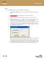
User Manual
After selecting “Next”, the software license agreement will appear. Select the “I accept the terms in the
license agreement” button, and press next to continue, or select “Cancel” if you would like to exit the
installer.
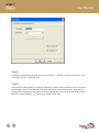
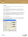
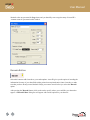
Step 2
Next, the customer information page will appear. Enter your company name, product serial number (as
printed on your CD case), and the password for the Asure ID ‘Admin’ user login. Enter the password
again to confirm your choice. Please choose a password that you will remember, as you will need it to
login to Asure ID after the install has completed.
User Manual
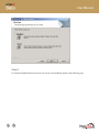
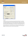
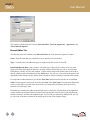
Step 3
Next, the “Setup Type” page will appear, and you may choose either a “Complete” or a “Custom”
installation. Select Complete Installation if you would like the software automatically installed with all of
the default options, or select Custom Installation if you would like to choose the installation path,
language and database configuration.
User Manual
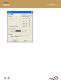
Step 4
If a Custom Installation has been selected, you will see the installation options on the following page.
User Manual
If multiple languages are available on your installation CD, you may choose from the available options.
If you would like to change the installation path, press the “Change” button where the current install path
is shown, and select the new location where you would like Asure ID installed.
When you have made the appropriate custom installation options, press the “Next” button to continue.
Step 5
After selecting your installation settings, the installer will present a page stating that it is ready to begin
the install. Press “Next” to begin the installation or “Cancel” to halt it and return to Windows without
installing Asure ID. When the installation begins you will see a progress window as files are copied to
your computer.
User Manual
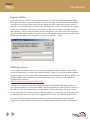
When the install has completed successfully, you will see a “InstallShield Wizard Completed” window, as
shown below. Press “Finish” to exit the installer.
User Manual
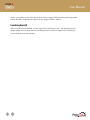
Step 6
Depending on your system and the install type you selected, you may be informed that you need to reboot
your computer before the installation will be complete, as displayed below. If you see this message, you
must reboot your computer before you can use Asure ID. Press “Yes” if you want to automatically reboot
immediately, or “No” if you will reboot the computer yourself at a later time. If you do not see this
message, you may launch Asure ID immediately, using the shortcuts that have been placed on the
Windows Start Menu, in the “Programs -> Synercard -> Asure ID…” folder.
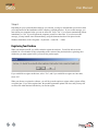
Registering Your Purchase
When you launch Asure ID, you will be asked to register the software. You will be able to use the
software for a fixed number of days (depending on the version of the product) before registering, after
which time you must register before you can use the product again.
If you would like to register at this time, select “Yes”, and if you would like to register at a later time,
select “No”.
When you choose to register the software, you will be given the option to register online, register offline,
or register later. If you select register later, the product registration options will close, and you may still
use Asure ID within the time limit before you need to register.
User Manual
Register Online
Select “Register Online” if you would like to use the built-in product activation. This is the standard
registration procedure that is recommended for the majority of users who are connected to the Internet.
After selecting “Register Online”, you will see a customer information page. Please fill out the different
items and press “Next” to continue – as long as your computer has web access, you should be registered
automatically.
If the Online Registration program is unable to communicate with the registration servers, you will see a
communication error message. Please check your Internet connection, disable any firewalls if needed
(just for the duration of the registration) and press the “Try Again” button. If the communication failure
persists, press “Cancel” and use “Register Offline” instead.
If the product license has already been registered multiple times, you will see a message stating that the
product cannot be automatically activated. Exit the Online Registration application, and select “Register
Offline” when next prompted to register.
User Manual
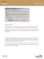
Register Offline
If you select “Register Offline” for the registration option, you will see the Offline Registration window.
Please phone the number shown on the window, and select the option for Asure ID Product Registration.
You will have to read the number displayed in the “Initialization ID” column to the operator, who will
issue you a corresponding number to enter into the “Installation ID” column. This number pair is unique
to your current installation, and cannot be used again, even if the same product is reinstalled onto the
same computer. After you enter the number issued by the operator, press “OK” to save your registration
data. The window will close and you may now run Asure ID using the shortcuts that have been placed on
the Windows Start Menu, in the “Programs -> Synercard -> Asure ID…” folder.
Web Registration
If you are unable to register your software using Online Registration, and are calling to register offline
outside of business hours, you may use the “Register Offline” function in conjunction with any computer
that has Internet access, even if it is not the same computer you are installing Asure ID onto. Please select
“Register Offline” when prompted by Asure ID, and then using any computer, go to our web-based
registration page located at:
http://www.synercard.com/support/registration.asp
You will need to fill out the form on the webpage, and enter the Initialization ID (displayed when you
select “Register Offline” in the Asure ID software) into the appropriate box on the web form. When you
have filled out all of the requested items, press the “Submit” button at the bottom of the page, and our
servers will process your registration request. If the registration is successful, you will be presented with
an “Installation ID” that you can type into the appropriate box in Asure ID’s Offline Register window.
Please note that this web-based registration will not re-activate products that have been registered
multiple times and thus cannot be activated by the standard “Register Online” function. If you cannot
User Manual
register your product because it has already been activated, please call Synercard’s product registration
team on the phone number that is displayed on the “Register Offline” window.
Launching Asure ID
After Asure ID has been installed, you may login to the Card Design Center. The Data Enter Center
module cannot be used until at least one card design has been created or imported into Card Design
Center and then saved to the database.
User Manual
Quick Start Guide - A Step-By-Step Tutorial
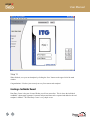
Designing a Card Template
The Card Design Center is where you create templates for cards, either from scratch or by modifying
existing templates. It is here that you decide what your cards will look like, what types of text and data
they will hold and display, and what types of special features (such as barcodes, magnetic stripes or chips)
they will incorporate. This is all done through a simple drag-and-drop visual interface, while Asure ID
takes care of creating a custom database for you ‘behind the scenes’. The best part is that no database
programming knowledge or skills is needed. To fully appreciate the powerful features of the Card Design
Center, take a look at the simple steps involved with creating a new card template.
Step 1
Login to the “Card Design Center” by clicking on the shortcut on your windows start menu labeled “Card
Design Center”.
Step 2
To create a new card template, press the ‘New’ button on the upper left of the main window.
User Manual
Step 3
After pressing the ‘New’ button, a ‘Template Layout Options’ window will appear asking you to specify
the ‘Template Name’ (We’ve used ‘Employee Card’ for our example), as well as other basic details about
the physical structure of the card that is going to be used, such as ‘Orientation’ and ‘Magnetic Stripe’.
These are fundamental aspects of the card’s appearance and structure, and must be selected before the
layout of the new card can be displayed. For this tutorial, select ‘Portrait’ for the ‘Orientation’ and leave
‘Magnetic Stripe’ to ‘No’.
Step 4
After you select the basic properties, a new blank template appears within the workspace. Now you
should select a background image or a color for the front of your card. Double-clicking on the white area
of the card allows you to add a background. A ‘New Background’ dialog box will appear, giving you the
option to browse your computer and network for a background image, or to select a custom color from the
Windows color palette. To add a background image click on the ‘Load’ button and a ‘Open’ dialog box
will appear, allowing you to choose an image. When you have located the image that you would like to
use, press the ‘Open’ button.
User Manual
Step 5
Edit the image by clicking on the ‘Edit’ button. An ‘Edit Image’ window will appear giving you the
option to crop (selecting the area of image to be used) the image. To crop the image, simply resize the
crop selection frame over the portion of the image you wish to use as the background. When you are
satisfied with your selection click ‘OK’, and then ‘OK’ again to close the ‘New Background’ dialog box,
and load your image onto the card area.
User Manual
A look at the Card Design Center’s main button panel (on the left side of the screen) shows buttons for
‘Data Field’, ‘Logo’, ‘Photograph’, ‘Magstripe’ and ‘Barcode’. Although there are a wide variety of
options, they are all added to the card in the same simple fashion. Simply press the button of the item that
you want to add, and then click within the card area to place the selected item.
Step 6
We will next add a ‘First Name’ field to your card. Begin by simply pressing the ‘Data Field’ button on
the left hand side of the screen and clicking on the area of the card where you would like the field to
appear.
User Manual
Step 7
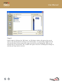
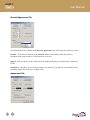
Within the ‘New Field’ dialog box that appears, you will see a field titled ‘Field Name’. In this area, type
the field name; in this case we will use ‘First Name’. Browse through the rest of the fields on both the
‘General’ and ‘Advanced’ tabs and try to replicate the options shown in the picture below. When you are
satisfied with your field choices click ‘OK’.
User Manual
Step 8
Add another data field and repeat the steps in steps 10 and 11. This time, instead of ‘First Name’, type
‘Last Name’ into the ‘Field Name’ area.
Step 9
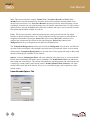
Add a field for a photograph by pressing the ‘Photograph’ button on the left hand side of the screen and
positioning the cursor on the front side of the card, and clicking the left mouse button. Name the new
photograph field ‘Employee’ and enable a frame by selecting the box next to the words ‘Enable Frame’,
and set the ‘Frame Width’ to ‘8’. When you are satisfied click ‘OK’.
User Manual
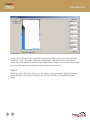
Step 10
To finish our card template, add a logo image to the front of the card by clicking on the ‘Logo’ button,
positioning the cursor on the front side of the card and clicking the left mouse button. From within the
‘Logo’ dialog box that appears, press the ‘Load’ button to locate and load an image in the same way that
you selected the background image for the card. If you would like to crop or edit the image (again, in the
same manner as with the background image), press the ‘Edit’ button to open the image editor. Select any
other desired options such as a frame, and then press ‘OK’ when you are satisfied with the settings. You
will see the logo appear on the card, and you may resize it by clicking on any of the image’s corners and
dragging the edge of the logo. Like any other field on the card, clicking on the center of the image and
dragging it to a different location on the card can easily reposition the logo.
User Manual
User Manual
Step 11
When finished, save your card template by clicking the ‘Save’ button on the upper left of the main
window.
Congratulations! You have just created your very first custom card template!
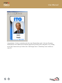
Creating a Cardholder Record
Data Entry Center is the part of Asure ID that you will use most often. This is where the individual
cardholder’s photograph, signature, biometric and personal data can be captured and added to the card
template’s database. The Data Entry Center is very simple to use.
User Manual
Let’s take a look at how the Data Entry Center functions by opening the card template we created in the
last section, and then adding a few cards to the database.
Step 12
If you are still in the Card Design Center, enter the Data Entry Center by clicking the ‘Data Entry Center’
button at the top of the screen.
Step 13
You first must select the ‘Card Template’ that you want to use. Data Entry Center provides you with any
templates that you have created in the Card Design Center. Select the ‘Synercard’ template from the
drop-down ‘Card Templates’ menu at the top of the Data Entry Center main window.
Step 14
After you have selected the template, click on the ‘Add Card’ button. You will notice that all of the data
fields on the card will include an area to enter values into (these fields are grayed out until you press the
Add Card button).
Step 15
Simply click in each field and type in the appropriate data. You may also use the <TAB> key to move
from one field to the next.
User Manual
Step 16
If the cardholder you wish to add is with you and you have an Imago or TWAIN compliant digital
camera attached to your computer, click on ‘Image’ on the main menu bar at the top of the screen and
select either ‘Photograph’ and then select ‘Acquire Photo from Imago’ or simply choose ‘Select Twain
Source’ to configure your TWAIN camera. If you selected ‘Select Twain Source’, from the ‘Select
Source’ window that appears highlight the source you would like to set as the default photograph capture
device and then press ‘Select’. You are only required to configure your TWAIN capture device once
unless you wish to change the default device at some point in the future.
Step 17
Once your camera (or scanner) is configured, right-click the large Photograph area in the upper right
corner of the Data Entry Center’s window and select ‘Acquire Photo from TWAIN Source’ to capture the
photo of your cardholder.
User Manual
Step 18
After you load (from file) or capture (Asure ID Imago, TWAIN camera or scanner) the photograph, you
have the option to edit the image. To crop the image simply right-click on the photograph display, and
select ‘Edit Photo’. Next, resize the crop selection frame that appears. When you are satisfied with your
selection click ‘OK’.
Step 19
When you have filled the fields on your card template with all the data for the cardholder, press the ‘Save
Card’ button to add this record to the database.
User Manual
Printing a Card
Step 20
You are now ready to print your first card. This can be done in one of two ways. First, by clicking on the
‘Print’ button on the left hand side of the main window, or by selecting ‘Card Print’ from the main menu
at the top of the screen. If you choose the ‘Card Print’ menu, you will need to next select ‘Print
Displayed Card’.
Step 21
To end this tutorial let’s take a look at the finished card by selecting ‘Card Print’ from the main dropdown menu, and then choosing ‘Preview Displayed Card’.
User Manual
Congratulations! You have reached the end of the Asure ID Quick Start guide. Full Asure ID product
documentation can be obtained from within the application by clicking on the ‘Help Menu’ or by clicking
on the ‘Help’ button at the top of either of the ‘Card Design Center’ or ‘Data Entry Center’ modules of
Asure ID.
User Manual
Card Design Center Detail
This section is designed to complement the information provided in the Quick Start Guide. Please ensure
that you begin by reading the Quick Start Guide, and then proceed to this section if you need to find more
detailed information. In this section you will find a comprehensive listing of all the options found in Card
Design Center, and their various functions
Introduction
Asure ID's Card Design Center is where you will create templates for new cards, either from scratch or by
modifying existing templates. It is here that you decide what your cards will look like, what types of text
and data they will hold and display, and what types of special features (such as magnetic stripes or
barcodes) they will incorporate.
This is all done through a simple drag-and-drop visual interface, while Asure ID takes care of creating a
custom database for you 'behind the scenes'. The benefit of this approach is that no database programming
knowledge or skills is needed to use Asure ID. In this section you will find a comprehensive listing of all
the options found in Card Design Center and their various corresponding functions.
User Manual
About Card Templates
Card Template: This area represents the appearance of the card you are designing, and will be used to
place your photo, signature, logos, data fields, magstripes, barcodes, and any other elements in your card's
design. After any of these elements have been placed on the card, they may be repositioned by dragging
them while holding down the left mouse button, or by single-clicking to select one and using the arrow
keys on your keyboard. If you hold down the <SHIFT> key while using the arrow buttons, you will
resize the selected field without moving it.
User Manual
Add a Background
There are three different ways to add a background to the card. You may simply double-click on the card
area as shown, right-click on the card and select 'Add Background' or choose 'Add' then 'Background'
from the drop-down menu bar at the top of the screen.
When the ‘New Background’ window appears, press the 'Load' button to load an image file for the
background, or check the 'Background Color' box to use a color instead.
If you select this box, you will need to click on the 'Select Color' area to choose a custom color from the
Windows color palette.
User Manual
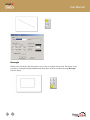
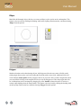
Editing Images
After you have loaded an image, you can press the 'Edit' button to perform various image enhancements
such as cropping and adjusting contrast, brightness, etc. A window will appear (shown below) giving you
various image editing options, including image cropping. You can change the size of the area you wish to
crop (select) by holding down the left mouse button, dragging the outline 'frame' over the area you want
to select, and then releasing the mouse button. If you do not want to crop the background image at this
time, simply press the 'Cancel' button to use the entire image un-cropped.
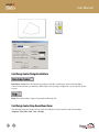
Additionally, on the cropping window, you see a number of control items along the right-hand side of the
window. These controls allow you to adjust various elements of the background, and provide greater
control over the appearance of your image. This cropping-window, along with it's adjustments, are a
'common dialog' within Asure ID, and the identical options are also available in Data Entry Center
whenever you add any image-based item (such as Photographs, Signatures, Fingerprints and Retina
Scans), or in Card Design Center when adding logos and background images.
When working with this dialog, all adjustments are made with the available controls, and the changes are
in real-time, updating your image as the adjustments are made. It is important to note that any time you
load an image file into Asure ID, the software automatically makes a copy of the original image, and will
only work with this copy. Under no circumstances do you need to worry about making edits or changes to
an original image file!
User Manual
Below you will find a description for the various adjustments made on the common image editor window:
Sharpness - Adjusts the sharpness, or 'crispness' of the image. Adjustment range is between 0 (lowest
possible) and 100 (maximum sharpness.)
Brightness - Controls the amount of brightness in the image. Adjustment range is between 0 (complete
darkness) and 100 (full brightness - a white image).
Contrast - Regulates the amount of contrast in the image, or, the amount of median difference between
light (white) and dark (black) colors. Adjustment range is between 0 (no contrast) and 100 (full contrast).
Gamma – Gamma controls the white balance of the image.
Hue - The hue adjustment allows for the adjustment of colors in the image. For example if you are
capturing images in an area with too much blue light (giving an undesired bluish tint to the image), then
this discoloration may be compensated for with the Hue adjustment. Different levels of this control will
affect different colors in the image. Adjustment is made between 0 and 100.
Saturation - Saturation controls the amount of white color used in the image. It is similar in function to
brightness, but when using saturation even very dark images can be made to look 'white' without
increasing brightness. Adjustment range for this control is from 0 (no saturation) to 100 (full saturation).
Transparency - Adjusting this control allows you to create a transparent, or 'see-through' image. This
will allow items that are behind the image in your card design show through, at least partially. Adjustment
is made from 0 to 100, and the selection is represented as 'percentage transparency'. For example,
setting this control to '50' makes your image 50% transparent. Setting it to 90 would mean that your
image is 90% transparent, or in other words, barely visible! You can use the transparency adjustment to
achieve 'ghosting' effects on your card designs.
Chromakey - The Chromakey adjustment allows for 'color matching' when adding images to your card
in Asure ID. This control will adjust the main background color in the image you supply, to match the
color of other items on the card. Adjustments are made between 0 and 100, and represent the amount (or
'strength') that the Chromakey feature will use to override the default colors in your image.
When selecting Chromakey, you will notice two radio buttons below the Chromakey item, asking you tell
the software what color should be matched. The options here are 'Auto' and 'Manual'.
If 'Auto' is selected, the Chromakey function will attempt to detect the color that is immediately behind
your image, or if none, the color that is the most commonly used around the image, and use this color for
matching.
User Manual
If 'Manual' is selected, you can press the 'Pick Color' button, to select a color to be used for matching.
Upon the configuration of the Chromakey item, the background color of the supplied image will be
adjusted in an attempt to match the selected color.
Keep Ratio - When this check box is selected, the area of the image that is cropped or captured will
always be forced to maintain the aspect ratio of the original image. When capturing photos, signatures,
fingerprints and retina scans in Data Entry Center, it is strongly recommended that you check this item.
Failure to do so will create a situation where you are using an arbitrary (defined by your selection) aspect
ratio from one image to the other and you will end up with inconsistent image sizes from one card to
another.
Card Design Center Function Buttons
In this section you will find a complete description of the functionality provided by the main Function
Buttons, found along the top and left-hand edge of the main Card Design Center interface.
New Template Button
Select this button to begin creating a new card template. It is important to remember that the template data
for new templates must be sent to the Asure ID Server before you send any card records entered into that
template. After selecting the 'New' option, you will be prompted to choose the layout of your new card
design (Portrait or Landscape) and specify if it should have a magnetic stripe or not.
User Manual
Open Template Button
Select this button to continue working on or to edit an existing card template. After selecting the 'Open'
option, you will be presented with a list of all the current templates, and may choose the one you would
like to open.
Save Template Button
Select this button to save the current template. If it has already been saved, you will be prompted to
confirm that you want to overwrite the existing template. If you would rather save it under a new name,
press 'Cancel', and select 'Save Template As…' from the 'Template' drop-down menu.
User Manual
Data Field Button
Select this button to add a data field either onto the card itself, or into non-printed entries. After clicking
on the 'Data Field' button, the cursor will change to a 'crosshair' cursor, and you can place the field by
clicking either on the front or backside of the card, or in the non-printed entries area. You may place up to
8 data fields on any individual card template. After selecting where you want to place the field, a dialog
box will appear detailing various options for the new data field. These options will be described in detail
below.
Editing and Moving Data Fields
After a data field has been placed on the card, its options dialog box can be reopened by double-clicking
on the field itself (either on the card surface, or in the non-printed entries area), or by right-clicking and
selecting 'Properties'. Also, after data fields have been placed, they can be resized by clicking on the
border of the field and dragging it while holding down the mouse button, or by holding down
<SHIFT>while using the arrow keys: left and right arrows to adjust the width, and the up and down
arrows to adjust the height.
Existing data fields can also be moved to a different position by clicking in the center of the field and
dragging it to a new location while holding down the mouse button, by single-clicking and using the
arrow keys on your keyboard, or by adjusting 'Screen Parameters' within the fields options dialog box.
The data field can be removed from the template (as long as no cardholder data has been entered into the
database for this template) by selecting it with a mouse click and pressing the <DEL> key, or by right
clicking on it and choosing 'Remove'.
Note that if you make a mistake at any point in Card Design Center (weather moving, adding or changing
items), it can be easily fixed by selecting 'Edit' and then 'Undo' from the drop-down menu bar at the top
of the main Card Design Center window.
Layering Fields
Data fields, along with all other fields created within the Card Design Center (such as logos, signatures,
and photograph fields), may be layered either above or below another field that is either partially or
completely overlapping it. To set the layering option for a field, select the field by single clicking on it,
then right click over the field and select either 'Layer Above' or 'Layer Below'. You can set the layering
options for any number of fields that overlap each other.
User Manual
Please note that the field layered at the top ('Above') will print and display in its entirety, while fields
layered below will only display that portion of themselves not covered by a higher layered field
(Assuming that there is no transparency enabled for the uppermost item). When layering multiple fields, it
is en a good idea to perform 'Print Preview' operations to ensure that the fields are being displayed the
way that you have intended.
Copying Fields
After a data field has been placed on the card, it may be copied to a new location. Please note that this
will create a new data field, which has simply copied the properties of the original, and you will need to
enter a new name for this field.
To copy a field, simply right-click on the field, select 'Copy', then right-click on a different area of the
card and select 'Paste'. After selecting 'Paste', the properties menu for the new copy will appear, allowing
you to type a new field name.
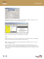
Data Field Options Dialog Box
This box appears when entering a new data field, or when editing an existing one (either by doubleclicking on any existing data field, or by right-clicking and selecting 'Properties'). The contents of the
options dialog box are broken into two 'tabbed' sections as displayed below:
• Field Options and
• Advanced Options
User Manual
Field Options
On the 'Field Options' tab, the following functions are available:
Field Name - Type the name, or label, of the new field you are creating here. This will be the label used
to prompt the user for what type of data should be entered into the field. For example, if you were
creating a field to hold an employee's card number, it would be a good idea to use 'Card Number' for the
'Field Name'.
Data Type – You may select either “Text” (for variable information), or “Label” (to create static text)
Field Settings - This item is normally grayed-out, unless you have selected the ‘Label’ data type, in
which case this button will launch the Label Text Editor.
Max Characters - This option can be used to specify the maximum number of characters allowed in a
field. Please note that Data Entry Center will not allow more characters than set here to be entered into the
field.
Min Characters - This option can be used to specify the minimum number of characters allowed in a
field. Please note that Data Entry Center will not allow a card to be saved less characters than set here are
entered into the field.
User Manual
Data Types
When adding a new Data Field to the card design, the following ‘Data Types’ are available to the user:
Text - (supporting all characters)
Label - The 'Label' data type is the only data type that can be placed on the card that will not create a
field for data entry in the Data Entry Center. If you would like your card to have ‘fixed text’, (for
example, to say 'Acme Inc.'), without having to enter this on a card-by-card basis, then the Label is the
data type you should choose.
When you select 'Label' from the drop-down 'Data Type' menu, a Label Editor dialog box (shown below)
will appear, letting you type in the Label's text. When entering this text, please bear in mind that you may
use spaces and carriage returns to achieve the formatting of the text that you desire. After you have
created the label, pressing the 'Field Settings ' button on the 'Field Parameters' properties page will
reopen the list values editor.
Advanced Field Options
The 'Advanced Options' tab of a Data Field’s properties box is used to configure the appearance of the
field on your card. The configurable items are broken into six distinct areas: Position, Justification,
Orientation, Frame, Field Color and Font.
User Manual
Position
Card Side (Front/Back): Select either the front or back of the card. Changing this option is the easiest
way to move a logo or signature from one side of the card to the other.
Left/Top/Width/Height: These items allow you to fine-tune the position of fields within your template.
Manually setting these values allows for much more precise lining up of fields compared to simply
dragging them into position. For example, to vertically line up (left-justify) two data fields, make sure that
the 'Left' screen parameter value is the same for both.
Justification
Horizontal Alignment - Configuring this item allows for the control over how your field's text is
horizontally aligned within it's own allotted space (the 'frame' around the field. The options are 'Left' (left
justify), 'Center' (centered within it's frame) and 'Right' (right justified). If you would like your text to be
centered horizontally on the card, the easiest way to do it would be to stretch the field to the entire width
of the card, and then choose the 'Center' option for 'Horizontal Alignment'.
Vertical Alignment - Configuring this item allows for the control over how your field's text is vertically
aligned within it's own allotted space (the 'frame' around the field. The options are 'Top' (top
justification), 'Center' (centered within it's frame) and 'Bottom' (bottom justification). If you would like
your text to be centered vertically on the card, the easiest way to do it would be to stretch the field to the
entire height of the card, and then choose the 'Center' option for 'Vertical Alignment'.
Orientation
Rotation in Degrees - This option provides control for the 'Rotation' of your data field. By default, all
data fields are, as you have seen, laid out horizontally on the card. This item allows for the rotation of the
field to be set in degrees by choosing a setting from the drop down menu. The options are given in fivedegree increments, from 5 to 355 degrees. A setting of 90 or 180 will make the field completely vertical,
either up-to-down or down-to-up. Please note that when using this item, the degree measurements will
rotate the data field counter-clockwise.
Frame
Enable Frame: Place a check in this box if you would like a frame drawn around the selected field.
Please note that the default thin black frame that is apparent on all data fields (before you choose 'Enable
Frame') is not actually a 'drawn frame' (one that is shown when cards are printed), but rather used
simply to show the card designer how much space on the card template area is being used by the field.
This can easily be verified by performing a print preview on your card template. Clearing the 'Enable
Frame' item is also handy for when you want to disable a frame without losing your color and line width
User Manual
settings. After enabling a frame, you can select the color of the frame by clicking on the 'Select Color'
button, and the width of the frame (in 0.11mm increments) can be configured with the 'Frame Width'
item.
Field Color
Enable Color - Selecting this item allows for a background 'fill' color to be used for your data field.
Please note that data fields by default have transparency, or no fill color, thus allowing the card's
background image to show through behind the data field's text. Using this item will draw the selected
color into the field's background. After enabling this item, the fill color can be selected by clicking on the
'Select Color' button.
Font
The items found in this section of the 'Advanced Options' tab allow for flexible control over the
appearance of text within your data field.
Change Font - Clicking on this item will bring up a font selection window, which will allow the user to
select the font they would like to use for the text in the data field from any TrueType font installed on the
system. This window will also allow for the user to select a font script and size for their field. Please note
that Asure ID only supports TrueType fonts, and not the Type II ATM fonts.
Select Color - Pressing this button will bring up the Windows color palette, allowing the user to select the
color that they would like to use for the text in this data field.
Word Wrap - selecting this item will cause the data contained within the field to occupy multiple lines if
needed, or if the width of the field is manually decreased.
Logo Button
Select this button to place a logo (fixed image) onto your card. After pressing the 'logo' button, singleclick on the card in the area where you would like to place your logo. After you click on the card, the
logo's properties dialog box will appear (shown below) - select the 'Load' button, then browse to the
image you want to use and select 'Open'.
User Manual
When browsing for an image file, a preview is available to help you choose what file to select. After the
image is loaded you may press the 'Edit' button to crop the selected logo. This cropping feature is
identical to that described for card background images.
Additionally you will find 'Frame', ‘Orientation’ and 'Position' items that function identically to those
previously described for Data Fields. After you have chosen the options for your logo, they can be
changed at any time by double-clicking on the logo field to reopen the item's options dialog box, or by
right-clicking and selecting ‘Properties’.
Photograph Button
Select this button to add a field to the template that will contain the cardholder’s photograph. After
selecting the 'Photograph' button, single-click on the area of your card where you would like the
photograph to appear. Like logos and data fields, the photograph field can be resized or repositioned by
dragging it around the template (or by using the arrow keys), and the options dialog box can be opened by
either double-clicking on the field, or right-clicking and selecting 'Properties'. This dialog box is almost
User Manual
identical to the one presented for Logo items, and you should by now recognize many of Asure ID’s
‘common controls’ presented on this window.
Barcode Button
Select this button to add a barcode to your card template. Asure ID gives you the option of encoding the
information from any of your data fields (either printed or non-printed entries) into a barcode, so make
sure that you have already created the data field(s) you want to encode before you select the 'Barcode'
option.
After pressing the 'Barcode' button, click on the card to specify where you would like your barcode to
appear. A 'Barcode Editor' dialog box will appear with various options for your barcode.
User Manual
This window is divided into four sections: 'Barcode Editor', 'Barcode Appearance', 'Appearance' and
'Linear Barcode Options'.
Barcode Editor Tab
The following items are available on the 'Barcode Editor' tab of the barcode's properties window:
Name - Enter the name that you would like to use to identify your barcode here.
Type – Currently only Linear Barcode types are supported in this version of Asure ID.
Data Fields/Barcode Data - After you have chosen the type of barcode you want to create, you must
choose what fields will supply the data to be encoded. On the left hand side you will see all of the data
fields that are currently on your card template. To add a field to the barcode, double-click on the field in
the left column (or select it and then press the 'Add' button). You will see a copy of the field appear in the
right hand column, which is used to list the fields selected for, and the ordering of, the data in the barcode.
It is important to understand that if you add the 'First Name' data field to the barcode, the words 'First
Name' will not appear in the barcode, but rather the value of the 'First Name' field (entered in Data Entry
Center) is what will be encoded, hence the need for a test string (described below) when previewing
barcodes in Card Design Center.
Fields that have already been added to the barcode may be removed by selecting them on the right-hand
column, and then pressing the 'Remove' button. Please note that this will only remove the field from the
barcode's structure, not from your template design. As you build your barcode by adding fields, you will
see a preview of the data's structure in the bottom preview pane of the properties page.
User Manual
Barcode Appearance Tab
The following items are available on the 'Barcode Appearance' page of the barcode's properties window:
Position - These items are identical to the 'Position' controls found on data fields, and allow for
adjustment of the position and size of the barcode on your card.
Options - This area allows for the configuration of Conditional Display (as described above under Data
Fields).
Orientation - This allows you to specify the degrees of rotation for your barcode, and is identical to the
Orientation option discussed above for Data Fields.
Appearance Tab
User Manual
Text - This area provides three controls, 'Include Text', 'Text Above Barcode' and 'Font'. When
'Include Text' is selected, the data that is encoded to the barcode is printed in 'human readable' form
directly below the barcode. The 'Text Above Barcode' function provides the same functionality, but not
surprisingly, forces the text to be printed directly above the barcode, rather than below it. If either of these
options has been selected, the 'Font' button will become available, and may be used to select the font and
font options that this human readable text will use.
Color - This area provides three controls that determine the colors used in the barcode. By default
barcodes are printed with black bars over a white background, but like most aspects of Asure ID this is
completely customizable. Pressing the 'Select Color' option next to 'Bar Color' will allow you to
configure the color that will be used for the bar, and pressing the 'Select Color' option next to
'Background' will let you configure that color that is used behind the bars.
The 'Transparent Background' check box will override the 'Background' color selection, and will force
any items on the card design to 'show through' between the bars of your barcode. Please exercise caution
when using the 'Transparent Background' item, as cards with a 'noisy' background image on them could
interfere with the proper readability of your barcode.
Options - Selecting 'Include Quiet Zones' will create a barcode with a 'quiet zone', or an area around the
barcode that is intentionally left blank to ensure readability. The 'Include Bearer Bars' item adds bearer
bars to both ends of the barcode. This can help differentiate the beginning and the end of the barcode, and
is required by certain (usually older) barcode readers. 'Include Optional Check Character' will, when
selected, add a check digit to the barcode. This is use to verify data integrity, and is required by certain
barcode readers.
Linear Barcode Options Tab
User Manual
Barcode Style - Select the barcode symbology (barcode style) that you would like to use for your
barcode. There are many types available, so if you are working with some specific barcode reader or
access control system, please check the specification to determine what type of barcode to implement.
More information on the various barcode symbologies and considerations is available in Appendix 'C' Barcode Limitations and Considerations.
Max Data Length - Specify the maximum number of characters the barcode will be able to use. Note that
the higher you increase this number, the wider the barcode will be. It is possible to create a barcode that is
too wide to fit on a card template.
Test String - Since the barcode is designed using the available data fields on your template, there will be
no data within these fields if you preview the barcode from within Card Design Center. The 'Test String'
allows for the inclusion of any desired characters, simply for the purpose of generating a barcode that can
be viewed for layout purposes from within Card Design Center.
Comment Line - At the bottom of the properties menu is a comment line. This area allows the user to type
any text in as a 'comment' that will be displayed in the barcode properties menu. Any text may be placed
into this field, with a limit of 100 characters. It is important to realize that this comment is not data that
will be encoded into the barcode, but rather a string of fixed text that will be displayed alongside the
barcode's configuration, possibly as a useful note or reminder to anyone who may be working with your
barcode's configuration at some time in the future.
Magstripe Button
Choose this option to add a magnetic stripe to your card. Like a barcode, the magstripe encodes
information from your existing data fields. Magstripes have three 'tracks' that can each contain separate
data, so Asure ID allows you to encode information from any of your data fields (either printed or nonprinted) into the magstripe. After selecting the Magstripe button, click on the card in the area where you
would like the magnetic stripe to appear. An options dialog box will appear asking you to specify the
following information:
User Manual
Name
You can use this area to type a name for your magstripe. By default, 'Magstripe 1' is used here, but it can
be changed to any desired name. This is simply a label used to identify the magstripe in the 'Show All
Objects' drop-down menu (described in the following section on Card Design Center Drop-Down Menu
Items).
Mag. Position
Select the position on the card for the magstripe. Your options are Up (top of card) and Down (bottom of
card) for a landscape card, or Left and Right for a portrait layout. As the orientation of the magstripe
encoder varies from printer to printer, please ensure that your choice matches the capabilities of your
encoding hardware.
Type
Choose this option if you would like your magstripe to conform to ISO standards, or if you would like to
build a custom magstripe format (non-ISO). Please note that choosing ISO will impose certain
requirements when choosing what fields to encode into which track. The magstripe editor will inform you
if you are not maintaining ISO compliance with your selections. A third option, entitled ‘Custom’ will
allow you to input ANY characters into any magstripe track, without checking for compliancy. This has
been added for user convenience, however please note that it is possible using this format to create
magstripe layouts that will not encode or read back.
User Manual
Also in the Type box is a drop-down menu that is used to choose which of the three available tracks are
currently being edited.
Data Source
Here you will see the data fields from your template that are available for encoding, as well as an item for
adding a static text field to each magstripe track.
Adding a static text field prompts you for a unique string of data to encode into the track. The length and
data type are useful when building ISO-compliant magstripes. To add a field to the currently selected
track, either double-click on the field name, or single-click it and press the 'Add' button.
Any fields that have been added will appear in the right-hand 'Data' window, and in the track display at
the bottom of the magstripe editor window. To remove a previously added field, either double click it in
the 'Format' window, or single-click to select it, and press the 'Remove' button. Multiple fields can be
encoded to a single track, as long as the track stays within the maximum character length as specified in
the track display at the bottom of the magstripe editor window (Track 1 - 79 characters, Track 2 - 40
Characters, Track 3 - 107 characters).
Fill/Do Not Fill Unused Space with Zeros
These two options provide a control for how the magstripe encoder should handle unused space in the
magstripe. By default, unused space in the magstripe (ex. the maximum of 107 characters for Track 3)
will be left empty, but this control allows an option to be selected that will force any unused characters in
each magstripe track to be filled with zeros.
When you have finished making your selections, press the 'OK' button to add the magstripe to the card.
Unlike other fields, magstripes cannot be layered, moved or resized after they have been placed on the
card template. The general position or track encoding of the stripe can however be modified by reopening the magstripe dialog box (by double-clicking on the stripe itself) and editing the various options.
This stripe can be removed from your card layout by right-clicking it and choosing the 'Remove
Magstripe' option. Please note that since they are encoded and not printed, magstripes do not appear in
print preview screens. Instead, a code for the data that the stripe holds will be shown.
User Manual
Drawing Tool Buttons
At the bottom right corner of the main Card Design Center screen, you will see a button bar containing
five 'drawing tool' buttons. These buttons are for 'Line', 'Rectangle', 'Round Rectangle', 'Ellipse' and
'Polygon'. Using these tools you can draw many different items on your card. To use the tools, simply
click the tool you would like, and then click on your card to begin placing the drawing. Depending on the
tool you have selected, you will need to place at least one more click on the card to set the second edge of
the drawn object.
The Polygon tool supports as many 'clicks' as you would like, allowing the user to draw an object of any
imaginable size and shape. After you have placed a drawn object on the card, it can be resized by clicking
and dragging the 'handles' that appear when it is selected. Additionally you may double click (or right
click and select properties) on the object to bring up its properties dialog box, which will allow you to
configure a 'fill color', 'frame color', 'location' and 'name' for the object. These drawn objects act like
any other item on your card, and can be moved, resized, deleted or opened just like a data field, logo or
photo.
Line
Select this item to draw a line on your card. This feature is also accessed by clicking 'Add' on the dropdown menu bar at the top of the screen, and selecting 'Line' from the options. The line object is created by
clicking on the card where you would like the line to begin, and then clicking again where you would like
it to end. After the first click, you will see the line 'following' your mouse as you move to the second
point in the line. After the line has been set, its properties can be opened by double clicking on it (or right
clicking and selecting 'Properties'), and will allow you to control the color, line width and location.
User Manual
Rectangle
Similar to the Line object, this option allows you to place a rectangle onto the card. This feature is also
accessed by clicking the heading 'Add' from the drop-down menu bar, and then selecting 'Rectangle'
from the options.
User Manual
Round Rectangle
Again, similar to the Line object, this allows you to place a rectangle with rounded corners on the card
template. This feature is also accessed by clicking the heading 'Add' on the top Drop-Down menu bar, and
then selecting 'Round Rectangle' from the options.
User Manual
Ellipse
Much like the Rectangle object, this lets you create an ellipse (oval or circle) on the card template. This
feature is also accessed by clicking the heading 'Add' on the top Drop-Down menu bar, and then selecting
'Ellipse' from the options.
Polygon
Similar in function to the other drawing objects, the Polygon tool lets the user create a flexible, multisided polygon object on the card. After setting the first point with a mouse click, additional clicks will
create multiple 'anchor points' for the polygon's corners on your card. After you have designed the object
you want, double clicking on the template will let you exit the Polygon tool. After the polygon has been
set, its dimensions can be rearranged by dragging any of the 'handles' (often referred to as vertices or
corners) while holding down the mouse button. This feature is also accessed by clicking the heading 'Add'
on the top Drop-Down menu bar, and then selecting 'Polygon' from the options.
User Manual
Card Design Center Navigation Buttons
Data Entry Center: Press this button to quickly go from the Card Design Center to the Data Entry
Center. Please note that you must have Data Entry Center privileges assigned to your user profile for this
to work.
Help: Select this button to jump to Synercard's online help file.
Card Design Center Drop-Down Menu Items
The following items are found at the top of the Card Design Center's interface, under the headings
Template, Print, Edit, Add, View and Help.
User Manual
Template
New Card Template - Select this item to begin working on a new card template. This is the same as
pressing the 'New' button on the main Card Design Center window.
Open Card Template - Select this item to open a previously saved template. This is identical to pressing
the 'Open' button on the main Card Design Center window.
Save Card Template - Select this item to save the current card template to the database. The template
will be saved under the name that was specified under Template Properties when the template was started.
Save Card Template As - Select this to save your current template and specify a filename. This is the
same as pressing the 'Save' button on the main Card Design Center window.
Template Properties - Select this item to review the properties for the current template; card size and
template name.
Import Card Template - Select this item to browse for a template file to import into Asure ID's
database. The template may be either an Asure ID v4.0 (or higher) template that was exported using the
'Export Template' function. When you Import a template, it will not be automatically added to the
database, so be sure to press the ‘Save’ button if you want to store this template in your Asure ID
database for later use.
Export Card Template - Select this item to export the currently selected template to a stand-alone file.
This is useful if you want to back up the templates that you have created or if you want to move your
template to another computer running Asure ID. Please note that exported templates will not work with
earlier versions of Asure ID – make sure that anyone you send the template to has updated their software
to at least the same version that you are using.
Exit - Choose this item to end your current Card Design Center session.
Print
Set Printer Settings - Select this item to choose from any available printers, and to set various options
provided with your printer driver.
User Manual
Print Preview - Select this item to view a print preview of the current template. You must have a card
printer driver installed on your local computer to use this option.
Print... - Choose this item to print the current template on a local printer.
Edit
Undo - Select this item to reverse the last action performed in the Card Design Center. Selecting 'Undo'
again will reverse the action previous to the one just reversed, and so on.
Redo - Select this item to duplicate the last action performed by Card Design Center, or to reverse the
effects of an 'Undo' operation.
Cut - Select this item to 'cut' the currently selected object on the card's design, and place it on the
Windows clipboard. You need to select either 'Cut' or 'Copy' if you want to paste an object to a different
location. You can also perform a 'Cut' operation by right clicking on the object you would like to cut, and
selecting 'Cut'.
User Manual
Copy - Select this item to place a copy of the currently selected object (from the card's design) onto the
Windows clipboard. A copy of the object can then be placed on a different location on the card by
choosing the 'Paste' option. You can also perform a 'Copy' operation by right clicking on the object you
would like to cut, and selecting 'Copy'.
Paste Field Properties – Selecting this option will paste the properties of the last copied object, onto the
currently selected object.
Properties - Select this item to open the properties dialog box for the currently selected object on the card
template's design. You can also access the object's properties right clicking on the object, and selecting
'Properties', or simply by double clicking the object.
Add
Background - Select this item to add an image or a color to the background of your card template. After
choosing this item you will be prompted to select which side of the card you want to add the background
to. Make your selection, then either browse to an image file to load for the background, or choose a
background from the Windows color palette. For more information, see ‘Card Template - (Front and
Back)’ earlier in this section. Choosing this drop-down menu item provides the same functionality as
double-clicking on the front or back of the card template.
Data Field - Select this item to add a data field to the card template. More information on data fields is
available under Data Field. Selecting this item provides identical functionality as pressing the 'Data Field'
button on the main Card Design Center window.
Logo - Select this item to add a logo to your card template. More information on Logos is available in the
section on Function Buttons. Selecting this item provides identical functionality to pressing the ‘Logo’
button on the main Card Design Center window.
Photo - Select this item to add a photograph field to your card template. For more information see
'Photograph' in the section on Function Buttons. Selecting this item provides the same functionality as
clicking on the 'Photograph' button on the main Card Design Center window.
Barcode - Select this item to add and set the options for a barcode on your card template. For more
information on barcodes see 'Barcodes' in the section on Function Buttons. Choosing this item provides
identical functionality as pressing the Barcode button on the main Card Design Center interface.
Magnetic Stripe - Select this item to add and set the options for a magstripe on your card template. For
more information see 'Magstripe' in the section on Function Buttons. Choosing this item provides
identical functionality as pressing the large Magstripe button on the main Card Design Center window.
User Manual
Line - Select this item to draw a line on your card. This feature may also be accessed by clicking on the
‘Line’ button within the ”Drawing Tools” button bar (at the lower right of the Card Design Center
screen). The line object is created by clicking on the card where you would like the line to begin, and then
clicking where you would like it to end. After the first click, you will see the line 'following' your mouse
as you move to the second point in the line. After the line has been set, it's properties can be opened by
double clicking on it (or right clicking and selecting 'Properties'), and will allow you to control the color,
line width and location.
Rectangle - Similar to the 'Line' object discussed above, this option allows you to place a rectangle onto
the card. The Rectangle button on the drawing objects button bar provides the same functionality.
Round Rectangle - Again, similar to the 'Line' object discussed above, this allows you to place a
rectangle with rounded corners on the card template. The Round Rectangle button on the drawing objects
button bar provides the same functionality.
Ellipse - Much like the 'Rectangle' object, this lets you create an ellipse (oval or circle) on the card
template. The Ellipse button on the drawing objects button bar provides the same functionality.
Polygon - Similar in function to the other drawing objects, the Polygon tool lets the user create a flexible,
'multi-sided polygon' object on the card. After setting the first point with a mouse click, additional clicks
will create multiple 'anchor points' for the polygon's corners on your card. After you have designed the
object you want, holding down while clicking will let you exit the Polygon tool. After the polygon has
been set, it's dimensions can be rearranged by dragging any of the 'handles' (often referred to as vertices
or corners) while holding down the mouse button. The Polygon button on the drawing objects button bar
provides the same functionality.
View
Show All Templates - Selecting this item will bring up a list of all the templates saved in the database.
This menu can be used to delete any of the active templates, simply by selecting the template, and
pressing the ‘Remove’ button. Please note that deleted templates will no longer be available – you may
want to export a copy of the template before you remove it from the database.
User Manual
Refresh - Select this item to 'refresh' the template database and the display of the active card template.
Use this if another networked user has made changes to the templates that you would like to see.
Help
•
On the 'Help' drop down menu you will find three additional items:
o
Asure ID User's Manual - launch the User's Manual that was installed along with your
software.
o
www.synercard.com - this item will take you to Synercard’s webpage.
o
About - display the version and copyright information for your copy of Asure ID.
o
Upgrade - Additionally, there is an ‘Upgrade’ button found on the About box that can be
used to perform an ‘Instant Upgrade’ from your version of Asure ID, to a more
comprehensive version, such as Asure ID Exchange. To perform an upgrade, you simply
need to purchase a license for the new application, which will come with a new serial
number that you may enter into the ‘Upgrade’ box. Click on the ‘Upgrade’ button (found
on the About box), to start the process.
User Manual
Your current serial number will be shown, and you will see a space to enter the new serial
number. Please note that you cannot ‘downgrade’ to a lower product. Enter your new
serial number into the lower box, and press ‘OK’ to validate your new product. You will
see a message stating that your upgrade has been successful, and after your restart Asure
ID, you will have a ‘new’ application with all your previous data and settings intact.
User Manual
Data Entry Center Detail
This section is designed to complement the information provided in the Asure ID Quick Start Guide.
Please ensure that you begin by reading the Quick Start Guide, and then proceed to this section if you
need to find more detailed information. In this section you will find a comprehensive listing of all the
options found in Data Entry Center, and their various functions.
Card Template
Select the template you wish to add cards to from the drop-down menu. When a template is selected, all
fields that require data entry will be visible in the center of the Data Entry Center window. These data
fields will be grayed out until either the 'Add' or 'Edit' button is pressed.
User Manual
Photograph Window
This window will display the photo that goes with each entered card. When entering new or editing
existing cards, double-click in this area to import an image from any TWAIN compliant device. To define
the default TWAIN device, select 'Image' from the drop-down menu at the top of the screen, then choose
'Select TWAIN Source'.
Alternatively, you may load an image file into the photograph field by right clicking on the photograph
area, and selecting 'Load Photo'. You will be asked to browse to the image you would like to load, and a
preview is available before you make your selection. If you load an image from a file, this will become
the default means of image capture, and double clicking the photo field will subsequently launch the
'Browse' dialog letting you load a file.
To restore the TWAIN capture as the default, simply choose the 'Image' drop-down menu, and select
'Photograph' and then 'Acquire photo from TWAIN Source'. After you have captured the TWAIN photo
successfully, this will again become the default action when double-clicking the photo area.
Additionally, Asure ID Imago camera users can right-click the photograph area, and select 'Acquire photo
from Asure ID Imago' to launch the camera interface. In a similar fashion to loading from a file, a
successful photo capture using the method will automatically set the Asure ID Imago to be the default
device, launched in subsequent operations by simply double-clicking on the Photograph area.
After an image has been entered into this field (either imported via TWAIN or loaded from a file), the
photo can be cropped by right clicking on it and selecting 'Edit Photo', or saved to a standalone file by
right-clicking and selecting 'Save Image'.
When cropping with the 'Edit Photo' option, a window will open showing the active selection (see
screenshot below). This window provides similar functionality to the Image Editor window described
User Manual
previously, and allows the user to perform both cropping and image enhancement operations. To crop,
simply resize the highlighted selection by dragging on the edges of the selection box, and reposition the
selection as needed by clicking in the center of the selection box and dragging it (releasing the mouse
button when it is in the correct location). When you are satisfied with the selection, press the 'OK' button
to import the edited image back into Data Entry Center. This cropping window will automatically appear
after an image has be imported via TWAIN, but this behavior can be disabled by choosing the 'Settings'
drop-down menu, and choosing 'Auto Crop'. If you do not wish to crop the image at this time simply
press the 'Cancel' button.
In addition to cropping, Asure ID provides the user with the ability to fine-tune the appearance of any
image file after it has been loaded from disk or imported via TWAIN. To perform image enhancement
operations (or to crop your image again), right-click on the photograph in the main Data Entry Center
window and select 'Edit Photo', and the press the 'Image Effects' button. On the Image Editing window
that appears, there will be adjustments for all the supported image enhancements - Sharpness, Brightness,
Contrast, Gamma, Hue, Saturation, and Image Quality.
More detailed information on these image enhancement operations can be found in the sub section on
Editing Images, in the chapter on Card Design Center Details. When you are satisfied with the appearance
press the 'OK' button to save your changes to the database.
User Manual
Data Entry Center Function Buttons
In this section you will find a complete description of the functionality provided by the main Function
Buttons, found along the top and left-hand edge of the main Data Entry Center interface.
Card Navigation Buttons
When a template is selected that has more than one card entered into its database, you can use these
buttons to navigate through the selected cards. The 'First' button will take you to the first card in the series
of selected cards, and the 'Last' button will take you to the last one. These navigation buttons are used
when finding a previously entered card that needs to be edited or voided. Between the ‘First’ and ‘Last’
buttons are ‘Previous’ and ‘Next’ buttons that can be used to move one card at a time through the
database.
Add Button
Add Card - Press this button to add a new card record to the database and enter the relevant data. You
may also add a card by right clicking on any of the data entry fields and selecting 'Add Card'.
Edit Button
Edit Card - Press this button to ‘open’ a saved card so that you may edit the information again.
Save Card Button
Save Card - Press this button when you are finished entering the data for a card and want to save it into
the active template's database. This button will only be available if you have selected either the 'Add Card'
button or by right clicking on any of the data entry fields and selecting 'Add Card' or 'Edit Card' first. You
may also save a card by right clicking on any of the data entry fields and selecting 'Save Card'
User Manual
Print
Print - Pressing this button will perform a local print operation of all selected cards. A printers dialog box
will appear letting you select and configure the printer that you want to use.
Data Entry Center Navigation Buttons
Card Design Center: Press this button to quickly go from the Data
Entry Center to the Card Design Center. Please note that you must have Card Design Center privileges
assigned to your user profile for this to work.
Help: Select this button to jump to Asure ID’s online help file.
Data Entry Center Drop-Down Menu Items
The following items are found at the top of the Data Entry Center's interface, under the headings 'Card
Records', 'Card Print', 'Database', 'Image', 'Settings' and 'Help'.
Card Records
The following items are found in the Drop-Down Menu heading 'Card Records' located at the top of the
Data Entry Center main interface.
User Manual
First Card - This option selects the first card in a selected series for the current template and selection.
This is the same as pressing the ‘First’ button on the main Data Entry Center window.
Previous Card - Selects the record before the currently displayed entry for the current template and
selection. This is the same as pressing the ‘Previous’ button on the main window.
Next Card - Selects the next record for the current template and selection. This is the same as pressing
the ‘Next’ button on the main window.
Last Card - Selects the last record in the current template and selection. This is identical to pressing the
‘Last’ button on the main window.
Add Card - Create a new card in the active template's database. This is identical to selecting the ‘Add
Card’ button on the main window.
Edit Card - Opens the current card record for editing provided it has been saved. You can also perform
an Edit Card operation by right clicking over any gray data entry field on a saved card records, and
selecting 'Edit Card'.
Save Card - Saves the currently displayed card into the template's database. This is identical to pressing
the ‘Save Card’ button on the main interface.
Discard Card Changes - This can only be selected when a card record is open, either for editing, or
when creating a new record. Selecting this function closes the current record, discarding any changes
since it was last saved, or discarding the entire record if it is an unsaved new card. This same functionality
is also be achieved by right clicking over any data entry field (on the open card record) and selecting
'Discard Card Changes'.
Delete Card – Deletes the current card record from the database.
Quick Find - Selecting this item brings up a 'Quick Find' dialog, similar to a Select (or Query) operation,
only much simpler. The 'Quick Find' will bring up a simple dialog box (shown below), asking for a line of
text, and it will search for matches to this text in the 'Quick Find Field', selecting the cards that match.
Please note that you must first configure the 'hot' Quick Find Field before you can use this feature. The
field can be chosen using the 'Quick Find Settings' option found on the Settings drop-down menu. If you
have not configured the 'hot field', you will be prompted to do so the first time you select 'Quick Find'.
The 'Quick Find' feature can be accessed at any time within Data Entry Center from the keyboard by
pressing <ALT>+<F>.
User Manual
Exit - Exits the Data Entry Center. You will be asked to confirm this choice in order to protect your data
and prevent accidentally leaving the application.
Card Print
The following items are found in the Drop-Down Menu heading 'Card Print' located at the top of the
Data Entry Center main interface.
Set Printer Settings - Choose this option to select a printer and configure the various options available
for your printer driver. Asure ID will remember any settings that you make here, and will use these
instead of the Windows default settings, whenever you print cards from within Asure ID.
Preview Displayed Card - Performs a print preview operation of the currently displayed card in the Data
Entry Center's main screen. This will allow you to see what the card will look like when it is outputted on
the currently selected (or default) printer. Various controls are available on the print preview's screen to
zoom in, zoom out, toggle between front side, backside and both sides, and to print the card.
User Manual
Print Displayed Card - Prints the currently displayed card on a local printer. After selecting this item, a
Printers dialog box will appear, letting you select the desired print device, and set any driver-specific
settings for the printer.
Database
Refresh Database - When working with a shared database, choosing this option reloads the database to
the local computer so that any changes by other networked users can be seen.
Image
The following items are found in the Drop-Down Menu heading 'Image' located at the top of the Data
Entry Center main interface.
Select TWAIN Source - Allows the user to select the default image capture device from any installed
TWAIN-compliant hardware (i.e. Digital Camera, Scanner, Video Capture Device etc.). After selecting
this option, a TWAIN menu will appear, listing all of the TWAIN compliant hardware that has been
installed on the system. Simply select the device that you wish to be the default, and press ‘OK’.
Photograph
•
•
Load Photo - Allows the user to load a photograph image from a file on your computer rather
than importing via TWAIN. This is the same as right clicking in the Photograph field on the main
window and selecting 'Load Image'. After successfully capturing your image using this method, it
will become the default image capture operation when you double click the photograph area in
Data Entry Center.
Save Photo - Lets the user save the current photo image to a standalone file on the computer's
disk. This is the same function as right clicking on the Photograph field of the main window and
selecting 'Save Image'.
User Manual
•
•
•
Edit Photo - Allows the user to perform cropping and image enhancement operations on the
photograph image, as discussed previously in the ‘Photograph’ section of this chapter.
Acquire Photo from Asure ID Imago - Capture an image from the Asure ID Imago integrated
camera. After successfully capturing your image using this method, it will become the default
image capture operation when you double click the photograph area in Data Entry Center. Please
note that you must have an Asure ID Imago camera installed in order to use this item.
Acquire Photo from TWAIN Source - Capture an image from the default TWAIN-compliant
device. After successfully capturing your image using this method, it will become the default
image capture operation when you double click the photograph area in Data Entry Center.
Settings
The following items are found in the Drop-Down Menu heading 'Settings' located at the top of the Data
Entry Center main interface.
View Status Bar - Deselecting this item removes the 'status bar' from the bottom of the Asure ID
interface.
Auto Crop - When this item is selected, the Edit Image dialog box (described above), which lets the user
crop and perform image enhancements, will automatically appear every time a photograph or signature
image is loaded or captured in the Data Entry Center. When this item is turned off, the 'Edit Image' dialog
will not appear, and the user can launch the 'Edit Image' dialog manually by right clicking on the
photograph (or signature) field, and selecting 'Edit Image'.
Quick Find Settings - Select this item to configure the 'hot field' for the 'Quick Find' feature (described
previously). You will see a list of all the fields on the template, and will be able to mark one as the 'Quick
Find Field' by placing a check mark in the box. Please note that for 'Quick Find', only one field may be
used as the 'hot' field. If you would like to perform more complex 'Find' operations (referred to as a Select
operation, often called a 'query'), please use the Select function, described in more detail in Data Entry
Center Function Buttons.
Advanced Encoding Settings – Launches the ‘Advanced Encoding Settings’ window where all
magstripe encoding settings are configured. Complete details on these options are found below in the
chapter on ‘Advanced Encoding & Printing Settings’.
Advanced Printer Settings – Launches the printer command configuration section of the ‘Advanced
Encoding Settings’ dialog box. Select this item if you would like to configure magstripe hardware
transport commands. Complete details on these options are found below in the chapter on ‘Advanced
Encoding & Printing Settings’.
User Manual
Help
•
On the 'Help' drop down menu you will find three additional items:
o
Asure ID User's Manual - launch the User's Manual that was installed along with your
software.
o
www.synercard.com - this item will take you to Synercard’s webpage.
o
About - display the version and copyright information for your copy of Asure ID.
o
Upgrade - Additionally, there is an ‘Upgrade’ button found on the About box that can be
used to perform an ‘Instant Upgrade’ from your version of Asure ID, to a more
comprehensive version, such as Asure ID Exchange. To perform an upgrade, you simply
need to purchase a license for the new application, which will come with a new serial
number that you may enter into the ‘Upgrade’ box. Click on the ‘Upgrade’ button (found
on the About box), to start the process.
Your current serial number will be shown, and you will see a space to enter the new serial
number. Please note that you cannot ‘downgrade’ to a lower product. Enter your new
serial number into the lower box, and press ‘OK’ to validate your new product. You will
see a message stating that your upgrade has been successful, and after your restart Asure
ID, you will have a ‘new’ application with all your previous data and settings intact.
User Manual
Appendix A - Barcode Limitations and Considerations
Barcodes are seemingly on everything we purchase and are becoming increasingly more and more
common on ID badges. They allow us the flexibility to store much more information than would be
possible from printing data on the card directly, as well as giving us added security by preventing
sensitive information from being displayed in a human readable fashion.
While the benefits of barcodes are quickly apparent, which barcode is best suited to a particular need isn't
always as crystal clear.
This reference guide will provide you with the information you need to select the appropriate barcode for
your desired results. Please bear in mind that barcodes require the proper reader to decipher the
information, so ensuring that you have the proper equipment beforehand is a must.
There are a variety of barcode styles to choose from in Asure ID, which will be examined in closer detail
below.
Linear Barcodes
It is important to note that while most of the linear barcodes support up to 100 characters there will be a
practical limit determined by the physical size of the resulting barcode and the scanning equipment. Bear
in mind that an ID Card is not the largest surface to be placing a barcode on!
Code 39 - The Code 39 barcode symbology supports 43 characters plus an additional character used as a
delimiter or start/stop character. The 43-character set includes the following:
1234567890ABCDEFGHIJKLMNOPQRSTUVWXYZ - . $ / + %
Note that the alphabetic characters are all upper case. If you wish to use lower case letters or other ASCII
characters then Code 39 Full ASCII (sometimes referred to as Extended Code 39) must be used.
The maximum data size is 100 characters.
Code 93 - Code 93 was designed to complement and improve upon Code 39 Full ASCII. It encodes the
same character set and the only difference is that Code 93 is a continuous symbology and produces denser
code.
Code 128 - Code 128 allows the full ASCII 128 character set to be encoded. It may also be scanned bidirectionally and there is no restriction on the number of characters allowed.
User Manual
Interleaved 2 of 5 - Interleaved 2 of 5 is capable of encoding numeric data only. The maximum data size
is 100 characters.
CodaBar - CodaBar, (sometimes referred to as Code 2 of 7), is a discrete, width-modulated barcode that
provides a character set for encoding numeric data plus six special characters. The supported characters
are as follows:
1234567890 $ - : / . +
UPC - The Uniform Product Code (UPC) family of codes is typically used for product identification, and
includes UPCA and UPCE. These are numeric codes only, supporting only the characters 1234567890.
• UPCA (12 digit) is limited to 12 characters.
• UPCE (6 digit) is limited to 6 characters.
EAN - European Article Numbering (EAN) codes are an extension of the UPC system. A barcode
scanner set to read EAN could also read UPC; however, a scanner set for UPC may not be able to read
EAN. This is also a numeric encoding system, which supports the characters 1234567890.
• EAN-8 is limited to 8 characters
• EAN-13 is limited to 13 characters
Booklan - The Booklan barcode is really an EAN-13 barcode that follows a specific format and is used
exclusively with books. The Booklan barcode therefore supports the same character set as the EAN
family.
EAN/UCC 128 - This barcode was created through joint cooperation between EAN International and the
Uniform Code Council. It incorporates functionality from both barcode styles and is able to encode both
alpha and numeric characters. The maximum number of encoded data characters is 48.
User Manual
Appendix B - Advanced Encoding & Printing Settings
Asure ID has the ability to communicate with a wide variety of different hardware. Because these units
can either be standalone or integrated within a printer, and additionally the many different settings for
addressing all these devices can be very different, Synercard has designed a powerful configuration
screen for setting up all of your printing and encoding hardware.
To setup custom commands for magstripe encoding, launch the menu by clicking on ‘Advanced Encoding
Settings’ from the ‘Settings’ drop-down menu in Data Entry Center.
When you select ‘Advanced Encoding Settings’, the configuration screen (shown below) will appear.
There are two global options for this page, ‘Use printer profile encoding settings’ and ‘Use the following
encoding settings’. Select the first item if your printer model is on the list, and Asure ID will
automatically use the correct settings for your printer. If your printer is not on the list, or your magstripe
encoder does not operate correctly with the default setting, select the second item, ‘Use the following
encoding settings’.
When selecting this option, the user must manually input the ‘escape characters’ or ‘sentinel characters’
that their encoder uses to initialize magstripe encoding. These can be found in the programming manual
for your printer, or obtained by contacting your printer manufacturer.
User Manual
The settings are made ‘per track’. For each of the three tracks on the magstripe, enter the escape
command for both ‘Start track’ and ‘End Track’ commands. When you are happy with your selection,
press ‘OK’ to close the window and save your settings.
If your printer has a retrofit encoder, the printer itself may have to be ‘told’ to move the card in and out of
the encoder unit. Asure ID knows how to control most printers, however if your printer is not accepting
the card movement commands, you may need to manually setup these commands. This is done by
pressing the ‘Advanced Printer Settings’ button found on the ‘Advanced Encoding Settings’ window.
The command flow window that appears has a drop-down menu at the top with a variety of presets for
different printer models. If your printer is listed, simply select it and Asure ID will handle the rest. If
your printer is not listed, or if it is not responding properly to Asure ID’s default commands, you may
need to manually configure the card movement commands.
User Manual
The second item from the top of the page is used to configure the timing of the encoding operation within
the print job. You may select to have the encoding performed before printing, after printing, after printing
the front of the card, etc. Make the desired setting by clicking on the appropriate radio button.
Next are sets of hardware binary commands used to perform operations such as ‘Feed card to encoder
module’, ‘Eject card from encoder module’, etc. Each of these needs to be configured for the commands
that your printer has been designed to use. Information on the correct values for these items will be
available in the programming manual for your printer, or by contacting your printer manufacturer.
Below the binary commands section is an area that is used to set the escape characters that should be sent
to the printer’s magstripe encoder unit. These are configured in the same manner as described above.
Finally, there is a ‘Supporting Printer Key Words’ section. After configuring the items on this menu, you
may save your settings as a preset. Any words entered into this ‘key words’ box will be matched against
the name of your print driver – if you have the same word in the print driver name, Asure ID will
automatically use this preset. After configuring the window, if you would like to save the settings as a
preset, press the ‘Save’ button.